suiss/uim · React Native Component
Widget
A rounded card for glanceable information in fixed widget sizes, with an optional drag handle to resize it.
Widget is an open-source mobile component from suiss/uim for React Native and Expo, with SwiftUI and Jetpack Compose versions built from the same design tokens. The @esuiss/uim CLI copies its source into your project, so you own the code.


import { SunIcon } from "phosphor-react-native"
import { Icon } from "@/components/ui/icon"
import { Widget, WidgetContent, WidgetDescription, WidgetFooter, WidgetHeader, WidgetIcon, WidgetTitle, WidgetValue } from "@/components/ui/widget"

function Weather() {
  return (
    <>
      <WidgetHeader>
        <WidgetIcon>
          <Icon as={SunIcon} weight="fill" />
        </WidgetIcon>
        <WidgetTitle>Istanbul</WidgetTitle>
      </WidgetHeader>
      <WidgetContent>
        <WidgetValue>24°</WidgetValue>
        <WidgetDescription>Partly cloudy</WidgetDescription>
      </WidgetContent>
      <WidgetFooter>H 27° · L 18°</WidgetFooter>
    </>
  )
}

export function WidgetExample() {
  return (
    <Widget size="small" align="start">
      <Weather />
    </Widget>
  )
}import EsuissUI
import PhosphorSwift
import SwiftUI
struct WidgetExample: View {
var body: some View {
Widget(.small) {
WidgetWeather()
}
}
}
struct WidgetWeather: View {
var body: some View {
WidgetHeader {
WidgetIcon {
Ph.sun.fill
}
WidgetTitle("Istanbul")
}
WidgetContent {
WidgetValue(verbatim: "24°")
WidgetDescription("Partly cloudy")
}
WidgetFooter(verbatim: "H 27° · L 18°")
}
}import androidx.compose.runtime.Composable
import androidx.compose.ui.text.style.TextOverflow
import com.adamglin.PhosphorIcons
import com.adamglin.phosphoricons.Fill
import com.adamglin.phosphoricons.fill.Sun
import com.esuiss.ui.components.Icon
import com.esuiss.ui.components.Text
import com.esuiss.ui.components.Widget
import com.esuiss.ui.components.WidgetContent
import com.esuiss.ui.components.WidgetDescription
import com.esuiss.ui.components.WidgetFooter
import com.esuiss.ui.components.WidgetHeader
import com.esuiss.ui.components.WidgetIcon
import com.esuiss.ui.components.WidgetSize
import com.esuiss.ui.components.WidgetTitle
import com.esuiss.ui.components.WidgetValue
@Composable
fun WidgetExample() {
Widget(size = WidgetSize.Small) { WidgetWeather() }
}
@Composable
fun WidgetFooterText(text: String) {
WidgetFooter {
Text(text, maxLines = 1, overflow = TextOverflow.Ellipsis)
}
}
@Composable
fun WidgetWeather() {
WidgetHeader {
WidgetIcon { Icon(PhosphorIcons.Fill.Sun, contentDescription = null) }
WidgetTitle("Istanbul")
}
WidgetContent {
WidgetValue("24°")
WidgetDescription("Partly cloudy")
}
WidgetFooterText("H 27° · L 18°")
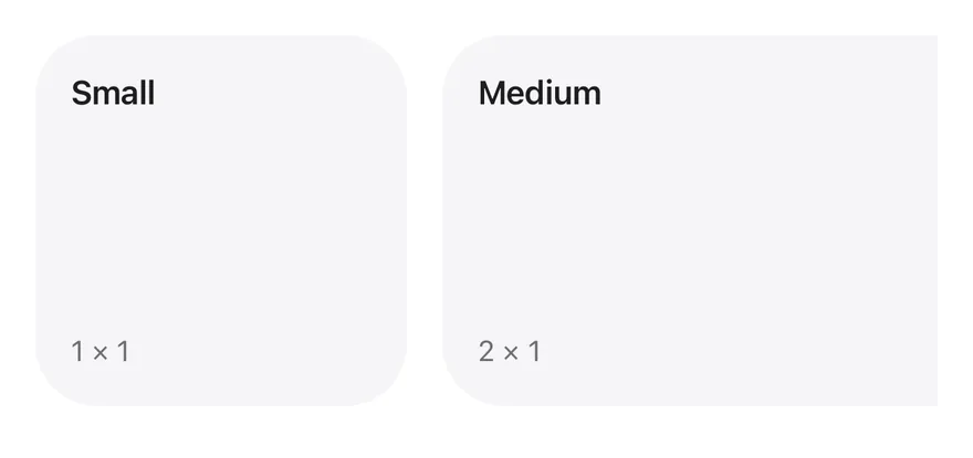
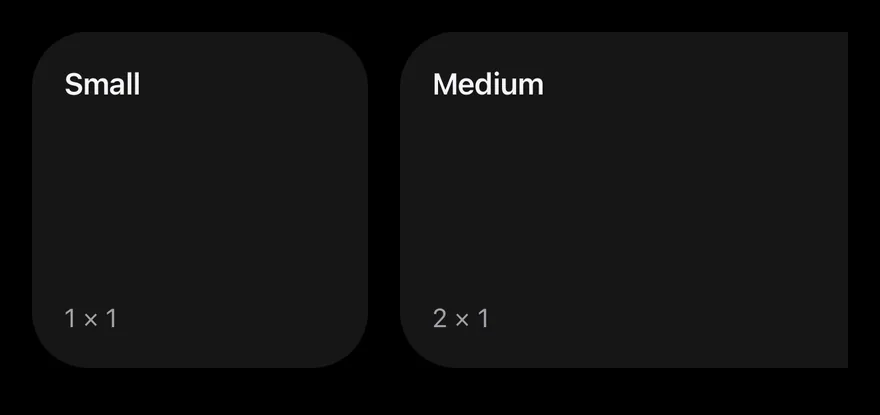
}Widget is a View with a rounded, filled surface. It comes in four fixed sizes, small (168×168), medium (352×168), large (352×352) and extra-large (720×352), or auto, which fills its parent. Fixed sizes animate with Reanimated when the size changes.
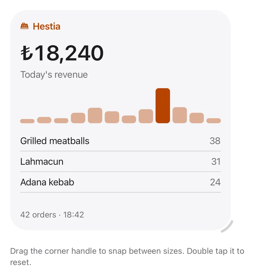
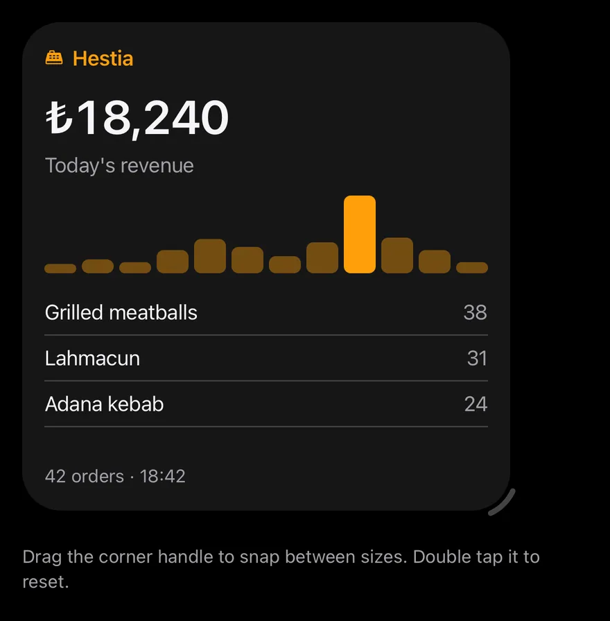
With resizable, a corner handle lets the user drag the widget between sizes: a dashed outline previews the size it will snap to, a selection haptic plays on each new snap, and double-tapping the handle returns to the initial size. Only sizes that fit the available width are offered. Set align="center" to center the content, which also hides WidgetAction.
Installation
$ pnpm dlx @esuiss/uim@latest add widget$ pnpm dlx @esuiss/uim@latest add widget --platform swift$ pnpm dlx @esuiss/uim@latest add widget --platform kotlinThe CLI also adds what it builds on: Icon, Text.
Manual
- Install the dependencies:
npx expo install cn phosphor-react-native react-native-gesture-handler react-native-reanimated react-native-svg react-native-worklets-
Add the pieces it builds on: Icon, Text, and the primitives
components/primitives/haptics.tsx. -
Copy the source into
components/ui/widget.tsx:
import { cn } from "cn"
import type { IconProps as PhosphorIconProps } from "phosphor-react-native"
import * as React from "react"
import {
  type AccessibilityActionEvent,
  I18nManager,
  View,
  type ViewProps,
} from "react-native"
import { Gesture, GestureDetector } from "react-native-gesture-handler"
import {
  Easing,
  ReduceMotion,
  runOnJS,
  useAnimatedStyle,
useSharedValue,- Update the import paths to match your project.
- Install the dependencies:
npx expo install cn phosphor-react-native react-native-gesture-handler react-native-reanimated react-native-svg react-native-worklets-
Add the pieces it builds on: Icon, Text, and the primitives
components/primitives/haptics.tsx. -
Copy the source into
components/ui/widget.tsx:
import { cn } from "cn"
import type { IconProps as PhosphorIconProps } from "phosphor-react-native"
import * as React from "react"
import {
  type AccessibilityActionEvent,
  I18nManager,
  View,
  type ViewProps,
} from "react-native"
import { Gesture, GestureDetector } from "react-native-gesture-handler"
import {
  Easing,
  ReduceMotion,
  runOnJS,
  useAnimatedStyle,
useSharedValue,- Update the import paths to match your project.
- Install the dependencies:
npx expo install phosphor-react-native react-native-gesture-handler react-native-reanimated react-native-svg react-native-worklets-
Add the pieces it builds on: Icon, Text, and the primitives
components/primitives/haptics.tsx. -
Copy the source into
components/ui/widget.tsx:
import type { IconProps as PhosphorIconProps } from "phosphor-react-native"
import * as React from "react"
import {
  type AccessibilityActionEvent,
  I18nManager,
  type StyleProp,
  StyleSheet,
  type TextStyle,
  View,
  type ViewProps,
  type ViewStyle,
} from "react-native"
import { Gesture, GestureDetector } from "react-native-gesture-handler"
import {
  Easing,
ReduceMotion,- Update the import paths to match your project.
-
Target iOS 17 or later.
-
Add the Swift package to your app:
.package(url: "https://github.com/phosphor-icons/swift", from: "2.1.0")- Copy the theme files every view uses:
import SwiftUI
import UIKit

struct RGBA: Sendable {
  let red: CGFloat
  let green: CGFloat
  let blue: CGFloat
  let alpha: CGFloat

  init(_ hex: UInt32, _ alpha: CGFloat = 1) {
    red = CGFloat((hex >> 16) & 0xFF) / 255
    green = CGFloat((hex >> 8) & 0xFF) / 255
    blue = CGFloat(hex & 0xFF) / 255
    self.alpha = alpha
}import SwiftUI
extension Color {
public static let surface = Color.adaptive(light: .init(0xFFFFFF), dark: .init(0x000000))
public static let surfaceSecondary = Color.adaptive(light: .init(0xF5F5F7), dark: .init(0x161617))
public static let surfaceTertiary = Color.adaptive(light: .init(0xE8E8ED), dark: .init(0x2C2C2E))
public static let surfaceRaised = Color.adaptive(light: .init(0xFFFFFF), dark: .init(0x1D1D1F))
public static let label = Color.adaptive(light: .init(0x1D1D1F), dark: .init(0xF5F5F7))
public static let labelSecondary = Color.adaptive(light: .init(0x6E6E73), dark: .init(0xA1A1A6))
public static let labelTertiary = Color.adaptive(light: .init(0x86868B), dark: .init(0x86868B))
public static let labelQuaternary = Color.adaptive(light: .init(0xD2D2D7), dark: .init(0x424245))
public static let control = Color.adaptive(light: .init(0x000000, 0.04), dark: .init(0xFFFFFF, 0.1))
public static let controlPressed = Color.adaptive(light: .init(0x000000, 0.12), dark: .init(0xFFFFFF, 0.22))
public static let controlSelected = Color.adaptive(light: .init(0x1D1D1F), dark: .init(0xF5F5F7))
public static let controlDisabled = Color.adaptive(light: .init(0x000000, 0.03), dark: .init(0xFFFFFF, 0.05))
public static let onControlSelected = Color.adaptive(light: .init(0xFFFFFF), dark: .init(0x000000))- Copy the source and every file it uses:
import PhosphorSwift
import SwiftUI

public enum WidgetSize: CaseIterable, Sendable {
  case small, medium, large, extraLarge

  public var dimensions: CGSize {
    switch self {
    case .small: CGSize(width: 168, height: 168)
    case .medium: CGSize(width: 352, height: 168)
    case .large: CGSize(width: 352, height: 352)
    case .extraLarge: CGSize(width: 720, height: 352)
    }
  }
}import SwiftUI
public struct VariantButtonStyle: ButtonStyle {
public enum Variant: CaseIterable, Sendable {
case `default`, outline, secondary, tinted, ghost, plain, destructive, link
}
public enum Size: CaseIterable, Sendable {
case `default`, xs, sm, lg, xl, icon, iconXs, iconSm, iconLg, iconXl
var height: CGFloat {
switch self {
case .xs, .iconXs: 24
case .sm, .iconSm: 32
case .default, .icon: 36
case .lg, .iconLg: 44import SwiftUI
extension EnvironmentValues {
@Entry var buttonGroup: Axis? = nil
@Entry var buttonGroupSize: CGSize = .zero
}
enum ButtonGroupSpace: Hashable {
case group
}
struct ButtonGroupFrame {
let bounds: Anchor<CGRect>
let outlined: Bool
}import PhosphorSwift
import SwiftUI
extension Shadow {
static let control = Shadow(color: .black.opacity(0.08), radius: 0.5, y: 0.5)
static let thumb = Shadow(color: .black.opacity(0.12), radius: 1.5, y: 1)
}
struct SelectionIndicator<Mark: View>: View {
let checked: Bool
let pressed: Bool
let cornerRadius: CGFloat
let mark: Mark
@Environment(\.isEnabled) private var isEnabled
@Environment(\.isInvalid) private var invalidimport SwiftUI
extension View {
public func dialog<Content: View>(
isPresented: Binding<Bool>,
@ViewBuilder content: @escaping () -> Content
) -> some View {
modifier(
CoverPresenter(isPresented: isPresented) { visible in
CenteredStage(visible: visible, dismissible: true, content: content)
}
)
}
}
struct CenteredStage<Content: View>: View {import SwiftUI
extension View {
public func drawer<Content: View>(
isPresented: Binding<Bool>,
detents: Set<PresentationDetent>? = nil,
selection: Binding<PresentationDetent>? = nil,
onDismiss: (() -> Void)? = nil,
@ViewBuilder content: @escaping () -> Content
) -> some View {
let binding = isPresented
return sheet(isPresented: isPresented, onDismiss: onDismiss) {
DrawerHost(detents: detents, selection: selection, content: content)
.environment(\.overlayDismiss, OverlayDismiss { binding.wrappedValue = false })
}
}import SwiftUI
extension EnvironmentValues {
@Entry public var isInvalid = false
@Entry var fieldInset = false
@Entry var fieldGroupInset = false
@Entry var fieldSetInset = false
}
extension View {
public func invalid(_ isInvalid: Bool = true) -> some View {
environment(\.isInvalid, isInvalid)
}
}
public enum FieldOrientation: CaseIterable, Sendable {import SwiftUI
extension EnvironmentValues {
@Entry public var hapticsEnabled = true
}
extension View {
public func haptics(_ enabled: Bool) -> some View {
environment(\.hapticsEnabled, enabled)
}
func hapticFeedback<Trigger: Equatable>(_ feedback: SensoryFeedback, trigger: Trigger) -> some View {
modifier(HapticFeedbackModifier(feedback: feedback, trigger: trigger) { _, _ in true })
}
func hapticFeedback<Trigger: Equatable>(import PhosphorSwift
import Observation
import SwiftUI
public enum PopupAlignment: Sendable, CaseIterable {
case start, center, end
}
struct OverlayDismiss: Sendable {
let action: @MainActor @Sendable () -> Void
@MainActor func callAsFunction() {
action()
}
}import SwiftUI
public struct PopoverContent<Content: View>: View {
let width: CGFloat?
let content: Content
public init(width: CGFloat? = 288, @ViewBuilder content: () -> Content) {
self.width = width
self.content = content()
}
public var body: some View {
VStack(alignment: .leading, spacing: 16) {
content
}
.font(TextStyle.base.font())import SwiftUI
public struct Separator: View {
let orientation: Axis
public init(_ orientation: Axis = .horizontal) {
self.orientation = orientation
}
public var body: some View {
Rectangle()
.fill(Color.separator)
.frame(width: orientation == .vertical ? 1 : nil, height: orientation == .horizontal ? 1 : nil)
.frame(maxWidth: orientation == .horizontal ? .infinity : nil, maxHeight: orientation == .vertical ? .infinity : nil)
.accessibilityHidden(true)
}import SwiftUI
public enum TextVariant: CaseIterable, Sendable {
case `default`, h1, h2, h3, h4, p, blockquote, code, lead, large, small, muted
var style: TextStyle {
switch self {
case .h1: .xl3
case .h2: .xl2
case .h3: .xl
case .h4, .lead, .large: .lg
case .code, .small, .muted: .sm
default: .base
}
}import SwiftUI
extension EnvironmentValues {
@Entry var patternCompact: Bool? = nil
}
@propertyWrapper
struct CompactLayout: DynamicProperty {
@Environment(\.patternCompact) private var forced
@Environment(\.horizontalSizeClass) private var sizeClass
init() {}
var wrappedValue: Bool {
forced ?? (sizeClass != .regular)
}import SwiftUI
extension View {
public func preview<Content: View>(
isPresented: Binding<Bool>,
arrowEdge: Edge = .top,
@ViewBuilder content: @escaping () -> Content
) -> some View {
modifier(PreviewPresenter(isPresented: isPresented, arrowEdge: arrowEdge, content: content))
}
}
struct PreviewPresenter<Body: View>: ViewModifier {
let isPresented: Binding<Bool>
let arrowEdge: Edge
@ViewBuilder let content: () -> Body- Add the files to your app target.
- Set
minSdkto 24 or higher and add the dependencies:
implementation(platform("androidx.compose:compose-bom:2026.09.00"))
implementation("androidx.compose.foundation:foundation")
implementation("androidx.compose.ui:ui")- Copy the theme files every view uses:
package com.esuiss.ui.theme

import androidx.compose.foundation.isSystemInDarkTheme
import androidx.compose.runtime.Composable
import androidx.compose.runtime.CompositionLocalProvider
import androidx.compose.runtime.Immutable
import androidx.compose.runtime.staticCompositionLocalOf
import androidx.compose.ui.Modifier
import androidx.compose.ui.draw.dropShadow
import androidx.compose.ui.graphics.Color
import androidx.compose.ui.graphics.Shape
import androidx.compose.ui.graphics.shadow.Shadow as DropShadow
import androidx.compose.ui.text.TextStyle
import androidx.compose.ui.text.style.LineHeightStyle
import androidx.compose.ui.unit.Dp
import androidx.compose.ui.unit.DpOffsetpackage com.esuiss.ui.theme
import androidx.compose.runtime.Immutable
import androidx.compose.ui.graphics.Color
import androidx.compose.ui.unit.dp
@Immutable
data class Colors(
val surface: Color,
val surfaceSecondary: Color,
val surfaceTertiary: Color,
val surfaceRaised: Color,
val label: Color,
val labelSecondary: Color,
val labelTertiary: Color,
val labelQuaternary: Color,- Copy the source and every file it uses:
package com.esuiss.ui.components

import androidx.compose.animation.core.animateDpAsState
import androidx.compose.animation.core.snap
import androidx.compose.animation.core.tween
import androidx.compose.foundation.background
import androidx.compose.foundation.gestures.detectDragGestures
import androidx.compose.foundation.gestures.detectTapGestures
import androidx.compose.foundation.layout.Arrangement
import androidx.compose.foundation.layout.Box
import androidx.compose.foundation.layout.BoxWithConstraints
import androidx.compose.foundation.layout.Column
import androidx.compose.foundation.layout.Row
import androidx.compose.foundation.layout.fillMaxWidth
import androidx.compose.foundation.layout.offset
import androidx.compose.foundation.layout.sizepackage com.esuiss.ui.components
import androidx.compose.runtime.compositionLocalOf
import androidx.compose.ui.graphics.Color
import androidx.compose.ui.text.TextStyle
import androidx.compose.ui.unit.Dp
import androidx.compose.ui.unit.dp
val LocalContentStyle = compositionLocalOf { TextStyle.Default }
val LocalContentColor = compositionLocalOf { Color.Unspecified }
val LocalIconSize = compositionLocalOf { 20.dp }package com.esuiss.ui.components
import android.provider.Settings
import androidx.compose.animation.core.CubicBezierEasing
import androidx.compose.foundation.background
import androidx.compose.foundation.border
import androidx.compose.foundation.gestures.Orientation
import androidx.compose.foundation.text.selection.TextSelectionColors
import androidx.compose.runtime.Composable
import androidx.compose.runtime.mutableStateOf
import androidx.compose.runtime.remember
import androidx.compose.ui.Modifier
import androidx.compose.ui.draw.clip
import androidx.compose.ui.draw.drawWithContent
import androidx.compose.ui.geometry.Offset
import androidx.compose.ui.geometry.Sizepackage com.esuiss.ui.components
import androidx.compose.runtime.Composable
import androidx.compose.runtime.CompositionLocalProvider
import androidx.compose.runtime.remember
import androidx.compose.runtime.staticCompositionLocalOf
import androidx.compose.ui.hapticfeedback.HapticFeedback
import androidx.compose.ui.hapticfeedback.HapticFeedbackType
import androidx.compose.ui.platform.LocalHapticFeedback
val LocalHapticsEnabled = staticCompositionLocalOf { true }
@Composable
fun ProvideHaptics(enabled: Boolean, content: @Composable () -> Unit) {
CompositionLocalProvider(LocalHapticsEnabled provides enabled, content = content)
}- Update the
com.esuiss.uipackage names to match your project.
Usage
import { Widget, WidgetHeader, WidgetIcon, WidgetTitle, WidgetAction, WidgetDescription, WidgetValue, WidgetContent, WidgetFooter } from "@/components/ui/widget"<Widget size="small" align="start">
<Weather />
</Widget>Compose the content from WidgetHeader (with WidgetIcon, WidgetTitle and WidgetAction), then WidgetValue, WidgetDescription or WidgetContent, and WidgetFooter, which sticks to the bottom. Plain strings passed to WidgetContent and WidgetFooter are wrapped in Text.
The size is uncontrolled with defaultSize, or controlled with size and onSizeChange. Use sizes to limit which sizes the user can pick. A non-resizable widget defaults to auto; a resizable one defaults to small.
useWidget returns the current size and align so custom content can adapt to the widget size.
Examples
Sizes
The four fixed sizes side by side.
import { ScrollView } from "react-native"
import { Widget, WidgetFooter, WidgetHeader, type WidgetSize, WidgetTitle } from "@/components/ui/widget"

const gridSpans: Record<WidgetSize, string> = {
  small: "1 × 1",
  medium: "2 × 1",
  large: "2 × 2",
  "extra-large": "4 × 2",
}

export function WidgetSizesExample() {
  return (
    <ScrollView
      horizontal
      contentContainerClassName="items-start gap-4"
      showsHorizontalScrollIndicator={false}
    >
      {(["small", "medium", "large", "extra-large"] as const).map((size) => (
        <Widget key={size} size={size}>
          <WidgetHeader>
            <WidgetTitle className="capitalize">
              {size.replace("-", " ")}
            </WidgetTitle>
          </WidgetHeader>
          <WidgetFooter>{gridSpans[size]}</WidgetFooter>
        </Widget>
      ))}
    </ScrollView>
  )
}import EsuissUI
import SwiftUI
struct WidgetSizesExample: View {
var body: some View {
ScrollView(.horizontal, showsIndicators: false) {
HStack(alignment: .top, spacing: 16) {
ForEach(widgetSizeNames, id: \.title) { entry in
Widget(entry.size) {
WidgetHeader {
WidgetTitle(verbatim: entry.title)
}
WidgetFooter(verbatim: entry.span)
}
}
}
}
}
}
struct WidgetSizeName {
let size: WidgetSize
let title: String
let span: String
}
let widgetSizeNames = [
WidgetSizeName(size: .small, title: "Small", span: "1 × 1"),
WidgetSizeName(size: .medium, title: "Medium", span: "2 × 1"),
WidgetSizeName(size: .large, title: "Large", span: "2 × 2"),
WidgetSizeName(size: .extraLarge, title: "Extra large", span: "4 × 2"),
]import androidx.compose.foundation.horizontalScroll
import androidx.compose.foundation.layout.Arrangement
import androidx.compose.foundation.layout.Row
import androidx.compose.foundation.rememberScrollState
import androidx.compose.runtime.Composable
import androidx.compose.ui.Alignment
import androidx.compose.ui.Modifier
import androidx.compose.ui.text.style.TextOverflow
import androidx.compose.ui.unit.dp
import com.esuiss.ui.components.Text
import com.esuiss.ui.components.Widget
import com.esuiss.ui.components.WidgetFooter
import com.esuiss.ui.components.WidgetHeader
import com.esuiss.ui.components.WidgetSize
import com.esuiss.ui.components.WidgetTitle
fun widgetSizeName(size: WidgetSize): String = when (size) {
WidgetSize.Auto -> "auto"
WidgetSize.Small -> "small"
WidgetSize.Medium -> "medium"
WidgetSize.Large -> "large"
WidgetSize.ExtraLarge -> "extra-large"
}
fun widgetGridSpan(size: WidgetSize): String = when (size) {
WidgetSize.Small -> "1 × 1"
WidgetSize.Medium -> "2 × 1"
WidgetSize.Large -> "2 × 2"
else -> "4 × 2"
}
@Composable
fun WidgetFooterText(text: String) {
WidgetFooter {
Text(text, maxLines = 1, overflow = TextOverflow.Ellipsis)
}
}
@Composable
fun WidgetSizes() {
Row(
Modifier.horizontalScroll(rememberScrollState()),
horizontalArrangement = Arrangement.spacedBy(16.dp),
verticalAlignment = Alignment.Top,
) {
listOf(WidgetSize.Small, WidgetSize.Medium, WidgetSize.Large, WidgetSize.ExtraLarge).forEach { size ->
Widget(size = size) {
WidgetHeader {
WidgetTitle(
widgetSizeName(size).split("-").joinToString(" ") { word -> word.replaceFirstChar { it.uppercaseChar() } },
)
}
WidgetFooterText(widgetGridSpan(size))
}
}
}
}Editing
A resizable widget starting at large.
import { CashRegisterIcon } from "phosphor-react-native"
import * as React from "react"
import { View } from "react-native"
import { Icon } from "@/components/ui/icon"
import { Text } from "@/components/ui/text"
import { useWidget, Widget, WidgetContent, WidgetDescription, WidgetFooter, WidgetHeader, WidgetIcon, WidgetTitle, WidgetValue } from "@/components/ui/widget"

const hourly = [12, 18, 14, 30, 44, 34, 22, 40, 100, 46, 30, 14].map(
  (value, hour) => ({ hour: hour + 10, value })
)

const topItems = [
  { name: "Grilled meatballs", count: 38 },
  { name: "Lahmacun", count: 31 },
  { name: "Adana kebab", count: 24 },
]

function Hint({ children }: { children: React.ReactNode }) {
  return <Text className="mt-6 text-xs text-label-secondary">{children}</Text>
}

function SalesBody() {
  const { size } = useWidget()
  return (
    <>
      <WidgetHeader className="gap-1.5">
        <WidgetIcon size="sm" iconClassName="text-warning">
          <Icon as={CashRegisterIcon} weight="fill" />
        </WidgetIcon>
        <WidgetTitle className="text-warning">Hestia</WidgetTitle>
      </WidgetHeader>
      <View
        className={
          size === "medium"
            ? "min-h-0 grow flex-row items-end gap-3"
            : "min-h-0 gap-3"
        }
      >
        <WidgetContent className="grow-0">
          <WidgetValue>₺18,240</WidgetValue>
          <WidgetDescription>Today's revenue</WidgetDescription>
        </WidgetContent>
        {size === "small" ? null : (
          <View
            className={
              size === "medium"
                ? "h-full flex-1 flex-row items-end gap-1"
                : "h-14 flex-row items-end gap-1"
            }
          >
            {hourly.map(({ hour, value }) => (
              <View
                key={hour}
                className={
                  value === 100
                    ? "flex-1 rounded-sm bg-warning"
                    : "flex-1 rounded-sm bg-warning/40"
                }
                style={{ height: `${value}%` }}
              />
            ))}
          </View>
        )}
      </View>
      {size === "large" || size === "extra-large" ? (
        <View className="min-h-0 shrink overflow-hidden">
          {topItems.map((item) => (
            <View
              key={item.name}
              className="flex-row items-center justify-between border-b border-separator py-1.5"
            >
              <Text className="text-sm">{item.name}</Text>
              <Text className="text-sm text-label-secondary">{item.count}</Text>
            </View>
          ))}
        </View>
      ) : null}
      <WidgetFooter>42 orders · 18:42</WidgetFooter>
    </>
  )
}

export function WidgetEditingExample() {
  return (
    <View className="w-full">
      <Widget resizable defaultSize="large">
        <SalesBody />
      </Widget>
      <Hint>
        Drag the corner handle to snap between sizes. Double tap it to reset.
      </Hint>
    </View>
  )
}import EsuissUI
import PhosphorSwift
import SwiftUI
struct WidgetEditingExample: View {
var body: some View {
VStack(alignment: .leading, spacing: 0) {
WidgetEditable(initial: .large) {
WidgetSales()
}
WidgetHint(text: "Drag the corner handle to snap between sizes. Double tap it to reset.")
}
.frame(maxWidth: .infinity, alignment: .leading)
}
}
let widgetHourly: [CGFloat] = [12, 18, 14, 30, 44, 34, 22, 40, 100, 46, 30, 14]
struct WidgetTopItem {
let name: String
let count: Int
}
let widgetTopItems = [
WidgetTopItem(name: "Grilled meatballs", count: 38),
WidgetTopItem(name: "Lahmacun", count: 31),
WidgetTopItem(name: "Adana kebab", count: 24),
]
struct WidgetHint: View {
let text: String
var body: some View {
Text(verbatim: text)
.textStyle(.xs)
.foregroundStyle(Color.labelSecondary)
.padding(.top, 24)
}
}
struct WidgetEditable<Content: View>: View {
let sizes: [WidgetSize]
let handle: WidgetHandlePlacement
let resetSize: WidgetSize
@ViewBuilder let content: () -> Content
@State private var size: WidgetSize
init(
initial: WidgetSize,
sizes: [WidgetSize] = WidgetSize.allCases,
handle: WidgetHandlePlacement = .outside,
@ViewBuilder content: @escaping () -> Content
) {
self.sizes = sizes
self.handle = handle
resetSize = initial
self.content = content
_size = State(initialValue: initial)
}
var body: some View {
Widget(size: $size, sizes: sizes, editing: true, handle: handle, resetSize: resetSize) {
content()
}
}
}
struct WidgetSalesHeader: View {
var body: some View {
WidgetHeader {
WidgetIcon(size: .sm) {
Ph.cashRegister.fill.foregroundStyle(Color.warning)
}
WidgetTitle("Hestia")
.foregroundStyle(Color.warning)
}
}
}
struct WidgetBars: View {
var body: some View {
GeometryReader { proxy in
HStack(alignment: .bottom, spacing: 4) {
ForEach(Array(widgetHourly.enumerated()), id: \.offset) { _, value in
RoundedRectangle(cornerRadius: Radius.sm, style: .continuous)
.fill(value == 100 ? Color.warning : Color.warning.opacity(0.4))
.frame(height: proxy.size.height * value / 100)
.frame(maxWidth: .infinity)
}
}
.frame(maxWidth: .infinity, maxHeight: .infinity, alignment: .bottom)
}
.accessibilityHidden(true)
}
}
struct WidgetSales: View {
@Environment(\.widgetSize) private var size
var body: some View {
WidgetSalesHeader()
if size == .medium {
HStack(alignment: .bottom, spacing: 12) {
revenue
WidgetBars()
}
.frame(maxHeight: .infinity)
} else {
VStack(alignment: .leading, spacing: 12) {
revenue
if size != .small {
WidgetBars().frame(height: 56)
}
}
}
if size == .large || size == .extraLarge {
VStack(spacing: 0) {
ForEach(widgetTopItems, id: \.name) { item in
HStack {
Text(verbatim: item.name)
.textStyle(.sm)
Spacer(minLength: 8)
Text(verbatim: "\(item.count)")
.textStyle(.sm)
.foregroundStyle(Color.labelSecondary)
}
.padding(.vertical, 6)
.overlay(alignment: .bottom) {
Color.separator.frame(height: 1)
}
}
}
.clipped()
}
WidgetFooter(verbatim: "42 orders · 18:42")
}
var revenue: some View {
WidgetContent {
WidgetValue(verbatim: "₺18,240")
WidgetDescription("Today's revenue")
}
.fixedSize(horizontal: true, vertical: false)
}
}import androidx.compose.foundation.background
import androidx.compose.foundation.layout.Arrangement
import androidx.compose.foundation.layout.Box
import androidx.compose.foundation.layout.Column
import androidx.compose.foundation.layout.Row
import androidx.compose.foundation.layout.fillMaxHeight
import androidx.compose.foundation.layout.fillMaxWidth
import androidx.compose.foundation.layout.height
import androidx.compose.foundation.layout.padding
import androidx.compose.foundation.shape.RoundedCornerShape
import androidx.compose.runtime.Composable
import androidx.compose.runtime.CompositionLocalProvider
import androidx.compose.ui.Alignment
import androidx.compose.ui.Modifier
import androidx.compose.ui.graphics.Color
import androidx.compose.ui.text.style.TextOverflow
import androidx.compose.ui.unit.dp
import com.adamglin.PhosphorIcons
import com.adamglin.phosphoricons.Fill
import com.adamglin.phosphoricons.fill.CashRegister
import com.esuiss.ui.components.Icon
import com.esuiss.ui.components.LocalContentStyle
import com.esuiss.ui.components.Separator
import com.esuiss.ui.components.Text
import com.esuiss.ui.components.Widget
import com.esuiss.ui.components.WidgetContent
import com.esuiss.ui.components.WidgetDescription
import com.esuiss.ui.components.WidgetFooter
import com.esuiss.ui.components.WidgetHeader
import com.esuiss.ui.components.WidgetIcon
import com.esuiss.ui.components.WidgetIconSize
import com.esuiss.ui.components.WidgetSize
import com.esuiss.ui.components.WidgetTitle
import com.esuiss.ui.components.WidgetValue
import com.esuiss.ui.theme.EsuissTheme
import com.esuiss.ui.theme.Radius
import com.esuiss.ui.theme.Typography
val widgetHourly = listOf(12, 18, 14, 30, 44, 34, 22, 40, 100, 46, 30, 14)
val widgetTopItems = listOf(
"Grilled meatballs" to 38,
"Lahmacun" to 31,
"Adana kebab" to 24,
)
@Composable
fun WidgetTintedTitle(text: String, color: Color) {
CompositionLocalProvider(LocalContentStyle provides LocalContentStyle.current.copy(color = color)) {
WidgetTitle(text)
}
}
@Composable
fun WidgetFooterText(text: String) {
WidgetFooter {
Text(text, maxLines = 1, overflow = TextOverflow.Ellipsis)
}
}
@Composable
fun WidgetHint(text: String) {
Text(
text,
Modifier.padding(top = 24.dp),
style = Typography.xs,
color = EsuissTheme.colors.labelSecondary,
)
}
@Composable
fun WidgetSalesHeader() {
val warning = EsuissTheme.colors.warning
WidgetHeader {
WidgetIcon(size = WidgetIconSize.Sm) { Icon(PhosphorIcons.Fill.CashRegister, contentDescription = null, tint = warning) }
WidgetTintedTitle("Hestia", warning)
}
}
@Composable
fun WidgetRevenue() {
Column(verticalArrangement = Arrangement.spacedBy(4.dp)) {
WidgetValue("₺18,240")
WidgetDescription("Today's revenue")
}
}
@Composable
fun WidgetBars(modifier: Modifier) {
val warning = EsuissTheme.colors.warning
Row(modifier, horizontalArrangement = Arrangement.spacedBy(4.dp), verticalAlignment = Alignment.Bottom) {
widgetHourly.forEach { value ->
Box(
Modifier
.weight(1f)
.fillMaxHeight(value / 100f)
.background(if (value == 100) warning else warning.copy(alpha = 0.4f), RoundedCornerShape(Radius.sm)),
)
}
}
}
@Composable
fun WidgetSalesBody(size: WidgetSize) {
WidgetSalesHeader()
if (size == WidgetSize.Medium) {
WidgetContent {
Row(
Modifier.fillMaxWidth().fillMaxHeight(),
horizontalArrangement = Arrangement.spacedBy(12.dp),
verticalAlignment = Alignment.Bottom,
) {
WidgetRevenue()
WidgetBars(Modifier.weight(1f).fillMaxHeight())
}
}
} else {
WidgetContent {
Column(verticalArrangement = Arrangement.spacedBy(12.dp)) {
WidgetRevenue()
if (size != WidgetSize.Small) WidgetBars(Modifier.fillMaxWidth().height(56.dp))
}
}
}
if (size == WidgetSize.Large || size == WidgetSize.ExtraLarge) {
Column {
widgetTopItems.forEach { (name, count) ->
Row(
Modifier.fillMaxWidth().padding(vertical = 6.dp),
horizontalArrangement = Arrangement.SpaceBetween,
verticalAlignment = Alignment.CenterVertically,
) {
Text(name, style = Typography.sm)
Text(count.toString(), style = Typography.sm, color = EsuissTheme.colors.labelSecondary)
}
Separator()
}
}
}
WidgetFooterText("42 orders · 18:42")
}
@Composable
fun WidgetEditing() {
Column(Modifier.fillMaxWidth()) {
Widget(resizable = true, defaultSize = WidgetSize.Large) { WidgetSalesBody(size) }
WidgetHint("Drag the corner handle to snap between sizes. Double tap it to reset.")
}
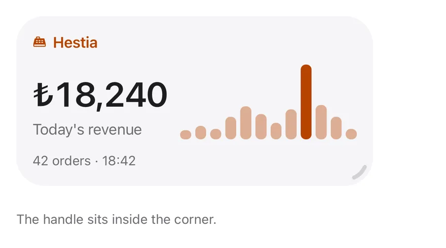
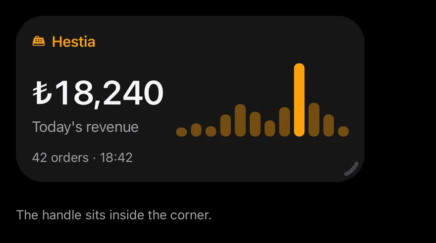
}Inside handle
A resizable widget with the handle drawn inside the corner.
import { CashRegisterIcon } from "phosphor-react-native"
import * as React from "react"
import { View } from "react-native"
import { Icon } from "@/components/ui/icon"
import { Text } from "@/components/ui/text"
import { useWidget, Widget, WidgetContent, WidgetDescription, WidgetFooter, WidgetHeader, WidgetIcon, WidgetTitle, WidgetValue } from "@/components/ui/widget"

const hourly = [12, 18, 14, 30, 44, 34, 22, 40, 100, 46, 30, 14].map(
  (value, hour) => ({ hour: hour + 10, value })
)

const topItems = [
  { name: "Grilled meatballs", count: 38 },
  { name: "Lahmacun", count: 31 },
  { name: "Adana kebab", count: 24 },
]

function Hint({ children }: { children: React.ReactNode }) {
  return <Text className="mt-6 text-xs text-label-secondary">{children}</Text>
}

function SalesBody() {
  const { size } = useWidget()
  return (
    <>
      <WidgetHeader className="gap-1.5">
        <WidgetIcon size="sm" iconClassName="text-warning">
          <Icon as={CashRegisterIcon} weight="fill" />
        </WidgetIcon>
        <WidgetTitle className="text-warning">Hestia</WidgetTitle>
      </WidgetHeader>
      <View
        className={
          size === "medium"
            ? "min-h-0 grow flex-row items-end gap-3"
            : "min-h-0 gap-3"
        }
      >
        <WidgetContent className="grow-0">
          <WidgetValue>₺18,240</WidgetValue>
          <WidgetDescription>Today's revenue</WidgetDescription>
        </WidgetContent>
        {size === "small" ? null : (
          <View
            className={
              size === "medium"
                ? "h-full flex-1 flex-row items-end gap-1"
                : "h-14 flex-row items-end gap-1"
            }
          >
            {hourly.map(({ hour, value }) => (
              <View
                key={hour}
                className={
                  value === 100
                    ? "flex-1 rounded-sm bg-warning"
                    : "flex-1 rounded-sm bg-warning/40"
                }
                style={{ height: `${value}%` }}
              />
            ))}
          </View>
        )}
      </View>
      {size === "large" || size === "extra-large" ? (
        <View className="min-h-0 shrink overflow-hidden">
          {topItems.map((item) => (
            <View
              key={item.name}
              className="flex-row items-center justify-between border-b border-separator py-1.5"
            >
              <Text className="text-sm">{item.name}</Text>
              <Text className="text-sm text-label-secondary">{item.count}</Text>
            </View>
          ))}
        </View>
      ) : null}
      <WidgetFooter>42 orders · 18:42</WidgetFooter>
    </>
  )
}

export function WidgetInsideHandleExample() {
  return (
    <View className="w-full">
      <Widget resizable handle="inside" defaultSize="medium">
        <SalesBody />
      </Widget>
      <Hint>The handle sits inside the corner.</Hint>
    </View>
  )
}import EsuissUI
import PhosphorSwift
import SwiftUI
struct WidgetInsideHandleExample: View {
var body: some View {
VStack(alignment: .leading, spacing: 0) {
WidgetEditable(initial: .medium, handle: .inside) {
WidgetSales()
}
WidgetHint(text: "The handle sits inside the corner.")
}
.frame(maxWidth: .infinity, alignment: .leading)
}
}
let widgetHourly: [CGFloat] = [12, 18, 14, 30, 44, 34, 22, 40, 100, 46, 30, 14]
struct WidgetTopItem {
let name: String
let count: Int
}
let widgetTopItems = [
WidgetTopItem(name: "Grilled meatballs", count: 38),
WidgetTopItem(name: "Lahmacun", count: 31),
WidgetTopItem(name: "Adana kebab", count: 24),
]
struct WidgetHint: View {
let text: String
var body: some View {
Text(verbatim: text)
.textStyle(.xs)
.foregroundStyle(Color.labelSecondary)
.padding(.top, 24)
}
}
struct WidgetEditable<Content: View>: View {
let sizes: [WidgetSize]
let handle: WidgetHandlePlacement
let resetSize: WidgetSize
@ViewBuilder let content: () -> Content
@State private var size: WidgetSize
init(
initial: WidgetSize,
sizes: [WidgetSize] = WidgetSize.allCases,
handle: WidgetHandlePlacement = .outside,
@ViewBuilder content: @escaping () -> Content
) {
self.sizes = sizes
self.handle = handle
resetSize = initial
self.content = content
_size = State(initialValue: initial)
}
var body: some View {
Widget(size: $size, sizes: sizes, editing: true, handle: handle, resetSize: resetSize) {
content()
}
}
}
struct WidgetSalesHeader: View {
var body: some View {
WidgetHeader {
WidgetIcon(size: .sm) {
Ph.cashRegister.fill.foregroundStyle(Color.warning)
}
WidgetTitle("Hestia")
.foregroundStyle(Color.warning)
}
}
}
struct WidgetBars: View {
var body: some View {
GeometryReader { proxy in
HStack(alignment: .bottom, spacing: 4) {
ForEach(Array(widgetHourly.enumerated()), id: \.offset) { _, value in
RoundedRectangle(cornerRadius: Radius.sm, style: .continuous)
.fill(value == 100 ? Color.warning : Color.warning.opacity(0.4))
.frame(height: proxy.size.height * value / 100)
.frame(maxWidth: .infinity)
}
}
.frame(maxWidth: .infinity, maxHeight: .infinity, alignment: .bottom)
}
.accessibilityHidden(true)
}
}
struct WidgetSales: View {
@Environment(\.widgetSize) private var size
var body: some View {
WidgetSalesHeader()
if size == .medium {
HStack(alignment: .bottom, spacing: 12) {
revenue
WidgetBars()
}
.frame(maxHeight: .infinity)
} else {
VStack(alignment: .leading, spacing: 12) {
revenue
if size != .small {
WidgetBars().frame(height: 56)
}
}
}
if size == .large || size == .extraLarge {
VStack(spacing: 0) {
ForEach(widgetTopItems, id: \.name) { item in
HStack {
Text(verbatim: item.name)
.textStyle(.sm)
Spacer(minLength: 8)
Text(verbatim: "\(item.count)")
.textStyle(.sm)
.foregroundStyle(Color.labelSecondary)
}
.padding(.vertical, 6)
.overlay(alignment: .bottom) {
Color.separator.frame(height: 1)
}
}
}
.clipped()
}
WidgetFooter(verbatim: "42 orders · 18:42")
}
var revenue: some View {
WidgetContent {
WidgetValue(verbatim: "₺18,240")
WidgetDescription("Today's revenue")
}
.fixedSize(horizontal: true, vertical: false)
}
}import androidx.compose.foundation.background
import androidx.compose.foundation.layout.Arrangement
import androidx.compose.foundation.layout.Box
import androidx.compose.foundation.layout.Column
import androidx.compose.foundation.layout.Row
import androidx.compose.foundation.layout.fillMaxHeight
import androidx.compose.foundation.layout.fillMaxWidth
import androidx.compose.foundation.layout.height
import androidx.compose.foundation.layout.padding
import androidx.compose.foundation.shape.RoundedCornerShape
import androidx.compose.runtime.Composable
import androidx.compose.runtime.CompositionLocalProvider
import androidx.compose.ui.Alignment
import androidx.compose.ui.Modifier
import androidx.compose.ui.graphics.Color
import androidx.compose.ui.text.style.TextOverflow
import androidx.compose.ui.unit.dp
import com.adamglin.PhosphorIcons
import com.adamglin.phosphoricons.Fill
import com.adamglin.phosphoricons.fill.CashRegister
import com.esuiss.ui.components.Icon
import com.esuiss.ui.components.LocalContentStyle
import com.esuiss.ui.components.Separator
import com.esuiss.ui.components.Text
import com.esuiss.ui.components.Widget
import com.esuiss.ui.components.WidgetContent
import com.esuiss.ui.components.WidgetDescription
import com.esuiss.ui.components.WidgetFooter
import com.esuiss.ui.components.WidgetHandlePlacement
import com.esuiss.ui.components.WidgetHeader
import com.esuiss.ui.components.WidgetIcon
import com.esuiss.ui.components.WidgetIconSize
import com.esuiss.ui.components.WidgetSize
import com.esuiss.ui.components.WidgetTitle
import com.esuiss.ui.components.WidgetValue
import com.esuiss.ui.theme.EsuissTheme
import com.esuiss.ui.theme.Radius
import com.esuiss.ui.theme.Typography
val widgetHourly = listOf(12, 18, 14, 30, 44, 34, 22, 40, 100, 46, 30, 14)
val widgetTopItems = listOf(
"Grilled meatballs" to 38,
"Lahmacun" to 31,
"Adana kebab" to 24,
)
@Composable
fun WidgetTintedTitle(text: String, color: Color) {
CompositionLocalProvider(LocalContentStyle provides LocalContentStyle.current.copy(color = color)) {
WidgetTitle(text)
}
}
@Composable
fun WidgetFooterText(text: String) {
WidgetFooter {
Text(text, maxLines = 1, overflow = TextOverflow.Ellipsis)
}
}
@Composable
fun WidgetHint(text: String) {
Text(
text,
Modifier.padding(top = 24.dp),
style = Typography.xs,
color = EsuissTheme.colors.labelSecondary,
)
}
@Composable
fun WidgetSalesHeader() {
val warning = EsuissTheme.colors.warning
WidgetHeader {
WidgetIcon(size = WidgetIconSize.Sm) { Icon(PhosphorIcons.Fill.CashRegister, contentDescription = null, tint = warning) }
WidgetTintedTitle("Hestia", warning)
}
}
@Composable
fun WidgetRevenue() {
Column(verticalArrangement = Arrangement.spacedBy(4.dp)) {
WidgetValue("₺18,240")
WidgetDescription("Today's revenue")
}
}
@Composable
fun WidgetBars(modifier: Modifier) {
val warning = EsuissTheme.colors.warning
Row(modifier, horizontalArrangement = Arrangement.spacedBy(4.dp), verticalAlignment = Alignment.Bottom) {
widgetHourly.forEach { value ->
Box(
Modifier
.weight(1f)
.fillMaxHeight(value / 100f)
.background(if (value == 100) warning else warning.copy(alpha = 0.4f), RoundedCornerShape(Radius.sm)),
)
}
}
}
@Composable
fun WidgetSalesBody(size: WidgetSize) {
WidgetSalesHeader()
if (size == WidgetSize.Medium) {
WidgetContent {
Row(
Modifier.fillMaxWidth().fillMaxHeight(),
horizontalArrangement = Arrangement.spacedBy(12.dp),
verticalAlignment = Alignment.Bottom,
) {
WidgetRevenue()
WidgetBars(Modifier.weight(1f).fillMaxHeight())
}
}
} else {
WidgetContent {
Column(verticalArrangement = Arrangement.spacedBy(12.dp)) {
WidgetRevenue()
if (size != WidgetSize.Small) WidgetBars(Modifier.fillMaxWidth().height(56.dp))
}
}
}
if (size == WidgetSize.Large || size == WidgetSize.ExtraLarge) {
Column {
widgetTopItems.forEach { (name, count) ->
Row(
Modifier.fillMaxWidth().padding(vertical = 6.dp),
horizontalArrangement = Arrangement.SpaceBetween,
verticalAlignment = Alignment.CenterVertically,
) {
Text(name, style = Typography.sm)
Text(count.toString(), style = Typography.sm, color = EsuissTheme.colors.labelSecondary)
}
Separator()
}
}
}
WidgetFooterText("42 orders · 18:42")
}
@Composable
fun WidgetInsideHandle() {
Column(Modifier.fillMaxWidth()) {
Widget(resizable = true, handle = WidgetHandlePlacement.Inside, defaultSize = WidgetSize.Medium) { WidgetSalesBody(size) }
WidgetHint("The handle sits inside the corner.")
}
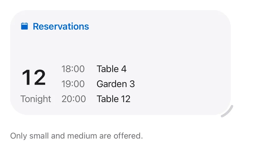
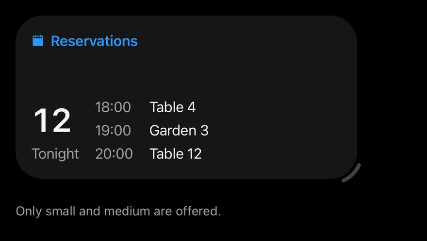
}Limited sizes
Resizing limited to small and medium.
import { CalendarBlankIcon } from "phosphor-react-native"
import * as React from "react"
import { View } from "react-native"
import { Icon } from "@/components/ui/icon"
import { Text } from "@/components/ui/text"
import { useWidget, Widget, WidgetContent, WidgetDescription, WidgetHeader, WidgetIcon, WidgetTitle, WidgetValue } from "@/components/ui/widget"

const reservations = [
  { time: "18:00", place: "Table 4" },
  { time: "19:00", place: "Garden 3" },
  { time: "20:00", place: "Table 12" },
  { time: "21:00", place: "Table 7" },
]

function Hint({ children }: { children: React.ReactNode }) {
  return <Text className="mt-6 text-xs text-label-secondary">{children}</Text>
}

function ReservationsBody() {
  const { size } = useWidget()
  return (
    <>
      <WidgetHeader className="gap-1.5">
        <WidgetIcon size="sm" iconClassName="text-link">
          <Icon as={CalendarBlankIcon} weight="fill" />
        </WidgetIcon>
        <WidgetTitle className="text-link">Reservations</WidgetTitle>
      </WidgetHeader>
      <View className="min-h-0 grow flex-row items-end gap-4">
        <WidgetContent className="grow-0">
          <WidgetValue>12</WidgetValue>
          <WidgetDescription>Tonight</WidgetDescription>
        </WidgetContent>
        {size === "medium" ? (
          <View className="flex-1 gap-1">
            {reservations.slice(0, 3).map((item) => (
              <View key={item.time} className="flex-row gap-3">
                <Text className="w-11 text-sm text-label-secondary">
                  {item.time}
                </Text>
                <Text className="flex-1 text-sm" numberOfLines={1}>
                  {item.place}
                </Text>
              </View>
            ))}
          </View>
        ) : null}
      </View>
    </>
  )
}

export function WidgetLimitedSizesExample() {
  return (
    <View className="w-full">
      <Widget resizable defaultSize="medium" sizes={["small", "medium"]}>
        <ReservationsBody />
      </Widget>
      <Hint>Only small and medium are offered.</Hint>
    </View>
  )
}import EsuissUI
import PhosphorSwift
import SwiftUI
struct WidgetLimitedSizesExample: View {
var body: some View {
VStack(alignment: .leading, spacing: 0) {
WidgetEditable(initial: .medium, sizes: [.small, .medium]) {
WidgetReservations()
}
WidgetHint(text: "Only small and medium are offered.")
}
.frame(maxWidth: .infinity, alignment: .leading)
}
}
struct WidgetReservation {
let time: String
let place: String
}
let widgetReservations = [
WidgetReservation(time: "18:00", place: "Table 4"),
WidgetReservation(time: "19:00", place: "Garden 3"),
WidgetReservation(time: "20:00", place: "Table 12"),
WidgetReservation(time: "21:00", place: "Table 7"),
]
struct WidgetHint: View {
let text: String
var body: some View {
Text(verbatim: text)
.textStyle(.xs)
.foregroundStyle(Color.labelSecondary)
.padding(.top, 24)
}
}
struct WidgetEditable<Content: View>: View {
let sizes: [WidgetSize]
let handle: WidgetHandlePlacement
let resetSize: WidgetSize
@ViewBuilder let content: () -> Content
@State private var size: WidgetSize
init(
initial: WidgetSize,
sizes: [WidgetSize] = WidgetSize.allCases,
handle: WidgetHandlePlacement = .outside,
@ViewBuilder content: @escaping () -> Content
) {
self.sizes = sizes
self.handle = handle
resetSize = initial
self.content = content
_size = State(initialValue: initial)
}
var body: some View {
Widget(size: $size, sizes: sizes, editing: true, handle: handle, resetSize: resetSize) {
content()
}
}
}
struct WidgetReservations: View {
@Environment(\.widgetSize) private var size
var body: some View {
WidgetHeader {
WidgetIcon(size: .sm) {
Ph.calendarBlank.fill.foregroundStyle(Color.link)
}
WidgetTitle("Reservations")
.foregroundStyle(Color.link)
}
HStack(alignment: .bottom, spacing: 16) {
WidgetContent {
WidgetValue(verbatim: "12")
WidgetDescription("Tonight")
}
.fixedSize(horizontal: true, vertical: false)
if size == .medium {
VStack(alignment: .leading, spacing: 4) {
ForEach(widgetReservations.prefix(3), id: \.time) { item in
HStack(spacing: 12) {
Text(verbatim: item.time)
.textStyle(.sm)
.foregroundStyle(Color.labelSecondary)
.frame(width: 44, alignment: .leading)
Text(verbatim: item.place)
.textStyle(.sm)
.lineLimit(1)
.frame(maxWidth: .infinity, alignment: .leading)
}
}
}
.frame(maxWidth: .infinity)
}
}
.frame(maxWidth: .infinity, maxHeight: .infinity, alignment: .bottomLeading)
}
}import androidx.compose.foundation.layout.Arrangement
import androidx.compose.foundation.layout.Column
import androidx.compose.foundation.layout.Row
import androidx.compose.foundation.layout.fillMaxHeight
import androidx.compose.foundation.layout.fillMaxWidth
import androidx.compose.foundation.layout.padding
import androidx.compose.foundation.layout.width
import androidx.compose.runtime.Composable
import androidx.compose.runtime.CompositionLocalProvider
import androidx.compose.ui.Alignment
import androidx.compose.ui.Modifier
import androidx.compose.ui.graphics.Color
import androidx.compose.ui.text.style.TextOverflow
import androidx.compose.ui.unit.dp
import com.adamglin.PhosphorIcons
import com.adamglin.phosphoricons.Fill
import com.adamglin.phosphoricons.fill.CalendarBlank
import com.esuiss.ui.components.Icon
import com.esuiss.ui.components.LocalContentStyle
import com.esuiss.ui.components.Text
import com.esuiss.ui.components.Widget
import com.esuiss.ui.components.WidgetContent
import com.esuiss.ui.components.WidgetDescription
import com.esuiss.ui.components.WidgetHeader
import com.esuiss.ui.components.WidgetIcon
import com.esuiss.ui.components.WidgetIconSize
import com.esuiss.ui.components.WidgetSize
import com.esuiss.ui.components.WidgetTitle
import com.esuiss.ui.components.WidgetValue
import com.esuiss.ui.theme.EsuissTheme
import com.esuiss.ui.theme.Typography
val widgetReservations = listOf(
"18:00" to "Table 4",
"19:00" to "Garden 3",
"20:00" to "Table 12",
"21:00" to "Table 7",
)
@Composable
fun WidgetTintedTitle(text: String, color: Color) {
CompositionLocalProvider(LocalContentStyle provides LocalContentStyle.current.copy(color = color)) {
WidgetTitle(text)
}
}
@Composable
fun WidgetHint(text: String) {
Text(
text,
Modifier.padding(top = 24.dp),
style = Typography.xs,
color = EsuissTheme.colors.labelSecondary,
)
}
@Composable
fun WidgetReservationsBody(size: WidgetSize) {
val colors = EsuissTheme.colors
WidgetHeader {
WidgetIcon(size = WidgetIconSize.Sm) { Icon(PhosphorIcons.Fill.CalendarBlank, contentDescription = null, tint = colors.link) }
WidgetTintedTitle("Reservations", colors.link)
}
WidgetContent {
Row(
Modifier.fillMaxWidth().fillMaxHeight(),
horizontalArrangement = Arrangement.spacedBy(16.dp),
verticalAlignment = Alignment.Bottom,
) {
Column(verticalArrangement = Arrangement.spacedBy(4.dp)) {
WidgetValue("12")
WidgetDescription("Tonight")
}
if (size == WidgetSize.Medium) {
Column(Modifier.weight(1f), verticalArrangement = Arrangement.spacedBy(4.dp)) {
widgetReservations.take(3).forEach { (time, place) ->
Row(horizontalArrangement = Arrangement.spacedBy(12.dp)) {
Text(time, Modifier.width(44.dp), style = Typography.sm, color = colors.labelSecondary)
Text(place, Modifier.weight(1f), style = Typography.sm, maxLines = 1, overflow = TextOverflow.Ellipsis)
}
}
}
}
}
}
}
@Composable
fun WidgetLimitedSizes() {
Column(Modifier.fillMaxWidth()) {
Widget(
resizable = true,
defaultSize = WidgetSize.Medium,
sizes = listOf(WidgetSize.Small, WidgetSize.Medium),
) { WidgetReservationsBody(size) }
WidgetHint("Only small and medium are offered.")
}
}Controlled
Controls the size with size and onSizeChange.
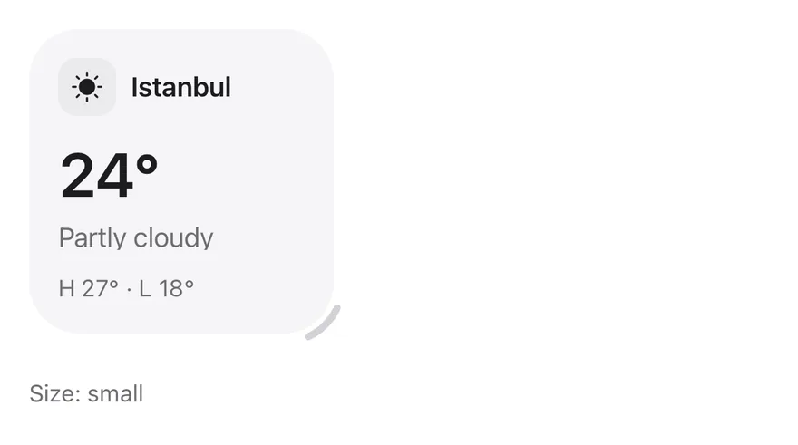
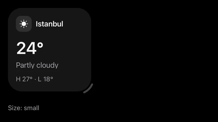
import { SunIcon } from "phosphor-react-native"
import * as React from "react"
import { View } from "react-native"
import { Icon } from "@/components/ui/icon"
import { Text } from "@/components/ui/text"
import { Widget, WidgetContent, WidgetDescription, WidgetFooter, WidgetHeader, WidgetIcon, type WidgetSize, WidgetTitle, WidgetValue } from "@/components/ui/widget"

function Hint({ children }: { children: React.ReactNode }) {
  return <Text className="mt-6 text-xs text-label-secondary">{children}</Text>
}

function Weather() {
  return (
    <>
      <WidgetHeader>
        <WidgetIcon>
          <Icon as={SunIcon} weight="fill" />
        </WidgetIcon>
        <WidgetTitle>Istanbul</WidgetTitle>
      </WidgetHeader>
      <WidgetContent>
        <WidgetValue>24°</WidgetValue>
        <WidgetDescription>Partly cloudy</WidgetDescription>
      </WidgetContent>
      <WidgetFooter>H 27° · L 18°</WidgetFooter>
    </>
  )
}

function ControlledEditing() {
  const [size, setSize] = React.useState<WidgetSize | "auto">("small")
  return (
    <View className="w-full">
      <Widget resizable size={size} onSizeChange={setSize}>
        <Weather />
      </Widget>
      <Hint>{`Size: ${size}`}</Hint>
    </View>
  )
}

export function WidgetControlledExample() {
  return (
    <ControlledEditing />
  )
}import EsuissUI
import PhosphorSwift
import SwiftUI
func widgetSizeValue(_ size: WidgetSize) -> String {
switch size {
case .small: "small"
case .medium: "medium"
case .large: "large"
case .extraLarge: "extra-large"
}
}
struct WidgetHint: View {
let text: String
var body: some View {
Text(verbatim: text)
.textStyle(.xs)
.foregroundStyle(Color.labelSecondary)
.padding(.top, 24)
}
}
struct WidgetControlled: View {
@State private var size: WidgetSize = .small
var body: some View {
VStack(alignment: .leading, spacing: 0) {
Widget(size: $size, editing: true) {
WidgetWeather()
}
WidgetHint(text: "Size: \(widgetSizeValue(size))")
}
.frame(maxWidth: .infinity, alignment: .leading)
}
}
struct WidgetWeather: View {
var body: some View {
WidgetHeader {
WidgetIcon {
Ph.sun.fill
}
WidgetTitle("Istanbul")
}
WidgetContent {
WidgetValue(verbatim: "24°")
WidgetDescription("Partly cloudy")
}
WidgetFooter(verbatim: "H 27° · L 18°")
}
}import androidx.compose.foundation.layout.Column
import androidx.compose.foundation.layout.fillMaxWidth
import androidx.compose.foundation.layout.padding
import androidx.compose.runtime.Composable
import androidx.compose.runtime.getValue
import androidx.compose.runtime.mutableStateOf
import androidx.compose.runtime.saveable.rememberSaveable
import androidx.compose.runtime.setValue
import androidx.compose.ui.Modifier
import androidx.compose.ui.text.style.TextOverflow
import androidx.compose.ui.unit.dp
import com.adamglin.PhosphorIcons
import com.adamglin.phosphoricons.Fill
import com.adamglin.phosphoricons.fill.Sun
import com.esuiss.ui.components.Icon
import com.esuiss.ui.components.Text
import com.esuiss.ui.components.Widget
import com.esuiss.ui.components.WidgetContent
import com.esuiss.ui.components.WidgetDescription
import com.esuiss.ui.components.WidgetFooter
import com.esuiss.ui.components.WidgetHeader
import com.esuiss.ui.components.WidgetIcon
import com.esuiss.ui.components.WidgetSize
import com.esuiss.ui.components.WidgetTitle
import com.esuiss.ui.components.WidgetValue
import com.esuiss.ui.theme.EsuissTheme
import com.esuiss.ui.theme.Typography
fun widgetSizeName(size: WidgetSize): String = when (size) {
WidgetSize.Auto -> "auto"
WidgetSize.Small -> "small"
WidgetSize.Medium -> "medium"
WidgetSize.Large -> "large"
WidgetSize.ExtraLarge -> "extra-large"
}
@Composable
fun WidgetFooterText(text: String) {
WidgetFooter {
Text(text, maxLines = 1, overflow = TextOverflow.Ellipsis)
}
}
@Composable
fun WidgetHint(text: String) {
Text(
text,
Modifier.padding(top = 24.dp),
style = Typography.xs,
color = EsuissTheme.colors.labelSecondary,
)
}
@Composable
fun WidgetWeather() {
WidgetHeader {
WidgetIcon { Icon(PhosphorIcons.Fill.Sun, contentDescription = null) }
WidgetTitle("Istanbul")
}
WidgetContent {
WidgetValue("24°")
WidgetDescription("Partly cloudy")
}
WidgetFooterText("H 27° · L 18°")
}
@Composable
fun WidgetControlled() {
var size by rememberSaveable { mutableStateOf(WidgetSize.Small) }
Column(Modifier.fillMaxWidth()) {
Widget(size = size, onSizeChange = { size = it }, resizable = true) { WidgetWeather() }
WidgetHint("Size: ${widgetSizeName(size)}")
}
}Centered
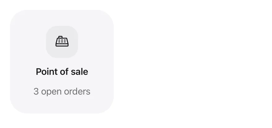
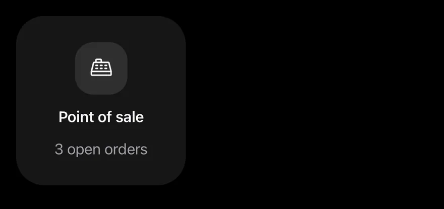
Centered content with align="center".
import { CashRegisterIcon } from "phosphor-react-native"
import { Icon } from "@/components/ui/icon"
import { Widget, WidgetDescription, WidgetHeader, WidgetIcon, WidgetTitle } from "@/components/ui/widget"

export function WidgetCenteredExample() {
  return (
    <Widget size="small" align="center">
      <WidgetHeader>
        <WidgetIcon size="lg">
          <Icon as={CashRegisterIcon} />
        </WidgetIcon>
        <WidgetTitle>Point of sale</WidgetTitle>
      </WidgetHeader>
      <WidgetDescription>3 open orders</WidgetDescription>
    </Widget>
  )
}import EsuissUI
import PhosphorSwift
import SwiftUI
struct WidgetCenteredExample: View {
var body: some View {
Widget(.small, align: .center) {
WidgetHeader {
WidgetIcon(size: .lg) {
Ph.cashRegister.regular
}
WidgetTitle("Point of sale")
}
WidgetDescription("3 open orders")
}
}
}import androidx.compose.runtime.Composable
import com.adamglin.PhosphorIcons
import com.adamglin.phosphoricons.Regular
import com.esuiss.ui.components.Icon
import com.esuiss.ui.components.Widget
import com.esuiss.ui.components.WidgetAlign
import com.esuiss.ui.components.WidgetDescription
import com.esuiss.ui.components.WidgetHeader
import com.esuiss.ui.components.WidgetIcon
import com.esuiss.ui.components.WidgetIconSize
import com.esuiss.ui.components.WidgetSize
import com.esuiss.ui.components.WidgetTitle
@Composable
fun WidgetCentered() {
Widget(size = WidgetSize.Small, align = WidgetAlign.Center) {
WidgetHeader {
WidgetIcon(size = WidgetIconSize.Lg) { Icon(PhosphorIcons.Regular.CashRegisterRegular, contentDescription = null) }
WidgetTitle("Point of sale")
}
WidgetDescription("3 open orders")
}
}Auto
An auto widget that fills its parent.
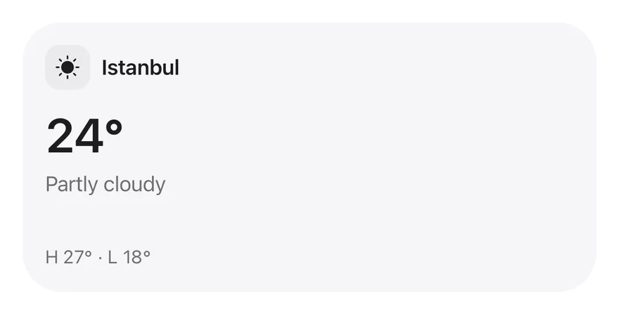
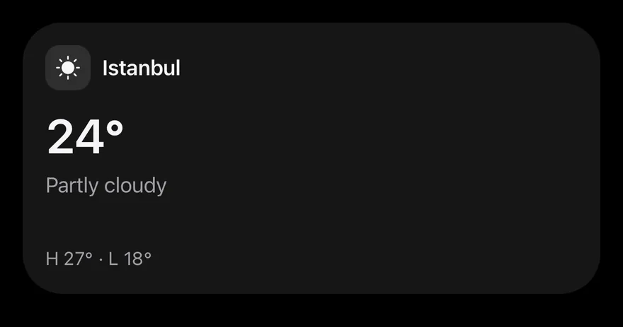
import { SunIcon } from "phosphor-react-native"
import { View } from "react-native"
import { Icon } from "@/components/ui/icon"
import { Widget, WidgetContent, WidgetDescription, WidgetFooter, WidgetHeader, WidgetIcon, WidgetTitle, WidgetValue } from "@/components/ui/widget"

function Weather() {
  return (
    <>
      <WidgetHeader>
        <WidgetIcon>
          <Icon as={SunIcon} weight="fill" />
        </WidgetIcon>
        <WidgetTitle>Istanbul</WidgetTitle>
      </WidgetHeader>
      <WidgetContent>
        <WidgetValue>24°</WidgetValue>
        <WidgetDescription>Partly cloudy</WidgetDescription>
      </WidgetContent>
      <WidgetFooter>H 27° · L 18°</WidgetFooter>
    </>
  )
}

export function WidgetAutoExample() {
  return (
    <View className="h-48 w-full">
      <Widget>
        <Weather />
      </Widget>
    </View>
  )
}import EsuissUI
import PhosphorSwift
import SwiftUI
struct WidgetAutoExample: View {
var body: some View {
Widget(nil) {
WidgetWeather()
}
.frame(maxWidth: .infinity)
.frame(height: 192)
}
}
struct WidgetWeather: View {
var body: some View {
WidgetHeader {
WidgetIcon {
Ph.sun.fill
}
WidgetTitle("Istanbul")
}
WidgetContent {
WidgetValue(verbatim: "24°")
WidgetDescription("Partly cloudy")
}
WidgetFooter(verbatim: "H 27° · L 18°")
}
}import androidx.compose.foundation.layout.height
import androidx.compose.runtime.Composable
import androidx.compose.ui.Modifier
import androidx.compose.ui.text.style.TextOverflow
import androidx.compose.ui.unit.dp
import com.adamglin.PhosphorIcons
import com.adamglin.phosphoricons.Fill
import com.adamglin.phosphoricons.fill.Sun
import com.esuiss.ui.components.Icon
import com.esuiss.ui.components.Text
import com.esuiss.ui.components.Widget
import com.esuiss.ui.components.WidgetContent
import com.esuiss.ui.components.WidgetDescription
import com.esuiss.ui.components.WidgetFooter
import com.esuiss.ui.components.WidgetHeader
import com.esuiss.ui.components.WidgetIcon
import com.esuiss.ui.components.WidgetTitle
import com.esuiss.ui.components.WidgetValue
@Composable
fun WidgetAutoExample() {
Widget(Modifier.height(192.dp)) { WidgetWeather() }
}
@Composable
fun WidgetFooterText(text: String) {
WidgetFooter {
Text(text, maxLines = 1, overflow = TextOverflow.Ellipsis)
}
}
@Composable
fun WidgetWeather() {
WidgetHeader {
WidgetIcon { Icon(PhosphorIcons.Fill.Sun, contentDescription = null) }
WidgetTitle("Istanbul")
}
WidgetContent {
WidgetValue("24°")
WidgetDescription("Partly cloudy")
}
WidgetFooterText("H 27° · L 18°")
}Dashboard
Several auto-sized widgets arranged in a grid.
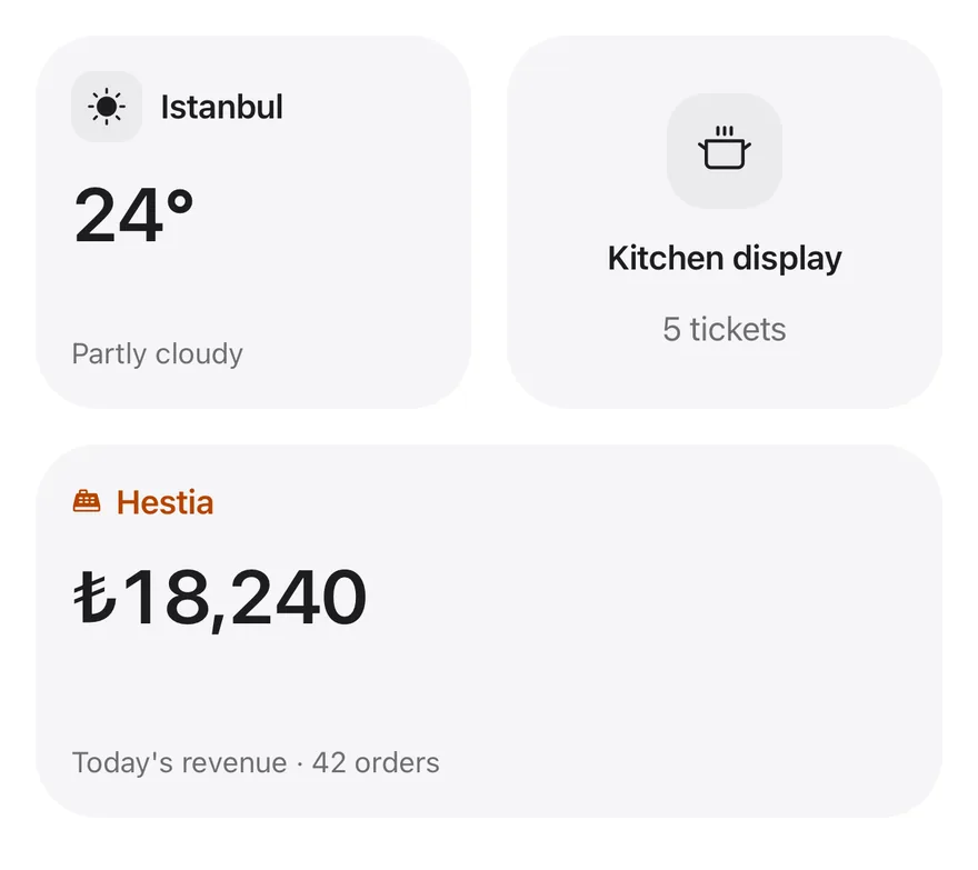
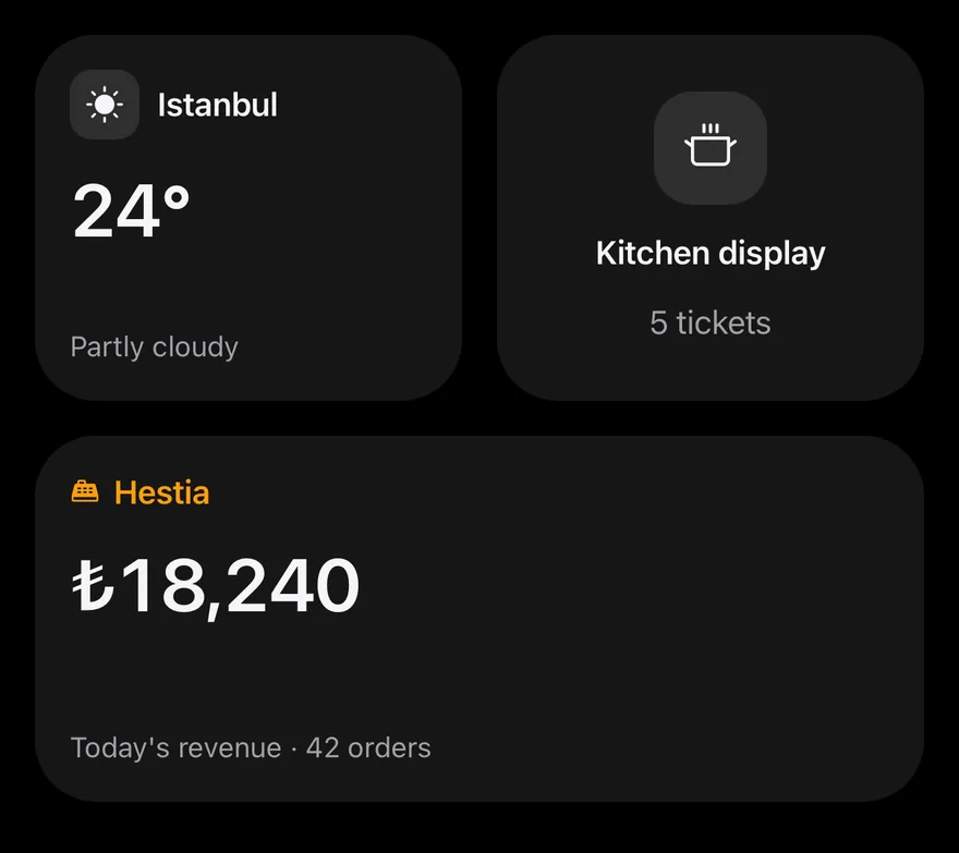
import { CashRegisterIcon, CookingPotIcon, SunIcon } from "phosphor-react-native"
import { ScrollView, View } from "react-native"
import { Icon } from "@/components/ui/icon"
import { Widget, WidgetDescription, WidgetFooter, WidgetHeader, WidgetIcon, WidgetTitle, WidgetValue } from "@/components/ui/widget"

export function WidgetDashboardExample() {
  return (
    <ScrollView contentContainerClassName="gap-4">
      <View className="h-42 flex-row gap-4">
        <View className="flex-1">
          <Widget>
            <WidgetHeader>
              <WidgetIcon>
                <Icon as={SunIcon} weight="fill" />
              </WidgetIcon>
              <WidgetTitle>Istanbul</WidgetTitle>
            </WidgetHeader>
            <WidgetValue>24°</WidgetValue>
            <WidgetFooter>Partly cloudy</WidgetFooter>
          </Widget>
        </View>
        <View className="flex-1">
          <Widget align="center">
            <WidgetHeader>
              <WidgetIcon size="lg">
                <Icon as={CookingPotIcon} />
              </WidgetIcon>
              <WidgetTitle>Kitchen display</WidgetTitle>
            </WidgetHeader>
            <WidgetDescription>5 tickets</WidgetDescription>
          </Widget>
        </View>
      </View>
      <View className="h-42">
        <Widget>
          <WidgetHeader className="gap-1.5">
            <WidgetIcon size="sm" iconClassName="text-warning">
              <Icon as={CashRegisterIcon} weight="fill" />
            </WidgetIcon>
            <WidgetTitle className="text-warning">Hestia</WidgetTitle>
          </WidgetHeader>
          <WidgetValue>₺18,240</WidgetValue>
          <WidgetFooter>Today's revenue · 42 orders</WidgetFooter>
        </Widget>
      </View>
    </ScrollView>
  )
}import EsuissUI
import PhosphorSwift
import SwiftUI
struct WidgetDashboardExample: View {
var body: some View {
VStack(spacing: 16) {
HStack(spacing: 16) {
Widget(nil) {
WidgetHeader {
WidgetIcon {
Ph.sun.fill
}
WidgetTitle("Istanbul")
}
WidgetValue(verbatim: "24°")
WidgetFooter("Partly cloudy")
}
Widget(nil, align: .center) {
WidgetHeader {
WidgetIcon(size: .lg) {
Ph.cookingPot.regular
}
WidgetTitle("Kitchen display")
}
WidgetDescription("5 tickets")
}
}
.frame(height: 168)
Widget(nil) {
WidgetSalesHeader()
WidgetValue(verbatim: "₺18,240")
WidgetFooter("Today's revenue · 42 orders")
}
.frame(height: 168)
}
.frame(maxWidth: .infinity)
}
}
struct WidgetSalesHeader: View {
var body: some View {
WidgetHeader {
WidgetIcon(size: .sm) {
Ph.cashRegister.fill.foregroundStyle(Color.warning)
}
WidgetTitle("Hestia")
.foregroundStyle(Color.warning)
}
}
}import androidx.compose.foundation.layout.Arrangement
import androidx.compose.foundation.layout.Box
import androidx.compose.foundation.layout.Column
import androidx.compose.foundation.layout.Row
import androidx.compose.foundation.layout.fillMaxWidth
import androidx.compose.foundation.layout.height
import androidx.compose.runtime.Composable
import androidx.compose.runtime.CompositionLocalProvider
import androidx.compose.ui.Modifier
import androidx.compose.ui.graphics.Color
import androidx.compose.ui.text.style.TextOverflow
import androidx.compose.ui.unit.dp
import com.adamglin.PhosphorIcons
import com.adamglin.phosphoricons.Fill
import com.adamglin.phosphoricons.Regular
import com.adamglin.phosphoricons.fill.CashRegister
import com.adamglin.phosphoricons.fill.Sun
import com.adamglin.phosphoricons.regular.CookingPot
import com.esuiss.ui.components.Icon
import com.esuiss.ui.components.LocalContentStyle
import com.esuiss.ui.components.Text
import com.esuiss.ui.components.Widget
import com.esuiss.ui.components.WidgetAlign
import com.esuiss.ui.components.WidgetDescription
import com.esuiss.ui.components.WidgetFooter
import com.esuiss.ui.components.WidgetHeader
import com.esuiss.ui.components.WidgetIcon
import com.esuiss.ui.components.WidgetIconSize
import com.esuiss.ui.components.WidgetTitle
import com.esuiss.ui.components.WidgetValue
import com.esuiss.ui.theme.EsuissTheme
@Composable
fun WidgetTintedTitle(text: String, color: Color) {
CompositionLocalProvider(LocalContentStyle provides LocalContentStyle.current.copy(color = color)) {
WidgetTitle(text)
}
}
@Composable
fun WidgetFooterText(text: String) {
WidgetFooter {
Text(text, maxLines = 1, overflow = TextOverflow.Ellipsis)
}
}
@Composable
fun WidgetDashboard() {
val warning = EsuissTheme.colors.warning
val tall = Modifier.height(168.dp)
Column(Modifier.fillMaxWidth(), verticalArrangement = Arrangement.spacedBy(16.dp)) {
Row(horizontalArrangement = Arrangement.spacedBy(16.dp)) {
Box(Modifier.weight(1f)) {
Widget(tall) {
WidgetHeader {
WidgetIcon { Icon(PhosphorIcons.Fill.Sun, contentDescription = null) }
WidgetTitle("Istanbul")
}
WidgetValue("24°")
WidgetFooterText("Partly cloudy")
}
}
Box(Modifier.weight(1f)) {
Widget(tall, align = WidgetAlign.Center) {
WidgetHeader {
WidgetIcon(size = WidgetIconSize.Lg) { Icon(PhosphorIcons.Regular.CookingPot, contentDescription = null) }
WidgetTitle("Kitchen display")
}
WidgetDescription("5 tickets")
}
}
}
Widget(tall) {
WidgetHeader {
WidgetIcon(size = WidgetIconSize.Sm) { Icon(PhosphorIcons.Fill.CashRegister, contentDescription = null, tint = warning) }
WidgetTintedTitle("Hestia", warning)
}
WidgetValue("₺18,240")
WidgetFooterText("Today's revenue · 42 orders")
}
}
}API Reference
Widget
The card surface and optional resize handle.
ViewPropsReact.RefAttributes<View>- Type
string- Default
- —
- About
- Controlled size:
small,medium,large,extra-largeorauto. - Type
WidgetSize"auto"- Default
- —
- About
- Initial size when uncontrolled.
- Type
WidgetSize"auto"- Default
- —
- About
- Called with the new size after a resize.
- Type
(size: WidgetSize | "auto") => void- Default
- —
- About
- Sizes the user can resize to. Defaults to all four.
- Type
WidgetSize[]- Default
- ALL_SIZES
- About
- Shows a drag handle for resizing.
- Type
boolean- Default
- false
- About
- Handle placement:
outsidethe corner orinsideit. Defaults tooutside. - Type
WidgetHandlePlacement- Default
- "outside"
- About
startorcentercontent alignment.- Type
WidgetAlign- Default
- "start"
- About
- Accessibility label for the handle. Defaults to "Resize widget".
- Type
string- Default
- "Resize widget"
WidgetHeader
Row for the icon, title and action.
ViewPropsReact.RefAttributes<View>- Type
string- Default
- —
WidgetIcon
Icon frame in default, sm or lg size.
ViewPropsReact.RefAttributes<View>- Type
string- Default
- —
- About
- Classes applied to the icon inside.
- Type
string- Default
- —
- About
default,smorlg.- Type
"default""sm""lg"- Default
- "default"
WidgetTitle
Single-line heading.
React.ComponentProps<typeof Text>React.RefAttributes<typeof Text>WidgetAction
Trailing slot in the header; hidden when centered.
ViewPropsReact.RefAttributes<View>- Type
string- Default
- —
WidgetDescription
Secondary text.
React.ComponentProps<typeof Text>React.RefAttributes<typeof Text>WidgetValue
Large number with tabular figures.
React.ComponentProps<typeof Text>React.RefAttributes<typeof Text>WidgetContent
Flexible body area that clips overflow.
ViewPropsReact.RefAttributes<View>- Type
string- Default
- —
WidgetFooter
Small secondary text and icons pinned to the bottom.
ViewPropsReact.RefAttributes<View>- Type
string- Default
- —
Accessibility
- The resize handle has the
adjustablerole, itsresizeLabeland the current size as its value; increment and decrement actions step through the available sizes, so VoiceOver and TalkBack users can resize without dragging. WidgetTitlehas theheadingrole.WidgetIconand the resize preview outline are hidden from assistive technology.- Size animations respect the system reduce motion setting.
Notes
- Uses
bg-surface-secondaryfor the surface,bg-controlfor icon frames, andtext-label-quaternaryfor the handle, which turnstext-accentwhile dragging. - The handle and drag direction mirror in right-to-left layouts.
- Light and dark colors follow the system appearance.