suiss/uim · React Native Component
Bubble
A chat message bubble with a tail, alignment, variants and emoji reactions.
Bubble is an open-source mobile component from suiss/uim for React Native and Expo, with SwiftUI and Jetpack Compose versions built from the same design tokens. The @esuiss/uim CLI copies its source into your project, so you own the code.
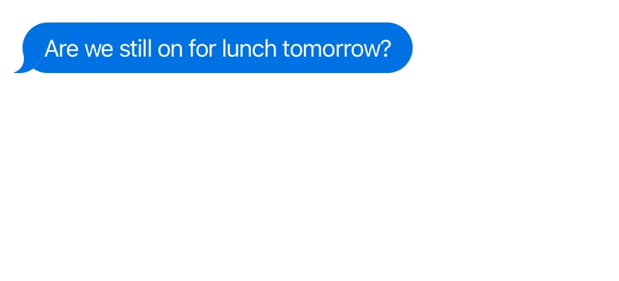
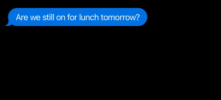
import { Bubble, BubbleContent } from "@/components/ui/bubble"

export function BubbleExample() {
  return (
    <Bubble align="start">
      <BubbleContent>Are we still on for lunch tomorrow?</BubbleContent>
    </Bubble>
  )
}import EsuissUI
import SwiftUI
struct BubbleExample: View {
var body: some View {
Bubble {
BubbleContent("Are we still on for lunch tomorrow?")
}
}
}import androidx.compose.runtime.Composable
import com.esuiss.ui.components.Bubble
import com.esuiss.ui.components.BubbleContent
@Composable
fun BubbleDefault() {
Bubble {
BubbleContent("Are we still on for lunch tomorrow?")
}
}Bubble lays out one message aligned to the start or end of the conversation, and BubbleContent draws the rounded bubble with an SVG tail on the aligned side. Seven variants are available: default (accent), secondary, muted, tinted, outline, ghost and destructive; outline and ghost have no tail.
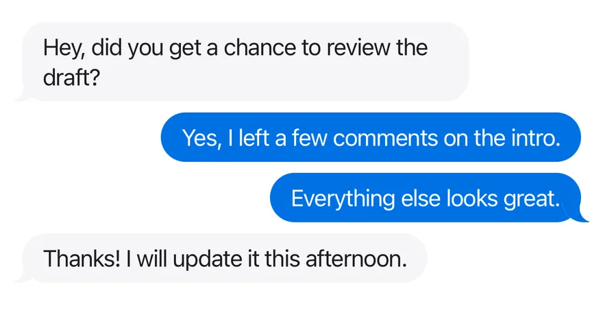
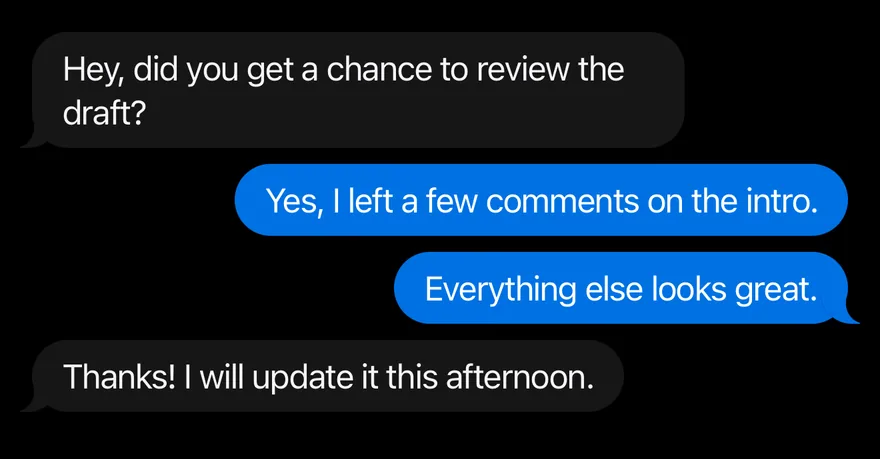
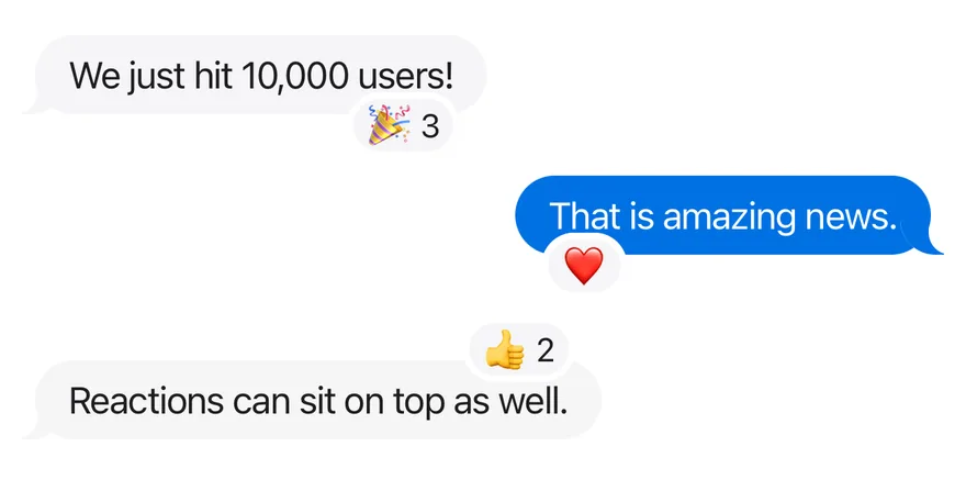
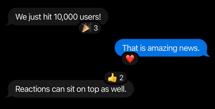
BubbleGroup stacks messages and shows the tail only on the last bubble of each run from the same side, so consecutive messages read as one block. BubbleReactions pins a small reaction pill to the top or bottom edge of a bubble.
Installation
$ pnpm dlx @esuiss/uim@latest add bubble$ pnpm dlx @esuiss/uim@latest add bubble --platform swift$ pnpm dlx @esuiss/uim@latest add bubble --platform kotlinThe CLI also adds what it builds on: Icon, Text.
Manual
- Install the dependencies:
npx expo install cn phosphor-react-native react-native-svg-
Add the pieces it builds on: Icon, Text, and the primitives
components/primitives/types.tsx,components/primitives/use-render.tsx. -
Copy the source into
components/ui/bubble.tsx:
import { cn } from "cn"
import type { IconProps as PhosphorIconProps } from "phosphor-react-native"
import * as React from "react"
import {
  type GestureResponderEvent,
  I18nManager,
  Pressable,
  View,
  type ViewProps,
} from "react-native"
import Svg, { Path } from "react-native-svg"
import type { RenderProp } from "@/components/primitives/types"
import { useRender } from "@/components/primitives/use-render"
import { Icon, IconClassContext } from "@/components/ui/icon"
import { Text, TextClassContext } from "@/components/ui/text"- Update the import paths to match your project.
- Install the dependencies:
npx expo install cn phosphor-react-native react-native-svg-
Add the pieces it builds on: Icon, Text, and the primitives
components/primitives/types.tsx,components/primitives/use-render.tsx. -
Copy the source into
components/ui/bubble.tsx:
import { cn } from "cn"
import type { IconProps as PhosphorIconProps } from "phosphor-react-native"
import * as React from "react"
import {
  type GestureResponderEvent,
  I18nManager,
  Pressable,
  View,
  type ViewProps,
} from "react-native"
import Svg, { Path } from "react-native-svg"
import type { RenderProp } from "@/components/primitives/types"
import { useRender } from "@/components/primitives/use-render"
import { Icon, IconClassContext } from "@/components/ui/icon"
import { Text, TextClassContext } from "@/components/ui/text"- Update the import paths to match your project.
- Install the dependencies:
npx expo install phosphor-react-native react-native-svg-
Add the pieces it builds on: Icon, Text, and the primitives
components/primitives/types.tsx,components/primitives/use-render.tsx. -
Copy the source into
components/ui/bubble.tsx:
import type { IconProps as PhosphorIconProps } from "phosphor-react-native"
import * as React from "react"
import {
  type GestureResponderEvent,
  I18nManager,
  Pressable,
  type StyleProp,
  StyleSheet,
  View,
  type ViewProps,
  type ViewStyle,
} from "react-native"
import Svg, { Path } from "react-native-svg"
import type { RenderProp } from "@/components/primitives/types"
import { useRender } from "@/components/primitives/use-render"
import { Icon } from "@/components/ui/icon"- Update the import paths to match your project.
-
Target iOS 17 or later.
-
Add the Swift package to your app:
.package(url: "https://github.com/phosphor-icons/swift", from: "2.1.0")- Copy the theme files every view uses:
import SwiftUI
import UIKit

struct RGBA: Sendable {
  let red: CGFloat
  let green: CGFloat
  let blue: CGFloat
  let alpha: CGFloat

  init(_ hex: UInt32, _ alpha: CGFloat = 1) {
    red = CGFloat((hex >> 16) & 0xFF) / 255
    green = CGFloat((hex >> 8) & 0xFF) / 255
    blue = CGFloat(hex & 0xFF) / 255
    self.alpha = alpha
}import SwiftUI
extension Color {
public static let surface = Color.adaptive(light: .init(0xFFFFFF), dark: .init(0x000000))
public static let surfaceSecondary = Color.adaptive(light: .init(0xF5F5F7), dark: .init(0x161617))
public static let surfaceTertiary = Color.adaptive(light: .init(0xE8E8ED), dark: .init(0x2C2C2E))
public static let surfaceRaised = Color.adaptive(light: .init(0xFFFFFF), dark: .init(0x1D1D1F))
public static let label = Color.adaptive(light: .init(0x1D1D1F), dark: .init(0xF5F5F7))
public static let labelSecondary = Color.adaptive(light: .init(0x6E6E73), dark: .init(0xA1A1A6))
public static let labelTertiary = Color.adaptive(light: .init(0x86868B), dark: .init(0x86868B))
public static let labelQuaternary = Color.adaptive(light: .init(0xD2D2D7), dark: .init(0x424245))
public static let control = Color.adaptive(light: .init(0x000000, 0.04), dark: .init(0xFFFFFF, 0.1))
public static let controlPressed = Color.adaptive(light: .init(0x000000, 0.12), dark: .init(0xFFFFFF, 0.22))
public static let controlSelected = Color.adaptive(light: .init(0x1D1D1F), dark: .init(0xF5F5F7))
public static let controlDisabled = Color.adaptive(light: .init(0x000000, 0.03), dark: .init(0xFFFFFF, 0.05))
public static let onControlSelected = Color.adaptive(light: .init(0xFFFFFF), dark: .init(0x000000))- Copy the source and every file it uses:
import SwiftUI

public enum BubbleVariant: CaseIterable, Sendable {
  case `default`, secondary, muted, tinted, outline, ghost, destructive

  var hasTail: Bool {
    self != .ghost && self != .outline
  }
}

public enum BubbleAlign: CaseIterable, Sendable {
  case start, end
}

public enum BubbleReactionsSide: CaseIterable, Sendable {
case top, bottomimport PhosphorSwift
import SwiftUI
extension Shadow {
static let control = Shadow(color: .black.opacity(0.08), radius: 0.5, y: 0.5)
static let thumb = Shadow(color: .black.opacity(0.12), radius: 1.5, y: 1)
}
struct SelectionIndicator<Mark: View>: View {
let checked: Bool
let pressed: Bool
let cornerRadius: CGFloat
let mark: Mark
@Environment(\.isEnabled) private var isEnabled
@Environment(\.isInvalid) private var invalidimport SwiftUI
extension EnvironmentValues {
@Entry public var isInvalid = false
@Entry var fieldInset = false
@Entry var fieldGroupInset = false
@Entry var fieldSetInset = false
}
extension View {
public func invalid(_ isInvalid: Bool = true) -> some View {
environment(\.isInvalid, isInvalid)
}
}
public enum FieldOrientation: CaseIterable, Sendable {import SwiftUI
extension EnvironmentValues {
@Entry public var hapticsEnabled = true
}
extension View {
public func haptics(_ enabled: Bool) -> some View {
environment(\.hapticsEnabled, enabled)
}
func hapticFeedback<Trigger: Equatable>(_ feedback: SensoryFeedback, trigger: Trigger) -> some View {
modifier(HapticFeedbackModifier(feedback: feedback, trigger: trigger) { _, _ in true })
}
func hapticFeedback<Trigger: Equatable>(import SwiftUI
import UIKit
public struct KeyboardScrollView<Content: View>: View {
let showsIndicators: Bool
let content: Content
public init(showsIndicators: Bool = true, @ViewBuilder content: () -> Content) {
self.showsIndicators = showsIndicators
self.content = content()
}
public var body: some View {
ScrollView(.vertical, showsIndicators: showsIndicators) {
content
.frame(maxWidth: .infinity, alignment: .topLeading)import SwiftUI
public typealias MessageAlign = BubbleAlign
struct MessageGhostKey: PreferenceKey {
static let defaultValue = false
static func reduce(value: inout Bool, nextValue: () -> Bool) {
value = value || nextValue()
}
}
struct MessageFooterKey: PreferenceKey {
static let defaultValue: CGFloat = 0
static func reduce(value: inout CGFloat, nextValue: () -> CGFloat) {import SwiftUI
extension EnvironmentValues {
@Entry var screenBackground: Color = .surface
}
public struct Screen<Content: View>: View {
public enum Background: CaseIterable, Sendable {
case surface, surfaceSecondary
var color: Color {
switch self {
case .surface: .surface
case .surfaceSecondary: .surfaceSecondary
}
}import SwiftUI
public struct Separator: View {
let orientation: Axis
public init(_ orientation: Axis = .horizontal) {
self.orientation = orientation
}
public var body: some View {
Rectangle()
.fill(Color.separator)
.frame(width: orientation == .vertical ? 1 : nil, height: orientation == .horizontal ? 1 : nil)
.frame(maxWidth: orientation == .horizontal ? .infinity : nil, maxHeight: orientation == .vertical ? .infinity : nil)
.accessibilityHidden(true)
}import SwiftUI
public enum TextVariant: CaseIterable, Sendable {
case `default`, h1, h2, h3, h4, p, blockquote, code, lead, large, small, muted
var style: TextStyle {
switch self {
case .h1: .xl3
case .h2: .xl2
case .h3: .xl
case .h4, .lead, .large: .lg
case .code, .small, .muted: .sm
default: .base
}
}- Add the files to your app target.
- Set
minSdkto 24 or higher and add the dependencies:
implementation(platform("androidx.compose:compose-bom:2026.09.00"))
implementation("androidx.compose.foundation:foundation")
implementation("androidx.compose.ui:ui")- Copy the theme files every view uses:
package com.esuiss.ui.theme

import androidx.compose.foundation.isSystemInDarkTheme
import androidx.compose.runtime.Composable
import androidx.compose.runtime.CompositionLocalProvider
import androidx.compose.runtime.Immutable
import androidx.compose.runtime.staticCompositionLocalOf
import androidx.compose.ui.Modifier
import androidx.compose.ui.draw.dropShadow
import androidx.compose.ui.graphics.Color
import androidx.compose.ui.graphics.Shape
import androidx.compose.ui.graphics.shadow.Shadow as DropShadow
import androidx.compose.ui.text.TextStyle
import androidx.compose.ui.text.style.LineHeightStyle
import androidx.compose.ui.unit.Dp
import androidx.compose.ui.unit.DpOffsetpackage com.esuiss.ui.theme
import androidx.compose.runtime.Immutable
import androidx.compose.ui.graphics.Color
import androidx.compose.ui.unit.dp
@Immutable
data class Colors(
val surface: Color,
val surfaceSecondary: Color,
val surfaceTertiary: Color,
val surfaceRaised: Color,
val label: Color,
val labelSecondary: Color,
val labelTertiary: Color,
val labelQuaternary: Color,- Copy the source and every file it uses:
package com.esuiss.ui.components

import androidx.compose.foundation.background
import androidx.compose.foundation.border
import androidx.compose.foundation.combinedClickable
import androidx.compose.foundation.gestures.detectTapGestures
import androidx.compose.foundation.interaction.MutableInteractionSource
import androidx.compose.foundation.interaction.collectIsPressedAsState
import androidx.compose.foundation.layout.Arrangement
import androidx.compose.foundation.layout.Box
import androidx.compose.foundation.layout.Row
import androidx.compose.foundation.layout.RowScope
import androidx.compose.foundation.layout.padding
import androidx.compose.foundation.shape.CircleShape
import androidx.compose.foundation.shape.RoundedCornerShape
import androidx.compose.foundation.text.BasicTextpackage com.esuiss.ui.components
import androidx.compose.foundation.Image
import androidx.compose.foundation.background
import androidx.compose.foundation.layout.Box
import androidx.compose.foundation.layout.fillMaxSize
import androidx.compose.foundation.layout.offset
import androidx.compose.foundation.layout.padding
import androidx.compose.foundation.layout.size
import androidx.compose.foundation.shape.CircleShape
import androidx.compose.foundation.text.BasicText
import androidx.compose.runtime.Composable
import androidx.compose.runtime.CompositionLocalProvider
import androidx.compose.runtime.staticCompositionLocalOf
import androidx.compose.ui.Alignment
import androidx.compose.ui.Modifierpackage com.esuiss.ui.components
import androidx.compose.foundation.background
import androidx.compose.foundation.border
import androidx.compose.foundation.clickable
import androidx.compose.foundation.interaction.MutableInteractionSource
import androidx.compose.foundation.interaction.collectIsPressedAsState
import androidx.compose.foundation.layout.Arrangement
import androidx.compose.foundation.layout.Row
import androidx.compose.foundation.layout.RowScope
import androidx.compose.foundation.layout.fillMaxWidth
import androidx.compose.foundation.layout.height
import androidx.compose.foundation.layout.padding
import androidx.compose.foundation.layout.size
import androidx.compose.foundation.shape.CircleShape
import androidx.compose.foundation.shape.RoundedCornerShapepackage com.esuiss.ui.components
import androidx.compose.foundation.background
import androidx.compose.foundation.gestures.Orientation
import androidx.compose.foundation.layout.Arrangement
import androidx.compose.foundation.layout.Box
import androidx.compose.foundation.layout.Row
import androidx.compose.foundation.layout.RowScope
import androidx.compose.foundation.layout.padding
import androidx.compose.foundation.shape.CircleShape
import androidx.compose.foundation.shape.CornerSize
import androidx.compose.foundation.shape.RoundedCornerShape
import androidx.compose.runtime.Composable
import androidx.compose.runtime.CompositionLocalProvider
import androidx.compose.runtime.DisposableEffect
import androidx.compose.runtime.Immutablepackage com.esuiss.ui.components
import androidx.compose.runtime.compositionLocalOf
import androidx.compose.ui.graphics.Color
import androidx.compose.ui.text.TextStyle
import androidx.compose.ui.unit.Dp
import androidx.compose.ui.unit.dp
val LocalContentStyle = compositionLocalOf { TextStyle.Default }
val LocalContentColor = compositionLocalOf { Color.Unspecified }
val LocalIconSize = compositionLocalOf { 20.dp }package com.esuiss.ui.components
import androidx.compose.runtime.Composable
import androidx.compose.runtime.CompositionLocalProvider
import androidx.compose.runtime.remember
import androidx.compose.runtime.staticCompositionLocalOf
import androidx.compose.ui.hapticfeedback.HapticFeedback
import androidx.compose.ui.hapticfeedback.HapticFeedbackType
import androidx.compose.ui.platform.LocalHapticFeedback
val LocalHapticsEnabled = staticCompositionLocalOf { true }
@Composable
fun ProvideHaptics(enabled: Boolean, content: @Composable () -> Unit) {
CompositionLocalProvider(LocalHapticsEnabled provides enabled, content = content)
}package com.esuiss.ui.components
import androidx.compose.foundation.Image
import androidx.compose.foundation.layout.size
import androidx.compose.runtime.Composable
import androidx.compose.ui.Modifier
import androidx.compose.ui.graphics.Color
import androidx.compose.ui.graphics.ColorFilter
import androidx.compose.ui.graphics.takeOrElse
import androidx.compose.ui.graphics.vector.ImageVector
import androidx.compose.ui.unit.Dp
import com.esuiss.ui.theme.EsuissTheme
@Composable
fun Icon(
imageVector: ImageVector,package com.esuiss.ui.components
import androidx.compose.foundation.background
import androidx.compose.foundation.layout.Arrangement
import androidx.compose.foundation.layout.Box
import androidx.compose.foundation.layout.BoxScope
import androidx.compose.foundation.layout.Column
import androidx.compose.foundation.layout.ColumnScope
import androidx.compose.foundation.layout.Row
import androidx.compose.foundation.layout.RowScope
import androidx.compose.foundation.layout.fillMaxWidth
import androidx.compose.foundation.layout.padding
import androidx.compose.foundation.layout.widthIn
import androidx.compose.foundation.shape.CircleShape
import androidx.compose.foundation.text.BasicText
import androidx.compose.runtime.Composablepackage com.esuiss.ui.components
import androidx.compose.foundation.Canvas
import androidx.compose.foundation.background
import androidx.compose.foundation.border
import androidx.compose.foundation.gestures.awaitEachGesture
import androidx.compose.foundation.gestures.awaitFirstDown
import androidx.compose.foundation.layout.Box
import androidx.compose.foundation.layout.fillMaxWidth
import androidx.compose.foundation.layout.height
import androidx.compose.foundation.layout.padding
import androidx.compose.foundation.shape.RoundedCornerShape
import androidx.compose.foundation.text.BasicText
import androidx.compose.runtime.Composable
import androidx.compose.runtime.Immutable
import androidx.compose.runtime.getValue- Update the
com.esuiss.uipackage names to match your project.
Usage
import { BubbleGroup, Bubble, BubbleContent, BubbleReactions } from "@/components/ui/bubble"<Bubble align="start">
<BubbleContent>Are we still on for lunch tomorrow?</BubbleContent>
</Bubble>Wrap each message in Bubble and put its text in BubbleContent; plain strings are wrapped in Text. Set align="end" for messages from the current user, or provide a default through BubbleAlignContext.
BubbleContent becomes a Pressable when you pass onPress, onLongPress or render, and its background darkens while pressed. Use render to attach it to a trigger such as a context menu.
BubbleReactions takes side (top or bottom) and align (start or end), and the bubble adds margin so the pill does not overlap its neighbors.
Examples
Variants
All seven variants.
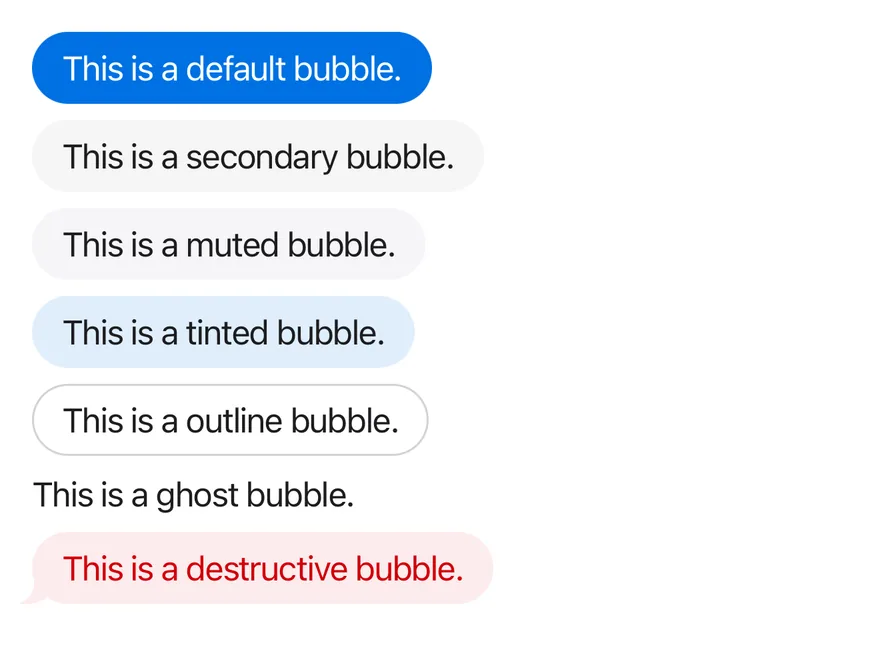
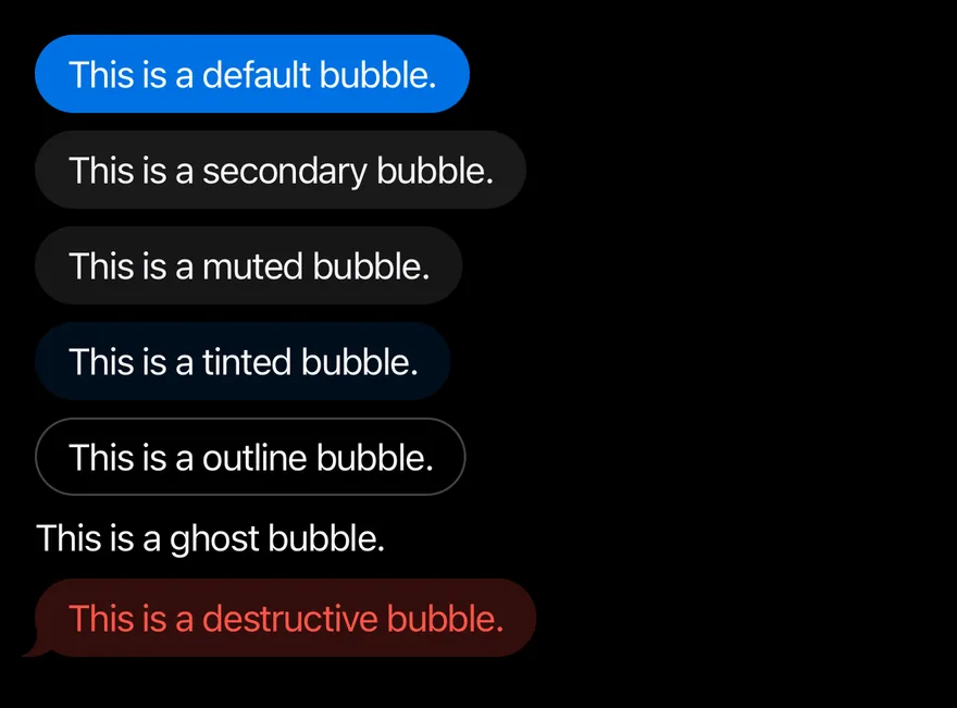
import { Bubble, BubbleContent, BubbleGroup } from "@/components/ui/bubble"

const VARIANTS = [
  "default",
  "secondary",
  "muted",
  "tinted",
  "outline",
  "ghost",
  "destructive",
] as const

export function BubbleVariantsExample() {
  return (
    <BubbleGroup>
      {VARIANTS.map((variant) => (
        <Bubble key={variant} align="start" variant={variant}>
          <BubbleContent>This is a {variant} bubble.</BubbleContent>
        </Bubble>
      ))}
    </BubbleGroup>
  )
}import EsuissUI
import SwiftUI
struct BubbleVariantsExample: View {
var body: some View {
BubbleGroup {
ForEach(BubbleVariantSample.all, id: \.name) { sample in
Bubble(variant: sample.variant) {
BubbleContent(verbatim: "This is a \(sample.name) bubble.")
}
}
}
}
}
struct BubbleVariantSample {
let variant: BubbleVariant
let name: String
static let all: [BubbleVariantSample] = [
BubbleVariantSample(variant: .default, name: "default"),
BubbleVariantSample(variant: .secondary, name: "secondary"),
BubbleVariantSample(variant: .muted, name: "muted"),
BubbleVariantSample(variant: .tinted, name: "tinted"),
BubbleVariantSample(variant: .outline, name: "outline"),
BubbleVariantSample(variant: .ghost, name: "ghost"),
BubbleVariantSample(variant: .destructive, name: "destructive"),
]
}
let all: [BubbleVariantSample] = [
BubbleVariantSample(variant: .default, name: "default"),
BubbleVariantSample(variant: .secondary, name: "secondary"),
BubbleVariantSample(variant: .muted, name: "muted"),
BubbleVariantSample(variant: .tinted, name: "tinted"),
BubbleVariantSample(variant: .outline, name: "outline"),
BubbleVariantSample(variant: .ghost, name: "ghost"),
BubbleVariantSample(variant: .destructive, name: "destructive"),
]import androidx.compose.runtime.Composable
import com.esuiss.ui.components.Bubble
import com.esuiss.ui.components.BubbleContent
import com.esuiss.ui.components.BubbleGroup
import com.esuiss.ui.components.BubbleVariant
@Composable
fun BubbleVariants() {
BubbleGroup {
BubbleVariant.entries.forEach { variant ->
Bubble(variant = variant) {
BubbleContent("This is a ${variant.name.lowercase()} bubble.")
}
}
}
}Conversation
A BubbleGroup with messages from both sides and merged tails.
import { Bubble, BubbleContent, BubbleGroup } from "@/components/ui/bubble"

export function BubbleConversationExample() {
  return (
    <BubbleGroup>
      <Bubble variant="muted">
        <BubbleContent>
          Hey, did you get a chance to review the draft?
        </BubbleContent>
      </Bubble>
      <Bubble align="end">
        <BubbleContent>Yes, I left a few comments on the intro.</BubbleContent>
      </Bubble>
      <Bubble align="end">
        <BubbleContent>Everything else looks great.</BubbleContent>
      </Bubble>
      <Bubble variant="muted">
        <BubbleContent>Thanks! I will update it this afternoon.</BubbleContent>
      </Bubble>
    </BubbleGroup>
  )
}import EsuissUI
import SwiftUI
struct BubbleConversationExample: View {
var body: some View {
BubbleGroup {
Bubble(variant: .muted) {
BubbleContent("Hey, did you get a chance to review the draft?")
}
Bubble(align: .end) {
BubbleContent("Yes, I left a few comments on the intro.")
}
Bubble(align: .end) {
BubbleContent("Everything else looks great.")
}
Bubble(variant: .muted) {
BubbleContent("Thanks! I will update it this afternoon.")
}
}
}
}import androidx.compose.runtime.Composable
import com.esuiss.ui.components.Bubble
import com.esuiss.ui.components.BubbleAlign
import com.esuiss.ui.components.BubbleContent
import com.esuiss.ui.components.BubbleGroup
import com.esuiss.ui.components.BubbleVariant
@Composable
fun BubbleConversation() {
BubbleGroup {
Bubble(variant = BubbleVariant.Muted) {
BubbleContent("Hey, did you get a chance to review the draft?")
}
Bubble(align = BubbleAlign.End) {
BubbleContent("Yes, I left a few comments on the intro.")
}
Bubble(align = BubbleAlign.End) {
BubbleContent("Everything else looks great.")
}
Bubble(variant = BubbleVariant.Muted) {
BubbleContent("Thanks! I will update it this afternoon.")
}
}
}With reactions
Reaction pills on the bottom and top edges.
import { Bubble, BubbleContent, BubbleGroup, BubbleReactions } from "@/components/ui/bubble"

export function BubbleWithReactionsExample() {
  return (
    <BubbleGroup>
      <Bubble align="start" variant="muted">
        <BubbleContent>We just hit 10,000 users!</BubbleContent>
        <BubbleReactions>🎉 3</BubbleReactions>
      </Bubble>
      <Bubble align="end">
        <BubbleContent>That is amazing news.</BubbleContent>
        <BubbleReactions align="start">❤️</BubbleReactions>
      </Bubble>
      <Bubble align="start" variant="secondary">
        <BubbleContent>Reactions can sit on top as well.</BubbleContent>
        <BubbleReactions side="top">👍 2</BubbleReactions>
      </Bubble>
    </BubbleGroup>
  )
}import EsuissUI
import SwiftUI
struct BubbleWithReactionsExample: View {
var body: some View {
BubbleGroup {
Bubble(variant: .muted) {
BubbleContent("We just hit 10,000 users!")
BubbleReactions(verbatim: "🎉 3")
}
Bubble(align: .end) {
BubbleContent("That is amazing news.")
BubbleReactions(verbatim: "❤️", align: .start)
}
Bubble(variant: .secondary) {
BubbleContent("Reactions can sit on top as well.")
BubbleReactions(verbatim: "👍 2", side: .top)
}
}
}
}import androidx.compose.runtime.Composable
import com.esuiss.ui.components.Bubble
import com.esuiss.ui.components.BubbleAlign
import com.esuiss.ui.components.BubbleContent
import com.esuiss.ui.components.BubbleGroup
import com.esuiss.ui.components.BubbleReactions
import com.esuiss.ui.components.BubbleReactionsSide
import com.esuiss.ui.components.BubbleVariant
@Composable
fun BubbleWithReactions() {
BubbleGroup {
Bubble(variant = BubbleVariant.Muted) {
BubbleContent("We just hit 10,000 users!")
BubbleReactions("🎉 3")
}
Bubble(align = BubbleAlign.End) {
BubbleContent("That is amazing news.")
BubbleReactions("❤️", align = BubbleAlign.Start)
}
Bubble(variant = BubbleVariant.Secondary) {
BubbleContent("Reactions can sit on top as well.")
BubbleReactions("👍 2", side = BubbleReactionsSide.Top)
}
}
}Interactive
A pressable outline bubble with onPress.
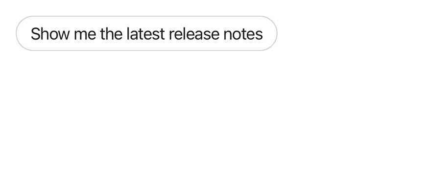
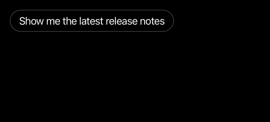
import { Bubble, BubbleContent } from "@/components/ui/bubble"

export function BubbleInteractiveExample() {
  return (
    <Bubble variant="outline" align="start">
      <BubbleContent onPress={() => {}}>
        Show me the latest release notes
      </BubbleContent>
    </Bubble>
  )
}import EsuissUI
import SwiftUI
struct BubbleInteractiveExample: View {
var body: some View {
Bubble(variant: .outline) {
BubbleContent(action: {}) {
Text("Show me the latest release notes")
}
}
}
}import androidx.compose.runtime.Composable
import com.esuiss.ui.components.Bubble
import com.esuiss.ui.components.BubbleContent
import com.esuiss.ui.components.BubbleVariant
@Composable
fun BubbleInteractive() {
Bubble(variant = BubbleVariant.Outline) {
BubbleContent("Show me the latest release notes", onClick = {})
}
}Long press actions
A bubble that opens a context menu on long press.
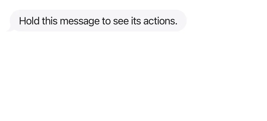
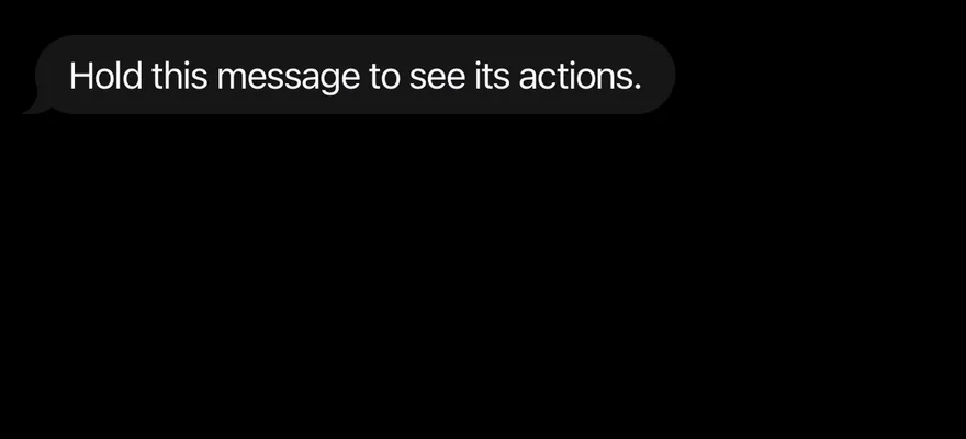
import { View } from "react-native"
import { ContextActions, ContextActionsContent, ContextActionsItem, ContextActionsTrigger } from "@/components/patterns/context-actions"
import { Bubble, BubbleContent } from "@/components/ui/bubble"

export function BubbleLongPressActionsExample() {
  return (
    <View>
      <ContextActions>
        <Bubble variant="muted">
          <BubbleContent
            accessibilityLabel="Message from Maya"
            render={<ContextActionsTrigger />}
          >
            Hold this message to see its actions.
          </BubbleContent>
        </Bubble>
        <ContextActionsContent>
          <ContextActionsItem>Reply</ContextActionsItem>
          <ContextActionsItem>Copy</ContextActionsItem>
          <ContextActionsItem variant="destructive">Delete</ContextActionsItem>
        </ContextActionsContent>
      </ContextActions>
    </View>
  )
}import EsuissUI
import SwiftUI
struct BubbleLongPressActionsExample: View {
var body: some View {
Bubble(variant: .muted) {
BubbleContent("Hold this message to see its actions.")
.accessibilityLabel(Text("Message from Maya"))
.contextActions {
ContextActionsItem("Reply") {}
ContextActionsItem("Copy") {}
ContextActionsItem("Delete", variant: .destructive) {}
}
}
}
}import androidx.compose.foundation.layout.Column
import androidx.compose.runtime.Composable
import androidx.compose.ui.Modifier
import androidx.compose.ui.semantics.contentDescription
import androidx.compose.ui.semantics.semantics
import com.esuiss.ui.components.Bubble
import com.esuiss.ui.components.BubbleContent
import com.esuiss.ui.components.BubbleVariant
import com.esuiss.ui.components.MenuItemVariant
import com.esuiss.ui.patterns.ContextActions
import com.esuiss.ui.patterns.ContextActionsContent
import com.esuiss.ui.patterns.ContextActionsItem
import com.esuiss.ui.patterns.ContextActionsTrigger
@Composable
fun BubbleLongPressActions() {
Column {
ContextActions {
ContextActionsTrigger(Modifier.semantics { contentDescription = "Message from Maya" }) {
Bubble(variant = BubbleVariant.Muted) {
BubbleContent("Hold this message to see its actions.")
}
}
ContextActionsContent {
ContextActionsItem("Reply", onClick = {})
ContextActionsItem("Copy", onClick = {})
ContextActionsItem("Delete", onClick = {}, variant = MenuItemVariant.Destructive)
}
}
}
}API Reference
BubbleGroup
Column that decides which bubbles show a tail.
ViewPropsBubble
One message, aligned to the start or end.
ViewProps- About
default,secondary,muted,tinted,outline,ghostordestructive.- Type
BubbleVariant- Default
- "default"
- About
startorend. Defaults tostart.- Type
BubbleAlign- Default
- —
BubbleContent
The bubble itself, optionally pressable.
React.ComponentProps<typeof Pressable>React.RefAttributes<View>- About
- Element to render instead of the default view or pressable.
- Type
RenderProp<Record<string, unknown>, Record<string, never>>- Default
- —
BubbleReactions
Reaction pill on the edge of a bubble.
ViewProps- About
startorendalong the bubble. Defaults toend.- Type
BubbleAlign- Default
- "end"
- About
toporbottom. Defaults tobottom.- Type
"top""bottom"- Default
- "bottom"
Accessibility
BubbleContentgets thebuttonrole when it hasonPressoronLongPress.- The tail is hidden from VoiceOver and TalkBack.
- Give long-press bubbles an
accessibilityLabelthat says who sent the message.
Notes
- The tail mirrors itself for
endalignment and in right-to-left layouts. - Uses
bg-accent,bg-control,bg-surface-secondaryandbg-danger-surfacetokens with pressed states; light and dark follow the system appearance.