suiss/uim · React Native Component
Button
A pill-shaped button that triggers an action, with variants for every level of emphasis.
Button is an open-source mobile component from suiss/uim for React Native and Expo, with SwiftUI and Jetpack Compose versions built from the same design tokens. The @esuiss/uim CLI copies its source into your project, so you own the code.
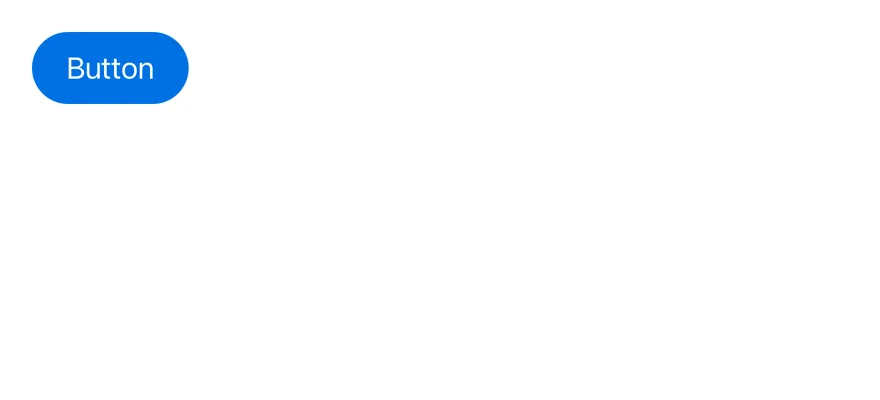
import { View } from "react-native"
import { Button } from "@/components/ui/button"
import { Text } from "@/components/ui/text"

export function ButtonExample() {
  return (
    <View className="items-start">
      <Button>
        <Text>Button</Text>
      </Button>
    </View>
  )
}import EsuissUI
import SwiftUI
struct ButtonExample: View {
var body: some View {
Button("Button") {}
.buttonStyle(.variant())
}
}import androidx.compose.foundation.layout.Column
import androidx.compose.runtime.Composable
import com.esuiss.ui.components.Button
@Composable
fun ButtonDefault() {
Column {
Button("Button", onClick = {})
}
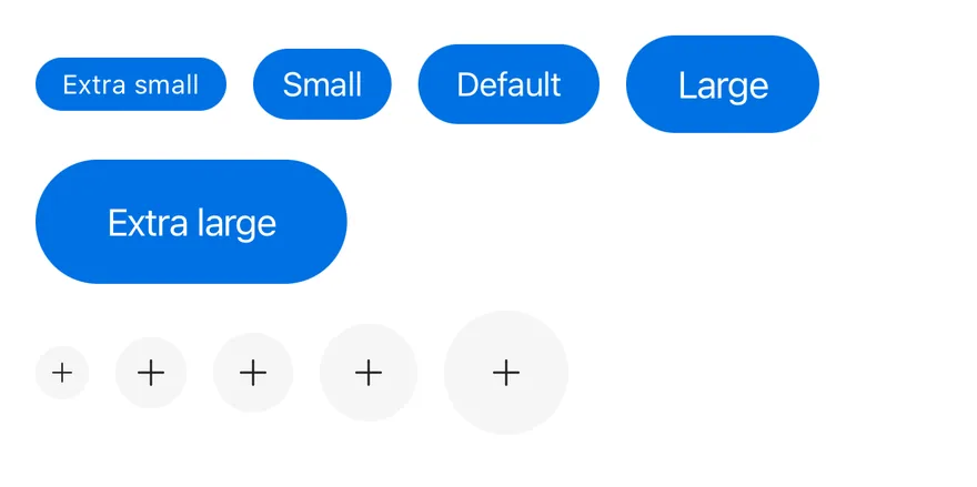
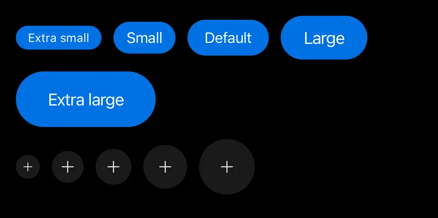
}Button is a Pressable with the button role. It supports eight visual variants, five text sizes and five icon-only sizes, and an optional block mode that fills the width of its container.
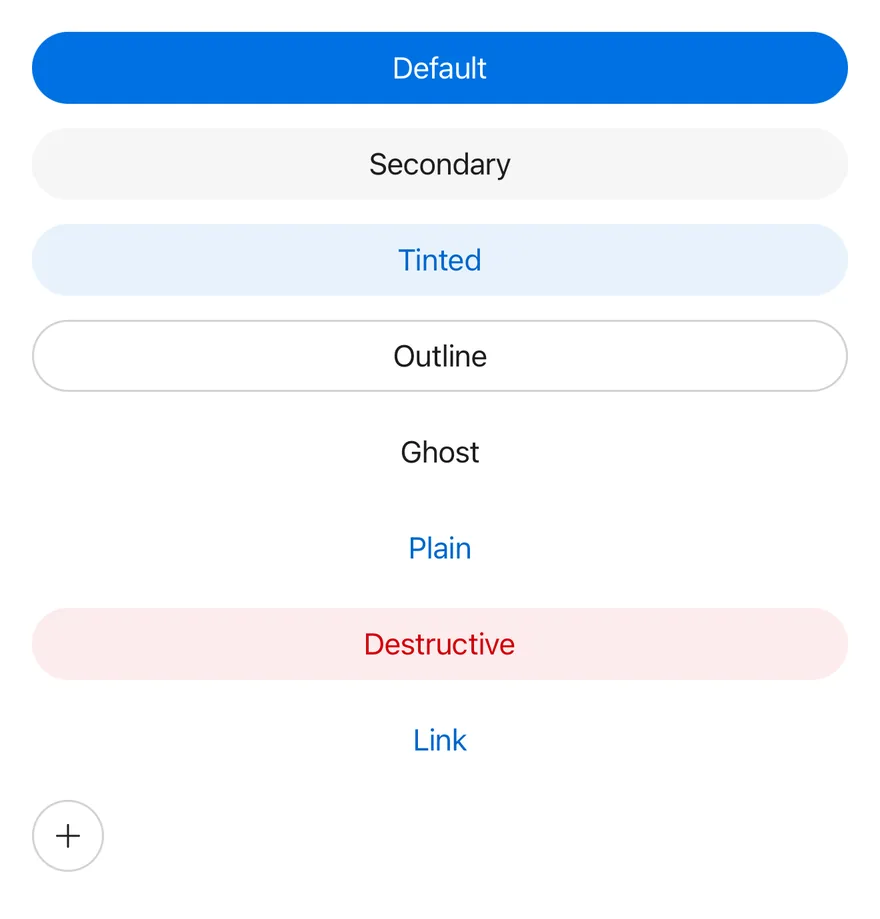
Use the default variant for the primary action on a screen, secondary, tinted or outline for supporting actions, ghost and plain for low-emphasis actions, and destructive for actions that delete or remove. To join several buttons into one control, use Button Group.
Installation
$ pnpm dlx @esuiss/uim@latest add button$ pnpm dlx @esuiss/uim@latest add button --platform swift$ pnpm dlx @esuiss/uim@latest add button --platform kotlinThe CLI also adds what it builds on: Icon, Text.
Manual
- Install the dependencies:
npx expo install class-variance-authority cnimport { cva, type VariantProps } from "class-variance-authority"
import { cn } from "cn"
import * as React from "react"
import { Pressable } from "react-native"
import { IconClassContext } from "@/components/ui/icon"
import { TextClassContext } from "@/components/ui/text"
const buttonVariants = cva(
"shrink-0 flex-row items-center justify-center rounded-full border border-transparent",
{
variants: {
variant: {
default:
"bg-accent active:bg-accent-pressed disabled:bg-accent-disabled",
outline:
"border-separator bg-surface active:bg-item-pressed dark:bg-transparent",- Update the import paths to match your project.
- Install the dependencies:
npx expo install class-variance-authority cnimport { cva, type VariantProps } from "class-variance-authority"
import { cn } from "cn"
import * as React from "react"
import { Pressable } from "react-native"
import { IconClassContext } from "@/components/ui/icon"
import { TextClassContext } from "@/components/ui/text"
const buttonVariants = cva(
"shrink-0 flex-row items-center justify-center rounded-full border border-transparent",
{
variants: {
variant: {
default:
"bg-accent active:bg-accent-pressed disabled:bg-accent-disabled",
outline:
"border-separator bg-surface active:bg-item-pressed dark:bg-transparent",- Update the import paths to match your project.
import * as React from "react"
import {
  Pressable,
  type PressableStateCallbackType,
  type StyleProp,
  StyleSheet,
  type TextStyle,
  type ViewStyle,
} from "react-native"
import { IconSizeContext } from "@/components/ui/icon"
import { TextStyleContext } from "@/components/ui/text"
import {
  fontSize,
  radius,
  type ThemeColors,
useTheme,- Update the import paths to match your project.
-
Target iOS 17 or later.
-
Add the Swift package to your app:
.package(url: "https://github.com/phosphor-icons/swift", from: "2.1.0")- Copy the theme files every view uses:
import SwiftUI
import UIKit

struct RGBA: Sendable {
  let red: CGFloat
  let green: CGFloat
  let blue: CGFloat
  let alpha: CGFloat

  init(_ hex: UInt32, _ alpha: CGFloat = 1) {
    red = CGFloat((hex >> 16) & 0xFF) / 255
    green = CGFloat((hex >> 8) & 0xFF) / 255
    blue = CGFloat(hex & 0xFF) / 255
    self.alpha = alpha
}import SwiftUI
extension Color {
public static let surface = Color.adaptive(light: .init(0xFFFFFF), dark: .init(0x000000))
public static let surfaceSecondary = Color.adaptive(light: .init(0xF5F5F7), dark: .init(0x161617))
public static let surfaceTertiary = Color.adaptive(light: .init(0xE8E8ED), dark: .init(0x2C2C2E))
public static let surfaceRaised = Color.adaptive(light: .init(0xFFFFFF), dark: .init(0x1D1D1F))
public static let label = Color.adaptive(light: .init(0x1D1D1F), dark: .init(0xF5F5F7))
public static let labelSecondary = Color.adaptive(light: .init(0x6E6E73), dark: .init(0xA1A1A6))
public static let labelTertiary = Color.adaptive(light: .init(0x86868B), dark: .init(0x86868B))
public static let labelQuaternary = Color.adaptive(light: .init(0xD2D2D7), dark: .init(0x424245))
public static let control = Color.adaptive(light: .init(0x000000, 0.04), dark: .init(0xFFFFFF, 0.1))
public static let controlPressed = Color.adaptive(light: .init(0x000000, 0.12), dark: .init(0xFFFFFF, 0.22))
public static let controlSelected = Color.adaptive(light: .init(0x1D1D1F), dark: .init(0xF5F5F7))
public static let controlDisabled = Color.adaptive(light: .init(0x000000, 0.03), dark: .init(0xFFFFFF, 0.05))
public static let onControlSelected = Color.adaptive(light: .init(0xFFFFFF), dark: .init(0x000000))- Copy the source and every file it uses:
import SwiftUI

public struct VariantButtonStyle: ButtonStyle {
  public enum Variant: CaseIterable, Sendable {
    case `default`, outline, secondary, tinted, ghost, plain, destructive, link
  }

  public enum Size: CaseIterable, Sendable {
    case `default`, xs, sm, lg, xl, icon, iconXs, iconSm, iconLg, iconXl

    var height: CGFloat {
      switch self {
      case .xs, .iconXs: 24
      case .sm, .iconSm: 32
      case .default, .icon: 36
case .lg, .iconLg: 44import SwiftUI
extension EnvironmentValues {
@Entry var buttonGroup: Axis? = nil
@Entry var buttonGroupSize: CGSize = .zero
}
enum ButtonGroupSpace: Hashable {
case group
}
struct ButtonGroupFrame {
let bounds: Anchor<CGRect>
let outlined: Bool
}import PhosphorSwift
import SwiftUI
extension Shadow {
static let control = Shadow(color: .black.opacity(0.08), radius: 0.5, y: 0.5)
static let thumb = Shadow(color: .black.opacity(0.12), radius: 1.5, y: 1)
}
struct SelectionIndicator<Mark: View>: View {
let checked: Bool
let pressed: Bool
let cornerRadius: CGFloat
let mark: Mark
@Environment(\.isEnabled) private var isEnabled
@Environment(\.isInvalid) private var invalidimport SwiftUI
extension EnvironmentValues {
@Entry public var isInvalid = false
@Entry var fieldInset = false
@Entry var fieldGroupInset = false
@Entry var fieldSetInset = false
}
extension View {
public func invalid(_ isInvalid: Bool = true) -> some View {
environment(\.isInvalid, isInvalid)
}
}
public enum FieldOrientation: CaseIterable, Sendable {import SwiftUI
extension EnvironmentValues {
@Entry public var hapticsEnabled = true
}
extension View {
public func haptics(_ enabled: Bool) -> some View {
environment(\.hapticsEnabled, enabled)
}
func hapticFeedback<Trigger: Equatable>(_ feedback: SensoryFeedback, trigger: Trigger) -> some View {
modifier(HapticFeedbackModifier(feedback: feedback, trigger: trigger) { _, _ in true })
}
func hapticFeedback<Trigger: Equatable>(import SwiftUI
public struct Separator: View {
let orientation: Axis
public init(_ orientation: Axis = .horizontal) {
self.orientation = orientation
}
public var body: some View {
Rectangle()
.fill(Color.separator)
.frame(width: orientation == .vertical ? 1 : nil, height: orientation == .horizontal ? 1 : nil)
.frame(maxWidth: orientation == .horizontal ? .infinity : nil, maxHeight: orientation == .vertical ? .infinity : nil)
.accessibilityHidden(true)
}import SwiftUI
public enum TextVariant: CaseIterable, Sendable {
case `default`, h1, h2, h3, h4, p, blockquote, code, lead, large, small, muted
var style: TextStyle {
switch self {
case .h1: .xl3
case .h2: .xl2
case .h3: .xl
case .h4, .lead, .large: .lg
case .code, .small, .muted: .sm
default: .base
}
}- Add the files to your app target.
- Set
minSdkto 24 or higher and add the dependencies:
implementation(platform("androidx.compose:compose-bom:2026.09.00"))
implementation("androidx.compose.foundation:foundation")
implementation("androidx.compose.ui:ui")- Copy the theme files every view uses:
package com.esuiss.ui.theme

import androidx.compose.foundation.isSystemInDarkTheme
import androidx.compose.runtime.Composable
import androidx.compose.runtime.CompositionLocalProvider
import androidx.compose.runtime.Immutable
import androidx.compose.runtime.staticCompositionLocalOf
import androidx.compose.ui.Modifier
import androidx.compose.ui.draw.dropShadow
import androidx.compose.ui.graphics.Color
import androidx.compose.ui.graphics.Shape
import androidx.compose.ui.graphics.shadow.Shadow as DropShadow
import androidx.compose.ui.text.TextStyle
import androidx.compose.ui.text.style.LineHeightStyle
import androidx.compose.ui.unit.Dp
import androidx.compose.ui.unit.DpOffsetpackage com.esuiss.ui.theme
import androidx.compose.runtime.Immutable
import androidx.compose.ui.graphics.Color
import androidx.compose.ui.unit.dp
@Immutable
data class Colors(
val surface: Color,
val surfaceSecondary: Color,
val surfaceTertiary: Color,
val surfaceRaised: Color,
val label: Color,
val labelSecondary: Color,
val labelTertiary: Color,
val labelQuaternary: Color,- Copy the source and every file it uses:
package com.esuiss.ui.components

import androidx.compose.foundation.background
import androidx.compose.foundation.border
import androidx.compose.foundation.clickable
import androidx.compose.foundation.interaction.MutableInteractionSource
import androidx.compose.foundation.interaction.collectIsPressedAsState
import androidx.compose.foundation.layout.Arrangement
import androidx.compose.foundation.layout.Row
import androidx.compose.foundation.layout.RowScope
import androidx.compose.foundation.layout.fillMaxWidth
import androidx.compose.foundation.layout.height
import androidx.compose.foundation.layout.padding
import androidx.compose.foundation.layout.size
import androidx.compose.foundation.shape.CircleShape
import androidx.compose.foundation.shape.RoundedCornerShapepackage com.esuiss.ui.components
import androidx.compose.foundation.background
import androidx.compose.foundation.gestures.Orientation
import androidx.compose.foundation.layout.Arrangement
import androidx.compose.foundation.layout.Box
import androidx.compose.foundation.layout.Row
import androidx.compose.foundation.layout.RowScope
import androidx.compose.foundation.layout.padding
import androidx.compose.foundation.shape.CircleShape
import androidx.compose.foundation.shape.CornerSize
import androidx.compose.foundation.shape.RoundedCornerShape
import androidx.compose.runtime.Composable
import androidx.compose.runtime.CompositionLocalProvider
import androidx.compose.runtime.DisposableEffect
import androidx.compose.runtime.Immutablepackage com.esuiss.ui.components
import androidx.compose.runtime.compositionLocalOf
import androidx.compose.ui.graphics.Color
import androidx.compose.ui.text.TextStyle
import androidx.compose.ui.unit.Dp
import androidx.compose.ui.unit.dp
val LocalContentStyle = compositionLocalOf { TextStyle.Default }
val LocalContentColor = compositionLocalOf { Color.Unspecified }
val LocalIconSize = compositionLocalOf { 20.dp }package com.esuiss.ui.components
import androidx.compose.foundation.Image
import androidx.compose.foundation.layout.size
import androidx.compose.runtime.Composable
import androidx.compose.ui.Modifier
import androidx.compose.ui.graphics.Color
import androidx.compose.ui.graphics.ColorFilter
import androidx.compose.ui.graphics.takeOrElse
import androidx.compose.ui.graphics.vector.ImageVector
import androidx.compose.ui.unit.Dp
import com.esuiss.ui.theme.EsuissTheme
@Composable
fun Icon(
imageVector: ImageVector,- Update the
com.esuiss.uipackage names to match your project.
Usage
import { Button } from "@/components/ui/button"<View className="items-start">
<Button>
<Text>Button</Text>
</Button>
</View>Put the label in a Text and icons in an Icon. The button passes its text color and icon size down through context, so children pick them up without extra classes.
Use an icon size, such as icon or icon-sm, for buttons that contain only an icon, and give them an accessibilityLabel.
buttonVariants and buttonTextVariants are also exported if you need the classes on another element.
Examples
Variants
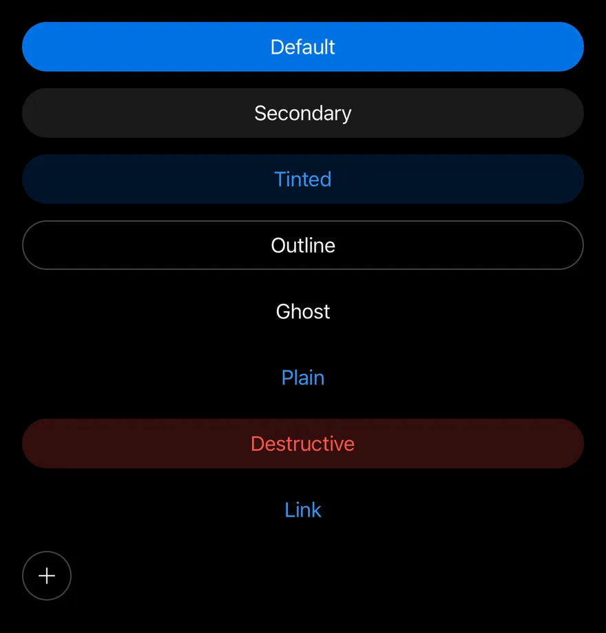
All eight variants, plus an icon-only button.
import { PlusIcon } from "phosphor-react-native"
import { View } from "react-native"
import { Button } from "@/components/ui/button"
import { Icon } from "@/components/ui/icon"
import { Text } from "@/components/ui/text"

export function ButtonVariantsExample() {
  return (
    <View className="gap-3">
      <Button>
        <Text>Default</Text>
      </Button>
      <Button variant="secondary">
        <Text>Secondary</Text>
      </Button>
      <Button variant="tinted">
        <Text>Tinted</Text>
      </Button>
      <Button variant="outline">
        <Text>Outline</Text>
      </Button>
      <Button variant="ghost">
        <Text>Ghost</Text>
      </Button>
      <Button variant="plain">
        <Text>Plain</Text>
      </Button>
      <Button variant="destructive">
        <Text>Destructive</Text>
      </Button>
      <Button variant="link">
        <Text>Link</Text>
      </Button>
      <Button size="icon" variant="outline">
        <Icon as={PlusIcon} />
      </Button>
    </View>
  )
}import EsuissUI
import PhosphorSwift
import SwiftUI
struct ButtonVariantsExample: View {
var body: some View {
VStack(alignment: .leading, spacing: 12) {
WideButton(title: "Default", variant: .default)
WideButton(title: "Secondary", variant: .secondary)
WideButton(title: "Tinted", variant: .tinted)
WideButton(title: "Outline", variant: .outline)
WideButton(title: "Ghost", variant: .ghost)
WideButton(title: "Plain", variant: .plain)
WideButton(title: "Destructive", variant: .destructive)
WideButton(title: "Link", variant: .link)
IconButton(icon: Ph.plus.regular, size: .icon, variant: .outline)
}
}
}
struct WideButton: View {
let title: LocalizedStringKey
let variant: VariantButtonStyle.Variant
var body: some View {
Button {} label: {
Text(title).frame(maxWidth: .infinity)
}
.buttonStyle(.variant(variant))
}
}
struct IconButton<Icon: View>: View {
let icon: Icon
let size: VariantButtonStyle.Size
let variant: VariantButtonStyle.Variant
var body: some View {
Button {} label: {
icon.frame(width: size.iconSize, height: size.iconSize)
}
.buttonStyle(.variant(variant, size: size))
.accessibilityLabel(Text("Add"))
}
}import androidx.compose.foundation.layout.Arrangement
import androidx.compose.foundation.layout.Column
import androidx.compose.foundation.layout.fillMaxWidth
import androidx.compose.runtime.Composable
import androidx.compose.ui.Modifier
import androidx.compose.ui.unit.dp
import com.adamglin.PhosphorIcons
import com.adamglin.phosphoricons.Regular
import com.adamglin.phosphoricons.regular.Plus
import com.esuiss.ui.components.Button
import com.esuiss.ui.components.ButtonSize
import com.esuiss.ui.components.ButtonVariant
import com.esuiss.ui.components.Icon
@Composable
fun ButtonVariants() {
val fill = Modifier.fillMaxWidth()
Column(Modifier.fillMaxWidth(), verticalArrangement = Arrangement.spacedBy(12.dp)) {
Button("Default", onClick = {}, modifier = fill)
Button("Secondary", onClick = {}, modifier = fill, variant = ButtonVariant.Secondary)
Button("Tinted", onClick = {}, modifier = fill, variant = ButtonVariant.Tinted)
Button("Outline", onClick = {}, modifier = fill, variant = ButtonVariant.Outline)
Button("Ghost", onClick = {}, modifier = fill, variant = ButtonVariant.Ghost)
Button("Plain", onClick = {}, modifier = fill, variant = ButtonVariant.Plain)
Button("Destructive", onClick = {}, modifier = fill, variant = ButtonVariant.Destructive)
Button("Link", onClick = {}, modifier = fill, variant = ButtonVariant.Link)
Button(onClick = {}, variant = ButtonVariant.Outline, size = ButtonSize.Icon) {
Icon(PhosphorIcons.Regular.Plus, contentDescription = "Add")
}
}
}Sizes
Compares the text and icon-only sizes.
import { PlusIcon } from "phosphor-react-native"
import { View } from "react-native"
import { Button } from "@/components/ui/button"
import { Icon } from "@/components/ui/icon"
import { Text } from "@/components/ui/text"

export function ButtonSizesExample() {
  return (
    <View className="gap-3">
      <View className="flex-row flex-wrap items-center gap-3">
        <Button size="xs">
          <Text>Extra small</Text>
        </Button>
        <Button size="sm">
          <Text>Small</Text>
        </Button>
        <Button>
          <Text>Default</Text>
        </Button>
        <Button size="lg">
          <Text>Large</Text>
        </Button>
        <Button size="xl">
          <Text>Extra large</Text>
        </Button>
      </View>
      <View className="flex-row flex-wrap items-center gap-3">
        <Button size="icon-xs" variant="secondary">
          <Icon as={PlusIcon} />
        </Button>
        <Button size="icon-sm" variant="secondary">
          <Icon as={PlusIcon} />
        </Button>
        <Button size="icon" variant="secondary">
          <Icon as={PlusIcon} />
        </Button>
        <Button size="icon-lg" variant="secondary">
          <Icon as={PlusIcon} />
        </Button>
        <Button size="icon-xl" variant="secondary">
          <Icon as={PlusIcon} />
        </Button>
      </View>
    </View>
  )
}import EsuissUI
import PhosphorSwift
import SwiftUI
struct ButtonSizesExample: View {
var body: some View {
VStack(alignment: .leading, spacing: 12) {
FlowRow {
Button("Extra small") {}.buttonStyle(.variant(size: .xs))
Button("Small") {}.buttonStyle(.variant(size: .sm))
Button("Default") {}.buttonStyle(.variant())
Button("Large") {}.buttonStyle(.variant(size: .lg))
Button("Extra large") {}.buttonStyle(.variant(size: .xl))
}
FlowRow {
IconButton(icon: Ph.plus.regular, size: .iconXs, variant: .secondary)
IconButton(icon: Ph.plus.regular, size: .iconSm, variant: .secondary)
IconButton(icon: Ph.plus.regular, size: .icon, variant: .secondary)
IconButton(icon: Ph.plus.regular, size: .iconLg, variant: .secondary)
IconButton(icon: Ph.plus.regular, size: .iconXl, variant: .secondary)
}
}
}
}
struct IconButton<Icon: View>: View {
let icon: Icon
let size: VariantButtonStyle.Size
let variant: VariantButtonStyle.Variant
var body: some View {
Button {} label: {
icon.frame(width: size.iconSize, height: size.iconSize)
}
.buttonStyle(.variant(variant, size: size))
.accessibilityLabel(Text("Add"))
}
}import androidx.compose.foundation.layout.Arrangement
import androidx.compose.foundation.layout.Column
import androidx.compose.foundation.layout.FlowRow
import androidx.compose.foundation.layout.fillMaxWidth
import androidx.compose.runtime.Composable
import androidx.compose.ui.Alignment
import androidx.compose.ui.Modifier
import androidx.compose.ui.unit.dp
import com.adamglin.PhosphorIcons
import com.adamglin.phosphoricons.Regular
import com.adamglin.phosphoricons.regular.Plus
import com.esuiss.ui.components.Button
import com.esuiss.ui.components.ButtonSize
import com.esuiss.ui.components.ButtonVariant
import com.esuiss.ui.components.Icon
@Composable
fun ButtonSizes() {
Column(Modifier.fillMaxWidth(), verticalArrangement = Arrangement.spacedBy(12.dp)) {
FlowRow(
horizontalArrangement = Arrangement.spacedBy(12.dp),
verticalArrangement = Arrangement.spacedBy(12.dp),
itemVerticalAlignment = Alignment.CenterVertically,
) {
Button("Extra small", onClick = {}, size = ButtonSize.Xs)
Button("Small", onClick = {}, size = ButtonSize.Sm)
Button("Default", onClick = {})
Button("Large", onClick = {}, size = ButtonSize.Lg)
Button("Extra large", onClick = {}, size = ButtonSize.Xl)
}
FlowRow(
horizontalArrangement = Arrangement.spacedBy(12.dp),
verticalArrangement = Arrangement.spacedBy(12.dp),
itemVerticalAlignment = Alignment.CenterVertically,
) {
listOf(ButtonSize.IconXs, ButtonSize.IconSm, ButtonSize.Icon, ButtonSize.IconLg, ButtonSize.IconXl).forEach { size ->
Button(onClick = {}, variant = ButtonVariant.Secondary, size = size) {
Icon(PhosphorIcons.Regular.Plus, contentDescription = "Add")
}
}
}
}
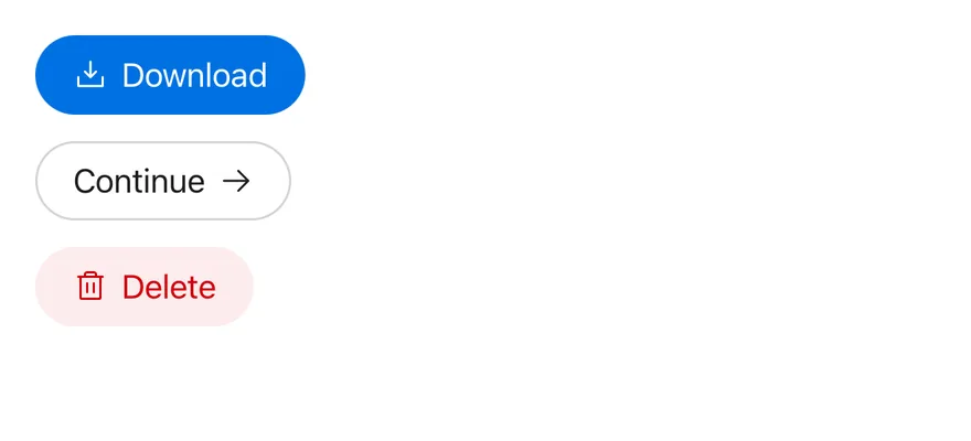
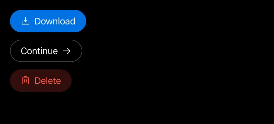
}With icon
Leading and trailing icons, and an icon-only button.
import { ArrowRightIcon, DownloadSimpleIcon, TrashIcon } from "phosphor-react-native"
import { View } from "react-native"
import { Button } from "@/components/ui/button"
import { Icon } from "@/components/ui/icon"
import { Text } from "@/components/ui/text"

export function ButtonWithIconExample() {
  return (
    <View className="items-start gap-3">
      <Button>
        <Icon as={DownloadSimpleIcon} />
        <Text>Download</Text>
      </Button>
      <Button variant="outline">
        <Text>Continue</Text>
        <Icon as={ArrowRightIcon} />
      </Button>
      <Button variant="destructive">
        <Icon as={TrashIcon} />
        <Text>Delete</Text>
      </Button>
    </View>
  )
}import EsuissUI
import PhosphorSwift
import SwiftUI
struct ButtonWithIconExample: View {
var body: some View {
VStack(alignment: .leading, spacing: 12) {
Button {} label: {
Label {
Text("Download")
} icon: {
Ph.downloadSimple.regular
}
}
.buttonStyle(.variant())
Button {} label: {
HStack(spacing: 6) {
Text("Continue")
Ph.arrowRight.regular
.frame(width: VariantButtonStyle.Size.default.iconSize, height: VariantButtonStyle.Size.default.iconSize)
}
}
.buttonStyle(.variant(.outline))
Button {} label: {
Label {
Text("Delete")
} icon: {
Ph.trash.regular
}
}
.buttonStyle(.variant(.destructive))
}
}
}import androidx.compose.foundation.layout.Arrangement
import androidx.compose.foundation.layout.Column
import androidx.compose.runtime.Composable
import androidx.compose.ui.unit.dp
import com.adamglin.PhosphorIcons
import com.adamglin.phosphoricons.Regular
import com.adamglin.phosphoricons.regular.ArrowRight
import com.adamglin.phosphoricons.regular.DownloadSimple
import com.adamglin.phosphoricons.regular.Trash
import com.esuiss.ui.components.Button
import com.esuiss.ui.components.ButtonVariant
import com.esuiss.ui.components.Icon
import com.esuiss.ui.components.Text
@Composable
fun ButtonWithIcon() {
Column(verticalArrangement = Arrangement.spacedBy(12.dp)) {
Button(onClick = {}) {
Icon(PhosphorIcons.Regular.DownloadSimple, contentDescription = null)
Text("Download")
}
Button(onClick = {}, variant = ButtonVariant.Outline) {
Text("Continue")
Icon(PhosphorIcons.Regular.ArrowRight, contentDescription = null)
}
Button(onClick = {}, variant = ButtonVariant.Destructive) {
Icon(PhosphorIcons.Regular.Trash, contentDescription = null)
Text("Delete")
}
}
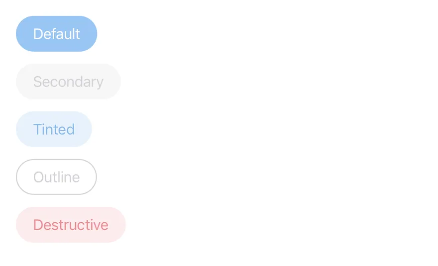
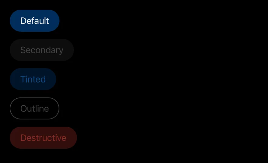
}Disabled
Disabled buttons in every variant.
import { View } from "react-native"
import { Button } from "@/components/ui/button"
import { Text } from "@/components/ui/text"

export function ButtonDisabledExample() {
  return (
    <View className="items-start gap-3">
      <Button disabled>
        <Text>Default</Text>
      </Button>
      <Button disabled variant="secondary">
        <Text>Secondary</Text>
      </Button>
      <Button disabled variant="tinted">
        <Text>Tinted</Text>
      </Button>
      <Button disabled variant="outline">
        <Text>Outline</Text>
      </Button>
      <Button disabled variant="destructive">
        <Text>Destructive</Text>
      </Button>
    </View>
  )
}import EsuissUI
import SwiftUI
struct ButtonDisabledExample: View {
var body: some View {
VStack(alignment: .leading, spacing: 12) {
Button("Default") {}.buttonStyle(.variant())
Button("Secondary") {}.buttonStyle(.variant(.secondary))
Button("Tinted") {}.buttonStyle(.variant(.tinted))
Button("Outline") {}.buttonStyle(.variant(.outline))
Button("Destructive") {}.buttonStyle(.variant(.destructive))
}
.disabled(true)
}
}import androidx.compose.foundation.layout.Arrangement
import androidx.compose.foundation.layout.Column
import androidx.compose.runtime.Composable
import androidx.compose.ui.unit.dp
import com.esuiss.ui.components.Button
import com.esuiss.ui.components.ButtonVariant
@Composable
fun ButtonDisabled() {
Column(verticalArrangement = Arrangement.spacedBy(12.dp)) {
Button("Default", onClick = {}, enabled = false)
Button("Secondary", onClick = {}, variant = ButtonVariant.Secondary, enabled = false)
Button("Tinted", onClick = {}, variant = ButtonVariant.Tinted, enabled = false)
Button("Outline", onClick = {}, variant = ButtonVariant.Outline, enabled = false)
Button("Destructive", onClick = {}, variant = ButtonVariant.Destructive, enabled = false)
}
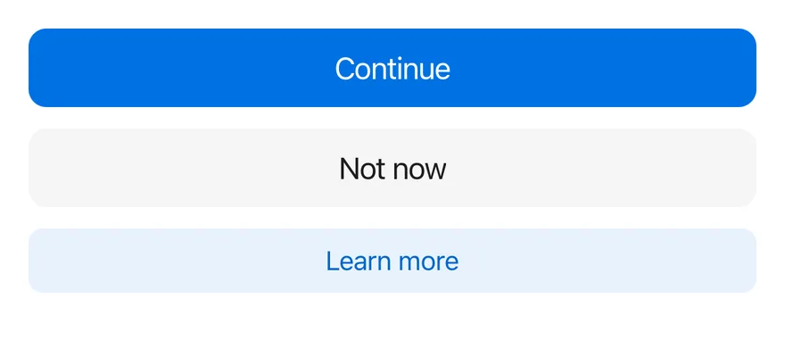
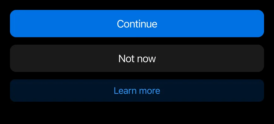
}Block
Full-width buttons at each size, whose corner radius scales with size.
import { View } from "react-native"
import { Button } from "@/components/ui/button"
import { Text } from "@/components/ui/text"

export function ButtonBlockExample() {
  return (
    <View className="gap-3">
      <Button block size="lg">
        <Text>Continue</Text>
      </Button>
      <Button block size="lg" variant="secondary">
        <Text>Not now</Text>
      </Button>
      <Button block variant="tinted">
        <Text>Learn more</Text>
      </Button>
    </View>
  )
}import EsuissUI
import SwiftUI
struct ButtonBlockExample: View {
var body: some View {
VStack(spacing: 12) {
Button("Continue") {}.buttonStyle(.variant(size: .lg, block: true))
Button("Not now") {}.buttonStyle(.variant(.secondary, size: .lg, block: true))
Button("Learn more") {}.buttonStyle(.variant(.tinted, block: true))
}
}
}import androidx.compose.foundation.layout.Arrangement
import androidx.compose.foundation.layout.Column
import androidx.compose.foundation.layout.fillMaxWidth
import androidx.compose.runtime.Composable
import androidx.compose.ui.Modifier
import androidx.compose.ui.unit.dp
import com.esuiss.ui.components.Button
import com.esuiss.ui.components.ButtonSize
import com.esuiss.ui.components.ButtonVariant
@Composable
fun ButtonBlock() {
Column(Modifier.fillMaxWidth(), verticalArrangement = Arrangement.spacedBy(12.dp)) {
Button("Continue", onClick = {}, size = ButtonSize.Lg, block = true)
Button("Not now", onClick = {}, size = ButtonSize.Lg, variant = ButtonVariant.Secondary, block = true)
Button("Learn more", onClick = {}, variant = ButtonVariant.Tinted, block = true)
}
}API Reference
Button
ButtonPropsAccessibility
- Renders a
Pressablewithrole="button", so VoiceOver and TalkBack announce it as a button. disabledis announced and blocks presses.- Icon-only buttons need an
accessibilityLabel.
Notes
- Colors come from semantic tokens such as
bg-accent,bg-control,bg-accent-surfaceandbg-danger-surface, each with pressed and disabled states. - Light and dark colors follow the system appearance.