suiss/uim · React Native Component
Accordion
A vertical stack of headings that each expand to reveal a section of content.
Accordion is an open-source mobile component from suiss/uim for React Native and Expo, with SwiftUI and Jetpack Compose versions built from the same design tokens. The @esuiss/uim CLI copies its source into your project, so you own the code.
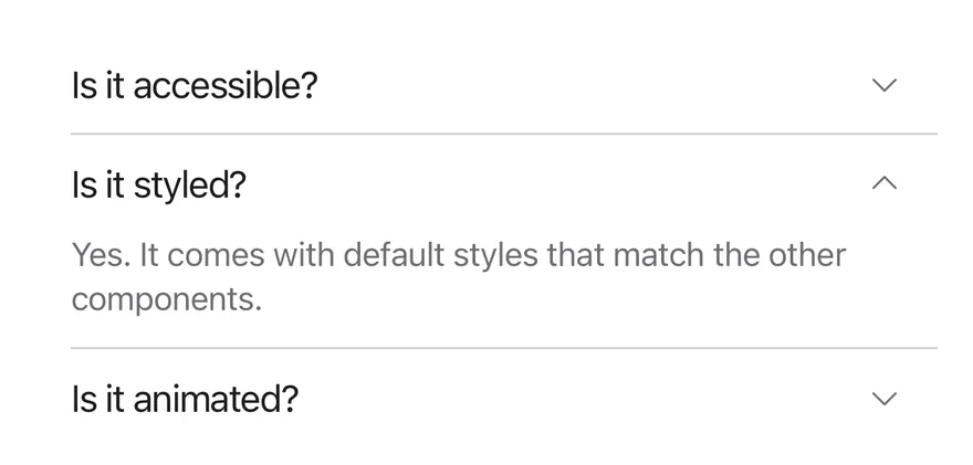
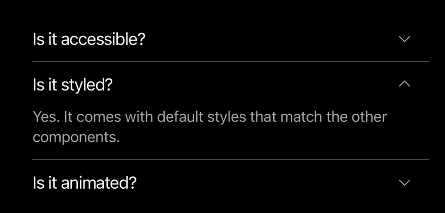
import { Accordion, AccordionContent, AccordionItem, AccordionTrigger } from "@/components/ui/accordion"
import { Text } from "@/components/ui/text"

const items = [
  {
    value: "item-1",
    title: "Is it accessible?",
    content: "Yes. It works with VoiceOver and TalkBack.",
  },
  {
    value: "item-2",
    title: "Is it styled?",
    content:
      "Yes. It comes with default styles that match the other components.",
  },
  {
    value: "item-3",
    title: "Is it animated?",
    content: "Yes. It animates open and closed by default.",
  },
]

function AccordionItems() {
  return items.map((item) => (
    <AccordionItem key={item.value} value={item.value}>
      <AccordionTrigger>
        <Text>{item.title}</Text>
      </AccordionTrigger>
      <AccordionContent>
        <Text>{item.content}</Text>
      </AccordionContent>
    </AccordionItem>
  ))
}

export function AccordionOpenByDefaultExample() {
  return (
    <Accordion defaultValue={["item-2"]}>
      <AccordionItems />
    </Accordion>
  )
}import EsuissUI
import SwiftUI
struct AccordionOpenByDefaultExample: View {
var body: some View {
AccordionDemo(initial: ["item-2"], multiple: false)
}
}
struct AccordionEntry: Identifiable {
let value: String
let title: LocalizedStringKey
let content: LocalizedStringKey
var id: String { value }
}
let accordionEntries = [
AccordionEntry(value: "item-1", title: "Is it accessible?", content: "Yes. It works with VoiceOver and TalkBack."),
AccordionEntry(
value: "item-2",
title: "Is it styled?",
content: "Yes. It comes with default styles that match the other components."
),
AccordionEntry(value: "item-3", title: "Is it animated?", content: "Yes. It animates open and closed by default."),
]
struct AccordionItems: View {
var body: some View {
ForEach(accordionEntries) { entry in
AccordionItem(entry.title, value: entry.value) {
Text(entry.content)
}
}
}
}
struct AccordionDemo: View {
let multiple: Bool
@State private var expanded: Set<String>
init(initial: Set<String>, multiple: Bool) {
self.multiple = multiple
_expanded = State(initialValue: initial)
}
var body: some View {
Accordion(expanded: $expanded, multiple: multiple) {
AccordionItems()
}
}
}import androidx.compose.runtime.Composable
import androidx.compose.runtime.getValue
import androidx.compose.runtime.mutableStateOf
import androidx.compose.runtime.saveable.rememberSaveable
import androidx.compose.runtime.setValue
import com.esuiss.ui.components.Accordion
import com.esuiss.ui.components.AccordionItem
import com.esuiss.ui.components.AccordionVariant
import com.esuiss.ui.components.Text
@Composable
fun AccordionOpenByDefaultExample() {
AccordionSingle(AccordionVariant.Default, "item-2")
}
class AccordionEntry(val value: String, val title: String, val content: String)
val accordionEntries = listOf(
AccordionEntry("item-1", "Is it accessible?", "Yes. It works with VoiceOver and TalkBack."),
AccordionEntry("item-2", "Is it styled?", "Yes. It comes with default styles that match the other components."),
AccordionEntry("item-3", "Is it animated?", "Yes. It animates open and closed by default."),
)
@Composable
fun AccordionItems(open: List<String>, onToggle: (String, Boolean) -> Unit) {
accordionEntries.forEach { entry ->
AccordionItem(
expanded = entry.value in open,
onExpandedChange = { onToggle(entry.value, it) },
title = entry.title,
) {
Text(entry.content)
}
}
}
@Composable
fun AccordionSingle(variant: AccordionVariant, defaultValue: String) {
var open by rememberSaveable { mutableStateOf(defaultValue) }
Accordion(variant = variant) {
AccordionItems(listOf(open)) { value, expanded -> open = if (expanded) value else "" }
}
}Accordion groups AccordionItems, each with an AccordionTrigger and an AccordionContent panel. The root and items are Reanimated views with a layout transition, so items below move smoothly as a panel opens or closes, and the trigger's caret rotates as it opens.
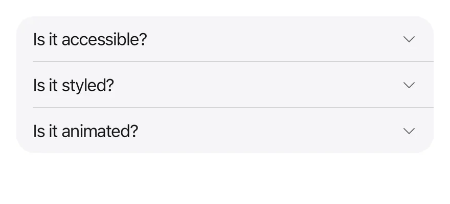
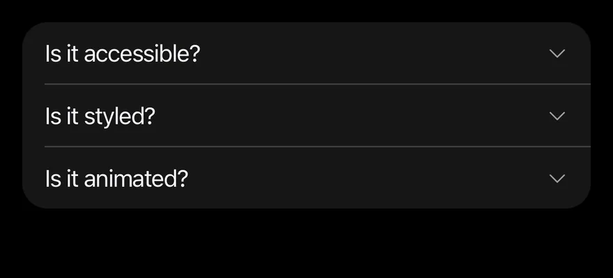
The default variant draws items on the page background separated by hairlines. The filled variant puts the whole list on a rounded secondary surface, which suits grouped settings or FAQ cards.
Installation
$ pnpm dlx @esuiss/uim@latest add accordion$ pnpm dlx @esuiss/uim@latest add accordion --platform swift$ pnpm dlx @esuiss/uim@latest add accordion --platform kotlinThe CLI also adds what it builds on: Icon, Text.
Manual
- Install the dependencies:
npx expo install class-variance-authority cn phosphor-react-native react-native-reanimated react-native-svg react-native-worklets-
Add the pieces it builds on: Icon, Text, and the primitives
components/primitives/accordion.tsx,components/primitives/use-render.tsx. -
Copy the source into
components/ui/accordion.tsx:
import { cva, type VariantProps } from "class-variance-authority"
import { cn } from "cn"
import { CaretDownIcon } from "phosphor-react-native"
import * as React from "react"
import type { GestureResponderEvent } from "react-native"
import Animated, {
  FadeOutUp,
  LayoutAnimationConfig,
  LinearTransition,
  ReduceMotion,
  useAnimatedStyle,
  useDerivedValue,
  withTiming,
} from "react-native-reanimated"
import * as AccordionPrimitive from "@/components/primitives/accordion"
import { resolveClassName } from "@/components/primitives/use-render"- Update the import paths to match your project.
- Install the dependencies:
npx expo install class-variance-authority cn phosphor-react-native react-native-reanimated react-native-svg react-native-worklets-
Add the pieces it builds on: Icon, Text, and the primitives
components/primitives/accordion.tsx,components/primitives/use-render.tsx. -
Copy the source into
components/ui/accordion.tsx:
import { cva, type VariantProps } from "class-variance-authority"
import { cn } from "cn"
import { CaretDownIcon } from "phosphor-react-native"
import * as React from "react"
import type { GestureResponderEvent } from "react-native"
import Animated, {
  FadeOutUp,
  LayoutAnimationConfig,
  LinearTransition,
  ReduceMotion,
  useAnimatedStyle,
  useDerivedValue,
  withTiming,
} from "react-native-reanimated"
import * as AccordionPrimitive from "@/components/primitives/accordion"
import { resolveClassName } from "@/components/primitives/use-render"- Update the import paths to match your project.
- Install the dependencies:
npx expo install phosphor-react-native react-native-reanimated react-native-svg react-native-worklets-
Add the pieces it builds on: Icon, Text, and the primitives
components/primitives/accordion.tsx,components/primitives/use-render.tsx. -
Copy the source into
components/ui/accordion.tsx:
import { CaretDownIcon } from "phosphor-react-native"
import * as React from "react"
import {
  type GestureResponderEvent,
  type StyleProp,
  StyleSheet,
  type ViewStyle,
} from "react-native"
import Animated, {
  FadeOutUp,
  LayoutAnimationConfig,
  LinearTransition,
  ReduceMotion,
  useAnimatedStyle,
  useDerivedValue,
withTiming,- Update the import paths to match your project.
-
Target iOS 17 or later.
-
Add the Swift package to your app:
.package(url: "https://github.com/phosphor-icons/swift", from: "2.1.0")- Copy the theme files every view uses:
import SwiftUI
import UIKit

struct RGBA: Sendable {
  let red: CGFloat
  let green: CGFloat
  let blue: CGFloat
  let alpha: CGFloat

  init(_ hex: UInt32, _ alpha: CGFloat = 1) {
    red = CGFloat((hex >> 16) & 0xFF) / 255
    green = CGFloat((hex >> 8) & 0xFF) / 255
    blue = CGFloat(hex & 0xFF) / 255
    self.alpha = alpha
}import SwiftUI
extension Color {
public static let surface = Color.adaptive(light: .init(0xFFFFFF), dark: .init(0x000000))
public static let surfaceSecondary = Color.adaptive(light: .init(0xF5F5F7), dark: .init(0x161617))
public static let surfaceTertiary = Color.adaptive(light: .init(0xE8E8ED), dark: .init(0x2C2C2E))
public static let surfaceRaised = Color.adaptive(light: .init(0xFFFFFF), dark: .init(0x1D1D1F))
public static let label = Color.adaptive(light: .init(0x1D1D1F), dark: .init(0xF5F5F7))
public static let labelSecondary = Color.adaptive(light: .init(0x6E6E73), dark: .init(0xA1A1A6))
public static let labelTertiary = Color.adaptive(light: .init(0x86868B), dark: .init(0x86868B))
public static let labelQuaternary = Color.adaptive(light: .init(0xD2D2D7), dark: .init(0x424245))
public static let control = Color.adaptive(light: .init(0x000000, 0.04), dark: .init(0xFFFFFF, 0.1))
public static let controlPressed = Color.adaptive(light: .init(0x000000, 0.12), dark: .init(0xFFFFFF, 0.22))
public static let controlSelected = Color.adaptive(light: .init(0x1D1D1F), dark: .init(0xF5F5F7))
public static let controlDisabled = Color.adaptive(light: .init(0x000000, 0.03), dark: .init(0xFFFFFF, 0.05))
public static let onControlSelected = Color.adaptive(light: .init(0xFFFFFF), dark: .init(0x000000))- Copy the source:
import PhosphorSwift
import SwiftUI

public struct Accordion<Content: View>: View {
  public enum Variant: CaseIterable, Sendable {
    case `default`, filled
  }

  let variant: Variant
  let multiple: Bool
  let external: Binding<Set<AnyHashable>>?
  let content: Content

  @State private var local: Set<AnyHashable> = []
@Environment(\.accessibilityReduceMotion) private var reduceMotion- Add the files to your app target.
- Set
minSdkto 24 or higher and add the dependencies:
implementation(platform("androidx.compose:compose-bom:2026.09.00"))
implementation("androidx.compose.foundation:foundation")
implementation("androidx.compose.ui:ui")
implementation("com.adamglin:phosphor-icon-android:1.0.0")- Copy the theme files every view uses:
package com.esuiss.ui.theme

import androidx.compose.foundation.isSystemInDarkTheme
import androidx.compose.runtime.Composable
import androidx.compose.runtime.CompositionLocalProvider
import androidx.compose.runtime.Immutable
import androidx.compose.runtime.staticCompositionLocalOf
import androidx.compose.ui.Modifier
import androidx.compose.ui.draw.dropShadow
import androidx.compose.ui.graphics.Color
import androidx.compose.ui.graphics.Shape
import androidx.compose.ui.graphics.shadow.Shadow as DropShadow
import androidx.compose.ui.text.TextStyle
import androidx.compose.ui.text.style.LineHeightStyle
import androidx.compose.ui.unit.Dp
import androidx.compose.ui.unit.DpOffsetpackage com.esuiss.ui.theme
import androidx.compose.runtime.Immutable
import androidx.compose.ui.graphics.Color
import androidx.compose.ui.unit.dp
@Immutable
data class Colors(
val surface: Color,
val surfaceSecondary: Color,
val surfaceTertiary: Color,
val surfaceRaised: Color,
val label: Color,
val labelSecondary: Color,
val labelTertiary: Color,
val labelQuaternary: Color,- Copy the source and every file it uses:
package com.esuiss.ui.components

import androidx.compose.animation.AnimatedVisibility
import androidx.compose.animation.core.animateFloatAsState
import androidx.compose.animation.core.tween
import androidx.compose.animation.expandVertically
import androidx.compose.animation.fadeIn
import androidx.compose.animation.fadeOut
import androidx.compose.animation.shrinkVertically
import androidx.compose.foundation.background
import androidx.compose.foundation.clickable
import androidx.compose.foundation.interaction.MutableInteractionSource
import androidx.compose.foundation.interaction.collectIsPressedAsState
import androidx.compose.foundation.layout.Arrangement
import androidx.compose.foundation.layout.Column
import androidx.compose.foundation.layout.ColumnScopepackage com.esuiss.ui.components
import androidx.compose.foundation.background
import androidx.compose.foundation.border
import androidx.compose.foundation.clickable
import androidx.compose.foundation.interaction.MutableInteractionSource
import androidx.compose.foundation.interaction.collectIsPressedAsState
import androidx.compose.foundation.layout.Arrangement
import androidx.compose.foundation.layout.Row
import androidx.compose.foundation.layout.RowScope
import androidx.compose.foundation.layout.fillMaxWidth
import androidx.compose.foundation.layout.height
import androidx.compose.foundation.layout.padding
import androidx.compose.foundation.layout.size
import androidx.compose.foundation.shape.CircleShape
import androidx.compose.foundation.shape.RoundedCornerShapepackage com.esuiss.ui.components
import androidx.compose.foundation.background
import androidx.compose.foundation.gestures.Orientation
import androidx.compose.foundation.layout.Arrangement
import androidx.compose.foundation.layout.Box
import androidx.compose.foundation.layout.Row
import androidx.compose.foundation.layout.RowScope
import androidx.compose.foundation.layout.padding
import androidx.compose.foundation.shape.CircleShape
import androidx.compose.foundation.shape.CornerSize
import androidx.compose.foundation.shape.RoundedCornerShape
import androidx.compose.runtime.Composable
import androidx.compose.runtime.CompositionLocalProvider
import androidx.compose.runtime.DisposableEffect
import androidx.compose.runtime.Immutablepackage com.esuiss.ui.components
import androidx.compose.runtime.compositionLocalOf
import androidx.compose.ui.graphics.Color
import androidx.compose.ui.text.TextStyle
import androidx.compose.ui.unit.Dp
import androidx.compose.ui.unit.dp
val LocalContentStyle = compositionLocalOf { TextStyle.Default }
val LocalContentColor = compositionLocalOf { Color.Unspecified }
val LocalIconSize = compositionLocalOf { 20.dp }package com.esuiss.ui.components
import androidx.compose.foundation.Image
import androidx.compose.foundation.layout.size
import androidx.compose.runtime.Composable
import androidx.compose.ui.Modifier
import androidx.compose.ui.graphics.Color
import androidx.compose.ui.graphics.ColorFilter
import androidx.compose.ui.graphics.takeOrElse
import androidx.compose.ui.graphics.vector.ImageVector
import androidx.compose.ui.unit.Dp
import com.esuiss.ui.theme.EsuissTheme
@Composable
fun Icon(
imageVector: ImageVector,- Update the
com.esuiss.uipackage names to match your project.
Usage
import { Accordion, AccordionItem, AccordionTrigger, AccordionContent } from "@/components/ui/accordion"<Accordion defaultValue={["item-2"]}>
<AccordionItems />
</Accordion>Give each AccordionItem a value. By default only one item is open at a time; set multiple to let several stay open.
Use defaultValue (an array of item values) for uncontrolled state, or value with onValueChange to control it. Set disabled on the root or on a single item to block toggling, and keepMounted to keep closed panels mounted.
accordionVariants is also exported if you need the classes elsewhere.
Examples
Default
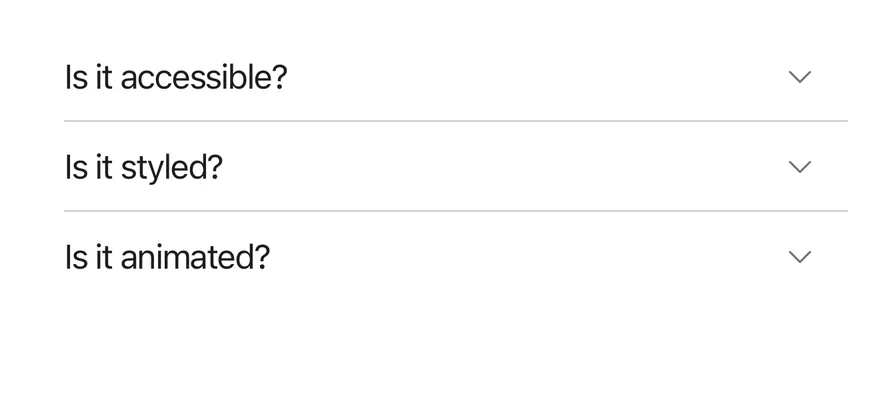
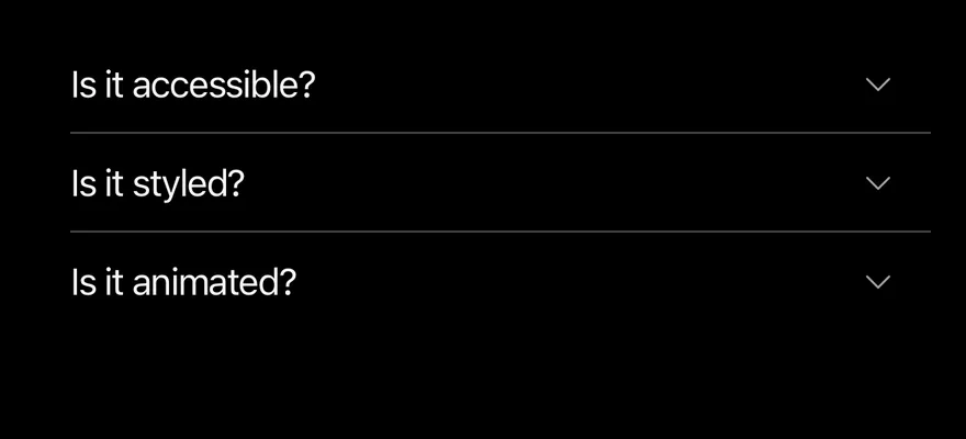
import { Accordion, AccordionContent, AccordionItem, AccordionTrigger } from "@/components/ui/accordion"
import { Text } from "@/components/ui/text"

const items = [
  {
    value: "item-1",
    title: "Is it accessible?",
    content: "Yes. It works with VoiceOver and TalkBack.",
  },
  {
    value: "item-2",
    title: "Is it styled?",
    content:
      "Yes. It comes with default styles that match the other components.",
  },
  {
    value: "item-3",
    title: "Is it animated?",
    content: "Yes. It animates open and closed by default.",
  },
]

function AccordionItems() {
  return items.map((item) => (
    <AccordionItem key={item.value} value={item.value}>
      <AccordionTrigger>
        <Text>{item.title}</Text>
      </AccordionTrigger>
      <AccordionContent>
        <Text>{item.content}</Text>
      </AccordionContent>
    </AccordionItem>
  ))
}

export function AccordionExample() {
  return (
    <Accordion>
      <AccordionItems />
    </Accordion>
  )
}import EsuissUI
import SwiftUI
struct AccordionExample: View {
var body: some View {
Accordion {
AccordionItems()
}
}
}
struct AccordionEntry: Identifiable {
let value: String
let title: LocalizedStringKey
let content: LocalizedStringKey
var id: String { value }
}
let accordionEntries = [
AccordionEntry(value: "item-1", title: "Is it accessible?", content: "Yes. It works with VoiceOver and TalkBack."),
AccordionEntry(
value: "item-2",
title: "Is it styled?",
content: "Yes. It comes with default styles that match the other components."
),
AccordionEntry(value: "item-3", title: "Is it animated?", content: "Yes. It animates open and closed by default."),
]
struct AccordionItems: View {
var body: some View {
ForEach(accordionEntries) { entry in
AccordionItem(entry.title, value: entry.value) {
Text(entry.content)
}
}
}
}import androidx.compose.runtime.Composable
import androidx.compose.runtime.getValue
import androidx.compose.runtime.mutableStateOf
import androidx.compose.runtime.saveable.rememberSaveable
import androidx.compose.runtime.setValue
import com.esuiss.ui.components.Accordion
import com.esuiss.ui.components.AccordionItem
import com.esuiss.ui.components.AccordionVariant
import com.esuiss.ui.components.Text
@Composable
fun AccordionExample() {
AccordionSingle(AccordionVariant.Default, "")
}
class AccordionEntry(val value: String, val title: String, val content: String)
val accordionEntries = listOf(
AccordionEntry("item-1", "Is it accessible?", "Yes. It works with VoiceOver and TalkBack."),
AccordionEntry("item-2", "Is it styled?", "Yes. It comes with default styles that match the other components."),
AccordionEntry("item-3", "Is it animated?", "Yes. It animates open and closed by default."),
)
@Composable
fun AccordionItems(open: List<String>, onToggle: (String, Boolean) -> Unit) {
accordionEntries.forEach { entry ->
AccordionItem(
expanded = entry.value in open,
onExpandedChange = { onToggle(entry.value, it) },
title = entry.title,
) {
Text(entry.content)
}
}
}
@Composable
fun AccordionSingle(variant: AccordionVariant, defaultValue: String) {
var open by rememberSaveable { mutableStateOf(defaultValue) }
Accordion(variant = variant) {
AccordionItems(listOf(open)) { value, expanded -> open = if (expanded) value else "" }
}
}Filled
The filled variant on a rounded secondary surface.
import { Accordion, AccordionContent, AccordionItem, AccordionTrigger } from "@/components/ui/accordion"
import { Text } from "@/components/ui/text"

const items = [
  {
    value: "item-1",
    title: "Is it accessible?",
    content: "Yes. It works with VoiceOver and TalkBack.",
  },
  {
    value: "item-2",
    title: "Is it styled?",
    content:
      "Yes. It comes with default styles that match the other components.",
  },
  {
    value: "item-3",
    title: "Is it animated?",
    content: "Yes. It animates open and closed by default.",
  },
]

function AccordionItems() {
  return items.map((item) => (
    <AccordionItem key={item.value} value={item.value}>
      <AccordionTrigger>
        <Text>{item.title}</Text>
      </AccordionTrigger>
      <AccordionContent>
        <Text>{item.content}</Text>
      </AccordionContent>
    </AccordionItem>
  ))
}

export function AccordionFilledExample() {
  return (
    <Accordion variant="filled">
      <AccordionItems />
    </Accordion>
  )
}import EsuissUI
import SwiftUI
struct AccordionFilledExample: View {
var body: some View {
Accordion(.filled) {
AccordionItems()
}
}
}
struct AccordionEntry: Identifiable {
let value: String
let title: LocalizedStringKey
let content: LocalizedStringKey
var id: String { value }
}
let accordionEntries = [
AccordionEntry(value: "item-1", title: "Is it accessible?", content: "Yes. It works with VoiceOver and TalkBack."),
AccordionEntry(
value: "item-2",
title: "Is it styled?",
content: "Yes. It comes with default styles that match the other components."
),
AccordionEntry(value: "item-3", title: "Is it animated?", content: "Yes. It animates open and closed by default."),
]
struct AccordionItems: View {
var body: some View {
ForEach(accordionEntries) { entry in
AccordionItem(entry.title, value: entry.value) {
Text(entry.content)
}
}
}
}import androidx.compose.runtime.Composable
import androidx.compose.runtime.getValue
import androidx.compose.runtime.mutableStateOf
import androidx.compose.runtime.saveable.rememberSaveable
import androidx.compose.runtime.setValue
import com.esuiss.ui.components.Accordion
import com.esuiss.ui.components.AccordionItem
import com.esuiss.ui.components.AccordionVariant
import com.esuiss.ui.components.Text
@Composable
fun AccordionFilledExample() {
AccordionSingle(AccordionVariant.Filled, "")
}
class AccordionEntry(val value: String, val title: String, val content: String)
val accordionEntries = listOf(
AccordionEntry("item-1", "Is it accessible?", "Yes. It works with VoiceOver and TalkBack."),
AccordionEntry("item-2", "Is it styled?", "Yes. It comes with default styles that match the other components."),
AccordionEntry("item-3", "Is it animated?", "Yes. It animates open and closed by default."),
)
@Composable
fun AccordionItems(open: List<String>, onToggle: (String, Boolean) -> Unit) {
accordionEntries.forEach { entry ->
AccordionItem(
expanded = entry.value in open,
onExpandedChange = { onToggle(entry.value, it) },
title = entry.title,
) {
Text(entry.content)
}
}
}
@Composable
fun AccordionSingle(variant: AccordionVariant, defaultValue: String) {
var open by rememberSaveable { mutableStateOf(defaultValue) }
Accordion(variant = variant) {
AccordionItems(listOf(open)) { value, expanded -> open = if (expanded) value else "" }
}
}Multiple
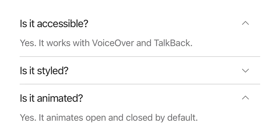
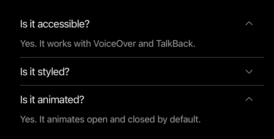
A controlled accordion with multiple, so several items stay open.
import * as React from "react"
import { Accordion, AccordionContent, AccordionItem, AccordionTrigger } from "@/components/ui/accordion"
import { Text } from "@/components/ui/text"

const items = [
  {
    value: "item-1",
    title: "Is it accessible?",
    content: "Yes. It works with VoiceOver and TalkBack.",
  },
  {
    value: "item-2",
    title: "Is it styled?",
    content:
      "Yes. It comes with default styles that match the other components.",
  },
  {
    value: "item-3",
    title: "Is it animated?",
    content: "Yes. It animates open and closed by default.",
  },
]

function AccordionItems() {
  return items.map((item) => (
    <AccordionItem key={item.value} value={item.value}>
      <AccordionTrigger>
        <Text>{item.title}</Text>
      </AccordionTrigger>
      <AccordionContent>
        <Text>{item.content}</Text>
      </AccordionContent>
    </AccordionItem>
  ))
}

function MultipleDemo() {
  const [value, setValue] = React.useState<string[]>(["item-1", "item-3"])
  return (
    <Accordion multiple value={value} onValueChange={setValue}>
      <AccordionItems />
    </Accordion>
  )
}

export function AccordionMultipleExample() {
  return (
    <MultipleDemo />
  )
}import EsuissUI
import SwiftUI
struct AccordionMultipleExample: View {
var body: some View {
AccordionDemo(initial: ["item-1", "item-3"], multiple: true)
}
}
struct AccordionEntry: Identifiable {
let value: String
let title: LocalizedStringKey
let content: LocalizedStringKey
var id: String { value }
}
let accordionEntries = [
AccordionEntry(value: "item-1", title: "Is it accessible?", content: "Yes. It works with VoiceOver and TalkBack."),
AccordionEntry(
value: "item-2",
title: "Is it styled?",
content: "Yes. It comes with default styles that match the other components."
),
AccordionEntry(value: "item-3", title: "Is it animated?", content: "Yes. It animates open and closed by default."),
]
struct AccordionItems: View {
var body: some View {
ForEach(accordionEntries) { entry in
AccordionItem(entry.title, value: entry.value) {
Text(entry.content)
}
}
}
}
struct AccordionDemo: View {
let multiple: Bool
@State private var expanded: Set<String>
init(initial: Set<String>, multiple: Bool) {
self.multiple = multiple
_expanded = State(initialValue: initial)
}
var body: some View {
Accordion(expanded: $expanded, multiple: multiple) {
AccordionItems()
}
}
}import androidx.compose.runtime.Composable
import androidx.compose.runtime.getValue
import androidx.compose.runtime.mutableStateOf
import androidx.compose.runtime.saveable.rememberSaveable
import androidx.compose.runtime.setValue
import com.esuiss.ui.components.Accordion
import com.esuiss.ui.components.AccordionItem
import com.esuiss.ui.components.Text
class AccordionEntry(val value: String, val title: String, val content: String)
val accordionEntries = listOf(
AccordionEntry("item-1", "Is it accessible?", "Yes. It works with VoiceOver and TalkBack."),
AccordionEntry("item-2", "Is it styled?", "Yes. It comes with default styles that match the other components."),
AccordionEntry("item-3", "Is it animated?", "Yes. It animates open and closed by default."),
)
@Composable
fun AccordionItems(open: List<String>, onToggle: (String, Boolean) -> Unit) {
accordionEntries.forEach { entry ->
AccordionItem(
expanded = entry.value in open,
onExpandedChange = { onToggle(entry.value, it) },
title = entry.title,
) {
Text(entry.content)
}
}
}
@Composable
fun AccordionMultiple() {
var open by rememberSaveable { mutableStateOf("item-1,item-3") }
Accordion {
AccordionItems(open.split(",")) { value, expanded ->
val current = open.split(",").filter { it.isNotEmpty() }
open = (if (expanded) current + value else current - value).joinToString(",")
}
}
}API Reference
Accordion
Root that holds the open state and lays out the items.
React.ComponentProps<typeof AccordionPrimitive.Root>- About
defaultorfilled.- Type
"default""filled"- Default
- "default"
AccordionItem
One section, separated from the previous one by a hairline.
React.ComponentProps<typeof AccordionPrimitive.Item>AccordionTrigger
Pressable heading row with a rotating caret.
React.ComponentProps<typeof AccordionPrimitive.Trigger>AccordionContent
Panel shown while the item is open; fades out upward on close.
React.ComponentProps<typeof AccordionPrimitive.Panel>- Type
string- Default
- —
Accessibility
- The header row has the
headerrole, and the trigger has thebuttonrole withexpandedanddisabledaccessibility state. - Closed panels are hidden from VoiceOver and TalkBack.
- A disabled trigger uses a dimmed label color.
Notes
- The trigger label underlines while pressed.
- Animations respect the system Reduce Motion setting.
- Uses
bg-surface-secondary,border-separatorandtext-labeltokens; light and dark follow the system appearance.