suiss/uim · React Native Component
Alert
A callout that shows a short message with an optional icon and action.
Alert is an open-source mobile component from suiss/uim for React Native and Expo, with SwiftUI and Jetpack Compose versions built from the same design tokens. The @esuiss/uim CLI copies its source into your project, so you own the code.
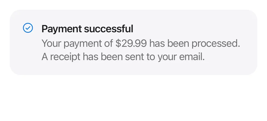
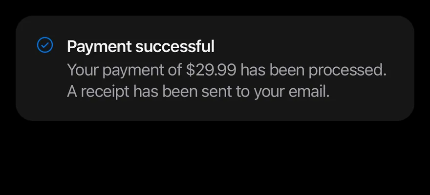
import { CheckCircleIcon } from "phosphor-react-native"
import { Alert, AlertDescription, AlertTitle } from "@/components/ui/alert"

export function AlertExample() {
  return (
    <Alert icon={CheckCircleIcon}>
      <AlertTitle>Payment successful</AlertTitle>
      <AlertDescription>
        Your payment of $29.99 has been processed. A receipt has been sent to
        your email.
      </AlertDescription>
    </Alert>
  )
}import EsuissUI
import PhosphorSwift
import SwiftUI
struct AlertExample: View {
var body: some View {
InlineAlert(icon: Ph.checkCircle.regular) {
AlertTitle("Payment successful")
AlertDescription("Your payment of $29.99 has been processed. A receipt has been sent to your email.")
}
}
}import androidx.compose.runtime.Composable
import com.adamglin.PhosphorIcons
import com.adamglin.phosphoricons.Regular
import com.adamglin.phosphoricons.regular.CheckCircle
import com.esuiss.ui.components.Alert
import com.esuiss.ui.components.AlertDescription
import com.esuiss.ui.components.AlertTitle
@Composable
fun AlertDefault() {
Alert(icon = PhosphorIcons.Regular.CheckCircle) {
AlertTitle("Payment successful")
AlertDescription("Your payment of \$29.99 has been processed. A receipt has been sent to your email.")
}
}Alert is a View on a rounded secondary surface with an optional leading icon, a title and description column, and an optional action pinned to the top-end corner. It is static and stays in the layout; it is not a toast or a modal.
Use the default variant for neutral information, where the icon uses the accent color, and destructive for errors, where the icon uses the danger color.
Installation
$ pnpm dlx @esuiss/uim@latest add alert$ pnpm dlx @esuiss/uim@latest add alert --platform swift$ pnpm dlx @esuiss/uim@latest add alert --platform kotlinThe CLI also adds what it builds on: Icon, Text.
Manual
- Install the dependencies:
npx expo install cn phosphor-react-native react-native-svgimport { cn } from "cn"
import type { Icon as PhosphorIcon } from "phosphor-react-native"
import * as React from "react"
import { View } from "react-native"
import { Icon } from "@/components/ui/icon"
import { Text, TextClassContext } from "@/components/ui/text"
function Alert({
className,
variant = "default",
children,
icon,
iconClassName,
...props
}: React.ComponentProps<typeof View> &
React.RefAttributes<View> & {- Update the import paths to match your project.
- Install the dependencies:
npx expo install cn phosphor-react-native react-native-svgimport { cn } from "cn"
import type { Icon as PhosphorIcon } from "phosphor-react-native"
import * as React from "react"
import { View } from "react-native"
import { Icon } from "@/components/ui/icon"
import { Text, TextClassContext } from "@/components/ui/text"
function Alert({
className,
variant = "default",
children,
icon,
iconClassName,
...props
}: React.ComponentProps<typeof View> &
React.RefAttributes<View> & {- Update the import paths to match your project.
- Install the dependencies:
npx expo install phosphor-react-native react-native-svgimport type {
Icon as PhosphorIcon,
IconProps as PhosphorIconProps,
} from "phosphor-react-native"
import * as React from "react"
import { StyleSheet, View } from "react-native"
import { Icon } from "@/components/ui/icon"
import { Text, TextStyleContext } from "@/components/ui/text"
import { fontSize, radius, useTheme } from "@/components/ui/theme"
const styles = StyleSheet.create({
root: {
position: "relative",
width: "100%",
flexDirection: "row",
gap: 12,- Update the import paths to match your project.
-
Target iOS 17 or later.
-
Copy the theme files every view uses:
import SwiftUI
import UIKit

struct RGBA: Sendable {
  let red: CGFloat
  let green: CGFloat
  let blue: CGFloat
  let alpha: CGFloat

  init(_ hex: UInt32, _ alpha: CGFloat = 1) {
    red = CGFloat((hex >> 16) & 0xFF) / 255
    green = CGFloat((hex >> 8) & 0xFF) / 255
    blue = CGFloat(hex & 0xFF) / 255
    self.alpha = alpha
}import SwiftUI
extension Color {
public static let surface = Color.adaptive(light: .init(0xFFFFFF), dark: .init(0x000000))
public static let surfaceSecondary = Color.adaptive(light: .init(0xF5F5F7), dark: .init(0x161617))
public static let surfaceTertiary = Color.adaptive(light: .init(0xE8E8ED), dark: .init(0x2C2C2E))
public static let surfaceRaised = Color.adaptive(light: .init(0xFFFFFF), dark: .init(0x1D1D1F))
public static let label = Color.adaptive(light: .init(0x1D1D1F), dark: .init(0xF5F5F7))
public static let labelSecondary = Color.adaptive(light: .init(0x6E6E73), dark: .init(0xA1A1A6))
public static let labelTertiary = Color.adaptive(light: .init(0x86868B), dark: .init(0x86868B))
public static let labelQuaternary = Color.adaptive(light: .init(0xD2D2D7), dark: .init(0x424245))
public static let control = Color.adaptive(light: .init(0x000000, 0.04), dark: .init(0xFFFFFF, 0.1))
public static let controlPressed = Color.adaptive(light: .init(0x000000, 0.12), dark: .init(0xFFFFFF, 0.22))
public static let controlSelected = Color.adaptive(light: .init(0x1D1D1F), dark: .init(0xF5F5F7))
public static let controlDisabled = Color.adaptive(light: .init(0x000000, 0.03), dark: .init(0xFFFFFF, 0.05))
public static let onControlSelected = Color.adaptive(light: .init(0xFFFFFF), dark: .init(0x000000))- Copy the source and every file it uses:
import SwiftUI

public struct InlineAlert<Content: View, Action: View>: View {
  public enum Variant: CaseIterable, Sendable {
    case `default`, destructive
  }

  let variant: Variant
  let icon: Image?
  let content: Content
  let action: Action

  @ScaledMetric(relativeTo: .body) private var iconSize: CGFloat = 20

  public init(
_ variant: Variant = .default,import SwiftUI
public enum TextVariant: CaseIterable, Sendable {
case `default`, h1, h2, h3, h4, p, blockquote, code, lead, large, small, muted
var style: TextStyle {
switch self {
case .h1: .xl3
case .h2: .xl2
case .h3: .xl
case .h4, .lead, .large: .lg
case .code, .small, .muted: .sm
default: .base
}
}- Add the files to your app target.
- Set
minSdkto 24 or higher and add the dependencies:
implementation(platform("androidx.compose:compose-bom:2026.09.00"))
implementation("androidx.compose.foundation:foundation")
implementation("androidx.compose.ui:ui")- Copy the theme files every view uses:
package com.esuiss.ui.theme

import androidx.compose.foundation.isSystemInDarkTheme
import androidx.compose.runtime.Composable
import androidx.compose.runtime.CompositionLocalProvider
import androidx.compose.runtime.Immutable
import androidx.compose.runtime.staticCompositionLocalOf
import androidx.compose.ui.Modifier
import androidx.compose.ui.draw.dropShadow
import androidx.compose.ui.graphics.Color
import androidx.compose.ui.graphics.Shape
import androidx.compose.ui.graphics.shadow.Shadow as DropShadow
import androidx.compose.ui.text.TextStyle
import androidx.compose.ui.text.style.LineHeightStyle
import androidx.compose.ui.unit.Dp
import androidx.compose.ui.unit.DpOffsetpackage com.esuiss.ui.theme
import androidx.compose.runtime.Immutable
import androidx.compose.ui.graphics.Color
import androidx.compose.ui.unit.dp
@Immutable
data class Colors(
val surface: Color,
val surfaceSecondary: Color,
val surfaceTertiary: Color,
val surfaceRaised: Color,
val label: Color,
val labelSecondary: Color,
val labelTertiary: Color,
val labelQuaternary: Color,- Copy the source and every file it uses:
package com.esuiss.ui.components

import androidx.compose.foundation.background
import androidx.compose.foundation.layout.Arrangement
import androidx.compose.foundation.layout.Box
import androidx.compose.foundation.layout.Column
import androidx.compose.foundation.layout.ColumnScope
import androidx.compose.foundation.layout.Row
import androidx.compose.foundation.layout.fillMaxWidth
import androidx.compose.foundation.layout.padding
import androidx.compose.foundation.shape.RoundedCornerShape
import androidx.compose.runtime.Composable
import androidx.compose.runtime.CompositionLocalProvider
import androidx.compose.ui.Alignment
import androidx.compose.ui.Modifier
import androidx.compose.ui.graphics.vector.ImageVectorpackage com.esuiss.ui.components
import androidx.compose.runtime.compositionLocalOf
import androidx.compose.ui.graphics.Color
import androidx.compose.ui.text.TextStyle
import androidx.compose.ui.unit.Dp
import androidx.compose.ui.unit.dp
val LocalContentStyle = compositionLocalOf { TextStyle.Default }
val LocalContentColor = compositionLocalOf { Color.Unspecified }
val LocalIconSize = compositionLocalOf { 20.dp }package com.esuiss.ui.components
import androidx.compose.foundation.Image
import androidx.compose.foundation.layout.size
import androidx.compose.runtime.Composable
import androidx.compose.ui.Modifier
import androidx.compose.ui.graphics.Color
import androidx.compose.ui.graphics.ColorFilter
import androidx.compose.ui.graphics.takeOrElse
import androidx.compose.ui.graphics.vector.ImageVector
import androidx.compose.ui.unit.Dp
import com.esuiss.ui.theme.EsuissTheme
@Composable
fun Icon(
imageVector: ImageVector,package com.esuiss.ui.components
import androidx.compose.foundation.background
import androidx.compose.foundation.layout.padding
import androidx.compose.foundation.shape.RoundedCornerShape
import androidx.compose.foundation.text.BasicText
import androidx.compose.runtime.Composable
import androidx.compose.ui.Modifier
import androidx.compose.ui.draw.clip
import androidx.compose.ui.draw.drawBehind
import androidx.compose.ui.geometry.Offset
import androidx.compose.ui.geometry.Size
import androidx.compose.ui.graphics.Color
import androidx.compose.ui.semantics.heading
import androidx.compose.ui.semantics.semantics
import androidx.compose.ui.text.AnnotatedString- Update the
com.esuiss.uipackage names to match your project.
Usage
import { Alert, AlertTitle, AlertDescription, AlertAction } from "@/components/ui/alert"<Alert icon={CheckCircleIcon}>
<AlertTitle>Payment successful</AlertTitle>
<AlertDescription>
Your payment of $29.99 has been processed. A receipt has been sent to
your email.
</AlertDescription>
</Alert>Pass a Phosphor icon component to icon, and compose AlertTitle and AlertDescription as children. Any AlertAction child is detected and placed in the corner, and extra end padding is added so the text does not run under it.
Use iconClassName to adjust the icon's size or color.
Examples
Destructive
The destructive variant with a danger-colored icon.
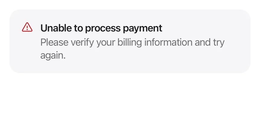
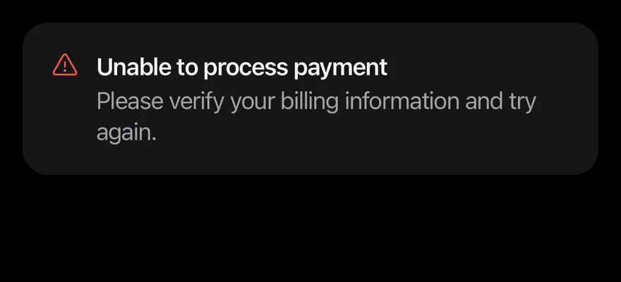
import { WarningIcon } from "phosphor-react-native"
import { Alert, AlertDescription, AlertTitle } from "@/components/ui/alert"

export function AlertDestructiveExample() {
  return (
    <Alert icon={WarningIcon} variant="destructive">
      <AlertTitle>Unable to process payment</AlertTitle>
      <AlertDescription>
        Please verify your billing information and try again.
      </AlertDescription>
    </Alert>
  )
}import EsuissUI
import PhosphorSwift
import SwiftUI
struct AlertDestructiveExample: View {
var body: some View {
InlineAlert(.destructive, icon: Ph.warning.regular) {
AlertTitle("Unable to process payment")
AlertDescription("Please verify your billing information and try again.")
}
}
}import androidx.compose.runtime.Composable
import com.adamglin.PhosphorIcons
import com.adamglin.phosphoricons.Regular
import com.adamglin.phosphoricons.regular.Warning
import com.esuiss.ui.components.Alert
import com.esuiss.ui.components.AlertDescription
import com.esuiss.ui.components.AlertTitle
import com.esuiss.ui.components.AlertVariant
@Composable
fun AlertDestructive() {
Alert(icon = PhosphorIcons.Regular.Warning, variant = AlertVariant.Destructive) {
AlertTitle("Unable to process payment")
AlertDescription("Please verify your billing information and try again.")
}
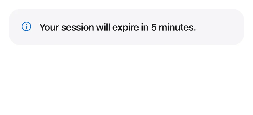
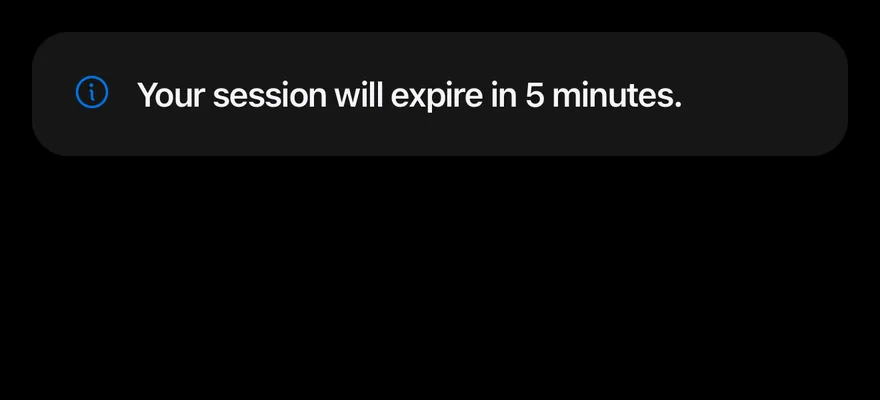
}Title only
An alert with only a title.
import { InfoIcon } from "phosphor-react-native"
import { Alert, AlertTitle } from "@/components/ui/alert"

export function AlertTitleOnlyExample() {
  return (
    <Alert icon={InfoIcon}>
      <AlertTitle>Your session will expire in 5 minutes.</AlertTitle>
    </Alert>
  )
}import EsuissUI
import PhosphorSwift
import SwiftUI
struct AlertTitleOnlyExample: View {
var body: some View {
InlineAlert(icon: Ph.info.regular) {
AlertTitle("Your session will expire in 5 minutes.")
}
}
}import androidx.compose.runtime.Composable
import com.adamglin.PhosphorIcons
import com.adamglin.phosphoricons.Regular
import com.adamglin.phosphoricons.regular.Info
import com.esuiss.ui.components.Alert
import com.esuiss.ui.components.AlertTitle
@Composable
fun AlertTitleOnly() {
Alert(icon = PhosphorIcons.Regular.Info) {
AlertTitle("Your session will expire in 5 minutes.")
}
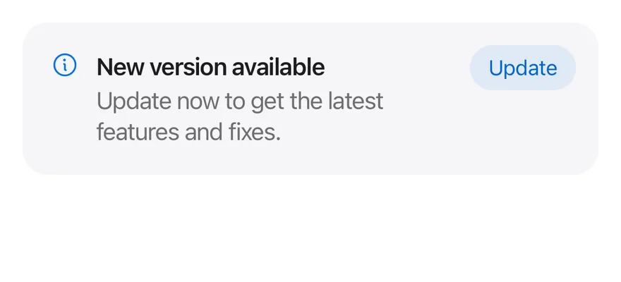
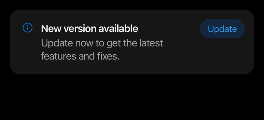
}With action
An AlertAction button in the top-end corner.
import { InfoIcon } from "phosphor-react-native"
import { Alert, AlertAction, AlertDescription, AlertTitle } from "@/components/ui/alert"
import { Button } from "@/components/ui/button"
import { Text } from "@/components/ui/text"

export function AlertWithActionExample() {
  return (
    <Alert icon={InfoIcon}>
      <AlertTitle>New version available</AlertTitle>
      <AlertDescription>
        Update now to get the latest features and fixes.
      </AlertDescription>
      <AlertAction>
        <Button size="sm" variant="tinted">
          <Text>Update</Text>
        </Button>
      </AlertAction>
    </Alert>
  )
}import EsuissUI
import PhosphorSwift
import SwiftUI
struct AlertWithActionExample: View {
var body: some View {
InlineAlert(icon: Ph.info.regular) {
AlertTitle("New version available")
AlertDescription("Update now to get the latest features and fixes.")
} action: {
Button("Update") {}
.buttonStyle(.variant(.tinted, size: .sm))
}
}
}import androidx.compose.runtime.Composable
import com.adamglin.PhosphorIcons
import com.adamglin.phosphoricons.Regular
import com.adamglin.phosphoricons.regular.Info
import com.esuiss.ui.components.Alert
import com.esuiss.ui.components.AlertDescription
import com.esuiss.ui.components.AlertTitle
import com.esuiss.ui.components.Button
import com.esuiss.ui.components.ButtonSize
import com.esuiss.ui.components.ButtonVariant
@Composable
fun AlertWithAction() {
Alert(
icon = PhosphorIcons.Regular.Info,
action = { Button("Update", onClick = {}, size = ButtonSize.Sm, variant = ButtonVariant.Tinted) },
) {
AlertTitle("New version available")
AlertDescription("Update now to get the latest features and fixes.")
}
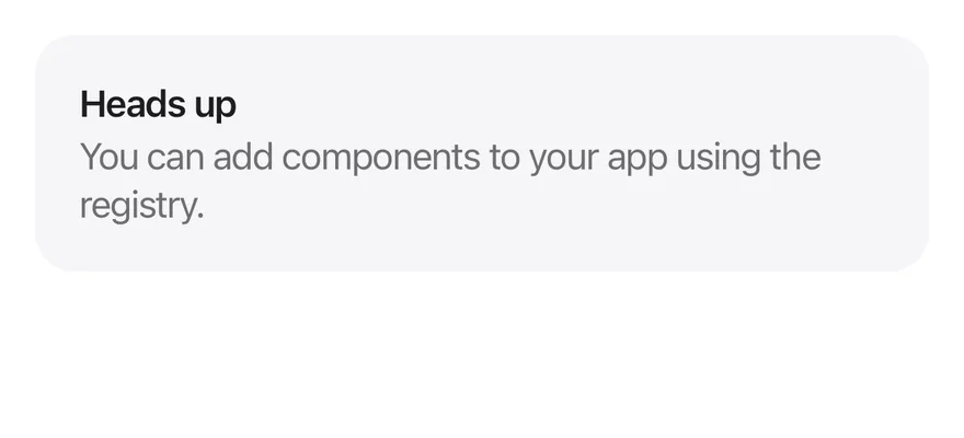
}Without icon
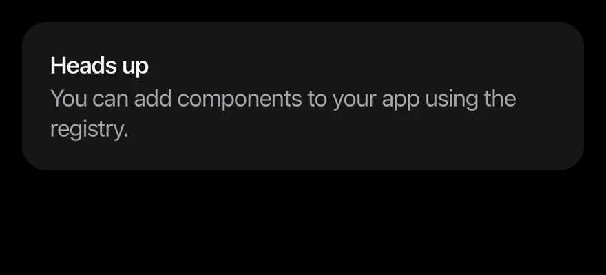
An alert with text only and no icon.
import { Alert, AlertDescription, AlertTitle } from "@/components/ui/alert"

export function AlertWithoutIconExample() {
  return (
    <Alert>
      <AlertTitle>Heads up</AlertTitle>
      <AlertDescription>
        You can add components to your app using the registry.
      </AlertDescription>
    </Alert>
  )
}import EsuissUI
import SwiftUI
struct AlertWithoutIconExample: View {
var body: some View {
InlineAlert {
AlertTitle("Heads up")
AlertDescription("You can add components to your app using the registry.")
}
}
}import androidx.compose.runtime.Composable
import com.esuiss.ui.components.Alert
import com.esuiss.ui.components.AlertDescription
import com.esuiss.ui.components.AlertTitle
@Composable
fun AlertWithoutIcon() {
Alert {
AlertTitle("Heads up")
AlertDescription("You can add components to your app using the registry.")
}
}API Reference
Alert
Container with the icon, text column and action.
React.ComponentProps<typeof View>React.RefAttributes<View>- About
- Phosphor icon component shown before the text.
- Type
PhosphorIcon- Default
- —
- About
defaultordestructive; changes the icon color.- Type
"default""destructive"- Default
- "default"
- About
- Extra classes for the icon.
- Type
string- Default
- —
AlertTitle
Bold first line.
React.ComponentProps<typeof Text>AlertDescription
Secondary-colored supporting text.
React.ComponentProps<typeof Text>AlertAction
Slot positioned in the top-end corner.
React.ComponentProps<typeof View>React.RefAttributes<View>Accessibility
- The container has the
alertrole. - The icon is decorative; put the meaning in the title or description.
Notes
- Uses
bg-surface-secondary,text-label,text-accentandtext-dangertokens; light and dark follow the system appearance. - The action is positioned with
end-4, so it flips in right-to-left layouts.