suiss/uim · React Native Component
Toast
Brief notifications that slide up from the bottom of the screen, stack, and dismiss on a timer or with a swipe.
Toast is an open-source mobile component from suiss/uim for React Native and Expo, with SwiftUI and Jetpack Compose versions built from the same design tokens. The @esuiss/uim CLI copies its source into your project, so you own the code.
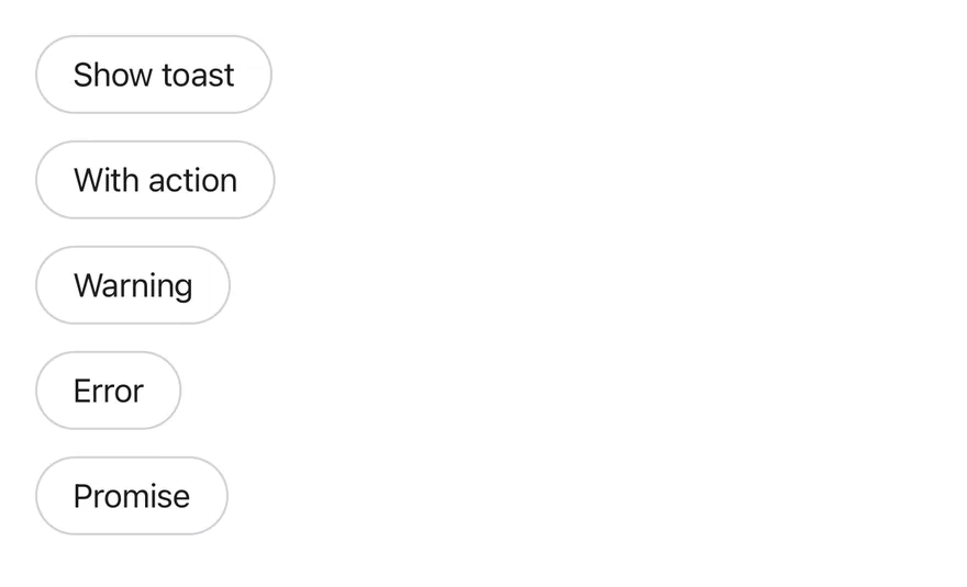
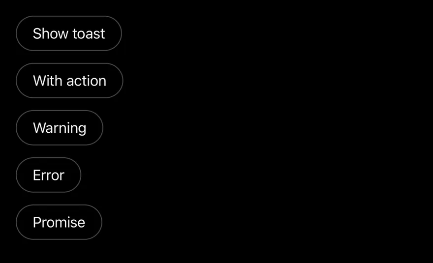
import { View } from "react-native"
import { Button } from "@/components/ui/button"
import { Text } from "@/components/ui/text"
import { Toaster, toast } from "@/components/ui/toast"

function wait(ms: number) {
  return new Promise<void>((resolve) => setTimeout(resolve, ms))
}

function Examples() {
  return (
    <View className="items-start gap-3">
      <Button
        variant="outline"
        onPress={() =>
          toast.add({
            title: "Event created",
            description: "Sunday, December 3 at 9:00 AM",
          })
        }
      >
        <Text>Show toast</Text>
      </Button>
      <Button
        variant="outline"
        onPress={() =>
          toast.add({
            title: "Message archived",
            type: "info",
            actionProps: {
              children: "Undo",
              onPress: () => toast.add({ title: "Restored", type: "success" }),
            },
          })
        }
      >
        <Text>With action</Text>
      </Button>
      <Button
        variant="outline"
        onPress={() =>
          toast.add({
            title: "Storage almost full",
            description: "Free up space to keep syncing.",
            type: "warning",
          })
        }
      >
        <Text>Warning</Text>
      </Button>
      <Button
        variant="outline"
        onPress={() =>
          toast.add({
            title: "Upload failed",
            description: "Check your connection and try again.",
            type: "error",
            priority: "high",
          })
        }
      >
        <Text>Error</Text>
      </Button>
      <Button
        variant="outline"
        onPress={() => {
          toast
            .promise(wait(2000), {
              loading: "Saving changes",
              success: "Changes saved",
              error: "Could not save changes",
            })
            .catch(() => undefined)
        }}
      >
        <Text>Promise</Text>
      </Button>
    </View>
  )
}

export function ToastExample() {
  return (
    <Toaster>
      <Examples />
    </Toaster>
  )
}Toaster wraps your app in a toast provider and renders the queue through a portal into a full-screen viewport. On iOS the viewport sits inside a FullWindowOverlay from react-native-screens, so toasts appear above native modals. Each toast is a Reanimated view that slides in from the bottom edge, fades out downward, and is capped at 384 points wide.
Visible toasts stack with a small peek and shrink behind the frontmost one. Touching the stack expands it; it collapses again three seconds after the touch ends. Each toast shows an icon for its type (success, info, warning, error, or a spinner for loading), a title, a description, an optional action button and a close button.
Installation
$ pnpm dlx @esuiss/uim@latest add toast$ pnpm dlx @esuiss/uim@latest add toast --platform swift$ pnpm dlx @esuiss/uim@latest add toast --platform kotlinThe CLI also adds what it builds on: Button, Icon, Text.
Manual
- Install the dependencies:
npx expo install cn phosphor-react-native react-native-reanimated react-native-safe-area-context react-native-screens react-native-svg react-native-worklets-
Add the pieces it builds on: Button, Icon, Text, and the primitives
components/primitives/toast.tsx,components/primitives/use-render.tsx. -
Copy the source into
components/ui/toast.tsx:
import { cn } from "cn"
import { CheckIcon, ExclamationMarkIcon, XIcon } from "phosphor-react-native"
import * as React from "react"
import {
  ActivityIndicator,
  Platform,
  useWindowDimensions,
  View,
} from "react-native"
import {
  FadeOutDown,
  ReduceMotion,
  SlideInDown,
  useAnimatedStyle,
  withTiming,
} from "react-native-reanimated"- Update the import paths to match your project.
- Install the dependencies:
npx expo install cn nativewind phosphor-react-native react-native-reanimated react-native-safe-area-context react-native-screens react-native-svg react-native-worklets-
Add the pieces it builds on: Button, Icon, Text, and the primitives
components/primitives/toast.tsx,components/primitives/use-render.tsx. -
Copy the source into
components/ui/toast.tsx:
import { cn } from "cn"
import { cssInterop } from "nativewind"
import { CheckIcon, ExclamationMarkIcon, XIcon } from "phosphor-react-native"
import * as React from "react"
import {
  ActivityIndicator,
  Platform,
  useWindowDimensions,
  View,
} from "react-native"
import {
  FadeOutDown,
  ReduceMotion,
  SlideInDown,
  useAnimatedStyle,
withTiming,- Update the import paths to match your project.
- Install the dependencies:
npx expo install phosphor-react-native react-native-reanimated react-native-safe-area-context react-native-screens react-native-svg react-native-worklets-
Add the pieces it builds on: Button, Icon, Text, and the primitives
components/primitives/toast.tsx,components/primitives/use-render.tsx. -
Copy the source into
components/ui/toast.tsx:
import { CheckIcon, ExclamationMarkIcon, XIcon } from "phosphor-react-native"
import * as React from "react"
import {
  ActivityIndicator,
  Platform,
  StyleSheet,
  useWindowDimensions,
  View,
} from "react-native"
import {
  FadeOutDown,
  ReduceMotion,
  SlideInDown,
  useAnimatedStyle,
  withTiming,
} from "react-native-reanimated"- Update the import paths to match your project.
-
Target iOS 17 or later.
-
Add the Swift package to your app:
.package(url: "https://github.com/phosphor-icons/swift", from: "2.1.0")- Copy the theme files every view uses:
import SwiftUI
import UIKit

struct RGBA: Sendable {
  let red: CGFloat
  let green: CGFloat
  let blue: CGFloat
  let alpha: CGFloat

  init(_ hex: UInt32, _ alpha: CGFloat = 1) {
    red = CGFloat((hex >> 16) & 0xFF) / 255
    green = CGFloat((hex >> 8) & 0xFF) / 255
    blue = CGFloat(hex & 0xFF) / 255
    self.alpha = alpha
}import SwiftUI
extension Color {
public static let surface = Color.adaptive(light: .init(0xFFFFFF), dark: .init(0x000000))
public static let surfaceSecondary = Color.adaptive(light: .init(0xF5F5F7), dark: .init(0x161617))
public static let surfaceTertiary = Color.adaptive(light: .init(0xE8E8ED), dark: .init(0x2C2C2E))
public static let surfaceRaised = Color.adaptive(light: .init(0xFFFFFF), dark: .init(0x1D1D1F))
public static let label = Color.adaptive(light: .init(0x1D1D1F), dark: .init(0xF5F5F7))
public static let labelSecondary = Color.adaptive(light: .init(0x6E6E73), dark: .init(0xA1A1A6))
public static let labelTertiary = Color.adaptive(light: .init(0x86868B), dark: .init(0x86868B))
public static let labelQuaternary = Color.adaptive(light: .init(0xD2D2D7), dark: .init(0x424245))
public static let control = Color.adaptive(light: .init(0x000000, 0.04), dark: .init(0xFFFFFF, 0.1))
public static let controlPressed = Color.adaptive(light: .init(0x000000, 0.12), dark: .init(0xFFFFFF, 0.22))
public static let controlSelected = Color.adaptive(light: .init(0x1D1D1F), dark: .init(0xF5F5F7))
public static let controlDisabled = Color.adaptive(light: .init(0x000000, 0.03), dark: .init(0xFFFFFF, 0.05))
public static let onControlSelected = Color.adaptive(light: .init(0xFFFFFF), dark: .init(0x000000))- Copy the source and every file it uses:
import Observation
import PhosphorSwift
import SwiftUI

public enum ToastType: CaseIterable, Sendable {
  case `default`, success, info, warning, error, loading
}

public struct ToastAction: Sendable {
  public let title: LocalizedStringResource
  public let action: @MainActor @Sendable () -> Void

  public init(_ title: LocalizedStringResource, action: @escaping @MainActor @Sendable () -> Void) {
    self.title = title
    self.action = action
}import SwiftUI
public struct VariantButtonStyle: ButtonStyle {
public enum Variant: CaseIterable, Sendable {
case `default`, outline, secondary, tinted, ghost, plain, destructive, link
}
public enum Size: CaseIterable, Sendable {
case `default`, xs, sm, lg, xl, icon, iconXs, iconSm, iconLg, iconXl
var height: CGFloat {
switch self {
case .xs, .iconXs: 24
case .sm, .iconSm: 32
case .default, .icon: 36
case .lg, .iconLg: 44import SwiftUI
extension EnvironmentValues {
@Entry var buttonGroup: Axis? = nil
@Entry var buttonGroupSize: CGSize = .zero
}
enum ButtonGroupSpace: Hashable {
case group
}
struct ButtonGroupFrame {
let bounds: Anchor<CGRect>
let outlined: Bool
}import PhosphorSwift
import SwiftUI
extension Shadow {
static let control = Shadow(color: .black.opacity(0.08), radius: 0.5, y: 0.5)
static let thumb = Shadow(color: .black.opacity(0.12), radius: 1.5, y: 1)
}
struct SelectionIndicator<Mark: View>: View {
let checked: Bool
let pressed: Bool
let cornerRadius: CGFloat
let mark: Mark
@Environment(\.isEnabled) private var isEnabled
@Environment(\.isInvalid) private var invalidimport SwiftUI
extension EnvironmentValues {
@Entry public var isInvalid = false
@Entry var fieldInset = false
@Entry var fieldGroupInset = false
@Entry var fieldSetInset = false
}
extension View {
public func invalid(_ isInvalid: Bool = true) -> some View {
environment(\.isInvalid, isInvalid)
}
}
public enum FieldOrientation: CaseIterable, Sendable {import SwiftUI
extension EnvironmentValues {
@Entry public var hapticsEnabled = true
}
extension View {
public func haptics(_ enabled: Bool) -> some View {
environment(\.hapticsEnabled, enabled)
}
func hapticFeedback<Trigger: Equatable>(_ feedback: SensoryFeedback, trigger: Trigger) -> some View {
modifier(HapticFeedbackModifier(feedback: feedback, trigger: trigger) { _, _ in true })
}
func hapticFeedback<Trigger: Equatable>(import SwiftUI
public struct Separator: View {
let orientation: Axis
public init(_ orientation: Axis = .horizontal) {
self.orientation = orientation
}
public var body: some View {
Rectangle()
.fill(Color.separator)
.frame(width: orientation == .vertical ? 1 : nil, height: orientation == .horizontal ? 1 : nil)
.frame(maxWidth: orientation == .horizontal ? .infinity : nil, maxHeight: orientation == .vertical ? .infinity : nil)
.accessibilityHidden(true)
}import SwiftUI
public enum TextVariant: CaseIterable, Sendable {
case `default`, h1, h2, h3, h4, p, blockquote, code, lead, large, small, muted
var style: TextStyle {
switch self {
case .h1: .xl3
case .h2: .xl2
case .h3: .xl
case .h4, .lead, .large: .lg
case .code, .small, .muted: .sm
default: .base
}
}- Add the files to your app target.
- Set
minSdkto 24 or higher and add the dependencies:
implementation(platform("androidx.compose:compose-bom:2026.09.00"))
implementation("androidx.compose.foundation:foundation")
implementation("androidx.compose.ui:ui")
implementation("com.adamglin:phosphor-icon-android:1.0.0")- Copy the theme files every view uses:
package com.esuiss.ui.theme

import androidx.compose.foundation.isSystemInDarkTheme
import androidx.compose.runtime.Composable
import androidx.compose.runtime.CompositionLocalProvider
import androidx.compose.runtime.Immutable
import androidx.compose.runtime.staticCompositionLocalOf
import androidx.compose.ui.Modifier
import androidx.compose.ui.draw.dropShadow
import androidx.compose.ui.graphics.Color
import androidx.compose.ui.graphics.Shape
import androidx.compose.ui.graphics.shadow.Shadow as DropShadow
import androidx.compose.ui.text.TextStyle
import androidx.compose.ui.text.style.LineHeightStyle
import androidx.compose.ui.unit.Dp
import androidx.compose.ui.unit.DpOffsetpackage com.esuiss.ui.theme
import androidx.compose.runtime.Immutable
import androidx.compose.ui.graphics.Color
import androidx.compose.ui.unit.dp
@Immutable
data class Colors(
val surface: Color,
val surfaceSecondary: Color,
val surfaceTertiary: Color,
val surfaceRaised: Color,
val label: Color,
val labelSecondary: Color,
val labelTertiary: Color,
val labelQuaternary: Color,- Copy the source and every file it uses:
package com.esuiss.ui.components

import androidx.compose.animation.core.Animatable
import androidx.compose.animation.core.LinearEasing
import androidx.compose.animation.core.RepeatMode
import androidx.compose.animation.core.VectorConverter
import androidx.compose.animation.core.animateDpAsState
import androidx.compose.animation.core.animateFloat
import androidx.compose.animation.core.animateFloatAsState
import androidx.compose.animation.core.infiniteRepeatable
import androidx.compose.animation.core.rememberInfiniteTransition
import androidx.compose.animation.core.tween
import androidx.compose.foundation.background
import androidx.compose.foundation.border
import androidx.compose.foundation.gestures.detectDragGestures
import androidx.compose.foundation.gestures.detectTapGesturespackage com.esuiss.ui.components
import androidx.compose.foundation.background
import androidx.compose.foundation.border
import androidx.compose.foundation.clickable
import androidx.compose.foundation.interaction.MutableInteractionSource
import androidx.compose.foundation.interaction.collectIsPressedAsState
import androidx.compose.foundation.layout.Arrangement
import androidx.compose.foundation.layout.Row
import androidx.compose.foundation.layout.RowScope
import androidx.compose.foundation.layout.fillMaxWidth
import androidx.compose.foundation.layout.height
import androidx.compose.foundation.layout.padding
import androidx.compose.foundation.layout.size
import androidx.compose.foundation.shape.CircleShape
import androidx.compose.foundation.shape.RoundedCornerShapepackage com.esuiss.ui.components
import androidx.compose.foundation.background
import androidx.compose.foundation.gestures.Orientation
import androidx.compose.foundation.layout.Arrangement
import androidx.compose.foundation.layout.Box
import androidx.compose.foundation.layout.Row
import androidx.compose.foundation.layout.RowScope
import androidx.compose.foundation.layout.padding
import androidx.compose.foundation.shape.CircleShape
import androidx.compose.foundation.shape.CornerSize
import androidx.compose.foundation.shape.RoundedCornerShape
import androidx.compose.runtime.Composable
import androidx.compose.runtime.CompositionLocalProvider
import androidx.compose.runtime.DisposableEffect
import androidx.compose.runtime.Immutablepackage com.esuiss.ui.components
import androidx.compose.runtime.compositionLocalOf
import androidx.compose.ui.graphics.Color
import androidx.compose.ui.text.TextStyle
import androidx.compose.ui.unit.Dp
import androidx.compose.ui.unit.dp
val LocalContentStyle = compositionLocalOf { TextStyle.Default }
val LocalContentColor = compositionLocalOf { Color.Unspecified }
val LocalIconSize = compositionLocalOf { 20.dp }package com.esuiss.ui.components
import androidx.compose.foundation.Image
import androidx.compose.foundation.layout.size
import androidx.compose.runtime.Composable
import androidx.compose.ui.Modifier
import androidx.compose.ui.graphics.Color
import androidx.compose.ui.graphics.ColorFilter
import androidx.compose.ui.graphics.takeOrElse
import androidx.compose.ui.graphics.vector.ImageVector
import androidx.compose.ui.unit.Dp
import com.esuiss.ui.theme.EsuissTheme
@Composable
fun Icon(
imageVector: ImageVector,- Update the
com.esuiss.uipackage names to match your project.
Usage
import { ToastProvider, ToastPortal, ToastViewport, Toast, ToastContent, ToastTitle, ToastDescription, ToastAction, ToastClose, Toaster } from "@/components/ui/toast"<Toaster>
<Examples />
</Toaster>Render Toaster once near the root, then call the exported toast manager from anywhere: toast.add({ title, description, type }) returns an id, toast.update(id, updates) changes a toast, and toast.close(id) removes it (or all toasts when called without an id).
toast.promise(promise, { loading, success, error }) shows a loading toast and replaces it with the success or error state when the promise settles.
Pass actionProps (for example { children: "Undo", onPress }) to show an action button. Set priority: "high" for urgent messages and timeout to override the provider default; loading toasts stay until updated.
Use createToastManager to create a separate manager and pass it to Toaster as toastManager, and useToastManager to read the current toasts and actions inside the provider. The lower-level parts are exported for building a custom toast layout.
Examples
Show on load
Shows a success toast as soon as the screen mounts.
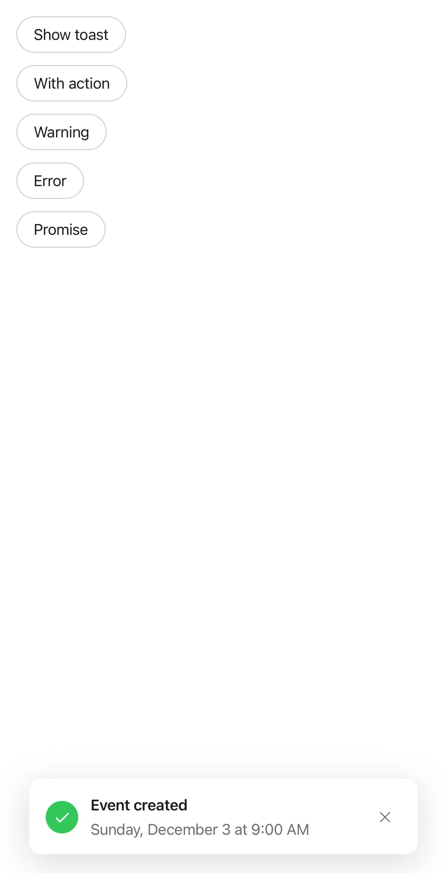
import * as React from "react"
import { View } from "react-native"
import { Button } from "@/components/ui/button"
import { Text } from "@/components/ui/text"
import { Toaster, toast } from "@/components/ui/toast"

function wait(ms: number) {
  return new Promise<void>((resolve) => setTimeout(resolve, ms))
}

function ShowOnMount() {
  React.useEffect(() => {
    const id = toast.add({
      title: "Event created",
      description: "Sunday, December 3 at 9:00 AM",
      type: "success",
    })
    return () => toast.close(id)
  }, [])
  return null
}

function Examples() {
  return (
    <View className="items-start gap-3">
      <Button
        variant="outline"
        onPress={() =>
          toast.add({
            title: "Event created",
            description: "Sunday, December 3 at 9:00 AM",
          })
        }
      >
        <Text>Show toast</Text>
      </Button>
      <Button
        variant="outline"
        onPress={() =>
          toast.add({
            title: "Message archived",
            type: "info",
            actionProps: {
              children: "Undo",
              onPress: () => toast.add({ title: "Restored", type: "success" }),
            },
          })
        }
      >
        <Text>With action</Text>
      </Button>
      <Button
        variant="outline"
        onPress={() =>
          toast.add({
            title: "Storage almost full",
            description: "Free up space to keep syncing.",
            type: "warning",
          })
        }
      >
        <Text>Warning</Text>
      </Button>
      <Button
        variant="outline"
        onPress={() =>
          toast.add({
            title: "Upload failed",
            description: "Check your connection and try again.",
            type: "error",
            priority: "high",
          })
        }
      >
        <Text>Error</Text>
      </Button>
      <Button
        variant="outline"
        onPress={() => {
          toast
            .promise(wait(2000), {
              loading: "Saving changes",
              success: "Changes saved",
              error: "Could not save changes",
            })
            .catch(() => undefined)
        }}
      >
        <Text>Promise</Text>
      </Button>
    </View>
  )
}

export function ToastShowOnLoadExample() {
  return (
    <Toaster>
      <ShowOnMount />
      <Examples />
    </Toaster>
  )
}API Reference
ToastProvider
Holds the toast queue, default timeout and visible limit.
ToastPrimitive.ProviderPropsToastPortal
Renders its children into a portal host.
ToastPrimitive.PortalPropsToastViewport
Full-screen layer that holds the stack and expands it on touch.
React.ComponentProps<typeof ToastPrimitive.Viewport>Toast
One animated, swipeable toast in the stack.
React.ComponentProps<typeof ToastPrimitive.Root>ToastContent
Row layout for the icon, text, action and close button.
React.ComponentProps<typeof ToastPrimitive.Content>ToastTitle
The toast title, read from the toast object.
React.ComponentProps<typeof ToastPrimitive.Title>ToastDescription
Secondary text under the title.
React.ComponentProps<typeof ToastPrimitive.Description>ToastAction
Outline button rendered from actionProps.
React.ComponentProps<typeof ToastPrimitive.Action>ToastClose
Icon button that dismisses the toast.
React.ComponentProps<typeof ToastPrimitive.Close>Toaster
Provider, portal and viewport that render the default toast list.
ToastPrimitive.ProviderProps- About
- Name of the portal host to render into.
- Type
string- Default
- —
Accessibility
- Each toast has the
alertrole and a live region that ispolite, orassertiveforpriority: "high". - New toasts are announced with their title and description; high-priority announcements are not queued.
- A
dismissaccessibility action and the escape gesture close the toast. - Toasts stacked behind the front one are hidden from VoiceOver and TalkBack.
- The close button has the label "Close toast" and the type icon is hidden from assistive technology.
- Animations respect the system reduce motion setting.
Notes
- Uses
bg-surface-raised,text-label,text-label-secondaryand tint tokensbg-green,bg-accent,bg-orangeandbg-dangerfor the icons. - Light and dark colors follow the system appearance; dark mode drops the border.
- Toasts respect the bottom safe area inset.
FullWindowOverlayis used on iOS only; Android renders the viewport directly.