suiss/uim · React Native Component
Tab Bar
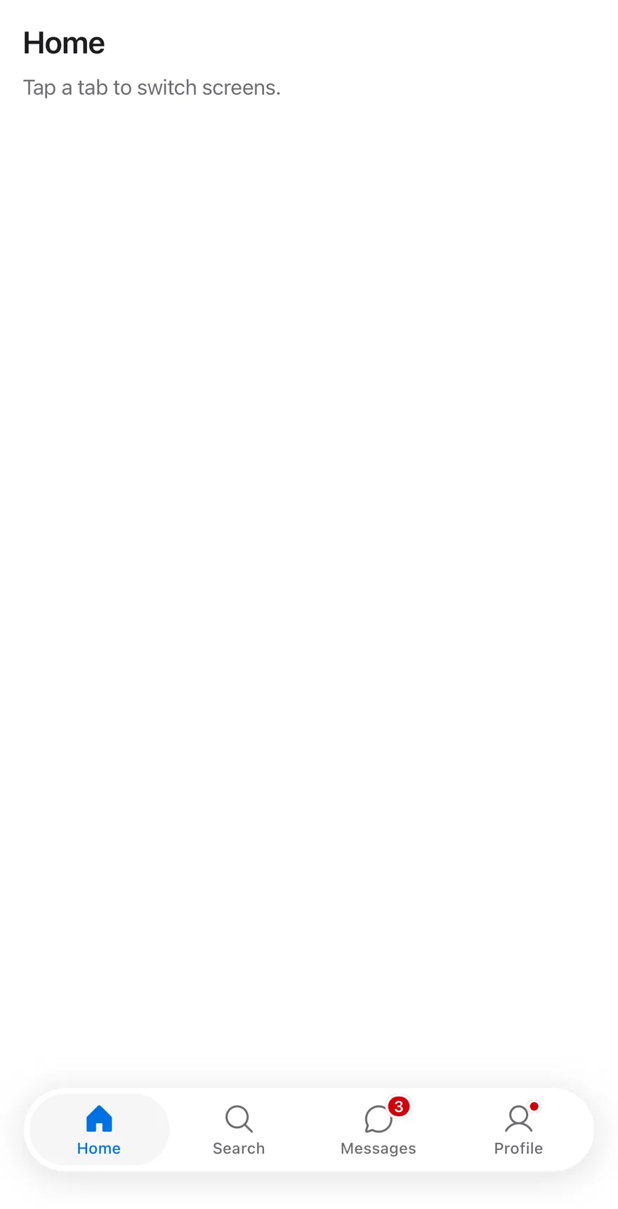
A bottom navigation bar of icon and label tabs, with optional badges.
Tab Bar is an open-source mobile component from suiss/uim for React Native and Expo, with SwiftUI and Jetpack Compose versions built from the same design tokens. The @esuiss/uim CLI copies its source into your project, so you own the code.
import { ChatCircleIcon, HouseIcon, MagnifyingGlassIcon, UserIcon } from "phosphor-react-native"
import * as React from "react"
import { View } from "react-native"
import { TabBar, TabBarItem, TabBarList } from "@/components/ui/tab-bar"
import { Text } from "@/components/ui/text"

const items = [
  { value: "home", label: "Home", icon: HouseIcon },
  { value: "search", label: "Search", icon: MagnifyingGlassIcon },
  { value: "messages", label: "Messages", icon: ChatCircleIcon, badge: 3 },
  { value: "profile", label: "Profile", icon: UserIcon, badge: true },
]

function Page({
  title,
  children,
}: {
  title: string
  children: React.ReactNode
}) {
  return (
    <View className="-m-4 flex-1 bg-surface">
      <View className="flex-1 gap-2 p-4">
        <Text variant="h3">{title}</Text>
        <Text variant="muted">Tap a tab to switch screens.</Text>
      </View>
      {children}
    </View>
  )
}

function TabBarExample({
  badges = true,
  disabled,
}: {
  badges?: boolean
  disabled?: string
}) {
  const [value, setValue] = React.useState("home")
  const current = items.find((item) => item.value === value)
  return (
    <Page title={current?.label ?? ""}>
      <TabBar value={value} onValueChange={setValue}>
        <TabBarList>
          {items.map((item) => (
            <TabBarItem
              key={item.value}
              value={item.value}
              icon={item.icon}
              badge={badges ? item.badge : undefined}
              disabled={item.value === disabled}
            >
              {item.label}
            </TabBarItem>
          ))}
        </TabBarList>
      </TabBar>
    </Page>
  )
}

export function TabBarExampleDemo() {
  return (
    <TabBarExample />
  )
}import EsuissUI
import PhosphorSwift
import SwiftUI
struct TabBarEntry {
let value: String
let label: String
let icon: Image
let activeIcon: Image
let badge: TabBarBadge?
}
let tabBarEntries = [
TabBarEntry(value: "home", label: "Home", icon: Ph.house.regular, activeIcon: Ph.house.fill, badge: nil),
TabBarEntry(value: "search", label: "Search", icon: Ph.magnifyingGlass.regular, activeIcon: Ph.magnifyingGlass.fill, badge: nil),
TabBarEntry(value: "messages", label: "Messages", icon: Ph.chatCircle.regular, activeIcon: Ph.chatCircle.fill, badge: 3),
TabBarEntry(value: "profile", label: "Profile", icon: Ph.user.regular, activeIcon: Ph.user.fill, badge: .dot),
]
struct TabBarPage<Bar: View>: View {
let title: String
@ViewBuilder let bar: () -> Bar
var body: some View {
VStack(spacing: 0) {
VStack(alignment: .leading, spacing: 8) {
Text(verbatim: title).textVariant(.h3)
Text("Tap a tab to switch screens.").textVariant(.muted)
}
.padding(16)
.frame(maxWidth: .infinity, maxHeight: .infinity, alignment: .topLeading)
bar()
}
.background(Color.surface.ignoresSafeArea())
}
}
struct TabBarExample: View {
var badges = true
var disabled: String?
@State private var value = "home"
var body: some View {
TabBarPage(title: tabBarEntries.first { $0.value == value }?.label ?? "") {
TabBar(selection: $value) {
ForEach(tabBarEntries, id: \.value) { item in
TabBarItem(
verbatim: item.label,
value: item.value,
icon: item.icon,
activeIcon: item.activeIcon,
badge: badges ? item.badge : nil
)
.disabled(item.value == disabled)
}
}
}
}
}import androidx.compose.foundation.layout.Arrangement
import androidx.compose.foundation.layout.Column
import androidx.compose.foundation.layout.fillMaxSize
import androidx.compose.foundation.layout.fillMaxWidth
import androidx.compose.foundation.layout.padding
import androidx.compose.runtime.Composable
import androidx.compose.runtime.getValue
import androidx.compose.runtime.mutableStateOf
import androidx.compose.runtime.saveable.rememberSaveable
import androidx.compose.runtime.setValue
import androidx.compose.ui.Modifier
import androidx.compose.ui.graphics.vector.ImageVector
import androidx.compose.ui.unit.dp
import com.adamglin.PhosphorIcons
import com.adamglin.phosphoricons.Fill
import com.adamglin.phosphoricons.Regular
import com.adamglin.phosphoricons.fill.ChatCircle
import com.adamglin.phosphoricons.fill.House
import com.adamglin.phosphoricons.fill.MagnifyingGlass
import com.adamglin.phosphoricons.fill.User
import com.adamglin.phosphoricons.regular.ChatCircle
import com.adamglin.phosphoricons.regular.House
import com.adamglin.phosphoricons.regular.MagnifyingGlass
import com.adamglin.phosphoricons.regular.User
import com.esuiss.ui.components.Screen
import com.esuiss.ui.components.ScreenEdge
import com.esuiss.ui.components.TabBar
import com.esuiss.ui.components.TabBarItem
import com.esuiss.ui.components.Text
import com.esuiss.ui.components.TextVariant
class TabBarEntry(val value: String, val label: String, val icon: ImageVector, val selectedIcon: ImageVector, val badge: String? = null)
val tabBarEntries = listOf(
TabBarEntry("home", "Home", PhosphorIcons.Regular.House, PhosphorIcons.Fill.House),
TabBarEntry("search", "Search", PhosphorIcons.Regular.MagnifyingGlass, PhosphorIcons.Fill.MagnifyingGlass),
TabBarEntry("messages", "Messages", PhosphorIcons.Regular.ChatCircle, PhosphorIcons.Fill.ChatCircle, "3"),
TabBarEntry("profile", "Profile", PhosphorIcons.Regular.User, PhosphorIcons.Fill.User, ""),
)
@Composable
fun TabBarPage(title: String, bar: @Composable () -> Unit) {
Screen(edges = setOf(ScreenEdge.Top, ScreenEdge.Left, ScreenEdge.Right)) {
Column(Modifier.fillMaxSize()) {
Column(
Modifier.weight(1f).fillMaxWidth().padding(16.dp),
verticalArrangement = Arrangement.spacedBy(8.dp),
) {
Text(title, variant = TextVariant.H3)
Text("Tap a tab to switch screens.", variant = TextVariant.Muted)
}
bar()
}
}
}
@Composable
fun TabBarExample(badges: Boolean = true, disabled: String? = null) {
var value by rememberSaveable { mutableStateOf("home") }
val current = tabBarEntries.firstOrNull { it.value == value }
TabBarPage(current?.label ?: "") {
TabBar(value = value, onValueChange = { value = it }) {
tabBarEntries.forEach { entry ->
TabBarItem(
value = entry.value,
label = entry.label,
icon = entry.icon,
selectedIcon = entry.selectedIcon,
badge = if (badges) entry.badge else null,
enabled = entry.value != disabled,
)
}
}
}
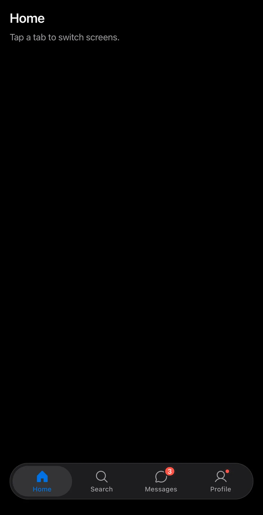
}TabBar is built on the tabs primitive and sits at the bottom of a screen. TabBarList is a rounded capsule with a shadow, inset from the screen edges, so the bar floats above the page. The root adds bottom padding for the safe area, unless an enclosing Screen already handles the bottom edge. TabBarItem stacks an icon over a short label; the active tab sits on a bg-control pill and uses the accent color and a filled icon weight.
Use it for switching between the top-level sections of an app. For switching views within a screen, use Tabs.
Installation
$ pnpm dlx @esuiss/uim@latest add tab-bar$ pnpm dlx @esuiss/uim@latest add tab-bar --platform swift$ pnpm dlx @esuiss/uim@latest add tab-bar --platform kotlinThe CLI also adds what it builds on: Icon, Screen, Text.
Manual
- Install the dependencies:
npx expo install cn phosphor-react-native react-native-safe-area-context react-native-svg-
Add the pieces it builds on: Icon, Screen, Text, and the primitives
components/primitives/haptics.tsx,components/primitives/tabs.tsx,components/primitives/use-render.tsx. -
Copy the source into
components/ui/tab-bar.tsx:
import { cn } from "cn"
import type { Icon as PhosphorIcon } from "phosphor-react-native"
import * as React from "react"
import { Pressable, View } from "react-native"
import { useSafeAreaInsets } from "react-native-safe-area-context"
import { useHaptics } from "@/components/primitives/haptics"
import * as TabsPrimitive from "@/components/primitives/tabs"
import { resolveClassName } from "@/components/primitives/use-render"
import { Icon } from "@/components/ui/icon"
import { ScreenContext } from "@/components/ui/screen"
import { Text, TextClassContext } from "@/components/ui/text"

type TabBarBadgeValue = number | string | boolean

function badgeText(badge: TabBarBadgeValue | undefined) {
if (badge === undefined || badge === false || badge === true) return undefined- Update the import paths to match your project.
- Install the dependencies:
npx expo install cn phosphor-react-native react-native-safe-area-context react-native-svg-
Add the pieces it builds on: Icon, Screen, Text, and the primitives
components/primitives/haptics.tsx,components/primitives/tabs.tsx,components/primitives/use-render.tsx. -
Copy the source into
components/ui/tab-bar.tsx:
import { cn } from "cn"
import type { Icon as PhosphorIcon } from "phosphor-react-native"
import * as React from "react"
import { Pressable, View } from "react-native"
import { useSafeAreaInsets } from "react-native-safe-area-context"
import { useHaptics } from "@/components/primitives/haptics"
import * as TabsPrimitive from "@/components/primitives/tabs"
import { resolveClassName } from "@/components/primitives/use-render"
import { Icon } from "@/components/ui/icon"
import { ScreenContext } from "@/components/ui/screen"
import { Text, TextClassContext } from "@/components/ui/text"

type TabBarBadgeValue = number | string | boolean

function badgeText(badge: TabBarBadgeValue | undefined) {
if (badge === undefined || badge === false || badge === true) return undefined- Update the import paths to match your project.
- Install the dependencies:
npx expo install phosphor-react-native react-native-safe-area-context react-native-svg-
Add the pieces it builds on: Icon, Screen, Text, and the primitives
components/primitives/haptics.tsx,components/primitives/tabs.tsx,components/primitives/use-render.tsx. -
Copy the source into
components/ui/tab-bar.tsx:
import type { Icon as PhosphorIcon } from "phosphor-react-native"
import * as React from "react"
import { Pressable, StyleSheet, View, type ViewStyle } from "react-native"
import { useSafeAreaInsets } from "react-native-safe-area-context"
import { useHaptics } from "@/components/primitives/haptics"
import * as TabsPrimitive from "@/components/primitives/tabs"
import { resolveStyle } from "@/components/primitives/use-render"
import { Icon } from "@/components/ui/icon"
import { ScreenContext } from "@/components/ui/screen"
import { Text, TextStyleContext } from "@/components/ui/text"
import { fontSize, radius, shadow, useTheme } from "@/components/ui/theme"

type TabBarBadgeValue = number | string | boolean

const styles = StyleSheet.create({
root: { paddingHorizontal: 16, paddingTop: 8 },- Update the import paths to match your project.
-
Target iOS 17 or later.
-
Add the Swift package to your app:
.package(url: "https://github.com/phosphor-icons/swift", from: "2.1.0")- Copy the theme files every view uses:
import SwiftUI
import UIKit

struct RGBA: Sendable {
  let red: CGFloat
  let green: CGFloat
  let blue: CGFloat
  let alpha: CGFloat

  init(_ hex: UInt32, _ alpha: CGFloat = 1) {
    red = CGFloat((hex >> 16) & 0xFF) / 255
    green = CGFloat((hex >> 8) & 0xFF) / 255
    blue = CGFloat(hex & 0xFF) / 255
    self.alpha = alpha
}import SwiftUI
extension Color {
public static let surface = Color.adaptive(light: .init(0xFFFFFF), dark: .init(0x000000))
public static let surfaceSecondary = Color.adaptive(light: .init(0xF5F5F7), dark: .init(0x161617))
public static let surfaceTertiary = Color.adaptive(light: .init(0xE8E8ED), dark: .init(0x2C2C2E))
public static let surfaceRaised = Color.adaptive(light: .init(0xFFFFFF), dark: .init(0x1D1D1F))
public static let label = Color.adaptive(light: .init(0x1D1D1F), dark: .init(0xF5F5F7))
public static let labelSecondary = Color.adaptive(light: .init(0x6E6E73), dark: .init(0xA1A1A6))
public static let labelTertiary = Color.adaptive(light: .init(0x86868B), dark: .init(0x86868B))
public static let labelQuaternary = Color.adaptive(light: .init(0xD2D2D7), dark: .init(0x424245))
public static let control = Color.adaptive(light: .init(0x000000, 0.04), dark: .init(0xFFFFFF, 0.1))
public static let controlPressed = Color.adaptive(light: .init(0x000000, 0.12), dark: .init(0xFFFFFF, 0.22))
public static let controlSelected = Color.adaptive(light: .init(0x1D1D1F), dark: .init(0xF5F5F7))
public static let controlDisabled = Color.adaptive(light: .init(0x000000, 0.03), dark: .init(0xFFFFFF, 0.05))
public static let onControlSelected = Color.adaptive(light: .init(0xFFFFFF), dark: .init(0x000000))- Copy the source and every file it uses:
import SwiftUI

public enum TabBarBadge: Equatable, Sendable, ExpressibleByIntegerLiteral, ExpressibleByStringLiteral {
  case dot
  case count(Int)
  case text(String)

  public init(integerLiteral value: Int) {
    self = .count(value)
  }

  public init(stringLiteral value: String) {
    self = .text(value)
  }

var label: String? {import SwiftUI
public struct VariantButtonStyle: ButtonStyle {
public enum Variant: CaseIterable, Sendable {
case `default`, outline, secondary, tinted, ghost, plain, destructive, link
}
public enum Size: CaseIterable, Sendable {
case `default`, xs, sm, lg, xl, icon, iconXs, iconSm, iconLg, iconXl
var height: CGFloat {
switch self {
case .xs, .iconXs: 24
case .sm, .iconSm: 32
case .default, .icon: 36
case .lg, .iconLg: 44import SwiftUI
extension EnvironmentValues {
@Entry var buttonGroup: Axis? = nil
@Entry var buttonGroupSize: CGSize = .zero
}
enum ButtonGroupSpace: Hashable {
case group
}
struct ButtonGroupFrame {
let bounds: Anchor<CGRect>
let outlined: Bool
}import PhosphorSwift
import SwiftUI
extension Shadow {
static let control = Shadow(color: .black.opacity(0.08), radius: 0.5, y: 0.5)
static let thumb = Shadow(color: .black.opacity(0.12), radius: 1.5, y: 1)
}
struct SelectionIndicator<Mark: View>: View {
let checked: Bool
let pressed: Bool
let cornerRadius: CGFloat
let mark: Mark
@Environment(\.isEnabled) private var isEnabled
@Environment(\.isInvalid) private var invalidimport PhosphorSwift
import SwiftUI
enum MenuPresentation: Sendable {
case system, popup
}
extension EnvironmentValues {
@Entry var menuPresentation: MenuPresentation = .system
@Entry var menuRadio = MenuRadioContext()
}
struct MenuRadioContext: @unchecked Sendable {
var selected: AnyHashable?
var select: @MainActor @Sendable (AnyHashable) -> Void = { _ in }
}import SwiftUI
extension EnvironmentValues {
@Entry public var isInvalid = false
@Entry var fieldInset = false
@Entry var fieldGroupInset = false
@Entry var fieldSetInset = false
}
extension View {
public func invalid(_ isInvalid: Bool = true) -> some View {
environment(\.isInvalid, isInvalid)
}
}
public enum FieldOrientation: CaseIterable, Sendable {import SwiftUI
extension EnvironmentValues {
@Entry public var hapticsEnabled = true
}
extension View {
public func haptics(_ enabled: Bool) -> some View {
environment(\.hapticsEnabled, enabled)
}
func hapticFeedback<Trigger: Equatable>(_ feedback: SensoryFeedback, trigger: Trigger) -> some View {
modifier(HapticFeedbackModifier(feedback: feedback, trigger: trigger) { _, _ in true })
}
func hapticFeedback<Trigger: Equatable>(import PhosphorSwift
import Observation
import SwiftUI
public enum PopupAlignment: Sendable, CaseIterable {
case start, center, end
}
struct OverlayDismiss: Sendable {
let action: @MainActor @Sendable () -> Void
@MainActor func callAsFunction() {
action()
}
}import PhosphorSwift
import SwiftUI
struct SelectContext: @unchecked Sendable {
var selected: AnyHashable?
var registering = false
var select: @MainActor @Sendable (AnyHashable) -> Void = { _ in }
}
extension EnvironmentValues {
@Entry var select = SelectContext()
}
struct SelectLabelsKey: PreferenceKey {
static var defaultValue: [AnyHashable: Text] { [:] }import SwiftUI
public struct Separator: View {
let orientation: Axis
public init(_ orientation: Axis = .horizontal) {
self.orientation = orientation
}
public var body: some View {
Rectangle()
.fill(Color.separator)
.frame(width: orientation == .vertical ? 1 : nil, height: orientation == .horizontal ? 1 : nil)
.frame(maxWidth: orientation == .horizontal ? .infinity : nil, maxHeight: orientation == .vertical ? .infinity : nil)
.accessibilityHidden(true)
}import SwiftUI
public enum TextVariant: CaseIterable, Sendable {
case `default`, h1, h2, h3, h4, p, blockquote, code, lead, large, small, muted
var style: TextStyle {
switch self {
case .h1: .xl3
case .h2: .xl2
case .h3: .xl
case .h4, .lead, .large: .lg
case .code, .small, .muted: .sm
default: .base
}
}- Add the files to your app target.
- Set
minSdkto 24 or higher and add the dependencies:
implementation(platform("androidx.compose:compose-bom:2026.09.00"))
implementation("androidx.compose.foundation:foundation")
implementation("androidx.compose.ui:ui")
implementation("com.adamglin:phosphor-icon-android:1.0.0")- Copy the theme files every view uses:
package com.esuiss.ui.theme

import androidx.compose.foundation.isSystemInDarkTheme
import androidx.compose.runtime.Composable
import androidx.compose.runtime.CompositionLocalProvider
import androidx.compose.runtime.Immutable
import androidx.compose.runtime.staticCompositionLocalOf
import androidx.compose.ui.Modifier
import androidx.compose.ui.draw.dropShadow
import androidx.compose.ui.graphics.Color
import androidx.compose.ui.graphics.Shape
import androidx.compose.ui.graphics.shadow.Shadow as DropShadow
import androidx.compose.ui.text.TextStyle
import androidx.compose.ui.text.style.LineHeightStyle
import androidx.compose.ui.unit.Dp
import androidx.compose.ui.unit.DpOffsetpackage com.esuiss.ui.theme
import androidx.compose.runtime.Immutable
import androidx.compose.ui.graphics.Color
import androidx.compose.ui.unit.dp
@Immutable
data class Colors(
val surface: Color,
val surfaceSecondary: Color,
val surfaceTertiary: Color,
val surfaceRaised: Color,
val label: Color,
val labelSecondary: Color,
val labelTertiary: Color,
val labelQuaternary: Color,- Copy the source and every file it uses:
package com.esuiss.ui.components

import androidx.compose.animation.core.Animatable
import androidx.compose.animation.core.Spring
import androidx.compose.animation.core.spring
import androidx.compose.foundation.background
import androidx.compose.foundation.border
import androidx.compose.foundation.interaction.MutableInteractionSource
import androidx.compose.foundation.interaction.collectIsPressedAsState
import androidx.compose.foundation.layout.Arrangement
import androidx.compose.foundation.layout.Box
import androidx.compose.foundation.layout.Column
import androidx.compose.foundation.layout.Row
import androidx.compose.foundation.layout.RowScope
import androidx.compose.foundation.layout.WindowInsets
import androidx.compose.foundation.layout.WindowInsetsSidespackage com.esuiss.ui.components
import androidx.compose.foundation.background
import androidx.compose.foundation.border
import androidx.compose.foundation.clickable
import androidx.compose.foundation.interaction.MutableInteractionSource
import androidx.compose.foundation.interaction.collectIsPressedAsState
import androidx.compose.foundation.layout.Arrangement
import androidx.compose.foundation.layout.Row
import androidx.compose.foundation.layout.RowScope
import androidx.compose.foundation.layout.fillMaxWidth
import androidx.compose.foundation.layout.height
import androidx.compose.foundation.layout.padding
import androidx.compose.foundation.layout.size
import androidx.compose.foundation.shape.CircleShape
import androidx.compose.foundation.shape.RoundedCornerShapepackage com.esuiss.ui.components
import androidx.compose.foundation.background
import androidx.compose.foundation.gestures.Orientation
import androidx.compose.foundation.layout.Arrangement
import androidx.compose.foundation.layout.Box
import androidx.compose.foundation.layout.Row
import androidx.compose.foundation.layout.RowScope
import androidx.compose.foundation.layout.padding
import androidx.compose.foundation.shape.CircleShape
import androidx.compose.foundation.shape.CornerSize
import androidx.compose.foundation.shape.RoundedCornerShape
import androidx.compose.runtime.Composable
import androidx.compose.runtime.CompositionLocalProvider
import androidx.compose.runtime.DisposableEffect
import androidx.compose.runtime.Immutablepackage com.esuiss.ui.components
import androidx.compose.runtime.compositionLocalOf
import androidx.compose.ui.graphics.Color
import androidx.compose.ui.text.TextStyle
import androidx.compose.ui.unit.Dp
import androidx.compose.ui.unit.dp
val LocalContentStyle = compositionLocalOf { TextStyle.Default }
val LocalContentColor = compositionLocalOf { Color.Unspecified }
val LocalIconSize = compositionLocalOf { 20.dp }package com.esuiss.ui.components
import androidx.compose.runtime.Composable
import androidx.compose.runtime.CompositionLocalProvider
import androidx.compose.runtime.remember
import androidx.compose.runtime.staticCompositionLocalOf
import androidx.compose.ui.hapticfeedback.HapticFeedback
import androidx.compose.ui.hapticfeedback.HapticFeedbackType
import androidx.compose.ui.platform.LocalHapticFeedback
val LocalHapticsEnabled = staticCompositionLocalOf { true }
@Composable
fun ProvideHaptics(enabled: Boolean, content: @Composable () -> Unit) {
CompositionLocalProvider(LocalHapticsEnabled provides enabled, content = content)
}package com.esuiss.ui.components
import androidx.compose.foundation.Image
import androidx.compose.foundation.layout.size
import androidx.compose.runtime.Composable
import androidx.compose.ui.Modifier
import androidx.compose.ui.graphics.Color
import androidx.compose.ui.graphics.ColorFilter
import androidx.compose.ui.graphics.takeOrElse
import androidx.compose.ui.graphics.vector.ImageVector
import androidx.compose.ui.unit.Dp
import com.esuiss.ui.theme.EsuissTheme
@Composable
fun Icon(
imageVector: ImageVector,package com.esuiss.ui.components
import android.os.Build
import android.view.Window
import android.view.WindowManager
import androidx.compose.animation.AnimatedVisibility
import androidx.compose.animation.AnimatedVisibilityScope
import androidx.compose.animation.EnterExitState
import androidx.compose.animation.core.MutableTransitionState
import androidx.compose.animation.core.animateFloat
import androidx.compose.animation.core.tween
import androidx.compose.animation.fadeIn
import androidx.compose.animation.fadeOut
import androidx.compose.animation.scaleIn
import androidx.compose.animation.scaleOut
import androidx.compose.animation.slideIn- Update the
com.esuiss.uipackage names to match your project.
Usage
import { TabBar, TabBarList, TabBarItem } from "@/components/ui/tab-bar"<TabBarExample />Put TabBarItem entries inside a TabBarList, inside TabBar. Give each item a value, an icon and a label as children. Control the active tab with value and onValueChange, or set defaultValue.
The badge prop shows a count, text or a dot: numbers above 99 show as 99+, 0 and empty strings show nothing, and true shows a small dot. A selection haptic plays whenever the tab changes.
The TabBarBadgeValue type is also exported.
Examples
Without badges
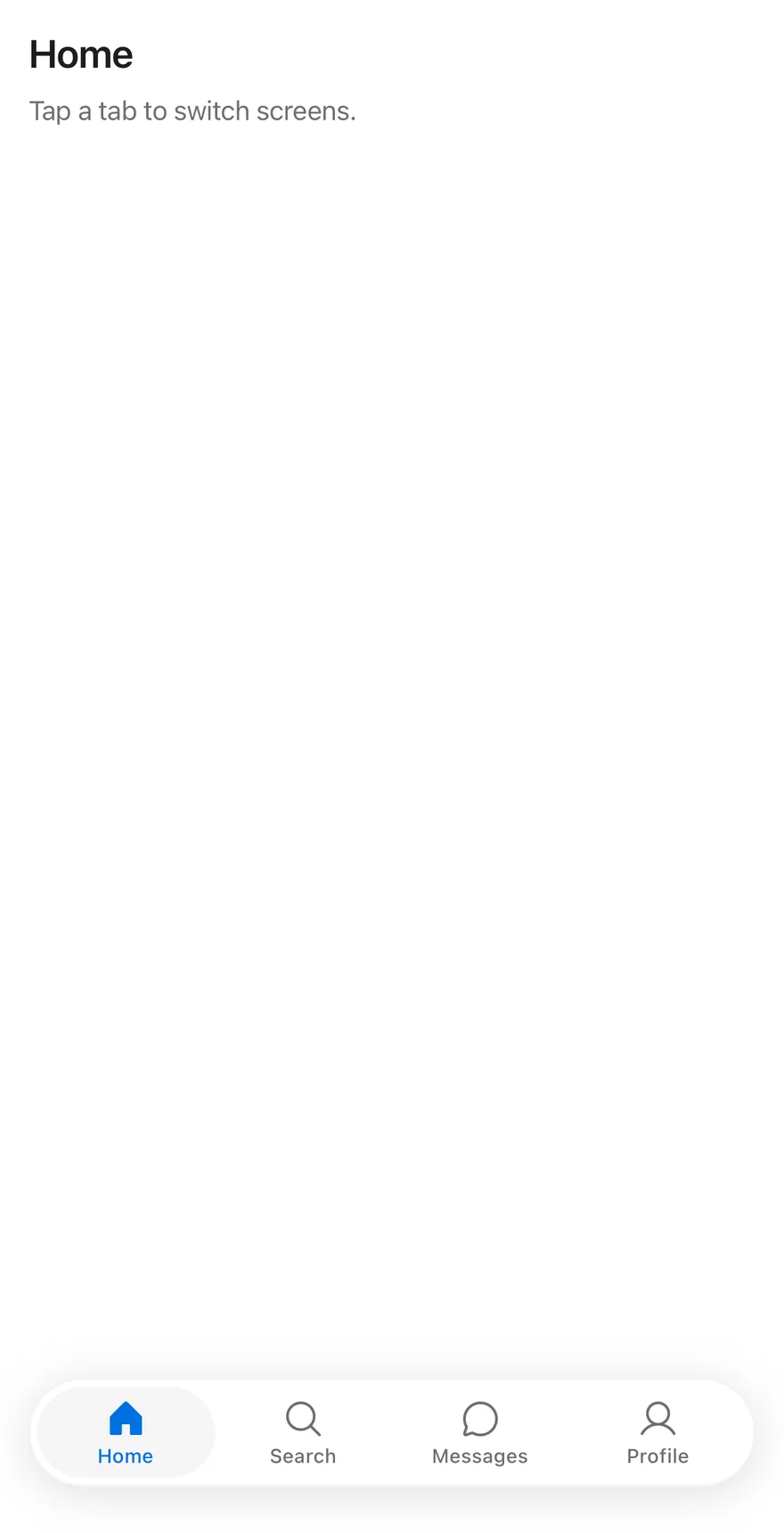
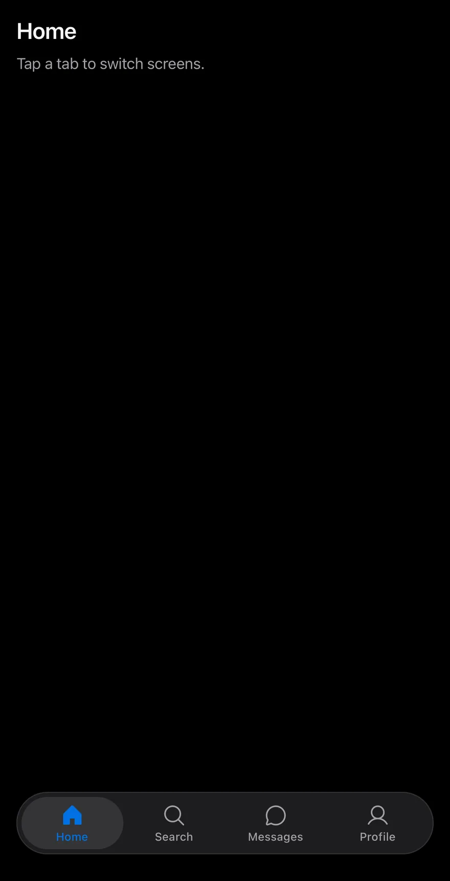
The tab bar without badges.
import { ChatCircleIcon, HouseIcon, MagnifyingGlassIcon, UserIcon } from "phosphor-react-native"
import * as React from "react"
import { View } from "react-native"
import { TabBar, TabBarItem, TabBarList } from "@/components/ui/tab-bar"
import { Text } from "@/components/ui/text"

const items = [
  { value: "home", label: "Home", icon: HouseIcon },
  { value: "search", label: "Search", icon: MagnifyingGlassIcon },
  { value: "messages", label: "Messages", icon: ChatCircleIcon, badge: 3 },
  { value: "profile", label: "Profile", icon: UserIcon, badge: true },
]

function Page({
  title,
  children,
}: {
  title: string
  children: React.ReactNode
}) {
  return (
    <View className="-m-4 flex-1 bg-surface">
      <View className="flex-1 gap-2 p-4">
        <Text variant="h3">{title}</Text>
        <Text variant="muted">Tap a tab to switch screens.</Text>
      </View>
      {children}
    </View>
  )
}

function TabBarExample({
  badges = true,
  disabled,
}: {
  badges?: boolean
  disabled?: string
}) {
  const [value, setValue] = React.useState("home")
  const current = items.find((item) => item.value === value)
  return (
    <Page title={current?.label ?? ""}>
      <TabBar value={value} onValueChange={setValue}>
        <TabBarList>
          {items.map((item) => (
            <TabBarItem
              key={item.value}
              value={item.value}
              icon={item.icon}
              badge={badges ? item.badge : undefined}
              disabled={item.value === disabled}
            >
              {item.label}
            </TabBarItem>
          ))}
        </TabBarList>
      </TabBar>
    </Page>
  )
}

export function TabBarWithoutBadgesExample() {
  return (
    <TabBarExample badges={false} />
  )
}import EsuissUI
import PhosphorSwift
import SwiftUI
struct TabBarWithoutBadgesExample: View {
var body: some View {
TabBarExample(badges: false)
}
}
struct TabBarEntry {
let value: String
let label: String
let icon: Image
let activeIcon: Image
let badge: TabBarBadge?
}
let tabBarEntries = [
TabBarEntry(value: "home", label: "Home", icon: Ph.house.regular, activeIcon: Ph.house.fill, badge: nil),
TabBarEntry(value: "search", label: "Search", icon: Ph.magnifyingGlass.regular, activeIcon: Ph.magnifyingGlass.fill, badge: nil),
TabBarEntry(value: "messages", label: "Messages", icon: Ph.chatCircle.regular, activeIcon: Ph.chatCircle.fill, badge: 3),
TabBarEntry(value: "profile", label: "Profile", icon: Ph.user.regular, activeIcon: Ph.user.fill, badge: .dot),
]
struct TabBarPage<Bar: View>: View {
let title: String
@ViewBuilder let bar: () -> Bar
var body: some View {
VStack(spacing: 0) {
VStack(alignment: .leading, spacing: 8) {
Text(verbatim: title).textVariant(.h3)
Text("Tap a tab to switch screens.").textVariant(.muted)
}
.padding(16)
.frame(maxWidth: .infinity, maxHeight: .infinity, alignment: .topLeading)
bar()
}
.background(Color.surface.ignoresSafeArea())
}
}
struct TabBarExample: View {
var badges = true
var disabled: String?
@State private var value = "home"
var body: some View {
TabBarPage(title: tabBarEntries.first { $0.value == value }?.label ?? "") {
TabBar(selection: $value) {
ForEach(tabBarEntries, id: \.value) { item in
TabBarItem(
verbatim: item.label,
value: item.value,
icon: item.icon,
activeIcon: item.activeIcon,
badge: badges ? item.badge : nil
)
.disabled(item.value == disabled)
}
}
}
}
}import androidx.compose.foundation.layout.Arrangement
import androidx.compose.foundation.layout.Column
import androidx.compose.foundation.layout.fillMaxSize
import androidx.compose.foundation.layout.fillMaxWidth
import androidx.compose.foundation.layout.padding
import androidx.compose.runtime.Composable
import androidx.compose.runtime.getValue
import androidx.compose.runtime.mutableStateOf
import androidx.compose.runtime.saveable.rememberSaveable
import androidx.compose.runtime.setValue
import androidx.compose.ui.Modifier
import androidx.compose.ui.graphics.vector.ImageVector
import androidx.compose.ui.unit.dp
import com.adamglin.PhosphorIcons
import com.adamglin.phosphoricons.Fill
import com.adamglin.phosphoricons.Regular
import com.adamglin.phosphoricons.fill.ChatCircle
import com.adamglin.phosphoricons.fill.House
import com.adamglin.phosphoricons.fill.MagnifyingGlass
import com.adamglin.phosphoricons.fill.User
import com.adamglin.phosphoricons.regular.ChatCircle
import com.adamglin.phosphoricons.regular.House
import com.adamglin.phosphoricons.regular.MagnifyingGlass
import com.adamglin.phosphoricons.regular.User
import com.esuiss.ui.components.Screen
import com.esuiss.ui.components.ScreenEdge
import com.esuiss.ui.components.TabBar
import com.esuiss.ui.components.TabBarItem
import com.esuiss.ui.components.Text
import com.esuiss.ui.components.TextVariant
@Composable
fun TabBarWithoutBadgesExample() {
TabBarExample(badges = false)
}
class TabBarEntry(val value: String, val label: String, val icon: ImageVector, val selectedIcon: ImageVector, val badge: String? = null)
val tabBarEntries = listOf(
TabBarEntry("home", "Home", PhosphorIcons.Regular.House, PhosphorIcons.Fill.House),
TabBarEntry("search", "Search", PhosphorIcons.Regular.MagnifyingGlass, PhosphorIcons.Fill.MagnifyingGlass),
TabBarEntry("messages", "Messages", PhosphorIcons.Regular.ChatCircle, PhosphorIcons.Fill.ChatCircle, "3"),
TabBarEntry("profile", "Profile", PhosphorIcons.Regular.User, PhosphorIcons.Fill.User, ""),
)
@Composable
fun TabBarPage(title: String, bar: @Composable () -> Unit) {
Screen(edges = setOf(ScreenEdge.Top, ScreenEdge.Left, ScreenEdge.Right)) {
Column(Modifier.fillMaxSize()) {
Column(
Modifier.weight(1f).fillMaxWidth().padding(16.dp),
verticalArrangement = Arrangement.spacedBy(8.dp),
) {
Text(title, variant = TextVariant.H3)
Text("Tap a tab to switch screens.", variant = TextVariant.Muted)
}
bar()
}
}
}
@Composable
fun TabBarExample(badges: Boolean = true, disabled: String? = null) {
var value by rememberSaveable { mutableStateOf("home") }
val current = tabBarEntries.firstOrNull { it.value == value }
TabBarPage(current?.label ?: "") {
TabBar(value = value, onValueChange = { value = it }) {
tabBarEntries.forEach { entry ->
TabBarItem(
value = entry.value,
label = entry.label,
icon = entry.icon,
selectedIcon = entry.selectedIcon,
badge = if (badges) entry.badge else null,
enabled = entry.value != disabled,
)
}
}
}
}Large badge
A count above 99 shown as 99+ and a text badge.
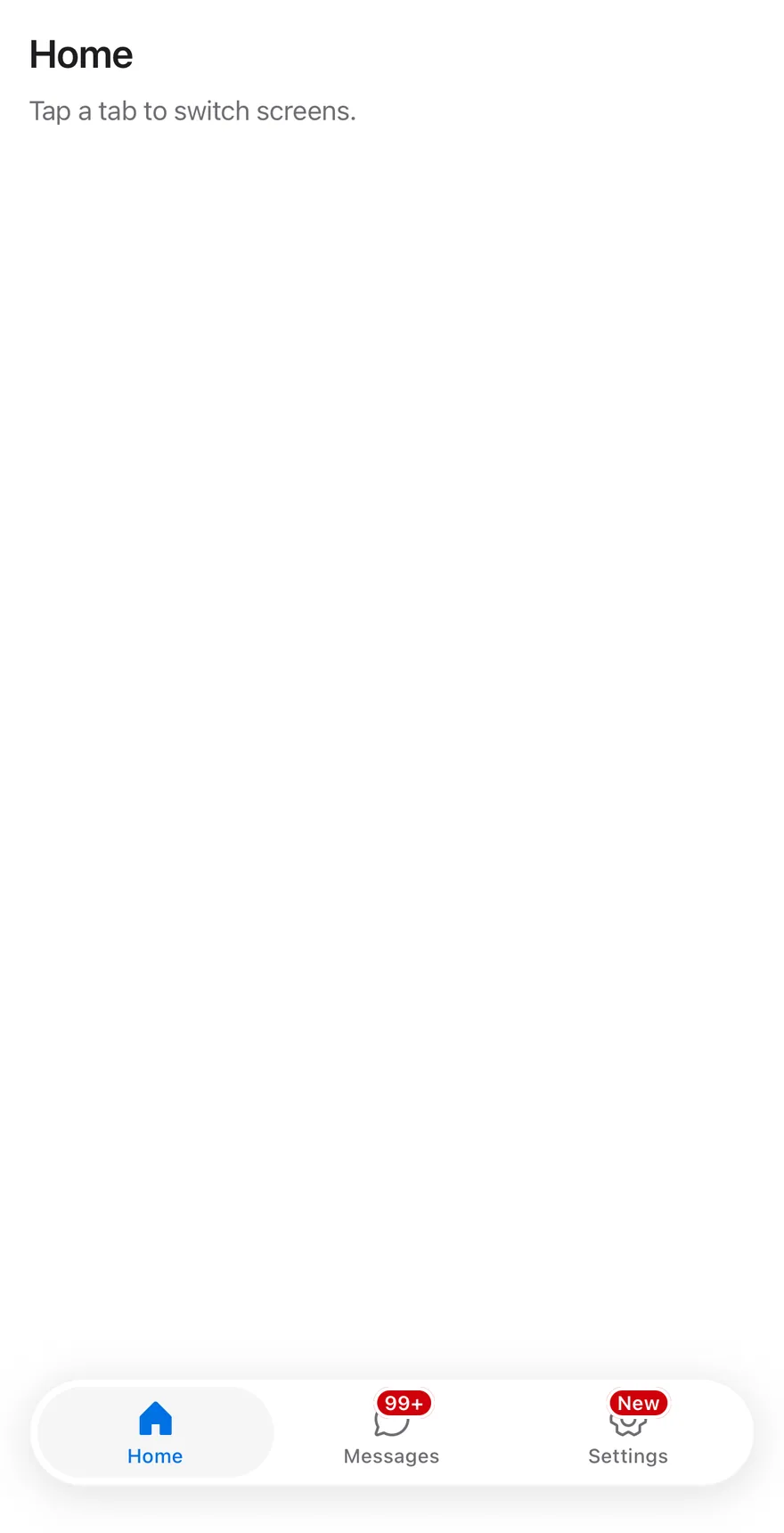
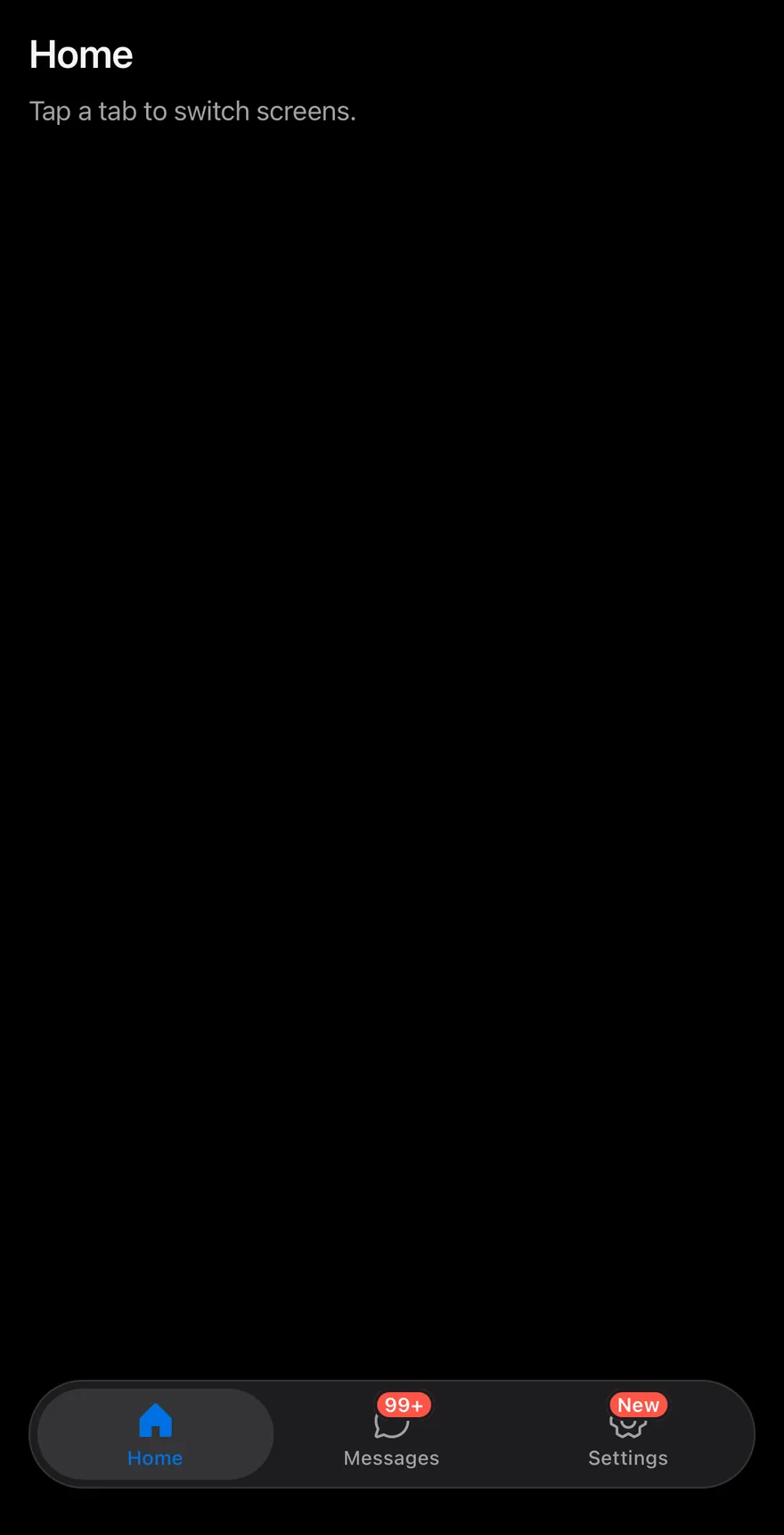
import { ChatCircleIcon, GearSixIcon, HouseIcon } from "phosphor-react-native"
import * as React from "react"
import { View } from "react-native"
import { TabBar, TabBarItem, TabBarList } from "@/components/ui/tab-bar"
import { Text } from "@/components/ui/text"

function Page({
  title,
  children,
}: {
  title: string
  children: React.ReactNode
}) {
  return (
    <View className="-m-4 flex-1 bg-surface">
      <View className="flex-1 gap-2 p-4">
        <Text variant="h3">{title}</Text>
        <Text variant="muted">Tap a tab to switch screens.</Text>
      </View>
      {children}
    </View>
  )
}

export function TabBarLargeBadgeExample() {
  return (
    <Page title="Home">
      <TabBar defaultValue="home">
        <TabBarList>
          <TabBarItem value="home" icon={HouseIcon}>
            Home
          </TabBarItem>
          <TabBarItem value="messages" icon={ChatCircleIcon} badge={128}>
            Messages
          </TabBarItem>
          <TabBarItem value="settings" icon={GearSixIcon} badge="New">
            Settings
          </TabBarItem>
        </TabBarList>
      </TabBar>
    </Page>
  )
}import EsuissUI
import PhosphorSwift
import SwiftUI
struct TabBarPage<Bar: View>: View {
let title: String
@ViewBuilder let bar: () -> Bar
var body: some View {
VStack(spacing: 0) {
VStack(alignment: .leading, spacing: 8) {
Text(verbatim: title).textVariant(.h3)
Text("Tap a tab to switch screens.").textVariant(.muted)
}
.padding(16)
.frame(maxWidth: .infinity, maxHeight: .infinity, alignment: .topLeading)
bar()
}
.background(Color.surface.ignoresSafeArea())
}
}
struct LargeBadgeDemo: View {
@State private var value = "home"
var body: some View {
TabBarPage(title: "Home") {
TabBar(selection: $value) {
TabBarItem("Home", value: "home", icon: Ph.house.regular, activeIcon: Ph.house.fill)
TabBarItem("Messages", value: "messages", icon: Ph.chatCircle.regular, activeIcon: Ph.chatCircle.fill, badge: 128)
TabBarItem("Settings", value: "settings", icon: Ph.gearSix.regular, activeIcon: Ph.gearSix.fill, badge: "New")
}
}
}
}import androidx.compose.foundation.layout.Arrangement
import androidx.compose.foundation.layout.Column
import androidx.compose.foundation.layout.fillMaxSize
import androidx.compose.foundation.layout.fillMaxWidth
import androidx.compose.foundation.layout.padding
import androidx.compose.runtime.Composable
import androidx.compose.runtime.getValue
import androidx.compose.runtime.mutableStateOf
import androidx.compose.runtime.saveable.rememberSaveable
import androidx.compose.runtime.setValue
import androidx.compose.ui.Modifier
import androidx.compose.ui.unit.dp
import com.adamglin.PhosphorIcons
import com.adamglin.phosphoricons.Fill
import com.adamglin.phosphoricons.Regular
import com.adamglin.phosphoricons.fill.ChatCircle
import com.adamglin.phosphoricons.fill.GearSix
import com.adamglin.phosphoricons.fill.House
import com.adamglin.phosphoricons.regular.ChatCircle
import com.adamglin.phosphoricons.regular.GearSix
import com.adamglin.phosphoricons.regular.House
import com.esuiss.ui.components.Screen
import com.esuiss.ui.components.ScreenEdge
import com.esuiss.ui.components.TabBar
import com.esuiss.ui.components.TabBarItem
import com.esuiss.ui.components.Text
import com.esuiss.ui.components.TextVariant
@Composable
fun TabBarPage(title: String, bar: @Composable () -> Unit) {
Screen(edges = setOf(ScreenEdge.Top, ScreenEdge.Left, ScreenEdge.Right)) {
Column(Modifier.fillMaxSize()) {
Column(
Modifier.weight(1f).fillMaxWidth().padding(16.dp),
verticalArrangement = Arrangement.spacedBy(8.dp),
) {
Text(title, variant = TextVariant.H3)
Text("Tap a tab to switch screens.", variant = TextVariant.Muted)
}
bar()
}
}
}
@Composable
fun TabBarLargeBadge() {
var value by rememberSaveable { mutableStateOf("home") }
TabBarPage("Home") {
TabBar(value = value, onValueChange = { value = it }) {
TabBarItem(value = "home", label = "Home", icon = PhosphorIcons.Regular.House, selectedIcon = PhosphorIcons.Fill.House)
TabBarItem(value = "messages", label = "Messages", icon = PhosphorIcons.Regular.ChatCircle, selectedIcon = PhosphorIcons.Fill.ChatCircle, badge = "128")
TabBarItem(value = "settings", label = "Settings", icon = PhosphorIcons.Regular.GearSix, selectedIcon = PhosphorIcons.Fill.GearSix, badge = "New")
}
}
}Disabled item
A tab bar with one disabled tab.
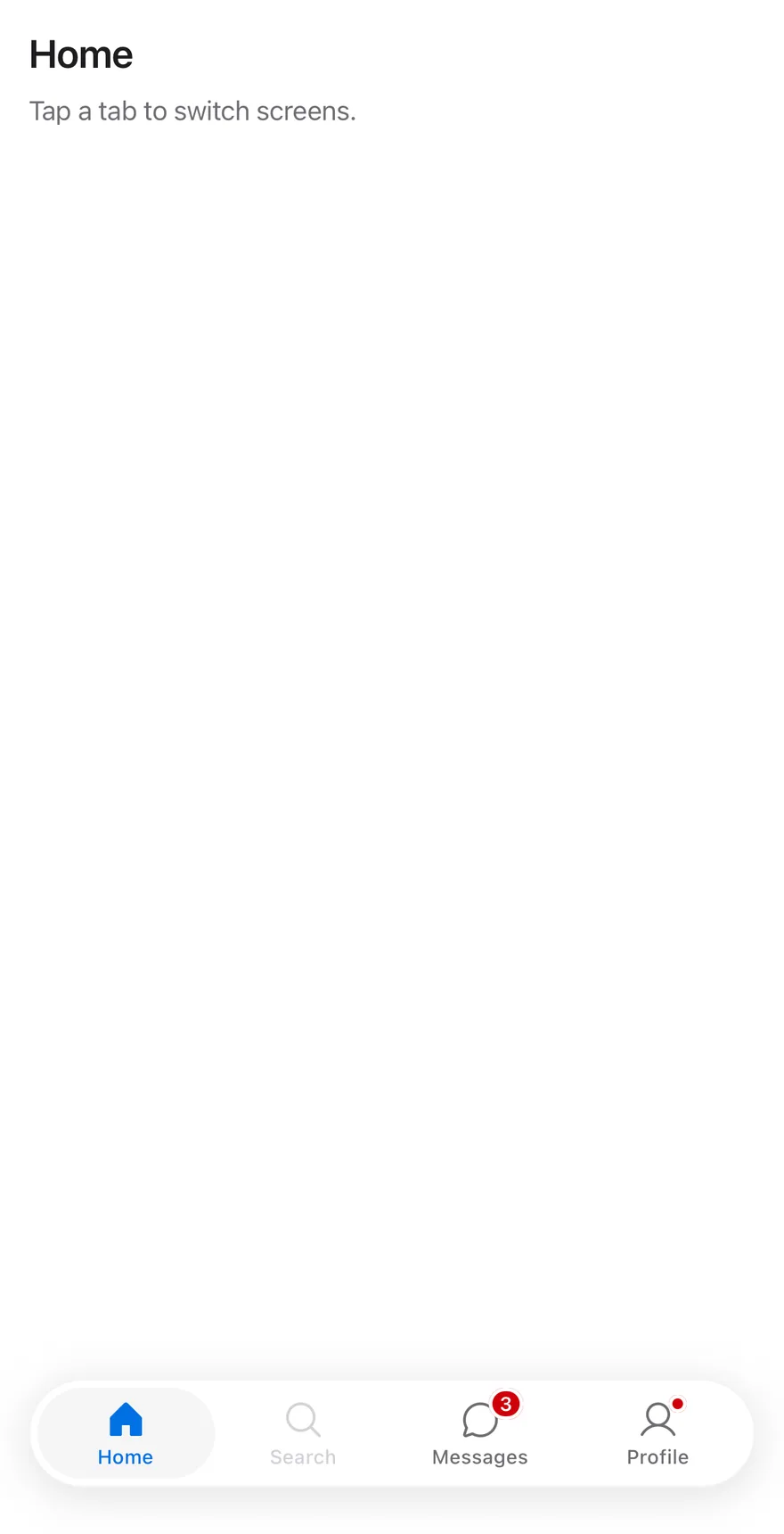
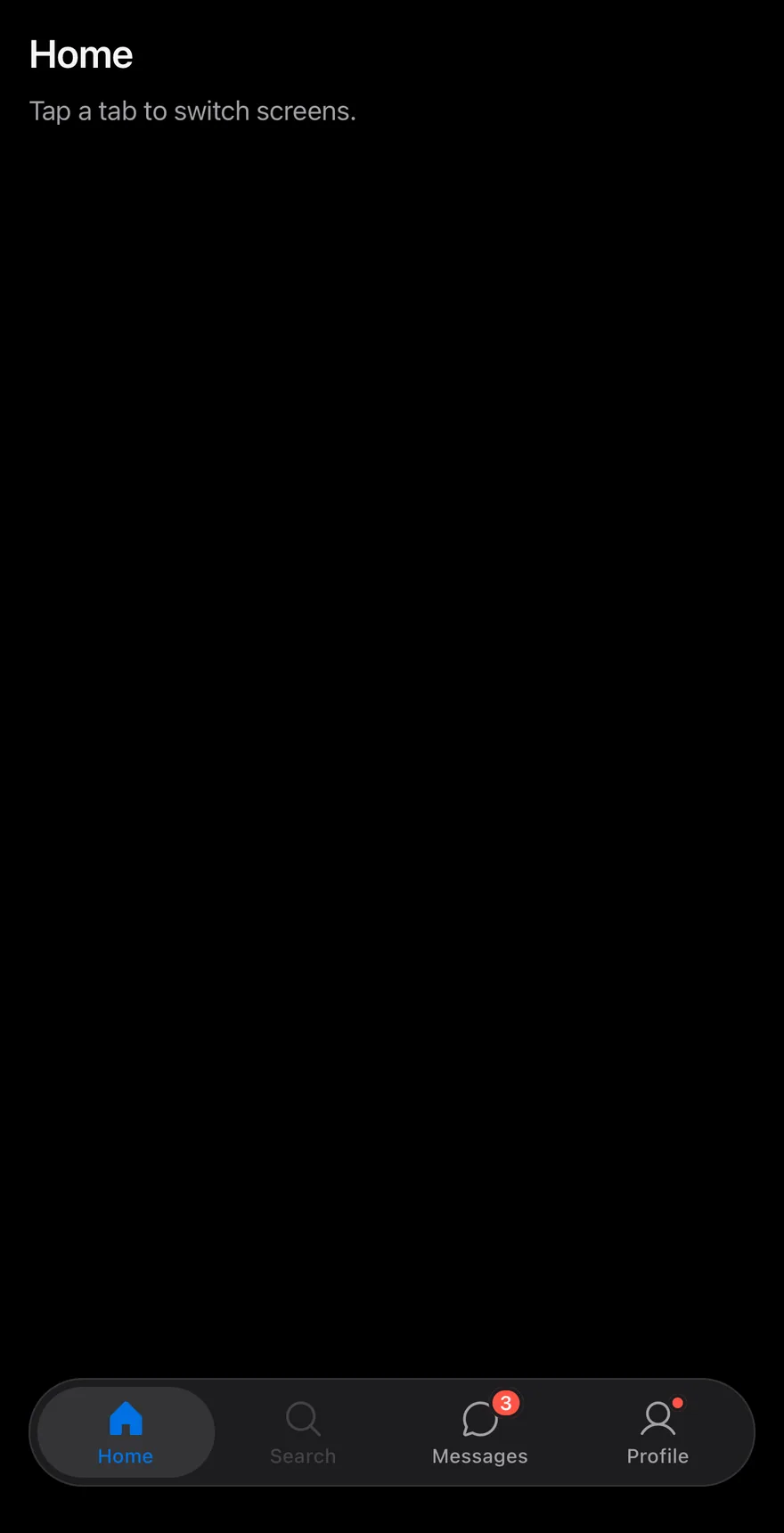
import { ChatCircleIcon, HouseIcon, MagnifyingGlassIcon, UserIcon } from "phosphor-react-native"
import * as React from "react"
import { View } from "react-native"
import { TabBar, TabBarItem, TabBarList } from "@/components/ui/tab-bar"
import { Text } from "@/components/ui/text"

const items = [
  { value: "home", label: "Home", icon: HouseIcon },
  { value: "search", label: "Search", icon: MagnifyingGlassIcon },
  { value: "messages", label: "Messages", icon: ChatCircleIcon, badge: 3 },
  { value: "profile", label: "Profile", icon: UserIcon, badge: true },
]

function Page({
  title,
  children,
}: {
  title: string
  children: React.ReactNode
}) {
  return (
    <View className="-m-4 flex-1 bg-surface">
      <View className="flex-1 gap-2 p-4">
        <Text variant="h3">{title}</Text>
        <Text variant="muted">Tap a tab to switch screens.</Text>
      </View>
      {children}
    </View>
  )
}

function TabBarExample({
  badges = true,
  disabled,
}: {
  badges?: boolean
  disabled?: string
}) {
  const [value, setValue] = React.useState("home")
  const current = items.find((item) => item.value === value)
  return (
    <Page title={current?.label ?? ""}>
      <TabBar value={value} onValueChange={setValue}>
        <TabBarList>
          {items.map((item) => (
            <TabBarItem
              key={item.value}
              value={item.value}
              icon={item.icon}
              badge={badges ? item.badge : undefined}
              disabled={item.value === disabled}
            >
              {item.label}
            </TabBarItem>
          ))}
        </TabBarList>
      </TabBar>
    </Page>
  )
}

export function TabBarDisabledItemExample() {
  return (
    <TabBarExample disabled="search" />
  )
}import EsuissUI
import PhosphorSwift
import SwiftUI
struct TabBarDisabledItemExample: View {
var body: some View {
TabBarExample(disabled: "search")
}
}
struct TabBarEntry {
let value: String
let label: String
let icon: Image
let activeIcon: Image
let badge: TabBarBadge?
}
let tabBarEntries = [
TabBarEntry(value: "home", label: "Home", icon: Ph.house.regular, activeIcon: Ph.house.fill, badge: nil),
TabBarEntry(value: "search", label: "Search", icon: Ph.magnifyingGlass.regular, activeIcon: Ph.magnifyingGlass.fill, badge: nil),
TabBarEntry(value: "messages", label: "Messages", icon: Ph.chatCircle.regular, activeIcon: Ph.chatCircle.fill, badge: 3),
TabBarEntry(value: "profile", label: "Profile", icon: Ph.user.regular, activeIcon: Ph.user.fill, badge: .dot),
]
struct TabBarPage<Bar: View>: View {
let title: String
@ViewBuilder let bar: () -> Bar
var body: some View {
VStack(spacing: 0) {
VStack(alignment: .leading, spacing: 8) {
Text(verbatim: title).textVariant(.h3)
Text("Tap a tab to switch screens.").textVariant(.muted)
}
.padding(16)
.frame(maxWidth: .infinity, maxHeight: .infinity, alignment: .topLeading)
bar()
}
.background(Color.surface.ignoresSafeArea())
}
}
struct TabBarExample: View {
var badges = true
var disabled: String?
@State private var value = "home"
var body: some View {
TabBarPage(title: tabBarEntries.first { $0.value == value }?.label ?? "") {
TabBar(selection: $value) {
ForEach(tabBarEntries, id: \.value) { item in
TabBarItem(
verbatim: item.label,
value: item.value,
icon: item.icon,
activeIcon: item.activeIcon,
badge: badges ? item.badge : nil
)
.disabled(item.value == disabled)
}
}
}
}
}import androidx.compose.foundation.layout.Arrangement
import androidx.compose.foundation.layout.Column
import androidx.compose.foundation.layout.fillMaxSize
import androidx.compose.foundation.layout.fillMaxWidth
import androidx.compose.foundation.layout.padding
import androidx.compose.runtime.Composable
import androidx.compose.runtime.getValue
import androidx.compose.runtime.mutableStateOf
import androidx.compose.runtime.saveable.rememberSaveable
import androidx.compose.runtime.setValue
import androidx.compose.ui.Modifier
import androidx.compose.ui.graphics.vector.ImageVector
import androidx.compose.ui.unit.dp
import com.adamglin.PhosphorIcons
import com.adamglin.phosphoricons.Fill
import com.adamglin.phosphoricons.Regular
import com.adamglin.phosphoricons.fill.ChatCircle
import com.adamglin.phosphoricons.fill.House
import com.adamglin.phosphoricons.fill.MagnifyingGlass
import com.adamglin.phosphoricons.fill.User
import com.adamglin.phosphoricons.regular.ChatCircle
import com.adamglin.phosphoricons.regular.House
import com.adamglin.phosphoricons.regular.MagnifyingGlass
import com.adamglin.phosphoricons.regular.User
import com.esuiss.ui.components.Screen
import com.esuiss.ui.components.ScreenEdge
import com.esuiss.ui.components.TabBar
import com.esuiss.ui.components.TabBarItem
import com.esuiss.ui.components.Text
import com.esuiss.ui.components.TextVariant
@Composable
fun TabBarDisabledItemExample() {
TabBarExample(disabled = "search")
}
class TabBarEntry(val value: String, val label: String, val icon: ImageVector, val selectedIcon: ImageVector, val badge: String? = null)
val tabBarEntries = listOf(
TabBarEntry("home", "Home", PhosphorIcons.Regular.House, PhosphorIcons.Fill.House),
TabBarEntry("search", "Search", PhosphorIcons.Regular.MagnifyingGlass, PhosphorIcons.Fill.MagnifyingGlass),
TabBarEntry("messages", "Messages", PhosphorIcons.Regular.ChatCircle, PhosphorIcons.Fill.ChatCircle, "3"),
TabBarEntry("profile", "Profile", PhosphorIcons.Regular.User, PhosphorIcons.Fill.User, ""),
)
@Composable
fun TabBarPage(title: String, bar: @Composable () -> Unit) {
Screen(edges = setOf(ScreenEdge.Top, ScreenEdge.Left, ScreenEdge.Right)) {
Column(Modifier.fillMaxSize()) {
Column(
Modifier.weight(1f).fillMaxWidth().padding(16.dp),
verticalArrangement = Arrangement.spacedBy(8.dp),
) {
Text(title, variant = TextVariant.H3)
Text("Tap a tab to switch screens.", variant = TextVariant.Muted)
}
bar()
}
}
}
@Composable
fun TabBarExample(badges: Boolean = true, disabled: String? = null) {
var value by rememberSaveable { mutableStateOf("home") }
val current = tabBarEntries.firstOrNull { it.value == value }
TabBarPage(current?.label ?: "") {
TabBar(value = value, onValueChange = { value = it }) {
tabBarEntries.forEach { entry ->
TabBarItem(
value = entry.value,
label = entry.label,
icon = entry.icon,
selectedIcon = entry.selectedIcon,
badge = if (badges) entry.badge else null,
enabled = entry.value != disabled,
)
}
}
}
}API Reference
TabBar
Root that holds the active tab, the side inset and the safe area padding.
React.ComponentProps<typeof TabsPrimitive.Root>TabBarList
Capsule that holds the tabs.
React.ComponentProps<typeof TabsPrimitive.List>TabBarItem
One tab with an icon, a label and an optional badge.
React.ComponentProps<typeof TabsPrimitive.Tab>- About
- Phosphor icon shown above the label. Uses the fill weight when active.
- Type
PhosphorIcon- Default
- —
- About
- Number, text or
truefor a dot, shown on the icon's corner. - Type
TabBarBadgeValue- Default
- —
Accessibility
- The list has the
tablistrole and each item has thetabrole, with selected and disabled states. - A badge with a count or text is exposed as the tab's accessibility value, so VoiceOver and TalkBack read it after the label.
- A dot badge is visual only and is not announced.
Notes
- The capsule uses
bg-surface-raisedwith aborder-label/5border (border-label/10in dark mode) and a large shadow. The active tab usesbg-controlandtext-accent, and badges usebg-danger; colors follow the system appearance. - The bottom padding is the remaining safe area inset minus 8 points, and never less than 12 points.