suiss/uim · React Native Component
Input Group
An input or textarea combined with prefix and suffix addons such as text, icons and buttons.
Input Group is an open-source mobile component from suiss/uim for React Native and Expo, with SwiftUI and Jetpack Compose versions built from the same design tokens. The @esuiss/uim CLI copies its source into your project, so you own the code.
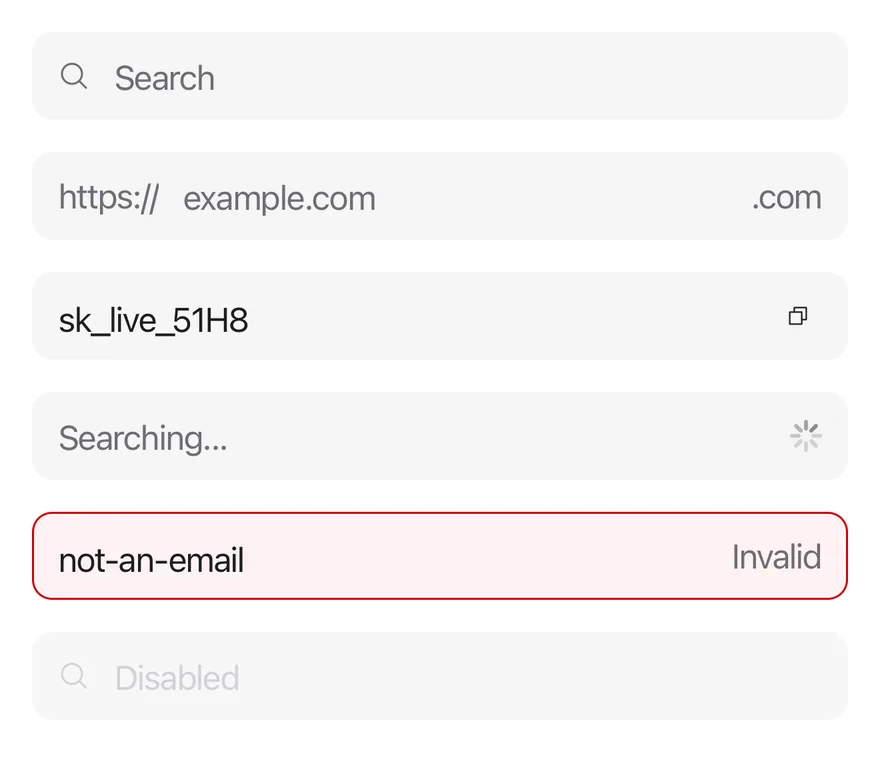
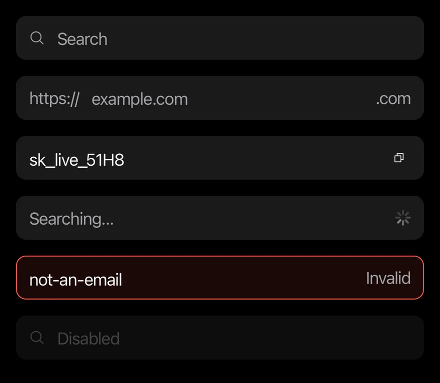
import { CopyIcon, MagnifyingGlassIcon, XIcon } from "phosphor-react-native"
import * as React from "react"
import { View } from "react-native"
import { Icon } from "@/components/ui/icon"
import { InputGroup, InputGroupAddon, InputGroupButton, InputGroupInput, InputGroupText } from "@/components/ui/input-group"
import { Spinner } from "@/components/ui/spinner"

function SearchDemo() {
  const [value, setValue] = React.useState("")
  return (
    <InputGroup>
      <InputGroupInput
        placeholder="Search"
        value={value}
        onValueChange={setValue}
      />
      <InputGroupAddon>
        <Icon as={MagnifyingGlassIcon} />
      </InputGroupAddon>
      {value ? (
        <InputGroupAddon align="inline-end">
          <InputGroupButton
            size="icon-xs"
            accessibilityLabel="Clear"
            onPress={() => setValue("")}
          >
            <Icon as={XIcon} />
          </InputGroupButton>
        </InputGroupAddon>
      ) : null}
    </InputGroup>
  )
}

export function InputGroupExample() {
  return (
    <View className="gap-4">
      <SearchDemo />
      <InputGroup>
        <InputGroupAddon>
          <InputGroupText>https://</InputGroupText>
        </InputGroupAddon>
        <InputGroupInput placeholder="example.com" autoCapitalize="none" />
        <InputGroupAddon align="inline-end">
          <InputGroupText>.com</InputGroupText>
        </InputGroupAddon>
      </InputGroup>
      <InputGroup>
        <InputGroupInput defaultValue="sk_live_51H8" />
        <InputGroupAddon align="inline-end">
          <InputGroupButton size="icon-xs" accessibilityLabel="Copy">
            <Icon as={CopyIcon} />
          </InputGroupButton>
        </InputGroupAddon>
      </InputGroup>
      <InputGroup>
        <InputGroupInput placeholder="Searching..." />
        <InputGroupAddon align="inline-end">
          <Spinner />
        </InputGroupAddon>
      </InputGroup>
      <InputGroup invalid>
        <InputGroupInput defaultValue="not-an-email" />
        <InputGroupAddon align="inline-end">
          <InputGroupText>Invalid</InputGroupText>
        </InputGroupAddon>
      </InputGroup>
      <InputGroup disabled>
        <InputGroupInput placeholder="Disabled" />
        <InputGroupAddon>
          <Icon as={MagnifyingGlassIcon} />
        </InputGroupAddon>
      </InputGroup>
    </View>
  )
}import EsuissUI
import PhosphorSwift
import SwiftUI
struct InputGroupIcon: View {
let image: Image
var body: some View {
image.frame(width: 16, height: 16)
}
}
struct InputGroupSearchDemo: View {
@State private var value = ""
var body: some View {
InputGroup {
InputGroupInput("Search", text: $value)
InputGroupAddon {
InputGroupIcon(image: Ph.magnifyingGlass.regular)
}
if !value.isEmpty {
InputGroupAddon(align: .inlineEnd) {
InputGroupButton(size: .iconXs) {
value = ""
} label: {
InputGroupIcon(image: Ph.x.regular)
}
.accessibilityLabel(Text("Clear"))
}
}
}
}
}
struct InputGroupDefaultDemo: View {
@State private var domain = ""
@State private var key = "sk_live_51H8"
@State private var searching = ""
@State private var email = "not-an-email"
@State private var disabled = ""
var body: some View {
VStack(alignment: .leading, spacing: 16) {
InputGroupSearchDemo()
InputGroup {
InputGroupAddon {
InputGroupText("https://")
}
InputGroupInput("example.com", text: $domain)
.textInputAutocapitalization(.never)
InputGroupAddon(align: .inlineEnd) {
InputGroupText(".com")
}
}
InputGroup {
InputGroupInput("", text: $key)
InputGroupAddon(align: .inlineEnd) {
InputGroupButton(size: .iconXs) {} label: {
InputGroupIcon(image: Ph.copy.regular)
}
.accessibilityLabel(Text("Copy"))
}
}
InputGroup {
InputGroupInput("Searching...", text: $searching)
InputGroupAddon(align: .inlineEnd) {
Spinner()
}
}
InputGroup {
InputGroupInput("", text: $email)
InputGroupAddon(align: .inlineEnd) {
InputGroupText("Invalid")
}
}
.invalid()
InputGroup {
InputGroupInput("Disabled", text: $disabled)
InputGroupAddon {
InputGroupIcon(image: Ph.magnifyingGlass.regular)
}
}
.disabled(true)
}
}
}import androidx.compose.foundation.layout.Arrangement
import androidx.compose.foundation.layout.Column
import androidx.compose.foundation.layout.fillMaxWidth
import androidx.compose.foundation.text.KeyboardOptions
import androidx.compose.runtime.Composable
import androidx.compose.runtime.getValue
import androidx.compose.runtime.mutableStateOf
import androidx.compose.runtime.saveable.rememberSaveable
import androidx.compose.runtime.setValue
import androidx.compose.ui.Modifier
import androidx.compose.ui.text.input.KeyboardCapitalization
import androidx.compose.ui.unit.dp
import com.adamglin.PhosphorIcons
import com.adamglin.phosphoricons.Regular
import com.adamglin.phosphoricons.regular.Copy
import com.adamglin.phosphoricons.regular.MagnifyingGlass
import com.adamglin.phosphoricons.regular.X
import com.esuiss.ui.components.Icon
import com.esuiss.ui.components.InputGroup
import com.esuiss.ui.components.InputGroupAddon
import com.esuiss.ui.components.InputGroupAddonAlign
import com.esuiss.ui.components.InputGroupButton
import com.esuiss.ui.components.InputGroupButtonSize
import com.esuiss.ui.components.InputGroupInput
import com.esuiss.ui.components.InputGroupText
import com.esuiss.ui.components.Spinner
@Composable
fun InputGroupSearch() {
var value by rememberSaveable { mutableStateOf("") }
InputGroup {
InputGroupInput(value, { value = it }, placeholder = "Search")
InputGroupAddon {
Icon(PhosphorIcons.Regular.MagnifyingGlass, contentDescription = null)
}
if (value.isNotEmpty()) {
InputGroupAddon(align = InputGroupAddonAlign.InlineEnd) {
InputGroupButton(onClick = { value = "" }, size = InputGroupButtonSize.IconXs) {
Icon(PhosphorIcons.Regular.X, contentDescription = "Clear")
}
}
}
}
}
@Composable
fun InputGroupDefault() {
var domain by rememberSaveable { mutableStateOf("") }
var key by rememberSaveable { mutableStateOf("sk_live_51H8") }
var searching by rememberSaveable { mutableStateOf("") }
var email by rememberSaveable { mutableStateOf("not-an-email") }
var disabled by rememberSaveable { mutableStateOf("") }
Column(Modifier.fillMaxWidth(), verticalArrangement = Arrangement.spacedBy(16.dp)) {
InputGroupSearch()
InputGroup {
InputGroupAddon { InputGroupText("https://") }
InputGroupInput(
domain,
{ domain = it },
placeholder = "example.com",
keyboardOptions = KeyboardOptions(capitalization = KeyboardCapitalization.None),
)
InputGroupAddon(align = InputGroupAddonAlign.InlineEnd) { InputGroupText(".com") }
}
InputGroup {
InputGroupInput(key, { key = it })
InputGroupAddon(align = InputGroupAddonAlign.InlineEnd) {
InputGroupButton(onClick = {}, size = InputGroupButtonSize.IconXs) {
Icon(PhosphorIcons.Regular.Copy, contentDescription = "Copy")
}
}
}
InputGroup {
InputGroupInput(searching, { searching = it }, placeholder = "Searching...")
InputGroupAddon(align = InputGroupAddonAlign.InlineEnd) { Spinner() }
}
InputGroup(invalid = true) {
InputGroupInput(email, { email = it })
InputGroupAddon(align = InputGroupAddonAlign.InlineEnd) { InputGroupText("Invalid") }
}
InputGroup(enabled = false) {
InputGroupInput(disabled, { disabled = it }, placeholder = "Disabled")
InputGroupAddon {
Icon(PhosphorIcons.Regular.MagnifyingGlass, contentDescription = null)
}
}
}
}InputGroup draws one control-colored field and places an InputGroupInput or InputGroupTextarea inside it with addons around. Addons can sit on the start or end of the same line (inline-start, inline-end), or above or below the input (block-start, block-end), which turns the group into a column.
The group shows the focus border while its input is focused, and reads the disabled and invalid state from a surrounding Field. Pressing an addon focuses the input.
Installation
$ pnpm dlx @esuiss/uim@latest add input-group$ pnpm dlx @esuiss/uim@latest add input-group --platform swift$ pnpm dlx @esuiss/uim@latest add input-group --platform kotlinThe CLI also adds what it builds on: Button, Icon, Input, Text, Textarea.
Manual
- Install the dependencies:
npx expo install class-variance-authority cn-
Add the pieces it builds on: Button, Icon, Input, Text, Textarea, and the primitives
components/primitives/field.tsx,components/primitives/use-render.tsx. -
Copy the source into
components/ui/input-group.tsx:
import { cva, type VariantProps } from "class-variance-authority"
import { cn } from "cn"
import * as React from "react"
import { Pressable, type TextInput, View, type ViewProps } from "react-native"
import { useFieldRootContext } from "@/components/primitives/field"
import { resolveClassName } from "@/components/primitives/use-render"
import { Button } from "@/components/ui/button"
import { IconClassContext } from "@/components/ui/icon"
import { Input } from "@/components/ui/input"
import { Text, TextClassContext } from "@/components/ui/text"
import { Textarea } from "@/components/ui/textarea"

type InputGroupAlign =
  | "inline-start"
  | "inline-end"
| "block-start"- Update the import paths to match your project.
- Install the dependencies:
npx expo install class-variance-authority cn-
Add the pieces it builds on: Button, Icon, Input, Text, Textarea, and the primitives
components/primitives/field.tsx,components/primitives/use-render.tsx. -
Copy the source into
components/ui/input-group.tsx:
import { cva, type VariantProps } from "class-variance-authority"
import { cn } from "cn"
import * as React from "react"
import { Pressable, type TextInput, View, type ViewProps } from "react-native"
import { useFieldRootContext } from "@/components/primitives/field"
import { resolveClassName } from "@/components/primitives/use-render"
import { Button } from "@/components/ui/button"
import { IconClassContext } from "@/components/ui/icon"
import { Input } from "@/components/ui/input"
import { Text, TextClassContext } from "@/components/ui/text"
import { Textarea } from "@/components/ui/textarea"

type InputGroupAlign =
  | "inline-start"
  | "inline-end"
| "block-start"- Update the import paths to match your project.
-
Add the pieces it builds on: Button, Icon, Input, Text, Textarea, and the primitives
components/primitives/field.tsx,components/primitives/use-render.tsx. -
Copy the source into
components/ui/input-group.tsx:
import * as React from "react"
import {
  Pressable,
  StyleSheet,
  type TextInput,
  View,
  type ViewProps,
} from "react-native"
import { useFieldRootContext } from "@/components/primitives/field"
import { Button, type ButtonSize } from "@/components/ui/button"
import { IconSizeContext } from "@/components/ui/icon"
import { Input } from "@/components/ui/input"
import { Text, TextStyleContext } from "@/components/ui/text"
import { Textarea } from "@/components/ui/textarea"
import { fontSize, radius, useTheme } from "@/components/ui/theme"- Update the import paths to match your project.
-
Target iOS 17 or later.
-
Add the Swift package to your app:
.package(url: "https://github.com/phosphor-icons/swift", from: "2.1.0")- Copy the theme files every view uses:
import SwiftUI
import UIKit

struct RGBA: Sendable {
  let red: CGFloat
  let green: CGFloat
  let blue: CGFloat
  let alpha: CGFloat

  init(_ hex: UInt32, _ alpha: CGFloat = 1) {
    red = CGFloat((hex >> 16) & 0xFF) / 255
    green = CGFloat((hex >> 8) & 0xFF) / 255
    blue = CGFloat(hex & 0xFF) / 255
    self.alpha = alpha
}import SwiftUI
extension Color {
public static let surface = Color.adaptive(light: .init(0xFFFFFF), dark: .init(0x000000))
public static let surfaceSecondary = Color.adaptive(light: .init(0xF5F5F7), dark: .init(0x161617))
public static let surfaceTertiary = Color.adaptive(light: .init(0xE8E8ED), dark: .init(0x2C2C2E))
public static let surfaceRaised = Color.adaptive(light: .init(0xFFFFFF), dark: .init(0x1D1D1F))
public static let label = Color.adaptive(light: .init(0x1D1D1F), dark: .init(0xF5F5F7))
public static let labelSecondary = Color.adaptive(light: .init(0x6E6E73), dark: .init(0xA1A1A6))
public static let labelTertiary = Color.adaptive(light: .init(0x86868B), dark: .init(0x86868B))
public static let labelQuaternary = Color.adaptive(light: .init(0xD2D2D7), dark: .init(0x424245))
public static let control = Color.adaptive(light: .init(0x000000, 0.04), dark: .init(0xFFFFFF, 0.1))
public static let controlPressed = Color.adaptive(light: .init(0x000000, 0.12), dark: .init(0xFFFFFF, 0.22))
public static let controlSelected = Color.adaptive(light: .init(0x1D1D1F), dark: .init(0xF5F5F7))
public static let controlDisabled = Color.adaptive(light: .init(0x000000, 0.03), dark: .init(0xFFFFFF, 0.05))
public static let onControlSelected = Color.adaptive(light: .init(0xFFFFFF), dark: .init(0x000000))- Copy the source and every file it uses:
import SwiftUI

public enum InputGroupAddonAlign: CaseIterable, Sendable, Hashable {
  case inlineStart, inlineEnd, blockStart, blockEnd

  var isBlock: Bool {
    self == .blockStart || self == .blockEnd
  }
}

struct InputGroupContext: Sendable {
  var focusRequest = 0
  var addons: Set<InputGroupAddonAlign> = []
  var requestFocus: @MainActor @Sendable () -> Void = {}
}import SwiftUI
public struct VariantButtonStyle: ButtonStyle {
public enum Variant: CaseIterable, Sendable {
case `default`, outline, secondary, tinted, ghost, plain, destructive, link
}
public enum Size: CaseIterable, Sendable {
case `default`, xs, sm, lg, xl, icon, iconXs, iconSm, iconLg, iconXl
var height: CGFloat {
switch self {
case .xs, .iconXs: 24
case .sm, .iconSm: 32
case .default, .icon: 36
case .lg, .iconLg: 44import SwiftUI
extension EnvironmentValues {
@Entry var buttonGroup: Axis? = nil
@Entry var buttonGroupSize: CGSize = .zero
}
enum ButtonGroupSpace: Hashable {
case group
}
struct ButtonGroupFrame {
let bounds: Anchor<CGRect>
let outlined: Bool
}import PhosphorSwift
import SwiftUI
extension Shadow {
static let control = Shadow(color: .black.opacity(0.08), radius: 0.5, y: 0.5)
static let thumb = Shadow(color: .black.opacity(0.12), radius: 1.5, y: 1)
}
struct SelectionIndicator<Mark: View>: View {
let checked: Bool
let pressed: Bool
let cornerRadius: CGFloat
let mark: Mark
@Environment(\.isEnabled) private var isEnabled
@Environment(\.isInvalid) private var invalidimport SwiftUI
extension EnvironmentValues {
@Entry public var isInvalid = false
@Entry var fieldInset = false
@Entry var fieldGroupInset = false
@Entry var fieldSetInset = false
}
extension View {
public func invalid(_ isInvalid: Bool = true) -> some View {
environment(\.isInvalid, isInvalid)
}
}
public enum FieldOrientation: CaseIterable, Sendable {import SwiftUI
extension EnvironmentValues {
@Entry public var hapticsEnabled = true
}
extension View {
public func haptics(_ enabled: Bool) -> some View {
environment(\.hapticsEnabled, enabled)
}
func hapticFeedback<Trigger: Equatable>(_ feedback: SensoryFeedback, trigger: Trigger) -> some View {
modifier(HapticFeedbackModifier(feedback: feedback, trigger: trigger) { _, _ in true })
}
func hapticFeedback<Trigger: Equatable>(import SwiftUI
public struct Separator: View {
let orientation: Axis
public init(_ orientation: Axis = .horizontal) {
self.orientation = orientation
}
public var body: some View {
Rectangle()
.fill(Color.separator)
.frame(width: orientation == .vertical ? 1 : nil, height: orientation == .horizontal ? 1 : nil)
.frame(maxWidth: orientation == .horizontal ? .infinity : nil, maxHeight: orientation == .vertical ? .infinity : nil)
.accessibilityHidden(true)
}import SwiftUI
public enum TextVariant: CaseIterable, Sendable {
case `default`, h1, h2, h3, h4, p, blockquote, code, lead, large, small, muted
var style: TextStyle {
switch self {
case .h1: .xl3
case .h2: .xl2
case .h3: .xl
case .h4, .lead, .large: .lg
case .code, .small, .muted: .sm
default: .base
}
}- Add the files to your app target.
- Set
minSdkto 24 or higher and add the dependencies:
implementation(platform("androidx.compose:compose-bom:2026.09.00"))
implementation("androidx.compose.foundation:foundation")
implementation("androidx.compose.ui:ui")- Copy the theme files every view uses:
package com.esuiss.ui.theme

import androidx.compose.foundation.isSystemInDarkTheme
import androidx.compose.runtime.Composable
import androidx.compose.runtime.CompositionLocalProvider
import androidx.compose.runtime.Immutable
import androidx.compose.runtime.staticCompositionLocalOf
import androidx.compose.ui.Modifier
import androidx.compose.ui.draw.dropShadow
import androidx.compose.ui.graphics.Color
import androidx.compose.ui.graphics.Shape
import androidx.compose.ui.graphics.shadow.Shadow as DropShadow
import androidx.compose.ui.text.TextStyle
import androidx.compose.ui.text.style.LineHeightStyle
import androidx.compose.ui.unit.Dp
import androidx.compose.ui.unit.DpOffsetpackage com.esuiss.ui.theme
import androidx.compose.runtime.Immutable
import androidx.compose.ui.graphics.Color
import androidx.compose.ui.unit.dp
@Immutable
data class Colors(
val surface: Color,
val surfaceSecondary: Color,
val surfaceTertiary: Color,
val surfaceRaised: Color,
val label: Color,
val labelSecondary: Color,
val labelTertiary: Color,
val labelQuaternary: Color,- Copy the source and every file it uses:
package com.esuiss.ui.components

import androidx.compose.foundation.gestures.detectTapGestures
import androidx.compose.foundation.layout.Arrangement
import androidx.compose.foundation.layout.Box
import androidx.compose.foundation.layout.Row
import androidx.compose.foundation.layout.RowScope
import androidx.compose.foundation.layout.fillMaxWidth
import androidx.compose.foundation.layout.padding
import androidx.compose.foundation.shape.RoundedCornerShape
import androidx.compose.foundation.text.BasicText
import androidx.compose.foundation.text.BasicTextField
import androidx.compose.foundation.text.KeyboardActions
import androidx.compose.foundation.text.KeyboardOptions
import androidx.compose.foundation.text.selection.LocalTextSelectionColors
import androidx.compose.runtime.Composablepackage com.esuiss.ui.components
import androidx.compose.foundation.background
import androidx.compose.foundation.border
import androidx.compose.foundation.clickable
import androidx.compose.foundation.interaction.MutableInteractionSource
import androidx.compose.foundation.interaction.collectIsPressedAsState
import androidx.compose.foundation.layout.Arrangement
import androidx.compose.foundation.layout.Row
import androidx.compose.foundation.layout.RowScope
import androidx.compose.foundation.layout.fillMaxWidth
import androidx.compose.foundation.layout.height
import androidx.compose.foundation.layout.padding
import androidx.compose.foundation.layout.size
import androidx.compose.foundation.shape.CircleShape
import androidx.compose.foundation.shape.RoundedCornerShapepackage com.esuiss.ui.components
import androidx.compose.foundation.background
import androidx.compose.foundation.gestures.Orientation
import androidx.compose.foundation.layout.Arrangement
import androidx.compose.foundation.layout.Box
import androidx.compose.foundation.layout.Row
import androidx.compose.foundation.layout.RowScope
import androidx.compose.foundation.layout.padding
import androidx.compose.foundation.shape.CircleShape
import androidx.compose.foundation.shape.CornerSize
import androidx.compose.foundation.shape.RoundedCornerShape
import androidx.compose.runtime.Composable
import androidx.compose.runtime.CompositionLocalProvider
import androidx.compose.runtime.DisposableEffect
import androidx.compose.runtime.Immutablepackage com.esuiss.ui.components
import androidx.compose.runtime.compositionLocalOf
import androidx.compose.ui.graphics.Color
import androidx.compose.ui.text.TextStyle
import androidx.compose.ui.unit.Dp
import androidx.compose.ui.unit.dp
val LocalContentStyle = compositionLocalOf { TextStyle.Default }
val LocalContentColor = compositionLocalOf { Color.Unspecified }
val LocalIconSize = compositionLocalOf { 20.dp }package com.esuiss.ui.components
import androidx.compose.foundation.background
import androidx.compose.foundation.gestures.Orientation
import androidx.compose.foundation.layout.Arrangement
import androidx.compose.foundation.layout.Box
import androidx.compose.foundation.layout.Column
import androidx.compose.foundation.layout.ColumnScope
import androidx.compose.foundation.layout.LayoutScopeMarker
import androidx.compose.foundation.layout.Row
import androidx.compose.foundation.layout.RowScope
import androidx.compose.foundation.layout.fillMaxWidth
import androidx.compose.foundation.layout.heightIn
import androidx.compose.foundation.layout.padding
import androidx.compose.foundation.shape.RoundedCornerShape
import androidx.compose.foundation.text.BasicTextpackage com.esuiss.ui.components
import android.provider.Settings
import androidx.compose.animation.core.CubicBezierEasing
import androidx.compose.foundation.background
import androidx.compose.foundation.border
import androidx.compose.foundation.gestures.Orientation
import androidx.compose.foundation.text.selection.TextSelectionColors
import androidx.compose.runtime.Composable
import androidx.compose.runtime.mutableStateOf
import androidx.compose.runtime.remember
import androidx.compose.ui.Modifier
import androidx.compose.ui.draw.clip
import androidx.compose.ui.draw.drawWithContent
import androidx.compose.ui.geometry.Offset
import androidx.compose.ui.geometry.Sizepackage com.esuiss.ui.components
import androidx.compose.foundation.Image
import androidx.compose.foundation.layout.size
import androidx.compose.runtime.Composable
import androidx.compose.ui.Modifier
import androidx.compose.ui.graphics.Color
import androidx.compose.ui.graphics.ColorFilter
import androidx.compose.ui.graphics.takeOrElse
import androidx.compose.ui.graphics.vector.ImageVector
import androidx.compose.ui.unit.Dp
import com.esuiss.ui.theme.EsuissTheme
@Composable
fun Icon(
imageVector: ImageVector,package com.esuiss.ui.components
import androidx.compose.foundation.layout.Arrangement
import androidx.compose.foundation.layout.Row
import androidx.compose.foundation.layout.RowScope
import androidx.compose.foundation.text.BasicText
import androidx.compose.runtime.Composable
import androidx.compose.runtime.CompositionLocalProvider
import androidx.compose.ui.Alignment
import androidx.compose.ui.Modifier
import androidx.compose.ui.text.font.FontWeight
import androidx.compose.ui.unit.dp
import com.esuiss.ui.theme.EsuissTheme
import com.esuiss.ui.theme.Typography
@Composablepackage com.esuiss.ui.components
import androidx.compose.foundation.background
import androidx.compose.foundation.gestures.Orientation
import androidx.compose.foundation.layout.Box
import androidx.compose.foundation.layout.fillMaxHeight
import androidx.compose.foundation.layout.fillMaxWidth
import androidx.compose.foundation.layout.height
import androidx.compose.foundation.layout.width
import androidx.compose.runtime.Composable
import androidx.compose.ui.Modifier
import androidx.compose.ui.unit.dp
import com.esuiss.ui.theme.EsuissTheme
@Composable
fun Separator(- Update the
com.esuiss.uipackage names to match your project.
Usage
import { InputGroup, InputGroupAddon, InputGroupButton, InputGroupText, InputGroupInput, InputGroupTextarea } from "@/components/ui/input-group"<View className="gap-4">
<SearchDemo />
<InputGroup>
<InputGroupAddon>
<InputGroupText>https://</InputGroupText>
</InputGroupAddon>
<InputGroupInput placeholder="example.com" autoCapitalize="none" />
<InputGroupAddon align="inline-end">
<InputGroupText>.com</InputGroupText>
</InputGroupAddon>
</InputGroup>
<InputGroup>
<InputGroupInput defaultValue="sk_live_51H8" />
<InputGroupAddon align="inline-end">
<InputGroupButton size="icon-xs" accessibilityLabel="Copy">
<Icon as={CopyIcon} />
</InputGroupButton>
</InputGroupAddon>
</InputGroup>
<InputGroup>
<InputGroupInput placeholder="Searching..." />
<InputGroupAddon align="inline-end">
<Spinner />
</InputGroupAddon>
</InputGroup>
<InputGroup invalid>
<InputGroupInput defaultValue="not-an-email" />
<InputGroupAddon align="inline-end">
<InputGroupText>Invalid</InputGroupText>
</InputGroupAddon>
</InputGroup>
<InputGroup disabled>
<InputGroupInput placeholder="Disabled" />
<InputGroupAddon>
<Icon as={MagnifyingGlassIcon} />
</InputGroupAddon>
</InputGroup>
</View>Add children in any order; the group sorts start addons before the input and end addons after it. Put short labels such as a URL prefix or a unit in InputGroupText, and actions in InputGroupButton, a small rounded Button that defaults to the ghost variant and xs size.
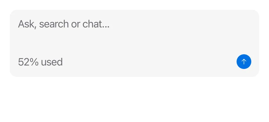
Use a block-end addon with InputGroupTextarea for a footer row, for example a character count and a send button. Set invalid or disabled on the group, or let a Field provide them.
Examples
With textarea
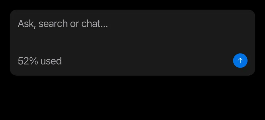
A textarea with a footer row holding a usage label and a button.
import { ArrowUpIcon } from "phosphor-react-native"
import { Icon } from "@/components/ui/icon"
import { InputGroup, InputGroupAddon, InputGroupButton, InputGroupText, InputGroupTextarea } from "@/components/ui/input-group"

export function InputGroupWithTextareaExample() {
  return (
    <InputGroup>
      <InputGroupTextarea
        placeholder="Ask, search or chat..."
        numberOfLines={3}
      />
      <InputGroupAddon align="block-end" className="justify-between">
        <InputGroupText>52% used</InputGroupText>
        <InputGroupButton
          variant="default"
          size="icon-xs"
          accessibilityLabel="Send"
        >
          <Icon as={ArrowUpIcon} />
        </InputGroupButton>
      </InputGroupAddon>
    </InputGroup>
  )
}import EsuissUI
import PhosphorSwift
import SwiftUI
struct InputGroupIcon: View {
let image: Image
var body: some View {
image.frame(width: 16, height: 16)
}
}
struct InputGroupTextareaDemo: View {
@State private var message = ""
var body: some View {
InputGroup {
InputGroupTextarea("Ask, search or chat...", text: $message, lineLimit: 3...8)
InputGroupAddon(align: .blockEnd) {
InputGroupText("52% used")
Spacer(minLength: 0)
InputGroupButton(variant: .default, size: .iconXs) {} label: {
InputGroupIcon(image: Ph.arrowUp.regular)
}
.accessibilityLabel(Text("Send"))
}
}
}
}import androidx.compose.foundation.layout.Spacer
import androidx.compose.foundation.layout.fillMaxWidth
import androidx.compose.runtime.Composable
import androidx.compose.runtime.getValue
import androidx.compose.runtime.mutableStateOf
import androidx.compose.runtime.saveable.rememberSaveable
import androidx.compose.runtime.setValue
import androidx.compose.ui.Modifier
import com.adamglin.PhosphorIcons
import com.adamglin.phosphoricons.Regular
import com.adamglin.phosphoricons.regular.ArrowUp
import com.esuiss.ui.components.ButtonVariant
import com.esuiss.ui.components.Icon
import com.esuiss.ui.components.InputGroup
import com.esuiss.ui.components.InputGroupAddon
import com.esuiss.ui.components.InputGroupAddonAlign
import com.esuiss.ui.components.InputGroupButton
import com.esuiss.ui.components.InputGroupButtonSize
import com.esuiss.ui.components.InputGroupText
import com.esuiss.ui.components.InputGroupTextarea
@Composable
fun InputGroupWithTextarea() {
var value by rememberSaveable { mutableStateOf("") }
InputGroup {
InputGroupTextarea(value, { value = it }, placeholder = "Ask, search or chat...", minLines = 3)
InputGroupAddon(Modifier.fillMaxWidth(), align = InputGroupAddonAlign.BlockEnd) {
InputGroupText("52% used")
Spacer(Modifier.weight(1f))
InputGroupButton(onClick = {}, size = InputGroupButtonSize.IconXs, variant = ButtonVariant.Default) {
Icon(PhosphorIcons.Regular.ArrowUp, contentDescription = "Send")
}
}
}
}Block start
A label addon above the input with block-start.
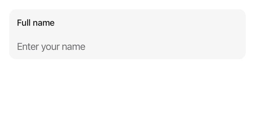
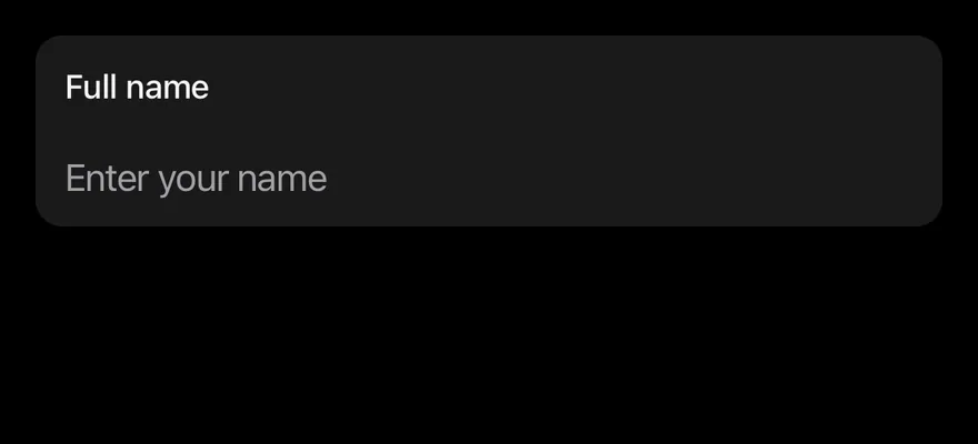
import { InputGroup, InputGroupAddon, InputGroupInput } from "@/components/ui/input-group"
import { Text } from "@/components/ui/text"

export function InputGroupBlockStartExample() {
  return (
    <InputGroup>
      <InputGroupInput placeholder="Enter your name" />
      <InputGroupAddon align="block-start">
        <Text className="text-sm font-medium text-label">Full name</Text>
      </InputGroupAddon>
    </InputGroup>
  )
}import EsuissUI
import SwiftUI
struct InputGroupBlockStartDemo: View {
@State private var name = ""
var body: some View {
InputGroup {
InputGroupInput("Enter your name", text: $name)
InputGroupAddon(align: .blockStart) {
Text("Full name")
.textStyle(.sm, weight: .medium)
.foregroundStyle(Color.label)
}
}
}
}import androidx.compose.runtime.Composable
import androidx.compose.runtime.getValue
import androidx.compose.runtime.mutableStateOf
import androidx.compose.runtime.saveable.rememberSaveable
import androidx.compose.runtime.setValue
import androidx.compose.ui.text.font.FontWeight
import com.esuiss.ui.components.InputGroup
import com.esuiss.ui.components.InputGroupAddon
import com.esuiss.ui.components.InputGroupAddonAlign
import com.esuiss.ui.components.InputGroupInput
import com.esuiss.ui.components.Text
import com.esuiss.ui.theme.EsuissTheme
import com.esuiss.ui.theme.Typography
@Composable
fun InputGroupBlockStart() {
var value by rememberSaveable { mutableStateOf("") }
InputGroup {
InputGroupInput(value, { value = it }, placeholder = "Enter your name")
InputGroupAddon(align = InputGroupAddonAlign.BlockStart) {
Text("Full name", style = Typography.sm.copy(fontWeight = FontWeight.Medium, color = EsuissTheme.colors.label))
}
}
}API Reference
InputGroup
Field container that lays out the input and addons.
ViewProps- About
- Disables the group and its input.
- Type
boolean- Default
- false
- About
- Shows the danger border and tint.
- Type
boolean- Default
- —
InputGroupAddon
Slot for text, icons or buttons beside or around the input.
React.ComponentProps<typeof Pressable>- About
inline-start,inline-end,block-startorblock-end. Defaults toinline-start.- Type
"inline-start""inline-end""block-start""block-end"- Default
- "inline-start"
InputGroupButton
Compact button inside an addon.
React.ComponentProps<typeof Button>- About
xs,sm,icon-xsoricon-sm. Defaults toxs.- Type
keyof typeof BUTTON_SIZE- Default
- "xs"
InputGroupText
Text inside an addon.
React.ComponentProps<typeof Text>InputGroupInput
Single-line input without its own border.
React.ComponentProps<typeof Input>InputGroupTextarea
Multi-line input without its own border.
React.ComponentProps<typeof Textarea>Accessibility
- The container has the
grouprole. - Addons are not separate accessibility elements; their text is not announced with the input, so give the input an
accessibilityLabelthat includes needed context. - Icon-only buttons need an
accessibilityLabel.
Notes
- Uses
bg-control,border-focus,border-dangerandbg-control-disabledtokens; the invalid tint is stronger in dark mode. - Light and dark follow the system appearance.