suiss/uim · React Native Component
Card
A container that groups related content and actions with a header, body and footer.
Card is an open-source mobile component from suiss/uim for React Native and Expo, with SwiftUI and Jetpack Compose versions built from the same design tokens. The @esuiss/uim CLI copies its source into your project, so you own the code.
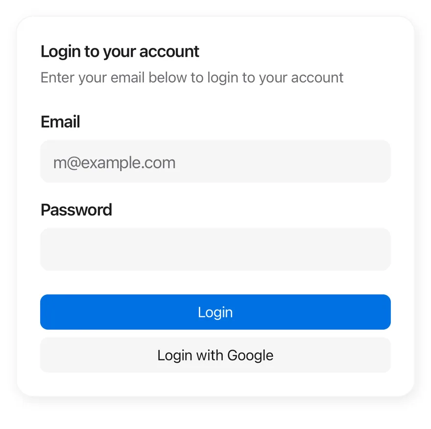
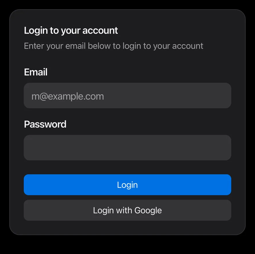
import { View } from "react-native"
import { Button } from "@/components/ui/button"
import { Card, CardContent, CardDescription, CardFooter, CardHeader, CardTitle } from "@/components/ui/card"
import { Input } from "@/components/ui/input"
import { Label } from "@/components/ui/label"
import { Text } from "@/components/ui/text"

export function CardExample() {
  return (
    <Card className="w-full">
      <CardHeader>
        <CardTitle>Login to your account</CardTitle>
        <CardDescription>
          Enter your email below to login to your account
        </CardDescription>
      </CardHeader>
      <CardContent className="gap-4">
        <View className="gap-2">
          <Label nativeID="card-email">Email</Label>
          <Input
            accessibilityLabelledBy="card-email"
            placeholder="[email protected]"
            keyboardType="email-address"
            autoCapitalize="none"
          />
        </View>
        <View className="gap-2">
          <Label nativeID="card-password">Password</Label>
          <Input accessibilityLabelledBy="card-password" secureTextEntry />
        </View>
      </CardContent>
      <CardFooter className="flex-col gap-2">
        <Button block>
          <Text>Login</Text>
        </Button>
        <Button block variant="secondary">
          <Text>Login with Google</Text>
        </Button>
      </CardFooter>
    </Card>
  )
}import EsuissUI
import SwiftUI
struct CardLoginDemo: View {
@State private var email = ""
@State private var password = ""
var body: some View {
Card {
CardHeader("Login to your account", description: "Enter your email below to login to your account")
CardContent {
VStack(alignment: .leading, spacing: 16) {
VStack(alignment: .leading, spacing: 8) {
FieldLabel("Email")
.accessibilityHidden(true)
TextField("Email", text: $email, prompt: Text(verbatim: "[email protected]"))
.textFieldStyle(.input)
.keyboardType(.emailAddress)
.textInputAutocapitalization(.never)
}
VStack(alignment: .leading, spacing: 8) {
FieldLabel("Password")
.accessibilityHidden(true)
SecureField("Password", text: $password, prompt: Text(verbatim: ""))
.textFieldStyle(.input)
}
}
}
CardFooter {
VStack(spacing: 8) {
Button("Login") {}
.buttonStyle(.variant(block: true))
Button("Login with Google") {}
.buttonStyle(.variant(.secondary, block: true))
}
}
}
}
}import androidx.compose.foundation.layout.Arrangement
import androidx.compose.foundation.layout.Column
import androidx.compose.foundation.layout.fillMaxWidth
import androidx.compose.foundation.text.KeyboardOptions
import androidx.compose.runtime.Composable
import androidx.compose.runtime.getValue
import androidx.compose.runtime.mutableStateOf
import androidx.compose.runtime.saveable.rememberSaveable
import androidx.compose.runtime.setValue
import androidx.compose.ui.Modifier
import androidx.compose.ui.semantics.contentDescription
import androidx.compose.ui.semantics.semantics
import androidx.compose.ui.text.input.KeyboardCapitalization
import androidx.compose.ui.text.input.KeyboardType
import androidx.compose.ui.text.input.PasswordVisualTransformation
import androidx.compose.ui.unit.dp
import com.esuiss.ui.components.Button
import com.esuiss.ui.components.ButtonVariant
import com.esuiss.ui.components.Card
import com.esuiss.ui.components.CardContent
import com.esuiss.ui.components.CardFooter
import com.esuiss.ui.components.CardHeader
import com.esuiss.ui.components.Input
import com.esuiss.ui.components.Label
@Composable
fun CardDefault() {
var email by rememberSaveable { mutableStateOf("") }
var password by rememberSaveable { mutableStateOf("") }
Card {
CardHeader("Login to your account", description = "Enter your email below to login to your account")
CardContent {
Column(verticalArrangement = Arrangement.spacedBy(16.dp)) {
Column(verticalArrangement = Arrangement.spacedBy(8.dp)) {
Label("Email")
Input(
email,
{ email = it },
Modifier.semantics { contentDescription = "Email" },
placeholder = "[email protected]",
keyboardOptions = KeyboardOptions(
capitalization = KeyboardCapitalization.None,
autoCorrectEnabled = false,
keyboardType = KeyboardType.Email,
),
)
}
Column(verticalArrangement = Arrangement.spacedBy(8.dp)) {
Label("Password")
Input(
password,
{ password = it },
Modifier.semantics { contentDescription = "Password" },
keyboardOptions = KeyboardOptions(keyboardType = KeyboardType.Password),
visualTransformation = PasswordVisualTransformation(),
)
}
}
}
CardFooter {
Column(Modifier.fillMaxWidth(), verticalArrangement = Arrangement.spacedBy(8.dp)) {
Button("Login", onClick = {}, block = true)
Button("Login with Google", onClick = {}, variant = ButtonVariant.Secondary, block = true)
}
}
}
}Card is a rounded View that stacks a CardHeader, CardContent and CardFooter with consistent spacing. The default variant is a raised surface with a hairline border and a shadow; the filled variant is a flat secondary surface.
The sm size reduces the padding and gaps for dense layouts. All parts read the size from context, so their horizontal padding stays aligned.
Installation
$ pnpm dlx @esuiss/uim@latest add card$ pnpm dlx @esuiss/uim@latest add card --platform swift$ pnpm dlx @esuiss/uim@latest add card --platform kotlinThe CLI also adds what it builds on: Text.
Manual
- Install the dependencies:
npx expo install cn-
Add the pieces it builds on: Text.
-
Copy the source into
components/ui/card.tsx:
import { cn } from "cn"
import * as React from "react"
import { View } from "react-native"
import { Text, TextClassContext } from "@/components/ui/text"

type CardSize = "default" | "sm"

type CardVariant = "default" | "filled"

const CardSizeContext = React.createContext<CardSize>("default")

const SPACING_X: Record<CardSize, string> = { default: "px-6", sm: "px-4" }

function Card({
  className,
size = "default",- Update the import paths to match your project.
- Install the dependencies:
npx expo install cn-
Add the pieces it builds on: Text.
-
Copy the source into
components/ui/card.tsx:
import { cn } from "cn"
import * as React from "react"
import { View } from "react-native"
import { Text, TextClassContext } from "@/components/ui/text"

type CardSize = "default" | "sm"

type CardVariant = "default" | "filled"

const CardSizeContext = React.createContext<CardSize>("default")

const SPACING_X: Record<CardSize, string> = { default: "px-6", sm: "px-4" }

function Card({
  className,
size = "default",- Update the import paths to match your project.
-
Add the pieces it builds on: Text.
-
Copy the source into
components/ui/card.tsx:
import * as React from "react"
import { StyleSheet, View } from "react-native"
import { Text, TextStyleContext } from "@/components/ui/text"
import { fontSize, radius, shadow, useTheme } from "@/components/ui/theme"

type CardSize = "default" | "sm"

type CardVariant = "default" | "filled"

const CardSizeContext = React.createContext<CardSize>("default")

const SPACING: Record<CardSize, number> = { default: 24, sm: 16 }

const styles = StyleSheet.create({
  card: {
flexDirection: "column",- Update the import paths to match your project.
-
Target iOS 17 or later.
-
Copy the theme files every view uses:
import SwiftUI
import UIKit

struct RGBA: Sendable {
  let red: CGFloat
  let green: CGFloat
  let blue: CGFloat
  let alpha: CGFloat

  init(_ hex: UInt32, _ alpha: CGFloat = 1) {
    red = CGFloat((hex >> 16) & 0xFF) / 255
    green = CGFloat((hex >> 8) & 0xFF) / 255
    blue = CGFloat(hex & 0xFF) / 255
    self.alpha = alpha
}import SwiftUI
extension Color {
public static let surface = Color.adaptive(light: .init(0xFFFFFF), dark: .init(0x000000))
public static let surfaceSecondary = Color.adaptive(light: .init(0xF5F5F7), dark: .init(0x161617))
public static let surfaceTertiary = Color.adaptive(light: .init(0xE8E8ED), dark: .init(0x2C2C2E))
public static let surfaceRaised = Color.adaptive(light: .init(0xFFFFFF), dark: .init(0x1D1D1F))
public static let label = Color.adaptive(light: .init(0x1D1D1F), dark: .init(0xF5F5F7))
public static let labelSecondary = Color.adaptive(light: .init(0x6E6E73), dark: .init(0xA1A1A6))
public static let labelTertiary = Color.adaptive(light: .init(0x86868B), dark: .init(0x86868B))
public static let labelQuaternary = Color.adaptive(light: .init(0xD2D2D7), dark: .init(0x424245))
public static let control = Color.adaptive(light: .init(0x000000, 0.04), dark: .init(0xFFFFFF, 0.1))
public static let controlPressed = Color.adaptive(light: .init(0x000000, 0.12), dark: .init(0xFFFFFF, 0.22))
public static let controlSelected = Color.adaptive(light: .init(0x1D1D1F), dark: .init(0xF5F5F7))
public static let controlDisabled = Color.adaptive(light: .init(0x000000, 0.03), dark: .init(0xFFFFFF, 0.05))
public static let onControlSelected = Color.adaptive(light: .init(0xFFFFFF), dark: .init(0x000000))- Copy the source:
import SwiftUI

public struct Card<Content: View>: View {
  public enum Variant: CaseIterable, Sendable {
    case `default`, filled
  }

  public enum Size: CaseIterable, Sendable {
    case `default`, sm

    var spacing: CGFloat {
      switch self {
      case .default: 24
      case .sm: 16
      }
}- Add the files to your app target.
- Set
minSdkto 24 or higher and add the dependencies:
implementation(platform("androidx.compose:compose-bom:2026.09.00"))
implementation("androidx.compose.foundation:foundation")
implementation("androidx.compose.ui:ui")- Copy the theme files every view uses:
package com.esuiss.ui.theme

import androidx.compose.foundation.isSystemInDarkTheme
import androidx.compose.runtime.Composable
import androidx.compose.runtime.CompositionLocalProvider
import androidx.compose.runtime.Immutable
import androidx.compose.runtime.staticCompositionLocalOf
import androidx.compose.ui.Modifier
import androidx.compose.ui.draw.dropShadow
import androidx.compose.ui.graphics.Color
import androidx.compose.ui.graphics.Shape
import androidx.compose.ui.graphics.shadow.Shadow as DropShadow
import androidx.compose.ui.text.TextStyle
import androidx.compose.ui.text.style.LineHeightStyle
import androidx.compose.ui.unit.Dp
import androidx.compose.ui.unit.DpOffsetpackage com.esuiss.ui.theme
import androidx.compose.runtime.Immutable
import androidx.compose.ui.graphics.Color
import androidx.compose.ui.unit.dp
@Immutable
data class Colors(
val surface: Color,
val surfaceSecondary: Color,
val surfaceTertiary: Color,
val surfaceRaised: Color,
val label: Color,
val labelSecondary: Color,
val labelTertiary: Color,
val labelQuaternary: Color,- Copy the source and every file it uses:
package com.esuiss.ui.components

import androidx.compose.foundation.background
import androidx.compose.foundation.border
import androidx.compose.foundation.layout.Arrangement
import androidx.compose.foundation.layout.Column
import androidx.compose.foundation.layout.ColumnScope
import androidx.compose.foundation.layout.Row
import androidx.compose.foundation.layout.RowScope
import androidx.compose.foundation.layout.fillMaxWidth
import androidx.compose.foundation.layout.padding
import androidx.compose.foundation.shape.RoundedCornerShape
import androidx.compose.foundation.text.BasicText
import androidx.compose.runtime.Composable
import androidx.compose.runtime.CompositionLocalProvider
import androidx.compose.runtime.compositionLocalOfpackage com.esuiss.ui.components
import androidx.compose.runtime.compositionLocalOf
import androidx.compose.ui.graphics.Color
import androidx.compose.ui.text.TextStyle
import androidx.compose.ui.unit.Dp
import androidx.compose.ui.unit.dp
val LocalContentStyle = compositionLocalOf { TextStyle.Default }
val LocalContentColor = compositionLocalOf { Color.Unspecified }
val LocalIconSize = compositionLocalOf { 20.dp }- Update the
com.esuiss.uipackage names to match your project.
Usage
import { Card, CardHeader, CardTitle, CardDescription, CardAction, CardContent, CardFooter } from "@/components/ui/card"<Card className="w-full">
<CardHeader>
<CardTitle>Login to your account</CardTitle>
<CardDescription>
Enter your email below to login to your account
</CardDescription>
</CardHeader>
<CardContent className="gap-4">
<View className="gap-2">
<Label nativeID="card-email">Email</Label>
<Input
accessibilityLabelledBy="card-email"
placeholder="[email protected]"
keyboardType="email-address"
autoCapitalize="none"
/>
</View>
<View className="gap-2">
<Label nativeID="card-password">Password</Label>
<Input accessibilityLabelledBy="card-password" secureTextEntry />
</View>
</CardContent>
<CardFooter className="flex-col gap-2">
<Button block>
<Text>Login</Text>
</Button>
<Button block variant="secondary">
<Text>Login with Google</Text>
</Button>
</CardFooter>
</Card>Put a CardTitle and CardDescription in CardHeader. Add a CardAction anywhere in the header and it is placed in the top-end corner beside the title.
To show an image edge to edge, place it directly in the card before the header and add pt-0 to the card; only the header, content and footer are padded horizontally.
Examples
Small
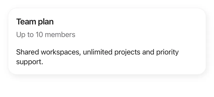
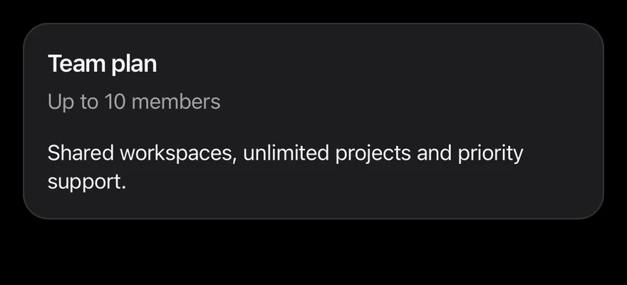
The compact sm size.
import { Card, CardContent, CardDescription, CardHeader, CardTitle } from "@/components/ui/card"
import { Text } from "@/components/ui/text"

export function CardSmallExample() {
  return (
    <Card size="sm" className="w-full">
      <CardHeader>
        <CardTitle>Team plan</CardTitle>
        <CardDescription>Up to 10 members</CardDescription>
      </CardHeader>
      <CardContent>
        <Text className="text-sm">
          Shared workspaces, unlimited projects and priority support.
        </Text>
      </CardContent>
    </Card>
  )
}import EsuissUI
import SwiftUI
struct CardSmallExample: View {
var body: some View {
Card(size: .sm) {
CardHeader("Team plan", description: "Up to 10 members")
CardContent {
Text("Shared workspaces, unlimited projects and priority support.")
.textStyle(.sm)
}
}
}
}import androidx.compose.runtime.Composable
import com.esuiss.ui.components.Card
import com.esuiss.ui.components.CardContent
import com.esuiss.ui.components.CardHeader
import com.esuiss.ui.components.CardSize
import com.esuiss.ui.components.Text
import com.esuiss.ui.theme.Typography
@Composable
fun CardSmall() {
Card(size = CardSize.Sm) {
CardHeader("Team plan", description = "Up to 10 members")
CardContent {
Text("Shared workspaces, unlimited projects and priority support.", style = Typography.sm)
}
}
}With action
A CardAction button beside the title.
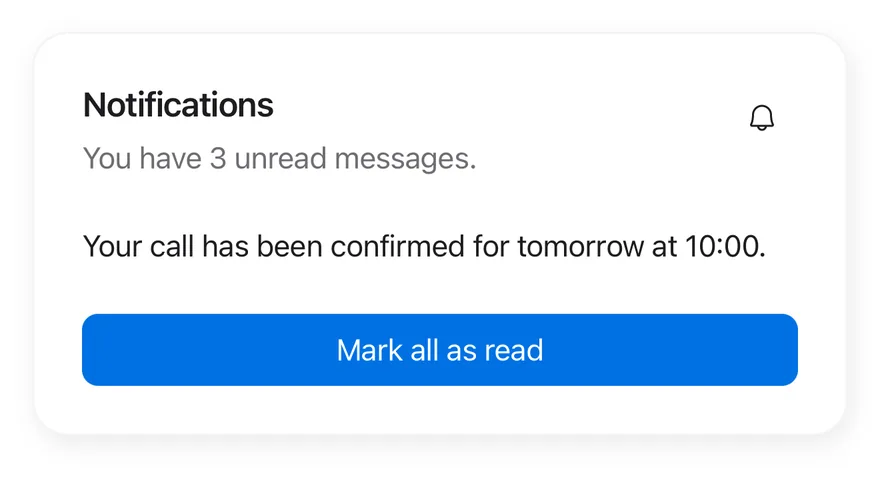
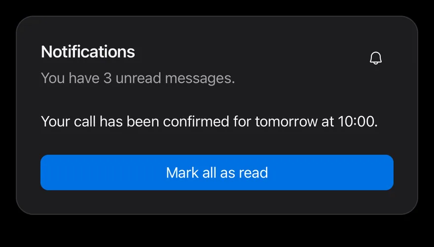
import { BellIcon } from "phosphor-react-native"
import { Button } from "@/components/ui/button"
import { Card, CardAction, CardContent, CardDescription, CardFooter, CardHeader, CardTitle } from "@/components/ui/card"
import { Icon } from "@/components/ui/icon"
import { Text } from "@/components/ui/text"

export function CardWithActionExample() {
  return (
    <Card className="w-full">
      <CardHeader>
        <CardTitle>Notifications</CardTitle>
        <CardDescription>You have 3 unread messages.</CardDescription>
        <CardAction>
          <Button size="icon" variant="ghost">
            <Icon as={BellIcon} />
          </Button>
        </CardAction>
      </CardHeader>
      <CardContent>
        <Text className="text-sm">
          Your call has been confirmed for tomorrow at 10:00.
        </Text>
      </CardContent>
      <CardFooter>
        <Button block>
          <Text>Mark all as read</Text>
        </Button>
      </CardFooter>
    </Card>
  )
}import EsuissUI
import PhosphorSwift
import SwiftUI
struct CardWithActionExample: View {
var body: some View {
Card {
CardHeader("Notifications", description: "You have 3 unread messages.") {
Button {} label: {
Ph.bell.regular
.frame(width: VariantButtonStyle.Size.icon.iconSize, height: VariantButtonStyle.Size.icon.iconSize)
}
.buttonStyle(.variant(.ghost, size: .icon))
.accessibilityLabel(Text("Notifications"))
}
CardContent {
Text("Your call has been confirmed for tomorrow at 10:00.")
.textStyle(.sm)
}
CardFooter {
Button("Mark all as read") {}
.buttonStyle(.variant(block: true))
}
}
}
}import androidx.compose.runtime.Composable
import androidx.compose.ui.semantics.contentDescription
import com.adamglin.PhosphorIcons
import com.adamglin.phosphoricons.Regular
import com.adamglin.phosphoricons.regular.Bell
import com.esuiss.ui.components.Button
import com.esuiss.ui.components.ButtonSize
import com.esuiss.ui.components.ButtonVariant
import com.esuiss.ui.components.Card
import com.esuiss.ui.components.CardContent
import com.esuiss.ui.components.CardFooter
import com.esuiss.ui.components.CardHeader
import com.esuiss.ui.components.Icon
import com.esuiss.ui.components.Text
import com.esuiss.ui.theme.Typography
@Composable
fun CardWithAction() {
Card {
CardHeader(
"Notifications",
description = "You have 3 unread messages.",
action = {
Button(onClick = {}, variant = ButtonVariant.Ghost, size = ButtonSize.Icon) {
Icon(PhosphorIcons.Regular.Bell, contentDescription = "Notifications")
}
},
)
CardContent {
Text("Your call has been confirmed for tomorrow at 10:00.", style = Typography.sm)
}
CardFooter {
Button("Mark all as read", onClick = {}, block = true)
}
}
}With image
An edge-to-edge image above the header.
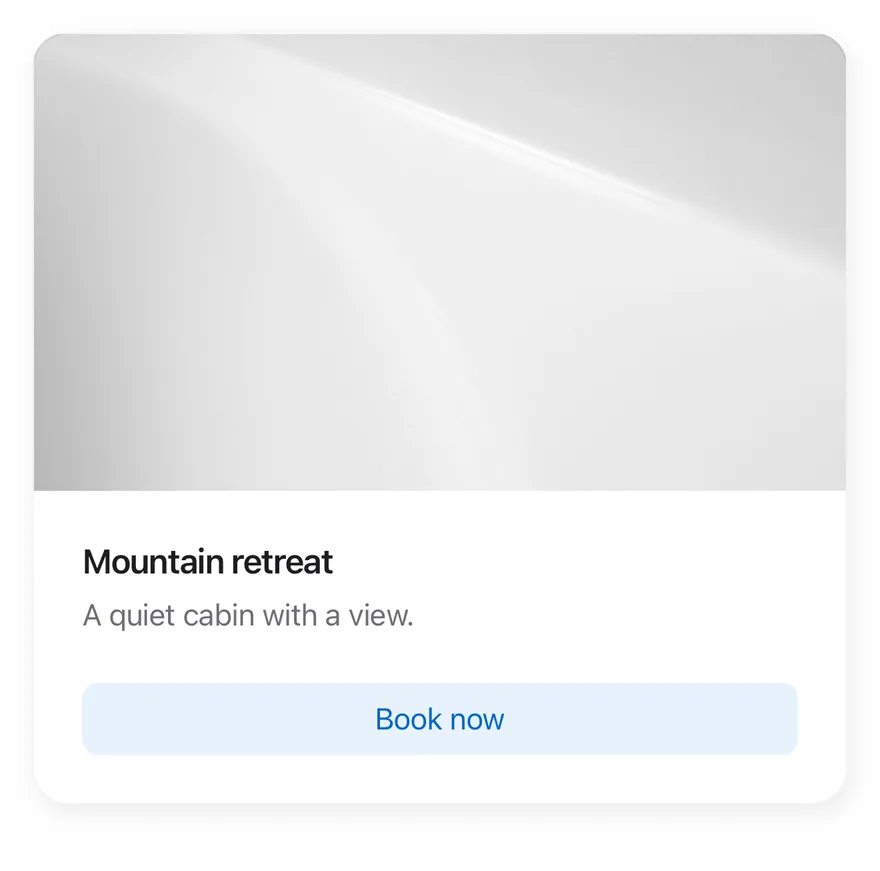
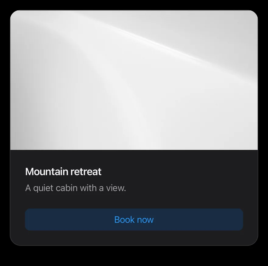
import { Image } from "react-native"
import { Button } from "@/components/ui/button"
import { Card, CardDescription, CardFooter, CardHeader, CardTitle } from "@/components/ui/card"
import { Text } from "@/components/ui/text"

export function CardWithImageExample() {
  return (
    <Card className="w-full pt-0">
      <Image
        source={{
          uri: "https://images.unsplash.com/photo-1588345921523-c2dcdb7f1dcd?w=800&dpr=2&q=80",
        }}
        className="aspect-video w-full"
      />
      <CardHeader>
        <CardTitle>Mountain retreat</CardTitle>
        <CardDescription>A quiet cabin with a view.</CardDescription>
      </CardHeader>
      <CardFooter>
        <Button block variant="tinted">
          <Text>Book now</Text>
        </Button>
      </CardFooter>
    </Card>
  )
}import EsuissUI
import SwiftUI
struct CardWithImageExample: View {
var body: some View {
Card {
Color.surfaceSecondary
.aspectRatio(16.0 / 9.0, contentMode: .fit)
.overlay {
AsyncImage(url: CardImage.url) { phase in
if let image = phase.image {
image.resizable().scaledToFill()
}
}
}
.clipped()
.padding(.top, -24)
.accessibilityHidden(true)
CardHeader("Mountain retreat", description: "A quiet cabin with a view.")
CardFooter {
Button("Book now") {}
.buttonStyle(.variant(.tinted, block: true))
}
}
}
}
enum CardImage {
static let url = URL(string: "https://images.unsplash.com/photo-1588345921523-c2dcdb7f1dcd?w=800&dpr=2&q=80")
}
let url = URL(string: "https://images.unsplash.com/photo-1588345921523-c2dcdb7f1dcd?w=800&dpr=2&q=80")import androidx.compose.foundation.background
import androidx.compose.foundation.layout.Box
import androidx.compose.foundation.layout.aspectRatio
import androidx.compose.foundation.layout.fillMaxWidth
import androidx.compose.runtime.Composable
import androidx.compose.ui.Modifier
import androidx.compose.ui.graphics.Brush
import androidx.compose.ui.layout.layout
import com.esuiss.ui.components.Button
import com.esuiss.ui.components.ButtonVariant
import com.esuiss.ui.components.Card
import com.esuiss.ui.components.CardFooter
import com.esuiss.ui.components.CardHeader
import com.esuiss.ui.components.CardSize
import com.esuiss.ui.theme.EsuissTheme
@Composable
fun CardWithImage() {
val colors = EsuissTheme.colors
val inset = CardSize.Default.spacing
Card {
Box(
Modifier
.layout { measurable, constraints ->
val placeable = measurable.measure(constraints)
val shift = inset.roundToPx()
layout(placeable.width, placeable.height - shift) { placeable.place(0, -shift) }
}
.fillMaxWidth()
.aspectRatio(16f / 9f)
.background(Brush.linearGradient(listOf(colors.teal, colors.blue, colors.indigo))),
)
CardHeader("Mountain retreat", description = "A quiet cabin with a view.")
CardFooter {
Button("Book now", onClick = {}, variant = ButtonVariant.Tinted, block = true)
}
}
}Filled
The flat filled variant.
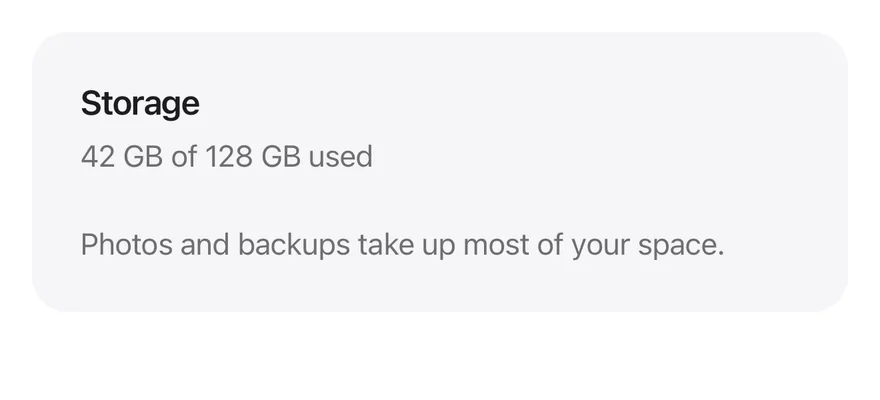
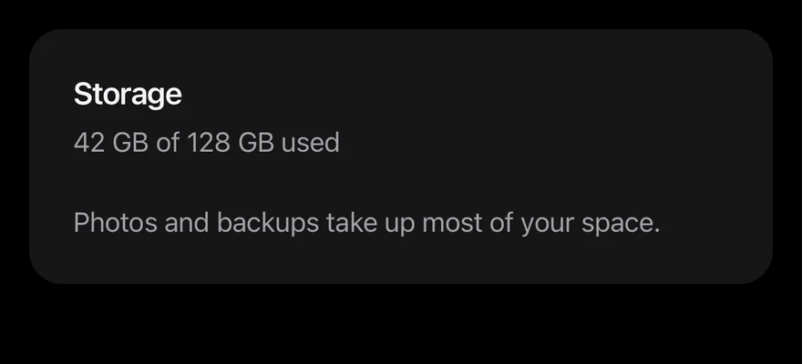
import { Card, CardContent, CardDescription, CardHeader, CardTitle } from "@/components/ui/card"
import { Text } from "@/components/ui/text"

export function CardFilledExample() {
  return (
    <Card variant="filled" className="w-full">
      <CardHeader>
        <CardTitle>Storage</CardTitle>
        <CardDescription>42 GB of 128 GB used</CardDescription>
      </CardHeader>
      <CardContent>
        <Text className="text-sm text-label-secondary">
          Photos and backups take up most of your space.
        </Text>
      </CardContent>
    </Card>
  )
}import EsuissUI
import SwiftUI
struct CardFilledExample: View {
var body: some View {
Card(.filled) {
CardHeader("Storage", description: "42 GB of 128 GB used")
CardContent {
Text("Photos and backups take up most of your space.")
.textStyle(.sm)
.foregroundStyle(Color.labelSecondary)
}
}
}
}import androidx.compose.runtime.Composable
import com.esuiss.ui.components.Card
import com.esuiss.ui.components.CardContent
import com.esuiss.ui.components.CardHeader
import com.esuiss.ui.components.CardVariant
import com.esuiss.ui.components.Text
import com.esuiss.ui.theme.EsuissTheme
import com.esuiss.ui.theme.Typography
@Composable
fun CardFilled() {
Card(variant = CardVariant.Filled) {
CardHeader("Storage", description = "42 GB of 128 GB used")
CardContent {
Text(
"Photos and backups take up most of your space.",
style = Typography.sm.copy(color = EsuissTheme.colors.labelSecondary),
)
}
}
}API Reference
Card
Outer container that sets the size and variant.
React.ComponentProps<typeof View>React.RefAttributes<View>- About
defaultorsm.- Type
CardSize- Default
- "default"
- About
default(raised) orfilled.- Type
CardVariant- Default
- "default"
CardHeader
Title area; places a CardAction beside the text.
React.ComponentProps<typeof View>React.RefAttributes<View>CardTitle
Bold heading.
React.ComponentProps<typeof Text>React.RefAttributes<typeof Text>CardDescription
Secondary text below the title.
React.ComponentProps<typeof Text>React.RefAttributes<typeof Text>CardAction
Slot for a button in the header.
React.ComponentProps<typeof View>React.RefAttributes<View>CardContent
Padded body.
React.ComponentProps<typeof View>React.RefAttributes<View>CardFooter
Padded row for actions.
React.ComponentProps<typeof View>React.RefAttributes<View>Accessibility
CardTitlehas theheadingrole.- The card itself adds no role; actions inside provide their own.
Notes
- Uses
bg-surface-raisedwith a shadow, orbg-surface-secondaryforfilled; the border is stronger in dark mode. - Light and dark follow the system appearance.