suiss/uim · React Native Component
Collapsible
A section that shows or hides its content when a trigger is pressed.
Collapsible is an open-source mobile component from suiss/uim for React Native and Expo, with SwiftUI and Jetpack Compose versions built from the same design tokens. The @esuiss/uim CLI copies its source into your project, so you own the code.
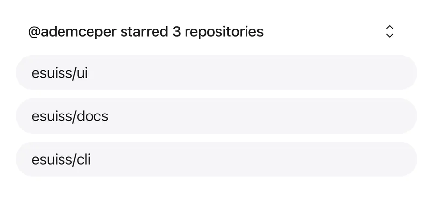
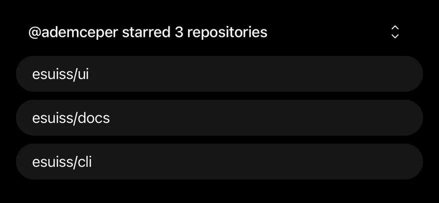
import { CaretUpDownIcon } from "phosphor-react-native"
import * as React from "react"
import { View } from "react-native"
import { Button } from "@/components/ui/button"
import { Collapsible, CollapsibleContent, CollapsibleTrigger } from "@/components/ui/collapsible"
import { Icon } from "@/components/ui/icon"
import { Text } from "@/components/ui/text"

const repositories = ["esuiss/ui", "esuiss/docs", "esuiss/cli"]

function CollapsibleDemo({
  initialOpen = false,
  disabled = false,
}: {
  initialOpen?: boolean
  disabled?: boolean
}) {
  const [open, setOpen] = React.useState(initialOpen)
  return (
    <Collapsible
      open={open}
      onOpenChange={setOpen}
      disabled={disabled}
      className="w-full gap-2"
    >
      <View className="flex-row items-center justify-between gap-4 px-3">
        <Text className="text-sm font-medium">
          @ademceper starred 3 repositories
        </Text>
        <CollapsibleTrigger
          render={
            <Button variant="ghost" size="icon-sm" disabled={disabled}>
              <Icon as={CaretUpDownIcon} className="size-4" />
            </Button>
          }
        />
      </View>
      <View className="rounded-2xl bg-surface-secondary px-4 py-2">
        <Text className="text-sm">{repositories[0]}</Text>
      </View>
      <CollapsibleContent className="gap-2">
        {repositories.slice(1).map((repository) => (
          <View
            key={repository}
            className="rounded-2xl bg-surface-secondary px-4 py-2"
          >
            <Text className="text-sm">{repository}</Text>
          </View>
        ))}
      </CollapsibleContent>
    </Collapsible>
  )
}

export function CollapsibleOpenByDefaultExample() {
  return (
    <CollapsibleDemo initialOpen />
  )
}import EsuissUI
import PhosphorSwift
import SwiftUI
struct CollapsibleOpenByDefaultExample: View {
var body: some View {
CollapsibleDemo(initialOpen: true)
}
}
let collapsibleRepositories = ["esuiss/ui", "esuiss/docs", "esuiss/cli"]
struct CollapsibleDemo: View {
var disabled = false
@State private var open: Bool
init(initialOpen: Bool = false, disabled: Bool = false) {
self.disabled = disabled
_open = State(initialValue: initialOpen)
}
var body: some View {
Collapsible(isExpanded: $open, spacing: 8) {
HStack(spacing: 16) {
Text("@ademceper starred 3 repositories")
.textStyle(.sm, weight: .medium)
.foregroundStyle(Color.label)
.frame(maxWidth: .infinity, alignment: .leading)
CollapsibleTrigger {
Ph.caretUpDown.regular
.frame(width: 16, height: 16)
}
.buttonStyle(.variant(.ghost, size: .iconSm))
.disabled(disabled)
}
.padding(.horizontal, 12)
CollapsibleRepository(name: collapsibleRepositories[0])
CollapsibleContent {
VStack(spacing: 8) {
ForEach(collapsibleRepositories.dropFirst(), id: \.self) { repository in
CollapsibleRepository(name: repository)
}
}
}
}
.frame(maxWidth: .infinity)
}
}
struct CollapsibleRepository: View {
let name: String
var body: some View {
Text(verbatim: name)
.textStyle(.sm)
.foregroundStyle(Color.label)
.padding(.horizontal, 16)
.padding(.vertical, 8)
.frame(maxWidth: .infinity, alignment: .leading)
.background(Color.surfaceSecondary, in: RoundedRectangle(cornerRadius: Radius.xl2, style: .continuous))
}
}import androidx.compose.foundation.background
import androidx.compose.foundation.layout.Arrangement
import androidx.compose.foundation.layout.Column
import androidx.compose.foundation.layout.Row
import androidx.compose.foundation.layout.fillMaxWidth
import androidx.compose.foundation.layout.padding
import androidx.compose.foundation.shape.RoundedCornerShape
import androidx.compose.runtime.Composable
import androidx.compose.runtime.getValue
import androidx.compose.runtime.mutableStateOf
import androidx.compose.runtime.saveable.rememberSaveable
import androidx.compose.runtime.setValue
import androidx.compose.ui.Alignment
import androidx.compose.ui.Modifier
import androidx.compose.ui.text.font.FontWeight
import androidx.compose.ui.unit.dp
import com.adamglin.PhosphorIcons
import com.adamglin.phosphoricons.Regular
import com.adamglin.phosphoricons.regular.CaretUpDown
import com.esuiss.ui.components.Button
import com.esuiss.ui.components.ButtonSize
import com.esuiss.ui.components.ButtonVariant
import com.esuiss.ui.components.Collapsible
import com.esuiss.ui.components.CollapsibleContent
import com.esuiss.ui.components.Icon
import com.esuiss.ui.components.Text
import com.esuiss.ui.theme.EsuissTheme
import com.esuiss.ui.theme.Radius
import com.esuiss.ui.theme.Typography
@Composable
fun CollapsibleOpenByDefaultExample() {
CollapsibleDemo(initialOpen = true)
}
val CollapsibleRepositories = listOf("esuiss/ui", "esuiss/docs", "esuiss/cli")
@Composable
fun CollapsibleRepository(name: String) {
Text(
name,
modifier = Modifier
.fillMaxWidth()
.background(EsuissTheme.colors.surfaceSecondary, RoundedCornerShape(Radius.xl2))
.padding(horizontal = 16.dp, vertical = 8.dp),
style = Typography.sm,
)
}
@Composable
fun CollapsibleDemo(initialOpen: Boolean = false, disabled: Boolean = false) {
var open by rememberSaveable { mutableStateOf(initialOpen) }
Collapsible(
expanded = open,
onExpandedChange = { open = it },
modifier = Modifier.fillMaxWidth(),
enabled = !disabled,
) {
Column(verticalArrangement = Arrangement.spacedBy(8.dp)) {
Row(
modifier = Modifier.fillMaxWidth().padding(horizontal = 12.dp),
horizontalArrangement = Arrangement.spacedBy(16.dp),
verticalAlignment = Alignment.CenterVertically,
) {
Text(
"@ademceper starred 3 repositories",
modifier = Modifier.weight(1f),
style = Typography.sm.copy(fontWeight = FontWeight.Medium),
)
Button(
onClick = { open = !open },
variant = ButtonVariant.Ghost,
size = ButtonSize.IconSm,
enabled = !disabled,
) {
Icon(PhosphorIcons.Regular.CaretUpDown, contentDescription = "Toggle", size = 16.dp)
}
}
CollapsibleRepository(CollapsibleRepositories[0])
CollapsibleContent {
Column(verticalArrangement = Arrangement.spacedBy(8.dp)) {
CollapsibleRepositories.drop(1).forEach { CollapsibleRepository(it) }
}
}
}
}
}Collapsible is an unstyled root with a CollapsibleTrigger and a CollapsibleContent panel. It handles the open state and accessibility, and leaves the look to you.
Use it for a single show-more section. For a list of sections where opening one can close another, use Accordion.
Installation
$ pnpm dlx @esuiss/uim@latest add collapsible$ pnpm dlx @esuiss/uim@latest add collapsible --platform swift$ pnpm dlx @esuiss/uim@latest add collapsible --platform kotlinManual
-
Add the pieces it builds on: the primitives
components/primitives/collapsible.tsx. -
Copy the source into
components/ui/collapsible.tsx:
import * as CollapsiblePrimitive from "@/components/primitives/collapsible"

const Collapsible = CollapsiblePrimitive.Root

const CollapsibleTrigger = CollapsiblePrimitive.Trigger

const CollapsibleContent = CollapsiblePrimitive.Panel

export { Collapsible, CollapsibleContent, CollapsibleTrigger }- Update the import paths to match your project.
-
Add the pieces it builds on: the primitives
components/primitives/collapsible.tsx. -
Copy the source into
components/ui/collapsible.tsx:
import * as CollapsiblePrimitive from "@/components/primitives/collapsible"

const Collapsible = CollapsiblePrimitive.Root

const CollapsibleTrigger = CollapsiblePrimitive.Trigger

const CollapsibleContent = CollapsiblePrimitive.Panel

export { Collapsible, CollapsibleContent, CollapsibleTrigger }- Update the import paths to match your project.
-
Add the pieces it builds on: the primitives
components/primitives/collapsible.tsx. -
Copy the source into
components/ui/collapsible.tsx:
import * as CollapsiblePrimitive from "@/components/primitives/collapsible"

const Collapsible = CollapsiblePrimitive.Root

const CollapsibleTrigger = CollapsiblePrimitive.Trigger

const CollapsibleContent = CollapsiblePrimitive.Panel

export { Collapsible, CollapsibleContent, CollapsibleTrigger }- Update the import paths to match your project.
-
Target iOS 17 or later.
-
Copy the theme files every view uses:
import SwiftUI
import UIKit

struct RGBA: Sendable {
  let red: CGFloat
  let green: CGFloat
  let blue: CGFloat
  let alpha: CGFloat

  init(_ hex: UInt32, _ alpha: CGFloat = 1) {
    red = CGFloat((hex >> 16) & 0xFF) / 255
    green = CGFloat((hex >> 8) & 0xFF) / 255
    blue = CGFloat(hex & 0xFF) / 255
    self.alpha = alpha
}import SwiftUI
extension Color {
public static let surface = Color.adaptive(light: .init(0xFFFFFF), dark: .init(0x000000))
public static let surfaceSecondary = Color.adaptive(light: .init(0xF5F5F7), dark: .init(0x161617))
public static let surfaceTertiary = Color.adaptive(light: .init(0xE8E8ED), dark: .init(0x2C2C2E))
public static let surfaceRaised = Color.adaptive(light: .init(0xFFFFFF), dark: .init(0x1D1D1F))
public static let label = Color.adaptive(light: .init(0x1D1D1F), dark: .init(0xF5F5F7))
public static let labelSecondary = Color.adaptive(light: .init(0x6E6E73), dark: .init(0xA1A1A6))
public static let labelTertiary = Color.adaptive(light: .init(0x86868B), dark: .init(0x86868B))
public static let labelQuaternary = Color.adaptive(light: .init(0xD2D2D7), dark: .init(0x424245))
public static let control = Color.adaptive(light: .init(0x000000, 0.04), dark: .init(0xFFFFFF, 0.1))
public static let controlPressed = Color.adaptive(light: .init(0x000000, 0.12), dark: .init(0xFFFFFF, 0.22))
public static let controlSelected = Color.adaptive(light: .init(0x1D1D1F), dark: .init(0xF5F5F7))
public static let controlDisabled = Color.adaptive(light: .init(0x000000, 0.03), dark: .init(0xFFFFFF, 0.05))
public static let onControlSelected = Color.adaptive(light: .init(0xFFFFFF), dark: .init(0x000000))- Copy the source:
import SwiftUI

public struct Collapsible<Content: View>: View {
  let external: Binding<Bool>?
  let spacing: CGFloat
  let content: Content

  @State private var local = false
  @Environment(\.accessibilityReduceMotion) private var reduceMotion

  public init(
    isExpanded: Binding<Bool>,
    spacing: CGFloat = 0,
    @ViewBuilder content: () -> Content
  ) {
self.external = isExpanded- Add the files to your app target.
- Set
minSdkto 24 or higher and add the dependencies:
implementation(platform("androidx.compose:compose-bom:2026.09.00"))
implementation("androidx.compose.foundation:foundation")
implementation("androidx.compose.ui:ui")- Copy the theme files every view uses:
package com.esuiss.ui.theme

import androidx.compose.foundation.isSystemInDarkTheme
import androidx.compose.runtime.Composable
import androidx.compose.runtime.CompositionLocalProvider
import androidx.compose.runtime.Immutable
import androidx.compose.runtime.staticCompositionLocalOf
import androidx.compose.ui.Modifier
import androidx.compose.ui.draw.dropShadow
import androidx.compose.ui.graphics.Color
import androidx.compose.ui.graphics.Shape
import androidx.compose.ui.graphics.shadow.Shadow as DropShadow
import androidx.compose.ui.text.TextStyle
import androidx.compose.ui.text.style.LineHeightStyle
import androidx.compose.ui.unit.Dp
import androidx.compose.ui.unit.DpOffsetpackage com.esuiss.ui.theme
import androidx.compose.runtime.Immutable
import androidx.compose.ui.graphics.Color
import androidx.compose.ui.unit.dp
@Immutable
data class Colors(
val surface: Color,
val surfaceSecondary: Color,
val surfaceTertiary: Color,
val surfaceRaised: Color,
val label: Color,
val labelSecondary: Color,
val labelTertiary: Color,
val labelQuaternary: Color,- Copy the source and every file it uses:
package com.esuiss.ui.components

import androidx.compose.animation.AnimatedVisibility
import androidx.compose.animation.core.tween
import androidx.compose.animation.expandVertically
import androidx.compose.animation.fadeIn
import androidx.compose.animation.fadeOut
import androidx.compose.animation.shrinkVertically
import androidx.compose.foundation.clickable
import androidx.compose.foundation.interaction.MutableInteractionSource
import androidx.compose.foundation.layout.Column
import androidx.compose.foundation.layout.ColumnScope
import androidx.compose.foundation.layout.Row
import androidx.compose.foundation.layout.RowScope
import androidx.compose.runtime.Composable
import androidx.compose.runtime.CompositionLocalProviderpackage com.esuiss.ui.components
import androidx.compose.foundation.background
import androidx.compose.foundation.border
import androidx.compose.foundation.clickable
import androidx.compose.foundation.interaction.MutableInteractionSource
import androidx.compose.foundation.interaction.collectIsPressedAsState
import androidx.compose.foundation.layout.Arrangement
import androidx.compose.foundation.layout.Row
import androidx.compose.foundation.layout.RowScope
import androidx.compose.foundation.layout.fillMaxWidth
import androidx.compose.foundation.layout.height
import androidx.compose.foundation.layout.padding
import androidx.compose.foundation.layout.size
import androidx.compose.foundation.shape.CircleShape
import androidx.compose.foundation.shape.RoundedCornerShapepackage com.esuiss.ui.components
import androidx.compose.foundation.background
import androidx.compose.foundation.gestures.Orientation
import androidx.compose.foundation.layout.Arrangement
import androidx.compose.foundation.layout.Box
import androidx.compose.foundation.layout.Row
import androidx.compose.foundation.layout.RowScope
import androidx.compose.foundation.layout.padding
import androidx.compose.foundation.shape.CircleShape
import androidx.compose.foundation.shape.CornerSize
import androidx.compose.foundation.shape.RoundedCornerShape
import androidx.compose.runtime.Composable
import androidx.compose.runtime.CompositionLocalProvider
import androidx.compose.runtime.DisposableEffect
import androidx.compose.runtime.Immutablepackage com.esuiss.ui.components
import androidx.compose.runtime.compositionLocalOf
import androidx.compose.ui.graphics.Color
import androidx.compose.ui.text.TextStyle
import androidx.compose.ui.unit.Dp
import androidx.compose.ui.unit.dp
val LocalContentStyle = compositionLocalOf { TextStyle.Default }
val LocalContentColor = compositionLocalOf { Color.Unspecified }
val LocalIconSize = compositionLocalOf { 20.dp }package com.esuiss.ui.components
import androidx.compose.foundation.Image
import androidx.compose.foundation.layout.size
import androidx.compose.runtime.Composable
import androidx.compose.ui.Modifier
import androidx.compose.ui.graphics.Color
import androidx.compose.ui.graphics.ColorFilter
import androidx.compose.ui.graphics.takeOrElse
import androidx.compose.ui.graphics.vector.ImageVector
import androidx.compose.ui.unit.Dp
import com.esuiss.ui.theme.EsuissTheme
@Composable
fun Icon(
imageVector: ImageVector,- Update the
com.esuiss.uipackage names to match your project.
Usage
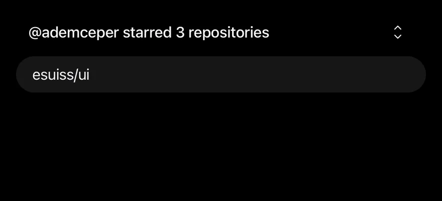
<CollapsibleDemo initialOpen />Put any content in CollapsibleTrigger, for example a Text and a caret Icon, and use render to render it as a Button. Use open with onOpenChange for controlled state, or defaultOpen for uncontrolled.
Set keepMounted on CollapsibleContent to keep the content mounted while closed.
Examples
Default

import { CaretUpDownIcon } from "phosphor-react-native"
import * as React from "react"
import { View } from "react-native"
import { Button } from "@/components/ui/button"
import { Collapsible, CollapsibleContent, CollapsibleTrigger } from "@/components/ui/collapsible"
import { Icon } from "@/components/ui/icon"
import { Text } from "@/components/ui/text"

const repositories = ["esuiss/ui", "esuiss/docs", "esuiss/cli"]

function CollapsibleDemo({
  initialOpen = false,
  disabled = false,
}: {
  initialOpen?: boolean
  disabled?: boolean
}) {
  const [open, setOpen] = React.useState(initialOpen)
  return (
    <Collapsible
      open={open}
      onOpenChange={setOpen}
      disabled={disabled}
      className="w-full gap-2"
    >
      <View className="flex-row items-center justify-between gap-4 px-3">
        <Text className="text-sm font-medium">
          @ademceper starred 3 repositories
        </Text>
        <CollapsibleTrigger
          render={
            <Button variant="ghost" size="icon-sm" disabled={disabled}>
              <Icon as={CaretUpDownIcon} className="size-4" />
            </Button>
          }
        />
      </View>
      <View className="rounded-2xl bg-surface-secondary px-4 py-2">
        <Text className="text-sm">{repositories[0]}</Text>
      </View>
      <CollapsibleContent className="gap-2">
        {repositories.slice(1).map((repository) => (
          <View
            key={repository}
            className="rounded-2xl bg-surface-secondary px-4 py-2"
          >
            <Text className="text-sm">{repository}</Text>
          </View>
        ))}
      </CollapsibleContent>
    </Collapsible>
  )
}

export function CollapsibleExample() {
  return (
    <CollapsibleDemo />
  )
}import EsuissUI
import PhosphorSwift
import SwiftUI
let collapsibleRepositories = ["esuiss/ui", "esuiss/docs", "esuiss/cli"]
struct CollapsibleDemo: View {
var disabled = false
@State private var open: Bool
init(initialOpen: Bool = false, disabled: Bool = false) {
self.disabled = disabled
_open = State(initialValue: initialOpen)
}
var body: some View {
Collapsible(isExpanded: $open, spacing: 8) {
HStack(spacing: 16) {
Text("@ademceper starred 3 repositories")
.textStyle(.sm, weight: .medium)
.foregroundStyle(Color.label)
.frame(maxWidth: .infinity, alignment: .leading)
CollapsibleTrigger {
Ph.caretUpDown.regular
.frame(width: 16, height: 16)
}
.buttonStyle(.variant(.ghost, size: .iconSm))
.disabled(disabled)
}
.padding(.horizontal, 12)
CollapsibleRepository(name: collapsibleRepositories[0])
CollapsibleContent {
VStack(spacing: 8) {
ForEach(collapsibleRepositories.dropFirst(), id: \.self) { repository in
CollapsibleRepository(name: repository)
}
}
}
}
.frame(maxWidth: .infinity)
}
}
struct CollapsibleRepository: View {
let name: String
var body: some View {
Text(verbatim: name)
.textStyle(.sm)
.foregroundStyle(Color.label)
.padding(.horizontal, 16)
.padding(.vertical, 8)
.frame(maxWidth: .infinity, alignment: .leading)
.background(Color.surfaceSecondary, in: RoundedRectangle(cornerRadius: Radius.xl2, style: .continuous))
}
}import androidx.compose.foundation.background
import androidx.compose.foundation.layout.Arrangement
import androidx.compose.foundation.layout.Column
import androidx.compose.foundation.layout.Row
import androidx.compose.foundation.layout.fillMaxWidth
import androidx.compose.foundation.layout.padding
import androidx.compose.foundation.shape.RoundedCornerShape
import androidx.compose.runtime.Composable
import androidx.compose.runtime.getValue
import androidx.compose.runtime.mutableStateOf
import androidx.compose.runtime.saveable.rememberSaveable
import androidx.compose.runtime.setValue
import androidx.compose.ui.Alignment
import androidx.compose.ui.Modifier
import androidx.compose.ui.text.font.FontWeight
import androidx.compose.ui.unit.dp
import com.adamglin.PhosphorIcons
import com.adamglin.phosphoricons.Regular
import com.adamglin.phosphoricons.regular.CaretUpDown
import com.esuiss.ui.components.Button
import com.esuiss.ui.components.ButtonSize
import com.esuiss.ui.components.ButtonVariant
import com.esuiss.ui.components.Collapsible
import com.esuiss.ui.components.CollapsibleContent
import com.esuiss.ui.components.Icon
import com.esuiss.ui.components.Text
import com.esuiss.ui.theme.EsuissTheme
import com.esuiss.ui.theme.Radius
import com.esuiss.ui.theme.Typography
val CollapsibleRepositories = listOf("esuiss/ui", "esuiss/docs", "esuiss/cli")
@Composable
fun CollapsibleRepository(name: String) {
Text(
name,
modifier = Modifier
.fillMaxWidth()
.background(EsuissTheme.colors.surfaceSecondary, RoundedCornerShape(Radius.xl2))
.padding(horizontal = 16.dp, vertical = 8.dp),
style = Typography.sm,
)
}
@Composable
fun CollapsibleDemo(initialOpen: Boolean = false, disabled: Boolean = false) {
var open by rememberSaveable { mutableStateOf(initialOpen) }
Collapsible(
expanded = open,
onExpandedChange = { open = it },
modifier = Modifier.fillMaxWidth(),
enabled = !disabled,
) {
Column(verticalArrangement = Arrangement.spacedBy(8.dp)) {
Row(
modifier = Modifier.fillMaxWidth().padding(horizontal = 12.dp),
horizontalArrangement = Arrangement.spacedBy(16.dp),
verticalAlignment = Alignment.CenterVertically,
) {
Text(
"@ademceper starred 3 repositories",
modifier = Modifier.weight(1f),
style = Typography.sm.copy(fontWeight = FontWeight.Medium),
)
Button(
onClick = { open = !open },
variant = ButtonVariant.Ghost,
size = ButtonSize.IconSm,
enabled = !disabled,
) {
Icon(PhosphorIcons.Regular.CaretUpDown, contentDescription = "Toggle", size = 16.dp)
}
}
CollapsibleRepository(CollapsibleRepositories[0])
CollapsibleContent {
Column(verticalArrangement = Arrangement.spacedBy(8.dp)) {
CollapsibleRepositories.drop(1).forEach { CollapsibleRepository(it) }
}
}
}
}
}Disabled
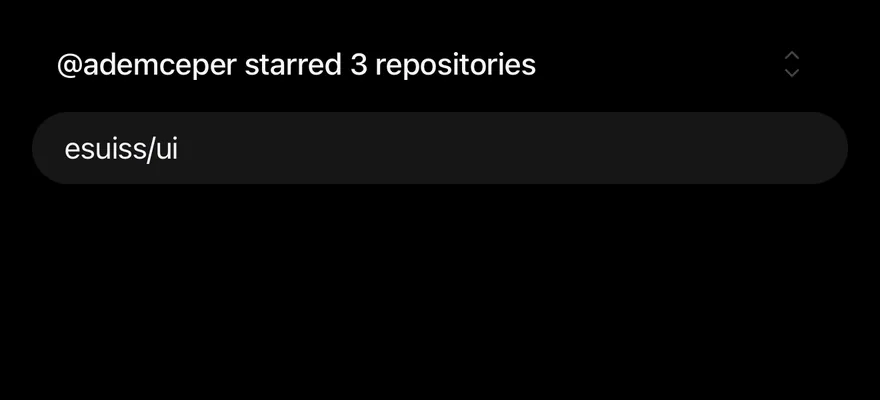
A disabled collapsible whose trigger cannot toggle it.

import { CaretUpDownIcon } from "phosphor-react-native"
import * as React from "react"
import { View } from "react-native"
import { Button } from "@/components/ui/button"
import { Collapsible, CollapsibleContent, CollapsibleTrigger } from "@/components/ui/collapsible"
import { Icon } from "@/components/ui/icon"
import { Text } from "@/components/ui/text"

const repositories = ["esuiss/ui", "esuiss/docs", "esuiss/cli"]

function CollapsibleDemo({
  initialOpen = false,
  disabled = false,
}: {
  initialOpen?: boolean
  disabled?: boolean
}) {
  const [open, setOpen] = React.useState(initialOpen)
  return (
    <Collapsible
      open={open}
      onOpenChange={setOpen}
      disabled={disabled}
      className="w-full gap-2"
    >
      <View className="flex-row items-center justify-between gap-4 px-3">
        <Text className="text-sm font-medium">
          @ademceper starred 3 repositories
        </Text>
        <CollapsibleTrigger
          render={
            <Button variant="ghost" size="icon-sm" disabled={disabled}>
              <Icon as={CaretUpDownIcon} className="size-4" />
            </Button>
          }
        />
      </View>
      <View className="rounded-2xl bg-surface-secondary px-4 py-2">
        <Text className="text-sm">{repositories[0]}</Text>
      </View>
      <CollapsibleContent className="gap-2">
        {repositories.slice(1).map((repository) => (
          <View
            key={repository}
            className="rounded-2xl bg-surface-secondary px-4 py-2"
          >
            <Text className="text-sm">{repository}</Text>
          </View>
        ))}
      </CollapsibleContent>
    </Collapsible>
  )
}

export function CollapsibleDisabledExample() {
  return (
    <CollapsibleDemo disabled />
  )
}import EsuissUI
import PhosphorSwift
import SwiftUI
struct CollapsibleDisabledExample: View {
var body: some View {
CollapsibleDemo(disabled: true)
}
}
let collapsibleRepositories = ["esuiss/ui", "esuiss/docs", "esuiss/cli"]
struct CollapsibleDemo: View {
var disabled = false
@State private var open: Bool
init(initialOpen: Bool = false, disabled: Bool = false) {
self.disabled = disabled
_open = State(initialValue: initialOpen)
}
var body: some View {
Collapsible(isExpanded: $open, spacing: 8) {
HStack(spacing: 16) {
Text("@ademceper starred 3 repositories")
.textStyle(.sm, weight: .medium)
.foregroundStyle(Color.label)
.frame(maxWidth: .infinity, alignment: .leading)
CollapsibleTrigger {
Ph.caretUpDown.regular
.frame(width: 16, height: 16)
}
.buttonStyle(.variant(.ghost, size: .iconSm))
.disabled(disabled)
}
.padding(.horizontal, 12)
CollapsibleRepository(name: collapsibleRepositories[0])
CollapsibleContent {
VStack(spacing: 8) {
ForEach(collapsibleRepositories.dropFirst(), id: \.self) { repository in
CollapsibleRepository(name: repository)
}
}
}
}
.frame(maxWidth: .infinity)
}
}
struct CollapsibleRepository: View {
let name: String
var body: some View {
Text(verbatim: name)
.textStyle(.sm)
.foregroundStyle(Color.label)
.padding(.horizontal, 16)
.padding(.vertical, 8)
.frame(maxWidth: .infinity, alignment: .leading)
.background(Color.surfaceSecondary, in: RoundedRectangle(cornerRadius: Radius.xl2, style: .continuous))
}
}import androidx.compose.foundation.background
import androidx.compose.foundation.layout.Arrangement
import androidx.compose.foundation.layout.Column
import androidx.compose.foundation.layout.Row
import androidx.compose.foundation.layout.fillMaxWidth
import androidx.compose.foundation.layout.padding
import androidx.compose.foundation.shape.RoundedCornerShape
import androidx.compose.runtime.Composable
import androidx.compose.runtime.getValue
import androidx.compose.runtime.mutableStateOf
import androidx.compose.runtime.saveable.rememberSaveable
import androidx.compose.runtime.setValue
import androidx.compose.ui.Alignment
import androidx.compose.ui.Modifier
import androidx.compose.ui.text.font.FontWeight
import androidx.compose.ui.unit.dp
import com.adamglin.PhosphorIcons
import com.adamglin.phosphoricons.Regular
import com.adamglin.phosphoricons.regular.CaretUpDown
import com.esuiss.ui.components.Button
import com.esuiss.ui.components.ButtonSize
import com.esuiss.ui.components.ButtonVariant
import com.esuiss.ui.components.Collapsible
import com.esuiss.ui.components.CollapsibleContent
import com.esuiss.ui.components.Icon
import com.esuiss.ui.components.Text
import com.esuiss.ui.theme.EsuissTheme
import com.esuiss.ui.theme.Radius
import com.esuiss.ui.theme.Typography
@Composable
fun CollapsibleDisabledExample() {
CollapsibleDemo(disabled = true)
}
val CollapsibleRepositories = listOf("esuiss/ui", "esuiss/docs", "esuiss/cli")
@Composable
fun CollapsibleRepository(name: String) {
Text(
name,
modifier = Modifier
.fillMaxWidth()
.background(EsuissTheme.colors.surfaceSecondary, RoundedCornerShape(Radius.xl2))
.padding(horizontal = 16.dp, vertical = 8.dp),
style = Typography.sm,
)
}
@Composable
fun CollapsibleDemo(initialOpen: Boolean = false, disabled: Boolean = false) {
var open by rememberSaveable { mutableStateOf(initialOpen) }
Collapsible(
expanded = open,
onExpandedChange = { open = it },
modifier = Modifier.fillMaxWidth(),
enabled = !disabled,
) {
Column(verticalArrangement = Arrangement.spacedBy(8.dp)) {
Row(
modifier = Modifier.fillMaxWidth().padding(horizontal = 12.dp),
horizontalArrangement = Arrangement.spacedBy(16.dp),
verticalAlignment = Alignment.CenterVertically,
) {
Text(
"@ademceper starred 3 repositories",
modifier = Modifier.weight(1f),
style = Typography.sm.copy(fontWeight = FontWeight.Medium),
)
Button(
onClick = { open = !open },
variant = ButtonVariant.Ghost,
size = ButtonSize.IconSm,
enabled = !disabled,
) {
Icon(PhosphorIcons.Regular.CaretUpDown, contentDescription = "Toggle", size = 16.dp)
}
}
CollapsibleRepository(CollapsibleRepositories[0])
CollapsibleContent {
Column(verticalArrangement = Arrangement.spacedBy(8.dp)) {
CollapsibleRepositories.drop(1).forEach { CollapsibleRepository(it) }
}
}
}
}
}Accessibility
- The trigger has the
buttonrole withexpandedanddisabledstate. - Closed content is hidden from VoiceOver and TalkBack.