suiss/uim · React Native Component
Chart
Line, area, bar, pie, radial and radar charts drawn with SVG, with touch tooltips and legends.
Chart is an open-source mobile component from suiss/uim for React Native and Expo, with SwiftUI and Jetpack Compose versions built from the same design tokens. The @esuiss/uim CLI copies its source into your project, so you own the code.
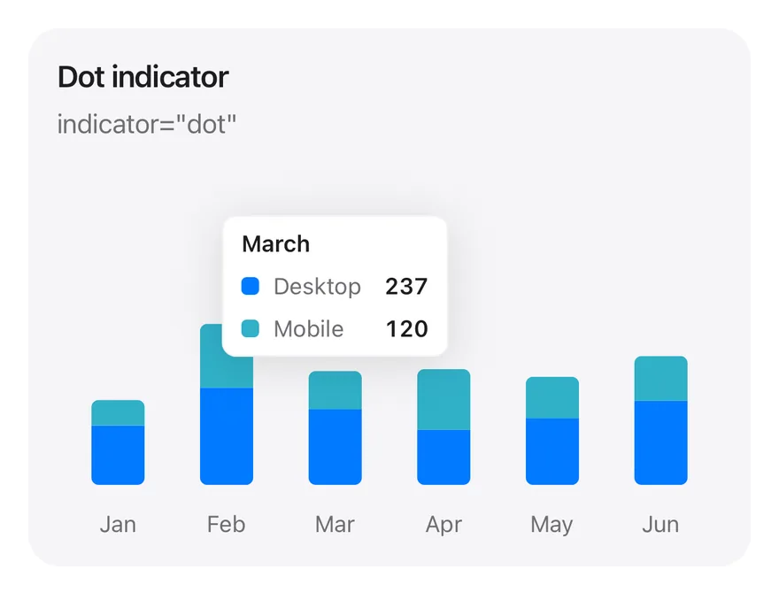
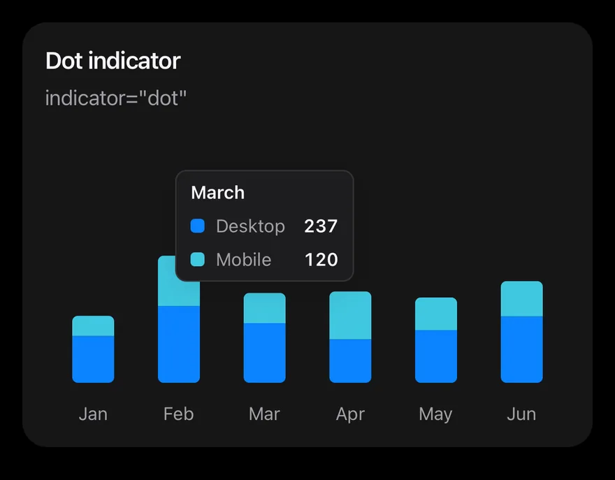
import * as React from "react"
import { Card, CardContent, CardDescription, CardHeader, CardTitle } from "@/components/ui/card"
import { Bar, BarChart, type ChartConfig, ChartContainer, ChartTooltip, ChartTooltipContent, XAxis } from "@/components/ui/chart"

const monthData = [
  { month: "January", desktop: 186, mobile: 80 },
  { month: "February", desktop: 305, mobile: 200 },
  { month: "March", desktop: 237, mobile: 120 },
  { month: "April", desktop: 173, mobile: 190 },
  { month: "May", desktop: 209, mobile: 130 },
  { month: "June", desktop: 264, mobile: 140 },
]

const deviceConfig = {
  desktop: { label: "Desktop", color: "blue" },
  mobile: { label: "Mobile", color: "teal" },
} satisfies ChartConfig

function StackedTooltipChart({
  title,
  description,
  defaultIndex,
  content,
}: {
  title: string
  description: string
  defaultIndex: number
  content: React.ReactElement
}) {
  return (
    <Card variant="filled" size="sm">
      <CardHeader>
        <CardTitle>{title}</CardTitle>
        <CardDescription>{description}</CardDescription>
      </CardHeader>
      <CardContent>
        <ChartContainer
          config={deviceConfig}
          accessibilityLabel={title}
          className="h-52 w-full"
        >
          <BarChart
            data={monthData}
            margin={{ top: 70, right: 4, left: 4, bottom: 0 }}
          >
            <XAxis
              dataKey="month"
              tickMargin={8}
              interval={0}
              tickFormatter={(value: string) => value.slice(0, 3)}
            />
            <ChartTooltip
              defaultIndex={defaultIndex}
              cursor={false}
              content={content}
            />
            <Bar
              dataKey="desktop"
              stackId="a"
              radius={[0, 0, 4, 4]}
              maxBarSize={30}
            />
            <Bar
              dataKey="mobile"
              stackId="a"
              radius={[4, 4, 0, 0]}
              maxBarSize={30}
            />
          </BarChart>
        </ChartContainer>
      </CardContent>
    </Card>
  )
}

export function ChartTooltipDotExample() {
  return (
    <StackedTooltipChart
      title="Dot indicator"
      description='indicator="dot"'
      defaultIndex={2}
      content={<ChartTooltipContent indicator="dot" />}
    />
  )
}import Charts
import EsuissUI
import SwiftUI
struct ChartTooltipDotExample: View {
var body: some View {
ChartStackedTooltip(title: "Dot indicator", description: "indicator=\"dot\"", defaultIndex: 2) { payload in
ChartTooltipContent(payload, indicator: .dot)
}
}
}
let chartMonthData: [(month: String, desktop: Double, mobile: Double)] = [
("January", 186, 80),
("February", 305, 200),
("March", 237, 120),
("April", 173, 190),
("May", 209, 130),
("June", 264, 140),
]
let chartDevices: ChartConfig = [
"desktop": .init("Desktop", color: .blue),
"mobile": .init("Mobile", color: .teal),
]
struct ChartStackedTooltip<Tooltip: View>: View {
let title: String
let description: String
var config = chartDevices
let defaultIndex: Int
@ViewBuilder let tooltip: (ChartTooltipPayload) -> Tooltip
var body: some View {
Card(.filled, size: .sm) {
CardHeader(LocalizedStringKey(title), description: LocalizedStringKey(description))
CardContent {
ChartContainer(config: config) {
ChartAnimator(animationDuration: 400) { progress in
Chart {
ForEach(chartMonthData.indices, id: \.self) { index in
let item = chartMonthData[index]
BarMark(
x: .value("Month", item.month),
yStart: .value("Start", 0),
yEnd: .value("Desktop", item.desktop * progress),
width: .fixed(30)
)
.clipShape(UnevenRoundedRectangle(bottomLeadingRadius: 4, bottomTrailingRadius: 4, style: .continuous))
.foregroundStyle(config.color("desktop"))
BarMark(
x: .value("Month", item.month),
yStart: .value("Start", item.desktop * progress),
yEnd: .value("Mobile", (item.desktop + item.mobile) * progress),
width: .fixed(30)
)
.clipShape(UnevenRoundedRectangle(topLeadingRadius: 4, topTrailingRadius: 4, style: .continuous))
.foregroundStyle(config.color("mobile"))
ChartAnchorMark(x: .value("Month", item.month), y: .value("Mobile", item.desktop + item.mobile))
}
}
.chartYScale(range: .plotDimension(endPadding: 70))
.chartXAxis { ChartAxis.x(values: chartMonthData.map(\.month)) { String($0.prefix(3)) } }
.chartYAxis(.hidden)
.chartTooltip(
x: chartMonthData.map(\.month),
defaultIndex: defaultIndex,
cursor: false,
accessibilityLabel: title,
items: { index in
[
ChartTooltipItem("desktop", value: chartMonthData[index].desktop),
ChartTooltipItem("mobile", value: chartMonthData[index].mobile),
]
},
content: tooltip
)
}
}
.frame(height: 208)
}
}
}
}import androidx.compose.foundation.layout.fillMaxWidth
import androidx.compose.foundation.layout.height
import androidx.compose.runtime.Composable
import androidx.compose.ui.Modifier
import androidx.compose.ui.unit.dp
import com.adamglin.phosphoricons.regular.Desktop
import com.esuiss.ui.components.BarChart
import com.esuiss.ui.components.Card
import com.esuiss.ui.components.CardContent
import com.esuiss.ui.components.CardHeader
import com.esuiss.ui.components.CardSize
import com.esuiss.ui.components.CardVariant
import com.esuiss.ui.components.ChartConfig
import com.esuiss.ui.components.ChartConfigItem
import com.esuiss.ui.components.ChartContainer
import com.esuiss.ui.components.ChartMargin
import com.esuiss.ui.components.ChartRadius
import com.esuiss.ui.components.ChartTooltipContent
import com.esuiss.ui.components.ChartTooltipIndicator
import com.esuiss.ui.components.ChartTooltipScope
@Composable
fun ChartTooltipDotExample() {
ChartStackedTooltip("Dot indicator", "indicator=\"dot\"", 2) { ChartTooltipContent(indicator = ChartTooltipIndicator.Dot) }
}
class ChartMonth(val month: String, val desktop: Double, val mobile: Double)
val chartMonthData = listOf(
ChartMonth("January", 186.0, 80.0),
ChartMonth("February", 305.0, 200.0),
ChartMonth("March", 237.0, 120.0),
ChartMonth("April", 173.0, 190.0),
ChartMonth("May", 209.0, 130.0),
ChartMonth("June", 264.0, 140.0),
)
val chartDeviceConfig = ChartConfig(
"desktop" to ChartConfigItem("Desktop") { blue },
"mobile" to ChartConfigItem("Mobile") { teal },
)
@Composable
fun ChartTooltipCard(title: String, description: String, content: @Composable () -> Unit) {
Card(variant = CardVariant.Filled, size = CardSize.Sm) {
CardHeader(title, description = description)
CardContent { content() }
}
}
@Composable
fun ChartStackedTooltip(
title: String,
description: String,
defaultIndex: Int,
config: ChartConfig = chartDeviceConfig,
tooltip: @Composable ChartTooltipScope.() -> Unit,
) {
ChartTooltipCard(title, description) {
ChartContainer(config, Modifier.fillMaxWidth().height(208.dp)) {
BarChart(
chartMonthData,
margin = ChartMargin(top = 70.dp, right = 4.dp, bottom = 0.dp, left = 4.dp),
accessibilityLabel = title,
) {
XAxis(label = { it.month }, tickMargin = 8.dp, interval = 0, tickFormatter = { it.take(3) })
ChartTooltip(defaultIndex = defaultIndex, cursor = null, content = tooltip)
Bar("desktop", value = { it.desktop }, stackId = "a", radius = ChartRadius(0.dp, 0.dp, 4.dp, 4.dp), maxBarSize = 30.dp)
Bar("mobile", value = { it.mobile }, stackId = "a", radius = ChartRadius(4.dp, 4.dp, 0.dp, 0.dp), maxBarSize = 30.dp)
}
}
}
}Charts are composed declaratively: a chart root such as LineChart, AreaChart, BarChart, ComposedChart, PieChart, RadialBarChart or RadarChart goes inside a ChartContainer, and series and axes such as Line, Area, Bar, XAxis, YAxis and CartesianGrid are added as children. These child components render nothing themselves; the root reads them and draws everything with react-native-svg.
Charts animate in when they first render: bars grow from the baseline, lines draw along their path, areas reveal from left to right, pie and radial sectors sweep open and radar shapes grow from the center. When the data changes, shapes animate from their previous values to the new ones.
Colors are theme tokens, not hex values. A series color such as blue, teal or accent resolves to the current token color, so charts follow light and dark mode automatically.
Installation
$ pnpm dlx @esuiss/uim@latest add chart$ pnpm dlx @esuiss/uim@latest add chart --platform swift$ pnpm dlx @esuiss/uim@latest add chart --platform kotlinThe CLI also adds what it builds on: Icon, Text.
Manual
- Install the dependencies:
npx expo install cn phosphor-react-native react-native-svg-
Add the pieces it builds on: Icon, Text, and the primitives
components/primitives/chart.tsx. -
Copy the source into
components/ui/chart.tsx:
import { cn } from "cn"
import type {
  Icon as PhosphorIcon,
  IconProps as PhosphorIconProps,
} from "phosphor-react-native"
import * as React from "react"
import { View } from "react-native"
import Svg, {
  Circle,
  ClipPath,
  Defs,
  LinearGradient,
  Path,
  Rect,
  Stop,
} from "react-native-svg"- Update the import paths to match your project.
- Install the dependencies:
npx expo install cn phosphor-react-native react-native-svg-
Add the pieces it builds on: Icon, Text, and the primitives
components/primitives/chart.tsx. -
Copy the source into
components/ui/chart.tsx:
import { cn } from "cn"
import type {
  Icon as PhosphorIcon,
  IconProps as PhosphorIconProps,
} from "phosphor-react-native"
import * as React from "react"
import { View } from "react-native"
import Svg, {
  Circle,
  ClipPath,
  Defs,
  LinearGradient,
  Path,
  Rect,
  Stop,
} from "react-native-svg"- Update the import paths to match your project.
- Install the dependencies:
npx expo install phosphor-react-native react-native-svg-
Add the pieces it builds on: Icon, Text, and the primitives
components/primitives/chart.tsx. -
Copy the source into
components/ui/chart.tsx:
import type { Icon as PhosphorIcon } from "phosphor-react-native"
import * as React from "react"
import {
  type StyleProp,
  StyleSheet,
  type TextStyle,
  View,
  type ViewStyle,
} from "react-native"
import Svg, {
  Circle,
  ClipPath,
  Defs,
  LinearGradient,
  Path,
Rect,- Update the import paths to match your project.
-
Target iOS 17 or later.
-
Copy the theme files every view uses:
import SwiftUI
import UIKit

struct RGBA: Sendable {
  let red: CGFloat
  let green: CGFloat
  let blue: CGFloat
  let alpha: CGFloat

  init(_ hex: UInt32, _ alpha: CGFloat = 1) {
    red = CGFloat((hex >> 16) & 0xFF) / 255
    green = CGFloat((hex >> 8) & 0xFF) / 255
    blue = CGFloat(hex & 0xFF) / 255
    self.alpha = alpha
}import SwiftUI
extension Color {
public static let surface = Color.adaptive(light: .init(0xFFFFFF), dark: .init(0x000000))
public static let surfaceSecondary = Color.adaptive(light: .init(0xF5F5F7), dark: .init(0x161617))
public static let surfaceTertiary = Color.adaptive(light: .init(0xE8E8ED), dark: .init(0x2C2C2E))
public static let surfaceRaised = Color.adaptive(light: .init(0xFFFFFF), dark: .init(0x1D1D1F))
public static let label = Color.adaptive(light: .init(0x1D1D1F), dark: .init(0xF5F5F7))
public static let labelSecondary = Color.adaptive(light: .init(0x6E6E73), dark: .init(0xA1A1A6))
public static let labelTertiary = Color.adaptive(light: .init(0x86868B), dark: .init(0x86868B))
public static let labelQuaternary = Color.adaptive(light: .init(0xD2D2D7), dark: .init(0x424245))
public static let control = Color.adaptive(light: .init(0x000000, 0.04), dark: .init(0xFFFFFF, 0.1))
public static let controlPressed = Color.adaptive(light: .init(0x000000, 0.12), dark: .init(0xFFFFFF, 0.22))
public static let controlSelected = Color.adaptive(light: .init(0x1D1D1F), dark: .init(0xF5F5F7))
public static let controlDisabled = Color.adaptive(light: .init(0x000000, 0.03), dark: .init(0xFFFFFF, 0.05))
public static let onControlSelected = Color.adaptive(light: .init(0xFFFFFF), dark: .init(0x000000))- Copy the source and every file it uses:
import Charts
import SwiftUI

public struct ChartConfig: ExpressibleByDictionaryLiteral, Sendable {
  public struct Item: Sendable {
    public var label: String?
    public var color: Color?
    public var icon: Image?

    public init(_ label: String? = nil, color: Color? = nil, icon: Image? = nil) {
      self.label = label
      self.color = color
      self.icon = icon
    }
}import SwiftUI
extension EnvironmentValues {
@Entry public var hapticsEnabled = true
}
extension View {
public func haptics(_ enabled: Bool) -> some View {
environment(\.hapticsEnabled, enabled)
}
func hapticFeedback<Trigger: Equatable>(_ feedback: SensoryFeedback, trigger: Trigger) -> some View {
modifier(HapticFeedbackModifier(feedback: feedback, trigger: trigger) { _, _ in true })
}
func hapticFeedback<Trigger: Equatable>(import SwiftUI
public enum ItemVariant: CaseIterable, Sendable {
case `default`, outline, muted
}
public enum ItemSize: CaseIterable, Sendable {
case `default`, sm, xs
var horizontalPadding: CGFloat {
switch self {
case .default: 16
case .sm: 14
case .xs: 12
}
}import SwiftUI
public struct Separator: View {
let orientation: Axis
public init(_ orientation: Axis = .horizontal) {
self.orientation = orientation
}
public var body: some View {
Rectangle()
.fill(Color.separator)
.frame(width: orientation == .vertical ? 1 : nil, height: orientation == .horizontal ? 1 : nil)
.frame(maxWidth: orientation == .horizontal ? .infinity : nil, maxHeight: orientation == .vertical ? .infinity : nil)
.accessibilityHidden(true)
}import SwiftUI
public enum TextVariant: CaseIterable, Sendable {
case `default`, h1, h2, h3, h4, p, blockquote, code, lead, large, small, muted
var style: TextStyle {
switch self {
case .h1: .xl3
case .h2: .xl2
case .h3: .xl
case .h4, .lead, .large: .lg
case .code, .small, .muted: .sm
default: .base
}
}- Add the files to your app target.
- Set
minSdkto 24 or higher and add the dependencies:
implementation(platform("androidx.compose:compose-bom:2026.09.00"))
implementation("androidx.compose.foundation:foundation")
implementation("androidx.compose.ui:ui")- Copy the theme files every view uses:
package com.esuiss.ui.theme

import androidx.compose.foundation.isSystemInDarkTheme
import androidx.compose.runtime.Composable
import androidx.compose.runtime.CompositionLocalProvider
import androidx.compose.runtime.Immutable
import androidx.compose.runtime.staticCompositionLocalOf
import androidx.compose.ui.Modifier
import androidx.compose.ui.draw.dropShadow
import androidx.compose.ui.graphics.Color
import androidx.compose.ui.graphics.Shape
import androidx.compose.ui.graphics.shadow.Shadow as DropShadow
import androidx.compose.ui.text.TextStyle
import androidx.compose.ui.text.style.LineHeightStyle
import androidx.compose.ui.unit.Dp
import androidx.compose.ui.unit.DpOffsetpackage com.esuiss.ui.theme
import androidx.compose.runtime.Immutable
import androidx.compose.ui.graphics.Color
import androidx.compose.ui.unit.dp
@Immutable
data class Colors(
val surface: Color,
val surfaceSecondary: Color,
val surfaceTertiary: Color,
val surfaceRaised: Color,
val label: Color,
val labelSecondary: Color,
val labelTertiary: Color,
val labelQuaternary: Color,- Copy the source and every file it uses:
package com.esuiss.ui.components

import androidx.compose.animation.core.Animatable
import androidx.compose.animation.core.CubicBezierEasing
import androidx.compose.animation.core.Easing
import androidx.compose.animation.core.LinearEasing
import androidx.compose.animation.core.tween
import androidx.compose.foundation.Canvas
import androidx.compose.foundation.background
import androidx.compose.foundation.border
import androidx.compose.foundation.gestures.detectHorizontalDragGestures
import androidx.compose.foundation.gestures.detectTapGestures
import androidx.compose.foundation.layout.Arrangement
import androidx.compose.foundation.layout.Box
import androidx.compose.foundation.layout.BoxScope
import androidx.compose.foundation.layout.BoxWithConstraintspackage com.esuiss.ui.components
import androidx.compose.runtime.compositionLocalOf
import androidx.compose.ui.graphics.Color
import androidx.compose.ui.text.TextStyle
import androidx.compose.ui.unit.Dp
import androidx.compose.ui.unit.dp
val LocalContentStyle = compositionLocalOf { TextStyle.Default }
val LocalContentColor = compositionLocalOf { Color.Unspecified }
val LocalIconSize = compositionLocalOf { 20.dp }package com.esuiss.ui.components
import android.provider.Settings
import androidx.compose.animation.core.CubicBezierEasing
import androidx.compose.foundation.background
import androidx.compose.foundation.border
import androidx.compose.foundation.gestures.Orientation
import androidx.compose.foundation.text.selection.TextSelectionColors
import androidx.compose.runtime.Composable
import androidx.compose.runtime.mutableStateOf
import androidx.compose.runtime.remember
import androidx.compose.ui.Modifier
import androidx.compose.ui.draw.clip
import androidx.compose.ui.draw.drawWithContent
import androidx.compose.ui.geometry.Offset
import androidx.compose.ui.geometry.Sizepackage com.esuiss.ui.components
import androidx.compose.runtime.Composable
import androidx.compose.runtime.CompositionLocalProvider
import androidx.compose.runtime.remember
import androidx.compose.runtime.staticCompositionLocalOf
import androidx.compose.ui.hapticfeedback.HapticFeedback
import androidx.compose.ui.hapticfeedback.HapticFeedbackType
import androidx.compose.ui.platform.LocalHapticFeedback
val LocalHapticsEnabled = staticCompositionLocalOf { true }
@Composable
fun ProvideHaptics(enabled: Boolean, content: @Composable () -> Unit) {
CompositionLocalProvider(LocalHapticsEnabled provides enabled, content = content)
}package com.esuiss.ui.components
import androidx.compose.foundation.Image
import androidx.compose.foundation.layout.size
import androidx.compose.runtime.Composable
import androidx.compose.ui.Modifier
import androidx.compose.ui.graphics.Color
import androidx.compose.ui.graphics.ColorFilter
import androidx.compose.ui.graphics.takeOrElse
import androidx.compose.ui.graphics.vector.ImageVector
import androidx.compose.ui.unit.Dp
import com.esuiss.ui.theme.EsuissTheme
@Composable
fun Icon(
imageVector: ImageVector,- Update the
com.esuiss.uipackage names to match your project.
Usage
import { ChartPalette, ChartContainer, LineChart, AreaChart, BarChart, ComposedChart, PieChart, RadialBarChart, RadarChart, ChartTooltipContent, ChartLegendContent } from "@/components/ui/chart"<StackedTooltipChart
title="Dot indicator"
description='indicator="dot"'
defaultIndex={2}
content={<ChartTooltipContent indicator="dot" />}
/>Describe each series in a ChartConfig object with a label, a token color and an optional icon, and pass it to ChartContainer as config. The container is full width with a 16:9 aspect ratio unless you give it an h-, size- or aspect- class.
Add ChartTooltip with content={<ChartTooltipContent />} to make the chart respond to touch: touching or dragging selects the nearest data point, draws a cursor and shows the tooltip, with a selection haptic. ChartTooltipContent supports indicator (dot, line or dashed), hideLabel, hideIndicator, labelFormatter, formatter and nameKey. Use defaultIndex on ChartTooltip to start with a point selected, or onActiveIndexChange on the chart to react to selection.
Line, Area, Bar, Pie, RadialBar and Radar take isAnimationActive, animationDuration and animationEasing. Bars default to 400 ms and curves, sectors and radar shapes to 1500 ms, with ease easing. Set isAnimationActive={false} to draw a series in its final state, for example when its data changes on every interaction.
Add ChartLegend with content={<ChartLegendContent />} for a legend in config order. useChart() returns the config inside a container, and ChartPalette resolves token colors for custom drawing.
Examples
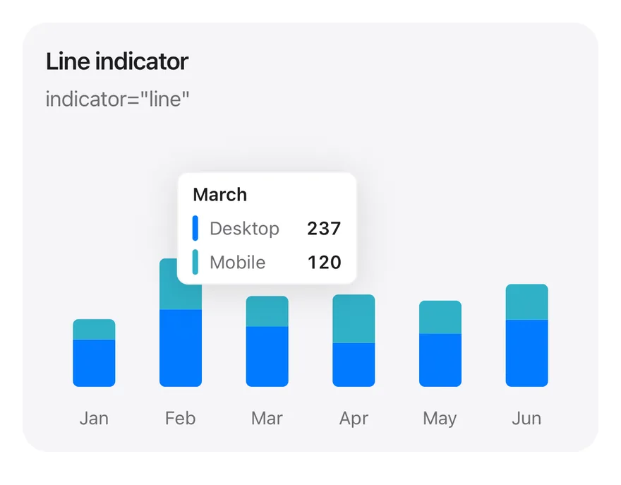
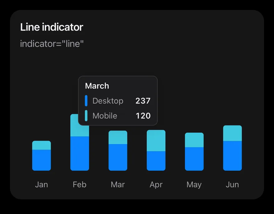
Tooltip line
Tooltip with a line indicator.
import * as React from "react"
import { Card, CardContent, CardDescription, CardHeader, CardTitle } from "@/components/ui/card"
import { Bar, BarChart, type ChartConfig, ChartContainer, ChartTooltip, ChartTooltipContent, XAxis } from "@/components/ui/chart"

const monthData = [
  { month: "January", desktop: 186, mobile: 80 },
  { month: "February", desktop: 305, mobile: 200 },
  { month: "March", desktop: 237, mobile: 120 },
  { month: "April", desktop: 173, mobile: 190 },
  { month: "May", desktop: 209, mobile: 130 },
  { month: "June", desktop: 264, mobile: 140 },
]

const deviceConfig = {
  desktop: { label: "Desktop", color: "blue" },
  mobile: { label: "Mobile", color: "teal" },
} satisfies ChartConfig

function StackedTooltipChart({
  title,
  description,
  defaultIndex,
  content,
}: {
  title: string
  description: string
  defaultIndex: number
  content: React.ReactElement
}) {
  return (
    <Card variant="filled" size="sm">
      <CardHeader>
        <CardTitle>{title}</CardTitle>
        <CardDescription>{description}</CardDescription>
      </CardHeader>
      <CardContent>
        <ChartContainer
          config={deviceConfig}
          accessibilityLabel={title}
          className="h-52 w-full"
        >
          <BarChart
            data={monthData}
            margin={{ top: 70, right: 4, left: 4, bottom: 0 }}
          >
            <XAxis
              dataKey="month"
              tickMargin={8}
              interval={0}
              tickFormatter={(value: string) => value.slice(0, 3)}
            />
            <ChartTooltip
              defaultIndex={defaultIndex}
              cursor={false}
              content={content}
            />
            <Bar
              dataKey="desktop"
              stackId="a"
              radius={[0, 0, 4, 4]}
              maxBarSize={30}
            />
            <Bar
              dataKey="mobile"
              stackId="a"
              radius={[4, 4, 0, 0]}
              maxBarSize={30}
            />
          </BarChart>
        </ChartContainer>
      </CardContent>
    </Card>
  )
}

export function ChartTooltipLineExample() {
  return (
    <StackedTooltipChart
      title="Line indicator"
      description='indicator="line"'
      defaultIndex={2}
      content={<ChartTooltipContent indicator="line" />}
    />
  )
}import Charts
import EsuissUI
import SwiftUI
struct ChartTooltipLineExample: View {
var body: some View {
ChartStackedTooltip(title: "Line indicator", description: "indicator=\"line\"", defaultIndex: 2) { payload in
ChartTooltipContent(payload, indicator: .line)
}
}
}
let chartMonthData: [(month: String, desktop: Double, mobile: Double)] = [
("January", 186, 80),
("February", 305, 200),
("March", 237, 120),
("April", 173, 190),
("May", 209, 130),
("June", 264, 140),
]
let chartDevices: ChartConfig = [
"desktop": .init("Desktop", color: .blue),
"mobile": .init("Mobile", color: .teal),
]
struct ChartStackedTooltip<Tooltip: View>: View {
let title: String
let description: String
var config = chartDevices
let defaultIndex: Int
@ViewBuilder let tooltip: (ChartTooltipPayload) -> Tooltip
var body: some View {
Card(.filled, size: .sm) {
CardHeader(LocalizedStringKey(title), description: LocalizedStringKey(description))
CardContent {
ChartContainer(config: config) {
ChartAnimator(animationDuration: 400) { progress in
Chart {
ForEach(chartMonthData.indices, id: \.self) { index in
let item = chartMonthData[index]
BarMark(
x: .value("Month", item.month),
yStart: .value("Start", 0),
yEnd: .value("Desktop", item.desktop * progress),
width: .fixed(30)
)
.clipShape(UnevenRoundedRectangle(bottomLeadingRadius: 4, bottomTrailingRadius: 4, style: .continuous))
.foregroundStyle(config.color("desktop"))
BarMark(
x: .value("Month", item.month),
yStart: .value("Start", item.desktop * progress),
yEnd: .value("Mobile", (item.desktop + item.mobile) * progress),
width: .fixed(30)
)
.clipShape(UnevenRoundedRectangle(topLeadingRadius: 4, topTrailingRadius: 4, style: .continuous))
.foregroundStyle(config.color("mobile"))
ChartAnchorMark(x: .value("Month", item.month), y: .value("Mobile", item.desktop + item.mobile))
}
}
.chartYScale(range: .plotDimension(endPadding: 70))
.chartXAxis { ChartAxis.x(values: chartMonthData.map(\.month)) { String($0.prefix(3)) } }
.chartYAxis(.hidden)
.chartTooltip(
x: chartMonthData.map(\.month),
defaultIndex: defaultIndex,
cursor: false,
accessibilityLabel: title,
items: { index in
[
ChartTooltipItem("desktop", value: chartMonthData[index].desktop),
ChartTooltipItem("mobile", value: chartMonthData[index].mobile),
]
},
content: tooltip
)
}
}
.frame(height: 208)
}
}
}
}import androidx.compose.foundation.layout.fillMaxWidth
import androidx.compose.foundation.layout.height
import androidx.compose.runtime.Composable
import androidx.compose.ui.Modifier
import androidx.compose.ui.unit.dp
import com.adamglin.phosphoricons.regular.Desktop
import com.esuiss.ui.components.BarChart
import com.esuiss.ui.components.Card
import com.esuiss.ui.components.CardContent
import com.esuiss.ui.components.CardHeader
import com.esuiss.ui.components.CardSize
import com.esuiss.ui.components.CardVariant
import com.esuiss.ui.components.ChartConfig
import com.esuiss.ui.components.ChartConfigItem
import com.esuiss.ui.components.ChartContainer
import com.esuiss.ui.components.ChartMargin
import com.esuiss.ui.components.ChartRadius
import com.esuiss.ui.components.ChartTooltipContent
import com.esuiss.ui.components.ChartTooltipIndicator
import com.esuiss.ui.components.ChartTooltipScope
@Composable
fun ChartTooltipLineExample() {
ChartStackedTooltip("Line indicator", "indicator=\"line\"", 2) { ChartTooltipContent(indicator = ChartTooltipIndicator.Line) }
}
class ChartMonth(val month: String, val desktop: Double, val mobile: Double)
val chartMonthData = listOf(
ChartMonth("January", 186.0, 80.0),
ChartMonth("February", 305.0, 200.0),
ChartMonth("March", 237.0, 120.0),
ChartMonth("April", 173.0, 190.0),
ChartMonth("May", 209.0, 130.0),
ChartMonth("June", 264.0, 140.0),
)
val chartDeviceConfig = ChartConfig(
"desktop" to ChartConfigItem("Desktop") { blue },
"mobile" to ChartConfigItem("Mobile") { teal },
)
@Composable
fun ChartTooltipCard(title: String, description: String, content: @Composable () -> Unit) {
Card(variant = CardVariant.Filled, size = CardSize.Sm) {
CardHeader(title, description = description)
CardContent { content() }
}
}
@Composable
fun ChartStackedTooltip(
title: String,
description: String,
defaultIndex: Int,
config: ChartConfig = chartDeviceConfig,
tooltip: @Composable ChartTooltipScope.() -> Unit,
) {
ChartTooltipCard(title, description) {
ChartContainer(config, Modifier.fillMaxWidth().height(208.dp)) {
BarChart(
chartMonthData,
margin = ChartMargin(top = 70.dp, right = 4.dp, bottom = 0.dp, left = 4.dp),
accessibilityLabel = title,
) {
XAxis(label = { it.month }, tickMargin = 8.dp, interval = 0, tickFormatter = { it.take(3) })
ChartTooltip(defaultIndex = defaultIndex, cursor = null, content = tooltip)
Bar("desktop", value = { it.desktop }, stackId = "a", radius = ChartRadius(0.dp, 0.dp, 4.dp, 4.dp), maxBarSize = 30.dp)
Bar("mobile", value = { it.mobile }, stackId = "a", radius = ChartRadius(4.dp, 4.dp, 0.dp, 0.dp), maxBarSize = 30.dp)
}
}
}
}Tooltip dashed
Tooltip with a dashed indicator.
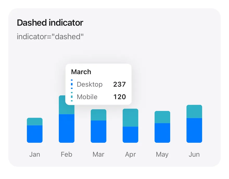
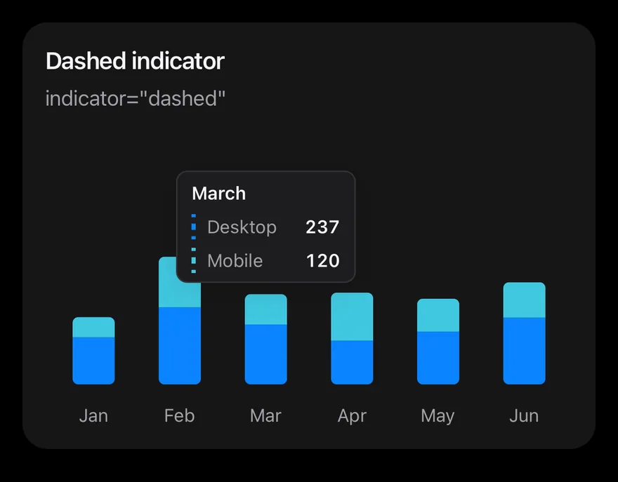
import * as React from "react"
import { Card, CardContent, CardDescription, CardHeader, CardTitle } from "@/components/ui/card"
import { Bar, BarChart, type ChartConfig, ChartContainer, ChartTooltip, ChartTooltipContent, XAxis } from "@/components/ui/chart"

const monthData = [
  { month: "January", desktop: 186, mobile: 80 },
  { month: "February", desktop: 305, mobile: 200 },
  { month: "March", desktop: 237, mobile: 120 },
  { month: "April", desktop: 173, mobile: 190 },
  { month: "May", desktop: 209, mobile: 130 },
  { month: "June", desktop: 264, mobile: 140 },
]

const deviceConfig = {
  desktop: { label: "Desktop", color: "blue" },
  mobile: { label: "Mobile", color: "teal" },
} satisfies ChartConfig

function StackedTooltipChart({
  title,
  description,
  defaultIndex,
  content,
}: {
  title: string
  description: string
  defaultIndex: number
  content: React.ReactElement
}) {
  return (
    <Card variant="filled" size="sm">
      <CardHeader>
        <CardTitle>{title}</CardTitle>
        <CardDescription>{description}</CardDescription>
      </CardHeader>
      <CardContent>
        <ChartContainer
          config={deviceConfig}
          accessibilityLabel={title}
          className="h-52 w-full"
        >
          <BarChart
            data={monthData}
            margin={{ top: 70, right: 4, left: 4, bottom: 0 }}
          >
            <XAxis
              dataKey="month"
              tickMargin={8}
              interval={0}
              tickFormatter={(value: string) => value.slice(0, 3)}
            />
            <ChartTooltip
              defaultIndex={defaultIndex}
              cursor={false}
              content={content}
            />
            <Bar
              dataKey="desktop"
              stackId="a"
              radius={[0, 0, 4, 4]}
              maxBarSize={30}
            />
            <Bar
              dataKey="mobile"
              stackId="a"
              radius={[4, 4, 0, 0]}
              maxBarSize={30}
            />
          </BarChart>
        </ChartContainer>
      </CardContent>
    </Card>
  )
}

export function ChartTooltipDashedExample() {
  return (
    <StackedTooltipChart
      title="Dashed indicator"
      description='indicator="dashed"'
      defaultIndex={2}
      content={<ChartTooltipContent indicator="dashed" />}
    />
  )
}import Charts
import EsuissUI
import SwiftUI
struct ChartTooltipDashedExample: View {
var body: some View {
ChartStackedTooltip(title: "Dashed indicator", description: "indicator=\"dashed\"", defaultIndex: 2) { payload in
ChartTooltipContent(payload, indicator: .dashed)
}
}
}
let chartMonthData: [(month: String, desktop: Double, mobile: Double)] = [
("January", 186, 80),
("February", 305, 200),
("March", 237, 120),
("April", 173, 190),
("May", 209, 130),
("June", 264, 140),
]
let chartDevices: ChartConfig = [
"desktop": .init("Desktop", color: .blue),
"mobile": .init("Mobile", color: .teal),
]
struct ChartStackedTooltip<Tooltip: View>: View {
let title: String
let description: String
var config = chartDevices
let defaultIndex: Int
@ViewBuilder let tooltip: (ChartTooltipPayload) -> Tooltip
var body: some View {
Card(.filled, size: .sm) {
CardHeader(LocalizedStringKey(title), description: LocalizedStringKey(description))
CardContent {
ChartContainer(config: config) {
ChartAnimator(animationDuration: 400) { progress in
Chart {
ForEach(chartMonthData.indices, id: \.self) { index in
let item = chartMonthData[index]
BarMark(
x: .value("Month", item.month),
yStart: .value("Start", 0),
yEnd: .value("Desktop", item.desktop * progress),
width: .fixed(30)
)
.clipShape(UnevenRoundedRectangle(bottomLeadingRadius: 4, bottomTrailingRadius: 4, style: .continuous))
.foregroundStyle(config.color("desktop"))
BarMark(
x: .value("Month", item.month),
yStart: .value("Start", item.desktop * progress),
yEnd: .value("Mobile", (item.desktop + item.mobile) * progress),
width: .fixed(30)
)
.clipShape(UnevenRoundedRectangle(topLeadingRadius: 4, topTrailingRadius: 4, style: .continuous))
.foregroundStyle(config.color("mobile"))
ChartAnchorMark(x: .value("Month", item.month), y: .value("Mobile", item.desktop + item.mobile))
}
}
.chartYScale(range: .plotDimension(endPadding: 70))
.chartXAxis { ChartAxis.x(values: chartMonthData.map(\.month)) { String($0.prefix(3)) } }
.chartYAxis(.hidden)
.chartTooltip(
x: chartMonthData.map(\.month),
defaultIndex: defaultIndex,
cursor: false,
accessibilityLabel: title,
items: { index in
[
ChartTooltipItem("desktop", value: chartMonthData[index].desktop),
ChartTooltipItem("mobile", value: chartMonthData[index].mobile),
]
},
content: tooltip
)
}
}
.frame(height: 208)
}
}
}
}import androidx.compose.foundation.layout.fillMaxWidth
import androidx.compose.foundation.layout.height
import androidx.compose.runtime.Composable
import androidx.compose.ui.Modifier
import androidx.compose.ui.unit.dp
import com.adamglin.phosphoricons.regular.Desktop
import com.esuiss.ui.components.BarChart
import com.esuiss.ui.components.Card
import com.esuiss.ui.components.CardContent
import com.esuiss.ui.components.CardHeader
import com.esuiss.ui.components.CardSize
import com.esuiss.ui.components.CardVariant
import com.esuiss.ui.components.ChartConfig
import com.esuiss.ui.components.ChartConfigItem
import com.esuiss.ui.components.ChartContainer
import com.esuiss.ui.components.ChartMargin
import com.esuiss.ui.components.ChartRadius
import com.esuiss.ui.components.ChartTooltipContent
import com.esuiss.ui.components.ChartTooltipIndicator
import com.esuiss.ui.components.ChartTooltipScope
@Composable
fun ChartTooltipDashedExample() {
ChartStackedTooltip("Dashed indicator", "indicator=\"dashed\"", 2) { ChartTooltipContent(indicator = ChartTooltipIndicator.Dashed) }
}
class ChartMonth(val month: String, val desktop: Double, val mobile: Double)
val chartMonthData = listOf(
ChartMonth("January", 186.0, 80.0),
ChartMonth("February", 305.0, 200.0),
ChartMonth("March", 237.0, 120.0),
ChartMonth("April", 173.0, 190.0),
ChartMonth("May", 209.0, 130.0),
ChartMonth("June", 264.0, 140.0),
)
val chartDeviceConfig = ChartConfig(
"desktop" to ChartConfigItem("Desktop") { blue },
"mobile" to ChartConfigItem("Mobile") { teal },
)
@Composable
fun ChartTooltipCard(title: String, description: String, content: @Composable () -> Unit) {
Card(variant = CardVariant.Filled, size = CardSize.Sm) {
CardHeader(title, description = description)
CardContent { content() }
}
}
@Composable
fun ChartStackedTooltip(
title: String,
description: String,
defaultIndex: Int,
config: ChartConfig = chartDeviceConfig,
tooltip: @Composable ChartTooltipScope.() -> Unit,
) {
ChartTooltipCard(title, description) {
ChartContainer(config, Modifier.fillMaxWidth().height(208.dp)) {
BarChart(
chartMonthData,
margin = ChartMargin(top = 70.dp, right = 4.dp, bottom = 0.dp, left = 4.dp),
accessibilityLabel = title,
) {
XAxis(label = { it.month }, tickMargin = 8.dp, interval = 0, tickFormatter = { it.take(3) })
ChartTooltip(defaultIndex = defaultIndex, cursor = null, content = tooltip)
Bar("desktop", value = { it.desktop }, stackId = "a", radius = ChartRadius(0.dp, 0.dp, 4.dp, 4.dp), maxBarSize = 30.dp)
Bar("mobile", value = { it.mobile }, stackId = "a", radius = ChartRadius(4.dp, 4.dp, 0.dp, 0.dp), maxBarSize = 30.dp)
}
}
}
}Tooltip no indicator
Tooltip with only names and values.
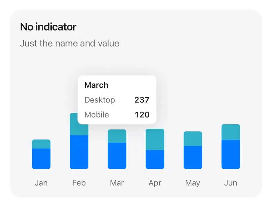
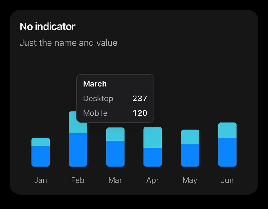
import * as React from "react"
import { Card, CardContent, CardDescription, CardHeader, CardTitle } from "@/components/ui/card"
import { Bar, BarChart, type ChartConfig, ChartContainer, ChartTooltip, ChartTooltipContent, XAxis } from "@/components/ui/chart"

const monthData = [
  { month: "January", desktop: 186, mobile: 80 },
  { month: "February", desktop: 305, mobile: 200 },
  { month: "March", desktop: 237, mobile: 120 },
  { month: "April", desktop: 173, mobile: 190 },
  { month: "May", desktop: 209, mobile: 130 },
  { month: "June", desktop: 264, mobile: 140 },
]

const deviceConfig = {
  desktop: { label: "Desktop", color: "blue" },
  mobile: { label: "Mobile", color: "teal" },
} satisfies ChartConfig

function StackedTooltipChart({
  title,
  description,
  defaultIndex,
  content,
}: {
  title: string
  description: string
  defaultIndex: number
  content: React.ReactElement
}) {
  return (
    <Card variant="filled" size="sm">
      <CardHeader>
        <CardTitle>{title}</CardTitle>
        <CardDescription>{description}</CardDescription>
      </CardHeader>
      <CardContent>
        <ChartContainer
          config={deviceConfig}
          accessibilityLabel={title}
          className="h-52 w-full"
        >
          <BarChart
            data={monthData}
            margin={{ top: 70, right: 4, left: 4, bottom: 0 }}
          >
            <XAxis
              dataKey="month"
              tickMargin={8}
              interval={0}
              tickFormatter={(value: string) => value.slice(0, 3)}
            />
            <ChartTooltip
              defaultIndex={defaultIndex}
              cursor={false}
              content={content}
            />
            <Bar
              dataKey="desktop"
              stackId="a"
              radius={[0, 0, 4, 4]}
              maxBarSize={30}
            />
            <Bar
              dataKey="mobile"
              stackId="a"
              radius={[4, 4, 0, 0]}
              maxBarSize={30}
            />
          </BarChart>
        </ChartContainer>
      </CardContent>
    </Card>
  )
}

export function ChartTooltipNoIndicatorExample() {
  return (
    <StackedTooltipChart
      title="No indicator"
      description="Just the name and value"
      defaultIndex={2}
      content={<ChartTooltipContent hideIndicator />}
    />
  )
}import Charts
import EsuissUI
import SwiftUI
struct ChartTooltipNoIndicatorExample: View {
var body: some View {
ChartStackedTooltip(title: "No indicator", description: "Just the name and value", defaultIndex: 2) { payload in
ChartTooltipContent(payload, hideIndicator: true)
}
}
}
let chartMonthData: [(month: String, desktop: Double, mobile: Double)] = [
("January", 186, 80),
("February", 305, 200),
("March", 237, 120),
("April", 173, 190),
("May", 209, 130),
("June", 264, 140),
]
let chartDevices: ChartConfig = [
"desktop": .init("Desktop", color: .blue),
"mobile": .init("Mobile", color: .teal),
]
struct ChartStackedTooltip<Tooltip: View>: View {
let title: String
let description: String
var config = chartDevices
let defaultIndex: Int
@ViewBuilder let tooltip: (ChartTooltipPayload) -> Tooltip
var body: some View {
Card(.filled, size: .sm) {
CardHeader(LocalizedStringKey(title), description: LocalizedStringKey(description))
CardContent {
ChartContainer(config: config) {
ChartAnimator(animationDuration: 400) { progress in
Chart {
ForEach(chartMonthData.indices, id: \.self) { index in
let item = chartMonthData[index]
BarMark(
x: .value("Month", item.month),
yStart: .value("Start", 0),
yEnd: .value("Desktop", item.desktop * progress),
width: .fixed(30)
)
.clipShape(UnevenRoundedRectangle(bottomLeadingRadius: 4, bottomTrailingRadius: 4, style: .continuous))
.foregroundStyle(config.color("desktop"))
BarMark(
x: .value("Month", item.month),
yStart: .value("Start", item.desktop * progress),
yEnd: .value("Mobile", (item.desktop + item.mobile) * progress),
width: .fixed(30)
)
.clipShape(UnevenRoundedRectangle(topLeadingRadius: 4, topTrailingRadius: 4, style: .continuous))
.foregroundStyle(config.color("mobile"))
ChartAnchorMark(x: .value("Month", item.month), y: .value("Mobile", item.desktop + item.mobile))
}
}
.chartYScale(range: .plotDimension(endPadding: 70))
.chartXAxis { ChartAxis.x(values: chartMonthData.map(\.month)) { String($0.prefix(3)) } }
.chartYAxis(.hidden)
.chartTooltip(
x: chartMonthData.map(\.month),
defaultIndex: defaultIndex,
cursor: false,
accessibilityLabel: title,
items: { index in
[
ChartTooltipItem("desktop", value: chartMonthData[index].desktop),
ChartTooltipItem("mobile", value: chartMonthData[index].mobile),
]
},
content: tooltip
)
}
}
.frame(height: 208)
}
}
}
}import androidx.compose.foundation.layout.fillMaxWidth
import androidx.compose.foundation.layout.height
import androidx.compose.runtime.Composable
import androidx.compose.ui.Modifier
import androidx.compose.ui.unit.dp
import com.adamglin.phosphoricons.regular.Desktop
import com.esuiss.ui.components.BarChart
import com.esuiss.ui.components.Card
import com.esuiss.ui.components.CardContent
import com.esuiss.ui.components.CardHeader
import com.esuiss.ui.components.CardSize
import com.esuiss.ui.components.CardVariant
import com.esuiss.ui.components.ChartConfig
import com.esuiss.ui.components.ChartConfigItem
import com.esuiss.ui.components.ChartContainer
import com.esuiss.ui.components.ChartMargin
import com.esuiss.ui.components.ChartRadius
import com.esuiss.ui.components.ChartTooltipContent
import com.esuiss.ui.components.ChartTooltipScope
@Composable
fun ChartTooltipNoIndicatorExample() {
ChartStackedTooltip("No indicator", "Just the name and value", 2) { ChartTooltipContent(hideIndicator = true) }
}
class ChartMonth(val month: String, val desktop: Double, val mobile: Double)
val chartMonthData = listOf(
ChartMonth("January", 186.0, 80.0),
ChartMonth("February", 305.0, 200.0),
ChartMonth("March", 237.0, 120.0),
ChartMonth("April", 173.0, 190.0),
ChartMonth("May", 209.0, 130.0),
ChartMonth("June", 264.0, 140.0),
)
val chartDeviceConfig = ChartConfig(
"desktop" to ChartConfigItem("Desktop") { blue },
"mobile" to ChartConfigItem("Mobile") { teal },
)
@Composable
fun ChartTooltipCard(title: String, description: String, content: @Composable () -> Unit) {
Card(variant = CardVariant.Filled, size = CardSize.Sm) {
CardHeader(title, description = description)
CardContent { content() }
}
}
@Composable
fun ChartStackedTooltip(
title: String,
description: String,
defaultIndex: Int,
config: ChartConfig = chartDeviceConfig,
tooltip: @Composable ChartTooltipScope.() -> Unit,
) {
ChartTooltipCard(title, description) {
ChartContainer(config, Modifier.fillMaxWidth().height(208.dp)) {
BarChart(
chartMonthData,
margin = ChartMargin(top = 70.dp, right = 4.dp, bottom = 0.dp, left = 4.dp),
accessibilityLabel = title,
) {
XAxis(label = { it.month }, tickMargin = 8.dp, interval = 0, tickFormatter = { it.take(3) })
ChartTooltip(defaultIndex = defaultIndex, cursor = null, content = tooltip)
Bar("desktop", value = { it.desktop }, stackId = "a", radius = ChartRadius(0.dp, 0.dp, 4.dp, 4.dp), maxBarSize = 30.dp)
Bar("mobile", value = { it.mobile }, stackId = "a", radius = ChartRadius(4.dp, 4.dp, 0.dp, 0.dp), maxBarSize = 30.dp)
}
}
}
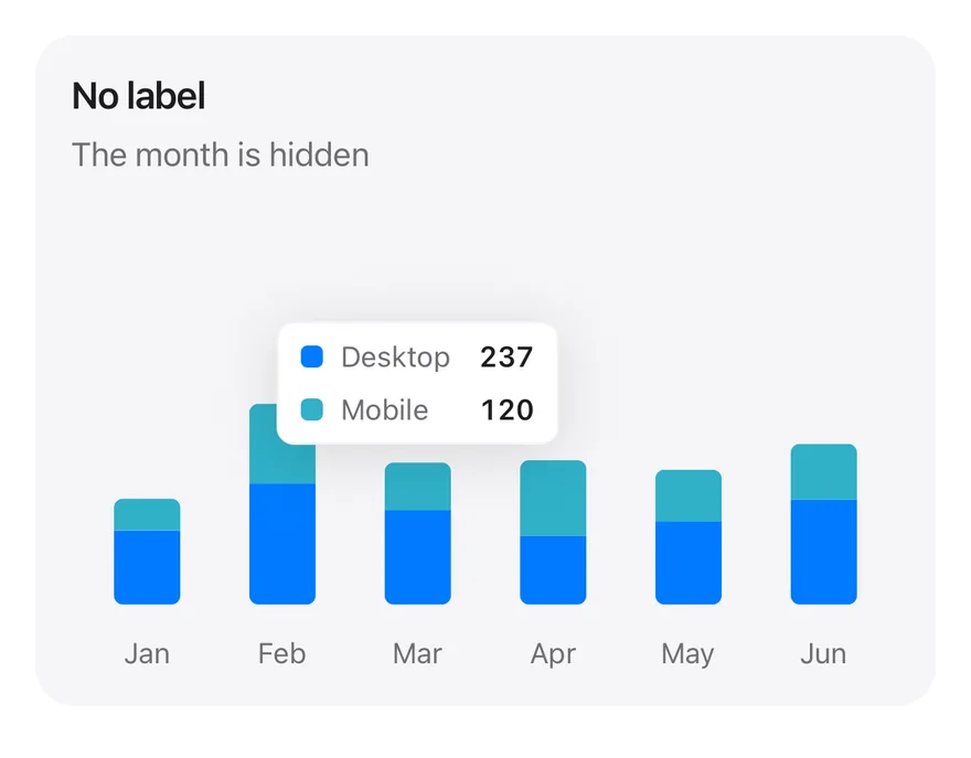
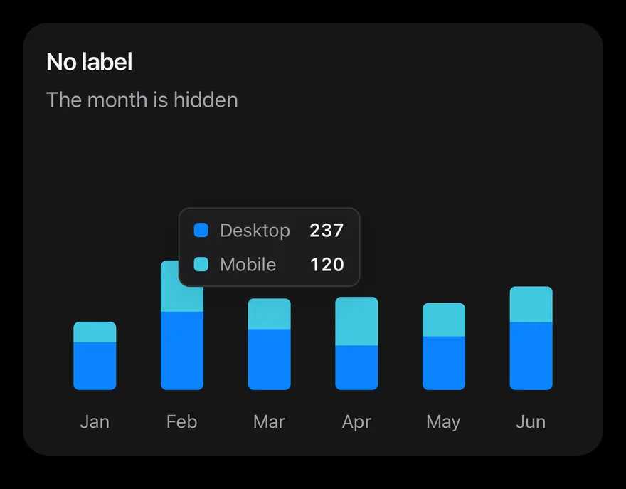
}Tooltip no label
Tooltip with the category label hidden.
import * as React from "react"
import { Card, CardContent, CardDescription, CardHeader, CardTitle } from "@/components/ui/card"
import { Bar, BarChart, type ChartConfig, ChartContainer, ChartTooltip, ChartTooltipContent, XAxis } from "@/components/ui/chart"

const monthData = [
  { month: "January", desktop: 186, mobile: 80 },
  { month: "February", desktop: 305, mobile: 200 },
  { month: "March", desktop: 237, mobile: 120 },
  { month: "April", desktop: 173, mobile: 190 },
  { month: "May", desktop: 209, mobile: 130 },
  { month: "June", desktop: 264, mobile: 140 },
]

const deviceConfig = {
  desktop: { label: "Desktop", color: "blue" },
  mobile: { label: "Mobile", color: "teal" },
} satisfies ChartConfig

function StackedTooltipChart({
  title,
  description,
  defaultIndex,
  content,
}: {
  title: string
  description: string
  defaultIndex: number
  content: React.ReactElement
}) {
  return (
    <Card variant="filled" size="sm">
      <CardHeader>
        <CardTitle>{title}</CardTitle>
        <CardDescription>{description}</CardDescription>
      </CardHeader>
      <CardContent>
        <ChartContainer
          config={deviceConfig}
          accessibilityLabel={title}
          className="h-52 w-full"
        >
          <BarChart
            data={monthData}
            margin={{ top: 70, right: 4, left: 4, bottom: 0 }}
          >
            <XAxis
              dataKey="month"
              tickMargin={8}
              interval={0}
              tickFormatter={(value: string) => value.slice(0, 3)}
            />
            <ChartTooltip
              defaultIndex={defaultIndex}
              cursor={false}
              content={content}
            />
            <Bar
              dataKey="desktop"
              stackId="a"
              radius={[0, 0, 4, 4]}
              maxBarSize={30}
            />
            <Bar
              dataKey="mobile"
              stackId="a"
              radius={[4, 4, 0, 0]}
              maxBarSize={30}
            />
          </BarChart>
        </ChartContainer>
      </CardContent>
    </Card>
  )
}

export function ChartTooltipNoLabelExample() {
  return (
    <StackedTooltipChart
      title="No label"
      description="The month is hidden"
      defaultIndex={2}
      content={<ChartTooltipContent hideLabel />}
    />
  )
}import Charts
import EsuissUI
import SwiftUI
struct ChartTooltipNoLabelExample: View {
var body: some View {
ChartStackedTooltip(title: "No label", description: "The month is hidden", defaultIndex: 2) { payload in
ChartTooltipContent(payload, hideLabel: true)
}
}
}
let chartMonthData: [(month: String, desktop: Double, mobile: Double)] = [
("January", 186, 80),
("February", 305, 200),
("March", 237, 120),
("April", 173, 190),
("May", 209, 130),
("June", 264, 140),
]
let chartDevices: ChartConfig = [
"desktop": .init("Desktop", color: .blue),
"mobile": .init("Mobile", color: .teal),
]
struct ChartStackedTooltip<Tooltip: View>: View {
let title: String
let description: String
var config = chartDevices
let defaultIndex: Int
@ViewBuilder let tooltip: (ChartTooltipPayload) -> Tooltip
var body: some View {
Card(.filled, size: .sm) {
CardHeader(LocalizedStringKey(title), description: LocalizedStringKey(description))
CardContent {
ChartContainer(config: config) {
ChartAnimator(animationDuration: 400) { progress in
Chart {
ForEach(chartMonthData.indices, id: \.self) { index in
let item = chartMonthData[index]
BarMark(
x: .value("Month", item.month),
yStart: .value("Start", 0),
yEnd: .value("Desktop", item.desktop * progress),
width: .fixed(30)
)
.clipShape(UnevenRoundedRectangle(bottomLeadingRadius: 4, bottomTrailingRadius: 4, style: .continuous))
.foregroundStyle(config.color("desktop"))
BarMark(
x: .value("Month", item.month),
yStart: .value("Start", item.desktop * progress),
yEnd: .value("Mobile", (item.desktop + item.mobile) * progress),
width: .fixed(30)
)
.clipShape(UnevenRoundedRectangle(topLeadingRadius: 4, topTrailingRadius: 4, style: .continuous))
.foregroundStyle(config.color("mobile"))
ChartAnchorMark(x: .value("Month", item.month), y: .value("Mobile", item.desktop + item.mobile))
}
}
.chartYScale(range: .plotDimension(endPadding: 70))
.chartXAxis { ChartAxis.x(values: chartMonthData.map(\.month)) { String($0.prefix(3)) } }
.chartYAxis(.hidden)
.chartTooltip(
x: chartMonthData.map(\.month),
defaultIndex: defaultIndex,
cursor: false,
accessibilityLabel: title,
items: { index in
[
ChartTooltipItem("desktop", value: chartMonthData[index].desktop),
ChartTooltipItem("mobile", value: chartMonthData[index].mobile),
]
},
content: tooltip
)
}
}
.frame(height: 208)
}
}
}
}import androidx.compose.foundation.layout.fillMaxWidth
import androidx.compose.foundation.layout.height
import androidx.compose.runtime.Composable
import androidx.compose.ui.Modifier
import androidx.compose.ui.unit.dp
import com.adamglin.phosphoricons.regular.Desktop
import com.esuiss.ui.components.BarChart
import com.esuiss.ui.components.Card
import com.esuiss.ui.components.CardContent
import com.esuiss.ui.components.CardHeader
import com.esuiss.ui.components.CardSize
import com.esuiss.ui.components.CardVariant
import com.esuiss.ui.components.ChartConfig
import com.esuiss.ui.components.ChartConfigItem
import com.esuiss.ui.components.ChartContainer
import com.esuiss.ui.components.ChartMargin
import com.esuiss.ui.components.ChartRadius
import com.esuiss.ui.components.ChartTooltipContent
import com.esuiss.ui.components.ChartTooltipScope
@Composable
fun ChartTooltipNoLabelExample() {
ChartStackedTooltip("No label", "The month is hidden", 2) { ChartTooltipContent(hideLabel = true) }
}
class ChartMonth(val month: String, val desktop: Double, val mobile: Double)
val chartMonthData = listOf(
ChartMonth("January", 186.0, 80.0),
ChartMonth("February", 305.0, 200.0),
ChartMonth("March", 237.0, 120.0),
ChartMonth("April", 173.0, 190.0),
ChartMonth("May", 209.0, 130.0),
ChartMonth("June", 264.0, 140.0),
)
val chartDeviceConfig = ChartConfig(
"desktop" to ChartConfigItem("Desktop") { blue },
"mobile" to ChartConfigItem("Mobile") { teal },
)
@Composable
fun ChartTooltipCard(title: String, description: String, content: @Composable () -> Unit) {
Card(variant = CardVariant.Filled, size = CardSize.Sm) {
CardHeader(title, description = description)
CardContent { content() }
}
}
@Composable
fun ChartStackedTooltip(
title: String,
description: String,
defaultIndex: Int,
config: ChartConfig = chartDeviceConfig,
tooltip: @Composable ChartTooltipScope.() -> Unit,
) {
ChartTooltipCard(title, description) {
ChartContainer(config, Modifier.fillMaxWidth().height(208.dp)) {
BarChart(
chartMonthData,
margin = ChartMargin(top = 70.dp, right = 4.dp, bottom = 0.dp, left = 4.dp),
accessibilityLabel = title,
) {
XAxis(label = { it.month }, tickMargin = 8.dp, interval = 0, tickFormatter = { it.take(3) })
ChartTooltip(defaultIndex = defaultIndex, cursor = null, content = tooltip)
Bar("desktop", value = { it.desktop }, stackId = "a", radius = ChartRadius(0.dp, 0.dp, 4.dp, 4.dp), maxBarSize = 30.dp)
Bar("mobile", value = { it.mobile }, stackId = "a", radius = ChartRadius(4.dp, 4.dp, 0.dp, 0.dp), maxBarSize = 30.dp)
}
}
}
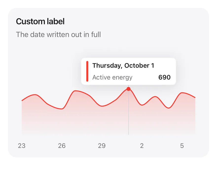
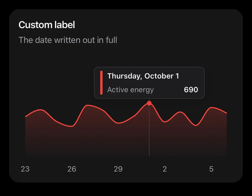
}Tooltip label formatter
A formatted date as the tooltip label.
import { Card, CardContent, CardDescription, CardHeader, CardTitle } from "@/components/ui/card"
import { Area, AreaChart, type ChartConfig, ChartContainer, ChartTooltip, ChartTooltipContent, XAxis } from "@/components/ui/chart"

const MONTHS = [
  "January",
  "February",
  "March",
  "April",
  "May",
  "June",
  "July",
  "August",
  "September",
  "October",
  "November",
  "December",
]

const WEEKDAYS = [
  "Sunday",
  "Monday",
  "Tuesday",
  "Wednesday",
  "Thursday",
  "Friday",
  "Saturday",
]

function dayKey(date: Date) {
  return [
    date.getFullYear(),
    String(date.getMonth() + 1).padStart(2, "0"),
    String(date.getDate()).padStart(2, "0"),
  ].join("-")
}

function fromKey(key: string) {
  const [year = 0, month = 1, day = 1] = key.split("-").map(Number)
  return new Date(year, month - 1, day)
}

const energyConfig = {
  energy: { label: "Active energy", color: "red" },
} satisfies ChartConfig

const energyValues = [
  512, 604, 455, 389, 662, 598, 431, 520, 690, 447, 575, 402, 633, 558,
]

const fortnight = energyValues.map((energy, index) => ({
  date: dayKey(new Date(2026, 8, 23 + index)),
  energy,
}))

function LabelFormatterDemo() {
  return (
    <Card variant="filled" size="sm">
      <CardHeader>
        <CardTitle>Custom label</CardTitle>
        <CardDescription>The date written out in full</CardDescription>
      </CardHeader>
      <CardContent>
        <ChartContainer
          config={energyConfig}
          accessibilityLabel="Custom label"
          className="h-52 w-full"
        >
          <AreaChart
            data={fortnight}
            margin={{ top: 70, right: 12, left: 12, bottom: 0 }}
          >
            <XAxis
              dataKey="date"
              tickMargin={8}
              interval={2}
              tickFormatter={(value: string) => String(Number(value.slice(8)))}
            />
            <ChartTooltip
              defaultIndex={8}
              content={
                <ChartTooltipContent
                  indicator="line"
                  labelFormatter={(_, payload) => {
                    const date = fromKey(String(payload[0]?.payload.date))
                    return `${WEEKDAYS[date.getDay()]}, ${MONTHS[date.getMonth()]} ${date.getDate()}`
                  }}
                />
              }
            />
            <Area
              dataKey="energy"
              type="monotone"
              strokeWidth={2}
              fill={{
                stops: [
                  { offset: 0, opacity: 0.38 },
                  { offset: 1, opacity: 0.02 },
                ],
              }}
            />
          </AreaChart>
        </ChartContainer>
      </CardContent>
    </Card>
  )
}

export function ChartTooltipLabelFormatterExample() {
  return (
    <LabelFormatterDemo />
  )
}import Charts
import EsuissUI
import SwiftUI
let chartEnglish = Locale(identifier: "en_US")
let chartEnergyValues: [Double] = [512, 604, 455, 389, 662, 598, 431, 520, 690, 447, 575, 402, 633, 558]
let chartEnergyConfig: ChartConfig = [
"energy": .init("Active energy", color: .red),
]
func chartDate(year: Int, month: Int, day: Int) -> Date {
let calendar = Foundation.Calendar(identifier: .gregorian)
let first = calendar.date(from: DateComponents(year: year, month: month, day: 1)) ?? .now
return calendar.date(byAdding: .day, value: day - 1, to: first) ?? first
}
struct ChartLabelFormatterDemo: View {
@State private var selection: Int? = 8
var body: some View {
let dates = chartEnergyValues.indices.map { chartDate(year: 2026, month: 9, day: 23 + $0) }
let color = chartEnergyConfig.color("energy")
Card(.filled, size: .sm) {
CardHeader("Custom label", description: "The date written out in full")
CardContent {
ChartContainer(config: chartEnergyConfig) {
ChartAnimator { progress in
Chart {
ForEach(chartEnergyValues.indices, id: \.self) { index in
AreaMark(x: .value("Day", index), y: .value("Energy", chartEnergyValues[index]))
.interpolationMethod(.monotone)
.foregroundStyle(
LinearGradient(colors: [color.opacity(0.38), color.opacity(0.02)], startPoint: .top, endPoint: .bottom)
)
LineMark(x: .value("Day", index), y: .value("Energy", chartEnergyValues[index]))
.interpolationMethod(.monotone)
.lineStyle(StrokeStyle(lineWidth: 2))
.foregroundStyle(color)
}
.chartReveal(progress, x: 0...(chartEnergyValues.count - 1))
if let selection {
PointMark(x: .value("Day", selection), y: .value("Energy", chartEnergyValues[selection]))
.symbolSize(64)
.foregroundStyle(color)
}
}
.chartXScale(domain: 0...(chartEnergyValues.count - 1), range: .plotDimension(padding: 12))
.chartYScale(range: .plotDimension(endPadding: 70))
.chartXAxis {
ChartAxis.x(values: Array(stride(from: 0, to: chartEnergyValues.count, by: 3))) {
"\(Foundation.Calendar(identifier: .gregorian).component(.day, from: dates[$0]))"
}
}
.chartYAxis(.hidden)
.chartTooltip(
x: Array(chartEnergyValues.indices),
selection: $selection,
defaultIndex: 8,
accessibilityLabel: "Custom label",
items: { [ChartTooltipItem("energy", value: chartEnergyValues[$0])] }
) { payload in
ChartTooltipContent(payload, indicator: .line) { payload in
Text(verbatim: dates[payload.index].formatted(
.dateTime.weekday(.wide).month(.wide).day().locale(chartEnglish)
))
}
}
}
}
.frame(height: 208)
}
}
}
}import androidx.compose.foundation.layout.fillMaxWidth
import androidx.compose.foundation.layout.height
import androidx.compose.runtime.Composable
import androidx.compose.runtime.remember
import androidx.compose.ui.Modifier
import androidx.compose.ui.text.font.FontWeight
import androidx.compose.ui.unit.dp
import com.esuiss.ui.components.AreaChart
import com.esuiss.ui.components.Card
import com.esuiss.ui.components.CardContent
import com.esuiss.ui.components.CardHeader
import com.esuiss.ui.components.CardSize
import com.esuiss.ui.components.CardVariant
import com.esuiss.ui.components.ChartConfig
import com.esuiss.ui.components.ChartConfigItem
import com.esuiss.ui.components.ChartContainer
import com.esuiss.ui.components.ChartCurve
import com.esuiss.ui.components.ChartFill
import com.esuiss.ui.components.ChartMargin
import com.esuiss.ui.components.ChartTooltipContent
import com.esuiss.ui.components.ChartTooltipIndicator
import com.esuiss.ui.components.Text
import com.esuiss.ui.theme.EsuissTheme
import com.esuiss.ui.theme.Typography
import java.text.SimpleDateFormat
import java.util.Calendar
import java.util.Locale
val chartEnergyConfig = ChartConfig("energy" to ChartConfigItem("Active energy") { red })
val chartEnergyValues = listOf(512, 604, 455, 389, 662, 598, 431, 520, 690, 447, 575, 402, 633, 558)
class ChartEnergy(val date: Calendar, val energy: Double)
fun chartEnergy(values: List<Int>, year: Int, month: Int, day: Int) = values.mapIndexed { index, value ->
ChartEnergy(Calendar.getInstance().apply { clear(); set(year, month, day + index, 12, 0) }, value.toDouble())
}
@Composable
fun ChartTooltipCard(title: String, description: String, content: @Composable () -> Unit) {
Card(variant = CardVariant.Filled, size = CardSize.Sm) {
CardHeader(title, description = description)
CardContent { content() }
}
}
@Composable
fun ChartLabelFormatter() {
val colors = EsuissTheme.colors
val data = remember { chartEnergy(chartEnergyValues, 2026, Calendar.SEPTEMBER, 23) }
val longDate = remember { SimpleDateFormat("EEEE, MMMM d", Locale.US) }
ChartTooltipCard("Custom label", "The date written out in full") {
ChartContainer(chartEnergyConfig, Modifier.fillMaxWidth().height(208.dp)) {
AreaChart(
data,
margin = ChartMargin(top = 70.dp, right = 12.dp, bottom = 0.dp, left = 12.dp),
accessibilityLabel = "Custom label",
) {
XAxis(label = { it.date.get(Calendar.DAY_OF_MONTH).toString() }, tickMargin = 8.dp, interval = 2)
ChartTooltip(defaultIndex = 8) {
ChartTooltipContent(
indicator = ChartTooltipIndicator.Line,
labelFormatter = { _, items ->
Text(
longDate.format(data[items.first().index].date.time),
style = Typography.xs.copy(color = colors.label, fontWeight = FontWeight.SemiBold),
)
},
)
}
Area(
"energy",
value = { it.energy },
curve = ChartCurve.Monotone,
strokeWidth = 2.dp,
fill = ChartFill.VerticalGradient(topAlpha = 0.38f, bottomAlpha = 0.02f),
)
}
}
}
}Tooltip formatter
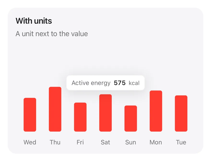
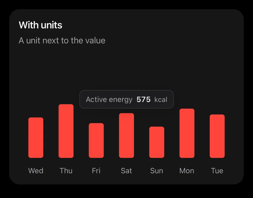
Custom value formatting with formatter.
import { View } from "react-native"
import { Card, CardContent, CardDescription, CardHeader, CardTitle } from "@/components/ui/card"
import { Bar, BarChart, type ChartConfig, ChartContainer, ChartTooltip, ChartTooltipContent, XAxis } from "@/components/ui/chart"
import { Text } from "@/components/ui/text"

const WEEKDAYS = [
  "Sunday",
  "Monday",
  "Tuesday",
  "Wednesday",
  "Thursday",
  "Friday",
  "Saturday",
]

function formatNumber(value: number, digits = 0) {
  try {
    return new Intl.NumberFormat("en-US", {
      minimumFractionDigits: digits,
      maximumFractionDigits: digits,
    }).format(value)
  } catch {
    const [whole = "0", fraction] = value.toFixed(digits).split(".")
    const grouped = whole.replace(/\B(?=(\d{3})+(?!\d))/g, ",")
    return fraction ? `${grouped}.${fraction}` : grouped
  }
}

function dayKey(date: Date) {
  return [
    date.getFullYear(),
    String(date.getMonth() + 1).padStart(2, "0"),
    String(date.getDate()).padStart(2, "0"),
  ].join("-")
}

function fromKey(key: string) {
  const [year = 0, month = 1, day = 1] = key.split("-").map(Number)
  return new Date(year, month - 1, day)
}

const energyConfig = {
  energy: { label: "Active energy", color: "red" },
} satisfies ChartConfig

const energyValues = [
  512, 604, 455, 389, 662, 598, 431, 520, 690, 447, 575, 402, 633, 558,
]

const week = energyValues.slice(-7).map((energy, index) => ({
  date: dayKey(new Date(2026, 9, index)),
  energy,
}))

function FormatterDemo() {
  return (
    <Card variant="filled" size="sm">
      <CardHeader>
        <CardTitle>With units</CardTitle>
        <CardDescription>A unit next to the value</CardDescription>
      </CardHeader>
      <CardContent>
        <ChartContainer
          config={energyConfig}
          accessibilityLabel="With units"
          className="h-52 w-full"
        >
          <BarChart
            data={week}
            margin={{ top: 70, right: 4, left: 4, bottom: 0 }}
          >
            <XAxis
              dataKey="date"
              tickMargin={8}
              interval={0}
              tickFormatter={(value: string) =>
                (WEEKDAYS[fromKey(value).getDay()] ?? "").slice(0, 3)
              }
            />
            <ChartTooltip
              defaultIndex={3}
              cursor={false}
              content={
                <ChartTooltipContent
                  hideLabel
                  formatter={(value) => (
                    <View className="flex-row items-baseline gap-1.5">
                      <Text className="text-label-secondary">
                        Active energy
                      </Text>
                      <Text className="font-semibold text-label tabular-nums">
                        {formatNumber(Number(value))}
                      </Text>
                      <Text className="text-2xs text-label-secondary">
                        kcal
                      </Text>
                    </View>
                  )}
                />
              }
            />
            <Bar dataKey="energy" radius={4} maxBarSize={26} />
          </BarChart>
        </ChartContainer>
      </CardContent>
    </Card>
  )
}

export function ChartTooltipFormatterExample() {
  return (
    <FormatterDemo />
  )
}import Charts
import EsuissUI
import SwiftUI
let chartEnglish = Locale(identifier: "en_US")
let chartEnergyValues: [Double] = [512, 604, 455, 389, 662, 598, 431, 520, 690, 447, 575, 402, 633, 558]
let chartEnergyConfig: ChartConfig = [
"energy": .init("Active energy", color: .red),
]
func chartDate(year: Int, month: Int, day: Int) -> Date {
let calendar = Foundation.Calendar(identifier: .gregorian)
let first = calendar.date(from: DateComponents(year: year, month: month, day: 1)) ?? .now
return calendar.date(byAdding: .day, value: day - 1, to: first) ?? first
}
struct ChartFormatterDemo: View {
let week = Array(chartEnergyValues.suffix(7))
var body: some View {
let labels = week.indices.map {
chartDate(year: 2026, month: 10, day: $0).formatted(.dateTime.weekday(.abbreviated).locale(chartEnglish))
}
Card(.filled, size: .sm) {
CardHeader("With units", description: "A unit next to the value")
CardContent {
ChartContainer(config: chartEnergyConfig) {
ChartAnimator(animationDuration: 400) { progress in
Chart {
ForEach(week.indices, id: \.self) { index in
BarMark(x: .value("Day", labels[index]), y: .value("Energy", week[index] * progress), width: .fixed(26))
.clipShape(RoundedRectangle(cornerRadius: 4, style: .continuous))
.foregroundStyle(chartEnergyConfig.color("energy"))
ChartAnchorMark(x: .value("Day", labels[index]), y: .value("Energy", week[index]))
}
}
.chartYScale(range: .plotDimension(endPadding: 70))
.chartXAxis { ChartAxis.x(values: labels) { $0 } }
.chartYAxis(.hidden)
.chartTooltip(
x: labels,
defaultIndex: 3,
cursor: false,
accessibilityLabel: "With units",
items: { [ChartTooltipItem("energy", value: week[$0])] }
) { payload in
ChartTooltipContent(payload, hideLabel: true) { item in
HStack(alignment: .firstTextBaseline, spacing: 6) {
Text("Active energy")
.foregroundStyle(Color.labelSecondary)
Text(verbatim: item.value.formatted(.number.locale(chartEnglish)))
.font(TextStyle.xs.font(weight: .semibold))
.monospacedDigit()
.foregroundStyle(Color.label)
Text("kcal")
.font(TextStyle.xs2.font())
.foregroundStyle(Color.labelSecondary)
}
}
}
}
}
.frame(height: 208)
}
}
}
}import androidx.compose.foundation.layout.Arrangement
import androidx.compose.foundation.layout.Row
import androidx.compose.foundation.layout.fillMaxWidth
import androidx.compose.foundation.layout.height
import androidx.compose.runtime.Composable
import androidx.compose.runtime.remember
import androidx.compose.ui.Modifier
import androidx.compose.ui.text.font.FontWeight
import androidx.compose.ui.unit.dp
import com.esuiss.ui.components.BarChart
import com.esuiss.ui.components.Card
import com.esuiss.ui.components.CardContent
import com.esuiss.ui.components.CardHeader
import com.esuiss.ui.components.CardSize
import com.esuiss.ui.components.CardVariant
import com.esuiss.ui.components.ChartConfig
import com.esuiss.ui.components.ChartConfigItem
import com.esuiss.ui.components.ChartContainer
import com.esuiss.ui.components.ChartMargin
import com.esuiss.ui.components.ChartRadius
import com.esuiss.ui.components.ChartTooltipContent
import com.esuiss.ui.components.Text
import com.esuiss.ui.theme.EsuissTheme
import com.esuiss.ui.theme.Typography
import java.text.NumberFormat
import java.text.SimpleDateFormat
import java.util.Calendar
import java.util.Locale
val chartEnergyConfig = ChartConfig("energy" to ChartConfigItem("Active energy") { red })
val chartEnergyValues = listOf(512, 604, 455, 389, 662, 598, 431, 520, 690, 447, 575, 402, 633, 558)
class ChartEnergy(val date: Calendar, val energy: Double)
fun chartEnergy(values: List<Int>, year: Int, month: Int, day: Int) = values.mapIndexed { index, value ->
ChartEnergy(Calendar.getInstance().apply { clear(); set(year, month, day + index, 12, 0) }, value.toDouble())
}
fun chartNumber(value: Double): String = NumberFormat.getNumberInstance(Locale.US).apply {
minimumFractionDigits = 0
maximumFractionDigits = 0
}.format(value)
@Composable
fun ChartTooltipCard(title: String, description: String, content: @Composable () -> Unit) {
Card(variant = CardVariant.Filled, size = CardSize.Sm) {
CardHeader(title, description = description)
CardContent { content() }
}
}
@Composable
fun ChartFormatter() {
val colors = EsuissTheme.colors
val data = remember { chartEnergy(chartEnergyValues.takeLast(7), 2026, Calendar.OCTOBER, 0) }
val weekday = remember { SimpleDateFormat("EEE", Locale.US) }
ChartTooltipCard("With units", "A unit next to the value") {
ChartContainer(chartEnergyConfig, Modifier.fillMaxWidth().height(208.dp)) {
BarChart(
data,
margin = ChartMargin(top = 70.dp, right = 4.dp, bottom = 0.dp, left = 4.dp),
accessibilityLabel = "With units",
) {
XAxis(label = { weekday.format(it.date.time) }, tickMargin = 8.dp, interval = 0)
ChartTooltip(defaultIndex = 3, cursor = null) {
ChartTooltipContent(
hideLabel = true,
formatter = { item ->
Row(horizontalArrangement = Arrangement.spacedBy(6.dp)) {
Text(
"Active energy",
Modifier.alignByBaseline(),
style = Typography.xs.copy(color = colors.labelSecondary),
)
Text(
chartNumber(item.value),
Modifier.alignByBaseline(),
style = Typography.xs.copy(color = colors.label, fontWeight = FontWeight.SemiBold, fontFeatureSettings = "tnum"),
)
Text("kcal", Modifier.alignByBaseline(), style = Typography.xs2.copy(color = colors.labelSecondary))
}
},
)
}
Bar("energy", value = { it.energy }, radius = ChartRadius(4.dp), maxBarSize = 26.dp)
}
}
}
}Tooltip icons
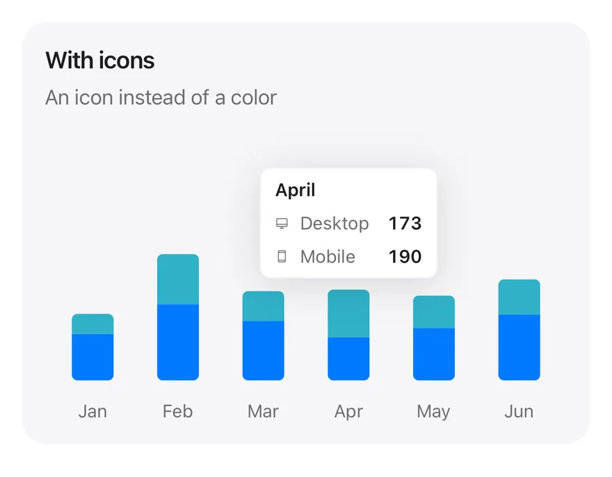
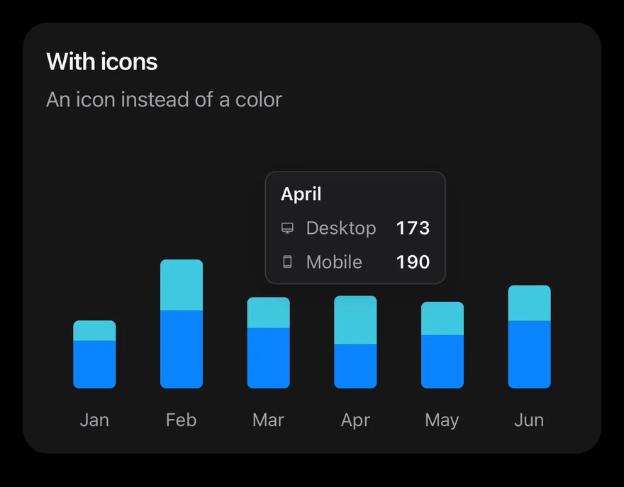
Config icons in place of color indicators.
import { DesktopIcon, DeviceMobileIcon } from "phosphor-react-native"
import { Card, CardContent, CardDescription, CardHeader, CardTitle } from "@/components/ui/card"
import { Bar, BarChart, type ChartConfig, ChartContainer, ChartTooltip, ChartTooltipContent, XAxis } from "@/components/ui/chart"

const monthData = [
  { month: "January", desktop: 186, mobile: 80 },
  { month: "February", desktop: 305, mobile: 200 },
  { month: "March", desktop: 237, mobile: 120 },
  { month: "April", desktop: 173, mobile: 190 },
  { month: "May", desktop: 209, mobile: 130 },
  { month: "June", desktop: 264, mobile: 140 },
]

const iconConfig = {
  desktop: { label: "Desktop", color: "blue", icon: DesktopIcon },
  mobile: { label: "Mobile", color: "teal", icon: DeviceMobileIcon },
} satisfies ChartConfig

function IconsDemo() {
  return (
    <Card variant="filled" size="sm">
      <CardHeader>
        <CardTitle>With icons</CardTitle>
        <CardDescription>An icon instead of a color</CardDescription>
      </CardHeader>
      <CardContent>
        <ChartContainer
          config={iconConfig}
          accessibilityLabel="With icons"
          className="h-52 w-full"
        >
          <BarChart
            data={monthData}
            margin={{ top: 70, right: 4, left: 4, bottom: 0 }}
          >
            <XAxis
              dataKey="month"
              tickMargin={8}
              interval={0}
              tickFormatter={(value: string) => value.slice(0, 3)}
            />
            <ChartTooltip
              defaultIndex={3}
              cursor={false}
              content={<ChartTooltipContent />}
            />
            <Bar
              dataKey="desktop"
              stackId="a"
              radius={[0, 0, 4, 4]}
              maxBarSize={30}
            />
            <Bar
              dataKey="mobile"
              stackId="a"
              radius={[4, 4, 0, 0]}
              maxBarSize={30}
            />
          </BarChart>
        </ChartContainer>
      </CardContent>
    </Card>
  )
}

export function ChartTooltipIconsExample() {
  return (
    <IconsDemo />
  )
}import Charts
import EsuissUI
import PhosphorSwift
import SwiftUI
struct ChartTooltipIconsExample: View {
var body: some View {
ChartStackedTooltip(
title: "With icons",
description: "An icon instead of a color",
config: chartDeviceIcons,
defaultIndex: 3
) { payload in
ChartTooltipContent(payload)
}
}
}
let chartMonthData: [(month: String, desktop: Double, mobile: Double)] = [
("January", 186, 80),
("February", 305, 200),
("March", 237, 120),
("April", 173, 190),
("May", 209, 130),
("June", 264, 140),
]
let chartDevices: ChartConfig = [
"desktop": .init("Desktop", color: .blue),
"mobile": .init("Mobile", color: .teal),
]
let chartDeviceIcons: ChartConfig = [
"desktop": .init("Desktop", color: .blue, icon: Ph.desktop.regular),
"mobile": .init("Mobile", color: .teal, icon: Ph.deviceMobile.regular),
]
struct ChartStackedTooltip<Tooltip: View>: View {
let title: String
let description: String
var config = chartDevices
let defaultIndex: Int
@ViewBuilder let tooltip: (ChartTooltipPayload) -> Tooltip
var body: some View {
Card(.filled, size: .sm) {
CardHeader(LocalizedStringKey(title), description: LocalizedStringKey(description))
CardContent {
ChartContainer(config: config) {
ChartAnimator(animationDuration: 400) { progress in
Chart {
ForEach(chartMonthData.indices, id: \.self) { index in
let item = chartMonthData[index]
BarMark(
x: .value("Month", item.month),
yStart: .value("Start", 0),
yEnd: .value("Desktop", item.desktop * progress),
width: .fixed(30)
)
.clipShape(UnevenRoundedRectangle(bottomLeadingRadius: 4, bottomTrailingRadius: 4, style: .continuous))
.foregroundStyle(config.color("desktop"))
BarMark(
x: .value("Month", item.month),
yStart: .value("Start", item.desktop * progress),
yEnd: .value("Mobile", (item.desktop + item.mobile) * progress),
width: .fixed(30)
)
.clipShape(UnevenRoundedRectangle(topLeadingRadius: 4, topTrailingRadius: 4, style: .continuous))
.foregroundStyle(config.color("mobile"))
ChartAnchorMark(x: .value("Month", item.month), y: .value("Mobile", item.desktop + item.mobile))
}
}
.chartYScale(range: .plotDimension(endPadding: 70))
.chartXAxis { ChartAxis.x(values: chartMonthData.map(\.month)) { String($0.prefix(3)) } }
.chartYAxis(.hidden)
.chartTooltip(
x: chartMonthData.map(\.month),
defaultIndex: defaultIndex,
cursor: false,
accessibilityLabel: title,
items: { index in
[
ChartTooltipItem("desktop", value: chartMonthData[index].desktop),
ChartTooltipItem("mobile", value: chartMonthData[index].mobile),
]
},
content: tooltip
)
}
}
.frame(height: 208)
}
}
}
}import androidx.compose.foundation.layout.fillMaxWidth
import androidx.compose.foundation.layout.height
import androidx.compose.runtime.Composable
import androidx.compose.ui.Modifier
import androidx.compose.ui.unit.dp
import com.adamglin.PhosphorIcons
import com.adamglin.phosphoricons.Regular
import com.adamglin.phosphoricons.regular.Desktop
import com.adamglin.phosphoricons.regular.DeviceMobile
import com.esuiss.ui.components.BarChart
import com.esuiss.ui.components.Card
import com.esuiss.ui.components.CardContent
import com.esuiss.ui.components.CardHeader
import com.esuiss.ui.components.CardSize
import com.esuiss.ui.components.CardVariant
import com.esuiss.ui.components.ChartConfig
import com.esuiss.ui.components.ChartConfigItem
import com.esuiss.ui.components.ChartContainer
import com.esuiss.ui.components.ChartMargin
import com.esuiss.ui.components.ChartRadius
import com.esuiss.ui.components.ChartTooltipContent
import com.esuiss.ui.components.ChartTooltipScope
@Composable
fun ChartTooltipIconsExample() {
ChartStackedTooltip("With icons", "An icon instead of a color", 3, chartIconConfig) { ChartTooltipContent() }
}
class ChartMonth(val month: String, val desktop: Double, val mobile: Double)
val chartMonthData = listOf(
ChartMonth("January", 186.0, 80.0),
ChartMonth("February", 305.0, 200.0),
ChartMonth("March", 237.0, 120.0),
ChartMonth("April", 173.0, 190.0),
ChartMonth("May", 209.0, 130.0),
ChartMonth("June", 264.0, 140.0),
)
val chartDeviceConfig = ChartConfig(
"desktop" to ChartConfigItem("Desktop") { blue },
"mobile" to ChartConfigItem("Mobile") { teal },
)
val chartIconConfig = ChartConfig(
"desktop" to ChartConfigItem("Desktop", PhosphorIcons.Regular.Desktop) { blue },
"mobile" to ChartConfigItem("Mobile", PhosphorIcons.Regular.DeviceMobile) { teal },
)
@Composable
fun ChartTooltipCard(title: String, description: String, content: @Composable () -> Unit) {
Card(variant = CardVariant.Filled, size = CardSize.Sm) {
CardHeader(title, description = description)
CardContent { content() }
}
}
@Composable
fun ChartStackedTooltip(
title: String,
description: String,
defaultIndex: Int,
config: ChartConfig = chartDeviceConfig,
tooltip: @Composable ChartTooltipScope.() -> Unit,
) {
ChartTooltipCard(title, description) {
ChartContainer(config, Modifier.fillMaxWidth().height(208.dp)) {
BarChart(
chartMonthData,
margin = ChartMargin(top = 70.dp, right = 4.dp, bottom = 0.dp, left = 4.dp),
accessibilityLabel = title,
) {
XAxis(label = { it.month }, tickMargin = 8.dp, interval = 0, tickFormatter = { it.take(3) })
ChartTooltip(defaultIndex = defaultIndex, cursor = null, content = tooltip)
Bar("desktop", value = { it.desktop }, stackId = "a", radius = ChartRadius(0.dp, 0.dp, 4.dp, 4.dp), maxBarSize = 30.dp)
Bar("mobile", value = { it.mobile }, stackId = "a", radius = ChartRadius(4.dp, 4.dp, 0.dp, 0.dp), maxBarSize = 30.dp)
}
}
}
}Tooltip custom
A fully custom tooltip rendered from a function.
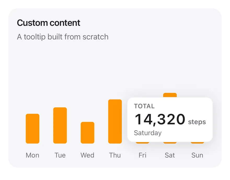
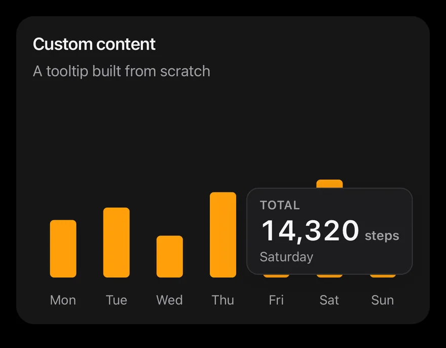
import { View } from "react-native"
import { Card, CardContent, CardDescription, CardHeader, CardTitle } from "@/components/ui/card"
import { Bar, BarChart, type ChartConfig, ChartContainer, ChartTooltip, XAxis } from "@/components/ui/chart"
import { Text } from "@/components/ui/text"

function formatNumber(value: number, digits = 0) {
  try {
    return new Intl.NumberFormat("en-US", {
      minimumFractionDigits: digits,
      maximumFractionDigits: digits,
    }).format(value)
  } catch {
    const [whole = "0", fraction] = value.toFixed(digits).split(".")
    const grouped = whole.replace(/\B(?=(\d{3})+(?!\d))/g, ",")
    return fraction ? `${grouped}.${fraction}` : grouped
  }
}

const stepsData = [
  { day: "Monday", steps: 8412 },
  { day: "Tuesday", steps: 10230 },
  { day: "Wednesday", steps: 6120 },
  { day: "Thursday", steps: 12480 },
  { day: "Friday", steps: 9050 },
  { day: "Saturday", steps: 14320 },
  { day: "Sunday", steps: 4870 },
]

const stepsConfig = {
  steps: { label: "Steps", color: "orange" },
} satisfies ChartConfig

function CustomDemo() {
  return (
    <Card variant="filled" size="sm">
      <CardHeader>
        <CardTitle>Custom content</CardTitle>
        <CardDescription>A tooltip built from scratch</CardDescription>
      </CardHeader>
      <CardContent>
        <ChartContainer
          config={stepsConfig}
          accessibilityLabel="Custom content"
          className="h-52 w-full"
        >
          <BarChart
            data={stepsData}
            margin={{ top: 70, right: 4, left: 4, bottom: 0 }}
          >
            <XAxis
              dataKey="day"
              tickMargin={8}
              interval={0}
              tickFormatter={(value: string) => value.slice(0, 3)}
            />
            <ChartTooltip
              defaultIndex={5}
              cursor={false}
              content={({ active, payload, label }) => {
                const entry = payload[0]
                if (!active || !entry) return null
                return (
                  <View className="min-w-28 rounded-xl border border-label/5 bg-surface-raised px-3 py-2 shadow-lg dark:border-label/10">
                    <Text className="text-2xs font-semibold tracking-wide text-label-secondary uppercase">
                      Total
                    </Text>
                    <View className="flex-row items-baseline gap-1">
                      <Text className="text-2xl font-semibold tabular-nums">
                        {formatNumber(Number(entry.value))}
                      </Text>
                      <Text className="text-xs font-semibold text-label-secondary">
                        steps
                      </Text>
                    </View>
                    <Text className="text-xs text-label-secondary">
                      {label}
                    </Text>
                  </View>
                )
              }}
            />
            <Bar dataKey="steps" radius={4} maxBarSize={26} />
          </BarChart>
        </ChartContainer>
      </CardContent>
    </Card>
  )
}

export function ChartTooltipCustomExample() {
  return (
    <CustomDemo />
  )
}import Charts
import EsuissUI
import SwiftUI
let chartEnglish = Locale(identifier: "en_US")
struct ChartCustomDemo: View {
let steps: [(day: String, steps: Double)] = [
("Monday", 8412),
("Tuesday", 10230),
("Wednesday", 6120),
("Thursday", 12480),
("Friday", 9050),
("Saturday", 14320),
("Sunday", 4870),
]
let config: ChartConfig = ["steps": .init("Steps", color: .orange)]
@Environment(\.colorScheme) private var colorScheme
var body: some View {
let shape = RoundedRectangle(cornerRadius: Radius.xl, style: .continuous)
Card(.filled, size: .sm) {
CardHeader("Custom content", description: "A tooltip built from scratch")
CardContent {
ChartContainer(config: config) {
ChartAnimator(animationDuration: 400) { progress in
Chart {
ForEach(steps.indices, id: \.self) { index in
BarMark(x: .value("Day", steps[index].day), y: .value("Steps", steps[index].steps * progress), width: .fixed(26))
.clipShape(RoundedRectangle(cornerRadius: 4, style: .continuous))
.foregroundStyle(config.color("steps"))
ChartAnchorMark(x: .value("Day", steps[index].day), y: .value("Steps", steps[index].steps))
}
}
.chartYScale(range: .plotDimension(endPadding: 70))
.chartXAxis { ChartAxis.x(values: steps.map(\.day)) { String($0.prefix(3)) } }
.chartYAxis(.hidden)
.chartTooltip(
x: steps.map(\.day),
defaultIndex: 5,
cursor: false,
accessibilityLabel: "Custom content",
items: { [ChartTooltipItem("steps", value: steps[$0].steps)] }
) { payload in
VStack(alignment: .leading, spacing: 0) {
Text("TOTAL")
.font(TextStyle.xs2.font(weight: .semibold))
.tracking(0.5)
.foregroundStyle(Color.labelSecondary)
HStack(alignment: .firstTextBaseline, spacing: 4) {
Text(verbatim: payload.total.formatted(.number.locale(chartEnglish)))
.font(TextStyle.xl2.font(weight: .semibold))
.monospacedDigit()
.foregroundStyle(Color.label)
Text("steps")
.font(TextStyle.xs.font(weight: .semibold))
.foregroundStyle(Color.labelSecondary)
}
Text(verbatim: payload.label)
.font(TextStyle.xs.font())
.foregroundStyle(Color.labelSecondary)
}
.padding(.horizontal, 12)
.padding(.vertical, 8)
.frame(minWidth: 112, alignment: .leading)
.background(Color.surfaceRaised, in: shape)
.overlay {
shape.strokeBorder(Color.label.opacity(colorScheme == .dark ? 0.1 : 0.05))
}
.shadow(.lg)
.fixedSize()
}
}
}
.frame(height: 208)
}
}
}
}import androidx.compose.foundation.background
import androidx.compose.foundation.border
import androidx.compose.foundation.layout.Arrangement
import androidx.compose.foundation.layout.Column
import androidx.compose.foundation.layout.Row
import androidx.compose.foundation.layout.fillMaxWidth
import androidx.compose.foundation.layout.height
import androidx.compose.foundation.layout.padding
import androidx.compose.foundation.layout.widthIn
import androidx.compose.foundation.shape.RoundedCornerShape
import androidx.compose.runtime.Composable
import androidx.compose.ui.Modifier
import androidx.compose.ui.text.font.FontWeight
import androidx.compose.ui.unit.dp
import com.esuiss.ui.components.BarChart
import com.esuiss.ui.components.Card
import com.esuiss.ui.components.CardContent
import com.esuiss.ui.components.CardHeader
import com.esuiss.ui.components.CardSize
import com.esuiss.ui.components.CardVariant
import com.esuiss.ui.components.ChartConfig
import com.esuiss.ui.components.ChartConfigItem
import com.esuiss.ui.components.ChartContainer
import com.esuiss.ui.components.ChartMargin
import com.esuiss.ui.components.ChartRadius
import com.esuiss.ui.components.Text
import com.esuiss.ui.theme.EsuissTheme
import com.esuiss.ui.theme.Radius
import com.esuiss.ui.theme.Shadows
import com.esuiss.ui.theme.Typography
import com.esuiss.ui.theme.shadow
import java.text.NumberFormat
import java.util.Locale
fun chartNumber(value: Double): String = NumberFormat.getNumberInstance(Locale.US).apply {
minimumFractionDigits = 0
maximumFractionDigits = 0
}.format(value)
@Composable
fun ChartTooltipCard(title: String, description: String, content: @Composable () -> Unit) {
Card(variant = CardVariant.Filled, size = CardSize.Sm) {
CardHeader(title, description = description)
CardContent { content() }
}
}
class ChartSteps(val day: String, val steps: Double)
val chartStepsData = listOf(
ChartSteps("Monday", 8412.0),
ChartSteps("Tuesday", 10230.0),
ChartSteps("Wednesday", 6120.0),
ChartSteps("Thursday", 12480.0),
ChartSteps("Friday", 9050.0),
ChartSteps("Saturday", 14320.0),
ChartSteps("Sunday", 4870.0),
)
val chartStepsConfig = ChartConfig("steps" to ChartConfigItem("Steps") { orange })
@Composable
fun ChartCustom() {
val colors = EsuissTheme.colors
ChartTooltipCard("Custom content", "A tooltip built from scratch") {
ChartContainer(chartStepsConfig, Modifier.fillMaxWidth().height(208.dp)) {
BarChart(
chartStepsData,
margin = ChartMargin(top = 70.dp, right = 4.dp, bottom = 0.dp, left = 4.dp),
accessibilityLabel = "Custom content",
) {
XAxis(label = { it.day }, tickMargin = 8.dp, interval = 0, tickFormatter = { it.take(3) })
ChartTooltip(defaultIndex = 5, cursor = null) {
val entry = items.firstOrNull() ?: return@ChartTooltip
val shape = RoundedCornerShape(Radius.xl)
Column(
Modifier
.widthIn(min = 112.dp)
.shadow(Shadows.lg, shape)
.background(colors.surfaceRaised, shape)
.border(1.dp, colors.label.copy(alpha = if (colors.isDark) 0.1f else 0.05f), shape)
.padding(horizontal = 12.dp, vertical = 8.dp),
) {
Text(
"TOTAL",
style = Typography.xs2.copy(color = colors.labelSecondary, fontWeight = FontWeight.SemiBold),
)
Row(horizontalArrangement = Arrangement.spacedBy(4.dp)) {
Text(
chartNumber(entry.value),
Modifier.alignByBaseline(),
style = Typography.xl2.copy(color = colors.label, fontWeight = FontWeight.SemiBold, fontFeatureSettings = "tnum"),
)
Text(
"steps",
Modifier.alignByBaseline(),
style = Typography.xs.copy(color = colors.labelSecondary, fontWeight = FontWeight.SemiBold),
)
}
Text(label, style = Typography.xs.copy(color = colors.labelSecondary))
}
}
Bar("steps", value = { it.steps }, radius = ChartRadius(4.dp), maxBarSize = 26.dp)
}
}
}
}Tooltip interactive
Settings that change the tooltip on a stacked bar chart with a legend.
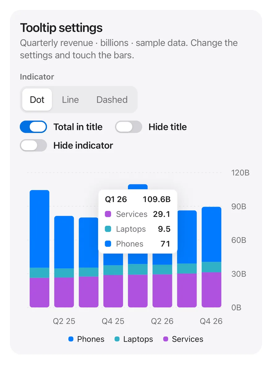
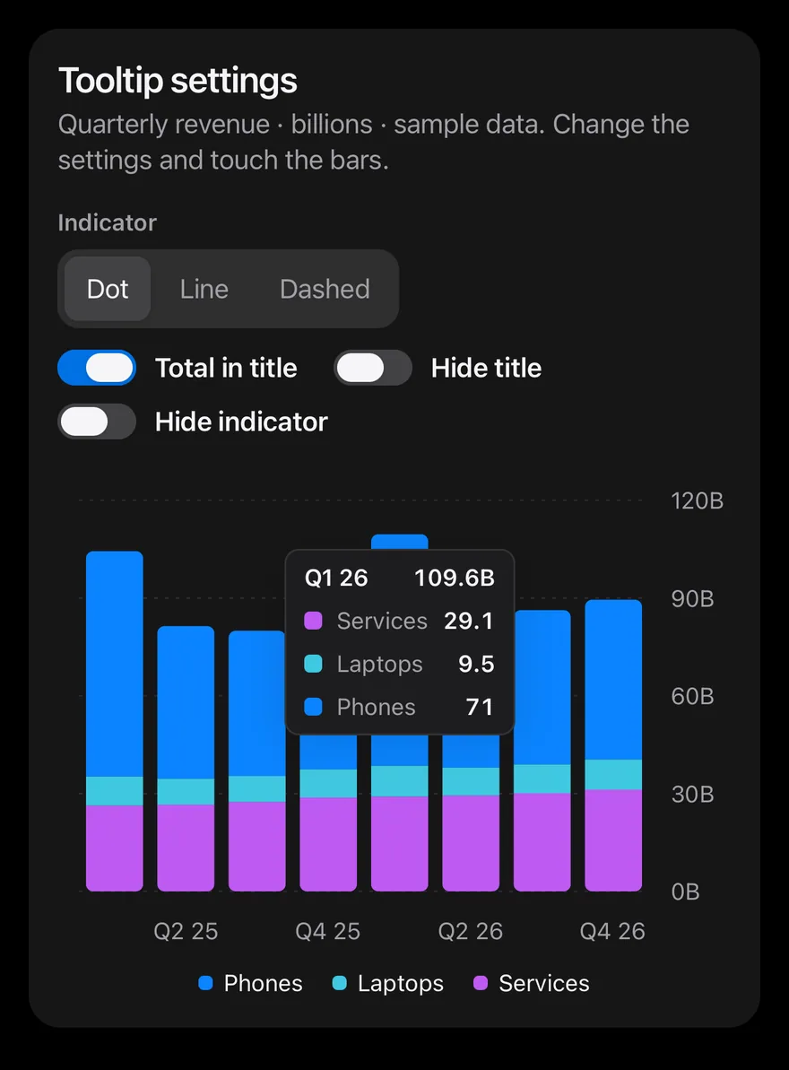
import * as React from "react"
import { View } from "react-native"
import { Card, CardContent, CardHeader } from "@/components/ui/card"
import { Bar, BarChart, CartesianGrid, type ChartConfig, ChartContainer, ChartLegend, ChartLegendContent, ChartTooltip, ChartTooltipContent, XAxis, YAxis } from "@/components/ui/chart"
import { Label } from "@/components/ui/label"
import { Switch } from "@/components/ui/switch"
import { Text } from "@/components/ui/text"
import { ToggleGroup, ToggleGroupItem } from "@/components/ui/toggle-group"

function formatTotal(value: number) {
  try {
    return new Intl.NumberFormat(undefined, {
      maximumFractionDigits: 1,
    }).format(value)
  } catch {
    return String(Math.round(value * 10) / 10)
  }
}

type Indicator = "dot" | "line" | "dashed"

const INDICATORS: Record<Indicator, string> = {
  dot: "Dot",
  line: "Line",
  dashed: "Dashed",
}

const revenueData = [
  ["Q1 25", 69.1, 9, 26.3],
  ["Q2 25", 46.8, 8, 26.6],
  ["Q3 25", 44.6, 8, 27.4],
  ["Q4 25", 46.2, 8.7, 28.8],
  ["Q1 26", 71, 9.5, 29.1],
  ["Q2 26", 49.4, 8.6, 29.4],
  ["Q3 26", 47.3, 8.9, 30.1],
  ["Q4 26", 49, 9.3, 31.2],
].map(([quarter, phones, laptops, services]) => ({
  quarter: quarter as string,
  phones: phones as number,
  laptops: laptops as number,
  services: services as number,
}))

const revenueConfig = {
  phones: { label: "Phones", color: "blue" },
  laptops: { label: "Laptops", color: "teal" },
  services: { label: "Services", color: "purple" },
} satisfies ChartConfig

function Setting({
  id,
  label,
  checked,
  onCheckedChange,
}: {
  id: string
  label: string
  checked: boolean
  onCheckedChange: (checked: boolean) => void
}) {
  return (
    <View className="flex-row items-center gap-2.5">
      <Switch
        size="sm"
        checked={checked}
        onCheckedChange={onCheckedChange}
        accessibilityLabelledBy={id}
      />
      <Label nativeID={id} onPress={() => onCheckedChange(!checked)}>
        <Text className="text-sm">{label}</Text>
      </Label>
    </View>
  )
}

function InteractiveDemo() {
  const [indicator, setIndicator] = React.useState<Indicator>("dot")
  const [showTotal, setShowTotal] = React.useState(true)
  const [hideLabel, setHideLabel] = React.useState(false)
  const [hideIndicator, setHideIndicator] = React.useState(false)

  return (
    <Card variant="filled" size="sm">
      <CardHeader className="gap-0.5">
        <Text className="text-lg font-semibold">Tooltip settings</Text>
        <Text className="text-sm text-label-secondary">
          Quarterly revenue · billions · sample data. Change the settings and
          touch the bars.
        </Text>
      </CardHeader>
      <CardContent className="gap-5">
        <View className="flex-row flex-wrap items-end gap-x-6 gap-y-3">
          <View className="gap-1.5">
            <Text className="text-xs font-semibold text-label-secondary">
              Indicator
            </Text>
            <ToggleGroup
              spacing={0}
              value={[indicator]}
              onValueChange={(value) => {
                if (value[0]) setIndicator(value[0] as Indicator)
              }}
              accessibilityLabel="Indicator"
            >
              {(Object.keys(INDICATORS) as Indicator[]).map((key) => (
                <ToggleGroupItem key={key} value={key} size="sm">
                  <Text>{INDICATORS[key]}</Text>
                </ToggleGroupItem>
              ))}
            </ToggleGroup>
          </View>
          <View className="flex-row flex-wrap gap-x-5 gap-y-2.5 pb-1">
            <Setting
              id="tooltip-total"
              label="Total in title"
              checked={showTotal}
              onCheckedChange={setShowTotal}
            />
            <Setting
              id="tooltip-hide-title"
              label="Hide title"
              checked={hideLabel}
              onCheckedChange={setHideLabel}
            />
            <Setting
              id="tooltip-hide-indicator"
              label="Hide indicator"
              checked={hideIndicator}
              onCheckedChange={setHideIndicator}
            />
          </View>
        </View>
        <ChartContainer
          config={revenueConfig}
          accessibilityLabel="Quarterly revenue"
          className="h-72 w-full"
        >
          <BarChart
            data={revenueData}
            margin={{ top: 10, right: 4, left: 12, bottom: 0 }}
          >
            <CartesianGrid vertical={false} strokeDasharray="2 4" />
            <XAxis dataKey="quarter" tickMargin={8} minTickGap={8} />
            <YAxis
              orientation="right"
              tickMargin={6}
              width="auto"
              tickFormatter={(value: number) => `${value}B`}
            />
            <ChartTooltip
              defaultIndex={4}
              cursor={false}
              content={
                <ChartTooltipContent
                  indicator={indicator}
                  hideLabel={hideLabel}
                  hideIndicator={hideIndicator}
                  labelFormatter={
                    showTotal
                      ? (label, payload) => (
                          <View className="flex-row justify-between gap-4">
                            <Text>{label}</Text>
                            <Text className="tabular-nums">
                              {formatTotal(
                                payload.reduce(
                                  (sum, item) => sum + Number(item.value),
                                  0
                                )
                              )}
                              B
                            </Text>
                          </View>
                        )
                      : undefined
                  }
                />
              }
            />
            <ChartLegend content={<ChartLegendContent />} />
            <Bar
              dataKey="services"
              stackId="a"
              radius={[0, 0, 4, 4]}
              maxBarSize={44}
            />
            <Bar dataKey="laptops" stackId="a" maxBarSize={44} />
            <Bar
              dataKey="phones"
              stackId="a"
              radius={[4, 4, 0, 0]}
              maxBarSize={44}
            />
          </BarChart>
        </ChartContainer>
      </CardContent>
    </Card>
  )
}

export function ChartTooltipInteractiveExample() {
  return (
    <InteractiveDemo />
  )
}import Charts
import EsuissUI
import SwiftUI
struct ChartInteractiveDemo: View {
let quarters: [(quarter: String, phones: Double, laptops: Double, services: Double)] = [
("Q1 25", 69.1, 9, 26.3),
("Q2 25", 46.8, 8, 26.6),
("Q3 25", 44.6, 8, 27.4),
("Q4 25", 46.2, 8.7, 28.8),
("Q1 26", 71, 9.5, 29.1),
("Q2 26", 49.4, 8.6, 29.4),
("Q3 26", 47.3, 8.9, 30.1),
("Q4 26", 49, 9.3, 31.2),
]
let config: ChartConfig = [
"phones": .init("Phones", color: .blue),
"laptops": .init("Laptops", color: .teal),
"services": .init("Services", color: .purple),
]
let order = ["services", "laptops", "phones"]
@State private var indicator: ChartTooltipIndicator = .dot
@State private var showTotal = true
@State private var hideLabel = false
@State private var hideIndicator = false
func value(_ key: String, _ index: Int) -> Double {
switch key {
case "phones": quarters[index].phones
case "laptops": quarters[index].laptops
default: quarters[index].services
}
}
var indicatorSelection: Binding<ChartTooltipIndicator?> {
Binding(
get: { indicator },
set: { next in
if let next { indicator = next }
}
)
}
var body: some View {
Card(.filled, size: .sm) {
VStack(alignment: .leading, spacing: 2) {
Text("Tooltip settings")
.textStyle(.lg, weight: .semibold)
Text("Quarterly revenue · billions · sample data. Change the settings and touch the bars.")
.textStyle(.sm)
.foregroundStyle(Color.labelSecondary)
}
.padding(.horizontal, 16)
CardContent {
VStack(alignment: .leading, spacing: 20) {
FlowRow(spacing: 12) {
VStack(alignment: .leading, spacing: 6) {
Text("Indicator")
.textStyle(.xs, weight: .semibold)
.foregroundStyle(Color.labelSecondary)
ToggleGroup(selection: indicatorSelection, size: .sm, spacing: 0) {
ToggleGroupItem("Dot", value: ChartTooltipIndicator.dot)
ToggleGroupItem("Line", value: ChartTooltipIndicator.line)
ToggleGroupItem("Dashed", value: ChartTooltipIndicator.dashed)
}
.accessibilityLabel(Text("Indicator"))
}
ChartSetting(label: "Total in title", isOn: $showTotal)
ChartSetting(label: "Hide title", isOn: $hideLabel)
ChartSetting(label: "Hide indicator", isOn: $hideIndicator)
}
ChartContainer(config: config) {
ChartAnimator(animationDuration: 400) { progress in
Chart {
ForEach(quarters.indices, id: \.self) { index in
ForEach(order, id: \.self) { key in
let start = order.prefix { $0 != key }.reduce(0) { $0 + value($1, index) }
BarMark(
x: .value("Quarter", quarters[index].quarter),
yStart: .value("Start", start * progress),
yEnd: .value("End", (start + value(key, index)) * progress),
width: .fixed(30)
)
.clipShape(
UnevenRoundedRectangle(
topLeadingRadius: key == "phones" ? 4 : 0,
bottomLeadingRadius: key == "services" ? 4 : 0,
bottomTrailingRadius: key == "services" ? 4 : 0,
topTrailingRadius: key == "phones" ? 4 : 0,
style: .continuous
)
)
.foregroundStyle(config.color(key))
}
ChartAnchorMark(
x: .value("Quarter", quarters[index].quarter),
y: .value("End", order.reduce(0) { $0 + value($1, index) })
)
}
}
.chartXAxis { ChartAxis.x(values: [0, 2, 4, 6].map { quarters[$0].quarter }) { $0 } }
.chartYAxis { ChartAxis.y(count: 5) { "\(Int($0))B" } }
.chartTooltip(
x: quarters.map(\.quarter),
defaultIndex: 4,
cursor: false,
accessibilityLabel: "Quarterly revenue",
items: { index in order.map { ChartTooltipItem($0, value: value($0, index)) } }
) { payload in
if showTotal {
ChartTooltipContent(payload, indicator: indicator, hideLabel: hideLabel, hideIndicator: hideIndicator) {
payload in
HStack(spacing: 16) {
Text(verbatim: payload.label)
Spacer(minLength: 0)
Text("\(payload.total, format: .number.precision(.fractionLength(0...1)))B")
.monospacedDigit()
}
}
} else {
ChartTooltipContent(payload, indicator: indicator, hideLabel: hideLabel, hideIndicator: hideIndicator)
}
}
}
ChartLegendContent()
}
.frame(height: 288)
}
}
}
}
}
struct ChartSetting: View {
let label: LocalizedStringKey
@Binding var isOn: Bool
var body: some View {
Toggle(isOn: $isOn) {
Text(label).textStyle(.sm)
}
.toggleStyle(.switch(size: .sm))
}
}import androidx.compose.foundation.clickable
import androidx.compose.foundation.layout.Arrangement
import androidx.compose.foundation.layout.Column
import androidx.compose.foundation.layout.FlowRow
import androidx.compose.foundation.layout.Row
import androidx.compose.foundation.layout.fillMaxWidth
import androidx.compose.foundation.layout.height
import androidx.compose.foundation.layout.padding
import androidx.compose.runtime.Composable
import androidx.compose.runtime.getValue
import androidx.compose.runtime.mutableStateOf
import androidx.compose.runtime.saveable.rememberSaveable
import androidx.compose.runtime.setValue
import androidx.compose.ui.Alignment
import androidx.compose.ui.Modifier
import androidx.compose.ui.semantics.contentDescription
import androidx.compose.ui.semantics.semantics
import androidx.compose.ui.text.font.FontWeight
import androidx.compose.ui.unit.dp
import com.esuiss.ui.components.BarChart
import com.esuiss.ui.components.Card
import com.esuiss.ui.components.CardContent
import com.esuiss.ui.components.CardSize
import com.esuiss.ui.components.CardVariant
import com.esuiss.ui.components.ChartAxisOrientation
import com.esuiss.ui.components.ChartConfig
import com.esuiss.ui.components.ChartConfigItem
import com.esuiss.ui.components.ChartContainer
import com.esuiss.ui.components.ChartMargin
import com.esuiss.ui.components.ChartRadius
import com.esuiss.ui.components.ChartTooltipContent
import com.esuiss.ui.components.ChartTooltipIndicator
import com.esuiss.ui.components.Label
import com.esuiss.ui.components.Switch
import com.esuiss.ui.components.SwitchSize
import com.esuiss.ui.components.Text
import com.esuiss.ui.components.ToggleGroup
import com.esuiss.ui.components.ToggleGroupItem
import com.esuiss.ui.components.ToggleSize
import com.esuiss.ui.theme.EsuissTheme
import com.esuiss.ui.theme.Typography
import java.text.NumberFormat
class ChartRevenue(val quarter: String, val phones: Double, val laptops: Double, val services: Double)
val chartRevenueData = listOf(
ChartRevenue("Q1 25", 69.1, 9.0, 26.3),
ChartRevenue("Q2 25", 46.8, 8.0, 26.6),
ChartRevenue("Q3 25", 44.6, 8.0, 27.4),
ChartRevenue("Q4 25", 46.2, 8.7, 28.8),
ChartRevenue("Q1 26", 71.0, 9.5, 29.1),
ChartRevenue("Q2 26", 49.4, 8.6, 29.4),
ChartRevenue("Q3 26", 47.3, 8.9, 30.1),
ChartRevenue("Q4 26", 49.0, 9.3, 31.2),
)
val chartRevenueConfig = ChartConfig(
"phones" to ChartConfigItem("Phones") { blue },
"laptops" to ChartConfigItem("Laptops") { teal },
"services" to ChartConfigItem("Services") { purple },
)
fun chartTotal(value: Double): String = NumberFormat.getNumberInstance().apply {
maximumFractionDigits = 1
}.format(value)
fun chartTick(value: Double): String =
if (value == Math.floor(value)) value.toLong().toString() else value.toString()
@Composable
fun ChartSetting(label: String, checked: Boolean, onCheckedChange: (Boolean) -> Unit) {
Row(horizontalArrangement = Arrangement.spacedBy(10.dp), verticalAlignment = Alignment.CenterVertically) {
Switch(checked, onCheckedChange, Modifier.semantics { contentDescription = label }, size = SwitchSize.Sm)
Label(Modifier.clickable(interactionSource = null, indication = null) { onCheckedChange(!checked) }) {
Text(label, style = Typography.sm)
}
}
}
@Composable
fun ChartInteractive() {
val colors = EsuissTheme.colors
var indicator by rememberSaveable { mutableStateOf("dot") }
var showTotal by rememberSaveable { mutableStateOf(true) }
var hideLabel by rememberSaveable { mutableStateOf(false) }
var hideIndicator by rememberSaveable { mutableStateOf(false) }
Card(variant = CardVariant.Filled, size = CardSize.Sm) {
CardContent {
Column(verticalArrangement = Arrangement.spacedBy(2.dp)) {
Text("Tooltip settings", style = Typography.lg.copy(fontWeight = FontWeight.SemiBold))
Text(
"Quarterly revenue · billions · sample data. Change the settings and touch the bars.",
style = Typography.sm.copy(color = colors.labelSecondary),
)
}
}
CardContent {
Column(verticalArrangement = Arrangement.spacedBy(20.dp)) {
FlowRow(
horizontalArrangement = Arrangement.spacedBy(24.dp),
verticalArrangement = Arrangement.spacedBy(12.dp),
itemVerticalAlignment = Alignment.Bottom,
) {
Column(verticalArrangement = Arrangement.spacedBy(6.dp)) {
Text(
"Indicator",
style = Typography.xs.copy(color = colors.labelSecondary, fontWeight = FontWeight.SemiBold),
)
ToggleGroup(
value = indicator,
onValueChange = { if (it != null) indicator = it },
modifier = Modifier.semantics { contentDescription = "Indicator" },
size = ToggleSize.Sm,
spacing = 0,
) {
ToggleGroupItem("Dot", "dot")
ToggleGroupItem("Line", "line")
ToggleGroupItem("Dashed", "dashed")
}
}
FlowRow(
modifier = Modifier.padding(bottom = 4.dp),
horizontalArrangement = Arrangement.spacedBy(20.dp),
verticalArrangement = Arrangement.spacedBy(10.dp),
) {
ChartSetting("Total in title", showTotal) { showTotal = it }
ChartSetting("Hide title", hideLabel) { hideLabel = it }
ChartSetting("Hide indicator", hideIndicator) { hideIndicator = it }
}
}
ChartContainer(chartRevenueConfig, Modifier.fillMaxWidth().height(288.dp)) {
BarChart(
chartRevenueData,
margin = ChartMargin(top = 10.dp, right = 4.dp, bottom = 0.dp, left = 12.dp),
accessibilityLabel = "Quarterly revenue",
) {
CartesianGrid(strokeDasharray = listOf(2f, 4f))
XAxis(label = { it.quarter }, tickMargin = 8.dp, minTickGap = 8.dp)
YAxis(orientation = ChartAxisOrientation.Right, tickMargin = 6.dp, tickFormatter = { "${chartTick(it)}B" })
ChartTooltip(defaultIndex = 4, cursor = null) {
ChartTooltipContent(
indicator = when (indicator) {
"line" -> ChartTooltipIndicator.Line
"dashed" -> ChartTooltipIndicator.Dashed
else -> ChartTooltipIndicator.Dot
},
hideLabel = hideLabel,
hideIndicator = hideIndicator,
labelFormatter = if (showTotal) {
{ label, items ->
Row(Modifier.fillMaxWidth(), horizontalArrangement = Arrangement.spacedBy(16.dp)) {
Text(
label,
Modifier.weight(1f),
style = Typography.xs.copy(color = colors.label, fontWeight = FontWeight.SemiBold),
)
Text(
"${chartTotal(items.sumOf { it.value })}B",
style = Typography.xs.copy(color = colors.label, fontWeight = FontWeight.SemiBold, fontFeatureSettings = "tnum"),
)
}
}
} else {
null
},
)
}
ChartLegend()
Bar("services", value = { it.services }, stackId = "a", radius = ChartRadius(0.dp, 0.dp, 4.dp, 4.dp), maxBarSize = 44.dp)
Bar("laptops", value = { it.laptops }, stackId = "a", maxBarSize = 44.dp)
Bar("phones", value = { it.phones }, stackId = "a", radius = ChartRadius(4.dp, 4.dp, 0.dp, 0.dp), maxBarSize = 44.dp)
}
}
}
}
}
}API Reference
ChartPalette
Resolves token colors to concrete values.
- About
- Token colors to resolve.
- Type
readonly ChartColor[]- Default
- required
- About
- Function that receives the resolved colors.
- Type
(palette: Partial<Record<ChartColor, string>>) => React.ReactNode- Default
- required
ChartContainer
Sizes the chart and provides the config.
ChartPrimitive.ContainerProps- About
- Series labels, token colors and icons keyed by data key.
- Type
ChartConfig- Default
- required
LineChart
Cartesian chart for Line series.
CartesianChartPropsAreaChart
Cartesian chart for Area series, with optional stacking.
CartesianChartPropsChartPrimitive.RootPropsBarChart
Cartesian chart for Bar series, vertical or horizontal.
CartesianChartPropsChartPrimitive.RootPropsComposedChart
Cartesian chart that mixes lines, areas and bars.
CartesianChartPropsPieChart
Pie and donut charts built from Pie.
ChartRootPropsChartPrimitive.RootPropsRadialBarChart
Circular bars built from RadialBar.
ChartRootPropsChartPrimitive.RootPropsRadarChart
Polar chart built from Radar and PolarGrid.
ChartRootPropsChartPrimitive.RootPropsChartTooltipContent
Default tooltip card.
- About
- Classes for the tooltip card.
- Type
string- Default
- —
- About
dot,lineordashed. Defaults todot.- Type
"line""dot""dashed"- Default
- "dot"
- About
- Hides the category label.
- Type
boolean- Default
- false
- About
- Hides the color indicator.
- Type
boolean- Default
- false
- About
- Data key used to look up series names in the config.
- Type
string- Default
- —
- About
- Formats the tooltip label.
- Type
( label: React.ReactNode, payload: ChartPrimitive.TooltipItem[] ) => React.ReactNode- Default
- —
- About
- Renders each row yourself.
- Type
( value: ChartPrimitive.ChartValue, name: string, item: ChartPrimitive.TooltipItem, index: number, payload: ChartPrimitive.ChartDatum ) => React.ReactNode- Default
- —
ChartLegendContent
Default legend with swatches or icons.
- About
- Classes for the legend row.
- Type
string- Default
- —
- About
- Data key used to look up legend names in the config.
- Type
string- Default
- —
Accessibility
- The chart is one accessible element labelled with its series names and data range; pass
accessibilityLabeltoChartContainerto override the names. - With a tooltip it has the
adjustablerole: VoiceOver and TalkBack swipe actions step through data points, and the selected values are announced as the value text. - Without a tooltip it has the
imagerole. - With Reduce Motion on, charts skip the enter and update animations and draw in their final state.
Notes
- Series colors accept named tokens such as
blue,green,teal,accent,success,dangerandlabel; grid and cursor lines useseparator. - Value labels from
LabelListand pielabelappear once a series finishes animating. - Light and dark follow the system appearance.