suiss/uim · React Native Component
Bottom Bar
A bar pinned to the bottom of a screen for primary actions, which rises above the keyboard.
Bottom Bar is an open-source mobile component from suiss/uim for React Native and Expo, with SwiftUI and Jetpack Compose versions built from the same design tokens. The @esuiss/uim CLI copies its source into your project, so you own the code.
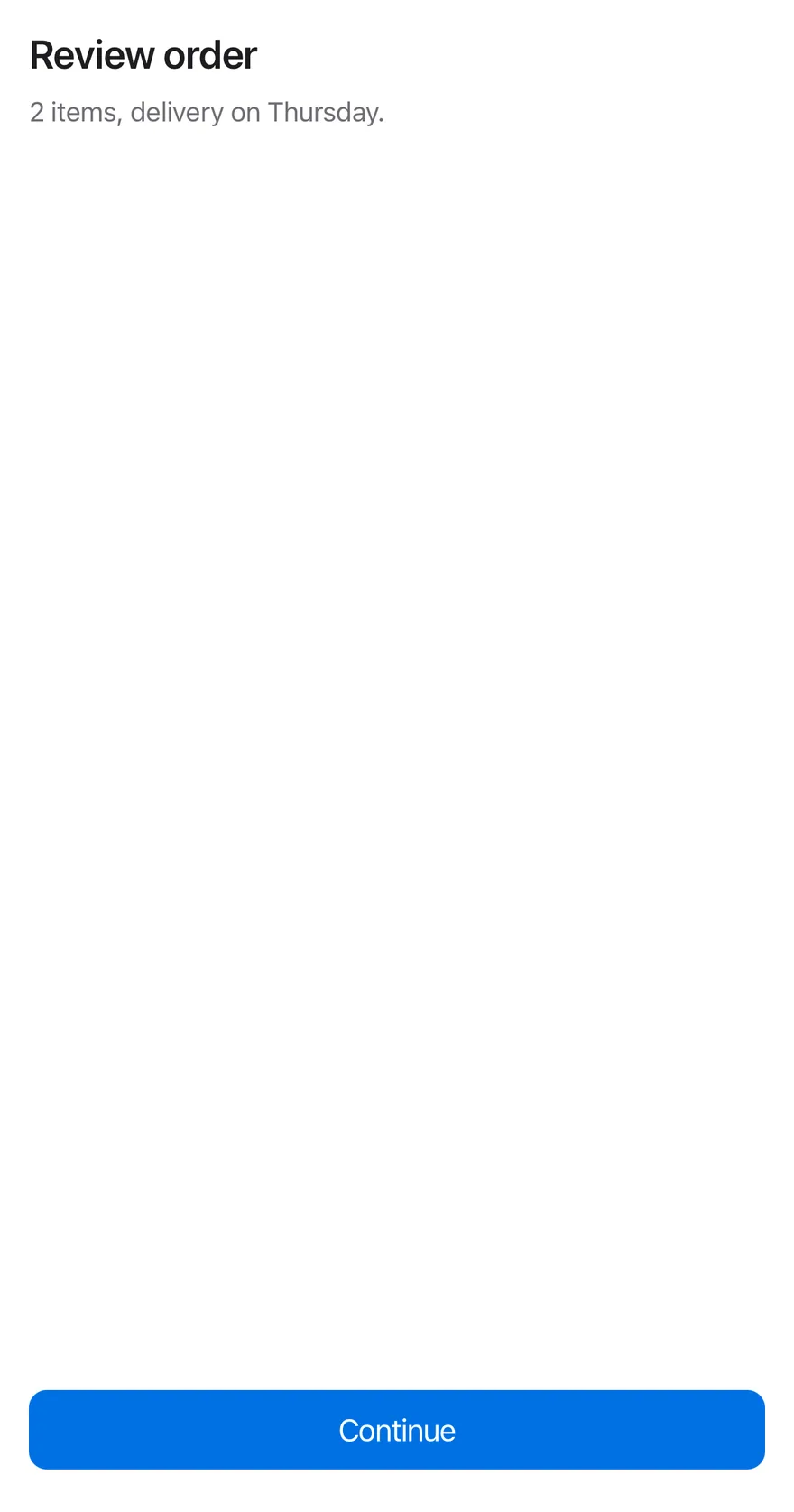
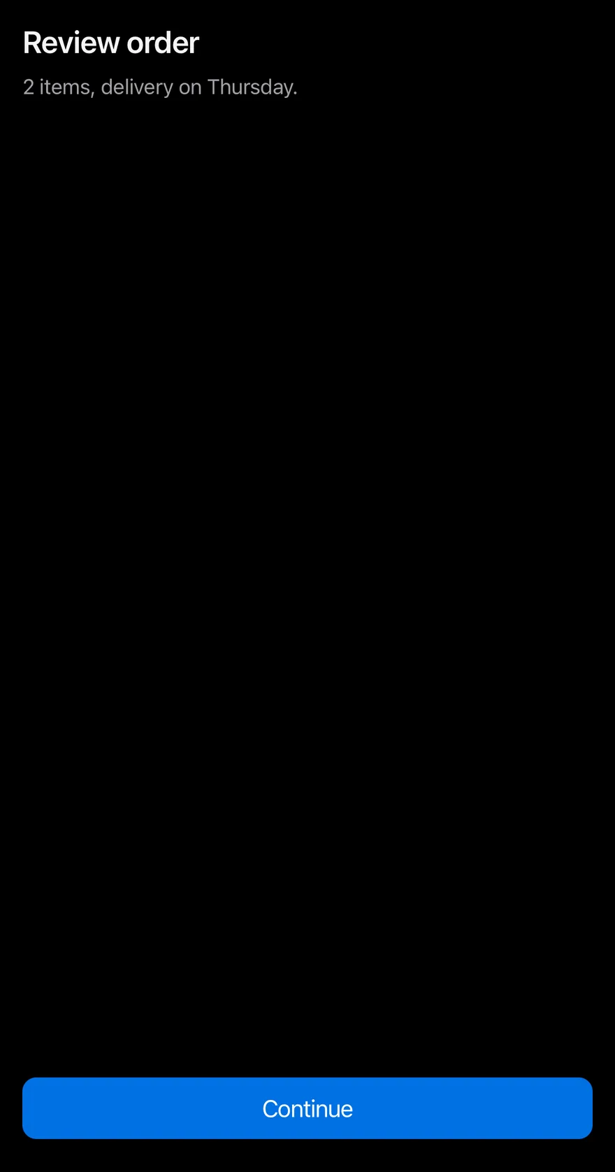
import { View } from "react-native"
import { BottomBar, BottomBarContent } from "@/components/ui/bottom-bar"
import { Button } from "@/components/ui/button"
import { Text } from "@/components/ui/text"

function Page({ children }: { children: React.ReactNode }) {
  return (
    <View className="-m-4 flex-1">
      <View className="flex-1 gap-2 p-4">
        <Text variant="h3">Review order</Text>
        <Text variant="muted">2 items, delivery on Thursday.</Text>
      </View>
      {children}
    </View>
  )
}

export function BottomBarExample() {
  return (
    <Page>
      <BottomBar>
        <BottomBarContent>
          <Button size="lg" block>
            <Text>Continue</Text>
          </Button>
        </BottomBarContent>
      </BottomBar>
    </Page>
  )
}import EsuissUI
import SwiftUI
struct BottomBarExample: View {
var body: some View {
BottomBarPage {
BottomBar(separator: false) {
BottomBarContent {
Button("Continue") {}.buttonStyle(.variant(size: .lg, block: true))
}
}
}
}
}
struct BottomBarPage<Bar: View>: View {
@ViewBuilder let bar: () -> Bar
var body: some View {
VStack(spacing: 0) {
VStack(alignment: .leading, spacing: 8) {
Text("Review order").textVariant(.h3)
Text("2 items, delivery on Thursday.").textVariant(.muted)
}
.padding(16)
.frame(maxWidth: .infinity, maxHeight: .infinity, alignment: .topLeading)
bar()
}
}
}import androidx.compose.foundation.layout.Arrangement
import androidx.compose.foundation.layout.Column
import androidx.compose.foundation.layout.ColumnScope
import androidx.compose.foundation.layout.fillMaxSize
import androidx.compose.foundation.layout.fillMaxWidth
import androidx.compose.foundation.layout.padding
import androidx.compose.runtime.Composable
import androidx.compose.ui.Modifier
import androidx.compose.ui.unit.dp
import com.esuiss.ui.components.BottomBar
import com.esuiss.ui.components.BottomBarContent
import com.esuiss.ui.components.Button
import com.esuiss.ui.components.ButtonSize
import com.esuiss.ui.components.Screen
import com.esuiss.ui.components.ScreenEdge
import com.esuiss.ui.components.Text
import com.esuiss.ui.components.TextVariant
@Composable
fun BottomBarPage(page: @Composable ColumnScope.() -> Unit, bar: @Composable () -> Unit) {
Screen(edges = setOf(ScreenEdge.Top, ScreenEdge.Left, ScreenEdge.Right)) {
Column(Modifier.fillMaxSize()) {
Column(
Modifier.weight(1f).fillMaxWidth().padding(16.dp),
verticalArrangement = Arrangement.spacedBy(8.dp),
content = page,
)
bar()
}
}
}
@Composable
fun BottomBarOrder(bar: @Composable () -> Unit) {
BottomBarPage(
page = {
Text("Review order", variant = TextVariant.H3)
Text("2 items, delivery on Thursday.", variant = TextVariant.Muted)
},
bar = bar,
)
}
@Composable
fun BottomBarDefault() {
BottomBarOrder {
BottomBar {
BottomBarContent {
Button("Continue", onClick = {}, size = ButtonSize.Lg, block = true)
}
}
}
}BottomBar is an animated View that adds bottom padding equal to the safe-area inset, or to the keyboard height while the keyboard is open, and animates between them with the keyboard's own timing. BottomBarContent adds the standard padding and spacing for the buttons inside.
Use it for the main call to action of a screen, such as checkout or a form submit button.
Installation
$ pnpm dlx @esuiss/uim@latest add bottom-bar$ pnpm dlx @esuiss/uim@latest add bottom-bar --platform swift$ pnpm dlx @esuiss/uim@latest add bottom-bar --platform kotlinThe CLI also adds what it builds on: Screen.
Manual
- Install the dependencies:
npx expo install cn react-native-reanimated react-native-safe-area-context react-native-worklets-
Add the pieces it builds on: Screen, and the primitives
components/primitives/keyboard.tsx. -
Copy the source into
components/ui/bottom-bar.tsx:
import { cn } from "cn"
import * as React from "react"
import { View, type ViewProps } from "react-native"
import {
  Easing,
  ReduceMotion,
  useAnimatedStyle,
  useSharedValue,
  withTiming,
} from "react-native-reanimated"
import { useSafeAreaInsets } from "react-native-safe-area-context"
import { useKeyboard } from "@/components/primitives/keyboard"
import { AnimatedView } from "@/components/ui/animated-view"
import { ScreenContext } from "@/components/ui/screen"

const EASING = Easing.bezier(0.17, 0.59, 0.4, 0.77)- Update the import paths to match your project.
- Install the dependencies:
npx expo install cn react-native-reanimated react-native-safe-area-context react-native-worklets-
Add the pieces it builds on: Screen, and the primitives
components/primitives/keyboard.tsx. -
Copy the source into
components/ui/bottom-bar.tsx:
import { cn } from "cn"
import * as React from "react"
import { View, type ViewProps } from "react-native"
import {
  Easing,
  ReduceMotion,
  useAnimatedStyle,
  useSharedValue,
  withTiming,
} from "react-native-reanimated"
import { useSafeAreaInsets } from "react-native-safe-area-context"
import { useKeyboard } from "@/components/primitives/keyboard"
import { AnimatedView } from "@/components/ui/animated-view"
import { ScreenContext } from "@/components/ui/screen"

const EASING = Easing.bezier(0.17, 0.59, 0.4, 0.77)- Update the import paths to match your project.
- Install the dependencies:
npx expo install react-native-reanimated react-native-safe-area-context react-native-worklets-
Add the pieces it builds on: Screen, and the primitives
components/primitives/keyboard.tsx. -
Copy the source into
components/ui/bottom-bar.tsx:
import * as React from "react"
import { StyleSheet, View, type ViewProps } from "react-native"
import {
  Easing,
  ReduceMotion,
  useAnimatedStyle,
  useSharedValue,
  withTiming,
} from "react-native-reanimated"
import { useSafeAreaInsets } from "react-native-safe-area-context"
import { useKeyboard } from "@/components/primitives/keyboard"
import { AnimatedView } from "@/components/ui/animated-view"
import { ScreenContext } from "@/components/ui/screen"
import { useTheme } from "@/components/ui/theme"

const EASING = Easing.bezier(0.17, 0.59, 0.4, 0.77)- Update the import paths to match your project.
-
Target iOS 17 or later.
-
Copy the theme files every view uses:
import SwiftUI
import UIKit

struct RGBA: Sendable {
  let red: CGFloat
  let green: CGFloat
  let blue: CGFloat
  let alpha: CGFloat

  init(_ hex: UInt32, _ alpha: CGFloat = 1) {
    red = CGFloat((hex >> 16) & 0xFF) / 255
    green = CGFloat((hex >> 8) & 0xFF) / 255
    blue = CGFloat(hex & 0xFF) / 255
    self.alpha = alpha
}import SwiftUI
extension Color {
public static let surface = Color.adaptive(light: .init(0xFFFFFF), dark: .init(0x000000))
public static let surfaceSecondary = Color.adaptive(light: .init(0xF5F5F7), dark: .init(0x161617))
public static let surfaceTertiary = Color.adaptive(light: .init(0xE8E8ED), dark: .init(0x2C2C2E))
public static let surfaceRaised = Color.adaptive(light: .init(0xFFFFFF), dark: .init(0x1D1D1F))
public static let label = Color.adaptive(light: .init(0x1D1D1F), dark: .init(0xF5F5F7))
public static let labelSecondary = Color.adaptive(light: .init(0x6E6E73), dark: .init(0xA1A1A6))
public static let labelTertiary = Color.adaptive(light: .init(0x86868B), dark: .init(0x86868B))
public static let labelQuaternary = Color.adaptive(light: .init(0xD2D2D7), dark: .init(0x424245))
public static let control = Color.adaptive(light: .init(0x000000, 0.04), dark: .init(0xFFFFFF, 0.1))
public static let controlPressed = Color.adaptive(light: .init(0x000000, 0.12), dark: .init(0xFFFFFF, 0.22))
public static let controlSelected = Color.adaptive(light: .init(0x1D1D1F), dark: .init(0xF5F5F7))
public static let controlDisabled = Color.adaptive(light: .init(0x000000, 0.03), dark: .init(0xFFFFFF, 0.05))
public static let onControlSelected = Color.adaptive(light: .init(0xFFFFFF), dark: .init(0x000000))- Copy the source and every file it uses:
import SwiftUI

public struct BottomBar<Content: View>: View {
  let separator: Bool
  let content: Content

  @Environment(\.screenBackground) private var background

  public init(separator: Bool = true, @ViewBuilder content: () -> Content) {
    self.separator = separator
    self.content = content()
  }

  public var body: some View {
    VStack(spacing: 0) {
contentimport SwiftUI
import UIKit
public struct KeyboardScrollView<Content: View>: View {
let showsIndicators: Bool
let content: Content
public init(showsIndicators: Bool = true, @ViewBuilder content: () -> Content) {
self.showsIndicators = showsIndicators
self.content = content()
}
public var body: some View {
ScrollView(.vertical, showsIndicators: showsIndicators) {
content
.frame(maxWidth: .infinity, alignment: .topLeading)import SwiftUI
extension EnvironmentValues {
@Entry var screenBackground: Color = .surface
}
public struct Screen<Content: View>: View {
public enum Background: CaseIterable, Sendable {
case surface, surfaceSecondary
var color: Color {
switch self {
case .surface: .surface
case .surfaceSecondary: .surfaceSecondary
}
}- Add the files to your app target.
- Set
minSdkto 24 or higher and add the dependencies:
implementation(platform("androidx.compose:compose-bom:2026.09.00"))
implementation("androidx.compose.foundation:foundation")
implementation("androidx.compose.ui:ui")- Copy the theme files every view uses:
package com.esuiss.ui.theme

import androidx.compose.foundation.isSystemInDarkTheme
import androidx.compose.runtime.Composable
import androidx.compose.runtime.CompositionLocalProvider
import androidx.compose.runtime.Immutable
import androidx.compose.runtime.staticCompositionLocalOf
import androidx.compose.ui.Modifier
import androidx.compose.ui.draw.dropShadow
import androidx.compose.ui.graphics.Color
import androidx.compose.ui.graphics.Shape
import androidx.compose.ui.graphics.shadow.Shadow as DropShadow
import androidx.compose.ui.text.TextStyle
import androidx.compose.ui.text.style.LineHeightStyle
import androidx.compose.ui.unit.Dp
import androidx.compose.ui.unit.DpOffsetpackage com.esuiss.ui.theme
import androidx.compose.runtime.Immutable
import androidx.compose.ui.graphics.Color
import androidx.compose.ui.unit.dp
@Immutable
data class Colors(
val surface: Color,
val surfaceSecondary: Color,
val surfaceTertiary: Color,
val surfaceRaised: Color,
val label: Color,
val labelSecondary: Color,
val labelTertiary: Color,
val labelQuaternary: Color,- Copy the source and every file it uses:
package com.esuiss.ui.components

import androidx.compose.foundation.background
import androidx.compose.foundation.layout.Arrangement
import androidx.compose.foundation.layout.Column
import androidx.compose.foundation.layout.ColumnScope
import androidx.compose.foundation.layout.WindowInsets
import androidx.compose.foundation.layout.WindowInsetsSides
import androidx.compose.foundation.layout.fillMaxWidth
import androidx.compose.foundation.layout.only
import androidx.compose.foundation.layout.padding
import androidx.compose.foundation.layout.safeDrawing
import androidx.compose.foundation.layout.windowInsetsPadding
import androidx.compose.runtime.Composable
import androidx.compose.ui.Alignment
import androidx.compose.ui.Modifierpackage com.esuiss.ui.components
import androidx.compose.runtime.compositionLocalOf
import androidx.compose.ui.graphics.Color
import androidx.compose.ui.text.TextStyle
import androidx.compose.ui.unit.Dp
import androidx.compose.ui.unit.dp
val LocalContentStyle = compositionLocalOf { TextStyle.Default }
val LocalContentColor = compositionLocalOf { Color.Unspecified }
val LocalIconSize = compositionLocalOf { 20.dp }package com.esuiss.ui.components
import android.app.Activity
import android.content.Context
import android.content.ContextWrapper
import android.os.Build
import android.view.View
import android.view.Window
import android.view.WindowInsetsController
import androidx.compose.foundation.background
import androidx.compose.foundation.layout.Arrangement
import androidx.compose.foundation.layout.Box
import androidx.compose.foundation.layout.BoxScope
import androidx.compose.foundation.layout.Column
import androidx.compose.foundation.layout.ExperimentalLayoutApi
import androidx.compose.foundation.layout.ColumnScope- Update the
com.esuiss.uipackage names to match your project.
Usage
import { BottomBar, BottomBarContent } from "@/components/ui/bottom-bar"<Page>
<BottomBar>
<BottomBarContent>
<Button size="lg" block>
<Text>Continue</Text>
</Button>
</BottomBarContent>
</BottomBar>
</Page>Place BottomBar as the last child of the screen so it sits below the scrolling content. Stack buttons in BottomBarContent, or add flex-row to place them side by side.
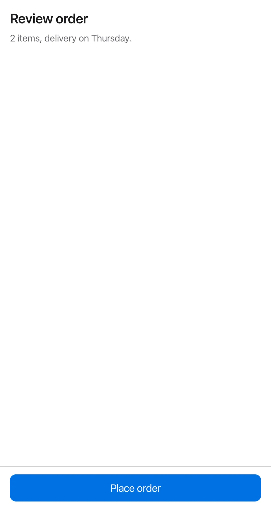
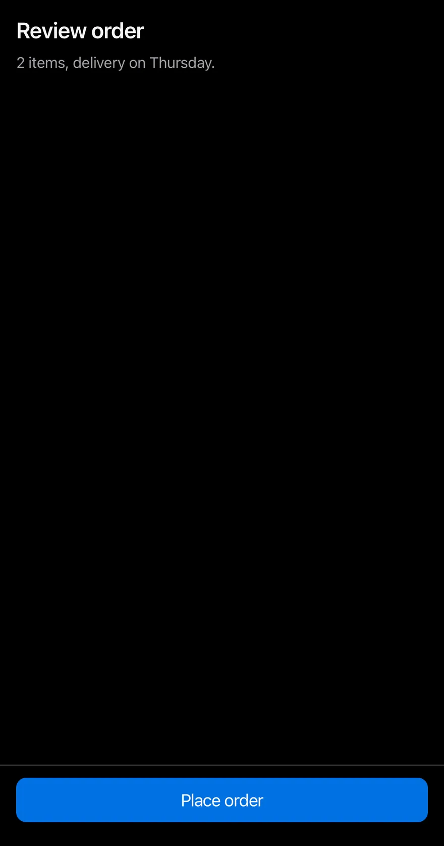
Set separator to draw a hairline above the bar. Inside a Screen that already handles the bottom safe-area edge, the inset is not added twice.
Examples
With separator
A hairline above the bar with separator.
import { View } from "react-native"
import { BottomBar, BottomBarContent } from "@/components/ui/bottom-bar"
import { Button } from "@/components/ui/button"
import { Text } from "@/components/ui/text"

function Page({ children }: { children: React.ReactNode }) {
  return (
    <View className="-m-4 flex-1">
      <View className="flex-1 gap-2 p-4">
        <Text variant="h3">Review order</Text>
        <Text variant="muted">2 items, delivery on Thursday.</Text>
      </View>
      {children}
    </View>
  )
}

export function BottomBarWithSeparatorExample() {
  return (
    <Page>
      <BottomBar separator>
        <BottomBarContent>
          <Button size="lg" block>
            <Text>Place order</Text>
          </Button>
        </BottomBarContent>
      </BottomBar>
    </Page>
  )
}import EsuissUI
import SwiftUI
struct BottomBarWithSeparatorExample: View {
var body: some View {
BottomBarPage {
BottomBar(separator: true) {
BottomBarContent {
Button("Place order") {}.buttonStyle(.variant(size: .lg, block: true))
}
}
}
}
}
struct BottomBarPage<Bar: View>: View {
@ViewBuilder let bar: () -> Bar
var body: some View {
VStack(spacing: 0) {
VStack(alignment: .leading, spacing: 8) {
Text("Review order").textVariant(.h3)
Text("2 items, delivery on Thursday.").textVariant(.muted)
}
.padding(16)
.frame(maxWidth: .infinity, maxHeight: .infinity, alignment: .topLeading)
bar()
}
}
}import androidx.compose.foundation.layout.Arrangement
import androidx.compose.foundation.layout.Column
import androidx.compose.foundation.layout.ColumnScope
import androidx.compose.foundation.layout.fillMaxSize
import androidx.compose.foundation.layout.fillMaxWidth
import androidx.compose.foundation.layout.padding
import androidx.compose.runtime.Composable
import androidx.compose.ui.Modifier
import androidx.compose.ui.unit.dp
import com.esuiss.ui.components.BottomBar
import com.esuiss.ui.components.BottomBarContent
import com.esuiss.ui.components.Button
import com.esuiss.ui.components.ButtonSize
import com.esuiss.ui.components.Screen
import com.esuiss.ui.components.ScreenEdge
import com.esuiss.ui.components.Text
import com.esuiss.ui.components.TextVariant
@Composable
fun BottomBarPage(page: @Composable ColumnScope.() -> Unit, bar: @Composable () -> Unit) {
Screen(edges = setOf(ScreenEdge.Top, ScreenEdge.Left, ScreenEdge.Right)) {
Column(Modifier.fillMaxSize()) {
Column(
Modifier.weight(1f).fillMaxWidth().padding(16.dp),
verticalArrangement = Arrangement.spacedBy(8.dp),
content = page,
)
bar()
}
}
}
@Composable
fun BottomBarOrder(bar: @Composable () -> Unit) {
BottomBarPage(
page = {
Text("Review order", variant = TextVariant.H3)
Text("2 items, delivery on Thursday.", variant = TextVariant.Muted)
},
bar = bar,
)
}
@Composable
fun BottomBarWithSeparator() {
BottomBarOrder {
BottomBar(separator = true) {
BottomBarContent {
Button("Place order", onClick = {}, size = ButtonSize.Lg, block = true)
}
}
}
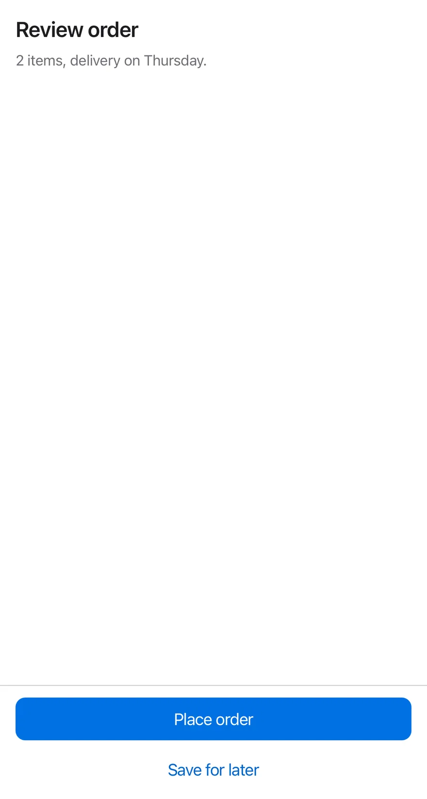
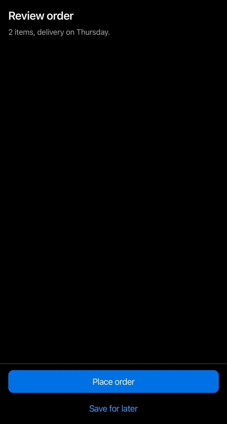
}Two actions
A primary and a plain button stacked.
import { View } from "react-native"
import { BottomBar, BottomBarContent } from "@/components/ui/bottom-bar"
import { Button } from "@/components/ui/button"
import { Text } from "@/components/ui/text"

function Page({ children }: { children: React.ReactNode }) {
  return (
    <View className="-m-4 flex-1">
      <View className="flex-1 gap-2 p-4">
        <Text variant="h3">Review order</Text>
        <Text variant="muted">2 items, delivery on Thursday.</Text>
      </View>
      {children}
    </View>
  )
}

export function BottomBarTwoActionsExample() {
  return (
    <Page>
      <BottomBar separator>
        <BottomBarContent>
          <Button size="lg" block>
            <Text>Place order</Text>
          </Button>
          <Button size="lg" variant="plain" block>
            <Text>Save for later</Text>
          </Button>
        </BottomBarContent>
      </BottomBar>
    </Page>
  )
}import EsuissUI
import SwiftUI
struct BottomBarTwoActionsExample: View {
var body: some View {
BottomBarPage {
BottomBar(separator: true) {
BottomBarContent {
Button("Place order") {}.buttonStyle(.variant(size: .lg, block: true))
Button("Save for later") {}.buttonStyle(.variant(.plain, size: .lg, block: true))
}
}
}
}
}
struct BottomBarPage<Bar: View>: View {
@ViewBuilder let bar: () -> Bar
var body: some View {
VStack(spacing: 0) {
VStack(alignment: .leading, spacing: 8) {
Text("Review order").textVariant(.h3)
Text("2 items, delivery on Thursday.").textVariant(.muted)
}
.padding(16)
.frame(maxWidth: .infinity, maxHeight: .infinity, alignment: .topLeading)
bar()
}
}
}import androidx.compose.foundation.layout.Arrangement
import androidx.compose.foundation.layout.Column
import androidx.compose.foundation.layout.ColumnScope
import androidx.compose.foundation.layout.fillMaxSize
import androidx.compose.foundation.layout.fillMaxWidth
import androidx.compose.foundation.layout.padding
import androidx.compose.runtime.Composable
import androidx.compose.ui.Modifier
import androidx.compose.ui.unit.dp
import com.esuiss.ui.components.BottomBar
import com.esuiss.ui.components.BottomBarContent
import com.esuiss.ui.components.Button
import com.esuiss.ui.components.ButtonSize
import com.esuiss.ui.components.ButtonVariant
import com.esuiss.ui.components.Screen
import com.esuiss.ui.components.ScreenEdge
import com.esuiss.ui.components.Text
import com.esuiss.ui.components.TextVariant
@Composable
fun BottomBarPage(page: @Composable ColumnScope.() -> Unit, bar: @Composable () -> Unit) {
Screen(edges = setOf(ScreenEdge.Top, ScreenEdge.Left, ScreenEdge.Right)) {
Column(Modifier.fillMaxSize()) {
Column(
Modifier.weight(1f).fillMaxWidth().padding(16.dp),
verticalArrangement = Arrangement.spacedBy(8.dp),
content = page,
)
bar()
}
}
}
@Composable
fun BottomBarOrder(bar: @Composable () -> Unit) {
BottomBarPage(
page = {
Text("Review order", variant = TextVariant.H3)
Text("2 items, delivery on Thursday.", variant = TextVariant.Muted)
},
bar = bar,
)
}
@Composable
fun BottomBarTwoActions() {
BottomBarOrder {
BottomBar(separator = true) {
BottomBarContent {
Button("Place order", onClick = {}, size = ButtonSize.Lg, block = true)
Button("Save for later", onClick = {}, size = ButtonSize.Lg, variant = ButtonVariant.Plain, block = true)
}
}
}
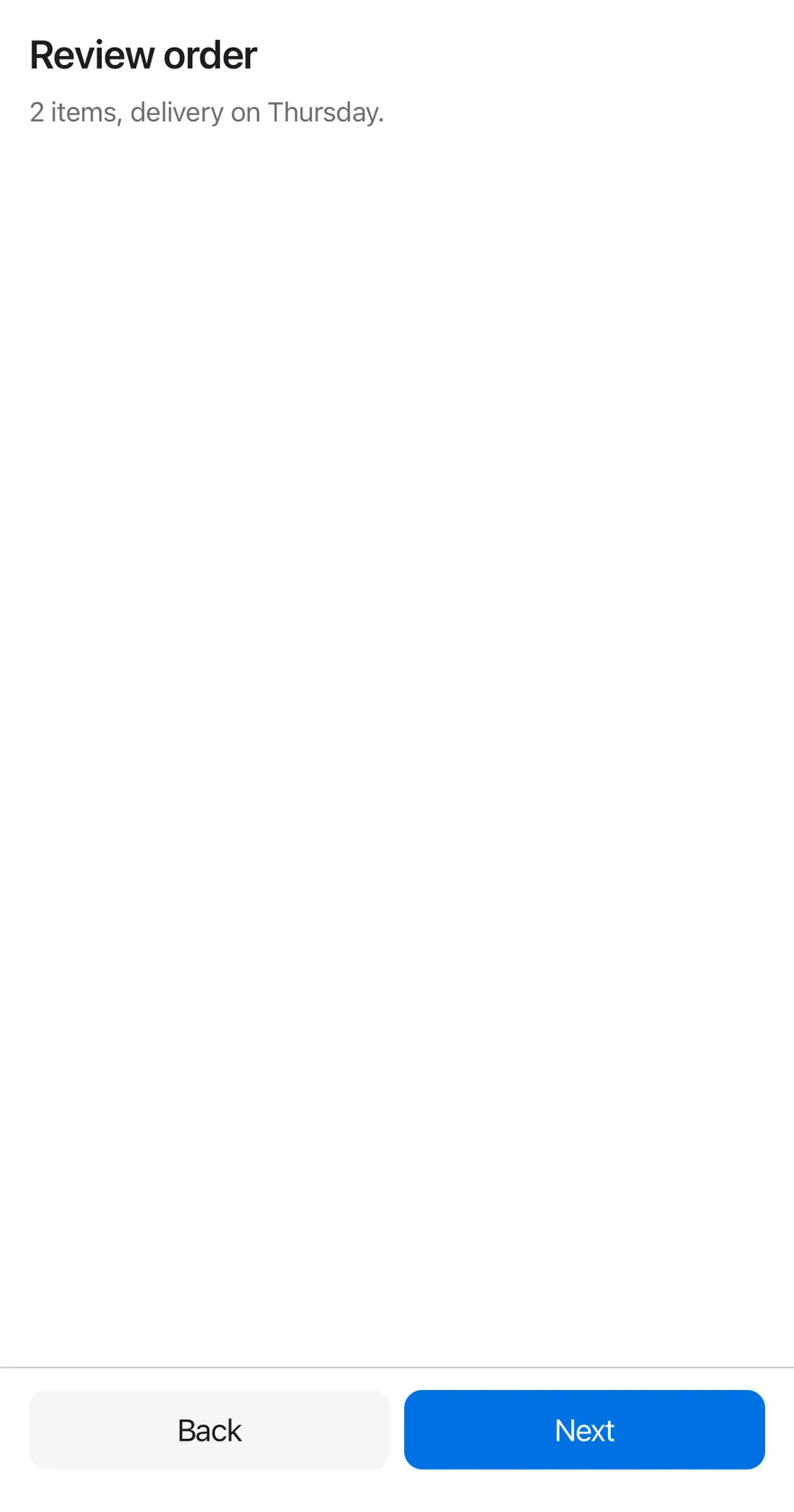
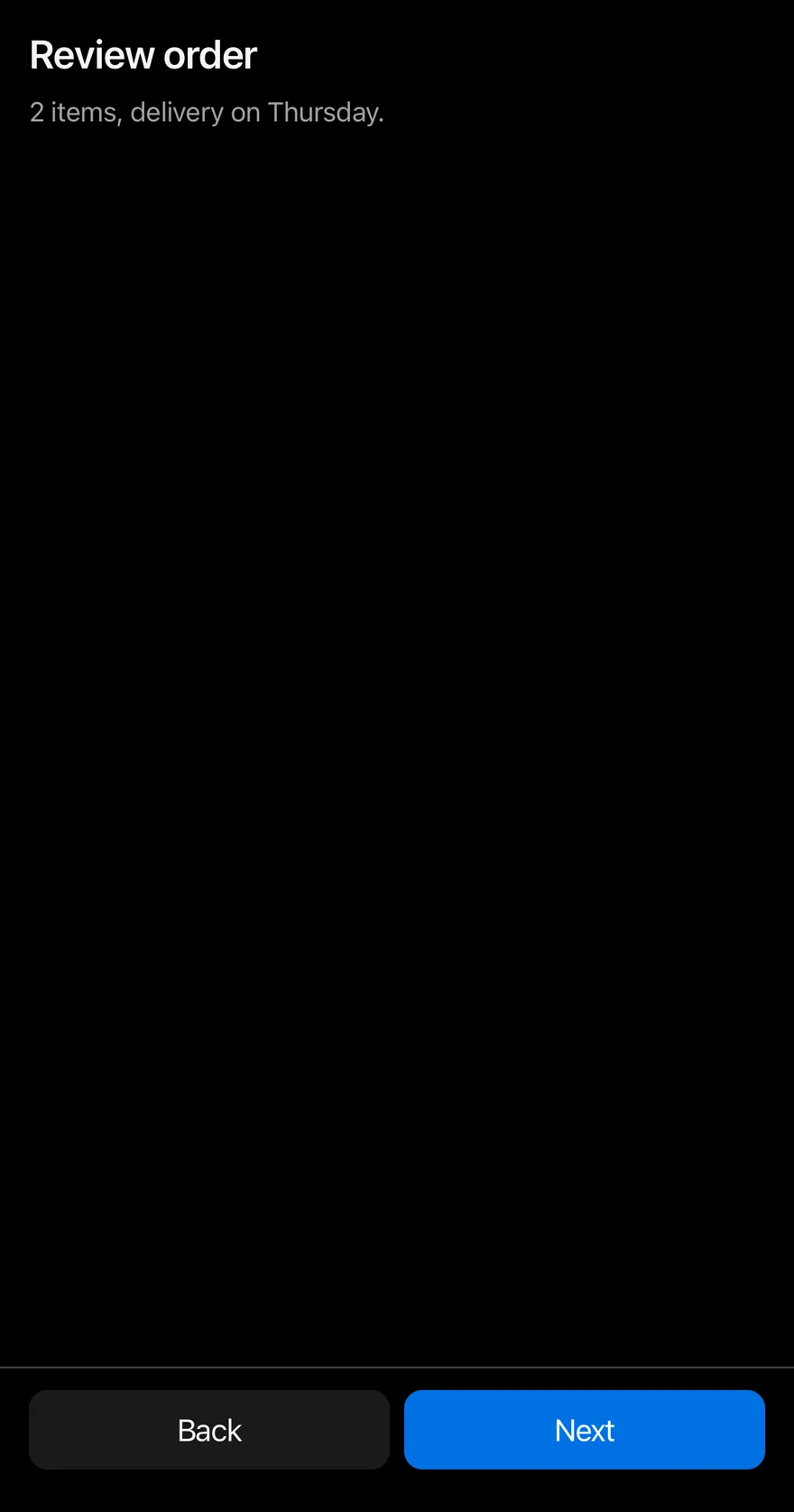
}Side by side
Back and Next buttons in a row.
import { View } from "react-native"
import { BottomBar, BottomBarContent } from "@/components/ui/bottom-bar"
import { Button } from "@/components/ui/button"
import { Text } from "@/components/ui/text"

function Page({ children }: { children: React.ReactNode }) {
  return (
    <View className="-m-4 flex-1">
      <View className="flex-1 gap-2 p-4">
        <Text variant="h3">Review order</Text>
        <Text variant="muted">2 items, delivery on Thursday.</Text>
      </View>
      {children}
    </View>
  )
}

export function BottomBarSideBySideExample() {
  return (
    <Page>
      <BottomBar separator>
        <BottomBarContent className="flex-row">
          <Button size="lg" variant="secondary" block className="flex-1">
            <Text>Back</Text>
          </Button>
          <Button size="lg" block className="flex-1">
            <Text>Next</Text>
          </Button>
        </BottomBarContent>
      </BottomBar>
    </Page>
  )
}import EsuissUI
import SwiftUI
struct BottomBarSideBySideExample: View {
var body: some View {
BottomBarPage {
BottomBar(separator: true) {
BottomBarContent {
HStack(spacing: 8) {
Button("Back") {}.buttonStyle(.variant(.secondary, size: .lg, block: true))
Button("Next") {}.buttonStyle(.variant(size: .lg, block: true))
}
}
}
}
}
}
struct BottomBarPage<Bar: View>: View {
@ViewBuilder let bar: () -> Bar
var body: some View {
VStack(spacing: 0) {
VStack(alignment: .leading, spacing: 8) {
Text("Review order").textVariant(.h3)
Text("2 items, delivery on Thursday.").textVariant(.muted)
}
.padding(16)
.frame(maxWidth: .infinity, maxHeight: .infinity, alignment: .topLeading)
bar()
}
}
}import androidx.compose.foundation.layout.Arrangement
import androidx.compose.foundation.layout.Column
import androidx.compose.foundation.layout.ColumnScope
import androidx.compose.foundation.layout.Row
import androidx.compose.foundation.layout.fillMaxSize
import androidx.compose.foundation.layout.fillMaxWidth
import androidx.compose.foundation.layout.padding
import androidx.compose.runtime.Composable
import androidx.compose.ui.Modifier
import androidx.compose.ui.unit.dp
import com.esuiss.ui.components.BottomBar
import com.esuiss.ui.components.BottomBarContent
import com.esuiss.ui.components.Button
import com.esuiss.ui.components.ButtonSize
import com.esuiss.ui.components.ButtonVariant
import com.esuiss.ui.components.Screen
import com.esuiss.ui.components.ScreenEdge
import com.esuiss.ui.components.Text
import com.esuiss.ui.components.TextVariant
@Composable
fun BottomBarPage(page: @Composable ColumnScope.() -> Unit, bar: @Composable () -> Unit) {
Screen(edges = setOf(ScreenEdge.Top, ScreenEdge.Left, ScreenEdge.Right)) {
Column(Modifier.fillMaxSize()) {
Column(
Modifier.weight(1f).fillMaxWidth().padding(16.dp),
verticalArrangement = Arrangement.spacedBy(8.dp),
content = page,
)
bar()
}
}
}
@Composable
fun BottomBarOrder(bar: @Composable () -> Unit) {
BottomBarPage(
page = {
Text("Review order", variant = TextVariant.H3)
Text("2 items, delivery on Thursday.", variant = TextVariant.Muted)
},
bar = bar,
)
}
@Composable
fun BottomBarSideBySide() {
BottomBarOrder {
BottomBar(separator = true) {
BottomBarContent {
Row(Modifier.fillMaxWidth(), horizontalArrangement = Arrangement.spacedBy(8.dp)) {
Button("Back", onClick = {}, modifier = Modifier.weight(1f), size = ButtonSize.Lg, variant = ButtonVariant.Secondary, block = true)
Button("Next", onClick = {}, modifier = Modifier.weight(1f), size = ButtonSize.Lg, block = true)
}
}
}
}
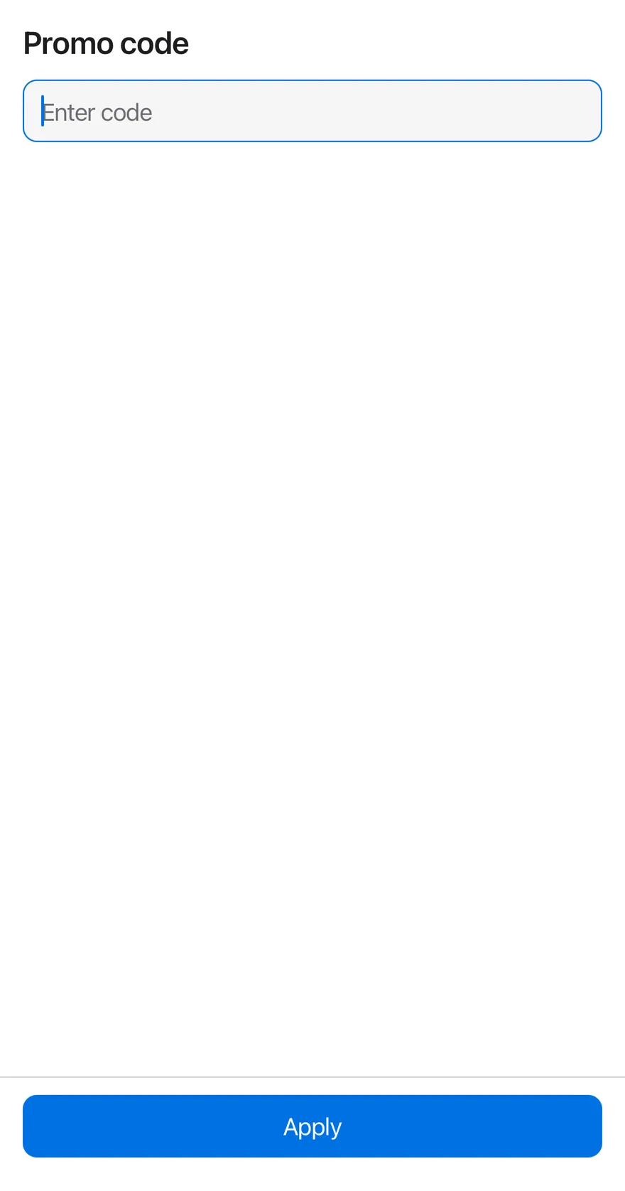
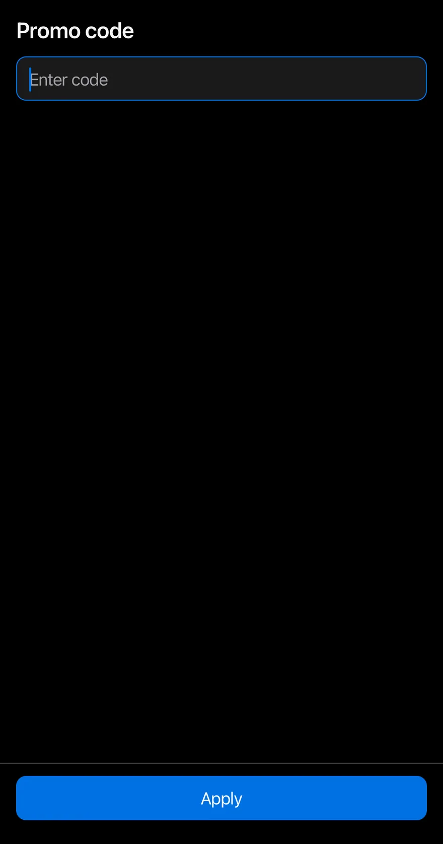
}Above keyboard
The bar moving up with the keyboard while an input is focused.
import { View } from "react-native"
import { BottomBar, BottomBarContent } from "@/components/ui/bottom-bar"
import { Button } from "@/components/ui/button"
import { Input } from "@/components/ui/input"
import { Text } from "@/components/ui/text"

export function BottomBarAboveKeyboardExample() {
  return (
    <View className="-m-4 flex-1">
      <View className="flex-1 gap-3 p-4">
        <Text variant="h3">Promo code</Text>
        <Input placeholder="Enter code" autoFocus autoCapitalize="characters" />
      </View>
      <BottomBar separator>
        <BottomBarContent>
          <Button size="lg" block>
            <Text>Apply</Text>
          </Button>
        </BottomBarContent>
      </BottomBar>
    </View>
  )
}import EsuissUI
import SwiftUI
struct BottomBarKeyboardDemo: View {
@State private var code = ""
@FocusState private var focused: Bool
var body: some View {
VStack(spacing: 0) {
VStack(alignment: .leading, spacing: 12) {
Text("Promo code").textVariant(.h3)
TextField("Promo code", text: $code, prompt: Text("Enter code"))
.textFieldStyle(.input)
.textInputAutocapitalization(.characters)
.focused($focused)
}
.padding(16)
.frame(maxWidth: .infinity, maxHeight: .infinity, alignment: .topLeading)
BottomBar(separator: true) {
BottomBarContent {
Button("Apply") {}.buttonStyle(.variant(size: .lg, block: true))
}
}
}
.onAppear { focused = true }
}
}import androidx.compose.foundation.layout.Arrangement
import androidx.compose.foundation.layout.Column
import androidx.compose.foundation.layout.ColumnScope
import androidx.compose.foundation.layout.fillMaxSize
import androidx.compose.foundation.layout.fillMaxWidth
import androidx.compose.foundation.layout.padding
import androidx.compose.foundation.text.KeyboardOptions
import androidx.compose.runtime.Composable
import androidx.compose.runtime.LaunchedEffect
import androidx.compose.runtime.getValue
import androidx.compose.runtime.mutableStateOf
import androidx.compose.runtime.remember
import androidx.compose.runtime.saveable.rememberSaveable
import androidx.compose.runtime.setValue
import androidx.compose.ui.Modifier
import androidx.compose.ui.focus.FocusRequester
import androidx.compose.ui.focus.focusRequester
import androidx.compose.ui.text.input.KeyboardCapitalization
import androidx.compose.ui.unit.dp
import com.esuiss.ui.components.BottomBar
import com.esuiss.ui.components.BottomBarContent
import com.esuiss.ui.components.Button
import com.esuiss.ui.components.ButtonSize
import com.esuiss.ui.components.Input
import com.esuiss.ui.components.Screen
import com.esuiss.ui.components.ScreenEdge
import com.esuiss.ui.components.Text
import com.esuiss.ui.components.TextVariant
@Composable
fun BottomBarPage(page: @Composable ColumnScope.() -> Unit, bar: @Composable () -> Unit) {
Screen(edges = setOf(ScreenEdge.Top, ScreenEdge.Left, ScreenEdge.Right)) {
Column(Modifier.fillMaxSize()) {
Column(
Modifier.weight(1f).fillMaxWidth().padding(16.dp),
verticalArrangement = Arrangement.spacedBy(8.dp),
content = page,
)
bar()
}
}
}
@Composable
fun BottomBarAboveKeyboard() {
var code by rememberSaveable { mutableStateOf("") }
val focus = remember { FocusRequester() }
LaunchedEffect(Unit) { focus.requestFocus() }
BottomBarPage(
page = {
Column(verticalArrangement = Arrangement.spacedBy(12.dp)) {
Text("Promo code", variant = TextVariant.H3)
Input(
code,
{ code = it },
Modifier.focusRequester(focus),
placeholder = "Enter code",
keyboardOptions = KeyboardOptions(capitalization = KeyboardCapitalization.Characters),
)
}
},
bar = {
BottomBar(separator = true) {
BottomBarContent {
Button("Apply", onClick = {}, size = ButtonSize.Lg, block = true)
}
}
},
)
}API Reference
BottomBar
Bottom container that follows the safe area and keyboard.
ViewProps- About
- Draws a top border. Defaults to
false. - Type
boolean- Default
- false
BottomBarContent
Padded area for the actions.
ViewPropsAccessibility
- The bar adds no role; each action inside provides its own.
Notes
- The padding animation respects the system Reduce Motion setting.
- Uses
bg-surfaceandborder-separatortokens; light and dark follow the system appearance.