suiss/uim · React Native Component
Attachment
A compact card for a file or upload, with media, name, details, progress and actions.
Attachment is an open-source mobile component from suiss/uim for React Native and Expo, with SwiftUI and Jetpack Compose versions built from the same design tokens. The @esuiss/uim CLI copies its source into your project, so you own the code.

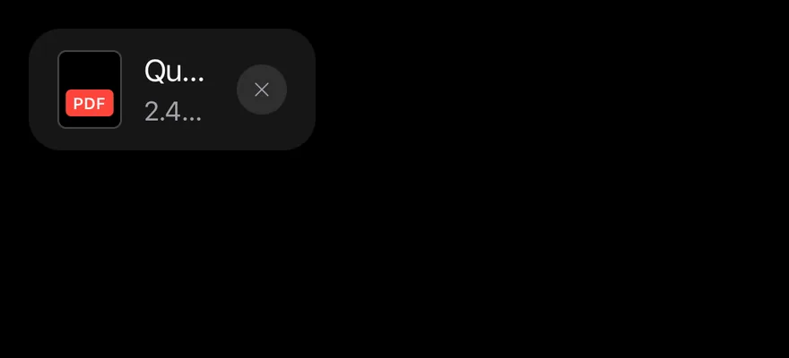
import { XIcon } from "phosphor-react-native"
import { Attachment, AttachmentAction, AttachmentActions, AttachmentContent, AttachmentDescription, AttachmentLabel, AttachmentMedia, AttachmentTitle } from "@/components/ui/attachment"
import { Icon } from "@/components/ui/icon"

export function AttachmentExample() {
  return (
    <Attachment orientation="horizontal" state="done">
      <AttachmentMedia variant="document">
        <AttachmentLabel className="bg-red">pdf</AttachmentLabel>
      </AttachmentMedia>
      <AttachmentContent>
        <AttachmentTitle>Quarterly report.pdf</AttachmentTitle>
        <AttachmentDescription>2.4 MB</AttachmentDescription>
      </AttachmentContent>
      <AttachmentActions>
        <AttachmentAction accessibilityLabel="Remove">
          <Icon as={XIcon} />
        </AttachmentAction>
      </AttachmentActions>
    </Attachment>
  )
}import EsuissUI
import PhosphorSwift
import SwiftUI
struct AttachmentExample: View {
var body: some View {
Attachment {
AttachmentMedia(.document) { AttachmentLabel("pdf", tint: .danger) }
AttachmentContent {
AttachmentTitle("Quarterly report.pdf")
AttachmentDescription("2.4 MB")
}
AttachmentActions {
AttachmentAction("Remove", icon: Ph.x.bold) {}
}
}
}
}import androidx.compose.foundation.layout.Row
import androidx.compose.runtime.Composable
import androidx.compose.ui.graphics.Color
import androidx.compose.ui.semantics.contentDescription
import com.adamglin.PhosphorIcons
import com.adamglin.phosphoricons.Regular
import com.adamglin.phosphoricons.regular.X
import com.esuiss.ui.components.Attachment
import com.esuiss.ui.components.AttachmentAction
import com.esuiss.ui.components.AttachmentActions
import com.esuiss.ui.components.AttachmentContent
import com.esuiss.ui.components.AttachmentDescription
import com.esuiss.ui.components.AttachmentLabel
import com.esuiss.ui.components.AttachmentMedia
import com.esuiss.ui.components.AttachmentMediaVariant
import com.esuiss.ui.components.AttachmentTitle
import com.esuiss.ui.components.Icon
import com.esuiss.ui.theme.EsuissTheme
@Composable
fun AttachmentDocument(extension: String, tone: Color) {
AttachmentMedia(variant = AttachmentMediaVariant.Document) {
AttachmentLabel(extension, background = tone)
}
}
@Composable
fun AttachmentIconAction(label: String, icon: androidx.compose.ui.graphics.vector.ImageVector = PhosphorIcons.Regular.X) {
AttachmentAction(onClick = {}, contentDescription = label) {
Icon(icon, contentDescription = null)
}
}
@Composable
fun AttachmentDefault() {
Row {
Attachment {
AttachmentDocument("pdf", EsuissTheme.colors.red)
AttachmentContent {
AttachmentTitle("Quarterly report.pdf")
AttachmentDescription("2.4 MB")
}
AttachmentActions { AttachmentIconAction("Remove") }
}
}
}Attachment is a rounded View that lays out an AttachmentMedia thumbnail, an AttachmentContent column and AttachmentActions. It comes in default, sm and xs sizes and in horizontal or vertical orientation; the vertical layout makes a tile with the actions floating over the media.
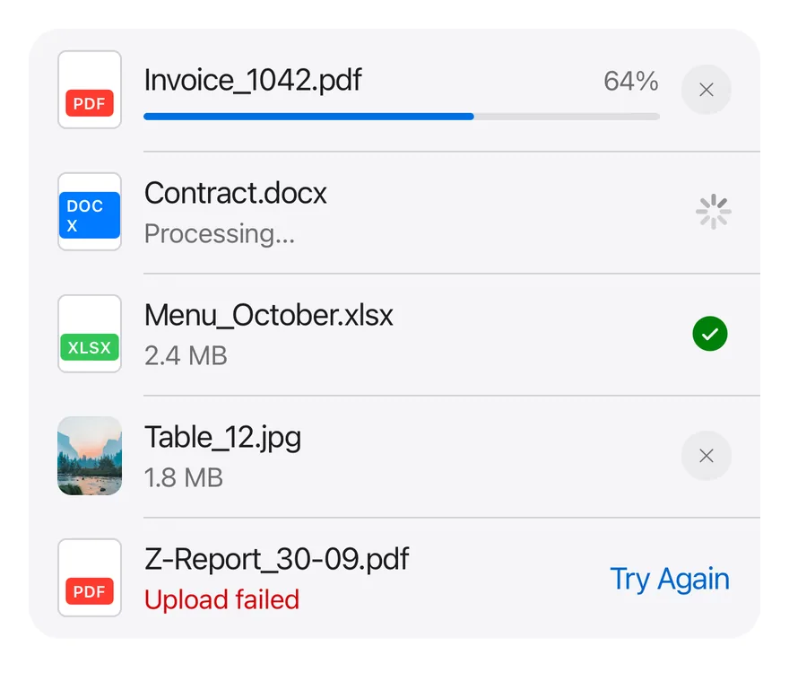
The state prop reflects the upload lifecycle: idle draws a dashed border for an empty drop slot, error turns the description red, and uploading, processing and done are passed to the parts through context. Put several attachments in an AttachmentGroup to show them as one list with hairlines between rows.
Installation
$ pnpm dlx @esuiss/uim@latest add attachment$ pnpm dlx @esuiss/uim@latest add attachment --platform swift$ pnpm dlx @esuiss/uim@latest add attachment --platform kotlinThe CLI also adds what it builds on: Button, Icon, Progress, Text.
Manual
- Install the dependencies:
npx expo install cn-
Add the pieces it builds on: Button, Icon, Progress, Text, and the primitives
components/primitives/progress.tsx,components/primitives/types.tsx,components/primitives/use-render.tsx. -
Copy the source into
components/ui/attachment.tsx:
import { cn } from "cn"
import * as React from "react"
import { Pressable, View, type ViewProps } from "react-native"
import * as ProgressPrimitive from "@/components/primitives/progress"
import type { RenderProp } from "@/components/primitives/types"
import { resolveClassName, useRender } from "@/components/primitives/use-render"
import { Button, buttonTextVariants } from "@/components/ui/button"
import { IconClassContext } from "@/components/ui/icon"
import {
  ProgressIndicator,
  ProgressTrack,
  ProgressValue,
} from "@/components/ui/progress"
import { Text, TextClassContext } from "@/components/ui/text"

type AttachmentState = "idle" | "uploading" | "processing" | "error" | "done"- Update the import paths to match your project.
- Install the dependencies:
npx expo install cn-
Add the pieces it builds on: Button, Icon, Progress, Text, and the primitives
components/primitives/progress.tsx,components/primitives/types.tsx,components/primitives/use-render.tsx. -
Copy the source into
components/ui/attachment.tsx:
import { cn } from "cn"
import * as React from "react"
import { Pressable, View, type ViewProps } from "react-native"
import * as ProgressPrimitive from "@/components/primitives/progress"
import type { RenderProp } from "@/components/primitives/types"
import { resolveClassName, useRender } from "@/components/primitives/use-render"
import { Button, buttonTextVariants } from "@/components/ui/button"
import { IconClassContext } from "@/components/ui/icon"
import {
  ProgressIndicator,
  ProgressTrack,
  ProgressValue,
} from "@/components/ui/progress"
import { Text, TextClassContext } from "@/components/ui/text"

type AttachmentState = "idle" | "uploading" | "processing" | "error" | "done"- Update the import paths to match your project.
-
Add the pieces it builds on: Button, Icon, Progress, Text, and the primitives
components/primitives/progress.tsx,components/primitives/types.tsx,components/primitives/use-render.tsx. -
Copy the source into
components/ui/attachment.tsx:
import * as React from "react"
import {
  Pressable,
  type StyleProp,
  StyleSheet,
  View,
  type ViewProps,
  type ViewStyle,
} from "react-native"
import * as ProgressPrimitive from "@/components/primitives/progress"
import type { RenderProp } from "@/components/primitives/types"
import { useRender } from "@/components/primitives/use-render"
import { Button, buttonTextStyle } from "@/components/ui/button"
import { IconSizeContext } from "@/components/ui/icon"
import {
ProgressIndicator,- Update the import paths to match your project.
-
Target iOS 17 or later.
-
Add the Swift package to your app:
.package(url: "https://github.com/phosphor-icons/swift", from: "2.1.0")- Copy the theme files every view uses:
import SwiftUI
import UIKit

struct RGBA: Sendable {
  let red: CGFloat
  let green: CGFloat
  let blue: CGFloat
  let alpha: CGFloat

  init(_ hex: UInt32, _ alpha: CGFloat = 1) {
    red = CGFloat((hex >> 16) & 0xFF) / 255
    green = CGFloat((hex >> 8) & 0xFF) / 255
    blue = CGFloat(hex & 0xFF) / 255
    self.alpha = alpha
}import SwiftUI
extension Color {
public static let surface = Color.adaptive(light: .init(0xFFFFFF), dark: .init(0x000000))
public static let surfaceSecondary = Color.adaptive(light: .init(0xF5F5F7), dark: .init(0x161617))
public static let surfaceTertiary = Color.adaptive(light: .init(0xE8E8ED), dark: .init(0x2C2C2E))
public static let surfaceRaised = Color.adaptive(light: .init(0xFFFFFF), dark: .init(0x1D1D1F))
public static let label = Color.adaptive(light: .init(0x1D1D1F), dark: .init(0xF5F5F7))
public static let labelSecondary = Color.adaptive(light: .init(0x6E6E73), dark: .init(0xA1A1A6))
public static let labelTertiary = Color.adaptive(light: .init(0x86868B), dark: .init(0x86868B))
public static let labelQuaternary = Color.adaptive(light: .init(0xD2D2D7), dark: .init(0x424245))
public static let control = Color.adaptive(light: .init(0x000000, 0.04), dark: .init(0xFFFFFF, 0.1))
public static let controlPressed = Color.adaptive(light: .init(0x000000, 0.12), dark: .init(0xFFFFFF, 0.22))
public static let controlSelected = Color.adaptive(light: .init(0x1D1D1F), dark: .init(0xF5F5F7))
public static let controlDisabled = Color.adaptive(light: .init(0x000000, 0.03), dark: .init(0xFFFFFF, 0.05))
public static let onControlSelected = Color.adaptive(light: .init(0xFFFFFF), dark: .init(0x000000))- Copy the source and every file it uses:
import SwiftUI

public enum AttachmentState: CaseIterable, Sendable {
  case idle, uploading, processing, error, done
}

public enum AttachmentSize: CaseIterable, Sendable {
  case `default`, sm, xs
}

public enum AttachmentOrientation: CaseIterable, Sendable {
  case horizontal, vertical
}

public enum AttachmentMediaVariant: CaseIterable, Sendable {
case icon, document, imageimport SwiftUI
public enum AvatarSize: CaseIterable, Sendable {
case sm, `default`, lg, xl
var dimension: CGFloat {
switch self {
case .sm: 24
case .default: 32
case .lg: 40
case .xl: 64
}
}
var overlap: CGFloat {
self == .xl ? 16 : 8import SwiftUI
public struct VariantButtonStyle: ButtonStyle {
public enum Variant: CaseIterable, Sendable {
case `default`, outline, secondary, tinted, ghost, plain, destructive, link
}
public enum Size: CaseIterable, Sendable {
case `default`, xs, sm, lg, xl, icon, iconXs, iconSm, iconLg, iconXl
var height: CGFloat {
switch self {
case .xs, .iconXs: 24
case .sm, .iconSm: 32
case .default, .icon: 36
case .lg, .iconLg: 44import SwiftUI
extension EnvironmentValues {
@Entry var buttonGroup: Axis? = nil
@Entry var buttonGroupSize: CGSize = .zero
}
enum ButtonGroupSpace: Hashable {
case group
}
struct ButtonGroupFrame {
let bounds: Anchor<CGRect>
let outlined: Bool
}import PhosphorSwift
import SwiftUI
extension Shadow {
static let control = Shadow(color: .black.opacity(0.08), radius: 0.5, y: 0.5)
static let thumb = Shadow(color: .black.opacity(0.12), radius: 1.5, y: 1)
}
struct SelectionIndicator<Mark: View>: View {
let checked: Bool
let pressed: Bool
let cornerRadius: CGFloat
let mark: Mark
@Environment(\.isEnabled) private var isEnabled
@Environment(\.isInvalid) private var invalidimport SwiftUI
extension EnvironmentValues {
@Entry public var isInvalid = false
@Entry var fieldInset = false
@Entry var fieldGroupInset = false
@Entry var fieldSetInset = false
}
extension View {
public func invalid(_ isInvalid: Bool = true) -> some View {
environment(\.isInvalid, isInvalid)
}
}
public enum FieldOrientation: CaseIterable, Sendable {import SwiftUI
extension EnvironmentValues {
@Entry public var hapticsEnabled = true
}
extension View {
public func haptics(_ enabled: Bool) -> some View {
environment(\.hapticsEnabled, enabled)
}
func hapticFeedback<Trigger: Equatable>(_ feedback: SensoryFeedback, trigger: Trigger) -> some View {
modifier(HapticFeedbackModifier(feedback: feedback, trigger: trigger) { _, _ in true })
}
func hapticFeedback<Trigger: Equatable>(import SwiftUI
public struct Separator: View {
let orientation: Axis
public init(_ orientation: Axis = .horizontal) {
self.orientation = orientation
}
public var body: some View {
Rectangle()
.fill(Color.separator)
.frame(width: orientation == .vertical ? 1 : nil, height: orientation == .horizontal ? 1 : nil)
.frame(maxWidth: orientation == .horizontal ? .infinity : nil, maxHeight: orientation == .vertical ? .infinity : nil)
.accessibilityHidden(true)
}import SwiftUI
public enum TextVariant: CaseIterable, Sendable {
case `default`, h1, h2, h3, h4, p, blockquote, code, lead, large, small, muted
var style: TextStyle {
switch self {
case .h1: .xl3
case .h2: .xl2
case .h3: .xl
case .h4, .lead, .large: .lg
case .code, .small, .muted: .sm
default: .base
}
}- Add the files to your app target.
- Set
minSdkto 24 or higher and add the dependencies:
implementation(platform("androidx.compose:compose-bom:2026.09.00"))
implementation("androidx.compose.foundation:foundation")
implementation("androidx.compose.ui:ui")- Copy the theme files every view uses:
package com.esuiss.ui.theme

import androidx.compose.foundation.isSystemInDarkTheme
import androidx.compose.runtime.Composable
import androidx.compose.runtime.CompositionLocalProvider
import androidx.compose.runtime.Immutable
import androidx.compose.runtime.staticCompositionLocalOf
import androidx.compose.ui.Modifier
import androidx.compose.ui.draw.dropShadow
import androidx.compose.ui.graphics.Color
import androidx.compose.ui.graphics.Shape
import androidx.compose.ui.graphics.shadow.Shadow as DropShadow
import androidx.compose.ui.text.TextStyle
import androidx.compose.ui.text.style.LineHeightStyle
import androidx.compose.ui.unit.Dp
import androidx.compose.ui.unit.DpOffsetpackage com.esuiss.ui.theme
import androidx.compose.runtime.Immutable
import androidx.compose.ui.graphics.Color
import androidx.compose.ui.unit.dp
@Immutable
data class Colors(
val surface: Color,
val surfaceSecondary: Color,
val surfaceTertiary: Color,
val surfaceRaised: Color,
val label: Color,
val labelSecondary: Color,
val labelTertiary: Color,
val labelQuaternary: Color,- Copy the source and every file it uses:
package com.esuiss.ui.components

import androidx.compose.animation.core.Spring
import androidx.compose.animation.core.animateFloatAsState
import androidx.compose.animation.core.spring
import androidx.compose.foundation.Image
import androidx.compose.foundation.background
import androidx.compose.foundation.border
import androidx.compose.foundation.clickable
import androidx.compose.foundation.interaction.MutableInteractionSource
import androidx.compose.foundation.interaction.collectIsPressedAsState
import androidx.compose.foundation.layout.Arrangement
import androidx.compose.foundation.layout.Box
import androidx.compose.foundation.layout.BoxScope
import androidx.compose.foundation.layout.Column
import androidx.compose.foundation.layout.ColumnScopepackage com.esuiss.ui.components
import androidx.compose.foundation.background
import androidx.compose.foundation.border
import androidx.compose.foundation.clickable
import androidx.compose.foundation.interaction.MutableInteractionSource
import androidx.compose.foundation.interaction.collectIsPressedAsState
import androidx.compose.foundation.layout.Arrangement
import androidx.compose.foundation.layout.Row
import androidx.compose.foundation.layout.RowScope
import androidx.compose.foundation.layout.fillMaxWidth
import androidx.compose.foundation.layout.height
import androidx.compose.foundation.layout.padding
import androidx.compose.foundation.layout.size
import androidx.compose.foundation.shape.CircleShape
import androidx.compose.foundation.shape.RoundedCornerShapepackage com.esuiss.ui.components
import androidx.compose.foundation.background
import androidx.compose.foundation.gestures.Orientation
import androidx.compose.foundation.layout.Arrangement
import androidx.compose.foundation.layout.Box
import androidx.compose.foundation.layout.Row
import androidx.compose.foundation.layout.RowScope
import androidx.compose.foundation.layout.padding
import androidx.compose.foundation.shape.CircleShape
import androidx.compose.foundation.shape.CornerSize
import androidx.compose.foundation.shape.RoundedCornerShape
import androidx.compose.runtime.Composable
import androidx.compose.runtime.CompositionLocalProvider
import androidx.compose.runtime.DisposableEffect
import androidx.compose.runtime.Immutablepackage com.esuiss.ui.components
import androidx.compose.runtime.compositionLocalOf
import androidx.compose.ui.graphics.Color
import androidx.compose.ui.text.TextStyle
import androidx.compose.ui.unit.Dp
import androidx.compose.ui.unit.dp
val LocalContentStyle = compositionLocalOf { TextStyle.Default }
val LocalContentColor = compositionLocalOf { Color.Unspecified }
val LocalIconSize = compositionLocalOf { 20.dp }package com.esuiss.ui.components
import androidx.compose.foundation.Image
import androidx.compose.foundation.layout.size
import androidx.compose.runtime.Composable
import androidx.compose.ui.Modifier
import androidx.compose.ui.graphics.Color
import androidx.compose.ui.graphics.ColorFilter
import androidx.compose.ui.graphics.takeOrElse
import androidx.compose.ui.graphics.vector.ImageVector
import androidx.compose.ui.unit.Dp
import com.esuiss.ui.theme.EsuissTheme
@Composable
fun Icon(
imageVector: ImageVector,- Update the
com.esuiss.uipackage names to match your project.
Usage
import { Attachment, AttachmentMedia, AttachmentLabel, AttachmentContent, AttachmentTitle, AttachmentDescription, AttachmentProgress, AttachmentActions, AttachmentAction, AttachmentTrigger, AttachmentGroup } from "@/components/ui/attachment"<Attachment orientation="horizontal" state="done">
<AttachmentMedia variant="document">
<AttachmentLabel className="bg-red">pdf</AttachmentLabel>
</AttachmentMedia>
<AttachmentContent>
<AttachmentTitle>Quarterly report.pdf</AttachmentTitle>
<AttachmentDescription>2.4 MB</AttachmentDescription>
</AttachmentContent>
<AttachmentActions>
<AttachmentAction accessibilityLabel="Remove">
<Icon as={XIcon} />
</AttachmentAction>
</AttachmentActions>
</Attachment>AttachmentMedia has three variants: icon for a glyph, document for a page shape (pair it with AttachmentLabel to show a file extension), and image for a thumbnail. Put AttachmentTitle and AttachmentDescription in AttachmentContent, and add AttachmentProgress with a value while uploading.
AttachmentAction is a Button that defaults to the secondary variant and a small icon size scaled to the attachment, with an enlarged hit area. Use variant="link" for a text action.
To make the whole card pressable, add an AttachmentTrigger; it covers the card while actions stay pressable above it.
Examples
Sizes
The default, sm and xs sizes.

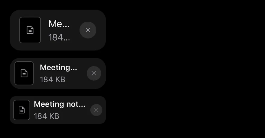
import { FileTextIcon, XIcon } from "phosphor-react-native"
import { View } from "react-native"
import { Attachment, AttachmentAction, AttachmentActions, AttachmentContent, AttachmentDescription, AttachmentMedia, AttachmentTitle } from "@/components/ui/attachment"
import { Icon } from "@/components/ui/icon"

export function AttachmentSizesExample() {
  return (
    <View className="items-start gap-3">
      {(["default", "sm", "xs"] as const).map((size) => (
        <Attachment key={size} orientation="horizontal" state="done" size={size}>
          <AttachmentMedia>
            <Icon as={FileTextIcon} />
          </AttachmentMedia>
          <AttachmentContent>
            <AttachmentTitle>Meeting notes.docx</AttachmentTitle>
            <AttachmentDescription>184 KB</AttachmentDescription>
          </AttachmentContent>
          <AttachmentActions>
            <AttachmentAction accessibilityLabel="Remove">
              <Icon as={XIcon} />
            </AttachmentAction>
          </AttachmentActions>
        </Attachment>
      ))}
    </View>
  )
}import EsuissUI
import PhosphorSwift
import SwiftUI
struct AttachmentSizesExample: View {
var body: some View {
VStack(alignment: .leading, spacing: 12) {
ForEach(AttachmentSize.allCases, id: \.self) { size in
Attachment(size: size) {
AttachmentMedia(icon: Ph.fileText.regular)
AttachmentContent {
AttachmentTitle("Meeting notes.docx")
AttachmentDescription("184 KB")
}
AttachmentActions {
AttachmentAction("Remove", icon: Ph.x.bold) {}
}
}
}
}
}
}import androidx.compose.foundation.layout.Arrangement
import androidx.compose.foundation.layout.Column
import androidx.compose.runtime.Composable
import androidx.compose.ui.semantics.contentDescription
import androidx.compose.ui.unit.dp
import com.adamglin.PhosphorIcons
import com.adamglin.phosphoricons.Regular
import com.adamglin.phosphoricons.regular.FileText
import com.adamglin.phosphoricons.regular.X
import com.esuiss.ui.components.Attachment
import com.esuiss.ui.components.AttachmentAction
import com.esuiss.ui.components.AttachmentActions
import com.esuiss.ui.components.AttachmentContent
import com.esuiss.ui.components.AttachmentDescription
import com.esuiss.ui.components.AttachmentMedia
import com.esuiss.ui.components.AttachmentSize
import com.esuiss.ui.components.AttachmentTitle
import com.esuiss.ui.components.Icon
@Composable
fun AttachmentIconAction(label: String, icon: androidx.compose.ui.graphics.vector.ImageVector = PhosphorIcons.Regular.X) {
AttachmentAction(onClick = {}, contentDescription = label) {
Icon(icon, contentDescription = null)
}
}
@Composable
fun AttachmentSizes() {
Column(verticalArrangement = Arrangement.spacedBy(12.dp)) {
AttachmentSize.entries.forEach { size ->
Attachment(size = size) {
AttachmentMedia { Icon(PhosphorIcons.Regular.FileText, contentDescription = null) }
AttachmentContent {
AttachmentTitle("Meeting notes.docx")
AttachmentDescription("184 KB")
}
AttachmentActions { AttachmentIconAction("Remove") }
}
}
}
}States
The idle, uploading, processing, error and done states.
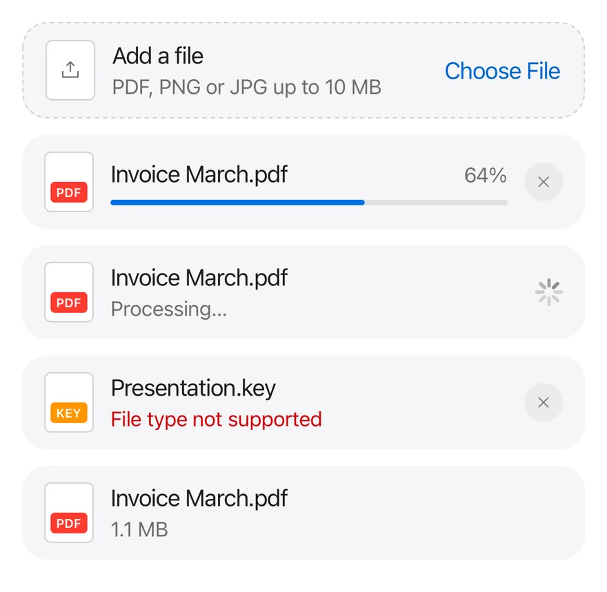
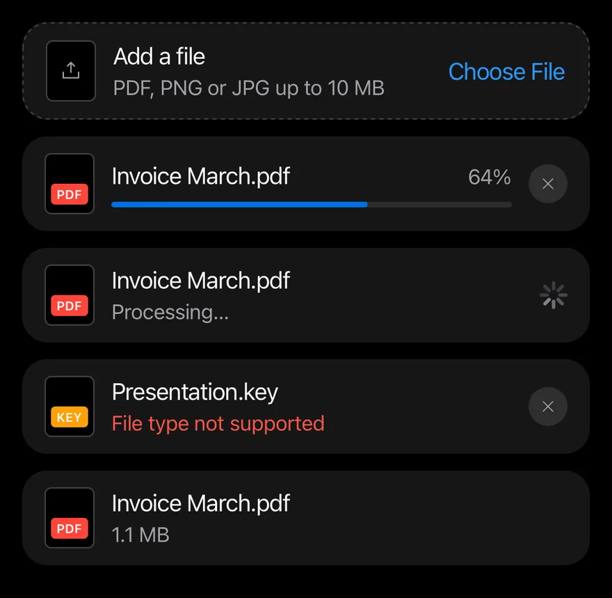
import { UploadSimpleIcon, XIcon } from "phosphor-react-native"
import { View } from "react-native"
import { Attachment, AttachmentAction, AttachmentActions, AttachmentContent, AttachmentDescription, AttachmentLabel, AttachmentMedia, AttachmentProgress, AttachmentTitle } from "@/components/ui/attachment"
import { Icon } from "@/components/ui/icon"
import { Spinner } from "@/components/ui/spinner"

export function AttachmentStatesExample() {
  return (
    <View className="gap-3">
      <Attachment orientation="horizontal" state="idle" className="w-full">
        <AttachmentMedia>
          <Icon as={UploadSimpleIcon} />
        </AttachmentMedia>
        <AttachmentContent>
          <AttachmentTitle>Add a file</AttachmentTitle>
          <AttachmentDescription>
            PDF, PNG or JPG up to 10 MB
          </AttachmentDescription>
        </AttachmentContent>
        <AttachmentActions>
          <AttachmentAction variant="link">Choose File</AttachmentAction>
        </AttachmentActions>
      </Attachment>
      <Attachment orientation="horizontal" state="uploading" className="w-full">
        <AttachmentMedia variant="document">
          <AttachmentLabel className="bg-red">pdf</AttachmentLabel>
        </AttachmentMedia>
        <AttachmentContent>
          <AttachmentTitle>Invoice March.pdf</AttachmentTitle>
          <AttachmentProgress value={64} accessibilityLabel="Uploading" />
        </AttachmentContent>
        <AttachmentActions>
          <AttachmentAction accessibilityLabel="Cancel upload">
            <Icon as={XIcon} />
          </AttachmentAction>
        </AttachmentActions>
      </Attachment>
      <Attachment orientation="horizontal" state="processing" className="w-full">
        <AttachmentMedia variant="document">
          <AttachmentLabel className="bg-red">pdf</AttachmentLabel>
        </AttachmentMedia>
        <AttachmentContent>
          <AttachmentTitle>Invoice March.pdf</AttachmentTitle>
          <AttachmentDescription>Processing…</AttachmentDescription>
        </AttachmentContent>
        <AttachmentActions>
          <Spinner size={20} />
        </AttachmentActions>
      </Attachment>
      <Attachment orientation="horizontal" state="error" className="w-full">
        <AttachmentMedia variant="document">
          <AttachmentLabel className="bg-orange">key</AttachmentLabel>
        </AttachmentMedia>
        <AttachmentContent>
          <AttachmentTitle>Presentation.key</AttachmentTitle>
          <AttachmentDescription>File type not supported</AttachmentDescription>
        </AttachmentContent>
        <AttachmentActions>
          <AttachmentAction accessibilityLabel="Remove">
            <Icon as={XIcon} />
          </AttachmentAction>
        </AttachmentActions>
      </Attachment>
      <Attachment orientation="horizontal" state="done" className="w-full">
        <AttachmentMedia variant="document">
          <AttachmentLabel className="bg-red">pdf</AttachmentLabel>
        </AttachmentMedia>
        <AttachmentContent>
          <AttachmentTitle>Invoice March.pdf</AttachmentTitle>
          <AttachmentDescription>1.1 MB</AttachmentDescription>
        </AttachmentContent>
      </Attachment>
    </View>
  )
}import EsuissUI
import PhosphorSwift
import SwiftUI
struct AttachmentStatesExample: View {
var body: some View {
VStack(spacing: 12) {
Attachment(state: .idle, block: true) {
AttachmentMedia(icon: Ph.uploadSimple.regular)
AttachmentContent {
AttachmentTitle("Add a file")
AttachmentDescription("PDF, PNG or JPG up to 10 MB")
}
AttachmentActions {
AttachmentAction("Choose File") {}
}
}
Attachment(state: .uploading, block: true) {
AttachmentMedia(.document) { AttachmentLabel("pdf", tint: .danger) }
AttachmentContent {
AttachmentTitle("Invoice March.pdf")
AttachmentProgress(value: 64, label: "Uploading")
}
AttachmentActions {
AttachmentAction("Cancel upload", icon: Ph.x.bold) {}
}
}
Attachment(state: .processing, block: true) {
AttachmentMedia(.document) { AttachmentLabel("pdf", tint: .danger) }
AttachmentContent {
AttachmentTitle("Invoice March.pdf")
AttachmentDescription("Processing…")
}
AttachmentActions {
Spinner(dimension: 20)
}
}
Attachment(state: .error, block: true) {
AttachmentMedia(.document) { AttachmentLabel("key", tint: .warning) }
AttachmentContent {
AttachmentTitle("Presentation.key")
AttachmentDescription("File type not supported")
}
AttachmentActions {
AttachmentAction("Remove", icon: Ph.x.bold) {}
}
}
Attachment(state: .done, block: true) {
AttachmentMedia(.document) { AttachmentLabel("pdf", tint: .danger) }
AttachmentContent {
AttachmentTitle("Invoice March.pdf")
AttachmentDescription("1.1 MB")
}
}
}
}
}import androidx.compose.foundation.layout.Arrangement
import androidx.compose.foundation.layout.Column
import androidx.compose.foundation.layout.fillMaxWidth
import androidx.compose.runtime.Composable
import androidx.compose.ui.Modifier
import androidx.compose.ui.graphics.Color
import androidx.compose.ui.semantics.contentDescription
import androidx.compose.ui.unit.dp
import com.adamglin.PhosphorIcons
import com.adamglin.phosphoricons.Regular
import com.adamglin.phosphoricons.regular.UploadSimple
import com.adamglin.phosphoricons.regular.X
import com.esuiss.ui.components.Attachment
import com.esuiss.ui.components.AttachmentAction
import com.esuiss.ui.components.AttachmentActions
import com.esuiss.ui.components.AttachmentContent
import com.esuiss.ui.components.AttachmentDescription
import com.esuiss.ui.components.AttachmentLabel
import com.esuiss.ui.components.AttachmentMedia
import com.esuiss.ui.components.AttachmentMediaVariant
import com.esuiss.ui.components.AttachmentProgress
import com.esuiss.ui.components.AttachmentState
import com.esuiss.ui.components.AttachmentTitle
import com.esuiss.ui.components.Icon
import com.esuiss.ui.components.Spinner
import com.esuiss.ui.theme.EsuissTheme
@Composable
fun AttachmentDocument(extension: String, tone: Color) {
AttachmentMedia(variant = AttachmentMediaVariant.Document) {
AttachmentLabel(extension, background = tone)
}
}
@Composable
fun AttachmentIconAction(label: String, icon: androidx.compose.ui.graphics.vector.ImageVector = PhosphorIcons.Regular.X) {
AttachmentAction(onClick = {}, contentDescription = label) {
Icon(icon, contentDescription = null)
}
}
@Composable
fun AttachmentStates() {
val colors = EsuissTheme.colors
val fill = Modifier.fillMaxWidth()
Column(Modifier.fillMaxWidth(), verticalArrangement = Arrangement.spacedBy(12.dp)) {
Attachment(fill, state = AttachmentState.Idle) {
AttachmentMedia { Icon(PhosphorIcons.Regular.UploadSimple, contentDescription = null) }
AttachmentContent {
AttachmentTitle("Add a file")
AttachmentDescription("PDF, PNG or JPG up to 10 MB")
}
AttachmentActions { AttachmentAction("Choose File", onClick = {}) }
}
Attachment(fill, state = AttachmentState.Uploading) {
AttachmentDocument("pdf", colors.red)
AttachmentContent {
AttachmentTitle("Invoice March.pdf")
AttachmentProgress(64f, contentDescription = "Uploading")
}
AttachmentActions { AttachmentIconAction("Cancel upload") }
}
Attachment(fill, state = AttachmentState.Processing) {
AttachmentDocument("pdf", colors.red)
AttachmentContent {
AttachmentTitle("Invoice March.pdf")
AttachmentDescription("Processing…")
}
AttachmentActions { Spinner(size = 20.dp) }
}
Attachment(fill, state = AttachmentState.Error) {
AttachmentDocument("key", colors.orange)
AttachmentContent {
AttachmentTitle("Presentation.key")
AttachmentDescription("File type not supported")
}
AttachmentActions { AttachmentIconAction("Remove") }
}
Attachment(fill, state = AttachmentState.Done) {
AttachmentDocument("pdf", colors.red)
AttachmentContent {
AttachmentTitle("Invoice March.pdf")
AttachmentDescription("1.1 MB")
}
}
}
}Image
An image thumbnail with the image media variant.

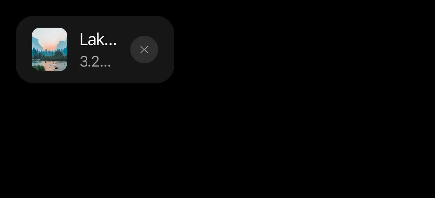
import { XIcon } from "phosphor-react-native"
import { Image as NativeImage } from "react-native"
import { Attachment, AttachmentAction, AttachmentActions, AttachmentContent, AttachmentDescription, AttachmentMedia, AttachmentTitle } from "@/components/ui/attachment"
import { Icon } from "@/components/ui/icon"

const imageUrl =
"https://images.unsplash.com/photo-1506744038136-46273834b3fb?w=400&q=80"

function Thumbnail() {
  return (
    <NativeImage
      source={{ uri: imageUrl }}
      accessibilityLabel="Mountain lake"
      className="size-full"
      resizeMode="cover"
    />
  )
}

export function AttachmentImageExample() {
  return (
    <Attachment orientation="horizontal" state="done">
      <AttachmentMedia variant="image">
        <Thumbnail />
      </AttachmentMedia>
      <AttachmentContent>
        <AttachmentTitle>Lake.jpg</AttachmentTitle>
        <AttachmentDescription>3.2 MB</AttachmentDescription>
      </AttachmentContent>
      <AttachmentActions>
        <AttachmentAction accessibilityLabel="Remove">
          <Icon as={XIcon} />
        </AttachmentAction>
      </AttachmentActions>
    </Attachment>
  )
}import EsuissUI
import PhosphorSwift
import SwiftUI
struct AttachmentImageExample: View {
var body: some View {
Attachment {
AttachmentThumbnail()
AttachmentContent {
AttachmentTitle("Lake.jpg")
AttachmentDescription("3.2 MB")
}
AttachmentActions {
AttachmentAction("Remove", icon: Ph.x.bold) {}
}
}
}
}
struct AttachmentThumbnail: View {
var body: some View {
AttachmentMedia(url: URL(string: "https://images.unsplash.com/photo-1506744038136-46273834b3fb?w=400&q=80"))
.accessibilityLabel(Text("Mountain lake"))
}
}import androidx.compose.foundation.layout.Row
import androidx.compose.runtime.Composable
import androidx.compose.runtime.remember
import androidx.compose.ui.graphics.Brush
import androidx.compose.ui.graphics.painter.BrushPainter
import androidx.compose.ui.graphics.painter.Painter
import androidx.compose.ui.semantics.contentDescription
import com.adamglin.PhosphorIcons
import com.adamglin.phosphoricons.Regular
import com.adamglin.phosphoricons.regular.X
import com.esuiss.ui.components.Attachment
import com.esuiss.ui.components.AttachmentAction
import com.esuiss.ui.components.AttachmentActions
import com.esuiss.ui.components.AttachmentContent
import com.esuiss.ui.components.AttachmentDescription
import com.esuiss.ui.components.AttachmentMedia
import com.esuiss.ui.components.AttachmentTitle
import com.esuiss.ui.components.Icon
import com.esuiss.ui.theme.EsuissTheme
@Composable
fun attachmentPhoto(): Painter {
val colors = EsuissTheme.colors
return remember(colors) { BrushPainter(Brush.linearGradient(listOf(colors.teal, colors.blue, colors.indigo))) }
}
@Composable
fun AttachmentIconAction(label: String, icon: androidx.compose.ui.graphics.vector.ImageVector = PhosphorIcons.Regular.X) {
AttachmentAction(onClick = {}, contentDescription = label) {
Icon(icon, contentDescription = null)
}
}
@Composable
fun AttachmentImage() {
val photo = attachmentPhoto()
Row {
Attachment {
AttachmentMedia(photo, contentDescription = "Mountain lake")
AttachmentContent {
AttachmentTitle("Lake.jpg")
AttachmentDescription("3.2 MB")
}
AttachmentActions { AttachmentIconAction("Remove") }
}
}
}Vertical
Tiles with orientation="vertical".
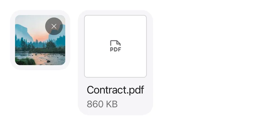
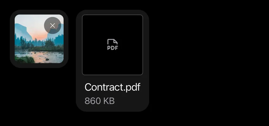
import { FilePdfIcon, XIcon } from "phosphor-react-native"
import { Image as NativeImage, View } from "react-native"
import { Attachment, AttachmentAction, AttachmentActions, AttachmentContent, AttachmentDescription, AttachmentMedia, AttachmentTitle } from "@/components/ui/attachment"
import { Icon } from "@/components/ui/icon"

const imageUrl =
"https://images.unsplash.com/photo-1506744038136-46273834b3fb?w=400&q=80"

function Thumbnail() {
  return (
    <NativeImage
      source={{ uri: imageUrl }}
      accessibilityLabel="Mountain lake"
      className="size-full"
      resizeMode="cover"
    />
  )
}

export function AttachmentVerticalExample() {
  return (
    <View className="flex-row items-start gap-3">
      <Attachment orientation="vertical" state="done">
        <AttachmentMedia variant="image">
          <Thumbnail />
        </AttachmentMedia>
        <AttachmentActions>
          <AttachmentAction accessibilityLabel="Remove">
            <Icon as={XIcon} />
          </AttachmentAction>
        </AttachmentActions>
      </Attachment>
      <Attachment orientation="vertical" state="done">
        <AttachmentMedia>
          <Icon as={FilePdfIcon} />
        </AttachmentMedia>
        <AttachmentContent>
          <AttachmentTitle>Contract.pdf</AttachmentTitle>
          <AttachmentDescription>860 KB</AttachmentDescription>
        </AttachmentContent>
      </Attachment>
    </View>
  )
}import EsuissUI
import PhosphorSwift
import SwiftUI
struct AttachmentVerticalExample: View {
var body: some View {
HStack(alignment: .top, spacing: 12) {
Attachment(orientation: .vertical) {
AttachmentThumbnail()
AttachmentActions {
AttachmentAction("Remove", icon: Ph.x.bold) {}
}
}
Attachment(orientation: .vertical) {
AttachmentMedia(icon: Ph.filePdf.regular)
AttachmentContent {
AttachmentTitle("Contract.pdf")
AttachmentDescription("860 KB")
}
}
}
}
}
struct AttachmentThumbnail: View {
var body: some View {
AttachmentMedia(url: URL(string: "https://images.unsplash.com/photo-1506744038136-46273834b3fb?w=400&q=80"))
.accessibilityLabel(Text("Mountain lake"))
}
}import androidx.compose.foundation.layout.Arrangement
import androidx.compose.foundation.layout.Row
import androidx.compose.runtime.Composable
import androidx.compose.runtime.remember
import androidx.compose.ui.Alignment
import androidx.compose.ui.graphics.Brush
import androidx.compose.ui.graphics.painter.BrushPainter
import androidx.compose.ui.graphics.painter.Painter
import androidx.compose.ui.semantics.contentDescription
import androidx.compose.ui.unit.dp
import com.adamglin.PhosphorIcons
import com.adamglin.phosphoricons.Regular
import com.adamglin.phosphoricons.regular.FilePdf
import com.adamglin.phosphoricons.regular.X
import com.esuiss.ui.components.Attachment
import com.esuiss.ui.components.AttachmentAction
import com.esuiss.ui.components.AttachmentActions
import com.esuiss.ui.components.AttachmentContent
import com.esuiss.ui.components.AttachmentDescription
import com.esuiss.ui.components.AttachmentMedia
import com.esuiss.ui.components.AttachmentOrientation
import com.esuiss.ui.components.AttachmentTitle
import com.esuiss.ui.components.Icon
import com.esuiss.ui.theme.EsuissTheme
@Composable
fun attachmentPhoto(): Painter {
val colors = EsuissTheme.colors
return remember(colors) { BrushPainter(Brush.linearGradient(listOf(colors.teal, colors.blue, colors.indigo))) }
}
@Composable
fun AttachmentIconAction(label: String, icon: androidx.compose.ui.graphics.vector.ImageVector = PhosphorIcons.Regular.X) {
AttachmentAction(onClick = {}, contentDescription = label) {
Icon(icon, contentDescription = null)
}
}
@Composable
fun AttachmentVertical() {
val photo = attachmentPhoto()
Row(horizontalArrangement = Arrangement.spacedBy(12.dp), verticalAlignment = Alignment.Top) {
Attachment(orientation = AttachmentOrientation.Vertical) {
AttachmentMedia(photo, contentDescription = "Mountain lake")
AttachmentActions { AttachmentIconAction("Remove") }
}
Attachment(orientation = AttachmentOrientation.Vertical) {
AttachmentMedia { Icon(PhosphorIcons.Regular.FilePdf, contentDescription = null) }
AttachmentContent {
AttachmentTitle("Contract.pdf")
AttachmentDescription("860 KB")
}
}
}
}Pressable
A card made pressable with AttachmentTrigger.

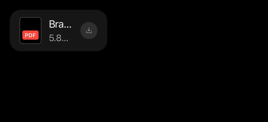
import { DownloadSimpleIcon } from "phosphor-react-native"
import { Attachment, AttachmentAction, AttachmentActions, AttachmentContent, AttachmentDescription, AttachmentLabel, AttachmentMedia, AttachmentTitle, AttachmentTrigger } from "@/components/ui/attachment"
import { Icon } from "@/components/ui/icon"

export function AttachmentPressableExample() {
  return (
    <Attachment orientation="horizontal" state="done">
      <AttachmentTrigger
        accessibilityLabel="Open Brand guidelines.pdf"
        onPress={() => {}}
      />
      <AttachmentMedia variant="document">
        <AttachmentLabel className="bg-red">pdf</AttachmentLabel>
      </AttachmentMedia>
      <AttachmentContent>
        <AttachmentTitle>Brand guidelines.pdf</AttachmentTitle>
        <AttachmentDescription>5.8 MB</AttachmentDescription>
      </AttachmentContent>
      <AttachmentActions>
        <AttachmentAction accessibilityLabel="Download">
          <Icon as={DownloadSimpleIcon} />
        </AttachmentAction>
      </AttachmentActions>
    </Attachment>
  )
}import EsuissUI
import PhosphorSwift
import SwiftUI
struct AttachmentPressableExample: View {
var body: some View {
Attachment {
AttachmentTrigger("Open Brand guidelines.pdf") {}
AttachmentMedia(.document) { AttachmentLabel("pdf", tint: .danger) }
AttachmentContent {
AttachmentTitle("Brand guidelines.pdf")
AttachmentDescription("5.8 MB")
}
AttachmentActions {
AttachmentAction("Download", icon: Ph.downloadSimple.bold) {}
}
}
}
}import androidx.compose.foundation.layout.Row
import androidx.compose.runtime.Composable
import androidx.compose.ui.graphics.Color
import androidx.compose.ui.semantics.contentDescription
import com.adamglin.PhosphorIcons
import com.adamglin.phosphoricons.Regular
import com.adamglin.phosphoricons.regular.DownloadSimple
import com.adamglin.phosphoricons.regular.X
import com.esuiss.ui.components.Attachment
import com.esuiss.ui.components.AttachmentAction
import com.esuiss.ui.components.AttachmentActions
import com.esuiss.ui.components.AttachmentContent
import com.esuiss.ui.components.AttachmentDescription
import com.esuiss.ui.components.AttachmentLabel
import com.esuiss.ui.components.AttachmentMedia
import com.esuiss.ui.components.AttachmentMediaVariant
import com.esuiss.ui.components.AttachmentTitle
import com.esuiss.ui.components.Icon
import com.esuiss.ui.theme.EsuissTheme
@Composable
fun AttachmentDocument(extension: String, tone: Color) {
AttachmentMedia(variant = AttachmentMediaVariant.Document) {
AttachmentLabel(extension, background = tone)
}
}
@Composable
fun AttachmentIconAction(label: String, icon: androidx.compose.ui.graphics.vector.ImageVector = PhosphorIcons.Regular.X) {
AttachmentAction(onClick = {}, contentDescription = label) {
Icon(icon, contentDescription = null)
}
}
@Composable
fun AttachmentPressable() {
Row {
Attachment(onClick = {}, onClickLabel = "Open Brand guidelines.pdf") {
AttachmentDocument("pdf", EsuissTheme.colors.red)
AttachmentContent {
AttachmentTitle("Brand guidelines.pdf")
AttachmentDescription("5.8 MB")
}
AttachmentActions { AttachmentIconAction("Download", PhosphorIcons.Regular.DownloadSimple) }
}
}
}Group
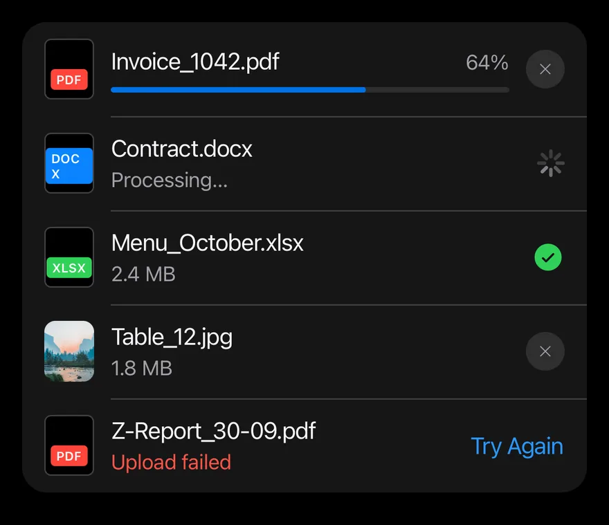
Several attachments in an AttachmentGroup, one of them uploading.
import { CheckCircleIcon, XIcon } from "phosphor-react-native"
import { Image as NativeImage, View } from "react-native"
import { Attachment, AttachmentAction, AttachmentActions, AttachmentContent, AttachmentDescription, AttachmentGroup, AttachmentLabel, AttachmentMedia, AttachmentProgress, AttachmentTitle } from "@/components/ui/attachment"
import { Icon } from "@/components/ui/icon"
import { Spinner } from "@/components/ui/spinner"

const imageUrl =
"https://images.unsplash.com/photo-1506744038136-46273834b3fb?w=400&q=80"

function Thumbnail() {
  return (
    <NativeImage
      source={{ uri: imageUrl }}
      accessibilityLabel="Mountain lake"
      className="size-full"
      resizeMode="cover"
    />
  )
}

export function AttachmentGroupExample() {
  return (
    <AttachmentGroup>
      <Attachment orientation="horizontal" state="uploading">
        <AttachmentMedia variant="document">
          <AttachmentLabel className="bg-red">pdf</AttachmentLabel>
        </AttachmentMedia>
        <AttachmentContent>
          <AttachmentTitle>Invoice_1042.pdf</AttachmentTitle>
          <AttachmentProgress value={64} accessibilityLabel="Uploading" />
        </AttachmentContent>
        <AttachmentActions>
          <AttachmentAction accessibilityLabel="Cancel upload">
            <Icon as={XIcon} />
          </AttachmentAction>
        </AttachmentActions>
      </Attachment>
      <Attachment orientation="horizontal" state="processing">
        <AttachmentMedia variant="document">
          <AttachmentLabel className="bg-blue">docx</AttachmentLabel>
        </AttachmentMedia>
        <AttachmentContent>
          <AttachmentTitle>Contract.docx</AttachmentTitle>
          <AttachmentDescription>Processing…</AttachmentDescription>
        </AttachmentContent>
        <AttachmentActions>
          <Spinner size={20} />
        </AttachmentActions>
      </Attachment>
      <Attachment orientation="horizontal" state="done">
        <AttachmentMedia variant="document">
          <AttachmentLabel className="bg-green">xlsx</AttachmentLabel>
        </AttachmentMedia>
        <AttachmentContent>
          <AttachmentTitle>Menu_October.xlsx</AttachmentTitle>
          <AttachmentDescription>2.4 MB</AttachmentDescription>
        </AttachmentContent>
        <AttachmentActions>
          <View accessible accessibilityLabel="Uploaded">
            <Icon
              as={CheckCircleIcon}
              weight="fill"
              className="size-6 text-success"
            />
          </View>
        </AttachmentActions>
      </Attachment>
      <Attachment orientation="horizontal" state="done">
        <AttachmentMedia variant="image">
          <Thumbnail />
        </AttachmentMedia>
        <AttachmentContent>
          <AttachmentTitle>Table_12.jpg</AttachmentTitle>
          <AttachmentDescription>1.8 MB</AttachmentDescription>
        </AttachmentContent>
        <AttachmentActions>
          <AttachmentAction accessibilityLabel="Remove">
            <Icon as={XIcon} />
          </AttachmentAction>
        </AttachmentActions>
      </Attachment>
      <Attachment orientation="horizontal" state="error">
        <AttachmentMedia variant="document">
          <AttachmentLabel className="bg-red">pdf</AttachmentLabel>
        </AttachmentMedia>
        <AttachmentContent>
          <AttachmentTitle>Z-Report_30-09.pdf</AttachmentTitle>
          <AttachmentDescription>Upload failed</AttachmentDescription>
        </AttachmentContent>
        <AttachmentActions>
          <AttachmentAction variant="link">Try Again</AttachmentAction>
        </AttachmentActions>
      </Attachment>
    </AttachmentGroup>
  )
}import EsuissUI
import PhosphorSwift
import SwiftUI
struct AttachmentGroupExample: View {
var body: some View {
AttachmentGroup {
Attachment(state: .uploading) {
AttachmentMedia(.document) { AttachmentLabel("pdf", tint: .danger) }
AttachmentContent {
AttachmentTitle("Invoice_1042.pdf")
AttachmentProgress(value: 64, label: "Uploading")
}
AttachmentActions {
AttachmentAction("Cancel upload", icon: Ph.x.bold) {}
}
}
Attachment(state: .processing) {
AttachmentMedia(.document) { AttachmentLabel("docx", tint: .accent) }
AttachmentContent {
AttachmentTitle("Contract.docx")
AttachmentDescription("Processing…")
}
AttachmentActions {
Spinner(dimension: 20)
}
}
Attachment {
AttachmentMedia(.document) { AttachmentLabel("xlsx", tint: .success) }
AttachmentContent {
AttachmentTitle("Menu_October.xlsx")
AttachmentDescription("2.4 MB")
}
AttachmentActions {
Ph.checkCircle.fill
.frame(width: 24, height: 24)
.foregroundStyle(Color.success)
.accessibilityElement()
.accessibilityLabel(Text("Uploaded"))
}
}
Attachment {
AttachmentThumbnail()
AttachmentContent {
AttachmentTitle("Table_12.jpg")
AttachmentDescription("1.8 MB")
}
AttachmentActions {
AttachmentAction("Remove", icon: Ph.x.bold) {}
}
}
Attachment(state: .error) {
AttachmentMedia(.document) { AttachmentLabel("pdf", tint: .danger) }
AttachmentContent {
AttachmentTitle("Z-Report_30-09.pdf")
AttachmentDescription("Upload failed")
}
AttachmentActions {
AttachmentAction("Try Again") {}
}
}
}
}
}
struct AttachmentThumbnail: View {
var body: some View {
AttachmentMedia(url: URL(string: "https://images.unsplash.com/photo-1506744038136-46273834b3fb?w=400&q=80"))
.accessibilityLabel(Text("Mountain lake"))
}
}import androidx.compose.foundation.layout.Box
import androidx.compose.runtime.Composable
import androidx.compose.runtime.remember
import androidx.compose.ui.Modifier
import androidx.compose.ui.graphics.Brush
import androidx.compose.ui.graphics.Color
import androidx.compose.ui.graphics.painter.BrushPainter
import androidx.compose.ui.graphics.painter.Painter
import androidx.compose.ui.semantics.clearAndSetSemantics
import androidx.compose.ui.semantics.contentDescription
import androidx.compose.ui.unit.dp
import com.adamglin.PhosphorIcons
import com.adamglin.phosphoricons.Fill
import com.adamglin.phosphoricons.Regular
import com.adamglin.phosphoricons.fill.CheckCircle
import com.adamglin.phosphoricons.regular.X
import com.esuiss.ui.components.Attachment
import com.esuiss.ui.components.AttachmentAction
import com.esuiss.ui.components.AttachmentActions
import com.esuiss.ui.components.AttachmentContent
import com.esuiss.ui.components.AttachmentDescription
import com.esuiss.ui.components.AttachmentGroup
import com.esuiss.ui.components.AttachmentLabel
import com.esuiss.ui.components.AttachmentMedia
import com.esuiss.ui.components.AttachmentMediaVariant
import com.esuiss.ui.components.AttachmentProgress
import com.esuiss.ui.components.AttachmentState
import com.esuiss.ui.components.AttachmentTitle
import com.esuiss.ui.components.Icon
import com.esuiss.ui.components.Spinner
import com.esuiss.ui.theme.EsuissTheme
@Composable
fun attachmentPhoto(): Painter {
val colors = EsuissTheme.colors
return remember(colors) { BrushPainter(Brush.linearGradient(listOf(colors.teal, colors.blue, colors.indigo))) }
}
@Composable
fun AttachmentDocument(extension: String, tone: Color) {
AttachmentMedia(variant = AttachmentMediaVariant.Document) {
AttachmentLabel(extension, background = tone)
}
}
@Composable
fun AttachmentIconAction(label: String, icon: androidx.compose.ui.graphics.vector.ImageVector = PhosphorIcons.Regular.X) {
AttachmentAction(onClick = {}, contentDescription = label) {
Icon(icon, contentDescription = null)
}
}
@Composable
fun AttachmentGroupStory() {
val colors = EsuissTheme.colors
val photo = attachmentPhoto()
AttachmentGroup {
Attachment(state = AttachmentState.Uploading) {
AttachmentDocument("pdf", colors.red)
AttachmentContent {
AttachmentTitle("Invoice_1042.pdf")
AttachmentProgress(64f, contentDescription = "Uploading")
}
AttachmentActions { AttachmentIconAction("Cancel upload") }
}
Attachment(state = AttachmentState.Processing) {
AttachmentDocument("docx", colors.blue)
AttachmentContent {
AttachmentTitle("Contract.docx")
AttachmentDescription("Processing…")
}
AttachmentActions { Spinner(size = 20.dp) }
}
Attachment {
AttachmentDocument("xlsx", colors.green)
AttachmentContent {
AttachmentTitle("Menu_October.xlsx")
AttachmentDescription("2.4 MB")
}
AttachmentActions {
Box(Modifier.clearAndSetSemantics { contentDescription = "Uploaded" }) {
Icon(PhosphorIcons.Fill.CheckCircle, contentDescription = null, size = 24.dp, tint = colors.success)
}
}
}
Attachment {
AttachmentMedia(photo, contentDescription = "Mountain lake")
AttachmentContent {
AttachmentTitle("Table_12.jpg")
AttachmentDescription("1.8 MB")
}
AttachmentActions { AttachmentIconAction("Remove") }
}
Attachment(state = AttachmentState.Error) {
AttachmentDocument("pdf", colors.red)
AttachmentContent {
AttachmentTitle("Z-Report_30-09.pdf")
AttachmentDescription("Upload failed")
}
AttachmentActions { AttachmentAction("Try Again", onClick = {}) }
}
}
}File types
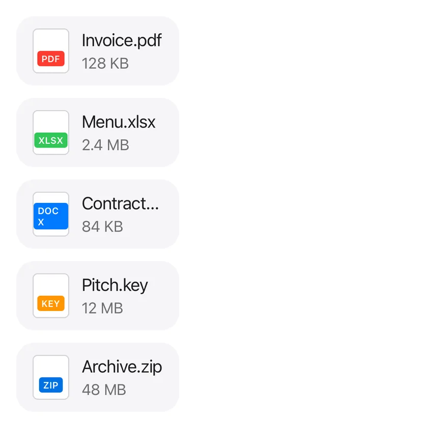
Document media with colored extension labels.
import { View } from "react-native"
import { Attachment, AttachmentContent, AttachmentDescription, AttachmentLabel, AttachmentMedia, AttachmentTitle } from "@/components/ui/attachment"

export function AttachmentFileTypesExample() {
  return (
    <View className="items-start gap-3">
      {[
        {
          name: "Invoice.pdf",
          meta: "128 KB",
          extension: "pdf",
          tone: "bg-red",
        },
        {
          name: "Menu.xlsx",
          meta: "2.4 MB",
          extension: "xlsx",
          tone: "bg-green",
        },
        {
          name: "Contract.docx",
          meta: "84 KB",
          extension: "docx",
          tone: "bg-blue",
        },
        {
          name: "Pitch.key",
          meta: "12 MB",
          extension: "key",
          tone: "bg-orange",
        },
        { name: "Archive.zip", meta: "48 MB", extension: "zip", tone: "" },
      ].map((file) => (
        <Attachment key={file.name} orientation="horizontal" state="done">
          <AttachmentMedia variant="document">
            <AttachmentLabel className={file.tone}>
              {file.extension}
            </AttachmentLabel>
          </AttachmentMedia>
          <AttachmentContent>
            <AttachmentTitle>{file.name}</AttachmentTitle>
            <AttachmentDescription>{file.meta}</AttachmentDescription>
          </AttachmentContent>
        </Attachment>
      ))}
    </View>
  )
}import EsuissUI
import SwiftUI
struct AttachmentFileTypesExample: View {
var body: some View {
VStack(alignment: .leading, spacing: 12) {
ForEach(AttachmentFile.all, id: \.name) { file in
Attachment {
AttachmentMedia(.document) { AttachmentLabel(verbatim: file.ext, tint: file.tint) }
AttachmentContent {
AttachmentTitle(verbatim: file.name)
AttachmentDescription(verbatim: file.meta)
}
}
}
}
}
}
struct AttachmentFile {
let name: String
let meta: String
let ext: String
let tint: Color
static let all: [AttachmentFile] = [
AttachmentFile(name: "Invoice.pdf", meta: "128 KB", ext: "pdf", tint: .danger),
AttachmentFile(name: "Menu.xlsx", meta: "2.4 MB", ext: "xlsx", tint: .success),
AttachmentFile(name: "Contract.docx", meta: "84 KB", ext: "docx", tint: .accent),
AttachmentFile(name: "Pitch.key", meta: "12 MB", ext: "key", tint: .warning),
AttachmentFile(name: "Archive.zip", meta: "48 MB", ext: "zip", tint: .accent),
]
}
let all: [AttachmentFile] = [
AttachmentFile(name: "Invoice.pdf", meta: "128 KB", ext: "pdf", tint: .danger),
AttachmentFile(name: "Menu.xlsx", meta: "2.4 MB", ext: "xlsx", tint: .success),
AttachmentFile(name: "Contract.docx", meta: "84 KB", ext: "docx", tint: .accent),
AttachmentFile(name: "Pitch.key", meta: "12 MB", ext: "key", tint: .warning),
AttachmentFile(name: "Archive.zip", meta: "48 MB", ext: "zip", tint: .accent),
]import androidx.compose.foundation.layout.Arrangement
import androidx.compose.foundation.layout.Column
import androidx.compose.runtime.Composable
import androidx.compose.ui.graphics.Color
import androidx.compose.ui.unit.dp
import com.esuiss.ui.components.Attachment
import com.esuiss.ui.components.AttachmentContent
import com.esuiss.ui.components.AttachmentDescription
import com.esuiss.ui.components.AttachmentLabel
import com.esuiss.ui.components.AttachmentMedia
import com.esuiss.ui.components.AttachmentMediaVariant
import com.esuiss.ui.components.AttachmentTitle
import com.esuiss.ui.theme.EsuissTheme
@Composable
fun AttachmentDocument(extension: String, tone: Color) {
AttachmentMedia(variant = AttachmentMediaVariant.Document) {
AttachmentLabel(extension, background = tone)
}
}
class AttachmentFile(val name: String, val meta: String, val extension: String, val tone: @Composable () -> Color)
val attachmentFiles = listOf(
AttachmentFile("Invoice.pdf", "128 KB", "pdf") { EsuissTheme.colors.red },
AttachmentFile("Menu.xlsx", "2.4 MB", "xlsx") { EsuissTheme.colors.green },
AttachmentFile("Contract.docx", "84 KB", "docx") { EsuissTheme.colors.blue },
AttachmentFile("Pitch.key", "12 MB", "key") { EsuissTheme.colors.orange },
AttachmentFile("Archive.zip", "48 MB", "zip") { EsuissTheme.colors.accent },
)
@Composable
fun AttachmentFileTypes() {
Column(verticalArrangement = Arrangement.spacedBy(12.dp)) {
attachmentFiles.forEach { file ->
Attachment {
AttachmentDocument(file.extension, file.tone())
AttachmentContent {
AttachmentTitle(file.name)
AttachmentDescription(file.meta)
}
}
}
}
}API Reference
Attachment
Card that provides state, size and orientation to its parts.
ViewProps- About
idle,uploading,processing,errorordone. Defaults todone.- Type
AttachmentState- Default
- "done"
- About
default,smorxs.- Type
AttachmentSize- Default
- "default"
- About
horizontalorvertical.- Type
AttachmentOrientation- Default
- "horizontal"
AttachmentMedia
Thumbnail area for an icon, document shape or image.
ViewProps- About
icon,documentorimage.- Type
"icon""document""image"- Default
- "icon"
AttachmentLabel
Small uppercase tag, such as a file extension.
ViewPropsAttachmentContent
Column for the title, description and progress.
ViewPropsAttachmentTitle
File name, one line by default.
React.ComponentProps<typeof Text>AttachmentDescription
Secondary details, red in the error state.
React.ComponentProps<typeof Text>AttachmentProgress
Progress bar with a percentage value.
React.ComponentProps<typeof ProgressPrimitive.Root>AttachmentActions
Row of actions; floats over the media in vertical layout.
ViewPropsAttachmentAction
Small button sized to the attachment.
React.ComponentProps<typeof Button>AttachmentTrigger
Pressable overlay that makes the whole card pressable.
React.ComponentProps<typeof Pressable>React.RefAttributes<View>- Type
RenderProp<Record<string, unknown>, Record<string, never>>- Default
- —
AttachmentGroup
List container that joins attachments with separators.
ViewPropsAccessibility
AttachmentProgresshas theprogressbarrole with its value exposed.AttachmentTriggerhas thebuttonrole; give it anaccessibilityLabelsuch as "Open Invoice.pdf".- Icon-only actions need an
accessibilityLabel.
Notes
- Uses
bg-surface-secondary,border-separator,bg-accentandtext-dangertokens; light and dark follow the system appearance. - Separators and action positions use start and end offsets, so they flip in right-to-left layouts.