suiss/uim · React Native Component
Button Group
A row or column of related buttons joined into one control.
Button Group is an open-source mobile component from suiss/uim for React Native and Expo, with SwiftUI and Jetpack Compose versions built from the same design tokens. The @esuiss/uim CLI copies its source into your project, so you own the code.
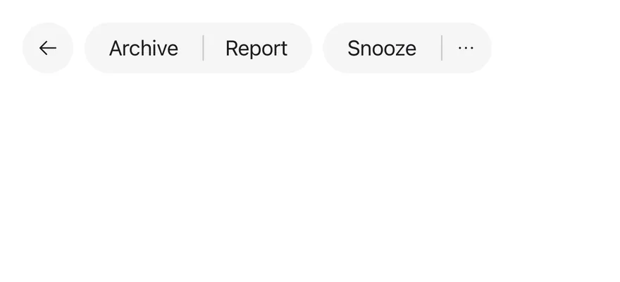
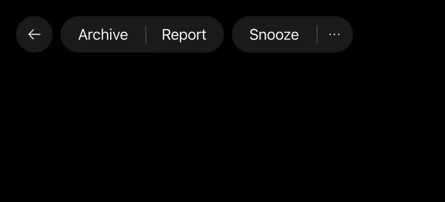
import { ArchiveIcon, ArrowLeftIcon, CalendarPlusIcon, ClockIcon, DotsThreeIcon, ListPlusIcon, TagIcon, TrashIcon } from "phosphor-react-native"
import { Button } from "@/components/ui/button"
import { ButtonGroup, ButtonGroupSeparator } from "@/components/ui/button-group"
import { DropdownMenu, DropdownMenuContent, DropdownMenuGroup, DropdownMenuItem, DropdownMenuSeparator, DropdownMenuTrigger } from "@/components/ui/dropdown-menu"
import { Icon } from "@/components/ui/icon"
import { Text } from "@/components/ui/text"

function MailMenuContent() {
  return (
    <DropdownMenuContent align="end" className="w-52">
      <DropdownMenuGroup>
        <DropdownMenuItem>
          <Icon as={ListPlusIcon} className="size-4" />
          <Text>Mark as read</Text>
        </DropdownMenuItem>
        <DropdownMenuItem>
          <Icon as={ArchiveIcon} className="size-4" />
          <Text>Archive</Text>
        </DropdownMenuItem>
      </DropdownMenuGroup>
      <DropdownMenuSeparator />
      <DropdownMenuGroup>
        <DropdownMenuItem>
          <Icon as={ClockIcon} className="size-4" />
          <Text>Snooze</Text>
        </DropdownMenuItem>
        <DropdownMenuItem>
          <Icon as={CalendarPlusIcon} className="size-4" />
          <Text>Add to calendar</Text>
        </DropdownMenuItem>
        <DropdownMenuItem>
          <Icon as={TagIcon} className="size-4" />
          <Text>Label as</Text>
        </DropdownMenuItem>
      </DropdownMenuGroup>
      <DropdownMenuSeparator />
      <DropdownMenuGroup>
        <DropdownMenuItem variant="destructive">
          <Icon as={TrashIcon} className="size-4" />
          <Text>Trash</Text>
        </DropdownMenuItem>
      </DropdownMenuGroup>
    </DropdownMenuContent>
  )
}

export function ButtonGroupExample() {
  return (
    <ButtonGroup>
      <ButtonGroup>
        <Button variant="secondary" size="icon" accessibilityLabel="Go back">
          <Icon as={ArrowLeftIcon} />
        </Button>
      </ButtonGroup>
      <ButtonGroup>
        <Button variant="secondary">
          <Text>Archive</Text>
        </Button>
        <ButtonGroupSeparator />
        <Button variant="secondary">
          <Text>Report</Text>
        </Button>
      </ButtonGroup>
      <ButtonGroup>
        <Button variant="secondary">
          <Text>Snooze</Text>
        </Button>
        <ButtonGroupSeparator />
        <DropdownMenu>
          <DropdownMenuTrigger
            accessibilityLabel="More options"
            render={<Button variant="secondary" size="icon" />}
          >
            <Icon as={DotsThreeIcon} />
          </DropdownMenuTrigger>
          <MailMenuContent />
        </DropdownMenu>
      </ButtonGroup>
    </ButtonGroup>
  )
}import EsuissUI
import PhosphorSwift
import SwiftUI
struct ButtonGroupExample: View {
var body: some View {
ButtonGroup {
ButtonGroup {
ButtonGroupIconButton(icon: Ph.arrowLeft.regular, label: "Go back", variant: .secondary)
}
ButtonGroup {
Button("Archive") {}.buttonStyle(.variant(.secondary))
ButtonGroupSeparator()
Button("Report") {}.buttonStyle(.variant(.secondary))
}
ButtonGroup {
Button("Snooze") {}.buttonStyle(.variant(.secondary))
ButtonGroupSeparator()
ButtonGroupMailMenu(variant: .secondary)
}
}
}
}
struct ButtonGroupIcon: View {
let icon: Image
let size: VariantButtonStyle.Size
var body: some View {
icon.frame(width: size.iconSize, height: size.iconSize)
}
}
struct ButtonGroupIconButton: View {
let icon: Image
let label: LocalizedStringKey
let variant: VariantButtonStyle.Variant
var size: VariantButtonStyle.Size = .icon
var body: some View {
Button {} label: {
ButtonGroupIcon(icon: icon, size: size)
}
.buttonStyle(.variant(variant, size: size))
.accessibilityLabel(Text(label))
}
}
struct ButtonGroupMailMenu: View {
let variant: VariantButtonStyle.Variant
var body: some View {
DropdownMenu(align: .end) {
DropdownMenuGroup {
DropdownMenuItem("Mark as read", icon: Ph.listPlus.regular) {}
DropdownMenuItem("Archive", icon: Ph.archive.regular) {}
}
DropdownMenuSeparator()
DropdownMenuGroup {
DropdownMenuItem("Snooze", icon: Ph.clock.regular) {}
DropdownMenuItem("Add to calendar", icon: Ph.calendarPlus.regular) {}
DropdownMenuItem("Label as", icon: Ph.tag.regular) {}
}
DropdownMenuSeparator()
DropdownMenuGroup {
DropdownMenuItem("Trash", icon: Ph.trash.regular, variant: .destructive) {}
}
} label: {
ButtonGroupIcon(icon: Ph.dotsThree.bold, size: .icon)
}
.buttonStyle(.variant(variant, size: .icon))
.accessibilityLabel(Text("More options"))
}
}import androidx.compose.runtime.Composable
import androidx.compose.runtime.getValue
import androidx.compose.runtime.mutableStateOf
import androidx.compose.runtime.saveable.rememberSaveable
import androidx.compose.runtime.setValue
import androidx.compose.ui.semantics.contentDescription
import com.adamglin.PhosphorIcons
import com.adamglin.phosphoricons.Regular
import com.adamglin.phosphoricons.regular.Archive
import com.adamglin.phosphoricons.regular.ArrowLeft
import com.adamglin.phosphoricons.regular.CalendarPlus
import com.adamglin.phosphoricons.regular.Clock
import com.adamglin.phosphoricons.regular.DotsThree
import com.adamglin.phosphoricons.regular.ListPlus
import com.adamglin.phosphoricons.regular.Tag
import com.adamglin.phosphoricons.regular.Trash
import com.esuiss.ui.components.Button
import com.esuiss.ui.components.ButtonGroup
import com.esuiss.ui.components.ButtonGroupSeparator
import com.esuiss.ui.components.ButtonSize
import com.esuiss.ui.components.ButtonVariant
import com.esuiss.ui.components.DropdownMenu
import com.esuiss.ui.components.DropdownMenuGroup
import com.esuiss.ui.components.DropdownMenuItem
import com.esuiss.ui.components.DropdownMenuSeparator
import com.esuiss.ui.components.Icon
import com.esuiss.ui.components.MenuItemVariant
import com.esuiss.ui.components.PopupAlign
@Composable
fun ButtonGroupExample() {
ButtonGroupMail(ButtonVariant.Secondary, separators = true)
}
@Composable
fun ButtonGroupIconButton(
label: String,
icon: androidx.compose.ui.graphics.vector.ImageVector,
variant: ButtonVariant = ButtonVariant.Default,
size: ButtonSize = ButtonSize.Icon,
onClick: () -> Unit = {},
) {
Button(onClick = onClick, variant = variant, size = size) {
Icon(icon, contentDescription = label)
}
}
@Composable
fun ButtonGroupMailMenu(variant: ButtonVariant) {
var open by rememberSaveable { mutableStateOf(false) }
DropdownMenu(
expanded = open,
onExpandedChange = { open = it },
trigger = { ButtonGroupIconButton("More options", PhosphorIcons.Regular.DotsThree, variant) { open = true } },
align = PopupAlign.End,
) {
DropdownMenuGroup {
DropdownMenuItem("Mark as read", onClick = {}, icon = PhosphorIcons.Regular.ListPlus)
DropdownMenuItem("Archive", onClick = {}, icon = PhosphorIcons.Regular.Archive)
}
DropdownMenuSeparator()
DropdownMenuGroup {
DropdownMenuItem("Snooze", onClick = {}, icon = PhosphorIcons.Regular.Clock)
DropdownMenuItem("Add to calendar", onClick = {}, icon = PhosphorIcons.Regular.CalendarPlus)
DropdownMenuItem("Label as", onClick = {}, icon = PhosphorIcons.Regular.Tag)
}
DropdownMenuSeparator()
DropdownMenuGroup {
DropdownMenuItem("Trash", onClick = {}, icon = PhosphorIcons.Regular.Trash, variant = MenuItemVariant.Destructive)
}
}
}
@Composable
fun ButtonGroupMail(variant: ButtonVariant, separators: Boolean) {
ButtonGroup {
ButtonGroup {
ButtonGroupIconButton("Go back", PhosphorIcons.Regular.ArrowLeft, variant)
}
ButtonGroup {
Button("Archive", onClick = {}, variant = variant)
if (separators) ButtonGroupSeparator()
Button("Report", onClick = {}, variant = variant)
}
ButtonGroup {
Button("Snooze", onClick = {}, variant = variant)
if (separators) ButtonGroupSeparator()
ButtonGroupMailMenu(variant)
}
}
}ButtonGroup is a View with the group role that joins its children: only the outer ends keep their rounded corners and the shared borders collapse. It works with Button and with other controls such as inputs, selects and menu triggers. ghost and plain buttons are left unjoined.
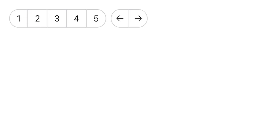
Nest groups to keep separate clusters in one row with a gap between them. ButtonGroupSeparator draws a divider between joined buttons, and ButtonGroupText shows a label or icon in the same pill shape.
Installation
$ pnpm dlx @esuiss/uim@latest add button-group$ pnpm dlx @esuiss/uim@latest add button-group --platform swift$ pnpm dlx @esuiss/uim@latest add button-group --platform kotlinThe CLI also adds what it builds on: Button, Icon, Separator, Text.
Manual
- Install the dependencies:
npx expo install class-variance-authority cn-
Add the pieces it builds on: Button, Icon, Separator, Text, and the primitives
components/primitives/types.tsx,components/primitives/use-render.tsx. -
Copy the source into
components/ui/button-group.tsx:
import { cva, type VariantProps } from "class-variance-authority"
import { cn } from "cn"
import * as React from "react"
import { View, type ViewProps } from "react-native"
import type { ClassNameProp, RenderProp } from "@/components/primitives/types"
import { resolveClassName, useRender } from "@/components/primitives/use-render"
import {
  Button,
  ButtonClassContext,
  type ButtonVariant,
} from "@/components/ui/button"
import { IconClassContext } from "@/components/ui/icon"
import { Separator } from "@/components/ui/separator"
import { TextClassContext } from "@/components/ui/text"

type ButtonGroupOrientation = "horizontal" | "vertical"- Update the import paths to match your project.
- Install the dependencies:
npx expo install class-variance-authority cn-
Add the pieces it builds on: Button, Icon, Separator, Text, and the primitives
components/primitives/types.tsx,components/primitives/use-render.tsx. -
Copy the source into
components/ui/button-group.tsx:
import { cva, type VariantProps } from "class-variance-authority"
import { cn } from "cn"
import * as React from "react"
import { View, type ViewProps } from "react-native"
import type { ClassNameProp, RenderProp } from "@/components/primitives/types"
import { resolveClassName, useRender } from "@/components/primitives/use-render"
import {
  Button,
  ButtonClassContext,
  type ButtonVariant,
} from "@/components/ui/button"
import { IconClassContext } from "@/components/ui/icon"
import { Separator } from "@/components/ui/separator"
import { TextClassContext } from "@/components/ui/text"

type ButtonGroupOrientation = "horizontal" | "vertical"- Update the import paths to match your project.
-
Add the pieces it builds on: Button, Icon, Separator, Text, and the primitives
components/primitives/types.tsx,components/primitives/use-render.tsx. -
Copy the source into
components/ui/button-group.tsx:
import * as React from "react"
import {
  type StyleProp,
  StyleSheet,
  View,
  type ViewProps,
  type ViewStyle,
} from "react-native"
import type { RenderProp } from "@/components/primitives/types"
import { resolveStyle, useRender } from "@/components/primitives/use-render"
import {
  Button,
  ButtonStyleContext,
  type ButtonVariant,
} from "@/components/ui/button"
import { IconSizeContext } from "@/components/ui/icon"- Update the import paths to match your project.
-
Target iOS 17 or later.
-
Add the Swift package to your app:
.package(url: "https://github.com/phosphor-icons/swift", from: "2.1.0")- Copy the theme files every view uses:
import SwiftUI
import UIKit

struct RGBA: Sendable {
  let red: CGFloat
  let green: CGFloat
  let blue: CGFloat
  let alpha: CGFloat

  init(_ hex: UInt32, _ alpha: CGFloat = 1) {
    red = CGFloat((hex >> 16) & 0xFF) / 255
    green = CGFloat((hex >> 8) & 0xFF) / 255
    blue = CGFloat(hex & 0xFF) / 255
    self.alpha = alpha
}import SwiftUI
extension Color {
public static let surface = Color.adaptive(light: .init(0xFFFFFF), dark: .init(0x000000))
public static let surfaceSecondary = Color.adaptive(light: .init(0xF5F5F7), dark: .init(0x161617))
public static let surfaceTertiary = Color.adaptive(light: .init(0xE8E8ED), dark: .init(0x2C2C2E))
public static let surfaceRaised = Color.adaptive(light: .init(0xFFFFFF), dark: .init(0x1D1D1F))
public static let label = Color.adaptive(light: .init(0x1D1D1F), dark: .init(0xF5F5F7))
public static let labelSecondary = Color.adaptive(light: .init(0x6E6E73), dark: .init(0xA1A1A6))
public static let labelTertiary = Color.adaptive(light: .init(0x86868B), dark: .init(0x86868B))
public static let labelQuaternary = Color.adaptive(light: .init(0xD2D2D7), dark: .init(0x424245))
public static let control = Color.adaptive(light: .init(0x000000, 0.04), dark: .init(0xFFFFFF, 0.1))
public static let controlPressed = Color.adaptive(light: .init(0x000000, 0.12), dark: .init(0xFFFFFF, 0.22))
public static let controlSelected = Color.adaptive(light: .init(0x1D1D1F), dark: .init(0xF5F5F7))
public static let controlDisabled = Color.adaptive(light: .init(0x000000, 0.03), dark: .init(0xFFFFFF, 0.05))
public static let onControlSelected = Color.adaptive(light: .init(0xFFFFFF), dark: .init(0x000000))- Copy the source and every file it uses:
import SwiftUI

extension EnvironmentValues {
  @Entry var buttonGroup: Axis? = nil
  @Entry var buttonGroupSize: CGSize = .zero
}

enum ButtonGroupSpace: Hashable {
  case group
}

struct ButtonGroupFrame {
  let bounds: Anchor<CGRect>
  let outlined: Bool
}import SwiftUI
public struct VariantButtonStyle: ButtonStyle {
public enum Variant: CaseIterable, Sendable {
case `default`, outline, secondary, tinted, ghost, plain, destructive, link
}
public enum Size: CaseIterable, Sendable {
case `default`, xs, sm, lg, xl, icon, iconXs, iconSm, iconLg, iconXl
var height: CGFloat {
switch self {
case .xs, .iconXs: 24
case .sm, .iconSm: 32
case .default, .icon: 36
case .lg, .iconLg: 44import PhosphorSwift
import SwiftUI
extension Shadow {
static let control = Shadow(color: .black.opacity(0.08), radius: 0.5, y: 0.5)
static let thumb = Shadow(color: .black.opacity(0.12), radius: 1.5, y: 1)
}
struct SelectionIndicator<Mark: View>: View {
let checked: Bool
let pressed: Bool
let cornerRadius: CGFloat
let mark: Mark
@Environment(\.isEnabled) private var isEnabled
@Environment(\.isInvalid) private var invalidimport SwiftUI
extension EnvironmentValues {
@Entry public var isInvalid = false
@Entry var fieldInset = false
@Entry var fieldGroupInset = false
@Entry var fieldSetInset = false
}
extension View {
public func invalid(_ isInvalid: Bool = true) -> some View {
environment(\.isInvalid, isInvalid)
}
}
public enum FieldOrientation: CaseIterable, Sendable {import SwiftUI
extension EnvironmentValues {
@Entry public var hapticsEnabled = true
}
extension View {
public func haptics(_ enabled: Bool) -> some View {
environment(\.hapticsEnabled, enabled)
}
func hapticFeedback<Trigger: Equatable>(_ feedback: SensoryFeedback, trigger: Trigger) -> some View {
modifier(HapticFeedbackModifier(feedback: feedback, trigger: trigger) { _, _ in true })
}
func hapticFeedback<Trigger: Equatable>(import SwiftUI
public struct Separator: View {
let orientation: Axis
public init(_ orientation: Axis = .horizontal) {
self.orientation = orientation
}
public var body: some View {
Rectangle()
.fill(Color.separator)
.frame(width: orientation == .vertical ? 1 : nil, height: orientation == .horizontal ? 1 : nil)
.frame(maxWidth: orientation == .horizontal ? .infinity : nil, maxHeight: orientation == .vertical ? .infinity : nil)
.accessibilityHidden(true)
}import SwiftUI
public enum TextVariant: CaseIterable, Sendable {
case `default`, h1, h2, h3, h4, p, blockquote, code, lead, large, small, muted
var style: TextStyle {
switch self {
case .h1: .xl3
case .h2: .xl2
case .h3: .xl
case .h4, .lead, .large: .lg
case .code, .small, .muted: .sm
default: .base
}
}- Add the files to your app target.
- Set
minSdkto 24 or higher and add the dependencies:
implementation(platform("androidx.compose:compose-bom:2026.09.00"))
implementation("androidx.compose.foundation:foundation")
implementation("androidx.compose.ui:ui")- Copy the theme files every view uses:
package com.esuiss.ui.theme

import androidx.compose.foundation.isSystemInDarkTheme
import androidx.compose.runtime.Composable
import androidx.compose.runtime.CompositionLocalProvider
import androidx.compose.runtime.Immutable
import androidx.compose.runtime.staticCompositionLocalOf
import androidx.compose.ui.Modifier
import androidx.compose.ui.draw.dropShadow
import androidx.compose.ui.graphics.Color
import androidx.compose.ui.graphics.Shape
import androidx.compose.ui.graphics.shadow.Shadow as DropShadow
import androidx.compose.ui.text.TextStyle
import androidx.compose.ui.text.style.LineHeightStyle
import androidx.compose.ui.unit.Dp
import androidx.compose.ui.unit.DpOffsetpackage com.esuiss.ui.theme
import androidx.compose.runtime.Immutable
import androidx.compose.ui.graphics.Color
import androidx.compose.ui.unit.dp
@Immutable
data class Colors(
val surface: Color,
val surfaceSecondary: Color,
val surfaceTertiary: Color,
val surfaceRaised: Color,
val label: Color,
val labelSecondary: Color,
val labelTertiary: Color,
val labelQuaternary: Color,- Copy the source and every file it uses:
package com.esuiss.ui.components

import androidx.compose.foundation.background
import androidx.compose.foundation.gestures.Orientation
import androidx.compose.foundation.layout.Arrangement
import androidx.compose.foundation.layout.Box
import androidx.compose.foundation.layout.Row
import androidx.compose.foundation.layout.RowScope
import androidx.compose.foundation.layout.padding
import androidx.compose.foundation.shape.CircleShape
import androidx.compose.foundation.shape.CornerSize
import androidx.compose.foundation.shape.RoundedCornerShape
import androidx.compose.runtime.Composable
import androidx.compose.runtime.CompositionLocalProvider
import androidx.compose.runtime.DisposableEffect
import androidx.compose.runtime.Immutablepackage com.esuiss.ui.components
import androidx.compose.runtime.compositionLocalOf
import androidx.compose.ui.graphics.Color
import androidx.compose.ui.text.TextStyle
import androidx.compose.ui.unit.Dp
import androidx.compose.ui.unit.dp
val LocalContentStyle = compositionLocalOf { TextStyle.Default }
val LocalContentColor = compositionLocalOf { Color.Unspecified }
val LocalIconSize = compositionLocalOf { 20.dp }- Update the
com.esuiss.uipackage names to match your project.
Usage
import { ButtonGroup, ButtonGroupText, ButtonGroupSeparator } from "@/components/ui/button-group"<ButtonGroup>
<ButtonGroup>
<Button variant="secondary" size="icon" accessibilityLabel="Go back">
<Icon as={ArrowLeftIcon} />
</Button>
</ButtonGroup>
<ButtonGroup>
<Button variant="secondary">
<Text>Archive</Text>
</Button>
<ButtonGroupSeparator />
<Button variant="secondary">
<Text>Report</Text>
</Button>
</ButtonGroup>
<ButtonGroup>
<Button variant="secondary">
<Text>Snooze</Text>
</Button>
<ButtonGroupSeparator />
<DropdownMenu>
<DropdownMenuTrigger
accessibilityLabel="More options"
render={<Button variant="secondary" size="icon" />}
>
<Icon as={DotsThreeIcon} />
</DropdownMenuTrigger>
<MailMenuContent />
</DropdownMenu>
</ButtonGroup>
</ButtonGroup>Set orientation="vertical" to stack the buttons. Use a separator between buttons of the same filled variant, such as in a split button, where there is no border to divide them.
Give icon-only buttons an accessibilityLabel, and give the group one when its purpose is not clear from its contents.
Examples
Outline
Nested groups of outline buttons.
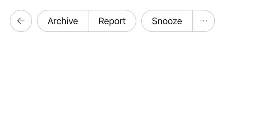
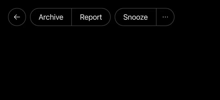
import { ArchiveIcon, ArrowLeftIcon, CalendarPlusIcon, ClockIcon, DotsThreeIcon, ListPlusIcon, TagIcon, TrashIcon } from "phosphor-react-native"
import { Button } from "@/components/ui/button"
import { ButtonGroup } from "@/components/ui/button-group"
import { DropdownMenu, DropdownMenuContent, DropdownMenuGroup, DropdownMenuItem, DropdownMenuSeparator, DropdownMenuTrigger } from "@/components/ui/dropdown-menu"
import { Icon } from "@/components/ui/icon"
import { Text } from "@/components/ui/text"

function MailMenuContent() {
  return (
    <DropdownMenuContent align="end" className="w-52">
      <DropdownMenuGroup>
        <DropdownMenuItem>
          <Icon as={ListPlusIcon} className="size-4" />
          <Text>Mark as read</Text>
        </DropdownMenuItem>
        <DropdownMenuItem>
          <Icon as={ArchiveIcon} className="size-4" />
          <Text>Archive</Text>
        </DropdownMenuItem>
      </DropdownMenuGroup>
      <DropdownMenuSeparator />
      <DropdownMenuGroup>
        <DropdownMenuItem>
          <Icon as={ClockIcon} className="size-4" />
          <Text>Snooze</Text>
        </DropdownMenuItem>
        <DropdownMenuItem>
          <Icon as={CalendarPlusIcon} className="size-4" />
          <Text>Add to calendar</Text>
        </DropdownMenuItem>
        <DropdownMenuItem>
          <Icon as={TagIcon} className="size-4" />
          <Text>Label as</Text>
        </DropdownMenuItem>
      </DropdownMenuGroup>
      <DropdownMenuSeparator />
      <DropdownMenuGroup>
        <DropdownMenuItem variant="destructive">
          <Icon as={TrashIcon} className="size-4" />
          <Text>Trash</Text>
        </DropdownMenuItem>
      </DropdownMenuGroup>
    </DropdownMenuContent>
  )
}

export function ButtonGroupOutlineExample() {
  return (
    <ButtonGroup>
      <ButtonGroup>
        <Button variant="outline" size="icon" accessibilityLabel="Go back">
          <Icon as={ArrowLeftIcon} />
        </Button>
      </ButtonGroup>
      <ButtonGroup>
        <Button variant="outline">
          <Text>Archive</Text>
        </Button>
        <Button variant="outline">
          <Text>Report</Text>
        </Button>
      </ButtonGroup>
      <ButtonGroup>
        <Button variant="outline">
          <Text>Snooze</Text>
        </Button>
        <DropdownMenu>
          <DropdownMenuTrigger
            accessibilityLabel="More options"
            render={<Button variant="outline" size="icon" />}
          >
            <Icon as={DotsThreeIcon} />
          </DropdownMenuTrigger>
          <MailMenuContent />
        </DropdownMenu>
      </ButtonGroup>
    </ButtonGroup>
  )
}import EsuissUI
import PhosphorSwift
import SwiftUI
struct ButtonGroupOutlineExample: View {
var body: some View {
ButtonGroup {
ButtonGroup {
ButtonGroupIconButton(icon: Ph.arrowLeft.regular, label: "Go back", variant: .outline)
}
ButtonGroup {
Button("Archive") {}.buttonStyle(.variant(.outline))
Button("Report") {}.buttonStyle(.variant(.outline))
}
ButtonGroup {
Button("Snooze") {}.buttonStyle(.variant(.outline))
ButtonGroupMailMenu(variant: .outline)
}
}
}
}
struct ButtonGroupIcon: View {
let icon: Image
let size: VariantButtonStyle.Size
var body: some View {
icon.frame(width: size.iconSize, height: size.iconSize)
}
}
struct ButtonGroupIconButton: View {
let icon: Image
let label: LocalizedStringKey
let variant: VariantButtonStyle.Variant
var size: VariantButtonStyle.Size = .icon
var body: some View {
Button {} label: {
ButtonGroupIcon(icon: icon, size: size)
}
.buttonStyle(.variant(variant, size: size))
.accessibilityLabel(Text(label))
}
}
struct ButtonGroupMailMenu: View {
let variant: VariantButtonStyle.Variant
var body: some View {
DropdownMenu(align: .end) {
DropdownMenuGroup {
DropdownMenuItem("Mark as read", icon: Ph.listPlus.regular) {}
DropdownMenuItem("Archive", icon: Ph.archive.regular) {}
}
DropdownMenuSeparator()
DropdownMenuGroup {
DropdownMenuItem("Snooze", icon: Ph.clock.regular) {}
DropdownMenuItem("Add to calendar", icon: Ph.calendarPlus.regular) {}
DropdownMenuItem("Label as", icon: Ph.tag.regular) {}
}
DropdownMenuSeparator()
DropdownMenuGroup {
DropdownMenuItem("Trash", icon: Ph.trash.regular, variant: .destructive) {}
}
} label: {
ButtonGroupIcon(icon: Ph.dotsThree.bold, size: .icon)
}
.buttonStyle(.variant(variant, size: .icon))
.accessibilityLabel(Text("More options"))
}
}import androidx.compose.runtime.Composable
import androidx.compose.runtime.getValue
import androidx.compose.runtime.mutableStateOf
import androidx.compose.runtime.saveable.rememberSaveable
import androidx.compose.runtime.setValue
import androidx.compose.ui.semantics.contentDescription
import com.adamglin.PhosphorIcons
import com.adamglin.phosphoricons.Regular
import com.adamglin.phosphoricons.regular.Archive
import com.adamglin.phosphoricons.regular.ArrowLeft
import com.adamglin.phosphoricons.regular.CalendarPlus
import com.adamglin.phosphoricons.regular.Clock
import com.adamglin.phosphoricons.regular.DotsThree
import com.adamglin.phosphoricons.regular.ListPlus
import com.adamglin.phosphoricons.regular.Tag
import com.adamglin.phosphoricons.regular.Trash
import com.esuiss.ui.components.Button
import com.esuiss.ui.components.ButtonGroup
import com.esuiss.ui.components.ButtonGroupSeparator
import com.esuiss.ui.components.ButtonSize
import com.esuiss.ui.components.ButtonVariant
import com.esuiss.ui.components.DropdownMenu
import com.esuiss.ui.components.DropdownMenuGroup
import com.esuiss.ui.components.DropdownMenuItem
import com.esuiss.ui.components.DropdownMenuSeparator
import com.esuiss.ui.components.Icon
import com.esuiss.ui.components.MenuItemVariant
import com.esuiss.ui.components.PopupAlign
@Composable
fun ButtonGroupOutlineExample() {
ButtonGroupMail(ButtonVariant.Outline, separators = false)
}
@Composable
fun ButtonGroupIconButton(
label: String,
icon: androidx.compose.ui.graphics.vector.ImageVector,
variant: ButtonVariant = ButtonVariant.Default,
size: ButtonSize = ButtonSize.Icon,
onClick: () -> Unit = {},
) {
Button(onClick = onClick, variant = variant, size = size) {
Icon(icon, contentDescription = label)
}
}
@Composable
fun ButtonGroupMailMenu(variant: ButtonVariant) {
var open by rememberSaveable { mutableStateOf(false) }
DropdownMenu(
expanded = open,
onExpandedChange = { open = it },
trigger = { ButtonGroupIconButton("More options", PhosphorIcons.Regular.DotsThree, variant) { open = true } },
align = PopupAlign.End,
) {
DropdownMenuGroup {
DropdownMenuItem("Mark as read", onClick = {}, icon = PhosphorIcons.Regular.ListPlus)
DropdownMenuItem("Archive", onClick = {}, icon = PhosphorIcons.Regular.Archive)
}
DropdownMenuSeparator()
DropdownMenuGroup {
DropdownMenuItem("Snooze", onClick = {}, icon = PhosphorIcons.Regular.Clock)
DropdownMenuItem("Add to calendar", onClick = {}, icon = PhosphorIcons.Regular.CalendarPlus)
DropdownMenuItem("Label as", onClick = {}, icon = PhosphorIcons.Regular.Tag)
}
DropdownMenuSeparator()
DropdownMenuGroup {
DropdownMenuItem("Trash", onClick = {}, icon = PhosphorIcons.Regular.Trash, variant = MenuItemVariant.Destructive)
}
}
}
@Composable
fun ButtonGroupMail(variant: ButtonVariant, separators: Boolean) {
ButtonGroup {
ButtonGroup {
ButtonGroupIconButton("Go back", PhosphorIcons.Regular.ArrowLeft, variant)
}
ButtonGroup {
Button("Archive", onClick = {}, variant = variant)
if (separators) ButtonGroupSeparator()
Button("Report", onClick = {}, variant = variant)
}
ButtonGroup {
Button("Snooze", onClick = {}, variant = variant)
if (separators) ButtonGroupSeparator()
ButtonGroupMailMenu(variant)
}
}
}Orientation
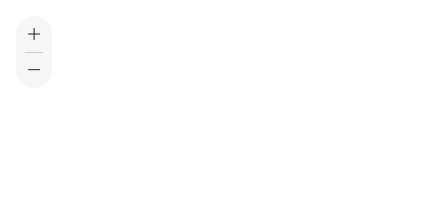
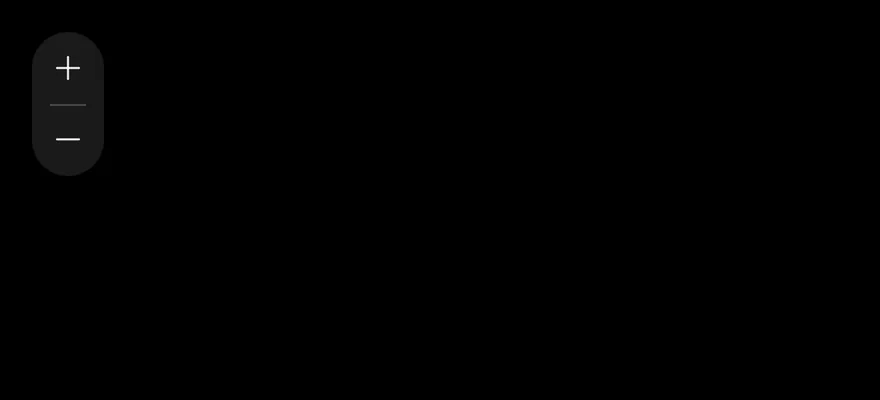
A vertical group of zoom buttons with a horizontal separator.
import { MinusIcon, PlusIcon } from "phosphor-react-native"
import { Button } from "@/components/ui/button"
import { ButtonGroup, ButtonGroupSeparator } from "@/components/ui/button-group"
import { Icon } from "@/components/ui/icon"

export function ButtonGroupOrientationExample() {
  return (
    <ButtonGroup orientation="vertical" accessibilityLabel="Media controls">
      <Button variant="secondary" size="icon" accessibilityLabel="Zoom in">
        <Icon as={PlusIcon} />
      </Button>
      <ButtonGroupSeparator orientation="horizontal" />
      <Button variant="secondary" size="icon" accessibilityLabel="Zoom out">
        <Icon as={MinusIcon} />
      </Button>
    </ButtonGroup>
  )
}import EsuissUI
import PhosphorSwift
import SwiftUI
struct ButtonGroupOrientationExample: View {
var body: some View {
ButtonGroup(orientation: .vertical) {
ButtonGroupIconButton(icon: Ph.plus.regular, label: "Zoom in", variant: .secondary)
ButtonGroupSeparator(.horizontal)
ButtonGroupIconButton(icon: Ph.minus.regular, label: "Zoom out", variant: .secondary)
}
.accessibilityLabel(Text("Media controls"))
}
}
struct ButtonGroupIcon: View {
let icon: Image
let size: VariantButtonStyle.Size
var body: some View {
icon.frame(width: size.iconSize, height: size.iconSize)
}
}
struct ButtonGroupIconButton: View {
let icon: Image
let label: LocalizedStringKey
let variant: VariantButtonStyle.Variant
var size: VariantButtonStyle.Size = .icon
var body: some View {
Button {} label: {
ButtonGroupIcon(icon: icon, size: size)
}
.buttonStyle(.variant(variant, size: size))
.accessibilityLabel(Text(label))
}
}import androidx.compose.foundation.gestures.Orientation
import androidx.compose.runtime.Composable
import androidx.compose.ui.Modifier
import androidx.compose.ui.semantics.contentDescription
import androidx.compose.ui.semantics.semantics
import com.adamglin.PhosphorIcons
import com.adamglin.phosphoricons.Regular
import com.adamglin.phosphoricons.regular.Minus
import com.adamglin.phosphoricons.regular.Plus
import com.esuiss.ui.components.Button
import com.esuiss.ui.components.ButtonGroup
import com.esuiss.ui.components.ButtonGroupOrientation
import com.esuiss.ui.components.ButtonGroupSeparator
import com.esuiss.ui.components.ButtonSize
import com.esuiss.ui.components.ButtonVariant
import com.esuiss.ui.components.Icon
@Composable
fun ButtonGroupIconButton(
label: String,
icon: androidx.compose.ui.graphics.vector.ImageVector,
variant: ButtonVariant = ButtonVariant.Default,
size: ButtonSize = ButtonSize.Icon,
onClick: () -> Unit = {},
) {
Button(onClick = onClick, variant = variant, size = size) {
Icon(icon, contentDescription = label)
}
}
@Composable
fun ButtonGroupOrientationStory() {
ButtonGroup(
modifier = Modifier.semantics { contentDescription = "Media controls" },
orientation = ButtonGroupOrientation.Vertical,
) {
ButtonGroupIconButton("Zoom in", PhosphorIcons.Regular.Plus, ButtonVariant.Secondary)
ButtonGroupSeparator(orientation = Orientation.Horizontal)
ButtonGroupIconButton("Zoom out", PhosphorIcons.Regular.Minus, ButtonVariant.Secondary)
}
}Sizes
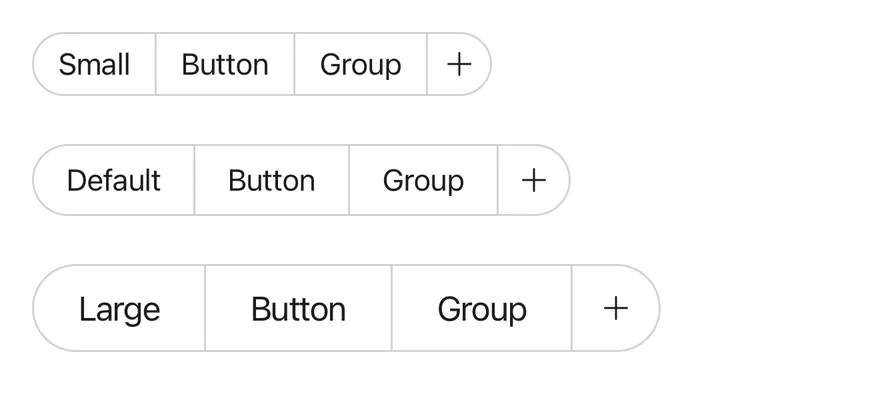
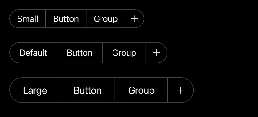
Groups at different button sizes.
import { PlusIcon } from "phosphor-react-native"
import { View } from "react-native"
import { Button } from "@/components/ui/button"
import { ButtonGroup } from "@/components/ui/button-group"
import { Icon } from "@/components/ui/icon"
import { Text } from "@/components/ui/text"

export function ButtonGroupSizesExample() {
  return (
    <View className="items-start gap-6">
      <ButtonGroup>
        <Button variant="outline" size="sm">
          <Text>Small</Text>
        </Button>
        <Button variant="outline" size="sm">
          <Text>Button</Text>
        </Button>
        <Button variant="outline" size="sm">
          <Text>Group</Text>
        </Button>
        <Button variant="outline" size="icon-sm" accessibilityLabel="Add">
          <Icon as={PlusIcon} />
        </Button>
      </ButtonGroup>
      <ButtonGroup>
        <Button variant="outline">
          <Text>Default</Text>
        </Button>
        <Button variant="outline">
          <Text>Button</Text>
        </Button>
        <Button variant="outline">
          <Text>Group</Text>
        </Button>
        <Button variant="outline" size="icon" accessibilityLabel="Add">
          <Icon as={PlusIcon} />
        </Button>
      </ButtonGroup>
      <ButtonGroup>
        <Button variant="outline" size="lg">
          <Text>Large</Text>
        </Button>
        <Button variant="outline" size="lg">
          <Text>Button</Text>
        </Button>
        <Button variant="outline" size="lg">
          <Text>Group</Text>
        </Button>
        <Button variant="outline" size="icon-lg" accessibilityLabel="Add">
          <Icon as={PlusIcon} />
        </Button>
      </ButtonGroup>
    </View>
  )
}import EsuissUI
import PhosphorSwift
import SwiftUI
struct ButtonGroupSizesExample: View {
var body: some View {
VStack(alignment: .leading, spacing: 24) {
ButtonGroupSizeRow(title: "Small", size: .sm, iconSize: .iconSm)
ButtonGroupSizeRow(title: "Default", size: .default, iconSize: .icon)
ButtonGroupSizeRow(title: "Large", size: .lg, iconSize: .iconLg)
}
}
}
struct ButtonGroupIcon: View {
let icon: Image
let size: VariantButtonStyle.Size
var body: some View {
icon.frame(width: size.iconSize, height: size.iconSize)
}
}
struct ButtonGroupIconButton: View {
let icon: Image
let label: LocalizedStringKey
let variant: VariantButtonStyle.Variant
var size: VariantButtonStyle.Size = .icon
var body: some View {
Button {} label: {
ButtonGroupIcon(icon: icon, size: size)
}
.buttonStyle(.variant(variant, size: size))
.accessibilityLabel(Text(label))
}
}
struct ButtonGroupSizeRow: View {
let title: LocalizedStringKey
let size: VariantButtonStyle.Size
let iconSize: VariantButtonStyle.Size
var body: some View {
ButtonGroup {
Button(title) {}.buttonStyle(.variant(.outline, size: size))
Button("Button") {}.buttonStyle(.variant(.outline, size: size))
Button("Group") {}.buttonStyle(.variant(.outline, size: size))
ButtonGroupIconButton(icon: Ph.plus.regular, label: "Add", variant: .outline, size: iconSize)
}
}
}import androidx.compose.foundation.layout.Arrangement
import androidx.compose.foundation.layout.Column
import androidx.compose.runtime.Composable
import androidx.compose.ui.semantics.contentDescription
import androidx.compose.ui.unit.dp
import com.adamglin.PhosphorIcons
import com.adamglin.phosphoricons.Regular
import com.adamglin.phosphoricons.regular.Plus
import com.esuiss.ui.components.Button
import com.esuiss.ui.components.ButtonGroup
import com.esuiss.ui.components.ButtonSize
import com.esuiss.ui.components.ButtonVariant
import com.esuiss.ui.components.Icon
@Composable
fun ButtonGroupIconButton(
label: String,
icon: androidx.compose.ui.graphics.vector.ImageVector,
variant: ButtonVariant = ButtonVariant.Default,
size: ButtonSize = ButtonSize.Icon,
onClick: () -> Unit = {},
) {
Button(onClick = onClick, variant = variant, size = size) {
Icon(icon, contentDescription = label)
}
}
@Composable
fun ButtonGroupSizes() {
Column(verticalArrangement = Arrangement.spacedBy(24.dp)) {
listOf(
Triple("Small", ButtonSize.Sm, ButtonSize.IconSm),
Triple("Default", ButtonSize.Default, ButtonSize.Icon),
Triple("Large", ButtonSize.Lg, ButtonSize.IconLg),
).forEach { (label, size, icon) ->
ButtonGroup {
Button(label, onClick = {}, variant = ButtonVariant.Outline, size = size)
Button("Button", onClick = {}, variant = ButtonVariant.Outline, size = size)
Button("Group", onClick = {}, variant = ButtonVariant.Outline, size = size)
ButtonGroupIconButton("Add", PhosphorIcons.Regular.Plus, ButtonVariant.Outline, icon)
}
}
}
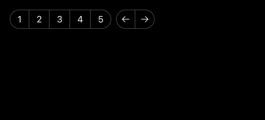
}Nested
Groups inside a group, spaced apart.
import { ArrowLeftIcon, ArrowRightIcon } from "phosphor-react-native"
import { Button } from "@/components/ui/button"
import { ButtonGroup } from "@/components/ui/button-group"
import { Icon } from "@/components/ui/icon"
import { Text } from "@/components/ui/text"

export function ButtonGroupNestedExample() {
  return (
    <ButtonGroup>
      <ButtonGroup>
        {["1", "2", "3", "4", "5"].map((page) => (
          <Button key={page} variant="outline" size="sm">
            <Text>{page}</Text>
          </Button>
        ))}
      </ButtonGroup>
      <ButtonGroup>
        <Button variant="outline" size="icon-sm" accessibilityLabel="Previous">
          <Icon as={ArrowLeftIcon} />
        </Button>
        <Button variant="outline" size="icon-sm" accessibilityLabel="Next">
          <Icon as={ArrowRightIcon} />
        </Button>
      </ButtonGroup>
    </ButtonGroup>
  )
}import EsuissUI
import PhosphorSwift
import SwiftUI
struct ButtonGroupNestedExample: View {
var body: some View {
ButtonGroup {
ButtonGroup {
ForEach(["1", "2", "3", "4", "5"], id: \.self) { page in
Button {} label: { Text(verbatim: page) }
.buttonStyle(.variant(.outline, size: .sm))
}
}
ButtonGroup {
ButtonGroupIconButton(icon: Ph.arrowLeft.regular, label: "Previous", variant: .outline, size: .iconSm)
ButtonGroupIconButton(icon: Ph.arrowRight.regular, label: "Next", variant: .outline, size: .iconSm)
}
}
}
}
struct ButtonGroupIcon: View {
let icon: Image
let size: VariantButtonStyle.Size
var body: some View {
icon.frame(width: size.iconSize, height: size.iconSize)
}
}
struct ButtonGroupIconButton: View {
let icon: Image
let label: LocalizedStringKey
let variant: VariantButtonStyle.Variant
var size: VariantButtonStyle.Size = .icon
var body: some View {
Button {} label: {
ButtonGroupIcon(icon: icon, size: size)
}
.buttonStyle(.variant(variant, size: size))
.accessibilityLabel(Text(label))
}
}import androidx.compose.runtime.Composable
import androidx.compose.ui.semantics.contentDescription
import com.adamglin.PhosphorIcons
import com.adamglin.phosphoricons.Regular
import com.adamglin.phosphoricons.regular.ArrowLeft
import com.adamglin.phosphoricons.regular.ArrowRight
import com.esuiss.ui.components.Button
import com.esuiss.ui.components.ButtonGroup
import com.esuiss.ui.components.ButtonSize
import com.esuiss.ui.components.ButtonVariant
import com.esuiss.ui.components.Icon
@Composable
fun ButtonGroupIconButton(
label: String,
icon: androidx.compose.ui.graphics.vector.ImageVector,
variant: ButtonVariant = ButtonVariant.Default,
size: ButtonSize = ButtonSize.Icon,
onClick: () -> Unit = {},
) {
Button(onClick = onClick, variant = variant, size = size) {
Icon(icon, contentDescription = label)
}
}
@Composable
fun ButtonGroupNested() {
ButtonGroup {
ButtonGroup {
listOf("1", "2", "3", "4", "5").forEach { page ->
Button(page, onClick = {}, variant = ButtonVariant.Outline, size = ButtonSize.Sm)
}
}
ButtonGroup {
ButtonGroupIconButton("Previous", PhosphorIcons.Regular.ArrowLeft, ButtonVariant.Outline, ButtonSize.IconSm)
ButtonGroupIconButton("Next", PhosphorIcons.Regular.ArrowRight, ButtonVariant.Outline, ButtonSize.IconSm)
}
}
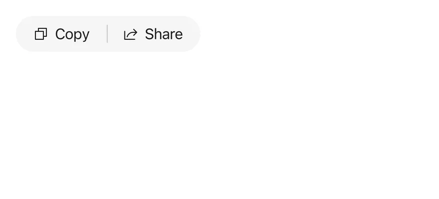
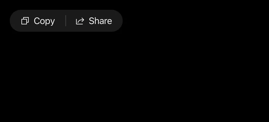
}With separator
Buttons divided by ButtonGroupSeparator.
import { CopyIcon, ShareIcon } from "phosphor-react-native"
import { Button } from "@/components/ui/button"
import { ButtonGroup, ButtonGroupSeparator } from "@/components/ui/button-group"
import { Icon } from "@/components/ui/icon"
import { Text } from "@/components/ui/text"

export function ButtonGroupWithSeparatorExample() {
  return (
    <ButtonGroup>
      <Button variant="secondary">
        <Icon as={CopyIcon} />
        <Text>Copy</Text>
      </Button>
      <ButtonGroupSeparator />
      <Button variant="secondary">
        <Icon as={ShareIcon} />
        <Text>Share</Text>
      </Button>
    </ButtonGroup>
  )
}import EsuissUI
import PhosphorSwift
import SwiftUI
struct ButtonGroupWithSeparatorExample: View {
var body: some View {
ButtonGroup {
Button {} label: {
Label { Text("Copy") } icon: { Ph.copy.regular }
}
.buttonStyle(.variant(.secondary))
ButtonGroupSeparator()
Button {} label: {
Label { Text("Share") } icon: { Ph.share.regular }
}
.buttonStyle(.variant(.secondary))
}
}
}import androidx.compose.runtime.Composable
import androidx.compose.ui.semantics.contentDescription
import com.adamglin.PhosphorIcons
import com.adamglin.phosphoricons.Regular
import com.adamglin.phosphoricons.regular.Copy
import com.adamglin.phosphoricons.regular.Share
import com.esuiss.ui.components.Button
import com.esuiss.ui.components.ButtonGroup
import com.esuiss.ui.components.ButtonGroupSeparator
import com.esuiss.ui.components.ButtonVariant
import com.esuiss.ui.components.Icon
import com.esuiss.ui.components.Text
@Composable
fun ButtonGroupWithSeparator() {
ButtonGroup {
Button(onClick = {}, variant = ButtonVariant.Secondary) {
Icon(PhosphorIcons.Regular.Copy, contentDescription = null)
Text("Copy")
}
ButtonGroupSeparator()
Button(onClick = {}, variant = ButtonVariant.Secondary) {
Icon(PhosphorIcons.Regular.Share, contentDescription = null)
Text("Share")
}
}
}Plain
plain buttons, which stay unjoined.
import { ArrowLeftIcon, ArrowRightIcon, ShareIcon } from "phosphor-react-native"
import { Button } from "@/components/ui/button"
import { ButtonGroup } from "@/components/ui/button-group"
import { Icon } from "@/components/ui/icon"
import { Text } from "@/components/ui/text"

export function ButtonGroupPlainExample() {
  return (
    <ButtonGroup>
      <Button variant="plain">
        <Icon as={ArrowLeftIcon} />
        <Text>Back</Text>
      </Button>
      <Button variant="plain">
        <Text>Forward</Text>
        <Icon as={ArrowRightIcon} />
      </Button>
      <Button variant="plain">
        <Icon as={ShareIcon} />
        <Text>Share</Text>
      </Button>
    </ButtonGroup>
  )
}import EsuissUI
import PhosphorSwift
import SwiftUI
struct ButtonGroupPlainExample: View {
var body: some View {
ButtonGroup {
Button {} label: {
Label { Text("Back") } icon: { Ph.arrowLeft.regular }
}
.buttonStyle(.variant(.plain))
Button {} label: {
HStack(spacing: 6) {
Text("Forward")
Ph.arrowRight.regular
.frame(width: VariantButtonStyle.Size.default.iconSize, height: VariantButtonStyle.Size.default.iconSize)
}
}
.buttonStyle(.variant(.plain))
Button {} label: {
Label { Text("Share") } icon: { Ph.share.regular }
}
.buttonStyle(.variant(.plain))
}
}
}import androidx.compose.runtime.Composable
import androidx.compose.ui.semantics.contentDescription
import com.adamglin.PhosphorIcons
import com.adamglin.phosphoricons.Regular
import com.adamglin.phosphoricons.regular.ArrowLeft
import com.adamglin.phosphoricons.regular.ArrowRight
import com.adamglin.phosphoricons.regular.Share
import com.esuiss.ui.components.Button
import com.esuiss.ui.components.ButtonGroup
import com.esuiss.ui.components.ButtonVariant
import com.esuiss.ui.components.Icon
import com.esuiss.ui.components.Text
@Composable
fun ButtonGroupPlain() {
ButtonGroup {
Button(onClick = {}, variant = ButtonVariant.Plain) {
Icon(PhosphorIcons.Regular.ArrowLeft, contentDescription = null)
Text("Back")
}
Button(onClick = {}, variant = ButtonVariant.Plain) {
Text("Forward")
Icon(PhosphorIcons.Regular.ArrowRight, contentDescription = null)
}
Button(onClick = {}, variant = ButtonVariant.Plain) {
Icon(PhosphorIcons.Regular.Share, contentDescription = null)
Text("Share")
}
}
}Split button
A main action with a joined icon button for more options.
import { CaretDownIcon } from "phosphor-react-native"
import { Button } from "@/components/ui/button"
import { ButtonGroup, ButtonGroupSeparator } from "@/components/ui/button-group"
import { Icon } from "@/components/ui/icon"
import { Text } from "@/components/ui/text"

export function ButtonGroupSplitButtonExample() {
  return (
    <ButtonGroup>
      <Button>
        <Text>Publish</Text>
      </Button>
      <ButtonGroupSeparator className="bg-on-accent/30" />
      <Button size="icon" accessibilityLabel="More options">
        <Icon as={CaretDownIcon} />
      </Button>
    </ButtonGroup>
  )
}import EsuissUI
import PhosphorSwift
import SwiftUI
struct ButtonGroupSplitButtonExample: View {
var body: some View {
ButtonGroup {
Button("Publish") {}.buttonStyle(.variant())
ButtonGroupSeparator()
ButtonGroupIconButton(icon: Ph.caretDown.regular, label: "More options", variant: .default)
}
}
}
struct ButtonGroupIcon: View {
let icon: Image
let size: VariantButtonStyle.Size
var body: some View {
icon.frame(width: size.iconSize, height: size.iconSize)
}
}
struct ButtonGroupIconButton: View {
let icon: Image
let label: LocalizedStringKey
let variant: VariantButtonStyle.Variant
var size: VariantButtonStyle.Size = .icon
var body: some View {
Button {} label: {
ButtonGroupIcon(icon: icon, size: size)
}
.buttonStyle(.variant(variant, size: size))
.accessibilityLabel(Text(label))
}
}import androidx.compose.runtime.Composable
import androidx.compose.ui.semantics.contentDescription
import com.adamglin.PhosphorIcons
import com.adamglin.phosphoricons.Regular
import com.adamglin.phosphoricons.regular.CaretDown
import com.esuiss.ui.components.Button
import com.esuiss.ui.components.ButtonGroup
import com.esuiss.ui.components.ButtonGroupSeparator
import com.esuiss.ui.components.ButtonSize
import com.esuiss.ui.components.ButtonVariant
import com.esuiss.ui.components.Icon
import com.esuiss.ui.theme.EsuissTheme
@Composable
fun ButtonGroupIconButton(
label: String,
icon: androidx.compose.ui.graphics.vector.ImageVector,
variant: ButtonVariant = ButtonVariant.Default,
size: ButtonSize = ButtonSize.Icon,
onClick: () -> Unit = {},
) {
Button(onClick = onClick, variant = variant, size = size) {
Icon(icon, contentDescription = label)
}
}
@Composable
fun ButtonGroupSplitButton() {
ButtonGroup {
Button("Publish", onClick = {})
ButtonGroupSeparator(color = EsuissTheme.colors.onAccent.copy(alpha = 0.3f))
ButtonGroupIconButton("More options", PhosphorIcons.Regular.CaretDown)
}
}With input
An input joined to a search button.
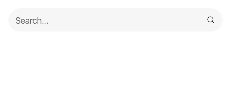
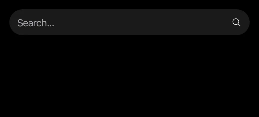
import { MagnifyingGlassIcon } from "phosphor-react-native"
import { Button } from "@/components/ui/button"
import { ButtonGroup } from "@/components/ui/button-group"
import { Icon } from "@/components/ui/icon"
import { Input } from "@/components/ui/input"

export function ButtonGroupWithInputExample() {
  return (
    <ButtonGroup className="self-stretch">
      <Input
        accessibilityLabel="Search"
        placeholder="Search..."
        className="w-auto flex-1"
      />
      <Button variant="secondary" size="icon-lg" accessibilityLabel="Search">
        <Icon as={MagnifyingGlassIcon} />
      </Button>
    </ButtonGroup>
  )
}import EsuissUI
import PhosphorSwift
import SwiftUI
struct ButtonGroupIcon: View {
let icon: Image
let size: VariantButtonStyle.Size
var body: some View {
icon.frame(width: size.iconSize, height: size.iconSize)
}
}
struct ButtonGroupIconButton: View {
let icon: Image
let label: LocalizedStringKey
let variant: VariantButtonStyle.Variant
var size: VariantButtonStyle.Size = .icon
var body: some View {
Button {} label: {
ButtonGroupIcon(icon: icon, size: size)
}
.buttonStyle(.variant(variant, size: size))
.accessibilityLabel(Text(label))
}
}
struct ButtonGroupWithInputDemo: View {
@State private var query = ""
var body: some View {
ButtonGroup {
TextField("Search", text: $query, prompt: Text("Search..."))
.textFieldStyle(.input)
ButtonGroupIconButton(icon: Ph.magnifyingGlass.regular, label: "Search", variant: .secondary, size: .iconLg)
}
}
}import androidx.compose.foundation.layout.fillMaxWidth
import androidx.compose.runtime.Composable
import androidx.compose.runtime.getValue
import androidx.compose.runtime.mutableStateOf
import androidx.compose.runtime.saveable.rememberSaveable
import androidx.compose.runtime.setValue
import androidx.compose.ui.Modifier
import androidx.compose.ui.semantics.contentDescription
import androidx.compose.ui.semantics.semantics
import com.adamglin.PhosphorIcons
import com.adamglin.phosphoricons.Regular
import com.adamglin.phosphoricons.regular.MagnifyingGlass
import com.esuiss.ui.components.Button
import com.esuiss.ui.components.ButtonGroup
import com.esuiss.ui.components.ButtonSize
import com.esuiss.ui.components.ButtonVariant
import com.esuiss.ui.components.Icon
import com.esuiss.ui.components.Input
@Composable
fun ButtonGroupIconButton(
label: String,
icon: androidx.compose.ui.graphics.vector.ImageVector,
variant: ButtonVariant = ButtonVariant.Default,
size: ButtonSize = ButtonSize.Icon,
onClick: () -> Unit = {},
) {
Button(onClick = onClick, variant = variant, size = size) {
Icon(icon, contentDescription = label)
}
}
@Composable
fun ButtonGroupWithInput() {
var search by rememberSaveable { mutableStateOf("") }
ButtonGroup(Modifier.fillMaxWidth()) {
Input(
search,
{ search = it },
Modifier.semantics { contentDescription = "Search" },
placeholder = "Search...",
)
ButtonGroupIconButton("Search", PhosphorIcons.Regular.MagnifyingGlass, ButtonVariant.Secondary, ButtonSize.IconLg)
}
}With input group
An input group joined with buttons.
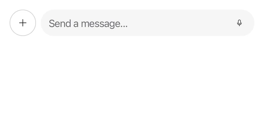
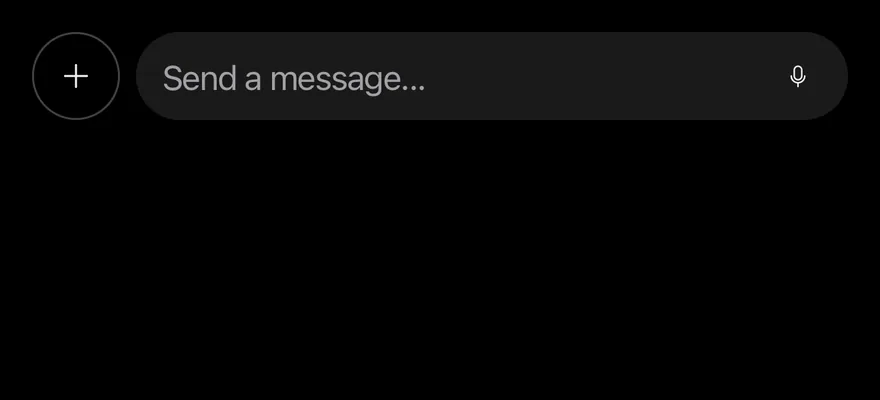
import { MicrophoneIcon, PlusIcon } from "phosphor-react-native"
import { Button } from "@/components/ui/button"
import { ButtonGroup } from "@/components/ui/button-group"
import { Icon } from "@/components/ui/icon"
import { InputGroup, InputGroupAddon, InputGroupButton, InputGroupInput } from "@/components/ui/input-group"

export function ButtonGroupWithInputGroupExample() {
  return (
    <ButtonGroup className="self-stretch">
      <ButtonGroup>
        <Button variant="outline" size="icon-lg" accessibilityLabel="Add">
          <Icon as={PlusIcon} />
        </Button>
      </ButtonGroup>
      <ButtonGroup className="flex-1">
        <InputGroup className="flex-1">
          <InputGroupInput
            accessibilityLabel="Message"
            placeholder="Send a message..."
          />
          <InputGroupAddon align="inline-end">
            <InputGroupButton size="icon-xs" accessibilityLabel="Voice mode">
              <Icon as={MicrophoneIcon} />
            </InputGroupButton>
          </InputGroupAddon>
        </InputGroup>
      </ButtonGroup>
    </ButtonGroup>
  )
}import EsuissUI
import PhosphorSwift
import SwiftUI
struct ButtonGroupIcon: View {
let icon: Image
let size: VariantButtonStyle.Size
var body: some View {
icon.frame(width: size.iconSize, height: size.iconSize)
}
}
struct ButtonGroupIconButton: View {
let icon: Image
let label: LocalizedStringKey
let variant: VariantButtonStyle.Variant
var size: VariantButtonStyle.Size = .icon
var body: some View {
Button {} label: {
ButtonGroupIcon(icon: icon, size: size)
}
.buttonStyle(.variant(variant, size: size))
.accessibilityLabel(Text(label))
}
}
struct ButtonGroupWithInputGroupDemo: View {
@State private var message = ""
var body: some View {
ButtonGroup {
ButtonGroup {
ButtonGroupIconButton(icon: Ph.plus.regular, label: "Add", variant: .outline, size: .iconLg)
}
ButtonGroup {
InputGroup {
InputGroupInput("Send a message...", text: $message)
.accessibilityLabel(Text("Message"))
InputGroupAddon(align: .inlineEnd) {
InputGroupButton(size: .iconXs) {} label: {
Ph.microphone.regular.frame(width: 14, height: 14)
}
.accessibilityLabel(Text("Voice mode"))
}
}
}
}
}
}import androidx.compose.foundation.layout.BoxWithConstraints
import androidx.compose.foundation.layout.fillMaxWidth
import androidx.compose.foundation.layout.width
import androidx.compose.runtime.Composable
import androidx.compose.runtime.getValue
import androidx.compose.runtime.mutableStateOf
import androidx.compose.runtime.saveable.rememberSaveable
import androidx.compose.runtime.setValue
import androidx.compose.ui.Modifier
import androidx.compose.ui.semantics.contentDescription
import androidx.compose.ui.semantics.semantics
import androidx.compose.ui.unit.dp
import com.adamglin.PhosphorIcons
import com.adamglin.phosphoricons.Regular
import com.adamglin.phosphoricons.regular.Microphone
import com.adamglin.phosphoricons.regular.Plus
import com.esuiss.ui.components.Button
import com.esuiss.ui.components.ButtonGroup
import com.esuiss.ui.components.ButtonSize
import com.esuiss.ui.components.ButtonVariant
import com.esuiss.ui.components.Icon
import com.esuiss.ui.components.InputGroup
import com.esuiss.ui.components.InputGroupAddon
import com.esuiss.ui.components.InputGroupAddonAlign
import com.esuiss.ui.components.InputGroupButton
import com.esuiss.ui.components.InputGroupButtonSize
import com.esuiss.ui.components.InputGroupInput
@Composable
fun ButtonGroupIconButton(
label: String,
icon: androidx.compose.ui.graphics.vector.ImageVector,
variant: ButtonVariant = ButtonVariant.Default,
size: ButtonSize = ButtonSize.Icon,
onClick: () -> Unit = {},
) {
Button(onClick = onClick, variant = variant, size = size) {
Icon(icon, contentDescription = label)
}
}
@Composable
fun ButtonGroupWithInputGroup() {
var message by rememberSaveable { mutableStateOf("") }
BoxWithConstraints(Modifier.fillMaxWidth()) {
val rest = maxWidth - 8.dp - ButtonSize.IconLg.height
ButtonGroup(Modifier.fillMaxWidth()) {
ButtonGroup {
ButtonGroupIconButton("Add", PhosphorIcons.Regular.Plus, ButtonVariant.Outline, ButtonSize.IconLg)
}
ButtonGroup(Modifier.width(rest)) {
InputGroup(Modifier.width(rest)) {
InputGroupInput(
message,
{ message = it },
Modifier.semantics { contentDescription = "Message" },
placeholder = "Send a message...",
)
InputGroupAddon(align = InputGroupAddonAlign.InlineEnd) {
InputGroupButton(onClick = {}, size = InputGroupButtonSize.IconXs) {
Icon(PhosphorIcons.Regular.Microphone, contentDescription = "Voice mode")
}
}
}
}
}
}
}With text
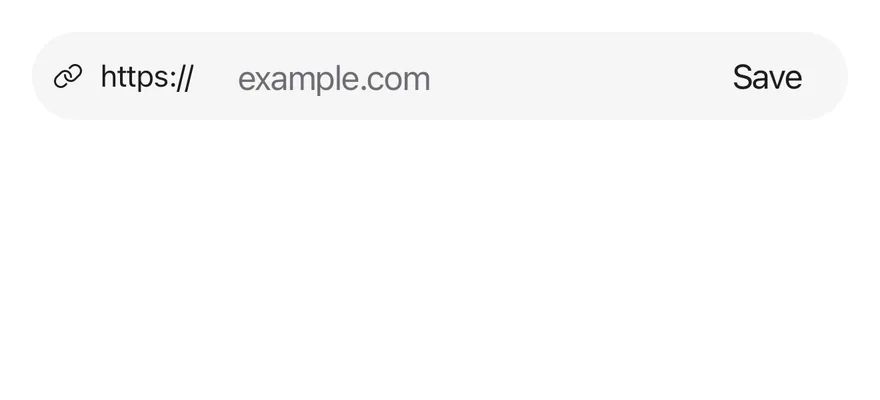
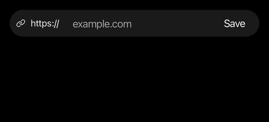
A ButtonGroupText URL prefix joined to an input and a save button.
import { LinkIcon } from "phosphor-react-native"
import { Button } from "@/components/ui/button"
import { ButtonGroup, ButtonGroupText } from "@/components/ui/button-group"
import { Icon } from "@/components/ui/icon"
import { Input } from "@/components/ui/input"
import { Text } from "@/components/ui/text"

export function ButtonGroupWithTextExample() {
  return (
    <ButtonGroup className="self-stretch">
      <ButtonGroupText>
        <Icon as={LinkIcon} />
        <Text>https://</Text>
      </ButtonGroupText>
      <Input
        accessibilityLabel="Website"
        placeholder="example.com"
        className="w-auto flex-1"
      />
      <Button variant="secondary" size="lg">
        <Text>Save</Text>
      </Button>
    </ButtonGroup>
  )
}import EsuissUI
import PhosphorSwift
import SwiftUI
struct ButtonGroupWithTextDemo: View {
@State private var url = ""
var body: some View {
ButtonGroup {
ButtonGroupText {
Label { Text(verbatim: "https://") } icon: { Ph.link.regular }
}
TextField("Website", text: $url, prompt: Text(verbatim: "example.com"))
.textFieldStyle(.input)
.keyboardType(.URL)
.textInputAutocapitalization(.never)
Button("Save") {}.buttonStyle(.variant(.secondary, size: .lg))
}
}
}import androidx.compose.foundation.layout.fillMaxWidth
import androidx.compose.runtime.Composable
import androidx.compose.runtime.getValue
import androidx.compose.runtime.mutableStateOf
import androidx.compose.runtime.saveable.rememberSaveable
import androidx.compose.runtime.setValue
import androidx.compose.ui.Modifier
import androidx.compose.ui.semantics.contentDescription
import androidx.compose.ui.semantics.semantics
import com.adamglin.PhosphorIcons
import com.adamglin.phosphoricons.Regular
import com.adamglin.phosphoricons.regular.Link
import com.esuiss.ui.components.Button
import com.esuiss.ui.components.ButtonGroup
import com.esuiss.ui.components.ButtonGroupText
import com.esuiss.ui.components.ButtonSize
import com.esuiss.ui.components.ButtonVariant
import com.esuiss.ui.components.Icon
import com.esuiss.ui.components.Input
import com.esuiss.ui.components.Text
@Composable
fun ButtonGroupWithText() {
var website by rememberSaveable { mutableStateOf("") }
ButtonGroup(Modifier.fillMaxWidth()) {
ButtonGroupText {
Icon(PhosphorIcons.Regular.Link, contentDescription = null)
Text("https://")
}
Input(
website,
{ website = it },
Modifier.semantics { contentDescription = "Website" },
placeholder = "example.com",
)
Button("Save", onClick = {}, variant = ButtonVariant.Secondary, size = ButtonSize.Lg)
}
}With dropdown menu
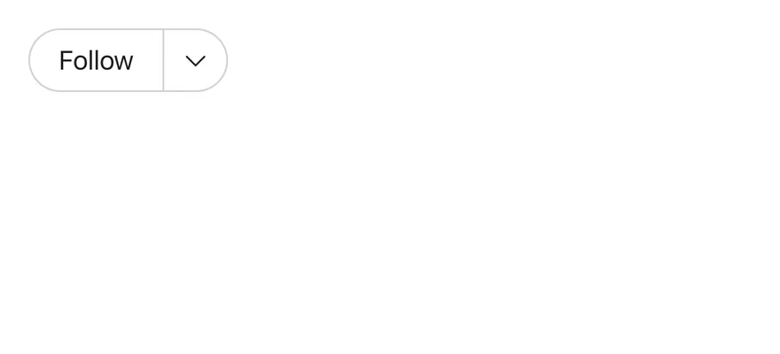
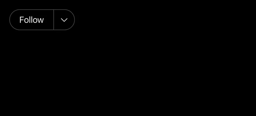
A button joined to a dropdown menu trigger.
import { CaretDownIcon, CopyIcon, ShareIcon, UserCircleMinusIcon, WarningCircleIcon } from "phosphor-react-native"
import { Button } from "@/components/ui/button"
import { ButtonGroup } from "@/components/ui/button-group"
import { DropdownMenu, DropdownMenuContent, DropdownMenuGroup, DropdownMenuItem, DropdownMenuSeparator, DropdownMenuTrigger } from "@/components/ui/dropdown-menu"
import { Icon } from "@/components/ui/icon"
import { Text } from "@/components/ui/text"

export function ButtonGroupWithDropdownMenuExample() {
  return (
    <ButtonGroup>
      <Button variant="outline">
        <Text>Follow</Text>
      </Button>
      <DropdownMenu>
        <DropdownMenuTrigger
          accessibilityLabel="More options"
          render={<Button variant="outline" size="icon" />}
        >
          <Icon as={CaretDownIcon} />
        </DropdownMenuTrigger>
        <DropdownMenuContent align="end" className="w-56">
          <DropdownMenuGroup>
            <DropdownMenuItem>
              <Icon as={WarningCircleIcon} className="size-4" />
              <Text>Mute conversation</Text>
            </DropdownMenuItem>
            <DropdownMenuItem>
              <Icon as={CopyIcon} className="size-4" />
              <Text>Copy link</Text>
            </DropdownMenuItem>
            <DropdownMenuItem>
              <Icon as={ShareIcon} className="size-4" />
              <Text>Share conversation</Text>
            </DropdownMenuItem>
          </DropdownMenuGroup>
          <DropdownMenuSeparator />
          <DropdownMenuGroup>
            <DropdownMenuItem variant="destructive">
              <Icon as={UserCircleMinusIcon} className="size-4" />
              <Text>Unfollow</Text>
            </DropdownMenuItem>
          </DropdownMenuGroup>
        </DropdownMenuContent>
      </DropdownMenu>
    </ButtonGroup>
  )
}import EsuissUI
import PhosphorSwift
import SwiftUI
struct ButtonGroupWithDropdownMenuExample: View {
var body: some View {
ButtonGroup {
Button("Follow") {}.buttonStyle(.variant(.outline))
DropdownMenu(align: .end) {
DropdownMenuGroup {
DropdownMenuItem("Mute conversation", icon: Ph.warningCircle.regular) {}
DropdownMenuItem("Copy link", icon: Ph.copy.regular) {}
DropdownMenuItem("Share conversation", icon: Ph.share.regular) {}
}
DropdownMenuSeparator()
DropdownMenuGroup {
DropdownMenuItem("Unfollow", icon: Ph.userCircleMinus.regular, variant: .destructive) {}
}
} label: {
ButtonGroupIcon(icon: Ph.caretDown.regular, size: .icon)
}
.buttonStyle(.variant(.outline, size: .icon))
.accessibilityLabel(Text("More options"))
}
}
}
struct ButtonGroupIcon: View {
let icon: Image
let size: VariantButtonStyle.Size
var body: some View {
icon.frame(width: size.iconSize, height: size.iconSize)
}
}import androidx.compose.runtime.Composable
import androidx.compose.runtime.getValue
import androidx.compose.runtime.mutableStateOf
import androidx.compose.runtime.saveable.rememberSaveable
import androidx.compose.runtime.setValue
import androidx.compose.ui.semantics.contentDescription
import com.adamglin.PhosphorIcons
import com.adamglin.phosphoricons.Regular
import com.adamglin.phosphoricons.regular.CaretDown
import com.adamglin.phosphoricons.regular.Copy
import com.adamglin.phosphoricons.regular.Share
import com.adamglin.phosphoricons.regular.UserCircleMinus
import com.adamglin.phosphoricons.regular.WarningCircle
import com.esuiss.ui.components.Button
import com.esuiss.ui.components.ButtonGroup
import com.esuiss.ui.components.ButtonSize
import com.esuiss.ui.components.ButtonVariant
import com.esuiss.ui.components.DropdownMenu
import com.esuiss.ui.components.DropdownMenuGroup
import com.esuiss.ui.components.DropdownMenuItem
import com.esuiss.ui.components.DropdownMenuSeparator
import com.esuiss.ui.components.Icon
import com.esuiss.ui.components.MenuItemVariant
import com.esuiss.ui.components.PopupAlign
@Composable
fun ButtonGroupIconButton(
label: String,
icon: androidx.compose.ui.graphics.vector.ImageVector,
variant: ButtonVariant = ButtonVariant.Default,
size: ButtonSize = ButtonSize.Icon,
onClick: () -> Unit = {},
) {
Button(onClick = onClick, variant = variant, size = size) {
Icon(icon, contentDescription = label)
}
}
@Composable
fun ButtonGroupWithDropdownMenu() {
var open by rememberSaveable { mutableStateOf(false) }
ButtonGroup {
Button("Follow", onClick = {}, variant = ButtonVariant.Outline)
DropdownMenu(
expanded = open,
onExpandedChange = { open = it },
trigger = { ButtonGroupIconButton("More options", PhosphorIcons.Regular.CaretDown, ButtonVariant.Outline) { open = true } },
align = PopupAlign.End,
) {
DropdownMenuGroup {
DropdownMenuItem("Mute conversation", onClick = {}, icon = PhosphorIcons.Regular.WarningCircle)
DropdownMenuItem("Copy link", onClick = {}, icon = PhosphorIcons.Regular.Copy)
DropdownMenuItem("Share conversation", onClick = {}, icon = PhosphorIcons.Regular.Share)
}
DropdownMenuSeparator()
DropdownMenuGroup {
DropdownMenuItem(
"Unfollow",
onClick = {},
icon = PhosphorIcons.Regular.UserCircleMinus,
variant = MenuItemVariant.Destructive,
)
}
}
}
}With select
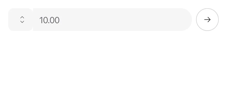
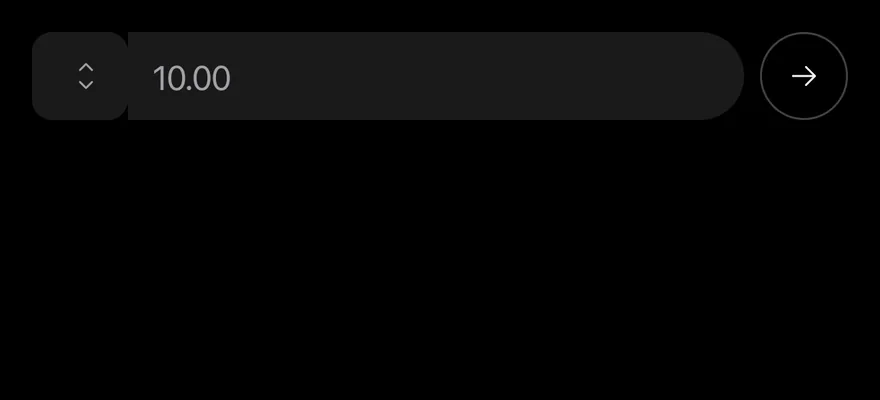
A select joined to an input for a currency amount.
import { ArrowRightIcon } from "phosphor-react-native"
import * as React from "react"
import { Button } from "@/components/ui/button"
import { ButtonGroup } from "@/components/ui/button-group"
import { Icon } from "@/components/ui/icon"
import { Input } from "@/components/ui/input"
import { type Option, Select, SelectContent, SelectGroup, SelectItem, SelectTrigger, SelectValue } from "@/components/ui/select"

const currencies: Option[] = [
  { value: "usd", label: "$" },
  { value: "eur", label: "€" },
  { value: "gbp", label: "£" },
  { value: "try", label: "₺" },
]

function CurrencyExample() {
  const [value, setValue] = React.useState<string | null>("usd")
  return (
    <ButtonGroup className="self-stretch">
      <ButtonGroup className="flex-1">
        <Select items={currencies} value={value} onValueChange={setValue}>
          <SelectTrigger accessibilityLabel="Currency">
            <SelectValue />
          </SelectTrigger>
          <SelectContent>
            <SelectGroup>
              {currencies.map((currency) => (
                <SelectItem
                  key={currency.value}
                  value={currency.value}
                  label={currency.label}
                />
              ))}
            </SelectGroup>
          </SelectContent>
        </Select>
        <Input
          accessibilityLabel="Amount"
          placeholder="10.00"
          inputMode="decimal"
          className="w-auto flex-1"
        />
      </ButtonGroup>
      <ButtonGroup>
        <Button variant="outline" size="icon-lg" accessibilityLabel="Send">
          <Icon as={ArrowRightIcon} />
        </Button>
      </ButtonGroup>
    </ButtonGroup>
  )
}

export function ButtonGroupWithSelectExample() {
  return (
    <CurrencyExample />
  )
}import EsuissUI
import PhosphorSwift
import SwiftUI
struct ButtonGroupIcon: View {
let icon: Image
let size: VariantButtonStyle.Size
var body: some View {
icon.frame(width: size.iconSize, height: size.iconSize)
}
}
struct ButtonGroupIconButton: View {
let icon: Image
let label: LocalizedStringKey
let variant: VariantButtonStyle.Variant
var size: VariantButtonStyle.Size = .icon
var body: some View {
Button {} label: {
ButtonGroupIcon(icon: icon, size: size)
}
.buttonStyle(.variant(variant, size: size))
.accessibilityLabel(Text(label))
}
}
struct ButtonGroupCurrencyDemo: View {
@State private var currency: String? = "usd"
@State private var amount = ""
var body: some View {
ButtonGroup {
ButtonGroup {
SelectField(selection: $currency) {
SelectGroup {
SelectItem(verbatim: "$", value: "usd")
SelectItem(verbatim: "€", value: "eur")
SelectItem(verbatim: "£", value: "gbp")
SelectItem(verbatim: "₺", value: "try")
}
}
.frame(width: 76)
.accessibilityLabel(Text("Currency"))
TextField("Amount", text: $amount, prompt: Text(verbatim: "10.00"))
.textFieldStyle(.input)
.keyboardType(.decimalPad)
}
ButtonGroup {
ButtonGroupIconButton(icon: Ph.arrowRight.regular, label: "Send", variant: .outline, size: .iconLg)
}
}
}
}import androidx.compose.foundation.layout.BoxWithConstraints
import androidx.compose.foundation.layout.fillMaxWidth
import androidx.compose.foundation.layout.width
import androidx.compose.foundation.text.KeyboardOptions
import androidx.compose.runtime.Composable
import androidx.compose.runtime.getValue
import androidx.compose.runtime.mutableStateOf
import androidx.compose.runtime.saveable.rememberSaveable
import androidx.compose.runtime.setValue
import androidx.compose.ui.Modifier
import androidx.compose.ui.semantics.contentDescription
import androidx.compose.ui.semantics.semantics
import androidx.compose.ui.text.input.KeyboardType
import androidx.compose.ui.unit.dp
import com.adamglin.PhosphorIcons
import com.adamglin.phosphoricons.Regular
import com.adamglin.phosphoricons.regular.ArrowRight
import com.esuiss.ui.components.Button
import com.esuiss.ui.components.ButtonGroup
import com.esuiss.ui.components.ButtonSize
import com.esuiss.ui.components.ButtonVariant
import com.esuiss.ui.components.Icon
import com.esuiss.ui.components.Input
import com.esuiss.ui.components.Select
import com.esuiss.ui.components.SelectOption
@Composable
fun ButtonGroupIconButton(
label: String,
icon: androidx.compose.ui.graphics.vector.ImageVector,
variant: ButtonVariant = ButtonVariant.Default,
size: ButtonSize = ButtonSize.Icon,
onClick: () -> Unit = {},
) {
Button(onClick = onClick, variant = variant, size = size) {
Icon(icon, contentDescription = label)
}
}
val buttonGroupCurrencies = listOf(
SelectOption("usd", "$"),
SelectOption("eur", "€"),
SelectOption("gbp", "£"),
SelectOption("try", "₺"),
)
@Composable
fun ButtonGroupWithSelect() {
var currency by rememberSaveable { mutableStateOf<String?>("usd") }
var amount by rememberSaveable { mutableStateOf("") }
BoxWithConstraints(Modifier.fillMaxWidth()) {
val rest = maxWidth - 8.dp - ButtonSize.IconLg.height
ButtonGroup(Modifier.fillMaxWidth()) {
ButtonGroup(Modifier.width(rest)) {
Select(
value = currency,
onValueChange = { currency = it },
options = buttonGroupCurrencies,
modifier = Modifier.semantics { contentDescription = "Currency" },
)
Input(
amount,
{ amount = it },
Modifier.semantics { contentDescription = "Amount" },
placeholder = "10.00",
keyboardOptions = KeyboardOptions(keyboardType = KeyboardType.Decimal),
)
}
ButtonGroup {
ButtonGroupIconButton("Send", PhosphorIcons.Regular.ArrowRight, ButtonVariant.Outline, ButtonSize.IconLg)
}
}
}
}With popover
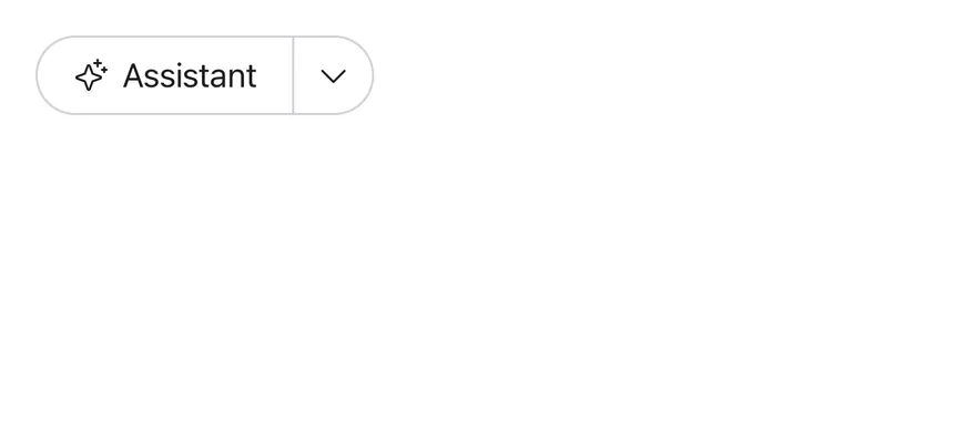
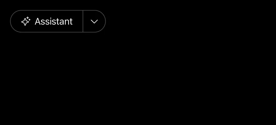
A button joined to a popover trigger.
import { CaretDownIcon, SparkleIcon } from "phosphor-react-native"
import { Button } from "@/components/ui/button"
import { ButtonGroup } from "@/components/ui/button-group"
import { Icon } from "@/components/ui/icon"
import { Popover, PopoverContent, PopoverDescription, PopoverHeader, PopoverTitle, PopoverTrigger } from "@/components/ui/popover"
import { Text } from "@/components/ui/text"
import { Textarea } from "@/components/ui/textarea"

export function ButtonGroupWithPopoverExample() {
  return (
    <ButtonGroup>
      <Button variant="outline">
        <Icon as={SparkleIcon} />
        <Text>Assistant</Text>
      </Button>
      <Popover>
        <PopoverTrigger
          accessibilityLabel="Open popover"
          render={<Button variant="outline" size="icon" />}
        >
          <Icon as={CaretDownIcon} />
        </PopoverTrigger>
        <PopoverContent align="end" className="w-80">
          <PopoverHeader>
            <PopoverTitle>Start a new task</PopoverTitle>
            <PopoverDescription>
              Describe your task in natural language.
            </PopoverDescription>
          </PopoverHeader>
          <Textarea
            accessibilityLabel="Task description"
            placeholder="I need to..."
          />
        </PopoverContent>
      </Popover>
    </ButtonGroup>
  )
}import EsuissUI
import PhosphorSwift
import SwiftUI
struct ButtonGroupIcon: View {
let icon: Image
let size: VariantButtonStyle.Size
var body: some View {
icon.frame(width: size.iconSize, height: size.iconSize)
}
}
struct ButtonGroupPopoverDemo: View {
@State private var open = false
@State private var task = ""
var body: some View {
ButtonGroup {
Button {} label: {
Label { Text("Assistant") } icon: { Ph.sparkle.regular }
}
.buttonStyle(.variant(.outline))
Button { open = true } label: {
ButtonGroupIcon(icon: Ph.caretDown.regular, size: .icon)
}
.buttonStyle(.variant(.outline, size: .icon))
.accessibilityLabel(Text("Open popover"))
.popover(isPresented: $open) {
PopoverContent(width: 320) {
PopoverHeader {
PopoverTitle("Start a new task")
PopoverDescription("Describe your task in natural language.")
}
TextField("Task description", text: $task, prompt: Text("I need to..."), axis: .vertical)
.textFieldStyle(.textarea)
}
}
}
}
}import androidx.compose.foundation.layout.width
import androidx.compose.runtime.Composable
import androidx.compose.runtime.getValue
import androidx.compose.runtime.mutableStateOf
import androidx.compose.runtime.saveable.rememberSaveable
import androidx.compose.runtime.setValue
import androidx.compose.ui.Modifier
import androidx.compose.ui.semantics.contentDescription
import androidx.compose.ui.semantics.semantics
import androidx.compose.ui.unit.dp
import com.adamglin.PhosphorIcons
import com.adamglin.phosphoricons.Regular
import com.adamglin.phosphoricons.regular.CaretDown
import com.adamglin.phosphoricons.regular.Sparkle
import com.esuiss.ui.components.Button
import com.esuiss.ui.components.ButtonGroup
import com.esuiss.ui.components.ButtonSize
import com.esuiss.ui.components.ButtonVariant
import com.esuiss.ui.components.Icon
import com.esuiss.ui.components.Popover
import com.esuiss.ui.components.PopoverDescription
import com.esuiss.ui.components.PopoverHeader
import com.esuiss.ui.components.PopoverTitle
import com.esuiss.ui.components.PopupAlign
import com.esuiss.ui.components.Text
import com.esuiss.ui.components.Textarea
@Composable
fun ButtonGroupIconButton(
label: String,
icon: androidx.compose.ui.graphics.vector.ImageVector,
variant: ButtonVariant = ButtonVariant.Default,
size: ButtonSize = ButtonSize.Icon,
onClick: () -> Unit = {},
) {
Button(onClick = onClick, variant = variant, size = size) {
Icon(icon, contentDescription = label)
}
}
@Composable
fun ButtonGroupWithPopover() {
var open by rememberSaveable { mutableStateOf(false) }
var task by rememberSaveable { mutableStateOf("") }
ButtonGroup {
Button(onClick = {}, variant = ButtonVariant.Outline) {
Icon(PhosphorIcons.Regular.Sparkle, contentDescription = null)
Text("Assistant")
}
Popover(
open = open,
onOpenChange = { open = it },
trigger = { ButtonGroupIconButton("Open popover", PhosphorIcons.Regular.CaretDown, ButtonVariant.Outline) { open = true } },
modifier = Modifier.width(320.dp),
align = PopupAlign.End,
) {
PopoverHeader {
PopoverTitle("Start a new task")
PopoverDescription("Describe your task in natural language.")
}
Textarea(
task,
{ task = it },
Modifier.semantics { contentDescription = "Task description" },
placeholder = "I need to...",
)
}
}
}Pagination
Page buttons with previous and next arrows.
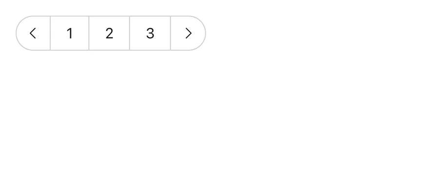
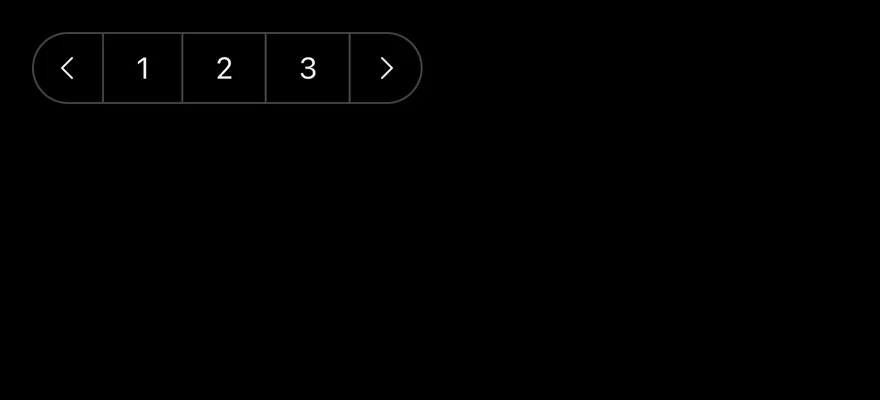
import { CaretLeftIcon, CaretRightIcon } from "phosphor-react-native"
import { Button } from "@/components/ui/button"
import { ButtonGroup } from "@/components/ui/button-group"
import { Icon } from "@/components/ui/icon"
import { Text } from "@/components/ui/text"

export function ButtonGroupPaginationExample() {
  return (
    <ButtonGroup accessibilityLabel="Pagination">
      <Button variant="outline" size="icon" accessibilityLabel="Previous page">
        <Icon as={CaretLeftIcon} />
      </Button>
      <Button variant="outline">
        <Text>1</Text>
      </Button>
      <Button variant="outline" accessibilityState={{ selected: true }}>
        <Text>2</Text>
      </Button>
      <Button variant="outline">
        <Text>3</Text>
      </Button>
      <Button variant="outline" size="icon" accessibilityLabel="Next page">
        <Icon as={CaretRightIcon} />
      </Button>
    </ButtonGroup>
  )
}import EsuissUI
import PhosphorSwift
import SwiftUI
struct ButtonGroupPaginationExample: View {
var body: some View {
ButtonGroup {
ButtonGroupIconButton(icon: Ph.caretLeft.regular, label: "Previous page", variant: .outline)
Button {} label: { Text(verbatim: "1") }.buttonStyle(.variant(.outline))
Button {} label: { Text(verbatim: "2") }
.buttonStyle(.variant(.outline))
.accessibilityAddTraits(.isSelected)
Button {} label: { Text(verbatim: "3") }.buttonStyle(.variant(.outline))
ButtonGroupIconButton(icon: Ph.caretRight.regular, label: "Next page", variant: .outline)
}
.accessibilityLabel(Text("Pagination"))
}
}
struct ButtonGroupIcon: View {
let icon: Image
let size: VariantButtonStyle.Size
var body: some View {
icon.frame(width: size.iconSize, height: size.iconSize)
}
}
struct ButtonGroupIconButton: View {
let icon: Image
let label: LocalizedStringKey
let variant: VariantButtonStyle.Variant
var size: VariantButtonStyle.Size = .icon
var body: some View {
Button {} label: {
ButtonGroupIcon(icon: icon, size: size)
}
.buttonStyle(.variant(variant, size: size))
.accessibilityLabel(Text(label))
}
}import androidx.compose.runtime.Composable
import androidx.compose.ui.Modifier
import androidx.compose.ui.semantics.contentDescription
import androidx.compose.ui.semantics.selected
import androidx.compose.ui.semantics.semantics
import com.adamglin.PhosphorIcons
import com.adamglin.phosphoricons.Regular
import com.adamglin.phosphoricons.regular.CaretLeft
import com.adamglin.phosphoricons.regular.CaretRight
import com.esuiss.ui.components.Button
import com.esuiss.ui.components.ButtonGroup
import com.esuiss.ui.components.ButtonSize
import com.esuiss.ui.components.ButtonVariant
import com.esuiss.ui.components.Icon
@Composable
fun ButtonGroupIconButton(
label: String,
icon: androidx.compose.ui.graphics.vector.ImageVector,
variant: ButtonVariant = ButtonVariant.Default,
size: ButtonSize = ButtonSize.Icon,
onClick: () -> Unit = {},
) {
Button(onClick = onClick, variant = variant, size = size) {
Icon(icon, contentDescription = label)
}
}
@Composable
fun ButtonGroupPagination() {
ButtonGroup(Modifier.semantics { contentDescription = "Pagination" }) {
ButtonGroupIconButton("Previous page", PhosphorIcons.Regular.CaretLeft, ButtonVariant.Outline)
Button("1", onClick = {}, variant = ButtonVariant.Outline)
Button("2", onClick = {}, modifier = Modifier.semantics { selected = true }, variant = ButtonVariant.Outline)
Button("3", onClick = {}, variant = ButtonVariant.Outline)
ButtonGroupIconButton("Next page", PhosphorIcons.Regular.CaretRight, ButtonVariant.Outline)
}
}API Reference
ButtonGroup
Container that joins its children.
ViewProps- About
horizontalorvertical. Defaults tohorizontal.- Type
"horizontal""vertical"- Default
- "horizontal"
ButtonGroupText
Pill-shaped label or icon slot.
ViewProps- About
- Element to render instead of the default
View. - Type
RenderProp<Record<string, unknown>, Record<string, never>>- Default
- —
ButtonGroupSeparator
Divider between joined buttons.
React.ComponentProps<typeof Separator>Accessibility
- The container has the
grouprole. - Each button keeps its own role and state.
- Icon-only buttons need an
accessibilityLabel.
Notes
- Uses
bg-controlforButtonGroupTextand a translucent label color for separators; light and dark follow the system appearance.