suiss/uim · React Native Component
Aspect Ratio
A view that keeps its content at a fixed width-to-height ratio.
Aspect Ratio is an open-source mobile component from suiss/uim for React Native and Expo, with SwiftUI and Jetpack Compose versions built from the same design tokens. The @esuiss/uim CLI copies its source into your project, so you own the code.
import { Image, View } from "react-native"
import { AspectRatio } from "@/components/ui/aspect-ratio"

const imageUri =
"https://images.unsplash.com/photo-1588345921523-c2dcdb7f1dcd?w=800&dpr=2&q=80"

export function AspectRatioExample() {
  return (
    <View className="w-full overflow-hidden rounded-lg">
      <AspectRatio ratio={16 / 9}>
        <Image source={{ uri: imageUri }} className="h-full w-full" />
      </AspectRatio>
    </View>
  )
}import EsuissUI
import SwiftUI
struct AspectRatioExample: View {
var body: some View {
AspectRatio(ratio: 16 / 9) {
AspectRatioPhoto()
}
.clipShape(RoundedRectangle(cornerRadius: Radius.lg, style: .continuous))
.frame(maxWidth: .infinity)
}
}
struct AspectRatioPhoto: View {
var body: some View {
AsyncImage(
url: URL(string: "https://images.unsplash.com/photo-1588345921523-c2dcdb7f1dcd?w=800&dpr=2&q=80")
) { phase in
if let image = phase.image {
image.resizable().scaledToFill()
} else {
Color.surfaceSecondary
}
}
.frame(maxWidth: .infinity, maxHeight: .infinity)
}
}import androidx.compose.foundation.Image
import androidx.compose.foundation.layout.Box
import androidx.compose.foundation.layout.fillMaxSize
import androidx.compose.foundation.layout.fillMaxWidth
import androidx.compose.foundation.layout.width
import androidx.compose.foundation.shape.RoundedCornerShape
import androidx.compose.runtime.Composable
import androidx.compose.runtime.remember
import androidx.compose.ui.Modifier
import androidx.compose.ui.draw.clip
import androidx.compose.ui.graphics.Brush
import androidx.compose.ui.graphics.painter.BrushPainter
import androidx.compose.ui.layout.ContentScale
import androidx.compose.ui.unit.Dp
import com.adamglin.phosphoricons.regular.Image
import com.esuiss.ui.components.AspectRatio
import com.esuiss.ui.theme.EsuissTheme
import com.esuiss.ui.theme.Radius
@Composable
fun AspectRatioExample() {
AspectRatioPhoto(null, 16f / 9f)
}
@Composable
fun AspectRatioPhoto(width: Dp?, ratio: Float) {
val colors = EsuissTheme.colors
val photo = remember(colors) { BrushPainter(Brush.linearGradient(listOf(colors.teal, colors.blue, colors.indigo))) }
Box(
(if (width != null) Modifier.width(width) else Modifier.fillMaxWidth())
.clip(RoundedCornerShape(Radius.lg)),
) {
AspectRatio(ratio) {
Image(photo, contentDescription = null, modifier = Modifier.fillMaxSize(), contentScale = ContentScale.Crop)
}
}
}AspectRatio is a View that sets the aspectRatio style from its ratio prop. Its height follows from the width it is given, so the content keeps its shape at any screen size.
Use it for images, video thumbnails and placeholders that must not stretch.
Installation
$ pnpm dlx @esuiss/uim@latest add aspect-ratio$ pnpm dlx @esuiss/uim@latest add aspect-ratio --platform swift$ pnpm dlx @esuiss/uim@latest add aspect-ratio --platform kotlinManual
-
Add the pieces it builds on: the primitives
components/primitives/aspect-ratio.tsx. -
Copy the source into
components/ui/aspect-ratio.tsx:
import * as AspectRatioPrimitive from "@/components/primitives/aspect-ratio"

const AspectRatio = AspectRatioPrimitive.Root

export { AspectRatio }- Update the import paths to match your project.
-
Add the pieces it builds on: the primitives
components/primitives/aspect-ratio.tsx. -
Copy the source into
components/ui/aspect-ratio.tsx:
import * as AspectRatioPrimitive from "@/components/primitives/aspect-ratio"

const AspectRatio = AspectRatioPrimitive.Root

export { AspectRatio }- Update the import paths to match your project.
-
Add the pieces it builds on: the primitives
components/primitives/aspect-ratio.tsx. -
Copy the source into
components/ui/aspect-ratio.tsx:
import * as AspectRatioPrimitive from "@/components/primitives/aspect-ratio"

const AspectRatio = AspectRatioPrimitive.Root

export { AspectRatio }- Update the import paths to match your project.
-
Target iOS 17 or later.
-
Copy the theme files every view uses:
import SwiftUI
import UIKit

struct RGBA: Sendable {
  let red: CGFloat
  let green: CGFloat
  let blue: CGFloat
  let alpha: CGFloat

  init(_ hex: UInt32, _ alpha: CGFloat = 1) {
    red = CGFloat((hex >> 16) & 0xFF) / 255
    green = CGFloat((hex >> 8) & 0xFF) / 255
    blue = CGFloat(hex & 0xFF) / 255
    self.alpha = alpha
}import SwiftUI
extension Color {
public static let surface = Color.adaptive(light: .init(0xFFFFFF), dark: .init(0x000000))
public static let surfaceSecondary = Color.adaptive(light: .init(0xF5F5F7), dark: .init(0x161617))
public static let surfaceTertiary = Color.adaptive(light: .init(0xE8E8ED), dark: .init(0x2C2C2E))
public static let surfaceRaised = Color.adaptive(light: .init(0xFFFFFF), dark: .init(0x1D1D1F))
public static let label = Color.adaptive(light: .init(0x1D1D1F), dark: .init(0xF5F5F7))
public static let labelSecondary = Color.adaptive(light: .init(0x6E6E73), dark: .init(0xA1A1A6))
public static let labelTertiary = Color.adaptive(light: .init(0x86868B), dark: .init(0x86868B))
public static let labelQuaternary = Color.adaptive(light: .init(0xD2D2D7), dark: .init(0x424245))
public static let control = Color.adaptive(light: .init(0x000000, 0.04), dark: .init(0xFFFFFF, 0.1))
public static let controlPressed = Color.adaptive(light: .init(0x000000, 0.12), dark: .init(0xFFFFFF, 0.22))
public static let controlSelected = Color.adaptive(light: .init(0x1D1D1F), dark: .init(0xF5F5F7))
public static let controlDisabled = Color.adaptive(light: .init(0x000000, 0.03), dark: .init(0xFFFFFF, 0.05))
public static let onControlSelected = Color.adaptive(light: .init(0xFFFFFF), dark: .init(0x000000))- Copy the source:
import SwiftUI

public struct AspectRatio<Content: View>: View {
  let ratio: CGFloat
  let content: Content

  public init(ratio: CGFloat = 1, @ViewBuilder content: () -> Content) {
    self.ratio = ratio
    self.content = content()
  }

  public var body: some View {
    Color.clear
      .aspectRatio(ratio, contentMode: .fit)
      .overlay {
content- Add the files to your app target.
- Set
minSdkto 24 or higher and add the dependencies:
implementation(platform("androidx.compose:compose-bom:2026.09.00"))
implementation("androidx.compose.foundation:foundation")
implementation("androidx.compose.ui:ui")- Copy the theme files every view uses:
package com.esuiss.ui.theme

import androidx.compose.foundation.isSystemInDarkTheme
import androidx.compose.runtime.Composable
import androidx.compose.runtime.CompositionLocalProvider
import androidx.compose.runtime.Immutable
import androidx.compose.runtime.staticCompositionLocalOf
import androidx.compose.ui.Modifier
import androidx.compose.ui.draw.dropShadow
import androidx.compose.ui.graphics.Color
import androidx.compose.ui.graphics.Shape
import androidx.compose.ui.graphics.shadow.Shadow as DropShadow
import androidx.compose.ui.text.TextStyle
import androidx.compose.ui.text.style.LineHeightStyle
import androidx.compose.ui.unit.Dp
import androidx.compose.ui.unit.DpOffsetpackage com.esuiss.ui.theme
import androidx.compose.runtime.Immutable
import androidx.compose.ui.graphics.Color
import androidx.compose.ui.unit.dp
@Immutable
data class Colors(
val surface: Color,
val surfaceSecondary: Color,
val surfaceTertiary: Color,
val surfaceRaised: Color,
val label: Color,
val labelSecondary: Color,
val labelTertiary: Color,
val labelQuaternary: Color,- Copy the source:
package com.esuiss.ui.components

import androidx.compose.foundation.layout.Box
import androidx.compose.foundation.layout.BoxScope
import androidx.compose.foundation.layout.aspectRatio
import androidx.compose.foundation.layout.fillMaxWidth
import androidx.compose.runtime.Composable
import androidx.compose.ui.Modifier

@Composable
fun AspectRatio(
    ratio: Float,
    modifier: Modifier = Modifier,
    content: @Composable BoxScope.() -> Unit,
) {
Box(- Update the
com.esuiss.uipackage names to match your project.
Usage
<View className="w-full overflow-hidden rounded-lg">
  <AspectRatio ratio={16 / 9}>
    <Image source={{ uri: imageUri }} className="h-full w-full" />
  </AspectRatio>
</View>
Pass ratio as width divided by height, such as 16 / 9. It defaults to 1. Size the content inside with h-full w-full, and put rounding or clipping on a parent view.
Examples
Square
A square image with ratio={1}.
import { Image, View } from "react-native"
import { AspectRatio } from "@/components/ui/aspect-ratio"

const imageUri =
"https://images.unsplash.com/photo-1588345921523-c2dcdb7f1dcd?w=800&dpr=2&q=80"

export function AspectRatioSquareExample() {
  return (
    <View className="w-48 overflow-hidden rounded-lg">
      <AspectRatio ratio={1}>
        <Image source={{ uri: imageUri }} className="h-full w-full" />
      </AspectRatio>
    </View>
  )
}import EsuissUI
import SwiftUI
struct AspectRatioSquareExample: View {
var body: some View {
AspectRatio(ratio: 1) {
AspectRatioPhoto()
}
.clipShape(RoundedRectangle(cornerRadius: Radius.lg, style: .continuous))
.frame(width: 192)
}
}
struct AspectRatioPhoto: View {
var body: some View {
AsyncImage(
url: URL(string: "https://images.unsplash.com/photo-1588345921523-c2dcdb7f1dcd?w=800&dpr=2&q=80")
) { phase in
if let image = phase.image {
image.resizable().scaledToFill()
} else {
Color.surfaceSecondary
}
}
.frame(maxWidth: .infinity, maxHeight: .infinity)
}
}import androidx.compose.foundation.Image
import androidx.compose.foundation.layout.Box
import androidx.compose.foundation.layout.fillMaxSize
import androidx.compose.foundation.layout.fillMaxWidth
import androidx.compose.foundation.layout.width
import androidx.compose.foundation.shape.RoundedCornerShape
import androidx.compose.runtime.Composable
import androidx.compose.runtime.remember
import androidx.compose.ui.Modifier
import androidx.compose.ui.draw.clip
import androidx.compose.ui.graphics.Brush
import androidx.compose.ui.graphics.painter.BrushPainter
import androidx.compose.ui.layout.ContentScale
import androidx.compose.ui.unit.Dp
import androidx.compose.ui.unit.dp
import com.adamglin.phosphoricons.regular.Image
import com.esuiss.ui.components.AspectRatio
import com.esuiss.ui.theme.EsuissTheme
import com.esuiss.ui.theme.Radius
@Composable
fun AspectRatioSquareExample() {
AspectRatioPhoto(192.dp, 1f)
}
@Composable
fun AspectRatioPhoto(width: Dp?, ratio: Float) {
val colors = EsuissTheme.colors
val photo = remember(colors) { BrushPainter(Brush.linearGradient(listOf(colors.teal, colors.blue, colors.indigo))) }
Box(
(if (width != null) Modifier.width(width) else Modifier.fillMaxWidth())
.clip(RoundedCornerShape(Radius.lg)),
) {
AspectRatio(ratio) {
Image(photo, contentDescription = null, modifier = Modifier.fillMaxSize(), contentScale = ContentScale.Crop)
}
}
}Portrait
A tall image with ratio={9 / 16}.
import { Image, View } from "react-native"
import { AspectRatio } from "@/components/ui/aspect-ratio"

const imageUri =
"https://images.unsplash.com/photo-1588345921523-c2dcdb7f1dcd?w=800&dpr=2&q=80"

export function AspectRatioPortraitExample() {
  return (
    <View className="w-40 overflow-hidden rounded-lg">
      <AspectRatio ratio={9 / 16}>
        <Image source={{ uri: imageUri }} className="h-full w-full" />
      </AspectRatio>
    </View>
  )
}import EsuissUI
import SwiftUI
struct AspectRatioPortraitExample: View {
var body: some View {
AspectRatio(ratio: 9 / 16) {
AspectRatioPhoto()
}
.clipShape(RoundedRectangle(cornerRadius: Radius.lg, style: .continuous))
.frame(width: 160)
}
}
struct AspectRatioPhoto: View {
var body: some View {
AsyncImage(
url: URL(string: "https://images.unsplash.com/photo-1588345921523-c2dcdb7f1dcd?w=800&dpr=2&q=80")
) { phase in
if let image = phase.image {
image.resizable().scaledToFill()
} else {
Color.surfaceSecondary
}
}
.frame(maxWidth: .infinity, maxHeight: .infinity)
}
}import androidx.compose.foundation.Image
import androidx.compose.foundation.layout.Box
import androidx.compose.foundation.layout.fillMaxSize
import androidx.compose.foundation.layout.fillMaxWidth
import androidx.compose.foundation.layout.width
import androidx.compose.foundation.shape.RoundedCornerShape
import androidx.compose.runtime.Composable
import androidx.compose.runtime.remember
import androidx.compose.ui.Modifier
import androidx.compose.ui.draw.clip
import androidx.compose.ui.graphics.Brush
import androidx.compose.ui.graphics.painter.BrushPainter
import androidx.compose.ui.layout.ContentScale
import androidx.compose.ui.unit.Dp
import androidx.compose.ui.unit.dp
import com.adamglin.phosphoricons.regular.Image
import com.esuiss.ui.components.AspectRatio
import com.esuiss.ui.theme.EsuissTheme
import com.esuiss.ui.theme.Radius
@Composable
fun AspectRatioPortraitExample() {
AspectRatioPhoto(160.dp, 9f / 16f)
}
@Composable
fun AspectRatioPhoto(width: Dp?, ratio: Float) {
val colors = EsuissTheme.colors
val photo = remember(colors) { BrushPainter(Brush.linearGradient(listOf(colors.teal, colors.blue, colors.indigo))) }
Box(
(if (width != null) Modifier.width(width) else Modifier.fillMaxWidth())
.clip(RoundedCornerShape(Radius.lg)),
) {
AspectRatio(ratio) {
Image(photo, contentDescription = null, modifier = Modifier.fillMaxSize(), contentScale = ContentScale.Crop)
}
}
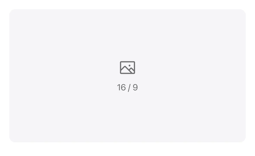
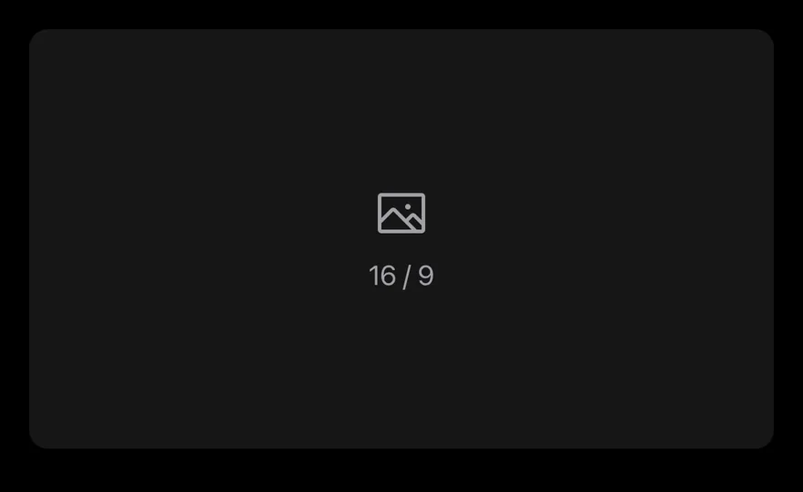
}Placeholder
A placeholder surface with an icon instead of an image.
import { ImageIcon } from "phosphor-react-native"
import { View } from "react-native"
import { AspectRatio } from "@/components/ui/aspect-ratio"
import { Icon } from "@/components/ui/icon"
import { Text } from "@/components/ui/text"

export function AspectRatioPlaceholderExample() {
  return (
    <View className="w-full">
      <AspectRatio ratio={16 / 9}>
        <View className="bg-surface-secondary h-full w-full items-center justify-center gap-2 rounded-lg">
          <Icon as={ImageIcon} className="text-label-secondary size-8" />
          <Text variant="muted">16 / 9</Text>
        </View>
      </AspectRatio>
    </View>
  )
}import EsuissUI
import PhosphorSwift
import SwiftUI
struct AspectRatioPlaceholderExample: View {
var body: some View {
AspectRatio(ratio: 16 / 9) {
VStack(spacing: 8) {
Ph.image.regular
.frame(width: 32, height: 32)
.foregroundStyle(Color.labelSecondary)
Text("16 / 9")
.textVariant(.muted)
}
.frame(maxWidth: .infinity, maxHeight: .infinity)
.background(Color.surfaceSecondary, in: RoundedRectangle(cornerRadius: Radius.lg, style: .continuous))
}
.frame(maxWidth: .infinity)
}
}import androidx.compose.foundation.Image
import androidx.compose.foundation.background
import androidx.compose.foundation.layout.Arrangement
import androidx.compose.foundation.layout.Column
import androidx.compose.foundation.layout.fillMaxSize
import androidx.compose.foundation.shape.RoundedCornerShape
import androidx.compose.runtime.Composable
import androidx.compose.ui.Alignment
import androidx.compose.ui.Modifier
import androidx.compose.ui.unit.dp
import com.adamglin.PhosphorIcons
import com.adamglin.phosphoricons.Regular
import com.adamglin.phosphoricons.regular.Image
import com.esuiss.ui.components.AspectRatio
import com.esuiss.ui.components.Icon
import com.esuiss.ui.components.Text
import com.esuiss.ui.components.TextVariant
import com.esuiss.ui.theme.EsuissTheme
import com.esuiss.ui.theme.Radius
@Composable
fun AspectRatioPlaceholder() {
val colors = EsuissTheme.colors
AspectRatio(16f / 9f) {
Column(
Modifier.fillMaxSize().background(colors.surfaceSecondary, RoundedCornerShape(Radius.lg)),
verticalArrangement = Arrangement.spacedBy(8.dp, Alignment.CenterVertically),
horizontalAlignment = Alignment.CenterHorizontally,
) {
Icon(PhosphorIcons.Regular.Image, contentDescription = null, size = 32.dp, tint = colors.labelSecondary)
Text("16 / 9", variant = TextVariant.Muted)
}
}
}Accessibility
- The view adds no role; give images their own
accessibilityLabel.