suiss/uim · React Native Component
Dropdown Menu
A menu of actions or options that opens from a trigger button.
Dropdown Menu is an open-source mobile component from suiss/uim for React Native and Expo, with SwiftUI and Jetpack Compose versions built from the same design tokens. The @esuiss/uim CLI copies its source into your project, so you own the code.
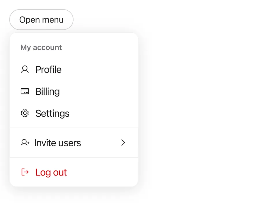
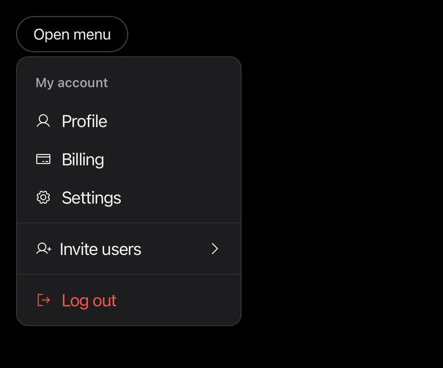
import { ChatCircleIcon, CreditCardIcon, EnvelopeIcon, GearIcon, SignOutIcon, UserIcon, UserPlusIcon } from "phosphor-react-native"
import { View } from "react-native"
import { Button } from "@/components/ui/button"
import { DropdownMenu, DropdownMenuContent, DropdownMenuGroup, DropdownMenuItem, DropdownMenuLabel, DropdownMenuSeparator, DropdownMenuSub, DropdownMenuSubContent, DropdownMenuSubTrigger, DropdownMenuTrigger } from "@/components/ui/dropdown-menu"
import { Icon } from "@/components/ui/icon"
import { Text } from "@/components/ui/text"

function OpenButton({ label = "Open menu" }: { label?: string }) {
  return (
    <DropdownMenuTrigger render={<Button variant="outline" />}>
      <Text>{label}</Text>
    </DropdownMenuTrigger>
  )
}

export function DropdownMenuOpenByDefaultExample() {
  return (
    <View className="items-start">
      <DropdownMenu defaultOpen>
        <OpenButton />
        <DropdownMenuContent className="w-56" align="start">
          <DropdownMenuLabel>My account</DropdownMenuLabel>
          <DropdownMenuGroup>
            <DropdownMenuItem>
              <Icon as={UserIcon} className="size-4" />
              <Text>Profile</Text>
            </DropdownMenuItem>
            <DropdownMenuItem>
              <Icon as={CreditCardIcon} className="size-4" />
              <Text>Billing</Text>
            </DropdownMenuItem>
            <DropdownMenuItem>
              <Icon as={GearIcon} className="size-4" />
              <Text>Settings</Text>
            </DropdownMenuItem>
          </DropdownMenuGroup>
          <DropdownMenuSeparator />
          <DropdownMenuSub>
            <DropdownMenuSubTrigger>
              <View className="flex-row items-center gap-2">
                <Icon as={UserPlusIcon} className="size-4" />
                <Text>Invite users</Text>
              </View>
            </DropdownMenuSubTrigger>
            <DropdownMenuSubContent>
              <DropdownMenuItem>
                <Icon as={EnvelopeIcon} className="size-4" />
                <Text>Email</Text>
              </DropdownMenuItem>
              <DropdownMenuItem>
                <Icon as={ChatCircleIcon} className="size-4" />
                <Text>Message</Text>
              </DropdownMenuItem>
            </DropdownMenuSubContent>
          </DropdownMenuSub>
          <DropdownMenuSeparator />
          <DropdownMenuItem variant="destructive">
            <Icon as={SignOutIcon} className="size-4" />
            <Text>Log out</Text>
          </DropdownMenuItem>
        </DropdownMenuContent>
      </DropdownMenu>
    </View>
  )
}import EsuissUI
import PhosphorSwift
import SwiftUI
struct DropdownMenuOpenByDefaultExample: View {
var body: some View {
DropdownMenuAccount(open: true)
}
}
struct DropdownMenuAccount: View {
@State private var open: Bool
init(open: Bool = false) {
_open = State(initialValue: open)
}
var body: some View {
DropdownMenu(isPresented: $open) {
DropdownMenuLabel("My account")
DropdownMenuGroup {
DropdownMenuItem("Profile", icon: Ph.user.regular) {}
DropdownMenuItem("Billing", icon: Ph.creditCard.regular) {}
DropdownMenuItem("Settings", icon: Ph.gear.regular) {}
}
DropdownMenuSeparator()
DropdownMenuSub("Invite users", icon: Ph.userPlus.regular) {
DropdownMenuItem("Email", icon: Ph.envelope.regular) {}
DropdownMenuItem("Message", icon: Ph.chatCircle.regular) {}
}
DropdownMenuSeparator()
DropdownMenuItem("Log out", icon: Ph.signOut.regular, variant: .destructive) {}
} label: {
Text("Open menu")
}
.buttonStyle(.variant(.outline))
}
}import androidx.compose.foundation.layout.Column
import androidx.compose.foundation.layout.width
import androidx.compose.runtime.Composable
import androidx.compose.runtime.getValue
import androidx.compose.runtime.mutableStateOf
import androidx.compose.runtime.saveable.rememberSaveable
import androidx.compose.runtime.setValue
import androidx.compose.ui.Modifier
import androidx.compose.ui.unit.dp
import com.adamglin.PhosphorIcons
import com.adamglin.phosphoricons.Regular
import com.adamglin.phosphoricons.regular.ChatCircle
import com.adamglin.phosphoricons.regular.CreditCard
import com.adamglin.phosphoricons.regular.Envelope
import com.adamglin.phosphoricons.regular.Gear
import com.adamglin.phosphoricons.regular.SignOut
import com.adamglin.phosphoricons.regular.User
import com.adamglin.phosphoricons.regular.UserPlus
import com.esuiss.ui.components.Button
import com.esuiss.ui.components.ButtonVariant
import com.esuiss.ui.components.DropdownMenu
import com.esuiss.ui.components.DropdownMenuGroup
import com.esuiss.ui.components.DropdownMenuItem
import com.esuiss.ui.components.DropdownMenuLabel
import com.esuiss.ui.components.DropdownMenuSeparator
import com.esuiss.ui.components.DropdownMenuSub
import com.esuiss.ui.components.MenuItemVariant
import com.esuiss.ui.components.PopupAlign
@Composable
fun DropdownMenuOpenByDefaultExample() {
DropdownMenuAccount(defaultOpen = true)
}
@Composable
fun DropdownMenuDemo(
label: String,
defaultOpen: Boolean = false,
content: @Composable () -> Unit,
) {
var open by rememberSaveable { mutableStateOf(defaultOpen) }
Column {
DropdownMenu(
expanded = open,
onExpandedChange = { open = it },
trigger = { Button(label, onClick = { open = !open }, variant = ButtonVariant.Outline) },
modifier = Modifier.width(224.dp),
align = PopupAlign.Start,
) {
content()
}
}
}
@Composable
fun DropdownMenuAccount(defaultOpen: Boolean) {
DropdownMenuDemo("Open menu", defaultOpen) {
DropdownMenuLabel("My account")
DropdownMenuGroup {
DropdownMenuItem("Profile", onClick = {}, icon = PhosphorIcons.Regular.User)
DropdownMenuItem("Billing", onClick = {}, icon = PhosphorIcons.Regular.CreditCard)
DropdownMenuItem("Settings", onClick = {}, icon = PhosphorIcons.Regular.Gear)
}
DropdownMenuSeparator()
DropdownMenuSub("Invite users", icon = PhosphorIcons.Regular.UserPlus) {
DropdownMenuItem("Email", onClick = {}, icon = PhosphorIcons.Regular.Envelope)
DropdownMenuItem("Message", onClick = {}, icon = PhosphorIcons.Regular.ChatCircle)
}
DropdownMenuSeparator()
DropdownMenuItem("Log out", onClick = {}, icon = PhosphorIcons.Regular.SignOut, variant = MenuItemVariant.Destructive)
}
}DropdownMenu opens DropdownMenuContent next to a DropdownMenuTrigger when it is pressed. The content renders through a portal (inside a full-window overlay on iOS) as a raised, rounded card positioned below the trigger by default.
Items can be plain actions, checkbox items, radio items in a group, or a submenu. DropdownMenuSubContent expands in place under its trigger, and the caret turns to point down while it is open. For a menu that opens on long press at the touch point, use Context Menu.
Installation
$ pnpm dlx @esuiss/uim@latest add dropdown-menu$ pnpm dlx @esuiss/uim@latest add dropdown-menu --platform swift$ pnpm dlx @esuiss/uim@latest add dropdown-menu --platform kotlinThe CLI also adds what it builds on: Icon, Text.
Manual
- Install the dependencies:
npx expo install cn phosphor-react-native react-native-reanimated react-native-screens react-native-svg react-native-worklets-
Add the pieces it builds on: Icon, Text, and the primitives
components/primitives/menu.tsx,components/primitives/use-render.tsx. -
Copy the source into
components/ui/dropdown-menu.tsx:
import { cn } from "cn"
import { CaretRightIcon, CheckIcon } from "phosphor-react-native"
import * as React from "react"
import { Platform, View } from "react-native"
import { FadeIn, ReduceMotion } from "react-native-reanimated"
import { FullWindowOverlay as RNFullWindowOverlay } from "react-native-screens"
import * as MenuPrimitive from "@/components/primitives/menu"
import { resolveClassName } from "@/components/primitives/use-render"
import { AnimatedView } from "@/components/ui/animated-view"
import { Icon } from "@/components/ui/icon"
import { TextClassContext } from "@/components/ui/text"

const DropdownMenu = MenuPrimitive.Root

const DropdownMenuPortal = MenuPrimitive.Portal- Update the import paths to match your project.
- Install the dependencies:
npx expo install cn phosphor-react-native react-native-reanimated react-native-screens react-native-svg react-native-worklets-
Add the pieces it builds on: Icon, Text, and the primitives
components/primitives/menu.tsx,components/primitives/use-render.tsx. -
Copy the source into
components/ui/dropdown-menu.tsx:
import { cn } from "cn"
import { CaretRightIcon, CheckIcon } from "phosphor-react-native"
import * as React from "react"
import { Platform, View } from "react-native"
import { FadeIn, ReduceMotion } from "react-native-reanimated"
import { FullWindowOverlay as RNFullWindowOverlay } from "react-native-screens"
import * as MenuPrimitive from "@/components/primitives/menu"
import { resolveClassName } from "@/components/primitives/use-render"
import { AnimatedView } from "@/components/ui/animated-view"
import { Icon } from "@/components/ui/icon"
import { TextClassContext } from "@/components/ui/text"

const DropdownMenu = MenuPrimitive.Root

const DropdownMenuPortal = MenuPrimitive.Portal- Update the import paths to match your project.
- Install the dependencies:
npx expo install phosphor-react-native react-native-reanimated react-native-screens react-native-svg react-native-worklets-
Add the pieces it builds on: Icon, Text, and the primitives
components/primitives/menu.tsx,components/primitives/use-render.tsx. -
Copy the source into
components/ui/dropdown-menu.tsx:
import type { IconProps as PhosphorIconProps } from "phosphor-react-native"
import { CaretRightIcon, CheckIcon } from "phosphor-react-native"
import * as React from "react"
import {
  Platform,
  type StyleProp,
  StyleSheet,
  type TextStyle,
  View,
  type ViewStyle,
} from "react-native"
import { FadeIn, ReduceMotion } from "react-native-reanimated"
import { FullWindowOverlay as RNFullWindowOverlay } from "react-native-screens"
import * as MenuPrimitive from "@/components/primitives/menu"
import { resolveStyle } from "@/components/primitives/use-render"
import { AnimatedView } from "@/components/ui/animated-view"- Update the import paths to match your project.
-
Target iOS 17 or later.
-
Add the Swift package to your app:
.package(url: "https://github.com/phosphor-icons/swift", from: "2.1.0")- Copy the theme files every view uses:
import SwiftUI
import UIKit

struct RGBA: Sendable {
  let red: CGFloat
  let green: CGFloat
  let blue: CGFloat
  let alpha: CGFloat

  init(_ hex: UInt32, _ alpha: CGFloat = 1) {
    red = CGFloat((hex >> 16) & 0xFF) / 255
    green = CGFloat((hex >> 8) & 0xFF) / 255
    blue = CGFloat(hex & 0xFF) / 255
    self.alpha = alpha
}import SwiftUI
extension Color {
public static let surface = Color.adaptive(light: .init(0xFFFFFF), dark: .init(0x000000))
public static let surfaceSecondary = Color.adaptive(light: .init(0xF5F5F7), dark: .init(0x161617))
public static let surfaceTertiary = Color.adaptive(light: .init(0xE8E8ED), dark: .init(0x2C2C2E))
public static let surfaceRaised = Color.adaptive(light: .init(0xFFFFFF), dark: .init(0x1D1D1F))
public static let label = Color.adaptive(light: .init(0x1D1D1F), dark: .init(0xF5F5F7))
public static let labelSecondary = Color.adaptive(light: .init(0x6E6E73), dark: .init(0xA1A1A6))
public static let labelTertiary = Color.adaptive(light: .init(0x86868B), dark: .init(0x86868B))
public static let labelQuaternary = Color.adaptive(light: .init(0xD2D2D7), dark: .init(0x424245))
public static let control = Color.adaptive(light: .init(0x000000, 0.04), dark: .init(0xFFFFFF, 0.1))
public static let controlPressed = Color.adaptive(light: .init(0x000000, 0.12), dark: .init(0xFFFFFF, 0.22))
public static let controlSelected = Color.adaptive(light: .init(0x1D1D1F), dark: .init(0xF5F5F7))
public static let controlDisabled = Color.adaptive(light: .init(0x000000, 0.03), dark: .init(0xFFFFFF, 0.05))
public static let onControlSelected = Color.adaptive(light: .init(0xFFFFFF), dark: .init(0x000000))- Copy the source and every file it uses:
import PhosphorSwift
import SwiftUI

enum MenuPresentation: Sendable {
  case system, popup
}

extension EnvironmentValues {
  @Entry var menuPresentation: MenuPresentation = .system
  @Entry var menuRadio = MenuRadioContext()
}

struct MenuRadioContext: @unchecked Sendable {
  var selected: AnyHashable?
  var select: @MainActor @Sendable (AnyHashable) -> Void = { _ in }
}import SwiftUI
public struct VariantButtonStyle: ButtonStyle {
public enum Variant: CaseIterable, Sendable {
case `default`, outline, secondary, tinted, ghost, plain, destructive, link
}
public enum Size: CaseIterable, Sendable {
case `default`, xs, sm, lg, xl, icon, iconXs, iconSm, iconLg, iconXl
var height: CGFloat {
switch self {
case .xs, .iconXs: 24
case .sm, .iconSm: 32
case .default, .icon: 36
case .lg, .iconLg: 44import SwiftUI
extension EnvironmentValues {
@Entry var buttonGroup: Axis? = nil
@Entry var buttonGroupSize: CGSize = .zero
}
enum ButtonGroupSpace: Hashable {
case group
}
struct ButtonGroupFrame {
let bounds: Anchor<CGRect>
let outlined: Bool
}import PhosphorSwift
import SwiftUI
extension Shadow {
static let control = Shadow(color: .black.opacity(0.08), radius: 0.5, y: 0.5)
static let thumb = Shadow(color: .black.opacity(0.12), radius: 1.5, y: 1)
}
struct SelectionIndicator<Mark: View>: View {
let checked: Bool
let pressed: Bool
let cornerRadius: CGFloat
let mark: Mark
@Environment(\.isEnabled) private var isEnabled
@Environment(\.isInvalid) private var invalidimport SwiftUI
extension EnvironmentValues {
@Entry public var isInvalid = false
@Entry var fieldInset = false
@Entry var fieldGroupInset = false
@Entry var fieldSetInset = false
}
extension View {
public func invalid(_ isInvalid: Bool = true) -> some View {
environment(\.isInvalid, isInvalid)
}
}
public enum FieldOrientation: CaseIterable, Sendable {import SwiftUI
extension EnvironmentValues {
@Entry public var hapticsEnabled = true
}
extension View {
public func haptics(_ enabled: Bool) -> some View {
environment(\.hapticsEnabled, enabled)
}
func hapticFeedback<Trigger: Equatable>(_ feedback: SensoryFeedback, trigger: Trigger) -> some View {
modifier(HapticFeedbackModifier(feedback: feedback, trigger: trigger) { _, _ in true })
}
func hapticFeedback<Trigger: Equatable>(import PhosphorSwift
import Observation
import SwiftUI
public enum PopupAlignment: Sendable, CaseIterable {
case start, center, end
}
struct OverlayDismiss: Sendable {
let action: @MainActor @Sendable () -> Void
@MainActor func callAsFunction() {
action()
}
}import PhosphorSwift
import SwiftUI
struct SelectContext: @unchecked Sendable {
var selected: AnyHashable?
var registering = false
var select: @MainActor @Sendable (AnyHashable) -> Void = { _ in }
}
extension EnvironmentValues {
@Entry var select = SelectContext()
}
struct SelectLabelsKey: PreferenceKey {
static var defaultValue: [AnyHashable: Text] { [:] }import SwiftUI
public struct Separator: View {
let orientation: Axis
public init(_ orientation: Axis = .horizontal) {
self.orientation = orientation
}
public var body: some View {
Rectangle()
.fill(Color.separator)
.frame(width: orientation == .vertical ? 1 : nil, height: orientation == .horizontal ? 1 : nil)
.frame(maxWidth: orientation == .horizontal ? .infinity : nil, maxHeight: orientation == .vertical ? .infinity : nil)
.accessibilityHidden(true)
}import SwiftUI
public enum TextVariant: CaseIterable, Sendable {
case `default`, h1, h2, h3, h4, p, blockquote, code, lead, large, small, muted
var style: TextStyle {
switch self {
case .h1: .xl3
case .h2: .xl2
case .h3: .xl
case .h4, .lead, .large: .lg
case .code, .small, .muted: .sm
default: .base
}
}- Add the files to your app target.
- Set
minSdkto 24 or higher and add the dependencies:
implementation(platform("androidx.compose:compose-bom:2026.09.00"))
implementation("androidx.compose.foundation:foundation")
implementation("androidx.compose.ui:ui")
implementation("com.adamglin:phosphor-icon-android:1.0.0")- Copy the theme files every view uses:
package com.esuiss.ui.theme

import androidx.compose.foundation.isSystemInDarkTheme
import androidx.compose.runtime.Composable
import androidx.compose.runtime.CompositionLocalProvider
import androidx.compose.runtime.Immutable
import androidx.compose.runtime.staticCompositionLocalOf
import androidx.compose.ui.Modifier
import androidx.compose.ui.draw.dropShadow
import androidx.compose.ui.graphics.Color
import androidx.compose.ui.graphics.Shape
import androidx.compose.ui.graphics.shadow.Shadow as DropShadow
import androidx.compose.ui.text.TextStyle
import androidx.compose.ui.text.style.LineHeightStyle
import androidx.compose.ui.unit.Dp
import androidx.compose.ui.unit.DpOffsetpackage com.esuiss.ui.theme
import androidx.compose.runtime.Immutable
import androidx.compose.ui.graphics.Color
import androidx.compose.ui.unit.dp
@Immutable
data class Colors(
val surface: Color,
val surfaceSecondary: Color,
val surfaceTertiary: Color,
val surfaceRaised: Color,
val label: Color,
val labelSecondary: Color,
val labelTertiary: Color,
val labelQuaternary: Color,- Copy the source and every file it uses:
package com.esuiss.ui.components

import androidx.compose.animation.core.animateFloatAsState
import androidx.compose.foundation.background
import androidx.compose.foundation.clickable
import androidx.compose.foundation.interaction.MutableInteractionSource
import androidx.compose.foundation.interaction.collectIsPressedAsState
import androidx.compose.foundation.layout.Arrangement
import androidx.compose.foundation.layout.Box
import androidx.compose.foundation.layout.Column
import androidx.compose.foundation.layout.ColumnScope
import androidx.compose.foundation.layout.IntrinsicSize
import androidx.compose.foundation.layout.Row
import androidx.compose.foundation.layout.RowScope
import androidx.compose.foundation.layout.fillMaxWidth
import androidx.compose.foundation.layout.heightpackage com.esuiss.ui.components
import androidx.compose.foundation.background
import androidx.compose.foundation.border
import androidx.compose.foundation.clickable
import androidx.compose.foundation.interaction.MutableInteractionSource
import androidx.compose.foundation.interaction.collectIsPressedAsState
import androidx.compose.foundation.layout.Arrangement
import androidx.compose.foundation.layout.Row
import androidx.compose.foundation.layout.RowScope
import androidx.compose.foundation.layout.fillMaxWidth
import androidx.compose.foundation.layout.height
import androidx.compose.foundation.layout.padding
import androidx.compose.foundation.layout.size
import androidx.compose.foundation.shape.CircleShape
import androidx.compose.foundation.shape.RoundedCornerShapepackage com.esuiss.ui.components
import androidx.compose.foundation.background
import androidx.compose.foundation.gestures.Orientation
import androidx.compose.foundation.layout.Arrangement
import androidx.compose.foundation.layout.Box
import androidx.compose.foundation.layout.Row
import androidx.compose.foundation.layout.RowScope
import androidx.compose.foundation.layout.padding
import androidx.compose.foundation.shape.CircleShape
import androidx.compose.foundation.shape.CornerSize
import androidx.compose.foundation.shape.RoundedCornerShape
import androidx.compose.runtime.Composable
import androidx.compose.runtime.CompositionLocalProvider
import androidx.compose.runtime.DisposableEffect
import androidx.compose.runtime.Immutablepackage com.esuiss.ui.components
import androidx.compose.foundation.background
import androidx.compose.foundation.border
import androidx.compose.foundation.interaction.MutableInteractionSource
import androidx.compose.foundation.interaction.collectIsPressedAsState
import androidx.compose.foundation.layout.Box
import androidx.compose.foundation.layout.size
import androidx.compose.foundation.selection.triStateToggleable
import androidx.compose.foundation.shape.RoundedCornerShape
import androidx.compose.runtime.Composable
import androidx.compose.runtime.getValue
import androidx.compose.runtime.remember
import androidx.compose.ui.Alignment
import androidx.compose.ui.Modifier
import androidx.compose.ui.graphics.Colorpackage com.esuiss.ui.components
import androidx.compose.runtime.compositionLocalOf
import androidx.compose.ui.graphics.Color
import androidx.compose.ui.text.TextStyle
import androidx.compose.ui.unit.Dp
import androidx.compose.ui.unit.dp
val LocalContentStyle = compositionLocalOf { TextStyle.Default }
val LocalContentColor = compositionLocalOf { Color.Unspecified }
val LocalIconSize = compositionLocalOf { 20.dp }package com.esuiss.ui.components
import androidx.compose.foundation.background
import androidx.compose.foundation.gestures.Orientation
import androidx.compose.foundation.layout.Arrangement
import androidx.compose.foundation.layout.Box
import androidx.compose.foundation.layout.Column
import androidx.compose.foundation.layout.ColumnScope
import androidx.compose.foundation.layout.LayoutScopeMarker
import androidx.compose.foundation.layout.Row
import androidx.compose.foundation.layout.RowScope
import androidx.compose.foundation.layout.fillMaxWidth
import androidx.compose.foundation.layout.heightIn
import androidx.compose.foundation.layout.padding
import androidx.compose.foundation.shape.RoundedCornerShape
import androidx.compose.foundation.text.BasicTextpackage com.esuiss.ui.components
import android.provider.Settings
import androidx.compose.animation.core.CubicBezierEasing
import androidx.compose.foundation.background
import androidx.compose.foundation.border
import androidx.compose.foundation.gestures.Orientation
import androidx.compose.foundation.text.selection.TextSelectionColors
import androidx.compose.runtime.Composable
import androidx.compose.runtime.mutableStateOf
import androidx.compose.runtime.remember
import androidx.compose.ui.Modifier
import androidx.compose.ui.draw.clip
import androidx.compose.ui.draw.drawWithContent
import androidx.compose.ui.geometry.Offset
import androidx.compose.ui.geometry.Sizepackage com.esuiss.ui.components
import androidx.compose.runtime.Composable
import androidx.compose.runtime.CompositionLocalProvider
import androidx.compose.runtime.remember
import androidx.compose.runtime.staticCompositionLocalOf
import androidx.compose.ui.hapticfeedback.HapticFeedback
import androidx.compose.ui.hapticfeedback.HapticFeedbackType
import androidx.compose.ui.platform.LocalHapticFeedback
val LocalHapticsEnabled = staticCompositionLocalOf { true }
@Composable
fun ProvideHaptics(enabled: Boolean, content: @Composable () -> Unit) {
CompositionLocalProvider(LocalHapticsEnabled provides enabled, content = content)
}package com.esuiss.ui.components
import androidx.compose.foundation.Image
import androidx.compose.foundation.layout.size
import androidx.compose.runtime.Composable
import androidx.compose.ui.Modifier
import androidx.compose.ui.graphics.Color
import androidx.compose.ui.graphics.ColorFilter
import androidx.compose.ui.graphics.takeOrElse
import androidx.compose.ui.graphics.vector.ImageVector
import androidx.compose.ui.unit.Dp
import com.esuiss.ui.theme.EsuissTheme
@Composable
fun Icon(
imageVector: ImageVector,package com.esuiss.ui.components
import androidx.compose.foundation.layout.Arrangement
import androidx.compose.foundation.layout.Row
import androidx.compose.foundation.layout.RowScope
import androidx.compose.foundation.text.BasicText
import androidx.compose.runtime.Composable
import androidx.compose.runtime.CompositionLocalProvider
import androidx.compose.ui.Alignment
import androidx.compose.ui.Modifier
import androidx.compose.ui.text.font.FontWeight
import androidx.compose.ui.unit.dp
import com.esuiss.ui.theme.EsuissTheme
import com.esuiss.ui.theme.Typography
@Composablepackage com.esuiss.ui.components
import android.os.Build
import android.view.Window
import android.view.WindowManager
import androidx.compose.animation.AnimatedVisibility
import androidx.compose.animation.AnimatedVisibilityScope
import androidx.compose.animation.EnterExitState
import androidx.compose.animation.core.MutableTransitionState
import androidx.compose.animation.core.animateFloat
import androidx.compose.animation.core.tween
import androidx.compose.animation.fadeIn
import androidx.compose.animation.fadeOut
import androidx.compose.animation.scaleIn
import androidx.compose.animation.scaleOut
import androidx.compose.animation.slideInpackage com.esuiss.ui.components
import androidx.compose.foundation.background
import androidx.compose.foundation.gestures.Orientation
import androidx.compose.foundation.layout.Box
import androidx.compose.foundation.layout.fillMaxHeight
import androidx.compose.foundation.layout.fillMaxWidth
import androidx.compose.foundation.layout.height
import androidx.compose.foundation.layout.width
import androidx.compose.runtime.Composable
import androidx.compose.ui.Modifier
import androidx.compose.ui.unit.dp
import com.esuiss.ui.theme.EsuissTheme
@Composable
fun Separator(- Update the
com.esuiss.uipackage names to match your project.
Usage
import { DropdownMenuContent, DropdownMenuSubTrigger, DropdownMenuSubContent, DropdownMenuItem, DropdownMenuCheckboxItem, DropdownMenuRadioItem, DropdownMenuLabel, DropdownMenuSeparator } from "@/components/ui/dropdown-menu"<View className="items-start">
<DropdownMenu defaultOpen>
<OpenButton />
<DropdownMenuContent className="w-56" align="start">
<DropdownMenuLabel>My account</DropdownMenuLabel>
<DropdownMenuGroup>
<DropdownMenuItem>
<Icon as={UserIcon} className="size-4" />
<Text>Profile</Text>
</DropdownMenuItem>
<DropdownMenuItem>
<Icon as={CreditCardIcon} className="size-4" />
<Text>Billing</Text>
</DropdownMenuItem>
<DropdownMenuItem>
<Icon as={GearIcon} className="size-4" />
<Text>Settings</Text>
</DropdownMenuItem>
</DropdownMenuGroup>
<DropdownMenuSeparator />
<DropdownMenuSub>
<DropdownMenuSubTrigger>
<View className="flex-row items-center gap-2">
<Icon as={UserPlusIcon} className="size-4" />
<Text>Invite users</Text>
</View>
</DropdownMenuSubTrigger>
<DropdownMenuSubContent>
<DropdownMenuItem>
<Icon as={EnvelopeIcon} className="size-4" />
<Text>Email</Text>
</DropdownMenuItem>
<DropdownMenuItem>
<Icon as={ChatCircleIcon} className="size-4" />
<Text>Message</Text>
</DropdownMenuItem>
</DropdownMenuSubContent>
</DropdownMenuSub>
<DropdownMenuSeparator />
<DropdownMenuItem variant="destructive">
<Icon as={SignOutIcon} className="size-4" />
<Text>Log out</Text>
</DropdownMenuItem>
</DropdownMenuContent>
</DropdownMenu>
</View>Use render on DropdownMenuTrigger to render it as a Button. Items close the menu when pressed unless closeOnPress={false}.
Use DropdownMenuCheckboxItem with checked and onCheckedChange, and DropdownMenuRadioItem inside a DropdownMenuRadioGroup with value and onValueChange. Group items with DropdownMenuGroup and DropdownMenuLabel, and divide sections with DropdownMenuSeparator.
Set variant="destructive" on an item that deletes or removes. Use inset on items without an icon to align them with items that have one. Position the content with side, align, sideOffset and alignOffset.
Examples
Default

import { ChatCircleIcon, CreditCardIcon, EnvelopeIcon, GearIcon, SignOutIcon, UserIcon, UserPlusIcon } from "phosphor-react-native"
import { View } from "react-native"
import { Button } from "@/components/ui/button"
import { DropdownMenu, DropdownMenuContent, DropdownMenuGroup, DropdownMenuItem, DropdownMenuLabel, DropdownMenuSeparator, DropdownMenuSub, DropdownMenuSubContent, DropdownMenuSubTrigger, DropdownMenuTrigger } from "@/components/ui/dropdown-menu"
import { Icon } from "@/components/ui/icon"
import { Text } from "@/components/ui/text"

function OpenButton({ label = "Open menu" }: { label?: string }) {
  return (
    <DropdownMenuTrigger render={<Button variant="outline" />}>
      <Text>{label}</Text>
    </DropdownMenuTrigger>
  )
}

export function DropdownMenuExample() {
  return (
    <View className="items-start">
      <DropdownMenu>
        <OpenButton />
        <DropdownMenuContent className="w-56" align="start">
          <DropdownMenuLabel>My account</DropdownMenuLabel>
          <DropdownMenuGroup>
            <DropdownMenuItem>
              <Icon as={UserIcon} className="size-4" />
              <Text>Profile</Text>
            </DropdownMenuItem>
            <DropdownMenuItem>
              <Icon as={CreditCardIcon} className="size-4" />
              <Text>Billing</Text>
            </DropdownMenuItem>
            <DropdownMenuItem>
              <Icon as={GearIcon} className="size-4" />
              <Text>Settings</Text>
            </DropdownMenuItem>
          </DropdownMenuGroup>
          <DropdownMenuSeparator />
          <DropdownMenuSub>
            <DropdownMenuSubTrigger>
              <View className="flex-row items-center gap-2">
                <Icon as={UserPlusIcon} className="size-4" />
                <Text>Invite users</Text>
              </View>
            </DropdownMenuSubTrigger>
            <DropdownMenuSubContent>
              <DropdownMenuItem>
                <Icon as={EnvelopeIcon} className="size-4" />
                <Text>Email</Text>
              </DropdownMenuItem>
              <DropdownMenuItem>
                <Icon as={ChatCircleIcon} className="size-4" />
                <Text>Message</Text>
              </DropdownMenuItem>
            </DropdownMenuSubContent>
          </DropdownMenuSub>
          <DropdownMenuSeparator />
          <DropdownMenuItem variant="destructive">
            <Icon as={SignOutIcon} className="size-4" />
            <Text>Log out</Text>
          </DropdownMenuItem>
        </DropdownMenuContent>
      </DropdownMenu>
    </View>
  )
}import EsuissUI
import PhosphorSwift
import SwiftUI
struct DropdownMenuAccount: View {
@State private var open: Bool
init(open: Bool = false) {
_open = State(initialValue: open)
}
var body: some View {
DropdownMenu(isPresented: $open) {
DropdownMenuLabel("My account")
DropdownMenuGroup {
DropdownMenuItem("Profile", icon: Ph.user.regular) {}
DropdownMenuItem("Billing", icon: Ph.creditCard.regular) {}
DropdownMenuItem("Settings", icon: Ph.gear.regular) {}
}
DropdownMenuSeparator()
DropdownMenuSub("Invite users", icon: Ph.userPlus.regular) {
DropdownMenuItem("Email", icon: Ph.envelope.regular) {}
DropdownMenuItem("Message", icon: Ph.chatCircle.regular) {}
}
DropdownMenuSeparator()
DropdownMenuItem("Log out", icon: Ph.signOut.regular, variant: .destructive) {}
} label: {
Text("Open menu")
}
.buttonStyle(.variant(.outline))
}
}import androidx.compose.foundation.layout.Column
import androidx.compose.foundation.layout.width
import androidx.compose.runtime.Composable
import androidx.compose.runtime.getValue
import androidx.compose.runtime.mutableStateOf
import androidx.compose.runtime.saveable.rememberSaveable
import androidx.compose.runtime.setValue
import androidx.compose.ui.Modifier
import androidx.compose.ui.unit.dp
import com.adamglin.PhosphorIcons
import com.adamglin.phosphoricons.Regular
import com.adamglin.phosphoricons.regular.ChatCircle
import com.adamglin.phosphoricons.regular.CreditCard
import com.adamglin.phosphoricons.regular.Envelope
import com.adamglin.phosphoricons.regular.Gear
import com.adamglin.phosphoricons.regular.SignOut
import com.adamglin.phosphoricons.regular.User
import com.adamglin.phosphoricons.regular.UserPlus
import com.esuiss.ui.components.Button
import com.esuiss.ui.components.ButtonVariant
import com.esuiss.ui.components.DropdownMenu
import com.esuiss.ui.components.DropdownMenuGroup
import com.esuiss.ui.components.DropdownMenuItem
import com.esuiss.ui.components.DropdownMenuLabel
import com.esuiss.ui.components.DropdownMenuSeparator
import com.esuiss.ui.components.DropdownMenuSub
import com.esuiss.ui.components.MenuItemVariant
import com.esuiss.ui.components.PopupAlign
@Composable
fun DropdownMenuExample() {
DropdownMenuAccount(defaultOpen = false)
}
@Composable
fun DropdownMenuDemo(
label: String,
defaultOpen: Boolean = false,
content: @Composable () -> Unit,
) {
var open by rememberSaveable { mutableStateOf(defaultOpen) }
Column {
DropdownMenu(
expanded = open,
onExpandedChange = { open = it },
trigger = { Button(label, onClick = { open = !open }, variant = ButtonVariant.Outline) },
modifier = Modifier.width(224.dp),
align = PopupAlign.Start,
) {
content()
}
}
}
@Composable
fun DropdownMenuAccount(defaultOpen: Boolean) {
DropdownMenuDemo("Open menu", defaultOpen) {
DropdownMenuLabel("My account")
DropdownMenuGroup {
DropdownMenuItem("Profile", onClick = {}, icon = PhosphorIcons.Regular.User)
DropdownMenuItem("Billing", onClick = {}, icon = PhosphorIcons.Regular.CreditCard)
DropdownMenuItem("Settings", onClick = {}, icon = PhosphorIcons.Regular.Gear)
}
DropdownMenuSeparator()
DropdownMenuSub("Invite users", icon = PhosphorIcons.Regular.UserPlus) {
DropdownMenuItem("Email", onClick = {}, icon = PhosphorIcons.Regular.Envelope)
DropdownMenuItem("Message", onClick = {}, icon = PhosphorIcons.Regular.ChatCircle)
}
DropdownMenuSeparator()
DropdownMenuItem("Log out", onClick = {}, icon = PhosphorIcons.Regular.SignOut, variant = MenuItemVariant.Destructive)
}
}Checkboxes
Checkbox items that toggle panels on and off.


import * as React from "react"
import { View } from "react-native"
import { Button } from "@/components/ui/button"
import { DropdownMenu, DropdownMenuCheckboxItem, DropdownMenuContent, DropdownMenuLabel, DropdownMenuSeparator, DropdownMenuTrigger } from "@/components/ui/dropdown-menu"
import { Text } from "@/components/ui/text"

function OpenButton({ label = "Open menu" }: { label?: string }) {
  return (
    <DropdownMenuTrigger render={<Button variant="outline" />}>
      <Text>{label}</Text>
    </DropdownMenuTrigger>
  )
}

function CheckboxesDemo() {
  const [statusBar, setStatusBar] = React.useState(true)
  const [activityBar, setActivityBar] = React.useState(false)
  const [panel, setPanel] = React.useState(false)
  return (
    <View className="items-start">
      <DropdownMenu>
        <OpenButton label="View" />
        <DropdownMenuContent className="w-56" align="start">
          <DropdownMenuLabel>Appearance</DropdownMenuLabel>
          <DropdownMenuSeparator />
          <DropdownMenuCheckboxItem
            checked={statusBar}
            onCheckedChange={setStatusBar}
          >
            <Text>Status bar</Text>
          </DropdownMenuCheckboxItem>
          <DropdownMenuCheckboxItem
            checked={activityBar}
            onCheckedChange={setActivityBar}
            disabled
          >
            <Text>Activity bar</Text>
          </DropdownMenuCheckboxItem>
          <DropdownMenuCheckboxItem checked={panel} onCheckedChange={setPanel}>
            <Text>Panel</Text>
          </DropdownMenuCheckboxItem>
        </DropdownMenuContent>
      </DropdownMenu>
    </View>
  )
}

export function DropdownMenuCheckboxesExample() {
  return (
    <CheckboxesDemo />
  )
}import EsuissUI
import SwiftUI
struct DropdownMenuCheckboxesDemo: View {
@State private var statusBar = true
@State private var activityBar = false
@State private var panel = false
var body: some View {
DropdownMenu {
DropdownMenuLabel("Appearance")
DropdownMenuSeparator()
DropdownMenuCheckboxItem("Status bar", isOn: $statusBar)
DropdownMenuCheckboxItem("Activity bar", isOn: $activityBar)
.disabled(true)
DropdownMenuCheckboxItem("Panel", isOn: $panel)
} label: {
Text("View")
}
.buttonStyle(.variant(.outline))
}
}import androidx.compose.foundation.layout.Column
import androidx.compose.foundation.layout.width
import androidx.compose.runtime.Composable
import androidx.compose.runtime.getValue
import androidx.compose.runtime.mutableStateOf
import androidx.compose.runtime.saveable.rememberSaveable
import androidx.compose.runtime.setValue
import androidx.compose.ui.Modifier
import androidx.compose.ui.unit.dp
import com.esuiss.ui.components.Button
import com.esuiss.ui.components.ButtonVariant
import com.esuiss.ui.components.DropdownMenu
import com.esuiss.ui.components.DropdownMenuCheckboxItem
import com.esuiss.ui.components.DropdownMenuLabel
import com.esuiss.ui.components.DropdownMenuSeparator
import com.esuiss.ui.components.PopupAlign
@Composable
fun DropdownMenuDemo(
label: String,
defaultOpen: Boolean = false,
content: @Composable () -> Unit,
) {
var open by rememberSaveable { mutableStateOf(defaultOpen) }
Column {
DropdownMenu(
expanded = open,
onExpandedChange = { open = it },
trigger = { Button(label, onClick = { open = !open }, variant = ButtonVariant.Outline) },
modifier = Modifier.width(224.dp),
align = PopupAlign.Start,
) {
content()
}
}
}
@Composable
fun DropdownMenuCheckboxes() {
var statusBar by rememberSaveable { mutableStateOf(true) }
var activityBar by rememberSaveable { mutableStateOf(false) }
var panel by rememberSaveable { mutableStateOf(false) }
DropdownMenuDemo("View") {
DropdownMenuLabel("Appearance")
DropdownMenuSeparator()
DropdownMenuCheckboxItem("Status bar", checked = statusBar, onCheckedChange = { statusBar = it })
DropdownMenuCheckboxItem("Activity bar", checked = activityBar, onCheckedChange = { activityBar = it }, enabled = false)
DropdownMenuCheckboxItem("Panel", checked = panel, onCheckedChange = { panel = it })
}
}Radio group
Radio items that pick one value.

import * as React from "react"
import { View } from "react-native"
import { Button } from "@/components/ui/button"
import { DropdownMenu, DropdownMenuContent, DropdownMenuLabel, DropdownMenuRadioGroup, DropdownMenuRadioItem, DropdownMenuSeparator, DropdownMenuTrigger } from "@/components/ui/dropdown-menu"
import { Text } from "@/components/ui/text"

function OpenButton({ label = "Open menu" }: { label?: string }) {
  return (
    <DropdownMenuTrigger render={<Button variant="outline" />}>
      <Text>{label}</Text>
    </DropdownMenuTrigger>
  )
}

function RadioGroupDemo() {
  const [position, setPosition] = React.useState("bottom")
  return (
    <View className="items-start">
      <DropdownMenu>
        <OpenButton label="Panel position" />
        <DropdownMenuContent className="w-56" align="start">
          <DropdownMenuLabel>Panel position</DropdownMenuLabel>
          <DropdownMenuSeparator />
          <DropdownMenuRadioGroup value={position} onValueChange={setPosition}>
            <DropdownMenuRadioItem value="top">
              <Text>Top</Text>
            </DropdownMenuRadioItem>
            <DropdownMenuRadioItem value="bottom">
              <Text>Bottom</Text>
            </DropdownMenuRadioItem>
            <DropdownMenuRadioItem value="right">
              <Text>Right</Text>
            </DropdownMenuRadioItem>
          </DropdownMenuRadioGroup>
        </DropdownMenuContent>
      </DropdownMenu>
    </View>
  )
}

export function DropdownMenuRadioGroupExample() {
  return (
    <RadioGroupDemo />
  )
}import EsuissUI
import SwiftUI
struct DropdownMenuRadioGroupDemo: View {
@State private var position = "bottom"
var body: some View {
DropdownMenu {
DropdownMenuLabel("Panel position")
DropdownMenuSeparator()
DropdownMenuRadioGroup(selection: $position) {
DropdownMenuRadioItem("Top", value: "top")
DropdownMenuRadioItem("Bottom", value: "bottom")
DropdownMenuRadioItem("Right", value: "right")
}
} label: {
Text("Panel position")
}
.buttonStyle(.variant(.outline))
}
}import androidx.compose.foundation.layout.Column
import androidx.compose.foundation.layout.width
import androidx.compose.runtime.Composable
import androidx.compose.runtime.getValue
import androidx.compose.runtime.mutableStateOf
import androidx.compose.runtime.saveable.rememberSaveable
import androidx.compose.runtime.setValue
import androidx.compose.ui.Modifier
import androidx.compose.ui.unit.dp
import com.esuiss.ui.components.Button
import com.esuiss.ui.components.ButtonVariant
import com.esuiss.ui.components.DropdownMenu
import com.esuiss.ui.components.DropdownMenuLabel
import com.esuiss.ui.components.DropdownMenuRadioGroup
import com.esuiss.ui.components.DropdownMenuRadioItem
import com.esuiss.ui.components.DropdownMenuSeparator
import com.esuiss.ui.components.PopupAlign
@Composable
fun DropdownMenuDemo(
label: String,
defaultOpen: Boolean = false,
content: @Composable () -> Unit,
) {
var open by rememberSaveable { mutableStateOf(defaultOpen) }
Column {
DropdownMenu(
expanded = open,
onExpandedChange = { open = it },
trigger = { Button(label, onClick = { open = !open }, variant = ButtonVariant.Outline) },
modifier = Modifier.width(224.dp),
align = PopupAlign.Start,
) {
content()
}
}
}
@Composable
fun DropdownMenuRadio() {
var position by rememberSaveable { mutableStateOf("bottom") }
DropdownMenuDemo("Panel position") {
DropdownMenuLabel("Panel position")
DropdownMenuSeparator()
DropdownMenuRadioGroup(value = position, onValueChange = { position = it }) {
DropdownMenuRadioItem("top", "Top")
DropdownMenuRadioItem("bottom", "Bottom")
DropdownMenuRadioItem("right", "Right")
}
}
}Inset
Items aligned with inset.

import { View } from "react-native"
import { Button } from "@/components/ui/button"
import { DropdownMenu, DropdownMenuContent, DropdownMenuItem, DropdownMenuLabel, DropdownMenuSeparator, DropdownMenuTrigger } from "@/components/ui/dropdown-menu"
import { Text } from "@/components/ui/text"

function OpenButton({ label = "Open menu" }: { label?: string }) {
  return (
    <DropdownMenuTrigger render={<Button variant="outline" />}>
      <Text>{label}</Text>
    </DropdownMenuTrigger>
  )
}

export function DropdownMenuInsetExample() {
  return (
    <View className="items-start">
      <DropdownMenu>
        <OpenButton />
        <DropdownMenuContent className="w-56" align="start">
          <DropdownMenuLabel inset>Actions</DropdownMenuLabel>
          <DropdownMenuItem inset>
            <Text>Copy</Text>
          </DropdownMenuItem>
          <DropdownMenuItem inset>
            <Text>Paste</Text>
          </DropdownMenuItem>
          <DropdownMenuSeparator />
          <DropdownMenuItem inset variant="destructive">
            <Text>Delete</Text>
          </DropdownMenuItem>
        </DropdownMenuContent>
      </DropdownMenu>
    </View>
  )
}import EsuissUI
import SwiftUI
struct DropdownMenuInsetExample: View {
var body: some View {
DropdownMenu {
DropdownMenuLabel("Actions", inset: true)
DropdownMenuItem("Copy", inset: true) {}
DropdownMenuItem("Paste", inset: true) {}
DropdownMenuSeparator()
DropdownMenuItem("Delete", variant: .destructive, inset: true) {}
} label: {
Text("Open menu")
}
.buttonStyle(.variant(.outline))
}
}import androidx.compose.foundation.layout.Column
import androidx.compose.foundation.layout.width
import androidx.compose.runtime.Composable
import androidx.compose.runtime.getValue
import androidx.compose.runtime.mutableStateOf
import androidx.compose.runtime.saveable.rememberSaveable
import androidx.compose.runtime.setValue
import androidx.compose.ui.Modifier
import androidx.compose.ui.unit.dp
import com.esuiss.ui.components.Button
import com.esuiss.ui.components.ButtonVariant
import com.esuiss.ui.components.DropdownMenu
import com.esuiss.ui.components.DropdownMenuItem
import com.esuiss.ui.components.DropdownMenuLabel
import com.esuiss.ui.components.DropdownMenuSeparator
import com.esuiss.ui.components.MenuItemVariant
import com.esuiss.ui.components.PopupAlign
@Composable
fun DropdownMenuDemo(
label: String,
defaultOpen: Boolean = false,
content: @Composable () -> Unit,
) {
var open by rememberSaveable { mutableStateOf(defaultOpen) }
Column {
DropdownMenu(
expanded = open,
onExpandedChange = { open = it },
trigger = { Button(label, onClick = { open = !open }, variant = ButtonVariant.Outline) },
modifier = Modifier.width(224.dp),
align = PopupAlign.Start,
) {
content()
}
}
}
@Composable
fun DropdownMenuInset() {
DropdownMenuDemo("Open menu") {
DropdownMenuLabel("Actions", inset = true)
DropdownMenuItem("Copy", onClick = {}, inset = true)
DropdownMenuItem("Paste", onClick = {}, inset = true)
DropdownMenuSeparator()
DropdownMenuItem("Delete", onClick = {}, inset = true, variant = MenuItemVariant.Destructive)
}
}API Reference
DropdownMenuContent
Floating menu card.
React.ComponentProps<typeof MenuPrimitive.Popup>PositionerProps- About
- Name of the portal host to render into.
- Type
string- Default
- —
DropdownMenuSubTrigger
Row that expands the submenu.
React.ComponentProps<typeof MenuPrimitive.SubmenuTrigger>- Type
React.ReactNode- Default
- —
- About
- Extra classes for the caret icon.
- Type
string- Default
- —
- About
- Adds start padding.
- Type
boolean- Default
- —
DropdownMenuSubContent
Items of the submenu.
React.ComponentProps<typeof MenuPrimitive.Popup>DropdownMenuItem
Action row.
React.ComponentProps<typeof MenuPrimitive.Item>- About
- Adds start padding to align with icon items.
- Type
boolean- Default
- —
- About
defaultordestructive.- Type
"default""destructive"- Default
- "default"
DropdownMenuCheckboxItem
Row with a check mark that toggles.
React.ComponentProps<typeof MenuPrimitive.CheckboxItem>- Type
React.ReactNode- Default
- —
- About
- Adds start padding.
- Type
boolean- Default
- —
DropdownMenuRadioItem
Row that selects one value in its group.
React.ComponentProps<typeof MenuPrimitive.RadioItem>- Type
React.ReactNode- Default
- —
- About
- Adds start padding.
- Type
boolean- Default
- —
DropdownMenuLabel
Heading for a group.
React.ComponentProps<typeof MenuPrimitive.GroupLabel>- About
- Adds start padding.
- Type
boolean- Default
- —
DropdownMenuSeparator
Line between sections.
React.ComponentProps<typeof MenuPrimitive.Separator>Accessibility
- The trigger has the
buttonrole. - The popup has the
menurole; items usemenuitem,checkboxandradioroles, and radio groups useradiogroup. - Groups are labelled by their
DropdownMenuLabel, and separators have theseparatorrole.
Notes
- Uses
bg-surface-raised,bg-item-pressed,bg-item-selectedandbg-danger-surface-pressedtokens; light and dark follow the system appearance. - The fade-in respects the system Reduce Motion setting.