suiss/uim · React Native Component
Spinner
A loading indicator built on the native activity indicator, at any size and color.
Spinner is an open-source mobile component from suiss/uim for React Native and Expo, with SwiftUI and Jetpack Compose versions built from the same design tokens. The @esuiss/uim CLI copies its source into your project, so you own the code.


import { Spinner } from "@/components/ui/spinner"

export function SpinnerExample() {
  return (
    <Spinner />
  )
}import EsuissUI
import SwiftUI
struct SpinnerExample: View {
var body: some View {
Spinner()
.foregroundStyle(Color.labelSecondary)
}
}import androidx.compose.runtime.Composable
import com.esuiss.ui.components.Spinner
@Composable
fun SpinnerExample() {
Spinner()
}Spinner wraps the native ActivityIndicator in a square View. The indicator is scaled from its native small size to the size you pass, so it can match text and icon sizes. Its color is set through a class.
Installation
$ pnpm dlx @esuiss/uim@latest add spinner$ pnpm dlx @esuiss/uim@latest add spinner --platform swift$ pnpm dlx @esuiss/uim@latest add spinner --platform kotlinManual
- Install the dependencies:
npx expo install cn- Copy the source into
components/ui/spinner.tsx:
import { cn } from "cn"
import { ActivityIndicator, View } from "react-native"

const NATIVE_SIZE = 20

function Spinner({
  colorClassName = "accent-label-secondary",
  className,
  size = 16,
  accessibilityLabel = "Loading",
  ...props
}: Omit<React.ComponentProps<typeof ActivityIndicator>, "size"> & {
  size?: number
  colorClassName?: string
}) {
return (- Update the import paths to match your project.
- Install the dependencies:
npx expo install cn nativewind- Copy the source into
components/ui/spinner.tsx:
import { cn } from "cn"
import { cssInterop } from "nativewind"
import { ActivityIndicator, View } from "react-native"

cssInterop(ActivityIndicator, {
  className: { target: "style", nativeStyleToProp: { color: true } },
})

const NATIVE_SIZE = 20

function Spinner({
  colorClassName = "text-label-secondary",
  className,
  size = 16,
  accessibilityLabel = "Loading",
...props- Update the import paths to match your project.
- Copy the source into
components/ui/spinner.tsx:
import { ActivityIndicator, View } from "react-native"
import { useTheme } from "@/components/ui/theme"

const NATIVE_SIZE = 20

function Spinner({
  color,
  style,
  size = 16,
  accessibilityLabel = "Loading",
  ...props
}: Omit<React.ComponentProps<typeof ActivityIndicator>, "size"> & {
  size?: number
}) {
  const { colors } = useTheme()
return (- Update the import paths to match your project.
-
Target iOS 17 or later.
-
Copy the theme files every view uses:
import SwiftUI
import UIKit

struct RGBA: Sendable {
  let red: CGFloat
  let green: CGFloat
  let blue: CGFloat
  let alpha: CGFloat

  init(_ hex: UInt32, _ alpha: CGFloat = 1) {
    red = CGFloat((hex >> 16) & 0xFF) / 255
    green = CGFloat((hex >> 8) & 0xFF) / 255
    blue = CGFloat(hex & 0xFF) / 255
    self.alpha = alpha
}import SwiftUI
extension Color {
public static let surface = Color.adaptive(light: .init(0xFFFFFF), dark: .init(0x000000))
public static let surfaceSecondary = Color.adaptive(light: .init(0xF5F5F7), dark: .init(0x161617))
public static let surfaceTertiary = Color.adaptive(light: .init(0xE8E8ED), dark: .init(0x2C2C2E))
public static let surfaceRaised = Color.adaptive(light: .init(0xFFFFFF), dark: .init(0x1D1D1F))
public static let label = Color.adaptive(light: .init(0x1D1D1F), dark: .init(0xF5F5F7))
public static let labelSecondary = Color.adaptive(light: .init(0x6E6E73), dark: .init(0xA1A1A6))
public static let labelTertiary = Color.adaptive(light: .init(0x86868B), dark: .init(0x86868B))
public static let labelQuaternary = Color.adaptive(light: .init(0xD2D2D7), dark: .init(0x424245))
public static let control = Color.adaptive(light: .init(0x000000, 0.04), dark: .init(0xFFFFFF, 0.1))
public static let controlPressed = Color.adaptive(light: .init(0x000000, 0.12), dark: .init(0xFFFFFF, 0.22))
public static let controlSelected = Color.adaptive(light: .init(0x1D1D1F), dark: .init(0xF5F5F7))
public static let controlDisabled = Color.adaptive(light: .init(0x000000, 0.03), dark: .init(0xFFFFFF, 0.05))
public static let onControlSelected = Color.adaptive(light: .init(0xFFFFFF), dark: .init(0x000000))- Copy the source:
import SwiftUI

public struct Spinner: View {
  public enum Size: CaseIterable, Sendable {
    case sm, `default`, lg, xl

    public var value: CGFloat {
      switch self {
      case .sm: 12
      case .default: 16
      case .lg: 24
      case .xl: 32
      }
    }
}- Add the files to your app target.
- Set
minSdkto 24 or higher and add the dependencies:
implementation(platform("androidx.compose:compose-bom:2026.09.00"))
implementation("androidx.compose.foundation:foundation")
implementation("androidx.compose.ui:ui")- Copy the theme files every view uses:
package com.esuiss.ui.theme

import androidx.compose.foundation.isSystemInDarkTheme
import androidx.compose.runtime.Composable
import androidx.compose.runtime.CompositionLocalProvider
import androidx.compose.runtime.Immutable
import androidx.compose.runtime.staticCompositionLocalOf
import androidx.compose.ui.Modifier
import androidx.compose.ui.draw.dropShadow
import androidx.compose.ui.graphics.Color
import androidx.compose.ui.graphics.Shape
import androidx.compose.ui.graphics.shadow.Shadow as DropShadow
import androidx.compose.ui.text.TextStyle
import androidx.compose.ui.text.style.LineHeightStyle
import androidx.compose.ui.unit.Dp
import androidx.compose.ui.unit.DpOffsetpackage com.esuiss.ui.theme
import androidx.compose.runtime.Immutable
import androidx.compose.ui.graphics.Color
import androidx.compose.ui.unit.dp
@Immutable
data class Colors(
val surface: Color,
val surfaceSecondary: Color,
val surfaceTertiary: Color,
val surfaceRaised: Color,
val label: Color,
val labelSecondary: Color,
val labelTertiary: Color,
val labelQuaternary: Color,- Copy the source and every file it uses:
package com.esuiss.ui.components

import androidx.compose.animation.core.LinearEasing
import androidx.compose.animation.core.RepeatMode
import androidx.compose.animation.core.animateFloat
import androidx.compose.animation.core.infiniteRepeatable
import androidx.compose.animation.core.rememberInfiniteTransition
import androidx.compose.animation.core.tween
import androidx.compose.foundation.Canvas
import androidx.compose.foundation.layout.size
import androidx.compose.runtime.Composable
import androidx.compose.runtime.State
import androidx.compose.runtime.remember
import androidx.compose.runtime.mutableFloatStateOf
import androidx.compose.ui.Modifier
import androidx.compose.ui.geometry.CornerRadiuspackage com.esuiss.ui.components
import androidx.compose.runtime.compositionLocalOf
import androidx.compose.ui.graphics.Color
import androidx.compose.ui.text.TextStyle
import androidx.compose.ui.unit.Dp
import androidx.compose.ui.unit.dp
val LocalContentStyle = compositionLocalOf { TextStyle.Default }
val LocalContentColor = compositionLocalOf { Color.Unspecified }
val LocalIconSize = compositionLocalOf { 20.dp }package com.esuiss.ui.components
import android.provider.Settings
import androidx.compose.animation.core.CubicBezierEasing
import androidx.compose.foundation.background
import androidx.compose.foundation.border
import androidx.compose.foundation.gestures.Orientation
import androidx.compose.foundation.text.selection.TextSelectionColors
import androidx.compose.runtime.Composable
import androidx.compose.runtime.mutableStateOf
import androidx.compose.runtime.remember
import androidx.compose.ui.Modifier
import androidx.compose.ui.draw.clip
import androidx.compose.ui.draw.drawWithContent
import androidx.compose.ui.geometry.Offset
import androidx.compose.ui.geometry.Size- Update the
com.esuiss.uipackage names to match your project.
Usage
import { Spinner } from "@/components/ui/spinner"<Spinner />Set size in points (default 16) and colorClassName with an accent-* class, such as accent-accent or accent-danger. Inside a button, use accent-on-accent on the default variant so the spinner matches the label.
Examples
Sizes
Spinners at 12, 16, 24 and 32 points.

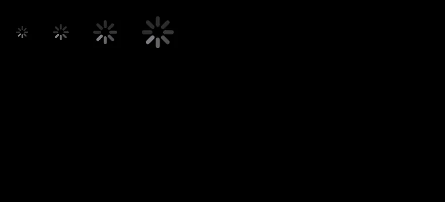
import { View } from "react-native"
import { Spinner } from "@/components/ui/spinner"

export function SpinnerSizesExample() {
  return (
    <View className="flex-row items-center gap-6">
      <Spinner size={12} />
      <Spinner />
      <Spinner size={24} />
      <Spinner size={32} />
    </View>
  )
}import EsuissUI
import SwiftUI
struct SpinnerSizesExample: View {
var body: some View {
HStack(spacing: 24) {
Spinner(.sm)
Spinner()
Spinner(.lg)
Spinner(.xl)
}
.foregroundStyle(Color.labelSecondary)
}
}import androidx.compose.foundation.layout.Arrangement
import androidx.compose.foundation.layout.Row
import androidx.compose.runtime.Composable
import androidx.compose.ui.Alignment
import androidx.compose.ui.unit.dp
import com.esuiss.ui.components.Spinner
@Composable
fun SpinnerRow(content: @Composable () -> Unit) {
Row(horizontalArrangement = Arrangement.spacedBy(24.dp), verticalAlignment = Alignment.CenterVertically) {
content()
}
}
@Composable
fun SpinnerSizes() {
SpinnerRow {
Spinner(size = 12.dp)
Spinner()
Spinner(size = 24.dp)
Spinner(size = 32.dp)
}
}Colors
Spinners in the label, accent and danger colors.
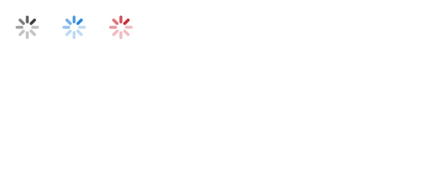
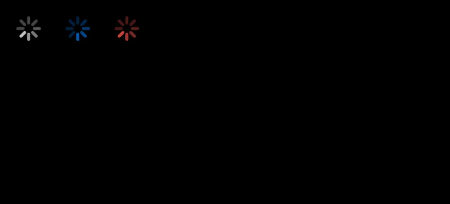
import { View } from "react-native"
import { Spinner } from "@/components/ui/spinner"

export function SpinnerColorsExample() {
  return (
    <View className="flex-row items-center gap-6">
      <Spinner size={24} colorClassName="accent-label" />
      <Spinner size={24} colorClassName="accent-accent" />
      <Spinner size={24} colorClassName="accent-danger" />
    </View>
  )
}import EsuissUI
import SwiftUI
struct SpinnerColorsExample: View {
var body: some View {
HStack(spacing: 24) {
Spinner(.lg).foregroundStyle(Color.label)
Spinner(.lg).foregroundStyle(Color.accent)
Spinner(.lg).foregroundStyle(Color.danger)
}
}
}import androidx.compose.foundation.layout.Arrangement
import androidx.compose.foundation.layout.Row
import androidx.compose.runtime.Composable
import androidx.compose.ui.Alignment
import androidx.compose.ui.unit.dp
import com.esuiss.ui.components.Spinner
import com.esuiss.ui.theme.EsuissTheme
@Composable
fun SpinnerRow(content: @Composable () -> Unit) {
Row(horizontalArrangement = Arrangement.spacedBy(24.dp), verticalAlignment = Alignment.CenterVertically) {
content()
}
}
@Composable
fun SpinnerColors() {
val colors = EsuissTheme.colors
SpinnerRow {
Spinner(size = 24.dp, color = colors.label)
Spinner(size = 24.dp, color = colors.accent)
Spinner(size = 24.dp, color = colors.danger)
}
}In button
Spinners inside disabled buttons next to a label.
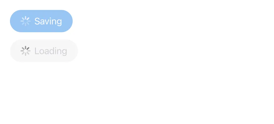
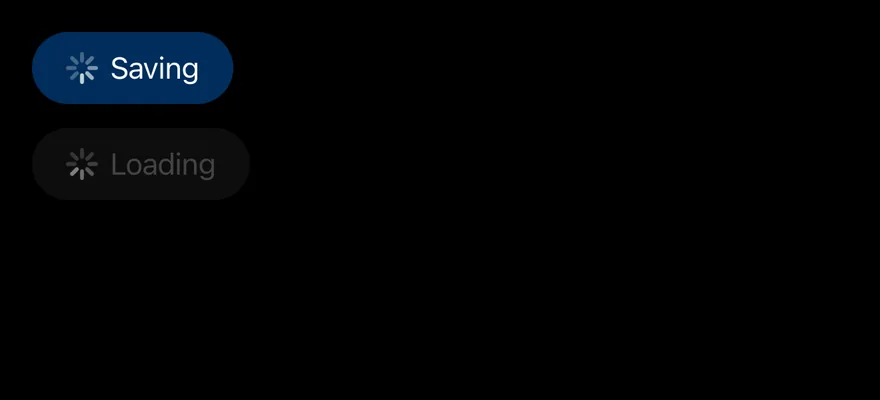
import { View } from "react-native"
import { Button } from "@/components/ui/button"
import { Spinner } from "@/components/ui/spinner"
import { Text } from "@/components/ui/text"

export function SpinnerInButtonExample() {
  return (
    <View className="items-start gap-3">
      <Button disabled>
        <Spinner colorClassName="accent-on-accent" />
        <Text>Saving</Text>
      </Button>
      <Button variant="secondary" disabled>
        <Spinner />
        <Text>Loading</Text>
      </Button>
    </View>
  )
}import EsuissUI
import SwiftUI
struct SpinnerInButtonExample: View {
var body: some View {
VStack(alignment: .leading, spacing: 12) {
Button {} label: {
HStack(spacing: 6) {
Spinner().foregroundStyle(Color.onAccent)
Text("Saving")
}
}
.buttonStyle(.variant())
Button {} label: {
HStack(spacing: 6) {
Spinner().foregroundStyle(Color.labelSecondary)
Text("Loading")
}
}
.buttonStyle(.variant(.secondary))
}
.disabled(true)
}
}import androidx.compose.foundation.layout.Arrangement
import androidx.compose.foundation.layout.Column
import androidx.compose.runtime.Composable
import androidx.compose.ui.unit.dp
import com.esuiss.ui.components.Button
import com.esuiss.ui.components.ButtonVariant
import com.esuiss.ui.components.Spinner
import com.esuiss.ui.components.Text
import com.esuiss.ui.theme.EsuissTheme
@Composable
fun SpinnerInButton() {
Column(verticalArrangement = Arrangement.spacedBy(12.dp)) {
Button(onClick = {}, enabled = false) {
Spinner(color = EsuissTheme.colors.onAccent)
Text("Saving")
}
Button(onClick = {}, variant = ButtonVariant.Secondary, enabled = false) {
Spinner()
Text("Loading")
}
}
}API Reference
Spinner
React.ComponentProps<typeof ActivityIndicator>- About
- Width and height in points. Defaults to
16. - Type
number- Default
- 16
- About
- Class that sets the indicator color. Defaults to
accent-label-secondary. - Type
string- Default
- "accent-label-secondary"
Accessibility
- The wrapper has
role="progressbar", isaccessible, and setsbusy: trueinaccessibilityState. - It is announced as
"Loading"unless you pass anotheraccessibilityLabel.
Notes
- The default color uses the
label-secondarytoken. - The look of the indicator comes from the platform's native activity indicator, so it differs between iOS and Android.