suiss/uim · React Native Component
Input Otp
A row of single-character boxes for entering one-time codes, with autofill support.
Input Otp is an open-source mobile component from suiss/uim for React Native and Expo, with SwiftUI and Jetpack Compose versions built from the same design tokens. The @esuiss/uim CLI copies its source into your project, so you own the code.
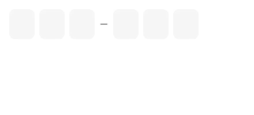
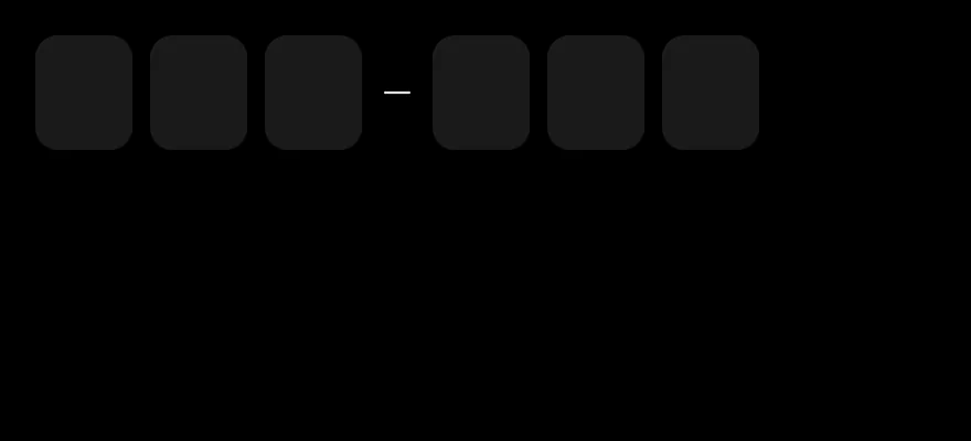
import { InputOTP, InputOTPGroup, InputOTPSeparator, InputOTPSlot } from "@/components/ui/input-otp"

export function InputOtpExample() {
  return (
    <InputOTP length={6}>
      <InputOTPGroup>
        <InputOTPSlot index={0} />
        <InputOTPSlot index={1} />
        <InputOTPSlot index={2} />
      </InputOTPGroup>
      <InputOTPSeparator />
      <InputOTPGroup>
        <InputOTPSlot index={3} />
        <InputOTPSlot index={4} />
        <InputOTPSlot index={5} />
      </InputOTPGroup>
    </InputOTP>
  )
}import EsuissUI
import SwiftUI
struct InputOTPDefaultDemo: View {
@State private var text = ""
var body: some View {
InputOTP(text: $text, length: 6) {
InputOTPGroup {
InputOTPSlot(index: 0)
InputOTPSlot(index: 1)
InputOTPSlot(index: 2)
}
InputOTPSeparator()
InputOTPGroup {
InputOTPSlot(index: 3)
InputOTPSlot(index: 4)
InputOTPSlot(index: 5)
}
}
}
}import androidx.compose.foundation.layout.Column
import androidx.compose.runtime.Composable
import androidx.compose.runtime.getValue
import androidx.compose.runtime.mutableStateOf
import androidx.compose.runtime.saveable.rememberSaveable
import androidx.compose.runtime.setValue
import com.esuiss.ui.components.InputOTP
import com.esuiss.ui.components.InputOTPGroup
import com.esuiss.ui.components.InputOTPSeparator
import com.esuiss.ui.components.InputOTPSlot
@Composable
fun InputOTPDefault() {
var value by rememberSaveable { mutableStateOf("") }
Column {
InputOTP(value, { value = it }, maxLength = 6) {
InputOTPGroup {
InputOTPSlot(0)
InputOTPSlot(1)
InputOTPSlot(2)
}
InputOTPSeparator()
InputOTPGroup {
InputOTPSlot(3)
InputOTPSlot(4)
InputOTPSlot(5)
}
}
}
}InputOTP is backed by one hidden TextInput and shows each character in an InputOTPSlot. The active slot gets an accent border and a blinking caret. The hidden input uses the one-time-code autofill hints, so codes from messages can be filled in automatically, and pasting fills every slot.
Group slots with InputOTPGroup and place an InputOTPSeparator between groups for codes such as 123-456.
Installation
$ pnpm dlx @esuiss/uim@latest add input-otp$ pnpm dlx @esuiss/uim@latest add input-otp --platform swift$ pnpm dlx @esuiss/uim@latest add input-otp --platform kotlinThe CLI also adds what it builds on: Icon, Text.
Manual
- Install the dependencies:
npx expo install cn phosphor-react-native react-native-reanimated react-native-svg react-native-worklets-
Add the pieces it builds on: Icon, Text, and the primitives
components/primitives/otp-field.tsx,components/primitives/use-render.tsx. -
Copy the source into
components/ui/input-otp.tsx:
import { cn } from "cn"
import { MinusIcon } from "phosphor-react-native"
import * as React from "react"
import { View } from "react-native"
import Animated, {
  cancelAnimation,
  ReduceMotion,
  useAnimatedStyle,
  useSharedValue,
  withDelay,
  withRepeat,
  withSequence,
  withTiming,
} from "react-native-reanimated"
import * as OTPFieldPrimitive from "@/components/primitives/otp-field"
import { resolveClassName } from "@/components/primitives/use-render"- Update the import paths to match your project.
- Install the dependencies:
npx expo install cn phosphor-react-native react-native-reanimated react-native-svg react-native-worklets-
Add the pieces it builds on: Icon, Text, and the primitives
components/primitives/otp-field.tsx,components/primitives/use-render.tsx. -
Copy the source into
components/ui/input-otp.tsx:
import { cn } from "cn"
import { MinusIcon } from "phosphor-react-native"
import * as React from "react"
import { View } from "react-native"
import Animated, {
  cancelAnimation,
  ReduceMotion,
  useAnimatedStyle,
  useSharedValue,
  withDelay,
  withRepeat,
  withSequence,
  withTiming,
} from "react-native-reanimated"
import * as OTPFieldPrimitive from "@/components/primitives/otp-field"
import { resolveClassName } from "@/components/primitives/use-render"- Update the import paths to match your project.
- Install the dependencies:
npx expo install phosphor-react-native react-native-reanimated react-native-svg react-native-worklets-
Add the pieces it builds on: Icon, Text, and the primitives
components/primitives/otp-field.tsx,components/primitives/use-render.tsx. -
Copy the source into
components/ui/input-otp.tsx:
import { MinusIcon } from "phosphor-react-native"
import * as React from "react"
import { StyleSheet, type TextStyle, View, type ViewStyle } from "react-native"
import Animated, {
  cancelAnimation,
  ReduceMotion,
  useAnimatedStyle,
  useSharedValue,
  withDelay,
  withRepeat,
  withSequence,
  withTiming,
} from "react-native-reanimated"
import * as OTPFieldPrimitive from "@/components/primitives/otp-field"
import { Icon } from "@/components/ui/icon"
import { Text } from "@/components/ui/text"- Update the import paths to match your project.
-
Target iOS 17 or later.
-
Add the Swift package to your app:
.package(url: "https://github.com/phosphor-icons/swift", from: "2.1.0")- Copy the theme files every view uses:
import SwiftUI
import UIKit

struct RGBA: Sendable {
  let red: CGFloat
  let green: CGFloat
  let blue: CGFloat
  let alpha: CGFloat

  init(_ hex: UInt32, _ alpha: CGFloat = 1) {
    red = CGFloat((hex >> 16) & 0xFF) / 255
    green = CGFloat((hex >> 8) & 0xFF) / 255
    blue = CGFloat(hex & 0xFF) / 255
    self.alpha = alpha
}import SwiftUI
extension Color {
public static let surface = Color.adaptive(light: .init(0xFFFFFF), dark: .init(0x000000))
public static let surfaceSecondary = Color.adaptive(light: .init(0xF5F5F7), dark: .init(0x161617))
public static let surfaceTertiary = Color.adaptive(light: .init(0xE8E8ED), dark: .init(0x2C2C2E))
public static let surfaceRaised = Color.adaptive(light: .init(0xFFFFFF), dark: .init(0x1D1D1F))
public static let label = Color.adaptive(light: .init(0x1D1D1F), dark: .init(0xF5F5F7))
public static let labelSecondary = Color.adaptive(light: .init(0x6E6E73), dark: .init(0xA1A1A6))
public static let labelTertiary = Color.adaptive(light: .init(0x86868B), dark: .init(0x86868B))
public static let labelQuaternary = Color.adaptive(light: .init(0xD2D2D7), dark: .init(0x424245))
public static let control = Color.adaptive(light: .init(0x000000, 0.04), dark: .init(0xFFFFFF, 0.1))
public static let controlPressed = Color.adaptive(light: .init(0x000000, 0.12), dark: .init(0xFFFFFF, 0.22))
public static let controlSelected = Color.adaptive(light: .init(0x1D1D1F), dark: .init(0xF5F5F7))
public static let controlDisabled = Color.adaptive(light: .init(0x000000, 0.03), dark: .init(0xFFFFFF, 0.05))
public static let onControlSelected = Color.adaptive(light: .init(0xFFFFFF), dark: .init(0x000000))- Copy the source and every file it uses:
import PhosphorSwift
import SwiftUI

struct InputOTPContext {
  var characters: [Character]
  var length: Int
  var focused: Bool
}

struct InputOTPTone: Equatable {
  var danger = false
  var verified = false
  var dimmed = false
  var pops: [Int] = []
}import PhosphorSwift
import SwiftUI
extension Shadow {
static let control = Shadow(color: .black.opacity(0.08), radius: 0.5, y: 0.5)
static let thumb = Shadow(color: .black.opacity(0.12), radius: 1.5, y: 1)
}
struct SelectionIndicator<Mark: View>: View {
let checked: Bool
let pressed: Bool
let cornerRadius: CGFloat
let mark: Mark
@Environment(\.isEnabled) private var isEnabled
@Environment(\.isInvalid) private var invalidimport SwiftUI
extension EnvironmentValues {
@Entry public var isInvalid = false
@Entry var fieldInset = false
@Entry var fieldGroupInset = false
@Entry var fieldSetInset = false
}
extension View {
public func invalid(_ isInvalid: Bool = true) -> some View {
environment(\.isInvalid, isInvalid)
}
}
public enum FieldOrientation: CaseIterable, Sendable {import SwiftUI
extension EnvironmentValues {
@Entry public var hapticsEnabled = true
}
extension View {
public func haptics(_ enabled: Bool) -> some View {
environment(\.hapticsEnabled, enabled)
}
func hapticFeedback<Trigger: Equatable>(_ feedback: SensoryFeedback, trigger: Trigger) -> some View {
modifier(HapticFeedbackModifier(feedback: feedback, trigger: trigger) { _, _ in true })
}
func hapticFeedback<Trigger: Equatable>(import SwiftUI
public struct Separator: View {
let orientation: Axis
public init(_ orientation: Axis = .horizontal) {
self.orientation = orientation
}
public var body: some View {
Rectangle()
.fill(Color.separator)
.frame(width: orientation == .vertical ? 1 : nil, height: orientation == .horizontal ? 1 : nil)
.frame(maxWidth: orientation == .horizontal ? .infinity : nil, maxHeight: orientation == .vertical ? .infinity : nil)
.accessibilityHidden(true)
}import SwiftUI
public enum TextVariant: CaseIterable, Sendable {
case `default`, h1, h2, h3, h4, p, blockquote, code, lead, large, small, muted
var style: TextStyle {
switch self {
case .h1: .xl3
case .h2: .xl2
case .h3: .xl
case .h4, .lead, .large: .lg
case .code, .small, .muted: .sm
default: .base
}
}- Add the files to your app target.
- Set
minSdkto 24 or higher and add the dependencies:
implementation(platform("androidx.compose:compose-bom:2026.09.00"))
implementation("androidx.compose.foundation:foundation")
implementation("androidx.compose.ui:ui")
implementation("com.adamglin:phosphor-icon-android:1.0.0")- Copy the theme files every view uses:
package com.esuiss.ui.theme

import androidx.compose.foundation.isSystemInDarkTheme
import androidx.compose.runtime.Composable
import androidx.compose.runtime.CompositionLocalProvider
import androidx.compose.runtime.Immutable
import androidx.compose.runtime.staticCompositionLocalOf
import androidx.compose.ui.Modifier
import androidx.compose.ui.draw.dropShadow
import androidx.compose.ui.graphics.Color
import androidx.compose.ui.graphics.Shape
import androidx.compose.ui.graphics.shadow.Shadow as DropShadow
import androidx.compose.ui.text.TextStyle
import androidx.compose.ui.text.style.LineHeightStyle
import androidx.compose.ui.unit.Dp
import androidx.compose.ui.unit.DpOffsetpackage com.esuiss.ui.theme
import androidx.compose.runtime.Immutable
import androidx.compose.ui.graphics.Color
import androidx.compose.ui.unit.dp
@Immutable
data class Colors(
val surface: Color,
val surfaceSecondary: Color,
val surfaceTertiary: Color,
val surfaceRaised: Color,
val label: Color,
val labelSecondary: Color,
val labelTertiary: Color,
val labelQuaternary: Color,- Copy the source and every file it uses:
package com.esuiss.ui.components

import androidx.compose.animation.animateColorAsState
import androidx.compose.animation.core.Animatable
import androidx.compose.animation.core.animateFloat
import androidx.compose.animation.core.animateFloatAsState
import androidx.compose.animation.core.infiniteRepeatable
import androidx.compose.animation.core.keyframes
import androidx.compose.animation.core.rememberInfiniteTransition
import androidx.compose.animation.core.tween
import androidx.compose.foundation.background
import androidx.compose.foundation.border
import androidx.compose.foundation.interaction.MutableInteractionSource
import androidx.compose.foundation.interaction.collectIsFocusedAsState
import androidx.compose.foundation.layout.Arrangement
import androidx.compose.foundation.layout.Boxpackage com.esuiss.ui.components
import androidx.compose.runtime.compositionLocalOf
import androidx.compose.ui.graphics.Color
import androidx.compose.ui.text.TextStyle
import androidx.compose.ui.unit.Dp
import androidx.compose.ui.unit.dp
val LocalContentStyle = compositionLocalOf { TextStyle.Default }
val LocalContentColor = compositionLocalOf { Color.Unspecified }
val LocalIconSize = compositionLocalOf { 20.dp }package com.esuiss.ui.components
import androidx.compose.foundation.background
import androidx.compose.foundation.gestures.Orientation
import androidx.compose.foundation.layout.Arrangement
import androidx.compose.foundation.layout.Box
import androidx.compose.foundation.layout.Column
import androidx.compose.foundation.layout.ColumnScope
import androidx.compose.foundation.layout.LayoutScopeMarker
import androidx.compose.foundation.layout.Row
import androidx.compose.foundation.layout.RowScope
import androidx.compose.foundation.layout.fillMaxWidth
import androidx.compose.foundation.layout.heightIn
import androidx.compose.foundation.layout.padding
import androidx.compose.foundation.shape.RoundedCornerShape
import androidx.compose.foundation.text.BasicTextpackage com.esuiss.ui.components
import android.provider.Settings
import androidx.compose.animation.core.CubicBezierEasing
import androidx.compose.foundation.background
import androidx.compose.foundation.border
import androidx.compose.foundation.gestures.Orientation
import androidx.compose.foundation.text.selection.TextSelectionColors
import androidx.compose.runtime.Composable
import androidx.compose.runtime.mutableStateOf
import androidx.compose.runtime.remember
import androidx.compose.ui.Modifier
import androidx.compose.ui.draw.clip
import androidx.compose.ui.draw.drawWithContent
import androidx.compose.ui.geometry.Offset
import androidx.compose.ui.geometry.Sizepackage com.esuiss.ui.components
import androidx.compose.foundation.Image
import androidx.compose.foundation.layout.size
import androidx.compose.runtime.Composable
import androidx.compose.ui.Modifier
import androidx.compose.ui.graphics.Color
import androidx.compose.ui.graphics.ColorFilter
import androidx.compose.ui.graphics.takeOrElse
import androidx.compose.ui.graphics.vector.ImageVector
import androidx.compose.ui.unit.Dp
import com.esuiss.ui.theme.EsuissTheme
@Composable
fun Icon(
imageVector: ImageVector,package com.esuiss.ui.components
import androidx.compose.foundation.layout.Arrangement
import androidx.compose.foundation.layout.Row
import androidx.compose.foundation.layout.RowScope
import androidx.compose.foundation.text.BasicText
import androidx.compose.runtime.Composable
import androidx.compose.runtime.CompositionLocalProvider
import androidx.compose.ui.Alignment
import androidx.compose.ui.Modifier
import androidx.compose.ui.text.font.FontWeight
import androidx.compose.ui.unit.dp
import com.esuiss.ui.theme.EsuissTheme
import com.esuiss.ui.theme.Typography
@Composablepackage com.esuiss.ui.components
import androidx.compose.foundation.background
import androidx.compose.foundation.gestures.Orientation
import androidx.compose.foundation.layout.Box
import androidx.compose.foundation.layout.fillMaxHeight
import androidx.compose.foundation.layout.fillMaxWidth
import androidx.compose.foundation.layout.height
import androidx.compose.foundation.layout.width
import androidx.compose.runtime.Composable
import androidx.compose.ui.Modifier
import androidx.compose.ui.unit.dp
import com.esuiss.ui.theme.EsuissTheme
@Composable
fun Separator(- Update the
com.esuiss.uipackage names to match your project.
Usage
import { InputOTP, InputOTPGroup, InputOTPSlot, InputOTPSeparator } from "@/components/ui/input-otp"<InputOTP length={6}>
<InputOTPGroup>
<InputOTPSlot index={0} />
<InputOTPSlot index={1} />
<InputOTPSlot index={2} />
</InputOTPGroup>
<InputOTPSeparator />
<InputOTPGroup>
<InputOTPSlot index={3} />
<InputOTPSlot index={4} />
<InputOTPSlot index={5} />
</InputOTPGroup>
</InputOTP>Set length and render one InputOTPSlot per index. Use value with onValueChange for controlled state, or defaultValue. onValueComplete fires when every slot is filled.
validationType limits input to numeric (the default number pad), alpha, alphanumeric or none, and onValueInvalid reports rejected characters. Set mask to hide the characters.
Use InputOTPSlotClassContext to style every slot at once, or className on a single slot.
Examples
Controlled
Controlled with value and onValueChange.
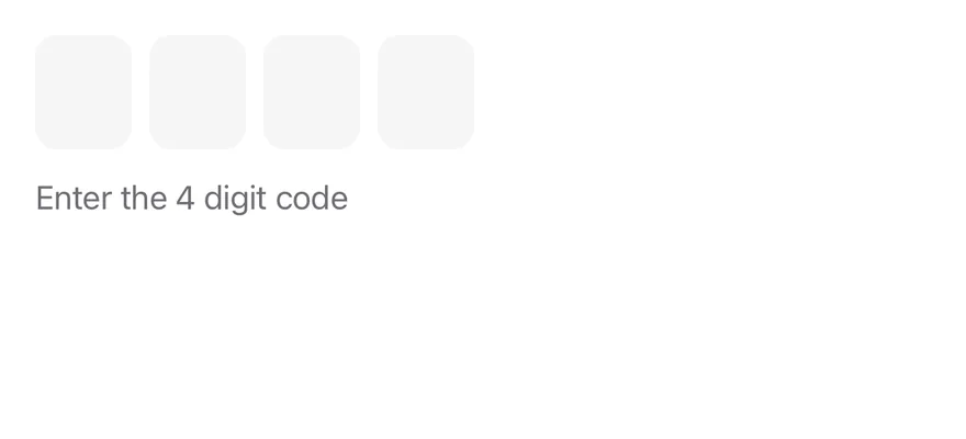
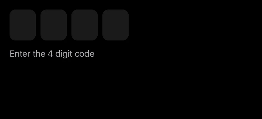
import * as React from "react"
import { View } from "react-native"
import { InputOTP, InputOTPGroup, InputOTPSlot } from "@/components/ui/input-otp"
import { Text } from "@/components/ui/text"

function slotIndexes(length: number) {
  return Array.from({ length }, (_, index) => index)
}

function ControlledDemo() {
  const [value, setValue] = React.useState("")
  const [completed, setCompleted] = React.useState<string | null>(null)
  return (
    <View className="gap-3">
      <InputOTP
        length={4}
        value={value}
        onValueChange={setValue}
        onValueComplete={setCompleted}
      >
        <InputOTPGroup>
          {slotIndexes(4).map((index) => (
            <InputOTPSlot key={index} index={index} />
          ))}
        </InputOTPGroup>
      </InputOTP>
      <Text variant="muted">
        {completed ? `Submitted ${completed}` : "Enter the 4 digit code"}
      </Text>
    </View>
  )
}

export function InputOtpControlledExample() {
  return (
    <ControlledDemo />
  )
}import EsuissUI
import SwiftUI
struct InputOTPControlledDemo: View {
@State private var value = ""
@State private var completed: String?
var body: some View {
VStack(alignment: .leading, spacing: 12) {
InputOTP(text: $value, length: 4)
Text(completed.map { "Submitted \($0)" } ?? "Enter the 4 digit code")
.textVariant(.muted)
}
.onChange(of: value) { _, next in
if next.count == 4 { completed = next }
}
}
}import androidx.compose.foundation.layout.Arrangement
import androidx.compose.foundation.layout.Column
import androidx.compose.runtime.Composable
import androidx.compose.runtime.getValue
import androidx.compose.runtime.mutableStateOf
import androidx.compose.runtime.saveable.rememberSaveable
import androidx.compose.runtime.setValue
import androidx.compose.ui.unit.dp
import com.esuiss.ui.components.InputOTP
import com.esuiss.ui.components.Text
import com.esuiss.ui.components.TextVariant
@Composable
fun InputOTPControlled() {
var value by rememberSaveable { mutableStateOf("") }
var completed by rememberSaveable { mutableStateOf<String?>(null) }
Column(verticalArrangement = Arrangement.spacedBy(12.dp)) {
InputOTP(value, { value = it }, maxLength = 4, onComplete = { completed = it })
Text(completed?.let { "Submitted $it" } ?: "Enter the 4 digit code", variant = TextVariant.Muted)
}
}Alphanumeric
Letters and numbers with validationType="alphanumeric".
import { InputOTP, InputOTPGroup, InputOTPSlot } from "@/components/ui/input-otp"

function slotIndexes(length: number) {
  return Array.from({ length }, (_, index) => index)
}

export function InputOtpAlphanumericExample() {
  return (
    <InputOTP
      length={6}
      validationType="alphanumeric"
      normalizeValue={(value) => value.toUpperCase()}
    >
      <InputOTPGroup>
        {slotIndexes(6).map((index) => (
          <InputOTPSlot key={index} index={index} />
        ))}
      </InputOTPGroup>
    </InputOTP>
  )
}import EsuissUI
import SwiftUI
struct InputOTPAlphanumericDemo: View {
@State private var value = ""
var body: some View {
InputOTP(
text: Binding(get: { value }, set: { value = $0.uppercased() }),
length: 6,
allowed: .alphanumerics
)
}
}import androidx.compose.foundation.layout.Column
import androidx.compose.runtime.Composable
import androidx.compose.runtime.getValue
import androidx.compose.runtime.mutableStateOf
import androidx.compose.runtime.saveable.rememberSaveable
import androidx.compose.runtime.setValue
import androidx.compose.ui.text.input.KeyboardType
import com.esuiss.ui.components.InputOTP
@Composable
fun InputOTPAlphanumeric() {
var value by rememberSaveable { mutableStateOf("") }
Column {
InputOTP(value, { value = it.uppercase() }, maxLength = 6, keyboardType = KeyboardType.Ascii)
}
}Masked
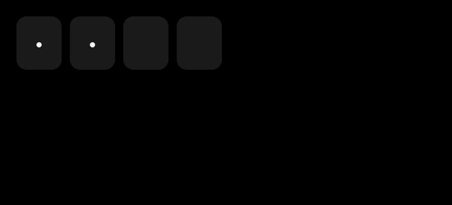
A four-digit code with hidden characters.

import { InputOTP, InputOTPGroup, InputOTPSlot } from "@/components/ui/input-otp"

function slotIndexes(length: number) {
  return Array.from({ length }, (_, index) => index)
}

export function InputOtpMaskedExample() {
  return (
    <InputOTP length={4} mask defaultValue="12">
      <InputOTPGroup>
        {slotIndexes(4).map((index) => (
          <InputOTPSlot key={index} index={index} />
        ))}
      </InputOTPGroup>
    </InputOTP>
  )
}Disabled
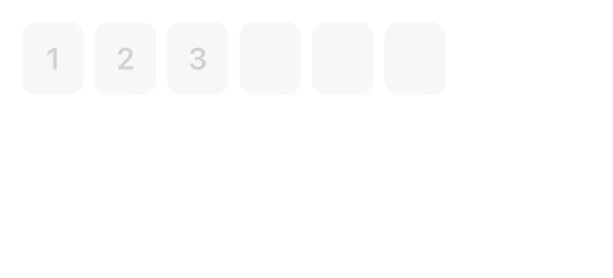
A disabled field with a partial value.
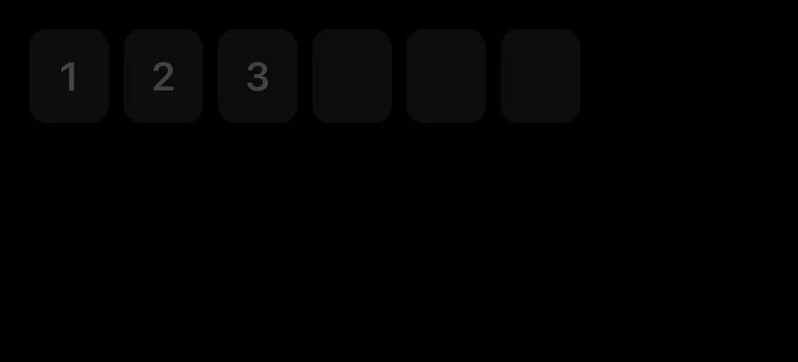
import { InputOTP, InputOTPGroup, InputOTPSlot } from "@/components/ui/input-otp"

function slotIndexes(length: number) {
  return Array.from({ length }, (_, index) => index)
}

export function InputOtpDisabledExample() {
  return (
    <InputOTP length={6} disabled defaultValue="123">
      <InputOTPGroup>
        {slotIndexes(6).map((index) => (
          <InputOTPSlot key={index} index={index} />
        ))}
      </InputOTPGroup>
    </InputOTP>
  )
}import EsuissUI
import SwiftUI
struct InputOTPDisabledExample: View {
var body: some View {
InputOTPDemo(length: 6, initial: "123")
.disabled(true)
}
}
struct InputOTPDemo: View {
let length: Int
@State private var text: String
init(length: Int, initial: String = "") {
self.length = length
_text = State(initialValue: initial)
}
var body: some View {
InputOTP(text: $text, length: length)
}
}import androidx.compose.foundation.layout.Column
import androidx.compose.runtime.Composable
import androidx.compose.runtime.getValue
import androidx.compose.runtime.mutableStateOf
import androidx.compose.runtime.saveable.rememberSaveable
import androidx.compose.runtime.setValue
import com.esuiss.ui.components.InputOTP
@Composable
fun InputOTPDisabled() {
var value by rememberSaveable { mutableStateOf("123") }
Column {
InputOTP(value, { value = it }, maxLength = 6, enabled = false)
}
}API Reference
InputOTP
Root that owns the hidden input and the value.
React.ComponentProps<typeof OTPFieldPrimitive.Root>InputOTPGroup
Row of adjacent slots.
React.ComponentProps<typeof View>InputOTPSlot
Box that shows one character.
React.ComponentProps<typeof OTPFieldPrimitive.Input>InputOTPSeparator
Dash between groups.
React.ComponentProps<typeof OTPFieldPrimitive.Separator>Accessibility
- Screen readers interact with the hidden input, labelled "N character code" by default; pass
inputPropswith anaccessibilityLabelto localize it. - The visual slots are hidden from VoiceOver and TalkBack.
disabledis exposed on the input.
Notes
- The hidden input sets
textContentType="oneTimeCode"for iOS andautoComplete="one-time-code"for Android autofill. - The caret blink respects the system Reduce Motion setting.
- Uses
bg-control,border-accentandbg-accenttokens; light and dark follow the system appearance.