suiss/uim · React Native Component
Switch
A toggle switch for turning a single setting on or off.
Switch is an open-source mobile component from suiss/uim for React Native and Expo, with SwiftUI and Jetpack Compose versions built from the same design tokens. The @esuiss/uim CLI copies its source into your project, so you own the code.


import * as React from "react"
import { Switch } from "@/components/ui/switch"

function SwitchDemo({ initial = false }: { initial?: boolean }) {
  const [checked, setChecked] = React.useState(initial)
  return <Switch checked={checked} onCheckedChange={setChecked} />
}

export function SwitchExample() {
  return (
    <SwitchDemo />
  )
}import EsuissUI
import SwiftUI
struct SwitchExample: View {
var body: some View {
SwitchDemo(initial: false)
}
}
struct SwitchDemo: View {
var size: SwitchStyle.Size = .default
var label: LocalizedStringKey?
@State private var checked: Bool
init(initial: Bool, size: SwitchStyle.Size = .default, label: LocalizedStringKey? = nil) {
self.size = size
self.label = label
_checked = State(initialValue: initial)
}
var body: some View {
if let label {
Toggle(isOn: $checked) { EmptyView() }
.toggleStyle(.switch(size: size))
.accessibilityLabel(Text(label))
} else {
Toggle(isOn: $checked) { EmptyView() }
.toggleStyle(.switch(size: size))
}
}
}import androidx.compose.runtime.Composable
import androidx.compose.runtime.getValue
import androidx.compose.runtime.mutableStateOf
import androidx.compose.runtime.saveable.rememberSaveable
import androidx.compose.runtime.setValue
import com.esuiss.ui.components.Switch
@Composable
fun SwitchExample() {
SwitchDemo(initial = false)
}
@Composable
fun SwitchDemo(initial: Boolean) {
var checked by rememberSaveable { mutableStateOf(initial) }
Switch(checked, { checked = it })
}Switch is a pressable track with a round thumb that slides between the off and on positions. The thumb animates with Reanimated and stretches slightly while pressed. It comes in two sizes, default and sm, and has an invalid state that adds a danger-colored border.
Use a switch for settings that take effect immediately. For choices that are submitted later, use Checkbox.
Installation
$ pnpm dlx @esuiss/uim@latest add switch$ pnpm dlx @esuiss/uim@latest add switch --platform swift$ pnpm dlx @esuiss/uim@latest add switch --platform kotlinManual
- Install the dependencies:
npx expo install cn react-native-reanimated react-native-worklets-
Add the pieces it builds on: the primitives
components/primitives/switch.tsx,components/primitives/use-render.tsx. -
Copy the source into
components/ui/switch.tsx:
import { cn } from "cn"
import * as React from "react"
import type { GestureResponderEvent } from "react-native"
import Animated, {
  Easing,
  ReduceMotion,
  useAnimatedStyle,
  withTiming,
} from "react-native-reanimated"
import * as SwitchPrimitives from "@/components/primitives/switch"
import { resolveClassName } from "@/components/primitives/use-render"

type SwitchSize = "default" | "sm"

const HIT_SLOP = { top: 8, bottom: 8, left: 12, right: 12 }- Update the import paths to match your project.
- Install the dependencies:
npx expo install cn react-native-reanimated react-native-worklets-
Add the pieces it builds on: the primitives
components/primitives/switch.tsx,components/primitives/use-render.tsx. -
Copy the source into
components/ui/switch.tsx:
import { cn } from "cn"
import * as React from "react"
import type { GestureResponderEvent } from "react-native"
import Animated, {
  Easing,
  ReduceMotion,
  useAnimatedStyle,
  withTiming,
} from "react-native-reanimated"
import * as SwitchPrimitives from "@/components/primitives/switch"
import { resolveClassName } from "@/components/primitives/use-render"

type SwitchSize = "default" | "sm"

const HIT_SLOP = { top: 8, bottom: 8, left: 12, right: 12 }- Update the import paths to match your project.
- Install the dependencies:
npx expo install react-native-reanimated react-native-worklets-
Add the pieces it builds on: the primitives
components/primitives/switch.tsx,components/primitives/use-render.tsx. -
Copy the source into
components/ui/switch.tsx:
import * as React from "react"
import { type GestureResponderEvent, StyleSheet } from "react-native"
import Animated, {
  Easing,
  ReduceMotion,
  useAnimatedStyle,
  withTiming,
} from "react-native-reanimated"
import * as SwitchPrimitives from "@/components/primitives/switch"
import { shadow, useTheme } from "@/components/ui/theme"

type SwitchSize = "default" | "sm"

const HIT_SLOP = { top: 8, bottom: 8, left: 12, right: 12 }

const THUMB = {- Update the import paths to match your project.
-
Target iOS 17 or later.
-
Add the Swift package to your app:
.package(url: "https://github.com/phosphor-icons/swift", from: "2.1.0")- Copy the theme files every view uses:
import SwiftUI
import UIKit

struct RGBA: Sendable {
  let red: CGFloat
  let green: CGFloat
  let blue: CGFloat
  let alpha: CGFloat

  init(_ hex: UInt32, _ alpha: CGFloat = 1) {
    red = CGFloat((hex >> 16) & 0xFF) / 255
    green = CGFloat((hex >> 8) & 0xFF) / 255
    blue = CGFloat(hex & 0xFF) / 255
    self.alpha = alpha
}import SwiftUI
extension Color {
public static let surface = Color.adaptive(light: .init(0xFFFFFF), dark: .init(0x000000))
public static let surfaceSecondary = Color.adaptive(light: .init(0xF5F5F7), dark: .init(0x161617))
public static let surfaceTertiary = Color.adaptive(light: .init(0xE8E8ED), dark: .init(0x2C2C2E))
public static let surfaceRaised = Color.adaptive(light: .init(0xFFFFFF), dark: .init(0x1D1D1F))
public static let label = Color.adaptive(light: .init(0x1D1D1F), dark: .init(0xF5F5F7))
public static let labelSecondary = Color.adaptive(light: .init(0x6E6E73), dark: .init(0xA1A1A6))
public static let labelTertiary = Color.adaptive(light: .init(0x86868B), dark: .init(0x86868B))
public static let labelQuaternary = Color.adaptive(light: .init(0xD2D2D7), dark: .init(0x424245))
public static let control = Color.adaptive(light: .init(0x000000, 0.04), dark: .init(0xFFFFFF, 0.1))
public static let controlPressed = Color.adaptive(light: .init(0x000000, 0.12), dark: .init(0xFFFFFF, 0.22))
public static let controlSelected = Color.adaptive(light: .init(0x1D1D1F), dark: .init(0xF5F5F7))
public static let controlDisabled = Color.adaptive(light: .init(0x000000, 0.03), dark: .init(0xFFFFFF, 0.05))
public static let onControlSelected = Color.adaptive(light: .init(0xFFFFFF), dark: .init(0x000000))- Copy the source and every file it uses:
import SwiftUI

public struct SwitchStyle: ToggleStyle {
  public enum Size: CaseIterable, Sendable {
    case `default`, sm

    var track: CGSize {
      switch self {
      case .default: CGSize(width: 52, height: 24)
      case .sm: CGSize(width: 44, height: 20)
      }
    }

    var thumbHeight: CGFloat {
      switch self {
case .default: 20import PhosphorSwift
import SwiftUI
extension Shadow {
static let control = Shadow(color: .black.opacity(0.08), radius: 0.5, y: 0.5)
static let thumb = Shadow(color: .black.opacity(0.12), radius: 1.5, y: 1)
}
struct SelectionIndicator<Mark: View>: View {
let checked: Bool
let pressed: Bool
let cornerRadius: CGFloat
let mark: Mark
@Environment(\.isEnabled) private var isEnabled
@Environment(\.isInvalid) private var invalidimport SwiftUI
extension EnvironmentValues {
@Entry public var isInvalid = false
@Entry var fieldInset = false
@Entry var fieldGroupInset = false
@Entry var fieldSetInset = false
}
extension View {
public func invalid(_ isInvalid: Bool = true) -> some View {
environment(\.isInvalid, isInvalid)
}
}
public enum FieldOrientation: CaseIterable, Sendable {import SwiftUI
extension EnvironmentValues {
@Entry public var hapticsEnabled = true
}
extension View {
public func haptics(_ enabled: Bool) -> some View {
environment(\.hapticsEnabled, enabled)
}
func hapticFeedback<Trigger: Equatable>(_ feedback: SensoryFeedback, trigger: Trigger) -> some View {
modifier(HapticFeedbackModifier(feedback: feedback, trigger: trigger) { _, _ in true })
}
func hapticFeedback<Trigger: Equatable>(import SwiftUI
public struct Separator: View {
let orientation: Axis
public init(_ orientation: Axis = .horizontal) {
self.orientation = orientation
}
public var body: some View {
Rectangle()
.fill(Color.separator)
.frame(width: orientation == .vertical ? 1 : nil, height: orientation == .horizontal ? 1 : nil)
.frame(maxWidth: orientation == .horizontal ? .infinity : nil, maxHeight: orientation == .vertical ? .infinity : nil)
.accessibilityHidden(true)
}import SwiftUI
public enum TextVariant: CaseIterable, Sendable {
case `default`, h1, h2, h3, h4, p, blockquote, code, lead, large, small, muted
var style: TextStyle {
switch self {
case .h1: .xl3
case .h2: .xl2
case .h3: .xl
case .h4, .lead, .large: .lg
case .code, .small, .muted: .sm
default: .base
}
}- Add the files to your app target.
- Set
minSdkto 24 or higher and add the dependencies:
implementation(platform("androidx.compose:compose-bom:2026.09.00"))
implementation("androidx.compose.foundation:foundation")
implementation("androidx.compose.ui:ui")- Copy the theme files every view uses:
package com.esuiss.ui.theme

import androidx.compose.foundation.isSystemInDarkTheme
import androidx.compose.runtime.Composable
import androidx.compose.runtime.CompositionLocalProvider
import androidx.compose.runtime.Immutable
import androidx.compose.runtime.staticCompositionLocalOf
import androidx.compose.ui.Modifier
import androidx.compose.ui.draw.dropShadow
import androidx.compose.ui.graphics.Color
import androidx.compose.ui.graphics.Shape
import androidx.compose.ui.graphics.shadow.Shadow as DropShadow
import androidx.compose.ui.text.TextStyle
import androidx.compose.ui.text.style.LineHeightStyle
import androidx.compose.ui.unit.Dp
import androidx.compose.ui.unit.DpOffsetpackage com.esuiss.ui.theme
import androidx.compose.runtime.Immutable
import androidx.compose.ui.graphics.Color
import androidx.compose.ui.unit.dp
@Immutable
data class Colors(
val surface: Color,
val surfaceSecondary: Color,
val surfaceTertiary: Color,
val surfaceRaised: Color,
val label: Color,
val labelSecondary: Color,
val labelTertiary: Color,
val labelQuaternary: Color,- Copy the source and every file it uses:
package com.esuiss.ui.components

import androidx.compose.animation.core.animateDpAsState
import androidx.compose.animation.core.tween
import androidx.compose.foundation.background
import androidx.compose.foundation.border
import androidx.compose.foundation.interaction.MutableInteractionSource
import androidx.compose.foundation.interaction.collectIsPressedAsState
import androidx.compose.foundation.layout.Box
import androidx.compose.foundation.layout.offset
import androidx.compose.foundation.layout.padding
import androidx.compose.foundation.layout.size
import androidx.compose.foundation.selection.toggleable
import androidx.compose.foundation.shape.CircleShape
import androidx.compose.runtime.Composable
import androidx.compose.runtime.getValuepackage com.esuiss.ui.components
import androidx.compose.runtime.compositionLocalOf
import androidx.compose.ui.graphics.Color
import androidx.compose.ui.text.TextStyle
import androidx.compose.ui.unit.Dp
import androidx.compose.ui.unit.dp
val LocalContentStyle = compositionLocalOf { TextStyle.Default }
val LocalContentColor = compositionLocalOf { Color.Unspecified }
val LocalIconSize = compositionLocalOf { 20.dp }package com.esuiss.ui.components
import androidx.compose.foundation.background
import androidx.compose.foundation.gestures.Orientation
import androidx.compose.foundation.layout.Arrangement
import androidx.compose.foundation.layout.Box
import androidx.compose.foundation.layout.Column
import androidx.compose.foundation.layout.ColumnScope
import androidx.compose.foundation.layout.LayoutScopeMarker
import androidx.compose.foundation.layout.Row
import androidx.compose.foundation.layout.RowScope
import androidx.compose.foundation.layout.fillMaxWidth
import androidx.compose.foundation.layout.heightIn
import androidx.compose.foundation.layout.padding
import androidx.compose.foundation.shape.RoundedCornerShape
import androidx.compose.foundation.text.BasicTextpackage com.esuiss.ui.components
import android.provider.Settings
import androidx.compose.animation.core.CubicBezierEasing
import androidx.compose.foundation.background
import androidx.compose.foundation.border
import androidx.compose.foundation.gestures.Orientation
import androidx.compose.foundation.text.selection.TextSelectionColors
import androidx.compose.runtime.Composable
import androidx.compose.runtime.mutableStateOf
import androidx.compose.runtime.remember
import androidx.compose.ui.Modifier
import androidx.compose.ui.draw.clip
import androidx.compose.ui.draw.drawWithContent
import androidx.compose.ui.geometry.Offset
import androidx.compose.ui.geometry.Sizepackage com.esuiss.ui.components
import androidx.compose.runtime.Composable
import androidx.compose.runtime.CompositionLocalProvider
import androidx.compose.runtime.remember
import androidx.compose.runtime.staticCompositionLocalOf
import androidx.compose.ui.hapticfeedback.HapticFeedback
import androidx.compose.ui.hapticfeedback.HapticFeedbackType
import androidx.compose.ui.platform.LocalHapticFeedback
val LocalHapticsEnabled = staticCompositionLocalOf { true }
@Composable
fun ProvideHaptics(enabled: Boolean, content: @Composable () -> Unit) {
CompositionLocalProvider(LocalHapticsEnabled provides enabled, content = content)
}package com.esuiss.ui.components
import androidx.compose.foundation.layout.Arrangement
import androidx.compose.foundation.layout.Row
import androidx.compose.foundation.layout.RowScope
import androidx.compose.foundation.text.BasicText
import androidx.compose.runtime.Composable
import androidx.compose.runtime.CompositionLocalProvider
import androidx.compose.ui.Alignment
import androidx.compose.ui.Modifier
import androidx.compose.ui.text.font.FontWeight
import androidx.compose.ui.unit.dp
import com.esuiss.ui.theme.EsuissTheme
import com.esuiss.ui.theme.Typography
@Composablepackage com.esuiss.ui.components
import androidx.compose.foundation.background
import androidx.compose.foundation.gestures.Orientation
import androidx.compose.foundation.layout.Box
import androidx.compose.foundation.layout.fillMaxHeight
import androidx.compose.foundation.layout.fillMaxWidth
import androidx.compose.foundation.layout.height
import androidx.compose.foundation.layout.width
import androidx.compose.runtime.Composable
import androidx.compose.ui.Modifier
import androidx.compose.ui.unit.dp
import com.esuiss.ui.theme.EsuissTheme
@Composable
fun Separator(- Update the
com.esuiss.uipackage names to match your project.
Usage
import { Switch } from "@/components/ui/switch"<SwitchDemo />Use defaultChecked for an uncontrolled switch, or checked with onCheckedChange to control it.
A switch has no visible text of its own. Pair it with a Label and link them with accessibilityLabelledBy and the label's nativeID, or set an accessibilityLabel. Give the Label an onPress that toggles the value if the label should be pressable too.
The switch has a hit slop around it, so it is easier to press than its visual size.
Examples
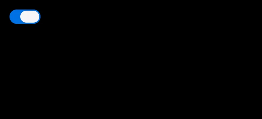
Checked
A switch that starts on.

import * as React from "react"
import { Switch } from "@/components/ui/switch"

function SwitchDemo({ initial = false }: { initial?: boolean }) {
  const [checked, setChecked] = React.useState(initial)
  return <Switch checked={checked} onCheckedChange={setChecked} />
}

export function SwitchCheckedExample() {
  return (
    <SwitchDemo initial />
  )
}import EsuissUI
import SwiftUI
struct SwitchCheckedExample: View {
var body: some View {
SwitchDemo(initial: true)
}
}
struct SwitchDemo: View {
var size: SwitchStyle.Size = .default
var label: LocalizedStringKey?
@State private var checked: Bool
init(initial: Bool, size: SwitchStyle.Size = .default, label: LocalizedStringKey? = nil) {
self.size = size
self.label = label
_checked = State(initialValue: initial)
}
var body: some View {
if let label {
Toggle(isOn: $checked) { EmptyView() }
.toggleStyle(.switch(size: size))
.accessibilityLabel(Text(label))
} else {
Toggle(isOn: $checked) { EmptyView() }
.toggleStyle(.switch(size: size))
}
}
}import androidx.compose.runtime.Composable
import androidx.compose.runtime.getValue
import androidx.compose.runtime.mutableStateOf
import androidx.compose.runtime.saveable.rememberSaveable
import androidx.compose.runtime.setValue
import com.esuiss.ui.components.Switch
@Composable
fun SwitchCheckedExample() {
SwitchDemo(initial = true)
}
@Composable
fun SwitchDemo(initial: Boolean) {
var checked by rememberSaveable { mutableStateOf(initial) }
Switch(checked, { checked = it })
}Sizes
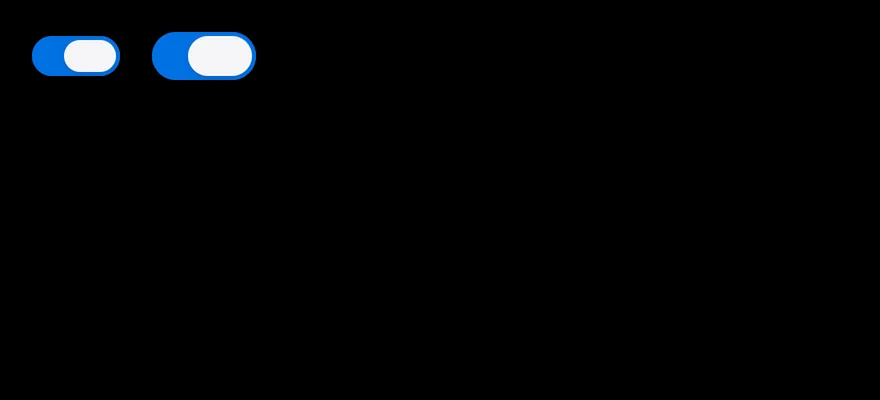
The sm and default sizes side by side.

import { View } from "react-native"
import { Switch } from "@/components/ui/switch"

export function SwitchSizesExample() {
  return (
    <View className="flex-row items-center gap-4">
      <Switch size="sm" defaultChecked accessibilityLabel="Wi-Fi" />
      <Switch defaultChecked accessibilityLabel="Bluetooth" />
    </View>
  )
}import EsuissUI
import SwiftUI
struct SwitchSizesExample: View {
var body: some View {
HStack(spacing: 16) {
SwitchDemo(initial: true, size: .sm, label: "Wi-Fi")
SwitchDemo(initial: true, label: "Bluetooth")
}
}
}
struct SwitchDemo: View {
var size: SwitchStyle.Size = .default
var label: LocalizedStringKey?
@State private var checked: Bool
init(initial: Bool, size: SwitchStyle.Size = .default, label: LocalizedStringKey? = nil) {
self.size = size
self.label = label
_checked = State(initialValue: initial)
}
var body: some View {
if let label {
Toggle(isOn: $checked) { EmptyView() }
.toggleStyle(.switch(size: size))
.accessibilityLabel(Text(label))
} else {
Toggle(isOn: $checked) { EmptyView() }
.toggleStyle(.switch(size: size))
}
}
}import androidx.compose.foundation.clickable
import androidx.compose.foundation.interaction.MutableInteractionSource
import androidx.compose.foundation.layout.Arrangement
import androidx.compose.foundation.layout.Row
import androidx.compose.runtime.Composable
import androidx.compose.runtime.getValue
import androidx.compose.runtime.mutableStateOf
import androidx.compose.runtime.remember
import androidx.compose.runtime.saveable.rememberSaveable
import androidx.compose.runtime.setValue
import androidx.compose.ui.Alignment
import androidx.compose.ui.Modifier
import androidx.compose.ui.semantics.contentDescription
import androidx.compose.ui.semantics.semantics
import androidx.compose.ui.unit.dp
import com.esuiss.ui.components.Switch
import com.esuiss.ui.components.SwitchSize
fun Modifier.label(text: String): Modifier = semantics { contentDescription = text }
@Composable
fun Modifier.toggles(onToggle: () -> Unit): Modifier = clickable(
interactionSource = remember { MutableInteractionSource() },
indication = null,
onClick = onToggle,
)
@Composable
fun SwitchSizes() {
var wifi by rememberSaveable { mutableStateOf(true) }
var bluetooth by rememberSaveable { mutableStateOf(true) }
Row(horizontalArrangement = Arrangement.spacedBy(16.dp), verticalAlignment = Alignment.CenterVertically) {
Switch(wifi, { wifi = it }, Modifier.label("Wi-Fi"), size = SwitchSize.Sm)
Switch(bluetooth, { bluetooth = it }, Modifier.label("Bluetooth"))
}
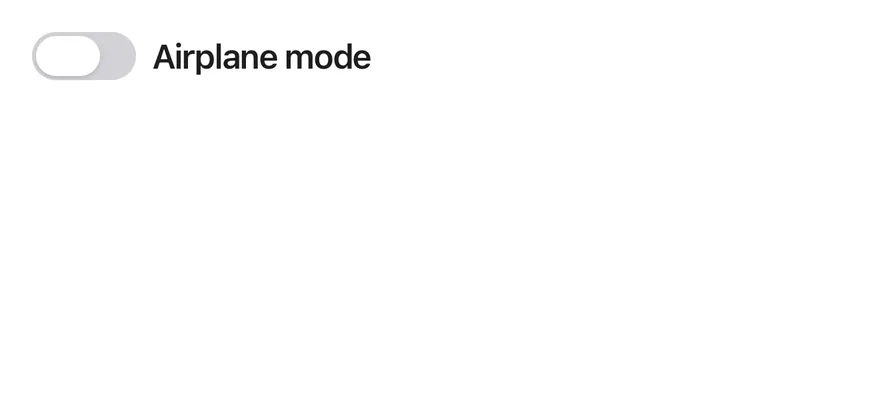
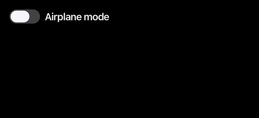
}With label
A controlled switch next to a pressable label.
import * as React from "react"
import { View } from "react-native"
import { Label } from "@/components/ui/label"
import { Switch } from "@/components/ui/switch"

function WithLabelDemo() {
  const [checked, setChecked] = React.useState(false)
  return (
    <View className="flex-row items-center gap-2">
      <Switch
        accessibilityLabelledBy="airplane-mode"
        checked={checked}
        onCheckedChange={setChecked}
      />
      <Label nativeID="airplane-mode" onPress={() => setChecked((v) => !v)}>
        Airplane mode
      </Label>
    </View>
  )
}

export function SwitchWithLabelExample() {
  return (
    <WithLabelDemo />
  )
}import EsuissUI
import SwiftUI
struct WithLabelDemo: View {
@State private var checked = false
var body: some View {
Toggle(isOn: $checked) {
FieldLabel("Airplane mode")
}
.toggleStyle(.switch(size: .default))
}
}import androidx.compose.foundation.clickable
import androidx.compose.foundation.interaction.MutableInteractionSource
import androidx.compose.foundation.layout.Arrangement
import androidx.compose.foundation.layout.Row
import androidx.compose.runtime.Composable
import androidx.compose.runtime.getValue
import androidx.compose.runtime.mutableStateOf
import androidx.compose.runtime.remember
import androidx.compose.runtime.saveable.rememberSaveable
import androidx.compose.runtime.setValue
import androidx.compose.ui.Alignment
import androidx.compose.ui.Modifier
import androidx.compose.ui.semantics.contentDescription
import androidx.compose.ui.semantics.semantics
import androidx.compose.ui.unit.dp
import com.esuiss.ui.components.Label
import com.esuiss.ui.components.Switch
fun Modifier.label(text: String): Modifier = semantics { contentDescription = text }
@Composable
fun Modifier.toggles(onToggle: () -> Unit): Modifier = clickable(
interactionSource = remember { MutableInteractionSource() },
indication = null,
onClick = onToggle,
)
@Composable
fun SwitchWithLabel() {
var checked by rememberSaveable { mutableStateOf(false) }
Row(horizontalArrangement = Arrangement.spacedBy(8.dp), verticalAlignment = Alignment.CenterVertically) {
Switch(checked, { checked = it }, Modifier.label("Airplane mode"))
Label("Airplane mode", Modifier.toggles { checked = !checked })
}
}With description
A switch with a label and a line of supporting text.
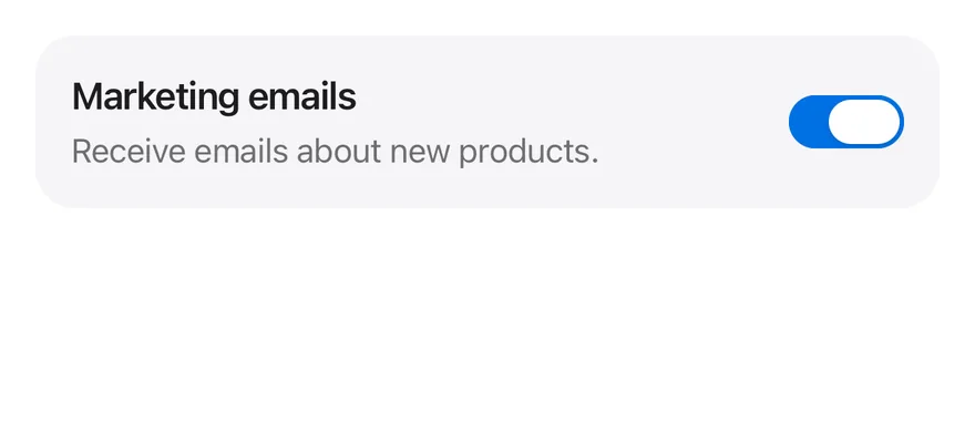
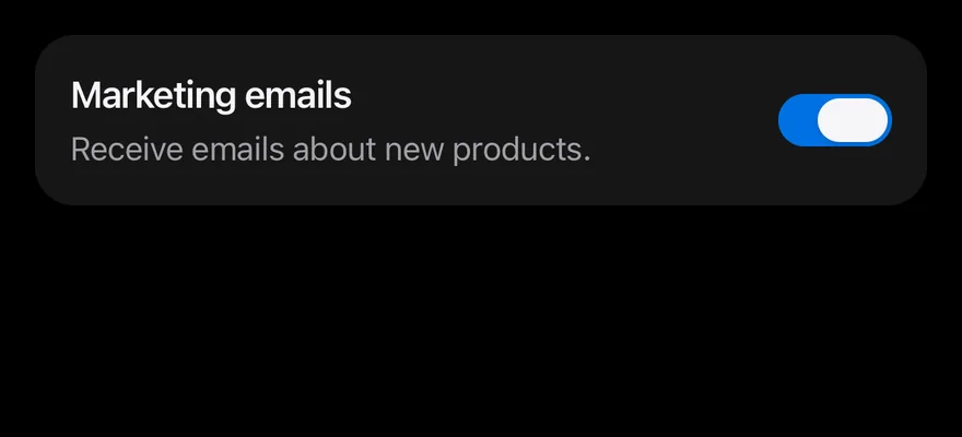
import * as React from "react"
import { View } from "react-native"
import { Label } from "@/components/ui/label"
import { Switch } from "@/components/ui/switch"
import { Text } from "@/components/ui/text"

function WithDescriptionDemo() {
  const [checked, setChecked] = React.useState(true)
  return (
    <View className="flex-row items-center justify-between gap-4 rounded-2xl bg-surface-secondary p-4">
      <View className="flex-1 gap-1">
        <Label nativeID="marketing" onPress={() => setChecked((v) => !v)}>
          Marketing emails
        </Label>
        <Text className="text-sm text-label-secondary">
          Receive emails about new products.
        </Text>
      </View>
      <Switch
        accessibilityLabelledBy="marketing"
        checked={checked}
        onCheckedChange={setChecked}
      />
    </View>
  )
}

export function SwitchWithDescriptionExample() {
  return (
    <WithDescriptionDemo />
  )
}import EsuissUI
import SwiftUI
struct WithDescriptionDemo: View {
@State private var checked = true
var body: some View {
HStack(spacing: 16) {
VStack(alignment: .leading, spacing: 4) {
FieldLabel("Marketing emails")
.onTapGesture { checked.toggle() }
Text("Receive emails about new products.")
.textStyle(.sm)
.foregroundStyle(Color.labelSecondary)
}
.frame(maxWidth: .infinity, alignment: .leading)
Toggle(isOn: $checked) { EmptyView() }
.toggleStyle(.switch(size: .default))
.accessibilityLabel(Text("Marketing emails"))
}
.padding(16)
.background(Color.surfaceSecondary, in: RoundedRectangle(cornerRadius: Radius.xl2, style: .continuous))
}
}import androidx.compose.foundation.background
import androidx.compose.foundation.clickable
import androidx.compose.foundation.interaction.MutableInteractionSource
import androidx.compose.foundation.layout.Arrangement
import androidx.compose.foundation.layout.Column
import androidx.compose.foundation.layout.Row
import androidx.compose.foundation.layout.fillMaxWidth
import androidx.compose.foundation.layout.padding
import androidx.compose.foundation.shape.RoundedCornerShape
import androidx.compose.runtime.Composable
import androidx.compose.runtime.getValue
import androidx.compose.runtime.mutableStateOf
import androidx.compose.runtime.remember
import androidx.compose.runtime.saveable.rememberSaveable
import androidx.compose.runtime.setValue
import androidx.compose.ui.Alignment
import androidx.compose.ui.Modifier
import androidx.compose.ui.semantics.contentDescription
import androidx.compose.ui.semantics.semantics
import androidx.compose.ui.unit.dp
import com.esuiss.ui.components.Label
import com.esuiss.ui.components.Switch
import com.esuiss.ui.components.Text
import com.esuiss.ui.theme.EsuissTheme
import com.esuiss.ui.theme.Radius
import com.esuiss.ui.theme.Typography
fun Modifier.label(text: String): Modifier = semantics { contentDescription = text }
@Composable
fun Modifier.toggles(onToggle: () -> Unit): Modifier = clickable(
interactionSource = remember { MutableInteractionSource() },
indication = null,
onClick = onToggle,
)
@Composable
fun SwitchWithDescription() {
var checked by rememberSaveable { mutableStateOf(true) }
val colors = EsuissTheme.colors
val shape = RoundedCornerShape(Radius.xl2)
Row(
modifier = Modifier
.fillMaxWidth()
.background(colors.surfaceSecondary, shape)
.padding(16.dp),
horizontalArrangement = Arrangement.spacedBy(16.dp),
verticalAlignment = Alignment.CenterVertically,
) {
Column(Modifier.weight(1f), verticalArrangement = Arrangement.spacedBy(4.dp)) {
Label("Marketing emails", Modifier.toggles { checked = !checked })
Text("Receive emails about new products.", style = Typography.sm.copy(color = colors.labelSecondary))
}
Switch(checked, { checked = it }, Modifier.label("Marketing emails"))
}
}Disabled
Disabled switches in the off and on states.
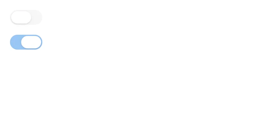
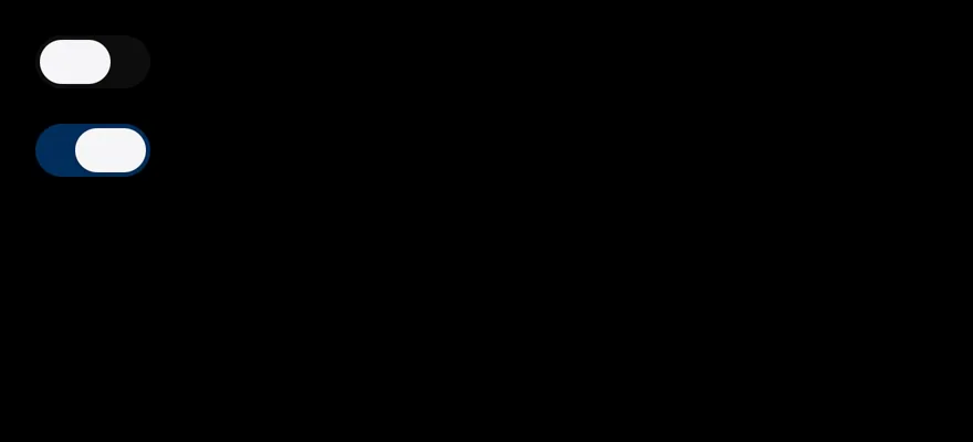
import { View } from "react-native"
import { Switch } from "@/components/ui/switch"

export function SwitchDisabledExample() {
  return (
    <View className="gap-4">
      <Switch disabled checked={false} onCheckedChange={() => {}} />
      <Switch disabled checked onCheckedChange={() => {}} />
    </View>
  )
}import EsuissUI
import SwiftUI
struct SwitchDisabledExample: View {
var body: some View {
VStack(alignment: .leading, spacing: 16) {
Toggle(isOn: .constant(false)) { EmptyView() }
Toggle(isOn: .constant(true)) { EmptyView() }
}
.toggleStyle(.switch(size: .default))
.disabled(true)
}
}import androidx.compose.foundation.layout.Arrangement
import androidx.compose.foundation.layout.Column
import androidx.compose.runtime.Composable
import androidx.compose.ui.unit.dp
import com.esuiss.ui.components.Switch
@Composable
fun SwitchDisabled() {
Column(verticalArrangement = Arrangement.spacedBy(16.dp)) {
Switch(false, {}, enabled = false)
Switch(true, {}, enabled = false)
}
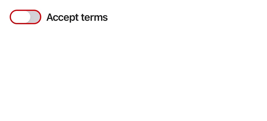
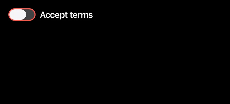
}Invalid
A switch with the invalid border next to its label.
import { View } from "react-native"
import { Label } from "@/components/ui/label"
import { Switch } from "@/components/ui/switch"

export function SwitchInvalidExample() {
  return (
    <View className="flex-row items-center gap-2">
      <Switch invalid accessibilityLabelledBy="terms-switch" />
      <Label nativeID="terms-switch">Accept terms</Label>
    </View>
  )
}import EsuissUI
import SwiftUI
struct InvalidDemo: View {
@State private var checked = false
var body: some View {
Toggle(isOn: $checked) {
FieldLabel("Accept terms")
}
.toggleStyle(.switch(size: .default))
.invalid()
}
}import androidx.compose.foundation.clickable
import androidx.compose.foundation.interaction.MutableInteractionSource
import androidx.compose.foundation.layout.Arrangement
import androidx.compose.foundation.layout.Row
import androidx.compose.runtime.Composable
import androidx.compose.runtime.getValue
import androidx.compose.runtime.mutableStateOf
import androidx.compose.runtime.remember
import androidx.compose.runtime.saveable.rememberSaveable
import androidx.compose.runtime.setValue
import androidx.compose.ui.Alignment
import androidx.compose.ui.Modifier
import androidx.compose.ui.semantics.contentDescription
import androidx.compose.ui.semantics.semantics
import androidx.compose.ui.unit.dp
import com.esuiss.ui.components.Label
import com.esuiss.ui.components.Switch
fun Modifier.label(text: String): Modifier = semantics { contentDescription = text }
@Composable
fun Modifier.toggles(onToggle: () -> Unit): Modifier = clickable(
interactionSource = remember { MutableInteractionSource() },
indication = null,
onClick = onToggle,
)
@Composable
fun SwitchInvalid() {
var checked by rememberSaveable { mutableStateOf(false) }
Row(horizontalArrangement = Arrangement.spacedBy(8.dp), verticalAlignment = Alignment.CenterVertically) {
Switch(checked, { checked = it }, Modifier.label("Accept terms"), invalid = true)
Label("Accept terms")
}
}API Reference
Switch
React.ComponentProps<typeof SwitchPrimitives.Root>- About
defaultorsm.- Type
SwitchSize- Default
- "default"
- About
- Adds a danger-colored border when not disabled.
- Type
boolean- Default
- —
Accessibility
- The root has the
switchrole and reportscheckedanddisabledin its accessibility state, so VoiceOver and TalkBack announce whether it is on. - The thumb is hidden from the accessibility tree.
- Label every switch with
accessibilityLabeloraccessibilityLabelledBy. - The thumb animation follows the system reduce motion setting.
Notes
- The track uses
bg-accentwhen on andbg-label-quaternarywhen off, withbg-accent-disabledandbg-control-disabledfor the disabled states. - The thumb uses
bg-surface, orbg-labelin dark mode. - Light and dark colors follow the system appearance.