suiss/uim · React Native Component
Marker
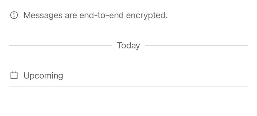
A small inline label that marks a point in a list or feed, such as a date divider or a notice.
Marker is an open-source mobile component from suiss/uim for React Native and Expo, with SwiftUI and Jetpack Compose versions built from the same design tokens. The @esuiss/uim CLI copies its source into your project, so you own the code.
import { CalendarBlankIcon, InfoIcon } from "phosphor-react-native"
import { View } from "react-native"
import { Icon } from "@/components/ui/icon"
import { Marker, MarkerContent, MarkerIcon } from "@/components/ui/marker"

export function MarkerVariantsExample() {
  return (
    <View className="gap-8">
      <Marker>
        <MarkerIcon>
          <Icon as={InfoIcon} />
        </MarkerIcon>
        <MarkerContent>Messages are end-to-end encrypted.</MarkerContent>
      </Marker>
      <Marker variant="separator">
        <MarkerContent>Today</MarkerContent>
      </Marker>
      <Marker variant="border">
        <MarkerIcon>
          <Icon as={CalendarBlankIcon} />
        </MarkerIcon>
        <MarkerContent>Upcoming</MarkerContent>
      </Marker>
    </View>
  )
}import EsuissUI
import PhosphorSwift
import SwiftUI
struct MarkerVariantsExample: View {
var body: some View {
VStack(spacing: 32) {
Marker {
MarkerIcon { Ph.info.regular }
MarkerContent("Messages are end-to-end encrypted.")
}
Marker(.separator) {
MarkerContent("Today")
}
Marker(.border) {
MarkerIcon { Ph.calendarBlank.regular }
MarkerContent("Upcoming")
}
}
.frame(maxWidth: .infinity)
}
}import androidx.compose.foundation.layout.Arrangement
import androidx.compose.foundation.layout.Column
import androidx.compose.foundation.layout.fillMaxWidth
import androidx.compose.runtime.Composable
import androidx.compose.ui.Modifier
import androidx.compose.ui.unit.dp
import com.adamglin.PhosphorIcons
import com.adamglin.phosphoricons.Regular
import com.adamglin.phosphoricons.regular.CalendarBlank
import com.adamglin.phosphoricons.regular.Info
import com.esuiss.ui.components.Icon
import com.esuiss.ui.components.Marker
import com.esuiss.ui.components.MarkerContent
import com.esuiss.ui.components.MarkerIcon
import com.esuiss.ui.components.MarkerVariant
@Composable
fun MarkerVariants() {
Column(Modifier.fillMaxWidth(), verticalArrangement = Arrangement.spacedBy(32.dp)) {
Marker {
MarkerIcon { Icon(PhosphorIcons.Regular.Info, contentDescription = null) }
MarkerContent("Messages are end-to-end encrypted.")
}
Marker(variant = MarkerVariant.Separator) {
MarkerContent("Today")
}
Marker(variant = MarkerVariant.Border) {
MarkerIcon { Icon(PhosphorIcons.Regular.CalendarBlank, contentDescription = null) }
MarkerContent("Upcoming")
}
}
}Marker is a row of secondary text with an optional icon. It has three variants: default for a plain row, separator for centered text with a line on each side, and border for a row with a bottom border.
Use separator for date dividers in a chat or feed, border for section headings, and default for short notices.
Installation
$ pnpm dlx @esuiss/uim@latest add marker$ pnpm dlx @esuiss/uim@latest add marker --platform swift$ pnpm dlx @esuiss/uim@latest add marker --platform kotlinThe CLI also adds what it builds on: Icon, Text.
Manual
- Install the dependencies:
npx expo install class-variance-authority cn-
Add the pieces it builds on: Icon, Text, and the primitives
components/primitives/types.tsx,components/primitives/use-render.tsx. -
Copy the source into
components/ui/marker.tsx:
import { cva, type VariantProps } from "class-variance-authority"
import { cn } from "cn"
import * as React from "react"
import { View, type ViewProps } from "react-native"
import type { RenderProp } from "@/components/primitives/types"
import { useRender } from "@/components/primitives/use-render"
import { IconClassContext } from "@/components/ui/icon"
import { Text, TextClassContext } from "@/components/ui/text"

type MarkerVariant = "default" | "separator" | "border"

const MarkerContext = React.createContext<MarkerVariant>("default")

const markerVariants = cva("min-h-4 w-full flex-row items-center gap-2", {
  variants: {
variant: {- Update the import paths to match your project.
- Install the dependencies:
npx expo install class-variance-authority cn-
Add the pieces it builds on: Icon, Text, and the primitives
components/primitives/types.tsx,components/primitives/use-render.tsx. -
Copy the source into
components/ui/marker.tsx:
import { cva, type VariantProps } from "class-variance-authority"
import { cn } from "cn"
import * as React from "react"
import { View, type ViewProps } from "react-native"
import type { RenderProp } from "@/components/primitives/types"
import { useRender } from "@/components/primitives/use-render"
import { IconClassContext } from "@/components/ui/icon"
import { Text, TextClassContext } from "@/components/ui/text"

type MarkerVariant = "default" | "separator" | "border"

const MarkerContext = React.createContext<MarkerVariant>("default")

const markerVariants = cva("min-h-4 w-full flex-row items-center gap-2", {
  variants: {
variant: {- Update the import paths to match your project.
-
Add the pieces it builds on: Icon, Text, and the primitives
components/primitives/types.tsx,components/primitives/use-render.tsx. -
Copy the source into
components/ui/marker.tsx:
import * as React from "react"
import { StyleSheet, View, type ViewProps } from "react-native"
import type { RenderProp } from "@/components/primitives/types"
import { useRender } from "@/components/primitives/use-render"
import { IconSizeContext } from "@/components/ui/icon"
import { Text, TextStyleContext } from "@/components/ui/text"
import { fontSize, useTheme } from "@/components/ui/theme"

type MarkerVariant = "default" | "separator" | "border"

const MarkerContext = React.createContext<MarkerVariant>("default")

const styles = StyleSheet.create({
  root: {
    minHeight: 16,
width: "100%",- Update the import paths to match your project.
-
Target iOS 17 or later.
-
Copy the theme files every view uses:
import SwiftUI
import UIKit

struct RGBA: Sendable {
  let red: CGFloat
  let green: CGFloat
  let blue: CGFloat
  let alpha: CGFloat

  init(_ hex: UInt32, _ alpha: CGFloat = 1) {
    red = CGFloat((hex >> 16) & 0xFF) / 255
    green = CGFloat((hex >> 8) & 0xFF) / 255
    blue = CGFloat(hex & 0xFF) / 255
    self.alpha = alpha
}import SwiftUI
extension Color {
public static let surface = Color.adaptive(light: .init(0xFFFFFF), dark: .init(0x000000))
public static let surfaceSecondary = Color.adaptive(light: .init(0xF5F5F7), dark: .init(0x161617))
public static let surfaceTertiary = Color.adaptive(light: .init(0xE8E8ED), dark: .init(0x2C2C2E))
public static let surfaceRaised = Color.adaptive(light: .init(0xFFFFFF), dark: .init(0x1D1D1F))
public static let label = Color.adaptive(light: .init(0x1D1D1F), dark: .init(0xF5F5F7))
public static let labelSecondary = Color.adaptive(light: .init(0x6E6E73), dark: .init(0xA1A1A6))
public static let labelTertiary = Color.adaptive(light: .init(0x86868B), dark: .init(0x86868B))
public static let labelQuaternary = Color.adaptive(light: .init(0xD2D2D7), dark: .init(0x424245))
public static let control = Color.adaptive(light: .init(0x000000, 0.04), dark: .init(0xFFFFFF, 0.1))
public static let controlPressed = Color.adaptive(light: .init(0x000000, 0.12), dark: .init(0xFFFFFF, 0.22))
public static let controlSelected = Color.adaptive(light: .init(0x1D1D1F), dark: .init(0xF5F5F7))
public static let controlDisabled = Color.adaptive(light: .init(0x000000, 0.03), dark: .init(0xFFFFFF, 0.05))
public static let onControlSelected = Color.adaptive(light: .init(0xFFFFFF), dark: .init(0x000000))- Copy the source and every file it uses:
import SwiftUI

public enum MarkerVariant: CaseIterable, Sendable {
  case `default`, separator, border
}

extension EnvironmentValues {
  @Entry var markerVariant: MarkerVariant = .default
}

public struct Marker<Content: View>: View {
  let variant: MarkerVariant
  let content: Content

  public init(_ variant: MarkerVariant = .default, @ViewBuilder content: () -> Content) {
self.variant = variantimport SwiftUI
public enum TextVariant: CaseIterable, Sendable {
case `default`, h1, h2, h3, h4, p, blockquote, code, lead, large, small, muted
var style: TextStyle {
switch self {
case .h1: .xl3
case .h2: .xl2
case .h3: .xl
case .h4, .lead, .large: .lg
case .code, .small, .muted: .sm
default: .base
}
}- Add the files to your app target.
- Set
minSdkto 24 or higher and add the dependencies:
implementation(platform("androidx.compose:compose-bom:2026.09.00"))
implementation("androidx.compose.foundation:foundation")
implementation("androidx.compose.ui:ui")- Copy the theme files every view uses:
package com.esuiss.ui.theme

import androidx.compose.foundation.isSystemInDarkTheme
import androidx.compose.runtime.Composable
import androidx.compose.runtime.CompositionLocalProvider
import androidx.compose.runtime.Immutable
import androidx.compose.runtime.staticCompositionLocalOf
import androidx.compose.ui.Modifier
import androidx.compose.ui.draw.dropShadow
import androidx.compose.ui.graphics.Color
import androidx.compose.ui.graphics.Shape
import androidx.compose.ui.graphics.shadow.Shadow as DropShadow
import androidx.compose.ui.text.TextStyle
import androidx.compose.ui.text.style.LineHeightStyle
import androidx.compose.ui.unit.Dp
import androidx.compose.ui.unit.DpOffsetpackage com.esuiss.ui.theme
import androidx.compose.runtime.Immutable
import androidx.compose.ui.graphics.Color
import androidx.compose.ui.unit.dp
@Immutable
data class Colors(
val surface: Color,
val surfaceSecondary: Color,
val surfaceTertiary: Color,
val surfaceRaised: Color,
val label: Color,
val labelSecondary: Color,
val labelTertiary: Color,
val labelQuaternary: Color,- Copy the source and every file it uses:
package com.esuiss.ui.components

import androidx.compose.foundation.background
import androidx.compose.foundation.layout.Arrangement
import androidx.compose.foundation.layout.Box
import androidx.compose.foundation.layout.BoxScope
import androidx.compose.foundation.layout.Row
import androidx.compose.foundation.layout.RowScope
import androidx.compose.foundation.layout.fillMaxWidth
import androidx.compose.foundation.layout.height
import androidx.compose.foundation.layout.heightIn
import androidx.compose.foundation.layout.padding
import androidx.compose.foundation.layout.size
import androidx.compose.foundation.text.BasicText
import androidx.compose.runtime.Composable
import androidx.compose.runtime.CompositionLocalProviderpackage com.esuiss.ui.components
import androidx.compose.runtime.compositionLocalOf
import androidx.compose.ui.graphics.Color
import androidx.compose.ui.text.TextStyle
import androidx.compose.ui.unit.Dp
import androidx.compose.ui.unit.dp
val LocalContentStyle = compositionLocalOf { TextStyle.Default }
val LocalContentColor = compositionLocalOf { Color.Unspecified }
val LocalIconSize = compositionLocalOf { 20.dp }package com.esuiss.ui.components
import androidx.compose.foundation.Image
import androidx.compose.foundation.layout.size
import androidx.compose.runtime.Composable
import androidx.compose.ui.Modifier
import androidx.compose.ui.graphics.Color
import androidx.compose.ui.graphics.ColorFilter
import androidx.compose.ui.graphics.takeOrElse
import androidx.compose.ui.graphics.vector.ImageVector
import androidx.compose.ui.unit.Dp
import com.esuiss.ui.theme.EsuissTheme
@Composable
fun Icon(
imageVector: ImageVector,package com.esuiss.ui.components
import androidx.compose.foundation.background
import androidx.compose.foundation.gestures.Orientation
import androidx.compose.foundation.layout.Box
import androidx.compose.foundation.layout.fillMaxHeight
import androidx.compose.foundation.layout.fillMaxWidth
import androidx.compose.foundation.layout.height
import androidx.compose.foundation.layout.width
import androidx.compose.runtime.Composable
import androidx.compose.ui.Modifier
import androidx.compose.ui.unit.dp
import com.esuiss.ui.theme.EsuissTheme
@Composable
fun Separator(- Update the
com.esuiss.uipackage names to match your project.
Usage
import { Marker, MarkerIcon, MarkerContent } from "@/components/ui/marker"<View className="gap-8">
<Marker>
<MarkerIcon>
<Icon as={InfoIcon} />
</MarkerIcon>
<MarkerContent>Messages are end-to-end encrypted.</MarkerContent>
</Marker>
<Marker variant="separator">
<MarkerContent>Today</MarkerContent>
</Marker>
<Marker variant="border">
<MarkerIcon>
<Icon as={CalendarBlankIcon} />
</MarkerIcon>
<MarkerContent>Upcoming</MarkerContent>
</Marker>
</View>Put the text in MarkerContent and an Icon in MarkerIcon. Text and icons inside the marker pick up the secondary label color and size through context.
Pass a render element to Marker to render it as another component instead of a View.
API Reference
Marker
Row that sets the variant and the text and icon styles.
ViewProps- About
default,separatororborder.- Type
"default""separator""border"- Default
- "default"
- About
- Element to render in place of the default
View. - Type
RenderProp<Record<string, unknown>, Record<string, never>>- Default
- —
MarkerIcon
Fixed-size slot for an icon.
ViewPropsMarkerContent
Marker text, centered in the separator variant.
React.ComponentProps<typeof Text>Accessibility
MarkerIconand the separator lines are hidden from screen readers, so only the text is read.- If the icon carries meaning, include it in the text.
Notes
- Text uses
text-sm text-label-secondaryand iconssize-4. - Lines and the bottom border use
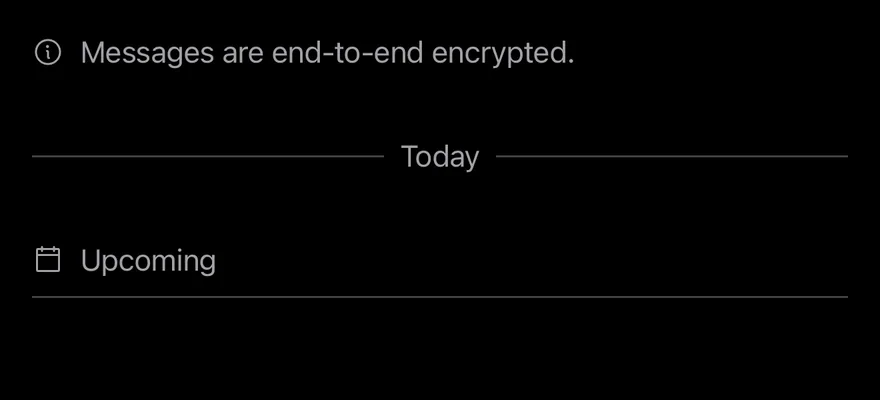
bg-separatorandborder-separator. - Light and dark colors follow the system appearance.