suiss/uim · React Native Component
Field
Building blocks for form fields: labels, descriptions, errors, validation and grouped layouts.
Field is an open-source mobile component from suiss/uim for React Native and Expo, with SwiftUI and Jetpack Compose versions built from the same design tokens. The @esuiss/uim CLI copies its source into your project, so you own the code.
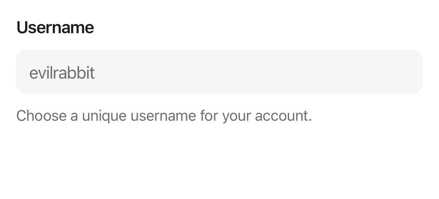
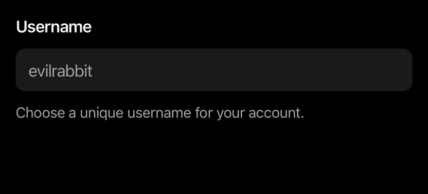
import { Field, FieldDescription, FieldLabel } from "@/components/ui/field"
import { Input } from "@/components/ui/input"

export function FieldExample() {
  return (
    <Field>
      <FieldLabel>Username</FieldLabel>
      <Input placeholder="evilrabbit" autoCapitalize="none" />
      <FieldDescription>
        Choose a unique username for your account.
      </FieldDescription>
    </Field>
  )
}import EsuissUI
import SwiftUI
struct FieldDefaultDemo: View {
@State private var username = ""
var body: some View {
Field {
FieldLabel("Username")
.accessibilityHidden(true)
TextField("evilrabbit", text: $username)
.textFieldStyle(.input)
.textInputAutocapitalization(.never)
.accessibilityLabel(Text("Username"))
FieldDescription("Choose a unique username for your account.")
}
}
}import androidx.compose.foundation.text.KeyboardOptions
import androidx.compose.runtime.Composable
import androidx.compose.runtime.getValue
import androidx.compose.runtime.mutableStateOf
import androidx.compose.runtime.saveable.rememberSaveable
import androidx.compose.runtime.setValue
import androidx.compose.ui.Modifier
import androidx.compose.ui.semantics.contentDescription
import androidx.compose.ui.semantics.semantics
import androidx.compose.ui.text.input.KeyboardCapitalization
import com.esuiss.ui.components.Field
import com.esuiss.ui.components.FieldDescription
import com.esuiss.ui.components.FieldLabel
import com.esuiss.ui.components.Input
val FieldPlainText = KeyboardOptions(capitalization = KeyboardCapitalization.None, autoCorrectEnabled = false)
@Composable
fun FieldDefault() {
var value by rememberSaveable { mutableStateOf("") }
Field {
FieldLabel("Username")
Input(
value,
{ value = it },
Modifier.semantics { contentDescription = "Username" },
placeholder = "evilrabbit",
keyboardOptions = FieldPlainText,
)
FieldDescription("Choose a unique username for your account.")
}
}Field wraps one control, such as an Input, Textarea or Switch, with a FieldLabel, an optional FieldDescription and a FieldError. It shares the field's disabled and invalid state with the control and handles validation: required values, length limits and custom validate functions, checked on submit, blur or change.
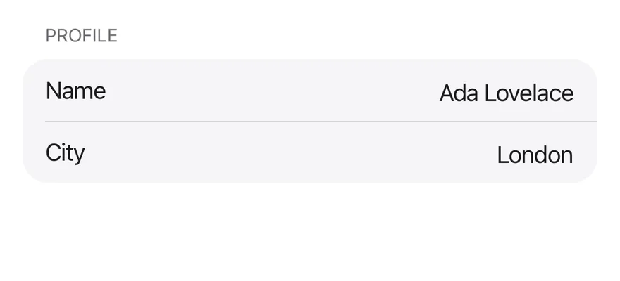
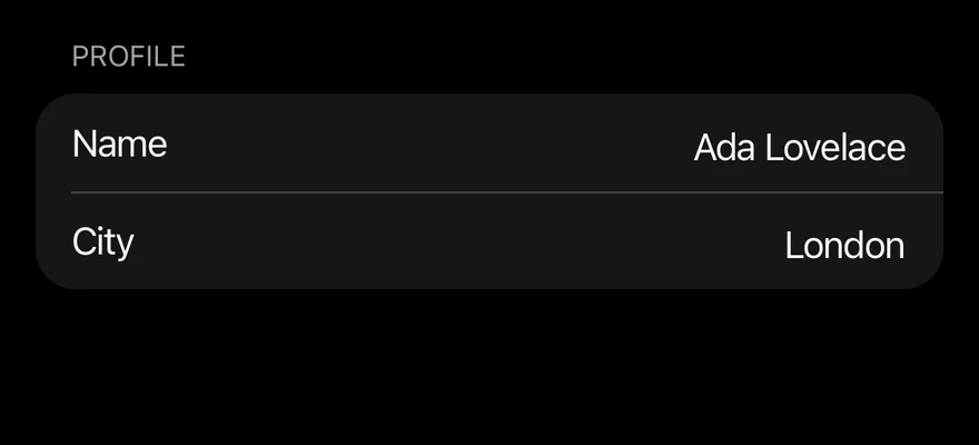
FieldSet and FieldLegend group related fields under a heading, and FieldGroup stacks fields. The inset variant of FieldGroup turns the fields into rows on a rounded secondary surface with hairlines between them, like a settings list.
Installation
$ pnpm dlx @esuiss/uim@latest add field$ pnpm dlx @esuiss/uim@latest add field --platform swift$ pnpm dlx @esuiss/uim@latest add field --platform kotlinThe CLI also adds what it builds on: Separator.
Manual
- Install the dependencies:
npx expo install cn-
Add the pieces it builds on: Separator, and the primitives
components/primitives/field.tsx,components/primitives/fieldset.tsx,components/primitives/use-render.tsx. -
Copy the source into
components/ui/field.tsx:
import { cn } from "cn"
import * as React from "react"
import { Text as RNText, View } from "react-native"
import * as FieldPrimitive from "@/components/primitives/field"
import * as FieldsetPrimitive from "@/components/primitives/fieldset"
import { resolveClassName } from "@/components/primitives/use-render"
import { Separator } from "@/components/ui/separator"

type FieldGroupVariant = "default" | "inset"

type FieldOrientation = "vertical" | "horizontal" | "responsive"

interface FieldGroupItemContextValue {
  variant: FieldGroupVariant
  index: number
}- Update the import paths to match your project.
- Install the dependencies:
npx expo install cn-
Add the pieces it builds on: Separator, and the primitives
components/primitives/field.tsx,components/primitives/fieldset.tsx,components/primitives/use-render.tsx. -
Copy the source into
components/ui/field.tsx:
import { cn } from "cn"
import * as React from "react"
import { Text as RNText, View } from "react-native"
import * as FieldPrimitive from "@/components/primitives/field"
import * as FieldsetPrimitive from "@/components/primitives/fieldset"
import { resolveClassName } from "@/components/primitives/use-render"
import { Separator } from "@/components/ui/separator"

type FieldGroupVariant = "default" | "inset"

type FieldOrientation = "vertical" | "horizontal" | "responsive"

interface FieldGroupItemContextValue {
  variant: FieldGroupVariant
  index: number
}- Update the import paths to match your project.
-
Add the pieces it builds on: Separator, and the primitives
components/primitives/field.tsx,components/primitives/fieldset.tsx,components/primitives/use-render.tsx. -
Copy the source into
components/ui/field.tsx:
import * as React from "react"
import {
  Text as RNText,
  StyleSheet,
  useWindowDimensions,
  View,
} from "react-native"
import * as FieldPrimitive from "@/components/primitives/field"
import * as FieldsetPrimitive from "@/components/primitives/fieldset"
import { Separator } from "@/components/ui/separator"
import { fontSize, radius, useTheme } from "@/components/ui/theme"

type FieldGroupVariant = "default" | "inset"

type FieldOrientation = "vertical" | "horizontal" | "responsive"- Update the import paths to match your project.
-
Target iOS 17 or later.
-
Copy the theme files every view uses:
import SwiftUI
import UIKit

struct RGBA: Sendable {
  let red: CGFloat
  let green: CGFloat
  let blue: CGFloat
  let alpha: CGFloat

  init(_ hex: UInt32, _ alpha: CGFloat = 1) {
    red = CGFloat((hex >> 16) & 0xFF) / 255
    green = CGFloat((hex >> 8) & 0xFF) / 255
    blue = CGFloat(hex & 0xFF) / 255
    self.alpha = alpha
}import SwiftUI
extension Color {
public static let surface = Color.adaptive(light: .init(0xFFFFFF), dark: .init(0x000000))
public static let surfaceSecondary = Color.adaptive(light: .init(0xF5F5F7), dark: .init(0x161617))
public static let surfaceTertiary = Color.adaptive(light: .init(0xE8E8ED), dark: .init(0x2C2C2E))
public static let surfaceRaised = Color.adaptive(light: .init(0xFFFFFF), dark: .init(0x1D1D1F))
public static let label = Color.adaptive(light: .init(0x1D1D1F), dark: .init(0xF5F5F7))
public static let labelSecondary = Color.adaptive(light: .init(0x6E6E73), dark: .init(0xA1A1A6))
public static let labelTertiary = Color.adaptive(light: .init(0x86868B), dark: .init(0x86868B))
public static let labelQuaternary = Color.adaptive(light: .init(0xD2D2D7), dark: .init(0x424245))
public static let control = Color.adaptive(light: .init(0x000000, 0.04), dark: .init(0xFFFFFF, 0.1))
public static let controlPressed = Color.adaptive(light: .init(0x000000, 0.12), dark: .init(0xFFFFFF, 0.22))
public static let controlSelected = Color.adaptive(light: .init(0x1D1D1F), dark: .init(0xF5F5F7))
public static let controlDisabled = Color.adaptive(light: .init(0x000000, 0.03), dark: .init(0xFFFFFF, 0.05))
public static let onControlSelected = Color.adaptive(light: .init(0xFFFFFF), dark: .init(0x000000))- Copy the source and every file it uses:
import SwiftUI

extension EnvironmentValues {
  @Entry public var isInvalid = false
  @Entry var fieldInset = false
  @Entry var fieldGroupInset = false
  @Entry var fieldSetInset = false
}

extension View {
  public func invalid(_ isInvalid: Bool = true) -> some View {
    environment(\.isInvalid, isInvalid)
  }
}

public enum FieldOrientation: CaseIterable, Sendable {import SwiftUI
public struct Separator: View {
let orientation: Axis
public init(_ orientation: Axis = .horizontal) {
self.orientation = orientation
}
public var body: some View {
Rectangle()
.fill(Color.separator)
.frame(width: orientation == .vertical ? 1 : nil, height: orientation == .horizontal ? 1 : nil)
.frame(maxWidth: orientation == .horizontal ? .infinity : nil, maxHeight: orientation == .vertical ? .infinity : nil)
.accessibilityHidden(true)
}import SwiftUI
public enum TextVariant: CaseIterable, Sendable {
case `default`, h1, h2, h3, h4, p, blockquote, code, lead, large, small, muted
var style: TextStyle {
switch self {
case .h1: .xl3
case .h2: .xl2
case .h3: .xl
case .h4, .lead, .large: .lg
case .code, .small, .muted: .sm
default: .base
}
}- Add the files to your app target.
- Set
minSdkto 24 or higher and add the dependencies:
implementation(platform("androidx.compose:compose-bom:2026.09.00"))
implementation("androidx.compose.foundation:foundation")
implementation("androidx.compose.ui:ui")- Copy the theme files every view uses:
package com.esuiss.ui.theme

import androidx.compose.foundation.isSystemInDarkTheme
import androidx.compose.runtime.Composable
import androidx.compose.runtime.CompositionLocalProvider
import androidx.compose.runtime.Immutable
import androidx.compose.runtime.staticCompositionLocalOf
import androidx.compose.ui.Modifier
import androidx.compose.ui.draw.dropShadow
import androidx.compose.ui.graphics.Color
import androidx.compose.ui.graphics.Shape
import androidx.compose.ui.graphics.shadow.Shadow as DropShadow
import androidx.compose.ui.text.TextStyle
import androidx.compose.ui.text.style.LineHeightStyle
import androidx.compose.ui.unit.Dp
import androidx.compose.ui.unit.DpOffsetpackage com.esuiss.ui.theme
import androidx.compose.runtime.Immutable
import androidx.compose.ui.graphics.Color
import androidx.compose.ui.unit.dp
@Immutable
data class Colors(
val surface: Color,
val surfaceSecondary: Color,
val surfaceTertiary: Color,
val surfaceRaised: Color,
val label: Color,
val labelSecondary: Color,
val labelTertiary: Color,
val labelQuaternary: Color,- Copy the source and every file it uses:
package com.esuiss.ui.components

import androidx.compose.foundation.background
import androidx.compose.foundation.gestures.Orientation
import androidx.compose.foundation.layout.Arrangement
import androidx.compose.foundation.layout.Box
import androidx.compose.foundation.layout.Column
import androidx.compose.foundation.layout.ColumnScope
import androidx.compose.foundation.layout.LayoutScopeMarker
import androidx.compose.foundation.layout.Row
import androidx.compose.foundation.layout.RowScope
import androidx.compose.foundation.layout.fillMaxWidth
import androidx.compose.foundation.layout.heightIn
import androidx.compose.foundation.layout.padding
import androidx.compose.foundation.shape.RoundedCornerShape
import androidx.compose.foundation.text.BasicTextpackage com.esuiss.ui.components
import androidx.compose.runtime.compositionLocalOf
import androidx.compose.ui.graphics.Color
import androidx.compose.ui.text.TextStyle
import androidx.compose.ui.unit.Dp
import androidx.compose.ui.unit.dp
val LocalContentStyle = compositionLocalOf { TextStyle.Default }
val LocalContentColor = compositionLocalOf { Color.Unspecified }
val LocalIconSize = compositionLocalOf { 20.dp }package com.esuiss.ui.components
import android.provider.Settings
import androidx.compose.animation.core.CubicBezierEasing
import androidx.compose.foundation.background
import androidx.compose.foundation.border
import androidx.compose.foundation.gestures.Orientation
import androidx.compose.foundation.text.selection.TextSelectionColors
import androidx.compose.runtime.Composable
import androidx.compose.runtime.mutableStateOf
import androidx.compose.runtime.remember
import androidx.compose.ui.Modifier
import androidx.compose.ui.draw.clip
import androidx.compose.ui.draw.drawWithContent
import androidx.compose.ui.geometry.Offset
import androidx.compose.ui.geometry.Sizepackage com.esuiss.ui.components
import androidx.compose.foundation.layout.Arrangement
import androidx.compose.foundation.layout.Row
import androidx.compose.foundation.layout.RowScope
import androidx.compose.foundation.text.BasicText
import androidx.compose.runtime.Composable
import androidx.compose.runtime.CompositionLocalProvider
import androidx.compose.ui.Alignment
import androidx.compose.ui.Modifier
import androidx.compose.ui.text.font.FontWeight
import androidx.compose.ui.unit.dp
import com.esuiss.ui.theme.EsuissTheme
import com.esuiss.ui.theme.Typography
@Composablepackage com.esuiss.ui.components
import androidx.compose.foundation.background
import androidx.compose.foundation.gestures.Orientation
import androidx.compose.foundation.layout.Box
import androidx.compose.foundation.layout.fillMaxHeight
import androidx.compose.foundation.layout.fillMaxWidth
import androidx.compose.foundation.layout.height
import androidx.compose.foundation.layout.width
import androidx.compose.runtime.Composable
import androidx.compose.ui.Modifier
import androidx.compose.ui.unit.dp
import com.esuiss.ui.theme.EsuissTheme
@Composable
fun Separator(- Update the
com.esuiss.uipackage names to match your project.
Usage
import { FieldSet, FieldLegend, FieldGroup, Field, FieldContent, FieldLabel, FieldTitle, FieldDescription, FieldSeparator, FieldError } from "@/components/ui/field"<Field>
<FieldLabel>Username</FieldLabel>
<Input placeholder="evilrabbit" autoCapitalize="none" />
<FieldDescription>
Choose a unique username for your account.
</FieldDescription>
</Field>Put a FieldLabel, the control and a FieldError inside Field. The control is labelled by the label and uses the description and error text as its accessibility hint. Set invalid to force the error state, or let validation decide it.
FieldError shows its children, or the messages from errors (for example from a form library), and can be limited to one failure with match, such as tooShort. Use orientation="horizontal" for a label beside a switch or checkbox, with FieldContent holding a FieldTitle and FieldDescription.
FieldSeparator divides fields and can show short text such as "or" in the middle.
Examples
Invalid
A field in the invalid state with an error message.
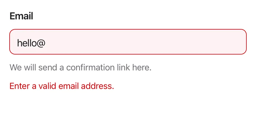
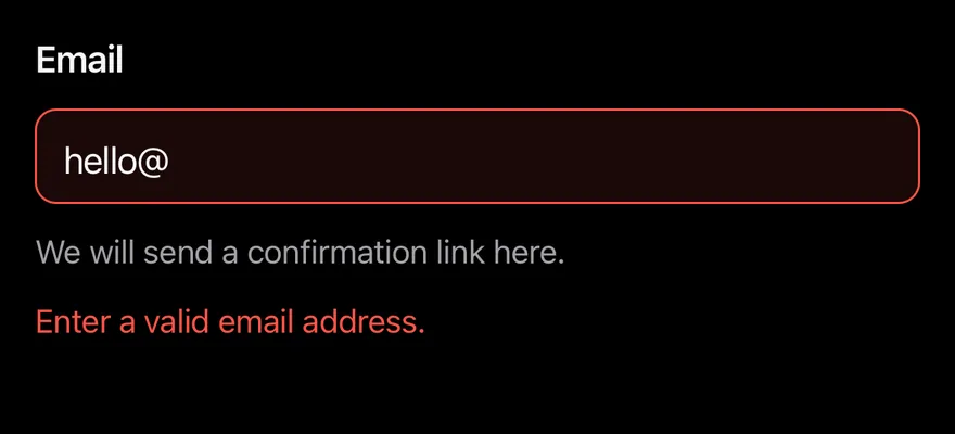
import { Field, FieldDescription, FieldError, FieldLabel } from "@/components/ui/field"
import { Input } from "@/components/ui/input"

export function FieldInvalidExample() {
  return (
    <Field invalid>
      <FieldLabel>Email</FieldLabel>
      <Input
        defaultValue="hello@"
        keyboardType="email-address"
        autoCapitalize="none"
      />
      <FieldDescription>
        We will send a confirmation link here.
      </FieldDescription>
      <FieldError>Enter a valid email address.</FieldError>
    </Field>
  )
}import EsuissUI
import SwiftUI
struct FieldInvalidDemo: View {
@State private var email = "hello@"
var body: some View {
Field(invalid: true) {
FieldLabel("Email")
.accessibilityHidden(true)
TextField("Email", text: $email)
.textFieldStyle(.input)
.keyboardType(.emailAddress)
.textInputAutocapitalization(.never)
.accessibilityLabel(Text("Email"))
FieldDescription("We will send a confirmation link here.")
FieldError("Enter a valid email address.")
}
}
}import androidx.compose.foundation.text.KeyboardOptions
import androidx.compose.runtime.Composable
import androidx.compose.runtime.getValue
import androidx.compose.runtime.mutableStateOf
import androidx.compose.runtime.saveable.rememberSaveable
import androidx.compose.runtime.setValue
import androidx.compose.ui.Modifier
import androidx.compose.ui.semantics.contentDescription
import androidx.compose.ui.semantics.semantics
import androidx.compose.ui.text.input.KeyboardCapitalization
import androidx.compose.ui.text.input.KeyboardType
import com.esuiss.ui.components.Field
import com.esuiss.ui.components.FieldDescription
import com.esuiss.ui.components.FieldError
import com.esuiss.ui.components.FieldLabel
import com.esuiss.ui.components.Input
val FieldEmailText = KeyboardOptions(
capitalization = KeyboardCapitalization.None,
autoCorrectEnabled = false,
keyboardType = KeyboardType.Email,
)
@Composable
fun FieldInvalid() {
var value by rememberSaveable { mutableStateOf("hello@") }
Field(invalid = true) {
FieldLabel("Email")
Input(value, { value = it }, Modifier.semantics { contentDescription = "Email" }, keyboardOptions = FieldEmailText)
FieldDescription("We will send a confirmation link here.")
FieldError("Enter a valid email address.")
}
}Validation
Required, custom and minimum-length validation on blur and on change.
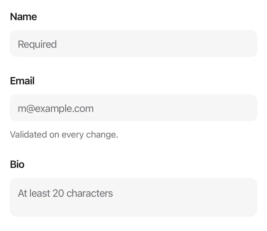
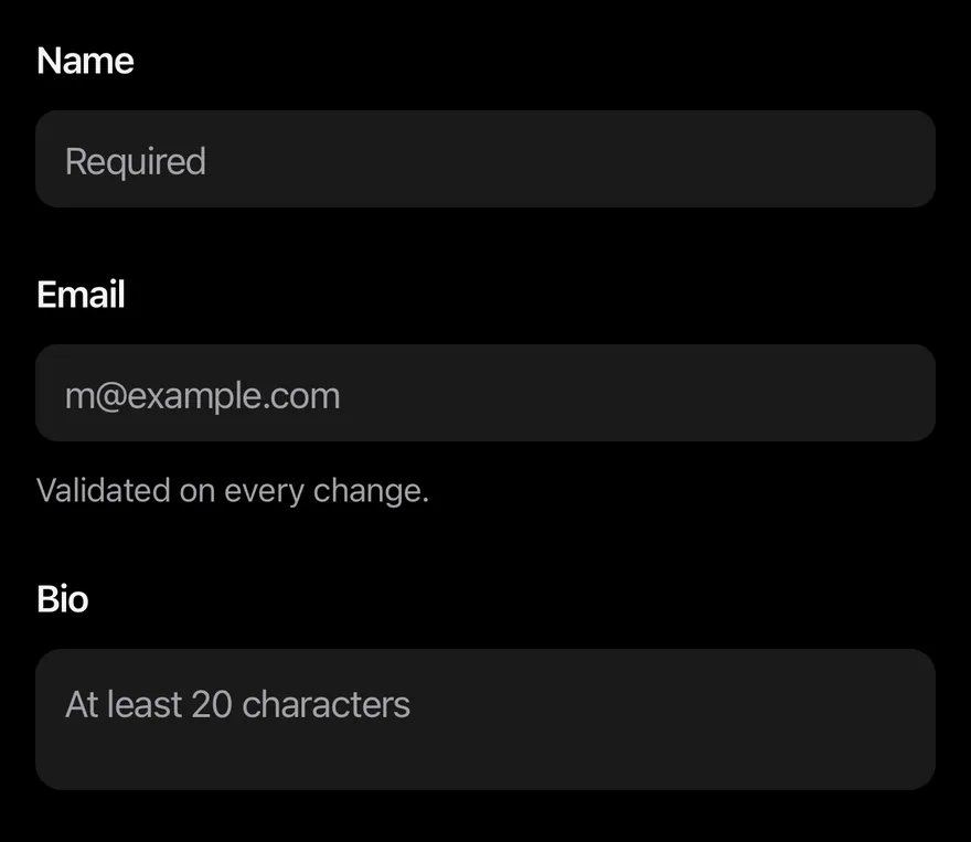
import { Field, FieldDescription, FieldError, FieldGroup, FieldLabel } from "@/components/ui/field"
import { Input } from "@/components/ui/input"
import { Textarea } from "@/components/ui/textarea"

export function FieldValidationExample() {
  return (
    <FieldGroup>
      <Field validationMode="onBlur">
        <FieldLabel>Name</FieldLabel>
        <Input placeholder="Required" required />
        <FieldError />
      </Field>
      <Field
        validationMode="onChange"
        validate={(value) =>
          typeof value === "string" && value.includes("@")
            ? null
            : "Email must contain @."
        }
      >
        <FieldLabel>Email</FieldLabel>
        <Input
          placeholder="[email protected]"
          keyboardType="email-address"
          autoCapitalize="none"
        />
        <FieldDescription>Validated on every change.</FieldDescription>
        <FieldError />
      </Field>
      <Field validationMode="onBlur">
        <FieldLabel>Bio</FieldLabel>
        <Textarea placeholder="At least 20 characters" minLength={20} />
        <FieldError match="tooShort">Tell us a little more.</FieldError>
      </Field>
    </FieldGroup>
  )
}import EsuissUI
import SwiftUI
enum FieldMessages {
static let required = "This field is required."
static func tooShort(_ minLength: Int) -> String {
"Use at least \(minLength) characters."
}
}
struct FieldValidationDemo: View {
enum Focus: Hashable {
case name, email, bio
}
@State private var name = ""
@State private var email = ""
@State private var bio = ""
@State private var nameError: String?
@State private var emailError: String?
@State private var bioError: String?
@State private var nameTouched = false
@State private var bioTouched = false
@FocusState private var focus: Focus?
var body: some View {
FieldGroup {
Field(invalid: nameError != nil) {
FieldLabel("Name")
.accessibilityHidden(true)
TextField("Required", text: $name)
.textFieldStyle(.input)
.focused($focus, equals: .name)
.accessibilityLabel(Text("Name"))
FieldError(errors: [nameError])
}
Field(invalid: emailError != nil) {
FieldLabel("Email")
.accessibilityHidden(true)
TextField("[email protected]", text: $email)
.textFieldStyle(.input)
.keyboardType(.emailAddress)
.textInputAutocapitalization(.never)
.focused($focus, equals: .email)
.accessibilityLabel(Text("Email"))
FieldDescription("Validated on every change.")
FieldError(errors: [emailError])
}
Field(invalid: bioError != nil) {
FieldLabel("Bio")
.accessibilityHidden(true)
TextField("At least 20 characters", text: $bio, axis: .vertical)
.textFieldStyle(.textarea)
.focused($focus, equals: .bio)
.accessibilityLabel(Text("Bio"))
if bioError != nil {
FieldError("Tell us a little more.")
}
}
}
.onChange(of: focus) { previous, _ in
switch previous {
case .name:
nameTouched = true
nameError = validateName()
case .bio:
bioTouched = true
bioError = validateBio()
default:
break
}
}
.onChange(of: name) {
if nameTouched { nameError = validateName() }
}
.onChange(of: email) {
emailError = email.contains("@") ? nil : "Email must contain @."
}
.onChange(of: bio) {
if bioTouched { bioError = validateBio() }
}
}
func validateName() -> String? {
name.isEmpty ? FieldMessages.required : nil
}
func validateBio() -> String? {
!bio.isEmpty && bio.count < 20 ? FieldMessages.tooShort(20) : nil
}
}
let required = "This field is required."
func tooShort(_ minLength: Int) -> String {
"Use at least \(minLength) characters."
}import androidx.compose.foundation.text.KeyboardOptions
import androidx.compose.runtime.Composable
import androidx.compose.runtime.getValue
import androidx.compose.runtime.mutableStateOf
import androidx.compose.runtime.remember
import androidx.compose.runtime.rememberUpdatedState
import androidx.compose.runtime.saveable.rememberSaveable
import androidx.compose.runtime.setValue
import androidx.compose.ui.Modifier
import androidx.compose.ui.focus.onFocusChanged
import androidx.compose.ui.semantics.contentDescription
import androidx.compose.ui.semantics.semantics
import androidx.compose.ui.text.input.KeyboardCapitalization
import androidx.compose.ui.text.input.KeyboardType
import com.esuiss.ui.components.Field
import com.esuiss.ui.components.FieldDescription
import com.esuiss.ui.components.FieldError
import com.esuiss.ui.components.FieldGroup
import com.esuiss.ui.components.FieldLabel
import com.esuiss.ui.components.Input
import com.esuiss.ui.components.Textarea
val FieldEmailText = KeyboardOptions(
capitalization = KeyboardCapitalization.None,
autoCorrectEnabled = false,
keyboardType = KeyboardType.Email,
)
class FieldFocus {
var focused = false
}
@Composable
fun fieldOnBlur(onBlur: () -> Unit): Modifier {
val focus = remember { FieldFocus() }
val current by rememberUpdatedState(onBlur)
return Modifier.onFocusChanged { state ->
if (focus.focused && !state.isFocused) current()
focus.focused = state.isFocused
}
}
@Composable
fun FieldValidation() {
var name by rememberSaveable { mutableStateOf("") }
var nameError by rememberSaveable { mutableStateOf<String?>(null) }
var email by rememberSaveable { mutableStateOf("") }
var emailError by rememberSaveable { mutableStateOf<String?>(null) }
var bio by rememberSaveable { mutableStateOf("") }
var bioShort by rememberSaveable { mutableStateOf(false) }
FieldGroup {
Field(invalid = nameError != null) {
FieldLabel("Name")
Input(
name,
{
name = it
if (nameError != null && it.isNotEmpty()) nameError = null
},
Modifier
.semantics { contentDescription = "Name" }
.then(fieldOnBlur { nameError = if (name.isEmpty()) FieldRequiredMessage else null }),
placeholder = "Required",
)
FieldError(nameError)
}
Field(invalid = emailError != null) {
FieldLabel("Email")
Input(
email,
{
email = it
emailError = if (it.contains("@")) null else "Email must contain @."
},
Modifier.semantics { contentDescription = "Email" },
placeholder = "[email protected]",
keyboardOptions = FieldEmailText,
)
FieldDescription("Validated on every change.")
FieldError(emailError)
}
Field(invalid = bioShort) {
FieldLabel("Bio")
Textarea(
bio,
{
bio = it
if (bioShort && (it.isEmpty() || it.length >= 20)) bioShort = false
},
Modifier
.semantics { contentDescription = "Bio" }
.then(fieldOnBlur { bioShort = bio.isNotEmpty() && bio.length < 20 }),
placeholder = "At least 20 characters",
)
FieldError(if (bioShort) "Tell us a little more." else null)
}
}
}Disabled
A disabled field.
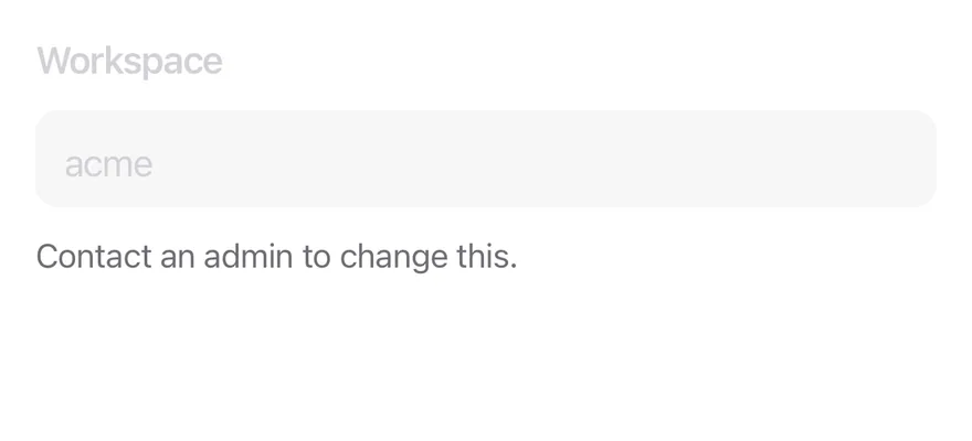
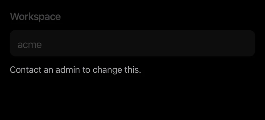
import { Field, FieldDescription, FieldLabel } from "@/components/ui/field"
import { Input } from "@/components/ui/input"

export function FieldDisabledExample() {
  return (
    <Field disabled>
      <FieldLabel>Workspace</FieldLabel>
      <Input defaultValue="acme" />
      <FieldDescription>Contact an admin to change this.</FieldDescription>
    </Field>
  )
}import EsuissUI
import SwiftUI
struct FieldDisabledDemo: View {
@State private var workspace = "acme"
var body: some View {
Field {
FieldLabel("Workspace")
.accessibilityHidden(true)
TextField("Workspace", text: $workspace)
.textFieldStyle(.input)
.accessibilityLabel(Text("Workspace"))
FieldDescription("Contact an admin to change this.")
}
.disabled(true)
}
}import androidx.compose.runtime.Composable
import androidx.compose.runtime.getValue
import androidx.compose.runtime.mutableStateOf
import androidx.compose.runtime.saveable.rememberSaveable
import androidx.compose.runtime.setValue
import androidx.compose.ui.Modifier
import androidx.compose.ui.semantics.contentDescription
import androidx.compose.ui.semantics.semantics
import com.esuiss.ui.components.Field
import com.esuiss.ui.components.FieldDescription
import com.esuiss.ui.components.FieldLabel
import com.esuiss.ui.components.Input
@Composable
fun FieldDisabled() {
var value by rememberSaveable { mutableStateOf("acme") }
Field(enabled = false) {
FieldLabel("Workspace")
Input(value, { value = it }, Modifier.semantics { contentDescription = "Workspace" })
FieldDescription("Contact an admin to change this.")
}
}Horizontal
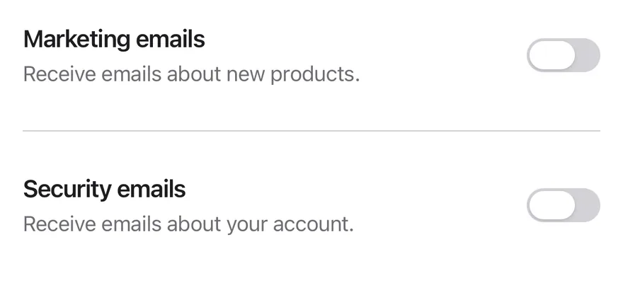
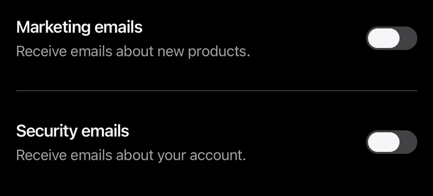
Switch rows with a title and description beside the control.
import { Field, FieldContent, FieldDescription, FieldGroup, FieldSeparator, FieldTitle } from "@/components/ui/field"
import { Switch } from "@/components/ui/switch"

export function FieldHorizontalExample() {
  return (
    <FieldGroup>
      <Field orientation="horizontal">
        <FieldContent>
          <FieldTitle>Marketing emails</FieldTitle>
          <FieldDescription>
            Receive emails about new products.
          </FieldDescription>
        </FieldContent>
        <Switch />
      </Field>
      <FieldSeparator />
      <Field orientation="horizontal">
        <FieldContent>
          <FieldTitle>Security emails</FieldTitle>
          <FieldDescription>
            Receive emails about your account.
          </FieldDescription>
        </FieldContent>
        <Switch />
      </Field>
    </FieldGroup>
  )
}import EsuissUI
import SwiftUI
struct FieldHorizontalDemo: View {
@State private var marketing = false
@State private var security = false
var body: some View {
FieldGroup {
Field(orientation: .horizontal) {
FieldContent {
FieldTitle("Marketing emails")
FieldDescription("Receive emails about new products.")
}
Toggle(isOn: $marketing) { EmptyView() }
.toggleStyle(.switch(size: .default))
.accessibilityLabel(Text("Marketing emails"))
}
FieldSeparator()
Field(orientation: .horizontal) {
FieldContent {
FieldTitle("Security emails")
FieldDescription("Receive emails about your account.")
}
Toggle(isOn: $security) { EmptyView() }
.toggleStyle(.switch(size: .default))
.accessibilityLabel(Text("Security emails"))
}
}
}
}import androidx.compose.runtime.Composable
import androidx.compose.runtime.getValue
import androidx.compose.runtime.mutableStateOf
import androidx.compose.runtime.saveable.rememberSaveable
import androidx.compose.runtime.setValue
import androidx.compose.ui.Modifier
import androidx.compose.ui.semantics.contentDescription
import androidx.compose.ui.semantics.semantics
import com.esuiss.ui.components.Field
import com.esuiss.ui.components.FieldContent
import com.esuiss.ui.components.FieldDescription
import com.esuiss.ui.components.FieldGroup
import com.esuiss.ui.components.FieldOrientation
import com.esuiss.ui.components.FieldSeparator
import com.esuiss.ui.components.FieldTitle
import com.esuiss.ui.components.Switch
@Composable
fun FieldHorizontal() {
var marketing by rememberSaveable { mutableStateOf(false) }
var security by rememberSaveable { mutableStateOf(false) }
FieldGroup {
Field(orientation = FieldOrientation.Horizontal) {
FieldContent {
FieldTitle("Marketing emails")
FieldDescription("Receive emails about new products.")
}
Switch(marketing, { marketing = it }, Modifier.semantics { contentDescription = "Marketing emails" })
}
FieldSeparator()
Field(orientation = FieldOrientation.Horizontal) {
FieldContent {
FieldTitle("Security emails")
FieldDescription("Receive emails about your account.")
}
Switch(security, { security = it }, Modifier.semantics { contentDescription = "Security emails" })
}
}
}Checkbox group
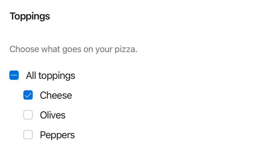
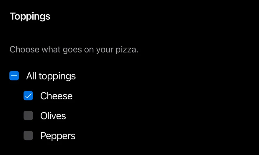
A fieldset of checkboxes with a legend.
import * as React from "react"
import { View } from "react-native"
import * as CheckboxGroupPrimitive from "@/components/primitives/checkbox-group"
import { Checkbox } from "@/components/ui/checkbox"
import { FieldDescription, FieldLegend, FieldSet } from "@/components/ui/field"
import { Text } from "@/components/ui/text"

const TOPPINGS = ["cheese", "olives", "peppers"]

function ToppingsDemo() {
  const [value, setValue] = React.useState<string[]>(["cheese"])
  return (
    <FieldSet>
      <FieldLegend>Toppings</FieldLegend>
      <FieldDescription>Choose what goes on your pizza.</FieldDescription>
      <CheckboxGroupPrimitive.Root
        value={value}
        onValueChange={setValue}
        allValues={TOPPINGS}
        className="gap-3"
      >
        <View className="flex-row items-center gap-3">
          <Checkbox parent />
          <Text>All toppings</Text>
        </View>
        {TOPPINGS.map((topping) => (
          <View key={topping} className="flex-row items-center gap-3 ps-6">
            <Checkbox value={topping} />
            <Text className="capitalize">{topping}</Text>
          </View>
        ))}
      </CheckboxGroupPrimitive.Root>
    </FieldSet>
  )
}

export function FieldCheckboxGroupExample() {
  return (
    <ToppingsDemo />
  )
}import EsuissUI
import SwiftUI
struct FieldToppingsDemo: View {
private static let toppings = ["cheese", "olives", "peppers"]
@State private var selected: Set<String> = ["cheese"]
var body: some View {
FieldSet {
FieldLegend("Toppings")
FieldDescription("Choose what goes on your pizza.")
VStack(alignment: .leading, spacing: 12) {
Toggle(sources: Self.toppings.map(binding), isOn: \.self) {
Text("All toppings")
.textStyle(.base)
.foregroundStyle(Color.label)
}
.toggleStyle(.checkbox)
ForEach(Self.toppings, id: \.self) { topping in
Toggle(isOn: binding(topping)) {
Text(verbatim: topping.capitalized)
.textStyle(.base)
.foregroundStyle(Color.label)
}
.toggleStyle(.checkbox)
.padding(.leading, 24)
}
}
}
}
func binding(_ topping: String) -> Binding<Bool> {
Binding(
get: { selected.contains(topping) },
set: { isOn in
if isOn { selected.insert(topping) } else { selected.remove(topping) }
}
)
}
}
let toppings = ["cheese", "olives", "peppers"]import androidx.compose.foundation.layout.Arrangement
import androidx.compose.foundation.layout.Column
import androidx.compose.foundation.layout.Row
import androidx.compose.foundation.layout.padding
import androidx.compose.runtime.Composable
import androidx.compose.runtime.getValue
import androidx.compose.runtime.mutableStateOf
import androidx.compose.runtime.saveable.rememberSaveable
import androidx.compose.runtime.setValue
import androidx.compose.ui.Alignment
import androidx.compose.ui.Modifier
import androidx.compose.ui.semantics.contentDescription
import androidx.compose.ui.semantics.semantics
import androidx.compose.ui.state.ToggleableState
import androidx.compose.ui.unit.dp
import com.esuiss.ui.components.Checkbox
import com.esuiss.ui.components.FieldDescription
import com.esuiss.ui.components.FieldLegend
import com.esuiss.ui.components.FieldSet
import com.esuiss.ui.components.Text
import com.esuiss.ui.components.TriStateCheckbox
val FieldToppings = listOf("cheese", "olives", "peppers")
@Composable
fun FieldCheckboxGroup() {
var value by rememberSaveable { mutableStateOf(listOf("cheese")) }
val parent = when (value.size) {
0 -> ToggleableState.Off
FieldToppings.size -> ToggleableState.On
else -> ToggleableState.Indeterminate
}
FieldSet {
FieldLegend("Toppings")
FieldDescription("Choose what goes on your pizza.")
Column(verticalArrangement = Arrangement.spacedBy(12.dp)) {
Row(horizontalArrangement = Arrangement.spacedBy(12.dp), verticalAlignment = Alignment.CenterVertically) {
TriStateCheckbox(
parent,
{ value = if (parent == ToggleableState.On) emptyList() else FieldToppings },
Modifier.semantics { contentDescription = "All toppings" },
)
Text("All toppings")
}
FieldToppings.forEach { topping ->
val label = topping.replaceFirstChar { it.uppercaseChar() }
Row(
modifier = Modifier.padding(start = 24.dp),
horizontalArrangement = Arrangement.spacedBy(12.dp),
verticalAlignment = Alignment.CenterVertically,
) {
Checkbox(
topping in value,
{ checked -> value = if (checked) FieldToppings.filter { it in value || it == topping } else value - topping },
Modifier.semantics { contentDescription = label },
)
Text(label)
}
}
}
}
}Inset
An inset group of rows on a rounded surface.
import { Field, FieldGroup, FieldLabel, FieldLegend, FieldSet } from "@/components/ui/field"
import { Input } from "@/components/ui/input"

export function FieldInsetExample() {
  return (
    <FieldSet>
      <FieldLegend>Profile</FieldLegend>
      <FieldGroup variant="inset">
        <Field orientation="horizontal">
          <FieldLabel className="flex-1 font-normal">Name</FieldLabel>
          <Input
            className="h-8 flex-1 bg-transparent px-0 text-right"
            defaultValue="Ada Lovelace"
          />
        </Field>
        <Field orientation="horizontal">
          <FieldLabel className="flex-1 font-normal">City</FieldLabel>
          <Input
            className="h-8 flex-1 bg-transparent px-0 text-right"
            defaultValue="London"
          />
        </Field>
      </FieldGroup>
    </FieldSet>
  )
}import EsuissUI
import SwiftUI
struct FieldInsetDemo: View {
@State private var name = "Ada Lovelace"
@State private var city = "London"
var body: some View {
FieldSet {
FieldLegend("Profile")
FieldGroup(.inset) {
FieldInsetRow(title: "Name", text: $name)
FieldInsetRow(title: "City", text: $city)
}
}
}
}
struct FieldInsetRow: View {
let title: LocalizedStringKey
@Binding var text: String
var body: some View {
Field(orientation: .horizontal) {
FieldLabel(title)
.frame(maxWidth: .infinity, alignment: .leading)
.accessibilityHidden(true)
TextField(title, text: $text)
.textFieldStyle(.plain)
.multilineTextAlignment(.trailing)
.textStyle(.base)
.foregroundStyle(Color.label)
.frame(maxWidth: .infinity, minHeight: 32)
.accessibilityLabel(Text(title))
}
}
}import androidx.compose.foundation.layout.Row
import androidx.compose.foundation.layout.height
import androidx.compose.foundation.text.BasicTextField
import androidx.compose.runtime.Composable
import androidx.compose.runtime.getValue
import androidx.compose.runtime.mutableStateOf
import androidx.compose.runtime.saveable.rememberSaveable
import androidx.compose.runtime.setValue
import androidx.compose.ui.Alignment
import androidx.compose.ui.Modifier
import androidx.compose.ui.graphics.SolidColor
import androidx.compose.ui.semantics.contentDescription
import androidx.compose.ui.semantics.semantics
import androidx.compose.ui.text.style.TextAlign
import androidx.compose.ui.unit.dp
import com.esuiss.ui.components.Field
import com.esuiss.ui.components.FieldGroup
import com.esuiss.ui.components.FieldGroupVariant
import com.esuiss.ui.components.FieldLabel
import com.esuiss.ui.components.FieldLegend
import com.esuiss.ui.components.FieldOrientation
import com.esuiss.ui.components.FieldSet
import com.esuiss.ui.theme.EsuissTheme
import com.esuiss.ui.theme.Typography
@Composable
fun FieldInsetInput(value: String, onValueChange: (String) -> Unit, label: String, modifier: Modifier) {
val colors = EsuissTheme.colors
BasicTextField(
value = value,
onValueChange = onValueChange,
modifier = modifier
.height(32.dp)
.semantics { contentDescription = label },
textStyle = Typography.base.copy(color = colors.label, textAlign = TextAlign.End),
singleLine = true,
cursorBrush = SolidColor(colors.accent),
decorationBox = { inner ->
Row(verticalAlignment = Alignment.CenterVertically) { inner() }
},
)
}
@Composable
fun FieldInset() {
var name by rememberSaveable { mutableStateOf("Ada Lovelace") }
var city by rememberSaveable { mutableStateOf("London") }
FieldSet {
FieldLegend("Profile")
FieldGroup(variant = FieldGroupVariant.Inset) {
Field(orientation = FieldOrientation.Horizontal) {
FieldLabel("Name", Modifier.weight(1f))
FieldInsetInput(name, { name = it }, "Name", Modifier.weight(1f))
}
Field(orientation = FieldOrientation.Horizontal) {
FieldLabel("City", Modifier.weight(1f))
FieldInsetInput(city, { city = it }, "City", Modifier.weight(1f))
}
}
}
}Form
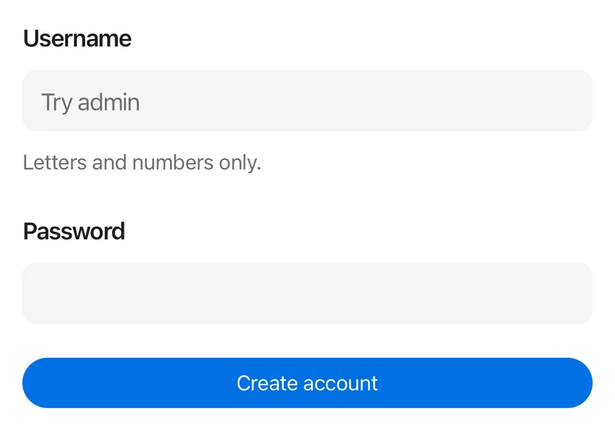
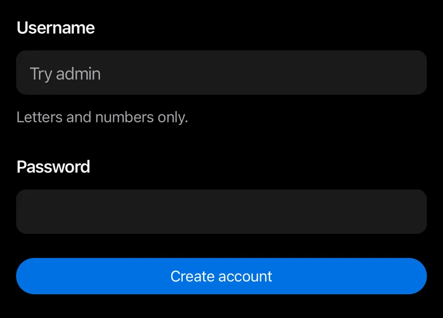
A complete form with validation and a submit button.
import * as React from "react"
import * as FormPrimitive from "@/components/primitives/form"
import { Button } from "@/components/ui/button"
import { Field, FieldDescription, FieldError, FieldGroup, FieldLabel } from "@/components/ui/field"
import { Input } from "@/components/ui/input"
import { Text } from "@/components/ui/text"

function FormDemo() {
  const actionsRef = React.useRef<FormPrimitive.Actions | null>(null)
  const [errors, setErrors] = React.useState<FormPrimitive.Errors>({})
  const [submitted, setSubmitted] = React.useState<string | null>(null)

  return (
    <FormPrimitive.Root
      actionsRef={actionsRef}
      errors={errors}
      onFormSubmit={(values) => {
        if (values.username === "admin") {
          setErrors({ username: "This username is taken." })
          return
        }
        setSubmitted(JSON.stringify(values))
      }}
      className="gap-6"
    >
      <FieldGroup>
        <Field name="username">
          <FieldLabel>Username</FieldLabel>
          <Input placeholder="Try admin" autoCapitalize="none" required />
          <FieldDescription>Letters and numbers only.</FieldDescription>
          <FieldError />
        </Field>
        <Field
          name="password"
          validate={(value) =>
            typeof value === "string" && /\d/.test(value)
              ? null
              : "Include at least one number."
          }
        >
          <FieldLabel>Password</FieldLabel>
          <Input secureTextEntry required minLength={8} />
          <FieldError />
        </Field>
      </FieldGroup>
      <Button onPress={() => actionsRef.current?.submit()}>
        <Text>Create account</Text>
      </Button>
      {submitted ? <Text variant="muted">Submitted: {submitted}</Text> : null}
    </FormPrimitive.Root>
  )
}

export function FieldFormExample() {
  return (
    <FormDemo />
  )
}import EsuissUI
import SwiftUI
enum FieldMessages {
static let required = "This field is required."
static func tooShort(_ minLength: Int) -> String {
"Use at least \(minLength) characters."
}
}
struct FieldFormDemo: View {
@State private var username = ""
@State private var password = ""
@State private var usernameErrors: [String] = []
@State private var passwordErrors: [String] = []
@State private var taken = false
@State private var submitted: String?
var body: some View {
VStack(alignment: .leading, spacing: 24) {
FieldGroup {
Field(invalid: !usernameErrors.isEmpty || taken) {
FieldLabel("Username")
.accessibilityHidden(true)
TextField("Try admin", text: $username)
.textFieldStyle(.input)
.textInputAutocapitalization(.never)
.autocorrectionDisabled()
.accessibilityLabel(Text("Username"))
FieldDescription("Letters and numbers only.")
FieldError(errors: usernameErrors + (taken ? ["This username is taken."] : []))
}
Field(invalid: !passwordErrors.isEmpty) {
FieldLabel("Password")
.accessibilityHidden(true)
SecureField("Password", text: $password)
.textFieldStyle(.input)
.accessibilityLabel(Text("Password"))
FieldError(errors: passwordErrors)
}
}
Button {
submit()
} label: {
Text("Create account").frame(maxWidth: .infinity)
}
.buttonStyle(.variant())
if let submitted {
Text(verbatim: "Submitted: \(submitted)")
.textVariant(.muted)
}
}
.onChange(of: username) { taken = false }
}
func submit() {
usernameErrors = username.isEmpty ? [FieldMessages.required] : []
var errors: [String] = []
if password.isEmpty {
errors.append(FieldMessages.required)
} else if password.count < 8 {
errors.append(FieldMessages.tooShort(8))
}
if !password.contains(where: \.isNumber) {
errors.append("Include at least one number.")
}
passwordErrors = errors
guard usernameErrors.isEmpty, passwordErrors.isEmpty else { return }
if username == "admin" {
taken = true
return
}
submitted = "{\"username\":\"\(username)\",\"password\":\"\(password)\"}"
}
}
let required = "This field is required."
func tooShort(_ minLength: Int) -> String {
"Use at least \(minLength) characters."
}import androidx.compose.foundation.layout.Arrangement
import androidx.compose.foundation.layout.Column
import androidx.compose.foundation.layout.fillMaxWidth
import androidx.compose.foundation.text.KeyboardOptions
import androidx.compose.runtime.Composable
import androidx.compose.runtime.getValue
import androidx.compose.runtime.mutableStateOf
import androidx.compose.runtime.saveable.rememberSaveable
import androidx.compose.runtime.setValue
import androidx.compose.ui.Modifier
import androidx.compose.ui.semantics.contentDescription
import androidx.compose.ui.semantics.semantics
import androidx.compose.ui.text.input.KeyboardCapitalization
import androidx.compose.ui.text.input.KeyboardType
import androidx.compose.ui.text.input.PasswordVisualTransformation
import androidx.compose.ui.unit.dp
import com.esuiss.ui.components.Button
import com.esuiss.ui.components.Field
import com.esuiss.ui.components.FieldDescription
import com.esuiss.ui.components.FieldError
import com.esuiss.ui.components.FieldGroup
import com.esuiss.ui.components.FieldLabel
import com.esuiss.ui.components.Input
import com.esuiss.ui.components.Text
import com.esuiss.ui.components.TextVariant
val FieldPlainText = KeyboardOptions(capitalization = KeyboardCapitalization.None, autoCorrectEnabled = false)
fun fieldUsernameErrors(username: String, taken: Boolean): List<String> = buildList {
if (username.isEmpty()) add(FieldRequiredMessage)
if (taken) add("This username is taken.")
}
fun fieldPasswordErrors(password: String): List<String> = buildList {
if (password.isEmpty()) add(FieldRequiredMessage)
if (password.isNotEmpty() && password.length < 8) add("Use at least 8 characters.")
if (!password.any { it.isDigit() }) add("Include at least one number.")
}
@Composable
fun FieldForm() {
var username by rememberSaveable { mutableStateOf("") }
var password by rememberSaveable { mutableStateOf("") }
var taken by rememberSaveable { mutableStateOf(false) }
var attempted by rememberSaveable { mutableStateOf(false) }
var submitted by rememberSaveable { mutableStateOf<String?>(null) }
val usernameErrors = if (attempted) fieldUsernameErrors(username, taken) else emptyList()
val passwordErrors = if (attempted) fieldPasswordErrors(password) else emptyList()
Column(Modifier.fillMaxWidth(), verticalArrangement = Arrangement.spacedBy(24.dp)) {
FieldGroup {
Field(invalid = usernameErrors.isNotEmpty()) {
FieldLabel("Username")
Input(
username,
{
username = it
taken = false
},
Modifier.semantics { contentDescription = "Username" },
placeholder = "Try admin",
keyboardOptions = FieldPlainText,
)
FieldDescription("Letters and numbers only.")
FieldError(usernameErrors)
}
Field(invalid = passwordErrors.isNotEmpty()) {
FieldLabel("Password")
Input(
password,
{ password = it },
Modifier.semantics { contentDescription = "Password" },
keyboardOptions = KeyboardOptions(keyboardType = KeyboardType.Password),
visualTransformation = PasswordVisualTransformation(),
)
FieldError(passwordErrors)
}
}
Button(
"Create account",
onClick = {
attempted = true
val invalid = fieldUsernameErrors(username, false).isNotEmpty() || fieldPasswordErrors(password).isNotEmpty()
if (invalid) return@Button
if (username == "admin") {
taken = true
return@Button
}
submitted = "{\"username\":\"$username\",\"password\":\"$password\"}"
},
modifier = Modifier.fillMaxWidth(),
)
submitted?.let { Text("Submitted: $it", variant = TextVariant.Muted) }
}
}API Reference
FieldSet
Group of related fields.
React.ComponentProps<typeof FieldsetPrimitive.Root>FieldLegend
Heading for a fieldset.
React.ComponentProps<typeof FieldsetPrimitive.Legend>- About
legend(heading) orlabel.- Type
"legend""label"- Default
- "legend"
FieldGroup
Stack of fields, plain or inset.
React.ComponentProps<typeof View>- About
defaultorinset.- Type
FieldGroupVariant- Default
- "default"
Field
One field that shares state with its control.
React.ComponentProps<typeof FieldPrimitive.Root>- About
vertical,horizontalorresponsive.- Type
FieldOrientation- Default
- "vertical"
FieldContent
Column for a title and description beside a control.
React.ComponentProps<typeof View>FieldLabel
Label linked to the control.
React.ComponentProps<typeof FieldPrimitive.Label>FieldTitle
Bold text for a field's title.
React.ComponentProps<typeof RNText>FieldDescription
Helper text.
React.ComponentProps<typeof FieldPrimitive.Description>FieldSeparator
Divider with optional centered text.
React.ComponentProps<typeof View>- Type
React.ReactNode- Default
- —
FieldError
Error message shown when validation fails.
React.ComponentProps<typeof FieldPrimitive.Error>- About
- Array of
{ message }objects to show. - Type
Array<{ message?: string } | undefined>- Default
- —
Accessibility
- The control is labelled by
FieldLabeland gets the description and error text as its accessibility hint. FieldErrorhas thealertrole, so screen readers announce it when it appears.FieldSethas thegrouprole labelled by its legend; the legend has theheaderrole.- Disabled state is passed to the label and control.
Notes
- Uses
text-label,text-label-secondary,text-dangerandbg-surface-secondarytokens; light and dark follow the system appearance. - Inset separators use start and end offsets, so they flip in right-to-left layouts.