suiss/uim · React Native Component
Carousel
A swipeable row or column of slides with arrow buttons, dots and optional autoplay.
Carousel is an open-source mobile component from suiss/uim for React Native and Expo, with SwiftUI and Jetpack Compose versions built from the same design tokens. The @esuiss/uim CLI copies its source into your project, so you own the code.
import { View } from "react-native"
import { Card, CardContent } from "@/components/ui/card"
import { Carousel, CarouselContent, CarouselItem, CarouselNext, CarouselPrevious } from "@/components/ui/carousel"
import { Text } from "@/components/ui/text"

const slides = [1, 2, 3, 4, 5]

function NumberSlides({ basis }: { basis?: number }) {
  return (
    <CarouselContent>
      {slides.map((slide) => (
        <CarouselItem key={slide} basis={basis}>
          <Card size={basis ? "sm" : "default"}>
            <CardContent className="aspect-square items-center justify-center">
              <Text className="text-4xl font-semibold">{slide}</Text>
            </CardContent>
          </Card>
        </CarouselItem>
      ))}
    </CarouselContent>
  )
}

export function CarouselExample() {
  return (
    <View className="mx-12">
      <Carousel>
        <NumberSlides />
        <CarouselPrevious />
        <CarouselNext />
      </Carousel>
    </View>
  )
}import EsuissUI
import SwiftUI
struct CarouselExample: View {
var body: some View {
Carousel {
HStack(spacing: 12) {
CarouselPrevious()
CarouselNumberSlides(basis: nil)
CarouselNext()
}
}
}
}
struct CarouselPick {
let eyebrow: String
let title: String
let tint: Color
}
enum CarouselData {
static let slides = [1, 2, 3, 4, 5]
static let picks = [
CarouselPick(eyebrow: "Today's pick", title: "Weekend breakfast", tint: .warning),
CarouselPick(eyebrow: "New", title: "Grilled meatballs", tint: .danger),
CarouselPick(eyebrow: "Chef's special", title: "Lentil soup", tint: .success),
CarouselPick(eyebrow: "Dessert", title: "Künefe", tint: .accent),
]
static let features = [
"Take orders at the table.",
"Every ticket, right on time.",
"A full room, every night.",
]
}
struct CarouselNumberSlides: View {
let basis: CGFloat?
var body: some View {
CarouselContent {
ForEach(CarouselData.slides, id: \.self) { slide in
CarouselItem(basis: basis ?? 1) {
Card(size: basis == nil ? .default : .sm) {
CardContent {
Text(verbatim: "\(slide)")
.textStyle(.xl3, weight: .semibold)
.frame(maxWidth: .infinity, maxHeight: .infinity)
.aspectRatio(1, contentMode: .fit)
}
}
}
}
}
}
}
let slides = [1, 2, 3, 4, 5]
let picks = [
CarouselPick(eyebrow: "Today's pick", title: "Weekend breakfast", tint: .warning),
CarouselPick(eyebrow: "New", title: "Grilled meatballs", tint: .danger),
CarouselPick(eyebrow: "Chef's special", title: "Lentil soup", tint: .success),
CarouselPick(eyebrow: "Dessert", title: "Künefe", tint: .accent),
]
let features = [
"Take orders at the table.",
"Every ticket, right on time.",
"A full room, every night.",
]import androidx.compose.foundation.layout.Arrangement
import androidx.compose.foundation.layout.Box
import androidx.compose.foundation.layout.BoxWithConstraints
import androidx.compose.foundation.layout.PaddingValues
import androidx.compose.foundation.layout.Row
import androidx.compose.foundation.layout.aspectRatio
import androidx.compose.foundation.layout.fillMaxWidth
import androidx.compose.foundation.layout.padding
import androidx.compose.runtime.Composable
import androidx.compose.ui.Alignment
import androidx.compose.ui.Modifier
import androidx.compose.ui.text.font.FontWeight
import androidx.compose.ui.unit.Dp
import androidx.compose.ui.unit.dp
import com.esuiss.ui.components.Card
import com.esuiss.ui.components.CardContent
import com.esuiss.ui.components.CardSize
import com.esuiss.ui.components.Carousel
import com.esuiss.ui.components.CarouselContent
import com.esuiss.ui.components.CarouselItem
import com.esuiss.ui.components.CarouselNext
import com.esuiss.ui.components.CarouselPrevious
import com.esuiss.ui.components.Text
import com.esuiss.ui.components.rememberCarouselState
import com.esuiss.ui.theme.Typography
@Composable
fun CarouselExample() {
CarouselNumbers(basis = null, loop = false)
}
val carouselSlides = listOf(1, 2, 3, 4, 5)
val carouselSpacing = 16.dp
fun carouselPeek(width: Dp, basis: Float?, spacing: Dp = carouselSpacing): PaddingValues {
if (basis == null) return PaddingValues(0.dp)
val page = (width + spacing) * basis - spacing
return PaddingValues(end = width - page)
}
@Composable
fun CarouselNumbers(basis: Float?, loop: Boolean) {
val state = rememberCarouselState(pageCount = carouselSlides.size, loop = loop)
BoxWithConstraints(Modifier.fillMaxWidth()) {
val width = maxWidth
Carousel(state = state, modifier = Modifier.fillMaxWidth()) {
CarouselContent(contentPadding = carouselPeek(width, basis)) { page ->
CarouselItem {
Card(size = if (basis != null) CardSize.Sm else CardSize.Default) {
CardContent {
Box(Modifier.fillMaxWidth().aspectRatio(1f), contentAlignment = Alignment.Center) {
Text(
carouselSlides[page].toString(),
style = Typography.xl3.copy(fontWeight = FontWeight.SemiBold),
)
}
}
}
}
}
Row(
Modifier.fillMaxWidth().padding(top = 12.dp),
horizontalArrangement = Arrangement.SpaceBetween,
verticalAlignment = Alignment.CenterVertically,
) {
CarouselPrevious()
CarouselNext()
}
}
}
}Carousel wraps a scroll view that snaps to each CarouselItem. It scrolls horizontally by default or vertically with orientation="vertical". CarouselPrevious and CarouselNext are round Buttons that sit outside the slides, or inline when placed in CarouselControls.
CarouselDots shows one dot per snap point, with the active dot stretched into a pill; with autoplay on, the active dot fills up as a timer. CarouselPlayButton pauses and resumes autoplay.
Installation
$ pnpm dlx @esuiss/uim@latest add carousel$ pnpm dlx @esuiss/uim@latest add carousel --platform swift$ pnpm dlx @esuiss/uim@latest add carousel --platform kotlinThe CLI also adds what it builds on: Button, Icon.
Manual
- Install the dependencies:
npx expo install cn phosphor-react-native react-native-reanimated react-native-svg react-native-worklets-
Add the pieces it builds on: Button, Icon, and the primitives
components/primitives/carousel.tsx,components/primitives/use-render.tsx. -
Copy the source into
components/ui/carousel.tsx:
import { cn } from "cn"
import {
  CaretLeftIcon,
  CaretRightIcon,
  PauseIcon,
  PlayIcon,
} from "phosphor-react-native"
import * as React from "react"
import { I18nManager, View, type ViewProps } from "react-native"
import {
  cancelAnimation,
  Easing,
  ReduceMotion,
  useAnimatedStyle,
  useSharedValue,
withTiming,- Update the import paths to match your project.
- Install the dependencies:
npx expo install cn phosphor-react-native react-native-reanimated react-native-svg react-native-worklets-
Add the pieces it builds on: Button, Icon, and the primitives
components/primitives/carousel.tsx,components/primitives/use-render.tsx. -
Copy the source into
components/ui/carousel.tsx:
import { cn } from "cn"
import {
  CaretLeftIcon,
  CaretRightIcon,
  PauseIcon,
  PlayIcon,
} from "phosphor-react-native"
import * as React from "react"
import { I18nManager, View, type ViewProps } from "react-native"
import {
  cancelAnimation,
  Easing,
  ReduceMotion,
  useAnimatedStyle,
  useSharedValue,
withTiming,- Update the import paths to match your project.
- Install the dependencies:
npx expo install phosphor-react-native react-native-reanimated react-native-svg react-native-worklets-
Add the pieces it builds on: Button, Icon, and the primitives
components/primitives/carousel.tsx,components/primitives/use-render.tsx. -
Copy the source into
components/ui/carousel.tsx:
import {
  CaretLeftIcon,
  CaretRightIcon,
  PauseIcon,
  PlayIcon,
} from "phosphor-react-native"
import * as React from "react"
import { I18nManager, StyleSheet, View, type ViewProps } from "react-native"
import {
  cancelAnimation,
  Easing,
  ReduceMotion,
  useAnimatedStyle,
  useSharedValue,
  withTiming,
} from "react-native-reanimated"- Update the import paths to match your project.
-
Target iOS 17 or later.
-
Add the Swift package to your app:
.package(url: "https://github.com/phosphor-icons/swift", from: "2.1.0")- Copy the theme files every view uses:
import SwiftUI
import UIKit

struct RGBA: Sendable {
  let red: CGFloat
  let green: CGFloat
  let blue: CGFloat
  let alpha: CGFloat

  init(_ hex: UInt32, _ alpha: CGFloat = 1) {
    red = CGFloat((hex >> 16) & 0xFF) / 255
    green = CGFloat((hex >> 8) & 0xFF) / 255
    blue = CGFloat(hex & 0xFF) / 255
    self.alpha = alpha
}import SwiftUI
extension Color {
public static let surface = Color.adaptive(light: .init(0xFFFFFF), dark: .init(0x000000))
public static let surfaceSecondary = Color.adaptive(light: .init(0xF5F5F7), dark: .init(0x161617))
public static let surfaceTertiary = Color.adaptive(light: .init(0xE8E8ED), dark: .init(0x2C2C2E))
public static let surfaceRaised = Color.adaptive(light: .init(0xFFFFFF), dark: .init(0x1D1D1F))
public static let label = Color.adaptive(light: .init(0x1D1D1F), dark: .init(0xF5F5F7))
public static let labelSecondary = Color.adaptive(light: .init(0x6E6E73), dark: .init(0xA1A1A6))
public static let labelTertiary = Color.adaptive(light: .init(0x86868B), dark: .init(0x86868B))
public static let labelQuaternary = Color.adaptive(light: .init(0xD2D2D7), dark: .init(0x424245))
public static let control = Color.adaptive(light: .init(0x000000, 0.04), dark: .init(0xFFFFFF, 0.1))
public static let controlPressed = Color.adaptive(light: .init(0x000000, 0.12), dark: .init(0xFFFFFF, 0.22))
public static let controlSelected = Color.adaptive(light: .init(0x1D1D1F), dark: .init(0xF5F5F7))
public static let controlDisabled = Color.adaptive(light: .init(0x000000, 0.03), dark: .init(0xFFFFFF, 0.05))
public static let onControlSelected = Color.adaptive(light: .init(0xFFFFFF), dark: .init(0x000000))- Copy the source and every file it uses:
import PhosphorSwift
import SwiftUI

public enum CarouselOrientation: CaseIterable, Sendable {
  case horizontal, vertical
}

public enum CarouselDotsVariant: CaseIterable, Sendable {
  case `default`, plain
}

let carouselAnimation = Animation.timingCurve(0.32, 0.72, 0, 1, duration: 0.5)

enum CarouselMath {
  static func clamp(_ index: Int, count: Int) -> Int {
count == 0 ? 0 : min(max(index, 0), count - 1)import SwiftUI
public struct VariantButtonStyle: ButtonStyle {
public enum Variant: CaseIterable, Sendable {
case `default`, outline, secondary, tinted, ghost, plain, destructive, link
}
public enum Size: CaseIterable, Sendable {
case `default`, xs, sm, lg, xl, icon, iconXs, iconSm, iconLg, iconXl
var height: CGFloat {
switch self {
case .xs, .iconXs: 24
case .sm, .iconSm: 32
case .default, .icon: 36
case .lg, .iconLg: 44import SwiftUI
extension EnvironmentValues {
@Entry var buttonGroup: Axis? = nil
@Entry var buttonGroupSize: CGSize = .zero
}
enum ButtonGroupSpace: Hashable {
case group
}
struct ButtonGroupFrame {
let bounds: Anchor<CGRect>
let outlined: Bool
}import PhosphorSwift
import SwiftUI
extension Shadow {
static let control = Shadow(color: .black.opacity(0.08), radius: 0.5, y: 0.5)
static let thumb = Shadow(color: .black.opacity(0.12), radius: 1.5, y: 1)
}
struct SelectionIndicator<Mark: View>: View {
let checked: Bool
let pressed: Bool
let cornerRadius: CGFloat
let mark: Mark
@Environment(\.isEnabled) private var isEnabled
@Environment(\.isInvalid) private var invalidimport SwiftUI
extension EnvironmentValues {
@Entry public var isInvalid = false
@Entry var fieldInset = false
@Entry var fieldGroupInset = false
@Entry var fieldSetInset = false
}
extension View {
public func invalid(_ isInvalid: Bool = true) -> some View {
environment(\.isInvalid, isInvalid)
}
}
public enum FieldOrientation: CaseIterable, Sendable {import SwiftUI
extension EnvironmentValues {
@Entry public var hapticsEnabled = true
}
extension View {
public func haptics(_ enabled: Bool) -> some View {
environment(\.hapticsEnabled, enabled)
}
func hapticFeedback<Trigger: Equatable>(_ feedback: SensoryFeedback, trigger: Trigger) -> some View {
modifier(HapticFeedbackModifier(feedback: feedback, trigger: trigger) { _, _ in true })
}
func hapticFeedback<Trigger: Equatable>(import SwiftUI
public struct Separator: View {
let orientation: Axis
public init(_ orientation: Axis = .horizontal) {
self.orientation = orientation
}
public var body: some View {
Rectangle()
.fill(Color.separator)
.frame(width: orientation == .vertical ? 1 : nil, height: orientation == .horizontal ? 1 : nil)
.frame(maxWidth: orientation == .horizontal ? .infinity : nil, maxHeight: orientation == .vertical ? .infinity : nil)
.accessibilityHidden(true)
}import SwiftUI
public enum TextVariant: CaseIterable, Sendable {
case `default`, h1, h2, h3, h4, p, blockquote, code, lead, large, small, muted
var style: TextStyle {
switch self {
case .h1: .xl3
case .h2: .xl2
case .h3: .xl
case .h4, .lead, .large: .lg
case .code, .small, .muted: .sm
default: .base
}
}- Add the files to your app target.
- Set
minSdkto 24 or higher and add the dependencies:
implementation(platform("androidx.compose:compose-bom:2026.09.00"))
implementation("androidx.compose.foundation:foundation")
implementation("androidx.compose.ui:ui")
implementation("com.adamglin:phosphor-icon-android:1.0.0")- Copy the theme files every view uses:
package com.esuiss.ui.theme

import androidx.compose.foundation.isSystemInDarkTheme
import androidx.compose.runtime.Composable
import androidx.compose.runtime.CompositionLocalProvider
import androidx.compose.runtime.Immutable
import androidx.compose.runtime.staticCompositionLocalOf
import androidx.compose.ui.Modifier
import androidx.compose.ui.draw.dropShadow
import androidx.compose.ui.graphics.Color
import androidx.compose.ui.graphics.Shape
import androidx.compose.ui.graphics.shadow.Shadow as DropShadow
import androidx.compose.ui.text.TextStyle
import androidx.compose.ui.text.style.LineHeightStyle
import androidx.compose.ui.unit.Dp
import androidx.compose.ui.unit.DpOffsetpackage com.esuiss.ui.theme
import androidx.compose.runtime.Immutable
import androidx.compose.ui.graphics.Color
import androidx.compose.ui.unit.dp
@Immutable
data class Colors(
val surface: Color,
val surfaceSecondary: Color,
val surfaceTertiary: Color,
val surfaceRaised: Color,
val label: Color,
val labelSecondary: Color,
val labelTertiary: Color,
val labelQuaternary: Color,- Copy the source and every file it uses:
package com.esuiss.ui.components

import androidx.compose.animation.animateColorAsState
import androidx.compose.animation.core.Animatable
import androidx.compose.animation.core.CubicBezierEasing
import androidx.compose.animation.core.LinearEasing
import androidx.compose.animation.core.animateDpAsState
import androidx.compose.animation.core.tween
import androidx.compose.foundation.background
import androidx.compose.foundation.clickable
import androidx.compose.foundation.interaction.MutableInteractionSource
import androidx.compose.foundation.interaction.collectIsDraggedAsState
import androidx.compose.foundation.interaction.collectIsPressedAsState
import androidx.compose.foundation.layout.Arrangement
import androidx.compose.foundation.layout.Box
import androidx.compose.foundation.layout.BoxScopepackage com.esuiss.ui.components
import androidx.compose.foundation.background
import androidx.compose.foundation.border
import androidx.compose.foundation.clickable
import androidx.compose.foundation.interaction.MutableInteractionSource
import androidx.compose.foundation.interaction.collectIsPressedAsState
import androidx.compose.foundation.layout.Arrangement
import androidx.compose.foundation.layout.Row
import androidx.compose.foundation.layout.RowScope
import androidx.compose.foundation.layout.fillMaxWidth
import androidx.compose.foundation.layout.height
import androidx.compose.foundation.layout.padding
import androidx.compose.foundation.layout.size
import androidx.compose.foundation.shape.CircleShape
import androidx.compose.foundation.shape.RoundedCornerShapepackage com.esuiss.ui.components
import androidx.compose.foundation.background
import androidx.compose.foundation.gestures.Orientation
import androidx.compose.foundation.layout.Arrangement
import androidx.compose.foundation.layout.Box
import androidx.compose.foundation.layout.Row
import androidx.compose.foundation.layout.RowScope
import androidx.compose.foundation.layout.padding
import androidx.compose.foundation.shape.CircleShape
import androidx.compose.foundation.shape.CornerSize
import androidx.compose.foundation.shape.RoundedCornerShape
import androidx.compose.runtime.Composable
import androidx.compose.runtime.CompositionLocalProvider
import androidx.compose.runtime.DisposableEffect
import androidx.compose.runtime.Immutablepackage com.esuiss.ui.components
import androidx.compose.runtime.compositionLocalOf
import androidx.compose.ui.graphics.Color
import androidx.compose.ui.text.TextStyle
import androidx.compose.ui.unit.Dp
import androidx.compose.ui.unit.dp
val LocalContentStyle = compositionLocalOf { TextStyle.Default }
val LocalContentColor = compositionLocalOf { Color.Unspecified }
val LocalIconSize = compositionLocalOf { 20.dp }package com.esuiss.ui.components
import androidx.compose.foundation.Image
import androidx.compose.foundation.layout.size
import androidx.compose.runtime.Composable
import androidx.compose.ui.Modifier
import androidx.compose.ui.graphics.Color
import androidx.compose.ui.graphics.ColorFilter
import androidx.compose.ui.graphics.takeOrElse
import androidx.compose.ui.graphics.vector.ImageVector
import androidx.compose.ui.unit.Dp
import com.esuiss.ui.theme.EsuissTheme
@Composable
fun Icon(
imageVector: ImageVector,- Update the
com.esuiss.uipackage names to match your project.
Usage
import { Carousel, CarouselContent, CarouselItem, CarouselPrevious, CarouselNext, CarouselControls, CarouselDots, CarouselPlayButton } from "@/components/ui/carousel"<View className="mx-12">
<Carousel>
<NumberSlides />
<CarouselPrevious />
<CarouselNext />
</Carousel>
</View>Set each slide's width with basis on CarouselItem, as a fraction of the viewport (for example 0.5 for two per view). Use opts for loop, align (start or center) and dragFree scrolling without snapping.
Pass autoplay as true for the default 5-second delay, or as a number of milliseconds. Put CarouselDots, CarouselPlayButton and nav buttons inside CarouselControls to show them in a row below the slides; CarouselDots takes variant="plain" to drop its background.
Use setApi to get a CarouselApi for scrolling from outside, or call useCarousel() inside the carousel to read the selected index and scroll state.
Examples
Multiple items
Two slides per view with basis={0.5}.
import { View } from "react-native"
import { Card, CardContent } from "@/components/ui/card"
import { Carousel, CarouselContent, CarouselItem, CarouselNext, CarouselPrevious } from "@/components/ui/carousel"
import { Text } from "@/components/ui/text"

const slides = [1, 2, 3, 4, 5]

function NumberSlides({ basis }: { basis?: number }) {
  return (
    <CarouselContent>
      {slides.map((slide) => (
        <CarouselItem key={slide} basis={basis}>
          <Card size={basis ? "sm" : "default"}>
            <CardContent className="aspect-square items-center justify-center">
              <Text className="text-4xl font-semibold">{slide}</Text>
            </CardContent>
          </Card>
        </CarouselItem>
      ))}
    </CarouselContent>
  )
}

export function CarouselMultipleItemsExample() {
  return (
    <View className="mx-12">
      <Carousel opts={{ align: "start" }}>
        <NumberSlides basis={0.5} />
        <CarouselPrevious />
        <CarouselNext />
      </Carousel>
    </View>
  )
}import EsuissUI
import SwiftUI
struct CarouselMultipleItemsExample: View {
var body: some View {
Carousel {
HStack(spacing: 12) {
CarouselPrevious()
CarouselNumberSlides(basis: 0.5)
CarouselNext()
}
}
}
}
struct CarouselPick {
let eyebrow: String
let title: String
let tint: Color
}
enum CarouselData {
static let slides = [1, 2, 3, 4, 5]
static let picks = [
CarouselPick(eyebrow: "Today's pick", title: "Weekend breakfast", tint: .warning),
CarouselPick(eyebrow: "New", title: "Grilled meatballs", tint: .danger),
CarouselPick(eyebrow: "Chef's special", title: "Lentil soup", tint: .success),
CarouselPick(eyebrow: "Dessert", title: "Künefe", tint: .accent),
]
static let features = [
"Take orders at the table.",
"Every ticket, right on time.",
"A full room, every night.",
]
}
struct CarouselNumberSlides: View {
let basis: CGFloat?
var body: some View {
CarouselContent {
ForEach(CarouselData.slides, id: \.self) { slide in
CarouselItem(basis: basis ?? 1) {
Card(size: basis == nil ? .default : .sm) {
CardContent {
Text(verbatim: "\(slide)")
.textStyle(.xl3, weight: .semibold)
.frame(maxWidth: .infinity, maxHeight: .infinity)
.aspectRatio(1, contentMode: .fit)
}
}
}
}
}
}
}
let slides = [1, 2, 3, 4, 5]
let picks = [
CarouselPick(eyebrow: "Today's pick", title: "Weekend breakfast", tint: .warning),
CarouselPick(eyebrow: "New", title: "Grilled meatballs", tint: .danger),
CarouselPick(eyebrow: "Chef's special", title: "Lentil soup", tint: .success),
CarouselPick(eyebrow: "Dessert", title: "Künefe", tint: .accent),
]
let features = [
"Take orders at the table.",
"Every ticket, right on time.",
"A full room, every night.",
]import androidx.compose.foundation.layout.Arrangement
import androidx.compose.foundation.layout.Box
import androidx.compose.foundation.layout.BoxWithConstraints
import androidx.compose.foundation.layout.PaddingValues
import androidx.compose.foundation.layout.Row
import androidx.compose.foundation.layout.aspectRatio
import androidx.compose.foundation.layout.fillMaxWidth
import androidx.compose.foundation.layout.padding
import androidx.compose.runtime.Composable
import androidx.compose.ui.Alignment
import androidx.compose.ui.Modifier
import androidx.compose.ui.text.font.FontWeight
import androidx.compose.ui.unit.Dp
import androidx.compose.ui.unit.dp
import com.esuiss.ui.components.Card
import com.esuiss.ui.components.CardContent
import com.esuiss.ui.components.CardSize
import com.esuiss.ui.components.Carousel
import com.esuiss.ui.components.CarouselContent
import com.esuiss.ui.components.CarouselItem
import com.esuiss.ui.components.CarouselNext
import com.esuiss.ui.components.CarouselPrevious
import com.esuiss.ui.components.Text
import com.esuiss.ui.components.rememberCarouselState
import com.esuiss.ui.theme.Typography
@Composable
fun CarouselMultipleItemsExample() {
CarouselNumbers(basis = 0.5f, loop = false)
}
val carouselSlides = listOf(1, 2, 3, 4, 5)
val carouselSpacing = 16.dp
fun carouselPeek(width: Dp, basis: Float?, spacing: Dp = carouselSpacing): PaddingValues {
if (basis == null) return PaddingValues(0.dp)
val page = (width + spacing) * basis - spacing
return PaddingValues(end = width - page)
}
@Composable
fun CarouselNumbers(basis: Float?, loop: Boolean) {
val state = rememberCarouselState(pageCount = carouselSlides.size, loop = loop)
BoxWithConstraints(Modifier.fillMaxWidth()) {
val width = maxWidth
Carousel(state = state, modifier = Modifier.fillMaxWidth()) {
CarouselContent(contentPadding = carouselPeek(width, basis)) { page ->
CarouselItem {
Card(size = if (basis != null) CardSize.Sm else CardSize.Default) {
CardContent {
Box(Modifier.fillMaxWidth().aspectRatio(1f), contentAlignment = Alignment.Center) {
Text(
carouselSlides[page].toString(),
style = Typography.xl3.copy(fontWeight = FontWeight.SemiBold),
)
}
}
}
}
}
Row(
Modifier.fillMaxWidth().padding(top = 12.dp),
horizontalArrangement = Arrangement.SpaceBetween,
verticalAlignment = Alignment.CenterVertically,
) {
CarouselPrevious()
CarouselNext()
}
}
}
}Loop
Wraps around from the last slide to the first.
import { View } from "react-native"
import { Card, CardContent } from "@/components/ui/card"
import { Carousel, CarouselContent, CarouselItem, CarouselNext, CarouselPrevious } from "@/components/ui/carousel"
import { Text } from "@/components/ui/text"

const slides = [1, 2, 3, 4, 5]

function NumberSlides({ basis }: { basis?: number }) {
  return (
    <CarouselContent>
      {slides.map((slide) => (
        <CarouselItem key={slide} basis={basis}>
          <Card size={basis ? "sm" : "default"}>
            <CardContent className="aspect-square items-center justify-center">
              <Text className="text-4xl font-semibold">{slide}</Text>
            </CardContent>
          </Card>
        </CarouselItem>
      ))}
    </CarouselContent>
  )
}

export function CarouselLoopExample() {
  return (
    <View className="mx-12">
      <Carousel opts={{ loop: true }}>
        <NumberSlides />
        <CarouselPrevious />
        <CarouselNext />
      </Carousel>
    </View>
  )
}import EsuissUI
import SwiftUI
struct CarouselLoopExample: View {
var body: some View {
Carousel(loop: true) {
HStack(spacing: 12) {
CarouselPrevious()
CarouselNumberSlides(basis: nil)
CarouselNext()
}
}
}
}
struct CarouselPick {
let eyebrow: String
let title: String
let tint: Color
}
enum CarouselData {
static let slides = [1, 2, 3, 4, 5]
static let picks = [
CarouselPick(eyebrow: "Today's pick", title: "Weekend breakfast", tint: .warning),
CarouselPick(eyebrow: "New", title: "Grilled meatballs", tint: .danger),
CarouselPick(eyebrow: "Chef's special", title: "Lentil soup", tint: .success),
CarouselPick(eyebrow: "Dessert", title: "Künefe", tint: .accent),
]
static let features = [
"Take orders at the table.",
"Every ticket, right on time.",
"A full room, every night.",
]
}
struct CarouselNumberSlides: View {
let basis: CGFloat?
var body: some View {
CarouselContent {
ForEach(CarouselData.slides, id: \.self) { slide in
CarouselItem(basis: basis ?? 1) {
Card(size: basis == nil ? .default : .sm) {
CardContent {
Text(verbatim: "\(slide)")
.textStyle(.xl3, weight: .semibold)
.frame(maxWidth: .infinity, maxHeight: .infinity)
.aspectRatio(1, contentMode: .fit)
}
}
}
}
}
}
}
let slides = [1, 2, 3, 4, 5]
let picks = [
CarouselPick(eyebrow: "Today's pick", title: "Weekend breakfast", tint: .warning),
CarouselPick(eyebrow: "New", title: "Grilled meatballs", tint: .danger),
CarouselPick(eyebrow: "Chef's special", title: "Lentil soup", tint: .success),
CarouselPick(eyebrow: "Dessert", title: "Künefe", tint: .accent),
]
let features = [
"Take orders at the table.",
"Every ticket, right on time.",
"A full room, every night.",
]import androidx.compose.foundation.layout.Arrangement
import androidx.compose.foundation.layout.Box
import androidx.compose.foundation.layout.BoxWithConstraints
import androidx.compose.foundation.layout.PaddingValues
import androidx.compose.foundation.layout.Row
import androidx.compose.foundation.layout.aspectRatio
import androidx.compose.foundation.layout.fillMaxWidth
import androidx.compose.foundation.layout.padding
import androidx.compose.runtime.Composable
import androidx.compose.ui.Alignment
import androidx.compose.ui.Modifier
import androidx.compose.ui.text.font.FontWeight
import androidx.compose.ui.unit.Dp
import androidx.compose.ui.unit.dp
import com.esuiss.ui.components.Card
import com.esuiss.ui.components.CardContent
import com.esuiss.ui.components.CardSize
import com.esuiss.ui.components.Carousel
import com.esuiss.ui.components.CarouselContent
import com.esuiss.ui.components.CarouselItem
import com.esuiss.ui.components.CarouselNext
import com.esuiss.ui.components.CarouselPrevious
import com.esuiss.ui.components.Text
import com.esuiss.ui.components.rememberCarouselState
import com.esuiss.ui.theme.Typography
@Composable
fun CarouselLoopExample() {
CarouselNumbers(basis = null, loop = true)
}
val carouselSlides = listOf(1, 2, 3, 4, 5)
val carouselSpacing = 16.dp
fun carouselPeek(width: Dp, basis: Float?, spacing: Dp = carouselSpacing): PaddingValues {
if (basis == null) return PaddingValues(0.dp)
val page = (width + spacing) * basis - spacing
return PaddingValues(end = width - page)
}
@Composable
fun CarouselNumbers(basis: Float?, loop: Boolean) {
val state = rememberCarouselState(pageCount = carouselSlides.size, loop = loop)
BoxWithConstraints(Modifier.fillMaxWidth()) {
val width = maxWidth
Carousel(state = state, modifier = Modifier.fillMaxWidth()) {
CarouselContent(contentPadding = carouselPeek(width, basis)) { page ->
CarouselItem {
Card(size = if (basis != null) CardSize.Sm else CardSize.Default) {
CardContent {
Box(Modifier.fillMaxWidth().aspectRatio(1f), contentAlignment = Alignment.Center) {
Text(
carouselSlides[page].toString(),
style = Typography.xl3.copy(fontWeight = FontWeight.SemiBold),
)
}
}
}
}
}
Row(
Modifier.fillMaxWidth().padding(top = 12.dp),
horizontalArrangement = Arrangement.SpaceBetween,
verticalAlignment = Alignment.CenterVertically,
) {
CarouselPrevious()
CarouselNext()
}
}
}
}Vertical
A vertical carousel with arrows above and below.
import { View } from "react-native"
import { Card, CardContent } from "@/components/ui/card"
import { Carousel, CarouselContent, CarouselItem, CarouselNext, CarouselPrevious } from "@/components/ui/carousel"
import { Text } from "@/components/ui/text"

const slides = [1, 2, 3, 4, 5]

export function CarouselVerticalExample() {
  return (
    <View className="my-12">
      <Carousel orientation="vertical" opts={{ align: "start" }}>
        <CarouselContent className="h-64">
          {slides.map((slide) => (
            <CarouselItem key={slide} basis={0.5}>
              <Card size="sm" className="h-full justify-center">
                <CardContent className="items-center justify-center">
                  <Text className="text-3xl font-semibold">{slide}</Text>
                </CardContent>
              </Card>
            </CarouselItem>
          ))}
        </CarouselContent>
        <CarouselPrevious />
        <CarouselNext />
      </Carousel>
    </View>
  )
}import EsuissUI
import SwiftUI
struct CarouselVerticalExample: View {
var body: some View {
Carousel(orientation: .vertical) {
VStack(spacing: 12) {
CarouselPrevious()
CarouselContent {
ForEach(CarouselData.slides, id: \.self) { slide in
CarouselItem(basis: 0.5) {
Card(size: .sm) {
CardContent {
Text(verbatim: "\(slide)")
.textStyle(.xl2, weight: .semibold)
.frame(maxWidth: .infinity, maxHeight: .infinity)
}
}
}
}
}
.frame(height: 256)
CarouselNext()
}
}
}
}
struct CarouselPick {
let eyebrow: String
let title: String
let tint: Color
}
enum CarouselData {
static let slides = [1, 2, 3, 4, 5]
static let picks = [
CarouselPick(eyebrow: "Today's pick", title: "Weekend breakfast", tint: .warning),
CarouselPick(eyebrow: "New", title: "Grilled meatballs", tint: .danger),
CarouselPick(eyebrow: "Chef's special", title: "Lentil soup", tint: .success),
CarouselPick(eyebrow: "Dessert", title: "Künefe", tint: .accent),
]
static let features = [
"Take orders at the table.",
"Every ticket, right on time.",
"A full room, every night.",
]
}
let slides = [1, 2, 3, 4, 5]
let picks = [
CarouselPick(eyebrow: "Today's pick", title: "Weekend breakfast", tint: .warning),
CarouselPick(eyebrow: "New", title: "Grilled meatballs", tint: .danger),
CarouselPick(eyebrow: "Chef's special", title: "Lentil soup", tint: .success),
CarouselPick(eyebrow: "Dessert", title: "Künefe", tint: .accent),
]
let features = [
"Take orders at the table.",
"Every ticket, right on time.",
"A full room, every night.",
]import androidx.compose.foundation.layout.Arrangement
import androidx.compose.foundation.layout.Box
import androidx.compose.foundation.layout.PaddingValues
import androidx.compose.foundation.layout.Row
import androidx.compose.foundation.layout.fillMaxHeight
import androidx.compose.foundation.layout.fillMaxWidth
import androidx.compose.foundation.layout.height
import androidx.compose.foundation.layout.padding
import androidx.compose.runtime.Composable
import androidx.compose.ui.Alignment
import androidx.compose.ui.Modifier
import androidx.compose.ui.text.font.FontWeight
import androidx.compose.ui.unit.dp
import com.esuiss.ui.components.Card
import com.esuiss.ui.components.CardSize
import com.esuiss.ui.components.Carousel
import com.esuiss.ui.components.CarouselContent
import com.esuiss.ui.components.CarouselItem
import com.esuiss.ui.components.CarouselNext
import com.esuiss.ui.components.CarouselOrientation
import com.esuiss.ui.components.CarouselPrevious
import com.esuiss.ui.components.Text
import com.esuiss.ui.components.rememberCarouselState
import com.esuiss.ui.theme.Typography
val carouselSlides = listOf(1, 2, 3, 4, 5)
val carouselSpacing = 16.dp
@Composable
fun CarouselVertical() {
val state = rememberCarouselState(pageCount = carouselSlides.size)
val height = 256.dp
val spacing = carouselSpacing
Carousel(state = state, modifier = Modifier.fillMaxWidth(), orientation = CarouselOrientation.Vertical) {
CarouselContent(
modifier = Modifier.fillMaxWidth().height(height),
contentPadding = PaddingValues(bottom = height - ((height + spacing) * 0.5f - spacing)),
) { page ->
CarouselItem(Modifier.fillMaxWidth().fillMaxHeight()) {
Card(modifier = Modifier.fillMaxHeight(), size = CardSize.Sm) {
Box(Modifier.fillMaxWidth().weight(1f), contentAlignment = Alignment.Center) {
Text(
carouselSlides[page].toString(),
style = Typography.xl3.copy(fontWeight = FontWeight.SemiBold),
)
}
}
}
}
Row(
Modifier.fillMaxWidth().padding(top = 12.dp),
horizontalArrangement = Arrangement.SpaceBetween,
verticalAlignment = Alignment.CenterVertically,
) {
CarouselPrevious()
CarouselNext()
}
}
}With page indicator
Full-width cards with a page indicator below.
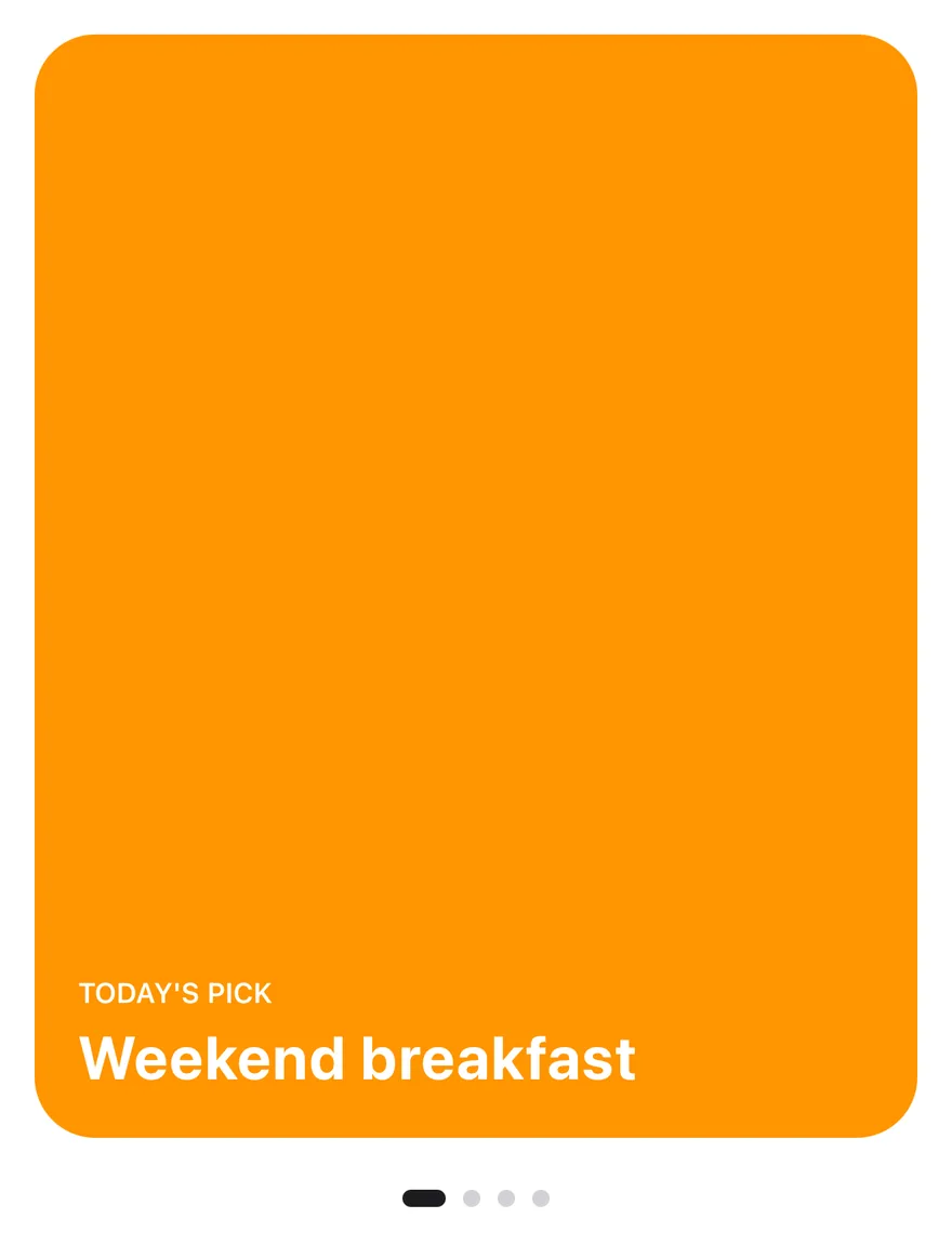
import { View } from "react-native"
import { Carousel, CarouselContent, CarouselItem, useCarousel } from "@/components/ui/carousel"
import { PageIndicator } from "@/components/ui/page-indicator"
import { Text } from "@/components/ui/text"

const picks = [
  { eyebrow: "Today's pick", title: "Weekend breakfast", tint: "bg-orange" },
  { eyebrow: "New", title: "Grilled meatballs", tint: "bg-red" },
  { eyebrow: "Chef's special", title: "Lentil soup", tint: "bg-teal" },
  { eyebrow: "Dessert", title: "Künefe", tint: "bg-purple" },
]

function CarouselPageIndicator() {
  const { scrollSnaps, selectedIndex, scrollTo } = useCarousel()
  return (
    <PageIndicator
      className="mt-4"
      count={scrollSnaps.length}
      index={selectedIndex}
      onIndexChange={(index) => scrollTo(index)}
    />
  )
}

export function CarouselWithPageIndicatorExample() {
  return (
    <Carousel>
      <CarouselContent>
        {picks.map((pick) => (
          <CarouselItem key={pick.title}>
            <View
              className={`aspect-[4/5] justify-end gap-1 rounded-3xl p-5 ${pick.tint}`}
            >
              <Text className="text-xs font-semibold text-on-accent uppercase">
                {pick.eyebrow}
              </Text>
              <Text className="text-2xl font-bold text-on-accent">
                {pick.title}
              </Text>
            </View>
          </CarouselItem>
        ))}
      </CarouselContent>
      <CarouselPageIndicator />
    </Carousel>
  )
}import EsuissUI
import SwiftUI
struct CarouselPick {
let eyebrow: String
let title: String
let tint: Color
}
enum CarouselData {
static let slides = [1, 2, 3, 4, 5]
static let picks = [
CarouselPick(eyebrow: "Today's pick", title: "Weekend breakfast", tint: .warning),
CarouselPick(eyebrow: "New", title: "Grilled meatballs", tint: .danger),
CarouselPick(eyebrow: "Chef's special", title: "Lentil soup", tint: .success),
CarouselPick(eyebrow: "Dessert", title: "Künefe", tint: .accent),
]
static let features = [
"Take orders at the table.",
"Every ticket, right on time.",
"A full room, every night.",
]
}
struct CarouselPickCard: View {
let pick: CarouselPick
var body: some View {
VStack(alignment: .leading, spacing: 4) {
Text(verbatim: pick.eyebrow.uppercased())
.textStyle(.xs2, weight: .semibold)
Text(verbatim: pick.title)
.textStyle(.xl2, weight: .bold)
}
.foregroundStyle(Color.onAccent)
.padding(20)
.frame(maxWidth: .infinity, maxHeight: .infinity, alignment: .bottomLeading)
.aspectRatio(4.0 / 5.0, contentMode: .fit)
.background(pick.tint, in: RoundedRectangle(cornerRadius: Radius.xl3, style: .continuous))
}
}
struct CarouselPageIndicatorDemo: View {
@State private var controller = CarouselController()
var body: some View {
Carousel(controller: controller) {
CarouselContent {
ForEach(CarouselData.picks, id: \.title) { pick in
CarouselItem {
CarouselPickCard(pick: pick)
}
}
}
PageIndicator(count: controller.count, index: controller.selectedIndex) { controller.scrollTo($0) }
.padding(.top, 16)
}
}
}
let slides = [1, 2, 3, 4, 5]
let picks = [
CarouselPick(eyebrow: "Today's pick", title: "Weekend breakfast", tint: .warning),
CarouselPick(eyebrow: "New", title: "Grilled meatballs", tint: .danger),
CarouselPick(eyebrow: "Chef's special", title: "Lentil soup", tint: .success),
CarouselPick(eyebrow: "Dessert", title: "Künefe", tint: .accent),
]
let features = [
"Take orders at the table.",
"Every ticket, right on time.",
"A full room, every night.",
]import androidx.compose.foundation.background
import androidx.compose.foundation.layout.Arrangement
import androidx.compose.foundation.layout.Column
import androidx.compose.foundation.layout.aspectRatio
import androidx.compose.foundation.layout.fillMaxWidth
import androidx.compose.foundation.layout.padding
import androidx.compose.foundation.shape.RoundedCornerShape
import androidx.compose.runtime.Composable
import androidx.compose.ui.Alignment
import androidx.compose.ui.Modifier
import androidx.compose.ui.draw.clip
import androidx.compose.ui.graphics.Color
import androidx.compose.ui.text.font.FontWeight
import androidx.compose.ui.unit.dp
import com.esuiss.ui.components.Carousel
import com.esuiss.ui.components.CarouselContent
import com.esuiss.ui.components.CarouselItem
import com.esuiss.ui.components.PageIndicator
import com.esuiss.ui.components.Text
import com.esuiss.ui.components.rememberCarouselState
import com.esuiss.ui.theme.Colors
import com.esuiss.ui.theme.EsuissTheme
import com.esuiss.ui.theme.Radius
import com.esuiss.ui.theme.Typography
class CarouselPick(val eyebrow: String, val title: String, val tint: (Colors) -> Color)
val carouselPicks = listOf(
CarouselPick("Today's pick", "Weekend breakfast") { it.orange },
CarouselPick("New", "Grilled meatballs") { it.red },
CarouselPick("Chef's special", "Lentil soup") { it.teal },
CarouselPick("Dessert", "Künefe") { it.purple },
)
@Composable
fun CarouselPickCard(pick: CarouselPick) {
val colors = EsuissTheme.colors
Column(
Modifier
.fillMaxWidth()
.aspectRatio(4f / 5f)
.clip(RoundedCornerShape(Radius.xl3))
.background(pick.tint(colors))
.padding(20.dp),
verticalArrangement = Arrangement.spacedBy(4.dp, Alignment.Bottom),
) {
Text(
pick.eyebrow.uppercase(),
style = Typography.xs.copy(color = colors.onAccent, fontWeight = FontWeight.SemiBold),
)
Text(
pick.title,
style = Typography.xl2.copy(color = colors.onAccent, fontWeight = FontWeight.Bold),
)
}
}
@Composable
fun CarouselWithPageIndicator() {
val state = rememberCarouselState(pageCount = carouselPicks.size)
Carousel(state = state, modifier = Modifier.fillMaxWidth()) {
CarouselContent { page ->
CarouselItem { CarouselPickCard(carouselPicks[page]) }
}
PageIndicator(
count = state.pageCount,
index = state.selectedIndex,
modifier = Modifier.padding(top = 16.dp).align(Alignment.CenterHorizontally),
onIndexChange = { state.scrollTo(it) },
)
}
}Featured
Peeking cards with plain dots and a play button.
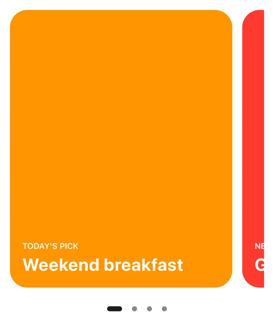
import { View } from "react-native"
import { Carousel, CarouselContent, CarouselControls, CarouselDots, CarouselItem, CarouselPlayButton } from "@/components/ui/carousel"
import { Text } from "@/components/ui/text"

const picks = [
  { eyebrow: "Today's pick", title: "Weekend breakfast", tint: "bg-orange" },
  { eyebrow: "New", title: "Grilled meatballs", tint: "bg-red" },
  { eyebrow: "Chef's special", title: "Lentil soup", tint: "bg-teal" },
  { eyebrow: "Dessert", title: "Künefe", tint: "bg-purple" },
]

export function CarouselFeaturedExample() {
  return (
    <Carousel opts={{ align: "start" }}>
      <CarouselContent>
        {picks.map((pick) => (
          <CarouselItem key={pick.title} basis={0.88}>
            <View
              className={`aspect-[4/5] justify-end gap-1 rounded-3xl p-5 ${pick.tint}`}
            >
              <Text className="text-xs font-semibold text-on-accent uppercase">
                {pick.eyebrow}
              </Text>
              <Text className="text-2xl font-bold text-on-accent">
                {pick.title}
              </Text>
            </View>
          </CarouselItem>
        ))}
      </CarouselContent>
      <CarouselControls className="mt-4 justify-center">
        <CarouselDots variant="plain" />
        <CarouselPlayButton variant="ghost" />
      </CarouselControls>
    </Carousel>
  )
}import EsuissUI
import SwiftUI
struct CarouselFeaturedExample: View {
var body: some View {
Carousel {
CarouselContent {
ForEach(CarouselData.picks, id: \.title) { pick in
CarouselItem(basis: 0.88) {
CarouselPickCard(pick: pick)
}
}
}
CarouselControls {
CarouselDots(variant: .plain)
CarouselPlayButton(variant: .ghost)
}
}
}
}
struct CarouselPick {
let eyebrow: String
let title: String
let tint: Color
}
enum CarouselData {
static let slides = [1, 2, 3, 4, 5]
static let picks = [
CarouselPick(eyebrow: "Today's pick", title: "Weekend breakfast", tint: .warning),
CarouselPick(eyebrow: "New", title: "Grilled meatballs", tint: .danger),
CarouselPick(eyebrow: "Chef's special", title: "Lentil soup", tint: .success),
CarouselPick(eyebrow: "Dessert", title: "Künefe", tint: .accent),
]
static let features = [
"Take orders at the table.",
"Every ticket, right on time.",
"A full room, every night.",
]
}
struct CarouselPickCard: View {
let pick: CarouselPick
var body: some View {
VStack(alignment: .leading, spacing: 4) {
Text(verbatim: pick.eyebrow.uppercased())
.textStyle(.xs2, weight: .semibold)
Text(verbatim: pick.title)
.textStyle(.xl2, weight: .bold)
}
.foregroundStyle(Color.onAccent)
.padding(20)
.frame(maxWidth: .infinity, maxHeight: .infinity, alignment: .bottomLeading)
.aspectRatio(4.0 / 5.0, contentMode: .fit)
.background(pick.tint, in: RoundedRectangle(cornerRadius: Radius.xl3, style: .continuous))
}
}
let slides = [1, 2, 3, 4, 5]
let picks = [
CarouselPick(eyebrow: "Today's pick", title: "Weekend breakfast", tint: .warning),
CarouselPick(eyebrow: "New", title: "Grilled meatballs", tint: .danger),
CarouselPick(eyebrow: "Chef's special", title: "Lentil soup", tint: .success),
CarouselPick(eyebrow: "Dessert", title: "Künefe", tint: .accent),
]
let features = [
"Take orders at the table.",
"Every ticket, right on time.",
"A full room, every night.",
]import androidx.compose.foundation.background
import androidx.compose.foundation.layout.Arrangement
import androidx.compose.foundation.layout.BoxWithConstraints
import androidx.compose.foundation.layout.Column
import androidx.compose.foundation.layout.PaddingValues
import androidx.compose.foundation.layout.aspectRatio
import androidx.compose.foundation.layout.fillMaxWidth
import androidx.compose.foundation.layout.padding
import androidx.compose.foundation.shape.RoundedCornerShape
import androidx.compose.runtime.Composable
import androidx.compose.ui.Alignment
import androidx.compose.ui.Modifier
import androidx.compose.ui.draw.clip
import androidx.compose.ui.graphics.Color
import androidx.compose.ui.text.font.FontWeight
import androidx.compose.ui.unit.Dp
import androidx.compose.ui.unit.dp
import com.esuiss.ui.components.ButtonVariant
import com.esuiss.ui.components.Carousel
import com.esuiss.ui.components.CarouselContent
import com.esuiss.ui.components.CarouselControls
import com.esuiss.ui.components.CarouselDots
import com.esuiss.ui.components.CarouselDotsVariant
import com.esuiss.ui.components.CarouselItem
import com.esuiss.ui.components.CarouselPlayButton
import com.esuiss.ui.components.Text
import com.esuiss.ui.components.rememberCarouselState
import com.esuiss.ui.theme.Colors
import com.esuiss.ui.theme.EsuissTheme
import com.esuiss.ui.theme.Radius
import com.esuiss.ui.theme.Typography
class CarouselPick(val eyebrow: String, val title: String, val tint: (Colors) -> Color)
val carouselPicks = listOf(
CarouselPick("Today's pick", "Weekend breakfast") { it.orange },
CarouselPick("New", "Grilled meatballs") { it.red },
CarouselPick("Chef's special", "Lentil soup") { it.teal },
CarouselPick("Dessert", "Künefe") { it.purple },
)
val carouselSpacing = 16.dp
fun carouselPeek(width: Dp, basis: Float?, spacing: Dp = carouselSpacing): PaddingValues {
if (basis == null) return PaddingValues(0.dp)
val page = (width + spacing) * basis - spacing
return PaddingValues(end = width - page)
}
@Composable
fun CarouselPickCard(pick: CarouselPick) {
val colors = EsuissTheme.colors
Column(
Modifier
.fillMaxWidth()
.aspectRatio(4f / 5f)
.clip(RoundedCornerShape(Radius.xl3))
.background(pick.tint(colors))
.padding(20.dp),
verticalArrangement = Arrangement.spacedBy(4.dp, Alignment.Bottom),
) {
Text(
pick.eyebrow.uppercase(),
style = Typography.xs.copy(color = colors.onAccent, fontWeight = FontWeight.SemiBold),
)
Text(
pick.title,
style = Typography.xl2.copy(color = colors.onAccent, fontWeight = FontWeight.Bold),
)
}
}
@Composable
fun CarouselFeatured() {
val state = rememberCarouselState(pageCount = carouselPicks.size)
BoxWithConstraints(Modifier.fillMaxWidth()) {
val width = maxWidth
Carousel(state = state, modifier = Modifier.fillMaxWidth()) {
CarouselContent(contentPadding = carouselPeek(width, 0.88f)) { page ->
CarouselItem { CarouselPickCard(carouselPicks[page]) }
}
CarouselControls(Modifier.align(Alignment.CenterHorizontally)) {
CarouselDots(variant = CarouselDotsVariant.Plain)
CarouselPlayButton(variant = ButtonVariant.Ghost)
}
}
}
}Spotlight
A looping showcase with dots and an inline next button.


import { View } from "react-native"
import { Carousel, CarouselContent, CarouselControls, CarouselDots, CarouselItem, CarouselNext } from "@/components/ui/carousel"
import { Text } from "@/components/ui/text"

const features = [
  { title: "Take orders at the table." },
  { title: "Every ticket, right on time." },
  { title: "A full room, every night." },
]

export function CarouselSpotlightExample() {
  return (
    <Carousel opts={{ loop: true }}>
      <CarouselContent>
        {features.map((feature) => (
          <CarouselItem key={feature.title}>
            <View className="aspect-[10/7] items-center justify-center gap-3 rounded-3xl bg-surface-secondary p-8">
              <Text className="text-3xl font-bold">Hestia POS</Text>
              <Text className="text-center text-label-secondary">
                {feature.title}
              </Text>
            </View>
          </CarouselItem>
        ))}
      </CarouselContent>
      <CarouselControls className="justify-center">
        <CarouselDots />
        <CarouselNext size="icon-sm" />
      </CarouselControls>
    </Carousel>
  )
}import EsuissUI
import SwiftUI
struct CarouselSpotlightExample: View {
var body: some View {
Carousel(loop: true) {
CarouselFeatureSlides()
CarouselControls {
CarouselDots()
CarouselNext(size: .iconSm)
}
}
}
}
struct CarouselPick {
let eyebrow: String
let title: String
let tint: Color
}
enum CarouselData {
static let slides = [1, 2, 3, 4, 5]
static let picks = [
CarouselPick(eyebrow: "Today's pick", title: "Weekend breakfast", tint: .warning),
CarouselPick(eyebrow: "New", title: "Grilled meatballs", tint: .danger),
CarouselPick(eyebrow: "Chef's special", title: "Lentil soup", tint: .success),
CarouselPick(eyebrow: "Dessert", title: "Künefe", tint: .accent),
]
static let features = [
"Take orders at the table.",
"Every ticket, right on time.",
"A full room, every night.",
]
}
struct CarouselFeatureSlides: View {
var body: some View {
CarouselContent {
ForEach(CarouselData.features, id: \.self) { feature in
CarouselItem {
VStack(spacing: 12) {
Text(verbatim: "Hestia POS")
.textStyle(.xl2, weight: .bold)
.foregroundStyle(Color.label)
Text(verbatim: feature)
.textStyle(.base)
.foregroundStyle(Color.labelSecondary)
.multilineTextAlignment(.center)
}
.padding(32)
.frame(maxWidth: .infinity, maxHeight: .infinity)
.aspectRatio(10.0 / 7.0, contentMode: .fit)
.background(Color.surfaceSecondary, in: RoundedRectangle(cornerRadius: Radius.xl3, style: .continuous))
}
}
}
}
}
let slides = [1, 2, 3, 4, 5]
let picks = [
CarouselPick(eyebrow: "Today's pick", title: "Weekend breakfast", tint: .warning),
CarouselPick(eyebrow: "New", title: "Grilled meatballs", tint: .danger),
CarouselPick(eyebrow: "Chef's special", title: "Lentil soup", tint: .success),
CarouselPick(eyebrow: "Dessert", title: "Künefe", tint: .accent),
]
let features = [
"Take orders at the table.",
"Every ticket, right on time.",
"A full room, every night.",
]import androidx.compose.foundation.background
import androidx.compose.foundation.layout.Arrangement
import androidx.compose.foundation.layout.Column
import androidx.compose.foundation.layout.aspectRatio
import androidx.compose.foundation.layout.fillMaxWidth
import androidx.compose.foundation.layout.padding
import androidx.compose.foundation.shape.RoundedCornerShape
import androidx.compose.runtime.Composable
import androidx.compose.ui.Alignment
import androidx.compose.ui.Modifier
import androidx.compose.ui.draw.clip
import androidx.compose.ui.text.font.FontWeight
import androidx.compose.ui.text.style.TextAlign
import androidx.compose.ui.unit.dp
import com.esuiss.ui.components.ButtonSize
import com.esuiss.ui.components.Carousel
import com.esuiss.ui.components.CarouselContent
import com.esuiss.ui.components.CarouselControls
import com.esuiss.ui.components.CarouselDots
import com.esuiss.ui.components.CarouselItem
import com.esuiss.ui.components.CarouselNext
import com.esuiss.ui.components.Text
import com.esuiss.ui.components.rememberCarouselState
import com.esuiss.ui.theme.EsuissTheme
import com.esuiss.ui.theme.Radius
import com.esuiss.ui.theme.Typography
val carouselFeatures = listOf(
"Take orders at the table.",
"Every ticket, right on time.",
"A full room, every night.",
)
@Composable
fun CarouselFeatureCard(title: String) {
val colors = EsuissTheme.colors
Column(
Modifier
.fillMaxWidth()
.aspectRatio(10f / 7f)
.clip(RoundedCornerShape(Radius.xl3))
.background(colors.surfaceSecondary)
.padding(32.dp),
verticalArrangement = Arrangement.spacedBy(12.dp, Alignment.CenterVertically),
horizontalAlignment = Alignment.CenterHorizontally,
) {
Text("Hestia POS", style = Typography.xl3.copy(fontWeight = FontWeight.Bold))
Text(title, style = Typography.base.copy(color = colors.labelSecondary), textAlign = TextAlign.Center)
}
}
@Composable
fun CarouselSpotlight() {
val state = rememberCarouselState(pageCount = carouselFeatures.size, loop = true)
Carousel(state = state, modifier = Modifier.fillMaxWidth()) {
CarouselContent { page ->
CarouselItem { CarouselFeatureCard(carouselFeatures[page]) }
}
CarouselControls(Modifier.align(Alignment.CenterHorizontally)) {
CarouselDots()
CarouselNext(size = ButtonSize.IconSm)
}
}
}Autoplay
Advances every four seconds, with progress dots and a play button.
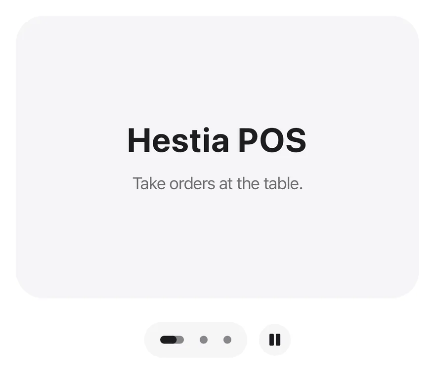

import { View } from "react-native"
import { Carousel, CarouselContent, CarouselControls, CarouselDots, CarouselItem, CarouselPlayButton } from "@/components/ui/carousel"
import { Text } from "@/components/ui/text"

const features = [
  { title: "Take orders at the table." },
  { title: "Every ticket, right on time." },
  { title: "A full room, every night." },
]

export function CarouselAutoplayExample() {
  return (
    <Carousel autoplay={4000} opts={{ loop: true }}>
      <CarouselContent>
        {features.map((feature) => (
          <CarouselItem key={feature.title}>
            <View className="aspect-[10/7] items-center justify-center gap-3 rounded-3xl bg-surface-secondary p-8">
              <Text className="text-3xl font-bold">Hestia POS</Text>
              <Text className="text-center text-label-secondary">
                {feature.title}
              </Text>
            </View>
          </CarouselItem>
        ))}
      </CarouselContent>
      <CarouselControls className="justify-center">
        <CarouselDots />
        <CarouselPlayButton />
      </CarouselControls>
    </Carousel>
  )
}import EsuissUI
import SwiftUI
struct CarouselAutoplayExample: View {
var body: some View {
Carousel(loop: true, autoplay: .seconds(4)) {
CarouselFeatureSlides()
CarouselControls {
CarouselDots()
CarouselPlayButton()
}
}
}
}
struct CarouselPick {
let eyebrow: String
let title: String
let tint: Color
}
enum CarouselData {
static let slides = [1, 2, 3, 4, 5]
static let picks = [
CarouselPick(eyebrow: "Today's pick", title: "Weekend breakfast", tint: .warning),
CarouselPick(eyebrow: "New", title: "Grilled meatballs", tint: .danger),
CarouselPick(eyebrow: "Chef's special", title: "Lentil soup", tint: .success),
CarouselPick(eyebrow: "Dessert", title: "Künefe", tint: .accent),
]
static let features = [
"Take orders at the table.",
"Every ticket, right on time.",
"A full room, every night.",
]
}
struct CarouselFeatureSlides: View {
var body: some View {
CarouselContent {
ForEach(CarouselData.features, id: \.self) { feature in
CarouselItem {
VStack(spacing: 12) {
Text(verbatim: "Hestia POS")
.textStyle(.xl2, weight: .bold)
.foregroundStyle(Color.label)
Text(verbatim: feature)
.textStyle(.base)
.foregroundStyle(Color.labelSecondary)
.multilineTextAlignment(.center)
}
.padding(32)
.frame(maxWidth: .infinity, maxHeight: .infinity)
.aspectRatio(10.0 / 7.0, contentMode: .fit)
.background(Color.surfaceSecondary, in: RoundedRectangle(cornerRadius: Radius.xl3, style: .continuous))
}
}
}
}
}
let slides = [1, 2, 3, 4, 5]
let picks = [
CarouselPick(eyebrow: "Today's pick", title: "Weekend breakfast", tint: .warning),
CarouselPick(eyebrow: "New", title: "Grilled meatballs", tint: .danger),
CarouselPick(eyebrow: "Chef's special", title: "Lentil soup", tint: .success),
CarouselPick(eyebrow: "Dessert", title: "Künefe", tint: .accent),
]
let features = [
"Take orders at the table.",
"Every ticket, right on time.",
"A full room, every night.",
]import androidx.compose.foundation.background
import androidx.compose.foundation.layout.Arrangement
import androidx.compose.foundation.layout.Column
import androidx.compose.foundation.layout.aspectRatio
import androidx.compose.foundation.layout.fillMaxWidth
import androidx.compose.foundation.layout.padding
import androidx.compose.foundation.shape.RoundedCornerShape
import androidx.compose.runtime.Composable
import androidx.compose.ui.Alignment
import androidx.compose.ui.Modifier
import androidx.compose.ui.draw.clip
import androidx.compose.ui.text.font.FontWeight
import androidx.compose.ui.text.style.TextAlign
import androidx.compose.ui.unit.dp
import com.esuiss.ui.components.Carousel
import com.esuiss.ui.components.CarouselContent
import com.esuiss.ui.components.CarouselControls
import com.esuiss.ui.components.CarouselDots
import com.esuiss.ui.components.CarouselItem
import com.esuiss.ui.components.CarouselPlayButton
import com.esuiss.ui.components.Text
import com.esuiss.ui.components.rememberCarouselState
import com.esuiss.ui.theme.EsuissTheme
import com.esuiss.ui.theme.Radius
import com.esuiss.ui.theme.Typography
val carouselFeatures = listOf(
"Take orders at the table.",
"Every ticket, right on time.",
"A full room, every night.",
)
@Composable
fun CarouselFeatureCard(title: String) {
val colors = EsuissTheme.colors
Column(
Modifier
.fillMaxWidth()
.aspectRatio(10f / 7f)
.clip(RoundedCornerShape(Radius.xl3))
.background(colors.surfaceSecondary)
.padding(32.dp),
verticalArrangement = Arrangement.spacedBy(12.dp, Alignment.CenterVertically),
horizontalAlignment = Alignment.CenterHorizontally,
) {
Text("Hestia POS", style = Typography.xl3.copy(fontWeight = FontWeight.Bold))
Text(title, style = Typography.base.copy(color = colors.labelSecondary), textAlign = TextAlign.Center)
}
}
@Composable
fun CarouselAutoplay() {
val state = rememberCarouselState(pageCount = carouselFeatures.size, loop = true)
Carousel(state = state, modifier = Modifier.fillMaxWidth(), autoplay = true, autoplayDelayMillis = 4000L) {
CarouselContent { page ->
CarouselItem { CarouselFeatureCard(carouselFeatures[page]) }
}
CarouselControls(Modifier.align(Alignment.CenterHorizontally)) {
CarouselDots()
CarouselPlayButton()
}
}
}Shelf
A free-scrolling shelf of small cards with dragFree.
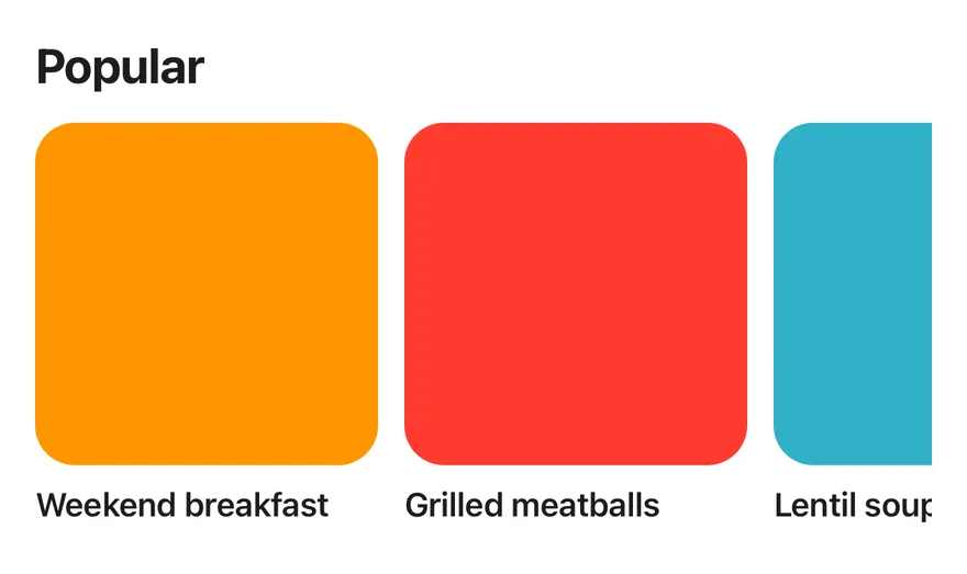
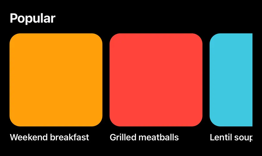
import { View } from "react-native"
import { Carousel, CarouselContent, CarouselItem } from "@/components/ui/carousel"
import { Text } from "@/components/ui/text"

const picks = [
  { eyebrow: "Today's pick", title: "Weekend breakfast", tint: "bg-orange" },
  { eyebrow: "New", title: "Grilled meatballs", tint: "bg-red" },
  { eyebrow: "Chef's special", title: "Lentil soup", tint: "bg-teal" },
  { eyebrow: "Dessert", title: "Künefe", tint: "bg-purple" },
]

export function CarouselShelfExample() {
  return (
    <Carousel opts={{ align: "start", dragFree: true }}>
      <Text className="mb-3 text-xl font-bold">Popular</Text>
      <CarouselContent className="-ms-3">
        {picks.map((pick) => (
          <CarouselItem key={pick.title} basis={0.4} className="ps-3">
            <View className={`aspect-square rounded-2xl ${pick.tint}`} />
            <Text className="mt-2 text-sm font-semibold" numberOfLines={1}>
              {pick.title}
            </Text>
          </CarouselItem>
        ))}
      </CarouselContent>
    </Carousel>
  )
}import EsuissUI
import SwiftUI
struct CarouselShelfExample: View {
var body: some View {
Carousel {
Text("Popular")
.textStyle(.xl, weight: .bold)
.foregroundStyle(Color.label)
.frame(maxWidth: .infinity, alignment: .leading)
.padding(.bottom, 12)
CarouselContent(spacing: 12) {
ForEach(CarouselData.picks, id: \.title) { pick in
CarouselItem(basis: 0.4) {
VStack(alignment: .leading, spacing: 8) {
RoundedRectangle(cornerRadius: Radius.xl2, style: .continuous)
.fill(pick.tint)
.aspectRatio(1, contentMode: .fit)
Text(verbatim: pick.title)
.textStyle(.sm, weight: .semibold)
.foregroundStyle(Color.label)
.lineLimit(1)
}
}
}
}
}
}
}
struct CarouselPick {
let eyebrow: String
let title: String
let tint: Color
}
enum CarouselData {
static let slides = [1, 2, 3, 4, 5]
static let picks = [
CarouselPick(eyebrow: "Today's pick", title: "Weekend breakfast", tint: .warning),
CarouselPick(eyebrow: "New", title: "Grilled meatballs", tint: .danger),
CarouselPick(eyebrow: "Chef's special", title: "Lentil soup", tint: .success),
CarouselPick(eyebrow: "Dessert", title: "Künefe", tint: .accent),
]
static let features = [
"Take orders at the table.",
"Every ticket, right on time.",
"A full room, every night.",
]
}
let slides = [1, 2, 3, 4, 5]
let picks = [
CarouselPick(eyebrow: "Today's pick", title: "Weekend breakfast", tint: .warning),
CarouselPick(eyebrow: "New", title: "Grilled meatballs", tint: .danger),
CarouselPick(eyebrow: "Chef's special", title: "Lentil soup", tint: .success),
CarouselPick(eyebrow: "Dessert", title: "Künefe", tint: .accent),
]
let features = [
"Take orders at the table.",
"Every ticket, right on time.",
"A full room, every night.",
]import androidx.compose.foundation.background
import androidx.compose.foundation.layout.Box
import androidx.compose.foundation.layout.BoxWithConstraints
import androidx.compose.foundation.layout.Column
import androidx.compose.foundation.layout.PaddingValues
import androidx.compose.foundation.layout.aspectRatio
import androidx.compose.foundation.layout.fillMaxWidth
import androidx.compose.foundation.layout.padding
import androidx.compose.foundation.shape.RoundedCornerShape
import androidx.compose.runtime.Composable
import androidx.compose.ui.Modifier
import androidx.compose.ui.draw.clip
import androidx.compose.ui.graphics.Color
import androidx.compose.ui.text.font.FontWeight
import androidx.compose.ui.text.style.TextOverflow
import androidx.compose.ui.unit.Dp
import androidx.compose.ui.unit.dp
import com.esuiss.ui.components.Carousel
import com.esuiss.ui.components.CarouselContent
import com.esuiss.ui.components.CarouselItem
import com.esuiss.ui.components.Text
import com.esuiss.ui.components.rememberCarouselState
import com.esuiss.ui.theme.Colors
import com.esuiss.ui.theme.EsuissTheme
import com.esuiss.ui.theme.Radius
import com.esuiss.ui.theme.Typography
class CarouselPick(val eyebrow: String, val title: String, val tint: (Colors) -> Color)
val carouselPicks = listOf(
CarouselPick("Today's pick", "Weekend breakfast") { it.orange },
CarouselPick("New", "Grilled meatballs") { it.red },
CarouselPick("Chef's special", "Lentil soup") { it.teal },
CarouselPick("Dessert", "Künefe") { it.purple },
)
val carouselSpacing = 16.dp
fun carouselPeek(width: Dp, basis: Float?, spacing: Dp = carouselSpacing): PaddingValues {
if (basis == null) return PaddingValues(0.dp)
val page = (width + spacing) * basis - spacing
return PaddingValues(end = width - page)
}
@Composable
fun CarouselShelf() {
val state = rememberCarouselState(pageCount = carouselPicks.size)
val colors = EsuissTheme.colors
val spacing = 12.dp
BoxWithConstraints(Modifier.fillMaxWidth()) {
val width = maxWidth
Carousel(state = state, modifier = Modifier.fillMaxWidth()) {
Text(
"Popular",
modifier = Modifier.padding(bottom = 12.dp),
style = Typography.xl.copy(fontWeight = FontWeight.Bold),
)
CarouselContent(contentPadding = carouselPeek(width, 0.4f, spacing), pageSpacing = spacing) { page ->
val pick = carouselPicks[page]
CarouselItem {
Column(Modifier.fillMaxWidth()) {
Box(
Modifier
.fillMaxWidth()
.aspectRatio(1f)
.clip(RoundedCornerShape(Radius.xl2))
.background(pick.tint(colors)),
)
Text(
pick.title,
modifier = Modifier.padding(top = 8.dp),
style = Typography.sm.copy(fontWeight = FontWeight.SemiBold),
maxLines = 1,
overflow = TextOverflow.Ellipsis,
)
}
}
}
}
}
}API Reference
Carousel
Root that holds the scroll state and options.
React.ComponentProps<typeof CarouselPrimitive.Root>CarouselContent
Scrolling track for the slides.
React.ComponentProps<typeof CarouselPrimitive.Content>CarouselItem
One slide.
React.ComponentProps<typeof CarouselPrimitive.Item>CarouselPrevious
Button that scrolls to the previous slide.
React.ComponentProps<typeof Button>CarouselNext
Button that scrolls to the next slide.
React.ComponentProps<typeof Button>CarouselControls
Row that lays out dots and buttons below the slides.
ViewPropsCarouselDots
One pressable dot per snap point.
ViewProps- About
default(on a control background) orplain.- Type
"default""plain"- Default
- "default"
CarouselPlayButton
Toggles autoplay.
React.ComponentProps<typeof Button>Accessibility
- Previous and next buttons have the
buttonrole and are labelled "Previous slide" and "Next slide", with a disabled state at the ends. - Each dot is labelled "Go to slide N" and marks the current slide as selected.
- The play button is labelled "Pause slideshow" or "Play slideshow".
Notes
- Arrow icons are mirrored in right-to-left layouts.
- Dot and progress animations respect the system Reduce Motion setting.
- Uses
bg-control,bg-labelandbg-label-tertiarytokens; light and dark follow the system appearance.