suiss/uim · React Native Component
Text
Styled text with typography variants for headings, body copy, quotes, code and captions.
Text is an open-source mobile component from suiss/uim for React Native and Expo, with SwiftUI and Jetpack Compose versions built from the same design tokens. The @esuiss/uim CLI copies its source into your project, so you own the code.
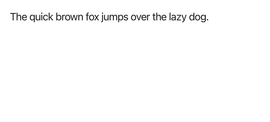

import { Text } from "@/components/ui/text"

export function TextExample() {
  return (
    <Text>The quick brown fox jumps over the lazy dog.</Text>
  )
}import EsuissUI
import SwiftUI
struct TextExample: View {
var body: some View {
Text("The quick brown fox jumps over the lazy dog.")
.textVariant(.default)
}
}import androidx.compose.runtime.Composable
import com.esuiss.ui.components.Text
@Composable
fun TextExample() {
Text("The quick brown fox jumps over the lazy dog.")
}Text renders a React Native Text with one of twelve typography variants: default, h1–h4, p, blockquote, code, lead, large, small and muted. Heading variants also set the heading role.
It reads TextClassContext, so components such as Button can pass a text color and size down to any Text inside them.
Installation
$ pnpm dlx @esuiss/uim@latest add text$ pnpm dlx @esuiss/uim@latest add text --platform swift$ pnpm dlx @esuiss/uim@latest add text --platform kotlinManual
- Install the dependencies:
npx expo install class-variance-authority cn-
Add the pieces it builds on: the primitives
components/primitives/types.tsx,components/primitives/use-render.tsx. -
Copy the source into
components/ui/text.tsx:
import { cva, type VariantProps } from "class-variance-authority"
import { cn } from "cn"
import * as React from "react"
import { Text as RNText, type Role } from "react-native"
import type { RenderProp } from "@/components/primitives/types"
import { useRender } from "@/components/primitives/use-render"

const textVariants = cva("text-base text-label", {
  variants: {
    variant: {
      default: "",
      h1: "text-3xl font-bold",
      h2: "text-2xl font-bold",
      h3: "text-xl font-semibold",
      h4: "text-lg font-semibold",
p: "mt-3",- Update the import paths to match your project.
- Install the dependencies:
npx expo install class-variance-authority cn-
Add the pieces it builds on: the primitives
components/primitives/types.tsx,components/primitives/use-render.tsx. -
Copy the source into
components/ui/text.tsx:
import { cva, type VariantProps } from "class-variance-authority"
import { cn } from "cn"
import * as React from "react"
import { Text as RNText, type Role } from "react-native"
import type { RenderProp } from "@/components/primitives/types"
import { useRender } from "@/components/primitives/use-render"

const textVariants = cva("text-base text-label", {
  variants: {
    variant: {
      default: "",
      h1: "text-3xl font-bold",
      h2: "text-2xl font-bold",
      h3: "text-xl font-semibold",
      h4: "text-lg font-semibold",
p: "mt-3",- Update the import paths to match your project.
-
Add the pieces it builds on: the primitives
components/primitives/types.tsx,components/primitives/use-render.tsx. -
Copy the source into
components/ui/text.tsx:
import * as React from "react"
import {
  Text as RNText,
  type Role,
  StyleSheet,
  type TextStyle,
} from "react-native"
import type { RenderProp } from "@/components/primitives/types"
import { useRender } from "@/components/primitives/use-render"
import {
  fontSize,
  radius,
  type ThemeColors,
  useTheme,
} from "@/components/ui/theme"- Update the import paths to match your project.
-
Target iOS 17 or later.
-
Copy the theme files every view uses:
import SwiftUI
import UIKit

struct RGBA: Sendable {
  let red: CGFloat
  let green: CGFloat
  let blue: CGFloat
  let alpha: CGFloat

  init(_ hex: UInt32, _ alpha: CGFloat = 1) {
    red = CGFloat((hex >> 16) & 0xFF) / 255
    green = CGFloat((hex >> 8) & 0xFF) / 255
    blue = CGFloat(hex & 0xFF) / 255
    self.alpha = alpha
}import SwiftUI
extension Color {
public static let surface = Color.adaptive(light: .init(0xFFFFFF), dark: .init(0x000000))
public static let surfaceSecondary = Color.adaptive(light: .init(0xF5F5F7), dark: .init(0x161617))
public static let surfaceTertiary = Color.adaptive(light: .init(0xE8E8ED), dark: .init(0x2C2C2E))
public static let surfaceRaised = Color.adaptive(light: .init(0xFFFFFF), dark: .init(0x1D1D1F))
public static let label = Color.adaptive(light: .init(0x1D1D1F), dark: .init(0xF5F5F7))
public static let labelSecondary = Color.adaptive(light: .init(0x6E6E73), dark: .init(0xA1A1A6))
public static let labelTertiary = Color.adaptive(light: .init(0x86868B), dark: .init(0x86868B))
public static let labelQuaternary = Color.adaptive(light: .init(0xD2D2D7), dark: .init(0x424245))
public static let control = Color.adaptive(light: .init(0x000000, 0.04), dark: .init(0xFFFFFF, 0.1))
public static let controlPressed = Color.adaptive(light: .init(0x000000, 0.12), dark: .init(0xFFFFFF, 0.22))
public static let controlSelected = Color.adaptive(light: .init(0x1D1D1F), dark: .init(0xF5F5F7))
public static let controlDisabled = Color.adaptive(light: .init(0x000000, 0.03), dark: .init(0xFFFFFF, 0.05))
public static let onControlSelected = Color.adaptive(light: .init(0xFFFFFF), dark: .init(0x000000))- Copy the source:
import SwiftUI

public enum TextVariant: CaseIterable, Sendable {
  case `default`, h1, h2, h3, h4, p, blockquote, code, lead, large, small, muted

  var style: TextStyle {
    switch self {
    case .h1: .xl3
    case .h2: .xl2
    case .h3: .xl
    case .h4, .lead, .large: .lg
    case .code, .small, .muted: .sm
    default: .base
    }
}- Add the files to your app target.
- Set
minSdkto 24 or higher and add the dependencies:
implementation(platform("androidx.compose:compose-bom:2026.09.00"))
implementation("androidx.compose.foundation:foundation")
implementation("androidx.compose.ui:ui")- Copy the theme files every view uses:
package com.esuiss.ui.theme

import androidx.compose.foundation.isSystemInDarkTheme
import androidx.compose.runtime.Composable
import androidx.compose.runtime.CompositionLocalProvider
import androidx.compose.runtime.Immutable
import androidx.compose.runtime.staticCompositionLocalOf
import androidx.compose.ui.Modifier
import androidx.compose.ui.draw.dropShadow
import androidx.compose.ui.graphics.Color
import androidx.compose.ui.graphics.Shape
import androidx.compose.ui.graphics.shadow.Shadow as DropShadow
import androidx.compose.ui.text.TextStyle
import androidx.compose.ui.text.style.LineHeightStyle
import androidx.compose.ui.unit.Dp
import androidx.compose.ui.unit.DpOffsetpackage com.esuiss.ui.theme
import androidx.compose.runtime.Immutable
import androidx.compose.ui.graphics.Color
import androidx.compose.ui.unit.dp
@Immutable
data class Colors(
val surface: Color,
val surfaceSecondary: Color,
val surfaceTertiary: Color,
val surfaceRaised: Color,
val label: Color,
val labelSecondary: Color,
val labelTertiary: Color,
val labelQuaternary: Color,- Copy the source and every file it uses:
package com.esuiss.ui.components

import androidx.compose.foundation.background
import androidx.compose.foundation.layout.padding
import androidx.compose.foundation.shape.RoundedCornerShape
import androidx.compose.foundation.text.BasicText
import androidx.compose.runtime.Composable
import androidx.compose.ui.Modifier
import androidx.compose.ui.draw.clip
import androidx.compose.ui.draw.drawBehind
import androidx.compose.ui.geometry.Offset
import androidx.compose.ui.geometry.Size
import androidx.compose.ui.graphics.Color
import androidx.compose.ui.semantics.heading
import androidx.compose.ui.semantics.semantics
import androidx.compose.ui.text.AnnotatedStringpackage com.esuiss.ui.components
import androidx.compose.runtime.compositionLocalOf
import androidx.compose.ui.graphics.Color
import androidx.compose.ui.text.TextStyle
import androidx.compose.ui.unit.Dp
import androidx.compose.ui.unit.dp
val LocalContentStyle = compositionLocalOf { TextStyle.Default }
val LocalContentColor = compositionLocalOf { Color.Unspecified }
val LocalIconSize = compositionLocalOf { 20.dp }- Update the
com.esuiss.uipackage names to match your project.
Usage
import { Text } from "@/components/ui/text"<Text>The quick brown fox jumps over the lazy dog.</Text>Pick a variant for the role of the text, and add classes through className for one-off changes.
Use the render prop to render a different component with the same classes. TextClassContext is exported so your own components can style nested Text the same way.
Examples
Typography
Every variant in a sample article.
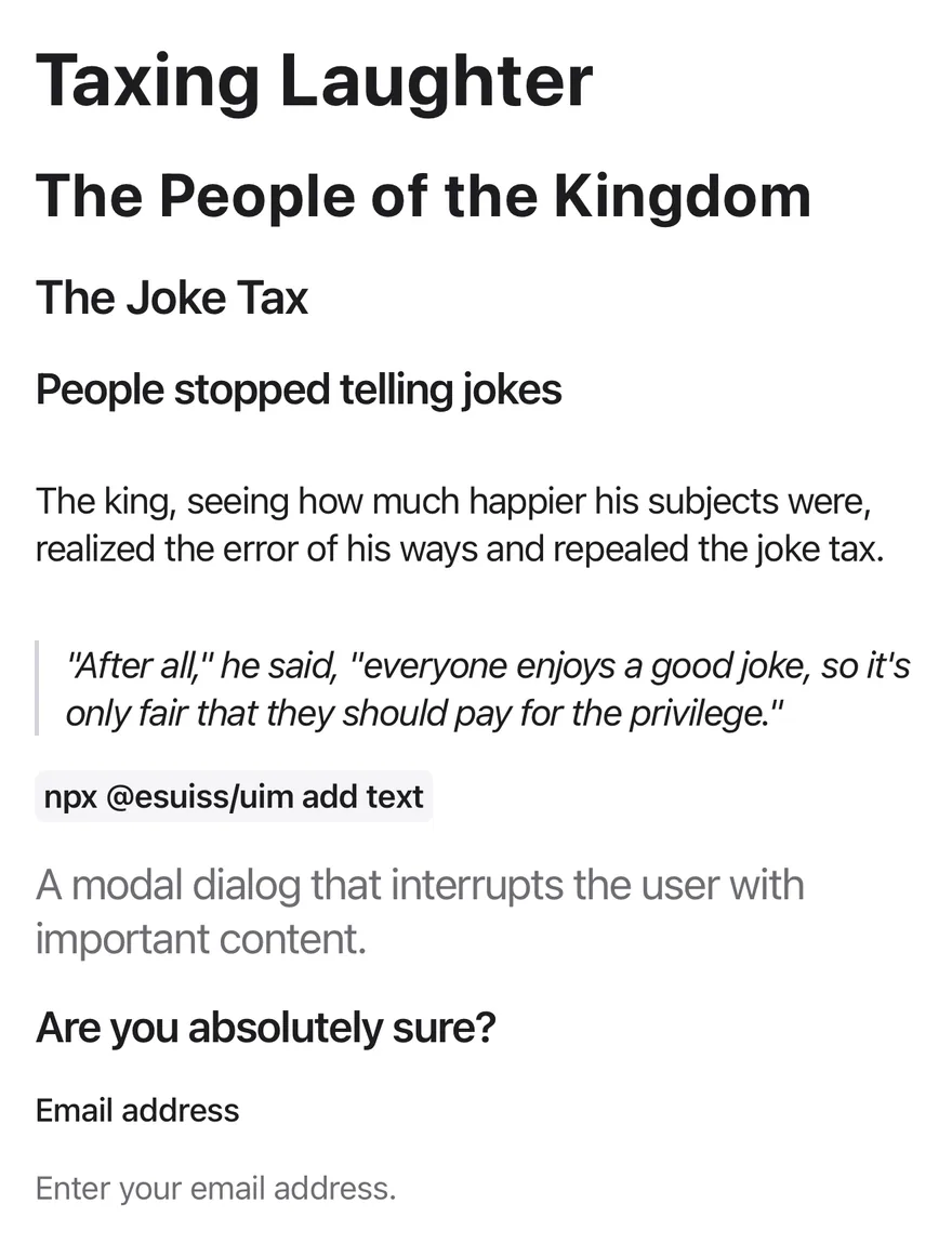
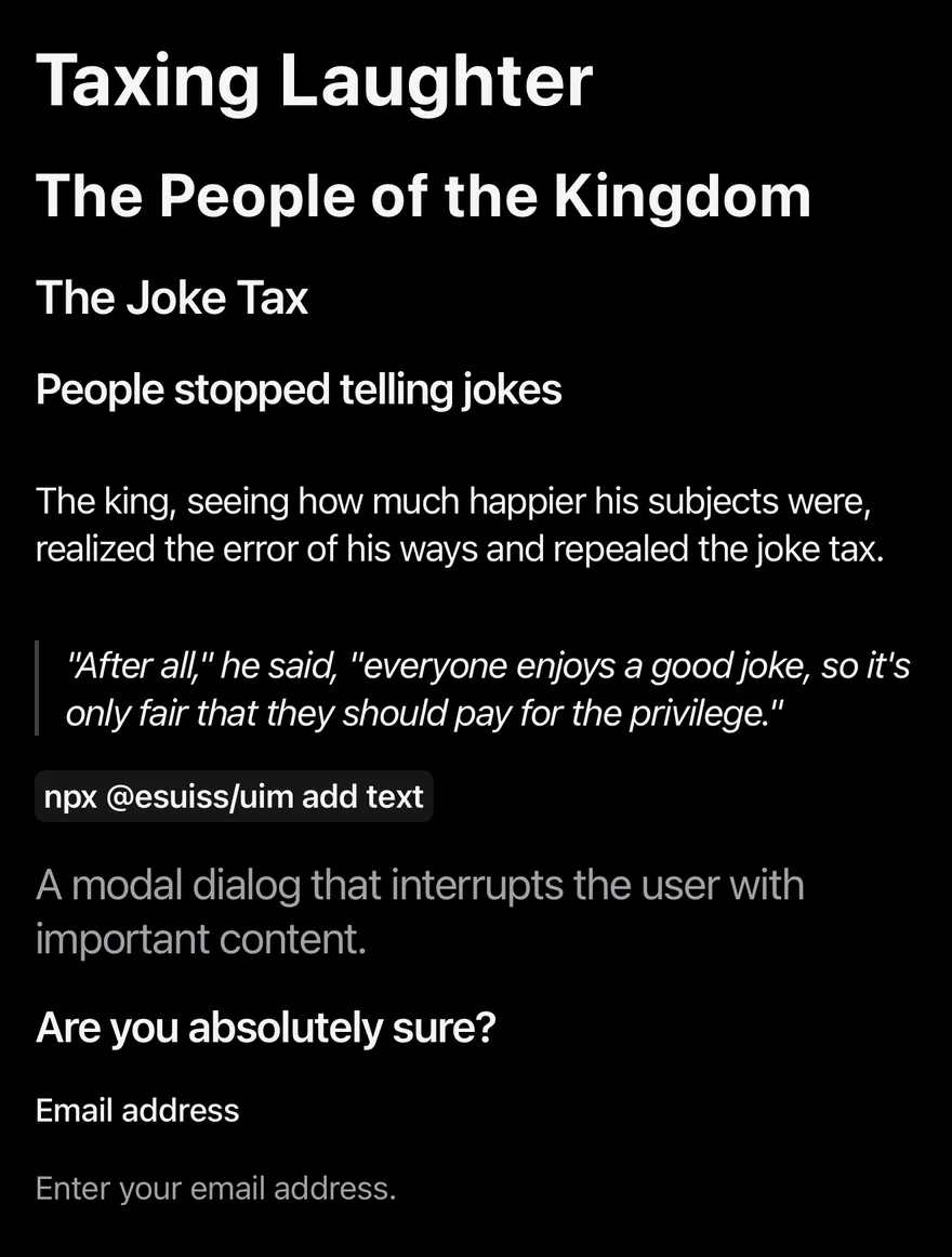
import { View } from "react-native"
import { Text } from "@/components/ui/text"
export function TextTypographyExample() {
return (
<View className="gap-4">
<Text variant="h1">Taxing Laughter</Text>
<Text variant="h2">The People of the Kingdom</Text>
<Text variant="h3">The Joke Tax</Text>
<Text variant="h4">People stopped telling jokes</Text>
<Text variant="p">
The king, seeing how much happier his subjects were, realized the error
of his ways and repealed the joke tax.
</Text>
<Text variant="blockquote">
"After all," he said, "everyone enjoys a good joke, so
it's only fair that they should pay for the privilege."
</Text>
<View className="flex-row">
<Text variant="code">npx @esuiss/uim add text</Text>
</View>
<Text variant="lead">
A modal dialog that interrupts the user with important content.
</Text>
<Text variant="large">Are you absolutely sure?</Text>
<Text variant="small">Email address</Text>
<Text variant="muted">Enter your email address.</Text>
</View>
)
}import EsuissUI
import SwiftUI
struct TextTypographyExample: View {
var body: some View {
VStack(alignment: .leading, spacing: 16) {
Text("Taxing Laughter").textVariant(.h1)
Text("The People of the Kingdom").textVariant(.h2)
Text("The Joke Tax").textVariant(.h3)
Text("People stopped telling jokes").textVariant(.h4)
Text("The king, seeing how much happier his subjects were, realized the error of his ways and repealed the joke tax.")
.textVariant(.p)
Text("\"After all,\" he said, \"everyone enjoys a good joke, so it's only fair that they should pay for the privilege.\"")
.textVariant(.blockquote)
Text(verbatim: "npx @esuiss/uim add text").textVariant(.code)
Text("A modal dialog that interrupts the user with important content.").textVariant(.lead)
Text("Are you absolutely sure?").textVariant(.large)
Text("Email address").textVariant(.small)
Text("Enter your email address.").textVariant(.muted)
}
.frame(maxWidth: .infinity, alignment: .leading)
}
}import androidx.compose.foundation.layout.Arrangement
import androidx.compose.foundation.layout.Column
import androidx.compose.foundation.layout.Row
import androidx.compose.runtime.Composable
import androidx.compose.ui.unit.dp
import com.esuiss.ui.components.Text
import com.esuiss.ui.components.TextVariant
@Composable
fun TextTypography() {
Column(verticalArrangement = Arrangement.spacedBy(16.dp)) {
Text("Taxing Laughter", variant = TextVariant.H1)
Text("The People of the Kingdom", variant = TextVariant.H2)
Text("The Joke Tax", variant = TextVariant.H3)
Text("People stopped telling jokes", variant = TextVariant.H4)
Text(
"The king, seeing how much happier his subjects were, realized the error of his ways and repealed the joke tax.",
variant = TextVariant.P,
)
Text(
"\"After all,\" he said, \"everyone enjoys a good joke, so it's only fair that they should pay for the privilege.\"",
variant = TextVariant.Blockquote,
)
Row {
Text("npx @esuiss/uim add text", variant = TextVariant.Code)
}
Text("A modal dialog that interrupts the user with important content.", variant = TextVariant.Lead)
Text("Are you absolutely sure?", variant = TextVariant.Large)
Text("Email address", variant = TextVariant.Small)
Text("Enter your email address.", variant = TextVariant.Muted)
}
}Headings
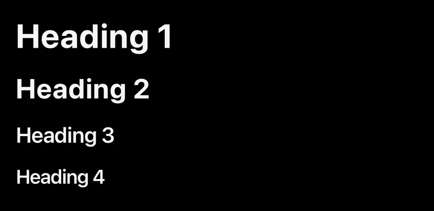
The four heading levels.
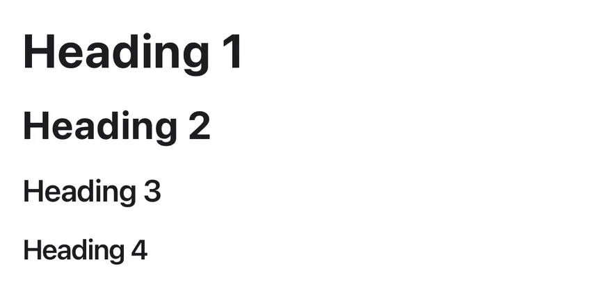
import { View } from "react-native"
import { Text } from "@/components/ui/text"

export function TextHeadingsExample() {
  return (
    <View className="gap-4">
      <Text variant="h1">Heading 1</Text>
      <Text variant="h2">Heading 2</Text>
      <Text variant="h3">Heading 3</Text>
      <Text variant="h4">Heading 4</Text>
    </View>
  )
}import EsuissUI
import SwiftUI
struct TextHeadingsExample: View {
var body: some View {
VStack(alignment: .leading, spacing: 16) {
Text("Heading 1").textVariant(.h1)
Text("Heading 2").textVariant(.h2)
Text("Heading 3").textVariant(.h3)
Text("Heading 4").textVariant(.h4)
}
.frame(maxWidth: .infinity, alignment: .leading)
}
}import androidx.compose.foundation.layout.Arrangement
import androidx.compose.foundation.layout.Column
import androidx.compose.runtime.Composable
import androidx.compose.ui.unit.dp
import com.esuiss.ui.components.Text
import com.esuiss.ui.components.TextVariant
@Composable
fun TextHeadings() {
Column(verticalArrangement = Arrangement.spacedBy(16.dp)) {
Text("Heading 1", variant = TextVariant.H1)
Text("Heading 2", variant = TextVariant.H2)
Text("Heading 3", variant = TextVariant.H3)
Text("Heading 4", variant = TextVariant.H4)
}
}API Reference
Text
The text element with typography variants.
React.ComponentProps<typeof RNText>React.RefAttributes<typeof RNText>TextVariantProps- About
- Renders another component in place of the default
Text, with the same props. - Type
RenderProp<Record<string, unknown>, Record<string, never>>- Default
- —
Accessibility
h1toh4setrole="heading", so VoiceOver and TalkBack can navigate by heading.- Text scales with the system font size.
Notes
- Colors use the
text-labelandtext-label-secondarytokens;codeusesbg-surface-secondaryandblockquoteaborder-separatorstart border. - Light and dark colors follow the system appearance.