suiss/uim · React Native Component
Qr Scanner
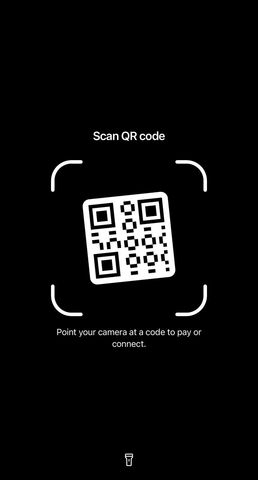
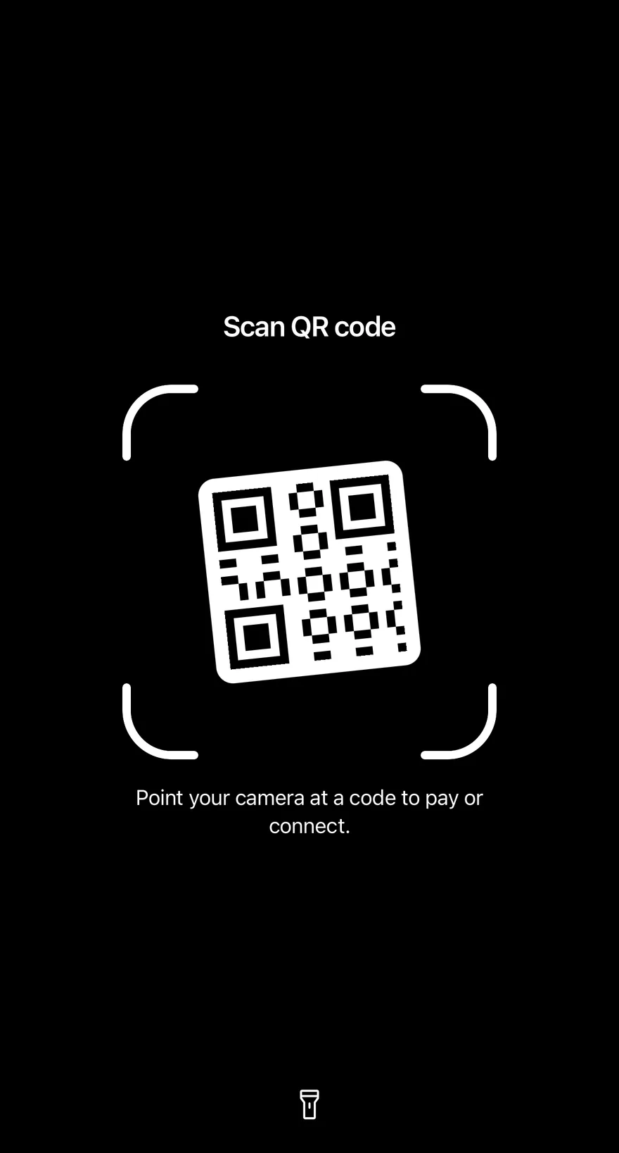
A camera overlay with a rounded cut-out scan frame, rounded corner brackets, an optional scan line and an optional flashlight toggle.
Qr Scanner is an open-source mobile component from suiss/uim for React Native and Expo, with SwiftUI and Jetpack Compose versions built from the same design tokens. The @esuiss/uim CLI copies its source into your project, so you own the code.
import { IconProps as PhosphorIconProps } from "phosphor-react-native"
import * as React from "react"
import { View } from "react-native"
import { Path } from "react-native-svg"
import Svg from "react-native-svg"
import { Icon } from "@/components/ui/icon"
import { QRScanner, type QRScannerState } from "@/components/ui/qr-scanner"

const MODULES = 21

const MODULE_SIZE = 6

const CODE_SIZE = MODULES * MODULE_SIZE

const FINDERS = [
  [0, 0],
  [0, 14],
  [14, 0],
]

function isDark(row: number, column: number) {
  for (const [top, left] of FINDERS) {
    const i = row - top
    const j = column - left
    if (i >= 0 && i <= 6 && j >= 0 && j <= 6) {
      return (
        i === 0 ||
        i === 6 ||
        j === 0 ||
        j === 6 ||
        (i >= 2 && i <= 4 && j >= 2 && j <= 4)
      )
    }
    const boxTop = top === 0 ? 0 : top - 1
    const boxLeft = left === 0 ? 0 : left - 1
    if (
      row >= boxTop &&
      row <= boxTop + 7 &&
      column >= boxLeft &&
      column <= boxLeft + 7
    ) {
      return false
    }
  }
  return (row * 7 + column * 11 + row * column) % 5 < 2
}

const CODE_PATH = Array.from({ length: MODULES * MODULES }, (_, index) => {
  const row = Math.floor(index / MODULES)
  const column = index % MODULES
  return isDark(row, column)
    ? `M${column * MODULE_SIZE} ${row * MODULE_SIZE}h${MODULE_SIZE}v${MODULE_SIZE}h-${MODULE_SIZE}Z`
    : ""
}).join("")

function QRCode({ color }: PhosphorIconProps) {
  return (
    <Svg width={CODE_SIZE} height={CODE_SIZE}>
      <Path d={CODE_PATH} fill={color} />
    </Svg>
  )
}

function CameraPlaceholder() {
  return (
    <View className="flex-1 items-center justify-center bg-media">
      <View className="mb-12 -rotate-6 rounded-xl bg-on-media p-2.5">
        <Icon as={QRCode} className="text-media" />
      </View>
    </View>
  )
}

function Scanner({
  state,
  description,
  scanLine,
}: {
  state?: QRScannerState
  description?: string
  scanLine?: boolean
}) {
  const [torch, setTorch] = React.useState(false)
  return (
    <QRScanner
      className="flex-1"
      state={state}
      scanLine={scanLine}
      title="Scan QR code"
      description={description}
      torch={torch}
      onTorchToggle={setTorch}
    >
      <CameraPlaceholder />
    </QRScanner>
  )
}

export function QrScannerExample() {
  return (
    <Scanner description="Point your camera at a code to pay or connect." />
  )
}import EsuissUI
import SwiftUI
struct QRScannerExample: View {
var body: some View {
QRScannerDemo(hint: "Point your camera at a code to pay or connect.")
}
}
struct QRScannerDemo: View {
var state: QRScannerState = .idle
let hint: LocalizedStringKey
var scanLine = false
@State private var torch = false
var body: some View {
QRScanner(
state: state,
title: "Scan QR code",
hint: hint,
scanLine: scanLine,
isTorchOn: torch,
onTorchToggle: { torch.toggle() }
) {
QRScannerCameraPlaceholder()
}
.ignoresSafeArea()
}
}
enum QRCodeSample {
static let count = 21
static let module: CGFloat = 6
static let padding: CGFloat = 10
static let side = CGFloat(count) * module + padding * 2
static func isDark(_ r: Int, _ c: Int) -> Bool {
for (fr, fc) in [(0, 0), (0, 14), (14, 0)] {
let i = r - fr
let j = c - fc
if (0...6).contains(i) && (0...6).contains(j) {
return i == 0 || i == 6 || j == 0 || j == 6 || ((2...4).contains(i) && (2...4).contains(j))
}
}
if r <= 7 && c <= 7 { return false }
if r <= 7 && c >= 13 { return false }
if r >= 13 && c <= 7 { return false }
return (r * 7 + c * 11 + r * c) % 5 < 2
}
static let modules: Path = {
var path = Path()
for r in 0..<count {
for c in 0..<count where isDark(r, c) {
path.addRect(CGRect(x: padding + CGFloat(c) * module, y: padding + CGFloat(r) * module, width: module, height: module))
}
}
return path
}()
}
struct QRScannerCameraPlaceholder: View {
var body: some View {
GeometryReader { proxy in
Canvas { context, _ in
let card = CGRect(origin: .zero, size: CGSize(width: QRCodeSample.side, height: QRCodeSample.side))
context.fill(Path(roundedRect: card, cornerRadius: Radius.xl, style: .continuous), with: .color(.onMedia))
context.fill(QRCodeSample.modules, with: .color(.media))
}
.frame(width: QRCodeSample.side, height: QRCodeSample.side)
.rotationEffect(.degrees(-6))
.position(x: proxy.size.width / 2, y: proxy.size.height / 2 - 24)
}
.background(Color.media)
.accessibilityHidden(true)
}
}
let count = 21
let module: CGFloat = 6
let padding: CGFloat = 10
let side = CGFloat(count) * module + padding * 2
func isDark(_ r: Int, _ c: Int) -> Bool {
for (fr, fc) in [(0, 0), (0, 14), (14, 0)] {
let i = r - fr
let j = c - fc
if (0...6).contains(i) && (0...6).contains(j) {
return i == 0 || i == 6 || j == 0 || j == 6 || ((2...4).contains(i) && (2...4).contains(j))
}
}
if r <= 7 && c <= 7 { return false }
if r <= 7 && c >= 13 { return false }
if r >= 13 && c <= 7 { return false }
return (r * 7 + c * 11 + r * c) % 5 < 2
}
let modules: Path = {
var path = Path()
for r in 0..<count {
for c in 0..<count where isDark(r, c) {
path.addRect(CGRect(x: padding + CGFloat(c) * module, y: padding + CGFloat(r) * module, width: module, height: module))
}
}
return path
}import androidx.compose.foundation.layout.fillMaxSize
import androidx.compose.runtime.Composable
import androidx.compose.runtime.getValue
import androidx.compose.runtime.mutableStateOf
import androidx.compose.runtime.saveable.rememberSaveable
import androidx.compose.runtime.setValue
import androidx.compose.ui.Modifier
import com.esuiss.ui.components.QrScanner
import com.esuiss.ui.components.QrScannerState
@Composable
fun QRScannerExample() {
QrScannerDemo(hint = "Point your camera at a code to pay or connect.")
}
@Composable
fun QrScannerDemo(
state: QrScannerState = QrScannerState.Idle,
hint: String? = null,
scanLine: Boolean = false,
) {
var torch by rememberSaveable { mutableStateOf(false) }
QrScanner(
modifier = Modifier.fillMaxSize(),
state = state,
title = "Scan QR code",
hint = hint,
scanLine = scanLine,
torch = torch,
onTorchToggle = { torch = it },
) {
QrScannerCameraPlaceholder()
}
}QRScanner is a View that draws an overlay on top of whatever you pass as children, usually a camera preview. It does not open the camera itself. The overlay dims everything outside a square frame with rounded corners (drawn with react-native-svg) and marks the frame with four rounded corner brackets. When scanLine is set, a line moves up and down inside the frame with Reanimated while the state is idle.
The frame size defaults to 66% of the shorter side, capped at 260 points. It is centered horizontally and sits slightly above the vertical center. A title sits above the frame and a description below it; the flashlight button sits near the bottom edge.
Installation
$ pnpm dlx @esuiss/uim@latest add qr-scanner$ pnpm dlx @esuiss/uim@latest add qr-scanner --platform swift$ pnpm dlx @esuiss/uim@latest add qr-scanner --platform kotlinThe CLI also adds what it builds on: Icon, Text.
Manual
- Install the dependencies:
npx expo install cn phosphor-react-native react-native-reanimated react-native-svg react-native-worklets-
Add the pieces it builds on: Icon, Text, and the primitives
components/primitives/haptics.tsx,components/primitives/hooks.tsx. -
Copy the source into
components/ui/qr-scanner.tsx:
import { cn } from "cn"
import {
  FlashlightIcon,
  type IconProps as PhosphorIconProps,
} from "phosphor-react-native"
import * as React from "react"
import { Pressable, View } from "react-native"
import Animated, {
  cancelAnimation,
  Easing,
  ReduceMotion,
  useAnimatedProps,
  useAnimatedStyle,
  useReducedMotion,
  useSharedValue,
withRepeat,- Update the import paths to match your project.
- Install the dependencies:
npx expo install cn phosphor-react-native react-native-reanimated react-native-svg react-native-worklets-
Add the pieces it builds on: Icon, Text, and the primitives
components/primitives/haptics.tsx,components/primitives/hooks.tsx. -
Copy the source into
components/ui/qr-scanner.tsx:
import { cn } from "cn"
import {
  FlashlightIcon,
  type IconProps as PhosphorIconProps,
} from "phosphor-react-native"
import * as React from "react"
import { Pressable, View } from "react-native"
import Animated, {
  cancelAnimation,
  Easing,
  ReduceMotion,
  useAnimatedProps,
  useAnimatedStyle,
  useReducedMotion,
  useSharedValue,
withRepeat,- Update the import paths to match your project.
- Install the dependencies:
npx expo install phosphor-react-native react-native-reanimated react-native-svg react-native-worklets-
Add the pieces it builds on: Icon, Text, and the primitives
components/primitives/haptics.tsx,components/primitives/hooks.tsx. -
Copy the source into
components/ui/qr-scanner.tsx:
import { FlashlightIcon } from "phosphor-react-native"
import * as React from "react"
import {
  Pressable,
  type StyleProp,
  StyleSheet,
  type TextStyle,
  View,
  type ViewStyle,
} from "react-native"
import Animated, {
  cancelAnimation,
  Easing,
  ReduceMotion,
  useAnimatedProps,
useAnimatedStyle,- Update the import paths to match your project.
-
Target iOS 17 or later.
-
Add the Swift package to your app:
.package(url: "https://github.com/phosphor-icons/swift", from: "2.1.0")- Copy the theme files every view uses:
import SwiftUI
import UIKit

struct RGBA: Sendable {
  let red: CGFloat
  let green: CGFloat
  let blue: CGFloat
  let alpha: CGFloat

  init(_ hex: UInt32, _ alpha: CGFloat = 1) {
    red = CGFloat((hex >> 16) & 0xFF) / 255
    green = CGFloat((hex >> 8) & 0xFF) / 255
    blue = CGFloat(hex & 0xFF) / 255
    self.alpha = alpha
}import SwiftUI
extension Color {
public static let surface = Color.adaptive(light: .init(0xFFFFFF), dark: .init(0x000000))
public static let surfaceSecondary = Color.adaptive(light: .init(0xF5F5F7), dark: .init(0x161617))
public static let surfaceTertiary = Color.adaptive(light: .init(0xE8E8ED), dark: .init(0x2C2C2E))
public static let surfaceRaised = Color.adaptive(light: .init(0xFFFFFF), dark: .init(0x1D1D1F))
public static let label = Color.adaptive(light: .init(0x1D1D1F), dark: .init(0xF5F5F7))
public static let labelSecondary = Color.adaptive(light: .init(0x6E6E73), dark: .init(0xA1A1A6))
public static let labelTertiary = Color.adaptive(light: .init(0x86868B), dark: .init(0x86868B))
public static let labelQuaternary = Color.adaptive(light: .init(0xD2D2D7), dark: .init(0x424245))
public static let control = Color.adaptive(light: .init(0x000000, 0.04), dark: .init(0xFFFFFF, 0.1))
public static let controlPressed = Color.adaptive(light: .init(0x000000, 0.12), dark: .init(0xFFFFFF, 0.22))
public static let controlSelected = Color.adaptive(light: .init(0x1D1D1F), dark: .init(0xF5F5F7))
public static let controlDisabled = Color.adaptive(light: .init(0x000000, 0.03), dark: .init(0xFFFFFF, 0.05))
public static let onControlSelected = Color.adaptive(light: .init(0xFFFFFF), dark: .init(0x000000))- Copy the source and every file it uses:
import PhosphorSwift
import SwiftUI

public enum QRScannerState: CaseIterable, Sendable {
  case idle, success, error
}

enum QRScannerMath {
  static let radius: CGFloat = 32
  static let arm: CGFloat = 48
  static let lift: CGFloat = 24

  static func side(in size: CGSize, frameSize: CGFloat? = nil) -> CGFloat {
    if let frameSize { return max(0, frameSize) }
    return max(0, min(260, (min(size.width, size.height) * 0.66).rounded()))
}import SwiftUI
public struct VariantButtonStyle: ButtonStyle {
public enum Variant: CaseIterable, Sendable {
case `default`, outline, secondary, tinted, ghost, plain, destructive, link
}
public enum Size: CaseIterable, Sendable {
case `default`, xs, sm, lg, xl, icon, iconXs, iconSm, iconLg, iconXl
var height: CGFloat {
switch self {
case .xs, .iconXs: 24
case .sm, .iconSm: 32
case .default, .icon: 36
case .lg, .iconLg: 44import SwiftUI
extension EnvironmentValues {
@Entry var buttonGroup: Axis? = nil
@Entry var buttonGroupSize: CGSize = .zero
}
enum ButtonGroupSpace: Hashable {
case group
}
struct ButtonGroupFrame {
let bounds: Anchor<CGRect>
let outlined: Bool
}import PhosphorSwift
import SwiftUI
extension Shadow {
static let control = Shadow(color: .black.opacity(0.08), radius: 0.5, y: 0.5)
static let thumb = Shadow(color: .black.opacity(0.12), radius: 1.5, y: 1)
}
struct SelectionIndicator<Mark: View>: View {
let checked: Bool
let pressed: Bool
let cornerRadius: CGFloat
let mark: Mark
@Environment(\.isEnabled) private var isEnabled
@Environment(\.isInvalid) private var invalidimport SwiftUI
extension View {
public func dialog<Content: View>(
isPresented: Binding<Bool>,
@ViewBuilder content: @escaping () -> Content
) -> some View {
modifier(
CoverPresenter(isPresented: isPresented) { visible in
CenteredStage(visible: visible, dismissible: true, content: content)
}
)
}
}
struct CenteredStage<Content: View>: View {import SwiftUI
extension View {
public func drawer<Content: View>(
isPresented: Binding<Bool>,
detents: Set<PresentationDetent>? = nil,
selection: Binding<PresentationDetent>? = nil,
onDismiss: (() -> Void)? = nil,
@ViewBuilder content: @escaping () -> Content
) -> some View {
let binding = isPresented
return sheet(isPresented: isPresented, onDismiss: onDismiss) {
DrawerHost(detents: detents, selection: selection, content: content)
.environment(\.overlayDismiss, OverlayDismiss { binding.wrappedValue = false })
}
}import SwiftUI
extension EnvironmentValues {
@Entry public var isInvalid = false
@Entry var fieldInset = false
@Entry var fieldGroupInset = false
@Entry var fieldSetInset = false
}
extension View {
public func invalid(_ isInvalid: Bool = true) -> some View {
environment(\.isInvalid, isInvalid)
}
}
public enum FieldOrientation: CaseIterable, Sendable {import SwiftUI
extension EnvironmentValues {
@Entry public var hapticsEnabled = true
}
extension View {
public func haptics(_ enabled: Bool) -> some View {
environment(\.hapticsEnabled, enabled)
}
func hapticFeedback<Trigger: Equatable>(_ feedback: SensoryFeedback, trigger: Trigger) -> some View {
modifier(HapticFeedbackModifier(feedback: feedback, trigger: trigger) { _, _ in true })
}
func hapticFeedback<Trigger: Equatable>(import PhosphorSwift
import SwiftUI
public enum KeypadKey: Hashable, Sendable {
case digit(Int)
case decimal
case delete
case biometric
}
public enum KeypadAccessory {
case none
case decimal(String, label: LocalizedStringKey = "Decimal separator")
case biometric(Image, label: LocalizedStringKey = "Use biometrics")
}import PhosphorSwift
import Observation
import SwiftUI
public enum PopupAlignment: Sendable, CaseIterable {
case start, center, end
}
struct OverlayDismiss: Sendable {
let action: @MainActor @Sendable () -> Void
@MainActor func callAsFunction() {
action()
}
}import SwiftUI
public struct PopoverContent<Content: View>: View {
let width: CGFloat?
let content: Content
public init(width: CGFloat? = 288, @ViewBuilder content: () -> Content) {
self.width = width
self.content = content()
}
public var body: some View {
VStack(alignment: .leading, spacing: 16) {
content
}
.font(TextStyle.base.font())import SwiftUI
public struct Separator: View {
let orientation: Axis
public init(_ orientation: Axis = .horizontal) {
self.orientation = orientation
}
public var body: some View {
Rectangle()
.fill(Color.separator)
.frame(width: orientation == .vertical ? 1 : nil, height: orientation == .horizontal ? 1 : nil)
.frame(maxWidth: orientation == .horizontal ? .infinity : nil, maxHeight: orientation == .vertical ? .infinity : nil)
.accessibilityHidden(true)
}import SwiftUI
public enum TextVariant: CaseIterable, Sendable {
case `default`, h1, h2, h3, h4, p, blockquote, code, lead, large, small, muted
var style: TextStyle {
switch self {
case .h1: .xl3
case .h2: .xl2
case .h3: .xl
case .h4, .lead, .large: .lg
case .code, .small, .muted: .sm
default: .base
}
}import SwiftUI
extension EnvironmentValues {
@Entry var patternCompact: Bool? = nil
}
@propertyWrapper
struct CompactLayout: DynamicProperty {
@Environment(\.patternCompact) private var forced
@Environment(\.horizontalSizeClass) private var sizeClass
init() {}
var wrappedValue: Bool {
forced ?? (sizeClass != .regular)
}import SwiftUI
extension View {
public func preview<Content: View>(
isPresented: Binding<Bool>,
arrowEdge: Edge = .top,
@ViewBuilder content: @escaping () -> Content
) -> some View {
modifier(PreviewPresenter(isPresented: isPresented, arrowEdge: arrowEdge, content: content))
}
}
struct PreviewPresenter<Body: View>: ViewModifier {
let isPresented: Binding<Bool>
let arrowEdge: Edge
@ViewBuilder let content: () -> Body- Add the files to your app target.
- Set
minSdkto 24 or higher and add the dependencies:
implementation(platform("androidx.compose:compose-bom:2026.09.00"))
implementation("androidx.compose.foundation:foundation")
implementation("androidx.compose.ui:ui")
implementation("com.adamglin:phosphor-icon-android:1.0.0")- Copy the theme files every view uses:
package com.esuiss.ui.theme

import androidx.compose.foundation.isSystemInDarkTheme
import androidx.compose.runtime.Composable
import androidx.compose.runtime.CompositionLocalProvider
import androidx.compose.runtime.Immutable
import androidx.compose.runtime.staticCompositionLocalOf
import androidx.compose.ui.Modifier
import androidx.compose.ui.draw.dropShadow
import androidx.compose.ui.graphics.Color
import androidx.compose.ui.graphics.Shape
import androidx.compose.ui.graphics.shadow.Shadow as DropShadow
import androidx.compose.ui.text.TextStyle
import androidx.compose.ui.text.style.LineHeightStyle
import androidx.compose.ui.unit.Dp
import androidx.compose.ui.unit.DpOffsetpackage com.esuiss.ui.theme
import androidx.compose.runtime.Immutable
import androidx.compose.ui.graphics.Color
import androidx.compose.ui.unit.dp
@Immutable
data class Colors(
val surface: Color,
val surfaceSecondary: Color,
val surfaceTertiary: Color,
val surfaceRaised: Color,
val label: Color,
val labelSecondary: Color,
val labelTertiary: Color,
val labelQuaternary: Color,- Copy the source and every file it uses:
package com.esuiss.ui.components

import androidx.compose.animation.animateColorAsState
import androidx.compose.animation.core.Animatable
import androidx.compose.animation.core.CubicBezierEasing
import androidx.compose.animation.core.RepeatMode
import androidx.compose.animation.core.animateFloat
import androidx.compose.animation.core.animateFloatAsState
import androidx.compose.animation.core.infiniteRepeatable
import androidx.compose.animation.core.rememberInfiniteTransition
import androidx.compose.animation.core.spring
import androidx.compose.animation.core.tween
import androidx.compose.foundation.Canvas
import androidx.compose.foundation.background
import androidx.compose.foundation.interaction.MutableInteractionSource
import androidx.compose.foundation.interaction.collectIsPressedAsStatepackage com.esuiss.ui.components
import androidx.compose.foundation.background
import androidx.compose.foundation.border
import androidx.compose.foundation.clickable
import androidx.compose.foundation.interaction.MutableInteractionSource
import androidx.compose.foundation.interaction.collectIsPressedAsState
import androidx.compose.foundation.layout.Arrangement
import androidx.compose.foundation.layout.Row
import androidx.compose.foundation.layout.RowScope
import androidx.compose.foundation.layout.fillMaxWidth
import androidx.compose.foundation.layout.height
import androidx.compose.foundation.layout.padding
import androidx.compose.foundation.layout.size
import androidx.compose.foundation.shape.CircleShape
import androidx.compose.foundation.shape.RoundedCornerShapepackage com.esuiss.ui.components
import androidx.compose.foundation.background
import androidx.compose.foundation.gestures.Orientation
import androidx.compose.foundation.layout.Arrangement
import androidx.compose.foundation.layout.Box
import androidx.compose.foundation.layout.Row
import androidx.compose.foundation.layout.RowScope
import androidx.compose.foundation.layout.padding
import androidx.compose.foundation.shape.CircleShape
import androidx.compose.foundation.shape.CornerSize
import androidx.compose.foundation.shape.RoundedCornerShape
import androidx.compose.runtime.Composable
import androidx.compose.runtime.CompositionLocalProvider
import androidx.compose.runtime.DisposableEffect
import androidx.compose.runtime.Immutablepackage com.esuiss.ui.components
import androidx.compose.runtime.compositionLocalOf
import androidx.compose.ui.graphics.Color
import androidx.compose.ui.text.TextStyle
import androidx.compose.ui.unit.Dp
import androidx.compose.ui.unit.dp
val LocalContentStyle = compositionLocalOf { TextStyle.Default }
val LocalContentColor = compositionLocalOf { Color.Unspecified }
val LocalIconSize = compositionLocalOf { 20.dp }package com.esuiss.ui.components
import androidx.compose.foundation.background
import androidx.compose.foundation.gestures.Orientation
import androidx.compose.foundation.layout.Arrangement
import androidx.compose.foundation.layout.Box
import androidx.compose.foundation.layout.Column
import androidx.compose.foundation.layout.ColumnScope
import androidx.compose.foundation.layout.LayoutScopeMarker
import androidx.compose.foundation.layout.Row
import androidx.compose.foundation.layout.RowScope
import androidx.compose.foundation.layout.fillMaxWidth
import androidx.compose.foundation.layout.heightIn
import androidx.compose.foundation.layout.padding
import androidx.compose.foundation.shape.RoundedCornerShape
import androidx.compose.foundation.text.BasicTextpackage com.esuiss.ui.components
import android.provider.Settings
import androidx.compose.animation.core.CubicBezierEasing
import androidx.compose.foundation.background
import androidx.compose.foundation.border
import androidx.compose.foundation.gestures.Orientation
import androidx.compose.foundation.text.selection.TextSelectionColors
import androidx.compose.runtime.Composable
import androidx.compose.runtime.mutableStateOf
import androidx.compose.runtime.remember
import androidx.compose.ui.Modifier
import androidx.compose.ui.draw.clip
import androidx.compose.ui.draw.drawWithContent
import androidx.compose.ui.geometry.Offset
import androidx.compose.ui.geometry.Sizepackage com.esuiss.ui.components
import androidx.compose.runtime.Composable
import androidx.compose.runtime.CompositionLocalProvider
import androidx.compose.runtime.remember
import androidx.compose.runtime.staticCompositionLocalOf
import androidx.compose.ui.hapticfeedback.HapticFeedback
import androidx.compose.ui.hapticfeedback.HapticFeedbackType
import androidx.compose.ui.platform.LocalHapticFeedback
val LocalHapticsEnabled = staticCompositionLocalOf { true }
@Composable
fun ProvideHaptics(enabled: Boolean, content: @Composable () -> Unit) {
CompositionLocalProvider(LocalHapticsEnabled provides enabled, content = content)
}package com.esuiss.ui.components
import androidx.compose.foundation.Image
import androidx.compose.foundation.layout.size
import androidx.compose.runtime.Composable
import androidx.compose.ui.Modifier
import androidx.compose.ui.graphics.Color
import androidx.compose.ui.graphics.ColorFilter
import androidx.compose.ui.graphics.takeOrElse
import androidx.compose.ui.graphics.vector.ImageVector
import androidx.compose.ui.unit.Dp
import com.esuiss.ui.theme.EsuissTheme
@Composable
fun Icon(
imageVector: ImageVector,package com.esuiss.ui.components
import androidx.compose.animation.core.Animatable
import androidx.compose.animation.core.AnimationVector1D
import androidx.compose.animation.core.keyframes
import androidx.compose.foundation.background
import androidx.compose.foundation.clickable
import androidx.compose.foundation.interaction.MutableInteractionSource
import androidx.compose.foundation.interaction.collectIsPressedAsState
import androidx.compose.foundation.layout.Arrangement
import androidx.compose.foundation.layout.Box
import androidx.compose.foundation.layout.Column
import androidx.compose.foundation.layout.Row
import androidx.compose.foundation.layout.size
import androidx.compose.foundation.shape.CircleShape
import androidx.compose.foundation.text.BasicTextpackage com.esuiss.ui.components
import androidx.compose.foundation.layout.Arrangement
import androidx.compose.foundation.layout.Row
import androidx.compose.foundation.layout.RowScope
import androidx.compose.foundation.text.BasicText
import androidx.compose.runtime.Composable
import androidx.compose.runtime.CompositionLocalProvider
import androidx.compose.ui.Alignment
import androidx.compose.ui.Modifier
import androidx.compose.ui.text.font.FontWeight
import androidx.compose.ui.unit.dp
import com.esuiss.ui.theme.EsuissTheme
import com.esuiss.ui.theme.Typography
@Composablepackage com.esuiss.ui.components
import androidx.compose.foundation.background
import androidx.compose.foundation.gestures.Orientation
import androidx.compose.foundation.layout.Box
import androidx.compose.foundation.layout.fillMaxHeight
import androidx.compose.foundation.layout.fillMaxWidth
import androidx.compose.foundation.layout.height
import androidx.compose.foundation.layout.width
import androidx.compose.runtime.Composable
import androidx.compose.ui.Modifier
import androidx.compose.ui.unit.dp
import com.esuiss.ui.theme.EsuissTheme
@Composable
fun Separator(package com.esuiss.ui.components
import androidx.compose.animation.core.animateDpAsState
import androidx.compose.animation.core.tween
import androidx.compose.foundation.background
import androidx.compose.foundation.border
import androidx.compose.foundation.interaction.MutableInteractionSource
import androidx.compose.foundation.interaction.collectIsPressedAsState
import androidx.compose.foundation.layout.Box
import androidx.compose.foundation.layout.offset
import androidx.compose.foundation.layout.padding
import androidx.compose.foundation.layout.size
import androidx.compose.foundation.selection.toggleable
import androidx.compose.foundation.shape.CircleShape
import androidx.compose.runtime.Composable
import androidx.compose.runtime.getValue- Update the
com.esuiss.uipackage names to match your project.
Usage
import { QRScanner } from "@/components/ui/qr-scanner"<Scanner description="Point your camera at a code to pay or connect." />Render your camera view as children and size the scanner with className. When there are no children, the background falls back to bg-media.
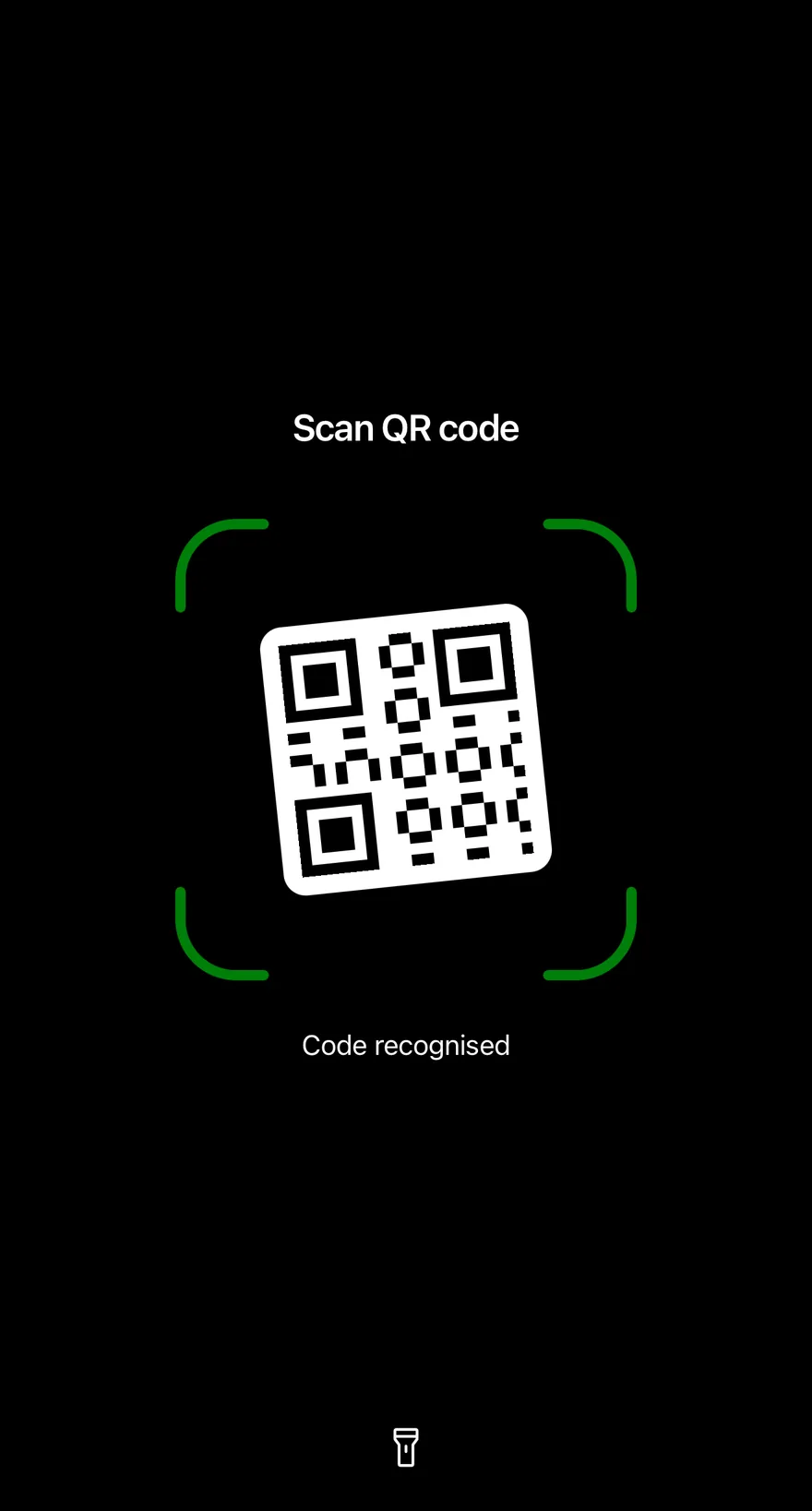
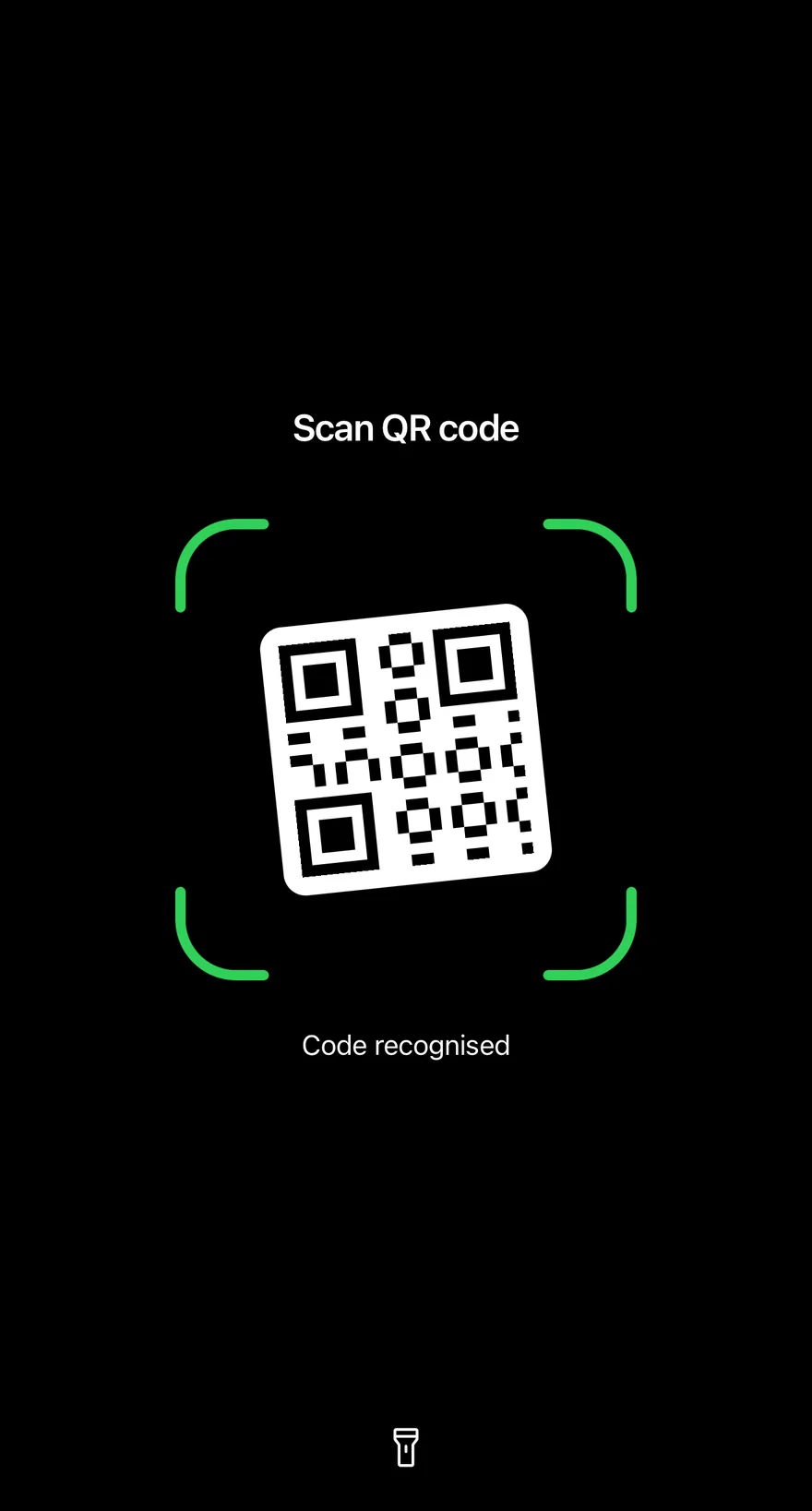
Set state to success or error after you read a code. The brackets fade to a matching color, success springs the frame slightly smaller and error shakes it. Pass onTorchToggle together with a controlled torch value to show the flashlight button; leave it out to hide the button. title and description accept strings or your own elements.
The QRScannerState type is also exported.
Examples
Success
The success state with green brackets and a slightly smaller frame.
import { IconProps as PhosphorIconProps } from "phosphor-react-native"
import * as React from "react"
import { View } from "react-native"
import { Path } from "react-native-svg"
import Svg from "react-native-svg"
import { Icon } from "@/components/ui/icon"
import { QRScanner, type QRScannerState } from "@/components/ui/qr-scanner"

const MODULES = 21

const MODULE_SIZE = 6

const CODE_SIZE = MODULES * MODULE_SIZE

const FINDERS = [
  [0, 0],
  [0, 14],
  [14, 0],
]

function isDark(row: number, column: number) {
  for (const [top, left] of FINDERS) {
    const i = row - top
    const j = column - left
    if (i >= 0 && i <= 6 && j >= 0 && j <= 6) {
      return (
        i === 0 ||
        i === 6 ||
        j === 0 ||
        j === 6 ||
        (i >= 2 && i <= 4 && j >= 2 && j <= 4)
      )
    }
    const boxTop = top === 0 ? 0 : top - 1
    const boxLeft = left === 0 ? 0 : left - 1
    if (
      row >= boxTop &&
      row <= boxTop + 7 &&
      column >= boxLeft &&
      column <= boxLeft + 7
    ) {
      return false
    }
  }
  return (row * 7 + column * 11 + row * column) % 5 < 2
}

const CODE_PATH = Array.from({ length: MODULES * MODULES }, (_, index) => {
  const row = Math.floor(index / MODULES)
  const column = index % MODULES
  return isDark(row, column)
    ? `M${column * MODULE_SIZE} ${row * MODULE_SIZE}h${MODULE_SIZE}v${MODULE_SIZE}h-${MODULE_SIZE}Z`
    : ""
}).join("")

function QRCode({ color }: PhosphorIconProps) {
  return (
    <Svg width={CODE_SIZE} height={CODE_SIZE}>
      <Path d={CODE_PATH} fill={color} />
    </Svg>
  )
}

function CameraPlaceholder() {
  return (
    <View className="flex-1 items-center justify-center bg-media">
      <View className="mb-12 -rotate-6 rounded-xl bg-on-media p-2.5">
        <Icon as={QRCode} className="text-media" />
      </View>
    </View>
  )
}

function Scanner({
  state,
  description,
  scanLine,
}: {
  state?: QRScannerState
  description?: string
  scanLine?: boolean
}) {
  const [torch, setTorch] = React.useState(false)
  return (
    <QRScanner
      className="flex-1"
      state={state}
      scanLine={scanLine}
      title="Scan QR code"
      description={description}
      torch={torch}
      onTorchToggle={setTorch}
    >
      <CameraPlaceholder />
    </QRScanner>
  )
}

export function QrScannerSuccessExample() {
  return (
    <Scanner state="success" description="Code recognised" />
  )
}import EsuissUI
import SwiftUI
struct QRScannerSuccessExample: View {
var body: some View {
QRScannerDemo(state: .success, hint: "Code recognised")
}
}
struct QRScannerDemo: View {
var state: QRScannerState = .idle
let hint: LocalizedStringKey
var scanLine = false
@State private var torch = false
var body: some View {
QRScanner(
state: state,
title: "Scan QR code",
hint: hint,
scanLine: scanLine,
isTorchOn: torch,
onTorchToggle: { torch.toggle() }
) {
QRScannerCameraPlaceholder()
}
.ignoresSafeArea()
}
}
enum QRCodeSample {
static let count = 21
static let module: CGFloat = 6
static let padding: CGFloat = 10
static let side = CGFloat(count) * module + padding * 2
static func isDark(_ r: Int, _ c: Int) -> Bool {
for (fr, fc) in [(0, 0), (0, 14), (14, 0)] {
let i = r - fr
let j = c - fc
if (0...6).contains(i) && (0...6).contains(j) {
return i == 0 || i == 6 || j == 0 || j == 6 || ((2...4).contains(i) && (2...4).contains(j))
}
}
if r <= 7 && c <= 7 { return false }
if r <= 7 && c >= 13 { return false }
if r >= 13 && c <= 7 { return false }
return (r * 7 + c * 11 + r * c) % 5 < 2
}
static let modules: Path = {
var path = Path()
for r in 0..<count {
for c in 0..<count where isDark(r, c) {
path.addRect(CGRect(x: padding + CGFloat(c) * module, y: padding + CGFloat(r) * module, width: module, height: module))
}
}
return path
}()
}
struct QRScannerCameraPlaceholder: View {
var body: some View {
GeometryReader { proxy in
Canvas { context, _ in
let card = CGRect(origin: .zero, size: CGSize(width: QRCodeSample.side, height: QRCodeSample.side))
context.fill(Path(roundedRect: card, cornerRadius: Radius.xl, style: .continuous), with: .color(.onMedia))
context.fill(QRCodeSample.modules, with: .color(.media))
}
.frame(width: QRCodeSample.side, height: QRCodeSample.side)
.rotationEffect(.degrees(-6))
.position(x: proxy.size.width / 2, y: proxy.size.height / 2 - 24)
}
.background(Color.media)
.accessibilityHidden(true)
}
}
let count = 21
let module: CGFloat = 6
let padding: CGFloat = 10
let side = CGFloat(count) * module + padding * 2
func isDark(_ r: Int, _ c: Int) -> Bool {
for (fr, fc) in [(0, 0), (0, 14), (14, 0)] {
let i = r - fr
let j = c - fc
if (0...6).contains(i) && (0...6).contains(j) {
return i == 0 || i == 6 || j == 0 || j == 6 || ((2...4).contains(i) && (2...4).contains(j))
}
}
if r <= 7 && c <= 7 { return false }
if r <= 7 && c >= 13 { return false }
if r >= 13 && c <= 7 { return false }
return (r * 7 + c * 11 + r * c) % 5 < 2
}
let modules: Path = {
var path = Path()
for r in 0..<count {
for c in 0..<count where isDark(r, c) {
path.addRect(CGRect(x: padding + CGFloat(c) * module, y: padding + CGFloat(r) * module, width: module, height: module))
}
}
return path
}import androidx.compose.foundation.layout.fillMaxSize
import androidx.compose.runtime.Composable
import androidx.compose.runtime.getValue
import androidx.compose.runtime.mutableStateOf
import androidx.compose.runtime.saveable.rememberSaveable
import androidx.compose.runtime.setValue
import androidx.compose.ui.Modifier
import com.esuiss.ui.components.QrScanner
import com.esuiss.ui.components.QrScannerState
@Composable
fun QRScannerSuccessExample() {
QrScannerDemo(state = QrScannerState.Success, hint = "Code recognised")
}
@Composable
fun QrScannerDemo(
state: QrScannerState = QrScannerState.Idle,
hint: String? = null,
scanLine: Boolean = false,
) {
var torch by rememberSaveable { mutableStateOf(false) }
QrScanner(
modifier = Modifier.fillMaxSize(),
state = state,
title = "Scan QR code",
hint = hint,
scanLine = scanLine,
torch = torch,
onTorchToggle = { torch = it },
) {
QrScannerCameraPlaceholder()
}
}Error
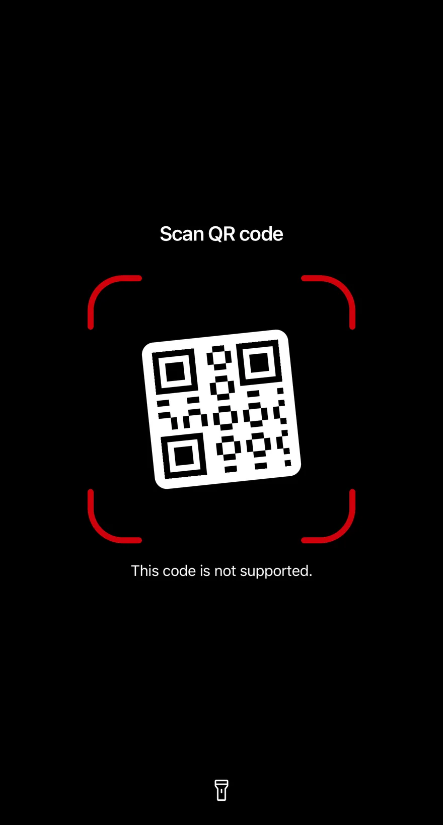
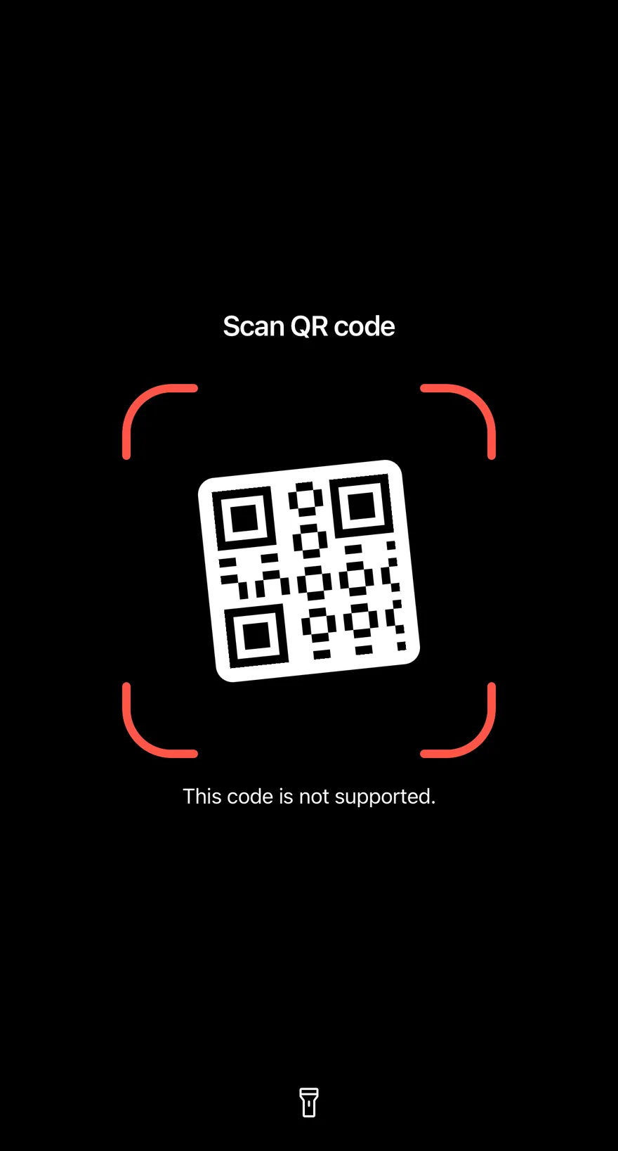
The error state, which shakes the frame and turns the brackets red.
import { IconProps as PhosphorIconProps } from "phosphor-react-native"
import * as React from "react"
import { View } from "react-native"
import { Path } from "react-native-svg"
import Svg from "react-native-svg"
import { Icon } from "@/components/ui/icon"
import { QRScanner, type QRScannerState } from "@/components/ui/qr-scanner"

const MODULES = 21

const MODULE_SIZE = 6

const CODE_SIZE = MODULES * MODULE_SIZE

const FINDERS = [
  [0, 0],
  [0, 14],
  [14, 0],
]

function isDark(row: number, column: number) {
  for (const [top, left] of FINDERS) {
    const i = row - top
    const j = column - left
    if (i >= 0 && i <= 6 && j >= 0 && j <= 6) {
      return (
        i === 0 ||
        i === 6 ||
        j === 0 ||
        j === 6 ||
        (i >= 2 && i <= 4 && j >= 2 && j <= 4)
      )
    }
    const boxTop = top === 0 ? 0 : top - 1
    const boxLeft = left === 0 ? 0 : left - 1
    if (
      row >= boxTop &&
      row <= boxTop + 7 &&
      column >= boxLeft &&
      column <= boxLeft + 7
    ) {
      return false
    }
  }
  return (row * 7 + column * 11 + row * column) % 5 < 2
}

const CODE_PATH = Array.from({ length: MODULES * MODULES }, (_, index) => {
  const row = Math.floor(index / MODULES)
  const column = index % MODULES
  return isDark(row, column)
    ? `M${column * MODULE_SIZE} ${row * MODULE_SIZE}h${MODULE_SIZE}v${MODULE_SIZE}h-${MODULE_SIZE}Z`
    : ""
}).join("")

function QRCode({ color }: PhosphorIconProps) {
  return (
    <Svg width={CODE_SIZE} height={CODE_SIZE}>
      <Path d={CODE_PATH} fill={color} />
    </Svg>
  )
}

function CameraPlaceholder() {
  return (
    <View className="flex-1 items-center justify-center bg-media">
      <View className="mb-12 -rotate-6 rounded-xl bg-on-media p-2.5">
        <Icon as={QRCode} className="text-media" />
      </View>
    </View>
  )
}

function Scanner({
  state,
  description,
  scanLine,
}: {
  state?: QRScannerState
  description?: string
  scanLine?: boolean
}) {
  const [torch, setTorch] = React.useState(false)
  return (
    <QRScanner
      className="flex-1"
      state={state}
      scanLine={scanLine}
      title="Scan QR code"
      description={description}
      torch={torch}
      onTorchToggle={setTorch}
    >
      <CameraPlaceholder />
    </QRScanner>
  )
}

export function QrScannerErrorStateExample() {
  return (
    <Scanner state="error" description="This code is not supported." />
  )
}import EsuissUI
import SwiftUI
struct QRScannerErrorStateExample: View {
var body: some View {
QRScannerDemo(state: .error, hint: "This code is not supported.")
}
}
struct QRScannerDemo: View {
var state: QRScannerState = .idle
let hint: LocalizedStringKey
var scanLine = false
@State private var torch = false
var body: some View {
QRScanner(
state: state,
title: "Scan QR code",
hint: hint,
scanLine: scanLine,
isTorchOn: torch,
onTorchToggle: { torch.toggle() }
) {
QRScannerCameraPlaceholder()
}
.ignoresSafeArea()
}
}
enum QRCodeSample {
static let count = 21
static let module: CGFloat = 6
static let padding: CGFloat = 10
static let side = CGFloat(count) * module + padding * 2
static func isDark(_ r: Int, _ c: Int) -> Bool {
for (fr, fc) in [(0, 0), (0, 14), (14, 0)] {
let i = r - fr
let j = c - fc
if (0...6).contains(i) && (0...6).contains(j) {
return i == 0 || i == 6 || j == 0 || j == 6 || ((2...4).contains(i) && (2...4).contains(j))
}
}
if r <= 7 && c <= 7 { return false }
if r <= 7 && c >= 13 { return false }
if r >= 13 && c <= 7 { return false }
return (r * 7 + c * 11 + r * c) % 5 < 2
}
static let modules: Path = {
var path = Path()
for r in 0..<count {
for c in 0..<count where isDark(r, c) {
path.addRect(CGRect(x: padding + CGFloat(c) * module, y: padding + CGFloat(r) * module, width: module, height: module))
}
}
return path
}()
}
struct QRScannerCameraPlaceholder: View {
var body: some View {
GeometryReader { proxy in
Canvas { context, _ in
let card = CGRect(origin: .zero, size: CGSize(width: QRCodeSample.side, height: QRCodeSample.side))
context.fill(Path(roundedRect: card, cornerRadius: Radius.xl, style: .continuous), with: .color(.onMedia))
context.fill(QRCodeSample.modules, with: .color(.media))
}
.frame(width: QRCodeSample.side, height: QRCodeSample.side)
.rotationEffect(.degrees(-6))
.position(x: proxy.size.width / 2, y: proxy.size.height / 2 - 24)
}
.background(Color.media)
.accessibilityHidden(true)
}
}
let count = 21
let module: CGFloat = 6
let padding: CGFloat = 10
let side = CGFloat(count) * module + padding * 2
func isDark(_ r: Int, _ c: Int) -> Bool {
for (fr, fc) in [(0, 0), (0, 14), (14, 0)] {
let i = r - fr
let j = c - fc
if (0...6).contains(i) && (0...6).contains(j) {
return i == 0 || i == 6 || j == 0 || j == 6 || ((2...4).contains(i) && (2...4).contains(j))
}
}
if r <= 7 && c <= 7 { return false }
if r <= 7 && c >= 13 { return false }
if r >= 13 && c <= 7 { return false }
return (r * 7 + c * 11 + r * c) % 5 < 2
}
let modules: Path = {
var path = Path()
for r in 0..<count {
for c in 0..<count where isDark(r, c) {
path.addRect(CGRect(x: padding + CGFloat(c) * module, y: padding + CGFloat(r) * module, width: module, height: module))
}
}
return path
}import androidx.compose.foundation.layout.fillMaxSize
import androidx.compose.runtime.Composable
import androidx.compose.runtime.getValue
import androidx.compose.runtime.mutableStateOf
import androidx.compose.runtime.saveable.rememberSaveable
import androidx.compose.runtime.setValue
import androidx.compose.ui.Modifier
import com.esuiss.ui.components.QrScanner
import com.esuiss.ui.components.QrScannerState
@Composable
fun QRScannerErrorStateExample() {
QrScannerDemo(state = QrScannerState.Error, hint = "This code is not supported.")
}
@Composable
fun QrScannerDemo(
state: QrScannerState = QrScannerState.Idle,
hint: String? = null,
scanLine: Boolean = false,
) {
var torch by rememberSaveable { mutableStateOf(false) }
QrScanner(
modifier = Modifier.fillMaxSize(),
state = state,
title = "Scan QR code",
hint = hint,
scanLine = scanLine,
torch = torch,
onTorchToggle = { torch = it },
) {
QrScannerCameraPlaceholder()
}
}With scan line
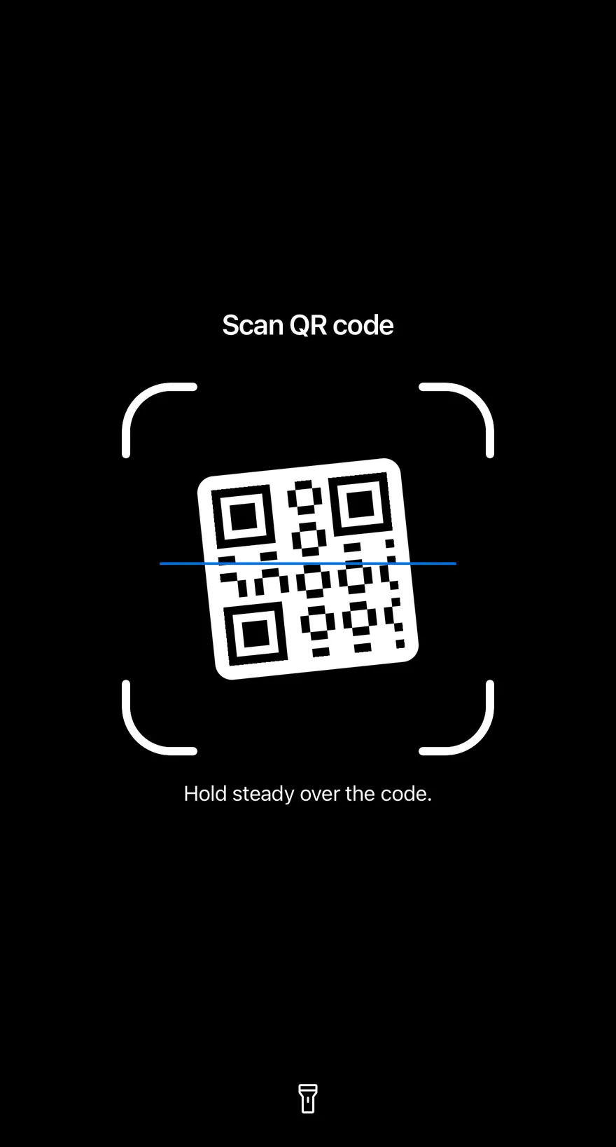
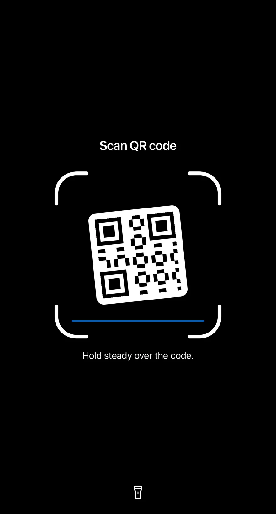
The scanner with scanLine turned on.
import { IconProps as PhosphorIconProps } from "phosphor-react-native"
import * as React from "react"
import { View } from "react-native"
import { Path } from "react-native-svg"
import Svg from "react-native-svg"
import { Icon } from "@/components/ui/icon"
import { QRScanner, type QRScannerState } from "@/components/ui/qr-scanner"

const MODULES = 21

const MODULE_SIZE = 6

const CODE_SIZE = MODULES * MODULE_SIZE

const FINDERS = [
  [0, 0],
  [0, 14],
  [14, 0],
]

function isDark(row: number, column: number) {
  for (const [top, left] of FINDERS) {
    const i = row - top
    const j = column - left
    if (i >= 0 && i <= 6 && j >= 0 && j <= 6) {
      return (
        i === 0 ||
        i === 6 ||
        j === 0 ||
        j === 6 ||
        (i >= 2 && i <= 4 && j >= 2 && j <= 4)
      )
    }
    const boxTop = top === 0 ? 0 : top - 1
    const boxLeft = left === 0 ? 0 : left - 1
    if (
      row >= boxTop &&
      row <= boxTop + 7 &&
      column >= boxLeft &&
      column <= boxLeft + 7
    ) {
      return false
    }
  }
  return (row * 7 + column * 11 + row * column) % 5 < 2
}

const CODE_PATH = Array.from({ length: MODULES * MODULES }, (_, index) => {
  const row = Math.floor(index / MODULES)
  const column = index % MODULES
  return isDark(row, column)
    ? `M${column * MODULE_SIZE} ${row * MODULE_SIZE}h${MODULE_SIZE}v${MODULE_SIZE}h-${MODULE_SIZE}Z`
    : ""
}).join("")

function QRCode({ color }: PhosphorIconProps) {
  return (
    <Svg width={CODE_SIZE} height={CODE_SIZE}>
      <Path d={CODE_PATH} fill={color} />
    </Svg>
  )
}

function CameraPlaceholder() {
  return (
    <View className="flex-1 items-center justify-center bg-media">
      <View className="mb-12 -rotate-6 rounded-xl bg-on-media p-2.5">
        <Icon as={QRCode} className="text-media" />
      </View>
    </View>
  )
}

function Scanner({
  state,
  description,
  scanLine,
}: {
  state?: QRScannerState
  description?: string
  scanLine?: boolean
}) {
  const [torch, setTorch] = React.useState(false)
  return (
    <QRScanner
      className="flex-1"
      state={state}
      scanLine={scanLine}
      title="Scan QR code"
      description={description}
      torch={torch}
      onTorchToggle={setTorch}
    >
      <CameraPlaceholder />
    </QRScanner>
  )
}

export function QrScannerWithScanLineExample() {
  return (
    <Scanner scanLine description="Hold steady over the code." />
  )
}import EsuissUI
import SwiftUI
struct QRScannerWithScanLineExample: View {
var body: some View {
QRScannerDemo(hint: "Hold steady over the code.", scanLine: true)
}
}
struct QRScannerDemo: View {
var state: QRScannerState = .idle
let hint: LocalizedStringKey
var scanLine = false
@State private var torch = false
var body: some View {
QRScanner(
state: state,
title: "Scan QR code",
hint: hint,
scanLine: scanLine,
isTorchOn: torch,
onTorchToggle: { torch.toggle() }
) {
QRScannerCameraPlaceholder()
}
.ignoresSafeArea()
}
}
enum QRCodeSample {
static let count = 21
static let module: CGFloat = 6
static let padding: CGFloat = 10
static let side = CGFloat(count) * module + padding * 2
static func isDark(_ r: Int, _ c: Int) -> Bool {
for (fr, fc) in [(0, 0), (0, 14), (14, 0)] {
let i = r - fr
let j = c - fc
if (0...6).contains(i) && (0...6).contains(j) {
return i == 0 || i == 6 || j == 0 || j == 6 || ((2...4).contains(i) && (2...4).contains(j))
}
}
if r <= 7 && c <= 7 { return false }
if r <= 7 && c >= 13 { return false }
if r >= 13 && c <= 7 { return false }
return (r * 7 + c * 11 + r * c) % 5 < 2
}
static let modules: Path = {
var path = Path()
for r in 0..<count {
for c in 0..<count where isDark(r, c) {
path.addRect(CGRect(x: padding + CGFloat(c) * module, y: padding + CGFloat(r) * module, width: module, height: module))
}
}
return path
}()
}
struct QRScannerCameraPlaceholder: View {
var body: some View {
GeometryReader { proxy in
Canvas { context, _ in
let card = CGRect(origin: .zero, size: CGSize(width: QRCodeSample.side, height: QRCodeSample.side))
context.fill(Path(roundedRect: card, cornerRadius: Radius.xl, style: .continuous), with: .color(.onMedia))
context.fill(QRCodeSample.modules, with: .color(.media))
}
.frame(width: QRCodeSample.side, height: QRCodeSample.side)
.rotationEffect(.degrees(-6))
.position(x: proxy.size.width / 2, y: proxy.size.height / 2 - 24)
}
.background(Color.media)
.accessibilityHidden(true)
}
}
let count = 21
let module: CGFloat = 6
let padding: CGFloat = 10
let side = CGFloat(count) * module + padding * 2
func isDark(_ r: Int, _ c: Int) -> Bool {
for (fr, fc) in [(0, 0), (0, 14), (14, 0)] {
let i = r - fr
let j = c - fc
if (0...6).contains(i) && (0...6).contains(j) {
return i == 0 || i == 6 || j == 0 || j == 6 || ((2...4).contains(i) && (2...4).contains(j))
}
}
if r <= 7 && c <= 7 { return false }
if r <= 7 && c >= 13 { return false }
if r >= 13 && c <= 7 { return false }
return (r * 7 + c * 11 + r * c) % 5 < 2
}
let modules: Path = {
var path = Path()
for r in 0..<count {
for c in 0..<count where isDark(r, c) {
path.addRect(CGRect(x: padding + CGFloat(c) * module, y: padding + CGFloat(r) * module, width: module, height: module))
}
}
return path
}import androidx.compose.foundation.layout.fillMaxSize
import androidx.compose.runtime.Composable
import androidx.compose.runtime.getValue
import androidx.compose.runtime.mutableStateOf
import androidx.compose.runtime.saveable.rememberSaveable
import androidx.compose.runtime.setValue
import androidx.compose.ui.Modifier
import com.esuiss.ui.components.QrScanner
import com.esuiss.ui.components.QrScannerState
@Composable
fun QRScannerWithScanLineExample() {
QrScannerDemo(scanLine = true, hint = "Hold steady over the code.")
}
@Composable
fun QrScannerDemo(
state: QrScannerState = QrScannerState.Idle,
hint: String? = null,
scanLine: Boolean = false,
) {
var torch by rememberSaveable { mutableStateOf(false) }
QrScanner(
modifier = Modifier.fillMaxSize(),
state = state,
title = "Scan QR code",
hint = hint,
scanLine = scanLine,
torch = torch,
onTorchToggle = { torch = it },
) {
QrScannerCameraPlaceholder()
}
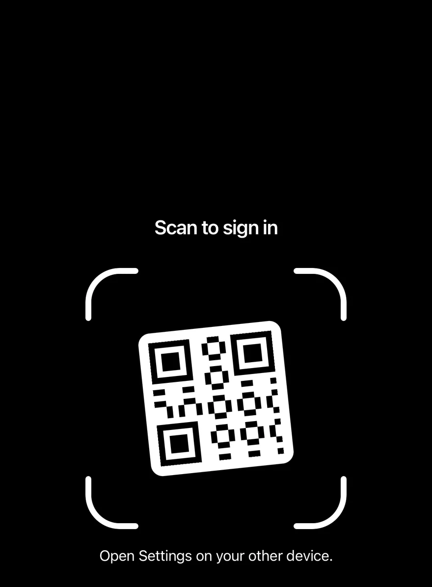
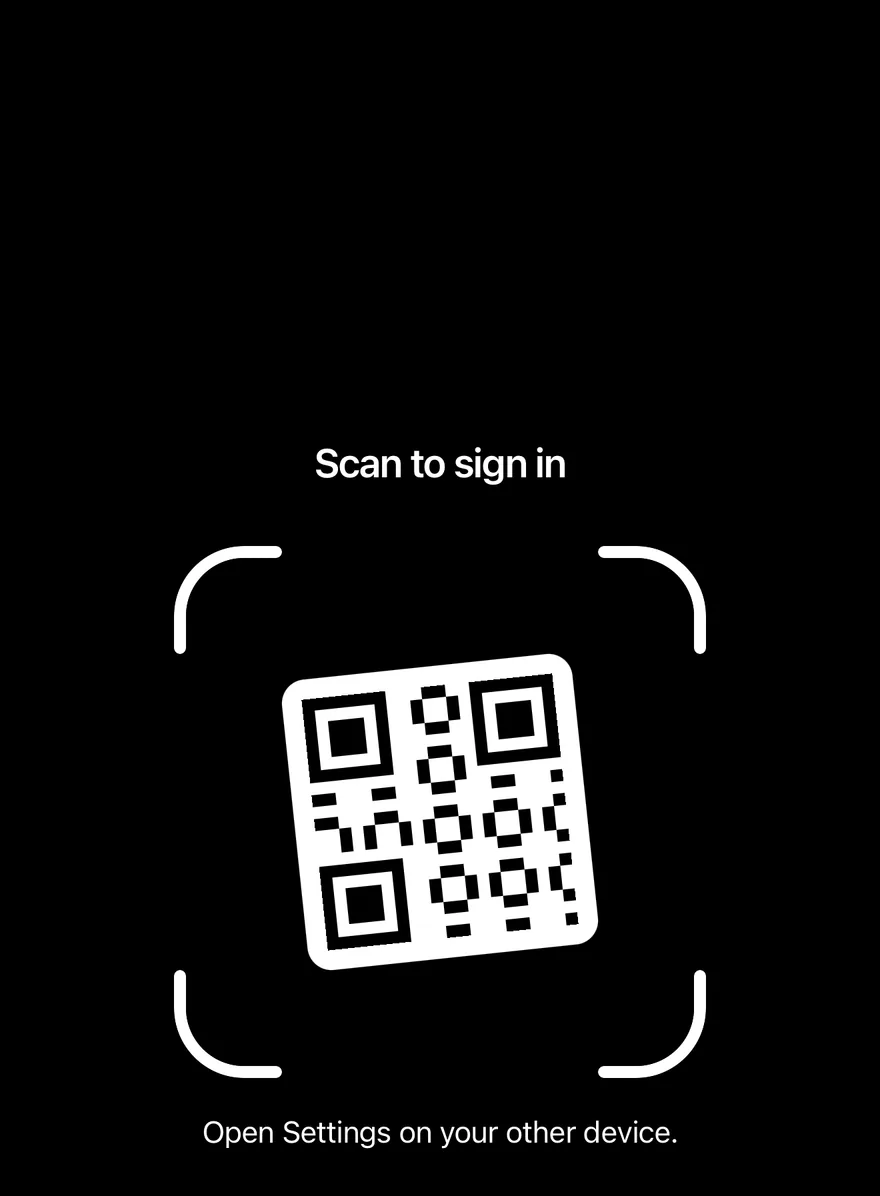
}Without torch
A title and description with no flashlight button, because onTorchToggle is not passed.
import { IconProps as PhosphorIconProps } from "phosphor-react-native"
import { View } from "react-native"
import { Path } from "react-native-svg"
import Svg from "react-native-svg"
import { Icon } from "@/components/ui/icon"
import { QRScanner } from "@/components/ui/qr-scanner"

const MODULES = 21

const MODULE_SIZE = 6

const CODE_SIZE = MODULES * MODULE_SIZE

const FINDERS = [
  [0, 0],
  [0, 14],
  [14, 0],
]

function isDark(row: number, column: number) {
  for (const [top, left] of FINDERS) {
    const i = row - top
    const j = column - left
    if (i >= 0 && i <= 6 && j >= 0 && j <= 6) {
      return (
        i === 0 ||
        i === 6 ||
        j === 0 ||
        j === 6 ||
        (i >= 2 && i <= 4 && j >= 2 && j <= 4)
      )
    }
    const boxTop = top === 0 ? 0 : top - 1
    const boxLeft = left === 0 ? 0 : left - 1
    if (
      row >= boxTop &&
      row <= boxTop + 7 &&
      column >= boxLeft &&
      column <= boxLeft + 7
    ) {
      return false
    }
  }
  return (row * 7 + column * 11 + row * column) % 5 < 2
}

const CODE_PATH = Array.from({ length: MODULES * MODULES }, (_, index) => {
  const row = Math.floor(index / MODULES)
  const column = index % MODULES
  return isDark(row, column)
    ? `M${column * MODULE_SIZE} ${row * MODULE_SIZE}h${MODULE_SIZE}v${MODULE_SIZE}h-${MODULE_SIZE}Z`
    : ""
}).join("")

function QRCode({ color }: PhosphorIconProps) {
  return (
    <Svg width={CODE_SIZE} height={CODE_SIZE}>
      <Path d={CODE_PATH} fill={color} />
    </Svg>
  )
}

function CameraPlaceholder() {
  return (
    <View className="flex-1 items-center justify-center bg-media">
      <View className="mb-12 -rotate-6 rounded-xl bg-on-media p-2.5">
        <Icon as={QRCode} className="text-media" />
      </View>
    </View>
  )
}

export function QrScannerWithoutTorchExample() {
  return (
    <QRScanner
      className="flex-1"
      title="Scan to sign in"
      description="Open Settings on your other device."
    >
      <CameraPlaceholder />
    </QRScanner>
  )
}import EsuissUI
import SwiftUI
struct QRScannerWithoutTorchExample: View {
var body: some View {
QRScanner(title: "Scan to sign in", hint: "Open Settings on your other device.") {
QRScannerCameraPlaceholder()
}
.ignoresSafeArea()
}
}
enum QRCodeSample {
static let count = 21
static let module: CGFloat = 6
static let padding: CGFloat = 10
static let side = CGFloat(count) * module + padding * 2
static func isDark(_ r: Int, _ c: Int) -> Bool {
for (fr, fc) in [(0, 0), (0, 14), (14, 0)] {
let i = r - fr
let j = c - fc
if (0...6).contains(i) && (0...6).contains(j) {
return i == 0 || i == 6 || j == 0 || j == 6 || ((2...4).contains(i) && (2...4).contains(j))
}
}
if r <= 7 && c <= 7 { return false }
if r <= 7 && c >= 13 { return false }
if r >= 13 && c <= 7 { return false }
return (r * 7 + c * 11 + r * c) % 5 < 2
}
static let modules: Path = {
var path = Path()
for r in 0..<count {
for c in 0..<count where isDark(r, c) {
path.addRect(CGRect(x: padding + CGFloat(c) * module, y: padding + CGFloat(r) * module, width: module, height: module))
}
}
return path
}()
}
struct QRScannerCameraPlaceholder: View {
var body: some View {
GeometryReader { proxy in
Canvas { context, _ in
let card = CGRect(origin: .zero, size: CGSize(width: QRCodeSample.side, height: QRCodeSample.side))
context.fill(Path(roundedRect: card, cornerRadius: Radius.xl, style: .continuous), with: .color(.onMedia))
context.fill(QRCodeSample.modules, with: .color(.media))
}
.frame(width: QRCodeSample.side, height: QRCodeSample.side)
.rotationEffect(.degrees(-6))
.position(x: proxy.size.width / 2, y: proxy.size.height / 2 - 24)
}
.background(Color.media)
.accessibilityHidden(true)
}
}
let count = 21
let module: CGFloat = 6
let padding: CGFloat = 10
let side = CGFloat(count) * module + padding * 2
func isDark(_ r: Int, _ c: Int) -> Bool {
for (fr, fc) in [(0, 0), (0, 14), (14, 0)] {
let i = r - fr
let j = c - fc
if (0...6).contains(i) && (0...6).contains(j) {
return i == 0 || i == 6 || j == 0 || j == 6 || ((2...4).contains(i) && (2...4).contains(j))
}
}
if r <= 7 && c <= 7 { return false }
if r <= 7 && c >= 13 { return false }
if r >= 13 && c <= 7 { return false }
return (r * 7 + c * 11 + r * c) % 5 < 2
}
let modules: Path = {
var path = Path()
for r in 0..<count {
for c in 0..<count where isDark(r, c) {
path.addRect(CGRect(x: padding + CGFloat(c) * module, y: padding + CGFloat(r) * module, width: module, height: module))
}
}
return path
}import androidx.compose.foundation.layout.fillMaxSize
import androidx.compose.runtime.Composable
import androidx.compose.ui.Modifier
import com.esuiss.ui.components.QrScanner
@Composable
fun QrScannerWithoutTorch() {
QrScanner(
modifier = Modifier.fillMaxSize(),
title = "Scan to sign in",
hint = "Open Settings on your other device.",
) {
QrScannerCameraPlaceholder()
}
}API Reference
QRScanner
React.ComponentProps<typeof View>- About
idle,successorerror. Sets the bracket color and triggers haptics, the success scale and the error shake. Defaults toidle.- Type
QRScannerState- Default
- "idle"
- About
- Content shown above the frame. Strings are wrapped in a
Text. - Type
React.ReactNode- Default
- —
- About
- Content shown below the frame. Strings are wrapped in a
Text. - Type
React.ReactNode- Default
- —
- About
- Shows the animated scan line while the state is
idle. Defaults tofalse. - Type
boolean- Default
- false
- About
- Whether the flashlight is on. The button fills and the icon uses the fill weight when on. Defaults to
false. - Type
boolean- Default
- false
- About
- Called with the next torch value when the flashlight button is pressed. The button is shown only when this is set.
- Type
(torch: boolean) => void- Default
- —
- About
- Accessibility label for the flashlight button. Defaults to
"Flashlight". - Type
string- Default
- "Flashlight"
- About
- Side length of the scan frame in points. Overrides the automatic size.
- Type
number- Default
- —
Accessibility
- The dimmed surround and brackets are hidden from VoiceOver and TalkBack.
- The overlay is a polite live region, so changes to the title and description are announced on Android.
- The flashlight button has the
buttonrole, usestorchLabelas its label and reportstorchas its selected state. - State changes to
successanderrorplay a matching haptic notification. - The shake and scan-line animations respect the system reduce motion setting, and the success scale is skipped when reduce motion is on.
Notes
- Uses the
bg-media,text-scrim,text-on-media,text-success,text-dangerandbg-accenttokens; the flashlight button usesbg-scrimwhen off andbg-on-mediawith atext-mediaicon when on. - The scan line restarts whenever the state returns to
idle.