suiss/uim · React Native Component
Item
A flexible row for lists and settings, with slots for media, a title, a description and trailing actions.
Item is an open-source mobile component from suiss/uim for React Native and Expo, with SwiftUI and Jetpack Compose versions built from the same design tokens. The @esuiss/uim CLI copies its source into your project, so you own the code.
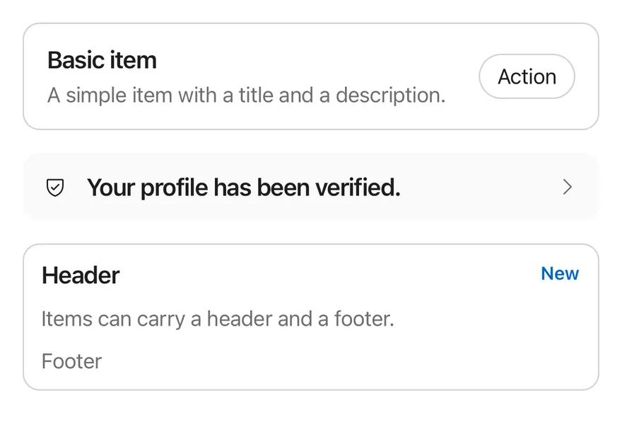
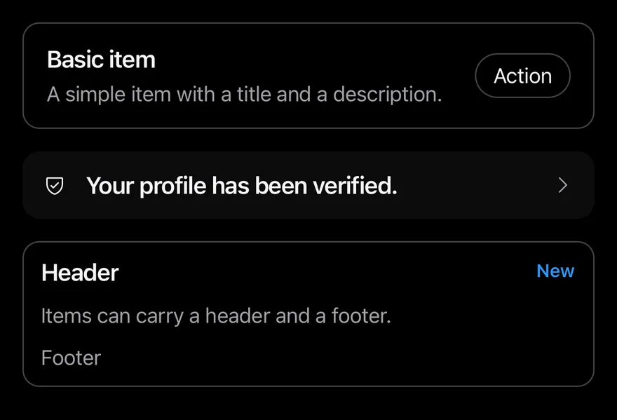
import { CaretRightIcon, ShieldCheckIcon } from "phosphor-react-native"
import { View } from "react-native"
import { Badge } from "@/components/ui/badge"
import { Button } from "@/components/ui/button"
import { Icon } from "@/components/ui/icon"
import { Item, ItemActions, ItemContent, ItemDescription, ItemFooter, ItemHeader, ItemMedia, ItemTitle } from "@/components/ui/item"
import { Text } from "@/components/ui/text"

export function ItemExample() {
  return (
    <View className="gap-4">
      <Item variant="outline">
        <ItemContent>
          <ItemTitle>Basic item</ItemTitle>
          <ItemDescription>
            A simple item with a title and a description.
          </ItemDescription>
        </ItemContent>
        <ItemActions>
          <Button variant="outline" size="sm">
            <Text>Action</Text>
          </Button>
        </ItemActions>
      </Item>
      <Item variant="muted" size="sm" onPress={() => {}}>
        <ItemMedia variant="icon">
          <Icon as={ShieldCheckIcon} />
        </ItemMedia>
        <ItemContent>
          <ItemTitle>Your profile has been verified.</ItemTitle>
        </ItemContent>
        <ItemActions>
          <Icon as={CaretRightIcon} className="size-4 text-label-secondary" />
        </ItemActions>
      </Item>
      <Item variant="outline" size="xs">
        <ItemHeader>
          <ItemTitle>Header</ItemTitle>
          <Badge>
            <Text>New</Text>
          </Badge>
        </ItemHeader>
        <ItemContent>
          <ItemDescription>
            Items can carry a header and a footer.
          </ItemDescription>
        </ItemContent>
        <ItemFooter>
          <Text className="text-sm text-label-secondary">Footer</Text>
        </ItemFooter>
      </Item>
    </View>
  )
}import EsuissUI
import PhosphorSwift
import SwiftUI
struct ItemExample: View {
var body: some View {
VStack(alignment: .leading, spacing: 16) {
Item(.outline) {
ItemContent {
ItemTitle("Basic item")
ItemDescription("A simple item with a title and a description.")
}
ItemActions {
Button("Action") {}
.buttonStyle(.variant(.outline, size: .sm))
}
}
Item(.muted, size: .sm, action: {}) {
ItemMedia(.icon) {
Ph.shieldCheck.regular
}
ItemContent {
ItemTitle("Your profile has been verified.")
}
ItemActions {
ItemChevron()
}
}
Item(.outline, size: .xs) {
ItemHeader {
ItemTitle("Header")
Badge("New")
}
ItemContent {
ItemDescription("Items can carry a header and a footer.")
}
ItemFooter {
Text("Footer")
.textStyle(.sm)
.foregroundStyle(Color.labelSecondary)
}
}
}
}
}
struct ItemChevron: View {
var body: some View {
Ph.caretRight.regular
.frame(width: 16, height: 16)
.foregroundStyle(Color.labelSecondary)
}
}import androidx.compose.foundation.layout.Arrangement
import androidx.compose.foundation.layout.Column
import androidx.compose.foundation.layout.fillMaxWidth
import androidx.compose.runtime.Composable
import androidx.compose.ui.Modifier
import androidx.compose.ui.unit.dp
import com.adamglin.PhosphorIcons
import com.adamglin.phosphoricons.Regular
import com.adamglin.phosphoricons.regular.CaretRight
import com.adamglin.phosphoricons.regular.ShieldCheck
import com.esuiss.ui.components.Badge
import com.esuiss.ui.components.Button
import com.esuiss.ui.components.ButtonSize
import com.esuiss.ui.components.ButtonVariant
import com.esuiss.ui.components.Icon
import com.esuiss.ui.components.Item
import com.esuiss.ui.components.ItemActions
import com.esuiss.ui.components.ItemContent
import com.esuiss.ui.components.ItemDescription
import com.esuiss.ui.components.ItemFooter
import com.esuiss.ui.components.ItemHeader
import com.esuiss.ui.components.ItemMedia
import com.esuiss.ui.components.ItemMediaVariant
import com.esuiss.ui.components.ItemSize
import com.esuiss.ui.components.ItemTitle
import com.esuiss.ui.components.ItemVariant
import com.esuiss.ui.components.Text
import com.esuiss.ui.theme.EsuissTheme
import com.esuiss.ui.theme.Typography
@Composable
fun ItemCaret() {
Icon(PhosphorIcons.Regular.CaretRight, contentDescription = null, size = 16.dp, tint = EsuissTheme.colors.labelSecondary)
}
@Composable
fun ItemDefault() {
Column(Modifier.fillMaxWidth(), verticalArrangement = Arrangement.spacedBy(16.dp)) {
Item(variant = ItemVariant.Outline, role = null) {
ItemContent {
ItemTitle("Basic item")
ItemDescription("A simple item with a title and a description.")
}
ItemActions {
Button("Action", onClick = {}, variant = ButtonVariant.Outline, size = ButtonSize.Sm)
}
}
Item(variant = ItemVariant.Muted, size = ItemSize.Sm, onClick = {}) {
ItemMedia(variant = ItemMediaVariant.Icon) {
Icon(PhosphorIcons.Regular.ShieldCheck, contentDescription = null)
}
ItemContent {
ItemTitle("Your profile has been verified.")
}
ItemActions { ItemCaret() }
}
Item(variant = ItemVariant.Outline, size = ItemSize.Xs, role = null) {
ItemHeader {
ItemTitle("Header")
Badge("New")
}
ItemContent {
ItemDescription("Items can carry a header and a footer.")
}
ItemFooter {
Text("Footer", style = Typography.sm.copy(color = EsuissTheme.colors.labelSecondary))
}
}
}
}Item is a row that renders as a Pressable with the button role when it has onPress or onLongPress, and as a plain View with the listitem role otherwise. It has three variants (default, outline, muted) and three sizes (default, sm, xs).
ItemGroup stacks items as a list. Its inset variant joins them into one rounded card with square inner corners, which suits settings screens; add ItemSeparator between rows to draw an inset divider.
Installation
$ pnpm dlx @esuiss/uim@latest add item$ pnpm dlx @esuiss/uim@latest add item --platform swift$ pnpm dlx @esuiss/uim@latest add item --platform kotlinThe CLI also adds what it builds on: Icon, Text.
Manual
- Install the dependencies:
npx expo install class-variance-authority cn-
Add the pieces it builds on: Icon, Text, and the primitives
components/primitives/types.tsx,components/primitives/use-render.tsx. -
Copy the source into
components/ui/item.tsx:
import { cva, type VariantProps } from "class-variance-authority"
import { cn } from "cn"
import * as React from "react"
import { Pressable, View, type ViewProps } from "react-native"
import type { RenderProp } from "@/components/primitives/types"
import { useRender } from "@/components/primitives/use-render"
import { IconClassContext } from "@/components/ui/icon"
import { Text, TextClassContext } from "@/components/ui/text"

type ItemSize = "default" | "sm" | "xs"

const ItemGroupContext = React.createContext<{ inset: boolean }>({
  inset: false,
})

const ItemContext = React.createContext<{ size: ItemSize }>({- Update the import paths to match your project.
- Install the dependencies:
npx expo install class-variance-authority cn-
Add the pieces it builds on: Icon, Text, and the primitives
components/primitives/types.tsx,components/primitives/use-render.tsx. -
Copy the source into
components/ui/item.tsx:
import { cva, type VariantProps } from "class-variance-authority"
import { cn } from "cn"
import * as React from "react"
import { Pressable, View, type ViewProps } from "react-native"
import type { RenderProp } from "@/components/primitives/types"
import { useRender } from "@/components/primitives/use-render"
import { IconClassContext } from "@/components/ui/icon"
import { Text, TextClassContext } from "@/components/ui/text"

type ItemSize = "default" | "sm" | "xs"

const ItemGroupContext = React.createContext<{ inset: boolean }>({
  inset: false,
})

const ItemContext = React.createContext<{ size: ItemSize }>({- Update the import paths to match your project.
-
Add the pieces it builds on: Icon, Text, and the primitives
components/primitives/types.tsx,components/primitives/use-render.tsx. -
Copy the source into
components/ui/item.tsx:
import * as React from "react"
import {
  Pressable,
  type PressableStateCallbackType,
  type StyleProp,
  StyleSheet,
  View,
  type ViewProps,
  type ViewStyle,
} from "react-native"
import type { RenderProp } from "@/components/primitives/types"
import { useRender } from "@/components/primitives/use-render"
import { IconSizeContext } from "@/components/ui/icon"
import { Text, TextStyleContext } from "@/components/ui/text"
import { fontSize, radius, useTheme } from "@/components/ui/theme"- Update the import paths to match your project.
-
Target iOS 17 or later.
-
Copy the theme files every view uses:
import SwiftUI
import UIKit

struct RGBA: Sendable {
  let red: CGFloat
  let green: CGFloat
  let blue: CGFloat
  let alpha: CGFloat

  init(_ hex: UInt32, _ alpha: CGFloat = 1) {
    red = CGFloat((hex >> 16) & 0xFF) / 255
    green = CGFloat((hex >> 8) & 0xFF) / 255
    blue = CGFloat(hex & 0xFF) / 255
    self.alpha = alpha
}import SwiftUI
extension Color {
public static let surface = Color.adaptive(light: .init(0xFFFFFF), dark: .init(0x000000))
public static let surfaceSecondary = Color.adaptive(light: .init(0xF5F5F7), dark: .init(0x161617))
public static let surfaceTertiary = Color.adaptive(light: .init(0xE8E8ED), dark: .init(0x2C2C2E))
public static let surfaceRaised = Color.adaptive(light: .init(0xFFFFFF), dark: .init(0x1D1D1F))
public static let label = Color.adaptive(light: .init(0x1D1D1F), dark: .init(0xF5F5F7))
public static let labelSecondary = Color.adaptive(light: .init(0x6E6E73), dark: .init(0xA1A1A6))
public static let labelTertiary = Color.adaptive(light: .init(0x86868B), dark: .init(0x86868B))
public static let labelQuaternary = Color.adaptive(light: .init(0xD2D2D7), dark: .init(0x424245))
public static let control = Color.adaptive(light: .init(0x000000, 0.04), dark: .init(0xFFFFFF, 0.1))
public static let controlPressed = Color.adaptive(light: .init(0x000000, 0.12), dark: .init(0xFFFFFF, 0.22))
public static let controlSelected = Color.adaptive(light: .init(0x1D1D1F), dark: .init(0xF5F5F7))
public static let controlDisabled = Color.adaptive(light: .init(0x000000, 0.03), dark: .init(0xFFFFFF, 0.05))
public static let onControlSelected = Color.adaptive(light: .init(0xFFFFFF), dark: .init(0x000000))- Copy the source and every file it uses:
import SwiftUI

public enum ItemVariant: CaseIterable, Sendable {
  case `default`, outline, muted
}

public enum ItemSize: CaseIterable, Sendable {
  case `default`, sm, xs

  var horizontalPadding: CGFloat {
    switch self {
    case .default: 16
    case .sm: 14
    case .xs: 12
    }
}import SwiftUI
public struct Separator: View {
let orientation: Axis
public init(_ orientation: Axis = .horizontal) {
self.orientation = orientation
}
public var body: some View {
Rectangle()
.fill(Color.separator)
.frame(width: orientation == .vertical ? 1 : nil, height: orientation == .horizontal ? 1 : nil)
.frame(maxWidth: orientation == .horizontal ? .infinity : nil, maxHeight: orientation == .vertical ? .infinity : nil)
.accessibilityHidden(true)
}import SwiftUI
public enum TextVariant: CaseIterable, Sendable {
case `default`, h1, h2, h3, h4, p, blockquote, code, lead, large, small, muted
var style: TextStyle {
switch self {
case .h1: .xl3
case .h2: .xl2
case .h3: .xl
case .h4, .lead, .large: .lg
case .code, .small, .muted: .sm
default: .base
}
}- Add the files to your app target.
- Set
minSdkto 24 or higher and add the dependencies:
implementation(platform("androidx.compose:compose-bom:2026.09.00"))
implementation("androidx.compose.foundation:foundation")
implementation("androidx.compose.ui:ui")
implementation("com.adamglin:phosphor-icon-android:1.0.0")- Copy the theme files every view uses:
package com.esuiss.ui.theme

import androidx.compose.foundation.isSystemInDarkTheme
import androidx.compose.runtime.Composable
import androidx.compose.runtime.CompositionLocalProvider
import androidx.compose.runtime.Immutable
import androidx.compose.runtime.staticCompositionLocalOf
import androidx.compose.ui.Modifier
import androidx.compose.ui.draw.dropShadow
import androidx.compose.ui.graphics.Color
import androidx.compose.ui.graphics.Shape
import androidx.compose.ui.graphics.shadow.Shadow as DropShadow
import androidx.compose.ui.text.TextStyle
import androidx.compose.ui.text.style.LineHeightStyle
import androidx.compose.ui.unit.Dp
import androidx.compose.ui.unit.DpOffsetpackage com.esuiss.ui.theme
import androidx.compose.runtime.Immutable
import androidx.compose.ui.graphics.Color
import androidx.compose.ui.unit.dp
@Immutable
data class Colors(
val surface: Color,
val surfaceSecondary: Color,
val surfaceTertiary: Color,
val surfaceRaised: Color,
val label: Color,
val labelSecondary: Color,
val labelTertiary: Color,
val labelQuaternary: Color,- Copy the source and every file it uses:
package com.esuiss.ui.components

import androidx.compose.foundation.background
import androidx.compose.foundation.border
import androidx.compose.foundation.combinedClickable
import androidx.compose.foundation.interaction.MutableInteractionSource
import androidx.compose.foundation.interaction.collectIsPressedAsState
import androidx.compose.foundation.layout.Arrangement
import androidx.compose.foundation.layout.Box
import androidx.compose.foundation.layout.BoxScope
import androidx.compose.foundation.layout.Column
import androidx.compose.foundation.layout.ColumnScope
import androidx.compose.foundation.layout.PaddingValues
import androidx.compose.foundation.layout.Row
import androidx.compose.foundation.layout.RowScope
import androidx.compose.foundation.layout.fillMaxWidthpackage com.esuiss.ui.components
import androidx.compose.foundation.background
import androidx.compose.foundation.border
import androidx.compose.foundation.clickable
import androidx.compose.foundation.interaction.MutableInteractionSource
import androidx.compose.foundation.interaction.collectIsPressedAsState
import androidx.compose.foundation.layout.Arrangement
import androidx.compose.foundation.layout.Row
import androidx.compose.foundation.layout.RowScope
import androidx.compose.foundation.layout.fillMaxWidth
import androidx.compose.foundation.layout.height
import androidx.compose.foundation.layout.padding
import androidx.compose.foundation.layout.size
import androidx.compose.foundation.shape.CircleShape
import androidx.compose.foundation.shape.RoundedCornerShapepackage com.esuiss.ui.components
import androidx.compose.foundation.background
import androidx.compose.foundation.gestures.Orientation
import androidx.compose.foundation.layout.Arrangement
import androidx.compose.foundation.layout.Box
import androidx.compose.foundation.layout.Row
import androidx.compose.foundation.layout.RowScope
import androidx.compose.foundation.layout.padding
import androidx.compose.foundation.shape.CircleShape
import androidx.compose.foundation.shape.CornerSize
import androidx.compose.foundation.shape.RoundedCornerShape
import androidx.compose.runtime.Composable
import androidx.compose.runtime.CompositionLocalProvider
import androidx.compose.runtime.DisposableEffect
import androidx.compose.runtime.Immutablepackage com.esuiss.ui.components
import androidx.compose.runtime.compositionLocalOf
import androidx.compose.ui.graphics.Color
import androidx.compose.ui.text.TextStyle
import androidx.compose.ui.unit.Dp
import androidx.compose.ui.unit.dp
val LocalContentStyle = compositionLocalOf { TextStyle.Default }
val LocalContentColor = compositionLocalOf { Color.Unspecified }
val LocalIconSize = compositionLocalOf { 20.dp }package com.esuiss.ui.components
import androidx.compose.animation.core.animate
import androidx.compose.animation.core.animateFloatAsState
import androidx.compose.animation.core.tween
import androidx.compose.foundation.clickable
import androidx.compose.foundation.interaction.MutableInteractionSource
import androidx.compose.foundation.interaction.collectIsPressedAsState
import androidx.compose.foundation.layout.Arrangement
import androidx.compose.foundation.layout.Column
import androidx.compose.foundation.layout.Row
import androidx.compose.foundation.layout.RowScope
import androidx.compose.foundation.layout.height
import androidx.compose.foundation.layout.padding
import androidx.compose.foundation.text.BasicText
import androidx.compose.runtime.Composablepackage com.esuiss.ui.components
import androidx.compose.foundation.Image
import androidx.compose.foundation.layout.size
import androidx.compose.runtime.Composable
import androidx.compose.ui.Modifier
import androidx.compose.ui.graphics.Color
import androidx.compose.ui.graphics.ColorFilter
import androidx.compose.ui.graphics.takeOrElse
import androidx.compose.ui.graphics.vector.ImageVector
import androidx.compose.ui.unit.Dp
import com.esuiss.ui.theme.EsuissTheme
@Composable
fun Icon(
imageVector: ImageVector,- Update the
com.esuiss.uipackage names to match your project.
Usage
import { ItemGroup, ItemSeparator, Item, ItemMedia, ItemContent, ItemTitle, ItemDescription, ItemActions, ItemHeader, ItemFooter } from "@/components/ui/item"<View className="gap-4">
<Item variant="outline">
<ItemContent>
<ItemTitle>Basic item</ItemTitle>
<ItemDescription>
A simple item with a title and a description.
</ItemDescription>
</ItemContent>
<ItemActions>
<Button variant="outline" size="sm">
<Text>Action</Text>
</Button>
</ItemActions>
</Item>
<Item variant="muted" size="sm" onPress={() => {}}>
<ItemMedia variant="icon">
<Icon as={ShieldCheckIcon} />
</ItemMedia>
<ItemContent>
<ItemTitle>Your profile has been verified.</ItemTitle>
</ItemContent>
<ItemActions>
<Icon as={CaretRightIcon} className="size-4 text-label-secondary" />
</ItemActions>
</Item>
<Item variant="outline" size="xs">
<ItemHeader>
<ItemTitle>Header</ItemTitle>
<Badge>
<Text>New</Text>
</Badge>
</ItemHeader>
<ItemContent>
<ItemDescription>
Items can carry a header and a footer.
</ItemDescription>
</ItemContent>
<ItemFooter>
<Text className="text-sm text-label-secondary">Footer</Text>
</ItemFooter>
</Item>
</View>Compose a row from ItemMedia, ItemContent (holding ItemTitle and ItemDescription) and ItemActions. Use ItemHeader and ItemFooter for full-width rows above or below the main content.
ItemMedia with variant="icon" sizes icons to 16 points; variant="image" makes a square thumbnail that shrinks with the item size. ItemTitle truncates to one line and ItemDescription to two by default; override with numberOfLines. Text inside ItemActions picks up a secondary color.
Pass render to render the row as another component while keeping the item styles.
Examples
Inset group
Pressable rows in an inset group, with colored icon tiles, separators and trailing chevrons.
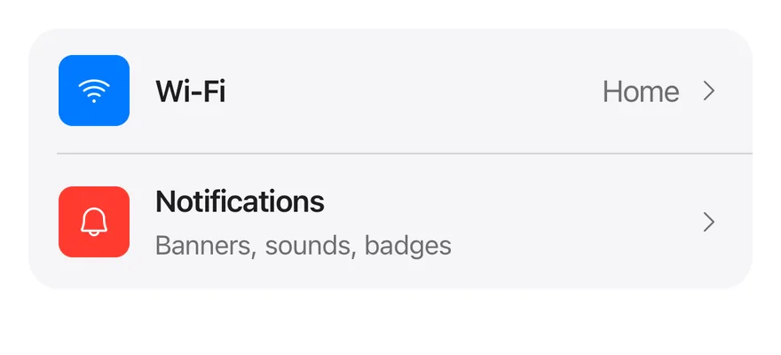
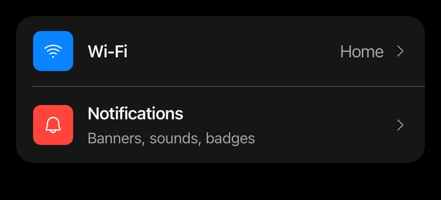
import { BellIcon, CaretRightIcon, WifiHighIcon } from "phosphor-react-native"
import { Icon } from "@/components/ui/icon"
import { Item, ItemActions, ItemContent, ItemDescription, ItemGroup, ItemMedia, ItemSeparator, ItemTitle } from "@/components/ui/item"
import { Text } from "@/components/ui/text"

export function ItemInsetGroupExample() {
  return (
    <ItemGroup variant="inset">
      <Item onPress={() => {}}>
        <ItemMedia
          variant="image"
          className="bg-blue items-center justify-center"
        >
          <Icon as={WifiHighIcon} className="size-5 text-on-accent" />
        </ItemMedia>
        <ItemContent>
          <ItemTitle>Wi-Fi</ItemTitle>
        </ItemContent>
        <ItemActions>
          <Text>Home</Text>
          <Icon as={CaretRightIcon} className="size-4 text-label-secondary" />
        </ItemActions>
      </Item>
      <ItemSeparator />
      <Item onPress={() => {}}>
        <ItemMedia
          variant="image"
          className="bg-red items-center justify-center"
        >
          <Icon as={BellIcon} className="size-5 text-on-accent" />
        </ItemMedia>
        <ItemContent>
          <ItemTitle>Notifications</ItemTitle>
          <ItemDescription>Banners, sounds, badges</ItemDescription>
        </ItemContent>
        <ItemActions>
          <Icon as={CaretRightIcon} className="size-4 text-label-secondary" />
        </ItemActions>
      </Item>
    </ItemGroup>
  )
}import EsuissUI
import PhosphorSwift
import SwiftUI
struct ItemInsetGroupExample: View {
var body: some View {
ItemGroup(.inset) {
Item(action: {}) {
ItemMedia(.image) {
ItemTile(icon: Ph.wifiHigh.regular, color: .accent)
}
ItemContent {
ItemTitle("Wi-Fi")
}
ItemActions {
Text("Home")
ItemChevron()
}
}
ItemSeparator()
Item(action: {}) {
ItemMedia(.image) {
ItemTile(icon: Ph.bell.regular, color: .danger)
}
ItemContent {
ItemTitle("Notifications")
ItemDescription("Banners, sounds, badges")
}
ItemActions {
ItemChevron()
}
}
}
}
}
struct ItemChevron: View {
var body: some View {
Ph.caretRight.regular
.frame(width: 16, height: 16)
.foregroundStyle(Color.labelSecondary)
}
}
struct ItemTile: View {
let icon: Image
let color: Color
var body: some View {
ZStack {
color
icon
.frame(width: 20, height: 20)
.foregroundStyle(Color.onAccent)
}
}
}import androidx.compose.foundation.background
import androidx.compose.foundation.layout.Box
import androidx.compose.runtime.Composable
import androidx.compose.ui.Modifier
import androidx.compose.ui.graphics.Color
import androidx.compose.ui.graphics.vector.ImageVector
import androidx.compose.ui.unit.dp
import com.adamglin.PhosphorIcons
import com.adamglin.phosphoricons.Regular
import com.adamglin.phosphoricons.regular.Bell
import com.adamglin.phosphoricons.regular.CaretRight
import com.adamglin.phosphoricons.regular.WifiHigh
import com.esuiss.ui.components.Icon
import com.esuiss.ui.components.Item
import com.esuiss.ui.components.ItemActions
import com.esuiss.ui.components.ItemContent
import com.esuiss.ui.components.ItemDescription
import com.esuiss.ui.components.ItemGroup
import com.esuiss.ui.components.ItemGroupVariant
import com.esuiss.ui.components.ItemMedia
import com.esuiss.ui.components.ItemMediaVariant
import com.esuiss.ui.components.ItemSeparator
import com.esuiss.ui.components.ItemTitle
import com.esuiss.ui.components.Text
import com.esuiss.ui.theme.EsuissTheme
@Composable
fun ItemCaret() {
Icon(PhosphorIcons.Regular.CaretRight, contentDescription = null, size = 16.dp, tint = EsuissTheme.colors.labelSecondary)
}
@Composable
fun ItemSettingsMedia(icon: ImageVector, background: Color) {
ItemMedia(variant = ItemMediaVariant.Image) {
Box(Modifier.matchParentSize().background(background))
Icon(icon, contentDescription = null, size = 20.dp, tint = EsuissTheme.colors.onAccent)
}
}
@Composable
fun ItemInsetGroup() {
val colors = EsuissTheme.colors
ItemGroup(variant = ItemGroupVariant.Inset) {
Item(onClick = {}) {
ItemSettingsMedia(PhosphorIcons.Regular.WifiHigh, colors.blue)
ItemContent {
ItemTitle("Wi-Fi")
}
ItemActions {
Text("Home")
ItemCaret()
}
}
ItemSeparator()
Item(onClick = {}) {
ItemSettingsMedia(PhosphorIcons.Regular.Bell, colors.red)
ItemContent {
ItemTitle("Notifications")
ItemDescription("Banners, sounds, badges")
}
ItemActions { ItemCaret() }
}
}
}API Reference
ItemGroup
List container for items.
ViewProps- About
defaultstacks items with a gap;insetjoins them into one rounded card.- Type
"default""inset"- Default
- "default"
ItemSeparator
Divider between items, inset inside an inset group.
ViewPropsItem
The row itself, pressable when given a press handler.
ItemPropsItemMedia
Leading icon, image or avatar.
ViewProps- About
default,iconfor 16-point icons, orimagefor a square thumbnail.- Type
"default""icon""image"- Default
- "default"
ItemContent
Flexible column for the title and description.
ViewPropsItemTitle
Single-line title.
React.ComponentProps<typeof Text>ItemDescription
Secondary text, up to two lines.
React.ComponentProps<typeof Text>ItemActions
Trailing row for values, buttons or chevrons.
ViewPropsItemHeader
Full-width row above the content.
ViewPropsItemFooter
Full-width row below the content.
ViewPropsAccessibility
ItemGrouphas thelistrole.- A static
Itemhas thelistitemrole; an item withonPressoronLongPresshas thebuttonrole and shows a pressed background. disableddims the item and blocks presses.ItemSeparatoris hidden from VoiceOver and TalkBack.
Notes
- Uses
bg-surface-secondaryfor inset groups and themutedvariant,border-separatorforoutline, andbg-item-pressedfor the pressed state. - Colors follow the system appearance.