suiss/uim · React Native Component
Message Scroller
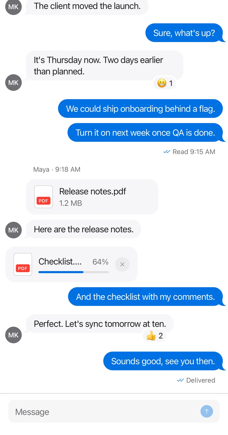
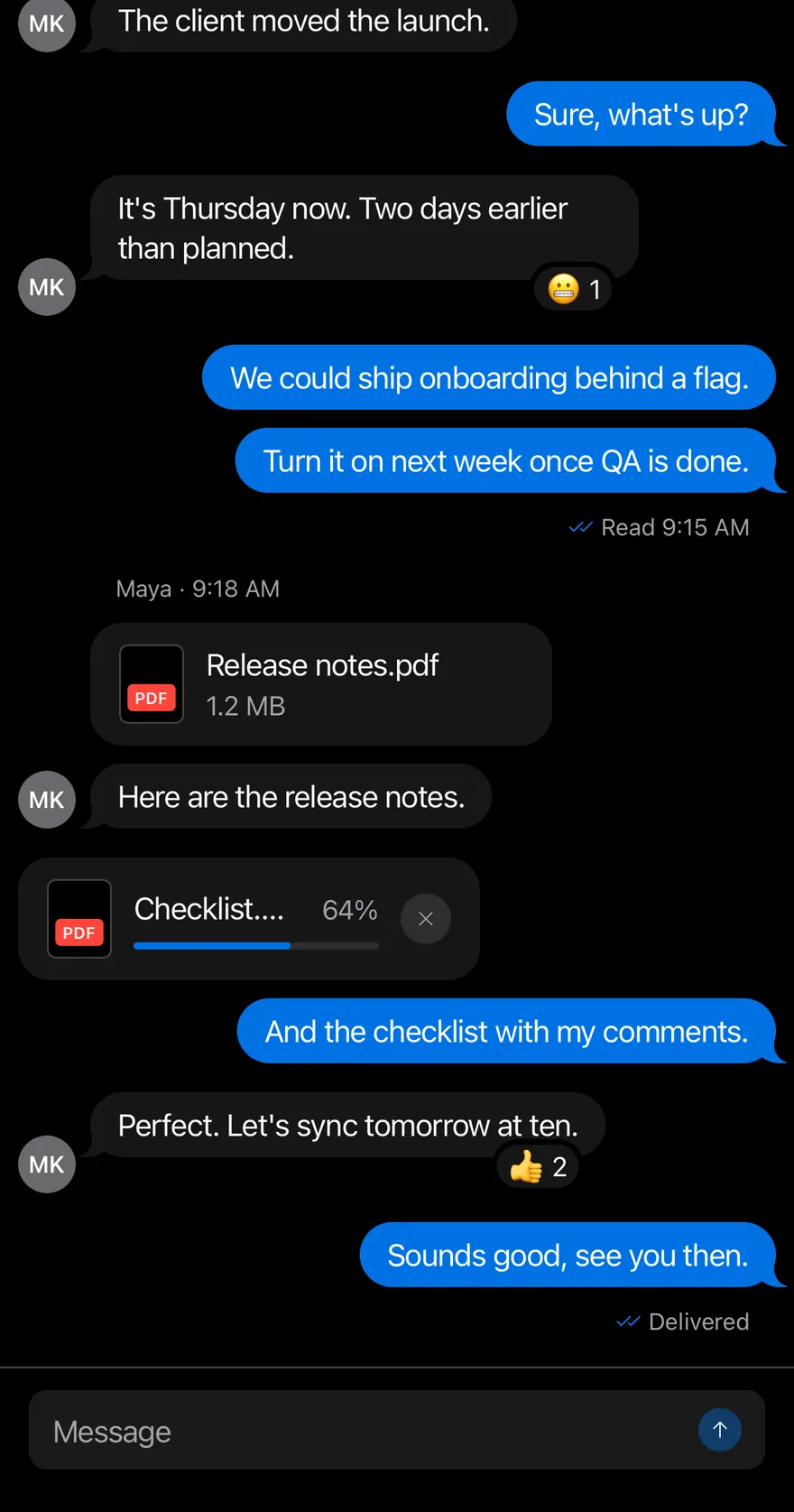
A chat-style message list that stays pinned to the newest message, tracks unread messages and loads older history.
Message Scroller is an open-source mobile component from suiss/uim for React Native and Expo, with SwiftUI and Jetpack Compose versions built from the same design tokens. The @esuiss/uim CLI copies its source into your project, so you own the code.
import { ArrowUpIcon, ChecksIcon, XIcon } from "phosphor-react-native"
import * as React from "react"
import { View } from "react-native"
import { Attachment, AttachmentAction, AttachmentActions, AttachmentContent, AttachmentDescription, AttachmentLabel, AttachmentMedia, AttachmentProgress, AttachmentTitle } from "@/components/ui/attachment"
import { Avatar, AvatarFallback } from "@/components/ui/avatar"
import { BottomBar, BottomBarContent } from "@/components/ui/bottom-bar"
import { Bubble, BubbleContent, BubbleReactions } from "@/components/ui/bubble"
import { Icon } from "@/components/ui/icon"
import { InputGroup, InputGroupAddon, InputGroupButton, InputGroupInput } from "@/components/ui/input-group"
import { Message, MessageAvatar, MessageContent, MessageFooter, MessageHeader } from "@/components/ui/message"
import { MessageScroller, MessageScrollerButton, MessageScrollerItem, MessageScrollerProvider, MessageScrollerViewport, useMessageScroller } from "@/components/ui/message-scroller"
import { Text } from "@/components/ui/text"

type ChatMessage = {
  id: string
  from: "me" | "them"
  texts: string[]
  time?: string
  status?: string
  reaction?: string
  attachment?: { name: string; size: string; progress?: number }
}

const thread: ChatMessage[] = [
  {
    id: "1",
    from: "them",
    texts: ["Hey, do you have a minute?", "The client moved the launch."],
    time: "9:12 AM",
  },
  { id: "2", from: "me", texts: ["Sure, what's up?"] },
  {
    id: "3",
    from: "them",
    texts: ["It's Thursday now. Two days earlier than planned."],
    reaction: "😬 1",
  },
  {
    id: "4",
    from: "me",
    texts: [
      "We could ship onboarding behind a flag.",
      "Turn it on next week once QA is done.",
    ],
    status: "Read 9:15 AM",
  },
  {
    id: "5",
    from: "them",
    texts: ["Here are the release notes."],
    attachment: { name: "Release notes.pdf", size: "1.2 MB" },
    time: "9:18 AM",
  },
  {
    id: "6",
    from: "me",
    texts: ["And the checklist with my comments."],
    attachment: { name: "Checklist.pdf", size: "Uploading", progress: 64 },
  },
  {
    id: "7",
    from: "them",
    texts: ["Perfect. Let's sync tomorrow at ten."],
    reaction: "👍 2",
  },
  {
    id: "8",
    from: "me",
    texts: ["Sounds good, see you then."],
    status: "Delivered",
  },
]

function ChatRow({ message }: { message: ChatMessage }) {
  const mine = message.from === "me"
  return (
    <MessageScrollerItem>
      <Message align={mine ? "end" : "start"}>
        {mine ? null : (
          <MessageAvatar>
            <Avatar>
              <AvatarFallback>MK</AvatarFallback>
            </Avatar>
          </MessageAvatar>
        )}
        <MessageContent>
          {message.time && !mine ? (
            <MessageHeader>Maya · {message.time}</MessageHeader>
          ) : null}
          {message.attachment ? (
            <Attachment
              state={message.attachment.progress ? "uploading" : "done"}
              className="w-64"
            >
              <AttachmentMedia variant="document">
                <AttachmentLabel className="bg-red">pdf</AttachmentLabel>
              </AttachmentMedia>
              <AttachmentContent>
                <AttachmentTitle>{message.attachment.name}</AttachmentTitle>
                {message.attachment.progress ? (
                  <AttachmentProgress
                    value={message.attachment.progress}
                    accessibilityLabel="Uploading"
                  />
                ) : (
                  <AttachmentDescription>
                    {message.attachment.size}
                  </AttachmentDescription>
                )}
              </AttachmentContent>
              {message.attachment.progress ? (
                <AttachmentActions>
                  <AttachmentAction accessibilityLabel="Cancel upload">
                    <Icon as={XIcon} />
                  </AttachmentAction>
                </AttachmentActions>
              ) : null}
            </Attachment>
          ) : null}
          {message.texts.map((text, index) => (
            <Bubble key={text} variant={mine ? "default" : "muted"}>
              <BubbleContent>{text}</BubbleContent>
              {message.reaction && index === message.texts.length - 1 ? (
                <BubbleReactions align={mine ? "start" : "end"}>
                  {message.reaction}
                </BubbleReactions>
              ) : null}
            </Bubble>
          ))}
          {message.status ? (
            <MessageFooter className="gap-1">
              <Icon as={ChecksIcon} className="text-accent" />
              <Text>{message.status}</Text>
            </MessageFooter>
          ) : null}
        </MessageContent>
      </Message>
    </MessageScrollerItem>
  )
}

function Composer({ onSend }: { onSend: (text: string) => void }) {
  const [value, setValue] = React.useState("")
  const { scrollToEnd } = useMessageScroller()
  const send = () => {
    const text = value.trim()
    if (!text) return
    onSend(text)
    setValue("")
    requestAnimationFrame(() => scrollToEnd())
  }
  return (
    <BottomBar separator>
      <BottomBarContent>
        <InputGroup>
          <InputGroupInput
            placeholder="Message"
            value={value}
            onValueChange={setValue}
            returnKeyType="send"
            onSubmitEditing={send}
          />
          <InputGroupAddon align="inline-end">
            <InputGroupButton
              variant="default"
              size="icon-xs"
              accessibilityLabel="Send"
              disabled={!value.trim()}
              onPress={send}
            >
              <Icon as={ArrowUpIcon} />
            </InputGroupButton>
          </InputGroupAddon>
        </InputGroup>
      </BottomBarContent>
    </BottomBar>
  )
}

type ChatReady = (
  append: (messages: ChatMessage[]) => void,
  scroller: ReturnType<typeof useMessageScroller>
) => void

function ReadyEffect({
  append,
  onReady,
}: {
  append: (messages: ChatMessage[]) => void
  onReady?: ChatReady
}) {
  const scroller = useMessageScroller()
  const readyRef = React.useRef(onReady)
  const scrollerRef = React.useRef(scroller)

  React.useEffect(() => {
    readyRef.current?.(append, scrollerRef.current)
  }, [append])

  return null
}

function Chat({
  initial,
  empty,
  onReady,
}: {
  initial: ChatMessage[]
  empty?: React.ReactElement
  onReady?: ChatReady
}) {
  const [messages, setMessages] = React.useState(initial)
  const append = React.useCallback((next: ChatMessage[]) => {
    setMessages((current) => [...current, ...next])
  }, [])

  return (
    <MessageScrollerProvider>
      <ReadyEffect append={append} onReady={onReady} />
      <View className="-m-4 flex-1">
        <MessageScroller>
          <MessageScrollerViewport
            data={messages}
            keyExtractor={(message) => message.id}
            renderItem={({ item }) => <ChatRow message={item} />}
            contentContainerClassName="gap-4 py-4"
            ListEmptyComponent={empty}
          />
          <MessageScrollerButton />
        </MessageScroller>
        <Composer
          onSend={(text) =>
            append([{ id: `sent-${Date.now()}`, from: "me", texts: [text] }])
          }
        />
      </View>
    </MessageScrollerProvider>
  )
}

export function MessageScrollerExample() {
  return (
    <Chat initial={thread} />
  )
}import EsuissUI
import PhosphorSwift
import SwiftUI
struct MessageScrollerExample: View {
var body: some View {
MessageScrollerChat(initial: MessageScrollerData.thread)
}
}
struct MessageScrollerAttachment: Hashable {
let name: String
let size: String
var progress: Double?
}
struct MessageScrollerMessage: Identifiable, Hashable {
let id: String
let fromMe: Bool
let texts: [String]
var time: String?
var status: String?
var reaction: String?
var attachment: MessageScrollerAttachment?
}
enum MessageScrollerData {
static let thread: [MessageScrollerMessage] = [
MessageScrollerMessage(
id: "1",
fromMe: false,
texts: ["Hey, do you have a minute?", "The client moved the launch."],
time: "9:12 AM"
),
MessageScrollerMessage(id: "2", fromMe: true, texts: ["Sure, what's up?"]),
MessageScrollerMessage(
id: "3",
fromMe: false,
texts: ["It's Thursday now. Two days earlier than planned."],
reaction: "😬 1"
),
MessageScrollerMessage(
id: "4",
fromMe: true,
texts: ["We could ship onboarding behind a flag.", "Turn it on next week once QA is done."],
status: "Read 9:15 AM"
),
MessageScrollerMessage(
id: "5",
fromMe: false,
texts: ["Here are the release notes."],
time: "9:18 AM",
attachment: MessageScrollerAttachment(name: "Release notes.pdf", size: "1.2 MB")
),
MessageScrollerMessage(
id: "6",
fromMe: true,
texts: ["And the checklist with my comments."],
attachment: MessageScrollerAttachment(name: "Checklist.pdf", size: "Uploading", progress: 64)
),
MessageScrollerMessage(
id: "7",
fromMe: false,
texts: ["Perfect. Let's sync tomorrow at ten."],
reaction: "👍 2"
),
MessageScrollerMessage(id: "8", fromMe: true, texts: ["Sounds good, see you then."], status: "Delivered"),
]
static let subjects = [
"Did you see the latest build?",
"The onboarding copy needs one more pass.",
"I can take the release notes.",
"QA found two small issues on Android.",
"Both are fixed in the next build.",
"Can we move the review to the afternoon?",
]
static func long(_ count: Int, offset: Int = 0) -> [MessageScrollerMessage] {
(0..<count).map { index in
let number = index + offset
return MessageScrollerMessage(
id: "m\(number)",
fromMe: number % 3 == 0,
texts: [subjects[number % subjects.count]]
)
}
}
}
struct MessageScrollerRow: View {
let message: MessageScrollerMessage
var body: some View {
let mine = message.fromMe
Message(align: mine ? .end : .start) {
if !mine {
MessageAvatar {
Avatar { AvatarFallback("MK") }
}
}
MessageContent {
if let time = message.time, !mine {
MessageHeader(verbatim: "Maya · \(time)")
}
if let attachment = message.attachment {
MessageScrollerAttachmentView(attachment: attachment)
}
ForEach(Array(message.texts.enumerated()), id: \.offset) { index, text in
Bubble(variant: mine ? .default : .muted) {
BubbleContent(verbatim: text)
if let reaction = message.reaction, index == message.texts.count - 1 {
BubbleReactions(verbatim: reaction, align: mine ? .start : .end)
}
}
}
if let status = message.status {
MessageFooter {
Ph.checks.regular
.frame(width: 16, height: 16)
.foregroundStyle(Color.accent)
Text(verbatim: status)
}
}
}
}
}
}
struct MessageScrollerAttachmentView: View {
let attachment: MessageScrollerAttachment
var body: some View {
Attachment(state: attachment.progress == nil ? .done : .uploading) {
AttachmentMedia(.document) {
AttachmentLabel("pdf", tint: .red)
}
AttachmentContent {
AttachmentTitle(verbatim: attachment.name)
if let progress = attachment.progress {
AttachmentProgress(value: progress, label: "Uploading")
} else {
AttachmentDescription(verbatim: attachment.size)
}
}
if attachment.progress != nil {
AttachmentActions {
AttachmentAction("Cancel upload", icon: Ph.x.bold) {}
}
}
}
.frame(width: 256)
}
}
struct MessageScrollerChat: View {
let unreadDemo: Bool
@State private var messages: [MessageScrollerMessage]
@State private var controller = MessageScrollerController()
@State private var draft = ""
init(initial: [MessageScrollerMessage], unreadDemo: Bool = false) {
self.unreadDemo = unreadDemo
_messages = State(initialValue: initial)
}
var body: some View {
let ready = !draft.trimmingCharacters(in: .whitespacesAndNewlines).isEmpty
VStack(spacing: 0) {
MessageScroller(messages, spacing: 16, controller: controller) { message in
MessageScrollerRow(message: message)
}
.overlay {
if messages.isEmpty {
Empty {
EmptyHeader {
EmptyMedia(.icon) { Ph.chatsCircle.regular }
EmptyTitle("No messages yet")
EmptyDescription("Say hello to start the conversation.")
}
}
}
}
.frame(maxHeight: .infinity)
BottomBar(separator: true) {
BottomBarContent {
InputGroup {
InputGroupInput("Message", text: $draft)
.submitLabel(.send)
.onSubmit(send)
InputGroupAddon(align: .inlineEnd) {
InputGroupButton(variant: .default, size: .iconXs, action: send) {
Ph.arrowUp.bold.frame(width: 14, height: 14)
}
.disabled(!ready)
.accessibilityLabel(Text("Send"))
}
}
}
}
}
.task {
guard unreadDemo else { return }
try? await Task.sleep(for: .milliseconds(300))
controller.scrollToStart(animated: false)
try? await Task.sleep(for: .milliseconds(600))
messages.append(contentsOf: [
MessageScrollerMessage(id: "n1", fromMe: false, texts: ["Are you there?"]),
MessageScrollerMessage(id: "n2", fromMe: false, texts: ["The build is green."]),
MessageScrollerMessage(id: "n3", fromMe: false, texts: ["Merging now."]),
])
}
}
func send() {
let text = draft.trimmingCharacters(in: .whitespacesAndNewlines)
guard !text.isEmpty else { return }
messages.append(MessageScrollerMessage(id: "sent-\(UUID().uuidString)", fromMe: true, texts: [text]))
draft = ""
Task { @MainActor in
controller.scrollToEnd()
}
}
}
let thread: [MessageScrollerMessage] = [
MessageScrollerMessage(
id: "1",
fromMe: false,
texts: ["Hey, do you have a minute?", "The client moved the launch."],
time: "9:12 AM"
),
MessageScrollerMessage(id: "2", fromMe: true, texts: ["Sure, what's up?"]),
MessageScrollerMessage(
id: "3",
fromMe: false,
texts: ["It's Thursday now. Two days earlier than planned."],
reaction: "😬 1"
),
MessageScrollerMessage(
id: "4",
fromMe: true,
texts: ["We could ship onboarding behind a flag.", "Turn it on next week once QA is done."],
status: "Read 9:15 AM"
),
MessageScrollerMessage(
id: "5",
fromMe: false,
texts: ["Here are the release notes."],
time: "9:18 AM",
attachment: MessageScrollerAttachment(name: "Release notes.pdf", size: "1.2 MB")
),
MessageScrollerMessage(
id: "6",
fromMe: true,
texts: ["And the checklist with my comments."],
attachment: MessageScrollerAttachment(name: "Checklist.pdf", size: "Uploading", progress: 64)
),
MessageScrollerMessage(
id: "7",
fromMe: false,
texts: ["Perfect. Let's sync tomorrow at ten."],
reaction: "👍 2"
),
MessageScrollerMessage(id: "8", fromMe: true, texts: ["Sounds good, see you then."], status: "Delivered"),
]
let subjects = [
"Did you see the latest build?",
"The onboarding copy needs one more pass.",
"I can take the release notes.",
"QA found two small issues on Android.",
"Both are fixed in the next build.",
"Can we move the review to the afternoon?",
]
func long(_ count: Int, offset: Int = 0) -> [MessageScrollerMessage] {
(0..<count).map { index in
let number = index + offset
return MessageScrollerMessage(
id: "m\(number)",
fromMe: number % 3 == 0,
texts: [subjects[number % subjects.count]]
)
}
}import androidx.compose.foundation.layout.Arrangement
import androidx.compose.foundation.layout.Box
import androidx.compose.foundation.layout.Column
import androidx.compose.foundation.layout.ColumnScope
import androidx.compose.foundation.layout.PaddingValues
import androidx.compose.foundation.layout.fillMaxSize
import androidx.compose.foundation.layout.fillMaxWidth
import androidx.compose.foundation.layout.width
import androidx.compose.foundation.text.KeyboardActions
import androidx.compose.foundation.text.KeyboardOptions
import androidx.compose.runtime.Composable
import androidx.compose.runtime.LaunchedEffect
import androidx.compose.runtime.getValue
import androidx.compose.runtime.mutableStateOf
import androidx.compose.runtime.remember
import androidx.compose.runtime.rememberCoroutineScope
import androidx.compose.runtime.saveable.rememberSaveable
import androidx.compose.runtime.setValue
import androidx.compose.runtime.withFrameNanos
import androidx.compose.ui.Alignment
import androidx.compose.ui.Modifier
import androidx.compose.ui.semantics.contentDescription
import androidx.compose.ui.semantics.semantics
import androidx.compose.ui.text.input.ImeAction
import androidx.compose.ui.unit.dp
import com.adamglin.PhosphorIcons
import com.adamglin.phosphoricons.Regular
import com.adamglin.phosphoricons.regular.ArrowUp
import com.adamglin.phosphoricons.regular.ChatsCircle
import com.adamglin.phosphoricons.regular.Checks
import com.adamglin.phosphoricons.regular.X
import com.esuiss.ui.components.Attachment
import com.esuiss.ui.components.AttachmentAction
import com.esuiss.ui.components.AttachmentActions
import com.esuiss.ui.components.AttachmentContent
import com.esuiss.ui.components.AttachmentDescription
import com.esuiss.ui.components.AttachmentLabel
import com.esuiss.ui.components.AttachmentMedia
import com.esuiss.ui.components.AttachmentMediaVariant
import com.esuiss.ui.components.AttachmentProgress
import com.esuiss.ui.components.AttachmentState
import com.esuiss.ui.components.AttachmentTitle
import com.esuiss.ui.components.Avatar
import com.esuiss.ui.components.AvatarFallback
import com.esuiss.ui.components.BottomBar
import com.esuiss.ui.components.BottomBarContent
import com.esuiss.ui.components.Bubble
import com.esuiss.ui.components.BubbleAlign
import com.esuiss.ui.components.BubbleContent
import com.esuiss.ui.components.BubbleReactions
import com.esuiss.ui.components.BubbleVariant
import com.esuiss.ui.components.ButtonVariant
import com.esuiss.ui.components.Empty
import com.esuiss.ui.components.EmptyDescription
import com.esuiss.ui.components.EmptyHeader
import com.esuiss.ui.components.EmptyMedia
import com.esuiss.ui.components.EmptyMediaVariant
import com.esuiss.ui.components.EmptyTitle
import com.esuiss.ui.components.Icon
import com.esuiss.ui.components.InputGroup
import com.esuiss.ui.components.InputGroupAddon
import com.esuiss.ui.components.InputGroupAddonAlign
import com.esuiss.ui.components.InputGroupButton
import com.esuiss.ui.components.InputGroupButtonSize
import com.esuiss.ui.components.InputGroupInput
import com.esuiss.ui.components.Message
import com.esuiss.ui.components.MessageAlign
import com.esuiss.ui.components.MessageAvatar
import com.esuiss.ui.components.MessageContent
import com.esuiss.ui.components.MessageFooter
import com.esuiss.ui.components.MessageHeader
import com.esuiss.ui.components.MessageScroller
import com.esuiss.ui.components.MessageScrollerState
import com.esuiss.ui.components.Screen
import com.esuiss.ui.components.ScreenEdge
import com.esuiss.ui.components.Text
import com.esuiss.ui.components.rememberMessageScrollerState
import com.esuiss.ui.theme.EsuissTheme
import kotlinx.coroutines.launch
@Composable
fun MessageScrollerExample() {
MessageScrollerChat(messageScrollerThread)
}
class MessageScrollerFile(val name: String, val size: String, val progress: Float? = null)
class MessageScrollerMessage(
val id: String,
val mine: Boolean,
val texts: List<String>,
val time: String? = null,
val status: String? = null,
val reaction: String? = null,
val attachment: MessageScrollerFile? = null,
)
val messageScrollerThread = listOf(
MessageScrollerMessage("1", false, listOf("Hey, do you have a minute?", "The client moved the launch."), time = "9:12 AM"),
MessageScrollerMessage("2", true, listOf("Sure, what's up?")),
MessageScrollerMessage("3", false, listOf("It's Thursday now. Two days earlier than planned."), reaction = "😬 1"),
MessageScrollerMessage(
"4",
true,
listOf("We could ship onboarding behind a flag.", "Turn it on next week once QA is done."),
status = "Read 9:15 AM",
),
MessageScrollerMessage(
"5",
false,
listOf("Here are the release notes."),
time = "9:18 AM",
attachment = MessageScrollerFile("Release notes.pdf", "1.2 MB"),
),
MessageScrollerMessage(
"6",
true,
listOf("And the checklist with my comments."),
attachment = MessageScrollerFile("Checklist.pdf", "Uploading", 64f),
),
MessageScrollerMessage("7", false, listOf("Perfect. Let's sync tomorrow at ten."), reaction = "👍 2"),
MessageScrollerMessage("8", true, listOf("Sounds good, see you then."), status = "Delivered"),
)
@Composable
fun MessageScrollerRow(message: MessageScrollerMessage) {
val colors = EsuissTheme.colors
val mine = message.mine
Message(Modifier.fillMaxWidth(), align = if (mine) MessageAlign.End else MessageAlign.Start) {
if (!mine) {
MessageAvatar {
Avatar(fallback = { AvatarFallback("MK") })
}
}
MessageContent {
if (message.time != null && !mine) MessageHeader("Maya · ${message.time}")
val file = message.attachment
if (file != null) {
Attachment(
Modifier.width(256.dp),
state = if (file.progress != null) AttachmentState.Uploading else AttachmentState.Done,
) {
AttachmentMedia(variant = AttachmentMediaVariant.Document) {
AttachmentLabel("pdf", background = colors.red)
}
AttachmentContent {
AttachmentTitle(file.name)
if (file.progress != null) {
AttachmentProgress(file.progress, contentDescription = "Uploading")
} else {
AttachmentDescription(file.size)
}
}
if (file.progress != null) {
AttachmentActions {
AttachmentAction(onClick = {}, contentDescription = "Cancel upload") {
Icon(PhosphorIcons.Regular.X, contentDescription = null)
}
}
}
}
}
message.texts.forEachIndexed { index, text ->
Bubble(variant = if (mine) BubbleVariant.Default else BubbleVariant.Muted) {
BubbleContent(text)
if (message.reaction != null && index == message.texts.lastIndex) {
BubbleReactions(message.reaction, align = if (mine) BubbleAlign.Start else BubbleAlign.End)
}
}
}
if (message.status != null) {
MessageFooter {
Icon(PhosphorIcons.Regular.Checks, contentDescription = null, tint = colors.accent)
Text(message.status)
}
}
}
}
}
@Composable
fun MessageScrollerComposer(state: MessageScrollerState, onSend: (String) -> Unit) {
var value by rememberSaveable { mutableStateOf("") }
val scope = rememberCoroutineScope()
val send = {
val text = value.trim()
if (text.isNotEmpty()) {
onSend(text)
value = ""
scope.launch {
withFrameNanos { }
state.scrollToEnd()
}
}
}
BottomBar(separator = true) {
BottomBarContent {
InputGroup {
InputGroupInput(
value,
{ value = it },
placeholder = "Message",
keyboardOptions = KeyboardOptions(imeAction = ImeAction.Send),
keyboardActions = KeyboardActions(onSend = { send() }),
)
InputGroupAddon(align = InputGroupAddonAlign.InlineEnd) {
InputGroupButton(
onClick = { send() },
modifier = Modifier.semantics { contentDescription = "Send" },
size = InputGroupButtonSize.IconXs,
variant = ButtonVariant.Default,
enabled = value.isNotBlank(),
) {
Icon(PhosphorIcons.Regular.ArrowUp, contentDescription = null)
}
}
}
}
}
}
@Composable
fun MessageScrollerEmpty(modifier: Modifier) {
Empty(modifier) {
EmptyHeader {
EmptyMedia(variant = EmptyMediaVariant.Icon) {
Icon(PhosphorIcons.Regular.ChatsCircle, contentDescription = null)
}
EmptyTitle("No messages yet")
EmptyDescription("Say hello to start the conversation.")
}
}
}
@Composable
fun MessageScrollerFrame(
edges: Set<ScreenEdge> = setOf(ScreenEdge.Top, ScreenEdge.Left, ScreenEdge.Right),
content: @Composable ColumnScope.() -> Unit,
) {
Screen(edges = edges) {
Column(Modifier.fillMaxSize()) {
content()
}
}
}
@Composable
fun MessageScrollerList(
messages: List<MessageScrollerMessage>,
state: MessageScrollerState,
modifier: Modifier,
onLoadOlder: (() -> Unit)? = null,
loadingOlder: Boolean = false,
) {
MessageScroller(
items = messages,
key = { it.id },
modifier = modifier,
state = state,
onLoadOlder = onLoadOlder,
loadingOlder = loadingOlder,
contentPadding = PaddingValues(16.dp),
verticalArrangement = Arrangement.spacedBy(16.dp, Alignment.Bottom),
) { message ->
MessageScrollerRow(message)
}
}
@Composable
fun MessageScrollerChat(
initial: List<MessageScrollerMessage>,
showEmpty: Boolean = false,
onReady: (suspend (append: (List<MessageScrollerMessage>) -> Unit, state: MessageScrollerState) -> Unit)? = null,
) {
var messages by remember { mutableStateOf(initial) }
val state = rememberMessageScrollerState()
val append: (List<MessageScrollerMessage>) -> Unit = { next -> messages = messages + next }
if (onReady != null) {
LaunchedEffect(Unit) { onReady(append, state) }
}
MessageScrollerFrame {
Box(Modifier.weight(1f).fillMaxWidth()) {
MessageScrollerList(messages, state, Modifier.fillMaxSize())
if (showEmpty && messages.isEmpty()) {
MessageScrollerEmpty(Modifier.align(Alignment.Center))
}
}
MessageScrollerComposer(state) { text ->
append(listOf(MessageScrollerMessage("sent-${System.currentTimeMillis()}", true, listOf(text))))
}
}
}MessageScroller is a View that hosts a scroll controller. MessageScrollerViewport renders your messages in an inverted FlatList, so the newest message sits at the bottom and new messages keep the list anchored there through maintainVisibleContentPosition. You pass data in chronological order; the viewport reverses it internally and maps indexes back for renderItem and keyExtractor.
MessageScrollerButton is a floating icon button that animates in with Reanimated when there is more content in its direction. When the user has scrolled up and new messages arrive, it shows an unread count badge.
Installation
$ pnpm dlx @esuiss/uim@latest add message-scroller$ pnpm dlx @esuiss/uim@latest add message-scroller --platform swift$ pnpm dlx @esuiss/uim@latest add message-scroller --platform kotlinThe CLI also adds what it builds on: Button, Icon, Text.
Manual
- Install the dependencies:
npx expo install cn phosphor-react-native react-native-reanimated react-native-svg react-native-worklets-
Add the pieces it builds on: Button, Icon, Text, and the primitives
components/primitives/hooks.tsx. -
Copy the source into
components/ui/message-scroller.tsx:
import { cn } from "cn"
import { ArrowDownIcon, ArrowUpIcon } from "phosphor-react-native"
import * as React from "react"
import {
  FlatList,
  type FlatListProps,
  Platform,
  View,
  type ViewProps,
  type ViewToken,
} from "react-native"
import {
  Easing,
  ReduceMotion,
  useAnimatedStyle,
useSharedValue,- Update the import paths to match your project.
- Install the dependencies:
npx expo install cn phosphor-react-native react-native-reanimated react-native-svg react-native-worklets-
Add the pieces it builds on: Button, Icon, Text, and the primitives
components/primitives/hooks.tsx. -
Copy the source into
components/ui/message-scroller.tsx:
import { cn } from "cn"
import { ArrowDownIcon, ArrowUpIcon } from "phosphor-react-native"
import * as React from "react"
import {
  FlatList,
  type FlatListProps,
  Platform,
  View,
  type ViewProps,
  type ViewToken,
} from "react-native"
import {
  Easing,
  ReduceMotion,
  useAnimatedStyle,
useSharedValue,- Update the import paths to match your project.
- Install the dependencies:
npx expo install phosphor-react-native react-native-reanimated react-native-svg react-native-worklets-
Add the pieces it builds on: Button, Icon, Text, and the primitives
components/primitives/hooks.tsx. -
Copy the source into
components/ui/message-scroller.tsx:
import { ArrowDownIcon, ArrowUpIcon } from "phosphor-react-native"
import * as React from "react"
import {
  FlatList,
  type FlatListProps,
  Platform,
  StyleSheet,
  View,
  type ViewProps,
  type ViewToken,
} from "react-native"
import {
  Easing,
  ReduceMotion,
  useAnimatedStyle,
useSharedValue,- Update the import paths to match your project.
-
Target iOS 17 or later.
-
Add the Swift package to your app:
.package(url: "https://github.com/phosphor-icons/swift", from: "2.1.0")- Copy the theme files every view uses:
import SwiftUI
import UIKit

struct RGBA: Sendable {
  let red: CGFloat
  let green: CGFloat
  let blue: CGFloat
  let alpha: CGFloat

  init(_ hex: UInt32, _ alpha: CGFloat = 1) {
    red = CGFloat((hex >> 16) & 0xFF) / 255
    green = CGFloat((hex >> 8) & 0xFF) / 255
    blue = CGFloat(hex & 0xFF) / 255
    self.alpha = alpha
}import SwiftUI
extension Color {
public static let surface = Color.adaptive(light: .init(0xFFFFFF), dark: .init(0x000000))
public static let surfaceSecondary = Color.adaptive(light: .init(0xF5F5F7), dark: .init(0x161617))
public static let surfaceTertiary = Color.adaptive(light: .init(0xE8E8ED), dark: .init(0x2C2C2E))
public static let surfaceRaised = Color.adaptive(light: .init(0xFFFFFF), dark: .init(0x1D1D1F))
public static let label = Color.adaptive(light: .init(0x1D1D1F), dark: .init(0xF5F5F7))
public static let labelSecondary = Color.adaptive(light: .init(0x6E6E73), dark: .init(0xA1A1A6))
public static let labelTertiary = Color.adaptive(light: .init(0x86868B), dark: .init(0x86868B))
public static let labelQuaternary = Color.adaptive(light: .init(0xD2D2D7), dark: .init(0x424245))
public static let control = Color.adaptive(light: .init(0x000000, 0.04), dark: .init(0xFFFFFF, 0.1))
public static let controlPressed = Color.adaptive(light: .init(0x000000, 0.12), dark: .init(0xFFFFFF, 0.22))
public static let controlSelected = Color.adaptive(light: .init(0x1D1D1F), dark: .init(0xF5F5F7))
public static let controlDisabled = Color.adaptive(light: .init(0x000000, 0.03), dark: .init(0xFFFFFF, 0.05))
public static let onControlSelected = Color.adaptive(light: .init(0xFFFFFF), dark: .init(0x000000))- Copy the source:
import PhosphorSwift
import SwiftUI

public enum MessageScrollerDefaultScrollPosition: CaseIterable, Sendable {
  case start, end
}

public enum MessageScrollerScrollDirection: CaseIterable, Sendable, Hashable {
  case start, end
}

struct MessageScrollerChange: Equatable {
  var appended = 0
  var prepended = 0
  var reset = false
}- Add the files to your app target.
- Set
minSdkto 24 or higher and add the dependencies:
implementation(platform("androidx.compose:compose-bom:2026.09.00"))
implementation("androidx.compose.foundation:foundation")
implementation("androidx.compose.ui:ui")
implementation("com.adamglin:phosphor-icon-android:1.0.0")- Copy the theme files every view uses:
package com.esuiss.ui.theme

import androidx.compose.foundation.isSystemInDarkTheme
import androidx.compose.runtime.Composable
import androidx.compose.runtime.CompositionLocalProvider
import androidx.compose.runtime.Immutable
import androidx.compose.runtime.staticCompositionLocalOf
import androidx.compose.ui.Modifier
import androidx.compose.ui.draw.dropShadow
import androidx.compose.ui.graphics.Color
import androidx.compose.ui.graphics.Shape
import androidx.compose.ui.graphics.shadow.Shadow as DropShadow
import androidx.compose.ui.text.TextStyle
import androidx.compose.ui.text.style.LineHeightStyle
import androidx.compose.ui.unit.Dp
import androidx.compose.ui.unit.DpOffsetpackage com.esuiss.ui.theme
import androidx.compose.runtime.Immutable
import androidx.compose.ui.graphics.Color
import androidx.compose.ui.unit.dp
@Immutable
data class Colors(
val surface: Color,
val surfaceSecondary: Color,
val surfaceTertiary: Color,
val surfaceRaised: Color,
val label: Color,
val labelSecondary: Color,
val labelTertiary: Color,
val labelQuaternary: Color,- Copy the source and every file it uses:
package com.esuiss.ui.components

import androidx.compose.animation.core.CubicBezierEasing
import androidx.compose.animation.core.animateFloatAsState
import androidx.compose.animation.core.tween
import androidx.compose.foundation.background
import androidx.compose.foundation.border
import androidx.compose.foundation.clickable
import androidx.compose.foundation.interaction.MutableInteractionSource
import androidx.compose.foundation.interaction.collectIsPressedAsState
import androidx.compose.foundation.layout.Arrangement
import androidx.compose.foundation.layout.Box
import androidx.compose.foundation.layout.BoxScope
import androidx.compose.foundation.layout.PaddingValues
import androidx.compose.foundation.layout.defaultMinSize
import androidx.compose.foundation.layout.fillMaxSizepackage com.esuiss.ui.components
import androidx.compose.foundation.background
import androidx.compose.foundation.border
import androidx.compose.foundation.clickable
import androidx.compose.foundation.interaction.MutableInteractionSource
import androidx.compose.foundation.interaction.collectIsPressedAsState
import androidx.compose.foundation.layout.Arrangement
import androidx.compose.foundation.layout.Row
import androidx.compose.foundation.layout.RowScope
import androidx.compose.foundation.layout.fillMaxWidth
import androidx.compose.foundation.layout.height
import androidx.compose.foundation.layout.padding
import androidx.compose.foundation.layout.size
import androidx.compose.foundation.shape.CircleShape
import androidx.compose.foundation.shape.RoundedCornerShapepackage com.esuiss.ui.components
import androidx.compose.foundation.background
import androidx.compose.foundation.gestures.Orientation
import androidx.compose.foundation.layout.Arrangement
import androidx.compose.foundation.layout.Box
import androidx.compose.foundation.layout.Row
import androidx.compose.foundation.layout.RowScope
import androidx.compose.foundation.layout.padding
import androidx.compose.foundation.shape.CircleShape
import androidx.compose.foundation.shape.CornerSize
import androidx.compose.foundation.shape.RoundedCornerShape
import androidx.compose.runtime.Composable
import androidx.compose.runtime.CompositionLocalProvider
import androidx.compose.runtime.DisposableEffect
import androidx.compose.runtime.Immutablepackage com.esuiss.ui.components
import androidx.compose.runtime.compositionLocalOf
import androidx.compose.ui.graphics.Color
import androidx.compose.ui.text.TextStyle
import androidx.compose.ui.unit.Dp
import androidx.compose.ui.unit.dp
val LocalContentStyle = compositionLocalOf { TextStyle.Default }
val LocalContentColor = compositionLocalOf { Color.Unspecified }
val LocalIconSize = compositionLocalOf { 20.dp }package com.esuiss.ui.components
import android.provider.Settings
import androidx.compose.animation.core.CubicBezierEasing
import androidx.compose.foundation.background
import androidx.compose.foundation.border
import androidx.compose.foundation.gestures.Orientation
import androidx.compose.foundation.text.selection.TextSelectionColors
import androidx.compose.runtime.Composable
import androidx.compose.runtime.mutableStateOf
import androidx.compose.runtime.remember
import androidx.compose.ui.Modifier
import androidx.compose.ui.draw.clip
import androidx.compose.ui.draw.drawWithContent
import androidx.compose.ui.geometry.Offset
import androidx.compose.ui.geometry.Sizepackage com.esuiss.ui.components
import androidx.compose.foundation.Image
import androidx.compose.foundation.layout.size
import androidx.compose.runtime.Composable
import androidx.compose.ui.Modifier
import androidx.compose.ui.graphics.Color
import androidx.compose.ui.graphics.ColorFilter
import androidx.compose.ui.graphics.takeOrElse
import androidx.compose.ui.graphics.vector.ImageVector
import androidx.compose.ui.unit.Dp
import com.esuiss.ui.theme.EsuissTheme
@Composable
fun Icon(
imageVector: ImageVector,package com.esuiss.ui.components
import androidx.compose.animation.core.LinearEasing
import androidx.compose.animation.core.RepeatMode
import androidx.compose.animation.core.animateFloat
import androidx.compose.animation.core.infiniteRepeatable
import androidx.compose.animation.core.rememberInfiniteTransition
import androidx.compose.animation.core.tween
import androidx.compose.foundation.Canvas
import androidx.compose.foundation.layout.size
import androidx.compose.runtime.Composable
import androidx.compose.runtime.State
import androidx.compose.runtime.remember
import androidx.compose.runtime.mutableFloatStateOf
import androidx.compose.ui.Modifier
import androidx.compose.ui.geometry.CornerRadius- Update the
com.esuiss.uipackage names to match your project.
Usage
import { MessageScrollerProvider, MessageScroller, MessageScrollerViewport, MessageScrollerItem, MessageScrollerButton } from "@/components/ui/message-scroller"<Chat initial={thread} />Place MessageScrollerViewport and MessageScrollerButton inside MessageScroller. Wrap everything in MessageScrollerProvider when components outside the scroller, such as a composer, need to call the scroll hooks.
useMessageScroller returns scrollToEnd, scrollToStart and scrollToMessage(id, { align, animated }). useMessageScrollerScrollable, useMessageScrollerUnreadCount and useMessageScrollerVisibility read whether each edge is scrollable, the unread count, and the visible message ids.
Set onLoadOlder to fetch older history when the user scrolls near the top. Other FlatList props such as ListEmptyComponent pass through.
Examples
Unread while scrolled up
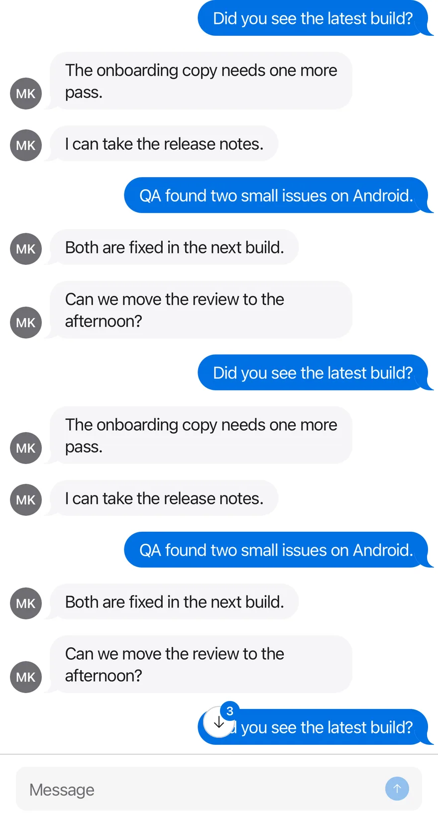
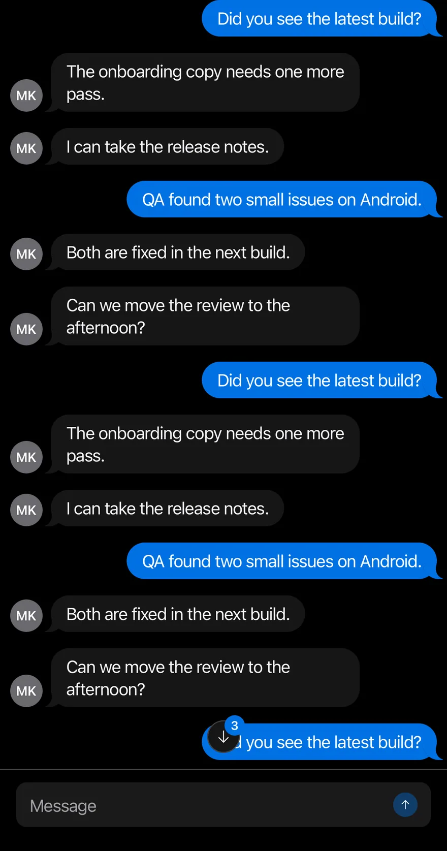
New messages arrive while scrolled up, so the button shows an unread count.
import { ArrowUpIcon, ChecksIcon, XIcon } from "phosphor-react-native"
import * as React from "react"
import { View } from "react-native"
import { Attachment, AttachmentAction, AttachmentActions, AttachmentContent, AttachmentDescription, AttachmentLabel, AttachmentMedia, AttachmentProgress, AttachmentTitle } from "@/components/ui/attachment"
import { Avatar, AvatarFallback } from "@/components/ui/avatar"
import { BottomBar, BottomBarContent } from "@/components/ui/bottom-bar"
import { Bubble, BubbleContent, BubbleReactions } from "@/components/ui/bubble"
import { Icon } from "@/components/ui/icon"
import { InputGroup, InputGroupAddon, InputGroupButton, InputGroupInput } from "@/components/ui/input-group"
import { Message, MessageAvatar, MessageContent, MessageFooter, MessageHeader } from "@/components/ui/message"
import { MessageScroller, MessageScrollerButton, MessageScrollerItem, MessageScrollerProvider, MessageScrollerViewport, useMessageScroller } from "@/components/ui/message-scroller"
import { Text } from "@/components/ui/text"

type ChatMessage = {
  id: string
  from: "me" | "them"
  texts: string[]
  time?: string
  status?: string
  reaction?: string
  attachment?: { name: string; size: string; progress?: number }
}

const subjects = [
  "Did you see the latest build?",
  "The onboarding copy needs one more pass.",
  "I can take the release notes.",
  "QA found two small issues on Android.",
  "Both are fixed in the next build.",
  "Can we move the review to the afternoon?",
]

function longThread(count: number, offset = 0): ChatMessage[] {
  return Array.from({ length: count }, (_, index) => {
    const number = index + offset
    return {
      id: `m${number}`,
      from: number % 3 === 0 ? "me" : "them",
      texts: [subjects[number % subjects.length]],
    }
  })
}

function ChatRow({ message }: { message: ChatMessage }) {
  const mine = message.from === "me"
  return (
    <MessageScrollerItem>
      <Message align={mine ? "end" : "start"}>
        {mine ? null : (
          <MessageAvatar>
            <Avatar>
              <AvatarFallback>MK</AvatarFallback>
            </Avatar>
          </MessageAvatar>
        )}
        <MessageContent>
          {message.time && !mine ? (
            <MessageHeader>Maya · {message.time}</MessageHeader>
          ) : null}
          {message.attachment ? (
            <Attachment
              state={message.attachment.progress ? "uploading" : "done"}
              className="w-64"
            >
              <AttachmentMedia variant="document">
                <AttachmentLabel className="bg-red">pdf</AttachmentLabel>
              </AttachmentMedia>
              <AttachmentContent>
                <AttachmentTitle>{message.attachment.name}</AttachmentTitle>
                {message.attachment.progress ? (
                  <AttachmentProgress
                    value={message.attachment.progress}
                    accessibilityLabel="Uploading"
                  />
                ) : (
                  <AttachmentDescription>
                    {message.attachment.size}
                  </AttachmentDescription>
                )}
              </AttachmentContent>
              {message.attachment.progress ? (
                <AttachmentActions>
                  <AttachmentAction accessibilityLabel="Cancel upload">
                    <Icon as={XIcon} />
                  </AttachmentAction>
                </AttachmentActions>
              ) : null}
            </Attachment>
          ) : null}
          {message.texts.map((text, index) => (
            <Bubble key={text} variant={mine ? "default" : "muted"}>
              <BubbleContent>{text}</BubbleContent>
              {message.reaction && index === message.texts.length - 1 ? (
                <BubbleReactions align={mine ? "start" : "end"}>
                  {message.reaction}
                </BubbleReactions>
              ) : null}
            </Bubble>
          ))}
          {message.status ? (
            <MessageFooter className="gap-1">
              <Icon as={ChecksIcon} className="text-accent" />
              <Text>{message.status}</Text>
            </MessageFooter>
          ) : null}
        </MessageContent>
      </Message>
    </MessageScrollerItem>
  )
}

function Composer({ onSend }: { onSend: (text: string) => void }) {
  const [value, setValue] = React.useState("")
  const { scrollToEnd } = useMessageScroller()
  const send = () => {
    const text = value.trim()
    if (!text) return
    onSend(text)
    setValue("")
    requestAnimationFrame(() => scrollToEnd())
  }
  return (
    <BottomBar separator>
      <BottomBarContent>
        <InputGroup>
          <InputGroupInput
            placeholder="Message"
            value={value}
            onValueChange={setValue}
            returnKeyType="send"
            onSubmitEditing={send}
          />
          <InputGroupAddon align="inline-end">
            <InputGroupButton
              variant="default"
              size="icon-xs"
              accessibilityLabel="Send"
              disabled={!value.trim()}
              onPress={send}
            >
              <Icon as={ArrowUpIcon} />
            </InputGroupButton>
          </InputGroupAddon>
        </InputGroup>
      </BottomBarContent>
    </BottomBar>
  )
}

type ChatReady = (
  append: (messages: ChatMessage[]) => void,
  scroller: ReturnType<typeof useMessageScroller>
) => void

function ReadyEffect({
  append,
  onReady,
}: {
  append: (messages: ChatMessage[]) => void
  onReady?: ChatReady
}) {
  const scroller = useMessageScroller()
  const readyRef = React.useRef(onReady)
  const scrollerRef = React.useRef(scroller)

  React.useEffect(() => {
    readyRef.current?.(append, scrollerRef.current)
  }, [append])

  return null
}

function Chat({
  initial,
  empty,
  onReady,
}: {
  initial: ChatMessage[]
  empty?: React.ReactElement
  onReady?: ChatReady
}) {
  const [messages, setMessages] = React.useState(initial)
  const append = React.useCallback((next: ChatMessage[]) => {
    setMessages((current) => [...current, ...next])
  }, [])

  return (
    <MessageScrollerProvider>
      <ReadyEffect append={append} onReady={onReady} />
      <View className="-m-4 flex-1">
        <MessageScroller>
          <MessageScrollerViewport
            data={messages}
            keyExtractor={(message) => message.id}
            renderItem={({ item }) => <ChatRow message={item} />}
            contentContainerClassName="gap-4 py-4"
            ListEmptyComponent={empty}
          />
          <MessageScrollerButton />
        </MessageScroller>
        <Composer
          onSend={(text) =>
            append([{ id: `sent-${Date.now()}`, from: "me", texts: [text] }])
          }
        />
      </View>
    </MessageScrollerProvider>
  )
}

export function MessageScrollerUnreadWhileScrolledUpExample() {
  return (
    <Chat
      initial={longThread(40)}
      onReady={(append, scroller) => {
        setTimeout(() => scroller.scrollToStart({ animated: false }), 300)
        setTimeout(
          () =>
            append([
              { id: "n1", from: "them", texts: ["Are you there?"] },
              { id: "n2", from: "them", texts: ["The build is green."] },
              { id: "n3", from: "them", texts: ["Merging now."] },
            ]),
          900
        )
      }}
    />
  )
}import EsuissUI
import PhosphorSwift
import SwiftUI
struct MessageScrollerUnreadWhileScrolledUpExample: View {
var body: some View {
MessageScrollerChat(initial: MessageScrollerData.long(40), unreadDemo: true)
}
}
struct MessageScrollerAttachment: Hashable {
let name: String
let size: String
var progress: Double?
}
struct MessageScrollerMessage: Identifiable, Hashable {
let id: String
let fromMe: Bool
let texts: [String]
var time: String?
var status: String?
var reaction: String?
var attachment: MessageScrollerAttachment?
}
enum MessageScrollerData {
static let thread: [MessageScrollerMessage] = [
MessageScrollerMessage(
id: "1",
fromMe: false,
texts: ["Hey, do you have a minute?", "The client moved the launch."],
time: "9:12 AM"
),
MessageScrollerMessage(id: "2", fromMe: true, texts: ["Sure, what's up?"]),
MessageScrollerMessage(
id: "3",
fromMe: false,
texts: ["It's Thursday now. Two days earlier than planned."],
reaction: "😬 1"
),
MessageScrollerMessage(
id: "4",
fromMe: true,
texts: ["We could ship onboarding behind a flag.", "Turn it on next week once QA is done."],
status: "Read 9:15 AM"
),
MessageScrollerMessage(
id: "5",
fromMe: false,
texts: ["Here are the release notes."],
time: "9:18 AM",
attachment: MessageScrollerAttachment(name: "Release notes.pdf", size: "1.2 MB")
),
MessageScrollerMessage(
id: "6",
fromMe: true,
texts: ["And the checklist with my comments."],
attachment: MessageScrollerAttachment(name: "Checklist.pdf", size: "Uploading", progress: 64)
),
MessageScrollerMessage(
id: "7",
fromMe: false,
texts: ["Perfect. Let's sync tomorrow at ten."],
reaction: "👍 2"
),
MessageScrollerMessage(id: "8", fromMe: true, texts: ["Sounds good, see you then."], status: "Delivered"),
]
static let subjects = [
"Did you see the latest build?",
"The onboarding copy needs one more pass.",
"I can take the release notes.",
"QA found two small issues on Android.",
"Both are fixed in the next build.",
"Can we move the review to the afternoon?",
]
static func long(_ count: Int, offset: Int = 0) -> [MessageScrollerMessage] {
(0..<count).map { index in
let number = index + offset
return MessageScrollerMessage(
id: "m\(number)",
fromMe: number % 3 == 0,
texts: [subjects[number % subjects.count]]
)
}
}
}
struct MessageScrollerRow: View {
let message: MessageScrollerMessage
var body: some View {
let mine = message.fromMe
Message(align: mine ? .end : .start) {
if !mine {
MessageAvatar {
Avatar { AvatarFallback("MK") }
}
}
MessageContent {
if let time = message.time, !mine {
MessageHeader(verbatim: "Maya · \(time)")
}
if let attachment = message.attachment {
MessageScrollerAttachmentView(attachment: attachment)
}
ForEach(Array(message.texts.enumerated()), id: \.offset) { index, text in
Bubble(variant: mine ? .default : .muted) {
BubbleContent(verbatim: text)
if let reaction = message.reaction, index == message.texts.count - 1 {
BubbleReactions(verbatim: reaction, align: mine ? .start : .end)
}
}
}
if let status = message.status {
MessageFooter {
Ph.checks.regular
.frame(width: 16, height: 16)
.foregroundStyle(Color.accent)
Text(verbatim: status)
}
}
}
}
}
}
struct MessageScrollerAttachmentView: View {
let attachment: MessageScrollerAttachment
var body: some View {
Attachment(state: attachment.progress == nil ? .done : .uploading) {
AttachmentMedia(.document) {
AttachmentLabel("pdf", tint: .red)
}
AttachmentContent {
AttachmentTitle(verbatim: attachment.name)
if let progress = attachment.progress {
AttachmentProgress(value: progress, label: "Uploading")
} else {
AttachmentDescription(verbatim: attachment.size)
}
}
if attachment.progress != nil {
AttachmentActions {
AttachmentAction("Cancel upload", icon: Ph.x.bold) {}
}
}
}
.frame(width: 256)
}
}
struct MessageScrollerChat: View {
let unreadDemo: Bool
@State private var messages: [MessageScrollerMessage]
@State private var controller = MessageScrollerController()
@State private var draft = ""
init(initial: [MessageScrollerMessage], unreadDemo: Bool = false) {
self.unreadDemo = unreadDemo
_messages = State(initialValue: initial)
}
var body: some View {
let ready = !draft.trimmingCharacters(in: .whitespacesAndNewlines).isEmpty
VStack(spacing: 0) {
MessageScroller(messages, spacing: 16, controller: controller) { message in
MessageScrollerRow(message: message)
}
.overlay {
if messages.isEmpty {
Empty {
EmptyHeader {
EmptyMedia(.icon) { Ph.chatsCircle.regular }
EmptyTitle("No messages yet")
EmptyDescription("Say hello to start the conversation.")
}
}
}
}
.frame(maxHeight: .infinity)
BottomBar(separator: true) {
BottomBarContent {
InputGroup {
InputGroupInput("Message", text: $draft)
.submitLabel(.send)
.onSubmit(send)
InputGroupAddon(align: .inlineEnd) {
InputGroupButton(variant: .default, size: .iconXs, action: send) {
Ph.arrowUp.bold.frame(width: 14, height: 14)
}
.disabled(!ready)
.accessibilityLabel(Text("Send"))
}
}
}
}
}
.task {
guard unreadDemo else { return }
try? await Task.sleep(for: .milliseconds(300))
controller.scrollToStart(animated: false)
try? await Task.sleep(for: .milliseconds(600))
messages.append(contentsOf: [
MessageScrollerMessage(id: "n1", fromMe: false, texts: ["Are you there?"]),
MessageScrollerMessage(id: "n2", fromMe: false, texts: ["The build is green."]),
MessageScrollerMessage(id: "n3", fromMe: false, texts: ["Merging now."]),
])
}
}
func send() {
let text = draft.trimmingCharacters(in: .whitespacesAndNewlines)
guard !text.isEmpty else { return }
messages.append(MessageScrollerMessage(id: "sent-\(UUID().uuidString)", fromMe: true, texts: [text]))
draft = ""
Task { @MainActor in
controller.scrollToEnd()
}
}
}
let thread: [MessageScrollerMessage] = [
MessageScrollerMessage(
id: "1",
fromMe: false,
texts: ["Hey, do you have a minute?", "The client moved the launch."],
time: "9:12 AM"
),
MessageScrollerMessage(id: "2", fromMe: true, texts: ["Sure, what's up?"]),
MessageScrollerMessage(
id: "3",
fromMe: false,
texts: ["It's Thursday now. Two days earlier than planned."],
reaction: "😬 1"
),
MessageScrollerMessage(
id: "4",
fromMe: true,
texts: ["We could ship onboarding behind a flag.", "Turn it on next week once QA is done."],
status: "Read 9:15 AM"
),
MessageScrollerMessage(
id: "5",
fromMe: false,
texts: ["Here are the release notes."],
time: "9:18 AM",
attachment: MessageScrollerAttachment(name: "Release notes.pdf", size: "1.2 MB")
),
MessageScrollerMessage(
id: "6",
fromMe: true,
texts: ["And the checklist with my comments."],
attachment: MessageScrollerAttachment(name: "Checklist.pdf", size: "Uploading", progress: 64)
),
MessageScrollerMessage(
id: "7",
fromMe: false,
texts: ["Perfect. Let's sync tomorrow at ten."],
reaction: "👍 2"
),
MessageScrollerMessage(id: "8", fromMe: true, texts: ["Sounds good, see you then."], status: "Delivered"),
]
let subjects = [
"Did you see the latest build?",
"The onboarding copy needs one more pass.",
"I can take the release notes.",
"QA found two small issues on Android.",
"Both are fixed in the next build.",
"Can we move the review to the afternoon?",
]
func long(_ count: Int, offset: Int = 0) -> [MessageScrollerMessage] {
(0..<count).map { index in
let number = index + offset
return MessageScrollerMessage(
id: "m\(number)",
fromMe: number % 3 == 0,
texts: [subjects[number % subjects.count]]
)
}
}import androidx.compose.foundation.layout.Arrangement
import androidx.compose.foundation.layout.Box
import androidx.compose.foundation.layout.Column
import androidx.compose.foundation.layout.ColumnScope
import androidx.compose.foundation.layout.PaddingValues
import androidx.compose.foundation.layout.fillMaxSize
import androidx.compose.foundation.layout.fillMaxWidth
import androidx.compose.foundation.layout.width
import androidx.compose.foundation.text.KeyboardActions
import androidx.compose.foundation.text.KeyboardOptions
import androidx.compose.runtime.Composable
import androidx.compose.runtime.LaunchedEffect
import androidx.compose.runtime.getValue
import androidx.compose.runtime.mutableStateOf
import androidx.compose.runtime.remember
import androidx.compose.runtime.rememberCoroutineScope
import androidx.compose.runtime.saveable.rememberSaveable
import androidx.compose.runtime.setValue
import androidx.compose.runtime.withFrameNanos
import androidx.compose.ui.Alignment
import androidx.compose.ui.Modifier
import androidx.compose.ui.semantics.contentDescription
import androidx.compose.ui.semantics.semantics
import androidx.compose.ui.text.input.ImeAction
import androidx.compose.ui.unit.dp
import com.adamglin.PhosphorIcons
import com.adamglin.phosphoricons.Regular
import com.adamglin.phosphoricons.regular.ArrowUp
import com.adamglin.phosphoricons.regular.ChatsCircle
import com.adamglin.phosphoricons.regular.Checks
import com.adamglin.phosphoricons.regular.X
import com.esuiss.ui.components.Attachment
import com.esuiss.ui.components.AttachmentAction
import com.esuiss.ui.components.AttachmentActions
import com.esuiss.ui.components.AttachmentContent
import com.esuiss.ui.components.AttachmentDescription
import com.esuiss.ui.components.AttachmentLabel
import com.esuiss.ui.components.AttachmentMedia
import com.esuiss.ui.components.AttachmentMediaVariant
import com.esuiss.ui.components.AttachmentProgress
import com.esuiss.ui.components.AttachmentState
import com.esuiss.ui.components.AttachmentTitle
import com.esuiss.ui.components.Avatar
import com.esuiss.ui.components.AvatarFallback
import com.esuiss.ui.components.BottomBar
import com.esuiss.ui.components.BottomBarContent
import com.esuiss.ui.components.Bubble
import com.esuiss.ui.components.BubbleAlign
import com.esuiss.ui.components.BubbleContent
import com.esuiss.ui.components.BubbleReactions
import com.esuiss.ui.components.BubbleVariant
import com.esuiss.ui.components.ButtonVariant
import com.esuiss.ui.components.Empty
import com.esuiss.ui.components.EmptyDescription
import com.esuiss.ui.components.EmptyHeader
import com.esuiss.ui.components.EmptyMedia
import com.esuiss.ui.components.EmptyMediaVariant
import com.esuiss.ui.components.EmptyTitle
import com.esuiss.ui.components.Icon
import com.esuiss.ui.components.InputGroup
import com.esuiss.ui.components.InputGroupAddon
import com.esuiss.ui.components.InputGroupAddonAlign
import com.esuiss.ui.components.InputGroupButton
import com.esuiss.ui.components.InputGroupButtonSize
import com.esuiss.ui.components.InputGroupInput
import com.esuiss.ui.components.Message
import com.esuiss.ui.components.MessageAlign
import com.esuiss.ui.components.MessageAvatar
import com.esuiss.ui.components.MessageContent
import com.esuiss.ui.components.MessageFooter
import com.esuiss.ui.components.MessageHeader
import com.esuiss.ui.components.MessageScroller
import com.esuiss.ui.components.MessageScrollerState
import com.esuiss.ui.components.Screen
import com.esuiss.ui.components.ScreenEdge
import com.esuiss.ui.components.Text
import com.esuiss.ui.components.rememberMessageScrollerState
import com.esuiss.ui.theme.EsuissTheme
import kotlinx.coroutines.delay
import kotlinx.coroutines.launch
class MessageScrollerFile(val name: String, val size: String, val progress: Float? = null)
class MessageScrollerMessage(
val id: String,
val mine: Boolean,
val texts: List<String>,
val time: String? = null,
val status: String? = null,
val reaction: String? = null,
val attachment: MessageScrollerFile? = null,
)
val messageScrollerSubjects = listOf(
"Did you see the latest build?",
"The onboarding copy needs one more pass.",
"I can take the release notes.",
"QA found two small issues on Android.",
"Both are fixed in the next build.",
"Can we move the review to the afternoon?",
)
fun messageScrollerLongThread(count: Int, offset: Int = 0): List<MessageScrollerMessage> =
List(count) { index ->
val number = index + offset
MessageScrollerMessage("m$number", number % 3 == 0, listOf(messageScrollerSubjects[number % messageScrollerSubjects.size]))
}
@Composable
fun MessageScrollerRow(message: MessageScrollerMessage) {
val colors = EsuissTheme.colors
val mine = message.mine
Message(Modifier.fillMaxWidth(), align = if (mine) MessageAlign.End else MessageAlign.Start) {
if (!mine) {
MessageAvatar {
Avatar(fallback = { AvatarFallback("MK") })
}
}
MessageContent {
if (message.time != null && !mine) MessageHeader("Maya · ${message.time}")
val file = message.attachment
if (file != null) {
Attachment(
Modifier.width(256.dp),
state = if (file.progress != null) AttachmentState.Uploading else AttachmentState.Done,
) {
AttachmentMedia(variant = AttachmentMediaVariant.Document) {
AttachmentLabel("pdf", background = colors.red)
}
AttachmentContent {
AttachmentTitle(file.name)
if (file.progress != null) {
AttachmentProgress(file.progress, contentDescription = "Uploading")
} else {
AttachmentDescription(file.size)
}
}
if (file.progress != null) {
AttachmentActions {
AttachmentAction(onClick = {}, contentDescription = "Cancel upload") {
Icon(PhosphorIcons.Regular.X, contentDescription = null)
}
}
}
}
}
message.texts.forEachIndexed { index, text ->
Bubble(variant = if (mine) BubbleVariant.Default else BubbleVariant.Muted) {
BubbleContent(text)
if (message.reaction != null && index == message.texts.lastIndex) {
BubbleReactions(message.reaction, align = if (mine) BubbleAlign.Start else BubbleAlign.End)
}
}
}
if (message.status != null) {
MessageFooter {
Icon(PhosphorIcons.Regular.Checks, contentDescription = null, tint = colors.accent)
Text(message.status)
}
}
}
}
}
@Composable
fun MessageScrollerComposer(state: MessageScrollerState, onSend: (String) -> Unit) {
var value by rememberSaveable { mutableStateOf("") }
val scope = rememberCoroutineScope()
val send = {
val text = value.trim()
if (text.isNotEmpty()) {
onSend(text)
value = ""
scope.launch {
withFrameNanos { }
state.scrollToEnd()
}
}
}
BottomBar(separator = true) {
BottomBarContent {
InputGroup {
InputGroupInput(
value,
{ value = it },
placeholder = "Message",
keyboardOptions = KeyboardOptions(imeAction = ImeAction.Send),
keyboardActions = KeyboardActions(onSend = { send() }),
)
InputGroupAddon(align = InputGroupAddonAlign.InlineEnd) {
InputGroupButton(
onClick = { send() },
modifier = Modifier.semantics { contentDescription = "Send" },
size = InputGroupButtonSize.IconXs,
variant = ButtonVariant.Default,
enabled = value.isNotBlank(),
) {
Icon(PhosphorIcons.Regular.ArrowUp, contentDescription = null)
}
}
}
}
}
}
@Composable
fun MessageScrollerEmpty(modifier: Modifier) {
Empty(modifier) {
EmptyHeader {
EmptyMedia(variant = EmptyMediaVariant.Icon) {
Icon(PhosphorIcons.Regular.ChatsCircle, contentDescription = null)
}
EmptyTitle("No messages yet")
EmptyDescription("Say hello to start the conversation.")
}
}
}
@Composable
fun MessageScrollerFrame(
edges: Set<ScreenEdge> = setOf(ScreenEdge.Top, ScreenEdge.Left, ScreenEdge.Right),
content: @Composable ColumnScope.() -> Unit,
) {
Screen(edges = edges) {
Column(Modifier.fillMaxSize()) {
content()
}
}
}
@Composable
fun MessageScrollerList(
messages: List<MessageScrollerMessage>,
state: MessageScrollerState,
modifier: Modifier,
onLoadOlder: (() -> Unit)? = null,
loadingOlder: Boolean = false,
) {
MessageScroller(
items = messages,
key = { it.id },
modifier = modifier,
state = state,
onLoadOlder = onLoadOlder,
loadingOlder = loadingOlder,
contentPadding = PaddingValues(16.dp),
verticalArrangement = Arrangement.spacedBy(16.dp, Alignment.Bottom),
) { message ->
MessageScrollerRow(message)
}
}
@Composable
fun MessageScrollerChat(
initial: List<MessageScrollerMessage>,
showEmpty: Boolean = false,
onReady: (suspend (append: (List<MessageScrollerMessage>) -> Unit, state: MessageScrollerState) -> Unit)? = null,
) {
var messages by remember { mutableStateOf(initial) }
val state = rememberMessageScrollerState()
val append: (List<MessageScrollerMessage>) -> Unit = { next -> messages = messages + next }
if (onReady != null) {
LaunchedEffect(Unit) { onReady(append, state) }
}
MessageScrollerFrame {
Box(Modifier.weight(1f).fillMaxWidth()) {
MessageScrollerList(messages, state, Modifier.fillMaxSize())
if (showEmpty && messages.isEmpty()) {
MessageScrollerEmpty(Modifier.align(Alignment.Center))
}
}
MessageScrollerComposer(state) { text ->
append(listOf(MessageScrollerMessage("sent-${System.currentTimeMillis()}", true, listOf(text))))
}
}
}
@Composable
fun MessageScrollerUnread() {
MessageScrollerChat(messageScrollerLongThread(40)) { append, state ->
delay(300)
state.scrollToStart(animated = false)
delay(600)
append(
listOf(
MessageScrollerMessage("n1", false, listOf("Are you there?")),
MessageScrollerMessage("n2", false, listOf("The build is green.")),
MessageScrollerMessage("n3", false, listOf("Merging now.")),
),
)
}
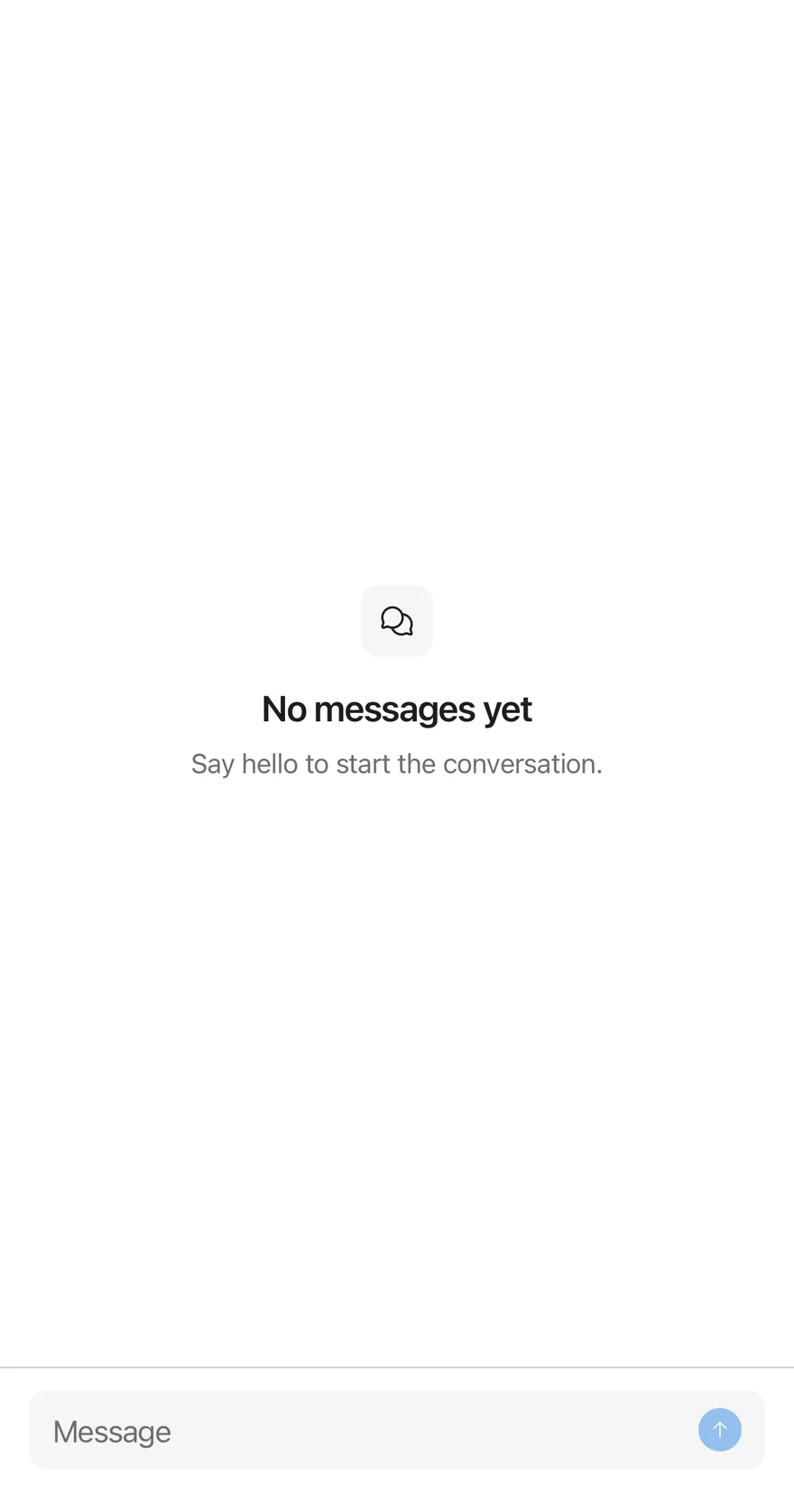
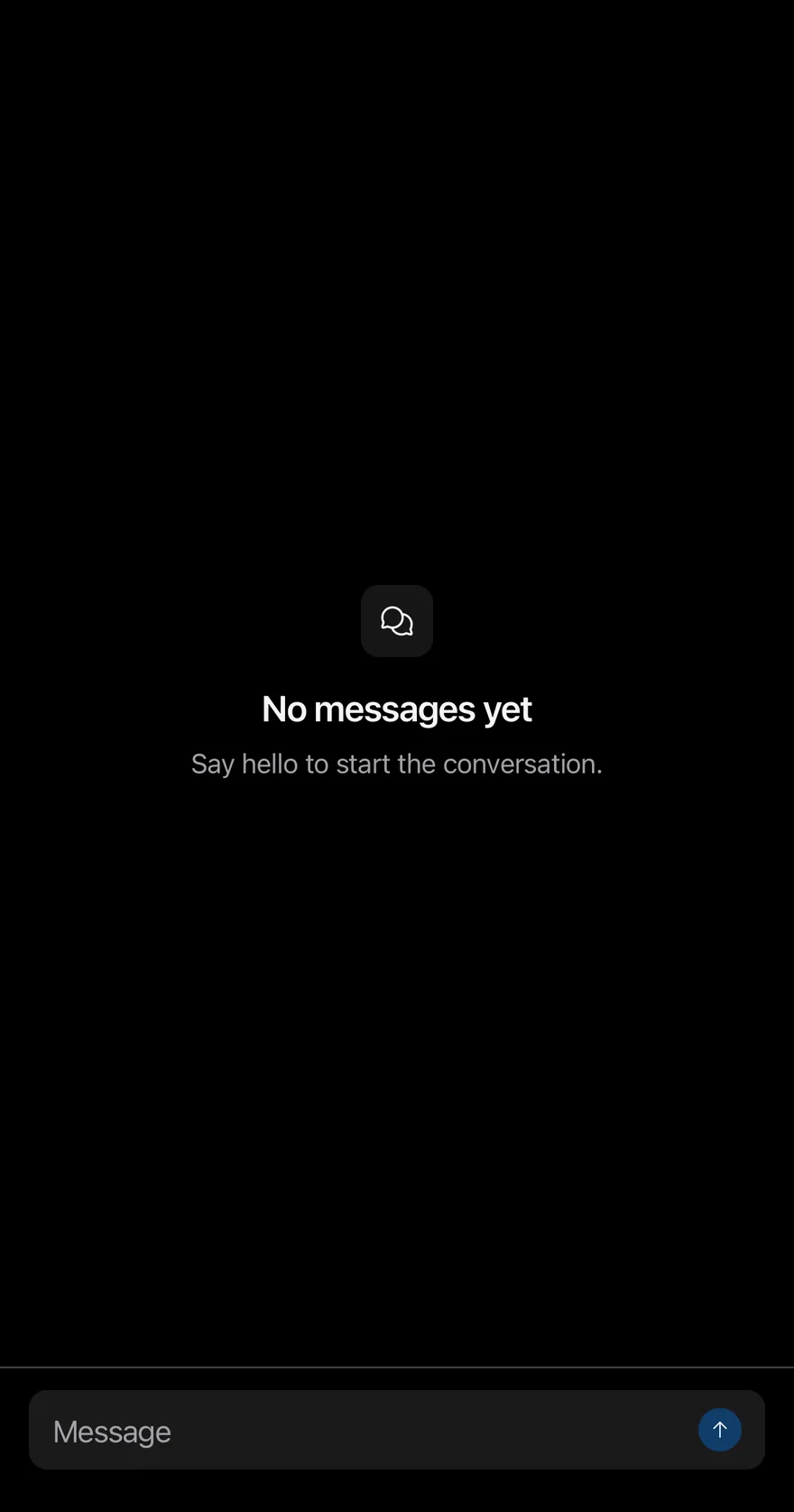
}Empty thread
An empty thread that renders an Empty state through ListEmptyComponent.
import { ArrowUpIcon, ChatsCircleIcon, ChecksIcon, XIcon } from "phosphor-react-native"
import * as React from "react"
import { View } from "react-native"
import { Attachment, AttachmentAction, AttachmentActions, AttachmentContent, AttachmentDescription, AttachmentLabel, AttachmentMedia, AttachmentProgress, AttachmentTitle } from "@/components/ui/attachment"
import { Avatar, AvatarFallback } from "@/components/ui/avatar"
import { BottomBar, BottomBarContent } from "@/components/ui/bottom-bar"
import { Bubble, BubbleContent, BubbleReactions } from "@/components/ui/bubble"
import { Empty, EmptyDescription, EmptyHeader, EmptyMedia, EmptyTitle } from "@/components/ui/empty"
import { Icon } from "@/components/ui/icon"
import { InputGroup, InputGroupAddon, InputGroupButton, InputGroupInput } from "@/components/ui/input-group"
import { Message, MessageAvatar, MessageContent, MessageFooter, MessageHeader } from "@/components/ui/message"
import { MessageScroller, MessageScrollerButton, MessageScrollerItem, MessageScrollerProvider, MessageScrollerViewport, useMessageScroller } from "@/components/ui/message-scroller"
import { Text } from "@/components/ui/text"

type ChatMessage = {
  id: string
  from: "me" | "them"
  texts: string[]
  time?: string
  status?: string
  reaction?: string
  attachment?: { name: string; size: string; progress?: number }
}

function ChatRow({ message }: { message: ChatMessage }) {
  const mine = message.from === "me"
  return (
    <MessageScrollerItem>
      <Message align={mine ? "end" : "start"}>
        {mine ? null : (
          <MessageAvatar>
            <Avatar>
              <AvatarFallback>MK</AvatarFallback>
            </Avatar>
          </MessageAvatar>
        )}
        <MessageContent>
          {message.time && !mine ? (
            <MessageHeader>Maya · {message.time}</MessageHeader>
          ) : null}
          {message.attachment ? (
            <Attachment
              state={message.attachment.progress ? "uploading" : "done"}
              className="w-64"
            >
              <AttachmentMedia variant="document">
                <AttachmentLabel className="bg-red">pdf</AttachmentLabel>
              </AttachmentMedia>
              <AttachmentContent>
                <AttachmentTitle>{message.attachment.name}</AttachmentTitle>
                {message.attachment.progress ? (
                  <AttachmentProgress
                    value={message.attachment.progress}
                    accessibilityLabel="Uploading"
                  />
                ) : (
                  <AttachmentDescription>
                    {message.attachment.size}
                  </AttachmentDescription>
                )}
              </AttachmentContent>
              {message.attachment.progress ? (
                <AttachmentActions>
                  <AttachmentAction accessibilityLabel="Cancel upload">
                    <Icon as={XIcon} />
                  </AttachmentAction>
                </AttachmentActions>
              ) : null}
            </Attachment>
          ) : null}
          {message.texts.map((text, index) => (
            <Bubble key={text} variant={mine ? "default" : "muted"}>
              <BubbleContent>{text}</BubbleContent>
              {message.reaction && index === message.texts.length - 1 ? (
                <BubbleReactions align={mine ? "start" : "end"}>
                  {message.reaction}
                </BubbleReactions>
              ) : null}
            </Bubble>
          ))}
          {message.status ? (
            <MessageFooter className="gap-1">
              <Icon as={ChecksIcon} className="text-accent" />
              <Text>{message.status}</Text>
            </MessageFooter>
          ) : null}
        </MessageContent>
      </Message>
    </MessageScrollerItem>
  )
}

function Composer({ onSend }: { onSend: (text: string) => void }) {
  const [value, setValue] = React.useState("")
  const { scrollToEnd } = useMessageScroller()
  const send = () => {
    const text = value.trim()
    if (!text) return
    onSend(text)
    setValue("")
    requestAnimationFrame(() => scrollToEnd())
  }
  return (
    <BottomBar separator>
      <BottomBarContent>
        <InputGroup>
          <InputGroupInput
            placeholder="Message"
            value={value}
            onValueChange={setValue}
            returnKeyType="send"
            onSubmitEditing={send}
          />
          <InputGroupAddon align="inline-end">
            <InputGroupButton
              variant="default"
              size="icon-xs"
              accessibilityLabel="Send"
              disabled={!value.trim()}
              onPress={send}
            >
              <Icon as={ArrowUpIcon} />
            </InputGroupButton>
          </InputGroupAddon>
        </InputGroup>
      </BottomBarContent>
    </BottomBar>
  )
}

type ChatReady = (
  append: (messages: ChatMessage[]) => void,
  scroller: ReturnType<typeof useMessageScroller>
) => void

function ReadyEffect({
  append,
  onReady,
}: {
  append: (messages: ChatMessage[]) => void
  onReady?: ChatReady
}) {
  const scroller = useMessageScroller()
  const readyRef = React.useRef(onReady)
  const scrollerRef = React.useRef(scroller)

  React.useEffect(() => {
    readyRef.current?.(append, scrollerRef.current)
  }, [append])

  return null
}

function Chat({
  initial,
  empty,
  onReady,
}: {
  initial: ChatMessage[]
  empty?: React.ReactElement
  onReady?: ChatReady
}) {
  const [messages, setMessages] = React.useState(initial)
  const append = React.useCallback((next: ChatMessage[]) => {
    setMessages((current) => [...current, ...next])
  }, [])

  return (
    <MessageScrollerProvider>
      <ReadyEffect append={append} onReady={onReady} />
      <View className="-m-4 flex-1">
        <MessageScroller>
          <MessageScrollerViewport
            data={messages}
            keyExtractor={(message) => message.id}
            renderItem={({ item }) => <ChatRow message={item} />}
            contentContainerClassName="gap-4 py-4"
            ListEmptyComponent={empty}
          />
          <MessageScrollerButton />
        </MessageScroller>
        <Composer
          onSend={(text) =>
            append([{ id: `sent-${Date.now()}`, from: "me", texts: [text] }])
          }
        />
      </View>
    </MessageScrollerProvider>
  )
}

export function MessageScrollerEmptyThreadExample() {
  return (
    <Chat
      initial={[]}
      empty={
        <Empty>
          <EmptyHeader>
            <EmptyMedia variant="icon">
              <Icon as={ChatsCircleIcon} />
            </EmptyMedia>
            <EmptyTitle>No messages yet</EmptyTitle>
            <EmptyDescription>
              Say hello to start the conversation.
            </EmptyDescription>
          </EmptyHeader>
        </Empty>
      }
    />
  )
}import EsuissUI
import PhosphorSwift
import SwiftUI
struct MessageScrollerEmptyThreadExample: View {
var body: some View {
MessageScrollerChat(initial: [])
}
}
struct MessageScrollerAttachment: Hashable {
let name: String
let size: String
var progress: Double?
}
struct MessageScrollerMessage: Identifiable, Hashable {
let id: String
let fromMe: Bool
let texts: [String]
var time: String?
var status: String?
var reaction: String?
var attachment: MessageScrollerAttachment?
}
struct MessageScrollerRow: View {
let message: MessageScrollerMessage
var body: some View {
let mine = message.fromMe
Message(align: mine ? .end : .start) {
if !mine {
MessageAvatar {
Avatar { AvatarFallback("MK") }
}
}
MessageContent {
if let time = message.time, !mine {
MessageHeader(verbatim: "Maya · \(time)")
}
if let attachment = message.attachment {
MessageScrollerAttachmentView(attachment: attachment)
}
ForEach(Array(message.texts.enumerated()), id: \.offset) { index, text in
Bubble(variant: mine ? .default : .muted) {
BubbleContent(verbatim: text)
if let reaction = message.reaction, index == message.texts.count - 1 {
BubbleReactions(verbatim: reaction, align: mine ? .start : .end)
}
}
}
if let status = message.status {
MessageFooter {
Ph.checks.regular
.frame(width: 16, height: 16)
.foregroundStyle(Color.accent)
Text(verbatim: status)
}
}
}
}
}
}
struct MessageScrollerAttachmentView: View {
let attachment: MessageScrollerAttachment
var body: some View {
Attachment(state: attachment.progress == nil ? .done : .uploading) {
AttachmentMedia(.document) {
AttachmentLabel("pdf", tint: .red)
}
AttachmentContent {
AttachmentTitle(verbatim: attachment.name)
if let progress = attachment.progress {
AttachmentProgress(value: progress, label: "Uploading")
} else {
AttachmentDescription(verbatim: attachment.size)
}
}
if attachment.progress != nil {
AttachmentActions {
AttachmentAction("Cancel upload", icon: Ph.x.bold) {}
}
}
}
.frame(width: 256)
}
}
struct MessageScrollerChat: View {
let unreadDemo: Bool
@State private var messages: [MessageScrollerMessage]
@State private var controller = MessageScrollerController()
@State private var draft = ""
init(initial: [MessageScrollerMessage], unreadDemo: Bool = false) {
self.unreadDemo = unreadDemo
_messages = State(initialValue: initial)
}
var body: some View {
let ready = !draft.trimmingCharacters(in: .whitespacesAndNewlines).isEmpty
VStack(spacing: 0) {
MessageScroller(messages, spacing: 16, controller: controller) { message in
MessageScrollerRow(message: message)
}
.overlay {
if messages.isEmpty {
Empty {
EmptyHeader {
EmptyMedia(.icon) { Ph.chatsCircle.regular }
EmptyTitle("No messages yet")
EmptyDescription("Say hello to start the conversation.")
}
}
}
}
.frame(maxHeight: .infinity)
BottomBar(separator: true) {
BottomBarContent {
InputGroup {
InputGroupInput("Message", text: $draft)
.submitLabel(.send)
.onSubmit(send)
InputGroupAddon(align: .inlineEnd) {
InputGroupButton(variant: .default, size: .iconXs, action: send) {
Ph.arrowUp.bold.frame(width: 14, height: 14)
}
.disabled(!ready)
.accessibilityLabel(Text("Send"))
}
}
}
}
}
.task {
guard unreadDemo else { return }
try? await Task.sleep(for: .milliseconds(300))
controller.scrollToStart(animated: false)
try? await Task.sleep(for: .milliseconds(600))
messages.append(contentsOf: [
MessageScrollerMessage(id: "n1", fromMe: false, texts: ["Are you there?"]),
MessageScrollerMessage(id: "n2", fromMe: false, texts: ["The build is green."]),
MessageScrollerMessage(id: "n3", fromMe: false, texts: ["Merging now."]),
])
}
}
func send() {
let text = draft.trimmingCharacters(in: .whitespacesAndNewlines)
guard !text.isEmpty else { return }
messages.append(MessageScrollerMessage(id: "sent-\(UUID().uuidString)", fromMe: true, texts: [text]))
draft = ""
Task { @MainActor in
controller.scrollToEnd()
}
}
}import androidx.compose.foundation.layout.Arrangement
import androidx.compose.foundation.layout.Box
import androidx.compose.foundation.layout.Column
import androidx.compose.foundation.layout.ColumnScope
import androidx.compose.foundation.layout.PaddingValues
import androidx.compose.foundation.layout.fillMaxSize
import androidx.compose.foundation.layout.fillMaxWidth
import androidx.compose.foundation.layout.width
import androidx.compose.foundation.text.KeyboardActions
import androidx.compose.foundation.text.KeyboardOptions
import androidx.compose.runtime.Composable
import androidx.compose.runtime.LaunchedEffect
import androidx.compose.runtime.getValue
import androidx.compose.runtime.mutableStateOf
import androidx.compose.runtime.remember
import androidx.compose.runtime.rememberCoroutineScope
import androidx.compose.runtime.saveable.rememberSaveable
import androidx.compose.runtime.setValue
import androidx.compose.runtime.withFrameNanos
import androidx.compose.ui.Alignment
import androidx.compose.ui.Modifier
import androidx.compose.ui.semantics.contentDescription
import androidx.compose.ui.semantics.semantics
import androidx.compose.ui.text.input.ImeAction
import androidx.compose.ui.unit.dp
import com.adamglin.PhosphorIcons
import com.adamglin.phosphoricons.Regular
import com.adamglin.phosphoricons.regular.ArrowUp
import com.adamglin.phosphoricons.regular.ChatsCircle
import com.adamglin.phosphoricons.regular.Checks
import com.adamglin.phosphoricons.regular.X
import com.esuiss.ui.components.Attachment
import com.esuiss.ui.components.AttachmentAction
import com.esuiss.ui.components.AttachmentActions
import com.esuiss.ui.components.AttachmentContent
import com.esuiss.ui.components.AttachmentDescription
import com.esuiss.ui.components.AttachmentLabel
import com.esuiss.ui.components.AttachmentMedia
import com.esuiss.ui.components.AttachmentMediaVariant
import com.esuiss.ui.components.AttachmentProgress
import com.esuiss.ui.components.AttachmentState
import com.esuiss.ui.components.AttachmentTitle
import com.esuiss.ui.components.Avatar
import com.esuiss.ui.components.AvatarFallback
import com.esuiss.ui.components.BottomBar
import com.esuiss.ui.components.BottomBarContent
import com.esuiss.ui.components.Bubble
import com.esuiss.ui.components.BubbleAlign
import com.esuiss.ui.components.BubbleContent
import com.esuiss.ui.components.BubbleReactions
import com.esuiss.ui.components.BubbleVariant
import com.esuiss.ui.components.ButtonVariant
import com.esuiss.ui.components.Empty
import com.esuiss.ui.components.EmptyDescription
import com.esuiss.ui.components.EmptyHeader
import com.esuiss.ui.components.EmptyMedia
import com.esuiss.ui.components.EmptyMediaVariant
import com.esuiss.ui.components.EmptyTitle
import com.esuiss.ui.components.Icon
import com.esuiss.ui.components.InputGroup
import com.esuiss.ui.components.InputGroupAddon
import com.esuiss.ui.components.InputGroupAddonAlign
import com.esuiss.ui.components.InputGroupButton
import com.esuiss.ui.components.InputGroupButtonSize
import com.esuiss.ui.components.InputGroupInput
import com.esuiss.ui.components.Message
import com.esuiss.ui.components.MessageAlign
import com.esuiss.ui.components.MessageAvatar
import com.esuiss.ui.components.MessageContent
import com.esuiss.ui.components.MessageFooter
import com.esuiss.ui.components.MessageHeader
import com.esuiss.ui.components.MessageScroller
import com.esuiss.ui.components.MessageScrollerState
import com.esuiss.ui.components.Screen
import com.esuiss.ui.components.ScreenEdge
import com.esuiss.ui.components.Text
import com.esuiss.ui.components.rememberMessageScrollerState
import com.esuiss.ui.theme.EsuissTheme
import kotlinx.coroutines.launch
@Composable
fun MessageScrollerEmptyThreadExample() {
MessageScrollerChat(emptyList(), showEmpty = true)
}
class MessageScrollerFile(val name: String, val size: String, val progress: Float? = null)
class MessageScrollerMessage(
val id: String,
val mine: Boolean,
val texts: List<String>,
val time: String? = null,
val status: String? = null,
val reaction: String? = null,
val attachment: MessageScrollerFile? = null,
)
@Composable
fun MessageScrollerRow(message: MessageScrollerMessage) {
val colors = EsuissTheme.colors
val mine = message.mine
Message(Modifier.fillMaxWidth(), align = if (mine) MessageAlign.End else MessageAlign.Start) {
if (!mine) {
MessageAvatar {
Avatar(fallback = { AvatarFallback("MK") })
}
}
MessageContent {
if (message.time != null && !mine) MessageHeader("Maya · ${message.time}")
val file = message.attachment
if (file != null) {
Attachment(
Modifier.width(256.dp),
state = if (file.progress != null) AttachmentState.Uploading else AttachmentState.Done,
) {
AttachmentMedia(variant = AttachmentMediaVariant.Document) {
AttachmentLabel("pdf", background = colors.red)
}
AttachmentContent {
AttachmentTitle(file.name)
if (file.progress != null) {
AttachmentProgress(file.progress, contentDescription = "Uploading")
} else {
AttachmentDescription(file.size)
}
}
if (file.progress != null) {
AttachmentActions {
AttachmentAction(onClick = {}, contentDescription = "Cancel upload") {
Icon(PhosphorIcons.Regular.X, contentDescription = null)
}
}
}
}
}
message.texts.forEachIndexed { index, text ->
Bubble(variant = if (mine) BubbleVariant.Default else BubbleVariant.Muted) {
BubbleContent(text)
if (message.reaction != null && index == message.texts.lastIndex) {
BubbleReactions(message.reaction, align = if (mine) BubbleAlign.Start else BubbleAlign.End)
}
}
}
if (message.status != null) {
MessageFooter {
Icon(PhosphorIcons.Regular.Checks, contentDescription = null, tint = colors.accent)
Text(message.status)
}
}
}
}
}
@Composable
fun MessageScrollerComposer(state: MessageScrollerState, onSend: (String) -> Unit) {
var value by rememberSaveable { mutableStateOf("") }
val scope = rememberCoroutineScope()
val send = {
val text = value.trim()
if (text.isNotEmpty()) {
onSend(text)
value = ""
scope.launch {
withFrameNanos { }
state.scrollToEnd()
}
}
}
BottomBar(separator = true) {
BottomBarContent {
InputGroup {
InputGroupInput(
value,
{ value = it },
placeholder = "Message",
keyboardOptions = KeyboardOptions(imeAction = ImeAction.Send),
keyboardActions = KeyboardActions(onSend = { send() }),
)
InputGroupAddon(align = InputGroupAddonAlign.InlineEnd) {
InputGroupButton(
onClick = { send() },
modifier = Modifier.semantics { contentDescription = "Send" },
size = InputGroupButtonSize.IconXs,
variant = ButtonVariant.Default,
enabled = value.isNotBlank(),
) {
Icon(PhosphorIcons.Regular.ArrowUp, contentDescription = null)
}
}
}
}
}
}
@Composable
fun MessageScrollerEmpty(modifier: Modifier) {
Empty(modifier) {
EmptyHeader {
EmptyMedia(variant = EmptyMediaVariant.Icon) {
Icon(PhosphorIcons.Regular.ChatsCircle, contentDescription = null)
}
EmptyTitle("No messages yet")
EmptyDescription("Say hello to start the conversation.")
}
}
}
@Composable
fun MessageScrollerFrame(
edges: Set<ScreenEdge> = setOf(ScreenEdge.Top, ScreenEdge.Left, ScreenEdge.Right),
content: @Composable ColumnScope.() -> Unit,
) {
Screen(edges = edges) {
Column(Modifier.fillMaxSize()) {
content()
}
}
}
@Composable
fun MessageScrollerList(
messages: List<MessageScrollerMessage>,
state: MessageScrollerState,
modifier: Modifier,
onLoadOlder: (() -> Unit)? = null,
loadingOlder: Boolean = false,
) {
MessageScroller(
items = messages,
key = { it.id },
modifier = modifier,
state = state,
onLoadOlder = onLoadOlder,
loadingOlder = loadingOlder,
contentPadding = PaddingValues(16.dp),
verticalArrangement = Arrangement.spacedBy(16.dp, Alignment.Bottom),
) { message ->
MessageScrollerRow(message)
}
}
@Composable
fun MessageScrollerChat(
initial: List<MessageScrollerMessage>,
showEmpty: Boolean = false,
onReady: (suspend (append: (List<MessageScrollerMessage>) -> Unit, state: MessageScrollerState) -> Unit)? = null,
) {
var messages by remember { mutableStateOf(initial) }
val state = rememberMessageScrollerState()
val append: (List<MessageScrollerMessage>) -> Unit = { next -> messages = messages + next }
if (onReady != null) {
LaunchedEffect(Unit) { onReady(append, state) }
}
MessageScrollerFrame {
Box(Modifier.weight(1f).fillMaxWidth()) {
MessageScrollerList(messages, state, Modifier.fillMaxSize())
if (showEmpty && messages.isEmpty()) {
MessageScrollerEmpty(Modifier.align(Alignment.Center))
}
}
MessageScrollerComposer(state) { text ->
append(listOf(MessageScrollerMessage("sent-${System.currentTimeMillis()}", true, listOf(text))))
}
}
}Load older
Loads earlier messages with onLoadOlder when scrolling to the top.
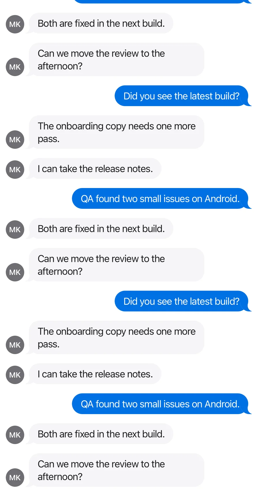
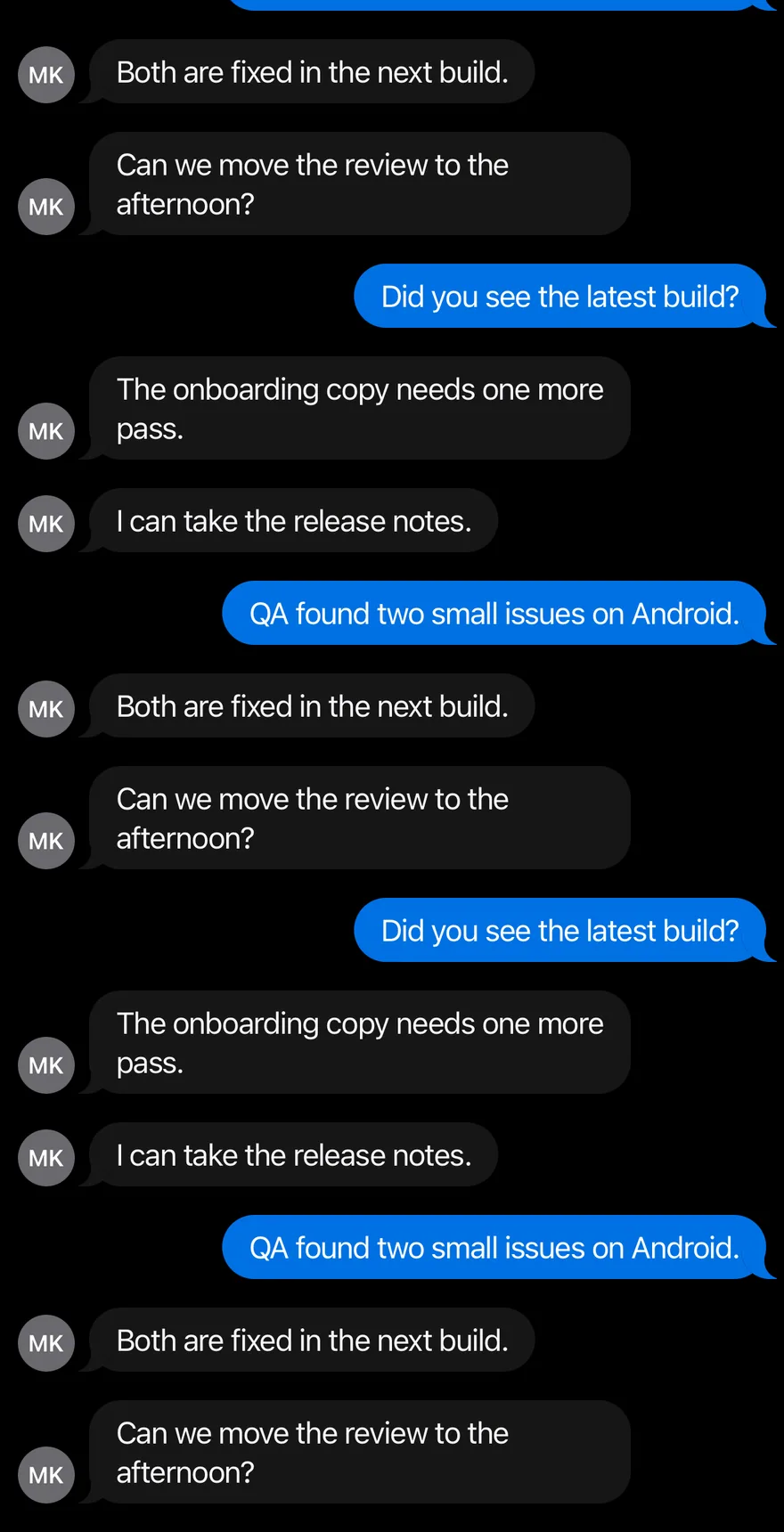
import { ChecksIcon, XIcon } from "phosphor-react-native"
import * as React from "react"
import { View } from "react-native"
import { Attachment, AttachmentAction, AttachmentActions, AttachmentContent, AttachmentDescription, AttachmentLabel, AttachmentMedia, AttachmentProgress, AttachmentTitle } from "@/components/ui/attachment"
import { Avatar, AvatarFallback } from "@/components/ui/avatar"
import { Bubble, BubbleContent, BubbleReactions } from "@/components/ui/bubble"
import { Icon } from "@/components/ui/icon"
import { Message, MessageAvatar, MessageContent, MessageFooter, MessageHeader } from "@/components/ui/message"
import { MessageScroller, MessageScrollerButton, MessageScrollerItem, MessageScrollerProvider, MessageScrollerViewport } from "@/components/ui/message-scroller"
import { Spinner } from "@/components/ui/spinner"
import { Text } from "@/components/ui/text"

type ChatMessage = {
  id: string
  from: "me" | "them"
  texts: string[]
  time?: string
  status?: string
  reaction?: string
  attachment?: { name: string; size: string; progress?: number }
}

const subjects = [
  "Did you see the latest build?",
  "The onboarding copy needs one more pass.",
  "I can take the release notes.",
  "QA found two small issues on Android.",
  "Both are fixed in the next build.",
  "Can we move the review to the afternoon?",
]

function longThread(count: number, offset = 0): ChatMessage[] {
  return Array.from({ length: count }, (_, index) => {
    const number = index + offset
    return {
      id: `m${number}`,
      from: number % 3 === 0 ? "me" : "them",
      texts: [subjects[number % subjects.length]],
    }
  })
}

function ChatRow({ message }: { message: ChatMessage }) {
  const mine = message.from === "me"
  return (
    <MessageScrollerItem>
      <Message align={mine ? "end" : "start"}>
        {mine ? null : (
          <MessageAvatar>
            <Avatar>
              <AvatarFallback>MK</AvatarFallback>
            </Avatar>
          </MessageAvatar>
        )}
        <MessageContent>
          {message.time && !mine ? (
            <MessageHeader>Maya · {message.time}</MessageHeader>
          ) : null}
          {message.attachment ? (
            <Attachment
              state={message.attachment.progress ? "uploading" : "done"}
              className="w-64"
            >
              <AttachmentMedia variant="document">
                <AttachmentLabel className="bg-red">pdf</AttachmentLabel>
              </AttachmentMedia>
              <AttachmentContent>
                <AttachmentTitle>{message.attachment.name}</AttachmentTitle>
                {message.attachment.progress ? (
                  <AttachmentProgress
                    value={message.attachment.progress}
                    accessibilityLabel="Uploading"
                  />
                ) : (
                  <AttachmentDescription>
                    {message.attachment.size}
                  </AttachmentDescription>
                )}
              </AttachmentContent>
              {message.attachment.progress ? (
                <AttachmentActions>
                  <AttachmentAction accessibilityLabel="Cancel upload">
                    <Icon as={XIcon} />
                  </AttachmentAction>
                </AttachmentActions>
              ) : null}
            </Attachment>
          ) : null}
          {message.texts.map((text, index) => (
            <Bubble key={text} variant={mine ? "default" : "muted"}>
              <BubbleContent>{text}</BubbleContent>
              {message.reaction && index === message.texts.length - 1 ? (
                <BubbleReactions align={mine ? "start" : "end"}>
                  {message.reaction}
                </BubbleReactions>
              ) : null}
            </Bubble>
          ))}
          {message.status ? (
            <MessageFooter className="gap-1">
              <Icon as={ChecksIcon} className="text-accent" />
              <Text>{message.status}</Text>
            </MessageFooter>
          ) : null}
        </MessageContent>
      </Message>
    </MessageScrollerItem>
  )
}

function LoadOlderDemo() {
  const [messages, setMessages] = React.useState(() => longThread(15, 45))
  const [loading, setLoading] = React.useState(false)
  const oldest = Number(messages[0]?.id.slice(1) ?? 0)
  const loadOlder = () => {
    if (loading || oldest <= 0) return
    setLoading(true)
    setTimeout(() => {
      setMessages((current) => [
        ...longThread(Math.min(15, oldest), Math.max(0, oldest - 15)),
        ...current,
      ])
      setLoading(false)
    }, 800)
  }
  return (
    <MessageScrollerProvider>
      <View className="-m-4 flex-1">
        <MessageScroller>
          <MessageScrollerViewport
            data={messages}
            keyExtractor={(message) => message.id}
            renderItem={({ item }) => <ChatRow message={item} />}
            contentContainerClassName="gap-4 py-4"
            onLoadOlder={loadOlder}
            ListFooterComponent={
              loading ? (
                <View className="items-center py-2">
                  <Spinner />
                </View>
              ) : null
            }
          />
          <MessageScrollerButton />
        </MessageScroller>
      </View>
    </MessageScrollerProvider>
  )
}

export function MessageScrollerLoadOlderExample() {
  return (
    <LoadOlderDemo />
  )
}import EsuissUI
import PhosphorSwift
import SwiftUI
struct MessageScrollerAttachment: Hashable {
let name: String
let size: String
var progress: Double?
}
struct MessageScrollerMessage: Identifiable, Hashable {
let id: String
let fromMe: Bool
let texts: [String]
var time: String?
var status: String?
var reaction: String?
var attachment: MessageScrollerAttachment?
}
enum MessageScrollerData {
static let thread: [MessageScrollerMessage] = [
MessageScrollerMessage(
id: "1",
fromMe: false,
texts: ["Hey, do you have a minute?", "The client moved the launch."],
time: "9:12 AM"
),
MessageScrollerMessage(id: "2", fromMe: true, texts: ["Sure, what's up?"]),
MessageScrollerMessage(
id: "3",
fromMe: false,
texts: ["It's Thursday now. Two days earlier than planned."],
reaction: "😬 1"
),
MessageScrollerMessage(
id: "4",
fromMe: true,
texts: ["We could ship onboarding behind a flag.", "Turn it on next week once QA is done."],
status: "Read 9:15 AM"
),
MessageScrollerMessage(
id: "5",
fromMe: false,
texts: ["Here are the release notes."],
time: "9:18 AM",
attachment: MessageScrollerAttachment(name: "Release notes.pdf", size: "1.2 MB")
),
MessageScrollerMessage(
id: "6",
fromMe: true,
texts: ["And the checklist with my comments."],
attachment: MessageScrollerAttachment(name: "Checklist.pdf", size: "Uploading", progress: 64)
),
MessageScrollerMessage(
id: "7",
fromMe: false,
texts: ["Perfect. Let's sync tomorrow at ten."],
reaction: "👍 2"
),
MessageScrollerMessage(id: "8", fromMe: true, texts: ["Sounds good, see you then."], status: "Delivered"),
]
static let subjects = [
"Did you see the latest build?",
"The onboarding copy needs one more pass.",
"I can take the release notes.",
"QA found two small issues on Android.",
"Both are fixed in the next build.",
"Can we move the review to the afternoon?",
]
static func long(_ count: Int, offset: Int = 0) -> [MessageScrollerMessage] {
(0..<count).map { index in
let number = index + offset
return MessageScrollerMessage(
id: "m\(number)",
fromMe: number % 3 == 0,
texts: [subjects[number % subjects.count]]
)
}
}
}
struct MessageScrollerRow: View {
let message: MessageScrollerMessage
var body: some View {
let mine = message.fromMe
Message(align: mine ? .end : .start) {
if !mine {
MessageAvatar {
Avatar { AvatarFallback("MK") }
}
}
MessageContent {
if let time = message.time, !mine {
MessageHeader(verbatim: "Maya · \(time)")
}
if let attachment = message.attachment {
MessageScrollerAttachmentView(attachment: attachment)
}
ForEach(Array(message.texts.enumerated()), id: \.offset) { index, text in
Bubble(variant: mine ? .default : .muted) {
BubbleContent(verbatim: text)
if let reaction = message.reaction, index == message.texts.count - 1 {
BubbleReactions(verbatim: reaction, align: mine ? .start : .end)
}
}
}
if let status = message.status {
MessageFooter {
Ph.checks.regular
.frame(width: 16, height: 16)
.foregroundStyle(Color.accent)
Text(verbatim: status)
}
}
}
}
}
}
struct MessageScrollerAttachmentView: View {
let attachment: MessageScrollerAttachment
var body: some View {
Attachment(state: attachment.progress == nil ? .done : .uploading) {
AttachmentMedia(.document) {
AttachmentLabel("pdf", tint: .red)
}
AttachmentContent {
AttachmentTitle(verbatim: attachment.name)
if let progress = attachment.progress {
AttachmentProgress(value: progress, label: "Uploading")
} else {
AttachmentDescription(verbatim: attachment.size)
}
}
if attachment.progress != nil {
AttachmentActions {
AttachmentAction("Cancel upload", icon: Ph.x.bold) {}
}
}
}
.frame(width: 256)
}
}
struct MessageScrollerLoadOlder: View {
@State private var messages = MessageScrollerData.long(15, offset: 45)
@State private var loading = false
var body: some View {
MessageScroller(messages, spacing: 16, onLoadOlder: loadOlder) { message in
MessageScrollerRow(message: message)
}
.overlay(alignment: .top) {
if loading {
Spinner()
.padding(.vertical, 8)
}
}
}
var oldest: Int {
Int(messages.first?.id.dropFirst() ?? "") ?? 0
}
func loadOlder() {
let oldest = oldest
guard !loading, oldest > 0 else { return }
loading = true
Task {
try? await Task.sleep(for: .milliseconds(800))
messages.insert(
contentsOf: MessageScrollerData.long(min(15, oldest), offset: max(0, oldest - 15)),
at: 0
)
loading = false
}
}
}
let thread: [MessageScrollerMessage] = [
MessageScrollerMessage(
id: "1",
fromMe: false,
texts: ["Hey, do you have a minute?", "The client moved the launch."],
time: "9:12 AM"
),
MessageScrollerMessage(id: "2", fromMe: true, texts: ["Sure, what's up?"]),
MessageScrollerMessage(
id: "3",
fromMe: false,
texts: ["It's Thursday now. Two days earlier than planned."],
reaction: "😬 1"
),
MessageScrollerMessage(
id: "4",
fromMe: true,
texts: ["We could ship onboarding behind a flag.", "Turn it on next week once QA is done."],
status: "Read 9:15 AM"
),
MessageScrollerMessage(
id: "5",
fromMe: false,
texts: ["Here are the release notes."],
time: "9:18 AM",
attachment: MessageScrollerAttachment(name: "Release notes.pdf", size: "1.2 MB")
),
MessageScrollerMessage(
id: "6",
fromMe: true,
texts: ["And the checklist with my comments."],
attachment: MessageScrollerAttachment(name: "Checklist.pdf", size: "Uploading", progress: 64)
),
MessageScrollerMessage(
id: "7",
fromMe: false,
texts: ["Perfect. Let's sync tomorrow at ten."],
reaction: "👍 2"
),
MessageScrollerMessage(id: "8", fromMe: true, texts: ["Sounds good, see you then."], status: "Delivered"),
]
let subjects = [
"Did you see the latest build?",
"The onboarding copy needs one more pass.",
"I can take the release notes.",
"QA found two small issues on Android.",
"Both are fixed in the next build.",
"Can we move the review to the afternoon?",
]
func long(_ count: Int, offset: Int = 0) -> [MessageScrollerMessage] {
(0..<count).map { index in
let number = index + offset
return MessageScrollerMessage(
id: "m\(number)",
fromMe: number % 3 == 0,
texts: [subjects[number % subjects.count]]
)
}
}import androidx.compose.foundation.layout.Arrangement
import androidx.compose.foundation.layout.Column
import androidx.compose.foundation.layout.ColumnScope
import androidx.compose.foundation.layout.PaddingValues
import androidx.compose.foundation.layout.fillMaxSize
import androidx.compose.foundation.layout.fillMaxWidth
import androidx.compose.foundation.layout.width
import androidx.compose.runtime.Composable
import androidx.compose.runtime.getValue
import androidx.compose.runtime.mutableStateOf
import androidx.compose.runtime.remember
import androidx.compose.runtime.rememberCoroutineScope
import androidx.compose.runtime.setValue
import androidx.compose.ui.Alignment
import androidx.compose.ui.Modifier
import androidx.compose.ui.semantics.contentDescription
import androidx.compose.ui.unit.dp
import com.adamglin.PhosphorIcons
import com.adamglin.phosphoricons.Regular
import com.adamglin.phosphoricons.regular.Checks
import com.adamglin.phosphoricons.regular.X
import com.esuiss.ui.components.Attachment
import com.esuiss.ui.components.AttachmentAction
import com.esuiss.ui.components.AttachmentActions
import com.esuiss.ui.components.AttachmentContent
import com.esuiss.ui.components.AttachmentDescription
import com.esuiss.ui.components.AttachmentLabel
import com.esuiss.ui.components.AttachmentMedia
import com.esuiss.ui.components.AttachmentMediaVariant
import com.esuiss.ui.components.AttachmentProgress
import com.esuiss.ui.components.AttachmentState
import com.esuiss.ui.components.AttachmentTitle
import com.esuiss.ui.components.Avatar
import com.esuiss.ui.components.AvatarFallback
import com.esuiss.ui.components.Bubble
import com.esuiss.ui.components.BubbleAlign
import com.esuiss.ui.components.BubbleContent
import com.esuiss.ui.components.BubbleReactions
import com.esuiss.ui.components.BubbleVariant
import com.esuiss.ui.components.Icon
import com.esuiss.ui.components.Message
import com.esuiss.ui.components.MessageAlign
import com.esuiss.ui.components.MessageAvatar
import com.esuiss.ui.components.MessageContent
import com.esuiss.ui.components.MessageFooter
import com.esuiss.ui.components.MessageHeader
import com.esuiss.ui.components.MessageScroller
import com.esuiss.ui.components.MessageScrollerState
import com.esuiss.ui.components.Screen
import com.esuiss.ui.components.ScreenEdge
import com.esuiss.ui.components.Text
import com.esuiss.ui.components.rememberMessageScrollerState
import com.esuiss.ui.theme.EsuissTheme
import kotlinx.coroutines.delay
import kotlinx.coroutines.launch
class MessageScrollerFile(val name: String, val size: String, val progress: Float? = null)
class MessageScrollerMessage(
val id: String,
val mine: Boolean,
val texts: List<String>,
val time: String? = null,
val status: String? = null,
val reaction: String? = null,
val attachment: MessageScrollerFile? = null,
)
val messageScrollerSubjects = listOf(
"Did you see the latest build?",
"The onboarding copy needs one more pass.",
"I can take the release notes.",
"QA found two small issues on Android.",
"Both are fixed in the next build.",
"Can we move the review to the afternoon?",
)
fun messageScrollerLongThread(count: Int, offset: Int = 0): List<MessageScrollerMessage> =
List(count) { index ->
val number = index + offset
MessageScrollerMessage("m$number", number % 3 == 0, listOf(messageScrollerSubjects[number % messageScrollerSubjects.size]))
}
@Composable
fun MessageScrollerRow(message: MessageScrollerMessage) {
val colors = EsuissTheme.colors
val mine = message.mine
Message(Modifier.fillMaxWidth(), align = if (mine) MessageAlign.End else MessageAlign.Start) {
if (!mine) {
MessageAvatar {
Avatar(fallback = { AvatarFallback("MK") })
}
}
MessageContent {
if (message.time != null && !mine) MessageHeader("Maya · ${message.time}")
val file = message.attachment
if (file != null) {
Attachment(
Modifier.width(256.dp),
state = if (file.progress != null) AttachmentState.Uploading else AttachmentState.Done,
) {
AttachmentMedia(variant = AttachmentMediaVariant.Document) {
AttachmentLabel("pdf", background = colors.red)
}
AttachmentContent {
AttachmentTitle(file.name)
if (file.progress != null) {
AttachmentProgress(file.progress, contentDescription = "Uploading")
} else {
AttachmentDescription(file.size)
}
}
if (file.progress != null) {
AttachmentActions {
AttachmentAction(onClick = {}, contentDescription = "Cancel upload") {
Icon(PhosphorIcons.Regular.X, contentDescription = null)
}
}
}
}
}
message.texts.forEachIndexed { index, text ->
Bubble(variant = if (mine) BubbleVariant.Default else BubbleVariant.Muted) {
BubbleContent(text)
if (message.reaction != null && index == message.texts.lastIndex) {
BubbleReactions(message.reaction, align = if (mine) BubbleAlign.Start else BubbleAlign.End)
}
}
}
if (message.status != null) {
MessageFooter {
Icon(PhosphorIcons.Regular.Checks, contentDescription = null, tint = colors.accent)
Text(message.status)
}
}
}
}
}
@Composable
fun MessageScrollerFrame(
edges: Set<ScreenEdge> = setOf(ScreenEdge.Top, ScreenEdge.Left, ScreenEdge.Right),
content: @Composable ColumnScope.() -> Unit,
) {
Screen(edges = edges) {
Column(Modifier.fillMaxSize()) {
content()
}
}
}
@Composable
fun MessageScrollerList(
messages: List<MessageScrollerMessage>,
state: MessageScrollerState,
modifier: Modifier,
onLoadOlder: (() -> Unit)? = null,
loadingOlder: Boolean = false,
) {
MessageScroller(
items = messages,
key = { it.id },
modifier = modifier,
state = state,
onLoadOlder = onLoadOlder,
loadingOlder = loadingOlder,
contentPadding = PaddingValues(16.dp),
verticalArrangement = Arrangement.spacedBy(16.dp, Alignment.Bottom),
) { message ->
MessageScrollerRow(message)
}
}
@Composable
fun MessageScrollerLoadOlder() {
var messages by remember { mutableStateOf(messageScrollerLongThread(15, 45)) }
var loading by remember { mutableStateOf(false) }
val scope = rememberCoroutineScope()
val state = rememberMessageScrollerState()
val oldest = messages.firstOrNull()?.id?.drop(1)?.toIntOrNull() ?: 0
val loadOlder = {
if (!loading && oldest > 0) {
loading = true
scope.launch {
delay(800)
messages = messageScrollerLongThread(minOf(15, oldest), maxOf(0, oldest - 15)) + messages
loading = false
}
}
}
MessageScrollerFrame(ScreenEdge.entries.toSet()) {
MessageScrollerList(
messages,
state,
Modifier.weight(1f).fillMaxWidth(),
onLoadOlder = { loadOlder() },
loadingOlder = loading,
)
}
}API Reference
MessageScrollerProvider
Shares one scroll controller with components outside the scroller.
MessageScrollerOptions- Type
React.ReactNode- Default
- —
MessageScroller
Container that clips the list and positions the button.
ViewPropsMessageScrollerViewport
Inverted FlatList that renders the messages.
MessageScrollerViewportProps<T>MessageScrollerItem
Row wrapper with horizontal padding.
ViewPropsMessageScrollerButton
Floating button that scrolls to the newest or oldest message.
React.ComponentProps<typeof Button>- Type
React.ReactNode- Default
- —
- About
endscrolls to the newest message,startto the oldest. Defaults toend.- Type
MessageScrollerScrollDirection- Default
- "end"
- About
- Whether the scroll is animated. Defaults to
true. - Type
boolean- Default
- true
Accessibility
- The button has a default label, "Scroll to end" or "Scroll to start", and includes the number of new messages when there are any.
- While the button is hidden it ignores touches and is hidden from VoiceOver and TalkBack.
- The button animation respects the system reduce motion setting.
Notes
- The keyboard dismisses interactively on iOS and on drag on Android, and taps on handled children keep it open.
- The button uses
bg-surface-raisedwithborder-separator, and the badge usesbg-accentwithtext-on-accent. - Light and dark colors follow the system appearance.