suiss/uim · React Native Component
Input Accessory Bar
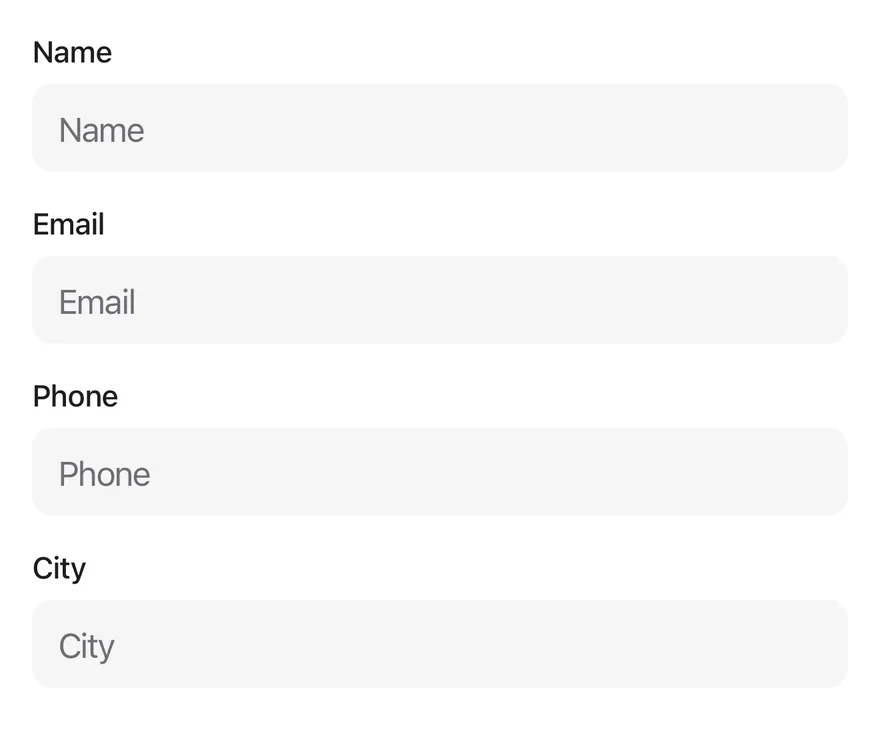
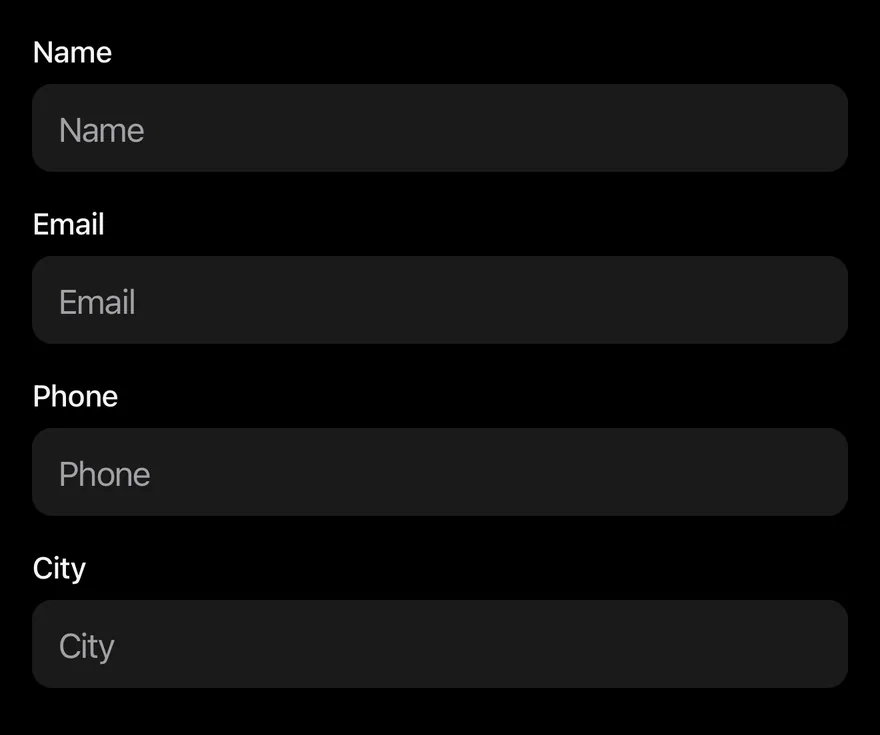
A toolbar above the keyboard with previous, next and done buttons for moving through form fields.
Input Accessory Bar is an open-source mobile component from suiss/uim for React Native and Expo, with SwiftUI and Jetpack Compose versions built from the same design tokens. The @esuiss/uim CLI copies its source into your project, so you own the code.
import { View } from "react-native"
import { InputAccessoryBar, InputAccessoryBarInput } from "@/components/ui/input-accessory-bar"
import { KeyboardScrollView } from "@/components/ui/keyboard-scroll-view"
import { Text } from "@/components/ui/text"

function Field({ label, autoFocus }: { label: string; autoFocus?: boolean }) {
  return (
    <View className="gap-1.5">
      <Text variant="small">{label}</Text>
      <InputAccessoryBarInput placeholder={label} autoFocus={autoFocus} />
    </View>
  )
}

function Form({ autoFocus = false }: { autoFocus?: boolean }) {
  return (
    <KeyboardScrollView className="-m-4" contentContainerClassName="gap-4 p-4">
      <Field label="Name" autoFocus={autoFocus} />
      <Field label="Email" />
      <Field label="Phone" />
      <Field label="City" />
    </KeyboardScrollView>
  )
}

export function InputAccessoryBarExample() {
  return (
    <InputAccessoryBar>
      <Form />
    </InputAccessoryBar>
  )
}import EsuissUI
import SwiftUI
enum InputAccessoryBarField: Hashable {
case name, email, phone, city, subject, message
}
struct InputAccessoryBarRow: View {
let label: LocalizedStringKey
let field: InputAccessoryBarField
let focus: FocusState<InputAccessoryBarField?>.Binding
@State private var text = ""
var body: some View {
VStack(alignment: .leading, spacing: 6) {
Text(label)
.textVariant(.small)
.accessibilityHidden(true)
TextField(label, text: $text)
.textFieldStyle(.input)
.focused(focus, equals: field)
.submitLabel(.next)
}
}
}
struct InputAccessoryBarForm: View {
var autoFocus = false
var previousLabel: LocalizedStringKey = "Previous"
var nextLabel: LocalizedStringKey = "Next"
var doneLabel: LocalizedStringKey = "Done"
@FocusState private var focus: InputAccessoryBarField?
var body: some View {
KeyboardScrollView {
VStack(alignment: .leading, spacing: 16) {
InputAccessoryBarRow(label: "Name", field: .name, focus: $focus)
InputAccessoryBarRow(label: "Email", field: .email, focus: $focus)
InputAccessoryBarRow(label: "Phone", field: .phone, focus: $focus)
InputAccessoryBarRow(label: "City", field: .city, focus: $focus)
}
.padding(16)
}
.inputAccessoryBar(
focus: $focus,
order: [.name, .email, .phone, .city],
previousLabel: previousLabel,
nextLabel: nextLabel,
doneLabel: doneLabel
)
.onAppear {
if autoFocus { focus = .name }
}
}
}import androidx.compose.foundation.layout.Arrangement
import androidx.compose.foundation.layout.Column
import androidx.compose.foundation.layout.PaddingValues
import androidx.compose.foundation.layout.fillMaxSize
import androidx.compose.foundation.layout.fillMaxWidth
import androidx.compose.runtime.Composable
import androidx.compose.runtime.LaunchedEffect
import androidx.compose.runtime.getValue
import androidx.compose.runtime.mutableStateOf
import androidx.compose.runtime.remember
import androidx.compose.runtime.saveable.rememberSaveable
import androidx.compose.runtime.setValue
import androidx.compose.ui.Modifier
import androidx.compose.ui.focus.FocusRequester
import androidx.compose.ui.focus.focusRequester
import androidx.compose.ui.unit.dp
import com.esuiss.ui.components.Input
import com.esuiss.ui.components.InputAccessoryBar
import com.esuiss.ui.components.InputAccessoryState
import com.esuiss.ui.components.KeyboardScrollView
import com.esuiss.ui.components.Screen
import com.esuiss.ui.components.Text
import com.esuiss.ui.components.TextVariant
import com.esuiss.ui.components.inputAccessory
import com.esuiss.ui.components.rememberInputAccessoryState
@Composable
fun InputAccessoryBarExample() {
InputAccessoryBarForm(autoFocus = false)
}
@Composable
fun InputAccessoryBarField(
label: String,
state: InputAccessoryState,
index: Int,
autoFocus: Boolean = false,
) {
var value by rememberSaveable(label) { mutableStateOf("") }
val requester = remember { FocusRequester() }
if (autoFocus) {
LaunchedEffect(Unit) { requester.requestFocus() }
}
Column(Modifier.fillMaxWidth(), verticalArrangement = Arrangement.spacedBy(6.dp)) {
Text(label, variant = TextVariant.Small)
Input(
value,
{ value = it },
Modifier.focusRequester(requester).inputAccessory(state, index),
placeholder = label,
)
}
}
@Composable
fun InputAccessoryBarForm(
autoFocus: Boolean,
previousLabel: String = "Previous",
nextLabel: String = "Next",
doneLabel: String = "Done",
) {
val state = rememberInputAccessoryState()
Screen {
KeyboardScrollView(
modifier = Modifier.fillMaxSize(),
contentPadding = PaddingValues(16.dp),
verticalArrangement = Arrangement.spacedBy(16.dp),
) {
InputAccessoryBarField("Name", state, 0, autoFocus)
InputAccessoryBarField("Email", state, 1)
InputAccessoryBarField("Phone", state, 2)
InputAccessoryBarField("City", state, 3)
}
InputAccessoryBar(state, previousLabel = previousLabel, nextLabel = nextLabel, doneLabel = doneLabel)
}
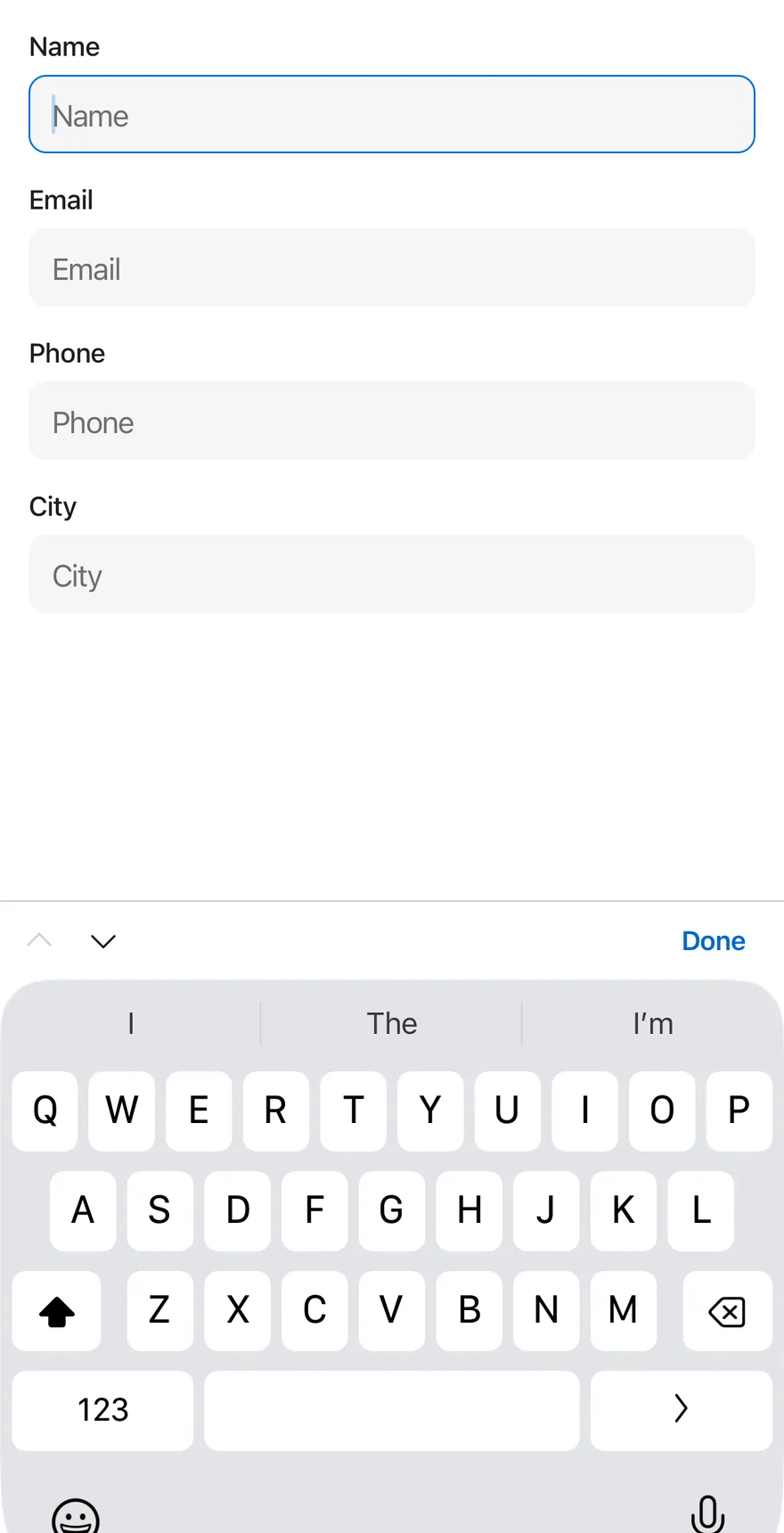
}InputAccessoryBar connects a set of inputs and shows a bar above the keyboard while one of them is focused. The up and down arrows move focus to the previous or next input, and the done button dismisses the keyboard.
On iOS the bar is a native InputAccessoryView, attached to the keyboard. On Android it is rendered through a portal and positioned just above the keyboard while an input is focused.
Installation
$ pnpm dlx @esuiss/uim@latest add input-accessory-bar$ pnpm dlx @esuiss/uim@latest add input-accessory-bar --platform swift$ pnpm dlx @esuiss/uim@latest add input-accessory-bar --platform kotlinThe CLI also adds what it builds on: Button, Icon, Input, Keyboard Scroll View, Text.
Manual
- Install the dependencies:
npx expo install cn phosphor-react-native react-native-svg-
Add the pieces it builds on: Button, Icon, Input, Keyboard Scroll View, Text, and the primitives
components/primitives/hooks.tsx,components/primitives/keyboard.tsx,components/primitives/portal.tsx. -
Copy the source into
components/ui/input-accessory-bar.tsx:
import { cn } from "cn"
import { CaretDownIcon, CaretUpIcon } from "phosphor-react-native"
import * as React from "react"
import {
  InputAccessoryView,
  Keyboard,
  Platform,
  type TextInput,
  type TextInputProps,
  View,
} from "react-native"
import { useComposedRefs } from "@/components/primitives/hooks"
import {
  setKeyboardAccessoryHeight,
  useKeyboard,
} from "@/components/primitives/keyboard"- Update the import paths to match your project.
- Install the dependencies:
npx expo install cn phosphor-react-native react-native-svg-
Add the pieces it builds on: Button, Icon, Input, Keyboard Scroll View, Text, and the primitives
components/primitives/hooks.tsx,components/primitives/keyboard.tsx,components/primitives/portal.tsx. -
Copy the source into
components/ui/input-accessory-bar.tsx:
import { cn } from "cn"
import { CaretDownIcon, CaretUpIcon } from "phosphor-react-native"
import * as React from "react"
import {
  InputAccessoryView,
  Keyboard,
  Platform,
  type TextInput,
  type TextInputProps,
  View,
} from "react-native"
import { useComposedRefs } from "@/components/primitives/hooks"
import {
  setKeyboardAccessoryHeight,
  useKeyboard,
} from "@/components/primitives/keyboard"- Update the import paths to match your project.
- Install the dependencies:
npx expo install phosphor-react-native react-native-svg-
Add the pieces it builds on: Button, Icon, Input, Keyboard Scroll View, Text, and the primitives
components/primitives/hooks.tsx,components/primitives/keyboard.tsx,components/primitives/portal.tsx. -
Copy the source into
components/ui/input-accessory-bar.tsx:
import { CaretDownIcon, CaretUpIcon } from "phosphor-react-native"
import * as React from "react"
import {
  InputAccessoryView,
  Keyboard,
  Platform,
  type StyleProp,
  StyleSheet,
  type TextInput,
  type TextInputProps,
  View,
  type ViewStyle,
} from "react-native"
import { useComposedRefs } from "@/components/primitives/hooks"
import {
setKeyboardAccessoryHeight,- Update the import paths to match your project.
-
Target iOS 17 or later.
-
Add the Swift package to your app:
.package(url: "https://github.com/phosphor-icons/swift", from: "2.1.0")- Copy the theme files every view uses:
import SwiftUI
import UIKit

struct RGBA: Sendable {
  let red: CGFloat
  let green: CGFloat
  let blue: CGFloat
  let alpha: CGFloat

  init(_ hex: UInt32, _ alpha: CGFloat = 1) {
    red = CGFloat((hex >> 16) & 0xFF) / 255
    green = CGFloat((hex >> 8) & 0xFF) / 255
    blue = CGFloat(hex & 0xFF) / 255
    self.alpha = alpha
}import SwiftUI
extension Color {
public static let surface = Color.adaptive(light: .init(0xFFFFFF), dark: .init(0x000000))
public static let surfaceSecondary = Color.adaptive(light: .init(0xF5F5F7), dark: .init(0x161617))
public static let surfaceTertiary = Color.adaptive(light: .init(0xE8E8ED), dark: .init(0x2C2C2E))
public static let surfaceRaised = Color.adaptive(light: .init(0xFFFFFF), dark: .init(0x1D1D1F))
public static let label = Color.adaptive(light: .init(0x1D1D1F), dark: .init(0xF5F5F7))
public static let labelSecondary = Color.adaptive(light: .init(0x6E6E73), dark: .init(0xA1A1A6))
public static let labelTertiary = Color.adaptive(light: .init(0x86868B), dark: .init(0x86868B))
public static let labelQuaternary = Color.adaptive(light: .init(0xD2D2D7), dark: .init(0x424245))
public static let control = Color.adaptive(light: .init(0x000000, 0.04), dark: .init(0xFFFFFF, 0.1))
public static let controlPressed = Color.adaptive(light: .init(0x000000, 0.12), dark: .init(0xFFFFFF, 0.22))
public static let controlSelected = Color.adaptive(light: .init(0x1D1D1F), dark: .init(0xF5F5F7))
public static let controlDisabled = Color.adaptive(light: .init(0x000000, 0.03), dark: .init(0xFFFFFF, 0.05))
public static let onControlSelected = Color.adaptive(light: .init(0xFFFFFF), dark: .init(0x000000))- Copy the source and every file it uses:
import PhosphorSwift
import SwiftUI

struct FocusChain<Value: Hashable> {
  let order: [Value]

  func next(after value: Value?) -> Value? {
    guard let value, let index = order.firstIndex(of: value) else { return order.first }
    let target = order.index(after: index)
    return target < order.endIndex ? order[target] : nil
  }

  func previous(before value: Value?) -> Value? {
    guard let value, let index = order.firstIndex(of: value) else { return nil }
    return index > order.startIndex ? order[order.index(before: index)] : nil
}import PhosphorSwift
import SwiftUI
extension Shadow {
static let control = Shadow(color: .black.opacity(0.08), radius: 0.5, y: 0.5)
static let thumb = Shadow(color: .black.opacity(0.12), radius: 1.5, y: 1)
}
struct SelectionIndicator<Mark: View>: View {
let checked: Bool
let pressed: Bool
let cornerRadius: CGFloat
let mark: Mark
@Environment(\.isEnabled) private var isEnabled
@Environment(\.isInvalid) private var invalidimport SwiftUI
extension EnvironmentValues {
@Entry public var isInvalid = false
@Entry var fieldInset = false
@Entry var fieldGroupInset = false
@Entry var fieldSetInset = false
}
extension View {
public func invalid(_ isInvalid: Bool = true) -> some View {
environment(\.isInvalid, isInvalid)
}
}
public enum FieldOrientation: CaseIterable, Sendable {import SwiftUI
extension EnvironmentValues {
@Entry public var hapticsEnabled = true
}
extension View {
public func haptics(_ enabled: Bool) -> some View {
environment(\.hapticsEnabled, enabled)
}
func hapticFeedback<Trigger: Equatable>(_ feedback: SensoryFeedback, trigger: Trigger) -> some View {
modifier(HapticFeedbackModifier(feedback: feedback, trigger: trigger) { _, _ in true })
}
func hapticFeedback<Trigger: Equatable>(import SwiftUI
public struct Separator: View {
let orientation: Axis
public init(_ orientation: Axis = .horizontal) {
self.orientation = orientation
}
public var body: some View {
Rectangle()
.fill(Color.separator)
.frame(width: orientation == .vertical ? 1 : nil, height: orientation == .horizontal ? 1 : nil)
.frame(maxWidth: orientation == .horizontal ? .infinity : nil, maxHeight: orientation == .vertical ? .infinity : nil)
.accessibilityHidden(true)
}import SwiftUI
public enum TextVariant: CaseIterable, Sendable {
case `default`, h1, h2, h3, h4, p, blockquote, code, lead, large, small, muted
var style: TextStyle {
switch self {
case .h1: .xl3
case .h2: .xl2
case .h3: .xl
case .h4, .lead, .large: .lg
case .code, .small, .muted: .sm
default: .base
}
}- Add the files to your app target.
- Set
minSdkto 24 or higher and add the dependencies:
implementation(platform("androidx.compose:compose-bom:2026.09.00"))
implementation("androidx.compose.foundation:foundation")
implementation("androidx.compose.ui:ui")
implementation("com.adamglin:phosphor-icon-android:1.0.0")- Copy the theme files every view uses:
package com.esuiss.ui.theme

import androidx.compose.foundation.isSystemInDarkTheme
import androidx.compose.runtime.Composable
import androidx.compose.runtime.CompositionLocalProvider
import androidx.compose.runtime.Immutable
import androidx.compose.runtime.staticCompositionLocalOf
import androidx.compose.ui.Modifier
import androidx.compose.ui.draw.dropShadow
import androidx.compose.ui.graphics.Color
import androidx.compose.ui.graphics.Shape
import androidx.compose.ui.graphics.shadow.Shadow as DropShadow
import androidx.compose.ui.text.TextStyle
import androidx.compose.ui.text.style.LineHeightStyle
import androidx.compose.ui.unit.Dp
import androidx.compose.ui.unit.DpOffsetpackage com.esuiss.ui.theme
import androidx.compose.runtime.Immutable
import androidx.compose.ui.graphics.Color
import androidx.compose.ui.unit.dp
@Immutable
data class Colors(
val surface: Color,
val surfaceSecondary: Color,
val surfaceTertiary: Color,
val surfaceRaised: Color,
val label: Color,
val labelSecondary: Color,
val labelTertiary: Color,
val labelQuaternary: Color,- Copy the source and every file it uses:
package com.esuiss.ui.components

import androidx.compose.foundation.background
import androidx.compose.foundation.layout.Arrangement
import androidx.compose.foundation.layout.Row
import androidx.compose.foundation.layout.Spacer
import androidx.compose.foundation.layout.WindowInsets
import androidx.compose.foundation.layout.fillMaxWidth
import androidx.compose.foundation.layout.height
import androidx.compose.foundation.layout.ime
import androidx.compose.foundation.layout.padding
import androidx.compose.foundation.layout.width
import androidx.compose.foundation.relocation.BringIntoViewRequester
import androidx.compose.foundation.relocation.bringIntoViewRequester
import androidx.compose.foundation.text.BasicText
import androidx.compose.runtime.Composablepackage com.esuiss.ui.components
import androidx.compose.foundation.background
import androidx.compose.foundation.border
import androidx.compose.foundation.clickable
import androidx.compose.foundation.interaction.MutableInteractionSource
import androidx.compose.foundation.interaction.collectIsPressedAsState
import androidx.compose.foundation.layout.Arrangement
import androidx.compose.foundation.layout.Row
import androidx.compose.foundation.layout.RowScope
import androidx.compose.foundation.layout.fillMaxWidth
import androidx.compose.foundation.layout.height
import androidx.compose.foundation.layout.padding
import androidx.compose.foundation.layout.size
import androidx.compose.foundation.shape.CircleShape
import androidx.compose.foundation.shape.RoundedCornerShapepackage com.esuiss.ui.components
import androidx.compose.foundation.background
import androidx.compose.foundation.gestures.Orientation
import androidx.compose.foundation.layout.Arrangement
import androidx.compose.foundation.layout.Box
import androidx.compose.foundation.layout.Row
import androidx.compose.foundation.layout.RowScope
import androidx.compose.foundation.layout.padding
import androidx.compose.foundation.shape.CircleShape
import androidx.compose.foundation.shape.CornerSize
import androidx.compose.foundation.shape.RoundedCornerShape
import androidx.compose.runtime.Composable
import androidx.compose.runtime.CompositionLocalProvider
import androidx.compose.runtime.DisposableEffect
import androidx.compose.runtime.Immutablepackage com.esuiss.ui.components
import androidx.compose.runtime.compositionLocalOf
import androidx.compose.ui.graphics.Color
import androidx.compose.ui.text.TextStyle
import androidx.compose.ui.unit.Dp
import androidx.compose.ui.unit.dp
val LocalContentStyle = compositionLocalOf { TextStyle.Default }
val LocalContentColor = compositionLocalOf { Color.Unspecified }
val LocalIconSize = compositionLocalOf { 20.dp }package com.esuiss.ui.components
import androidx.compose.foundation.Image
import androidx.compose.foundation.layout.size
import androidx.compose.runtime.Composable
import androidx.compose.ui.Modifier
import androidx.compose.ui.graphics.Color
import androidx.compose.ui.graphics.ColorFilter
import androidx.compose.ui.graphics.takeOrElse
import androidx.compose.ui.graphics.vector.ImageVector
import androidx.compose.ui.unit.Dp
import com.esuiss.ui.theme.EsuissTheme
@Composable
fun Icon(
imageVector: ImageVector,package com.esuiss.ui.components
import android.app.Activity
import android.content.Context
import android.content.ContextWrapper
import android.os.Build
import android.view.View
import android.view.Window
import android.view.WindowInsetsController
import androidx.compose.foundation.background
import androidx.compose.foundation.layout.Arrangement
import androidx.compose.foundation.layout.Box
import androidx.compose.foundation.layout.BoxScope
import androidx.compose.foundation.layout.Column
import androidx.compose.foundation.layout.ExperimentalLayoutApi
import androidx.compose.foundation.layout.ColumnScope- Update the
com.esuiss.uipackage names to match your project.
Usage
import { InputAccessoryBar, InputAccessoryBarInput } from "@/components/ui/input-accessory-bar"<InputAccessoryBar>
<Form />
</InputAccessoryBar>Wrap the form in InputAccessoryBar and use InputAccessoryBarInput in place of Input. Inputs are ordered by the order they mount. The return key reads "next" on every input but the last, which reads "done" and dismisses the keyboard.
For other text inputs, such as a Textarea, call useInputAccessoryBarInput() and spread the returned props onto the input. Inside a Keyboard Scroll View, the focused input is scrolled into view.
Use previousLabel, nextLabel and doneLabel to localize the buttons, and onDone to react when done is pressed.
Examples
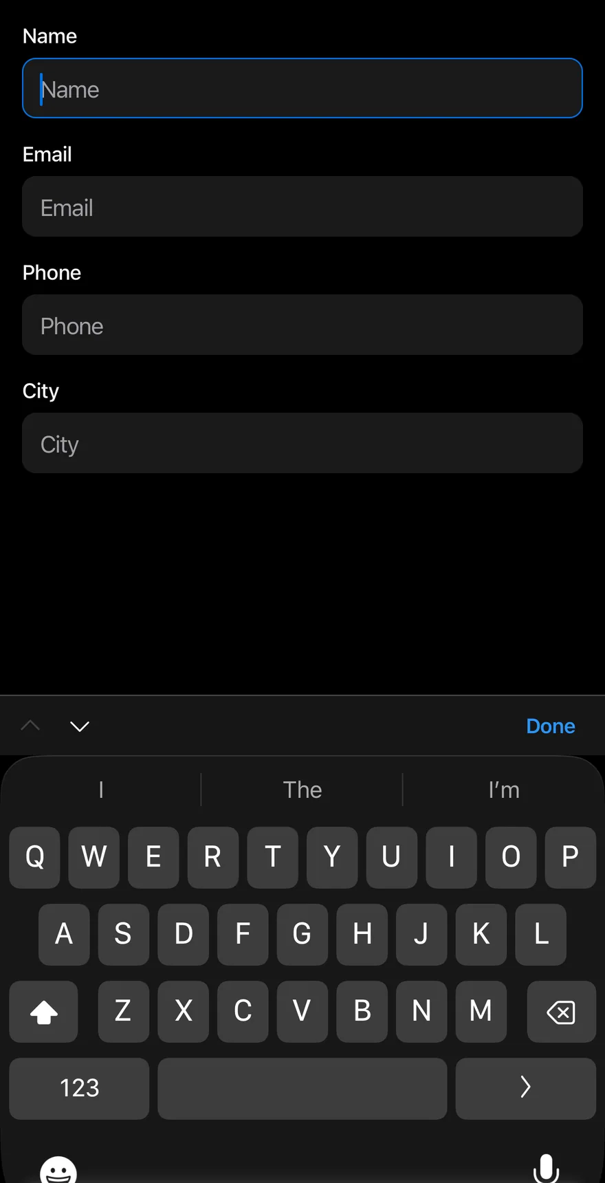
Focused
The first input focused, so the bar is visible.
import { View } from "react-native"
import { InputAccessoryBar, InputAccessoryBarInput } from "@/components/ui/input-accessory-bar"
import { KeyboardScrollView } from "@/components/ui/keyboard-scroll-view"
import { Text } from "@/components/ui/text"

function Field({ label, autoFocus }: { label: string; autoFocus?: boolean }) {
  return (
    <View className="gap-1.5">
      <Text variant="small">{label}</Text>
      <InputAccessoryBarInput placeholder={label} autoFocus={autoFocus} />
    </View>
  )
}

function Form({ autoFocus = false }: { autoFocus?: boolean }) {
  return (
    <KeyboardScrollView className="-m-4" contentContainerClassName="gap-4 p-4">
      <Field label="Name" autoFocus={autoFocus} />
      <Field label="Email" />
      <Field label="Phone" />
      <Field label="City" />
    </KeyboardScrollView>
  )
}

export function InputAccessoryBarFocusedExample() {
  return (
    <InputAccessoryBar>
      <Form autoFocus />
    </InputAccessoryBar>
  )
}import EsuissUI
import SwiftUI
struct InputAccessoryBarFocusedExample: View {
var body: some View {
InputAccessoryBarForm(autoFocus: true)
}
}
enum InputAccessoryBarField: Hashable {
case name, email, phone, city, subject, message
}
struct InputAccessoryBarRow: View {
let label: LocalizedStringKey
let field: InputAccessoryBarField
let focus: FocusState<InputAccessoryBarField?>.Binding
@State private var text = ""
var body: some View {
VStack(alignment: .leading, spacing: 6) {
Text(label)
.textVariant(.small)
.accessibilityHidden(true)
TextField(label, text: $text)
.textFieldStyle(.input)
.focused(focus, equals: field)
.submitLabel(.next)
}
}
}
struct InputAccessoryBarForm: View {
var autoFocus = false
var previousLabel: LocalizedStringKey = "Previous"
var nextLabel: LocalizedStringKey = "Next"
var doneLabel: LocalizedStringKey = "Done"
@FocusState private var focus: InputAccessoryBarField?
var body: some View {
KeyboardScrollView {
VStack(alignment: .leading, spacing: 16) {
InputAccessoryBarRow(label: "Name", field: .name, focus: $focus)
InputAccessoryBarRow(label: "Email", field: .email, focus: $focus)
InputAccessoryBarRow(label: "Phone", field: .phone, focus: $focus)
InputAccessoryBarRow(label: "City", field: .city, focus: $focus)
}
.padding(16)
}
.inputAccessoryBar(
focus: $focus,
order: [.name, .email, .phone, .city],
previousLabel: previousLabel,
nextLabel: nextLabel,
doneLabel: doneLabel
)
.onAppear {
if autoFocus { focus = .name }
}
}
}import androidx.compose.foundation.layout.Arrangement
import androidx.compose.foundation.layout.Column
import androidx.compose.foundation.layout.PaddingValues
import androidx.compose.foundation.layout.fillMaxSize
import androidx.compose.foundation.layout.fillMaxWidth
import androidx.compose.runtime.Composable
import androidx.compose.runtime.LaunchedEffect
import androidx.compose.runtime.getValue
import androidx.compose.runtime.mutableStateOf
import androidx.compose.runtime.remember
import androidx.compose.runtime.saveable.rememberSaveable
import androidx.compose.runtime.setValue
import androidx.compose.ui.Modifier
import androidx.compose.ui.focus.FocusRequester
import androidx.compose.ui.focus.focusRequester
import androidx.compose.ui.unit.dp
import com.esuiss.ui.components.Input
import com.esuiss.ui.components.InputAccessoryBar
import com.esuiss.ui.components.InputAccessoryState
import com.esuiss.ui.components.KeyboardScrollView
import com.esuiss.ui.components.Screen
import com.esuiss.ui.components.Text
import com.esuiss.ui.components.TextVariant
import com.esuiss.ui.components.inputAccessory
import com.esuiss.ui.components.rememberInputAccessoryState
@Composable
fun InputAccessoryBarFocusedExample() {
InputAccessoryBarForm(autoFocus = true)
}
@Composable
fun InputAccessoryBarField(
label: String,
state: InputAccessoryState,
index: Int,
autoFocus: Boolean = false,
) {
var value by rememberSaveable(label) { mutableStateOf("") }
val requester = remember { FocusRequester() }
if (autoFocus) {
LaunchedEffect(Unit) { requester.requestFocus() }
}
Column(Modifier.fillMaxWidth(), verticalArrangement = Arrangement.spacedBy(6.dp)) {
Text(label, variant = TextVariant.Small)
Input(
value,
{ value = it },
Modifier.focusRequester(requester).inputAccessory(state, index),
placeholder = label,
)
}
}
@Composable
fun InputAccessoryBarForm(
autoFocus: Boolean,
previousLabel: String = "Previous",
nextLabel: String = "Next",
doneLabel: String = "Done",
) {
val state = rememberInputAccessoryState()
Screen {
KeyboardScrollView(
modifier = Modifier.fillMaxSize(),
contentPadding = PaddingValues(16.dp),
verticalArrangement = Arrangement.spacedBy(16.dp),
) {
InputAccessoryBarField("Name", state, 0, autoFocus)
InputAccessoryBarField("Email", state, 1)
InputAccessoryBarField("Phone", state, 2)
InputAccessoryBarField("City", state, 3)
}
InputAccessoryBar(state, previousLabel = previousLabel, nextLabel = nextLabel, doneLabel = doneLabel)
}
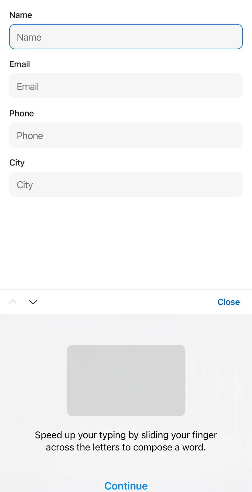
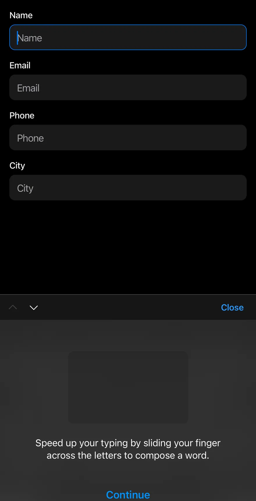
}Custom labels
Custom labels for the previous, next and done buttons.
import { View } from "react-native"
import { InputAccessoryBar, InputAccessoryBarInput } from "@/components/ui/input-accessory-bar"
import { KeyboardScrollView } from "@/components/ui/keyboard-scroll-view"
import { Text } from "@/components/ui/text"

function Field({ label, autoFocus }: { label: string; autoFocus?: boolean }) {
  return (
    <View className="gap-1.5">
      <Text variant="small">{label}</Text>
      <InputAccessoryBarInput placeholder={label} autoFocus={autoFocus} />
    </View>
  )
}

function Form({ autoFocus = false }: { autoFocus?: boolean }) {
  return (
    <KeyboardScrollView className="-m-4" contentContainerClassName="gap-4 p-4">
      <Field label="Name" autoFocus={autoFocus} />
      <Field label="Email" />
      <Field label="Phone" />
      <Field label="City" />
    </KeyboardScrollView>
  )
}

export function InputAccessoryBarCustomLabelsExample() {
  return (
    <InputAccessoryBar
      previousLabel="Back"
      nextLabel="Forward"
      doneLabel="Close"
    >
      <Form autoFocus />
    </InputAccessoryBar>
  )
}import EsuissUI
import SwiftUI
struct InputAccessoryBarCustomLabelsExample: View {
var body: some View {
InputAccessoryBarForm(autoFocus: true, previousLabel: "Back", nextLabel: "Forward", doneLabel: "Close")
}
}
enum InputAccessoryBarField: Hashable {
case name, email, phone, city, subject, message
}
struct InputAccessoryBarRow: View {
let label: LocalizedStringKey
let field: InputAccessoryBarField
let focus: FocusState<InputAccessoryBarField?>.Binding
@State private var text = ""
var body: some View {
VStack(alignment: .leading, spacing: 6) {
Text(label)
.textVariant(.small)
.accessibilityHidden(true)
TextField(label, text: $text)
.textFieldStyle(.input)
.focused(focus, equals: field)
.submitLabel(.next)
}
}
}
struct InputAccessoryBarForm: View {
var autoFocus = false
var previousLabel: LocalizedStringKey = "Previous"
var nextLabel: LocalizedStringKey = "Next"
var doneLabel: LocalizedStringKey = "Done"
@FocusState private var focus: InputAccessoryBarField?
var body: some View {
KeyboardScrollView {
VStack(alignment: .leading, spacing: 16) {
InputAccessoryBarRow(label: "Name", field: .name, focus: $focus)
InputAccessoryBarRow(label: "Email", field: .email, focus: $focus)
InputAccessoryBarRow(label: "Phone", field: .phone, focus: $focus)
InputAccessoryBarRow(label: "City", field: .city, focus: $focus)
}
.padding(16)
}
.inputAccessoryBar(
focus: $focus,
order: [.name, .email, .phone, .city],
previousLabel: previousLabel,
nextLabel: nextLabel,
doneLabel: doneLabel
)
.onAppear {
if autoFocus { focus = .name }
}
}
}import androidx.compose.foundation.layout.Arrangement
import androidx.compose.foundation.layout.Column
import androidx.compose.foundation.layout.PaddingValues
import androidx.compose.foundation.layout.fillMaxSize
import androidx.compose.foundation.layout.fillMaxWidth
import androidx.compose.runtime.Composable
import androidx.compose.runtime.LaunchedEffect
import androidx.compose.runtime.getValue
import androidx.compose.runtime.mutableStateOf
import androidx.compose.runtime.remember
import androidx.compose.runtime.saveable.rememberSaveable
import androidx.compose.runtime.setValue
import androidx.compose.ui.Modifier
import androidx.compose.ui.focus.FocusRequester
import androidx.compose.ui.focus.focusRequester
import androidx.compose.ui.unit.dp
import com.esuiss.ui.components.Input
import com.esuiss.ui.components.InputAccessoryBar
import com.esuiss.ui.components.InputAccessoryState
import com.esuiss.ui.components.KeyboardScrollView
import com.esuiss.ui.components.Screen
import com.esuiss.ui.components.Text
import com.esuiss.ui.components.TextVariant
import com.esuiss.ui.components.inputAccessory
import com.esuiss.ui.components.rememberInputAccessoryState
@Composable
fun InputAccessoryBarCustomLabelsExample() {
InputAccessoryBarForm(autoFocus = true, previousLabel = "Back", nextLabel = "Forward", doneLabel = "Close")
}
@Composable
fun InputAccessoryBarField(
label: String,
state: InputAccessoryState,
index: Int,
autoFocus: Boolean = false,
) {
var value by rememberSaveable(label) { mutableStateOf("") }
val requester = remember { FocusRequester() }
if (autoFocus) {
LaunchedEffect(Unit) { requester.requestFocus() }
}
Column(Modifier.fillMaxWidth(), verticalArrangement = Arrangement.spacedBy(6.dp)) {
Text(label, variant = TextVariant.Small)
Input(
value,
{ value = it },
Modifier.focusRequester(requester).inputAccessory(state, index),
placeholder = label,
)
}
}
@Composable
fun InputAccessoryBarForm(
autoFocus: Boolean,
previousLabel: String = "Previous",
nextLabel: String = "Next",
doneLabel: String = "Done",
) {
val state = rememberInputAccessoryState()
Screen {
KeyboardScrollView(
modifier = Modifier.fillMaxSize(),
contentPadding = PaddingValues(16.dp),
verticalArrangement = Arrangement.spacedBy(16.dp),
) {
InputAccessoryBarField("Name", state, 0, autoFocus)
InputAccessoryBarField("Email", state, 1)
InputAccessoryBarField("Phone", state, 2)
InputAccessoryBarField("City", state, 3)
}
InputAccessoryBar(state, previousLabel = previousLabel, nextLabel = nextLabel, doneLabel = doneLabel)
}
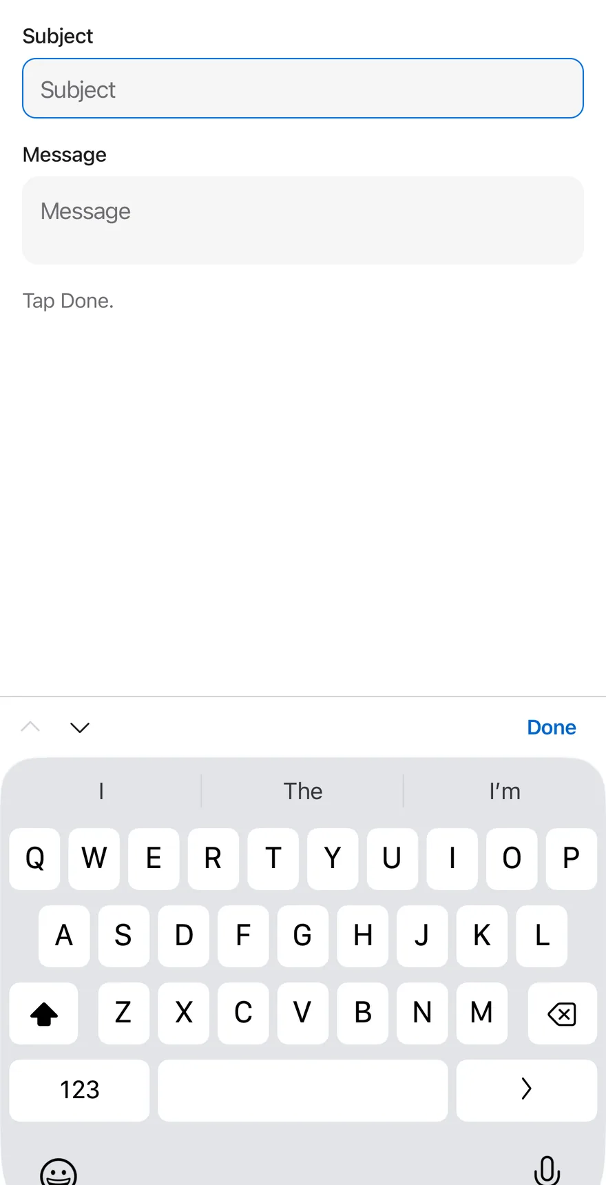
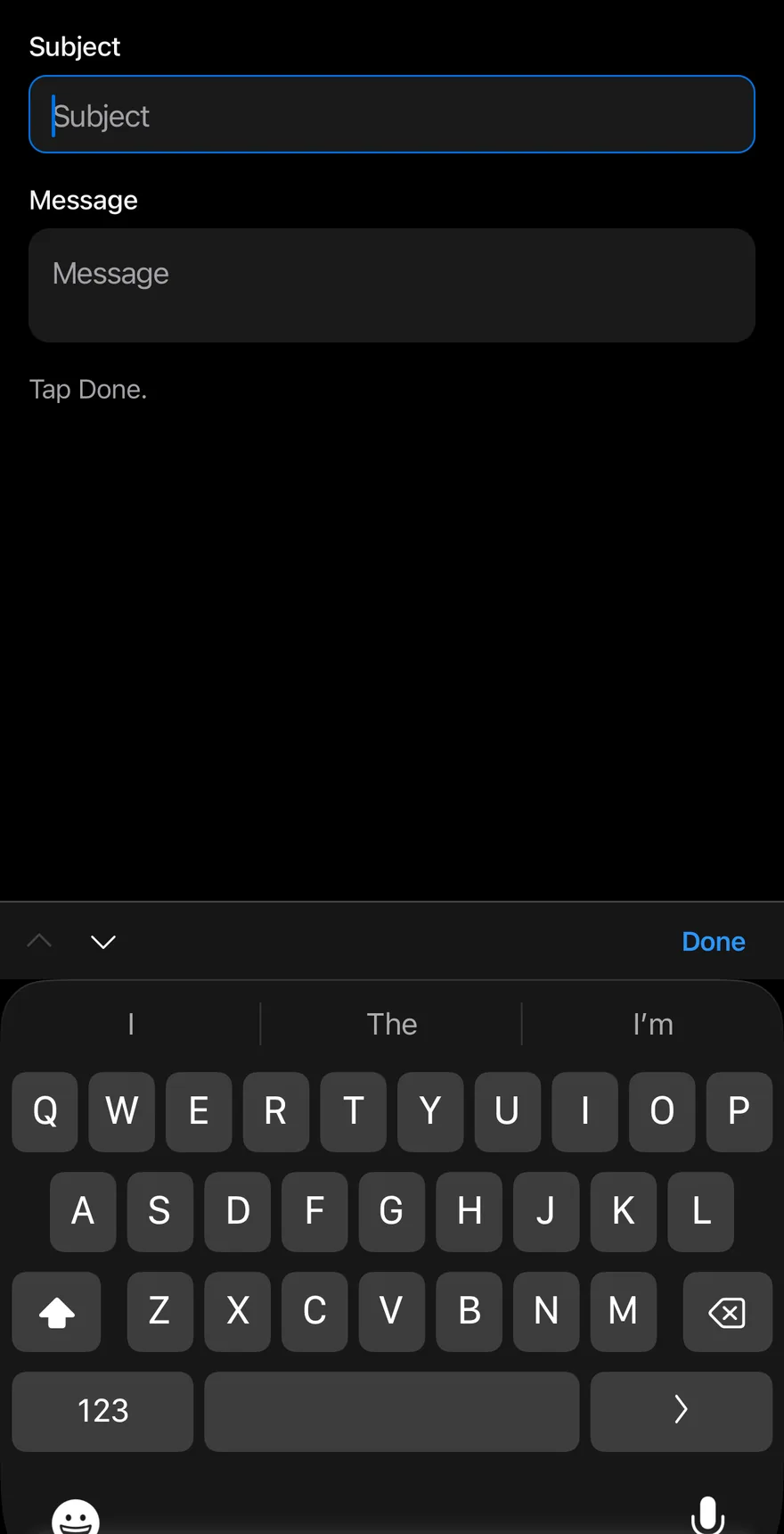
}With textarea
A textarea connected through useInputAccessoryBarInput.
import * as React from "react"
import { View } from "react-native"
import { InputAccessoryBar, InputAccessoryBarInput, useInputAccessoryBarInput } from "@/components/ui/input-accessory-bar"
import { KeyboardScrollView } from "@/components/ui/keyboard-scroll-view"
import { Text } from "@/components/ui/text"
import { Textarea } from "@/components/ui/textarea"

function Field({ label, autoFocus }: { label: string; autoFocus?: boolean }) {
  return (
    <View className="gap-1.5">
      <Text variant="small">{label}</Text>
      <InputAccessoryBarInput placeholder={label} autoFocus={autoFocus} />
    </View>
  )
}

function MessageField() {
  const accessory = useInputAccessoryBarInput()
  return (
    <View className="gap-1.5">
      <Text variant="small">Message</Text>
      <Textarea
        placeholder="Message"
        ref={accessory.ref}
        inputAccessoryViewID={accessory.inputAccessoryViewID}
        onFocus={accessory.onFocus}
        onBlur={accessory.onBlur}
      />
    </View>
  )
}

function DoneLogDemo() {
  const [log, setLog] = React.useState("Tap Done.")
  return (
    <InputAccessoryBar onDone={() => setLog("Done pressed")}>
      <KeyboardScrollView
        className="-m-4"
        contentContainerClassName="gap-4 p-4"
      >
        <Field label="Subject" autoFocus />
        <MessageField />
        <Text role="status" className="text-sm text-label-secondary">
          {log}
        </Text>
      </KeyboardScrollView>
    </InputAccessoryBar>
  )
}

export function InputAccessoryBarWithTextareaExample() {
  return (
    <DoneLogDemo />
  )
}import EsuissUI
import SwiftUI
enum InputAccessoryBarField: Hashable {
case name, email, phone, city, subject, message
}
struct InputAccessoryBarRow: View {
let label: LocalizedStringKey
let field: InputAccessoryBarField
let focus: FocusState<InputAccessoryBarField?>.Binding
@State private var text = ""
var body: some View {
VStack(alignment: .leading, spacing: 6) {
Text(label)
.textVariant(.small)
.accessibilityHidden(true)
TextField(label, text: $text)
.textFieldStyle(.input)
.focused(focus, equals: field)
.submitLabel(.next)
}
}
}
struct InputAccessoryBarTextareaDemo: View {
@FocusState private var focus: InputAccessoryBarField?
@State private var message = ""
@State private var log = "Tap Done."
var body: some View {
KeyboardScrollView {
VStack(alignment: .leading, spacing: 16) {
InputAccessoryBarRow(label: "Subject", field: .subject, focus: $focus)
VStack(alignment: .leading, spacing: 6) {
Text("Message")
.textVariant(.small)
.accessibilityHidden(true)
TextField("Message", text: $message, axis: .vertical)
.textFieldStyle(.textarea)
.focused($focus, equals: .message)
}
Text(log)
.textStyle(.sm)
.foregroundStyle(Color.labelSecondary)
}
.padding(16)
}
.safeAreaInset(edge: .bottom, spacing: 0) {
if let current = focus {
InputAccessoryBar(
onPrevious: current == .message ? { focus = .subject } : nil,
onNext: current == .subject ? { focus = .message } : nil,
onDone: {
log = "Done pressed"
focus = nil
}
)
}
}
.onSubmit {
if focus == .subject { focus = .message }
}
.onAppear { focus = .subject }
}
}import androidx.compose.foundation.layout.Arrangement
import androidx.compose.foundation.layout.Column
import androidx.compose.foundation.layout.PaddingValues
import androidx.compose.foundation.layout.fillMaxSize
import androidx.compose.foundation.layout.fillMaxWidth
import androidx.compose.runtime.Composable
import androidx.compose.runtime.LaunchedEffect
import androidx.compose.runtime.getValue
import androidx.compose.runtime.mutableStateOf
import androidx.compose.runtime.remember
import androidx.compose.runtime.saveable.rememberSaveable
import androidx.compose.runtime.setValue
import androidx.compose.ui.Modifier
import androidx.compose.ui.focus.FocusRequester
import androidx.compose.ui.focus.focusRequester
import androidx.compose.ui.semantics.LiveRegionMode
import androidx.compose.ui.semantics.liveRegion
import androidx.compose.ui.semantics.semantics
import androidx.compose.ui.unit.dp
import com.esuiss.ui.components.Input
import com.esuiss.ui.components.InputAccessoryBar
import com.esuiss.ui.components.InputAccessoryState
import com.esuiss.ui.components.KeyboardScrollView
import com.esuiss.ui.components.Screen
import com.esuiss.ui.components.Text
import com.esuiss.ui.components.TextVariant
import com.esuiss.ui.components.Textarea
import com.esuiss.ui.components.inputAccessory
import com.esuiss.ui.components.rememberInputAccessoryState
import com.esuiss.ui.theme.EsuissTheme
import com.esuiss.ui.theme.Typography
@Composable
fun InputAccessoryBarField(
label: String,
state: InputAccessoryState,
index: Int,
autoFocus: Boolean = false,
) {
var value by rememberSaveable(label) { mutableStateOf("") }
val requester = remember { FocusRequester() }
if (autoFocus) {
LaunchedEffect(Unit) { requester.requestFocus() }
}
Column(Modifier.fillMaxWidth(), verticalArrangement = Arrangement.spacedBy(6.dp)) {
Text(label, variant = TextVariant.Small)
Input(
value,
{ value = it },
Modifier.focusRequester(requester).inputAccessory(state, index),
placeholder = label,
)
}
}
@Composable
fun InputAccessoryBarDoneLog() {
val state = rememberInputAccessoryState()
var log by rememberSaveable { mutableStateOf("Tap Done.") }
var message by rememberSaveable { mutableStateOf("") }
Screen {
KeyboardScrollView(
modifier = Modifier.fillMaxSize(),
contentPadding = PaddingValues(16.dp),
verticalArrangement = Arrangement.spacedBy(16.dp),
) {
InputAccessoryBarField("Subject", state, 0, autoFocus = true)
Column(Modifier.fillMaxWidth(), verticalArrangement = Arrangement.spacedBy(6.dp)) {
Text("Message", variant = TextVariant.Small)
Textarea(
message,
{ message = it },
Modifier.inputAccessory(state, 1),
placeholder = "Message",
)
}
Text(
log,
modifier = Modifier.semantics { liveRegion = LiveRegionMode.Polite },
style = Typography.sm.copy(color = EsuissTheme.colors.labelSecondary),
)
}
InputAccessoryBar(state, onDone = { log = "Done pressed" })
}
}API Reference
InputAccessoryBar
Provider that tracks the inputs and renders the bar.
- About
- Label for the previous button. Defaults to
"Previous". - Type
string- Default
- "Previous"
- About
- Label for the next button. Defaults to
"Next". - Type
string- Default
- "Next"
- About
- Text or node for the done button. Defaults to
"Done". - Type
React.ReactNode- Default
- "Done"
- About
- Called after the keyboard is dismissed with done.
- Type
() => void- Default
- —
- About
- Name of the portal host on Android.
- Type
string- Default
- —
- Type
string- Default
- —
- Type
React.ReactNode- Default
- —
InputAccessoryBarInput
Input connected to the bar.
React.ComponentProps<typeof Input>Accessibility
- The arrow buttons are labelled with
previousLabelandnextLabeland are disabled at the first and last input. - The done button is a text button that dismisses the keyboard.
Notes
- iOS uses the native input accessory view; Android uses a portal and reserves the bar height so keyboard-aware layouts stay above it.
- Uses
bg-surface-raised(a secondary surface in dark mode) andborder-separatortokens.