suiss/uim · React Native Component
Toggle Group
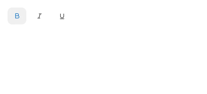
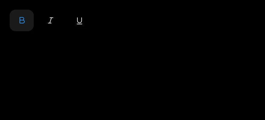
A set of toggles that share one value, for formatting controls, alignment options and segmented controls.
Toggle Group is an open-source mobile component from suiss/uim for React Native and Expo, with SwiftUI and Jetpack Compose versions built from the same design tokens. The @esuiss/uim CLI copies its source into your project, so you own the code.
import { TextBIcon, TextItalicIcon, TextUnderlineIcon } from "phosphor-react-native"
import * as React from "react"
import { ToggleGroup, ToggleGroupIcon, ToggleGroupItem } from "@/components/ui/toggle-group"

type GroupProps = Omit<
  React.ComponentProps<typeof ToggleGroup>,
  "value" | "onValueChange" | "children"
>

function FormattingDemo({
  initial = ["bold"],
  ...props
}: GroupProps & { initial?: string[] }) {
  const [value, setValue] = React.useState<string[]>(initial)
  return (
    <ToggleGroup multiple value={value} onValueChange={setValue} {...props}>
      <ToggleGroupItem value="bold" accessibilityLabel="Toggle bold">
        <ToggleGroupIcon as={TextBIcon} />
      </ToggleGroupItem>
      <ToggleGroupItem value="italic" accessibilityLabel="Toggle italic">
        <ToggleGroupIcon as={TextItalicIcon} />
      </ToggleGroupItem>
      <ToggleGroupItem value="underline" accessibilityLabel="Toggle underline">
        <ToggleGroupIcon as={TextUnderlineIcon} />
      </ToggleGroupItem>
    </ToggleGroup>
  )
}

export function ToggleGroupExample() {
  return (
    <FormattingDemo />
  )
}import EsuissUI
import PhosphorSwift
import SwiftUI
struct FormattingDemo: View {
let variant: ToggleVariant
let size: ToggleSize
let spacing: Int
let orientation: Axis
@State private var value: Set<String>
init(
initial: Set<String> = ["bold"],
variant: ToggleVariant = .default,
size: ToggleSize = .default,
spacing: Int = 2,
orientation: Axis = .horizontal
) {
self.variant = variant
self.size = size
self.spacing = spacing
self.orientation = orientation
_value = State(initialValue: initial)
}
var body: some View {
ToggleGroup(selection: $value, variant: variant, size: size, spacing: spacing, orientation: orientation) {
ToggleGroupItem(value: "bold") {
Ph.textB.regular.frame(width: 16, height: 16)
}
.accessibilityLabel(Text("Toggle bold"))
ToggleGroupItem(value: "italic") {
Ph.textItalic.regular.frame(width: 16, height: 16)
}
.accessibilityLabel(Text("Toggle italic"))
ToggleGroupItem(value: "underline") {
Ph.textUnderline.regular.frame(width: 16, height: 16)
}
.accessibilityLabel(Text("Toggle underline"))
}
}
}import androidx.compose.foundation.gestures.Orientation
import androidx.compose.runtime.Composable
import androidx.compose.runtime.getValue
import androidx.compose.runtime.mutableStateOf
import androidx.compose.runtime.saveable.rememberSaveable
import androidx.compose.runtime.setValue
import androidx.compose.ui.Modifier
import androidx.compose.ui.graphics.vector.ImageVector
import androidx.compose.ui.semantics.contentDescription
import androidx.compose.ui.semantics.semantics
import com.adamglin.PhosphorIcons
import com.adamglin.phosphoricons.Regular
import com.adamglin.phosphoricons.regular.TextB
import com.adamglin.phosphoricons.regular.TextItalic
import com.adamglin.phosphoricons.regular.TextUnderline
import com.esuiss.ui.components.Icon
import com.esuiss.ui.components.ToggleGroup
import com.esuiss.ui.components.ToggleGroupItem
import com.esuiss.ui.components.ToggleSize
import com.esuiss.ui.components.ToggleVariant
@Composable
fun ToggleGroupIconItem(value: String, label: String, icon: ImageVector) {
ToggleGroupItem(value, Modifier.semantics { contentDescription = label }) {
Icon(icon, contentDescription = null)
}
}
@Composable
fun ToggleGroupFormatting(
variant: ToggleVariant = ToggleVariant.Default,
size: ToggleSize = ToggleSize.Default,
spacing: Int = 2,
orientation: Orientation = Orientation.Horizontal,
enabled: Boolean = true,
initial: Set<String> = setOf("bold"),
) {
var values by rememberSaveable { mutableStateOf(initial.toList()) }
ToggleGroup(
values = values.toSet(),
onValuesChange = { values = it.toList() },
variant = variant,
size = size,
spacing = spacing,
orientation = orientation,
enabled = enabled,
) {
ToggleGroupIconItem("bold", "Toggle bold", PhosphorIcons.Regular.TextB)
ToggleGroupIconItem("italic", "Toggle italic", PhosphorIcons.Regular.TextItalic)
ToggleGroupIconItem("underline", "Toggle underline", PhosphorIcons.Regular.TextUnderline)
}
}ToggleGroup is built on the toggle group primitive and lays out ToggleGroupItem toggles in a row or a column. Items take the same variant and size styles as Toggle. The spacing prop sets the gap between items in steps of 4 points.
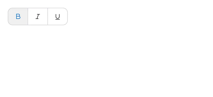
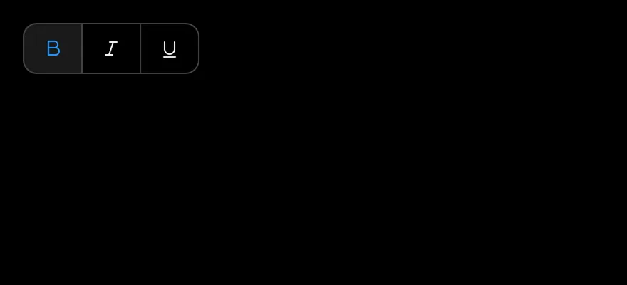
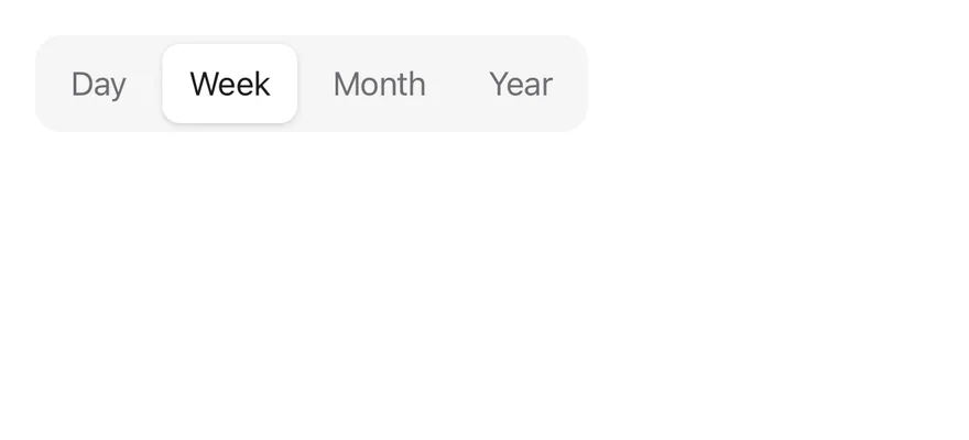
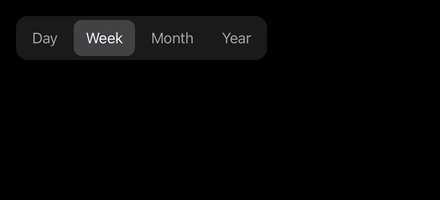
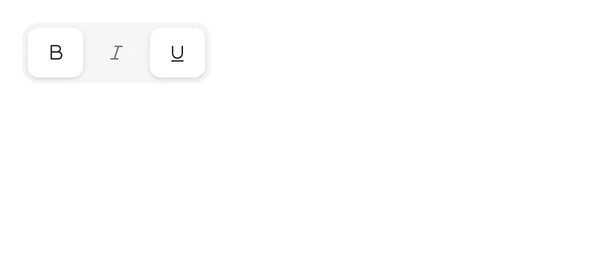
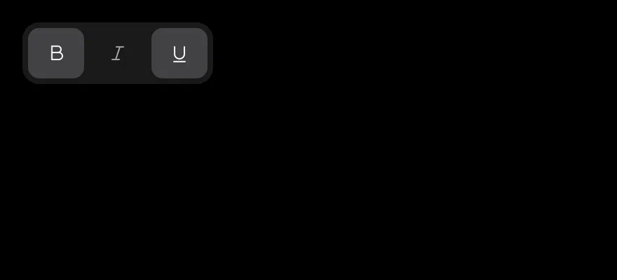
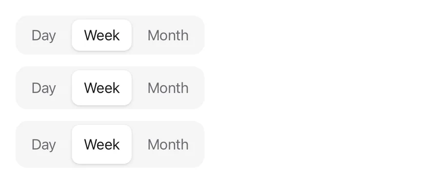
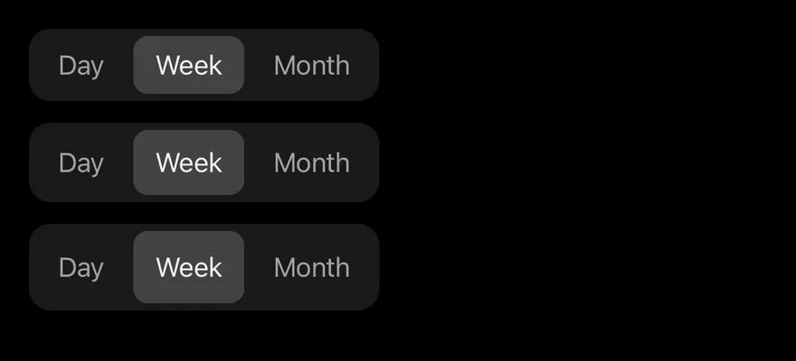
With spacing={0}, the group changes shape: the default variant becomes a segmented control on a bg-control track, and the outline variant joins items into one bordered strip. In a single-selection segmented control, the selected item is marked by a raised indicator that slides to the new item when the selection changes, like Tabs. In a multiple segmented control, each pressed item is raised on its own. Use the segmented style for switching views and the spaced style for toolbars.
Installation
$ pnpm dlx @esuiss/uim@latest add toggle-group$ pnpm dlx @esuiss/uim@latest add toggle-group --platform swift$ pnpm dlx @esuiss/uim@latest add toggle-group --platform kotlinThe CLI also adds what it builds on: Icon, Text, Toggle.
Manual
- Install the dependencies:
npx expo install class-variance-authority cn react-native-reanimated react-native-worklets-
Add the pieces it builds on: Icon, Text, Toggle, and the primitives
components/primitives/toggle.tsx,components/primitives/toggle-group.tsx,components/primitives/types.tsx,components/primitives/use-render.tsx. -
Copy the source into
components/ui/toggle-group.tsx:
import type { VariantProps } from "class-variance-authority"
import { cn } from "cn"
import * as React from "react"
import { Pressable } from "react-native"
import Animated, {
  Easing,
  LinearTransition,
  ReduceMotion,
} from "react-native-reanimated"
import {
  Toggle as TogglePrimitive,
  type ToggleState,
} from "@/components/primitives/toggle"
import {
  ToggleGroupIndicator as ToggleGroupIndicatorPrimitive,
ToggleGroup as ToggleGroupPrimitive,- Update the import paths to match your project.
- Install the dependencies:
npx expo install class-variance-authority cn react-native-reanimated react-native-worklets-
Add the pieces it builds on: Icon, Text, Toggle, and the primitives
components/primitives/toggle.tsx,components/primitives/toggle-group.tsx,components/primitives/types.tsx,components/primitives/use-render.tsx. -
Copy the source into
components/ui/toggle-group.tsx:
import type { VariantProps } from "class-variance-authority"
import { cn } from "cn"
import * as React from "react"
import { Pressable } from "react-native"
import Animated, {
  Easing,
  LinearTransition,
  ReduceMotion,
} from "react-native-reanimated"
import {
  Toggle as TogglePrimitive,
  type ToggleState,
} from "@/components/primitives/toggle"
import {
  ToggleGroupIndicator as ToggleGroupIndicatorPrimitive,
ToggleGroup as ToggleGroupPrimitive,- Update the import paths to match your project.
- Install the dependencies:
npx expo install react-native-reanimated react-native-worklets-
Add the pieces it builds on: Icon, Text, Toggle, and the primitives
components/primitives/toggle.tsx,components/primitives/toggle-group.tsx,components/primitives/types.tsx,components/primitives/use-render.tsx. -
Copy the source into
components/ui/toggle-group.tsx:
import * as React from "react"
import {
  Pressable,
  type StyleProp,
  StyleSheet,
  type TextStyle,
  type ViewStyle,
} from "react-native"
import Animated, {
  Easing,
  LinearTransition,
  ReduceMotion,
} from "react-native-reanimated"
import {
  Toggle as TogglePrimitive,
type ToggleState,- Update the import paths to match your project.
-
Target iOS 17 or later.
-
Add the Swift package to your app:
.package(url: "https://github.com/phosphor-icons/swift", from: "2.1.0")- Copy the theme files every view uses:
import SwiftUI
import UIKit

struct RGBA: Sendable {
  let red: CGFloat
  let green: CGFloat
  let blue: CGFloat
  let alpha: CGFloat

  init(_ hex: UInt32, _ alpha: CGFloat = 1) {
    red = CGFloat((hex >> 16) & 0xFF) / 255
    green = CGFloat((hex >> 8) & 0xFF) / 255
    blue = CGFloat(hex & 0xFF) / 255
    self.alpha = alpha
}import SwiftUI
extension Color {
public static let surface = Color.adaptive(light: .init(0xFFFFFF), dark: .init(0x000000))
public static let surfaceSecondary = Color.adaptive(light: .init(0xF5F5F7), dark: .init(0x161617))
public static let surfaceTertiary = Color.adaptive(light: .init(0xE8E8ED), dark: .init(0x2C2C2E))
public static let surfaceRaised = Color.adaptive(light: .init(0xFFFFFF), dark: .init(0x1D1D1F))
public static let label = Color.adaptive(light: .init(0x1D1D1F), dark: .init(0xF5F5F7))
public static let labelSecondary = Color.adaptive(light: .init(0x6E6E73), dark: .init(0xA1A1A6))
public static let labelTertiary = Color.adaptive(light: .init(0x86868B), dark: .init(0x86868B))
public static let labelQuaternary = Color.adaptive(light: .init(0xD2D2D7), dark: .init(0x424245))
public static let control = Color.adaptive(light: .init(0x000000, 0.04), dark: .init(0xFFFFFF, 0.1))
public static let controlPressed = Color.adaptive(light: .init(0x000000, 0.12), dark: .init(0xFFFFFF, 0.22))
public static let controlSelected = Color.adaptive(light: .init(0x1D1D1F), dark: .init(0xF5F5F7))
public static let controlDisabled = Color.adaptive(light: .init(0x000000, 0.03), dark: .init(0xFFFFFF, 0.05))
public static let onControlSelected = Color.adaptive(light: .init(0xFFFFFF), dark: .init(0x000000))- Copy the source and every file it uses:
import SwiftUI

struct ToggleGroupContext {
  var variant: ToggleVariant
  var size: ToggleSize
  var spacing: Int
  var orientation: Axis
  var namespace: Namespace.ID
  var multiple: Bool
  var isSelected: (AnyHashable) -> Bool
  var toggle: (AnyHashable) -> Void

  var segmented: Bool { spacing == 0 && variant == .default }
  var attached: Bool { spacing == 0 && variant == .outline }
}import SwiftUI
public struct VariantButtonStyle: ButtonStyle {
public enum Variant: CaseIterable, Sendable {
case `default`, outline, secondary, tinted, ghost, plain, destructive, link
}
public enum Size: CaseIterable, Sendable {
case `default`, xs, sm, lg, xl, icon, iconXs, iconSm, iconLg, iconXl
var height: CGFloat {
switch self {
case .xs, .iconXs: 24
case .sm, .iconSm: 32
case .default, .icon: 36
case .lg, .iconLg: 44import SwiftUI
extension EnvironmentValues {
@Entry var buttonGroup: Axis? = nil
@Entry var buttonGroupSize: CGSize = .zero
}
enum ButtonGroupSpace: Hashable {
case group
}
struct ButtonGroupFrame {
let bounds: Anchor<CGRect>
let outlined: Bool
}import PhosphorSwift
import SwiftUI
extension Shadow {
static let control = Shadow(color: .black.opacity(0.08), radius: 0.5, y: 0.5)
static let thumb = Shadow(color: .black.opacity(0.12), radius: 1.5, y: 1)
}
struct SelectionIndicator<Mark: View>: View {
let checked: Bool
let pressed: Bool
let cornerRadius: CGFloat
let mark: Mark
@Environment(\.isEnabled) private var isEnabled
@Environment(\.isInvalid) private var invalidimport SwiftUI
extension EnvironmentValues {
@Entry public var isInvalid = false
@Entry var fieldInset = false
@Entry var fieldGroupInset = false
@Entry var fieldSetInset = false
}
extension View {
public func invalid(_ isInvalid: Bool = true) -> some View {
environment(\.isInvalid, isInvalid)
}
}
public enum FieldOrientation: CaseIterable, Sendable {import SwiftUI
extension EnvironmentValues {
@Entry public var hapticsEnabled = true
}
extension View {
public func haptics(_ enabled: Bool) -> some View {
environment(\.hapticsEnabled, enabled)
}
func hapticFeedback<Trigger: Equatable>(_ feedback: SensoryFeedback, trigger: Trigger) -> some View {
modifier(HapticFeedbackModifier(feedback: feedback, trigger: trigger) { _, _ in true })
}
func hapticFeedback<Trigger: Equatable>(import SwiftUI
public struct Separator: View {
let orientation: Axis
public init(_ orientation: Axis = .horizontal) {
self.orientation = orientation
}
public var body: some View {
Rectangle()
.fill(Color.separator)
.frame(width: orientation == .vertical ? 1 : nil, height: orientation == .horizontal ? 1 : nil)
.frame(maxWidth: orientation == .horizontal ? .infinity : nil, maxHeight: orientation == .vertical ? .infinity : nil)
.accessibilityHidden(true)
}import SwiftUI
public enum TextVariant: CaseIterable, Sendable {
case `default`, h1, h2, h3, h4, p, blockquote, code, lead, large, small, muted
var style: TextStyle {
switch self {
case .h1: .xl3
case .h2: .xl2
case .h3: .xl
case .h4, .lead, .large: .lg
case .code, .small, .muted: .sm
default: .base
}
}import SwiftUI
public enum ToggleVariant: CaseIterable, Sendable {
case `default`, outline
}
public enum ToggleSize: CaseIterable, Sendable {
case `default`, sm, lg
var height: CGFloat {
switch self {
case .default: 36
case .sm: 32
case .lg: 40
}
}- Add the files to your app target.
- Set
minSdkto 24 or higher and add the dependencies:
implementation(platform("androidx.compose:compose-bom:2026.09.00"))
implementation("androidx.compose.foundation:foundation")
implementation("androidx.compose.ui:ui")
implementation("com.adamglin:phosphor-icon-android:1.0.0")- Copy the theme files every view uses:
package com.esuiss.ui.theme

import androidx.compose.foundation.isSystemInDarkTheme
import androidx.compose.runtime.Composable
import androidx.compose.runtime.CompositionLocalProvider
import androidx.compose.runtime.Immutable
import androidx.compose.runtime.staticCompositionLocalOf
import androidx.compose.ui.Modifier
import androidx.compose.ui.draw.dropShadow
import androidx.compose.ui.graphics.Color
import androidx.compose.ui.graphics.Shape
import androidx.compose.ui.graphics.shadow.Shadow as DropShadow
import androidx.compose.ui.text.TextStyle
import androidx.compose.ui.text.style.LineHeightStyle
import androidx.compose.ui.unit.Dp
import androidx.compose.ui.unit.DpOffsetpackage com.esuiss.ui.theme
import androidx.compose.runtime.Immutable
import androidx.compose.ui.graphics.Color
import androidx.compose.ui.unit.dp
@Immutable
data class Colors(
val surface: Color,
val surfaceSecondary: Color,
val surfaceTertiary: Color,
val surfaceRaised: Color,
val label: Color,
val labelSecondary: Color,
val labelTertiary: Color,
val labelQuaternary: Color,- Copy the source and every file it uses:
package com.esuiss.ui.components

import androidx.compose.animation.core.Animatable
import androidx.compose.animation.core.CubicBezierEasing
import androidx.compose.animation.core.tween
import androidx.compose.foundation.background
import androidx.compose.foundation.border
import androidx.compose.foundation.gestures.Orientation
import androidx.compose.foundation.interaction.MutableInteractionSource
import androidx.compose.foundation.interaction.collectIsPressedAsState
import androidx.compose.foundation.layout.Arrangement
import androidx.compose.foundation.layout.Box
import androidx.compose.foundation.layout.Column
import androidx.compose.foundation.layout.IntrinsicSize
import androidx.compose.foundation.layout.Row
import androidx.compose.foundation.layout.RowScopepackage com.esuiss.ui.components
import androidx.compose.foundation.background
import androidx.compose.foundation.border
import androidx.compose.foundation.interaction.MutableInteractionSource
import androidx.compose.foundation.interaction.collectIsPressedAsState
import androidx.compose.foundation.layout.Box
import androidx.compose.foundation.layout.size
import androidx.compose.foundation.selection.triStateToggleable
import androidx.compose.foundation.shape.RoundedCornerShape
import androidx.compose.runtime.Composable
import androidx.compose.runtime.getValue
import androidx.compose.runtime.remember
import androidx.compose.ui.Alignment
import androidx.compose.ui.Modifier
import androidx.compose.ui.graphics.Colorpackage com.esuiss.ui.components
import androidx.compose.runtime.compositionLocalOf
import androidx.compose.ui.graphics.Color
import androidx.compose.ui.text.TextStyle
import androidx.compose.ui.unit.Dp
import androidx.compose.ui.unit.dp
val LocalContentStyle = compositionLocalOf { TextStyle.Default }
val LocalContentColor = compositionLocalOf { Color.Unspecified }
val LocalIconSize = compositionLocalOf { 20.dp }package com.esuiss.ui.components
import androidx.compose.foundation.background
import androidx.compose.foundation.gestures.Orientation
import androidx.compose.foundation.layout.Arrangement
import androidx.compose.foundation.layout.Box
import androidx.compose.foundation.layout.Column
import androidx.compose.foundation.layout.ColumnScope
import androidx.compose.foundation.layout.LayoutScopeMarker
import androidx.compose.foundation.layout.Row
import androidx.compose.foundation.layout.RowScope
import androidx.compose.foundation.layout.fillMaxWidth
import androidx.compose.foundation.layout.heightIn
import androidx.compose.foundation.layout.padding
import androidx.compose.foundation.shape.RoundedCornerShape
import androidx.compose.foundation.text.BasicTextpackage com.esuiss.ui.components
import android.provider.Settings
import androidx.compose.animation.core.CubicBezierEasing
import androidx.compose.foundation.background
import androidx.compose.foundation.border
import androidx.compose.foundation.gestures.Orientation
import androidx.compose.foundation.text.selection.TextSelectionColors
import androidx.compose.runtime.Composable
import androidx.compose.runtime.mutableStateOf
import androidx.compose.runtime.remember
import androidx.compose.ui.Modifier
import androidx.compose.ui.draw.clip
import androidx.compose.ui.draw.drawWithContent
import androidx.compose.ui.geometry.Offset
import androidx.compose.ui.geometry.Sizepackage com.esuiss.ui.components
import androidx.compose.runtime.Composable
import androidx.compose.runtime.CompositionLocalProvider
import androidx.compose.runtime.remember
import androidx.compose.runtime.staticCompositionLocalOf
import androidx.compose.ui.hapticfeedback.HapticFeedback
import androidx.compose.ui.hapticfeedback.HapticFeedbackType
import androidx.compose.ui.platform.LocalHapticFeedback
val LocalHapticsEnabled = staticCompositionLocalOf { true }
@Composable
fun ProvideHaptics(enabled: Boolean, content: @Composable () -> Unit) {
CompositionLocalProvider(LocalHapticsEnabled provides enabled, content = content)
}package com.esuiss.ui.components
import androidx.compose.foundation.Image
import androidx.compose.foundation.layout.size
import androidx.compose.runtime.Composable
import androidx.compose.ui.Modifier
import androidx.compose.ui.graphics.Color
import androidx.compose.ui.graphics.ColorFilter
import androidx.compose.ui.graphics.takeOrElse
import androidx.compose.ui.graphics.vector.ImageVector
import androidx.compose.ui.unit.Dp
import com.esuiss.ui.theme.EsuissTheme
@Composable
fun Icon(
imageVector: ImageVector,package com.esuiss.ui.components
import androidx.compose.foundation.layout.Arrangement
import androidx.compose.foundation.layout.Row
import androidx.compose.foundation.layout.RowScope
import androidx.compose.foundation.text.BasicText
import androidx.compose.runtime.Composable
import androidx.compose.runtime.CompositionLocalProvider
import androidx.compose.ui.Alignment
import androidx.compose.ui.Modifier
import androidx.compose.ui.text.font.FontWeight
import androidx.compose.ui.unit.dp
import com.esuiss.ui.theme.EsuissTheme
import com.esuiss.ui.theme.Typography
@Composablepackage com.esuiss.ui.components
import androidx.compose.foundation.background
import androidx.compose.foundation.gestures.Orientation
import androidx.compose.foundation.layout.Box
import androidx.compose.foundation.layout.fillMaxHeight
import androidx.compose.foundation.layout.fillMaxWidth
import androidx.compose.foundation.layout.height
import androidx.compose.foundation.layout.width
import androidx.compose.runtime.Composable
import androidx.compose.ui.Modifier
import androidx.compose.ui.unit.dp
import com.esuiss.ui.theme.EsuissTheme
@Composable
fun Separator(package com.esuiss.ui.components
import androidx.compose.animation.core.animateFloatAsState
import androidx.compose.animation.core.tween
import androidx.compose.foundation.background
import androidx.compose.foundation.border
import androidx.compose.foundation.interaction.MutableInteractionSource
import androidx.compose.foundation.interaction.collectIsPressedAsState
import androidx.compose.foundation.layout.Arrangement
import androidx.compose.foundation.layout.Row
import androidx.compose.foundation.layout.RowScope
import androidx.compose.foundation.layout.defaultMinSize
import androidx.compose.foundation.layout.height
import androidx.compose.foundation.layout.padding
import androidx.compose.foundation.selection.selectable
import androidx.compose.foundation.selection.toggleable- Update the
com.esuiss.uipackage names to match your project.
Usage
import { ToggleGroup, ToggleGroupItem, ToggleGroupIcon } from "@/components/ui/toggle-group"<FormattingDemo />The value is always an array of strings. Use value and onValueChange for controlled use, or defaultValue. Set multiple to allow more than one pressed item; without it, pressing an item replaces the selection.
Give each ToggleGroupItem a value. Put icons in a ToggleGroupIcon, which sizes them to 16 points, and give icon-only items an accessibilityLabel. orientation switches between a row and a column, and disabled on the group turns off every item.
Examples
Outline
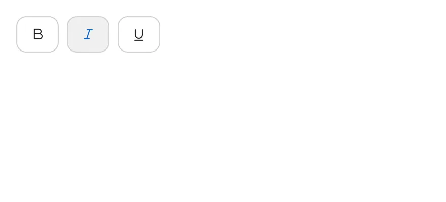
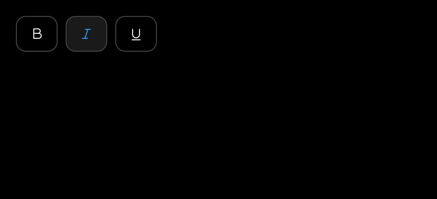
The outline variant.
import { TextBIcon, TextItalicIcon, TextUnderlineIcon } from "phosphor-react-native"
import * as React from "react"
import { ToggleGroup, ToggleGroupIcon, ToggleGroupItem } from "@/components/ui/toggle-group"

type GroupProps = Omit<
  React.ComponentProps<typeof ToggleGroup>,
  "value" | "onValueChange" | "children"
>

function FormattingDemo({
  initial = ["bold"],
  ...props
}: GroupProps & { initial?: string[] }) {
  const [value, setValue] = React.useState<string[]>(initial)
  return (
    <ToggleGroup multiple value={value} onValueChange={setValue} {...props}>
      <ToggleGroupItem value="bold" accessibilityLabel="Toggle bold">
        <ToggleGroupIcon as={TextBIcon} />
      </ToggleGroupItem>
      <ToggleGroupItem value="italic" accessibilityLabel="Toggle italic">
        <ToggleGroupIcon as={TextItalicIcon} />
      </ToggleGroupItem>
      <ToggleGroupItem value="underline" accessibilityLabel="Toggle underline">
        <ToggleGroupIcon as={TextUnderlineIcon} />
      </ToggleGroupItem>
    </ToggleGroup>
  )
}

export function ToggleGroupOutlineExample() {
  return (
    <FormattingDemo variant="outline" initial={["italic"]} />
  )
}import EsuissUI
import PhosphorSwift
import SwiftUI
struct ToggleGroupOutlineExample: View {
var body: some View {
FormattingDemo(initial: ["italic"], variant: .outline)
}
}
struct FormattingDemo: View {
let variant: ToggleVariant
let size: ToggleSize
let spacing: Int
let orientation: Axis
@State private var value: Set<String>
init(
initial: Set<String> = ["bold"],
variant: ToggleVariant = .default,
size: ToggleSize = .default,
spacing: Int = 2,
orientation: Axis = .horizontal
) {
self.variant = variant
self.size = size
self.spacing = spacing
self.orientation = orientation
_value = State(initialValue: initial)
}
var body: some View {
ToggleGroup(selection: $value, variant: variant, size: size, spacing: spacing, orientation: orientation) {
ToggleGroupItem(value: "bold") {
Ph.textB.regular.frame(width: 16, height: 16)
}
.accessibilityLabel(Text("Toggle bold"))
ToggleGroupItem(value: "italic") {
Ph.textItalic.regular.frame(width: 16, height: 16)
}
.accessibilityLabel(Text("Toggle italic"))
ToggleGroupItem(value: "underline") {
Ph.textUnderline.regular.frame(width: 16, height: 16)
}
.accessibilityLabel(Text("Toggle underline"))
}
}
}import androidx.compose.foundation.gestures.Orientation
import androidx.compose.runtime.Composable
import androidx.compose.runtime.getValue
import androidx.compose.runtime.mutableStateOf
import androidx.compose.runtime.saveable.rememberSaveable
import androidx.compose.runtime.setValue
import androidx.compose.ui.Modifier
import androidx.compose.ui.graphics.vector.ImageVector
import androidx.compose.ui.semantics.contentDescription
import androidx.compose.ui.semantics.semantics
import com.adamglin.PhosphorIcons
import com.adamglin.phosphoricons.Regular
import com.adamglin.phosphoricons.regular.TextB
import com.adamglin.phosphoricons.regular.TextItalic
import com.adamglin.phosphoricons.regular.TextUnderline
import com.esuiss.ui.components.Icon
import com.esuiss.ui.components.ToggleGroup
import com.esuiss.ui.components.ToggleGroupItem
import com.esuiss.ui.components.ToggleSize
import com.esuiss.ui.components.ToggleVariant
@Composable
fun ToggleGroupOutlineExample() {
ToggleGroupFormatting(variant = ToggleVariant.Outline, initial = setOf("italic"))
}
@Composable
fun ToggleGroupIconItem(value: String, label: String, icon: ImageVector) {
ToggleGroupItem(value, Modifier.semantics { contentDescription = label }) {
Icon(icon, contentDescription = null)
}
}
@Composable
fun ToggleGroupFormatting(
variant: ToggleVariant = ToggleVariant.Default,
size: ToggleSize = ToggleSize.Default,
spacing: Int = 2,
orientation: Orientation = Orientation.Horizontal,
enabled: Boolean = true,
initial: Set<String> = setOf("bold"),
) {
var values by rememberSaveable { mutableStateOf(initial.toList()) }
ToggleGroup(
values = values.toSet(),
onValuesChange = { values = it.toList() },
variant = variant,
size = size,
spacing = spacing,
orientation = orientation,
enabled = enabled,
) {
ToggleGroupIconItem("bold", "Toggle bold", PhosphorIcons.Regular.TextB)
ToggleGroupIconItem("italic", "Toggle italic", PhosphorIcons.Regular.TextItalic)
ToggleGroupIconItem("underline", "Toggle underline", PhosphorIcons.Regular.TextUnderline)
}
}Attached
Outlined items joined into one strip with spacing={0}.
import { TextBIcon, TextItalicIcon, TextUnderlineIcon } from "phosphor-react-native"
import * as React from "react"
import { ToggleGroup, ToggleGroupIcon, ToggleGroupItem } from "@/components/ui/toggle-group"

type GroupProps = Omit<
  React.ComponentProps<typeof ToggleGroup>,
  "value" | "onValueChange" | "children"
>

function FormattingDemo({
  initial = ["bold"],
  ...props
}: GroupProps & { initial?: string[] }) {
  const [value, setValue] = React.useState<string[]>(initial)
  return (
    <ToggleGroup multiple value={value} onValueChange={setValue} {...props}>
      <ToggleGroupItem value="bold" accessibilityLabel="Toggle bold">
        <ToggleGroupIcon as={TextBIcon} />
      </ToggleGroupItem>
      <ToggleGroupItem value="italic" accessibilityLabel="Toggle italic">
        <ToggleGroupIcon as={TextItalicIcon} />
      </ToggleGroupItem>
      <ToggleGroupItem value="underline" accessibilityLabel="Toggle underline">
        <ToggleGroupIcon as={TextUnderlineIcon} />
      </ToggleGroupItem>
    </ToggleGroup>
  )
}

export function ToggleGroupAttachedExample() {
  return (
    <FormattingDemo variant="outline" spacing={0} />
  )
}import EsuissUI
import PhosphorSwift
import SwiftUI
struct ToggleGroupAttachedExample: View {
var body: some View {
FormattingDemo(variant: .outline, spacing: 0)
}
}
struct FormattingDemo: View {
let variant: ToggleVariant
let size: ToggleSize
let spacing: Int
let orientation: Axis
@State private var value: Set<String>
init(
initial: Set<String> = ["bold"],
variant: ToggleVariant = .default,
size: ToggleSize = .default,
spacing: Int = 2,
orientation: Axis = .horizontal
) {
self.variant = variant
self.size = size
self.spacing = spacing
self.orientation = orientation
_value = State(initialValue: initial)
}
var body: some View {
ToggleGroup(selection: $value, variant: variant, size: size, spacing: spacing, orientation: orientation) {
ToggleGroupItem(value: "bold") {
Ph.textB.regular.frame(width: 16, height: 16)
}
.accessibilityLabel(Text("Toggle bold"))
ToggleGroupItem(value: "italic") {
Ph.textItalic.regular.frame(width: 16, height: 16)
}
.accessibilityLabel(Text("Toggle italic"))
ToggleGroupItem(value: "underline") {
Ph.textUnderline.regular.frame(width: 16, height: 16)
}
.accessibilityLabel(Text("Toggle underline"))
}
}
}import androidx.compose.foundation.gestures.Orientation
import androidx.compose.runtime.Composable
import androidx.compose.runtime.getValue
import androidx.compose.runtime.mutableStateOf
import androidx.compose.runtime.saveable.rememberSaveable
import androidx.compose.runtime.setValue
import androidx.compose.ui.Modifier
import androidx.compose.ui.graphics.vector.ImageVector
import androidx.compose.ui.semantics.contentDescription
import androidx.compose.ui.semantics.semantics
import com.adamglin.PhosphorIcons
import com.adamglin.phosphoricons.Regular
import com.adamglin.phosphoricons.regular.TextB
import com.adamglin.phosphoricons.regular.TextItalic
import com.adamglin.phosphoricons.regular.TextUnderline
import com.esuiss.ui.components.Icon
import com.esuiss.ui.components.ToggleGroup
import com.esuiss.ui.components.ToggleGroupItem
import com.esuiss.ui.components.ToggleSize
import com.esuiss.ui.components.ToggleVariant
@Composable
fun ToggleGroupAttachedExample() {
ToggleGroupFormatting(variant = ToggleVariant.Outline, spacing = 0)
}
@Composable
fun ToggleGroupIconItem(value: String, label: String, icon: ImageVector) {
ToggleGroupItem(value, Modifier.semantics { contentDescription = label }) {
Icon(icon, contentDescription = null)
}
}
@Composable
fun ToggleGroupFormatting(
variant: ToggleVariant = ToggleVariant.Default,
size: ToggleSize = ToggleSize.Default,
spacing: Int = 2,
orientation: Orientation = Orientation.Horizontal,
enabled: Boolean = true,
initial: Set<String> = setOf("bold"),
) {
var values by rememberSaveable { mutableStateOf(initial.toList()) }
ToggleGroup(
values = values.toSet(),
onValuesChange = { values = it.toList() },
variant = variant,
size = size,
spacing = spacing,
orientation = orientation,
enabled = enabled,
) {
ToggleGroupIconItem("bold", "Toggle bold", PhosphorIcons.Regular.TextB)
ToggleGroupIconItem("italic", "Toggle italic", PhosphorIcons.Regular.TextItalic)
ToggleGroupIconItem("underline", "Toggle underline", PhosphorIcons.Regular.TextUnderline)
}
}Sizes
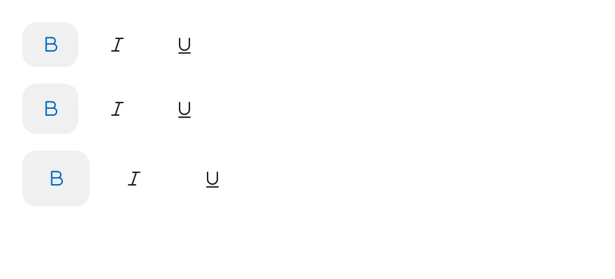
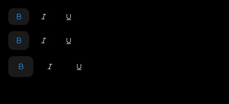
The sm, default and lg sizes.
import { TextBIcon, TextItalicIcon, TextUnderlineIcon } from "phosphor-react-native"
import * as React from "react"
import { View } from "react-native"
import { ToggleGroup, ToggleGroupIcon, ToggleGroupItem } from "@/components/ui/toggle-group"

type GroupProps = Omit<
  React.ComponentProps<typeof ToggleGroup>,
  "value" | "onValueChange" | "children"
>

function FormattingDemo({
  initial = ["bold"],
  ...props
}: GroupProps & { initial?: string[] }) {
  const [value, setValue] = React.useState<string[]>(initial)
  return (
    <ToggleGroup multiple value={value} onValueChange={setValue} {...props}>
      <ToggleGroupItem value="bold" accessibilityLabel="Toggle bold">
        <ToggleGroupIcon as={TextBIcon} />
      </ToggleGroupItem>
      <ToggleGroupItem value="italic" accessibilityLabel="Toggle italic">
        <ToggleGroupIcon as={TextItalicIcon} />
      </ToggleGroupItem>
      <ToggleGroupItem value="underline" accessibilityLabel="Toggle underline">
        <ToggleGroupIcon as={TextUnderlineIcon} />
      </ToggleGroupItem>
    </ToggleGroup>
  )
}

export function ToggleGroupSizesExample() {
  return (
    <View className="items-start gap-3">
      <FormattingDemo size="sm" />
      <FormattingDemo />
      <FormattingDemo size="lg" />
    </View>
  )
}import EsuissUI
import PhosphorSwift
import SwiftUI
struct ToggleGroupSizesExample: View {
var body: some View {
VStack(alignment: .leading, spacing: 12) {
FormattingDemo(size: .sm)
FormattingDemo()
FormattingDemo(size: .lg)
}
}
}
struct FormattingDemo: View {
let variant: ToggleVariant
let size: ToggleSize
let spacing: Int
let orientation: Axis
@State private var value: Set<String>
init(
initial: Set<String> = ["bold"],
variant: ToggleVariant = .default,
size: ToggleSize = .default,
spacing: Int = 2,
orientation: Axis = .horizontal
) {
self.variant = variant
self.size = size
self.spacing = spacing
self.orientation = orientation
_value = State(initialValue: initial)
}
var body: some View {
ToggleGroup(selection: $value, variant: variant, size: size, spacing: spacing, orientation: orientation) {
ToggleGroupItem(value: "bold") {
Ph.textB.regular.frame(width: 16, height: 16)
}
.accessibilityLabel(Text("Toggle bold"))
ToggleGroupItem(value: "italic") {
Ph.textItalic.regular.frame(width: 16, height: 16)
}
.accessibilityLabel(Text("Toggle italic"))
ToggleGroupItem(value: "underline") {
Ph.textUnderline.regular.frame(width: 16, height: 16)
}
.accessibilityLabel(Text("Toggle underline"))
}
}
}import androidx.compose.foundation.gestures.Orientation
import androidx.compose.foundation.layout.Arrangement
import androidx.compose.foundation.layout.Column
import androidx.compose.runtime.Composable
import androidx.compose.runtime.getValue
import androidx.compose.runtime.mutableStateOf
import androidx.compose.runtime.saveable.rememberSaveable
import androidx.compose.runtime.setValue
import androidx.compose.ui.Modifier
import androidx.compose.ui.graphics.vector.ImageVector
import androidx.compose.ui.semantics.contentDescription
import androidx.compose.ui.semantics.semantics
import androidx.compose.ui.unit.dp
import com.adamglin.PhosphorIcons
import com.adamglin.phosphoricons.Regular
import com.adamglin.phosphoricons.regular.TextB
import com.adamglin.phosphoricons.regular.TextItalic
import com.adamglin.phosphoricons.regular.TextUnderline
import com.esuiss.ui.components.Icon
import com.esuiss.ui.components.ToggleGroup
import com.esuiss.ui.components.ToggleGroupItem
import com.esuiss.ui.components.ToggleSize
import com.esuiss.ui.components.ToggleVariant
@Composable
fun ToggleGroupIconItem(value: String, label: String, icon: ImageVector) {
ToggleGroupItem(value, Modifier.semantics { contentDescription = label }) {
Icon(icon, contentDescription = null)
}
}
@Composable
fun ToggleGroupFormatting(
variant: ToggleVariant = ToggleVariant.Default,
size: ToggleSize = ToggleSize.Default,
spacing: Int = 2,
orientation: Orientation = Orientation.Horizontal,
enabled: Boolean = true,
initial: Set<String> = setOf("bold"),
) {
var values by rememberSaveable { mutableStateOf(initial.toList()) }
ToggleGroup(
values = values.toSet(),
onValuesChange = { values = it.toList() },
variant = variant,
size = size,
spacing = spacing,
orientation = orientation,
enabled = enabled,
) {
ToggleGroupIconItem("bold", "Toggle bold", PhosphorIcons.Regular.TextB)
ToggleGroupIconItem("italic", "Toggle italic", PhosphorIcons.Regular.TextItalic)
ToggleGroupIconItem("underline", "Toggle underline", PhosphorIcons.Regular.TextUnderline)
}
}
@Composable
fun ToggleGroupSizes() {
Column(verticalArrangement = Arrangement.spacedBy(12.dp)) {
ToggleGroupFormatting(size = ToggleSize.Sm)
ToggleGroupFormatting()
ToggleGroupFormatting(size = ToggleSize.Lg)
}
}Segmented
A single-selection segmented control for calendar views.
import * as React from "react"
import { Text } from "@/components/ui/text"
import { ToggleGroup, ToggleGroupItem } from "@/components/ui/toggle-group"

type GroupProps = Omit<
  React.ComponentProps<typeof ToggleGroup>,
  "value" | "onValueChange" | "children"
>

const views = ["day", "week", "month", "year"]

function SegmentedDemo({
  items = views,
  ...props
}: GroupProps & { items?: string[] }) {
  const [value, setValue] = React.useState<string[]>(["week"])
  return (
    <ToggleGroup
      spacing={0}
      value={value}
      onValueChange={setValue}
      accessibilityLabel="Calendar view"
      {...props}
    >
      {items.map((item) => (
        <ToggleGroupItem key={item} value={item}>
          <Text className="capitalize">{item}</Text>
        </ToggleGroupItem>
      ))}
    </ToggleGroup>
  )
}

export function ToggleGroupSegmentedExample() {
  return (
    <SegmentedDemo />
  )
}import EsuissUI
import SwiftUI
let segmentedViews = ["Day", "Week", "Month", "Year"]
struct SegmentedDemo: View {
var items: [String] = segmentedViews
var size: ToggleSize = .default
var orientation: Axis = .horizontal
@State private var value: String? = "Week"
var body: some View {
ToggleGroup(selection: $value, size: size, spacing: 0, orientation: orientation) {
ForEach(items, id: \.self) { item in
ToggleGroupItem(value: item) {
Text(verbatim: item)
}
}
}
.accessibilityLabel(Text("Calendar view"))
}
}import androidx.compose.foundation.gestures.Orientation
import androidx.compose.runtime.Composable
import androidx.compose.runtime.getValue
import androidx.compose.runtime.mutableStateOf
import androidx.compose.runtime.saveable.rememberSaveable
import androidx.compose.runtime.setValue
import androidx.compose.ui.Modifier
import androidx.compose.ui.semantics.contentDescription
import androidx.compose.ui.semantics.semantics
import com.esuiss.ui.components.ToggleGroup
import com.esuiss.ui.components.ToggleGroupItem
import com.esuiss.ui.components.ToggleSize
val toggleGroupViews = listOf("day", "week", "month", "year")
@Composable
fun ToggleGroupSegmented(
items: List<String> = toggleGroupViews,
size: ToggleSize = ToggleSize.Default,
orientation: Orientation = Orientation.Horizontal,
) {
var value by rememberSaveable { mutableStateOf<String?>("week") }
ToggleGroup(
value = value,
onValueChange = { value = it },
modifier = Modifier.semantics { contentDescription = "Calendar view" },
size = size,
spacing = 0,
orientation = orientation,
) {
items.forEach { item ->
ToggleGroupItem(item.replaceFirstChar { it.uppercaseChar() }, value = item)
}
}
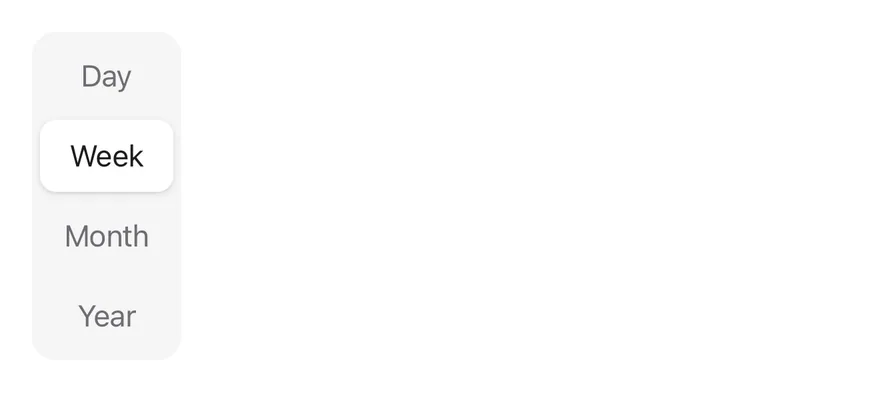
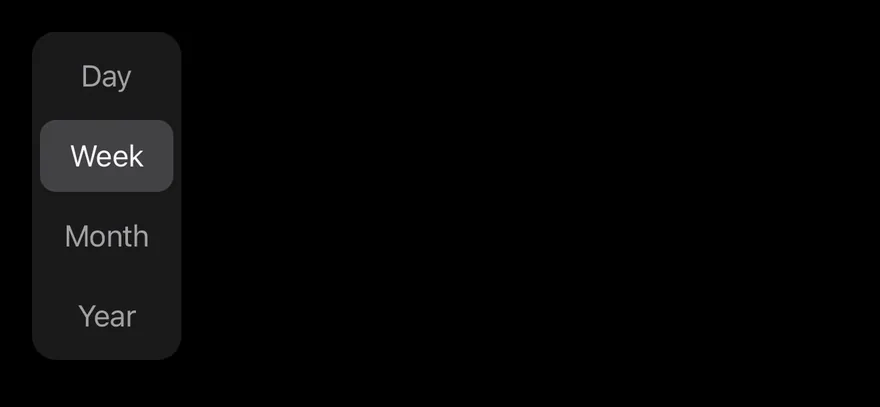
}Segmented vertical
The segmented control in a vertical orientation.
import * as React from "react"
import { Text } from "@/components/ui/text"
import { ToggleGroup, ToggleGroupItem } from "@/components/ui/toggle-group"

type GroupProps = Omit<
  React.ComponentProps<typeof ToggleGroup>,
  "value" | "onValueChange" | "children"
>

const views = ["day", "week", "month", "year"]

function SegmentedDemo({
  items = views,
  ...props
}: GroupProps & { items?: string[] }) {
  const [value, setValue] = React.useState<string[]>(["week"])
  return (
    <ToggleGroup
      spacing={0}
      value={value}
      onValueChange={setValue}
      accessibilityLabel="Calendar view"
      {...props}
    >
      {items.map((item) => (
        <ToggleGroupItem key={item} value={item}>
          <Text className="capitalize">{item}</Text>
        </ToggleGroupItem>
      ))}
    </ToggleGroup>
  )
}

export function ToggleGroupSegmentedVerticalExample() {
  return (
    <SegmentedDemo orientation="vertical" />
  )
}import EsuissUI
import SwiftUI
struct ToggleGroupSegmentedVerticalExample: View {
var body: some View {
SegmentedDemo(orientation: .vertical)
.fixedSize(horizontal: true, vertical: false)
}
}
let segmentedViews = ["Day", "Week", "Month", "Year"]
struct SegmentedDemo: View {
var items: [String] = segmentedViews
var size: ToggleSize = .default
var orientation: Axis = .horizontal
@State private var value: String? = "Week"
var body: some View {
ToggleGroup(selection: $value, size: size, spacing: 0, orientation: orientation) {
ForEach(items, id: \.self) { item in
ToggleGroupItem(value: item) {
Text(verbatim: item)
}
}
}
.accessibilityLabel(Text("Calendar view"))
}
}import androidx.compose.foundation.gestures.Orientation
import androidx.compose.runtime.Composable
import androidx.compose.runtime.getValue
import androidx.compose.runtime.mutableStateOf
import androidx.compose.runtime.saveable.rememberSaveable
import androidx.compose.runtime.setValue
import androidx.compose.ui.Modifier
import androidx.compose.ui.semantics.contentDescription
import androidx.compose.ui.semantics.semantics
import com.esuiss.ui.components.ToggleGroup
import com.esuiss.ui.components.ToggleGroupItem
import com.esuiss.ui.components.ToggleSize
@Composable
fun ToggleGroupSegmentedVerticalExample() {
ToggleGroupSegmented(orientation = Orientation.Vertical)
}
val toggleGroupViews = listOf("day", "week", "month", "year")
@Composable
fun ToggleGroupSegmented(
items: List<String> = toggleGroupViews,
size: ToggleSize = ToggleSize.Default,
orientation: Orientation = Orientation.Horizontal,
) {
var value by rememberSaveable { mutableStateOf<String?>("week") }
ToggleGroup(
value = value,
onValueChange = { value = it },
modifier = Modifier.semantics { contentDescription = "Calendar view" },
size = size,
spacing = 0,
orientation = orientation,
) {
items.forEach { item ->
ToggleGroupItem(item.replaceFirstChar { it.uppercaseChar() }, value = item)
}
}
}Segmented multiple
A segmented control that allows several selected items.
import { TextBIcon, TextItalicIcon, TextUnderlineIcon } from "phosphor-react-native"
import * as React from "react"
import { ToggleGroup, ToggleGroupIcon, ToggleGroupItem } from "@/components/ui/toggle-group"

type GroupProps = Omit<
  React.ComponentProps<typeof ToggleGroup>,
  "value" | "onValueChange" | "children"
>

function FormattingDemo({
  initial = ["bold"],
  ...props
}: GroupProps & { initial?: string[] }) {
  const [value, setValue] = React.useState<string[]>(initial)
  return (
    <ToggleGroup multiple value={value} onValueChange={setValue} {...props}>
      <ToggleGroupItem value="bold" accessibilityLabel="Toggle bold">
        <ToggleGroupIcon as={TextBIcon} />
      </ToggleGroupItem>
      <ToggleGroupItem value="italic" accessibilityLabel="Toggle italic">
        <ToggleGroupIcon as={TextItalicIcon} />
      </ToggleGroupItem>
      <ToggleGroupItem value="underline" accessibilityLabel="Toggle underline">
        <ToggleGroupIcon as={TextUnderlineIcon} />
      </ToggleGroupItem>
    </ToggleGroup>
  )
}

export function ToggleGroupSegmentedMultipleExample() {
  return (
    <FormattingDemo spacing={0} initial={["bold", "underline"]} />
  )
}import EsuissUI
import PhosphorSwift
import SwiftUI
struct ToggleGroupSegmentedMultipleExample: View {
var body: some View {
FormattingDemo(initial: ["bold", "underline"], spacing: 0)
}
}
struct FormattingDemo: View {
let variant: ToggleVariant
let size: ToggleSize
let spacing: Int
let orientation: Axis
@State private var value: Set<String>
init(
initial: Set<String> = ["bold"],
variant: ToggleVariant = .default,
size: ToggleSize = .default,
spacing: Int = 2,
orientation: Axis = .horizontal
) {
self.variant = variant
self.size = size
self.spacing = spacing
self.orientation = orientation
_value = State(initialValue: initial)
}
var body: some View {
ToggleGroup(selection: $value, variant: variant, size: size, spacing: spacing, orientation: orientation) {
ToggleGroupItem(value: "bold") {
Ph.textB.regular.frame(width: 16, height: 16)
}
.accessibilityLabel(Text("Toggle bold"))
ToggleGroupItem(value: "italic") {
Ph.textItalic.regular.frame(width: 16, height: 16)
}
.accessibilityLabel(Text("Toggle italic"))
ToggleGroupItem(value: "underline") {
Ph.textUnderline.regular.frame(width: 16, height: 16)
}
.accessibilityLabel(Text("Toggle underline"))
}
}
}import androidx.compose.foundation.gestures.Orientation
import androidx.compose.runtime.Composable
import androidx.compose.runtime.getValue
import androidx.compose.runtime.mutableStateOf
import androidx.compose.runtime.saveable.rememberSaveable
import androidx.compose.runtime.setValue
import androidx.compose.ui.Modifier
import androidx.compose.ui.graphics.vector.ImageVector
import androidx.compose.ui.semantics.contentDescription
import androidx.compose.ui.semantics.semantics
import com.adamglin.PhosphorIcons
import com.adamglin.phosphoricons.Regular
import com.adamglin.phosphoricons.regular.TextB
import com.adamglin.phosphoricons.regular.TextItalic
import com.adamglin.phosphoricons.regular.TextUnderline
import com.esuiss.ui.components.Icon
import com.esuiss.ui.components.ToggleGroup
import com.esuiss.ui.components.ToggleGroupItem
import com.esuiss.ui.components.ToggleSize
import com.esuiss.ui.components.ToggleVariant
@Composable
fun ToggleGroupSegmentedMultipleExample() {
ToggleGroupFormatting(spacing = 0, initial = setOf("bold", "underline"))
}
@Composable
fun ToggleGroupIconItem(value: String, label: String, icon: ImageVector) {
ToggleGroupItem(value, Modifier.semantics { contentDescription = label }) {
Icon(icon, contentDescription = null)
}
}
@Composable
fun ToggleGroupFormatting(
variant: ToggleVariant = ToggleVariant.Default,
size: ToggleSize = ToggleSize.Default,
spacing: Int = 2,
orientation: Orientation = Orientation.Horizontal,
enabled: Boolean = true,
initial: Set<String> = setOf("bold"),
) {
var values by rememberSaveable { mutableStateOf(initial.toList()) }
ToggleGroup(
values = values.toSet(),
onValuesChange = { values = it.toList() },
variant = variant,
size = size,
spacing = spacing,
orientation = orientation,
enabled = enabled,
) {
ToggleGroupIconItem("bold", "Toggle bold", PhosphorIcons.Regular.TextB)
ToggleGroupIconItem("italic", "Toggle italic", PhosphorIcons.Regular.TextItalic)
ToggleGroupIconItem("underline", "Toggle underline", PhosphorIcons.Regular.TextUnderline)
}
}Segmented sizes
Segmented controls at each size.
import * as React from "react"
import { View } from "react-native"
import { Text } from "@/components/ui/text"
import { ToggleGroup, ToggleGroupItem } from "@/components/ui/toggle-group"

type GroupProps = Omit<
  React.ComponentProps<typeof ToggleGroup>,
  "value" | "onValueChange" | "children"
>

const views = ["day", "week", "month", "year"]

function SegmentedDemo({
  items = views,
  ...props
}: GroupProps & { items?: string[] }) {
  const [value, setValue] = React.useState<string[]>(["week"])
  return (
    <ToggleGroup
      spacing={0}
      value={value}
      onValueChange={setValue}
      accessibilityLabel="Calendar view"
      {...props}
    >
      {items.map((item) => (
        <ToggleGroupItem key={item} value={item}>
          <Text className="capitalize">{item}</Text>
        </ToggleGroupItem>
      ))}
    </ToggleGroup>
  )
}

export function ToggleGroupSegmentedSizesExample() {
  return (
    <View className="items-start gap-3">
      <SegmentedDemo size="sm" items={views.slice(0, 3)} />
      <SegmentedDemo items={views.slice(0, 3)} />
      <SegmentedDemo size="lg" items={views.slice(0, 3)} />
    </View>
  )
}import EsuissUI
import SwiftUI
struct ToggleGroupSegmentedSizesExample: View {
var body: some View {
VStack(alignment: .leading, spacing: 12) {
SegmentedDemo(items: Array(segmentedViews.prefix(3)), size: .sm)
SegmentedDemo(items: Array(segmentedViews.prefix(3)))
SegmentedDemo(items: Array(segmentedViews.prefix(3)), size: .lg)
}
}
}
let segmentedViews = ["Day", "Week", "Month", "Year"]
struct SegmentedDemo: View {
var items: [String] = segmentedViews
var size: ToggleSize = .default
var orientation: Axis = .horizontal
@State private var value: String? = "Week"
var body: some View {
ToggleGroup(selection: $value, size: size, spacing: 0, orientation: orientation) {
ForEach(items, id: \.self) { item in
ToggleGroupItem(value: item) {
Text(verbatim: item)
}
}
}
.accessibilityLabel(Text("Calendar view"))
}
}import androidx.compose.foundation.gestures.Orientation
import androidx.compose.foundation.layout.Arrangement
import androidx.compose.foundation.layout.Column
import androidx.compose.runtime.Composable
import androidx.compose.runtime.getValue
import androidx.compose.runtime.mutableStateOf
import androidx.compose.runtime.saveable.rememberSaveable
import androidx.compose.runtime.setValue
import androidx.compose.ui.Modifier
import androidx.compose.ui.semantics.contentDescription
import androidx.compose.ui.semantics.semantics
import androidx.compose.ui.unit.dp
import com.esuiss.ui.components.ToggleGroup
import com.esuiss.ui.components.ToggleGroupItem
import com.esuiss.ui.components.ToggleSize
val toggleGroupViews = listOf("day", "week", "month", "year")
@Composable
fun ToggleGroupSegmented(
items: List<String> = toggleGroupViews,
size: ToggleSize = ToggleSize.Default,
orientation: Orientation = Orientation.Horizontal,
) {
var value by rememberSaveable { mutableStateOf<String?>("week") }
ToggleGroup(
value = value,
onValueChange = { value = it },
modifier = Modifier.semantics { contentDescription = "Calendar view" },
size = size,
spacing = 0,
orientation = orientation,
) {
items.forEach { item ->
ToggleGroupItem(item.replaceFirstChar { it.uppercaseChar() }, value = item)
}
}
}
@Composable
fun ToggleGroupSegmentedSizes() {
val items = toggleGroupViews.take(3)
Column(verticalArrangement = Arrangement.spacedBy(12.dp)) {
ToggleGroupSegmented(items, ToggleSize.Sm)
ToggleGroupSegmented(items)
ToggleGroupSegmented(items, ToggleSize.Lg)
}
}Single selection
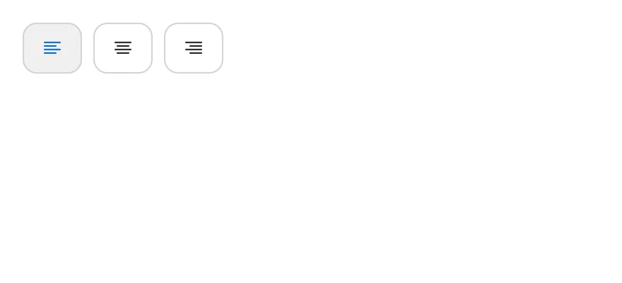
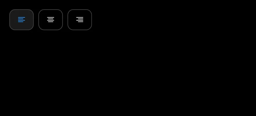
Outlined alignment options where only one item can be pressed.
import { TextAlignCenterIcon, TextAlignLeftIcon, TextAlignRightIcon } from "phosphor-react-native"
import * as React from "react"
import { ToggleGroup, ToggleGroupIcon, ToggleGroupItem } from "@/components/ui/toggle-group"

function AlignmentDemo() {
  const [value, setValue] = React.useState<string[]>(["left"])
  return (
    <ToggleGroup value={value} onValueChange={setValue} variant="outline">
      <ToggleGroupItem value="left" accessibilityLabel="Align left">
        <ToggleGroupIcon as={TextAlignLeftIcon} />
      </ToggleGroupItem>
      <ToggleGroupItem value="center" accessibilityLabel="Align center">
        <ToggleGroupIcon as={TextAlignCenterIcon} />
      </ToggleGroupItem>
      <ToggleGroupItem value="right" accessibilityLabel="Align right">
        <ToggleGroupIcon as={TextAlignRightIcon} />
      </ToggleGroupItem>
    </ToggleGroup>
  )
}

export function ToggleGroupSingleSelectionExample() {
  return (
    <AlignmentDemo />
  )
}import EsuissUI
import PhosphorSwift
import SwiftUI
struct AlignmentDemo: View {
@State private var value: String? = "left"
var body: some View {
ToggleGroup(selection: $value, variant: .outline) {
ToggleGroupItem(value: "left") {
Ph.textAlignLeft.regular.frame(width: 16, height: 16)
}
.accessibilityLabel(Text("Align left"))
ToggleGroupItem(value: "center") {
Ph.textAlignCenter.regular.frame(width: 16, height: 16)
}
.accessibilityLabel(Text("Align center"))
ToggleGroupItem(value: "right") {
Ph.textAlignRight.regular.frame(width: 16, height: 16)
}
.accessibilityLabel(Text("Align right"))
}
}
}import androidx.compose.runtime.Composable
import androidx.compose.runtime.getValue
import androidx.compose.runtime.mutableStateOf
import androidx.compose.runtime.saveable.rememberSaveable
import androidx.compose.runtime.setValue
import androidx.compose.ui.Modifier
import androidx.compose.ui.graphics.vector.ImageVector
import androidx.compose.ui.semantics.contentDescription
import androidx.compose.ui.semantics.semantics
import com.adamglin.PhosphorIcons
import com.adamglin.phosphoricons.Regular
import com.adamglin.phosphoricons.regular.TextAlignCenter
import com.adamglin.phosphoricons.regular.TextAlignLeft
import com.adamglin.phosphoricons.regular.TextAlignRight
import com.esuiss.ui.components.Icon
import com.esuiss.ui.components.ToggleGroup
import com.esuiss.ui.components.ToggleGroupItem
import com.esuiss.ui.components.ToggleVariant
@Composable
fun ToggleGroupIconItem(value: String, label: String, icon: ImageVector) {
ToggleGroupItem(value, Modifier.semantics { contentDescription = label }) {
Icon(icon, contentDescription = null)
}
}
@Composable
fun ToggleGroupAlignment() {
var value by rememberSaveable { mutableStateOf<String?>("left") }
ToggleGroup(value = value, onValueChange = { value = it }, variant = ToggleVariant.Outline) {
ToggleGroupIconItem("left", "Align left", PhosphorIcons.Regular.TextAlignLeft)
ToggleGroupIconItem("center", "Align center", PhosphorIcons.Regular.TextAlignCenter)
ToggleGroupIconItem("right", "Align right", PhosphorIcons.Regular.TextAlignRight)
}
}Vertical
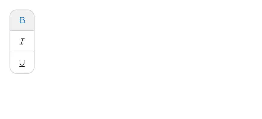
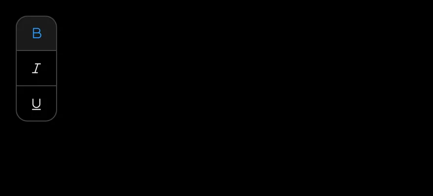
Joined outline items stacked in a column.
import { TextBIcon, TextItalicIcon, TextUnderlineIcon } from "phosphor-react-native"
import * as React from "react"
import { ToggleGroup, ToggleGroupIcon, ToggleGroupItem } from "@/components/ui/toggle-group"

type GroupProps = Omit<
  React.ComponentProps<typeof ToggleGroup>,
  "value" | "onValueChange" | "children"
>

function FormattingDemo({
  initial = ["bold"],
  ...props
}: GroupProps & { initial?: string[] }) {
  const [value, setValue] = React.useState<string[]>(initial)
  return (
    <ToggleGroup multiple value={value} onValueChange={setValue} {...props}>
      <ToggleGroupItem value="bold" accessibilityLabel="Toggle bold">
        <ToggleGroupIcon as={TextBIcon} />
      </ToggleGroupItem>
      <ToggleGroupItem value="italic" accessibilityLabel="Toggle italic">
        <ToggleGroupIcon as={TextItalicIcon} />
      </ToggleGroupItem>
      <ToggleGroupItem value="underline" accessibilityLabel="Toggle underline">
        <ToggleGroupIcon as={TextUnderlineIcon} />
      </ToggleGroupItem>
    </ToggleGroup>
  )
}

export function ToggleGroupVerticalExample() {
  return (
    <FormattingDemo orientation="vertical" variant="outline" spacing={0} />
  )
}import EsuissUI
import PhosphorSwift
import SwiftUI
struct ToggleGroupVerticalExample: View {
var body: some View {
FormattingDemo(variant: .outline, spacing: 0, orientation: .vertical)
.fixedSize(horizontal: true, vertical: false)
}
}
struct FormattingDemo: View {
let variant: ToggleVariant
let size: ToggleSize
let spacing: Int
let orientation: Axis
@State private var value: Set<String>
init(
initial: Set<String> = ["bold"],
variant: ToggleVariant = .default,
size: ToggleSize = .default,
spacing: Int = 2,
orientation: Axis = .horizontal
) {
self.variant = variant
self.size = size
self.spacing = spacing
self.orientation = orientation
_value = State(initialValue: initial)
}
var body: some View {
ToggleGroup(selection: $value, variant: variant, size: size, spacing: spacing, orientation: orientation) {
ToggleGroupItem(value: "bold") {
Ph.textB.regular.frame(width: 16, height: 16)
}
.accessibilityLabel(Text("Toggle bold"))
ToggleGroupItem(value: "italic") {
Ph.textItalic.regular.frame(width: 16, height: 16)
}
.accessibilityLabel(Text("Toggle italic"))
ToggleGroupItem(value: "underline") {
Ph.textUnderline.regular.frame(width: 16, height: 16)
}
.accessibilityLabel(Text("Toggle underline"))
}
}
}import androidx.compose.foundation.gestures.Orientation
import androidx.compose.runtime.Composable
import androidx.compose.runtime.getValue
import androidx.compose.runtime.mutableStateOf
import androidx.compose.runtime.saveable.rememberSaveable
import androidx.compose.runtime.setValue
import androidx.compose.ui.Modifier
import androidx.compose.ui.graphics.vector.ImageVector
import androidx.compose.ui.semantics.contentDescription
import androidx.compose.ui.semantics.semantics
import com.adamglin.PhosphorIcons
import com.adamglin.phosphoricons.Regular
import com.adamglin.phosphoricons.regular.TextB
import com.adamglin.phosphoricons.regular.TextItalic
import com.adamglin.phosphoricons.regular.TextUnderline
import com.esuiss.ui.components.Icon
import com.esuiss.ui.components.ToggleGroup
import com.esuiss.ui.components.ToggleGroupItem
import com.esuiss.ui.components.ToggleSize
import com.esuiss.ui.components.ToggleVariant
@Composable
fun ToggleGroupVerticalExample() {
ToggleGroupFormatting(variant = ToggleVariant.Outline, spacing = 0, orientation = Orientation.Vertical)
}
@Composable
fun ToggleGroupIconItem(value: String, label: String, icon: ImageVector) {
ToggleGroupItem(value, Modifier.semantics { contentDescription = label }) {
Icon(icon, contentDescription = null)
}
}
@Composable
fun ToggleGroupFormatting(
variant: ToggleVariant = ToggleVariant.Default,
size: ToggleSize = ToggleSize.Default,
spacing: Int = 2,
orientation: Orientation = Orientation.Horizontal,
enabled: Boolean = true,
initial: Set<String> = setOf("bold"),
) {
var values by rememberSaveable { mutableStateOf(initial.toList()) }
ToggleGroup(
values = values.toSet(),
onValuesChange = { values = it.toList() },
variant = variant,
size = size,
spacing = spacing,
orientation = orientation,
enabled = enabled,
) {
ToggleGroupIconItem("bold", "Toggle bold", PhosphorIcons.Regular.TextB)
ToggleGroupIconItem("italic", "Toggle italic", PhosphorIcons.Regular.TextItalic)
ToggleGroupIconItem("underline", "Toggle underline", PhosphorIcons.Regular.TextUnderline)
}
}Disabled
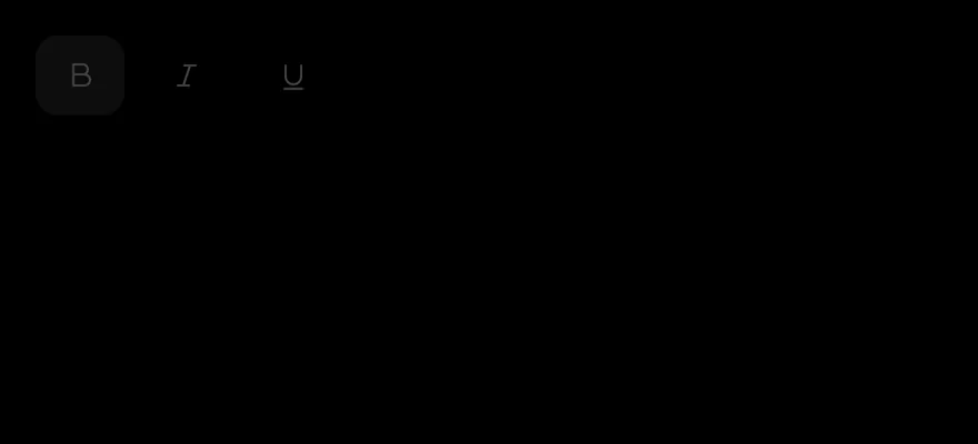
A disabled group.

import { TextBIcon, TextItalicIcon, TextUnderlineIcon } from "phosphor-react-native"
import * as React from "react"
import { ToggleGroup, ToggleGroupIcon, ToggleGroupItem } from "@/components/ui/toggle-group"

type GroupProps = Omit<
  React.ComponentProps<typeof ToggleGroup>,
  "value" | "onValueChange" | "children"
>

function FormattingDemo({
  initial = ["bold"],
  ...props
}: GroupProps & { initial?: string[] }) {
  const [value, setValue] = React.useState<string[]>(initial)
  return (
    <ToggleGroup multiple value={value} onValueChange={setValue} {...props}>
      <ToggleGroupItem value="bold" accessibilityLabel="Toggle bold">
        <ToggleGroupIcon as={TextBIcon} />
      </ToggleGroupItem>
      <ToggleGroupItem value="italic" accessibilityLabel="Toggle italic">
        <ToggleGroupIcon as={TextItalicIcon} />
      </ToggleGroupItem>
      <ToggleGroupItem value="underline" accessibilityLabel="Toggle underline">
        <ToggleGroupIcon as={TextUnderlineIcon} />
      </ToggleGroupItem>
    </ToggleGroup>
  )
}

export function ToggleGroupDisabledExample() {
  return (
    <FormattingDemo disabled />
  )
}import EsuissUI
import PhosphorSwift
import SwiftUI
struct ToggleGroupDisabledExample: View {
var body: some View {
FormattingDemo()
.disabled(true)
}
}
struct FormattingDemo: View {
let variant: ToggleVariant
let size: ToggleSize
let spacing: Int
let orientation: Axis
@State private var value: Set<String>
init(
initial: Set<String> = ["bold"],
variant: ToggleVariant = .default,
size: ToggleSize = .default,
spacing: Int = 2,
orientation: Axis = .horizontal
) {
self.variant = variant
self.size = size
self.spacing = spacing
self.orientation = orientation
_value = State(initialValue: initial)
}
var body: some View {
ToggleGroup(selection: $value, variant: variant, size: size, spacing: spacing, orientation: orientation) {
ToggleGroupItem(value: "bold") {
Ph.textB.regular.frame(width: 16, height: 16)
}
.accessibilityLabel(Text("Toggle bold"))
ToggleGroupItem(value: "italic") {
Ph.textItalic.regular.frame(width: 16, height: 16)
}
.accessibilityLabel(Text("Toggle italic"))
ToggleGroupItem(value: "underline") {
Ph.textUnderline.regular.frame(width: 16, height: 16)
}
.accessibilityLabel(Text("Toggle underline"))
}
}
}import androidx.compose.foundation.gestures.Orientation
import androidx.compose.runtime.Composable
import androidx.compose.runtime.getValue
import androidx.compose.runtime.mutableStateOf
import androidx.compose.runtime.saveable.rememberSaveable
import androidx.compose.runtime.setValue
import androidx.compose.ui.Modifier
import androidx.compose.ui.graphics.vector.ImageVector
import androidx.compose.ui.semantics.contentDescription
import androidx.compose.ui.semantics.semantics
import com.adamglin.PhosphorIcons
import com.adamglin.phosphoricons.Regular
import com.adamglin.phosphoricons.regular.TextB
import com.adamglin.phosphoricons.regular.TextItalic
import com.adamglin.phosphoricons.regular.TextUnderline
import com.esuiss.ui.components.Icon
import com.esuiss.ui.components.ToggleGroup
import com.esuiss.ui.components.ToggleGroupItem
import com.esuiss.ui.components.ToggleSize
import com.esuiss.ui.components.ToggleVariant
@Composable
fun ToggleGroupDisabledExample() {
ToggleGroupFormatting(enabled = false)
}
@Composable
fun ToggleGroupIconItem(value: String, label: String, icon: ImageVector) {
ToggleGroupItem(value, Modifier.semantics { contentDescription = label }) {
Icon(icon, contentDescription = null)
}
}
@Composable
fun ToggleGroupFormatting(
variant: ToggleVariant = ToggleVariant.Default,
size: ToggleSize = ToggleSize.Default,
spacing: Int = 2,
orientation: Orientation = Orientation.Horizontal,
enabled: Boolean = true,
initial: Set<String> = setOf("bold"),
) {
var values by rememberSaveable { mutableStateOf(initial.toList()) }
ToggleGroup(
values = values.toSet(),
onValuesChange = { values = it.toList() },
variant = variant,
size = size,
spacing = spacing,
orientation = orientation,
enabled = enabled,
) {
ToggleGroupIconItem("bold", "Toggle bold", PhosphorIcons.Regular.TextB)
ToggleGroupIconItem("italic", "Toggle italic", PhosphorIcons.Regular.TextItalic)
ToggleGroupIconItem("underline", "Toggle underline", PhosphorIcons.Regular.TextUnderline)
}
}API Reference
ToggleGroup
Container that holds the shared value.
React.ComponentProps<typeof ToggleGroupPrimitive>- About
- Gap between items in steps of 4 points.
0joins the items. Defaults to2. - Type
number- Default
- 2
ToggleGroupItem
One toggle in the group.
React.ComponentProps<typeof TogglePrimitive>ToggleGroupIcon
Icon sized for a toggle group item.
React.ComponentProps<typeof Icon>Accessibility
- A single-selection group has the
radiogrouprole and its items have theradiorole. - A
multiplegroup has thegrouprole and its items have thetogglebuttonrole. - Items report checked and disabled states to VoiceOver and TalkBack.
- The sliding segmented indicator is hidden from VoiceOver and TalkBack.
- Icon-only items need an
accessibilityLabel; label the group itself withaccessibilityLabelwhen its purpose is not clear from context.
Notes
- Pressed items use
bg-item-selectedandtext-link; the segmented indicator and pressed segmented items usebg-surface-raisedwith a small shadow in light mode andbg-label-quaternaryin dark mode. - The indicator slides over 300 ms and respects the system reduce motion setting. It is hidden when the selected item is disabled.
- Colors follow the system appearance.