suiss/uim · React Native Component
Questionnaire
A step-by-step form that shows one question at a time, with choices, text answers, validation, skipping and a submit step.
Questionnaire is an open-source mobile component from suiss/uim for React Native and Expo, with SwiftUI and Jetpack Compose versions built from the same design tokens. The @esuiss/uim CLI copies its source into your project, so you own the code.
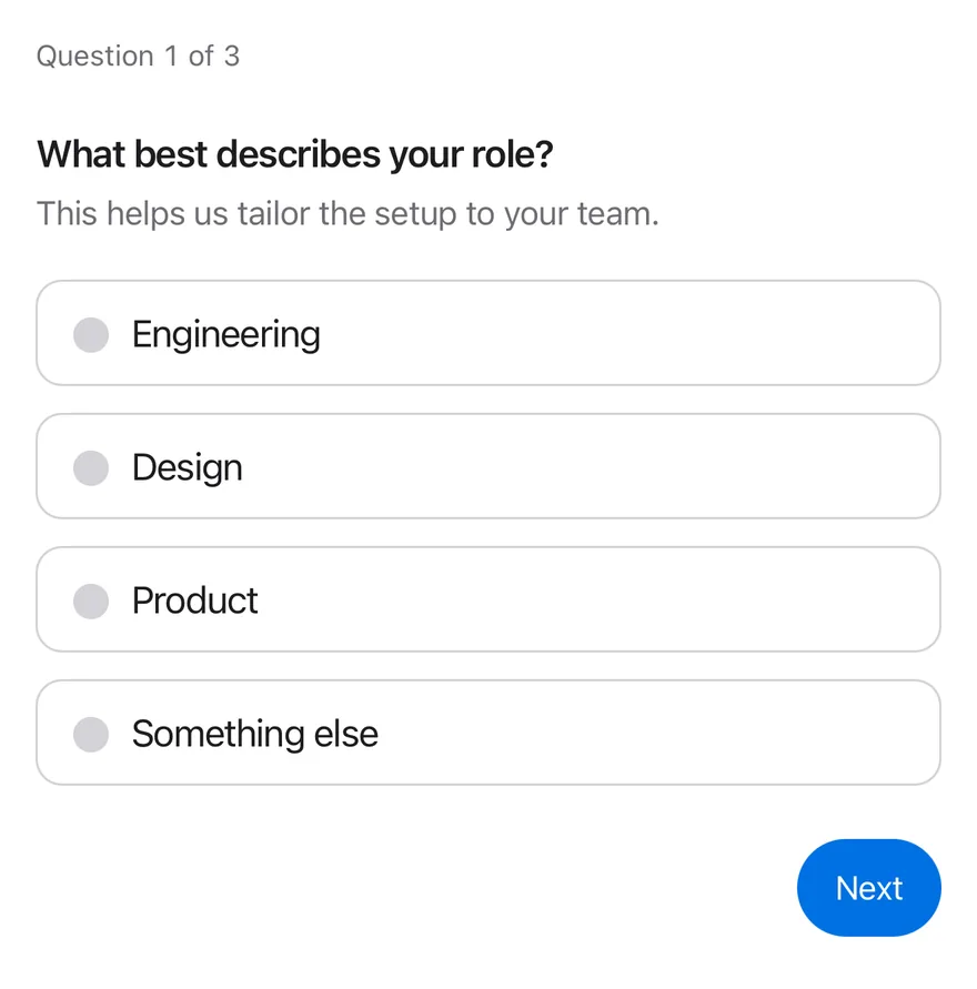
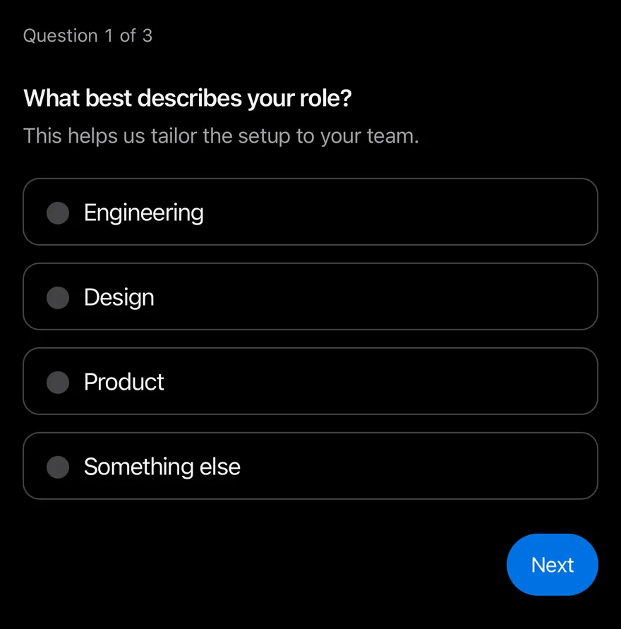
import * as React from "react"
import { View } from "react-native"
import { Questionnaire, QuestionnaireActions, QuestionnaireChoice, QuestionnaireChoices, QuestionnaireDescription, QuestionnaireError, QuestionnaireInput, QuestionnaireItem, QuestionnaireNext, QuestionnairePrevious, QuestionnaireProgress, QuestionnaireSkip, QuestionnaireSubmit, QuestionnaireTitle, type QuestionnaireValues } from "@/components/ui/questionnaire"
import { Text } from "@/components/ui/text"

function Actions() {
  return (
    <QuestionnaireActions>
      <QuestionnairePrevious />
      <QuestionnaireSkip />
      <QuestionnaireNext />
      <QuestionnaireSubmit />
    </QuestionnaireActions>
  )
}

function Result({ values }: { values: QuestionnaireValues | null }) {
  if (!values) return null
  return (
    <Text role="status" className="text-sm text-label-secondary">
      {`Submitted: ${JSON.stringify(values)}`}
    </Text>
  )
}

function Onboarding({
  defaultItem,
  attempted = false,
}: {
  defaultItem?: string
  attempted?: boolean
}) {
  const [values, setValues] = React.useState<QuestionnaireValues | null>(null)
  return (
    <View className="w-full gap-4">
      <Questionnaire defaultItem={defaultItem} onSubmit={setValues}>
        <QuestionnaireProgress />
        <QuestionnaireItem name="role" required invalid={attempted}>
          <QuestionnaireTitle>
            What best describes your role?
          </QuestionnaireTitle>
          <QuestionnaireDescription>
            This helps us tailor the setup to your team.
          </QuestionnaireDescription>
          <QuestionnaireChoices>
            <QuestionnaireChoice value="engineering">
              Engineering
            </QuestionnaireChoice>
            <QuestionnaireChoice value="design">Design</QuestionnaireChoice>
            <QuestionnaireChoice value="product">Product</QuestionnaireChoice>
            <QuestionnaireChoice value="other">
              Something else
            </QuestionnaireChoice>
          </QuestionnaireChoices>
          <QuestionnaireError />
        </QuestionnaireItem>
        <QuestionnaireItem name="team-size">
          <QuestionnaireTitle>How large is your team?</QuestionnaireTitle>
          <QuestionnaireChoices>
            <QuestionnaireChoice value="solo">Just me</QuestionnaireChoice>
            <QuestionnaireChoice value="small" defaultChecked>
              2 to 10 people
            </QuestionnaireChoice>
            <QuestionnaireChoice value="medium">
              11 to 50 people
            </QuestionnaireChoice>
            <QuestionnaireChoice value="large">
              More than 50 people
            </QuestionnaireChoice>
          </QuestionnaireChoices>
          <QuestionnaireError />
        </QuestionnaireItem>
        <QuestionnaireItem name="company" required>
          <QuestionnaireTitle>What is your company called?</QuestionnaireTitle>
          <QuestionnaireInput placeholder="Acme Inc." />
          <QuestionnaireError>
            Enter a company name to continue.
          </QuestionnaireError>
        </QuestionnaireItem>
        <Actions />
      </Questionnaire>
      <Result values={values} />
    </View>
  )
}

export function QuestionnaireExample() {
  return (
    <Onboarding />
  )
}import EsuissUI
import SwiftUI
struct QuestionnaireStoryActions: View {
var body: some View {
QuestionnaireActions {
QuestionnairePrevious()
QuestionnaireSkip()
QuestionnaireNext()
QuestionnaireSubmit()
}
}
}
struct QuestionnaireOnboarding: View {
var attempted = false
@State private var controller: QuestionnaireController
@State private var submitted: String?
init(defaultItem: String? = nil, attempted: Bool = false) {
self.attempted = attempted
_controller = State(initialValue: QuestionnaireController(
defaultItem: defaultItem,
defaultValues: ["team-size": ["small"]]
))
}
var body: some View {
VStack(alignment: .leading, spacing: 16) {
Questionnaire(controller: controller) {
QuestionnaireProgress()
QuestionnaireItem(name: "role", required: true, invalid: attempted) {
QuestionnaireTitle("What best describes your role?")
QuestionnaireDescription("This helps us tailor the setup to your team.")
QuestionnaireChoices {
QuestionnaireChoice("Engineering", value: "engineering")
QuestionnaireChoice("Design", value: "design")
QuestionnaireChoice("Product", value: "product")
QuestionnaireChoice("Something else", value: "other")
}
QuestionnaireError()
}
QuestionnaireItem(name: "team-size") {
QuestionnaireTitle("How large is your team?")
QuestionnaireChoices {
QuestionnaireChoice("Just me", value: "solo")
QuestionnaireChoice("2 to 10 people", value: "small")
QuestionnaireChoice("11 to 50 people", value: "medium")
QuestionnaireChoice("More than 50 people", value: "large")
}
QuestionnaireError()
}
QuestionnaireItem(name: "company", required: true) {
QuestionnaireTitle("What is your company called?")
QuestionnaireInput("Acme Inc.")
QuestionnaireError("Enter a company name to continue.")
}
QuestionnaireStoryActions()
}
if let submitted {
Text(verbatim: submitted)
.textStyle(.sm)
.foregroundStyle(Color.labelSecondary)
.accessibilityAddTraits(.updatesFrequently)
}
}
.frame(maxWidth: .infinity, alignment: .leading)
.onAppear {
let controller = controller
controller.onSubmit = { answers in
let fields = controller.sequence.compactMap { name -> String? in
guard let value = answers[name]?.first else { return nil }
return "\"\(name)\":\"\(value)\""
}
submitted = "Submitted: {\(fields.joined(separator: ","))}"
}
}
}
}import androidx.compose.foundation.layout.Arrangement
import androidx.compose.foundation.layout.Column
import androidx.compose.foundation.layout.fillMaxWidth
import androidx.compose.runtime.Composable
import androidx.compose.runtime.getValue
import androidx.compose.runtime.mutableStateOf
import androidx.compose.runtime.saveable.rememberSaveable
import androidx.compose.runtime.setValue
import androidx.compose.ui.Modifier
import androidx.compose.ui.semantics.LiveRegionMode
import androidx.compose.ui.semantics.liveRegion
import androidx.compose.ui.semantics.semantics
import androidx.compose.ui.unit.dp
import com.esuiss.ui.components.Questionnaire
import com.esuiss.ui.components.QuestionnaireActions
import com.esuiss.ui.components.QuestionnaireChoice
import com.esuiss.ui.components.QuestionnaireChoices
import com.esuiss.ui.components.QuestionnaireDescription
import com.esuiss.ui.components.QuestionnaireError
import com.esuiss.ui.components.QuestionnaireInput
import com.esuiss.ui.components.QuestionnaireItem
import com.esuiss.ui.components.QuestionnaireNext
import com.esuiss.ui.components.QuestionnairePrevious
import com.esuiss.ui.components.QuestionnaireProgress
import com.esuiss.ui.components.QuestionnaireSkip
import com.esuiss.ui.components.QuestionnaireSubmit
import com.esuiss.ui.components.QuestionnaireTitle
import com.esuiss.ui.components.Text
import com.esuiss.ui.components.rememberQuestionnaireState
import com.esuiss.ui.theme.EsuissTheme
import com.esuiss.ui.theme.Typography
fun questionnaireJson(values: Map<String, List<String>>): String =
values.entries.joinToString(",", "{", "}") { (key, list) ->
"\"$key\":" + list.joinToString(",", "[", "]") { "\"$it\"" }
}
@Composable
fun QuestionnaireActionsRow() {
QuestionnaireActions {
QuestionnairePrevious()
QuestionnaireSkip()
QuestionnaireNext()
QuestionnaireSubmit()
}
}
@Composable
fun QuestionnaireResult(values: String?) {
if (values == null) return
Text(
"Submitted: $values",
modifier = Modifier.semantics { liveRegion = LiveRegionMode.Polite },
style = Typography.sm,
color = EsuissTheme.colors.labelSecondary,
)
}
@Composable
fun QuestionnaireOnboarding(defaultItem: String? = null, attempted: Boolean = false) {
var values by rememberSaveable { mutableStateOf<String?>(null) }
val state = rememberQuestionnaireState(defaultItem = defaultItem)
Column(Modifier.fillMaxWidth(), verticalArrangement = Arrangement.spacedBy(16.dp)) {
Questionnaire(state = state, onSubmit = { values = questionnaireJson(it) }) {
QuestionnaireProgress()
QuestionnaireItem(name = "role", required = true, invalid = attempted) {
QuestionnaireTitle("What best describes your role?")
QuestionnaireDescription("This helps us tailor the setup to your team.")
QuestionnaireChoices {
QuestionnaireChoice("Engineering", value = "engineering")
QuestionnaireChoice("Design", value = "design")
QuestionnaireChoice("Product", value = "product")
QuestionnaireChoice("Something else", value = "other")
}
QuestionnaireError()
}
QuestionnaireItem(name = "team-size") {
QuestionnaireTitle("How large is your team?")
QuestionnaireChoices {
QuestionnaireChoice("Just me", value = "solo")
QuestionnaireChoice("2 to 10 people", value = "small", defaultChecked = true)
QuestionnaireChoice("11 to 50 people", value = "medium")
QuestionnaireChoice("More than 50 people", value = "large")
}
QuestionnaireError()
}
QuestionnaireItem(name = "company", required = true) {
QuestionnaireTitle("What is your company called?")
QuestionnaireInput(placeholder = "Acme Inc.")
QuestionnaireError("Enter a company name to continue.")
}
QuestionnaireActionsRow()
}
QuestionnaireResult(values)
}
}Questionnaire is a View that tracks which question is active, collects answers and validates them. Each QuestionnaireItem is one question; only the active item is shown, and moving between items slides the content horizontally with a Reanimated keyframe that follows the layout direction.
Items hold QuestionnaireChoice rows, which are Pressable radios or, with multiple, checkboxes, or a QuestionnaireInput for a typed answer. QuestionnaireActions holds the Previous, Skip, Next and Submit buttons, each of which only appears when it applies.
Installation
$ pnpm dlx @esuiss/uim@latest add questionnaire$ pnpm dlx @esuiss/uim@latest add questionnaire --platform swift$ pnpm dlx @esuiss/uim@latest add questionnaire --platform kotlinThe CLI also adds what it builds on: Button, Icon, Input, Text.
Manual
- Install the dependencies:
npx expo install cn phosphor-react-native react-native-reanimated react-native-svg react-native-worklets-
Add the pieces it builds on: Button, Icon, Input, Text, and the primitives
components/primitives/haptics.tsx,components/primitives/hooks.tsx,components/primitives/use-render.tsx. -
Copy the source into
components/ui/questionnaire.tsx:
import { cn } from "cn"
import { CheckIcon } from "phosphor-react-native"
import * as React from "react"
import {
  type GestureResponderEvent,
  I18nManager,
  Pressable,
  View,
} from "react-native"
import Animated, { Keyframe, ReduceMotion } from "react-native-reanimated"
import { useHaptics } from "@/components/primitives/haptics"
import { useEffectEvent } from "@/components/primitives/hooks"
import { resolveClassName } from "@/components/primitives/use-render"
import { Button, type ButtonProps } from "@/components/ui/button"
import { Icon } from "@/components/ui/icon"
import { Input } from "@/components/ui/input"- Update the import paths to match your project.
- Install the dependencies:
npx expo install cn phosphor-react-native react-native-reanimated react-native-svg react-native-worklets-
Add the pieces it builds on: Button, Icon, Input, Text, and the primitives
components/primitives/haptics.tsx,components/primitives/hooks.tsx,components/primitives/use-render.tsx. -
Copy the source into
components/ui/questionnaire.tsx:
import { cn } from "cn"
import { CheckIcon } from "phosphor-react-native"
import * as React from "react"
import {
  type GestureResponderEvent,
  I18nManager,
  Pressable,
  View,
} from "react-native"
import Animated, { Keyframe, ReduceMotion } from "react-native-reanimated"
import { useHaptics } from "@/components/primitives/haptics"
import { useEffectEvent } from "@/components/primitives/hooks"
import { resolveClassName } from "@/components/primitives/use-render"
import { Button, type ButtonProps } from "@/components/ui/button"
import { Icon } from "@/components/ui/icon"
import { Input } from "@/components/ui/input"- Update the import paths to match your project.
- Install the dependencies:
npx expo install phosphor-react-native react-native-reanimated react-native-svg react-native-worklets-
Add the pieces it builds on: Button, Icon, Input, Text, and the primitives
components/primitives/haptics.tsx,components/primitives/hooks.tsx,components/primitives/use-render.tsx. -
Copy the source into
components/ui/questionnaire.tsx:
import { CheckIcon } from "phosphor-react-native"
import * as React from "react"
import {
  type GestureResponderEvent,
  I18nManager,
  Pressable,
  type PressableStateCallbackType,
  type StyleProp,
  StyleSheet,
  type TextStyle,
  View,
  type ViewStyle,
} from "react-native"
import Animated, { Keyframe, ReduceMotion } from "react-native-reanimated"
import { useHaptics } from "@/components/primitives/haptics"
import { useEffectEvent } from "@/components/primitives/hooks"- Update the import paths to match your project.
-
Target iOS 17 or later.
-
Add the Swift package to your app:
.package(url: "https://github.com/phosphor-icons/swift", from: "2.1.0")- Copy the theme files every view uses:
import SwiftUI
import UIKit

struct RGBA: Sendable {
  let red: CGFloat
  let green: CGFloat
  let blue: CGFloat
  let alpha: CGFloat

  init(_ hex: UInt32, _ alpha: CGFloat = 1) {
    red = CGFloat((hex >> 16) & 0xFF) / 255
    green = CGFloat((hex >> 8) & 0xFF) / 255
    blue = CGFloat(hex & 0xFF) / 255
    self.alpha = alpha
}import SwiftUI
extension Color {
public static let surface = Color.adaptive(light: .init(0xFFFFFF), dark: .init(0x000000))
public static let surfaceSecondary = Color.adaptive(light: .init(0xF5F5F7), dark: .init(0x161617))
public static let surfaceTertiary = Color.adaptive(light: .init(0xE8E8ED), dark: .init(0x2C2C2E))
public static let surfaceRaised = Color.adaptive(light: .init(0xFFFFFF), dark: .init(0x1D1D1F))
public static let label = Color.adaptive(light: .init(0x1D1D1F), dark: .init(0xF5F5F7))
public static let labelSecondary = Color.adaptive(light: .init(0x6E6E73), dark: .init(0xA1A1A6))
public static let labelTertiary = Color.adaptive(light: .init(0x86868B), dark: .init(0x86868B))
public static let labelQuaternary = Color.adaptive(light: .init(0xD2D2D7), dark: .init(0x424245))
public static let control = Color.adaptive(light: .init(0x000000, 0.04), dark: .init(0xFFFFFF, 0.1))
public static let controlPressed = Color.adaptive(light: .init(0x000000, 0.12), dark: .init(0xFFFFFF, 0.22))
public static let controlSelected = Color.adaptive(light: .init(0x1D1D1F), dark: .init(0xF5F5F7))
public static let controlDisabled = Color.adaptive(light: .init(0x000000, 0.03), dark: .init(0xFFFFFF, 0.05))
public static let onControlSelected = Color.adaptive(light: .init(0xFFFFFF), dark: .init(0x000000))- Copy the source and every file it uses:
import Observation
import PhosphorSwift
import SwiftUI

public enum QuestionnaireItemStatus: CaseIterable, Sendable {
  case unanswered, answered, skipped
}

public enum QuestionnaireDirection: Sendable {
  case forward, backward
}

public struct QuestionnaireItemDefinition: Hashable, Sendable {
  public var name: String
  public var required: Bool
public var multiple: Boolimport SwiftUI
public struct VariantButtonStyle: ButtonStyle {
public enum Variant: CaseIterable, Sendable {
case `default`, outline, secondary, tinted, ghost, plain, destructive, link
}
public enum Size: CaseIterable, Sendable {
case `default`, xs, sm, lg, xl, icon, iconXs, iconSm, iconLg, iconXl
var height: CGFloat {
switch self {
case .xs, .iconXs: 24
case .sm, .iconSm: 32
case .default, .icon: 36
case .lg, .iconLg: 44import SwiftUI
extension EnvironmentValues {
@Entry var buttonGroup: Axis? = nil
@Entry var buttonGroupSize: CGSize = .zero
}
enum ButtonGroupSpace: Hashable {
case group
}
struct ButtonGroupFrame {
let bounds: Anchor<CGRect>
let outlined: Bool
}import PhosphorSwift
import SwiftUI
extension Shadow {
static let control = Shadow(color: .black.opacity(0.08), radius: 0.5, y: 0.5)
static let thumb = Shadow(color: .black.opacity(0.12), radius: 1.5, y: 1)
}
struct SelectionIndicator<Mark: View>: View {
let checked: Bool
let pressed: Bool
let cornerRadius: CGFloat
let mark: Mark
@Environment(\.isEnabled) private var isEnabled
@Environment(\.isInvalid) private var invalidimport SwiftUI
extension EnvironmentValues {
@Entry public var isInvalid = false
@Entry var fieldInset = false
@Entry var fieldGroupInset = false
@Entry var fieldSetInset = false
}
extension View {
public func invalid(_ isInvalid: Bool = true) -> some View {
environment(\.isInvalid, isInvalid)
}
}
public enum FieldOrientation: CaseIterable, Sendable {import SwiftUI
extension EnvironmentValues {
@Entry public var hapticsEnabled = true
}
extension View {
public func haptics(_ enabled: Bool) -> some View {
environment(\.hapticsEnabled, enabled)
}
func hapticFeedback<Trigger: Equatable>(_ feedback: SensoryFeedback, trigger: Trigger) -> some View {
modifier(HapticFeedbackModifier(feedback: feedback, trigger: trigger) { _, _ in true })
}
func hapticFeedback<Trigger: Equatable>(import SwiftUI
public struct Separator: View {
let orientation: Axis
public init(_ orientation: Axis = .horizontal) {
self.orientation = orientation
}
public var body: some View {
Rectangle()
.fill(Color.separator)
.frame(width: orientation == .vertical ? 1 : nil, height: orientation == .horizontal ? 1 : nil)
.frame(maxWidth: orientation == .horizontal ? .infinity : nil, maxHeight: orientation == .vertical ? .infinity : nil)
.accessibilityHidden(true)
}import SwiftUI
public enum TextVariant: CaseIterable, Sendable {
case `default`, h1, h2, h3, h4, p, blockquote, code, lead, large, small, muted
var style: TextStyle {
switch self {
case .h1: .xl3
case .h2: .xl2
case .h3: .xl
case .h4, .lead, .large: .lg
case .code, .small, .muted: .sm
default: .base
}
}- Add the files to your app target.
- Set
minSdkto 24 or higher and add the dependencies:
implementation(platform("androidx.compose:compose-bom:2026.09.00"))
implementation("androidx.compose.foundation:foundation")
implementation("androidx.compose.ui:ui")
implementation("com.adamglin:phosphor-icon-android:1.0.0")- Copy the theme files every view uses:
package com.esuiss.ui.theme

import androidx.compose.foundation.isSystemInDarkTheme
import androidx.compose.runtime.Composable
import androidx.compose.runtime.CompositionLocalProvider
import androidx.compose.runtime.Immutable
import androidx.compose.runtime.staticCompositionLocalOf
import androidx.compose.ui.Modifier
import androidx.compose.ui.draw.dropShadow
import androidx.compose.ui.graphics.Color
import androidx.compose.ui.graphics.Shape
import androidx.compose.ui.graphics.shadow.Shadow as DropShadow
import androidx.compose.ui.text.TextStyle
import androidx.compose.ui.text.style.LineHeightStyle
import androidx.compose.ui.unit.Dp
import androidx.compose.ui.unit.DpOffsetpackage com.esuiss.ui.theme
import androidx.compose.runtime.Immutable
import androidx.compose.ui.graphics.Color
import androidx.compose.ui.unit.dp
@Immutable
data class Colors(
val surface: Color,
val surfaceSecondary: Color,
val surfaceTertiary: Color,
val surfaceRaised: Color,
val label: Color,
val labelSecondary: Color,
val labelTertiary: Color,
val labelQuaternary: Color,- Copy the source and every file it uses:
package com.esuiss.ui.components

import androidx.compose.animation.AnimatedVisibility
import androidx.compose.animation.EnterTransition
import androidx.compose.animation.ExitTransition
import androidx.compose.animation.core.tween
import androidx.compose.animation.fadeIn
import androidx.compose.animation.fadeOut
import androidx.compose.animation.slideInHorizontally
import androidx.compose.animation.slideOutHorizontally
import androidx.compose.foundation.background
import androidx.compose.foundation.border
import androidx.compose.foundation.interaction.MutableInteractionSource
import androidx.compose.foundation.interaction.collectIsPressedAsState
import androidx.compose.foundation.layout.Arrangement
import androidx.compose.foundation.layout.Boxpackage com.esuiss.ui.components
import androidx.compose.foundation.background
import androidx.compose.foundation.border
import androidx.compose.foundation.clickable
import androidx.compose.foundation.interaction.MutableInteractionSource
import androidx.compose.foundation.interaction.collectIsPressedAsState
import androidx.compose.foundation.layout.Arrangement
import androidx.compose.foundation.layout.Row
import androidx.compose.foundation.layout.RowScope
import androidx.compose.foundation.layout.fillMaxWidth
import androidx.compose.foundation.layout.height
import androidx.compose.foundation.layout.padding
import androidx.compose.foundation.layout.size
import androidx.compose.foundation.shape.CircleShape
import androidx.compose.foundation.shape.RoundedCornerShapepackage com.esuiss.ui.components
import androidx.compose.foundation.background
import androidx.compose.foundation.gestures.Orientation
import androidx.compose.foundation.layout.Arrangement
import androidx.compose.foundation.layout.Box
import androidx.compose.foundation.layout.Row
import androidx.compose.foundation.layout.RowScope
import androidx.compose.foundation.layout.padding
import androidx.compose.foundation.shape.CircleShape
import androidx.compose.foundation.shape.CornerSize
import androidx.compose.foundation.shape.RoundedCornerShape
import androidx.compose.runtime.Composable
import androidx.compose.runtime.CompositionLocalProvider
import androidx.compose.runtime.DisposableEffect
import androidx.compose.runtime.Immutablepackage com.esuiss.ui.components
import androidx.compose.foundation.background
import androidx.compose.foundation.border
import androidx.compose.foundation.interaction.MutableInteractionSource
import androidx.compose.foundation.interaction.collectIsPressedAsState
import androidx.compose.foundation.layout.Box
import androidx.compose.foundation.layout.size
import androidx.compose.foundation.selection.triStateToggleable
import androidx.compose.foundation.shape.RoundedCornerShape
import androidx.compose.runtime.Composable
import androidx.compose.runtime.getValue
import androidx.compose.runtime.remember
import androidx.compose.ui.Alignment
import androidx.compose.ui.Modifier
import androidx.compose.ui.graphics.Colorpackage com.esuiss.ui.components
import androidx.compose.runtime.compositionLocalOf
import androidx.compose.ui.graphics.Color
import androidx.compose.ui.text.TextStyle
import androidx.compose.ui.unit.Dp
import androidx.compose.ui.unit.dp
val LocalContentStyle = compositionLocalOf { TextStyle.Default }
val LocalContentColor = compositionLocalOf { Color.Unspecified }
val LocalIconSize = compositionLocalOf { 20.dp }package com.esuiss.ui.components
import androidx.compose.foundation.background
import androidx.compose.foundation.gestures.Orientation
import androidx.compose.foundation.layout.Arrangement
import androidx.compose.foundation.layout.Box
import androidx.compose.foundation.layout.Column
import androidx.compose.foundation.layout.ColumnScope
import androidx.compose.foundation.layout.LayoutScopeMarker
import androidx.compose.foundation.layout.Row
import androidx.compose.foundation.layout.RowScope
import androidx.compose.foundation.layout.fillMaxWidth
import androidx.compose.foundation.layout.heightIn
import androidx.compose.foundation.layout.padding
import androidx.compose.foundation.shape.RoundedCornerShape
import androidx.compose.foundation.text.BasicTextpackage com.esuiss.ui.components
import android.provider.Settings
import androidx.compose.animation.core.CubicBezierEasing
import androidx.compose.foundation.background
import androidx.compose.foundation.border
import androidx.compose.foundation.gestures.Orientation
import androidx.compose.foundation.text.selection.TextSelectionColors
import androidx.compose.runtime.Composable
import androidx.compose.runtime.mutableStateOf
import androidx.compose.runtime.remember
import androidx.compose.ui.Modifier
import androidx.compose.ui.draw.clip
import androidx.compose.ui.draw.drawWithContent
import androidx.compose.ui.geometry.Offset
import androidx.compose.ui.geometry.Sizepackage com.esuiss.ui.components
import androidx.compose.runtime.Composable
import androidx.compose.runtime.CompositionLocalProvider
import androidx.compose.runtime.remember
import androidx.compose.runtime.staticCompositionLocalOf
import androidx.compose.ui.hapticfeedback.HapticFeedback
import androidx.compose.ui.hapticfeedback.HapticFeedbackType
import androidx.compose.ui.platform.LocalHapticFeedback
val LocalHapticsEnabled = staticCompositionLocalOf { true }
@Composable
fun ProvideHaptics(enabled: Boolean, content: @Composable () -> Unit) {
CompositionLocalProvider(LocalHapticsEnabled provides enabled, content = content)
}package com.esuiss.ui.components
import androidx.compose.foundation.Image
import androidx.compose.foundation.layout.size
import androidx.compose.runtime.Composable
import androidx.compose.ui.Modifier
import androidx.compose.ui.graphics.Color
import androidx.compose.ui.graphics.ColorFilter
import androidx.compose.ui.graphics.takeOrElse
import androidx.compose.ui.graphics.vector.ImageVector
import androidx.compose.ui.unit.Dp
import com.esuiss.ui.theme.EsuissTheme
@Composable
fun Icon(
imageVector: ImageVector,package com.esuiss.ui.components
import androidx.compose.foundation.interaction.MutableInteractionSource
import androidx.compose.foundation.interaction.collectIsFocusedAsState
import androidx.compose.foundation.layout.Box
import androidx.compose.foundation.layout.fillMaxWidth
import androidx.compose.foundation.layout.height
import androidx.compose.foundation.layout.padding
import androidx.compose.foundation.shape.RoundedCornerShape
import androidx.compose.foundation.text.BasicText
import androidx.compose.foundation.text.BasicTextField
import androidx.compose.foundation.text.KeyboardActions
import androidx.compose.foundation.text.KeyboardOptions
import androidx.compose.foundation.text.selection.LocalTextSelectionColors
import androidx.compose.runtime.Composable
import androidx.compose.runtime.CompositionLocalProviderpackage com.esuiss.ui.components
import androidx.compose.foundation.layout.Arrangement
import androidx.compose.foundation.layout.Row
import androidx.compose.foundation.layout.RowScope
import androidx.compose.foundation.text.BasicText
import androidx.compose.runtime.Composable
import androidx.compose.runtime.CompositionLocalProvider
import androidx.compose.ui.Alignment
import androidx.compose.ui.Modifier
import androidx.compose.ui.text.font.FontWeight
import androidx.compose.ui.unit.dp
import com.esuiss.ui.theme.EsuissTheme
import com.esuiss.ui.theme.Typography
@Composablepackage com.esuiss.ui.components
import androidx.compose.foundation.background
import androidx.compose.foundation.gestures.Orientation
import androidx.compose.foundation.layout.Box
import androidx.compose.foundation.layout.fillMaxHeight
import androidx.compose.foundation.layout.fillMaxWidth
import androidx.compose.foundation.layout.height
import androidx.compose.foundation.layout.width
import androidx.compose.runtime.Composable
import androidx.compose.ui.Modifier
import androidx.compose.ui.unit.dp
import com.esuiss.ui.theme.EsuissTheme
@Composable
fun Separator(- Update the
com.esuiss.uipackage names to match your project.
Usage
import { Questionnaire, QuestionnaireProgress, QuestionnaireItem, QuestionnaireTitle, QuestionnaireDescription, QuestionnaireChoices, QuestionnaireChoice, QuestionnaireChoiceDescription, QuestionnaireInput, QuestionnaireError, QuestionnaireActions, QuestionnairePrevious, QuestionnaireSkip, QuestionnaireNext, QuestionnaireSubmit } from "@/components/ui/questionnaire"<Onboarding />Give every QuestionnaireItem a unique name; answers are collected under that name. Mark items required to block moving on without an answer; optional items show the Skip button. QuestionnaireError appears only when the item is invalid and has a default message you can replace.
The active item is uncontrolled through defaultItem or controlled with item and onItemChange. onSubmit receives the collected values: a string for single-answer items and a string array for multiple items.
QuestionnaireChoice supports defaultChecked, or controlled checked with onCheckedChange. QuestionnaireInput takes a type that sets the keyboard, autocomplete and secure entry. QuestionnaireProgress shows "Question 1 of 3" by default and accepts a render function. Use useQuestionnaireContext to build custom controls, or useQuestionnaire for the underlying state.
Examples
Mid flow
Starts on the second question with defaultItem.
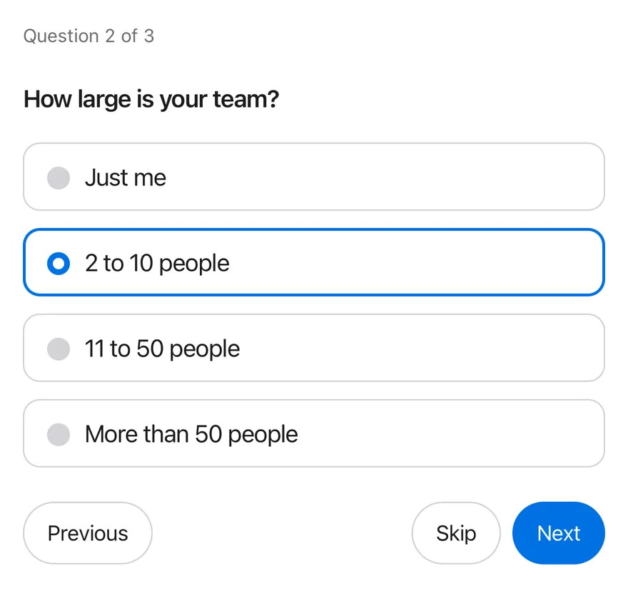
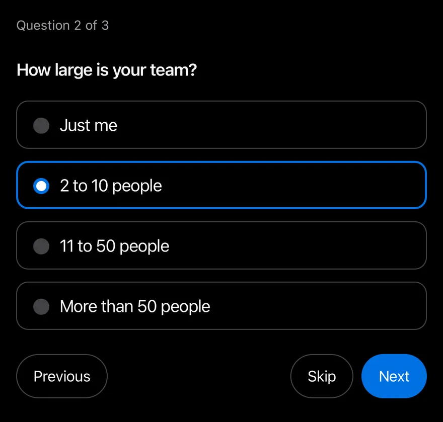
import * as React from "react"
import { View } from "react-native"
import { Questionnaire, QuestionnaireActions, QuestionnaireChoice, QuestionnaireChoices, QuestionnaireDescription, QuestionnaireError, QuestionnaireInput, QuestionnaireItem, QuestionnaireNext, QuestionnairePrevious, QuestionnaireProgress, QuestionnaireSkip, QuestionnaireSubmit, QuestionnaireTitle, type QuestionnaireValues } from "@/components/ui/questionnaire"
import { Text } from "@/components/ui/text"

function Actions() {
  return (
    <QuestionnaireActions>
      <QuestionnairePrevious />
      <QuestionnaireSkip />
      <QuestionnaireNext />
      <QuestionnaireSubmit />
    </QuestionnaireActions>
  )
}

function Result({ values }: { values: QuestionnaireValues | null }) {
  if (!values) return null
  return (
    <Text role="status" className="text-sm text-label-secondary">
      {`Submitted: ${JSON.stringify(values)}`}
    </Text>
  )
}

function Onboarding({
  defaultItem,
  attempted = false,
}: {
  defaultItem?: string
  attempted?: boolean
}) {
  const [values, setValues] = React.useState<QuestionnaireValues | null>(null)
  return (
    <View className="w-full gap-4">
      <Questionnaire defaultItem={defaultItem} onSubmit={setValues}>
        <QuestionnaireProgress />
        <QuestionnaireItem name="role" required invalid={attempted}>
          <QuestionnaireTitle>
            What best describes your role?
          </QuestionnaireTitle>
          <QuestionnaireDescription>
            This helps us tailor the setup to your team.
          </QuestionnaireDescription>
          <QuestionnaireChoices>
            <QuestionnaireChoice value="engineering">
              Engineering
            </QuestionnaireChoice>
            <QuestionnaireChoice value="design">Design</QuestionnaireChoice>
            <QuestionnaireChoice value="product">Product</QuestionnaireChoice>
            <QuestionnaireChoice value="other">
              Something else
            </QuestionnaireChoice>
          </QuestionnaireChoices>
          <QuestionnaireError />
        </QuestionnaireItem>
        <QuestionnaireItem name="team-size">
          <QuestionnaireTitle>How large is your team?</QuestionnaireTitle>
          <QuestionnaireChoices>
            <QuestionnaireChoice value="solo">Just me</QuestionnaireChoice>
            <QuestionnaireChoice value="small" defaultChecked>
              2 to 10 people
            </QuestionnaireChoice>
            <QuestionnaireChoice value="medium">
              11 to 50 people
            </QuestionnaireChoice>
            <QuestionnaireChoice value="large">
              More than 50 people
            </QuestionnaireChoice>
          </QuestionnaireChoices>
          <QuestionnaireError />
        </QuestionnaireItem>
        <QuestionnaireItem name="company" required>
          <QuestionnaireTitle>What is your company called?</QuestionnaireTitle>
          <QuestionnaireInput placeholder="Acme Inc." />
          <QuestionnaireError>
            Enter a company name to continue.
          </QuestionnaireError>
        </QuestionnaireItem>
        <Actions />
      </Questionnaire>
      <Result values={values} />
    </View>
  )
}

export function QuestionnaireMidFlowExample() {
  return (
    <Onboarding defaultItem="team-size" />
  )
}import EsuissUI
import SwiftUI
struct QuestionnaireMidFlowExample: View {
var body: some View {
QuestionnaireOnboarding(defaultItem: "team-size")
}
}
struct QuestionnaireStoryActions: View {
var body: some View {
QuestionnaireActions {
QuestionnairePrevious()
QuestionnaireSkip()
QuestionnaireNext()
QuestionnaireSubmit()
}
}
}
struct QuestionnaireOnboarding: View {
var attempted = false
@State private var controller: QuestionnaireController
@State private var submitted: String?
init(defaultItem: String? = nil, attempted: Bool = false) {
self.attempted = attempted
_controller = State(initialValue: QuestionnaireController(
defaultItem: defaultItem,
defaultValues: ["team-size": ["small"]]
))
}
var body: some View {
VStack(alignment: .leading, spacing: 16) {
Questionnaire(controller: controller) {
QuestionnaireProgress()
QuestionnaireItem(name: "role", required: true, invalid: attempted) {
QuestionnaireTitle("What best describes your role?")
QuestionnaireDescription("This helps us tailor the setup to your team.")
QuestionnaireChoices {
QuestionnaireChoice("Engineering", value: "engineering")
QuestionnaireChoice("Design", value: "design")
QuestionnaireChoice("Product", value: "product")
QuestionnaireChoice("Something else", value: "other")
}
QuestionnaireError()
}
QuestionnaireItem(name: "team-size") {
QuestionnaireTitle("How large is your team?")
QuestionnaireChoices {
QuestionnaireChoice("Just me", value: "solo")
QuestionnaireChoice("2 to 10 people", value: "small")
QuestionnaireChoice("11 to 50 people", value: "medium")
QuestionnaireChoice("More than 50 people", value: "large")
}
QuestionnaireError()
}
QuestionnaireItem(name: "company", required: true) {
QuestionnaireTitle("What is your company called?")
QuestionnaireInput("Acme Inc.")
QuestionnaireError("Enter a company name to continue.")
}
QuestionnaireStoryActions()
}
if let submitted {
Text(verbatim: submitted)
.textStyle(.sm)
.foregroundStyle(Color.labelSecondary)
.accessibilityAddTraits(.updatesFrequently)
}
}
.frame(maxWidth: .infinity, alignment: .leading)
.onAppear {
let controller = controller
controller.onSubmit = { answers in
let fields = controller.sequence.compactMap { name -> String? in
guard let value = answers[name]?.first else { return nil }
return "\"\(name)\":\"\(value)\""
}
submitted = "Submitted: {\(fields.joined(separator: ","))}"
}
}
}
}import androidx.compose.foundation.layout.Arrangement
import androidx.compose.foundation.layout.Column
import androidx.compose.foundation.layout.fillMaxWidth
import androidx.compose.runtime.Composable
import androidx.compose.runtime.getValue
import androidx.compose.runtime.mutableStateOf
import androidx.compose.runtime.saveable.rememberSaveable
import androidx.compose.runtime.setValue
import androidx.compose.ui.Modifier
import androidx.compose.ui.semantics.LiveRegionMode
import androidx.compose.ui.semantics.liveRegion
import androidx.compose.ui.semantics.semantics
import androidx.compose.ui.unit.dp
import com.esuiss.ui.components.Questionnaire
import com.esuiss.ui.components.QuestionnaireActions
import com.esuiss.ui.components.QuestionnaireChoice
import com.esuiss.ui.components.QuestionnaireChoices
import com.esuiss.ui.components.QuestionnaireDescription
import com.esuiss.ui.components.QuestionnaireError
import com.esuiss.ui.components.QuestionnaireInput
import com.esuiss.ui.components.QuestionnaireItem
import com.esuiss.ui.components.QuestionnaireNext
import com.esuiss.ui.components.QuestionnairePrevious
import com.esuiss.ui.components.QuestionnaireProgress
import com.esuiss.ui.components.QuestionnaireSkip
import com.esuiss.ui.components.QuestionnaireSubmit
import com.esuiss.ui.components.QuestionnaireTitle
import com.esuiss.ui.components.Text
import com.esuiss.ui.components.rememberQuestionnaireState
import com.esuiss.ui.theme.EsuissTheme
import com.esuiss.ui.theme.Typography
@Composable
fun QuestionnaireMidFlowExample() {
QuestionnaireOnboarding(defaultItem = "team-size")
}
fun questionnaireJson(values: Map<String, List<String>>): String =
values.entries.joinToString(",", "{", "}") { (key, list) ->
"\"$key\":" + list.joinToString(",", "[", "]") { "\"$it\"" }
}
@Composable
fun QuestionnaireActionsRow() {
QuestionnaireActions {
QuestionnairePrevious()
QuestionnaireSkip()
QuestionnaireNext()
QuestionnaireSubmit()
}
}
@Composable
fun QuestionnaireResult(values: String?) {
if (values == null) return
Text(
"Submitted: $values",
modifier = Modifier.semantics { liveRegion = LiveRegionMode.Polite },
style = Typography.sm,
color = EsuissTheme.colors.labelSecondary,
)
}
@Composable
fun QuestionnaireOnboarding(defaultItem: String? = null, attempted: Boolean = false) {
var values by rememberSaveable { mutableStateOf<String?>(null) }
val state = rememberQuestionnaireState(defaultItem = defaultItem)
Column(Modifier.fillMaxWidth(), verticalArrangement = Arrangement.spacedBy(16.dp)) {
Questionnaire(state = state, onSubmit = { values = questionnaireJson(it) }) {
QuestionnaireProgress()
QuestionnaireItem(name = "role", required = true, invalid = attempted) {
QuestionnaireTitle("What best describes your role?")
QuestionnaireDescription("This helps us tailor the setup to your team.")
QuestionnaireChoices {
QuestionnaireChoice("Engineering", value = "engineering")
QuestionnaireChoice("Design", value = "design")
QuestionnaireChoice("Product", value = "product")
QuestionnaireChoice("Something else", value = "other")
}
QuestionnaireError()
}
QuestionnaireItem(name = "team-size") {
QuestionnaireTitle("How large is your team?")
QuestionnaireChoices {
QuestionnaireChoice("Just me", value = "solo")
QuestionnaireChoice("2 to 10 people", value = "small", defaultChecked = true)
QuestionnaireChoice("11 to 50 people", value = "medium")
QuestionnaireChoice("More than 50 people", value = "large")
}
QuestionnaireError()
}
QuestionnaireItem(name = "company", required = true) {
QuestionnaireTitle("What is your company called?")
QuestionnaireInput(placeholder = "Acme Inc.")
QuestionnaireError("Enter a company name to continue.")
}
QuestionnaireActionsRow()
}
QuestionnaireResult(values)
}
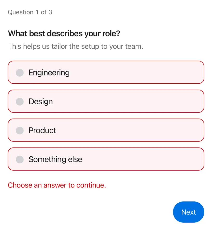
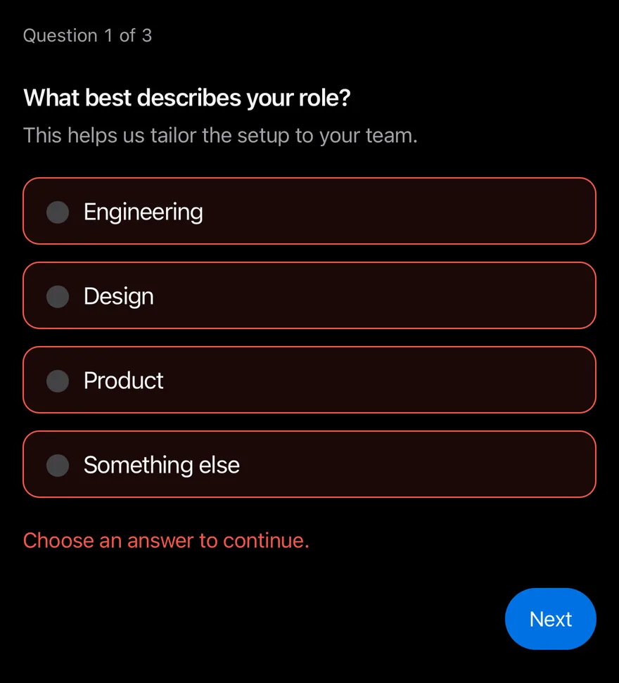
}Invalid
A required question shown in its invalid state with an error message.
import * as React from "react"
import { View } from "react-native"
import { Questionnaire, QuestionnaireActions, QuestionnaireChoice, QuestionnaireChoices, QuestionnaireDescription, QuestionnaireError, QuestionnaireInput, QuestionnaireItem, QuestionnaireNext, QuestionnairePrevious, QuestionnaireProgress, QuestionnaireSkip, QuestionnaireSubmit, QuestionnaireTitle, type QuestionnaireValues } from "@/components/ui/questionnaire"
import { Text } from "@/components/ui/text"

function Actions() {
  return (
    <QuestionnaireActions>
      <QuestionnairePrevious />
      <QuestionnaireSkip />
      <QuestionnaireNext />
      <QuestionnaireSubmit />
    </QuestionnaireActions>
  )
}

function Result({ values }: { values: QuestionnaireValues | null }) {
  if (!values) return null
  return (
    <Text role="status" className="text-sm text-label-secondary">
      {`Submitted: ${JSON.stringify(values)}`}
    </Text>
  )
}

function Onboarding({
  defaultItem,
  attempted = false,
}: {
  defaultItem?: string
  attempted?: boolean
}) {
  const [values, setValues] = React.useState<QuestionnaireValues | null>(null)
  return (
    <View className="w-full gap-4">
      <Questionnaire defaultItem={defaultItem} onSubmit={setValues}>
        <QuestionnaireProgress />
        <QuestionnaireItem name="role" required invalid={attempted}>
          <QuestionnaireTitle>
            What best describes your role?
          </QuestionnaireTitle>
          <QuestionnaireDescription>
            This helps us tailor the setup to your team.
          </QuestionnaireDescription>
          <QuestionnaireChoices>
            <QuestionnaireChoice value="engineering">
              Engineering
            </QuestionnaireChoice>
            <QuestionnaireChoice value="design">Design</QuestionnaireChoice>
            <QuestionnaireChoice value="product">Product</QuestionnaireChoice>
            <QuestionnaireChoice value="other">
              Something else
            </QuestionnaireChoice>
          </QuestionnaireChoices>
          <QuestionnaireError />
        </QuestionnaireItem>
        <QuestionnaireItem name="team-size">
          <QuestionnaireTitle>How large is your team?</QuestionnaireTitle>
          <QuestionnaireChoices>
            <QuestionnaireChoice value="solo">Just me</QuestionnaireChoice>
            <QuestionnaireChoice value="small" defaultChecked>
              2 to 10 people
            </QuestionnaireChoice>
            <QuestionnaireChoice value="medium">
              11 to 50 people
            </QuestionnaireChoice>
            <QuestionnaireChoice value="large">
              More than 50 people
            </QuestionnaireChoice>
          </QuestionnaireChoices>
          <QuestionnaireError />
        </QuestionnaireItem>
        <QuestionnaireItem name="company" required>
          <QuestionnaireTitle>What is your company called?</QuestionnaireTitle>
          <QuestionnaireInput placeholder="Acme Inc." />
          <QuestionnaireError>
            Enter a company name to continue.
          </QuestionnaireError>
        </QuestionnaireItem>
        <Actions />
      </Questionnaire>
      <Result values={values} />
    </View>
  )
}

export function QuestionnaireInvalidExample() {
  return (
    <Onboarding attempted />
  )
}import EsuissUI
import SwiftUI
struct QuestionnaireInvalidExample: View {
var body: some View {
QuestionnaireOnboarding(attempted: true)
}
}
struct QuestionnaireStoryActions: View {
var body: some View {
QuestionnaireActions {
QuestionnairePrevious()
QuestionnaireSkip()
QuestionnaireNext()
QuestionnaireSubmit()
}
}
}
struct QuestionnaireOnboarding: View {
var attempted = false
@State private var controller: QuestionnaireController
@State private var submitted: String?
init(defaultItem: String? = nil, attempted: Bool = false) {
self.attempted = attempted
_controller = State(initialValue: QuestionnaireController(
defaultItem: defaultItem,
defaultValues: ["team-size": ["small"]]
))
}
var body: some View {
VStack(alignment: .leading, spacing: 16) {
Questionnaire(controller: controller) {
QuestionnaireProgress()
QuestionnaireItem(name: "role", required: true, invalid: attempted) {
QuestionnaireTitle("What best describes your role?")
QuestionnaireDescription("This helps us tailor the setup to your team.")
QuestionnaireChoices {
QuestionnaireChoice("Engineering", value: "engineering")
QuestionnaireChoice("Design", value: "design")
QuestionnaireChoice("Product", value: "product")
QuestionnaireChoice("Something else", value: "other")
}
QuestionnaireError()
}
QuestionnaireItem(name: "team-size") {
QuestionnaireTitle("How large is your team?")
QuestionnaireChoices {
QuestionnaireChoice("Just me", value: "solo")
QuestionnaireChoice("2 to 10 people", value: "small")
QuestionnaireChoice("11 to 50 people", value: "medium")
QuestionnaireChoice("More than 50 people", value: "large")
}
QuestionnaireError()
}
QuestionnaireItem(name: "company", required: true) {
QuestionnaireTitle("What is your company called?")
QuestionnaireInput("Acme Inc.")
QuestionnaireError("Enter a company name to continue.")
}
QuestionnaireStoryActions()
}
if let submitted {
Text(verbatim: submitted)
.textStyle(.sm)
.foregroundStyle(Color.labelSecondary)
.accessibilityAddTraits(.updatesFrequently)
}
}
.frame(maxWidth: .infinity, alignment: .leading)
.onAppear {
let controller = controller
controller.onSubmit = { answers in
let fields = controller.sequence.compactMap { name -> String? in
guard let value = answers[name]?.first else { return nil }
return "\"\(name)\":\"\(value)\""
}
submitted = "Submitted: {\(fields.joined(separator: ","))}"
}
}
}
}import androidx.compose.foundation.layout.Arrangement
import androidx.compose.foundation.layout.Column
import androidx.compose.foundation.layout.fillMaxWidth
import androidx.compose.runtime.Composable
import androidx.compose.runtime.getValue
import androidx.compose.runtime.mutableStateOf
import androidx.compose.runtime.saveable.rememberSaveable
import androidx.compose.runtime.setValue
import androidx.compose.ui.Modifier
import androidx.compose.ui.semantics.LiveRegionMode
import androidx.compose.ui.semantics.liveRegion
import androidx.compose.ui.semantics.semantics
import androidx.compose.ui.unit.dp
import com.esuiss.ui.components.Questionnaire
import com.esuiss.ui.components.QuestionnaireActions
import com.esuiss.ui.components.QuestionnaireChoice
import com.esuiss.ui.components.QuestionnaireChoices
import com.esuiss.ui.components.QuestionnaireDescription
import com.esuiss.ui.components.QuestionnaireError
import com.esuiss.ui.components.QuestionnaireInput
import com.esuiss.ui.components.QuestionnaireItem
import com.esuiss.ui.components.QuestionnaireNext
import com.esuiss.ui.components.QuestionnairePrevious
import com.esuiss.ui.components.QuestionnaireProgress
import com.esuiss.ui.components.QuestionnaireSkip
import com.esuiss.ui.components.QuestionnaireSubmit
import com.esuiss.ui.components.QuestionnaireTitle
import com.esuiss.ui.components.Text
import com.esuiss.ui.components.rememberQuestionnaireState
import com.esuiss.ui.theme.EsuissTheme
import com.esuiss.ui.theme.Typography
@Composable
fun QuestionnaireInvalidExample() {
QuestionnaireOnboarding(attempted = true)
}
fun questionnaireJson(values: Map<String, List<String>>): String =
values.entries.joinToString(",", "{", "}") { (key, list) ->
"\"$key\":" + list.joinToString(",", "[", "]") { "\"$it\"" }
}
@Composable
fun QuestionnaireActionsRow() {
QuestionnaireActions {
QuestionnairePrevious()
QuestionnaireSkip()
QuestionnaireNext()
QuestionnaireSubmit()
}
}
@Composable
fun QuestionnaireResult(values: String?) {
if (values == null) return
Text(
"Submitted: $values",
modifier = Modifier.semantics { liveRegion = LiveRegionMode.Polite },
style = Typography.sm,
color = EsuissTheme.colors.labelSecondary,
)
}
@Composable
fun QuestionnaireOnboarding(defaultItem: String? = null, attempted: Boolean = false) {
var values by rememberSaveable { mutableStateOf<String?>(null) }
val state = rememberQuestionnaireState(defaultItem = defaultItem)
Column(Modifier.fillMaxWidth(), verticalArrangement = Arrangement.spacedBy(16.dp)) {
Questionnaire(state = state, onSubmit = { values = questionnaireJson(it) }) {
QuestionnaireProgress()
QuestionnaireItem(name = "role", required = true, invalid = attempted) {
QuestionnaireTitle("What best describes your role?")
QuestionnaireDescription("This helps us tailor the setup to your team.")
QuestionnaireChoices {
QuestionnaireChoice("Engineering", value = "engineering")
QuestionnaireChoice("Design", value = "design")
QuestionnaireChoice("Product", value = "product")
QuestionnaireChoice("Something else", value = "other")
}
QuestionnaireError()
}
QuestionnaireItem(name = "team-size") {
QuestionnaireTitle("How large is your team?")
QuestionnaireChoices {
QuestionnaireChoice("Just me", value = "solo")
QuestionnaireChoice("2 to 10 people", value = "small", defaultChecked = true)
QuestionnaireChoice("11 to 50 people", value = "medium")
QuestionnaireChoice("More than 50 people", value = "large")
}
QuestionnaireError()
}
QuestionnaireItem(name = "company", required = true) {
QuestionnaireTitle("What is your company called?")
QuestionnaireInput(placeholder = "Acme Inc.")
QuestionnaireError("Enter a company name to continue.")
}
QuestionnaireActionsRow()
}
QuestionnaireResult(values)
}
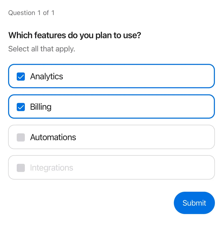
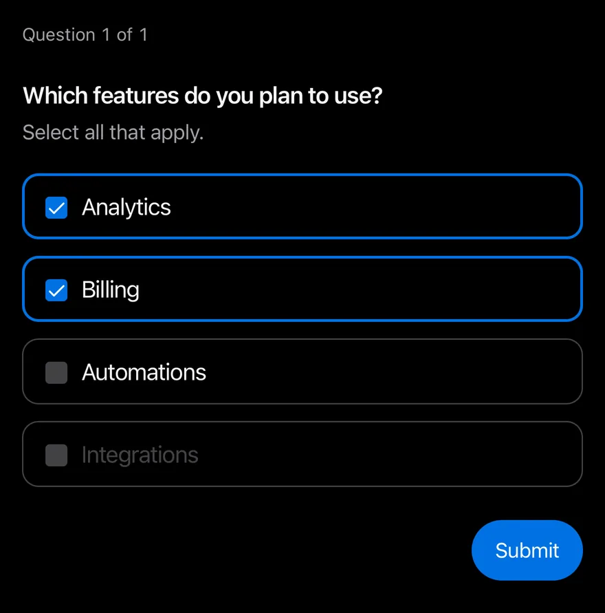
}Multiple choice
A multiple item that accepts several checked choices.
import { Questionnaire, QuestionnaireActions, QuestionnaireChoice, QuestionnaireChoices, QuestionnaireDescription, QuestionnaireError, QuestionnaireItem, QuestionnaireNext, QuestionnairePrevious, QuestionnaireProgress, QuestionnaireSkip, QuestionnaireSubmit, QuestionnaireTitle } from "@/components/ui/questionnaire"

function Actions() {
  return (
    <QuestionnaireActions>
      <QuestionnairePrevious />
      <QuestionnaireSkip />
      <QuestionnaireNext />
      <QuestionnaireSubmit />
    </QuestionnaireActions>
  )
}

export function QuestionnaireMultipleChoiceExample() {
  return (
    <Questionnaire>
      <QuestionnaireProgress />
      <QuestionnaireItem name="features" multiple required>
        <QuestionnaireTitle>
          Which features do you plan to use?
        </QuestionnaireTitle>
        <QuestionnaireDescription>
          Select all that apply.
        </QuestionnaireDescription>
        <QuestionnaireChoices>
          <QuestionnaireChoice value="analytics" defaultChecked>
            Analytics
          </QuestionnaireChoice>
          <QuestionnaireChoice value="billing" defaultChecked>
            Billing
          </QuestionnaireChoice>
          <QuestionnaireChoice value="automations">
            Automations
          </QuestionnaireChoice>
          <QuestionnaireChoice value="integrations" disabled>
            Integrations
          </QuestionnaireChoice>
        </QuestionnaireChoices>
        <QuestionnaireError>Choose at least one feature.</QuestionnaireError>
      </QuestionnaireItem>
      <Actions />
    </Questionnaire>
  )
}import EsuissUI
import SwiftUI
struct QuestionnaireStoryActions: View {
var body: some View {
QuestionnaireActions {
QuestionnairePrevious()
QuestionnaireSkip()
QuestionnaireNext()
QuestionnaireSubmit()
}
}
}
struct QuestionnaireMultipleChoice: View {
@State private var controller = QuestionnaireController(defaultValues: ["features": ["analytics", "billing"]])
var body: some View {
Questionnaire(controller: controller) {
QuestionnaireProgress()
QuestionnaireItem(name: "features", required: true, multiple: true) {
QuestionnaireTitle("Which features do you plan to use?")
QuestionnaireDescription("Select all that apply.")
QuestionnaireChoices {
QuestionnaireChoice("Analytics", value: "analytics")
QuestionnaireChoice("Billing", value: "billing")
QuestionnaireChoice("Automations", value: "automations")
QuestionnaireChoice("Integrations", value: "integrations", disabled: true)
}
QuestionnaireError("Choose at least one feature.")
}
QuestionnaireStoryActions()
}
}
}import androidx.compose.foundation.layout.fillMaxWidth
import androidx.compose.runtime.Composable
import androidx.compose.ui.Modifier
import com.esuiss.ui.components.Questionnaire
import com.esuiss.ui.components.QuestionnaireActions
import com.esuiss.ui.components.QuestionnaireChoice
import com.esuiss.ui.components.QuestionnaireChoices
import com.esuiss.ui.components.QuestionnaireDescription
import com.esuiss.ui.components.QuestionnaireError
import com.esuiss.ui.components.QuestionnaireItem
import com.esuiss.ui.components.QuestionnaireNext
import com.esuiss.ui.components.QuestionnairePrevious
import com.esuiss.ui.components.QuestionnaireProgress
import com.esuiss.ui.components.QuestionnaireSkip
import com.esuiss.ui.components.QuestionnaireSubmit
import com.esuiss.ui.components.QuestionnaireTitle
@Composable
fun QuestionnaireActionsRow() {
QuestionnaireActions {
QuestionnairePrevious()
QuestionnaireSkip()
QuestionnaireNext()
QuestionnaireSubmit()
}
}
@Composable
fun QuestionnaireMultipleChoice() {
Questionnaire(Modifier.fillMaxWidth()) {
QuestionnaireProgress()
QuestionnaireItem(name = "features", multiple = true, required = true) {
QuestionnaireTitle("Which features do you plan to use?")
QuestionnaireDescription("Select all that apply.")
QuestionnaireChoices {
QuestionnaireChoice("Analytics", value = "analytics", defaultChecked = true)
QuestionnaireChoice("Billing", value = "billing", defaultChecked = true)
QuestionnaireChoice("Automations", value = "automations")
QuestionnaireChoice("Integrations", value = "integrations", enabled = false)
}
QuestionnaireError("Choose at least one feature.")
}
QuestionnaireActionsRow()
}
}With choice descriptions
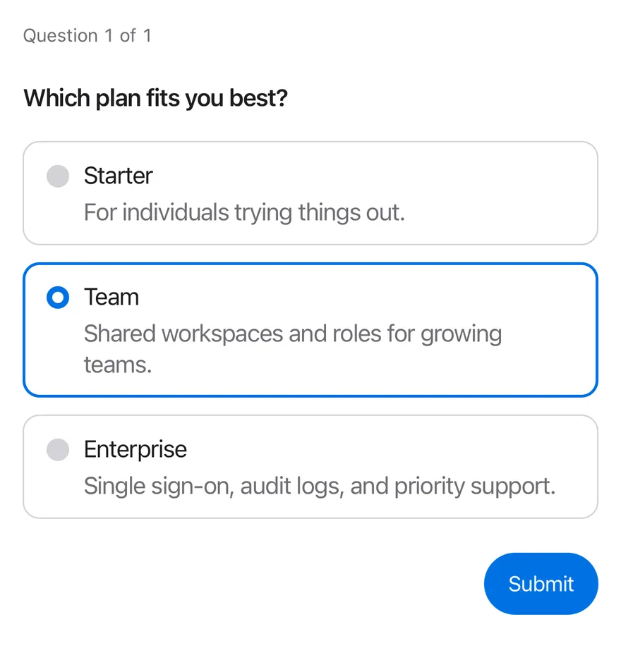
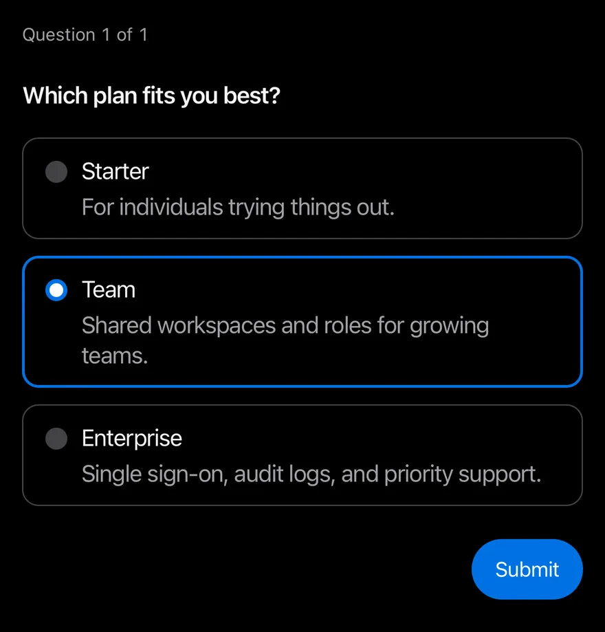
Choices with secondary text from QuestionnaireChoiceDescription.
import { Questionnaire, QuestionnaireActions, QuestionnaireChoice, QuestionnaireChoiceDescription, QuestionnaireChoices, QuestionnaireError, QuestionnaireItem, QuestionnaireNext, QuestionnairePrevious, QuestionnaireProgress, QuestionnaireSkip, QuestionnaireSubmit, QuestionnaireTitle } from "@/components/ui/questionnaire"

function Actions() {
  return (
    <QuestionnaireActions>
      <QuestionnairePrevious />
      <QuestionnaireSkip />
      <QuestionnaireNext />
      <QuestionnaireSubmit />
    </QuestionnaireActions>
  )
}

export function QuestionnaireWithChoiceDescriptionsExample() {
  return (
    <Questionnaire>
      <QuestionnaireProgress />
      <QuestionnaireItem name="plan" required>
        <QuestionnaireTitle>Which plan fits you best?</QuestionnaireTitle>
        <QuestionnaireChoices>
          <QuestionnaireChoice value="starter">
            Starter
            <QuestionnaireChoiceDescription>
              For individuals trying things out.
            </QuestionnaireChoiceDescription>
          </QuestionnaireChoice>
          <QuestionnaireChoice value="team" defaultChecked>
            Team
            <QuestionnaireChoiceDescription>
              Shared workspaces and roles for growing teams.
            </QuestionnaireChoiceDescription>
          </QuestionnaireChoice>
          <QuestionnaireChoice value="enterprise">
            Enterprise
            <QuestionnaireChoiceDescription>
              Single sign-on, audit logs, and priority support.
            </QuestionnaireChoiceDescription>
          </QuestionnaireChoice>
        </QuestionnaireChoices>
        <QuestionnaireError />
      </QuestionnaireItem>
      <Actions />
    </Questionnaire>
  )
}import EsuissUI
import SwiftUI
struct QuestionnaireStoryActions: View {
var body: some View {
QuestionnaireActions {
QuestionnairePrevious()
QuestionnaireSkip()
QuestionnaireNext()
QuestionnaireSubmit()
}
}
}
struct QuestionnaireChoiceDescriptions: View {
@State private var controller = QuestionnaireController(defaultValues: ["plan": ["team"]])
var body: some View {
Questionnaire(controller: controller) {
QuestionnaireProgress()
QuestionnaireItem(name: "plan", required: true) {
QuestionnaireTitle("Which plan fits you best?")
QuestionnaireChoices {
QuestionnaireChoice(value: "starter") {
Text("Starter")
QuestionnaireChoiceDescription("For individuals trying things out.")
}
QuestionnaireChoice(value: "team") {
Text("Team")
QuestionnaireChoiceDescription("Shared workspaces and roles for growing teams.")
}
QuestionnaireChoice(value: "enterprise") {
Text("Enterprise")
QuestionnaireChoiceDescription("Single sign-on, audit logs, and priority support.")
}
}
QuestionnaireError()
}
QuestionnaireStoryActions()
}
}
}import androidx.compose.foundation.layout.fillMaxWidth
import androidx.compose.runtime.Composable
import androidx.compose.ui.Modifier
import com.esuiss.ui.components.Questionnaire
import com.esuiss.ui.components.QuestionnaireActions
import com.esuiss.ui.components.QuestionnaireChoice
import com.esuiss.ui.components.QuestionnaireChoiceDescription
import com.esuiss.ui.components.QuestionnaireChoices
import com.esuiss.ui.components.QuestionnaireError
import com.esuiss.ui.components.QuestionnaireItem
import com.esuiss.ui.components.QuestionnaireNext
import com.esuiss.ui.components.QuestionnairePrevious
import com.esuiss.ui.components.QuestionnaireProgress
import com.esuiss.ui.components.QuestionnaireSkip
import com.esuiss.ui.components.QuestionnaireSubmit
import com.esuiss.ui.components.QuestionnaireTitle
import com.esuiss.ui.components.Text
@Composable
fun QuestionnaireActionsRow() {
QuestionnaireActions {
QuestionnairePrevious()
QuestionnaireSkip()
QuestionnaireNext()
QuestionnaireSubmit()
}
}
@Composable
fun QuestionnaireWithChoiceDescriptions() {
Questionnaire(Modifier.fillMaxWidth()) {
QuestionnaireProgress()
QuestionnaireItem(name = "plan", required = true) {
QuestionnaireTitle("Which plan fits you best?")
QuestionnaireChoices {
QuestionnaireChoice(value = "starter") {
Text("Starter")
QuestionnaireChoiceDescription("For individuals trying things out.")
}
QuestionnaireChoice(value = "team", defaultChecked = true) {
Text("Team")
QuestionnaireChoiceDescription("Shared workspaces and roles for growing teams.")
}
QuestionnaireChoice(value = "enterprise") {
Text("Enterprise")
QuestionnaireChoiceDescription("Single sign-on, audit logs, and priority support.")
}
}
QuestionnaireError()
}
QuestionnaireActionsRow()
}
}Text input
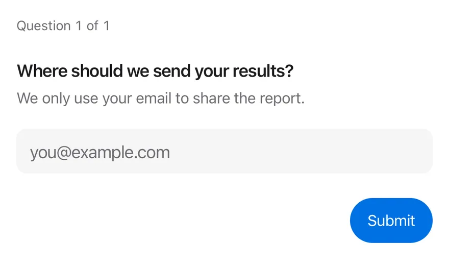
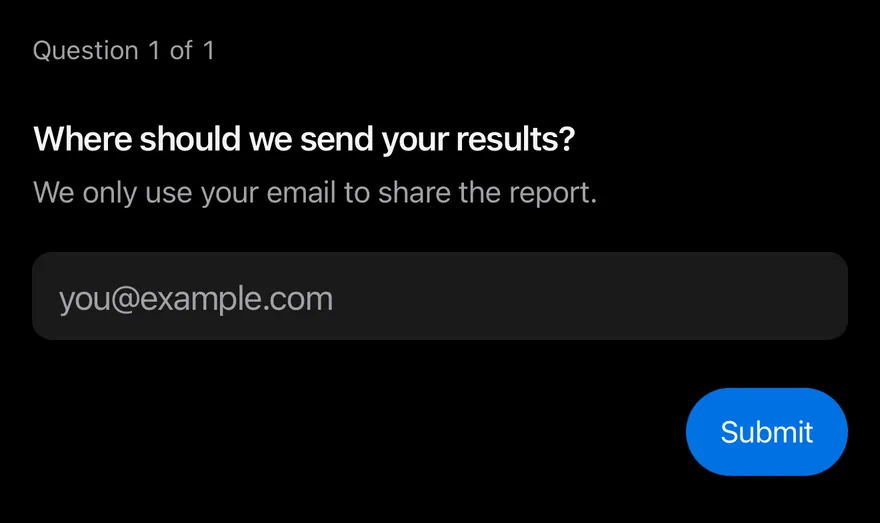
A required question answered with QuestionnaireInput.
import { Questionnaire, QuestionnaireActions, QuestionnaireDescription, QuestionnaireError, QuestionnaireInput, QuestionnaireItem, QuestionnaireNext, QuestionnairePrevious, QuestionnaireProgress, QuestionnaireSkip, QuestionnaireSubmit, QuestionnaireTitle } from "@/components/ui/questionnaire"

function Actions() {
  return (
    <QuestionnaireActions>
      <QuestionnairePrevious />
      <QuestionnaireSkip />
      <QuestionnaireNext />
      <QuestionnaireSubmit />
    </QuestionnaireActions>
  )
}

export function QuestionnaireTextInputExample() {
  return (
    <Questionnaire>
      <QuestionnaireProgress />
      <QuestionnaireItem name="email" required>
        <QuestionnaireTitle>
          Where should we send your results?
        </QuestionnaireTitle>
        <QuestionnaireDescription>
          We only use your email to share the report.
        </QuestionnaireDescription>
        <QuestionnaireInput type="email" placeholder="[email protected]" />
        <QuestionnaireError>
          Enter an email address to continue.
        </QuestionnaireError>
      </QuestionnaireItem>
      <Actions />
    </Questionnaire>
  )
}import EsuissUI
import SwiftUI
struct QuestionnaireStoryActions: View {
var body: some View {
QuestionnaireActions {
QuestionnairePrevious()
QuestionnaireSkip()
QuestionnaireNext()
QuestionnaireSubmit()
}
}
}
struct QuestionnaireTextInput: View {
@State private var controller = QuestionnaireController()
var body: some View {
Questionnaire(controller: controller) {
QuestionnaireProgress()
QuestionnaireItem(name: "email", required: true) {
QuestionnaireTitle("Where should we send your results?")
QuestionnaireDescription("We only use your email to share the report.")
QuestionnaireInput("[email protected]", keyboard: .emailAddress, contentType: .emailAddress)
QuestionnaireError("Enter an email address to continue.")
}
QuestionnaireStoryActions()
}
}
}import androidx.compose.foundation.layout.fillMaxWidth
import androidx.compose.foundation.text.KeyboardOptions
import androidx.compose.runtime.Composable
import androidx.compose.ui.Modifier
import androidx.compose.ui.text.input.KeyboardType
import com.esuiss.ui.components.Questionnaire
import com.esuiss.ui.components.QuestionnaireActions
import com.esuiss.ui.components.QuestionnaireDescription
import com.esuiss.ui.components.QuestionnaireError
import com.esuiss.ui.components.QuestionnaireInput
import com.esuiss.ui.components.QuestionnaireItem
import com.esuiss.ui.components.QuestionnaireNext
import com.esuiss.ui.components.QuestionnairePrevious
import com.esuiss.ui.components.QuestionnaireProgress
import com.esuiss.ui.components.QuestionnaireSkip
import com.esuiss.ui.components.QuestionnaireSubmit
import com.esuiss.ui.components.QuestionnaireTitle
@Composable
fun QuestionnaireActionsRow() {
QuestionnaireActions {
QuestionnairePrevious()
QuestionnaireSkip()
QuestionnaireNext()
QuestionnaireSubmit()
}
}
@Composable
fun QuestionnaireTextInput() {
Questionnaire(Modifier.fillMaxWidth()) {
QuestionnaireProgress()
QuestionnaireItem(name = "email", required = true) {
QuestionnaireTitle("Where should we send your results?")
QuestionnaireDescription("We only use your email to share the report.")
QuestionnaireInput(
placeholder = "[email protected]",
keyboardOptions = KeyboardOptions(keyboardType = KeyboardType.Email),
)
QuestionnaireError("Enter an email address to continue.")
}
QuestionnaireActionsRow()
}
}API Reference
Questionnaire
Root that holds the state and the active question.
React.ComponentProps<typeof View>React.RefAttributes<View>UseQuestionnaireParametersQuestionnaireProgress
Shows the current question number and total.
React.ComponentProps<typeof View>React.RefAttributes<View>- Type
React.ReactNode((state: QuestionnaireState) => React.ReactNode)- Default
- —
QuestionnaireItem
One question; shown only while active.
React.ComponentProps<typeof View>React.RefAttributes<View>- About
- Unique key for the answer.
- Type
string- Default
- required
- About
- Requires an answer before moving on and hides Skip.
- Type
boolean- Default
- false
- About
- Removes the item from the sequence.
- Type
boolean- Default
- false
- About
- Forces the invalid state.
- Type
boolean- Default
- false
- About
- Allows more than one choice.
- Type
boolean- Default
- false
- About
- Called when the status changes to
unanswered,answeredorskipped. - Type
(status: QuestionnaireItemStatus) => void- Default
- —
QuestionnaireTitle
The question heading.
React.ComponentProps<typeof Text>React.RefAttributes<typeof Text>QuestionnaireDescription
Secondary text under the title.
React.ComponentProps<typeof Text>React.RefAttributes<typeof Text>QuestionnaireChoices
Stack of choice rows.
React.ComponentProps<typeof View>React.RefAttributes<View>QuestionnaireChoice
A selectable answer row.
React.ComponentProps<typeof Pressable>React.RefAttributes<View>- About
- Value stored when the choice is selected.
- Type
string- Default
- required
- About
- Controlled checked state.
- Type
boolean- Default
- —
- About
- Initial checked state.
- Type
boolean- Default
- false
- About
- Disables the choice.
- Type
boolean- Default
- false
- About
- Called with the next checked state.
- Type
(checked: boolean) => void- Default
- —
- Type
React.ReactNode- Default
- —
QuestionnaireChoiceDescription
Secondary text inside a choice.
React.ComponentProps<typeof Text>React.RefAttributes<typeof Text>QuestionnaireInput
Text field for a typed answer.
React.ComponentProps<typeof Input>- About
text,email,number,tel,url,passwordorsearch; sets keyboard and autofill props.- Type
QuestionnaireInputType- Default
- "text"
QuestionnaireError
Validation message shown when the item is invalid.
React.ComponentProps<typeof Text>React.RefAttributes<typeof Text>QuestionnaireActions
Row for the navigation buttons.
React.ComponentProps<typeof View>React.RefAttributes<View>QuestionnairePrevious
Goes to the previous question.
QuestionnaireNavigationPropsQuestionnaireSkip
Skips the active question when it is optional.
QuestionnaireNavigationPropsQuestionnaireNext
Validates and moves to the next question.
QuestionnaireNavigationPropsQuestionnaireSubmit
Validates all questions and calls onSubmit on the last step.
QuestionnaireNavigationPropsAccessibility
- Each item has the
radiogrouprole, orgroupwhenmultiple, and is labelled by itsQuestionnaireTitle, which has theheadingrole. - Choices have the
radioorcheckboxrole with checked and disabled states. QuestionnaireInputis labelled by the title unless you pass anaccessibilityLabel.QuestionnaireProgresshas theprogressbarrole, a value such as "Question 2 of 3" and a polite live region.QuestionnaireErrorhas thealertrole with a polite live region.- Slide transitions respect the system reduce motion setting.
Notes
- Selecting a choice plays a selection haptic.
- Selected choices use
border-accentandbg-accent; invalid items useborder-danger. - The slide direction flips for right-to-left layouts.
- Light and dark colors follow the system appearance.