suiss/uim · React Native Component
Dialog
A modal window centered over the screen for focused tasks and messages.
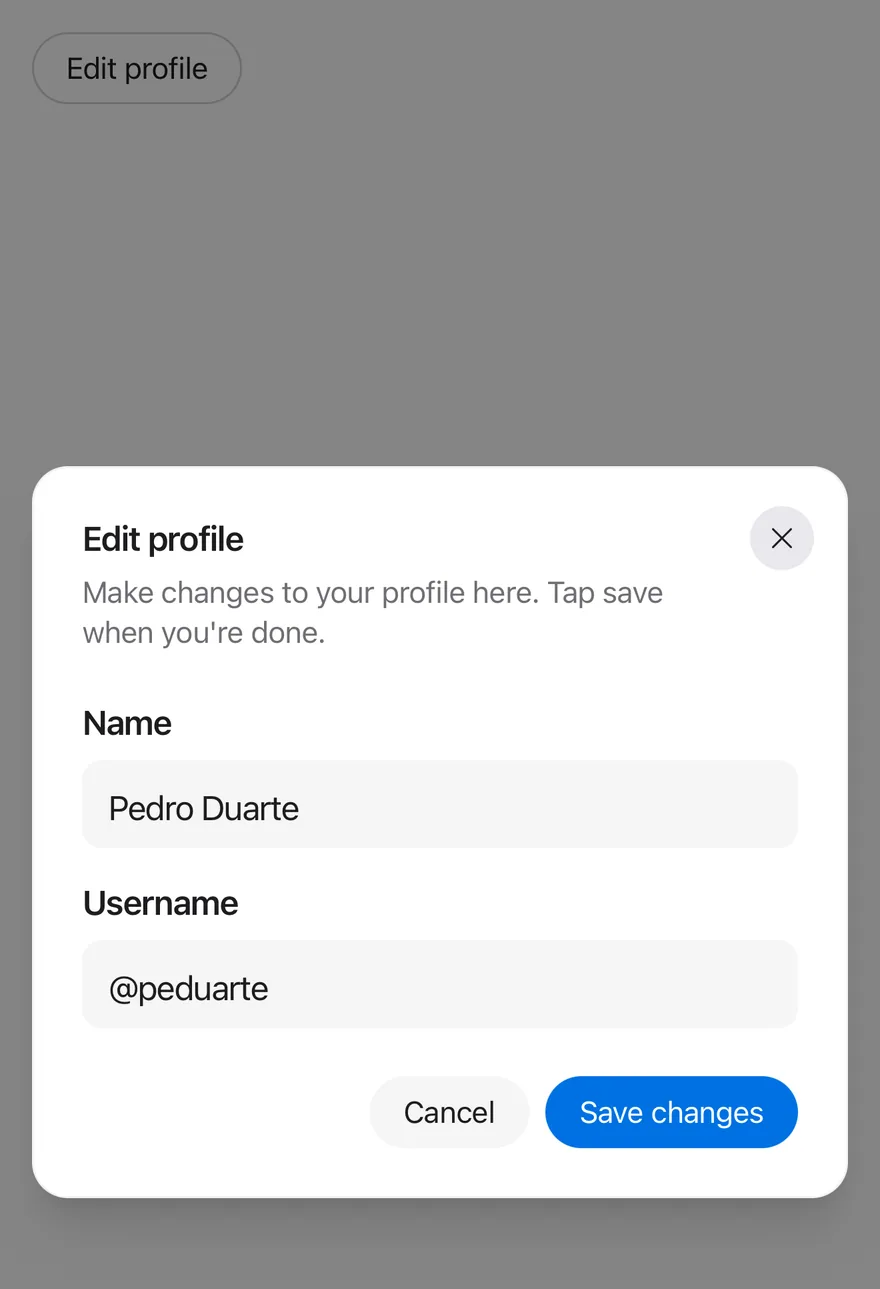
Dialog is an open-source mobile component from suiss/uim for React Native and Expo, with SwiftUI and Jetpack Compose versions built from the same design tokens. The @esuiss/uim CLI copies its source into your project, so you own the code.
import { View } from "react-native"
import { Button } from "@/components/ui/button"
import { Dialog, DialogClose, DialogContent, DialogDescription, DialogFooter, DialogHeader, DialogTitle, DialogTrigger } from "@/components/ui/dialog"
import { Input } from "@/components/ui/input"
import { Label } from "@/components/ui/label"
import { Text } from "@/components/ui/text"
function EditProfileContent() {
return (
<DialogContent>
<DialogHeader>
<DialogTitle>Edit profile</DialogTitle>
<DialogDescription>
Make changes to your profile here. Tap save when you're done.
</DialogDescription>
</DialogHeader>
<View className="gap-4">
<View className="gap-2">
<Label nativeID="dialog-name">Name</Label>
<Input
accessibilityLabelledBy="dialog-name"
defaultValue="Pedro Duarte"
/>
</View>
<View className="gap-2">
<Label nativeID="dialog-username">Username</Label>
<Input
accessibilityLabelledBy="dialog-username"
defaultValue="@peduarte"
autoCapitalize="none"
/>
</View>
</View>
<DialogFooter>
<DialogClose render={<Button variant="secondary" />}>
<Text>Cancel</Text>
</DialogClose>
<Button>
<Text>Save changes</Text>
</Button>
</DialogFooter>
</DialogContent>
)
}
export function DialogOpenByDefaultExample() {
return (
<View className="items-start">
<Dialog defaultOpen>
<DialogTrigger render={<Button variant="outline" />}>
<Text>Edit profile</Text>
</DialogTrigger>
<EditProfileContent />
</Dialog>
</View>
)
}import EsuissUI
import SwiftUI
struct DialogOpenByDefaultExample: View {
var body: some View {
DialogEditProfile(open: true)
}
}
struct DialogEditProfile: View {
@State private var open: Bool
init(open: Bool = false) {
_open = State(initialValue: open)
}
var body: some View {
Button("Edit profile") { open = true }
.buttonStyle(.variant(.outline))
.dialog(isPresented: $open) {
DialogEditProfileContent()
}
}
}
struct DialogEditProfileContent: View {
@State private var name = "Pedro Duarte"
@State private var username = "@peduarte"
var body: some View {
DialogContent {
DialogHeader {
DialogTitle("Edit profile")
DialogDescription("Make changes to your profile here. Tap save when you're done.")
}
VStack(alignment: .leading, spacing: 16) {
VStack(alignment: .leading, spacing: 8) {
FieldLabel("Name")
.accessibilityHidden(true)
TextField("Name", text: $name)
.textFieldStyle(.input)
}
VStack(alignment: .leading, spacing: 8) {
FieldLabel("Username")
.accessibilityHidden(true)
TextField("Username", text: $username)
.textFieldStyle(.input)
.textInputAutocapitalization(.never)
}
}
DialogFooter {
DialogClose {
Text("Cancel").frame(maxWidth: .infinity)
}
.buttonStyle(.variant(.secondary))
Button {} label: {
Text("Save changes").frame(maxWidth: .infinity)
}
.buttonStyle(.variant())
}
}
}
}import androidx.compose.foundation.layout.Arrangement
import androidx.compose.foundation.layout.Column
import androidx.compose.foundation.layout.fillMaxWidth
import androidx.compose.foundation.text.KeyboardOptions
import androidx.compose.runtime.Composable
import androidx.compose.runtime.getValue
import androidx.compose.runtime.mutableStateOf
import androidx.compose.runtime.saveable.rememberSaveable
import androidx.compose.runtime.setValue
import androidx.compose.ui.Modifier
import androidx.compose.ui.semantics.contentDescription
import androidx.compose.ui.semantics.semantics
import androidx.compose.ui.text.input.KeyboardCapitalization
import androidx.compose.ui.unit.dp
import com.esuiss.ui.components.Button
import com.esuiss.ui.components.ButtonVariant
import com.esuiss.ui.components.Dialog
import com.esuiss.ui.components.DialogDescription
import com.esuiss.ui.components.DialogFooter
import com.esuiss.ui.components.DialogHeader
import com.esuiss.ui.components.DialogTitle
import com.esuiss.ui.components.Input
import com.esuiss.ui.components.Label
@Composable
fun DialogOpenByDefaultExample() {
DialogDefault(defaultOpen = true)
}
@Composable
fun DialogDefault(defaultOpen: Boolean) {
var open by rememberSaveable { mutableStateOf(defaultOpen) }
var name by rememberSaveable { mutableStateOf("Pedro Duarte") }
var username by rememberSaveable { mutableStateOf("@peduarte") }
Column {
Button("Edit profile", onClick = { open = true }, variant = ButtonVariant.Outline)
Dialog(open = open, onOpenChange = { open = it }) {
DialogHeader {
DialogTitle("Edit profile")
DialogDescription("Make changes to your profile here. Tap save when you're done.")
}
Column(verticalArrangement = Arrangement.spacedBy(16.dp)) {
Column(verticalArrangement = Arrangement.spacedBy(8.dp)) {
Label("Name")
Input(name, { name = it }, Modifier.semantics { contentDescription = "Name" })
}
Column(verticalArrangement = Arrangement.spacedBy(8.dp)) {
Label("Username")
Input(
username,
{ username = it },
Modifier.semantics { contentDescription = "Username" },
keyboardOptions = KeyboardOptions(capitalization = KeyboardCapitalization.None),
)
}
}
DialogFooter {
Button("Cancel", onClick = { open = false }, modifier = Modifier.fillMaxWidth(), variant = ButtonVariant.Secondary)
Button("Save changes", onClick = {}, modifier = Modifier.fillMaxWidth())
}
}
}
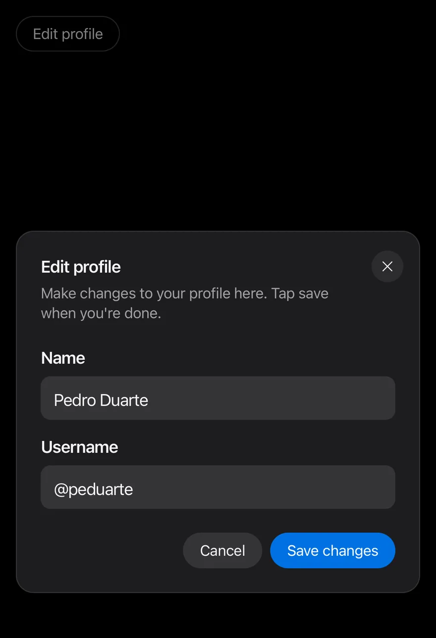
}Dialog opens a centered card over a dimmed scrim. DialogContent renders through a portal (inside a full-window overlay on iOS), scales and fades in, and shows a round close button in the top-right corner by default. Tapping the scrim closes the dialog.
Use it for short forms and information that the user can dismiss freely. When the user must make an explicit choice, use Alert Dialog instead.
Installation
$ pnpm dlx @esuiss/uim@latest add dialog$ pnpm dlx @esuiss/uim@latest add dialog --platform swift$ pnpm dlx @esuiss/uim@latest add dialog --platform kotlinThe CLI also adds what it builds on: Button, Icon, Text.
Manual
- Install the dependencies:
npx expo install cn phosphor-react-native react-native-reanimated react-native-screens react-native-svg react-native-worklets-
Add the pieces it builds on: Button, Icon, Text, and the primitives
components/primitives/dialog.tsx,components/primitives/use-render.tsx. -
Copy the source into
components/ui/dialog.tsx:
import { cn } from "cn"
import { XIcon } from "phosphor-react-native"
import * as React from "react"
import { Platform, View, type ViewProps } from "react-native"
import {
  FadeIn,
  FadeOut,
  Keyframe,
  ReduceMotion,
} from "react-native-reanimated"
import { FullWindowOverlay as RNFullWindowOverlay } from "react-native-screens"
import * as DialogPrimitive from "@/components/primitives/dialog"
import { resolveClassName } from "@/components/primitives/use-render"
import { AnimatedView } from "@/components/ui/animated-view"
import { Button } from "@/components/ui/button"
import { Icon } from "@/components/ui/icon"- Update the import paths to match your project.
- Install the dependencies:
npx expo install cn phosphor-react-native react-native-reanimated react-native-screens react-native-svg react-native-worklets-
Add the pieces it builds on: Button, Icon, Text, and the primitives
components/primitives/dialog.tsx,components/primitives/use-render.tsx. -
Copy the source into
components/ui/dialog.tsx:
import { cn } from "cn"
import { XIcon } from "phosphor-react-native"
import * as React from "react"
import { Platform, View, type ViewProps } from "react-native"
import {
  FadeIn,
  FadeOut,
  Keyframe,
  ReduceMotion,
} from "react-native-reanimated"
import { FullWindowOverlay as RNFullWindowOverlay } from "react-native-screens"
import * as DialogPrimitive from "@/components/primitives/dialog"
import { resolveClassName } from "@/components/primitives/use-render"
import { AnimatedView } from "@/components/ui/animated-view"
import { Button } from "@/components/ui/button"
import { Icon } from "@/components/ui/icon"- Update the import paths to match your project.
- Install the dependencies:
npx expo install phosphor-react-native react-native-reanimated react-native-screens react-native-svg react-native-worklets-
Add the pieces it builds on: Button, Icon, Text, and the primitives
components/primitives/dialog.tsx,components/primitives/use-render.tsx. -
Copy the source into
components/ui/dialog.tsx:
import { XIcon } from "phosphor-react-native"
import * as React from "react"
import {
  Platform,
  StyleSheet,
  useWindowDimensions,
  View,
  type ViewProps,
} from "react-native"
import {
  FadeIn,
  FadeOut,
  Keyframe,
  ReduceMotion,
} from "react-native-reanimated"
import { FullWindowOverlay as RNFullWindowOverlay } from "react-native-screens"- Update the import paths to match your project.
-
Target iOS 17 or later.
-
Add the Swift package to your app:
.package(url: "https://github.com/phosphor-icons/swift", from: "2.1.0")- Copy the theme files every view uses:
import SwiftUI
import UIKit

struct RGBA: Sendable {
  let red: CGFloat
  let green: CGFloat
  let blue: CGFloat
  let alpha: CGFloat

  init(_ hex: UInt32, _ alpha: CGFloat = 1) {
    red = CGFloat((hex >> 16) & 0xFF) / 255
    green = CGFloat((hex >> 8) & 0xFF) / 255
    blue = CGFloat(hex & 0xFF) / 255
    self.alpha = alpha
}import SwiftUI
extension Color {
public static let surface = Color.adaptive(light: .init(0xFFFFFF), dark: .init(0x000000))
public static let surfaceSecondary = Color.adaptive(light: .init(0xF5F5F7), dark: .init(0x161617))
public static let surfaceTertiary = Color.adaptive(light: .init(0xE8E8ED), dark: .init(0x2C2C2E))
public static let surfaceRaised = Color.adaptive(light: .init(0xFFFFFF), dark: .init(0x1D1D1F))
public static let label = Color.adaptive(light: .init(0x1D1D1F), dark: .init(0xF5F5F7))
public static let labelSecondary = Color.adaptive(light: .init(0x6E6E73), dark: .init(0xA1A1A6))
public static let labelTertiary = Color.adaptive(light: .init(0x86868B), dark: .init(0x86868B))
public static let labelQuaternary = Color.adaptive(light: .init(0xD2D2D7), dark: .init(0x424245))
public static let control = Color.adaptive(light: .init(0x000000, 0.04), dark: .init(0xFFFFFF, 0.1))
public static let controlPressed = Color.adaptive(light: .init(0x000000, 0.12), dark: .init(0xFFFFFF, 0.22))
public static let controlSelected = Color.adaptive(light: .init(0x1D1D1F), dark: .init(0xF5F5F7))
public static let controlDisabled = Color.adaptive(light: .init(0x000000, 0.03), dark: .init(0xFFFFFF, 0.05))
public static let onControlSelected = Color.adaptive(light: .init(0xFFFFFF), dark: .init(0x000000))- Copy the source and every file it uses:
import SwiftUI

extension View {
  public func dialog<Content: View>(
    isPresented: Binding<Bool>,
    @ViewBuilder content: @escaping () -> Content
  ) -> some View {
    modifier(
      CoverPresenter(isPresented: isPresented) { visible in
        CenteredStage(visible: visible, dismissible: true, content: content)
      }
    )
  }
}

struct CenteredStage<Content: View>: View {import SwiftUI
public struct VariantButtonStyle: ButtonStyle {
public enum Variant: CaseIterable, Sendable {
case `default`, outline, secondary, tinted, ghost, plain, destructive, link
}
public enum Size: CaseIterable, Sendable {
case `default`, xs, sm, lg, xl, icon, iconXs, iconSm, iconLg, iconXl
var height: CGFloat {
switch self {
case .xs, .iconXs: 24
case .sm, .iconSm: 32
case .default, .icon: 36
case .lg, .iconLg: 44import SwiftUI
extension EnvironmentValues {
@Entry var buttonGroup: Axis? = nil
@Entry var buttonGroupSize: CGSize = .zero
}
enum ButtonGroupSpace: Hashable {
case group
}
struct ButtonGroupFrame {
let bounds: Anchor<CGRect>
let outlined: Bool
}import PhosphorSwift
import SwiftUI
extension Shadow {
static let control = Shadow(color: .black.opacity(0.08), radius: 0.5, y: 0.5)
static let thumb = Shadow(color: .black.opacity(0.12), radius: 1.5, y: 1)
}
struct SelectionIndicator<Mark: View>: View {
let checked: Bool
let pressed: Bool
let cornerRadius: CGFloat
let mark: Mark
@Environment(\.isEnabled) private var isEnabled
@Environment(\.isInvalid) private var invalidimport SwiftUI
extension EnvironmentValues {
@Entry public var isInvalid = false
@Entry var fieldInset = false
@Entry var fieldGroupInset = false
@Entry var fieldSetInset = false
}
extension View {
public func invalid(_ isInvalid: Bool = true) -> some View {
environment(\.isInvalid, isInvalid)
}
}
public enum FieldOrientation: CaseIterable, Sendable {import SwiftUI
extension EnvironmentValues {
@Entry public var hapticsEnabled = true
}
extension View {
public func haptics(_ enabled: Bool) -> some View {
environment(\.hapticsEnabled, enabled)
}
func hapticFeedback<Trigger: Equatable>(_ feedback: SensoryFeedback, trigger: Trigger) -> some View {
modifier(HapticFeedbackModifier(feedback: feedback, trigger: trigger) { _, _ in true })
}
func hapticFeedback<Trigger: Equatable>(import PhosphorSwift
import Observation
import SwiftUI
public enum PopupAlignment: Sendable, CaseIterable {
case start, center, end
}
struct OverlayDismiss: Sendable {
let action: @MainActor @Sendable () -> Void
@MainActor func callAsFunction() {
action()
}
}import SwiftUI
public struct Separator: View {
let orientation: Axis
public init(_ orientation: Axis = .horizontal) {
self.orientation = orientation
}
public var body: some View {
Rectangle()
.fill(Color.separator)
.frame(width: orientation == .vertical ? 1 : nil, height: orientation == .horizontal ? 1 : nil)
.frame(maxWidth: orientation == .horizontal ? .infinity : nil, maxHeight: orientation == .vertical ? .infinity : nil)
.accessibilityHidden(true)
}import SwiftUI
public enum TextVariant: CaseIterable, Sendable {
case `default`, h1, h2, h3, h4, p, blockquote, code, lead, large, small, muted
var style: TextStyle {
switch self {
case .h1: .xl3
case .h2: .xl2
case .h3: .xl
case .h4, .lead, .large: .lg
case .code, .small, .muted: .sm
default: .base
}
}- Add the files to your app target.
- Set
minSdkto 24 or higher and add the dependencies:
implementation(platform("androidx.compose:compose-bom:2026.09.00"))
implementation("androidx.compose.foundation:foundation")
implementation("androidx.compose.ui:ui")
implementation("com.adamglin:phosphor-icon-android:1.0.0")- Copy the theme files every view uses:
package com.esuiss.ui.theme

import androidx.compose.foundation.isSystemInDarkTheme
import androidx.compose.runtime.Composable
import androidx.compose.runtime.CompositionLocalProvider
import androidx.compose.runtime.Immutable
import androidx.compose.runtime.staticCompositionLocalOf
import androidx.compose.ui.Modifier
import androidx.compose.ui.draw.dropShadow
import androidx.compose.ui.graphics.Color
import androidx.compose.ui.graphics.Shape
import androidx.compose.ui.graphics.shadow.Shadow as DropShadow
import androidx.compose.ui.text.TextStyle
import androidx.compose.ui.text.style.LineHeightStyle
import androidx.compose.ui.unit.Dp
import androidx.compose.ui.unit.DpOffsetpackage com.esuiss.ui.theme
import androidx.compose.runtime.Immutable
import androidx.compose.ui.graphics.Color
import androidx.compose.ui.unit.dp
@Immutable
data class Colors(
val surface: Color,
val surfaceSecondary: Color,
val surfaceTertiary: Color,
val surfaceRaised: Color,
val label: Color,
val labelSecondary: Color,
val labelTertiary: Color,
val labelQuaternary: Color,- Copy the source and every file it uses:
package com.esuiss.ui.components

import androidx.compose.animation.AnimatedVisibility
import androidx.compose.animation.core.MutableTransitionState
import androidx.compose.animation.core.tween
import androidx.compose.animation.fadeIn
import androidx.compose.animation.fadeOut
import androidx.compose.animation.scaleIn
import androidx.compose.animation.scaleOut
import androidx.compose.foundation.layout.Arrangement
import androidx.compose.foundation.layout.Box
import androidx.compose.foundation.layout.Column
import androidx.compose.foundation.layout.ColumnScope
import androidx.compose.foundation.layout.WindowInsets
import androidx.compose.foundation.layout.fillMaxSize
import androidx.compose.foundation.layout.fillMaxWidthpackage com.esuiss.ui.components
import androidx.compose.foundation.background
import androidx.compose.foundation.border
import androidx.compose.foundation.clickable
import androidx.compose.foundation.interaction.MutableInteractionSource
import androidx.compose.foundation.interaction.collectIsPressedAsState
import androidx.compose.foundation.layout.Arrangement
import androidx.compose.foundation.layout.Row
import androidx.compose.foundation.layout.RowScope
import androidx.compose.foundation.layout.fillMaxWidth
import androidx.compose.foundation.layout.height
import androidx.compose.foundation.layout.padding
import androidx.compose.foundation.layout.size
import androidx.compose.foundation.shape.CircleShape
import androidx.compose.foundation.shape.RoundedCornerShapepackage com.esuiss.ui.components
import androidx.compose.foundation.background
import androidx.compose.foundation.gestures.Orientation
import androidx.compose.foundation.layout.Arrangement
import androidx.compose.foundation.layout.Box
import androidx.compose.foundation.layout.Row
import androidx.compose.foundation.layout.RowScope
import androidx.compose.foundation.layout.padding
import androidx.compose.foundation.shape.CircleShape
import androidx.compose.foundation.shape.CornerSize
import androidx.compose.foundation.shape.RoundedCornerShape
import androidx.compose.runtime.Composable
import androidx.compose.runtime.CompositionLocalProvider
import androidx.compose.runtime.DisposableEffect
import androidx.compose.runtime.Immutablepackage com.esuiss.ui.components
import androidx.compose.runtime.compositionLocalOf
import androidx.compose.ui.graphics.Color
import androidx.compose.ui.text.TextStyle
import androidx.compose.ui.unit.Dp
import androidx.compose.ui.unit.dp
val LocalContentStyle = compositionLocalOf { TextStyle.Default }
val LocalContentColor = compositionLocalOf { Color.Unspecified }
val LocalIconSize = compositionLocalOf { 20.dp }package com.esuiss.ui.components
import androidx.compose.foundation.Image
import androidx.compose.foundation.layout.size
import androidx.compose.runtime.Composable
import androidx.compose.ui.Modifier
import androidx.compose.ui.graphics.Color
import androidx.compose.ui.graphics.ColorFilter
import androidx.compose.ui.graphics.takeOrElse
import androidx.compose.ui.graphics.vector.ImageVector
import androidx.compose.ui.unit.Dp
import com.esuiss.ui.theme.EsuissTheme
@Composable
fun Icon(
imageVector: ImageVector,package com.esuiss.ui.components
import android.os.Build
import android.view.Window
import android.view.WindowManager
import androidx.compose.animation.AnimatedVisibility
import androidx.compose.animation.AnimatedVisibilityScope
import androidx.compose.animation.EnterExitState
import androidx.compose.animation.core.MutableTransitionState
import androidx.compose.animation.core.animateFloat
import androidx.compose.animation.core.tween
import androidx.compose.animation.fadeIn
import androidx.compose.animation.fadeOut
import androidx.compose.animation.scaleIn
import androidx.compose.animation.scaleOut
import androidx.compose.animation.slideIn- Update the
com.esuiss.uipackage names to match your project.
Usage
import { DialogOverlay, DialogContent, DialogHeader, DialogFooter, DialogTitle, DialogDescription } from "@/components/ui/dialog"<View className="items-start">
<Dialog defaultOpen>
<DialogTrigger render={<Button variant="outline" />}>
<Text>Edit profile</Text>
</DialogTrigger>
<EditProfileContent />
</Dialog>
</View>Compose DialogTrigger and DialogContent with a DialogHeader (DialogTitle, DialogDescription), your content, and a DialogFooter. Footer buttons stack vertically with the first child at the bottom, and sit in a row aligned to the end on wider screens. Use DialogClose with render to turn any Button into a close button.
Set showCloseButton={false} on the content to hide the corner button, or pass closeLabel to show a text button such as "Done" instead of the icon. The header adds end padding so the title does not run under it. DialogFooter takes showCloseButton to append a secondary Close button.
Use open and onOpenChange for controlled state, or defaultOpen for uncontrolled.
Examples
Default

import { View } from "react-native"
import { Button } from "@/components/ui/button"
import { Dialog, DialogClose, DialogContent, DialogDescription, DialogFooter, DialogHeader, DialogTitle, DialogTrigger } from "@/components/ui/dialog"
import { Input } from "@/components/ui/input"
import { Label } from "@/components/ui/label"
import { Text } from "@/components/ui/text"
function EditProfileContent() {
return (
<DialogContent>
<DialogHeader>
<DialogTitle>Edit profile</DialogTitle>
<DialogDescription>
Make changes to your profile here. Tap save when you're done.
</DialogDescription>
</DialogHeader>
<View className="gap-4">
<View className="gap-2">
<Label nativeID="dialog-name">Name</Label>
<Input
accessibilityLabelledBy="dialog-name"
defaultValue="Pedro Duarte"
/>
</View>
<View className="gap-2">
<Label nativeID="dialog-username">Username</Label>
<Input
accessibilityLabelledBy="dialog-username"
defaultValue="@peduarte"
autoCapitalize="none"
/>
</View>
</View>
<DialogFooter>
<DialogClose render={<Button variant="secondary" />}>
<Text>Cancel</Text>
</DialogClose>
<Button>
<Text>Save changes</Text>
</Button>
</DialogFooter>
</DialogContent>
)
}
export function DialogExample() {
return (
<View className="items-start">
<Dialog>
<DialogTrigger render={<Button variant="outline" />}>
<Text>Edit profile</Text>
</DialogTrigger>
<EditProfileContent />
</Dialog>
</View>
)
}import EsuissUI
import SwiftUI
struct DialogEditProfile: View {
@State private var open: Bool
init(open: Bool = false) {
_open = State(initialValue: open)
}
var body: some View {
Button("Edit profile") { open = true }
.buttonStyle(.variant(.outline))
.dialog(isPresented: $open) {
DialogEditProfileContent()
}
}
}
struct DialogEditProfileContent: View {
@State private var name = "Pedro Duarte"
@State private var username = "@peduarte"
var body: some View {
DialogContent {
DialogHeader {
DialogTitle("Edit profile")
DialogDescription("Make changes to your profile here. Tap save when you're done.")
}
VStack(alignment: .leading, spacing: 16) {
VStack(alignment: .leading, spacing: 8) {
FieldLabel("Name")
.accessibilityHidden(true)
TextField("Name", text: $name)
.textFieldStyle(.input)
}
VStack(alignment: .leading, spacing: 8) {
FieldLabel("Username")
.accessibilityHidden(true)
TextField("Username", text: $username)
.textFieldStyle(.input)
.textInputAutocapitalization(.never)
}
}
DialogFooter {
DialogClose {
Text("Cancel").frame(maxWidth: .infinity)
}
.buttonStyle(.variant(.secondary))
Button {} label: {
Text("Save changes").frame(maxWidth: .infinity)
}
.buttonStyle(.variant())
}
}
}
}import androidx.compose.foundation.layout.Arrangement
import androidx.compose.foundation.layout.Column
import androidx.compose.foundation.layout.fillMaxWidth
import androidx.compose.foundation.text.KeyboardOptions
import androidx.compose.runtime.Composable
import androidx.compose.runtime.getValue
import androidx.compose.runtime.mutableStateOf
import androidx.compose.runtime.saveable.rememberSaveable
import androidx.compose.runtime.setValue
import androidx.compose.ui.Modifier
import androidx.compose.ui.semantics.contentDescription
import androidx.compose.ui.semantics.semantics
import androidx.compose.ui.text.input.KeyboardCapitalization
import androidx.compose.ui.unit.dp
import com.esuiss.ui.components.Button
import com.esuiss.ui.components.ButtonVariant
import com.esuiss.ui.components.Dialog
import com.esuiss.ui.components.DialogDescription
import com.esuiss.ui.components.DialogFooter
import com.esuiss.ui.components.DialogHeader
import com.esuiss.ui.components.DialogTitle
import com.esuiss.ui.components.Input
import com.esuiss.ui.components.Label
@Composable
fun DialogExample() {
DialogDefault(defaultOpen = false)
}
@Composable
fun DialogDefault(defaultOpen: Boolean) {
var open by rememberSaveable { mutableStateOf(defaultOpen) }
var name by rememberSaveable { mutableStateOf("Pedro Duarte") }
var username by rememberSaveable { mutableStateOf("@peduarte") }
Column {
Button("Edit profile", onClick = { open = true }, variant = ButtonVariant.Outline)
Dialog(open = open, onOpenChange = { open = it }) {
DialogHeader {
DialogTitle("Edit profile")
DialogDescription("Make changes to your profile here. Tap save when you're done.")
}
Column(verticalArrangement = Arrangement.spacedBy(16.dp)) {
Column(verticalArrangement = Arrangement.spacedBy(8.dp)) {
Label("Name")
Input(name, { name = it }, Modifier.semantics { contentDescription = "Name" })
}
Column(verticalArrangement = Arrangement.spacedBy(8.dp)) {
Label("Username")
Input(
username,
{ username = it },
Modifier.semantics { contentDescription = "Username" },
keyboardOptions = KeyboardOptions(capitalization = KeyboardCapitalization.None),
)
}
}
DialogFooter {
Button("Cancel", onClick = { open = false }, modifier = Modifier.fillMaxWidth(), variant = ButtonVariant.Secondary)
Button("Save changes", onClick = {}, modifier = Modifier.fillMaxWidth())
}
}
}
}Destructive
A destructive action with a cancel button in the footer.

import { View } from "react-native"
import { Button } from "@/components/ui/button"
import { Dialog, DialogClose, DialogContent, DialogDescription, DialogFooter, DialogHeader, DialogTitle, DialogTrigger } from "@/components/ui/dialog"
import { Text } from "@/components/ui/text"

export function DialogDestructiveExample() {
  return (
    <View className="items-start">
      <Dialog>
        <DialogTrigger render={<Button variant="destructive" />}>
          <Text>Delete account</Text>
        </DialogTrigger>
        <DialogContent>
          <DialogHeader>
            <DialogTitle>Delete account</DialogTitle>
            <DialogDescription>
              This will permanently delete your account and all of its data.
            </DialogDescription>
          </DialogHeader>
          <DialogFooter>
            <DialogClose render={<Button variant="secondary" />}>
              <Text>Cancel</Text>
            </DialogClose>
            <DialogClose render={<Button variant="destructive" />}>
              <Text>Delete</Text>
            </DialogClose>
          </DialogFooter>
        </DialogContent>
      </Dialog>
    </View>
  )
}import EsuissUI
import SwiftUI
struct DialogDestructive: View {
@State private var open = false
var body: some View {
Button("Delete account") { open = true }
.buttonStyle(.variant(.destructive))
.dialog(isPresented: $open) {
DialogContent {
DialogHeader {
DialogTitle("Delete account")
DialogDescription("This will permanently delete your account and all of its data.")
}
DialogFooter {
DialogClose {
Text("Cancel").frame(maxWidth: .infinity)
}
.buttonStyle(.variant(.secondary))
DialogClose {
Text("Delete").frame(maxWidth: .infinity)
}
.buttonStyle(.variant(.destructive))
}
}
}
}
}import androidx.compose.foundation.layout.Column
import androidx.compose.foundation.layout.fillMaxWidth
import androidx.compose.runtime.Composable
import androidx.compose.runtime.getValue
import androidx.compose.runtime.mutableStateOf
import androidx.compose.runtime.saveable.rememberSaveable
import androidx.compose.runtime.setValue
import androidx.compose.ui.Modifier
import com.esuiss.ui.components.Button
import com.esuiss.ui.components.ButtonVariant
import com.esuiss.ui.components.Dialog
import com.esuiss.ui.components.DialogDescription
import com.esuiss.ui.components.DialogFooter
import com.esuiss.ui.components.DialogHeader
import com.esuiss.ui.components.DialogTitle
@Composable
fun DialogDestructive() {
var open by rememberSaveable { mutableStateOf(false) }
Column {
Button("Delete account", onClick = { open = true }, variant = ButtonVariant.Destructive)
Dialog(open = open, onOpenChange = { open = it }) {
DialogHeader {
DialogTitle("Delete account")
DialogDescription("This will permanently delete your account and all of its data.")
}
DialogFooter {
Button("Cancel", onClick = { open = false }, modifier = Modifier.fillMaxWidth(), variant = ButtonVariant.Secondary)
Button("Delete", onClick = { open = false }, modifier = Modifier.fillMaxWidth(), variant = ButtonVariant.Destructive)
}
}
}
}Without close button
No corner button, with a Close button in the footer.

import { View } from "react-native"
import { Button } from "@/components/ui/button"
import { Dialog, DialogContent, DialogDescription, DialogFooter, DialogHeader, DialogTitle, DialogTrigger } from "@/components/ui/dialog"
import { Text } from "@/components/ui/text"

export function DialogWithoutCloseButtonExample() {
  return (
    <View className="items-start">
      <Dialog>
        <DialogTrigger render={<Button variant="outline" />}>
          <Text>Show terms</Text>
        </DialogTrigger>
        <DialogContent showCloseButton={false}>
          <DialogHeader>
            <DialogTitle>Terms updated</DialogTitle>
            <DialogDescription>
              We have updated our terms of service. Please review the changes
              before continuing.
            </DialogDescription>
          </DialogHeader>
          <DialogFooter showCloseButton>
            <Button>
              <Text>Accept</Text>
            </Button>
          </DialogFooter>
        </DialogContent>
      </Dialog>
    </View>
  )
}import EsuissUI
import SwiftUI
struct DialogWithoutCloseButton: View {
@State private var open = false
var body: some View {
Button("Show terms") { open = true }
.buttonStyle(.variant(.outline))
.dialog(isPresented: $open) {
DialogContent(showCloseButton: false) {
DialogHeader {
DialogTitle("Terms updated")
DialogDescription("We have updated our terms of service. Please review the changes before continuing.")
}
DialogFooter(showCloseButton: true) {
Button {} label: {
Text("Accept").frame(maxWidth: .infinity)
}
.buttonStyle(.variant())
}
}
}
}
}import androidx.compose.foundation.layout.Column
import androidx.compose.foundation.layout.fillMaxWidth
import androidx.compose.runtime.Composable
import androidx.compose.runtime.getValue
import androidx.compose.runtime.mutableStateOf
import androidx.compose.runtime.saveable.rememberSaveable
import androidx.compose.runtime.setValue
import androidx.compose.ui.Modifier
import com.esuiss.ui.components.Button
import com.esuiss.ui.components.ButtonVariant
import com.esuiss.ui.components.Dialog
import com.esuiss.ui.components.DialogDescription
import com.esuiss.ui.components.DialogFooter
import com.esuiss.ui.components.DialogHeader
import com.esuiss.ui.components.DialogTitle
@Composable
fun DialogWithoutCloseButton() {
var open by rememberSaveable { mutableStateOf(false) }
Column {
Button("Show terms", onClick = { open = true }, variant = ButtonVariant.Outline)
Dialog(open = open, onOpenChange = { open = it }, showCloseButton = false) {
DialogHeader {
DialogTitle("Terms updated")
DialogDescription("We have updated our terms of service. Please review the changes before continuing.")
}
DialogFooter(showCloseButton = true) {
Button("Accept", onClick = {}, modifier = Modifier.fillMaxWidth())
}
}
}
}With close label
A text close button through closeLabel.

import { View } from "react-native"
import { Button } from "@/components/ui/button"
import { Dialog, DialogContent, DialogDescription, DialogHeader, DialogTitle, DialogTrigger } from "@/components/ui/dialog"
import { Text } from "@/components/ui/text"

export function DialogWithCloseLabelExample() {
  return (
    <View className="items-start">
      <Dialog>
        <DialogTrigger render={<Button variant="outline" />}>
          <Text>Open settings</Text>
        </DialogTrigger>
        <DialogContent closeLabel="Done">
          <DialogHeader>
            <DialogTitle>Notification settings</DialogTitle>
            <DialogDescription>
              Choose how you want to be notified about activity in your
              workspace.
            </DialogDescription>
          </DialogHeader>
        </DialogContent>
      </Dialog>
    </View>
  )
}import EsuissUI
import SwiftUI
struct DialogWithCloseLabel: View {
@State private var open = false
var body: some View {
Button("Open settings") { open = true }
.buttonStyle(.variant(.outline))
.dialog(isPresented: $open) {
DialogContent(closeLabel: "Done") {
DialogHeader {
DialogTitle("Notification settings")
DialogDescription("Choose how you want to be notified about activity in your workspace.")
}
}
}
}
}import androidx.compose.foundation.layout.Column
import androidx.compose.runtime.Composable
import androidx.compose.runtime.getValue
import androidx.compose.runtime.mutableStateOf
import androidx.compose.runtime.saveable.rememberSaveable
import androidx.compose.runtime.setValue
import com.esuiss.ui.components.Button
import com.esuiss.ui.components.ButtonVariant
import com.esuiss.ui.components.Dialog
import com.esuiss.ui.components.DialogDescription
import com.esuiss.ui.components.DialogHeader
import com.esuiss.ui.components.DialogTitle
@Composable
fun DialogWithCloseLabel() {
var open by rememberSaveable { mutableStateOf(false) }
Column {
Button("Open settings", onClick = { open = true }, variant = ButtonVariant.Outline)
Dialog(open = open, onOpenChange = { open = it }, closeLabel = "Done") {
DialogHeader {
DialogTitle("Notification settings")
DialogDescription("Choose how you want to be notified about activity in your workspace.")
}
}
}
}API Reference
DialogOverlay
Dimmed scrim that closes the dialog when tapped.
React.ComponentProps<typeof DialogPrimitive.Backdrop>DialogContent
Centered card with an optional close button.
React.ComponentProps<typeof DialogPrimitive.Popup>- About
- Name of the portal host to render into.
- Type
string- Default
- —
- About
- Shows the corner close button. Defaults to
true. - Type
boolean- Default
- true
- About
- Text for the close button instead of the icon.
- Type
string- Default
- —
DialogHeader
Column for the title and description.
ViewPropsDialogFooter
Area for actions.
ViewProps- About
- Appends a secondary Close button.
- Type
boolean- Default
- false
DialogTitle
Dialog heading.
React.ComponentProps<typeof DialogPrimitive.Title>DialogDescription
Supporting text.
React.ComponentProps<typeof DialogPrimitive.Description>Accessibility
- The popup has the
dialogrole, is labelled by the title and is marked as modal for VoiceOver. - Focus moves to the title when the dialog opens.
- The Android back button and the VoiceOver escape gesture close it.
- The icon close button is labelled "Close".
Notes
- On iOS the content is wrapped in a full-window overlay so it appears above native navigation.
- Animations respect the system Reduce Motion setting.
- Uses
bg-surface-raised,bg-scrimandbg-surface-tertiarytokens; light and dark follow the system appearance.