suiss/uim · Pattern
Paged List
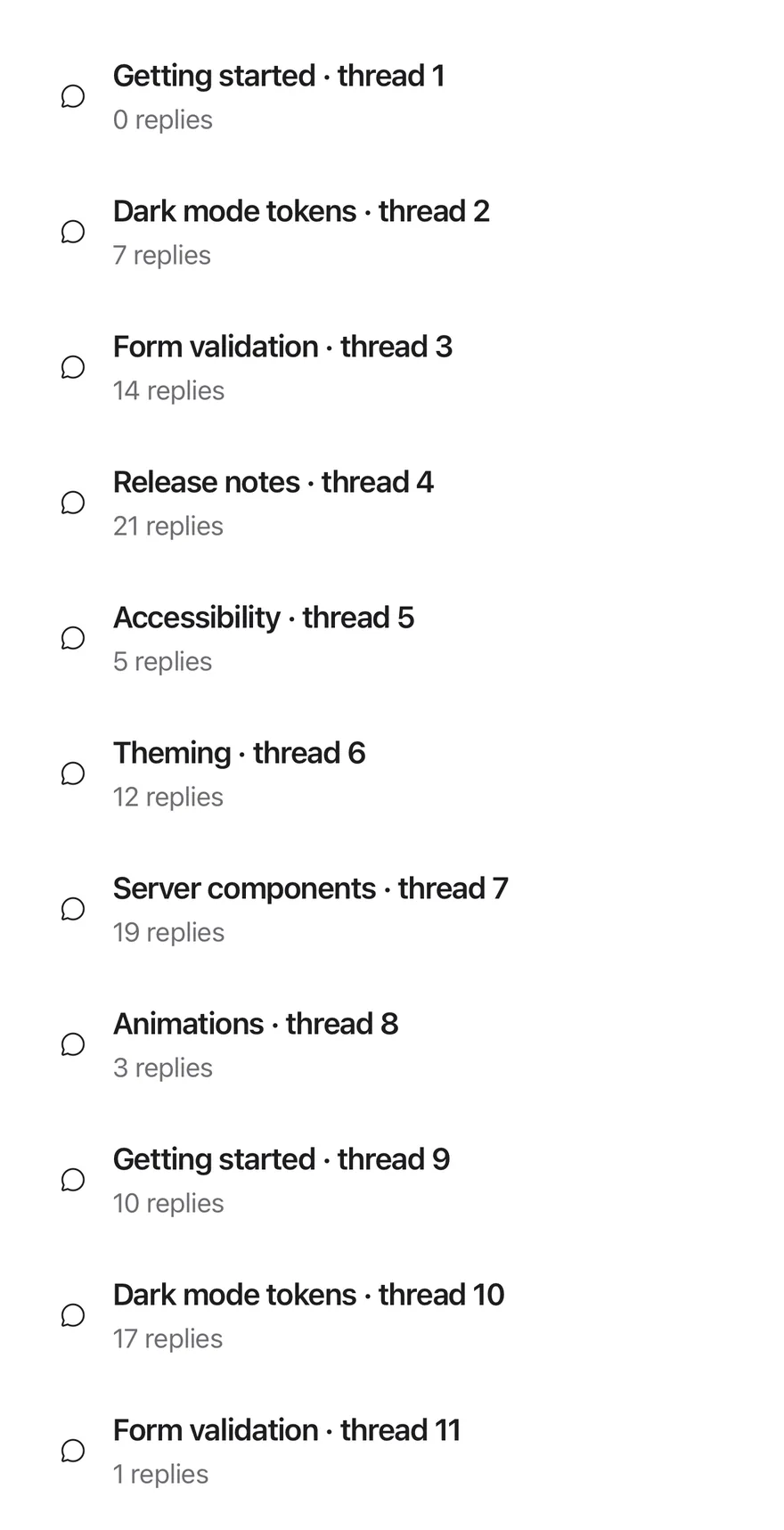
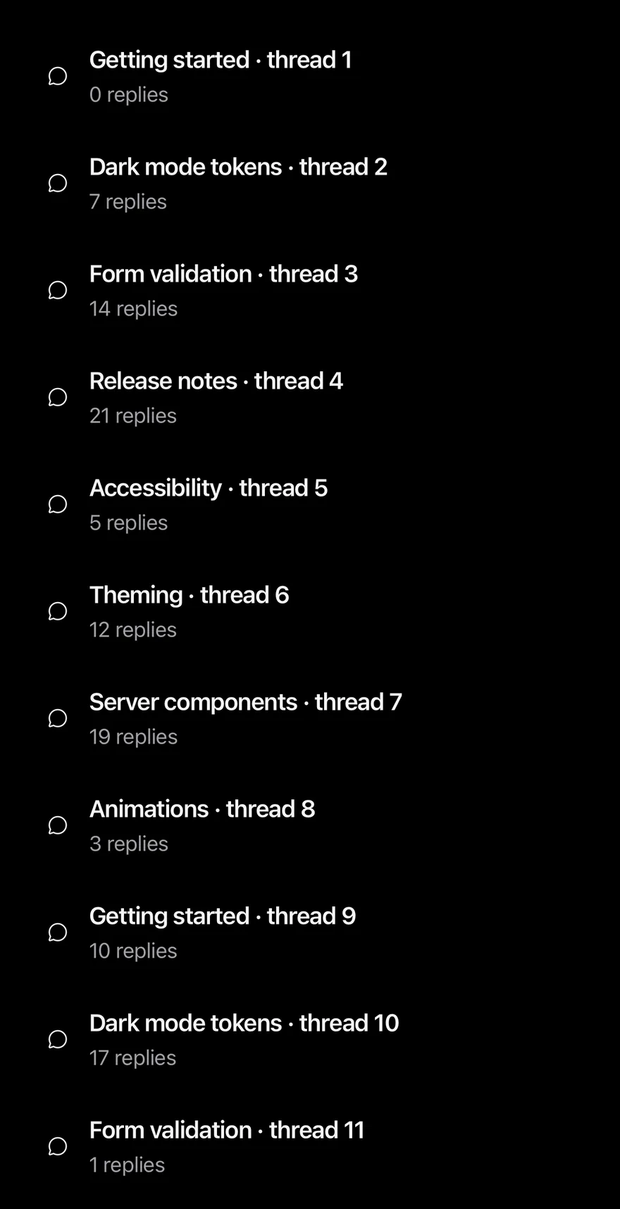
A FlatList that shows items one page at a time and loads the next page on scroll or with a button.
Paged List is an open-source mobile pattern from suiss/uim: components composed into a flow for React Native and Expo, with SwiftUI and Jetpack Compose versions built from the same design tokens. The @esuiss/uim CLI copies its source into your project, so you own the code.
import { ChatCircleIcon } from "phosphor-react-native"
import { PagedList } from "@/components/patterns/paged-list"
import { Icon } from "@/components/ui/icon"
import { Item, ItemContent, ItemDescription, ItemMedia, ItemTitle } from "@/components/ui/item"

type Topic = { id: number; title: string; replies: number }

const subjects = [
  "Getting started",
  "Dark mode tokens",
  "Form validation",
  "Release notes",
  "Accessibility",
  "Theming",
  "Server components",
  "Animations",
]

const topics: Topic[] = Array.from({ length: 57 }, (_, index) => ({
  id: index + 1,
  title: `${subjects[index % subjects.length]} · thread ${index + 1}`,
  replies: (index * 7) % 23,
}))

function TopicRow({ topic }: { topic: Topic }) {
  return (
    <Item onPress={() => {}}>
      <ItemMedia variant="icon">
        <Icon as={ChatCircleIcon} />
      </ItemMedia>
      <ItemContent>
        <ItemTitle>{topic.title}</ItemTitle>
        <ItemDescription>{topic.replies} replies</ItemDescription>
      </ItemContent>
    </Item>
  )
}

export function PagedListExample() {
  return (
    <PagedList<Topic> items={topics} pageSize={10} getKey={(topic: Topic) => topic.id} renderItem={(topic: Topic) => <TopicRow topic={topic} />} />
  )
}import EsuissUI
import PhosphorSwift
import SwiftUI
struct PagedListExample: View {
var body: some View {
PagedListDemo(topics: pagedListTopics)
}
}
struct PagedListTopic: Identifiable {
let id: Int
let title: String
let replies: Int
}
let pagedListSubjects = [
"Getting started",
"Dark mode tokens",
"Form validation",
"Release notes",
"Accessibility",
"Theming",
"Server components",
"Animations",
]
let pagedListTopics: [PagedListTopic] = (0..<57).map { index in
PagedListTopic(
id: index + 1,
title: "\(pagedListSubjects[index % pagedListSubjects.count]) · thread \(index + 1)",
replies: (index * 7) % 23
)
}
struct PagedListDemo: View {
let topics: [PagedListTopic]
var pageSize = 10
var loadMoreLabel: LocalizedStringKey = "Load more"
var body: some View {
PagedList(topics, pageSize: pageSize, loadMoreLabel: loadMoreLabel) { topic, _ in
Item(action: {}) {
ItemMedia(.icon) {
Ph.chatCircle.regular
}
ItemContent {
ItemTitle(verbatim: topic.title)
ItemDescription(verbatim: "\(topic.replies) replies")
}
}
}
}
}import androidx.compose.foundation.layout.fillMaxWidth
import androidx.compose.foundation.layout.height
import androidx.compose.runtime.Composable
import androidx.compose.ui.Modifier
import androidx.compose.ui.unit.dp
import com.adamglin.PhosphorIcons
import com.adamglin.phosphoricons.Regular
import com.adamglin.phosphoricons.regular.ChatCircle
import com.esuiss.ui.components.Icon
import com.esuiss.ui.components.Item
import com.esuiss.ui.components.ItemContent
import com.esuiss.ui.components.ItemDescription
import com.esuiss.ui.components.ItemMedia
import com.esuiss.ui.components.ItemMediaVariant
import com.esuiss.ui.components.ItemTitle
import com.esuiss.ui.patterns.PagedList
@Composable
fun PagedListExample() {
PagedListDemo(pagedListTopics)
}
class PagedListTopic(val id: Int, val title: String, val replies: Int)
val pagedListSubjects = listOf(
"Getting started",
"Dark mode tokens",
"Form validation",
"Release notes",
"Accessibility",
"Theming",
"Server components",
"Animations",
)
val pagedListTopics = List(57) { index ->
PagedListTopic(
id = index + 1,
title = "${pagedListSubjects[index % pagedListSubjects.size]} · thread ${index + 1}",
replies = (index * 7) % 23,
)
}
@Composable
fun PagedListDemo(items: List<PagedListTopic>, pageSize: Int = 10, loadMoreLabel: String = "Load more") {
PagedList(
items = items,
modifier = Modifier.fillMaxWidth().height(560.dp),
pageSize = pageSize,
getKey = { topic, _ -> topic.id },
loadMoreLabel = loadMoreLabel,
) { topic, _ ->
PagedListRow(topic)
}
}
@Composable
fun PagedListRow(topic: PagedListTopic) {
Item(onClick = {}) {
ItemMedia(variant = ItemMediaVariant.Icon) {
Icon(PhosphorIcons.Regular.ChatCircle, contentDescription = null)
}
ItemContent {
ItemTitle(topic.title)
ItemDescription("${topic.replies} replies")
}
}
}PagedList takes the full items array and renders only the first pageSize items. When the user scrolls near the end, or presses the Load more button in the footer, the next page is appended.
The button disappears once every item is shown. Use it for long local lists where rendering everything at once is not needed.
Installation
$ pnpm dlx @esuiss/uim@latest add paged-list$ pnpm dlx @esuiss/uim@latest add paged-list --platform swift$ pnpm dlx @esuiss/uim@latest add paged-list --platform kotlinThe CLI also adds what it builds on: Button, Text.
Manual
- Install the dependencies:
npx expo install cnimport { cn } from "cn"
import * as React from "react"
import { FlatList, type FlatListProps, View } from "react-native"
import { Button } from "@/components/ui/button"
import { Text } from "@/components/ui/text"
function PagedList<T>({
items,
pageSize = 10,
getKey = (_, index) => index,
renderItem,
loadMoreLabel = "Load more",
className,
listClassName,
...props
}: Omit<- Update the import paths to match your project.
- Install the dependencies:
npx expo install cnimport { cn } from "cn"
import * as React from "react"
import { FlatList, type FlatListProps, View } from "react-native"
import { Button } from "@/components/ui/button"
import { Text } from "@/components/ui/text"
function PagedList<T>({
items,
pageSize = 10,
getKey = (_, index) => index,
renderItem,
loadMoreLabel = "Load more",
className,
listClassName,
...props
}: Omit<- Update the import paths to match your project.
import * as React from "react"
import {
  FlatList,
  type FlatListProps,
  type StyleProp,
  StyleSheet,
  View,
  type ViewStyle,
} from "react-native"
import { Button } from "@/components/ui/button"
import { Text } from "@/components/ui/text"

const styles = StyleSheet.create({
  root: { flex: 1 },
  loadMore: { marginTop: 16 },
})- Update the import paths to match your project.
-
Target iOS 17 or later.
-
Add the Swift package to your app:
.package(url: "https://github.com/phosphor-icons/swift", from: "2.1.0")- Copy the theme files every view uses:
import SwiftUI
import UIKit

struct RGBA: Sendable {
  let red: CGFloat
  let green: CGFloat
  let blue: CGFloat
  let alpha: CGFloat

  init(_ hex: UInt32, _ alpha: CGFloat = 1) {
    red = CGFloat((hex >> 16) & 0xFF) / 255
    green = CGFloat((hex >> 8) & 0xFF) / 255
    blue = CGFloat(hex & 0xFF) / 255
    self.alpha = alpha
}import SwiftUI
extension Color {
public static let surface = Color.adaptive(light: .init(0xFFFFFF), dark: .init(0x000000))
public static let surfaceSecondary = Color.adaptive(light: .init(0xF5F5F7), dark: .init(0x161617))
public static let surfaceTertiary = Color.adaptive(light: .init(0xE8E8ED), dark: .init(0x2C2C2E))
public static let surfaceRaised = Color.adaptive(light: .init(0xFFFFFF), dark: .init(0x1D1D1F))
public static let label = Color.adaptive(light: .init(0x1D1D1F), dark: .init(0xF5F5F7))
public static let labelSecondary = Color.adaptive(light: .init(0x6E6E73), dark: .init(0xA1A1A6))
public static let labelTertiary = Color.adaptive(light: .init(0x86868B), dark: .init(0x86868B))
public static let labelQuaternary = Color.adaptive(light: .init(0xD2D2D7), dark: .init(0x424245))
public static let control = Color.adaptive(light: .init(0x000000, 0.04), dark: .init(0xFFFFFF, 0.1))
public static let controlPressed = Color.adaptive(light: .init(0x000000, 0.12), dark: .init(0xFFFFFF, 0.22))
public static let controlSelected = Color.adaptive(light: .init(0x1D1D1F), dark: .init(0xF5F5F7))
public static let controlDisabled = Color.adaptive(light: .init(0x000000, 0.03), dark: .init(0xFFFFFF, 0.05))
public static let onControlSelected = Color.adaptive(light: .init(0xFFFFFF), dark: .init(0x000000))- Copy the source and every file it uses:
import SwiftUI

enum PagedListMath {
  static func pageCount(total: Int, pageSize: Int) -> Int {
    max(1, Int((Double(total) / Double(max(pageSize, 1))).rounded(.up)))
  }

  static func visibleCount(loaded: Int, pageSize: Int, total: Int) -> Int {
    min(loaded * max(pageSize, 1), total)
  }

  static func shouldLoad(appearing index: Int, visible: Int, total: Int) -> Bool {
    index == visible - 1 && visible < total
  }
}import SwiftUI
public struct VariantButtonStyle: ButtonStyle {
public enum Variant: CaseIterable, Sendable {
case `default`, outline, secondary, tinted, ghost, plain, destructive, link
}
public enum Size: CaseIterable, Sendable {
case `default`, xs, sm, lg, xl, icon, iconXs, iconSm, iconLg, iconXl
var height: CGFloat {
switch self {
case .xs, .iconXs: 24
case .sm, .iconSm: 32
case .default, .icon: 36
case .lg, .iconLg: 44import SwiftUI
extension EnvironmentValues {
@Entry var buttonGroup: Axis? = nil
@Entry var buttonGroupSize: CGSize = .zero
}
enum ButtonGroupSpace: Hashable {
case group
}
struct ButtonGroupFrame {
let bounds: Anchor<CGRect>
let outlined: Bool
}import PhosphorSwift
import SwiftUI
extension Shadow {
static let control = Shadow(color: .black.opacity(0.08), radius: 0.5, y: 0.5)
static let thumb = Shadow(color: .black.opacity(0.12), radius: 1.5, y: 1)
}
struct SelectionIndicator<Mark: View>: View {
let checked: Bool
let pressed: Bool
let cornerRadius: CGFloat
let mark: Mark
@Environment(\.isEnabled) private var isEnabled
@Environment(\.isInvalid) private var invalidimport SwiftUI
extension EnvironmentValues {
@Entry public var isInvalid = false
@Entry var fieldInset = false
@Entry var fieldGroupInset = false
@Entry var fieldSetInset = false
}
extension View {
public func invalid(_ isInvalid: Bool = true) -> some View {
environment(\.isInvalid, isInvalid)
}
}
public enum FieldOrientation: CaseIterable, Sendable {import SwiftUI
extension EnvironmentValues {
@Entry public var hapticsEnabled = true
}
extension View {
public func haptics(_ enabled: Bool) -> some View {
environment(\.hapticsEnabled, enabled)
}
func hapticFeedback<Trigger: Equatable>(_ feedback: SensoryFeedback, trigger: Trigger) -> some View {
modifier(HapticFeedbackModifier(feedback: feedback, trigger: trigger) { _, _ in true })
}
func hapticFeedback<Trigger: Equatable>(import SwiftUI
public enum ItemVariant: CaseIterable, Sendable {
case `default`, outline, muted
}
public enum ItemSize: CaseIterable, Sendable {
case `default`, sm, xs
var horizontalPadding: CGFloat {
switch self {
case .default: 16
case .sm: 14
case .xs: 12
}
}import SwiftUI
public struct Separator: View {
let orientation: Axis
public init(_ orientation: Axis = .horizontal) {
self.orientation = orientation
}
public var body: some View {
Rectangle()
.fill(Color.separator)
.frame(width: orientation == .vertical ? 1 : nil, height: orientation == .horizontal ? 1 : nil)
.frame(maxWidth: orientation == .horizontal ? .infinity : nil, maxHeight: orientation == .vertical ? .infinity : nil)
.accessibilityHidden(true)
}import SwiftUI
public enum TextVariant: CaseIterable, Sendable {
case `default`, h1, h2, h3, h4, p, blockquote, code, lead, large, small, muted
var style: TextStyle {
switch self {
case .h1: .xl3
case .h2: .xl2
case .h3: .xl
case .h4, .lead, .large: .lg
case .code, .small, .muted: .sm
default: .base
}
}- Add the files to your app target.
- Set
minSdkto 24 or higher and add the dependencies:
implementation(platform("androidx.compose:compose-bom:2026.09.00"))
implementation("androidx.compose.foundation:foundation")
implementation("androidx.compose.ui:ui")- Copy the theme files every view uses:
package com.esuiss.ui.theme

import androidx.compose.foundation.isSystemInDarkTheme
import androidx.compose.runtime.Composable
import androidx.compose.runtime.CompositionLocalProvider
import androidx.compose.runtime.Immutable
import androidx.compose.runtime.staticCompositionLocalOf
import androidx.compose.ui.Modifier
import androidx.compose.ui.draw.dropShadow
import androidx.compose.ui.graphics.Color
import androidx.compose.ui.graphics.Shape
import androidx.compose.ui.graphics.shadow.Shadow as DropShadow
import androidx.compose.ui.text.TextStyle
import androidx.compose.ui.text.style.LineHeightStyle
import androidx.compose.ui.unit.Dp
import androidx.compose.ui.unit.DpOffsetpackage com.esuiss.ui.theme
import androidx.compose.runtime.Immutable
import androidx.compose.ui.graphics.Color
import androidx.compose.ui.unit.dp
@Immutable
data class Colors(
val surface: Color,
val surfaceSecondary: Color,
val surfaceTertiary: Color,
val surfaceRaised: Color,
val label: Color,
val labelSecondary: Color,
val labelTertiary: Color,
val labelQuaternary: Color,- Copy the source and every file it uses:
package com.esuiss.ui.patterns

import androidx.compose.foundation.layout.PaddingValues
import androidx.compose.foundation.layout.padding
import androidx.compose.foundation.lazy.LazyColumn
import androidx.compose.foundation.lazy.LazyListState
import androidx.compose.foundation.lazy.itemsIndexed
import androidx.compose.foundation.lazy.rememberLazyListState
import androidx.compose.runtime.Composable
import androidx.compose.runtime.LaunchedEffect
import androidx.compose.runtime.getValue
import androidx.compose.runtime.mutableIntStateOf
import androidx.compose.runtime.rememberUpdatedState
import androidx.compose.runtime.saveable.rememberSaveable
import androidx.compose.runtime.setValue
import androidx.compose.runtime.snapshotFlowpackage com.esuiss.ui.components
import androidx.compose.foundation.background
import androidx.compose.foundation.border
import androidx.compose.foundation.clickable
import androidx.compose.foundation.interaction.MutableInteractionSource
import androidx.compose.foundation.interaction.collectIsPressedAsState
import androidx.compose.foundation.layout.Arrangement
import androidx.compose.foundation.layout.Row
import androidx.compose.foundation.layout.RowScope
import androidx.compose.foundation.layout.fillMaxWidth
import androidx.compose.foundation.layout.height
import androidx.compose.foundation.layout.padding
import androidx.compose.foundation.layout.size
import androidx.compose.foundation.shape.CircleShape
import androidx.compose.foundation.shape.RoundedCornerShapepackage com.esuiss.ui.components
import androidx.compose.foundation.background
import androidx.compose.foundation.gestures.Orientation
import androidx.compose.foundation.layout.Arrangement
import androidx.compose.foundation.layout.Box
import androidx.compose.foundation.layout.Row
import androidx.compose.foundation.layout.RowScope
import androidx.compose.foundation.layout.padding
import androidx.compose.foundation.shape.CircleShape
import androidx.compose.foundation.shape.CornerSize
import androidx.compose.foundation.shape.RoundedCornerShape
import androidx.compose.runtime.Composable
import androidx.compose.runtime.CompositionLocalProvider
import androidx.compose.runtime.DisposableEffect
import androidx.compose.runtime.Immutablepackage com.esuiss.ui.components
import androidx.compose.runtime.compositionLocalOf
import androidx.compose.ui.graphics.Color
import androidx.compose.ui.text.TextStyle
import androidx.compose.ui.unit.Dp
import androidx.compose.ui.unit.dp
val LocalContentStyle = compositionLocalOf { TextStyle.Default }
val LocalContentColor = compositionLocalOf { Color.Unspecified }
val LocalIconSize = compositionLocalOf { 20.dp }package com.esuiss.ui.components
import androidx.compose.foundation.Image
import androidx.compose.foundation.layout.size
import androidx.compose.runtime.Composable
import androidx.compose.ui.Modifier
import androidx.compose.ui.graphics.Color
import androidx.compose.ui.graphics.ColorFilter
import androidx.compose.ui.graphics.takeOrElse
import androidx.compose.ui.graphics.vector.ImageVector
import androidx.compose.ui.unit.Dp
import com.esuiss.ui.theme.EsuissTheme
@Composable
fun Icon(
imageVector: ImageVector,- Update the
com.esuiss.uipackage names to match your project.
Usage
import { PagedList } from "@/components/patterns/paged-list"<PagedList<Topic> items={topics} pageSize={10} getKey={(topic: Topic) => topic.id} renderItem={(topic: Topic) => <TopicRow topic={topic} />} />Pass items, renderItem and a getKey that returns a stable key for each item. renderItem receives the item and its index, not the FlatList info object.
Other FlatList props pass through, except data, keyExtractor, onEndReached and ListFooterComponent, which the list manages. Use listClassName to style the content container.
Examples
Small pages
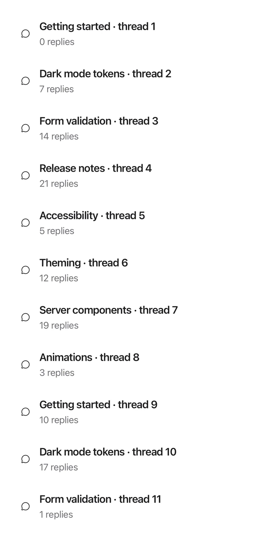
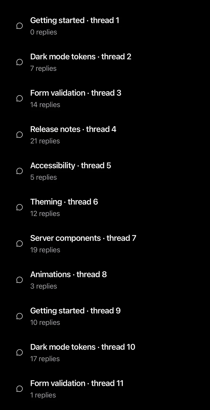
Uses a pageSize of 3 so pages load sooner.
import { ChatCircleIcon } from "phosphor-react-native"
import { PagedList } from "@/components/patterns/paged-list"
import { Icon } from "@/components/ui/icon"
import { Item, ItemContent, ItemDescription, ItemMedia, ItemTitle } from "@/components/ui/item"

type Topic = { id: number; title: string; replies: number }

const subjects = [
  "Getting started",
  "Dark mode tokens",
  "Form validation",
  "Release notes",
  "Accessibility",
  "Theming",
  "Server components",
  "Animations",
]

const topics: Topic[] = Array.from({ length: 57 }, (_, index) => ({
  id: index + 1,
  title: `${subjects[index % subjects.length]} · thread ${index + 1}`,
  replies: (index * 7) % 23,
}))

function TopicRow({ topic }: { topic: Topic }) {
  return (
    <Item onPress={() => {}}>
      <ItemMedia variant="icon">
        <Icon as={ChatCircleIcon} />
      </ItemMedia>
      <ItemContent>
        <ItemTitle>{topic.title}</ItemTitle>
        <ItemDescription>{topic.replies} replies</ItemDescription>
      </ItemContent>
    </Item>
  )
}

export function PagedListSmallPagesExample() {
  return (
    <PagedList<Topic> items={topics} pageSize={3} getKey={(topic: Topic) => topic.id} renderItem={(topic: Topic) => <TopicRow topic={topic} />} />
  )
}import EsuissUI
import PhosphorSwift
import SwiftUI
struct PagedListSmallPagesExample: View {
var body: some View {
PagedListDemo(topics: pagedListTopics, pageSize: 3)
}
}
struct PagedListTopic: Identifiable {
let id: Int
let title: String
let replies: Int
}
let pagedListSubjects = [
"Getting started",
"Dark mode tokens",
"Form validation",
"Release notes",
"Accessibility",
"Theming",
"Server components",
"Animations",
]
let pagedListTopics: [PagedListTopic] = (0..<57).map { index in
PagedListTopic(
id: index + 1,
title: "\(pagedListSubjects[index % pagedListSubjects.count]) · thread \(index + 1)",
replies: (index * 7) % 23
)
}
struct PagedListDemo: View {
let topics: [PagedListTopic]
var pageSize = 10
var loadMoreLabel: LocalizedStringKey = "Load more"
var body: some View {
PagedList(topics, pageSize: pageSize, loadMoreLabel: loadMoreLabel) { topic, _ in
Item(action: {}) {
ItemMedia(.icon) {
Ph.chatCircle.regular
}
ItemContent {
ItemTitle(verbatim: topic.title)
ItemDescription(verbatim: "\(topic.replies) replies")
}
}
}
}
}import androidx.compose.foundation.layout.fillMaxWidth
import androidx.compose.foundation.layout.height
import androidx.compose.runtime.Composable
import androidx.compose.ui.Modifier
import androidx.compose.ui.unit.dp
import com.adamglin.PhosphorIcons
import com.adamglin.phosphoricons.Regular
import com.adamglin.phosphoricons.regular.ChatCircle
import com.esuiss.ui.components.Icon
import com.esuiss.ui.components.Item
import com.esuiss.ui.components.ItemContent
import com.esuiss.ui.components.ItemDescription
import com.esuiss.ui.components.ItemMedia
import com.esuiss.ui.components.ItemMediaVariant
import com.esuiss.ui.components.ItemTitle
import com.esuiss.ui.patterns.PagedList
@Composable
fun PagedListSmallPagesExample() {
PagedListDemo(pagedListTopics, pageSize = 3)
}
class PagedListTopic(val id: Int, val title: String, val replies: Int)
val pagedListSubjects = listOf(
"Getting started",
"Dark mode tokens",
"Form validation",
"Release notes",
"Accessibility",
"Theming",
"Server components",
"Animations",
)
val pagedListTopics = List(57) { index ->
PagedListTopic(
id = index + 1,
title = "${pagedListSubjects[index % pagedListSubjects.size]} · thread ${index + 1}",
replies = (index * 7) % 23,
)
}
@Composable
fun PagedListDemo(items: List<PagedListTopic>, pageSize: Int = 10, loadMoreLabel: String = "Load more") {
PagedList(
items = items,
modifier = Modifier.fillMaxWidth().height(560.dp),
pageSize = pageSize,
getKey = { topic, _ -> topic.id },
loadMoreLabel = loadMoreLabel,
) { topic, _ ->
PagedListRow(topic)
}
}
@Composable
fun PagedListRow(topic: PagedListTopic) {
Item(onClick = {}) {
ItemMedia(variant = ItemMediaVariant.Icon) {
Icon(PhosphorIcons.Regular.ChatCircle, contentDescription = null)
}
ItemContent {
ItemTitle(topic.title)
ItemDescription("${topic.replies} replies")
}
}
}Single page
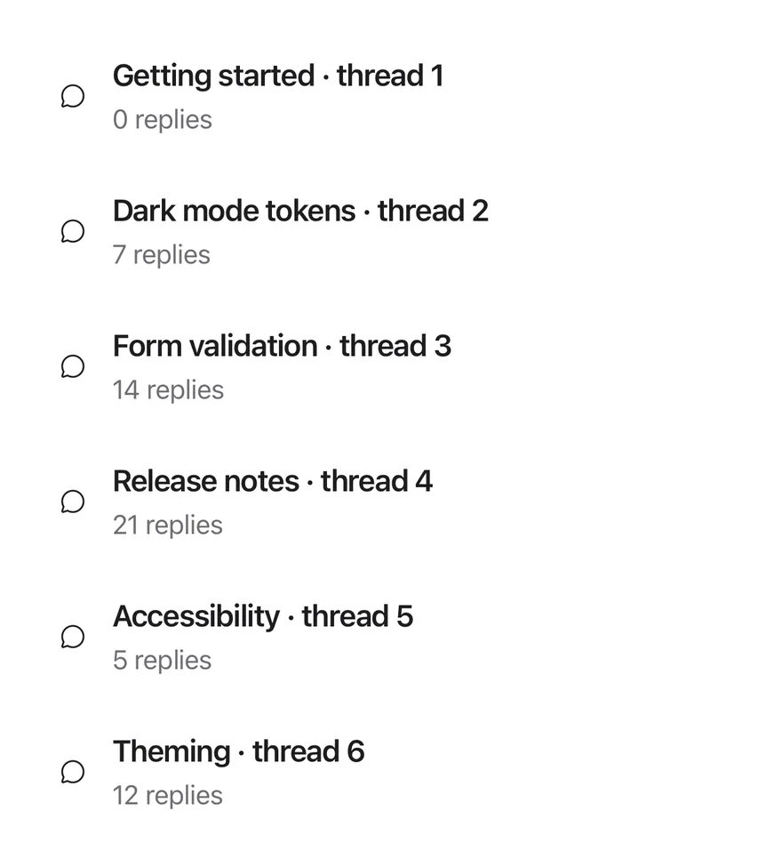
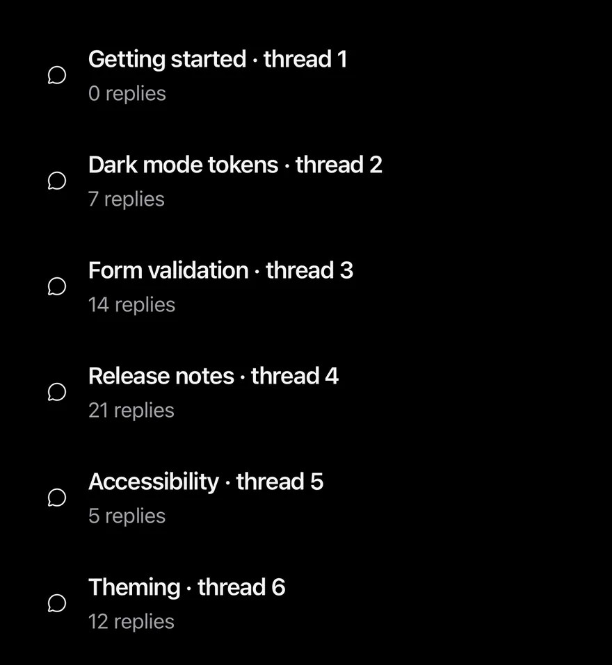
Fewer items than one page, so no Load more button appears.
import { ChatCircleIcon } from "phosphor-react-native"
import { PagedList } from "@/components/patterns/paged-list"
import { Icon } from "@/components/ui/icon"
import { Item, ItemContent, ItemDescription, ItemMedia, ItemTitle } from "@/components/ui/item"

type Topic = { id: number; title: string; replies: number }

const subjects = [
  "Getting started",
  "Dark mode tokens",
  "Form validation",
  "Release notes",
  "Accessibility",
  "Theming",
  "Server components",
  "Animations",
]

const topics: Topic[] = Array.from({ length: 57 }, (_, index) => ({
  id: index + 1,
  title: `${subjects[index % subjects.length]} · thread ${index + 1}`,
  replies: (index * 7) % 23,
}))

function TopicRow({ topic }: { topic: Topic }) {
  return (
    <Item onPress={() => {}}>
      <ItemMedia variant="icon">
        <Icon as={ChatCircleIcon} />
      </ItemMedia>
      <ItemContent>
        <ItemTitle>{topic.title}</ItemTitle>
        <ItemDescription>{topic.replies} replies</ItemDescription>
      </ItemContent>
    </Item>
  )
}

export function PagedListSinglePageExample() {
  return (
    <PagedList<Topic> items={topics.slice(0, 6)} pageSize={10} getKey={(topic: Topic) => topic.id} renderItem={(topic: Topic) => <TopicRow topic={topic} />} />
  )
}import EsuissUI
import PhosphorSwift
import SwiftUI
struct PagedListSinglePageExample: View {
var body: some View {
PagedListDemo(topics: Array(pagedListTopics.prefix(6)))
}
}
struct PagedListTopic: Identifiable {
let id: Int
let title: String
let replies: Int
}
let pagedListSubjects = [
"Getting started",
"Dark mode tokens",
"Form validation",
"Release notes",
"Accessibility",
"Theming",
"Server components",
"Animations",
]
let pagedListTopics: [PagedListTopic] = (0..<57).map { index in
PagedListTopic(
id: index + 1,
title: "\(pagedListSubjects[index % pagedListSubjects.count]) · thread \(index + 1)",
replies: (index * 7) % 23
)
}
struct PagedListDemo: View {
let topics: [PagedListTopic]
var pageSize = 10
var loadMoreLabel: LocalizedStringKey = "Load more"
var body: some View {
PagedList(topics, pageSize: pageSize, loadMoreLabel: loadMoreLabel) { topic, _ in
Item(action: {}) {
ItemMedia(.icon) {
Ph.chatCircle.regular
}
ItemContent {
ItemTitle(verbatim: topic.title)
ItemDescription(verbatim: "\(topic.replies) replies")
}
}
}
}
}import androidx.compose.foundation.layout.fillMaxWidth
import androidx.compose.foundation.layout.height
import androidx.compose.runtime.Composable
import androidx.compose.ui.Modifier
import androidx.compose.ui.unit.dp
import com.adamglin.PhosphorIcons
import com.adamglin.phosphoricons.Regular
import com.adamglin.phosphoricons.regular.ChatCircle
import com.esuiss.ui.components.Icon
import com.esuiss.ui.components.Item
import com.esuiss.ui.components.ItemContent
import com.esuiss.ui.components.ItemDescription
import com.esuiss.ui.components.ItemMedia
import com.esuiss.ui.components.ItemMediaVariant
import com.esuiss.ui.components.ItemTitle
import com.esuiss.ui.patterns.PagedList
@Composable
fun PagedListSinglePageExample() {
PagedListDemo(pagedListTopics.take(6))
}
class PagedListTopic(val id: Int, val title: String, val replies: Int)
val pagedListSubjects = listOf(
"Getting started",
"Dark mode tokens",
"Form validation",
"Release notes",
"Accessibility",
"Theming",
"Server components",
"Animations",
)
val pagedListTopics = List(57) { index ->
PagedListTopic(
id = index + 1,
title = "${pagedListSubjects[index % pagedListSubjects.size]} · thread ${index + 1}",
replies = (index * 7) % 23,
)
}
@Composable
fun PagedListDemo(items: List<PagedListTopic>, pageSize: Int = 10, loadMoreLabel: String = "Load more") {
PagedList(
items = items,
modifier = Modifier.fillMaxWidth().height(560.dp),
pageSize = pageSize,
getKey = { topic, _ -> topic.id },
loadMoreLabel = loadMoreLabel,
) { topic, _ ->
PagedListRow(topic)
}
}
@Composable
fun PagedListRow(topic: PagedListTopic) {
Item(onClick = {}) {
ItemMedia(variant = ItemMediaVariant.Icon) {
Icon(PhosphorIcons.Regular.ChatCircle, contentDescription = null)
}
ItemContent {
ItemTitle(topic.title)
ItemDescription("${topic.replies} replies")
}
}
}Custom labels
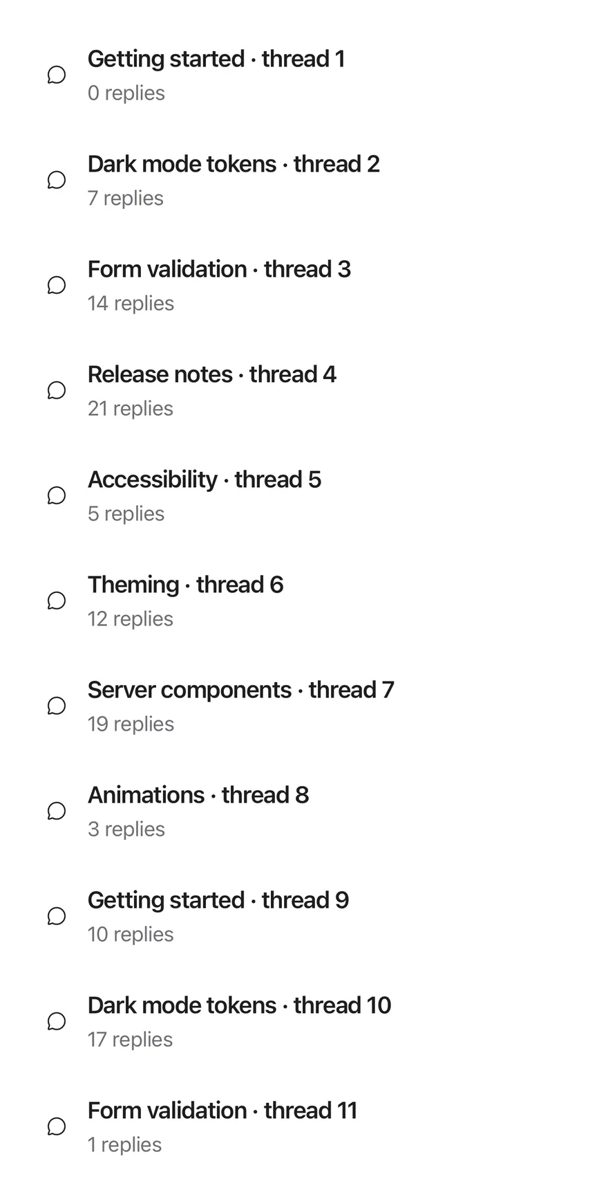
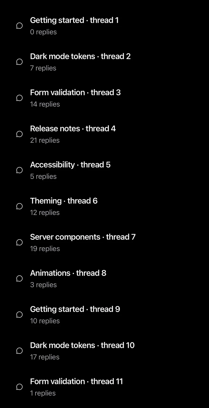
Renames the button with loadMoreLabel.
import { ChatCircleIcon } from "phosphor-react-native"
import { PagedList } from "@/components/patterns/paged-list"
import { Icon } from "@/components/ui/icon"
import { Item, ItemContent, ItemDescription, ItemMedia, ItemTitle } from "@/components/ui/item"

type Topic = { id: number; title: string; replies: number }

const subjects = [
  "Getting started",
  "Dark mode tokens",
  "Form validation",
  "Release notes",
  "Accessibility",
  "Theming",
  "Server components",
  "Animations",
]

const topics: Topic[] = Array.from({ length: 57 }, (_, index) => ({
  id: index + 1,
  title: `${subjects[index % subjects.length]} · thread ${index + 1}`,
  replies: (index * 7) % 23,
}))

function TopicRow({ topic }: { topic: Topic }) {
  return (
    <Item onPress={() => {}}>
      <ItemMedia variant="icon">
        <Icon as={ChatCircleIcon} />
      </ItemMedia>
      <ItemContent>
        <ItemTitle>{topic.title}</ItemTitle>
        <ItemDescription>{topic.replies} replies</ItemDescription>
      </ItemContent>
    </Item>
  )
}

export function PagedListCustomLabelsExample() {
  return (
    <PagedList<Topic> items={topics} pageSize={3} getKey={(topic: Topic) => topic.id} renderItem={(topic: Topic) => <TopicRow topic={topic} />} loadMoreLabel="Show more topics" />
  )
}import EsuissUI
import PhosphorSwift
import SwiftUI
struct PagedListCustomLabelsExample: View {
var body: some View {
PagedListDemo(topics: pagedListTopics, pageSize: 3, loadMoreLabel: "Show more topics")
}
}
struct PagedListTopic: Identifiable {
let id: Int
let title: String
let replies: Int
}
let pagedListSubjects = [
"Getting started",
"Dark mode tokens",
"Form validation",
"Release notes",
"Accessibility",
"Theming",
"Server components",
"Animations",
]
let pagedListTopics: [PagedListTopic] = (0..<57).map { index in
PagedListTopic(
id: index + 1,
title: "\(pagedListSubjects[index % pagedListSubjects.count]) · thread \(index + 1)",
replies: (index * 7) % 23
)
}
struct PagedListDemo: View {
let topics: [PagedListTopic]
var pageSize = 10
var loadMoreLabel: LocalizedStringKey = "Load more"
var body: some View {
PagedList(topics, pageSize: pageSize, loadMoreLabel: loadMoreLabel) { topic, _ in
Item(action: {}) {
ItemMedia(.icon) {
Ph.chatCircle.regular
}
ItemContent {
ItemTitle(verbatim: topic.title)
ItemDescription(verbatim: "\(topic.replies) replies")
}
}
}
}
}import androidx.compose.foundation.layout.fillMaxWidth
import androidx.compose.foundation.layout.height
import androidx.compose.runtime.Composable
import androidx.compose.ui.Modifier
import androidx.compose.ui.unit.dp
import com.adamglin.PhosphorIcons
import com.adamglin.phosphoricons.Regular
import com.adamglin.phosphoricons.regular.ChatCircle
import com.esuiss.ui.components.Icon
import com.esuiss.ui.components.Item
import com.esuiss.ui.components.ItemContent
import com.esuiss.ui.components.ItemDescription
import com.esuiss.ui.components.ItemMedia
import com.esuiss.ui.components.ItemMediaVariant
import com.esuiss.ui.components.ItemTitle
import com.esuiss.ui.patterns.PagedList
@Composable
fun PagedListCustomLabelsExample() {
PagedListDemo(pagedListTopics, pageSize = 3, loadMoreLabel = "Show more topics")
}
class PagedListTopic(val id: Int, val title: String, val replies: Int)
val pagedListSubjects = listOf(
"Getting started",
"Dark mode tokens",
"Form validation",
"Release notes",
"Accessibility",
"Theming",
"Server components",
"Animations",
)
val pagedListTopics = List(57) { index ->
PagedListTopic(
id = index + 1,
title = "${pagedListSubjects[index % pagedListSubjects.size]} · thread ${index + 1}",
replies = (index * 7) % 23,
)
}
@Composable
fun PagedListDemo(items: List<PagedListTopic>, pageSize: Int = 10, loadMoreLabel: String = "Load more") {
PagedList(
items = items,
modifier = Modifier.fillMaxWidth().height(560.dp),
pageSize = pageSize,
getKey = { topic, _ -> topic.id },
loadMoreLabel = loadMoreLabel,
) { topic, _ ->
PagedListRow(topic)
}
}
@Composable
fun PagedListRow(topic: PagedListTopic) {
Item(onClick = {}) {
ItemMedia(variant = ItemMediaVariant.Icon) {
Icon(PhosphorIcons.Regular.ChatCircle, contentDescription = null)
}
ItemContent {
ItemTitle(topic.title)
ItemDescription("${topic.replies} replies")
}
}
}API Reference
PagedList
FlatListProps<T>- About
- The full array of items.
- Type
T[]- Default
- required
- About
- Items added per page. Defaults to
10. - Type
number- Default
- 10
- About
- Returns a unique key for an item. Defaults to the index.
- Type
(item: T, index: number) => React.Key- Default
- (_, index) => index
- About
- Renders one item from the item and its index.
- Type
(item: T, index: number) => React.ReactNode- Default
- required
- About
- Text of the footer button. Defaults to
Load more. - Type
string- Default
- "Load more"
- About
- Classes for the
FlatList. - Type
string- Default
- —
- About
- Classes for the list's content container.
- Type
string- Default
- —
Accessibility
- The Load more button is a
Button, so screen reader users can load the next page without scrolling to the end.
Notes
- The next page loads when the scroll position is within half a screen of the end (
onEndReachedThresholdof0.5). - The footer is a full-width
secondarybutton.