suiss/uim · Pattern
Preview
A link-styled trigger that opens a floating drawer with a quick preview, such as a profile card.
Preview is an open-source mobile pattern from suiss/uim: components composed into a flow for React Native and Expo, with SwiftUI and Jetpack Compose versions built from the same design tokens. The @esuiss/uim CLI copies its source into your project, so you own the code.


import { CalendarBlankIcon } from "phosphor-react-native"
import { View } from "react-native"
import { Preview, PreviewContent, PreviewTrigger } from "@/components/patterns/preview"
import { Avatar, AvatarFallback, AvatarImage } from "@/components/ui/avatar"
import { Icon } from "@/components/ui/icon"
import { Text } from "@/components/ui/text"

function ProfileCard() {
  return (
    <View className="flex-row gap-4">
      <Avatar size="lg">
        <AvatarImage
          alt="Ada Lovelace"
          source={{ uri: "https://i.pravatar.cc/150?img=5" }}
        />
        <AvatarFallback>AL</AvatarFallback>
      </Avatar>
      <View className="flex-1 gap-1">
        <Text className="text-sm font-semibold">@ada</Text>
        <Text className="text-sm">
          Mathematician and writer, known for her work on the Analytical Engine.
        </Text>
        <View className="mt-1 flex-row items-center gap-1.5">
          <Icon
            as={CalendarBlankIcon}
            className="size-4 text-label-secondary"
          />
          <Text className="text-xs text-label-secondary">
            Joined December 2021
          </Text>
        </View>
      </View>
    </View>
  )
}

function PreviewDemo({
  defaultOpen,
  floating,
  showCloseButton,
  closeLabel,
}: {
  defaultOpen?: boolean
  floating?: boolean
  showCloseButton?: boolean
  closeLabel?: string
}) {
  return (
    <View className="flex-1 items-center justify-center">
      <Preview defaultOpen={defaultOpen} floating={floating}>
        <PreviewTrigger>@ada</PreviewTrigger>
        <PreviewContent
          showCloseButton={showCloseButton}
          closeLabel={closeLabel}
          accessibilityLabel="@ada"
        >
          <ProfileCard />
        </PreviewContent>
      </Preview>
    </View>
  )
}

export function PreviewOpenByDefaultExample() {
  return (
    <PreviewDemo defaultOpen />
  )
}import EsuissUI
import PhosphorSwift
import SwiftUI
struct PreviewOpenByDefaultExample: View {
var body: some View {
PreviewDemo(open: true)
}
}
struct PreviewDemo: View {
var showCloseButton = false
var closeLabel: LocalizedStringKey?
@State private var open: Bool
init(open: Bool = false, showCloseButton: Bool = false, closeLabel: LocalizedStringKey? = nil) {
_open = State(initialValue: open)
self.showCloseButton = showCloseButton
self.closeLabel = closeLabel
}
var body: some View {
Button {
open = true
} label: {
Text(verbatim: "@ada")
.textStyle(.base)
.foregroundStyle(Color.link)
}
.buttonStyle(PreviewTriggerStyle())
.preview(isPresented: $open) {
PreviewContent(showCloseButton: showCloseButton, closeLabel: closeLabel) {
PreviewProfileCard()
}
.accessibilityLabel(Text(verbatim: "@ada"))
}
.frame(maxWidth: .infinity)
}
}
struct PreviewTriggerStyle: ButtonStyle {
func makeBody(configuration: Configuration) -> some View {
configuration.label
.opacity(configuration.isPressed ? 0.6 : 1)
}
}
struct PreviewProfileCard: View {
var body: some View {
HStack(alignment: .top, spacing: 16) {
Avatar(url: URL(string: "https://i.pravatar.cc/150?img=5"), initials: "AL", size: .lg)
.accessibilityLabel(Text(verbatim: "Ada Lovelace"))
VStack(alignment: .leading, spacing: 4) {
Text(verbatim: "@ada")
.textStyle(.sm, weight: .semibold)
.foregroundStyle(Color.label)
Text("Mathematician and writer, known for her work on the Analytical Engine.")
.textStyle(.sm)
.foregroundStyle(Color.label)
.fixedSize(horizontal: false, vertical: true)
HStack(spacing: 6) {
Ph.calendarBlank.regular
.frame(width: 16, height: 16)
Text("Joined December 2021")
.textStyle(.xs)
}
.foregroundStyle(Color.labelSecondary)
.padding(.top, 4)
}
.frame(maxWidth: .infinity, alignment: .leading)
}
}
}import androidx.compose.foundation.layout.Arrangement
import androidx.compose.foundation.layout.Box
import androidx.compose.foundation.layout.Column
import androidx.compose.foundation.layout.Row
import androidx.compose.foundation.layout.fillMaxWidth
import androidx.compose.foundation.layout.padding
import androidx.compose.runtime.Composable
import androidx.compose.runtime.getValue
import androidx.compose.runtime.mutableStateOf
import androidx.compose.runtime.saveable.rememberSaveable
import androidx.compose.runtime.setValue
import androidx.compose.ui.Alignment
import androidx.compose.ui.Modifier
import androidx.compose.ui.semantics.contentDescription
import androidx.compose.ui.semantics.semantics
import androidx.compose.ui.text.font.FontWeight
import androidx.compose.ui.unit.dp
import com.adamglin.PhosphorIcons
import com.adamglin.phosphoricons.Regular
import com.adamglin.phosphoricons.regular.CalendarBlank
import com.esuiss.ui.components.Avatar
import com.esuiss.ui.components.AvatarFallback
import com.esuiss.ui.components.AvatarSize
import com.esuiss.ui.components.Icon
import com.esuiss.ui.components.Text
import com.esuiss.ui.patterns.Preview
import com.esuiss.ui.patterns.PreviewContent
import com.esuiss.ui.patterns.PreviewTrigger
import com.esuiss.ui.theme.EsuissTheme
import com.esuiss.ui.theme.Typography
@Composable
fun PreviewOpenByDefaultExample() {
PreviewDemo(defaultOpen = true)
}
@Composable
fun PreviewProfileCard() {
val colors = EsuissTheme.colors
Row(horizontalArrangement = Arrangement.spacedBy(16.dp)) {
Avatar(size = AvatarSize.Lg, contentDescription = "Ada Lovelace") {
AvatarFallback("AL")
}
Column(Modifier.weight(1f), verticalArrangement = Arrangement.spacedBy(4.dp)) {
Text("@ada", style = Typography.sm.copy(fontWeight = FontWeight.SemiBold))
Text(
"Mathematician and writer, known for her work on the Analytical Engine.",
style = Typography.sm,
)
Row(
modifier = Modifier.padding(top = 4.dp),
horizontalArrangement = Arrangement.spacedBy(6.dp),
verticalAlignment = Alignment.CenterVertically,
) {
Icon(PhosphorIcons.Regular.CalendarBlank, contentDescription = null, size = 16.dp, tint = colors.labelSecondary)
Text("Joined December 2021", style = Typography.xs.copy(color = colors.labelSecondary))
}
}
}
}
@Composable
fun PreviewDemo(
defaultOpen: Boolean = false,
floating: Boolean = true,
showCloseButton: Boolean = false,
closeLabel: String? = null,
) {
var open by rememberSaveable { mutableStateOf(defaultOpen) }
Box(Modifier.fillMaxWidth(), contentAlignment = Alignment.Center) {
Preview(open = open, onOpenChange = { open = it }, floating = floating) {
PreviewTrigger("@ada")
PreviewContent(
modifier = Modifier.semantics { contentDescription = "@ada" },
showCloseButton = showCloseButton,
closeLabel = closeLabel,
) {
PreviewProfileCard()
}
}
}
}PreviewTrigger renders inline in link color and dims when pressed. It opens a Drawer that floats above the screen edges by default and has a swipe handle.
Use it to show a summary of a person, place or item from a mention or link without leaving the screen.
Installation
$ pnpm dlx @esuiss/uim@latest add preview$ pnpm dlx @esuiss/uim@latest add preview --platform swift$ pnpm dlx @esuiss/uim@latest add preview --platform kotlinThe CLI also adds what it builds on: Drawer, Text.
Manual
- Install the dependencies:
npx expo install cn-
Add the pieces it builds on: Drawer, Text, and the primitives
components/primitives/use-render.tsx. -
Copy the source into
components/patterns/preview.tsx:
import { cn } from "cn"
import type * as React from "react"
import { View } from "react-native"
import { resolveClassName } from "@/components/primitives/use-render"
import { Drawer, DrawerContent, DrawerTrigger } from "@/components/ui/drawer"
import { Text, TextClassContext } from "@/components/ui/text"

function Preview({
  open,
  defaultOpen,
  onOpenChange,
  floating = true,
  children,
}: {
  open?: boolean
defaultOpen?: boolean- Update the import paths to match your project.
- Install the dependencies:
npx expo install cn-
Add the pieces it builds on: Drawer, Text, and the primitives
components/primitives/use-render.tsx. -
Copy the source into
components/patterns/preview.tsx:
import { cn } from "cn"
import type * as React from "react"
import { View } from "react-native"
import { resolveClassName } from "@/components/primitives/use-render"
import { Drawer, DrawerContent, DrawerTrigger } from "@/components/ui/drawer"
import { Text, TextClassContext } from "@/components/ui/text"

function Preview({
  open,
  defaultOpen,
  onOpenChange,
  floating = true,
  children,
}: {
  open?: boolean
defaultOpen?: boolean- Update the import paths to match your project.
-
Add the pieces it builds on: Drawer, Text, and the primitives
components/primitives/use-render.tsx. -
Copy the source into
components/patterns/preview.tsx:
import type * as React from "react"
import { Pressable, StyleSheet, View, type ViewStyle } from "react-native"
import { resolveStyle } from "@/components/primitives/use-render"
import { Drawer, DrawerContent, DrawerTrigger } from "@/components/ui/drawer"
import { Text, TextStyleContext } from "@/components/ui/text"
import { fontSize, useTheme } from "@/components/ui/theme"

const styles = StyleSheet.create({
  trigger: { alignSelf: "flex-start" },
  pressed: { opacity: 0.6 },
  body: { padding: 16 },
  bodyClose: { paddingEnd: 56 },
  bodyCloseLabel: { paddingEnd: 96 },
})

function Preview({- Update the import paths to match your project.
-
Target iOS 17 or later.
-
Add the Swift package to your app:
.package(url: "https://github.com/phosphor-icons/swift", from: "2.1.0")- Copy the theme files every view uses:
import SwiftUI
import UIKit

struct RGBA: Sendable {
  let red: CGFloat
  let green: CGFloat
  let blue: CGFloat
  let alpha: CGFloat

  init(_ hex: UInt32, _ alpha: CGFloat = 1) {
    red = CGFloat((hex >> 16) & 0xFF) / 255
    green = CGFloat((hex >> 8) & 0xFF) / 255
    blue = CGFloat(hex & 0xFF) / 255
    self.alpha = alpha
}import SwiftUI
extension Color {
public static let surface = Color.adaptive(light: .init(0xFFFFFF), dark: .init(0x000000))
public static let surfaceSecondary = Color.adaptive(light: .init(0xF5F5F7), dark: .init(0x161617))
public static let surfaceTertiary = Color.adaptive(light: .init(0xE8E8ED), dark: .init(0x2C2C2E))
public static let surfaceRaised = Color.adaptive(light: .init(0xFFFFFF), dark: .init(0x1D1D1F))
public static let label = Color.adaptive(light: .init(0x1D1D1F), dark: .init(0xF5F5F7))
public static let labelSecondary = Color.adaptive(light: .init(0x6E6E73), dark: .init(0xA1A1A6))
public static let labelTertiary = Color.adaptive(light: .init(0x86868B), dark: .init(0x86868B))
public static let labelQuaternary = Color.adaptive(light: .init(0xD2D2D7), dark: .init(0x424245))
public static let control = Color.adaptive(light: .init(0x000000, 0.04), dark: .init(0xFFFFFF, 0.1))
public static let controlPressed = Color.adaptive(light: .init(0x000000, 0.12), dark: .init(0xFFFFFF, 0.22))
public static let controlSelected = Color.adaptive(light: .init(0x1D1D1F), dark: .init(0xF5F5F7))
public static let controlDisabled = Color.adaptive(light: .init(0x000000, 0.03), dark: .init(0xFFFFFF, 0.05))
public static let onControlSelected = Color.adaptive(light: .init(0xFFFFFF), dark: .init(0x000000))- Copy the source and every file it uses:
import SwiftUI

extension View {
  public func preview<Content: View>(
    isPresented: Binding<Bool>,
    arrowEdge: Edge = .top,
    @ViewBuilder content: @escaping () -> Content
  ) -> some View {
    modifier(PreviewPresenter(isPresented: isPresented, arrowEdge: arrowEdge, content: content))
  }
}

struct PreviewPresenter<Body: View>: ViewModifier {
  let isPresented: Binding<Bool>
  let arrowEdge: Edge
@ViewBuilder let content: () -> Bodyimport SwiftUI
public struct VariantButtonStyle: ButtonStyle {
public enum Variant: CaseIterable, Sendable {
case `default`, outline, secondary, tinted, ghost, plain, destructive, link
}
public enum Size: CaseIterable, Sendable {
case `default`, xs, sm, lg, xl, icon, iconXs, iconSm, iconLg, iconXl
var height: CGFloat {
switch self {
case .xs, .iconXs: 24
case .sm, .iconSm: 32
case .default, .icon: 36
case .lg, .iconLg: 44import SwiftUI
extension EnvironmentValues {
@Entry var buttonGroup: Axis? = nil
@Entry var buttonGroupSize: CGSize = .zero
}
enum ButtonGroupSpace: Hashable {
case group
}
struct ButtonGroupFrame {
let bounds: Anchor<CGRect>
let outlined: Bool
}import PhosphorSwift
import SwiftUI
extension Shadow {
static let control = Shadow(color: .black.opacity(0.08), radius: 0.5, y: 0.5)
static let thumb = Shadow(color: .black.opacity(0.12), radius: 1.5, y: 1)
}
struct SelectionIndicator<Mark: View>: View {
let checked: Bool
let pressed: Bool
let cornerRadius: CGFloat
let mark: Mark
@Environment(\.isEnabled) private var isEnabled
@Environment(\.isInvalid) private var invalidimport SwiftUI
extension View {
public func dialog<Content: View>(
isPresented: Binding<Bool>,
@ViewBuilder content: @escaping () -> Content
) -> some View {
modifier(
CoverPresenter(isPresented: isPresented) { visible in
CenteredStage(visible: visible, dismissible: true, content: content)
}
)
}
}
struct CenteredStage<Content: View>: View {import SwiftUI
extension View {
public func drawer<Content: View>(
isPresented: Binding<Bool>,
detents: Set<PresentationDetent>? = nil,
selection: Binding<PresentationDetent>? = nil,
onDismiss: (() -> Void)? = nil,
@ViewBuilder content: @escaping () -> Content
) -> some View {
let binding = isPresented
return sheet(isPresented: isPresented, onDismiss: onDismiss) {
DrawerHost(detents: detents, selection: selection, content: content)
.environment(\.overlayDismiss, OverlayDismiss { binding.wrappedValue = false })
}
}import SwiftUI
extension EnvironmentValues {
@Entry public var isInvalid = false
@Entry var fieldInset = false
@Entry var fieldGroupInset = false
@Entry var fieldSetInset = false
}
extension View {
public func invalid(_ isInvalid: Bool = true) -> some View {
environment(\.isInvalid, isInvalid)
}
}
public enum FieldOrientation: CaseIterable, Sendable {import SwiftUI
extension EnvironmentValues {
@Entry public var hapticsEnabled = true
}
extension View {
public func haptics(_ enabled: Bool) -> some View {
environment(\.hapticsEnabled, enabled)
}
func hapticFeedback<Trigger: Equatable>(_ feedback: SensoryFeedback, trigger: Trigger) -> some View {
modifier(HapticFeedbackModifier(feedback: feedback, trigger: trigger) { _, _ in true })
}
func hapticFeedback<Trigger: Equatable>(import PhosphorSwift
import Observation
import SwiftUI
public enum PopupAlignment: Sendable, CaseIterable {
case start, center, end
}
struct OverlayDismiss: Sendable {
let action: @MainActor @Sendable () -> Void
@MainActor func callAsFunction() {
action()
}
}import SwiftUI
public struct PopoverContent<Content: View>: View {
let width: CGFloat?
let content: Content
public init(width: CGFloat? = 288, @ViewBuilder content: () -> Content) {
self.width = width
self.content = content()
}
public var body: some View {
VStack(alignment: .leading, spacing: 16) {
content
}
.font(TextStyle.base.font())import SwiftUI
public struct Separator: View {
let orientation: Axis
public init(_ orientation: Axis = .horizontal) {
self.orientation = orientation
}
public var body: some View {
Rectangle()
.fill(Color.separator)
.frame(width: orientation == .vertical ? 1 : nil, height: orientation == .horizontal ? 1 : nil)
.frame(maxWidth: orientation == .horizontal ? .infinity : nil, maxHeight: orientation == .vertical ? .infinity : nil)
.accessibilityHidden(true)
}import SwiftUI
public enum TextVariant: CaseIterable, Sendable {
case `default`, h1, h2, h3, h4, p, blockquote, code, lead, large, small, muted
var style: TextStyle {
switch self {
case .h1: .xl3
case .h2: .xl2
case .h3: .xl
case .h4, .lead, .large: .lg
case .code, .small, .muted: .sm
default: .base
}
}import SwiftUI
extension EnvironmentValues {
@Entry var patternCompact: Bool? = nil
}
@propertyWrapper
struct CompactLayout: DynamicProperty {
@Environment(\.patternCompact) private var forced
@Environment(\.horizontalSizeClass) private var sizeClass
init() {}
var wrappedValue: Bool {
forced ?? (sizeClass != .regular)
}- Add the files to your app target.
- Set
minSdkto 24 or higher and add the dependencies:
implementation(platform("androidx.compose:compose-bom:2026.09.00"))
implementation("androidx.compose.foundation:foundation")
implementation("androidx.compose.ui:ui")
implementation("com.adamglin:phosphor-icon-android:1.0.0")- Copy the theme files every view uses:
package com.esuiss.ui.theme

import androidx.compose.foundation.isSystemInDarkTheme
import androidx.compose.runtime.Composable
import androidx.compose.runtime.CompositionLocalProvider
import androidx.compose.runtime.Immutable
import androidx.compose.runtime.staticCompositionLocalOf
import androidx.compose.ui.Modifier
import androidx.compose.ui.draw.dropShadow
import androidx.compose.ui.graphics.Color
import androidx.compose.ui.graphics.Shape
import androidx.compose.ui.graphics.shadow.Shadow as DropShadow
import androidx.compose.ui.text.TextStyle
import androidx.compose.ui.text.style.LineHeightStyle
import androidx.compose.ui.unit.Dp
import androidx.compose.ui.unit.DpOffsetpackage com.esuiss.ui.theme
import androidx.compose.runtime.Immutable
import androidx.compose.ui.graphics.Color
import androidx.compose.ui.unit.dp
@Immutable
data class Colors(
val surface: Color,
val surfaceSecondary: Color,
val surfaceTertiary: Color,
val surfaceRaised: Color,
val label: Color,
val labelSecondary: Color,
val labelTertiary: Color,
val labelQuaternary: Color,- Copy the source and every file it uses:
package com.esuiss.ui.patterns

import androidx.compose.foundation.clickable
import androidx.compose.foundation.interaction.MutableInteractionSource
import androidx.compose.foundation.interaction.collectIsPressedAsState
import androidx.compose.foundation.layout.Box
import androidx.compose.foundation.layout.BoxScope
import androidx.compose.foundation.layout.Column
import androidx.compose.foundation.layout.ColumnScope
import androidx.compose.foundation.layout.fillMaxWidth
import androidx.compose.foundation.layout.padding
import androidx.compose.foundation.text.BasicText
import androidx.compose.runtime.Composable
import androidx.compose.runtime.CompositionLocalProvider
import androidx.compose.runtime.getValue
import androidx.compose.runtime.rememberpackage com.esuiss.ui.components
import androidx.compose.foundation.background
import androidx.compose.foundation.border
import androidx.compose.foundation.clickable
import androidx.compose.foundation.interaction.MutableInteractionSource
import androidx.compose.foundation.interaction.collectIsPressedAsState
import androidx.compose.foundation.layout.Arrangement
import androidx.compose.foundation.layout.Row
import androidx.compose.foundation.layout.RowScope
import androidx.compose.foundation.layout.fillMaxWidth
import androidx.compose.foundation.layout.height
import androidx.compose.foundation.layout.padding
import androidx.compose.foundation.layout.size
import androidx.compose.foundation.shape.CircleShape
import androidx.compose.foundation.shape.RoundedCornerShapepackage com.esuiss.ui.components
import androidx.compose.foundation.background
import androidx.compose.foundation.gestures.Orientation
import androidx.compose.foundation.layout.Arrangement
import androidx.compose.foundation.layout.Box
import androidx.compose.foundation.layout.Row
import androidx.compose.foundation.layout.RowScope
import androidx.compose.foundation.layout.padding
import androidx.compose.foundation.shape.CircleShape
import androidx.compose.foundation.shape.CornerSize
import androidx.compose.foundation.shape.RoundedCornerShape
import androidx.compose.runtime.Composable
import androidx.compose.runtime.CompositionLocalProvider
import androidx.compose.runtime.DisposableEffect
import androidx.compose.runtime.Immutablepackage com.esuiss.ui.components
import androidx.compose.runtime.compositionLocalOf
import androidx.compose.ui.graphics.Color
import androidx.compose.ui.text.TextStyle
import androidx.compose.ui.unit.Dp
import androidx.compose.ui.unit.dp
val LocalContentStyle = compositionLocalOf { TextStyle.Default }
val LocalContentColor = compositionLocalOf { Color.Unspecified }
val LocalIconSize = compositionLocalOf { 20.dp }package com.esuiss.ui.components
import androidx.compose.animation.core.CubicBezierEasing
import androidx.compose.animation.core.tween
import androidx.compose.foundation.background
import androidx.compose.foundation.gestures.AnchoredDraggableDefaults
import androidx.compose.foundation.gestures.AnchoredDraggableState
import androidx.compose.foundation.gestures.DraggableAnchors
import androidx.compose.foundation.gestures.Orientation
import androidx.compose.foundation.gestures.anchoredDraggable
import androidx.compose.foundation.gestures.animateTo
import androidx.compose.foundation.gestures.detectTapGestures
import androidx.compose.foundation.layout.Arrangement
import androidx.compose.foundation.layout.Box
import androidx.compose.foundation.layout.BoxWithConstraints
import androidx.compose.foundation.layout.Columnpackage com.esuiss.ui.components
import androidx.compose.foundation.Image
import androidx.compose.foundation.layout.size
import androidx.compose.runtime.Composable
import androidx.compose.ui.Modifier
import androidx.compose.ui.graphics.Color
import androidx.compose.ui.graphics.ColorFilter
import androidx.compose.ui.graphics.takeOrElse
import androidx.compose.ui.graphics.vector.ImageVector
import androidx.compose.ui.unit.Dp
import com.esuiss.ui.theme.EsuissTheme
@Composable
fun Icon(
imageVector: ImageVector,package com.esuiss.ui.components
import android.os.Build
import android.view.Window
import android.view.WindowManager
import androidx.compose.animation.AnimatedVisibility
import androidx.compose.animation.AnimatedVisibilityScope
import androidx.compose.animation.EnterExitState
import androidx.compose.animation.core.MutableTransitionState
import androidx.compose.animation.core.animateFloat
import androidx.compose.animation.core.tween
import androidx.compose.animation.fadeIn
import androidx.compose.animation.fadeOut
import androidx.compose.animation.scaleIn
import androidx.compose.animation.scaleOut
import androidx.compose.animation.slideInpackage com.esuiss.ui.patterns
import androidx.compose.foundation.layout.ColumnScope
import androidx.compose.runtime.Composable
import androidx.compose.runtime.Immutable
import androidx.compose.runtime.ProvidableCompositionLocal
import androidx.compose.runtime.staticCompositionLocalOf
import androidx.compose.ui.Modifier
import com.esuiss.ui.components.Drawer
@Immutable
internal class DrawerPatternState(
val open: Boolean,
val onOpenChange: (Boolean) -> Unit,
val floating: Boolean,
)- Update the
com.esuiss.uipackage names to match your project.
Usage
import { Preview, PreviewTrigger, PreviewContent } from "@/components/patterns/preview"<PreviewDemo defaultOpen />Put a PreviewTrigger and a PreviewContent inside Preview. A string or number child of the trigger is wrapped in Text.
The preview can be uncontrolled or controlled with open, defaultOpen and onOpenChange. PreviewContent pads its children and adds end padding when a close button is shown, so content does not sit under it.
Examples
Default


import { CalendarBlankIcon } from "phosphor-react-native"
import { View } from "react-native"
import { Preview, PreviewContent, PreviewTrigger } from "@/components/patterns/preview"
import { Avatar, AvatarFallback, AvatarImage } from "@/components/ui/avatar"
import { Icon } from "@/components/ui/icon"
import { Text } from "@/components/ui/text"

function ProfileCard() {
  return (
    <View className="flex-row gap-4">
      <Avatar size="lg">
        <AvatarImage
          alt="Ada Lovelace"
          source={{ uri: "https://i.pravatar.cc/150?img=5" }}
        />
        <AvatarFallback>AL</AvatarFallback>
      </Avatar>
      <View className="flex-1 gap-1">
        <Text className="text-sm font-semibold">@ada</Text>
        <Text className="text-sm">
          Mathematician and writer, known for her work on the Analytical Engine.
        </Text>
        <View className="mt-1 flex-row items-center gap-1.5">
          <Icon
            as={CalendarBlankIcon}
            className="size-4 text-label-secondary"
          />
          <Text className="text-xs text-label-secondary">
            Joined December 2021
          </Text>
        </View>
      </View>
    </View>
  )
}

function PreviewDemo({
  defaultOpen,
  floating,
  showCloseButton,
  closeLabel,
}: {
  defaultOpen?: boolean
  floating?: boolean
  showCloseButton?: boolean
  closeLabel?: string
}) {
  return (
    <View className="flex-1 items-center justify-center">
      <Preview defaultOpen={defaultOpen} floating={floating}>
        <PreviewTrigger>@ada</PreviewTrigger>
        <PreviewContent
          showCloseButton={showCloseButton}
          closeLabel={closeLabel}
          accessibilityLabel="@ada"
        >
          <ProfileCard />
        </PreviewContent>
      </Preview>
    </View>
  )
}

export function PreviewExample() {
  return (
    <PreviewDemo />
  )
}import EsuissUI
import PhosphorSwift
import SwiftUI
struct PreviewDemo: View {
var showCloseButton = false
var closeLabel: LocalizedStringKey?
@State private var open: Bool
init(open: Bool = false, showCloseButton: Bool = false, closeLabel: LocalizedStringKey? = nil) {
_open = State(initialValue: open)
self.showCloseButton = showCloseButton
self.closeLabel = closeLabel
}
var body: some View {
Button {
open = true
} label: {
Text(verbatim: "@ada")
.textStyle(.base)
.foregroundStyle(Color.link)
}
.buttonStyle(PreviewTriggerStyle())
.preview(isPresented: $open) {
PreviewContent(showCloseButton: showCloseButton, closeLabel: closeLabel) {
PreviewProfileCard()
}
.accessibilityLabel(Text(verbatim: "@ada"))
}
.frame(maxWidth: .infinity)
}
}
struct PreviewTriggerStyle: ButtonStyle {
func makeBody(configuration: Configuration) -> some View {
configuration.label
.opacity(configuration.isPressed ? 0.6 : 1)
}
}
struct PreviewProfileCard: View {
var body: some View {
HStack(alignment: .top, spacing: 16) {
Avatar(url: URL(string: "https://i.pravatar.cc/150?img=5"), initials: "AL", size: .lg)
.accessibilityLabel(Text(verbatim: "Ada Lovelace"))
VStack(alignment: .leading, spacing: 4) {
Text(verbatim: "@ada")
.textStyle(.sm, weight: .semibold)
.foregroundStyle(Color.label)
Text("Mathematician and writer, known for her work on the Analytical Engine.")
.textStyle(.sm)
.foregroundStyle(Color.label)
.fixedSize(horizontal: false, vertical: true)
HStack(spacing: 6) {
Ph.calendarBlank.regular
.frame(width: 16, height: 16)
Text("Joined December 2021")
.textStyle(.xs)
}
.foregroundStyle(Color.labelSecondary)
.padding(.top, 4)
}
.frame(maxWidth: .infinity, alignment: .leading)
}
}
}import androidx.compose.foundation.layout.Arrangement
import androidx.compose.foundation.layout.Box
import androidx.compose.foundation.layout.Column
import androidx.compose.foundation.layout.Row
import androidx.compose.foundation.layout.fillMaxWidth
import androidx.compose.foundation.layout.padding
import androidx.compose.runtime.Composable
import androidx.compose.runtime.getValue
import androidx.compose.runtime.mutableStateOf
import androidx.compose.runtime.saveable.rememberSaveable
import androidx.compose.runtime.setValue
import androidx.compose.ui.Alignment
import androidx.compose.ui.Modifier
import androidx.compose.ui.semantics.contentDescription
import androidx.compose.ui.semantics.semantics
import androidx.compose.ui.text.font.FontWeight
import androidx.compose.ui.unit.dp
import com.adamglin.PhosphorIcons
import com.adamglin.phosphoricons.Regular
import com.adamglin.phosphoricons.regular.CalendarBlank
import com.esuiss.ui.components.Avatar
import com.esuiss.ui.components.AvatarFallback
import com.esuiss.ui.components.AvatarSize
import com.esuiss.ui.components.Icon
import com.esuiss.ui.components.Text
import com.esuiss.ui.patterns.Preview
import com.esuiss.ui.patterns.PreviewContent
import com.esuiss.ui.patterns.PreviewTrigger
import com.esuiss.ui.theme.EsuissTheme
import com.esuiss.ui.theme.Typography
@Composable
fun PreviewProfileCard() {
val colors = EsuissTheme.colors
Row(horizontalArrangement = Arrangement.spacedBy(16.dp)) {
Avatar(size = AvatarSize.Lg, contentDescription = "Ada Lovelace") {
AvatarFallback("AL")
}
Column(Modifier.weight(1f), verticalArrangement = Arrangement.spacedBy(4.dp)) {
Text("@ada", style = Typography.sm.copy(fontWeight = FontWeight.SemiBold))
Text(
"Mathematician and writer, known for her work on the Analytical Engine.",
style = Typography.sm,
)
Row(
modifier = Modifier.padding(top = 4.dp),
horizontalArrangement = Arrangement.spacedBy(6.dp),
verticalAlignment = Alignment.CenterVertically,
) {
Icon(PhosphorIcons.Regular.CalendarBlank, contentDescription = null, size = 16.dp, tint = colors.labelSecondary)
Text("Joined December 2021", style = Typography.xs.copy(color = colors.labelSecondary))
}
}
}
}
@Composable
fun PreviewDemo(
defaultOpen: Boolean = false,
floating: Boolean = true,
showCloseButton: Boolean = false,
closeLabel: String? = null,
) {
var open by rememberSaveable { mutableStateOf(defaultOpen) }
Box(Modifier.fillMaxWidth(), contentAlignment = Alignment.Center) {
Preview(open = open, onOpenChange = { open = it }, floating = floating) {
PreviewTrigger("@ada")
PreviewContent(
modifier = Modifier.semantics { contentDescription = "@ada" },
showCloseButton = showCloseButton,
closeLabel = closeLabel,
) {
PreviewProfileCard()
}
}
}
}With close button
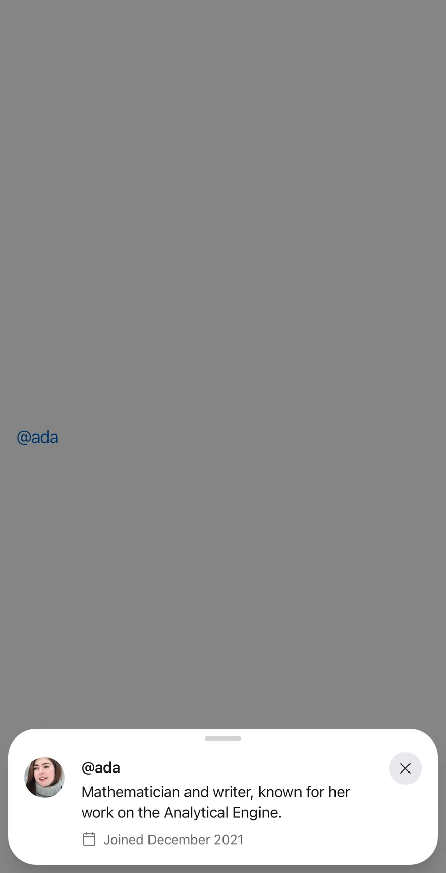
Shows a close button with showCloseButton.

import { CalendarBlankIcon } from "phosphor-react-native"
import { View } from "react-native"
import { Preview, PreviewContent, PreviewTrigger } from "@/components/patterns/preview"
import { Avatar, AvatarFallback, AvatarImage } from "@/components/ui/avatar"
import { Icon } from "@/components/ui/icon"
import { Text } from "@/components/ui/text"

function ProfileCard() {
  return (
    <View className="flex-row gap-4">
      <Avatar size="lg">
        <AvatarImage
          alt="Ada Lovelace"
          source={{ uri: "https://i.pravatar.cc/150?img=5" }}
        />
        <AvatarFallback>AL</AvatarFallback>
      </Avatar>
      <View className="flex-1 gap-1">
        <Text className="text-sm font-semibold">@ada</Text>
        <Text className="text-sm">
          Mathematician and writer, known for her work on the Analytical Engine.
        </Text>
        <View className="mt-1 flex-row items-center gap-1.5">
          <Icon
            as={CalendarBlankIcon}
            className="size-4 text-label-secondary"
          />
          <Text className="text-xs text-label-secondary">
            Joined December 2021
          </Text>
        </View>
      </View>
    </View>
  )
}

function PreviewDemo({
  defaultOpen,
  floating,
  showCloseButton,
  closeLabel,
}: {
  defaultOpen?: boolean
  floating?: boolean
  showCloseButton?: boolean
  closeLabel?: string
}) {
  return (
    <View className="flex-1 items-center justify-center">
      <Preview defaultOpen={defaultOpen} floating={floating}>
        <PreviewTrigger>@ada</PreviewTrigger>
        <PreviewContent
          showCloseButton={showCloseButton}
          closeLabel={closeLabel}
          accessibilityLabel="@ada"
        >
          <ProfileCard />
        </PreviewContent>
      </Preview>
    </View>
  )
}

export function PreviewWithCloseButtonExample() {
  return (
    <PreviewDemo defaultOpen showCloseButton />
  )
}import EsuissUI
import PhosphorSwift
import SwiftUI
struct PreviewWithCloseButtonExample: View {
var body: some View {
PreviewDemo(open: true, showCloseButton: true)
}
}
struct PreviewDemo: View {
var showCloseButton = false
var closeLabel: LocalizedStringKey?
@State private var open: Bool
init(open: Bool = false, showCloseButton: Bool = false, closeLabel: LocalizedStringKey? = nil) {
_open = State(initialValue: open)
self.showCloseButton = showCloseButton
self.closeLabel = closeLabel
}
var body: some View {
Button {
open = true
} label: {
Text(verbatim: "@ada")
.textStyle(.base)
.foregroundStyle(Color.link)
}
.buttonStyle(PreviewTriggerStyle())
.preview(isPresented: $open) {
PreviewContent(showCloseButton: showCloseButton, closeLabel: closeLabel) {
PreviewProfileCard()
}
.accessibilityLabel(Text(verbatim: "@ada"))
}
.frame(maxWidth: .infinity)
}
}
struct PreviewTriggerStyle: ButtonStyle {
func makeBody(configuration: Configuration) -> some View {
configuration.label
.opacity(configuration.isPressed ? 0.6 : 1)
}
}
struct PreviewProfileCard: View {
var body: some View {
HStack(alignment: .top, spacing: 16) {
Avatar(url: URL(string: "https://i.pravatar.cc/150?img=5"), initials: "AL", size: .lg)
.accessibilityLabel(Text(verbatim: "Ada Lovelace"))
VStack(alignment: .leading, spacing: 4) {
Text(verbatim: "@ada")
.textStyle(.sm, weight: .semibold)
.foregroundStyle(Color.label)
Text("Mathematician and writer, known for her work on the Analytical Engine.")
.textStyle(.sm)
.foregroundStyle(Color.label)
.fixedSize(horizontal: false, vertical: true)
HStack(spacing: 6) {
Ph.calendarBlank.regular
.frame(width: 16, height: 16)
Text("Joined December 2021")
.textStyle(.xs)
}
.foregroundStyle(Color.labelSecondary)
.padding(.top, 4)
}
.frame(maxWidth: .infinity, alignment: .leading)
}
}
}import androidx.compose.foundation.layout.Arrangement
import androidx.compose.foundation.layout.Box
import androidx.compose.foundation.layout.Column
import androidx.compose.foundation.layout.Row
import androidx.compose.foundation.layout.fillMaxWidth
import androidx.compose.foundation.layout.padding
import androidx.compose.runtime.Composable
import androidx.compose.runtime.getValue
import androidx.compose.runtime.mutableStateOf
import androidx.compose.runtime.saveable.rememberSaveable
import androidx.compose.runtime.setValue
import androidx.compose.ui.Alignment
import androidx.compose.ui.Modifier
import androidx.compose.ui.semantics.contentDescription
import androidx.compose.ui.semantics.semantics
import androidx.compose.ui.text.font.FontWeight
import androidx.compose.ui.unit.dp
import com.adamglin.PhosphorIcons
import com.adamglin.phosphoricons.Regular
import com.adamglin.phosphoricons.regular.CalendarBlank
import com.esuiss.ui.components.Avatar
import com.esuiss.ui.components.AvatarFallback
import com.esuiss.ui.components.AvatarSize
import com.esuiss.ui.components.Icon
import com.esuiss.ui.components.Text
import com.esuiss.ui.patterns.Preview
import com.esuiss.ui.patterns.PreviewContent
import com.esuiss.ui.patterns.PreviewTrigger
import com.esuiss.ui.theme.EsuissTheme
import com.esuiss.ui.theme.Typography
@Composable
fun PreviewWithCloseButtonExample() {
PreviewDemo(defaultOpen = true, showCloseButton = true)
}
@Composable
fun PreviewProfileCard() {
val colors = EsuissTheme.colors
Row(horizontalArrangement = Arrangement.spacedBy(16.dp)) {
Avatar(size = AvatarSize.Lg, contentDescription = "Ada Lovelace") {
AvatarFallback("AL")
}
Column(Modifier.weight(1f), verticalArrangement = Arrangement.spacedBy(4.dp)) {
Text("@ada", style = Typography.sm.copy(fontWeight = FontWeight.SemiBold))
Text(
"Mathematician and writer, known for her work on the Analytical Engine.",
style = Typography.sm,
)
Row(
modifier = Modifier.padding(top = 4.dp),
horizontalArrangement = Arrangement.spacedBy(6.dp),
verticalAlignment = Alignment.CenterVertically,
) {
Icon(PhosphorIcons.Regular.CalendarBlank, contentDescription = null, size = 16.dp, tint = colors.labelSecondary)
Text("Joined December 2021", style = Typography.xs.copy(color = colors.labelSecondary))
}
}
}
}
@Composable
fun PreviewDemo(
defaultOpen: Boolean = false,
floating: Boolean = true,
showCloseButton: Boolean = false,
closeLabel: String? = null,
) {
var open by rememberSaveable { mutableStateOf(defaultOpen) }
Box(Modifier.fillMaxWidth(), contentAlignment = Alignment.Center) {
Preview(open = open, onOpenChange = { open = it }, floating = floating) {
PreviewTrigger("@ada")
PreviewContent(
modifier = Modifier.semantics { contentDescription = "@ada" },
showCloseButton = showCloseButton,
closeLabel = closeLabel,
) {
PreviewProfileCard()
}
}
}
}With close label
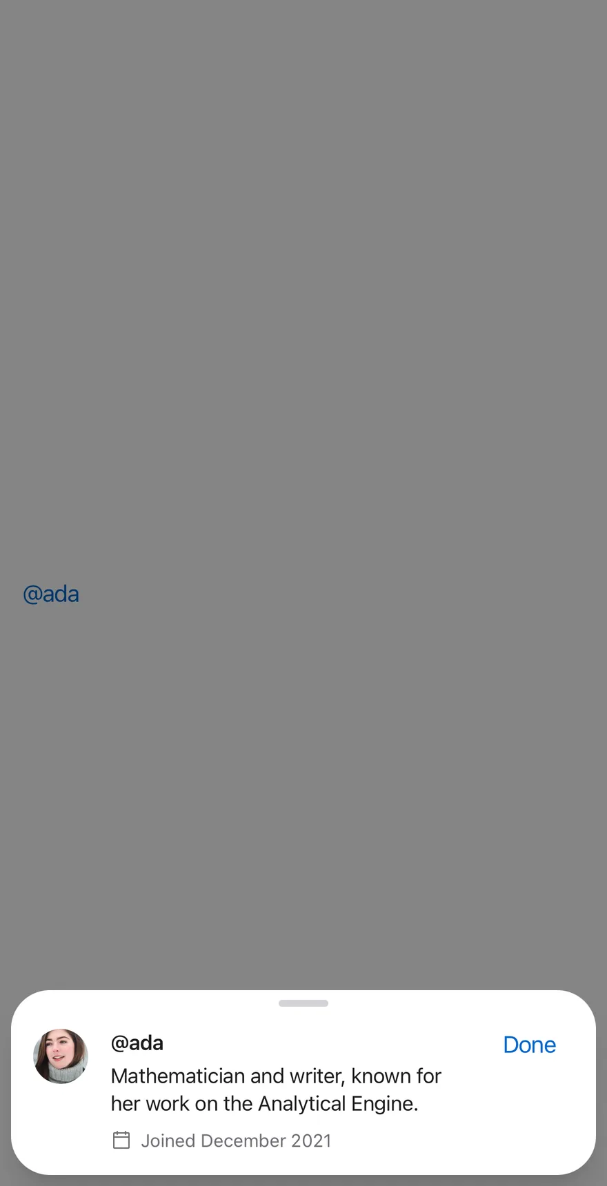
Labels the close button Done with closeLabel.

import { CalendarBlankIcon } from "phosphor-react-native"
import { View } from "react-native"
import { Preview, PreviewContent, PreviewTrigger } from "@/components/patterns/preview"
import { Avatar, AvatarFallback, AvatarImage } from "@/components/ui/avatar"
import { Icon } from "@/components/ui/icon"
import { Text } from "@/components/ui/text"

function ProfileCard() {
  return (
    <View className="flex-row gap-4">
      <Avatar size="lg">
        <AvatarImage
          alt="Ada Lovelace"
          source={{ uri: "https://i.pravatar.cc/150?img=5" }}
        />
        <AvatarFallback>AL</AvatarFallback>
      </Avatar>
      <View className="flex-1 gap-1">
        <Text className="text-sm font-semibold">@ada</Text>
        <Text className="text-sm">
          Mathematician and writer, known for her work on the Analytical Engine.
        </Text>
        <View className="mt-1 flex-row items-center gap-1.5">
          <Icon
            as={CalendarBlankIcon}
            className="size-4 text-label-secondary"
          />
          <Text className="text-xs text-label-secondary">
            Joined December 2021
          </Text>
        </View>
      </View>
    </View>
  )
}

function PreviewDemo({
  defaultOpen,
  floating,
  showCloseButton,
  closeLabel,
}: {
  defaultOpen?: boolean
  floating?: boolean
  showCloseButton?: boolean
  closeLabel?: string
}) {
  return (
    <View className="flex-1 items-center justify-center">
      <Preview defaultOpen={defaultOpen} floating={floating}>
        <PreviewTrigger>@ada</PreviewTrigger>
        <PreviewContent
          showCloseButton={showCloseButton}
          closeLabel={closeLabel}
          accessibilityLabel="@ada"
        >
          <ProfileCard />
        </PreviewContent>
      </Preview>
    </View>
  )
}

export function PreviewWithCloseLabelExample() {
  return (
    <PreviewDemo defaultOpen showCloseButton closeLabel="Done" />
  )
}import EsuissUI
import PhosphorSwift
import SwiftUI
struct PreviewWithCloseLabelExample: View {
var body: some View {
PreviewDemo(open: true, showCloseButton: true, closeLabel: "Done")
}
}
struct PreviewDemo: View {
var showCloseButton = false
var closeLabel: LocalizedStringKey?
@State private var open: Bool
init(open: Bool = false, showCloseButton: Bool = false, closeLabel: LocalizedStringKey? = nil) {
_open = State(initialValue: open)
self.showCloseButton = showCloseButton
self.closeLabel = closeLabel
}
var body: some View {
Button {
open = true
} label: {
Text(verbatim: "@ada")
.textStyle(.base)
.foregroundStyle(Color.link)
}
.buttonStyle(PreviewTriggerStyle())
.preview(isPresented: $open) {
PreviewContent(showCloseButton: showCloseButton, closeLabel: closeLabel) {
PreviewProfileCard()
}
.accessibilityLabel(Text(verbatim: "@ada"))
}
.frame(maxWidth: .infinity)
}
}
struct PreviewTriggerStyle: ButtonStyle {
func makeBody(configuration: Configuration) -> some View {
configuration.label
.opacity(configuration.isPressed ? 0.6 : 1)
}
}
struct PreviewProfileCard: View {
var body: some View {
HStack(alignment: .top, spacing: 16) {
Avatar(url: URL(string: "https://i.pravatar.cc/150?img=5"), initials: "AL", size: .lg)
.accessibilityLabel(Text(verbatim: "Ada Lovelace"))
VStack(alignment: .leading, spacing: 4) {
Text(verbatim: "@ada")
.textStyle(.sm, weight: .semibold)
.foregroundStyle(Color.label)
Text("Mathematician and writer, known for her work on the Analytical Engine.")
.textStyle(.sm)
.foregroundStyle(Color.label)
.fixedSize(horizontal: false, vertical: true)
HStack(spacing: 6) {
Ph.calendarBlank.regular
.frame(width: 16, height: 16)
Text("Joined December 2021")
.textStyle(.xs)
}
.foregroundStyle(Color.labelSecondary)
.padding(.top, 4)
}
.frame(maxWidth: .infinity, alignment: .leading)
}
}
}import androidx.compose.foundation.layout.Arrangement
import androidx.compose.foundation.layout.Box
import androidx.compose.foundation.layout.Column
import androidx.compose.foundation.layout.Row
import androidx.compose.foundation.layout.fillMaxWidth
import androidx.compose.foundation.layout.padding
import androidx.compose.runtime.Composable
import androidx.compose.runtime.getValue
import androidx.compose.runtime.mutableStateOf
import androidx.compose.runtime.saveable.rememberSaveable
import androidx.compose.runtime.setValue
import androidx.compose.ui.Alignment
import androidx.compose.ui.Modifier
import androidx.compose.ui.semantics.contentDescription
import androidx.compose.ui.semantics.semantics
import androidx.compose.ui.text.font.FontWeight
import androidx.compose.ui.unit.dp
import com.adamglin.PhosphorIcons
import com.adamglin.phosphoricons.Regular
import com.adamglin.phosphoricons.regular.CalendarBlank
import com.esuiss.ui.components.Avatar
import com.esuiss.ui.components.AvatarFallback
import com.esuiss.ui.components.AvatarSize
import com.esuiss.ui.components.Icon
import com.esuiss.ui.components.Text
import com.esuiss.ui.patterns.Preview
import com.esuiss.ui.patterns.PreviewContent
import com.esuiss.ui.patterns.PreviewTrigger
import com.esuiss.ui.theme.EsuissTheme
import com.esuiss.ui.theme.Typography
@Composable
fun PreviewWithCloseLabelExample() {
PreviewDemo(defaultOpen = true, showCloseButton = true, closeLabel = "Done")
}
@Composable
fun PreviewProfileCard() {
val colors = EsuissTheme.colors
Row(horizontalArrangement = Arrangement.spacedBy(16.dp)) {
Avatar(size = AvatarSize.Lg, contentDescription = "Ada Lovelace") {
AvatarFallback("AL")
}
Column(Modifier.weight(1f), verticalArrangement = Arrangement.spacedBy(4.dp)) {
Text("@ada", style = Typography.sm.copy(fontWeight = FontWeight.SemiBold))
Text(
"Mathematician and writer, known for her work on the Analytical Engine.",
style = Typography.sm,
)
Row(
modifier = Modifier.padding(top = 4.dp),
horizontalArrangement = Arrangement.spacedBy(6.dp),
verticalAlignment = Alignment.CenterVertically,
) {
Icon(PhosphorIcons.Regular.CalendarBlank, contentDescription = null, size = 16.dp, tint = colors.labelSecondary)
Text("Joined December 2021", style = Typography.xs.copy(color = colors.labelSecondary))
}
}
}
}
@Composable
fun PreviewDemo(
defaultOpen: Boolean = false,
floating: Boolean = true,
showCloseButton: Boolean = false,
closeLabel: String? = null,
) {
var open by rememberSaveable { mutableStateOf(defaultOpen) }
Box(Modifier.fillMaxWidth(), contentAlignment = Alignment.Center) {
Preview(open = open, onOpenChange = { open = it }, floating = floating) {
PreviewTrigger("@ada")
PreviewContent(
modifier = Modifier.semantics { contentDescription = "@ada" },
showCloseButton = showCloseButton,
closeLabel = closeLabel,
) {
PreviewProfileCard()
}
}
}
}Attached
Sets floating to false so the drawer sits on the screen edges.


import { CalendarBlankIcon } from "phosphor-react-native"
import { View } from "react-native"
import { Preview, PreviewContent, PreviewTrigger } from "@/components/patterns/preview"
import { Avatar, AvatarFallback, AvatarImage } from "@/components/ui/avatar"
import { Icon } from "@/components/ui/icon"
import { Text } from "@/components/ui/text"

function ProfileCard() {
  return (
    <View className="flex-row gap-4">
      <Avatar size="lg">
        <AvatarImage
          alt="Ada Lovelace"
          source={{ uri: "https://i.pravatar.cc/150?img=5" }}
        />
        <AvatarFallback>AL</AvatarFallback>
      </Avatar>
      <View className="flex-1 gap-1">
        <Text className="text-sm font-semibold">@ada</Text>
        <Text className="text-sm">
          Mathematician and writer, known for her work on the Analytical Engine.
        </Text>
        <View className="mt-1 flex-row items-center gap-1.5">
          <Icon
            as={CalendarBlankIcon}
            className="size-4 text-label-secondary"
          />
          <Text className="text-xs text-label-secondary">
            Joined December 2021
          </Text>
        </View>
      </View>
    </View>
  )
}

function PreviewDemo({
  defaultOpen,
  floating,
  showCloseButton,
  closeLabel,
}: {
  defaultOpen?: boolean
  floating?: boolean
  showCloseButton?: boolean
  closeLabel?: string
}) {
  return (
    <View className="flex-1 items-center justify-center">
      <Preview defaultOpen={defaultOpen} floating={floating}>
        <PreviewTrigger>@ada</PreviewTrigger>
        <PreviewContent
          showCloseButton={showCloseButton}
          closeLabel={closeLabel}
          accessibilityLabel="@ada"
        >
          <ProfileCard />
        </PreviewContent>
      </Preview>
    </View>
  )
}

export function PreviewAttachedExample() {
  return (
    <PreviewDemo defaultOpen floating={false} />
  )
}import androidx.compose.foundation.layout.Arrangement
import androidx.compose.foundation.layout.Box
import androidx.compose.foundation.layout.Column
import androidx.compose.foundation.layout.Row
import androidx.compose.foundation.layout.fillMaxWidth
import androidx.compose.foundation.layout.padding
import androidx.compose.runtime.Composable
import androidx.compose.runtime.getValue
import androidx.compose.runtime.mutableStateOf
import androidx.compose.runtime.saveable.rememberSaveable
import androidx.compose.runtime.setValue
import androidx.compose.ui.Alignment
import androidx.compose.ui.Modifier
import androidx.compose.ui.semantics.contentDescription
import androidx.compose.ui.semantics.semantics
import androidx.compose.ui.text.font.FontWeight
import androidx.compose.ui.unit.dp
import com.adamglin.PhosphorIcons
import com.adamglin.phosphoricons.Regular
import com.adamglin.phosphoricons.regular.CalendarBlank
import com.esuiss.ui.components.Avatar
import com.esuiss.ui.components.AvatarFallback
import com.esuiss.ui.components.AvatarSize
import com.esuiss.ui.components.Icon
import com.esuiss.ui.components.Text
import com.esuiss.ui.patterns.Preview
import com.esuiss.ui.patterns.PreviewContent
import com.esuiss.ui.patterns.PreviewTrigger
import com.esuiss.ui.theme.EsuissTheme
import com.esuiss.ui.theme.Typography
@Composable
fun PreviewAttachedExample() {
PreviewDemo(defaultOpen = true, floating = false)
}
@Composable
fun PreviewProfileCard() {
val colors = EsuissTheme.colors
Row(horizontalArrangement = Arrangement.spacedBy(16.dp)) {
Avatar(size = AvatarSize.Lg, contentDescription = "Ada Lovelace") {
AvatarFallback("AL")
}
Column(Modifier.weight(1f), verticalArrangement = Arrangement.spacedBy(4.dp)) {
Text("@ada", style = Typography.sm.copy(fontWeight = FontWeight.SemiBold))
Text(
"Mathematician and writer, known for her work on the Analytical Engine.",
style = Typography.sm,
)
Row(
modifier = Modifier.padding(top = 4.dp),
horizontalArrangement = Arrangement.spacedBy(6.dp),
verticalAlignment = Alignment.CenterVertically,
) {
Icon(PhosphorIcons.Regular.CalendarBlank, contentDescription = null, size = 16.dp, tint = colors.labelSecondary)
Text("Joined December 2021", style = Typography.xs.copy(color = colors.labelSecondary))
}
}
}
}
@Composable
fun PreviewDemo(
defaultOpen: Boolean = false,
floating: Boolean = true,
showCloseButton: Boolean = false,
closeLabel: String? = null,
) {
var open by rememberSaveable { mutableStateOf(defaultOpen) }
Box(Modifier.fillMaxWidth(), contentAlignment = Alignment.Center) {
Preview(open = open, onOpenChange = { open = it }, floating = floating) {
PreviewTrigger("@ada")
PreviewContent(
modifier = Modifier.semantics { contentDescription = "@ada" },
showCloseButton = showCloseButton,
closeLabel = closeLabel,
) {
PreviewProfileCard()
}
}
}
}API Reference
Preview
The root drawer, floating by default.
- About
- Controls whether the preview is open.
- Type
boolean- Default
- —
- About
- Whether the preview starts open when uncontrolled.
- Type
boolean- Default
- —
- About
- Called when the preview opens or closes.
- Type
(open: boolean) => void- Default
- —
- About
- Insets the drawer from the screen edges. Defaults to
true. - Type
boolean- Default
- true
- Type
React.ReactNode- Default
- —
PreviewTrigger
The link-styled element that opens the preview.
React.ComponentProps<typeof DrawerTrigger>PreviewContent
The drawer content with padding for the preview.
React.ComponentProps<typeof DrawerContent>- Type
string- Default
- —
Accessibility
- Give
PreviewContentanaccessibilityLabelthat names what is previewed.
Notes
- The trigger uses the
text-linkcolor.