suiss/uim · Pattern
Action Bar
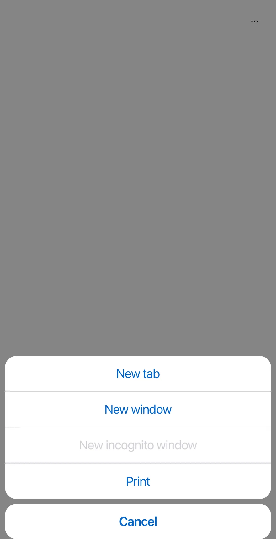
A More actions button that lists several menus in a drawer and opens the chosen menu's items in an alert sheet.
Action Bar is an open-source mobile pattern from suiss/uim: components composed into a flow for React Native and Expo, with SwiftUI and Jetpack Compose versions built from the same design tokens. The @esuiss/uim CLI copies its source into your project, so you own the code.
import { ClipboardTextIcon, CopyIcon, ScissorsIcon, TrashIcon } from "phosphor-react-native"
import { ActionBar, ActionBarContent, ActionBarItem, ActionBarLabel, ActionBarMenu, ActionBarSeparator, ActionBarTrigger } from "@/components/patterns/action-bar"
import { Icon } from "@/components/ui/icon"
import { Text } from "@/components/ui/text"

function FileMenu({ defaultOpen }: { defaultOpen?: boolean }) {
  return (
    <ActionBarMenu defaultOpen={defaultOpen}>
      <ActionBarTrigger>File</ActionBarTrigger>
      <ActionBarContent>
        <ActionBarItem>New tab</ActionBarItem>
        <ActionBarItem>New window</ActionBarItem>
        <ActionBarItem disabled>New incognito window</ActionBarItem>
        <ActionBarSeparator />
        <ActionBarItem>Print</ActionBarItem>
      </ActionBarContent>
    </ActionBarMenu>
  )
}

function EditMenu({ withIcons = false }: { withIcons?: boolean }) {
  return (
    <ActionBarMenu>
      <ActionBarTrigger>Edit</ActionBarTrigger>
      <ActionBarContent>
        <ActionBarItem>
          {withIcons ? <Icon as={ScissorsIcon} /> : null}
          <Text>Cut</Text>
        </ActionBarItem>
        <ActionBarItem>
          {withIcons ? <Icon as={CopyIcon} /> : null}
          <Text>Copy</Text>
        </ActionBarItem>
        <ActionBarItem>
          {withIcons ? <Icon as={ClipboardTextIcon} /> : null}
          <Text>Paste</Text>
        </ActionBarItem>
        <ActionBarSeparator />
        <ActionBarItem variant="destructive">
          {withIcons ? <Icon as={TrashIcon} /> : null}
          <Text>Delete</Text>
        </ActionBarItem>
      </ActionBarContent>
    </ActionBarMenu>
  )
}

function ViewMenu() {
  return (
    <ActionBarMenu>
      <ActionBarTrigger>View</ActionBarTrigger>
      <ActionBarContent>
        <ActionBarLabel>Appearance</ActionBarLabel>
        <ActionBarItem>Zoom in</ActionBarItem>
        <ActionBarItem>Zoom out</ActionBarItem>
        <ActionBarItem>Actual size</ActionBarItem>
      </ActionBarContent>
    </ActionBarMenu>
  )
}

export function ActionBarOpenByDefaultExample() {
  return (
    <ActionBar defaultOpen>
      <FileMenu defaultOpen />
      <EditMenu />
      <ViewMenu />
    </ActionBar>
  )
}import EsuissUI
import PhosphorSwift
import SwiftUI
struct ActionBarOpenFileDemo: View {
@State private var file = true
var body: some View {
ActionBar {
ActionBarFileMenu(isPresented: $file)
ActionBarEditMenu()
ActionBarViewMenu()
}
}
}
struct ActionBarFileMenu: View {
var isPresented: Binding<Bool>?
var body: some View {
ActionBarMenu("File", isPresented: isPresented) {
ActionBarItem("New tab") {}
ActionBarItem("New window") {}
ActionBarItem("New incognito window") {}.disabled(true)
ActionBarSeparator()
ActionBarItem("Print") {}
}
}
}
struct ActionBarEditMenu: View {
var withIcons = false
var body: some View {
ActionBarMenu("Edit") {
if withIcons {
ActionBarItem("Cut", icon: Ph.scissors.regular) {}
ActionBarItem("Copy", icon: Ph.copy.regular) {}
ActionBarItem("Paste", icon: Ph.clipboardText.regular) {}
ActionBarSeparator()
ActionBarItem("Delete", icon: Ph.trash.regular, variant: .destructive) {}
} else {
ActionBarItem("Cut") {}
ActionBarItem("Copy") {}
ActionBarItem("Paste") {}
ActionBarSeparator()
ActionBarItem("Delete", variant: .destructive) {}
}
}
}
}
struct ActionBarViewMenu: View {
var body: some View {
ActionBarMenu("View") {
ActionBarLabel("Appearance")
ActionBarItem("Zoom in") {}
ActionBarItem("Zoom out") {}
ActionBarItem("Actual size") {}
}
}
}import androidx.compose.foundation.layout.fillMaxWidth
import androidx.compose.runtime.Composable
import androidx.compose.runtime.getValue
import androidx.compose.runtime.mutableStateOf
import androidx.compose.runtime.saveable.rememberSaveable
import androidx.compose.runtime.setValue
import androidx.compose.ui.Modifier
import com.esuiss.ui.patterns.ActionBar
@Composable
fun ActionBarOpenByDefaultExample() {
ActionBarDemo(defaultOpen = true, fileOpen = true)
}
@Composable
fun ActionBarDemo(
defaultOpen: Boolean = false,
fileOpen: Boolean = false,
withIcons: Boolean = false,
view: Boolean = true,
dismissible: Boolean = true,
floating: Boolean = false,
moreLabel: String = "More actions",
cancelLabel: String = "Cancel",
) {
var open by rememberSaveable { mutableStateOf(defaultOpen) }
ActionBar(
open = open,
onOpenChange = { open = it },
modifier = Modifier.fillMaxWidth(),
dismissible = dismissible,
floating = floating,
moreLabel = moreLabel,
cancelLabel = cancelLabel,
) {
actionBarFileMenu(fileOpen)
actionBarEditMenu(withIcons)
if (view) actionBarViewMenu()
}
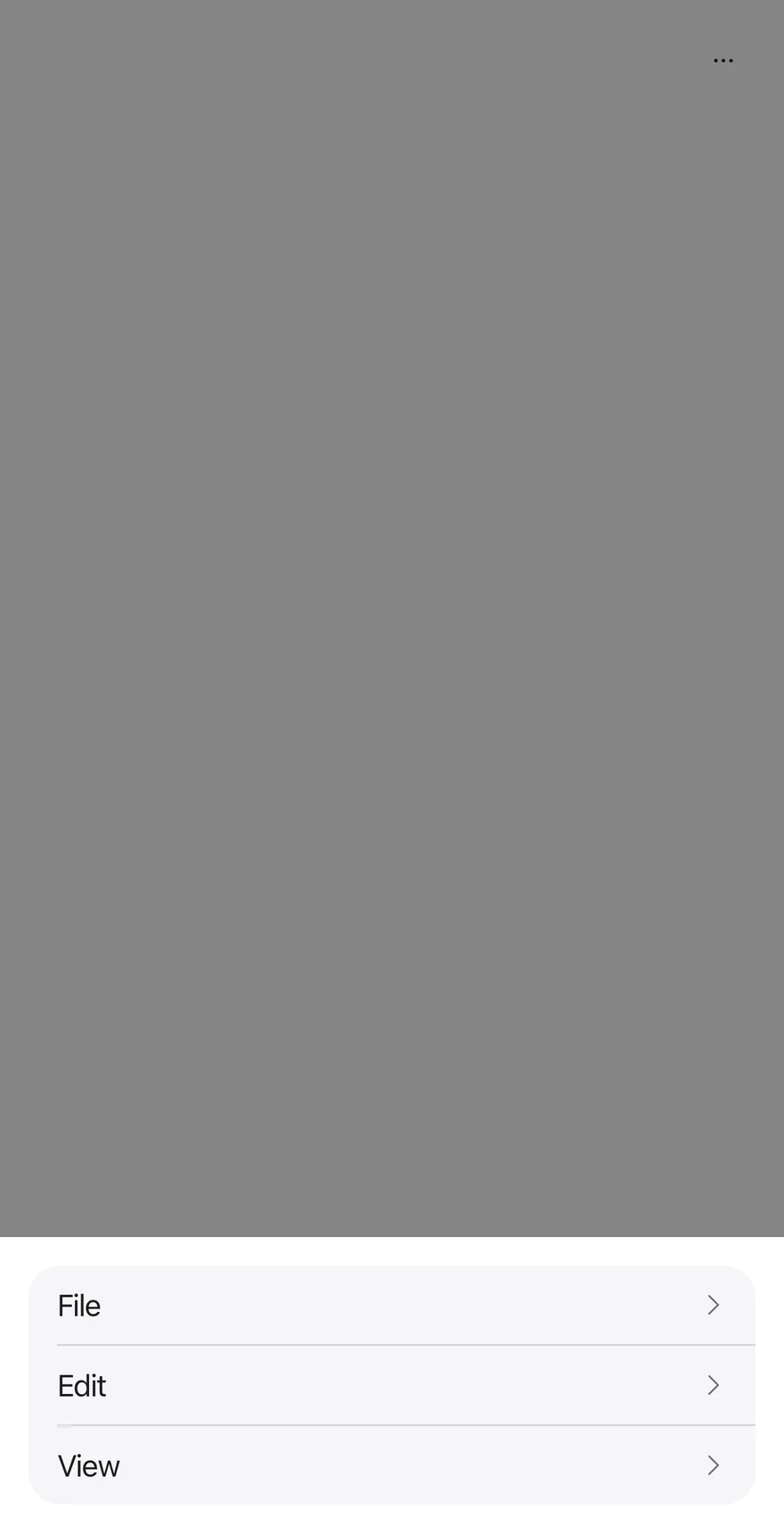
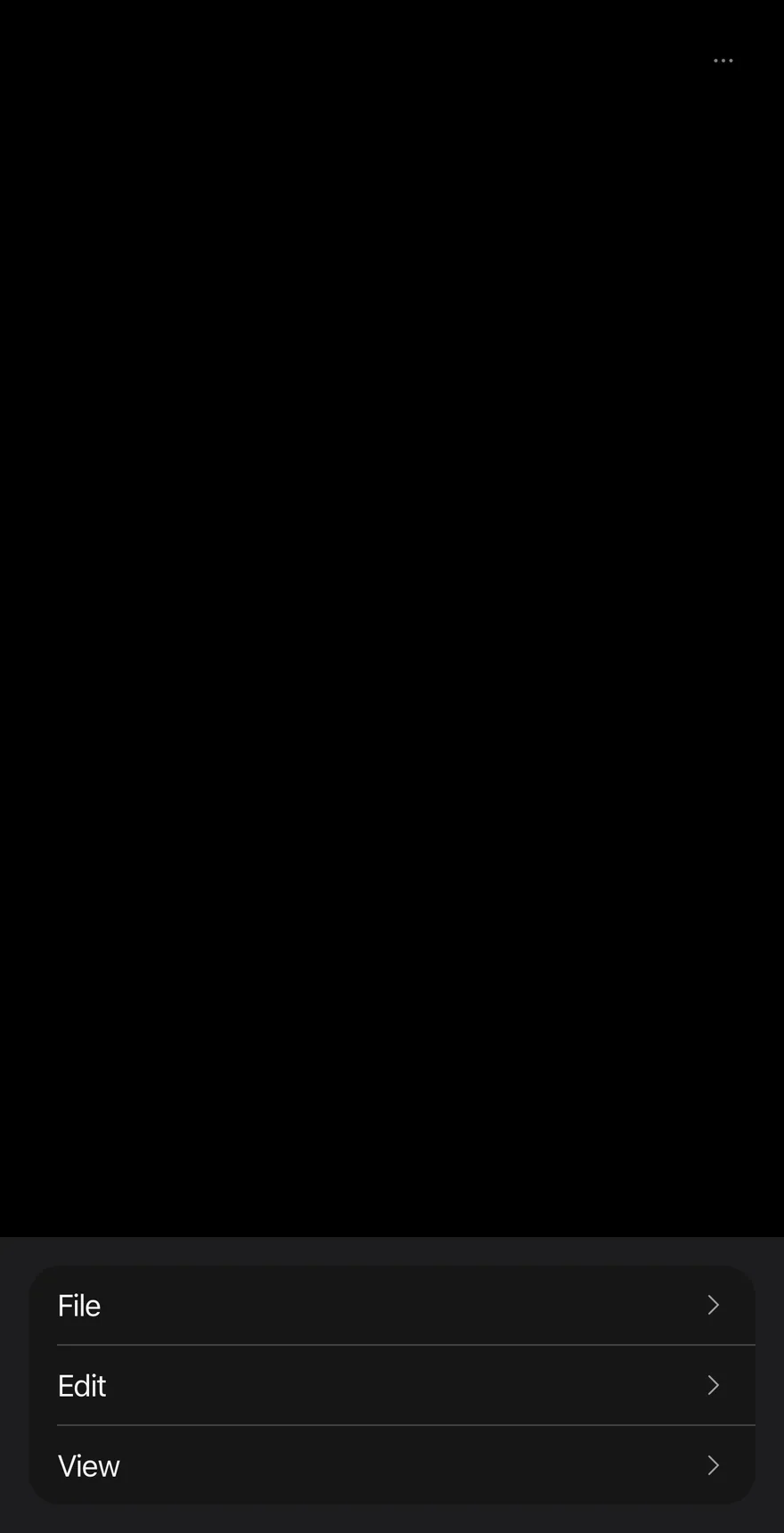
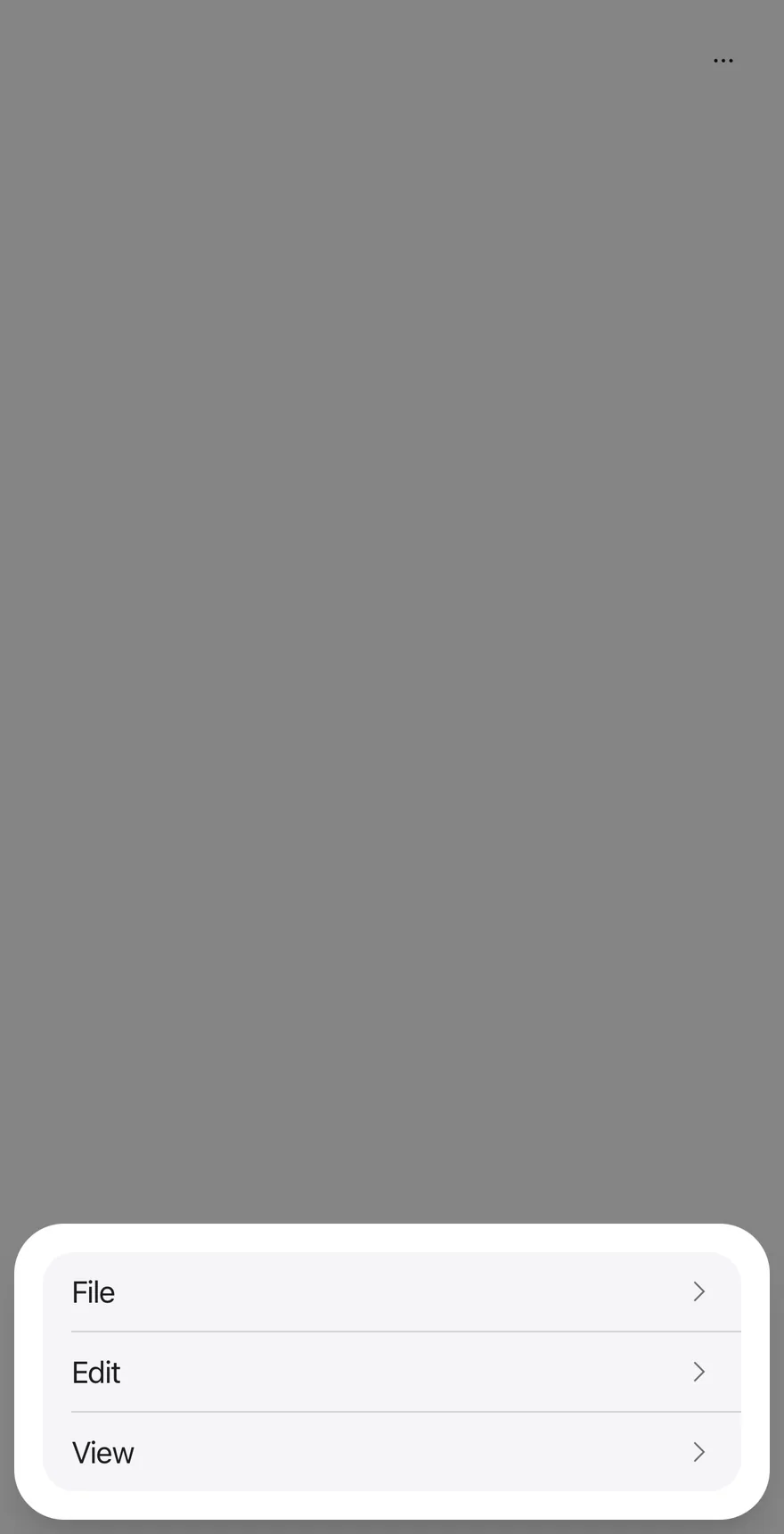
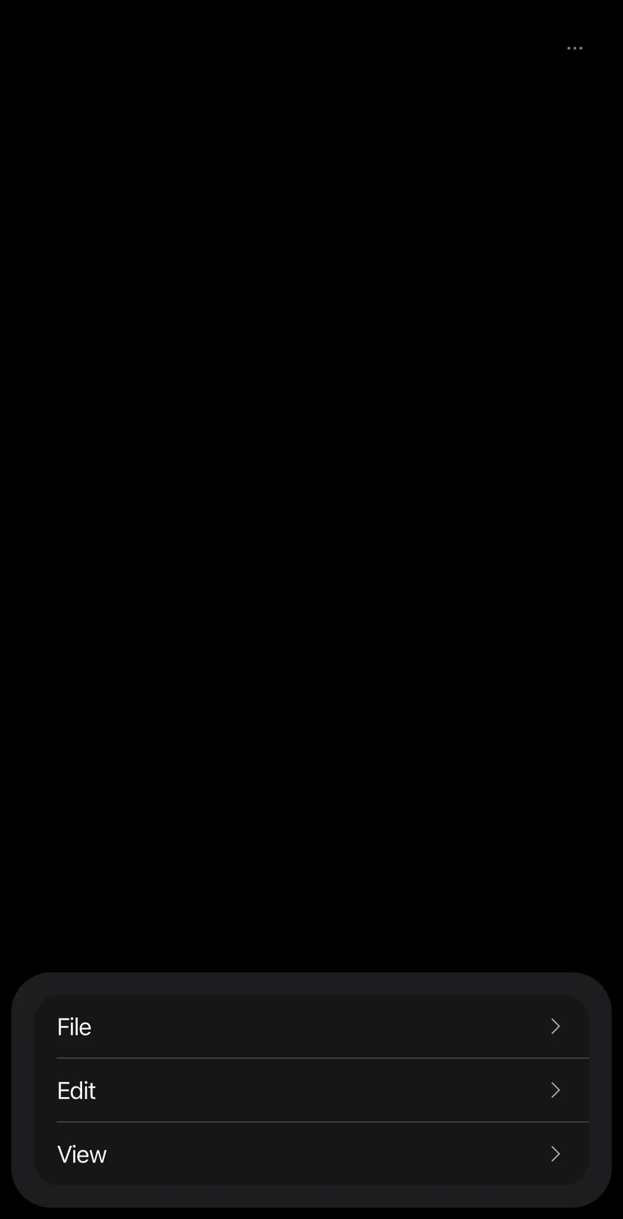
}ActionBar groups several ActionBarMenus, such as File, Edit and View, behind one ghost icon Button. Pressing it opens a Drawer that lists each menu's trigger as a row with a chevron.
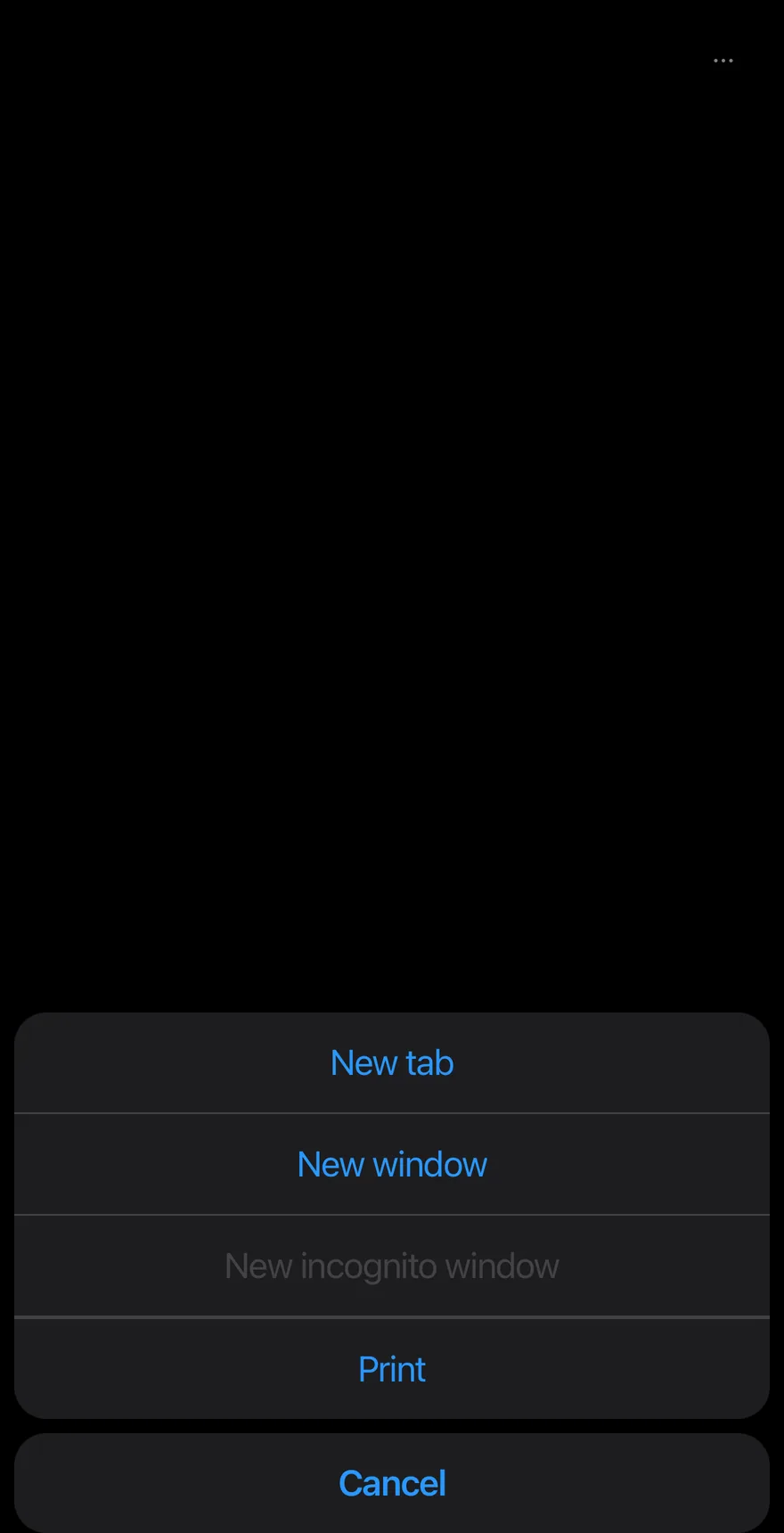
Choosing a row closes the drawer and opens that menu's items in an AlertSheet, with a Cancel button appended. Use it for toolbar-style command groups that need to fit on a phone screen.
Installation
$ pnpm dlx @esuiss/uim@latest add action-bar$ pnpm dlx @esuiss/uim@latest add action-bar --platform swift$ pnpm dlx @esuiss/uim@latest add action-bar --platform kotlinThe CLI also adds what it builds on: Alert Sheet, Button, Drawer, Icon, Text.
Manual
- Install the dependencies:
npx expo install cn phosphor-react-native react-native-svg-
Add the pieces it builds on: Alert Sheet, Button, Drawer, Icon, Text.
-
Copy the source into
components/patterns/action-bar.tsx:
import { cn } from "cn"
import { CaretRightIcon, DotsThreeIcon } from "phosphor-react-native"
import * as React from "react"
import { I18nManager, Pressable, View, type ViewProps } from "react-native"
import {
  AlertSheet,
  AlertSheetAction,
  AlertSheetCancel,
  AlertSheetContent,
  AlertSheetGroup,
  AlertSheetHeader,
  AlertSheetTitle,
} from "@/components/ui/alert-sheet"
import { Button } from "@/components/ui/button"
import { Drawer, DrawerContent, DrawerTrigger } from "@/components/ui/drawer"
import { Icon } from "@/components/ui/icon"- Update the import paths to match your project.
- Install the dependencies:
npx expo install cn phosphor-react-native react-native-svg-
Add the pieces it builds on: Alert Sheet, Button, Drawer, Icon, Text.
-
Copy the source into
components/patterns/action-bar.tsx:
import { cn } from "cn"
import { CaretRightIcon, DotsThreeIcon } from "phosphor-react-native"
import * as React from "react"
import { I18nManager, Pressable, View, type ViewProps } from "react-native"
import {
  AlertSheet,
  AlertSheetAction,
  AlertSheetCancel,
  AlertSheetContent,
  AlertSheetGroup,
  AlertSheetHeader,
  AlertSheetTitle,
} from "@/components/ui/alert-sheet"
import { Button } from "@/components/ui/button"
import { Drawer, DrawerContent, DrawerTrigger } from "@/components/ui/drawer"
import { Icon } from "@/components/ui/icon"- Update the import paths to match your project.
- Install the dependencies:
npx expo install phosphor-react-native react-native-svg-
Add the pieces it builds on: Alert Sheet, Button, Drawer, Icon, Text.
-
Copy the source into
components/patterns/action-bar.tsx:
import { CaretRightIcon, DotsThreeIcon } from "phosphor-react-native"
import * as React from "react"
import {
  I18nManager,
  Pressable,
  type StyleProp,
  StyleSheet,
  View,
  type ViewProps,
  type ViewStyle,
} from "react-native"
import {
  AlertSheet,
  AlertSheetAction,
  AlertSheetCancel,
AlertSheetContent,- Update the import paths to match your project.
-
Target iOS 17 or later.
-
Add the Swift package to your app:
.package(url: "https://github.com/phosphor-icons/swift", from: "2.1.0")- Copy the theme files every view uses:
import SwiftUI
import UIKit

struct RGBA: Sendable {
  let red: CGFloat
  let green: CGFloat
  let blue: CGFloat
  let alpha: CGFloat

  init(_ hex: UInt32, _ alpha: CGFloat = 1) {
    red = CGFloat((hex >> 16) & 0xFF) / 255
    green = CGFloat((hex >> 8) & 0xFF) / 255
    blue = CGFloat(hex & 0xFF) / 255
    self.alpha = alpha
}import SwiftUI
extension Color {
public static let surface = Color.adaptive(light: .init(0xFFFFFF), dark: .init(0x000000))
public static let surfaceSecondary = Color.adaptive(light: .init(0xF5F5F7), dark: .init(0x161617))
public static let surfaceTertiary = Color.adaptive(light: .init(0xE8E8ED), dark: .init(0x2C2C2E))
public static let surfaceRaised = Color.adaptive(light: .init(0xFFFFFF), dark: .init(0x1D1D1F))
public static let label = Color.adaptive(light: .init(0x1D1D1F), dark: .init(0xF5F5F7))
public static let labelSecondary = Color.adaptive(light: .init(0x6E6E73), dark: .init(0xA1A1A6))
public static let labelTertiary = Color.adaptive(light: .init(0x86868B), dark: .init(0x86868B))
public static let labelQuaternary = Color.adaptive(light: .init(0xD2D2D7), dark: .init(0x424245))
public static let control = Color.adaptive(light: .init(0x000000, 0.04), dark: .init(0xFFFFFF, 0.1))
public static let controlPressed = Color.adaptive(light: .init(0x000000, 0.12), dark: .init(0xFFFFFF, 0.22))
public static let controlSelected = Color.adaptive(light: .init(0x1D1D1F), dark: .init(0xF5F5F7))
public static let controlDisabled = Color.adaptive(light: .init(0x000000, 0.03), dark: .init(0xFFFFFF, 0.05))
public static let onControlSelected = Color.adaptive(light: .init(0xFFFFFF), dark: .init(0x000000))- Copy the source and every file it uses:
import PhosphorSwift
import SwiftUI

enum ActionBarPart: Sendable {
  case row, sheet, menu
}

struct ActionBarContext {
  var part: ActionBarPart
  var dismissible: Bool
  var cancelLabel: LocalizedStringKey
  var open: (@escaping () -> Void) -> Void
  var present: (AnyView) -> Void
}

extension EnvironmentValues {import SwiftUI
extension View {
public func alertSheet<Content: View>(
isPresented: Binding<Bool>,
dismissible: Bool = true,
@ViewBuilder content: @escaping () -> Content
) -> some View {
modifier(
CoverPresenter(
isPresented: isPresented,
enter: .timingCurve(0.32, 0.72, 0, 1, duration: 0.3),
exit: .timingCurve(0.32, 0.72, 0, 1, duration: 0.25)
) { visible in
AlertSheetStage(visible: visible, dismissible: dismissible, content: content)
}import SwiftUI
public struct VariantButtonStyle: ButtonStyle {
public enum Variant: CaseIterable, Sendable {
case `default`, outline, secondary, tinted, ghost, plain, destructive, link
}
public enum Size: CaseIterable, Sendable {
case `default`, xs, sm, lg, xl, icon, iconXs, iconSm, iconLg, iconXl
var height: CGFloat {
switch self {
case .xs, .iconXs: 24
case .sm, .iconSm: 32
case .default, .icon: 36
case .lg, .iconLg: 44import SwiftUI
extension EnvironmentValues {
@Entry var buttonGroup: Axis? = nil
@Entry var buttonGroupSize: CGSize = .zero
}
enum ButtonGroupSpace: Hashable {
case group
}
struct ButtonGroupFrame {
let bounds: Anchor<CGRect>
let outlined: Bool
}import PhosphorSwift
import SwiftUI
extension Shadow {
static let control = Shadow(color: .black.opacity(0.08), radius: 0.5, y: 0.5)
static let thumb = Shadow(color: .black.opacity(0.12), radius: 1.5, y: 1)
}
struct SelectionIndicator<Mark: View>: View {
let checked: Bool
let pressed: Bool
let cornerRadius: CGFloat
let mark: Mark
@Environment(\.isEnabled) private var isEnabled
@Environment(\.isInvalid) private var invalidimport SwiftUI
extension View {
public func dialog<Content: View>(
isPresented: Binding<Bool>,
@ViewBuilder content: @escaping () -> Content
) -> some View {
modifier(
CoverPresenter(isPresented: isPresented) { visible in
CenteredStage(visible: visible, dismissible: true, content: content)
}
)
}
}
struct CenteredStage<Content: View>: View {import SwiftUI
extension View {
public func drawer<Content: View>(
isPresented: Binding<Bool>,
detents: Set<PresentationDetent>? = nil,
selection: Binding<PresentationDetent>? = nil,
onDismiss: (() -> Void)? = nil,
@ViewBuilder content: @escaping () -> Content
) -> some View {
let binding = isPresented
return sheet(isPresented: isPresented, onDismiss: onDismiss) {
DrawerHost(detents: detents, selection: selection, content: content)
.environment(\.overlayDismiss, OverlayDismiss { binding.wrappedValue = false })
}
}import PhosphorSwift
import SwiftUI
enum MenuPresentation: Sendable {
case system, popup
}
extension EnvironmentValues {
@Entry var menuPresentation: MenuPresentation = .system
@Entry var menuRadio = MenuRadioContext()
}
struct MenuRadioContext: @unchecked Sendable {
var selected: AnyHashable?
var select: @MainActor @Sendable (AnyHashable) -> Void = { _ in }
}import SwiftUI
extension EnvironmentValues {
@Entry public var isInvalid = false
@Entry var fieldInset = false
@Entry var fieldGroupInset = false
@Entry var fieldSetInset = false
}
extension View {
public func invalid(_ isInvalid: Bool = true) -> some View {
environment(\.isInvalid, isInvalid)
}
}
public enum FieldOrientation: CaseIterable, Sendable {import SwiftUI
extension EnvironmentValues {
@Entry public var hapticsEnabled = true
}
extension View {
public func haptics(_ enabled: Bool) -> some View {
environment(\.hapticsEnabled, enabled)
}
func hapticFeedback<Trigger: Equatable>(_ feedback: SensoryFeedback, trigger: Trigger) -> some View {
modifier(HapticFeedbackModifier(feedback: feedback, trigger: trigger) { _, _ in true })
}
func hapticFeedback<Trigger: Equatable>(import PhosphorSwift
import Observation
import SwiftUI
public enum PopupAlignment: Sendable, CaseIterable {
case start, center, end
}
struct OverlayDismiss: Sendable {
let action: @MainActor @Sendable () -> Void
@MainActor func callAsFunction() {
action()
}
}import PhosphorSwift
import SwiftUI
struct SelectContext: @unchecked Sendable {
var selected: AnyHashable?
var registering = false
var select: @MainActor @Sendable (AnyHashable) -> Void = { _ in }
}
extension EnvironmentValues {
@Entry var select = SelectContext()
}
struct SelectLabelsKey: PreferenceKey {
static var defaultValue: [AnyHashable: Text] { [:] }import SwiftUI
public struct Separator: View {
let orientation: Axis
public init(_ orientation: Axis = .horizontal) {
self.orientation = orientation
}
public var body: some View {
Rectangle()
.fill(Color.separator)
.frame(width: orientation == .vertical ? 1 : nil, height: orientation == .horizontal ? 1 : nil)
.frame(maxWidth: orientation == .horizontal ? .infinity : nil, maxHeight: orientation == .vertical ? .infinity : nil)
.accessibilityHidden(true)
}import SwiftUI
extension View {
public func sheet<Content: View>(
isPresented: Binding<Bool>,
side: Edge,
@ViewBuilder content: @escaping () -> Content
) -> some View {
modifier(
CoverPresenter(
isPresented: isPresented,
enter: .easeOut(duration: 0.4),
exit: .easeIn(duration: 0.3)
) { visible in
SideSheetStage(side: side, visible: visible, content: content)
}import SwiftUI
public enum TextVariant: CaseIterable, Sendable {
case `default`, h1, h2, h3, h4, p, blockquote, code, lead, large, small, muted
var style: TextStyle {
switch self {
case .h1: .xl3
case .h2: .xl2
case .h3: .xl
case .h4, .lead, .large: .lg
case .code, .small, .muted: .sm
default: .base
}
}import SwiftUI
enum ActionListMode: Sendable {
case sheet, menu
}
extension EnvironmentValues {
@Entry var actionListMode: ActionListMode = .menu
}
struct ActionSheetBody<Content: View>: View {
let cancelLabel: LocalizedStringKey
@ViewBuilder let content: () -> Content
var body: some View {
AlertSheetContent {import SwiftUI
extension EnvironmentValues {
@Entry var patternCompact: Bool? = nil
}
@propertyWrapper
struct CompactLayout: DynamicProperty {
@Environment(\.patternCompact) private var forced
@Environment(\.horizontalSizeClass) private var sizeClass
init() {}
var wrappedValue: Bool {
forced ?? (sizeClass != .regular)
}- Add the files to your app target.
- Set
minSdkto 24 or higher and add the dependencies:
implementation(platform("androidx.compose:compose-bom:2026.09.00"))
implementation("androidx.compose.foundation:foundation")
implementation("androidx.compose.ui:ui")
implementation("com.adamglin:phosphor-icon-android:1.0.0")- Copy the theme files every view uses:
package com.esuiss.ui.theme

import androidx.compose.foundation.isSystemInDarkTheme
import androidx.compose.runtime.Composable
import androidx.compose.runtime.CompositionLocalProvider
import androidx.compose.runtime.Immutable
import androidx.compose.runtime.staticCompositionLocalOf
import androidx.compose.ui.Modifier
import androidx.compose.ui.draw.dropShadow
import androidx.compose.ui.graphics.Color
import androidx.compose.ui.graphics.Shape
import androidx.compose.ui.graphics.shadow.Shadow as DropShadow
import androidx.compose.ui.text.TextStyle
import androidx.compose.ui.text.style.LineHeightStyle
import androidx.compose.ui.unit.Dp
import androidx.compose.ui.unit.DpOffsetpackage com.esuiss.ui.theme
import androidx.compose.runtime.Immutable
import androidx.compose.ui.graphics.Color
import androidx.compose.ui.unit.dp
@Immutable
data class Colors(
val surface: Color,
val surfaceSecondary: Color,
val surfaceTertiary: Color,
val surfaceRaised: Color,
val label: Color,
val labelSecondary: Color,
val labelTertiary: Color,
val labelQuaternary: Color,- Copy the source and every file it uses:
package com.esuiss.ui.patterns

import androidx.compose.foundation.background
import androidx.compose.foundation.clickable
import androidx.compose.foundation.interaction.MutableInteractionSource
import androidx.compose.foundation.layout.Arrangement
import androidx.compose.foundation.layout.Column
import androidx.compose.foundation.layout.Row
import androidx.compose.foundation.layout.fillMaxWidth
import androidx.compose.foundation.layout.heightIn
import androidx.compose.foundation.layout.padding
import androidx.compose.foundation.shape.RoundedCornerShape
import androidx.compose.foundation.text.BasicText
import androidx.compose.runtime.Composable
import androidx.compose.runtime.CompositionLocalProvider
import androidx.compose.runtime.LaunchedEffectpackage com.esuiss.ui.components
import androidx.compose.animation.AnimatedVisibility
import androidx.compose.animation.core.MutableTransitionState
import androidx.compose.animation.core.tween
import androidx.compose.animation.fadeIn
import androidx.compose.animation.fadeOut
import androidx.compose.animation.slideInVertically
import androidx.compose.animation.slideOutVertically
import androidx.compose.foundation.background
import androidx.compose.foundation.clickable
import androidx.compose.foundation.gestures.Orientation
import androidx.compose.foundation.interaction.MutableInteractionSource
import androidx.compose.foundation.interaction.collectIsPressedAsState
import androidx.compose.foundation.layout.Arrangement
import androidx.compose.foundation.layout.Boxpackage com.esuiss.ui.components
import androidx.compose.foundation.background
import androidx.compose.foundation.border
import androidx.compose.foundation.clickable
import androidx.compose.foundation.interaction.MutableInteractionSource
import androidx.compose.foundation.interaction.collectIsPressedAsState
import androidx.compose.foundation.layout.Arrangement
import androidx.compose.foundation.layout.Row
import androidx.compose.foundation.layout.RowScope
import androidx.compose.foundation.layout.fillMaxWidth
import androidx.compose.foundation.layout.height
import androidx.compose.foundation.layout.padding
import androidx.compose.foundation.layout.size
import androidx.compose.foundation.shape.CircleShape
import androidx.compose.foundation.shape.RoundedCornerShapepackage com.esuiss.ui.components
import androidx.compose.foundation.background
import androidx.compose.foundation.gestures.Orientation
import androidx.compose.foundation.layout.Arrangement
import androidx.compose.foundation.layout.Box
import androidx.compose.foundation.layout.Row
import androidx.compose.foundation.layout.RowScope
import androidx.compose.foundation.layout.padding
import androidx.compose.foundation.shape.CircleShape
import androidx.compose.foundation.shape.CornerSize
import androidx.compose.foundation.shape.RoundedCornerShape
import androidx.compose.runtime.Composable
import androidx.compose.runtime.CompositionLocalProvider
import androidx.compose.runtime.DisposableEffect
import androidx.compose.runtime.Immutablepackage com.esuiss.ui.components
import androidx.compose.foundation.background
import androidx.compose.foundation.border
import androidx.compose.foundation.interaction.MutableInteractionSource
import androidx.compose.foundation.interaction.collectIsPressedAsState
import androidx.compose.foundation.layout.Box
import androidx.compose.foundation.layout.size
import androidx.compose.foundation.selection.triStateToggleable
import androidx.compose.foundation.shape.RoundedCornerShape
import androidx.compose.runtime.Composable
import androidx.compose.runtime.getValue
import androidx.compose.runtime.remember
import androidx.compose.ui.Alignment
import androidx.compose.ui.Modifier
import androidx.compose.ui.graphics.Colorpackage com.esuiss.ui.components
import androidx.compose.runtime.compositionLocalOf
import androidx.compose.ui.graphics.Color
import androidx.compose.ui.text.TextStyle
import androidx.compose.ui.unit.Dp
import androidx.compose.ui.unit.dp
val LocalContentStyle = compositionLocalOf { TextStyle.Default }
val LocalContentColor = compositionLocalOf { Color.Unspecified }
val LocalIconSize = compositionLocalOf { 20.dp }package com.esuiss.ui.components
import androidx.compose.animation.core.CubicBezierEasing
import androidx.compose.animation.core.tween
import androidx.compose.foundation.background
import androidx.compose.foundation.gestures.AnchoredDraggableDefaults
import androidx.compose.foundation.gestures.AnchoredDraggableState
import androidx.compose.foundation.gestures.DraggableAnchors
import androidx.compose.foundation.gestures.Orientation
import androidx.compose.foundation.gestures.anchoredDraggable
import androidx.compose.foundation.gestures.animateTo
import androidx.compose.foundation.gestures.detectTapGestures
import androidx.compose.foundation.layout.Arrangement
import androidx.compose.foundation.layout.Box
import androidx.compose.foundation.layout.BoxWithConstraints
import androidx.compose.foundation.layout.Columnpackage com.esuiss.ui.components
import androidx.compose.animation.core.animateFloatAsState
import androidx.compose.foundation.background
import androidx.compose.foundation.clickable
import androidx.compose.foundation.interaction.MutableInteractionSource
import androidx.compose.foundation.interaction.collectIsPressedAsState
import androidx.compose.foundation.layout.Arrangement
import androidx.compose.foundation.layout.Box
import androidx.compose.foundation.layout.Column
import androidx.compose.foundation.layout.ColumnScope
import androidx.compose.foundation.layout.IntrinsicSize
import androidx.compose.foundation.layout.Row
import androidx.compose.foundation.layout.RowScope
import androidx.compose.foundation.layout.fillMaxWidth
import androidx.compose.foundation.layout.heightpackage com.esuiss.ui.components
import androidx.compose.foundation.background
import androidx.compose.foundation.gestures.Orientation
import androidx.compose.foundation.layout.Arrangement
import androidx.compose.foundation.layout.Box
import androidx.compose.foundation.layout.Column
import androidx.compose.foundation.layout.ColumnScope
import androidx.compose.foundation.layout.LayoutScopeMarker
import androidx.compose.foundation.layout.Row
import androidx.compose.foundation.layout.RowScope
import androidx.compose.foundation.layout.fillMaxWidth
import androidx.compose.foundation.layout.heightIn
import androidx.compose.foundation.layout.padding
import androidx.compose.foundation.shape.RoundedCornerShape
import androidx.compose.foundation.text.BasicTextpackage com.esuiss.ui.components
import android.provider.Settings
import androidx.compose.animation.core.CubicBezierEasing
import androidx.compose.foundation.background
import androidx.compose.foundation.border
import androidx.compose.foundation.gestures.Orientation
import androidx.compose.foundation.text.selection.TextSelectionColors
import androidx.compose.runtime.Composable
import androidx.compose.runtime.mutableStateOf
import androidx.compose.runtime.remember
import androidx.compose.ui.Modifier
import androidx.compose.ui.draw.clip
import androidx.compose.ui.draw.drawWithContent
import androidx.compose.ui.geometry.Offset
import androidx.compose.ui.geometry.Sizepackage com.esuiss.ui.components
import androidx.compose.runtime.Composable
import androidx.compose.runtime.CompositionLocalProvider
import androidx.compose.runtime.remember
import androidx.compose.runtime.staticCompositionLocalOf
import androidx.compose.ui.hapticfeedback.HapticFeedback
import androidx.compose.ui.hapticfeedback.HapticFeedbackType
import androidx.compose.ui.platform.LocalHapticFeedback
val LocalHapticsEnabled = staticCompositionLocalOf { true }
@Composable
fun ProvideHaptics(enabled: Boolean, content: @Composable () -> Unit) {
CompositionLocalProvider(LocalHapticsEnabled provides enabled, content = content)
}package com.esuiss.ui.components
import androidx.compose.foundation.Image
import androidx.compose.foundation.layout.size
import androidx.compose.runtime.Composable
import androidx.compose.ui.Modifier
import androidx.compose.ui.graphics.Color
import androidx.compose.ui.graphics.ColorFilter
import androidx.compose.ui.graphics.takeOrElse
import androidx.compose.ui.graphics.vector.ImageVector
import androidx.compose.ui.unit.Dp
import com.esuiss.ui.theme.EsuissTheme
@Composable
fun Icon(
imageVector: ImageVector,package com.esuiss.ui.components
import androidx.compose.foundation.layout.Arrangement
import androidx.compose.foundation.layout.Row
import androidx.compose.foundation.layout.RowScope
import androidx.compose.foundation.text.BasicText
import androidx.compose.runtime.Composable
import androidx.compose.runtime.CompositionLocalProvider
import androidx.compose.ui.Alignment
import androidx.compose.ui.Modifier
import androidx.compose.ui.text.font.FontWeight
import androidx.compose.ui.unit.dp
import com.esuiss.ui.theme.EsuissTheme
import com.esuiss.ui.theme.Typography
@Composablepackage com.esuiss.ui.components
import android.os.Build
import android.view.Window
import android.view.WindowManager
import androidx.compose.animation.AnimatedVisibility
import androidx.compose.animation.AnimatedVisibilityScope
import androidx.compose.animation.EnterExitState
import androidx.compose.animation.core.MutableTransitionState
import androidx.compose.animation.core.animateFloat
import androidx.compose.animation.core.tween
import androidx.compose.animation.fadeIn
import androidx.compose.animation.fadeOut
import androidx.compose.animation.scaleIn
import androidx.compose.animation.scaleOut
import androidx.compose.animation.slideInpackage com.esuiss.ui.components
import androidx.compose.foundation.background
import androidx.compose.foundation.gestures.Orientation
import androidx.compose.foundation.layout.Box
import androidx.compose.foundation.layout.fillMaxHeight
import androidx.compose.foundation.layout.fillMaxWidth
import androidx.compose.foundation.layout.height
import androidx.compose.foundation.layout.width
import androidx.compose.runtime.Composable
import androidx.compose.ui.Modifier
import androidx.compose.ui.unit.dp
import com.esuiss.ui.theme.EsuissTheme
@Composable
fun Separator(package com.esuiss.ui.patterns
import androidx.compose.runtime.Composable
import androidx.compose.runtime.Immutable
import androidx.compose.ui.Modifier
import com.esuiss.ui.components.AlertSheet
import com.esuiss.ui.components.AlertSheetActionVariant
import com.esuiss.ui.components.AlertSheetCancel
import com.esuiss.ui.components.AlertSheetGroup
import com.esuiss.ui.components.AlertSheetHeader
import com.esuiss.ui.components.AlertSheetTitle
import com.esuiss.ui.components.MenuItemVariant
@Immutable
internal class SheetMenuState(
val open: Boolean,- Update the
com.esuiss.uipackage names to match your project.
Usage
import { ActionBar, ActionBarMenu, ActionBarTrigger, ActionBarContent, ActionBarLabel, ActionBarItem, ActionBarSeparator } from "@/components/patterns/action-bar"<ActionBar defaultOpen>
<FileMenu defaultOpen />
<EditMenu />
<ViewMenu />
</ActionBar>Each child of ActionBar should be an ActionBarMenu containing one ActionBarTrigger and one ActionBarContent. The bar renders every child twice, once as a drawer row and once as a sheet, and pairs them by child index.
open, defaultOpen and onOpenChange on ActionBar control the drawer. ActionBarMenu takes its own open, defaultOpen and onOpenChange for its sheet. A string child of ActionBarTrigger is wrapped in Text.
Examples
Default


import { ClipboardTextIcon, CopyIcon, ScissorsIcon, TrashIcon } from "phosphor-react-native"
import { ActionBar, ActionBarContent, ActionBarItem, ActionBarLabel, ActionBarMenu, ActionBarSeparator, ActionBarTrigger } from "@/components/patterns/action-bar"
import { Icon } from "@/components/ui/icon"
import { Text } from "@/components/ui/text"

function FileMenu({ defaultOpen }: { defaultOpen?: boolean }) {
  return (
    <ActionBarMenu defaultOpen={defaultOpen}>
      <ActionBarTrigger>File</ActionBarTrigger>
      <ActionBarContent>
        <ActionBarItem>New tab</ActionBarItem>
        <ActionBarItem>New window</ActionBarItem>
        <ActionBarItem disabled>New incognito window</ActionBarItem>
        <ActionBarSeparator />
        <ActionBarItem>Print</ActionBarItem>
      </ActionBarContent>
    </ActionBarMenu>
  )
}

function EditMenu({ withIcons = false }: { withIcons?: boolean }) {
  return (
    <ActionBarMenu>
      <ActionBarTrigger>Edit</ActionBarTrigger>
      <ActionBarContent>
        <ActionBarItem>
          {withIcons ? <Icon as={ScissorsIcon} /> : null}
          <Text>Cut</Text>
        </ActionBarItem>
        <ActionBarItem>
          {withIcons ? <Icon as={CopyIcon} /> : null}
          <Text>Copy</Text>
        </ActionBarItem>
        <ActionBarItem>
          {withIcons ? <Icon as={ClipboardTextIcon} /> : null}
          <Text>Paste</Text>
        </ActionBarItem>
        <ActionBarSeparator />
        <ActionBarItem variant="destructive">
          {withIcons ? <Icon as={TrashIcon} /> : null}
          <Text>Delete</Text>
        </ActionBarItem>
      </ActionBarContent>
    </ActionBarMenu>
  )
}

function ViewMenu() {
  return (
    <ActionBarMenu>
      <ActionBarTrigger>View</ActionBarTrigger>
      <ActionBarContent>
        <ActionBarLabel>Appearance</ActionBarLabel>
        <ActionBarItem>Zoom in</ActionBarItem>
        <ActionBarItem>Zoom out</ActionBarItem>
        <ActionBarItem>Actual size</ActionBarItem>
      </ActionBarContent>
    </ActionBarMenu>
  )
}

export function ActionBarExample() {
  return (
    <ActionBar>
      <FileMenu />
      <EditMenu />
      <ViewMenu />
    </ActionBar>
  )
}import EsuissUI
import PhosphorSwift
import SwiftUI
struct ActionBarExample: View {
var body: some View {
ActionBarDemo {
ActionBarFileMenu()
ActionBarEditMenu()
ActionBarViewMenu()
}
}
}
struct ActionBarDemo<Content: View>: View {
var dismissible = true
var moreLabel: LocalizedStringKey = "More actions"
var cancelLabel: LocalizedStringKey = "Cancel"
let content: Content
@State private var open: Bool
init(
open: Bool = false,
dismissible: Bool = true,
moreLabel: LocalizedStringKey = "More actions",
cancelLabel: LocalizedStringKey = "Cancel",
@ViewBuilder content: () -> Content
) {
_open = State(initialValue: open)
self.dismissible = dismissible
self.moreLabel = moreLabel
self.cancelLabel = cancelLabel
self.content = content()
}
var body: some View {
ActionBar(isPresented: $open, dismissible: dismissible, moreLabel: moreLabel, cancelLabel: cancelLabel) {
content
}
}
}
struct ActionBarFileMenu: View {
var isPresented: Binding<Bool>?
var body: some View {
ActionBarMenu("File", isPresented: isPresented) {
ActionBarItem("New tab") {}
ActionBarItem("New window") {}
ActionBarItem("New incognito window") {}.disabled(true)
ActionBarSeparator()
ActionBarItem("Print") {}
}
}
}
struct ActionBarEditMenu: View {
var withIcons = false
var body: some View {
ActionBarMenu("Edit") {
if withIcons {
ActionBarItem("Cut", icon: Ph.scissors.regular) {}
ActionBarItem("Copy", icon: Ph.copy.regular) {}
ActionBarItem("Paste", icon: Ph.clipboardText.regular) {}
ActionBarSeparator()
ActionBarItem("Delete", icon: Ph.trash.regular, variant: .destructive) {}
} else {
ActionBarItem("Cut") {}
ActionBarItem("Copy") {}
ActionBarItem("Paste") {}
ActionBarSeparator()
ActionBarItem("Delete", variant: .destructive) {}
}
}
}
}
struct ActionBarViewMenu: View {
var body: some View {
ActionBarMenu("View") {
ActionBarLabel("Appearance")
ActionBarItem("Zoom in") {}
ActionBarItem("Zoom out") {}
ActionBarItem("Actual size") {}
}
}
}import androidx.compose.foundation.layout.fillMaxWidth
import androidx.compose.runtime.Composable
import androidx.compose.runtime.getValue
import androidx.compose.runtime.mutableStateOf
import androidx.compose.runtime.saveable.rememberSaveable
import androidx.compose.runtime.setValue
import androidx.compose.ui.Modifier
import com.esuiss.ui.patterns.ActionBar
@Composable
fun ActionBarDemo(
defaultOpen: Boolean = false,
fileOpen: Boolean = false,
withIcons: Boolean = false,
view: Boolean = true,
dismissible: Boolean = true,
floating: Boolean = false,
moreLabel: String = "More actions",
cancelLabel: String = "Cancel",
) {
var open by rememberSaveable { mutableStateOf(defaultOpen) }
ActionBar(
open = open,
onOpenChange = { open = it },
modifier = Modifier.fillMaxWidth(),
dismissible = dismissible,
floating = floating,
moreLabel = moreLabel,
cancelLabel = cancelLabel,
) {
actionBarFileMenu(fileOpen)
actionBarEditMenu(withIcons)
if (view) actionBarViewMenu()
}
}Overflow
Opens the More actions drawer on first render.
import { ClipboardTextIcon, CopyIcon, ScissorsIcon, TrashIcon } from "phosphor-react-native"
import { ActionBar, ActionBarContent, ActionBarItem, ActionBarLabel, ActionBarMenu, ActionBarSeparator, ActionBarTrigger } from "@/components/patterns/action-bar"
import { Icon } from "@/components/ui/icon"
import { Text } from "@/components/ui/text"

function FileMenu({ defaultOpen }: { defaultOpen?: boolean }) {
  return (
    <ActionBarMenu defaultOpen={defaultOpen}>
      <ActionBarTrigger>File</ActionBarTrigger>
      <ActionBarContent>
        <ActionBarItem>New tab</ActionBarItem>
        <ActionBarItem>New window</ActionBarItem>
        <ActionBarItem disabled>New incognito window</ActionBarItem>
        <ActionBarSeparator />
        <ActionBarItem>Print</ActionBarItem>
      </ActionBarContent>
    </ActionBarMenu>
  )
}

function EditMenu({ withIcons = false }: { withIcons?: boolean }) {
  return (
    <ActionBarMenu>
      <ActionBarTrigger>Edit</ActionBarTrigger>
      <ActionBarContent>
        <ActionBarItem>
          {withIcons ? <Icon as={ScissorsIcon} /> : null}
          <Text>Cut</Text>
        </ActionBarItem>
        <ActionBarItem>
          {withIcons ? <Icon as={CopyIcon} /> : null}
          <Text>Copy</Text>
        </ActionBarItem>
        <ActionBarItem>
          {withIcons ? <Icon as={ClipboardTextIcon} /> : null}
          <Text>Paste</Text>
        </ActionBarItem>
        <ActionBarSeparator />
        <ActionBarItem variant="destructive">
          {withIcons ? <Icon as={TrashIcon} /> : null}
          <Text>Delete</Text>
        </ActionBarItem>
      </ActionBarContent>
    </ActionBarMenu>
  )
}

function ViewMenu() {
  return (
    <ActionBarMenu>
      <ActionBarTrigger>View</ActionBarTrigger>
      <ActionBarContent>
        <ActionBarLabel>Appearance</ActionBarLabel>
        <ActionBarItem>Zoom in</ActionBarItem>
        <ActionBarItem>Zoom out</ActionBarItem>
        <ActionBarItem>Actual size</ActionBarItem>
      </ActionBarContent>
    </ActionBarMenu>
  )
}

export function ActionBarOverflowExample() {
  return (
    <ActionBar defaultOpen>
      <FileMenu />
      <EditMenu />
      <ViewMenu />
    </ActionBar>
  )
}import EsuissUI
import PhosphorSwift
import SwiftUI
struct ActionBarOverflowExample: View {
var body: some View {
ActionBarDemo(open: true) {
ActionBarFileMenu()
ActionBarEditMenu()
ActionBarViewMenu()
}
}
}
struct ActionBarDemo<Content: View>: View {
var dismissible = true
var moreLabel: LocalizedStringKey = "More actions"
var cancelLabel: LocalizedStringKey = "Cancel"
let content: Content
@State private var open: Bool
init(
open: Bool = false,
dismissible: Bool = true,
moreLabel: LocalizedStringKey = "More actions",
cancelLabel: LocalizedStringKey = "Cancel",
@ViewBuilder content: () -> Content
) {
_open = State(initialValue: open)
self.dismissible = dismissible
self.moreLabel = moreLabel
self.cancelLabel = cancelLabel
self.content = content()
}
var body: some View {
ActionBar(isPresented: $open, dismissible: dismissible, moreLabel: moreLabel, cancelLabel: cancelLabel) {
content
}
}
}
struct ActionBarFileMenu: View {
var isPresented: Binding<Bool>?
var body: some View {
ActionBarMenu("File", isPresented: isPresented) {
ActionBarItem("New tab") {}
ActionBarItem("New window") {}
ActionBarItem("New incognito window") {}.disabled(true)
ActionBarSeparator()
ActionBarItem("Print") {}
}
}
}
struct ActionBarEditMenu: View {
var withIcons = false
var body: some View {
ActionBarMenu("Edit") {
if withIcons {
ActionBarItem("Cut", icon: Ph.scissors.regular) {}
ActionBarItem("Copy", icon: Ph.copy.regular) {}
ActionBarItem("Paste", icon: Ph.clipboardText.regular) {}
ActionBarSeparator()
ActionBarItem("Delete", icon: Ph.trash.regular, variant: .destructive) {}
} else {
ActionBarItem("Cut") {}
ActionBarItem("Copy") {}
ActionBarItem("Paste") {}
ActionBarSeparator()
ActionBarItem("Delete", variant: .destructive) {}
}
}
}
}
struct ActionBarViewMenu: View {
var body: some View {
ActionBarMenu("View") {
ActionBarLabel("Appearance")
ActionBarItem("Zoom in") {}
ActionBarItem("Zoom out") {}
ActionBarItem("Actual size") {}
}
}
}import androidx.compose.foundation.layout.fillMaxWidth
import androidx.compose.runtime.Composable
import androidx.compose.runtime.getValue
import androidx.compose.runtime.mutableStateOf
import androidx.compose.runtime.saveable.rememberSaveable
import androidx.compose.runtime.setValue
import androidx.compose.ui.Modifier
import com.esuiss.ui.patterns.ActionBar
@Composable
fun ActionBarOverflowExample() {
ActionBarDemo(defaultOpen = true)
}
@Composable
fun ActionBarDemo(
defaultOpen: Boolean = false,
fileOpen: Boolean = false,
withIcons: Boolean = false,
view: Boolean = true,
dismissible: Boolean = true,
floating: Boolean = false,
moreLabel: String = "More actions",
cancelLabel: String = "Cancel",
) {
var open by rememberSaveable { mutableStateOf(defaultOpen) }
ActionBar(
open = open,
onOpenChange = { open = it },
modifier = Modifier.fillMaxWidth(),
dismissible = dismissible,
floating = floating,
moreLabel = moreLabel,
cancelLabel = cancelLabel,
) {
actionBarFileMenu(fileOpen)
actionBarEditMenu(withIcons)
if (view) actionBarViewMenu()
}
}With icons
Places an icon before each item in the Edit menu.


import { ClipboardTextIcon, CopyIcon, ScissorsIcon, TrashIcon } from "phosphor-react-native"
import { ActionBar, ActionBarContent, ActionBarItem, ActionBarLabel, ActionBarMenu, ActionBarSeparator, ActionBarTrigger } from "@/components/patterns/action-bar"
import { Icon } from "@/components/ui/icon"
import { Text } from "@/components/ui/text"

function FileMenu({ defaultOpen }: { defaultOpen?: boolean }) {
  return (
    <ActionBarMenu defaultOpen={defaultOpen}>
      <ActionBarTrigger>File</ActionBarTrigger>
      <ActionBarContent>
        <ActionBarItem>New tab</ActionBarItem>
        <ActionBarItem>New window</ActionBarItem>
        <ActionBarItem disabled>New incognito window</ActionBarItem>
        <ActionBarSeparator />
        <ActionBarItem>Print</ActionBarItem>
      </ActionBarContent>
    </ActionBarMenu>
  )
}

function EditMenu({ withIcons = false }: { withIcons?: boolean }) {
  return (
    <ActionBarMenu>
      <ActionBarTrigger>Edit</ActionBarTrigger>
      <ActionBarContent>
        <ActionBarItem>
          {withIcons ? <Icon as={ScissorsIcon} /> : null}
          <Text>Cut</Text>
        </ActionBarItem>
        <ActionBarItem>
          {withIcons ? <Icon as={CopyIcon} /> : null}
          <Text>Copy</Text>
        </ActionBarItem>
        <ActionBarItem>
          {withIcons ? <Icon as={ClipboardTextIcon} /> : null}
          <Text>Paste</Text>
        </ActionBarItem>
        <ActionBarSeparator />
        <ActionBarItem variant="destructive">
          {withIcons ? <Icon as={TrashIcon} /> : null}
          <Text>Delete</Text>
        </ActionBarItem>
      </ActionBarContent>
    </ActionBarMenu>
  )
}

function ViewMenu() {
  return (
    <ActionBarMenu>
      <ActionBarTrigger>View</ActionBarTrigger>
      <ActionBarContent>
        <ActionBarLabel>Appearance</ActionBarLabel>
        <ActionBarItem>Zoom in</ActionBarItem>
        <ActionBarItem>Zoom out</ActionBarItem>
        <ActionBarItem>Actual size</ActionBarItem>
      </ActionBarContent>
    </ActionBarMenu>
  )
}

export function ActionBarWithIconsExample() {
  return (
    <ActionBar>
      <FileMenu />
      <EditMenu withIcons />
      <ViewMenu />
    </ActionBar>
  )
}import EsuissUI
import PhosphorSwift
import SwiftUI
struct ActionBarWithIconsExample: View {
var body: some View {
ActionBarDemo {
ActionBarFileMenu()
ActionBarEditMenu(withIcons: true)
ActionBarViewMenu()
}
}
}
struct ActionBarDemo<Content: View>: View {
var dismissible = true
var moreLabel: LocalizedStringKey = "More actions"
var cancelLabel: LocalizedStringKey = "Cancel"
let content: Content
@State private var open: Bool
init(
open: Bool = false,
dismissible: Bool = true,
moreLabel: LocalizedStringKey = "More actions",
cancelLabel: LocalizedStringKey = "Cancel",
@ViewBuilder content: () -> Content
) {
_open = State(initialValue: open)
self.dismissible = dismissible
self.moreLabel = moreLabel
self.cancelLabel = cancelLabel
self.content = content()
}
var body: some View {
ActionBar(isPresented: $open, dismissible: dismissible, moreLabel: moreLabel, cancelLabel: cancelLabel) {
content
}
}
}
struct ActionBarFileMenu: View {
var isPresented: Binding<Bool>?
var body: some View {
ActionBarMenu("File", isPresented: isPresented) {
ActionBarItem("New tab") {}
ActionBarItem("New window") {}
ActionBarItem("New incognito window") {}.disabled(true)
ActionBarSeparator()
ActionBarItem("Print") {}
}
}
}
struct ActionBarEditMenu: View {
var withIcons = false
var body: some View {
ActionBarMenu("Edit") {
if withIcons {
ActionBarItem("Cut", icon: Ph.scissors.regular) {}
ActionBarItem("Copy", icon: Ph.copy.regular) {}
ActionBarItem("Paste", icon: Ph.clipboardText.regular) {}
ActionBarSeparator()
ActionBarItem("Delete", icon: Ph.trash.regular, variant: .destructive) {}
} else {
ActionBarItem("Cut") {}
ActionBarItem("Copy") {}
ActionBarItem("Paste") {}
ActionBarSeparator()
ActionBarItem("Delete", variant: .destructive) {}
}
}
}
}
struct ActionBarViewMenu: View {
var body: some View {
ActionBarMenu("View") {
ActionBarLabel("Appearance")
ActionBarItem("Zoom in") {}
ActionBarItem("Zoom out") {}
ActionBarItem("Actual size") {}
}
}
}import androidx.compose.foundation.layout.fillMaxWidth
import androidx.compose.runtime.Composable
import androidx.compose.runtime.getValue
import androidx.compose.runtime.mutableStateOf
import androidx.compose.runtime.saveable.rememberSaveable
import androidx.compose.runtime.setValue
import androidx.compose.ui.Modifier
import com.esuiss.ui.patterns.ActionBar
@Composable
fun ActionBarWithIconsExample() {
ActionBarDemo(withIcons = true)
}
@Composable
fun ActionBarDemo(
defaultOpen: Boolean = false,
fileOpen: Boolean = false,
withIcons: Boolean = false,
view: Boolean = true,
dismissible: Boolean = true,
floating: Boolean = false,
moreLabel: String = "More actions",
cancelLabel: String = "Cancel",
) {
var open by rememberSaveable { mutableStateOf(defaultOpen) }
ActionBar(
open = open,
onOpenChange = { open = it },
modifier = Modifier.fillMaxWidth(),
dismissible = dismissible,
floating = floating,
moreLabel = moreLabel,
cancelLabel = cancelLabel,
) {
actionBarFileMenu(fileOpen)
actionBarEditMenu(withIcons)
if (view) actionBarViewMenu()
}
}Not dismissible
Sets dismissible to false, so sheets close only through an action or Cancel.


import { ClipboardTextIcon, CopyIcon, ScissorsIcon, TrashIcon } from "phosphor-react-native"
import { ActionBar, ActionBarContent, ActionBarItem, ActionBarMenu, ActionBarSeparator, ActionBarTrigger } from "@/components/patterns/action-bar"
import { Icon } from "@/components/ui/icon"
import { Text } from "@/components/ui/text"

function FileMenu({ defaultOpen }: { defaultOpen?: boolean }) {
  return (
    <ActionBarMenu defaultOpen={defaultOpen}>
      <ActionBarTrigger>File</ActionBarTrigger>
      <ActionBarContent>
        <ActionBarItem>New tab</ActionBarItem>
        <ActionBarItem>New window</ActionBarItem>
        <ActionBarItem disabled>New incognito window</ActionBarItem>
        <ActionBarSeparator />
        <ActionBarItem>Print</ActionBarItem>
      </ActionBarContent>
    </ActionBarMenu>
  )
}

function EditMenu({ withIcons = false }: { withIcons?: boolean }) {
  return (
    <ActionBarMenu>
      <ActionBarTrigger>Edit</ActionBarTrigger>
      <ActionBarContent>
        <ActionBarItem>
          {withIcons ? <Icon as={ScissorsIcon} /> : null}
          <Text>Cut</Text>
        </ActionBarItem>
        <ActionBarItem>
          {withIcons ? <Icon as={CopyIcon} /> : null}
          <Text>Copy</Text>
        </ActionBarItem>
        <ActionBarItem>
          {withIcons ? <Icon as={ClipboardTextIcon} /> : null}
          <Text>Paste</Text>
        </ActionBarItem>
        <ActionBarSeparator />
        <ActionBarItem variant="destructive">
          {withIcons ? <Icon as={TrashIcon} /> : null}
          <Text>Delete</Text>
        </ActionBarItem>
      </ActionBarContent>
    </ActionBarMenu>
  )
}

export function ActionBarNotDismissibleExample() {
  return (
    <ActionBar dismissible={false}>
      <FileMenu />
      <EditMenu />
    </ActionBar>
  )
}import EsuissUI
import PhosphorSwift
import SwiftUI
struct ActionBarNotDismissibleExample: View {
var body: some View {
ActionBarDemo(dismissible: false) {
ActionBarFileMenu()
ActionBarEditMenu()
}
}
}
struct ActionBarDemo<Content: View>: View {
var dismissible = true
var moreLabel: LocalizedStringKey = "More actions"
var cancelLabel: LocalizedStringKey = "Cancel"
let content: Content
@State private var open: Bool
init(
open: Bool = false,
dismissible: Bool = true,
moreLabel: LocalizedStringKey = "More actions",
cancelLabel: LocalizedStringKey = "Cancel",
@ViewBuilder content: () -> Content
) {
_open = State(initialValue: open)
self.dismissible = dismissible
self.moreLabel = moreLabel
self.cancelLabel = cancelLabel
self.content = content()
}
var body: some View {
ActionBar(isPresented: $open, dismissible: dismissible, moreLabel: moreLabel, cancelLabel: cancelLabel) {
content
}
}
}
struct ActionBarFileMenu: View {
var isPresented: Binding<Bool>?
var body: some View {
ActionBarMenu("File", isPresented: isPresented) {
ActionBarItem("New tab") {}
ActionBarItem("New window") {}
ActionBarItem("New incognito window") {}.disabled(true)
ActionBarSeparator()
ActionBarItem("Print") {}
}
}
}
struct ActionBarEditMenu: View {
var withIcons = false
var body: some View {
ActionBarMenu("Edit") {
if withIcons {
ActionBarItem("Cut", icon: Ph.scissors.regular) {}
ActionBarItem("Copy", icon: Ph.copy.regular) {}
ActionBarItem("Paste", icon: Ph.clipboardText.regular) {}
ActionBarSeparator()
ActionBarItem("Delete", icon: Ph.trash.regular, variant: .destructive) {}
} else {
ActionBarItem("Cut") {}
ActionBarItem("Copy") {}
ActionBarItem("Paste") {}
ActionBarSeparator()
ActionBarItem("Delete", variant: .destructive) {}
}
}
}
}import androidx.compose.foundation.layout.fillMaxWidth
import androidx.compose.runtime.Composable
import androidx.compose.runtime.getValue
import androidx.compose.runtime.mutableStateOf
import androidx.compose.runtime.saveable.rememberSaveable
import androidx.compose.runtime.setValue
import androidx.compose.ui.Modifier
import com.esuiss.ui.patterns.ActionBar
@Composable
fun ActionBarNotDismissibleExample() {
ActionBarDemo(dismissible = false, view = false)
}
@Composable
fun ActionBarDemo(
defaultOpen: Boolean = false,
fileOpen: Boolean = false,
withIcons: Boolean = false,
view: Boolean = true,
dismissible: Boolean = true,
floating: Boolean = false,
moreLabel: String = "More actions",
cancelLabel: String = "Cancel",
) {
var open by rememberSaveable { mutableStateOf(defaultOpen) }
ActionBar(
open = open,
onOpenChange = { open = it },
modifier = Modifier.fillMaxWidth(),
dismissible = dismissible,
floating = floating,
moreLabel = moreLabel,
cancelLabel = cancelLabel,
) {
actionBarFileMenu(fileOpen)
actionBarEditMenu(withIcons)
if (view) actionBarViewMenu()
}
}Custom labels
Renames the More actions button and the Cancel button with moreLabel and cancelLabel.


import { ClipboardTextIcon, CopyIcon, ScissorsIcon, TrashIcon } from "phosphor-react-native"
import { ActionBar, ActionBarContent, ActionBarItem, ActionBarMenu, ActionBarSeparator, ActionBarTrigger } from "@/components/patterns/action-bar"
import { Icon } from "@/components/ui/icon"
import { Text } from "@/components/ui/text"

function FileMenu({ defaultOpen }: { defaultOpen?: boolean }) {
  return (
    <ActionBarMenu defaultOpen={defaultOpen}>
      <ActionBarTrigger>File</ActionBarTrigger>
      <ActionBarContent>
        <ActionBarItem>New tab</ActionBarItem>
        <ActionBarItem>New window</ActionBarItem>
        <ActionBarItem disabled>New incognito window</ActionBarItem>
        <ActionBarSeparator />
        <ActionBarItem>Print</ActionBarItem>
      </ActionBarContent>
    </ActionBarMenu>
  )
}

function EditMenu({ withIcons = false }: { withIcons?: boolean }) {
  return (
    <ActionBarMenu>
      <ActionBarTrigger>Edit</ActionBarTrigger>
      <ActionBarContent>
        <ActionBarItem>
          {withIcons ? <Icon as={ScissorsIcon} /> : null}
          <Text>Cut</Text>
        </ActionBarItem>
        <ActionBarItem>
          {withIcons ? <Icon as={CopyIcon} /> : null}
          <Text>Copy</Text>
        </ActionBarItem>
        <ActionBarItem>
          {withIcons ? <Icon as={ClipboardTextIcon} /> : null}
          <Text>Paste</Text>
        </ActionBarItem>
        <ActionBarSeparator />
        <ActionBarItem variant="destructive">
          {withIcons ? <Icon as={TrashIcon} /> : null}
          <Text>Delete</Text>
        </ActionBarItem>
      </ActionBarContent>
    </ActionBarMenu>
  )
}

export function ActionBarCustomLabelsExample() {
  return (
    <ActionBar moreLabel="Document actions" cancelLabel="Close">
      <FileMenu />
      <EditMenu />
    </ActionBar>
  )
}import EsuissUI
import PhosphorSwift
import SwiftUI
struct ActionBarCustomLabelsExample: View {
var body: some View {
ActionBarDemo(moreLabel: "Document actions", cancelLabel: "Close") {
ActionBarFileMenu()
ActionBarEditMenu()
}
}
}
struct ActionBarDemo<Content: View>: View {
var dismissible = true
var moreLabel: LocalizedStringKey = "More actions"
var cancelLabel: LocalizedStringKey = "Cancel"
let content: Content
@State private var open: Bool
init(
open: Bool = false,
dismissible: Bool = true,
moreLabel: LocalizedStringKey = "More actions",
cancelLabel: LocalizedStringKey = "Cancel",
@ViewBuilder content: () -> Content
) {
_open = State(initialValue: open)
self.dismissible = dismissible
self.moreLabel = moreLabel
self.cancelLabel = cancelLabel
self.content = content()
}
var body: some View {
ActionBar(isPresented: $open, dismissible: dismissible, moreLabel: moreLabel, cancelLabel: cancelLabel) {
content
}
}
}
struct ActionBarFileMenu: View {
var isPresented: Binding<Bool>?
var body: some View {
ActionBarMenu("File", isPresented: isPresented) {
ActionBarItem("New tab") {}
ActionBarItem("New window") {}
ActionBarItem("New incognito window") {}.disabled(true)
ActionBarSeparator()
ActionBarItem("Print") {}
}
}
}
struct ActionBarEditMenu: View {
var withIcons = false
var body: some View {
ActionBarMenu("Edit") {
if withIcons {
ActionBarItem("Cut", icon: Ph.scissors.regular) {}
ActionBarItem("Copy", icon: Ph.copy.regular) {}
ActionBarItem("Paste", icon: Ph.clipboardText.regular) {}
ActionBarSeparator()
ActionBarItem("Delete", icon: Ph.trash.regular, variant: .destructive) {}
} else {
ActionBarItem("Cut") {}
ActionBarItem("Copy") {}
ActionBarItem("Paste") {}
ActionBarSeparator()
ActionBarItem("Delete", variant: .destructive) {}
}
}
}
}import androidx.compose.foundation.layout.fillMaxWidth
import androidx.compose.runtime.Composable
import androidx.compose.runtime.getValue
import androidx.compose.runtime.mutableStateOf
import androidx.compose.runtime.saveable.rememberSaveable
import androidx.compose.runtime.setValue
import androidx.compose.ui.Modifier
import com.esuiss.ui.patterns.ActionBar
@Composable
fun ActionBarCustomLabelsExample() {
ActionBarDemo(view = false, moreLabel = "Document actions", cancelLabel = "Close")
}
@Composable
fun ActionBarDemo(
defaultOpen: Boolean = false,
fileOpen: Boolean = false,
withIcons: Boolean = false,
view: Boolean = true,
dismissible: Boolean = true,
floating: Boolean = false,
moreLabel: String = "More actions",
cancelLabel: String = "Cancel",
) {
var open by rememberSaveable { mutableStateOf(defaultOpen) }
ActionBar(
open = open,
onOpenChange = { open = it },
modifier = Modifier.fillMaxWidth(),
dismissible = dismissible,
floating = floating,
moreLabel = moreLabel,
cancelLabel = cancelLabel,
) {
actionBarFileMenu(fileOpen)
actionBarEditMenu(withIcons)
if (view) actionBarViewMenu()
}
}Floating
Detaches the drawer from the screen edges with floating.
import { ClipboardTextIcon, CopyIcon, ScissorsIcon, TrashIcon } from "phosphor-react-native"
import { ActionBar, ActionBarContent, ActionBarItem, ActionBarLabel, ActionBarMenu, ActionBarSeparator, ActionBarTrigger } from "@/components/patterns/action-bar"
import { Icon } from "@/components/ui/icon"
import { Text } from "@/components/ui/text"

function FileMenu({ defaultOpen }: { defaultOpen?: boolean }) {
  return (
    <ActionBarMenu defaultOpen={defaultOpen}>
      <ActionBarTrigger>File</ActionBarTrigger>
      <ActionBarContent>
        <ActionBarItem>New tab</ActionBarItem>
        <ActionBarItem>New window</ActionBarItem>
        <ActionBarItem disabled>New incognito window</ActionBarItem>
        <ActionBarSeparator />
        <ActionBarItem>Print</ActionBarItem>
      </ActionBarContent>
    </ActionBarMenu>
  )
}

function EditMenu({ withIcons = false }: { withIcons?: boolean }) {
  return (
    <ActionBarMenu>
      <ActionBarTrigger>Edit</ActionBarTrigger>
      <ActionBarContent>
        <ActionBarItem>
          {withIcons ? <Icon as={ScissorsIcon} /> : null}
          <Text>Cut</Text>
        </ActionBarItem>
        <ActionBarItem>
          {withIcons ? <Icon as={CopyIcon} /> : null}
          <Text>Copy</Text>
        </ActionBarItem>
        <ActionBarItem>
          {withIcons ? <Icon as={ClipboardTextIcon} /> : null}
          <Text>Paste</Text>
        </ActionBarItem>
        <ActionBarSeparator />
        <ActionBarItem variant="destructive">
          {withIcons ? <Icon as={TrashIcon} /> : null}
          <Text>Delete</Text>
        </ActionBarItem>
      </ActionBarContent>
    </ActionBarMenu>
  )
}

function ViewMenu() {
  return (
    <ActionBarMenu>
      <ActionBarTrigger>View</ActionBarTrigger>
      <ActionBarContent>
        <ActionBarLabel>Appearance</ActionBarLabel>
        <ActionBarItem>Zoom in</ActionBarItem>
        <ActionBarItem>Zoom out</ActionBarItem>
        <ActionBarItem>Actual size</ActionBarItem>
      </ActionBarContent>
    </ActionBarMenu>
  )
}

export function ActionBarFloatingExample() {
  return (
    <ActionBar floating defaultOpen>
      <FileMenu />
      <EditMenu />
      <ViewMenu />
    </ActionBar>
  )
}import androidx.compose.foundation.layout.fillMaxWidth
import androidx.compose.runtime.Composable
import androidx.compose.runtime.getValue
import androidx.compose.runtime.mutableStateOf
import androidx.compose.runtime.saveable.rememberSaveable
import androidx.compose.runtime.setValue
import androidx.compose.ui.Modifier
import com.esuiss.ui.patterns.ActionBar
@Composable
fun ActionBarFloatingExample() {
ActionBarDemo(defaultOpen = true, floating = true)
}
@Composable
fun ActionBarDemo(
defaultOpen: Boolean = false,
fileOpen: Boolean = false,
withIcons: Boolean = false,
view: Boolean = true,
dismissible: Boolean = true,
floating: Boolean = false,
moreLabel: String = "More actions",
cancelLabel: String = "Cancel",
) {
var open by rememberSaveable { mutableStateOf(defaultOpen) }
ActionBar(
open = open,
onOpenChange = { open = it },
modifier = Modifier.fillMaxWidth(),
dismissible = dismissible,
floating = floating,
moreLabel = moreLabel,
cancelLabel = cancelLabel,
) {
actionBarFileMenu(fileOpen)
actionBarEditMenu(withIcons)
if (view) actionBarViewMenu()
}
}API Reference
ActionBar
The root that renders the More actions button, its drawer and each menu's sheet.
ViewProps- About
- Controls whether the More actions drawer is open.
- Type
boolean- Default
- —
- About
- Whether the drawer starts open when uncontrolled.
- Type
boolean- Default
- false
- About
- Called when the drawer opens or closes.
- Type
(open: boolean) => void- Default
- —
- About
- When
false, sheets ignore outside presses and close only through an action or Cancel. Defaults totrue. - Type
boolean- Default
- true
- About
- Insets the drawer from the screen edges.
- Type
boolean- Default
- —
- About
- Accessibility label of the More actions button and drawer. Defaults to
More actions. - Type
string- Default
- "More actions"
- About
- Text of the Cancel button in each sheet. Defaults to
Cancel. - Type
string- Default
- "Cancel"
ActionBarMenu
One menu; a row in the drawer and an AlertSheet for its items.
- About
- Controls whether this menu's sheet is open.
- Type
boolean- Default
- —
- About
- Opens this menu's sheet on first render.
- Type
boolean- Default
- —
- About
- Called when this menu's sheet opens or closes.
- Type
(open: boolean) => void- Default
- —
- Type
React.ReactNode- Default
- —
ActionBarTrigger
The drawer row that opens the menu's sheet, with a trailing chevron.
React.ComponentProps<typeof Pressable>- Type
React.ReactNode- Default
- —
ActionBarContent
The menu's items in an AlertSheetContent, followed by a Cancel button.
React.ComponentProps<typeof AlertSheetContent>ActionBarLabel
A title shown at the top of the sheet.
React.ComponentProps<typeof AlertSheetTitle>ActionBarItem
An actionable entry, rendered as an AlertSheetAction.
React.ComponentProps<typeof AlertSheetAction>ActionBarSeparator
Kept for API parity; renders nothing.
- Type
string- Default
- —
Accessibility
- The More actions button and the drawer are labelled by
moreLabel. - Each drawer row has the
buttonrole and exposes its disabled state. - The chevron flips in right-to-left layouts.
Notes
- Rows sit on
bg-surface-secondarywithborder-separatordividers; disabled rows usetext-label-quaternary. - Without
floating, the drawer's top corners are square.