suiss/uim · Pattern
Date Picker
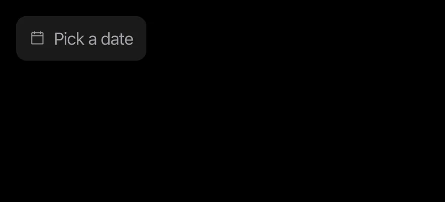
A date field that opens a drawer with day, month and year wheels ordered for the locale.
Date Picker is an open-source mobile pattern from suiss/uim: components composed into a flow for React Native and Expo, with SwiftUI and Jetpack Compose versions built from the same design tokens. The @esuiss/uim CLI copies its source into your project, so you own the code.

import { DatePicker } from "@/components/patterns/date-picker"

export function DatePickerExample() {
  return (
    <DatePicker accessibilityLabel="Date" />
  )
}import EsuissUI
import SwiftUI
struct DatePickerDemo: View {
var placeholder: LocalizedStringKey = "Pick a date"
var fromYear: Int?
var toYear: Int?
var title: LocalizedStringKey?
var showCloseButton = false
var closeLabel: LocalizedStringKey?
@State private var value: Date?
init(
value: Date? = nil,
placeholder: LocalizedStringKey = "Pick a date",
fromYear: Int? = nil,
toYear: Int? = nil,
title: LocalizedStringKey? = nil,
showCloseButton: Bool = false,
closeLabel: LocalizedStringKey? = nil
) {
_value = State(initialValue: value)
self.placeholder = placeholder
self.fromYear = fromYear
self.toYear = toYear
self.title = title
self.showCloseButton = showCloseButton
self.closeLabel = closeLabel
}
var body: some View {
DatePickerField(
selection: $value,
placeholder: placeholder,
fromYear: fromYear,
toYear: toYear,
title: title,
showCloseButton: showCloseButton,
closeLabel: closeLabel
)
.fixedSize()
.accessibilityLabel(Text("Date"))
}
}import androidx.compose.runtime.Composable
import androidx.compose.runtime.getValue
import androidx.compose.runtime.mutableStateOf
import androidx.compose.runtime.saveable.rememberSaveable
import androidx.compose.runtime.setValue
import androidx.compose.ui.Modifier
import androidx.compose.ui.semantics.contentDescription
import androidx.compose.ui.semantics.semantics
import com.esuiss.ui.patterns.DatePicker
import java.util.Calendar
import java.util.Date
import java.util.Locale
@Composable
fun DatePickerDemo(
initial: Long? = null,
locale: Locale = Locale.getDefault(),
placeholder: String = "Pick a date",
fromYear: Int = Calendar.getInstance().get(Calendar.YEAR) - 100,
toYear: Int = Calendar.getInstance().get(Calendar.YEAR) + 10,
title: String? = null,
enabled: Boolean = true,
invalid: Boolean? = null,
floating: Boolean = false,
showCloseButton: Boolean = false,
closeLabel: String? = null,
) {
var value by rememberSaveable { mutableStateOf(initial) }
DatePicker(
value = value?.let(::Date),
onValueChange = { value = it.time },
modifier = Modifier.semantics { contentDescription = "Date" },
placeholder = placeholder,
locale = locale,
fromYear = fromYear,
toYear = toYear,
title = title,
enabled = enabled,
invalid = invalid,
floating = floating,
showCloseButton = showCloseButton,
closeLabel = closeLabel,
)
}DatePicker renders a field-style DrawerTrigger with a calendar icon and the selected date formatted with Intl.DateTimeFormat in the medium date style. The trigger sizes itself to its content rather than filling the width; pass className to change that. Pressing it opens a Drawer with three WheelPicker columns.
The column order follows the locale's short date format, falling back to month, day, year. Month names come from the locale, and the day column shrinks or grows with the chosen month and year, clamping the day when needed.
Installation
$ pnpm dlx @esuiss/uim@latest add date-picker$ pnpm dlx @esuiss/uim@latest add date-picker --platform swift$ pnpm dlx @esuiss/uim@latest add date-picker --platform kotlinThe CLI also adds what it builds on: Drawer, Icon, Text, Wheel Picker.
Manual
- Install the dependencies:
npx expo install cn phosphor-react-native react-native-svg-
Add the pieces it builds on: Drawer, Icon, Text, Wheel Picker.
-
Copy the source into
components/patterns/date-picker.tsx:
import { cn } from "cn"
import { CalendarBlankIcon } from "phosphor-react-native"
import * as React from "react"
import {
  Drawer,
  DrawerContent,
  DrawerHeader,
  DrawerTitle,
  DrawerTrigger,
} from "@/components/ui/drawer"
import { Icon } from "@/components/ui/icon"
import { Text } from "@/components/ui/text"
import {
  WheelPicker,
  WheelPickerColumn,
WheelPickerItem,- Update the import paths to match your project.
- Install the dependencies:
npx expo install cn phosphor-react-native react-native-svg-
Add the pieces it builds on: Drawer, Icon, Text, Wheel Picker.
-
Copy the source into
components/patterns/date-picker.tsx:
import { cn } from "cn"
import { CalendarBlankIcon } from "phosphor-react-native"
import * as React from "react"
import {
  Drawer,
  DrawerContent,
  DrawerHeader,
  DrawerTitle,
  DrawerTrigger,
} from "@/components/ui/drawer"
import { Icon } from "@/components/ui/icon"
import { Text } from "@/components/ui/text"
import {
  WheelPicker,
  WheelPickerColumn,
WheelPickerItem,- Update the import paths to match your project.
- Install the dependencies:
npx expo install phosphor-react-native react-native-svg-
Add the pieces it builds on: Drawer, Icon, Text, Wheel Picker.
-
Copy the source into
components/patterns/date-picker.tsx:
import { CalendarBlankIcon } from "phosphor-react-native"
import * as React from "react"
import { type StyleProp, StyleSheet, type ViewStyle } from "react-native"
import {
  Drawer,
  DrawerContent,
  DrawerHeader,
  DrawerTitle,
  DrawerTrigger,
} from "@/components/ui/drawer"
import { Icon } from "@/components/ui/icon"
import { Text } from "@/components/ui/text"
import { fontSize, radius, useTheme } from "@/components/ui/theme"
import {
  WheelPicker,
WheelPickerColumn,- Update the import paths to match your project.
-
Target iOS 17 or later.
-
Add the Swift package to your app:
.package(url: "https://github.com/phosphor-icons/swift", from: "2.1.0")- Copy the theme files every view uses:
import SwiftUI
import UIKit

struct RGBA: Sendable {
  let red: CGFloat
  let green: CGFloat
  let blue: CGFloat
  let alpha: CGFloat

  init(_ hex: UInt32, _ alpha: CGFloat = 1) {
    red = CGFloat((hex >> 16) & 0xFF) / 255
    green = CGFloat((hex >> 8) & 0xFF) / 255
    blue = CGFloat(hex & 0xFF) / 255
    self.alpha = alpha
}import SwiftUI
extension Color {
public static let surface = Color.adaptive(light: .init(0xFFFFFF), dark: .init(0x000000))
public static let surfaceSecondary = Color.adaptive(light: .init(0xF5F5F7), dark: .init(0x161617))
public static let surfaceTertiary = Color.adaptive(light: .init(0xE8E8ED), dark: .init(0x2C2C2E))
public static let surfaceRaised = Color.adaptive(light: .init(0xFFFFFF), dark: .init(0x1D1D1F))
public static let label = Color.adaptive(light: .init(0x1D1D1F), dark: .init(0xF5F5F7))
public static let labelSecondary = Color.adaptive(light: .init(0x6E6E73), dark: .init(0xA1A1A6))
public static let labelTertiary = Color.adaptive(light: .init(0x86868B), dark: .init(0x86868B))
public static let labelQuaternary = Color.adaptive(light: .init(0xD2D2D7), dark: .init(0x424245))
public static let control = Color.adaptive(light: .init(0x000000, 0.04), dark: .init(0xFFFFFF, 0.1))
public static let controlPressed = Color.adaptive(light: .init(0x000000, 0.12), dark: .init(0xFFFFFF, 0.22))
public static let controlSelected = Color.adaptive(light: .init(0x1D1D1F), dark: .init(0xF5F5F7))
public static let controlDisabled = Color.adaptive(light: .init(0x000000, 0.03), dark: .init(0xFFFFFF, 0.05))
public static let onControlSelected = Color.adaptive(light: .init(0xFFFFFF), dark: .init(0x000000))- Copy the source and every file it uses:
import PhosphorSwift
import SwiftUI

enum DatePart: Hashable, Sendable {
  case day, month, year

  static func order(locale: Locale) -> [DatePart] {
    let format = DateFormatter.dateFormat(fromTemplate: "yMd", options: 0, locale: locale) ?? ""
    var parts: [DatePart] = []
    for character in format {
      let part: DatePart? = switch character {
      case "d": .day
      case "M", "L": .month
      case "y": .year
      default: nil
}import SwiftUI
public struct VariantButtonStyle: ButtonStyle {
public enum Variant: CaseIterable, Sendable {
case `default`, outline, secondary, tinted, ghost, plain, destructive, link
}
public enum Size: CaseIterable, Sendable {
case `default`, xs, sm, lg, xl, icon, iconXs, iconSm, iconLg, iconXl
var height: CGFloat {
switch self {
case .xs, .iconXs: 24
case .sm, .iconSm: 32
case .default, .icon: 36
case .lg, .iconLg: 44import SwiftUI
extension EnvironmentValues {
@Entry var buttonGroup: Axis? = nil
@Entry var buttonGroupSize: CGSize = .zero
}
enum ButtonGroupSpace: Hashable {
case group
}
struct ButtonGroupFrame {
let bounds: Anchor<CGRect>
let outlined: Bool
}import PhosphorSwift
import SwiftUI
public struct DateRange: Hashable, Sendable {
public var from: Date
public var to: Date?
public init(from: Date, to: Date? = nil) {
self.from = from
self.to = to
}
public static func adding(_ day: Date, to range: DateRange?, calendar: Foundation.Calendar) -> DateRange? {
guard let range else { return DateRange(from: day) }
let from = range.from
guard let to = range.to else {import PhosphorSwift
import SwiftUI
extension Shadow {
static let control = Shadow(color: .black.opacity(0.08), radius: 0.5, y: 0.5)
static let thumb = Shadow(color: .black.opacity(0.12), radius: 1.5, y: 1)
}
struct SelectionIndicator<Mark: View>: View {
let checked: Bool
let pressed: Bool
let cornerRadius: CGFloat
let mark: Mark
@Environment(\.isEnabled) private var isEnabled
@Environment(\.isInvalid) private var invalidimport SwiftUI
extension View {
public func dialog<Content: View>(
isPresented: Binding<Bool>,
@ViewBuilder content: @escaping () -> Content
) -> some View {
modifier(
CoverPresenter(isPresented: isPresented) { visible in
CenteredStage(visible: visible, dismissible: true, content: content)
}
)
}
}
struct CenteredStage<Content: View>: View {import SwiftUI
extension View {
public func drawer<Content: View>(
isPresented: Binding<Bool>,
detents: Set<PresentationDetent>? = nil,
selection: Binding<PresentationDetent>? = nil,
onDismiss: (() -> Void)? = nil,
@ViewBuilder content: @escaping () -> Content
) -> some View {
let binding = isPresented
return sheet(isPresented: isPresented, onDismiss: onDismiss) {
DrawerHost(detents: detents, selection: selection, content: content)
.environment(\.overlayDismiss, OverlayDismiss { binding.wrappedValue = false })
}
}import PhosphorSwift
import SwiftUI
enum MenuPresentation: Sendable {
case system, popup
}
extension EnvironmentValues {
@Entry var menuPresentation: MenuPresentation = .system
@Entry var menuRadio = MenuRadioContext()
}
struct MenuRadioContext: @unchecked Sendable {
var selected: AnyHashable?
var select: @MainActor @Sendable (AnyHashable) -> Void = { _ in }
}import SwiftUI
extension EnvironmentValues {
@Entry public var isInvalid = false
@Entry var fieldInset = false
@Entry var fieldGroupInset = false
@Entry var fieldSetInset = false
}
extension View {
public func invalid(_ isInvalid: Bool = true) -> some View {
environment(\.isInvalid, isInvalid)
}
}
public enum FieldOrientation: CaseIterable, Sendable {import SwiftUI
extension EnvironmentValues {
@Entry public var hapticsEnabled = true
}
extension View {
public func haptics(_ enabled: Bool) -> some View {
environment(\.hapticsEnabled, enabled)
}
func hapticFeedback<Trigger: Equatable>(_ feedback: SensoryFeedback, trigger: Trigger) -> some View {
modifier(HapticFeedbackModifier(feedback: feedback, trigger: trigger) { _, _ in true })
}
func hapticFeedback<Trigger: Equatable>(import PhosphorSwift
import Observation
import SwiftUI
public enum PopupAlignment: Sendable, CaseIterable {
case start, center, end
}
struct OverlayDismiss: Sendable {
let action: @MainActor @Sendable () -> Void
@MainActor func callAsFunction() {
action()
}
}import PhosphorSwift
import SwiftUI
struct SelectContext: @unchecked Sendable {
var selected: AnyHashable?
var registering = false
var select: @MainActor @Sendable (AnyHashable) -> Void = { _ in }
}
extension EnvironmentValues {
@Entry var select = SelectContext()
}
struct SelectLabelsKey: PreferenceKey {
static var defaultValue: [AnyHashable: Text] { [:] }import SwiftUI
public struct Separator: View {
let orientation: Axis
public init(_ orientation: Axis = .horizontal) {
self.orientation = orientation
}
public var body: some View {
Rectangle()
.fill(Color.separator)
.frame(width: orientation == .vertical ? 1 : nil, height: orientation == .horizontal ? 1 : nil)
.frame(maxWidth: orientation == .horizontal ? .infinity : nil, maxHeight: orientation == .vertical ? .infinity : nil)
.accessibilityHidden(true)
}import SwiftUI
public enum TextVariant: CaseIterable, Sendable {
case `default`, h1, h2, h3, h4, p, blockquote, code, lead, large, small, muted
var style: TextStyle {
switch self {
case .h1: .xl3
case .h2: .xl2
case .h3: .xl
case .h4, .lead, .large: .lg
case .code, .small, .muted: .sm
default: .base
}
}import SwiftUI
struct WheelPickerEntry: Equatable {
let value: AnyHashable
let disabled: Bool
let text: Text?
}
struct WheelPickerEntriesKey: PreferenceKey {
static var defaultValue: [WheelPickerEntry] { [] }
static func reduce(value: inout [WheelPickerEntry], nextValue: () -> [WheelPickerEntry]) {
value.append(contentsOf: nextValue())
}
}import SwiftUI
extension EnvironmentValues {
@Entry var patternCompact: Bool? = nil
}
@propertyWrapper
struct CompactLayout: DynamicProperty {
@Environment(\.patternCompact) private var forced
@Environment(\.horizontalSizeClass) private var sizeClass
init() {}
var wrappedValue: Bool {
forced ?? (sizeClass != .regular)
}- Add the files to your app target.
- Set
minSdkto 24 or higher and add the dependencies:
implementation(platform("androidx.compose:compose-bom:2026.09.00"))
implementation("androidx.compose.foundation:foundation")
implementation("androidx.compose.ui:ui")
implementation("com.adamglin:phosphor-icon-android:1.0.0")- Copy the theme files every view uses:
package com.esuiss.ui.theme

import androidx.compose.foundation.isSystemInDarkTheme
import androidx.compose.runtime.Composable
import androidx.compose.runtime.CompositionLocalProvider
import androidx.compose.runtime.Immutable
import androidx.compose.runtime.staticCompositionLocalOf
import androidx.compose.ui.Modifier
import androidx.compose.ui.draw.dropShadow
import androidx.compose.ui.graphics.Color
import androidx.compose.ui.graphics.Shape
import androidx.compose.ui.graphics.shadow.Shadow as DropShadow
import androidx.compose.ui.text.TextStyle
import androidx.compose.ui.text.style.LineHeightStyle
import androidx.compose.ui.unit.Dp
import androidx.compose.ui.unit.DpOffsetpackage com.esuiss.ui.theme
import androidx.compose.runtime.Immutable
import androidx.compose.ui.graphics.Color
import androidx.compose.ui.unit.dp
@Immutable
data class Colors(
val surface: Color,
val surfaceSecondary: Color,
val surfaceTertiary: Color,
val surfaceRaised: Color,
val label: Color,
val labelSecondary: Color,
val labelTertiary: Color,
val labelQuaternary: Color,- Copy the source and every file it uses:
package com.esuiss.ui.patterns

import androidx.compose.foundation.border
import androidx.compose.foundation.background
import androidx.compose.foundation.clickable
import androidx.compose.foundation.interaction.MutableInteractionSource
import androidx.compose.foundation.layout.Arrangement
import androidx.compose.foundation.layout.Box
import androidx.compose.foundation.layout.Row
import androidx.compose.foundation.layout.fillMaxWidth
import androidx.compose.foundation.layout.height
import androidx.compose.foundation.layout.padding
import androidx.compose.foundation.layout.width
import androidx.compose.foundation.layout.widthIn
import androidx.compose.foundation.shape.RoundedCornerShape
import androidx.compose.foundation.text.BasicTextpackage com.esuiss.ui.components
import androidx.compose.foundation.background
import androidx.compose.foundation.border
import androidx.compose.foundation.clickable
import androidx.compose.foundation.interaction.MutableInteractionSource
import androidx.compose.foundation.interaction.collectIsPressedAsState
import androidx.compose.foundation.layout.Arrangement
import androidx.compose.foundation.layout.Row
import androidx.compose.foundation.layout.RowScope
import androidx.compose.foundation.layout.fillMaxWidth
import androidx.compose.foundation.layout.height
import androidx.compose.foundation.layout.padding
import androidx.compose.foundation.layout.size
import androidx.compose.foundation.shape.CircleShape
import androidx.compose.foundation.shape.RoundedCornerShapepackage com.esuiss.ui.components
import androidx.compose.foundation.background
import androidx.compose.foundation.gestures.Orientation
import androidx.compose.foundation.layout.Arrangement
import androidx.compose.foundation.layout.Box
import androidx.compose.foundation.layout.Row
import androidx.compose.foundation.layout.RowScope
import androidx.compose.foundation.layout.padding
import androidx.compose.foundation.shape.CircleShape
import androidx.compose.foundation.shape.CornerSize
import androidx.compose.foundation.shape.RoundedCornerShape
import androidx.compose.runtime.Composable
import androidx.compose.runtime.CompositionLocalProvider
import androidx.compose.runtime.DisposableEffect
import androidx.compose.runtime.Immutablepackage com.esuiss.ui.components
import androidx.compose.runtime.compositionLocalOf
import androidx.compose.ui.graphics.Color
import androidx.compose.ui.text.TextStyle
import androidx.compose.ui.unit.Dp
import androidx.compose.ui.unit.dp
val LocalContentStyle = compositionLocalOf { TextStyle.Default }
val LocalContentColor = compositionLocalOf { Color.Unspecified }
val LocalIconSize = compositionLocalOf { 20.dp }package com.esuiss.ui.components
import androidx.compose.animation.core.CubicBezierEasing
import androidx.compose.animation.core.tween
import androidx.compose.foundation.background
import androidx.compose.foundation.gestures.AnchoredDraggableDefaults
import androidx.compose.foundation.gestures.AnchoredDraggableState
import androidx.compose.foundation.gestures.DraggableAnchors
import androidx.compose.foundation.gestures.Orientation
import androidx.compose.foundation.gestures.anchoredDraggable
import androidx.compose.foundation.gestures.animateTo
import androidx.compose.foundation.gestures.detectTapGestures
import androidx.compose.foundation.layout.Arrangement
import androidx.compose.foundation.layout.Box
import androidx.compose.foundation.layout.BoxWithConstraints
import androidx.compose.foundation.layout.Columnpackage com.esuiss.ui.components
import androidx.compose.foundation.background
import androidx.compose.foundation.gestures.Orientation
import androidx.compose.foundation.layout.Arrangement
import androidx.compose.foundation.layout.Box
import androidx.compose.foundation.layout.Column
import androidx.compose.foundation.layout.ColumnScope
import androidx.compose.foundation.layout.LayoutScopeMarker
import androidx.compose.foundation.layout.Row
import androidx.compose.foundation.layout.RowScope
import androidx.compose.foundation.layout.fillMaxWidth
import androidx.compose.foundation.layout.heightIn
import androidx.compose.foundation.layout.padding
import androidx.compose.foundation.shape.RoundedCornerShape
import androidx.compose.foundation.text.BasicTextpackage com.esuiss.ui.components
import android.provider.Settings
import androidx.compose.animation.core.CubicBezierEasing
import androidx.compose.foundation.background
import androidx.compose.foundation.border
import androidx.compose.foundation.gestures.Orientation
import androidx.compose.foundation.text.selection.TextSelectionColors
import androidx.compose.runtime.Composable
import androidx.compose.runtime.mutableStateOf
import androidx.compose.runtime.remember
import androidx.compose.ui.Modifier
import androidx.compose.ui.draw.clip
import androidx.compose.ui.draw.drawWithContent
import androidx.compose.ui.geometry.Offset
import androidx.compose.ui.geometry.Sizepackage com.esuiss.ui.components
import androidx.compose.runtime.Composable
import androidx.compose.runtime.CompositionLocalProvider
import androidx.compose.runtime.remember
import androidx.compose.runtime.staticCompositionLocalOf
import androidx.compose.ui.hapticfeedback.HapticFeedback
import androidx.compose.ui.hapticfeedback.HapticFeedbackType
import androidx.compose.ui.platform.LocalHapticFeedback
val LocalHapticsEnabled = staticCompositionLocalOf { true }
@Composable
fun ProvideHaptics(enabled: Boolean, content: @Composable () -> Unit) {
CompositionLocalProvider(LocalHapticsEnabled provides enabled, content = content)
}package com.esuiss.ui.components
import androidx.compose.foundation.Image
import androidx.compose.foundation.layout.size
import androidx.compose.runtime.Composable
import androidx.compose.ui.Modifier
import androidx.compose.ui.graphics.Color
import androidx.compose.ui.graphics.ColorFilter
import androidx.compose.ui.graphics.takeOrElse
import androidx.compose.ui.graphics.vector.ImageVector
import androidx.compose.ui.unit.Dp
import com.esuiss.ui.theme.EsuissTheme
@Composable
fun Icon(
imageVector: ImageVector,package com.esuiss.ui.components
import androidx.compose.foundation.layout.Arrangement
import androidx.compose.foundation.layout.Row
import androidx.compose.foundation.layout.RowScope
import androidx.compose.foundation.text.BasicText
import androidx.compose.runtime.Composable
import androidx.compose.runtime.CompositionLocalProvider
import androidx.compose.ui.Alignment
import androidx.compose.ui.Modifier
import androidx.compose.ui.text.font.FontWeight
import androidx.compose.ui.unit.dp
import com.esuiss.ui.theme.EsuissTheme
import com.esuiss.ui.theme.Typography
@Composablepackage com.esuiss.ui.components
import android.os.Build
import android.view.Window
import android.view.WindowManager
import androidx.compose.animation.AnimatedVisibility
import androidx.compose.animation.AnimatedVisibilityScope
import androidx.compose.animation.EnterExitState
import androidx.compose.animation.core.MutableTransitionState
import androidx.compose.animation.core.animateFloat
import androidx.compose.animation.core.tween
import androidx.compose.animation.fadeIn
import androidx.compose.animation.fadeOut
import androidx.compose.animation.scaleIn
import androidx.compose.animation.scaleOut
import androidx.compose.animation.slideInpackage com.esuiss.ui.components
import androidx.compose.foundation.background
import androidx.compose.foundation.border
import androidx.compose.foundation.clickable
import androidx.compose.foundation.interaction.MutableInteractionSource
import androidx.compose.foundation.interaction.collectIsPressedAsState
import androidx.compose.foundation.layout.Arrangement
import androidx.compose.foundation.layout.Box
import androidx.compose.foundation.layout.Column
import androidx.compose.foundation.layout.ColumnScope
import androidx.compose.foundation.layout.IntrinsicSize
import androidx.compose.foundation.layout.Row
import androidx.compose.foundation.layout.fillMaxWidth
import androidx.compose.foundation.layout.height
import androidx.compose.foundation.layout.heightInpackage com.esuiss.ui.components
import androidx.compose.foundation.background
import androidx.compose.foundation.gestures.Orientation
import androidx.compose.foundation.layout.Box
import androidx.compose.foundation.layout.fillMaxHeight
import androidx.compose.foundation.layout.fillMaxWidth
import androidx.compose.foundation.layout.height
import androidx.compose.foundation.layout.width
import androidx.compose.runtime.Composable
import androidx.compose.ui.Modifier
import androidx.compose.ui.unit.dp
import com.esuiss.ui.theme.EsuissTheme
@Composable
fun Separator(package com.esuiss.ui.components
import androidx.compose.foundation.background
import androidx.compose.foundation.clickable
import androidx.compose.foundation.gestures.snapping.SnapPosition
import androidx.compose.foundation.gestures.snapping.rememberSnapFlingBehavior
import androidx.compose.foundation.layout.Arrangement
import androidx.compose.foundation.layout.Box
import androidx.compose.foundation.layout.PaddingValues
import androidx.compose.foundation.layout.Row
import androidx.compose.foundation.layout.RowScope
import androidx.compose.foundation.layout.fillMaxWidth
import androidx.compose.foundation.layout.height
import androidx.compose.foundation.layout.padding
import androidx.compose.foundation.layout.wrapContentWidth
import androidx.compose.foundation.lazy.LazyColumn- Update the
com.esuiss.uipackage names to match your project.
Usage
import { DatePicker } from "@/components/patterns/date-picker"<DatePicker accessibilityLabel="Date" />Use it uncontrolled with defaultValue, or controlled with value and onValueChange. The value is a Date or null; onValueChange fires on every wheel change, so there is no separate confirm step.
When no value is set the wheels start at today and the field shows placeholder. Limit the year column with fromYear and toYear.
Examples
With value
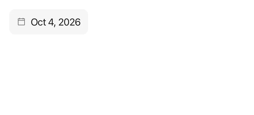
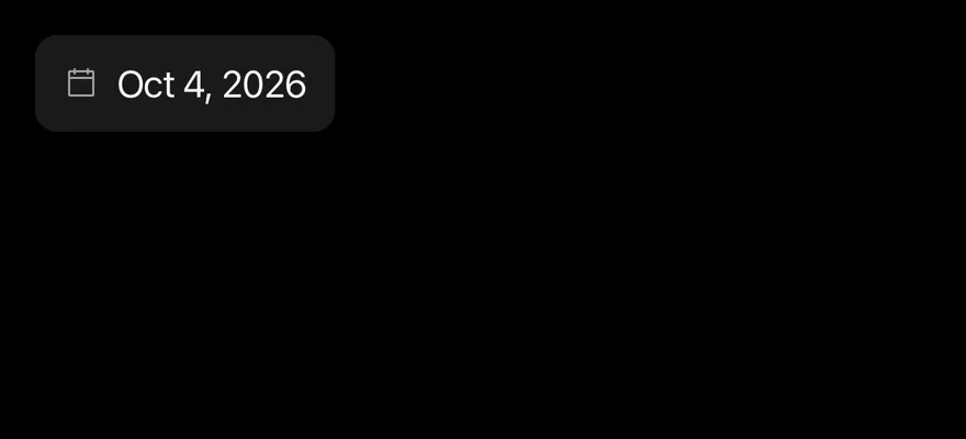
Starts with a preset date via defaultValue.
import { DatePicker } from "@/components/patterns/date-picker"

export function DatePickerWithValueExample() {
  return (
    <DatePicker accessibilityLabel="Date" defaultValue={new Date(2026, 9, 4)} />
  )
}import EsuissUI
import SwiftUI
struct DatePickerWithValueExample: View {
var body: some View {
DatePickerDemo(value: datePickerDay(2026, 10, 4))
}
}
func datePickerDay(_ year: Int, _ month: Int, _ day: Int) -> Date? {
Foundation.Calendar.current.date(from: DateComponents(year: year, month: month, day: day))
}
struct DatePickerDemo: View {
var placeholder: LocalizedStringKey = "Pick a date"
var fromYear: Int?
var toYear: Int?
var title: LocalizedStringKey?
var showCloseButton = false
var closeLabel: LocalizedStringKey?
@State private var value: Date?
init(
value: Date? = nil,
placeholder: LocalizedStringKey = "Pick a date",
fromYear: Int? = nil,
toYear: Int? = nil,
title: LocalizedStringKey? = nil,
showCloseButton: Bool = false,
closeLabel: LocalizedStringKey? = nil
) {
_value = State(initialValue: value)
self.placeholder = placeholder
self.fromYear = fromYear
self.toYear = toYear
self.title = title
self.showCloseButton = showCloseButton
self.closeLabel = closeLabel
}
var body: some View {
DatePickerField(
selection: $value,
placeholder: placeholder,
fromYear: fromYear,
toYear: toYear,
title: title,
showCloseButton: showCloseButton,
closeLabel: closeLabel
)
.fixedSize()
.accessibilityLabel(Text("Date"))
}
}import androidx.compose.runtime.Composable
import androidx.compose.runtime.getValue
import androidx.compose.runtime.mutableStateOf
import androidx.compose.runtime.saveable.rememberSaveable
import androidx.compose.runtime.setValue
import androidx.compose.ui.Modifier
import androidx.compose.ui.semantics.contentDescription
import androidx.compose.ui.semantics.semantics
import com.esuiss.ui.patterns.DatePicker
import java.util.Calendar
import java.util.Date
import java.util.Locale
@Composable
fun DatePickerWithValueExample() {
DatePickerDemo(initial = datePickerDate(2026, 9, 4))
}
fun datePickerDate(year: Int, month: Int, day: Int): Long =
Calendar.getInstance().apply {
clear()
set(year, month, day)
}.timeInMillis
@Composable
fun DatePickerDemo(
initial: Long? = null,
locale: Locale = Locale.getDefault(),
placeholder: String = "Pick a date",
fromYear: Int = Calendar.getInstance().get(Calendar.YEAR) - 100,
toYear: Int = Calendar.getInstance().get(Calendar.YEAR) + 10,
title: String? = null,
enabled: Boolean = true,
invalid: Boolean? = null,
floating: Boolean = false,
showCloseButton: Boolean = false,
closeLabel: String? = null,
) {
var value by rememberSaveable { mutableStateOf(initial) }
DatePicker(
value = value?.let(::Date),
onValueChange = { value = it.time },
modifier = Modifier.semantics { contentDescription = "Date" },
placeholder = placeholder,
locale = locale,
fromYear = fromYear,
toYear = toYear,
title = title,
enabled = enabled,
invalid = invalid,
floating = floating,
showCloseButton = showCloseButton,
closeLabel = closeLabel,
)
}Locale
Uses tr-TR, which reorders the wheels and translates month names.


import { DatePicker } from "@/components/patterns/date-picker"

export function DatePickerLocaleExample() {
  return (
    <DatePicker accessibilityLabel="Date" locale="tr-TR" placeholder="Tarih seç" defaultValue={new Date(2026, 9, 4)} />
  )
}import EsuissUI
import SwiftUI
struct DatePickerLocaleExample: View {
var body: some View {
DatePickerDemo(value: datePickerDay(2026, 10, 4), placeholder: "Tarih seç")
.environment(\.locale, Locale(identifier: "tr_TR"))
}
}
func datePickerDay(_ year: Int, _ month: Int, _ day: Int) -> Date? {
Foundation.Calendar.current.date(from: DateComponents(year: year, month: month, day: day))
}
struct DatePickerDemo: View {
var placeholder: LocalizedStringKey = "Pick a date"
var fromYear: Int?
var toYear: Int?
var title: LocalizedStringKey?
var showCloseButton = false
var closeLabel: LocalizedStringKey?
@State private var value: Date?
init(
value: Date? = nil,
placeholder: LocalizedStringKey = "Pick a date",
fromYear: Int? = nil,
toYear: Int? = nil,
title: LocalizedStringKey? = nil,
showCloseButton: Bool = false,
closeLabel: LocalizedStringKey? = nil
) {
_value = State(initialValue: value)
self.placeholder = placeholder
self.fromYear = fromYear
self.toYear = toYear
self.title = title
self.showCloseButton = showCloseButton
self.closeLabel = closeLabel
}
var body: some View {
DatePickerField(
selection: $value,
placeholder: placeholder,
fromYear: fromYear,
toYear: toYear,
title: title,
showCloseButton: showCloseButton,
closeLabel: closeLabel
)
.fixedSize()
.accessibilityLabel(Text("Date"))
}
}import androidx.compose.runtime.Composable
import androidx.compose.runtime.getValue
import androidx.compose.runtime.mutableStateOf
import androidx.compose.runtime.saveable.rememberSaveable
import androidx.compose.runtime.setValue
import androidx.compose.ui.Modifier
import androidx.compose.ui.semantics.contentDescription
import androidx.compose.ui.semantics.semantics
import com.esuiss.ui.patterns.DatePicker
import java.util.Calendar
import java.util.Date
import java.util.Locale
@Composable
fun DatePickerLocaleExample() {
DatePickerDemo(
initial = datePickerDate(2026, 9, 4),
locale = Locale.forLanguageTag("tr-TR"),
placeholder = "Tarih seç",
)
}
fun datePickerDate(year: Int, month: Int, day: Int): Long =
Calendar.getInstance().apply {
clear()
set(year, month, day)
}.timeInMillis
@Composable
fun DatePickerDemo(
initial: Long? = null,
locale: Locale = Locale.getDefault(),
placeholder: String = "Pick a date",
fromYear: Int = Calendar.getInstance().get(Calendar.YEAR) - 100,
toYear: Int = Calendar.getInstance().get(Calendar.YEAR) + 10,
title: String? = null,
enabled: Boolean = true,
invalid: Boolean? = null,
floating: Boolean = false,
showCloseButton: Boolean = false,
closeLabel: String? = null,
) {
var value by rememberSaveable { mutableStateOf(initial) }
DatePicker(
value = value?.let(::Date),
onValueChange = { value = it.time },
modifier = Modifier.semantics { contentDescription = "Date" },
placeholder = placeholder,
locale = locale,
fromYear = fromYear,
toYear = toYear,
title = title,
enabled = enabled,
invalid = invalid,
floating = floating,
showCloseButton = showCloseButton,
closeLabel = closeLabel,
)
}Year range
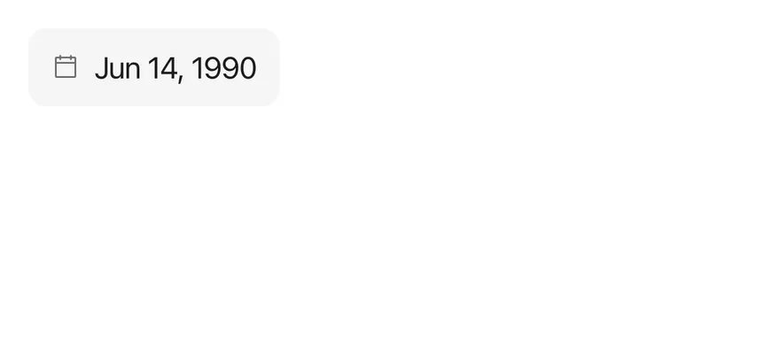
A date-of-birth field limited to 1940 through 2010.
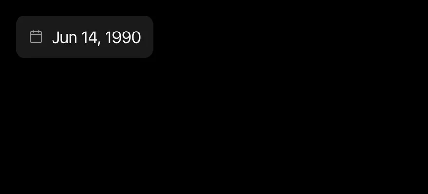
import { DatePicker } from "@/components/patterns/date-picker"

export function DatePickerYearRangeExample() {
  return (
    <DatePicker accessibilityLabel="Date" placeholder="Date of birth" fromYear={1940} toYear={2010} defaultValue={new Date(1990, 5, 15)} />
  )
}import EsuissUI
import SwiftUI
struct DatePickerYearRangeExample: View {
var body: some View {
DatePickerDemo(value: datePickerDay(1990, 6, 15), placeholder: "Date of birth", fromYear: 1940, toYear: 2010)
}
}
func datePickerDay(_ year: Int, _ month: Int, _ day: Int) -> Date? {
Foundation.Calendar.current.date(from: DateComponents(year: year, month: month, day: day))
}
struct DatePickerDemo: View {
var placeholder: LocalizedStringKey = "Pick a date"
var fromYear: Int?
var toYear: Int?
var title: LocalizedStringKey?
var showCloseButton = false
var closeLabel: LocalizedStringKey?
@State private var value: Date?
init(
value: Date? = nil,
placeholder: LocalizedStringKey = "Pick a date",
fromYear: Int? = nil,
toYear: Int? = nil,
title: LocalizedStringKey? = nil,
showCloseButton: Bool = false,
closeLabel: LocalizedStringKey? = nil
) {
_value = State(initialValue: value)
self.placeholder = placeholder
self.fromYear = fromYear
self.toYear = toYear
self.title = title
self.showCloseButton = showCloseButton
self.closeLabel = closeLabel
}
var body: some View {
DatePickerField(
selection: $value,
placeholder: placeholder,
fromYear: fromYear,
toYear: toYear,
title: title,
showCloseButton: showCloseButton,
closeLabel: closeLabel
)
.fixedSize()
.accessibilityLabel(Text("Date"))
}
}import androidx.compose.runtime.Composable
import androidx.compose.runtime.getValue
import androidx.compose.runtime.mutableStateOf
import androidx.compose.runtime.saveable.rememberSaveable
import androidx.compose.runtime.setValue
import androidx.compose.ui.Modifier
import androidx.compose.ui.semantics.contentDescription
import androidx.compose.ui.semantics.semantics
import com.esuiss.ui.patterns.DatePicker
import java.util.Calendar
import java.util.Date
import java.util.Locale
@Composable
fun DatePickerYearRangeExample() {
DatePickerDemo(
initial = datePickerDate(1990, 5, 15),
placeholder = "Date of birth",
fromYear = 1940,
toYear = 2010,
)
}
fun datePickerDate(year: Int, month: Int, day: Int): Long =
Calendar.getInstance().apply {
clear()
set(year, month, day)
}.timeInMillis
@Composable
fun DatePickerDemo(
initial: Long? = null,
locale: Locale = Locale.getDefault(),
placeholder: String = "Pick a date",
fromYear: Int = Calendar.getInstance().get(Calendar.YEAR) - 100,
toYear: Int = Calendar.getInstance().get(Calendar.YEAR) + 10,
title: String? = null,
enabled: Boolean = true,
invalid: Boolean? = null,
floating: Boolean = false,
showCloseButton: Boolean = false,
closeLabel: String? = null,
) {
var value by rememberSaveable { mutableStateOf(initial) }
DatePicker(
value = value?.let(::Date),
onValueChange = { value = it.time },
modifier = Modifier.semantics { contentDescription = "Date" },
placeholder = placeholder,
locale = locale,
fromYear = fromYear,
toYear = toYear,
title = title,
enabled = enabled,
invalid = invalid,
floating = floating,
showCloseButton = showCloseButton,
closeLabel = closeLabel,
)
}With title
Adds a heading to the drawer with title.

import { DatePicker } from "@/components/patterns/date-picker"

export function DatePickerWithTitleExample() {
  return (
    <DatePicker accessibilityLabel="Date" title="Delivery date" />
  )
}import EsuissUI
import SwiftUI
struct DatePickerWithTitleExample: View {
var body: some View {
DatePickerDemo(title: "Delivery date")
}
}
struct DatePickerDemo: View {
var placeholder: LocalizedStringKey = "Pick a date"
var fromYear: Int?
var toYear: Int?
var title: LocalizedStringKey?
var showCloseButton = false
var closeLabel: LocalizedStringKey?
@State private var value: Date?
init(
value: Date? = nil,
placeholder: LocalizedStringKey = "Pick a date",
fromYear: Int? = nil,
toYear: Int? = nil,
title: LocalizedStringKey? = nil,
showCloseButton: Bool = false,
closeLabel: LocalizedStringKey? = nil
) {
_value = State(initialValue: value)
self.placeholder = placeholder
self.fromYear = fromYear
self.toYear = toYear
self.title = title
self.showCloseButton = showCloseButton
self.closeLabel = closeLabel
}
var body: some View {
DatePickerField(
selection: $value,
placeholder: placeholder,
fromYear: fromYear,
toYear: toYear,
title: title,
showCloseButton: showCloseButton,
closeLabel: closeLabel
)
.fixedSize()
.accessibilityLabel(Text("Date"))
}
}import androidx.compose.runtime.Composable
import androidx.compose.runtime.getValue
import androidx.compose.runtime.mutableStateOf
import androidx.compose.runtime.saveable.rememberSaveable
import androidx.compose.runtime.setValue
import androidx.compose.ui.Modifier
import androidx.compose.ui.semantics.contentDescription
import androidx.compose.ui.semantics.semantics
import com.esuiss.ui.patterns.DatePicker
import java.util.Calendar
import java.util.Date
import java.util.Locale
@Composable
fun DatePickerWithTitleExample() {
DatePickerDemo(title = "Delivery date")
}
@Composable
fun DatePickerDemo(
initial: Long? = null,
locale: Locale = Locale.getDefault(),
placeholder: String = "Pick a date",
fromYear: Int = Calendar.getInstance().get(Calendar.YEAR) - 100,
toYear: Int = Calendar.getInstance().get(Calendar.YEAR) + 10,
title: String? = null,
enabled: Boolean = true,
invalid: Boolean? = null,
floating: Boolean = false,
showCloseButton: Boolean = false,
closeLabel: String? = null,
) {
var value by rememberSaveable { mutableStateOf(initial) }
DatePicker(
value = value?.let(::Date),
onValueChange = { value = it.time },
modifier = Modifier.semantics { contentDescription = "Date" },
placeholder = placeholder,
locale = locale,
fromYear = fromYear,
toYear = toYear,
title = title,
enabled = enabled,
invalid = invalid,
floating = floating,
showCloseButton = showCloseButton,
closeLabel = closeLabel,
)
}With close button
Shows a close button in the drawer.

import { DatePicker } from "@/components/patterns/date-picker"

export function DatePickerWithCloseButtonExample() {
  return (
    <DatePicker accessibilityLabel="Date" showCloseButton />
  )
}import EsuissUI
import SwiftUI
struct DatePickerWithCloseButtonExample: View {
var body: some View {
DatePickerDemo(showCloseButton: true)
}
}
struct DatePickerDemo: View {
var placeholder: LocalizedStringKey = "Pick a date"
var fromYear: Int?
var toYear: Int?
var title: LocalizedStringKey?
var showCloseButton = false
var closeLabel: LocalizedStringKey?
@State private var value: Date?
init(
value: Date? = nil,
placeholder: LocalizedStringKey = "Pick a date",
fromYear: Int? = nil,
toYear: Int? = nil,
title: LocalizedStringKey? = nil,
showCloseButton: Bool = false,
closeLabel: LocalizedStringKey? = nil
) {
_value = State(initialValue: value)
self.placeholder = placeholder
self.fromYear = fromYear
self.toYear = toYear
self.title = title
self.showCloseButton = showCloseButton
self.closeLabel = closeLabel
}
var body: some View {
DatePickerField(
selection: $value,
placeholder: placeholder,
fromYear: fromYear,
toYear: toYear,
title: title,
showCloseButton: showCloseButton,
closeLabel: closeLabel
)
.fixedSize()
.accessibilityLabel(Text("Date"))
}
}import androidx.compose.runtime.Composable
import androidx.compose.runtime.getValue
import androidx.compose.runtime.mutableStateOf
import androidx.compose.runtime.saveable.rememberSaveable
import androidx.compose.runtime.setValue
import androidx.compose.ui.Modifier
import androidx.compose.ui.semantics.contentDescription
import androidx.compose.ui.semantics.semantics
import com.esuiss.ui.patterns.DatePicker
import java.util.Calendar
import java.util.Date
import java.util.Locale
@Composable
fun DatePickerWithCloseButtonExample() {
DatePickerDemo(showCloseButton = true)
}
@Composable
fun DatePickerDemo(
initial: Long? = null,
locale: Locale = Locale.getDefault(),
placeholder: String = "Pick a date",
fromYear: Int = Calendar.getInstance().get(Calendar.YEAR) - 100,
toYear: Int = Calendar.getInstance().get(Calendar.YEAR) + 10,
title: String? = null,
enabled: Boolean = true,
invalid: Boolean? = null,
floating: Boolean = false,
showCloseButton: Boolean = false,
closeLabel: String? = null,
) {
var value by rememberSaveable { mutableStateOf(initial) }
DatePicker(
value = value?.let(::Date),
onValueChange = { value = it.time },
modifier = Modifier.semantics { contentDescription = "Date" },
placeholder = placeholder,
locale = locale,
fromYear = fromYear,
toYear = toYear,
title = title,
enabled = enabled,
invalid = invalid,
floating = floating,
showCloseButton = showCloseButton,
closeLabel = closeLabel,
)
}With close label
Labels the close button Done with closeLabel.

import { DatePicker } from "@/components/patterns/date-picker"

export function DatePickerWithCloseLabelExample() {
  return (
    <DatePicker accessibilityLabel="Date" showCloseButton closeLabel="Done" />
  )
}import EsuissUI
import SwiftUI
struct DatePickerWithCloseLabelExample: View {
var body: some View {
DatePickerDemo(showCloseButton: true, closeLabel: "Done")
}
}
struct DatePickerDemo: View {
var placeholder: LocalizedStringKey = "Pick a date"
var fromYear: Int?
var toYear: Int?
var title: LocalizedStringKey?
var showCloseButton = false
var closeLabel: LocalizedStringKey?
@State private var value: Date?
init(
value: Date? = nil,
placeholder: LocalizedStringKey = "Pick a date",
fromYear: Int? = nil,
toYear: Int? = nil,
title: LocalizedStringKey? = nil,
showCloseButton: Bool = false,
closeLabel: LocalizedStringKey? = nil
) {
_value = State(initialValue: value)
self.placeholder = placeholder
self.fromYear = fromYear
self.toYear = toYear
self.title = title
self.showCloseButton = showCloseButton
self.closeLabel = closeLabel
}
var body: some View {
DatePickerField(
selection: $value,
placeholder: placeholder,
fromYear: fromYear,
toYear: toYear,
title: title,
showCloseButton: showCloseButton,
closeLabel: closeLabel
)
.fixedSize()
.accessibilityLabel(Text("Date"))
}
}import androidx.compose.runtime.Composable
import androidx.compose.runtime.getValue
import androidx.compose.runtime.mutableStateOf
import androidx.compose.runtime.saveable.rememberSaveable
import androidx.compose.runtime.setValue
import androidx.compose.ui.Modifier
import androidx.compose.ui.semantics.contentDescription
import androidx.compose.ui.semantics.semantics
import com.esuiss.ui.patterns.DatePicker
import java.util.Calendar
import java.util.Date
import java.util.Locale
@Composable
fun DatePickerWithCloseLabelExample() {
DatePickerDemo(showCloseButton = true, closeLabel = "Done")
}
@Composable
fun DatePickerDemo(
initial: Long? = null,
locale: Locale = Locale.getDefault(),
placeholder: String = "Pick a date",
fromYear: Int = Calendar.getInstance().get(Calendar.YEAR) - 100,
toYear: Int = Calendar.getInstance().get(Calendar.YEAR) + 10,
title: String? = null,
enabled: Boolean = true,
invalid: Boolean? = null,
floating: Boolean = false,
showCloseButton: Boolean = false,
closeLabel: String? = null,
) {
var value by rememberSaveable { mutableStateOf(initial) }
DatePicker(
value = value?.let(::Date),
onValueChange = { value = it.time },
modifier = Modifier.semantics { contentDescription = "Date" },
placeholder = placeholder,
locale = locale,
fromYear = fromYear,
toYear = toYear,
title = title,
enabled = enabled,
invalid = invalid,
floating = floating,
showCloseButton = showCloseButton,
closeLabel = closeLabel,
)
}Disabled
A disabled field that cannot open the drawer.


import { DatePicker } from "@/components/patterns/date-picker"

export function DatePickerDisabledExample() {
  return (
    <DatePicker accessibilityLabel="Date" disabled />
  )
}import EsuissUI
import SwiftUI
struct DatePickerDisabledExample: View {
var body: some View {
DatePickerDemo()
.disabled(true)
}
}
struct DatePickerDemo: View {
var placeholder: LocalizedStringKey = "Pick a date"
var fromYear: Int?
var toYear: Int?
var title: LocalizedStringKey?
var showCloseButton = false
var closeLabel: LocalizedStringKey?
@State private var value: Date?
init(
value: Date? = nil,
placeholder: LocalizedStringKey = "Pick a date",
fromYear: Int? = nil,
toYear: Int? = nil,
title: LocalizedStringKey? = nil,
showCloseButton: Bool = false,
closeLabel: LocalizedStringKey? = nil
) {
_value = State(initialValue: value)
self.placeholder = placeholder
self.fromYear = fromYear
self.toYear = toYear
self.title = title
self.showCloseButton = showCloseButton
self.closeLabel = closeLabel
}
var body: some View {
DatePickerField(
selection: $value,
placeholder: placeholder,
fromYear: fromYear,
toYear: toYear,
title: title,
showCloseButton: showCloseButton,
closeLabel: closeLabel
)
.fixedSize()
.accessibilityLabel(Text("Date"))
}
}import androidx.compose.runtime.Composable
import androidx.compose.runtime.getValue
import androidx.compose.runtime.mutableStateOf
import androidx.compose.runtime.saveable.rememberSaveable
import androidx.compose.runtime.setValue
import androidx.compose.ui.Modifier
import androidx.compose.ui.semantics.contentDescription
import androidx.compose.ui.semantics.semantics
import com.esuiss.ui.patterns.DatePicker
import java.util.Calendar
import java.util.Date
import java.util.Locale
@Composable
fun DatePickerDisabledExample() {
DatePickerDemo(enabled = false)
}
@Composable
fun DatePickerDemo(
initial: Long? = null,
locale: Locale = Locale.getDefault(),
placeholder: String = "Pick a date",
fromYear: Int = Calendar.getInstance().get(Calendar.YEAR) - 100,
toYear: Int = Calendar.getInstance().get(Calendar.YEAR) + 10,
title: String? = null,
enabled: Boolean = true,
invalid: Boolean? = null,
floating: Boolean = false,
showCloseButton: Boolean = false,
closeLabel: String? = null,
) {
var value by rememberSaveable { mutableStateOf(initial) }
DatePicker(
value = value?.let(::Date),
onValueChange = { value = it.time },
modifier = Modifier.semantics { contentDescription = "Date" },
placeholder = placeholder,
locale = locale,
fromYear = fromYear,
toYear = toYear,
title = title,
enabled = enabled,
invalid = invalid,
floating = floating,
showCloseButton = showCloseButton,
closeLabel = closeLabel,
)
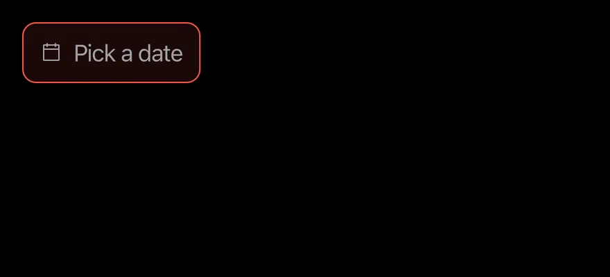
}Invalid
Shows the error border and tint with invalid.

import { DatePicker } from "@/components/patterns/date-picker"

export function DatePickerInvalidExample() {
  return (
    <DatePicker accessibilityLabel="Date" invalid />
  )
}import EsuissUI
import SwiftUI
struct DatePickerInvalidExample: View {
var body: some View {
DatePickerDemo()
.invalid()
}
}
struct DatePickerDemo: View {
var placeholder: LocalizedStringKey = "Pick a date"
var fromYear: Int?
var toYear: Int?
var title: LocalizedStringKey?
var showCloseButton = false
var closeLabel: LocalizedStringKey?
@State private var value: Date?
init(
value: Date? = nil,
placeholder: LocalizedStringKey = "Pick a date",
fromYear: Int? = nil,
toYear: Int? = nil,
title: LocalizedStringKey? = nil,
showCloseButton: Bool = false,
closeLabel: LocalizedStringKey? = nil
) {
_value = State(initialValue: value)
self.placeholder = placeholder
self.fromYear = fromYear
self.toYear = toYear
self.title = title
self.showCloseButton = showCloseButton
self.closeLabel = closeLabel
}
var body: some View {
DatePickerField(
selection: $value,
placeholder: placeholder,
fromYear: fromYear,
toYear: toYear,
title: title,
showCloseButton: showCloseButton,
closeLabel: closeLabel
)
.fixedSize()
.accessibilityLabel(Text("Date"))
}
}import androidx.compose.runtime.Composable
import androidx.compose.runtime.getValue
import androidx.compose.runtime.mutableStateOf
import androidx.compose.runtime.saveable.rememberSaveable
import androidx.compose.runtime.setValue
import androidx.compose.ui.Modifier
import androidx.compose.ui.semantics.contentDescription
import androidx.compose.ui.semantics.semantics
import com.esuiss.ui.patterns.DatePicker
import java.util.Calendar
import java.util.Date
import java.util.Locale
@Composable
fun DatePickerInvalidExample() {
DatePickerDemo(invalid = true)
}
@Composable
fun DatePickerDemo(
initial: Long? = null,
locale: Locale = Locale.getDefault(),
placeholder: String = "Pick a date",
fromYear: Int = Calendar.getInstance().get(Calendar.YEAR) - 100,
toYear: Int = Calendar.getInstance().get(Calendar.YEAR) + 10,
title: String? = null,
enabled: Boolean = true,
invalid: Boolean? = null,
floating: Boolean = false,
showCloseButton: Boolean = false,
closeLabel: String? = null,
) {
var value by rememberSaveable { mutableStateOf(initial) }
DatePicker(
value = value?.let(::Date),
onValueChange = { value = it.time },
modifier = Modifier.semantics { contentDescription = "Date" },
placeholder = placeholder,
locale = locale,
fromYear = fromYear,
toYear = toYear,
title = title,
enabled = enabled,
invalid = invalid,
floating = floating,
showCloseButton = showCloseButton,
closeLabel = closeLabel,
)
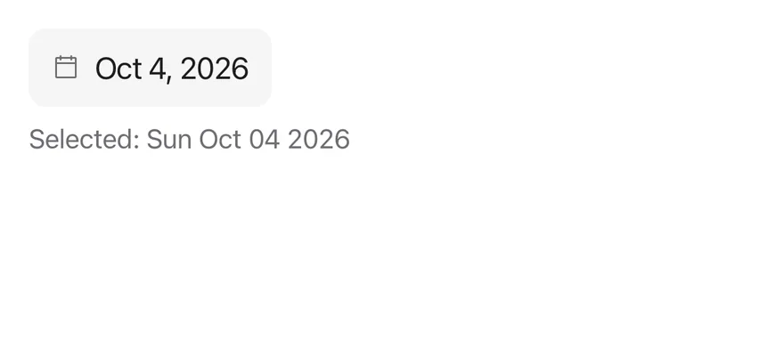
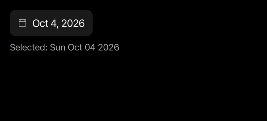
}Controlled
Holds the date in state and prints the selection below.
import * as React from "react"
import { View } from "react-native"
import { DatePicker } from "@/components/patterns/date-picker"
import { Text } from "@/components/ui/text"

function ControlledExample(args: React.ComponentProps<typeof DatePicker>) {
  const [value, setValue] = React.useState<Date | null>(new Date(2026, 9, 4))

  return (
    <View className="items-start gap-2">
      <DatePicker {...args} value={value} onValueChange={setValue} />
      <Text className="text-sm text-label-secondary">
        Selected: {value ? value.toDateString() : "none"}
      </Text>
    </View>
  )
}

export function DatePickerControlledExample() {
  return (
    <ControlledExample accessibilityLabel="Date" />
  )
}import EsuissUI
import SwiftUI
func datePickerDay(_ year: Int, _ month: Int, _ day: Int) -> Date? {
Foundation.Calendar.current.date(from: DateComponents(year: year, month: month, day: day))
}
struct DatePickerControlled: View {
@State private var value: Date? = datePickerDay(2026, 10, 4)
var selected: String {
guard let value else { return "none" }
let formatter = DateFormatter()
formatter.locale = Locale(identifier: "en_US_POSIX")
formatter.dateFormat = "EEE MMM dd yyyy"
return formatter.string(from: value)
}
var body: some View {
VStack(alignment: .leading, spacing: 8) {
DatePickerField(selection: $value)
.fixedSize()
.accessibilityLabel(Text("Date"))
Text(verbatim: "Selected: \(selected)")
.textStyle(.sm)
.foregroundStyle(Color.labelSecondary)
}
}
}import androidx.compose.foundation.layout.Arrangement
import androidx.compose.foundation.layout.Column
import androidx.compose.runtime.Composable
import androidx.compose.runtime.getValue
import androidx.compose.runtime.mutableStateOf
import androidx.compose.runtime.saveable.rememberSaveable
import androidx.compose.runtime.setValue
import androidx.compose.ui.Modifier
import androidx.compose.ui.semantics.contentDescription
import androidx.compose.ui.semantics.semantics
import androidx.compose.ui.unit.dp
import com.esuiss.ui.components.Text
import com.esuiss.ui.patterns.DatePicker
import com.esuiss.ui.theme.EsuissTheme
import com.esuiss.ui.theme.Typography
import java.text.SimpleDateFormat
import java.util.Calendar
import java.util.Date
import java.util.Locale
fun datePickerDate(year: Int, month: Int, day: Int): Long =
Calendar.getInstance().apply {
clear()
set(year, month, day)
}.timeInMillis
@Composable
fun DatePickerControlled() {
var value by rememberSaveable { mutableStateOf<Long?>(datePickerDate(2026, 9, 4)) }
val format = SimpleDateFormat("EEE MMM dd yyyy", Locale.US)
Column(verticalArrangement = Arrangement.spacedBy(8.dp)) {
DatePicker(
value = value?.let(::Date),
onValueChange = { value = it.time },
modifier = Modifier.semantics { contentDescription = "Date" },
)
Text(
"Selected: ${value?.let { format.format(Date(it)) } ?: "none"}",
style = Typography.sm.copy(color = EsuissTheme.colors.labelSecondary),
)
}
}Floating
Detaches the drawer from the screen edges.

import { DatePicker } from "@/components/patterns/date-picker"

export function DatePickerFloatingExample() {
  return (
    <DatePicker accessibilityLabel="Date" floating />
  )
}import androidx.compose.runtime.Composable
import androidx.compose.runtime.getValue
import androidx.compose.runtime.mutableStateOf
import androidx.compose.runtime.saveable.rememberSaveable
import androidx.compose.runtime.setValue
import androidx.compose.ui.Modifier
import androidx.compose.ui.semantics.contentDescription
import androidx.compose.ui.semantics.semantics
import com.esuiss.ui.patterns.DatePicker
import java.util.Calendar
import java.util.Date
import java.util.Locale
@Composable
fun DatePickerFloatingExample() {
DatePickerDemo(floating = true)
}
@Composable
fun DatePickerDemo(
initial: Long? = null,
locale: Locale = Locale.getDefault(),
placeholder: String = "Pick a date",
fromYear: Int = Calendar.getInstance().get(Calendar.YEAR) - 100,
toYear: Int = Calendar.getInstance().get(Calendar.YEAR) + 10,
title: String? = null,
enabled: Boolean = true,
invalid: Boolean? = null,
floating: Boolean = false,
showCloseButton: Boolean = false,
closeLabel: String? = null,
) {
var value by rememberSaveable { mutableStateOf(initial) }
DatePicker(
value = value?.let(::Date),
onValueChange = { value = it.time },
modifier = Modifier.semantics { contentDescription = "Date" },
placeholder = placeholder,
locale = locale,
fromYear = fromYear,
toYear = toYear,
title = title,
enabled = enabled,
invalid = invalid,
floating = floating,
showCloseButton = showCloseButton,
closeLabel = closeLabel,
)
}API Reference
DatePicker
- About
- The selected date when controlled, or
null. - Type
Datenull- Default
- —
- About
- The initial date when uncontrolled.
- Type
Datenull- Default
- —
- About
- Called with the new
Dateon every wheel change. - Type
(value: Date | null) => void- Default
- —
- About
- Text shown when no date is set. Defaults to
Pick a date. - Type
string- Default
- "Pick a date"
- About
- BCP 47 locale for formatting, month names and wheel order.
- Type
string- Default
- —
- About
- First year in the year wheel. Defaults to 100 years ago.
- Type
number- Default
- new Date().getFullYear() - 100
- About
- Last year in the year wheel. Defaults to 10 years ahead.
- Type
number- Default
- new Date().getFullYear() + 10
- About
- Heading shown at the top of the drawer.
- Type
string- Default
- —
- About
- Prevents opening and dims the field.
- Type
boolean- Default
- —
- About
- Insets the drawer from the screen edges.
- Type
boolean- Default
- —
- About
- Shows a close button in the drawer. Defaults to
false. - Type
boolean- Default
- false
- About
- Label of the close button.
- Type
string- Default
- —
- About
- Applies the error border and background.
- Type
boolean- Default
- —
- About
- Extra classes for the field, for example
w-fullto fill the width. - Type
string- Default
- —
- About
- Label for the field, also used for the drawer when there is no
title. - Type
string- Default
- —
- About
- Links the field to a visible label.
- Type
string- Default
- —
Accessibility
- The wheels are labelled
Day,MonthandYear. - Without a
title, the drawer is labelled byaccessibilityLabelor the placeholder.
Notes
- The field uses
bg-control,border-dangerwith abg-dangertint when invalid, andbg-control-disabledwhen disabled; the tint is stronger in dark mode. - Without
floating, the drawer's top corners are square.