suiss/uim · Pattern
Search Picker
A select field that opens a drawer with a search box and a filtered, optionally grouped list of options.
Search Picker is an open-source mobile pattern from suiss/uim: components composed into a flow for React Native and Expo, with SwiftUI and Jetpack Compose versions built from the same design tokens. The @esuiss/uim CLI copies its source into your project, so you own the code.


import { SearchPicker, type SearchPickerItem } from "@/components/patterns/search-picker"

const frameworks: SearchPickerItem[] = [
  { value: "next", label: "Next.js" },
  { value: "remix", label: "Remix" },
  { value: "astro", label: "Astro" },
  { value: "sveltekit", label: "SvelteKit" },
  { value: "nuxt", label: "Nuxt" },
  { value: "gatsby", label: "Gatsby", disabled: true },
]

export function SearchPickerExample() {
  return (
    <SearchPicker items={frameworks} placeholder="Select a framework" searchPlaceholder="Search frameworks..." emptyText="No framework found." accessibilityLabel="Framework" className="w-56" />
  )
}import EsuissUI
import SwiftUI
let searchPickerFrameworks = [
SearchPickerItem(value: "next", label: "Next.js"),
SearchPickerItem(value: "remix", label: "Remix"),
SearchPickerItem(value: "astro", label: "Astro"),
SearchPickerItem(value: "sveltekit", label: "SvelteKit"),
SearchPickerItem(value: "nuxt", label: "Nuxt"),
SearchPickerItem(value: "gatsby", label: "Gatsby", disabled: true),
]
struct SearchPickerDemo: View {
var items = searchPickerFrameworks
var placeholder: LocalizedStringKey = "Select a framework"
var searchPlaceholder: LocalizedStringKey = "Search frameworks..."
var emptyText: LocalizedStringKey = "No framework found."
var label: LocalizedStringKey = "Framework"
var title: LocalizedStringKey?
var showCloseButton = false
var closeLabel: LocalizedStringKey?
@State private var value: String?
init(
value: String? = nil,
items: [SearchPickerItem] = searchPickerFrameworks,
placeholder: LocalizedStringKey = "Select a framework",
searchPlaceholder: LocalizedStringKey = "Search frameworks...",
emptyText: LocalizedStringKey = "No framework found.",
label: LocalizedStringKey = "Framework",
title: LocalizedStringKey? = nil,
showCloseButton: Bool = false,
closeLabel: LocalizedStringKey? = nil
) {
_value = State(initialValue: value)
self.items = items
self.placeholder = placeholder
self.searchPlaceholder = searchPlaceholder
self.emptyText = emptyText
self.label = label
self.title = title
self.showCloseButton = showCloseButton
self.closeLabel = closeLabel
}
var body: some View {
SearchPicker(
items: items,
selection: $value,
placeholder: placeholder,
searchPlaceholder: searchPlaceholder,
emptyText: emptyText,
title: title,
showCloseButton: showCloseButton,
closeLabel: closeLabel
)
.frame(width: 224)
.accessibilityLabel(Text(label))
}
}import androidx.compose.foundation.layout.width
import androidx.compose.runtime.Composable
import androidx.compose.runtime.getValue
import androidx.compose.runtime.mutableStateOf
import androidx.compose.runtime.saveable.rememberSaveable
import androidx.compose.runtime.setValue
import androidx.compose.ui.Modifier
import androidx.compose.ui.semantics.contentDescription
import androidx.compose.ui.semantics.semantics
import androidx.compose.ui.unit.dp
import com.esuiss.ui.patterns.SearchPicker
import com.esuiss.ui.patterns.SearchPickerItem
val searchPickerFrameworks = listOf(
SearchPickerItem("next", "Next.js"),
SearchPickerItem("remix", "Remix"),
SearchPickerItem("astro", "Astro"),
SearchPickerItem("sveltekit", "SvelteKit"),
SearchPickerItem("nuxt", "Nuxt"),
SearchPickerItem("gatsby", "Gatsby", enabled = false),
)
@Composable
fun SearchPickerDemo(
initial: String? = null,
items: List<SearchPickerItem> = searchPickerFrameworks,
placeholder: String = "Select a framework",
searchPlaceholder: String = "Search frameworks...",
emptyText: String = "No framework found.",
label: String = "Framework",
title: String? = null,
enabled: Boolean = true,
invalid: Boolean? = null,
floating: Boolean = false,
showCloseButton: Boolean = false,
closeLabel: String? = null,
) {
var value by rememberSaveable { mutableStateOf(initial) }
SearchPicker(
items = items,
value = value,
onValueChange = { value = it },
modifier = Modifier.width(224.dp).semantics { contentDescription = label },
placeholder = placeholder,
searchPlaceholder = searchPlaceholder,
emptyText = emptyText,
title = title,
enabled = enabled,
invalid = invalid,
floating = floating,
showCloseButton = showCloseButton,
closeLabel = closeLabel,
)
}SearchPicker renders a field-style DrawerTrigger with the selected label and an up-down caret. Pressing it opens a Drawer with a search input and a scrollable list of options.
Typing filters options by label, case-insensitively. Options with a group are shown under a group heading. Choosing an option selects it, closes the drawer and clears the search. Use it when the list is too long to scan, such as countries, cities or frameworks.
Installation
$ pnpm dlx @esuiss/uim@latest add search-picker$ pnpm dlx @esuiss/uim@latest add search-picker --platform swift$ pnpm dlx @esuiss/uim@latest add search-picker --platform kotlinThe CLI also adds what it builds on: Drawer, Icon, Text.
Manual
- Install the dependencies:
npx expo install cn phosphor-react-native react-native-svg-
Copy the source into
components/patterns/search-picker.tsx:
import { cn } from "cn"
import {
  CaretUpDownIcon,
  CheckIcon,
  MagnifyingGlassIcon,
} from "phosphor-react-native"
import * as React from "react"
import {
  Pressable,
  ScrollView,
  TextInput,
  useWindowDimensions,
  View,
} from "react-native"
import {
Drawer,- Update the import paths to match your project.
- Install the dependencies:
npx expo install cn nativewind phosphor-react-native react-native-svg-
Copy the source into
components/patterns/search-picker.tsx:
import { cn } from "cn"
import { cssInterop } from "nativewind"
import {
  CaretUpDownIcon,
  CheckIcon,
  MagnifyingGlassIcon,
} from "phosphor-react-native"
import * as React from "react"
import {
  Pressable,
  ScrollView,
  TextInput,
  useWindowDimensions,
  View,
} from "react-native"
import {- Update the import paths to match your project.
- Install the dependencies:
npx expo install phosphor-react-native react-native-svg-
Copy the source into
components/patterns/search-picker.tsx:
import {
  CaretUpDownIcon,
  CheckIcon,
  MagnifyingGlassIcon,
} from "phosphor-react-native"
import * as React from "react"
import {
  Pressable,
  ScrollView,
  type StyleProp,
  StyleSheet,
  TextInput,
  useWindowDimensions,
  View,
  type ViewStyle,
} from "react-native"- Update the import paths to match your project.
-
Target iOS 17 or later.
-
Add the Swift package to your app:
.package(url: "https://github.com/phosphor-icons/swift", from: "2.1.0")- Copy the theme files every view uses:
import SwiftUI
import UIKit

struct RGBA: Sendable {
  let red: CGFloat
  let green: CGFloat
  let blue: CGFloat
  let alpha: CGFloat

  init(_ hex: UInt32, _ alpha: CGFloat = 1) {
    red = CGFloat((hex >> 16) & 0xFF) / 255
    green = CGFloat((hex >> 8) & 0xFF) / 255
    blue = CGFloat(hex & 0xFF) / 255
    self.alpha = alpha
}import SwiftUI
extension Color {
public static let surface = Color.adaptive(light: .init(0xFFFFFF), dark: .init(0x000000))
public static let surfaceSecondary = Color.adaptive(light: .init(0xF5F5F7), dark: .init(0x161617))
public static let surfaceTertiary = Color.adaptive(light: .init(0xE8E8ED), dark: .init(0x2C2C2E))
public static let surfaceRaised = Color.adaptive(light: .init(0xFFFFFF), dark: .init(0x1D1D1F))
public static let label = Color.adaptive(light: .init(0x1D1D1F), dark: .init(0xF5F5F7))
public static let labelSecondary = Color.adaptive(light: .init(0x6E6E73), dark: .init(0xA1A1A6))
public static let labelTertiary = Color.adaptive(light: .init(0x86868B), dark: .init(0x86868B))
public static let labelQuaternary = Color.adaptive(light: .init(0xD2D2D7), dark: .init(0x424245))
public static let control = Color.adaptive(light: .init(0x000000, 0.04), dark: .init(0xFFFFFF, 0.1))
public static let controlPressed = Color.adaptive(light: .init(0x000000, 0.12), dark: .init(0xFFFFFF, 0.22))
public static let controlSelected = Color.adaptive(light: .init(0x1D1D1F), dark: .init(0xF5F5F7))
public static let controlDisabled = Color.adaptive(light: .init(0x000000, 0.03), dark: .init(0xFFFFFF, 0.05))
public static let onControlSelected = Color.adaptive(light: .init(0xFFFFFF), dark: .init(0x000000))- Copy the source and every file it uses:
import PhosphorSwift
import SwiftUI

public struct SearchPickerItem: Hashable, Sendable, Identifiable {
  public var value: String
  public var label: String
  public var group: String?
  public var disabled: Bool

  public var id: String { value }

  public init(value: String, label: String, group: String? = nil, disabled: Bool = false) {
    self.value = value
    self.label = label
    self.group = group
self.disabled = disabledimport SwiftUI
public struct VariantButtonStyle: ButtonStyle {
public enum Variant: CaseIterable, Sendable {
case `default`, outline, secondary, tinted, ghost, plain, destructive, link
}
public enum Size: CaseIterable, Sendable {
case `default`, xs, sm, lg, xl, icon, iconXs, iconSm, iconLg, iconXl
var height: CGFloat {
switch self {
case .xs, .iconXs: 24
case .sm, .iconSm: 32
case .default, .icon: 36
case .lg, .iconLg: 44import SwiftUI
extension EnvironmentValues {
@Entry var buttonGroup: Axis? = nil
@Entry var buttonGroupSize: CGSize = .zero
}
enum ButtonGroupSpace: Hashable {
case group
}
struct ButtonGroupFrame {
let bounds: Anchor<CGRect>
let outlined: Bool
}import PhosphorSwift
import SwiftUI
extension Shadow {
static let control = Shadow(color: .black.opacity(0.08), radius: 0.5, y: 0.5)
static let thumb = Shadow(color: .black.opacity(0.12), radius: 1.5, y: 1)
}
struct SelectionIndicator<Mark: View>: View {
let checked: Bool
let pressed: Bool
let cornerRadius: CGFloat
let mark: Mark
@Environment(\.isEnabled) private var isEnabled
@Environment(\.isInvalid) private var invalidimport SwiftUI
extension View {
public func dialog<Content: View>(
isPresented: Binding<Bool>,
@ViewBuilder content: @escaping () -> Content
) -> some View {
modifier(
CoverPresenter(isPresented: isPresented) { visible in
CenteredStage(visible: visible, dismissible: true, content: content)
}
)
}
}
struct CenteredStage<Content: View>: View {import SwiftUI
extension View {
public func drawer<Content: View>(
isPresented: Binding<Bool>,
detents: Set<PresentationDetent>? = nil,
selection: Binding<PresentationDetent>? = nil,
onDismiss: (() -> Void)? = nil,
@ViewBuilder content: @escaping () -> Content
) -> some View {
let binding = isPresented
return sheet(isPresented: isPresented, onDismiss: onDismiss) {
DrawerHost(detents: detents, selection: selection, content: content)
.environment(\.overlayDismiss, OverlayDismiss { binding.wrappedValue = false })
}
}import SwiftUI
extension EnvironmentValues {
@Entry public var isInvalid = false
@Entry var fieldInset = false
@Entry var fieldGroupInset = false
@Entry var fieldSetInset = false
}
extension View {
public func invalid(_ isInvalid: Bool = true) -> some View {
environment(\.isInvalid, isInvalid)
}
}
public enum FieldOrientation: CaseIterable, Sendable {import SwiftUI
extension EnvironmentValues {
@Entry public var hapticsEnabled = true
}
extension View {
public func haptics(_ enabled: Bool) -> some View {
environment(\.hapticsEnabled, enabled)
}
func hapticFeedback<Trigger: Equatable>(_ feedback: SensoryFeedback, trigger: Trigger) -> some View {
modifier(HapticFeedbackModifier(feedback: feedback, trigger: trigger) { _, _ in true })
}
func hapticFeedback<Trigger: Equatable>(import PhosphorSwift
import Observation
import SwiftUI
public enum PopupAlignment: Sendable, CaseIterable {
case start, center, end
}
struct OverlayDismiss: Sendable {
let action: @MainActor @Sendable () -> Void
@MainActor func callAsFunction() {
action()
}
}import SwiftUI
public struct Separator: View {
let orientation: Axis
public init(_ orientation: Axis = .horizontal) {
self.orientation = orientation
}
public var body: some View {
Rectangle()
.fill(Color.separator)
.frame(width: orientation == .vertical ? 1 : nil, height: orientation == .horizontal ? 1 : nil)
.frame(maxWidth: orientation == .horizontal ? .infinity : nil, maxHeight: orientation == .vertical ? .infinity : nil)
.accessibilityHidden(true)
}import SwiftUI
public enum TextVariant: CaseIterable, Sendable {
case `default`, h1, h2, h3, h4, p, blockquote, code, lead, large, small, muted
var style: TextStyle {
switch self {
case .h1: .xl3
case .h2: .xl2
case .h3: .xl
case .h4, .lead, .large: .lg
case .code, .small, .muted: .sm
default: .base
}
}import SwiftUI
extension EnvironmentValues {
@Entry var patternCompact: Bool? = nil
}
@propertyWrapper
struct CompactLayout: DynamicProperty {
@Environment(\.patternCompact) private var forced
@Environment(\.horizontalSizeClass) private var sizeClass
init() {}
var wrappedValue: Bool {
forced ?? (sizeClass != .regular)
}- Add the files to your app target.
- Set
minSdkto 24 or higher and add the dependencies:
implementation(platform("androidx.compose:compose-bom:2026.09.00"))
implementation("androidx.compose.foundation:foundation")
implementation("androidx.compose.ui:ui")
implementation("com.adamglin:phosphor-icon-android:1.0.0")- Copy the theme files every view uses:
package com.esuiss.ui.theme

import androidx.compose.foundation.isSystemInDarkTheme
import androidx.compose.runtime.Composable
import androidx.compose.runtime.CompositionLocalProvider
import androidx.compose.runtime.Immutable
import androidx.compose.runtime.staticCompositionLocalOf
import androidx.compose.ui.Modifier
import androidx.compose.ui.draw.dropShadow
import androidx.compose.ui.graphics.Color
import androidx.compose.ui.graphics.Shape
import androidx.compose.ui.graphics.shadow.Shadow as DropShadow
import androidx.compose.ui.text.TextStyle
import androidx.compose.ui.text.style.LineHeightStyle
import androidx.compose.ui.unit.Dp
import androidx.compose.ui.unit.DpOffsetpackage com.esuiss.ui.theme
import androidx.compose.runtime.Immutable
import androidx.compose.ui.graphics.Color
import androidx.compose.ui.unit.dp
@Immutable
data class Colors(
val surface: Color,
val surfaceSecondary: Color,
val surfaceTertiary: Color,
val surfaceRaised: Color,
val label: Color,
val labelSecondary: Color,
val labelTertiary: Color,
val labelQuaternary: Color,- Copy the source and every file it uses:
package com.esuiss.ui.patterns

import androidx.compose.foundation.background
import androidx.compose.foundation.clickable
import androidx.compose.foundation.interaction.MutableInteractionSource
import androidx.compose.foundation.interaction.collectIsPressedAsState
import androidx.compose.foundation.layout.Arrangement
import androidx.compose.foundation.layout.Box
import androidx.compose.foundation.layout.Column
import androidx.compose.foundation.layout.PaddingValues
import androidx.compose.foundation.layout.Row
import androidx.compose.foundation.layout.fillMaxWidth
import androidx.compose.foundation.layout.height
import androidx.compose.foundation.layout.heightIn
import androidx.compose.foundation.layout.padding
import androidx.compose.foundation.lazy.LazyColumnpackage com.esuiss.ui.components
import androidx.compose.foundation.background
import androidx.compose.foundation.border
import androidx.compose.foundation.clickable
import androidx.compose.foundation.interaction.MutableInteractionSource
import androidx.compose.foundation.interaction.collectIsPressedAsState
import androidx.compose.foundation.layout.Arrangement
import androidx.compose.foundation.layout.Row
import androidx.compose.foundation.layout.RowScope
import androidx.compose.foundation.layout.fillMaxWidth
import androidx.compose.foundation.layout.height
import androidx.compose.foundation.layout.padding
import androidx.compose.foundation.layout.size
import androidx.compose.foundation.shape.CircleShape
import androidx.compose.foundation.shape.RoundedCornerShapepackage com.esuiss.ui.components
import androidx.compose.foundation.background
import androidx.compose.foundation.gestures.Orientation
import androidx.compose.foundation.layout.Arrangement
import androidx.compose.foundation.layout.Box
import androidx.compose.foundation.layout.Row
import androidx.compose.foundation.layout.RowScope
import androidx.compose.foundation.layout.padding
import androidx.compose.foundation.shape.CircleShape
import androidx.compose.foundation.shape.CornerSize
import androidx.compose.foundation.shape.RoundedCornerShape
import androidx.compose.runtime.Composable
import androidx.compose.runtime.CompositionLocalProvider
import androidx.compose.runtime.DisposableEffect
import androidx.compose.runtime.Immutablepackage com.esuiss.ui.components
import androidx.compose.runtime.compositionLocalOf
import androidx.compose.ui.graphics.Color
import androidx.compose.ui.text.TextStyle
import androidx.compose.ui.unit.Dp
import androidx.compose.ui.unit.dp
val LocalContentStyle = compositionLocalOf { TextStyle.Default }
val LocalContentColor = compositionLocalOf { Color.Unspecified }
val LocalIconSize = compositionLocalOf { 20.dp }package com.esuiss.ui.components
import androidx.compose.animation.core.CubicBezierEasing
import androidx.compose.animation.core.tween
import androidx.compose.foundation.background
import androidx.compose.foundation.gestures.AnchoredDraggableDefaults
import androidx.compose.foundation.gestures.AnchoredDraggableState
import androidx.compose.foundation.gestures.DraggableAnchors
import androidx.compose.foundation.gestures.Orientation
import androidx.compose.foundation.gestures.anchoredDraggable
import androidx.compose.foundation.gestures.animateTo
import androidx.compose.foundation.gestures.detectTapGestures
import androidx.compose.foundation.layout.Arrangement
import androidx.compose.foundation.layout.Box
import androidx.compose.foundation.layout.BoxWithConstraints
import androidx.compose.foundation.layout.Columnpackage com.esuiss.ui.components
import androidx.compose.foundation.background
import androidx.compose.foundation.gestures.Orientation
import androidx.compose.foundation.layout.Arrangement
import androidx.compose.foundation.layout.Box
import androidx.compose.foundation.layout.Column
import androidx.compose.foundation.layout.ColumnScope
import androidx.compose.foundation.layout.LayoutScopeMarker
import androidx.compose.foundation.layout.Row
import androidx.compose.foundation.layout.RowScope
import androidx.compose.foundation.layout.fillMaxWidth
import androidx.compose.foundation.layout.heightIn
import androidx.compose.foundation.layout.padding
import androidx.compose.foundation.shape.RoundedCornerShape
import androidx.compose.foundation.text.BasicTextpackage com.esuiss.ui.components
import android.provider.Settings
import androidx.compose.animation.core.CubicBezierEasing
import androidx.compose.foundation.background
import androidx.compose.foundation.border
import androidx.compose.foundation.gestures.Orientation
import androidx.compose.foundation.text.selection.TextSelectionColors
import androidx.compose.runtime.Composable
import androidx.compose.runtime.mutableStateOf
import androidx.compose.runtime.remember
import androidx.compose.ui.Modifier
import androidx.compose.ui.draw.clip
import androidx.compose.ui.draw.drawWithContent
import androidx.compose.ui.geometry.Offset
import androidx.compose.ui.geometry.Sizepackage com.esuiss.ui.components
import androidx.compose.runtime.Composable
import androidx.compose.runtime.CompositionLocalProvider
import androidx.compose.runtime.remember
import androidx.compose.runtime.staticCompositionLocalOf
import androidx.compose.ui.hapticfeedback.HapticFeedback
import androidx.compose.ui.hapticfeedback.HapticFeedbackType
import androidx.compose.ui.platform.LocalHapticFeedback
val LocalHapticsEnabled = staticCompositionLocalOf { true }
@Composable
fun ProvideHaptics(enabled: Boolean, content: @Composable () -> Unit) {
CompositionLocalProvider(LocalHapticsEnabled provides enabled, content = content)
}package com.esuiss.ui.components
import androidx.compose.foundation.Image
import androidx.compose.foundation.layout.size
import androidx.compose.runtime.Composable
import androidx.compose.ui.Modifier
import androidx.compose.ui.graphics.Color
import androidx.compose.ui.graphics.ColorFilter
import androidx.compose.ui.graphics.takeOrElse
import androidx.compose.ui.graphics.vector.ImageVector
import androidx.compose.ui.unit.Dp
import com.esuiss.ui.theme.EsuissTheme
@Composable
fun Icon(
imageVector: ImageVector,package com.esuiss.ui.components
import androidx.compose.foundation.layout.Arrangement
import androidx.compose.foundation.layout.Row
import androidx.compose.foundation.layout.RowScope
import androidx.compose.foundation.text.BasicText
import androidx.compose.runtime.Composable
import androidx.compose.runtime.CompositionLocalProvider
import androidx.compose.ui.Alignment
import androidx.compose.ui.Modifier
import androidx.compose.ui.text.font.FontWeight
import androidx.compose.ui.unit.dp
import com.esuiss.ui.theme.EsuissTheme
import com.esuiss.ui.theme.Typography
@Composablepackage com.esuiss.ui.components
import android.os.Build
import android.view.Window
import android.view.WindowManager
import androidx.compose.animation.AnimatedVisibility
import androidx.compose.animation.AnimatedVisibilityScope
import androidx.compose.animation.EnterExitState
import androidx.compose.animation.core.MutableTransitionState
import androidx.compose.animation.core.animateFloat
import androidx.compose.animation.core.tween
import androidx.compose.animation.fadeIn
import androidx.compose.animation.fadeOut
import androidx.compose.animation.scaleIn
import androidx.compose.animation.scaleOut
import androidx.compose.animation.slideInpackage com.esuiss.ui.components
import androidx.compose.foundation.background
import androidx.compose.foundation.border
import androidx.compose.foundation.clickable
import androidx.compose.foundation.interaction.MutableInteractionSource
import androidx.compose.foundation.interaction.collectIsPressedAsState
import androidx.compose.foundation.layout.Arrangement
import androidx.compose.foundation.layout.Box
import androidx.compose.foundation.layout.Column
import androidx.compose.foundation.layout.ColumnScope
import androidx.compose.foundation.layout.IntrinsicSize
import androidx.compose.foundation.layout.Row
import androidx.compose.foundation.layout.fillMaxWidth
import androidx.compose.foundation.layout.height
import androidx.compose.foundation.layout.heightInpackage com.esuiss.ui.components
import androidx.compose.foundation.background
import androidx.compose.foundation.gestures.Orientation
import androidx.compose.foundation.layout.Box
import androidx.compose.foundation.layout.fillMaxHeight
import androidx.compose.foundation.layout.fillMaxWidth
import androidx.compose.foundation.layout.height
import androidx.compose.foundation.layout.width
import androidx.compose.runtime.Composable
import androidx.compose.ui.Modifier
import androidx.compose.ui.unit.dp
import com.esuiss.ui.theme.EsuissTheme
@Composable
fun Separator(package com.esuiss.ui.components
import androidx.compose.foundation.background
import androidx.compose.foundation.clickable
import androidx.compose.foundation.gestures.snapping.SnapPosition
import androidx.compose.foundation.gestures.snapping.rememberSnapFlingBehavior
import androidx.compose.foundation.layout.Arrangement
import androidx.compose.foundation.layout.Box
import androidx.compose.foundation.layout.PaddingValues
import androidx.compose.foundation.layout.Row
import androidx.compose.foundation.layout.RowScope
import androidx.compose.foundation.layout.fillMaxWidth
import androidx.compose.foundation.layout.height
import androidx.compose.foundation.layout.padding
import androidx.compose.foundation.layout.wrapContentWidth
import androidx.compose.foundation.lazy.LazyColumnpackage com.esuiss.ui.patterns
import androidx.compose.foundation.border
import androidx.compose.foundation.background
import androidx.compose.foundation.clickable
import androidx.compose.foundation.interaction.MutableInteractionSource
import androidx.compose.foundation.layout.Arrangement
import androidx.compose.foundation.layout.Box
import androidx.compose.foundation.layout.Row
import androidx.compose.foundation.layout.fillMaxWidth
import androidx.compose.foundation.layout.height
import androidx.compose.foundation.layout.padding
import androidx.compose.foundation.layout.width
import androidx.compose.foundation.layout.widthIn
import androidx.compose.foundation.shape.RoundedCornerShape
import androidx.compose.foundation.text.BasicText- Update the
com.esuiss.uipackage names to match your project.
Usage
import { SearchPicker } from "@/components/patterns/search-picker"<SearchPicker items={frameworks} placeholder="Select a framework" searchPlaceholder="Search frameworks..." emptyText="No framework found." accessibilityLabel="Framework" className="w-56" />Pass items as an array of { value, label, group?, disabled? }. The SearchPickerItem type is exported.
Use it uncontrolled with defaultValue, or controlled with value and onValueChange; the value is a string or null. emptyText shows when nothing matches.
Examples
With value
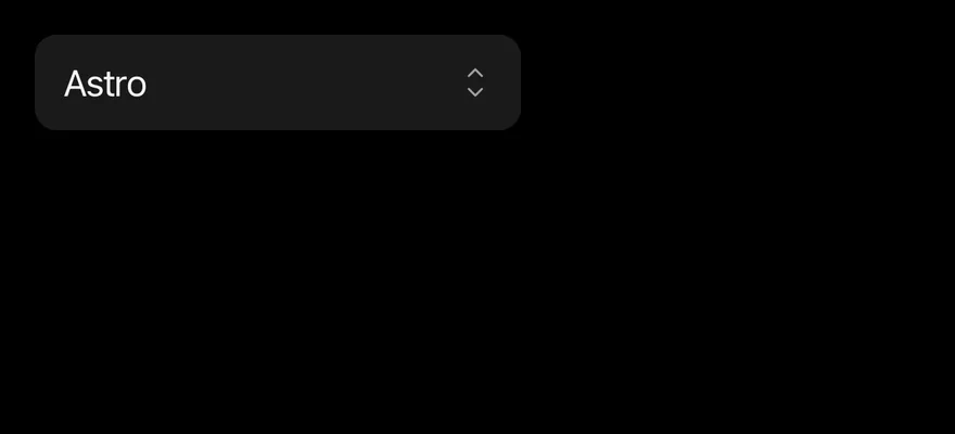
Starts with a preset selection via defaultValue.

import { SearchPicker, type SearchPickerItem } from "@/components/patterns/search-picker"

const frameworks: SearchPickerItem[] = [
  { value: "next", label: "Next.js" },
  { value: "remix", label: "Remix" },
  { value: "astro", label: "Astro" },
  { value: "sveltekit", label: "SvelteKit" },
  { value: "nuxt", label: "Nuxt" },
  { value: "gatsby", label: "Gatsby", disabled: true },
]

export function SearchPickerWithValueExample() {
  return (
    <SearchPicker items={frameworks} placeholder="Select a framework" searchPlaceholder="Search frameworks..." emptyText="No framework found." accessibilityLabel="Framework" className="w-56" defaultValue="astro" />
  )
}import EsuissUI
import SwiftUI
struct SearchPickerWithValueExample: View {
var body: some View {
SearchPickerDemo(value: "astro")
}
}
let searchPickerFrameworks = [
SearchPickerItem(value: "next", label: "Next.js"),
SearchPickerItem(value: "remix", label: "Remix"),
SearchPickerItem(value: "astro", label: "Astro"),
SearchPickerItem(value: "sveltekit", label: "SvelteKit"),
SearchPickerItem(value: "nuxt", label: "Nuxt"),
SearchPickerItem(value: "gatsby", label: "Gatsby", disabled: true),
]
struct SearchPickerDemo: View {
var items = searchPickerFrameworks
var placeholder: LocalizedStringKey = "Select a framework"
var searchPlaceholder: LocalizedStringKey = "Search frameworks..."
var emptyText: LocalizedStringKey = "No framework found."
var label: LocalizedStringKey = "Framework"
var title: LocalizedStringKey?
var showCloseButton = false
var closeLabel: LocalizedStringKey?
@State private var value: String?
init(
value: String? = nil,
items: [SearchPickerItem] = searchPickerFrameworks,
placeholder: LocalizedStringKey = "Select a framework",
searchPlaceholder: LocalizedStringKey = "Search frameworks...",
emptyText: LocalizedStringKey = "No framework found.",
label: LocalizedStringKey = "Framework",
title: LocalizedStringKey? = nil,
showCloseButton: Bool = false,
closeLabel: LocalizedStringKey? = nil
) {
_value = State(initialValue: value)
self.items = items
self.placeholder = placeholder
self.searchPlaceholder = searchPlaceholder
self.emptyText = emptyText
self.label = label
self.title = title
self.showCloseButton = showCloseButton
self.closeLabel = closeLabel
}
var body: some View {
SearchPicker(
items: items,
selection: $value,
placeholder: placeholder,
searchPlaceholder: searchPlaceholder,
emptyText: emptyText,
title: title,
showCloseButton: showCloseButton,
closeLabel: closeLabel
)
.frame(width: 224)
.accessibilityLabel(Text(label))
}
}import androidx.compose.foundation.layout.width
import androidx.compose.runtime.Composable
import androidx.compose.runtime.getValue
import androidx.compose.runtime.mutableStateOf
import androidx.compose.runtime.saveable.rememberSaveable
import androidx.compose.runtime.setValue
import androidx.compose.ui.Modifier
import androidx.compose.ui.semantics.contentDescription
import androidx.compose.ui.semantics.semantics
import androidx.compose.ui.unit.dp
import com.esuiss.ui.patterns.SearchPicker
import com.esuiss.ui.patterns.SearchPickerItem
@Composable
fun SearchPickerWithValueExample() {
SearchPickerDemo(initial = "astro")
}
val searchPickerFrameworks = listOf(
SearchPickerItem("next", "Next.js"),
SearchPickerItem("remix", "Remix"),
SearchPickerItem("astro", "Astro"),
SearchPickerItem("sveltekit", "SvelteKit"),
SearchPickerItem("nuxt", "Nuxt"),
SearchPickerItem("gatsby", "Gatsby", enabled = false),
)
@Composable
fun SearchPickerDemo(
initial: String? = null,
items: List<SearchPickerItem> = searchPickerFrameworks,
placeholder: String = "Select a framework",
searchPlaceholder: String = "Search frameworks...",
emptyText: String = "No framework found.",
label: String = "Framework",
title: String? = null,
enabled: Boolean = true,
invalid: Boolean? = null,
floating: Boolean = false,
showCloseButton: Boolean = false,
closeLabel: String? = null,
) {
var value by rememberSaveable { mutableStateOf(initial) }
SearchPicker(
items = items,
value = value,
onValueChange = { value = it },
modifier = Modifier.width(224.dp).semantics { contentDescription = label },
placeholder = placeholder,
searchPlaceholder = searchPlaceholder,
emptyText = emptyText,
title = title,
enabled = enabled,
invalid = invalid,
floating = floating,
showCloseButton = showCloseButton,
closeLabel = closeLabel,
)
}Grouped
Cities grouped by country, with custom placeholders.


import { SearchPicker, type SearchPickerItem } from "@/components/patterns/search-picker"

const cities: SearchPickerItem[] = [
  { value: "nyc", label: "New York", group: "Americas" },
  { value: "chi", label: "Chicago", group: "Americas" },
  { value: "sao", label: "São Paulo", group: "Americas" },
  { value: "lon", label: "London", group: "Europe" },
  { value: "ber", label: "Berlin", group: "Europe" },
  { value: "ist", label: "Istanbul", group: "Europe" },
  { value: "tyo", label: "Tokyo", group: "Asia" },
  { value: "sin", label: "Singapore", group: "Asia" },
]

export function SearchPickerGroupedExample() {
  return (
    <SearchPicker items={cities} placeholder="Select a city" searchPlaceholder="Search cities..." emptyText="No city found." accessibilityLabel="City" className="w-56" />
  )
}import EsuissUI
import SwiftUI
struct SearchPickerGroupedExample: View {
var body: some View {
SearchPickerDemo(
items: searchPickerCities,
placeholder: "Select a city",
searchPlaceholder: "Search cities...",
emptyText: "No city found.",
label: "City"
)
}
}
let searchPickerFrameworks = [
SearchPickerItem(value: "next", label: "Next.js"),
SearchPickerItem(value: "remix", label: "Remix"),
SearchPickerItem(value: "astro", label: "Astro"),
SearchPickerItem(value: "sveltekit", label: "SvelteKit"),
SearchPickerItem(value: "nuxt", label: "Nuxt"),
SearchPickerItem(value: "gatsby", label: "Gatsby", disabled: true),
]
let searchPickerCities = [
SearchPickerItem(value: "nyc", label: "New York", group: "Americas"),
SearchPickerItem(value: "chi", label: "Chicago", group: "Americas"),
SearchPickerItem(value: "sao", label: "São Paulo", group: "Americas"),
SearchPickerItem(value: "lon", label: "London", group: "Europe"),
SearchPickerItem(value: "ber", label: "Berlin", group: "Europe"),
SearchPickerItem(value: "ist", label: "Istanbul", group: "Europe"),
SearchPickerItem(value: "tyo", label: "Tokyo", group: "Asia"),
SearchPickerItem(value: "sin", label: "Singapore", group: "Asia"),
]
struct SearchPickerDemo: View {
var items = searchPickerFrameworks
var placeholder: LocalizedStringKey = "Select a framework"
var searchPlaceholder: LocalizedStringKey = "Search frameworks..."
var emptyText: LocalizedStringKey = "No framework found."
var label: LocalizedStringKey = "Framework"
var title: LocalizedStringKey?
var showCloseButton = false
var closeLabel: LocalizedStringKey?
@State private var value: String?
init(
value: String? = nil,
items: [SearchPickerItem] = searchPickerFrameworks,
placeholder: LocalizedStringKey = "Select a framework",
searchPlaceholder: LocalizedStringKey = "Search frameworks...",
emptyText: LocalizedStringKey = "No framework found.",
label: LocalizedStringKey = "Framework",
title: LocalizedStringKey? = nil,
showCloseButton: Bool = false,
closeLabel: LocalizedStringKey? = nil
) {
_value = State(initialValue: value)
self.items = items
self.placeholder = placeholder
self.searchPlaceholder = searchPlaceholder
self.emptyText = emptyText
self.label = label
self.title = title
self.showCloseButton = showCloseButton
self.closeLabel = closeLabel
}
var body: some View {
SearchPicker(
items: items,
selection: $value,
placeholder: placeholder,
searchPlaceholder: searchPlaceholder,
emptyText: emptyText,
title: title,
showCloseButton: showCloseButton,
closeLabel: closeLabel
)
.frame(width: 224)
.accessibilityLabel(Text(label))
}
}
struct SearchPickerControlled: View {
@State private var value: String? = "next"
var body: some View {
VStack(alignment: .leading, spacing: 8) {
SearchPicker(
items: searchPickerFrameworks,
selection: $value,
placeholder: "Select a framework",
searchPlaceholder: "Search frameworks...",
emptyText: "No framework found."
)
.frame(width: 224)
.accessibilityLabel(Text("Framework"))
Text(verbatim: "Selected: \(value ?? "none")")
.textStyle(.sm)
.foregroundStyle(Color.labelSecondary)
}
}
}
let group = StoryGroup(.patterns, "Search Picker", stories: [
Story("Default") {
SearchPickerDemo()
},
Story("WithValue") {
SearchPickerDemo(value: "astro")
},
Story("Grouped") {
SearchPickerDemo(
items: searchPickerCities,
placeholder: "Select a city",
searchPlaceholder: "Search cities...",
emptyText: "No city found.",
label: "City"
)
},
Story("WithTitle") {
SearchPickerDemo(title: "Framework")
},
Story("WithCloseButton") {
SearchPickerDemo(showCloseButton: true)
},
Story("WithCloseLabel") {
SearchPickerDemo(showCloseButton: true, closeLabel: "Cancel")
},
Story("Disabled") {
SearchPickerDemo()
.disabled(true)
},
Story("Invalid") {
SearchPickerDemo()
.invalid()
},
Story("Controlled") {
SearchPickerControlled()
},
]import androidx.compose.foundation.layout.width
import androidx.compose.runtime.Composable
import androidx.compose.runtime.getValue
import androidx.compose.runtime.mutableStateOf
import androidx.compose.runtime.saveable.rememberSaveable
import androidx.compose.runtime.setValue
import androidx.compose.ui.Modifier
import androidx.compose.ui.semantics.contentDescription
import androidx.compose.ui.semantics.semantics
import androidx.compose.ui.unit.dp
import com.esuiss.ui.patterns.SearchPicker
import com.esuiss.ui.patterns.SearchPickerItem
@Composable
fun SearchPickerGroupedExample() {
SearchPickerDemo(
items = searchPickerCities,
placeholder = "Select a city",
searchPlaceholder = "Search cities...",
emptyText = "No city found.",
label = "City",
)
}
val searchPickerFrameworks = listOf(
SearchPickerItem("next", "Next.js"),
SearchPickerItem("remix", "Remix"),
SearchPickerItem("astro", "Astro"),
SearchPickerItem("sveltekit", "SvelteKit"),
SearchPickerItem("nuxt", "Nuxt"),
SearchPickerItem("gatsby", "Gatsby", enabled = false),
)
val searchPickerCities = listOf(
SearchPickerItem("nyc", "New York", group = "Americas"),
SearchPickerItem("chi", "Chicago", group = "Americas"),
SearchPickerItem("sao", "São Paulo", group = "Americas"),
SearchPickerItem("lon", "London", group = "Europe"),
SearchPickerItem("ber", "Berlin", group = "Europe"),
SearchPickerItem("ist", "Istanbul", group = "Europe"),
SearchPickerItem("tyo", "Tokyo", group = "Asia"),
SearchPickerItem("sin", "Singapore", group = "Asia"),
)
@Composable
fun SearchPickerDemo(
initial: String? = null,
items: List<SearchPickerItem> = searchPickerFrameworks,
placeholder: String = "Select a framework",
searchPlaceholder: String = "Search frameworks...",
emptyText: String = "No framework found.",
label: String = "Framework",
title: String? = null,
enabled: Boolean = true,
invalid: Boolean? = null,
floating: Boolean = false,
showCloseButton: Boolean = false,
closeLabel: String? = null,
) {
var value by rememberSaveable { mutableStateOf(initial) }
SearchPicker(
items = items,
value = value,
onValueChange = { value = it },
modifier = Modifier.width(224.dp).semantics { contentDescription = label },
placeholder = placeholder,
searchPlaceholder = searchPlaceholder,
emptyText = emptyText,
title = title,
enabled = enabled,
invalid = invalid,
floating = floating,
showCloseButton = showCloseButton,
closeLabel = closeLabel,
)
}With title
Adds a heading to the drawer with title.


import { SearchPicker, type SearchPickerItem } from "@/components/patterns/search-picker"

const frameworks: SearchPickerItem[] = [
  { value: "next", label: "Next.js" },
  { value: "remix", label: "Remix" },
  { value: "astro", label: "Astro" },
  { value: "sveltekit", label: "SvelteKit" },
  { value: "nuxt", label: "Nuxt" },
  { value: "gatsby", label: "Gatsby", disabled: true },
]

export function SearchPickerWithTitleExample() {
  return (
    <SearchPicker items={frameworks} placeholder="Select a framework" searchPlaceholder="Search frameworks..." emptyText="No framework found." accessibilityLabel="Framework" className="w-56" title="Framework" />
  )
}import EsuissUI
import SwiftUI
struct SearchPickerWithTitleExample: View {
var body: some View {
SearchPickerDemo(title: "Framework")
}
}
let searchPickerFrameworks = [
SearchPickerItem(value: "next", label: "Next.js"),
SearchPickerItem(value: "remix", label: "Remix"),
SearchPickerItem(value: "astro", label: "Astro"),
SearchPickerItem(value: "sveltekit", label: "SvelteKit"),
SearchPickerItem(value: "nuxt", label: "Nuxt"),
SearchPickerItem(value: "gatsby", label: "Gatsby", disabled: true),
]
struct SearchPickerDemo: View {
var items = searchPickerFrameworks
var placeholder: LocalizedStringKey = "Select a framework"
var searchPlaceholder: LocalizedStringKey = "Search frameworks..."
var emptyText: LocalizedStringKey = "No framework found."
var label: LocalizedStringKey = "Framework"
var title: LocalizedStringKey?
var showCloseButton = false
var closeLabel: LocalizedStringKey?
@State private var value: String?
init(
value: String? = nil,
items: [SearchPickerItem] = searchPickerFrameworks,
placeholder: LocalizedStringKey = "Select a framework",
searchPlaceholder: LocalizedStringKey = "Search frameworks...",
emptyText: LocalizedStringKey = "No framework found.",
label: LocalizedStringKey = "Framework",
title: LocalizedStringKey? = nil,
showCloseButton: Bool = false,
closeLabel: LocalizedStringKey? = nil
) {
_value = State(initialValue: value)
self.items = items
self.placeholder = placeholder
self.searchPlaceholder = searchPlaceholder
self.emptyText = emptyText
self.label = label
self.title = title
self.showCloseButton = showCloseButton
self.closeLabel = closeLabel
}
var body: some View {
SearchPicker(
items: items,
selection: $value,
placeholder: placeholder,
searchPlaceholder: searchPlaceholder,
emptyText: emptyText,
title: title,
showCloseButton: showCloseButton,
closeLabel: closeLabel
)
.frame(width: 224)
.accessibilityLabel(Text(label))
}
}import androidx.compose.foundation.layout.width
import androidx.compose.runtime.Composable
import androidx.compose.runtime.getValue
import androidx.compose.runtime.mutableStateOf
import androidx.compose.runtime.saveable.rememberSaveable
import androidx.compose.runtime.setValue
import androidx.compose.ui.Modifier
import androidx.compose.ui.semantics.contentDescription
import androidx.compose.ui.semantics.semantics
import androidx.compose.ui.unit.dp
import com.esuiss.ui.patterns.SearchPicker
import com.esuiss.ui.patterns.SearchPickerItem
@Composable
fun SearchPickerWithTitleExample() {
SearchPickerDemo(title = "Framework")
}
val searchPickerFrameworks = listOf(
SearchPickerItem("next", "Next.js"),
SearchPickerItem("remix", "Remix"),
SearchPickerItem("astro", "Astro"),
SearchPickerItem("sveltekit", "SvelteKit"),
SearchPickerItem("nuxt", "Nuxt"),
SearchPickerItem("gatsby", "Gatsby", enabled = false),
)
@Composable
fun SearchPickerDemo(
initial: String? = null,
items: List<SearchPickerItem> = searchPickerFrameworks,
placeholder: String = "Select a framework",
searchPlaceholder: String = "Search frameworks...",
emptyText: String = "No framework found.",
label: String = "Framework",
title: String? = null,
enabled: Boolean = true,
invalid: Boolean? = null,
floating: Boolean = false,
showCloseButton: Boolean = false,
closeLabel: String? = null,
) {
var value by rememberSaveable { mutableStateOf(initial) }
SearchPicker(
items = items,
value = value,
onValueChange = { value = it },
modifier = Modifier.width(224.dp).semantics { contentDescription = label },
placeholder = placeholder,
searchPlaceholder = searchPlaceholder,
emptyText = emptyText,
title = title,
enabled = enabled,
invalid = invalid,
floating = floating,
showCloseButton = showCloseButton,
closeLabel = closeLabel,
)
}With close button
Shows a close button in the drawer.


import { SearchPicker, type SearchPickerItem } from "@/components/patterns/search-picker"

const frameworks: SearchPickerItem[] = [
  { value: "next", label: "Next.js" },
  { value: "remix", label: "Remix" },
  { value: "astro", label: "Astro" },
  { value: "sveltekit", label: "SvelteKit" },
  { value: "nuxt", label: "Nuxt" },
  { value: "gatsby", label: "Gatsby", disabled: true },
]

export function SearchPickerWithCloseButtonExample() {
  return (
    <SearchPicker items={frameworks} placeholder="Select a framework" searchPlaceholder="Search frameworks..." emptyText="No framework found." accessibilityLabel="Framework" className="w-56" showCloseButton />
  )
}import EsuissUI
import SwiftUI
struct SearchPickerWithCloseButtonExample: View {
var body: some View {
SearchPickerDemo(showCloseButton: true)
}
}
let searchPickerFrameworks = [
SearchPickerItem(value: "next", label: "Next.js"),
SearchPickerItem(value: "remix", label: "Remix"),
SearchPickerItem(value: "astro", label: "Astro"),
SearchPickerItem(value: "sveltekit", label: "SvelteKit"),
SearchPickerItem(value: "nuxt", label: "Nuxt"),
SearchPickerItem(value: "gatsby", label: "Gatsby", disabled: true),
]
struct SearchPickerDemo: View {
var items = searchPickerFrameworks
var placeholder: LocalizedStringKey = "Select a framework"
var searchPlaceholder: LocalizedStringKey = "Search frameworks..."
var emptyText: LocalizedStringKey = "No framework found."
var label: LocalizedStringKey = "Framework"
var title: LocalizedStringKey?
var showCloseButton = false
var closeLabel: LocalizedStringKey?
@State private var value: String?
init(
value: String? = nil,
items: [SearchPickerItem] = searchPickerFrameworks,
placeholder: LocalizedStringKey = "Select a framework",
searchPlaceholder: LocalizedStringKey = "Search frameworks...",
emptyText: LocalizedStringKey = "No framework found.",
label: LocalizedStringKey = "Framework",
title: LocalizedStringKey? = nil,
showCloseButton: Bool = false,
closeLabel: LocalizedStringKey? = nil
) {
_value = State(initialValue: value)
self.items = items
self.placeholder = placeholder
self.searchPlaceholder = searchPlaceholder
self.emptyText = emptyText
self.label = label
self.title = title
self.showCloseButton = showCloseButton
self.closeLabel = closeLabel
}
var body: some View {
SearchPicker(
items: items,
selection: $value,
placeholder: placeholder,
searchPlaceholder: searchPlaceholder,
emptyText: emptyText,
title: title,
showCloseButton: showCloseButton,
closeLabel: closeLabel
)
.frame(width: 224)
.accessibilityLabel(Text(label))
}
}import androidx.compose.foundation.layout.width
import androidx.compose.runtime.Composable
import androidx.compose.runtime.getValue
import androidx.compose.runtime.mutableStateOf
import androidx.compose.runtime.saveable.rememberSaveable
import androidx.compose.runtime.setValue
import androidx.compose.ui.Modifier
import androidx.compose.ui.semantics.contentDescription
import androidx.compose.ui.semantics.semantics
import androidx.compose.ui.unit.dp
import com.esuiss.ui.patterns.SearchPicker
import com.esuiss.ui.patterns.SearchPickerItem
@Composable
fun SearchPickerWithCloseButtonExample() {
SearchPickerDemo(showCloseButton = true)
}
val searchPickerFrameworks = listOf(
SearchPickerItem("next", "Next.js"),
SearchPickerItem("remix", "Remix"),
SearchPickerItem("astro", "Astro"),
SearchPickerItem("sveltekit", "SvelteKit"),
SearchPickerItem("nuxt", "Nuxt"),
SearchPickerItem("gatsby", "Gatsby", enabled = false),
)
@Composable
fun SearchPickerDemo(
initial: String? = null,
items: List<SearchPickerItem> = searchPickerFrameworks,
placeholder: String = "Select a framework",
searchPlaceholder: String = "Search frameworks...",
emptyText: String = "No framework found.",
label: String = "Framework",
title: String? = null,
enabled: Boolean = true,
invalid: Boolean? = null,
floating: Boolean = false,
showCloseButton: Boolean = false,
closeLabel: String? = null,
) {
var value by rememberSaveable { mutableStateOf(initial) }
SearchPicker(
items = items,
value = value,
onValueChange = { value = it },
modifier = Modifier.width(224.dp).semantics { contentDescription = label },
placeholder = placeholder,
searchPlaceholder = searchPlaceholder,
emptyText = emptyText,
title = title,
enabled = enabled,
invalid = invalid,
floating = floating,
showCloseButton = showCloseButton,
closeLabel = closeLabel,
)
}With close label
Labels the close button Cancel with closeLabel.


import { SearchPicker, type SearchPickerItem } from "@/components/patterns/search-picker"

const frameworks: SearchPickerItem[] = [
  { value: "next", label: "Next.js" },
  { value: "remix", label: "Remix" },
  { value: "astro", label: "Astro" },
  { value: "sveltekit", label: "SvelteKit" },
  { value: "nuxt", label: "Nuxt" },
  { value: "gatsby", label: "Gatsby", disabled: true },
]

export function SearchPickerWithCloseLabelExample() {
  return (
    <SearchPicker items={frameworks} placeholder="Select a framework" searchPlaceholder="Search frameworks..." emptyText="No framework found." accessibilityLabel="Framework" className="w-56" showCloseButton closeLabel="Cancel" />
  )
}import EsuissUI
import SwiftUI
struct SearchPickerWithCloseLabelExample: View {
var body: some View {
SearchPickerDemo(showCloseButton: true, closeLabel: "Cancel")
}
}
let searchPickerFrameworks = [
SearchPickerItem(value: "next", label: "Next.js"),
SearchPickerItem(value: "remix", label: "Remix"),
SearchPickerItem(value: "astro", label: "Astro"),
SearchPickerItem(value: "sveltekit", label: "SvelteKit"),
SearchPickerItem(value: "nuxt", label: "Nuxt"),
SearchPickerItem(value: "gatsby", label: "Gatsby", disabled: true),
]
struct SearchPickerDemo: View {
var items = searchPickerFrameworks
var placeholder: LocalizedStringKey = "Select a framework"
var searchPlaceholder: LocalizedStringKey = "Search frameworks..."
var emptyText: LocalizedStringKey = "No framework found."
var label: LocalizedStringKey = "Framework"
var title: LocalizedStringKey?
var showCloseButton = false
var closeLabel: LocalizedStringKey?
@State private var value: String?
init(
value: String? = nil,
items: [SearchPickerItem] = searchPickerFrameworks,
placeholder: LocalizedStringKey = "Select a framework",
searchPlaceholder: LocalizedStringKey = "Search frameworks...",
emptyText: LocalizedStringKey = "No framework found.",
label: LocalizedStringKey = "Framework",
title: LocalizedStringKey? = nil,
showCloseButton: Bool = false,
closeLabel: LocalizedStringKey? = nil
) {
_value = State(initialValue: value)
self.items = items
self.placeholder = placeholder
self.searchPlaceholder = searchPlaceholder
self.emptyText = emptyText
self.label = label
self.title = title
self.showCloseButton = showCloseButton
self.closeLabel = closeLabel
}
var body: some View {
SearchPicker(
items: items,
selection: $value,
placeholder: placeholder,
searchPlaceholder: searchPlaceholder,
emptyText: emptyText,
title: title,
showCloseButton: showCloseButton,
closeLabel: closeLabel
)
.frame(width: 224)
.accessibilityLabel(Text(label))
}
}import androidx.compose.foundation.layout.width
import androidx.compose.runtime.Composable
import androidx.compose.runtime.getValue
import androidx.compose.runtime.mutableStateOf
import androidx.compose.runtime.saveable.rememberSaveable
import androidx.compose.runtime.setValue
import androidx.compose.ui.Modifier
import androidx.compose.ui.semantics.contentDescription
import androidx.compose.ui.semantics.semantics
import androidx.compose.ui.unit.dp
import com.esuiss.ui.patterns.SearchPicker
import com.esuiss.ui.patterns.SearchPickerItem
@Composable
fun SearchPickerWithCloseLabelExample() {
SearchPickerDemo(showCloseButton = true, closeLabel = "Cancel")
}
val searchPickerFrameworks = listOf(
SearchPickerItem("next", "Next.js"),
SearchPickerItem("remix", "Remix"),
SearchPickerItem("astro", "Astro"),
SearchPickerItem("sveltekit", "SvelteKit"),
SearchPickerItem("nuxt", "Nuxt"),
SearchPickerItem("gatsby", "Gatsby", enabled = false),
)
@Composable
fun SearchPickerDemo(
initial: String? = null,
items: List<SearchPickerItem> = searchPickerFrameworks,
placeholder: String = "Select a framework",
searchPlaceholder: String = "Search frameworks...",
emptyText: String = "No framework found.",
label: String = "Framework",
title: String? = null,
enabled: Boolean = true,
invalid: Boolean? = null,
floating: Boolean = false,
showCloseButton: Boolean = false,
closeLabel: String? = null,
) {
var value by rememberSaveable { mutableStateOf(initial) }
SearchPicker(
items = items,
value = value,
onValueChange = { value = it },
modifier = Modifier.width(224.dp).semantics { contentDescription = label },
placeholder = placeholder,
searchPlaceholder = searchPlaceholder,
emptyText = emptyText,
title = title,
enabled = enabled,
invalid = invalid,
floating = floating,
showCloseButton = showCloseButton,
closeLabel = closeLabel,
)
}Disabled
A disabled field that cannot open the drawer.


import { SearchPicker, type SearchPickerItem } from "@/components/patterns/search-picker"

const frameworks: SearchPickerItem[] = [
  { value: "next", label: "Next.js" },
  { value: "remix", label: "Remix" },
  { value: "astro", label: "Astro" },
  { value: "sveltekit", label: "SvelteKit" },
  { value: "nuxt", label: "Nuxt" },
  { value: "gatsby", label: "Gatsby", disabled: true },
]

export function SearchPickerDisabledExample() {
  return (
    <SearchPicker items={frameworks} placeholder="Select a framework" searchPlaceholder="Search frameworks..." emptyText="No framework found." accessibilityLabel="Framework" className="w-56" disabled />
  )
}import EsuissUI
import SwiftUI
struct SearchPickerDisabledExample: View {
var body: some View {
SearchPickerDemo()
.disabled(true)
}
}
let searchPickerFrameworks = [
SearchPickerItem(value: "next", label: "Next.js"),
SearchPickerItem(value: "remix", label: "Remix"),
SearchPickerItem(value: "astro", label: "Astro"),
SearchPickerItem(value: "sveltekit", label: "SvelteKit"),
SearchPickerItem(value: "nuxt", label: "Nuxt"),
SearchPickerItem(value: "gatsby", label: "Gatsby", disabled: true),
]
struct SearchPickerDemo: View {
var items = searchPickerFrameworks
var placeholder: LocalizedStringKey = "Select a framework"
var searchPlaceholder: LocalizedStringKey = "Search frameworks..."
var emptyText: LocalizedStringKey = "No framework found."
var label: LocalizedStringKey = "Framework"
var title: LocalizedStringKey?
var showCloseButton = false
var closeLabel: LocalizedStringKey?
@State private var value: String?
init(
value: String? = nil,
items: [SearchPickerItem] = searchPickerFrameworks,
placeholder: LocalizedStringKey = "Select a framework",
searchPlaceholder: LocalizedStringKey = "Search frameworks...",
emptyText: LocalizedStringKey = "No framework found.",
label: LocalizedStringKey = "Framework",
title: LocalizedStringKey? = nil,
showCloseButton: Bool = false,
closeLabel: LocalizedStringKey? = nil
) {
_value = State(initialValue: value)
self.items = items
self.placeholder = placeholder
self.searchPlaceholder = searchPlaceholder
self.emptyText = emptyText
self.label = label
self.title = title
self.showCloseButton = showCloseButton
self.closeLabel = closeLabel
}
var body: some View {
SearchPicker(
items: items,
selection: $value,
placeholder: placeholder,
searchPlaceholder: searchPlaceholder,
emptyText: emptyText,
title: title,
showCloseButton: showCloseButton,
closeLabel: closeLabel
)
.frame(width: 224)
.accessibilityLabel(Text(label))
}
}import androidx.compose.foundation.layout.width
import androidx.compose.runtime.Composable
import androidx.compose.runtime.getValue
import androidx.compose.runtime.mutableStateOf
import androidx.compose.runtime.saveable.rememberSaveable
import androidx.compose.runtime.setValue
import androidx.compose.ui.Modifier
import androidx.compose.ui.semantics.contentDescription
import androidx.compose.ui.semantics.semantics
import androidx.compose.ui.unit.dp
import com.esuiss.ui.patterns.SearchPicker
import com.esuiss.ui.patterns.SearchPickerItem
@Composable
fun SearchPickerDisabledExample() {
SearchPickerDemo(enabled = false)
}
val searchPickerFrameworks = listOf(
SearchPickerItem("next", "Next.js"),
SearchPickerItem("remix", "Remix"),
SearchPickerItem("astro", "Astro"),
SearchPickerItem("sveltekit", "SvelteKit"),
SearchPickerItem("nuxt", "Nuxt"),
SearchPickerItem("gatsby", "Gatsby", enabled = false),
)
@Composable
fun SearchPickerDemo(
initial: String? = null,
items: List<SearchPickerItem> = searchPickerFrameworks,
placeholder: String = "Select a framework",
searchPlaceholder: String = "Search frameworks...",
emptyText: String = "No framework found.",
label: String = "Framework",
title: String? = null,
enabled: Boolean = true,
invalid: Boolean? = null,
floating: Boolean = false,
showCloseButton: Boolean = false,
closeLabel: String? = null,
) {
var value by rememberSaveable { mutableStateOf(initial) }
SearchPicker(
items = items,
value = value,
onValueChange = { value = it },
modifier = Modifier.width(224.dp).semantics { contentDescription = label },
placeholder = placeholder,
searchPlaceholder = searchPlaceholder,
emptyText = emptyText,
title = title,
enabled = enabled,
invalid = invalid,
floating = floating,
showCloseButton = showCloseButton,
closeLabel = closeLabel,
)
}Invalid
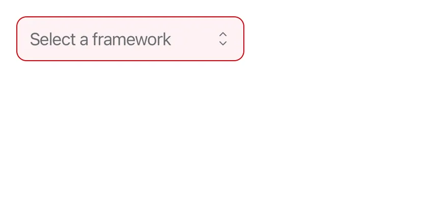
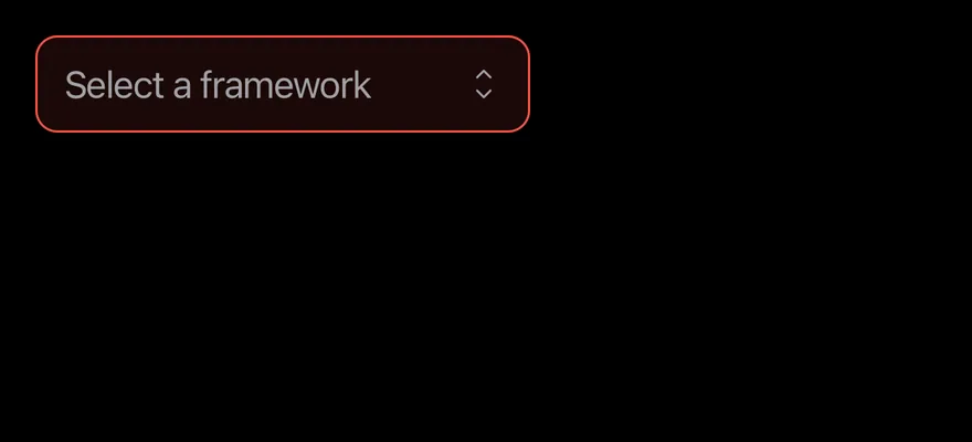
Shows the error border and tint with invalid.
import { SearchPicker, type SearchPickerItem } from "@/components/patterns/search-picker"

const frameworks: SearchPickerItem[] = [
  { value: "next", label: "Next.js" },
  { value: "remix", label: "Remix" },
  { value: "astro", label: "Astro" },
  { value: "sveltekit", label: "SvelteKit" },
  { value: "nuxt", label: "Nuxt" },
  { value: "gatsby", label: "Gatsby", disabled: true },
]

export function SearchPickerInvalidExample() {
  return (
    <SearchPicker items={frameworks} placeholder="Select a framework" searchPlaceholder="Search frameworks..." emptyText="No framework found." accessibilityLabel="Framework" className="w-56" invalid />
  )
}import EsuissUI
import SwiftUI
struct SearchPickerInvalidExample: View {
var body: some View {
SearchPickerDemo()
.invalid()
}
}
let searchPickerFrameworks = [
SearchPickerItem(value: "next", label: "Next.js"),
SearchPickerItem(value: "remix", label: "Remix"),
SearchPickerItem(value: "astro", label: "Astro"),
SearchPickerItem(value: "sveltekit", label: "SvelteKit"),
SearchPickerItem(value: "nuxt", label: "Nuxt"),
SearchPickerItem(value: "gatsby", label: "Gatsby", disabled: true),
]
struct SearchPickerDemo: View {
var items = searchPickerFrameworks
var placeholder: LocalizedStringKey = "Select a framework"
var searchPlaceholder: LocalizedStringKey = "Search frameworks..."
var emptyText: LocalizedStringKey = "No framework found."
var label: LocalizedStringKey = "Framework"
var title: LocalizedStringKey?
var showCloseButton = false
var closeLabel: LocalizedStringKey?
@State private var value: String?
init(
value: String? = nil,
items: [SearchPickerItem] = searchPickerFrameworks,
placeholder: LocalizedStringKey = "Select a framework",
searchPlaceholder: LocalizedStringKey = "Search frameworks...",
emptyText: LocalizedStringKey = "No framework found.",
label: LocalizedStringKey = "Framework",
title: LocalizedStringKey? = nil,
showCloseButton: Bool = false,
closeLabel: LocalizedStringKey? = nil
) {
_value = State(initialValue: value)
self.items = items
self.placeholder = placeholder
self.searchPlaceholder = searchPlaceholder
self.emptyText = emptyText
self.label = label
self.title = title
self.showCloseButton = showCloseButton
self.closeLabel = closeLabel
}
var body: some View {
SearchPicker(
items: items,
selection: $value,
placeholder: placeholder,
searchPlaceholder: searchPlaceholder,
emptyText: emptyText,
title: title,
showCloseButton: showCloseButton,
closeLabel: closeLabel
)
.frame(width: 224)
.accessibilityLabel(Text(label))
}
}import androidx.compose.foundation.layout.width
import androidx.compose.runtime.Composable
import androidx.compose.runtime.getValue
import androidx.compose.runtime.mutableStateOf
import androidx.compose.runtime.saveable.rememberSaveable
import androidx.compose.runtime.setValue
import androidx.compose.ui.Modifier
import androidx.compose.ui.semantics.contentDescription
import androidx.compose.ui.semantics.semantics
import androidx.compose.ui.unit.dp
import com.esuiss.ui.patterns.SearchPicker
import com.esuiss.ui.patterns.SearchPickerItem
@Composable
fun SearchPickerInvalidExample() {
SearchPickerDemo(invalid = true)
}
val searchPickerFrameworks = listOf(
SearchPickerItem("next", "Next.js"),
SearchPickerItem("remix", "Remix"),
SearchPickerItem("astro", "Astro"),
SearchPickerItem("sveltekit", "SvelteKit"),
SearchPickerItem("nuxt", "Nuxt"),
SearchPickerItem("gatsby", "Gatsby", enabled = false),
)
@Composable
fun SearchPickerDemo(
initial: String? = null,
items: List<SearchPickerItem> = searchPickerFrameworks,
placeholder: String = "Select a framework",
searchPlaceholder: String = "Search frameworks...",
emptyText: String = "No framework found.",
label: String = "Framework",
title: String? = null,
enabled: Boolean = true,
invalid: Boolean? = null,
floating: Boolean = false,
showCloseButton: Boolean = false,
closeLabel: String? = null,
) {
var value by rememberSaveable { mutableStateOf(initial) }
SearchPicker(
items = items,
value = value,
onValueChange = { value = it },
modifier = Modifier.width(224.dp).semantics { contentDescription = label },
placeholder = placeholder,
searchPlaceholder = searchPlaceholder,
emptyText = emptyText,
title = title,
enabled = enabled,
invalid = invalid,
floating = floating,
showCloseButton = showCloseButton,
closeLabel = closeLabel,
)
}Controlled
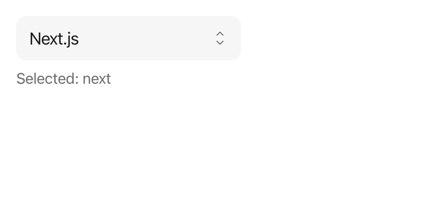
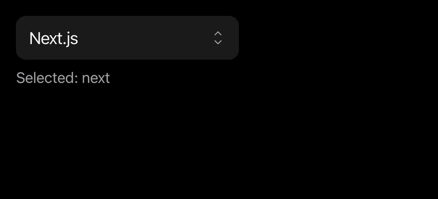
Holds the value in state and prints the selection below.
import * as React from "react"
import { View } from "react-native"
import { SearchPicker, type SearchPickerItem } from "@/components/patterns/search-picker"
import { Text } from "@/components/ui/text"

const frameworks: SearchPickerItem[] = [
  { value: "next", label: "Next.js" },
  { value: "remix", label: "Remix" },
  { value: "astro", label: "Astro" },
  { value: "sveltekit", label: "SvelteKit" },
  { value: "nuxt", label: "Nuxt" },
  { value: "gatsby", label: "Gatsby", disabled: true },
]

function ControlledExample(args: React.ComponentProps<typeof SearchPicker>) {
  const [value, setValue] = React.useState<string | null>("next")

  return (
    <View className="items-start gap-2">
      <SearchPicker {...args} value={value} onValueChange={setValue} />
      <Text className="text-sm text-label-secondary">
        Selected: {value ?? "none"}
      </Text>
    </View>
  )
}

export function SearchPickerControlledExample() {
  return (
    <ControlledExample items={frameworks} placeholder="Select a framework" searchPlaceholder="Search frameworks..." emptyText="No framework found." accessibilityLabel="Framework" className="w-56" />
  )
}import EsuissUI
import SwiftUI
let searchPickerFrameworks = [
SearchPickerItem(value: "next", label: "Next.js"),
SearchPickerItem(value: "remix", label: "Remix"),
SearchPickerItem(value: "astro", label: "Astro"),
SearchPickerItem(value: "sveltekit", label: "SvelteKit"),
SearchPickerItem(value: "nuxt", label: "Nuxt"),
SearchPickerItem(value: "gatsby", label: "Gatsby", disabled: true),
]
struct SearchPickerControlled: View {
@State private var value: String? = "next"
var body: some View {
VStack(alignment: .leading, spacing: 8) {
SearchPicker(
items: searchPickerFrameworks,
selection: $value,
placeholder: "Select a framework",
searchPlaceholder: "Search frameworks...",
emptyText: "No framework found."
)
.frame(width: 224)
.accessibilityLabel(Text("Framework"))
Text(verbatim: "Selected: \(value ?? "none")")
.textStyle(.sm)
.foregroundStyle(Color.labelSecondary)
}
}
}import androidx.compose.foundation.layout.Arrangement
import androidx.compose.foundation.layout.Column
import androidx.compose.foundation.layout.width
import androidx.compose.runtime.Composable
import androidx.compose.runtime.getValue
import androidx.compose.runtime.mutableStateOf
import androidx.compose.runtime.saveable.rememberSaveable
import androidx.compose.runtime.setValue
import androidx.compose.ui.Modifier
import androidx.compose.ui.semantics.contentDescription
import androidx.compose.ui.semantics.semantics
import androidx.compose.ui.unit.dp
import com.esuiss.ui.components.Text
import com.esuiss.ui.patterns.SearchPicker
import com.esuiss.ui.patterns.SearchPickerItem
import com.esuiss.ui.theme.EsuissTheme
import com.esuiss.ui.theme.Typography
val searchPickerFrameworks = listOf(
SearchPickerItem("next", "Next.js"),
SearchPickerItem("remix", "Remix"),
SearchPickerItem("astro", "Astro"),
SearchPickerItem("sveltekit", "SvelteKit"),
SearchPickerItem("nuxt", "Nuxt"),
SearchPickerItem("gatsby", "Gatsby", enabled = false),
)
@Composable
fun SearchPickerControlled() {
var value by rememberSaveable { mutableStateOf<String?>("next") }
Column(verticalArrangement = Arrangement.spacedBy(8.dp)) {
SearchPicker(
items = searchPickerFrameworks,
value = value,
onValueChange = { value = it },
modifier = Modifier.width(224.dp).semantics { contentDescription = "Framework" },
placeholder = "Select a framework",
searchPlaceholder = "Search frameworks...",
emptyText = "No framework found.",
)
Text("Selected: ${value ?: "none"}", style = Typography.sm.copy(color = EsuissTheme.colors.labelSecondary))
}
}Floating
Detaches the drawer from the screen edges.


import { SearchPicker, type SearchPickerItem } from "@/components/patterns/search-picker"

const frameworks: SearchPickerItem[] = [
  { value: "next", label: "Next.js" },
  { value: "remix", label: "Remix" },
  { value: "astro", label: "Astro" },
  { value: "sveltekit", label: "SvelteKit" },
  { value: "nuxt", label: "Nuxt" },
  { value: "gatsby", label: "Gatsby", disabled: true },
]

export function SearchPickerFloatingExample() {
  return (
    <SearchPicker items={frameworks} placeholder="Select a framework" searchPlaceholder="Search frameworks..." emptyText="No framework found." accessibilityLabel="Framework" className="w-56" floating />
  )
}import androidx.compose.foundation.layout.width
import androidx.compose.runtime.Composable
import androidx.compose.runtime.getValue
import androidx.compose.runtime.mutableStateOf
import androidx.compose.runtime.saveable.rememberSaveable
import androidx.compose.runtime.setValue
import androidx.compose.ui.Modifier
import androidx.compose.ui.semantics.contentDescription
import androidx.compose.ui.semantics.semantics
import androidx.compose.ui.unit.dp
import com.esuiss.ui.patterns.SearchPicker
import com.esuiss.ui.patterns.SearchPickerItem
@Composable
fun SearchPickerFloatingExample() {
SearchPickerDemo(floating = true)
}
val searchPickerFrameworks = listOf(
SearchPickerItem("next", "Next.js"),
SearchPickerItem("remix", "Remix"),
SearchPickerItem("astro", "Astro"),
SearchPickerItem("sveltekit", "SvelteKit"),
SearchPickerItem("nuxt", "Nuxt"),
SearchPickerItem("gatsby", "Gatsby", enabled = false),
)
@Composable
fun SearchPickerDemo(
initial: String? = null,
items: List<SearchPickerItem> = searchPickerFrameworks,
placeholder: String = "Select a framework",
searchPlaceholder: String = "Search frameworks...",
emptyText: String = "No framework found.",
label: String = "Framework",
title: String? = null,
enabled: Boolean = true,
invalid: Boolean? = null,
floating: Boolean = false,
showCloseButton: Boolean = false,
closeLabel: String? = null,
) {
var value by rememberSaveable { mutableStateOf(initial) }
SearchPicker(
items = items,
value = value,
onValueChange = { value = it },
modifier = Modifier.width(224.dp).semantics { contentDescription = label },
placeholder = placeholder,
searchPlaceholder = searchPlaceholder,
emptyText = emptyText,
title = title,
enabled = enabled,
invalid = invalid,
floating = floating,
showCloseButton = showCloseButton,
closeLabel = closeLabel,
)
}API Reference
SearchPicker
- About
- The options, each with
value,labeland optionalgroupanddisabled. - Type
SearchPickerItem[]- Default
- required
- About
- The selected value when controlled, or
null. - Type
stringnull- Default
- —
- About
- The initial value when uncontrolled.
- Type
stringnull- Default
- —
- About
- Called with the chosen value.
- Type
(value: string | null) => void- Default
- —
- About
- Text shown in the field when nothing is selected.
- Type
string- Default
- —
- About
- Placeholder and label of the search input. Defaults to
Search.... - Type
string- Default
- "Search..."
- About
- Text shown when no option matches. Defaults to
No results found.. - Type
string- Default
- "No results found."
- About
- Heading shown at the top of the drawer.
- Type
string- Default
- —
- About
- Prevents opening and dims the field.
- Type
boolean- Default
- —
- About
- Insets the drawer from the screen edges.
- Type
boolean- Default
- —
- About
- Shows a close button in the drawer. Defaults to
false. - Type
boolean- Default
- false
- About
- Label of the close button.
- Type
string- Default
- —
- About
- Applies the error border and background.
- Type
boolean- Default
- —
- Type
string- Default
- —
- About
- Label for the field.
- Type
string- Default
- —
- About
- Links the field to a visible label.
- Type
string- Default
- —
Accessibility
- Each option is a button that exposes
selectedanddisabledstates. - Each group has the
grouprole and is labelled by its name. - The search input is labelled by
searchPlaceholder. - Without a
title, the drawer is labelled by the placeholder oraccessibilityLabel.
Notes
- The list stays between 40% and 60% of the window height, and taps work while the keyboard is open.
- The field uses
bg-control,border-dangerwith abg-dangertint when invalid, andbg-control-disabledwhen disabled; the tint is stronger in dark mode. - The search input disables autocorrect and autocapitalization.