suiss/uim · Pattern
Split View
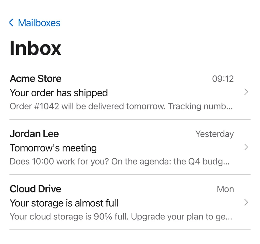
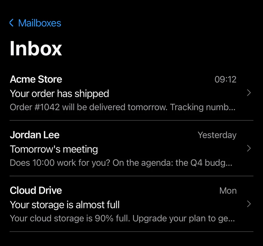
Sidebar, list and detail columns side by side on wide screens, shown one at a time with back navigation on phones.
Split View is an open-source mobile pattern from suiss/uim: components composed into a flow for React Native and Expo, with SwiftUI and Jetpack Compose versions built from the same design tokens. The @esuiss/uim CLI copies its source into your project, so you own the code.
import * as React from "react"
import { View } from "react-native"
import { SplitView, type SplitViewColumn, SplitViewDetail, SplitViewItem, SplitViewList, SplitViewSidebar } from "@/components/patterns/split-view"
import { Text } from "@/components/ui/text"

const mailboxes = ["Inbox", "Sent", "Drafts", "Archive"]

const messages = [
  {
    id: "order",
    from: "Acme Store",
    time: "09:12",
    subject: "Your order has shipped",
    body: "Order #1042 will be delivered tomorrow. Tracking number: 4815 1623 42.",
  },
  {
    id: "meeting",
    from: "Jordan Lee",
    time: "Yesterday",
    subject: "Tomorrow's meeting",
    body: "Does 10:00 work for you? On the agenda: the Q4 budget and the campaign plan.",
  },
  {
    id: "storage",
    from: "Cloud Drive",
    time: "Mon",
    subject: "Your storage is almost full",
    body: "Your cloud storage is 90% full. Upgrade your plan to get more space.",
  },
] as const

function MailExample({
  withSidebar = true,
  defaultColumn,
  breakpoint,
}: {
  withSidebar?: boolean
  defaultColumn?: SplitViewColumn
  breakpoint?: number
}) {
  const [mailbox, setMailbox] = React.useState("Inbox")
  const [messageId, setMessageId] = React.useState<string>("order")
  const message = messages.find((item) => item.id === messageId) ?? messages[0]

  return (
    <SplitView defaultColumn={defaultColumn} breakpoint={breakpoint}>
      {withSidebar ? (
        <SplitViewSidebar title="Mailboxes">
          {mailboxes.map((name) => (
            <SplitViewItem
              key={name}
              isActive={mailbox === name}
              onPress={() => setMailbox(name)}
            >
              {name}
            </SplitViewItem>
          ))}
        </SplitViewSidebar>
      ) : null}
      <SplitViewList title={mailbox}>
        {messages.map((item) => (
          <SplitViewItem
            key={item.id}
            isActive={item.id === messageId}
            onPress={() => setMessageId(item.id)}
          >
            <View className="flex-row items-baseline justify-between gap-2">
              <Text className="shrink font-semibold" numberOfLines={1}>
                {item.from}
              </Text>
              <Text className="text-sm text-label-secondary">{item.time}</Text>
            </View>
            <Text numberOfLines={1}>{item.subject}</Text>
            <Text className="text-sm text-label-secondary" numberOfLines={1}>
              {item.body}
            </Text>
          </SplitViewItem>
        ))}
      </SplitViewList>
      <SplitViewDetail title={message.subject}>
        <Text className="text-sm text-label-secondary">
          {message.from} · {message.time}
        </Text>
        <Text className="mt-6">{message.body}</Text>
      </SplitViewDetail>
    </SplitView>
  )
}

export function SplitViewExample() {
  return (
    <MailExample />
  )
}import EsuissUI
import SwiftUI
struct SplitViewMessage: Identifiable {
let id: String
let from: String
let time: String
let subject: String
let body: String
}
let splitViewMailboxes = ["Inbox", "Sent", "Drafts", "Archive"]
let splitViewMessages = [
SplitViewMessage(
id: "order",
from: "Acme Store",
time: "09:12",
subject: "Your order has shipped",
body: "Order #1042 will be delivered tomorrow. Tracking number: 4815 1623 42."
),
SplitViewMessage(
id: "meeting",
from: "Jordan Lee",
time: "Yesterday",
subject: "Tomorrow's meeting",
body: "Does 10:00 work for you? On the agenda: the Q4 budget and the campaign plan."
),
SplitViewMessage(
id: "storage",
from: "Cloud Drive",
time: "Mon",
subject: "Your storage is almost full",
body: "Your cloud storage is 90% full. Upgrade your plan to get more space."
),
]
struct SplitViewMail: View {
var withSidebar = true
@State private var column: SplitViewColumn
@State private var mailbox = "Inbox"
@State private var messageID = "order"
init(column: SplitViewColumn = .list, withSidebar: Bool = true) {
_column = State(initialValue: column)
self.withSidebar = withSidebar
}
var message: SplitViewMessage {
splitViewMessages.first { $0.id == messageID } ?? splitViewMessages[0]
}
var body: some View {
SplitView(column: $column) {
if withSidebar {
SplitViewSidebar("Mailboxes") {
ForEach(splitViewMailboxes, id: \.self) { name in
SplitViewItem(isActive: mailbox == name, action: { mailbox = name }) {
Text(verbatim: name)
}
}
}
}
SplitViewList(verbatim: mailbox) {
ForEach(splitViewMessages) { item in
SplitViewItem(isActive: item.id == messageID, action: { messageID = item.id }) {
HStack(alignment: .firstTextBaseline, spacing: 8) {
Text(verbatim: item.from)
.fontWeight(.semibold)
.lineLimit(1)
.frame(maxWidth: .infinity, alignment: .leading)
Text(verbatim: item.time)
.textStyle(.sm)
.foregroundStyle(Color.labelSecondary)
}
Text(verbatim: item.subject)
.lineLimit(1)
Text(verbatim: item.body)
.textStyle(.sm)
.foregroundStyle(Color.labelSecondary)
.lineLimit(1)
}
}
}
SplitViewDetail(verbatim: message.subject) {
Text(verbatim: "\(message.from) · \(message.time)")
.textStyle(.sm)
.foregroundStyle(Color.labelSecondary)
Text(verbatim: message.body)
.foregroundStyle(Color.label)
.fixedSize(horizontal: false, vertical: true)
.padding(.top, 24)
}
}
.containerRelativeFrame(.vertical) { height, _ in height - 32 }
}
}import androidx.compose.foundation.layout.Arrangement
import androidx.compose.foundation.layout.Row
import androidx.compose.foundation.layout.fillMaxWidth
import androidx.compose.foundation.layout.height
import androidx.compose.foundation.layout.padding
import androidx.compose.runtime.Composable
import androidx.compose.runtime.getValue
import androidx.compose.runtime.mutableStateOf
import androidx.compose.runtime.saveable.rememberSaveable
import androidx.compose.runtime.setValue
import androidx.compose.ui.Alignment
import androidx.compose.ui.Modifier
import androidx.compose.ui.text.font.FontWeight
import androidx.compose.ui.text.style.TextOverflow
import androidx.compose.ui.unit.dp
import com.esuiss.ui.components.Text
import com.esuiss.ui.patterns.SplitView
import com.esuiss.ui.patterns.SplitViewColumn
import com.esuiss.ui.patterns.SplitViewItem
import com.esuiss.ui.theme.EsuissTheme
import com.esuiss.ui.theme.Typography
class SplitViewMessage(
val id: String,
val from: String,
val time: String,
val subject: String,
val body: String,
)
val splitViewMailboxes = listOf("Inbox", "Sent", "Drafts", "Archive")
val splitViewMessages = listOf(
SplitViewMessage(
"order",
"Acme Store",
"09:12",
"Your order has shipped",
"Order #1042 will be delivered tomorrow. Tracking number: 4815 1623 42.",
),
SplitViewMessage(
"meeting",
"Jordan Lee",
"Yesterday",
"Tomorrow's meeting",
"Does 10:00 work for you? On the agenda: the Q4 budget and the campaign plan.",
),
SplitViewMessage(
"storage",
"Cloud Drive",
"Mon",
"Your storage is almost full",
"Your cloud storage is 90% full. Upgrade your plan to get more space.",
),
)
@Composable
fun SplitViewMail(withSidebar: Boolean = true, defaultColumn: SplitViewColumn = SplitViewColumn.List) {
var mailbox by rememberSaveable { mutableStateOf("Inbox") }
var messageId by rememberSaveable { mutableStateOf("order") }
val message = splitViewMessages.firstOrNull { it.id == messageId } ?: splitViewMessages.first()
val colors = EsuissTheme.colors
SplitView(modifier = Modifier.fillMaxWidth().height(640.dp), defaultColumn = defaultColumn) {
if (withSidebar) {
SplitViewSidebar(title = "Mailboxes") {
splitViewMailboxes.forEach { name ->
SplitViewItem(isActive = mailbox == name, onClick = { mailbox = name }) {
Text(name)
}
}
}
}
SplitViewList(title = mailbox) {
splitViewMessages.forEach { item ->
SplitViewItem(isActive = item.id == messageId, onClick = { messageId = item.id }) {
Row(
modifier = Modifier.fillMaxWidth(),
horizontalArrangement = Arrangement.spacedBy(8.dp),
verticalAlignment = Alignment.CenterVertically,
) {
Text(
item.from,
modifier = Modifier.weight(1f),
style = Typography.base.copy(fontWeight = FontWeight.SemiBold),
maxLines = 1,
overflow = TextOverflow.Ellipsis,
)
Text(item.time, style = Typography.sm.copy(color = colors.labelSecondary), maxLines = 1)
}
Text(item.subject, maxLines = 1, overflow = TextOverflow.Ellipsis)
Text(
item.body,
style = Typography.sm.copy(color = colors.labelSecondary),
maxLines = 1,
overflow = TextOverflow.Ellipsis,
)
}
}
}
SplitViewDetail(title = message.subject) {
Text("${message.from} · ${message.time}", style = Typography.sm.copy(color = colors.labelSecondary))
Text(message.body, modifier = Modifier.padding(top = 24.dp))
}
}
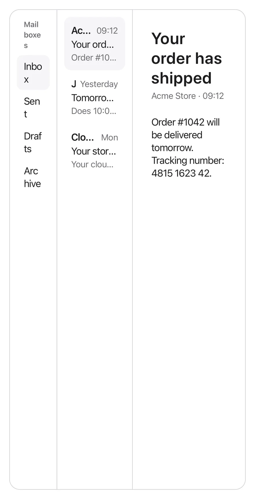
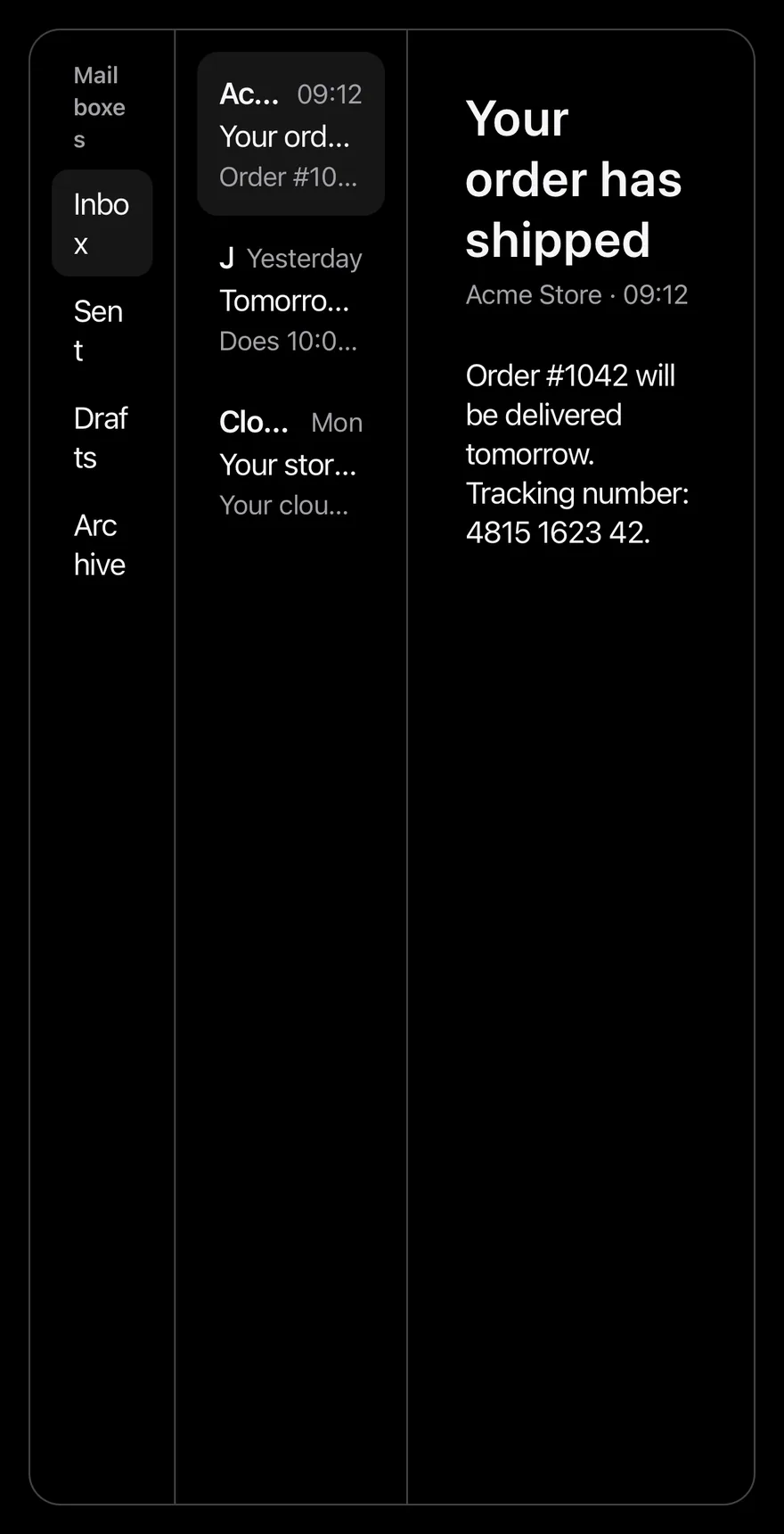
}SplitView lays out up to three panes: SplitViewSidebar, SplitViewList and SplitViewDetail. When the window is at least breakpoint wide (768 by default), they sit side by side in a bordered row, sized 20, 32 and 48 parts.
Below the breakpoint only the current column is shown, full screen and scrollable, with a large title. Pressing a SplitViewItem moves to the next column, and a back button titled with the previous pane returns to it. On Android the hardware back button also goes back. Use it for mail, notes or settings screens that drill down.
Installation
$ pnpm dlx @esuiss/uim@latest add split-view$ pnpm dlx @esuiss/uim@latest add split-view --platform swift$ pnpm dlx @esuiss/uim@latest add split-view --platform kotlinThe CLI also adds what it builds on: Icon, Text.
Manual
- Install the dependencies:
npx expo install cn phosphor-react-native react-native-reanimated react-native-svg react-native-worklets-
Add the pieces it builds on: Icon, Text, and the primitives
components/primitives/hooks.tsx. -
Copy the source into
components/patterns/split-view.tsx:
import { cn } from "cn"
import { CaretLeftIcon, CaretRightIcon } from "phosphor-react-native"
import * as React from "react"
import {
  AccessibilityInfo,
  I18nManager,
  Pressable,
  type Text as RNText,
  ScrollView,
  useWindowDimensions,
  View,
  type ViewProps,
} from "react-native"
import { FadeIn, ReduceMotion } from "react-native-reanimated"
import { useBackHandler } from "@/components/primitives/hooks"
import { AnimatedView } from "@/components/ui/animated-view"- Update the import paths to match your project.
- Install the dependencies:
npx expo install cn phosphor-react-native react-native-reanimated react-native-svg react-native-worklets-
Add the pieces it builds on: Icon, Text, and the primitives
components/primitives/hooks.tsx. -
Copy the source into
components/patterns/split-view.tsx:
import { cn } from "cn"
import { CaretLeftIcon, CaretRightIcon } from "phosphor-react-native"
import * as React from "react"
import {
  AccessibilityInfo,
  I18nManager,
  Pressable,
  type Text as RNText,
  ScrollView,
  useWindowDimensions,
  View,
  type ViewProps,
} from "react-native"
import { FadeIn, ReduceMotion } from "react-native-reanimated"
import { useBackHandler } from "@/components/primitives/hooks"
import { AnimatedView } from "@/components/ui/animated-view"- Update the import paths to match your project.
- Install the dependencies:
npx expo install phosphor-react-native react-native-reanimated react-native-svg react-native-worklets-
Add the pieces it builds on: Icon, Text, and the primitives
components/primitives/hooks.tsx. -
Copy the source into
components/patterns/split-view.tsx:
import { CaretLeftIcon, CaretRightIcon } from "phosphor-react-native"
import * as React from "react"
import {
  AccessibilityInfo,
  I18nManager,
  Pressable,
  type Text as RNText,
  ScrollView,
  StyleSheet,
  type TextStyle,
  useWindowDimensions,
  View,
  type ViewProps,
  type ViewStyle,
} from "react-native"
import { FadeIn, ReduceMotion } from "react-native-reanimated"- Update the import paths to match your project.
-
Target iOS 17 or later.
-
Add the Swift package to your app:
.package(url: "https://github.com/phosphor-icons/swift", from: "2.1.0")- Copy the theme files every view uses:
import SwiftUI
import UIKit

struct RGBA: Sendable {
  let red: CGFloat
  let green: CGFloat
  let blue: CGFloat
  let alpha: CGFloat

  init(_ hex: UInt32, _ alpha: CGFloat = 1) {
    red = CGFloat((hex >> 16) & 0xFF) / 255
    green = CGFloat((hex >> 8) & 0xFF) / 255
    blue = CGFloat(hex & 0xFF) / 255
    self.alpha = alpha
}import SwiftUI
extension Color {
public static let surface = Color.adaptive(light: .init(0xFFFFFF), dark: .init(0x000000))
public static let surfaceSecondary = Color.adaptive(light: .init(0xF5F5F7), dark: .init(0x161617))
public static let surfaceTertiary = Color.adaptive(light: .init(0xE8E8ED), dark: .init(0x2C2C2E))
public static let surfaceRaised = Color.adaptive(light: .init(0xFFFFFF), dark: .init(0x1D1D1F))
public static let label = Color.adaptive(light: .init(0x1D1D1F), dark: .init(0xF5F5F7))
public static let labelSecondary = Color.adaptive(light: .init(0x6E6E73), dark: .init(0xA1A1A6))
public static let labelTertiary = Color.adaptive(light: .init(0x86868B), dark: .init(0x86868B))
public static let labelQuaternary = Color.adaptive(light: .init(0xD2D2D7), dark: .init(0x424245))
public static let control = Color.adaptive(light: .init(0x000000, 0.04), dark: .init(0xFFFFFF, 0.1))
public static let controlPressed = Color.adaptive(light: .init(0x000000, 0.12), dark: .init(0xFFFFFF, 0.22))
public static let controlSelected = Color.adaptive(light: .init(0x1D1D1F), dark: .init(0xF5F5F7))
public static let controlDisabled = Color.adaptive(light: .init(0x000000, 0.03), dark: .init(0xFFFFFF, 0.05))
public static let onControlSelected = Color.adaptive(light: .init(0xFFFFFF), dark: .init(0x000000))- Copy the source and every file it uses:
import PhosphorSwift
import SwiftUI

public enum SplitViewColumn: CaseIterable, Sendable {
  case sidebar, list, detail

  var next: SplitViewColumn {
    switch self {
    case .sidebar: .list
    case .list, .detail: .detail
    }
  }

  var previous: SplitViewColumn? {
    switch self {
case .sidebar: nilimport SwiftUI
public struct VariantButtonStyle: ButtonStyle {
public enum Variant: CaseIterable, Sendable {
case `default`, outline, secondary, tinted, ghost, plain, destructive, link
}
public enum Size: CaseIterable, Sendable {
case `default`, xs, sm, lg, xl, icon, iconXs, iconSm, iconLg, iconXl
var height: CGFloat {
switch self {
case .xs, .iconXs: 24
case .sm, .iconSm: 32
case .default, .icon: 36
case .lg, .iconLg: 44import SwiftUI
extension EnvironmentValues {
@Entry var buttonGroup: Axis? = nil
@Entry var buttonGroupSize: CGSize = .zero
}
enum ButtonGroupSpace: Hashable {
case group
}
struct ButtonGroupFrame {
let bounds: Anchor<CGRect>
let outlined: Bool
}import PhosphorSwift
import SwiftUI
extension Shadow {
static let control = Shadow(color: .black.opacity(0.08), radius: 0.5, y: 0.5)
static let thumb = Shadow(color: .black.opacity(0.12), radius: 1.5, y: 1)
}
struct SelectionIndicator<Mark: View>: View {
let checked: Bool
let pressed: Bool
let cornerRadius: CGFloat
let mark: Mark
@Environment(\.isEnabled) private var isEnabled
@Environment(\.isInvalid) private var invalidimport PhosphorSwift
import SwiftUI
enum MenuPresentation: Sendable {
case system, popup
}
extension EnvironmentValues {
@Entry var menuPresentation: MenuPresentation = .system
@Entry var menuRadio = MenuRadioContext()
}
struct MenuRadioContext: @unchecked Sendable {
var selected: AnyHashable?
var select: @MainActor @Sendable (AnyHashable) -> Void = { _ in }
}import SwiftUI
extension EnvironmentValues {
@Entry public var isInvalid = false
@Entry var fieldInset = false
@Entry var fieldGroupInset = false
@Entry var fieldSetInset = false
}
extension View {
public func invalid(_ isInvalid: Bool = true) -> some View {
environment(\.isInvalid, isInvalid)
}
}
public enum FieldOrientation: CaseIterable, Sendable {import SwiftUI
extension EnvironmentValues {
@Entry public var hapticsEnabled = true
}
extension View {
public func haptics(_ enabled: Bool) -> some View {
environment(\.hapticsEnabled, enabled)
}
func hapticFeedback<Trigger: Equatable>(_ feedback: SensoryFeedback, trigger: Trigger) -> some View {
modifier(HapticFeedbackModifier(feedback: feedback, trigger: trigger) { _, _ in true })
}
func hapticFeedback<Trigger: Equatable>(import PhosphorSwift
import Observation
import SwiftUI
public enum PopupAlignment: Sendable, CaseIterable {
case start, center, end
}
struct OverlayDismiss: Sendable {
let action: @MainActor @Sendable () -> Void
@MainActor func callAsFunction() {
action()
}
}import PhosphorSwift
import SwiftUI
struct SelectContext: @unchecked Sendable {
var selected: AnyHashable?
var registering = false
var select: @MainActor @Sendable (AnyHashable) -> Void = { _ in }
}
extension EnvironmentValues {
@Entry var select = SelectContext()
}
struct SelectLabelsKey: PreferenceKey {
static var defaultValue: [AnyHashable: Text] { [:] }import SwiftUI
public struct Separator: View {
let orientation: Axis
public init(_ orientation: Axis = .horizontal) {
self.orientation = orientation
}
public var body: some View {
Rectangle()
.fill(Color.separator)
.frame(width: orientation == .vertical ? 1 : nil, height: orientation == .horizontal ? 1 : nil)
.frame(maxWidth: orientation == .horizontal ? .infinity : nil, maxHeight: orientation == .vertical ? .infinity : nil)
.accessibilityHidden(true)
}import SwiftUI
public enum TextVariant: CaseIterable, Sendable {
case `default`, h1, h2, h3, h4, p, blockquote, code, lead, large, small, muted
var style: TextStyle {
switch self {
case .h1: .xl3
case .h2: .xl2
case .h3: .xl
case .h4, .lead, .large: .lg
case .code, .small, .muted: .sm
default: .base
}
}- Add the files to your app target.
- Set
minSdkto 24 or higher and add the dependencies:
implementation(platform("androidx.compose:compose-bom:2026.09.00"))
implementation("androidx.compose.foundation:foundation")
implementation("androidx.compose.ui:ui")
implementation("com.adamglin:phosphor-icon-android:1.0.0")- Copy the theme files every view uses:
package com.esuiss.ui.theme

import androidx.compose.foundation.isSystemInDarkTheme
import androidx.compose.runtime.Composable
import androidx.compose.runtime.CompositionLocalProvider
import androidx.compose.runtime.Immutable
import androidx.compose.runtime.staticCompositionLocalOf
import androidx.compose.ui.Modifier
import androidx.compose.ui.draw.dropShadow
import androidx.compose.ui.graphics.Color
import androidx.compose.ui.graphics.Shape
import androidx.compose.ui.graphics.shadow.Shadow as DropShadow
import androidx.compose.ui.text.TextStyle
import androidx.compose.ui.text.style.LineHeightStyle
import androidx.compose.ui.unit.Dp
import androidx.compose.ui.unit.DpOffsetpackage com.esuiss.ui.theme
import androidx.compose.runtime.Immutable
import androidx.compose.ui.graphics.Color
import androidx.compose.ui.unit.dp
@Immutable
data class Colors(
val surface: Color,
val surfaceSecondary: Color,
val surfaceTertiary: Color,
val surfaceRaised: Color,
val label: Color,
val labelSecondary: Color,
val labelTertiary: Color,
val labelQuaternary: Color,- Copy the source and every file it uses:
package com.esuiss.ui.patterns

import androidx.compose.animation.AnimatedContent
import androidx.compose.animation.core.tween
import androidx.compose.animation.fadeIn
import androidx.compose.animation.fadeOut
import androidx.compose.animation.slideInHorizontally
import androidx.compose.animation.slideOutHorizontally
import androidx.compose.animation.togetherWith
import androidx.compose.foundation.background
import androidx.compose.foundation.clickable
import androidx.compose.foundation.interaction.MutableInteractionSource
import androidx.compose.foundation.interaction.collectIsPressedAsState
import androidx.compose.foundation.layout.Arrangement
import androidx.compose.foundation.layout.Box
import androidx.compose.foundation.layout.BoxWithConstraintspackage com.esuiss.ui.components
import androidx.compose.runtime.compositionLocalOf
import androidx.compose.ui.graphics.Color
import androidx.compose.ui.text.TextStyle
import androidx.compose.ui.unit.Dp
import androidx.compose.ui.unit.dp
val LocalContentStyle = compositionLocalOf { TextStyle.Default }
val LocalContentColor = compositionLocalOf { Color.Unspecified }
val LocalIconSize = compositionLocalOf { 20.dp }package com.esuiss.ui.components
import androidx.compose.foundation.Image
import androidx.compose.foundation.layout.size
import androidx.compose.runtime.Composable
import androidx.compose.ui.Modifier
import androidx.compose.ui.graphics.Color
import androidx.compose.ui.graphics.ColorFilter
import androidx.compose.ui.graphics.takeOrElse
import androidx.compose.ui.graphics.vector.ImageVector
import androidx.compose.ui.unit.Dp
import com.esuiss.ui.theme.EsuissTheme
@Composable
fun Icon(
imageVector: ImageVector,- Update the
com.esuiss.uipackage names to match your project.
Usage
import { SplitView, SplitViewSidebar, SplitViewList, SplitViewDetail, SplitViewItem } from "@/components/patterns/split-view"<MailExample />Give each pane a title; the back button only appears when the previous pane exists and has a title. Put SplitViewItems in the sidebar and list panes, and use their onPress to set the selection in your own state.
The current column is uncontrolled with defaultColumn (list by default) or controlled with column and onColumnChange. useSplitView returns isCompact, column and setColumn for custom navigation.
Examples
Detail column
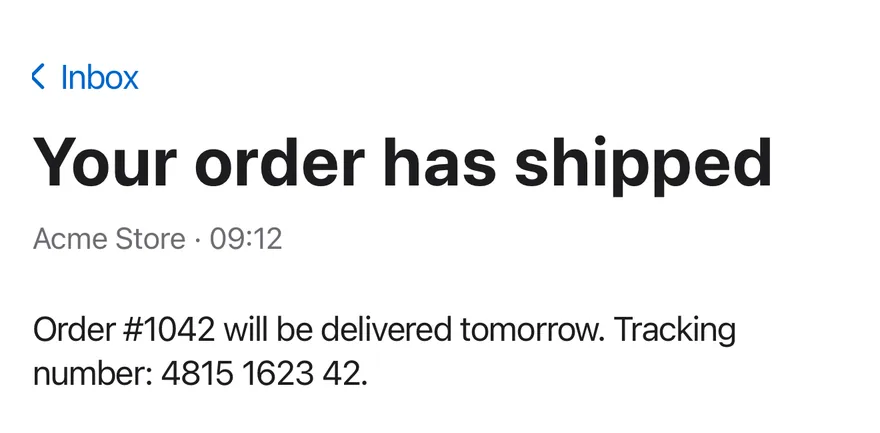
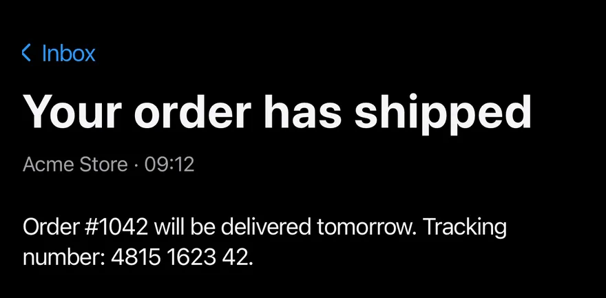
Starts on the detail column.
import * as React from "react"
import { View } from "react-native"
import { SplitView, type SplitViewColumn, SplitViewDetail, SplitViewItem, SplitViewList, SplitViewSidebar } from "@/components/patterns/split-view"
import { Text } from "@/components/ui/text"

const mailboxes = ["Inbox", "Sent", "Drafts", "Archive"]

const messages = [
  {
    id: "order",
    from: "Acme Store",
    time: "09:12",
    subject: "Your order has shipped",
    body: "Order #1042 will be delivered tomorrow. Tracking number: 4815 1623 42.",
  },
  {
    id: "meeting",
    from: "Jordan Lee",
    time: "Yesterday",
    subject: "Tomorrow's meeting",
    body: "Does 10:00 work for you? On the agenda: the Q4 budget and the campaign plan.",
  },
  {
    id: "storage",
    from: "Cloud Drive",
    time: "Mon",
    subject: "Your storage is almost full",
    body: "Your cloud storage is 90% full. Upgrade your plan to get more space.",
  },
] as const

function MailExample({
  withSidebar = true,
  defaultColumn,
  breakpoint,
}: {
  withSidebar?: boolean
  defaultColumn?: SplitViewColumn
  breakpoint?: number
}) {
  const [mailbox, setMailbox] = React.useState("Inbox")
  const [messageId, setMessageId] = React.useState<string>("order")
  const message = messages.find((item) => item.id === messageId) ?? messages[0]

  return (
    <SplitView defaultColumn={defaultColumn} breakpoint={breakpoint}>
      {withSidebar ? (
        <SplitViewSidebar title="Mailboxes">
          {mailboxes.map((name) => (
            <SplitViewItem
              key={name}
              isActive={mailbox === name}
              onPress={() => setMailbox(name)}
            >
              {name}
            </SplitViewItem>
          ))}
        </SplitViewSidebar>
      ) : null}
      <SplitViewList title={mailbox}>
        {messages.map((item) => (
          <SplitViewItem
            key={item.id}
            isActive={item.id === messageId}
            onPress={() => setMessageId(item.id)}
          >
            <View className="flex-row items-baseline justify-between gap-2">
              <Text className="shrink font-semibold" numberOfLines={1}>
                {item.from}
              </Text>
              <Text className="text-sm text-label-secondary">{item.time}</Text>
            </View>
            <Text numberOfLines={1}>{item.subject}</Text>
            <Text className="text-sm text-label-secondary" numberOfLines={1}>
              {item.body}
            </Text>
          </SplitViewItem>
        ))}
      </SplitViewList>
      <SplitViewDetail title={message.subject}>
        <Text className="text-sm text-label-secondary">
          {message.from} · {message.time}
        </Text>
        <Text className="mt-6">{message.body}</Text>
      </SplitViewDetail>
    </SplitView>
  )
}

export function SplitViewDetailColumnExample() {
  return (
    <MailExample defaultColumn="detail" />
  )
}import EsuissUI
import SwiftUI
struct SplitViewDetailColumnExample: View {
var body: some View {
SplitViewMail(column: .detail)
}
}
struct SplitViewMessage: Identifiable {
let id: String
let from: String
let time: String
let subject: String
let body: String
}
let splitViewMailboxes = ["Inbox", "Sent", "Drafts", "Archive"]
let splitViewMessages = [
SplitViewMessage(
id: "order",
from: "Acme Store",
time: "09:12",
subject: "Your order has shipped",
body: "Order #1042 will be delivered tomorrow. Tracking number: 4815 1623 42."
),
SplitViewMessage(
id: "meeting",
from: "Jordan Lee",
time: "Yesterday",
subject: "Tomorrow's meeting",
body: "Does 10:00 work for you? On the agenda: the Q4 budget and the campaign plan."
),
SplitViewMessage(
id: "storage",
from: "Cloud Drive",
time: "Mon",
subject: "Your storage is almost full",
body: "Your cloud storage is 90% full. Upgrade your plan to get more space."
),
]
struct SplitViewMail: View {
var withSidebar = true
@State private var column: SplitViewColumn
@State private var mailbox = "Inbox"
@State private var messageID = "order"
init(column: SplitViewColumn = .list, withSidebar: Bool = true) {
_column = State(initialValue: column)
self.withSidebar = withSidebar
}
var message: SplitViewMessage {
splitViewMessages.first { $0.id == messageID } ?? splitViewMessages[0]
}
var body: some View {
SplitView(column: $column) {
if withSidebar {
SplitViewSidebar("Mailboxes") {
ForEach(splitViewMailboxes, id: \.self) { name in
SplitViewItem(isActive: mailbox == name, action: { mailbox = name }) {
Text(verbatim: name)
}
}
}
}
SplitViewList(verbatim: mailbox) {
ForEach(splitViewMessages) { item in
SplitViewItem(isActive: item.id == messageID, action: { messageID = item.id }) {
HStack(alignment: .firstTextBaseline, spacing: 8) {
Text(verbatim: item.from)
.fontWeight(.semibold)
.lineLimit(1)
.frame(maxWidth: .infinity, alignment: .leading)
Text(verbatim: item.time)
.textStyle(.sm)
.foregroundStyle(Color.labelSecondary)
}
Text(verbatim: item.subject)
.lineLimit(1)
Text(verbatim: item.body)
.textStyle(.sm)
.foregroundStyle(Color.labelSecondary)
.lineLimit(1)
}
}
}
SplitViewDetail(verbatim: message.subject) {
Text(verbatim: "\(message.from) · \(message.time)")
.textStyle(.sm)
.foregroundStyle(Color.labelSecondary)
Text(verbatim: message.body)
.foregroundStyle(Color.label)
.fixedSize(horizontal: false, vertical: true)
.padding(.top, 24)
}
}
.containerRelativeFrame(.vertical) { height, _ in height - 32 }
}
}import androidx.compose.foundation.layout.Arrangement
import androidx.compose.foundation.layout.Row
import androidx.compose.foundation.layout.fillMaxWidth
import androidx.compose.foundation.layout.height
import androidx.compose.foundation.layout.padding
import androidx.compose.runtime.Composable
import androidx.compose.runtime.getValue
import androidx.compose.runtime.mutableStateOf
import androidx.compose.runtime.saveable.rememberSaveable
import androidx.compose.runtime.setValue
import androidx.compose.ui.Alignment
import androidx.compose.ui.Modifier
import androidx.compose.ui.text.font.FontWeight
import androidx.compose.ui.text.style.TextOverflow
import androidx.compose.ui.unit.dp
import com.esuiss.ui.components.Text
import com.esuiss.ui.patterns.SplitView
import com.esuiss.ui.patterns.SplitViewColumn
import com.esuiss.ui.patterns.SplitViewItem
import com.esuiss.ui.theme.EsuissTheme
import com.esuiss.ui.theme.Typography
@Composable
fun SplitViewDetailColumnExample() {
SplitViewMail(defaultColumn = SplitViewColumn.Detail)
}
class SplitViewMessage(
val id: String,
val from: String,
val time: String,
val subject: String,
val body: String,
)
val splitViewMailboxes = listOf("Inbox", "Sent", "Drafts", "Archive")
val splitViewMessages = listOf(
SplitViewMessage(
"order",
"Acme Store",
"09:12",
"Your order has shipped",
"Order #1042 will be delivered tomorrow. Tracking number: 4815 1623 42.",
),
SplitViewMessage(
"meeting",
"Jordan Lee",
"Yesterday",
"Tomorrow's meeting",
"Does 10:00 work for you? On the agenda: the Q4 budget and the campaign plan.",
),
SplitViewMessage(
"storage",
"Cloud Drive",
"Mon",
"Your storage is almost full",
"Your cloud storage is 90% full. Upgrade your plan to get more space.",
),
)
@Composable
fun SplitViewMail(withSidebar: Boolean = true, defaultColumn: SplitViewColumn = SplitViewColumn.List) {
var mailbox by rememberSaveable { mutableStateOf("Inbox") }
var messageId by rememberSaveable { mutableStateOf("order") }
val message = splitViewMessages.firstOrNull { it.id == messageId } ?: splitViewMessages.first()
val colors = EsuissTheme.colors
SplitView(modifier = Modifier.fillMaxWidth().height(640.dp), defaultColumn = defaultColumn) {
if (withSidebar) {
SplitViewSidebar(title = "Mailboxes") {
splitViewMailboxes.forEach { name ->
SplitViewItem(isActive = mailbox == name, onClick = { mailbox = name }) {
Text(name)
}
}
}
}
SplitViewList(title = mailbox) {
splitViewMessages.forEach { item ->
SplitViewItem(isActive = item.id == messageId, onClick = { messageId = item.id }) {
Row(
modifier = Modifier.fillMaxWidth(),
horizontalArrangement = Arrangement.spacedBy(8.dp),
verticalAlignment = Alignment.CenterVertically,
) {
Text(
item.from,
modifier = Modifier.weight(1f),
style = Typography.base.copy(fontWeight = FontWeight.SemiBold),
maxLines = 1,
overflow = TextOverflow.Ellipsis,
)
Text(item.time, style = Typography.sm.copy(color = colors.labelSecondary), maxLines = 1)
}
Text(item.subject, maxLines = 1, overflow = TextOverflow.Ellipsis)
Text(
item.body,
style = Typography.sm.copy(color = colors.labelSecondary),
maxLines = 1,
overflow = TextOverflow.Ellipsis,
)
}
}
}
SplitViewDetail(title = message.subject) {
Text("${message.from} · ${message.time}", style = Typography.sm.copy(color = colors.labelSecondary))
Text(message.body, modifier = Modifier.padding(top = 24.dp))
}
}
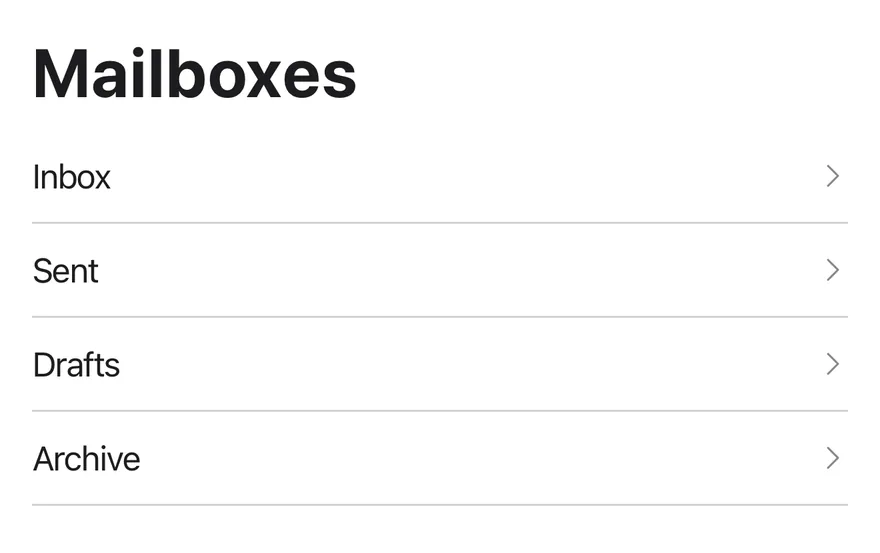
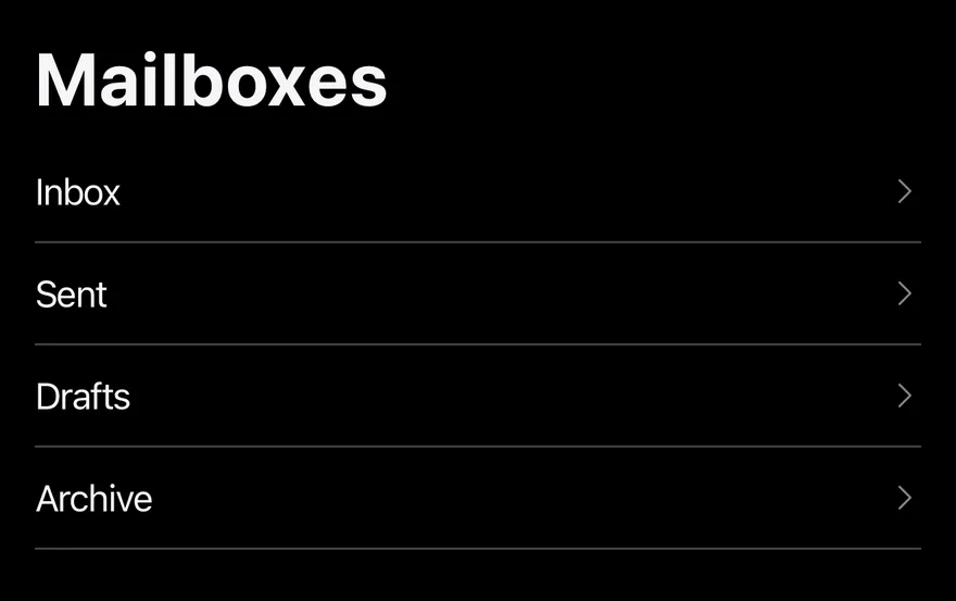
}Start on sidebar
Starts on the sidebar column.
import * as React from "react"
import { View } from "react-native"
import { SplitView, type SplitViewColumn, SplitViewDetail, SplitViewItem, SplitViewList, SplitViewSidebar } from "@/components/patterns/split-view"
import { Text } from "@/components/ui/text"

const mailboxes = ["Inbox", "Sent", "Drafts", "Archive"]

const messages = [
  {
    id: "order",
    from: "Acme Store",
    time: "09:12",
    subject: "Your order has shipped",
    body: "Order #1042 will be delivered tomorrow. Tracking number: 4815 1623 42.",
  },
  {
    id: "meeting",
    from: "Jordan Lee",
    time: "Yesterday",
    subject: "Tomorrow's meeting",
    body: "Does 10:00 work for you? On the agenda: the Q4 budget and the campaign plan.",
  },
  {
    id: "storage",
    from: "Cloud Drive",
    time: "Mon",
    subject: "Your storage is almost full",
    body: "Your cloud storage is 90% full. Upgrade your plan to get more space.",
  },
] as const

function MailExample({
  withSidebar = true,
  defaultColumn,
  breakpoint,
}: {
  withSidebar?: boolean
  defaultColumn?: SplitViewColumn
  breakpoint?: number
}) {
  const [mailbox, setMailbox] = React.useState("Inbox")
  const [messageId, setMessageId] = React.useState<string>("order")
  const message = messages.find((item) => item.id === messageId) ?? messages[0]

  return (
    <SplitView defaultColumn={defaultColumn} breakpoint={breakpoint}>
      {withSidebar ? (
        <SplitViewSidebar title="Mailboxes">
          {mailboxes.map((name) => (
            <SplitViewItem
              key={name}
              isActive={mailbox === name}
              onPress={() => setMailbox(name)}
            >
              {name}
            </SplitViewItem>
          ))}
        </SplitViewSidebar>
      ) : null}
      <SplitViewList title={mailbox}>
        {messages.map((item) => (
          <SplitViewItem
            key={item.id}
            isActive={item.id === messageId}
            onPress={() => setMessageId(item.id)}
          >
            <View className="flex-row items-baseline justify-between gap-2">
              <Text className="shrink font-semibold" numberOfLines={1}>
                {item.from}
              </Text>
              <Text className="text-sm text-label-secondary">{item.time}</Text>
            </View>
            <Text numberOfLines={1}>{item.subject}</Text>
            <Text className="text-sm text-label-secondary" numberOfLines={1}>
              {item.body}
            </Text>
          </SplitViewItem>
        ))}
      </SplitViewList>
      <SplitViewDetail title={message.subject}>
        <Text className="text-sm text-label-secondary">
          {message.from} · {message.time}
        </Text>
        <Text className="mt-6">{message.body}</Text>
      </SplitViewDetail>
    </SplitView>
  )
}

export function SplitViewStartOnSidebarExample() {
  return (
    <MailExample defaultColumn="sidebar" />
  )
}import EsuissUI
import SwiftUI
struct SplitViewStartOnSidebarExample: View {
var body: some View {
SplitViewMail(column: .sidebar)
}
}
struct SplitViewMessage: Identifiable {
let id: String
let from: String
let time: String
let subject: String
let body: String
}
let splitViewMailboxes = ["Inbox", "Sent", "Drafts", "Archive"]
let splitViewMessages = [
SplitViewMessage(
id: "order",
from: "Acme Store",
time: "09:12",
subject: "Your order has shipped",
body: "Order #1042 will be delivered tomorrow. Tracking number: 4815 1623 42."
),
SplitViewMessage(
id: "meeting",
from: "Jordan Lee",
time: "Yesterday",
subject: "Tomorrow's meeting",
body: "Does 10:00 work for you? On the agenda: the Q4 budget and the campaign plan."
),
SplitViewMessage(
id: "storage",
from: "Cloud Drive",
time: "Mon",
subject: "Your storage is almost full",
body: "Your cloud storage is 90% full. Upgrade your plan to get more space."
),
]
struct SplitViewMail: View {
var withSidebar = true
@State private var column: SplitViewColumn
@State private var mailbox = "Inbox"
@State private var messageID = "order"
init(column: SplitViewColumn = .list, withSidebar: Bool = true) {
_column = State(initialValue: column)
self.withSidebar = withSidebar
}
var message: SplitViewMessage {
splitViewMessages.first { $0.id == messageID } ?? splitViewMessages[0]
}
var body: some View {
SplitView(column: $column) {
if withSidebar {
SplitViewSidebar("Mailboxes") {
ForEach(splitViewMailboxes, id: \.self) { name in
SplitViewItem(isActive: mailbox == name, action: { mailbox = name }) {
Text(verbatim: name)
}
}
}
}
SplitViewList(verbatim: mailbox) {
ForEach(splitViewMessages) { item in
SplitViewItem(isActive: item.id == messageID, action: { messageID = item.id }) {
HStack(alignment: .firstTextBaseline, spacing: 8) {
Text(verbatim: item.from)
.fontWeight(.semibold)
.lineLimit(1)
.frame(maxWidth: .infinity, alignment: .leading)
Text(verbatim: item.time)
.textStyle(.sm)
.foregroundStyle(Color.labelSecondary)
}
Text(verbatim: item.subject)
.lineLimit(1)
Text(verbatim: item.body)
.textStyle(.sm)
.foregroundStyle(Color.labelSecondary)
.lineLimit(1)
}
}
}
SplitViewDetail(verbatim: message.subject) {
Text(verbatim: "\(message.from) · \(message.time)")
.textStyle(.sm)
.foregroundStyle(Color.labelSecondary)
Text(verbatim: message.body)
.foregroundStyle(Color.label)
.fixedSize(horizontal: false, vertical: true)
.padding(.top, 24)
}
}
.containerRelativeFrame(.vertical) { height, _ in height - 32 }
}
}import androidx.compose.foundation.layout.Arrangement
import androidx.compose.foundation.layout.Row
import androidx.compose.foundation.layout.fillMaxWidth
import androidx.compose.foundation.layout.height
import androidx.compose.foundation.layout.padding
import androidx.compose.runtime.Composable
import androidx.compose.runtime.getValue
import androidx.compose.runtime.mutableStateOf
import androidx.compose.runtime.saveable.rememberSaveable
import androidx.compose.runtime.setValue
import androidx.compose.ui.Alignment
import androidx.compose.ui.Modifier
import androidx.compose.ui.text.font.FontWeight
import androidx.compose.ui.text.style.TextOverflow
import androidx.compose.ui.unit.dp
import com.esuiss.ui.components.Text
import com.esuiss.ui.patterns.SplitView
import com.esuiss.ui.patterns.SplitViewColumn
import com.esuiss.ui.patterns.SplitViewItem
import com.esuiss.ui.theme.EsuissTheme
import com.esuiss.ui.theme.Typography
@Composable
fun SplitViewStartOnSidebarExample() {
SplitViewMail(defaultColumn = SplitViewColumn.Sidebar)
}
class SplitViewMessage(
val id: String,
val from: String,
val time: String,
val subject: String,
val body: String,
)
val splitViewMailboxes = listOf("Inbox", "Sent", "Drafts", "Archive")
val splitViewMessages = listOf(
SplitViewMessage(
"order",
"Acme Store",
"09:12",
"Your order has shipped",
"Order #1042 will be delivered tomorrow. Tracking number: 4815 1623 42.",
),
SplitViewMessage(
"meeting",
"Jordan Lee",
"Yesterday",
"Tomorrow's meeting",
"Does 10:00 work for you? On the agenda: the Q4 budget and the campaign plan.",
),
SplitViewMessage(
"storage",
"Cloud Drive",
"Mon",
"Your storage is almost full",
"Your cloud storage is 90% full. Upgrade your plan to get more space.",
),
)
@Composable
fun SplitViewMail(withSidebar: Boolean = true, defaultColumn: SplitViewColumn = SplitViewColumn.List) {
var mailbox by rememberSaveable { mutableStateOf("Inbox") }
var messageId by rememberSaveable { mutableStateOf("order") }
val message = splitViewMessages.firstOrNull { it.id == messageId } ?: splitViewMessages.first()
val colors = EsuissTheme.colors
SplitView(modifier = Modifier.fillMaxWidth().height(640.dp), defaultColumn = defaultColumn) {
if (withSidebar) {
SplitViewSidebar(title = "Mailboxes") {
splitViewMailboxes.forEach { name ->
SplitViewItem(isActive = mailbox == name, onClick = { mailbox = name }) {
Text(name)
}
}
}
}
SplitViewList(title = mailbox) {
splitViewMessages.forEach { item ->
SplitViewItem(isActive = item.id == messageId, onClick = { messageId = item.id }) {
Row(
modifier = Modifier.fillMaxWidth(),
horizontalArrangement = Arrangement.spacedBy(8.dp),
verticalAlignment = Alignment.CenterVertically,
) {
Text(
item.from,
modifier = Modifier.weight(1f),
style = Typography.base.copy(fontWeight = FontWeight.SemiBold),
maxLines = 1,
overflow = TextOverflow.Ellipsis,
)
Text(item.time, style = Typography.sm.copy(color = colors.labelSecondary), maxLines = 1)
}
Text(item.subject, maxLines = 1, overflow = TextOverflow.Ellipsis)
Text(
item.body,
style = Typography.sm.copy(color = colors.labelSecondary),
maxLines = 1,
overflow = TextOverflow.Ellipsis,
)
}
}
}
SplitViewDetail(title = message.subject) {
Text("${message.from} · ${message.time}", style = Typography.sm.copy(color = colors.labelSecondary))
Text(message.body, modifier = Modifier.padding(top = 24.dp))
}
}
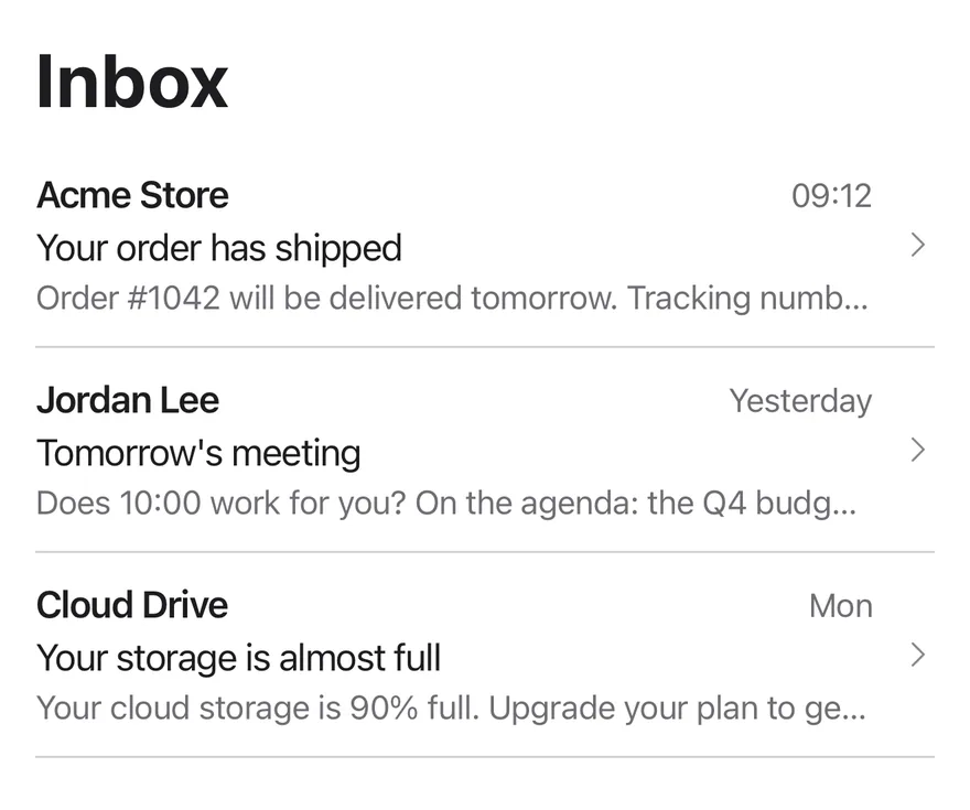
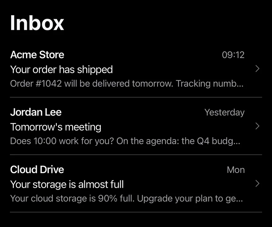
}Two columns
Only list and detail panes, without a sidebar.
import * as React from "react"
import { View } from "react-native"
import { SplitView, type SplitViewColumn, SplitViewDetail, SplitViewItem, SplitViewList, SplitViewSidebar } from "@/components/patterns/split-view"
import { Text } from "@/components/ui/text"

const mailboxes = ["Inbox", "Sent", "Drafts", "Archive"]

const messages = [
  {
    id: "order",
    from: "Acme Store",
    time: "09:12",
    subject: "Your order has shipped",
    body: "Order #1042 will be delivered tomorrow. Tracking number: 4815 1623 42.",
  },
  {
    id: "meeting",
    from: "Jordan Lee",
    time: "Yesterday",
    subject: "Tomorrow's meeting",
    body: "Does 10:00 work for you? On the agenda: the Q4 budget and the campaign plan.",
  },
  {
    id: "storage",
    from: "Cloud Drive",
    time: "Mon",
    subject: "Your storage is almost full",
    body: "Your cloud storage is 90% full. Upgrade your plan to get more space.",
  },
] as const

function MailExample({
  withSidebar = true,
  defaultColumn,
  breakpoint,
}: {
  withSidebar?: boolean
  defaultColumn?: SplitViewColumn
  breakpoint?: number
}) {
  const [mailbox, setMailbox] = React.useState("Inbox")
  const [messageId, setMessageId] = React.useState<string>("order")
  const message = messages.find((item) => item.id === messageId) ?? messages[0]

  return (
    <SplitView defaultColumn={defaultColumn} breakpoint={breakpoint}>
      {withSidebar ? (
        <SplitViewSidebar title="Mailboxes">
          {mailboxes.map((name) => (
            <SplitViewItem
              key={name}
              isActive={mailbox === name}
              onPress={() => setMailbox(name)}
            >
              {name}
            </SplitViewItem>
          ))}
        </SplitViewSidebar>
      ) : null}
      <SplitViewList title={mailbox}>
        {messages.map((item) => (
          <SplitViewItem
            key={item.id}
            isActive={item.id === messageId}
            onPress={() => setMessageId(item.id)}
          >
            <View className="flex-row items-baseline justify-between gap-2">
              <Text className="shrink font-semibold" numberOfLines={1}>
                {item.from}
              </Text>
              <Text className="text-sm text-label-secondary">{item.time}</Text>
            </View>
            <Text numberOfLines={1}>{item.subject}</Text>
            <Text className="text-sm text-label-secondary" numberOfLines={1}>
              {item.body}
            </Text>
          </SplitViewItem>
        ))}
      </SplitViewList>
      <SplitViewDetail title={message.subject}>
        <Text className="text-sm text-label-secondary">
          {message.from} · {message.time}
        </Text>
        <Text className="mt-6">{message.body}</Text>
      </SplitViewDetail>
    </SplitView>
  )
}

export function SplitViewTwoColumnsExample() {
  return (
    <MailExample withSidebar={false} />
  )
}import EsuissUI
import SwiftUI
struct SplitViewTwoColumnsExample: View {
var body: some View {
SplitViewMail(withSidebar: false)
}
}
struct SplitViewMessage: Identifiable {
let id: String
let from: String
let time: String
let subject: String
let body: String
}
let splitViewMailboxes = ["Inbox", "Sent", "Drafts", "Archive"]
let splitViewMessages = [
SplitViewMessage(
id: "order",
from: "Acme Store",
time: "09:12",
subject: "Your order has shipped",
body: "Order #1042 will be delivered tomorrow. Tracking number: 4815 1623 42."
),
SplitViewMessage(
id: "meeting",
from: "Jordan Lee",
time: "Yesterday",
subject: "Tomorrow's meeting",
body: "Does 10:00 work for you? On the agenda: the Q4 budget and the campaign plan."
),
SplitViewMessage(
id: "storage",
from: "Cloud Drive",
time: "Mon",
subject: "Your storage is almost full",
body: "Your cloud storage is 90% full. Upgrade your plan to get more space."
),
]
struct SplitViewMail: View {
var withSidebar = true
@State private var column: SplitViewColumn
@State private var mailbox = "Inbox"
@State private var messageID = "order"
init(column: SplitViewColumn = .list, withSidebar: Bool = true) {
_column = State(initialValue: column)
self.withSidebar = withSidebar
}
var message: SplitViewMessage {
splitViewMessages.first { $0.id == messageID } ?? splitViewMessages[0]
}
var body: some View {
SplitView(column: $column) {
if withSidebar {
SplitViewSidebar("Mailboxes") {
ForEach(splitViewMailboxes, id: \.self) { name in
SplitViewItem(isActive: mailbox == name, action: { mailbox = name }) {
Text(verbatim: name)
}
}
}
}
SplitViewList(verbatim: mailbox) {
ForEach(splitViewMessages) { item in
SplitViewItem(isActive: item.id == messageID, action: { messageID = item.id }) {
HStack(alignment: .firstTextBaseline, spacing: 8) {
Text(verbatim: item.from)
.fontWeight(.semibold)
.lineLimit(1)
.frame(maxWidth: .infinity, alignment: .leading)
Text(verbatim: item.time)
.textStyle(.sm)
.foregroundStyle(Color.labelSecondary)
}
Text(verbatim: item.subject)
.lineLimit(1)
Text(verbatim: item.body)
.textStyle(.sm)
.foregroundStyle(Color.labelSecondary)
.lineLimit(1)
}
}
}
SplitViewDetail(verbatim: message.subject) {
Text(verbatim: "\(message.from) · \(message.time)")
.textStyle(.sm)
.foregroundStyle(Color.labelSecondary)
Text(verbatim: message.body)
.foregroundStyle(Color.label)
.fixedSize(horizontal: false, vertical: true)
.padding(.top, 24)
}
}
.containerRelativeFrame(.vertical) { height, _ in height - 32 }
}
}import androidx.compose.foundation.layout.Arrangement
import androidx.compose.foundation.layout.Row
import androidx.compose.foundation.layout.fillMaxWidth
import androidx.compose.foundation.layout.height
import androidx.compose.foundation.layout.padding
import androidx.compose.runtime.Composable
import androidx.compose.runtime.getValue
import androidx.compose.runtime.mutableStateOf
import androidx.compose.runtime.saveable.rememberSaveable
import androidx.compose.runtime.setValue
import androidx.compose.ui.Alignment
import androidx.compose.ui.Modifier
import androidx.compose.ui.text.font.FontWeight
import androidx.compose.ui.text.style.TextOverflow
import androidx.compose.ui.unit.dp
import com.esuiss.ui.components.Text
import com.esuiss.ui.patterns.SplitView
import com.esuiss.ui.patterns.SplitViewColumn
import com.esuiss.ui.patterns.SplitViewItem
import com.esuiss.ui.theme.EsuissTheme
import com.esuiss.ui.theme.Typography
@Composable
fun SplitViewTwoColumnsExample() {
SplitViewMail(withSidebar = false)
}
class SplitViewMessage(
val id: String,
val from: String,
val time: String,
val subject: String,
val body: String,
)
val splitViewMailboxes = listOf("Inbox", "Sent", "Drafts", "Archive")
val splitViewMessages = listOf(
SplitViewMessage(
"order",
"Acme Store",
"09:12",
"Your order has shipped",
"Order #1042 will be delivered tomorrow. Tracking number: 4815 1623 42.",
),
SplitViewMessage(
"meeting",
"Jordan Lee",
"Yesterday",
"Tomorrow's meeting",
"Does 10:00 work for you? On the agenda: the Q4 budget and the campaign plan.",
),
SplitViewMessage(
"storage",
"Cloud Drive",
"Mon",
"Your storage is almost full",
"Your cloud storage is 90% full. Upgrade your plan to get more space.",
),
)
@Composable
fun SplitViewMail(withSidebar: Boolean = true, defaultColumn: SplitViewColumn = SplitViewColumn.List) {
var mailbox by rememberSaveable { mutableStateOf("Inbox") }
var messageId by rememberSaveable { mutableStateOf("order") }
val message = splitViewMessages.firstOrNull { it.id == messageId } ?: splitViewMessages.first()
val colors = EsuissTheme.colors
SplitView(modifier = Modifier.fillMaxWidth().height(640.dp), defaultColumn = defaultColumn) {
if (withSidebar) {
SplitViewSidebar(title = "Mailboxes") {
splitViewMailboxes.forEach { name ->
SplitViewItem(isActive = mailbox == name, onClick = { mailbox = name }) {
Text(name)
}
}
}
}
SplitViewList(title = mailbox) {
splitViewMessages.forEach { item ->
SplitViewItem(isActive = item.id == messageId, onClick = { messageId = item.id }) {
Row(
modifier = Modifier.fillMaxWidth(),
horizontalArrangement = Arrangement.spacedBy(8.dp),
verticalAlignment = Alignment.CenterVertically,
) {
Text(
item.from,
modifier = Modifier.weight(1f),
style = Typography.base.copy(fontWeight = FontWeight.SemiBold),
maxLines = 1,
overflow = TextOverflow.Ellipsis,
)
Text(item.time, style = Typography.sm.copy(color = colors.labelSecondary), maxLines = 1)
}
Text(item.subject, maxLines = 1, overflow = TextOverflow.Ellipsis)
Text(
item.body,
style = Typography.sm.copy(color = colors.labelSecondary),
maxLines = 1,
overflow = TextOverflow.Ellipsis,
)
}
}
}
SplitViewDetail(title = message.subject) {
Text("${message.from} · ${message.time}", style = Typography.sm.copy(color = colors.labelSecondary))
Text(message.body, modifier = Modifier.padding(top = 24.dp))
}
}
}Wide
Sets breakpoint to 0 to always show the columns side by side.
import * as React from "react"
import { View } from "react-native"
import { SplitView, type SplitViewColumn, SplitViewDetail, SplitViewItem, SplitViewList, SplitViewSidebar } from "@/components/patterns/split-view"
import { Text } from "@/components/ui/text"

const mailboxes = ["Inbox", "Sent", "Drafts", "Archive"]

const messages = [
  {
    id: "order",
    from: "Acme Store",
    time: "09:12",
    subject: "Your order has shipped",
    body: "Order #1042 will be delivered tomorrow. Tracking number: 4815 1623 42.",
  },
  {
    id: "meeting",
    from: "Jordan Lee",
    time: "Yesterday",
    subject: "Tomorrow's meeting",
    body: "Does 10:00 work for you? On the agenda: the Q4 budget and the campaign plan.",
  },
  {
    id: "storage",
    from: "Cloud Drive",
    time: "Mon",
    subject: "Your storage is almost full",
    body: "Your cloud storage is 90% full. Upgrade your plan to get more space.",
  },
] as const

function MailExample({
  withSidebar = true,
  defaultColumn,
  breakpoint,
}: {
  withSidebar?: boolean
  defaultColumn?: SplitViewColumn
  breakpoint?: number
}) {
  const [mailbox, setMailbox] = React.useState("Inbox")
  const [messageId, setMessageId] = React.useState<string>("order")
  const message = messages.find((item) => item.id === messageId) ?? messages[0]

  return (
    <SplitView defaultColumn={defaultColumn} breakpoint={breakpoint}>
      {withSidebar ? (
        <SplitViewSidebar title="Mailboxes">
          {mailboxes.map((name) => (
            <SplitViewItem
              key={name}
              isActive={mailbox === name}
              onPress={() => setMailbox(name)}
            >
              {name}
            </SplitViewItem>
          ))}
        </SplitViewSidebar>
      ) : null}
      <SplitViewList title={mailbox}>
        {messages.map((item) => (
          <SplitViewItem
            key={item.id}
            isActive={item.id === messageId}
            onPress={() => setMessageId(item.id)}
          >
            <View className="flex-row items-baseline justify-between gap-2">
              <Text className="shrink font-semibold" numberOfLines={1}>
                {item.from}
              </Text>
              <Text className="text-sm text-label-secondary">{item.time}</Text>
            </View>
            <Text numberOfLines={1}>{item.subject}</Text>
            <Text className="text-sm text-label-secondary" numberOfLines={1}>
              {item.body}
            </Text>
          </SplitViewItem>
        ))}
      </SplitViewList>
      <SplitViewDetail title={message.subject}>
        <Text className="text-sm text-label-secondary">
          {message.from} · {message.time}
        </Text>
        <Text className="mt-6">{message.body}</Text>
      </SplitViewDetail>
    </SplitView>
  )
}

export function SplitViewWideExample() {
  return (
    <MailExample breakpoint={0} />
  )
}Wide two columns
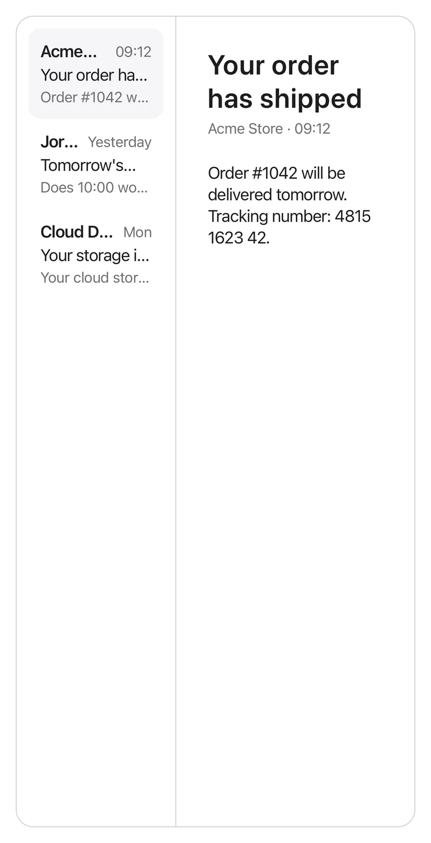
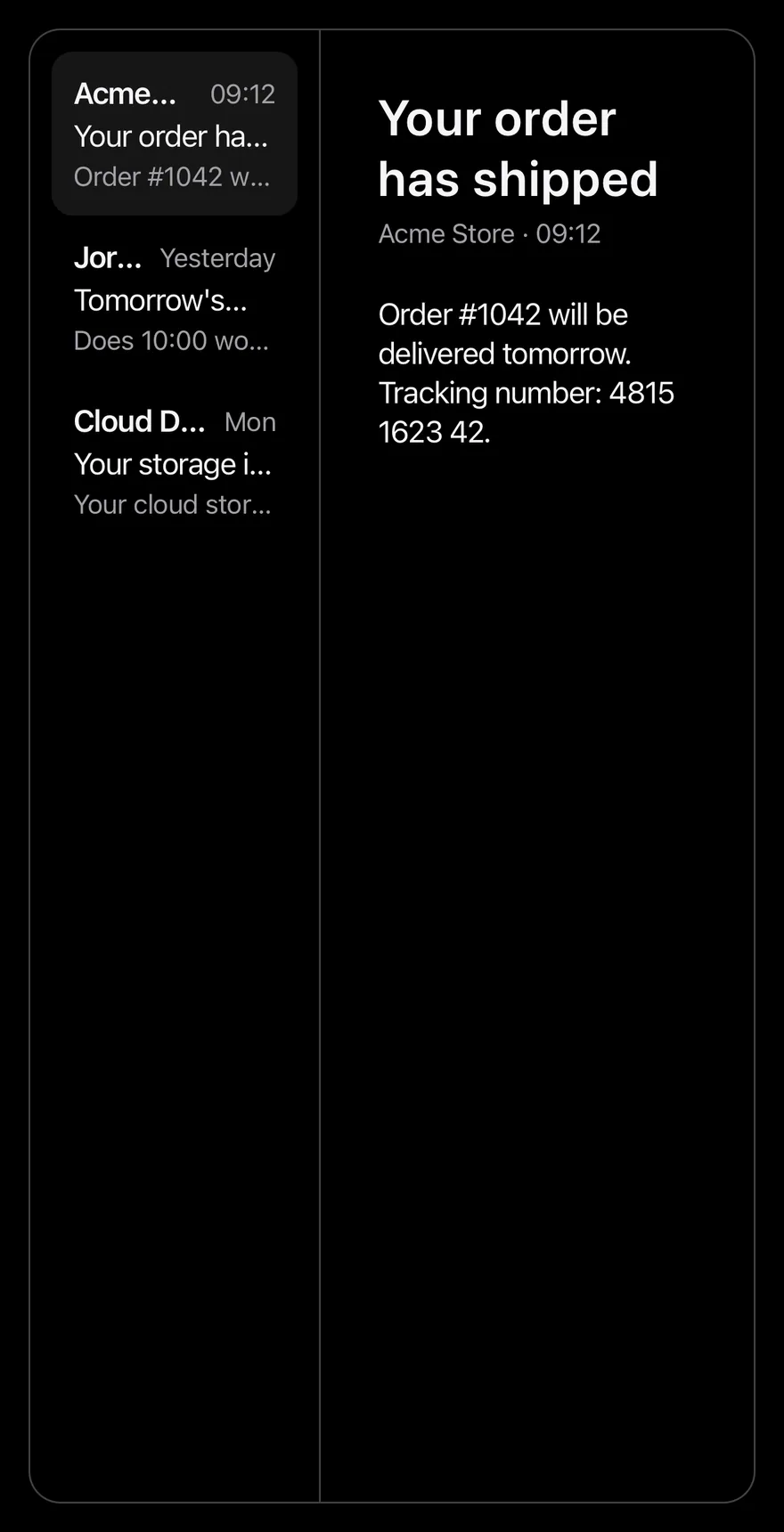
Side-by-side list and detail panes without a sidebar.
import * as React from "react"
import { View } from "react-native"
import { SplitView, type SplitViewColumn, SplitViewDetail, SplitViewItem, SplitViewList, SplitViewSidebar } from "@/components/patterns/split-view"
import { Text } from "@/components/ui/text"

const mailboxes = ["Inbox", "Sent", "Drafts", "Archive"]

const messages = [
  {
    id: "order",
    from: "Acme Store",
    time: "09:12",
    subject: "Your order has shipped",
    body: "Order #1042 will be delivered tomorrow. Tracking number: 4815 1623 42.",
  },
  {
    id: "meeting",
    from: "Jordan Lee",
    time: "Yesterday",
    subject: "Tomorrow's meeting",
    body: "Does 10:00 work for you? On the agenda: the Q4 budget and the campaign plan.",
  },
  {
    id: "storage",
    from: "Cloud Drive",
    time: "Mon",
    subject: "Your storage is almost full",
    body: "Your cloud storage is 90% full. Upgrade your plan to get more space.",
  },
] as const

function MailExample({
  withSidebar = true,
  defaultColumn,
  breakpoint,
}: {
  withSidebar?: boolean
  defaultColumn?: SplitViewColumn
  breakpoint?: number
}) {
  const [mailbox, setMailbox] = React.useState("Inbox")
  const [messageId, setMessageId] = React.useState<string>("order")
  const message = messages.find((item) => item.id === messageId) ?? messages[0]

  return (
    <SplitView defaultColumn={defaultColumn} breakpoint={breakpoint}>
      {withSidebar ? (
        <SplitViewSidebar title="Mailboxes">
          {mailboxes.map((name) => (
            <SplitViewItem
              key={name}
              isActive={mailbox === name}
              onPress={() => setMailbox(name)}
            >
              {name}
            </SplitViewItem>
          ))}
        </SplitViewSidebar>
      ) : null}
      <SplitViewList title={mailbox}>
        {messages.map((item) => (
          <SplitViewItem
            key={item.id}
            isActive={item.id === messageId}
            onPress={() => setMessageId(item.id)}
          >
            <View className="flex-row items-baseline justify-between gap-2">
              <Text className="shrink font-semibold" numberOfLines={1}>
                {item.from}
              </Text>
              <Text className="text-sm text-label-secondary">{item.time}</Text>
            </View>
            <Text numberOfLines={1}>{item.subject}</Text>
            <Text className="text-sm text-label-secondary" numberOfLines={1}>
              {item.body}
            </Text>
          </SplitViewItem>
        ))}
      </SplitViewList>
      <SplitViewDetail title={message.subject}>
        <Text className="text-sm text-label-secondary">
          {message.from} · {message.time}
        </Text>
        <Text className="mt-6">{message.body}</Text>
      </SplitViewDetail>
    </SplitView>
  )
}

export function SplitViewWideTwoColumnsExample() {
  return (
    <MailExample withSidebar={false} breakpoint={0} />
  )
}API Reference
SplitView
The root that tracks the current column and the layout mode.
ViewProps- About
- The visible column on phones when controlled:
sidebar,listordetail. - Type
SplitViewColumn- Default
- —
- About
- The initial column when uncontrolled. Defaults to
list. - Type
SplitViewColumn- Default
- "list"
- About
- Called with the new column.
- Type
(column: SplitViewColumn) => void- Default
- —
- About
- Window width at which the panes sit side by side. Defaults to
768. - Type
number- Default
- 768
SplitViewSidebar
The first pane, for top-level sections.
SplitViewPanePropsSplitViewList
The middle pane, for the items in a section.
SplitViewPanePropsSplitViewDetail
The last pane, for the selected item.
SplitViewPanePropsSplitViewItem
A pressable row that moves to the next column.
React.ComponentProps<typeof Pressable>- About
- Highlights the row and marks it as selected.
- Type
boolean- Default
- false
- Type
React.ReactNode- Default
- —
Accessibility
- Pane titles have the
headingrole, and panes are labelled by string titles. - On phones, screen reader focus moves to the new pane's heading after navigating.
SplitViewItemexposes itsselectedstate.- Back and row chevrons mirror in right-to-left layouts.
Notes
- On phones the new pane fades in, respecting the system reduce motion setting.
- Active rows use
bg-surface-secondary; panes are divided byborder-separator.