suiss/uim · Interaction
Tip
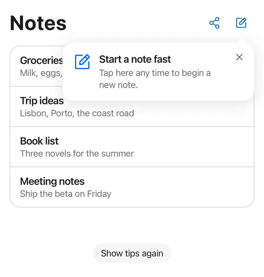
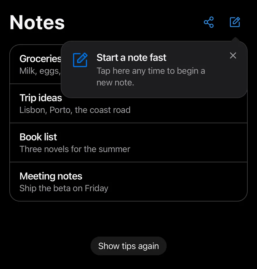
One-time hints shown as an inline card or a popover pointing at a control, remembered once dismissed.
Tip is an open-source mobile interaction from suiss/uim for React Native and Expo, with SwiftUI and Jetpack Compose versions built from the same design tokens. The @esuiss/uim CLI copies its source into your project, so you own the code.
import { NotePencilIcon, PushPinIcon, ShareNetworkIcon } from "phosphor-react-native"
import * as React from "react"
import { Pressable, View } from "react-native"
import { resetTips, Tip, TipAnchor, TipCard, TipClose, TipContent, TipDescription, TipGroup, TipIcon, TipPopover, TipTitle } from "@/components/interactions/tip"
import { Button } from "@/components/ui/button"
import { Icon } from "@/components/ui/icon"
import { Text } from "@/components/ui/text"

const notes = [
  { id: 1, title: "Groceries", preview: "Milk, eggs, bread, coffee" },
  { id: 2, title: "Trip ideas", preview: "Lisbon, Porto, the coast road" },
  { id: 3, title: "Book list", preview: "Three novels for the summer" },
  { id: 4, title: "Meeting notes", preview: "Ship the beta on Friday" },
]

const TIP_IDS = ["notes-pin", "notes-compose"]

function NotesPage() {
  const [log, setLog] = React.useState("")
  return (
    <TipGroup>
      <View className="w-full gap-4">
        <View className="flex-row items-center justify-between">
          <Text variant="h1">Notes</Text>
          <View className="flex-row items-center">
            <Button
              variant="plain"
              size="icon-lg"
              accessibilityLabel="Share folder"
              onPress={() => setLog("Shared the folder")}
            >
              <Icon as={ShareNetworkIcon} className="size-5.5" />
            </Button>
            <Tip id="notes-compose" delay={600}>
              <TipAnchor>
                <Button
                  variant="plain"
                  size="icon-lg"
                  accessibilityLabel="New note"
                  onPress={() => setLog("Started a new note")}
                >
                  <Icon as={NotePencilIcon} className="size-5.5" />
                </Button>
              </TipAnchor>
              <TipPopover side="bottom" align="end">
                <TipIcon>
                  <Icon as={NotePencilIcon} weight="duotone" />
                </TipIcon>
                <TipContent>
                  <TipTitle>Start a note fast</TipTitle>
                  <TipDescription>
                    Tap here any time to begin a new note.
                  </TipDescription>
                </TipContent>
                <TipClose />
              </TipPopover>
            </Tip>
          </View>
        </View>
        <Tip id="notes-pin">
          <TipCard>
            <TipIcon>
              <Icon as={PushPinIcon} weight="duotone" />
            </TipIcon>
            <TipContent>
              <TipTitle>Pin your favorites</TipTitle>
              <TipDescription>
                Swipe right on a note to keep it at the top of the list.
              </TipDescription>
            </TipContent>
            <TipClose />
          </TipCard>
        </Tip>
        <View className="overflow-hidden rounded-2xl border border-separator">
          {notes.map((note, index) => (
            <Pressable
              key={note.id}
              onPress={() => setLog(`Opened ${note.title}`)}
              className={
                index > 0
                  ? "border-t border-separator px-4 py-3 active:bg-item-pressed"
                  : "px-4 py-3 active:bg-item-pressed"
              }
            >
              <Text numberOfLines={1} className="font-semibold">
                {note.title}
              </Text>
              <Text numberOfLines={1} className="text-sm text-label-secondary">
                {note.preview}
              </Text>
            </Pressable>
          ))}
        </View>
        <Text role="status" className="min-h-5 text-sm text-label-secondary">
          {log}
        </Text>
      </View>
    </TipGroup>
  )
}

function TipsExample({ fresh = false }: { fresh?: boolean }) {
  const [key, setKey] = React.useState(0)
  const [ready, setReady] = React.useState(!fresh)

  React.useEffect(() => {
    if (!fresh) return
    resetTips(TIP_IDS).then(() => setReady(true))
  }, [fresh])

  return (
    <View className="gap-6">
      {ready ? <NotesPage key={key} /> : null}
      <Button
        variant="secondary"
        size="sm"
        className="self-center"
        onPress={() => {
          resetTips(TIP_IDS).then(() => setKey((value) => value + 1))
        }}
      >
        <Text>Show tips again</Text>
      </Button>
    </View>
  )
}

export function TipExample() {
  return (
    <TipsExample fresh />
  )
}import EsuissUI
import PhosphorSwift
import SwiftUI
let tipIDs = ["notes-pin", "notes-compose"]
struct TipNote: Identifiable {
let id: Int
let title: String
let preview: String
}
let tipNotes = [
TipNote(id: 1, title: "Groceries", preview: "Milk, eggs, bread, coffee"),
TipNote(id: 2, title: "Trip ideas", preview: "Lisbon, Porto, the coast road"),
TipNote(id: 3, title: "Book list", preview: "Three novels for the summer"),
TipNote(id: 4, title: "Meeting notes", preview: "Ship the beta on Friday"),
]
struct TipPinCard: View {
let id: String
var body: some View {
Tip(id: id) {
TipCard {
TipIcon { Ph.pushPin.duotone }
TipContent {
TipTitle("Pin your favorites")
TipDescription("Swipe right on a note to keep it at the top of the list.")
}
TipClose()
}
}
}
}
struct TipNotesPage: View {
@State private var log = ""
var body: some View {
let shape = RoundedRectangle(cornerRadius: Radius.xl2, style: .continuous)
TipGroup {
VStack(alignment: .leading, spacing: 16) {
HStack {
Text("Notes")
.textVariant(.h1)
Spacer()
Button {
log = "Shared the folder"
} label: {
Ph.shareNetwork.regular.frame(width: 22, height: 22)
}
.buttonStyle(.variant(.plain, size: .iconLg))
.accessibilityLabel(Text("Share folder"))
Tip(id: "notes-compose", delay: .milliseconds(600)) {
Button {
log = "Started a new note"
} label: {
Ph.notePencil.regular.frame(width: 22, height: 22)
}
.buttonStyle(.variant(.plain, size: .iconLg))
.accessibilityLabel(Text("New note"))
.tipPopover(side: .bottom) {
TipIcon { Ph.notePencil.duotone }
TipContent {
TipTitle("Start a note fast")
TipDescription("Tap here any time to begin a new note.")
}
TipClose()
}
}
}
TipPinCard(id: "notes-pin")
VStack(spacing: 0) {
ForEach(Array(tipNotes.enumerated()), id: \.element.id) { index, note in
Button {
log = "Opened \(note.title)"
} label: {
VStack(alignment: .leading, spacing: 0) {
Text(verbatim: note.title)
.textStyle(.base, weight: .semibold)
.foregroundStyle(Color.label)
.lineLimit(1)
Text(verbatim: note.preview)
.textStyle(.sm)
.foregroundStyle(Color.labelSecondary)
.lineLimit(1)
}
.padding(.horizontal, 16)
.padding(.vertical, 12)
.frame(maxWidth: .infinity, alignment: .leading)
.contentShape(Rectangle())
}
.buttonStyle(TipRowStyle())
.overlay(alignment: .top) {
if index > 0 {
Color.separator.frame(height: 1)
}
}
}
}
.clipShape(shape)
.overlay { shape.strokeBorder(Color.separator) }
Text(verbatim: log)
.textStyle(.sm)
.foregroundStyle(Color.labelSecondary)
.frame(minHeight: 20)
.accessibilityAddTraits(.updatesFrequently)
}
}
}
}
struct TipRowStyle: ButtonStyle {
func makeBody(configuration: Configuration) -> some View {
configuration.label
.background(configuration.isPressed ? Color.itemPressed : .clear)
}
}
struct TipExample: View {
@State private var key = 0
@State private var ready = false
var body: some View {
VStack(spacing: 24) {
if ready {
TipNotesPage()
.id(key)
}
Button("Show tips again") {
Task {
await resetTips(tipIDs)
key += 1
}
}
.buttonStyle(.variant(.secondary, size: .sm))
}
.task {
await resetTips(tipIDs)
ready = true
}
}
}import androidx.compose.foundation.background
import androidx.compose.foundation.border
import androidx.compose.foundation.clickable
import androidx.compose.foundation.interaction.MutableInteractionSource
import androidx.compose.foundation.interaction.collectIsPressedAsState
import androidx.compose.foundation.layout.Arrangement
import androidx.compose.foundation.layout.Box
import androidx.compose.foundation.layout.Column
import androidx.compose.foundation.layout.Row
import androidx.compose.foundation.layout.fillMaxWidth
import androidx.compose.foundation.layout.height
import androidx.compose.foundation.layout.heightIn
import androidx.compose.foundation.layout.padding
import androidx.compose.foundation.shape.RoundedCornerShape
import androidx.compose.runtime.Composable
import androidx.compose.runtime.LaunchedEffect
import androidx.compose.runtime.getValue
import androidx.compose.runtime.key
import androidx.compose.runtime.mutableIntStateOf
import androidx.compose.runtime.mutableStateOf
import androidx.compose.runtime.remember
import androidx.compose.runtime.rememberCoroutineScope
import androidx.compose.runtime.saveable.rememberSaveable
import androidx.compose.runtime.setValue
import androidx.compose.ui.Alignment
import androidx.compose.ui.Modifier
import androidx.compose.ui.draw.clip
import androidx.compose.ui.graphics.Color
import androidx.compose.ui.semantics.LiveRegionMode
import androidx.compose.ui.semantics.Role
import androidx.compose.ui.semantics.liveRegion
import androidx.compose.ui.semantics.semantics
import androidx.compose.ui.text.font.FontWeight
import androidx.compose.ui.text.style.TextOverflow
import androidx.compose.ui.unit.dp
import com.adamglin.PhosphorIcons
import com.adamglin.phosphoricons.Duotone
import com.adamglin.phosphoricons.Regular
import com.adamglin.phosphoricons.duotone.NotePencil
import com.adamglin.phosphoricons.duotone.PushPin
import com.adamglin.phosphoricons.regular.NotePencil
import com.adamglin.phosphoricons.regular.ShareNetwork
import com.esuiss.ui.components.Button
import com.esuiss.ui.components.ButtonSize
import com.esuiss.ui.components.ButtonVariant
import com.esuiss.ui.components.Icon
import com.esuiss.ui.components.PopupAlign
import com.esuiss.ui.components.PopupSide
import com.esuiss.ui.components.Text
import com.esuiss.ui.components.TextVariant
import com.esuiss.ui.interactions.Tip
import com.esuiss.ui.interactions.TipAnchor
import com.esuiss.ui.interactions.TipCard
import com.esuiss.ui.interactions.TipClose
import com.esuiss.ui.interactions.TipContent
import com.esuiss.ui.interactions.TipDescription
import com.esuiss.ui.interactions.TipGroup
import com.esuiss.ui.interactions.TipIcon
import com.esuiss.ui.interactions.TipPopover
import com.esuiss.ui.interactions.TipTitle
import com.esuiss.ui.interactions.resetTips
import com.esuiss.ui.theme.EsuissTheme
import com.esuiss.ui.theme.Radius
import com.esuiss.ui.theme.Typography
import kotlinx.coroutines.launch
class TipNote(val id: Int, val title: String, val preview: String)
val tipNotes = listOf(
TipNote(1, "Groceries", "Milk, eggs, bread, coffee"),
TipNote(2, "Trip ideas", "Lisbon, Porto, the coast road"),
TipNote(3, "Book list", "Three novels for the summer"),
TipNote(4, "Meeting notes", "Ship the beta on Friday"),
)
val tipIds = listOf("notes-pin", "notes-compose")
@Composable
fun TipPinCard() {
TipCard {
TipIcon {
Icon(PhosphorIcons.Duotone.PushPin, contentDescription = null)
}
TipContent {
TipTitle("Pin your favorites")
TipDescription("Swipe right on a note to keep it at the top of the list.")
}
TipClose()
}
}
@Composable
fun TipNotesPage() {
val colors = EsuissTheme.colors
var log by rememberSaveable { mutableStateOf("") }
val shape = RoundedCornerShape(Radius.xl2)
TipGroup {
Column(Modifier.fillMaxWidth(), verticalArrangement = Arrangement.spacedBy(16.dp)) {
Row(
modifier = Modifier.fillMaxWidth(),
horizontalArrangement = Arrangement.SpaceBetween,
verticalAlignment = Alignment.CenterVertically,
) {
Text("Notes", variant = TextVariant.H1)
Row(verticalAlignment = Alignment.CenterVertically) {
Button(onClick = { log = "Shared the folder" }, variant = ButtonVariant.Plain, size = ButtonSize.IconLg) {
Icon(PhosphorIcons.Regular.ShareNetwork, contentDescription = "Share folder", size = 22.dp)
}
Tip(id = "notes-compose", delayMillis = 600) {
TipAnchor {
Button(onClick = { log = "Started a new note" }, variant = ButtonVariant.Plain, size = ButtonSize.IconLg) {
Icon(PhosphorIcons.Regular.NotePencil, contentDescription = "New note", size = 22.dp)
}
}
TipPopover(side = PopupSide.Bottom, align = PopupAlign.End) {
TipIcon {
Icon(PhosphorIcons.Duotone.NotePencil, contentDescription = null)
}
TipContent {
TipTitle("Start a note fast")
TipDescription("Tap here any time to begin a new note.")
}
TipClose()
}
}
}
}
Tip(id = "notes-pin") {
TipPinCard()
}
Column(
Modifier
.fillMaxWidth()
.clip(shape)
.border(1.dp, colors.separator, shape),
) {
tipNotes.forEachIndexed { index, note ->
if (index > 0) Box(Modifier.fillMaxWidth().height(1.dp).background(colors.separator))
TipNoteRow(note) { log = "Opened ${note.title}" }
}
}
Text(
log,
modifier = Modifier.heightIn(min = 20.dp).semantics { liveRegion = LiveRegionMode.Polite },
style = Typography.sm.copy(color = colors.labelSecondary),
)
}
}
}
@Composable
fun TipNoteRow(note: TipNote, onClick: () -> Unit) {
val colors = EsuissTheme.colors
val interaction = remember { MutableInteractionSource() }
val pressed by interaction.collectIsPressedAsState()
Column(
Modifier
.fillMaxWidth()
.background(if (pressed) colors.itemPressed else Color.Transparent)
.clickable(interactionSource = interaction, indication = null, role = Role.Button, onClick = onClick)
.padding(horizontal = 16.dp, vertical = 12.dp),
) {
Text(
note.title,
style = Typography.base.copy(fontWeight = FontWeight.SemiBold),
maxLines = 1,
overflow = TextOverflow.Ellipsis,
)
Text(
note.preview,
style = Typography.sm.copy(color = colors.labelSecondary),
maxLines = 1,
overflow = TextOverflow.Ellipsis,
)
}
}
@Composable
fun TipExample() {
val scope = rememberCoroutineScope()
var ready by remember { mutableStateOf(false) }
var page by remember { mutableIntStateOf(0) }
LaunchedEffect(Unit) {
resetTips(tipIds)
ready = true
}
Column(verticalArrangement = Arrangement.spacedBy(24.dp), horizontalAlignment = Alignment.CenterHorizontally) {
if (ready) {
key(page) { TipNotesPage() }
}
Button(
"Show tips again",
onClick = {
scope.launch {
resetTips(tipIds)
page += 1
}
},
variant = ButtonVariant.Secondary,
size = ButtonSize.Sm,
)
}
}Tip shows a hint until the user dismisses it, then records the dismissal under its id so it does not return. It renders either as a TipCard placed in the layout, or as a TipPopover with an arrow pointing at a TipAnchor. Touching the anchor also dismisses the tip.
TipGroup shows several tips one at a time in the order they mount, moving to the next when one is dismissed. Use tips to introduce a feature or gesture the user may not discover.
Installation
$ pnpm dlx @esuiss/uim@latest add tip$ pnpm dlx @esuiss/uim@latest add tip --platform swift$ pnpm dlx @esuiss/uim@latest add tip --platform kotlinThe CLI also adds what it builds on: Icon, Text.
Manual
- Install the dependencies:
npx expo install cn phosphor-react-native react-native-reanimated react-native-screens react-native-svg react-native-worklets-
Add the pieces it builds on: Icon, Text, and the primitives
components/primitives/popover.tsx,components/primitives/types.tsx,components/primitives/use-render.tsx. -
Copy the source into
components/interactions/tip.tsx:
import { cn } from "cn"
import { XIcon } from "phosphor-react-native"
import * as React from "react"
import {
  Platform,
  Pressable,
  useWindowDimensions,
  View,
  type ViewProps,
} from "react-native"
import {
  Easing,
  FadeInDown,
  FadeOut,
  Keyframe,
ReduceMotion,- Update the import paths to match your project.
- Install the dependencies:
npx expo install cn phosphor-react-native react-native-reanimated react-native-screens react-native-svg react-native-worklets-
Add the pieces it builds on: Icon, Text, and the primitives
components/primitives/popover.tsx,components/primitives/types.tsx,components/primitives/use-render.tsx. -
Copy the source into
components/interactions/tip.tsx:
import { cn } from "cn"
import { XIcon } from "phosphor-react-native"
import * as React from "react"
import {
  Platform,
  Pressable,
  useWindowDimensions,
  View,
  type ViewProps,
} from "react-native"
import {
  Easing,
  FadeInDown,
  FadeOut,
  Keyframe,
ReduceMotion,- Update the import paths to match your project.
- Install the dependencies:
npx expo install phosphor-react-native react-native-reanimated react-native-screens react-native-svg react-native-worklets-
Add the pieces it builds on: Icon, Text, and the primitives
components/primitives/popover.tsx,components/primitives/types.tsx,components/primitives/use-render.tsx. -
Copy the source into
components/interactions/tip.tsx:
import { XIcon } from "phosphor-react-native"
import * as React from "react"
import {
  Platform,
  Pressable,
  type StyleProp,
  StyleSheet,
  useWindowDimensions,
  View,
  type ViewProps,
  type ViewStyle,
} from "react-native"
import {
  Easing,
  FadeInDown,
FadeOut,- Update the import paths to match your project.
-
Target iOS 17 or later.
-
Add the Swift package to your app:
.package(url: "https://github.com/phosphor-icons/swift", from: "2.1.0")- Copy the theme files every view uses:
import SwiftUI
import UIKit

struct RGBA: Sendable {
  let red: CGFloat
  let green: CGFloat
  let blue: CGFloat
  let alpha: CGFloat

  init(_ hex: UInt32, _ alpha: CGFloat = 1) {
    red = CGFloat((hex >> 16) & 0xFF) / 255
    green = CGFloat((hex >> 8) & 0xFF) / 255
    blue = CGFloat(hex & 0xFF) / 255
    self.alpha = alpha
}import SwiftUI
extension Color {
public static let surface = Color.adaptive(light: .init(0xFFFFFF), dark: .init(0x000000))
public static let surfaceSecondary = Color.adaptive(light: .init(0xF5F5F7), dark: .init(0x161617))
public static let surfaceTertiary = Color.adaptive(light: .init(0xE8E8ED), dark: .init(0x2C2C2E))
public static let surfaceRaised = Color.adaptive(light: .init(0xFFFFFF), dark: .init(0x1D1D1F))
public static let label = Color.adaptive(light: .init(0x1D1D1F), dark: .init(0xF5F5F7))
public static let labelSecondary = Color.adaptive(light: .init(0x6E6E73), dark: .init(0xA1A1A6))
public static let labelTertiary = Color.adaptive(light: .init(0x86868B), dark: .init(0x86868B))
public static let labelQuaternary = Color.adaptive(light: .init(0xD2D2D7), dark: .init(0x424245))
public static let control = Color.adaptive(light: .init(0x000000, 0.04), dark: .init(0xFFFFFF, 0.1))
public static let controlPressed = Color.adaptive(light: .init(0x000000, 0.12), dark: .init(0xFFFFFF, 0.22))
public static let controlSelected = Color.adaptive(light: .init(0x1D1D1F), dark: .init(0xF5F5F7))
public static let controlDisabled = Color.adaptive(light: .init(0x000000, 0.03), dark: .init(0xFFFFFF, 0.05))
public static let onControlSelected = Color.adaptive(light: .init(0xFFFFFF), dark: .init(0x000000))- Copy the source and every file it uses:
import PhosphorSwift
import SwiftUI

public protocol TipStorage: Sendable {
  func getItem(_ key: String) async -> String?
  func setItem(_ key: String, _ value: String?) async
}

public actor InMemoryTipStorage: TipStorage {
  public static let shared = InMemoryTipStorage()

  private var values: [String: String] = [:]

  public init() {}

public func getItem(_ key: String) async -> String? {import SwiftUI
public enum TextVariant: CaseIterable, Sendable {
case `default`, h1, h2, h3, h4, p, blockquote, code, lead, large, small, muted
var style: TextStyle {
switch self {
case .h1: .xl3
case .h2: .xl2
case .h3: .xl
case .h4, .lead, .large: .lg
case .code, .small, .muted: .sm
default: .base
}
}- Add the files to your app target.
- Set
minSdkto 24 or higher and add the dependencies:
implementation(platform("androidx.compose:compose-bom:2026.09.00"))
implementation("androidx.compose.foundation:foundation")
implementation("androidx.compose.ui:ui")
implementation("com.adamglin:phosphor-icon-android:1.0.0")- Copy the theme files every view uses:
package com.esuiss.ui.theme

import androidx.compose.foundation.isSystemInDarkTheme
import androidx.compose.runtime.Composable
import androidx.compose.runtime.CompositionLocalProvider
import androidx.compose.runtime.Immutable
import androidx.compose.runtime.staticCompositionLocalOf
import androidx.compose.ui.Modifier
import androidx.compose.ui.draw.dropShadow
import androidx.compose.ui.graphics.Color
import androidx.compose.ui.graphics.Shape
import androidx.compose.ui.graphics.shadow.Shadow as DropShadow
import androidx.compose.ui.text.TextStyle
import androidx.compose.ui.text.style.LineHeightStyle
import androidx.compose.ui.unit.Dp
import androidx.compose.ui.unit.DpOffsetpackage com.esuiss.ui.theme
import androidx.compose.runtime.Immutable
import androidx.compose.ui.graphics.Color
import androidx.compose.ui.unit.dp
@Immutable
data class Colors(
val surface: Color,
val surfaceSecondary: Color,
val surfaceTertiary: Color,
val surfaceRaised: Color,
val label: Color,
val labelSecondary: Color,
val labelTertiary: Color,
val labelQuaternary: Color,- Copy the source and every file it uses:
package com.esuiss.ui.interactions

import androidx.compose.animation.AnimatedVisibility
import androidx.compose.animation.core.MutableTransitionState
import androidx.compose.animation.core.tween
import androidx.compose.animation.expandVertically
import androidx.compose.animation.fadeIn
import androidx.compose.animation.fadeOut
import androidx.compose.animation.scaleIn
import androidx.compose.animation.scaleOut
import androidx.compose.animation.shrinkVertically
import androidx.compose.animation.slideInVertically
import androidx.compose.foundation.background
import androidx.compose.foundation.border
import androidx.compose.foundation.clickable
import androidx.compose.foundation.gestures.awaitEachGesturepackage com.esuiss.ui.components
import androidx.compose.foundation.background
import androidx.compose.foundation.border
import androidx.compose.foundation.clickable
import androidx.compose.foundation.interaction.MutableInteractionSource
import androidx.compose.foundation.interaction.collectIsPressedAsState
import androidx.compose.foundation.layout.Arrangement
import androidx.compose.foundation.layout.Row
import androidx.compose.foundation.layout.RowScope
import androidx.compose.foundation.layout.fillMaxWidth
import androidx.compose.foundation.layout.height
import androidx.compose.foundation.layout.padding
import androidx.compose.foundation.layout.size
import androidx.compose.foundation.shape.CircleShape
import androidx.compose.foundation.shape.RoundedCornerShapepackage com.esuiss.ui.components
import androidx.compose.foundation.background
import androidx.compose.foundation.gestures.Orientation
import androidx.compose.foundation.layout.Arrangement
import androidx.compose.foundation.layout.Box
import androidx.compose.foundation.layout.Row
import androidx.compose.foundation.layout.RowScope
import androidx.compose.foundation.layout.padding
import androidx.compose.foundation.shape.CircleShape
import androidx.compose.foundation.shape.CornerSize
import androidx.compose.foundation.shape.RoundedCornerShape
import androidx.compose.runtime.Composable
import androidx.compose.runtime.CompositionLocalProvider
import androidx.compose.runtime.DisposableEffect
import androidx.compose.runtime.Immutablepackage com.esuiss.ui.components
import androidx.compose.runtime.compositionLocalOf
import androidx.compose.ui.graphics.Color
import androidx.compose.ui.text.TextStyle
import androidx.compose.ui.unit.Dp
import androidx.compose.ui.unit.dp
val LocalContentStyle = compositionLocalOf { TextStyle.Default }
val LocalContentColor = compositionLocalOf { Color.Unspecified }
val LocalIconSize = compositionLocalOf { 20.dp }package com.esuiss.ui.components
import android.provider.Settings
import androidx.compose.animation.core.CubicBezierEasing
import androidx.compose.foundation.background
import androidx.compose.foundation.border
import androidx.compose.foundation.gestures.Orientation
import androidx.compose.foundation.text.selection.TextSelectionColors
import androidx.compose.runtime.Composable
import androidx.compose.runtime.mutableStateOf
import androidx.compose.runtime.remember
import androidx.compose.ui.Modifier
import androidx.compose.ui.draw.clip
import androidx.compose.ui.draw.drawWithContent
import androidx.compose.ui.geometry.Offset
import androidx.compose.ui.geometry.Sizepackage com.esuiss.ui.components
import androidx.compose.foundation.Image
import androidx.compose.foundation.layout.size
import androidx.compose.runtime.Composable
import androidx.compose.ui.Modifier
import androidx.compose.ui.graphics.Color
import androidx.compose.ui.graphics.ColorFilter
import androidx.compose.ui.graphics.takeOrElse
import androidx.compose.ui.graphics.vector.ImageVector
import androidx.compose.ui.unit.Dp
import com.esuiss.ui.theme.EsuissTheme
@Composable
fun Icon(
imageVector: ImageVector,package com.esuiss.ui.components
import android.os.Build
import android.view.Window
import android.view.WindowManager
import androidx.compose.animation.AnimatedVisibility
import androidx.compose.animation.AnimatedVisibilityScope
import androidx.compose.animation.EnterExitState
import androidx.compose.animation.core.MutableTransitionState
import androidx.compose.animation.core.animateFloat
import androidx.compose.animation.core.tween
import androidx.compose.animation.fadeIn
import androidx.compose.animation.fadeOut
import androidx.compose.animation.scaleIn
import androidx.compose.animation.scaleOut
import androidx.compose.animation.slideIn- Update the
com.esuiss.uipackage names to match your project.
Usage
import { TipGroup, Tip, TipCard, TipAnchor, TipPopover, TipIcon, TipContent, TipTitle, TipDescription, TipClose } from "@/components/interactions/tip"<TipsExample fresh />Give each Tip a stable id. Compose TipIcon, TipContent with TipTitle and TipDescription, and TipClose inside a TipCard or TipPopover. For a popover, wrap the target in TipAnchor inside the same Tip.
By default dismissals are kept in memory and reset when the app restarts. To persist them, pass a storage adapter to TipGroup with getItem and setItem, sync or async, such as one backed by your app's key-value store. Keys are prefixed with tip:. resetTips(ids, storage) clears dismissals, and useTip returns visible and dismiss. The TipStorage type is exported.
Examples
Card
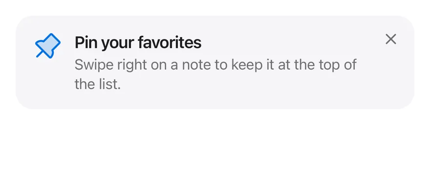
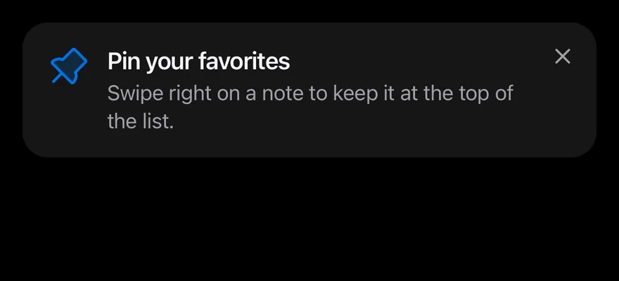
An inline card tip with an icon, title, description and close button.
import { PushPinIcon } from "phosphor-react-native"
import * as React from "react"
import { resetTips, Tip, TipCard, TipClose, TipContent, TipDescription, TipIcon, TipTitle } from "@/components/interactions/tip"
import { Icon } from "@/components/ui/icon"

function CardExample() {
  const [ready, setReady] = React.useState(false)

  React.useEffect(() => {
    resetTips(["story-card"]).then(() => setReady(true))
  }, [])

  if (!ready) return null

  return (
    <Tip id="story-card">
      <TipCard>
        <TipIcon>
          <Icon as={PushPinIcon} weight="duotone" />
        </TipIcon>
        <TipContent>
          <TipTitle>Pin your favorites</TipTitle>
          <TipDescription>
            Swipe right on a note to keep it at the top of the list.
          </TipDescription>
        </TipContent>
        <TipClose />
      </TipCard>
    </Tip>
  )
}

export function TipCardExample() {
  return (
    <CardExample />
  )
}import EsuissUI
import PhosphorSwift
import SwiftUI
struct TipPinCard: View {
let id: String
var body: some View {
Tip(id: id) {
TipCard {
TipIcon { Ph.pushPin.duotone }
TipContent {
TipTitle("Pin your favorites")
TipDescription("Swipe right on a note to keep it at the top of the list.")
}
TipClose()
}
}
}
}
struct TipCardExample: View {
@State private var ready = false
var body: some View {
Group {
if ready {
TipPinCard(id: "story-card")
}
}
.task {
await resetTips(["story-card"])
ready = true
}
}
}import androidx.compose.runtime.Composable
import androidx.compose.runtime.LaunchedEffect
import androidx.compose.runtime.getValue
import androidx.compose.runtime.mutableStateOf
import androidx.compose.runtime.remember
import androidx.compose.runtime.setValue
import com.adamglin.PhosphorIcons
import com.adamglin.phosphoricons.Duotone
import com.adamglin.phosphoricons.duotone.PushPin
import com.esuiss.ui.components.Icon
import com.esuiss.ui.interactions.Tip
import com.esuiss.ui.interactions.TipCard
import com.esuiss.ui.interactions.TipClose
import com.esuiss.ui.interactions.TipContent
import com.esuiss.ui.interactions.TipDescription
import com.esuiss.ui.interactions.TipIcon
import com.esuiss.ui.interactions.TipTitle
import com.esuiss.ui.interactions.resetTips
@Composable
fun TipPinCard() {
TipCard {
TipIcon {
Icon(PhosphorIcons.Duotone.PushPin, contentDescription = null)
}
TipContent {
TipTitle("Pin your favorites")
TipDescription("Swipe right on a note to keep it at the top of the list.")
}
TipClose()
}
}
@Composable
fun TipCardExample() {
var ready by remember { mutableStateOf(false) }
LaunchedEffect(Unit) {
resetTips(listOf("story-card"))
ready = true
}
if (!ready) return
Tip(id = "story-card") {
TipPinCard()
}
}API Reference
TipGroup
Shows its tips one at a time and supplies the storage.
- About
- Adapter with
getItemandsetItemfor remembering dismissals. Defaults to in-memory storage. - Type
TipStorage- Default
- memoryStorage
- Type
React.ReactNode- Default
- —
Tip
One hint, identified by id.
- About
- Stable key used to remember the dismissal.
- Type
string- Default
- required
- About
- Milliseconds to wait before showing. Defaults to
0. - Type
number- Default
- 0
- About
- Called when the tip is dismissed.
- Type
() => void- Default
- —
- Type
React.ReactNode- Default
- —
TipCard
Renders the tip inline as a card.
ViewPropsTipAnchor
The element the popover points at.
ViewPropsTipPopover
Renders the tip as a popover next to the anchor.
React.ComponentProps<typeof PopoverPrimitive.Popup>- About
- Side of the anchor to show on. Defaults to
bottom. - Type
Side- Default
- "bottom"
- About
- Alignment against the anchor. Defaults to
center. - Type
Align- Default
- "center"
- About
- Gap from the anchor. Defaults to
10. - Type
number- Default
- 10
- About
- Name of a portal host to render into.
- Type
string- Default
- —
TipIcon
A decorative icon slot.
ViewPropsTipContent
Holds the title and description.
ViewPropsTipTitle
The tip's heading.
React.ComponentProps<typeof Text>TipDescription
The tip's supporting text.
React.ComponentProps<typeof Text>TipClose
A button that dismisses the tip.
React.ComponentProps<typeof Pressable>Accessibility
TipCardhas thenoterole.TipPopoveris non-modal, does not move focus, and is labelled byTipTitle.TipCloseis labelledDismiss tip.- The icon is hidden from screen readers.
Notes
- Cards use
bg-surface-secondary; popovers usebg-surface-raisedwith a border that is stronger in dark mode, and are up to 320 points wide. - Animations respect the system reduce motion setting.
- On iOS the popover renders in a full-window overlay so it appears above native screens.