suiss/uim · Interaction
Search Reveal
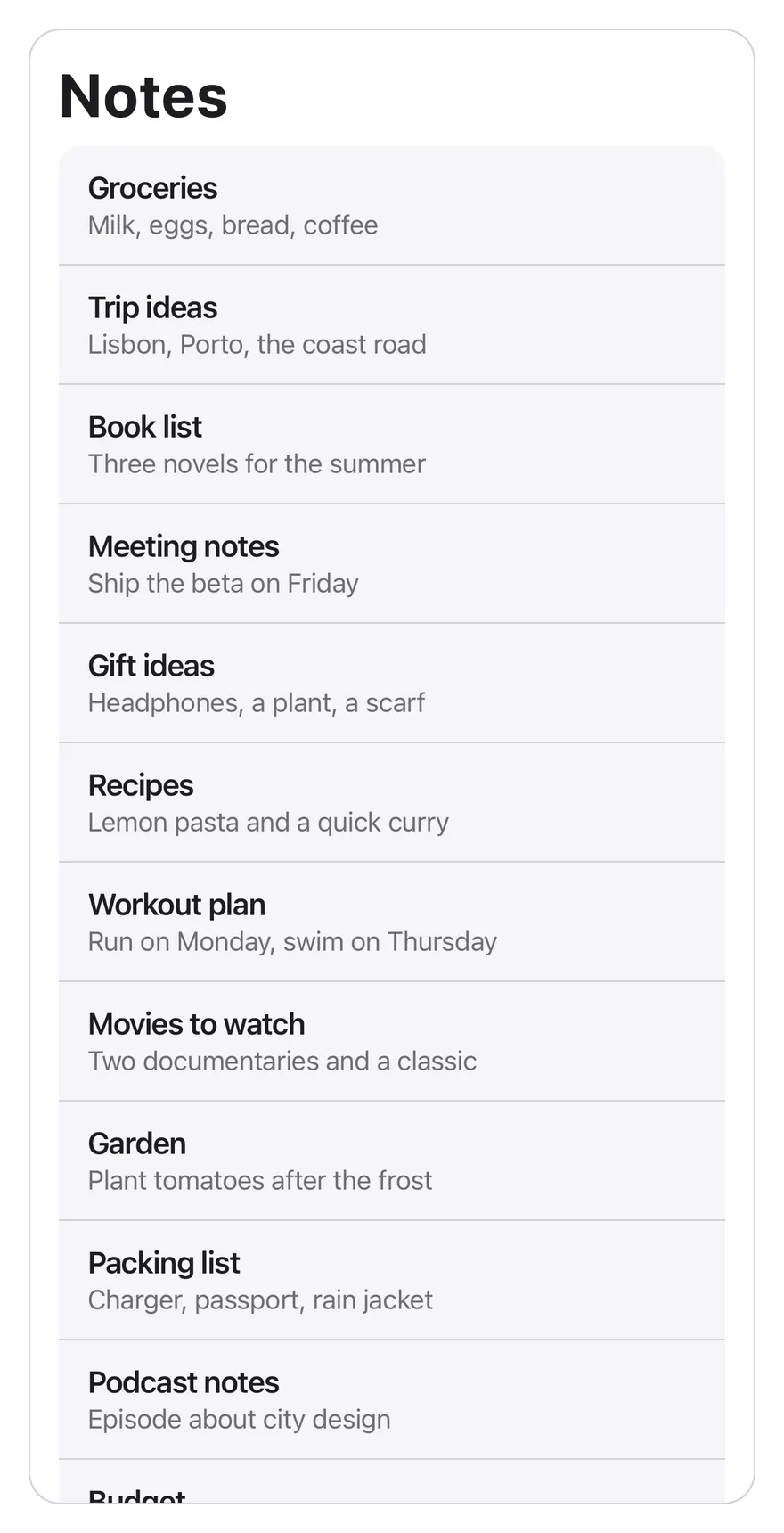
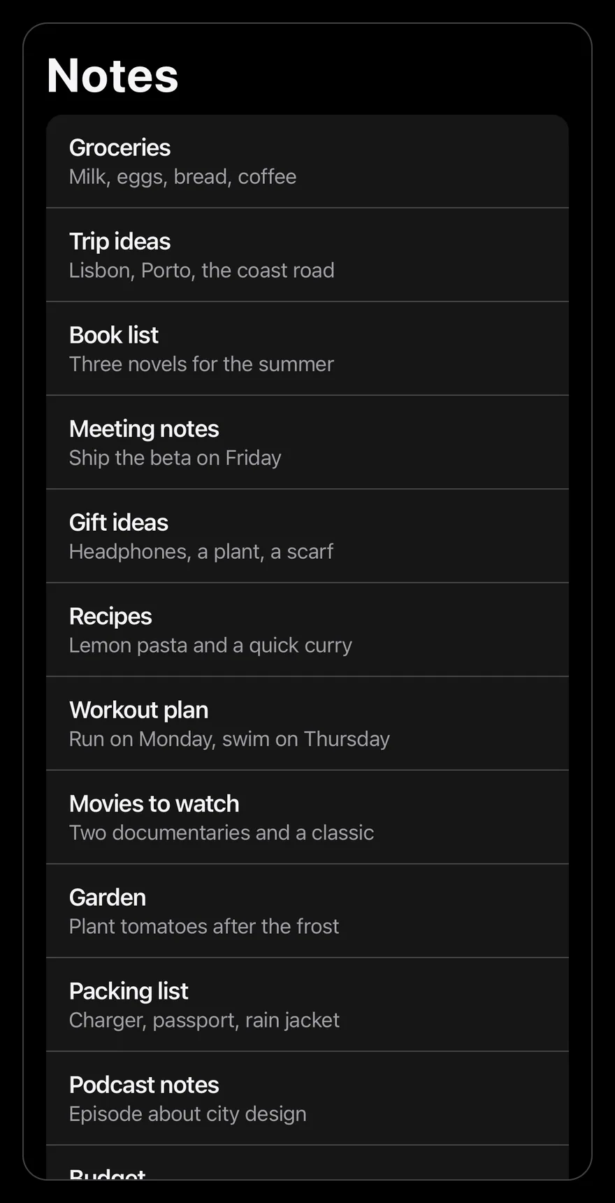
A search field hidden above a scrolling list that appears when the user pulls the list down.
Search Reveal is an open-source mobile interaction from suiss/uim for React Native and Expo, with SwiftUI and Jetpack Compose versions built from the same design tokens. The @esuiss/uim CLI copies its source into your project, so you own the code.
import * as React from "react"
import { Pressable, View } from "react-native"
import { SearchReveal, SearchRevealContent, SearchRevealField } from "@/components/interactions/search-reveal"
import { Text } from "@/components/ui/text"

const allNotes = [
  { id: 1, title: "Groceries", preview: "Milk, eggs, bread, coffee" },
  { id: 2, title: "Trip ideas", preview: "Lisbon, Porto, the coast road" },
  { id: 3, title: "Book list", preview: "Three novels for the summer" },
  { id: 4, title: "Meeting notes", preview: "Ship the beta on Friday" },
  { id: 5, title: "Gift ideas", preview: "Headphones, a plant, a scarf" },
  { id: 6, title: "Recipes", preview: "Lemon pasta and a quick curry" },
  { id: 7, title: "Workout plan", preview: "Run on Monday, swim on Thursday" },
  {
    id: 8,
    title: "Movies to watch",
    preview: "Two documentaries and a classic",
  },
  { id: 9, title: "Garden", preview: "Plant tomatoes after the frost" },
  { id: 10, title: "Packing list", preview: "Charger, passport, rain jacket" },
  { id: 11, title: "Podcast notes", preview: "Episode about city design" },
  { id: 12, title: "Budget", preview: "Rent, groceries, savings" },
]

function NotesExample({
  count,
  defaultQuery = "",
}: {
  count: number
  defaultQuery?: string
}) {
  const [query, setQuery] = React.useState(defaultQuery)
  const notes = allNotes
    .slice(0, count)
    .filter((note) =>
      `${note.title} ${note.preview}`
        .toLowerCase()
        .includes(query.trim().toLowerCase())
    )

  return (
    <View className="flex-1 overflow-hidden rounded-2xl border border-separator">
      <Text variant="h1" className="px-4 pt-4 pb-2">
        Notes
      </Text>
      <SearchReveal>
        <SearchRevealField value={query} onValueChange={setQuery} />
        <SearchRevealContent>
          {notes.length === 0 ? (
            <Text className="px-4 py-16 text-center text-sm text-label-secondary">
              No results for “{query}”
            </Text>
          ) : (
            <View className="mx-4 overflow-hidden rounded-xl bg-surface-secondary">
              {notes.map((note, index) => (
                <Pressable
                  key={note.id}
                  className={
                    index > 0
                      ? "border-t border-separator px-4 py-3 active:bg-item-pressed"
                      : "px-4 py-3 active:bg-item-pressed"
                  }
                >
                  <Text numberOfLines={1} className="font-semibold">
                    {note.title}
                  </Text>
                  <Text
                    numberOfLines={1}
                    className="text-sm text-label-secondary"
                  >
                    {note.preview}
                  </Text>
                </Pressable>
              ))}
            </View>
          )}
          <Text className="px-4 py-3 text-center text-xs text-label-secondary">
            {notes.length} {notes.length === 1 ? "note" : "notes"}
          </Text>
        </SearchRevealContent>
      </SearchReveal>
    </View>
  )
}

export function SearchRevealExample() {
  return (
    <NotesExample count={12} />
  )
}import EsuissUI
import SwiftUI
struct SearchRevealExample: View {
var body: some View {
SearchRevealNotes(count: 12)
}
}
struct SearchRevealNote: Identifiable {
let id: Int
let title: String
let preview: String
}
let searchRevealNotes = [
SearchRevealNote(id: 1, title: "Groceries", preview: "Milk, eggs, bread, coffee"),
SearchRevealNote(id: 2, title: "Trip ideas", preview: "Lisbon, Porto, the coast road"),
SearchRevealNote(id: 3, title: "Book list", preview: "Three novels for the summer"),
SearchRevealNote(id: 4, title: "Meeting notes", preview: "Ship the beta on Friday"),
SearchRevealNote(id: 5, title: "Gift ideas", preview: "Headphones, a plant, a scarf"),
SearchRevealNote(id: 6, title: "Recipes", preview: "Lemon pasta and a quick curry"),
SearchRevealNote(id: 7, title: "Workout plan", preview: "Run on Monday, swim on Thursday"),
SearchRevealNote(id: 8, title: "Movies to watch", preview: "Two documentaries and a classic"),
SearchRevealNote(id: 9, title: "Garden", preview: "Plant tomatoes after the frost"),
SearchRevealNote(id: 10, title: "Packing list", preview: "Charger, passport, rain jacket"),
SearchRevealNote(id: 11, title: "Podcast notes", preview: "Episode about city design"),
SearchRevealNote(id: 12, title: "Budget", preview: "Rent, groceries, savings"),
]
struct SearchRevealNotes: View {
let count: Int
@State private var query: String
init(count: Int, query: String = "") {
self.count = count
_query = State(initialValue: query)
}
var notes: [SearchRevealNote] {
let needle = query.trimmingCharacters(in: .whitespaces).lowercased()
return searchRevealNotes.prefix(count).filter { note in
needle.isEmpty || "\(note.title) \(note.preview)".lowercased().contains(needle)
}
}
var body: some View {
let notes = notes
let shape = RoundedRectangle(cornerRadius: Radius.xl2, style: .continuous)
VStack(alignment: .leading, spacing: 0) {
Text("Notes")
.textVariant(.h1)
.padding(.horizontal, 16)
.padding(.top, 16)
.padding(.bottom, 8)
SearchReveal {
SearchRevealField(text: $query)
SearchRevealContent {
if notes.isEmpty {
Text(verbatim: "No results for “\(query)”")
.textStyle(.sm)
.foregroundStyle(Color.labelSecondary)
.multilineTextAlignment(.center)
.padding(.horizontal, 16)
.padding(.vertical, 64)
.frame(maxWidth: .infinity)
} else {
VStack(spacing: 0) {
ForEach(Array(notes.enumerated()), id: \.element.id) { index, note in
Button {} label: {
VStack(alignment: .leading, spacing: 0) {
Text(verbatim: note.title)
.textStyle(.base, weight: .semibold)
.foregroundStyle(Color.label)
.lineLimit(1)
Text(verbatim: note.preview)
.textStyle(.sm)
.foregroundStyle(Color.labelSecondary)
.lineLimit(1)
}
.padding(.horizontal, 16)
.padding(.vertical, 12)
.frame(maxWidth: .infinity, alignment: .leading)
.contentShape(Rectangle())
}
.buttonStyle(SearchRevealRowStyle())
.overlay(alignment: .top) {
if index > 0 {
Color.separator.frame(height: 1)
}
}
}
}
.background(Color.surfaceSecondary)
.clipShape(RoundedRectangle(cornerRadius: Radius.xl, style: .continuous))
.padding(.horizontal, 16)
}
Text(verbatim: "\(notes.count) \(notes.count == 1 ? "note" : "notes")")
.textStyle(.xs)
.foregroundStyle(Color.labelSecondary)
.multilineTextAlignment(.center)
.padding(.horizontal, 16)
.padding(.vertical, 12)
.frame(maxWidth: .infinity)
}
}
}
.clipShape(shape)
.overlay { shape.strokeBorder(Color.separator) }
.containerRelativeFrame(.vertical) { height, _ in height - 32 }
}
}
struct SearchRevealRowStyle: ButtonStyle {
func makeBody(configuration: Configuration) -> some View {
configuration.label
.background(configuration.isPressed ? Color.itemPressed : .clear)
}
}import androidx.compose.foundation.background
import androidx.compose.foundation.border
import androidx.compose.foundation.clickable
import androidx.compose.foundation.interaction.MutableInteractionSource
import androidx.compose.foundation.interaction.collectIsPressedAsState
import androidx.compose.foundation.layout.Box
import androidx.compose.foundation.layout.Column
import androidx.compose.foundation.layout.fillMaxWidth
import androidx.compose.foundation.layout.height
import androidx.compose.foundation.layout.padding
import androidx.compose.foundation.shape.RoundedCornerShape
import androidx.compose.runtime.Composable
import androidx.compose.runtime.getValue
import androidx.compose.runtime.mutableStateOf
import androidx.compose.runtime.remember
import androidx.compose.runtime.saveable.rememberSaveable
import androidx.compose.runtime.setValue
import androidx.compose.ui.Modifier
import androidx.compose.ui.draw.clip
import androidx.compose.ui.graphics.Color
import androidx.compose.ui.semantics.Role
import androidx.compose.ui.text.font.FontWeight
import androidx.compose.ui.text.style.TextAlign
import androidx.compose.ui.text.style.TextOverflow
import androidx.compose.ui.unit.dp
import com.esuiss.ui.components.Text
import com.esuiss.ui.components.TextVariant
import com.esuiss.ui.interactions.SearchReveal
import com.esuiss.ui.interactions.SearchRevealContent
import com.esuiss.ui.interactions.SearchRevealField
import com.esuiss.ui.theme.EsuissTheme
import com.esuiss.ui.theme.Radius
import com.esuiss.ui.theme.Typography
@Composable
fun SearchRevealExample() {
SearchRevealNotes(count = 12)
}
class SearchRevealNote(val id: Int, val title: String, val preview: String)
val searchRevealAllNotes = listOf(
SearchRevealNote(1, "Groceries", "Milk, eggs, bread, coffee"),
SearchRevealNote(2, "Trip ideas", "Lisbon, Porto, the coast road"),
SearchRevealNote(3, "Book list", "Three novels for the summer"),
SearchRevealNote(4, "Meeting notes", "Ship the beta on Friday"),
SearchRevealNote(5, "Gift ideas", "Headphones, a plant, a scarf"),
SearchRevealNote(6, "Recipes", "Lemon pasta and a quick curry"),
SearchRevealNote(7, "Workout plan", "Run on Monday, swim on Thursday"),
SearchRevealNote(8, "Movies to watch", "Two documentaries and a classic"),
SearchRevealNote(9, "Garden", "Plant tomatoes after the frost"),
SearchRevealNote(10, "Packing list", "Charger, passport, rain jacket"),
SearchRevealNote(11, "Podcast notes", "Episode about city design"),
SearchRevealNote(12, "Budget", "Rent, groceries, savings"),
)
@Composable
fun SearchRevealNotes(count: Int, defaultQuery: String = "") {
val colors = EsuissTheme.colors
var query by rememberSaveable { mutableStateOf(defaultQuery) }
val needle = query.trim().lowercase()
val notes = searchRevealAllNotes.take(count).filter { "${it.title} ${it.preview}".lowercase().contains(needle) }
val shape = RoundedCornerShape(Radius.xl2)
Column(
Modifier
.fillMaxWidth()
.height(600.dp)
.clip(shape)
.border(1.dp, colors.separator, shape),
) {
Text("Notes", modifier = Modifier.padding(start = 16.dp, end = 16.dp, top = 16.dp, bottom = 8.dp), variant = TextVariant.H1)
SearchReveal(Modifier.weight(1f)) {
SearchRevealField(value = query, onValueChange = { query = it })
SearchRevealContent {
if (notes.isEmpty()) {
Text(
"No results for “$query”",
modifier = Modifier.fillMaxWidth().padding(horizontal = 16.dp, vertical = 64.dp),
style = Typography.sm.copy(color = colors.labelSecondary),
textAlign = TextAlign.Center,
)
} else {
Column(
Modifier
.padding(horizontal = 16.dp)
.fillMaxWidth()
.clip(RoundedCornerShape(Radius.xl))
.background(colors.surfaceSecondary),
) {
notes.forEachIndexed { index, note ->
if (index > 0) Box(Modifier.fillMaxWidth().height(1.dp).background(colors.separator))
SearchRevealRow(note)
}
}
}
Text(
"${notes.size} ${if (notes.size == 1) "note" else "notes"}",
modifier = Modifier.fillMaxWidth().padding(horizontal = 16.dp, vertical = 12.dp),
style = Typography.xs.copy(color = colors.labelSecondary),
textAlign = TextAlign.Center,
)
}
}
}
}
@Composable
fun SearchRevealRow(note: SearchRevealNote) {
val colors = EsuissTheme.colors
val interaction = remember { MutableInteractionSource() }
val pressed by interaction.collectIsPressedAsState()
Column(
Modifier
.fillMaxWidth()
.background(if (pressed) colors.itemPressed else Color.Transparent)
.clickable(interactionSource = interaction, indication = null, role = Role.Button) {}
.padding(horizontal = 16.dp, vertical = 12.dp),
) {
Text(
note.title,
style = Typography.base.copy(fontWeight = FontWeight.SemiBold),
maxLines = 1,
overflow = TextOverflow.Ellipsis,
)
Text(
note.preview,
style = Typography.sm.copy(color = colors.labelSecondary),
maxLines = 1,
overflow = TextOverflow.Ellipsis,
)
}
}SearchReveal is a scroll view that starts scrolled just past its SearchRevealField, so the list shows first and the field is out of view. Pulling down reveals the field, which fades in as it appears, and the scroll snaps either fully open or fully hidden.
Focusing the field scrolls it into view. While there is a query, snapping is turned off so the field stays visible. Use it for notes, mail or settings lists where search should be close but not take space.
Installation
$ pnpm dlx @esuiss/uim@latest add search-reveal$ pnpm dlx @esuiss/uim@latest add search-reveal --platform swift$ pnpm dlx @esuiss/uim@latest add search-reveal --platform kotlinThe CLI also adds what it builds on: Icon.
Manual
- Install the dependencies:
npx expo install cn phosphor-react-native react-native-reanimated react-native-svg react-native-worklets-
Add the pieces it builds on: Icon.
-
Copy the source into
components/interactions/search-reveal.tsx:
import { cn } from "cn"
import { MagnifyingGlassIcon, XCircleIcon } from "phosphor-react-native"
import * as React from "react"
import {
  type LayoutChangeEvent,
  Pressable,
  type ScrollView,
  type ScrollViewProps,
  TextInput,
  View,
  type ViewProps,
} from "react-native"
import Animated, {
  type SharedValue,
  useAnimatedRef,
useAnimatedScrollHandler,- Update the import paths to match your project.
- Install the dependencies:
npx expo install cn nativewind phosphor-react-native react-native-reanimated react-native-svg react-native-worklets-
Add the pieces it builds on: Icon.
-
Copy the source into
components/interactions/search-reveal.tsx:
import { cn } from "cn"
import { cssInterop } from "nativewind"
import { MagnifyingGlassIcon, XCircleIcon } from "phosphor-react-native"
import * as React from "react"
import {
  type LayoutChangeEvent,
  Pressable,
  type ScrollView,
  type ScrollViewProps,
  TextInput,
  View,
  type ViewProps,
} from "react-native"
import Animated, {
  type SharedValue,
useAnimatedRef,- Update the import paths to match your project.
- Install the dependencies:
npx expo install phosphor-react-native react-native-reanimated react-native-svg react-native-worklets-
Add the pieces it builds on: Icon.
-
Copy the source into
components/interactions/search-reveal.tsx:
import { MagnifyingGlassIcon, XCircleIcon } from "phosphor-react-native"
import * as React from "react"
import {
  type LayoutChangeEvent,
  Pressable,
  type ScrollView,
  type ScrollViewProps,
  StyleSheet,
  TextInput,
  View,
  type ViewProps,
} from "react-native"
import Animated, {
  type SharedValue,
  useAnimatedRef,
useAnimatedScrollHandler,- Update the import paths to match your project.
-
Target iOS 17 or later.
-
Add the Swift package to your app:
.package(url: "https://github.com/phosphor-icons/swift", from: "2.1.0")- Copy the theme files every view uses:
import SwiftUI
import UIKit

struct RGBA: Sendable {
  let red: CGFloat
  let green: CGFloat
  let blue: CGFloat
  let alpha: CGFloat

  init(_ hex: UInt32, _ alpha: CGFloat = 1) {
    red = CGFloat((hex >> 16) & 0xFF) / 255
    green = CGFloat((hex >> 8) & 0xFF) / 255
    blue = CGFloat(hex & 0xFF) / 255
    self.alpha = alpha
}import SwiftUI
extension Color {
public static let surface = Color.adaptive(light: .init(0xFFFFFF), dark: .init(0x000000))
public static let surfaceSecondary = Color.adaptive(light: .init(0xF5F5F7), dark: .init(0x161617))
public static let surfaceTertiary = Color.adaptive(light: .init(0xE8E8ED), dark: .init(0x2C2C2E))
public static let surfaceRaised = Color.adaptive(light: .init(0xFFFFFF), dark: .init(0x1D1D1F))
public static let label = Color.adaptive(light: .init(0x1D1D1F), dark: .init(0xF5F5F7))
public static let labelSecondary = Color.adaptive(light: .init(0x6E6E73), dark: .init(0xA1A1A6))
public static let labelTertiary = Color.adaptive(light: .init(0x86868B), dark: .init(0x86868B))
public static let labelQuaternary = Color.adaptive(light: .init(0xD2D2D7), dark: .init(0x424245))
public static let control = Color.adaptive(light: .init(0x000000, 0.04), dark: .init(0xFFFFFF, 0.1))
public static let controlPressed = Color.adaptive(light: .init(0x000000, 0.12), dark: .init(0xFFFFFF, 0.22))
public static let controlSelected = Color.adaptive(light: .init(0x1D1D1F), dark: .init(0xF5F5F7))
public static let controlDisabled = Color.adaptive(light: .init(0x000000, 0.03), dark: .init(0xFFFFFF, 0.05))
public static let onControlSelected = Color.adaptive(light: .init(0xFFFFFF), dark: .init(0x000000))- Copy the source and every file it uses:
import PhosphorSwift
import SwiftUI

enum SearchRevealAnchor: Hashable, Sendable {
  case field, content
}

struct SearchRevealFieldInfo: Equatable {
  var height: CGFloat = 0
  var hasQuery = false
}

struct SearchRevealFieldKey: PreferenceKey {
  static var defaultValue: SearchRevealFieldInfo { SearchRevealFieldInfo() }

static func reduce(value: inout SearchRevealFieldInfo, nextValue: () -> SearchRevealFieldInfo) {import SwiftUI
public enum TextVariant: CaseIterable, Sendable {
case `default`, h1, h2, h3, h4, p, blockquote, code, lead, large, small, muted
var style: TextStyle {
switch self {
case .h1: .xl3
case .h2: .xl2
case .h3: .xl
case .h4, .lead, .large: .lg
case .code, .small, .muted: .sm
default: .base
}
}- Add the files to your app target.
- Set
minSdkto 24 or higher and add the dependencies:
implementation(platform("androidx.compose:compose-bom:2026.09.00"))
implementation("androidx.compose.foundation:foundation")
implementation("androidx.compose.ui:ui")
implementation("com.adamglin:phosphor-icon-android:1.0.0")- Copy the theme files every view uses:
package com.esuiss.ui.theme

import androidx.compose.foundation.isSystemInDarkTheme
import androidx.compose.runtime.Composable
import androidx.compose.runtime.CompositionLocalProvider
import androidx.compose.runtime.Immutable
import androidx.compose.runtime.staticCompositionLocalOf
import androidx.compose.ui.Modifier
import androidx.compose.ui.draw.dropShadow
import androidx.compose.ui.graphics.Color
import androidx.compose.ui.graphics.Shape
import androidx.compose.ui.graphics.shadow.Shadow as DropShadow
import androidx.compose.ui.text.TextStyle
import androidx.compose.ui.text.style.LineHeightStyle
import androidx.compose.ui.unit.Dp
import androidx.compose.ui.unit.DpOffsetpackage com.esuiss.ui.theme
import androidx.compose.runtime.Immutable
import androidx.compose.ui.graphics.Color
import androidx.compose.ui.unit.dp
@Immutable
data class Colors(
val surface: Color,
val surfaceSecondary: Color,
val surfaceTertiary: Color,
val surfaceRaised: Color,
val label: Color,
val labelSecondary: Color,
val labelTertiary: Color,
val labelQuaternary: Color,- Copy the source and every file it uses:
package com.esuiss.ui.interactions

import androidx.compose.foundation.ScrollState
import androidx.compose.foundation.background
import androidx.compose.foundation.clickable
import androidx.compose.foundation.interaction.MutableInteractionSource
import androidx.compose.foundation.interaction.collectIsFocusedAsState
import androidx.compose.foundation.layout.Arrangement
import androidx.compose.foundation.layout.Box
import androidx.compose.foundation.layout.Column
import androidx.compose.foundation.layout.ColumnScope
import androidx.compose.foundation.layout.Row
import androidx.compose.foundation.layout.fillMaxWidth
import androidx.compose.foundation.layout.height
import androidx.compose.foundation.layout.heightIn
import androidx.compose.foundation.layout.paddingpackage com.esuiss.ui.components
import androidx.compose.runtime.compositionLocalOf
import androidx.compose.ui.graphics.Color
import androidx.compose.ui.text.TextStyle
import androidx.compose.ui.unit.Dp
import androidx.compose.ui.unit.dp
val LocalContentStyle = compositionLocalOf { TextStyle.Default }
val LocalContentColor = compositionLocalOf { Color.Unspecified }
val LocalIconSize = compositionLocalOf { 20.dp }package com.esuiss.ui.components
import androidx.compose.foundation.Image
import androidx.compose.foundation.layout.size
import androidx.compose.runtime.Composable
import androidx.compose.ui.Modifier
import androidx.compose.ui.graphics.Color
import androidx.compose.ui.graphics.ColorFilter
import androidx.compose.ui.graphics.takeOrElse
import androidx.compose.ui.graphics.vector.ImageVector
import androidx.compose.ui.unit.Dp
import com.esuiss.ui.theme.EsuissTheme
@Composable
fun Icon(
imageVector: ImageVector,- Update the
com.esuiss.uipackage names to match your project.
Usage
import { SearchReveal, SearchRevealField, SearchRevealContent } from "@/components/interactions/search-reveal"<NotesExample count={12} />Put a SearchRevealField first, then the list inside a SearchRevealContent, all inside SearchReveal. The field is controlled: pass value and update it in onValueChange, then filter your list with it.
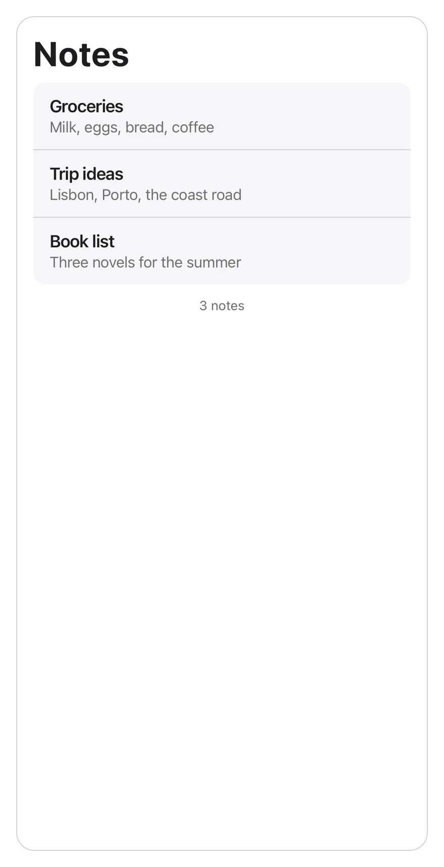
SearchRevealContent is at least as tall as the scroll view, so the field can be hidden even when the list is short. Other ScrollView props, except onScroll, pass through to SearchReveal, and other TextInput props pass through to the field.
Examples
Short list
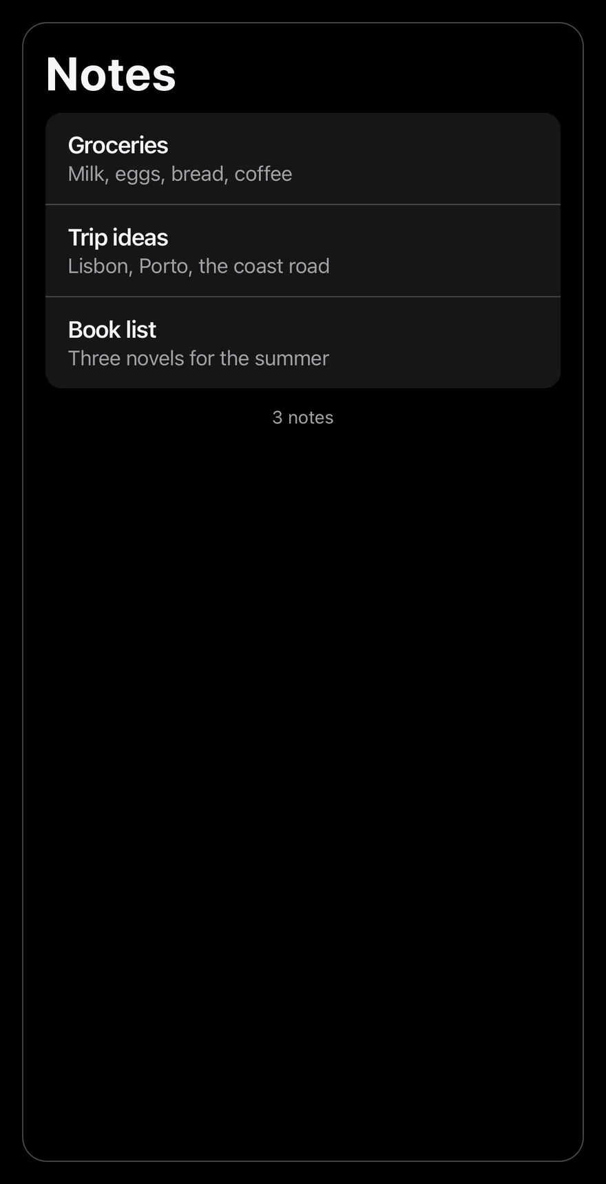
A three-item list that still hides the field.
import * as React from "react"
import { Pressable, View } from "react-native"
import { SearchReveal, SearchRevealContent, SearchRevealField } from "@/components/interactions/search-reveal"
import { Text } from "@/components/ui/text"

const allNotes = [
  { id: 1, title: "Groceries", preview: "Milk, eggs, bread, coffee" },
  { id: 2, title: "Trip ideas", preview: "Lisbon, Porto, the coast road" },
  { id: 3, title: "Book list", preview: "Three novels for the summer" },
  { id: 4, title: "Meeting notes", preview: "Ship the beta on Friday" },
  { id: 5, title: "Gift ideas", preview: "Headphones, a plant, a scarf" },
  { id: 6, title: "Recipes", preview: "Lemon pasta and a quick curry" },
  { id: 7, title: "Workout plan", preview: "Run on Monday, swim on Thursday" },
  {
    id: 8,
    title: "Movies to watch",
    preview: "Two documentaries and a classic",
  },
  { id: 9, title: "Garden", preview: "Plant tomatoes after the frost" },
  { id: 10, title: "Packing list", preview: "Charger, passport, rain jacket" },
  { id: 11, title: "Podcast notes", preview: "Episode about city design" },
  { id: 12, title: "Budget", preview: "Rent, groceries, savings" },
]

function NotesExample({
  count,
  defaultQuery = "",
}: {
  count: number
  defaultQuery?: string
}) {
  const [query, setQuery] = React.useState(defaultQuery)
  const notes = allNotes
    .slice(0, count)
    .filter((note) =>
      `${note.title} ${note.preview}`
        .toLowerCase()
        .includes(query.trim().toLowerCase())
    )

  return (
    <View className="flex-1 overflow-hidden rounded-2xl border border-separator">
      <Text variant="h1" className="px-4 pt-4 pb-2">
        Notes
      </Text>
      <SearchReveal>
        <SearchRevealField value={query} onValueChange={setQuery} />
        <SearchRevealContent>
          {notes.length === 0 ? (
            <Text className="px-4 py-16 text-center text-sm text-label-secondary">
              No results for “{query}”
            </Text>
          ) : (
            <View className="mx-4 overflow-hidden rounded-xl bg-surface-secondary">
              {notes.map((note, index) => (
                <Pressable
                  key={note.id}
                  className={
                    index > 0
                      ? "border-t border-separator px-4 py-3 active:bg-item-pressed"
                      : "px-4 py-3 active:bg-item-pressed"
                  }
                >
                  <Text numberOfLines={1} className="font-semibold">
                    {note.title}
                  </Text>
                  <Text
                    numberOfLines={1}
                    className="text-sm text-label-secondary"
                  >
                    {note.preview}
                  </Text>
                </Pressable>
              ))}
            </View>
          )}
          <Text className="px-4 py-3 text-center text-xs text-label-secondary">
            {notes.length} {notes.length === 1 ? "note" : "notes"}
          </Text>
        </SearchRevealContent>
      </SearchReveal>
    </View>
  )
}

export function SearchRevealShortListExample() {
  return (
    <NotesExample count={3} />
  )
}import EsuissUI
import SwiftUI
struct SearchRevealShortListExample: View {
var body: some View {
SearchRevealNotes(count: 3)
}
}
struct SearchRevealNote: Identifiable {
let id: Int
let title: String
let preview: String
}
let searchRevealNotes = [
SearchRevealNote(id: 1, title: "Groceries", preview: "Milk, eggs, bread, coffee"),
SearchRevealNote(id: 2, title: "Trip ideas", preview: "Lisbon, Porto, the coast road"),
SearchRevealNote(id: 3, title: "Book list", preview: "Three novels for the summer"),
SearchRevealNote(id: 4, title: "Meeting notes", preview: "Ship the beta on Friday"),
SearchRevealNote(id: 5, title: "Gift ideas", preview: "Headphones, a plant, a scarf"),
SearchRevealNote(id: 6, title: "Recipes", preview: "Lemon pasta and a quick curry"),
SearchRevealNote(id: 7, title: "Workout plan", preview: "Run on Monday, swim on Thursday"),
SearchRevealNote(id: 8, title: "Movies to watch", preview: "Two documentaries and a classic"),
SearchRevealNote(id: 9, title: "Garden", preview: "Plant tomatoes after the frost"),
SearchRevealNote(id: 10, title: "Packing list", preview: "Charger, passport, rain jacket"),
SearchRevealNote(id: 11, title: "Podcast notes", preview: "Episode about city design"),
SearchRevealNote(id: 12, title: "Budget", preview: "Rent, groceries, savings"),
]
struct SearchRevealNotes: View {
let count: Int
@State private var query: String
init(count: Int, query: String = "") {
self.count = count
_query = State(initialValue: query)
}
var notes: [SearchRevealNote] {
let needle = query.trimmingCharacters(in: .whitespaces).lowercased()
return searchRevealNotes.prefix(count).filter { note in
needle.isEmpty || "\(note.title) \(note.preview)".lowercased().contains(needle)
}
}
var body: some View {
let notes = notes
let shape = RoundedRectangle(cornerRadius: Radius.xl2, style: .continuous)
VStack(alignment: .leading, spacing: 0) {
Text("Notes")
.textVariant(.h1)
.padding(.horizontal, 16)
.padding(.top, 16)
.padding(.bottom, 8)
SearchReveal {
SearchRevealField(text: $query)
SearchRevealContent {
if notes.isEmpty {
Text(verbatim: "No results for “\(query)”")
.textStyle(.sm)
.foregroundStyle(Color.labelSecondary)
.multilineTextAlignment(.center)
.padding(.horizontal, 16)
.padding(.vertical, 64)
.frame(maxWidth: .infinity)
} else {
VStack(spacing: 0) {
ForEach(Array(notes.enumerated()), id: \.element.id) { index, note in
Button {} label: {
VStack(alignment: .leading, spacing: 0) {
Text(verbatim: note.title)
.textStyle(.base, weight: .semibold)
.foregroundStyle(Color.label)
.lineLimit(1)
Text(verbatim: note.preview)
.textStyle(.sm)
.foregroundStyle(Color.labelSecondary)
.lineLimit(1)
}
.padding(.horizontal, 16)
.padding(.vertical, 12)
.frame(maxWidth: .infinity, alignment: .leading)
.contentShape(Rectangle())
}
.buttonStyle(SearchRevealRowStyle())
.overlay(alignment: .top) {
if index > 0 {
Color.separator.frame(height: 1)
}
}
}
}
.background(Color.surfaceSecondary)
.clipShape(RoundedRectangle(cornerRadius: Radius.xl, style: .continuous))
.padding(.horizontal, 16)
}
Text(verbatim: "\(notes.count) \(notes.count == 1 ? "note" : "notes")")
.textStyle(.xs)
.foregroundStyle(Color.labelSecondary)
.multilineTextAlignment(.center)
.padding(.horizontal, 16)
.padding(.vertical, 12)
.frame(maxWidth: .infinity)
}
}
}
.clipShape(shape)
.overlay { shape.strokeBorder(Color.separator) }
.containerRelativeFrame(.vertical) { height, _ in height - 32 }
}
}
struct SearchRevealRowStyle: ButtonStyle {
func makeBody(configuration: Configuration) -> some View {
configuration.label
.background(configuration.isPressed ? Color.itemPressed : .clear)
}
}import androidx.compose.foundation.background
import androidx.compose.foundation.border
import androidx.compose.foundation.clickable
import androidx.compose.foundation.interaction.MutableInteractionSource
import androidx.compose.foundation.interaction.collectIsPressedAsState
import androidx.compose.foundation.layout.Box
import androidx.compose.foundation.layout.Column
import androidx.compose.foundation.layout.fillMaxWidth
import androidx.compose.foundation.layout.height
import androidx.compose.foundation.layout.padding
import androidx.compose.foundation.shape.RoundedCornerShape
import androidx.compose.runtime.Composable
import androidx.compose.runtime.getValue
import androidx.compose.runtime.mutableStateOf
import androidx.compose.runtime.remember
import androidx.compose.runtime.saveable.rememberSaveable
import androidx.compose.runtime.setValue
import androidx.compose.ui.Modifier
import androidx.compose.ui.draw.clip
import androidx.compose.ui.graphics.Color
import androidx.compose.ui.semantics.Role
import androidx.compose.ui.text.font.FontWeight
import androidx.compose.ui.text.style.TextAlign
import androidx.compose.ui.text.style.TextOverflow
import androidx.compose.ui.unit.dp
import com.esuiss.ui.components.Text
import com.esuiss.ui.components.TextVariant
import com.esuiss.ui.interactions.SearchReveal
import com.esuiss.ui.interactions.SearchRevealContent
import com.esuiss.ui.interactions.SearchRevealField
import com.esuiss.ui.theme.EsuissTheme
import com.esuiss.ui.theme.Radius
import com.esuiss.ui.theme.Typography
@Composable
fun SearchRevealShortListExample() {
SearchRevealNotes(count = 3)
}
class SearchRevealNote(val id: Int, val title: String, val preview: String)
val searchRevealAllNotes = listOf(
SearchRevealNote(1, "Groceries", "Milk, eggs, bread, coffee"),
SearchRevealNote(2, "Trip ideas", "Lisbon, Porto, the coast road"),
SearchRevealNote(3, "Book list", "Three novels for the summer"),
SearchRevealNote(4, "Meeting notes", "Ship the beta on Friday"),
SearchRevealNote(5, "Gift ideas", "Headphones, a plant, a scarf"),
SearchRevealNote(6, "Recipes", "Lemon pasta and a quick curry"),
SearchRevealNote(7, "Workout plan", "Run on Monday, swim on Thursday"),
SearchRevealNote(8, "Movies to watch", "Two documentaries and a classic"),
SearchRevealNote(9, "Garden", "Plant tomatoes after the frost"),
SearchRevealNote(10, "Packing list", "Charger, passport, rain jacket"),
SearchRevealNote(11, "Podcast notes", "Episode about city design"),
SearchRevealNote(12, "Budget", "Rent, groceries, savings"),
)
@Composable
fun SearchRevealNotes(count: Int, defaultQuery: String = "") {
val colors = EsuissTheme.colors
var query by rememberSaveable { mutableStateOf(defaultQuery) }
val needle = query.trim().lowercase()
val notes = searchRevealAllNotes.take(count).filter { "${it.title} ${it.preview}".lowercase().contains(needle) }
val shape = RoundedCornerShape(Radius.xl2)
Column(
Modifier
.fillMaxWidth()
.height(600.dp)
.clip(shape)
.border(1.dp, colors.separator, shape),
) {
Text("Notes", modifier = Modifier.padding(start = 16.dp, end = 16.dp, top = 16.dp, bottom = 8.dp), variant = TextVariant.H1)
SearchReveal(Modifier.weight(1f)) {
SearchRevealField(value = query, onValueChange = { query = it })
SearchRevealContent {
if (notes.isEmpty()) {
Text(
"No results for “$query”",
modifier = Modifier.fillMaxWidth().padding(horizontal = 16.dp, vertical = 64.dp),
style = Typography.sm.copy(color = colors.labelSecondary),
textAlign = TextAlign.Center,
)
} else {
Column(
Modifier
.padding(horizontal = 16.dp)
.fillMaxWidth()
.clip(RoundedCornerShape(Radius.xl))
.background(colors.surfaceSecondary),
) {
notes.forEachIndexed { index, note ->
if (index > 0) Box(Modifier.fillMaxWidth().height(1.dp).background(colors.separator))
SearchRevealRow(note)
}
}
}
Text(
"${notes.size} ${if (notes.size == 1) "note" else "notes"}",
modifier = Modifier.fillMaxWidth().padding(horizontal = 16.dp, vertical = 12.dp),
style = Typography.xs.copy(color = colors.labelSecondary),
textAlign = TextAlign.Center,
)
}
}
}
}
@Composable
fun SearchRevealRow(note: SearchRevealNote) {
val colors = EsuissTheme.colors
val interaction = remember { MutableInteractionSource() }
val pressed by interaction.collectIsPressedAsState()
Column(
Modifier
.fillMaxWidth()
.background(if (pressed) colors.itemPressed else Color.Transparent)
.clickable(interactionSource = interaction, indication = null, role = Role.Button) {}
.padding(horizontal = 16.dp, vertical = 12.dp),
) {
Text(
note.title,
style = Typography.base.copy(fontWeight = FontWeight.SemiBold),
maxLines = 1,
overflow = TextOverflow.Ellipsis,
)
Text(
note.preview,
style = Typography.sm.copy(color = colors.labelSecondary),
maxLines = 1,
overflow = TextOverflow.Ellipsis,
)
}
}With query
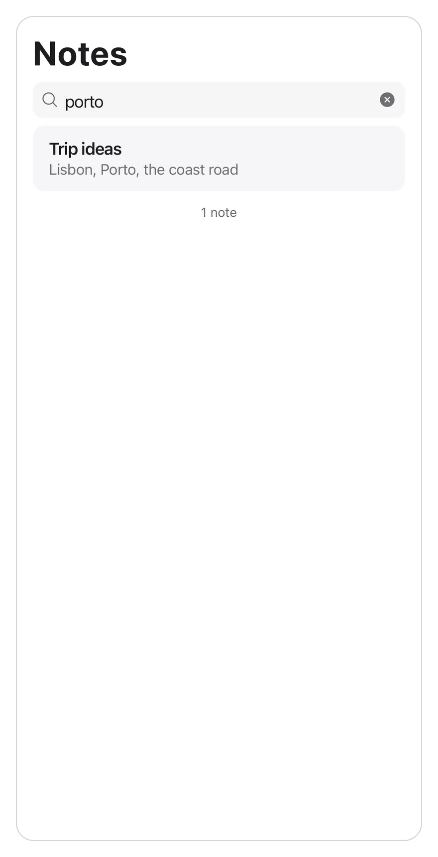
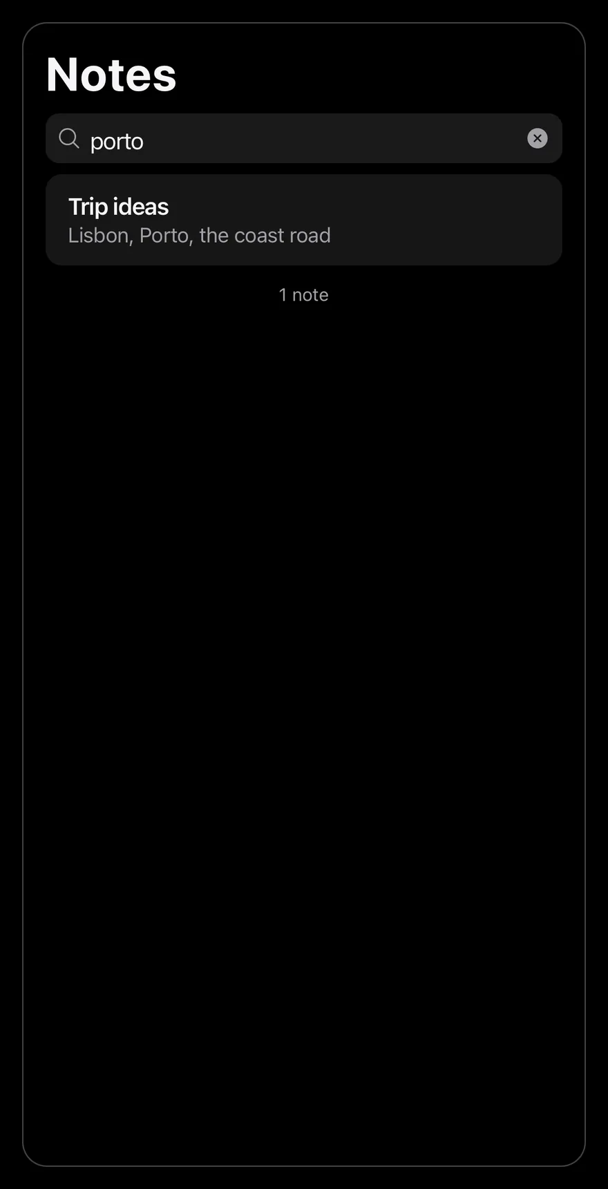
Starts with a query, so the field is visible and the list is filtered.
import * as React from "react"
import { Pressable, View } from "react-native"
import { SearchReveal, SearchRevealContent, SearchRevealField } from "@/components/interactions/search-reveal"
import { Text } from "@/components/ui/text"

const allNotes = [
  { id: 1, title: "Groceries", preview: "Milk, eggs, bread, coffee" },
  { id: 2, title: "Trip ideas", preview: "Lisbon, Porto, the coast road" },
  { id: 3, title: "Book list", preview: "Three novels for the summer" },
  { id: 4, title: "Meeting notes", preview: "Ship the beta on Friday" },
  { id: 5, title: "Gift ideas", preview: "Headphones, a plant, a scarf" },
  { id: 6, title: "Recipes", preview: "Lemon pasta and a quick curry" },
  { id: 7, title: "Workout plan", preview: "Run on Monday, swim on Thursday" },
  {
    id: 8,
    title: "Movies to watch",
    preview: "Two documentaries and a classic",
  },
  { id: 9, title: "Garden", preview: "Plant tomatoes after the frost" },
  { id: 10, title: "Packing list", preview: "Charger, passport, rain jacket" },
  { id: 11, title: "Podcast notes", preview: "Episode about city design" },
  { id: 12, title: "Budget", preview: "Rent, groceries, savings" },
]

function NotesExample({
  count,
  defaultQuery = "",
}: {
  count: number
  defaultQuery?: string
}) {
  const [query, setQuery] = React.useState(defaultQuery)
  const notes = allNotes
    .slice(0, count)
    .filter((note) =>
      `${note.title} ${note.preview}`
        .toLowerCase()
        .includes(query.trim().toLowerCase())
    )

  return (
    <View className="flex-1 overflow-hidden rounded-2xl border border-separator">
      <Text variant="h1" className="px-4 pt-4 pb-2">
        Notes
      </Text>
      <SearchReveal>
        <SearchRevealField value={query} onValueChange={setQuery} />
        <SearchRevealContent>
          {notes.length === 0 ? (
            <Text className="px-4 py-16 text-center text-sm text-label-secondary">
              No results for “{query}”
            </Text>
          ) : (
            <View className="mx-4 overflow-hidden rounded-xl bg-surface-secondary">
              {notes.map((note, index) => (
                <Pressable
                  key={note.id}
                  className={
                    index > 0
                      ? "border-t border-separator px-4 py-3 active:bg-item-pressed"
                      : "px-4 py-3 active:bg-item-pressed"
                  }
                >
                  <Text numberOfLines={1} className="font-semibold">
                    {note.title}
                  </Text>
                  <Text
                    numberOfLines={1}
                    className="text-sm text-label-secondary"
                  >
                    {note.preview}
                  </Text>
                </Pressable>
              ))}
            </View>
          )}
          <Text className="px-4 py-3 text-center text-xs text-label-secondary">
            {notes.length} {notes.length === 1 ? "note" : "notes"}
          </Text>
        </SearchRevealContent>
      </SearchReveal>
    </View>
  )
}

export function SearchRevealWithQueryExample() {
  return (
    <NotesExample count={12} defaultQuery="porto" />
  )
}import EsuissUI
import SwiftUI
struct SearchRevealWithQueryExample: View {
var body: some View {
SearchRevealNotes(count: 12, query: "porto")
}
}
struct SearchRevealNote: Identifiable {
let id: Int
let title: String
let preview: String
}
let searchRevealNotes = [
SearchRevealNote(id: 1, title: "Groceries", preview: "Milk, eggs, bread, coffee"),
SearchRevealNote(id: 2, title: "Trip ideas", preview: "Lisbon, Porto, the coast road"),
SearchRevealNote(id: 3, title: "Book list", preview: "Three novels for the summer"),
SearchRevealNote(id: 4, title: "Meeting notes", preview: "Ship the beta on Friday"),
SearchRevealNote(id: 5, title: "Gift ideas", preview: "Headphones, a plant, a scarf"),
SearchRevealNote(id: 6, title: "Recipes", preview: "Lemon pasta and a quick curry"),
SearchRevealNote(id: 7, title: "Workout plan", preview: "Run on Monday, swim on Thursday"),
SearchRevealNote(id: 8, title: "Movies to watch", preview: "Two documentaries and a classic"),
SearchRevealNote(id: 9, title: "Garden", preview: "Plant tomatoes after the frost"),
SearchRevealNote(id: 10, title: "Packing list", preview: "Charger, passport, rain jacket"),
SearchRevealNote(id: 11, title: "Podcast notes", preview: "Episode about city design"),
SearchRevealNote(id: 12, title: "Budget", preview: "Rent, groceries, savings"),
]
struct SearchRevealNotes: View {
let count: Int
@State private var query: String
init(count: Int, query: String = "") {
self.count = count
_query = State(initialValue: query)
}
var notes: [SearchRevealNote] {
let needle = query.trimmingCharacters(in: .whitespaces).lowercased()
return searchRevealNotes.prefix(count).filter { note in
needle.isEmpty || "\(note.title) \(note.preview)".lowercased().contains(needle)
}
}
var body: some View {
let notes = notes
let shape = RoundedRectangle(cornerRadius: Radius.xl2, style: .continuous)
VStack(alignment: .leading, spacing: 0) {
Text("Notes")
.textVariant(.h1)
.padding(.horizontal, 16)
.padding(.top, 16)
.padding(.bottom, 8)
SearchReveal {
SearchRevealField(text: $query)
SearchRevealContent {
if notes.isEmpty {
Text(verbatim: "No results for “\(query)”")
.textStyle(.sm)
.foregroundStyle(Color.labelSecondary)
.multilineTextAlignment(.center)
.padding(.horizontal, 16)
.padding(.vertical, 64)
.frame(maxWidth: .infinity)
} else {
VStack(spacing: 0) {
ForEach(Array(notes.enumerated()), id: \.element.id) { index, note in
Button {} label: {
VStack(alignment: .leading, spacing: 0) {
Text(verbatim: note.title)
.textStyle(.base, weight: .semibold)
.foregroundStyle(Color.label)
.lineLimit(1)
Text(verbatim: note.preview)
.textStyle(.sm)
.foregroundStyle(Color.labelSecondary)
.lineLimit(1)
}
.padding(.horizontal, 16)
.padding(.vertical, 12)
.frame(maxWidth: .infinity, alignment: .leading)
.contentShape(Rectangle())
}
.buttonStyle(SearchRevealRowStyle())
.overlay(alignment: .top) {
if index > 0 {
Color.separator.frame(height: 1)
}
}
}
}
.background(Color.surfaceSecondary)
.clipShape(RoundedRectangle(cornerRadius: Radius.xl, style: .continuous))
.padding(.horizontal, 16)
}
Text(verbatim: "\(notes.count) \(notes.count == 1 ? "note" : "notes")")
.textStyle(.xs)
.foregroundStyle(Color.labelSecondary)
.multilineTextAlignment(.center)
.padding(.horizontal, 16)
.padding(.vertical, 12)
.frame(maxWidth: .infinity)
}
}
}
.clipShape(shape)
.overlay { shape.strokeBorder(Color.separator) }
.containerRelativeFrame(.vertical) { height, _ in height - 32 }
}
}
struct SearchRevealRowStyle: ButtonStyle {
func makeBody(configuration: Configuration) -> some View {
configuration.label
.background(configuration.isPressed ? Color.itemPressed : .clear)
}
}import androidx.compose.foundation.background
import androidx.compose.foundation.border
import androidx.compose.foundation.clickable
import androidx.compose.foundation.interaction.MutableInteractionSource
import androidx.compose.foundation.interaction.collectIsPressedAsState
import androidx.compose.foundation.layout.Box
import androidx.compose.foundation.layout.Column
import androidx.compose.foundation.layout.fillMaxWidth
import androidx.compose.foundation.layout.height
import androidx.compose.foundation.layout.padding
import androidx.compose.foundation.shape.RoundedCornerShape
import androidx.compose.runtime.Composable
import androidx.compose.runtime.getValue
import androidx.compose.runtime.mutableStateOf
import androidx.compose.runtime.remember
import androidx.compose.runtime.saveable.rememberSaveable
import androidx.compose.runtime.setValue
import androidx.compose.ui.Modifier
import androidx.compose.ui.draw.clip
import androidx.compose.ui.graphics.Color
import androidx.compose.ui.semantics.Role
import androidx.compose.ui.text.font.FontWeight
import androidx.compose.ui.text.style.TextAlign
import androidx.compose.ui.text.style.TextOverflow
import androidx.compose.ui.unit.dp
import com.esuiss.ui.components.Text
import com.esuiss.ui.components.TextVariant
import com.esuiss.ui.interactions.SearchReveal
import com.esuiss.ui.interactions.SearchRevealContent
import com.esuiss.ui.interactions.SearchRevealField
import com.esuiss.ui.theme.EsuissTheme
import com.esuiss.ui.theme.Radius
import com.esuiss.ui.theme.Typography
@Composable
fun SearchRevealWithQueryExample() {
SearchRevealNotes(count = 12, defaultQuery = "porto")
}
class SearchRevealNote(val id: Int, val title: String, val preview: String)
val searchRevealAllNotes = listOf(
SearchRevealNote(1, "Groceries", "Milk, eggs, bread, coffee"),
SearchRevealNote(2, "Trip ideas", "Lisbon, Porto, the coast road"),
SearchRevealNote(3, "Book list", "Three novels for the summer"),
SearchRevealNote(4, "Meeting notes", "Ship the beta on Friday"),
SearchRevealNote(5, "Gift ideas", "Headphones, a plant, a scarf"),
SearchRevealNote(6, "Recipes", "Lemon pasta and a quick curry"),
SearchRevealNote(7, "Workout plan", "Run on Monday, swim on Thursday"),
SearchRevealNote(8, "Movies to watch", "Two documentaries and a classic"),
SearchRevealNote(9, "Garden", "Plant tomatoes after the frost"),
SearchRevealNote(10, "Packing list", "Charger, passport, rain jacket"),
SearchRevealNote(11, "Podcast notes", "Episode about city design"),
SearchRevealNote(12, "Budget", "Rent, groceries, savings"),
)
@Composable
fun SearchRevealNotes(count: Int, defaultQuery: String = "") {
val colors = EsuissTheme.colors
var query by rememberSaveable { mutableStateOf(defaultQuery) }
val needle = query.trim().lowercase()
val notes = searchRevealAllNotes.take(count).filter { "${it.title} ${it.preview}".lowercase().contains(needle) }
val shape = RoundedCornerShape(Radius.xl2)
Column(
Modifier
.fillMaxWidth()
.height(600.dp)
.clip(shape)
.border(1.dp, colors.separator, shape),
) {
Text("Notes", modifier = Modifier.padding(start = 16.dp, end = 16.dp, top = 16.dp, bottom = 8.dp), variant = TextVariant.H1)
SearchReveal(Modifier.weight(1f)) {
SearchRevealField(value = query, onValueChange = { query = it })
SearchRevealContent {
if (notes.isEmpty()) {
Text(
"No results for “$query”",
modifier = Modifier.fillMaxWidth().padding(horizontal = 16.dp, vertical = 64.dp),
style = Typography.sm.copy(color = colors.labelSecondary),
textAlign = TextAlign.Center,
)
} else {
Column(
Modifier
.padding(horizontal = 16.dp)
.fillMaxWidth()
.clip(RoundedCornerShape(Radius.xl))
.background(colors.surfaceSecondary),
) {
notes.forEachIndexed { index, note ->
if (index > 0) Box(Modifier.fillMaxWidth().height(1.dp).background(colors.separator))
SearchRevealRow(note)
}
}
}
Text(
"${notes.size} ${if (notes.size == 1) "note" else "notes"}",
modifier = Modifier.fillMaxWidth().padding(horizontal = 16.dp, vertical = 12.dp),
style = Typography.xs.copy(color = colors.labelSecondary),
textAlign = TextAlign.Center,
)
}
}
}
}
@Composable
fun SearchRevealRow(note: SearchRevealNote) {
val colors = EsuissTheme.colors
val interaction = remember { MutableInteractionSource() }
val pressed by interaction.collectIsPressedAsState()
Column(
Modifier
.fillMaxWidth()
.background(if (pressed) colors.itemPressed else Color.Transparent)
.clickable(interactionSource = interaction, indication = null, role = Role.Button) {}
.padding(horizontal = 16.dp, vertical = 12.dp),
) {
Text(
note.title,
style = Typography.base.copy(fontWeight = FontWeight.SemiBold),
maxLines = 1,
overflow = TextOverflow.Ellipsis,
)
Text(
note.preview,
style = Typography.sm.copy(color = colors.labelSecondary),
maxLines = 1,
overflow = TextOverflow.Ellipsis,
)
}
}API Reference
SearchReveal
The scroll view that hides and reveals the field.
ScrollViewPropsSearchRevealField
The search input with a clear button.
React.ComponentProps<typeof TextInput>- About
- The current query.
- Type
string- Default
- required
- About
- Called with the new query.
- Type
(value: string) => void- Default
- required
SearchRevealContent
The list area, at least one screen tall.
ViewPropsAccessibility
- The input has the
searchboxrole and is labelled byplaceholder. - The clear button is labelled
Clear searchand returns focus to the input.
Notes
- The field uses
bg-controlwithlabel-secondaryplaceholder and icons. - Autocorrect and autocapitalization are off, and the return key reads
search. - Taps on the list work while the keyboard is open.