suiss/uim · Interaction
Image Viewer
A full-screen photo viewer with swipe paging, pinch and double-tap zoom, and swipe down to close.
Image Viewer is an open-source mobile interaction from suiss/uim for React Native and Expo, with SwiftUI and Jetpack Compose versions built from the same design tokens. The @esuiss/uim CLI copies its source into your project, so you own the code.
import { Image, View } from "react-native"
import { ImageViewer, ImageViewerContent, type ImageViewerImage, ImageViewerTrigger } from "@/components/interactions/image-viewer"
import { Text } from "@/components/ui/text"

const images: ImageViewerImage[] = [
  {
    source: {
      uri: "https://images.unsplash.com/photo-1588345921523-c2dcdb7f1dcd?w=1200&q=80",
    },
    accessibilityLabel: "Mountain lake at sunrise",
  },
  {
    source: {
      uri: "https://images.unsplash.com/photo-1506744038136-46273834b3fb?w=1200&q=80",
    },
    accessibilityLabel: "Valley with a river",
  },
  {
    source: {
      uri: "https://images.unsplash.com/photo-1501785888041-af3ef285b470?w=1200&q=80",
    },
    accessibilityLabel: "Lake between mountains",
  },
  {
    source: {
      uri: "https://images.unsplash.com/photo-1470071459604-3b5ec3a7fe05?w=1200&q=80",
    },
    accessibilityLabel: "Foggy hills",
  },
  {
    source: {
      uri: "https://images.unsplash.com/photo-1441974231531-c6227db76b6e?w=1200&q=80",
    },
    accessibilityLabel: "Forest path",
  },
]

function Gallery({
  defaultOpen,
  defaultIndex,
}: {
  defaultOpen?: boolean
  defaultIndex?: number
}) {
  return (
    <ImageViewer
      images={images}
      defaultOpen={defaultOpen}
      defaultIndex={defaultIndex}
    >
      <View className="gap-3">
        <View className="flex-row flex-wrap gap-2">
          {images.map((image, index) => (
            <ImageViewerTrigger
              key={image.accessibilityLabel}
              index={index}
              accessibilityLabel={image.accessibilityLabel}
              className="aspect-square w-[31%] overflow-hidden rounded-xl bg-surface-secondary"
            >
              <Image source={image.source} className="h-full w-full" />
            </ImageViewerTrigger>
          ))}
        </View>
        <Text variant="muted">
          Tap a photo. Pinch or double-tap to zoom, swipe down to close.
        </Text>
      </View>
      <ImageViewerContent />
    </ImageViewer>
  )
}

export function ImageViewerOpenByDefaultExample() {
  return (
    <Gallery defaultOpen defaultIndex={1} />
  )
}import EsuissUI
import SwiftUI
import UIKit
struct ImageViewerOpenByDefaultExample: View {
var body: some View {
ImageViewerGallery(open: true, index: 1)
}
}
struct ImageViewerPhoto {
let url: URL
let label: String
}
let imageViewerPhotos = [
ImageViewerPhoto(url: URL(string: "https://images.unsplash.com/photo-1588345921523-c2dcdb7f1dcd?w=1200&q=80")!, label: "Mountain lake at sunrise"),
ImageViewerPhoto(url: URL(string: "https://images.unsplash.com/photo-1506744038136-46273834b3fb?w=1200&q=80")!, label: "Valley with a river"),
ImageViewerPhoto(url: URL(string: "https://images.unsplash.com/photo-1501785888041-af3ef285b470?w=1200&q=80")!, label: "Lake between mountains"),
ImageViewerPhoto(url: URL(string: "https://images.unsplash.com/photo-1470071459604-3b5ec3a7fe05?w=1200&q=80")!, label: "Foggy hills"),
ImageViewerPhoto(url: URL(string: "https://images.unsplash.com/photo-1441974231531-c6227db76b6e?w=1200&q=80")!, label: "Forest path"),
]
struct ImageViewerGallery: View {
@State private var open: Bool
@State private var index: Int
@State private var loaded: [Int: UIImage] = [:]
init(open: Bool = false, index: Int = 0) {
_open = State(initialValue: open)
_index = State(initialValue: index)
}
var images: [Image] {
imageViewerPhotos.indices.map { page in
let photo = imageViewerPhotos[page]
if let cgImage = loaded[page]?.cgImage {
return Image(cgImage, scale: 1, orientation: .up, label: Text(verbatim: photo.label))
}
return Image(uiImage: UIImage())
}
}
var body: some View {
VStack(alignment: .leading, spacing: 12) {
GeometryReader { proxy in
let side = ((proxy.size.width - 16) / 3).rounded(.down)
FlowRow(spacing: 8) {
ForEach(imageViewerPhotos.indices, id: \.self) { page in
Button {
index = page
open = true
} label: {
thumbnail(page)
.frame(width: side, height: side)
.background(Color.surfaceSecondary)
.clipShape(RoundedRectangle(cornerRadius: Radius.xl, style: .continuous))
}
.buttonStyle(.plain)
.accessibilityLabel(Text(verbatim: imageViewerPhotos[page].label))
}
}
}
.aspectRatio(3 / 2, contentMode: .fit)
Text("Tap a photo. Pinch or double-tap to zoom, swipe down to close.")
.textVariant(.muted)
}
.imageViewer(isPresented: $open, images: images, index: $index)
.task {
await load()
}
}
@ViewBuilder
func thumbnail(_ page: Int) -> some View {
if let image = loaded[page] {
Image(uiImage: image)
.resizable()
.scaledToFill()
} else {
Color.surfaceSecondary
}
}
func load() async {
await withTaskGroup(of: (Int, UIImage?).self) { group in
for (page, photo) in imageViewerPhotos.enumerated() {
group.addTask {
guard let (data, _) = try? await URLSession.shared.data(from: photo.url) else { return (page, nil) }
return (page, UIImage(data: data))
}
}
for await (page, image) in group {
if let image { loaded[page] = image }
}
}
}
}
let group = StoryGroup(.interactions, "Image Viewer", stories: [
Story("Default") {
ImageViewerGallery()
},
Story("OpenByDefault") {
ImageViewerGallery(open: true, index: 1)
},
]import androidx.compose.foundation.Image
import androidx.compose.foundation.background
import androidx.compose.foundation.clickable
import androidx.compose.foundation.layout.Arrangement
import androidx.compose.foundation.layout.Column
import androidx.compose.foundation.layout.FlowRow
import androidx.compose.foundation.layout.aspectRatio
import androidx.compose.foundation.layout.fillMaxWidth
import androidx.compose.foundation.shape.RoundedCornerShape
import androidx.compose.runtime.Composable
import androidx.compose.runtime.getValue
import androidx.compose.runtime.mutableIntStateOf
import androidx.compose.runtime.mutableStateOf
import androidx.compose.runtime.remember
import androidx.compose.runtime.saveable.rememberSaveable
import androidx.compose.runtime.setValue
import androidx.compose.ui.Modifier
import androidx.compose.ui.draw.clip
import androidx.compose.ui.geometry.Offset
import androidx.compose.ui.geometry.Size
import androidx.compose.ui.graphics.Brush
import androidx.compose.ui.graphics.Color
import androidx.compose.ui.graphics.drawscope.DrawScope
import androidx.compose.ui.graphics.painter.Painter
import androidx.compose.ui.layout.ContentScale
import androidx.compose.ui.semantics.Role
import androidx.compose.ui.semantics.contentDescription
import androidx.compose.ui.semantics.semantics
import androidx.compose.ui.unit.dp
import com.esuiss.ui.components.Text
import com.esuiss.ui.components.TextVariant
import com.esuiss.ui.interactions.ImageViewer
import com.esuiss.ui.interactions.ImageViewerImage
import com.esuiss.ui.theme.EsuissTheme
import com.esuiss.ui.theme.Radius
@Composable
fun ImageViewerOpenByDefaultExample() {
ImageViewerGallery(defaultOpen = true, defaultIndex = 1)
}
class ImageViewerGradient(private val from: Color, private val to: Color, private val size: Size) : Painter() {
override val intrinsicSize: Size
get() = size
override fun DrawScope.onDraw() {
drawRect(Brush.linearGradient(listOf(from, to), start = Offset.Zero, end = Offset(this.size.width, this.size.height)))
}
}
val imageViewerLabels = listOf(
"Mountain lake at sunrise",
"Valley with a river",
"Lake between mountains",
"Foggy hills",
"Forest path",
)
@Composable
fun ImageViewerGallery(defaultOpen: Boolean, defaultIndex: Int) {
val colors = EsuissTheme.colors
var open by rememberSaveable { mutableStateOf(defaultOpen) }
var index by rememberSaveable { mutableIntStateOf(defaultIndex) }
val tones = listOf(
colors.orange to colors.pink,
colors.teal to colors.blue,
colors.indigo to colors.cyan,
colors.gray to colors.mint,
colors.green to colors.brown,
)
val images = remember(tones) {
imageViewerLabels.mapIndexed { position, label ->
val (from, to) = tones[position]
ImageViewerImage(ImageViewerGradient(from, to, Size(1200f, 800f)), contentDescription = label)
}
}
val shape = RoundedCornerShape(Radius.xl)
Column(verticalArrangement = Arrangement.spacedBy(12.dp)) {
FlowRow(
modifier = Modifier.fillMaxWidth(),
horizontalArrangement = Arrangement.spacedBy(8.dp),
verticalArrangement = Arrangement.spacedBy(8.dp),
) {
images.forEachIndexed { position, image ->
Image(
painter = image.painter,
contentDescription = null,
contentScale = ContentScale.Crop,
modifier = Modifier
.fillMaxWidth(0.31f)
.aspectRatio(1f)
.clip(shape)
.background(colors.surfaceSecondary, shape)
.semantics { contentDescription = imageViewerLabels[position] }
.clickable(role = Role.Button) {
index = position
open = true
},
)
}
}
Text("Tap a photo. Pinch or double-tap to zoom, swipe down to close.", variant = TextVariant.Muted)
}
ImageViewer(
open = open,
onOpenChange = { open = it },
images = images,
index = index,
onIndexChange = { index = it },
)
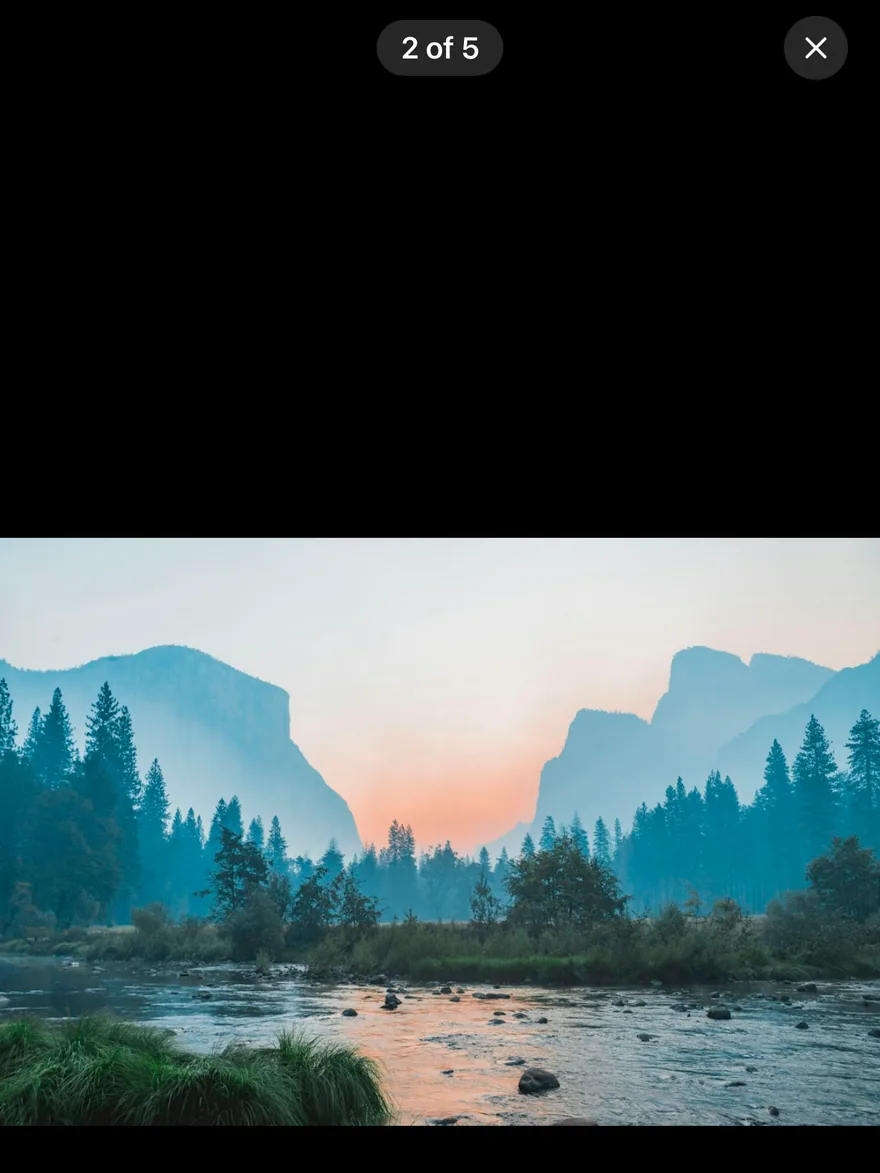
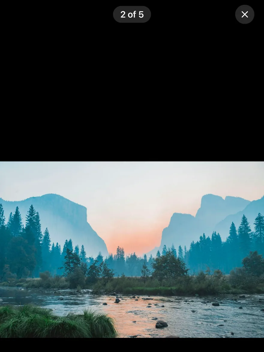
}ImageViewer opens a set of images full screen on a dark media background, starting at the pressed thumbnail. A counter such as 2 of 5 and a close button sit at the top, below the safe area.
Swipe sideways to page between images, with resistance at the first and last image. Pinch to zoom between 1x and 4x around the fingers, double-tap to zoom to 2.5x at the tapped point or back to 1x, and drag to pan while zoomed. Swiping up or down far enough closes the viewer, and a single tap toggles the controls.
Installation
$ pnpm dlx @esuiss/uim@latest add image-viewer$ pnpm dlx @esuiss/uim@latest add image-viewer --platform swift$ pnpm dlx @esuiss/uim@latest add image-viewer --platform kotlinThe CLI also adds what it builds on: Icon, Text.
Manual
- Install the dependencies:
npx expo install cn phosphor-react-native react-native-reanimated react-native-safe-area-context react-native-screens react-native-svg react-native-worklets-
Add the pieces it builds on: Icon, Text, and the primitives
components/primitives/image-viewer.tsx,components/primitives/use-render.tsx. -
Copy the source into
components/interactions/image-viewer.tsx:
import { cn } from "cn"
import { XIcon } from "phosphor-react-native"
import * as React from "react"
import { Platform, View } from "react-native"
import { FadeIn, FadeOut, ReduceMotion } from "react-native-reanimated"
import { useSafeAreaInsets } from "react-native-safe-area-context"
import { FullWindowOverlay as RNFullWindowOverlay } from "react-native-screens"
import * as ImageViewerPrimitive from "@/components/primitives/image-viewer"
import { resolveClassName } from "@/components/primitives/use-render"
import { AnimatedView } from "@/components/ui/animated-view"
import { Icon } from "@/components/ui/icon"
import { Text } from "@/components/ui/text"

type ImageViewerImage = ImageViewerPrimitive.ImageViewerImage

const FullWindowOverlay =- Update the import paths to match your project.
- Install the dependencies:
npx expo install cn phosphor-react-native react-native-reanimated react-native-safe-area-context react-native-screens react-native-svg react-native-worklets-
Add the pieces it builds on: Icon, Text, and the primitives
components/primitives/image-viewer.tsx,components/primitives/use-render.tsx. -
Copy the source into
components/interactions/image-viewer.tsx:
import { cn } from "cn"
import { XIcon } from "phosphor-react-native"
import * as React from "react"
import { Platform, View } from "react-native"
import { FadeIn, FadeOut, ReduceMotion } from "react-native-reanimated"
import { useSafeAreaInsets } from "react-native-safe-area-context"
import { FullWindowOverlay as RNFullWindowOverlay } from "react-native-screens"
import * as ImageViewerPrimitive from "@/components/primitives/image-viewer"
import { resolveClassName } from "@/components/primitives/use-render"
import { AnimatedView } from "@/components/ui/animated-view"
import { Icon } from "@/components/ui/icon"
import { Text } from "@/components/ui/text"

type ImageViewerImage = ImageViewerPrimitive.ImageViewerImage

const FullWindowOverlay =- Update the import paths to match your project.
- Install the dependencies:
npx expo install phosphor-react-native react-native-reanimated react-native-safe-area-context react-native-screens react-native-svg react-native-worklets-
Add the pieces it builds on: Icon, Text, and the primitives
components/primitives/image-viewer.tsx,components/primitives/use-render.tsx. -
Copy the source into
components/interactions/image-viewer.tsx:
import { XIcon } from "phosphor-react-native"
import * as React from "react"
import {
  Platform,
  Pressable,
  StyleSheet,
  View,
  type ViewStyle,
} from "react-native"
import { FadeIn, FadeOut, ReduceMotion } from "react-native-reanimated"
import { useSafeAreaInsets } from "react-native-safe-area-context"
import { FullWindowOverlay as RNFullWindowOverlay } from "react-native-screens"
import * as ImageViewerPrimitive from "@/components/primitives/image-viewer"
import { resolveStyle } from "@/components/primitives/use-render"
import { AnimatedView } from "@/components/ui/animated-view"
import { Icon } from "@/components/ui/icon"- Update the import paths to match your project.
-
Target iOS 17 or later.
-
Add the Swift package to your app:
.package(url: "https://github.com/phosphor-icons/swift", from: "2.1.0")- Copy the theme files every view uses:
import SwiftUI
import UIKit

struct RGBA: Sendable {
  let red: CGFloat
  let green: CGFloat
  let blue: CGFloat
  let alpha: CGFloat

  init(_ hex: UInt32, _ alpha: CGFloat = 1) {
    red = CGFloat((hex >> 16) & 0xFF) / 255
    green = CGFloat((hex >> 8) & 0xFF) / 255
    blue = CGFloat(hex & 0xFF) / 255
    self.alpha = alpha
}import SwiftUI
extension Color {
public static let surface = Color.adaptive(light: .init(0xFFFFFF), dark: .init(0x000000))
public static let surfaceSecondary = Color.adaptive(light: .init(0xF5F5F7), dark: .init(0x161617))
public static let surfaceTertiary = Color.adaptive(light: .init(0xE8E8ED), dark: .init(0x2C2C2E))
public static let surfaceRaised = Color.adaptive(light: .init(0xFFFFFF), dark: .init(0x1D1D1F))
public static let label = Color.adaptive(light: .init(0x1D1D1F), dark: .init(0xF5F5F7))
public static let labelSecondary = Color.adaptive(light: .init(0x6E6E73), dark: .init(0xA1A1A6))
public static let labelTertiary = Color.adaptive(light: .init(0x86868B), dark: .init(0x86868B))
public static let labelQuaternary = Color.adaptive(light: .init(0xD2D2D7), dark: .init(0x424245))
public static let control = Color.adaptive(light: .init(0x000000, 0.04), dark: .init(0xFFFFFF, 0.1))
public static let controlPressed = Color.adaptive(light: .init(0x000000, 0.12), dark: .init(0xFFFFFF, 0.22))
public static let controlSelected = Color.adaptive(light: .init(0x1D1D1F), dark: .init(0xF5F5F7))
public static let controlDisabled = Color.adaptive(light: .init(0x000000, 0.03), dark: .init(0xFFFFFF, 0.05))
public static let onControlSelected = Color.adaptive(light: .init(0xFFFFFF), dark: .init(0x000000))- Copy the source and every file it uses:
import PhosphorSwift
import SwiftUI

enum ImageViewerMath {
  static let minScale: CGFloat = 1
  static let maxScale: CGFloat = 4
  static let doubleTapScale: CGFloat = 2.5
  static let dismissDistance: CGFloat = 120
  static let fadeDistance: CGFloat = 300

  static func clampScale(_ scale: CGFloat) -> CGFloat {
    min(max(scale, minScale), maxScale)
  }

  static func clampOffset(_ offset: CGSize, scale: CGFloat, size: CGSize) -> CGSize {
let limitX = max(0, (size.width * scale - size.width) / 2)import SwiftUI
public struct VariantButtonStyle: ButtonStyle {
public enum Variant: CaseIterable, Sendable {
case `default`, outline, secondary, tinted, ghost, plain, destructive, link
}
public enum Size: CaseIterable, Sendable {
case `default`, xs, sm, lg, xl, icon, iconXs, iconSm, iconLg, iconXl
var height: CGFloat {
switch self {
case .xs, .iconXs: 24
case .sm, .iconSm: 32
case .default, .icon: 36
case .lg, .iconLg: 44import SwiftUI
extension EnvironmentValues {
@Entry var buttonGroup: Axis? = nil
@Entry var buttonGroupSize: CGSize = .zero
}
enum ButtonGroupSpace: Hashable {
case group
}
struct ButtonGroupFrame {
let bounds: Anchor<CGRect>
let outlined: Bool
}import PhosphorSwift
import SwiftUI
public enum CarouselOrientation: CaseIterable, Sendable {
case horizontal, vertical
}
public enum CarouselDotsVariant: CaseIterable, Sendable {
case `default`, plain
}
let carouselAnimation = Animation.timingCurve(0.32, 0.72, 0, 1, duration: 0.5)
enum CarouselMath {
static func clamp(_ index: Int, count: Int) -> Int {
count == 0 ? 0 : min(max(index, 0), count - 1)import PhosphorSwift
import SwiftUI
extension Shadow {
static let control = Shadow(color: .black.opacity(0.08), radius: 0.5, y: 0.5)
static let thumb = Shadow(color: .black.opacity(0.12), radius: 1.5, y: 1)
}
struct SelectionIndicator<Mark: View>: View {
let checked: Bool
let pressed: Bool
let cornerRadius: CGFloat
let mark: Mark
@Environment(\.isEnabled) private var isEnabled
@Environment(\.isInvalid) private var invalidimport SwiftUI
extension EnvironmentValues {
@Entry public var isInvalid = false
@Entry var fieldInset = false
@Entry var fieldGroupInset = false
@Entry var fieldSetInset = false
}
extension View {
public func invalid(_ isInvalid: Bool = true) -> some View {
environment(\.isInvalid, isInvalid)
}
}
public enum FieldOrientation: CaseIterable, Sendable {import SwiftUI
extension EnvironmentValues {
@Entry public var hapticsEnabled = true
}
extension View {
public func haptics(_ enabled: Bool) -> some View {
environment(\.hapticsEnabled, enabled)
}
func hapticFeedback<Trigger: Equatable>(_ feedback: SensoryFeedback, trigger: Trigger) -> some View {
modifier(HapticFeedbackModifier(feedback: feedback, trigger: trigger) { _, _ in true })
}
func hapticFeedback<Trigger: Equatable>(import PhosphorSwift
import Observation
import SwiftUI
public enum PopupAlignment: Sendable, CaseIterable {
case start, center, end
}
struct OverlayDismiss: Sendable {
let action: @MainActor @Sendable () -> Void
@MainActor func callAsFunction() {
action()
}
}import SwiftUI
public struct Separator: View {
let orientation: Axis
public init(_ orientation: Axis = .horizontal) {
self.orientation = orientation
}
public var body: some View {
Rectangle()
.fill(Color.separator)
.frame(width: orientation == .vertical ? 1 : nil, height: orientation == .horizontal ? 1 : nil)
.frame(maxWidth: orientation == .horizontal ? .infinity : nil, maxHeight: orientation == .vertical ? .infinity : nil)
.accessibilityHidden(true)
}import SwiftUI
public enum TextVariant: CaseIterable, Sendable {
case `default`, h1, h2, h3, h4, p, blockquote, code, lead, large, small, muted
var style: TextStyle {
switch self {
case .h1: .xl3
case .h2: .xl2
case .h3: .xl
case .h4, .lead, .large: .lg
case .code, .small, .muted: .sm
default: .base
}
}- Add the files to your app target.
- Set
minSdkto 24 or higher and add the dependencies:
implementation(platform("androidx.compose:compose-bom:2026.09.00"))
implementation("androidx.compose.foundation:foundation")
implementation("androidx.compose.ui:ui")
implementation("com.adamglin:phosphor-icon-android:1.0.0")- Copy the theme files every view uses:
package com.esuiss.ui.theme

import androidx.compose.foundation.isSystemInDarkTheme
import androidx.compose.runtime.Composable
import androidx.compose.runtime.CompositionLocalProvider
import androidx.compose.runtime.Immutable
import androidx.compose.runtime.staticCompositionLocalOf
import androidx.compose.ui.Modifier
import androidx.compose.ui.draw.dropShadow
import androidx.compose.ui.graphics.Color
import androidx.compose.ui.graphics.Shape
import androidx.compose.ui.graphics.shadow.Shadow as DropShadow
import androidx.compose.ui.text.TextStyle
import androidx.compose.ui.text.style.LineHeightStyle
import androidx.compose.ui.unit.Dp
import androidx.compose.ui.unit.DpOffsetpackage com.esuiss.ui.theme
import androidx.compose.runtime.Immutable
import androidx.compose.ui.graphics.Color
import androidx.compose.ui.unit.dp
@Immutable
data class Colors(
val surface: Color,
val surfaceSecondary: Color,
val surfaceTertiary: Color,
val surfaceRaised: Color,
val label: Color,
val labelSecondary: Color,
val labelTertiary: Color,
val labelQuaternary: Color,- Copy the source and every file it uses:
package com.esuiss.ui.interactions

import androidx.compose.animation.core.Animatable
import androidx.compose.animation.core.CubicBezierEasing
import androidx.compose.animation.core.VectorConverter
import androidx.compose.animation.core.spring
import androidx.compose.animation.core.tween
import androidx.compose.foundation.Image
import androidx.compose.foundation.background
import androidx.compose.foundation.gestures.awaitEachGesture
import androidx.compose.foundation.gestures.awaitFirstDown
import androidx.compose.foundation.gestures.calculateCentroid
import androidx.compose.foundation.gestures.calculatePan
import androidx.compose.foundation.gestures.calculateZoom
import androidx.compose.foundation.layout.Box
import androidx.compose.foundation.layout.Rowpackage com.esuiss.ui.components
import androidx.compose.foundation.background
import androidx.compose.foundation.border
import androidx.compose.foundation.clickable
import androidx.compose.foundation.interaction.MutableInteractionSource
import androidx.compose.foundation.interaction.collectIsPressedAsState
import androidx.compose.foundation.layout.Arrangement
import androidx.compose.foundation.layout.Row
import androidx.compose.foundation.layout.RowScope
import androidx.compose.foundation.layout.fillMaxWidth
import androidx.compose.foundation.layout.height
import androidx.compose.foundation.layout.padding
import androidx.compose.foundation.layout.size
import androidx.compose.foundation.shape.CircleShape
import androidx.compose.foundation.shape.RoundedCornerShapepackage com.esuiss.ui.components
import androidx.compose.foundation.background
import androidx.compose.foundation.gestures.Orientation
import androidx.compose.foundation.layout.Arrangement
import androidx.compose.foundation.layout.Box
import androidx.compose.foundation.layout.Row
import androidx.compose.foundation.layout.RowScope
import androidx.compose.foundation.layout.padding
import androidx.compose.foundation.shape.CircleShape
import androidx.compose.foundation.shape.CornerSize
import androidx.compose.foundation.shape.RoundedCornerShape
import androidx.compose.runtime.Composable
import androidx.compose.runtime.CompositionLocalProvider
import androidx.compose.runtime.DisposableEffect
import androidx.compose.runtime.Immutablepackage com.esuiss.ui.components
import androidx.compose.runtime.compositionLocalOf
import androidx.compose.ui.graphics.Color
import androidx.compose.ui.text.TextStyle
import androidx.compose.ui.unit.Dp
import androidx.compose.ui.unit.dp
val LocalContentStyle = compositionLocalOf { TextStyle.Default }
val LocalContentColor = compositionLocalOf { Color.Unspecified }
val LocalIconSize = compositionLocalOf { 20.dp }package com.esuiss.ui.components
import androidx.compose.foundation.Image
import androidx.compose.foundation.layout.size
import androidx.compose.runtime.Composable
import androidx.compose.ui.Modifier
import androidx.compose.ui.graphics.Color
import androidx.compose.ui.graphics.ColorFilter
import androidx.compose.ui.graphics.takeOrElse
import androidx.compose.ui.graphics.vector.ImageVector
import androidx.compose.ui.unit.Dp
import com.esuiss.ui.theme.EsuissTheme
@Composable
fun Icon(
imageVector: ImageVector,package com.esuiss.ui.components
import android.os.Build
import android.view.Window
import android.view.WindowManager
import androidx.compose.animation.AnimatedVisibility
import androidx.compose.animation.AnimatedVisibilityScope
import androidx.compose.animation.EnterExitState
import androidx.compose.animation.core.MutableTransitionState
import androidx.compose.animation.core.animateFloat
import androidx.compose.animation.core.tween
import androidx.compose.animation.fadeIn
import androidx.compose.animation.fadeOut
import androidx.compose.animation.scaleIn
import androidx.compose.animation.scaleOut
import androidx.compose.animation.slideIn- Update the
com.esuiss.uipackage names to match your project.
Usage
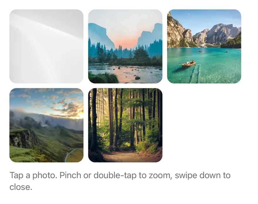
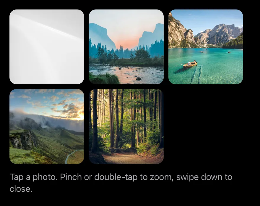
import { ImageViewer, ImageViewerTrigger, ImageViewerContent } from "@/components/interactions/image-viewer"<Gallery defaultOpen defaultIndex={1} />Pass images to ImageViewer, wrap each thumbnail in an ImageViewerTrigger with its index, and render one ImageViewerContent. Give each image an accessibilityLabel. The ImageViewerImage type is exported.
Open state and the current image can be uncontrolled with defaultOpen and defaultIndex, or controlled with open, onOpenChange, index and onIndexChange. useImageViewer returns open, index, count and images.
Examples
Default
import { Image, View } from "react-native"
import { ImageViewer, ImageViewerContent, type ImageViewerImage, ImageViewerTrigger } from "@/components/interactions/image-viewer"
import { Text } from "@/components/ui/text"

const images: ImageViewerImage[] = [
  {
    source: {
      uri: "https://images.unsplash.com/photo-1588345921523-c2dcdb7f1dcd?w=1200&q=80",
    },
    accessibilityLabel: "Mountain lake at sunrise",
  },
  {
    source: {
      uri: "https://images.unsplash.com/photo-1506744038136-46273834b3fb?w=1200&q=80",
    },
    accessibilityLabel: "Valley with a river",
  },
  {
    source: {
      uri: "https://images.unsplash.com/photo-1501785888041-af3ef285b470?w=1200&q=80",
    },
    accessibilityLabel: "Lake between mountains",
  },
  {
    source: {
      uri: "https://images.unsplash.com/photo-1470071459604-3b5ec3a7fe05?w=1200&q=80",
    },
    accessibilityLabel: "Foggy hills",
  },
  {
    source: {
      uri: "https://images.unsplash.com/photo-1441974231531-c6227db76b6e?w=1200&q=80",
    },
    accessibilityLabel: "Forest path",
  },
]

function Gallery({
  defaultOpen,
  defaultIndex,
}: {
  defaultOpen?: boolean
  defaultIndex?: number
}) {
  return (
    <ImageViewer
      images={images}
      defaultOpen={defaultOpen}
      defaultIndex={defaultIndex}
    >
      <View className="gap-3">
        <View className="flex-row flex-wrap gap-2">
          {images.map((image, index) => (
            <ImageViewerTrigger
              key={image.accessibilityLabel}
              index={index}
              accessibilityLabel={image.accessibilityLabel}
              className="aspect-square w-[31%] overflow-hidden rounded-xl bg-surface-secondary"
            >
              <Image source={image.source} className="h-full w-full" />
            </ImageViewerTrigger>
          ))}
        </View>
        <Text variant="muted">
          Tap a photo. Pinch or double-tap to zoom, swipe down to close.
        </Text>
      </View>
      <ImageViewerContent />
    </ImageViewer>
  )
}

export function ImageViewerExample() {
  return (
    <Gallery />
  )
}import EsuissUI
import SwiftUI
import UIKit
struct ImageViewerPhoto {
let url: URL
let label: String
}
let imageViewerPhotos = [
ImageViewerPhoto(url: URL(string: "https://images.unsplash.com/photo-1588345921523-c2dcdb7f1dcd?w=1200&q=80")!, label: "Mountain lake at sunrise"),
ImageViewerPhoto(url: URL(string: "https://images.unsplash.com/photo-1506744038136-46273834b3fb?w=1200&q=80")!, label: "Valley with a river"),
ImageViewerPhoto(url: URL(string: "https://images.unsplash.com/photo-1501785888041-af3ef285b470?w=1200&q=80")!, label: "Lake between mountains"),
ImageViewerPhoto(url: URL(string: "https://images.unsplash.com/photo-1470071459604-3b5ec3a7fe05?w=1200&q=80")!, label: "Foggy hills"),
ImageViewerPhoto(url: URL(string: "https://images.unsplash.com/photo-1441974231531-c6227db76b6e?w=1200&q=80")!, label: "Forest path"),
]
struct ImageViewerGallery: View {
@State private var open: Bool
@State private var index: Int
@State private var loaded: [Int: UIImage] = [:]
init(open: Bool = false, index: Int = 0) {
_open = State(initialValue: open)
_index = State(initialValue: index)
}
var images: [Image] {
imageViewerPhotos.indices.map { page in
let photo = imageViewerPhotos[page]
if let cgImage = loaded[page]?.cgImage {
return Image(cgImage, scale: 1, orientation: .up, label: Text(verbatim: photo.label))
}
return Image(uiImage: UIImage())
}
}
var body: some View {
VStack(alignment: .leading, spacing: 12) {
GeometryReader { proxy in
let side = ((proxy.size.width - 16) / 3).rounded(.down)
FlowRow(spacing: 8) {
ForEach(imageViewerPhotos.indices, id: \.self) { page in
Button {
index = page
open = true
} label: {
thumbnail(page)
.frame(width: side, height: side)
.background(Color.surfaceSecondary)
.clipShape(RoundedRectangle(cornerRadius: Radius.xl, style: .continuous))
}
.buttonStyle(.plain)
.accessibilityLabel(Text(verbatim: imageViewerPhotos[page].label))
}
}
}
.aspectRatio(3 / 2, contentMode: .fit)
Text("Tap a photo. Pinch or double-tap to zoom, swipe down to close.")
.textVariant(.muted)
}
.imageViewer(isPresented: $open, images: images, index: $index)
.task {
await load()
}
}
@ViewBuilder
func thumbnail(_ page: Int) -> some View {
if let image = loaded[page] {
Image(uiImage: image)
.resizable()
.scaledToFill()
} else {
Color.surfaceSecondary
}
}
func load() async {
await withTaskGroup(of: (Int, UIImage?).self) { group in
for (page, photo) in imageViewerPhotos.enumerated() {
group.addTask {
guard let (data, _) = try? await URLSession.shared.data(from: photo.url) else { return (page, nil) }
return (page, UIImage(data: data))
}
}
for await (page, image) in group {
if let image { loaded[page] = image }
}
}
}
}
let group = StoryGroup(.interactions, "Image Viewer", stories: [
Story("Default") {
ImageViewerGallery()
},
Story("OpenByDefault") {
ImageViewerGallery(open: true, index: 1)
},
]import androidx.compose.foundation.Image
import androidx.compose.foundation.background
import androidx.compose.foundation.clickable
import androidx.compose.foundation.layout.Arrangement
import androidx.compose.foundation.layout.Column
import androidx.compose.foundation.layout.FlowRow
import androidx.compose.foundation.layout.aspectRatio
import androidx.compose.foundation.layout.fillMaxWidth
import androidx.compose.foundation.shape.RoundedCornerShape
import androidx.compose.runtime.Composable
import androidx.compose.runtime.getValue
import androidx.compose.runtime.mutableIntStateOf
import androidx.compose.runtime.mutableStateOf
import androidx.compose.runtime.remember
import androidx.compose.runtime.saveable.rememberSaveable
import androidx.compose.runtime.setValue
import androidx.compose.ui.Modifier
import androidx.compose.ui.draw.clip
import androidx.compose.ui.geometry.Offset
import androidx.compose.ui.geometry.Size
import androidx.compose.ui.graphics.Brush
import androidx.compose.ui.graphics.Color
import androidx.compose.ui.graphics.drawscope.DrawScope
import androidx.compose.ui.graphics.painter.Painter
import androidx.compose.ui.layout.ContentScale
import androidx.compose.ui.semantics.Role
import androidx.compose.ui.semantics.contentDescription
import androidx.compose.ui.semantics.semantics
import androidx.compose.ui.unit.dp
import com.esuiss.ui.components.Text
import com.esuiss.ui.components.TextVariant
import com.esuiss.ui.interactions.ImageViewer
import com.esuiss.ui.interactions.ImageViewerImage
import com.esuiss.ui.theme.EsuissTheme
import com.esuiss.ui.theme.Radius
@Composable
fun ImageViewerExample() {
ImageViewerGallery(defaultOpen = false, defaultIndex = 0)
}
class ImageViewerGradient(private val from: Color, private val to: Color, private val size: Size) : Painter() {
override val intrinsicSize: Size
get() = size
override fun DrawScope.onDraw() {
drawRect(Brush.linearGradient(listOf(from, to), start = Offset.Zero, end = Offset(this.size.width, this.size.height)))
}
}
val imageViewerLabels = listOf(
"Mountain lake at sunrise",
"Valley with a river",
"Lake between mountains",
"Foggy hills",
"Forest path",
)
@Composable
fun ImageViewerGallery(defaultOpen: Boolean, defaultIndex: Int) {
val colors = EsuissTheme.colors
var open by rememberSaveable { mutableStateOf(defaultOpen) }
var index by rememberSaveable { mutableIntStateOf(defaultIndex) }
val tones = listOf(
colors.orange to colors.pink,
colors.teal to colors.blue,
colors.indigo to colors.cyan,
colors.gray to colors.mint,
colors.green to colors.brown,
)
val images = remember(tones) {
imageViewerLabels.mapIndexed { position, label ->
val (from, to) = tones[position]
ImageViewerImage(ImageViewerGradient(from, to, Size(1200f, 800f)), contentDescription = label)
}
}
val shape = RoundedCornerShape(Radius.xl)
Column(verticalArrangement = Arrangement.spacedBy(12.dp)) {
FlowRow(
modifier = Modifier.fillMaxWidth(),
horizontalArrangement = Arrangement.spacedBy(8.dp),
verticalArrangement = Arrangement.spacedBy(8.dp),
) {
images.forEachIndexed { position, image ->
Image(
painter = image.painter,
contentDescription = null,
contentScale = ContentScale.Crop,
modifier = Modifier
.fillMaxWidth(0.31f)
.aspectRatio(1f)
.clip(shape)
.background(colors.surfaceSecondary, shape)
.semantics { contentDescription = imageViewerLabels[position] }
.clickable(role = Role.Button) {
index = position
open = true
},
)
}
}
Text("Tap a photo. Pinch or double-tap to zoom, swipe down to close.", variant = TextVariant.Muted)
}
ImageViewer(
open = open,
onOpenChange = { open = it },
images = images,
index = index,
onIndexChange = { index = it },
)
}API Reference
ImageViewer
The root that holds the images, open state and current index.
React.ComponentProps<typeof ImageViewerPrimitive.Root>- About
- Called when the viewer opens or closes.
- Type
(open: boolean) => void- Default
- —
- About
- Called with the new index after paging.
- Type
(index: number) => void- Default
- —
ImageViewerTrigger
A pressable thumbnail that opens the viewer at its index.
React.ComponentProps<typeof ImageViewerPrimitive.Trigger>ImageViewerContent
The full-screen viewer with the pages, counter and close button.
- About
- Name of a portal host to render into.
- Type
string- Default
- —
- About
- Accessibility label of the close button. Defaults to
Close. - Type
string- Default
- "Close"
- About
- Formats the counter from the index and count. Defaults to
n of count. - Type
(index: number, count: number) => string- Default
- defaultIndexLabel
- Type
string- Default
- —
Accessibility
- The viewer is modal for screen readers, and the escape gesture closes it.
- The current page is
adjustable: swiping up or down with a screen reader moves between images. It is labelled by the image'saccessibilityLabel, orImage n, with the counter as its value. - Triggers have the
buttonrole and expose theirexpandedstate.
Notes
- The viewer fades in and out, and paging and zoom animations respect the system reduce motion setting.
- Colors use the
bg-mediaandtext-on-mediatokens, so the viewer stays dark in light mode. - On iOS the viewer renders in a full-window overlay so it appears above native screens.