suiss/uim · Interaction
Swipe Actions
Swipe a list row sideways to reveal action buttons, with full swipe to run the main action.
Swipe Actions is an open-source mobile interaction from suiss/uim for React Native and Expo, with SwiftUI and Jetpack Compose versions built from the same design tokens. The @esuiss/uim CLI copies its source into your project, so you own the code.
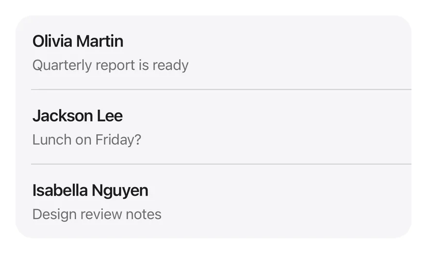
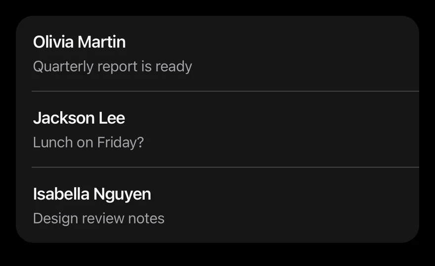
import { ArchiveIcon, BellSlashIcon, EnvelopeOpenIcon, TrashIcon } from "phosphor-react-native"
import * as React from "react"
import { View } from "react-native"
import { SwipeAction, SwipeActions, SwipeActionsActions, SwipeActionsContent } from "@/components/interactions/swipe-actions"
import { Icon } from "@/components/ui/icon"
import { Item, ItemContent, ItemDescription, ItemGroup, ItemSeparator, ItemTitle } from "@/components/ui/item"
import { Text } from "@/components/ui/text"

const MESSAGES = [
  { id: "1", from: "Olivia Martin", subject: "Quarterly report is ready" },
  { id: "2", from: "Jackson Lee", subject: "Lunch on Friday?" },
  { id: "3", from: "Isabella Nguyen", subject: "Design review notes" },
]

function Inbox() {
  const [messages, setMessages] = React.useState(MESSAGES)
  const remove = (id: string) =>
    setMessages((current) => current.filter((message) => message.id !== id))
  return (
    <ItemGroup variant="inset">
      {messages.map((message, index) => (
        <React.Fragment key={message.id}>
          {index > 0 ? <ItemSeparator /> : null}
          <SwipeActions>
            <SwipeActionsActions side="leading">
              <SwipeAction>
                <Icon as={EnvelopeOpenIcon} />
                <Text>Read</Text>
              </SwipeAction>
            </SwipeActionsActions>
            <SwipeActionsContent className="bg-surface-secondary">
              <Item onPress={() => {}}>
                <ItemContent>
                  <ItemTitle>{message.from}</ItemTitle>
                  <ItemDescription>{message.subject}</ItemDescription>
                </ItemContent>
              </Item>
            </SwipeActionsContent>
            <SwipeActionsActions side="trailing">
              <SwipeAction variant="neutral">
                <Icon as={BellSlashIcon} />
                <Text>Mute</Text>
              </SwipeAction>
              <SwipeAction variant="archive">
                <Icon as={ArchiveIcon} />
                <Text>Archive</Text>
              </SwipeAction>
              <SwipeAction
                variant="destructive"
                fullSwipe
                onPress={() => remove(message.id)}
              >
                <Icon as={TrashIcon} />
                <Text>Delete</Text>
              </SwipeAction>
            </SwipeActionsActions>
          </SwipeActions>
        </React.Fragment>
      ))}
    </ItemGroup>
  )
}

export function SwipeActionsExample() {
  return (
    <View>
      <Inbox />
    </View>
  )
}import EsuissUI
import PhosphorSwift
import SwiftUI
struct SwipeActionsMessage: Identifiable {
let id: String
let from: String
let subject: String
}
let swipeActionsMessages = [
SwipeActionsMessage(id: "1", from: "Olivia Martin", subject: "Quarterly report is ready"),
SwipeActionsMessage(id: "2", from: "Jackson Lee", subject: "Lunch on Friday?"),
SwipeActionsMessage(id: "3", from: "Isabella Nguyen", subject: "Design review notes"),
]
struct SwipeActionsInbox: View {
@State private var messages = swipeActionsMessages
var body: some View {
ItemGroup(.inset) {
ForEach(Array(messages.enumerated()), id: \.element.id) { index, message in
if index > 0 {
ItemSeparator()
}
SwipeActions(background: .surfaceSecondary) {
Item(action: {}) {
ItemContent {
ItemTitle(verbatim: message.from)
ItemDescription(verbatim: message.subject)
}
}
} leading: {
SwipeAction("Read", icon: Ph.envelopeOpen.regular) {}
} trailing: {
SwipeAction("Mute", icon: Ph.bellSlash.regular, variant: .neutral) {}
SwipeAction("Archive", icon: Ph.archive.regular, variant: .archive) {}
SwipeAction("Delete", icon: Ph.trash.regular, variant: .destructive, fullSwipe: true) {
messages.removeAll { $0.id == message.id }
}
}
}
}
}
}import androidx.compose.runtime.Composable
import androidx.compose.runtime.getValue
import androidx.compose.runtime.key
import androidx.compose.runtime.mutableStateOf
import androidx.compose.runtime.remember
import androidx.compose.runtime.setValue
import com.adamglin.PhosphorIcons
import com.adamglin.phosphoricons.Regular
import com.adamglin.phosphoricons.regular.Archive
import com.adamglin.phosphoricons.regular.BellSlash
import com.adamglin.phosphoricons.regular.EnvelopeOpen
import com.adamglin.phosphoricons.regular.Trash
import com.esuiss.ui.components.Item
import com.esuiss.ui.components.ItemContent
import com.esuiss.ui.components.ItemDescription
import com.esuiss.ui.components.ItemGroup
import com.esuiss.ui.components.ItemGroupVariant
import com.esuiss.ui.components.ItemSeparator
import com.esuiss.ui.components.ItemTitle
import com.esuiss.ui.interactions.SwipeAction
import com.esuiss.ui.interactions.SwipeActionVariant
import com.esuiss.ui.interactions.SwipeActions
import com.esuiss.ui.theme.EsuissTheme
class SwipeActionsMessage(val id: String, val from: String, val subject: String)
val swipeActionsMessages = listOf(
SwipeActionsMessage("1", "Olivia Martin", "Quarterly report is ready"),
SwipeActionsMessage("2", "Jackson Lee", "Lunch on Friday?"),
SwipeActionsMessage("3", "Isabella Nguyen", "Design review notes"),
)
@Composable
fun SwipeActionsInbox() {
var messages by remember { mutableStateOf(swipeActionsMessages) }
ItemGroup(variant = ItemGroupVariant.Inset) {
messages.forEachIndexed { index, message ->
key(message.id) {
if (index > 0) ItemSeparator()
SwipeActions(
leading = listOf(SwipeAction("Read", {}, icon = PhosphorIcons.Regular.EnvelopeOpen)),
trailing = listOf(
SwipeAction("Mute", {}, icon = PhosphorIcons.Regular.BellSlash, variant = SwipeActionVariant.Neutral),
SwipeAction("Archive", {}, icon = PhosphorIcons.Regular.Archive, variant = SwipeActionVariant.Archive),
SwipeAction(
"Delete",
{ messages = messages.filterNot { it.id == message.id } },
icon = PhosphorIcons.Regular.Trash,
variant = SwipeActionVariant.Destructive,
fullSwipe = true,
),
),
background = EsuissTheme.colors.surfaceSecondary,
) {
Item(onClick = {}) {
ItemContent {
ItemTitle(message.from)
ItemDescription(message.subject)
}
}
}
}
}
}
}SwipeActions wraps a row so it can be dragged left or right to reveal SwipeAction buttons on the leading or trailing side. The buttons stretch to fill the revealed space, and opening one row closes any other open row.
When an action has fullSwipe, dragging past 60% of the row width expands that action over the others with a medium impact haptic. Releasing there slides the row off, collapses its height, then runs the action, which suits delete or archive. Use it for mail, message or task lists.
Installation
$ pnpm dlx @esuiss/uim@latest add swipe-actions$ pnpm dlx @esuiss/uim@latest add swipe-actions --platform swift$ pnpm dlx @esuiss/uim@latest add swipe-actions --platform kotlinThe CLI also adds what it builds on: Icon, Text.
Manual
- Install the dependencies:
npx expo install class-variance-authority cn react-native-gesture-handler react-native-reanimated react-native-worklets-
Add the pieces it builds on: Icon, Text, and the primitives
components/primitives/haptics.tsx. -
Copy the source into
components/interactions/swipe-actions.tsx:
import { cva, type VariantProps } from "class-variance-authority"
import { cn } from "cn"
import * as React from "react"
import {
  type AccessibilityActionEvent,
  I18nManager,
  Pressable,
  View,
  type ViewProps,
} from "react-native"
import ReanimatedSwipeable, {
  type SwipeableMethods,
} from "react-native-gesture-handler/ReanimatedSwipeable"
import {
  Easing,
runOnJS,- Update the import paths to match your project.
- Install the dependencies:
npx expo install class-variance-authority cn react-native-gesture-handler react-native-reanimated react-native-worklets-
Add the pieces it builds on: Icon, Text, and the primitives
components/primitives/haptics.tsx. -
Copy the source into
components/interactions/swipe-actions.tsx:
import { cva, type VariantProps } from "class-variance-authority"
import { cn } from "cn"
import * as React from "react"
import {
  type AccessibilityActionEvent,
  I18nManager,
  Pressable,
  View,
  type ViewProps,
} from "react-native"
import ReanimatedSwipeable, {
  type SwipeableMethods,
} from "react-native-gesture-handler/ReanimatedSwipeable"
import {
  Easing,
runOnJS,- Update the import paths to match your project.
- Install the dependencies:
npx expo install react-native-gesture-handler react-native-reanimated react-native-worklets-
Add the pieces it builds on: Icon, Text, and the primitives
components/primitives/haptics.tsx. -
Copy the source into
components/interactions/swipe-actions.tsx:
import * as React from "react"
import {
  type AccessibilityActionEvent,
  I18nManager,
  Pressable,
  StyleSheet,
  View,
  type ViewProps,
} from "react-native"
import ReanimatedSwipeable, {
  type SwipeableMethods,
} from "react-native-gesture-handler/ReanimatedSwipeable"
import {
  Easing,
  runOnJS,
type SharedValue,- Update the import paths to match your project.
-
Target iOS 17 or later.
-
Copy the theme files every view uses:
import SwiftUI
import UIKit

struct RGBA: Sendable {
  let red: CGFloat
  let green: CGFloat
  let blue: CGFloat
  let alpha: CGFloat

  init(_ hex: UInt32, _ alpha: CGFloat = 1) {
    red = CGFloat((hex >> 16) & 0xFF) / 255
    green = CGFloat((hex >> 8) & 0xFF) / 255
    blue = CGFloat(hex & 0xFF) / 255
    self.alpha = alpha
}import SwiftUI
extension Color {
public static let surface = Color.adaptive(light: .init(0xFFFFFF), dark: .init(0x000000))
public static let surfaceSecondary = Color.adaptive(light: .init(0xF5F5F7), dark: .init(0x161617))
public static let surfaceTertiary = Color.adaptive(light: .init(0xE8E8ED), dark: .init(0x2C2C2E))
public static let surfaceRaised = Color.adaptive(light: .init(0xFFFFFF), dark: .init(0x1D1D1F))
public static let label = Color.adaptive(light: .init(0x1D1D1F), dark: .init(0xF5F5F7))
public static let labelSecondary = Color.adaptive(light: .init(0x6E6E73), dark: .init(0xA1A1A6))
public static let labelTertiary = Color.adaptive(light: .init(0x86868B), dark: .init(0x86868B))
public static let labelQuaternary = Color.adaptive(light: .init(0xD2D2D7), dark: .init(0x424245))
public static let control = Color.adaptive(light: .init(0x000000, 0.04), dark: .init(0xFFFFFF, 0.1))
public static let controlPressed = Color.adaptive(light: .init(0x000000, 0.12), dark: .init(0xFFFFFF, 0.22))
public static let controlSelected = Color.adaptive(light: .init(0x1D1D1F), dark: .init(0xF5F5F7))
public static let controlDisabled = Color.adaptive(light: .init(0x000000, 0.03), dark: .init(0xFFFFFF, 0.05))
public static let onControlSelected = Color.adaptive(light: .init(0xFFFFFF), dark: .init(0x000000))- Copy the source and every file it uses:
import SwiftUI

public enum SwipeActionVariant: CaseIterable, Sendable {
  case `default`, destructive, archive, neutral

  var color: Color {
    switch self {
    case .default: .accent
    case .destructive: .adaptive(light: .init(0xD0000A), dark: .init(0xB33B32))
    case .archive: .adaptive(light: .init(0x994AC1), dark: .init(0x863FA9))
    case .neutral: .adaptive(light: .init(0x66666A), dark: .init(0x555558))
    }
  }
}

enum SwipeActionsMode: Sendable {import SwiftUI
extension EnvironmentValues {
@Entry public var hapticsEnabled = true
}
extension View {
public func haptics(_ enabled: Bool) -> some View {
environment(\.hapticsEnabled, enabled)
}
func hapticFeedback<Trigger: Equatable>(_ feedback: SensoryFeedback, trigger: Trigger) -> some View {
modifier(HapticFeedbackModifier(feedback: feedback, trigger: trigger) { _, _ in true })
}
func hapticFeedback<Trigger: Equatable>(- Add the files to your app target.
- Set
minSdkto 24 or higher and add the dependencies:
implementation(platform("androidx.compose:compose-bom:2026.09.00"))
implementation("androidx.compose.foundation:foundation")
implementation("androidx.compose.ui:ui")- Copy the theme files every view uses:
package com.esuiss.ui.theme

import androidx.compose.foundation.isSystemInDarkTheme
import androidx.compose.runtime.Composable
import androidx.compose.runtime.CompositionLocalProvider
import androidx.compose.runtime.Immutable
import androidx.compose.runtime.staticCompositionLocalOf
import androidx.compose.ui.Modifier
import androidx.compose.ui.draw.dropShadow
import androidx.compose.ui.graphics.Color
import androidx.compose.ui.graphics.Shape
import androidx.compose.ui.graphics.shadow.Shadow as DropShadow
import androidx.compose.ui.text.TextStyle
import androidx.compose.ui.text.style.LineHeightStyle
import androidx.compose.ui.unit.Dp
import androidx.compose.ui.unit.DpOffsetpackage com.esuiss.ui.theme
import androidx.compose.runtime.Immutable
import androidx.compose.ui.graphics.Color
import androidx.compose.ui.unit.dp
@Immutable
data class Colors(
val surface: Color,
val surfaceSecondary: Color,
val surfaceTertiary: Color,
val surfaceRaised: Color,
val label: Color,
val labelSecondary: Color,
val labelTertiary: Color,
val labelQuaternary: Color,- Copy the source and every file it uses:
package com.esuiss.ui.interactions

import androidx.compose.animation.core.Animatable
import androidx.compose.animation.core.animateFloatAsState
import androidx.compose.animation.core.tween
import androidx.compose.foundation.background
import androidx.compose.foundation.clickable
import androidx.compose.foundation.gestures.AnchoredDraggableDefaults
import androidx.compose.foundation.gestures.AnchoredDraggableState
import androidx.compose.foundation.gestures.DraggableAnchors
import androidx.compose.foundation.gestures.Orientation
import androidx.compose.foundation.gestures.anchoredDraggable
import androidx.compose.foundation.gestures.animateTo
import androidx.compose.foundation.gestures.detectTapGestures
import androidx.compose.foundation.gestures.snapTo
import androidx.compose.foundation.interaction.MutableInteractionSourcepackage com.esuiss.ui.components
import androidx.compose.runtime.compositionLocalOf
import androidx.compose.ui.graphics.Color
import androidx.compose.ui.text.TextStyle
import androidx.compose.ui.unit.Dp
import androidx.compose.ui.unit.dp
val LocalContentStyle = compositionLocalOf { TextStyle.Default }
val LocalContentColor = compositionLocalOf { Color.Unspecified }
val LocalIconSize = compositionLocalOf { 20.dp }package com.esuiss.ui.components
import android.provider.Settings
import androidx.compose.animation.core.CubicBezierEasing
import androidx.compose.foundation.background
import androidx.compose.foundation.border
import androidx.compose.foundation.gestures.Orientation
import androidx.compose.foundation.text.selection.TextSelectionColors
import androidx.compose.runtime.Composable
import androidx.compose.runtime.mutableStateOf
import androidx.compose.runtime.remember
import androidx.compose.ui.Modifier
import androidx.compose.ui.draw.clip
import androidx.compose.ui.draw.drawWithContent
import androidx.compose.ui.geometry.Offset
import androidx.compose.ui.geometry.Sizepackage com.esuiss.ui.components
import androidx.compose.runtime.Composable
import androidx.compose.runtime.CompositionLocalProvider
import androidx.compose.runtime.remember
import androidx.compose.runtime.staticCompositionLocalOf
import androidx.compose.ui.hapticfeedback.HapticFeedback
import androidx.compose.ui.hapticfeedback.HapticFeedbackType
import androidx.compose.ui.platform.LocalHapticFeedback
val LocalHapticsEnabled = staticCompositionLocalOf { true }
@Composable
fun ProvideHaptics(enabled: Boolean, content: @Composable () -> Unit) {
CompositionLocalProvider(LocalHapticsEnabled provides enabled, content = content)
}package com.esuiss.ui.components
import androidx.compose.foundation.Image
import androidx.compose.foundation.layout.size
import androidx.compose.runtime.Composable
import androidx.compose.ui.Modifier
import androidx.compose.ui.graphics.Color
import androidx.compose.ui.graphics.ColorFilter
import androidx.compose.ui.graphics.takeOrElse
import androidx.compose.ui.graphics.vector.ImageVector
import androidx.compose.ui.unit.Dp
import com.esuiss.ui.theme.EsuissTheme
@Composable
fun Icon(
imageVector: ImageVector,- Update the
com.esuiss.uipackage names to match your project.
Usage
import { SwipeActions, SwipeActionsContent, SwipeActionsActions, SwipeAction } from "@/components/interactions/swipe-actions"<View>
<Inbox />
</View>Put the row in SwipeActionsContent, and the buttons in one SwipeActionsActions per side, with side set to leading or trailing (the default). Leading actions are on the left in left-to-right layouts and on the right in right-to-left layouts.
Pressing an action runs onPress and closes the row. For a full-swipe action, onPress runs after the row collapses, so remove the item from your data there. useSwipeActions returns close for closing the row from inside it. swipeActionVariants is also exported.
API Reference
SwipeActions
The root that handles the swipe gesture.
ViewProps- About
- Called with
leading,trailingornullwhen the row opens or closes. - Type
(side: SwipeActionsSide | null) => void- Default
- —
SwipeActionsContent
The row content that slides.
ViewPropsSwipeActionsActions
The group of actions for one side.
ViewProps- About
leadingortrailing. Defaults totrailing.- Type
SwipeActionsSide- Default
- —
- Type
React.ReactNode- Default
- —
SwipeAction
One action button.
SwipeActionPropsAccessibility
- Every action is offered as an accessibility action on
SwipeActionsContent, labelled by itsaccessibilityLabelor text, so screen reader users can run it without swiping. - Hidden actions are removed from the accessibility tree until their side is open.
- The row has the
grouprole and each action thebuttonrole.
Notes
- The full-swipe haptic plays only if the app provides an adapter through
HapticsProvider. - Action colors use
bg-accent,bg-danger,bg-purpleandbg-graywithtext-on-accentlabels and icons; the content usesbg-surface.