suiss/uim · Chart
Bar Chart Hourly
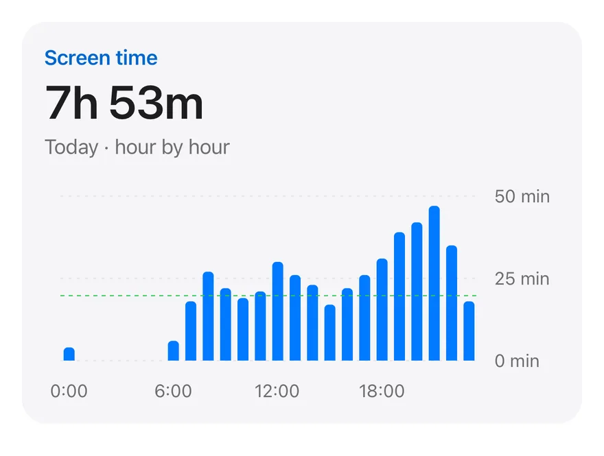
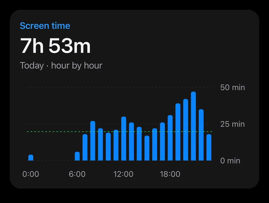
A screen-time card with 24 hourly bars, a total in the header and a dashed average line.
Bar Chart Hourly is an open-source mobile chart from suiss/uim, drawn with react-native-svg for React Native and Expo, with SwiftUI and Jetpack Compose versions built from the same design tokens. The @esuiss/uim CLI copies its source into your project, so you own the code.
import { Card, CardContent, CardHeader } from "@/components/ui/card"
import {
  Bar,
  BarChart,
  CartesianGrid,
  type ChartConfig,
  ChartContainer,
  ChartTooltip,
  ChartTooltipContent,
  ReferenceLine,
  XAxis,
  YAxis,
} from "@/components/ui/chart"
import { Text } from "@/components/ui/text"

const chartData = [import Charts
import SwiftUI
private let minutes: [Double] = [
4, 0, 0, 0, 0, 0, 6, 18, 27, 22, 19, 21, 30, 26, 23, 17, 22, 26, 31, 39, 42, 47, 35, 18,
]
private let hours = minutes.indices.map { "\($0)" }
private let chartConfig: ChartConfig = [
"minutes": .init("Screen time", color: .blue),
]
private let total = Int(minutes.reduce(0, +))
private let average = minutes.reduce(0, +) / Double(minutes.count)package com.esuiss.ui.charts
import androidx.compose.foundation.layout.Arrangement
import androidx.compose.foundation.layout.Column
import androidx.compose.foundation.layout.fillMaxWidth
import androidx.compose.foundation.layout.height
import androidx.compose.foundation.text.BasicText
import androidx.compose.runtime.Composable
import androidx.compose.ui.Modifier
import androidx.compose.ui.text.font.FontWeight
import androidx.compose.ui.unit.dp
import com.esuiss.ui.components.BarChart
import com.esuiss.ui.components.Card
import com.esuiss.ui.components.CardContent
import com.esuiss.ui.components.CardSize
import com.esuiss.ui.components.CardVariantThin bars show minutes for each hour of the day, with ticks every six hours and a value axis in minutes on the right. A ReferenceLine marks the hourly average, and the header shows the day's total in hours and minutes. The tooltip formats the hour and the minutes.
Installation
$ pnpm dlx @esuiss/uim@latest add bar-chart-hourly$ pnpm dlx @esuiss/uim@latest add bar-chart-hourly --platform swift$ pnpm dlx @esuiss/uim@latest add bar-chart-hourly --platform kotlinThe CLI also adds what it builds on: Card, Chart, Text.
Manual
-
Copy the source into
components/charts/bar-chart-hourly.tsx:
import { Card, CardContent, CardHeader } from "@/components/ui/card"
import {
Bar,
BarChart,
CartesianGrid,
type ChartConfig,
ChartContainer,
ChartTooltip,
ChartTooltipContent,
ReferenceLine,
XAxis,
YAxis,
} from "@/components/ui/chart"
import { Text } from "@/components/ui/text"
const chartData = [- Update the import paths to match your project.
-
Copy the source into
components/charts/bar-chart-hourly.tsx:
import { Card, CardContent, CardHeader } from "@/components/ui/card"
import {
Bar,
BarChart,
CartesianGrid,
type ChartConfig,
ChartContainer,
ChartTooltip,
ChartTooltipContent,
ReferenceLine,
XAxis,
YAxis,
} from "@/components/ui/chart"
import { Text } from "@/components/ui/text"
const chartData = [- Update the import paths to match your project.
-
Copy the source into
components/charts/bar-chart-hourly.tsx:
import { StyleSheet } from "react-native"
import { Card, CardContent, CardHeader } from "@/components/ui/card"
import {
Bar,
BarChart,
CartesianGrid,
type ChartConfig,
ChartContainer,
ChartTooltip,
ChartTooltipContent,
ReferenceLine,
XAxis,
YAxis,
} from "@/components/ui/chart"
import { Text } from "@/components/ui/text"
import { fontSize, useTheme } from "@/components/ui/theme"- Update the import paths to match your project.
-
Target iOS 17 or later.
-
Copy the theme files every view uses:
import SwiftUI
import UIKit
struct RGBA: Sendable {
let red: CGFloat
let green: CGFloat
let blue: CGFloat
let alpha: CGFloat
init(_ hex: UInt32, _ alpha: CGFloat = 1) {
red = CGFloat((hex >> 16) & 0xFF) / 255
green = CGFloat((hex >> 8) & 0xFF) / 255
blue = CGFloat(hex & 0xFF) / 255
self.alpha = alpha
}import SwiftUI
extension Color {
public static let surface = Color.adaptive(light: .init(0xFFFFFF), dark: .init(0x000000))
public static let surfaceSecondary = Color.adaptive(light: .init(0xF5F5F7), dark: .init(0x161617))
public static let surfaceTertiary = Color.adaptive(light: .init(0xE8E8ED), dark: .init(0x2C2C2E))
public static let surfaceRaised = Color.adaptive(light: .init(0xFFFFFF), dark: .init(0x1D1D1F))
public static let label = Color.adaptive(light: .init(0x1D1D1F), dark: .init(0xF5F5F7))
public static let labelSecondary = Color.adaptive(light: .init(0x6E6E73), dark: .init(0xA1A1A6))
public static let labelTertiary = Color.adaptive(light: .init(0x86868B), dark: .init(0x86868B))
public static let labelQuaternary = Color.adaptive(light: .init(0xD2D2D7), dark: .init(0x424245))
public static let control = Color.adaptive(light: .init(0x000000, 0.04), dark: .init(0xFFFFFF, 0.1))
public static let controlPressed = Color.adaptive(light: .init(0x000000, 0.12), dark: .init(0xFFFFFF, 0.22))
public static let controlSelected = Color.adaptive(light: .init(0x1D1D1F), dark: .init(0xF5F5F7))
public static let controlDisabled = Color.adaptive(light: .init(0x000000, 0.03), dark: .init(0xFFFFFF, 0.05))
public static let onControlSelected = Color.adaptive(light: .init(0xFFFFFF), dark: .init(0x000000))- Copy the source and every file it uses:
import Charts
import SwiftUI

private let minutes: [Double] = [
  4, 0, 0, 0, 0, 0, 6, 18, 27, 22, 19, 21, 30, 26, 23, 17, 22, 26, 31, 39, 42, 47, 35, 18,
]

private let hours = minutes.indices.map { "\($0)" }

private let chartConfig: ChartConfig = [
  "minutes": .init("Screen time", color: .blue),
]

private let total = Int(minutes.reduce(0, +))
private let average = minutes.reduce(0, +) / Double(minutes.count)import SwiftUI
public struct Card<Content: View>: View {
public enum Variant: CaseIterable, Sendable {
case `default`, filled
}
public enum Size: CaseIterable, Sendable {
case `default`, sm
var spacing: CGFloat {
switch self {
case .default: 24
case .sm: 16
}
}import Charts
import SwiftUI
public struct ChartConfig: ExpressibleByDictionaryLiteral, Sendable {
public struct Item: Sendable {
public var label: String?
public var color: Color?
public var icon: Image?
public init(_ label: String? = nil, color: Color? = nil, icon: Image? = nil) {
self.label = label
self.color = color
self.icon = icon
}
}import SwiftUI
extension EnvironmentValues {
@Entry public var hapticsEnabled = true
}
extension View {
public func haptics(_ enabled: Bool) -> some View {
environment(\.hapticsEnabled, enabled)
}
func hapticFeedback<Trigger: Equatable>(_ feedback: SensoryFeedback, trigger: Trigger) -> some View {
modifier(HapticFeedbackModifier(feedback: feedback, trigger: trigger) { _, _ in true })
}
func hapticFeedback<Trigger: Equatable>(import SwiftUI
public enum ItemVariant: CaseIterable, Sendable {
case `default`, outline, muted
}
public enum ItemSize: CaseIterable, Sendable {
case `default`, sm, xs
var horizontalPadding: CGFloat {
switch self {
case .default: 16
case .sm: 14
case .xs: 12
}
}import SwiftUI
public struct Separator: View {
let orientation: Axis
public init(_ orientation: Axis = .horizontal) {
self.orientation = orientation
}
public var body: some View {
Rectangle()
.fill(Color.separator)
.frame(width: orientation == .vertical ? 1 : nil, height: orientation == .horizontal ? 1 : nil)
.frame(maxWidth: orientation == .horizontal ? .infinity : nil, maxHeight: orientation == .vertical ? .infinity : nil)
.accessibilityHidden(true)
}import SwiftUI
public enum TextVariant: CaseIterable, Sendable {
case `default`, h1, h2, h3, h4, p, blockquote, code, lead, large, small, muted
var style: TextStyle {
switch self {
case .h1: .xl3
case .h2: .xl2
case .h3: .xl
case .h4, .lead, .large: .lg
case .code, .small, .muted: .sm
default: .base
}
}- Add the files to your app target.
- Set
minSdkto 24 or higher and add the dependencies:
implementation(platform("androidx.compose:compose-bom:2026.09.00"))
implementation("androidx.compose.foundation:foundation")
implementation("androidx.compose.ui:ui")- Copy the theme files every view uses:
package com.esuiss.ui.theme
import androidx.compose.foundation.isSystemInDarkTheme
import androidx.compose.runtime.Composable
import androidx.compose.runtime.CompositionLocalProvider
import androidx.compose.runtime.Immutable
import androidx.compose.runtime.staticCompositionLocalOf
import androidx.compose.ui.Modifier
import androidx.compose.ui.draw.dropShadow
import androidx.compose.ui.graphics.Color
import androidx.compose.ui.graphics.Shape
import androidx.compose.ui.graphics.shadow.Shadow as DropShadow
import androidx.compose.ui.text.TextStyle
import androidx.compose.ui.text.style.LineHeightStyle
import androidx.compose.ui.unit.Dp
import androidx.compose.ui.unit.DpOffsetpackage com.esuiss.ui.theme
import androidx.compose.runtime.Immutable
import androidx.compose.ui.graphics.Color
import androidx.compose.ui.unit.dp
@Immutable
data class Colors(
val surface: Color,
val surfaceSecondary: Color,
val surfaceTertiary: Color,
val surfaceRaised: Color,
val label: Color,
val labelSecondary: Color,
val labelTertiary: Color,
val labelQuaternary: Color,- Copy the source and every file it uses:
package com.esuiss.ui.charts

import androidx.compose.foundation.layout.Arrangement
import androidx.compose.foundation.layout.Column
import androidx.compose.foundation.layout.fillMaxWidth
import androidx.compose.foundation.layout.height
import androidx.compose.foundation.text.BasicText
import androidx.compose.runtime.Composable
import androidx.compose.ui.Modifier
import androidx.compose.ui.text.font.FontWeight
import androidx.compose.ui.unit.dp
import com.esuiss.ui.components.BarChart
import com.esuiss.ui.components.Card
import com.esuiss.ui.components.CardContent
import com.esuiss.ui.components.CardSize
import com.esuiss.ui.components.CardVariantpackage com.esuiss.ui.components
import androidx.compose.foundation.background
import androidx.compose.foundation.border
import androidx.compose.foundation.layout.Arrangement
import androidx.compose.foundation.layout.Column
import androidx.compose.foundation.layout.ColumnScope
import androidx.compose.foundation.layout.Row
import androidx.compose.foundation.layout.RowScope
import androidx.compose.foundation.layout.fillMaxWidth
import androidx.compose.foundation.layout.padding
import androidx.compose.foundation.shape.RoundedCornerShape
import androidx.compose.foundation.text.BasicText
import androidx.compose.runtime.Composable
import androidx.compose.runtime.CompositionLocalProvider
import androidx.compose.runtime.compositionLocalOfpackage com.esuiss.ui.components
import androidx.compose.animation.core.Animatable
import androidx.compose.animation.core.CubicBezierEasing
import androidx.compose.animation.core.Easing
import androidx.compose.animation.core.LinearEasing
import androidx.compose.animation.core.tween
import androidx.compose.foundation.Canvas
import androidx.compose.foundation.background
import androidx.compose.foundation.border
import androidx.compose.foundation.gestures.detectHorizontalDragGestures
import androidx.compose.foundation.gestures.detectTapGestures
import androidx.compose.foundation.layout.Arrangement
import androidx.compose.foundation.layout.Box
import androidx.compose.foundation.layout.BoxScope
import androidx.compose.foundation.layout.BoxWithConstraintspackage com.esuiss.ui.components
import androidx.compose.runtime.compositionLocalOf
import androidx.compose.ui.graphics.Color
import androidx.compose.ui.text.TextStyle
import androidx.compose.ui.unit.Dp
import androidx.compose.ui.unit.dp
val LocalContentStyle = compositionLocalOf { TextStyle.Default }
val LocalContentColor = compositionLocalOf { Color.Unspecified }
val LocalIconSize = compositionLocalOf { 20.dp }package com.esuiss.ui.components
import android.provider.Settings
import androidx.compose.animation.core.CubicBezierEasing
import androidx.compose.foundation.background
import androidx.compose.foundation.border
import androidx.compose.foundation.gestures.Orientation
import androidx.compose.foundation.text.selection.TextSelectionColors
import androidx.compose.runtime.Composable
import androidx.compose.runtime.mutableStateOf
import androidx.compose.runtime.remember
import androidx.compose.ui.Modifier
import androidx.compose.ui.draw.clip
import androidx.compose.ui.draw.drawWithContent
import androidx.compose.ui.geometry.Offset
import androidx.compose.ui.geometry.Sizepackage com.esuiss.ui.components
import androidx.compose.runtime.Composable
import androidx.compose.runtime.CompositionLocalProvider
import androidx.compose.runtime.remember
import androidx.compose.runtime.staticCompositionLocalOf
import androidx.compose.ui.hapticfeedback.HapticFeedback
import androidx.compose.ui.hapticfeedback.HapticFeedbackType
import androidx.compose.ui.platform.LocalHapticFeedback
val LocalHapticsEnabled = staticCompositionLocalOf { true }
@Composable
fun ProvideHaptics(enabled: Boolean, content: @Composable () -> Unit) {
CompositionLocalProvider(LocalHapticsEnabled provides enabled, content = content)
}package com.esuiss.ui.components
import androidx.compose.foundation.Image
import androidx.compose.foundation.layout.size
import androidx.compose.runtime.Composable
import androidx.compose.ui.Modifier
import androidx.compose.ui.graphics.Color
import androidx.compose.ui.graphics.ColorFilter
import androidx.compose.ui.graphics.takeOrElse
import androidx.compose.ui.graphics.vector.ImageVector
import androidx.compose.ui.unit.Dp
import com.esuiss.ui.theme.EsuissTheme
@Composable
fun Icon(
imageVector: ImageVector,- Update the
com.esuiss.uipackage names to match your project.
Usage
import { BarChartHourly } from "@/components/charts/bar-chart-hourly"<BarChartHourly />Replace the 24 values in chartData with your hourly minutes; the total and average are calculated from it. The component takes no props.