# Action Bar

A More actions button that lists several menus in a drawer and opens the chosen menu's items in an alert sheet.

Action Bar is an open-source mobile pattern from suiss/uim: components composed into a flow for React Native and Expo, with SwiftUI and Jetpack Compose versions built from the same design tokens. The @esuiss/uim CLI copies its source into your project, so you own the code.

Source: https://uim.suiss.app/docs/patterns/action-bar
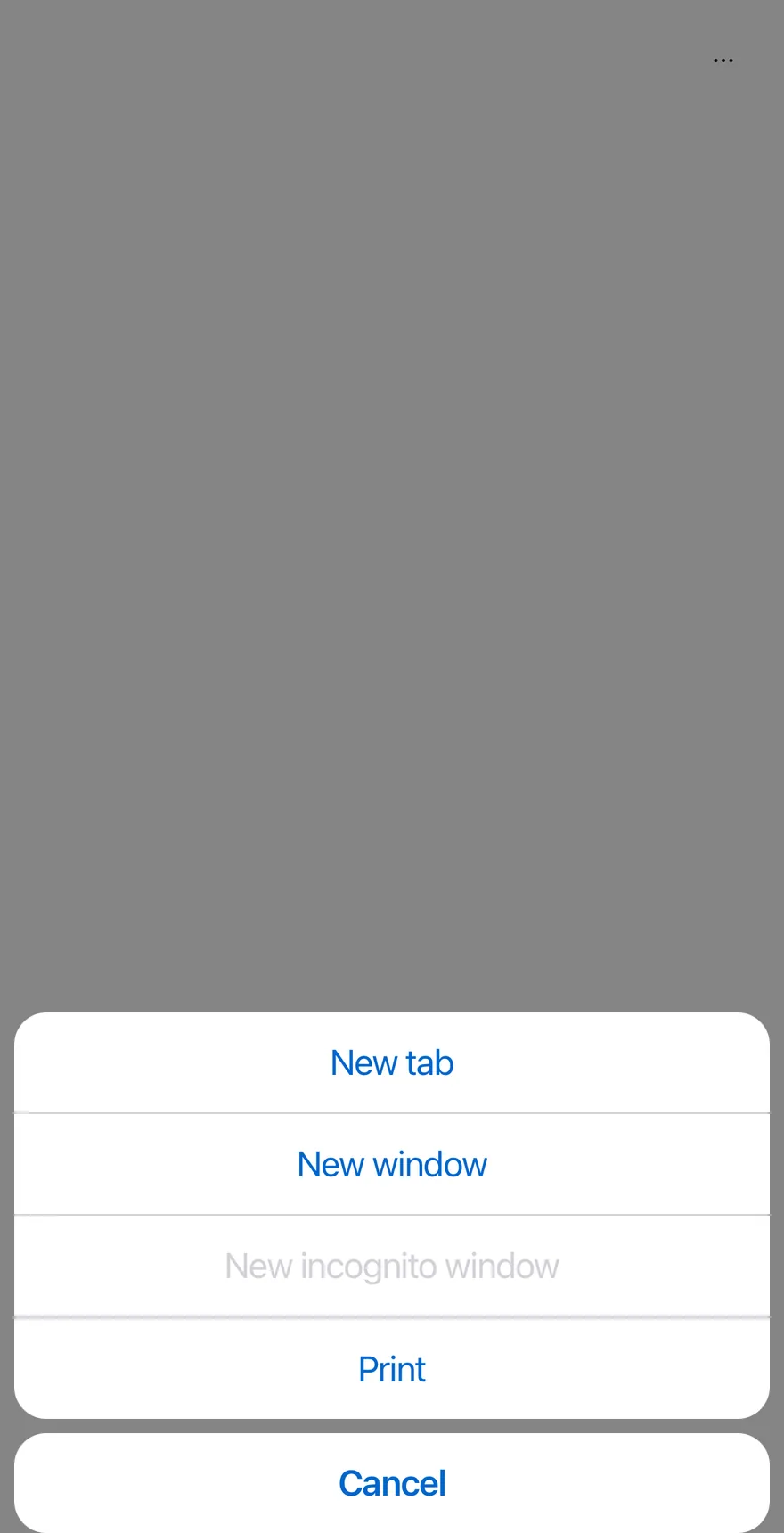
![Preview](https://uim.suiss.app/previews/patterns-action-bar--open-by-default.light.webp)

```tsx
import { ClipboardTextIcon, CopyIcon, ScissorsIcon, TrashIcon } from "phosphor-react-native"
import { ActionBar, ActionBarContent, ActionBarItem, ActionBarLabel, ActionBarMenu, ActionBarSeparator, ActionBarTrigger } from "@/components/patterns/action-bar"
import { Icon } from "@/components/ui/icon"
import { Text } from "@/components/ui/text"

function FileMenu({ defaultOpen }: { defaultOpen?: boolean }) {
  return (
    <ActionBarMenu defaultOpen={defaultOpen}>
      <ActionBarTrigger>File</ActionBarTrigger>
      <ActionBarContent>
        <ActionBarItem>New tab</ActionBarItem>
        <ActionBarItem>New window</ActionBarItem>
        <ActionBarItem disabled>New incognito window</ActionBarItem>
        <ActionBarSeparator />
        <ActionBarItem>Print</ActionBarItem>
      </ActionBarContent>
    </ActionBarMenu>
  )
}

function EditMenu({ withIcons = false }: { withIcons?: boolean }) {
  return (
    <ActionBarMenu>
      <ActionBarTrigger>Edit</ActionBarTrigger>
      <ActionBarContent>
        <ActionBarItem>
          {withIcons ? <Icon as={ScissorsIcon} /> : null}
          <Text>Cut</Text>
        </ActionBarItem>
        <ActionBarItem>
          {withIcons ? <Icon as={CopyIcon} /> : null}
          <Text>Copy</Text>
        </ActionBarItem>
        <ActionBarItem>
          {withIcons ? <Icon as={ClipboardTextIcon} /> : null}
          <Text>Paste</Text>
        </ActionBarItem>
        <ActionBarSeparator />
        <ActionBarItem variant="destructive">
          {withIcons ? <Icon as={TrashIcon} /> : null}
          <Text>Delete</Text>
        </ActionBarItem>
      </ActionBarContent>
    </ActionBarMenu>
  )
}

function ViewMenu() {
  return (
    <ActionBarMenu>
      <ActionBarTrigger>View</ActionBarTrigger>
      <ActionBarContent>
        <ActionBarLabel>Appearance</ActionBarLabel>
        <ActionBarItem>Zoom in</ActionBarItem>
        <ActionBarItem>Zoom out</ActionBarItem>
        <ActionBarItem>Actual size</ActionBarItem>
      </ActionBarContent>
    </ActionBarMenu>
  )
}

export function ActionBarOpenByDefaultExample() {
  return (
    <ActionBar defaultOpen>
      <FileMenu defaultOpen />
      <EditMenu />
      <ViewMenu />
    </ActionBar>
  )
}
```

```swift
import EsuissUI
import PhosphorSwift
import SwiftUI

struct ActionBarOpenFileDemo: View {
  @State private var file = true

  var body: some View {
    ActionBar {
      ActionBarFileMenu(isPresented: $file)
      ActionBarEditMenu()
      ActionBarViewMenu()
    }
  }
}

struct ActionBarFileMenu: View {
  var isPresented: Binding<Bool>?

  var body: some View {
    ActionBarMenu("File", isPresented: isPresented) {
      ActionBarItem("New tab") {}
      ActionBarItem("New window") {}
      ActionBarItem("New incognito window") {}.disabled(true)
      ActionBarSeparator()
      ActionBarItem("Print") {}
    }
  }
}

struct ActionBarEditMenu: View {
  var withIcons = false

  var body: some View {
    ActionBarMenu("Edit") {
      if withIcons {
        ActionBarItem("Cut", icon: Ph.scissors.regular) {}
        ActionBarItem("Copy", icon: Ph.copy.regular) {}
        ActionBarItem("Paste", icon: Ph.clipboardText.regular) {}
        ActionBarSeparator()
        ActionBarItem("Delete", icon: Ph.trash.regular, variant: .destructive) {}
      } else {
        ActionBarItem("Cut") {}
        ActionBarItem("Copy") {}
        ActionBarItem("Paste") {}
        ActionBarSeparator()
        ActionBarItem("Delete", variant: .destructive) {}
      }
    }
  }
}

struct ActionBarViewMenu: View {
  var body: some View {
    ActionBarMenu("View") {
      ActionBarLabel("Appearance")
      ActionBarItem("Zoom in") {}
      ActionBarItem("Zoom out") {}
      ActionBarItem("Actual size") {}
    }
  }
}
```

```kotlin
import androidx.compose.foundation.layout.fillMaxWidth
import androidx.compose.runtime.Composable
import androidx.compose.runtime.getValue
import androidx.compose.runtime.mutableStateOf
import androidx.compose.runtime.saveable.rememberSaveable
import androidx.compose.runtime.setValue
import androidx.compose.ui.Modifier
import com.esuiss.ui.patterns.ActionBar

@Composable
fun ActionBarOpenByDefaultExample() {
    ActionBarDemo(defaultOpen = true, fileOpen = true)
}

@Composable
fun ActionBarDemo(
    defaultOpen: Boolean = false,
    fileOpen: Boolean = false,
    withIcons: Boolean = false,
    view: Boolean = true,
    dismissible: Boolean = true,
    floating: Boolean = false,
    moreLabel: String = "More actions",
    cancelLabel: String = "Cancel",
) {
    var open by rememberSaveable { mutableStateOf(defaultOpen) }
    ActionBar(
        open = open,
        onOpenChange = { open = it },
        modifier = Modifier.fillMaxWidth(),
        dismissible = dismissible,
        floating = floating,
        moreLabel = moreLabel,
        cancelLabel = cancelLabel,
    ) {
        actionBarFileMenu(fileOpen)
        actionBarEditMenu(withIcons)
        if (view) actionBarViewMenu()
    }
}
```

`ActionBar` groups several `ActionBarMenu`s, such as File, Edit and View, behind one ghost icon `Button`. Pressing it opens a `Drawer` that lists each menu's trigger as a row with a chevron.

Choosing a row closes the drawer and opens that menu's items in an `AlertSheet`, with a Cancel button appended. Use it for toolbar-style command groups that need to fit on a phone screen.

## Installation

```bash title="Terminal"
npx @esuiss/uim@latest add action-bar
```

```bash title="Terminal"
npx @esuiss/uim@latest add action-bar --platform swift
```

```bash title="Terminal"
npx @esuiss/uim@latest add action-bar --platform kotlin
```

The CLI also adds what it builds on: [Alert Sheet](/docs/components/alert-sheet), [Button](/docs/components/button), [Drawer](/docs/components/drawer), [Icon](/docs/components/icon), [Text](/docs/components/text).

### Manual

**Uniwind**

1. Install the dependencies:

```bash title="Terminal"
npx expo install cn phosphor-react-native react-native-svg
```

2. Add the pieces it builds on: [Alert Sheet](/docs/components/alert-sheet), [Button](/docs/components/button), [Drawer](/docs/components/drawer), [Icon](/docs/components/icon), [Text](/docs/components/text).

3. Copy the source into `components/patterns/action-bar.tsx`:

```tsx title="uniwind/components/patterns/action-bar.tsx"
import { cn } from "cn"
import { CaretRightIcon, DotsThreeIcon } from "phosphor-react-native"
import * as React from "react"
import { I18nManager, Pressable, View, type ViewProps } from "react-native"
import {
  AlertSheet,
  AlertSheetAction,
  AlertSheetCancel,
  AlertSheetContent,
  AlertSheetGroup,
  AlertSheetHeader,
  AlertSheetTitle,
} from "@/components/ui/alert-sheet"
import { Button } from "@/components/ui/button"
import { Drawer, DrawerContent, DrawerTrigger } from "@/components/ui/drawer"
import { Icon } from "@/components/ui/icon"
import { Text, TextClassContext } from "@/components/ui/text"

type ActionBarContextProps = {
  dismissible: boolean
  cancelLabel: string
  active: number | null
  showMenu: (index: number) => void
  hideMenu: () => void
}

type ActionBarMenuContextProps = {
  index: number
  part: "row" | "sheet"
  onOpen?: () => void
}

const ActionBarContext = React.createContext<ActionBarContextProps | null>(null)

const ActionBarMenuContext =
  React.createContext<ActionBarMenuContextProps | null>(null)

function useActionBar() {
  const context = React.useContext(ActionBarContext)
  if (!context) {
    throw new Error("useActionBar must be used within an <ActionBar />")
  }
  return context
}

function ActionBar({
  open: openProp,
  defaultOpen = false,
  onOpenChange,
  dismissible = true,
  floating,
  moreLabel = "More actions",
  cancelLabel = "Cancel",
  className,
  children,
  ...props
}: ViewProps & {
  open?: boolean
  defaultOpen?: boolean
  onOpenChange?: (open: boolean) => void
  dismissible?: boolean
  floating?: boolean
  moreLabel?: string
  cancelLabel?: string
}) {
  const [uncontrolledOpen, setUncontrolledOpen] = React.useState(defaultOpen)
  const open = openProp ?? uncontrolledOpen
  const [active, setActive] = React.useState<number | null>(null)

  const setOpen = React.useCallback(
    (next: boolean) => {
      if (openProp === undefined) setUncontrolledOpen(next)
      onOpenChange?.(next)
    },
    [openProp, onOpenChange]
  )

  const contextValue = React.useMemo<ActionBarContextProps>(
    () => ({
      dismissible,
      cancelLabel,
      active,
      showMenu: (index) => {
        setOpen(false)
        setActive(index)
      },
      hideMenu: () => setActive(null),
    }),
    [dismissible, cancelLabel, active, setOpen]
  )

  const menus = (part: ActionBarMenuContextProps["part"]) =>
    React.Children.map(children, (child, index) => (
      <ActionBarMenuContext.Provider value={{ index, part }}>
        {child}
      </ActionBarMenuContext.Provider>
    ))

  return (
    <ActionBarContext.Provider value={contextValue}>
      <View
        className={cn("flex-row items-center justify-end", className)}
        {...props}
      >
        <Drawer open={open} onOpenChange={setOpen} floating={floating}>
          <DrawerTrigger
            accessibilityLabel={moreLabel}
            render={<Button variant="ghost" size="icon" />}
          >
            <Icon as={DotsThreeIcon} weight="bold" />
          </DrawerTrigger>
          <DrawerContent
            accessibilityLabel={moreLabel}
            className={cn(!floating && "rounded-t-none")}
          >
            <ActionBarContext.Provider value={contextValue}>
              <View className="m-4 overflow-hidden rounded-2xl bg-surface-secondary">
                {menus("row")}
              </View>
            </ActionBarContext.Provider>
          </DrawerContent>
        </Drawer>
        {menus("sheet")}
      </View>
    </ActionBarContext.Provider>
  )
}

function ActionBarMenu({
  open,
  defaultOpen,
  onOpenChange,
  children,
}: {
  open?: boolean
  defaultOpen?: boolean
  onOpenChange?: (open: boolean) => void
  children?: React.ReactNode
}) {
  const { dismissible, active, showMenu, hideMenu } = useActionBar()
  const menu = React.useContext(ActionBarMenuContext)
  const sheet = menu?.part === "sheet"
  const openedByDefault = React.useRef(false)

  React.useEffect(() => {
    if (!sheet || !menu || !defaultOpen || openedByDefault.current) return
    openedByDefault.current = true
    showMenu(menu.index)
  }, [sheet, menu, defaultOpen, showMenu])

  if (!menu) return null

  if (menu.part === "row") {
    return (
      <ActionBarMenuContext.Provider
        value={{ ...menu, onOpen: () => onOpenChange?.(true) }}
      >
        <View
          className={cn("ms-4", menu.index > 0 && "border-t border-separator")}
        >
          {children}
        </View>
      </ActionBarMenuContext.Provider>
    )
  }

  return (
    <AlertSheet
      open={open ?? active === menu.index}
      onOpenChange={(next) => {
        if (!next) hideMenu()
        onOpenChange?.(next)
      }}
      dismissible={dismissible}
    >
      {children}
    </AlertSheet>
  )
}

function ActionBarTrigger({
  className,
  disabled,
  children,
  onPress,
  ...props
}: Omit<React.ComponentProps<typeof Pressable>, "children"> & {
  children?: React.ReactNode
}) {
  const { showMenu } = useActionBar()
  const menu = React.useContext(ActionBarMenuContext)

  if (!menu || menu.part === "sheet") return null

  return (
    <TextClassContext.Provider
      value={cn("text-base", disabled && "text-label-quaternary")}
    >
      <Pressable
        role="button"
        disabled={disabled}
        accessibilityState={{ disabled: Boolean(disabled) }}
        onPress={(event) => {
          onPress?.(event)
          showMenu(menu.index)
          menu.onOpen?.()
        }}
        className={cn(
          "min-h-11 w-full flex-row items-center justify-between gap-6 py-2.75 pe-4",
          className
        )}
        {...props}
      >
        {typeof children === "string" || typeof children === "number" ? (
          <Text className="flex-1">{children}</Text>
        ) : (
          children
        )}
        <Icon
          as={CaretRightIcon}
          className={cn(
            "size-4 shrink-0 text-label-secondary",
            I18nManager.isRTL && "rotate-180"
          )}
        />
      </Pressable>
    </TextClassContext.Provider>
  )
}

function ActionBarContent({
  children,
  ...props
}: React.ComponentProps<typeof AlertSheetContent>) {
  const { cancelLabel } = useActionBar()
  const menu = React.useContext(ActionBarMenuContext)

  if (menu?.part === "row") return null

  return (
    <AlertSheetContent {...props}>
      <AlertSheetGroup>{children}</AlertSheetGroup>
      <AlertSheetCancel>{cancelLabel}</AlertSheetCancel>
    </AlertSheetContent>
  )
}

function ActionBarLabel(props: React.ComponentProps<typeof AlertSheetTitle>) {
  return (
    <AlertSheetHeader>
      <AlertSheetTitle {...props} />
    </AlertSheetHeader>
  )
}

function ActionBarItem(props: React.ComponentProps<typeof AlertSheetAction>) {
  return <AlertSheetAction {...props} />
}

function ActionBarSeparator(_props: { className?: string }) {
  return null
}

export {
  ActionBar,
  ActionBarContent,
  ActionBarItem,
  ActionBarLabel,
  ActionBarMenu,
  ActionBarSeparator,
  ActionBarTrigger,
}
```

4. Update the import paths to match your project.

**NativeWind**

1. Install the dependencies:

```bash title="Terminal"
npx expo install cn phosphor-react-native react-native-svg
```

2. Add the pieces it builds on: [Alert Sheet](/docs/components/alert-sheet), [Button](/docs/components/button), [Drawer](/docs/components/drawer), [Icon](/docs/components/icon), [Text](/docs/components/text).

3. Copy the source into `components/patterns/action-bar.tsx`:

```tsx title="nativewind/components/patterns/action-bar.tsx"
import { cn } from "cn"
import { CaretRightIcon, DotsThreeIcon } from "phosphor-react-native"
import * as React from "react"
import { I18nManager, Pressable, View, type ViewProps } from "react-native"
import {
  AlertSheet,
  AlertSheetAction,
  AlertSheetCancel,
  AlertSheetContent,
  AlertSheetGroup,
  AlertSheetHeader,
  AlertSheetTitle,
} from "@/components/ui/alert-sheet"
import { Button } from "@/components/ui/button"
import { Drawer, DrawerContent, DrawerTrigger } from "@/components/ui/drawer"
import { Icon } from "@/components/ui/icon"
import { Text, TextClassContext } from "@/components/ui/text"

type ActionBarContextProps = {
  dismissible: boolean
  cancelLabel: string
  active: number | null
  showMenu: (index: number) => void
  hideMenu: () => void
}

type ActionBarMenuContextProps = {
  index: number
  part: "row" | "sheet"
  onOpen?: () => void
}

const ActionBarContext = React.createContext<ActionBarContextProps | null>(null)

const ActionBarMenuContext =
  React.createContext<ActionBarMenuContextProps | null>(null)

function useActionBar() {
  const context = React.useContext(ActionBarContext)
  if (!context) {
    throw new Error("useActionBar must be used within an <ActionBar />")
  }
  return context
}

function ActionBar({
  open: openProp,
  defaultOpen = false,
  onOpenChange,
  dismissible = true,
  floating,
  moreLabel = "More actions",
  cancelLabel = "Cancel",
  className,
  children,
  ...props
}: ViewProps & {
  open?: boolean
  defaultOpen?: boolean
  onOpenChange?: (open: boolean) => void
  dismissible?: boolean
  floating?: boolean
  moreLabel?: string
  cancelLabel?: string
}) {
  const [uncontrolledOpen, setUncontrolledOpen] = React.useState(defaultOpen)
  const open = openProp ?? uncontrolledOpen
  const [active, setActive] = React.useState<number | null>(null)

  const setOpen = React.useCallback(
    (next: boolean) => {
      if (openProp === undefined) setUncontrolledOpen(next)
      onOpenChange?.(next)
    },
    [openProp, onOpenChange]
  )

  const contextValue = React.useMemo<ActionBarContextProps>(
    () => ({
      dismissible,
      cancelLabel,
      active,
      showMenu: (index) => {
        setOpen(false)
        setActive(index)
      },
      hideMenu: () => setActive(null),
    }),
    [dismissible, cancelLabel, active, setOpen]
  )

  const menus = (part: ActionBarMenuContextProps["part"]) =>
    React.Children.map(children, (child, index) => (
      <ActionBarMenuContext.Provider value={{ index, part }}>
        {child}
      </ActionBarMenuContext.Provider>
    ))

  return (
    <ActionBarContext.Provider value={contextValue}>
      <View
        className={cn("flex-row items-center justify-end", className)}
        {...props}
      >
        <Drawer open={open} onOpenChange={setOpen} floating={floating}>
          <DrawerTrigger
            accessibilityLabel={moreLabel}
            render={<Button variant="ghost" size="icon" />}
          >
            <Icon as={DotsThreeIcon} weight="bold" />
          </DrawerTrigger>
          <DrawerContent
            accessibilityLabel={moreLabel}
            className={cn(!floating && "rounded-t-none")}
          >
            <ActionBarContext.Provider value={contextValue}>
              <View className="m-4 overflow-hidden rounded-2xl bg-surface-secondary">
                {menus("row")}
              </View>
            </ActionBarContext.Provider>
          </DrawerContent>
        </Drawer>
        {menus("sheet")}
      </View>
    </ActionBarContext.Provider>
  )
}

function ActionBarMenu({
  open,
  defaultOpen,
  onOpenChange,
  children,
}: {
  open?: boolean
  defaultOpen?: boolean
  onOpenChange?: (open: boolean) => void
  children?: React.ReactNode
}) {
  const { dismissible, active, showMenu, hideMenu } = useActionBar()
  const menu = React.useContext(ActionBarMenuContext)
  const sheet = menu?.part === "sheet"
  const openedByDefault = React.useRef(false)

  React.useEffect(() => {
    if (!sheet || !menu || !defaultOpen || openedByDefault.current) return
    openedByDefault.current = true
    showMenu(menu.index)
  }, [sheet, menu, defaultOpen, showMenu])

  if (!menu) return null

  if (menu.part === "row") {
    return (
      <ActionBarMenuContext.Provider
        value={{ ...menu, onOpen: () => onOpenChange?.(true) }}
      >
        <View
          className={cn("ms-4", menu.index > 0 && "border-t border-separator")}
        >
          {children}
        </View>
      </ActionBarMenuContext.Provider>
    )
  }

  return (
    <AlertSheet
      open={open ?? active === menu.index}
      onOpenChange={(next) => {
        if (!next) hideMenu()
        onOpenChange?.(next)
      }}
      dismissible={dismissible}
    >
      {children}
    </AlertSheet>
  )
}

function ActionBarTrigger({
  className,
  disabled,
  children,
  onPress,
  ...props
}: Omit<React.ComponentProps<typeof Pressable>, "children"> & {
  children?: React.ReactNode
}) {
  const { showMenu } = useActionBar()
  const menu = React.useContext(ActionBarMenuContext)

  if (!menu || menu.part === "sheet") return null

  return (
    <TextClassContext.Provider
      value={cn("text-base", disabled && "text-label-quaternary")}
    >
      <Pressable
        role="button"
        disabled={disabled}
        accessibilityState={{ disabled: Boolean(disabled) }}
        onPress={(event) => {
          onPress?.(event)
          showMenu(menu.index)
          menu.onOpen?.()
        }}
        className={cn(
          "min-h-11 w-full flex-row items-center justify-between gap-6 py-[0.6875rem] pe-4",
          className
        )}
        {...props}
      >
        {typeof children === "string" || typeof children === "number" ? (
          <Text className="flex-1">{children}</Text>
        ) : (
          children
        )}
        <Icon
          as={CaretRightIcon}
          className={cn(
            "size-4 shrink-0 text-label-secondary",
            I18nManager.isRTL && "rotate-180"
          )}
        />
      </Pressable>
    </TextClassContext.Provider>
  )
}

function ActionBarContent({
  children,
  ...props
}: React.ComponentProps<typeof AlertSheetContent>) {
  const { cancelLabel } = useActionBar()
  const menu = React.useContext(ActionBarMenuContext)

  if (menu?.part === "row") return null

  return (
    <AlertSheetContent {...props}>
      <AlertSheetGroup>{children}</AlertSheetGroup>
      <AlertSheetCancel>{cancelLabel}</AlertSheetCancel>
    </AlertSheetContent>
  )
}

function ActionBarLabel(props: React.ComponentProps<typeof AlertSheetTitle>) {
  return (
    <AlertSheetHeader>
      <AlertSheetTitle {...props} />
    </AlertSheetHeader>
  )
}

function ActionBarItem(props: React.ComponentProps<typeof AlertSheetAction>) {
  return <AlertSheetAction {...props} />
}

function ActionBarSeparator(_props: { className?: string }) {
  return null
}

export {
  ActionBar,
  ActionBarContent,
  ActionBarItem,
  ActionBarLabel,
  ActionBarMenu,
  ActionBarSeparator,
  ActionBarTrigger,
}
```

4. Update the import paths to match your project.

**StyleSheet**

1. Install the dependencies:

```bash title="Terminal"
npx expo install phosphor-react-native react-native-svg
```

2. Add the pieces it builds on: [Alert Sheet](/docs/components/alert-sheet), [Button](/docs/components/button), [Drawer](/docs/components/drawer), [Icon](/docs/components/icon), [Text](/docs/components/text).

3. Copy the source into `components/patterns/action-bar.tsx`:

```tsx title="stylesheet/components/patterns/action-bar.tsx"
import { CaretRightIcon, DotsThreeIcon } from "phosphor-react-native"
import * as React from "react"
import {
  I18nManager,
  Pressable,
  type StyleProp,
  StyleSheet,
  View,
  type ViewProps,
  type ViewStyle,
} from "react-native"
import {
  AlertSheet,
  AlertSheetAction,
  AlertSheetCancel,
  AlertSheetContent,
  AlertSheetGroup,
  AlertSheetHeader,
  AlertSheetTitle,
} from "@/components/ui/alert-sheet"
import { Button } from "@/components/ui/button"
import { Drawer, DrawerContent, DrawerTrigger } from "@/components/ui/drawer"
import { Icon } from "@/components/ui/icon"
import { Text, TextStyleContext } from "@/components/ui/text"
import { fontSize, radius, useTheme } from "@/components/ui/theme"

type ActionBarContextProps = {
  dismissible: boolean
  cancelLabel: string
  active: number | null
  showMenu: (index: number) => void
  hideMenu: () => void
}

type ActionBarMenuContextProps = {
  index: number
  part: "row" | "sheet"
  onOpen?: () => void
}

const styles = StyleSheet.create({
  root: {
    flexDirection: "row",
    alignItems: "center",
    justifyContent: "flex-end",
  },
  docked: { borderTopLeftRadius: 0, borderTopRightRadius: 0 },
  rows: { margin: 16, overflow: "hidden", borderRadius: radius["2xl"] },
  row: { marginStart: 16 },
  trigger: {
    minHeight: 44,
    width: "100%",
    flexDirection: "row",
    alignItems: "center",
    justifyContent: "space-between",
    gap: 24,
    paddingVertical: 11,
    paddingEnd: 16,
  },
  triggerText: { flex: 1 },
})

const ActionBarContext = React.createContext<ActionBarContextProps | null>(null)

const ActionBarMenuContext =
  React.createContext<ActionBarMenuContextProps | null>(null)

function useActionBar() {
  const context = React.useContext(ActionBarContext)
  if (!context) {
    throw new Error("useActionBar must be used within an <ActionBar />")
  }
  return context
}

function ActionBar({
  open: openProp,
  defaultOpen = false,
  onOpenChange,
  dismissible = true,
  floating,
  moreLabel = "More actions",
  cancelLabel = "Cancel",
  style,
  children,
  ...props
}: ViewProps & {
  open?: boolean
  defaultOpen?: boolean
  onOpenChange?: (open: boolean) => void
  dismissible?: boolean
  floating?: boolean
  moreLabel?: string
  cancelLabel?: string
}) {
  const { colors } = useTheme()
  const [uncontrolledOpen, setUncontrolledOpen] = React.useState(defaultOpen)
  const open = openProp ?? uncontrolledOpen
  const [active, setActive] = React.useState<number | null>(null)

  const setOpen = React.useCallback(
    (next: boolean) => {
      if (openProp === undefined) setUncontrolledOpen(next)
      onOpenChange?.(next)
    },
    [openProp, onOpenChange]
  )

  const contextValue = React.useMemo<ActionBarContextProps>(
    () => ({
      dismissible,
      cancelLabel,
      active,
      showMenu: (index) => {
        setOpen(false)
        setActive(index)
      },
      hideMenu: () => setActive(null),
    }),
    [dismissible, cancelLabel, active, setOpen]
  )

  const menus = (part: ActionBarMenuContextProps["part"]) =>
    React.Children.map(children, (child, index) => (
      <ActionBarMenuContext.Provider value={{ index, part }}>
        {child}
      </ActionBarMenuContext.Provider>
    ))

  return (
    <ActionBarContext.Provider value={contextValue}>
      <View style={[styles.root, style]} {...props}>
        <Drawer open={open} onOpenChange={setOpen} floating={floating}>
          <DrawerTrigger
            accessibilityLabel={moreLabel}
            render={<Button variant="ghost" size="icon" />}
          >
            <Icon as={DotsThreeIcon} weight="bold" />
          </DrawerTrigger>
          <DrawerContent
            accessibilityLabel={moreLabel}
            style={floating ? undefined : styles.docked}
          >
            <ActionBarContext.Provider value={contextValue}>
              <View
                style={[
                  styles.rows,
                  { backgroundColor: colors.surfaceSecondary },
                ]}
              >
                {menus("row")}
              </View>
            </ActionBarContext.Provider>
          </DrawerContent>
        </Drawer>
        {menus("sheet")}
      </View>
    </ActionBarContext.Provider>
  )
}

function ActionBarMenu({
  open,
  defaultOpen,
  onOpenChange,
  children,
}: {
  open?: boolean
  defaultOpen?: boolean
  onOpenChange?: (open: boolean) => void
  children?: React.ReactNode
}) {
  const { colors } = useTheme()
  const { dismissible, active, showMenu, hideMenu } = useActionBar()
  const menu = React.useContext(ActionBarMenuContext)
  const sheet = menu?.part === "sheet"
  const openedByDefault = React.useRef(false)

  React.useEffect(() => {
    if (!sheet || !menu || !defaultOpen || openedByDefault.current) return
    openedByDefault.current = true
    showMenu(menu.index)
  }, [sheet, menu, defaultOpen, showMenu])

  if (!menu) return null

  if (menu.part === "row") {
    return (
      <ActionBarMenuContext.Provider
        value={{ ...menu, onOpen: () => onOpenChange?.(true) }}
      >
        <View
          style={[
            styles.row,
            menu.index > 0 && {
              borderTopWidth: 1,
              borderTopColor: colors.separator,
            },
          ]}
        >
          {children}
        </View>
      </ActionBarMenuContext.Provider>
    )
  }

  return (
    <AlertSheet
      open={open ?? active === menu.index}
      onOpenChange={(next) => {
        if (!next) hideMenu()
        onOpenChange?.(next)
      }}
      dismissible={dismissible}
    >
      {children}
    </AlertSheet>
  )
}

function ActionBarTrigger({
  style,
  disabled,
  children,
  onPress,
  ...props
}: Omit<React.ComponentProps<typeof Pressable>, "children"> & {
  children?: React.ReactNode
}) {
  const { colors } = useTheme()
  const { showMenu } = useActionBar()
  const menu = React.useContext(ActionBarMenuContext)

  if (!menu || menu.part === "sheet") return null

  return (
    <TextStyleContext.Provider
      value={{
        ...fontSize.base,
        color: disabled ? colors.labelQuaternary : colors.label,
      }}
    >
      <Pressable
        role="button"
        disabled={disabled}
        accessibilityState={{ disabled: Boolean(disabled) }}
        onPress={(event) => {
          onPress?.(event)
          showMenu(menu.index)
          menu.onOpen?.()
        }}
        style={(state): StyleProp<ViewStyle> => [
          styles.trigger,
          typeof style === "function" ? style(state) : style,
        ]}
        {...props}
      >
        {typeof children === "string" || typeof children === "number" ? (
          <Text style={styles.triggerText}>{children}</Text>
        ) : (
          children
        )}
        <Icon
          as={CaretRightIcon}
          size={16}
          color={colors.labelSecondary}
          style={
            I18nManager.isRTL
              ? { transform: [{ rotate: "180deg" }] }
              : undefined
          }
        />
      </Pressable>
    </TextStyleContext.Provider>
  )
}

function ActionBarContent({
  children,
  ...props
}: React.ComponentProps<typeof AlertSheetContent>) {
  const { cancelLabel } = useActionBar()
  const menu = React.useContext(ActionBarMenuContext)

  if (menu?.part === "row") return null

  return (
    <AlertSheetContent {...props}>
      <AlertSheetGroup>{children}</AlertSheetGroup>
      <AlertSheetCancel>{cancelLabel}</AlertSheetCancel>
    </AlertSheetContent>
  )
}

function ActionBarLabel(props: React.ComponentProps<typeof AlertSheetTitle>) {
  return (
    <AlertSheetHeader>
      <AlertSheetTitle {...props} />
    </AlertSheetHeader>
  )
}

function ActionBarItem(props: React.ComponentProps<typeof AlertSheetAction>) {
  return <AlertSheetAction {...props} />
}

function ActionBarSeparator(_props: { style?: StyleProp<ViewStyle> }) {
  return null
}

export {
  ActionBar,
  ActionBarContent,
  ActionBarItem,
  ActionBarLabel,
  ActionBarMenu,
  ActionBarSeparator,
  ActionBarTrigger,
}
```

4. Update the import paths to match your project.

**SwiftUI**

1. Target iOS 17 or later.

2. Add the Swift package to your app:

```swift title="Package.swift"
.package(url: "https://github.com/phosphor-icons/swift", from: "2.1.0")
```

3. Copy the theme files every view uses:

```swift title="swift/Theme/Theme.swift"
import SwiftUI
import UIKit

struct RGBA: Sendable {
  let red: CGFloat
  let green: CGFloat
  let blue: CGFloat
  let alpha: CGFloat

  init(_ hex: UInt32, _ alpha: CGFloat = 1) {
    red = CGFloat((hex >> 16) & 0xFF) / 255
    green = CGFloat((hex >> 8) & 0xFF) / 255
    blue = CGFloat(hex & 0xFF) / 255
    self.alpha = alpha
  }

  var uiColor: UIColor {
    UIColor(red: red, green: green, blue: blue, alpha: alpha)
  }
}

extension Color {
  static func adaptive(light: RGBA, dark: RGBA) -> Color {
    let lightColor = light.uiColor
    let darkColor = dark.uiColor
    return Color(uiColor: UIColor { traits in
      traits.userInterfaceStyle == .dark ? darkColor : lightColor
    })
  }
}

public struct TextStyle: Sendable, Hashable {
  public let size: CGFloat
  public let lineHeight: CGFloat
  public let letterSpacing: CGFloat

  public init(size: CGFloat, lineHeight: CGFloat, letterSpacing: CGFloat) {
    self.size = size
    self.lineHeight = lineHeight
    self.letterSpacing = letterSpacing
  }

  public func font(weight: Font.Weight = .regular) -> Font {
    .system(size: size, weight: weight)
  }

  public var lineSpacing: CGFloat {
    max(0, lineHeight - UIFont.systemFont(ofSize: size).lineHeight)
  }
}

extension Hashable where Self == Font {
  public static func textStyle(_ style: TextStyle, weight: Font.Weight = .regular) -> Font {
    style.font(weight: weight)
  }
}

private struct TextStyleModifier: ViewModifier {
  let style: TextStyle
  let weight: Font.Weight

  func body(content: Content) -> some View {
    content
      .font(style.font(weight: weight))
      .tracking(style.letterSpacing)
      .lineSpacing(style.lineSpacing)
      .padding(.vertical, style.lineSpacing / 2)
  }
}

extension View {
  public func textStyle(_ style: TextStyle, weight: Font.Weight = .regular) -> some View {
    modifier(TextStyleModifier(style: style, weight: weight))
  }
}

public struct Shadow: Sendable, Hashable {
  public let color: Color
  public let radius: CGFloat
  public let x: CGFloat
  public let y: CGFloat

  public init(color: Color, radius: CGFloat, x: CGFloat = 0, y: CGFloat = 0) {
    self.color = color
    self.radius = radius
    self.x = x
    self.y = y
  }
}

extension View {
  public func shadow(_ shadow: Shadow) -> some View {
    self.shadow(color: shadow.color, radius: shadow.radius, x: shadow.x, y: shadow.y)
  }
}
```

```swift title="swift/Theme/Tokens.swift"
import SwiftUI

extension Color {
  public static let surface = Color.adaptive(light: .init(0xFFFFFF), dark: .init(0x000000))
  public static let surfaceSecondary = Color.adaptive(light: .init(0xF5F5F7), dark: .init(0x161617))
  public static let surfaceTertiary = Color.adaptive(light: .init(0xE8E8ED), dark: .init(0x2C2C2E))
  public static let surfaceRaised = Color.adaptive(light: .init(0xFFFFFF), dark: .init(0x1D1D1F))
  public static let label = Color.adaptive(light: .init(0x1D1D1F), dark: .init(0xF5F5F7))
  public static let labelSecondary = Color.adaptive(light: .init(0x6E6E73), dark: .init(0xA1A1A6))
  public static let labelTertiary = Color.adaptive(light: .init(0x86868B), dark: .init(0x86868B))
  public static let labelQuaternary = Color.adaptive(light: .init(0xD2D2D7), dark: .init(0x424245))
  public static let control = Color.adaptive(light: .init(0x000000, 0.04), dark: .init(0xFFFFFF, 0.1))
  public static let controlPressed = Color.adaptive(light: .init(0x000000, 0.12), dark: .init(0xFFFFFF, 0.22))
  public static let controlSelected = Color.adaptive(light: .init(0x1D1D1F), dark: .init(0xF5F5F7))
  public static let controlDisabled = Color.adaptive(light: .init(0x000000, 0.03), dark: .init(0xFFFFFF, 0.05))
  public static let onControlSelected = Color.adaptive(light: .init(0xFFFFFF), dark: .init(0x000000))
  public static let itemPressed = Color.adaptive(light: .init(0x000000, 0.08), dark: .init(0xFFFFFF, 0.12))
  public static let itemSelected = Color.adaptive(light: .init(0x000000, 0.06), dark: .init(0xFFFFFF, 0.1))
  public static let separator = Color.adaptive(light: .init(0xD2D2D7), dark: .init(0x424245))
  public static let separatorStrong = Color.adaptive(light: .init(0x86868B), dark: .init(0x6E6E73))
  public static let accent = Color.adaptive(light: .init(0x0071E3), dark: .init(0x0071E3))
  public static let accentPressed = Color.adaptive(light: .init(0x005BB8), dark: .init(0x004D9E))
  public static let accentSelected = Color.adaptive(light: .init(0x0071E3), dark: .init(0x0071E3))
  public static let accentDisabled = Color.adaptive(light: .init(0x0071E3, 0.4), dark: .init(0x0071E3, 0.4))
  public static let onAccent = Color.adaptive(light: .init(0xFFFFFF), dark: .init(0xFFFFFF))
  public static let accentSurface = Color.adaptive(light: .init(0x0071E3, 0.09), dark: .init(0x0071E3, 0.18))
  public static let accentSurfacePressed = Color.adaptive(light: .init(0x0071E3, 0.18), dark: .init(0x0071E3, 0.3))
  public static let link = Color.adaptive(light: .init(0x0066CC), dark: .init(0x2997FF))
  public static let focus = Color.adaptive(light: .init(0x0071E3), dark: .init(0x0071E3))
  public static let scrim = Color.adaptive(light: .init(0x000000, 0.48), dark: .init(0x000000, 0.48))
  public static let media = Color.adaptive(light: .init(0x000000), dark: .init(0x000000))
  public static let onMedia = Color.adaptive(light: .init(0xFFFFFF), dark: .init(0xFFFFFF))
  public static let danger = Color.adaptive(light: .init(0xD0000A), dark: .init(0xFF5447))
  public static let dangerSurface = Color.adaptive(light: .init(0xD70015, 0.08), dark: .init(0xFF453A, 0.2))
  public static let dangerSurfacePressed = Color.adaptive(light: .init(0xD70015, 0.16), dark: .init(0xFF453A, 0.36))
  public static let success = Color.adaptive(light: .init(0x008009), dark: .init(0x30D158))
  public static let successSurface = Color.adaptive(light: .init(0xEFFAF1), dark: .init(0x30D158, 0.16))
  public static let warning = Color.adaptive(light: .init(0xB64400), dark: .init(0xFF9F0A))
  public static let warningSurface = Color.adaptive(light: .init(0xFFF5EA), dark: .init(0xFF9F0A, 0.16))
}

public enum Radius {
  public static let xs: CGFloat = 3
  public static let sm: CGFloat = 5
  public static let md: CGFloat = 8
  public static let lg: CGFloat = 10
  public static let xl: CGFloat = 12
  public static let xl2: CGFloat = 18
  public static let xl3: CGFloat = 28
  public static let full: CGFloat = 9999
}

extension TextStyle {
  public static let xs3 = TextStyle(size: 11, lineHeight: 13, letterSpacing: 0.066)
  public static let xs2 = TextStyle(size: 12, lineHeight: 16, letterSpacing: 0)
  public static let xs = TextStyle(size: 13, lineHeight: 18, letterSpacing: -0.078)
  public static let sm = TextStyle(size: 15, lineHeight: 20, letterSpacing: -0.24)
  public static let md = TextStyle(size: 16, lineHeight: 21, letterSpacing: -0.32)
  public static let base = TextStyle(size: 17, lineHeight: 22, letterSpacing: -0.442)
  public static let lg = TextStyle(size: 20, lineHeight: 25, letterSpacing: -0.46)
  public static let xl = TextStyle(size: 22, lineHeight: 28, letterSpacing: -0.264)
  public static let xl2 = TextStyle(size: 28, lineHeight: 34, letterSpacing: 0.392)
  public static let xl3 = TextStyle(size: 34, lineHeight: 41, letterSpacing: 0.408)

  public static let allCases: [TextStyle] = [.xs3, .xs2, .xs, .sm, .md, .base, .lg, .xl, .xl2, .xl3]
}

extension Shadow {
  public static let md = Shadow(color: .black.opacity(0.08), radius: 6, x: 2, y: 4)
  public static let lg = Shadow(color: .black.opacity(0.12), radius: 12, y: 4)
}
```

4. Copy the source and every file it uses:

```swift title="swift/Patterns/ActionBar.swift"
import PhosphorSwift
import SwiftUI

enum ActionBarPart: Sendable {
  case row, sheet, menu
}

struct ActionBarContext {
  var part: ActionBarPart
  var dismissible: Bool
  var cancelLabel: LocalizedStringKey
  var open: (@escaping () -> Void) -> Void
  var present: (AnyView) -> Void
}

extension EnvironmentValues {
  @Entry var actionBar: ActionBarContext?
}

public struct ActionBar<Content: View>: View {
  let external: Binding<Bool>?
  let dismissible: Bool
  let moreLabel: LocalizedStringKey
  let cancelLabel: LocalizedStringKey
  let content: Content

  @State private var local = false
  @State private var pending: (() -> Void)?
  @State private var presented: AnyView?
  @CompactLayout private var compact

  public init(
    isPresented: Binding<Bool>? = nil,
    dismissible: Bool = true,
    moreLabel: LocalizedStringKey = "More actions",
    cancelLabel: LocalizedStringKey = "Cancel",
    @ViewBuilder content: () -> Content
  ) {
    external = isPresented
    self.dismissible = dismissible
    self.moreLabel = moreLabel
    self.cancelLabel = cancelLabel
    self.content = content()
  }

  private func context(_ part: ActionBarPart, drawer: Binding<Bool>) -> ActionBarContext {
    ActionBarContext(
      part: part,
      dismissible: dismissible,
      cancelLabel: cancelLabel,
      open: { action in
        pending = action
        drawer.wrappedValue = false
      },
      present: { view in presented = view }
    )
  }

  public var body: some View {
    let drawer = external ?? $local
    if compact {
      Button {
        drawer.wrappedValue = true
      } label: {
        Ph.dotsThree.bold.frame(width: 16, height: 16)
      }
      .buttonStyle(.variant(.ghost, size: .icon))
      .accessibilityLabel(Text(moreLabel))
      .frame(maxWidth: .infinity, alignment: .trailing)
      .drawer(isPresented: drawer, onDismiss: {
        let action = pending
        pending = nil
        action?()
      }) {
        DrawerContent {
          ActionBarRows {
            content.environment(\.actionBar, context(.row, drawer: drawer))
          }
          .accessibilityElement(children: .contain)
          .accessibilityLabel(Text(moreLabel))
        }
        .environment(\.patternCompact, true)
      }
      .background {
        content
          .environment(\.actionBar, context(.sheet, drawer: drawer))
          .frame(width: 0, height: 0)
          .hidden()
      }
      .alertSheet(
        isPresented: Binding(
          get: { presented != nil },
          set: { if !$0 { presented = nil } }
        ),
        dismissible: dismissible
      ) {
        presented
      }
    } else {
      HStack(spacing: 4) {
        content.environment(\.actionBar, context(.menu, drawer: drawer))
      }
    }
  }
}

struct ActionBarRows<Content: View>: View {
  @ViewBuilder let content: () -> Content

  var body: some View {
    SeparatedStack {
      content()
    }
    .background(Color.separator)
    .overlay(alignment: .leading) {
      Color.surfaceSecondary.frame(width: 16)
    }
    .clipShape(RoundedRectangle(cornerRadius: Radius.xl2, style: .continuous))
    .padding(16)
  }
}

public struct ActionBarMenu<Label: View, Content: View>: View {
  let external: Binding<Bool>?
  let content: () -> Content
  let label: Label

  @Environment(\.actionBar) private var bar
  @Environment(\.isEnabled) private var isEnabled

  public init(
    isPresented: Binding<Bool>? = nil,
    @ViewBuilder content: @escaping () -> Content,
    @ViewBuilder label: () -> Label
  ) {
    external = isPresented
    self.content = content
    self.label = label()
  }

  public var body: some View {
    switch bar?.part {
    case .row:
      row
    case .sheet:
      if let external, let bar {
        let content = content
        Color.clear
          .frame(width: 0, height: 0)
          .alertSheet(isPresented: external, dismissible: bar.dismissible) {
            ActionSheetBody(cancelLabel: bar.cancelLabel, content: content)
          }
      }
    case .menu, nil:
      DropdownMenu(isPresented: external, content: { content().environment(\.actionListMode, .menu) }) {
        label
      }
      .buttonStyle(.variant(.ghost, size: .sm))
    }
  }

  private var row: some View {
    Button {
      guard let bar else { return }
      let external = external
      let body = ActionSheetBody(cancelLabel: bar.cancelLabel, content: content)
      bar.open {
        if let external {
          external.wrappedValue = true
        } else {
          bar.present(AnyView(body))
        }
      }
    } label: {
      HStack(spacing: 24) {
        label
          .frame(maxWidth: .infinity, alignment: .leading)
        Ph.caretRight.regular
          .frame(width: 16, height: 16)
          .foregroundStyle(Color.labelSecondary)
          .flipsForRightToLeftLayoutDirection(true)
      }
      .scaledFont(.base)
      .foregroundStyle(isEnabled ? Color.label : .labelQuaternary)
      .padding(.vertical, 11)
      .padding(.trailing, 16)
      .frame(minHeight: 44)
      .padding(.leading, 16)
      .contentShape(Rectangle())
    }
    .buttonStyle(.plain)
    .background(Color.surfaceSecondary)
    .accessibilityHint(Text("Shows actions"))
  }
}

extension ActionBarMenu where Label == Text {
  public init(
    _ title: LocalizedStringKey,
    isPresented: Binding<Bool>? = nil,
    @ViewBuilder content: @escaping () -> Content
  ) {
    self.init(isPresented: isPresented, content: content) { Text(title) }
  }
}
```

```swift title="swift/Components/AlertSheet.swift"
import SwiftUI

extension View {
  public func alertSheet<Content: View>(
    isPresented: Binding<Bool>,
    dismissible: Bool = true,
    @ViewBuilder content: @escaping () -> Content
  ) -> some View {
    modifier(
      CoverPresenter(
        isPresented: isPresented,
        enter: .timingCurve(0.32, 0.72, 0, 1, duration: 0.3),
        exit: .timingCurve(0.32, 0.72, 0, 1, duration: 0.25)
      ) { visible in
        AlertSheetStage(visible: visible, dismissible: dismissible, content: content)
      }
    )
  }
}

struct AlertSheetStage<Content: View>: View {
  let visible: Bool
  let dismissible: Bool
  @ViewBuilder let content: () -> Content

  @Environment(\.overlayDismiss) private var dismiss
  @Environment(\.accessibilityReduceMotion) private var reduceMotion

  var body: some View {
    let hidden = !visible
    let slide = !reduceMotion
    ZStack(alignment: .bottom) {
      ScrimLayer(visible: visible, dismissible: dismissible)
      content()
        .visualEffect { view, proxy in
          view.offset(y: hidden && slide ? proxy.size.height + 16 : 0)
        }
        .opacity(hidden && !slide ? 0 : 1)
    }
    .accessibilityAction(.escape) { dismiss?() }
  }
}

public struct AlertSheetContent<Content: View>: View {
  let content: Content

  public init(@ViewBuilder content: () -> Content) {
    self.content = content()
  }

  public var body: some View {
    VStack(spacing: 8) {
      content
    }
    .multilineTextAlignment(.center)
    .frame(maxWidth: 448)
    .padding(8)
    .frame(maxWidth: .infinity)
    .accessibilityElement(children: .contain)
    .accessibilityAddTraits(.isModal)
  }
}

public struct AlertSheetGroup<Content: View>: View {
  let content: Content

  public init(@ViewBuilder content: () -> Content) {
    self.content = content()
  }

  public var body: some View {
    let shape = RoundedRectangle(cornerRadius: Radius.xl2, style: .continuous)
    SeparatedStack {
      content
    }
    .frame(maxWidth: .infinity)
    .background(Color.separator)
    .clipShape(shape)
    .foregroundStyle(Color.label)
  }
}

public struct AlertSheetHeader<Content: View>: View {
  let content: Content

  public init(@ViewBuilder content: () -> Content) {
    self.content = content()
  }

  public var body: some View {
    VStack(spacing: 4) {
      content
    }
    .padding(16)
    .frame(maxWidth: .infinity)
    .background(Color.surfaceRaised)
  }
}

public struct AlertSheetTitle: View {
  let text: Text

  public init(_ title: LocalizedStringKey) {
    text = Text(title)
  }

  public init(verbatim title: String) {
    text = Text(verbatim: title)
  }

  public var body: some View {
    text
      .scaledTextStyle(.sm, weight: .semibold)
      .foregroundStyle(Color.labelSecondary)
      .fixedSize(horizontal: false, vertical: true)
      .accessibilityAddTraits(.isHeader)
  }
}

public struct AlertSheetDescription: View {
  let text: Text

  public init(_ description: LocalizedStringKey) {
    text = Text(description)
  }

  public init(verbatim description: String) {
    text = Text(verbatim: description)
  }

  public var body: some View {
    text
      .scaledTextStyle(.sm)
      .foregroundStyle(Color.labelSecondary)
      .fixedSize(horizontal: false, vertical: true)
  }
}

public enum AlertSheetActionVariant: CaseIterable, Sendable {
  case `default`, destructive
}

struct AlertSheetActionStyle: ButtonStyle {
  let variant: AlertSheetActionVariant
  var cancel = false

  @Environment(\.isEnabled) private var isEnabled

  func makeBody(configuration: Configuration) -> some View {
    configuration.label
      .labelStyle(ButtonLabelStyle(spacing: 12, iconSize: 20))
      .scaledFont(.lg, weight: cancel ? .semibold : .regular)
      .foregroundStyle(!isEnabled ? Color.labelQuaternary : variant == .destructive ? .danger : .link)
      .lineLimit(2)
      .padding(.horizontal, 16)
      .padding(.vertical, 8)
      .frame(maxWidth: .infinity, minHeight: 56)
      .background(Color.surfaceRaised)
      .overlay {
        if configuration.isPressed && isEnabled {
          Color.label.opacity(0.1)
        }
      }
      .contentShape(Rectangle())
  }
}

public struct AlertSheetAction<Label: View>: View {
  let variant: AlertSheetActionVariant
  let action: (() -> Void)?
  let label: Label

  @Environment(\.overlayDismiss) private var dismiss

  public init(
    variant: AlertSheetActionVariant = .default,
    action: (() -> Void)? = nil,
    @ViewBuilder label: () -> Label
  ) {
    self.variant = variant
    self.action = action
    self.label = label()
  }

  public var body: some View {
    Button(role: variant == .destructive ? .destructive : nil) {
      action?()
      dismiss?()
    } label: {
      label
    }
    .buttonStyle(AlertSheetActionStyle(variant: variant))
  }
}

extension AlertSheetAction where Label == Text {
  public init(
    _ title: LocalizedStringKey,
    variant: AlertSheetActionVariant = .default,
    action: (() -> Void)? = nil
  ) {
    self.init(variant: variant, action: action) { Text(title) }
  }
}

extension AlertSheetAction where Label == SwiftUI.Label<Text, Image> {
  public init(
    _ title: LocalizedStringKey,
    icon: Image,
    variant: AlertSheetActionVariant = .default,
    action: (() -> Void)? = nil
  ) {
    self.init(variant: variant, action: action) {
      SwiftUI.Label { Text(title) } icon: { icon }
    }
  }
}

public struct AlertSheetCancel<Label: View>: View {
  let action: (() -> Void)?
  let label: Label

  @Environment(\.overlayDismiss) private var dismiss

  public init(action: (() -> Void)? = nil, @ViewBuilder label: () -> Label) {
    self.action = action
    self.label = label()
  }

  public var body: some View {
    Button(role: .cancel) {
      action?()
      dismiss?()
    } label: {
      label
    }
    .buttonStyle(AlertSheetActionStyle(variant: .default, cancel: true))
    .clipShape(RoundedRectangle(cornerRadius: Radius.xl2, style: .continuous))
  }
}

extension AlertSheetCancel where Label == Text {
  public init(_ title: LocalizedStringKey = "Cancel", action: (() -> Void)? = nil) {
    self.init(action: action) { Text(title) }
  }
}

struct SeparatedStack: Layout {
  var spacing: CGFloat = 1

  private func heights(_ subviews: Subviews, width: CGFloat?) -> [CGFloat] {
    subviews.map { $0.sizeThatFits(ProposedViewSize(width: width, height: nil)).height }
  }

  func sizeThatFits(proposal: ProposedViewSize, subviews: Subviews, cache: inout ()) -> CGSize {
    let visible = heights(subviews, width: proposal.width).filter { $0 > 0 }
    let height = visible.reduce(0, +) + spacing * CGFloat(max(visible.count - 1, 0))
    let width = proposal.width ?? subviews.map { $0.sizeThatFits(.unspecified).width }.max() ?? 0
    return CGSize(width: width, height: height)
  }

  func placeSubviews(in bounds: CGRect, proposal: ProposedViewSize, subviews: Subviews, cache: inout ()) {
    var y = bounds.minY
    var first = true
    for (view, height) in zip(subviews, heights(subviews, width: bounds.width)) {
      if height <= 0 {
        view.place(at: CGPoint(x: bounds.minX, y: y), anchor: .topLeading, proposal: ProposedViewSize(width: bounds.width, height: 0))
        continue
      }
      if !first { y += spacing }
      first = false
      view.place(at: CGPoint(x: bounds.minX, y: y), anchor: .topLeading, proposal: ProposedViewSize(width: bounds.width, height: height))
      y += height
    }
  }
}
```

```swift title="swift/Components/Button.swift"
import SwiftUI

public struct VariantButtonStyle: ButtonStyle {
  public enum Variant: CaseIterable, Sendable {
    case `default`, outline, secondary, tinted, ghost, plain, destructive, link
  }

  public enum Size: CaseIterable, Sendable {
    case `default`, xs, sm, lg, xl, icon, iconXs, iconSm, iconLg, iconXl

    var height: CGFloat {
      switch self {
      case .xs, .iconXs: 24
      case .sm, .iconSm: 32
      case .default, .icon: 36
      case .lg, .iconLg: 44
      case .xl, .iconXl: 56
      }
    }

    var horizontalPadding: CGFloat {
      switch self {
      case .xs: 11
      case .sm: 12
      case .default: 16
      case .lg: 22
      case .xl: 31
      case .icon, .iconXs, .iconSm, .iconLg, .iconXl: 0
      }
    }

    var spacing: CGFloat {
      switch self {
      case .xs, .sm, .iconXs, .iconSm: 4
      case .xl, .iconXl: 8
      default: 6
      }
    }

    var textStyle: TextStyle {
      switch self {
      case .xs, .iconXs: .xs2
      case .lg, .xl: .base
      default: .sm
      }
    }

    public var iconSize: CGFloat {
      switch self {
      case .xs, .iconXs: 12
      default: 16
      }
    }

    var blockRadius: CGFloat {
      switch self {
      case .xs, .iconXs: Radius.sm
      case .lg, .iconLg: Radius.lg
      case .xl, .iconXl: Radius.xl
      default: Radius.md
      }
    }

    var isIcon: Bool {
      switch self {
      case .icon, .iconXs, .iconSm, .iconLg, .iconXl: true
      default: false
      }
    }
  }

  let variant: Variant
  let size: Size
  let block: Bool
  var metrics: ButtonMetrics?

  public init(_ variant: Variant = .default, size: Size = .default, block: Bool = false) {
    self.variant = variant
    self.size = size
    self.block = block
  }

  init(_ variant: Variant, size: Size, metrics: ButtonMetrics) {
    self.variant = variant
    self.size = size
    self.block = false
    self.metrics = metrics
  }

  public func makeBody(configuration: Configuration) -> some View {
    StyledButton(configuration: configuration, variant: variant, size: size, block: block, metrics: metrics)
  }
}

struct ButtonMetrics: Sendable {
  var horizontalPadding: CGFloat
  var spacing: CGFloat
  var iconSize: CGFloat
  var textStyle: TextStyle
}

private struct StyledButton: View {
  let configuration: ButtonStyleConfiguration
  let variant: VariantButtonStyle.Variant
  let size: VariantButtonStyle.Size
  let block: Bool
  let metrics: ButtonMetrics?

  @Environment(\.colorScheme) private var colorScheme
  @Environment(\.isEnabled) private var isEnabled
  @Environment(\.buttonGroup) private var group

  var body: some View {
    let joined = group != nil && variant != .ghost && variant != .plain
    let rounded = RoundedRectangle(
      cornerRadius: block ? size.blockRadius : Radius.full,
      style: .continuous
    )
    let shape = joined ? AnyShape(Rectangle()) : AnyShape(rounded)
    configuration.label
      .labelStyle(ButtonLabelStyle(spacing: metrics?.spacing ?? size.spacing, iconSize: metrics?.iconSize ?? size.iconSize))
    .font((metrics?.textStyle ?? size.textStyle).font())
    .tracking((metrics?.textStyle ?? size.textStyle).letterSpacing)
    .underline(variant == .link && pressed && isEnabled)
    .lineLimit(1)
    .foregroundStyle(foreground)
    .padding(.horizontal, metrics?.horizontalPadding ?? size.horizontalPadding)
    .frame(width: size.isIcon && !block ? size.height : nil, height: size.height)
    .frame(maxWidth: block || group == .vertical ? .infinity : nil)
    .background(background, in: shape)
    .overlay {
      if variant == .outline && !joined {
        rounded.strokeBorder(Color.separator)
      }
    }
    .contentShape(shape)
    .anchorPreference(key: ButtonGroupFramesKey.self, value: .bounds) { anchor in
      joined ? [ButtonGroupFrame(bounds: anchor, outlined: variant == .outline)] : []
    }
  }

  private var isDark: Bool { colorScheme == .dark }
  private var pressed: Bool { configuration.isPressed }

  private var foreground: Color {
    switch variant {
    case .default:
      .onAccent
    case .outline, .secondary, .ghost:
      isEnabled ? .label : .labelQuaternary
    case .tinted, .plain:
      isEnabled ? .link : .link.opacity(0.4)
    case .destructive:
      isEnabled ? .danger : .danger.opacity(0.4)
    case .link:
      isEnabled ? .link : .labelQuaternary
    }
  }

  private var background: Color {
    switch variant {
    case .default:
      !isEnabled ? .accentDisabled : pressed ? .accentPressed : .accent
    case .outline:
      isEnabled && pressed ? .itemPressed : isDark ? .clear : .surface
    case .secondary:
      !isEnabled ? .controlDisabled : pressed ? .controlPressed : .control
    case .tinted:
      isEnabled && pressed ? .accentSurfacePressed : .accentSurface
    case .ghost:
      isEnabled && pressed ? .itemPressed : .clear
    case .plain:
      isEnabled && pressed ? .itemPressed : .clear
    case .destructive:
      isEnabled && pressed ? .dangerSurfacePressed : .dangerSurface
    case .link:
      .clear
    }
  }
}

struct ButtonLabelStyle: LabelStyle {
  let spacing: CGFloat
  let iconSize: CGFloat

  func makeBody(configuration: Configuration) -> some View {
    HStack(spacing: spacing) {
      configuration.icon
        .frame(width: iconSize, height: iconSize)
      configuration.title
    }
  }
}

extension ButtonStyle where Self == VariantButtonStyle {
  public static func variant(
    _ variant: VariantButtonStyle.Variant = .default,
    size: VariantButtonStyle.Size = .default,
    block: Bool = false
  ) -> VariantButtonStyle {
    VariantButtonStyle(variant, size: size, block: block)
  }
}
```

```swift title="swift/Components/ButtonGroup.swift"
import SwiftUI

extension EnvironmentValues {
  @Entry var buttonGroup: Axis? = nil
  @Entry var buttonGroupSize: CGSize = .zero
}

enum ButtonGroupSpace: Hashable {
  case group
}

struct ButtonGroupFrame {
  let bounds: Anchor<CGRect>
  let outlined: Bool
}

struct ButtonGroupFramesKey: PreferenceKey {
  static var defaultValue: [ButtonGroupFrame] { [] }

  static func reduce(value: inout [ButtonGroupFrame], nextValue: () -> [ButtonGroupFrame]) {
    value.append(contentsOf: nextValue())
  }
}

struct ButtonGroupNestedKey: PreferenceKey {
  static var defaultValue: Bool { false }

  static func reduce(value: inout Bool, nextValue: () -> Bool) {
    value = value || nextValue()
  }
}

public struct ButtonGroup<Content: View>: View {
  let orientation: Axis
  let content: Content

  @State private var nested = false
  @State private var size: CGSize = .zero

  public init(orientation: Axis = .horizontal, @ViewBuilder content: () -> Content) {
    self.orientation = orientation
    self.content = content()
  }

  public var body: some View {
    let shape = orientation == .horizontal
      ? AnyShape(Capsule())
      : AnyShape(RoundedRectangle(cornerRadius: Radius.xl2, style: .continuous))
    stack
      .coordinateSpace(.named(ButtonGroupSpace.group))
      .onGeometryChange(for: CGSize.self) { $0.size } action: { size = $0 }
      .environment(\.buttonGroup, nested ? nil : orientation)
      .environment(\.buttonGroupSize, size)
      .onPreferenceChange(ButtonGroupNestedKey.self) { nested = $0 }
      .modifier(ButtonGroupClip(shape: nested ? nil : shape))
      .overlayPreferenceValue(ButtonGroupFramesKey.self) { frames in
        if !nested {
          GeometryReader { proxy in
            outline(frames.map { (proxy[$0.bounds], $0.outlined) }, shape: shape)
          }
        }
      }
      .transformPreference(ButtonGroupFramesKey.self) { $0 = [] }
      .transformPreference(ButtonGroupNestedKey.self) { $0 = true }
      .fixedSize(horizontal: orientation == .vertical, vertical: orientation == .horizontal)
      .accessibilityElement(children: .contain)
  }

  @ViewBuilder private var stack: some View {
    switch orientation {
    case .horizontal:
      HStack(spacing: nested ? 8 : 0) { content }
    case .vertical:
      VStack(spacing: nested ? 8 : 0) { content }
    }
  }

  @ViewBuilder private func outline(_ frames: [(CGRect, Bool)], shape: AnyShape) -> some View {
    if frames.contains(where: \.1) {
      ZStack(alignment: .topLeading) {
        shape
          .stroke(Color.separator, lineWidth: 1)
          .padding(0.5)
          .mask {
            Path { path in
              for (rect, outlined) in frames where outlined {
                path.addRect(rect)
              }
            }
          }
        ForEach(Array(frames.dropLast().enumerated()), id: \.offset) { _, frame in
          if frame.1 {
            divider(frame.0)
          }
        }
      }
      .clipShape(shape)
      .allowsHitTesting(false)
    }
  }

  private func divider(_ rect: CGRect) -> some View {
    let horizontal = orientation == .horizontal
    return Rectangle()
      .fill(Color.separator)
      .frame(width: horizontal ? 1 : rect.width, height: horizontal ? rect.height : 1)
      .position(
        x: horizontal ? rect.maxX - 0.5 : rect.midX,
        y: horizontal ? rect.midY : rect.maxY - 0.5
      )
  }
}

struct ButtonGroupItem<Content: View>: View {
  let radius: CGFloat
  let content: (UnevenRoundedRectangle) -> Content

  @State private var frame: CGRect = .zero
  @Environment(\.buttonGroup) private var group
  @Environment(\.buttonGroupSize) private var groupSize

  init(radius: CGFloat, @ViewBuilder content: @escaping (UnevenRoundedRectangle) -> Content) {
    self.radius = radius
    self.content = content
  }

  var body: some View {
    if let group {
      content(shape(group))
        .onGeometryChange(for: CGRect.self) { $0.frame(in: .named(ButtonGroupSpace.group)) } action: { frame = $0 }
    } else {
      content(UnevenRoundedRectangle(cornerRadii: RectangleCornerRadii(
        topLeading: radius,
        bottomLeading: radius,
        bottomTrailing: radius,
        topTrailing: radius
      ), style: .continuous))
    }
  }

  private func shape(_ group: Axis) -> UnevenRoundedRectangle {
    let horizontal = group == .horizontal
    let first = horizontal ? frame.minX <= 0.5 : frame.minY <= 0.5
    let last = horizontal
      ? frame.maxX >= groupSize.width - 0.5
      : frame.maxY >= groupSize.height - 0.5
    let round = horizontal ? frame.height / 2 : Radius.xl2
    let start: CGFloat = first ? round : 0
    let end: CGFloat = last ? round : 0
    let radii = horizontal
      ? RectangleCornerRadii(topLeading: start, bottomLeading: start, bottomTrailing: end, topTrailing: end)
      : RectangleCornerRadii(topLeading: start, bottomLeading: end, bottomTrailing: end, topTrailing: start)
    return UnevenRoundedRectangle(cornerRadii: radii, style: .continuous)
  }
}

private struct ButtonGroupClip: ViewModifier {
  let shape: AnyShape?

  func body(content: Content) -> some View {
    if let shape {
      content.clipShape(shape)
    } else {
      content
    }
  }
}

public struct ButtonGroupText<Content: View>: View {
  let content: Content

  @Environment(\.buttonGroup) private var group

  public init(@ViewBuilder content: () -> Content) {
    self.content = content()
  }

  public var body: some View {
    let shape = group == nil ? AnyShape(Capsule()) : AnyShape(Rectangle())
    HStack(spacing: 8) {
      content
    }
    .labelStyle(ButtonLabelStyle(spacing: 8, iconSize: 16))
    .scaledFont(.sm)
    .lineLimit(1)
    .foregroundStyle(Color.label)
    .padding(.horizontal, 10)
    .frame(minHeight: 36)
    .frame(maxWidth: group == .vertical ? .infinity : nil, maxHeight: group == .horizontal ? .infinity : nil)
    .background(Color.control, in: shape)
    .anchorPreference(key: ButtonGroupFramesKey.self, value: .bounds) { anchor in
      group == nil ? [] : [ButtonGroupFrame(bounds: anchor, outlined: false)]
    }
  }
}

extension ButtonGroupText where Content == Text {
  public init(_ title: LocalizedStringKey) {
    self.init { Text(title) }
  }

  public init(verbatim title: String) {
    self.init { Text(verbatim: title) }
  }
}

public struct ButtonGroupSeparator: View {
  let orientation: Axis

  public init(_ orientation: Axis = .vertical) {
    self.orientation = orientation
  }

  public var body: some View {
    let vertical = orientation == .vertical
    Rectangle()
      .fill(Color.label.opacity(0.2))
      .frame(width: vertical ? 1 : nil, height: vertical ? nil : 1)
      .padding(vertical ? .vertical : .horizontal, 9)
      .frame(maxWidth: vertical ? nil : .infinity, maxHeight: vertical ? .infinity : nil)
      .padding(vertical ? .trailing : .bottom, -1)
      .zIndex(1)
      .accessibilityHidden(true)
  }
}
```

```swift title="swift/Components/Checkbox.swift"
import PhosphorSwift
import SwiftUI

extension Shadow {
  static let control = Shadow(color: .black.opacity(0.08), radius: 0.5, y: 0.5)
  static let thumb = Shadow(color: .black.opacity(0.12), radius: 1.5, y: 1)
}

struct SelectionIndicator<Mark: View>: View {
  let checked: Bool
  let pressed: Bool
  let cornerRadius: CGFloat
  let mark: Mark

  @Environment(\.isEnabled) private var isEnabled
  @Environment(\.isInvalid) private var invalid
  @Environment(\.colorScheme) private var colorScheme

  init(checked: Bool, pressed: Bool, cornerRadius: CGFloat, @ViewBuilder mark: () -> Mark) {
    self.checked = checked
    self.pressed = pressed
    self.cornerRadius = cornerRadius
    self.mark = mark()
  }

  var body: some View {
    let shape = RoundedRectangle(cornerRadius: cornerRadius, style: .continuous)
    ZStack {
      shape.fill(fill)
      shape.strokeBorder(border, lineWidth: 1)
      if checked {
        mark
      }
    }
    .frame(width: 16, height: 16)
    .shadow(raised ? .control : Shadow(color: .clear, radius: 0))
  }

  private var isDark: Bool { colorScheme == .dark }

  private var raised: Bool { !checked && isEnabled && !isDark }

  private var fill: Color {
    if checked {
      return !isEnabled ? .accentDisabled : pressed ? .accentPressed : .accent
    }
    if !isEnabled { return .controlDisabled }
    if isDark { return pressed ? .labelTertiary.opacity(0.6) : .labelQuaternary }
    return pressed ? .control : .surface
  }

  private var border: Color {
    if checked {
      return !isEnabled ? .clear : pressed ? .accentPressed : .accent
    }
    if !isEnabled { return isDark ? .clear : .label.opacity(0.1) }
    if invalid { return .danger }
    return isDark ? .clear : .label.opacity(0.25)
  }
}

struct PressReader<Content: View>: ButtonStyle {
  let content: (Bool) -> Content

  init(@ViewBuilder content: @escaping (Bool) -> Content) {
    self.content = content
  }

  func makeBody(configuration: Configuration) -> some View {
    content(configuration.isPressed)
  }
}

public struct CheckboxStyle: ToggleStyle {
  public init() {}

  public func makeBody(configuration: Configuration) -> some View {
    HapticButton(style: PressReader { pressed in
      HStack(spacing: 12) {
        SelectionIndicator(
          checked: configuration.isOn || configuration.isMixed,
          pressed: pressed,
          cornerRadius: 4
        ) {
          (configuration.isMixed ? Ph.minus.regular : Ph.check.regular)
            .frame(width: 14, height: 14)
            .foregroundStyle(Color.onAccent)
        }
        configuration.label
      }
      .contentShape(Rectangle().inset(by: -8))
    }) {
      configuration.isOn.toggle()
      return true
    }
    .accessibilityElement(children: .combine)
    .accessibilityRemoveTraits(.isButton)
    .accessibilityAddTraits(.isToggle)
    .accessibilityValue(
      configuration.isMixed
        ? Text("Mixed")
        : configuration.isOn ? Text("Checked") : Text("Unchecked")
    )
  }
}

extension ToggleStyle where Self == CheckboxStyle {
  public static var checkbox: CheckboxStyle { CheckboxStyle() }
}
```

```swift title="swift/Components/Dialog.swift"
import SwiftUI

extension View {
  public func dialog<Content: View>(
    isPresented: Binding<Bool>,
    @ViewBuilder content: @escaping () -> Content
  ) -> some View {
    modifier(
      CoverPresenter(isPresented: isPresented) { visible in
        CenteredStage(visible: visible, dismissible: true, content: content)
      }
    )
  }
}

struct CenteredStage<Content: View>: View {
  let visible: Bool
  let dismissible: Bool
  @ViewBuilder let content: () -> Content

  @Environment(\.overlayDismiss) private var dismiss
  @Environment(\.accessibilityReduceMotion) private var reduceMotion

  var body: some View {
    ZStack {
      ScrimLayer(visible: visible, dismissible: dismissible)
      content()
        .scaleEffect(visible || reduceMotion ? 1 : 0.95)
        .opacity(visible ? 1 : 0)
        .padding(16)
    }
    .accessibilityAction(.escape) { dismiss?() }
  }
}

extension EnvironmentValues {
  @Entry var overlayCloseInset: CGFloat = 0
}

public struct DialogContent<Content: View>: View {
  let showCloseButton: Bool
  let closeLabel: LocalizedStringKey?
  let content: Content

  public init(
    showCloseButton: Bool = true,
    closeLabel: LocalizedStringKey? = nil,
    @ViewBuilder content: () -> Content
  ) {
    self.showCloseButton = showCloseButton
    self.closeLabel = closeLabel
    self.content = content()
  }

  public var body: some View {
    VStack(alignment: .leading, spacing: 24) {
      content
    }
    .padding(24)
    .frame(maxWidth: 448, alignment: .leading)
    .environment(\.overlayCloseInset, showCloseButton ? (closeLabel == nil ? 32 : 72) : 0)
    .popupSurface(radius: Radius.xl2)
    .overlay(alignment: .topTrailing) {
      if showCloseButton {
        OverlayCloseButton(label: closeLabel)
          .padding(.top, closeLabel == nil ? 19 : 17)
          .padding(.trailing, 16)
      }
    }
    .accessibilityElement(children: .contain)
    .accessibilityAddTraits(.isModal)
  }
}

public struct DialogHeader<Content: View>: View {
  let content: Content

  @Environment(\.overlayCloseInset) private var closeInset

  public init(@ViewBuilder content: () -> Content) {
    self.content = content()
  }

  public var body: some View {
    VStack(alignment: .leading, spacing: 6) {
      content
    }
    .padding(.trailing, closeInset)
    .frame(maxWidth: .infinity, alignment: .leading)
  }
}

public struct DialogFooter<Content: View>: View {
  let showCloseButton: Bool
  let content: Content

  public init(showCloseButton: Bool = false, @ViewBuilder content: () -> Content) {
    self.showCloseButton = showCloseButton
    self.content = content()
  }

  public var body: some View {
    ReversedVStack(spacing: 8) {
      content
      if showCloseButton {
        DialogClose {
          Text("Close").frame(maxWidth: .infinity)
        }
        .buttonStyle(.variant(.secondary))
      }
    }
  }
}

extension DialogFooter where Content == EmptyView {
  public init(showCloseButton: Bool) {
    self.init(showCloseButton: showCloseButton) { EmptyView() }
  }
}

public struct DialogTitle: View {
  let text: Text

  public init(_ title: LocalizedStringKey) {
    text = Text(title)
  }

  public init(verbatim title: String) {
    text = Text(verbatim: title)
  }

  public var body: some View {
    text
      .textStyle(.base, weight: .semibold)
      .foregroundStyle(Color.label)
      .fixedSize(horizontal: false, vertical: true)
      .accessibilityAddTraits(.isHeader)
  }
}

public struct DialogDescription: View {
  let text: Text

  public init(_ description: LocalizedStringKey) {
    text = Text(description)
  }

  public init(verbatim description: String) {
    text = Text(verbatim: description)
  }

  public var body: some View {
    text
      .textStyle(.sm)
      .foregroundStyle(Color.labelSecondary)
      .fixedSize(horizontal: false, vertical: true)
  }
}

public struct DialogClose<Label: View>: View {
  let action: (() -> Void)?
  let label: Label

  @Environment(\.overlayDismiss) private var dismiss

  public init(action: (() -> Void)? = nil, @ViewBuilder label: () -> Label) {
    self.action = action
    self.label = label()
  }

  public var body: some View {
    Button {
      action?()
      dismiss?()
    } label: {
      label
    }
  }
}

extension DialogClose where Label == Text {
  public init(_ title: LocalizedStringKey, action: (() -> Void)? = nil) {
    self.init(action: action) { Text(title) }
  }
}
```

```swift title="swift/Components/Drawer.swift"
import SwiftUI

extension View {
  public func drawer<Content: View>(
    isPresented: Binding<Bool>,
    detents: Set<PresentationDetent>? = nil,
    selection: Binding<PresentationDetent>? = nil,
    onDismiss: (() -> Void)? = nil,
    @ViewBuilder content: @escaping () -> Content
  ) -> some View {
    let binding = isPresented
    return sheet(isPresented: isPresented, onDismiss: onDismiss) {
      DrawerHost(detents: detents, selection: selection, content: content)
        .environment(\.overlayDismiss, OverlayDismiss { binding.wrappedValue = false })
    }
  }
}

extension EnvironmentValues {
  @Entry var drawerFitsContent = false
}

struct DrawerHost<Content: View>: View {
  let detents: Set<PresentationDetent>?
  let selection: Binding<PresentationDetent>?
  @ViewBuilder let content: () -> Content

  @State private var height: CGFloat = 0
  @State private var bottomInset: CGFloat = 0

  var body: some View {
    let styled = content()
      .environment(\.drawerFitsContent, detents == nil)
      .frame(maxWidth: .infinity, maxHeight: detents == nil ? nil : .infinity, alignment: .top)
      .onGeometryChange(for: CGFloat.self) { proxy in
        proxy.size.height
      } action: { value in
        height = value
      }
      .background {
        GeometryReader { proxy in
          Color.clear.onAppear { bottomInset = proxy.safeAreaInsets.bottom }
        }
      }
      .presentationDragIndicator(.visible)
      .presentationBackground(Color.surfaceRaised)
      .presentationCornerRadius(Radius.xl3)
    if let detents, let selection {
      styled.presentationDetents(detents, selection: selection)
    } else if let detents {
      styled.presentationDetents(detents)
    } else {
      styled.presentationDetents([.height(max(height + bottomInset, 1))])
    }
  }
}

public struct DrawerContent<Content: View>: View {
  let showCloseButton: Bool
  let closeLabel: LocalizedStringKey?
  let content: Content

  @Environment(\.drawerFitsContent) private var fitsContent

  public init(
    showCloseButton: Bool = false,
    closeLabel: LocalizedStringKey? = nil,
    @ViewBuilder content: () -> Content
  ) {
    self.showCloseButton = showCloseButton
    self.closeLabel = closeLabel
    self.content = content()
  }

  public var body: some View {
    VStack(alignment: .leading, spacing: 0) {
      content
    }
    .padding(.top, 12)
    .frame(maxWidth: .infinity, maxHeight: fitsContent ? nil : .infinity, alignment: .top)
    .fixedSize(horizontal: false, vertical: fitsContent)
    .environment(\.overlayCloseInset, showCloseButton ? (closeLabel == nil ? 56 : 96) : 0)
    .overlay(alignment: .topTrailing) {
      if showCloseButton {
        OverlayCloseButton(label: closeLabel)
          .padding(.top, closeLabel == nil ? 23 : 21)
          .padding(.trailing, 16)
      }
    }
    .background(Color.surfaceRaised)
  }
}

public struct DrawerHeader<Content: View>: View {
  let content: Content

  @Environment(\.overlayCloseInset) private var closeInset

  public init(@ViewBuilder content: () -> Content) {
    self.content = content()
  }

  public var body: some View {
    VStack(spacing: 2) {
      content
    }
    .multilineTextAlignment(.center)
    .frame(maxWidth: .infinity)
    .padding(.top, 16)
    .padding(.horizontal, max(closeInset, 16))
  }
}

public struct DrawerFooter<Content: View>: View {
  let content: Content

  public init(@ViewBuilder content: () -> Content) {
    self.content = content()
  }

  public var body: some View {
    VStack(spacing: 0) {
      Spacer(minLength: 0)
      VStack(spacing: 8) {
        content
      }
      .frame(maxWidth: .infinity)
      .padding([.horizontal, .bottom], 16)
    }
  }
}

public typealias DrawerTitle = DialogTitle
public typealias DrawerDescription = DialogDescription
public typealias DrawerClose<Label: View> = DialogClose<Label>
```

```swift title="swift/Components/DropdownMenu.swift"
import PhosphorSwift
import SwiftUI

enum MenuPresentation: Sendable {
  case system, popup
}

extension EnvironmentValues {
  @Entry var menuPresentation: MenuPresentation = .system
  @Entry var menuRadio = MenuRadioContext()
}

struct MenuRadioContext: @unchecked Sendable {
  var selected: AnyHashable?
  var select: @MainActor @Sendable (AnyHashable) -> Void = { _ in }
}

public struct DropdownMenu<Label: View, Content: View>: View {
  let side: Edge
  let align: PopupAlignment
  let sideOffset: CGFloat
  let alignOffset: CGFloat
  let external: Binding<Bool>?
  let content: () -> Content
  let label: Label

  @State private var local = false

  public init(
    isPresented: Binding<Bool>? = nil,
    side: Edge = .bottom,
    align: PopupAlignment = .start,
    sideOffset: CGFloat = 4,
    alignOffset: CGFloat = 0,
    @ViewBuilder content: @escaping () -> Content,
    @ViewBuilder label: () -> Label
  ) {
    self.external = isPresented
    self.side = side
    self.align = align
    self.sideOffset = sideOffset
    self.alignOffset = alignOffset
    self.content = content
    self.label = label()
  }

  public var body: some View {
    let binding = external ?? $local
    Button {
      binding.wrappedValue = true
    } label: {
      label
    }
    .accessibilityHint(Text("Opens a menu"))
    .anchoredPopup(
      isPresented: binding,
      side: side,
      align: align,
      sideOffset: sideOffset,
      alignOffset: alignOffset,
      minWidth: 192
    ) {
      MenuPanel(content: content)
    }
  }
}

extension DropdownMenu where Label == Text {
  public init(
    _ title: LocalizedStringKey,
    isPresented: Binding<Bool>? = nil,
    side: Edge = .bottom,
    align: PopupAlignment = .start,
    @ViewBuilder content: @escaping () -> Content
  ) {
    self.init(isPresented: isPresented, side: side, align: align, content: content) { Text(title) }
  }
}

struct MenuPanel<Content: View>: View {
  @ViewBuilder let content: () -> Content

  var body: some View {
    let stack = VStack(alignment: .leading, spacing: 0) {
      content()
    }
    .padding(6)
    ViewThatFits(in: .vertical) {
      stack
      ScrollView { stack }
    }
    .font(TextStyle.base.font())
    .tracking(TextStyle.base.letterSpacing)
    .foregroundStyle(Color.label)
    .environment(\.menuPresentation, .popup)
    .popupSurface(radius: Radius.xl)
    .accessibilityElement(children: .contain)
  }
}

struct MenuRowStyle: ButtonStyle {
  var destructive = false
  var inset = false
  var trailing: CGFloat = 12
  var selected = false

  @Environment(\.isEnabled) private var isEnabled

  func makeBody(configuration: Configuration) -> some View {
    configuration.label
      .labelStyle(ButtonLabelStyle(spacing: 10, iconSize: 16))
      .lineLimit(1)
      .foregroundStyle(!isEnabled ? Color.labelQuaternary : destructive ? .danger : .label)
      .padding(.leading, inset ? 38 : 12)
      .padding(.trailing, trailing)
      .padding(.vertical, 8)
      .frame(maxWidth: .infinity, alignment: .leading)
      .background(background(pressed: configuration.isPressed), in: RoundedRectangle(cornerRadius: Radius.md, style: .continuous))
      .contentShape(Rectangle())
  }

  private func background(pressed: Bool) -> Color {
    if pressed && isEnabled {
      return destructive ? .dangerSurfacePressed : .itemPressed
    }
    return selected ? .itemSelected : .clear
  }
}

private struct MenuCheckmark: View {
  let visible: Bool

  var body: some View {
    Ph.check.regular
      .frame(width: 16, height: 16)
      .opacity(visible ? 1 : 0)
      .padding(.trailing, 8)
      .accessibilityHidden(true)
  }
}

public struct DropdownMenuItem<Label: View>: View {
  public enum Variant: CaseIterable, Sendable {
    case `default`, destructive
  }

  let variant: Variant
  let inset: Bool
  let action: () -> Void
  let label: Label

  @Environment(\.menuPresentation) private var presentation
  @Environment(\.overlayDismiss) private var dismiss

  public init(
    variant: Variant = .default,
    inset: Bool = false,
    action: @escaping () -> Void,
    @ViewBuilder label: () -> Label
  ) {
    self.variant = variant
    self.inset = inset
    self.action = action
    self.label = label()
  }

  public var body: some View {
    if presentation == .system {
      Button(role: variant == .destructive ? .destructive : nil, action: action) {
        label
      }
    } else {
      Button {
        action()
        dismiss?()
      } label: {
        HStack(spacing: 10) {
          label
        }
      }
      .buttonStyle(MenuRowStyle(destructive: variant == .destructive, inset: inset))
    }
  }
}

extension DropdownMenuItem where Label == Text {
  public init(
    _ title: LocalizedStringKey,
    variant: Variant = .default,
    inset: Bool = false,
    action: @escaping () -> Void
  ) {
    self.init(variant: variant, inset: inset, action: action) { Text(title) }
  }
}

extension DropdownMenuItem where Label == SwiftUI.Label<Text, Image> {
  public init(
    _ title: LocalizedStringKey,
    icon: Image,
    variant: Variant = .default,
    action: @escaping () -> Void
  ) {
    self.init(variant: variant, action: action) {
      SwiftUI.Label { Text(title) } icon: { icon }
    }
  }
}

public struct DropdownMenuCheckboxItem<Label: View>: View {
  let isOn: Binding<Bool>
  let inset: Bool
  let label: Label

  @Environment(\.menuPresentation) private var presentation

  public init(isOn: Binding<Bool>, inset: Bool = false, @ViewBuilder label: () -> Label) {
    self.isOn = isOn
    self.inset = inset
    self.label = label()
  }

  public var body: some View {
    if presentation == .system {
      Toggle(isOn: isOn) { label }
    } else {
      Button {
        isOn.wrappedValue.toggle()
      } label: {
        label
      }
      .buttonStyle(MenuRowStyle(inset: inset, trailing: 32))
      .overlay(alignment: .trailing) { MenuCheckmark(visible: isOn.wrappedValue) }
      .accessibilityAddTraits(isOn.wrappedValue ? [.isToggle, .isSelected] : .isToggle)
    }
  }
}

extension DropdownMenuCheckboxItem where Label == Text {
  public init(_ title: LocalizedStringKey, isOn: Binding<Bool>, inset: Bool = false) {
    self.init(isOn: isOn, inset: inset) { Text(title) }
  }
}

public struct DropdownMenuRadioGroup<Content: View>: View {
  let selection: Binding<AnyHashable>
  let content: Content

  public init<Value: Hashable & Sendable>(selection: Binding<Value>, @ViewBuilder content: () -> Content) {
    self.selection = Binding(
      get: { AnyHashable(selection.wrappedValue) },
      set: { value in
        if let value = value.base as? Value { selection.wrappedValue = value }
      }
    )
    self.content = content()
  }

  public var body: some View {
    let binding = selection
    content
      .environment(
        \.menuRadio,
        MenuRadioContext(selected: binding.wrappedValue, select: { binding.wrappedValue = $0 })
      )
  }
}

public struct DropdownMenuRadioItem<Label: View>: View {
  let value: AnyHashable
  let inset: Bool
  let label: Label

  @Environment(\.menuPresentation) private var presentation
  @Environment(\.menuRadio) private var radio

  public init<Value: Hashable & Sendable>(value: Value, inset: Bool = false, @ViewBuilder label: () -> Label) {
    self.value = AnyHashable(value)
    self.inset = inset
    self.label = label()
  }

  public var body: some View {
    let selected = radio.selected == value
    if presentation == .system {
      let radio = radio
      let value = value
      Toggle(isOn: Binding(get: { selected }, set: { if $0 { radio.select(value) } })) { label }
    } else {
      Button {
        radio.select(value)
      } label: {
        label
      }
      .buttonStyle(MenuRowStyle(inset: inset, trailing: 32))
      .overlay(alignment: .trailing) { MenuCheckmark(visible: selected) }
      .accessibilityAddTraits(selected ? .isSelected : [])
    }
  }
}

extension DropdownMenuRadioItem where Label == Text {
  public init<Value: Hashable & Sendable>(_ title: LocalizedStringKey, value: Value, inset: Bool = false) {
    self.init(value: value, inset: inset) { Text(title) }
  }
}

public struct DropdownMenuLabel: View {
  let title: LocalizedStringKey
  let inset: Bool

  @Environment(\.menuPresentation) private var presentation

  public init(_ title: LocalizedStringKey, inset: Bool = false) {
    self.title = title
    self.inset = inset
  }

  public var body: some View {
    if presentation == .system {
      Text(title)
    } else {
      Text(title)
        .font(TextStyle.xs.font(weight: .semibold))
        .tracking(TextStyle.xs.letterSpacing)
        .foregroundStyle(Color.labelSecondary)
        .padding(.leading, inset ? 38 : 12)
        .padding(.trailing, 12)
        .padding(.vertical, 10)
        .frame(maxWidth: .infinity, alignment: .leading)
        .accessibilityAddTraits(.isHeader)
    }
  }
}

public struct DropdownMenuGroup<Content: View>: View {
  let content: Content

  @Environment(\.menuPresentation) private var presentation

  public init(@ViewBuilder content: () -> Content) {
    self.content = content()
  }

  public var body: some View {
    if presentation == .system {
      Section { content }
    } else {
      VStack(alignment: .leading, spacing: 0) { content }
    }
  }
}

public struct DropdownMenuSeparator: View {
  @Environment(\.menuPresentation) private var presentation

  public init() {}

  public var body: some View {
    if presentation == .system {
      Divider()
    } else {
      Rectangle()
        .fill(Color.separator.opacity(0.5))
        .frame(height: 1)
        .padding(.vertical, 6)
        .padding(.horizontal, -6)
        .accessibilityHidden(true)
    }
  }
}

public struct DropdownMenuSub<Label: View, Content: View>: View {
  let inset: Bool
  let content: Content
  let label: Label

  @State private var open = false
  @Environment(\.menuPresentation) private var presentation
  @Environment(\.accessibilityReduceMotion) private var reduceMotion

  public init(inset: Bool = false, @ViewBuilder content: () -> Content, @ViewBuilder label: () -> Label) {
    self.inset = inset
    self.content = content()
    self.label = label()
  }

  public var body: some View {
    if presentation == .system {
      Menu { content } label: { label }
    } else {
      VStack(alignment: .leading, spacing: 0) {
        Button {
          withAnimation(reduceMotion ? nil : .easeInOut(duration: 0.2)) { open.toggle() }
        } label: {
          HStack(spacing: 8) {
            label
            Spacer(minLength: 16)
            Ph.caretRight.regular
              .frame(width: 16, height: 16)
              .rotationEffect(.degrees(open ? 90 : 0))
          }
        }
        .buttonStyle(MenuRowStyle(inset: inset, selected: open))
        .accessibilityValue(Text(open ? "Expanded" : "Collapsed"))
        if open {
          VStack(alignment: .leading, spacing: 0) { content }
            .padding(.leading, 12)
            .transition(.opacity)
        }
      }
    }
  }
}

extension DropdownMenuSub where Label == Text {
  public init(_ title: LocalizedStringKey, inset: Bool = false, @ViewBuilder content: () -> Content) {
    self.init(inset: inset, content: content) { Text(title) }
  }
}

extension DropdownMenuSub where Label == SwiftUI.Label<Text, Image> {
  public init(_ title: LocalizedStringKey, icon: Image, @ViewBuilder content: () -> Content) {
    self.init(content: content) {
      SwiftUI.Label { Text(title) } icon: { icon }
    }
  }
}
```

```swift title="swift/Components/Field.swift"
import SwiftUI

extension EnvironmentValues {
  @Entry public var isInvalid = false
  @Entry var fieldInset = false
  @Entry var fieldGroupInset = false
  @Entry var fieldSetInset = false
}

extension View {
  public func invalid(_ isInvalid: Bool = true) -> some View {
    environment(\.isInvalid, isInvalid)
  }
}

public enum FieldOrientation: CaseIterable, Sendable {
  case vertical, horizontal
}

public struct Field<Content: View>: View {
  let orientation: FieldOrientation
  let invalid: Bool?
  let content: Content

  @Environment(\.fieldGroupInset) private var inset
  @Environment(\.isInvalid) private var inheritedInvalid

  public init(
    orientation: FieldOrientation = .vertical,
    invalid: Bool? = nil,
    @ViewBuilder content: () -> Content
  ) {
    self.orientation = orientation
    self.invalid = invalid
    self.content = content()
  }

  public var body: some View {
    Group {
      switch orientation {
      case .vertical:
        VStack(alignment: .leading, spacing: 12) { content }
      case .horizontal:
        HStack(alignment: .center, spacing: 12) { content }
      }
    }
    .frame(maxWidth: .infinity, alignment: .leading)
    .padding(.horizontal, inset ? 16 : 0)
    .padding(.vertical, inset ? 6 : 0)
    .frame(minHeight: inset ? 44 : nil)
    .overlay(alignment: .top) {
      if inset {
        Color.separator
          .frame(height: 1)
          .padding(.leading, 16)
          .offset(y: -1)
      }
    }
    .environment(\.fieldInset, inset)
    .environment(\.fieldGroupInset, false)
    .environment(\.isInvalid, invalid ?? inheritedInvalid)
  }
}

public struct FieldContent<Content: View>: View {
  let content: Content

  public init(@ViewBuilder content: () -> Content) {
    self.content = content()
  }

  public var body: some View {
    VStack(alignment: .leading, spacing: 4) {
      content
    }
    .frame(maxWidth: .infinity, alignment: .leading)
  }
}

public struct FieldTitle: View {
  let text: Text

  @Environment(\.isEnabled) private var isEnabled

  public init(_ title: LocalizedStringKey) {
    text = Text(title)
  }

  public init<S: StringProtocol>(_ title: S) {
    text = Text(title)
  }

  public var body: some View {
    text
      .scaledTextStyle(.base, weight: .semibold)
      .foregroundStyle(isEnabled ? Color.label : .labelQuaternary)
  }
}

public struct FieldDescription: View {
  let text: Text

  @Environment(\.fieldSetInset) private var inset

  public init(_ description: LocalizedStringKey) {
    text = Text(description)
  }

  public init<S: StringProtocol>(_ description: S) {
    text = Text(description)
  }

  public var body: some View {
    text
      .scaledTextStyle(inset ? .xs : .sm)
      .foregroundStyle(Color.labelSecondary)
      .multilineTextAlignment(.leading)
      .fixedSize(horizontal: false, vertical: true)
      .padding(.leading, inset ? 16 : 0)
  }
}

public struct FieldError: View {
  let messages: [String]
  let text: Text?

  public init(_ message: LocalizedStringKey) {
    messages = []
    text = Text(message)
  }

  public init(errors: [String?]) {
    var seen = Set<String>()
    messages = errors.compactMap { $0 }.filter { !$0.isEmpty && seen.insert($0).inserted }
    text = nil
  }

  public var body: some View {
    if let content {
      content
        .scaledTextStyle(.sm)
        .foregroundStyle(Color.danger)
        .multilineTextAlignment(.leading)
        .fixedSize(horizontal: false, vertical: true)
    }
  }

  private var content: Text? {
    if let text { return text }
    switch messages.count {
    case 0: return nil
    case 1: return Text(verbatim: messages[0])
    default: return Text(verbatim: messages.map { "\u{2022} \($0)" }.joined(separator: "\n"))
    }
  }
}

public enum FieldGroupVariant: CaseIterable, Sendable {
  case `default`, inset
}

public struct FieldGroup<Content: View>: View {
  let variant: FieldGroupVariant
  let content: Content

  public init(_ variant: FieldGroupVariant = .default, @ViewBuilder content: () -> Content) {
    self.variant = variant
    self.content = content()
  }

  public var body: some View {
    styled
      .environment(\.fieldGroupInset, variant == .inset)
      .environment(\.fieldSetInset, false)
      .transformPreference(FieldSetInsetKey.self) { $0 = variant == .inset }
  }

  @ViewBuilder private var styled: some View {
    let stack = VStack(alignment: .leading, spacing: variant == .inset ? 0 : 28) {
      content
    }
    .frame(maxWidth: .infinity, alignment: .leading)
    if variant == .inset {
      let shape = RoundedRectangle(cornerRadius: Radius.xl2, style: .continuous)
      stack
        .background(Color.surfaceSecondary, in: shape)
        .clipShape(shape)
    } else {
      stack
    }
  }
}

struct FieldSetInsetKey: PreferenceKey {
  static let defaultValue = false

  static func reduce(value: inout Bool, nextValue: () -> Bool) {
    value = value || nextValue()
  }
}

public struct FieldSet<Content: View>: View {
  let content: Content

  @State private var inset = false

  public init(@ViewBuilder content: () -> Content) {
    self.content = content()
  }

  public var body: some View {
    VStack(alignment: .leading, spacing: inset ? 8 : 24) {
      content
    }
    .frame(maxWidth: .infinity, alignment: .leading)
    .environment(\.fieldSetInset, inset)
    .onPreferenceChange(FieldSetInsetKey.self) { inset = $0 }
    .transformPreference(FieldSetInsetKey.self) { $0 = false }
    .accessibilityElement(children: .contain)
  }
}

public struct FieldLegend: View {
  public enum Variant: CaseIterable, Sendable {
    case legend, label
  }

  let text: Text
  let variant: Variant

  @Environment(\.fieldSetInset) private var inset
  @Environment(\.isEnabled) private var isEnabled

  public init(_ title: LocalizedStringKey, variant: Variant = .legend) {
    text = Text(title)
    self.variant = variant
  }

  public init<S: StringProtocol>(_ title: S, variant: Variant = .legend) {
    text = Text(title)
    self.variant = variant
  }

  public var body: some View {
    Group {
      if inset {
        text
          .textCase(.uppercase)
          .scaledTextStyle(.xs)
          .foregroundStyle(isEnabled ? Color.labelSecondary : .labelQuaternary)
          .padding(.leading, 16)
      } else {
        text
          .scaledTextStyle(.base, weight: .semibold)
          .foregroundStyle(isEnabled ? Color.label : .labelQuaternary)
          .padding(.bottom, 12)
      }
    }
    .accessibilityAddTraits(variant == .legend ? .isHeader : [])
  }
}

public struct FieldSeparator<Content: View>: View {
  let content: Content

  public init(@ViewBuilder content: () -> Content) {
    self.content = content()
  }

  public var body: some View {
    ZStack {
      Separator()
      content
        .scaledTextStyle(.sm)
        .foregroundStyle(Color.labelSecondary)
        .padding(.horizontal, 8)
        .background(Color.surface)
    }
    .frame(minHeight: 20)
    .padding(.vertical, -8)
  }
}

extension FieldSeparator where Content == EmptyView {
  public init() {
    self.init { EmptyView() }
  }
}

extension FieldSeparator where Content == Text {
  public init(_ title: LocalizedStringKey) {
    self.init { Text(title) }
  }
}
```

```swift title="swift/Components/Haptics.swift"
import SwiftUI

extension EnvironmentValues {
  @Entry public var hapticsEnabled = true
}

extension View {
  public func haptics(_ enabled: Bool) -> some View {
    environment(\.hapticsEnabled, enabled)
  }

  func hapticFeedback<Trigger: Equatable>(_ feedback: SensoryFeedback, trigger: Trigger) -> some View {
    modifier(HapticFeedbackModifier(feedback: feedback, trigger: trigger) { _, _ in true })
  }

  func hapticFeedback<Trigger: Equatable>(
    _ feedback: SensoryFeedback,
    trigger: Trigger,
    condition: @escaping (Trigger, Trigger) -> Bool
  ) -> some View {
    modifier(HapticFeedbackModifier(feedback: feedback, trigger: trigger, condition: condition))
  }
}

private struct HapticFeedbackModifier<Trigger: Equatable>: ViewModifier {
  let feedback: SensoryFeedback
  let trigger: Trigger
  let condition: (Trigger, Trigger) -> Bool

  @Environment(\.hapticsEnabled) private var enabled

  func body(content: Content) -> some View {
    let enabled = enabled
    let condition = condition
    content.sensoryFeedback(feedback, trigger: trigger) { old, new in
      enabled && condition(old, new)
    }
  }
}

enum HapticMoments {
  static func step(_ value: Double, bounds: ClosedRange<Double>, step: Double?) -> Int? {
    guard let step, step > 0 else { return nil }
    return Int(((value - bounds.lowerBound) / step).rounded())
  }

  static func lifted<Value: Equatable>(_ old: Value?, _ new: Value?) -> Bool {
    new != nil && old != new
  }

  static func crossed<Value: Equatable>(_ old: Value?, _ new: Value?) -> Bool {
    old == nil && new != nil
  }

  static func moved(_ old: Int?, _ new: Int?) -> Bool {
    guard let old, let new else { return false }
    return old != new
  }
}

struct HapticButton<Style: ButtonStyle>: View {
  let feedback: SensoryFeedback
  let action: () -> Bool
  let style: Style

  @State private var count = 0

  init(_ feedback: SensoryFeedback = .selection, style: Style, action: @escaping () -> Bool) {
    self.feedback = feedback
    self.style = style
    self.action = action
  }

  var body: some View {
    Button {
      if action() { count += 1 }
    } label: {
      EmptyView()
    }
    .buttonStyle(style)
    .hapticFeedback(feedback, trigger: count)
  }
}
```

```swift title="swift/Components/Overlay.swift"
import PhosphorSwift
import Observation
import SwiftUI

public enum PopupAlignment: Sendable, CaseIterable {
  case start, center, end
}

struct OverlayDismiss: Sendable {
  let action: @MainActor @Sendable () -> Void

  @MainActor func callAsFunction() {
    action()
  }
}

extension EnvironmentValues {
  @Entry var overlayDismiss: OverlayDismiss? = nil
}

private var instantTransaction: Transaction {
  var transaction = Transaction()
  transaction.disablesAnimations = true
  return transaction
}

struct CoverPresenter<Cover: View>: ViewModifier {
  @Binding var isPresented: Bool
  var enter: Animation = .easeOut(duration: 0.15)
  var exit: Animation = .easeIn(duration: 0.1)
  @ViewBuilder let cover: (Bool) -> Cover

  @State private var presented = false
  @State private var visible = false

  func body(content: Content) -> some View {
    let binding = $isPresented
    content
      .fullScreenCover(isPresented: coverBinding) {
        cover(visible)
          .environment(\.overlayDismiss, OverlayDismiss { binding.wrappedValue = false })
          .presentationBackground(.clear)
          .onAppear {
            withAnimation(enter) { visible = true }
          }
      }
      .onChange(of: isPresented, initial: true) { _, value in
        if value {
          withTransaction(instantTransaction) { presented = true }
        } else if presented {
          withAnimation(exit) {
            visible = false
          } completion: {
            withTransaction(instantTransaction) { presented = false }
          }
        }
      }
  }

  private var coverBinding: Binding<Bool> {
    Binding(
      get: { presented },
      set: { value in
        presented = value
        if !value {
          visible = false
          isPresented = false
        }
      }
    )
  }
}

struct PopupLayout: Layout {
  var anchor: CGRect
  var side: Edge
  var align: PopupAlignment
  var sideOffset: CGFloat
  var alignOffset: CGFloat
  var matchWidth: Bool
  var minWidth: CGFloat
  var maxHeight: CGFloat
  var margin: CGFloat = 8

  func sizeThatFits(proposal: ProposedViewSize, subviews: Subviews, cache: inout ()) -> CGSize {
    proposal.replacingUnspecifiedDimensions()
  }

  func placeSubviews(in bounds: CGRect, proposal: ProposedViewSize, subviews: Subviews, cache: inout ()) {
    guard let view = subviews.first else { return }
    let anchor = anchor.offsetBy(dx: bounds.minX, dy: bounds.minY)
    let maxWidth = max(0, bounds.width - margin * 2)
    var width: CGFloat
    if matchWidth {
      width = max(anchor.width, minWidth)
    } else {
      width = max(view.sizeThatFits(ProposedViewSize(width: nil, height: nil)).width, minWidth)
    }
    width = min(width, maxWidth)
    let natural = view.sizeThatFits(ProposedViewSize(width: width, height: nil))
    let vertical = side == .top || side == .bottom
    let before = vertical
      ? anchor.minY - sideOffset - bounds.minY - margin
      : anchor.minX - sideOffset - bounds.minX - margin
    let after = vertical
      ? bounds.maxY - margin - anchor.maxY - sideOffset
      : bounds.maxX - margin - anchor.maxX - sideOffset
    let extent = vertical ? natural.height : natural.width
    var resolved = side
    switch side {
    case .bottom where extent > after && before > after: resolved = .top
    case .top where extent > before && after > before: resolved = .bottom
    case .trailing where extent > after && before > after: resolved = .leading
    case .leading where extent > before && after > before: resolved = .trailing
    default: break
    }
    var height = natural.height
    let space: CGFloat
    switch resolved {
    case .top, .leading: space = before
    case .bottom, .trailing: space = after
    }
    if vertical {
      height = min(height, maxHeight, max(space, 0))
    } else {
      height = min(height, maxHeight, bounds.height - margin * 2)
      width = min(width, max(space, 0))
    }
    var x: CGFloat
    var y: CGFloat
    if vertical {
      switch align {
      case .start: x = anchor.minX + alignOffset
      case .center: x = anchor.midX - width / 2 + alignOffset
      case .end: x = anchor.maxX - width - alignOffset
      }
      y = resolved == .bottom ? anchor.maxY + sideOffset : anchor.minY - sideOffset - height
    } else {
      switch align {
      case .start: y = anchor.minY + alignOffset
      case .center: y = anchor.midY - height / 2 + alignOffset
      case .end: y = anchor.maxY - height - alignOffset
      }
      x = resolved == .trailing ? anchor.maxX + sideOffset : anchor.minX - sideOffset - width
    }
    x = min(max(x, bounds.minX + margin), bounds.maxX - margin - width)
    y = min(max(y, bounds.minY + margin), bounds.maxY - margin - height)
    view.place(
      at: CGPoint(x: x, y: y),
      anchor: .topLeading,
      proposal: ProposedViewSize(width: width, height: height)
    )
  }
}

struct PopupPresenter<Popup: View>: ViewModifier {
  @Binding var isPresented: Bool
  var side: Edge = .bottom
  var align: PopupAlignment = .start
  var sideOffset: CGFloat = 4
  var alignOffset: CGFloat = 0
  var matchWidth = false
  var minWidth: CGFloat = 0
  var maxHeight: CGFloat = .infinity
  @ViewBuilder let popup: () -> Popup

  @State private var anchor = PopupAnchor()

  func body(content: Content) -> some View {
    content
      .onGeometryChange(for: CGRect.self) { proxy in
        proxy.frame(in: .global)
      } action: { frame in
        anchor.frame = frame
      }
      .modifier(
        CoverPresenter(isPresented: $isPresented) { visible in
          PopupCanvas(
            anchor: anchor,
            side: side,
            align: align,
            sideOffset: sideOffset,
            alignOffset: alignOffset,
            matchWidth: matchWidth,
            minWidth: minWidth,
            maxHeight: maxHeight,
            visible: visible,
            popup: popup
          )
        }
      )
  }
}

@Observable
final class PopupAnchor {
  var frame: CGRect = .zero
}

struct PopupCanvas<Popup: View>: View {
  let anchor: PopupAnchor
  let side: Edge
  let align: PopupAlignment
  let sideOffset: CGFloat
  let alignOffset: CGFloat
  let matchWidth: Bool
  let minWidth: CGFloat
  let maxHeight: CGFloat
  let visible: Bool
  @ViewBuilder let popup: () -> Popup

  @Environment(\.overlayDismiss) private var dismiss
  @Environment(\.accessibilityReduceMotion) private var reduceMotion

  var body: some View {
    GeometryReader { proxy in
      let origin = proxy.frame(in: .global).origin
      PopupLayout(
        anchor: anchor.frame.offsetBy(dx: -origin.x, dy: -origin.y),
        side: side,
        align: align,
        sideOffset: sideOffset,
        alignOffset: alignOffset,
        matchWidth: matchWidth,
        minWidth: minWidth,
        maxHeight: maxHeight
      ) {
        popup()
          .accessibilityAddTraits(.isModal)
          .scaleEffect(visible || reduceMotion ? 1 : 0.96, anchor: scaleAnchor)
          .opacity(visible ? 1 : 0)
      }
    }
    .background {
      Color.clear
        .contentShape(Rectangle())
        .ignoresSafeArea()
        .onTapGesture { dismiss?() }
        .accessibilityHidden(true)
    }
    .accessibilityAction(.escape) { dismiss?() }
  }

  private var scaleAnchor: UnitPoint {
    switch side {
    case .top: .bottom
    case .bottom: .top
    case .leading: .trailing
    case .trailing: .leading
    }
  }
}

extension View {
  func anchoredPopup<Popup: View>(
    isPresented: Binding<Bool>,
    side: Edge = .bottom,
    align: PopupAlignment = .start,
    sideOffset: CGFloat = 4,
    alignOffset: CGFloat = 0,
    matchWidth: Bool = false,
    minWidth: CGFloat = 0,
    maxHeight: CGFloat = .infinity,
    @ViewBuilder popup: @escaping () -> Popup
  ) -> some View {
    modifier(
      PopupPresenter(
        isPresented: isPresented,
        side: side,
        align: align,
        sideOffset: sideOffset,
        alignOffset: alignOffset,
        matchWidth: matchWidth,
        minWidth: minWidth,
        maxHeight: maxHeight,
        popup: popup
      )
    )
  }

  func popupSurface(radius: CGFloat = Radius.xl, shadow: Shadow = .lg) -> some View {
    modifier(PopupSurface(radius: radius, shadow: shadow))
  }
}

struct PopupSurface: ViewModifier {
  let radius: CGFloat
  let shadow: Shadow

  @Environment(\.colorScheme) private var colorScheme

  func body(content: Content) -> some View {
    let shape = RoundedRectangle(cornerRadius: radius, style: .continuous)
    content
      .clipShape(shape)
      .background {
        shape
          .fill(Color.surfaceRaised)
          .shadow(shadow)
      }
      .overlay {
        shape.strokeBorder(Color.label.opacity(colorScheme == .dark ? 0.1 : 0.05))
      }
  }
}

struct OverlayCloseButton: View {
  let label: LocalizedStringKey?

  @Environment(\.overlayDismiss) private var dismiss

  var body: some View {
    if let label {
      Button {
        dismiss?()
      } label: {
        Text(label).font(TextStyle.base.font())
      }
      .buttonStyle(.variant(.plain, size: .sm))
    } else {
      Button {
        dismiss?()
      } label: {
        Ph.x.regular
          .frame(width: 16, height: 16)
          .foregroundStyle(Color.label)
      }
      .buttonStyle(CloseIconButtonStyle())
      .accessibilityLabel(Text("Close"))
    }
  }
}

private struct CloseIconButtonStyle: ButtonStyle {
  func makeBody(configuration: Configuration) -> some View {
    configuration.label
      .frame(width: 32, height: 32)
      .background(configuration.isPressed ? Color.separator : .surfaceTertiary, in: Circle())
      .contentShape(Circle().inset(by: -8))
  }
}

struct ReversedVStack: Layout {
  var spacing: CGFloat

  func sizeThatFits(proposal: ProposedViewSize, subviews: Subviews, cache: inout ()) -> CGSize {
    let width = proposal.width
    var height: CGFloat = 0
    var widest: CGFloat = 0
    for view in subviews {
      let size = view.sizeThatFits(ProposedViewSize(width: width, height: nil))
      height += size.height
      widest = max(widest, size.width)
    }
    height += spacing * CGFloat(max(subviews.count - 1, 0))
    return CGSize(width: width ?? widest, height: height)
  }

  func placeSubviews(in bounds: CGRect, proposal: ProposedViewSize, subviews: Subviews, cache: inout ()) {
    var y = bounds.minY
    for view in subviews.reversed() {
      let size = view.sizeThatFits(ProposedViewSize(width: bounds.width, height: nil))
      view.place(
        at: CGPoint(x: bounds.minX, y: y),
        anchor: .topLeading,
        proposal: ProposedViewSize(width: bounds.width, height: size.height)
      )
      y += size.height + spacing
    }
  }
}

struct ScrimLayer: View {
  let visible: Bool
  var dismissible = true

  @Environment(\.overlayDismiss) private var dismiss

  var body: some View {
    Color.scrim
      .ignoresSafeArea()
      .opacity(visible ? 1 : 0)
      .contentShape(Rectangle())
      .onTapGesture {
        if dismissible { dismiss?() }
      }
      .accessibilityHidden(true)
  }
}
```

```swift title="swift/Components/Select.swift"
import PhosphorSwift
import SwiftUI

struct SelectContext: @unchecked Sendable {
  var selected: AnyHashable?
  var registering = false
  var select: @MainActor @Sendable (AnyHashable) -> Void = { _ in }
}

extension EnvironmentValues {
  @Entry var select = SelectContext()
}

struct SelectLabelsKey: PreferenceKey {
  static var defaultValue: [AnyHashable: Text] { [:] }

  static func reduce(value: inout [AnyHashable: Text], nextValue: () -> [AnyHashable: Text]) {
    value.merge(nextValue()) { current, _ in current }
  }
}

public enum SelectSize: CaseIterable, Sendable {
  case `default`, sm
}

public struct SelectField<Value: Hashable & Sendable, Content: View>: View {
  public typealias Size = SelectSize

  let selection: Binding<Value?>
  let placeholder: LocalizedStringKey
  let size: Size
  let content: () -> Content

  @State private var open = false
  @State private var labels: [AnyHashable: Text] = [:]
  @Environment(\.isEnabled) private var isEnabled
  @Environment(\.isInvalid) private var invalid
  @Environment(\.colorScheme) private var colorScheme

  public init(
    selection: Binding<Value?>,
    placeholder: LocalizedStringKey = "Select",
    size: Size = .default,
    @ViewBuilder content: @escaping () -> Content
  ) {
    self.selection = selection
    self.placeholder = placeholder
    self.size = size
    self.content = content
  }

  public var body: some View {
    let binding = selection
    let current = binding.wrappedValue.map { AnyHashable($0) }
    let valueText = current.flatMap { labels[$0] }
    let context = SelectContext(
      selected: current,
      select: { value in
        if let value = value.base as? Value { binding.wrappedValue = value }
      }
    )
    ButtonGroupItem(radius: size == .sm ? Radius.md : Radius.lg) { shape in
      Button {
        open = true
      } label: {
        HStack(spacing: 6) {
          (valueText ?? Text(placeholder))
            .font(TextStyle.base.font())
            .tracking(TextStyle.base.letterSpacing)
            .lineLimit(1)
            .foregroundStyle(!isEnabled ? Color.labelQuaternary : valueText == nil ? .labelSecondary : .label)
            .frame(maxWidth: .infinity, alignment: .leading)
          Ph.caretUpDown.regular
            .frame(width: 16, height: 16)
            .foregroundStyle(Color.labelSecondary)
            .accessibilityHidden(true)
        }
        .padding(.horizontal, 12)
        .frame(height: size == .sm ? 36 : 44)
        .background(background, in: shape)
        .overlay {
          if invalid {
            shape.strokeBorder(Color.danger)
          }
        }
        .contentShape(shape)
      }
      .buttonStyle(SelectTriggerStyle())
    }
    .accessibilityHint(Text("Shows options"))
    .background {
      VStack(spacing: 0) { content() }
        .environment(\.select, SelectContext(registering: true))
        .hidden()
        .frame(width: 0, height: 0)
        .clipped()
        .accessibilityHidden(true)
        .allowsHitTesting(false)
    }
    .onPreferenceChange(SelectLabelsKey.self) { value in
      labels = value
    }
    .anchoredPopup(
      isPresented: $open,
      side: .bottom,
      align: .center,
      matchWidth: true,
      minWidth: 144
    ) {
      SelectPanel(content: content)
        .environment(\.select, context)
    }
  }

  private var background: Color {
    if !isEnabled { return .controlDisabled }
    if invalid { return .danger.opacity(colorScheme == .dark ? 0.1 : 0.05) }
    return .control
  }
}

private struct SelectTriggerStyle: ButtonStyle {
  func makeBody(configuration: Configuration) -> some View {
    configuration.label.opacity(configuration.isPressed ? 0.8 : 1)
  }
}

struct SelectPanel<Content: View>: View {
  @ViewBuilder let content: () -> Content

  var body: some View {
    let stack = VStack(alignment: .leading, spacing: 0) {
      content()
    }
    .padding(6)
    ViewThatFits(in: .vertical) {
      stack
      ScrollView { stack }
    }
    .font(TextStyle.base.font())
    .tracking(TextStyle.base.letterSpacing)
    .foregroundStyle(Color.label)
    .popupSurface(radius: Radius.xl)
    .accessibilityElement(children: .contain)
  }
}

public struct SelectItem: View {
  let value: AnyHashable
  let title: Text

  @Environment(\.select) private var select
  @Environment(\.overlayDismiss) private var dismiss

  public init<Value: Hashable & Sendable>(_ title: LocalizedStringKey, value: Value) {
    self.value = AnyHashable(value)
    self.title = Text(title)
  }

  public init<Value: Hashable & Sendable>(verbatim title: String, value: Value) {
    self.value = AnyHashable(value)
    self.title = Text(verbatim: title)
  }

  public var body: some View {
    if select.registering {
      Color.clear
        .frame(width: 0, height: 0)
        .preference(key: SelectLabelsKey.self, value: [value: title])
    } else {
      let selected = select.selected == value
      Button {
        select.select(value)
        dismiss?()
      } label: {
        title
      }
      .buttonStyle(MenuRowStyle(trailing: 32))
      .overlay(alignment: .trailing) {
        if selected {
          Ph.check.regular
            .frame(width: 16, height: 16)
            .foregroundStyle(Color.link)
            .padding(.trailing, 8)
            .accessibilityHidden(true)
        }
      }
      .accessibilityAddTraits(selected ? .isSelected : [])
    }
  }
}

public struct SelectGroup<Content: View>: View {
  let content: Content

  @Environment(\.select) private var select

  public init(@ViewBuilder content: () -> Content) {
    self.content = content()
  }

  public var body: some View {
    VStack(alignment: .leading, spacing: 0) { content }
  }
}

public struct SelectLabel: View {
  let title: LocalizedStringKey

  @Environment(\.select) private var select

  public init(_ title: LocalizedStringKey) {
    self.title = title
  }

  public var body: some View {
    if !select.registering {
      Text(title)
        .font(TextStyle.xs.font(weight: .semibold))
        .tracking(TextStyle.xs.letterSpacing)
        .foregroundStyle(Color.labelSecondary)
        .padding(.horizontal, 12)
        .padding(.vertical, 10)
        .frame(maxWidth: .infinity, alignment: .leading)
        .accessibilityAddTraits(.isHeader)
    }
  }
}

public struct SelectSeparator: View {
  @Environment(\.select) private var select

  public init() {}

  public var body: some View {
    if !select.registering {
      Rectangle()
        .fill(Color.separator)
        .frame(height: 1)
        .padding(.vertical, 6)
        .padding(.horizontal, -6)
        .accessibilityHidden(true)
    }
  }
}
```

```swift title="swift/Components/Separator.swift"
import SwiftUI

public struct Separator: View {
  let orientation: Axis

  public init(_ orientation: Axis = .horizontal) {
    self.orientation = orientation
  }

  public var body: some View {
    Rectangle()
      .fill(Color.separator)
      .frame(width: orientation == .vertical ? 1 : nil, height: orientation == .horizontal ? 1 : nil)
      .frame(maxWidth: orientation == .horizontal ? .infinity : nil, maxHeight: orientation == .vertical ? .infinity : nil)
      .accessibilityHidden(true)
  }
}
```

```swift title="swift/Components/Sheet.swift"
import SwiftUI

extension View {
  public func sheet<Content: View>(
    isPresented: Binding<Bool>,
    side: Edge,
    @ViewBuilder content: @escaping () -> Content
  ) -> some View {
    modifier(
      CoverPresenter(
        isPresented: isPresented,
        enter: .easeOut(duration: 0.4),
        exit: .easeIn(duration: 0.3)
      ) { visible in
        SideSheetStage(side: side, visible: visible, content: content)
      }
    )
  }
}

extension EnvironmentValues {
  @Entry var sheetSide: Edge = .trailing
}

struct SideSheetStage<Content: View>: View {
  let side: Edge
  let visible: Bool
  @ViewBuilder let content: () -> Content

  @State private var drag: CGFloat = 0
  @Environment(\.overlayDismiss) private var dismiss
  @Environment(\.accessibilityReduceMotion) private var reduceMotion
  @Environment(\.layoutDirection) private var layoutDirection

  var body: some View {
    GeometryReader { proxy in
      let horizontal = side == .leading || side == .trailing
      let width = min(proxy.size.width * 0.75, proxy.size.width >= 640 ? 384 : .infinity)
      ZStack(alignment: alignment) {
        ScrimLayer(visible: visible)
        content()
          .environment(\.sheetSide, side)
          .frame(width: horizontal ? width : nil)
          .frame(maxHeight: horizontal ? .infinity : nil)
          .padding(8)
          .offset(offset(visible: visible))
          .opacity(visible ? 1 : 0)
          .gesture(swipe)
      }
      .frame(width: proxy.size.width, height: proxy.size.height)
    }
    .accessibilityAction(.escape) { dismiss?() }
  }

  private var alignment: Alignment {
    switch side {
    case .top: .top
    case .bottom: .bottom
    case .leading: .leading
    case .trailing: .trailing
    }
  }

  private var direction: CGSize {
    let flip: CGFloat = layoutDirection == .rightToLeft ? -1 : 1
    switch side {
    case .top: return CGSize(width: 0, height: -1)
    case .bottom: return CGSize(width: 0, height: 1)
    case .leading: return CGSize(width: -flip, height: 0)
    case .trailing: return CGSize(width: flip, height: 0)
    }
  }

  private func offset(visible: Bool) -> CGSize {
    let distance = (visible || reduceMotion ? 0 : 25) + drag
    return CGSize(width: direction.width * distance, height: direction.height * distance)
  }

  private var swipe: some Gesture {
    DragGesture(minimumDistance: 10)
      .onChanged { value in
        let moved = value.translation.width * direction.width + value.translation.height * direction.height
        drag = max(0, moved)
      }
      .onEnded { value in
        let predicted = value.predictedEndTranslation.width * direction.width
          + value.predictedEndTranslation.height * direction.height
        if drag > 80 || predicted > 240 {
          dismiss?()
          withAnimation(.easeIn(duration: 0.3)) { drag += 60 }
        } else {
          withAnimation(.spring(duration: 0.3)) { drag = 0 }
        }
      }
  }
}

public struct SheetContent<Content: View>: View {
  let showCloseButton: Bool
  let closeLabel: LocalizedStringKey?
  let content: Content

  @Environment(\.sheetSide) private var side

  public init(
    showCloseButton: Bool = true,
    closeLabel: LocalizedStringKey? = nil,
    @ViewBuilder content: () -> Content
  ) {
    self.showCloseButton = showCloseButton
    self.closeLabel = closeLabel
    self.content = content()
  }

  public var body: some View {
    let horizontal = side == .leading || side == .trailing
    let shape = RoundedRectangle(cornerRadius: Radius.xl3, style: .continuous)
    VStack(alignment: .leading, spacing: 0) {
      content
    }
    .frame(maxWidth: .infinity, maxHeight: horizontal ? .infinity : nil, alignment: .topLeading)
    .fixedSize(horizontal: false, vertical: !horizontal)
    .environment(\.overlayCloseInset, showCloseButton ? (closeLabel == nil ? 56 : 96) : 0)
    .clipShape(shape)
    .background {
      shape
        .fill(Color.surfaceRaised)
        .shadow(.lg)
    }
    .overlay(alignment: .topTrailing) {
      if showCloseButton {
        OverlayCloseButton(label: closeLabel)
          .padding(.top, closeLabel == nil ? 19 : 17)
          .padding(.trailing, 16)
      }
    }
    .accessibilityElement(children: .contain)
    .accessibilityAddTraits(.isModal)
  }
}

public struct SheetHeader<Content: View>: View {
  let content: Content

  @Environment(\.overlayCloseInset) private var closeInset

  public init(@ViewBuilder content: () -> Content) {
    self.content = content()
  }

  public var body: some View {
    VStack(alignment: .leading, spacing: 6) {
      content
    }
    .frame(maxWidth: .infinity, alignment: .leading)
    .padding(24)
    .padding(.trailing, max(closeInset - 24, 0))
  }
}

public struct SheetFooter<Content: View>: View {
  let content: Content

  public init(@ViewBuilder content: () -> Content) {
    self.content = content()
  }

  public var body: some View {
    VStack(spacing: 0) {
      Spacer(minLength: 0)
      VStack(spacing: 8) {
        content
      }
      .frame(maxWidth: .infinity)
      .padding(24)
    }
  }
}

public typealias SheetTitle = DialogTitle
public typealias SheetDescription = DialogDescription
public typealias SheetClose<Label: View> = DialogClose<Label>
```

```swift title="swift/Components/TextVariant.swift"
import SwiftUI

public enum TextVariant: CaseIterable, Sendable {
  case `default`, h1, h2, h3, h4, p, blockquote, code, lead, large, small, muted

  var style: TextStyle {
    switch self {
    case .h1: .xl3
    case .h2: .xl2
    case .h3: .xl
    case .h4, .lead, .large: .lg
    case .code, .small, .muted: .sm
    default: .base
    }
  }

  var weight: Font.Weight {
    switch self {
    case .h1, .h2: .bold
    case .h3, .h4, .large, .code: .semibold
    case .small: .medium
    default: .regular
    }
  }

  var color: Color {
    switch self {
    case .lead, .muted: .labelSecondary
    default: .label
    }
  }

  var isHeading: Bool {
    switch self {
    case .h1, .h2, .h3, .h4: true
    default: false
    }
  }
}

private struct TextVariantModifier: ViewModifier {
  let variant: TextVariant

  func body(content: Content) -> some View {
    switch variant {
    case .blockquote:
      styled(content)
        .italic()
        .padding(.leading, 12)
        .overlay(alignment: .leading) {
          Rectangle().fill(Color.separator).frame(width: 2)
        }
        .padding(.top, 16)
    case .code:
      styled(content)
        .monospaced()
        .padding(.horizontal, 4)
        .padding(.vertical, 2)
        .background(Color.surfaceSecondary, in: RoundedRectangle(cornerRadius: Radius.sm, style: .continuous))
    case .p:
      styled(content).padding(.top, 12)
    default:
      styled(content)
    }
  }

  private func styled(_ content: Content) -> some View {
    content
      .scaledTextStyle(variant.style, weight: variant.weight)
      .foregroundStyle(variant.color)
      .accessibilityAddTraits(variant.isHeading ? .isHeader : [])
  }
}

extension View {
  public func textVariant(_ variant: TextVariant) -> some View {
    modifier(TextVariantModifier(variant: variant))
  }
}

private struct ScaledTextStyleModifier: ViewModifier {
  let style: TextStyle
  let weight: Font.Weight

  @ScaledMetric(relativeTo: .body) private var scale: CGFloat = 1

  func body(content: Content) -> some View {
    let size = style.size * scale
    let lineSpacing = max(0, style.lineHeight * scale - UIFont.systemFont(ofSize: size).lineHeight)
    content
      .font(.system(size: size, weight: weight))
      .tracking(style.letterSpacing)
      .lineSpacing(lineSpacing)
      .padding(.vertical, lineSpacing / 2)
  }
}

extension View {
  func scaledTextStyle(_ style: TextStyle, weight: Font.Weight = .regular) -> some View {
    modifier(ScaledTextStyleModifier(style: style, weight: weight))
  }

  func scaledFont(_ style: TextStyle, weight: Font.Weight = .regular) -> some View {
    modifier(ScaledFontModifier(style: style, weight: weight))
  }
}

private struct ScaledFontModifier: ViewModifier {
  let style: TextStyle
  let weight: Font.Weight

  @ScaledMetric(relativeTo: .body) private var scale: CGFloat = 1

  func body(content: Content) -> some View {
    content
      .font(.system(size: style.size * scale, weight: weight))
      .tracking(style.letterSpacing)
  }
}
```

```swift title="swift/Patterns/ActionList.swift"
import SwiftUI

enum ActionListMode: Sendable {
  case sheet, menu
}

extension EnvironmentValues {
  @Entry var actionListMode: ActionListMode = .menu
}

struct ActionSheetBody<Content: View>: View {
  let cancelLabel: LocalizedStringKey
  @ViewBuilder let content: () -> Content

  var body: some View {
    AlertSheetContent {
      AlertSheetGroup {
        content().environment(\.actionListMode, .sheet)
      }
      AlertSheetCancel(cancelLabel)
    }
  }
}

public struct ActionBarLabel: View {
  let title: LocalizedStringKey

  @Environment(\.actionListMode) private var mode

  public init(_ title: LocalizedStringKey) {
    self.title = title
  }

  public var body: some View {
    switch mode {
    case .sheet:
      AlertSheetHeader { AlertSheetTitle(title) }
    case .menu:
      DropdownMenuGroup { DropdownMenuLabel(title) }
    }
  }
}

public struct ActionBarItem<Label: View>: View {
  let variant: AlertSheetActionVariant
  let action: () -> Void
  let label: Label

  @Environment(\.actionListMode) private var mode

  public init(
    variant: AlertSheetActionVariant = .default,
    action: @escaping () -> Void,
    @ViewBuilder label: () -> Label
  ) {
    self.variant = variant
    self.action = action
    self.label = label()
  }

  public var body: some View {
    switch mode {
    case .sheet:
      AlertSheetAction(variant: variant, action: action) { label }
    case .menu:
      DropdownMenuItem(variant: variant == .destructive ? .destructive : .default, action: action) { label }
    }
  }
}

extension ActionBarItem where Label == Text {
  public init(
    _ title: LocalizedStringKey,
    variant: AlertSheetActionVariant = .default,
    action: @escaping () -> Void
  ) {
    self.init(variant: variant, action: action) { Text(title) }
  }
}

extension ActionBarItem where Label == SwiftUI.Label<Text, Image> {
  public init(
    _ title: LocalizedStringKey,
    icon: Image,
    variant: AlertSheetActionVariant = .default,
    action: @escaping () -> Void
  ) {
    self.init(variant: variant, action: action) {
      SwiftUI.Label { Text(title) } icon: { icon }
    }
  }
}

public struct ActionBarSeparator: View {
  @Environment(\.actionListMode) private var mode

  public init() {}

  public var body: some View {
    if mode == .menu {
      DropdownMenuSeparator()
    }
  }
}
```

```swift title="swift/Patterns/Adaptive.swift"
import SwiftUI

extension EnvironmentValues {
  @Entry var patternCompact: Bool? = nil
}

@propertyWrapper
struct CompactLayout: DynamicProperty {
  @Environment(\.patternCompact) private var forced
  @Environment(\.horizontalSizeClass) private var sizeClass

  init() {}

  var wrappedValue: Bool {
    forced ?? (sizeClass != .regular)
  }
}

extension Binding where Value == Bool {
  func gated(_ enabled: Bool) -> Binding<Bool> {
    Binding(
      get: { enabled && wrappedValue },
      set: { wrappedValue = $0 }
    )
  }
}
```

5. Add the files to your app target.

**Jetpack Compose**

1. Set `minSdk` to 24 or higher and add the dependencies:

```kotlin title="build.gradle.kts"
implementation(platform("androidx.compose:compose-bom:2026.09.00"))
implementation("androidx.compose.foundation:foundation")
implementation("androidx.compose.ui:ui")
implementation("com.adamglin:phosphor-icon-android:1.0.0")
```

2. Copy the theme files every view uses:

```kt title="kotlin/theme/Theme.kt"
package com.esuiss.ui.theme

import androidx.compose.foundation.isSystemInDarkTheme
import androidx.compose.runtime.Composable
import androidx.compose.runtime.CompositionLocalProvider
import androidx.compose.runtime.Immutable
import androidx.compose.runtime.staticCompositionLocalOf
import androidx.compose.ui.Modifier
import androidx.compose.ui.draw.dropShadow
import androidx.compose.ui.graphics.Color
import androidx.compose.ui.graphics.Shape
import androidx.compose.ui.graphics.shadow.Shadow as DropShadow
import androidx.compose.ui.text.TextStyle
import androidx.compose.ui.text.style.LineHeightStyle
import androidx.compose.ui.unit.Dp
import androidx.compose.ui.unit.DpOffset
import androidx.compose.ui.unit.em
import androidx.compose.ui.unit.sp

internal fun textStyle(size: Double, lineHeight: Double, letterSpacing: Double) = TextStyle(
    fontSize = size.sp,
    lineHeight = lineHeight.sp,
    letterSpacing = letterSpacing.em,
    lineHeightStyle = LineHeightStyle(
        alignment = LineHeightStyle.Alignment.Center,
        trim = LineHeightStyle.Trim.None,
    ),
)

@Immutable
data class Shadow(
    val offsetX: Dp,
    val offsetY: Dp,
    val blur: Dp,
    val color: Color,
)

fun Modifier.shadow(shadow: Shadow, shape: Shape): Modifier = dropShadow(
    shape,
    DropShadow(
        radius = shadow.blur,
        color = shadow.color,
        offset = DpOffset(shadow.offsetX, shadow.offsetY),
    ),
)

val LocalColors = staticCompositionLocalOf { LightColors }

object EsuissTheme {
    val colors: Colors
        @Composable get() = LocalColors.current

    val typography: Typography
        get() = Typography

    val radius: Radius
        get() = Radius

    val shadows: Shadows
        get() = Shadows
}

@Composable
fun EsuissTheme(
    darkTheme: Boolean = isSystemInDarkTheme(),
    content: @Composable () -> Unit,
) {
    CompositionLocalProvider(
        LocalColors provides if (darkTheme) DarkColors else LightColors,
        content = content,
    )
}
```

```kt title="kotlin/theme/Tokens.kt"
package com.esuiss.ui.theme

import androidx.compose.runtime.Immutable
import androidx.compose.ui.graphics.Color
import androidx.compose.ui.unit.dp

@Immutable
data class Colors(
    val surface: Color,
    val surfaceSecondary: Color,
    val surfaceTertiary: Color,
    val surfaceRaised: Color,
    val label: Color,
    val labelSecondary: Color,
    val labelTertiary: Color,
    val labelQuaternary: Color,
    val control: Color,
    val controlPressed: Color,
    val controlSelected: Color,
    val controlDisabled: Color,
    val onControlSelected: Color,
    val itemPressed: Color,
    val itemSelected: Color,
    val separator: Color,
    val separatorStrong: Color,
    val accent: Color,
    val accentPressed: Color,
    val accentSelected: Color,
    val accentDisabled: Color,
    val onAccent: Color,
    val accentSurface: Color,
    val accentSurfacePressed: Color,
    val link: Color,
    val focus: Color,
    val scrim: Color,
    val media: Color,
    val onMedia: Color,
    val danger: Color,
    val dangerSurface: Color,
    val dangerSurfacePressed: Color,
    val success: Color,
    val successSurface: Color,
    val warning: Color,
    val warningSurface: Color,
    val blue: Color,
    val green: Color,
    val orange: Color,
    val red: Color,
    val yellow: Color,
    val purple: Color,
    val pink: Color,
    val indigo: Color,
    val teal: Color,
    val mint: Color,
    val cyan: Color,
    val brown: Color,
    val gray: Color,
    val isDark: Boolean,
)

val LightColors = Colors(
    surface = Color(0xFFFFFFFF),
    surfaceSecondary = Color(0xFFF5F5F7),
    surfaceTertiary = Color(0xFFE8E8ED),
    surfaceRaised = Color(0xFFFFFFFF),
    label = Color(0xFF1D1D1F),
    labelSecondary = Color(0xFF6E6E73),
    labelTertiary = Color(0xFF86868B),
    labelQuaternary = Color(0xFFD2D2D7),
    control = Color(0xFF000000).copy(alpha = 0.04f),
    controlPressed = Color(0xFF000000).copy(alpha = 0.12f),
    controlSelected = Color(0xFF1D1D1F),
    controlDisabled = Color(0xFF000000).copy(alpha = 0.03f),
    onControlSelected = Color(0xFFFFFFFF),
    itemPressed = Color(0xFF000000).copy(alpha = 0.08f),
    itemSelected = Color(0xFF000000).copy(alpha = 0.06f),
    separator = Color(0xFFD2D2D7),
    separatorStrong = Color(0xFF86868B),
    accent = Color(0xFF0071E3),
    accentPressed = Color(0xFF005BB8),
    accentSelected = Color(0xFF0071E3),
    accentDisabled = Color(0xFF0071E3).copy(alpha = 0.4f),
    onAccent = Color(0xFFFFFFFF),
    accentSurface = Color(0xFF0071E3).copy(alpha = 0.09f),
    accentSurfacePressed = Color(0xFF0071E3).copy(alpha = 0.18f),
    link = Color(0xFF0066CC),
    focus = Color(0xFF0071E3),
    scrim = Color(0xFF000000).copy(alpha = 0.48f),
    media = Color(0xFF000000),
    onMedia = Color(0xFFFFFFFF),
    danger = Color(0xFFD0000A),
    dangerSurface = Color(0xFFD70015).copy(alpha = 0.08f),
    dangerSurfacePressed = Color(0xFFD70015).copy(alpha = 0.16f),
    success = Color(0xFF008009),
    successSurface = Color(0xFFEFFAF1),
    warning = Color(0xFFB64400),
    warningSurface = Color(0xFFFFF5EA),
    blue = Color(0xFF007AFF),
    green = Color(0xFF34C759),
    orange = Color(0xFFFF9500),
    red = Color(0xFFFF3B30),
    yellow = Color(0xFFFFCC00),
    purple = Color(0xFFAF52DE),
    pink = Color(0xFFFF2D55),
    indigo = Color(0xFF5856D6),
    teal = Color(0xFF30B0C7),
    mint = Color(0xFF00C7BE),
    cyan = Color(0xFF32ADE6),
    brown = Color(0xFFA2845E),
    gray = Color(0xFF8E8E93),
    isDark = false,
)

val DarkColors = Colors(
    surface = Color(0xFF000000),
    surfaceSecondary = Color(0xFF161617),
    surfaceTertiary = Color(0xFF2C2C2E),
    surfaceRaised = Color(0xFF1D1D1F),
    label = Color(0xFFF5F5F7),
    labelSecondary = Color(0xFFA1A1A6),
    labelTertiary = Color(0xFF86868B),
    labelQuaternary = Color(0xFF424245),
    control = Color(0xFFFFFFFF).copy(alpha = 0.1f),
    controlPressed = Color(0xFFFFFFFF).copy(alpha = 0.22f),
    controlSelected = Color(0xFFF5F5F7),
    controlDisabled = Color(0xFFFFFFFF).copy(alpha = 0.05f),
    onControlSelected = Color(0xFF000000),
    itemPressed = Color(0xFFFFFFFF).copy(alpha = 0.12f),
    itemSelected = Color(0xFFFFFFFF).copy(alpha = 0.1f),
    separator = Color(0xFF424245),
    separatorStrong = Color(0xFF6E6E73),
    accent = Color(0xFF0071E3),
    accentPressed = Color(0xFF004D9E),
    accentSelected = Color(0xFF0071E3),
    accentDisabled = Color(0xFF0071E3).copy(alpha = 0.4f),
    onAccent = Color(0xFFFFFFFF),
    accentSurface = Color(0xFF0071E3).copy(alpha = 0.18f),
    accentSurfacePressed = Color(0xFF0071E3).copy(alpha = 0.3f),
    link = Color(0xFF2997FF),
    focus = Color(0xFF0071E3),
    scrim = Color(0xFF000000).copy(alpha = 0.48f),
    media = Color(0xFF000000),
    onMedia = Color(0xFFFFFFFF),
    danger = Color(0xFFFF5447),
    dangerSurface = Color(0xFFFF453A).copy(alpha = 0.2f),
    dangerSurfacePressed = Color(0xFFFF453A).copy(alpha = 0.36f),
    success = Color(0xFF30D158),
    successSurface = Color(0xFF30D158).copy(alpha = 0.16f),
    warning = Color(0xFFFF9F0A),
    warningSurface = Color(0xFFFF9F0A).copy(alpha = 0.16f),
    blue = Color(0xFF0A84FF),
    green = Color(0xFF30D158),
    orange = Color(0xFFFF9F0A),
    red = Color(0xFFFF453A),
    yellow = Color(0xFFFFD60A),
    purple = Color(0xFFBF5AF2),
    pink = Color(0xFFFF375F),
    indigo = Color(0xFF5E5CE6),
    teal = Color(0xFF40C8E0),
    mint = Color(0xFF66D4CF),
    cyan = Color(0xFF64D2FF),
    brown = Color(0xFFAC8E68),
    gray = Color(0xFF8E8E93),
    isDark = true,
)

object Radius {
    val xs = 3.dp
    val sm = 5.dp
    val md = 8.dp
    val lg = 10.dp
    val xl = 12.dp
    val xl2 = 18.dp
    val xl3 = 28.dp
    val full = 9999.dp
}

object Typography {
    val xs3 = textStyle(11.0, 13.0, 0.006)
    val xs2 = textStyle(12.0, 16.0, 0.0)
    val xs = textStyle(13.0, 18.0, -0.006)
    val sm = textStyle(15.0, 20.0, -0.016)
    val md = textStyle(16.0, 21.0, -0.02)
    val base = textStyle(17.0, 22.0, -0.026)
    val lg = textStyle(20.0, 25.0, -0.023)
    val xl = textStyle(22.0, 28.0, -0.012)
    val xl2 = textStyle(28.0, 34.0, 0.014)
    val xl3 = textStyle(34.0, 41.0, 0.012)

    val all = listOf(xs3, xs2, xs, sm, md, base, lg, xl, xl2, xl3)
}

object Shadows {
    val md = Shadow(2.dp, 4.dp, 12.dp, Color.Black.copy(alpha = 0.08f))
    val lg = Shadow(0.dp, 4.dp, 24.dp, Color.Black.copy(alpha = 0.12f))
}
```

3. Copy the source and every file it uses:

```kt title="kotlin/patterns/ActionBar.kt"
package com.esuiss.ui.patterns

import androidx.compose.foundation.background
import androidx.compose.foundation.clickable
import androidx.compose.foundation.interaction.MutableInteractionSource
import androidx.compose.foundation.layout.Arrangement
import androidx.compose.foundation.layout.Column
import androidx.compose.foundation.layout.Row
import androidx.compose.foundation.layout.fillMaxWidth
import androidx.compose.foundation.layout.heightIn
import androidx.compose.foundation.layout.padding
import androidx.compose.foundation.shape.RoundedCornerShape
import androidx.compose.foundation.text.BasicText
import androidx.compose.runtime.Composable
import androidx.compose.runtime.CompositionLocalProvider
import androidx.compose.runtime.LaunchedEffect
import androidx.compose.runtime.getValue
import androidx.compose.runtime.mutableStateOf
import androidx.compose.runtime.remember
import androidx.compose.runtime.setValue
import androidx.compose.ui.Alignment
import androidx.compose.ui.Modifier
import androidx.compose.ui.draw.clip
import androidx.compose.ui.draw.drawBehind
import androidx.compose.ui.geometry.Offset
import androidx.compose.ui.geometry.Size
import androidx.compose.ui.graphics.graphicsLayer
import androidx.compose.ui.graphics.vector.ImageVector
import androidx.compose.ui.platform.LocalLayoutDirection
import androidx.compose.ui.semantics.Role
import androidx.compose.ui.semantics.contentDescription
import androidx.compose.ui.semantics.semantics
import androidx.compose.ui.text.style.TextOverflow
import androidx.compose.ui.unit.LayoutDirection
import androidx.compose.ui.unit.dp
import com.adamglin.PhosphorIcons
import com.adamglin.phosphoricons.Bold
import com.adamglin.phosphoricons.Regular
import com.adamglin.phosphoricons.bold.DotsThree
import com.adamglin.phosphoricons.regular.CaretRight
import com.esuiss.ui.components.AlertSheet
import com.esuiss.ui.components.AlertSheetAction
import com.esuiss.ui.components.AlertSheetCancel
import com.esuiss.ui.components.AlertSheetGroup
import com.esuiss.ui.components.Button
import com.esuiss.ui.components.ButtonSize
import com.esuiss.ui.components.ButtonVariant
import com.esuiss.ui.components.Drawer
import com.esuiss.ui.components.Icon
import com.esuiss.ui.components.LocalDrawerSquareTop
import com.esuiss.ui.components.MenuItemVariant
import com.esuiss.ui.components.RegisterPaneTitle
import com.esuiss.ui.theme.EsuissTheme
import com.esuiss.ui.theme.Radius
import com.esuiss.ui.theme.Typography

class ActionBarScope internal constructor() {
    internal val menus = mutableListOf<ActionBarMenuScope>()

    fun ActionBarMenu(
        open: Boolean? = null,
        onOpenChange: (Boolean) -> Unit = {},
        defaultOpen: Boolean = false,
        content: ActionBarMenuScope.() -> Unit,
    ) {
        menus += ActionBarMenuScope(open, onOpenChange, defaultOpen).apply(content)
    }
}

class ActionBarMenuScope internal constructor(
    internal val open: Boolean?,
    internal val onOpenChange: (Boolean) -> Unit,
    internal val defaultOpen: Boolean,
) {
    internal var trigger: String = ""
    internal var triggerEnabled: Boolean = true
    internal var contentModifier: Modifier = Modifier
    internal var content: (@Composable () -> Unit)? = null

    fun ActionBarTrigger(text: String, enabled: Boolean = true) {
        trigger = text
        triggerEnabled = enabled
    }

    fun ActionBarContent(modifier: Modifier = Modifier, content: @Composable () -> Unit) {
        contentModifier = modifier
        this.content = content
    }
}

@Composable
fun ActionBar(
    open: Boolean,
    onOpenChange: (Boolean) -> Unit,
    modifier: Modifier = Modifier,
    dismissible: Boolean = true,
    floating: Boolean = false,
    moreLabel: String = "More actions",
    cancelLabel: String = "Cancel",
    content: ActionBarScope.() -> Unit,
) {
    val menus = ActionBarScope().apply(content).menus
    var active by remember { mutableStateOf<Int?>(null) }
    val defaultIndex = menus.indexOfFirst { it.defaultOpen }
    LaunchedEffect(Unit) {
        if (defaultIndex >= 0) active = defaultIndex
    }
    val colors = EsuissTheme.colors
    Row(
        modifier = modifier,
        horizontalArrangement = Arrangement.End,
        verticalAlignment = Alignment.CenterVertically,
    ) {
        Button(
            onClick = { onOpenChange(true) },
            modifier = Modifier.semantics { contentDescription = moreLabel },
            variant = ButtonVariant.Ghost,
            size = ButtonSize.Icon,
        ) {
            Icon(PhosphorIcons.Bold.DotsThree, contentDescription = null)
        }
    }
    CompositionLocalProvider(LocalDrawerSquareTop provides !floating) {
        Drawer(open = open, onOpenChange = onOpenChange, floating = floating) {
            RegisterPaneTitle(moreLabel)
            val shape = RoundedCornerShape(Radius.xl2)
            Column(
                modifier = Modifier
                    .fillMaxWidth()
                    .padding(16.dp)
                    .clip(shape)
                    .background(colors.surfaceSecondary, shape),
            ) {
                menus.forEachIndexed { index, menu ->
                    ActionBarRow(
                        text = menu.trigger,
                        enabled = menu.triggerEnabled,
                        divided = index > 0,
                        onClick = {
                            onOpenChange(false)
                            active = index
                            menu.onOpenChange(true)
                        },
                    )
                }
            }
        }
    }
    menus.forEachIndexed { index, menu ->
        AlertSheet(
            open = menu.open ?: (active == index),
            onOpenChange = { next ->
                if (!next) active = null
                menu.onOpenChange(next)
            },
            modifier = menu.contentModifier,
            dismissible = dismissible,
        ) {
            AlertSheetGroup { menu.content?.invoke() }
            AlertSheetCancel(cancelLabel)
        }
    }
}

@Composable
private fun ActionBarRow(
    text: String,
    enabled: Boolean,
    divided: Boolean,
    onClick: () -> Unit,
) {
    val colors = EsuissTheme.colors
    val rtl = LocalLayoutDirection.current == LayoutDirection.Rtl
    Row(
        modifier = Modifier
            .fillMaxWidth()
            .padding(start = 16.dp)
            .drawBehind {
                if (divided) drawRect(colors.separator, Offset.Zero, Size(size.width, 1.dp.toPx()))
            }
            .heightIn(min = 44.dp)
            .clickable(
                interactionSource = remember { MutableInteractionSource() },
                indication = null,
                enabled = enabled,
                role = Role.Button,
                onClick = onClick,
            )
            .padding(top = 11.dp, bottom = 11.dp, end = 16.dp),
        horizontalArrangement = Arrangement.spacedBy(24.dp),
        verticalAlignment = Alignment.CenterVertically,
    ) {
        BasicText(
            text,
            modifier = Modifier.weight(1f),
            style = Typography.base.copy(color = if (enabled) colors.label else colors.labelQuaternary),
            maxLines = 1,
            overflow = TextOverflow.Ellipsis,
        )
        Icon(
            PhosphorIcons.Regular.CaretRight,
            contentDescription = null,
            modifier = Modifier.graphicsLayer { scaleX = if (rtl) -1f else 1f },
            size = 16.dp,
            tint = colors.labelSecondary,
        )
    }
}

@Composable
fun ActionBarLabel(text: String, modifier: Modifier = Modifier) {
    SheetMenuLabel(text, modifier)
}

@Composable
fun ActionBarItem(
    text: String,
    onClick: () -> Unit,
    modifier: Modifier = Modifier,
    variant: MenuItemVariant = MenuItemVariant.Default,
    enabled: Boolean = true,
    icon: ImageVector? = null,
) {
    AlertSheetAction(text, onClick, modifier, variant.toSheetVariant(), enabled, icon)
}

@Composable
fun ActionBarSeparator() {
}
```

```kt title="kotlin/components/AlertSheet.kt"
package com.esuiss.ui.components

import androidx.compose.animation.AnimatedVisibility
import androidx.compose.animation.core.MutableTransitionState
import androidx.compose.animation.core.tween
import androidx.compose.animation.fadeIn
import androidx.compose.animation.fadeOut
import androidx.compose.animation.slideInVertically
import androidx.compose.animation.slideOutVertically
import androidx.compose.foundation.background
import androidx.compose.foundation.clickable
import androidx.compose.foundation.gestures.Orientation
import androidx.compose.foundation.interaction.MutableInteractionSource
import androidx.compose.foundation.interaction.collectIsPressedAsState
import androidx.compose.foundation.layout.Arrangement
import androidx.compose.foundation.layout.Box
import androidx.compose.foundation.layout.Column
import androidx.compose.foundation.layout.ColumnScope
import androidx.compose.foundation.layout.Row
import androidx.compose.foundation.layout.WindowInsets
import androidx.compose.foundation.layout.WindowInsetsSides
import androidx.compose.foundation.layout.asPaddingValues
import androidx.compose.foundation.layout.fillMaxSize
import androidx.compose.foundation.layout.fillMaxWidth
import androidx.compose.foundation.layout.heightIn
import androidx.compose.foundation.layout.only
import androidx.compose.foundation.layout.padding
import androidx.compose.foundation.layout.safeDrawing
import androidx.compose.foundation.layout.widthIn
import androidx.compose.foundation.layout.windowInsetsPadding
import androidx.compose.foundation.shape.RoundedCornerShape
import androidx.compose.foundation.text.BasicText
import androidx.compose.runtime.Composable
import androidx.compose.runtime.CompositionLocalProvider
import androidx.compose.runtime.getValue
import androidx.compose.runtime.remember
import androidx.compose.runtime.staticCompositionLocalOf
import androidx.compose.ui.Alignment
import androidx.compose.ui.Modifier
import androidx.compose.ui.draw.clip
import androidx.compose.ui.graphics.Color
import androidx.compose.ui.graphics.vector.ImageVector
import androidx.compose.ui.input.pointer.pointerInput
import androidx.compose.ui.platform.LocalDensity
import androidx.compose.ui.semantics.Role
import androidx.compose.ui.semantics.paneTitle
import androidx.compose.ui.semantics.semantics
import androidx.compose.ui.text.font.FontWeight
import androidx.compose.ui.text.style.TextAlign
import androidx.compose.ui.unit.dp
import com.esuiss.ui.theme.EsuissTheme
import com.esuiss.ui.theme.Radius
import com.esuiss.ui.theme.Typography

enum class AlertSheetActionVariant { Default, Destructive }

private const val AlertSheetDuration = 300

private val LocalAlertSheetClose = staticCompositionLocalOf<() -> Unit> { {} }

@Composable
fun AlertSheet(
    open: Boolean,
    onOpenChange: (Boolean) -> Unit,
    modifier: Modifier = Modifier,
    dismissible: Boolean = true,
    content: @Composable ColumnScope.() -> Unit,
) {
    val transition = remember { MutableTransitionState(false) }
    transition.targetState = open
    val paneTitle = remember { PaneTitleState() }
    val reduced = formReducedMotion()
    val colors = EsuissTheme.colors
    val close = { if (open) onOpenChange(false) }
    ModalWindow(
        visible = transition.currentState || transition.targetState,
        onDismissRequest = close,
        dismissOnBackPress = true,
        paneTitle = paneTitle.value,
    ) {
        val bottom = maxOf(8.dp, WindowInsets.safeDrawing.asPaddingValues().calculateBottomPadding())
        val bottomPx = with(LocalDensity.current) { bottom.roundToPx() }
        Box(modifier = Modifier.fillMaxSize()) {
            Scrim(transition, AlertSheetDuration, AlertSheetDuration, onClick = if (dismissible) close else null)
            AnimatedVisibility(
                visibleState = transition,
                modifier = Modifier
                    .align(Alignment.BottomCenter)
                    .windowInsetsPadding(WindowInsets.safeDrawing.only(WindowInsetsSides.Horizontal))
                    .padding(start = 8.dp, end = 8.dp, top = 8.dp, bottom = bottom),
                enter = if (reduced) {
                    fadeIn(tween(AlertSheetDuration))
                } else {
                    slideInVertically(tween(AlertSheetDuration, easing = FormEasing)) { it + bottomPx }
                },
                exit = if (reduced) {
                    fadeOut(tween(AlertSheetDuration))
                } else {
                    slideOutVertically(tween(AlertSheetDuration, easing = FormEasing)) { it + bottomPx }
                },
            ) {
                Column(
                    modifier = modifier
                        .widthIn(max = 448.dp)
                        .fillMaxWidth()
                        .pointerInput(Unit) {}
                        .semantics { paneTitle.value?.let { this.paneTitle = it } },
                    verticalArrangement = Arrangement.spacedBy(8.dp),
                ) {
                    CompositionLocalProvider(
                        LocalPaneTitle provides paneTitle,
                        LocalAlertSheetClose provides close,
                        LocalContentStyle provides Typography.base.copy(color = colors.label),
                        LocalContentColor provides colors.label,
                    ) {
                        content()
                    }
                }
            }
        }
    }
}

@Composable
fun AlertSheetGroup(
    modifier: Modifier = Modifier,
    content: @Composable () -> Unit,
) {
    val colors = EsuissTheme.colors
    val shape = RoundedCornerShape(Radius.xl2)
    FormDividedStack(
        orientation = Orientation.Vertical,
        dividerColor = colors.separator,
        modifier = modifier
            .fillMaxWidth()
            .clip(shape)
            .background(colors.surfaceRaised, shape),
        content = content,
    )
}

@Composable
fun AlertSheetHeader(
    modifier: Modifier = Modifier,
    content: @Composable ColumnScope.() -> Unit,
) {
    Column(
        modifier = modifier
            .fillMaxWidth()
            .padding(16.dp),
        horizontalAlignment = Alignment.CenterHorizontally,
        verticalArrangement = Arrangement.spacedBy(4.dp),
        content = content,
    )
}

@Composable
fun AlertSheetTitle(text: String, modifier: Modifier = Modifier) {
    OverlayTitle(
        text,
        modifier,
        Typography.sm.copy(
            color = EsuissTheme.colors.labelSecondary,
            fontWeight = FontWeight.SemiBold,
            textAlign = TextAlign.Center,
        ),
    )
}

@Composable
fun AlertSheetDescription(text: String, modifier: Modifier = Modifier) {
    BasicText(
        text,
        modifier = modifier,
        style = Typography.sm.copy(color = EsuissTheme.colors.labelSecondary, textAlign = TextAlign.Center),
    )
}

@Composable
private fun AlertSheetButton(
    text: String,
    onClick: () -> Unit,
    modifier: Modifier,
    variant: AlertSheetActionVariant,
    enabled: Boolean,
    icon: ImageVector?,
    emphasized: Boolean,
) {
    val colors = EsuissTheme.colors
    val close = LocalAlertSheetClose.current
    val interaction = remember { MutableInteractionSource() }
    val pressed by interaction.collectIsPressedAsState()
    val foreground = when {
        !enabled -> colors.labelQuaternary
        variant == AlertSheetActionVariant.Destructive -> colors.danger
        else -> colors.link
    }
    Row(
        modifier = modifier
            .fillMaxWidth()
            .heightIn(min = 56.dp)
            .background(if (pressed && enabled) colors.label.copy(alpha = 0.1f) else Color.Transparent)
            .clickable(
                interactionSource = interaction,
                indication = null,
                enabled = enabled,
                role = Role.Button,
                onClick = {
                    onClick()
                    close()
                },
            )
            .padding(horizontal = 16.dp, vertical = 8.dp),
        horizontalArrangement = Arrangement.spacedBy(12.dp, Alignment.CenterHorizontally),
        verticalAlignment = Alignment.CenterVertically,
    ) {
        if (icon != null) Icon(icon, contentDescription = null, size = 20.dp, tint = foreground)
        BasicText(
            text,
            style = Typography.lg.copy(
                color = foreground,
                fontWeight = if (emphasized) FontWeight.SemiBold else FontWeight.Normal,
                textAlign = TextAlign.Center,
            ),
        )
    }
}

@Composable
fun AlertSheetAction(
    text: String,
    onClick: () -> Unit,
    modifier: Modifier = Modifier,
    variant: AlertSheetActionVariant = AlertSheetActionVariant.Default,
    enabled: Boolean = true,
    icon: ImageVector? = null,
) {
    AlertSheetButton(text, onClick, modifier, variant, enabled, icon, emphasized = false)
}

@Composable
fun AlertSheetCancel(
    text: String = "Cancel",
    modifier: Modifier = Modifier,
    onClick: () -> Unit = {},
) {
    val colors = EsuissTheme.colors
    val shape = RoundedCornerShape(Radius.xl2)
    Box(modifier = modifier.fillMaxWidth().clip(shape).background(colors.surfaceRaised, shape)) {
        AlertSheetButton(text, onClick, Modifier, AlertSheetActionVariant.Default, true, null, emphasized = true)
    }
}
```

```kt title="kotlin/components/Button.kt"
package com.esuiss.ui.components

import androidx.compose.foundation.background
import androidx.compose.foundation.border
import androidx.compose.foundation.clickable
import androidx.compose.foundation.interaction.MutableInteractionSource
import androidx.compose.foundation.interaction.collectIsPressedAsState
import androidx.compose.foundation.layout.Arrangement
import androidx.compose.foundation.layout.Row
import androidx.compose.foundation.layout.RowScope
import androidx.compose.foundation.layout.fillMaxWidth
import androidx.compose.foundation.layout.height
import androidx.compose.foundation.layout.padding
import androidx.compose.foundation.layout.size
import androidx.compose.foundation.shape.CircleShape
import androidx.compose.foundation.shape.RoundedCornerShape
import androidx.compose.foundation.text.BasicText
import androidx.compose.runtime.Composable
import androidx.compose.runtime.CompositionLocalProvider
import androidx.compose.runtime.getValue
import androidx.compose.runtime.remember
import androidx.compose.ui.Alignment
import androidx.compose.ui.Modifier
import androidx.compose.ui.draw.clip
import androidx.compose.ui.graphics.Color
import androidx.compose.ui.semantics.Role
import androidx.compose.ui.text.TextStyle
import androidx.compose.ui.text.style.TextDecoration
import androidx.compose.ui.unit.Dp
import androidx.compose.ui.unit.dp
import com.esuiss.ui.theme.Colors
import com.esuiss.ui.theme.EsuissTheme
import com.esuiss.ui.theme.Radius
import com.esuiss.ui.theme.Typography

enum class ButtonVariant { Default, Outline, Secondary, Tinted, Ghost, Plain, Destructive, Link }

enum class ButtonSize(
    val height: Dp,
    val horizontalPadding: Dp,
    val spacing: Dp,
    val iconSize: Dp,
    val blockRadius: Dp,
    val isIcon: Boolean,
) {
    Default(36.dp, 16.dp, 6.dp, 16.dp, Radius.md, false),
    Xs(24.dp, 11.dp, 4.dp, 12.dp, Radius.sm, false),
    Sm(32.dp, 12.dp, 4.dp, 16.dp, Radius.md, false),
    Lg(44.dp, 22.dp, 6.dp, 16.dp, Radius.lg, false),
    Xl(56.dp, 31.dp, 8.dp, 16.dp, Radius.xl, false),
    Icon(36.dp, 0.dp, 6.dp, 16.dp, Radius.md, true),
    IconXs(24.dp, 0.dp, 4.dp, 12.dp, Radius.sm, true),
    IconSm(32.dp, 0.dp, 4.dp, 16.dp, Radius.md, true),
    IconLg(44.dp, 0.dp, 6.dp, 16.dp, Radius.lg, true),
    IconXl(56.dp, 0.dp, 8.dp, 16.dp, Radius.xl, true),
    ;

    val textStyle: TextStyle
        get() = when (this) {
            Xs, IconXs -> Typography.xs2
            Lg, Xl -> Typography.base
            else -> Typography.sm
        }
}

@Composable
fun Button(
    onClick: () -> Unit,
    modifier: Modifier = Modifier,
    variant: ButtonVariant = ButtonVariant.Default,
    size: ButtonSize = ButtonSize.Default,
    block: Boolean = false,
    enabled: Boolean = true,
    content: @Composable RowScope.() -> Unit,
) {
    val colors = EsuissTheme.colors
    val interaction = remember { MutableInteractionSource() }
    val pressed by interaction.collectIsPressedAsState()
    val foreground = buttonForeground(variant, colors, enabled)
    val group = LocalButtonGroup.current?.takeIf { variant != ButtonVariant.Ghost && variant != ButtonVariant.Plain }
    RegisterButtonGroupOutline(group, variant == ButtonVariant.Outline)
    val shape = group.itemShape(if (block) RoundedCornerShape(size.blockRadius) else CircleShape)
    val sizing = when {
        block -> Modifier.fillMaxWidth().height(size.height)
        size.isIcon -> Modifier.size(size.height)
        else -> Modifier.height(size.height)
    }

    Row(
        modifier = modifier
            .then(sizing)
            .clip(shape)
            .background(buttonBackground(variant, colors, pressed && enabled, enabled), shape)
            .then(
                when {
                    variant != ButtonVariant.Outline -> Modifier
                    group != null -> Modifier.buttonGroupEdge(group, colors.separator)
                    else -> Modifier.border(1.dp, colors.separator, shape)
                },
            )
            .clickable(
                interactionSource = interaction,
                indication = null,
                enabled = enabled,
                role = Role.Button,
                onClick = onClick,
            )
            .padding(horizontal = size.horizontalPadding),
        horizontalArrangement = Arrangement.spacedBy(size.spacing, Alignment.CenterHorizontally),
        verticalAlignment = Alignment.CenterVertically,
    ) {
        CompositionLocalProvider(
            LocalButtonGroup provides null,
            LocalContentStyle provides size.textStyle.copy(
                color = foreground,
                textDecoration = if (variant == ButtonVariant.Link && pressed && enabled) {
                    TextDecoration.Underline
                } else {
                    null
                },
            ),
            LocalContentColor provides foreground,
            LocalIconSize provides size.iconSize,
        ) {
            content()
        }
    }
}

@Composable
fun Button(
    text: String,
    onClick: () -> Unit,
    modifier: Modifier = Modifier,
    variant: ButtonVariant = ButtonVariant.Default,
    size: ButtonSize = ButtonSize.Default,
    block: Boolean = false,
    enabled: Boolean = true,
) {
    Button(onClick, modifier, variant, size, block, enabled) {
        BasicText(text, style = LocalContentStyle.current, maxLines = 1)
    }
}

private fun buttonForeground(variant: ButtonVariant, colors: Colors, enabled: Boolean): Color =
    when (variant) {
        ButtonVariant.Default -> colors.onAccent
        ButtonVariant.Outline, ButtonVariant.Secondary, ButtonVariant.Ghost ->
            if (enabled) colors.label else colors.labelQuaternary
        ButtonVariant.Tinted, ButtonVariant.Plain ->
            if (enabled) colors.link else colors.link.copy(alpha = 0.4f)
        ButtonVariant.Destructive ->
            if (enabled) colors.danger else colors.danger.copy(alpha = 0.4f)
        ButtonVariant.Link -> if (enabled) colors.link else colors.labelQuaternary
    }

private fun buttonBackground(variant: ButtonVariant, colors: Colors, pressed: Boolean, enabled: Boolean): Color =
    when (variant) {
        ButtonVariant.Default -> when {
            !enabled -> colors.accentDisabled
            pressed -> colors.accentPressed
            else -> colors.accent
        }
        ButtonVariant.Outline -> when {
            pressed -> colors.itemPressed
            colors.isDark -> Color.Transparent
            else -> colors.surface
        }
        ButtonVariant.Secondary -> when {
            !enabled -> colors.controlDisabled
            pressed -> colors.controlPressed
            else -> colors.control
        }
        ButtonVariant.Tinted -> if (pressed) colors.accentSurfacePressed else colors.accentSurface
        ButtonVariant.Ghost -> if (pressed) colors.itemPressed else Color.Transparent
        ButtonVariant.Plain -> if (pressed) colors.itemPressed else Color.Transparent
        ButtonVariant.Destructive -> if (pressed) colors.dangerSurfacePressed else colors.dangerSurface
        ButtonVariant.Link -> Color.Transparent
    }
```

```kt title="kotlin/components/ButtonGroup.kt"
package com.esuiss.ui.components

import androidx.compose.foundation.background
import androidx.compose.foundation.gestures.Orientation
import androidx.compose.foundation.layout.Arrangement
import androidx.compose.foundation.layout.Box
import androidx.compose.foundation.layout.Row
import androidx.compose.foundation.layout.RowScope
import androidx.compose.foundation.layout.padding
import androidx.compose.foundation.shape.CircleShape
import androidx.compose.foundation.shape.CornerSize
import androidx.compose.foundation.shape.RoundedCornerShape
import androidx.compose.runtime.Composable
import androidx.compose.runtime.CompositionLocalProvider
import androidx.compose.runtime.DisposableEffect
import androidx.compose.runtime.Immutable
import androidx.compose.runtime.Stable
import androidx.compose.runtime.compositionLocalOf
import androidx.compose.runtime.getValue
import androidx.compose.runtime.mutableIntStateOf
import androidx.compose.runtime.remember
import androidx.compose.runtime.setValue
import androidx.compose.ui.Alignment
import androidx.compose.ui.Modifier
import androidx.compose.ui.draw.clip
import androidx.compose.ui.draw.drawBehind
import androidx.compose.ui.draw.drawWithContent
import androidx.compose.ui.geometry.Offset
import androidx.compose.ui.geometry.Size
import androidx.compose.ui.graphics.Color
import androidx.compose.ui.graphics.RectangleShape
import androidx.compose.ui.graphics.Shape
import androidx.compose.ui.graphics.drawOutline
import androidx.compose.ui.graphics.drawscope.Stroke
import androidx.compose.ui.graphics.drawscope.translate
import androidx.compose.ui.graphics.takeOrElse
import androidx.compose.ui.layout.Layout
import androidx.compose.ui.layout.Placeable
import androidx.compose.ui.layout.layout
import androidx.compose.ui.layout.layoutId
import androidx.compose.ui.layout.onPlaced
import androidx.compose.ui.platform.LocalLayoutDirection
import androidx.compose.ui.semantics.isTraversalGroup
import androidx.compose.ui.semantics.semantics
import androidx.compose.ui.unit.Constraints
import androidx.compose.ui.unit.LayoutDirection
import androidx.compose.ui.unit.constrainHeight
import androidx.compose.ui.unit.constrainWidth
import androidx.compose.ui.unit.dp
import com.esuiss.ui.theme.EsuissTheme
import com.esuiss.ui.theme.Radius
import com.esuiss.ui.theme.Typography

enum class ButtonGroupOrientation { Horizontal, Vertical }

@Stable
internal class ButtonGroupState(val orientation: ButtonGroupOrientation) {
    var nested by mutableIntStateOf(0)
    var outlined by mutableIntStateOf(0)
}

internal val LocalButtonGroup = compositionLocalOf<ButtonGroupState?> { null }

internal object ButtonGroupFill

private object ButtonGroupDivider

internal fun ButtonGroupState?.itemShape(default: Shape): Shape = if (this == null) default else RectangleShape

@Immutable
internal class ButtonGroupItem(val shape: Shape, val modifier: Modifier)

@Composable
internal fun rememberButtonGroupItem(group: ButtonGroupState?, default: Shape): ButtonGroupItem {
    var edges by remember { mutableIntStateOf(0) }
    val horizontal = group?.orientation != ButtonGroupOrientation.Vertical
    val rtl = LocalLayoutDirection.current == LayoutDirection.Rtl
    val shape = remember(edges, horizontal) {
        val round = if (horizontal) CornerSize(50) else CornerSize(Radius.xl2)
        val square = CornerSize(0)
        val start = if (edges and 1 != 0) round else square
        val end = if (edges and 2 != 0) round else square
        if (horizontal) {
            RoundedCornerShape(topStart = start, topEnd = end, bottomEnd = end, bottomStart = start)
        } else {
            RoundedCornerShape(topStart = start, topEnd = start, bottomEnd = end, bottomStart = end)
        }
    }
    if (group == null || group.nested > 0) return ButtonGroupItem(default, Modifier)
    return ButtonGroupItem(
        shape = shape,
        modifier = Modifier.onPlaced { coordinates ->
            val parent = coordinates.parentLayoutCoordinates ?: return@onPlaced
            val bounds = parent.localBoundingBoxOf(coordinates, clipBounds = false)
            val first: Boolean
            val last: Boolean
            if (horizontal) {
                val left = bounds.left <= 0.5f
                val right = bounds.right >= parent.size.width - 0.5f
                first = if (rtl) right else left
                last = if (rtl) left else right
            } else {
                first = bounds.top <= 0.5f
                last = bounds.bottom >= parent.size.height - 0.5f
            }
            edges = (if (first) 1 else 0) or (if (last) 2 else 0)
        },
    )
}

internal fun Modifier.buttonGroupEdge(group: ButtonGroupState?, color: Color): Modifier {
    if (group == null) return this
    return drawBehind {
        val stroke = 1.dp.toPx()
        if (group.orientation == ButtonGroupOrientation.Horizontal) {
            val x = if (layoutDirection == LayoutDirection.Rtl) 0f else size.width - stroke
            drawRect(color, Offset(x, 0f), Size(stroke, size.height))
        } else {
            drawRect(color, Offset(0f, size.height - stroke), Size(size.width, stroke))
        }
    }
}

@Composable
internal fun RegisterButtonGroupOutline(group: ButtonGroupState?, outlined: Boolean) {
    DisposableEffect(group, outlined) {
        if (group != null && outlined) group.outlined += 1
        onDispose {
            if (group != null && outlined) group.outlined -= 1
        }
    }
}

@Composable
fun ButtonGroup(
    modifier: Modifier = Modifier,
    orientation: ButtonGroupOrientation = ButtonGroupOrientation.Horizontal,
    content: @Composable () -> Unit,
) {
    val parent = LocalButtonGroup.current
    DisposableEffect(parent) {
        parent?.let { it.nested += 1 }
        onDispose { parent?.let { it.nested -= 1 } }
    }
    val state = remember(orientation) { ButtonGroupState(orientation) }
    val colors = EsuissTheme.colors
    val joined = state.nested == 0
    val horizontal = orientation == ButtonGroupOrientation.Horizontal
    val shape = if (horizontal) CircleShape else RoundedCornerShape(Radius.xl2)
    val outline = colors.separator
    Layout(
        content = {
            CompositionLocalProvider(LocalButtonGroup provides state, content = content)
        },
        modifier = modifier
            .semantics { isTraversalGroup = true }
            .then(
                if (joined) {
                    Modifier
                        .clip(shape)
                        .drawWithContent {
                            drawContent()
                            if (state.outlined > 0) {
                                val stroke = 1.dp.toPx()
                                val inset = stroke / 2
                                val path = shape.createOutline(
                                    Size(size.width - stroke, size.height - stroke),
                                    layoutDirection,
                                    this,
                                )
                                translate(inset, inset) {
                                    drawOutline(path, outline, style = Stroke(stroke))
                                }
                            }
                        }
                } else {
                    Modifier
                },
            ),
    ) { measurables, constraints ->
        val gap = if (joined) 0 else 8.dp.roundToPx()
        val items = measurables.filter { it.layoutId != ButtonGroupDivider }
        if (horizontal) {
            val height = if (constraints.hasFixedHeight) {
                constraints.maxHeight
            } else {
                constraints.constrainHeight(items.maxOfOrNull { it.maxIntrinsicHeight(Constraints.Infinity) } ?: 0)
            }
            val fills = measurables.count { it.layoutId == ButtonGroupFill }
            val placeables = arrayOfNulls<Placeable>(measurables.size)
            var used = 0
            measurables.forEachIndexed { index, measurable ->
                if (measurable.layoutId != ButtonGroupFill) {
                    val placeable = measurable.measure(Constraints(minHeight = height, maxHeight = height))
                    placeables[index] = placeable
                    used += placeable.width
                }
            }
            val gaps = gap * (items.size - 1).coerceAtLeast(0)
            val remaining = if (constraints.hasBoundedWidth) {
                (constraints.maxWidth - used - gaps).coerceAtLeast(0)
            } else {
                0
            }
            measurables.forEachIndexed { index, measurable ->
                if (measurable.layoutId == ButtonGroupFill) {
                    val placeable = if (constraints.hasBoundedWidth) {
                        val width = remaining / fills
                        measurable.measure(Constraints(width, width, height, height))
                    } else {
                        measurable.measure(Constraints(minHeight = height, maxHeight = height))
                    }
                    placeables[index] = placeable
                    used += placeable.width
                }
            }
            val width = constraints.constrainWidth(used + gaps)
            layout(width, height) {
                var x = 0
                measurables.forEachIndexed { index, measurable ->
                    val placeable = placeables[index] ?: return@forEachIndexed
                    val divider = measurable.layoutId == ButtonGroupDivider
                    placeable.placeRelative(x, 0, zIndex = if (divider) 1f else 0f)
                    if (!divider) x += placeable.width + gap
                }
            }
        } else {
            val width = if (constraints.hasFixedWidth) {
                constraints.maxWidth
            } else {
                constraints.constrainWidth(items.maxOfOrNull { it.maxIntrinsicWidth(Constraints.Infinity) } ?: 0)
            }
            val placeables = measurables.map { it.measure(Constraints(minWidth = width, maxWidth = width)) }
            val gaps = gap * (items.size - 1).coerceAtLeast(0)
            val height = constraints.constrainHeight(
                placeables.filterIndexed { index, _ -> measurables[index].layoutId != ButtonGroupDivider }.sumOf { it.height } + gaps,
            )
            layout(width, height) {
                var y = 0
                measurables.forEachIndexed { index, measurable ->
                    val divider = measurable.layoutId == ButtonGroupDivider
                    placeables[index].placeRelative(0, y, zIndex = if (divider) 1f else 0f)
                    if (!divider) y += placeables[index].height + gap
                }
            }
        }
    }
}

@Composable
fun ButtonGroupText(
    modifier: Modifier = Modifier,
    content: @Composable RowScope.() -> Unit,
) {
    val colors = EsuissTheme.colors
    val shape = LocalButtonGroup.current.itemShape(CircleShape)
    Row(
        modifier = modifier
            .clip(shape)
            .background(colors.control, shape)
            .padding(horizontal = 10.dp),
        horizontalArrangement = Arrangement.spacedBy(8.dp),
        verticalAlignment = Alignment.CenterVertically,
    ) {
        CompositionLocalProvider(
            LocalButtonGroup provides null,
            LocalContentStyle provides Typography.sm.copy(color = colors.label),
            LocalContentColor provides colors.label,
            LocalIconSize provides 16.dp,
        ) {
            content()
        }
    }
}

@Composable
fun ButtonGroupSeparator(
    modifier: Modifier = Modifier,
    orientation: Orientation = Orientation.Vertical,
    color: Color = Color.Unspecified,
) {
    val line = color.takeOrElse { EsuissTheme.colors.label.copy(alpha = 0.2f) }
    Box(
        modifier = modifier
            .layoutId(ButtonGroupDivider)
            .then(
                if (orientation == Orientation.Vertical) {
                    Modifier.layout { measurable, constraints ->
                        val placeable = measurable.measure(constraints.copy(minWidth = 0, maxWidth = 0))
                        layout(0, placeable.height) { placeable.place(0, 0) }
                    }
                } else {
                    Modifier.layout { measurable, constraints ->
                        val placeable = measurable.measure(constraints.copy(minHeight = 0, maxHeight = 0))
                        layout(placeable.width, 0) { placeable.place(0, 0) }
                    }
                },
            )
            .drawBehind {
                val stroke = 1.dp.toPx()
                val inset = 9.dp.toPx()
                if (orientation == Orientation.Vertical) {
                    val x = if (layoutDirection == LayoutDirection.Rtl) -stroke else 0f
                    drawRect(line, Offset(x, inset), Size(stroke, (size.height - inset * 2).coerceAtLeast(0f)))
                } else {
                    drawRect(line, Offset(inset, 0f), Size((size.width - inset * 2).coerceAtLeast(0f), stroke))
                }
            },
    )
}
```

```kt title="kotlin/components/Checkbox.kt"
package com.esuiss.ui.components

import androidx.compose.foundation.background
import androidx.compose.foundation.border
import androidx.compose.foundation.interaction.MutableInteractionSource
import androidx.compose.foundation.interaction.collectIsPressedAsState
import androidx.compose.foundation.layout.Box
import androidx.compose.foundation.layout.size
import androidx.compose.foundation.selection.triStateToggleable
import androidx.compose.foundation.shape.RoundedCornerShape
import androidx.compose.runtime.Composable
import androidx.compose.runtime.getValue
import androidx.compose.runtime.remember
import androidx.compose.ui.Alignment
import androidx.compose.ui.Modifier
import androidx.compose.ui.graphics.Color
import androidx.compose.ui.semantics.Role
import androidx.compose.ui.semantics.error
import androidx.compose.ui.semantics.semantics
import androidx.compose.ui.state.ToggleableState
import androidx.compose.ui.unit.dp
import com.adamglin.PhosphorIcons
import com.adamglin.phosphoricons.Regular
import com.adamglin.phosphoricons.regular.Check
import com.adamglin.phosphoricons.regular.Minus
import com.esuiss.ui.theme.Colors
import com.esuiss.ui.theme.EsuissTheme
import com.esuiss.ui.theme.shadow

@Composable
fun Checkbox(
    checked: Boolean,
    onCheckedChange: ((Boolean) -> Unit)?,
    modifier: Modifier = Modifier,
    enabled: Boolean = LocalFieldState.current.enabled,
    invalid: Boolean = LocalFieldState.current.invalid,
    interactionSource: MutableInteractionSource? = null,
) {
    TriStateCheckbox(
        state = ToggleableState(checked),
        onClick = onCheckedChange?.let { { it(!checked) } },
        modifier = modifier,
        enabled = enabled,
        invalid = invalid,
        interactionSource = interactionSource,
    )
}

@Composable
fun TriStateCheckbox(
    state: ToggleableState,
    onClick: (() -> Unit)?,
    modifier: Modifier = Modifier,
    enabled: Boolean = LocalFieldState.current.enabled,
    invalid: Boolean = LocalFieldState.current.invalid,
    interactionSource: MutableInteractionSource? = null,
) {
    val colors = EsuissTheme.colors
    val haptics = rememberHaptics()
    val source = interactionSource ?: remember { MutableInteractionSource() }
    val pressed by source.collectIsPressedAsState()
    val on = state != ToggleableState.Off
    val shape = RoundedCornerShape(4.dp)
    val look = selectionControlLook(colors, on, enabled, invalid, pressed)
    val toggle = if (onClick != null) {
        Modifier
            .triStateToggleable(
                state = state,
                interactionSource = source,
                indication = null,
                enabled = enabled,
                role = Role.Checkbox,
                onClick = {
                    haptics.toggle(state != ToggleableState.On)
                    onClick()
                },
            )
            .formTouchTarget()
    } else {
        Modifier
    }
    Box(
        modifier = modifier
            .then(toggle)
            .then(if (invalid) Modifier.semantics { error("Invalid") } else Modifier)
            .size(16.dp)
            .then(if (look.shadow) Modifier.shadow(FormShadowXs, shape) else Modifier)
            .background(look.background, shape)
            .border(1.dp, look.border, shape),
        contentAlignment = Alignment.Center,
    ) {
        if (on) {
            Icon(
                if (state == ToggleableState.Indeterminate) PhosphorIcons.Regular.Minus else PhosphorIcons.Regular.Check,
                contentDescription = null,
                size = 14.dp,
                tint = colors.onAccent,
            )
        }
    }
}

internal class SelectionControlLook(val background: Color, val border: Color, val shadow: Boolean)

internal fun selectionControlLook(
    colors: Colors,
    on: Boolean,
    enabled: Boolean,
    invalid: Boolean,
    pressed: Boolean,
): SelectionControlLook = when {
    on && !enabled -> SelectionControlLook(colors.accentDisabled, Color.Transparent, false)
    on -> {
        val color = if (pressed) colors.accentPressed else colors.accent
        SelectionControlLook(color, color, false)
    }
    !enabled -> SelectionControlLook(
        colors.controlDisabled,
        if (colors.isDark) Color.Transparent else colors.label.copy(alpha = 0.1f),
        false,
    )
    colors.isDark -> SelectionControlLook(
        colors.labelQuaternary,
        if (invalid) colors.danger else Color.Transparent,
        false,
    )
    else -> SelectionControlLook(
        if (pressed) colors.control else colors.surface,
        if (invalid) colors.danger else colors.label.copy(alpha = 0.25f),
        true,
    )
}
```

```kt title="kotlin/components/Content.kt"
package com.esuiss.ui.components

import androidx.compose.runtime.compositionLocalOf
import androidx.compose.ui.graphics.Color
import androidx.compose.ui.text.TextStyle
import androidx.compose.ui.unit.Dp
import androidx.compose.ui.unit.dp

val LocalContentStyle = compositionLocalOf { TextStyle.Default }

val LocalContentColor = compositionLocalOf { Color.Unspecified }

val LocalIconSize = compositionLocalOf { 20.dp }
```

```kt title="kotlin/components/Drawer.kt"
package com.esuiss.ui.components

import androidx.compose.animation.core.CubicBezierEasing
import androidx.compose.animation.core.tween
import androidx.compose.foundation.background
import androidx.compose.foundation.gestures.AnchoredDraggableDefaults
import androidx.compose.foundation.gestures.AnchoredDraggableState
import androidx.compose.foundation.gestures.DraggableAnchors
import androidx.compose.foundation.gestures.Orientation
import androidx.compose.foundation.gestures.anchoredDraggable
import androidx.compose.foundation.gestures.animateTo
import androidx.compose.foundation.gestures.detectTapGestures
import androidx.compose.foundation.layout.Arrangement
import androidx.compose.foundation.layout.Box
import androidx.compose.foundation.layout.BoxWithConstraints
import androidx.compose.foundation.layout.Column
import androidx.compose.foundation.layout.ColumnScope
import androidx.compose.foundation.layout.Spacer
import androidx.compose.foundation.layout.WindowInsets
import androidx.compose.foundation.layout.WindowInsetsSides
import androidx.compose.foundation.layout.fillMaxSize
import androidx.compose.foundation.layout.fillMaxWidth
import androidx.compose.foundation.layout.height
import androidx.compose.foundation.layout.heightIn
import androidx.compose.foundation.layout.offset
import androidx.compose.foundation.layout.only
import androidx.compose.foundation.layout.padding
import androidx.compose.foundation.layout.safeDrawing
import androidx.compose.foundation.layout.size
import androidx.compose.foundation.layout.windowInsetsPadding
import androidx.compose.foundation.shape.CircleShape
import androidx.compose.foundation.shape.RoundedCornerShape
import androidx.compose.foundation.text.BasicText
import androidx.compose.runtime.Composable
import androidx.compose.runtime.CompositionLocalProvider
import androidx.compose.runtime.Immutable
import androidx.compose.runtime.LaunchedEffect
import androidx.compose.runtime.getValue
import androidx.compose.runtime.mutableIntStateOf
import androidx.compose.runtime.mutableStateOf
import androidx.compose.runtime.remember
import androidx.compose.runtime.rememberUpdatedState
import androidx.compose.runtime.setValue
import androidx.compose.runtime.snapshotFlow
import androidx.compose.runtime.staticCompositionLocalOf
import androidx.compose.ui.Alignment
import androidx.compose.ui.Modifier
import androidx.compose.ui.draw.clip
import androidx.compose.ui.graphics.RectangleShape
import androidx.compose.ui.graphics.graphicsLayer
import androidx.compose.ui.input.pointer.pointerInput
import androidx.compose.ui.layout.onSizeChanged
import androidx.compose.ui.platform.LocalDensity
import androidx.compose.ui.semantics.clearAndSetSemantics
import androidx.compose.ui.semantics.paneTitle
import androidx.compose.ui.semantics.semantics
import androidx.compose.ui.unit.IntOffset
import androidx.compose.ui.unit.dp
import com.esuiss.ui.theme.EsuissTheme
import com.esuiss.ui.theme.Radius
import com.esuiss.ui.theme.Shadows
import com.esuiss.ui.theme.Typography
import com.esuiss.ui.theme.shadow
import kotlin.math.roundToInt
import kotlinx.coroutines.flow.drop

private const val Hidden = -1

private val DrawerEasing = CubicBezierEasing(0.32f, 0.72f, 0f, 1f)

@Immutable
private data class DrawerInfo(
    val hasCloseButton: Boolean,
    val hasCloseLabel: Boolean,
    val fillsHeight: Boolean,
)

private val LocalDrawerInfo = staticCompositionLocalOf { DrawerInfo(false, false, false) }

internal val LocalDrawerSquareTop = staticCompositionLocalOf { false }

@Composable
fun Drawer(
    open: Boolean,
    onOpenChange: (Boolean) -> Unit,
    modifier: Modifier = Modifier,
    snapPoints: List<Float> = emptyList(),
    onSnapPointChange: (Float) -> Unit = {},
    floating: Boolean = false,
    showSwipeHandle: Boolean = false,
    showCloseButton: Boolean = false,
    closeLabel: String? = null,
    content: @Composable ColumnScope.() -> Unit,
) {
    val squareTop = LocalDrawerSquareTop.current
    var visible by remember { mutableStateOf(false) }
    if (open && !visible) visible = true
    val state = remember { AnchoredDraggableState(initialValue = Hidden) }
    var sheetHeight by remember { mutableIntStateOf(0) }
    val paneTitle = remember { PaneTitleState() }
    val spec = tween<Float>(450, easing = DrawerEasing)
    val currentOpen by rememberUpdatedState(open)
    val currentOnOpenChange by rememberUpdatedState(onOpenChange)
    val currentOnSnapPointChange by rememberUpdatedState(onSnapPointChange)
    val currentSnapPoints by rememberUpdatedState(snapPoints)
    val close = { if (open) onOpenChange(false) }

    LaunchedEffect(open, sheetHeight) {
        if (sheetHeight == 0) {
            if (!open) visible = false
            return@LaunchedEffect
        }
        if (open) {
            if (state.targetValue == Hidden) state.animateTo(0, spec)
        } else {
            state.animateTo(Hidden, tween(300, easing = DrawerEasing))
            visible = false
            sheetHeight = 0
        }
    }

    LaunchedEffect(state) {
        snapshotFlow { state.settledValue }.drop(1).collect { value ->
            if (value == Hidden) {
                if (currentOpen) currentOnOpenChange(false)
            } else {
                currentSnapPoints.getOrNull(value)?.let { currentOnSnapPointChange(it) }
            }
        }
    }

    val colors = EsuissTheme.colors
    val density = LocalDensity.current
    ModalWindow(
        visible = visible,
        onDismissRequest = close,
        dismissOnBackPress = true,
        paneTitle = paneTitle.value,
    ) {
        BoxWithConstraints(modifier = Modifier.fillMaxSize()) {
            val windowHeight = constraints.maxHeight
            val topInset = WindowInsets.safeDrawing.getTop(density)
            val maxSheetHeight = windowHeight - maxOf(with(density) { 96.dp.roundToPx() }, topInset + with(density) { 24.dp.roundToPx() })
            val fixedHeight = if (snapPoints.isNotEmpty()) {
                minOf(maxSheetHeight, (snapPoints.max() * windowHeight).roundToInt())
            } else {
                null
            }
            val rawOffset = state.offset
            val offset = if (rawOffset.isNaN()) sheetHeight.toFloat() else rawOffset
            val lowestOpen = if (snapPoints.isEmpty()) {
                0f
            } else {
                sheetHeight - minOf(sheetHeight.toFloat(), snapPoints.min() * windowHeight)
            }
            val scrimAlpha = if (sheetHeight == 0) {
                0f
            } else {
                ((sheetHeight - offset) / (sheetHeight - lowestOpen).coerceAtLeast(1f)).coerceIn(0f, 1f)
            }

            Box(
                modifier = Modifier
                    .fillMaxSize()
                    .graphicsLayer { alpha = scrimAlpha }
                    .background(colors.scrim)
                    .pointerInput(Unit) { detectTapGestures { close() } },
            )

            val shape = when {
                floating -> RoundedCornerShape(Radius.xl3)
                squareTop -> RectangleShape
                else -> RoundedCornerShape(topStart = Radius.xl3, topEnd = Radius.xl3)
            }
            Box(
                modifier = Modifier
                    .align(Alignment.BottomCenter)
                    .fillMaxWidth()
                    .then(
                        if (floating) {
                            Modifier
                                .windowInsetsPadding(WindowInsets.safeDrawing.only(WindowInsetsSides.Bottom + WindowInsetsSides.Horizontal))
                                .padding(8.dp)
                        } else {
                            Modifier
                        },
                    )
                    .offset { IntOffset(0, offset.roundToInt()) }
                    .graphicsLayer { alpha = if (rawOffset.isNaN()) 0f else 1f }
                    .then(
                        if (fixedHeight != null) {
                            Modifier.height(with(density) { fixedHeight.toDp() })
                        } else {
                            Modifier.heightIn(max = with(density) { maxSheetHeight.toDp() })
                        },
                    )
                    .onSizeChanged { size ->
                        val height = size.height
                        val anchors = DraggableAnchors {
                            Hidden at height.toFloat()
                            if (snapPoints.isEmpty()) {
                                0 at 0f
                            } else {
                                snapPoints.forEachIndexed { index, point ->
                                    index at height - minOf(height.toFloat(), point * windowHeight)
                                }
                            }
                        }
                        state.updateAnchors(anchors, state.targetValue)
                        sheetHeight = height
                    }
                    .anchoredDraggable(
                        state = state,
                        orientation = Orientation.Vertical,
                        flingBehavior = AnchoredDraggableDefaults.flingBehavior(
                            state = state,
                            positionalThreshold = { it * 0.5f },
                            animationSpec = spec,
                        ),
                    )
                    .then(modifier)
                    .shadow(Shadows.lg, shape)
                    .clip(shape)
                    .background(colors.surfaceRaised, shape)
                    .pointerInput(Unit) {}
                    .semantics { paneTitle.value?.let { this.paneTitle = it } },
            ) {
                Column(
                    modifier = Modifier
                        .fillMaxWidth()
                        .then(if (floating) Modifier else Modifier.windowInsetsPadding(WindowInsets.safeDrawing.only(WindowInsetsSides.Bottom))),
                ) {
                    if (showSwipeHandle) DrawerHandle()
                    CompositionLocalProvider(
                        LocalDrawerSquareTop provides false,
                        LocalPaneTitle provides paneTitle,
                        LocalDrawerInfo provides DrawerInfo(showCloseButton, showCloseButton && closeLabel != null, fixedHeight != null),
                        LocalContentStyle provides Typography.base.copy(color = colors.label),
                        LocalContentColor provides colors.label,
                    ) {
                        Column(
                            modifier = Modifier.fillMaxWidth().then(if (fixedHeight != null) Modifier.weight(1f) else Modifier),
                            content = content,
                        )
                    }
                }
                if (showCloseButton) {
                    OverlayCloseButton(
                        onClick = close,
                        label = closeLabel,
                        modifier = Modifier
                            .align(Alignment.TopEnd)
                            .padding(
                                top = (if (showSwipeHandle) 23.dp else 11.dp) - (if (closeLabel != null) 0.dp else 6.dp),
                                end = if (closeLabel != null) 16.dp else 10.dp,
                            ),
                    )
                }
            }
        }
    }
}

@Composable
private fun DrawerHandle() {
    Box(
        modifier = Modifier
            .fillMaxWidth()
            .height(12.dp)
            .clearAndSetSemantics {},
        contentAlignment = Alignment.BottomCenter,
    ) {
        Box(
            modifier = Modifier
                .size(width = 36.dp, height = 5.dp)
                .background(EsuissTheme.colors.labelQuaternary, CircleShape),
        )
    }
}

@Composable
fun DrawerHeader(
    modifier: Modifier = Modifier,
    content: @Composable ColumnScope.() -> Unit,
) {
    val info = LocalDrawerInfo.current
    val horizontal = when {
        info.hasCloseLabel -> 96.dp
        info.hasCloseButton -> 56.dp
        else -> 16.dp
    }
    Column(
        modifier = modifier.fillMaxWidth().padding(start = horizontal, end = horizontal, top = 16.dp),
        horizontalAlignment = Alignment.CenterHorizontally,
        verticalArrangement = Arrangement.spacedBy(2.dp),
        content = content,
    )
}

@Composable
fun ColumnScope.DrawerFooter(
    modifier: Modifier = Modifier,
    content: @Composable ColumnScope.() -> Unit,
) {
    if (LocalDrawerInfo.current.fillsHeight) {
        Spacer(Modifier.weight(1f))
    }
    Column(
        modifier = modifier.fillMaxWidth().padding(start = 16.dp, end = 16.dp, bottom = 16.dp),
        verticalArrangement = Arrangement.spacedBy(8.dp),
        content = content,
    )
}

@Composable
fun DrawerTitle(text: String, modifier: Modifier = Modifier) {
    OverlayTitle(text, modifier, titleStyle(EsuissTheme.colors, centered = true))
}

@Composable
fun DrawerDescription(text: String, modifier: Modifier = Modifier) {
    BasicText(text, modifier = modifier, style = descriptionStyle(EsuissTheme.colors, centered = true))
}
```

```kt title="kotlin/components/DropdownMenu.kt"
package com.esuiss.ui.components

import androidx.compose.animation.core.animateFloatAsState
import androidx.compose.foundation.background
import androidx.compose.foundation.clickable
import androidx.compose.foundation.interaction.MutableInteractionSource
import androidx.compose.foundation.interaction.collectIsPressedAsState
import androidx.compose.foundation.layout.Arrangement
import androidx.compose.foundation.layout.Box
import androidx.compose.foundation.layout.Column
import androidx.compose.foundation.layout.ColumnScope
import androidx.compose.foundation.layout.IntrinsicSize
import androidx.compose.foundation.layout.Row
import androidx.compose.foundation.layout.RowScope
import androidx.compose.foundation.layout.fillMaxWidth
import androidx.compose.foundation.layout.height
import androidx.compose.foundation.layout.heightIn
import androidx.compose.foundation.layout.padding
import androidx.compose.foundation.layout.width
import androidx.compose.foundation.layout.widthIn
import androidx.compose.foundation.rememberScrollState
import androidx.compose.foundation.selection.selectable
import androidx.compose.foundation.selection.selectableGroup
import androidx.compose.foundation.selection.toggleable
import androidx.compose.foundation.shape.RoundedCornerShape
import androidx.compose.foundation.text.BasicText
import androidx.compose.foundation.verticalScroll
import androidx.compose.runtime.Composable
import androidx.compose.runtime.CompositionLocalProvider
import androidx.compose.runtime.Immutable
import androidx.compose.runtime.getValue
import androidx.compose.runtime.mutableStateOf
import androidx.compose.runtime.remember
import androidx.compose.runtime.setValue
import androidx.compose.runtime.staticCompositionLocalOf
import androidx.compose.ui.Alignment
import androidx.compose.ui.Modifier
import androidx.compose.ui.draw.clip
import androidx.compose.ui.draw.rotate
import androidx.compose.ui.graphics.Color
import androidx.compose.ui.graphics.vector.ImageVector
import androidx.compose.ui.layout.layout
import androidx.compose.ui.semantics.Role
import androidx.compose.ui.semantics.heading
import androidx.compose.ui.semantics.semantics
import androidx.compose.ui.semantics.stateDescription
import androidx.compose.ui.text.font.FontWeight
import androidx.compose.ui.unit.Dp
import androidx.compose.ui.unit.IntOffset
import androidx.compose.ui.unit.constrainWidth
import androidx.compose.ui.unit.dp
import com.adamglin.PhosphorIcons
import com.adamglin.phosphoricons.Regular
import com.adamglin.phosphoricons.regular.CaretRight
import com.adamglin.phosphoricons.regular.Check
import com.esuiss.ui.theme.EsuissTheme
import com.esuiss.ui.theme.Radius
import com.esuiss.ui.theme.Typography

enum class MenuItemVariant { Default, Destructive }

@Immutable
internal data class MenuContext(val dismiss: () -> Unit)

internal val LocalMenu = staticCompositionLocalOf { MenuContext {} }

@Immutable
private data class MenuRadioContext(val value: String?, val onValueChange: (String) -> Unit)

private val LocalMenuRadio = staticCompositionLocalOf { MenuRadioContext(null) {} }

@Composable
fun DropdownMenu(
    expanded: Boolean,
    onExpandedChange: (Boolean) -> Unit,
    trigger: @Composable () -> Unit,
    modifier: Modifier = Modifier,
    side: PopupSide = PopupSide.Bottom,
    align: PopupAlign = PopupAlign.Start,
    sideOffset: Dp = 4.dp,
    alignOffset: Dp = 0.dp,
    content: @Composable ColumnScope.() -> Unit,
) {
    Box {
        trigger()
        MenuPopup(
            expanded = expanded,
            onDismissRequest = { onExpandedChange(false) },
            modifier = modifier,
            side = side,
            align = align,
            sideOffset = sideOffset,
            alignOffset = alignOffset,
            minWidth = 192.dp,
            content = content,
        )
    }
}

@Composable
internal fun MenuPopup(
    expanded: Boolean,
    onDismissRequest: () -> Unit,
    modifier: Modifier,
    side: PopupSide,
    align: PopupAlign,
    sideOffset: Dp,
    alignOffset: Dp,
    minWidth: Dp,
    point: IntOffset? = null,
    content: @Composable ColumnScope.() -> Unit,
) {
    val colors = EsuissTheme.colors
    AnchoredPopup(
        expanded = expanded,
        onDismissRequest = onDismissRequest,
        side = side,
        align = align,
        sideOffset = sideOffset,
        alignOffset = alignOffset,
        point = point,
    ) {
        CompositionLocalProvider(
            LocalMenu provides MenuContext(onDismissRequest),
            LocalContentStyle provides Typography.base.copy(color = colors.label),
            LocalContentColor provides colors.label,
            LocalIconSize provides 16.dp,
        ) {
            Column(
                modifier = modifier
                    .widthIn(min = minWidth)
                    .width(IntrinsicSize.Max)
                    .raisedSurface(colors, RoundedCornerShape(Radius.xl))
                    .verticalScroll(rememberScrollState())
                    .padding(6.dp),
                content = content,
            )
        }
    }
}

@Composable
private fun MenuRow(
    modifier: Modifier,
    enabled: Boolean,
    foreground: Color,
    pressedBackground: Color,
    restingBackground: Color,
    interaction: MutableInteractionSource,
    startPadding: Dp,
    endPadding: Dp,
    indicator: (@Composable () -> Unit)?,
    content: @Composable RowScope.() -> Unit,
) {
    val pressed by interaction.collectIsPressedAsState()
    val shape = RoundedCornerShape(Radius.md)
    Box(
        modifier = Modifier
            .fillMaxWidth()
            .heightIn(min = 44.dp)
            .clip(shape)
            .background(if (pressed && enabled) pressedBackground else restingBackground, shape)
            .then(modifier),
        contentAlignment = Alignment.CenterEnd,
    ) {
        CompositionLocalProvider(
            LocalContentStyle provides Typography.base.copy(color = foreground),
            LocalContentColor provides foreground,
            LocalIconSize provides 16.dp,
        ) {
            Row(
                modifier = Modifier
                    .fillMaxWidth()
                    .heightIn(min = 44.dp)
                    .padding(start = startPadding, end = endPadding, top = 8.dp, bottom = 8.dp),
                horizontalArrangement = Arrangement.spacedBy(10.dp),
                verticalAlignment = Alignment.CenterVertically,
                content = content,
            )
            if (indicator != null) {
                Box(
                    modifier = Modifier.padding(start = 12.dp, end = 8.dp),
                    contentAlignment = Alignment.Center,
                ) {
                    indicator()
                }
            }
        }
    }
}

@Composable
private fun menuForeground(enabled: Boolean, destructive: Boolean = false): Color {
    val colors = EsuissTheme.colors
    return when {
        !enabled -> colors.labelQuaternary
        destructive -> colors.danger
        else -> colors.label
    }
}

@Composable
fun DropdownMenuItem(
    onClick: () -> Unit,
    modifier: Modifier = Modifier,
    variant: MenuItemVariant = MenuItemVariant.Default,
    enabled: Boolean = true,
    inset: Boolean = false,
    closeOnClick: Boolean = true,
    content: @Composable RowScope.() -> Unit,
) {
    val colors = EsuissTheme.colors
    val menu = LocalMenu.current
    val interaction = remember { MutableInteractionSource() }
    val destructive = variant == MenuItemVariant.Destructive
    MenuRow(
        modifier = modifier.clickable(
            interactionSource = interaction,
            indication = null,
            enabled = enabled,
            role = Role.Button,
            onClick = {
                onClick()
                if (closeOnClick) menu.dismiss()
            },
        ),
        enabled = enabled,
        foreground = menuForeground(enabled, destructive),
        pressedBackground = if (destructive) colors.dangerSurfacePressed else colors.itemPressed,
        restingBackground = Color.Transparent,
        interaction = interaction,
        startPadding = if (inset) 38.dp else 12.dp,
        endPadding = 12.dp,
        indicator = null,
        content = content,
    )
}

@Composable
fun DropdownMenuItem(
    text: String,
    onClick: () -> Unit,
    modifier: Modifier = Modifier,
    icon: ImageVector? = null,
    variant: MenuItemVariant = MenuItemVariant.Default,
    enabled: Boolean = true,
    inset: Boolean = false,
    closeOnClick: Boolean = true,
) {
    DropdownMenuItem(onClick, modifier, variant, enabled, inset, closeOnClick) {
        if (icon != null) Icon(icon, contentDescription = null)
        BasicText(text, style = LocalContentStyle.current, maxLines = 1)
    }
}

@Composable
private fun CheckIndicator(visible: Boolean) {
    Box(modifier = Modifier.width(16.dp)) {
        if (visible) Icon(PhosphorIcons.Regular.Check, contentDescription = null, size = 16.dp)
    }
}

@Composable
fun DropdownMenuCheckboxItem(
    checked: Boolean,
    onCheckedChange: (Boolean) -> Unit,
    modifier: Modifier = Modifier,
    enabled: Boolean = true,
    inset: Boolean = false,
    closeOnClick: Boolean = false,
    content: @Composable RowScope.() -> Unit,
) {
    val colors = EsuissTheme.colors
    val menu = LocalMenu.current
    val interaction = remember { MutableInteractionSource() }
    MenuRow(
        modifier = modifier.toggleable(
            value = checked,
            interactionSource = interaction,
            indication = null,
            enabled = enabled,
            role = Role.Checkbox,
            onValueChange = {
                onCheckedChange(it)
                if (closeOnClick) menu.dismiss()
            },
        ),
        enabled = enabled,
        foreground = menuForeground(enabled),
        pressedBackground = colors.itemPressed,
        restingBackground = Color.Transparent,
        interaction = interaction,
        startPadding = if (inset) 38.dp else 12.dp,
        endPadding = 32.dp,
        indicator = { CheckIndicator(checked) },
        content = content,
    )
}

@Composable
fun DropdownMenuCheckboxItem(
    text: String,
    checked: Boolean,
    onCheckedChange: (Boolean) -> Unit,
    modifier: Modifier = Modifier,
    enabled: Boolean = true,
    inset: Boolean = false,
) {
    DropdownMenuCheckboxItem(checked, onCheckedChange, modifier, enabled, inset) {
        BasicText(text, style = LocalContentStyle.current, maxLines = 1)
    }
}

@Composable
fun DropdownMenuRadioGroup(
    value: String?,
    onValueChange: (String) -> Unit,
    modifier: Modifier = Modifier,
    content: @Composable ColumnScope.() -> Unit,
) {
    CompositionLocalProvider(LocalMenuRadio provides MenuRadioContext(value, onValueChange)) {
        Column(modifier = modifier.fillMaxWidth().selectableGroup(), content = content)
    }
}

@Composable
fun DropdownMenuRadioItem(
    value: String,
    modifier: Modifier = Modifier,
    enabled: Boolean = true,
    inset: Boolean = false,
    closeOnClick: Boolean = false,
    content: @Composable RowScope.() -> Unit,
) {
    val colors = EsuissTheme.colors
    val menu = LocalMenu.current
    val group = LocalMenuRadio.current
    val selected = group.value == value
    val interaction = remember { MutableInteractionSource() }
    MenuRow(
        modifier = modifier.selectable(
            selected = selected,
            interactionSource = interaction,
            indication = null,
            enabled = enabled,
            role = Role.RadioButton,
            onClick = {
                group.onValueChange(value)
                if (closeOnClick) menu.dismiss()
            },
        ),
        enabled = enabled,
        foreground = menuForeground(enabled),
        pressedBackground = colors.itemPressed,
        restingBackground = Color.Transparent,
        interaction = interaction,
        startPadding = if (inset) 38.dp else 12.dp,
        endPadding = 32.dp,
        indicator = { CheckIndicator(selected) },
        content = content,
    )
}

@Composable
fun DropdownMenuRadioItem(
    value: String,
    text: String,
    modifier: Modifier = Modifier,
    enabled: Boolean = true,
    inset: Boolean = false,
) {
    DropdownMenuRadioItem(value, modifier, enabled, inset) {
        BasicText(text, style = LocalContentStyle.current, maxLines = 1)
    }
}

@Composable
fun DropdownMenuLabel(
    text: String,
    modifier: Modifier = Modifier,
    inset: Boolean = false,
) {
    BasicText(
        text,
        modifier = modifier
            .fillMaxWidth()
            .semantics { heading() }
            .padding(start = if (inset) 38.dp else 12.dp, end = 12.dp, top = 10.dp, bottom = 10.dp),
        style = Typography.xs.copy(color = EsuissTheme.colors.labelSecondary, fontWeight = FontWeight.SemiBold),
    )
}

@Composable
fun DropdownMenuSeparator(modifier: Modifier = Modifier) {
    MenuSeparatorLine(modifier, bleed = 6.dp, color = EsuissTheme.colors.separator.copy(alpha = 0.5f))
}

@Composable
internal fun MenuSeparatorLine(modifier: Modifier, bleed: Dp, color: Color) {
    Box(
        modifier = modifier
            .padding(vertical = bleed)
            .layout { measurable, constraints ->
                val extra = bleed.roundToPx()
                val width = if (constraints.hasBoundedWidth) constraints.maxWidth + extra * 2 else constraints.minWidth
                val placeable = measurable.measure(constraints.copy(minWidth = width, maxWidth = width))
                layout(constraints.constrainWidth(placeable.width - extra * 2), placeable.height) {
                    placeable.place(-extra, 0)
                }
            }
            .height(1.dp)
            .background(color),
    )
}

@Composable
fun DropdownMenuGroup(
    modifier: Modifier = Modifier,
    content: @Composable ColumnScope.() -> Unit,
) {
    Column(modifier = modifier.fillMaxWidth(), content = content)
}

@Composable
fun DropdownMenuSub(
    text: String,
    modifier: Modifier = Modifier,
    icon: ImageVector? = null,
    enabled: Boolean = true,
    inset: Boolean = false,
    content: @Composable ColumnScope.() -> Unit,
) {
    DropdownMenuSub(
        trigger = {
            if (icon != null) Icon(icon, contentDescription = null)
            BasicText(text, style = LocalContentStyle.current, maxLines = 1)
        },
        modifier = modifier,
        enabled = enabled,
        inset = inset,
        content = content,
    )
}

@Composable
fun DropdownMenuSub(
    trigger: @Composable RowScope.() -> Unit,
    modifier: Modifier = Modifier,
    enabled: Boolean = true,
    inset: Boolean = false,
    content: @Composable ColumnScope.() -> Unit,
) {
    val colors = EsuissTheme.colors
    val menu = LocalMenu.current
    var open by remember { mutableStateOf(false) }
    val interaction = remember { MutableInteractionSource() }
    val rotation by animateFloatAsState(if (open) 90f else 0f, label = "caret")
    Box {
        MenuRow(
            modifier = modifier
                .semantics { stateDescription = if (open) "Expanded" else "Collapsed" }
                .clickable(
                    interactionSource = interaction,
                    indication = null,
                    enabled = enabled,
                    role = Role.Button,
                    onClick = { open = !open },
                ),
            enabled = enabled,
            foreground = menuForeground(enabled),
            pressedBackground = colors.itemPressed,
            restingBackground = if (open) colors.itemSelected else Color.Transparent,
            interaction = interaction,
            startPadding = if (inset) 38.dp else 12.dp,
            endPadding = 12.dp,
            indicator = null,
        ) {
            Row(
                modifier = Modifier.weight(1f),
                horizontalArrangement = Arrangement.spacedBy(8.dp),
                verticalAlignment = Alignment.CenterVertically,
                content = trigger,
            )
            Icon(PhosphorIcons.Regular.CaretRight, contentDescription = null, modifier = Modifier.rotate(rotation), size = 16.dp)
        }
        MenuPopup(
            expanded = open,
            onDismissRequest = { open = false },
            modifier = Modifier,
            side = PopupSide.Right,
            align = PopupAlign.Start,
            sideOffset = 0.dp,
            alignOffset = (-6).dp,
            minWidth = 144.dp,
        ) {
            CompositionLocalProvider(
                LocalMenu provides MenuContext(
                    dismiss = {
                        open = false
                        menu.dismiss()
                    },
                ),
            ) {
                content()
            }
        }
    }
}
```

```kt title="kotlin/components/Field.kt"
package com.esuiss.ui.components

import androidx.compose.foundation.background
import androidx.compose.foundation.gestures.Orientation
import androidx.compose.foundation.layout.Arrangement
import androidx.compose.foundation.layout.Box
import androidx.compose.foundation.layout.Column
import androidx.compose.foundation.layout.ColumnScope
import androidx.compose.foundation.layout.LayoutScopeMarker
import androidx.compose.foundation.layout.Row
import androidx.compose.foundation.layout.RowScope
import androidx.compose.foundation.layout.fillMaxWidth
import androidx.compose.foundation.layout.heightIn
import androidx.compose.foundation.layout.padding
import androidx.compose.foundation.shape.RoundedCornerShape
import androidx.compose.foundation.text.BasicText
import androidx.compose.runtime.Composable
import androidx.compose.runtime.CompositionLocalProvider
import androidx.compose.runtime.Immutable
import androidx.compose.runtime.remember
import androidx.compose.runtime.staticCompositionLocalOf
import androidx.compose.ui.Alignment
import androidx.compose.ui.Modifier
import androidx.compose.ui.draw.clip
import androidx.compose.ui.layout.layout
import androidx.compose.ui.platform.LocalConfiguration
import androidx.compose.ui.semantics.LiveRegionMode
import androidx.compose.ui.semantics.heading
import androidx.compose.ui.semantics.liveRegion
import androidx.compose.ui.semantics.semantics
import androidx.compose.ui.text.font.FontWeight
import androidx.compose.ui.unit.dp
import com.esuiss.ui.theme.EsuissTheme
import com.esuiss.ui.theme.Radius
import com.esuiss.ui.theme.Typography

enum class FieldOrientation { Vertical, Horizontal, Responsive }

enum class FieldGroupVariant { Default, Inset }

enum class FieldLegendVariant { Legend, Label }

@Immutable
internal class FieldState(val enabled: Boolean, val invalid: Boolean)

internal val LocalFieldState = staticCompositionLocalOf { FieldState(enabled = true, invalid = false) }

private val LocalFieldSetInset = staticCompositionLocalOf { false }

private val LocalFieldGroupVariant = staticCompositionLocalOf<FieldGroupVariant?> { null }

private val LocalFieldInset = staticCompositionLocalOf { false }

@LayoutScopeMarker
@Immutable
interface FieldScope {
    fun Modifier.weight(weight: Float): Modifier
}

private class RowFieldScope(private val scope: RowScope) : FieldScope {
    override fun Modifier.weight(weight: Float): Modifier = with(scope) { this@weight.weight(weight, true) }
}

private object ColumnFieldScope : FieldScope {
    override fun Modifier.weight(weight: Float): Modifier = this
}

@Composable
fun FieldSet(
    modifier: Modifier = Modifier,
    variant: FieldGroupVariant = FieldGroupVariant.Default,
    enabled: Boolean = true,
    content: @Composable ColumnScope.() -> Unit,
) {
    val inset = variant == FieldGroupVariant.Inset
    CompositionLocalProvider(
        LocalFieldSetInset provides inset,
        LocalFieldState provides FieldState(enabled, LocalFieldState.current.invalid),
    ) {
        Column(
            modifier = modifier.fillMaxWidth(),
            verticalArrangement = Arrangement.spacedBy(if (inset) 8.dp else 24.dp),
            content = content,
        )
    }
}

@Composable
fun FieldLegend(
    text: String,
    modifier: Modifier = Modifier,
    variant: FieldLegendVariant = FieldLegendVariant.Legend,
) {
    val colors = EsuissTheme.colors
    val inset = LocalFieldSetInset.current
    val enabled = LocalFieldState.current.enabled
    val style = if (inset) {
        Typography.xs.copy(color = if (enabled) colors.labelSecondary else colors.labelQuaternary)
    } else {
        Typography.base.copy(color = if (enabled) colors.label else colors.labelQuaternary, fontWeight = FontWeight.SemiBold)
    }
    BasicText(
        text = if (inset) text.uppercase() else text,
        modifier = modifier
            .then(if (variant == FieldLegendVariant.Legend) Modifier.semantics { heading() } else Modifier)
            .padding(start = if (inset) 16.dp else 0.dp, bottom = if (inset) 0.dp else 12.dp),
        style = style,
    )
}

@Composable
fun FieldGroup(
    modifier: Modifier = Modifier,
    variant: FieldGroupVariant = FieldGroupVariant.Default,
    content: @Composable () -> Unit,
) {
    val colors = EsuissTheme.colors
    CompositionLocalProvider(
        LocalFieldSetInset provides false,
        LocalFieldGroupVariant provides variant,
    ) {
        if (variant == FieldGroupVariant.Inset) {
            FormDividedStack(
                orientation = Orientation.Vertical,
                dividerColor = colors.separator,
                modifier = modifier
                    .fillMaxWidth()
                    .clip(RoundedCornerShape(Radius.xl2))
                    .background(colors.surfaceSecondary),
                dividerInsetStart = 16.dp,
                content = content,
            )
        } else {
            Column(
                modifier = modifier.fillMaxWidth(),
                verticalArrangement = Arrangement.spacedBy(28.dp),
            ) {
                content()
            }
        }
    }
}

@Composable
fun Field(
    modifier: Modifier = Modifier,
    orientation: FieldOrientation = FieldOrientation.Vertical,
    enabled: Boolean = LocalFieldState.current.enabled,
    invalid: Boolean = false,
    content: @Composable FieldScope.() -> Unit,
) {
    val inset = LocalFieldGroupVariant.current == FieldGroupVariant.Inset
    val horizontal = when (orientation) {
        FieldOrientation.Vertical -> false
        FieldOrientation.Horizontal -> true
        FieldOrientation.Responsive -> LocalConfiguration.current.screenWidthDp >= 768
    }
    val sizing = modifier
        .fillMaxWidth()
        .then(if (inset) Modifier.heightIn(min = 44.dp).padding(horizontal = 16.dp, vertical = 6.dp) else Modifier)
    CompositionLocalProvider(
        LocalFieldGroupVariant provides null,
        LocalFieldInset provides inset,
        LocalFieldState provides FieldState(enabled, invalid),
    ) {
        if (horizontal) {
            Row(
                modifier = sizing,
                horizontalArrangement = Arrangement.spacedBy(12.dp),
                verticalAlignment = Alignment.CenterVertically,
            ) {
                val scope = remember(this) { RowFieldScope(this) }
                scope.content()
            }
        } else {
            Column(
                modifier = sizing,
                verticalArrangement = Arrangement.spacedBy(12.dp, Alignment.CenterVertically),
            ) {
                ColumnFieldScope.content()
            }
        }
    }
}

@Composable
fun FieldScope.FieldContent(
    modifier: Modifier = Modifier,
    content: @Composable ColumnScope.() -> Unit,
) {
    Column(
        modifier = modifier.weight(1f),
        verticalArrangement = Arrangement.spacedBy(4.dp),
        content = content,
    )
}

@Composable
fun FieldLabel(text: String, modifier: Modifier = Modifier) {
    val colors = EsuissTheme.colors
    val enabled = LocalFieldState.current.enabled
    BasicText(
        text = text,
        modifier = modifier,
        style = Typography.base.copy(
            color = if (enabled) colors.label else colors.labelQuaternary,
            fontWeight = if (LocalFieldInset.current) FontWeight.Normal else FontWeight.SemiBold,
        ),
    )
}

@Composable
fun FieldTitle(text: String, modifier: Modifier = Modifier) {
    val colors = EsuissTheme.colors
    val enabled = LocalFieldState.current.enabled
    BasicText(
        text = text,
        modifier = modifier,
        style = Typography.base.copy(
            color = if (enabled) colors.label else colors.labelQuaternary,
            fontWeight = FontWeight.SemiBold,
        ),
    )
}

@Composable
fun FieldDescription(text: String, modifier: Modifier = Modifier) {
    val colors = EsuissTheme.colors
    val inset = LocalFieldSetInset.current
    BasicText(
        text = text,
        modifier = modifier.padding(start = if (inset) 16.dp else 0.dp),
        style = (if (inset) Typography.xs else Typography.sm).copy(color = colors.labelSecondary),
    )
}

@Composable
fun FieldSeparator(
    modifier: Modifier = Modifier,
    text: String? = null,
) {
    val colors = EsuissTheme.colors
    Box(
        modifier = modifier
            .fillMaxWidth()
            .layout { measurable, constraints ->
                val placeable = measurable.measure(constraints)
                val overlap = 8.dp.roundToPx()
                val height = (placeable.height - overlap * 2).coerceAtLeast(0)
                layout(placeable.width, height) { placeable.place(0, -overlap) }
            }
            .heightIn(min = 20.dp),
        contentAlignment = Alignment.Center,
    ) {
        Separator()
        if (text != null) {
            BasicText(
                text = text,
                modifier = Modifier.background(colors.surface).padding(horizontal = 8.dp),
                style = Typography.sm.copy(color = colors.labelSecondary),
            )
        }
    }
}

@Composable
fun FieldError(text: String?, modifier: Modifier = Modifier) {
    if (text.isNullOrEmpty()) return
    BasicText(
        text = text,
        modifier = modifier.semantics { liveRegion = LiveRegionMode.Polite },
        style = Typography.sm.copy(color = EsuissTheme.colors.danger),
    )
}

@Composable
fun FieldError(errors: List<String?>, modifier: Modifier = Modifier) {
    val messages = errors.filterNotNull().filter { it.isNotEmpty() }.distinct()
    val text = when (messages.size) {
        0 -> null
        1 -> messages[0]
        else -> messages.joinToString("\n") { "• $it" }
    }
    FieldError(text, modifier)
}
```

```kt title="kotlin/components/FormSupport.kt"
package com.esuiss.ui.components

import android.provider.Settings
import androidx.compose.animation.core.CubicBezierEasing
import androidx.compose.foundation.background
import androidx.compose.foundation.border
import androidx.compose.foundation.gestures.Orientation
import androidx.compose.foundation.text.selection.TextSelectionColors
import androidx.compose.runtime.Composable
import androidx.compose.runtime.mutableStateOf
import androidx.compose.runtime.remember
import androidx.compose.ui.Modifier
import androidx.compose.ui.draw.clip
import androidx.compose.ui.draw.drawWithContent
import androidx.compose.ui.geometry.Offset
import androidx.compose.ui.geometry.Size
import androidx.compose.ui.graphics.Color
import androidx.compose.ui.graphics.Shape
import androidx.compose.ui.layout.Layout
import androidx.compose.ui.layout.layout
import androidx.compose.ui.platform.LocalContext
import androidx.compose.ui.unit.Constraints
import androidx.compose.ui.unit.Dp
import androidx.compose.ui.unit.LayoutDirection
import androidx.compose.ui.unit.constrainHeight
import androidx.compose.ui.unit.constrainWidth
import androidx.compose.ui.unit.dp
import com.esuiss.ui.theme.Colors
import com.esuiss.ui.theme.Shadow

internal val FormShadowXs = Shadow(0.dp, 1.dp, 2.dp, Color.Black.copy(alpha = 0.05f))

internal val FormShadowSm = Shadow(0.dp, 1.dp, 3.dp, Color.Black.copy(alpha = 0.1f))

internal val FormEasing = CubicBezierEasing(0.32f, 0.72f, 0f, 1f)

internal fun Modifier.formTouchTarget(): Modifier = layout { measurable, constraints ->
    val minimum = 48.dp.roundToPx()
    val placeable = measurable.measure(constraints)
    val width = constraints.constrainWidth(maxOf(placeable.width, minimum))
    val height = constraints.constrainHeight(maxOf(placeable.height, minimum))
    layout(width, height) {
        placeable.place((width - placeable.width) / 2, (height - placeable.height) / 2)
    }
}

@Composable
internal fun formReducedMotion(): Boolean {
    val context = LocalContext.current
    return remember(context) {
        Settings.Global.getFloat(context.contentResolver, Settings.Global.ANIMATOR_DURATION_SCALE, 1f) == 0f
    }
}

internal fun formSelectionColors(colors: Colors) = TextSelectionColors(
    handleColor = colors.accent,
    backgroundColor = colors.accent.copy(alpha = 0.3f),
)

internal fun Modifier.formInputSurface(
    colors: Colors,
    shape: Shape,
    focused: Boolean,
    invalid: Boolean,
    enabled: Boolean,
): Modifier {
    val background = when {
        !enabled -> colors.controlDisabled
        invalid -> colors.danger.copy(alpha = if (colors.isDark) 0.1f else 0.05f)
        else -> colors.control
    }
    val border = when {
        invalid -> colors.danger
        focused -> colors.focus
        else -> Color.Transparent
    }
    return clip(shape).background(background, shape).border(1.dp, border, shape)
}

@Composable
internal fun FormDividedStack(
    orientation: Orientation,
    dividerColor: Color,
    modifier: Modifier = Modifier,
    dividerInsetStart: Dp = 0.dp,
    content: @Composable () -> Unit,
) {
    val boundaries = remember { mutableStateOf(IntArray(0)) }
    val vertical = orientation == Orientation.Vertical
    Layout(
        content = content,
        modifier = modifier.drawWithContent {
            drawContent()
            val stroke = 1.dp.toPx()
            val inset = dividerInsetStart.toPx()
            boundaries.value.forEach { position ->
                if (vertical) {
                    val start = if (layoutDirection == LayoutDirection.Rtl) 0f else inset
                    drawRect(dividerColor, Offset(start, position.toFloat()), Size(size.width - inset, stroke))
                } else {
                    val x = if (layoutDirection == LayoutDirection.Rtl) size.width - position - stroke else position.toFloat()
                    drawRect(dividerColor, Offset(x, 0f), Size(stroke, size.height))
                }
            }
        },
    ) { measurables, constraints ->
        if (vertical) {
            val width = if (constraints.hasFixedWidth) {
                constraints.maxWidth
            } else {
                constraints.constrainWidth(measurables.maxOfOrNull { it.maxIntrinsicWidth(Constraints.Infinity) } ?: 0)
            }
            val placeables = measurables.map {
                it.measure(Constraints(minWidth = width, maxWidth = width))
            }
            val offsets = IntArray(placeables.size)
            var y = 0
            placeables.forEachIndexed { index, placeable ->
                offsets[index] = y
                y += placeable.height
            }
            val next = offsets.drop(1).toIntArray()
            if (!next.contentEquals(boundaries.value)) boundaries.value = next
            layout(width, constraints.constrainHeight(y)) {
                placeables.forEachIndexed { index, placeable -> placeable.placeRelative(0, offsets[index]) }
            }
        } else {
            val height = if (constraints.hasFixedHeight) {
                constraints.maxHeight
            } else {
                constraints.constrainHeight(measurables.maxOfOrNull { it.maxIntrinsicHeight(Constraints.Infinity) } ?: 0)
            }
            val placeables = measurables.map {
                it.measure(Constraints(minHeight = height, maxHeight = height))
            }
            val offsets = IntArray(placeables.size)
            var x = 0
            placeables.forEachIndexed { index, placeable ->
                offsets[index] = x
                x += placeable.width
            }
            val next = offsets.drop(1).toIntArray()
            if (!next.contentEquals(boundaries.value)) boundaries.value = next
            layout(constraints.constrainWidth(x), height) {
                placeables.forEachIndexed { index, placeable -> placeable.placeRelative(offsets[index], 0) }
            }
        }
    }
}
```

```kt title="kotlin/components/Haptics.kt"
package com.esuiss.ui.components

import androidx.compose.runtime.Composable
import androidx.compose.runtime.CompositionLocalProvider
import androidx.compose.runtime.remember
import androidx.compose.runtime.staticCompositionLocalOf
import androidx.compose.ui.hapticfeedback.HapticFeedback
import androidx.compose.ui.hapticfeedback.HapticFeedbackType
import androidx.compose.ui.platform.LocalHapticFeedback

val LocalHapticsEnabled = staticCompositionLocalOf { true }

@Composable
fun ProvideHaptics(enabled: Boolean, content: @Composable () -> Unit) {
    CompositionLocalProvider(LocalHapticsEnabled provides enabled, content = content)
}

internal class Haptics(private val feedback: HapticFeedback, private val enabled: Boolean) {
    fun perform(type: HapticFeedbackType) {
        if (enabled) feedback.performHapticFeedback(type)
    }

    fun toggle(on: Boolean) = perform(if (on) HapticFeedbackType.ToggleOn else HapticFeedbackType.ToggleOff)

    fun selection() = perform(HapticFeedbackType.SegmentTick)
}

@Composable
internal fun rememberHaptics(): Haptics {
    val feedback = LocalHapticFeedback.current
    val enabled = LocalHapticsEnabled.current
    return remember(feedback, enabled) { Haptics(feedback, enabled) }
}
```

```kt title="kotlin/components/Icon.kt"
package com.esuiss.ui.components

import androidx.compose.foundation.Image
import androidx.compose.foundation.layout.size
import androidx.compose.runtime.Composable
import androidx.compose.ui.Modifier
import androidx.compose.ui.graphics.Color
import androidx.compose.ui.graphics.ColorFilter
import androidx.compose.ui.graphics.takeOrElse
import androidx.compose.ui.graphics.vector.ImageVector
import androidx.compose.ui.unit.Dp
import com.esuiss.ui.theme.EsuissTheme

@Composable
fun Icon(
    imageVector: ImageVector,
    contentDescription: String?,
    modifier: Modifier = Modifier,
    size: Dp = LocalIconSize.current,
    tint: Color = LocalContentColor.current.takeOrElse { EsuissTheme.colors.label },
) {
    Image(
        imageVector = imageVector,
        contentDescription = contentDescription,
        modifier = modifier.size(size),
        colorFilter = ColorFilter.tint(tint),
    )
}
```

```kt title="kotlin/components/Label.kt"
package com.esuiss.ui.components

import androidx.compose.foundation.layout.Arrangement
import androidx.compose.foundation.layout.Row
import androidx.compose.foundation.layout.RowScope
import androidx.compose.foundation.text.BasicText
import androidx.compose.runtime.Composable
import androidx.compose.runtime.CompositionLocalProvider
import androidx.compose.ui.Alignment
import androidx.compose.ui.Modifier
import androidx.compose.ui.text.font.FontWeight
import androidx.compose.ui.unit.dp
import com.esuiss.ui.theme.EsuissTheme
import com.esuiss.ui.theme.Typography

@Composable
fun Label(
    modifier: Modifier = Modifier,
    enabled: Boolean = true,
    content: @Composable RowScope.() -> Unit,
) {
    val colors = EsuissTheme.colors
    val color = if (enabled) colors.label else colors.labelQuaternary
    Row(
        modifier = modifier,
        horizontalArrangement = Arrangement.spacedBy(8.dp),
        verticalAlignment = Alignment.CenterVertically,
    ) {
        CompositionLocalProvider(
            LocalContentStyle provides Typography.base.copy(color = color, fontWeight = FontWeight.SemiBold),
            LocalContentColor provides color,
        ) {
            content()
        }
    }
}

@Composable
fun Label(
    text: String,
    modifier: Modifier = Modifier,
    enabled: Boolean = true,
) {
    Label(modifier, enabled) {
        BasicText(text, style = LocalContentStyle.current)
    }
}
```

```kt title="kotlin/components/Overlay.kt"
package com.esuiss.ui.components

import android.os.Build
import android.view.Window
import android.view.WindowManager
import androidx.compose.animation.AnimatedVisibility
import androidx.compose.animation.AnimatedVisibilityScope
import androidx.compose.animation.EnterExitState
import androidx.compose.animation.core.MutableTransitionState
import androidx.compose.animation.core.animateFloat
import androidx.compose.animation.core.tween
import androidx.compose.animation.fadeIn
import androidx.compose.animation.fadeOut
import androidx.compose.animation.scaleIn
import androidx.compose.animation.scaleOut
import androidx.compose.animation.slideIn
import androidx.compose.foundation.background
import androidx.compose.foundation.border
import androidx.compose.foundation.clickable
import androidx.compose.foundation.gestures.awaitEachGesture
import androidx.compose.foundation.gestures.awaitFirstDown
import androidx.compose.foundation.gestures.detectTapGestures
import androidx.compose.foundation.interaction.MutableInteractionSource
import androidx.compose.foundation.interaction.collectIsPressedAsState
import androidx.compose.foundation.layout.Box
import androidx.compose.foundation.layout.WindowInsets
import androidx.compose.foundation.layout.fillMaxSize
import androidx.compose.foundation.layout.ime
import androidx.compose.foundation.layout.padding
import androidx.compose.foundation.layout.size
import androidx.compose.foundation.shape.CircleShape
import androidx.compose.foundation.text.BasicText
import androidx.compose.runtime.Composable
import androidx.compose.runtime.CompositionLocalProvider
import androidx.compose.runtime.SideEffect
import androidx.compose.runtime.Stable
import androidx.compose.runtime.getValue
import androidx.compose.runtime.mutableIntStateOf
import androidx.compose.runtime.mutableStateOf
import androidx.compose.runtime.remember
import androidx.compose.runtime.rememberUpdatedState
import androidx.compose.runtime.setValue
import androidx.compose.runtime.staticCompositionLocalOf
import androidx.compose.ui.Alignment
import androidx.compose.ui.Modifier
import androidx.compose.ui.draw.clip
import androidx.compose.ui.geometry.Offset
import androidx.compose.ui.graphics.CompositingStrategy
import androidx.compose.ui.graphics.Shape
import androidx.compose.ui.graphics.TransformOrigin
import androidx.compose.ui.graphics.graphicsLayer
import androidx.compose.ui.input.pointer.PointerEventPass
import androidx.compose.ui.input.pointer.pointerInput
import androidx.compose.ui.platform.LocalDensity
import androidx.compose.ui.platform.LocalView
import androidx.compose.ui.platform.LocalWindowInfo
import androidx.compose.ui.semantics.Role
import androidx.compose.ui.semantics.contentDescription
import androidx.compose.ui.semantics.heading
import androidx.compose.ui.semantics.semantics
import androidx.compose.ui.text.TextStyle
import androidx.compose.ui.text.font.FontWeight
import androidx.compose.ui.text.style.TextAlign
import androidx.compose.ui.unit.Dp
import androidx.compose.ui.unit.IntOffset
import androidx.compose.ui.unit.IntRect
import androidx.compose.ui.unit.IntSize
import androidx.compose.ui.unit.LayoutDirection
import androidx.compose.ui.unit.dp
import androidx.compose.ui.window.Dialog as WindowDialog
import androidx.compose.ui.window.DialogProperties
import androidx.compose.ui.window.DialogWindowProvider
import androidx.compose.ui.window.Popup
import androidx.compose.ui.window.PopupPositionProvider
import androidx.compose.ui.window.PopupProperties
import com.adamglin.PhosphorIcons
import com.adamglin.phosphoricons.Regular
import com.adamglin.phosphoricons.regular.X
import com.esuiss.ui.theme.Colors
import com.esuiss.ui.theme.EsuissTheme
import com.esuiss.ui.theme.Shadow
import com.esuiss.ui.theme.Shadows
import com.esuiss.ui.theme.Typography
import com.esuiss.ui.theme.shadow
import kotlin.math.max
import kotlin.math.min

enum class PopupSide { Top, Bottom, Left, Right }

enum class PopupAlign { Start, Center, End }

internal val PopupInset = 16.dp

internal val PopupMargin = 8.dp

@Stable
internal class PopupPlacement {
    var anchorWidth by mutableIntStateOf(0)
}

internal class AnchoredPositionProvider(
    private val side: PopupSide,
    private val align: PopupAlign,
    private val sideOffset: Int,
    private val alignOffset: Int,
    private val inset: Int,
    private val margin: Int,
    private val bottomLimit: Int,
    private val point: IntOffset?,
    private val placement: PopupPlacement,
) : PopupPositionProvider {
    override fun calculatePosition(
        anchorBounds: IntRect,
        windowSize: IntSize,
        layoutDirection: LayoutDirection,
        popupContentSize: IntSize,
    ): IntOffset {
        val anchor = if (point != null) {
            val x = anchorBounds.left + point.x
            val y = anchorBounds.top + point.y
            IntRect(x, y, x, y)
        } else {
            anchorBounds
        }
        val width = (popupContentSize.width - inset * 2).coerceAtLeast(0)
        val height = (popupContentSize.height - inset * 2).coerceAtLeast(0)
        val left = margin
        val top = margin
        val right = windowSize.width - margin
        val bottom = min(windowSize.height, bottomLimit) - margin

        fun space(candidate: PopupSide): Int = when (candidate) {
            PopupSide.Bottom -> bottom - anchor.bottom - sideOffset
            PopupSide.Top -> anchor.top - sideOffset - top
            PopupSide.Right -> right - anchor.right - sideOffset
            PopupSide.Left -> anchor.left - sideOffset - left
        }

        val opposite = when (side) {
            PopupSide.Bottom -> PopupSide.Top
            PopupSide.Top -> PopupSide.Bottom
            PopupSide.Left -> PopupSide.Right
            PopupSide.Right -> PopupSide.Left
        }
        val vertical = side == PopupSide.Top || side == PopupSide.Bottom
        val needed = if (vertical) height else width
        val resolved = if (space(side) >= needed || space(side) >= space(opposite)) side else opposite
        val rtl = layoutDirection == LayoutDirection.Rtl

        var x: Int
        var y: Int
        if (vertical) {
            x = when (align) {
                PopupAlign.Start -> if (rtl) anchor.right - width else anchor.left
                PopupAlign.Center -> anchor.left + (anchor.width - width) / 2
                PopupAlign.End -> if (rtl) anchor.left else anchor.right - width
            } + if (rtl) -alignOffset else alignOffset
            y = if (resolved == PopupSide.Bottom) anchor.bottom + sideOffset else anchor.top - sideOffset - height
        } else {
            y = when (align) {
                PopupAlign.Start -> anchor.top
                PopupAlign.Center -> anchor.top + (anchor.height - height) / 2
                PopupAlign.End -> anchor.bottom - height
            } + alignOffset
            x = if (resolved == PopupSide.Right) anchor.right + sideOffset else anchor.left - sideOffset - width
        }
        x = x.coerceIn(left, max(left, right - width))
        y = y.coerceIn(top, max(top, bottom - height))
        placement.anchorWidth = anchorBounds.width
        return IntOffset(x - inset, y - inset)
    }
}

private fun transformOrigin(side: PopupSide): TransformOrigin = when (side) {
    PopupSide.Bottom -> TransformOrigin(0.5f, 0f)
    PopupSide.Top -> TransformOrigin(0.5f, 1f)
    PopupSide.Left -> TransformOrigin(1f, 0.5f)
    PopupSide.Right -> TransformOrigin(0f, 0.5f)
}

@Composable
internal fun AnchoredPopup(
    expanded: Boolean,
    onDismissRequest: () -> Unit,
    side: PopupSide = PopupSide.Bottom,
    align: PopupAlign = PopupAlign.Center,
    sideOffset: Dp = 4.dp,
    alignOffset: Dp = 0.dp,
    focusable: Boolean = true,
    point: IntOffset? = null,
    enterMillis: Int = 150,
    exitMillis: Int = 100,
    content: @Composable (PopupPlacement) -> Unit,
) {
    val transition = remember { MutableTransitionState(false) }
    transition.targetState = expanded
    if (!transition.currentState && !transition.targetState) return

    val density = LocalDensity.current
    val imeBottom = WindowInsets.ime.getBottom(density)
    val containerHeight = LocalWindowInfo.current.containerSize.height
    val bottomLimit = if (containerHeight > 0) containerHeight - imeBottom else Int.MAX_VALUE
    val placement = remember { PopupPlacement() }
    val provider = remember(side, align, sideOffset, alignOffset, point, bottomLimit, density) {
        with(density) {
            AnchoredPositionProvider(
                side = side,
                align = align,
                sideOffset = sideOffset.roundToPx(),
                alignOffset = alignOffset.roundToPx(),
                inset = PopupInset.roundToPx(),
                margin = PopupMargin.roundToPx(),
                bottomLimit = bottomLimit,
                point = point,
                placement = placement,
            )
        }
    }
    val currentExpanded by rememberUpdatedState(expanded)
    val dismiss by rememberUpdatedState(onDismissRequest)
    val properties = PopupProperties(
        focusable = focusable,
        dismissOnBackPress = true,
        dismissOnClickOutside = true,
    )
    val slide = with(density) { 8.dp.roundToPx() }
    val origin = transformOrigin(side)
    Popup(
        popupPositionProvider = provider,
        onDismissRequest = { if (currentExpanded) dismiss() },
        properties = properties,
    ) {
        Box(
            modifier = Modifier
                .pointerInput(Unit) {
                    val insetPx = PopupInset.toPx()
                    detectTapGestures { position ->
                        val inside = position.x >= insetPx && position.y >= insetPx &&
                            position.x <= size.width - insetPx && position.y <= size.height - insetPx
                        if (!inside && currentExpanded) dismiss()
                    }
                }
                .padding(PopupInset),
        ) {
            AnimatedVisibility(
                visibleState = transition,
                enter = scaleIn(tween(enterMillis), initialScale = 0.95f, transformOrigin = origin) +
                    slideIn(tween(enterMillis)) {
                        when (side) {
                            PopupSide.Bottom -> IntOffset(0, -slide)
                            PopupSide.Top -> IntOffset(0, slide)
                            PopupSide.Left -> IntOffset(slide, 0)
                            PopupSide.Right -> IntOffset(-slide, 0)
                        }
                    },
                exit = scaleOut(tween(exitMillis), targetScale = 0.95f, transformOrigin = origin),
            ) {
                Box(fadeWithShadow(enterMillis, exitMillis)) {
                    CompositionLocalProvider(LocalButtonGroup provides null) {
                        content(placement)
                    }
                }
            }
        }
    }
}

@Composable
internal fun ModalWindow(
    visible: Boolean,
    onDismissRequest: () -> Unit,
    dismissOnBackPress: Boolean,
    paneTitle: String?,
    content: @Composable () -> Unit,
) {
    if (!visible) return
    WindowDialog(
        onDismissRequest = onDismissRequest,
        properties = DialogProperties(
            dismissOnBackPress = dismissOnBackPress,
            dismissOnClickOutside = false,
            usePlatformDefaultWidth = false,
            decorFitsSystemWindows = false,
            windowTitle = paneTitle.orEmpty(),
        ),
    ) {
        val window = (LocalView.current.parent as? DialogWindowProvider)?.window
        SideEffect {
            window?.apply {
                setDimAmount(0f)
                clearFlags(WindowManager.LayoutParams.FLAG_DIM_BEHIND)
                setLayout(WindowManager.LayoutParams.MATCH_PARENT, WindowManager.LayoutParams.MATCH_PARENT)
                val params = attributes
                if (Build.VERSION.SDK_INT >= Build.VERSION_CODES.R) {
                    params.fitInsetsTypes = 0
                    params.fitInsetsSides = 0
                    params.layoutInDisplayCutoutMode = WindowManager.LayoutParams.LAYOUT_IN_DISPLAY_CUTOUT_MODE_ALWAYS
                } else if (Build.VERSION.SDK_INT >= Build.VERSION_CODES.P) {
                    params.layoutInDisplayCutoutMode = WindowManager.LayoutParams.LAYOUT_IN_DISPLAY_CUTOUT_MODE_SHORT_EDGES
                }
                attributes = params
                addFlags(WindowManager.LayoutParams.FLAG_DRAWS_SYSTEM_BAR_BACKGROUNDS)
                clearSystemBarColors()
            }
        }
        CompositionLocalProvider(LocalButtonGroup provides null, content = content)
    }
}

@Suppress("DEPRECATION")
private fun Window.clearSystemBarColors() {
    statusBarColor = android.graphics.Color.TRANSPARENT
    navigationBarColor = android.graphics.Color.TRANSPARENT
    if (Build.VERSION.SDK_INT >= Build.VERSION_CODES.Q) {
        isStatusBarContrastEnforced = false
        isNavigationBarContrastEnforced = false
    }
}

@Composable
internal fun AnimatedVisibilityScope.fadeWithShadow(enterMillis: Int, exitMillis: Int): Modifier {
    val alpha by transition.animateFloat(
        transitionSpec = { tween(if (targetState == EnterExitState.Visible) enterMillis else exitMillis) },
        label = "alpha",
    ) { if (it == EnterExitState.Visible) 1f else 0f }
    return Modifier.graphicsLayer {
        this.alpha = alpha
        compositingStrategy = CompositingStrategy.ModulateAlpha
    }
}

@Composable
internal fun Scrim(
    transition: MutableTransitionState<Boolean>,
    enterMillis: Int,
    exitMillis: Int,
    onClick: (() -> Unit)?,
) {
    val color = EsuissTheme.colors.scrim
    val click by rememberUpdatedState(onClick)
    AnimatedVisibility(
        visibleState = transition,
        enter = fadeIn(tween(enterMillis)),
        exit = fadeOut(tween(exitMillis)),
    ) {
        Box(
            modifier = Modifier
                .fillMaxSize()
                .background(color)
                .pointerInput(Unit) { detectTapGestures { click?.invoke() } },
        )
    }
}

@Stable
internal class PaneTitleState {
    var value by mutableStateOf<String?>(null)
}

internal val LocalPaneTitle = staticCompositionLocalOf<PaneTitleState?> { null }

@Composable
internal fun RegisterPaneTitle(text: String) {
    val state = LocalPaneTitle.current
    SideEffect { state?.value = text }
}

internal fun Modifier.raisedSurface(colors: Colors, shape: Shape, shadow: Shadow = Shadows.lg): Modifier =
    this
        .shadow(shadow, shape)
        .clip(shape)
        .background(colors.surfaceRaised, shape)
        .border(1.dp, colors.label.copy(alpha = if (colors.isDark) 0.1f else 0.05f), shape)

internal fun titleStyle(colors: Colors, style: TextStyle = Typography.base, centered: Boolean = false): TextStyle =
    style.copy(
        color = colors.label,
        fontWeight = FontWeight.SemiBold,
        textAlign = if (centered) TextAlign.Center else TextAlign.Unspecified,
    )

internal fun descriptionStyle(colors: Colors, centered: Boolean = false): TextStyle =
    Typography.sm.copy(
        color = colors.labelSecondary,
        textAlign = if (centered) TextAlign.Center else TextAlign.Unspecified,
    )

@Composable
internal fun OverlayTitle(text: String, modifier: Modifier, style: TextStyle) {
    RegisterPaneTitle(text)
    BasicText(text, modifier = modifier.semantics { heading() }, style = style)
}

@Composable
internal fun OverlayCloseButton(
    onClick: () -> Unit,
    label: String?,
    modifier: Modifier = Modifier,
) {
    val colors = EsuissTheme.colors
    if (label != null) {
        Button(onClick = onClick, modifier = modifier, variant = ButtonVariant.Plain, size = ButtonSize.Sm) {
            BasicText(label, style = Typography.base.copy(color = LocalContentColor.current), maxLines = 1)
        }
        return
    }
    val interaction = remember { MutableInteractionSource() }
    val pressed by interaction.collectIsPressedAsState()
    Box(
        modifier = modifier
            .size(44.dp)
            .clip(CircleShape)
            .clickable(interactionSource = interaction, indication = null, role = Role.Button, onClick = onClick)
            .semantics { contentDescription = "Close" },
        contentAlignment = Alignment.Center,
    ) {
        Box(
            modifier = Modifier
                .size(32.dp)
                .background(if (pressed) colors.separator else colors.surfaceTertiary, CircleShape),
            contentAlignment = Alignment.Center,
        ) {
            Icon(PhosphorIcons.Regular.X, contentDescription = null, size = 16.dp, tint = colors.label)
        }
    }
}

@Composable
internal fun rememberLongPressModifier(enabled: Boolean, onLongPress: (Offset) -> Unit): Modifier {
    val callback by rememberUpdatedState(onLongPress)
    if (!enabled) return Modifier
    return Modifier.pointerInput(Unit) {
        awaitEachGesture {
            val down = awaitFirstDown(requireUnconsumed = false, pass = PointerEventPass.Initial)
            val released = withTimeoutOrNull(viewConfiguration.longPressTimeoutMillis) {
                while (true) {
                    val event = awaitPointerEvent(PointerEventPass.Initial)
                    val change = event.changes.firstOrNull { it.id == down.id }
                    if (change == null || !change.pressed) break
                    if ((change.position - down.position).getDistance() > viewConfiguration.touchSlop) break
                }
                true
            }
            if (released == null) {
                callback(down.position)
                while (true) {
                    val event = awaitPointerEvent(PointerEventPass.Initial)
                    event.changes.forEach { it.consume() }
                    if (event.changes.none { it.pressed }) break
                }
            }
        }
    }
}
```

```kt title="kotlin/components/Separator.kt"
package com.esuiss.ui.components

import androidx.compose.foundation.background
import androidx.compose.foundation.gestures.Orientation
import androidx.compose.foundation.layout.Box
import androidx.compose.foundation.layout.fillMaxHeight
import androidx.compose.foundation.layout.fillMaxWidth
import androidx.compose.foundation.layout.height
import androidx.compose.foundation.layout.width
import androidx.compose.runtime.Composable
import androidx.compose.ui.Modifier
import androidx.compose.ui.unit.dp
import com.esuiss.ui.theme.EsuissTheme

@Composable
fun Separator(
    modifier: Modifier = Modifier,
    orientation: Orientation = Orientation.Horizontal,
) {
    val sizing = if (orientation == Orientation.Horizontal) {
        Modifier.fillMaxWidth().height(1.dp)
    } else {
        Modifier.fillMaxHeight().width(1.dp)
    }
    Box(modifier.then(sizing).background(EsuissTheme.colors.separator))
}
```

```kt title="kotlin/patterns/ActionList.kt"
package com.esuiss.ui.patterns

import androidx.compose.runtime.Composable
import androidx.compose.runtime.Immutable
import androidx.compose.ui.Modifier
import com.esuiss.ui.components.AlertSheet
import com.esuiss.ui.components.AlertSheetActionVariant
import com.esuiss.ui.components.AlertSheetCancel
import com.esuiss.ui.components.AlertSheetGroup
import com.esuiss.ui.components.AlertSheetHeader
import com.esuiss.ui.components.AlertSheetTitle
import com.esuiss.ui.components.MenuItemVariant

@Immutable
internal class SheetMenuState(
    val open: Boolean,
    val onOpenChange: (Boolean) -> Unit,
    val dismissible: Boolean,
)

internal fun MenuItemVariant.toSheetVariant(): AlertSheetActionVariant =
    if (this == MenuItemVariant.Destructive) AlertSheetActionVariant.Destructive else AlertSheetActionVariant.Default

@Composable
internal fun SheetMenuContent(
    state: SheetMenuState?,
    cancelLabel: String,
    modifier: Modifier,
    content: @Composable () -> Unit,
) {
    if (state == null) return
    AlertSheet(
        open = state.open,
        onOpenChange = state.onOpenChange,
        modifier = modifier,
        dismissible = state.dismissible,
    ) {
        AlertSheetGroup(content = content)
        AlertSheetCancel(cancelLabel)
    }
}

@Composable
internal fun SheetMenuLabel(text: String, modifier: Modifier) {
    AlertSheetHeader {
        AlertSheetTitle(text, modifier)
    }
}
```

4. Update the `com.esuiss.ui` package names to match your project.

## Usage

```tsx
import { ActionBar, ActionBarMenu, ActionBarTrigger, ActionBarContent, ActionBarLabel, ActionBarItem, ActionBarSeparator } from "@/components/patterns/action-bar"
```

```tsx
<ActionBar defaultOpen>
  <FileMenu defaultOpen />
  <EditMenu />
  <ViewMenu />
</ActionBar>
```

Each child of `ActionBar` should be an `ActionBarMenu` containing one `ActionBarTrigger` and one `ActionBarContent`. The bar renders every child twice, once as a drawer row and once as a sheet, and pairs them by child index.

`open`, `defaultOpen` and `onOpenChange` on `ActionBar` control the drawer. `ActionBarMenu` takes its own `open`, `defaultOpen` and `onOpenChange` for its sheet. A string child of `ActionBarTrigger` is wrapped in `Text`.

## Examples

### Default

![Preview](https://uim.suiss.app/previews/patterns-action-bar--default.light.webp)

```tsx
import { ClipboardTextIcon, CopyIcon, ScissorsIcon, TrashIcon } from "phosphor-react-native"
import { ActionBar, ActionBarContent, ActionBarItem, ActionBarLabel, ActionBarMenu, ActionBarSeparator, ActionBarTrigger } from "@/components/patterns/action-bar"
import { Icon } from "@/components/ui/icon"
import { Text } from "@/components/ui/text"

function FileMenu({ defaultOpen }: { defaultOpen?: boolean }) {
  return (
    <ActionBarMenu defaultOpen={defaultOpen}>
      <ActionBarTrigger>File</ActionBarTrigger>
      <ActionBarContent>
        <ActionBarItem>New tab</ActionBarItem>
        <ActionBarItem>New window</ActionBarItem>
        <ActionBarItem disabled>New incognito window</ActionBarItem>
        <ActionBarSeparator />
        <ActionBarItem>Print</ActionBarItem>
      </ActionBarContent>
    </ActionBarMenu>
  )
}

function EditMenu({ withIcons = false }: { withIcons?: boolean }) {
  return (
    <ActionBarMenu>
      <ActionBarTrigger>Edit</ActionBarTrigger>
      <ActionBarContent>
        <ActionBarItem>
          {withIcons ? <Icon as={ScissorsIcon} /> : null}
          <Text>Cut</Text>
        </ActionBarItem>
        <ActionBarItem>
          {withIcons ? <Icon as={CopyIcon} /> : null}
          <Text>Copy</Text>
        </ActionBarItem>
        <ActionBarItem>
          {withIcons ? <Icon as={ClipboardTextIcon} /> : null}
          <Text>Paste</Text>
        </ActionBarItem>
        <ActionBarSeparator />
        <ActionBarItem variant="destructive">
          {withIcons ? <Icon as={TrashIcon} /> : null}
          <Text>Delete</Text>
        </ActionBarItem>
      </ActionBarContent>
    </ActionBarMenu>
  )
}

function ViewMenu() {
  return (
    <ActionBarMenu>
      <ActionBarTrigger>View</ActionBarTrigger>
      <ActionBarContent>
        <ActionBarLabel>Appearance</ActionBarLabel>
        <ActionBarItem>Zoom in</ActionBarItem>
        <ActionBarItem>Zoom out</ActionBarItem>
        <ActionBarItem>Actual size</ActionBarItem>
      </ActionBarContent>
    </ActionBarMenu>
  )
}

export function ActionBarExample() {
  return (
    <ActionBar>
      <FileMenu />
      <EditMenu />
      <ViewMenu />
    </ActionBar>
  )
}
```

```swift
import EsuissUI
import PhosphorSwift
import SwiftUI

struct ActionBarExample: View {
  var body: some View {
    ActionBarDemo {
      ActionBarFileMenu()
      ActionBarEditMenu()
      ActionBarViewMenu()
    }
  }
}

struct ActionBarDemo<Content: View>: View {
  var dismissible = true
  var moreLabel: LocalizedStringKey = "More actions"
  var cancelLabel: LocalizedStringKey = "Cancel"
  let content: Content

  @State private var open: Bool

  init(
    open: Bool = false,
    dismissible: Bool = true,
    moreLabel: LocalizedStringKey = "More actions",
    cancelLabel: LocalizedStringKey = "Cancel",
    @ViewBuilder content: () -> Content
  ) {
    _open = State(initialValue: open)
    self.dismissible = dismissible
    self.moreLabel = moreLabel
    self.cancelLabel = cancelLabel
    self.content = content()
  }

  var body: some View {
    ActionBar(isPresented: $open, dismissible: dismissible, moreLabel: moreLabel, cancelLabel: cancelLabel) {
      content
    }
  }
}

struct ActionBarFileMenu: View {
  var isPresented: Binding<Bool>?

  var body: some View {
    ActionBarMenu("File", isPresented: isPresented) {
      ActionBarItem("New tab") {}
      ActionBarItem("New window") {}
      ActionBarItem("New incognito window") {}.disabled(true)
      ActionBarSeparator()
      ActionBarItem("Print") {}
    }
  }
}

struct ActionBarEditMenu: View {
  var withIcons = false

  var body: some View {
    ActionBarMenu("Edit") {
      if withIcons {
        ActionBarItem("Cut", icon: Ph.scissors.regular) {}
        ActionBarItem("Copy", icon: Ph.copy.regular) {}
        ActionBarItem("Paste", icon: Ph.clipboardText.regular) {}
        ActionBarSeparator()
        ActionBarItem("Delete", icon: Ph.trash.regular, variant: .destructive) {}
      } else {
        ActionBarItem("Cut") {}
        ActionBarItem("Copy") {}
        ActionBarItem("Paste") {}
        ActionBarSeparator()
        ActionBarItem("Delete", variant: .destructive) {}
      }
    }
  }
}

struct ActionBarViewMenu: View {
  var body: some View {
    ActionBarMenu("View") {
      ActionBarLabel("Appearance")
      ActionBarItem("Zoom in") {}
      ActionBarItem("Zoom out") {}
      ActionBarItem("Actual size") {}
    }
  }
}
```

```kotlin
import androidx.compose.foundation.layout.fillMaxWidth
import androidx.compose.runtime.Composable
import androidx.compose.runtime.getValue
import androidx.compose.runtime.mutableStateOf
import androidx.compose.runtime.saveable.rememberSaveable
import androidx.compose.runtime.setValue
import androidx.compose.ui.Modifier
import com.esuiss.ui.patterns.ActionBar

@Composable
fun ActionBarDemo(
    defaultOpen: Boolean = false,
    fileOpen: Boolean = false,
    withIcons: Boolean = false,
    view: Boolean = true,
    dismissible: Boolean = true,
    floating: Boolean = false,
    moreLabel: String = "More actions",
    cancelLabel: String = "Cancel",
) {
    var open by rememberSaveable { mutableStateOf(defaultOpen) }
    ActionBar(
        open = open,
        onOpenChange = { open = it },
        modifier = Modifier.fillMaxWidth(),
        dismissible = dismissible,
        floating = floating,
        moreLabel = moreLabel,
        cancelLabel = cancelLabel,
    ) {
        actionBarFileMenu(fileOpen)
        actionBarEditMenu(withIcons)
        if (view) actionBarViewMenu()
    }
}
```

### Overflow

Opens the More actions drawer on first render.

![Preview](https://uim.suiss.app/previews/patterns-action-bar--overflow.light.webp)

```tsx
import { ClipboardTextIcon, CopyIcon, ScissorsIcon, TrashIcon } from "phosphor-react-native"
import { ActionBar, ActionBarContent, ActionBarItem, ActionBarLabel, ActionBarMenu, ActionBarSeparator, ActionBarTrigger } from "@/components/patterns/action-bar"
import { Icon } from "@/components/ui/icon"
import { Text } from "@/components/ui/text"

function FileMenu({ defaultOpen }: { defaultOpen?: boolean }) {
  return (
    <ActionBarMenu defaultOpen={defaultOpen}>
      <ActionBarTrigger>File</ActionBarTrigger>
      <ActionBarContent>
        <ActionBarItem>New tab</ActionBarItem>
        <ActionBarItem>New window</ActionBarItem>
        <ActionBarItem disabled>New incognito window</ActionBarItem>
        <ActionBarSeparator />
        <ActionBarItem>Print</ActionBarItem>
      </ActionBarContent>
    </ActionBarMenu>
  )
}

function EditMenu({ withIcons = false }: { withIcons?: boolean }) {
  return (
    <ActionBarMenu>
      <ActionBarTrigger>Edit</ActionBarTrigger>
      <ActionBarContent>
        <ActionBarItem>
          {withIcons ? <Icon as={ScissorsIcon} /> : null}
          <Text>Cut</Text>
        </ActionBarItem>
        <ActionBarItem>
          {withIcons ? <Icon as={CopyIcon} /> : null}
          <Text>Copy</Text>
        </ActionBarItem>
        <ActionBarItem>
          {withIcons ? <Icon as={ClipboardTextIcon} /> : null}
          <Text>Paste</Text>
        </ActionBarItem>
        <ActionBarSeparator />
        <ActionBarItem variant="destructive">
          {withIcons ? <Icon as={TrashIcon} /> : null}
          <Text>Delete</Text>
        </ActionBarItem>
      </ActionBarContent>
    </ActionBarMenu>
  )
}

function ViewMenu() {
  return (
    <ActionBarMenu>
      <ActionBarTrigger>View</ActionBarTrigger>
      <ActionBarContent>
        <ActionBarLabel>Appearance</ActionBarLabel>
        <ActionBarItem>Zoom in</ActionBarItem>
        <ActionBarItem>Zoom out</ActionBarItem>
        <ActionBarItem>Actual size</ActionBarItem>
      </ActionBarContent>
    </ActionBarMenu>
  )
}

export function ActionBarOverflowExample() {
  return (
    <ActionBar defaultOpen>
      <FileMenu />
      <EditMenu />
      <ViewMenu />
    </ActionBar>
  )
}
```

```swift
import EsuissUI
import PhosphorSwift
import SwiftUI

struct ActionBarOverflowExample: View {
  var body: some View {
    ActionBarDemo(open: true) {
      ActionBarFileMenu()
      ActionBarEditMenu()
      ActionBarViewMenu()
    }
  }
}

struct ActionBarDemo<Content: View>: View {
  var dismissible = true
  var moreLabel: LocalizedStringKey = "More actions"
  var cancelLabel: LocalizedStringKey = "Cancel"
  let content: Content

  @State private var open: Bool

  init(
    open: Bool = false,
    dismissible: Bool = true,
    moreLabel: LocalizedStringKey = "More actions",
    cancelLabel: LocalizedStringKey = "Cancel",
    @ViewBuilder content: () -> Content
  ) {
    _open = State(initialValue: open)
    self.dismissible = dismissible
    self.moreLabel = moreLabel
    self.cancelLabel = cancelLabel
    self.content = content()
  }

  var body: some View {
    ActionBar(isPresented: $open, dismissible: dismissible, moreLabel: moreLabel, cancelLabel: cancelLabel) {
      content
    }
  }
}

struct ActionBarFileMenu: View {
  var isPresented: Binding<Bool>?

  var body: some View {
    ActionBarMenu("File", isPresented: isPresented) {
      ActionBarItem("New tab") {}
      ActionBarItem("New window") {}
      ActionBarItem("New incognito window") {}.disabled(true)
      ActionBarSeparator()
      ActionBarItem("Print") {}
    }
  }
}

struct ActionBarEditMenu: View {
  var withIcons = false

  var body: some View {
    ActionBarMenu("Edit") {
      if withIcons {
        ActionBarItem("Cut", icon: Ph.scissors.regular) {}
        ActionBarItem("Copy", icon: Ph.copy.regular) {}
        ActionBarItem("Paste", icon: Ph.clipboardText.regular) {}
        ActionBarSeparator()
        ActionBarItem("Delete", icon: Ph.trash.regular, variant: .destructive) {}
      } else {
        ActionBarItem("Cut") {}
        ActionBarItem("Copy") {}
        ActionBarItem("Paste") {}
        ActionBarSeparator()
        ActionBarItem("Delete", variant: .destructive) {}
      }
    }
  }
}

struct ActionBarViewMenu: View {
  var body: some View {
    ActionBarMenu("View") {
      ActionBarLabel("Appearance")
      ActionBarItem("Zoom in") {}
      ActionBarItem("Zoom out") {}
      ActionBarItem("Actual size") {}
    }
  }
}
```

```kotlin
import androidx.compose.foundation.layout.fillMaxWidth
import androidx.compose.runtime.Composable
import androidx.compose.runtime.getValue
import androidx.compose.runtime.mutableStateOf
import androidx.compose.runtime.saveable.rememberSaveable
import androidx.compose.runtime.setValue
import androidx.compose.ui.Modifier
import com.esuiss.ui.patterns.ActionBar

@Composable
fun ActionBarOverflowExample() {
    ActionBarDemo(defaultOpen = true)
}

@Composable
fun ActionBarDemo(
    defaultOpen: Boolean = false,
    fileOpen: Boolean = false,
    withIcons: Boolean = false,
    view: Boolean = true,
    dismissible: Boolean = true,
    floating: Boolean = false,
    moreLabel: String = "More actions",
    cancelLabel: String = "Cancel",
) {
    var open by rememberSaveable { mutableStateOf(defaultOpen) }
    ActionBar(
        open = open,
        onOpenChange = { open = it },
        modifier = Modifier.fillMaxWidth(),
        dismissible = dismissible,
        floating = floating,
        moreLabel = moreLabel,
        cancelLabel = cancelLabel,
    ) {
        actionBarFileMenu(fileOpen)
        actionBarEditMenu(withIcons)
        if (view) actionBarViewMenu()
    }
}
```

### With icons

Places an icon before each item in the Edit menu.

![Preview](https://uim.suiss.app/previews/patterns-action-bar--with-icons.light.webp)

```tsx
import { ClipboardTextIcon, CopyIcon, ScissorsIcon, TrashIcon } from "phosphor-react-native"
import { ActionBar, ActionBarContent, ActionBarItem, ActionBarLabel, ActionBarMenu, ActionBarSeparator, ActionBarTrigger } from "@/components/patterns/action-bar"
import { Icon } from "@/components/ui/icon"
import { Text } from "@/components/ui/text"

function FileMenu({ defaultOpen }: { defaultOpen?: boolean }) {
  return (
    <ActionBarMenu defaultOpen={defaultOpen}>
      <ActionBarTrigger>File</ActionBarTrigger>
      <ActionBarContent>
        <ActionBarItem>New tab</ActionBarItem>
        <ActionBarItem>New window</ActionBarItem>
        <ActionBarItem disabled>New incognito window</ActionBarItem>
        <ActionBarSeparator />
        <ActionBarItem>Print</ActionBarItem>
      </ActionBarContent>
    </ActionBarMenu>
  )
}

function EditMenu({ withIcons = false }: { withIcons?: boolean }) {
  return (
    <ActionBarMenu>
      <ActionBarTrigger>Edit</ActionBarTrigger>
      <ActionBarContent>
        <ActionBarItem>
          {withIcons ? <Icon as={ScissorsIcon} /> : null}
          <Text>Cut</Text>
        </ActionBarItem>
        <ActionBarItem>
          {withIcons ? <Icon as={CopyIcon} /> : null}
          <Text>Copy</Text>
        </ActionBarItem>
        <ActionBarItem>
          {withIcons ? <Icon as={ClipboardTextIcon} /> : null}
          <Text>Paste</Text>
        </ActionBarItem>
        <ActionBarSeparator />
        <ActionBarItem variant="destructive">
          {withIcons ? <Icon as={TrashIcon} /> : null}
          <Text>Delete</Text>
        </ActionBarItem>
      </ActionBarContent>
    </ActionBarMenu>
  )
}

function ViewMenu() {
  return (
    <ActionBarMenu>
      <ActionBarTrigger>View</ActionBarTrigger>
      <ActionBarContent>
        <ActionBarLabel>Appearance</ActionBarLabel>
        <ActionBarItem>Zoom in</ActionBarItem>
        <ActionBarItem>Zoom out</ActionBarItem>
        <ActionBarItem>Actual size</ActionBarItem>
      </ActionBarContent>
    </ActionBarMenu>
  )
}

export function ActionBarWithIconsExample() {
  return (
    <ActionBar>
      <FileMenu />
      <EditMenu withIcons />
      <ViewMenu />
    </ActionBar>
  )
}
```

```swift
import EsuissUI
import PhosphorSwift
import SwiftUI

struct ActionBarWithIconsExample: View {
  var body: some View {
    ActionBarDemo {
      ActionBarFileMenu()
      ActionBarEditMenu(withIcons: true)
      ActionBarViewMenu()
    }
  }
}

struct ActionBarDemo<Content: View>: View {
  var dismissible = true
  var moreLabel: LocalizedStringKey = "More actions"
  var cancelLabel: LocalizedStringKey = "Cancel"
  let content: Content

  @State private var open: Bool

  init(
    open: Bool = false,
    dismissible: Bool = true,
    moreLabel: LocalizedStringKey = "More actions",
    cancelLabel: LocalizedStringKey = "Cancel",
    @ViewBuilder content: () -> Content
  ) {
    _open = State(initialValue: open)
    self.dismissible = dismissible
    self.moreLabel = moreLabel
    self.cancelLabel = cancelLabel
    self.content = content()
  }

  var body: some View {
    ActionBar(isPresented: $open, dismissible: dismissible, moreLabel: moreLabel, cancelLabel: cancelLabel) {
      content
    }
  }
}

struct ActionBarFileMenu: View {
  var isPresented: Binding<Bool>?

  var body: some View {
    ActionBarMenu("File", isPresented: isPresented) {
      ActionBarItem("New tab") {}
      ActionBarItem("New window") {}
      ActionBarItem("New incognito window") {}.disabled(true)
      ActionBarSeparator()
      ActionBarItem("Print") {}
    }
  }
}

struct ActionBarEditMenu: View {
  var withIcons = false

  var body: some View {
    ActionBarMenu("Edit") {
      if withIcons {
        ActionBarItem("Cut", icon: Ph.scissors.regular) {}
        ActionBarItem("Copy", icon: Ph.copy.regular) {}
        ActionBarItem("Paste", icon: Ph.clipboardText.regular) {}
        ActionBarSeparator()
        ActionBarItem("Delete", icon: Ph.trash.regular, variant: .destructive) {}
      } else {
        ActionBarItem("Cut") {}
        ActionBarItem("Copy") {}
        ActionBarItem("Paste") {}
        ActionBarSeparator()
        ActionBarItem("Delete", variant: .destructive) {}
      }
    }
  }
}

struct ActionBarViewMenu: View {
  var body: some View {
    ActionBarMenu("View") {
      ActionBarLabel("Appearance")
      ActionBarItem("Zoom in") {}
      ActionBarItem("Zoom out") {}
      ActionBarItem("Actual size") {}
    }
  }
}
```

```kotlin
import androidx.compose.foundation.layout.fillMaxWidth
import androidx.compose.runtime.Composable
import androidx.compose.runtime.getValue
import androidx.compose.runtime.mutableStateOf
import androidx.compose.runtime.saveable.rememberSaveable
import androidx.compose.runtime.setValue
import androidx.compose.ui.Modifier
import com.esuiss.ui.patterns.ActionBar

@Composable
fun ActionBarWithIconsExample() {
    ActionBarDemo(withIcons = true)
}

@Composable
fun ActionBarDemo(
    defaultOpen: Boolean = false,
    fileOpen: Boolean = false,
    withIcons: Boolean = false,
    view: Boolean = true,
    dismissible: Boolean = true,
    floating: Boolean = false,
    moreLabel: String = "More actions",
    cancelLabel: String = "Cancel",
) {
    var open by rememberSaveable { mutableStateOf(defaultOpen) }
    ActionBar(
        open = open,
        onOpenChange = { open = it },
        modifier = Modifier.fillMaxWidth(),
        dismissible = dismissible,
        floating = floating,
        moreLabel = moreLabel,
        cancelLabel = cancelLabel,
    ) {
        actionBarFileMenu(fileOpen)
        actionBarEditMenu(withIcons)
        if (view) actionBarViewMenu()
    }
}
```

### Not dismissible

Sets `dismissible` to `false`, so sheets close only through an action or Cancel.

![Preview](https://uim.suiss.app/previews/patterns-action-bar--not-dismissible.light.webp)

```tsx
import { ClipboardTextIcon, CopyIcon, ScissorsIcon, TrashIcon } from "phosphor-react-native"
import { ActionBar, ActionBarContent, ActionBarItem, ActionBarMenu, ActionBarSeparator, ActionBarTrigger } from "@/components/patterns/action-bar"
import { Icon } from "@/components/ui/icon"
import { Text } from "@/components/ui/text"

function FileMenu({ defaultOpen }: { defaultOpen?: boolean }) {
  return (
    <ActionBarMenu defaultOpen={defaultOpen}>
      <ActionBarTrigger>File</ActionBarTrigger>
      <ActionBarContent>
        <ActionBarItem>New tab</ActionBarItem>
        <ActionBarItem>New window</ActionBarItem>
        <ActionBarItem disabled>New incognito window</ActionBarItem>
        <ActionBarSeparator />
        <ActionBarItem>Print</ActionBarItem>
      </ActionBarContent>
    </ActionBarMenu>
  )
}

function EditMenu({ withIcons = false }: { withIcons?: boolean }) {
  return (
    <ActionBarMenu>
      <ActionBarTrigger>Edit</ActionBarTrigger>
      <ActionBarContent>
        <ActionBarItem>
          {withIcons ? <Icon as={ScissorsIcon} /> : null}
          <Text>Cut</Text>
        </ActionBarItem>
        <ActionBarItem>
          {withIcons ? <Icon as={CopyIcon} /> : null}
          <Text>Copy</Text>
        </ActionBarItem>
        <ActionBarItem>
          {withIcons ? <Icon as={ClipboardTextIcon} /> : null}
          <Text>Paste</Text>
        </ActionBarItem>
        <ActionBarSeparator />
        <ActionBarItem variant="destructive">
          {withIcons ? <Icon as={TrashIcon} /> : null}
          <Text>Delete</Text>
        </ActionBarItem>
      </ActionBarContent>
    </ActionBarMenu>
  )
}

export function ActionBarNotDismissibleExample() {
  return (
    <ActionBar dismissible={false}>
      <FileMenu />
      <EditMenu />
    </ActionBar>
  )
}
```

```swift
import EsuissUI
import PhosphorSwift
import SwiftUI

struct ActionBarNotDismissibleExample: View {
  var body: some View {
    ActionBarDemo(dismissible: false) {
      ActionBarFileMenu()
      ActionBarEditMenu()
    }
  }
}

struct ActionBarDemo<Content: View>: View {
  var dismissible = true
  var moreLabel: LocalizedStringKey = "More actions"
  var cancelLabel: LocalizedStringKey = "Cancel"
  let content: Content

  @State private var open: Bool

  init(
    open: Bool = false,
    dismissible: Bool = true,
    moreLabel: LocalizedStringKey = "More actions",
    cancelLabel: LocalizedStringKey = "Cancel",
    @ViewBuilder content: () -> Content
  ) {
    _open = State(initialValue: open)
    self.dismissible = dismissible
    self.moreLabel = moreLabel
    self.cancelLabel = cancelLabel
    self.content = content()
  }

  var body: some View {
    ActionBar(isPresented: $open, dismissible: dismissible, moreLabel: moreLabel, cancelLabel: cancelLabel) {
      content
    }
  }
}

struct ActionBarFileMenu: View {
  var isPresented: Binding<Bool>?

  var body: some View {
    ActionBarMenu("File", isPresented: isPresented) {
      ActionBarItem("New tab") {}
      ActionBarItem("New window") {}
      ActionBarItem("New incognito window") {}.disabled(true)
      ActionBarSeparator()
      ActionBarItem("Print") {}
    }
  }
}

struct ActionBarEditMenu: View {
  var withIcons = false

  var body: some View {
    ActionBarMenu("Edit") {
      if withIcons {
        ActionBarItem("Cut", icon: Ph.scissors.regular) {}
        ActionBarItem("Copy", icon: Ph.copy.regular) {}
        ActionBarItem("Paste", icon: Ph.clipboardText.regular) {}
        ActionBarSeparator()
        ActionBarItem("Delete", icon: Ph.trash.regular, variant: .destructive) {}
      } else {
        ActionBarItem("Cut") {}
        ActionBarItem("Copy") {}
        ActionBarItem("Paste") {}
        ActionBarSeparator()
        ActionBarItem("Delete", variant: .destructive) {}
      }
    }
  }
}
```

```kotlin
import androidx.compose.foundation.layout.fillMaxWidth
import androidx.compose.runtime.Composable
import androidx.compose.runtime.getValue
import androidx.compose.runtime.mutableStateOf
import androidx.compose.runtime.saveable.rememberSaveable
import androidx.compose.runtime.setValue
import androidx.compose.ui.Modifier
import com.esuiss.ui.patterns.ActionBar

@Composable
fun ActionBarNotDismissibleExample() {
    ActionBarDemo(dismissible = false, view = false)
}

@Composable
fun ActionBarDemo(
    defaultOpen: Boolean = false,
    fileOpen: Boolean = false,
    withIcons: Boolean = false,
    view: Boolean = true,
    dismissible: Boolean = true,
    floating: Boolean = false,
    moreLabel: String = "More actions",
    cancelLabel: String = "Cancel",
) {
    var open by rememberSaveable { mutableStateOf(defaultOpen) }
    ActionBar(
        open = open,
        onOpenChange = { open = it },
        modifier = Modifier.fillMaxWidth(),
        dismissible = dismissible,
        floating = floating,
        moreLabel = moreLabel,
        cancelLabel = cancelLabel,
    ) {
        actionBarFileMenu(fileOpen)
        actionBarEditMenu(withIcons)
        if (view) actionBarViewMenu()
    }
}
```

### Custom labels

Renames the More actions button and the Cancel button with `moreLabel` and `cancelLabel`.

![Preview](https://uim.suiss.app/previews/patterns-action-bar--custom-labels.light.webp)

```tsx
import { ClipboardTextIcon, CopyIcon, ScissorsIcon, TrashIcon } from "phosphor-react-native"
import { ActionBar, ActionBarContent, ActionBarItem, ActionBarMenu, ActionBarSeparator, ActionBarTrigger } from "@/components/patterns/action-bar"
import { Icon } from "@/components/ui/icon"
import { Text } from "@/components/ui/text"

function FileMenu({ defaultOpen }: { defaultOpen?: boolean }) {
  return (
    <ActionBarMenu defaultOpen={defaultOpen}>
      <ActionBarTrigger>File</ActionBarTrigger>
      <ActionBarContent>
        <ActionBarItem>New tab</ActionBarItem>
        <ActionBarItem>New window</ActionBarItem>
        <ActionBarItem disabled>New incognito window</ActionBarItem>
        <ActionBarSeparator />
        <ActionBarItem>Print</ActionBarItem>
      </ActionBarContent>
    </ActionBarMenu>
  )
}

function EditMenu({ withIcons = false }: { withIcons?: boolean }) {
  return (
    <ActionBarMenu>
      <ActionBarTrigger>Edit</ActionBarTrigger>
      <ActionBarContent>
        <ActionBarItem>
          {withIcons ? <Icon as={ScissorsIcon} /> : null}
          <Text>Cut</Text>
        </ActionBarItem>
        <ActionBarItem>
          {withIcons ? <Icon as={CopyIcon} /> : null}
          <Text>Copy</Text>
        </ActionBarItem>
        <ActionBarItem>
          {withIcons ? <Icon as={ClipboardTextIcon} /> : null}
          <Text>Paste</Text>
        </ActionBarItem>
        <ActionBarSeparator />
        <ActionBarItem variant="destructive">
          {withIcons ? <Icon as={TrashIcon} /> : null}
          <Text>Delete</Text>
        </ActionBarItem>
      </ActionBarContent>
    </ActionBarMenu>
  )
}

export function ActionBarCustomLabelsExample() {
  return (
    <ActionBar moreLabel="Document actions" cancelLabel="Close">
      <FileMenu />
      <EditMenu />
    </ActionBar>
  )
}
```

```swift
import EsuissUI
import PhosphorSwift
import SwiftUI

struct ActionBarCustomLabelsExample: View {
  var body: some View {
    ActionBarDemo(moreLabel: "Document actions", cancelLabel: "Close") {
      ActionBarFileMenu()
      ActionBarEditMenu()
    }
  }
}

struct ActionBarDemo<Content: View>: View {
  var dismissible = true
  var moreLabel: LocalizedStringKey = "More actions"
  var cancelLabel: LocalizedStringKey = "Cancel"
  let content: Content

  @State private var open: Bool

  init(
    open: Bool = false,
    dismissible: Bool = true,
    moreLabel: LocalizedStringKey = "More actions",
    cancelLabel: LocalizedStringKey = "Cancel",
    @ViewBuilder content: () -> Content
  ) {
    _open = State(initialValue: open)
    self.dismissible = dismissible
    self.moreLabel = moreLabel
    self.cancelLabel = cancelLabel
    self.content = content()
  }

  var body: some View {
    ActionBar(isPresented: $open, dismissible: dismissible, moreLabel: moreLabel, cancelLabel: cancelLabel) {
      content
    }
  }
}

struct ActionBarFileMenu: View {
  var isPresented: Binding<Bool>?

  var body: some View {
    ActionBarMenu("File", isPresented: isPresented) {
      ActionBarItem("New tab") {}
      ActionBarItem("New window") {}
      ActionBarItem("New incognito window") {}.disabled(true)
      ActionBarSeparator()
      ActionBarItem("Print") {}
    }
  }
}

struct ActionBarEditMenu: View {
  var withIcons = false

  var body: some View {
    ActionBarMenu("Edit") {
      if withIcons {
        ActionBarItem("Cut", icon: Ph.scissors.regular) {}
        ActionBarItem("Copy", icon: Ph.copy.regular) {}
        ActionBarItem("Paste", icon: Ph.clipboardText.regular) {}
        ActionBarSeparator()
        ActionBarItem("Delete", icon: Ph.trash.regular, variant: .destructive) {}
      } else {
        ActionBarItem("Cut") {}
        ActionBarItem("Copy") {}
        ActionBarItem("Paste") {}
        ActionBarSeparator()
        ActionBarItem("Delete", variant: .destructive) {}
      }
    }
  }
}
```

```kotlin
import androidx.compose.foundation.layout.fillMaxWidth
import androidx.compose.runtime.Composable
import androidx.compose.runtime.getValue
import androidx.compose.runtime.mutableStateOf
import androidx.compose.runtime.saveable.rememberSaveable
import androidx.compose.runtime.setValue
import androidx.compose.ui.Modifier
import com.esuiss.ui.patterns.ActionBar

@Composable
fun ActionBarCustomLabelsExample() {
    ActionBarDemo(view = false, moreLabel = "Document actions", cancelLabel = "Close")
}

@Composable
fun ActionBarDemo(
    defaultOpen: Boolean = false,
    fileOpen: Boolean = false,
    withIcons: Boolean = false,
    view: Boolean = true,
    dismissible: Boolean = true,
    floating: Boolean = false,
    moreLabel: String = "More actions",
    cancelLabel: String = "Cancel",
) {
    var open by rememberSaveable { mutableStateOf(defaultOpen) }
    ActionBar(
        open = open,
        onOpenChange = { open = it },
        modifier = Modifier.fillMaxWidth(),
        dismissible = dismissible,
        floating = floating,
        moreLabel = moreLabel,
        cancelLabel = cancelLabel,
    ) {
        actionBarFileMenu(fileOpen)
        actionBarEditMenu(withIcons)
        if (view) actionBarViewMenu()
    }
}
```

### Floating

Detaches the drawer from the screen edges with `floating`.

![Preview](https://uim.suiss.app/previews/patterns-action-bar--floating.light.webp)

```tsx
import { ClipboardTextIcon, CopyIcon, ScissorsIcon, TrashIcon } from "phosphor-react-native"
import { ActionBar, ActionBarContent, ActionBarItem, ActionBarLabel, ActionBarMenu, ActionBarSeparator, ActionBarTrigger } from "@/components/patterns/action-bar"
import { Icon } from "@/components/ui/icon"
import { Text } from "@/components/ui/text"

function FileMenu({ defaultOpen }: { defaultOpen?: boolean }) {
  return (
    <ActionBarMenu defaultOpen={defaultOpen}>
      <ActionBarTrigger>File</ActionBarTrigger>
      <ActionBarContent>
        <ActionBarItem>New tab</ActionBarItem>
        <ActionBarItem>New window</ActionBarItem>
        <ActionBarItem disabled>New incognito window</ActionBarItem>
        <ActionBarSeparator />
        <ActionBarItem>Print</ActionBarItem>
      </ActionBarContent>
    </ActionBarMenu>
  )
}

function EditMenu({ withIcons = false }: { withIcons?: boolean }) {
  return (
    <ActionBarMenu>
      <ActionBarTrigger>Edit</ActionBarTrigger>
      <ActionBarContent>
        <ActionBarItem>
          {withIcons ? <Icon as={ScissorsIcon} /> : null}
          <Text>Cut</Text>
        </ActionBarItem>
        <ActionBarItem>
          {withIcons ? <Icon as={CopyIcon} /> : null}
          <Text>Copy</Text>
        </ActionBarItem>
        <ActionBarItem>
          {withIcons ? <Icon as={ClipboardTextIcon} /> : null}
          <Text>Paste</Text>
        </ActionBarItem>
        <ActionBarSeparator />
        <ActionBarItem variant="destructive">
          {withIcons ? <Icon as={TrashIcon} /> : null}
          <Text>Delete</Text>
        </ActionBarItem>
      </ActionBarContent>
    </ActionBarMenu>
  )
}

function ViewMenu() {
  return (
    <ActionBarMenu>
      <ActionBarTrigger>View</ActionBarTrigger>
      <ActionBarContent>
        <ActionBarLabel>Appearance</ActionBarLabel>
        <ActionBarItem>Zoom in</ActionBarItem>
        <ActionBarItem>Zoom out</ActionBarItem>
        <ActionBarItem>Actual size</ActionBarItem>
      </ActionBarContent>
    </ActionBarMenu>
  )
}

export function ActionBarFloatingExample() {
  return (
    <ActionBar floating defaultOpen>
      <FileMenu />
      <EditMenu />
      <ViewMenu />
    </ActionBar>
  )
}
```

```kotlin
import androidx.compose.foundation.layout.fillMaxWidth
import androidx.compose.runtime.Composable
import androidx.compose.runtime.getValue
import androidx.compose.runtime.mutableStateOf
import androidx.compose.runtime.saveable.rememberSaveable
import androidx.compose.runtime.setValue
import androidx.compose.ui.Modifier
import com.esuiss.ui.patterns.ActionBar

@Composable
fun ActionBarFloatingExample() {
    ActionBarDemo(defaultOpen = true, floating = true)
}

@Composable
fun ActionBarDemo(
    defaultOpen: Boolean = false,
    fileOpen: Boolean = false,
    withIcons: Boolean = false,
    view: Boolean = true,
    dismissible: Boolean = true,
    floating: Boolean = false,
    moreLabel: String = "More actions",
    cancelLabel: String = "Cancel",
) {
    var open by rememberSaveable { mutableStateOf(defaultOpen) }
    ActionBar(
        open = open,
        onOpenChange = { open = it },
        modifier = Modifier.fillMaxWidth(),
        dismissible = dismissible,
        floating = floating,
        moreLabel = moreLabel,
        cancelLabel = cancelLabel,
    ) {
        actionBarFileMenu(fileOpen)
        actionBarEditMenu(withIcons)
        if (view) actionBarViewMenu()
    }
}
```

## API Reference

### ActionBar

The root that renders the More actions button, its drawer and each menu's sheet.

### ActionBarMenu

One menu; a row in the drawer and an `AlertSheet` for its items.

### ActionBarTrigger

The drawer row that opens the menu's sheet, with a trailing chevron.

### ActionBarContent

The menu's items in an `AlertSheetContent`, followed by a Cancel button.

### ActionBarLabel

A title shown at the top of the sheet.

### ActionBarItem

An actionable entry, rendered as an `AlertSheetAction`.

### ActionBarSeparator

Kept for API parity; renders nothing.

## Accessibility

- The More actions button and the drawer are labelled by `moreLabel`.
- Each drawer row has the `button` role and exposes its disabled state.
- The chevron flips in right-to-left layouts.

## Notes

- Rows sit on `bg-surface-secondary` with `border-separator` dividers; disabled rows use `text-label-quaternary`.
- Without `floating`, the drawer's top corners are square.
