# Selection List
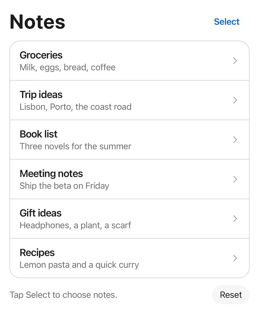
An edit mode for lists where rows slide in check circles, toggle on press, and a floating bar shows bulk actions.
Selection List is an open-source mobile interaction from suiss/uim for React Native and Expo, with SwiftUI and Jetpack Compose versions built from the same design tokens. The @esuiss/uim CLI copies its source into your project, so you own the code.
Source: https://uim.suiss.app/docs/interactions/selection-list
```tsx
import { CaretRightIcon } from "phosphor-react-native"
import * as React from "react"
import { Pressable, View } from "react-native"
import { SelectionList, SelectionListBar, SelectionListCount, SelectionListItem, SelectionListTrigger, useSelectionList } from "@/components/interactions/selection-list"
import { Button } from "@/components/ui/button"
import { Icon } from "@/components/ui/icon"
import { Text } from "@/components/ui/text"
const initialNotes = [
{ id: "groceries", title: "Groceries", preview: "Milk, eggs, bread, coffee" },
{ id: "trip", title: "Trip ideas", preview: "Lisbon, Porto, the coast road" },
{ id: "books", title: "Book list", preview: "Three novels for the summer" },
{ id: "meeting", title: "Meeting notes", preview: "Ship the beta on Friday" },
{ id: "gifts", title: "Gift ideas", preview: "Headphones, a plant, a scarf" },
{ id: "recipes", title: "Recipes", preview: "Lemon pasta and a quick curry" },
]
type Note = (typeof initialNotes)[number]
function NoteRows({
notes,
onOpen,
}: {
notes: Note[]
onOpen: (note: Note) => void
}) {
const { editing } = useSelectionList()
return (
{notes.map((note, index) => (
0 ? "border-t border-separator" : undefined}
>
onOpen(note)}
className="min-w-0 flex-1 flex-row items-center gap-3 px-4 py-3 active:bg-item-pressed"
>
{note.title}
{note.preview}
))}
)
}
function SelectAllButton() {
const { selected, selectAll, clear } = useSelectionList()
const all = selected.length > 0
return (
)
}
function DeleteButton({ onDelete }: { onDelete: (ids: string[]) => void }) {
const { selected, setEditing } = useSelectionList()
const disabled = selected.length === 0
return (
)
}
function useNotes() {
const [notes, setNotes] = React.useState(initialNotes)
const [log, setLog] = React.useState("Tap Select to choose notes.")
return {
notes,
log,
setLog,
remove: (ids: string[]) => {
setNotes((current) => current.filter((note) => !ids.includes(note.id)))
setLog(`Deleted ${ids.length} ${ids.length === 1 ? "note" : "notes"}`)
},
reset: () => {
setNotes(initialNotes)
setLog("Tap Select to choose notes.")
},
}
}
function Footer({ log, onReset }: { log: string; onReset: () => void }) {
return (
{log}
)
}
function NotesExample({
defaultEditing,
defaultValue,
}: {
defaultEditing?: boolean
defaultValue?: string[]
}) {
const { notes, log, setLog, remove, reset } = useNotes()
return (
Notes
setLog(`Opened ${note.title}`)}
/>
)
}
export function SelectionListExample() {
return (
)
}
```
```swift
import EsuissUI
import PhosphorSwift
import SwiftUI
struct SelectionListNote: Identifiable {
let id: String
let title: String
let preview: String
}
let selectionListInitialNotes = [
SelectionListNote(id: "groceries", title: "Groceries", preview: "Milk, eggs, bread, coffee"),
SelectionListNote(id: "trip", title: "Trip ideas", preview: "Lisbon, Porto, the coast road"),
SelectionListNote(id: "books", title: "Book list", preview: "Three novels for the summer"),
SelectionListNote(id: "meeting", title: "Meeting notes", preview: "Ship the beta on Friday"),
SelectionListNote(id: "gifts", title: "Gift ideas", preview: "Headphones, a plant, a scarf"),
SelectionListNote(id: "recipes", title: "Recipes", preview: "Lemon pasta and a quick curry"),
]
let selectionListIdleLog = "Tap Select to choose notes."
struct SelectionListRows: View {
let notes: [SelectionListNote]
let editing: Bool
let onOpen: (SelectionListNote) -> Void
var body: some View {
let shape = RoundedRectangle(cornerRadius: Radius.xl2, style: .continuous)
VStack(spacing: 0) {
ForEach(Array(notes.enumerated()), id: \.element.id) { index, note in
SelectionListItem(value: note.id) {
Button {
onOpen(note)
} label: {
HStack(spacing: 12) {
VStack(alignment: .leading, spacing: 0) {
Text(verbatim: note.title)
.textStyle(.base, weight: .semibold)
.foregroundStyle(Color.label)
.lineLimit(1)
Text(verbatim: note.preview)
.textStyle(.sm)
.foregroundStyle(Color.labelSecondary)
.lineLimit(1)
}
.frame(maxWidth: .infinity, alignment: .leading)
Ph.caretRight.regular
.frame(width: 16, height: 16)
.foregroundStyle(Color.labelTertiary)
.opacity(editing ? 0 : 1)
}
.padding(.horizontal, 16)
.padding(.vertical, 12)
.contentShape(Rectangle())
}
.buttonStyle(SelectionListRowStyle())
}
.overlay(alignment: .top) {
if index > 0 {
Color.separator.frame(height: 1)
}
}
}
}
.clipShape(shape)
.overlay { shape.strokeBorder(Color.separator) }
}
}
struct SelectionListRowStyle: ButtonStyle {
func makeBody(configuration: Configuration) -> some View {
configuration.label
.background(configuration.isPressed ? Color.itemPressed : .clear)
}
}
struct SelectionListFooter: View {
let log: String
let onReset: () -> Void
var body: some View {
HStack(spacing: 12) {
Text(verbatim: log)
.textStyle(.sm)
.foregroundStyle(Color.labelSecondary)
.frame(maxWidth: .infinity, alignment: .leading)
.accessibilityAddTraits(.updatesFrequently)
Button("Reset", action: onReset)
.buttonStyle(.variant(.secondary, size: .sm))
}
}
}
struct SelectionListStage: View {
@ViewBuilder let content: () -> Content
@ViewBuilder let bar: () -> Bar
var body: some View {
VStack(alignment: .leading, spacing: 12) {
content()
}
.frame(maxHeight: .infinity, alignment: .top)
.overlay(alignment: .bottom) {
bar()
.padding(.horizontal, -16)
}
.containerRelativeFrame(.vertical) { height, _ in height - 32 }
}
}
struct SelectionListNotes: View {
@State private var editing: Bool
@State private var selection: Set
@State private var notes = selectionListInitialNotes
@State private var log = selectionListIdleLog
init(editing: Bool = false, selection: Set = []) {
_editing = State(initialValue: editing)
_selection = State(initialValue: selection)
}
var body: some View {
SelectionList(isEditing: $editing, selection: $selection) {
SelectionListStage {
HStack {
Text("Notes")
.textVariant(.h1)
Spacer()
SelectionListTrigger()
}
SelectionListRows(notes: notes, editing: editing) { log = "Opened \($0.title)" }
SelectionListFooter(log: log) {
notes = selectionListInitialNotes
log = selectionListIdleLog
}
} bar: {
SelectionListBar { list in
Button(list.count > 0 ? "Deselect All" : "Select All") {
if list.count > 0 { list.clear() } else { list.selectAll() }
}
.buttonStyle(.variant(.plain, size: .lg))
SelectionListCount()
Button {
let ids = selection
notes.removeAll { ids.contains($0.id) }
log = "Deleted \(ids.count) \(ids.count == 1 ? "note" : "notes")"
selection = []
list.setEditing(false)
} label: {
Text("Delete")
.foregroundStyle(list.count == 0 ? Color.labelQuaternary : .danger)
}
.buttonStyle(.variant(.plain, size: .lg))
.disabled(list.count == 0)
}
.accessibilityLabel(Text("Selection actions"))
}
}
}
}
```
```kotlin
import androidx.compose.foundation.background
import androidx.compose.foundation.border
import androidx.compose.foundation.layout.Arrangement
import androidx.compose.foundation.layout.Box
import androidx.compose.foundation.layout.Column
import androidx.compose.foundation.layout.Row
import androidx.compose.foundation.layout.fillMaxWidth
import androidx.compose.foundation.layout.height
import androidx.compose.foundation.layout.padding
import androidx.compose.foundation.shape.RoundedCornerShape
import androidx.compose.runtime.Composable
import androidx.compose.runtime.getValue
import androidx.compose.runtime.mutableStateOf
import androidx.compose.runtime.remember
import androidx.compose.runtime.saveable.rememberSaveable
import androidx.compose.runtime.setValue
import androidx.compose.ui.Alignment
import androidx.compose.ui.Modifier
import androidx.compose.ui.draw.clip
import androidx.compose.ui.semantics.LiveRegionMode
import androidx.compose.ui.semantics.liveRegion
import androidx.compose.ui.semantics.semantics
import androidx.compose.ui.unit.dp
import com.esuiss.ui.components.Button
import com.esuiss.ui.components.ButtonSize
import com.esuiss.ui.components.ButtonVariant
import com.esuiss.ui.components.Text
import com.esuiss.ui.components.TextVariant
import com.esuiss.ui.interactions.SelectionList
import com.esuiss.ui.interactions.SelectionListBar
import com.esuiss.ui.interactions.SelectionListCount
import com.esuiss.ui.interactions.SelectionListItem
import com.esuiss.ui.interactions.SelectionListTrigger
import com.esuiss.ui.theme.EsuissTheme
import com.esuiss.ui.theme.Radius
import com.esuiss.ui.theme.Typography
class SelectionListNote(val id: String, val title: String, val preview: String)
val selectionListInitialNotes = listOf(
SelectionListNote("groceries", "Groceries", "Milk, eggs, bread, coffee"),
SelectionListNote("trip", "Trip ideas", "Lisbon, Porto, the coast road"),
SelectionListNote("books", "Book list", "Three novels for the summer"),
SelectionListNote("meeting", "Meeting notes", "Ship the beta on Friday"),
SelectionListNote("gifts", "Gift ideas", "Headphones, a plant, a scarf"),
SelectionListNote("recipes", "Recipes", "Lemon pasta and a quick curry"),
)
@Composable
fun SelectionListRows(notes: List, editing: Boolean, onOpen: (SelectionListNote) -> Unit) {
val colors = EsuissTheme.colors
val shape = RoundedCornerShape(Radius.xl2)
Column(
Modifier
.fillMaxWidth()
.clip(shape)
.border(1.dp, colors.separator, shape),
) {
notes.forEachIndexed { index, note ->
if (index > 0) Box(Modifier.fillMaxWidth().height(1.dp).background(colors.separator))
SelectionListItem(value = note.id, contentDescription = note.title) {
SelectionListRowContent(note, editing) { onOpen(note) }
}
}
}
}
@Composable
fun SelectionListFooter(log: String, onReset: () -> Unit) {
Row(
modifier = Modifier.fillMaxWidth(),
horizontalArrangement = Arrangement.spacedBy(12.dp),
verticalAlignment = Alignment.CenterVertically,
) {
Text(
log,
modifier = Modifier.weight(1f).semantics { liveRegion = LiveRegionMode.Polite },
style = Typography.sm.copy(color = EsuissTheme.colors.labelSecondary),
)
Button("Reset", onClick = onReset, variant = ButtonVariant.Secondary, size = ButtonSize.Sm)
}
}
@Composable
fun SelectionListHeader(title: String) {
Row(
modifier = Modifier.fillMaxWidth(),
horizontalArrangement = Arrangement.SpaceBetween,
verticalAlignment = Alignment.CenterVertically,
) {
Text(title, variant = TextVariant.H1)
SelectionListTrigger()
}
}
fun selectionListDeleted(count: Int): String = "Deleted $count ${if (count == 1) "note" else "notes"}"
@Composable
fun SelectionListNotes(defaultEditing: Boolean = false, defaultValue: List = emptyList()) {
val colors = EsuissTheme.colors
var notes by remember { mutableStateOf(selectionListInitialNotes) }
var log by rememberSaveable { mutableStateOf(SelectionListHint) }
var editing by rememberSaveable { mutableStateOf(defaultEditing) }
var selected by rememberSaveable { mutableStateOf(defaultValue) }
SelectionList(
editing = editing,
onEditingChange = { editing = it },
value = selected,
onValueChange = { selected = it },
modifier = Modifier.fillMaxWidth(),
) {
Column(verticalArrangement = Arrangement.spacedBy(12.dp)) {
SelectionListHeader("Notes")
SelectionListRows(notes, editing) { log = "Opened ${it.title}" }
SelectionListFooter(log) {
notes = selectionListInitialNotes
log = SelectionListHint
}
}
SelectionListBar {
val any = this@SelectionList.selected.isNotEmpty()
Button(
if (any) "Deselect All" else "Select All",
onClick = { if (any) clear() else selectAll() },
modifier = Modifier.padding(horizontal = 4.dp),
variant = ButtonVariant.Plain,
size = ButtonSize.Lg,
)
SelectionListCount()
Button(
onClick = {
val ids = this@SelectionList.selected
notes = notes.filterNot { it.id in ids }
log = selectionListDeleted(ids.size)
setEditing(false)
},
modifier = Modifier.padding(horizontal = 4.dp),
variant = ButtonVariant.Plain,
size = ButtonSize.Lg,
enabled = any,
) {
Text("Delete", style = Typography.base.copy(color = if (any) colors.danger else colors.labelQuaternary))
}
}
}
}
```
`SelectionList` switches a list between normal and editing modes. In editing mode each `SelectionListItem` slides in a check circle at its start, the whole row toggles on press, and selected rows are highlighted.
`SelectionListBar` floats above the bottom safe area while editing, sliding up into view, for actions such as delete or move. Leaving editing mode clears the selection. On Android the hardware back button also leaves it. Use it for mail, notes or photo lists that need bulk actions.
## Installation
```bash title="Terminal"
npx @esuiss/uim@latest add selection-list
```
```bash title="Terminal"
npx @esuiss/uim@latest add selection-list --platform swift
```
```bash title="Terminal"
npx @esuiss/uim@latest add selection-list --platform kotlin
```
The CLI also adds what it builds on: [Button](/docs/components/button), [Icon](/docs/components/icon), [Text](/docs/components/text).
### Manual
**Uniwind**
1. Install the dependencies:
```bash title="Terminal"
npx expo install cn phosphor-react-native react-native-reanimated react-native-safe-area-context react-native-svg react-native-worklets
```
2. Add the pieces it builds on: [Button](/docs/components/button), [Icon](/docs/components/icon), [Text](/docs/components/text), and the primitives `components/primitives/hooks.tsx`, `components/primitives/portal.tsx`.
3. Copy the source into `components/interactions/selection-list.tsx`:
```tsx title="uniwind/components/interactions/selection-list.tsx"
import { cn } from "cn"
import { CheckIcon } from "phosphor-react-native"
import * as React from "react"
import { Pressable, View, type ViewProps } from "react-native"
import {
Easing,
Keyframe,
ReduceMotion,
useAnimatedStyle,
withTiming,
} from "react-native-reanimated"
import { useSafeAreaInsets } from "react-native-safe-area-context"
import { useBackHandler } from "@/components/primitives/hooks"
import { Portal } from "@/components/primitives/portal"
import { AnimatedView } from "@/components/ui/animated-view"
import { Button } from "@/components/ui/button"
import { Icon } from "@/components/ui/icon"
import { Text } from "@/components/ui/text"
type SelectionListContextProps = {
editing: boolean
setEditing: (editing: boolean) => void
selected: string[]
setSelected: (selected: string[]) => void
toggle: (value: string) => void
selectAll: () => void
clear: () => void
}
const SelectionListContext =
React.createContext(null)
const SelectionListItemsContext = React.createContext<
((value: string) => () => void) | null
>(null)
function useSelectionList() {
const context = React.useContext(SelectionListContext)
if (!context) {
throw new Error("useSelectionList must be used within a ")
}
return context
}
const EASING = Easing.bezier(0.32, 0.72, 0, 1)
const EMPTY: string[] = []
const BAR_ENTERING = new Keyframe({
0: { opacity: 0, transform: [{ translateY: 80 }, { scale: 0.95 }] },
100: {
opacity: 1,
transform: [{ translateY: 0 }, { scale: 1 }],
easing: EASING,
},
})
.duration(400)
.reduceMotion(ReduceMotion.System)
const BAR_EXITING = new Keyframe({
0: { opacity: 1, transform: [{ translateY: 0 }, { scale: 1 }] },
100: {
opacity: 0,
transform: [{ translateY: 80 }, { scale: 0.95 }],
easing: EASING,
},
})
.duration(300)
.reduceMotion(ReduceMotion.System)
function wrapText(children: React.ReactNode) {
if (typeof children === "string" || typeof children === "number") {
return {children}
}
return children
}
function SelectionList({
editing: editingProp,
defaultEditing = false,
onEditingChange,
value,
defaultValue = EMPTY,
onValueChange,
className,
...props
}: ViewProps & {
editing?: boolean
defaultEditing?: boolean
onEditingChange?: (editing: boolean) => void
value?: string[]
defaultValue?: string[]
onValueChange?: (value: string[]) => void
}) {
const [uncontrolledEditing, setUncontrolledEditing] =
React.useState(defaultEditing)
const [uncontrolledValue, setUncontrolledValue] = React.useState(defaultValue)
const editing = editingProp ?? uncontrolledEditing
const selected = value ?? uncontrolledValue
const valuesRef = React.useRef([])
const setSelected = React.useCallback(
(next: string[]) => {
if (value === undefined) setUncontrolledValue(next)
onValueChange?.(next)
},
[value, onValueChange]
)
const setEditing = React.useCallback(
(next: boolean) => {
if (editingProp === undefined) setUncontrolledEditing(next)
onEditingChange?.(next)
if (!next) setSelected([])
},
[editingProp, onEditingChange, setSelected]
)
const register = React.useCallback((item: string) => {
valuesRef.current = [...valuesRef.current, item]
return () => {
valuesRef.current = valuesRef.current.filter((entry) => entry !== item)
}
}, [])
useBackHandler(editing, () => setEditing(false))
const contextValue = React.useMemo(
() => ({
editing,
setEditing,
selected,
setSelected,
toggle: (item) =>
setSelected(
selected.includes(item)
? selected.filter((entry) => entry !== item)
: [...selected, item]
),
selectAll: () => setSelected([...valuesRef.current]),
clear: () => setSelected([]),
}),
[editing, setEditing, selected, setSelected]
)
return (
)
}
function SelectionListTrigger({
children,
onPress,
...props
}: React.ComponentProps) {
const { editing, setEditing } = useSelectionList()
return (
)
}
const EDIT_TIMING = {
duration: 400,
easing: EASING,
reduceMotion: ReduceMotion.System,
}
const RING_TIMING = {
duration: 300,
easing: EASING,
reduceMotion: ReduceMotion.System,
}
const CHECK_TIMING = { duration: 200, reduceMotion: ReduceMotion.System }
function SelectionListItem({
value,
className,
children,
onPress,
...props
}: Omit, "children"> & {
value: string
children?: React.ReactNode
}) {
const { editing, selected, toggle } = useSelectionList()
const register = React.useContext(SelectionListItemsContext)
const checked = selected.includes(value)
React.useEffect(() => register?.(value), [register, value])
const slotStyle = useAnimatedStyle(
() => ({
width: withTiming(editing ? 40 : 0, EDIT_TIMING),
opacity: withTiming(editing ? 1 : 0, EDIT_TIMING),
}),
[editing]
)
const ringStyle = useAnimatedStyle(
() => ({
transform: [{ scale: withTiming(editing ? 1 : 0.5, RING_TIMING) }],
}),
[editing]
)
const checkStyle = useAnimatedStyle(
() => ({
transform: [{ scale: withTiming(checked ? 1 : 0, CHECK_TIMING) }],
}),
[checked]
)
return (
{
onPress?.(event)
toggle(value)
}}
className={cn(
"flex-row items-center",
checked && "bg-item-selected",
className
)}
{...props}
>
{children}
)
}
function SelectionListBar({
className,
portalHost,
...props
}: ViewProps & { portalHost?: string }) {
const context = useSelectionList()
const insets = useSafeAreaInsets()
const id = React.useId()
return (
{context.editing ? (
) : null}
)
}
function SelectionListCount({
className,
children,
...props
}: React.ComponentProps) {
const { selected } = useSelectionList()
return (
{children ??
(selected.length === 0
? "Select items"
: `${selected.length} selected`)}
)
}
export {
SelectionList,
SelectionListBar,
SelectionListCount,
SelectionListItem,
SelectionListTrigger,
useSelectionList,
}
```
4. Update the import paths to match your project.
**NativeWind**
1. Install the dependencies:
```bash title="Terminal"
npx expo install cn phosphor-react-native react-native-reanimated react-native-safe-area-context react-native-svg react-native-worklets
```
2. Add the pieces it builds on: [Button](/docs/components/button), [Icon](/docs/components/icon), [Text](/docs/components/text), and the primitives `components/primitives/hooks.tsx`, `components/primitives/portal.tsx`.
3. Copy the source into `components/interactions/selection-list.tsx`:
```tsx title="nativewind/components/interactions/selection-list.tsx"
import { cn } from "cn"
import { CheckIcon } from "phosphor-react-native"
import * as React from "react"
import { Pressable, View, type ViewProps } from "react-native"
import {
Easing,
Keyframe,
ReduceMotion,
useAnimatedStyle,
withTiming,
} from "react-native-reanimated"
import { useSafeAreaInsets } from "react-native-safe-area-context"
import { useBackHandler } from "@/components/primitives/hooks"
import { Portal } from "@/components/primitives/portal"
import { AnimatedView } from "@/components/ui/animated-view"
import { Button } from "@/components/ui/button"
import { Icon } from "@/components/ui/icon"
import { Text } from "@/components/ui/text"
type SelectionListContextProps = {
editing: boolean
setEditing: (editing: boolean) => void
selected: string[]
setSelected: (selected: string[]) => void
toggle: (value: string) => void
selectAll: () => void
clear: () => void
}
const SelectionListContext =
React.createContext(null)
const SelectionListItemsContext = React.createContext<
((value: string) => () => void) | null
>(null)
function useSelectionList() {
const context = React.useContext(SelectionListContext)
if (!context) {
throw new Error("useSelectionList must be used within a ")
}
return context
}
const EASING = Easing.bezier(0.32, 0.72, 0, 1)
const EMPTY: string[] = []
const BAR_ENTERING = new Keyframe({
0: { opacity: 0, transform: [{ translateY: 80 }, { scale: 0.95 }] },
100: {
opacity: 1,
transform: [{ translateY: 0 }, { scale: 1 }],
easing: EASING,
},
})
.duration(400)
.reduceMotion(ReduceMotion.System)
const BAR_EXITING = new Keyframe({
0: { opacity: 1, transform: [{ translateY: 0 }, { scale: 1 }] },
100: {
opacity: 0,
transform: [{ translateY: 80 }, { scale: 0.95 }],
easing: EASING,
},
})
.duration(300)
.reduceMotion(ReduceMotion.System)
function wrapText(children: React.ReactNode) {
if (typeof children === "string" || typeof children === "number") {
return {children}
}
return children
}
function SelectionList({
editing: editingProp,
defaultEditing = false,
onEditingChange,
value,
defaultValue = EMPTY,
onValueChange,
className,
...props
}: ViewProps & {
editing?: boolean
defaultEditing?: boolean
onEditingChange?: (editing: boolean) => void
value?: string[]
defaultValue?: string[]
onValueChange?: (value: string[]) => void
}) {
const [uncontrolledEditing, setUncontrolledEditing] =
React.useState(defaultEditing)
const [uncontrolledValue, setUncontrolledValue] = React.useState(defaultValue)
const editing = editingProp ?? uncontrolledEditing
const selected = value ?? uncontrolledValue
const valuesRef = React.useRef([])
const setSelected = React.useCallback(
(next: string[]) => {
if (value === undefined) setUncontrolledValue(next)
onValueChange?.(next)
},
[value, onValueChange]
)
const setEditing = React.useCallback(
(next: boolean) => {
if (editingProp === undefined) setUncontrolledEditing(next)
onEditingChange?.(next)
if (!next) setSelected([])
},
[editingProp, onEditingChange, setSelected]
)
const register = React.useCallback((item: string) => {
valuesRef.current = [...valuesRef.current, item]
return () => {
valuesRef.current = valuesRef.current.filter((entry) => entry !== item)
}
}, [])
useBackHandler(editing, () => setEditing(false))
const contextValue = React.useMemo(
() => ({
editing,
setEditing,
selected,
setSelected,
toggle: (item) =>
setSelected(
selected.includes(item)
? selected.filter((entry) => entry !== item)
: [...selected, item]
),
selectAll: () => setSelected([...valuesRef.current]),
clear: () => setSelected([]),
}),
[editing, setEditing, selected, setSelected]
)
return (
)
}
function SelectionListTrigger({
children,
onPress,
...props
}: React.ComponentProps) {
const { editing, setEditing } = useSelectionList()
return (
)
}
const EDIT_TIMING = {
duration: 400,
easing: EASING,
reduceMotion: ReduceMotion.System,
}
const RING_TIMING = {
duration: 300,
easing: EASING,
reduceMotion: ReduceMotion.System,
}
const CHECK_TIMING = { duration: 200, reduceMotion: ReduceMotion.System }
function SelectionListItem({
value,
className,
children,
onPress,
...props
}: Omit, "children"> & {
value: string
children?: React.ReactNode
}) {
const { editing, selected, toggle } = useSelectionList()
const register = React.useContext(SelectionListItemsContext)
const checked = selected.includes(value)
React.useEffect(() => register?.(value), [register, value])
const slotStyle = useAnimatedStyle(
() => ({
width: withTiming(editing ? 40 : 0, EDIT_TIMING),
opacity: withTiming(editing ? 1 : 0, EDIT_TIMING),
}),
[editing]
)
const ringStyle = useAnimatedStyle(
() => ({
transform: [{ scale: withTiming(editing ? 1 : 0.5, RING_TIMING) }],
}),
[editing]
)
const checkStyle = useAnimatedStyle(
() => ({
transform: [{ scale: withTiming(checked ? 1 : 0, CHECK_TIMING) }],
}),
[checked]
)
return (
{
onPress?.(event)
toggle(value)
}}
className={cn(
"flex-row items-center",
checked && "bg-item-selected",
className
)}
{...props}
>
{children}
)
}
function SelectionListBar({
className,
portalHost,
...props
}: ViewProps & { portalHost?: string }) {
const context = useSelectionList()
const insets = useSafeAreaInsets()
const id = React.useId()
return (
{context.editing ? (
) : null}
)
}
function SelectionListCount({
className,
children,
...props
}: React.ComponentProps) {
const { selected } = useSelectionList()
return (
{children ??
(selected.length === 0
? "Select items"
: `${selected.length} selected`)}
)
}
export {
SelectionList,
SelectionListBar,
SelectionListCount,
SelectionListItem,
SelectionListTrigger,
useSelectionList,
}
```
4. Update the import paths to match your project.
**StyleSheet**
1. Install the dependencies:
```bash title="Terminal"
npx expo install phosphor-react-native react-native-reanimated react-native-safe-area-context react-native-svg react-native-worklets
```
2. Add the pieces it builds on: [Button](/docs/components/button), [Icon](/docs/components/icon), [Text](/docs/components/text), and the primitives `components/primitives/hooks.tsx`, `components/primitives/portal.tsx`.
3. Copy the source into `components/interactions/selection-list.tsx`:
```tsx title="stylesheet/components/interactions/selection-list.tsx"
import { CheckIcon } from "phosphor-react-native"
import * as React from "react"
import { Pressable, StyleSheet, View, type ViewProps } from "react-native"
import {
Easing,
Keyframe,
ReduceMotion,
useAnimatedStyle,
withTiming,
} from "react-native-reanimated"
import { useSafeAreaInsets } from "react-native-safe-area-context"
import { useBackHandler } from "@/components/primitives/hooks"
import { Portal } from "@/components/primitives/portal"
import { AnimatedView } from "@/components/ui/animated-view"
import { Button } from "@/components/ui/button"
import { Icon } from "@/components/ui/icon"
import { Text } from "@/components/ui/text"
import { fontSize, radius, shadow, useTheme } from "@/components/ui/theme"
type SelectionListContextProps = {
editing: boolean
setEditing: (editing: boolean) => void
selected: string[]
setSelected: (selected: string[]) => void
toggle: (value: string) => void
selectAll: () => void
clear: () => void
}
const SelectionListContext =
React.createContext(null)
const SelectionListItemsContext = React.createContext<
((value: string) => () => void) | null
>(null)
function useSelectionList() {
const context = React.useContext(SelectionListContext)
if (!context) {
throw new Error("useSelectionList must be used within a ")
}
return context
}
const EASING = Easing.bezier(0.32, 0.72, 0, 1)
const EMPTY: string[] = []
const BAR_ENTERING = new Keyframe({
0: { opacity: 0, transform: [{ translateY: 80 }, { scale: 0.95 }] },
100: {
opacity: 1,
transform: [{ translateY: 0 }, { scale: 1 }],
easing: EASING,
},
})
.duration(400)
.reduceMotion(ReduceMotion.System)
const BAR_EXITING = new Keyframe({
0: { opacity: 1, transform: [{ translateY: 0 }, { scale: 1 }] },
100: {
opacity: 0,
transform: [{ translateY: 80 }, { scale: 0.95 }],
easing: EASING,
},
})
.duration(300)
.reduceMotion(ReduceMotion.System)
const styles = StyleSheet.create({
item: { flexDirection: "row", alignItems: "center" },
slot: {
flexShrink: 0,
flexDirection: "row",
alignItems: "center",
overflow: "hidden",
},
ring: {
marginStart: 16,
width: 22,
height: 22,
flexShrink: 0,
alignItems: "center",
justifyContent: "center",
borderRadius: radius.full,
borderWidth: 1.5,
},
content: {
minWidth: 0,
flex: 1,
flexDirection: "row",
alignItems: "center",
},
barFrame: { position: "absolute", zIndex: 40, alignItems: "center" },
bar: {
height: 52,
width: "100%",
maxWidth: 448,
flexDirection: "row",
alignItems: "center",
justifyContent: "space-between",
gap: 8,
borderRadius: radius.full,
borderWidth: 1,
paddingHorizontal: 6,
...shadow.xl,
},
count: {
minWidth: 0,
flex: 1,
textAlign: "center",
...fontSize.sm,
fontWeight: "500",
fontVariant: ["tabular-nums"],
},
trigger: { fontWeight: "600" },
})
function wrapText(children: React.ReactNode) {
if (typeof children === "string" || typeof children === "number") {
return {children}
}
return children
}
function SelectionList({
editing: editingProp,
defaultEditing = false,
onEditingChange,
value,
defaultValue = EMPTY,
onValueChange,
...props
}: ViewProps & {
editing?: boolean
defaultEditing?: boolean
onEditingChange?: (editing: boolean) => void
value?: string[]
defaultValue?: string[]
onValueChange?: (value: string[]) => void
}) {
const [uncontrolledEditing, setUncontrolledEditing] =
React.useState(defaultEditing)
const [uncontrolledValue, setUncontrolledValue] = React.useState(defaultValue)
const editing = editingProp ?? uncontrolledEditing
const selected = value ?? uncontrolledValue
const valuesRef = React.useRef([])
const setSelected = React.useCallback(
(next: string[]) => {
if (value === undefined) setUncontrolledValue(next)
onValueChange?.(next)
},
[value, onValueChange]
)
const setEditing = React.useCallback(
(next: boolean) => {
if (editingProp === undefined) setUncontrolledEditing(next)
onEditingChange?.(next)
if (!next) setSelected([])
},
[editingProp, onEditingChange, setSelected]
)
const register = React.useCallback((item: string) => {
valuesRef.current = [...valuesRef.current, item]
return () => {
valuesRef.current = valuesRef.current.filter((entry) => entry !== item)
}
}, [])
useBackHandler(editing, () => setEditing(false))
const contextValue = React.useMemo(
() => ({
editing,
setEditing,
selected,
setSelected,
toggle: (item) =>
setSelected(
selected.includes(item)
? selected.filter((entry) => entry !== item)
: [...selected, item]
),
selectAll: () => setSelected([...valuesRef.current]),
clear: () => setSelected([]),
}),
[editing, setEditing, selected, setSelected]
)
return (
)
}
function SelectionListTrigger({
children,
onPress,
...props
}: React.ComponentProps) {
const { editing, setEditing } = useSelectionList()
return (
)
}
const EDIT_TIMING = {
duration: 400,
easing: EASING,
reduceMotion: ReduceMotion.System,
}
const RING_TIMING = {
duration: 300,
easing: EASING,
reduceMotion: ReduceMotion.System,
}
const CHECK_TIMING = { duration: 200, reduceMotion: ReduceMotion.System }
function SelectionListItem({
value,
style,
children,
onPress,
...props
}: Omit, "children"> & {
value: string
children?: React.ReactNode
}) {
const { colors } = useTheme()
const { editing, selected, toggle } = useSelectionList()
const register = React.useContext(SelectionListItemsContext)
const checked = selected.includes(value)
React.useEffect(() => register?.(value), [register, value])
const slotStyle = useAnimatedStyle(
() => ({
width: withTiming(editing ? 40 : 0, EDIT_TIMING),
opacity: withTiming(editing ? 1 : 0, EDIT_TIMING),
}),
[editing]
)
const ringStyle = useAnimatedStyle(
() => ({
transform: [{ scale: withTiming(editing ? 1 : 0.5, RING_TIMING) }],
}),
[editing]
)
const checkStyle = useAnimatedStyle(
() => ({
transform: [{ scale: withTiming(checked ? 1 : 0, CHECK_TIMING) }],
}),
[checked]
)
return (
{
onPress?.(event)
toggle(value)
}}
style={(state) => [
styles.item,
checked && { backgroundColor: colors.itemSelected },
typeof style === "function" ? style(state) : style,
]}
{...props}
>
{children}
)
}
function SelectionListBar({
style,
portalHost,
...props
}: ViewProps & { portalHost?: string }) {
const { colors, isDark } = useTheme()
const context = useSelectionList()
const insets = useSafeAreaInsets()
const id = React.useId()
return (
{context.editing ? (
) : null}
)
}
function SelectionListCount({
style,
children,
...props
}: React.ComponentProps) {
const { selected } = useSelectionList()
return (
{children ??
(selected.length === 0
? "Select items"
: `${selected.length} selected`)}
)
}
export {
SelectionList,
SelectionListBar,
SelectionListCount,
SelectionListItem,
SelectionListTrigger,
useSelectionList,
}
```
4. Update the import paths to match your project.
**SwiftUI**
1. Target iOS 17 or later.
2. Add the Swift package to your app:
```swift title="Package.swift"
.package(url: "https://github.com/phosphor-icons/swift", from: "2.1.0")
```
3. Copy the theme files every view uses:
```swift title="swift/Theme/Theme.swift"
import SwiftUI
import UIKit
struct RGBA: Sendable {
let red: CGFloat
let green: CGFloat
let blue: CGFloat
let alpha: CGFloat
init(_ hex: UInt32, _ alpha: CGFloat = 1) {
red = CGFloat((hex >> 16) & 0xFF) / 255
green = CGFloat((hex >> 8) & 0xFF) / 255
blue = CGFloat(hex & 0xFF) / 255
self.alpha = alpha
}
var uiColor: UIColor {
UIColor(red: red, green: green, blue: blue, alpha: alpha)
}
}
extension Color {
static func adaptive(light: RGBA, dark: RGBA) -> Color {
let lightColor = light.uiColor
let darkColor = dark.uiColor
return Color(uiColor: UIColor { traits in
traits.userInterfaceStyle == .dark ? darkColor : lightColor
})
}
}
public struct TextStyle: Sendable, Hashable {
public let size: CGFloat
public let lineHeight: CGFloat
public let letterSpacing: CGFloat
public init(size: CGFloat, lineHeight: CGFloat, letterSpacing: CGFloat) {
self.size = size
self.lineHeight = lineHeight
self.letterSpacing = letterSpacing
}
public func font(weight: Font.Weight = .regular) -> Font {
.system(size: size, weight: weight)
}
public var lineSpacing: CGFloat {
max(0, lineHeight - UIFont.systemFont(ofSize: size).lineHeight)
}
}
extension Hashable where Self == Font {
public static func textStyle(_ style: TextStyle, weight: Font.Weight = .regular) -> Font {
style.font(weight: weight)
}
}
private struct TextStyleModifier: ViewModifier {
let style: TextStyle
let weight: Font.Weight
func body(content: Content) -> some View {
content
.font(style.font(weight: weight))
.tracking(style.letterSpacing)
.lineSpacing(style.lineSpacing)
.padding(.vertical, style.lineSpacing / 2)
}
}
extension View {
public func textStyle(_ style: TextStyle, weight: Font.Weight = .regular) -> some View {
modifier(TextStyleModifier(style: style, weight: weight))
}
}
public struct Shadow: Sendable, Hashable {
public let color: Color
public let radius: CGFloat
public let x: CGFloat
public let y: CGFloat
public init(color: Color, radius: CGFloat, x: CGFloat = 0, y: CGFloat = 0) {
self.color = color
self.radius = radius
self.x = x
self.y = y
}
}
extension View {
public func shadow(_ shadow: Shadow) -> some View {
self.shadow(color: shadow.color, radius: shadow.radius, x: shadow.x, y: shadow.y)
}
}
```
```swift title="swift/Theme/Tokens.swift"
import SwiftUI
extension Color {
public static let surface = Color.adaptive(light: .init(0xFFFFFF), dark: .init(0x000000))
public static let surfaceSecondary = Color.adaptive(light: .init(0xF5F5F7), dark: .init(0x161617))
public static let surfaceTertiary = Color.adaptive(light: .init(0xE8E8ED), dark: .init(0x2C2C2E))
public static let surfaceRaised = Color.adaptive(light: .init(0xFFFFFF), dark: .init(0x1D1D1F))
public static let label = Color.adaptive(light: .init(0x1D1D1F), dark: .init(0xF5F5F7))
public static let labelSecondary = Color.adaptive(light: .init(0x6E6E73), dark: .init(0xA1A1A6))
public static let labelTertiary = Color.adaptive(light: .init(0x86868B), dark: .init(0x86868B))
public static let labelQuaternary = Color.adaptive(light: .init(0xD2D2D7), dark: .init(0x424245))
public static let control = Color.adaptive(light: .init(0x000000, 0.04), dark: .init(0xFFFFFF, 0.1))
public static let controlPressed = Color.adaptive(light: .init(0x000000, 0.12), dark: .init(0xFFFFFF, 0.22))
public static let controlSelected = Color.adaptive(light: .init(0x1D1D1F), dark: .init(0xF5F5F7))
public static let controlDisabled = Color.adaptive(light: .init(0x000000, 0.03), dark: .init(0xFFFFFF, 0.05))
public static let onControlSelected = Color.adaptive(light: .init(0xFFFFFF), dark: .init(0x000000))
public static let itemPressed = Color.adaptive(light: .init(0x000000, 0.08), dark: .init(0xFFFFFF, 0.12))
public static let itemSelected = Color.adaptive(light: .init(0x000000, 0.06), dark: .init(0xFFFFFF, 0.1))
public static let separator = Color.adaptive(light: .init(0xD2D2D7), dark: .init(0x424245))
public static let separatorStrong = Color.adaptive(light: .init(0x86868B), dark: .init(0x6E6E73))
public static let accent = Color.adaptive(light: .init(0x0071E3), dark: .init(0x0071E3))
public static let accentPressed = Color.adaptive(light: .init(0x005BB8), dark: .init(0x004D9E))
public static let accentSelected = Color.adaptive(light: .init(0x0071E3), dark: .init(0x0071E3))
public static let accentDisabled = Color.adaptive(light: .init(0x0071E3, 0.4), dark: .init(0x0071E3, 0.4))
public static let onAccent = Color.adaptive(light: .init(0xFFFFFF), dark: .init(0xFFFFFF))
public static let accentSurface = Color.adaptive(light: .init(0x0071E3, 0.09), dark: .init(0x0071E3, 0.18))
public static let accentSurfacePressed = Color.adaptive(light: .init(0x0071E3, 0.18), dark: .init(0x0071E3, 0.3))
public static let link = Color.adaptive(light: .init(0x0066CC), dark: .init(0x2997FF))
public static let focus = Color.adaptive(light: .init(0x0071E3), dark: .init(0x0071E3))
public static let scrim = Color.adaptive(light: .init(0x000000, 0.48), dark: .init(0x000000, 0.48))
public static let media = Color.adaptive(light: .init(0x000000), dark: .init(0x000000))
public static let onMedia = Color.adaptive(light: .init(0xFFFFFF), dark: .init(0xFFFFFF))
public static let danger = Color.adaptive(light: .init(0xD0000A), dark: .init(0xFF5447))
public static let dangerSurface = Color.adaptive(light: .init(0xD70015, 0.08), dark: .init(0xFF453A, 0.2))
public static let dangerSurfacePressed = Color.adaptive(light: .init(0xD70015, 0.16), dark: .init(0xFF453A, 0.36))
public static let success = Color.adaptive(light: .init(0x008009), dark: .init(0x30D158))
public static let successSurface = Color.adaptive(light: .init(0xEFFAF1), dark: .init(0x30D158, 0.16))
public static let warning = Color.adaptive(light: .init(0xB64400), dark: .init(0xFF9F0A))
public static let warningSurface = Color.adaptive(light: .init(0xFFF5EA), dark: .init(0xFF9F0A, 0.16))
}
public enum Radius {
public static let xs: CGFloat = 3
public static let sm: CGFloat = 5
public static let md: CGFloat = 8
public static let lg: CGFloat = 10
public static let xl: CGFloat = 12
public static let xl2: CGFloat = 18
public static let xl3: CGFloat = 28
public static let full: CGFloat = 9999
}
extension TextStyle {
public static let xs3 = TextStyle(size: 11, lineHeight: 13, letterSpacing: 0.066)
public static let xs2 = TextStyle(size: 12, lineHeight: 16, letterSpacing: 0)
public static let xs = TextStyle(size: 13, lineHeight: 18, letterSpacing: -0.078)
public static let sm = TextStyle(size: 15, lineHeight: 20, letterSpacing: -0.24)
public static let md = TextStyle(size: 16, lineHeight: 21, letterSpacing: -0.32)
public static let base = TextStyle(size: 17, lineHeight: 22, letterSpacing: -0.442)
public static let lg = TextStyle(size: 20, lineHeight: 25, letterSpacing: -0.46)
public static let xl = TextStyle(size: 22, lineHeight: 28, letterSpacing: -0.264)
public static let xl2 = TextStyle(size: 28, lineHeight: 34, letterSpacing: 0.392)
public static let xl3 = TextStyle(size: 34, lineHeight: 41, letterSpacing: 0.408)
public static let allCases: [TextStyle] = [.xs3, .xs2, .xs, .sm, .md, .base, .lg, .xl, .xl2, .xl3]
}
extension Shadow {
public static let md = Shadow(color: .black.opacity(0.08), radius: 6, x: 2, y: 4)
public static let lg = Shadow(color: .black.opacity(0.12), radius: 12, y: 4)
}
```
4. Copy the source and every file it uses:
```swift title="swift/Interactions/SelectionList.swift"
import PhosphorSwift
import SwiftUI
struct SelectionModel {
var editing = false
var selected: Set = []
var order: [Value] = []
mutating func toggle(_ value: Value) {
if selected.contains(value) {
selected.remove(value)
} else {
selected.insert(value)
}
}
mutating func selectAll() {
selected = Set(order)
}
mutating func clear() {
selected = []
}
mutating func setEditing(_ value: Bool) {
editing = value
if !value { selected = [] }
}
}
struct SelectionListContext {
var editing: Bool
var count: Int
var total: Int
var isSelected: (AnyHashable) -> Bool
var toggle: (AnyHashable) -> Void
var setEditing: (Bool) -> Void
var selectAll: () -> Void
var clear: () -> Void
}
extension EnvironmentValues {
@Entry var selectionList: SelectionListContext?
}
struct SelectionListValuesKey: PreferenceKey {
static var defaultValue: [AnyHashable] { [] }
static func reduce(value: inout [AnyHashable], nextValue: () -> [AnyHashable]) {
value.append(contentsOf: nextValue())
}
}
let selectionListAnimation = Animation.timingCurve(0.32, 0.72, 0, 1, duration: 0.4)
public struct SelectionListProxy {
let context: SelectionListContext
public var isEditing: Bool { context.editing }
public var count: Int { context.count }
public var total: Int { context.total }
public func setEditing(_ value: Bool) {
context.setEditing(value)
}
public func selectAll() {
context.selectAll()
}
public func clear() {
context.clear()
}
}
public struct SelectionList: View {
let editingBinding: Binding?
let selectionBinding: Binding>?
let content: Content
@State private var localEditing: Bool
@State private var localSelection: Set
@State private var order: [Value] = []
@Environment(\.accessibilityReduceMotion) private var reduceMotion
public init(
isEditing: Binding? = nil,
selection: Binding>? = nil,
defaultEditing: Bool = false,
defaultSelection: Set = [],
@ViewBuilder content: () -> Content
) {
editingBinding = isEditing
selectionBinding = selection
_localEditing = State(initialValue: defaultEditing)
_localSelection = State(initialValue: defaultSelection)
self.content = content()
}
private var model: SelectionModel {
SelectionModel(
editing: editingBinding?.wrappedValue ?? localEditing,
selected: selectionBinding?.wrappedValue ?? localSelection,
order: order
)
}
private func update(_ change: (inout SelectionModel) -> Void) {
var next = model
change(&next)
if next.selected != model.selected {
if let selectionBinding {
selectionBinding.wrappedValue = next.selected
} else {
localSelection = next.selected
}
}
if next.editing != model.editing {
let apply = {
if let editingBinding {
editingBinding.wrappedValue = next.editing
} else {
localEditing = next.editing
}
}
if reduceMotion {
apply()
} else {
withAnimation(selectionListAnimation, apply)
}
}
}
public var body: some View {
let current = model
let context = SelectionListContext(
editing: current.editing,
count: current.selected.count,
total: order.count,
isSelected: { value in (value.base as? Value).map(current.selected.contains) ?? false },
toggle: { value in
guard let value = value.base as? Value else { return }
update { $0.toggle(value) }
},
setEditing: { value in update { $0.setEditing(value) } },
selectAll: { update { $0.selectAll() } },
clear: { update { $0.clear() } }
)
content
.environment(\.selectionList, context)
.onPreferenceChange(SelectionListValuesKey.self) { values in
order = values.compactMap { $0.base as? Value }
}
.accessibilityAction(.escape) {
if current.editing { context.setEditing(false) }
}
}
}
public struct SelectionListTrigger: View {
let label: Label?
@Environment(\.selectionList) private var list
public init(@ViewBuilder label: () -> Label) {
self.label = label()
}
public var body: some View {
let editing = list?.editing ?? false
Button {
list?.setEditing(!editing)
} label: {
if let label {
label
} else {
Text(editing ? "Done" : "Select").fontWeight(.semibold)
}
}
.buttonStyle(.variant(.plain))
.fontWeight(.semibold)
.accessibilityAddTraits(editing ? .isSelected : [])
}
}
extension SelectionListTrigger where Label == Text {
public init() {
label = nil
}
public init(_ title: LocalizedStringKey) {
label = Text(title).fontWeight(.semibold)
}
}
public struct SelectionListItem: View {
let value: Value
let content: Content
@Environment(\.selectionList) private var list
public init(value: Value, @ViewBuilder content: () -> Content) {
self.value = value
self.content = content()
}
public var body: some View {
let editing = list?.editing ?? false
let checked = list?.isSelected(AnyHashable(value)) ?? false
HStack(spacing: 0) {
SelectionListIndicator(editing: editing, checked: checked)
content
.frame(maxWidth: .infinity, alignment: .leading)
.allowsHitTesting(!editing)
}
.background(checked ? Color.itemSelected : .clear)
.contentShape(Rectangle())
.onTapGesture {
guard editing else { return }
list?.toggle(AnyHashable(value))
}
.animation(.timingCurve(0.32, 0.72, 0, 1, duration: 0.2), value: checked)
.preference(key: SelectionListValuesKey.self, value: [AnyHashable(value)])
.modifier(SelectionItemAccessibility(editing: editing, checked: checked) {
list?.toggle(AnyHashable(value))
})
}
}
private struct SelectionItemAccessibility: ViewModifier {
let editing: Bool
let checked: Bool
let toggle: () -> Void
func body(content: Content) -> some View {
if editing {
content
.accessibilityElement(children: .combine)
.accessibilityAddTraits(checked ? [.isButton, .isSelected] : .isButton)
.accessibilityAction { toggle() }
} else {
content
}
}
}
struct SelectionListIndicator: View {
let editing: Bool
let checked: Bool
var body: some View {
ZStack {
Circle()
.strokeBorder(checked ? Color.accent : .labelTertiary, lineWidth: 1.5)
if checked {
Circle().fill(Color.accent)
Ph.check.bold
.frame(width: 14, height: 14)
.foregroundStyle(Color.onAccent)
.transition(.scale)
}
}
.frame(width: 22, height: 22)
.scaleEffect(editing ? 1 : 0.5)
.padding(.leading, 16)
.frame(width: editing ? 40 : 0, alignment: .leading)
.opacity(editing ? 1 : 0)
.clipped()
.accessibilityHidden(true)
}
}
public struct SelectionListBar: View {
let content: (SelectionListProxy) -> Content
@Environment(\.selectionList) private var list
public init(@ViewBuilder content: @escaping (SelectionListProxy) -> Content) {
self.content = content
}
public init(@ViewBuilder content: @escaping () -> Content) {
self.content = { _ in content() }
}
public var body: some View {
let editing = list?.editing ?? false
FloatingBar(visible: editing) {
HStack(spacing: 8) {
if let list {
content(SelectionListProxy(context: list))
}
}
.padding(.horizontal, 6)
}
.accessibilityElement(children: .contain)
}
}
public struct SelectionListCount: View {
let text: Text?
@Environment(\.selectionList) private var list
public init() {
text = nil
}
public init(_ title: LocalizedStringKey) {
text = Text(title)
}
public var body: some View {
let count = list?.count ?? 0
Group {
if let text {
text
} else if count == 0 {
Text("Select items")
} else {
Text("\(count) selected")
}
}
.scaledFont(.sm, weight: .medium)
.monospacedDigit()
.lineLimit(1)
.multilineTextAlignment(.center)
.foregroundStyle(Color.label)
.frame(maxWidth: .infinity)
.contentTransition(.numericText())
.accessibilityAddTraits(.updatesFrequently)
}
}
struct FloatingBar: View {
let visible: Bool
var maxWidth: CGFloat = 448
@ViewBuilder let content: () -> Content
@State private var bottomInset: CGFloat = 0
@Environment(\.colorScheme) private var colorScheme
@Environment(\.accessibilityReduceMotion) private var reduceMotion
var body: some View {
let dark = colorScheme == .dark
content()
.frame(maxWidth: .infinity, minHeight: 52, maxHeight: 52)
.foregroundStyle(Color.label)
.background {
Capsule()
.fill(.ultraThinMaterial)
.overlay {
Capsule().fill(dark ? Color.surfaceSecondary.opacity(0.75) : Color.surfaceRaised.opacity(0.8))
}
.shadow(Shadow(color: .black.opacity(dark ? 0.3 : 0.12), radius: 14, y: 10))
}
.overlay {
Capsule().strokeBorder(Color.separator)
}
.frame(maxWidth: maxWidth)
.padding(.horizontal, 16)
.padding(.bottom, 16)
.scaleEffect(visible || reduceMotion ? 1 : 0.95, anchor: .bottom)
.offset(y: min(16, bottomInset) + (visible || reduceMotion ? 0 : 52 + 16 + bottomInset))
.background {
Color.clear
.onGeometryChange(for: CGFloat.self) { $0.safeAreaInsets.bottom } action: { bottomInset = $0 }
}
.opacity(visible ? 1 : 0)
.allowsHitTesting(visible)
.accessibilityHidden(!visible)
}
}
```
```swift title="swift/Components/Button.swift"
import SwiftUI
public struct VariantButtonStyle: ButtonStyle {
public enum Variant: CaseIterable, Sendable {
case `default`, outline, secondary, tinted, ghost, plain, destructive, link
}
public enum Size: CaseIterable, Sendable {
case `default`, xs, sm, lg, xl, icon, iconXs, iconSm, iconLg, iconXl
var height: CGFloat {
switch self {
case .xs, .iconXs: 24
case .sm, .iconSm: 32
case .default, .icon: 36
case .lg, .iconLg: 44
case .xl, .iconXl: 56
}
}
var horizontalPadding: CGFloat {
switch self {
case .xs: 11
case .sm: 12
case .default: 16
case .lg: 22
case .xl: 31
case .icon, .iconXs, .iconSm, .iconLg, .iconXl: 0
}
}
var spacing: CGFloat {
switch self {
case .xs, .sm, .iconXs, .iconSm: 4
case .xl, .iconXl: 8
default: 6
}
}
var textStyle: TextStyle {
switch self {
case .xs, .iconXs: .xs2
case .lg, .xl: .base
default: .sm
}
}
public var iconSize: CGFloat {
switch self {
case .xs, .iconXs: 12
default: 16
}
}
var blockRadius: CGFloat {
switch self {
case .xs, .iconXs: Radius.sm
case .lg, .iconLg: Radius.lg
case .xl, .iconXl: Radius.xl
default: Radius.md
}
}
var isIcon: Bool {
switch self {
case .icon, .iconXs, .iconSm, .iconLg, .iconXl: true
default: false
}
}
}
let variant: Variant
let size: Size
let block: Bool
var metrics: ButtonMetrics?
public init(_ variant: Variant = .default, size: Size = .default, block: Bool = false) {
self.variant = variant
self.size = size
self.block = block
}
init(_ variant: Variant, size: Size, metrics: ButtonMetrics) {
self.variant = variant
self.size = size
self.block = false
self.metrics = metrics
}
public func makeBody(configuration: Configuration) -> some View {
StyledButton(configuration: configuration, variant: variant, size: size, block: block, metrics: metrics)
}
}
struct ButtonMetrics: Sendable {
var horizontalPadding: CGFloat
var spacing: CGFloat
var iconSize: CGFloat
var textStyle: TextStyle
}
private struct StyledButton: View {
let configuration: ButtonStyleConfiguration
let variant: VariantButtonStyle.Variant
let size: VariantButtonStyle.Size
let block: Bool
let metrics: ButtonMetrics?
@Environment(\.colorScheme) private var colorScheme
@Environment(\.isEnabled) private var isEnabled
@Environment(\.buttonGroup) private var group
var body: some View {
let joined = group != nil && variant != .ghost && variant != .plain
let rounded = RoundedRectangle(
cornerRadius: block ? size.blockRadius : Radius.full,
style: .continuous
)
let shape = joined ? AnyShape(Rectangle()) : AnyShape(rounded)
configuration.label
.labelStyle(ButtonLabelStyle(spacing: metrics?.spacing ?? size.spacing, iconSize: metrics?.iconSize ?? size.iconSize))
.font((metrics?.textStyle ?? size.textStyle).font())
.tracking((metrics?.textStyle ?? size.textStyle).letterSpacing)
.underline(variant == .link && pressed && isEnabled)
.lineLimit(1)
.foregroundStyle(foreground)
.padding(.horizontal, metrics?.horizontalPadding ?? size.horizontalPadding)
.frame(width: size.isIcon && !block ? size.height : nil, height: size.height)
.frame(maxWidth: block || group == .vertical ? .infinity : nil)
.background(background, in: shape)
.overlay {
if variant == .outline && !joined {
rounded.strokeBorder(Color.separator)
}
}
.contentShape(shape)
.anchorPreference(key: ButtonGroupFramesKey.self, value: .bounds) { anchor in
joined ? [ButtonGroupFrame(bounds: anchor, outlined: variant == .outline)] : []
}
}
private var isDark: Bool { colorScheme == .dark }
private var pressed: Bool { configuration.isPressed }
private var foreground: Color {
switch variant {
case .default:
.onAccent
case .outline, .secondary, .ghost:
isEnabled ? .label : .labelQuaternary
case .tinted, .plain:
isEnabled ? .link : .link.opacity(0.4)
case .destructive:
isEnabled ? .danger : .danger.opacity(0.4)
case .link:
isEnabled ? .link : .labelQuaternary
}
}
private var background: Color {
switch variant {
case .default:
!isEnabled ? .accentDisabled : pressed ? .accentPressed : .accent
case .outline:
isEnabled && pressed ? .itemPressed : isDark ? .clear : .surface
case .secondary:
!isEnabled ? .controlDisabled : pressed ? .controlPressed : .control
case .tinted:
isEnabled && pressed ? .accentSurfacePressed : .accentSurface
case .ghost:
isEnabled && pressed ? .itemPressed : .clear
case .plain:
isEnabled && pressed ? .itemPressed : .clear
case .destructive:
isEnabled && pressed ? .dangerSurfacePressed : .dangerSurface
case .link:
.clear
}
}
}
struct ButtonLabelStyle: LabelStyle {
let spacing: CGFloat
let iconSize: CGFloat
func makeBody(configuration: Configuration) -> some View {
HStack(spacing: spacing) {
configuration.icon
.frame(width: iconSize, height: iconSize)
configuration.title
}
}
}
extension ButtonStyle where Self == VariantButtonStyle {
public static func variant(
_ variant: VariantButtonStyle.Variant = .default,
size: VariantButtonStyle.Size = .default,
block: Bool = false
) -> VariantButtonStyle {
VariantButtonStyle(variant, size: size, block: block)
}
}
```
```swift title="swift/Components/ButtonGroup.swift"
import SwiftUI
extension EnvironmentValues {
@Entry var buttonGroup: Axis? = nil
@Entry var buttonGroupSize: CGSize = .zero
}
enum ButtonGroupSpace: Hashable {
case group
}
struct ButtonGroupFrame {
let bounds: Anchor
let outlined: Bool
}
struct ButtonGroupFramesKey: PreferenceKey {
static var defaultValue: [ButtonGroupFrame] { [] }
static func reduce(value: inout [ButtonGroupFrame], nextValue: () -> [ButtonGroupFrame]) {
value.append(contentsOf: nextValue())
}
}
struct ButtonGroupNestedKey: PreferenceKey {
static var defaultValue: Bool { false }
static func reduce(value: inout Bool, nextValue: () -> Bool) {
value = value || nextValue()
}
}
public struct ButtonGroup: View {
let orientation: Axis
let content: Content
@State private var nested = false
@State private var size: CGSize = .zero
public init(orientation: Axis = .horizontal, @ViewBuilder content: () -> Content) {
self.orientation = orientation
self.content = content()
}
public var body: some View {
let shape = orientation == .horizontal
? AnyShape(Capsule())
: AnyShape(RoundedRectangle(cornerRadius: Radius.xl2, style: .continuous))
stack
.coordinateSpace(.named(ButtonGroupSpace.group))
.onGeometryChange(for: CGSize.self) { $0.size } action: { size = $0 }
.environment(\.buttonGroup, nested ? nil : orientation)
.environment(\.buttonGroupSize, size)
.onPreferenceChange(ButtonGroupNestedKey.self) { nested = $0 }
.modifier(ButtonGroupClip(shape: nested ? nil : shape))
.overlayPreferenceValue(ButtonGroupFramesKey.self) { frames in
if !nested {
GeometryReader { proxy in
outline(frames.map { (proxy[$0.bounds], $0.outlined) }, shape: shape)
}
}
}
.transformPreference(ButtonGroupFramesKey.self) { $0 = [] }
.transformPreference(ButtonGroupNestedKey.self) { $0 = true }
.fixedSize(horizontal: orientation == .vertical, vertical: orientation == .horizontal)
.accessibilityElement(children: .contain)
}
@ViewBuilder private var stack: some View {
switch orientation {
case .horizontal:
HStack(spacing: nested ? 8 : 0) { content }
case .vertical:
VStack(spacing: nested ? 8 : 0) { content }
}
}
@ViewBuilder private func outline(_ frames: [(CGRect, Bool)], shape: AnyShape) -> some View {
if frames.contains(where: \.1) {
ZStack(alignment: .topLeading) {
shape
.stroke(Color.separator, lineWidth: 1)
.padding(0.5)
.mask {
Path { path in
for (rect, outlined) in frames where outlined {
path.addRect(rect)
}
}
}
ForEach(Array(frames.dropLast().enumerated()), id: \.offset) { _, frame in
if frame.1 {
divider(frame.0)
}
}
}
.clipShape(shape)
.allowsHitTesting(false)
}
}
private func divider(_ rect: CGRect) -> some View {
let horizontal = orientation == .horizontal
return Rectangle()
.fill(Color.separator)
.frame(width: horizontal ? 1 : rect.width, height: horizontal ? rect.height : 1)
.position(
x: horizontal ? rect.maxX - 0.5 : rect.midX,
y: horizontal ? rect.midY : rect.maxY - 0.5
)
}
}
struct ButtonGroupItem: View {
let radius: CGFloat
let content: (UnevenRoundedRectangle) -> Content
@State private var frame: CGRect = .zero
@Environment(\.buttonGroup) private var group
@Environment(\.buttonGroupSize) private var groupSize
init(radius: CGFloat, @ViewBuilder content: @escaping (UnevenRoundedRectangle) -> Content) {
self.radius = radius
self.content = content
}
var body: some View {
if let group {
content(shape(group))
.onGeometryChange(for: CGRect.self) { $0.frame(in: .named(ButtonGroupSpace.group)) } action: { frame = $0 }
} else {
content(UnevenRoundedRectangle(cornerRadii: RectangleCornerRadii(
topLeading: radius,
bottomLeading: radius,
bottomTrailing: radius,
topTrailing: radius
), style: .continuous))
}
}
private func shape(_ group: Axis) -> UnevenRoundedRectangle {
let horizontal = group == .horizontal
let first = horizontal ? frame.minX <= 0.5 : frame.minY <= 0.5
let last = horizontal
? frame.maxX >= groupSize.width - 0.5
: frame.maxY >= groupSize.height - 0.5
let round = horizontal ? frame.height / 2 : Radius.xl2
let start: CGFloat = first ? round : 0
let end: CGFloat = last ? round : 0
let radii = horizontal
? RectangleCornerRadii(topLeading: start, bottomLeading: start, bottomTrailing: end, topTrailing: end)
: RectangleCornerRadii(topLeading: start, bottomLeading: end, bottomTrailing: end, topTrailing: start)
return UnevenRoundedRectangle(cornerRadii: radii, style: .continuous)
}
}
private struct ButtonGroupClip: ViewModifier {
let shape: AnyShape?
func body(content: Content) -> some View {
if let shape {
content.clipShape(shape)
} else {
content
}
}
}
public struct ButtonGroupText: View {
let content: Content
@Environment(\.buttonGroup) private var group
public init(@ViewBuilder content: () -> Content) {
self.content = content()
}
public var body: some View {
let shape = group == nil ? AnyShape(Capsule()) : AnyShape(Rectangle())
HStack(spacing: 8) {
content
}
.labelStyle(ButtonLabelStyle(spacing: 8, iconSize: 16))
.scaledFont(.sm)
.lineLimit(1)
.foregroundStyle(Color.label)
.padding(.horizontal, 10)
.frame(minHeight: 36)
.frame(maxWidth: group == .vertical ? .infinity : nil, maxHeight: group == .horizontal ? .infinity : nil)
.background(Color.control, in: shape)
.anchorPreference(key: ButtonGroupFramesKey.self, value: .bounds) { anchor in
group == nil ? [] : [ButtonGroupFrame(bounds: anchor, outlined: false)]
}
}
}
extension ButtonGroupText where Content == Text {
public init(_ title: LocalizedStringKey) {
self.init { Text(title) }
}
public init(verbatim title: String) {
self.init { Text(verbatim: title) }
}
}
public struct ButtonGroupSeparator: View {
let orientation: Axis
public init(_ orientation: Axis = .vertical) {
self.orientation = orientation
}
public var body: some View {
let vertical = orientation == .vertical
Rectangle()
.fill(Color.label.opacity(0.2))
.frame(width: vertical ? 1 : nil, height: vertical ? nil : 1)
.padding(vertical ? .vertical : .horizontal, 9)
.frame(maxWidth: vertical ? nil : .infinity, maxHeight: vertical ? .infinity : nil)
.padding(vertical ? .trailing : .bottom, -1)
.zIndex(1)
.accessibilityHidden(true)
}
}
```
```swift title="swift/Components/Checkbox.swift"
import PhosphorSwift
import SwiftUI
extension Shadow {
static let control = Shadow(color: .black.opacity(0.08), radius: 0.5, y: 0.5)
static let thumb = Shadow(color: .black.opacity(0.12), radius: 1.5, y: 1)
}
struct SelectionIndicator: View {
let checked: Bool
let pressed: Bool
let cornerRadius: CGFloat
let mark: Mark
@Environment(\.isEnabled) private var isEnabled
@Environment(\.isInvalid) private var invalid
@Environment(\.colorScheme) private var colorScheme
init(checked: Bool, pressed: Bool, cornerRadius: CGFloat, @ViewBuilder mark: () -> Mark) {
self.checked = checked
self.pressed = pressed
self.cornerRadius = cornerRadius
self.mark = mark()
}
var body: some View {
let shape = RoundedRectangle(cornerRadius: cornerRadius, style: .continuous)
ZStack {
shape.fill(fill)
shape.strokeBorder(border, lineWidth: 1)
if checked {
mark
}
}
.frame(width: 16, height: 16)
.shadow(raised ? .control : Shadow(color: .clear, radius: 0))
}
private var isDark: Bool { colorScheme == .dark }
private var raised: Bool { !checked && isEnabled && !isDark }
private var fill: Color {
if checked {
return !isEnabled ? .accentDisabled : pressed ? .accentPressed : .accent
}
if !isEnabled { return .controlDisabled }
if isDark { return pressed ? .labelTertiary.opacity(0.6) : .labelQuaternary }
return pressed ? .control : .surface
}
private var border: Color {
if checked {
return !isEnabled ? .clear : pressed ? .accentPressed : .accent
}
if !isEnabled { return isDark ? .clear : .label.opacity(0.1) }
if invalid { return .danger }
return isDark ? .clear : .label.opacity(0.25)
}
}
struct PressReader: ButtonStyle {
let content: (Bool) -> Content
init(@ViewBuilder content: @escaping (Bool) -> Content) {
self.content = content
}
func makeBody(configuration: Configuration) -> some View {
content(configuration.isPressed)
}
}
public struct CheckboxStyle: ToggleStyle {
public init() {}
public func makeBody(configuration: Configuration) -> some View {
HapticButton(style: PressReader { pressed in
HStack(spacing: 12) {
SelectionIndicator(
checked: configuration.isOn || configuration.isMixed,
pressed: pressed,
cornerRadius: 4
) {
(configuration.isMixed ? Ph.minus.regular : Ph.check.regular)
.frame(width: 14, height: 14)
.foregroundStyle(Color.onAccent)
}
configuration.label
}
.contentShape(Rectangle().inset(by: -8))
}) {
configuration.isOn.toggle()
return true
}
.accessibilityElement(children: .combine)
.accessibilityRemoveTraits(.isButton)
.accessibilityAddTraits(.isToggle)
.accessibilityValue(
configuration.isMixed
? Text("Mixed")
: configuration.isOn ? Text("Checked") : Text("Unchecked")
)
}
}
extension ToggleStyle where Self == CheckboxStyle {
public static var checkbox: CheckboxStyle { CheckboxStyle() }
}
```
```swift title="swift/Components/Field.swift"
import SwiftUI
extension EnvironmentValues {
@Entry public var isInvalid = false
@Entry var fieldInset = false
@Entry var fieldGroupInset = false
@Entry var fieldSetInset = false
}
extension View {
public func invalid(_ isInvalid: Bool = true) -> some View {
environment(\.isInvalid, isInvalid)
}
}
public enum FieldOrientation: CaseIterable, Sendable {
case vertical, horizontal
}
public struct Field: View {
let orientation: FieldOrientation
let invalid: Bool?
let content: Content
@Environment(\.fieldGroupInset) private var inset
@Environment(\.isInvalid) private var inheritedInvalid
public init(
orientation: FieldOrientation = .vertical,
invalid: Bool? = nil,
@ViewBuilder content: () -> Content
) {
self.orientation = orientation
self.invalid = invalid
self.content = content()
}
public var body: some View {
Group {
switch orientation {
case .vertical:
VStack(alignment: .leading, spacing: 12) { content }
case .horizontal:
HStack(alignment: .center, spacing: 12) { content }
}
}
.frame(maxWidth: .infinity, alignment: .leading)
.padding(.horizontal, inset ? 16 : 0)
.padding(.vertical, inset ? 6 : 0)
.frame(minHeight: inset ? 44 : nil)
.overlay(alignment: .top) {
if inset {
Color.separator
.frame(height: 1)
.padding(.leading, 16)
.offset(y: -1)
}
}
.environment(\.fieldInset, inset)
.environment(\.fieldGroupInset, false)
.environment(\.isInvalid, invalid ?? inheritedInvalid)
}
}
public struct FieldContent: View {
let content: Content
public init(@ViewBuilder content: () -> Content) {
self.content = content()
}
public var body: some View {
VStack(alignment: .leading, spacing: 4) {
content
}
.frame(maxWidth: .infinity, alignment: .leading)
}
}
public struct FieldTitle: View {
let text: Text
@Environment(\.isEnabled) private var isEnabled
public init(_ title: LocalizedStringKey) {
text = Text(title)
}
public init(_ title: S) {
text = Text(title)
}
public var body: some View {
text
.scaledTextStyle(.base, weight: .semibold)
.foregroundStyle(isEnabled ? Color.label : .labelQuaternary)
}
}
public struct FieldDescription: View {
let text: Text
@Environment(\.fieldSetInset) private var inset
public init(_ description: LocalizedStringKey) {
text = Text(description)
}
public init(_ description: S) {
text = Text(description)
}
public var body: some View {
text
.scaledTextStyle(inset ? .xs : .sm)
.foregroundStyle(Color.labelSecondary)
.multilineTextAlignment(.leading)
.fixedSize(horizontal: false, vertical: true)
.padding(.leading, inset ? 16 : 0)
}
}
public struct FieldError: View {
let messages: [String]
let text: Text?
public init(_ message: LocalizedStringKey) {
messages = []
text = Text(message)
}
public init(errors: [String?]) {
var seen = Set()
messages = errors.compactMap { $0 }.filter { !$0.isEmpty && seen.insert($0).inserted }
text = nil
}
public var body: some View {
if let content {
content
.scaledTextStyle(.sm)
.foregroundStyle(Color.danger)
.multilineTextAlignment(.leading)
.fixedSize(horizontal: false, vertical: true)
}
}
private var content: Text? {
if let text { return text }
switch messages.count {
case 0: return nil
case 1: return Text(verbatim: messages[0])
default: return Text(verbatim: messages.map { "\u{2022} \($0)" }.joined(separator: "\n"))
}
}
}
public enum FieldGroupVariant: CaseIterable, Sendable {
case `default`, inset
}
public struct FieldGroup: View {
let variant: FieldGroupVariant
let content: Content
public init(_ variant: FieldGroupVariant = .default, @ViewBuilder content: () -> Content) {
self.variant = variant
self.content = content()
}
public var body: some View {
styled
.environment(\.fieldGroupInset, variant == .inset)
.environment(\.fieldSetInset, false)
.transformPreference(FieldSetInsetKey.self) { $0 = variant == .inset }
}
@ViewBuilder private var styled: some View {
let stack = VStack(alignment: .leading, spacing: variant == .inset ? 0 : 28) {
content
}
.frame(maxWidth: .infinity, alignment: .leading)
if variant == .inset {
let shape = RoundedRectangle(cornerRadius: Radius.xl2, style: .continuous)
stack
.background(Color.surfaceSecondary, in: shape)
.clipShape(shape)
} else {
stack
}
}
}
struct FieldSetInsetKey: PreferenceKey {
static let defaultValue = false
static func reduce(value: inout Bool, nextValue: () -> Bool) {
value = value || nextValue()
}
}
public struct FieldSet: View {
let content: Content
@State private var inset = false
public init(@ViewBuilder content: () -> Content) {
self.content = content()
}
public var body: some View {
VStack(alignment: .leading, spacing: inset ? 8 : 24) {
content
}
.frame(maxWidth: .infinity, alignment: .leading)
.environment(\.fieldSetInset, inset)
.onPreferenceChange(FieldSetInsetKey.self) { inset = $0 }
.transformPreference(FieldSetInsetKey.self) { $0 = false }
.accessibilityElement(children: .contain)
}
}
public struct FieldLegend: View {
public enum Variant: CaseIterable, Sendable {
case legend, label
}
let text: Text
let variant: Variant
@Environment(\.fieldSetInset) private var inset
@Environment(\.isEnabled) private var isEnabled
public init(_ title: LocalizedStringKey, variant: Variant = .legend) {
text = Text(title)
self.variant = variant
}
public init(_ title: S, variant: Variant = .legend) {
text = Text(title)
self.variant = variant
}
public var body: some View {
Group {
if inset {
text
.textCase(.uppercase)
.scaledTextStyle(.xs)
.foregroundStyle(isEnabled ? Color.labelSecondary : .labelQuaternary)
.padding(.leading, 16)
} else {
text
.scaledTextStyle(.base, weight: .semibold)
.foregroundStyle(isEnabled ? Color.label : .labelQuaternary)
.padding(.bottom, 12)
}
}
.accessibilityAddTraits(variant == .legend ? .isHeader : [])
}
}
public struct FieldSeparator: View {
let content: Content
public init(@ViewBuilder content: () -> Content) {
self.content = content()
}
public var body: some View {
ZStack {
Separator()
content
.scaledTextStyle(.sm)
.foregroundStyle(Color.labelSecondary)
.padding(.horizontal, 8)
.background(Color.surface)
}
.frame(minHeight: 20)
.padding(.vertical, -8)
}
}
extension FieldSeparator where Content == EmptyView {
public init() {
self.init { EmptyView() }
}
}
extension FieldSeparator where Content == Text {
public init(_ title: LocalizedStringKey) {
self.init { Text(title) }
}
}
```
```swift title="swift/Components/Haptics.swift"
import SwiftUI
extension EnvironmentValues {
@Entry public var hapticsEnabled = true
}
extension View {
public func haptics(_ enabled: Bool) -> some View {
environment(\.hapticsEnabled, enabled)
}
func hapticFeedback(_ feedback: SensoryFeedback, trigger: Trigger) -> some View {
modifier(HapticFeedbackModifier(feedback: feedback, trigger: trigger) { _, _ in true })
}
func hapticFeedback(
_ feedback: SensoryFeedback,
trigger: Trigger,
condition: @escaping (Trigger, Trigger) -> Bool
) -> some View {
modifier(HapticFeedbackModifier(feedback: feedback, trigger: trigger, condition: condition))
}
}
private struct HapticFeedbackModifier: ViewModifier {
let feedback: SensoryFeedback
let trigger: Trigger
let condition: (Trigger, Trigger) -> Bool
@Environment(\.hapticsEnabled) private var enabled
func body(content: Content) -> some View {
let enabled = enabled
let condition = condition
content.sensoryFeedback(feedback, trigger: trigger) { old, new in
enabled && condition(old, new)
}
}
}
enum HapticMoments {
static func step(_ value: Double, bounds: ClosedRange, step: Double?) -> Int? {
guard let step, step > 0 else { return nil }
return Int(((value - bounds.lowerBound) / step).rounded())
}
static func lifted(_ old: Value?, _ new: Value?) -> Bool {
new != nil && old != new
}
static func crossed(_ old: Value?, _ new: Value?) -> Bool {
old == nil && new != nil
}
static func moved(_ old: Int?, _ new: Int?) -> Bool {
guard let old, let new else { return false }
return old != new
}
}
struct HapticButton: View {
let feedback: SensoryFeedback
let action: () -> Bool
let style: Style
@State private var count = 0
init(_ feedback: SensoryFeedback = .selection, style: Style, action: @escaping () -> Bool) {
self.feedback = feedback
self.style = style
self.action = action
}
var body: some View {
Button {
if action() { count += 1 }
} label: {
EmptyView()
}
.buttonStyle(style)
.hapticFeedback(feedback, trigger: count)
}
}
```
```swift title="swift/Components/Separator.swift"
import SwiftUI
public struct Separator: View {
let orientation: Axis
public init(_ orientation: Axis = .horizontal) {
self.orientation = orientation
}
public var body: some View {
Rectangle()
.fill(Color.separator)
.frame(width: orientation == .vertical ? 1 : nil, height: orientation == .horizontal ? 1 : nil)
.frame(maxWidth: orientation == .horizontal ? .infinity : nil, maxHeight: orientation == .vertical ? .infinity : nil)
.accessibilityHidden(true)
}
}
```
```swift title="swift/Components/TextVariant.swift"
import SwiftUI
public enum TextVariant: CaseIterable, Sendable {
case `default`, h1, h2, h3, h4, p, blockquote, code, lead, large, small, muted
var style: TextStyle {
switch self {
case .h1: .xl3
case .h2: .xl2
case .h3: .xl
case .h4, .lead, .large: .lg
case .code, .small, .muted: .sm
default: .base
}
}
var weight: Font.Weight {
switch self {
case .h1, .h2: .bold
case .h3, .h4, .large, .code: .semibold
case .small: .medium
default: .regular
}
}
var color: Color {
switch self {
case .lead, .muted: .labelSecondary
default: .label
}
}
var isHeading: Bool {
switch self {
case .h1, .h2, .h3, .h4: true
default: false
}
}
}
private struct TextVariantModifier: ViewModifier {
let variant: TextVariant
func body(content: Content) -> some View {
switch variant {
case .blockquote:
styled(content)
.italic()
.padding(.leading, 12)
.overlay(alignment: .leading) {
Rectangle().fill(Color.separator).frame(width: 2)
}
.padding(.top, 16)
case .code:
styled(content)
.monospaced()
.padding(.horizontal, 4)
.padding(.vertical, 2)
.background(Color.surfaceSecondary, in: RoundedRectangle(cornerRadius: Radius.sm, style: .continuous))
case .p:
styled(content).padding(.top, 12)
default:
styled(content)
}
}
private func styled(_ content: Content) -> some View {
content
.scaledTextStyle(variant.style, weight: variant.weight)
.foregroundStyle(variant.color)
.accessibilityAddTraits(variant.isHeading ? .isHeader : [])
}
}
extension View {
public func textVariant(_ variant: TextVariant) -> some View {
modifier(TextVariantModifier(variant: variant))
}
}
private struct ScaledTextStyleModifier: ViewModifier {
let style: TextStyle
let weight: Font.Weight
@ScaledMetric(relativeTo: .body) private var scale: CGFloat = 1
func body(content: Content) -> some View {
let size = style.size * scale
let lineSpacing = max(0, style.lineHeight * scale - UIFont.systemFont(ofSize: size).lineHeight)
content
.font(.system(size: size, weight: weight))
.tracking(style.letterSpacing)
.lineSpacing(lineSpacing)
.padding(.vertical, lineSpacing / 2)
}
}
extension View {
func scaledTextStyle(_ style: TextStyle, weight: Font.Weight = .regular) -> some View {
modifier(ScaledTextStyleModifier(style: style, weight: weight))
}
func scaledFont(_ style: TextStyle, weight: Font.Weight = .regular) -> some View {
modifier(ScaledFontModifier(style: style, weight: weight))
}
}
private struct ScaledFontModifier: ViewModifier {
let style: TextStyle
let weight: Font.Weight
@ScaledMetric(relativeTo: .body) private var scale: CGFloat = 1
func body(content: Content) -> some View {
content
.font(.system(size: style.size * scale, weight: weight))
.tracking(style.letterSpacing)
}
}
```
5. Add the files to your app target.
**Jetpack Compose**
1. Set `minSdk` to 24 or higher and add the dependencies:
```kotlin title="build.gradle.kts"
implementation(platform("androidx.compose:compose-bom:2026.09.00"))
implementation("androidx.compose.foundation:foundation")
implementation("androidx.compose.ui:ui")
implementation("com.adamglin:phosphor-icon-android:1.0.0")
```
2. Copy the theme files every view uses:
```kt title="kotlin/theme/Theme.kt"
package com.esuiss.ui.theme
import androidx.compose.foundation.isSystemInDarkTheme
import androidx.compose.runtime.Composable
import androidx.compose.runtime.CompositionLocalProvider
import androidx.compose.runtime.Immutable
import androidx.compose.runtime.staticCompositionLocalOf
import androidx.compose.ui.Modifier
import androidx.compose.ui.draw.dropShadow
import androidx.compose.ui.graphics.Color
import androidx.compose.ui.graphics.Shape
import androidx.compose.ui.graphics.shadow.Shadow as DropShadow
import androidx.compose.ui.text.TextStyle
import androidx.compose.ui.text.style.LineHeightStyle
import androidx.compose.ui.unit.Dp
import androidx.compose.ui.unit.DpOffset
import androidx.compose.ui.unit.em
import androidx.compose.ui.unit.sp
internal fun textStyle(size: Double, lineHeight: Double, letterSpacing: Double) = TextStyle(
fontSize = size.sp,
lineHeight = lineHeight.sp,
letterSpacing = letterSpacing.em,
lineHeightStyle = LineHeightStyle(
alignment = LineHeightStyle.Alignment.Center,
trim = LineHeightStyle.Trim.None,
),
)
@Immutable
data class Shadow(
val offsetX: Dp,
val offsetY: Dp,
val blur: Dp,
val color: Color,
)
fun Modifier.shadow(shadow: Shadow, shape: Shape): Modifier = dropShadow(
shape,
DropShadow(
radius = shadow.blur,
color = shadow.color,
offset = DpOffset(shadow.offsetX, shadow.offsetY),
),
)
val LocalColors = staticCompositionLocalOf { LightColors }
object EsuissTheme {
val colors: Colors
@Composable get() = LocalColors.current
val typography: Typography
get() = Typography
val radius: Radius
get() = Radius
val shadows: Shadows
get() = Shadows
}
@Composable
fun EsuissTheme(
darkTheme: Boolean = isSystemInDarkTheme(),
content: @Composable () -> Unit,
) {
CompositionLocalProvider(
LocalColors provides if (darkTheme) DarkColors else LightColors,
content = content,
)
}
```
```kt title="kotlin/theme/Tokens.kt"
package com.esuiss.ui.theme
import androidx.compose.runtime.Immutable
import androidx.compose.ui.graphics.Color
import androidx.compose.ui.unit.dp
@Immutable
data class Colors(
val surface: Color,
val surfaceSecondary: Color,
val surfaceTertiary: Color,
val surfaceRaised: Color,
val label: Color,
val labelSecondary: Color,
val labelTertiary: Color,
val labelQuaternary: Color,
val control: Color,
val controlPressed: Color,
val controlSelected: Color,
val controlDisabled: Color,
val onControlSelected: Color,
val itemPressed: Color,
val itemSelected: Color,
val separator: Color,
val separatorStrong: Color,
val accent: Color,
val accentPressed: Color,
val accentSelected: Color,
val accentDisabled: Color,
val onAccent: Color,
val accentSurface: Color,
val accentSurfacePressed: Color,
val link: Color,
val focus: Color,
val scrim: Color,
val media: Color,
val onMedia: Color,
val danger: Color,
val dangerSurface: Color,
val dangerSurfacePressed: Color,
val success: Color,
val successSurface: Color,
val warning: Color,
val warningSurface: Color,
val blue: Color,
val green: Color,
val orange: Color,
val red: Color,
val yellow: Color,
val purple: Color,
val pink: Color,
val indigo: Color,
val teal: Color,
val mint: Color,
val cyan: Color,
val brown: Color,
val gray: Color,
val isDark: Boolean,
)
val LightColors = Colors(
surface = Color(0xFFFFFFFF),
surfaceSecondary = Color(0xFFF5F5F7),
surfaceTertiary = Color(0xFFE8E8ED),
surfaceRaised = Color(0xFFFFFFFF),
label = Color(0xFF1D1D1F),
labelSecondary = Color(0xFF6E6E73),
labelTertiary = Color(0xFF86868B),
labelQuaternary = Color(0xFFD2D2D7),
control = Color(0xFF000000).copy(alpha = 0.04f),
controlPressed = Color(0xFF000000).copy(alpha = 0.12f),
controlSelected = Color(0xFF1D1D1F),
controlDisabled = Color(0xFF000000).copy(alpha = 0.03f),
onControlSelected = Color(0xFFFFFFFF),
itemPressed = Color(0xFF000000).copy(alpha = 0.08f),
itemSelected = Color(0xFF000000).copy(alpha = 0.06f),
separator = Color(0xFFD2D2D7),
separatorStrong = Color(0xFF86868B),
accent = Color(0xFF0071E3),
accentPressed = Color(0xFF005BB8),
accentSelected = Color(0xFF0071E3),
accentDisabled = Color(0xFF0071E3).copy(alpha = 0.4f),
onAccent = Color(0xFFFFFFFF),
accentSurface = Color(0xFF0071E3).copy(alpha = 0.09f),
accentSurfacePressed = Color(0xFF0071E3).copy(alpha = 0.18f),
link = Color(0xFF0066CC),
focus = Color(0xFF0071E3),
scrim = Color(0xFF000000).copy(alpha = 0.48f),
media = Color(0xFF000000),
onMedia = Color(0xFFFFFFFF),
danger = Color(0xFFD0000A),
dangerSurface = Color(0xFFD70015).copy(alpha = 0.08f),
dangerSurfacePressed = Color(0xFFD70015).copy(alpha = 0.16f),
success = Color(0xFF008009),
successSurface = Color(0xFFEFFAF1),
warning = Color(0xFFB64400),
warningSurface = Color(0xFFFFF5EA),
blue = Color(0xFF007AFF),
green = Color(0xFF34C759),
orange = Color(0xFFFF9500),
red = Color(0xFFFF3B30),
yellow = Color(0xFFFFCC00),
purple = Color(0xFFAF52DE),
pink = Color(0xFFFF2D55),
indigo = Color(0xFF5856D6),
teal = Color(0xFF30B0C7),
mint = Color(0xFF00C7BE),
cyan = Color(0xFF32ADE6),
brown = Color(0xFFA2845E),
gray = Color(0xFF8E8E93),
isDark = false,
)
val DarkColors = Colors(
surface = Color(0xFF000000),
surfaceSecondary = Color(0xFF161617),
surfaceTertiary = Color(0xFF2C2C2E),
surfaceRaised = Color(0xFF1D1D1F),
label = Color(0xFFF5F5F7),
labelSecondary = Color(0xFFA1A1A6),
labelTertiary = Color(0xFF86868B),
labelQuaternary = Color(0xFF424245),
control = Color(0xFFFFFFFF).copy(alpha = 0.1f),
controlPressed = Color(0xFFFFFFFF).copy(alpha = 0.22f),
controlSelected = Color(0xFFF5F5F7),
controlDisabled = Color(0xFFFFFFFF).copy(alpha = 0.05f),
onControlSelected = Color(0xFF000000),
itemPressed = Color(0xFFFFFFFF).copy(alpha = 0.12f),
itemSelected = Color(0xFFFFFFFF).copy(alpha = 0.1f),
separator = Color(0xFF424245),
separatorStrong = Color(0xFF6E6E73),
accent = Color(0xFF0071E3),
accentPressed = Color(0xFF004D9E),
accentSelected = Color(0xFF0071E3),
accentDisabled = Color(0xFF0071E3).copy(alpha = 0.4f),
onAccent = Color(0xFFFFFFFF),
accentSurface = Color(0xFF0071E3).copy(alpha = 0.18f),
accentSurfacePressed = Color(0xFF0071E3).copy(alpha = 0.3f),
link = Color(0xFF2997FF),
focus = Color(0xFF0071E3),
scrim = Color(0xFF000000).copy(alpha = 0.48f),
media = Color(0xFF000000),
onMedia = Color(0xFFFFFFFF),
danger = Color(0xFFFF5447),
dangerSurface = Color(0xFFFF453A).copy(alpha = 0.2f),
dangerSurfacePressed = Color(0xFFFF453A).copy(alpha = 0.36f),
success = Color(0xFF30D158),
successSurface = Color(0xFF30D158).copy(alpha = 0.16f),
warning = Color(0xFFFF9F0A),
warningSurface = Color(0xFFFF9F0A).copy(alpha = 0.16f),
blue = Color(0xFF0A84FF),
green = Color(0xFF30D158),
orange = Color(0xFFFF9F0A),
red = Color(0xFFFF453A),
yellow = Color(0xFFFFD60A),
purple = Color(0xFFBF5AF2),
pink = Color(0xFFFF375F),
indigo = Color(0xFF5E5CE6),
teal = Color(0xFF40C8E0),
mint = Color(0xFF66D4CF),
cyan = Color(0xFF64D2FF),
brown = Color(0xFFAC8E68),
gray = Color(0xFF8E8E93),
isDark = true,
)
object Radius {
val xs = 3.dp
val sm = 5.dp
val md = 8.dp
val lg = 10.dp
val xl = 12.dp
val xl2 = 18.dp
val xl3 = 28.dp
val full = 9999.dp
}
object Typography {
val xs3 = textStyle(11.0, 13.0, 0.006)
val xs2 = textStyle(12.0, 16.0, 0.0)
val xs = textStyle(13.0, 18.0, -0.006)
val sm = textStyle(15.0, 20.0, -0.016)
val md = textStyle(16.0, 21.0, -0.02)
val base = textStyle(17.0, 22.0, -0.026)
val lg = textStyle(20.0, 25.0, -0.023)
val xl = textStyle(22.0, 28.0, -0.012)
val xl2 = textStyle(28.0, 34.0, 0.014)
val xl3 = textStyle(34.0, 41.0, 0.012)
val all = listOf(xs3, xs2, xs, sm, md, base, lg, xl, xl2, xl3)
}
object Shadows {
val md = Shadow(2.dp, 4.dp, 12.dp, Color.Black.copy(alpha = 0.08f))
val lg = Shadow(0.dp, 4.dp, 24.dp, Color.Black.copy(alpha = 0.12f))
}
```
3. Copy the source and every file it uses:
```kt title="kotlin/interactions/SelectionList.kt"
package com.esuiss.ui.interactions
import androidx.compose.animation.animateColorAsState
import androidx.compose.animation.core.animateDpAsState
import androidx.compose.animation.core.animateFloatAsState
import androidx.compose.animation.core.tween
import androidx.compose.foundation.background
import androidx.compose.foundation.border
import androidx.compose.foundation.interaction.MutableInteractionSource
import androidx.compose.foundation.layout.Arrangement
import androidx.compose.foundation.layout.Box
import androidx.compose.foundation.layout.PaddingValues
import androidx.compose.foundation.layout.Row
import androidx.compose.foundation.layout.RowScope
import androidx.compose.foundation.layout.Spacer
import androidx.compose.foundation.layout.fillMaxWidth
import androidx.compose.foundation.layout.padding
import androidx.compose.foundation.layout.size
import androidx.compose.foundation.layout.width
import androidx.compose.foundation.selection.toggleable
import androidx.compose.foundation.shape.CircleShape
import androidx.compose.foundation.text.BasicText
import androidx.compose.runtime.Composable
import androidx.compose.runtime.CompositionLocalProvider
import androidx.compose.runtime.DisposableEffect
import androidx.compose.runtime.Stable
import androidx.compose.runtime.getValue
import androidx.compose.runtime.mutableStateListOf
import androidx.compose.runtime.remember
import androidx.compose.runtime.rememberUpdatedState
import androidx.compose.runtime.staticCompositionLocalOf
import androidx.compose.ui.Alignment
import androidx.compose.ui.Modifier
import androidx.compose.ui.draw.clipToBounds
import androidx.compose.ui.draw.scale
import androidx.compose.ui.graphics.Color
import androidx.compose.ui.graphics.graphicsLayer
import androidx.compose.ui.semantics.Role
import androidx.compose.ui.semantics.clearAndSetSemantics
import androidx.compose.ui.semantics.contentDescription
import androidx.compose.ui.semantics.semantics
import androidx.compose.ui.text.font.FontWeight
import androidx.compose.ui.text.style.TextAlign
import androidx.compose.ui.text.style.TextOverflow
import androidx.compose.ui.unit.dp
import com.adamglin.PhosphorIcons
import com.adamglin.phosphoricons.Bold
import com.adamglin.phosphoricons.bold.Check
import com.esuiss.ui.components.Button
import com.esuiss.ui.components.ButtonVariant
import com.esuiss.ui.components.FormEasing
import com.esuiss.ui.components.Icon
import com.esuiss.ui.components.LocalContentStyle
import com.esuiss.ui.components.formReducedMotion
import com.esuiss.ui.theme.EsuissTheme
import com.esuiss.ui.theme.Typography
@Stable
interface SelectionListScope {
val editing: Boolean
val selected: List
fun setEditing(editing: Boolean)
fun setSelected(selected: List)
fun toggle(value: String)
fun selectAll()
fun clear()
}
private class SelectionListContext(
editing: () -> Boolean,
selected: () -> List,
private val onEditingChange: () -> (Boolean) -> Unit,
private val onValueChange: () -> (List) -> Unit,
) : SelectionListScope {
private val editingState = editing
private val selectedState = selected
val values = mutableStateListOf()
override val editing: Boolean
get() = editingState()
override val selected: List
get() = selectedState()
override fun setEditing(editing: Boolean) {
onEditingChange()(editing)
if (!editing) onValueChange()(emptyList())
}
override fun setSelected(selected: List) {
onValueChange()(selected)
}
override fun toggle(value: String) {
val current = selected
setSelected(if (value in current) current - value else current + value)
}
override fun selectAll() {
setSelected(values.toList())
}
override fun clear() {
setSelected(emptyList())
}
}
private val LocalSelectionList = staticCompositionLocalOf { null }
@Composable
private fun selectionList(): SelectionListContext =
LocalSelectionList.current ?: error("SelectionList parts must be used within a SelectionList")
@Composable
fun SelectionList(
editing: Boolean,
onEditingChange: (Boolean) -> Unit,
value: List,
onValueChange: (List) -> Unit,
modifier: Modifier = Modifier,
content: @Composable SelectionListScope.() -> Unit,
) {
val currentEditing by rememberUpdatedState(editing)
val currentValue by rememberUpdatedState(value)
val currentOnEditingChange by rememberUpdatedState(onEditingChange)
val currentOnValueChange by rememberUpdatedState(onValueChange)
val context = remember {
SelectionListContext(
editing = { currentEditing },
selected = { currentValue },
onEditingChange = { currentOnEditingChange },
onValueChange = { currentOnValueChange },
)
}
CompositionLocalProvider(LocalSelectionList provides context) {
Box(modifier = modifier) {
context.content()
}
}
}
@Composable
fun SelectionListTrigger(
modifier: Modifier = Modifier,
text: String? = null,
) {
val context = selectionList()
val editing = context.editing
Button(
onClick = { context.setEditing(!editing) },
modifier = modifier,
variant = ButtonVariant.Plain,
) {
BasicText(
text ?: if (editing) "Done" else "Select",
style = LocalContentStyle.current.copy(fontWeight = FontWeight.SemiBold),
maxLines = 1,
)
}
}
@Composable
fun SelectionListItem(
value: String,
modifier: Modifier = Modifier,
contentDescription: String? = null,
content: @Composable RowScope.() -> Unit,
) {
val context = selectionList()
DisposableEffect(context, value) {
context.values.add(value)
onDispose { context.values.remove(value) }
}
val colors = EsuissTheme.colors
val editing = context.editing
val checked = value in context.selected
val reduced = formReducedMotion()
val slow = if (reduced) 0 else 400
val medium = if (reduced) 0 else 300
val fast = if (reduced) 0 else 200
val indicatorWidth by animateDpAsState(if (editing) 40.dp else 0.dp, tween(slow, easing = FormEasing), label = "width")
val indicatorAlpha by animateFloatAsState(if (editing) 1f else 0f, tween(slow, easing = FormEasing), label = "alpha")
val indicatorScale by animateFloatAsState(if (editing) 1f else 0.5f, tween(medium, easing = FormEasing), label = "scale")
val checkScale by animateFloatAsState(if (checked) 1f else 0f, tween(fast), label = "check")
val background by animateColorAsState(if (checked) colors.itemSelected else Color.Transparent, tween(fast), label = "background")
val fill by animateColorAsState(if (checked) colors.accent else Color.Transparent, tween(medium, easing = FormEasing), label = "fill")
val stroke by animateColorAsState(if (checked) colors.accent else colors.labelTertiary, tween(medium, easing = FormEasing), label = "stroke")
Box(modifier = modifier.fillMaxWidth().background(background)) {
Row(
modifier = Modifier.fillMaxWidth().then(if (editing) Modifier.clearAndSetSemantics {} else Modifier),
verticalAlignment = Alignment.CenterVertically,
) {
Box(
modifier = Modifier
.width(indicatorWidth)
.clipToBounds()
.graphicsLayer { alpha = indicatorAlpha },
contentAlignment = Alignment.CenterStart,
) {
Box(
modifier = Modifier
.padding(start = 16.dp)
.size(22.dp)
.scale(indicatorScale)
.background(fill, CircleShape)
.border(1.5.dp, stroke, CircleShape),
contentAlignment = Alignment.Center,
) {
Icon(
PhosphorIcons.Bold.Check,
contentDescription = null,
modifier = Modifier.scale(checkScale),
size = 14.dp,
tint = colors.onAccent,
)
}
}
Row(
modifier = Modifier.weight(1f),
verticalAlignment = Alignment.CenterVertically,
content = content,
)
}
if (editing) {
Spacer(
modifier = Modifier
.matchParentSize()
.toggleable(
value = checked,
interactionSource = remember { MutableInteractionSource() },
indication = null,
role = Role.Checkbox,
onValueChange = { context.toggle(value) },
)
.semantics { if (contentDescription != null) this.contentDescription = contentDescription },
)
}
}
}
@Composable
fun SelectionListBar(
modifier: Modifier = Modifier,
content: @Composable RowScope.() -> Unit,
) {
val context = selectionList()
FloatingBar(
visible = context.editing,
maxWidth = 448.dp,
contentPadding = PaddingValues(horizontal = 6.dp),
horizontalArrangement = Arrangement.spacedBy(8.dp),
modifier = modifier,
) {
CompositionLocalProvider(LocalSelectionList provides context) {
content()
}
}
}
@Composable
fun RowScope.SelectionListCount(
modifier: Modifier = Modifier,
text: String? = null,
) {
val count = selectionList().selected.size
BasicText(
text ?: if (count == 0) "Select items" else "$count selected",
modifier = modifier.weight(1f),
style = Typography.sm.copy(
color = EsuissTheme.colors.label,
fontWeight = FontWeight.Medium,
textAlign = TextAlign.Center,
fontFeatureSettings = "tnum",
),
maxLines = 1,
overflow = TextOverflow.Ellipsis,
)
}
```
```kt title="kotlin/components/Button.kt"
package com.esuiss.ui.components
import androidx.compose.foundation.background
import androidx.compose.foundation.border
import androidx.compose.foundation.clickable
import androidx.compose.foundation.interaction.MutableInteractionSource
import androidx.compose.foundation.interaction.collectIsPressedAsState
import androidx.compose.foundation.layout.Arrangement
import androidx.compose.foundation.layout.Row
import androidx.compose.foundation.layout.RowScope
import androidx.compose.foundation.layout.fillMaxWidth
import androidx.compose.foundation.layout.height
import androidx.compose.foundation.layout.padding
import androidx.compose.foundation.layout.size
import androidx.compose.foundation.shape.CircleShape
import androidx.compose.foundation.shape.RoundedCornerShape
import androidx.compose.foundation.text.BasicText
import androidx.compose.runtime.Composable
import androidx.compose.runtime.CompositionLocalProvider
import androidx.compose.runtime.getValue
import androidx.compose.runtime.remember
import androidx.compose.ui.Alignment
import androidx.compose.ui.Modifier
import androidx.compose.ui.draw.clip
import androidx.compose.ui.graphics.Color
import androidx.compose.ui.semantics.Role
import androidx.compose.ui.text.TextStyle
import androidx.compose.ui.text.style.TextDecoration
import androidx.compose.ui.unit.Dp
import androidx.compose.ui.unit.dp
import com.esuiss.ui.theme.Colors
import com.esuiss.ui.theme.EsuissTheme
import com.esuiss.ui.theme.Radius
import com.esuiss.ui.theme.Typography
enum class ButtonVariant { Default, Outline, Secondary, Tinted, Ghost, Plain, Destructive, Link }
enum class ButtonSize(
val height: Dp,
val horizontalPadding: Dp,
val spacing: Dp,
val iconSize: Dp,
val blockRadius: Dp,
val isIcon: Boolean,
) {
Default(36.dp, 16.dp, 6.dp, 16.dp, Radius.md, false),
Xs(24.dp, 11.dp, 4.dp, 12.dp, Radius.sm, false),
Sm(32.dp, 12.dp, 4.dp, 16.dp, Radius.md, false),
Lg(44.dp, 22.dp, 6.dp, 16.dp, Radius.lg, false),
Xl(56.dp, 31.dp, 8.dp, 16.dp, Radius.xl, false),
Icon(36.dp, 0.dp, 6.dp, 16.dp, Radius.md, true),
IconXs(24.dp, 0.dp, 4.dp, 12.dp, Radius.sm, true),
IconSm(32.dp, 0.dp, 4.dp, 16.dp, Radius.md, true),
IconLg(44.dp, 0.dp, 6.dp, 16.dp, Radius.lg, true),
IconXl(56.dp, 0.dp, 8.dp, 16.dp, Radius.xl, true),
;
val textStyle: TextStyle
get() = when (this) {
Xs, IconXs -> Typography.xs2
Lg, Xl -> Typography.base
else -> Typography.sm
}
}
@Composable
fun Button(
onClick: () -> Unit,
modifier: Modifier = Modifier,
variant: ButtonVariant = ButtonVariant.Default,
size: ButtonSize = ButtonSize.Default,
block: Boolean = false,
enabled: Boolean = true,
content: @Composable RowScope.() -> Unit,
) {
val colors = EsuissTheme.colors
val interaction = remember { MutableInteractionSource() }
val pressed by interaction.collectIsPressedAsState()
val foreground = buttonForeground(variant, colors, enabled)
val group = LocalButtonGroup.current?.takeIf { variant != ButtonVariant.Ghost && variant != ButtonVariant.Plain }
RegisterButtonGroupOutline(group, variant == ButtonVariant.Outline)
val shape = group.itemShape(if (block) RoundedCornerShape(size.blockRadius) else CircleShape)
val sizing = when {
block -> Modifier.fillMaxWidth().height(size.height)
size.isIcon -> Modifier.size(size.height)
else -> Modifier.height(size.height)
}
Row(
modifier = modifier
.then(sizing)
.clip(shape)
.background(buttonBackground(variant, colors, pressed && enabled, enabled), shape)
.then(
when {
variant != ButtonVariant.Outline -> Modifier
group != null -> Modifier.buttonGroupEdge(group, colors.separator)
else -> Modifier.border(1.dp, colors.separator, shape)
},
)
.clickable(
interactionSource = interaction,
indication = null,
enabled = enabled,
role = Role.Button,
onClick = onClick,
)
.padding(horizontal = size.horizontalPadding),
horizontalArrangement = Arrangement.spacedBy(size.spacing, Alignment.CenterHorizontally),
verticalAlignment = Alignment.CenterVertically,
) {
CompositionLocalProvider(
LocalButtonGroup provides null,
LocalContentStyle provides size.textStyle.copy(
color = foreground,
textDecoration = if (variant == ButtonVariant.Link && pressed && enabled) {
TextDecoration.Underline
} else {
null
},
),
LocalContentColor provides foreground,
LocalIconSize provides size.iconSize,
) {
content()
}
}
}
@Composable
fun Button(
text: String,
onClick: () -> Unit,
modifier: Modifier = Modifier,
variant: ButtonVariant = ButtonVariant.Default,
size: ButtonSize = ButtonSize.Default,
block: Boolean = false,
enabled: Boolean = true,
) {
Button(onClick, modifier, variant, size, block, enabled) {
BasicText(text, style = LocalContentStyle.current, maxLines = 1)
}
}
private fun buttonForeground(variant: ButtonVariant, colors: Colors, enabled: Boolean): Color =
when (variant) {
ButtonVariant.Default -> colors.onAccent
ButtonVariant.Outline, ButtonVariant.Secondary, ButtonVariant.Ghost ->
if (enabled) colors.label else colors.labelQuaternary
ButtonVariant.Tinted, ButtonVariant.Plain ->
if (enabled) colors.link else colors.link.copy(alpha = 0.4f)
ButtonVariant.Destructive ->
if (enabled) colors.danger else colors.danger.copy(alpha = 0.4f)
ButtonVariant.Link -> if (enabled) colors.link else colors.labelQuaternary
}
private fun buttonBackground(variant: ButtonVariant, colors: Colors, pressed: Boolean, enabled: Boolean): Color =
when (variant) {
ButtonVariant.Default -> when {
!enabled -> colors.accentDisabled
pressed -> colors.accentPressed
else -> colors.accent
}
ButtonVariant.Outline -> when {
pressed -> colors.itemPressed
colors.isDark -> Color.Transparent
else -> colors.surface
}
ButtonVariant.Secondary -> when {
!enabled -> colors.controlDisabled
pressed -> colors.controlPressed
else -> colors.control
}
ButtonVariant.Tinted -> if (pressed) colors.accentSurfacePressed else colors.accentSurface
ButtonVariant.Ghost -> if (pressed) colors.itemPressed else Color.Transparent
ButtonVariant.Plain -> if (pressed) colors.itemPressed else Color.Transparent
ButtonVariant.Destructive -> if (pressed) colors.dangerSurfacePressed else colors.dangerSurface
ButtonVariant.Link -> Color.Transparent
}
```
```kt title="kotlin/components/ButtonGroup.kt"
package com.esuiss.ui.components
import androidx.compose.foundation.background
import androidx.compose.foundation.gestures.Orientation
import androidx.compose.foundation.layout.Arrangement
import androidx.compose.foundation.layout.Box
import androidx.compose.foundation.layout.Row
import androidx.compose.foundation.layout.RowScope
import androidx.compose.foundation.layout.padding
import androidx.compose.foundation.shape.CircleShape
import androidx.compose.foundation.shape.CornerSize
import androidx.compose.foundation.shape.RoundedCornerShape
import androidx.compose.runtime.Composable
import androidx.compose.runtime.CompositionLocalProvider
import androidx.compose.runtime.DisposableEffect
import androidx.compose.runtime.Immutable
import androidx.compose.runtime.Stable
import androidx.compose.runtime.compositionLocalOf
import androidx.compose.runtime.getValue
import androidx.compose.runtime.mutableIntStateOf
import androidx.compose.runtime.remember
import androidx.compose.runtime.setValue
import androidx.compose.ui.Alignment
import androidx.compose.ui.Modifier
import androidx.compose.ui.draw.clip
import androidx.compose.ui.draw.drawBehind
import androidx.compose.ui.draw.drawWithContent
import androidx.compose.ui.geometry.Offset
import androidx.compose.ui.geometry.Size
import androidx.compose.ui.graphics.Color
import androidx.compose.ui.graphics.RectangleShape
import androidx.compose.ui.graphics.Shape
import androidx.compose.ui.graphics.drawOutline
import androidx.compose.ui.graphics.drawscope.Stroke
import androidx.compose.ui.graphics.drawscope.translate
import androidx.compose.ui.graphics.takeOrElse
import androidx.compose.ui.layout.Layout
import androidx.compose.ui.layout.Placeable
import androidx.compose.ui.layout.layout
import androidx.compose.ui.layout.layoutId
import androidx.compose.ui.layout.onPlaced
import androidx.compose.ui.platform.LocalLayoutDirection
import androidx.compose.ui.semantics.isTraversalGroup
import androidx.compose.ui.semantics.semantics
import androidx.compose.ui.unit.Constraints
import androidx.compose.ui.unit.LayoutDirection
import androidx.compose.ui.unit.constrainHeight
import androidx.compose.ui.unit.constrainWidth
import androidx.compose.ui.unit.dp
import com.esuiss.ui.theme.EsuissTheme
import com.esuiss.ui.theme.Radius
import com.esuiss.ui.theme.Typography
enum class ButtonGroupOrientation { Horizontal, Vertical }
@Stable
internal class ButtonGroupState(val orientation: ButtonGroupOrientation) {
var nested by mutableIntStateOf(0)
var outlined by mutableIntStateOf(0)
}
internal val LocalButtonGroup = compositionLocalOf { null }
internal object ButtonGroupFill
private object ButtonGroupDivider
internal fun ButtonGroupState?.itemShape(default: Shape): Shape = if (this == null) default else RectangleShape
@Immutable
internal class ButtonGroupItem(val shape: Shape, val modifier: Modifier)
@Composable
internal fun rememberButtonGroupItem(group: ButtonGroupState?, default: Shape): ButtonGroupItem {
var edges by remember { mutableIntStateOf(0) }
val horizontal = group?.orientation != ButtonGroupOrientation.Vertical
val rtl = LocalLayoutDirection.current == LayoutDirection.Rtl
val shape = remember(edges, horizontal) {
val round = if (horizontal) CornerSize(50) else CornerSize(Radius.xl2)
val square = CornerSize(0)
val start = if (edges and 1 != 0) round else square
val end = if (edges and 2 != 0) round else square
if (horizontal) {
RoundedCornerShape(topStart = start, topEnd = end, bottomEnd = end, bottomStart = start)
} else {
RoundedCornerShape(topStart = start, topEnd = start, bottomEnd = end, bottomStart = end)
}
}
if (group == null || group.nested > 0) return ButtonGroupItem(default, Modifier)
return ButtonGroupItem(
shape = shape,
modifier = Modifier.onPlaced { coordinates ->
val parent = coordinates.parentLayoutCoordinates ?: return@onPlaced
val bounds = parent.localBoundingBoxOf(coordinates, clipBounds = false)
val first: Boolean
val last: Boolean
if (horizontal) {
val left = bounds.left <= 0.5f
val right = bounds.right >= parent.size.width - 0.5f
first = if (rtl) right else left
last = if (rtl) left else right
} else {
first = bounds.top <= 0.5f
last = bounds.bottom >= parent.size.height - 0.5f
}
edges = (if (first) 1 else 0) or (if (last) 2 else 0)
},
)
}
internal fun Modifier.buttonGroupEdge(group: ButtonGroupState?, color: Color): Modifier {
if (group == null) return this
return drawBehind {
val stroke = 1.dp.toPx()
if (group.orientation == ButtonGroupOrientation.Horizontal) {
val x = if (layoutDirection == LayoutDirection.Rtl) 0f else size.width - stroke
drawRect(color, Offset(x, 0f), Size(stroke, size.height))
} else {
drawRect(color, Offset(0f, size.height - stroke), Size(size.width, stroke))
}
}
}
@Composable
internal fun RegisterButtonGroupOutline(group: ButtonGroupState?, outlined: Boolean) {
DisposableEffect(group, outlined) {
if (group != null && outlined) group.outlined += 1
onDispose {
if (group != null && outlined) group.outlined -= 1
}
}
}
@Composable
fun ButtonGroup(
modifier: Modifier = Modifier,
orientation: ButtonGroupOrientation = ButtonGroupOrientation.Horizontal,
content: @Composable () -> Unit,
) {
val parent = LocalButtonGroup.current
DisposableEffect(parent) {
parent?.let { it.nested += 1 }
onDispose { parent?.let { it.nested -= 1 } }
}
val state = remember(orientation) { ButtonGroupState(orientation) }
val colors = EsuissTheme.colors
val joined = state.nested == 0
val horizontal = orientation == ButtonGroupOrientation.Horizontal
val shape = if (horizontal) CircleShape else RoundedCornerShape(Radius.xl2)
val outline = colors.separator
Layout(
content = {
CompositionLocalProvider(LocalButtonGroup provides state, content = content)
},
modifier = modifier
.semantics { isTraversalGroup = true }
.then(
if (joined) {
Modifier
.clip(shape)
.drawWithContent {
drawContent()
if (state.outlined > 0) {
val stroke = 1.dp.toPx()
val inset = stroke / 2
val path = shape.createOutline(
Size(size.width - stroke, size.height - stroke),
layoutDirection,
this,
)
translate(inset, inset) {
drawOutline(path, outline, style = Stroke(stroke))
}
}
}
} else {
Modifier
},
),
) { measurables, constraints ->
val gap = if (joined) 0 else 8.dp.roundToPx()
val items = measurables.filter { it.layoutId != ButtonGroupDivider }
if (horizontal) {
val height = if (constraints.hasFixedHeight) {
constraints.maxHeight
} else {
constraints.constrainHeight(items.maxOfOrNull { it.maxIntrinsicHeight(Constraints.Infinity) } ?: 0)
}
val fills = measurables.count { it.layoutId == ButtonGroupFill }
val placeables = arrayOfNulls(measurables.size)
var used = 0
measurables.forEachIndexed { index, measurable ->
if (measurable.layoutId != ButtonGroupFill) {
val placeable = measurable.measure(Constraints(minHeight = height, maxHeight = height))
placeables[index] = placeable
used += placeable.width
}
}
val gaps = gap * (items.size - 1).coerceAtLeast(0)
val remaining = if (constraints.hasBoundedWidth) {
(constraints.maxWidth - used - gaps).coerceAtLeast(0)
} else {
0
}
measurables.forEachIndexed { index, measurable ->
if (measurable.layoutId == ButtonGroupFill) {
val placeable = if (constraints.hasBoundedWidth) {
val width = remaining / fills
measurable.measure(Constraints(width, width, height, height))
} else {
measurable.measure(Constraints(minHeight = height, maxHeight = height))
}
placeables[index] = placeable
used += placeable.width
}
}
val width = constraints.constrainWidth(used + gaps)
layout(width, height) {
var x = 0
measurables.forEachIndexed { index, measurable ->
val placeable = placeables[index] ?: return@forEachIndexed
val divider = measurable.layoutId == ButtonGroupDivider
placeable.placeRelative(x, 0, zIndex = if (divider) 1f else 0f)
if (!divider) x += placeable.width + gap
}
}
} else {
val width = if (constraints.hasFixedWidth) {
constraints.maxWidth
} else {
constraints.constrainWidth(items.maxOfOrNull { it.maxIntrinsicWidth(Constraints.Infinity) } ?: 0)
}
val placeables = measurables.map { it.measure(Constraints(minWidth = width, maxWidth = width)) }
val gaps = gap * (items.size - 1).coerceAtLeast(0)
val height = constraints.constrainHeight(
placeables.filterIndexed { index, _ -> measurables[index].layoutId != ButtonGroupDivider }.sumOf { it.height } + gaps,
)
layout(width, height) {
var y = 0
measurables.forEachIndexed { index, measurable ->
val divider = measurable.layoutId == ButtonGroupDivider
placeables[index].placeRelative(0, y, zIndex = if (divider) 1f else 0f)
if (!divider) y += placeables[index].height + gap
}
}
}
}
}
@Composable
fun ButtonGroupText(
modifier: Modifier = Modifier,
content: @Composable RowScope.() -> Unit,
) {
val colors = EsuissTheme.colors
val shape = LocalButtonGroup.current.itemShape(CircleShape)
Row(
modifier = modifier
.clip(shape)
.background(colors.control, shape)
.padding(horizontal = 10.dp),
horizontalArrangement = Arrangement.spacedBy(8.dp),
verticalAlignment = Alignment.CenterVertically,
) {
CompositionLocalProvider(
LocalButtonGroup provides null,
LocalContentStyle provides Typography.sm.copy(color = colors.label),
LocalContentColor provides colors.label,
LocalIconSize provides 16.dp,
) {
content()
}
}
}
@Composable
fun ButtonGroupSeparator(
modifier: Modifier = Modifier,
orientation: Orientation = Orientation.Vertical,
color: Color = Color.Unspecified,
) {
val line = color.takeOrElse { EsuissTheme.colors.label.copy(alpha = 0.2f) }
Box(
modifier = modifier
.layoutId(ButtonGroupDivider)
.then(
if (orientation == Orientation.Vertical) {
Modifier.layout { measurable, constraints ->
val placeable = measurable.measure(constraints.copy(minWidth = 0, maxWidth = 0))
layout(0, placeable.height) { placeable.place(0, 0) }
}
} else {
Modifier.layout { measurable, constraints ->
val placeable = measurable.measure(constraints.copy(minHeight = 0, maxHeight = 0))
layout(placeable.width, 0) { placeable.place(0, 0) }
}
},
)
.drawBehind {
val stroke = 1.dp.toPx()
val inset = 9.dp.toPx()
if (orientation == Orientation.Vertical) {
val x = if (layoutDirection == LayoutDirection.Rtl) -stroke else 0f
drawRect(line, Offset(x, inset), Size(stroke, (size.height - inset * 2).coerceAtLeast(0f)))
} else {
drawRect(line, Offset(inset, 0f), Size((size.width - inset * 2).coerceAtLeast(0f), stroke))
}
},
)
}
```
```kt title="kotlin/components/Content.kt"
package com.esuiss.ui.components
import androidx.compose.runtime.compositionLocalOf
import androidx.compose.ui.graphics.Color
import androidx.compose.ui.text.TextStyle
import androidx.compose.ui.unit.Dp
import androidx.compose.ui.unit.dp
val LocalContentStyle = compositionLocalOf { TextStyle.Default }
val LocalContentColor = compositionLocalOf { Color.Unspecified }
val LocalIconSize = compositionLocalOf { 20.dp }
```
```kt title="kotlin/components/FormSupport.kt"
package com.esuiss.ui.components
import android.provider.Settings
import androidx.compose.animation.core.CubicBezierEasing
import androidx.compose.foundation.background
import androidx.compose.foundation.border
import androidx.compose.foundation.gestures.Orientation
import androidx.compose.foundation.text.selection.TextSelectionColors
import androidx.compose.runtime.Composable
import androidx.compose.runtime.mutableStateOf
import androidx.compose.runtime.remember
import androidx.compose.ui.Modifier
import androidx.compose.ui.draw.clip
import androidx.compose.ui.draw.drawWithContent
import androidx.compose.ui.geometry.Offset
import androidx.compose.ui.geometry.Size
import androidx.compose.ui.graphics.Color
import androidx.compose.ui.graphics.Shape
import androidx.compose.ui.layout.Layout
import androidx.compose.ui.layout.layout
import androidx.compose.ui.platform.LocalContext
import androidx.compose.ui.unit.Constraints
import androidx.compose.ui.unit.Dp
import androidx.compose.ui.unit.LayoutDirection
import androidx.compose.ui.unit.constrainHeight
import androidx.compose.ui.unit.constrainWidth
import androidx.compose.ui.unit.dp
import com.esuiss.ui.theme.Colors
import com.esuiss.ui.theme.Shadow
internal val FormShadowXs = Shadow(0.dp, 1.dp, 2.dp, Color.Black.copy(alpha = 0.05f))
internal val FormShadowSm = Shadow(0.dp, 1.dp, 3.dp, Color.Black.copy(alpha = 0.1f))
internal val FormEasing = CubicBezierEasing(0.32f, 0.72f, 0f, 1f)
internal fun Modifier.formTouchTarget(): Modifier = layout { measurable, constraints ->
val minimum = 48.dp.roundToPx()
val placeable = measurable.measure(constraints)
val width = constraints.constrainWidth(maxOf(placeable.width, minimum))
val height = constraints.constrainHeight(maxOf(placeable.height, minimum))
layout(width, height) {
placeable.place((width - placeable.width) / 2, (height - placeable.height) / 2)
}
}
@Composable
internal fun formReducedMotion(): Boolean {
val context = LocalContext.current
return remember(context) {
Settings.Global.getFloat(context.contentResolver, Settings.Global.ANIMATOR_DURATION_SCALE, 1f) == 0f
}
}
internal fun formSelectionColors(colors: Colors) = TextSelectionColors(
handleColor = colors.accent,
backgroundColor = colors.accent.copy(alpha = 0.3f),
)
internal fun Modifier.formInputSurface(
colors: Colors,
shape: Shape,
focused: Boolean,
invalid: Boolean,
enabled: Boolean,
): Modifier {
val background = when {
!enabled -> colors.controlDisabled
invalid -> colors.danger.copy(alpha = if (colors.isDark) 0.1f else 0.05f)
else -> colors.control
}
val border = when {
invalid -> colors.danger
focused -> colors.focus
else -> Color.Transparent
}
return clip(shape).background(background, shape).border(1.dp, border, shape)
}
@Composable
internal fun FormDividedStack(
orientation: Orientation,
dividerColor: Color,
modifier: Modifier = Modifier,
dividerInsetStart: Dp = 0.dp,
content: @Composable () -> Unit,
) {
val boundaries = remember { mutableStateOf(IntArray(0)) }
val vertical = orientation == Orientation.Vertical
Layout(
content = content,
modifier = modifier.drawWithContent {
drawContent()
val stroke = 1.dp.toPx()
val inset = dividerInsetStart.toPx()
boundaries.value.forEach { position ->
if (vertical) {
val start = if (layoutDirection == LayoutDirection.Rtl) 0f else inset
drawRect(dividerColor, Offset(start, position.toFloat()), Size(size.width - inset, stroke))
} else {
val x = if (layoutDirection == LayoutDirection.Rtl) size.width - position - stroke else position.toFloat()
drawRect(dividerColor, Offset(x, 0f), Size(stroke, size.height))
}
}
},
) { measurables, constraints ->
if (vertical) {
val width = if (constraints.hasFixedWidth) {
constraints.maxWidth
} else {
constraints.constrainWidth(measurables.maxOfOrNull { it.maxIntrinsicWidth(Constraints.Infinity) } ?: 0)
}
val placeables = measurables.map {
it.measure(Constraints(minWidth = width, maxWidth = width))
}
val offsets = IntArray(placeables.size)
var y = 0
placeables.forEachIndexed { index, placeable ->
offsets[index] = y
y += placeable.height
}
val next = offsets.drop(1).toIntArray()
if (!next.contentEquals(boundaries.value)) boundaries.value = next
layout(width, constraints.constrainHeight(y)) {
placeables.forEachIndexed { index, placeable -> placeable.placeRelative(0, offsets[index]) }
}
} else {
val height = if (constraints.hasFixedHeight) {
constraints.maxHeight
} else {
constraints.constrainHeight(measurables.maxOfOrNull { it.maxIntrinsicHeight(Constraints.Infinity) } ?: 0)
}
val placeables = measurables.map {
it.measure(Constraints(minHeight = height, maxHeight = height))
}
val offsets = IntArray(placeables.size)
var x = 0
placeables.forEachIndexed { index, placeable ->
offsets[index] = x
x += placeable.width
}
val next = offsets.drop(1).toIntArray()
if (!next.contentEquals(boundaries.value)) boundaries.value = next
layout(constraints.constrainWidth(x), height) {
placeables.forEachIndexed { index, placeable -> placeable.placeRelative(offsets[index], 0) }
}
}
}
}
```
```kt title="kotlin/components/Icon.kt"
package com.esuiss.ui.components
import androidx.compose.foundation.Image
import androidx.compose.foundation.layout.size
import androidx.compose.runtime.Composable
import androidx.compose.ui.Modifier
import androidx.compose.ui.graphics.Color
import androidx.compose.ui.graphics.ColorFilter
import androidx.compose.ui.graphics.takeOrElse
import androidx.compose.ui.graphics.vector.ImageVector
import androidx.compose.ui.unit.Dp
import com.esuiss.ui.theme.EsuissTheme
@Composable
fun Icon(
imageVector: ImageVector,
contentDescription: String?,
modifier: Modifier = Modifier,
size: Dp = LocalIconSize.current,
tint: Color = LocalContentColor.current.takeOrElse { EsuissTheme.colors.label },
) {
Image(
imageVector = imageVector,
contentDescription = contentDescription,
modifier = modifier.size(size),
colorFilter = ColorFilter.tint(tint),
)
}
```
```kt title="kotlin/interactions/FloatingBar.kt"
package com.esuiss.ui.interactions
import androidx.compose.animation.AnimatedVisibility
import androidx.compose.animation.core.MutableTransitionState
import androidx.compose.animation.core.tween
import androidx.compose.animation.fadeIn
import androidx.compose.animation.fadeOut
import androidx.compose.animation.scaleIn
import androidx.compose.animation.scaleOut
import androidx.compose.animation.slideInVertically
import androidx.compose.animation.slideOutVertically
import androidx.compose.foundation.background
import androidx.compose.foundation.border
import androidx.compose.foundation.layout.Arrangement
import androidx.compose.foundation.layout.Box
import androidx.compose.foundation.layout.PaddingValues
import androidx.compose.foundation.layout.Row
import androidx.compose.foundation.layout.RowScope
import androidx.compose.foundation.layout.WindowInsets
import androidx.compose.foundation.layout.height
import androidx.compose.foundation.layout.padding
import androidx.compose.foundation.layout.safeDrawing
import androidx.compose.foundation.layout.width
import androidx.compose.foundation.shape.CircleShape
import androidx.compose.runtime.Composable
import androidx.compose.runtime.CompositionLocalProvider
import androidx.compose.runtime.remember
import androidx.compose.ui.Alignment
import androidx.compose.ui.Modifier
import androidx.compose.ui.draw.clip
import androidx.compose.ui.platform.LocalDensity
import androidx.compose.ui.platform.LocalWindowInfo
import androidx.compose.ui.unit.Dp
import androidx.compose.ui.unit.IntOffset
import androidx.compose.ui.unit.IntRect
import androidx.compose.ui.unit.IntSize
import androidx.compose.ui.unit.LayoutDirection
import androidx.compose.ui.unit.dp
import androidx.compose.ui.window.Popup
import androidx.compose.ui.window.PopupPositionProvider
import androidx.compose.ui.window.PopupProperties
import com.esuiss.ui.components.FormEasing
import com.esuiss.ui.components.LocalContentColor
import com.esuiss.ui.components.LocalContentStyle
import com.esuiss.ui.components.formReducedMotion
import com.esuiss.ui.theme.EsuissTheme
import com.esuiss.ui.theme.Shadows
import com.esuiss.ui.theme.Typography
import com.esuiss.ui.theme.shadow
private val FloatingBarPadding = 16.dp
private class FloatingBarPosition(
private val bottomLimit: Int,
private val padding: Int,
) : PopupPositionProvider {
override fun calculatePosition(
anchorBounds: IntRect,
windowSize: IntSize,
layoutDirection: LayoutDirection,
popupContentSize: IntSize,
): IntOffset {
val bottom = minOf(windowSize.height, bottomLimit)
return IntOffset(
(windowSize.width - popupContentSize.width) / 2,
bottom - popupContentSize.height + padding,
)
}
}
@Composable
internal fun FloatingBar(
visible: Boolean,
maxWidth: Dp,
contentPadding: PaddingValues,
horizontalArrangement: Arrangement.Horizontal,
modifier: Modifier = Modifier,
content: @Composable RowScope.() -> Unit,
) {
val transition = remember { MutableTransitionState(false) }
transition.targetState = visible
if (!transition.currentState && !transition.targetState) return
val density = LocalDensity.current
val colors = EsuissTheme.colors
val reduced = formReducedMotion()
val container = LocalWindowInfo.current.containerSize
val safeBottom = WindowInsets.safeDrawing.getBottom(density)
val margin = with(density) { FloatingBarPadding.roundToPx() }
val bottomLimit = if (container.height > 0) container.height - maxOf(margin, safeBottom) else Int.MAX_VALUE
val available = with(density) { container.width.toDp() } - FloatingBarPadding * 2
val width = if (container.width > 0 && available < maxWidth) available else maxWidth
val provider = remember(bottomLimit, margin) { FloatingBarPosition(bottomLimit, margin) }
val slide = with(density) { FloatingBarPadding.roundToPx() }
Popup(
popupPositionProvider = provider,
properties = PopupProperties(focusable = false, dismissOnBackPress = false, dismissOnClickOutside = false),
) {
Box(modifier = Modifier.padding(FloatingBarPadding)) {
AnimatedVisibility(
visibleState = transition,
enter = if (reduced) {
fadeIn(tween(400))
} else {
fadeIn(tween(400, easing = FormEasing)) +
scaleIn(tween(400, easing = FormEasing), initialScale = 0.95f) +
slideInVertically(tween(400, easing = FormEasing)) { it + slide }
},
exit = if (reduced) {
fadeOut(tween(300))
} else {
fadeOut(tween(300, easing = FormEasing)) +
scaleOut(tween(300, easing = FormEasing), targetScale = 0.95f) +
slideOutVertically(tween(300, easing = FormEasing)) { it + slide }
},
) {
val background = if (colors.isDark) colors.surfaceSecondary.copy(alpha = 0.75f) else colors.surfaceRaised.copy(alpha = 0.8f)
Row(
modifier = modifier
.width(width)
.height(52.dp)
.shadow(Shadows.lg, CircleShape)
.clip(CircleShape)
.background(background, CircleShape)
.border(1.dp, colors.separator, CircleShape)
.padding(contentPadding),
horizontalArrangement = horizontalArrangement,
verticalAlignment = Alignment.CenterVertically,
) {
CompositionLocalProvider(
LocalContentStyle provides Typography.sm.copy(color = colors.label),
LocalContentColor provides colors.label,
) {
content()
}
}
}
}
}
}
```
4. Update the `com.esuiss.ui` package names to match your project.
## Usage
```tsx
import { SelectionList, SelectionListTrigger, SelectionListItem, SelectionListBar, SelectionListCount } from "@/components/interactions/selection-list"
```
```tsx
```
Wrap the list in `SelectionList`, add a `SelectionListTrigger` that toggles editing (it reads `Select` and `Done` by default), and give each `SelectionListItem` a unique `value`. Put your buttons and a `SelectionListCount` in `SelectionListBar`.
Editing and the selection can be uncontrolled with `defaultEditing` and `defaultValue`, or controlled with `editing`, `onEditingChange`, `value` and `onValueChange`. `useSelectionList` returns `editing`, `selected`, `toggle`, `selectAll` and `clear` for custom actions. Outside editing mode, the row's children receive presses as usual.
## Examples
### Editing
Starts in editing mode with two notes selected.
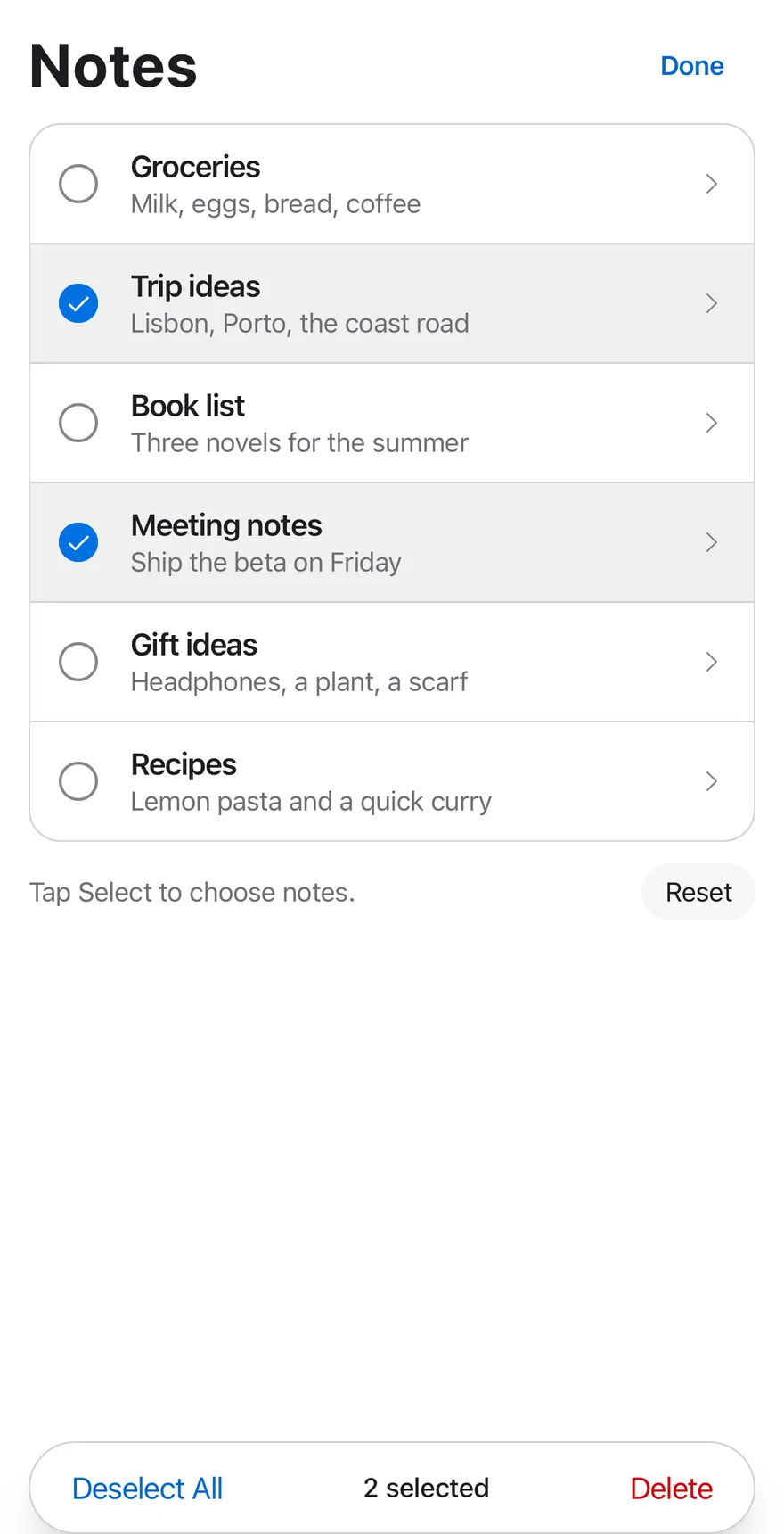
```tsx
import { CaretRightIcon } from "phosphor-react-native"
import * as React from "react"
import { Pressable, View } from "react-native"
import { SelectionList, SelectionListBar, SelectionListCount, SelectionListItem, SelectionListTrigger, useSelectionList } from "@/components/interactions/selection-list"
import { Button } from "@/components/ui/button"
import { Icon } from "@/components/ui/icon"
import { Text } from "@/components/ui/text"
const initialNotes = [
{ id: "groceries", title: "Groceries", preview: "Milk, eggs, bread, coffee" },
{ id: "trip", title: "Trip ideas", preview: "Lisbon, Porto, the coast road" },
{ id: "books", title: "Book list", preview: "Three novels for the summer" },
{ id: "meeting", title: "Meeting notes", preview: "Ship the beta on Friday" },
{ id: "gifts", title: "Gift ideas", preview: "Headphones, a plant, a scarf" },
{ id: "recipes", title: "Recipes", preview: "Lemon pasta and a quick curry" },
]
type Note = (typeof initialNotes)[number]
function NoteRows({
notes,
onOpen,
}: {
notes: Note[]
onOpen: (note: Note) => void
}) {
const { editing } = useSelectionList()
return (
{notes.map((note, index) => (
0 ? "border-t border-separator" : undefined}
>
onOpen(note)}
className="min-w-0 flex-1 flex-row items-center gap-3 px-4 py-3 active:bg-item-pressed"
>
{note.title}
{note.preview}
))}
)
}
function SelectAllButton() {
const { selected, selectAll, clear } = useSelectionList()
const all = selected.length > 0
return (
)
}
function DeleteButton({ onDelete }: { onDelete: (ids: string[]) => void }) {
const { selected, setEditing } = useSelectionList()
const disabled = selected.length === 0
return (
)
}
function useNotes() {
const [notes, setNotes] = React.useState(initialNotes)
const [log, setLog] = React.useState("Tap Select to choose notes.")
return {
notes,
log,
setLog,
remove: (ids: string[]) => {
setNotes((current) => current.filter((note) => !ids.includes(note.id)))
setLog(`Deleted ${ids.length} ${ids.length === 1 ? "note" : "notes"}`)
},
reset: () => {
setNotes(initialNotes)
setLog("Tap Select to choose notes.")
},
}
}
function Footer({ log, onReset }: { log: string; onReset: () => void }) {
return (
{log}
)
}
function NotesExample({
defaultEditing,
defaultValue,
}: {
defaultEditing?: boolean
defaultValue?: string[]
}) {
const { notes, log, setLog, remove, reset } = useNotes()
return (
Notes
setLog(`Opened ${note.title}`)}
/>
)
}
export function SelectionListEditingExample() {
return (
)
}
```
```swift
import EsuissUI
import PhosphorSwift
import SwiftUI
struct SelectionListEditingExample: View {
var body: some View {
SelectionListNotes(editing: true, selection: ["trip", "meeting"])
}
}
struct SelectionListNote: Identifiable {
let id: String
let title: String
let preview: String
}
let selectionListInitialNotes = [
SelectionListNote(id: "groceries", title: "Groceries", preview: "Milk, eggs, bread, coffee"),
SelectionListNote(id: "trip", title: "Trip ideas", preview: "Lisbon, Porto, the coast road"),
SelectionListNote(id: "books", title: "Book list", preview: "Three novels for the summer"),
SelectionListNote(id: "meeting", title: "Meeting notes", preview: "Ship the beta on Friday"),
SelectionListNote(id: "gifts", title: "Gift ideas", preview: "Headphones, a plant, a scarf"),
SelectionListNote(id: "recipes", title: "Recipes", preview: "Lemon pasta and a quick curry"),
]
let selectionListIdleLog = "Tap Select to choose notes."
struct SelectionListRows: View {
let notes: [SelectionListNote]
let editing: Bool
let onOpen: (SelectionListNote) -> Void
var body: some View {
let shape = RoundedRectangle(cornerRadius: Radius.xl2, style: .continuous)
VStack(spacing: 0) {
ForEach(Array(notes.enumerated()), id: \.element.id) { index, note in
SelectionListItem(value: note.id) {
Button {
onOpen(note)
} label: {
HStack(spacing: 12) {
VStack(alignment: .leading, spacing: 0) {
Text(verbatim: note.title)
.textStyle(.base, weight: .semibold)
.foregroundStyle(Color.label)
.lineLimit(1)
Text(verbatim: note.preview)
.textStyle(.sm)
.foregroundStyle(Color.labelSecondary)
.lineLimit(1)
}
.frame(maxWidth: .infinity, alignment: .leading)
Ph.caretRight.regular
.frame(width: 16, height: 16)
.foregroundStyle(Color.labelTertiary)
.opacity(editing ? 0 : 1)
}
.padding(.horizontal, 16)
.padding(.vertical, 12)
.contentShape(Rectangle())
}
.buttonStyle(SelectionListRowStyle())
}
.overlay(alignment: .top) {
if index > 0 {
Color.separator.frame(height: 1)
}
}
}
}
.clipShape(shape)
.overlay { shape.strokeBorder(Color.separator) }
}
}
struct SelectionListRowStyle: ButtonStyle {
func makeBody(configuration: Configuration) -> some View {
configuration.label
.background(configuration.isPressed ? Color.itemPressed : .clear)
}
}
struct SelectionListFooter: View {
let log: String
let onReset: () -> Void
var body: some View {
HStack(spacing: 12) {
Text(verbatim: log)
.textStyle(.sm)
.foregroundStyle(Color.labelSecondary)
.frame(maxWidth: .infinity, alignment: .leading)
.accessibilityAddTraits(.updatesFrequently)
Button("Reset", action: onReset)
.buttonStyle(.variant(.secondary, size: .sm))
}
}
}
struct SelectionListStage: View {
@ViewBuilder let content: () -> Content
@ViewBuilder let bar: () -> Bar
var body: some View {
VStack(alignment: .leading, spacing: 12) {
content()
}
.frame(maxHeight: .infinity, alignment: .top)
.overlay(alignment: .bottom) {
bar()
.padding(.horizontal, -16)
}
.containerRelativeFrame(.vertical) { height, _ in height - 32 }
}
}
struct SelectionListNotes: View {
@State private var editing: Bool
@State private var selection: Set
@State private var notes = selectionListInitialNotes
@State private var log = selectionListIdleLog
init(editing: Bool = false, selection: Set = []) {
_editing = State(initialValue: editing)
_selection = State(initialValue: selection)
}
var body: some View {
SelectionList(isEditing: $editing, selection: $selection) {
SelectionListStage {
HStack {
Text("Notes")
.textVariant(.h1)
Spacer()
SelectionListTrigger()
}
SelectionListRows(notes: notes, editing: editing) { log = "Opened \($0.title)" }
SelectionListFooter(log: log) {
notes = selectionListInitialNotes
log = selectionListIdleLog
}
} bar: {
SelectionListBar { list in
Button(list.count > 0 ? "Deselect All" : "Select All") {
if list.count > 0 { list.clear() } else { list.selectAll() }
}
.buttonStyle(.variant(.plain, size: .lg))
SelectionListCount()
Button {
let ids = selection
notes.removeAll { ids.contains($0.id) }
log = "Deleted \(ids.count) \(ids.count == 1 ? "note" : "notes")"
selection = []
list.setEditing(false)
} label: {
Text("Delete")
.foregroundStyle(list.count == 0 ? Color.labelQuaternary : .danger)
}
.buttonStyle(.variant(.plain, size: .lg))
.disabled(list.count == 0)
}
.accessibilityLabel(Text("Selection actions"))
}
}
}
}
```
```kotlin
import androidx.compose.foundation.background
import androidx.compose.foundation.border
import androidx.compose.foundation.layout.Arrangement
import androidx.compose.foundation.layout.Box
import androidx.compose.foundation.layout.Column
import androidx.compose.foundation.layout.Row
import androidx.compose.foundation.layout.fillMaxWidth
import androidx.compose.foundation.layout.height
import androidx.compose.foundation.layout.padding
import androidx.compose.foundation.shape.RoundedCornerShape
import androidx.compose.runtime.Composable
import androidx.compose.runtime.getValue
import androidx.compose.runtime.mutableStateOf
import androidx.compose.runtime.remember
import androidx.compose.runtime.saveable.rememberSaveable
import androidx.compose.runtime.setValue
import androidx.compose.ui.Alignment
import androidx.compose.ui.Modifier
import androidx.compose.ui.draw.clip
import androidx.compose.ui.semantics.LiveRegionMode
import androidx.compose.ui.semantics.liveRegion
import androidx.compose.ui.semantics.semantics
import androidx.compose.ui.unit.dp
import com.esuiss.ui.components.Button
import com.esuiss.ui.components.ButtonSize
import com.esuiss.ui.components.ButtonVariant
import com.esuiss.ui.components.Text
import com.esuiss.ui.components.TextVariant
import com.esuiss.ui.interactions.SelectionList
import com.esuiss.ui.interactions.SelectionListBar
import com.esuiss.ui.interactions.SelectionListCount
import com.esuiss.ui.interactions.SelectionListItem
import com.esuiss.ui.interactions.SelectionListTrigger
import com.esuiss.ui.theme.EsuissTheme
import com.esuiss.ui.theme.Radius
import com.esuiss.ui.theme.Typography
@Composable
fun SelectionListEditingExample() {
SelectionListNotes(defaultEditing = true, defaultValue = listOf("trip", "meeting"))
}
class SelectionListNote(val id: String, val title: String, val preview: String)
val selectionListInitialNotes = listOf(
SelectionListNote("groceries", "Groceries", "Milk, eggs, bread, coffee"),
SelectionListNote("trip", "Trip ideas", "Lisbon, Porto, the coast road"),
SelectionListNote("books", "Book list", "Three novels for the summer"),
SelectionListNote("meeting", "Meeting notes", "Ship the beta on Friday"),
SelectionListNote("gifts", "Gift ideas", "Headphones, a plant, a scarf"),
SelectionListNote("recipes", "Recipes", "Lemon pasta and a quick curry"),
)
@Composable
fun SelectionListRows(notes: List, editing: Boolean, onOpen: (SelectionListNote) -> Unit) {
val colors = EsuissTheme.colors
val shape = RoundedCornerShape(Radius.xl2)
Column(
Modifier
.fillMaxWidth()
.clip(shape)
.border(1.dp, colors.separator, shape),
) {
notes.forEachIndexed { index, note ->
if (index > 0) Box(Modifier.fillMaxWidth().height(1.dp).background(colors.separator))
SelectionListItem(value = note.id, contentDescription = note.title) {
SelectionListRowContent(note, editing) { onOpen(note) }
}
}
}
}
@Composable
fun SelectionListFooter(log: String, onReset: () -> Unit) {
Row(
modifier = Modifier.fillMaxWidth(),
horizontalArrangement = Arrangement.spacedBy(12.dp),
verticalAlignment = Alignment.CenterVertically,
) {
Text(
log,
modifier = Modifier.weight(1f).semantics { liveRegion = LiveRegionMode.Polite },
style = Typography.sm.copy(color = EsuissTheme.colors.labelSecondary),
)
Button("Reset", onClick = onReset, variant = ButtonVariant.Secondary, size = ButtonSize.Sm)
}
}
@Composable
fun SelectionListHeader(title: String) {
Row(
modifier = Modifier.fillMaxWidth(),
horizontalArrangement = Arrangement.SpaceBetween,
verticalAlignment = Alignment.CenterVertically,
) {
Text(title, variant = TextVariant.H1)
SelectionListTrigger()
}
}
fun selectionListDeleted(count: Int): String = "Deleted $count ${if (count == 1) "note" else "notes"}"
@Composable
fun SelectionListNotes(defaultEditing: Boolean = false, defaultValue: List = emptyList()) {
val colors = EsuissTheme.colors
var notes by remember { mutableStateOf(selectionListInitialNotes) }
var log by rememberSaveable { mutableStateOf(SelectionListHint) }
var editing by rememberSaveable { mutableStateOf(defaultEditing) }
var selected by rememberSaveable { mutableStateOf(defaultValue) }
SelectionList(
editing = editing,
onEditingChange = { editing = it },
value = selected,
onValueChange = { selected = it },
modifier = Modifier.fillMaxWidth(),
) {
Column(verticalArrangement = Arrangement.spacedBy(12.dp)) {
SelectionListHeader("Notes")
SelectionListRows(notes, editing) { log = "Opened ${it.title}" }
SelectionListFooter(log) {
notes = selectionListInitialNotes
log = SelectionListHint
}
}
SelectionListBar {
val any = this@SelectionList.selected.isNotEmpty()
Button(
if (any) "Deselect All" else "Select All",
onClick = { if (any) clear() else selectAll() },
modifier = Modifier.padding(horizontal = 4.dp),
variant = ButtonVariant.Plain,
size = ButtonSize.Lg,
)
SelectionListCount()
Button(
onClick = {
val ids = this@SelectionList.selected
notes = notes.filterNot { it.id in ids }
log = selectionListDeleted(ids.size)
setEditing(false)
},
modifier = Modifier.padding(horizontal = 4.dp),
variant = ButtonVariant.Plain,
size = ButtonSize.Lg,
enabled = any,
) {
Text("Delete", style = Typography.base.copy(color = if (any) colors.danger else colors.labelQuaternary))
}
}
}
}
```
### Icon actions
A mail list whose bar holds icon-only actions.
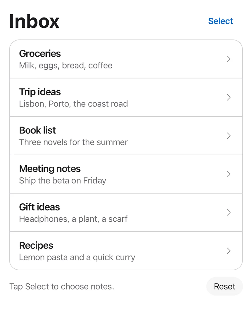
```tsx
import { ArchiveIcon, CaretRightIcon, FolderSimpleIcon, TrashIcon } from "phosphor-react-native"
import * as React from "react"
import { Pressable, View } from "react-native"
import { SelectionList, SelectionListBar, SelectionListCount, SelectionListItem, SelectionListTrigger, useSelectionList } from "@/components/interactions/selection-list"
import { Button } from "@/components/ui/button"
import { Icon } from "@/components/ui/icon"
import { Text } from "@/components/ui/text"
const initialNotes = [
{ id: "groceries", title: "Groceries", preview: "Milk, eggs, bread, coffee" },
{ id: "trip", title: "Trip ideas", preview: "Lisbon, Porto, the coast road" },
{ id: "books", title: "Book list", preview: "Three novels for the summer" },
{ id: "meeting", title: "Meeting notes", preview: "Ship the beta on Friday" },
{ id: "gifts", title: "Gift ideas", preview: "Headphones, a plant, a scarf" },
{ id: "recipes", title: "Recipes", preview: "Lemon pasta and a quick curry" },
]
type Note = (typeof initialNotes)[number]
function NoteRows({
notes,
onOpen,
}: {
notes: Note[]
onOpen: (note: Note) => void
}) {
const { editing } = useSelectionList()
return (
{notes.map((note, index) => (
0 ? "border-t border-separator" : undefined}
>
onOpen(note)}
className="min-w-0 flex-1 flex-row items-center gap-3 px-4 py-3 active:bg-item-pressed"
>
{note.title}
{note.preview}
))}
)
}
function useNotes() {
const [notes, setNotes] = React.useState(initialNotes)
const [log, setLog] = React.useState("Tap Select to choose notes.")
return {
notes,
log,
setLog,
remove: (ids: string[]) => {
setNotes((current) => current.filter((note) => !ids.includes(note.id)))
setLog(`Deleted ${ids.length} ${ids.length === 1 ? "note" : "notes"}`)
},
reset: () => {
setNotes(initialNotes)
setLog("Tap Select to choose notes.")
},
}
}
function Footer({ log, onReset }: { log: string; onReset: () => void }) {
return (
{log}
)
}
function MailExample() {
const { notes, log, setLog, remove, reset } = useNotes()
const [selected, setSelected] = React.useState([])
const disabled = selected.length === 0
const act = (verb: string) => setLog(`${verb} ${selected.join(", ")}`)
return (
Inbox
setLog(`Opened ${note.title}`)}
/>
)
}
export function SelectionListIconActionsExample() {
return (
)
}
```
```swift
import EsuissUI
import PhosphorSwift
import SwiftUI
struct SelectionListNote: Identifiable {
let id: String
let title: String
let preview: String
}
let selectionListInitialNotes = [
SelectionListNote(id: "groceries", title: "Groceries", preview: "Milk, eggs, bread, coffee"),
SelectionListNote(id: "trip", title: "Trip ideas", preview: "Lisbon, Porto, the coast road"),
SelectionListNote(id: "books", title: "Book list", preview: "Three novels for the summer"),
SelectionListNote(id: "meeting", title: "Meeting notes", preview: "Ship the beta on Friday"),
SelectionListNote(id: "gifts", title: "Gift ideas", preview: "Headphones, a plant, a scarf"),
SelectionListNote(id: "recipes", title: "Recipes", preview: "Lemon pasta and a quick curry"),
]
let selectionListIdleLog = "Tap Select to choose notes."
struct SelectionListRows: View {
let notes: [SelectionListNote]
let editing: Bool
let onOpen: (SelectionListNote) -> Void
var body: some View {
let shape = RoundedRectangle(cornerRadius: Radius.xl2, style: .continuous)
VStack(spacing: 0) {
ForEach(Array(notes.enumerated()), id: \.element.id) { index, note in
SelectionListItem(value: note.id) {
Button {
onOpen(note)
} label: {
HStack(spacing: 12) {
VStack(alignment: .leading, spacing: 0) {
Text(verbatim: note.title)
.textStyle(.base, weight: .semibold)
.foregroundStyle(Color.label)
.lineLimit(1)
Text(verbatim: note.preview)
.textStyle(.sm)
.foregroundStyle(Color.labelSecondary)
.lineLimit(1)
}
.frame(maxWidth: .infinity, alignment: .leading)
Ph.caretRight.regular
.frame(width: 16, height: 16)
.foregroundStyle(Color.labelTertiary)
.opacity(editing ? 0 : 1)
}
.padding(.horizontal, 16)
.padding(.vertical, 12)
.contentShape(Rectangle())
}
.buttonStyle(SelectionListRowStyle())
}
.overlay(alignment: .top) {
if index > 0 {
Color.separator.frame(height: 1)
}
}
}
}
.clipShape(shape)
.overlay { shape.strokeBorder(Color.separator) }
}
}
struct SelectionListRowStyle: ButtonStyle {
func makeBody(configuration: Configuration) -> some View {
configuration.label
.background(configuration.isPressed ? Color.itemPressed : .clear)
}
}
struct SelectionListFooter: View {
let log: String
let onReset: () -> Void
var body: some View {
HStack(spacing: 12) {
Text(verbatim: log)
.textStyle(.sm)
.foregroundStyle(Color.labelSecondary)
.frame(maxWidth: .infinity, alignment: .leading)
.accessibilityAddTraits(.updatesFrequently)
Button("Reset", action: onReset)
.buttonStyle(.variant(.secondary, size: .sm))
}
}
}
struct SelectionListStage: View {
@ViewBuilder let content: () -> Content
@ViewBuilder let bar: () -> Bar
var body: some View {
VStack(alignment: .leading, spacing: 12) {
content()
}
.frame(maxHeight: .infinity, alignment: .top)
.overlay(alignment: .bottom) {
bar()
.padding(.horizontal, -16)
}
.containerRelativeFrame(.vertical) { height, _ in height - 32 }
}
}
struct SelectionListMail: View {
@State private var editing = false
@State private var selection: Set = []
@State private var notes = selectionListInitialNotes
@State private var log = selectionListIdleLog
var selectedIDs: String {
notes.map(\.id).filter { selection.contains($0) }.joined(separator: ", ")
}
var body: some View {
let disabled = selection.isEmpty
SelectionList(isEditing: $editing, selection: $selection) {
SelectionListStage {
HStack {
Text("Inbox")
.textVariant(.h1)
Spacer()
SelectionListTrigger()
}
SelectionListRows(notes: notes, editing: editing) { log = "Opened \($0.title)" }
SelectionListFooter(log: log) {
notes = selectionListInitialNotes
log = selectionListIdleLog
}
} bar: {
SelectionListBar {
Button {
log = "Archived \(selectedIDs)"
} label: {
Ph.archive.regular.frame(width: 22, height: 22)
}
.buttonStyle(.variant(.plain, size: .iconLg))
.accessibilityLabel(Text("Archive"))
.disabled(disabled)
Button {
log = "Moved \(selectedIDs)"
} label: {
Ph.folderSimple.regular.frame(width: 22, height: 22)
}
.buttonStyle(.variant(.plain, size: .iconLg))
.accessibilityLabel(Text("Move"))
.disabled(disabled)
SelectionListCount()
Button {
let ids = selection
notes.removeAll { ids.contains($0.id) }
log = "Deleted \(ids.count) \(ids.count == 1 ? "note" : "notes")"
selection = []
} label: {
Ph.trash.regular
.frame(width: 22, height: 22)
.foregroundStyle(disabled ? Color.labelQuaternary : .danger)
}
.buttonStyle(.variant(.plain, size: .iconLg))
.accessibilityLabel(Text("Delete"))
.disabled(disabled)
}
.accessibilityLabel(Text("Selection actions"))
}
}
}
}
```
```kotlin
import androidx.compose.foundation.background
import androidx.compose.foundation.border
import androidx.compose.foundation.layout.Arrangement
import androidx.compose.foundation.layout.Box
import androidx.compose.foundation.layout.Column
import androidx.compose.foundation.layout.Row
import androidx.compose.foundation.layout.fillMaxWidth
import androidx.compose.foundation.layout.height
import androidx.compose.foundation.shape.RoundedCornerShape
import androidx.compose.runtime.Composable
import androidx.compose.runtime.getValue
import androidx.compose.runtime.mutableStateOf
import androidx.compose.runtime.remember
import androidx.compose.runtime.saveable.rememberSaveable
import androidx.compose.runtime.setValue
import androidx.compose.ui.Alignment
import androidx.compose.ui.Modifier
import androidx.compose.ui.draw.clip
import androidx.compose.ui.semantics.LiveRegionMode
import androidx.compose.ui.semantics.liveRegion
import androidx.compose.ui.semantics.semantics
import androidx.compose.ui.unit.dp
import com.adamglin.PhosphorIcons
import com.adamglin.phosphoricons.Regular
import com.adamglin.phosphoricons.regular.Archive
import com.adamglin.phosphoricons.regular.FolderSimple
import com.adamglin.phosphoricons.regular.Trash
import com.esuiss.ui.components.Button
import com.esuiss.ui.components.ButtonSize
import com.esuiss.ui.components.ButtonVariant
import com.esuiss.ui.components.Text
import com.esuiss.ui.components.TextVariant
import com.esuiss.ui.interactions.SelectionList
import com.esuiss.ui.interactions.SelectionListBar
import com.esuiss.ui.interactions.SelectionListCount
import com.esuiss.ui.interactions.SelectionListItem
import com.esuiss.ui.interactions.SelectionListTrigger
import com.esuiss.ui.theme.EsuissTheme
import com.esuiss.ui.theme.Radius
import com.esuiss.ui.theme.Typography
class SelectionListNote(val id: String, val title: String, val preview: String)
val selectionListInitialNotes = listOf(
SelectionListNote("groceries", "Groceries", "Milk, eggs, bread, coffee"),
SelectionListNote("trip", "Trip ideas", "Lisbon, Porto, the coast road"),
SelectionListNote("books", "Book list", "Three novels for the summer"),
SelectionListNote("meeting", "Meeting notes", "Ship the beta on Friday"),
SelectionListNote("gifts", "Gift ideas", "Headphones, a plant, a scarf"),
SelectionListNote("recipes", "Recipes", "Lemon pasta and a quick curry"),
)
@Composable
fun SelectionListRows(notes: List, editing: Boolean, onOpen: (SelectionListNote) -> Unit) {
val colors = EsuissTheme.colors
val shape = RoundedCornerShape(Radius.xl2)
Column(
Modifier
.fillMaxWidth()
.clip(shape)
.border(1.dp, colors.separator, shape),
) {
notes.forEachIndexed { index, note ->
if (index > 0) Box(Modifier.fillMaxWidth().height(1.dp).background(colors.separator))
SelectionListItem(value = note.id, contentDescription = note.title) {
SelectionListRowContent(note, editing) { onOpen(note) }
}
}
}
}
@Composable
fun SelectionListFooter(log: String, onReset: () -> Unit) {
Row(
modifier = Modifier.fillMaxWidth(),
horizontalArrangement = Arrangement.spacedBy(12.dp),
verticalAlignment = Alignment.CenterVertically,
) {
Text(
log,
modifier = Modifier.weight(1f).semantics { liveRegion = LiveRegionMode.Polite },
style = Typography.sm.copy(color = EsuissTheme.colors.labelSecondary),
)
Button("Reset", onClick = onReset, variant = ButtonVariant.Secondary, size = ButtonSize.Sm)
}
}
@Composable
fun SelectionListHeader(title: String) {
Row(
modifier = Modifier.fillMaxWidth(),
horizontalArrangement = Arrangement.SpaceBetween,
verticalAlignment = Alignment.CenterVertically,
) {
Text(title, variant = TextVariant.H1)
SelectionListTrigger()
}
}
fun selectionListDeleted(count: Int): String = "Deleted $count ${if (count == 1) "note" else "notes"}"
@Composable
fun SelectionListMail() {
val colors = EsuissTheme.colors
var notes by remember { mutableStateOf(selectionListInitialNotes) }
var log by rememberSaveable { mutableStateOf(SelectionListHint) }
var editing by rememberSaveable { mutableStateOf(false) }
var selected by rememberSaveable { mutableStateOf(emptyList()) }
val enabled = selected.isNotEmpty()
SelectionList(
editing = editing,
onEditingChange = { editing = it },
value = selected,
onValueChange = { selected = it },
modifier = Modifier.fillMaxWidth(),
) {
Column(verticalArrangement = Arrangement.spacedBy(12.dp)) {
SelectionListHeader("Inbox")
SelectionListRows(notes, editing) { log = "Opened ${it.title}" }
SelectionListFooter(log) {
notes = selectionListInitialNotes
log = SelectionListHint
}
}
SelectionListBar {
SelectionListBarIcon(PhosphorIcons.Regular.Archive, "Archive", enabled) { log = "Archived ${selected.joinToString(", ")}" }
SelectionListBarIcon(PhosphorIcons.Regular.FolderSimple, "Move", enabled) { log = "Moved ${selected.joinToString(", ")}" }
SelectionListCount()
SelectionListBarIcon(
PhosphorIcons.Regular.Trash,
"Delete",
enabled,
tint = if (enabled) colors.danger else colors.labelQuaternary,
) {
val ids = selected
notes = notes.filterNot { it.id in ids }
log = selectionListDeleted(ids.size)
selected = emptyList()
}
}
}
}
```
## API Reference
### SelectionList
The root that holds the editing state and selection.
### SelectionListTrigger
A plain button that toggles editing.
### SelectionListItem
A row that toggles its `value` while editing.
### SelectionListBar
A floating toolbar shown while editing.
### SelectionListCount
Text showing the number of selected items.
## Accessibility
- While editing, rows have the `checkbox` role and expose their `checked` state; otherwise the row wrapper is not focusable and its children are.
- The trigger exposes a `selected` state while editing.
- The bar has the `toolbar` role.
- `SelectionListCount` is a polite live region, reading `Select items` or `n selected` by default.
## Notes
- Selected rows use `bg-item-selected`; checked circles use `bg-accent` with an `on-accent` check.
- The bar uses `bg-surface-raised`, or `bg-surface-secondary` in dark mode, and is up to `max-w-md` wide.
- Animations respect the system reduce motion setting.