# Island
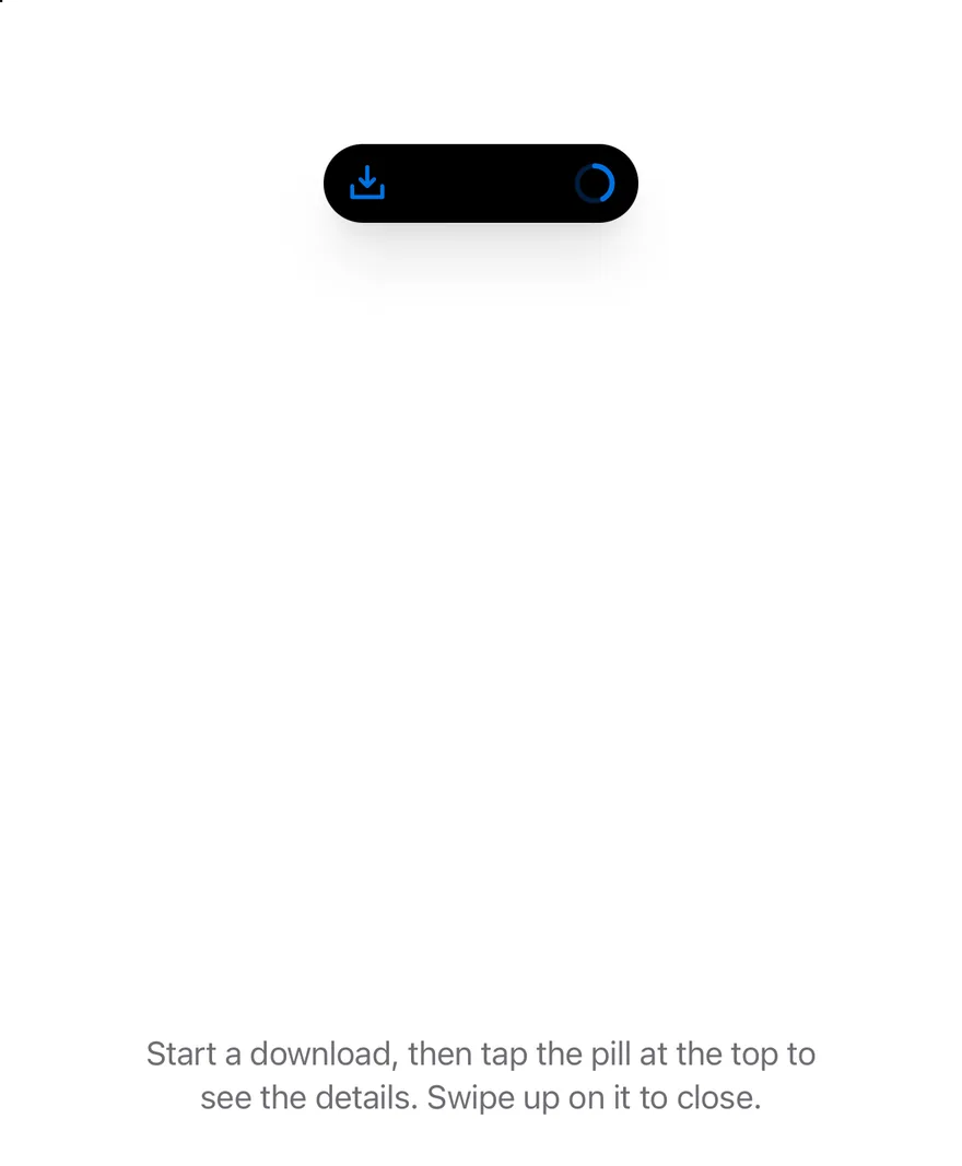
A floating pill at the top of the screen that shows ongoing activity and short notices, and expands on press.
Island is an open-source mobile interaction from suiss/uim for React Native and Expo, with SwiftUI and Jetpack Compose versions built from the same design tokens. The @esuiss/uim CLI copies its source into your project, so you own the code.
Source: https://uim.suiss.app/docs/interactions/island
```tsx
import { BellIcon, ChatCircleIcon, CheckCircleIcon, DownloadSimpleIcon, FileZipIcon } from "phosphor-react-native"
import * as React from "react"
import { Pressable, View } from "react-native"
import { Island, IslandExpandedRegion, IslandProvider, IslandRing, useIsland } from "@/components/interactions/island"
import { Button } from "@/components/ui/button"
import { Icon } from "@/components/ui/icon"
import { Text } from "@/components/ui/text"
function NotifyButtons({ children }: { children?: React.ReactNode }) {
const { notify } = useIsland()
return (
{children}
)
}
function useDownload(initial: number | null = null) {
const [progress, setProgress] = React.useState(initial)
const { notify } = useIsland()
React.useEffect(() => {
if (initial !== null || progress === null || progress >= 1) return
const timer = setTimeout(
() => setProgress((value) => Math.min((value ?? 0) + 0.01, 1)),
150
)
return () => clearTimeout(timer)
}, [initial, progress])
React.useEffect(() => {
if (progress !== 1) return
const timer = setTimeout(() => {
setProgress(null)
notify({
icon: (
),
title: "Download complete",
description: "Design-Kit.zip",
})
}, 1200)
return () => clearTimeout(timer)
}, [progress, notify])
return {
progress,
start: () => setProgress(0),
cancel: () => setProgress(null),
}
}
function DownloadIsland({
progress,
onCancel,
}: {
progress: number | null
onCancel: () => void
}) {
if (progress === null) return
const done = progress >= 1
const percent = Math.round(progress * 100)
return (
}
compactTrailing={
done ? (
) : (
)
}
minimal={}
>
{percent}%
{done ? "Downloaded" : "Downloading"}
Design-Kit.zip
Cancel download
)
}
function DownloadsExample({
initial = null,
view = "compact",
withNotifications = false,
}: {
initial?: number | null
view?: "compact" | "expanded" | "minimal"
withNotifications?: boolean
}) {
const { progress, start, cancel } = useDownload(initial)
const { expand, minimize } = useIsland()
React.useEffect(() => {
if (view === "expanded") expand()
else if (view === "minimal") minimize()
}, [view, expand, minimize])
return (
Start a download, then tap the pill at the top to see the details. Swipe
up on it to close.
{initial === null ? (
) : null}
{withNotifications ? (
) : null}
)
}
export function IslandCompactExample() {
return (
)
}
```
```kotlin
import androidx.compose.foundation.background
import androidx.compose.foundation.clickable
import androidx.compose.foundation.interaction.MutableInteractionSource
import androidx.compose.foundation.interaction.collectIsPressedAsState
import androidx.compose.foundation.layout.Arrangement
import androidx.compose.foundation.layout.Box
import androidx.compose.foundation.layout.Column
import androidx.compose.foundation.layout.FlowRow
import androidx.compose.foundation.layout.Spacer
import androidx.compose.foundation.layout.fillMaxHeight
import androidx.compose.foundation.layout.fillMaxWidth
import androidx.compose.foundation.layout.height
import androidx.compose.foundation.layout.size
import androidx.compose.foundation.layout.widthIn
import androidx.compose.foundation.shape.CircleShape
import androidx.compose.foundation.shape.RoundedCornerShape
import androidx.compose.runtime.Composable
import androidx.compose.runtime.LaunchedEffect
import androidx.compose.runtime.getValue
import androidx.compose.runtime.mutableStateOf
import androidx.compose.runtime.remember
import androidx.compose.runtime.saveable.rememberSaveable
import androidx.compose.runtime.setValue
import androidx.compose.ui.Alignment
import androidx.compose.ui.Modifier
import androidx.compose.ui.draw.alpha
import androidx.compose.ui.draw.clip
import androidx.compose.ui.semantics.ProgressBarRangeInfo
import androidx.compose.ui.semantics.Role
import androidx.compose.ui.semantics.contentDescription
import androidx.compose.ui.semantics.progressBarRangeInfo
import androidx.compose.ui.semantics.semantics
import androidx.compose.ui.text.font.FontWeight
import androidx.compose.ui.text.style.TextAlign
import androidx.compose.ui.text.style.TextOverflow
import androidx.compose.ui.unit.dp
import com.adamglin.PhosphorIcons
import com.adamglin.phosphoricons.Bold
import com.adamglin.phosphoricons.Fill
import com.adamglin.phosphoricons.bold.DownloadSimple
import com.adamglin.phosphoricons.fill.Bell
import com.adamglin.phosphoricons.fill.ChatCircle
import com.adamglin.phosphoricons.fill.CheckCircle
import com.esuiss.ui.components.Button
import com.esuiss.ui.components.ButtonVariant
import com.esuiss.ui.components.Icon
import com.esuiss.ui.components.LocalContentColor
import com.esuiss.ui.components.Text
import com.esuiss.ui.interactions.Island
import com.esuiss.ui.interactions.IslandProvider
import com.esuiss.ui.interactions.IslandRegion
import com.esuiss.ui.interactions.IslandRing
import com.esuiss.ui.interactions.useIsland
import com.esuiss.ui.theme.EsuissTheme
import com.esuiss.ui.theme.Radius
import com.esuiss.ui.theme.Typography
import kotlinx.coroutines.delay
import kotlin.math.roundToInt
@Composable
fun IslandCompactExample() {
IslandProvider { IslandDownloads(initial = 0.42f) }
}
enum class IslandStart { Compact, Expanded, Minimal }
@Composable
fun IslandNotifyButtons(extra: @Composable () -> Unit = {}) {
val island = useIsland()
val colors = EsuissTheme.colors
FlowRow(
modifier = Modifier.fillMaxWidth(),
horizontalArrangement = Arrangement.spacedBy(12.dp, Alignment.CenterHorizontally),
verticalArrangement = Arrangement.spacedBy(12.dp),
) {
Button(
"New message",
onClick = {
island.notify(
title = "Jordan Lee",
description = "Are we still on for Saturday?",
icon = { Icon(PhosphorIcons.Fill.ChatCircle, contentDescription = null, tint = colors.green) },
)
},
variant = ButtonVariant.Secondary,
)
Button(
"Reminder",
onClick = {
island.notify(
title = "Design review",
description = "Starts in 10 minutes",
icon = { Icon(PhosphorIcons.Fill.Bell, contentDescription = null, tint = colors.orange) },
)
},
variant = ButtonVariant.Secondary,
)
extra()
}
}
@Composable
fun IslandProgress(progress: Float) {
val colors = EsuissTheme.colors
if (progress >= 1f) {
Icon(PhosphorIcons.Fill.CheckCircle, contentDescription = null, tint = colors.green)
} else {
IslandRing(progress)
}
}
@Composable
fun IslandDownloadIsland(progress: Float?, onCancel: () -> Unit) {
val colors = EsuissTheme.colors
val current = progress ?: 0f
val done = current >= 1f
val percent = (current * 100).roundToInt()
Island(
compactLeading = progress?.let {
{ Icon(PhosphorIcons.Bold.DownloadSimple, contentDescription = null, tint = colors.accent) }
},
compactTrailing = progress?.let { value -> { IslandProgress(value) } },
minimal = progress?.let { value -> { IslandProgress(value) } },
modifier = Modifier.semantics { contentDescription = "Downloading Design-Kit.zip, $percent%" },
) {
IslandExpandedRegion(IslandRegion.Leading) {
val foreground = LocalContentColor.current
Box(
modifier = Modifier
.size(40.dp)
.background(foreground.copy(alpha = 0.15f), RoundedCornerShape(Radius.xl)),
contentAlignment = Alignment.Center,
) {
Icon(PhosphorIcons.Bold.DownloadSimple, contentDescription = null, size = 24.dp, tint = colors.accent)
}
}
IslandExpandedRegion(IslandRegion.Trailing) {
Text("$percent%", style = Typography.xl2.copy(color = LocalContentColor.current, fontWeight = FontWeight.SemiBold))
}
IslandExpandedRegion(IslandRegion.Center) {
val foreground = LocalContentColor.current
Text(
if (done) "Downloaded" else "Downloading",
style = Typography.sm.copy(color = foreground, fontWeight = FontWeight.SemiBold),
maxLines = 1,
overflow = TextOverflow.Ellipsis,
)
Text(
if (done) "Design-Kit.zip" else "Design-Kit.zip · ${(current * IslandSize).roundToInt()} of $IslandSize MB",
style = Typography.sm.copy(color = foreground.copy(alpha = 0.7f)),
maxLines = 1,
overflow = TextOverflow.Ellipsis,
)
}
IslandExpandedRegion(IslandRegion.Bottom) {
val foreground = LocalContentColor.current
Box(
modifier = Modifier
.fillMaxWidth()
.height(6.dp)
.clip(CircleShape)
.background(foreground.copy(alpha = 0.2f))
.semantics {
contentDescription = "Download progress"
progressBarRangeInfo = ProgressBarRangeInfo(percent.toFloat(), 0f..100f)
},
) {
Box(
Modifier
.fillMaxWidth(current.coerceIn(0f, 1f))
.fillMaxHeight()
.background(colors.accent, CircleShape),
)
}
Spacer(Modifier.height(12.dp))
val interaction = remember { MutableInteractionSource() }
val pressed by interaction.collectIsPressedAsState()
Box(
modifier = Modifier
.fillMaxWidth()
.height(44.dp)
.alpha(if (done) 0.5f else 1f)
.clip(CircleShape)
.background(foreground.copy(alpha = if (pressed) 0.25f else 0.15f))
.clickable(interactionSource = interaction, indication = null, enabled = !done, role = Role.Button, onClick = onCancel),
contentAlignment = Alignment.Center,
) {
Text("Cancel download", style = Typography.sm.copy(color = foreground, fontWeight = FontWeight.SemiBold))
}
}
}
}
@Composable
fun IslandDownloads(initial: Float? = null, start: IslandStart = IslandStart.Compact, withNotifications: Boolean = false) {
val island = useIsland()
val colors = EsuissTheme.colors
var progress by rememberSaveable { mutableStateOf(initial) }
LaunchedEffect(progress) {
val current = progress ?: return@LaunchedEffect
if (initial != null) return@LaunchedEffect
if (current < 1f) {
delay(150)
progress = minOf(current + 0.01f, 1f)
} else {
delay(1200)
progress = null
island.notify(
title = "Download complete",
description = "Design-Kit.zip",
icon = { Icon(PhosphorIcons.Fill.CheckCircle, contentDescription = null, tint = colors.green) },
)
}
}
LaunchedEffect(start) {
when (start) {
IslandStart.Expanded -> island.expand()
IslandStart.Minimal -> island.minimize()
IslandStart.Compact -> Unit
}
}
Column(
modifier = Modifier.fillMaxWidth(),
horizontalAlignment = Alignment.CenterHorizontally,
verticalArrangement = Arrangement.spacedBy(16.dp),
) {
IslandDownloadIsland(progress) { progress = null }
Text(
"Start a download, then tap the pill at the top to see the details. Swipe up on it to close.",
modifier = Modifier.widthIn(max = 320.dp),
style = Typography.sm.copy(color = colors.labelSecondary),
textAlign = TextAlign.Center,
)
if (initial == null) {
Button(
if (progress == null) "Download Design-Kit.zip" else "Downloading…",
onClick = { progress = 0f },
enabled = progress == null,
)
}
if (withNotifications) {
IslandNotifyButtons {
Button(
"Minimize",
onClick = island::minimize,
variant = ButtonVariant.Secondary,
enabled = progress != null,
)
}
}
}
}
```
`Island` floats below the top safe area and morphs between views: `hidden`, `compact`, `minimal`, `expanded` and `notice`. Its width, height and corner radius spring to the measured size of the active view, and views cross-fade as it changes.
Content is passed through slots. `compactLeading` and `compactTrailing` sit at the two ends of the compact pill, `minimal` is a single small circle, and `IslandExpandedRegion` children fill the expanded view. The island appears while it has compact or minimal content and hides when it has none. Pressing it expands; pressing outside, swiping up or the Android back button collapses it. `notify` shows a notice that replaces the current view and dismisses itself after 4 seconds, on press or on swipe up. Use it for ongoing activity such as a download, timer or call.
## Installation
```bash title="Terminal"
npx @esuiss/uim@latest add island
```
```bash title="Terminal"
npx @esuiss/uim@latest add island --platform swift
```
```bash title="Terminal"
npx @esuiss/uim@latest add island --platform kotlin
```
The CLI also adds what it builds on: [Icon](/docs/components/icon), [Text](/docs/components/text).
### Manual
**Uniwind**
1. Install the dependencies:
```bash title="Terminal"
npx expo install cn phosphor-react-native react-native-gesture-handler react-native-reanimated react-native-safe-area-context react-native-svg react-native-worklets
```
2. Add the pieces it builds on: [Icon](/docs/components/icon), [Text](/docs/components/text), and the primitives `components/primitives/hooks.tsx`, `components/primitives/portal.tsx`.
3. Copy the source into `components/interactions/island.tsx`:
```tsx title="uniwind/components/interactions/island.tsx"
import { cn } from "cn"
import type { IconProps as PhosphorIconProps } from "phosphor-react-native"
import * as React from "react"
import {
type AccessibilityActionEvent,
AccessibilityInfo,
Pressable,
useWindowDimensions,
View,
} from "react-native"
import { Gesture, GestureDetector } from "react-native-gesture-handler"
import {
ReduceMotion,
runOnJS,
type SharedValue,
useAnimatedStyle,
useSharedValue,
withSpring,
withTiming,
} from "react-native-reanimated"
import { useSafeAreaInsets } from "react-native-safe-area-context"
import Svg, { Circle } from "react-native-svg"
import { useBackHandler } from "@/components/primitives/hooks"
import { Portal } from "@/components/primitives/portal"
import { AnimatedView } from "@/components/ui/animated-view"
import { Icon, IconClassContext } from "@/components/ui/icon"
import { Text, TextClassContext } from "@/components/ui/text"
type IslandView = "hidden" | "compact" | "minimal" | "expanded" | "notice"
type IslandMode = "compact" | "minimal" | "expanded"
type IslandPartName = Exclude
type IslandRegion = "leading" | "trailing" | "center" | "bottom"
type IslandNotice = {
icon?: React.ReactNode
title: React.ReactNode
description?: React.ReactNode
duration?: number
}
type IslandContextProps = {
view: IslandView
notice: IslandNotice | null
expand: () => void
collapse: () => void
minimize: () => void
notify: (notice: IslandNotice) => void
dismiss: () => void
registerActivity: () => () => void
}
type IslandSize = { width: number; height: number }
type IslandStageContextProps = {
view: IslandView
stageWidth: number
reportSize: (part: IslandPartName, size: IslandSize) => void
}
const IslandContext = React.createContext(null)
const IslandPauseContext = React.createContext<(paused: boolean) => void>(
() => {}
)
const IslandStageContext = React.createContext(
null
)
function useIsland() {
const context = React.useContext(IslandContext)
if (!context) {
throw new Error("useIsland must be used within an ")
}
return context
}
const NOTICE_DURATION = 4000
const HIDDEN_SIZE: IslandSize = { width: 126, height: 36 }
const MAX_WIDTH = 384
const SPRING = {
damping: 22,
stiffness: 260,
mass: 1,
reduceMotion: ReduceMotion.System,
}
const RADIUS: Record = {
hidden: 18,
compact: 18,
minimal: 18,
expanded: 28,
notice: 28,
}
function islandView(
notice: IslandNotice | null,
mode: IslandMode,
activityCount: number
): IslandView {
if (notice) return "notice"
if (activityCount <= 0) return "hidden"
return mode
}
function plainText(node: React.ReactNode) {
return typeof node === "string" || typeof node === "number"
? String(node)
: ""
}
function wrapText(
children: React.ReactNode,
className: string,
numberOfLines?: number
) {
if (typeof children === "string" || typeof children === "number") {
return (
{children}
)
}
return children
}
function IslandProvider({ children }: { children?: React.ReactNode }) {
const [mode, setMode] = React.useState("compact")
const [notice, setNotice] = React.useState<
(IslandNotice & { id: number }) | null
>(null)
const [activityCount, setActivityCount] = React.useState(0)
const [paused, setPaused] = React.useState(false)
const idRef = React.useRef(0)
const view = islandView(notice, mode, activityCount)
const expand = React.useCallback(() => setMode("expanded"), [])
const collapse = React.useCallback(() => setMode("compact"), [])
const minimize = React.useCallback(() => setMode("minimal"), [])
const dismiss = React.useCallback(() => {
setNotice(null)
setPaused(false)
}, [])
const notify = React.useCallback((next: IslandNotice) => {
idRef.current += 1
setNotice({ ...next, id: idRef.current })
}, [])
const registerActivity = React.useCallback(() => {
setActivityCount((count) => count + 1)
return () => {
setActivityCount((count) => count - 1)
setMode("compact")
}
}, [])
React.useEffect(() => {
if (!notice) return
const message = [plainText(notice.title), plainText(notice.description)]
.filter(Boolean)
.join(", ")
if (message) AccessibilityInfo.announceForAccessibility(message)
}, [notice])
React.useEffect(() => {
if (!notice || paused) return
const duration = notice.duration ?? NOTICE_DURATION
if (!Number.isFinite(duration) || duration <= 0) return
const timer = setTimeout(dismiss, duration)
return () => clearTimeout(timer)
}, [notice, paused, dismiss])
const contextValue = React.useMemo(
() => ({
view,
notice,
expand,
collapse,
minimize,
notify,
dismiss,
registerActivity,
}),
[
view,
notice,
expand,
collapse,
minimize,
notify,
dismiss,
registerActivity,
]
)
return (
{children}
)
}
function IslandPart({
part,
className,
style,
children,
}: {
part: IslandPartName
className?: string
style?: React.ComponentProps["style"]
children?: React.ReactNode
}) {
const stage = React.useContext(IslandStageContext)
const active = stage?.view === part
const progress = useSharedValue(active ? 1 : 0)
React.useEffect(() => {
progress.value = withTiming(active ? 1 : 0, {
duration: active ? 300 : 150,
reduceMotion: ReduceMotion.System,
})
}, [active, progress])
const animatedStyle = useAnimatedStyle(() => ({
opacity: progress.value,
transform: [{ scale: 0.9 + progress.value * 0.1 }],
}))
return (
{
const { width, height } = event.nativeEvent.layout
stage?.reportSize(part, { width, height })
}}
className={cn("absolute top-0", className)}
style={[style, animatedStyle]}
>
{children}
)
}
function IslandNoticeView({ current }: { current: IslandNotice | null }) {
const { dismiss } = useIsland()
const lastRef = React.useRef(current)
if (current) lastRef.current = current
const notice = current ?? lastRef.current
const stage = React.useContext(IslandStageContext)
const width = Math.min((stage?.stageWidth ?? MAX_WIDTH) - 24, MAX_WIDTH)
return (
{
const action = event.nativeEvent.actionName
if (action === "activate" || action === "dismiss") dismiss()
}}
onPress={dismiss}
className="w-full flex-row items-center gap-3 p-3.5"
>
{notice?.icon ? (
{notice.icon}
) : null}
{wrapText(notice?.title, "text-sm font-semibold", 1)}
{notice?.description !== undefined
? wrapText(notice.description, "text-sm text-on-media/70", 1)
: null}
)
}
function IslandStage({
width,
stageWidth,
stageHeight,
children,
}: {
width: SharedValue
stageWidth: number
stageHeight: number
children?: React.ReactNode
}) {
const animatedStyle = useAnimatedStyle(() => ({
left: (width.value - stageWidth) / 2,
}))
return (
{children}
)
}
type IslandExpandedRegionProps = React.ComponentProps & {
region: IslandRegion
className?: string
}
const REGION_CLASS: Record = {
leading: "shrink-0",
trailing: "shrink-0 items-end",
center: "min-w-0 flex-1",
bottom: "w-full gap-3",
}
function IslandExpandedRegion({
region,
className,
...props
}: IslandExpandedRegionProps) {
return
}
type IslandRegions = Record
function collectRegions(
children: React.ReactNode,
regions: IslandRegions = {
leading: [],
trailing: [],
center: [],
bottom: [],
}
) {
for (const child of React.Children.toArray(children)) {
if (!React.isValidElement(child)) continue
if (child.type === React.Fragment) {
collectRegions(
(child.props as { children?: React.ReactNode }).children,
regions
)
} else if (child.type === IslandExpandedRegion) {
const { region } = child.props as IslandExpandedRegionProps
regions[region].push(child)
}
}
return regions
}
function IslandExpandedView({
regions,
accessibilityLabel,
}: {
regions: IslandRegions
accessibilityLabel?: string
}) {
const { collapse } = useIsland()
const stage = React.useContext(IslandStageContext)
const width = Math.min((stage?.stageWidth ?? MAX_WIDTH) - 24, MAX_WIDTH)
const hasTop =
regions.leading.length > 0 ||
regions.center.length > 0 ||
regions.trailing.length > 0
return (
{
const action = event.nativeEvent.actionName
if (action === "escape" || action === "collapse") collapse()
}}
onAccessibilityEscape={collapse}
className="w-full flex-col gap-3 p-4"
>
{hasTop ? (
{regions.leading}
{regions.center.length > 0 ? (
regions.center
) : (
)}
{regions.trailing}
) : null}
{regions.bottom}
)
}
function Island({
className,
style,
children,
compactLeading,
compactTrailing,
minimal,
accessibilityLabel,
portalHost,
...props
}: React.ComponentProps & {
className?: string
compactLeading?: React.ReactNode
compactTrailing?: React.ReactNode
minimal?: React.ReactNode
portalHost?: string
}) {
const context = useIsland()
const setPaused = React.useContext(IslandPauseContext)
const { notice, expand, collapse, dismiss, registerActivity } = context
const insets = useSafeAreaInsets()
const window = useWindowDimensions()
const id = React.useId()
const [sizes, setSizes] = React.useState<
Partial>
>({})
const width = useSharedValue(HIDDEN_SIZE.width)
const height = useSharedValue(HIDDEN_SIZE.height)
const radius = useSharedValue(RADIUS.hidden)
const visible = useSharedValue(0)
const translateY = useSharedValue(0)
const hasCompact = compactLeading != null || compactTrailing != null
const hasMinimal = minimal != null
const active = hasCompact || hasMinimal
React.useEffect(() => {
if (!active) return
return registerActivity()
}, [active, registerActivity])
const view: IslandView =
context.view === "minimal" && !hasMinimal
? "compact"
: context.view === "compact" && !hasCompact
? "minimal"
: context.view
const regions = collectRegions(children)
const reportSize = React.useCallback(
(part: IslandPartName, size: IslandSize) => {
setSizes((current) => {
const previous = current[part]
if (
previous &&
previous.width === size.width &&
previous.height === size.height
) {
return current
}
return { ...current, [part]: size }
})
},
[]
)
const target = view === "hidden" ? HIDDEN_SIZE : (sizes[view] ?? HIDDEN_SIZE)
React.useEffect(() => {
width.value = withSpring(target.width, SPRING)
height.value = withSpring(target.height, SPRING)
radius.value = withSpring(RADIUS[view], SPRING)
visible.value = withTiming(view === "hidden" ? 0 : 1, {
duration: view === "hidden" ? 400 : 300,
reduceMotion: ReduceMotion.System,
})
}, [target.width, target.height, view, width, height, radius, visible])
const swipeUp = React.useCallback(() => {
if (view === "notice") dismiss()
else if (view === "expanded") collapse()
}, [view, dismiss, collapse])
useBackHandler(view === "expanded", collapse)
const gesture = React.useMemo(
() =>
Gesture.Pan()
.activeOffsetY([-8, 8])
.onStart(() => {
runOnJS(setPaused)(true)
})
.onUpdate((event) => {
translateY.value =
event.translationY < 0
? event.translationY * 0.5
: event.translationY * 0.15
})
.onEnd((event) => {
translateY.value = withSpring(0, SPRING)
runOnJS(setPaused)(false)
if (event.translationY < -24 || event.velocityY < -500) {
runOnJS(swipeUp)()
}
}),
[translateY, setPaused, swipeUp]
)
const animatedStyle = useAnimatedStyle(() => ({
width: width.value,
height: height.value,
borderRadius: radius.value,
opacity: visible.value,
transform: [
{ translateY: translateY.value },
{ scale: 0.75 + visible.value * 0.25 },
],
}))
const stage = React.useMemo(
() => ({ view, stageWidth: window.width, reportSize }),
[view, window.width, reportSize]
)
const expandActions = [{ name: "activate" }, { name: "expand" }]
const onExpandAction = (event: AccessibilityActionEvent) => {
const action = event.nativeEvent.actionName
if (action === "activate" || action === "expand") expand()
}
return (
{view === "expanded" ? (
) : null}
{hasCompact ? (
{compactLeading ?? }
{compactTrailing ?? }
) : null}
{hasMinimal ? (
{minimal}
) : null}
)
}
const IslandRingValueContext = React.createContext(0)
const RING_RADIUS = 8
const RING_CIRCUMFERENCE = 2 * Math.PI * RING_RADIUS
function IslandRingShape({ color, size, style }: PhosphorIconProps) {
const value = React.useContext(IslandRingValueContext)
return (
)
}
function IslandRing({
value,
className,
}: {
value: number
className?: string
}) {
return (
)
}
export type { IslandNotice, IslandRegion, IslandView }
export { Island, IslandExpandedRegion, IslandProvider, IslandRing, useIsland }
```
4. Update the import paths to match your project.
**NativeWind**
1. Install the dependencies:
```bash title="Terminal"
npx expo install cn phosphor-react-native react-native-gesture-handler react-native-reanimated react-native-safe-area-context react-native-svg react-native-worklets
```
2. Add the pieces it builds on: [Icon](/docs/components/icon), [Text](/docs/components/text), and the primitives `components/primitives/hooks.tsx`, `components/primitives/portal.tsx`.
3. Copy the source into `components/interactions/island.tsx`:
```tsx title="nativewind/components/interactions/island.tsx"
import { cn } from "cn"
import type { IconProps as PhosphorIconProps } from "phosphor-react-native"
import * as React from "react"
import {
type AccessibilityActionEvent,
AccessibilityInfo,
Pressable,
useWindowDimensions,
View,
} from "react-native"
import { Gesture, GestureDetector } from "react-native-gesture-handler"
import {
ReduceMotion,
runOnJS,
type SharedValue,
useAnimatedStyle,
useSharedValue,
withSpring,
withTiming,
} from "react-native-reanimated"
import { useSafeAreaInsets } from "react-native-safe-area-context"
import Svg, { Circle } from "react-native-svg"
import { useBackHandler } from "@/components/primitives/hooks"
import { Portal } from "@/components/primitives/portal"
import { AnimatedView } from "@/components/ui/animated-view"
import { Icon, IconClassContext } from "@/components/ui/icon"
import { Text, TextClassContext } from "@/components/ui/text"
type IslandView = "hidden" | "compact" | "minimal" | "expanded" | "notice"
type IslandMode = "compact" | "minimal" | "expanded"
type IslandPartName = Exclude
type IslandRegion = "leading" | "trailing" | "center" | "bottom"
type IslandNotice = {
icon?: React.ReactNode
title: React.ReactNode
description?: React.ReactNode
duration?: number
}
type IslandContextProps = {
view: IslandView
notice: IslandNotice | null
expand: () => void
collapse: () => void
minimize: () => void
notify: (notice: IslandNotice) => void
dismiss: () => void
registerActivity: () => () => void
}
type IslandSize = { width: number; height: number }
type IslandStageContextProps = {
view: IslandView
stageWidth: number
reportSize: (part: IslandPartName, size: IslandSize) => void
}
const IslandContext = React.createContext(null)
const IslandPauseContext = React.createContext<(paused: boolean) => void>(
() => {}
)
const IslandStageContext = React.createContext(
null
)
function useIsland() {
const context = React.useContext(IslandContext)
if (!context) {
throw new Error("useIsland must be used within an ")
}
return context
}
const NOTICE_DURATION = 4000
const HIDDEN_SIZE: IslandSize = { width: 126, height: 36 }
const MAX_WIDTH = 384
const SPRING = {
damping: 22,
stiffness: 260,
mass: 1,
reduceMotion: ReduceMotion.System,
}
const RADIUS: Record = {
hidden: 18,
compact: 18,
minimal: 18,
expanded: 28,
notice: 28,
}
function islandView(
notice: IslandNotice | null,
mode: IslandMode,
activityCount: number
): IslandView {
if (notice) return "notice"
if (activityCount <= 0) return "hidden"
return mode
}
function plainText(node: React.ReactNode) {
return typeof node === "string" || typeof node === "number"
? String(node)
: ""
}
function wrapText(
children: React.ReactNode,
className: string,
numberOfLines?: number
) {
if (typeof children === "string" || typeof children === "number") {
return (
{children}
)
}
return children
}
function IslandProvider({ children }: { children?: React.ReactNode }) {
const [mode, setMode] = React.useState("compact")
const [notice, setNotice] = React.useState<
(IslandNotice & { id: number }) | null
>(null)
const [activityCount, setActivityCount] = React.useState(0)
const [paused, setPaused] = React.useState(false)
const idRef = React.useRef(0)
const view = islandView(notice, mode, activityCount)
const expand = React.useCallback(() => setMode("expanded"), [])
const collapse = React.useCallback(() => setMode("compact"), [])
const minimize = React.useCallback(() => setMode("minimal"), [])
const dismiss = React.useCallback(() => {
setNotice(null)
setPaused(false)
}, [])
const notify = React.useCallback((next: IslandNotice) => {
idRef.current += 1
setNotice({ ...next, id: idRef.current })
}, [])
const registerActivity = React.useCallback(() => {
setActivityCount((count) => count + 1)
return () => {
setActivityCount((count) => count - 1)
setMode("compact")
}
}, [])
React.useEffect(() => {
if (!notice) return
const message = [plainText(notice.title), plainText(notice.description)]
.filter(Boolean)
.join(", ")
if (message) AccessibilityInfo.announceForAccessibility(message)
}, [notice])
React.useEffect(() => {
if (!notice || paused) return
const duration = notice.duration ?? NOTICE_DURATION
if (!Number.isFinite(duration) || duration <= 0) return
const timer = setTimeout(dismiss, duration)
return () => clearTimeout(timer)
}, [notice, paused, dismiss])
const contextValue = React.useMemo(
() => ({
view,
notice,
expand,
collapse,
minimize,
notify,
dismiss,
registerActivity,
}),
[
view,
notice,
expand,
collapse,
minimize,
notify,
dismiss,
registerActivity,
]
)
return (
{children}
)
}
function IslandPart({
part,
className,
style,
children,
}: {
part: IslandPartName
className?: string
style?: React.ComponentProps["style"]
children?: React.ReactNode
}) {
const stage = React.useContext(IslandStageContext)
const active = stage?.view === part
const progress = useSharedValue(active ? 1 : 0)
React.useEffect(() => {
progress.value = withTiming(active ? 1 : 0, {
duration: active ? 300 : 150,
reduceMotion: ReduceMotion.System,
})
}, [active, progress])
const animatedStyle = useAnimatedStyle(() => ({
opacity: progress.value,
transform: [{ scale: 0.9 + progress.value * 0.1 }],
}))
return (
{
const { width, height } = event.nativeEvent.layout
stage?.reportSize(part, { width, height })
}}
className={cn("absolute top-0", className)}
style={[style, animatedStyle]}
>
{children}
)
}
function IslandNoticeView({ current }: { current: IslandNotice | null }) {
const { dismiss } = useIsland()
const lastRef = React.useRef(current)
if (current) lastRef.current = current
const notice = current ?? lastRef.current
const stage = React.useContext(IslandStageContext)
const width = Math.min((stage?.stageWidth ?? MAX_WIDTH) - 24, MAX_WIDTH)
return (
{
const action = event.nativeEvent.actionName
if (action === "activate" || action === "dismiss") dismiss()
}}
onPress={dismiss}
className="w-full flex-row items-center gap-3 p-3.5"
>
{notice?.icon ? (
{notice.icon}
) : null}
{wrapText(notice?.title, "text-sm font-semibold", 1)}
{notice?.description !== undefined
? wrapText(notice.description, "text-sm text-on-media-70", 1)
: null}
)
}
function IslandStage({
width,
stageWidth,
stageHeight,
children,
}: {
width: SharedValue
stageWidth: number
stageHeight: number
children?: React.ReactNode
}) {
const animatedStyle = useAnimatedStyle(() => ({
left: (width.value - stageWidth) / 2,
}))
return (
{children}
)
}
type IslandExpandedRegionProps = React.ComponentProps & {
region: IslandRegion
className?: string
}
const REGION_CLASS: Record = {
leading: "shrink-0",
trailing: "shrink-0 items-end",
center: "min-w-0 flex-1",
bottom: "w-full gap-3",
}
function IslandExpandedRegion({
region,
className,
...props
}: IslandExpandedRegionProps) {
return
}
type IslandRegions = Record
function collectRegions(
children: React.ReactNode,
regions: IslandRegions = {
leading: [],
trailing: [],
center: [],
bottom: [],
}
) {
for (const child of React.Children.toArray(children)) {
if (!React.isValidElement(child)) continue
if (child.type === React.Fragment) {
collectRegions(
(child.props as { children?: React.ReactNode }).children,
regions
)
} else if (child.type === IslandExpandedRegion) {
const { region } = child.props as IslandExpandedRegionProps
regions[region].push(child)
}
}
return regions
}
function IslandExpandedView({
regions,
accessibilityLabel,
}: {
regions: IslandRegions
accessibilityLabel?: string
}) {
const { collapse } = useIsland()
const stage = React.useContext(IslandStageContext)
const width = Math.min((stage?.stageWidth ?? MAX_WIDTH) - 24, MAX_WIDTH)
const hasTop =
regions.leading.length > 0 ||
regions.center.length > 0 ||
regions.trailing.length > 0
return (
{
const action = event.nativeEvent.actionName
if (action === "escape" || action === "collapse") collapse()
}}
onAccessibilityEscape={collapse}
className="w-full flex-col gap-3 p-4"
>
{hasTop ? (
{regions.leading}
{regions.center.length > 0 ? (
regions.center
) : (
)}
{regions.trailing}
) : null}
{regions.bottom}
)
}
function Island({
className,
style,
children,
compactLeading,
compactTrailing,
minimal,
accessibilityLabel,
portalHost,
...props
}: React.ComponentProps & {
className?: string
compactLeading?: React.ReactNode
compactTrailing?: React.ReactNode
minimal?: React.ReactNode
portalHost?: string
}) {
const context = useIsland()
const setPaused = React.useContext(IslandPauseContext)
const { notice, expand, collapse, dismiss, registerActivity } = context
const insets = useSafeAreaInsets()
const window = useWindowDimensions()
const id = React.useId()
const [sizes, setSizes] = React.useState<
Partial>
>({})
const width = useSharedValue(HIDDEN_SIZE.width)
const height = useSharedValue(HIDDEN_SIZE.height)
const radius = useSharedValue(RADIUS.hidden)
const visible = useSharedValue(0)
const translateY = useSharedValue(0)
const hasCompact = compactLeading != null || compactTrailing != null
const hasMinimal = minimal != null
const active = hasCompact || hasMinimal
React.useEffect(() => {
if (!active) return
return registerActivity()
}, [active, registerActivity])
const view: IslandView =
context.view === "minimal" && !hasMinimal
? "compact"
: context.view === "compact" && !hasCompact
? "minimal"
: context.view
const regions = collectRegions(children)
const reportSize = React.useCallback(
(part: IslandPartName, size: IslandSize) => {
setSizes((current) => {
const previous = current[part]
if (
previous &&
previous.width === size.width &&
previous.height === size.height
) {
return current
}
return { ...current, [part]: size }
})
},
[]
)
const target = view === "hidden" ? HIDDEN_SIZE : (sizes[view] ?? HIDDEN_SIZE)
React.useEffect(() => {
width.value = withSpring(target.width, SPRING)
height.value = withSpring(target.height, SPRING)
radius.value = withSpring(RADIUS[view], SPRING)
visible.value = withTiming(view === "hidden" ? 0 : 1, {
duration: view === "hidden" ? 400 : 300,
reduceMotion: ReduceMotion.System,
})
}, [target.width, target.height, view, width, height, radius, visible])
const swipeUp = React.useCallback(() => {
if (view === "notice") dismiss()
else if (view === "expanded") collapse()
}, [view, dismiss, collapse])
useBackHandler(view === "expanded", collapse)
const gesture = React.useMemo(
() =>
Gesture.Pan()
.activeOffsetY([-8, 8])
.onStart(() => {
runOnJS(setPaused)(true)
})
.onUpdate((event) => {
translateY.value =
event.translationY < 0
? event.translationY * 0.5
: event.translationY * 0.15
})
.onEnd((event) => {
translateY.value = withSpring(0, SPRING)
runOnJS(setPaused)(false)
if (event.translationY < -24 || event.velocityY < -500) {
runOnJS(swipeUp)()
}
}),
[translateY, setPaused, swipeUp]
)
const animatedStyle = useAnimatedStyle(() => ({
width: width.value,
height: height.value,
borderRadius: radius.value,
opacity: visible.value,
transform: [
{ translateY: translateY.value },
{ scale: 0.75 + visible.value * 0.25 },
],
}))
const stage = React.useMemo(
() => ({ view, stageWidth: window.width, reportSize }),
[view, window.width, reportSize]
)
const expandActions = [{ name: "activate" }, { name: "expand" }]
const onExpandAction = (event: AccessibilityActionEvent) => {
const action = event.nativeEvent.actionName
if (action === "activate" || action === "expand") expand()
}
return (
{view === "expanded" ? (
) : null}
{hasCompact ? (
{compactLeading ?? }
{compactTrailing ?? }
) : null}
{hasMinimal ? (
{minimal}
) : null}
)
}
const IslandRingValueContext = React.createContext(0)
const RING_RADIUS = 8
const RING_CIRCUMFERENCE = 2 * Math.PI * RING_RADIUS
function IslandRingShape({ color, size, style }: PhosphorIconProps) {
const value = React.useContext(IslandRingValueContext)
return (
)
}
function IslandRing({
value,
className,
}: {
value: number
className?: string
}) {
return (
)
}
export type { IslandNotice, IslandRegion, IslandView }
export { Island, IslandExpandedRegion, IslandProvider, IslandRing, useIsland }
```
4. Update the import paths to match your project.
**StyleSheet**
1. Install the dependencies:
```bash title="Terminal"
npx expo install phosphor-react-native react-native-gesture-handler react-native-reanimated react-native-safe-area-context react-native-svg react-native-worklets
```
2. Add the pieces it builds on: [Icon](/docs/components/icon), [Text](/docs/components/text), and the primitives `components/primitives/hooks.tsx`, `components/primitives/portal.tsx`.
3. Copy the source into `components/interactions/island.tsx`:
```tsx title="stylesheet/components/interactions/island.tsx"
import type { IconProps as PhosphorIconProps } from "phosphor-react-native"
import * as React from "react"
import {
type AccessibilityActionEvent,
AccessibilityInfo,
Pressable,
type StyleProp,
StyleSheet,
type TextStyle,
useWindowDimensions,
View,
type ViewStyle,
} from "react-native"
import { Gesture, GestureDetector } from "react-native-gesture-handler"
import {
ReduceMotion,
runOnJS,
type SharedValue,
useAnimatedStyle,
useSharedValue,
withSpring,
withTiming,
} from "react-native-reanimated"
import { useSafeAreaInsets } from "react-native-safe-area-context"
import Svg, { Circle } from "react-native-svg"
import { useBackHandler } from "@/components/primitives/hooks"
import { Portal } from "@/components/primitives/portal"
import { AnimatedView } from "@/components/ui/animated-view"
import { Icon, IconSizeContext } from "@/components/ui/icon"
import { Text, TextStyleContext } from "@/components/ui/text"
import { fontSize, shadow, useTheme } from "@/components/ui/theme"
type IslandView = "hidden" | "compact" | "minimal" | "expanded" | "notice"
type IslandMode = "compact" | "minimal" | "expanded"
type IslandPartName = Exclude
type IslandRegion = "leading" | "trailing" | "center" | "bottom"
type IslandNotice = {
icon?: React.ReactNode
title: React.ReactNode
description?: React.ReactNode
duration?: number
}
type IslandContextProps = {
view: IslandView
notice: IslandNotice | null
expand: () => void
collapse: () => void
minimize: () => void
notify: (notice: IslandNotice) => void
dismiss: () => void
registerActivity: () => () => void
}
type IslandSize = { width: number; height: number }
type IslandStageContextProps = {
view: IslandView
stageWidth: number
reportSize: (part: IslandPartName, size: IslandSize) => void
}
const IslandContext = React.createContext(null)
const IslandPauseContext = React.createContext<(paused: boolean) => void>(
() => {}
)
const IslandStageContext = React.createContext(
null
)
function useIsland() {
const context = React.useContext(IslandContext)
if (!context) {
throw new Error("useIsland must be used within an ")
}
return context
}
const NOTICE_DURATION = 4000
const HIDDEN_SIZE: IslandSize = { width: 126, height: 36 }
const MAX_WIDTH = 384
const SPRING = {
damping: 22,
stiffness: 260,
mass: 1,
reduceMotion: ReduceMotion.System,
}
const RADIUS: Record = {
hidden: 18,
compact: 18,
minimal: 18,
expanded: 28,
notice: 28,
}
function islandView(
notice: IslandNotice | null,
mode: IslandMode,
activityCount: number
): IslandView {
if (notice) return "notice"
if (activityCount <= 0) return "hidden"
return mode
}
const styles = StyleSheet.create({
part: { position: "absolute", top: 0 },
notice: {
width: "100%",
flexDirection: "row",
alignItems: "center",
gap: 12,
padding: 14,
},
noticeIcon: {
width: 40,
height: 40,
flexShrink: 0,
alignItems: "center",
justifyContent: "center",
borderRadius: 12,
},
noticeBody: { minWidth: 0, flex: 1 },
title: { ...fontSize.sm, fontWeight: "600" },
description: { ...fontSize.sm },
stage: { position: "absolute", top: 0, alignItems: "center" },
backdrop: { ...StyleSheet.absoluteFill, zIndex: 40 },
frame: {
position: "absolute",
left: 0,
right: 0,
zIndex: 50,
alignItems: "center",
},
island: { overflow: "hidden", ...shadow.xl },
compact: {
height: 36,
minWidth: 144,
flexDirection: "row",
alignItems: "center",
justifyContent: "space-between",
gap: 24,
paddingHorizontal: 10,
},
minimal: {
width: 36,
height: 36,
alignItems: "center",
justifyContent: "center",
},
expanded: { width: "100%", flexDirection: "column", gap: 12, padding: 16 },
expandedTop: {
width: "100%",
flexDirection: "row",
alignItems: "center",
gap: 12,
},
spacer: { flex: 1 },
})
function withAlpha(color: string, alpha: number) {
if (!color.startsWith("#") || color.length !== 7) return color
const r = Number.parseInt(color.slice(1, 3), 16)
const g = Number.parseInt(color.slice(3, 5), 16)
const b = Number.parseInt(color.slice(5, 7), 16)
return `rgba(${r}, ${g}, ${b}, ${alpha})`
}
function plainText(node: React.ReactNode) {
return typeof node === "string" || typeof node === "number"
? String(node)
: ""
}
function wrapText(
children: React.ReactNode,
style: StyleProp,
numberOfLines?: number
) {
if (typeof children === "string" || typeof children === "number") {
return (
{children}
)
}
return children
}
function IslandProvider({ children }: { children?: React.ReactNode }) {
const [mode, setMode] = React.useState("compact")
const [notice, setNotice] = React.useState<
(IslandNotice & { id: number }) | null
>(null)
const [activityCount, setActivityCount] = React.useState(0)
const [paused, setPaused] = React.useState(false)
const idRef = React.useRef(0)
const view = islandView(notice, mode, activityCount)
const expand = React.useCallback(() => setMode("expanded"), [])
const collapse = React.useCallback(() => setMode("compact"), [])
const minimize = React.useCallback(() => setMode("minimal"), [])
const dismiss = React.useCallback(() => {
setNotice(null)
setPaused(false)
}, [])
const notify = React.useCallback((next: IslandNotice) => {
idRef.current += 1
setNotice({ ...next, id: idRef.current })
}, [])
const registerActivity = React.useCallback(() => {
setActivityCount((count) => count + 1)
return () => {
setActivityCount((count) => count - 1)
setMode("compact")
}
}, [])
React.useEffect(() => {
if (!notice) return
const message = [plainText(notice.title), plainText(notice.description)]
.filter(Boolean)
.join(", ")
if (message) AccessibilityInfo.announceForAccessibility(message)
}, [notice])
React.useEffect(() => {
if (!notice || paused) return
const duration = notice.duration ?? NOTICE_DURATION
if (!Number.isFinite(duration) || duration <= 0) return
const timer = setTimeout(dismiss, duration)
return () => clearTimeout(timer)
}, [notice, paused, dismiss])
const contextValue = React.useMemo(
() => ({
view,
notice,
expand,
collapse,
minimize,
notify,
dismiss,
registerActivity,
}),
[
view,
notice,
expand,
collapse,
minimize,
notify,
dismiss,
registerActivity,
]
)
return (
{children}
)
}
function IslandPart({
part,
style,
children,
}: {
part: IslandPartName
style?: StyleProp
children?: React.ReactNode
}) {
const stage = React.useContext(IslandStageContext)
const active = stage?.view === part
const progress = useSharedValue(active ? 1 : 0)
React.useEffect(() => {
progress.value = withTiming(active ? 1 : 0, {
duration: active ? 300 : 150,
reduceMotion: ReduceMotion.System,
})
}, [active, progress])
const animatedStyle = useAnimatedStyle(() => ({
opacity: progress.value,
transform: [{ scale: 0.9 + progress.value * 0.1 }],
}))
return (
{
const { width, height } = event.nativeEvent.layout
stage?.reportSize(part, { width, height })
}}
style={[styles.part, style, animatedStyle]}
>
{children}
)
}
function IslandNoticeView({ current }: { current: IslandNotice | null }) {
const { dismiss } = useIsland()
const lastRef = React.useRef(current)
if (current) lastRef.current = current
const notice = current ?? lastRef.current
const { colors } = useTheme()
const stage = React.useContext(IslandStageContext)
const width = Math.min((stage?.stageWidth ?? MAX_WIDTH) - 24, MAX_WIDTH)
return (
{
const action = event.nativeEvent.actionName
if (action === "activate" || action === "dismiss") dismiss()
}}
onPress={dismiss}
style={styles.notice}
>
{notice?.icon ? (
{notice.icon}
) : null}
{wrapText(notice?.title, styles.title, 1)}
{notice?.description !== undefined
? wrapText(
notice.description,
[styles.description, { color: withAlpha(colors.onMedia, 0.7) }],
1
)
: null}
)
}
function IslandStage({
width,
stageWidth,
stageHeight,
children,
}: {
width: SharedValue
stageWidth: number
stageHeight: number
children?: React.ReactNode
}) {
const animatedStyle = useAnimatedStyle(() => ({
left: (width.value - stageWidth) / 2,
}))
return (
{children}
)
}
type IslandExpandedRegionProps = React.ComponentProps & {
region: IslandRegion
}
const regionStyles = StyleSheet.create({
leading: { flexShrink: 0 },
trailing: { flexShrink: 0, alignItems: "flex-end" },
center: { minWidth: 0, flex: 1 },
bottom: { width: "100%", gap: 12 },
})
function IslandExpandedRegion({
region,
style,
...props
}: IslandExpandedRegionProps) {
return
}
type IslandRegions = Record
function collectRegions(
children: React.ReactNode,
regions: IslandRegions = {
leading: [],
trailing: [],
center: [],
bottom: [],
}
) {
for (const child of React.Children.toArray(children)) {
if (!React.isValidElement(child)) continue
if (child.type === React.Fragment) {
collectRegions(
(child.props as { children?: React.ReactNode }).children,
regions
)
} else if (child.type === IslandExpandedRegion) {
const { region } = child.props as IslandExpandedRegionProps
regions[region].push(child)
}
}
return regions
}
function IslandExpandedView({
regions,
accessibilityLabel,
}: {
regions: IslandRegions
accessibilityLabel?: string
}) {
const { collapse } = useIsland()
const stage = React.useContext(IslandStageContext)
const width = Math.min((stage?.stageWidth ?? MAX_WIDTH) - 24, MAX_WIDTH)
const hasTop =
regions.leading.length > 0 ||
regions.center.length > 0 ||
regions.trailing.length > 0
return (
{
const action = event.nativeEvent.actionName
if (action === "escape" || action === "collapse") collapse()
}}
onAccessibilityEscape={collapse}
style={styles.expanded}
>
{hasTop ? (
{regions.leading}
{regions.center.length > 0 ? (
regions.center
) : (
)}
{regions.trailing}
) : null}
{regions.bottom}
)
}
function Island({
style,
children,
compactLeading,
compactTrailing,
minimal,
accessibilityLabel,
portalHost,
...props
}: React.ComponentProps & {
compactLeading?: React.ReactNode
compactTrailing?: React.ReactNode
minimal?: React.ReactNode
portalHost?: string
}) {
const context = useIsland()
const { colors } = useTheme()
const setPaused = React.useContext(IslandPauseContext)
const { notice, expand, collapse, dismiss, registerActivity } = context
const insets = useSafeAreaInsets()
const window = useWindowDimensions()
const id = React.useId()
const [sizes, setSizes] = React.useState<
Partial>
>({})
const width = useSharedValue(HIDDEN_SIZE.width)
const height = useSharedValue(HIDDEN_SIZE.height)
const radius = useSharedValue(RADIUS.hidden)
const visible = useSharedValue(0)
const translateY = useSharedValue(0)
const hasCompact = compactLeading != null || compactTrailing != null
const hasMinimal = minimal != null
const active = hasCompact || hasMinimal
React.useEffect(() => {
if (!active) return
return registerActivity()
}, [active, registerActivity])
const view: IslandView =
context.view === "minimal" && !hasMinimal
? "compact"
: context.view === "compact" && !hasCompact
? "minimal"
: context.view
const regions = collectRegions(children)
const reportSize = React.useCallback(
(part: IslandPartName, size: IslandSize) => {
setSizes((current) => {
const previous = current[part]
if (
previous &&
previous.width === size.width &&
previous.height === size.height
) {
return current
}
return { ...current, [part]: size }
})
},
[]
)
const target = view === "hidden" ? HIDDEN_SIZE : (sizes[view] ?? HIDDEN_SIZE)
React.useEffect(() => {
width.value = withSpring(target.width, SPRING)
height.value = withSpring(target.height, SPRING)
radius.value = withSpring(RADIUS[view], SPRING)
visible.value = withTiming(view === "hidden" ? 0 : 1, {
duration: view === "hidden" ? 400 : 300,
reduceMotion: ReduceMotion.System,
})
}, [target.width, target.height, view, width, height, radius, visible])
const swipeUp = React.useCallback(() => {
if (view === "notice") dismiss()
else if (view === "expanded") collapse()
}, [view, dismiss, collapse])
useBackHandler(view === "expanded", collapse)
const gesture = React.useMemo(
() =>
Gesture.Pan()
.activeOffsetY([-8, 8])
.onStart(() => {
runOnJS(setPaused)(true)
})
.onUpdate((event) => {
translateY.value =
event.translationY < 0
? event.translationY * 0.5
: event.translationY * 0.15
})
.onEnd((event) => {
translateY.value = withSpring(0, SPRING)
runOnJS(setPaused)(false)
if (event.translationY < -24 || event.velocityY < -500) {
runOnJS(swipeUp)()
}
}),
[translateY, setPaused, swipeUp]
)
const animatedStyle = useAnimatedStyle(() => ({
width: width.value,
height: height.value,
borderRadius: radius.value,
opacity: visible.value,
transform: [
{ translateY: translateY.value },
{ scale: 0.75 + visible.value * 0.25 },
],
}))
const stage = React.useMemo(
() => ({ view, stageWidth: window.width, reportSize }),
[view, window.width, reportSize]
)
const expandActions = [{ name: "activate" }, { name: "expand" }]
const onExpandAction = (event: AccessibilityActionEvent) => {
const action = event.nativeEvent.actionName
if (action === "activate" || action === "expand") expand()
}
return (
{view === "expanded" ? (
) : null}
{hasCompact ? (
{compactLeading ?? }
{compactTrailing ?? }
) : null}
{hasMinimal ? (
{minimal}
) : null}
)
}
const IslandRingValueContext = React.createContext(0)
const RING_RADIUS = 8
const RING_CIRCUMFERENCE = 2 * Math.PI * RING_RADIUS
function IslandRingShape({ color, size, style }: PhosphorIconProps) {
const value = React.useContext(IslandRingValueContext)
return (
)
}
function IslandRing({
value,
size = 20,
color,
}: {
value: number
size?: number
color?: string
}) {
const { colors } = useTheme()
return (
)
}
export type { IslandNotice, IslandRegion, IslandView }
export { Island, IslandExpandedRegion, IslandProvider, IslandRing, useIsland }
```
4. Update the import paths to match your project.
**SwiftUI**
1. Target iOS 17 or later.
2. Copy the theme files every view uses:
```swift title="swift/Theme/Theme.swift"
import SwiftUI
import UIKit
struct RGBA: Sendable {
let red: CGFloat
let green: CGFloat
let blue: CGFloat
let alpha: CGFloat
init(_ hex: UInt32, _ alpha: CGFloat = 1) {
red = CGFloat((hex >> 16) & 0xFF) / 255
green = CGFloat((hex >> 8) & 0xFF) / 255
blue = CGFloat(hex & 0xFF) / 255
self.alpha = alpha
}
var uiColor: UIColor {
UIColor(red: red, green: green, blue: blue, alpha: alpha)
}
}
extension Color {
static func adaptive(light: RGBA, dark: RGBA) -> Color {
let lightColor = light.uiColor
let darkColor = dark.uiColor
return Color(uiColor: UIColor { traits in
traits.userInterfaceStyle == .dark ? darkColor : lightColor
})
}
}
public struct TextStyle: Sendable, Hashable {
public let size: CGFloat
public let lineHeight: CGFloat
public let letterSpacing: CGFloat
public init(size: CGFloat, lineHeight: CGFloat, letterSpacing: CGFloat) {
self.size = size
self.lineHeight = lineHeight
self.letterSpacing = letterSpacing
}
public func font(weight: Font.Weight = .regular) -> Font {
.system(size: size, weight: weight)
}
public var lineSpacing: CGFloat {
max(0, lineHeight - UIFont.systemFont(ofSize: size).lineHeight)
}
}
extension Hashable where Self == Font {
public static func textStyle(_ style: TextStyle, weight: Font.Weight = .regular) -> Font {
style.font(weight: weight)
}
}
private struct TextStyleModifier: ViewModifier {
let style: TextStyle
let weight: Font.Weight
func body(content: Content) -> some View {
content
.font(style.font(weight: weight))
.tracking(style.letterSpacing)
.lineSpacing(style.lineSpacing)
.padding(.vertical, style.lineSpacing / 2)
}
}
extension View {
public func textStyle(_ style: TextStyle, weight: Font.Weight = .regular) -> some View {
modifier(TextStyleModifier(style: style, weight: weight))
}
}
public struct Shadow: Sendable, Hashable {
public let color: Color
public let radius: CGFloat
public let x: CGFloat
public let y: CGFloat
public init(color: Color, radius: CGFloat, x: CGFloat = 0, y: CGFloat = 0) {
self.color = color
self.radius = radius
self.x = x
self.y = y
}
}
extension View {
public func shadow(_ shadow: Shadow) -> some View {
self.shadow(color: shadow.color, radius: shadow.radius, x: shadow.x, y: shadow.y)
}
}
```
```swift title="swift/Theme/Tokens.swift"
import SwiftUI
extension Color {
public static let surface = Color.adaptive(light: .init(0xFFFFFF), dark: .init(0x000000))
public static let surfaceSecondary = Color.adaptive(light: .init(0xF5F5F7), dark: .init(0x161617))
public static let surfaceTertiary = Color.adaptive(light: .init(0xE8E8ED), dark: .init(0x2C2C2E))
public static let surfaceRaised = Color.adaptive(light: .init(0xFFFFFF), dark: .init(0x1D1D1F))
public static let label = Color.adaptive(light: .init(0x1D1D1F), dark: .init(0xF5F5F7))
public static let labelSecondary = Color.adaptive(light: .init(0x6E6E73), dark: .init(0xA1A1A6))
public static let labelTertiary = Color.adaptive(light: .init(0x86868B), dark: .init(0x86868B))
public static let labelQuaternary = Color.adaptive(light: .init(0xD2D2D7), dark: .init(0x424245))
public static let control = Color.adaptive(light: .init(0x000000, 0.04), dark: .init(0xFFFFFF, 0.1))
public static let controlPressed = Color.adaptive(light: .init(0x000000, 0.12), dark: .init(0xFFFFFF, 0.22))
public static let controlSelected = Color.adaptive(light: .init(0x1D1D1F), dark: .init(0xF5F5F7))
public static let controlDisabled = Color.adaptive(light: .init(0x000000, 0.03), dark: .init(0xFFFFFF, 0.05))
public static let onControlSelected = Color.adaptive(light: .init(0xFFFFFF), dark: .init(0x000000))
public static let itemPressed = Color.adaptive(light: .init(0x000000, 0.08), dark: .init(0xFFFFFF, 0.12))
public static let itemSelected = Color.adaptive(light: .init(0x000000, 0.06), dark: .init(0xFFFFFF, 0.1))
public static let separator = Color.adaptive(light: .init(0xD2D2D7), dark: .init(0x424245))
public static let separatorStrong = Color.adaptive(light: .init(0x86868B), dark: .init(0x6E6E73))
public static let accent = Color.adaptive(light: .init(0x0071E3), dark: .init(0x0071E3))
public static let accentPressed = Color.adaptive(light: .init(0x005BB8), dark: .init(0x004D9E))
public static let accentSelected = Color.adaptive(light: .init(0x0071E3), dark: .init(0x0071E3))
public static let accentDisabled = Color.adaptive(light: .init(0x0071E3, 0.4), dark: .init(0x0071E3, 0.4))
public static let onAccent = Color.adaptive(light: .init(0xFFFFFF), dark: .init(0xFFFFFF))
public static let accentSurface = Color.adaptive(light: .init(0x0071E3, 0.09), dark: .init(0x0071E3, 0.18))
public static let accentSurfacePressed = Color.adaptive(light: .init(0x0071E3, 0.18), dark: .init(0x0071E3, 0.3))
public static let link = Color.adaptive(light: .init(0x0066CC), dark: .init(0x2997FF))
public static let focus = Color.adaptive(light: .init(0x0071E3), dark: .init(0x0071E3))
public static let scrim = Color.adaptive(light: .init(0x000000, 0.48), dark: .init(0x000000, 0.48))
public static let media = Color.adaptive(light: .init(0x000000), dark: .init(0x000000))
public static let onMedia = Color.adaptive(light: .init(0xFFFFFF), dark: .init(0xFFFFFF))
public static let danger = Color.adaptive(light: .init(0xD0000A), dark: .init(0xFF5447))
public static let dangerSurface = Color.adaptive(light: .init(0xD70015, 0.08), dark: .init(0xFF453A, 0.2))
public static let dangerSurfacePressed = Color.adaptive(light: .init(0xD70015, 0.16), dark: .init(0xFF453A, 0.36))
public static let success = Color.adaptive(light: .init(0x008009), dark: .init(0x30D158))
public static let successSurface = Color.adaptive(light: .init(0xEFFAF1), dark: .init(0x30D158, 0.16))
public static let warning = Color.adaptive(light: .init(0xB64400), dark: .init(0xFF9F0A))
public static let warningSurface = Color.adaptive(light: .init(0xFFF5EA), dark: .init(0xFF9F0A, 0.16))
}
public enum Radius {
public static let xs: CGFloat = 3
public static let sm: CGFloat = 5
public static let md: CGFloat = 8
public static let lg: CGFloat = 10
public static let xl: CGFloat = 12
public static let xl2: CGFloat = 18
public static let xl3: CGFloat = 28
public static let full: CGFloat = 9999
}
extension TextStyle {
public static let xs3 = TextStyle(size: 11, lineHeight: 13, letterSpacing: 0.066)
public static let xs2 = TextStyle(size: 12, lineHeight: 16, letterSpacing: 0)
public static let xs = TextStyle(size: 13, lineHeight: 18, letterSpacing: -0.078)
public static let sm = TextStyle(size: 15, lineHeight: 20, letterSpacing: -0.24)
public static let md = TextStyle(size: 16, lineHeight: 21, letterSpacing: -0.32)
public static let base = TextStyle(size: 17, lineHeight: 22, letterSpacing: -0.442)
public static let lg = TextStyle(size: 20, lineHeight: 25, letterSpacing: -0.46)
public static let xl = TextStyle(size: 22, lineHeight: 28, letterSpacing: -0.264)
public static let xl2 = TextStyle(size: 28, lineHeight: 34, letterSpacing: 0.392)
public static let xl3 = TextStyle(size: 34, lineHeight: 41, letterSpacing: 0.408)
public static let allCases: [TextStyle] = [.xs3, .xs2, .xs, .sm, .md, .base, .lg, .xl, .xl2, .xl3]
}
extension Shadow {
public static let md = Shadow(color: .black.opacity(0.08), radius: 6, x: 2, y: 4)
public static let lg = Shadow(color: .black.opacity(0.12), radius: 12, y: 4)
}
```
3. Copy the source:
```swift title="swift/Interactions/Island.swift"
import SwiftUI
enum IslandMath {
static func ringProgress(_ value: Double) -> Double {
min(max(value, 0), 1)
}
}
public struct IslandRing: View {
let value: Double
let color: Color
public init(value: Double, color: Color = .accent) {
self.value = value
self.color = color
}
public var body: some View {
let progress = IslandMath.ringProgress(value)
ZStack {
Circle()
.stroke(color.opacity(0.25), lineWidth: 2.5)
Circle()
.trim(from: 0, to: progress)
.stroke(color, style: StrokeStyle(lineWidth: 2.5, lineCap: .round))
.rotationEffect(.degrees(-90))
.animation(.easeOut(duration: 0.3), value: progress)
}
.padding(2)
.frame(width: 20, height: 20)
.accessibilityHidden(true)
}
}
```
4. Add the files to your app target.
**Jetpack Compose**
1. Set `minSdk` to 24 or higher and add the dependencies:
```kotlin title="build.gradle.kts"
implementation(platform("androidx.compose:compose-bom:2026.09.00"))
implementation("androidx.compose.foundation:foundation")
implementation("androidx.compose.ui:ui")
```
2. Copy the theme files every view uses:
```kt title="kotlin/theme/Theme.kt"
package com.esuiss.ui.theme
import androidx.compose.foundation.isSystemInDarkTheme
import androidx.compose.runtime.Composable
import androidx.compose.runtime.CompositionLocalProvider
import androidx.compose.runtime.Immutable
import androidx.compose.runtime.staticCompositionLocalOf
import androidx.compose.ui.Modifier
import androidx.compose.ui.draw.dropShadow
import androidx.compose.ui.graphics.Color
import androidx.compose.ui.graphics.Shape
import androidx.compose.ui.graphics.shadow.Shadow as DropShadow
import androidx.compose.ui.text.TextStyle
import androidx.compose.ui.text.style.LineHeightStyle
import androidx.compose.ui.unit.Dp
import androidx.compose.ui.unit.DpOffset
import androidx.compose.ui.unit.em
import androidx.compose.ui.unit.sp
internal fun textStyle(size: Double, lineHeight: Double, letterSpacing: Double) = TextStyle(
fontSize = size.sp,
lineHeight = lineHeight.sp,
letterSpacing = letterSpacing.em,
lineHeightStyle = LineHeightStyle(
alignment = LineHeightStyle.Alignment.Center,
trim = LineHeightStyle.Trim.None,
),
)
@Immutable
data class Shadow(
val offsetX: Dp,
val offsetY: Dp,
val blur: Dp,
val color: Color,
)
fun Modifier.shadow(shadow: Shadow, shape: Shape): Modifier = dropShadow(
shape,
DropShadow(
radius = shadow.blur,
color = shadow.color,
offset = DpOffset(shadow.offsetX, shadow.offsetY),
),
)
val LocalColors = staticCompositionLocalOf { LightColors }
object EsuissTheme {
val colors: Colors
@Composable get() = LocalColors.current
val typography: Typography
get() = Typography
val radius: Radius
get() = Radius
val shadows: Shadows
get() = Shadows
}
@Composable
fun EsuissTheme(
darkTheme: Boolean = isSystemInDarkTheme(),
content: @Composable () -> Unit,
) {
CompositionLocalProvider(
LocalColors provides if (darkTheme) DarkColors else LightColors,
content = content,
)
}
```
```kt title="kotlin/theme/Tokens.kt"
package com.esuiss.ui.theme
import androidx.compose.runtime.Immutable
import androidx.compose.ui.graphics.Color
import androidx.compose.ui.unit.dp
@Immutable
data class Colors(
val surface: Color,
val surfaceSecondary: Color,
val surfaceTertiary: Color,
val surfaceRaised: Color,
val label: Color,
val labelSecondary: Color,
val labelTertiary: Color,
val labelQuaternary: Color,
val control: Color,
val controlPressed: Color,
val controlSelected: Color,
val controlDisabled: Color,
val onControlSelected: Color,
val itemPressed: Color,
val itemSelected: Color,
val separator: Color,
val separatorStrong: Color,
val accent: Color,
val accentPressed: Color,
val accentSelected: Color,
val accentDisabled: Color,
val onAccent: Color,
val accentSurface: Color,
val accentSurfacePressed: Color,
val link: Color,
val focus: Color,
val scrim: Color,
val media: Color,
val onMedia: Color,
val danger: Color,
val dangerSurface: Color,
val dangerSurfacePressed: Color,
val success: Color,
val successSurface: Color,
val warning: Color,
val warningSurface: Color,
val blue: Color,
val green: Color,
val orange: Color,
val red: Color,
val yellow: Color,
val purple: Color,
val pink: Color,
val indigo: Color,
val teal: Color,
val mint: Color,
val cyan: Color,
val brown: Color,
val gray: Color,
val isDark: Boolean,
)
val LightColors = Colors(
surface = Color(0xFFFFFFFF),
surfaceSecondary = Color(0xFFF5F5F7),
surfaceTertiary = Color(0xFFE8E8ED),
surfaceRaised = Color(0xFFFFFFFF),
label = Color(0xFF1D1D1F),
labelSecondary = Color(0xFF6E6E73),
labelTertiary = Color(0xFF86868B),
labelQuaternary = Color(0xFFD2D2D7),
control = Color(0xFF000000).copy(alpha = 0.04f),
controlPressed = Color(0xFF000000).copy(alpha = 0.12f),
controlSelected = Color(0xFF1D1D1F),
controlDisabled = Color(0xFF000000).copy(alpha = 0.03f),
onControlSelected = Color(0xFFFFFFFF),
itemPressed = Color(0xFF000000).copy(alpha = 0.08f),
itemSelected = Color(0xFF000000).copy(alpha = 0.06f),
separator = Color(0xFFD2D2D7),
separatorStrong = Color(0xFF86868B),
accent = Color(0xFF0071E3),
accentPressed = Color(0xFF005BB8),
accentSelected = Color(0xFF0071E3),
accentDisabled = Color(0xFF0071E3).copy(alpha = 0.4f),
onAccent = Color(0xFFFFFFFF),
accentSurface = Color(0xFF0071E3).copy(alpha = 0.09f),
accentSurfacePressed = Color(0xFF0071E3).copy(alpha = 0.18f),
link = Color(0xFF0066CC),
focus = Color(0xFF0071E3),
scrim = Color(0xFF000000).copy(alpha = 0.48f),
media = Color(0xFF000000),
onMedia = Color(0xFFFFFFFF),
danger = Color(0xFFD0000A),
dangerSurface = Color(0xFFD70015).copy(alpha = 0.08f),
dangerSurfacePressed = Color(0xFFD70015).copy(alpha = 0.16f),
success = Color(0xFF008009),
successSurface = Color(0xFFEFFAF1),
warning = Color(0xFFB64400),
warningSurface = Color(0xFFFFF5EA),
blue = Color(0xFF007AFF),
green = Color(0xFF34C759),
orange = Color(0xFFFF9500),
red = Color(0xFFFF3B30),
yellow = Color(0xFFFFCC00),
purple = Color(0xFFAF52DE),
pink = Color(0xFFFF2D55),
indigo = Color(0xFF5856D6),
teal = Color(0xFF30B0C7),
mint = Color(0xFF00C7BE),
cyan = Color(0xFF32ADE6),
brown = Color(0xFFA2845E),
gray = Color(0xFF8E8E93),
isDark = false,
)
val DarkColors = Colors(
surface = Color(0xFF000000),
surfaceSecondary = Color(0xFF161617),
surfaceTertiary = Color(0xFF2C2C2E),
surfaceRaised = Color(0xFF1D1D1F),
label = Color(0xFFF5F5F7),
labelSecondary = Color(0xFFA1A1A6),
labelTertiary = Color(0xFF86868B),
labelQuaternary = Color(0xFF424245),
control = Color(0xFFFFFFFF).copy(alpha = 0.1f),
controlPressed = Color(0xFFFFFFFF).copy(alpha = 0.22f),
controlSelected = Color(0xFFF5F5F7),
controlDisabled = Color(0xFFFFFFFF).copy(alpha = 0.05f),
onControlSelected = Color(0xFF000000),
itemPressed = Color(0xFFFFFFFF).copy(alpha = 0.12f),
itemSelected = Color(0xFFFFFFFF).copy(alpha = 0.1f),
separator = Color(0xFF424245),
separatorStrong = Color(0xFF6E6E73),
accent = Color(0xFF0071E3),
accentPressed = Color(0xFF004D9E),
accentSelected = Color(0xFF0071E3),
accentDisabled = Color(0xFF0071E3).copy(alpha = 0.4f),
onAccent = Color(0xFFFFFFFF),
accentSurface = Color(0xFF0071E3).copy(alpha = 0.18f),
accentSurfacePressed = Color(0xFF0071E3).copy(alpha = 0.3f),
link = Color(0xFF2997FF),
focus = Color(0xFF0071E3),
scrim = Color(0xFF000000).copy(alpha = 0.48f),
media = Color(0xFF000000),
onMedia = Color(0xFFFFFFFF),
danger = Color(0xFFFF5447),
dangerSurface = Color(0xFFFF453A).copy(alpha = 0.2f),
dangerSurfacePressed = Color(0xFFFF453A).copy(alpha = 0.36f),
success = Color(0xFF30D158),
successSurface = Color(0xFF30D158).copy(alpha = 0.16f),
warning = Color(0xFFFF9F0A),
warningSurface = Color(0xFFFF9F0A).copy(alpha = 0.16f),
blue = Color(0xFF0A84FF),
green = Color(0xFF30D158),
orange = Color(0xFFFF9F0A),
red = Color(0xFFFF453A),
yellow = Color(0xFFFFD60A),
purple = Color(0xFFBF5AF2),
pink = Color(0xFFFF375F),
indigo = Color(0xFF5E5CE6),
teal = Color(0xFF40C8E0),
mint = Color(0xFF66D4CF),
cyan = Color(0xFF64D2FF),
brown = Color(0xFFAC8E68),
gray = Color(0xFF8E8E93),
isDark = true,
)
object Radius {
val xs = 3.dp
val sm = 5.dp
val md = 8.dp
val lg = 10.dp
val xl = 12.dp
val xl2 = 18.dp
val xl3 = 28.dp
val full = 9999.dp
}
object Typography {
val xs3 = textStyle(11.0, 13.0, 0.006)
val xs2 = textStyle(12.0, 16.0, 0.0)
val xs = textStyle(13.0, 18.0, -0.006)
val sm = textStyle(15.0, 20.0, -0.016)
val md = textStyle(16.0, 21.0, -0.02)
val base = textStyle(17.0, 22.0, -0.026)
val lg = textStyle(20.0, 25.0, -0.023)
val xl = textStyle(22.0, 28.0, -0.012)
val xl2 = textStyle(28.0, 34.0, 0.014)
val xl3 = textStyle(34.0, 41.0, 0.012)
val all = listOf(xs3, xs2, xs, sm, md, base, lg, xl, xl2, xl3)
}
object Shadows {
val md = Shadow(2.dp, 4.dp, 12.dp, Color.Black.copy(alpha = 0.08f))
val lg = Shadow(0.dp, 4.dp, 24.dp, Color.Black.copy(alpha = 0.12f))
}
```
3. Copy the source and every file it uses:
```kt title="kotlin/interactions/Island.kt"
package com.esuiss.ui.interactions
import android.graphics.RectF
import android.os.Build
import android.view.View
import android.view.Window
import android.view.WindowInsets as PlatformWindowInsets
import android.view.WindowInsetsController
import androidx.compose.animation.AnimatedVisibility
import androidx.compose.animation.EnterTransition
import androidx.compose.animation.ExitTransition
import androidx.compose.animation.animateContentSize
import androidx.compose.animation.core.Animatable
import androidx.compose.animation.core.Spring
import androidx.compose.animation.core.animateDpAsState
import androidx.compose.animation.core.animateFloatAsState
import androidx.compose.animation.core.snap
import androidx.compose.animation.core.spring
import androidx.compose.animation.core.tween
import androidx.compose.animation.fadeIn
import androidx.compose.animation.fadeOut
import androidx.compose.animation.scaleIn
import androidx.compose.animation.scaleOut
import androidx.compose.foundation.Canvas
import androidx.compose.foundation.background
import androidx.compose.foundation.clickable
import androidx.compose.foundation.gestures.Orientation
import androidx.compose.foundation.gestures.draggable
import androidx.compose.foundation.gestures.rememberDraggableState
import androidx.compose.foundation.interaction.MutableInteractionSource
import androidx.compose.foundation.layout.Arrangement
import androidx.compose.foundation.layout.Box
import androidx.compose.foundation.layout.Column
import androidx.compose.foundation.layout.ColumnScope
import androidx.compose.foundation.layout.ExperimentalLayoutApi
import androidx.compose.foundation.layout.Row
import androidx.compose.foundation.layout.RowScope
import androidx.compose.foundation.layout.WindowInsets
import androidx.compose.foundation.layout.height
import androidx.compose.foundation.layout.padding
import androidx.compose.foundation.layout.size
import androidx.compose.foundation.layout.statusBarsIgnoringVisibility
import androidx.compose.foundation.layout.width
import androidx.compose.foundation.shape.RoundedCornerShape
import androidx.compose.foundation.text.BasicText
import androidx.compose.runtime.Composable
import androidx.compose.runtime.CompositionLocalProvider
import androidx.compose.runtime.DisposableEffect
import androidx.compose.runtime.Immutable
import androidx.compose.runtime.LaunchedEffect
import androidx.compose.runtime.Stable
import androidx.compose.runtime.getValue
import androidx.compose.runtime.mutableIntStateOf
import androidx.compose.runtime.mutableStateOf
import androidx.compose.runtime.remember
import androidx.compose.runtime.rememberCoroutineScope
import androidx.compose.runtime.setValue
import androidx.compose.runtime.staticCompositionLocalOf
import androidx.compose.ui.Alignment
import androidx.compose.ui.Modifier
import androidx.compose.ui.draw.clip
import androidx.compose.ui.geometry.Offset
import androidx.compose.ui.geometry.Size
import androidx.compose.ui.graphics.Color
import androidx.compose.ui.graphics.StrokeCap
import androidx.compose.ui.graphics.drawscope.Stroke
import androidx.compose.ui.graphics.graphicsLayer
import androidx.compose.ui.layout.onGloballyPositioned
import androidx.compose.ui.layout.Layout
import androidx.compose.ui.layout.layoutId
import androidx.compose.ui.layout.positionOnScreen
import androidx.compose.ui.platform.LocalConfiguration
import androidx.compose.ui.platform.LocalDensity
import androidx.compose.ui.platform.LocalView
import androidx.compose.ui.platform.LocalWindowInfo
import androidx.compose.ui.semantics.CustomAccessibilityAction
import androidx.compose.ui.semantics.LiveRegionMode
import androidx.compose.ui.semantics.Role
import androidx.compose.ui.semantics.collapse
import androidx.compose.ui.semantics.customActions
import androidx.compose.ui.semantics.dismiss
import androidx.compose.ui.semantics.expand
import androidx.compose.ui.semantics.liveRegion
import androidx.compose.ui.semantics.semantics
import androidx.compose.ui.semantics.stateDescription
import androidx.compose.ui.text.font.FontWeight
import androidx.compose.ui.text.style.TextOverflow
import androidx.compose.ui.unit.Constraints
import androidx.compose.ui.unit.Dp
import androidx.compose.ui.unit.IntOffset
import androidx.compose.ui.unit.IntRect
import androidx.compose.ui.unit.IntSize
import androidx.compose.ui.unit.LayoutDirection
import androidx.compose.ui.unit.dp
import androidx.compose.ui.window.Popup
import androidx.compose.ui.window.PopupPositionProvider
import androidx.compose.ui.window.PopupProperties
import com.esuiss.ui.components.FormEasing
import com.esuiss.ui.components.LocalContentColor
import com.esuiss.ui.components.LocalContentStyle
import com.esuiss.ui.components.LocalIconSize
import com.esuiss.ui.components.findActivity
import com.esuiss.ui.components.formReducedMotion
import com.esuiss.ui.theme.DarkColors
import com.esuiss.ui.theme.EsuissTheme
import com.esuiss.ui.theme.LocalColors
import com.esuiss.ui.theme.Shadow
import com.esuiss.ui.theme.Typography
import com.esuiss.ui.theme.shadow
import kotlinx.coroutines.delay
import kotlinx.coroutines.launch
enum class IslandView { Hidden, Compact, Minimal, Expanded, Notice }
enum class IslandRegion { Leading, Trailing, Center, Bottom }
@Immutable
class IslandNotice(
val title: String,
val description: String? = null,
val duration: Long = IslandNoticeDuration,
val icon: (@Composable () -> Unit)? = null,
)
const val IslandNoticeDuration = 4000L
private enum class IslandMode { Compact, Minimal, Expanded }
@Stable
class IslandState internal constructor() {
private var mode by mutableStateOf(IslandMode.Compact)
val expanded: Boolean
get() = view == IslandView.Expanded
var notice by mutableStateOf(null)
private set
internal var activeCount by mutableIntStateOf(0)
internal var hasMinimal by mutableStateOf(false)
internal var noticeId by mutableIntStateOf(0)
val view: IslandView
get() = when {
notice != null -> IslandView.Notice
activeCount <= 0 -> IslandView.Hidden
mode == IslandMode.Expanded -> IslandView.Expanded
mode == IslandMode.Minimal && hasMinimal -> IslandView.Minimal
else -> IslandView.Compact
}
fun expand() {
mode = IslandMode.Expanded
}
fun collapse() {
mode = IslandMode.Compact
}
fun minimize() {
mode = IslandMode.Minimal
}
fun notify(notice: IslandNotice) {
this.notice = notice
noticeId += 1
}
fun notify(
title: String,
description: String? = null,
duration: Long = IslandNoticeDuration,
icon: (@Composable () -> Unit)? = null,
) = notify(IslandNotice(title, description, duration, icon))
fun dismiss() {
notice = null
}
internal fun register(): () -> Unit {
activeCount += 1
return {
activeCount -= 1
if (activeCount <= 0) mode = IslandMode.Compact
}
}
}
private val LocalIsland = staticCompositionLocalOf { null }
@Composable
fun useIsland(): IslandState = checkNotNull(LocalIsland.current) { "useIsland must be used within an IslandProvider" }
@Composable
fun IslandProvider(content: @Composable () -> Unit) {
val state = remember { IslandState() }
val notice = state.notice
LaunchedEffect(state.noticeId, notice) {
if (notice == null) return@LaunchedEffect
delay(notice.duration)
state.dismiss()
}
CompositionLocalProvider(LocalIsland provides state, content = content)
}
private class IslandPosition(private val center: Float?) : PopupPositionProvider {
override fun calculatePosition(
anchorBounds: IntRect,
windowSize: IntSize,
layoutDirection: LayoutDirection,
popupContentSize: IntSize,
): IntOffset {
val x = center?.let { (it - popupContentSize.width / 2f).toInt() } ?: ((windowSize.width - popupContentSize.width) / 2)
return IntOffset(x.coerceIn(0, (windowSize.width - popupContentSize.width).coerceAtLeast(0)), 0)
}
}
private class IslandCamera(val centerX: Float, val centerY: Float, val width: Float, val bottom: Float)
@Composable
private fun rememberIslandCamera(): IslandCamera? {
val view = LocalView.current
val configuration = LocalConfiguration.current
var camera by remember { mutableStateOf(null) }
DisposableEffect(view, configuration) {
fun read() {
camera = islandCamera(view)
}
read()
val listener = View.OnLayoutChangeListener { _, _, _, _, _, _, _, _, _ -> read() }
view.addOnLayoutChangeListener(listener)
onDispose { view.removeOnLayoutChangeListener(listener) }
}
return camera
}
private fun islandCamera(view: View): IslandCamera? {
if (Build.VERSION.SDK_INT < 28) return null
val cutout = view.rootWindowInsets?.displayCutout ?: return null
val width = view.rootView.width.takeIf { it > 0 } ?: return null
if (view.rootView.height <= width) return null
if (Build.VERSION.SDK_INT >= 31) {
val path = cutout.cutoutPath
if (path != null) {
val bounds = RectF()
@Suppress("DEPRECATION")
path.computeBounds(bounds, true)
if (bounds.width() > 0f && bounds.top < width * 0.2f && bounds.width() < width * 0.3f) {
return IslandCamera(bounds.centerX(), bounds.centerY(), bounds.width(), bounds.bottom)
}
}
}
val rect = cutout.boundingRects.firstOrNull { it.top <= 0 && it.width() > 0 && it.width() < width * 0.3f } ?: return null
return IslandCamera(rect.exactCenterX(), rect.exactCenterY(), rect.width().toFloat(), rect.bottom.toFloat())
}
@Suppress("DEPRECATION")
private fun Window.showStatusBar(visible: Boolean) {
if (Build.VERSION.SDK_INT >= 30) {
val controller = insetsController ?: return
if (visible) {
controller.show(PlatformWindowInsets.Type.statusBars())
} else {
controller.systemBarsBehavior = WindowInsetsController.BEHAVIOR_SHOW_TRANSIENT_BARS_BY_SWIPE
controller.hide(PlatformWindowInsets.Type.statusBars())
}
return
}
val flags = decorView.systemUiVisibility
val next = if (visible) flags and View.SYSTEM_UI_FLAG_FULLSCREEN.inv() else flags or View.SYSTEM_UI_FLAG_FULLSCREEN
if (next != flags) decorView.systemUiVisibility = next
}
@Composable
private fun IslandStatusBar(hide: Boolean) {
val view = LocalView.current
DisposableEffect(view, hide) {
val window = if (hide && !view.isInEditMode) view.context.findActivity()?.window else null
window?.showStatusBar(false)
onDispose { window?.showStatusBar(true) }
}
}
private val IslandSpring = spring(dampingRatio = 0.72f, stiffness = Spring.StiffnessMediumLow)
@Composable
internal fun islandWideWidth(): Dp {
val density = LocalDensity.current
val container = LocalWindowInfo.current.containerSize
val available = with(density) { container.width.toDp() } - 24.dp
return if (container.width > 0 && available < 384.dp) available else 384.dp
}
@OptIn(ExperimentalLayoutApi::class)
@Composable
fun Island(
compactLeading: (@Composable RowScope.() -> Unit)? = null,
compactTrailing: (@Composable RowScope.() -> Unit)? = null,
minimal: (@Composable () -> Unit)? = null,
modifier: Modifier = Modifier,
expanded: @Composable IslandExpandedScope.() -> Unit = {},
) {
val state = useIsland()
val active = compactLeading != null || compactTrailing != null
DisposableEffect(state, active) {
val release = if (active) state.register() else null
onDispose { release?.invoke() }
}
val withMinimal = minimal != null
DisposableEffect(state, withMinimal) {
state.hasMinimal = withMinimal
onDispose { state.hasMinimal = false }
}
val colors = EsuissTheme.colors
val density = LocalDensity.current
val reduced = formReducedMotion()
val scope = rememberCoroutineScope()
val view = state.view
val hidden = view == IslandView.Hidden
var present by remember { mutableStateOf(!hidden) }
if (!hidden) present = true
LaunchedEffect(hidden) {
if (!hidden) return@LaunchedEffect
delay(if (reduced) 0 else 400)
present = false
}
val shown by animateFloatAsState(if (hidden) 0f else 1f, if (reduced) tween(0) else tween(400, easing = FormEasing), label = "shown")
val small = view == IslandView.Compact || view == IslandView.Minimal || hidden
val radius by animateDpAsState(
if (small) 18.dp else 28.dp,
if (reduced) tween(0) else tween(450, easing = FormEasing),
label = "radius",
)
val camera = rememberIslandCamera()
val belowBar = maxOf(with(density) { WindowInsets.statusBarsIgnoringVisibility.getTop(density).toDp() }, 12.dp)
val atCamera = camera?.let { with(density) { (it.centerY.toDp() - 18.dp).coerceAtLeast(4.dp) } }
val top by animateDpAsState(
atCamera ?: belowBar,
if (reduced) tween(0) else tween(450, easing = FormEasing),
label = "top",
)
var origin by remember { mutableStateOf(null) }
val offset = origin?.let { with(density) { (top.toPx() - it).coerceAtLeast(0f).toDp() } } ?: top
val target = camera?.let {
if (view == IslandView.Minimal) it.centerX + it.width / 2f + with(density) { 26.dp.toPx() } else it.centerX
}
val anchor = remember { Animatable(0f) }
var anchored by remember { mutableStateOf(false) }
LaunchedEffect(target) {
if (target == null) {
anchored = false
return@LaunchedEffect
}
if (!anchored || reduced) {
anchor.snapTo(target)
anchored = true
} else {
anchor.animateTo(target, tween(450, easing = FormEasing))
}
}
val center = if (anchored) anchor.value else null
val provider = remember(center) { IslandPosition(center) }
val drag = remember { Animatable(0f) }
val dragState = rememberDraggableState { delta ->
scope.launch { drag.snapTo((drag.value + delta).coerceAtMost(with(density) { 8.dp.toPx() })) }
}
val shape = RoundedCornerShape(radius)
val background = colors.media
val foreground = colors.onMedia
val hole = camera?.let { with(density) { it.width.toDp() } }
val clearance = if (camera != null && atCamera != null) {
with(density) { (camera.bottom.toDp() - atCamera - 8.dp).coerceAtLeast(0.dp) }
} else {
0.dp
}
val reach = camera != null && (view == IslandView.Compact || view == IslandView.Minimal)
IslandStatusBar(camera != null && (view == IslandView.Expanded || view == IslandView.Notice))
Popup(
popupPositionProvider = provider,
onDismissRequest = { if (state.view == IslandView.Expanded) state.collapse() },
properties = PopupProperties(
clippingEnabled = false,
focusable = view == IslandView.Expanded,
dismissOnBackPress = true,
dismissOnClickOutside = view == IslandView.Expanded,
),
) {
IslandReach(
modifier = Modifier
.onGloballyPositioned { origin = it.positionOnScreen().y }
.then(if (present) Modifier.padding(top = offset, start = 12.dp, end = 12.dp, bottom = if (reach) 0.dp else 24.dp) else Modifier),
) {
Box(
modifier = if (!present) {
Modifier.size(0.dp)
} else {
modifier
.graphicsLayer {
translationY = drag.value
alpha = shown
scaleX = 0.75f + 0.25f * shown
scaleY = scaleX
}
.shadow(Shadow(0.dp, 20.dp, 25.dp, Color.Black.copy(alpha = 0.1f)), shape)
.clip(shape)
.background(background, shape)
.animateContentSize(if (reduced) snap() else IslandSpring)
.then(if (hidden) Modifier.size(126.dp, 36.dp) else Modifier)
.draggable(
state = dragState,
orientation = Orientation.Vertical,
enabled = !hidden,
onDragStopped = { velocity ->
val threshold = with(density) { 24.dp.toPx() }
if (drag.value < -threshold || velocity < -800f) {
when (state.view) {
IslandView.Notice -> state.dismiss()
IslandView.Expanded -> state.collapse()
else -> Unit
}
}
drag.animateTo(0f, tween(200))
},
)
.padding(top = if (view == IslandView.Notice) clearance else 0.dp)
},
contentAlignment = Alignment.TopCenter,
) {
CompositionLocalProvider(
LocalColors provides DarkColors,
LocalContentColor provides foreground,
LocalContentStyle provides Typography.sm.copy(color = foreground),
LocalIconSize provides 20.dp,
LocalIslandForeground provides foreground,
) {
IslandCompactView(state, compactLeading, compactTrailing, hole, reduced)
if (minimal != null) IslandMinimalView(state, minimal, reduced)
IslandExpandedView(state, clearance, expanded, reduced)
IslandNoticeView(state, reduced)
}
}
if (present && reach) {
Box(
modifier = Modifier.clickable(
interactionSource = remember { MutableInteractionSource() },
indication = null,
onClick = state::expand,
),
)
}
}
}
}
@Composable
private fun IslandReach(modifier: Modifier, content: @Composable () -> Unit) {
Layout(content = content, modifier = modifier) { measurables, constraints ->
val pill = measurables[0].measure(constraints.copy(minWidth = 0, minHeight = 0))
val reach = measurables.getOrNull(1)?.measure(Constraints.fixed(pill.width, 28.dp.roundToPx()))
layout(pill.width, pill.height + (reach?.height ?: 0)) {
pill.place(0, 0)
reach?.place(0, pill.height)
}
}
}
private val LocalIslandForeground = staticCompositionLocalOf { Color.Unspecified }
@Composable
private fun islandPartEnter(reduced: Boolean): EnterTransition =
if (reduced) EnterTransition.None else fadeIn(tween(450, 100, FormEasing)) + scaleIn(tween(450, 100, FormEasing), initialScale = 0.9f)
@Composable
private fun islandPartExit(reduced: Boolean): ExitTransition =
if (reduced) ExitTransition.None else fadeOut(tween(150, easing = FormEasing)) + scaleOut(tween(150, easing = FormEasing), targetScale = 0.9f)
@Composable
private fun IslandNoticeView(state: IslandState, reduced: Boolean) {
val foreground = LocalIslandForeground.current
var shown by remember { mutableStateOf(state.notice) }
if (state.notice != null) shown = state.notice
AnimatedVisibility(
visible = state.view == IslandView.Notice,
enter = islandPartEnter(reduced),
exit = islandPartExit(reduced),
) {
val notice = shown ?: return@AnimatedVisibility
Row(
modifier = Modifier
.width(islandWideWidth())
.clickable(
interactionSource = remember { MutableInteractionSource() },
indication = null,
role = Role.Button,
onClick = state::dismiss,
)
.semantics(mergeDescendants = true) {
liveRegion = LiveRegionMode.Polite
dismiss {
state.dismiss()
true
}
}
.padding(14.dp),
horizontalArrangement = Arrangement.spacedBy(12.dp),
verticalAlignment = Alignment.CenterVertically,
) {
if (notice.icon != null) {
Box(
modifier = Modifier
.size(40.dp)
.background(
foreground.copy(alpha = 0.15f),
RoundedCornerShape(12.dp),
),
contentAlignment = Alignment.Center,
) {
CompositionLocalProvider(LocalIconSize provides 24.dp) {
notice.icon.invoke()
}
}
}
Column(modifier = Modifier.weight(1f)) {
BasicText(
notice.title,
style = Typography.sm.copy(color = foreground, fontWeight = FontWeight.SemiBold),
maxLines = 1,
overflow = TextOverflow.Ellipsis,
)
if (notice.description != null) {
BasicText(
notice.description,
style = Typography.sm.copy(
color = foreground.copy(alpha = 0.7f),
),
maxLines = 1,
overflow = TextOverflow.Ellipsis,
)
}
}
}
}
}
@Composable
private fun IslandCompactView(
state: IslandState,
leading: (@Composable RowScope.() -> Unit)?,
trailing: (@Composable RowScope.() -> Unit)?,
hole: Dp?,
reduced: Boolean,
) {
AnimatedVisibility(
visible = state.view == IslandView.Compact,
enter = islandPartEnter(reduced),
exit = islandPartExit(reduced),
) {
Layout(
content = {
Row(horizontalArrangement = Arrangement.spacedBy(6.dp), verticalAlignment = Alignment.CenterVertically) {
leading?.invoke(this)
}
Row(horizontalArrangement = Arrangement.spacedBy(6.dp), verticalAlignment = Alignment.CenterVertically) {
trailing?.invoke(this)
}
},
modifier = Modifier
.height(36.dp)
.clickable(
interactionSource = remember { MutableInteractionSource() },
indication = null,
role = Role.Button,
onClick = state::expand,
)
.semantics(mergeDescendants = true) {
stateDescription = "Collapsed"
expand {
state.expand()
true
}
}
.padding(horizontal = 10.dp),
) { measurables, constraints ->
val loose = constraints.copy(minWidth = 0, minHeight = 0)
val start = measurables[0].measure(loose)
val end = measurables[1].measure(loose)
val split = hole != null || (leading != null && trailing != null)
val gap = (if (hole != null) hole + 16.dp else 24.dp).roundToPx()
val minimum = (if (hole != null) maxOf(144.dp, hole + 112.dp) else 144.dp).roundToPx() - 20.dp.roundToPx()
val side = maxOf(start.width, end.width)
val width = (if (split) maxOf(minimum, side * 2 + gap) else maxOf(minimum, side))
.coerceIn(constraints.minWidth, constraints.maxWidth)
val height = maxOf(constraints.minHeight, start.height, end.height)
layout(width, height) {
if (split) {
start.placeRelative(0, (height - start.height) / 2)
end.placeRelative(width - end.width, (height - end.height) / 2)
} else {
val only = if (leading != null) start else end
only.placeRelative((width - only.width) / 2, (height - only.height) / 2)
}
}
}
}
}
@Composable
private fun IslandMinimalView(state: IslandState, content: @Composable () -> Unit, reduced: Boolean) {
AnimatedVisibility(
visible = state.view == IslandView.Minimal,
enter = islandPartEnter(reduced),
exit = islandPartExit(reduced),
) {
Box(
modifier = Modifier
.size(36.dp)
.clickable(
interactionSource = remember { MutableInteractionSource() },
indication = null,
role = Role.Button,
onClick = state::expand,
)
.semantics(mergeDescendants = true) {
stateDescription = "Minimized"
expand {
state.expand()
true
}
},
contentAlignment = Alignment.Center,
) {
content()
}
}
}
@Stable
class IslandExpandedScope internal constructor() {
@Composable
fun IslandExpandedRegion(
region: IslandRegion,
modifier: Modifier = Modifier,
content: @Composable ColumnScope.() -> Unit,
) {
Column(modifier = Modifier.layoutId(region).then(modifier), content = content)
}
}
private val IslandExpandedScopeInstance = IslandExpandedScope()
@Composable
private fun IslandExpandedView(
state: IslandState,
clearance: Dp,
content: @Composable IslandExpandedScope.() -> Unit,
reduced: Boolean,
) {
AnimatedVisibility(
visible = state.view == IslandView.Expanded,
enter = islandPartEnter(reduced),
exit = islandPartExit(reduced),
) {
Layout(
content = { IslandExpandedScopeInstance.content() },
modifier = Modifier
.width(islandWideWidth())
.semantics {
stateDescription = "Expanded"
collapse {
state.collapse()
true
}
customActions = listOfNotNull(
CustomAccessibilityAction("Collapse") {
state.collapse()
true
},
if (state.hasMinimal) {
CustomAccessibilityAction("Minimize") {
state.minimize()
true
}
} else {
null
},
)
}
.padding(16.dp),
) { measurables, constraints ->
val width = constraints.maxWidth
val gap = 12.dp.roundToPx()
fun region(region: IslandRegion) = measurables.firstOrNull { it.layoutId == region }
val leading = region(IslandRegion.Leading)?.measure(Constraints(maxWidth = width))
val trailing = region(IslandRegion.Trailing)?.measure(
Constraints(maxWidth = (width - (leading?.let { it.width + gap } ?: 0)).coerceAtLeast(0)),
)
val startX = leading?.let { it.width + gap } ?: 0
val endX = width - (trailing?.let { it.width + gap } ?: 0)
val center = region(IslandRegion.Center)?.measure(Constraints.fixedWidth((endX - startX).coerceAtLeast(0)))
val bottom = region(IslandRegion.Bottom)?.measure(Constraints.fixedWidth(width))
val drop = clearance.roundToPx()
val band = maxOf(leading?.height ?: 0, trailing?.height ?: 0)
val centerHeight = center?.height ?: 0
val row = if (drop > 0 && center != null) maxOf(band, drop + centerHeight) else maxOf(band, centerHeight)
val bottomY = if (row > 0 && bottom != null) row + gap else row
val height = (bottomY + (bottom?.height ?: 0)).coerceAtLeast(constraints.minHeight)
layout(width, height) {
leading?.placeRelative(0, if (drop > 0) 0 else (row - leading.height) / 2)
trailing?.placeRelative(width - trailing.width, if (drop > 0) 0 else (row - trailing.height) / 2)
center?.placeRelative(startX, if (drop > 0) drop else (row - centerHeight) / 2)
bottom?.placeRelative(0, bottomY)
}
}
}
}
@Composable
fun IslandRing(
value: Float,
modifier: Modifier = Modifier,
color: Color = EsuissTheme.colors.accent,
) {
val progress = value.coerceIn(0f, 1f)
Canvas(modifier = modifier.size(20.dp)) {
val stroke = 2.5f * size.minDimension / 20f
val radius = 8f * size.minDimension / 20f
val topLeft = center - Offset(radius, radius)
val arc = Size(radius * 2, radius * 2)
drawCircle(color.copy(alpha = color.alpha * 0.25f), radius, style = Stroke(stroke))
drawArc(color, -90f, 360f * progress, false, topLeft, arc, style = Stroke(stroke, cap = StrokeCap.Round))
}
}
```
```kt title="kotlin/components/Content.kt"
package com.esuiss.ui.components
import androidx.compose.runtime.compositionLocalOf
import androidx.compose.ui.graphics.Color
import androidx.compose.ui.text.TextStyle
import androidx.compose.ui.unit.Dp
import androidx.compose.ui.unit.dp
val LocalContentStyle = compositionLocalOf { TextStyle.Default }
val LocalContentColor = compositionLocalOf { Color.Unspecified }
val LocalIconSize = compositionLocalOf { 20.dp }
```
```kt title="kotlin/components/FormSupport.kt"
package com.esuiss.ui.components
import android.provider.Settings
import androidx.compose.animation.core.CubicBezierEasing
import androidx.compose.foundation.background
import androidx.compose.foundation.border
import androidx.compose.foundation.gestures.Orientation
import androidx.compose.foundation.text.selection.TextSelectionColors
import androidx.compose.runtime.Composable
import androidx.compose.runtime.mutableStateOf
import androidx.compose.runtime.remember
import androidx.compose.ui.Modifier
import androidx.compose.ui.draw.clip
import androidx.compose.ui.draw.drawWithContent
import androidx.compose.ui.geometry.Offset
import androidx.compose.ui.geometry.Size
import androidx.compose.ui.graphics.Color
import androidx.compose.ui.graphics.Shape
import androidx.compose.ui.layout.Layout
import androidx.compose.ui.layout.layout
import androidx.compose.ui.platform.LocalContext
import androidx.compose.ui.unit.Constraints
import androidx.compose.ui.unit.Dp
import androidx.compose.ui.unit.LayoutDirection
import androidx.compose.ui.unit.constrainHeight
import androidx.compose.ui.unit.constrainWidth
import androidx.compose.ui.unit.dp
import com.esuiss.ui.theme.Colors
import com.esuiss.ui.theme.Shadow
internal val FormShadowXs = Shadow(0.dp, 1.dp, 2.dp, Color.Black.copy(alpha = 0.05f))
internal val FormShadowSm = Shadow(0.dp, 1.dp, 3.dp, Color.Black.copy(alpha = 0.1f))
internal val FormEasing = CubicBezierEasing(0.32f, 0.72f, 0f, 1f)
internal fun Modifier.formTouchTarget(): Modifier = layout { measurable, constraints ->
val minimum = 48.dp.roundToPx()
val placeable = measurable.measure(constraints)
val width = constraints.constrainWidth(maxOf(placeable.width, minimum))
val height = constraints.constrainHeight(maxOf(placeable.height, minimum))
layout(width, height) {
placeable.place((width - placeable.width) / 2, (height - placeable.height) / 2)
}
}
@Composable
internal fun formReducedMotion(): Boolean {
val context = LocalContext.current
return remember(context) {
Settings.Global.getFloat(context.contentResolver, Settings.Global.ANIMATOR_DURATION_SCALE, 1f) == 0f
}
}
internal fun formSelectionColors(colors: Colors) = TextSelectionColors(
handleColor = colors.accent,
backgroundColor = colors.accent.copy(alpha = 0.3f),
)
internal fun Modifier.formInputSurface(
colors: Colors,
shape: Shape,
focused: Boolean,
invalid: Boolean,
enabled: Boolean,
): Modifier {
val background = when {
!enabled -> colors.controlDisabled
invalid -> colors.danger.copy(alpha = if (colors.isDark) 0.1f else 0.05f)
else -> colors.control
}
val border = when {
invalid -> colors.danger
focused -> colors.focus
else -> Color.Transparent
}
return clip(shape).background(background, shape).border(1.dp, border, shape)
}
@Composable
internal fun FormDividedStack(
orientation: Orientation,
dividerColor: Color,
modifier: Modifier = Modifier,
dividerInsetStart: Dp = 0.dp,
content: @Composable () -> Unit,
) {
val boundaries = remember { mutableStateOf(IntArray(0)) }
val vertical = orientation == Orientation.Vertical
Layout(
content = content,
modifier = modifier.drawWithContent {
drawContent()
val stroke = 1.dp.toPx()
val inset = dividerInsetStart.toPx()
boundaries.value.forEach { position ->
if (vertical) {
val start = if (layoutDirection == LayoutDirection.Rtl) 0f else inset
drawRect(dividerColor, Offset(start, position.toFloat()), Size(size.width - inset, stroke))
} else {
val x = if (layoutDirection == LayoutDirection.Rtl) size.width - position - stroke else position.toFloat()
drawRect(dividerColor, Offset(x, 0f), Size(stroke, size.height))
}
}
},
) { measurables, constraints ->
if (vertical) {
val width = if (constraints.hasFixedWidth) {
constraints.maxWidth
} else {
constraints.constrainWidth(measurables.maxOfOrNull { it.maxIntrinsicWidth(Constraints.Infinity) } ?: 0)
}
val placeables = measurables.map {
it.measure(Constraints(minWidth = width, maxWidth = width))
}
val offsets = IntArray(placeables.size)
var y = 0
placeables.forEachIndexed { index, placeable ->
offsets[index] = y
y += placeable.height
}
val next = offsets.drop(1).toIntArray()
if (!next.contentEquals(boundaries.value)) boundaries.value = next
layout(width, constraints.constrainHeight(y)) {
placeables.forEachIndexed { index, placeable -> placeable.placeRelative(0, offsets[index]) }
}
} else {
val height = if (constraints.hasFixedHeight) {
constraints.maxHeight
} else {
constraints.constrainHeight(measurables.maxOfOrNull { it.maxIntrinsicHeight(Constraints.Infinity) } ?: 0)
}
val placeables = measurables.map {
it.measure(Constraints(minHeight = height, maxHeight = height))
}
val offsets = IntArray(placeables.size)
var x = 0
placeables.forEachIndexed { index, placeable ->
offsets[index] = x
x += placeable.width
}
val next = offsets.drop(1).toIntArray()
if (!next.contentEquals(boundaries.value)) boundaries.value = next
layout(constraints.constrainWidth(x), height) {
placeables.forEachIndexed { index, placeable -> placeable.placeRelative(offsets[index], 0) }
}
}
}
}
```
```kt title="kotlin/components/Screen.kt"
package com.esuiss.ui.components
import android.app.Activity
import android.content.Context
import android.content.ContextWrapper
import android.os.Build
import android.view.View
import android.view.Window
import android.view.WindowInsetsController
import androidx.compose.foundation.background
import androidx.compose.foundation.layout.Arrangement
import androidx.compose.foundation.layout.Box
import androidx.compose.foundation.layout.BoxScope
import androidx.compose.foundation.layout.Column
import androidx.compose.foundation.layout.ExperimentalLayoutApi
import androidx.compose.foundation.layout.ColumnScope
import androidx.compose.foundation.layout.PaddingValues
import androidx.compose.foundation.layout.WindowInsets
import androidx.compose.foundation.layout.WindowInsetsSides
import androidx.compose.foundation.layout.displayCutout
import androidx.compose.foundation.layout.fillMaxSize
import androidx.compose.foundation.layout.fillMaxWidth
import androidx.compose.foundation.layout.only
import androidx.compose.foundation.layout.padding
import androidx.compose.foundation.layout.statusBarsIgnoringVisibility
import androidx.compose.foundation.layout.systemBars
import androidx.compose.foundation.layout.union
import androidx.compose.foundation.layout.windowInsetsPadding
import androidx.compose.foundation.rememberScrollState
import androidx.compose.foundation.verticalScroll
import androidx.compose.runtime.Composable
import androidx.compose.runtime.CompositionLocalProvider
import androidx.compose.runtime.SideEffect
import androidx.compose.runtime.Stable
import androidx.compose.runtime.getValue
import androidx.compose.runtime.mutableIntStateOf
import androidx.compose.runtime.remember
import androidx.compose.runtime.setValue
import androidx.compose.runtime.staticCompositionLocalOf
import androidx.compose.ui.Modifier
import androidx.compose.ui.platform.LocalView
import androidx.compose.ui.unit.dp
import com.esuiss.ui.theme.EsuissTheme
import com.esuiss.ui.theme.Typography
@Stable
internal class KeyboardAccessoryInset {
var height by mutableIntStateOf(0)
}
internal val LocalKeyboardAccessory = staticCompositionLocalOf { null }
enum class ScreenEdge { Top, Bottom, Left, Right }
enum class ScreenVariant { Default, Secondary }
private val AllScreenEdges = setOf(ScreenEdge.Top, ScreenEdge.Bottom, ScreenEdge.Left, ScreenEdge.Right)
private fun Set.sides(): WindowInsetsSides? = map {
when (it) {
ScreenEdge.Top -> WindowInsetsSides.Top
ScreenEdge.Bottom -> WindowInsetsSides.Bottom
ScreenEdge.Left -> WindowInsetsSides.Left
ScreenEdge.Right -> WindowInsetsSides.Right
}
}.reduceOrNull { sides, side -> sides + side }
internal tailrec fun Context.findActivity(): Activity? = when (this) {
is Activity -> this
is ContextWrapper -> baseContext.findActivity()
else -> null
}
@Suppress("DEPRECATION")
private fun Window.applyLightBars(light: Boolean) {
if (Build.VERSION.SDK_INT >= Build.VERSION_CODES.R) {
val mask = WindowInsetsController.APPEARANCE_LIGHT_STATUS_BARS or WindowInsetsController.APPEARANCE_LIGHT_NAVIGATION_BARS
insetsController?.setSystemBarsAppearance(if (light) mask else 0, mask)
return
}
var flags = decorView.systemUiVisibility
flags = if (light) flags or View.SYSTEM_UI_FLAG_LIGHT_STATUS_BAR else flags and View.SYSTEM_UI_FLAG_LIGHT_STATUS_BAR.inv()
if (Build.VERSION.SDK_INT >= Build.VERSION_CODES.O) {
flags = if (light) flags or View.SYSTEM_UI_FLAG_LIGHT_NAVIGATION_BAR else flags and View.SYSTEM_UI_FLAG_LIGHT_NAVIGATION_BAR.inv()
}
if (decorView.systemUiVisibility != flags) decorView.systemUiVisibility = flags
}
@OptIn(ExperimentalLayoutApi::class)
@Composable
fun Screen(
modifier: Modifier = Modifier,
edges: Set = AllScreenEdges,
variant: ScreenVariant = ScreenVariant.Default,
content: @Composable BoxScope.() -> Unit,
) {
val colors = EsuissTheme.colors
val view = LocalView.current
val light = !colors.isDark
SideEffect {
if (!view.isInEditMode) view.context.findActivity()?.window?.applyLightBars(light)
}
val sides = edges.sides()
val accessory = remember { KeyboardAccessoryInset() }
val fill = when (variant) {
ScreenVariant.Default -> colors.surface
ScreenVariant.Secondary -> colors.surfaceSecondary
}
Box(
modifier = modifier
.fillMaxSize()
.background(fill)
.then(
if (sides != null) {
Modifier.windowInsetsPadding(WindowInsets.systemBars.union(WindowInsets.displayCutout).union(WindowInsets.statusBarsIgnoringVisibility).only(sides))
} else {
Modifier
},
),
) {
CompositionLocalProvider(
LocalKeyboardAccessory provides accessory,
LocalContentStyle provides Typography.base.copy(color = colors.label),
LocalContentColor provides colors.label,
) {
content()
}
}
}
@Composable
fun ScreenContent(
modifier: Modifier = Modifier,
scrollable: Boolean = false,
contentPadding: PaddingValues = PaddingValues(16.dp),
verticalArrangement: Arrangement.Vertical = Arrangement.spacedBy(16.dp),
content: @Composable ColumnScope.() -> Unit,
) {
Column(
modifier = modifier
.fillMaxWidth()
.then(if (scrollable) Modifier.verticalScroll(rememberScrollState()) else Modifier)
.padding(contentPadding),
verticalArrangement = verticalArrangement,
content = content,
)
}
```
4. Update the `com.esuiss.ui` package names to match your project.
## Usage
```tsx
import { IslandProvider, IslandExpandedRegion, Island, IslandRing } from "@/components/interactions/island"
```
```tsx
```
Wrap the app in `IslandProvider` and render one `Island`. Pass `compactLeading`, `compactTrailing` and `minimal` only while there is activity to show, and add `IslandExpandedRegion`s as children with a `region` of `leading`, `trailing`, `center` or `bottom`. Leading, center and trailing form a top row; bottom regions stack below it at full width. If only one of the compact and minimal slots is given, the island uses it for both views.
`useIsland` returns `view`, `notice`, `expand`, `collapse`, `minimize`, `notify` and `dismiss`. A notice is `{ icon?, title, description?, duration? }`; pass a `duration` of `0` or `Infinity` to keep it until dismissed. Dragging the island pauses the notice timer. Use `IslandRing` for circular progress. The `IslandNotice`, `IslandRegion` and `IslandView` types are exported.
## Examples
### Expanded
Starts with the island expanded to show download details.
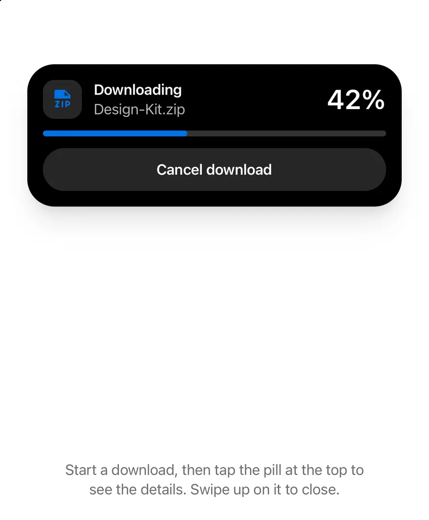
```tsx
import { BellIcon, ChatCircleIcon, CheckCircleIcon, DownloadSimpleIcon, FileZipIcon } from "phosphor-react-native"
import * as React from "react"
import { Pressable, View } from "react-native"
import { Island, IslandExpandedRegion, IslandProvider, IslandRing, useIsland } from "@/components/interactions/island"
import { Button } from "@/components/ui/button"
import { Icon } from "@/components/ui/icon"
import { Text } from "@/components/ui/text"
function NotifyButtons({ children }: { children?: React.ReactNode }) {
const { notify } = useIsland()
return (
{children}
)
}
function useDownload(initial: number | null = null) {
const [progress, setProgress] = React.useState(initial)
const { notify } = useIsland()
React.useEffect(() => {
if (initial !== null || progress === null || progress >= 1) return
const timer = setTimeout(
() => setProgress((value) => Math.min((value ?? 0) + 0.01, 1)),
150
)
return () => clearTimeout(timer)
}, [initial, progress])
React.useEffect(() => {
if (progress !== 1) return
const timer = setTimeout(() => {
setProgress(null)
notify({
icon: (
),
title: "Download complete",
description: "Design-Kit.zip",
})
}, 1200)
return () => clearTimeout(timer)
}, [progress, notify])
return {
progress,
start: () => setProgress(0),
cancel: () => setProgress(null),
}
}
function DownloadIsland({
progress,
onCancel,
}: {
progress: number | null
onCancel: () => void
}) {
if (progress === null) return
const done = progress >= 1
const percent = Math.round(progress * 100)
return (
}
compactTrailing={
done ? (
) : (
)
}
minimal={}
>
{percent}%
{done ? "Downloaded" : "Downloading"}
Design-Kit.zip
Cancel download
)
}
function DownloadsExample({
initial = null,
view = "compact",
withNotifications = false,
}: {
initial?: number | null
view?: "compact" | "expanded" | "minimal"
withNotifications?: boolean
}) {
const { progress, start, cancel } = useDownload(initial)
const { expand, minimize } = useIsland()
React.useEffect(() => {
if (view === "expanded") expand()
else if (view === "minimal") minimize()
}, [view, expand, minimize])
return (
Start a download, then tap the pill at the top to see the details. Swipe
up on it to close.
{initial === null ? (
) : null}
{withNotifications ? (
) : null}
)
}
export function IslandExpandedExample() {
return (
)
}
```
```kotlin
import androidx.compose.foundation.background
import androidx.compose.foundation.clickable
import androidx.compose.foundation.interaction.MutableInteractionSource
import androidx.compose.foundation.interaction.collectIsPressedAsState
import androidx.compose.foundation.layout.Arrangement
import androidx.compose.foundation.layout.Box
import androidx.compose.foundation.layout.Column
import androidx.compose.foundation.layout.FlowRow
import androidx.compose.foundation.layout.Spacer
import androidx.compose.foundation.layout.fillMaxHeight
import androidx.compose.foundation.layout.fillMaxWidth
import androidx.compose.foundation.layout.height
import androidx.compose.foundation.layout.size
import androidx.compose.foundation.layout.widthIn
import androidx.compose.foundation.shape.CircleShape
import androidx.compose.foundation.shape.RoundedCornerShape
import androidx.compose.runtime.Composable
import androidx.compose.runtime.LaunchedEffect
import androidx.compose.runtime.getValue
import androidx.compose.runtime.mutableStateOf
import androidx.compose.runtime.remember
import androidx.compose.runtime.saveable.rememberSaveable
import androidx.compose.runtime.setValue
import androidx.compose.ui.Alignment
import androidx.compose.ui.Modifier
import androidx.compose.ui.draw.alpha
import androidx.compose.ui.draw.clip
import androidx.compose.ui.semantics.ProgressBarRangeInfo
import androidx.compose.ui.semantics.Role
import androidx.compose.ui.semantics.contentDescription
import androidx.compose.ui.semantics.progressBarRangeInfo
import androidx.compose.ui.semantics.semantics
import androidx.compose.ui.text.font.FontWeight
import androidx.compose.ui.text.style.TextAlign
import androidx.compose.ui.text.style.TextOverflow
import androidx.compose.ui.unit.dp
import com.adamglin.PhosphorIcons
import com.adamglin.phosphoricons.Bold
import com.adamglin.phosphoricons.Fill
import com.adamglin.phosphoricons.bold.DownloadSimple
import com.adamglin.phosphoricons.fill.Bell
import com.adamglin.phosphoricons.fill.ChatCircle
import com.adamglin.phosphoricons.fill.CheckCircle
import com.esuiss.ui.components.Button
import com.esuiss.ui.components.ButtonVariant
import com.esuiss.ui.components.Icon
import com.esuiss.ui.components.LocalContentColor
import com.esuiss.ui.components.Text
import com.esuiss.ui.interactions.Island
import com.esuiss.ui.interactions.IslandProvider
import com.esuiss.ui.interactions.IslandRegion
import com.esuiss.ui.interactions.IslandRing
import com.esuiss.ui.interactions.useIsland
import com.esuiss.ui.theme.EsuissTheme
import com.esuiss.ui.theme.Radius
import com.esuiss.ui.theme.Typography
import kotlinx.coroutines.delay
import kotlin.math.roundToInt
@Composable
fun IslandExpandedExample() {
IslandProvider { IslandDownloads(initial = 0.42f, start = IslandStart.Expanded) }
}
enum class IslandStart { Compact, Expanded, Minimal }
@Composable
fun IslandNotifyButtons(extra: @Composable () -> Unit = {}) {
val island = useIsland()
val colors = EsuissTheme.colors
FlowRow(
modifier = Modifier.fillMaxWidth(),
horizontalArrangement = Arrangement.spacedBy(12.dp, Alignment.CenterHorizontally),
verticalArrangement = Arrangement.spacedBy(12.dp),
) {
Button(
"New message",
onClick = {
island.notify(
title = "Jordan Lee",
description = "Are we still on for Saturday?",
icon = { Icon(PhosphorIcons.Fill.ChatCircle, contentDescription = null, tint = colors.green) },
)
},
variant = ButtonVariant.Secondary,
)
Button(
"Reminder",
onClick = {
island.notify(
title = "Design review",
description = "Starts in 10 minutes",
icon = { Icon(PhosphorIcons.Fill.Bell, contentDescription = null, tint = colors.orange) },
)
},
variant = ButtonVariant.Secondary,
)
extra()
}
}
@Composable
fun IslandProgress(progress: Float) {
val colors = EsuissTheme.colors
if (progress >= 1f) {
Icon(PhosphorIcons.Fill.CheckCircle, contentDescription = null, tint = colors.green)
} else {
IslandRing(progress)
}
}
@Composable
fun IslandDownloadIsland(progress: Float?, onCancel: () -> Unit) {
val colors = EsuissTheme.colors
val current = progress ?: 0f
val done = current >= 1f
val percent = (current * 100).roundToInt()
Island(
compactLeading = progress?.let {
{ Icon(PhosphorIcons.Bold.DownloadSimple, contentDescription = null, tint = colors.accent) }
},
compactTrailing = progress?.let { value -> { IslandProgress(value) } },
minimal = progress?.let { value -> { IslandProgress(value) } },
modifier = Modifier.semantics { contentDescription = "Downloading Design-Kit.zip, $percent%" },
) {
IslandExpandedRegion(IslandRegion.Leading) {
val foreground = LocalContentColor.current
Box(
modifier = Modifier
.size(40.dp)
.background(foreground.copy(alpha = 0.15f), RoundedCornerShape(Radius.xl)),
contentAlignment = Alignment.Center,
) {
Icon(PhosphorIcons.Bold.DownloadSimple, contentDescription = null, size = 24.dp, tint = colors.accent)
}
}
IslandExpandedRegion(IslandRegion.Trailing) {
Text("$percent%", style = Typography.xl2.copy(color = LocalContentColor.current, fontWeight = FontWeight.SemiBold))
}
IslandExpandedRegion(IslandRegion.Center) {
val foreground = LocalContentColor.current
Text(
if (done) "Downloaded" else "Downloading",
style = Typography.sm.copy(color = foreground, fontWeight = FontWeight.SemiBold),
maxLines = 1,
overflow = TextOverflow.Ellipsis,
)
Text(
if (done) "Design-Kit.zip" else "Design-Kit.zip · ${(current * IslandSize).roundToInt()} of $IslandSize MB",
style = Typography.sm.copy(color = foreground.copy(alpha = 0.7f)),
maxLines = 1,
overflow = TextOverflow.Ellipsis,
)
}
IslandExpandedRegion(IslandRegion.Bottom) {
val foreground = LocalContentColor.current
Box(
modifier = Modifier
.fillMaxWidth()
.height(6.dp)
.clip(CircleShape)
.background(foreground.copy(alpha = 0.2f))
.semantics {
contentDescription = "Download progress"
progressBarRangeInfo = ProgressBarRangeInfo(percent.toFloat(), 0f..100f)
},
) {
Box(
Modifier
.fillMaxWidth(current.coerceIn(0f, 1f))
.fillMaxHeight()
.background(colors.accent, CircleShape),
)
}
Spacer(Modifier.height(12.dp))
val interaction = remember { MutableInteractionSource() }
val pressed by interaction.collectIsPressedAsState()
Box(
modifier = Modifier
.fillMaxWidth()
.height(44.dp)
.alpha(if (done) 0.5f else 1f)
.clip(CircleShape)
.background(foreground.copy(alpha = if (pressed) 0.25f else 0.15f))
.clickable(interactionSource = interaction, indication = null, enabled = !done, role = Role.Button, onClick = onCancel),
contentAlignment = Alignment.Center,
) {
Text("Cancel download", style = Typography.sm.copy(color = foreground, fontWeight = FontWeight.SemiBold))
}
}
}
}
@Composable
fun IslandDownloads(initial: Float? = null, start: IslandStart = IslandStart.Compact, withNotifications: Boolean = false) {
val island = useIsland()
val colors = EsuissTheme.colors
var progress by rememberSaveable { mutableStateOf(initial) }
LaunchedEffect(progress) {
val current = progress ?: return@LaunchedEffect
if (initial != null) return@LaunchedEffect
if (current < 1f) {
delay(150)
progress = minOf(current + 0.01f, 1f)
} else {
delay(1200)
progress = null
island.notify(
title = "Download complete",
description = "Design-Kit.zip",
icon = { Icon(PhosphorIcons.Fill.CheckCircle, contentDescription = null, tint = colors.green) },
)
}
}
LaunchedEffect(start) {
when (start) {
IslandStart.Expanded -> island.expand()
IslandStart.Minimal -> island.minimize()
IslandStart.Compact -> Unit
}
}
Column(
modifier = Modifier.fillMaxWidth(),
horizontalAlignment = Alignment.CenterHorizontally,
verticalArrangement = Arrangement.spacedBy(16.dp),
) {
IslandDownloadIsland(progress) { progress = null }
Text(
"Start a download, then tap the pill at the top to see the details. Swipe up on it to close.",
modifier = Modifier.widthIn(max = 320.dp),
style = Typography.sm.copy(color = colors.labelSecondary),
textAlign = TextAlign.Center,
)
if (initial == null) {
Button(
if (progress == null) "Download Design-Kit.zip" else "Downloading…",
onClick = { progress = 0f },
enabled = progress == null,
)
}
if (withNotifications) {
IslandNotifyButtons {
Button(
"Minimize",
onClick = island::minimize,
variant = ButtonVariant.Secondary,
enabled = progress != null,
)
}
}
}
}
```
### Minimal
Starts in the minimal view with only the progress ring.
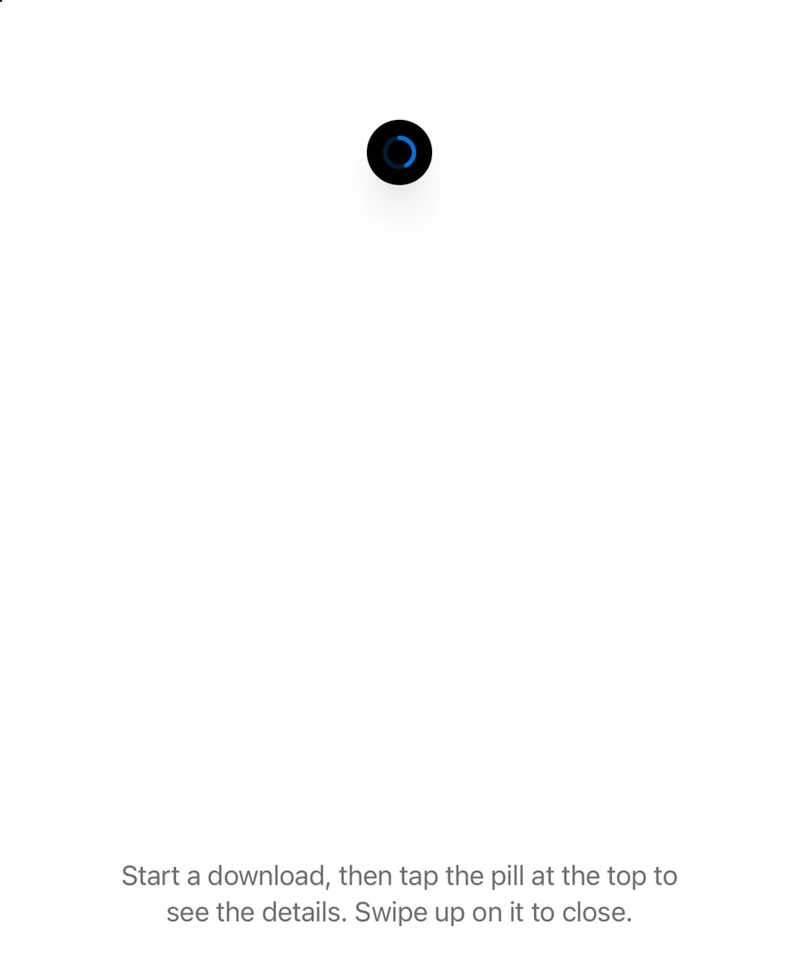
```tsx
import { BellIcon, ChatCircleIcon, CheckCircleIcon, DownloadSimpleIcon, FileZipIcon } from "phosphor-react-native"
import * as React from "react"
import { Pressable, View } from "react-native"
import { Island, IslandExpandedRegion, IslandProvider, IslandRing, useIsland } from "@/components/interactions/island"
import { Button } from "@/components/ui/button"
import { Icon } from "@/components/ui/icon"
import { Text } from "@/components/ui/text"
function NotifyButtons({ children }: { children?: React.ReactNode }) {
const { notify } = useIsland()
return (
{children}
)
}
function useDownload(initial: number | null = null) {
const [progress, setProgress] = React.useState(initial)
const { notify } = useIsland()
React.useEffect(() => {
if (initial !== null || progress === null || progress >= 1) return
const timer = setTimeout(
() => setProgress((value) => Math.min((value ?? 0) + 0.01, 1)),
150
)
return () => clearTimeout(timer)
}, [initial, progress])
React.useEffect(() => {
if (progress !== 1) return
const timer = setTimeout(() => {
setProgress(null)
notify({
icon: (
),
title: "Download complete",
description: "Design-Kit.zip",
})
}, 1200)
return () => clearTimeout(timer)
}, [progress, notify])
return {
progress,
start: () => setProgress(0),
cancel: () => setProgress(null),
}
}
function DownloadIsland({
progress,
onCancel,
}: {
progress: number | null
onCancel: () => void
}) {
if (progress === null) return
const done = progress >= 1
const percent = Math.round(progress * 100)
return (
}
compactTrailing={
done ? (
) : (
)
}
minimal={}
>
{percent}%
{done ? "Downloaded" : "Downloading"}
Design-Kit.zip
Cancel download
)
}
function DownloadsExample({
initial = null,
view = "compact",
withNotifications = false,
}: {
initial?: number | null
view?: "compact" | "expanded" | "minimal"
withNotifications?: boolean
}) {
const { progress, start, cancel } = useDownload(initial)
const { expand, minimize } = useIsland()
React.useEffect(() => {
if (view === "expanded") expand()
else if (view === "minimal") minimize()
}, [view, expand, minimize])
return (
Start a download, then tap the pill at the top to see the details. Swipe
up on it to close.
{initial === null ? (
) : null}
{withNotifications ? (
) : null}
)
}
export function IslandMinimalExample() {
return (
)
}
```
```kotlin
import androidx.compose.foundation.background
import androidx.compose.foundation.clickable
import androidx.compose.foundation.interaction.MutableInteractionSource
import androidx.compose.foundation.interaction.collectIsPressedAsState
import androidx.compose.foundation.layout.Arrangement
import androidx.compose.foundation.layout.Box
import androidx.compose.foundation.layout.Column
import androidx.compose.foundation.layout.FlowRow
import androidx.compose.foundation.layout.Spacer
import androidx.compose.foundation.layout.fillMaxHeight
import androidx.compose.foundation.layout.fillMaxWidth
import androidx.compose.foundation.layout.height
import androidx.compose.foundation.layout.size
import androidx.compose.foundation.layout.widthIn
import androidx.compose.foundation.shape.CircleShape
import androidx.compose.foundation.shape.RoundedCornerShape
import androidx.compose.runtime.Composable
import androidx.compose.runtime.LaunchedEffect
import androidx.compose.runtime.getValue
import androidx.compose.runtime.mutableStateOf
import androidx.compose.runtime.remember
import androidx.compose.runtime.saveable.rememberSaveable
import androidx.compose.runtime.setValue
import androidx.compose.ui.Alignment
import androidx.compose.ui.Modifier
import androidx.compose.ui.draw.alpha
import androidx.compose.ui.draw.clip
import androidx.compose.ui.semantics.ProgressBarRangeInfo
import androidx.compose.ui.semantics.Role
import androidx.compose.ui.semantics.contentDescription
import androidx.compose.ui.semantics.progressBarRangeInfo
import androidx.compose.ui.semantics.semantics
import androidx.compose.ui.text.font.FontWeight
import androidx.compose.ui.text.style.TextAlign
import androidx.compose.ui.text.style.TextOverflow
import androidx.compose.ui.unit.dp
import com.adamglin.PhosphorIcons
import com.adamglin.phosphoricons.Bold
import com.adamglin.phosphoricons.Fill
import com.adamglin.phosphoricons.bold.DownloadSimple
import com.adamglin.phosphoricons.fill.Bell
import com.adamglin.phosphoricons.fill.ChatCircle
import com.adamglin.phosphoricons.fill.CheckCircle
import com.esuiss.ui.components.Button
import com.esuiss.ui.components.ButtonVariant
import com.esuiss.ui.components.Icon
import com.esuiss.ui.components.LocalContentColor
import com.esuiss.ui.components.Text
import com.esuiss.ui.interactions.Island
import com.esuiss.ui.interactions.IslandProvider
import com.esuiss.ui.interactions.IslandRegion
import com.esuiss.ui.interactions.IslandRing
import com.esuiss.ui.interactions.useIsland
import com.esuiss.ui.theme.EsuissTheme
import com.esuiss.ui.theme.Radius
import com.esuiss.ui.theme.Typography
import kotlinx.coroutines.delay
import kotlin.math.roundToInt
@Composable
fun IslandMinimalExample() {
IslandProvider { IslandDownloads(initial = 0.42f, start = IslandStart.Minimal) }
}
enum class IslandStart { Compact, Expanded, Minimal }
@Composable
fun IslandNotifyButtons(extra: @Composable () -> Unit = {}) {
val island = useIsland()
val colors = EsuissTheme.colors
FlowRow(
modifier = Modifier.fillMaxWidth(),
horizontalArrangement = Arrangement.spacedBy(12.dp, Alignment.CenterHorizontally),
verticalArrangement = Arrangement.spacedBy(12.dp),
) {
Button(
"New message",
onClick = {
island.notify(
title = "Jordan Lee",
description = "Are we still on for Saturday?",
icon = { Icon(PhosphorIcons.Fill.ChatCircle, contentDescription = null, tint = colors.green) },
)
},
variant = ButtonVariant.Secondary,
)
Button(
"Reminder",
onClick = {
island.notify(
title = "Design review",
description = "Starts in 10 minutes",
icon = { Icon(PhosphorIcons.Fill.Bell, contentDescription = null, tint = colors.orange) },
)
},
variant = ButtonVariant.Secondary,
)
extra()
}
}
@Composable
fun IslandProgress(progress: Float) {
val colors = EsuissTheme.colors
if (progress >= 1f) {
Icon(PhosphorIcons.Fill.CheckCircle, contentDescription = null, tint = colors.green)
} else {
IslandRing(progress)
}
}
@Composable
fun IslandDownloadIsland(progress: Float?, onCancel: () -> Unit) {
val colors = EsuissTheme.colors
val current = progress ?: 0f
val done = current >= 1f
val percent = (current * 100).roundToInt()
Island(
compactLeading = progress?.let {
{ Icon(PhosphorIcons.Bold.DownloadSimple, contentDescription = null, tint = colors.accent) }
},
compactTrailing = progress?.let { value -> { IslandProgress(value) } },
minimal = progress?.let { value -> { IslandProgress(value) } },
modifier = Modifier.semantics { contentDescription = "Downloading Design-Kit.zip, $percent%" },
) {
IslandExpandedRegion(IslandRegion.Leading) {
val foreground = LocalContentColor.current
Box(
modifier = Modifier
.size(40.dp)
.background(foreground.copy(alpha = 0.15f), RoundedCornerShape(Radius.xl)),
contentAlignment = Alignment.Center,
) {
Icon(PhosphorIcons.Bold.DownloadSimple, contentDescription = null, size = 24.dp, tint = colors.accent)
}
}
IslandExpandedRegion(IslandRegion.Trailing) {
Text("$percent%", style = Typography.xl2.copy(color = LocalContentColor.current, fontWeight = FontWeight.SemiBold))
}
IslandExpandedRegion(IslandRegion.Center) {
val foreground = LocalContentColor.current
Text(
if (done) "Downloaded" else "Downloading",
style = Typography.sm.copy(color = foreground, fontWeight = FontWeight.SemiBold),
maxLines = 1,
overflow = TextOverflow.Ellipsis,
)
Text(
if (done) "Design-Kit.zip" else "Design-Kit.zip · ${(current * IslandSize).roundToInt()} of $IslandSize MB",
style = Typography.sm.copy(color = foreground.copy(alpha = 0.7f)),
maxLines = 1,
overflow = TextOverflow.Ellipsis,
)
}
IslandExpandedRegion(IslandRegion.Bottom) {
val foreground = LocalContentColor.current
Box(
modifier = Modifier
.fillMaxWidth()
.height(6.dp)
.clip(CircleShape)
.background(foreground.copy(alpha = 0.2f))
.semantics {
contentDescription = "Download progress"
progressBarRangeInfo = ProgressBarRangeInfo(percent.toFloat(), 0f..100f)
},
) {
Box(
Modifier
.fillMaxWidth(current.coerceIn(0f, 1f))
.fillMaxHeight()
.background(colors.accent, CircleShape),
)
}
Spacer(Modifier.height(12.dp))
val interaction = remember { MutableInteractionSource() }
val pressed by interaction.collectIsPressedAsState()
Box(
modifier = Modifier
.fillMaxWidth()
.height(44.dp)
.alpha(if (done) 0.5f else 1f)
.clip(CircleShape)
.background(foreground.copy(alpha = if (pressed) 0.25f else 0.15f))
.clickable(interactionSource = interaction, indication = null, enabled = !done, role = Role.Button, onClick = onCancel),
contentAlignment = Alignment.Center,
) {
Text("Cancel download", style = Typography.sm.copy(color = foreground, fontWeight = FontWeight.SemiBold))
}
}
}
}
@Composable
fun IslandDownloads(initial: Float? = null, start: IslandStart = IslandStart.Compact, withNotifications: Boolean = false) {
val island = useIsland()
val colors = EsuissTheme.colors
var progress by rememberSaveable { mutableStateOf(initial) }
LaunchedEffect(progress) {
val current = progress ?: return@LaunchedEffect
if (initial != null) return@LaunchedEffect
if (current < 1f) {
delay(150)
progress = minOf(current + 0.01f, 1f)
} else {
delay(1200)
progress = null
island.notify(
title = "Download complete",
description = "Design-Kit.zip",
icon = { Icon(PhosphorIcons.Fill.CheckCircle, contentDescription = null, tint = colors.green) },
)
}
}
LaunchedEffect(start) {
when (start) {
IslandStart.Expanded -> island.expand()
IslandStart.Minimal -> island.minimize()
IslandStart.Compact -> Unit
}
}
Column(
modifier = Modifier.fillMaxWidth(),
horizontalAlignment = Alignment.CenterHorizontally,
verticalArrangement = Arrangement.spacedBy(16.dp),
) {
IslandDownloadIsland(progress) { progress = null }
Text(
"Start a download, then tap the pill at the top to see the details. Swipe up on it to close.",
modifier = Modifier.widthIn(max = 320.dp),
style = Typography.sm.copy(color = colors.labelSecondary),
textAlign = TextAlign.Center,
)
if (initial == null) {
Button(
if (progress == null) "Download Design-Kit.zip" else "Downloading…",
onClick = { progress = 0f },
enabled = progress == null,
)
}
if (withNotifications) {
IslandNotifyButtons {
Button(
"Minimize",
onClick = island::minimize,
variant = ButtonVariant.Secondary,
enabled = progress != null,
)
}
}
}
}
```
### Notice
Shows a notice on mount.
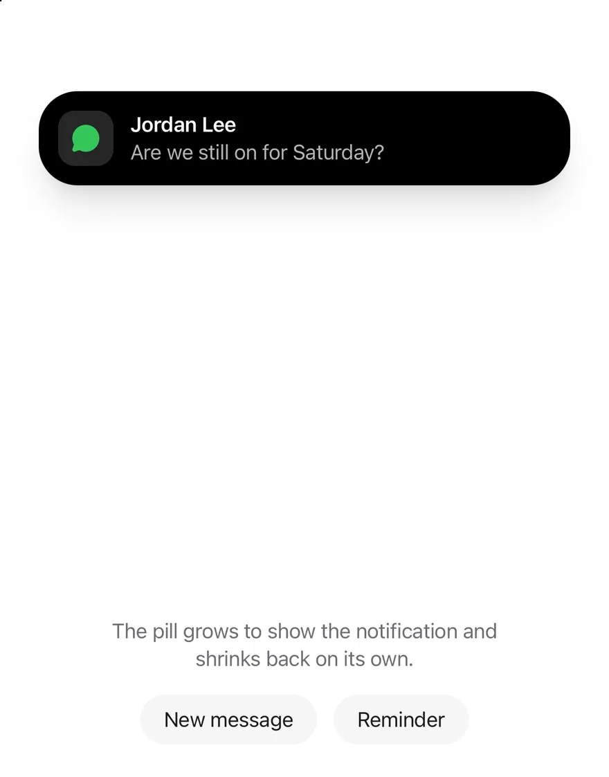
```tsx
import { BellIcon, ChatCircleIcon } from "phosphor-react-native"
import * as React from "react"
import { View } from "react-native"
import { Island, IslandProvider, useIsland } from "@/components/interactions/island"
import { Button } from "@/components/ui/button"
import { Icon } from "@/components/ui/icon"
import { Text } from "@/components/ui/text"
function NotifyButtons({ children }: { children?: React.ReactNode }) {
const { notify } = useIsland()
return (
{children}
)
}
function NoticeOnMount() {
const { notify } = useIsland()
const shownRef = React.useRef(false)
React.useEffect(() => {
if (shownRef.current) return
shownRef.current = true
notify({
icon: ,
title: "Jordan Lee",
description: "Are we still on for Saturday?",
duration: 600000,
})
}, [notify])
return (
The pill grows to show the notification and shrinks back on its own.
)
}
export function IslandNoticeExample() {
return (
)
}
```
```kotlin
import androidx.compose.foundation.layout.Arrangement
import androidx.compose.foundation.layout.Column
import androidx.compose.foundation.layout.FlowRow
import androidx.compose.foundation.layout.fillMaxWidth
import androidx.compose.foundation.layout.widthIn
import androidx.compose.runtime.Composable
import androidx.compose.runtime.LaunchedEffect
import androidx.compose.runtime.getValue
import androidx.compose.runtime.mutableStateOf
import androidx.compose.runtime.saveable.rememberSaveable
import androidx.compose.runtime.setValue
import androidx.compose.ui.Alignment
import androidx.compose.ui.Modifier
import androidx.compose.ui.semantics.contentDescription
import androidx.compose.ui.text.style.TextAlign
import androidx.compose.ui.unit.dp
import com.adamglin.PhosphorIcons
import com.adamglin.phosphoricons.Fill
import com.adamglin.phosphoricons.fill.Bell
import com.adamglin.phosphoricons.fill.ChatCircle
import com.esuiss.ui.components.Button
import com.esuiss.ui.components.ButtonVariant
import com.esuiss.ui.components.Icon
import com.esuiss.ui.components.Text
import com.esuiss.ui.interactions.Island
import com.esuiss.ui.interactions.IslandProvider
import com.esuiss.ui.interactions.useIsland
import com.esuiss.ui.theme.EsuissTheme
import com.esuiss.ui.theme.Typography
@Composable
fun IslandNoticeExample() {
IslandProvider { IslandNoticeOnMount() }
}
@Composable
fun IslandNotifyButtons(extra: @Composable () -> Unit = {}) {
val island = useIsland()
val colors = EsuissTheme.colors
FlowRow(
modifier = Modifier.fillMaxWidth(),
horizontalArrangement = Arrangement.spacedBy(12.dp, Alignment.CenterHorizontally),
verticalArrangement = Arrangement.spacedBy(12.dp),
) {
Button(
"New message",
onClick = {
island.notify(
title = "Jordan Lee",
description = "Are we still on for Saturday?",
icon = { Icon(PhosphorIcons.Fill.ChatCircle, contentDescription = null, tint = colors.green) },
)
},
variant = ButtonVariant.Secondary,
)
Button(
"Reminder",
onClick = {
island.notify(
title = "Design review",
description = "Starts in 10 minutes",
icon = { Icon(PhosphorIcons.Fill.Bell, contentDescription = null, tint = colors.orange) },
)
},
variant = ButtonVariant.Secondary,
)
extra()
}
}
@Composable
fun IslandNoticeOnMount() {
val island = useIsland()
val colors = EsuissTheme.colors
var shown by rememberSaveable { mutableStateOf(false) }
LaunchedEffect(Unit) {
if (shown) return@LaunchedEffect
shown = true
island.notify(
title = "Jordan Lee",
description = "Are we still on for Saturday?",
duration = 600000L,
icon = { Icon(PhosphorIcons.Fill.ChatCircle, contentDescription = null, tint = colors.green) },
)
}
Column(
modifier = Modifier.fillMaxWidth(),
horizontalAlignment = Alignment.CenterHorizontally,
verticalArrangement = Arrangement.spacedBy(16.dp),
) {
Island()
Text(
"The pill grows to show the notification and shrinks back on its own.",
modifier = Modifier.widthIn(max = 320.dp),
style = Typography.sm.copy(color = colors.labelSecondary),
textAlign = TextAlign.Center,
)
IslandNotifyButtons()
}
}
```
### Live activity
A download that starts on press, with buttons that minimize the island and send notices over it.
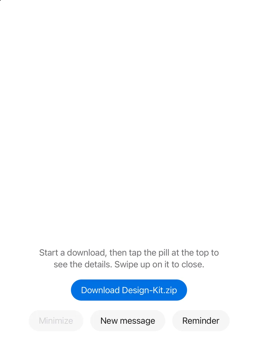
```tsx
import { BellIcon, ChatCircleIcon, CheckCircleIcon, DownloadSimpleIcon, FileZipIcon } from "phosphor-react-native"
import * as React from "react"
import { Pressable, View } from "react-native"
import { Island, IslandExpandedRegion, IslandProvider, IslandRing, useIsland } from "@/components/interactions/island"
import { Button } from "@/components/ui/button"
import { Icon } from "@/components/ui/icon"
import { Text } from "@/components/ui/text"
function NotifyButtons({ children }: { children?: React.ReactNode }) {
const { notify } = useIsland()
return (
{children}
)
}
function useDownload(initial: number | null = null) {
const [progress, setProgress] = React.useState(initial)
const { notify } = useIsland()
React.useEffect(() => {
if (initial !== null || progress === null || progress >= 1) return
const timer = setTimeout(
() => setProgress((value) => Math.min((value ?? 0) + 0.01, 1)),
150
)
return () => clearTimeout(timer)
}, [initial, progress])
React.useEffect(() => {
if (progress !== 1) return
const timer = setTimeout(() => {
setProgress(null)
notify({
icon: (
),
title: "Download complete",
description: "Design-Kit.zip",
})
}, 1200)
return () => clearTimeout(timer)
}, [progress, notify])
return {
progress,
start: () => setProgress(0),
cancel: () => setProgress(null),
}
}
function DownloadIsland({
progress,
onCancel,
}: {
progress: number | null
onCancel: () => void
}) {
if (progress === null) return
const done = progress >= 1
const percent = Math.round(progress * 100)
return (
}
compactTrailing={
done ? (
) : (
)
}
minimal={}
>
{percent}%
{done ? "Downloaded" : "Downloading"}
Design-Kit.zip
Cancel download
)
}
function DownloadsExample({
initial = null,
view = "compact",
withNotifications = false,
}: {
initial?: number | null
view?: "compact" | "expanded" | "minimal"
withNotifications?: boolean
}) {
const { progress, start, cancel } = useDownload(initial)
const { expand, minimize } = useIsland()
React.useEffect(() => {
if (view === "expanded") expand()
else if (view === "minimal") minimize()
}, [view, expand, minimize])
return (
Start a download, then tap the pill at the top to see the details. Swipe
up on it to close.
{initial === null ? (
) : null}
{withNotifications ? (
) : null}
)
}
export function IslandLiveActivityExample() {
return (
)
}
```
```swift
import ActivityKit
import EsuissUI
import SwiftUI
struct IslandLiveActivity: View {
@State private var activity: Activity?
@State private var state = DownloadActivityAttributes.ContentState(progress: 0, fileName: "Design-Kit.zip", finished: false)
@State private var failure: String?
var body: some View {
VStack(alignment: .leading, spacing: 16) {
Text("Start a download, then leave the app. The activity shows in the Dynamic Island and on the Lock Screen.")
.textStyle(.sm)
.foregroundStyle(Color.labelSecondary)
FlowRow(spacing: 12) {
Button("Start") { start() }
.buttonStyle(.variant())
.disabled(activity != nil)
Button("Update (+10%)") { advance() }
.buttonStyle(.variant(.secondary))
.disabled(activity == nil || state.finished)
Button("Finish") { finish() }
.buttonStyle(.variant(.secondary))
.disabled(activity == nil || state.finished)
Button("End") { end() }
.buttonStyle(.variant(.destructive))
.disabled(activity == nil)
}
Text(verbatim: activity == nil ? "No activity" : "\(state.fileName) · \(state.percent)%")
.textStyle(.sm, weight: .semibold)
.monospacedDigit()
if let failure {
Text(verbatim: failure)
.textStyle(.sm)
.foregroundStyle(Color.danger)
}
}
.frame(maxWidth: .infinity, alignment: .leading)
.task {
activity = Activity.activities.first
if let current = activity?.content.state { state = current }
}
}
func start() {
guard ActivityAuthorizationInfo().areActivitiesEnabled else {
failure = "Live Activities are turned off for this app."
return
}
let next = DownloadActivityAttributes.ContentState(progress: 0, fileName: "Design-Kit.zip", finished: false)
do {
activity = try Activity.request(
attributes: DownloadActivityAttributes(),
content: ActivityContent(state: next, staleDate: nil)
)
state = next
failure = nil
} catch {
failure = error.localizedDescription
}
}
func advance() {
state.progress = min(state.progress + 0.1, 1)
state.finished = state.progress >= 1
push()
}
func finish() {
state.progress = 1
state.finished = true
push()
}
func push() {
guard let activity else { return }
let content = ActivityContent(state: state, staleDate: nil)
Task { await activity.update(content) }
}
func end() {
guard let activity else { return }
let content = ActivityContent(state: state, staleDate: nil)
self.activity = nil
Task { await activity.end(content, dismissalPolicy: .immediate) }
}
}
```
```kotlin
import androidx.compose.foundation.background
import androidx.compose.foundation.clickable
import androidx.compose.foundation.interaction.MutableInteractionSource
import androidx.compose.foundation.interaction.collectIsPressedAsState
import androidx.compose.foundation.layout.Arrangement
import androidx.compose.foundation.layout.Box
import androidx.compose.foundation.layout.Column
import androidx.compose.foundation.layout.FlowRow
import androidx.compose.foundation.layout.Spacer
import androidx.compose.foundation.layout.fillMaxHeight
import androidx.compose.foundation.layout.fillMaxWidth
import androidx.compose.foundation.layout.height
import androidx.compose.foundation.layout.size
import androidx.compose.foundation.layout.widthIn
import androidx.compose.foundation.shape.CircleShape
import androidx.compose.foundation.shape.RoundedCornerShape
import androidx.compose.runtime.Composable
import androidx.compose.runtime.LaunchedEffect
import androidx.compose.runtime.getValue
import androidx.compose.runtime.mutableStateOf
import androidx.compose.runtime.remember
import androidx.compose.runtime.saveable.rememberSaveable
import androidx.compose.runtime.setValue
import androidx.compose.ui.Alignment
import androidx.compose.ui.Modifier
import androidx.compose.ui.draw.alpha
import androidx.compose.ui.draw.clip
import androidx.compose.ui.semantics.ProgressBarRangeInfo
import androidx.compose.ui.semantics.Role
import androidx.compose.ui.semantics.contentDescription
import androidx.compose.ui.semantics.progressBarRangeInfo
import androidx.compose.ui.semantics.semantics
import androidx.compose.ui.text.font.FontWeight
import androidx.compose.ui.text.style.TextAlign
import androidx.compose.ui.text.style.TextOverflow
import androidx.compose.ui.unit.dp
import com.adamglin.PhosphorIcons
import com.adamglin.phosphoricons.Bold
import com.adamglin.phosphoricons.Fill
import com.adamglin.phosphoricons.bold.DownloadSimple
import com.adamglin.phosphoricons.fill.Bell
import com.adamglin.phosphoricons.fill.ChatCircle
import com.adamglin.phosphoricons.fill.CheckCircle
import com.esuiss.ui.components.Button
import com.esuiss.ui.components.ButtonVariant
import com.esuiss.ui.components.Icon
import com.esuiss.ui.components.LocalContentColor
import com.esuiss.ui.components.Text
import com.esuiss.ui.interactions.Island
import com.esuiss.ui.interactions.IslandProvider
import com.esuiss.ui.interactions.IslandRegion
import com.esuiss.ui.interactions.IslandRing
import com.esuiss.ui.interactions.useIsland
import com.esuiss.ui.theme.EsuissTheme
import com.esuiss.ui.theme.Radius
import com.esuiss.ui.theme.Typography
import kotlinx.coroutines.delay
import kotlin.math.roundToInt
@Composable
fun IslandLiveActivityExample() {
IslandProvider { IslandDownloads(withNotifications = true) }
}
enum class IslandStart { Compact, Expanded, Minimal }
@Composable
fun IslandNotifyButtons(extra: @Composable () -> Unit = {}) {
val island = useIsland()
val colors = EsuissTheme.colors
FlowRow(
modifier = Modifier.fillMaxWidth(),
horizontalArrangement = Arrangement.spacedBy(12.dp, Alignment.CenterHorizontally),
verticalArrangement = Arrangement.spacedBy(12.dp),
) {
Button(
"New message",
onClick = {
island.notify(
title = "Jordan Lee",
description = "Are we still on for Saturday?",
icon = { Icon(PhosphorIcons.Fill.ChatCircle, contentDescription = null, tint = colors.green) },
)
},
variant = ButtonVariant.Secondary,
)
Button(
"Reminder",
onClick = {
island.notify(
title = "Design review",
description = "Starts in 10 minutes",
icon = { Icon(PhosphorIcons.Fill.Bell, contentDescription = null, tint = colors.orange) },
)
},
variant = ButtonVariant.Secondary,
)
extra()
}
}
@Composable
fun IslandProgress(progress: Float) {
val colors = EsuissTheme.colors
if (progress >= 1f) {
Icon(PhosphorIcons.Fill.CheckCircle, contentDescription = null, tint = colors.green)
} else {
IslandRing(progress)
}
}
@Composable
fun IslandDownloadIsland(progress: Float?, onCancel: () -> Unit) {
val colors = EsuissTheme.colors
val current = progress ?: 0f
val done = current >= 1f
val percent = (current * 100).roundToInt()
Island(
compactLeading = progress?.let {
{ Icon(PhosphorIcons.Bold.DownloadSimple, contentDescription = null, tint = colors.accent) }
},
compactTrailing = progress?.let { value -> { IslandProgress(value) } },
minimal = progress?.let { value -> { IslandProgress(value) } },
modifier = Modifier.semantics { contentDescription = "Downloading Design-Kit.zip, $percent%" },
) {
IslandExpandedRegion(IslandRegion.Leading) {
val foreground = LocalContentColor.current
Box(
modifier = Modifier
.size(40.dp)
.background(foreground.copy(alpha = 0.15f), RoundedCornerShape(Radius.xl)),
contentAlignment = Alignment.Center,
) {
Icon(PhosphorIcons.Bold.DownloadSimple, contentDescription = null, size = 24.dp, tint = colors.accent)
}
}
IslandExpandedRegion(IslandRegion.Trailing) {
Text("$percent%", style = Typography.xl2.copy(color = LocalContentColor.current, fontWeight = FontWeight.SemiBold))
}
IslandExpandedRegion(IslandRegion.Center) {
val foreground = LocalContentColor.current
Text(
if (done) "Downloaded" else "Downloading",
style = Typography.sm.copy(color = foreground, fontWeight = FontWeight.SemiBold),
maxLines = 1,
overflow = TextOverflow.Ellipsis,
)
Text(
if (done) "Design-Kit.zip" else "Design-Kit.zip · ${(current * IslandSize).roundToInt()} of $IslandSize MB",
style = Typography.sm.copy(color = foreground.copy(alpha = 0.7f)),
maxLines = 1,
overflow = TextOverflow.Ellipsis,
)
}
IslandExpandedRegion(IslandRegion.Bottom) {
val foreground = LocalContentColor.current
Box(
modifier = Modifier
.fillMaxWidth()
.height(6.dp)
.clip(CircleShape)
.background(foreground.copy(alpha = 0.2f))
.semantics {
contentDescription = "Download progress"
progressBarRangeInfo = ProgressBarRangeInfo(percent.toFloat(), 0f..100f)
},
) {
Box(
Modifier
.fillMaxWidth(current.coerceIn(0f, 1f))
.fillMaxHeight()
.background(colors.accent, CircleShape),
)
}
Spacer(Modifier.height(12.dp))
val interaction = remember { MutableInteractionSource() }
val pressed by interaction.collectIsPressedAsState()
Box(
modifier = Modifier
.fillMaxWidth()
.height(44.dp)
.alpha(if (done) 0.5f else 1f)
.clip(CircleShape)
.background(foreground.copy(alpha = if (pressed) 0.25f else 0.15f))
.clickable(interactionSource = interaction, indication = null, enabled = !done, role = Role.Button, onClick = onCancel),
contentAlignment = Alignment.Center,
) {
Text("Cancel download", style = Typography.sm.copy(color = foreground, fontWeight = FontWeight.SemiBold))
}
}
}
}
@Composable
fun IslandDownloads(initial: Float? = null, start: IslandStart = IslandStart.Compact, withNotifications: Boolean = false) {
val island = useIsland()
val colors = EsuissTheme.colors
var progress by rememberSaveable { mutableStateOf(initial) }
LaunchedEffect(progress) {
val current = progress ?: return@LaunchedEffect
if (initial != null) return@LaunchedEffect
if (current < 1f) {
delay(150)
progress = minOf(current + 0.01f, 1f)
} else {
delay(1200)
progress = null
island.notify(
title = "Download complete",
description = "Design-Kit.zip",
icon = { Icon(PhosphorIcons.Fill.CheckCircle, contentDescription = null, tint = colors.green) },
)
}
}
LaunchedEffect(start) {
when (start) {
IslandStart.Expanded -> island.expand()
IslandStart.Minimal -> island.minimize()
IslandStart.Compact -> Unit
}
}
Column(
modifier = Modifier.fillMaxWidth(),
horizontalAlignment = Alignment.CenterHorizontally,
verticalArrangement = Arrangement.spacedBy(16.dp),
) {
IslandDownloadIsland(progress) { progress = null }
Text(
"Start a download, then tap the pill at the top to see the details. Swipe up on it to close.",
modifier = Modifier.widthIn(max = 320.dp),
style = Typography.sm.copy(color = colors.labelSecondary),
textAlign = TextAlign.Center,
)
if (initial == null) {
Button(
if (progress == null) "Download Design-Kit.zip" else "Downloading…",
onClick = { progress = 0f },
enabled = progress == null,
)
}
if (withNotifications) {
IslandNotifyButtons {
Button(
"Minimize",
onClick = island::minimize,
variant = ButtonVariant.Secondary,
enabled = progress != null,
)
}
}
}
}
```
## API Reference
### IslandProvider
Holds the island mode, the notice and the notice timer.
### IslandExpandedRegion
A region of the expanded view.
### Island
The floating pill, rendered in a portal, with slots for the compact and minimal views.
### IslandRing
A small circular progress ring.
## Accessibility
- Notices are announced with their title and description when they are text.
- The compact and minimal views are buttons that expose `expanded` and have `activate` and `expand` actions.
- The expanded view has the `group` role, a `collapse` action and closes on the escape gesture.
- The notice is a button with `activate` and `dismiss` actions.
- Inactive views and the progress ring are hidden from screen readers.
## Notes
- The island uses `bg-media` with `text-on-media`.
- Expanded and notice views are up to 384 points wide.
- Size and fade animations respect the system reduce motion setting.