# Card Stack
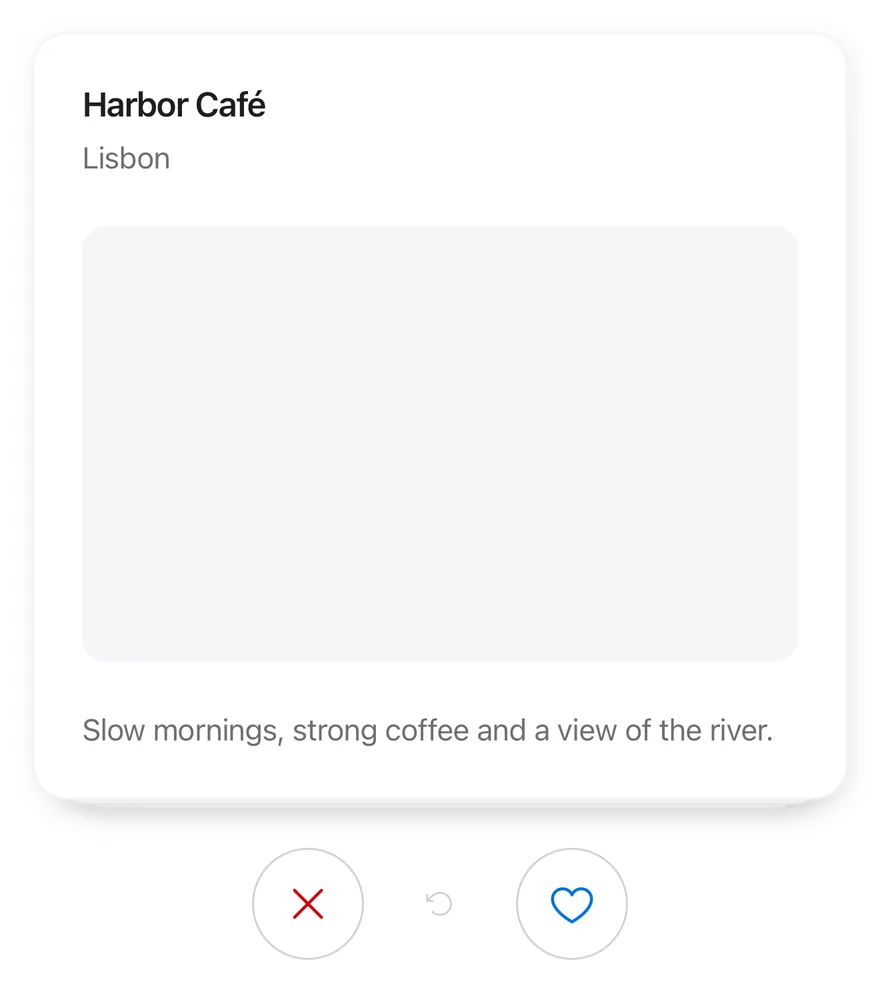
A deck of cards the user swipes left or right one at a time, with buttons, undo and an empty state.
Card Stack is an open-source mobile interaction from suiss/uim for React Native and Expo, with SwiftUI and Jetpack Compose versions built from the same design tokens. The @esuiss/uim CLI copies its source into your project, so you own the code.
Source: https://uim.suiss.app/docs/interactions/card-stack
```tsx
import * as React from "react"
import { View } from "react-native"
import { CardStack, CardStackActions, CardStackEmpty, CardStackSwipeButton, CardStackUndo } from "@/components/interactions/card-stack"
import { Card, CardContent, CardDescription, CardHeader, CardTitle } from "@/components/ui/card"
import { Text } from "@/components/ui/text"
type Place = { id: string; name: string; city: string; detail: string }
const places: Place[] = [
{
id: "harbor",
name: "Harbor Café",
city: "Lisbon",
detail: "Slow mornings, strong coffee and a view of the river.",
},
{
id: "garden",
name: "Garden Library",
city: "Kyoto",
detail: "Quiet reading rooms around a moss garden.",
},
{
id: "market",
name: "Night Market",
city: "Taipei",
detail: "Street food stalls open until two in the morning.",
},
]
function PlaceCard({ place }: { place: Place }) {
return (
{place.name}
{place.city}
{place.detail}
)
}
function Demo({ disabled = false }: { disabled?: boolean }) {
const [log, setLog] = React.useState("")
return (
place.id}
renderItem={(place) => }
itemAccessibilityLabel={(place) => `${place.name}, ${place.city}`}
disabled={disabled}
onSwipe={(direction, place) =>
setLog(`${direction === "left" ? "Skipped" : "Liked"} ${place.name}`)
}
onUndo={(place) => setLog(`Restored ${place.name}`)}
>
You have seen every place.
{log}
)
}
export function CardStackExample() {
return (
)
}
```
```swift
import EsuissUI
import SwiftUI
struct CardStackExample: View {
var body: some View {
CardStackDemo(places: cardStackPlaces)
}
}
struct CardStackPlace: Identifiable {
let id: String
let name: String
let city: String
let detail: String
}
let cardStackPlaces = [
CardStackPlace(id: "harbor", name: "Harbor Café", city: "Lisbon", detail: "Slow mornings, strong coffee and a view of the river."),
CardStackPlace(id: "garden", name: "Garden Library", city: "Kyoto", detail: "Quiet reading rooms around a moss garden."),
CardStackPlace(id: "market", name: "Night Market", city: "Taipei", detail: "Street food stalls open until two in the morning."),
]
struct CardStackPlaceCard: View {
let place: CardStackPlace
var body: some View {
Card {
CardHeader(LocalizedStringKey(place.name), description: LocalizedStringKey(place.city))
CardContent {
RoundedRectangle(cornerRadius: Radius.xl, style: .continuous)
.fill(Color.surfaceSecondary)
.frame(maxHeight: .infinity)
}
.frame(maxHeight: .infinity)
CardContent {
Text(verbatim: place.detail)
.textStyle(.sm)
.foregroundStyle(Color.labelSecondary)
}
}
.frame(maxHeight: .infinity)
.accessibilityElement(children: .combine)
.accessibilityLabel(Text(verbatim: "\(place.name), \(place.city)"))
}
}
struct CardStackDemo: View {
let places: [CardStackPlace]
var showsLog = true
@State private var controller = CardStackController()
@State private var log = ""
var body: some View {
VStack(spacing: 12) {
VStack(spacing: 24) {
ZStack {
if !controller.canSwipe {
Text("You have seen every place.")
.textStyle(.sm)
.foregroundStyle(Color.labelSecondary)
.multilineTextAlignment(.center)
.padding(24)
.frame(maxWidth: .infinity, maxHeight: .infinity)
.overlay {
RoundedRectangle(cornerRadius: Radius.xl2, style: .continuous)
.strokeBorder(Color.separator, style: StrokeStyle(lineWidth: 1, dash: [4, 4]))
}
}
CardStack(
places,
controller: controller,
onSwipe: { direction, place in
log = "\(direction == .left ? "Skipped" : "Liked") \(place.name)"
},
onUndo: { place in
log = "Restored \(place.name)"
}
) { place in
CardStackPlaceCard(place: place)
}
}
.frame(height: 384)
HStack(spacing: 16) {
CardStackButton(.swipeLeft, controller: controller)
CardStackButton(.undo, controller: controller)
CardStackButton(.swipeRight, controller: controller)
}
}
if showsLog {
Text(verbatim: log)
.textStyle(.sm)
.foregroundStyle(Color.labelSecondary)
.multilineTextAlignment(.center)
.frame(maxWidth: .infinity)
.accessibilityAddTraits(.updatesFrequently)
}
}
}
}
```
```kotlin
import androidx.compose.foundation.background
import androidx.compose.foundation.layout.Arrangement
import androidx.compose.foundation.layout.Box
import androidx.compose.foundation.layout.Column
import androidx.compose.foundation.layout.Row
import androidx.compose.foundation.layout.fillMaxSize
import androidx.compose.foundation.layout.fillMaxWidth
import androidx.compose.foundation.layout.height
import androidx.compose.foundation.layout.padding
import androidx.compose.foundation.layout.size
import androidx.compose.foundation.shape.RoundedCornerShape
import androidx.compose.runtime.Composable
import androidx.compose.runtime.getValue
import androidx.compose.runtime.mutableStateOf
import androidx.compose.runtime.saveable.rememberSaveable
import androidx.compose.runtime.setValue
import androidx.compose.ui.Alignment
import androidx.compose.ui.Modifier
import androidx.compose.ui.draw.drawBehind
import androidx.compose.ui.geometry.CornerRadius
import androidx.compose.ui.geometry.Offset
import androidx.compose.ui.geometry.Size
import androidx.compose.ui.graphics.PathEffect
import androidx.compose.ui.graphics.drawscope.Stroke
import androidx.compose.ui.semantics.LiveRegionMode
import androidx.compose.ui.semantics.contentDescription
import androidx.compose.ui.semantics.liveRegion
import androidx.compose.ui.semantics.semantics
import androidx.compose.ui.text.style.TextAlign
import androidx.compose.ui.unit.dp
import com.adamglin.PhosphorIcons
import com.adamglin.phosphoricons.Regular
import com.adamglin.phosphoricons.regular.ArrowCounterClockwise
import com.adamglin.phosphoricons.regular.Heart
import com.adamglin.phosphoricons.regular.X
import com.esuiss.ui.components.Button
import com.esuiss.ui.components.ButtonSize
import com.esuiss.ui.components.ButtonVariant
import com.esuiss.ui.components.Card
import com.esuiss.ui.components.CardContent
import com.esuiss.ui.components.CardHeader
import com.esuiss.ui.components.Icon
import com.esuiss.ui.components.Text
import com.esuiss.ui.interactions.CardStack
import com.esuiss.ui.interactions.CardStackDirection
import com.esuiss.ui.interactions.CardStackState
import com.esuiss.ui.interactions.rememberCardStackState
import com.esuiss.ui.theme.EsuissTheme
import com.esuiss.ui.theme.Radius
import com.esuiss.ui.theme.Typography
@Composable
fun CardStackExample() {
CardStackDemo(enabled = true)
}
class CardStackPlace(val id: String, val name: String, val city: String, val detail: String)
val cardStackPlaces = listOf(
CardStackPlace("harbor", "Harbor Café", "Lisbon", "Slow mornings, strong coffee and a view of the river."),
CardStackPlace("garden", "Garden Library", "Kyoto", "Quiet reading rooms around a moss garden."),
CardStackPlace("market", "Night Market", "Taipei", "Street food stalls open until two in the morning."),
)
val cardStackDeckHeight = 384.dp
@Composable
fun CardStackPlaceCard(place: CardStackPlace, modifier: Modifier = Modifier) {
val colors = EsuissTheme.colors
Card(modifier.fillMaxWidth().height(cardStackDeckHeight)) {
CardHeader(place.name, description = place.city)
CardContent(Modifier.weight(1f)) {
Box(
Modifier
.fillMaxSize()
.background(colors.surfaceSecondary, RoundedCornerShape(Radius.xl)),
)
}
CardContent {
Text(place.detail, style = Typography.sm.copy(color = colors.labelSecondary))
}
}
}
@Composable
fun CardStackEmptyBox() {
val colors = EsuissTheme.colors
Box(
modifier = Modifier
.fillMaxWidth()
.height(cardStackDeckHeight)
.drawBehind {
val stroke = 1.dp.toPx()
val radius = Radius.xl2.toPx()
drawRoundRect(
color = colors.separator,
topLeft = Offset(stroke / 2, stroke / 2),
size = Size(size.width - stroke, size.height - stroke),
cornerRadius = CornerRadius(radius, radius),
style = Stroke(width = stroke, pathEffect = PathEffect.dashPathEffect(floatArrayOf(3.dp.toPx(), 3.dp.toPx()))),
)
}
.padding(24.dp),
contentAlignment = Alignment.Center,
) {
Text(
"You have seen every place.",
style = Typography.sm.copy(color = colors.labelSecondary),
textAlign = TextAlign.Center,
)
}
}
@Composable
fun CardStackActions(state: CardStackState, enabled: Boolean) {
val colors = EsuissTheme.colors
val canSwipe = enabled && !state.isEmpty
Row(
modifier = Modifier.fillMaxWidth(),
horizontalArrangement = Arrangement.spacedBy(16.dp, Alignment.CenterHorizontally),
verticalAlignment = Alignment.CenterVertically,
) {
Button(
onClick = { state.swipe(CardStackDirection.Left) },
modifier = Modifier.size(56.dp),
variant = ButtonVariant.Outline,
size = ButtonSize.IconLg,
enabled = canSwipe,
) {
Icon(PhosphorIcons.Regular.X, contentDescription = "Swipe left", size = 24.dp, tint = colors.danger)
}
Button(
onClick = { state.undo() },
variant = ButtonVariant.Ghost,
size = ButtonSize.IconLg,
enabled = state.canUndo,
) {
Icon(PhosphorIcons.Regular.ArrowCounterClockwise, contentDescription = "Undo")
}
Button(
onClick = { state.swipe(CardStackDirection.Right) },
modifier = Modifier.size(56.dp),
variant = ButtonVariant.Outline,
size = ButtonSize.IconLg,
enabled = canSwipe,
) {
Icon(PhosphorIcons.Regular.Heart, contentDescription = "Swipe right", size = 24.dp, tint = colors.accent)
}
}
}
@Composable
fun CardStackDemo(enabled: Boolean) {
var log by rememberSaveable { mutableStateOf("") }
val state = rememberCardStackState()
Column(verticalArrangement = Arrangement.spacedBy(12.dp)) {
Column(verticalArrangement = Arrangement.spacedBy(24.dp)) {
CardStack(
items = cardStackPlaces,
onSwipe = { direction, place ->
log = "${if (direction == CardStackDirection.Left) "Skipped" else "Liked"} ${place.name}"
},
state = state,
key = { it.id },
enabled = enabled,
onUndo = { _, place -> log = "Restored ${place.name}" },
empty = { CardStackEmptyBox() },
) { place ->
CardStackPlaceCard(place, Modifier.semantics(mergeDescendants = true) { contentDescription = "${place.name}, ${place.city}" })
}
CardStackActions(state, enabled)
}
Text(
log,
modifier = Modifier.fillMaxWidth().semantics { liveRegion = LiveRegionMode.Polite },
style = Typography.sm.copy(color = EsuissTheme.colors.labelSecondary),
textAlign = TextAlign.Center,
)
}
}
```
`CardStack` shows the top card of `data` with up to `visibleCount` cards stacked behind it, each slightly smaller and lower. Dragging the top card sideways moves and tilts it, while the cards behind grow into place.
Releasing past `threshold`, or flicking faster than 800 points per second, flies the card off in that direction and shows the next one; otherwise it springs back. Use it for one-at-a-time decisions such as keep or skip.
## Installation
```bash title="Terminal"
npx @esuiss/uim@latest add card-stack
```
```bash title="Terminal"
npx @esuiss/uim@latest add card-stack --platform swift
```
```bash title="Terminal"
npx @esuiss/uim@latest add card-stack --platform kotlin
```
The CLI also adds what it builds on: [Button](/docs/components/button), [Icon](/docs/components/icon), [Text](/docs/components/text).
### Manual
**Uniwind**
1. Install the dependencies:
```bash title="Terminal"
npx expo install cn phosphor-react-native react-native-gesture-handler react-native-reanimated react-native-svg react-native-worklets
```
2. Add the pieces it builds on: [Button](/docs/components/button), [Icon](/docs/components/icon), [Text](/docs/components/text), and the primitives `components/primitives/haptics.tsx`.
3. Copy the source into `components/interactions/card-stack.tsx`:
```tsx title="uniwind/components/interactions/card-stack.tsx"
import { cn } from "cn"
import {
ArrowCounterClockwiseIcon,
HeartIcon,
XIcon,
} from "phosphor-react-native"
import * as React from "react"
import {
type AccessibilityActionEvent,
View,
type ViewProps,
} from "react-native"
import { Gesture, GestureDetector } from "react-native-gesture-handler"
import {
Easing,
ReduceMotion,
runOnJS,
type SharedValue,
useAnimatedStyle,
useSharedValue,
withSpring,
withTiming,
} from "react-native-reanimated"
import { useHaptics } from "@/components/primitives/haptics"
import { AnimatedView } from "@/components/ui/animated-view"
import { Button } from "@/components/ui/button"
import { Icon } from "@/components/ui/icon"
import { Text } from "@/components/ui/text"
type CardStackDirection = "left" | "right"
type CardStackContextProps = {
index: number
count: number
remaining: number
canUndo: boolean
disabled: boolean
swipe: (direction: CardStackDirection) => void
undo: () => void
}
type CardStackInternalContextProps = {
swipeWithFeedback: (direction: CardStackDirection) => void
}
const CardStackContext = React.createContext(null)
const CardStackInternalContext =
React.createContext(null)
function useCardStack() {
const context = React.useContext(CardStackContext)
if (!context) {
throw new Error("useCardStack must be used within a ")
}
return context
}
const EASING = Easing.bezier(0.32, 0.72, 0, 1)
const ROTATION = 12
const VELOCITY = 800
const SCALE_STEP = 0.05
const OFFSET_STEP = 12
const FLY_DURATION = 260
const SPRING = {
damping: 20,
stiffness: 220,
reduceMotion: ReduceMotion.System,
}
function wrapText(children: React.ReactNode, className: string) {
if (typeof children === "string" || typeof children === "number") {
return {children}
}
return children
}
function StackCard({
depth,
visibleCount,
translateX,
threshold,
children,
}: {
depth: number
visibleCount: number
translateX: SharedValue
threshold: number
children: React.ReactNode
}) {
const animatedStyle = useAnimatedStyle(() => {
const progress = Math.min(Math.abs(translateX.value) / threshold, 1)
const level = depth - progress
return {
opacity: depth >= visibleCount ? progress : 1,
transform: [
{ translateY: level * OFFSET_STEP },
{ scale: 1 - level * SCALE_STEP },
],
}
})
return (
{children}
)
}
function TopCard({
translateX,
translateY,
width,
zIndex,
gesture,
accessibilityLabel,
onAccessibilityAction,
children,
}: {
translateX: SharedValue
translateY: SharedValue
width: SharedValue
zIndex: number
gesture: ReturnType
accessibilityLabel?: string
onAccessibilityAction: (event: AccessibilityActionEvent) => void
children: React.ReactNode
}) {
const animatedStyle = useAnimatedStyle(() => {
const base = width.value > 0 ? width.value : 1
return {
transform: [
{ translateX: translateX.value },
{ translateY: translateY.value },
{ rotate: `${(translateX.value / base) * ROTATION}deg` },
],
}
})
return (
{children}
)
}
function CardStack({
data,
renderItem,
keyExtractor,
onSwipe,
onUndo,
threshold = 120,
visibleCount = 3,
disabled = false,
itemAccessibilityLabel,
className,
deckClassName,
children,
...props
}: ViewProps & {
data: readonly T[]
renderItem: (item: T, index: number) => React.ReactNode
keyExtractor?: (item: T, index: number) => string
onSwipe?: (direction: CardStackDirection, item: T, index: number) => void
onUndo?: (item: T, index: number) => void
threshold?: number
visibleCount?: number
disabled?: boolean
itemAccessibilityLabel?: (item: T, index: number) => string
deckClassName?: string
}) {
const [index, setIndex] = React.useState(0)
const [history, setHistory] = React.useState([])
const translateX = useSharedValue(0)
const translateY = useSharedValue(0)
const width = useSharedValue(0)
const flyingRef = React.useRef(false)
const pendingRef = React.useRef<{ index: number; from: number } | null>(null)
const { impact } = useHaptics()
const indexRef = React.useRef(index)
indexRef.current = index
const dataRef = React.useRef(data)
dataRef.current = data
const onSwipeRef = React.useRef(onSwipe)
onSwipeRef.current = onSwipe
const commit = React.useCallback(
(direction: CardStackDirection, feedback: boolean) => {
flyingRef.current = false
const current = indexRef.current
const item = dataRef.current[current]
if (item === undefined) return
if (feedback) impact("medium")
pendingRef.current = { index: current + 1, from: 0 }
setHistory((entries) => [...entries, direction])
setIndex(current + 1)
onSwipeRef.current?.(direction, item, current)
},
[impact]
)
React.useLayoutEffect(() => {
const pending = pendingRef.current
if (!pending || pending.index !== index) return
const from = pending.from
pendingRef.current = null
translateY.value = 0
if (from === 0) {
translateX.value = 0
return
}
translateX.value = from
translateX.value = withSpring(0, SPRING)
}, [index, translateX, translateY])
const fly = React.useCallback(
(direction: CardStackDirection, feedback: boolean) => {
if (flyingRef.current || disabled) return
if (indexRef.current >= dataRef.current.length) return
flyingRef.current = true
const sign = direction === "left" ? -1 : 1
const distance = Math.max(width.value, 320) * 1.5
translateX.value = withTiming(
sign * distance,
{
duration: FLY_DURATION,
easing: EASING,
reduceMotion: ReduceMotion.System,
},
() => {
runOnJS(commit)(direction, feedback)
}
)
},
[disabled, translateX, width, commit]
)
const swipe = React.useCallback(
(direction: CardStackDirection) => fly(direction, false),
[fly]
)
const swipeWithFeedback = React.useCallback(
(direction: CardStackDirection) => fly(direction, true),
[fly]
)
const undo = React.useCallback(() => {
if (flyingRef.current) return
const direction = history[history.length - 1]
if (!direction || index === 0) return
const previous = index - 1
const item = data[previous]
const sign = direction === "left" ? -1 : 1
pendingRef.current = {
index: previous,
from: sign * Math.max(width.value, 320) * 1.5,
}
setHistory((entries) => entries.slice(0, -1))
setIndex(previous)
if (item !== undefined) onUndo?.(item, previous)
}, [history, index, data, width, onUndo])
const gesture = React.useMemo(
() =>
Gesture.Pan()
.enabled(!disabled)
.activeOffsetX([-10, 10])
.onUpdate((event) => {
translateX.value = event.translationX
translateY.value = event.translationY * 0.4
})
.onEnd((event) => {
const passed =
Math.abs(event.translationX) > threshold ||
Math.abs(event.velocityX) > VELOCITY
const sign =
Math.abs(event.velocityX) > VELOCITY
? Math.sign(event.velocityX)
: Math.sign(event.translationX)
if (passed && sign !== 0) {
runOnJS(swipeWithFeedback)(sign < 0 ? "left" : "right")
return
}
translateX.value = withSpring(0, SPRING)
translateY.value = withSpring(0, SPRING)
}),
[disabled, threshold, translateX, translateY, swipeWithFeedback]
)
const remaining = Math.max(data.length - index, 0)
const contextValue = React.useMemo(
() => ({
index,
count: data.length,
remaining,
canUndo: history.length > 0 && index > 0,
disabled,
swipe,
undo,
}),
[index, data.length, remaining, history.length, disabled, swipe, undo]
)
const internalValue = React.useMemo(
() => ({ swipeWithFeedback }),
[swipeWithFeedback]
)
const nodes = React.Children.toArray(children)
const empty = nodes.filter(
(node) => React.isValidElement(node) && node.type === CardStackEmpty
)
const rest = nodes.filter((node) => !empty.includes(node))
const visible = data
.slice(index, index + visibleCount + 1)
.map((item, offset) => ({ item, position: index + offset, depth: offset }))
.reverse()
return (
{
width.value = event.nativeEvent.layout.width
}}
>
{remaining === 0 ? empty : null}
{visible.map(({ item, position, depth }) => {
const key = keyExtractor
? keyExtractor(item, position)
: String(position)
if (depth === 0) {
return (
{
if (event.nativeEvent.actionName === "swipeLeft") {
swipeWithFeedback("left")
} else if (
event.nativeEvent.actionName === "swipeRight"
) {
swipeWithFeedback("right")
}
}}
>
{renderItem(item, position)}
)
}
return (
{renderItem(item, position)}
)
})}
{rest}
)
}
function CardStackEmpty({
className,
children,
...props
}: ViewProps & React.RefAttributes) {
return (
{wrapText(children, "text-center text-sm text-label-secondary")}
)
}
function CardStackActions({
className,
...props
}: ViewProps & React.RefAttributes) {
return (
)
}
function CardStackSwipeButton({
direction,
children,
className,
accessibilityLabel,
disabled,
...props
}: Omit, "onPress"> & {
direction: CardStackDirection
}) {
const stack = useCardStack()
const internal = React.useContext(CardStackInternalContext)
return (
)
}
function CardStackUndo({
children,
accessibilityLabel = "Undo",
disabled,
...props
}: Omit, "onPress">) {
const stack = useCardStack()
return (
)
}
export type { CardStackDirection }
export {
CardStack,
CardStackActions,
CardStackEmpty,
CardStackSwipeButton,
CardStackUndo,
useCardStack,
}
```
4. Update the import paths to match your project.
**NativeWind**
1. Install the dependencies:
```bash title="Terminal"
npx expo install cn phosphor-react-native react-native-gesture-handler react-native-reanimated react-native-svg react-native-worklets
```
2. Add the pieces it builds on: [Button](/docs/components/button), [Icon](/docs/components/icon), [Text](/docs/components/text), and the primitives `components/primitives/haptics.tsx`.
3. Copy the source into `components/interactions/card-stack.tsx`:
```tsx title="nativewind/components/interactions/card-stack.tsx"
import { cn } from "cn"
import {
ArrowCounterClockwiseIcon,
HeartIcon,
XIcon,
} from "phosphor-react-native"
import * as React from "react"
import {
type AccessibilityActionEvent,
View,
type ViewProps,
} from "react-native"
import { Gesture, GestureDetector } from "react-native-gesture-handler"
import {
Easing,
ReduceMotion,
runOnJS,
type SharedValue,
useAnimatedStyle,
useSharedValue,
withSpring,
withTiming,
} from "react-native-reanimated"
import { useHaptics } from "@/components/primitives/haptics"
import { AnimatedView } from "@/components/ui/animated-view"
import { Button } from "@/components/ui/button"
import { Icon } from "@/components/ui/icon"
import { Text } from "@/components/ui/text"
type CardStackDirection = "left" | "right"
type CardStackContextProps = {
index: number
count: number
remaining: number
canUndo: boolean
disabled: boolean
swipe: (direction: CardStackDirection) => void
undo: () => void
}
type CardStackInternalContextProps = {
swipeWithFeedback: (direction: CardStackDirection) => void
}
const CardStackContext = React.createContext(null)
const CardStackInternalContext =
React.createContext(null)
function useCardStack() {
const context = React.useContext(CardStackContext)
if (!context) {
throw new Error("useCardStack must be used within a ")
}
return context
}
const EASING = Easing.bezier(0.32, 0.72, 0, 1)
const ROTATION = 12
const VELOCITY = 800
const SCALE_STEP = 0.05
const OFFSET_STEP = 12
const FLY_DURATION = 260
const SPRING = {
damping: 20,
stiffness: 220,
reduceMotion: ReduceMotion.System,
}
function wrapText(children: React.ReactNode, className: string) {
if (typeof children === "string" || typeof children === "number") {
return {children}
}
return children
}
function StackCard({
depth,
visibleCount,
translateX,
threshold,
children,
}: {
depth: number
visibleCount: number
translateX: SharedValue
threshold: number
children: React.ReactNode
}) {
const animatedStyle = useAnimatedStyle(() => {
const progress = Math.min(Math.abs(translateX.value) / threshold, 1)
const level = depth - progress
return {
opacity: depth >= visibleCount ? progress : 1,
transform: [
{ translateY: level * OFFSET_STEP },
{ scale: 1 - level * SCALE_STEP },
],
}
})
return (
{children}
)
}
function TopCard({
translateX,
translateY,
width,
zIndex,
gesture,
accessibilityLabel,
onAccessibilityAction,
children,
}: {
translateX: SharedValue
translateY: SharedValue
width: SharedValue
zIndex: number
gesture: ReturnType
accessibilityLabel?: string
onAccessibilityAction: (event: AccessibilityActionEvent) => void
children: React.ReactNode
}) {
const animatedStyle = useAnimatedStyle(() => {
const base = width.value > 0 ? width.value : 1
return {
transform: [
{ translateX: translateX.value },
{ translateY: translateY.value },
{ rotate: `${(translateX.value / base) * ROTATION}deg` },
],
}
})
return (
{children}
)
}
function CardStack({
data,
renderItem,
keyExtractor,
onSwipe,
onUndo,
threshold = 120,
visibleCount = 3,
disabled = false,
itemAccessibilityLabel,
className,
deckClassName,
children,
...props
}: ViewProps & {
data: readonly T[]
renderItem: (item: T, index: number) => React.ReactNode
keyExtractor?: (item: T, index: number) => string
onSwipe?: (direction: CardStackDirection, item: T, index: number) => void
onUndo?: (item: T, index: number) => void
threshold?: number
visibleCount?: number
disabled?: boolean
itemAccessibilityLabel?: (item: T, index: number) => string
deckClassName?: string
}) {
const [index, setIndex] = React.useState(0)
const [history, setHistory] = React.useState([])
const translateX = useSharedValue(0)
const translateY = useSharedValue(0)
const width = useSharedValue(0)
const flyingRef = React.useRef(false)
const pendingRef = React.useRef<{ index: number; from: number } | null>(null)
const { impact } = useHaptics()
const indexRef = React.useRef(index)
indexRef.current = index
const dataRef = React.useRef(data)
dataRef.current = data
const onSwipeRef = React.useRef(onSwipe)
onSwipeRef.current = onSwipe
const commit = React.useCallback(
(direction: CardStackDirection, feedback: boolean) => {
flyingRef.current = false
const current = indexRef.current
const item = dataRef.current[current]
if (item === undefined) return
if (feedback) impact("medium")
pendingRef.current = { index: current + 1, from: 0 }
setHistory((entries) => [...entries, direction])
setIndex(current + 1)
onSwipeRef.current?.(direction, item, current)
},
[impact]
)
React.useLayoutEffect(() => {
const pending = pendingRef.current
if (!pending || pending.index !== index) return
const from = pending.from
pendingRef.current = null
translateY.value = 0
if (from === 0) {
translateX.value = 0
return
}
translateX.value = from
translateX.value = withSpring(0, SPRING)
}, [index, translateX, translateY])
const fly = React.useCallback(
(direction: CardStackDirection, feedback: boolean) => {
if (flyingRef.current || disabled) return
if (indexRef.current >= dataRef.current.length) return
flyingRef.current = true
const sign = direction === "left" ? -1 : 1
const distance = Math.max(width.value, 320) * 1.5
translateX.value = withTiming(
sign * distance,
{
duration: FLY_DURATION,
easing: EASING,
reduceMotion: ReduceMotion.System,
},
() => {
runOnJS(commit)(direction, feedback)
}
)
},
[disabled, translateX, width, commit]
)
const swipe = React.useCallback(
(direction: CardStackDirection) => fly(direction, false),
[fly]
)
const swipeWithFeedback = React.useCallback(
(direction: CardStackDirection) => fly(direction, true),
[fly]
)
const undo = React.useCallback(() => {
if (flyingRef.current) return
const direction = history[history.length - 1]
if (!direction || index === 0) return
const previous = index - 1
const item = data[previous]
const sign = direction === "left" ? -1 : 1
pendingRef.current = {
index: previous,
from: sign * Math.max(width.value, 320) * 1.5,
}
setHistory((entries) => entries.slice(0, -1))
setIndex(previous)
if (item !== undefined) onUndo?.(item, previous)
}, [history, index, data, width, onUndo])
const gesture = React.useMemo(
() =>
Gesture.Pan()
.enabled(!disabled)
.activeOffsetX([-10, 10])
.onUpdate((event) => {
translateX.value = event.translationX
translateY.value = event.translationY * 0.4
})
.onEnd((event) => {
const passed =
Math.abs(event.translationX) > threshold ||
Math.abs(event.velocityX) > VELOCITY
const sign =
Math.abs(event.velocityX) > VELOCITY
? Math.sign(event.velocityX)
: Math.sign(event.translationX)
if (passed && sign !== 0) {
runOnJS(swipeWithFeedback)(sign < 0 ? "left" : "right")
return
}
translateX.value = withSpring(0, SPRING)
translateY.value = withSpring(0, SPRING)
}),
[disabled, threshold, translateX, translateY, swipeWithFeedback]
)
const remaining = Math.max(data.length - index, 0)
const contextValue = React.useMemo(
() => ({
index,
count: data.length,
remaining,
canUndo: history.length > 0 && index > 0,
disabled,
swipe,
undo,
}),
[index, data.length, remaining, history.length, disabled, swipe, undo]
)
const internalValue = React.useMemo(
() => ({ swipeWithFeedback }),
[swipeWithFeedback]
)
const nodes = React.Children.toArray(children)
const empty = nodes.filter(
(node) => React.isValidElement(node) && node.type === CardStackEmpty
)
const rest = nodes.filter((node) => !empty.includes(node))
const visible = data
.slice(index, index + visibleCount + 1)
.map((item, offset) => ({ item, position: index + offset, depth: offset }))
.reverse()
return (
{
width.value = event.nativeEvent.layout.width
}}
>
{remaining === 0 ? empty : null}
{visible.map(({ item, position, depth }) => {
const key = keyExtractor
? keyExtractor(item, position)
: String(position)
if (depth === 0) {
return (
{
if (event.nativeEvent.actionName === "swipeLeft") {
swipeWithFeedback("left")
} else if (
event.nativeEvent.actionName === "swipeRight"
) {
swipeWithFeedback("right")
}
}}
>
{renderItem(item, position)}
)
}
return (
{renderItem(item, position)}
)
})}
{rest}
)
}
function CardStackEmpty({
className,
children,
...props
}: ViewProps & React.RefAttributes) {
return (
{wrapText(children, "text-center text-sm text-label-secondary")}
)
}
function CardStackActions({
className,
...props
}: ViewProps & React.RefAttributes) {
return (
)
}
function CardStackSwipeButton({
direction,
children,
className,
accessibilityLabel,
disabled,
...props
}: Omit, "onPress"> & {
direction: CardStackDirection
}) {
const stack = useCardStack()
const internal = React.useContext(CardStackInternalContext)
return (
)
}
function CardStackUndo({
children,
accessibilityLabel = "Undo",
disabled,
...props
}: Omit, "onPress">) {
const stack = useCardStack()
return (
)
}
export type { CardStackDirection }
export {
CardStack,
CardStackActions,
CardStackEmpty,
CardStackSwipeButton,
CardStackUndo,
useCardStack,
}
```
4. Update the import paths to match your project.
**StyleSheet**
1. Install the dependencies:
```bash title="Terminal"
npx expo install phosphor-react-native react-native-gesture-handler react-native-reanimated react-native-svg react-native-worklets
```
2. Add the pieces it builds on: [Button](/docs/components/button), [Icon](/docs/components/icon), [Text](/docs/components/text), and the primitives `components/primitives/haptics.tsx`.
3. Copy the source into `components/interactions/card-stack.tsx`:
```tsx title="stylesheet/components/interactions/card-stack.tsx"
import {
ArrowCounterClockwiseIcon,
HeartIcon,
XIcon,
} from "phosphor-react-native"
import * as React from "react"
import {
type AccessibilityActionEvent,
type StyleProp,
StyleSheet,
type TextStyle,
View,
type ViewProps,
type ViewStyle,
} from "react-native"
import { Gesture, GestureDetector } from "react-native-gesture-handler"
import {
Easing,
ReduceMotion,
runOnJS,
type SharedValue,
useAnimatedStyle,
useSharedValue,
withSpring,
withTiming,
} from "react-native-reanimated"
import { useHaptics } from "@/components/primitives/haptics"
import { AnimatedView } from "@/components/ui/animated-view"
import { Button } from "@/components/ui/button"
import { Icon } from "@/components/ui/icon"
import { Text } from "@/components/ui/text"
import { fontSize, radius, useTheme } from "@/components/ui/theme"
type CardStackDirection = "left" | "right"
type CardStackContextProps = {
index: number
count: number
remaining: number
canUndo: boolean
disabled: boolean
swipe: (direction: CardStackDirection) => void
undo: () => void
}
type CardStackInternalContextProps = {
swipeWithFeedback: (direction: CardStackDirection) => void
}
const CardStackContext = React.createContext(null)
const CardStackInternalContext =
React.createContext(null)
function useCardStack() {
const context = React.useContext(CardStackContext)
if (!context) {
throw new Error("useCardStack must be used within a ")
}
return context
}
const EASING = Easing.bezier(0.32, 0.72, 0, 1)
const ROTATION = 12
const VELOCITY = 800
const SCALE_STEP = 0.05
const OFFSET_STEP = 12
const FLY_DURATION = 260
const SPRING = {
damping: 20,
stiffness: 220,
reduceMotion: ReduceMotion.System,
}
const styles = StyleSheet.create({
root: { width: "100%", gap: 24 },
deck: { width: "100%", height: 384 },
empty: {
position: "absolute",
top: 0,
right: 0,
bottom: 0,
left: 0,
alignItems: "center",
justifyContent: "center",
gap: 8,
borderRadius: radius["2xl"],
borderWidth: 1,
borderStyle: "dashed",
padding: 24,
},
emptyText: { ...fontSize.sm, textAlign: "center" },
actions: {
flexDirection: "row",
alignItems: "center",
justifyContent: "center",
gap: 16,
},
swipeButton: { width: 56, height: 56, borderRadius: radius.full },
})
function wrapText(children: React.ReactNode, style: TextStyle) {
if (typeof children === "string" || typeof children === "number") {
return {children}
}
return children
}
function StackCard({
depth,
visibleCount,
translateX,
threshold,
children,
}: {
depth: number
visibleCount: number
translateX: SharedValue
threshold: number
children: React.ReactNode
}) {
const animatedStyle = useAnimatedStyle(() => {
const progress = Math.min(Math.abs(translateX.value) / threshold, 1)
const level = depth - progress
return {
opacity: depth >= visibleCount ? progress : 1,
transform: [
{ translateY: level * OFFSET_STEP },
{ scale: 1 - level * SCALE_STEP },
],
}
})
return (
{children}
)
}
function TopCard({
translateX,
translateY,
width,
zIndex,
gesture,
accessibilityLabel,
onAccessibilityAction,
children,
}: {
translateX: SharedValue
translateY: SharedValue
width: SharedValue
zIndex: number
gesture: ReturnType
accessibilityLabel?: string
onAccessibilityAction: (event: AccessibilityActionEvent) => void
children: React.ReactNode
}) {
const animatedStyle = useAnimatedStyle(() => {
const base = width.value > 0 ? width.value : 1
return {
transform: [
{ translateX: translateX.value },
{ translateY: translateY.value },
{ rotate: `${(translateX.value / base) * ROTATION}deg` },
],
}
})
return (
{children}
)
}
function CardStack({
data,
renderItem,
keyExtractor,
onSwipe,
onUndo,
threshold = 120,
visibleCount = 3,
disabled = false,
itemAccessibilityLabel,
style,
deckStyle,
children,
...props
}: ViewProps & {
data: readonly T[]
renderItem: (item: T, index: number) => React.ReactNode
keyExtractor?: (item: T, index: number) => string
onSwipe?: (direction: CardStackDirection, item: T, index: number) => void
onUndo?: (item: T, index: number) => void
threshold?: number
visibleCount?: number
disabled?: boolean
itemAccessibilityLabel?: (item: T, index: number) => string
deckStyle?: StyleProp
}) {
const [index, setIndex] = React.useState(0)
const [history, setHistory] = React.useState([])
const translateX = useSharedValue(0)
const translateY = useSharedValue(0)
const width = useSharedValue(0)
const flyingRef = React.useRef(false)
const pendingRef = React.useRef<{ index: number; from: number } | null>(null)
const { impact } = useHaptics()
const indexRef = React.useRef(index)
indexRef.current = index
const dataRef = React.useRef(data)
dataRef.current = data
const onSwipeRef = React.useRef(onSwipe)
onSwipeRef.current = onSwipe
const commit = React.useCallback(
(direction: CardStackDirection, feedback: boolean) => {
flyingRef.current = false
const current = indexRef.current
const item = dataRef.current[current]
if (item === undefined) return
if (feedback) impact("medium")
pendingRef.current = { index: current + 1, from: 0 }
setHistory((entries) => [...entries, direction])
setIndex(current + 1)
onSwipeRef.current?.(direction, item, current)
},
[impact]
)
React.useLayoutEffect(() => {
const pending = pendingRef.current
if (!pending || pending.index !== index) return
const from = pending.from
pendingRef.current = null
translateY.value = 0
if (from === 0) {
translateX.value = 0
return
}
translateX.value = from
translateX.value = withSpring(0, SPRING)
}, [index, translateX, translateY])
const fly = React.useCallback(
(direction: CardStackDirection, feedback: boolean) => {
if (flyingRef.current || disabled) return
if (indexRef.current >= dataRef.current.length) return
flyingRef.current = true
const sign = direction === "left" ? -1 : 1
const distance = Math.max(width.value, 320) * 1.5
translateX.value = withTiming(
sign * distance,
{
duration: FLY_DURATION,
easing: EASING,
reduceMotion: ReduceMotion.System,
},
() => {
runOnJS(commit)(direction, feedback)
}
)
},
[disabled, translateX, width, commit]
)
const swipe = React.useCallback(
(direction: CardStackDirection) => fly(direction, false),
[fly]
)
const swipeWithFeedback = React.useCallback(
(direction: CardStackDirection) => fly(direction, true),
[fly]
)
const undo = React.useCallback(() => {
if (flyingRef.current) return
const direction = history[history.length - 1]
if (!direction || index === 0) return
const previous = index - 1
const item = data[previous]
const sign = direction === "left" ? -1 : 1
pendingRef.current = {
index: previous,
from: sign * Math.max(width.value, 320) * 1.5,
}
setHistory((entries) => entries.slice(0, -1))
setIndex(previous)
if (item !== undefined) onUndo?.(item, previous)
}, [history, index, data, width, onUndo])
const gesture = React.useMemo(
() =>
Gesture.Pan()
.enabled(!disabled)
.activeOffsetX([-10, 10])
.onUpdate((event) => {
translateX.value = event.translationX
translateY.value = event.translationY * 0.4
})
.onEnd((event) => {
const passed =
Math.abs(event.translationX) > threshold ||
Math.abs(event.velocityX) > VELOCITY
const sign =
Math.abs(event.velocityX) > VELOCITY
? Math.sign(event.velocityX)
: Math.sign(event.translationX)
if (passed && sign !== 0) {
runOnJS(swipeWithFeedback)(sign < 0 ? "left" : "right")
return
}
translateX.value = withSpring(0, SPRING)
translateY.value = withSpring(0, SPRING)
}),
[disabled, threshold, translateX, translateY, swipeWithFeedback]
)
const remaining = Math.max(data.length - index, 0)
const contextValue = React.useMemo(
() => ({
index,
count: data.length,
remaining,
canUndo: history.length > 0 && index > 0,
disabled,
swipe,
undo,
}),
[index, data.length, remaining, history.length, disabled, swipe, undo]
)
const internalValue = React.useMemo(
() => ({ swipeWithFeedback }),
[swipeWithFeedback]
)
const nodes = React.Children.toArray(children)
const empty = nodes.filter(
(node) => React.isValidElement(node) && node.type === CardStackEmpty
)
const rest = nodes.filter((node) => !empty.includes(node))
const visible = data
.slice(index, index + visibleCount + 1)
.map((item, offset) => ({ item, position: index + offset, depth: offset }))
.reverse()
return (
{
width.value = event.nativeEvent.layout.width
}}
>
{remaining === 0 ? empty : null}
{visible.map(({ item, position, depth }) => {
const key = keyExtractor
? keyExtractor(item, position)
: String(position)
if (depth === 0) {
return (
{
if (event.nativeEvent.actionName === "swipeLeft") {
swipeWithFeedback("left")
} else if (
event.nativeEvent.actionName === "swipeRight"
) {
swipeWithFeedback("right")
}
}}
>
{renderItem(item, position)}
)
}
return (
{renderItem(item, position)}
)
})}
{rest}
)
}
function CardStackEmpty({
style,
children,
...props
}: ViewProps & React.RefAttributes) {
const { colors } = useTheme()
return (
{wrapText(children, {
...styles.emptyText,
color: colors.labelSecondary,
})}
)
}
function CardStackActions({
style,
...props
}: ViewProps & React.RefAttributes) {
return
}
function CardStackSwipeButton({
direction,
children,
style,
accessibilityLabel,
disabled,
...props
}: Omit, "onPress"> & {
direction: CardStackDirection
}) {
const { colors } = useTheme()
const stack = useCardStack()
const internal = React.useContext(CardStackInternalContext)
return (
)
}
function CardStackUndo({
children,
accessibilityLabel = "Undo",
disabled,
...props
}: Omit, "onPress">) {
const stack = useCardStack()
return (
)
}
export type { CardStackDirection }
export {
CardStack,
CardStackActions,
CardStackEmpty,
CardStackSwipeButton,
CardStackUndo,
useCardStack,
}
```
4. Update the import paths to match your project.
**SwiftUI**
1. Target iOS 17 or later.
2. Add the Swift package to your app:
```swift title="Package.swift"
.package(url: "https://github.com/phosphor-icons/swift", from: "2.1.0")
```
3. Copy the theme files every view uses:
```swift title="swift/Theme/Theme.swift"
import SwiftUI
import UIKit
struct RGBA: Sendable {
let red: CGFloat
let green: CGFloat
let blue: CGFloat
let alpha: CGFloat
init(_ hex: UInt32, _ alpha: CGFloat = 1) {
red = CGFloat((hex >> 16) & 0xFF) / 255
green = CGFloat((hex >> 8) & 0xFF) / 255
blue = CGFloat(hex & 0xFF) / 255
self.alpha = alpha
}
var uiColor: UIColor {
UIColor(red: red, green: green, blue: blue, alpha: alpha)
}
}
extension Color {
static func adaptive(light: RGBA, dark: RGBA) -> Color {
let lightColor = light.uiColor
let darkColor = dark.uiColor
return Color(uiColor: UIColor { traits in
traits.userInterfaceStyle == .dark ? darkColor : lightColor
})
}
}
public struct TextStyle: Sendable, Hashable {
public let size: CGFloat
public let lineHeight: CGFloat
public let letterSpacing: CGFloat
public init(size: CGFloat, lineHeight: CGFloat, letterSpacing: CGFloat) {
self.size = size
self.lineHeight = lineHeight
self.letterSpacing = letterSpacing
}
public func font(weight: Font.Weight = .regular) -> Font {
.system(size: size, weight: weight)
}
public var lineSpacing: CGFloat {
max(0, lineHeight - UIFont.systemFont(ofSize: size).lineHeight)
}
}
extension Hashable where Self == Font {
public static func textStyle(_ style: TextStyle, weight: Font.Weight = .regular) -> Font {
style.font(weight: weight)
}
}
private struct TextStyleModifier: ViewModifier {
let style: TextStyle
let weight: Font.Weight
func body(content: Content) -> some View {
content
.font(style.font(weight: weight))
.tracking(style.letterSpacing)
.lineSpacing(style.lineSpacing)
.padding(.vertical, style.lineSpacing / 2)
}
}
extension View {
public func textStyle(_ style: TextStyle, weight: Font.Weight = .regular) -> some View {
modifier(TextStyleModifier(style: style, weight: weight))
}
}
public struct Shadow: Sendable, Hashable {
public let color: Color
public let radius: CGFloat
public let x: CGFloat
public let y: CGFloat
public init(color: Color, radius: CGFloat, x: CGFloat = 0, y: CGFloat = 0) {
self.color = color
self.radius = radius
self.x = x
self.y = y
}
}
extension View {
public func shadow(_ shadow: Shadow) -> some View {
self.shadow(color: shadow.color, radius: shadow.radius, x: shadow.x, y: shadow.y)
}
}
```
```swift title="swift/Theme/Tokens.swift"
import SwiftUI
extension Color {
public static let surface = Color.adaptive(light: .init(0xFFFFFF), dark: .init(0x000000))
public static let surfaceSecondary = Color.adaptive(light: .init(0xF5F5F7), dark: .init(0x161617))
public static let surfaceTertiary = Color.adaptive(light: .init(0xE8E8ED), dark: .init(0x2C2C2E))
public static let surfaceRaised = Color.adaptive(light: .init(0xFFFFFF), dark: .init(0x1D1D1F))
public static let label = Color.adaptive(light: .init(0x1D1D1F), dark: .init(0xF5F5F7))
public static let labelSecondary = Color.adaptive(light: .init(0x6E6E73), dark: .init(0xA1A1A6))
public static let labelTertiary = Color.adaptive(light: .init(0x86868B), dark: .init(0x86868B))
public static let labelQuaternary = Color.adaptive(light: .init(0xD2D2D7), dark: .init(0x424245))
public static let control = Color.adaptive(light: .init(0x000000, 0.04), dark: .init(0xFFFFFF, 0.1))
public static let controlPressed = Color.adaptive(light: .init(0x000000, 0.12), dark: .init(0xFFFFFF, 0.22))
public static let controlSelected = Color.adaptive(light: .init(0x1D1D1F), dark: .init(0xF5F5F7))
public static let controlDisabled = Color.adaptive(light: .init(0x000000, 0.03), dark: .init(0xFFFFFF, 0.05))
public static let onControlSelected = Color.adaptive(light: .init(0xFFFFFF), dark: .init(0x000000))
public static let itemPressed = Color.adaptive(light: .init(0x000000, 0.08), dark: .init(0xFFFFFF, 0.12))
public static let itemSelected = Color.adaptive(light: .init(0x000000, 0.06), dark: .init(0xFFFFFF, 0.1))
public static let separator = Color.adaptive(light: .init(0xD2D2D7), dark: .init(0x424245))
public static let separatorStrong = Color.adaptive(light: .init(0x86868B), dark: .init(0x6E6E73))
public static let accent = Color.adaptive(light: .init(0x0071E3), dark: .init(0x0071E3))
public static let accentPressed = Color.adaptive(light: .init(0x005BB8), dark: .init(0x004D9E))
public static let accentSelected = Color.adaptive(light: .init(0x0071E3), dark: .init(0x0071E3))
public static let accentDisabled = Color.adaptive(light: .init(0x0071E3, 0.4), dark: .init(0x0071E3, 0.4))
public static let onAccent = Color.adaptive(light: .init(0xFFFFFF), dark: .init(0xFFFFFF))
public static let accentSurface = Color.adaptive(light: .init(0x0071E3, 0.09), dark: .init(0x0071E3, 0.18))
public static let accentSurfacePressed = Color.adaptive(light: .init(0x0071E3, 0.18), dark: .init(0x0071E3, 0.3))
public static let link = Color.adaptive(light: .init(0x0066CC), dark: .init(0x2997FF))
public static let focus = Color.adaptive(light: .init(0x0071E3), dark: .init(0x0071E3))
public static let scrim = Color.adaptive(light: .init(0x000000, 0.48), dark: .init(0x000000, 0.48))
public static let media = Color.adaptive(light: .init(0x000000), dark: .init(0x000000))
public static let onMedia = Color.adaptive(light: .init(0xFFFFFF), dark: .init(0xFFFFFF))
public static let danger = Color.adaptive(light: .init(0xD0000A), dark: .init(0xFF5447))
public static let dangerSurface = Color.adaptive(light: .init(0xD70015, 0.08), dark: .init(0xFF453A, 0.2))
public static let dangerSurfacePressed = Color.adaptive(light: .init(0xD70015, 0.16), dark: .init(0xFF453A, 0.36))
public static let success = Color.adaptive(light: .init(0x008009), dark: .init(0x30D158))
public static let successSurface = Color.adaptive(light: .init(0xEFFAF1), dark: .init(0x30D158, 0.16))
public static let warning = Color.adaptive(light: .init(0xB64400), dark: .init(0xFF9F0A))
public static let warningSurface = Color.adaptive(light: .init(0xFFF5EA), dark: .init(0xFF9F0A, 0.16))
}
public enum Radius {
public static let xs: CGFloat = 3
public static let sm: CGFloat = 5
public static let md: CGFloat = 8
public static let lg: CGFloat = 10
public static let xl: CGFloat = 12
public static let xl2: CGFloat = 18
public static let xl3: CGFloat = 28
public static let full: CGFloat = 9999
}
extension TextStyle {
public static let xs3 = TextStyle(size: 11, lineHeight: 13, letterSpacing: 0.066)
public static let xs2 = TextStyle(size: 12, lineHeight: 16, letterSpacing: 0)
public static let xs = TextStyle(size: 13, lineHeight: 18, letterSpacing: -0.078)
public static let sm = TextStyle(size: 15, lineHeight: 20, letterSpacing: -0.24)
public static let md = TextStyle(size: 16, lineHeight: 21, letterSpacing: -0.32)
public static let base = TextStyle(size: 17, lineHeight: 22, letterSpacing: -0.442)
public static let lg = TextStyle(size: 20, lineHeight: 25, letterSpacing: -0.46)
public static let xl = TextStyle(size: 22, lineHeight: 28, letterSpacing: -0.264)
public static let xl2 = TextStyle(size: 28, lineHeight: 34, letterSpacing: 0.392)
public static let xl3 = TextStyle(size: 34, lineHeight: 41, letterSpacing: 0.408)
public static let allCases: [TextStyle] = [.xs3, .xs2, .xs, .sm, .md, .base, .lg, .xl, .xl2, .xl3]
}
extension Shadow {
public static let md = Shadow(color: .black.opacity(0.08), radius: 6, x: 2, y: 4)
public static let lg = Shadow(color: .black.opacity(0.12), radius: 12, y: 4)
}
```
4. Copy the source and every file it uses:
```swift title="swift/Interactions/CardStack.swift"
import Observation
import PhosphorSwift
import SwiftUI
public enum CardStackDirection: CaseIterable, Sendable {
case left, right
var sign: CGFloat { self == .left ? -1 : 1 }
}
enum CardStackMath {
static let maxRotation: Double = 12
static let depthScale: CGFloat = 0.05
static let depthOffset: CGFloat = 12
static func threshold(width: CGFloat) -> CGFloat {
min(120, width * 0.3)
}
static func direction(translation: CGFloat, predicted: CGFloat, width: CGFloat) -> CardStackDirection? {
let limit = threshold(width: width)
if translation <= -limit || (predicted <= -width * 0.6 && translation < 0) { return .left }
if translation >= limit || (predicted >= width * 0.6 && translation > 0) { return .right }
return nil
}
static func rotation(translation: CGFloat, width: CGFloat) -> Double {
guard width > 0 else { return 0 }
let value = Double(translation / width) * maxRotation * 1.5
return min(max(value, -maxRotation), maxRotation)
}
static func progress(translation: CGFloat, width: CGFloat) -> CGFloat {
let limit = threshold(width: width)
guard limit > 0 else { return 0 }
return min(abs(translation) / limit, 1)
}
static func scale(depth: Int, progress: CGFloat) -> CGFloat {
let position = max(CGFloat(depth) - progress, 0)
return 1 - position * depthScale
}
static func offset(depth: Int, progress: CGFloat) -> CGFloat {
let position = max(CGFloat(depth) - progress, 0)
return position * depthOffset
}
static func exit(direction: CardStackDirection, width: CGFloat) -> CGFloat {
direction.sign * (width * 1.5 + 80)
}
}
@MainActor
@Observable
public final class CardStackController {
public private(set) var index = 0
public private(set) var history: [CardStackDirection] = []
public internal(set) var count = 0
var pending: CardStackDirection?
var restoring: CardStackDirection?
public init() {}
public var canSwipe: Bool { index < count }
public var canUndo: Bool { !history.isEmpty && index > 0 }
public func swipe(_ direction: CardStackDirection) {
guard canSwipe, pending == nil else { return }
pending = direction
}
public func undo() {
guard canUndo, let last = history.popLast() else { return }
index -= 1
restoring = last
}
public func reset() {
index = 0
history = []
pending = nil
restoring = nil
}
func commit(_ direction: CardStackDirection) {
guard index < count else { return }
history.append(direction)
index += 1
pending = nil
}
}
public struct CardStack: View {
let items: [Item]
let controller: CardStackController
let visibleCount: Int
let onSwipe: ((CardStackDirection, Item) -> Void)?
let onUndo: ((Item) -> Void)?
let card: (Item) -> Card
@State private var drag: CGSize
@State private var exiting: CardStackDirection?
@State private var width: CGFloat = 0
@Environment(\.accessibilityReduceMotion) private var reduceMotion
public init(
_ items: [Item],
controller: CardStackController,
visibleCount: Int = 3,
onSwipe: ((CardStackDirection, Item) -> Void)? = nil,
onUndo: ((Item) -> Void)? = nil,
@ViewBuilder card: @escaping (Item) -> Card
) {
self.items = items
self.controller = controller
self.visibleCount = max(visibleCount, 1)
self.onSwipe = onSwipe
self.onUndo = onUndo
self.card = card
_drag = State(initialValue: .zero)
}
init(
_ items: [Item],
controller: CardStackController,
drag: CGSize,
@ViewBuilder card: @escaping (Item) -> Card
) {
self.init(items, controller: controller, card: card)
_drag = State(initialValue: drag)
}
public var body: some View {
let start = min(controller.index, items.count)
let end = min(start + visibleCount, items.count)
let visible = Array(items[start.. old }
.onAppear { controller.count = items.count }
.onChange(of: items.count) { _, value in controller.count = value }
.onChange(of: controller.pending) { _, value in
if let value { fling(value) }
}
.onChange(of: controller.restoring) { _, value in
guard let value else { return }
restore(value)
}
}
private func dragGesture(_ item: Item) -> some Gesture {
DragGesture(minimumDistance: 8)
.onChanged { value in
guard exiting == nil else { return }
drag = value.translation
}
.onEnded { value in
guard exiting == nil else { return }
if let direction = CardStackMath.direction(
translation: value.translation.width,
predicted: value.predictedEndTranslation.width,
width: width
) {
fling(direction)
} else {
withAnimation(reduceMotion ? .linear(duration: 0.15) : .spring(duration: 0.4, bounce: 0.35)) {
drag = .zero
}
}
}
}
private func fling(_ direction: CardStackDirection) {
let start = controller.index
guard start < items.count else {
controller.pending = nil
return
}
let item = items[start]
exiting = direction
let target = CGSize(width: CardStackMath.exit(direction: direction, width: max(width, 320)), height: drag.height + 40)
withAnimation(reduceMotion ? .linear(duration: 0.15) : .easeOut(duration: 0.3)) {
drag = target
} completion: {
var transaction = Transaction()
transaction.disablesAnimations = true
withTransaction(transaction) {
controller.commit(direction)
drag = .zero
exiting = nil
}
onSwipe?(direction, item)
}
}
private func restore(_ direction: CardStackDirection) {
let index = controller.index
controller.restoring = nil
guard index < items.count else { return }
var transaction = Transaction()
transaction.disablesAnimations = true
withTransaction(transaction) {
drag = CGSize(width: CardStackMath.exit(direction: direction, width: max(width, 320)), height: 40)
}
withAnimation(reduceMotion ? .linear(duration: 0.15) : .spring(duration: 0.45, bounce: 0.2)) {
drag = .zero
}
onUndo?(items[index])
}
}
public enum CardStackAction: CaseIterable, Sendable {
case swipeLeft, swipeRight, undo
}
public struct CardStackButton: View {
let action: CardStackAction
let controller: CardStackController
let size: VariantButtonStyle.Size
public init(_ action: CardStackAction, controller: CardStackController, size: VariantButtonStyle.Size = .iconXl) {
self.action = action
self.controller = controller
self.size = size
}
public var body: some View {
let enabled = action == .undo ? controller.canUndo : controller.canSwipe
Button {
switch action {
case .swipeLeft: controller.swipe(.left)
case .swipeRight: controller.swipe(.right)
case .undo: controller.undo()
}
} label: {
icon
.frame(width: size == .iconXl ? 22 : size.iconSize, height: size == .iconXl ? 22 : size.iconSize)
}
.buttonStyle(.variant(variant, size: size))
.clipShape(Circle())
.disabled(!enabled)
.accessibilityLabel(Text(label))
}
private var variant: VariantButtonStyle.Variant {
switch action {
case .swipeLeft: .secondary
case .swipeRight: .default
case .undo: .ghost
}
}
@ViewBuilder private var icon: some View {
switch action {
case .swipeLeft: Ph.x.bold
case .swipeRight: Ph.check.bold
case .undo: Ph.arrowCounterClockwise.bold
}
}
private var label: LocalizedStringKey {
switch action {
case .swipeLeft: "Swipe left"
case .swipeRight: "Swipe right"
case .undo: "Undo"
}
}
}
```
```swift title="swift/Components/Button.swift"
import SwiftUI
public struct VariantButtonStyle: ButtonStyle {
public enum Variant: CaseIterable, Sendable {
case `default`, outline, secondary, tinted, ghost, plain, destructive, link
}
public enum Size: CaseIterable, Sendable {
case `default`, xs, sm, lg, xl, icon, iconXs, iconSm, iconLg, iconXl
var height: CGFloat {
switch self {
case .xs, .iconXs: 24
case .sm, .iconSm: 32
case .default, .icon: 36
case .lg, .iconLg: 44
case .xl, .iconXl: 56
}
}
var horizontalPadding: CGFloat {
switch self {
case .xs: 11
case .sm: 12
case .default: 16
case .lg: 22
case .xl: 31
case .icon, .iconXs, .iconSm, .iconLg, .iconXl: 0
}
}
var spacing: CGFloat {
switch self {
case .xs, .sm, .iconXs, .iconSm: 4
case .xl, .iconXl: 8
default: 6
}
}
var textStyle: TextStyle {
switch self {
case .xs, .iconXs: .xs2
case .lg, .xl: .base
default: .sm
}
}
public var iconSize: CGFloat {
switch self {
case .xs, .iconXs: 12
default: 16
}
}
var blockRadius: CGFloat {
switch self {
case .xs, .iconXs: Radius.sm
case .lg, .iconLg: Radius.lg
case .xl, .iconXl: Radius.xl
default: Radius.md
}
}
var isIcon: Bool {
switch self {
case .icon, .iconXs, .iconSm, .iconLg, .iconXl: true
default: false
}
}
}
let variant: Variant
let size: Size
let block: Bool
var metrics: ButtonMetrics?
public init(_ variant: Variant = .default, size: Size = .default, block: Bool = false) {
self.variant = variant
self.size = size
self.block = block
}
init(_ variant: Variant, size: Size, metrics: ButtonMetrics) {
self.variant = variant
self.size = size
self.block = false
self.metrics = metrics
}
public func makeBody(configuration: Configuration) -> some View {
StyledButton(configuration: configuration, variant: variant, size: size, block: block, metrics: metrics)
}
}
struct ButtonMetrics: Sendable {
var horizontalPadding: CGFloat
var spacing: CGFloat
var iconSize: CGFloat
var textStyle: TextStyle
}
private struct StyledButton: View {
let configuration: ButtonStyleConfiguration
let variant: VariantButtonStyle.Variant
let size: VariantButtonStyle.Size
let block: Bool
let metrics: ButtonMetrics?
@Environment(\.colorScheme) private var colorScheme
@Environment(\.isEnabled) private var isEnabled
@Environment(\.buttonGroup) private var group
var body: some View {
let joined = group != nil && variant != .ghost && variant != .plain
let rounded = RoundedRectangle(
cornerRadius: block ? size.blockRadius : Radius.full,
style: .continuous
)
let shape = joined ? AnyShape(Rectangle()) : AnyShape(rounded)
configuration.label
.labelStyle(ButtonLabelStyle(spacing: metrics?.spacing ?? size.spacing, iconSize: metrics?.iconSize ?? size.iconSize))
.font((metrics?.textStyle ?? size.textStyle).font())
.tracking((metrics?.textStyle ?? size.textStyle).letterSpacing)
.underline(variant == .link && pressed && isEnabled)
.lineLimit(1)
.foregroundStyle(foreground)
.padding(.horizontal, metrics?.horizontalPadding ?? size.horizontalPadding)
.frame(width: size.isIcon && !block ? size.height : nil, height: size.height)
.frame(maxWidth: block || group == .vertical ? .infinity : nil)
.background(background, in: shape)
.overlay {
if variant == .outline && !joined {
rounded.strokeBorder(Color.separator)
}
}
.contentShape(shape)
.anchorPreference(key: ButtonGroupFramesKey.self, value: .bounds) { anchor in
joined ? [ButtonGroupFrame(bounds: anchor, outlined: variant == .outline)] : []
}
}
private var isDark: Bool { colorScheme == .dark }
private var pressed: Bool { configuration.isPressed }
private var foreground: Color {
switch variant {
case .default:
.onAccent
case .outline, .secondary, .ghost:
isEnabled ? .label : .labelQuaternary
case .tinted, .plain:
isEnabled ? .link : .link.opacity(0.4)
case .destructive:
isEnabled ? .danger : .danger.opacity(0.4)
case .link:
isEnabled ? .link : .labelQuaternary
}
}
private var background: Color {
switch variant {
case .default:
!isEnabled ? .accentDisabled : pressed ? .accentPressed : .accent
case .outline:
isEnabled && pressed ? .itemPressed : isDark ? .clear : .surface
case .secondary:
!isEnabled ? .controlDisabled : pressed ? .controlPressed : .control
case .tinted:
isEnabled && pressed ? .accentSurfacePressed : .accentSurface
case .ghost:
isEnabled && pressed ? .itemPressed : .clear
case .plain:
isEnabled && pressed ? .itemPressed : .clear
case .destructive:
isEnabled && pressed ? .dangerSurfacePressed : .dangerSurface
case .link:
.clear
}
}
}
struct ButtonLabelStyle: LabelStyle {
let spacing: CGFloat
let iconSize: CGFloat
func makeBody(configuration: Configuration) -> some View {
HStack(spacing: spacing) {
configuration.icon
.frame(width: iconSize, height: iconSize)
configuration.title
}
}
}
extension ButtonStyle where Self == VariantButtonStyle {
public static func variant(
_ variant: VariantButtonStyle.Variant = .default,
size: VariantButtonStyle.Size = .default,
block: Bool = false
) -> VariantButtonStyle {
VariantButtonStyle(variant, size: size, block: block)
}
}
```
```swift title="swift/Components/ButtonGroup.swift"
import SwiftUI
extension EnvironmentValues {
@Entry var buttonGroup: Axis? = nil
@Entry var buttonGroupSize: CGSize = .zero
}
enum ButtonGroupSpace: Hashable {
case group
}
struct ButtonGroupFrame {
let bounds: Anchor
let outlined: Bool
}
struct ButtonGroupFramesKey: PreferenceKey {
static var defaultValue: [ButtonGroupFrame] { [] }
static func reduce(value: inout [ButtonGroupFrame], nextValue: () -> [ButtonGroupFrame]) {
value.append(contentsOf: nextValue())
}
}
struct ButtonGroupNestedKey: PreferenceKey {
static var defaultValue: Bool { false }
static func reduce(value: inout Bool, nextValue: () -> Bool) {
value = value || nextValue()
}
}
public struct ButtonGroup: View {
let orientation: Axis
let content: Content
@State private var nested = false
@State private var size: CGSize = .zero
public init(orientation: Axis = .horizontal, @ViewBuilder content: () -> Content) {
self.orientation = orientation
self.content = content()
}
public var body: some View {
let shape = orientation == .horizontal
? AnyShape(Capsule())
: AnyShape(RoundedRectangle(cornerRadius: Radius.xl2, style: .continuous))
stack
.coordinateSpace(.named(ButtonGroupSpace.group))
.onGeometryChange(for: CGSize.self) { $0.size } action: { size = $0 }
.environment(\.buttonGroup, nested ? nil : orientation)
.environment(\.buttonGroupSize, size)
.onPreferenceChange(ButtonGroupNestedKey.self) { nested = $0 }
.modifier(ButtonGroupClip(shape: nested ? nil : shape))
.overlayPreferenceValue(ButtonGroupFramesKey.self) { frames in
if !nested {
GeometryReader { proxy in
outline(frames.map { (proxy[$0.bounds], $0.outlined) }, shape: shape)
}
}
}
.transformPreference(ButtonGroupFramesKey.self) { $0 = [] }
.transformPreference(ButtonGroupNestedKey.self) { $0 = true }
.fixedSize(horizontal: orientation == .vertical, vertical: orientation == .horizontal)
.accessibilityElement(children: .contain)
}
@ViewBuilder private var stack: some View {
switch orientation {
case .horizontal:
HStack(spacing: nested ? 8 : 0) { content }
case .vertical:
VStack(spacing: nested ? 8 : 0) { content }
}
}
@ViewBuilder private func outline(_ frames: [(CGRect, Bool)], shape: AnyShape) -> some View {
if frames.contains(where: \.1) {
ZStack(alignment: .topLeading) {
shape
.stroke(Color.separator, lineWidth: 1)
.padding(0.5)
.mask {
Path { path in
for (rect, outlined) in frames where outlined {
path.addRect(rect)
}
}
}
ForEach(Array(frames.dropLast().enumerated()), id: \.offset) { _, frame in
if frame.1 {
divider(frame.0)
}
}
}
.clipShape(shape)
.allowsHitTesting(false)
}
}
private func divider(_ rect: CGRect) -> some View {
let horizontal = orientation == .horizontal
return Rectangle()
.fill(Color.separator)
.frame(width: horizontal ? 1 : rect.width, height: horizontal ? rect.height : 1)
.position(
x: horizontal ? rect.maxX - 0.5 : rect.midX,
y: horizontal ? rect.midY : rect.maxY - 0.5
)
}
}
struct ButtonGroupItem: View {
let radius: CGFloat
let content: (UnevenRoundedRectangle) -> Content
@State private var frame: CGRect = .zero
@Environment(\.buttonGroup) private var group
@Environment(\.buttonGroupSize) private var groupSize
init(radius: CGFloat, @ViewBuilder content: @escaping (UnevenRoundedRectangle) -> Content) {
self.radius = radius
self.content = content
}
var body: some View {
if let group {
content(shape(group))
.onGeometryChange(for: CGRect.self) { $0.frame(in: .named(ButtonGroupSpace.group)) } action: { frame = $0 }
} else {
content(UnevenRoundedRectangle(cornerRadii: RectangleCornerRadii(
topLeading: radius,
bottomLeading: radius,
bottomTrailing: radius,
topTrailing: radius
), style: .continuous))
}
}
private func shape(_ group: Axis) -> UnevenRoundedRectangle {
let horizontal = group == .horizontal
let first = horizontal ? frame.minX <= 0.5 : frame.minY <= 0.5
let last = horizontal
? frame.maxX >= groupSize.width - 0.5
: frame.maxY >= groupSize.height - 0.5
let round = horizontal ? frame.height / 2 : Radius.xl2
let start: CGFloat = first ? round : 0
let end: CGFloat = last ? round : 0
let radii = horizontal
? RectangleCornerRadii(topLeading: start, bottomLeading: start, bottomTrailing: end, topTrailing: end)
: RectangleCornerRadii(topLeading: start, bottomLeading: end, bottomTrailing: end, topTrailing: start)
return UnevenRoundedRectangle(cornerRadii: radii, style: .continuous)
}
}
private struct ButtonGroupClip: ViewModifier {
let shape: AnyShape?
func body(content: Content) -> some View {
if let shape {
content.clipShape(shape)
} else {
content
}
}
}
public struct ButtonGroupText: View {
let content: Content
@Environment(\.buttonGroup) private var group
public init(@ViewBuilder content: () -> Content) {
self.content = content()
}
public var body: some View {
let shape = group == nil ? AnyShape(Capsule()) : AnyShape(Rectangle())
HStack(spacing: 8) {
content
}
.labelStyle(ButtonLabelStyle(spacing: 8, iconSize: 16))
.scaledFont(.sm)
.lineLimit(1)
.foregroundStyle(Color.label)
.padding(.horizontal, 10)
.frame(minHeight: 36)
.frame(maxWidth: group == .vertical ? .infinity : nil, maxHeight: group == .horizontal ? .infinity : nil)
.background(Color.control, in: shape)
.anchorPreference(key: ButtonGroupFramesKey.self, value: .bounds) { anchor in
group == nil ? [] : [ButtonGroupFrame(bounds: anchor, outlined: false)]
}
}
}
extension ButtonGroupText where Content == Text {
public init(_ title: LocalizedStringKey) {
self.init { Text(title) }
}
public init(verbatim title: String) {
self.init { Text(verbatim: title) }
}
}
public struct ButtonGroupSeparator: View {
let orientation: Axis
public init(_ orientation: Axis = .vertical) {
self.orientation = orientation
}
public var body: some View {
let vertical = orientation == .vertical
Rectangle()
.fill(Color.label.opacity(0.2))
.frame(width: vertical ? 1 : nil, height: vertical ? nil : 1)
.padding(vertical ? .vertical : .horizontal, 9)
.frame(maxWidth: vertical ? nil : .infinity, maxHeight: vertical ? .infinity : nil)
.padding(vertical ? .trailing : .bottom, -1)
.zIndex(1)
.accessibilityHidden(true)
}
}
```
```swift title="swift/Components/Card.swift"
import SwiftUI
public struct Card: View {
public enum Variant: CaseIterable, Sendable {
case `default`, filled
}
public enum Size: CaseIterable, Sendable {
case `default`, sm
var spacing: CGFloat {
switch self {
case .default: 24
case .sm: 16
}
}
}
let variant: Variant
let size: Size
let content: Content
@Environment(\.colorScheme) private var colorScheme
public init(
_ variant: Variant = .default,
size: Size = .default,
@ViewBuilder content: () -> Content
) {
self.variant = variant
self.size = size
self.content = content()
}
public var body: some View {
let shape = RoundedRectangle(cornerRadius: Radius.xl2, style: .continuous)
VStack(alignment: .leading, spacing: size.spacing) {
content
}
.padding(.vertical, size.spacing)
.frame(maxWidth: .infinity, alignment: .leading)
.environment(\.cardSpacing, size.spacing)
.font(TextStyle.base.font())
.tracking(TextStyle.base.letterSpacing)
.foregroundStyle(Color.label)
.background(variant == .filled ? Color.surfaceSecondary : .surfaceRaised, in: shape)
.clipShape(shape)
.overlay {
if variant == .default {
shape.strokeBorder(Color.label.opacity(colorScheme == .dark ? 0.1 : 0.05))
}
}
.shadow(variant == .default ? .md : Shadow(color: .clear, radius: 0))
}
}
extension EnvironmentValues {
@Entry var cardSpacing: CGFloat = 24
}
public struct CardHeader: View {
let title: LocalizedStringKey
let description: LocalizedStringKey?
let action: Action
@Environment(\.cardSpacing) private var spacing
public init(
_ title: LocalizedStringKey,
description: LocalizedStringKey? = nil,
@ViewBuilder action: () -> Action
) {
self.title = title
self.description = description
self.action = action()
}
public var body: some View {
HStack(alignment: .top, spacing: 6) {
VStack(alignment: .leading, spacing: 6) {
CardTitle(title)
if let description {
CardDescription(description)
}
}
.frame(maxWidth: .infinity, alignment: .leading)
action
}
.padding(.horizontal, spacing)
}
}
extension CardHeader where Action == EmptyView {
public init(_ title: LocalizedStringKey, description: LocalizedStringKey? = nil) {
self.init(title, description: description) { EmptyView() }
}
}
public struct CardTitle: View {
let title: LocalizedStringKey
public init(_ title: LocalizedStringKey) {
self.title = title
}
public var body: some View {
Text(title)
.textStyle(.base, weight: .semibold)
.foregroundStyle(Color.label)
}
}
public struct CardDescription: View {
let text: LocalizedStringKey
public init(_ text: LocalizedStringKey) {
self.text = text
}
public var body: some View {
Text(text)
.textStyle(.sm)
.foregroundStyle(Color.labelSecondary)
}
}
public struct CardContent: View {
let content: Content
@Environment(\.cardSpacing) private var spacing
public init(@ViewBuilder content: () -> Content) {
self.content = content()
}
public var body: some View {
VStack(alignment: .leading, spacing: 0) {
content
}
.frame(maxWidth: .infinity, alignment: .leading)
.padding(.horizontal, spacing)
}
}
public struct CardFooter: View {
let content: Content
@Environment(\.cardSpacing) private var spacing
public init(@ViewBuilder content: () -> Content) {
self.content = content()
}
public var body: some View {
HStack(spacing: 0) {
content
}
.frame(maxWidth: .infinity, alignment: .leading)
.padding(.horizontal, spacing)
}
}
```
```swift title="swift/Components/Checkbox.swift"
import PhosphorSwift
import SwiftUI
extension Shadow {
static let control = Shadow(color: .black.opacity(0.08), radius: 0.5, y: 0.5)
static let thumb = Shadow(color: .black.opacity(0.12), radius: 1.5, y: 1)
}
struct SelectionIndicator: View {
let checked: Bool
let pressed: Bool
let cornerRadius: CGFloat
let mark: Mark
@Environment(\.isEnabled) private var isEnabled
@Environment(\.isInvalid) private var invalid
@Environment(\.colorScheme) private var colorScheme
init(checked: Bool, pressed: Bool, cornerRadius: CGFloat, @ViewBuilder mark: () -> Mark) {
self.checked = checked
self.pressed = pressed
self.cornerRadius = cornerRadius
self.mark = mark()
}
var body: some View {
let shape = RoundedRectangle(cornerRadius: cornerRadius, style: .continuous)
ZStack {
shape.fill(fill)
shape.strokeBorder(border, lineWidth: 1)
if checked {
mark
}
}
.frame(width: 16, height: 16)
.shadow(raised ? .control : Shadow(color: .clear, radius: 0))
}
private var isDark: Bool { colorScheme == .dark }
private var raised: Bool { !checked && isEnabled && !isDark }
private var fill: Color {
if checked {
return !isEnabled ? .accentDisabled : pressed ? .accentPressed : .accent
}
if !isEnabled { return .controlDisabled }
if isDark { return pressed ? .labelTertiary.opacity(0.6) : .labelQuaternary }
return pressed ? .control : .surface
}
private var border: Color {
if checked {
return !isEnabled ? .clear : pressed ? .accentPressed : .accent
}
if !isEnabled { return isDark ? .clear : .label.opacity(0.1) }
if invalid { return .danger }
return isDark ? .clear : .label.opacity(0.25)
}
}
struct PressReader: ButtonStyle {
let content: (Bool) -> Content
init(@ViewBuilder content: @escaping (Bool) -> Content) {
self.content = content
}
func makeBody(configuration: Configuration) -> some View {
content(configuration.isPressed)
}
}
public struct CheckboxStyle: ToggleStyle {
public init() {}
public func makeBody(configuration: Configuration) -> some View {
HapticButton(style: PressReader { pressed in
HStack(spacing: 12) {
SelectionIndicator(
checked: configuration.isOn || configuration.isMixed,
pressed: pressed,
cornerRadius: 4
) {
(configuration.isMixed ? Ph.minus.regular : Ph.check.regular)
.frame(width: 14, height: 14)
.foregroundStyle(Color.onAccent)
}
configuration.label
}
.contentShape(Rectangle().inset(by: -8))
}) {
configuration.isOn.toggle()
return true
}
.accessibilityElement(children: .combine)
.accessibilityRemoveTraits(.isButton)
.accessibilityAddTraits(.isToggle)
.accessibilityValue(
configuration.isMixed
? Text("Mixed")
: configuration.isOn ? Text("Checked") : Text("Unchecked")
)
}
}
extension ToggleStyle where Self == CheckboxStyle {
public static var checkbox: CheckboxStyle { CheckboxStyle() }
}
```
```swift title="swift/Components/Field.swift"
import SwiftUI
extension EnvironmentValues {
@Entry public var isInvalid = false
@Entry var fieldInset = false
@Entry var fieldGroupInset = false
@Entry var fieldSetInset = false
}
extension View {
public func invalid(_ isInvalid: Bool = true) -> some View {
environment(\.isInvalid, isInvalid)
}
}
public enum FieldOrientation: CaseIterable, Sendable {
case vertical, horizontal
}
public struct Field: View {
let orientation: FieldOrientation
let invalid: Bool?
let content: Content
@Environment(\.fieldGroupInset) private var inset
@Environment(\.isInvalid) private var inheritedInvalid
public init(
orientation: FieldOrientation = .vertical,
invalid: Bool? = nil,
@ViewBuilder content: () -> Content
) {
self.orientation = orientation
self.invalid = invalid
self.content = content()
}
public var body: some View {
Group {
switch orientation {
case .vertical:
VStack(alignment: .leading, spacing: 12) { content }
case .horizontal:
HStack(alignment: .center, spacing: 12) { content }
}
}
.frame(maxWidth: .infinity, alignment: .leading)
.padding(.horizontal, inset ? 16 : 0)
.padding(.vertical, inset ? 6 : 0)
.frame(minHeight: inset ? 44 : nil)
.overlay(alignment: .top) {
if inset {
Color.separator
.frame(height: 1)
.padding(.leading, 16)
.offset(y: -1)
}
}
.environment(\.fieldInset, inset)
.environment(\.fieldGroupInset, false)
.environment(\.isInvalid, invalid ?? inheritedInvalid)
}
}
public struct FieldContent: View {
let content: Content
public init(@ViewBuilder content: () -> Content) {
self.content = content()
}
public var body: some View {
VStack(alignment: .leading, spacing: 4) {
content
}
.frame(maxWidth: .infinity, alignment: .leading)
}
}
public struct FieldTitle: View {
let text: Text
@Environment(\.isEnabled) private var isEnabled
public init(_ title: LocalizedStringKey) {
text = Text(title)
}
public init(_ title: S) {
text = Text(title)
}
public var body: some View {
text
.scaledTextStyle(.base, weight: .semibold)
.foregroundStyle(isEnabled ? Color.label : .labelQuaternary)
}
}
public struct FieldDescription: View {
let text: Text
@Environment(\.fieldSetInset) private var inset
public init(_ description: LocalizedStringKey) {
text = Text(description)
}
public init(_ description: S) {
text = Text(description)
}
public var body: some View {
text
.scaledTextStyle(inset ? .xs : .sm)
.foregroundStyle(Color.labelSecondary)
.multilineTextAlignment(.leading)
.fixedSize(horizontal: false, vertical: true)
.padding(.leading, inset ? 16 : 0)
}
}
public struct FieldError: View {
let messages: [String]
let text: Text?
public init(_ message: LocalizedStringKey) {
messages = []
text = Text(message)
}
public init(errors: [String?]) {
var seen = Set()
messages = errors.compactMap { $0 }.filter { !$0.isEmpty && seen.insert($0).inserted }
text = nil
}
public var body: some View {
if let content {
content
.scaledTextStyle(.sm)
.foregroundStyle(Color.danger)
.multilineTextAlignment(.leading)
.fixedSize(horizontal: false, vertical: true)
}
}
private var content: Text? {
if let text { return text }
switch messages.count {
case 0: return nil
case 1: return Text(verbatim: messages[0])
default: return Text(verbatim: messages.map { "\u{2022} \($0)" }.joined(separator: "\n"))
}
}
}
public enum FieldGroupVariant: CaseIterable, Sendable {
case `default`, inset
}
public struct FieldGroup: View {
let variant: FieldGroupVariant
let content: Content
public init(_ variant: FieldGroupVariant = .default, @ViewBuilder content: () -> Content) {
self.variant = variant
self.content = content()
}
public var body: some View {
styled
.environment(\.fieldGroupInset, variant == .inset)
.environment(\.fieldSetInset, false)
.transformPreference(FieldSetInsetKey.self) { $0 = variant == .inset }
}
@ViewBuilder private var styled: some View {
let stack = VStack(alignment: .leading, spacing: variant == .inset ? 0 : 28) {
content
}
.frame(maxWidth: .infinity, alignment: .leading)
if variant == .inset {
let shape = RoundedRectangle(cornerRadius: Radius.xl2, style: .continuous)
stack
.background(Color.surfaceSecondary, in: shape)
.clipShape(shape)
} else {
stack
}
}
}
struct FieldSetInsetKey: PreferenceKey {
static let defaultValue = false
static func reduce(value: inout Bool, nextValue: () -> Bool) {
value = value || nextValue()
}
}
public struct FieldSet: View {
let content: Content
@State private var inset = false
public init(@ViewBuilder content: () -> Content) {
self.content = content()
}
public var body: some View {
VStack(alignment: .leading, spacing: inset ? 8 : 24) {
content
}
.frame(maxWidth: .infinity, alignment: .leading)
.environment(\.fieldSetInset, inset)
.onPreferenceChange(FieldSetInsetKey.self) { inset = $0 }
.transformPreference(FieldSetInsetKey.self) { $0 = false }
.accessibilityElement(children: .contain)
}
}
public struct FieldLegend: View {
public enum Variant: CaseIterable, Sendable {
case legend, label
}
let text: Text
let variant: Variant
@Environment(\.fieldSetInset) private var inset
@Environment(\.isEnabled) private var isEnabled
public init(_ title: LocalizedStringKey, variant: Variant = .legend) {
text = Text(title)
self.variant = variant
}
public init(_ title: S, variant: Variant = .legend) {
text = Text(title)
self.variant = variant
}
public var body: some View {
Group {
if inset {
text
.textCase(.uppercase)
.scaledTextStyle(.xs)
.foregroundStyle(isEnabled ? Color.labelSecondary : .labelQuaternary)
.padding(.leading, 16)
} else {
text
.scaledTextStyle(.base, weight: .semibold)
.foregroundStyle(isEnabled ? Color.label : .labelQuaternary)
.padding(.bottom, 12)
}
}
.accessibilityAddTraits(variant == .legend ? .isHeader : [])
}
}
public struct FieldSeparator: View {
let content: Content
public init(@ViewBuilder content: () -> Content) {
self.content = content()
}
public var body: some View {
ZStack {
Separator()
content
.scaledTextStyle(.sm)
.foregroundStyle(Color.labelSecondary)
.padding(.horizontal, 8)
.background(Color.surface)
}
.frame(minHeight: 20)
.padding(.vertical, -8)
}
}
extension FieldSeparator where Content == EmptyView {
public init() {
self.init { EmptyView() }
}
}
extension FieldSeparator where Content == Text {
public init(_ title: LocalizedStringKey) {
self.init { Text(title) }
}
}
```
```swift title="swift/Components/Haptics.swift"
import SwiftUI
extension EnvironmentValues {
@Entry public var hapticsEnabled = true
}
extension View {
public func haptics(_ enabled: Bool) -> some View {
environment(\.hapticsEnabled, enabled)
}
func hapticFeedback(_ feedback: SensoryFeedback, trigger: Trigger) -> some View {
modifier(HapticFeedbackModifier(feedback: feedback, trigger: trigger) { _, _ in true })
}
func hapticFeedback(
_ feedback: SensoryFeedback,
trigger: Trigger,
condition: @escaping (Trigger, Trigger) -> Bool
) -> some View {
modifier(HapticFeedbackModifier(feedback: feedback, trigger: trigger, condition: condition))
}
}
private struct HapticFeedbackModifier: ViewModifier {
let feedback: SensoryFeedback
let trigger: Trigger
let condition: (Trigger, Trigger) -> Bool
@Environment(\.hapticsEnabled) private var enabled
func body(content: Content) -> some View {
let enabled = enabled
let condition = condition
content.sensoryFeedback(feedback, trigger: trigger) { old, new in
enabled && condition(old, new)
}
}
}
enum HapticMoments {
static func step(_ value: Double, bounds: ClosedRange, step: Double?) -> Int? {
guard let step, step > 0 else { return nil }
return Int(((value - bounds.lowerBound) / step).rounded())
}
static func lifted(_ old: Value?, _ new: Value?) -> Bool {
new != nil && old != new
}
static func crossed(_ old: Value?, _ new: Value?) -> Bool {
old == nil && new != nil
}
static func moved(_ old: Int?, _ new: Int?) -> Bool {
guard let old, let new else { return false }
return old != new
}
}
struct HapticButton: View {
let feedback: SensoryFeedback
let action: () -> Bool
let style: Style
@State private var count = 0
init(_ feedback: SensoryFeedback = .selection, style: Style, action: @escaping () -> Bool) {
self.feedback = feedback
self.style = style
self.action = action
}
var body: some View {
Button {
if action() { count += 1 }
} label: {
EmptyView()
}
.buttonStyle(style)
.hapticFeedback(feedback, trigger: count)
}
}
```
```swift title="swift/Components/Item.swift"
import SwiftUI
public enum ItemVariant: CaseIterable, Sendable {
case `default`, outline, muted
}
public enum ItemSize: CaseIterable, Sendable {
case `default`, sm, xs
var horizontalPadding: CGFloat {
switch self {
case .default: 16
case .sm: 14
case .xs: 12
}
}
var verticalPadding: CGFloat {
switch self {
case .default: 14
case .sm: 12
case .xs: 10
}
}
var gap: CGFloat {
self == .xs ? 10 : 14
}
var groupGap: CGFloat {
switch self {
case .default: 16
case .sm: 10
case .xs: 8
}
}
var mediaImage: CGFloat {
switch self {
case .default: 40
case .sm: 32
case .xs: 24
}
}
}
public enum ItemGroupVariant: CaseIterable, Sendable {
case `default`, inset
}
extension EnvironmentValues {
@Entry var itemSize: ItemSize = .default
@Entry var itemGroupInset = false
@Entry var itemHasDescription = false
}
struct ItemGapKey: PreferenceKey {
static var defaultValue: CGFloat? { nil }
static func reduce(value: inout CGFloat?, nextValue: () -> CGFloat?) {
guard let next = nextValue() else { return }
value = min(value ?? next, next)
}
}
struct ItemDescriptionKey: PreferenceKey {
static var defaultValue: Bool { false }
static func reduce(value: inout Bool, nextValue: () -> Bool) {
value = value || nextValue()
}
}
enum ItemSlot: Sendable {
case media, content, actions, fullRow, other
}
struct ItemSlotKey: LayoutValueKey {
static let defaultValue = ItemSlot.other
}
public struct ItemGroup: View {
let variant: ItemGroupVariant
let content: Content
@State private var gap: CGFloat?
public init(_ variant: ItemGroupVariant = .default, @ViewBuilder content: () -> Content) {
self.variant = variant
self.content = content()
}
public var body: some View {
let inset = variant == .inset
let shape = RoundedRectangle(cornerRadius: Radius.xl2, style: .continuous)
VStack(alignment: .leading, spacing: inset ? 0 : gap ?? ItemSize.default.groupGap) {
content
}
.frame(maxWidth: .infinity, alignment: .leading)
.environment(\.itemGroupInset, inset)
.onPreferenceChange(ItemGapKey.self) { gap = $0 }
.transformPreference(ItemGapKey.self) { $0 = nil }
.background(inset ? Color.surfaceSecondary : .clear, in: shape)
.clipShape(inset ? AnyShape(shape) : AnyShape(Rectangle()))
.accessibilityElement(children: .contain)
}
}
public struct ItemSeparator: View {
@Environment(\.itemGroupInset) private var inset
public init() {}
public var body: some View {
Separator()
.padding(.vertical, inset ? 0 : 8)
.padding(.leading, inset ? 16 : 0)
}
}
public struct Item: View {
let variant: ItemVariant
let size: ItemSize
let action: (() -> Void)?
let content: Content
@State private var hasDescription = false
@Environment(\.itemGroupInset) private var inset
public init(
_ variant: ItemVariant = .default,
size: ItemSize = .default,
action: (() -> Void)? = nil,
@ViewBuilder content: () -> Content
) {
self.variant = variant
self.size = size
self.action = action
self.content = content()
}
public var body: some View {
Group {
if let action {
Button(action: action) {
surface
}
.buttonStyle(ItemButtonStyle(variant: variant, inset: inset))
} else {
surface.background(ItemBackground(variant: variant, inset: inset, pressed: false))
}
}
.preference(key: ItemGapKey.self, value: size.groupGap)
}
private var surface: some View {
ItemLayout(gap: size.gap, topAlignMedia: hasDescription) {
content
}
.scaledFont(.base)
.foregroundStyle(Color.label)
.padding(.horizontal, size.horizontalPadding)
.padding(.vertical, size.verticalPadding)
.frame(maxWidth: .infinity, alignment: .leading)
.environment(\.itemSize, size)
.environment(\.itemHasDescription, hasDescription)
.onPreferenceChange(ItemDescriptionKey.self) { hasDescription = $0 }
.contentShape(Rectangle())
}
}
private struct ItemBackground: View {
let variant: ItemVariant
let inset: Bool
let pressed: Bool
var body: some View {
let shape = RoundedRectangle(cornerRadius: inset ? 0 : Radius.xl, style: .continuous)
ZStack {
shape.fill(variant == .muted ? Color.surfaceSecondary.opacity(0.5) : .clear)
if pressed {
shape.fill(Color.itemPressed)
}
if variant == .outline {
shape.strokeBorder(Color.separator)
}
}
}
}
private struct ItemButtonStyle: ButtonStyle {
let variant: ItemVariant
let inset: Bool
@Environment(\.isEnabled) private var isEnabled
func makeBody(configuration: Configuration) -> some View {
configuration.label
.background(ItemBackground(variant: variant, inset: inset, pressed: configuration.isPressed && isEnabled))
.opacity(isEnabled ? 1 : 0.5)
}
}
struct ItemLayout: Layout {
var gap: CGFloat
var topAlignMedia: Bool
private struct Line {
var indices: [Int]
var full: Bool
}
private func lines(_ subviews: Subviews) -> [Line] {
var result: [Line] = []
var current: [Int] = []
for index in subviews.indices {
if subviews[index][ItemSlotKey.self] == .fullRow {
if !current.isEmpty { result.append(Line(indices: current, full: false)) }
current = []
result.append(Line(indices: [index], full: true))
} else {
current.append(index)
}
}
if !current.isEmpty { result.append(Line(indices: current, full: false)) }
return result
}
private func widths(_ line: Line, subviews: Subviews, width: CGFloat?) -> [CGFloat] {
if line.full {
return [width ?? subviews[line.indices[0]].sizeThatFits(.unspecified).width]
}
let spacing = gap * CGFloat(max(line.indices.count - 1, 0))
let flexible = line.indices.first { subviews[$0][ItemSlotKey.self] == .content }
var fixed: [Int: CGFloat] = [:]
for index in line.indices where index != flexible {
fixed[index] = subviews[index].sizeThatFits(.unspecified).width
}
let used = fixed.values.reduce(0, +) + spacing
return line.indices.map { index in
if index == flexible {
if let width { return max(width - used, 0) }
return subviews[index].sizeThatFits(.unspecified).width
}
return fixed[index] ?? 0
}
}
func sizeThatFits(proposal: ProposedViewSize, subviews: Subviews, cache: inout ()) -> CGSize {
var height: CGFloat = 0
var widest: CGFloat = 0
let all = lines(subviews)
for (position, line) in all.enumerated() {
let sizes = widths(line, subviews: subviews, width: proposal.width)
var lineHeight: CGFloat = 0
for (index, width) in zip(line.indices, sizes) {
lineHeight = max(lineHeight, subviews[index].sizeThatFits(ProposedViewSize(width: width, height: nil)).height)
}
let spacing = gap * CGFloat(max(line.indices.count - 1, 0))
widest = max(widest, sizes.reduce(0, +) + (line.full ? 0 : spacing))
height += lineHeight + (position > 0 ? gap : 0)
}
return CGSize(width: proposal.width ?? widest, height: height)
}
func placeSubviews(in bounds: CGRect, proposal: ProposedViewSize, subviews: Subviews, cache: inout ()) {
var y = bounds.minY
for line in lines(subviews) {
let sizes = widths(line, subviews: subviews, width: bounds.width)
var heights: [CGFloat] = []
for (index, width) in zip(line.indices, sizes) {
heights.append(subviews[index].sizeThatFits(ProposedViewSize(width: width, height: nil)).height)
}
let lineHeight = heights.max() ?? 0
var x = bounds.minX
for (offset, index) in line.indices.enumerated() {
let width = sizes[offset]
let height = heights[offset]
let top = topAlignMedia && subviews[index][ItemSlotKey.self] == .media
let originY = top ? y + 2 : y + (lineHeight - height) / 2
subviews[index].place(
at: CGPoint(x: x, y: originY),
anchor: .topLeading,
proposal: ProposedViewSize(width: width, height: height)
)
x += width + gap
}
y += lineHeight + gap
}
}
}
public enum ItemMediaVariant: CaseIterable, Sendable {
case `default`, icon, image
}
public struct ItemMedia: View {
let variant: ItemMediaVariant
let content: Content
@Environment(\.itemSize) private var size
public init(_ variant: ItemMediaVariant = .default, @ViewBuilder content: () -> Content) {
self.variant = variant
self.content = content()
}
public var body: some View {
Group {
switch variant {
case .default:
HStack(spacing: 8) { content }
case .icon:
content.frame(width: 16, height: 16)
case .image:
content
.scaledToFill()
.frame(width: size.mediaImage, height: size.mediaImage)
.clipShape(RoundedRectangle(cornerRadius: size == .xs ? Radius.sm : Radius.md, style: .continuous))
}
}
.accessibilityHidden(variant != .default)
.layoutValue(key: ItemSlotKey.self, value: .media)
}
}
public struct ItemContent: View {
let content: Content
@Environment(\.itemSize) private var size
public init(@ViewBuilder content: () -> Content) {
self.content = content()
}
public var body: some View {
VStack(alignment: .leading, spacing: size == .xs ? 2 : 4) {
content
}
.frame(maxWidth: .infinity, alignment: .leading)
.layoutValue(key: ItemSlotKey.self, value: .content)
}
}
public struct ItemTitle: View {
let content: Content
public init(@ViewBuilder content: () -> Content) {
self.content = content()
}
public var body: some View {
HStack(spacing: 8) {
content
}
.scaledTextStyle(.base, weight: .semibold)
.foregroundStyle(Color.label)
.lineLimit(1)
.accessibilityElement(children: .combine)
}
}
extension ItemTitle where Content == Text {
public init(_ title: LocalizedStringKey) {
self.init { Text(title) }
}
public init(verbatim title: String) {
self.init { Text(verbatim: title) }
}
}
public struct ItemDescription: View {
let text: Text
public init(_ description: LocalizedStringKey) {
text = Text(description)
}
public init(verbatim description: String) {
text = Text(verbatim: description)
}
public var body: some View {
text
.scaledTextStyle(.sm)
.foregroundStyle(Color.labelSecondary)
.multilineTextAlignment(.leading)
.lineLimit(2)
.fixedSize(horizontal: false, vertical: true)
.preference(key: ItemDescriptionKey.self, value: true)
}
}
public struct ItemActions: View {
let content: Content
public init(@ViewBuilder content: () -> Content) {
self.content = content()
}
public var body: some View {
HStack(spacing: 8) {
content
}
.fixedSize()
.layoutValue(key: ItemSlotKey.self, value: .actions)
}
}
public struct ItemHeader: View {
let content: Content
public init(@ViewBuilder content: () -> Content) {
self.content = content()
}
public var body: some View {
SpaceBetween(spacing: 8) {
content
}
.frame(maxWidth: .infinity)
.layoutValue(key: ItemSlotKey.self, value: .fullRow)
}
}
public struct ItemFooter: View {
let content: Content
public init(@ViewBuilder content: () -> Content) {
self.content = content()
}
public var body: some View {
SpaceBetween(spacing: 8) {
content
}
.frame(maxWidth: .infinity)
.layoutValue(key: ItemSlotKey.self, value: .fullRow)
}
}
struct SpaceBetween: Layout {
var spacing: CGFloat
func sizeThatFits(proposal: ProposedViewSize, subviews: Subviews, cache: inout ()) -> CGSize {
let sizes = subviews.map { $0.sizeThatFits(.unspecified) }
let natural = sizes.reduce(0) { $0 + $1.width } + spacing * CGFloat(max(subviews.count - 1, 0))
return CGSize(width: proposal.width ?? natural, height: sizes.map(\.height).max() ?? 0)
}
func placeSubviews(in bounds: CGRect, proposal: ProposedViewSize, subviews: Subviews, cache: inout ()) {
let sizes = subviews.map { $0.sizeThatFits(.unspecified) }
let total = sizes.reduce(0) { $0 + $1.width }
let gaps = CGFloat(max(subviews.count - 1, 0))
let gap = subviews.count > 1 ? max(spacing, (bounds.width - total) / gaps) : 0
var x = bounds.minX
for (index, view) in subviews.enumerated() {
let size = sizes[index]
view.place(
at: CGPoint(x: x, y: bounds.midY - size.height / 2),
anchor: .topLeading,
proposal: ProposedViewSize(size)
)
x += size.width + gap
}
}
}
```
```swift title="swift/Components/Separator.swift"
import SwiftUI
public struct Separator: View {
let orientation: Axis
public init(_ orientation: Axis = .horizontal) {
self.orientation = orientation
}
public var body: some View {
Rectangle()
.fill(Color.separator)
.frame(width: orientation == .vertical ? 1 : nil, height: orientation == .horizontal ? 1 : nil)
.frame(maxWidth: orientation == .horizontal ? .infinity : nil, maxHeight: orientation == .vertical ? .infinity : nil)
.accessibilityHidden(true)
}
}
```
```swift title="swift/Components/TextVariant.swift"
import SwiftUI
public enum TextVariant: CaseIterable, Sendable {
case `default`, h1, h2, h3, h4, p, blockquote, code, lead, large, small, muted
var style: TextStyle {
switch self {
case .h1: .xl3
case .h2: .xl2
case .h3: .xl
case .h4, .lead, .large: .lg
case .code, .small, .muted: .sm
default: .base
}
}
var weight: Font.Weight {
switch self {
case .h1, .h2: .bold
case .h3, .h4, .large, .code: .semibold
case .small: .medium
default: .regular
}
}
var color: Color {
switch self {
case .lead, .muted: .labelSecondary
default: .label
}
}
var isHeading: Bool {
switch self {
case .h1, .h2, .h3, .h4: true
default: false
}
}
}
private struct TextVariantModifier: ViewModifier {
let variant: TextVariant
func body(content: Content) -> some View {
switch variant {
case .blockquote:
styled(content)
.italic()
.padding(.leading, 12)
.overlay(alignment: .leading) {
Rectangle().fill(Color.separator).frame(width: 2)
}
.padding(.top, 16)
case .code:
styled(content)
.monospaced()
.padding(.horizontal, 4)
.padding(.vertical, 2)
.background(Color.surfaceSecondary, in: RoundedRectangle(cornerRadius: Radius.sm, style: .continuous))
case .p:
styled(content).padding(.top, 12)
default:
styled(content)
}
}
private func styled(_ content: Content) -> some View {
content
.scaledTextStyle(variant.style, weight: variant.weight)
.foregroundStyle(variant.color)
.accessibilityAddTraits(variant.isHeading ? .isHeader : [])
}
}
extension View {
public func textVariant(_ variant: TextVariant) -> some View {
modifier(TextVariantModifier(variant: variant))
}
}
private struct ScaledTextStyleModifier: ViewModifier {
let style: TextStyle
let weight: Font.Weight
@ScaledMetric(relativeTo: .body) private var scale: CGFloat = 1
func body(content: Content) -> some View {
let size = style.size * scale
let lineSpacing = max(0, style.lineHeight * scale - UIFont.systemFont(ofSize: size).lineHeight)
content
.font(.system(size: size, weight: weight))
.tracking(style.letterSpacing)
.lineSpacing(lineSpacing)
.padding(.vertical, lineSpacing / 2)
}
}
extension View {
func scaledTextStyle(_ style: TextStyle, weight: Font.Weight = .regular) -> some View {
modifier(ScaledTextStyleModifier(style: style, weight: weight))
}
func scaledFont(_ style: TextStyle, weight: Font.Weight = .regular) -> some View {
modifier(ScaledFontModifier(style: style, weight: weight))
}
}
private struct ScaledFontModifier: ViewModifier {
let style: TextStyle
let weight: Font.Weight
@ScaledMetric(relativeTo: .body) private var scale: CGFloat = 1
func body(content: Content) -> some View {
content
.font(.system(size: style.size * scale, weight: weight))
.tracking(style.letterSpacing)
}
}
```
5. Add the files to your app target.
**Jetpack Compose**
1. Set `minSdk` to 24 or higher and add the dependencies:
```kotlin title="build.gradle.kts"
implementation(platform("androidx.compose:compose-bom:2026.09.00"))
implementation("androidx.compose.foundation:foundation")
implementation("androidx.compose.ui:ui")
```
2. Copy the theme files every view uses:
```kt title="kotlin/theme/Theme.kt"
package com.esuiss.ui.theme
import androidx.compose.foundation.isSystemInDarkTheme
import androidx.compose.runtime.Composable
import androidx.compose.runtime.CompositionLocalProvider
import androidx.compose.runtime.Immutable
import androidx.compose.runtime.staticCompositionLocalOf
import androidx.compose.ui.Modifier
import androidx.compose.ui.draw.dropShadow
import androidx.compose.ui.graphics.Color
import androidx.compose.ui.graphics.Shape
import androidx.compose.ui.graphics.shadow.Shadow as DropShadow
import androidx.compose.ui.text.TextStyle
import androidx.compose.ui.text.style.LineHeightStyle
import androidx.compose.ui.unit.Dp
import androidx.compose.ui.unit.DpOffset
import androidx.compose.ui.unit.em
import androidx.compose.ui.unit.sp
internal fun textStyle(size: Double, lineHeight: Double, letterSpacing: Double) = TextStyle(
fontSize = size.sp,
lineHeight = lineHeight.sp,
letterSpacing = letterSpacing.em,
lineHeightStyle = LineHeightStyle(
alignment = LineHeightStyle.Alignment.Center,
trim = LineHeightStyle.Trim.None,
),
)
@Immutable
data class Shadow(
val offsetX: Dp,
val offsetY: Dp,
val blur: Dp,
val color: Color,
)
fun Modifier.shadow(shadow: Shadow, shape: Shape): Modifier = dropShadow(
shape,
DropShadow(
radius = shadow.blur,
color = shadow.color,
offset = DpOffset(shadow.offsetX, shadow.offsetY),
),
)
val LocalColors = staticCompositionLocalOf { LightColors }
object EsuissTheme {
val colors: Colors
@Composable get() = LocalColors.current
val typography: Typography
get() = Typography
val radius: Radius
get() = Radius
val shadows: Shadows
get() = Shadows
}
@Composable
fun EsuissTheme(
darkTheme: Boolean = isSystemInDarkTheme(),
content: @Composable () -> Unit,
) {
CompositionLocalProvider(
LocalColors provides if (darkTheme) DarkColors else LightColors,
content = content,
)
}
```
```kt title="kotlin/theme/Tokens.kt"
package com.esuiss.ui.theme
import androidx.compose.runtime.Immutable
import androidx.compose.ui.graphics.Color
import androidx.compose.ui.unit.dp
@Immutable
data class Colors(
val surface: Color,
val surfaceSecondary: Color,
val surfaceTertiary: Color,
val surfaceRaised: Color,
val label: Color,
val labelSecondary: Color,
val labelTertiary: Color,
val labelQuaternary: Color,
val control: Color,
val controlPressed: Color,
val controlSelected: Color,
val controlDisabled: Color,
val onControlSelected: Color,
val itemPressed: Color,
val itemSelected: Color,
val separator: Color,
val separatorStrong: Color,
val accent: Color,
val accentPressed: Color,
val accentSelected: Color,
val accentDisabled: Color,
val onAccent: Color,
val accentSurface: Color,
val accentSurfacePressed: Color,
val link: Color,
val focus: Color,
val scrim: Color,
val media: Color,
val onMedia: Color,
val danger: Color,
val dangerSurface: Color,
val dangerSurfacePressed: Color,
val success: Color,
val successSurface: Color,
val warning: Color,
val warningSurface: Color,
val blue: Color,
val green: Color,
val orange: Color,
val red: Color,
val yellow: Color,
val purple: Color,
val pink: Color,
val indigo: Color,
val teal: Color,
val mint: Color,
val cyan: Color,
val brown: Color,
val gray: Color,
val isDark: Boolean,
)
val LightColors = Colors(
surface = Color(0xFFFFFFFF),
surfaceSecondary = Color(0xFFF5F5F7),
surfaceTertiary = Color(0xFFE8E8ED),
surfaceRaised = Color(0xFFFFFFFF),
label = Color(0xFF1D1D1F),
labelSecondary = Color(0xFF6E6E73),
labelTertiary = Color(0xFF86868B),
labelQuaternary = Color(0xFFD2D2D7),
control = Color(0xFF000000).copy(alpha = 0.04f),
controlPressed = Color(0xFF000000).copy(alpha = 0.12f),
controlSelected = Color(0xFF1D1D1F),
controlDisabled = Color(0xFF000000).copy(alpha = 0.03f),
onControlSelected = Color(0xFFFFFFFF),
itemPressed = Color(0xFF000000).copy(alpha = 0.08f),
itemSelected = Color(0xFF000000).copy(alpha = 0.06f),
separator = Color(0xFFD2D2D7),
separatorStrong = Color(0xFF86868B),
accent = Color(0xFF0071E3),
accentPressed = Color(0xFF005BB8),
accentSelected = Color(0xFF0071E3),
accentDisabled = Color(0xFF0071E3).copy(alpha = 0.4f),
onAccent = Color(0xFFFFFFFF),
accentSurface = Color(0xFF0071E3).copy(alpha = 0.09f),
accentSurfacePressed = Color(0xFF0071E3).copy(alpha = 0.18f),
link = Color(0xFF0066CC),
focus = Color(0xFF0071E3),
scrim = Color(0xFF000000).copy(alpha = 0.48f),
media = Color(0xFF000000),
onMedia = Color(0xFFFFFFFF),
danger = Color(0xFFD0000A),
dangerSurface = Color(0xFFD70015).copy(alpha = 0.08f),
dangerSurfacePressed = Color(0xFFD70015).copy(alpha = 0.16f),
success = Color(0xFF008009),
successSurface = Color(0xFFEFFAF1),
warning = Color(0xFFB64400),
warningSurface = Color(0xFFFFF5EA),
blue = Color(0xFF007AFF),
green = Color(0xFF34C759),
orange = Color(0xFFFF9500),
red = Color(0xFFFF3B30),
yellow = Color(0xFFFFCC00),
purple = Color(0xFFAF52DE),
pink = Color(0xFFFF2D55),
indigo = Color(0xFF5856D6),
teal = Color(0xFF30B0C7),
mint = Color(0xFF00C7BE),
cyan = Color(0xFF32ADE6),
brown = Color(0xFFA2845E),
gray = Color(0xFF8E8E93),
isDark = false,
)
val DarkColors = Colors(
surface = Color(0xFF000000),
surfaceSecondary = Color(0xFF161617),
surfaceTertiary = Color(0xFF2C2C2E),
surfaceRaised = Color(0xFF1D1D1F),
label = Color(0xFFF5F5F7),
labelSecondary = Color(0xFFA1A1A6),
labelTertiary = Color(0xFF86868B),
labelQuaternary = Color(0xFF424245),
control = Color(0xFFFFFFFF).copy(alpha = 0.1f),
controlPressed = Color(0xFFFFFFFF).copy(alpha = 0.22f),
controlSelected = Color(0xFFF5F5F7),
controlDisabled = Color(0xFFFFFFFF).copy(alpha = 0.05f),
onControlSelected = Color(0xFF000000),
itemPressed = Color(0xFFFFFFFF).copy(alpha = 0.12f),
itemSelected = Color(0xFFFFFFFF).copy(alpha = 0.1f),
separator = Color(0xFF424245),
separatorStrong = Color(0xFF6E6E73),
accent = Color(0xFF0071E3),
accentPressed = Color(0xFF004D9E),
accentSelected = Color(0xFF0071E3),
accentDisabled = Color(0xFF0071E3).copy(alpha = 0.4f),
onAccent = Color(0xFFFFFFFF),
accentSurface = Color(0xFF0071E3).copy(alpha = 0.18f),
accentSurfacePressed = Color(0xFF0071E3).copy(alpha = 0.3f),
link = Color(0xFF2997FF),
focus = Color(0xFF0071E3),
scrim = Color(0xFF000000).copy(alpha = 0.48f),
media = Color(0xFF000000),
onMedia = Color(0xFFFFFFFF),
danger = Color(0xFFFF5447),
dangerSurface = Color(0xFFFF453A).copy(alpha = 0.2f),
dangerSurfacePressed = Color(0xFFFF453A).copy(alpha = 0.36f),
success = Color(0xFF30D158),
successSurface = Color(0xFF30D158).copy(alpha = 0.16f),
warning = Color(0xFFFF9F0A),
warningSurface = Color(0xFFFF9F0A).copy(alpha = 0.16f),
blue = Color(0xFF0A84FF),
green = Color(0xFF30D158),
orange = Color(0xFFFF9F0A),
red = Color(0xFFFF453A),
yellow = Color(0xFFFFD60A),
purple = Color(0xFFBF5AF2),
pink = Color(0xFFFF375F),
indigo = Color(0xFF5E5CE6),
teal = Color(0xFF40C8E0),
mint = Color(0xFF66D4CF),
cyan = Color(0xFF64D2FF),
brown = Color(0xFFAC8E68),
gray = Color(0xFF8E8E93),
isDark = true,
)
object Radius {
val xs = 3.dp
val sm = 5.dp
val md = 8.dp
val lg = 10.dp
val xl = 12.dp
val xl2 = 18.dp
val xl3 = 28.dp
val full = 9999.dp
}
object Typography {
val xs3 = textStyle(11.0, 13.0, 0.006)
val xs2 = textStyle(12.0, 16.0, 0.0)
val xs = textStyle(13.0, 18.0, -0.006)
val sm = textStyle(15.0, 20.0, -0.016)
val md = textStyle(16.0, 21.0, -0.02)
val base = textStyle(17.0, 22.0, -0.026)
val lg = textStyle(20.0, 25.0, -0.023)
val xl = textStyle(22.0, 28.0, -0.012)
val xl2 = textStyle(28.0, 34.0, 0.014)
val xl3 = textStyle(34.0, 41.0, 0.012)
val all = listOf(xs3, xs2, xs, sm, md, base, lg, xl, xl2, xl3)
}
object Shadows {
val md = Shadow(2.dp, 4.dp, 12.dp, Color.Black.copy(alpha = 0.08f))
val lg = Shadow(0.dp, 4.dp, 24.dp, Color.Black.copy(alpha = 0.12f))
}
```
3. Copy the source and every file it uses:
```kt title="kotlin/interactions/CardStack.kt"
package com.esuiss.ui.interactions
import androidx.compose.animation.core.Animatable
import androidx.compose.animation.core.Spring
import androidx.compose.animation.core.VectorConverter
import androidx.compose.animation.core.spring
import androidx.compose.animation.core.tween
import androidx.compose.foundation.gestures.detectDragGestures
import androidx.compose.foundation.layout.Box
import androidx.compose.foundation.layout.BoxWithConstraints
import androidx.compose.foundation.layout.fillMaxWidth
import androidx.compose.foundation.layout.padding
import androidx.compose.runtime.Composable
import androidx.compose.runtime.LaunchedEffect
import androidx.compose.runtime.Stable
import androidx.compose.runtime.getValue
import androidx.compose.runtime.key as identity
import androidx.compose.runtime.mutableIntStateOf
import androidx.compose.runtime.mutableStateListOf
import androidx.compose.runtime.mutableStateOf
import androidx.compose.runtime.remember
import androidx.compose.runtime.rememberCoroutineScope
import androidx.compose.runtime.rememberUpdatedState
import androidx.compose.runtime.setValue
import androidx.compose.ui.Alignment
import androidx.compose.ui.Modifier
import androidx.compose.ui.geometry.Offset
import androidx.compose.ui.graphics.TransformOrigin
import androidx.compose.ui.graphics.graphicsLayer
import androidx.compose.ui.hapticfeedback.HapticFeedbackType
import androidx.compose.ui.input.pointer.pointerInput
import androidx.compose.ui.input.pointer.util.VelocityTracker
import androidx.compose.ui.platform.LocalDensity
import androidx.compose.ui.semantics.CustomAccessibilityAction
import androidx.compose.ui.semantics.customActions
import androidx.compose.ui.semantics.semantics
import androidx.compose.ui.unit.dp
import androidx.compose.ui.util.lerp
import com.esuiss.ui.components.formReducedMotion
import com.esuiss.ui.components.rememberHaptics
import kotlinx.coroutines.CoroutineScope
import kotlinx.coroutines.launch
import kotlin.math.abs
enum class CardStackDirection { Left, Right }
@Stable
class CardStackState internal constructor(initialIndex: Int, private val scope: CoroutineScope) {
var index by mutableIntStateOf(initialIndex)
private set
internal val history = mutableStateListOf()
internal val offset = Animatable(Offset.Zero, Offset.VectorConverter)
internal var width = 0f
internal var count = 0
internal var busy by mutableStateOf(false)
internal var onSwiped: ((CardStackDirection, Int) -> Unit)? = null
internal var onUndone: ((CardStackDirection, Int) -> Unit)? = null
internal var reduced = false
val canUndo: Boolean
get() = history.isNotEmpty() && index > 0
val isEmpty: Boolean
get() = index >= count
val progress: Float
get() = if (width <= 0f) 0f else (offset.value.x / (width * 0.35f)).coerceIn(-1f, 1f)
fun swipe(direction: CardStackDirection) {
if (busy || isEmpty) return
scope.launch { dismiss(direction) }
}
fun undo() {
if (busy || !canUndo) return
scope.launch {
busy = true
val direction = history.removeAt(history.lastIndex)
index -= 1
offset.snapTo(Offset(if (direction == CardStackDirection.Left) -width * 1.5f else width * 1.5f, 0f))
onUndone?.invoke(direction, index)
offset.animateTo(Offset.Zero, if (reduced) tween(0) else spring(0.8f, Spring.StiffnessMediumLow))
busy = false
}
}
internal suspend fun dismiss(direction: CardStackDirection) {
busy = true
val target = Offset(if (direction == CardStackDirection.Left) -width * 1.5f else width * 1.5f, offset.value.y)
offset.animateTo(target, tween(if (reduced) 0 else 260))
val swiped = index
history.add(direction)
index += 1
offset.snapTo(Offset.Zero)
busy = false
onSwiped?.invoke(direction, swiped)
}
internal suspend fun settle() {
offset.animateTo(Offset.Zero, if (reduced) tween(0) else spring(0.7f, Spring.StiffnessMedium))
}
}
@Composable
fun rememberCardStackState(initialIndex: Int = 0): CardStackState {
val scope = rememberCoroutineScope()
return remember(scope) { CardStackState(initialIndex, scope) }
}
@Composable
fun CardStack(
items: List,
onSwipe: (CardStackDirection, T) -> Unit,
modifier: Modifier = Modifier,
state: CardStackState = rememberCardStackState(),
key: ((T) -> Any)? = null,
visibleCount: Int = 3,
enabled: Boolean = true,
onUndo: ((CardStackDirection, T) -> Unit)? = null,
empty: @Composable () -> Unit = {},
content: @Composable (T) -> Unit,
) {
val haptics = rememberHaptics()
val scope = rememberCoroutineScope()
val density = LocalDensity.current
val swipe by rememberUpdatedState(onSwipe)
val undo by rememberUpdatedState(onUndo)
val list by rememberUpdatedState(items)
state.count = items.size
state.reduced = formReducedMotion()
LaunchedEffect(state) {
state.onSwiped = { direction, index ->
haptics.perform(HapticFeedbackType.GestureThresholdActivate)
list.getOrNull(index)?.let { swipe(direction, it) }
}
state.onUndone = { direction, index ->
list.getOrNull(index)?.let { undo?.invoke(direction, it) }
}
}
BoxWithConstraints(
modifier = modifier.fillMaxWidth().padding(bottom = 10.dp * (visibleCount - 1).coerceAtLeast(0)),
contentAlignment = Alignment.TopCenter,
) {
val width = with(density) { maxWidth.toPx() }
state.width = width
if (state.isEmpty) {
empty()
return@BoxWithConstraints
}
val threshold = width * 0.35f
val step = with(density) { 10.dp.toPx() }
val shown = items.drop(state.index).take(visibleCount.coerceAtLeast(1))
val progress = abs(state.progress)
shown.indices.reversed().forEach { depth ->
val item = shown[depth]
val position = state.index + depth
identity(key?.invoke(item) ?: position) {
val top = depth == 0
val effective = if (top) 0f else depth - progress
Box(
modifier = Modifier
.graphicsLayer {
if (top) {
val offset = state.offset.value
translationX = offset.x
translationY = offset.y
rotationZ = (offset.x / width) * 12f
transformOrigin = TransformOrigin(0.5f, 1f)
} else {
val scale = 1f - 0.05f * effective
scaleX = scale
scaleY = scale
translationY = step * effective
transformOrigin = TransformOrigin(0.5f, 1f)
alpha = if (depth >= visibleCount - 1) lerp(0f, 1f, (visibleCount - effective).coerceIn(0f, 1f)) else 1f
}
}
.then(
if (top && enabled) {
Modifier
.semantics {
customActions = listOf(
CustomAccessibilityAction("Swipe left") {
state.swipe(CardStackDirection.Left)
true
},
CustomAccessibilityAction("Swipe right") {
state.swipe(CardStackDirection.Right)
true
},
)
}
.pointerInput(state, position) {
val tracker = VelocityTracker()
detectDragGestures(
onDragStart = { tracker.resetTracking() },
onDrag = { change, amount ->
if (state.busy) return@detectDragGestures
change.consume()
tracker.addPosition(change.uptimeMillis, change.position)
scope.launch { state.offset.snapTo(state.offset.value + amount) }
},
onDragEnd = {
if (state.busy) return@detectDragGestures
val x = state.offset.value.x
val velocity = tracker.calculateVelocity().x
val fling = with(density) { 1000.dp.toPx() }
scope.launch {
when {
x > threshold || (velocity > fling && x > 0f) -> state.dismiss(CardStackDirection.Right)
x < -threshold || (velocity < -fling && x < 0f) -> state.dismiss(CardStackDirection.Left)
else -> state.settle()
}
}
},
onDragCancel = { scope.launch { state.settle() } },
)
}
} else {
Modifier
},
),
) {
content(item)
}
}
}
}
}
```
```kt title="kotlin/components/FormSupport.kt"
package com.esuiss.ui.components
import android.provider.Settings
import androidx.compose.animation.core.CubicBezierEasing
import androidx.compose.foundation.background
import androidx.compose.foundation.border
import androidx.compose.foundation.gestures.Orientation
import androidx.compose.foundation.text.selection.TextSelectionColors
import androidx.compose.runtime.Composable
import androidx.compose.runtime.mutableStateOf
import androidx.compose.runtime.remember
import androidx.compose.ui.Modifier
import androidx.compose.ui.draw.clip
import androidx.compose.ui.draw.drawWithContent
import androidx.compose.ui.geometry.Offset
import androidx.compose.ui.geometry.Size
import androidx.compose.ui.graphics.Color
import androidx.compose.ui.graphics.Shape
import androidx.compose.ui.layout.Layout
import androidx.compose.ui.layout.layout
import androidx.compose.ui.platform.LocalContext
import androidx.compose.ui.unit.Constraints
import androidx.compose.ui.unit.Dp
import androidx.compose.ui.unit.LayoutDirection
import androidx.compose.ui.unit.constrainHeight
import androidx.compose.ui.unit.constrainWidth
import androidx.compose.ui.unit.dp
import com.esuiss.ui.theme.Colors
import com.esuiss.ui.theme.Shadow
internal val FormShadowXs = Shadow(0.dp, 1.dp, 2.dp, Color.Black.copy(alpha = 0.05f))
internal val FormShadowSm = Shadow(0.dp, 1.dp, 3.dp, Color.Black.copy(alpha = 0.1f))
internal val FormEasing = CubicBezierEasing(0.32f, 0.72f, 0f, 1f)
internal fun Modifier.formTouchTarget(): Modifier = layout { measurable, constraints ->
val minimum = 48.dp.roundToPx()
val placeable = measurable.measure(constraints)
val width = constraints.constrainWidth(maxOf(placeable.width, minimum))
val height = constraints.constrainHeight(maxOf(placeable.height, minimum))
layout(width, height) {
placeable.place((width - placeable.width) / 2, (height - placeable.height) / 2)
}
}
@Composable
internal fun formReducedMotion(): Boolean {
val context = LocalContext.current
return remember(context) {
Settings.Global.getFloat(context.contentResolver, Settings.Global.ANIMATOR_DURATION_SCALE, 1f) == 0f
}
}
internal fun formSelectionColors(colors: Colors) = TextSelectionColors(
handleColor = colors.accent,
backgroundColor = colors.accent.copy(alpha = 0.3f),
)
internal fun Modifier.formInputSurface(
colors: Colors,
shape: Shape,
focused: Boolean,
invalid: Boolean,
enabled: Boolean,
): Modifier {
val background = when {
!enabled -> colors.controlDisabled
invalid -> colors.danger.copy(alpha = if (colors.isDark) 0.1f else 0.05f)
else -> colors.control
}
val border = when {
invalid -> colors.danger
focused -> colors.focus
else -> Color.Transparent
}
return clip(shape).background(background, shape).border(1.dp, border, shape)
}
@Composable
internal fun FormDividedStack(
orientation: Orientation,
dividerColor: Color,
modifier: Modifier = Modifier,
dividerInsetStart: Dp = 0.dp,
content: @Composable () -> Unit,
) {
val boundaries = remember { mutableStateOf(IntArray(0)) }
val vertical = orientation == Orientation.Vertical
Layout(
content = content,
modifier = modifier.drawWithContent {
drawContent()
val stroke = 1.dp.toPx()
val inset = dividerInsetStart.toPx()
boundaries.value.forEach { position ->
if (vertical) {
val start = if (layoutDirection == LayoutDirection.Rtl) 0f else inset
drawRect(dividerColor, Offset(start, position.toFloat()), Size(size.width - inset, stroke))
} else {
val x = if (layoutDirection == LayoutDirection.Rtl) size.width - position - stroke else position.toFloat()
drawRect(dividerColor, Offset(x, 0f), Size(stroke, size.height))
}
}
},
) { measurables, constraints ->
if (vertical) {
val width = if (constraints.hasFixedWidth) {
constraints.maxWidth
} else {
constraints.constrainWidth(measurables.maxOfOrNull { it.maxIntrinsicWidth(Constraints.Infinity) } ?: 0)
}
val placeables = measurables.map {
it.measure(Constraints(minWidth = width, maxWidth = width))
}
val offsets = IntArray(placeables.size)
var y = 0
placeables.forEachIndexed { index, placeable ->
offsets[index] = y
y += placeable.height
}
val next = offsets.drop(1).toIntArray()
if (!next.contentEquals(boundaries.value)) boundaries.value = next
layout(width, constraints.constrainHeight(y)) {
placeables.forEachIndexed { index, placeable -> placeable.placeRelative(0, offsets[index]) }
}
} else {
val height = if (constraints.hasFixedHeight) {
constraints.maxHeight
} else {
constraints.constrainHeight(measurables.maxOfOrNull { it.maxIntrinsicHeight(Constraints.Infinity) } ?: 0)
}
val placeables = measurables.map {
it.measure(Constraints(minHeight = height, maxHeight = height))
}
val offsets = IntArray(placeables.size)
var x = 0
placeables.forEachIndexed { index, placeable ->
offsets[index] = x
x += placeable.width
}
val next = offsets.drop(1).toIntArray()
if (!next.contentEquals(boundaries.value)) boundaries.value = next
layout(constraints.constrainWidth(x), height) {
placeables.forEachIndexed { index, placeable -> placeable.placeRelative(offsets[index], 0) }
}
}
}
}
```
```kt title="kotlin/components/Haptics.kt"
package com.esuiss.ui.components
import androidx.compose.runtime.Composable
import androidx.compose.runtime.CompositionLocalProvider
import androidx.compose.runtime.remember
import androidx.compose.runtime.staticCompositionLocalOf
import androidx.compose.ui.hapticfeedback.HapticFeedback
import androidx.compose.ui.hapticfeedback.HapticFeedbackType
import androidx.compose.ui.platform.LocalHapticFeedback
val LocalHapticsEnabled = staticCompositionLocalOf { true }
@Composable
fun ProvideHaptics(enabled: Boolean, content: @Composable () -> Unit) {
CompositionLocalProvider(LocalHapticsEnabled provides enabled, content = content)
}
internal class Haptics(private val feedback: HapticFeedback, private val enabled: Boolean) {
fun perform(type: HapticFeedbackType) {
if (enabled) feedback.performHapticFeedback(type)
}
fun toggle(on: Boolean) = perform(if (on) HapticFeedbackType.ToggleOn else HapticFeedbackType.ToggleOff)
fun selection() = perform(HapticFeedbackType.SegmentTick)
}
@Composable
internal fun rememberHaptics(): Haptics {
val feedback = LocalHapticFeedback.current
val enabled = LocalHapticsEnabled.current
return remember(feedback, enabled) { Haptics(feedback, enabled) }
}
```
4. Update the `com.esuiss.ui` package names to match your project.
## Usage
```tsx
import { CardStack, CardStackEmpty, CardStackActions, CardStackSwipeButton, CardStackUndo } from "@/components/interactions/card-stack"
```
```tsx
```
Pass `data` and `renderItem`, and handle `onSwipe(direction, item, index)`. Add children below the deck: `CardStackActions` with `CardStackSwipeButton`s and a `CardStackUndo`, and a `CardStackEmpty` shown once every card is swiped.
Undo brings back the last card from the side it left and calls `onUndo`. `useCardStack` exposes `index`, `count`, `remaining`, `canUndo`, `swipe` and `undo` for custom controls. The `CardStackDirection` type is exported.
## Examples
### Mid swipe
A static frame of the top card dragged to the right.
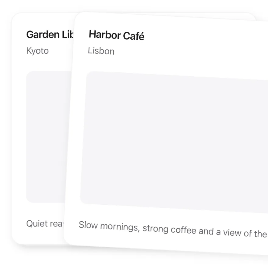
```tsx
import { View } from "react-native"
import { Card, CardContent, CardDescription, CardHeader, CardTitle } from "@/components/ui/card"
import { Text } from "@/components/ui/text"
type Place = { id: string; name: string; city: string; detail: string }
const places: Place[] = [
{
id: "harbor",
name: "Harbor Café",
city: "Lisbon",
detail: "Slow mornings, strong coffee and a view of the river.",
},
{
id: "garden",
name: "Garden Library",
city: "Kyoto",
detail: "Quiet reading rooms around a moss garden.",
},
{
id: "market",
name: "Night Market",
city: "Taipei",
detail: "Street food stalls open until two in the morning.",
},
]
function PlaceCard({ place }: { place: Place }) {
return (
{place.name}
{place.city}
{place.detail}
)
}
export function CardStackMidSwipeExample() {
return (
)
}
```
```swift
import EsuissUI
import SwiftUI
struct CardStackMidSwipeExample: View {
var body: some View {
ZStack {
CardStackPlaceCard(place: cardStackPlaces[2])
.scaleEffect(0.94)
.offset(y: 14.4)
CardStackPlaceCard(place: cardStackPlaces[1])
.scaleEffect(0.99)
.offset(y: 2.4)
CardStackPlaceCard(place: cardStackPlaces[0])
.rotationEffect(.degrees(3))
.offset(x: 96, y: 12)
}
.frame(height: 384)
}
}
struct CardStackPlace: Identifiable {
let id: String
let name: String
let city: String
let detail: String
}
let cardStackPlaces = [
CardStackPlace(id: "harbor", name: "Harbor Café", city: "Lisbon", detail: "Slow mornings, strong coffee and a view of the river."),
CardStackPlace(id: "garden", name: "Garden Library", city: "Kyoto", detail: "Quiet reading rooms around a moss garden."),
CardStackPlace(id: "market", name: "Night Market", city: "Taipei", detail: "Street food stalls open until two in the morning."),
]
struct CardStackPlaceCard: View {
let place: CardStackPlace
var body: some View {
Card {
CardHeader(LocalizedStringKey(place.name), description: LocalizedStringKey(place.city))
CardContent {
RoundedRectangle(cornerRadius: Radius.xl, style: .continuous)
.fill(Color.surfaceSecondary)
.frame(maxHeight: .infinity)
}
.frame(maxHeight: .infinity)
CardContent {
Text(verbatim: place.detail)
.textStyle(.sm)
.foregroundStyle(Color.labelSecondary)
}
}
.frame(maxHeight: .infinity)
.accessibilityElement(children: .combine)
.accessibilityLabel(Text(verbatim: "\(place.name), \(place.city)"))
}
}
```
```kotlin
import androidx.compose.foundation.background
import androidx.compose.foundation.layout.Box
import androidx.compose.foundation.layout.fillMaxSize
import androidx.compose.foundation.layout.fillMaxWidth
import androidx.compose.foundation.layout.height
import androidx.compose.foundation.shape.RoundedCornerShape
import androidx.compose.runtime.Composable
import androidx.compose.ui.Modifier
import androidx.compose.ui.graphics.TransformOrigin
import androidx.compose.ui.graphics.graphicsLayer
import androidx.compose.ui.unit.dp
import com.esuiss.ui.components.Card
import com.esuiss.ui.components.CardContent
import com.esuiss.ui.components.CardHeader
import com.esuiss.ui.components.Text
import com.esuiss.ui.theme.EsuissTheme
import com.esuiss.ui.theme.Radius
import com.esuiss.ui.theme.Typography
class CardStackPlace(val id: String, val name: String, val city: String, val detail: String)
val cardStackPlaces = listOf(
CardStackPlace("harbor", "Harbor Café", "Lisbon", "Slow mornings, strong coffee and a view of the river."),
CardStackPlace("garden", "Garden Library", "Kyoto", "Quiet reading rooms around a moss garden."),
CardStackPlace("market", "Night Market", "Taipei", "Street food stalls open until two in the morning."),
)
val cardStackDeckHeight = 384.dp
@Composable
fun CardStackPlaceCard(place: CardStackPlace, modifier: Modifier = Modifier) {
val colors = EsuissTheme.colors
Card(modifier.fillMaxWidth().height(cardStackDeckHeight)) {
CardHeader(place.name, description = place.city)
CardContent(Modifier.weight(1f)) {
Box(
Modifier
.fillMaxSize()
.background(colors.surfaceSecondary, RoundedCornerShape(Radius.xl)),
)
}
CardContent {
Text(place.detail, style = Typography.sm.copy(color = colors.labelSecondary))
}
}
}
@Composable
fun CardStackMidSwipe() {
Box(Modifier.fillMaxWidth().height(cardStackDeckHeight)) {
CardStackPlaceCard(
cardStackPlaces[2],
Modifier.graphicsLayer {
translationY = 14.4.dp.toPx()
scaleX = 0.94f
scaleY = 0.94f
},
)
CardStackPlaceCard(
cardStackPlaces[1],
Modifier.graphicsLayer {
translationY = 2.4.dp.toPx()
scaleX = 0.99f
scaleY = 0.99f
},
)
CardStackPlaceCard(
cardStackPlaces[0],
Modifier.graphicsLayer {
translationX = 96.dp.toPx()
translationY = 12.dp.toPx()
rotationZ = 3f
transformOrigin = TransformOrigin.Center
},
)
}
}
```
### Empty
An empty deck showing `CardStackEmpty`.
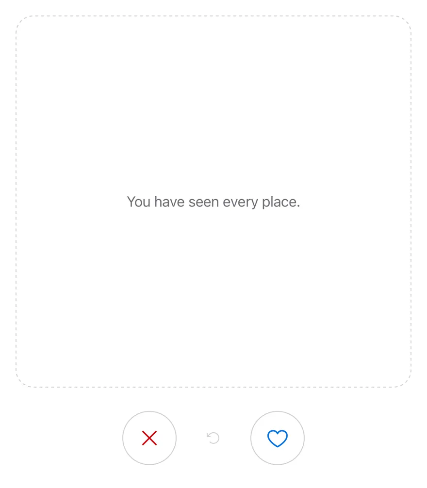
```tsx
import { CardStack, CardStackActions, CardStackEmpty, CardStackSwipeButton, CardStackUndo } from "@/components/interactions/card-stack"
type Place = { id: string; name: string; city: string; detail: string }
export function CardStackEmptyExample() {
return (
null}>
You have seen every place.
)
}
```
```swift
import EsuissUI
import SwiftUI
struct CardStackEmptyExample: View {
var body: some View {
CardStackDemo(places: [], showsLog: false)
}
}
struct CardStackPlace: Identifiable {
let id: String
let name: String
let city: String
let detail: String
}
struct CardStackPlaceCard: View {
let place: CardStackPlace
var body: some View {
Card {
CardHeader(LocalizedStringKey(place.name), description: LocalizedStringKey(place.city))
CardContent {
RoundedRectangle(cornerRadius: Radius.xl, style: .continuous)
.fill(Color.surfaceSecondary)
.frame(maxHeight: .infinity)
}
.frame(maxHeight: .infinity)
CardContent {
Text(verbatim: place.detail)
.textStyle(.sm)
.foregroundStyle(Color.labelSecondary)
}
}
.frame(maxHeight: .infinity)
.accessibilityElement(children: .combine)
.accessibilityLabel(Text(verbatim: "\(place.name), \(place.city)"))
}
}
struct CardStackDemo: View {
let places: [CardStackPlace]
var showsLog = true
@State private var controller = CardStackController()
@State private var log = ""
var body: some View {
VStack(spacing: 12) {
VStack(spacing: 24) {
ZStack {
if !controller.canSwipe {
Text("You have seen every place.")
.textStyle(.sm)
.foregroundStyle(Color.labelSecondary)
.multilineTextAlignment(.center)
.padding(24)
.frame(maxWidth: .infinity, maxHeight: .infinity)
.overlay {
RoundedRectangle(cornerRadius: Radius.xl2, style: .continuous)
.strokeBorder(Color.separator, style: StrokeStyle(lineWidth: 1, dash: [4, 4]))
}
}
CardStack(
places,
controller: controller,
onSwipe: { direction, place in
log = "\(direction == .left ? "Skipped" : "Liked") \(place.name)"
},
onUndo: { place in
log = "Restored \(place.name)"
}
) { place in
CardStackPlaceCard(place: place)
}
}
.frame(height: 384)
HStack(spacing: 16) {
CardStackButton(.swipeLeft, controller: controller)
CardStackButton(.undo, controller: controller)
CardStackButton(.swipeRight, controller: controller)
}
}
if showsLog {
Text(verbatim: log)
.textStyle(.sm)
.foregroundStyle(Color.labelSecondary)
.multilineTextAlignment(.center)
.frame(maxWidth: .infinity)
.accessibilityAddTraits(.updatesFrequently)
}
}
}
}
```
```kotlin
import androidx.compose.foundation.layout.Arrangement
import androidx.compose.foundation.layout.Box
import androidx.compose.foundation.layout.Column
import androidx.compose.foundation.layout.Row
import androidx.compose.foundation.layout.fillMaxWidth
import androidx.compose.foundation.layout.height
import androidx.compose.foundation.layout.padding
import androidx.compose.foundation.layout.size
import androidx.compose.runtime.Composable
import androidx.compose.ui.Alignment
import androidx.compose.ui.Modifier
import androidx.compose.ui.draw.drawBehind
import androidx.compose.ui.geometry.CornerRadius
import androidx.compose.ui.geometry.Offset
import androidx.compose.ui.geometry.Size
import androidx.compose.ui.graphics.PathEffect
import androidx.compose.ui.graphics.drawscope.Stroke
import androidx.compose.ui.semantics.contentDescription
import androidx.compose.ui.text.style.TextAlign
import androidx.compose.ui.unit.dp
import com.adamglin.PhosphorIcons
import com.adamglin.phosphoricons.Regular
import com.adamglin.phosphoricons.regular.ArrowCounterClockwise
import com.adamglin.phosphoricons.regular.Heart
import com.adamglin.phosphoricons.regular.X
import com.esuiss.ui.components.Button
import com.esuiss.ui.components.ButtonSize
import com.esuiss.ui.components.ButtonVariant
import com.esuiss.ui.components.Icon
import com.esuiss.ui.components.Text
import com.esuiss.ui.interactions.CardStack
import com.esuiss.ui.interactions.CardStackDirection
import com.esuiss.ui.interactions.CardStackState
import com.esuiss.ui.interactions.rememberCardStackState
import com.esuiss.ui.theme.EsuissTheme
import com.esuiss.ui.theme.Radius
import com.esuiss.ui.theme.Typography
class CardStackPlace(val id: String, val name: String, val city: String, val detail: String)
val cardStackDeckHeight = 384.dp
@Composable
fun CardStackEmptyBox() {
val colors = EsuissTheme.colors
Box(
modifier = Modifier
.fillMaxWidth()
.height(cardStackDeckHeight)
.drawBehind {
val stroke = 1.dp.toPx()
val radius = Radius.xl2.toPx()
drawRoundRect(
color = colors.separator,
topLeft = Offset(stroke / 2, stroke / 2),
size = Size(size.width - stroke, size.height - stroke),
cornerRadius = CornerRadius(radius, radius),
style = Stroke(width = stroke, pathEffect = PathEffect.dashPathEffect(floatArrayOf(3.dp.toPx(), 3.dp.toPx()))),
)
}
.padding(24.dp),
contentAlignment = Alignment.Center,
) {
Text(
"You have seen every place.",
style = Typography.sm.copy(color = colors.labelSecondary),
textAlign = TextAlign.Center,
)
}
}
@Composable
fun CardStackActions(state: CardStackState, enabled: Boolean) {
val colors = EsuissTheme.colors
val canSwipe = enabled && !state.isEmpty
Row(
modifier = Modifier.fillMaxWidth(),
horizontalArrangement = Arrangement.spacedBy(16.dp, Alignment.CenterHorizontally),
verticalAlignment = Alignment.CenterVertically,
) {
Button(
onClick = { state.swipe(CardStackDirection.Left) },
modifier = Modifier.size(56.dp),
variant = ButtonVariant.Outline,
size = ButtonSize.IconLg,
enabled = canSwipe,
) {
Icon(PhosphorIcons.Regular.X, contentDescription = "Swipe left", size = 24.dp, tint = colors.danger)
}
Button(
onClick = { state.undo() },
variant = ButtonVariant.Ghost,
size = ButtonSize.IconLg,
enabled = state.canUndo,
) {
Icon(PhosphorIcons.Regular.ArrowCounterClockwise, contentDescription = "Undo")
}
Button(
onClick = { state.swipe(CardStackDirection.Right) },
modifier = Modifier.size(56.dp),
variant = ButtonVariant.Outline,
size = ButtonSize.IconLg,
enabled = canSwipe,
) {
Icon(PhosphorIcons.Regular.Heart, contentDescription = "Swipe right", size = 24.dp, tint = colors.accent)
}
}
}
@Composable
fun CardStackEmptyDemo() {
val state = rememberCardStackState()
Column(verticalArrangement = Arrangement.spacedBy(24.dp)) {
CardStack(
items = emptyList(),
onSwipe = { _, _ -> },
state = state,
empty = { CardStackEmptyBox() },
) { }
CardStackActions(state, enabled = true)
}
}
```
### Disabled
Turns off swiping and the buttons with `disabled`.
```tsx
import * as React from "react"
import { View } from "react-native"
import { CardStack, CardStackActions, CardStackEmpty, CardStackSwipeButton, CardStackUndo } from "@/components/interactions/card-stack"
import { Card, CardContent, CardDescription, CardHeader, CardTitle } from "@/components/ui/card"
import { Text } from "@/components/ui/text"
type Place = { id: string; name: string; city: string; detail: string }
const places: Place[] = [
{
id: "harbor",
name: "Harbor Café",
city: "Lisbon",
detail: "Slow mornings, strong coffee and a view of the river.",
},
{
id: "garden",
name: "Garden Library",
city: "Kyoto",
detail: "Quiet reading rooms around a moss garden.",
},
{
id: "market",
name: "Night Market",
city: "Taipei",
detail: "Street food stalls open until two in the morning.",
},
]
function PlaceCard({ place }: { place: Place }) {
return (
{place.name}
{place.city}
{place.detail}
)
}
function Demo({ disabled = false }: { disabled?: boolean }) {
const [log, setLog] = React.useState("")
return (
place.id}
renderItem={(place) => }
itemAccessibilityLabel={(place) => `${place.name}, ${place.city}`}
disabled={disabled}
onSwipe={(direction, place) =>
setLog(`${direction === "left" ? "Skipped" : "Liked"} ${place.name}`)
}
onUndo={(place) => setLog(`Restored ${place.name}`)}
>
You have seen every place.
{log}
)
}
export function CardStackDisabledExample() {
return (
)
}
```
```swift
import EsuissUI
import SwiftUI
struct CardStackDisabledExample: View {
var body: some View {
CardStackDemo(places: cardStackPlaces)
.disabled(true)
}
}
struct CardStackPlace: Identifiable {
let id: String
let name: String
let city: String
let detail: String
}
let cardStackPlaces = [
CardStackPlace(id: "harbor", name: "Harbor Café", city: "Lisbon", detail: "Slow mornings, strong coffee and a view of the river."),
CardStackPlace(id: "garden", name: "Garden Library", city: "Kyoto", detail: "Quiet reading rooms around a moss garden."),
CardStackPlace(id: "market", name: "Night Market", city: "Taipei", detail: "Street food stalls open until two in the morning."),
]
struct CardStackPlaceCard: View {
let place: CardStackPlace
var body: some View {
Card {
CardHeader(LocalizedStringKey(place.name), description: LocalizedStringKey(place.city))
CardContent {
RoundedRectangle(cornerRadius: Radius.xl, style: .continuous)
.fill(Color.surfaceSecondary)
.frame(maxHeight: .infinity)
}
.frame(maxHeight: .infinity)
CardContent {
Text(verbatim: place.detail)
.textStyle(.sm)
.foregroundStyle(Color.labelSecondary)
}
}
.frame(maxHeight: .infinity)
.accessibilityElement(children: .combine)
.accessibilityLabel(Text(verbatim: "\(place.name), \(place.city)"))
}
}
struct CardStackDemo: View {
let places: [CardStackPlace]
var showsLog = true
@State private var controller = CardStackController()
@State private var log = ""
var body: some View {
VStack(spacing: 12) {
VStack(spacing: 24) {
ZStack {
if !controller.canSwipe {
Text("You have seen every place.")
.textStyle(.sm)
.foregroundStyle(Color.labelSecondary)
.multilineTextAlignment(.center)
.padding(24)
.frame(maxWidth: .infinity, maxHeight: .infinity)
.overlay {
RoundedRectangle(cornerRadius: Radius.xl2, style: .continuous)
.strokeBorder(Color.separator, style: StrokeStyle(lineWidth: 1, dash: [4, 4]))
}
}
CardStack(
places,
controller: controller,
onSwipe: { direction, place in
log = "\(direction == .left ? "Skipped" : "Liked") \(place.name)"
},
onUndo: { place in
log = "Restored \(place.name)"
}
) { place in
CardStackPlaceCard(place: place)
}
}
.frame(height: 384)
HStack(spacing: 16) {
CardStackButton(.swipeLeft, controller: controller)
CardStackButton(.undo, controller: controller)
CardStackButton(.swipeRight, controller: controller)
}
}
if showsLog {
Text(verbatim: log)
.textStyle(.sm)
.foregroundStyle(Color.labelSecondary)
.multilineTextAlignment(.center)
.frame(maxWidth: .infinity)
.accessibilityAddTraits(.updatesFrequently)
}
}
}
}
```
```kotlin
import androidx.compose.foundation.background
import androidx.compose.foundation.layout.Arrangement
import androidx.compose.foundation.layout.Box
import androidx.compose.foundation.layout.Column
import androidx.compose.foundation.layout.Row
import androidx.compose.foundation.layout.fillMaxSize
import androidx.compose.foundation.layout.fillMaxWidth
import androidx.compose.foundation.layout.height
import androidx.compose.foundation.layout.padding
import androidx.compose.foundation.layout.size
import androidx.compose.foundation.shape.RoundedCornerShape
import androidx.compose.runtime.Composable
import androidx.compose.runtime.getValue
import androidx.compose.runtime.mutableStateOf
import androidx.compose.runtime.saveable.rememberSaveable
import androidx.compose.runtime.setValue
import androidx.compose.ui.Alignment
import androidx.compose.ui.Modifier
import androidx.compose.ui.draw.drawBehind
import androidx.compose.ui.geometry.CornerRadius
import androidx.compose.ui.geometry.Offset
import androidx.compose.ui.geometry.Size
import androidx.compose.ui.graphics.PathEffect
import androidx.compose.ui.graphics.drawscope.Stroke
import androidx.compose.ui.semantics.LiveRegionMode
import androidx.compose.ui.semantics.contentDescription
import androidx.compose.ui.semantics.liveRegion
import androidx.compose.ui.semantics.semantics
import androidx.compose.ui.text.style.TextAlign
import androidx.compose.ui.unit.dp
import com.adamglin.PhosphorIcons
import com.adamglin.phosphoricons.Regular
import com.adamglin.phosphoricons.regular.ArrowCounterClockwise
import com.adamglin.phosphoricons.regular.Heart
import com.adamglin.phosphoricons.regular.X
import com.esuiss.ui.components.Button
import com.esuiss.ui.components.ButtonSize
import com.esuiss.ui.components.ButtonVariant
import com.esuiss.ui.components.Card
import com.esuiss.ui.components.CardContent
import com.esuiss.ui.components.CardHeader
import com.esuiss.ui.components.Icon
import com.esuiss.ui.components.Text
import com.esuiss.ui.interactions.CardStack
import com.esuiss.ui.interactions.CardStackDirection
import com.esuiss.ui.interactions.CardStackState
import com.esuiss.ui.interactions.rememberCardStackState
import com.esuiss.ui.theme.EsuissTheme
import com.esuiss.ui.theme.Radius
import com.esuiss.ui.theme.Typography
@Composable
fun CardStackDisabledExample() {
CardStackDemo(enabled = false)
}
class CardStackPlace(val id: String, val name: String, val city: String, val detail: String)
val cardStackPlaces = listOf(
CardStackPlace("harbor", "Harbor Café", "Lisbon", "Slow mornings, strong coffee and a view of the river."),
CardStackPlace("garden", "Garden Library", "Kyoto", "Quiet reading rooms around a moss garden."),
CardStackPlace("market", "Night Market", "Taipei", "Street food stalls open until two in the morning."),
)
val cardStackDeckHeight = 384.dp
@Composable
fun CardStackPlaceCard(place: CardStackPlace, modifier: Modifier = Modifier) {
val colors = EsuissTheme.colors
Card(modifier.fillMaxWidth().height(cardStackDeckHeight)) {
CardHeader(place.name, description = place.city)
CardContent(Modifier.weight(1f)) {
Box(
Modifier
.fillMaxSize()
.background(colors.surfaceSecondary, RoundedCornerShape(Radius.xl)),
)
}
CardContent {
Text(place.detail, style = Typography.sm.copy(color = colors.labelSecondary))
}
}
}
@Composable
fun CardStackEmptyBox() {
val colors = EsuissTheme.colors
Box(
modifier = Modifier
.fillMaxWidth()
.height(cardStackDeckHeight)
.drawBehind {
val stroke = 1.dp.toPx()
val radius = Radius.xl2.toPx()
drawRoundRect(
color = colors.separator,
topLeft = Offset(stroke / 2, stroke / 2),
size = Size(size.width - stroke, size.height - stroke),
cornerRadius = CornerRadius(radius, radius),
style = Stroke(width = stroke, pathEffect = PathEffect.dashPathEffect(floatArrayOf(3.dp.toPx(), 3.dp.toPx()))),
)
}
.padding(24.dp),
contentAlignment = Alignment.Center,
) {
Text(
"You have seen every place.",
style = Typography.sm.copy(color = colors.labelSecondary),
textAlign = TextAlign.Center,
)
}
}
@Composable
fun CardStackActions(state: CardStackState, enabled: Boolean) {
val colors = EsuissTheme.colors
val canSwipe = enabled && !state.isEmpty
Row(
modifier = Modifier.fillMaxWidth(),
horizontalArrangement = Arrangement.spacedBy(16.dp, Alignment.CenterHorizontally),
verticalAlignment = Alignment.CenterVertically,
) {
Button(
onClick = { state.swipe(CardStackDirection.Left) },
modifier = Modifier.size(56.dp),
variant = ButtonVariant.Outline,
size = ButtonSize.IconLg,
enabled = canSwipe,
) {
Icon(PhosphorIcons.Regular.X, contentDescription = "Swipe left", size = 24.dp, tint = colors.danger)
}
Button(
onClick = { state.undo() },
variant = ButtonVariant.Ghost,
size = ButtonSize.IconLg,
enabled = state.canUndo,
) {
Icon(PhosphorIcons.Regular.ArrowCounterClockwise, contentDescription = "Undo")
}
Button(
onClick = { state.swipe(CardStackDirection.Right) },
modifier = Modifier.size(56.dp),
variant = ButtonVariant.Outline,
size = ButtonSize.IconLg,
enabled = canSwipe,
) {
Icon(PhosphorIcons.Regular.Heart, contentDescription = "Swipe right", size = 24.dp, tint = colors.accent)
}
}
}
@Composable
fun CardStackDemo(enabled: Boolean) {
var log by rememberSaveable { mutableStateOf("") }
val state = rememberCardStackState()
Column(verticalArrangement = Arrangement.spacedBy(12.dp)) {
Column(verticalArrangement = Arrangement.spacedBy(24.dp)) {
CardStack(
items = cardStackPlaces,
onSwipe = { direction, place ->
log = "${if (direction == CardStackDirection.Left) "Skipped" else "Liked"} ${place.name}"
},
state = state,
key = { it.id },
enabled = enabled,
onUndo = { _, place -> log = "Restored ${place.name}" },
empty = { CardStackEmptyBox() },
) { place ->
CardStackPlaceCard(place, Modifier.semantics(mergeDescendants = true) { contentDescription = "${place.name}, ${place.city}" })
}
CardStackActions(state, enabled)
}
Text(
log,
modifier = Modifier.fillMaxWidth().semantics { liveRegion = LiveRegionMode.Polite },
style = Typography.sm.copy(color = EsuissTheme.colors.labelSecondary),
textAlign = TextAlign.Center,
)
}
}
```
## API Reference
### CardStack
The root that renders the deck and handles the drag gesture.
### CardStackEmpty
A dashed placeholder shown when no cards remain.
### CardStackActions
A centered row for the buttons.
### CardStackSwipeButton
A round button that swipes the top card left or right.
### CardStackUndo
A button that restores the last swiped card.
## Accessibility
- The top card has `Swipe left` and `Swipe right` accessibility actions.
- Cards behind the top card are hidden from screen readers.
- Swipe buttons are labelled `Swipe left` and `Swipe right`, and undo is labelled `Undo`, unless you pass `accessibilityLabel`.
## Notes
- A medium impact haptic plays when a card is swiped by gesture, button or accessibility action, if the app provides an adapter through `HapticsProvider`.
- Fly-out and spring animations respect the system reduce motion setting.
- The left button icon uses `text-danger`; the right uses `text-accent`.