# Wheel Picker
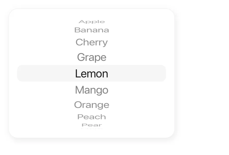
A scrolling wheel for picking one value per column, with items that curve away from the center.
Wheel Picker is an open-source mobile component from suiss/uim for React Native and Expo, with SwiftUI and Jetpack Compose versions built from the same design tokens. The @esuiss/uim CLI copies its source into your project, so you own the code.
Source: https://uim.suiss.app/docs/components/wheel-picker
```tsx
import { View } from "react-native"
import { WheelPicker, WheelPickerColumn, WheelPickerItem } from "@/components/ui/wheel-picker"
const fruits = [
"Apple",
"Banana",
"Cherry",
"Grape",
"Lemon",
"Mango",
"Orange",
"Peach",
"Pear",
"Plum",
]
export function WheelPickerExample() {
return (
{fruits.map((fruit) => (
{fruit}
))}
)
}
```
```swift
import EsuissUI
import SwiftUI
struct WheelPickerExample: View {
var body: some View {
WheelPickerFrame {
FruitDemo()
}
}
}
struct WheelPickerFrame: View {
@ViewBuilder let content: () -> Content
@Environment(\.colorScheme) private var colorScheme
var body: some View {
let shape = RoundedRectangle(cornerRadius: Radius.xl2, style: .continuous)
content()
.padding(16)
.frame(width: 320)
.background(Color.surfaceRaised, in: shape)
.overlay {
shape.strokeBorder(Color.label.opacity(colorScheme == .dark ? 0.1 : 0.05))
}
.shadow(Shadow.md)
}
}
let wheelFruits = ["Apple", "Banana", "Cherry", "Grape", "Lemon", "Mango", "Orange", "Peach", "Pear", "Plum"]
struct FruitDemo: View {
@State private var fruit = "Lemon"
var body: some View {
WheelPicker {
WheelPickerColumn(selection: $fruit) {
ForEach(wheelFruits, id: \.self) { item in
WheelPickerItem(verbatim: item, value: item)
}
}
.accessibilityLabel(Text("Fruit"))
}
}
}
```
```kotlin
import androidx.compose.foundation.background
import androidx.compose.foundation.border
import androidx.compose.foundation.layout.Box
import androidx.compose.foundation.layout.fillMaxWidth
import androidx.compose.foundation.layout.padding
import androidx.compose.foundation.layout.width
import androidx.compose.foundation.shape.RoundedCornerShape
import androidx.compose.runtime.Composable
import androidx.compose.runtime.getValue
import androidx.compose.runtime.mutableStateOf
import androidx.compose.runtime.saveable.rememberSaveable
import androidx.compose.runtime.setValue
import androidx.compose.ui.Modifier
import androidx.compose.ui.unit.dp
import com.esuiss.ui.components.WheelPicker
import com.esuiss.ui.components.WheelPickerColumn
import com.esuiss.ui.theme.EsuissTheme
import com.esuiss.ui.theme.Radius
import com.esuiss.ui.theme.Shadows
import com.esuiss.ui.theme.shadow
@Composable
fun WheelPickerExample() {
WheelPickerFrame { WheelPickerFruits() }
}
val wheelPickerFruits = listOf(
"Apple",
"Banana",
"Cherry",
"Grape",
"Lemon",
"Mango",
"Orange",
"Peach",
"Pear",
"Plum",
)
@Composable
fun WheelPickerFrame(content: @Composable () -> Unit) {
val colors = EsuissTheme.colors
val shape = RoundedCornerShape(Radius.xl2)
Box(
Modifier
.width(320.dp)
.shadow(Shadows.md, shape)
.background(colors.surfaceRaised, shape)
.border(1.dp, colors.label.copy(alpha = if (colors.isDark) 0.1f else 0.05f), shape)
.padding(16.dp),
) {
content()
}
}
@Composable
fun WheelPickerFruits() {
var value by rememberSaveable { mutableStateOf("Lemon") }
WheelPicker(Modifier.fillMaxWidth()) {
WheelPickerColumn(value, { value = it }, label = "Fruit") {
wheelPickerFruits.forEach { WheelPickerItem(it, it) }
}
}
}
```
`WheelPicker` lays out one or more `WheelPickerColumn` components side by side behind a shared highlight band. Each column is a snapping `ScrollView`; items above and below the center are scaled, moved and faded with React Native `Animated` interpolations to look like a rotating wheel.
Use it for times, dates and other values picked from a short, ordered list, often in a sheet or popover.
## Installation
```bash title="Terminal"
npx @esuiss/uim@latest add wheel-picker
```
```bash title="Terminal"
npx @esuiss/uim@latest add wheel-picker --platform swift
```
```bash title="Terminal"
npx @esuiss/uim@latest add wheel-picker --platform kotlin
```
The CLI also adds what it builds on: [Text](/docs/components/text).
### Manual
**Uniwind**
1. Install the dependencies:
```bash title="Terminal"
npx expo install cn
```
2. Add the pieces it builds on: [Text](/docs/components/text), and the primitives `components/primitives/use-render.tsx`, `components/primitives/wheel-picker.tsx`.
3. Copy the source into `components/ui/wheel-picker.tsx`:
```tsx title="uniwind/components/ui/wheel-picker.tsx"
import { cn } from "cn"
import type * as React from "react"
import { resolveClassName } from "@/components/primitives/use-render"
import * as WheelPickerPrimitive from "@/components/primitives/wheel-picker"
import { Text, TextClassContext } from "@/components/ui/text"
function WheelPicker({
className,
children,
...props
}: React.ComponentProps) {
return (
cn(
"relative flex-row items-stretch justify-center",
resolveClassName(className, state)
)
}
{...props}
>
{children}
)
}
function WheelPickerColumn({
className,
...props
}: React.ComponentProps) {
return (
cn("relative rounded-lg", resolveClassName(className, state))
}
{...props}
/>
)
}
function WheelPickerItem({
className,
children,
disabled = false,
...props
}: React.ComponentProps) {
return (
cn(
"flex-row items-center justify-center px-3",
resolveClassName(className, state)
)
}
{...props}
>
{typeof children === "string" || typeof children === "number" ? (
{children}
) : (
children
)}
)
}
export { WheelPicker, WheelPickerColumn, WheelPickerItem }
```
4. Update the import paths to match your project.
**NativeWind**
1. Install the dependencies:
```bash title="Terminal"
npx expo install cn
```
2. Add the pieces it builds on: [Text](/docs/components/text), and the primitives `components/primitives/use-render.tsx`, `components/primitives/wheel-picker.tsx`.
3. Copy the source into `components/ui/wheel-picker.tsx`:
```tsx title="nativewind/components/ui/wheel-picker.tsx"
import { cn } from "cn"
import type * as React from "react"
import { resolveClassName } from "@/components/primitives/use-render"
import * as WheelPickerPrimitive from "@/components/primitives/wheel-picker"
import { Text, TextClassContext } from "@/components/ui/text"
function WheelPicker({
className,
children,
...props
}: React.ComponentProps) {
return (
cn(
"relative flex-row items-stretch justify-center",
resolveClassName(className, state)
)
}
{...props}
>
{children}
)
}
function WheelPickerColumn({
className,
...props
}: React.ComponentProps) {
return (
cn("relative rounded-lg", resolveClassName(className, state))
}
{...props}
/>
)
}
function WheelPickerItem({
className,
children,
disabled = false,
...props
}: React.ComponentProps) {
return (
cn(
"flex-row items-center justify-center px-3",
resolveClassName(className, state)
)
}
{...props}
>
{typeof children === "string" || typeof children === "number" ? (
{children}
) : (
children
)}
)
}
export { WheelPicker, WheelPickerColumn, WheelPickerItem }
```
4. Update the import paths to match your project.
**StyleSheet**
1. Add the pieces it builds on: [Text](/docs/components/text), and the primitives `components/primitives/use-render.tsx`, `components/primitives/wheel-picker.tsx`.
2. Copy the source into `components/ui/wheel-picker.tsx`:
```tsx title="stylesheet/components/ui/wheel-picker.tsx"
import type * as React from "react"
import {
type StyleProp,
StyleSheet,
type TextStyle,
type ViewStyle,
} from "react-native"
import { resolveStyle } from "@/components/primitives/use-render"
import * as WheelPickerPrimitive from "@/components/primitives/wheel-picker"
import { Text, TextStyleContext } from "@/components/ui/text"
import { fontSize, radius, useTheme } from "@/components/ui/theme"
const styles = StyleSheet.create({
root: {
position: "relative",
flexDirection: "row",
alignItems: "stretch",
justifyContent: "center",
},
indicator: { borderRadius: radius.lg },
column: { position: "relative", borderRadius: radius.lg },
item: {
flexDirection: "row",
alignItems: "center",
justifyContent: "center",
paddingHorizontal: 12,
},
text: { ...fontSize.xl, fontVariant: ["tabular-nums"] },
})
function WheelPicker({
style,
children,
...props
}: React.ComponentProps) {
const { colors } = useTheme()
return (
[
styles.root,
resolveStyle(style, state) as StyleProp,
]}
{...props}
>
{children}
)
}
function WheelPickerColumn({
style,
...props
}: React.ComponentProps) {
return (
[
styles.column,
resolveStyle(style, state) as StyleProp,
]}
{...props}
/>
)
}
function WheelPickerItem({
style,
children,
disabled = false,
...props
}: React.ComponentProps) {
const { colors } = useTheme()
const textStyle: TextStyle = {
...styles.text,
color: disabled ? colors.labelTertiary : colors.label,
}
return (
[
styles.item,
resolveStyle(style, state) as StyleProp,
]}
{...props}
>
{typeof children === "string" || typeof children === "number" ? (
{children}
) : (
children
)}
)
}
export { WheelPicker, WheelPickerColumn, WheelPickerItem }
```
3. Update the import paths to match your project.
**SwiftUI**
1. Target iOS 17 or later.
2. Add the Swift package to your app:
```swift title="Package.swift"
.package(url: "https://github.com/phosphor-icons/swift", from: "2.1.0")
```
3. Copy the theme files every view uses:
```swift title="swift/Theme/Theme.swift"
import SwiftUI
import UIKit
struct RGBA: Sendable {
let red: CGFloat
let green: CGFloat
let blue: CGFloat
let alpha: CGFloat
init(_ hex: UInt32, _ alpha: CGFloat = 1) {
red = CGFloat((hex >> 16) & 0xFF) / 255
green = CGFloat((hex >> 8) & 0xFF) / 255
blue = CGFloat(hex & 0xFF) / 255
self.alpha = alpha
}
var uiColor: UIColor {
UIColor(red: red, green: green, blue: blue, alpha: alpha)
}
}
extension Color {
static func adaptive(light: RGBA, dark: RGBA) -> Color {
let lightColor = light.uiColor
let darkColor = dark.uiColor
return Color(uiColor: UIColor { traits in
traits.userInterfaceStyle == .dark ? darkColor : lightColor
})
}
}
public struct TextStyle: Sendable, Hashable {
public let size: CGFloat
public let lineHeight: CGFloat
public let letterSpacing: CGFloat
public init(size: CGFloat, lineHeight: CGFloat, letterSpacing: CGFloat) {
self.size = size
self.lineHeight = lineHeight
self.letterSpacing = letterSpacing
}
public func font(weight: Font.Weight = .regular) -> Font {
.system(size: size, weight: weight)
}
public var lineSpacing: CGFloat {
max(0, lineHeight - UIFont.systemFont(ofSize: size).lineHeight)
}
}
extension Hashable where Self == Font {
public static func textStyle(_ style: TextStyle, weight: Font.Weight = .regular) -> Font {
style.font(weight: weight)
}
}
private struct TextStyleModifier: ViewModifier {
let style: TextStyle
let weight: Font.Weight
func body(content: Content) -> some View {
content
.font(style.font(weight: weight))
.tracking(style.letterSpacing)
.lineSpacing(style.lineSpacing)
.padding(.vertical, style.lineSpacing / 2)
}
}
extension View {
public func textStyle(_ style: TextStyle, weight: Font.Weight = .regular) -> some View {
modifier(TextStyleModifier(style: style, weight: weight))
}
}
public struct Shadow: Sendable, Hashable {
public let color: Color
public let radius: CGFloat
public let x: CGFloat
public let y: CGFloat
public init(color: Color, radius: CGFloat, x: CGFloat = 0, y: CGFloat = 0) {
self.color = color
self.radius = radius
self.x = x
self.y = y
}
}
extension View {
public func shadow(_ shadow: Shadow) -> some View {
self.shadow(color: shadow.color, radius: shadow.radius, x: shadow.x, y: shadow.y)
}
}
```
```swift title="swift/Theme/Tokens.swift"
import SwiftUI
extension Color {
public static let surface = Color.adaptive(light: .init(0xFFFFFF), dark: .init(0x000000))
public static let surfaceSecondary = Color.adaptive(light: .init(0xF5F5F7), dark: .init(0x161617))
public static let surfaceTertiary = Color.adaptive(light: .init(0xE8E8ED), dark: .init(0x2C2C2E))
public static let surfaceRaised = Color.adaptive(light: .init(0xFFFFFF), dark: .init(0x1D1D1F))
public static let label = Color.adaptive(light: .init(0x1D1D1F), dark: .init(0xF5F5F7))
public static let labelSecondary = Color.adaptive(light: .init(0x6E6E73), dark: .init(0xA1A1A6))
public static let labelTertiary = Color.adaptive(light: .init(0x86868B), dark: .init(0x86868B))
public static let labelQuaternary = Color.adaptive(light: .init(0xD2D2D7), dark: .init(0x424245))
public static let control = Color.adaptive(light: .init(0x000000, 0.04), dark: .init(0xFFFFFF, 0.1))
public static let controlPressed = Color.adaptive(light: .init(0x000000, 0.12), dark: .init(0xFFFFFF, 0.22))
public static let controlSelected = Color.adaptive(light: .init(0x1D1D1F), dark: .init(0xF5F5F7))
public static let controlDisabled = Color.adaptive(light: .init(0x000000, 0.03), dark: .init(0xFFFFFF, 0.05))
public static let onControlSelected = Color.adaptive(light: .init(0xFFFFFF), dark: .init(0x000000))
public static let itemPressed = Color.adaptive(light: .init(0x000000, 0.08), dark: .init(0xFFFFFF, 0.12))
public static let itemSelected = Color.adaptive(light: .init(0x000000, 0.06), dark: .init(0xFFFFFF, 0.1))
public static let separator = Color.adaptive(light: .init(0xD2D2D7), dark: .init(0x424245))
public static let separatorStrong = Color.adaptive(light: .init(0x86868B), dark: .init(0x6E6E73))
public static let accent = Color.adaptive(light: .init(0x0071E3), dark: .init(0x0071E3))
public static let accentPressed = Color.adaptive(light: .init(0x005BB8), dark: .init(0x004D9E))
public static let accentSelected = Color.adaptive(light: .init(0x0071E3), dark: .init(0x0071E3))
public static let accentDisabled = Color.adaptive(light: .init(0x0071E3, 0.4), dark: .init(0x0071E3, 0.4))
public static let onAccent = Color.adaptive(light: .init(0xFFFFFF), dark: .init(0xFFFFFF))
public static let accentSurface = Color.adaptive(light: .init(0x0071E3, 0.09), dark: .init(0x0071E3, 0.18))
public static let accentSurfacePressed = Color.adaptive(light: .init(0x0071E3, 0.18), dark: .init(0x0071E3, 0.3))
public static let link = Color.adaptive(light: .init(0x0066CC), dark: .init(0x2997FF))
public static let focus = Color.adaptive(light: .init(0x0071E3), dark: .init(0x0071E3))
public static let scrim = Color.adaptive(light: .init(0x000000, 0.48), dark: .init(0x000000, 0.48))
public static let media = Color.adaptive(light: .init(0x000000), dark: .init(0x000000))
public static let onMedia = Color.adaptive(light: .init(0xFFFFFF), dark: .init(0xFFFFFF))
public static let danger = Color.adaptive(light: .init(0xD0000A), dark: .init(0xFF5447))
public static let dangerSurface = Color.adaptive(light: .init(0xD70015, 0.08), dark: .init(0xFF453A, 0.2))
public static let dangerSurfacePressed = Color.adaptive(light: .init(0xD70015, 0.16), dark: .init(0xFF453A, 0.36))
public static let success = Color.adaptive(light: .init(0x008009), dark: .init(0x30D158))
public static let successSurface = Color.adaptive(light: .init(0xEFFAF1), dark: .init(0x30D158, 0.16))
public static let warning = Color.adaptive(light: .init(0xB64400), dark: .init(0xFF9F0A))
public static let warningSurface = Color.adaptive(light: .init(0xFFF5EA), dark: .init(0xFF9F0A, 0.16))
}
public enum Radius {
public static let xs: CGFloat = 3
public static let sm: CGFloat = 5
public static let md: CGFloat = 8
public static let lg: CGFloat = 10
public static let xl: CGFloat = 12
public static let xl2: CGFloat = 18
public static let xl3: CGFloat = 28
public static let full: CGFloat = 9999
}
extension TextStyle {
public static let xs3 = TextStyle(size: 11, lineHeight: 13, letterSpacing: 0.066)
public static let xs2 = TextStyle(size: 12, lineHeight: 16, letterSpacing: 0)
public static let xs = TextStyle(size: 13, lineHeight: 18, letterSpacing: -0.078)
public static let sm = TextStyle(size: 15, lineHeight: 20, letterSpacing: -0.24)
public static let md = TextStyle(size: 16, lineHeight: 21, letterSpacing: -0.32)
public static let base = TextStyle(size: 17, lineHeight: 22, letterSpacing: -0.442)
public static let lg = TextStyle(size: 20, lineHeight: 25, letterSpacing: -0.46)
public static let xl = TextStyle(size: 22, lineHeight: 28, letterSpacing: -0.264)
public static let xl2 = TextStyle(size: 28, lineHeight: 34, letterSpacing: 0.392)
public static let xl3 = TextStyle(size: 34, lineHeight: 41, letterSpacing: 0.408)
public static let allCases: [TextStyle] = [.xs3, .xs2, .xs, .sm, .md, .base, .lg, .xl, .xl2, .xl3]
}
extension Shadow {
public static let md = Shadow(color: .black.opacity(0.08), radius: 6, x: 2, y: 4)
public static let lg = Shadow(color: .black.opacity(0.12), radius: 12, y: 4)
}
```
4. Copy the source and every file it uses:
```swift title="swift/Components/WheelPicker.swift"
import SwiftUI
struct WheelPickerEntry: Equatable {
let value: AnyHashable
let disabled: Bool
let text: Text?
}
struct WheelPickerEntriesKey: PreferenceKey {
static var defaultValue: [WheelPickerEntry] { [] }
static func reduce(value: inout [WheelPickerEntry], nextValue: () -> [WheelPickerEntry]) {
value.append(contentsOf: nextValue())
}
}
struct WheelPickerColumnContext {
var alignment: Alignment
var select: @MainActor (AnyHashable) -> Void
}
extension EnvironmentValues {
@Entry var wheelPickerColumn: WheelPickerColumnContext?
@Entry var wheelPickerItemInset: CGFloat = 12
}
enum WheelPickerMetrics {
static let rowHeight: CGFloat = 32
static let height: CGFloat = rowHeight * 6.75
static let inset: CGFloat = (height - rowHeight) / 2
}
struct WheelPickerCurve: Equatable {
static let rowAngle = Double.pi / 10.5
static let maxAngle = Double.pi / 2
static let perspective = 1200.0
static let fadeAngle = 0.35
let offset: Double
let scaleX: Double
let scaleY: Double
let opacity: Double
init(distance: Double, height: Double) {
let radius = height / Self.rowAngle
let angle = min(max(distance * Self.rowAngle, -Self.maxAngle), Self.maxAngle)
let away = abs(distance)
let tone = away < 1 ? 1 - away * 0.45 : 0.55 - (away - 1) * 0.06
let fade = min(1, (Self.maxAngle - abs(angle)) / Self.fadeAngle)
let depth = Self.perspective / (Self.perspective + radius - radius * cos(angle))
offset = radius * sin(angle) - distance * height
scaleX = depth
scaleY = depth * cos(angle)
opacity = max(0, tone * fade)
}
}
enum WheelPickerNavigation {
static func enabled(_ disabled: [Bool], from index: Int, step: Int) -> Int? {
var current = index
while current >= 0 && current < disabled.count {
if !disabled[current] { return current }
current += step
}
return nil
}
static func nearestEnabled(_ disabled: [Bool], from index: Int) -> Int? {
for distance in 0..= 0 && before < disabled.count && !disabled[before] { return before }
let after = index + distance
if after >= 0 && after < disabled.count && !disabled[after] { return after }
}
return nil
}
static func centered(offset: CGFloat, count: Int) -> Int {
guard count > 0 else { return 0 }
let index = Int((offset / WheelPickerMetrics.rowHeight).rounded())
return min(max(index, 0), count - 1)
}
}
struct WheelPickerSnap: ScrollTargetBehavior {
let disabled: [Bool]
func updateTarget(_ target: inout ScrollTarget, context: TargetContext) {
let row = WheelPickerMetrics.rowHeight
guard !disabled.isEmpty else {
target.rect.origin.y = (target.rect.minY / row).rounded() * row
return
}
let index = WheelPickerNavigation.centered(offset: target.rect.minY, count: disabled.count)
let resolved = WheelPickerNavigation.nearestEnabled(disabled, from: index) ?? index
target.rect.origin.y = CGFloat(resolved) * row
}
}
public struct WheelPicker: View {
let spacing: CGFloat
let content: Content
public init(spacing: CGFloat = 0, @ViewBuilder content: () -> Content) {
self.spacing = spacing
self.content = content()
}
public var body: some View {
HStack(alignment: .center, spacing: spacing) {
content
}
.frame(maxWidth: .infinity)
.background {
RoundedRectangle(cornerRadius: Radius.lg, style: .continuous)
.fill(Color.control)
.frame(height: WheelPickerMetrics.rowHeight)
}
}
}
public struct WheelPickerColumn: View {
let selection: Binding
let alignment: HorizontalAlignment
let content: Content
@State private var entries: [WheelPickerEntry] = []
@State private var offset: CGFloat = 0
@State private var settling: Task?
@State private var ticks = 0
@Environment(\.accessibilityReduceMotion) private var reduceMotion
public init(
selection: Binding,
alignment: HorizontalAlignment = .center,
@ViewBuilder content: () -> Content
) {
self.selection = selection
self.alignment = alignment
self.content = content()
}
public var body: some View {
ScrollViewReader { proxy in
ScrollView(.vertical, showsIndicators: false) {
VStack(spacing: 0) {
content
}
.padding(.vertical, WheelPickerMetrics.inset)
.onGeometryChange(for: CGFloat.self) { geometry in
geometry.frame(in: .scrollView).minY
} action: { value in
offset = -value
scheduleSettle(proxy)
}
}
.scrollTargetBehavior(WheelPickerSnap(disabled: entries.map(\.disabled)))
.frame(height: WheelPickerMetrics.height)
.fixedSize(horizontal: true, vertical: false)
.clipShape(RoundedRectangle(cornerRadius: Radius.lg, style: .continuous))
.hapticFeedback(.selection, trigger: ticks)
.environment(\.wheelPickerColumn, WheelPickerColumnContext(
alignment: Alignment(horizontal: alignment, vertical: .center),
select: { value in
if let next = value.base as? Value { commit(next) }
}
))
.onPreferenceChange(WheelPickerEntriesKey.self) { value in
entries = value
}
.onAppear {
proxy.scrollTo(selection.wrappedValue, anchor: .center)
}
.onChange(of: selection.wrappedValue) { _, value in
guard centeredValue != AnyHashable(value) else { return }
scroll(proxy, to: value)
}
.accessibilityElement(children: .ignore)
.accessibilityValue(entries.first { $0.value == AnyHashable(selection.wrappedValue) }?.text ?? Text(verbatim: String(describing: selection.wrappedValue)))
.accessibilityAdjustableAction { direction in
let disabled = entries.map(\.disabled)
guard let current = entries.firstIndex(where: { $0.value == AnyHashable(selection.wrappedValue) }) else { return }
let target: Int?
switch direction {
case .increment: target = WheelPickerNavigation.enabled(disabled, from: current + 1, step: 1)
case .decrement: target = WheelPickerNavigation.enabled(disabled, from: current - 1, step: -1)
@unknown default: target = nil
}
if let target, let next = entries[target].value.base as? Value { commit(next) }
}
}
}
private var centeredValue: AnyHashable? {
guard !entries.isEmpty else { return nil }
return entries[WheelPickerNavigation.centered(offset: offset, count: entries.count)].value
}
private func commit(_ value: Value) {
if selection.wrappedValue != value {
selection.wrappedValue = value
ticks += 1
}
}
private func scroll(_ proxy: ScrollViewProxy, to value: Value) {
if reduceMotion {
proxy.scrollTo(value, anchor: .center)
} else {
withAnimation(.timingCurve(0.32, 0.72, 0, 1, duration: 0.3)) {
proxy.scrollTo(value, anchor: .center)
}
}
}
private func scheduleSettle(_ proxy: ScrollViewProxy) {
settling?.cancel()
settling = Task { @MainActor in
try? await Task.sleep(for: .milliseconds(150))
guard !Task.isCancelled else { return }
settle(proxy)
}
}
private func settle(_ proxy: ScrollViewProxy) {
guard !entries.isEmpty else { return }
let centered = WheelPickerNavigation.centered(offset: offset, count: entries.count)
guard let index = WheelPickerNavigation.nearestEnabled(entries.map(\.disabled), from: centered),
let next = entries[index].value.base as? Value
else { return }
if index != centered { scroll(proxy, to: next) }
commit(next)
}
}
public struct WheelPickerItem: View {
let value: Value
let text: Text?
let label: Label
@Environment(\.wheelPickerColumn) private var column
@Environment(\.wheelPickerItemInset) private var inset
@Environment(\.isEnabled) private var isEnabled
public init(value: Value, @ViewBuilder label: () -> Label) {
self.value = value
text = nil
self.label = label()
}
init(value: Value, text: Text, label: Label) {
self.value = value
self.text = text
self.label = label
}
public var body: some View {
label
.font(TextStyle.xl.font())
.tracking(TextStyle.xl.letterSpacing)
.monospacedDigit()
.lineLimit(1)
.fixedSize()
.foregroundStyle(isEnabled ? Color.label : .labelTertiary)
.visualEffect { content, geometry in
let row = Double(WheelPickerMetrics.rowHeight)
let center = Double(WheelPickerMetrics.height) / 2
let distance = (Double(geometry.frame(in: .scrollView).midY) - center) / row
let curve = WheelPickerCurve(distance: distance, height: row)
return content
.scaleEffect(x: curve.scaleX, y: curve.scaleY)
.offset(y: curve.offset)
.opacity(curve.opacity)
}
.padding(.horizontal, inset)
.frame(maxWidth: .infinity, alignment: column?.alignment ?? .center)
.frame(height: WheelPickerMetrics.rowHeight)
.contentShape(Rectangle())
.onTapGesture {
if isEnabled { column?.select(AnyHashable(value)) }
}
.id(value)
.preference(key: WheelPickerEntriesKey.self, value: [WheelPickerEntry(value: AnyHashable(value), disabled: !isEnabled, text: text)])
}
}
extension WheelPickerItem where Label == Text {
public init(_ title: LocalizedStringKey, value: Value) {
self.init(value: value, text: Text(title), label: Text(title))
}
public init(verbatim title: String, value: Value) {
self.init(value: value, text: Text(verbatim: title), label: Text(verbatim: title))
}
}
```
```swift title="swift/Components/Button.swift"
import SwiftUI
public struct VariantButtonStyle: ButtonStyle {
public enum Variant: CaseIterable, Sendable {
case `default`, outline, secondary, tinted, ghost, plain, destructive, link
}
public enum Size: CaseIterable, Sendable {
case `default`, xs, sm, lg, xl, icon, iconXs, iconSm, iconLg, iconXl
var height: CGFloat {
switch self {
case .xs, .iconXs: 24
case .sm, .iconSm: 32
case .default, .icon: 36
case .lg, .iconLg: 44
case .xl, .iconXl: 56
}
}
var horizontalPadding: CGFloat {
switch self {
case .xs: 11
case .sm: 12
case .default: 16
case .lg: 22
case .xl: 31
case .icon, .iconXs, .iconSm, .iconLg, .iconXl: 0
}
}
var spacing: CGFloat {
switch self {
case .xs, .sm, .iconXs, .iconSm: 4
case .xl, .iconXl: 8
default: 6
}
}
var textStyle: TextStyle {
switch self {
case .xs, .iconXs: .xs2
case .lg, .xl: .base
default: .sm
}
}
public var iconSize: CGFloat {
switch self {
case .xs, .iconXs: 12
default: 16
}
}
var blockRadius: CGFloat {
switch self {
case .xs, .iconXs: Radius.sm
case .lg, .iconLg: Radius.lg
case .xl, .iconXl: Radius.xl
default: Radius.md
}
}
var isIcon: Bool {
switch self {
case .icon, .iconXs, .iconSm, .iconLg, .iconXl: true
default: false
}
}
}
let variant: Variant
let size: Size
let block: Bool
var metrics: ButtonMetrics?
public init(_ variant: Variant = .default, size: Size = .default, block: Bool = false) {
self.variant = variant
self.size = size
self.block = block
}
init(_ variant: Variant, size: Size, metrics: ButtonMetrics) {
self.variant = variant
self.size = size
self.block = false
self.metrics = metrics
}
public func makeBody(configuration: Configuration) -> some View {
StyledButton(configuration: configuration, variant: variant, size: size, block: block, metrics: metrics)
}
}
struct ButtonMetrics: Sendable {
var horizontalPadding: CGFloat
var spacing: CGFloat
var iconSize: CGFloat
var textStyle: TextStyle
}
private struct StyledButton: View {
let configuration: ButtonStyleConfiguration
let variant: VariantButtonStyle.Variant
let size: VariantButtonStyle.Size
let block: Bool
let metrics: ButtonMetrics?
@Environment(\.colorScheme) private var colorScheme
@Environment(\.isEnabled) private var isEnabled
@Environment(\.buttonGroup) private var group
var body: some View {
let joined = group != nil && variant != .ghost && variant != .plain
let rounded = RoundedRectangle(
cornerRadius: block ? size.blockRadius : Radius.full,
style: .continuous
)
let shape = joined ? AnyShape(Rectangle()) : AnyShape(rounded)
configuration.label
.labelStyle(ButtonLabelStyle(spacing: metrics?.spacing ?? size.spacing, iconSize: metrics?.iconSize ?? size.iconSize))
.font((metrics?.textStyle ?? size.textStyle).font())
.tracking((metrics?.textStyle ?? size.textStyle).letterSpacing)
.underline(variant == .link && pressed && isEnabled)
.lineLimit(1)
.foregroundStyle(foreground)
.padding(.horizontal, metrics?.horizontalPadding ?? size.horizontalPadding)
.frame(width: size.isIcon && !block ? size.height : nil, height: size.height)
.frame(maxWidth: block || group == .vertical ? .infinity : nil)
.background(background, in: shape)
.overlay {
if variant == .outline && !joined {
rounded.strokeBorder(Color.separator)
}
}
.contentShape(shape)
.anchorPreference(key: ButtonGroupFramesKey.self, value: .bounds) { anchor in
joined ? [ButtonGroupFrame(bounds: anchor, outlined: variant == .outline)] : []
}
}
private var isDark: Bool { colorScheme == .dark }
private var pressed: Bool { configuration.isPressed }
private var foreground: Color {
switch variant {
case .default:
.onAccent
case .outline, .secondary, .ghost:
isEnabled ? .label : .labelQuaternary
case .tinted, .plain:
isEnabled ? .link : .link.opacity(0.4)
case .destructive:
isEnabled ? .danger : .danger.opacity(0.4)
case .link:
isEnabled ? .link : .labelQuaternary
}
}
private var background: Color {
switch variant {
case .default:
!isEnabled ? .accentDisabled : pressed ? .accentPressed : .accent
case .outline:
isEnabled && pressed ? .itemPressed : isDark ? .clear : .surface
case .secondary:
!isEnabled ? .controlDisabled : pressed ? .controlPressed : .control
case .tinted:
isEnabled && pressed ? .accentSurfacePressed : .accentSurface
case .ghost:
isEnabled && pressed ? .itemPressed : .clear
case .plain:
isEnabled && pressed ? .itemPressed : .clear
case .destructive:
isEnabled && pressed ? .dangerSurfacePressed : .dangerSurface
case .link:
.clear
}
}
}
struct ButtonLabelStyle: LabelStyle {
let spacing: CGFloat
let iconSize: CGFloat
func makeBody(configuration: Configuration) -> some View {
HStack(spacing: spacing) {
configuration.icon
.frame(width: iconSize, height: iconSize)
configuration.title
}
}
}
extension ButtonStyle where Self == VariantButtonStyle {
public static func variant(
_ variant: VariantButtonStyle.Variant = .default,
size: VariantButtonStyle.Size = .default,
block: Bool = false
) -> VariantButtonStyle {
VariantButtonStyle(variant, size: size, block: block)
}
}
```
```swift title="swift/Components/ButtonGroup.swift"
import SwiftUI
extension EnvironmentValues {
@Entry var buttonGroup: Axis? = nil
@Entry var buttonGroupSize: CGSize = .zero
}
enum ButtonGroupSpace: Hashable {
case group
}
struct ButtonGroupFrame {
let bounds: Anchor
let outlined: Bool
}
struct ButtonGroupFramesKey: PreferenceKey {
static var defaultValue: [ButtonGroupFrame] { [] }
static func reduce(value: inout [ButtonGroupFrame], nextValue: () -> [ButtonGroupFrame]) {
value.append(contentsOf: nextValue())
}
}
struct ButtonGroupNestedKey: PreferenceKey {
static var defaultValue: Bool { false }
static func reduce(value: inout Bool, nextValue: () -> Bool) {
value = value || nextValue()
}
}
public struct ButtonGroup: View {
let orientation: Axis
let content: Content
@State private var nested = false
@State private var size: CGSize = .zero
public init(orientation: Axis = .horizontal, @ViewBuilder content: () -> Content) {
self.orientation = orientation
self.content = content()
}
public var body: some View {
let shape = orientation == .horizontal
? AnyShape(Capsule())
: AnyShape(RoundedRectangle(cornerRadius: Radius.xl2, style: .continuous))
stack
.coordinateSpace(.named(ButtonGroupSpace.group))
.onGeometryChange(for: CGSize.self) { $0.size } action: { size = $0 }
.environment(\.buttonGroup, nested ? nil : orientation)
.environment(\.buttonGroupSize, size)
.onPreferenceChange(ButtonGroupNestedKey.self) { nested = $0 }
.modifier(ButtonGroupClip(shape: nested ? nil : shape))
.overlayPreferenceValue(ButtonGroupFramesKey.self) { frames in
if !nested {
GeometryReader { proxy in
outline(frames.map { (proxy[$0.bounds], $0.outlined) }, shape: shape)
}
}
}
.transformPreference(ButtonGroupFramesKey.self) { $0 = [] }
.transformPreference(ButtonGroupNestedKey.self) { $0 = true }
.fixedSize(horizontal: orientation == .vertical, vertical: orientation == .horizontal)
.accessibilityElement(children: .contain)
}
@ViewBuilder private var stack: some View {
switch orientation {
case .horizontal:
HStack(spacing: nested ? 8 : 0) { content }
case .vertical:
VStack(spacing: nested ? 8 : 0) { content }
}
}
@ViewBuilder private func outline(_ frames: [(CGRect, Bool)], shape: AnyShape) -> some View {
if frames.contains(where: \.1) {
ZStack(alignment: .topLeading) {
shape
.stroke(Color.separator, lineWidth: 1)
.padding(0.5)
.mask {
Path { path in
for (rect, outlined) in frames where outlined {
path.addRect(rect)
}
}
}
ForEach(Array(frames.dropLast().enumerated()), id: \.offset) { _, frame in
if frame.1 {
divider(frame.0)
}
}
}
.clipShape(shape)
.allowsHitTesting(false)
}
}
private func divider(_ rect: CGRect) -> some View {
let horizontal = orientation == .horizontal
return Rectangle()
.fill(Color.separator)
.frame(width: horizontal ? 1 : rect.width, height: horizontal ? rect.height : 1)
.position(
x: horizontal ? rect.maxX - 0.5 : rect.midX,
y: horizontal ? rect.midY : rect.maxY - 0.5
)
}
}
struct ButtonGroupItem: View {
let radius: CGFloat
let content: (UnevenRoundedRectangle) -> Content
@State private var frame: CGRect = .zero
@Environment(\.buttonGroup) private var group
@Environment(\.buttonGroupSize) private var groupSize
init(radius: CGFloat, @ViewBuilder content: @escaping (UnevenRoundedRectangle) -> Content) {
self.radius = radius
self.content = content
}
var body: some View {
if let group {
content(shape(group))
.onGeometryChange(for: CGRect.self) { $0.frame(in: .named(ButtonGroupSpace.group)) } action: { frame = $0 }
} else {
content(UnevenRoundedRectangle(cornerRadii: RectangleCornerRadii(
topLeading: radius,
bottomLeading: radius,
bottomTrailing: radius,
topTrailing: radius
), style: .continuous))
}
}
private func shape(_ group: Axis) -> UnevenRoundedRectangle {
let horizontal = group == .horizontal
let first = horizontal ? frame.minX <= 0.5 : frame.minY <= 0.5
let last = horizontal
? frame.maxX >= groupSize.width - 0.5
: frame.maxY >= groupSize.height - 0.5
let round = horizontal ? frame.height / 2 : Radius.xl2
let start: CGFloat = first ? round : 0
let end: CGFloat = last ? round : 0
let radii = horizontal
? RectangleCornerRadii(topLeading: start, bottomLeading: start, bottomTrailing: end, topTrailing: end)
: RectangleCornerRadii(topLeading: start, bottomLeading: end, bottomTrailing: end, topTrailing: start)
return UnevenRoundedRectangle(cornerRadii: radii, style: .continuous)
}
}
private struct ButtonGroupClip: ViewModifier {
let shape: AnyShape?
func body(content: Content) -> some View {
if let shape {
content.clipShape(shape)
} else {
content
}
}
}
public struct ButtonGroupText: View {
let content: Content
@Environment(\.buttonGroup) private var group
public init(@ViewBuilder content: () -> Content) {
self.content = content()
}
public var body: some View {
let shape = group == nil ? AnyShape(Capsule()) : AnyShape(Rectangle())
HStack(spacing: 8) {
content
}
.labelStyle(ButtonLabelStyle(spacing: 8, iconSize: 16))
.scaledFont(.sm)
.lineLimit(1)
.foregroundStyle(Color.label)
.padding(.horizontal, 10)
.frame(minHeight: 36)
.frame(maxWidth: group == .vertical ? .infinity : nil, maxHeight: group == .horizontal ? .infinity : nil)
.background(Color.control, in: shape)
.anchorPreference(key: ButtonGroupFramesKey.self, value: .bounds) { anchor in
group == nil ? [] : [ButtonGroupFrame(bounds: anchor, outlined: false)]
}
}
}
extension ButtonGroupText where Content == Text {
public init(_ title: LocalizedStringKey) {
self.init { Text(title) }
}
public init(verbatim title: String) {
self.init { Text(verbatim: title) }
}
}
public struct ButtonGroupSeparator: View {
let orientation: Axis
public init(_ orientation: Axis = .vertical) {
self.orientation = orientation
}
public var body: some View {
let vertical = orientation == .vertical
Rectangle()
.fill(Color.label.opacity(0.2))
.frame(width: vertical ? 1 : nil, height: vertical ? nil : 1)
.padding(vertical ? .vertical : .horizontal, 9)
.frame(maxWidth: vertical ? nil : .infinity, maxHeight: vertical ? .infinity : nil)
.padding(vertical ? .trailing : .bottom, -1)
.zIndex(1)
.accessibilityHidden(true)
}
}
```
```swift title="swift/Components/Checkbox.swift"
import PhosphorSwift
import SwiftUI
extension Shadow {
static let control = Shadow(color: .black.opacity(0.08), radius: 0.5, y: 0.5)
static let thumb = Shadow(color: .black.opacity(0.12), radius: 1.5, y: 1)
}
struct SelectionIndicator: View {
let checked: Bool
let pressed: Bool
let cornerRadius: CGFloat
let mark: Mark
@Environment(\.isEnabled) private var isEnabled
@Environment(\.isInvalid) private var invalid
@Environment(\.colorScheme) private var colorScheme
init(checked: Bool, pressed: Bool, cornerRadius: CGFloat, @ViewBuilder mark: () -> Mark) {
self.checked = checked
self.pressed = pressed
self.cornerRadius = cornerRadius
self.mark = mark()
}
var body: some View {
let shape = RoundedRectangle(cornerRadius: cornerRadius, style: .continuous)
ZStack {
shape.fill(fill)
shape.strokeBorder(border, lineWidth: 1)
if checked {
mark
}
}
.frame(width: 16, height: 16)
.shadow(raised ? .control : Shadow(color: .clear, radius: 0))
}
private var isDark: Bool { colorScheme == .dark }
private var raised: Bool { !checked && isEnabled && !isDark }
private var fill: Color {
if checked {
return !isEnabled ? .accentDisabled : pressed ? .accentPressed : .accent
}
if !isEnabled { return .controlDisabled }
if isDark { return pressed ? .labelTertiary.opacity(0.6) : .labelQuaternary }
return pressed ? .control : .surface
}
private var border: Color {
if checked {
return !isEnabled ? .clear : pressed ? .accentPressed : .accent
}
if !isEnabled { return isDark ? .clear : .label.opacity(0.1) }
if invalid { return .danger }
return isDark ? .clear : .label.opacity(0.25)
}
}
struct PressReader: ButtonStyle {
let content: (Bool) -> Content
init(@ViewBuilder content: @escaping (Bool) -> Content) {
self.content = content
}
func makeBody(configuration: Configuration) -> some View {
content(configuration.isPressed)
}
}
public struct CheckboxStyle: ToggleStyle {
public init() {}
public func makeBody(configuration: Configuration) -> some View {
HapticButton(style: PressReader { pressed in
HStack(spacing: 12) {
SelectionIndicator(
checked: configuration.isOn || configuration.isMixed,
pressed: pressed,
cornerRadius: 4
) {
(configuration.isMixed ? Ph.minus.regular : Ph.check.regular)
.frame(width: 14, height: 14)
.foregroundStyle(Color.onAccent)
}
configuration.label
}
.contentShape(Rectangle().inset(by: -8))
}) {
configuration.isOn.toggle()
return true
}
.accessibilityElement(children: .combine)
.accessibilityRemoveTraits(.isButton)
.accessibilityAddTraits(.isToggle)
.accessibilityValue(
configuration.isMixed
? Text("Mixed")
: configuration.isOn ? Text("Checked") : Text("Unchecked")
)
}
}
extension ToggleStyle where Self == CheckboxStyle {
public static var checkbox: CheckboxStyle { CheckboxStyle() }
}
```
```swift title="swift/Components/DropdownMenu.swift"
import PhosphorSwift
import SwiftUI
enum MenuPresentation: Sendable {
case system, popup
}
extension EnvironmentValues {
@Entry var menuPresentation: MenuPresentation = .system
@Entry var menuRadio = MenuRadioContext()
}
struct MenuRadioContext: @unchecked Sendable {
var selected: AnyHashable?
var select: @MainActor @Sendable (AnyHashable) -> Void = { _ in }
}
public struct DropdownMenu: View {
let side: Edge
let align: PopupAlignment
let sideOffset: CGFloat
let alignOffset: CGFloat
let external: Binding?
let content: () -> Content
let label: Label
@State private var local = false
public init(
isPresented: Binding? = nil,
side: Edge = .bottom,
align: PopupAlignment = .start,
sideOffset: CGFloat = 4,
alignOffset: CGFloat = 0,
@ViewBuilder content: @escaping () -> Content,
@ViewBuilder label: () -> Label
) {
self.external = isPresented
self.side = side
self.align = align
self.sideOffset = sideOffset
self.alignOffset = alignOffset
self.content = content
self.label = label()
}
public var body: some View {
let binding = external ?? $local
Button {
binding.wrappedValue = true
} label: {
label
}
.accessibilityHint(Text("Opens a menu"))
.anchoredPopup(
isPresented: binding,
side: side,
align: align,
sideOffset: sideOffset,
alignOffset: alignOffset,
minWidth: 192
) {
MenuPanel(content: content)
}
}
}
extension DropdownMenu where Label == Text {
public init(
_ title: LocalizedStringKey,
isPresented: Binding? = nil,
side: Edge = .bottom,
align: PopupAlignment = .start,
@ViewBuilder content: @escaping () -> Content
) {
self.init(isPresented: isPresented, side: side, align: align, content: content) { Text(title) }
}
}
struct MenuPanel: View {
@ViewBuilder let content: () -> Content
var body: some View {
let stack = VStack(alignment: .leading, spacing: 0) {
content()
}
.padding(6)
ViewThatFits(in: .vertical) {
stack
ScrollView { stack }
}
.font(TextStyle.base.font())
.tracking(TextStyle.base.letterSpacing)
.foregroundStyle(Color.label)
.environment(\.menuPresentation, .popup)
.popupSurface(radius: Radius.xl)
.accessibilityElement(children: .contain)
}
}
struct MenuRowStyle: ButtonStyle {
var destructive = false
var inset = false
var trailing: CGFloat = 12
var selected = false
@Environment(\.isEnabled) private var isEnabled
func makeBody(configuration: Configuration) -> some View {
configuration.label
.labelStyle(ButtonLabelStyle(spacing: 10, iconSize: 16))
.lineLimit(1)
.foregroundStyle(!isEnabled ? Color.labelQuaternary : destructive ? .danger : .label)
.padding(.leading, inset ? 38 : 12)
.padding(.trailing, trailing)
.padding(.vertical, 8)
.frame(maxWidth: .infinity, alignment: .leading)
.background(background(pressed: configuration.isPressed), in: RoundedRectangle(cornerRadius: Radius.md, style: .continuous))
.contentShape(Rectangle())
}
private func background(pressed: Bool) -> Color {
if pressed && isEnabled {
return destructive ? .dangerSurfacePressed : .itemPressed
}
return selected ? .itemSelected : .clear
}
}
private struct MenuCheckmark: View {
let visible: Bool
var body: some View {
Ph.check.regular
.frame(width: 16, height: 16)
.opacity(visible ? 1 : 0)
.padding(.trailing, 8)
.accessibilityHidden(true)
}
}
public struct DropdownMenuItem: View {
public enum Variant: CaseIterable, Sendable {
case `default`, destructive
}
let variant: Variant
let inset: Bool
let action: () -> Void
let label: Label
@Environment(\.menuPresentation) private var presentation
@Environment(\.overlayDismiss) private var dismiss
public init(
variant: Variant = .default,
inset: Bool = false,
action: @escaping () -> Void,
@ViewBuilder label: () -> Label
) {
self.variant = variant
self.inset = inset
self.action = action
self.label = label()
}
public var body: some View {
if presentation == .system {
Button(role: variant == .destructive ? .destructive : nil, action: action) {
label
}
} else {
Button {
action()
dismiss?()
} label: {
HStack(spacing: 10) {
label
}
}
.buttonStyle(MenuRowStyle(destructive: variant == .destructive, inset: inset))
}
}
}
extension DropdownMenuItem where Label == Text {
public init(
_ title: LocalizedStringKey,
variant: Variant = .default,
inset: Bool = false,
action: @escaping () -> Void
) {
self.init(variant: variant, inset: inset, action: action) { Text(title) }
}
}
extension DropdownMenuItem where Label == SwiftUI.Label {
public init(
_ title: LocalizedStringKey,
icon: Image,
variant: Variant = .default,
action: @escaping () -> Void
) {
self.init(variant: variant, action: action) {
SwiftUI.Label { Text(title) } icon: { icon }
}
}
}
public struct DropdownMenuCheckboxItem: View {
let isOn: Binding
let inset: Bool
let label: Label
@Environment(\.menuPresentation) private var presentation
public init(isOn: Binding, inset: Bool = false, @ViewBuilder label: () -> Label) {
self.isOn = isOn
self.inset = inset
self.label = label()
}
public var body: some View {
if presentation == .system {
Toggle(isOn: isOn) { label }
} else {
Button {
isOn.wrappedValue.toggle()
} label: {
label
}
.buttonStyle(MenuRowStyle(inset: inset, trailing: 32))
.overlay(alignment: .trailing) { MenuCheckmark(visible: isOn.wrappedValue) }
.accessibilityAddTraits(isOn.wrappedValue ? [.isToggle, .isSelected] : .isToggle)
}
}
}
extension DropdownMenuCheckboxItem where Label == Text {
public init(_ title: LocalizedStringKey, isOn: Binding, inset: Bool = false) {
self.init(isOn: isOn, inset: inset) { Text(title) }
}
}
public struct DropdownMenuRadioGroup: View {
let selection: Binding
let content: Content
public init(selection: Binding, @ViewBuilder content: () -> Content) {
self.selection = Binding(
get: { AnyHashable(selection.wrappedValue) },
set: { value in
if let value = value.base as? Value { selection.wrappedValue = value }
}
)
self.content = content()
}
public var body: some View {
let binding = selection
content
.environment(
\.menuRadio,
MenuRadioContext(selected: binding.wrappedValue, select: { binding.wrappedValue = $0 })
)
}
}
public struct DropdownMenuRadioItem: View {
let value: AnyHashable
let inset: Bool
let label: Label
@Environment(\.menuPresentation) private var presentation
@Environment(\.menuRadio) private var radio
public init(value: Value, inset: Bool = false, @ViewBuilder label: () -> Label) {
self.value = AnyHashable(value)
self.inset = inset
self.label = label()
}
public var body: some View {
let selected = radio.selected == value
if presentation == .system {
let radio = radio
let value = value
Toggle(isOn: Binding(get: { selected }, set: { if $0 { radio.select(value) } })) { label }
} else {
Button {
radio.select(value)
} label: {
label
}
.buttonStyle(MenuRowStyle(inset: inset, trailing: 32))
.overlay(alignment: .trailing) { MenuCheckmark(visible: selected) }
.accessibilityAddTraits(selected ? .isSelected : [])
}
}
}
extension DropdownMenuRadioItem where Label == Text {
public init(_ title: LocalizedStringKey, value: Value, inset: Bool = false) {
self.init(value: value, inset: inset) { Text(title) }
}
}
public struct DropdownMenuLabel: View {
let title: LocalizedStringKey
let inset: Bool
@Environment(\.menuPresentation) private var presentation
public init(_ title: LocalizedStringKey, inset: Bool = false) {
self.title = title
self.inset = inset
}
public var body: some View {
if presentation == .system {
Text(title)
} else {
Text(title)
.font(TextStyle.xs.font(weight: .semibold))
.tracking(TextStyle.xs.letterSpacing)
.foregroundStyle(Color.labelSecondary)
.padding(.leading, inset ? 38 : 12)
.padding(.trailing, 12)
.padding(.vertical, 10)
.frame(maxWidth: .infinity, alignment: .leading)
.accessibilityAddTraits(.isHeader)
}
}
}
public struct DropdownMenuGroup: View {
let content: Content
@Environment(\.menuPresentation) private var presentation
public init(@ViewBuilder content: () -> Content) {
self.content = content()
}
public var body: some View {
if presentation == .system {
Section { content }
} else {
VStack(alignment: .leading, spacing: 0) { content }
}
}
}
public struct DropdownMenuSeparator: View {
@Environment(\.menuPresentation) private var presentation
public init() {}
public var body: some View {
if presentation == .system {
Divider()
} else {
Rectangle()
.fill(Color.separator.opacity(0.5))
.frame(height: 1)
.padding(.vertical, 6)
.padding(.horizontal, -6)
.accessibilityHidden(true)
}
}
}
public struct DropdownMenuSub: View {
let inset: Bool
let content: Content
let label: Label
@State private var open = false
@Environment(\.menuPresentation) private var presentation
@Environment(\.accessibilityReduceMotion) private var reduceMotion
public init(inset: Bool = false, @ViewBuilder content: () -> Content, @ViewBuilder label: () -> Label) {
self.inset = inset
self.content = content()
self.label = label()
}
public var body: some View {
if presentation == .system {
Menu { content } label: { label }
} else {
VStack(alignment: .leading, spacing: 0) {
Button {
withAnimation(reduceMotion ? nil : .easeInOut(duration: 0.2)) { open.toggle() }
} label: {
HStack(spacing: 8) {
label
Spacer(minLength: 16)
Ph.caretRight.regular
.frame(width: 16, height: 16)
.rotationEffect(.degrees(open ? 90 : 0))
}
}
.buttonStyle(MenuRowStyle(inset: inset, selected: open))
.accessibilityValue(Text(open ? "Expanded" : "Collapsed"))
if open {
VStack(alignment: .leading, spacing: 0) { content }
.padding(.leading, 12)
.transition(.opacity)
}
}
}
}
}
extension DropdownMenuSub where Label == Text {
public init(_ title: LocalizedStringKey, inset: Bool = false, @ViewBuilder content: () -> Content) {
self.init(inset: inset, content: content) { Text(title) }
}
}
extension DropdownMenuSub where Label == SwiftUI.Label {
public init(_ title: LocalizedStringKey, icon: Image, @ViewBuilder content: () -> Content) {
self.init(content: content) {
SwiftUI.Label { Text(title) } icon: { icon }
}
}
}
```
```swift title="swift/Components/Field.swift"
import SwiftUI
extension EnvironmentValues {
@Entry public var isInvalid = false
@Entry var fieldInset = false
@Entry var fieldGroupInset = false
@Entry var fieldSetInset = false
}
extension View {
public func invalid(_ isInvalid: Bool = true) -> some View {
environment(\.isInvalid, isInvalid)
}
}
public enum FieldOrientation: CaseIterable, Sendable {
case vertical, horizontal
}
public struct Field: View {
let orientation: FieldOrientation
let invalid: Bool?
let content: Content
@Environment(\.fieldGroupInset) private var inset
@Environment(\.isInvalid) private var inheritedInvalid
public init(
orientation: FieldOrientation = .vertical,
invalid: Bool? = nil,
@ViewBuilder content: () -> Content
) {
self.orientation = orientation
self.invalid = invalid
self.content = content()
}
public var body: some View {
Group {
switch orientation {
case .vertical:
VStack(alignment: .leading, spacing: 12) { content }
case .horizontal:
HStack(alignment: .center, spacing: 12) { content }
}
}
.frame(maxWidth: .infinity, alignment: .leading)
.padding(.horizontal, inset ? 16 : 0)
.padding(.vertical, inset ? 6 : 0)
.frame(minHeight: inset ? 44 : nil)
.overlay(alignment: .top) {
if inset {
Color.separator
.frame(height: 1)
.padding(.leading, 16)
.offset(y: -1)
}
}
.environment(\.fieldInset, inset)
.environment(\.fieldGroupInset, false)
.environment(\.isInvalid, invalid ?? inheritedInvalid)
}
}
public struct FieldContent: View {
let content: Content
public init(@ViewBuilder content: () -> Content) {
self.content = content()
}
public var body: some View {
VStack(alignment: .leading, spacing: 4) {
content
}
.frame(maxWidth: .infinity, alignment: .leading)
}
}
public struct FieldTitle: View {
let text: Text
@Environment(\.isEnabled) private var isEnabled
public init(_ title: LocalizedStringKey) {
text = Text(title)
}
public init(_ title: S) {
text = Text(title)
}
public var body: some View {
text
.scaledTextStyle(.base, weight: .semibold)
.foregroundStyle(isEnabled ? Color.label : .labelQuaternary)
}
}
public struct FieldDescription: View {
let text: Text
@Environment(\.fieldSetInset) private var inset
public init(_ description: LocalizedStringKey) {
text = Text(description)
}
public init(_ description: S) {
text = Text(description)
}
public var body: some View {
text
.scaledTextStyle(inset ? .xs : .sm)
.foregroundStyle(Color.labelSecondary)
.multilineTextAlignment(.leading)
.fixedSize(horizontal: false, vertical: true)
.padding(.leading, inset ? 16 : 0)
}
}
public struct FieldError: View {
let messages: [String]
let text: Text?
public init(_ message: LocalizedStringKey) {
messages = []
text = Text(message)
}
public init(errors: [String?]) {
var seen = Set()
messages = errors.compactMap { $0 }.filter { !$0.isEmpty && seen.insert($0).inserted }
text = nil
}
public var body: some View {
if let content {
content
.scaledTextStyle(.sm)
.foregroundStyle(Color.danger)
.multilineTextAlignment(.leading)
.fixedSize(horizontal: false, vertical: true)
}
}
private var content: Text? {
if let text { return text }
switch messages.count {
case 0: return nil
case 1: return Text(verbatim: messages[0])
default: return Text(verbatim: messages.map { "\u{2022} \($0)" }.joined(separator: "\n"))
}
}
}
public enum FieldGroupVariant: CaseIterable, Sendable {
case `default`, inset
}
public struct FieldGroup: View {
let variant: FieldGroupVariant
let content: Content
public init(_ variant: FieldGroupVariant = .default, @ViewBuilder content: () -> Content) {
self.variant = variant
self.content = content()
}
public var body: some View {
styled
.environment(\.fieldGroupInset, variant == .inset)
.environment(\.fieldSetInset, false)
.transformPreference(FieldSetInsetKey.self) { $0 = variant == .inset }
}
@ViewBuilder private var styled: some View {
let stack = VStack(alignment: .leading, spacing: variant == .inset ? 0 : 28) {
content
}
.frame(maxWidth: .infinity, alignment: .leading)
if variant == .inset {
let shape = RoundedRectangle(cornerRadius: Radius.xl2, style: .continuous)
stack
.background(Color.surfaceSecondary, in: shape)
.clipShape(shape)
} else {
stack
}
}
}
struct FieldSetInsetKey: PreferenceKey {
static let defaultValue = false
static func reduce(value: inout Bool, nextValue: () -> Bool) {
value = value || nextValue()
}
}
public struct FieldSet: View {
let content: Content
@State private var inset = false
public init(@ViewBuilder content: () -> Content) {
self.content = content()
}
public var body: some View {
VStack(alignment: .leading, spacing: inset ? 8 : 24) {
content
}
.frame(maxWidth: .infinity, alignment: .leading)
.environment(\.fieldSetInset, inset)
.onPreferenceChange(FieldSetInsetKey.self) { inset = $0 }
.transformPreference(FieldSetInsetKey.self) { $0 = false }
.accessibilityElement(children: .contain)
}
}
public struct FieldLegend: View {
public enum Variant: CaseIterable, Sendable {
case legend, label
}
let text: Text
let variant: Variant
@Environment(\.fieldSetInset) private var inset
@Environment(\.isEnabled) private var isEnabled
public init(_ title: LocalizedStringKey, variant: Variant = .legend) {
text = Text(title)
self.variant = variant
}
public init(_ title: S, variant: Variant = .legend) {
text = Text(title)
self.variant = variant
}
public var body: some View {
Group {
if inset {
text
.textCase(.uppercase)
.scaledTextStyle(.xs)
.foregroundStyle(isEnabled ? Color.labelSecondary : .labelQuaternary)
.padding(.leading, 16)
} else {
text
.scaledTextStyle(.base, weight: .semibold)
.foregroundStyle(isEnabled ? Color.label : .labelQuaternary)
.padding(.bottom, 12)
}
}
.accessibilityAddTraits(variant == .legend ? .isHeader : [])
}
}
public struct FieldSeparator: View {
let content: Content
public init(@ViewBuilder content: () -> Content) {
self.content = content()
}
public var body: some View {
ZStack {
Separator()
content
.scaledTextStyle(.sm)
.foregroundStyle(Color.labelSecondary)
.padding(.horizontal, 8)
.background(Color.surface)
}
.frame(minHeight: 20)
.padding(.vertical, -8)
}
}
extension FieldSeparator where Content == EmptyView {
public init() {
self.init { EmptyView() }
}
}
extension FieldSeparator where Content == Text {
public init(_ title: LocalizedStringKey) {
self.init { Text(title) }
}
}
```
```swift title="swift/Components/Haptics.swift"
import SwiftUI
extension EnvironmentValues {
@Entry public var hapticsEnabled = true
}
extension View {
public func haptics(_ enabled: Bool) -> some View {
environment(\.hapticsEnabled, enabled)
}
func hapticFeedback(_ feedback: SensoryFeedback, trigger: Trigger) -> some View {
modifier(HapticFeedbackModifier(feedback: feedback, trigger: trigger) { _, _ in true })
}
func hapticFeedback(
_ feedback: SensoryFeedback,
trigger: Trigger,
condition: @escaping (Trigger, Trigger) -> Bool
) -> some View {
modifier(HapticFeedbackModifier(feedback: feedback, trigger: trigger, condition: condition))
}
}
private struct HapticFeedbackModifier: ViewModifier {
let feedback: SensoryFeedback
let trigger: Trigger
let condition: (Trigger, Trigger) -> Bool
@Environment(\.hapticsEnabled) private var enabled
func body(content: Content) -> some View {
let enabled = enabled
let condition = condition
content.sensoryFeedback(feedback, trigger: trigger) { old, new in
enabled && condition(old, new)
}
}
}
enum HapticMoments {
static func step(_ value: Double, bounds: ClosedRange, step: Double?) -> Int? {
guard let step, step > 0 else { return nil }
return Int(((value - bounds.lowerBound) / step).rounded())
}
static func lifted(_ old: Value?, _ new: Value?) -> Bool {
new != nil && old != new
}
static func crossed(_ old: Value?, _ new: Value?) -> Bool {
old == nil && new != nil
}
static func moved(_ old: Int?, _ new: Int?) -> Bool {
guard let old, let new else { return false }
return old != new
}
}
struct HapticButton: View {
let feedback: SensoryFeedback
let action: () -> Bool
let style: Style
@State private var count = 0
init(_ feedback: SensoryFeedback = .selection, style: Style, action: @escaping () -> Bool) {
self.feedback = feedback
self.style = style
self.action = action
}
var body: some View {
Button {
if action() { count += 1 }
} label: {
EmptyView()
}
.buttonStyle(style)
.hapticFeedback(feedback, trigger: count)
}
}
```
```swift title="swift/Components/Overlay.swift"
import PhosphorSwift
import Observation
import SwiftUI
public enum PopupAlignment: Sendable, CaseIterable {
case start, center, end
}
struct OverlayDismiss: Sendable {
let action: @MainActor @Sendable () -> Void
@MainActor func callAsFunction() {
action()
}
}
extension EnvironmentValues {
@Entry var overlayDismiss: OverlayDismiss? = nil
}
private var instantTransaction: Transaction {
var transaction = Transaction()
transaction.disablesAnimations = true
return transaction
}
struct CoverPresenter: ViewModifier {
@Binding var isPresented: Bool
var enter: Animation = .easeOut(duration: 0.15)
var exit: Animation = .easeIn(duration: 0.1)
@ViewBuilder let cover: (Bool) -> Cover
@State private var presented = false
@State private var visible = false
func body(content: Content) -> some View {
let binding = $isPresented
content
.fullScreenCover(isPresented: coverBinding) {
cover(visible)
.environment(\.overlayDismiss, OverlayDismiss { binding.wrappedValue = false })
.presentationBackground(.clear)
.onAppear {
withAnimation(enter) { visible = true }
}
}
.onChange(of: isPresented, initial: true) { _, value in
if value {
withTransaction(instantTransaction) { presented = true }
} else if presented {
withAnimation(exit) {
visible = false
} completion: {
withTransaction(instantTransaction) { presented = false }
}
}
}
}
private var coverBinding: Binding {
Binding(
get: { presented },
set: { value in
presented = value
if !value {
visible = false
isPresented = false
}
}
)
}
}
struct PopupLayout: Layout {
var anchor: CGRect
var side: Edge
var align: PopupAlignment
var sideOffset: CGFloat
var alignOffset: CGFloat
var matchWidth: Bool
var minWidth: CGFloat
var maxHeight: CGFloat
var margin: CGFloat = 8
func sizeThatFits(proposal: ProposedViewSize, subviews: Subviews, cache: inout ()) -> CGSize {
proposal.replacingUnspecifiedDimensions()
}
func placeSubviews(in bounds: CGRect, proposal: ProposedViewSize, subviews: Subviews, cache: inout ()) {
guard let view = subviews.first else { return }
let anchor = anchor.offsetBy(dx: bounds.minX, dy: bounds.minY)
let maxWidth = max(0, bounds.width - margin * 2)
var width: CGFloat
if matchWidth {
width = max(anchor.width, minWidth)
} else {
width = max(view.sizeThatFits(ProposedViewSize(width: nil, height: nil)).width, minWidth)
}
width = min(width, maxWidth)
let natural = view.sizeThatFits(ProposedViewSize(width: width, height: nil))
let vertical = side == .top || side == .bottom
let before = vertical
? anchor.minY - sideOffset - bounds.minY - margin
: anchor.minX - sideOffset - bounds.minX - margin
let after = vertical
? bounds.maxY - margin - anchor.maxY - sideOffset
: bounds.maxX - margin - anchor.maxX - sideOffset
let extent = vertical ? natural.height : natural.width
var resolved = side
switch side {
case .bottom where extent > after && before > after: resolved = .top
case .top where extent > before && after > before: resolved = .bottom
case .trailing where extent > after && before > after: resolved = .leading
case .leading where extent > before && after > before: resolved = .trailing
default: break
}
var height = natural.height
let space: CGFloat
switch resolved {
case .top, .leading: space = before
case .bottom, .trailing: space = after
}
if vertical {
height = min(height, maxHeight, max(space, 0))
} else {
height = min(height, maxHeight, bounds.height - margin * 2)
width = min(width, max(space, 0))
}
var x: CGFloat
var y: CGFloat
if vertical {
switch align {
case .start: x = anchor.minX + alignOffset
case .center: x = anchor.midX - width / 2 + alignOffset
case .end: x = anchor.maxX - width - alignOffset
}
y = resolved == .bottom ? anchor.maxY + sideOffset : anchor.minY - sideOffset - height
} else {
switch align {
case .start: y = anchor.minY + alignOffset
case .center: y = anchor.midY - height / 2 + alignOffset
case .end: y = anchor.maxY - height - alignOffset
}
x = resolved == .trailing ? anchor.maxX + sideOffset : anchor.minX - sideOffset - width
}
x = min(max(x, bounds.minX + margin), bounds.maxX - margin - width)
y = min(max(y, bounds.minY + margin), bounds.maxY - margin - height)
view.place(
at: CGPoint(x: x, y: y),
anchor: .topLeading,
proposal: ProposedViewSize(width: width, height: height)
)
}
}
struct PopupPresenter: ViewModifier {
@Binding var isPresented: Bool
var side: Edge = .bottom
var align: PopupAlignment = .start
var sideOffset: CGFloat = 4
var alignOffset: CGFloat = 0
var matchWidth = false
var minWidth: CGFloat = 0
var maxHeight: CGFloat = .infinity
@ViewBuilder let popup: () -> Popup
@State private var anchor = PopupAnchor()
func body(content: Content) -> some View {
content
.onGeometryChange(for: CGRect.self) { proxy in
proxy.frame(in: .global)
} action: { frame in
anchor.frame = frame
}
.modifier(
CoverPresenter(isPresented: $isPresented) { visible in
PopupCanvas(
anchor: anchor,
side: side,
align: align,
sideOffset: sideOffset,
alignOffset: alignOffset,
matchWidth: matchWidth,
minWidth: minWidth,
maxHeight: maxHeight,
visible: visible,
popup: popup
)
}
)
}
}
@Observable
final class PopupAnchor {
var frame: CGRect = .zero
}
struct PopupCanvas: View {
let anchor: PopupAnchor
let side: Edge
let align: PopupAlignment
let sideOffset: CGFloat
let alignOffset: CGFloat
let matchWidth: Bool
let minWidth: CGFloat
let maxHeight: CGFloat
let visible: Bool
@ViewBuilder let popup: () -> Popup
@Environment(\.overlayDismiss) private var dismiss
@Environment(\.accessibilityReduceMotion) private var reduceMotion
var body: some View {
GeometryReader { proxy in
let origin = proxy.frame(in: .global).origin
PopupLayout(
anchor: anchor.frame.offsetBy(dx: -origin.x, dy: -origin.y),
side: side,
align: align,
sideOffset: sideOffset,
alignOffset: alignOffset,
matchWidth: matchWidth,
minWidth: minWidth,
maxHeight: maxHeight
) {
popup()
.accessibilityAddTraits(.isModal)
.scaleEffect(visible || reduceMotion ? 1 : 0.96, anchor: scaleAnchor)
.opacity(visible ? 1 : 0)
}
}
.background {
Color.clear
.contentShape(Rectangle())
.ignoresSafeArea()
.onTapGesture { dismiss?() }
.accessibilityHidden(true)
}
.accessibilityAction(.escape) { dismiss?() }
}
private var scaleAnchor: UnitPoint {
switch side {
case .top: .bottom
case .bottom: .top
case .leading: .trailing
case .trailing: .leading
}
}
}
extension View {
func anchoredPopup(
isPresented: Binding,
side: Edge = .bottom,
align: PopupAlignment = .start,
sideOffset: CGFloat = 4,
alignOffset: CGFloat = 0,
matchWidth: Bool = false,
minWidth: CGFloat = 0,
maxHeight: CGFloat = .infinity,
@ViewBuilder popup: @escaping () -> Popup
) -> some View {
modifier(
PopupPresenter(
isPresented: isPresented,
side: side,
align: align,
sideOffset: sideOffset,
alignOffset: alignOffset,
matchWidth: matchWidth,
minWidth: minWidth,
maxHeight: maxHeight,
popup: popup
)
)
}
func popupSurface(radius: CGFloat = Radius.xl, shadow: Shadow = .lg) -> some View {
modifier(PopupSurface(radius: radius, shadow: shadow))
}
}
struct PopupSurface: ViewModifier {
let radius: CGFloat
let shadow: Shadow
@Environment(\.colorScheme) private var colorScheme
func body(content: Content) -> some View {
let shape = RoundedRectangle(cornerRadius: radius, style: .continuous)
content
.clipShape(shape)
.background {
shape
.fill(Color.surfaceRaised)
.shadow(shadow)
}
.overlay {
shape.strokeBorder(Color.label.opacity(colorScheme == .dark ? 0.1 : 0.05))
}
}
}
struct OverlayCloseButton: View {
let label: LocalizedStringKey?
@Environment(\.overlayDismiss) private var dismiss
var body: some View {
if let label {
Button {
dismiss?()
} label: {
Text(label).font(TextStyle.base.font())
}
.buttonStyle(.variant(.plain, size: .sm))
} else {
Button {
dismiss?()
} label: {
Ph.x.regular
.frame(width: 16, height: 16)
.foregroundStyle(Color.label)
}
.buttonStyle(CloseIconButtonStyle())
.accessibilityLabel(Text("Close"))
}
}
}
private struct CloseIconButtonStyle: ButtonStyle {
func makeBody(configuration: Configuration) -> some View {
configuration.label
.frame(width: 32, height: 32)
.background(configuration.isPressed ? Color.separator : .surfaceTertiary, in: Circle())
.contentShape(Circle().inset(by: -8))
}
}
struct ReversedVStack: Layout {
var spacing: CGFloat
func sizeThatFits(proposal: ProposedViewSize, subviews: Subviews, cache: inout ()) -> CGSize {
let width = proposal.width
var height: CGFloat = 0
var widest: CGFloat = 0
for view in subviews {
let size = view.sizeThatFits(ProposedViewSize(width: width, height: nil))
height += size.height
widest = max(widest, size.width)
}
height += spacing * CGFloat(max(subviews.count - 1, 0))
return CGSize(width: width ?? widest, height: height)
}
func placeSubviews(in bounds: CGRect, proposal: ProposedViewSize, subviews: Subviews, cache: inout ()) {
var y = bounds.minY
for view in subviews.reversed() {
let size = view.sizeThatFits(ProposedViewSize(width: bounds.width, height: nil))
view.place(
at: CGPoint(x: bounds.minX, y: y),
anchor: .topLeading,
proposal: ProposedViewSize(width: bounds.width, height: size.height)
)
y += size.height + spacing
}
}
}
struct ScrimLayer: View {
let visible: Bool
var dismissible = true
@Environment(\.overlayDismiss) private var dismiss
var body: some View {
Color.scrim
.ignoresSafeArea()
.opacity(visible ? 1 : 0)
.contentShape(Rectangle())
.onTapGesture {
if dismissible { dismiss?() }
}
.accessibilityHidden(true)
}
}
```
```swift title="swift/Components/Select.swift"
import PhosphorSwift
import SwiftUI
struct SelectContext: @unchecked Sendable {
var selected: AnyHashable?
var registering = false
var select: @MainActor @Sendable (AnyHashable) -> Void = { _ in }
}
extension EnvironmentValues {
@Entry var select = SelectContext()
}
struct SelectLabelsKey: PreferenceKey {
static var defaultValue: [AnyHashable: Text] { [:] }
static func reduce(value: inout [AnyHashable: Text], nextValue: () -> [AnyHashable: Text]) {
value.merge(nextValue()) { current, _ in current }
}
}
public enum SelectSize: CaseIterable, Sendable {
case `default`, sm
}
public struct SelectField: View {
public typealias Size = SelectSize
let selection: Binding
let placeholder: LocalizedStringKey
let size: Size
let content: () -> Content
@State private var open = false
@State private var labels: [AnyHashable: Text] = [:]
@Environment(\.isEnabled) private var isEnabled
@Environment(\.isInvalid) private var invalid
@Environment(\.colorScheme) private var colorScheme
public init(
selection: Binding,
placeholder: LocalizedStringKey = "Select",
size: Size = .default,
@ViewBuilder content: @escaping () -> Content
) {
self.selection = selection
self.placeholder = placeholder
self.size = size
self.content = content
}
public var body: some View {
let binding = selection
let current = binding.wrappedValue.map { AnyHashable($0) }
let valueText = current.flatMap { labels[$0] }
let context = SelectContext(
selected: current,
select: { value in
if let value = value.base as? Value { binding.wrappedValue = value }
}
)
ButtonGroupItem(radius: size == .sm ? Radius.md : Radius.lg) { shape in
Button {
open = true
} label: {
HStack(spacing: 6) {
(valueText ?? Text(placeholder))
.font(TextStyle.base.font())
.tracking(TextStyle.base.letterSpacing)
.lineLimit(1)
.foregroundStyle(!isEnabled ? Color.labelQuaternary : valueText == nil ? .labelSecondary : .label)
.frame(maxWidth: .infinity, alignment: .leading)
Ph.caretUpDown.regular
.frame(width: 16, height: 16)
.foregroundStyle(Color.labelSecondary)
.accessibilityHidden(true)
}
.padding(.horizontal, 12)
.frame(height: size == .sm ? 36 : 44)
.background(background, in: shape)
.overlay {
if invalid {
shape.strokeBorder(Color.danger)
}
}
.contentShape(shape)
}
.buttonStyle(SelectTriggerStyle())
}
.accessibilityHint(Text("Shows options"))
.background {
VStack(spacing: 0) { content() }
.environment(\.select, SelectContext(registering: true))
.hidden()
.frame(width: 0, height: 0)
.clipped()
.accessibilityHidden(true)
.allowsHitTesting(false)
}
.onPreferenceChange(SelectLabelsKey.self) { value in
labels = value
}
.anchoredPopup(
isPresented: $open,
side: .bottom,
align: .center,
matchWidth: true,
minWidth: 144
) {
SelectPanel(content: content)
.environment(\.select, context)
}
}
private var background: Color {
if !isEnabled { return .controlDisabled }
if invalid { return .danger.opacity(colorScheme == .dark ? 0.1 : 0.05) }
return .control
}
}
private struct SelectTriggerStyle: ButtonStyle {
func makeBody(configuration: Configuration) -> some View {
configuration.label.opacity(configuration.isPressed ? 0.8 : 1)
}
}
struct SelectPanel: View {
@ViewBuilder let content: () -> Content
var body: some View {
let stack = VStack(alignment: .leading, spacing: 0) {
content()
}
.padding(6)
ViewThatFits(in: .vertical) {
stack
ScrollView { stack }
}
.font(TextStyle.base.font())
.tracking(TextStyle.base.letterSpacing)
.foregroundStyle(Color.label)
.popupSurface(radius: Radius.xl)
.accessibilityElement(children: .contain)
}
}
public struct SelectItem: View {
let value: AnyHashable
let title: Text
@Environment(\.select) private var select
@Environment(\.overlayDismiss) private var dismiss
public init(_ title: LocalizedStringKey, value: Value) {
self.value = AnyHashable(value)
self.title = Text(title)
}
public init(verbatim title: String, value: Value) {
self.value = AnyHashable(value)
self.title = Text(verbatim: title)
}
public var body: some View {
if select.registering {
Color.clear
.frame(width: 0, height: 0)
.preference(key: SelectLabelsKey.self, value: [value: title])
} else {
let selected = select.selected == value
Button {
select.select(value)
dismiss?()
} label: {
title
}
.buttonStyle(MenuRowStyle(trailing: 32))
.overlay(alignment: .trailing) {
if selected {
Ph.check.regular
.frame(width: 16, height: 16)
.foregroundStyle(Color.link)
.padding(.trailing, 8)
.accessibilityHidden(true)
}
}
.accessibilityAddTraits(selected ? .isSelected : [])
}
}
}
public struct SelectGroup: View {
let content: Content
@Environment(\.select) private var select
public init(@ViewBuilder content: () -> Content) {
self.content = content()
}
public var body: some View {
VStack(alignment: .leading, spacing: 0) { content }
}
}
public struct SelectLabel: View {
let title: LocalizedStringKey
@Environment(\.select) private var select
public init(_ title: LocalizedStringKey) {
self.title = title
}
public var body: some View {
if !select.registering {
Text(title)
.font(TextStyle.xs.font(weight: .semibold))
.tracking(TextStyle.xs.letterSpacing)
.foregroundStyle(Color.labelSecondary)
.padding(.horizontal, 12)
.padding(.vertical, 10)
.frame(maxWidth: .infinity, alignment: .leading)
.accessibilityAddTraits(.isHeader)
}
}
}
public struct SelectSeparator: View {
@Environment(\.select) private var select
public init() {}
public var body: some View {
if !select.registering {
Rectangle()
.fill(Color.separator)
.frame(height: 1)
.padding(.vertical, 6)
.padding(.horizontal, -6)
.accessibilityHidden(true)
}
}
}
```
```swift title="swift/Components/Separator.swift"
import SwiftUI
public struct Separator: View {
let orientation: Axis
public init(_ orientation: Axis = .horizontal) {
self.orientation = orientation
}
public var body: some View {
Rectangle()
.fill(Color.separator)
.frame(width: orientation == .vertical ? 1 : nil, height: orientation == .horizontal ? 1 : nil)
.frame(maxWidth: orientation == .horizontal ? .infinity : nil, maxHeight: orientation == .vertical ? .infinity : nil)
.accessibilityHidden(true)
}
}
```
```swift title="swift/Components/TextVariant.swift"
import SwiftUI
public enum TextVariant: CaseIterable, Sendable {
case `default`, h1, h2, h3, h4, p, blockquote, code, lead, large, small, muted
var style: TextStyle {
switch self {
case .h1: .xl3
case .h2: .xl2
case .h3: .xl
case .h4, .lead, .large: .lg
case .code, .small, .muted: .sm
default: .base
}
}
var weight: Font.Weight {
switch self {
case .h1, .h2: .bold
case .h3, .h4, .large, .code: .semibold
case .small: .medium
default: .regular
}
}
var color: Color {
switch self {
case .lead, .muted: .labelSecondary
default: .label
}
}
var isHeading: Bool {
switch self {
case .h1, .h2, .h3, .h4: true
default: false
}
}
}
private struct TextVariantModifier: ViewModifier {
let variant: TextVariant
func body(content: Content) -> some View {
switch variant {
case .blockquote:
styled(content)
.italic()
.padding(.leading, 12)
.overlay(alignment: .leading) {
Rectangle().fill(Color.separator).frame(width: 2)
}
.padding(.top, 16)
case .code:
styled(content)
.monospaced()
.padding(.horizontal, 4)
.padding(.vertical, 2)
.background(Color.surfaceSecondary, in: RoundedRectangle(cornerRadius: Radius.sm, style: .continuous))
case .p:
styled(content).padding(.top, 12)
default:
styled(content)
}
}
private func styled(_ content: Content) -> some View {
content
.scaledTextStyle(variant.style, weight: variant.weight)
.foregroundStyle(variant.color)
.accessibilityAddTraits(variant.isHeading ? .isHeader : [])
}
}
extension View {
public func textVariant(_ variant: TextVariant) -> some View {
modifier(TextVariantModifier(variant: variant))
}
}
private struct ScaledTextStyleModifier: ViewModifier {
let style: TextStyle
let weight: Font.Weight
@ScaledMetric(relativeTo: .body) private var scale: CGFloat = 1
func body(content: Content) -> some View {
let size = style.size * scale
let lineSpacing = max(0, style.lineHeight * scale - UIFont.systemFont(ofSize: size).lineHeight)
content
.font(.system(size: size, weight: weight))
.tracking(style.letterSpacing)
.lineSpacing(lineSpacing)
.padding(.vertical, lineSpacing / 2)
}
}
extension View {
func scaledTextStyle(_ style: TextStyle, weight: Font.Weight = .regular) -> some View {
modifier(ScaledTextStyleModifier(style: style, weight: weight))
}
func scaledFont(_ style: TextStyle, weight: Font.Weight = .regular) -> some View {
modifier(ScaledFontModifier(style: style, weight: weight))
}
}
private struct ScaledFontModifier: ViewModifier {
let style: TextStyle
let weight: Font.Weight
@ScaledMetric(relativeTo: .body) private var scale: CGFloat = 1
func body(content: Content) -> some View {
content
.font(.system(size: style.size * scale, weight: weight))
.tracking(style.letterSpacing)
}
}
```
5. Add the files to your app target.
**Jetpack Compose**
1. Set `minSdk` to 24 or higher and add the dependencies:
```kotlin title="build.gradle.kts"
implementation(platform("androidx.compose:compose-bom:2026.09.00"))
implementation("androidx.compose.foundation:foundation")
implementation("androidx.compose.ui:ui")
```
2. Copy the theme files every view uses:
```kt title="kotlin/theme/Theme.kt"
package com.esuiss.ui.theme
import androidx.compose.foundation.isSystemInDarkTheme
import androidx.compose.runtime.Composable
import androidx.compose.runtime.CompositionLocalProvider
import androidx.compose.runtime.Immutable
import androidx.compose.runtime.staticCompositionLocalOf
import androidx.compose.ui.Modifier
import androidx.compose.ui.draw.dropShadow
import androidx.compose.ui.graphics.Color
import androidx.compose.ui.graphics.Shape
import androidx.compose.ui.graphics.shadow.Shadow as DropShadow
import androidx.compose.ui.text.TextStyle
import androidx.compose.ui.text.style.LineHeightStyle
import androidx.compose.ui.unit.Dp
import androidx.compose.ui.unit.DpOffset
import androidx.compose.ui.unit.em
import androidx.compose.ui.unit.sp
internal fun textStyle(size: Double, lineHeight: Double, letterSpacing: Double) = TextStyle(
fontSize = size.sp,
lineHeight = lineHeight.sp,
letterSpacing = letterSpacing.em,
lineHeightStyle = LineHeightStyle(
alignment = LineHeightStyle.Alignment.Center,
trim = LineHeightStyle.Trim.None,
),
)
@Immutable
data class Shadow(
val offsetX: Dp,
val offsetY: Dp,
val blur: Dp,
val color: Color,
)
fun Modifier.shadow(shadow: Shadow, shape: Shape): Modifier = dropShadow(
shape,
DropShadow(
radius = shadow.blur,
color = shadow.color,
offset = DpOffset(shadow.offsetX, shadow.offsetY),
),
)
val LocalColors = staticCompositionLocalOf { LightColors }
object EsuissTheme {
val colors: Colors
@Composable get() = LocalColors.current
val typography: Typography
get() = Typography
val radius: Radius
get() = Radius
val shadows: Shadows
get() = Shadows
}
@Composable
fun EsuissTheme(
darkTheme: Boolean = isSystemInDarkTheme(),
content: @Composable () -> Unit,
) {
CompositionLocalProvider(
LocalColors provides if (darkTheme) DarkColors else LightColors,
content = content,
)
}
```
```kt title="kotlin/theme/Tokens.kt"
package com.esuiss.ui.theme
import androidx.compose.runtime.Immutable
import androidx.compose.ui.graphics.Color
import androidx.compose.ui.unit.dp
@Immutable
data class Colors(
val surface: Color,
val surfaceSecondary: Color,
val surfaceTertiary: Color,
val surfaceRaised: Color,
val label: Color,
val labelSecondary: Color,
val labelTertiary: Color,
val labelQuaternary: Color,
val control: Color,
val controlPressed: Color,
val controlSelected: Color,
val controlDisabled: Color,
val onControlSelected: Color,
val itemPressed: Color,
val itemSelected: Color,
val separator: Color,
val separatorStrong: Color,
val accent: Color,
val accentPressed: Color,
val accentSelected: Color,
val accentDisabled: Color,
val onAccent: Color,
val accentSurface: Color,
val accentSurfacePressed: Color,
val link: Color,
val focus: Color,
val scrim: Color,
val media: Color,
val onMedia: Color,
val danger: Color,
val dangerSurface: Color,
val dangerSurfacePressed: Color,
val success: Color,
val successSurface: Color,
val warning: Color,
val warningSurface: Color,
val blue: Color,
val green: Color,
val orange: Color,
val red: Color,
val yellow: Color,
val purple: Color,
val pink: Color,
val indigo: Color,
val teal: Color,
val mint: Color,
val cyan: Color,
val brown: Color,
val gray: Color,
val isDark: Boolean,
)
val LightColors = Colors(
surface = Color(0xFFFFFFFF),
surfaceSecondary = Color(0xFFF5F5F7),
surfaceTertiary = Color(0xFFE8E8ED),
surfaceRaised = Color(0xFFFFFFFF),
label = Color(0xFF1D1D1F),
labelSecondary = Color(0xFF6E6E73),
labelTertiary = Color(0xFF86868B),
labelQuaternary = Color(0xFFD2D2D7),
control = Color(0xFF000000).copy(alpha = 0.04f),
controlPressed = Color(0xFF000000).copy(alpha = 0.12f),
controlSelected = Color(0xFF1D1D1F),
controlDisabled = Color(0xFF000000).copy(alpha = 0.03f),
onControlSelected = Color(0xFFFFFFFF),
itemPressed = Color(0xFF000000).copy(alpha = 0.08f),
itemSelected = Color(0xFF000000).copy(alpha = 0.06f),
separator = Color(0xFFD2D2D7),
separatorStrong = Color(0xFF86868B),
accent = Color(0xFF0071E3),
accentPressed = Color(0xFF005BB8),
accentSelected = Color(0xFF0071E3),
accentDisabled = Color(0xFF0071E3).copy(alpha = 0.4f),
onAccent = Color(0xFFFFFFFF),
accentSurface = Color(0xFF0071E3).copy(alpha = 0.09f),
accentSurfacePressed = Color(0xFF0071E3).copy(alpha = 0.18f),
link = Color(0xFF0066CC),
focus = Color(0xFF0071E3),
scrim = Color(0xFF000000).copy(alpha = 0.48f),
media = Color(0xFF000000),
onMedia = Color(0xFFFFFFFF),
danger = Color(0xFFD0000A),
dangerSurface = Color(0xFFD70015).copy(alpha = 0.08f),
dangerSurfacePressed = Color(0xFFD70015).copy(alpha = 0.16f),
success = Color(0xFF008009),
successSurface = Color(0xFFEFFAF1),
warning = Color(0xFFB64400),
warningSurface = Color(0xFFFFF5EA),
blue = Color(0xFF007AFF),
green = Color(0xFF34C759),
orange = Color(0xFFFF9500),
red = Color(0xFFFF3B30),
yellow = Color(0xFFFFCC00),
purple = Color(0xFFAF52DE),
pink = Color(0xFFFF2D55),
indigo = Color(0xFF5856D6),
teal = Color(0xFF30B0C7),
mint = Color(0xFF00C7BE),
cyan = Color(0xFF32ADE6),
brown = Color(0xFFA2845E),
gray = Color(0xFF8E8E93),
isDark = false,
)
val DarkColors = Colors(
surface = Color(0xFF000000),
surfaceSecondary = Color(0xFF161617),
surfaceTertiary = Color(0xFF2C2C2E),
surfaceRaised = Color(0xFF1D1D1F),
label = Color(0xFFF5F5F7),
labelSecondary = Color(0xFFA1A1A6),
labelTertiary = Color(0xFF86868B),
labelQuaternary = Color(0xFF424245),
control = Color(0xFFFFFFFF).copy(alpha = 0.1f),
controlPressed = Color(0xFFFFFFFF).copy(alpha = 0.22f),
controlSelected = Color(0xFFF5F5F7),
controlDisabled = Color(0xFFFFFFFF).copy(alpha = 0.05f),
onControlSelected = Color(0xFF000000),
itemPressed = Color(0xFFFFFFFF).copy(alpha = 0.12f),
itemSelected = Color(0xFFFFFFFF).copy(alpha = 0.1f),
separator = Color(0xFF424245),
separatorStrong = Color(0xFF6E6E73),
accent = Color(0xFF0071E3),
accentPressed = Color(0xFF004D9E),
accentSelected = Color(0xFF0071E3),
accentDisabled = Color(0xFF0071E3).copy(alpha = 0.4f),
onAccent = Color(0xFFFFFFFF),
accentSurface = Color(0xFF0071E3).copy(alpha = 0.18f),
accentSurfacePressed = Color(0xFF0071E3).copy(alpha = 0.3f),
link = Color(0xFF2997FF),
focus = Color(0xFF0071E3),
scrim = Color(0xFF000000).copy(alpha = 0.48f),
media = Color(0xFF000000),
onMedia = Color(0xFFFFFFFF),
danger = Color(0xFFFF5447),
dangerSurface = Color(0xFFFF453A).copy(alpha = 0.2f),
dangerSurfacePressed = Color(0xFFFF453A).copy(alpha = 0.36f),
success = Color(0xFF30D158),
successSurface = Color(0xFF30D158).copy(alpha = 0.16f),
warning = Color(0xFFFF9F0A),
warningSurface = Color(0xFFFF9F0A).copy(alpha = 0.16f),
blue = Color(0xFF0A84FF),
green = Color(0xFF30D158),
orange = Color(0xFFFF9F0A),
red = Color(0xFFFF453A),
yellow = Color(0xFFFFD60A),
purple = Color(0xFFBF5AF2),
pink = Color(0xFFFF375F),
indigo = Color(0xFF5E5CE6),
teal = Color(0xFF40C8E0),
mint = Color(0xFF66D4CF),
cyan = Color(0xFF64D2FF),
brown = Color(0xFFAC8E68),
gray = Color(0xFF8E8E93),
isDark = true,
)
object Radius {
val xs = 3.dp
val sm = 5.dp
val md = 8.dp
val lg = 10.dp
val xl = 12.dp
val xl2 = 18.dp
val xl3 = 28.dp
val full = 9999.dp
}
object Typography {
val xs3 = textStyle(11.0, 13.0, 0.006)
val xs2 = textStyle(12.0, 16.0, 0.0)
val xs = textStyle(13.0, 18.0, -0.006)
val sm = textStyle(15.0, 20.0, -0.016)
val md = textStyle(16.0, 21.0, -0.02)
val base = textStyle(17.0, 22.0, -0.026)
val lg = textStyle(20.0, 25.0, -0.023)
val xl = textStyle(22.0, 28.0, -0.012)
val xl2 = textStyle(28.0, 34.0, 0.014)
val xl3 = textStyle(34.0, 41.0, 0.012)
val all = listOf(xs3, xs2, xs, sm, md, base, lg, xl, xl2, xl3)
}
object Shadows {
val md = Shadow(2.dp, 4.dp, 12.dp, Color.Black.copy(alpha = 0.08f))
val lg = Shadow(0.dp, 4.dp, 24.dp, Color.Black.copy(alpha = 0.12f))
}
```
3. Copy the source and every file it uses:
```kt title="kotlin/components/WheelPicker.kt"
package com.esuiss.ui.components
import androidx.compose.foundation.background
import androidx.compose.foundation.clickable
import androidx.compose.foundation.gestures.snapping.SnapPosition
import androidx.compose.foundation.gestures.snapping.rememberSnapFlingBehavior
import androidx.compose.foundation.layout.Arrangement
import androidx.compose.foundation.layout.Box
import androidx.compose.foundation.layout.PaddingValues
import androidx.compose.foundation.layout.Row
import androidx.compose.foundation.layout.RowScope
import androidx.compose.foundation.layout.fillMaxWidth
import androidx.compose.foundation.layout.height
import androidx.compose.foundation.layout.padding
import androidx.compose.foundation.layout.wrapContentWidth
import androidx.compose.foundation.lazy.LazyColumn
import androidx.compose.foundation.lazy.LazyListState
import androidx.compose.foundation.lazy.itemsIndexed
import androidx.compose.foundation.lazy.rememberLazyListState
import androidx.compose.foundation.shape.RoundedCornerShape
import androidx.compose.foundation.text.BasicText
import androidx.compose.runtime.Composable
import androidx.compose.runtime.CompositionLocalProvider
import androidx.compose.runtime.Immutable
import androidx.compose.runtime.LaunchedEffect
import androidx.compose.runtime.getValue
import androidx.compose.runtime.remember
import androidx.compose.runtime.rememberUpdatedState
import androidx.compose.runtime.snapshotFlow
import androidx.compose.ui.Alignment
import androidx.compose.ui.Modifier
import androidx.compose.ui.draw.clip
import androidx.compose.ui.graphics.graphicsLayer
import androidx.compose.ui.layout.Layout
import androidx.compose.ui.semantics.ProgressBarRangeInfo
import androidx.compose.ui.semantics.clearAndSetSemantics
import androidx.compose.ui.semantics.contentDescription
import androidx.compose.ui.semantics.progressBarRangeInfo
import androidx.compose.ui.semantics.setProgress
import androidx.compose.ui.semantics.stateDescription
import androidx.compose.ui.unit.Dp
import androidx.compose.ui.unit.dp
import com.esuiss.ui.theme.EsuissTheme
import com.esuiss.ui.theme.Radius
import com.esuiss.ui.theme.Typography
import kotlin.math.PI
import kotlin.math.abs
import kotlin.math.cos
import kotlin.math.max
import kotlin.math.min
import kotlin.math.roundToInt
import kotlin.math.sin
import kotlinx.coroutines.flow.drop
import kotlinx.coroutines.flow.filter
private val WheelItemHeight = 32.dp
private const val RowAngle = (PI / 10.5).toFloat()
private const val MaxAngle = (PI / 2).toFloat()
private const val Perspective = 1200f
private const val FadeAngle = 0.35f
@Immutable
private class WheelEntry(
val value: String,
val text: String?,
val enabled: Boolean,
val content: @Composable () -> Unit,
)
interface WheelPickerColumnScope {
fun WheelPickerItem(value: String, enabled: Boolean = true, content: @Composable () -> Unit)
fun WheelPickerItem(value: String, text: String, enabled: Boolean = true)
}
private class WheelPickerColumnScopeImpl : WheelPickerColumnScope {
val entries = mutableListOf()
override fun WheelPickerItem(value: String, enabled: Boolean, content: @Composable () -> Unit) {
entries += WheelEntry(value, null, enabled, content)
}
override fun WheelPickerItem(value: String, text: String, enabled: Boolean) {
entries += WheelEntry(value, text, enabled) {
BasicText(text, style = LocalContentStyle.current, maxLines = 1, softWrap = false)
}
}
}
@Composable
fun WheelPicker(
modifier: Modifier = Modifier,
horizontalArrangement: Arrangement.Horizontal = Arrangement.Center,
content: @Composable RowScope.() -> Unit,
) {
Box(modifier = modifier, contentAlignment = Alignment.Center) {
Box(
modifier = Modifier
.fillMaxWidth()
.height(WheelItemHeight)
.background(EsuissTheme.colors.control, RoundedCornerShape(Radius.lg)),
)
Row(
horizontalArrangement = horizontalArrangement,
verticalAlignment = Alignment.CenterVertically,
content = content,
)
}
}
@Composable
fun WheelPickerColumn(
value: String?,
onValueChange: (String) -> Unit,
modifier: Modifier = Modifier,
label: String? = null,
horizontalAlignment: Alignment.Horizontal = Alignment.CenterHorizontally,
itemPadding: Dp = 12.dp,
content: WheelPickerColumnScope.() -> Unit,
) {
val colors = EsuissTheme.colors
val entries = WheelPickerColumnScopeImpl().apply(content).entries.toList()
val selectedIndex = entries.indexOfFirst { it.value == value }
val state = rememberLazyListState(initialFirstVisibleItemIndex = selectedIndex.coerceAtLeast(0))
val fling = rememberSnapFlingBehavior(state, SnapPosition.Center)
val reducedMotion = formReducedMotion()
val currentValue by rememberUpdatedState(value)
val currentEntries by rememberUpdatedState(entries)
val haptics = rememberHaptics()
val select: (String) -> Unit = {
if (it != value) haptics.selection()
onValueChange(it)
}
val currentOnValueChange by rememberUpdatedState(select)
LaunchedEffect(state) {
snapshotFlow { state.isScrollInProgress }
.drop(1)
.filter { !it }
.collect {
val list = currentEntries
if (list.isEmpty()) return@collect
val centered = state.wheelPosition().roundToInt().coerceIn(0, list.lastIndex)
val index = nearestEnabledIndex(list, centered)
if (index < 0) return@collect
if (index != centered) {
if (reducedMotion) state.scrollToItem(index) else state.animateScrollToItem(index)
}
if (list[index].value != currentValue) currentOnValueChange(list[index].value)
}
}
LaunchedEffect(value, entries.size) {
if (selectedIndex < 0 || state.isScrollInProgress) return@LaunchedEffect
if (state.layoutInfo.visibleItemsInfo.isEmpty()) {
state.scrollToItem(selectedIndex)
return@LaunchedEffect
}
if (selectedIndex == state.wheelPosition().roundToInt()) return@LaunchedEffect
if (reducedMotion) state.scrollToItem(selectedIndex) else state.animateScrollToItem(selectedIndex)
}
val itemStyle = Typography.xl.copy(fontFeatureSettings = "tnum")
Box(modifier = modifier.height(WheelItemHeight * 6.75f)) {
Layout(
content = {
entries.forEach { entry ->
Box(Modifier.padding(horizontal = itemPadding)) {
CompositionLocalProvider(LocalContentStyle provides itemStyle) { entry.content() }
}
}
},
) { measurables, constraints ->
val width = measurables.maxOfOrNull { it.maxIntrinsicWidth(WheelItemHeight.roundToPx()) } ?: 0
layout(width.coerceIn(constraints.minWidth, constraints.maxWidth), 0) {}
}
LazyColumn(
state = state,
flingBehavior = fling,
contentPadding = PaddingValues(vertical = WheelItemHeight * 2.875f),
horizontalAlignment = horizontalAlignment,
modifier = Modifier
.matchParentSize()
.clip(RoundedCornerShape(Radius.lg))
.clearAndSetSemantics {
if (label != null) contentDescription = label
if (selectedIndex >= 0) {
stateDescription = entries[selectedIndex].text ?: entries[selectedIndex].value
}
if (entries.isNotEmpty()) {
val last = entries.lastIndex
progressBarRangeInfo = ProgressBarRangeInfo(
selectedIndex.coerceAtLeast(0).toFloat(),
0f..last.toFloat().coerceAtLeast(1f),
max(0, last - 1),
)
setProgress { target ->
val current = selectedIndex.coerceAtLeast(0)
val wanted = target.roundToInt().coerceIn(0, last)
val index = when {
wanted > current -> enabledIndex(entries, wanted, 1)
wanted < current -> enabledIndex(entries, wanted, -1)
else -> -1
}
if (index >= 0) select(entries[index].value)
index >= 0
}
}
},
) {
itemsIndexed(entries, key = { _, entry -> entry.value }) { index, entry ->
Box(
modifier = Modifier
.height(WheelItemHeight)
.fillMaxWidth()
.clickable(interactionSource = null, indication = null, enabled = entry.enabled) {
select(entry.value)
}
.padding(horizontal = itemPadding),
contentAlignment = Alignment.CenterStart,
) {
Box(
modifier = Modifier
.align(Alignment.Center)
.fillMaxWidth()
.wrapContentWidth(horizontalAlignment, unbounded = true)
.graphicsLayer {
val distance = index - state.wheelPosition()
val height = WheelItemHeight.value
val radius = height / RowAngle
val angle = (distance * RowAngle).coerceIn(-MaxAngle, MaxAngle)
val offset = abs(distance)
val tone = if (offset < 1f) 1f - offset * 0.45f else 0.55f - (offset - 1f) * 0.06f
val fade = min(1f, (MaxAngle - abs(angle)) / FadeAngle)
val depth = Perspective / (Perspective + radius - radius * cos(angle))
translationY = (radius * sin(angle) - distance * height) * density
scaleX = depth
scaleY = depth * cos(angle)
alpha = max(0f, tone * fade)
},
) {
CompositionLocalProvider(
LocalContentStyle provides itemStyle.copy(
color = if (entry.enabled) colors.label else colors.labelTertiary,
),
LocalContentColor provides if (entry.enabled) colors.label else colors.labelTertiary,
) {
entry.content()
}
}
}
}
}
}
}
private fun LazyListState.wheelPosition(): Float {
val info = layoutInfo
val first = info.visibleItemsInfo.firstOrNull() ?: return firstVisibleItemIndex.toFloat()
if (first.size == 0) return first.index.toFloat()
val center = (info.viewportStartOffset + info.viewportEndOffset) / 2f
return first.index - (first.offset - center) / first.size - 0.5f
}
private fun enabledIndex(entries: List, from: Int, step: Int): Int {
var index = from
while (index >= 0 && index < entries.size) {
if (entries[index].enabled) return index
index += step
}
return -1
}
private fun nearestEnabledIndex(entries: List, from: Int): Int {
for (distance in entries.indices) {
if (entries.getOrNull(from - distance)?.enabled == true) return from - distance
if (entries.getOrNull(from + distance)?.enabled == true) return from + distance
}
return -1
}
```
```kt title="kotlin/components/Content.kt"
package com.esuiss.ui.components
import androidx.compose.runtime.compositionLocalOf
import androidx.compose.ui.graphics.Color
import androidx.compose.ui.text.TextStyle
import androidx.compose.ui.unit.Dp
import androidx.compose.ui.unit.dp
val LocalContentStyle = compositionLocalOf { TextStyle.Default }
val LocalContentColor = compositionLocalOf { Color.Unspecified }
val LocalIconSize = compositionLocalOf { 20.dp }
```
```kt title="kotlin/components/FormSupport.kt"
package com.esuiss.ui.components
import android.provider.Settings
import androidx.compose.animation.core.CubicBezierEasing
import androidx.compose.foundation.background
import androidx.compose.foundation.border
import androidx.compose.foundation.gestures.Orientation
import androidx.compose.foundation.text.selection.TextSelectionColors
import androidx.compose.runtime.Composable
import androidx.compose.runtime.mutableStateOf
import androidx.compose.runtime.remember
import androidx.compose.ui.Modifier
import androidx.compose.ui.draw.clip
import androidx.compose.ui.draw.drawWithContent
import androidx.compose.ui.geometry.Offset
import androidx.compose.ui.geometry.Size
import androidx.compose.ui.graphics.Color
import androidx.compose.ui.graphics.Shape
import androidx.compose.ui.layout.Layout
import androidx.compose.ui.layout.layout
import androidx.compose.ui.platform.LocalContext
import androidx.compose.ui.unit.Constraints
import androidx.compose.ui.unit.Dp
import androidx.compose.ui.unit.LayoutDirection
import androidx.compose.ui.unit.constrainHeight
import androidx.compose.ui.unit.constrainWidth
import androidx.compose.ui.unit.dp
import com.esuiss.ui.theme.Colors
import com.esuiss.ui.theme.Shadow
internal val FormShadowXs = Shadow(0.dp, 1.dp, 2.dp, Color.Black.copy(alpha = 0.05f))
internal val FormShadowSm = Shadow(0.dp, 1.dp, 3.dp, Color.Black.copy(alpha = 0.1f))
internal val FormEasing = CubicBezierEasing(0.32f, 0.72f, 0f, 1f)
internal fun Modifier.formTouchTarget(): Modifier = layout { measurable, constraints ->
val minimum = 48.dp.roundToPx()
val placeable = measurable.measure(constraints)
val width = constraints.constrainWidth(maxOf(placeable.width, minimum))
val height = constraints.constrainHeight(maxOf(placeable.height, minimum))
layout(width, height) {
placeable.place((width - placeable.width) / 2, (height - placeable.height) / 2)
}
}
@Composable
internal fun formReducedMotion(): Boolean {
val context = LocalContext.current
return remember(context) {
Settings.Global.getFloat(context.contentResolver, Settings.Global.ANIMATOR_DURATION_SCALE, 1f) == 0f
}
}
internal fun formSelectionColors(colors: Colors) = TextSelectionColors(
handleColor = colors.accent,
backgroundColor = colors.accent.copy(alpha = 0.3f),
)
internal fun Modifier.formInputSurface(
colors: Colors,
shape: Shape,
focused: Boolean,
invalid: Boolean,
enabled: Boolean,
): Modifier {
val background = when {
!enabled -> colors.controlDisabled
invalid -> colors.danger.copy(alpha = if (colors.isDark) 0.1f else 0.05f)
else -> colors.control
}
val border = when {
invalid -> colors.danger
focused -> colors.focus
else -> Color.Transparent
}
return clip(shape).background(background, shape).border(1.dp, border, shape)
}
@Composable
internal fun FormDividedStack(
orientation: Orientation,
dividerColor: Color,
modifier: Modifier = Modifier,
dividerInsetStart: Dp = 0.dp,
content: @Composable () -> Unit,
) {
val boundaries = remember { mutableStateOf(IntArray(0)) }
val vertical = orientation == Orientation.Vertical
Layout(
content = content,
modifier = modifier.drawWithContent {
drawContent()
val stroke = 1.dp.toPx()
val inset = dividerInsetStart.toPx()
boundaries.value.forEach { position ->
if (vertical) {
val start = if (layoutDirection == LayoutDirection.Rtl) 0f else inset
drawRect(dividerColor, Offset(start, position.toFloat()), Size(size.width - inset, stroke))
} else {
val x = if (layoutDirection == LayoutDirection.Rtl) size.width - position - stroke else position.toFloat()
drawRect(dividerColor, Offset(x, 0f), Size(stroke, size.height))
}
}
},
) { measurables, constraints ->
if (vertical) {
val width = if (constraints.hasFixedWidth) {
constraints.maxWidth
} else {
constraints.constrainWidth(measurables.maxOfOrNull { it.maxIntrinsicWidth(Constraints.Infinity) } ?: 0)
}
val placeables = measurables.map {
it.measure(Constraints(minWidth = width, maxWidth = width))
}
val offsets = IntArray(placeables.size)
var y = 0
placeables.forEachIndexed { index, placeable ->
offsets[index] = y
y += placeable.height
}
val next = offsets.drop(1).toIntArray()
if (!next.contentEquals(boundaries.value)) boundaries.value = next
layout(width, constraints.constrainHeight(y)) {
placeables.forEachIndexed { index, placeable -> placeable.placeRelative(0, offsets[index]) }
}
} else {
val height = if (constraints.hasFixedHeight) {
constraints.maxHeight
} else {
constraints.constrainHeight(measurables.maxOfOrNull { it.maxIntrinsicHeight(Constraints.Infinity) } ?: 0)
}
val placeables = measurables.map {
it.measure(Constraints(minHeight = height, maxHeight = height))
}
val offsets = IntArray(placeables.size)
var x = 0
placeables.forEachIndexed { index, placeable ->
offsets[index] = x
x += placeable.width
}
val next = offsets.drop(1).toIntArray()
if (!next.contentEquals(boundaries.value)) boundaries.value = next
layout(constraints.constrainWidth(x), height) {
placeables.forEachIndexed { index, placeable -> placeable.placeRelative(offsets[index], 0) }
}
}
}
}
```
```kt title="kotlin/components/Haptics.kt"
package com.esuiss.ui.components
import androidx.compose.runtime.Composable
import androidx.compose.runtime.CompositionLocalProvider
import androidx.compose.runtime.remember
import androidx.compose.runtime.staticCompositionLocalOf
import androidx.compose.ui.hapticfeedback.HapticFeedback
import androidx.compose.ui.hapticfeedback.HapticFeedbackType
import androidx.compose.ui.platform.LocalHapticFeedback
val LocalHapticsEnabled = staticCompositionLocalOf { true }
@Composable
fun ProvideHaptics(enabled: Boolean, content: @Composable () -> Unit) {
CompositionLocalProvider(LocalHapticsEnabled provides enabled, content = content)
}
internal class Haptics(private val feedback: HapticFeedback, private val enabled: Boolean) {
fun perform(type: HapticFeedbackType) {
if (enabled) feedback.performHapticFeedback(type)
}
fun toggle(on: Boolean) = perform(if (on) HapticFeedbackType.ToggleOn else HapticFeedbackType.ToggleOff)
fun selection() = perform(HapticFeedbackType.SegmentTick)
}
@Composable
internal fun rememberHaptics(): Haptics {
val feedback = LocalHapticFeedback.current
val enabled = LocalHapticsEnabled.current
return remember(feedback, enabled) { Haptics(feedback, enabled) }
}
```
4. Update the `com.esuiss.ui` package names to match your project.
## Usage
```tsx
import { WheelPicker, WheelPickerColumn, WheelPickerItem } from "@/components/ui/wheel-picker"
```
```tsx
{fruits.map((fruit) => (
{fruit}
))}
```
Give each column a `defaultValue`, or `value` with `onValueChange`, and fill it with `WheelPickerItem` components that each have a unique `value`. Plain string or number children are wrapped in single-line `Text`.
The value is set when scrolling settles or when an item is pressed. Disabled items are skipped: if the wheel stops on one, it moves to the nearest enabled item.
Combine several columns for compound values such as day, hour and minute, and use `className` on columns and items to control width and alignment. Set `itemHeight` on `WheelPicker` to change the row height.
## Examples
### Disabled items
A time list where booked slots are disabled and skipped.
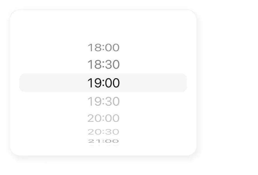
```tsx
import { View } from "react-native"
import { WheelPicker, WheelPickerColumn, WheelPickerItem } from "@/components/ui/wheel-picker"
const slots = Array.from({ length: 11 }, (_, index) => {
const minutes = 18 * 60 + index * 30
return `${Math.floor(minutes / 60)}:${String(minutes % 60).padStart(2, "0")}`
})
const booked = new Set(["19:30", "20:00", "20:30"])
const minutes = Array.from({ length: 12 }, (_, step) =>
String(step * 5).padStart(2, "0")
)
export function WheelPickerDisabledItemsExample() {
return (
{slots.map((slot) => (
{slot}
))}
)
}
```
```swift
import EsuissUI
import SwiftUI
struct WheelPickerDisabledItemsExample: View {
var body: some View {
WheelPickerFrame {
SlotsDemo()
}
}
}
struct WheelPickerFrame: View {
@ViewBuilder let content: () -> Content
@Environment(\.colorScheme) private var colorScheme
var body: some View {
let shape = RoundedRectangle(cornerRadius: Radius.xl2, style: .continuous)
content()
.padding(16)
.frame(width: 320)
.background(Color.surfaceRaised, in: shape)
.overlay {
shape.strokeBorder(Color.label.opacity(colorScheme == .dark ? 0.1 : 0.05))
}
.shadow(Shadow.md)
}
}
let wheelSlots: [String] = (0..<11).map { index in
let minutes = 18 * 60 + index * 30
return String(format: "%d:%02d", minutes / 60, minutes % 60)
}
let wheelBooked: Set = ["19:30", "20:00", "20:30"]
struct SlotsDemo: View {
@State private var slot = "19:00"
var body: some View {
WheelPicker {
WheelPickerColumn(selection: $slot) {
ForEach(wheelSlots, id: \.self) { item in
WheelPickerItem(verbatim: item, value: item)
.disabled(wheelBooked.contains(item))
}
}
.accessibilityLabel(Text("Reservation time"))
}
}
}
```
```kotlin
import androidx.compose.foundation.background
import androidx.compose.foundation.border
import androidx.compose.foundation.layout.Box
import androidx.compose.foundation.layout.fillMaxWidth
import androidx.compose.foundation.layout.padding
import androidx.compose.foundation.layout.width
import androidx.compose.foundation.shape.RoundedCornerShape
import androidx.compose.runtime.Composable
import androidx.compose.runtime.getValue
import androidx.compose.runtime.mutableStateOf
import androidx.compose.runtime.saveable.rememberSaveable
import androidx.compose.runtime.setValue
import androidx.compose.ui.Modifier
import androidx.compose.ui.unit.dp
import com.esuiss.ui.components.WheelPicker
import com.esuiss.ui.components.WheelPickerColumn
import com.esuiss.ui.theme.EsuissTheme
import com.esuiss.ui.theme.Radius
import com.esuiss.ui.theme.Shadows
import com.esuiss.ui.theme.shadow
@Composable
fun WheelPickerDisabledItemsExample() {
WheelPickerFrame { WheelPickerDisabledItems() }
}
val wheelPickerSlots = List(11) { index ->
val minutes = 18 * 60 + index * 30
"${minutes / 60}:${(minutes % 60).toString().padStart(2, '0')}"
}
val wheelPickerBooked = setOf("19:30", "20:00", "20:30")
@Composable
fun WheelPickerFrame(content: @Composable () -> Unit) {
val colors = EsuissTheme.colors
val shape = RoundedCornerShape(Radius.xl2)
Box(
Modifier
.width(320.dp)
.shadow(Shadows.md, shape)
.background(colors.surfaceRaised, shape)
.border(1.dp, colors.label.copy(alpha = if (colors.isDark) 0.1f else 0.05f), shape)
.padding(16.dp),
) {
content()
}
}
@Composable
fun WheelPickerDisabledItems() {
var value by rememberSaveable { mutableStateOf("19:00") }
WheelPicker(Modifier.fillMaxWidth()) {
WheelPickerColumn(value, { value = it }, label = "Reservation time") {
wheelPickerSlots.forEach { WheelPickerItem(it, it, enabled = it !in wheelPickerBooked) }
}
}
}
```
### Date time
Controlled day, hour and minute columns combined into one value.
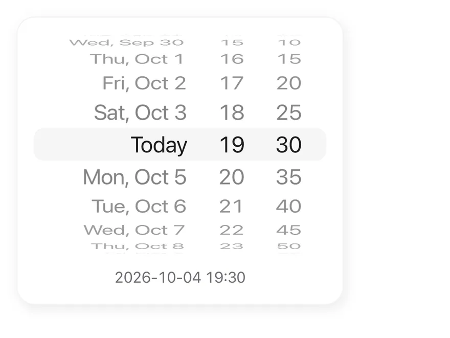
```tsx
import * as React from "react"
import { View } from "react-native"
import { Text } from "@/components/ui/text"
import { WheelPicker, WheelPickerColumn, WheelPickerItem } from "@/components/ui/wheel-picker"
function toDayValue(date: Date) {
return [
date.getFullYear(),
String(date.getMonth() + 1).padStart(2, "0"),
String(date.getDate()).padStart(2, "0"),
].join("-")
}
const today = new Date(2026, 9, 4)
const days = Array.from({ length: 15 }, (_, index) => {
const date = new Date(
today.getFullYear(),
today.getMonth(),
today.getDate() + index - 7
)
const label =
index === 7
? "Today"
: date.toLocaleDateString("en-US", {
weekday: "short",
month: "short",
day: "numeric",
})
return { value: toDayValue(date), label }
})
const hours = Array.from({ length: 24 }, (_, hour) =>
String(hour).padStart(2, "0")
)
const minutes = Array.from({ length: 12 }, (_, step) =>
String(step * 5).padStart(2, "0")
)
function DateTimeExample() {
const [day, setDay] = React.useState(toDayValue(today))
const [hour, setHour] = React.useState("19")
const [minute, setMinute] = React.useState("30")
return (
{days.map(({ value, label }) => (
{label}
))}
{hours.map((value) => (
{value}
))}
{minutes.map((value) => (
{value}
))}
{day} {hour}:{minute}
)
}
export function WheelPickerDateTimeExample() {
return (
)
}
```
```swift
import EsuissUI
import SwiftUI
struct WheelPickerDateTimeExample: View {
var body: some View {
WheelPickerFrame {
DateTimeDemo()
}
}
}
struct WheelPickerFrame: View {
@ViewBuilder let content: () -> Content
@Environment(\.colorScheme) private var colorScheme
var body: some View {
let shape = RoundedRectangle(cornerRadius: Radius.xl2, style: .continuous)
content()
.padding(16)
.frame(width: 320)
.background(Color.surfaceRaised, in: shape)
.overlay {
shape.strokeBorder(Color.label.opacity(colorScheme == .dark ? 0.1 : 0.05))
}
.shadow(Shadow.md)
}
}
struct WheelDay {
let value: String
let label: String
}
let wheelDays: [WheelDay] = {
var calendar = Calendar(identifier: .gregorian)
calendar.timeZone = TimeZone(identifier: "UTC") ?? .current
let today = calendar.date(from: DateComponents(year: 2026, month: 10, day: 4)) ?? .now
let label = Date.FormatStyle(timeZone: calendar.timeZone)
.weekday(.abbreviated)
.month(.abbreviated)
.day()
.locale(Locale(identifier: "en_US"))
return (0..<15).map { index in
let date = calendar.date(byAdding: .day, value: index - 7, to: today) ?? today
let parts = calendar.dateComponents([.year, .month, .day], from: date)
let value = String(format: "%04d-%02d-%02d", parts.year ?? 0, parts.month ?? 0, parts.day ?? 0)
return WheelDay(value: value, label: index == 7 ? "Today" : date.formatted(label))
}
}()
let wheelHours = (0..<24).map { String(format: "%02d", $0) }
let wheelMinutes = (0..<12).map { String(format: "%02d", $0 * 5) }
struct DateTimeDemo: View {
@State private var day = "2026-10-04"
@State private var hour = "19"
@State private var minute = "30"
var body: some View {
VStack(spacing: 12) {
WheelPicker {
WheelPickerColumn(selection: $day, alignment: .trailing) {
ForEach(wheelDays, id: \.value) { item in
WheelPickerItem(verbatim: item.label, value: item.value)
}
}
.frame(minWidth: 150, maxWidth: .infinity, alignment: .trailing)
.accessibilityLabel(Text("Day"))
WheelPickerColumn(selection: $hour) {
ForEach(wheelHours, id: \.self) { item in
WheelPickerItem(verbatim: item, value: item)
}
}
.accessibilityLabel(Text("Hour"))
WheelPickerColumn(selection: $minute, alignment: .leading) {
ForEach(wheelMinutes, id: \.self) { item in
WheelPickerItem(verbatim: item, value: item)
}
}
.frame(maxWidth: .infinity, alignment: .leading)
.accessibilityLabel(Text("Minute"))
}
Text(verbatim: "\(day) \(hour):\(minute)")
.textStyle(.sm)
.monospacedDigit()
.foregroundStyle(Color.labelSecondary)
.multilineTextAlignment(.center)
.frame(maxWidth: .infinity)
}
}
}
```
```kotlin
import androidx.compose.foundation.background
import androidx.compose.foundation.border
import androidx.compose.foundation.layout.Arrangement
import androidx.compose.foundation.layout.Box
import androidx.compose.foundation.layout.Column
import androidx.compose.foundation.layout.fillMaxWidth
import androidx.compose.foundation.layout.padding
import androidx.compose.foundation.layout.width
import androidx.compose.foundation.shape.RoundedCornerShape
import androidx.compose.runtime.Composable
import androidx.compose.runtime.getValue
import androidx.compose.runtime.mutableStateOf
import androidx.compose.runtime.saveable.rememberSaveable
import androidx.compose.runtime.setValue
import androidx.compose.ui.Alignment
import androidx.compose.ui.Modifier
import androidx.compose.ui.text.style.TextAlign
import androidx.compose.ui.unit.dp
import com.esuiss.ui.components.Text
import com.esuiss.ui.components.WheelPicker
import com.esuiss.ui.components.WheelPickerColumn
import com.esuiss.ui.theme.EsuissTheme
import com.esuiss.ui.theme.Radius
import com.esuiss.ui.theme.Shadows
import com.esuiss.ui.theme.Typography
import com.esuiss.ui.theme.shadow
import java.text.SimpleDateFormat
import java.util.Calendar
import java.util.Locale
@Composable
fun WheelPickerDateTimeExample() {
WheelPickerFrame { WheelPickerDateTime() }
}
class WheelPickerDay(val value: String, val label: String)
val wheelPickerDays: List = run {
val format = SimpleDateFormat("EEE, MMM d", Locale.US)
val key = SimpleDateFormat("yyyy-MM-dd", Locale.US)
List(15) { index ->
val calendar = Calendar.getInstance(Locale.US)
calendar.clear()
calendar.set(2026, Calendar.OCTOBER, 4 + index - 7)
WheelPickerDay(key.format(calendar.time), if (index == 7) "Today" else format.format(calendar.time))
}
}
val wheelPickerHours = List(24) { it.toString().padStart(2, '0') }
val wheelPickerMinutes = List(12) { (it * 5).toString().padStart(2, '0') }
@Composable
fun WheelPickerFrame(content: @Composable () -> Unit) {
val colors = EsuissTheme.colors
val shape = RoundedCornerShape(Radius.xl2)
Box(
Modifier
.width(320.dp)
.shadow(Shadows.md, shape)
.background(colors.surfaceRaised, shape)
.border(1.dp, colors.label.copy(alpha = if (colors.isDark) 0.1f else 0.05f), shape)
.padding(16.dp),
) {
content()
}
}
@Composable
fun WheelPickerDateTime() {
var day by rememberSaveable { mutableStateOf(wheelPickerDays[7].value) }
var hour by rememberSaveable { mutableStateOf("19") }
var minute by rememberSaveable { mutableStateOf("30") }
Column(Modifier.fillMaxWidth(), verticalArrangement = Arrangement.spacedBy(12.dp)) {
WheelPicker(Modifier.fillMaxWidth()) {
WheelPickerColumn(
day,
{ day = it },
Modifier.weight(1.6f),
label = "Day",
horizontalAlignment = Alignment.End,
) {
wheelPickerDays.forEach { WheelPickerItem(it.value, it.label) }
}
WheelPickerColumn(hour, { hour = it }, label = "Hour") {
wheelPickerHours.forEach { WheelPickerItem(it, it) }
}
WheelPickerColumn(
minute,
{ minute = it },
Modifier.weight(1f),
label = "Minute",
horizontalAlignment = Alignment.Start,
) {
wheelPickerMinutes.forEach { WheelPickerItem(it, it) }
}
}
Text(
"$day $hour:$minute",
modifier = Modifier.fillMaxWidth(),
style = Typography.sm.copy(fontFeatureSettings = "tnum"),
color = EsuissTheme.colors.labelSecondary,
textAlign = TextAlign.Center,
)
}
}
```
## API Reference
### WheelPicker
Root row of columns with the selection highlight.
### WheelPickerColumn
Snapping scroll column that holds one value.
### WheelPickerItem
Single row in a column.
## Accessibility
- Each column has the `adjustable` role and announces the selected item's label as its value.
- VoiceOver and TalkBack users swipe up or down to move to the next or previous enabled item.
- Give each column an `accessibilityLabel`, such as `Hour` or `Minute`.
- The highlight band is hidden from screen readers.
## Notes
- A selection haptic plays when the value changes, if a haptics adapter is provided through the haptics context.
- The highlight uses `bg-control`; items use `text-xl text-label` with tabular numbers and `text-label-tertiary` when disabled.
- Light and dark colors follow the system appearance.