# Signature Pad
A drawing area that captures a handwritten signature as strokes and can export it as an SVG string.
Signature Pad is an open-source mobile component from suiss/uim for React Native and Expo, with SwiftUI and Jetpack Compose versions built from the same design tokens. The @esuiss/uim CLI copies its source into your project, so you own the code.
Source: https://uim.suiss.app/docs/components/signature-pad
```tsx
import { SignaturePad } from "@/components/ui/signature-pad"
export function SignaturePadExample() {
return (
)
}
```
```swift
import EsuissUI
import SwiftUI
struct SignaturePadExample: View {
var body: some View {
SignaturePadDemo(initial: [])
}
}
struct SignaturePadDemo: View {
var strokeWidth: CGFloat = 2.5
@State private var strokes: [SignatureStroke]
init(initial: [SignatureStroke], strokeWidth: CGFloat = 2.5) {
self.strokeWidth = strokeWidth
_strokes = State(initialValue: initial)
}
var body: some View {
SignaturePad(value: $strokes, strokeWidth: strokeWidth)
.frame(height: 192)
.frame(maxWidth: .infinity)
}
}
```
```kotlin
import androidx.compose.foundation.layout.fillMaxWidth
import androidx.compose.runtime.Composable
import androidx.compose.ui.Modifier
import com.esuiss.ui.components.SignaturePad
@Composable
fun SignaturePadExample() {
SignaturePad(Modifier.fillMaxWidth())
}
```
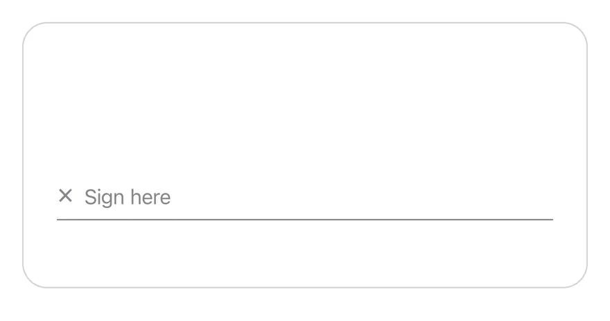
`SignaturePad` is a `View` with a single-finger pan gesture from `react-native-gesture-handler`. Each touch records a stroke of points, and the strokes are drawn as smoothed paths with `react-native-svg`. A signature line with an `×` mark and a placeholder sits near the bottom, and a ghost Clear button appears in the top corner once something is drawn.
## Installation
```bash title="Terminal"
npx @esuiss/uim@latest add signature-pad
```
```bash title="Terminal"
npx @esuiss/uim@latest add signature-pad --platform swift
```
```bash title="Terminal"
npx @esuiss/uim@latest add signature-pad --platform kotlin
```
The CLI also adds what it builds on: [Button](/docs/components/button), [Icon](/docs/components/icon), [Text](/docs/components/text).
### Manual
**Uniwind**
1. Install the dependencies:
```bash title="Terminal"
npx expo install cn phosphor-react-native react-native-gesture-handler react-native-svg
```
2. Add the pieces it builds on: [Button](/docs/components/button), [Icon](/docs/components/icon), [Text](/docs/components/text).
3. Copy the source into `components/ui/signature-pad.tsx`:
```tsx title="uniwind/components/ui/signature-pad.tsx"
import { cn } from "cn"
import type { IconProps as PhosphorIconProps } from "phosphor-react-native"
import * as React from "react"
import { View } from "react-native"
import { Gesture, GestureDetector } from "react-native-gesture-handler"
import Svg, { Path } from "react-native-svg"
import { Button } from "@/components/ui/button"
import { Icon } from "@/components/ui/icon"
import { Text, TextClassContext } from "@/components/ui/text"
type SignaturePadPoint = { x: number; y: number }
type SignaturePadStroke = SignaturePadPoint[]
type SignaturePadHandle = {
toSVG: (options?: { color?: string }) => string
clear: () => void
isEmpty: () => boolean
}
type SignaturePadContextValue = {
strokes: SignaturePadStroke[]
strokeWidth: number
}
const SignaturePadContext = React.createContext({
strokes: [],
strokeWidth: 2.5,
})
function round(value: number) {
return Math.round(value * 10) / 10
}
function strokePath(stroke: SignaturePadStroke) {
const [first, ...rest] = stroke
if (!first) return ""
if (rest.length === 0) {
return `M${round(first.x)} ${round(first.y)}L${round(first.x)} ${round(first.y)}`
}
let path = `M${round(first.x)} ${round(first.y)}`
for (let index = 1; index < stroke.length - 1; index++) {
const point = stroke[index]
const next = stroke[index + 1]
if (!point || !next) continue
path += `Q${round(point.x)} ${round(point.y)} ${round((point.x + next.x) / 2)} ${round((point.y + next.y) / 2)}`
}
const last = stroke[stroke.length - 1]
if (last) path += `L${round(last.x)} ${round(last.y)}`
return path
}
function signatureToSVG(
strokes: SignaturePadStroke[],
width: number,
height: number,
strokeWidth: number,
color: string
) {
const paths = strokes
.filter((stroke) => stroke.length > 0)
.map(
(stroke) =>
``
)
.join("")
return ``
}
function SignaturePadStrokes({ color }: PhosphorIconProps) {
const { strokes, strokeWidth } = React.useContext(SignaturePadContext)
return (
)
}
function SignaturePad({
value: valueProp,
defaultValue,
onChange,
strokeWidth = 2.5,
disabled = false,
placeholder = "Sign here",
clearLabel = "Clear",
accessibilityLabel = "Signature",
className,
ref,
...props
}: Omit, "children"> & {
value?: SignaturePadStroke[]
defaultValue?: SignaturePadStroke[]
onChange?: (value: SignaturePadStroke[]) => void
strokeWidth?: number
disabled?: boolean
placeholder?: React.ReactNode
clearLabel?: React.ReactNode
ref?: React.Ref
}) {
const [uncontrolled, setUncontrolled] = React.useState(
defaultValue ?? []
)
const isControlled = valueProp !== undefined
const value = isControlled ? valueProp : uncontrolled
const valueRef = React.useRef(value)
valueRef.current = value
const [active, setActive] = React.useState(null)
const activeRef = React.useRef(null)
const sizeRef = React.useRef({ width: 0, height: 0 })
const commit = React.useCallback(
(next: SignaturePadStroke[]) => {
valueRef.current = next
if (!isControlled) setUncontrolled(next)
onChange?.(next)
},
[isControlled, onChange]
)
const clear = React.useCallback(() => {
activeRef.current = null
setActive(null)
if (valueRef.current.length === 0) return
commit([])
}, [commit])
React.useImperativeHandle(
ref,
() => ({
toSVG: (options) =>
signatureToSVG(
valueRef.current,
sizeRef.current.width,
sizeRef.current.height,
strokeWidth,
options?.color ?? "currentColor"
),
clear,
isEmpty: () => valueRef.current.length === 0,
}),
[clear, strokeWidth]
)
const gesture = React.useMemo(
() =>
Gesture.Pan()
.runOnJS(true)
.enabled(!disabled)
.minDistance(0)
.maxPointers(1)
.onBegin((event) => {
const stroke = [{ x: event.x, y: event.y }]
activeRef.current = stroke
setActive(stroke)
})
.onUpdate((event) => {
const current = activeRef.current
if (!current) return
const last = current[current.length - 1]
if (
last &&
Math.abs(last.x - event.x) < 1 &&
Math.abs(last.y - event.y) < 1
) {
return
}
const stroke = [...current, { x: event.x, y: event.y }]
activeRef.current = stroke
setActive(stroke)
})
.onFinalize(() => {
const stroke = activeRef.current
activeRef.current = null
setActive(null)
if (stroke && stroke.length > 0) commit([...valueRef.current, stroke])
}),
[disabled, commit]
)
const strokes = active ? [...value, active] : value
const empty = strokes.length === 0
const context = React.useMemo(
() => ({ strokes, strokeWidth }),
[strokes, strokeWidth]
)
return (
{
if (event.nativeEvent.actionName === "clear") clear()
}}
onLayout={(event) => {
sizeRef.current = {
width: event.nativeEvent.layout.width,
height: event.nativeEvent.layout.height,
}
}}
className={cn(
"relative h-48 w-full overflow-hidden rounded-2xl border border-separator bg-surface-raised dark:bg-surface-secondary",
disabled && "opacity-50",
className
)}
{...props}
>
×
{empty ? (
typeof placeholder === "string" || typeof placeholder === "number" ? (
{placeholder}
) : (
placeholder
)
) : null}
{!empty && !disabled ? (
) : null}
)
}
export type { SignaturePadHandle, SignaturePadPoint, SignaturePadStroke }
export { SignaturePad }
```
4. Update the import paths to match your project.
**NativeWind**
1. Install the dependencies:
```bash title="Terminal"
npx expo install cn phosphor-react-native react-native-gesture-handler react-native-svg
```
2. Add the pieces it builds on: [Button](/docs/components/button), [Icon](/docs/components/icon), [Text](/docs/components/text).
3. Copy the source into `components/ui/signature-pad.tsx`:
```tsx title="nativewind/components/ui/signature-pad.tsx"
import { cn } from "cn"
import type { IconProps as PhosphorIconProps } from "phosphor-react-native"
import * as React from "react"
import { View } from "react-native"
import { Gesture, GestureDetector } from "react-native-gesture-handler"
import Svg, { Path } from "react-native-svg"
import { Button } from "@/components/ui/button"
import { Icon } from "@/components/ui/icon"
import { Text, TextClassContext } from "@/components/ui/text"
type SignaturePadPoint = { x: number; y: number }
type SignaturePadStroke = SignaturePadPoint[]
type SignaturePadHandle = {
toSVG: (options?: { color?: string }) => string
clear: () => void
isEmpty: () => boolean
}
type SignaturePadContextValue = {
strokes: SignaturePadStroke[]
strokeWidth: number
}
const SignaturePadContext = React.createContext({
strokes: [],
strokeWidth: 2.5,
})
function round(value: number) {
return Math.round(value * 10) / 10
}
function strokePath(stroke: SignaturePadStroke) {
const [first, ...rest] = stroke
if (!first) return ""
if (rest.length === 0) {
return `M${round(first.x)} ${round(first.y)}L${round(first.x)} ${round(first.y)}`
}
let path = `M${round(first.x)} ${round(first.y)}`
for (let index = 1; index < stroke.length - 1; index++) {
const point = stroke[index]
const next = stroke[index + 1]
if (!point || !next) continue
path += `Q${round(point.x)} ${round(point.y)} ${round((point.x + next.x) / 2)} ${round((point.y + next.y) / 2)}`
}
const last = stroke[stroke.length - 1]
if (last) path += `L${round(last.x)} ${round(last.y)}`
return path
}
function signatureToSVG(
strokes: SignaturePadStroke[],
width: number,
height: number,
strokeWidth: number,
color: string
) {
const paths = strokes
.filter((stroke) => stroke.length > 0)
.map(
(stroke) =>
``
)
.join("")
return ``
}
function SignaturePadStrokes({ color }: PhosphorIconProps) {
const { strokes, strokeWidth } = React.useContext(SignaturePadContext)
return (
)
}
function SignaturePad({
value: valueProp,
defaultValue,
onChange,
strokeWidth = 2.5,
disabled = false,
placeholder = "Sign here",
clearLabel = "Clear",
accessibilityLabel = "Signature",
className,
ref,
...props
}: Omit, "children"> & {
value?: SignaturePadStroke[]
defaultValue?: SignaturePadStroke[]
onChange?: (value: SignaturePadStroke[]) => void
strokeWidth?: number
disabled?: boolean
placeholder?: React.ReactNode
clearLabel?: React.ReactNode
ref?: React.Ref
}) {
const [uncontrolled, setUncontrolled] = React.useState(
defaultValue ?? []
)
const isControlled = valueProp !== undefined
const value = isControlled ? valueProp : uncontrolled
const valueRef = React.useRef(value)
valueRef.current = value
const [active, setActive] = React.useState(null)
const activeRef = React.useRef(null)
const sizeRef = React.useRef({ width: 0, height: 0 })
const commit = React.useCallback(
(next: SignaturePadStroke[]) => {
valueRef.current = next
if (!isControlled) setUncontrolled(next)
onChange?.(next)
},
[isControlled, onChange]
)
const clear = React.useCallback(() => {
activeRef.current = null
setActive(null)
if (valueRef.current.length === 0) return
commit([])
}, [commit])
React.useImperativeHandle(
ref,
() => ({
toSVG: (options) =>
signatureToSVG(
valueRef.current,
sizeRef.current.width,
sizeRef.current.height,
strokeWidth,
options?.color ?? "currentColor"
),
clear,
isEmpty: () => valueRef.current.length === 0,
}),
[clear, strokeWidth]
)
const gesture = React.useMemo(
() =>
Gesture.Pan()
.runOnJS(true)
.enabled(!disabled)
.minDistance(0)
.maxPointers(1)
.onBegin((event) => {
const stroke = [{ x: event.x, y: event.y }]
activeRef.current = stroke
setActive(stroke)
})
.onUpdate((event) => {
const current = activeRef.current
if (!current) return
const last = current[current.length - 1]
if (
last &&
Math.abs(last.x - event.x) < 1 &&
Math.abs(last.y - event.y) < 1
) {
return
}
const stroke = [...current, { x: event.x, y: event.y }]
activeRef.current = stroke
setActive(stroke)
})
.onFinalize(() => {
const stroke = activeRef.current
activeRef.current = null
setActive(null)
if (stroke && stroke.length > 0) commit([...valueRef.current, stroke])
}),
[disabled, commit]
)
const strokes = active ? [...value, active] : value
const empty = strokes.length === 0
const context = React.useMemo(
() => ({ strokes, strokeWidth }),
[strokes, strokeWidth]
)
return (
{
if (event.nativeEvent.actionName === "clear") clear()
}}
onLayout={(event) => {
sizeRef.current = {
width: event.nativeEvent.layout.width,
height: event.nativeEvent.layout.height,
}
}}
className={cn(
"relative h-48 w-full overflow-hidden rounded-2xl border border-separator bg-surface-raised dark:bg-surface-secondary",
disabled && "opacity-50",
className
)}
{...props}
>
×
{empty ? (
typeof placeholder === "string" || typeof placeholder === "number" ? (
{placeholder}
) : (
placeholder
)
) : null}
{!empty && !disabled ? (
) : null}
)
}
export type { SignaturePadHandle, SignaturePadPoint, SignaturePadStroke }
export { SignaturePad }
```
4. Update the import paths to match your project.
**StyleSheet**
1. Install the dependencies:
```bash title="Terminal"
npx expo install react-native-gesture-handler react-native-svg
```
2. Add the pieces it builds on: [Button](/docs/components/button), [Icon](/docs/components/icon), [Text](/docs/components/text).
3. Copy the source into `components/ui/signature-pad.tsx`:
```tsx title="stylesheet/components/ui/signature-pad.tsx"
import * as React from "react"
import { type StyleProp, StyleSheet, View, type ViewStyle } from "react-native"
import { Gesture, GestureDetector } from "react-native-gesture-handler"
import Svg, { Path } from "react-native-svg"
import { Button } from "@/components/ui/button"
import { Text } from "@/components/ui/text"
import { fontSize, radius, useTheme } from "@/components/ui/theme"
type SignaturePadPoint = { x: number; y: number }
type SignaturePadStroke = SignaturePadPoint[]
type SignaturePadHandle = {
toSVG: (options?: { color?: string }) => string
clear: () => void
isEmpty: () => boolean
}
type SignaturePadContextValue = {
strokes: SignaturePadStroke[]
strokeWidth: number
}
const SignaturePadContext = React.createContext({
strokes: [],
strokeWidth: 2.5,
})
function round(value: number) {
return Math.round(value * 10) / 10
}
function strokePath(stroke: SignaturePadStroke) {
const [first, ...rest] = stroke
if (!first) return ""
if (rest.length === 0) {
return `M${round(first.x)} ${round(first.y)}L${round(first.x)} ${round(first.y)}`
}
let path = `M${round(first.x)} ${round(first.y)}`
for (let index = 1; index < stroke.length - 1; index++) {
const point = stroke[index]
const next = stroke[index + 1]
if (!point || !next) continue
path += `Q${round(point.x)} ${round(point.y)} ${round((point.x + next.x) / 2)} ${round((point.y + next.y) / 2)}`
}
const last = stroke[stroke.length - 1]
if (last) path += `L${round(last.x)} ${round(last.y)}`
return path
}
function signatureToSVG(
strokes: SignaturePadStroke[],
width: number,
height: number,
strokeWidth: number,
color: string
) {
const paths = strokes
.filter((stroke) => stroke.length > 0)
.map(
(stroke) =>
``
)
.join("")
return ``
}
const styles = StyleSheet.create({
root: {
position: "relative",
height: 192,
width: "100%",
overflow: "hidden",
borderRadius: radius["2xl"],
borderWidth: 1,
},
baseline: {
position: "absolute",
left: 24,
right: 24,
bottom: 48,
flexDirection: "row",
alignItems: "flex-end",
gap: 8,
borderBottomWidth: 1,
paddingBottom: 6,
},
mark: { ...fontSize.lg },
placeholder: { ...fontSize.sm },
clear: { position: "absolute", end: 8, top: 8 },
})
function SignaturePadStrokes({ color }: { color: string }) {
const { strokes, strokeWidth } = React.useContext(SignaturePadContext)
return (
)
}
function SignaturePad({
value: valueProp,
defaultValue,
onChange,
strokeWidth = 2.5,
disabled = false,
placeholder = "Sign here",
clearLabel = "Clear",
accessibilityLabel = "Signature",
style,
ref,
...props
}: Omit, "children" | "style"> & {
style?: StyleProp
value?: SignaturePadStroke[]
defaultValue?: SignaturePadStroke[]
onChange?: (value: SignaturePadStroke[]) => void
strokeWidth?: number
disabled?: boolean
placeholder?: React.ReactNode
clearLabel?: React.ReactNode
ref?: React.Ref
}) {
const [uncontrolled, setUncontrolled] = React.useState(
defaultValue ?? []
)
const isControlled = valueProp !== undefined
const value = isControlled ? valueProp : uncontrolled
const valueRef = React.useRef(value)
valueRef.current = value
const [active, setActive] = React.useState(null)
const activeRef = React.useRef(null)
const sizeRef = React.useRef({ width: 0, height: 0 })
const commit = React.useCallback(
(next: SignaturePadStroke[]) => {
valueRef.current = next
if (!isControlled) setUncontrolled(next)
onChange?.(next)
},
[isControlled, onChange]
)
const clear = React.useCallback(() => {
activeRef.current = null
setActive(null)
if (valueRef.current.length === 0) return
commit([])
}, [commit])
React.useImperativeHandle(
ref,
() => ({
toSVG: (options) =>
signatureToSVG(
valueRef.current,
sizeRef.current.width,
sizeRef.current.height,
strokeWidth,
options?.color ?? "currentColor"
),
clear,
isEmpty: () => valueRef.current.length === 0,
}),
[clear, strokeWidth]
)
const gesture = React.useMemo(
() =>
Gesture.Pan()
.runOnJS(true)
.enabled(!disabled)
.minDistance(0)
.maxPointers(1)
.onBegin((event) => {
const stroke = [{ x: event.x, y: event.y }]
activeRef.current = stroke
setActive(stroke)
})
.onUpdate((event) => {
const current = activeRef.current
if (!current) return
const last = current[current.length - 1]
if (
last &&
Math.abs(last.x - event.x) < 1 &&
Math.abs(last.y - event.y) < 1
) {
return
}
const stroke = [...current, { x: event.x, y: event.y }]
activeRef.current = stroke
setActive(stroke)
})
.onFinalize(() => {
const stroke = activeRef.current
activeRef.current = null
setActive(null)
if (stroke && stroke.length > 0) commit([...valueRef.current, stroke])
}),
[disabled, commit]
)
const { colors, isDark } = useTheme()
const strokes = active ? [...value, active] : value
const empty = strokes.length === 0
const context = React.useMemo(
() => ({ strokes, strokeWidth }),
[strokes, strokeWidth]
)
return (
{
if (event.nativeEvent.actionName === "clear") clear()
}}
onLayout={(event) => {
sizeRef.current = {
width: event.nativeEvent.layout.width,
height: event.nativeEvent.layout.height,
}
}}
style={[
styles.root,
{
borderColor: colors.separator,
backgroundColor: isDark
? colors.surfaceSecondary
: colors.surfaceRaised,
},
disabled && { opacity: 0.5 },
style,
]}
{...props}
>
×
{empty ? (
typeof placeholder === "string" || typeof placeholder === "number" ? (
{placeholder}
) : (
placeholder
)
) : null}
{!empty && !disabled ? (
) : null}
)
}
export type { SignaturePadHandle, SignaturePadPoint, SignaturePadStroke }
export { SignaturePad }
```
4. Update the import paths to match your project.
**SwiftUI**
1. Target iOS 17 or later.
2. Add the Swift package to your app:
```swift title="Package.swift"
.package(url: "https://github.com/phosphor-icons/swift", from: "2.1.0")
```
3. Copy the theme files every view uses:
```swift title="swift/Theme/Theme.swift"
import SwiftUI
import UIKit
struct RGBA: Sendable {
let red: CGFloat
let green: CGFloat
let blue: CGFloat
let alpha: CGFloat
init(_ hex: UInt32, _ alpha: CGFloat = 1) {
red = CGFloat((hex >> 16) & 0xFF) / 255
green = CGFloat((hex >> 8) & 0xFF) / 255
blue = CGFloat(hex & 0xFF) / 255
self.alpha = alpha
}
var uiColor: UIColor {
UIColor(red: red, green: green, blue: blue, alpha: alpha)
}
}
extension Color {
static func adaptive(light: RGBA, dark: RGBA) -> Color {
let lightColor = light.uiColor
let darkColor = dark.uiColor
return Color(uiColor: UIColor { traits in
traits.userInterfaceStyle == .dark ? darkColor : lightColor
})
}
}
public struct TextStyle: Sendable, Hashable {
public let size: CGFloat
public let lineHeight: CGFloat
public let letterSpacing: CGFloat
public init(size: CGFloat, lineHeight: CGFloat, letterSpacing: CGFloat) {
self.size = size
self.lineHeight = lineHeight
self.letterSpacing = letterSpacing
}
public func font(weight: Font.Weight = .regular) -> Font {
.system(size: size, weight: weight)
}
public var lineSpacing: CGFloat {
max(0, lineHeight - UIFont.systemFont(ofSize: size).lineHeight)
}
}
extension Hashable where Self == Font {
public static func textStyle(_ style: TextStyle, weight: Font.Weight = .regular) -> Font {
style.font(weight: weight)
}
}
private struct TextStyleModifier: ViewModifier {
let style: TextStyle
let weight: Font.Weight
func body(content: Content) -> some View {
content
.font(style.font(weight: weight))
.tracking(style.letterSpacing)
.lineSpacing(style.lineSpacing)
.padding(.vertical, style.lineSpacing / 2)
}
}
extension View {
public func textStyle(_ style: TextStyle, weight: Font.Weight = .regular) -> some View {
modifier(TextStyleModifier(style: style, weight: weight))
}
}
public struct Shadow: Sendable, Hashable {
public let color: Color
public let radius: CGFloat
public let x: CGFloat
public let y: CGFloat
public init(color: Color, radius: CGFloat, x: CGFloat = 0, y: CGFloat = 0) {
self.color = color
self.radius = radius
self.x = x
self.y = y
}
}
extension View {
public func shadow(_ shadow: Shadow) -> some View {
self.shadow(color: shadow.color, radius: shadow.radius, x: shadow.x, y: shadow.y)
}
}
```
```swift title="swift/Theme/Tokens.swift"
import SwiftUI
extension Color {
public static let surface = Color.adaptive(light: .init(0xFFFFFF), dark: .init(0x000000))
public static let surfaceSecondary = Color.adaptive(light: .init(0xF5F5F7), dark: .init(0x161617))
public static let surfaceTertiary = Color.adaptive(light: .init(0xE8E8ED), dark: .init(0x2C2C2E))
public static let surfaceRaised = Color.adaptive(light: .init(0xFFFFFF), dark: .init(0x1D1D1F))
public static let label = Color.adaptive(light: .init(0x1D1D1F), dark: .init(0xF5F5F7))
public static let labelSecondary = Color.adaptive(light: .init(0x6E6E73), dark: .init(0xA1A1A6))
public static let labelTertiary = Color.adaptive(light: .init(0x86868B), dark: .init(0x86868B))
public static let labelQuaternary = Color.adaptive(light: .init(0xD2D2D7), dark: .init(0x424245))
public static let control = Color.adaptive(light: .init(0x000000, 0.04), dark: .init(0xFFFFFF, 0.1))
public static let controlPressed = Color.adaptive(light: .init(0x000000, 0.12), dark: .init(0xFFFFFF, 0.22))
public static let controlSelected = Color.adaptive(light: .init(0x1D1D1F), dark: .init(0xF5F5F7))
public static let controlDisabled = Color.adaptive(light: .init(0x000000, 0.03), dark: .init(0xFFFFFF, 0.05))
public static let onControlSelected = Color.adaptive(light: .init(0xFFFFFF), dark: .init(0x000000))
public static let itemPressed = Color.adaptive(light: .init(0x000000, 0.08), dark: .init(0xFFFFFF, 0.12))
public static let itemSelected = Color.adaptive(light: .init(0x000000, 0.06), dark: .init(0xFFFFFF, 0.1))
public static let separator = Color.adaptive(light: .init(0xD2D2D7), dark: .init(0x424245))
public static let separatorStrong = Color.adaptive(light: .init(0x86868B), dark: .init(0x6E6E73))
public static let accent = Color.adaptive(light: .init(0x0071E3), dark: .init(0x0071E3))
public static let accentPressed = Color.adaptive(light: .init(0x005BB8), dark: .init(0x004D9E))
public static let accentSelected = Color.adaptive(light: .init(0x0071E3), dark: .init(0x0071E3))
public static let accentDisabled = Color.adaptive(light: .init(0x0071E3, 0.4), dark: .init(0x0071E3, 0.4))
public static let onAccent = Color.adaptive(light: .init(0xFFFFFF), dark: .init(0xFFFFFF))
public static let accentSurface = Color.adaptive(light: .init(0x0071E3, 0.09), dark: .init(0x0071E3, 0.18))
public static let accentSurfacePressed = Color.adaptive(light: .init(0x0071E3, 0.18), dark: .init(0x0071E3, 0.3))
public static let link = Color.adaptive(light: .init(0x0066CC), dark: .init(0x2997FF))
public static let focus = Color.adaptive(light: .init(0x0071E3), dark: .init(0x0071E3))
public static let scrim = Color.adaptive(light: .init(0x000000, 0.48), dark: .init(0x000000, 0.48))
public static let media = Color.adaptive(light: .init(0x000000), dark: .init(0x000000))
public static let onMedia = Color.adaptive(light: .init(0xFFFFFF), dark: .init(0xFFFFFF))
public static let danger = Color.adaptive(light: .init(0xD0000A), dark: .init(0xFF5447))
public static let dangerSurface = Color.adaptive(light: .init(0xD70015, 0.08), dark: .init(0xFF453A, 0.2))
public static let dangerSurfacePressed = Color.adaptive(light: .init(0xD70015, 0.16), dark: .init(0xFF453A, 0.36))
public static let success = Color.adaptive(light: .init(0x008009), dark: .init(0x30D158))
public static let successSurface = Color.adaptive(light: .init(0xEFFAF1), dark: .init(0x30D158, 0.16))
public static let warning = Color.adaptive(light: .init(0xB64400), dark: .init(0xFF9F0A))
public static let warningSurface = Color.adaptive(light: .init(0xFFF5EA), dark: .init(0xFF9F0A, 0.16))
}
public enum Radius {
public static let xs: CGFloat = 3
public static let sm: CGFloat = 5
public static let md: CGFloat = 8
public static let lg: CGFloat = 10
public static let xl: CGFloat = 12
public static let xl2: CGFloat = 18
public static let xl3: CGFloat = 28
public static let full: CGFloat = 9999
}
extension TextStyle {
public static let xs3 = TextStyle(size: 11, lineHeight: 13, letterSpacing: 0.066)
public static let xs2 = TextStyle(size: 12, lineHeight: 16, letterSpacing: 0)
public static let xs = TextStyle(size: 13, lineHeight: 18, letterSpacing: -0.078)
public static let sm = TextStyle(size: 15, lineHeight: 20, letterSpacing: -0.24)
public static let md = TextStyle(size: 16, lineHeight: 21, letterSpacing: -0.32)
public static let base = TextStyle(size: 17, lineHeight: 22, letterSpacing: -0.442)
public static let lg = TextStyle(size: 20, lineHeight: 25, letterSpacing: -0.46)
public static let xl = TextStyle(size: 22, lineHeight: 28, letterSpacing: -0.264)
public static let xl2 = TextStyle(size: 28, lineHeight: 34, letterSpacing: 0.392)
public static let xl3 = TextStyle(size: 34, lineHeight: 41, letterSpacing: 0.408)
public static let allCases: [TextStyle] = [.xs3, .xs2, .xs, .sm, .md, .base, .lg, .xl, .xl2, .xl3]
}
extension Shadow {
public static let md = Shadow(color: .black.opacity(0.08), radius: 6, x: 2, y: 4)
public static let lg = Shadow(color: .black.opacity(0.12), radius: 12, y: 4)
}
```
4. Copy the source and every file it uses:
```swift title="swift/Components/SignaturePad.swift"
import PhosphorSwift
import SwiftUI
import UIKit
public struct SignatureStroke: Hashable, Sendable {
public var points: [CGPoint]
public init(_ points: [CGPoint]) {
self.points = points
}
}
enum SignatureMath {
static func path(for stroke: [CGPoint], strokeWidth: CGFloat) -> Path {
var path = Path()
guard let first = stroke.first else { return path }
if stroke.count == 1 {
let radius = strokeWidth / 2
path.addEllipse(in: CGRect(x: first.x - radius, y: first.y - radius, width: radius * 2, height: radius * 2))
return path
}
path.move(to: first)
if stroke.count == 2 {
path.addLine(to: stroke[1])
return path
}
for index in 1..<(stroke.count - 1) {
let point = stroke[index]
let next = stroke[index + 1]
let middle = CGPoint(x: (point.x + next.x) / 2, y: (point.y + next.y) / 2)
path.addQuadCurve(to: middle, control: point)
}
if let last = stroke.last {
path.addLine(to: last)
}
return path
}
static func path(for strokes: [SignatureStroke], strokeWidth: CGFloat) -> Path {
var path = Path()
for stroke in strokes {
path.addPath(self.path(for: stroke.points, strokeWidth: strokeWidth))
}
return path
}
static func appending(_ point: CGPoint, to stroke: [CGPoint], minDistance: CGFloat = 1.5) -> [CGPoint] {
guard let last = stroke.last else { return [point] }
let distance = hypot(point.x - last.x, point.y - last.y)
return distance < minDistance ? stroke : stroke + [point]
}
static func clamp(_ point: CGPoint, to size: CGSize) -> CGPoint {
CGPoint(x: min(max(point.x, 0), size.width), y: min(max(point.y, 0), size.height))
}
}
public struct SignaturePad: View {
@Binding var value: [SignatureStroke]
let strokeWidth: CGFloat
let placeholder: Text
let clearable: Bool
@State private var current: [CGPoint] = []
@Environment(\.isEnabled) private var isEnabled
@Environment(\.isInvalid) private var invalid
public init(
value: Binding<[SignatureStroke]>,
strokeWidth: CGFloat = 2.5,
placeholder: LocalizedStringKey = "Sign here",
clearable: Bool = true
) {
_value = value
self.strokeWidth = strokeWidth
self.placeholder = Text(placeholder)
self.clearable = clearable
}
public static func path(_ strokes: [SignatureStroke], strokeWidth: CGFloat = 2.5) -> Path {
SignatureMath.path(for: strokes, strokeWidth: strokeWidth)
}
@MainActor
public static func image(
_ strokes: [SignatureStroke],
size: CGSize,
strokeWidth: CGFloat = 2.5,
color: Color = .label,
colorScheme: ColorScheme = .light,
scale: CGFloat = 3
) -> UIImage? {
let shape = path(strokes, strokeWidth: strokeWidth)
let dots = strokes.filter { $0.points.count == 1 }
let renderer = ImageRenderer(
content: ZStack {
shape.stroke(color, style: StrokeStyle(lineWidth: strokeWidth, lineCap: .round, lineJoin: .round))
SignatureMath.path(for: dots, strokeWidth: strokeWidth).fill(color)
}
.frame(width: size.width, height: size.height)
.environment(\.colorScheme, colorScheme)
)
renderer.scale = scale
renderer.isOpaque = false
return renderer.uiImage
}
public var body: some View {
let shape = RoundedRectangle(cornerRadius: Radius.xl, style: .continuous)
let empty = value.isEmpty && current.isEmpty
GeometryReader { proxy in
let size = proxy.size
ZStack(alignment: .bottomLeading) {
VStack(alignment: .leading, spacing: 6) {
HStack(alignment: .lastTextBaseline, spacing: 8) {
Ph.x.bold
.frame(width: 14, height: 14)
.foregroundStyle(Color.labelTertiary)
if empty {
placeholder
.scaledFont(.sm)
.foregroundStyle(Color.labelTertiary)
.transition(.opacity)
}
}
Rectangle()
.fill(Color.separatorStrong)
.frame(height: 1)
}
.padding(.horizontal, 20)
.padding(.bottom, 28)
.accessibilityHidden(true)
strokes
.frame(width: size.width, height: size.height)
.allowsHitTesting(false)
}
.frame(width: size.width, height: size.height)
.contentShape(shape)
.gesture(drawGesture(size: size), including: isEnabled ? .all : .subviews)
}
.frame(minHeight: 160)
.background(Color.surfaceSecondary, in: shape)
.overlay {
shape.strokeBorder(invalid ? Color.danger : .separator, lineWidth: 1)
}
.overlay(alignment: .topTrailing) {
if clearable && !value.isEmpty && isEnabled {
Button {
withAnimation(.easeOut(duration: 0.2)) { value = [] }
} label: {
Text("Clear")
}
.buttonStyle(.variant(.ghost, size: .sm))
.padding(8)
.transition(.opacity)
}
}
.opacity(isEnabled ? 1 : 0.5)
.animation(.easeOut(duration: 0.15), value: empty)
.accessibilityElement(children: .contain)
.accessibilityLabel(Text("Signature"))
.accessibilityValue(Text(value.isEmpty ? "Empty" : "Signed"))
}
private var strokes: some View {
let width = strokeWidth
let committed = value
let active = current
return Canvas { context, _ in
let style = StrokeStyle(lineWidth: width, lineCap: .round, lineJoin: .round)
for stroke in committed + [SignatureStroke(active)] where !stroke.points.isEmpty {
let path = SignatureMath.path(for: stroke.points, strokeWidth: width)
if stroke.points.count == 1 {
context.fill(path, with: .color(Color.label))
} else {
context.stroke(path, with: .color(Color.label), style: style)
}
}
}
}
private func drawGesture(size: CGSize) -> some Gesture {
DragGesture(minimumDistance: 0, coordinateSpace: .local)
.onChanged { gesture in
current = SignatureMath.appending(SignatureMath.clamp(gesture.location, to: size), to: current)
}
.onEnded { _ in
guard !current.isEmpty else { return }
value.append(SignatureStroke(current))
current = []
}
}
}
```
```swift title="swift/Components/Button.swift"
import SwiftUI
public struct VariantButtonStyle: ButtonStyle {
public enum Variant: CaseIterable, Sendable {
case `default`, outline, secondary, tinted, ghost, plain, destructive, link
}
public enum Size: CaseIterable, Sendable {
case `default`, xs, sm, lg, xl, icon, iconXs, iconSm, iconLg, iconXl
var height: CGFloat {
switch self {
case .xs, .iconXs: 24
case .sm, .iconSm: 32
case .default, .icon: 36
case .lg, .iconLg: 44
case .xl, .iconXl: 56
}
}
var horizontalPadding: CGFloat {
switch self {
case .xs: 11
case .sm: 12
case .default: 16
case .lg: 22
case .xl: 31
case .icon, .iconXs, .iconSm, .iconLg, .iconXl: 0
}
}
var spacing: CGFloat {
switch self {
case .xs, .sm, .iconXs, .iconSm: 4
case .xl, .iconXl: 8
default: 6
}
}
var textStyle: TextStyle {
switch self {
case .xs, .iconXs: .xs2
case .lg, .xl: .base
default: .sm
}
}
public var iconSize: CGFloat {
switch self {
case .xs, .iconXs: 12
default: 16
}
}
var blockRadius: CGFloat {
switch self {
case .xs, .iconXs: Radius.sm
case .lg, .iconLg: Radius.lg
case .xl, .iconXl: Radius.xl
default: Radius.md
}
}
var isIcon: Bool {
switch self {
case .icon, .iconXs, .iconSm, .iconLg, .iconXl: true
default: false
}
}
}
let variant: Variant
let size: Size
let block: Bool
var metrics: ButtonMetrics?
public init(_ variant: Variant = .default, size: Size = .default, block: Bool = false) {
self.variant = variant
self.size = size
self.block = block
}
init(_ variant: Variant, size: Size, metrics: ButtonMetrics) {
self.variant = variant
self.size = size
self.block = false
self.metrics = metrics
}
public func makeBody(configuration: Configuration) -> some View {
StyledButton(configuration: configuration, variant: variant, size: size, block: block, metrics: metrics)
}
}
struct ButtonMetrics: Sendable {
var horizontalPadding: CGFloat
var spacing: CGFloat
var iconSize: CGFloat
var textStyle: TextStyle
}
private struct StyledButton: View {
let configuration: ButtonStyleConfiguration
let variant: VariantButtonStyle.Variant
let size: VariantButtonStyle.Size
let block: Bool
let metrics: ButtonMetrics?
@Environment(\.colorScheme) private var colorScheme
@Environment(\.isEnabled) private var isEnabled
@Environment(\.buttonGroup) private var group
var body: some View {
let joined = group != nil && variant != .ghost && variant != .plain
let rounded = RoundedRectangle(
cornerRadius: block ? size.blockRadius : Radius.full,
style: .continuous
)
let shape = joined ? AnyShape(Rectangle()) : AnyShape(rounded)
configuration.label
.labelStyle(ButtonLabelStyle(spacing: metrics?.spacing ?? size.spacing, iconSize: metrics?.iconSize ?? size.iconSize))
.font((metrics?.textStyle ?? size.textStyle).font())
.tracking((metrics?.textStyle ?? size.textStyle).letterSpacing)
.underline(variant == .link && pressed && isEnabled)
.lineLimit(1)
.foregroundStyle(foreground)
.padding(.horizontal, metrics?.horizontalPadding ?? size.horizontalPadding)
.frame(width: size.isIcon && !block ? size.height : nil, height: size.height)
.frame(maxWidth: block || group == .vertical ? .infinity : nil)
.background(background, in: shape)
.overlay {
if variant == .outline && !joined {
rounded.strokeBorder(Color.separator)
}
}
.contentShape(shape)
.anchorPreference(key: ButtonGroupFramesKey.self, value: .bounds) { anchor in
joined ? [ButtonGroupFrame(bounds: anchor, outlined: variant == .outline)] : []
}
}
private var isDark: Bool { colorScheme == .dark }
private var pressed: Bool { configuration.isPressed }
private var foreground: Color {
switch variant {
case .default:
.onAccent
case .outline, .secondary, .ghost:
isEnabled ? .label : .labelQuaternary
case .tinted, .plain:
isEnabled ? .link : .link.opacity(0.4)
case .destructive:
isEnabled ? .danger : .danger.opacity(0.4)
case .link:
isEnabled ? .link : .labelQuaternary
}
}
private var background: Color {
switch variant {
case .default:
!isEnabled ? .accentDisabled : pressed ? .accentPressed : .accent
case .outline:
isEnabled && pressed ? .itemPressed : isDark ? .clear : .surface
case .secondary:
!isEnabled ? .controlDisabled : pressed ? .controlPressed : .control
case .tinted:
isEnabled && pressed ? .accentSurfacePressed : .accentSurface
case .ghost:
isEnabled && pressed ? .itemPressed : .clear
case .plain:
isEnabled && pressed ? .itemPressed : .clear
case .destructive:
isEnabled && pressed ? .dangerSurfacePressed : .dangerSurface
case .link:
.clear
}
}
}
struct ButtonLabelStyle: LabelStyle {
let spacing: CGFloat
let iconSize: CGFloat
func makeBody(configuration: Configuration) -> some View {
HStack(spacing: spacing) {
configuration.icon
.frame(width: iconSize, height: iconSize)
configuration.title
}
}
}
extension ButtonStyle where Self == VariantButtonStyle {
public static func variant(
_ variant: VariantButtonStyle.Variant = .default,
size: VariantButtonStyle.Size = .default,
block: Bool = false
) -> VariantButtonStyle {
VariantButtonStyle(variant, size: size, block: block)
}
}
```
```swift title="swift/Components/ButtonGroup.swift"
import SwiftUI
extension EnvironmentValues {
@Entry var buttonGroup: Axis? = nil
@Entry var buttonGroupSize: CGSize = .zero
}
enum ButtonGroupSpace: Hashable {
case group
}
struct ButtonGroupFrame {
let bounds: Anchor
let outlined: Bool
}
struct ButtonGroupFramesKey: PreferenceKey {
static var defaultValue: [ButtonGroupFrame] { [] }
static func reduce(value: inout [ButtonGroupFrame], nextValue: () -> [ButtonGroupFrame]) {
value.append(contentsOf: nextValue())
}
}
struct ButtonGroupNestedKey: PreferenceKey {
static var defaultValue: Bool { false }
static func reduce(value: inout Bool, nextValue: () -> Bool) {
value = value || nextValue()
}
}
public struct ButtonGroup: View {
let orientation: Axis
let content: Content
@State private var nested = false
@State private var size: CGSize = .zero
public init(orientation: Axis = .horizontal, @ViewBuilder content: () -> Content) {
self.orientation = orientation
self.content = content()
}
public var body: some View {
let shape = orientation == .horizontal
? AnyShape(Capsule())
: AnyShape(RoundedRectangle(cornerRadius: Radius.xl2, style: .continuous))
stack
.coordinateSpace(.named(ButtonGroupSpace.group))
.onGeometryChange(for: CGSize.self) { $0.size } action: { size = $0 }
.environment(\.buttonGroup, nested ? nil : orientation)
.environment(\.buttonGroupSize, size)
.onPreferenceChange(ButtonGroupNestedKey.self) { nested = $0 }
.modifier(ButtonGroupClip(shape: nested ? nil : shape))
.overlayPreferenceValue(ButtonGroupFramesKey.self) { frames in
if !nested {
GeometryReader { proxy in
outline(frames.map { (proxy[$0.bounds], $0.outlined) }, shape: shape)
}
}
}
.transformPreference(ButtonGroupFramesKey.self) { $0 = [] }
.transformPreference(ButtonGroupNestedKey.self) { $0 = true }
.fixedSize(horizontal: orientation == .vertical, vertical: orientation == .horizontal)
.accessibilityElement(children: .contain)
}
@ViewBuilder private var stack: some View {
switch orientation {
case .horizontal:
HStack(spacing: nested ? 8 : 0) { content }
case .vertical:
VStack(spacing: nested ? 8 : 0) { content }
}
}
@ViewBuilder private func outline(_ frames: [(CGRect, Bool)], shape: AnyShape) -> some View {
if frames.contains(where: \.1) {
ZStack(alignment: .topLeading) {
shape
.stroke(Color.separator, lineWidth: 1)
.padding(0.5)
.mask {
Path { path in
for (rect, outlined) in frames where outlined {
path.addRect(rect)
}
}
}
ForEach(Array(frames.dropLast().enumerated()), id: \.offset) { _, frame in
if frame.1 {
divider(frame.0)
}
}
}
.clipShape(shape)
.allowsHitTesting(false)
}
}
private func divider(_ rect: CGRect) -> some View {
let horizontal = orientation == .horizontal
return Rectangle()
.fill(Color.separator)
.frame(width: horizontal ? 1 : rect.width, height: horizontal ? rect.height : 1)
.position(
x: horizontal ? rect.maxX - 0.5 : rect.midX,
y: horizontal ? rect.midY : rect.maxY - 0.5
)
}
}
struct ButtonGroupItem: View {
let radius: CGFloat
let content: (UnevenRoundedRectangle) -> Content
@State private var frame: CGRect = .zero
@Environment(\.buttonGroup) private var group
@Environment(\.buttonGroupSize) private var groupSize
init(radius: CGFloat, @ViewBuilder content: @escaping (UnevenRoundedRectangle) -> Content) {
self.radius = radius
self.content = content
}
var body: some View {
if let group {
content(shape(group))
.onGeometryChange(for: CGRect.self) { $0.frame(in: .named(ButtonGroupSpace.group)) } action: { frame = $0 }
} else {
content(UnevenRoundedRectangle(cornerRadii: RectangleCornerRadii(
topLeading: radius,
bottomLeading: radius,
bottomTrailing: radius,
topTrailing: radius
), style: .continuous))
}
}
private func shape(_ group: Axis) -> UnevenRoundedRectangle {
let horizontal = group == .horizontal
let first = horizontal ? frame.minX <= 0.5 : frame.minY <= 0.5
let last = horizontal
? frame.maxX >= groupSize.width - 0.5
: frame.maxY >= groupSize.height - 0.5
let round = horizontal ? frame.height / 2 : Radius.xl2
let start: CGFloat = first ? round : 0
let end: CGFloat = last ? round : 0
let radii = horizontal
? RectangleCornerRadii(topLeading: start, bottomLeading: start, bottomTrailing: end, topTrailing: end)
: RectangleCornerRadii(topLeading: start, bottomLeading: end, bottomTrailing: end, topTrailing: start)
return UnevenRoundedRectangle(cornerRadii: radii, style: .continuous)
}
}
private struct ButtonGroupClip: ViewModifier {
let shape: AnyShape?
func body(content: Content) -> some View {
if let shape {
content.clipShape(shape)
} else {
content
}
}
}
public struct ButtonGroupText: View {
let content: Content
@Environment(\.buttonGroup) private var group
public init(@ViewBuilder content: () -> Content) {
self.content = content()
}
public var body: some View {
let shape = group == nil ? AnyShape(Capsule()) : AnyShape(Rectangle())
HStack(spacing: 8) {
content
}
.labelStyle(ButtonLabelStyle(spacing: 8, iconSize: 16))
.scaledFont(.sm)
.lineLimit(1)
.foregroundStyle(Color.label)
.padding(.horizontal, 10)
.frame(minHeight: 36)
.frame(maxWidth: group == .vertical ? .infinity : nil, maxHeight: group == .horizontal ? .infinity : nil)
.background(Color.control, in: shape)
.anchorPreference(key: ButtonGroupFramesKey.self, value: .bounds) { anchor in
group == nil ? [] : [ButtonGroupFrame(bounds: anchor, outlined: false)]
}
}
}
extension ButtonGroupText where Content == Text {
public init(_ title: LocalizedStringKey) {
self.init { Text(title) }
}
public init(verbatim title: String) {
self.init { Text(verbatim: title) }
}
}
public struct ButtonGroupSeparator: View {
let orientation: Axis
public init(_ orientation: Axis = .vertical) {
self.orientation = orientation
}
public var body: some View {
let vertical = orientation == .vertical
Rectangle()
.fill(Color.label.opacity(0.2))
.frame(width: vertical ? 1 : nil, height: vertical ? nil : 1)
.padding(vertical ? .vertical : .horizontal, 9)
.frame(maxWidth: vertical ? nil : .infinity, maxHeight: vertical ? .infinity : nil)
.padding(vertical ? .trailing : .bottom, -1)
.zIndex(1)
.accessibilityHidden(true)
}
}
```
```swift title="swift/Components/Checkbox.swift"
import PhosphorSwift
import SwiftUI
extension Shadow {
static let control = Shadow(color: .black.opacity(0.08), radius: 0.5, y: 0.5)
static let thumb = Shadow(color: .black.opacity(0.12), radius: 1.5, y: 1)
}
struct SelectionIndicator: View {
let checked: Bool
let pressed: Bool
let cornerRadius: CGFloat
let mark: Mark
@Environment(\.isEnabled) private var isEnabled
@Environment(\.isInvalid) private var invalid
@Environment(\.colorScheme) private var colorScheme
init(checked: Bool, pressed: Bool, cornerRadius: CGFloat, @ViewBuilder mark: () -> Mark) {
self.checked = checked
self.pressed = pressed
self.cornerRadius = cornerRadius
self.mark = mark()
}
var body: some View {
let shape = RoundedRectangle(cornerRadius: cornerRadius, style: .continuous)
ZStack {
shape.fill(fill)
shape.strokeBorder(border, lineWidth: 1)
if checked {
mark
}
}
.frame(width: 16, height: 16)
.shadow(raised ? .control : Shadow(color: .clear, radius: 0))
}
private var isDark: Bool { colorScheme == .dark }
private var raised: Bool { !checked && isEnabled && !isDark }
private var fill: Color {
if checked {
return !isEnabled ? .accentDisabled : pressed ? .accentPressed : .accent
}
if !isEnabled { return .controlDisabled }
if isDark { return pressed ? .labelTertiary.opacity(0.6) : .labelQuaternary }
return pressed ? .control : .surface
}
private var border: Color {
if checked {
return !isEnabled ? .clear : pressed ? .accentPressed : .accent
}
if !isEnabled { return isDark ? .clear : .label.opacity(0.1) }
if invalid { return .danger }
return isDark ? .clear : .label.opacity(0.25)
}
}
struct PressReader: ButtonStyle {
let content: (Bool) -> Content
init(@ViewBuilder content: @escaping (Bool) -> Content) {
self.content = content
}
func makeBody(configuration: Configuration) -> some View {
content(configuration.isPressed)
}
}
public struct CheckboxStyle: ToggleStyle {
public init() {}
public func makeBody(configuration: Configuration) -> some View {
HapticButton(style: PressReader { pressed in
HStack(spacing: 12) {
SelectionIndicator(
checked: configuration.isOn || configuration.isMixed,
pressed: pressed,
cornerRadius: 4
) {
(configuration.isMixed ? Ph.minus.regular : Ph.check.regular)
.frame(width: 14, height: 14)
.foregroundStyle(Color.onAccent)
}
configuration.label
}
.contentShape(Rectangle().inset(by: -8))
}) {
configuration.isOn.toggle()
return true
}
.accessibilityElement(children: .combine)
.accessibilityRemoveTraits(.isButton)
.accessibilityAddTraits(.isToggle)
.accessibilityValue(
configuration.isMixed
? Text("Mixed")
: configuration.isOn ? Text("Checked") : Text("Unchecked")
)
}
}
extension ToggleStyle where Self == CheckboxStyle {
public static var checkbox: CheckboxStyle { CheckboxStyle() }
}
```
```swift title="swift/Components/Field.swift"
import SwiftUI
extension EnvironmentValues {
@Entry public var isInvalid = false
@Entry var fieldInset = false
@Entry var fieldGroupInset = false
@Entry var fieldSetInset = false
}
extension View {
public func invalid(_ isInvalid: Bool = true) -> some View {
environment(\.isInvalid, isInvalid)
}
}
public enum FieldOrientation: CaseIterable, Sendable {
case vertical, horizontal
}
public struct Field: View {
let orientation: FieldOrientation
let invalid: Bool?
let content: Content
@Environment(\.fieldGroupInset) private var inset
@Environment(\.isInvalid) private var inheritedInvalid
public init(
orientation: FieldOrientation = .vertical,
invalid: Bool? = nil,
@ViewBuilder content: () -> Content
) {
self.orientation = orientation
self.invalid = invalid
self.content = content()
}
public var body: some View {
Group {
switch orientation {
case .vertical:
VStack(alignment: .leading, spacing: 12) { content }
case .horizontal:
HStack(alignment: .center, spacing: 12) { content }
}
}
.frame(maxWidth: .infinity, alignment: .leading)
.padding(.horizontal, inset ? 16 : 0)
.padding(.vertical, inset ? 6 : 0)
.frame(minHeight: inset ? 44 : nil)
.overlay(alignment: .top) {
if inset {
Color.separator
.frame(height: 1)
.padding(.leading, 16)
.offset(y: -1)
}
}
.environment(\.fieldInset, inset)
.environment(\.fieldGroupInset, false)
.environment(\.isInvalid, invalid ?? inheritedInvalid)
}
}
public struct FieldContent: View {
let content: Content
public init(@ViewBuilder content: () -> Content) {
self.content = content()
}
public var body: some View {
VStack(alignment: .leading, spacing: 4) {
content
}
.frame(maxWidth: .infinity, alignment: .leading)
}
}
public struct FieldTitle: View {
let text: Text
@Environment(\.isEnabled) private var isEnabled
public init(_ title: LocalizedStringKey) {
text = Text(title)
}
public init(_ title: S) {
text = Text(title)
}
public var body: some View {
text
.scaledTextStyle(.base, weight: .semibold)
.foregroundStyle(isEnabled ? Color.label : .labelQuaternary)
}
}
public struct FieldDescription: View {
let text: Text
@Environment(\.fieldSetInset) private var inset
public init(_ description: LocalizedStringKey) {
text = Text(description)
}
public init(_ description: S) {
text = Text(description)
}
public var body: some View {
text
.scaledTextStyle(inset ? .xs : .sm)
.foregroundStyle(Color.labelSecondary)
.multilineTextAlignment(.leading)
.fixedSize(horizontal: false, vertical: true)
.padding(.leading, inset ? 16 : 0)
}
}
public struct FieldError: View {
let messages: [String]
let text: Text?
public init(_ message: LocalizedStringKey) {
messages = []
text = Text(message)
}
public init(errors: [String?]) {
var seen = Set()
messages = errors.compactMap { $0 }.filter { !$0.isEmpty && seen.insert($0).inserted }
text = nil
}
public var body: some View {
if let content {
content
.scaledTextStyle(.sm)
.foregroundStyle(Color.danger)
.multilineTextAlignment(.leading)
.fixedSize(horizontal: false, vertical: true)
}
}
private var content: Text? {
if let text { return text }
switch messages.count {
case 0: return nil
case 1: return Text(verbatim: messages[0])
default: return Text(verbatim: messages.map { "\u{2022} \($0)" }.joined(separator: "\n"))
}
}
}
public enum FieldGroupVariant: CaseIterable, Sendable {
case `default`, inset
}
public struct FieldGroup: View {
let variant: FieldGroupVariant
let content: Content
public init(_ variant: FieldGroupVariant = .default, @ViewBuilder content: () -> Content) {
self.variant = variant
self.content = content()
}
public var body: some View {
styled
.environment(\.fieldGroupInset, variant == .inset)
.environment(\.fieldSetInset, false)
.transformPreference(FieldSetInsetKey.self) { $0 = variant == .inset }
}
@ViewBuilder private var styled: some View {
let stack = VStack(alignment: .leading, spacing: variant == .inset ? 0 : 28) {
content
}
.frame(maxWidth: .infinity, alignment: .leading)
if variant == .inset {
let shape = RoundedRectangle(cornerRadius: Radius.xl2, style: .continuous)
stack
.background(Color.surfaceSecondary, in: shape)
.clipShape(shape)
} else {
stack
}
}
}
struct FieldSetInsetKey: PreferenceKey {
static let defaultValue = false
static func reduce(value: inout Bool, nextValue: () -> Bool) {
value = value || nextValue()
}
}
public struct FieldSet: View {
let content: Content
@State private var inset = false
public init(@ViewBuilder content: () -> Content) {
self.content = content()
}
public var body: some View {
VStack(alignment: .leading, spacing: inset ? 8 : 24) {
content
}
.frame(maxWidth: .infinity, alignment: .leading)
.environment(\.fieldSetInset, inset)
.onPreferenceChange(FieldSetInsetKey.self) { inset = $0 }
.transformPreference(FieldSetInsetKey.self) { $0 = false }
.accessibilityElement(children: .contain)
}
}
public struct FieldLegend: View {
public enum Variant: CaseIterable, Sendable {
case legend, label
}
let text: Text
let variant: Variant
@Environment(\.fieldSetInset) private var inset
@Environment(\.isEnabled) private var isEnabled
public init(_ title: LocalizedStringKey, variant: Variant = .legend) {
text = Text(title)
self.variant = variant
}
public init(_ title: S, variant: Variant = .legend) {
text = Text(title)
self.variant = variant
}
public var body: some View {
Group {
if inset {
text
.textCase(.uppercase)
.scaledTextStyle(.xs)
.foregroundStyle(isEnabled ? Color.labelSecondary : .labelQuaternary)
.padding(.leading, 16)
} else {
text
.scaledTextStyle(.base, weight: .semibold)
.foregroundStyle(isEnabled ? Color.label : .labelQuaternary)
.padding(.bottom, 12)
}
}
.accessibilityAddTraits(variant == .legend ? .isHeader : [])
}
}
public struct FieldSeparator: View {
let content: Content
public init(@ViewBuilder content: () -> Content) {
self.content = content()
}
public var body: some View {
ZStack {
Separator()
content
.scaledTextStyle(.sm)
.foregroundStyle(Color.labelSecondary)
.padding(.horizontal, 8)
.background(Color.surface)
}
.frame(minHeight: 20)
.padding(.vertical, -8)
}
}
extension FieldSeparator where Content == EmptyView {
public init() {
self.init { EmptyView() }
}
}
extension FieldSeparator where Content == Text {
public init(_ title: LocalizedStringKey) {
self.init { Text(title) }
}
}
```
```swift title="swift/Components/Haptics.swift"
import SwiftUI
extension EnvironmentValues {
@Entry public var hapticsEnabled = true
}
extension View {
public func haptics(_ enabled: Bool) -> some View {
environment(\.hapticsEnabled, enabled)
}
func hapticFeedback(_ feedback: SensoryFeedback, trigger: Trigger) -> some View {
modifier(HapticFeedbackModifier(feedback: feedback, trigger: trigger) { _, _ in true })
}
func hapticFeedback(
_ feedback: SensoryFeedback,
trigger: Trigger,
condition: @escaping (Trigger, Trigger) -> Bool
) -> some View {
modifier(HapticFeedbackModifier(feedback: feedback, trigger: trigger, condition: condition))
}
}
private struct HapticFeedbackModifier: ViewModifier {
let feedback: SensoryFeedback
let trigger: Trigger
let condition: (Trigger, Trigger) -> Bool
@Environment(\.hapticsEnabled) private var enabled
func body(content: Content) -> some View {
let enabled = enabled
let condition = condition
content.sensoryFeedback(feedback, trigger: trigger) { old, new in
enabled && condition(old, new)
}
}
}
enum HapticMoments {
static func step(_ value: Double, bounds: ClosedRange, step: Double?) -> Int? {
guard let step, step > 0 else { return nil }
return Int(((value - bounds.lowerBound) / step).rounded())
}
static func lifted(_ old: Value?, _ new: Value?) -> Bool {
new != nil && old != new
}
static func crossed(_ old: Value?, _ new: Value?) -> Bool {
old == nil && new != nil
}
static func moved(_ old: Int?, _ new: Int?) -> Bool {
guard let old, let new else { return false }
return old != new
}
}
struct HapticButton: View {
let feedback: SensoryFeedback
let action: () -> Bool
let style: Style
@State private var count = 0
init(_ feedback: SensoryFeedback = .selection, style: Style, action: @escaping () -> Bool) {
self.feedback = feedback
self.style = style
self.action = action
}
var body: some View {
Button {
if action() { count += 1 }
} label: {
EmptyView()
}
.buttonStyle(style)
.hapticFeedback(feedback, trigger: count)
}
}
```
```swift title="swift/Components/Separator.swift"
import SwiftUI
public struct Separator: View {
let orientation: Axis
public init(_ orientation: Axis = .horizontal) {
self.orientation = orientation
}
public var body: some View {
Rectangle()
.fill(Color.separator)
.frame(width: orientation == .vertical ? 1 : nil, height: orientation == .horizontal ? 1 : nil)
.frame(maxWidth: orientation == .horizontal ? .infinity : nil, maxHeight: orientation == .vertical ? .infinity : nil)
.accessibilityHidden(true)
}
}
```
```swift title="swift/Components/TextVariant.swift"
import SwiftUI
public enum TextVariant: CaseIterable, Sendable {
case `default`, h1, h2, h3, h4, p, blockquote, code, lead, large, small, muted
var style: TextStyle {
switch self {
case .h1: .xl3
case .h2: .xl2
case .h3: .xl
case .h4, .lead, .large: .lg
case .code, .small, .muted: .sm
default: .base
}
}
var weight: Font.Weight {
switch self {
case .h1, .h2: .bold
case .h3, .h4, .large, .code: .semibold
case .small: .medium
default: .regular
}
}
var color: Color {
switch self {
case .lead, .muted: .labelSecondary
default: .label
}
}
var isHeading: Bool {
switch self {
case .h1, .h2, .h3, .h4: true
default: false
}
}
}
private struct TextVariantModifier: ViewModifier {
let variant: TextVariant
func body(content: Content) -> some View {
switch variant {
case .blockquote:
styled(content)
.italic()
.padding(.leading, 12)
.overlay(alignment: .leading) {
Rectangle().fill(Color.separator).frame(width: 2)
}
.padding(.top, 16)
case .code:
styled(content)
.monospaced()
.padding(.horizontal, 4)
.padding(.vertical, 2)
.background(Color.surfaceSecondary, in: RoundedRectangle(cornerRadius: Radius.sm, style: .continuous))
case .p:
styled(content).padding(.top, 12)
default:
styled(content)
}
}
private func styled(_ content: Content) -> some View {
content
.scaledTextStyle(variant.style, weight: variant.weight)
.foregroundStyle(variant.color)
.accessibilityAddTraits(variant.isHeading ? .isHeader : [])
}
}
extension View {
public func textVariant(_ variant: TextVariant) -> some View {
modifier(TextVariantModifier(variant: variant))
}
}
private struct ScaledTextStyleModifier: ViewModifier {
let style: TextStyle
let weight: Font.Weight
@ScaledMetric(relativeTo: .body) private var scale: CGFloat = 1
func body(content: Content) -> some View {
let size = style.size * scale
let lineSpacing = max(0, style.lineHeight * scale - UIFont.systemFont(ofSize: size).lineHeight)
content
.font(.system(size: size, weight: weight))
.tracking(style.letterSpacing)
.lineSpacing(lineSpacing)
.padding(.vertical, lineSpacing / 2)
}
}
extension View {
func scaledTextStyle(_ style: TextStyle, weight: Font.Weight = .regular) -> some View {
modifier(ScaledTextStyleModifier(style: style, weight: weight))
}
func scaledFont(_ style: TextStyle, weight: Font.Weight = .regular) -> some View {
modifier(ScaledFontModifier(style: style, weight: weight))
}
}
private struct ScaledFontModifier: ViewModifier {
let style: TextStyle
let weight: Font.Weight
@ScaledMetric(relativeTo: .body) private var scale: CGFloat = 1
func body(content: Content) -> some View {
content
.font(.system(size: style.size * scale, weight: weight))
.tracking(style.letterSpacing)
}
}
```
5. Add the files to your app target.
**Jetpack Compose**
1. Set `minSdk` to 24 or higher and add the dependencies:
```kotlin title="build.gradle.kts"
implementation(platform("androidx.compose:compose-bom:2026.09.00"))
implementation("androidx.compose.foundation:foundation")
implementation("androidx.compose.ui:ui")
```
2. Copy the theme files every view uses:
```kt title="kotlin/theme/Theme.kt"
package com.esuiss.ui.theme
import androidx.compose.foundation.isSystemInDarkTheme
import androidx.compose.runtime.Composable
import androidx.compose.runtime.CompositionLocalProvider
import androidx.compose.runtime.Immutable
import androidx.compose.runtime.staticCompositionLocalOf
import androidx.compose.ui.Modifier
import androidx.compose.ui.draw.dropShadow
import androidx.compose.ui.graphics.Color
import androidx.compose.ui.graphics.Shape
import androidx.compose.ui.graphics.shadow.Shadow as DropShadow
import androidx.compose.ui.text.TextStyle
import androidx.compose.ui.text.style.LineHeightStyle
import androidx.compose.ui.unit.Dp
import androidx.compose.ui.unit.DpOffset
import androidx.compose.ui.unit.em
import androidx.compose.ui.unit.sp
internal fun textStyle(size: Double, lineHeight: Double, letterSpacing: Double) = TextStyle(
fontSize = size.sp,
lineHeight = lineHeight.sp,
letterSpacing = letterSpacing.em,
lineHeightStyle = LineHeightStyle(
alignment = LineHeightStyle.Alignment.Center,
trim = LineHeightStyle.Trim.None,
),
)
@Immutable
data class Shadow(
val offsetX: Dp,
val offsetY: Dp,
val blur: Dp,
val color: Color,
)
fun Modifier.shadow(shadow: Shadow, shape: Shape): Modifier = dropShadow(
shape,
DropShadow(
radius = shadow.blur,
color = shadow.color,
offset = DpOffset(shadow.offsetX, shadow.offsetY),
),
)
val LocalColors = staticCompositionLocalOf { LightColors }
object EsuissTheme {
val colors: Colors
@Composable get() = LocalColors.current
val typography: Typography
get() = Typography
val radius: Radius
get() = Radius
val shadows: Shadows
get() = Shadows
}
@Composable
fun EsuissTheme(
darkTheme: Boolean = isSystemInDarkTheme(),
content: @Composable () -> Unit,
) {
CompositionLocalProvider(
LocalColors provides if (darkTheme) DarkColors else LightColors,
content = content,
)
}
```
```kt title="kotlin/theme/Tokens.kt"
package com.esuiss.ui.theme
import androidx.compose.runtime.Immutable
import androidx.compose.ui.graphics.Color
import androidx.compose.ui.unit.dp
@Immutable
data class Colors(
val surface: Color,
val surfaceSecondary: Color,
val surfaceTertiary: Color,
val surfaceRaised: Color,
val label: Color,
val labelSecondary: Color,
val labelTertiary: Color,
val labelQuaternary: Color,
val control: Color,
val controlPressed: Color,
val controlSelected: Color,
val controlDisabled: Color,
val onControlSelected: Color,
val itemPressed: Color,
val itemSelected: Color,
val separator: Color,
val separatorStrong: Color,
val accent: Color,
val accentPressed: Color,
val accentSelected: Color,
val accentDisabled: Color,
val onAccent: Color,
val accentSurface: Color,
val accentSurfacePressed: Color,
val link: Color,
val focus: Color,
val scrim: Color,
val media: Color,
val onMedia: Color,
val danger: Color,
val dangerSurface: Color,
val dangerSurfacePressed: Color,
val success: Color,
val successSurface: Color,
val warning: Color,
val warningSurface: Color,
val blue: Color,
val green: Color,
val orange: Color,
val red: Color,
val yellow: Color,
val purple: Color,
val pink: Color,
val indigo: Color,
val teal: Color,
val mint: Color,
val cyan: Color,
val brown: Color,
val gray: Color,
val isDark: Boolean,
)
val LightColors = Colors(
surface = Color(0xFFFFFFFF),
surfaceSecondary = Color(0xFFF5F5F7),
surfaceTertiary = Color(0xFFE8E8ED),
surfaceRaised = Color(0xFFFFFFFF),
label = Color(0xFF1D1D1F),
labelSecondary = Color(0xFF6E6E73),
labelTertiary = Color(0xFF86868B),
labelQuaternary = Color(0xFFD2D2D7),
control = Color(0xFF000000).copy(alpha = 0.04f),
controlPressed = Color(0xFF000000).copy(alpha = 0.12f),
controlSelected = Color(0xFF1D1D1F),
controlDisabled = Color(0xFF000000).copy(alpha = 0.03f),
onControlSelected = Color(0xFFFFFFFF),
itemPressed = Color(0xFF000000).copy(alpha = 0.08f),
itemSelected = Color(0xFF000000).copy(alpha = 0.06f),
separator = Color(0xFFD2D2D7),
separatorStrong = Color(0xFF86868B),
accent = Color(0xFF0071E3),
accentPressed = Color(0xFF005BB8),
accentSelected = Color(0xFF0071E3),
accentDisabled = Color(0xFF0071E3).copy(alpha = 0.4f),
onAccent = Color(0xFFFFFFFF),
accentSurface = Color(0xFF0071E3).copy(alpha = 0.09f),
accentSurfacePressed = Color(0xFF0071E3).copy(alpha = 0.18f),
link = Color(0xFF0066CC),
focus = Color(0xFF0071E3),
scrim = Color(0xFF000000).copy(alpha = 0.48f),
media = Color(0xFF000000),
onMedia = Color(0xFFFFFFFF),
danger = Color(0xFFD0000A),
dangerSurface = Color(0xFFD70015).copy(alpha = 0.08f),
dangerSurfacePressed = Color(0xFFD70015).copy(alpha = 0.16f),
success = Color(0xFF008009),
successSurface = Color(0xFFEFFAF1),
warning = Color(0xFFB64400),
warningSurface = Color(0xFFFFF5EA),
blue = Color(0xFF007AFF),
green = Color(0xFF34C759),
orange = Color(0xFFFF9500),
red = Color(0xFFFF3B30),
yellow = Color(0xFFFFCC00),
purple = Color(0xFFAF52DE),
pink = Color(0xFFFF2D55),
indigo = Color(0xFF5856D6),
teal = Color(0xFF30B0C7),
mint = Color(0xFF00C7BE),
cyan = Color(0xFF32ADE6),
brown = Color(0xFFA2845E),
gray = Color(0xFF8E8E93),
isDark = false,
)
val DarkColors = Colors(
surface = Color(0xFF000000),
surfaceSecondary = Color(0xFF161617),
surfaceTertiary = Color(0xFF2C2C2E),
surfaceRaised = Color(0xFF1D1D1F),
label = Color(0xFFF5F5F7),
labelSecondary = Color(0xFFA1A1A6),
labelTertiary = Color(0xFF86868B),
labelQuaternary = Color(0xFF424245),
control = Color(0xFFFFFFFF).copy(alpha = 0.1f),
controlPressed = Color(0xFFFFFFFF).copy(alpha = 0.22f),
controlSelected = Color(0xFFF5F5F7),
controlDisabled = Color(0xFFFFFFFF).copy(alpha = 0.05f),
onControlSelected = Color(0xFF000000),
itemPressed = Color(0xFFFFFFFF).copy(alpha = 0.12f),
itemSelected = Color(0xFFFFFFFF).copy(alpha = 0.1f),
separator = Color(0xFF424245),
separatorStrong = Color(0xFF6E6E73),
accent = Color(0xFF0071E3),
accentPressed = Color(0xFF004D9E),
accentSelected = Color(0xFF0071E3),
accentDisabled = Color(0xFF0071E3).copy(alpha = 0.4f),
onAccent = Color(0xFFFFFFFF),
accentSurface = Color(0xFF0071E3).copy(alpha = 0.18f),
accentSurfacePressed = Color(0xFF0071E3).copy(alpha = 0.3f),
link = Color(0xFF2997FF),
focus = Color(0xFF0071E3),
scrim = Color(0xFF000000).copy(alpha = 0.48f),
media = Color(0xFF000000),
onMedia = Color(0xFFFFFFFF),
danger = Color(0xFFFF5447),
dangerSurface = Color(0xFFFF453A).copy(alpha = 0.2f),
dangerSurfacePressed = Color(0xFFFF453A).copy(alpha = 0.36f),
success = Color(0xFF30D158),
successSurface = Color(0xFF30D158).copy(alpha = 0.16f),
warning = Color(0xFFFF9F0A),
warningSurface = Color(0xFFFF9F0A).copy(alpha = 0.16f),
blue = Color(0xFF0A84FF),
green = Color(0xFF30D158),
orange = Color(0xFFFF9F0A),
red = Color(0xFFFF453A),
yellow = Color(0xFFFFD60A),
purple = Color(0xFFBF5AF2),
pink = Color(0xFFFF375F),
indigo = Color(0xFF5E5CE6),
teal = Color(0xFF40C8E0),
mint = Color(0xFF66D4CF),
cyan = Color(0xFF64D2FF),
brown = Color(0xFFAC8E68),
gray = Color(0xFF8E8E93),
isDark = true,
)
object Radius {
val xs = 3.dp
val sm = 5.dp
val md = 8.dp
val lg = 10.dp
val xl = 12.dp
val xl2 = 18.dp
val xl3 = 28.dp
val full = 9999.dp
}
object Typography {
val xs3 = textStyle(11.0, 13.0, 0.006)
val xs2 = textStyle(12.0, 16.0, 0.0)
val xs = textStyle(13.0, 18.0, -0.006)
val sm = textStyle(15.0, 20.0, -0.016)
val md = textStyle(16.0, 21.0, -0.02)
val base = textStyle(17.0, 22.0, -0.026)
val lg = textStyle(20.0, 25.0, -0.023)
val xl = textStyle(22.0, 28.0, -0.012)
val xl2 = textStyle(28.0, 34.0, 0.014)
val xl3 = textStyle(34.0, 41.0, 0.012)
val all = listOf(xs3, xs2, xs, sm, md, base, lg, xl, xl2, xl3)
}
object Shadows {
val md = Shadow(2.dp, 4.dp, 12.dp, Color.Black.copy(alpha = 0.08f))
val lg = Shadow(0.dp, 4.dp, 24.dp, Color.Black.copy(alpha = 0.12f))
}
```
3. Copy the source and every file it uses:
```kt title="kotlin/components/SignaturePad.kt"
package com.esuiss.ui.components
import androidx.compose.foundation.Canvas
import androidx.compose.foundation.background
import androidx.compose.foundation.border
import androidx.compose.foundation.gestures.awaitEachGesture
import androidx.compose.foundation.gestures.awaitFirstDown
import androidx.compose.foundation.layout.Box
import androidx.compose.foundation.layout.fillMaxWidth
import androidx.compose.foundation.layout.height
import androidx.compose.foundation.layout.padding
import androidx.compose.foundation.shape.RoundedCornerShape
import androidx.compose.foundation.text.BasicText
import androidx.compose.runtime.Composable
import androidx.compose.runtime.Immutable
import androidx.compose.runtime.getValue
import androidx.compose.runtime.mutableStateListOf
import androidx.compose.runtime.mutableStateOf
import androidx.compose.runtime.remember
import androidx.compose.runtime.rememberUpdatedState
import androidx.compose.runtime.setValue
import androidx.compose.ui.Alignment
import androidx.compose.ui.Modifier
import androidx.compose.ui.draw.clip
import androidx.compose.ui.geometry.Offset
import androidx.compose.ui.geometry.Size
import androidx.compose.ui.graphics.Color
import androidx.compose.ui.graphics.ImageBitmap
import androidx.compose.ui.graphics.Path
import androidx.compose.ui.graphics.PathEffect
import androidx.compose.ui.graphics.StrokeCap
import androidx.compose.ui.graphics.StrokeJoin
import androidx.compose.ui.graphics.drawscope.CanvasDrawScope
import androidx.compose.ui.graphics.drawscope.DrawScope
import androidx.compose.ui.graphics.drawscope.Stroke
import androidx.compose.ui.graphics.Canvas as GraphicsCanvas
import androidx.compose.ui.input.pointer.pointerInput
import androidx.compose.ui.layout.layout
import androidx.compose.ui.input.pointer.positionChange
import androidx.compose.ui.semantics.CustomAccessibilityAction
import androidx.compose.ui.semantics.contentDescription
import androidx.compose.ui.semantics.customActions
import androidx.compose.ui.semantics.semantics
import androidx.compose.ui.semantics.stateDescription
import androidx.compose.ui.unit.Density
import androidx.compose.ui.unit.Dp
import androidx.compose.ui.unit.LayoutDirection
import androidx.compose.ui.unit.dp
import com.esuiss.ui.theme.EsuissTheme
import com.esuiss.ui.theme.Radius
import com.esuiss.ui.theme.Typography
import java.util.Locale
@Immutable
class SignatureStroke(val points: List)
fun List.toPath(scale: Float = 1f): Path {
val path = Path()
forEach { stroke ->
val points = stroke.points
if (points.isEmpty()) return@forEach
val first = points.first() * scale
path.moveTo(first.x, first.y)
if (points.size == 1) {
path.lineTo(first.x + 0.01f, first.y)
return@forEach
}
for (i in 1 until points.size) {
val previous = points[i - 1] * scale
val current = points[i] * scale
val middle = (previous + current) / 2f
if (i == 1) path.lineTo(middle.x, middle.y) else path.quadraticTo(previous.x, previous.y, middle.x, middle.y)
}
val last = points.last() * scale
path.lineTo(last.x, last.y)
}
return path
}
fun List.toSvg(width: Float, height: Float, strokeWidth: Float = 3f, color: String = "#000000"): String {
fun format(value: Float) = String.format(Locale.US, "%.1f", value)
val paths = joinToString("") { stroke ->
val points = stroke.points
if (points.isEmpty()) return@joinToString ""
val data = StringBuilder("M${format(points[0].x)} ${format(points[0].y)}")
if (points.size == 1) data.append(" l0.01 0")
for (i in 1 until points.size) {
val previous = points[i - 1]
val middle = (previous + points[i]) / 2f
if (i == 1) data.append(" L${format(middle.x)} ${format(middle.y)}")
else data.append(" Q${format(previous.x)} ${format(previous.y)} ${format(middle.x)} ${format(middle.y)}")
}
if (points.size > 1) data.append(" L${format(points.last().x)} ${format(points.last().y)}")
""
}
return ""
}
fun List.toImageBitmap(
width: Dp,
height: Dp,
density: Density,
color: Color = Color.Black,
strokeWidth: Dp = 3.dp,
background: Color = Color.Transparent,
): ImageBitmap {
val bitmap = with(density) { ImageBitmap(width.roundToPx().coerceAtLeast(1), height.roundToPx().coerceAtLeast(1)) }
val scope = CanvasDrawScope()
val size = Size(bitmap.width.toFloat(), bitmap.height.toFloat())
scope.draw(density, LayoutDirection.Ltr, GraphicsCanvas(bitmap), size) {
if (background != Color.Transparent) drawRect(background)
drawSignature(this@toImageBitmap, density.density, color, strokeWidth.toPx())
}
return bitmap
}
private fun DrawScope.drawSignature(strokes: List, scale: Float, color: Color, width: Float) {
drawPath(strokes.toPath(scale), color, style = Stroke(width, cap = StrokeCap.Round, join = StrokeJoin.Round))
}
@Composable
fun SignaturePad(
modifier: Modifier = Modifier,
value: List? = null,
onValueChange: ((List) -> Unit)? = null,
defaultValue: List = emptyList(),
strokeWidth: Dp = 3.dp,
enabled: Boolean = true,
placeholder: String = "Sign here",
clearLabel: String = "Clear",
showClearButton: Boolean = true,
) {
val colors = EsuissTheme.colors
var uncontrolled by remember { mutableStateOf(defaultValue) }
val strokes = value ?: uncontrolled
val latest by rememberUpdatedState(strokes)
val change by rememberUpdatedState<(List) -> Unit>({ next ->
if (value == null) uncontrolled = next
onValueChange?.invoke(next)
})
val live = remember { mutableStateListOf() }
val empty = strokes.isEmpty() && live.isEmpty()
val shape = RoundedCornerShape(Radius.xl)
val ink = if (enabled) colors.label else colors.labelQuaternary
val guide = colors.separatorStrong
Box(
modifier = modifier
.fillMaxWidth()
.height(200.dp)
.clip(shape)
.background(if (enabled) colors.surface else colors.controlDisabled, shape)
.border(1.dp, colors.separator, shape)
.semantics {
contentDescription = "Signature pad"
stateDescription = if (strokes.isEmpty()) "Empty" else "Signed"
if (enabled && strokes.isNotEmpty()) {
customActions = listOf(
CustomAccessibilityAction(clearLabel) {
change(emptyList())
true
},
)
}
},
) {
Canvas(
modifier = Modifier
.matchParentSize()
.then(
if (!enabled) {
Modifier
} else {
Modifier.pointerInput(Unit) {
awaitEachGesture {
val down = awaitFirstDown()
down.consume()
val scale = density
live.clear()
live.add(down.position / scale)
while (true) {
val event = awaitPointerEvent()
val pointer = event.changes.firstOrNull { it.id == down.id } ?: break
if (!pointer.pressed) break
if (pointer.positionChange() != Offset.Zero) {
live.add(pointer.position / scale)
pointer.consume()
}
}
val stroke = SignatureStroke(live.toList())
live.clear()
change(latest + stroke)
}
}
},
),
) {
val inset = 24.dp.toPx()
val baseline = size.height * 0.72f
drawLine(
guide,
Offset(inset, baseline),
Offset(size.width - inset, baseline),
strokeWidth = 1.dp.toPx(),
pathEffect = PathEffect.dashPathEffect(floatArrayOf(4.dp.toPx(), 4.dp.toPx())),
)
val width = strokeWidth.toPx()
drawSignature(strokes, density, ink, width)
if (live.isNotEmpty()) drawSignature(listOf(SignatureStroke(live.toList())), density, ink, width)
}
if (empty) {
BasicText(
placeholder,
modifier = Modifier.layout { measurable, constraints ->
val placeable = measurable.measure(constraints.copy(minWidth = 0, minHeight = 0))
layout(constraints.maxWidth, constraints.maxHeight) {
placeable.place(24.dp.roundToPx(), (constraints.maxHeight * 0.72f).toInt() + 8.dp.roundToPx())
}
},
style = Typography.sm.copy(color = colors.labelTertiary),
)
}
if (showClearButton && enabled && strokes.isNotEmpty()) {
Button(
text = clearLabel,
onClick = { change(emptyList()) },
modifier = Modifier
.align(Alignment.TopEnd)
.padding(8.dp),
variant = ButtonVariant.Ghost,
size = ButtonSize.Sm,
)
}
}
}
```
```kt title="kotlin/components/Button.kt"
package com.esuiss.ui.components
import androidx.compose.foundation.background
import androidx.compose.foundation.border
import androidx.compose.foundation.clickable
import androidx.compose.foundation.interaction.MutableInteractionSource
import androidx.compose.foundation.interaction.collectIsPressedAsState
import androidx.compose.foundation.layout.Arrangement
import androidx.compose.foundation.layout.Row
import androidx.compose.foundation.layout.RowScope
import androidx.compose.foundation.layout.fillMaxWidth
import androidx.compose.foundation.layout.height
import androidx.compose.foundation.layout.padding
import androidx.compose.foundation.layout.size
import androidx.compose.foundation.shape.CircleShape
import androidx.compose.foundation.shape.RoundedCornerShape
import androidx.compose.foundation.text.BasicText
import androidx.compose.runtime.Composable
import androidx.compose.runtime.CompositionLocalProvider
import androidx.compose.runtime.getValue
import androidx.compose.runtime.remember
import androidx.compose.ui.Alignment
import androidx.compose.ui.Modifier
import androidx.compose.ui.draw.clip
import androidx.compose.ui.graphics.Color
import androidx.compose.ui.semantics.Role
import androidx.compose.ui.text.TextStyle
import androidx.compose.ui.text.style.TextDecoration
import androidx.compose.ui.unit.Dp
import androidx.compose.ui.unit.dp
import com.esuiss.ui.theme.Colors
import com.esuiss.ui.theme.EsuissTheme
import com.esuiss.ui.theme.Radius
import com.esuiss.ui.theme.Typography
enum class ButtonVariant { Default, Outline, Secondary, Tinted, Ghost, Plain, Destructive, Link }
enum class ButtonSize(
val height: Dp,
val horizontalPadding: Dp,
val spacing: Dp,
val iconSize: Dp,
val blockRadius: Dp,
val isIcon: Boolean,
) {
Default(36.dp, 16.dp, 6.dp, 16.dp, Radius.md, false),
Xs(24.dp, 11.dp, 4.dp, 12.dp, Radius.sm, false),
Sm(32.dp, 12.dp, 4.dp, 16.dp, Radius.md, false),
Lg(44.dp, 22.dp, 6.dp, 16.dp, Radius.lg, false),
Xl(56.dp, 31.dp, 8.dp, 16.dp, Radius.xl, false),
Icon(36.dp, 0.dp, 6.dp, 16.dp, Radius.md, true),
IconXs(24.dp, 0.dp, 4.dp, 12.dp, Radius.sm, true),
IconSm(32.dp, 0.dp, 4.dp, 16.dp, Radius.md, true),
IconLg(44.dp, 0.dp, 6.dp, 16.dp, Radius.lg, true),
IconXl(56.dp, 0.dp, 8.dp, 16.dp, Radius.xl, true),
;
val textStyle: TextStyle
get() = when (this) {
Xs, IconXs -> Typography.xs2
Lg, Xl -> Typography.base
else -> Typography.sm
}
}
@Composable
fun Button(
onClick: () -> Unit,
modifier: Modifier = Modifier,
variant: ButtonVariant = ButtonVariant.Default,
size: ButtonSize = ButtonSize.Default,
block: Boolean = false,
enabled: Boolean = true,
content: @Composable RowScope.() -> Unit,
) {
val colors = EsuissTheme.colors
val interaction = remember { MutableInteractionSource() }
val pressed by interaction.collectIsPressedAsState()
val foreground = buttonForeground(variant, colors, enabled)
val group = LocalButtonGroup.current?.takeIf { variant != ButtonVariant.Ghost && variant != ButtonVariant.Plain }
RegisterButtonGroupOutline(group, variant == ButtonVariant.Outline)
val shape = group.itemShape(if (block) RoundedCornerShape(size.blockRadius) else CircleShape)
val sizing = when {
block -> Modifier.fillMaxWidth().height(size.height)
size.isIcon -> Modifier.size(size.height)
else -> Modifier.height(size.height)
}
Row(
modifier = modifier
.then(sizing)
.clip(shape)
.background(buttonBackground(variant, colors, pressed && enabled, enabled), shape)
.then(
when {
variant != ButtonVariant.Outline -> Modifier
group != null -> Modifier.buttonGroupEdge(group, colors.separator)
else -> Modifier.border(1.dp, colors.separator, shape)
},
)
.clickable(
interactionSource = interaction,
indication = null,
enabled = enabled,
role = Role.Button,
onClick = onClick,
)
.padding(horizontal = size.horizontalPadding),
horizontalArrangement = Arrangement.spacedBy(size.spacing, Alignment.CenterHorizontally),
verticalAlignment = Alignment.CenterVertically,
) {
CompositionLocalProvider(
LocalButtonGroup provides null,
LocalContentStyle provides size.textStyle.copy(
color = foreground,
textDecoration = if (variant == ButtonVariant.Link && pressed && enabled) {
TextDecoration.Underline
} else {
null
},
),
LocalContentColor provides foreground,
LocalIconSize provides size.iconSize,
) {
content()
}
}
}
@Composable
fun Button(
text: String,
onClick: () -> Unit,
modifier: Modifier = Modifier,
variant: ButtonVariant = ButtonVariant.Default,
size: ButtonSize = ButtonSize.Default,
block: Boolean = false,
enabled: Boolean = true,
) {
Button(onClick, modifier, variant, size, block, enabled) {
BasicText(text, style = LocalContentStyle.current, maxLines = 1)
}
}
private fun buttonForeground(variant: ButtonVariant, colors: Colors, enabled: Boolean): Color =
when (variant) {
ButtonVariant.Default -> colors.onAccent
ButtonVariant.Outline, ButtonVariant.Secondary, ButtonVariant.Ghost ->
if (enabled) colors.label else colors.labelQuaternary
ButtonVariant.Tinted, ButtonVariant.Plain ->
if (enabled) colors.link else colors.link.copy(alpha = 0.4f)
ButtonVariant.Destructive ->
if (enabled) colors.danger else colors.danger.copy(alpha = 0.4f)
ButtonVariant.Link -> if (enabled) colors.link else colors.labelQuaternary
}
private fun buttonBackground(variant: ButtonVariant, colors: Colors, pressed: Boolean, enabled: Boolean): Color =
when (variant) {
ButtonVariant.Default -> when {
!enabled -> colors.accentDisabled
pressed -> colors.accentPressed
else -> colors.accent
}
ButtonVariant.Outline -> when {
pressed -> colors.itemPressed
colors.isDark -> Color.Transparent
else -> colors.surface
}
ButtonVariant.Secondary -> when {
!enabled -> colors.controlDisabled
pressed -> colors.controlPressed
else -> colors.control
}
ButtonVariant.Tinted -> if (pressed) colors.accentSurfacePressed else colors.accentSurface
ButtonVariant.Ghost -> if (pressed) colors.itemPressed else Color.Transparent
ButtonVariant.Plain -> if (pressed) colors.itemPressed else Color.Transparent
ButtonVariant.Destructive -> if (pressed) colors.dangerSurfacePressed else colors.dangerSurface
ButtonVariant.Link -> Color.Transparent
}
```
```kt title="kotlin/components/ButtonGroup.kt"
package com.esuiss.ui.components
import androidx.compose.foundation.background
import androidx.compose.foundation.gestures.Orientation
import androidx.compose.foundation.layout.Arrangement
import androidx.compose.foundation.layout.Box
import androidx.compose.foundation.layout.Row
import androidx.compose.foundation.layout.RowScope
import androidx.compose.foundation.layout.padding
import androidx.compose.foundation.shape.CircleShape
import androidx.compose.foundation.shape.CornerSize
import androidx.compose.foundation.shape.RoundedCornerShape
import androidx.compose.runtime.Composable
import androidx.compose.runtime.CompositionLocalProvider
import androidx.compose.runtime.DisposableEffect
import androidx.compose.runtime.Immutable
import androidx.compose.runtime.Stable
import androidx.compose.runtime.compositionLocalOf
import androidx.compose.runtime.getValue
import androidx.compose.runtime.mutableIntStateOf
import androidx.compose.runtime.remember
import androidx.compose.runtime.setValue
import androidx.compose.ui.Alignment
import androidx.compose.ui.Modifier
import androidx.compose.ui.draw.clip
import androidx.compose.ui.draw.drawBehind
import androidx.compose.ui.draw.drawWithContent
import androidx.compose.ui.geometry.Offset
import androidx.compose.ui.geometry.Size
import androidx.compose.ui.graphics.Color
import androidx.compose.ui.graphics.RectangleShape
import androidx.compose.ui.graphics.Shape
import androidx.compose.ui.graphics.drawOutline
import androidx.compose.ui.graphics.drawscope.Stroke
import androidx.compose.ui.graphics.drawscope.translate
import androidx.compose.ui.graphics.takeOrElse
import androidx.compose.ui.layout.Layout
import androidx.compose.ui.layout.Placeable
import androidx.compose.ui.layout.layout
import androidx.compose.ui.layout.layoutId
import androidx.compose.ui.layout.onPlaced
import androidx.compose.ui.platform.LocalLayoutDirection
import androidx.compose.ui.semantics.isTraversalGroup
import androidx.compose.ui.semantics.semantics
import androidx.compose.ui.unit.Constraints
import androidx.compose.ui.unit.LayoutDirection
import androidx.compose.ui.unit.constrainHeight
import androidx.compose.ui.unit.constrainWidth
import androidx.compose.ui.unit.dp
import com.esuiss.ui.theme.EsuissTheme
import com.esuiss.ui.theme.Radius
import com.esuiss.ui.theme.Typography
enum class ButtonGroupOrientation { Horizontal, Vertical }
@Stable
internal class ButtonGroupState(val orientation: ButtonGroupOrientation) {
var nested by mutableIntStateOf(0)
var outlined by mutableIntStateOf(0)
}
internal val LocalButtonGroup = compositionLocalOf { null }
internal object ButtonGroupFill
private object ButtonGroupDivider
internal fun ButtonGroupState?.itemShape(default: Shape): Shape = if (this == null) default else RectangleShape
@Immutable
internal class ButtonGroupItem(val shape: Shape, val modifier: Modifier)
@Composable
internal fun rememberButtonGroupItem(group: ButtonGroupState?, default: Shape): ButtonGroupItem {
var edges by remember { mutableIntStateOf(0) }
val horizontal = group?.orientation != ButtonGroupOrientation.Vertical
val rtl = LocalLayoutDirection.current == LayoutDirection.Rtl
val shape = remember(edges, horizontal) {
val round = if (horizontal) CornerSize(50) else CornerSize(Radius.xl2)
val square = CornerSize(0)
val start = if (edges and 1 != 0) round else square
val end = if (edges and 2 != 0) round else square
if (horizontal) {
RoundedCornerShape(topStart = start, topEnd = end, bottomEnd = end, bottomStart = start)
} else {
RoundedCornerShape(topStart = start, topEnd = start, bottomEnd = end, bottomStart = end)
}
}
if (group == null || group.nested > 0) return ButtonGroupItem(default, Modifier)
return ButtonGroupItem(
shape = shape,
modifier = Modifier.onPlaced { coordinates ->
val parent = coordinates.parentLayoutCoordinates ?: return@onPlaced
val bounds = parent.localBoundingBoxOf(coordinates, clipBounds = false)
val first: Boolean
val last: Boolean
if (horizontal) {
val left = bounds.left <= 0.5f
val right = bounds.right >= parent.size.width - 0.5f
first = if (rtl) right else left
last = if (rtl) left else right
} else {
first = bounds.top <= 0.5f
last = bounds.bottom >= parent.size.height - 0.5f
}
edges = (if (first) 1 else 0) or (if (last) 2 else 0)
},
)
}
internal fun Modifier.buttonGroupEdge(group: ButtonGroupState?, color: Color): Modifier {
if (group == null) return this
return drawBehind {
val stroke = 1.dp.toPx()
if (group.orientation == ButtonGroupOrientation.Horizontal) {
val x = if (layoutDirection == LayoutDirection.Rtl) 0f else size.width - stroke
drawRect(color, Offset(x, 0f), Size(stroke, size.height))
} else {
drawRect(color, Offset(0f, size.height - stroke), Size(size.width, stroke))
}
}
}
@Composable
internal fun RegisterButtonGroupOutline(group: ButtonGroupState?, outlined: Boolean) {
DisposableEffect(group, outlined) {
if (group != null && outlined) group.outlined += 1
onDispose {
if (group != null && outlined) group.outlined -= 1
}
}
}
@Composable
fun ButtonGroup(
modifier: Modifier = Modifier,
orientation: ButtonGroupOrientation = ButtonGroupOrientation.Horizontal,
content: @Composable () -> Unit,
) {
val parent = LocalButtonGroup.current
DisposableEffect(parent) {
parent?.let { it.nested += 1 }
onDispose { parent?.let { it.nested -= 1 } }
}
val state = remember(orientation) { ButtonGroupState(orientation) }
val colors = EsuissTheme.colors
val joined = state.nested == 0
val horizontal = orientation == ButtonGroupOrientation.Horizontal
val shape = if (horizontal) CircleShape else RoundedCornerShape(Radius.xl2)
val outline = colors.separator
Layout(
content = {
CompositionLocalProvider(LocalButtonGroup provides state, content = content)
},
modifier = modifier
.semantics { isTraversalGroup = true }
.then(
if (joined) {
Modifier
.clip(shape)
.drawWithContent {
drawContent()
if (state.outlined > 0) {
val stroke = 1.dp.toPx()
val inset = stroke / 2
val path = shape.createOutline(
Size(size.width - stroke, size.height - stroke),
layoutDirection,
this,
)
translate(inset, inset) {
drawOutline(path, outline, style = Stroke(stroke))
}
}
}
} else {
Modifier
},
),
) { measurables, constraints ->
val gap = if (joined) 0 else 8.dp.roundToPx()
val items = measurables.filter { it.layoutId != ButtonGroupDivider }
if (horizontal) {
val height = if (constraints.hasFixedHeight) {
constraints.maxHeight
} else {
constraints.constrainHeight(items.maxOfOrNull { it.maxIntrinsicHeight(Constraints.Infinity) } ?: 0)
}
val fills = measurables.count { it.layoutId == ButtonGroupFill }
val placeables = arrayOfNulls(measurables.size)
var used = 0
measurables.forEachIndexed { index, measurable ->
if (measurable.layoutId != ButtonGroupFill) {
val placeable = measurable.measure(Constraints(minHeight = height, maxHeight = height))
placeables[index] = placeable
used += placeable.width
}
}
val gaps = gap * (items.size - 1).coerceAtLeast(0)
val remaining = if (constraints.hasBoundedWidth) {
(constraints.maxWidth - used - gaps).coerceAtLeast(0)
} else {
0
}
measurables.forEachIndexed { index, measurable ->
if (measurable.layoutId == ButtonGroupFill) {
val placeable = if (constraints.hasBoundedWidth) {
val width = remaining / fills
measurable.measure(Constraints(width, width, height, height))
} else {
measurable.measure(Constraints(minHeight = height, maxHeight = height))
}
placeables[index] = placeable
used += placeable.width
}
}
val width = constraints.constrainWidth(used + gaps)
layout(width, height) {
var x = 0
measurables.forEachIndexed { index, measurable ->
val placeable = placeables[index] ?: return@forEachIndexed
val divider = measurable.layoutId == ButtonGroupDivider
placeable.placeRelative(x, 0, zIndex = if (divider) 1f else 0f)
if (!divider) x += placeable.width + gap
}
}
} else {
val width = if (constraints.hasFixedWidth) {
constraints.maxWidth
} else {
constraints.constrainWidth(items.maxOfOrNull { it.maxIntrinsicWidth(Constraints.Infinity) } ?: 0)
}
val placeables = measurables.map { it.measure(Constraints(minWidth = width, maxWidth = width)) }
val gaps = gap * (items.size - 1).coerceAtLeast(0)
val height = constraints.constrainHeight(
placeables.filterIndexed { index, _ -> measurables[index].layoutId != ButtonGroupDivider }.sumOf { it.height } + gaps,
)
layout(width, height) {
var y = 0
measurables.forEachIndexed { index, measurable ->
val divider = measurable.layoutId == ButtonGroupDivider
placeables[index].placeRelative(0, y, zIndex = if (divider) 1f else 0f)
if (!divider) y += placeables[index].height + gap
}
}
}
}
}
@Composable
fun ButtonGroupText(
modifier: Modifier = Modifier,
content: @Composable RowScope.() -> Unit,
) {
val colors = EsuissTheme.colors
val shape = LocalButtonGroup.current.itemShape(CircleShape)
Row(
modifier = modifier
.clip(shape)
.background(colors.control, shape)
.padding(horizontal = 10.dp),
horizontalArrangement = Arrangement.spacedBy(8.dp),
verticalAlignment = Alignment.CenterVertically,
) {
CompositionLocalProvider(
LocalButtonGroup provides null,
LocalContentStyle provides Typography.sm.copy(color = colors.label),
LocalContentColor provides colors.label,
LocalIconSize provides 16.dp,
) {
content()
}
}
}
@Composable
fun ButtonGroupSeparator(
modifier: Modifier = Modifier,
orientation: Orientation = Orientation.Vertical,
color: Color = Color.Unspecified,
) {
val line = color.takeOrElse { EsuissTheme.colors.label.copy(alpha = 0.2f) }
Box(
modifier = modifier
.layoutId(ButtonGroupDivider)
.then(
if (orientation == Orientation.Vertical) {
Modifier.layout { measurable, constraints ->
val placeable = measurable.measure(constraints.copy(minWidth = 0, maxWidth = 0))
layout(0, placeable.height) { placeable.place(0, 0) }
}
} else {
Modifier.layout { measurable, constraints ->
val placeable = measurable.measure(constraints.copy(minHeight = 0, maxHeight = 0))
layout(placeable.width, 0) { placeable.place(0, 0) }
}
},
)
.drawBehind {
val stroke = 1.dp.toPx()
val inset = 9.dp.toPx()
if (orientation == Orientation.Vertical) {
val x = if (layoutDirection == LayoutDirection.Rtl) -stroke else 0f
drawRect(line, Offset(x, inset), Size(stroke, (size.height - inset * 2).coerceAtLeast(0f)))
} else {
drawRect(line, Offset(inset, 0f), Size((size.width - inset * 2).coerceAtLeast(0f), stroke))
}
},
)
}
```
```kt title="kotlin/components/Content.kt"
package com.esuiss.ui.components
import androidx.compose.runtime.compositionLocalOf
import androidx.compose.ui.graphics.Color
import androidx.compose.ui.text.TextStyle
import androidx.compose.ui.unit.Dp
import androidx.compose.ui.unit.dp
val LocalContentStyle = compositionLocalOf { TextStyle.Default }
val LocalContentColor = compositionLocalOf { Color.Unspecified }
val LocalIconSize = compositionLocalOf { 20.dp }
```
```kt title="kotlin/components/Icon.kt"
package com.esuiss.ui.components
import androidx.compose.foundation.Image
import androidx.compose.foundation.layout.size
import androidx.compose.runtime.Composable
import androidx.compose.ui.Modifier
import androidx.compose.ui.graphics.Color
import androidx.compose.ui.graphics.ColorFilter
import androidx.compose.ui.graphics.takeOrElse
import androidx.compose.ui.graphics.vector.ImageVector
import androidx.compose.ui.unit.Dp
import com.esuiss.ui.theme.EsuissTheme
@Composable
fun Icon(
imageVector: ImageVector,
contentDescription: String?,
modifier: Modifier = Modifier,
size: Dp = LocalIconSize.current,
tint: Color = LocalContentColor.current.takeOrElse { EsuissTheme.colors.label },
) {
Image(
imageVector = imageVector,
contentDescription = contentDescription,
modifier = modifier.size(size),
colorFilter = ColorFilter.tint(tint),
)
}
```
4. Update the `com.esuiss.ui` package names to match your project.
## Usage
```tsx
import { SignaturePad } from "@/components/ui/signature-pad"
```
```tsx
```
Use it uncontrolled with `defaultValue`, or controlled with `value` and `onChange`. The value is an array of strokes, where each stroke is an array of `{ x, y }` points.
Pass a `ref` to get a `SignaturePadHandle` with `toSVG()`, `clear()` and `isEmpty()`. `toSVG` returns an SVG string sized to the pad and accepts an optional `color` (defaults to `currentColor`).
The `SignaturePadHandle`, `SignaturePadPoint` and `SignaturePadStroke` types are also exported.
## Examples
### Signed
A pad that starts with a saved signature.
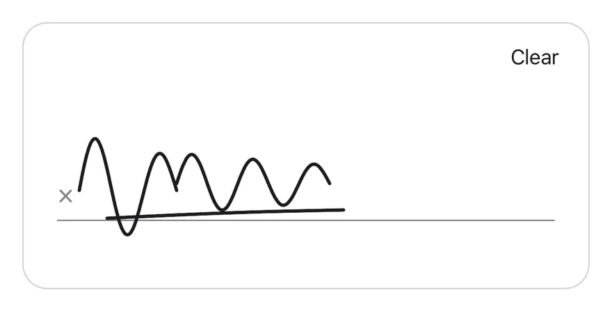
```tsx
import { SignaturePad, type SignaturePadStroke } from "@/components/ui/signature-pad"
function wave(
startX: number,
baseY: number,
length: number,
amplitude: number,
turns: number
): SignaturePadStroke {
return Array.from({ length: 48 }, (_, index) => {
const progress = index / 47
return {
x: startX + progress * length,
y:
baseY -
Math.sin(progress * Math.PI * turns) * amplitude * (1 - progress * 0.4),
}
})
}
const SIGNATURE: SignaturePadStroke[] = [
wave(40, 120, 70, 40, 3),
wave(110, 115, 110, 22, 5),
[
{ x: 60, y: 140 },
{ x: 140, y: 136 },
{ x: 230, y: 134 },
],
]
export function SignaturePadSignedExample() {
return (
)
}
```
```swift
import EsuissUI
import SwiftUI
struct SignaturePadSignedExample: View {
var body: some View {
SignaturePadDemo(initial: signaturePadSample)
}
}
func signaturePadWave(startX: CGFloat, baseY: CGFloat, length: CGFloat, amplitude: CGFloat, turns: CGFloat) -> SignatureStroke {
SignatureStroke((0..<48).map { index in
let progress = CGFloat(index) / 47
return CGPoint(
x: startX + progress * length,
y: baseY - sin(progress * .pi * turns) * amplitude * (1 - progress * 0.4)
)
})
}
let signaturePadSample: [SignatureStroke] = [
signaturePadWave(startX: 40, baseY: 120, length: 70, amplitude: 40, turns: 3),
signaturePadWave(startX: 110, baseY: 115, length: 110, amplitude: 22, turns: 5),
SignatureStroke([CGPoint(x: 60, y: 140), CGPoint(x: 140, y: 136), CGPoint(x: 230, y: 134)]),
]
struct SignaturePadDemo: View {
var strokeWidth: CGFloat = 2.5
@State private var strokes: [SignatureStroke]
init(initial: [SignatureStroke], strokeWidth: CGFloat = 2.5) {
self.strokeWidth = strokeWidth
_strokes = State(initialValue: initial)
}
var body: some View {
SignaturePad(value: $strokes, strokeWidth: strokeWidth)
.frame(height: 192)
.frame(maxWidth: .infinity)
}
}
```
```kotlin
import androidx.compose.foundation.layout.fillMaxWidth
import androidx.compose.runtime.Composable
import androidx.compose.ui.Modifier
import androidx.compose.ui.geometry.Offset
import com.esuiss.ui.components.SignaturePad
import com.esuiss.ui.components.SignatureStroke
import kotlin.math.PI
import kotlin.math.sin
@Composable
fun SignaturePadSignedExample() {
SignaturePad(Modifier.fillMaxWidth(), defaultValue = signaturePadSample)
}
fun signaturePadWave(startX: Float, baseY: Float, length: Float, amplitude: Float, turns: Float): SignatureStroke =
SignatureStroke(
List(48) { index ->
val progress = index / 47f
Offset(
startX + progress * length,
baseY - sin(progress * PI.toFloat() * turns) * amplitude * (1 - progress * 0.4f),
)
},
)
val signaturePadSample = listOf(
signaturePadWave(40f, 120f, 70f, 40f, 3f),
signaturePadWave(110f, 115f, 110f, 22f, 5f),
SignatureStroke(listOf(Offset(60f, 140f), Offset(140f, 136f), Offset(230f, 134f))),
)
```
### Thick stroke
A signature drawn with `strokeWidth={5}`.
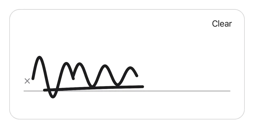
```tsx
import { SignaturePad, type SignaturePadStroke } from "@/components/ui/signature-pad"
function wave(
startX: number,
baseY: number,
length: number,
amplitude: number,
turns: number
): SignaturePadStroke {
return Array.from({ length: 48 }, (_, index) => {
const progress = index / 47
return {
x: startX + progress * length,
y:
baseY -
Math.sin(progress * Math.PI * turns) * amplitude * (1 - progress * 0.4),
}
})
}
const SIGNATURE: SignaturePadStroke[] = [
wave(40, 120, 70, 40, 3),
wave(110, 115, 110, 22, 5),
[
{ x: 60, y: 140 },
{ x: 140, y: 136 },
{ x: 230, y: 134 },
],
]
export function SignaturePadThickStrokeExample() {
return (
)
}
```
```swift
import EsuissUI
import SwiftUI
struct SignaturePadThickStrokeExample: View {
var body: some View {
SignaturePadDemo(initial: signaturePadSample, strokeWidth: 5)
}
}
func signaturePadWave(startX: CGFloat, baseY: CGFloat, length: CGFloat, amplitude: CGFloat, turns: CGFloat) -> SignatureStroke {
SignatureStroke((0..<48).map { index in
let progress = CGFloat(index) / 47
return CGPoint(
x: startX + progress * length,
y: baseY - sin(progress * .pi * turns) * amplitude * (1 - progress * 0.4)
)
})
}
let signaturePadSample: [SignatureStroke] = [
signaturePadWave(startX: 40, baseY: 120, length: 70, amplitude: 40, turns: 3),
signaturePadWave(startX: 110, baseY: 115, length: 110, amplitude: 22, turns: 5),
SignatureStroke([CGPoint(x: 60, y: 140), CGPoint(x: 140, y: 136), CGPoint(x: 230, y: 134)]),
]
struct SignaturePadDemo: View {
var strokeWidth: CGFloat = 2.5
@State private var strokes: [SignatureStroke]
init(initial: [SignatureStroke], strokeWidth: CGFloat = 2.5) {
self.strokeWidth = strokeWidth
_strokes = State(initialValue: initial)
}
var body: some View {
SignaturePad(value: $strokes, strokeWidth: strokeWidth)
.frame(height: 192)
.frame(maxWidth: .infinity)
}
}
```
```kotlin
import androidx.compose.foundation.layout.fillMaxWidth
import androidx.compose.runtime.Composable
import androidx.compose.ui.Modifier
import androidx.compose.ui.geometry.Offset
import androidx.compose.ui.unit.dp
import com.esuiss.ui.components.SignaturePad
import com.esuiss.ui.components.SignatureStroke
import kotlin.math.PI
import kotlin.math.sin
@Composable
fun SignaturePadThickStrokeExample() {
SignaturePad(Modifier.fillMaxWidth(), defaultValue = signaturePadSample, strokeWidth = 5.dp)
}
fun signaturePadWave(startX: Float, baseY: Float, length: Float, amplitude: Float, turns: Float): SignatureStroke =
SignatureStroke(
List(48) { index ->
val progress = index / 47f
Offset(
startX + progress * length,
baseY - sin(progress * PI.toFloat() * turns) * amplitude * (1 - progress * 0.4f),
)
},
)
val signaturePadSample = listOf(
signaturePadWave(40f, 120f, 70f, 40f, 3f),
signaturePadWave(110f, 115f, 110f, 22f, 5f),
SignatureStroke(listOf(Offset(60f, 140f), Offset(140f, 136f), Offset(230f, 134f))),
)
```
### Disabled
A disabled pad that ignores touches and hides the Clear button.
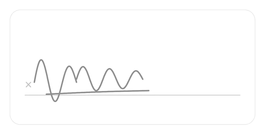
```tsx
import { SignaturePad, type SignaturePadStroke } from "@/components/ui/signature-pad"
function wave(
startX: number,
baseY: number,
length: number,
amplitude: number,
turns: number
): SignaturePadStroke {
return Array.from({ length: 48 }, (_, index) => {
const progress = index / 47
return {
x: startX + progress * length,
y:
baseY -
Math.sin(progress * Math.PI * turns) * amplitude * (1 - progress * 0.4),
}
})
}
const SIGNATURE: SignaturePadStroke[] = [
wave(40, 120, 70, 40, 3),
wave(110, 115, 110, 22, 5),
[
{ x: 60, y: 140 },
{ x: 140, y: 136 },
{ x: 230, y: 134 },
],
]
export function SignaturePadDisabledExample() {
return (
)
}
```
```swift
import EsuissUI
import SwiftUI
struct SignaturePadDisabledExample: View {
var body: some View {
SignaturePadDemo(initial: signaturePadSample)
.disabled(true)
}
}
func signaturePadWave(startX: CGFloat, baseY: CGFloat, length: CGFloat, amplitude: CGFloat, turns: CGFloat) -> SignatureStroke {
SignatureStroke((0..<48).map { index in
let progress = CGFloat(index) / 47
return CGPoint(
x: startX + progress * length,
y: baseY - sin(progress * .pi * turns) * amplitude * (1 - progress * 0.4)
)
})
}
let signaturePadSample: [SignatureStroke] = [
signaturePadWave(startX: 40, baseY: 120, length: 70, amplitude: 40, turns: 3),
signaturePadWave(startX: 110, baseY: 115, length: 110, amplitude: 22, turns: 5),
SignatureStroke([CGPoint(x: 60, y: 140), CGPoint(x: 140, y: 136), CGPoint(x: 230, y: 134)]),
]
struct SignaturePadDemo: View {
var strokeWidth: CGFloat = 2.5
@State private var strokes: [SignatureStroke]
init(initial: [SignatureStroke], strokeWidth: CGFloat = 2.5) {
self.strokeWidth = strokeWidth
_strokes = State(initialValue: initial)
}
var body: some View {
SignaturePad(value: $strokes, strokeWidth: strokeWidth)
.frame(height: 192)
.frame(maxWidth: .infinity)
}
}
```
```kotlin
import androidx.compose.foundation.layout.fillMaxWidth
import androidx.compose.runtime.Composable
import androidx.compose.ui.Modifier
import androidx.compose.ui.geometry.Offset
import com.esuiss.ui.components.SignaturePad
import com.esuiss.ui.components.SignatureStroke
import kotlin.math.PI
import kotlin.math.sin
@Composable
fun SignaturePadDisabledExample() {
SignaturePad(Modifier.fillMaxWidth(), defaultValue = signaturePadSample, enabled = false)
}
fun signaturePadWave(startX: Float, baseY: Float, length: Float, amplitude: Float, turns: Float): SignatureStroke =
SignatureStroke(
List(48) { index ->
val progress = index / 47f
Offset(
startX + progress * length,
baseY - sin(progress * PI.toFloat() * turns) * amplitude * (1 - progress * 0.4f),
)
},
)
val signaturePadSample = listOf(
signaturePadWave(40f, 120f, 70f, 40f, 3f),
signaturePadWave(110f, 115f, 110f, 22f, 5f),
SignatureStroke(listOf(Offset(60f, 140f), Offset(140f, 136f), Offset(230f, 134f))),
)
```
### Controlled
A controlled pad that reads the signature through the ref and exports it with `toSVG`.
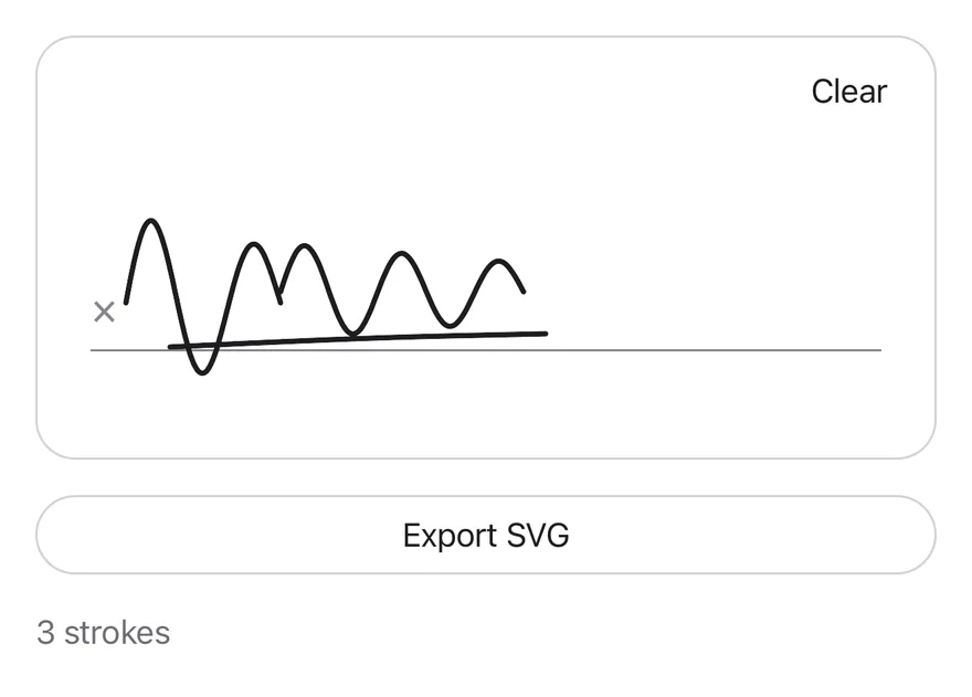
```tsx
import * as React from "react"
import { View } from "react-native"
import { Button } from "@/components/ui/button"
import { SignaturePad, type SignaturePadHandle, type SignaturePadStroke } from "@/components/ui/signature-pad"
import { Text } from "@/components/ui/text"
function wave(
startX: number,
baseY: number,
length: number,
amplitude: number,
turns: number
): SignaturePadStroke {
return Array.from({ length: 48 }, (_, index) => {
const progress = index / 47
return {
x: startX + progress * length,
y:
baseY -
Math.sin(progress * Math.PI * turns) * amplitude * (1 - progress * 0.4),
}
})
}
const SIGNATURE: SignaturePadStroke[] = [
wave(40, 120, 70, 40, 3),
wave(110, 115, 110, 22, 5),
[
{ x: 60, y: 140 },
{ x: 140, y: 136 },
{ x: 230, y: 134 },
],
]
function ExportDemo() {
const ref = React.useRef(null)
const [strokes, setStrokes] = React.useState(SIGNATURE)
const [size, setSize] = React.useState("")
return (
{`${strokes.length} strokes${size ? ` · ${size}` : ""}`}
)
}
export function SignaturePadControlledExample() {
return (
)
}
```
```swift
import EsuissUI
import SwiftUI
func signaturePadWave(startX: CGFloat, baseY: CGFloat, length: CGFloat, amplitude: CGFloat, turns: CGFloat) -> SignatureStroke {
SignatureStroke((0..<48).map { index in
let progress = CGFloat(index) / 47
return CGPoint(
x: startX + progress * length,
y: baseY - sin(progress * .pi * turns) * amplitude * (1 - progress * 0.4)
)
})
}
let signaturePadSample: [SignatureStroke] = [
signaturePadWave(startX: 40, baseY: 120, length: 70, amplitude: 40, turns: 3),
signaturePadWave(startX: 110, baseY: 115, length: 110, amplitude: 22, turns: 5),
SignatureStroke([CGPoint(x: 60, y: 140), CGPoint(x: 140, y: 136), CGPoint(x: 230, y: 134)]),
]
struct SignaturePadExportDemo: View {
@State private var strokes = signaturePadSample
@State private var exported = ""
@State private var width: CGFloat = 0
@Environment(\.colorScheme) private var colorScheme
var body: some View {
VStack(alignment: .leading, spacing: 16) {
SignaturePad(value: $strokes)
.frame(height: 192)
.frame(maxWidth: .infinity)
.onGeometryChange(for: CGFloat.self) { $0.size.width } action: { width = $0 }
.onChange(of: strokes) { _, _ in exported = "" }
Button {
let image = SignaturePad.image(strokes, size: CGSize(width: width, height: 192), colorScheme: colorScheme)
if let image {
exported = "Image: \(Int(image.size.width * image.scale))×\(Int(image.size.height * image.scale)) px"
}
} label: {
Text("Export image").frame(maxWidth: .infinity)
}
.buttonStyle(.variant(.outline))
Text(verbatim: exported.isEmpty ? "\(strokes.count) strokes" : "\(strokes.count) strokes · \(exported)")
.textStyle(.sm)
.foregroundStyle(Color.labelSecondary)
}
.frame(maxWidth: .infinity, alignment: .leading)
}
}
```
```kotlin
import androidx.compose.foundation.layout.Arrangement
import androidx.compose.foundation.layout.Column
import androidx.compose.foundation.layout.fillMaxWidth
import androidx.compose.runtime.Composable
import androidx.compose.runtime.getValue
import androidx.compose.runtime.mutableStateOf
import androidx.compose.runtime.remember
import androidx.compose.runtime.saveable.rememberSaveable
import androidx.compose.runtime.setValue
import androidx.compose.ui.Modifier
import androidx.compose.ui.geometry.Offset
import androidx.compose.ui.layout.onSizeChanged
import androidx.compose.ui.platform.LocalDensity
import androidx.compose.ui.semantics.LiveRegionMode
import androidx.compose.ui.semantics.liveRegion
import androidx.compose.ui.semantics.semantics
import androidx.compose.ui.unit.IntSize
import androidx.compose.ui.unit.dp
import com.esuiss.ui.components.Button
import com.esuiss.ui.components.ButtonVariant
import com.esuiss.ui.components.SignaturePad
import com.esuiss.ui.components.SignatureStroke
import com.esuiss.ui.components.Text
import com.esuiss.ui.components.toSvg
import com.esuiss.ui.theme.EsuissTheme
import com.esuiss.ui.theme.Typography
import kotlin.math.PI
import kotlin.math.sin
fun signaturePadWave(startX: Float, baseY: Float, length: Float, amplitude: Float, turns: Float): SignatureStroke =
SignatureStroke(
List(48) { index ->
val progress = index / 47f
Offset(
startX + progress * length,
baseY - sin(progress * PI.toFloat() * turns) * amplitude * (1 - progress * 0.4f),
)
},
)
val signaturePadSample = listOf(
signaturePadWave(40f, 120f, 70f, 40f, 3f),
signaturePadWave(110f, 115f, 110f, 22f, 5f),
SignatureStroke(listOf(Offset(60f, 140f), Offset(140f, 136f), Offset(230f, 134f))),
)
@Composable
fun SignaturePadControlled() {
var strokes by remember { mutableStateOf(signaturePadSample) }
var exported by rememberSaveable { mutableStateOf("") }
var size by remember { mutableStateOf(IntSize.Zero) }
val density = LocalDensity.current
Column(Modifier.fillMaxWidth(), verticalArrangement = Arrangement.spacedBy(16.dp)) {
SignaturePad(
Modifier.fillMaxWidth().onSizeChanged { size = it },
value = strokes,
onValueChange = { strokes = it },
)
Button(
"Export SVG",
onClick = {
val svg = with(density) { strokes.toSvg(size.width.toDp().value, size.height.toDp().value) }
exported = "SVG: ${svg.length} characters"
},
modifier = Modifier.fillMaxWidth(),
variant = ButtonVariant.Outline,
)
Text(
"${strokes.size} strokes" + if (exported.isNotEmpty()) " · $exported" else "",
modifier = Modifier.semantics { liveRegion = LiveRegionMode.Polite },
style = Typography.sm,
color = EsuissTheme.colors.labelSecondary,
)
}
}
```
## API Reference
### SignaturePad
## Accessibility
- The pad is a single accessible element labeled by `accessibilityLabel`.
- Its value is announced as "Empty" or "Signed", and `disabled` is reported in its state.
- When it has a signature and is not disabled, it offers a `clear` accessibility action, so VoiceOver and TalkBack users can clear it without finding the button.
## Notes
- Uses `bg-surface-raised` in light mode and `bg-surface-secondary` in dark mode, with `border-separator` and `text-label` for the strokes.
- Points closer than one point to the previous point are skipped while drawing.