# Screen
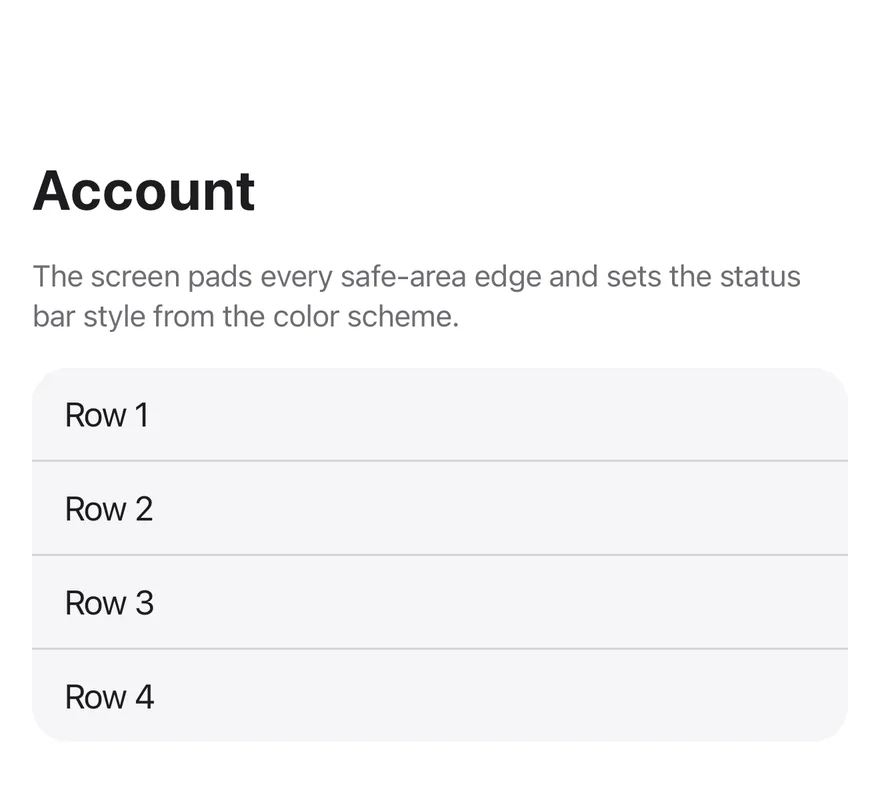
A full-screen container that pads for safe area insets and sets the status bar style.
Screen is an open-source mobile component from suiss/uim for React Native and Expo, with SwiftUI and Jetpack Compose versions built from the same design tokens. The @esuiss/uim CLI copies its source into your project, so you own the code.
Source: https://uim.suiss.app/docs/components/screen
```tsx
import { View } from "react-native"
import { Screen, ScreenContent } from "@/components/ui/screen"
import { Text } from "@/components/ui/text"
function Rows({ count = 4 }: { count?: number }) {
return (
{Array.from({ length: count }, (_, index) => `Row ${index + 1}`).map(
(label, index) => (
0 ? "border-t border-separator px-4 py-3" : "px-4 py-3"
}
>
{label}
)
)}
)
}
export function ScreenExample() {
return (
Account
The screen pads every safe-area edge and sets the status bar style
from the color scheme.
)
}
```
```swift
import EsuissUI
import SwiftUI
struct ScreenExample: View {
var body: some View {
Screen {
ScreenContent(scroll: false) {
Text("Account").textVariant(.h2)
Text("The screen pads every safe-area edge and sets the status bar style from the color scheme.")
.textVariant(.muted)
ScreenRows()
}
}
}
}
struct ScreenRows: View {
var labels: [String] = (1...4).map { "Row \($0)" }
var background: Color = .surfaceSecondary
var body: some View {
VStack(spacing: 0) {
ForEach(Array(labels.enumerated()), id: \.offset) { index, label in
Text(verbatim: label)
.textVariant(.default)
.frame(maxWidth: .infinity, alignment: .leading)
.padding(.horizontal, 16)
.padding(.vertical, 12)
.overlay(alignment: .top) {
if index > 0 {
Color.separator.frame(height: 1)
}
}
}
}
.background(background)
.clipShape(RoundedRectangle(cornerRadius: Radius.xl2, style: .continuous))
}
}
```
```kotlin
import androidx.compose.foundation.background
import androidx.compose.foundation.layout.Column
import androidx.compose.foundation.layout.fillMaxWidth
import androidx.compose.foundation.layout.padding
import androidx.compose.foundation.shape.RoundedCornerShape
import androidx.compose.runtime.Composable
import androidx.compose.ui.Modifier
import androidx.compose.ui.draw.clip
import androidx.compose.ui.graphics.Color
import androidx.compose.ui.unit.dp
import com.esuiss.ui.components.Screen
import com.esuiss.ui.components.ScreenContent
import com.esuiss.ui.components.Separator
import com.esuiss.ui.components.Text
import com.esuiss.ui.components.TextVariant
import com.esuiss.ui.theme.EsuissTheme
import com.esuiss.ui.theme.Radius
@Composable
fun ScreenRows(labels: List, background: Color) {
Column(
Modifier
.fillMaxWidth()
.clip(RoundedCornerShape(Radius.xl2))
.background(background),
) {
labels.forEachIndexed { index, label ->
if (index > 0) Separator()
Text(label, Modifier.fillMaxWidth().padding(horizontal = 16.dp, vertical = 12.dp))
}
}
}
fun screenRowLabels(count: Int): List = (1..count).map { "Row $it" }
@Composable
fun ScreenDefault() {
Screen {
ScreenContent {
Text("Account", variant = TextVariant.H2)
Text(
"The screen pads every safe-area edge and sets the status bar style from the color scheme.",
variant = TextVariant.Muted,
)
ScreenRows(screenRowLabels(4), EsuissTheme.colors.surfaceSecondary)
}
}
}
```
`Screen` is a `View` that fills the screen, paints the surface background and adds padding for the safe area insets on the edges you choose. It also renders a `StatusBar` with light or dark content to match the color scheme.
`ScreenContent` lays out the body with padding and gaps. With `scrollable`, it renders a `KeyboardScrollView` so content scrolls and stays above the keyboard.
## Installation
```bash title="Terminal"
npx @esuiss/uim@latest add screen
```
```bash title="Terminal"
npx @esuiss/uim@latest add screen --platform swift
```
```bash title="Terminal"
npx @esuiss/uim@latest add screen --platform kotlin
```
The CLI also adds what it builds on: [Keyboard Scroll View](/docs/components/keyboard-scroll-view).
### Manual
**Uniwind**
1. Install the dependencies:
```bash title="Terminal"
npx expo install cn react-native-safe-area-context
```
2. Add the pieces it builds on: [Keyboard Scroll View](/docs/components/keyboard-scroll-view).
3. Copy the source into `components/ui/screen.tsx`:
```tsx title="uniwind/components/ui/screen.tsx"
import { cn } from "cn"
import * as React from "react"
import { StatusBar, useColorScheme, View, type ViewProps } from "react-native"
import { useSafeAreaInsets } from "react-native-safe-area-context"
import { KeyboardScrollView } from "@/components/ui/keyboard-scroll-view"
type ScreenEdge = "top" | "right" | "bottom" | "left"
const ALL_EDGES: readonly ScreenEdge[] = ["top", "right", "bottom", "left"]
const ScreenContext = React.createContext<{
edges: readonly ScreenEdge[]
} | null>(null)
function Screen({
edges = ALL_EDGES,
variant = "default",
className,
style,
children,
...props
}: ViewProps & {
edges?: readonly ScreenEdge[]
variant?: "default" | "secondary"
}) {
const insets = useSafeAreaInsets()
const scheme = useColorScheme()
const context = React.useMemo(() => ({ edges }), [edges])
return (
{children}
)
}
function ScreenContent({
scrollable = false,
className,
children,
...props
}: ViewProps & {
scrollable?: boolean
}) {
if (scrollable) {
return (
{children}
)
}
return (
{children}
)
}
export type { ScreenEdge }
export { Screen, ScreenContent, ScreenContext }
```
4. Update the import paths to match your project.
**NativeWind**
1. Install the dependencies:
```bash title="Terminal"
npx expo install cn react-native-safe-area-context
```
2. Add the pieces it builds on: [Keyboard Scroll View](/docs/components/keyboard-scroll-view).
3. Copy the source into `components/ui/screen.tsx`:
```tsx title="nativewind/components/ui/screen.tsx"
import { cn } from "cn"
import * as React from "react"
import { StatusBar, useColorScheme, View, type ViewProps } from "react-native"
import { useSafeAreaInsets } from "react-native-safe-area-context"
import { KeyboardScrollView } from "@/components/ui/keyboard-scroll-view"
type ScreenEdge = "top" | "right" | "bottom" | "left"
const ALL_EDGES: readonly ScreenEdge[] = ["top", "right", "bottom", "left"]
const ScreenContext = React.createContext<{
edges: readonly ScreenEdge[]
} | null>(null)
function Screen({
edges = ALL_EDGES,
variant = "default",
className,
style,
children,
...props
}: ViewProps & {
edges?: readonly ScreenEdge[]
variant?: "default" | "secondary"
}) {
const insets = useSafeAreaInsets()
const scheme = useColorScheme()
const context = React.useMemo(() => ({ edges }), [edges])
return (
{children}
)
}
function ScreenContent({
scrollable = false,
className,
children,
...props
}: ViewProps & {
scrollable?: boolean
}) {
if (scrollable) {
return (
{children}
)
}
return (
{children}
)
}
export type { ScreenEdge }
export { Screen, ScreenContent, ScreenContext }
```
4. Update the import paths to match your project.
**StyleSheet**
1. Install the dependencies:
```bash title="Terminal"
npx expo install react-native-safe-area-context
```
2. Add the pieces it builds on: [Keyboard Scroll View](/docs/components/keyboard-scroll-view).
3. Copy the source into `components/ui/screen.tsx`:
```tsx title="stylesheet/components/ui/screen.tsx"
import * as React from "react"
import { StatusBar, StyleSheet, View, type ViewProps } from "react-native"
import { useSafeAreaInsets } from "react-native-safe-area-context"
import { KeyboardScrollView } from "@/components/ui/keyboard-scroll-view"
import { useTheme } from "@/components/ui/theme"
type ScreenEdge = "top" | "right" | "bottom" | "left"
const ALL_EDGES: readonly ScreenEdge[] = ["top", "right", "bottom", "left"]
const ScreenContext = React.createContext<{
edges: readonly ScreenEdge[]
} | null>(null)
const styles = StyleSheet.create({
root: { flex: 1 },
content: { flex: 1, gap: 16, padding: 16 },
scrollContent: { flexGrow: 1, gap: 16, padding: 16 },
})
function Screen({
edges = ALL_EDGES,
variant = "default",
style,
children,
...props
}: ViewProps & {
edges?: readonly ScreenEdge[]
variant?: "default" | "secondary"
}) {
const { colors, isDark } = useTheme()
const insets = useSafeAreaInsets()
const context = React.useMemo(() => ({ edges }), [edges])
return (
{children}
)
}
function ScreenContent({
scrollable = false,
style,
children,
...props
}: ViewProps & {
scrollable?: boolean
}) {
if (scrollable) {
return (
{children}
)
}
return (
{children}
)
}
export type { ScreenEdge }
export { Screen, ScreenContent, ScreenContext }
```
4. Update the import paths to match your project.
**SwiftUI**
1. Target iOS 17 or later.
2. Copy the theme files every view uses:
```swift title="swift/Theme/Theme.swift"
import SwiftUI
import UIKit
struct RGBA: Sendable {
let red: CGFloat
let green: CGFloat
let blue: CGFloat
let alpha: CGFloat
init(_ hex: UInt32, _ alpha: CGFloat = 1) {
red = CGFloat((hex >> 16) & 0xFF) / 255
green = CGFloat((hex >> 8) & 0xFF) / 255
blue = CGFloat(hex & 0xFF) / 255
self.alpha = alpha
}
var uiColor: UIColor {
UIColor(red: red, green: green, blue: blue, alpha: alpha)
}
}
extension Color {
static func adaptive(light: RGBA, dark: RGBA) -> Color {
let lightColor = light.uiColor
let darkColor = dark.uiColor
return Color(uiColor: UIColor { traits in
traits.userInterfaceStyle == .dark ? darkColor : lightColor
})
}
}
public struct TextStyle: Sendable, Hashable {
public let size: CGFloat
public let lineHeight: CGFloat
public let letterSpacing: CGFloat
public init(size: CGFloat, lineHeight: CGFloat, letterSpacing: CGFloat) {
self.size = size
self.lineHeight = lineHeight
self.letterSpacing = letterSpacing
}
public func font(weight: Font.Weight = .regular) -> Font {
.system(size: size, weight: weight)
}
public var lineSpacing: CGFloat {
max(0, lineHeight - UIFont.systemFont(ofSize: size).lineHeight)
}
}
extension Hashable where Self == Font {
public static func textStyle(_ style: TextStyle, weight: Font.Weight = .regular) -> Font {
style.font(weight: weight)
}
}
private struct TextStyleModifier: ViewModifier {
let style: TextStyle
let weight: Font.Weight
func body(content: Content) -> some View {
content
.font(style.font(weight: weight))
.tracking(style.letterSpacing)
.lineSpacing(style.lineSpacing)
.padding(.vertical, style.lineSpacing / 2)
}
}
extension View {
public func textStyle(_ style: TextStyle, weight: Font.Weight = .regular) -> some View {
modifier(TextStyleModifier(style: style, weight: weight))
}
}
public struct Shadow: Sendable, Hashable {
public let color: Color
public let radius: CGFloat
public let x: CGFloat
public let y: CGFloat
public init(color: Color, radius: CGFloat, x: CGFloat = 0, y: CGFloat = 0) {
self.color = color
self.radius = radius
self.x = x
self.y = y
}
}
extension View {
public func shadow(_ shadow: Shadow) -> some View {
self.shadow(color: shadow.color, radius: shadow.radius, x: shadow.x, y: shadow.y)
}
}
```
```swift title="swift/Theme/Tokens.swift"
import SwiftUI
extension Color {
public static let surface = Color.adaptive(light: .init(0xFFFFFF), dark: .init(0x000000))
public static let surfaceSecondary = Color.adaptive(light: .init(0xF5F5F7), dark: .init(0x161617))
public static let surfaceTertiary = Color.adaptive(light: .init(0xE8E8ED), dark: .init(0x2C2C2E))
public static let surfaceRaised = Color.adaptive(light: .init(0xFFFFFF), dark: .init(0x1D1D1F))
public static let label = Color.adaptive(light: .init(0x1D1D1F), dark: .init(0xF5F5F7))
public static let labelSecondary = Color.adaptive(light: .init(0x6E6E73), dark: .init(0xA1A1A6))
public static let labelTertiary = Color.adaptive(light: .init(0x86868B), dark: .init(0x86868B))
public static let labelQuaternary = Color.adaptive(light: .init(0xD2D2D7), dark: .init(0x424245))
public static let control = Color.adaptive(light: .init(0x000000, 0.04), dark: .init(0xFFFFFF, 0.1))
public static let controlPressed = Color.adaptive(light: .init(0x000000, 0.12), dark: .init(0xFFFFFF, 0.22))
public static let controlSelected = Color.adaptive(light: .init(0x1D1D1F), dark: .init(0xF5F5F7))
public static let controlDisabled = Color.adaptive(light: .init(0x000000, 0.03), dark: .init(0xFFFFFF, 0.05))
public static let onControlSelected = Color.adaptive(light: .init(0xFFFFFF), dark: .init(0x000000))
public static let itemPressed = Color.adaptive(light: .init(0x000000, 0.08), dark: .init(0xFFFFFF, 0.12))
public static let itemSelected = Color.adaptive(light: .init(0x000000, 0.06), dark: .init(0xFFFFFF, 0.1))
public static let separator = Color.adaptive(light: .init(0xD2D2D7), dark: .init(0x424245))
public static let separatorStrong = Color.adaptive(light: .init(0x86868B), dark: .init(0x6E6E73))
public static let accent = Color.adaptive(light: .init(0x0071E3), dark: .init(0x0071E3))
public static let accentPressed = Color.adaptive(light: .init(0x005BB8), dark: .init(0x004D9E))
public static let accentSelected = Color.adaptive(light: .init(0x0071E3), dark: .init(0x0071E3))
public static let accentDisabled = Color.adaptive(light: .init(0x0071E3, 0.4), dark: .init(0x0071E3, 0.4))
public static let onAccent = Color.adaptive(light: .init(0xFFFFFF), dark: .init(0xFFFFFF))
public static let accentSurface = Color.adaptive(light: .init(0x0071E3, 0.09), dark: .init(0x0071E3, 0.18))
public static let accentSurfacePressed = Color.adaptive(light: .init(0x0071E3, 0.18), dark: .init(0x0071E3, 0.3))
public static let link = Color.adaptive(light: .init(0x0066CC), dark: .init(0x2997FF))
public static let focus = Color.adaptive(light: .init(0x0071E3), dark: .init(0x0071E3))
public static let scrim = Color.adaptive(light: .init(0x000000, 0.48), dark: .init(0x000000, 0.48))
public static let media = Color.adaptive(light: .init(0x000000), dark: .init(0x000000))
public static let onMedia = Color.adaptive(light: .init(0xFFFFFF), dark: .init(0xFFFFFF))
public static let danger = Color.adaptive(light: .init(0xD0000A), dark: .init(0xFF5447))
public static let dangerSurface = Color.adaptive(light: .init(0xD70015, 0.08), dark: .init(0xFF453A, 0.2))
public static let dangerSurfacePressed = Color.adaptive(light: .init(0xD70015, 0.16), dark: .init(0xFF453A, 0.36))
public static let success = Color.adaptive(light: .init(0x008009), dark: .init(0x30D158))
public static let successSurface = Color.adaptive(light: .init(0xEFFAF1), dark: .init(0x30D158, 0.16))
public static let warning = Color.adaptive(light: .init(0xB64400), dark: .init(0xFF9F0A))
public static let warningSurface = Color.adaptive(light: .init(0xFFF5EA), dark: .init(0xFF9F0A, 0.16))
}
public enum Radius {
public static let xs: CGFloat = 3
public static let sm: CGFloat = 5
public static let md: CGFloat = 8
public static let lg: CGFloat = 10
public static let xl: CGFloat = 12
public static let xl2: CGFloat = 18
public static let xl3: CGFloat = 28
public static let full: CGFloat = 9999
}
extension TextStyle {
public static let xs3 = TextStyle(size: 11, lineHeight: 13, letterSpacing: 0.066)
public static let xs2 = TextStyle(size: 12, lineHeight: 16, letterSpacing: 0)
public static let xs = TextStyle(size: 13, lineHeight: 18, letterSpacing: -0.078)
public static let sm = TextStyle(size: 15, lineHeight: 20, letterSpacing: -0.24)
public static let md = TextStyle(size: 16, lineHeight: 21, letterSpacing: -0.32)
public static let base = TextStyle(size: 17, lineHeight: 22, letterSpacing: -0.442)
public static let lg = TextStyle(size: 20, lineHeight: 25, letterSpacing: -0.46)
public static let xl = TextStyle(size: 22, lineHeight: 28, letterSpacing: -0.264)
public static let xl2 = TextStyle(size: 28, lineHeight: 34, letterSpacing: 0.392)
public static let xl3 = TextStyle(size: 34, lineHeight: 41, letterSpacing: 0.408)
public static let allCases: [TextStyle] = [.xs3, .xs2, .xs, .sm, .md, .base, .lg, .xl, .xl2, .xl3]
}
extension Shadow {
public static let md = Shadow(color: .black.opacity(0.08), radius: 6, x: 2, y: 4)
public static let lg = Shadow(color: .black.opacity(0.12), radius: 12, y: 4)
}
```
3. Copy the source and every file it uses:
```swift title="swift/Components/Screen.swift"
import SwiftUI
extension EnvironmentValues {
@Entry var screenBackground: Color = .surface
}
public struct Screen: View {
public enum Background: CaseIterable, Sendable {
case surface, surfaceSecondary
var color: Color {
switch self {
case .surface: .surface
case .surfaceSecondary: .surfaceSecondary
}
}
}
let edges: Edge.Set
let background: Background
let content: Content
public init(
edges: Edge.Set = .all,
background: Background = .surface,
@ViewBuilder content: () -> Content
) {
self.edges = edges
self.background = background
self.content = content()
}
public var body: some View {
VStack(spacing: 0) {
content
}
.frame(maxWidth: .infinity, maxHeight: .infinity, alignment: .top)
.ignoresSafeArea(.container, edges: Edge.Set.all.subtracting(edges))
.foregroundStyle(Color.label)
.background(background.color.ignoresSafeArea())
.environment(\.screenBackground, background.color)
}
}
public struct ScreenContent: View {
let scroll: Bool
let padded: Bool
let content: Content
public init(scroll: Bool = true, padded: Bool = true, @ViewBuilder content: () -> Content) {
self.scroll = scroll
self.padded = padded
self.content = content()
}
public var body: some View {
if scroll {
KeyboardScrollView {
stack
}
} else {
stack
.frame(maxHeight: .infinity, alignment: .top)
}
}
private var stack: some View {
VStack(alignment: .leading, spacing: 16) {
content
}
.padding(padded ? 16 : 0)
.frame(maxWidth: .infinity, alignment: .leading)
}
}
```
```swift title="swift/Components/KeyboardScrollView.swift"
import SwiftUI
import UIKit
public struct KeyboardScrollView: View {
let showsIndicators: Bool
let content: Content
public init(showsIndicators: Bool = true, @ViewBuilder content: () -> Content) {
self.showsIndicators = showsIndicators
self.content = content()
}
public var body: some View {
ScrollView(.vertical, showsIndicators: showsIndicators) {
content
.frame(maxWidth: .infinity, alignment: .topLeading)
.background {
Color.clear
.contentShape(Rectangle())
.onTapGesture { KeyboardScrollView.dismissKeyboard() }
}
}
.scrollDismissesKeyboard(.interactively)
}
@MainActor
static func dismissKeyboard() {
UIApplication.shared.sendAction(#selector(UIResponder.resignFirstResponder), to: nil, from: nil, for: nil)
}
}
```
4. Add the files to your app target.
**Jetpack Compose**
1. Set `minSdk` to 24 or higher and add the dependencies:
```kotlin title="build.gradle.kts"
implementation(platform("androidx.compose:compose-bom:2026.09.00"))
implementation("androidx.compose.foundation:foundation")
implementation("androidx.compose.ui:ui")
```
2. Copy the theme files every view uses:
```kt title="kotlin/theme/Theme.kt"
package com.esuiss.ui.theme
import androidx.compose.foundation.isSystemInDarkTheme
import androidx.compose.runtime.Composable
import androidx.compose.runtime.CompositionLocalProvider
import androidx.compose.runtime.Immutable
import androidx.compose.runtime.staticCompositionLocalOf
import androidx.compose.ui.Modifier
import androidx.compose.ui.draw.dropShadow
import androidx.compose.ui.graphics.Color
import androidx.compose.ui.graphics.Shape
import androidx.compose.ui.graphics.shadow.Shadow as DropShadow
import androidx.compose.ui.text.TextStyle
import androidx.compose.ui.text.style.LineHeightStyle
import androidx.compose.ui.unit.Dp
import androidx.compose.ui.unit.DpOffset
import androidx.compose.ui.unit.em
import androidx.compose.ui.unit.sp
internal fun textStyle(size: Double, lineHeight: Double, letterSpacing: Double) = TextStyle(
fontSize = size.sp,
lineHeight = lineHeight.sp,
letterSpacing = letterSpacing.em,
lineHeightStyle = LineHeightStyle(
alignment = LineHeightStyle.Alignment.Center,
trim = LineHeightStyle.Trim.None,
),
)
@Immutable
data class Shadow(
val offsetX: Dp,
val offsetY: Dp,
val blur: Dp,
val color: Color,
)
fun Modifier.shadow(shadow: Shadow, shape: Shape): Modifier = dropShadow(
shape,
DropShadow(
radius = shadow.blur,
color = shadow.color,
offset = DpOffset(shadow.offsetX, shadow.offsetY),
),
)
val LocalColors = staticCompositionLocalOf { LightColors }
object EsuissTheme {
val colors: Colors
@Composable get() = LocalColors.current
val typography: Typography
get() = Typography
val radius: Radius
get() = Radius
val shadows: Shadows
get() = Shadows
}
@Composable
fun EsuissTheme(
darkTheme: Boolean = isSystemInDarkTheme(),
content: @Composable () -> Unit,
) {
CompositionLocalProvider(
LocalColors provides if (darkTheme) DarkColors else LightColors,
content = content,
)
}
```
```kt title="kotlin/theme/Tokens.kt"
package com.esuiss.ui.theme
import androidx.compose.runtime.Immutable
import androidx.compose.ui.graphics.Color
import androidx.compose.ui.unit.dp
@Immutable
data class Colors(
val surface: Color,
val surfaceSecondary: Color,
val surfaceTertiary: Color,
val surfaceRaised: Color,
val label: Color,
val labelSecondary: Color,
val labelTertiary: Color,
val labelQuaternary: Color,
val control: Color,
val controlPressed: Color,
val controlSelected: Color,
val controlDisabled: Color,
val onControlSelected: Color,
val itemPressed: Color,
val itemSelected: Color,
val separator: Color,
val separatorStrong: Color,
val accent: Color,
val accentPressed: Color,
val accentSelected: Color,
val accentDisabled: Color,
val onAccent: Color,
val accentSurface: Color,
val accentSurfacePressed: Color,
val link: Color,
val focus: Color,
val scrim: Color,
val media: Color,
val onMedia: Color,
val danger: Color,
val dangerSurface: Color,
val dangerSurfacePressed: Color,
val success: Color,
val successSurface: Color,
val warning: Color,
val warningSurface: Color,
val blue: Color,
val green: Color,
val orange: Color,
val red: Color,
val yellow: Color,
val purple: Color,
val pink: Color,
val indigo: Color,
val teal: Color,
val mint: Color,
val cyan: Color,
val brown: Color,
val gray: Color,
val isDark: Boolean,
)
val LightColors = Colors(
surface = Color(0xFFFFFFFF),
surfaceSecondary = Color(0xFFF5F5F7),
surfaceTertiary = Color(0xFFE8E8ED),
surfaceRaised = Color(0xFFFFFFFF),
label = Color(0xFF1D1D1F),
labelSecondary = Color(0xFF6E6E73),
labelTertiary = Color(0xFF86868B),
labelQuaternary = Color(0xFFD2D2D7),
control = Color(0xFF000000).copy(alpha = 0.04f),
controlPressed = Color(0xFF000000).copy(alpha = 0.12f),
controlSelected = Color(0xFF1D1D1F),
controlDisabled = Color(0xFF000000).copy(alpha = 0.03f),
onControlSelected = Color(0xFFFFFFFF),
itemPressed = Color(0xFF000000).copy(alpha = 0.08f),
itemSelected = Color(0xFF000000).copy(alpha = 0.06f),
separator = Color(0xFFD2D2D7),
separatorStrong = Color(0xFF86868B),
accent = Color(0xFF0071E3),
accentPressed = Color(0xFF005BB8),
accentSelected = Color(0xFF0071E3),
accentDisabled = Color(0xFF0071E3).copy(alpha = 0.4f),
onAccent = Color(0xFFFFFFFF),
accentSurface = Color(0xFF0071E3).copy(alpha = 0.09f),
accentSurfacePressed = Color(0xFF0071E3).copy(alpha = 0.18f),
link = Color(0xFF0066CC),
focus = Color(0xFF0071E3),
scrim = Color(0xFF000000).copy(alpha = 0.48f),
media = Color(0xFF000000),
onMedia = Color(0xFFFFFFFF),
danger = Color(0xFFD0000A),
dangerSurface = Color(0xFFD70015).copy(alpha = 0.08f),
dangerSurfacePressed = Color(0xFFD70015).copy(alpha = 0.16f),
success = Color(0xFF008009),
successSurface = Color(0xFFEFFAF1),
warning = Color(0xFFB64400),
warningSurface = Color(0xFFFFF5EA),
blue = Color(0xFF007AFF),
green = Color(0xFF34C759),
orange = Color(0xFFFF9500),
red = Color(0xFFFF3B30),
yellow = Color(0xFFFFCC00),
purple = Color(0xFFAF52DE),
pink = Color(0xFFFF2D55),
indigo = Color(0xFF5856D6),
teal = Color(0xFF30B0C7),
mint = Color(0xFF00C7BE),
cyan = Color(0xFF32ADE6),
brown = Color(0xFFA2845E),
gray = Color(0xFF8E8E93),
isDark = false,
)
val DarkColors = Colors(
surface = Color(0xFF000000),
surfaceSecondary = Color(0xFF161617),
surfaceTertiary = Color(0xFF2C2C2E),
surfaceRaised = Color(0xFF1D1D1F),
label = Color(0xFFF5F5F7),
labelSecondary = Color(0xFFA1A1A6),
labelTertiary = Color(0xFF86868B),
labelQuaternary = Color(0xFF424245),
control = Color(0xFFFFFFFF).copy(alpha = 0.1f),
controlPressed = Color(0xFFFFFFFF).copy(alpha = 0.22f),
controlSelected = Color(0xFFF5F5F7),
controlDisabled = Color(0xFFFFFFFF).copy(alpha = 0.05f),
onControlSelected = Color(0xFF000000),
itemPressed = Color(0xFFFFFFFF).copy(alpha = 0.12f),
itemSelected = Color(0xFFFFFFFF).copy(alpha = 0.1f),
separator = Color(0xFF424245),
separatorStrong = Color(0xFF6E6E73),
accent = Color(0xFF0071E3),
accentPressed = Color(0xFF004D9E),
accentSelected = Color(0xFF0071E3),
accentDisabled = Color(0xFF0071E3).copy(alpha = 0.4f),
onAccent = Color(0xFFFFFFFF),
accentSurface = Color(0xFF0071E3).copy(alpha = 0.18f),
accentSurfacePressed = Color(0xFF0071E3).copy(alpha = 0.3f),
link = Color(0xFF2997FF),
focus = Color(0xFF0071E3),
scrim = Color(0xFF000000).copy(alpha = 0.48f),
media = Color(0xFF000000),
onMedia = Color(0xFFFFFFFF),
danger = Color(0xFFFF5447),
dangerSurface = Color(0xFFFF453A).copy(alpha = 0.2f),
dangerSurfacePressed = Color(0xFFFF453A).copy(alpha = 0.36f),
success = Color(0xFF30D158),
successSurface = Color(0xFF30D158).copy(alpha = 0.16f),
warning = Color(0xFFFF9F0A),
warningSurface = Color(0xFFFF9F0A).copy(alpha = 0.16f),
blue = Color(0xFF0A84FF),
green = Color(0xFF30D158),
orange = Color(0xFFFF9F0A),
red = Color(0xFFFF453A),
yellow = Color(0xFFFFD60A),
purple = Color(0xFFBF5AF2),
pink = Color(0xFFFF375F),
indigo = Color(0xFF5E5CE6),
teal = Color(0xFF40C8E0),
mint = Color(0xFF66D4CF),
cyan = Color(0xFF64D2FF),
brown = Color(0xFFAC8E68),
gray = Color(0xFF8E8E93),
isDark = true,
)
object Radius {
val xs = 3.dp
val sm = 5.dp
val md = 8.dp
val lg = 10.dp
val xl = 12.dp
val xl2 = 18.dp
val xl3 = 28.dp
val full = 9999.dp
}
object Typography {
val xs3 = textStyle(11.0, 13.0, 0.006)
val xs2 = textStyle(12.0, 16.0, 0.0)
val xs = textStyle(13.0, 18.0, -0.006)
val sm = textStyle(15.0, 20.0, -0.016)
val md = textStyle(16.0, 21.0, -0.02)
val base = textStyle(17.0, 22.0, -0.026)
val lg = textStyle(20.0, 25.0, -0.023)
val xl = textStyle(22.0, 28.0, -0.012)
val xl2 = textStyle(28.0, 34.0, 0.014)
val xl3 = textStyle(34.0, 41.0, 0.012)
val all = listOf(xs3, xs2, xs, sm, md, base, lg, xl, xl2, xl3)
}
object Shadows {
val md = Shadow(2.dp, 4.dp, 12.dp, Color.Black.copy(alpha = 0.08f))
val lg = Shadow(0.dp, 4.dp, 24.dp, Color.Black.copy(alpha = 0.12f))
}
```
3. Copy the source and every file it uses:
```kt title="kotlin/components/Screen.kt"
package com.esuiss.ui.components
import android.app.Activity
import android.content.Context
import android.content.ContextWrapper
import android.os.Build
import android.view.View
import android.view.Window
import android.view.WindowInsetsController
import androidx.compose.foundation.background
import androidx.compose.foundation.layout.Arrangement
import androidx.compose.foundation.layout.Box
import androidx.compose.foundation.layout.BoxScope
import androidx.compose.foundation.layout.Column
import androidx.compose.foundation.layout.ExperimentalLayoutApi
import androidx.compose.foundation.layout.ColumnScope
import androidx.compose.foundation.layout.PaddingValues
import androidx.compose.foundation.layout.WindowInsets
import androidx.compose.foundation.layout.WindowInsetsSides
import androidx.compose.foundation.layout.displayCutout
import androidx.compose.foundation.layout.fillMaxSize
import androidx.compose.foundation.layout.fillMaxWidth
import androidx.compose.foundation.layout.only
import androidx.compose.foundation.layout.padding
import androidx.compose.foundation.layout.statusBarsIgnoringVisibility
import androidx.compose.foundation.layout.systemBars
import androidx.compose.foundation.layout.union
import androidx.compose.foundation.layout.windowInsetsPadding
import androidx.compose.foundation.rememberScrollState
import androidx.compose.foundation.verticalScroll
import androidx.compose.runtime.Composable
import androidx.compose.runtime.CompositionLocalProvider
import androidx.compose.runtime.SideEffect
import androidx.compose.runtime.Stable
import androidx.compose.runtime.getValue
import androidx.compose.runtime.mutableIntStateOf
import androidx.compose.runtime.remember
import androidx.compose.runtime.setValue
import androidx.compose.runtime.staticCompositionLocalOf
import androidx.compose.ui.Modifier
import androidx.compose.ui.platform.LocalView
import androidx.compose.ui.unit.dp
import com.esuiss.ui.theme.EsuissTheme
import com.esuiss.ui.theme.Typography
@Stable
internal class KeyboardAccessoryInset {
var height by mutableIntStateOf(0)
}
internal val LocalKeyboardAccessory = staticCompositionLocalOf { null }
enum class ScreenEdge { Top, Bottom, Left, Right }
enum class ScreenVariant { Default, Secondary }
private val AllScreenEdges = setOf(ScreenEdge.Top, ScreenEdge.Bottom, ScreenEdge.Left, ScreenEdge.Right)
private fun Set.sides(): WindowInsetsSides? = map {
when (it) {
ScreenEdge.Top -> WindowInsetsSides.Top
ScreenEdge.Bottom -> WindowInsetsSides.Bottom
ScreenEdge.Left -> WindowInsetsSides.Left
ScreenEdge.Right -> WindowInsetsSides.Right
}
}.reduceOrNull { sides, side -> sides + side }
internal tailrec fun Context.findActivity(): Activity? = when (this) {
is Activity -> this
is ContextWrapper -> baseContext.findActivity()
else -> null
}
@Suppress("DEPRECATION")
private fun Window.applyLightBars(light: Boolean) {
if (Build.VERSION.SDK_INT >= Build.VERSION_CODES.R) {
val mask = WindowInsetsController.APPEARANCE_LIGHT_STATUS_BARS or WindowInsetsController.APPEARANCE_LIGHT_NAVIGATION_BARS
insetsController?.setSystemBarsAppearance(if (light) mask else 0, mask)
return
}
var flags = decorView.systemUiVisibility
flags = if (light) flags or View.SYSTEM_UI_FLAG_LIGHT_STATUS_BAR else flags and View.SYSTEM_UI_FLAG_LIGHT_STATUS_BAR.inv()
if (Build.VERSION.SDK_INT >= Build.VERSION_CODES.O) {
flags = if (light) flags or View.SYSTEM_UI_FLAG_LIGHT_NAVIGATION_BAR else flags and View.SYSTEM_UI_FLAG_LIGHT_NAVIGATION_BAR.inv()
}
if (decorView.systemUiVisibility != flags) decorView.systemUiVisibility = flags
}
@OptIn(ExperimentalLayoutApi::class)
@Composable
fun Screen(
modifier: Modifier = Modifier,
edges: Set = AllScreenEdges,
variant: ScreenVariant = ScreenVariant.Default,
content: @Composable BoxScope.() -> Unit,
) {
val colors = EsuissTheme.colors
val view = LocalView.current
val light = !colors.isDark
SideEffect {
if (!view.isInEditMode) view.context.findActivity()?.window?.applyLightBars(light)
}
val sides = edges.sides()
val accessory = remember { KeyboardAccessoryInset() }
val fill = when (variant) {
ScreenVariant.Default -> colors.surface
ScreenVariant.Secondary -> colors.surfaceSecondary
}
Box(
modifier = modifier
.fillMaxSize()
.background(fill)
.then(
if (sides != null) {
Modifier.windowInsetsPadding(WindowInsets.systemBars.union(WindowInsets.displayCutout).union(WindowInsets.statusBarsIgnoringVisibility).only(sides))
} else {
Modifier
},
),
) {
CompositionLocalProvider(
LocalKeyboardAccessory provides accessory,
LocalContentStyle provides Typography.base.copy(color = colors.label),
LocalContentColor provides colors.label,
) {
content()
}
}
}
@Composable
fun ScreenContent(
modifier: Modifier = Modifier,
scrollable: Boolean = false,
contentPadding: PaddingValues = PaddingValues(16.dp),
verticalArrangement: Arrangement.Vertical = Arrangement.spacedBy(16.dp),
content: @Composable ColumnScope.() -> Unit,
) {
Column(
modifier = modifier
.fillMaxWidth()
.then(if (scrollable) Modifier.verticalScroll(rememberScrollState()) else Modifier)
.padding(contentPadding),
verticalArrangement = verticalArrangement,
content = content,
)
}
```
```kt title="kotlin/components/Content.kt"
package com.esuiss.ui.components
import androidx.compose.runtime.compositionLocalOf
import androidx.compose.ui.graphics.Color
import androidx.compose.ui.text.TextStyle
import androidx.compose.ui.unit.Dp
import androidx.compose.ui.unit.dp
val LocalContentStyle = compositionLocalOf { TextStyle.Default }
val LocalContentColor = compositionLocalOf { Color.Unspecified }
val LocalIconSize = compositionLocalOf { 20.dp }
```
4. Update the `com.esuiss.ui` package names to match your project.
## Usage
```tsx
import { Screen, ScreenContent } from "@/components/ui/screen"
```
```tsx
Account
The screen pads every safe-area edge and sets the status bar style
from the color scheme.
```
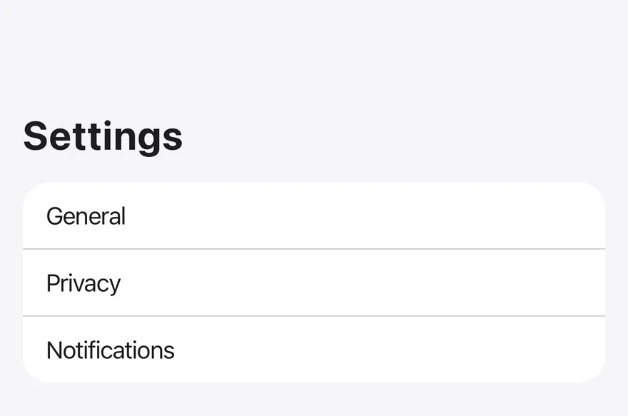
Wrap each screen in `Screen` and put the body in `ScreenContent`. Use `variant="secondary"` for grouped screens such as settings.
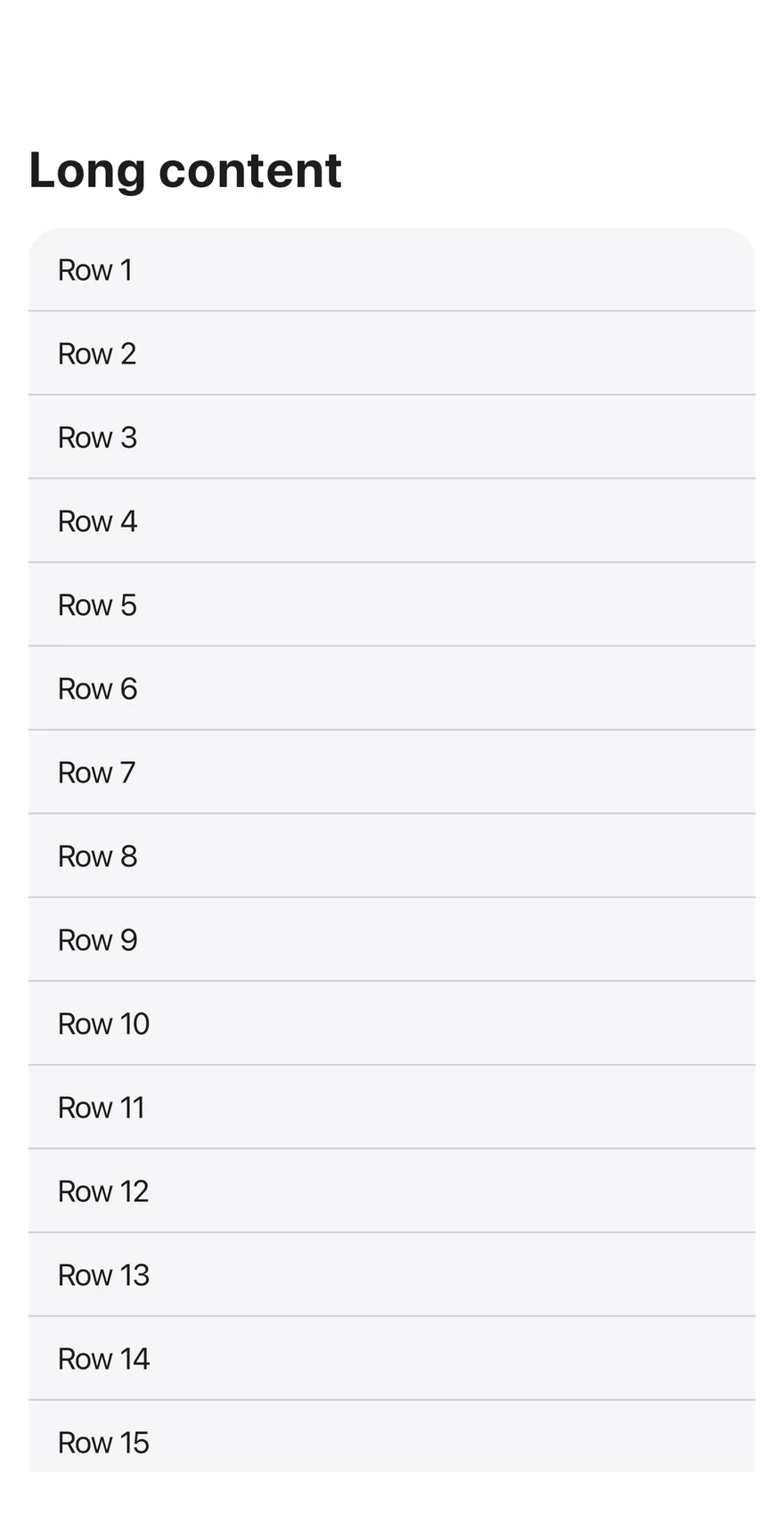
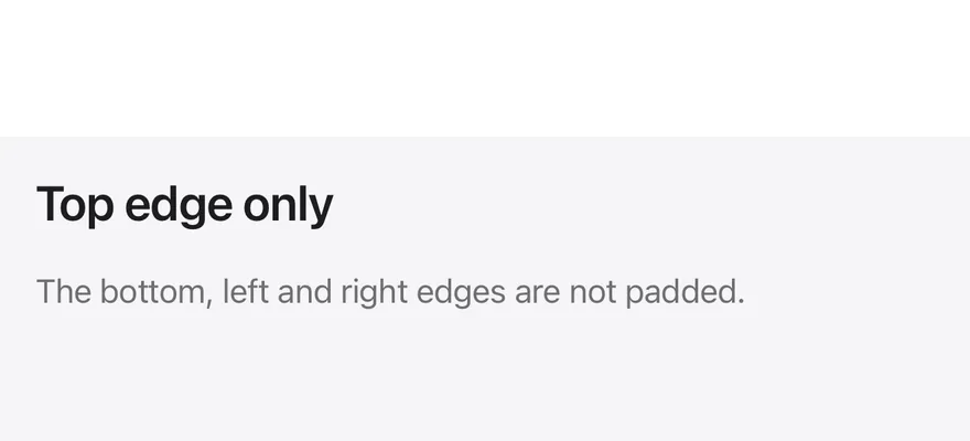
Pass `edges` to pad only some sides, for example `["top"]` when a tab bar or bottom bar handles the bottom inset. Set `scrollable` on `ScreenContent` for content taller than the screen or for forms.
The app must be wrapped in a `SafeAreaProvider` from `react-native-safe-area-context`. `ScreenContext` exposes the active `edges` to children.
## Examples
### Secondary
A screen with the `secondary` background.
```tsx
import { View } from "react-native"
import { Screen, ScreenContent } from "@/components/ui/screen"
import { Text } from "@/components/ui/text"
export function ScreenSecondaryExample() {
return (
Settings
{["General", "Privacy", "Notifications"].map((label, index) => (
0 ? "border-t border-separator px-4 py-3" : "px-4 py-3"
}
>
{label}
))}
)
}
```
```swift
import EsuissUI
import SwiftUI
struct ScreenSecondaryExample: View {
var body: some View {
Screen(background: .surfaceSecondary) {
ScreenContent(scroll: false) {
Text("Settings").textVariant(.h2)
ScreenRows(labels: ["General", "Privacy", "Notifications"], background: .surface)
}
}
}
}
struct ScreenRows: View {
var labels: [String] = (1...4).map { "Row \($0)" }
var background: Color = .surfaceSecondary
var body: some View {
VStack(spacing: 0) {
ForEach(Array(labels.enumerated()), id: \.offset) { index, label in
Text(verbatim: label)
.textVariant(.default)
.frame(maxWidth: .infinity, alignment: .leading)
.padding(.horizontal, 16)
.padding(.vertical, 12)
.overlay(alignment: .top) {
if index > 0 {
Color.separator.frame(height: 1)
}
}
}
}
.background(background)
.clipShape(RoundedRectangle(cornerRadius: Radius.xl2, style: .continuous))
}
}
```
```kotlin
import androidx.compose.foundation.background
import androidx.compose.foundation.layout.Column
import androidx.compose.foundation.layout.fillMaxWidth
import androidx.compose.foundation.layout.padding
import androidx.compose.foundation.shape.RoundedCornerShape
import androidx.compose.runtime.Composable
import androidx.compose.ui.Modifier
import androidx.compose.ui.draw.clip
import androidx.compose.ui.graphics.Color
import androidx.compose.ui.unit.dp
import com.esuiss.ui.components.Screen
import com.esuiss.ui.components.ScreenContent
import com.esuiss.ui.components.ScreenVariant
import com.esuiss.ui.components.Separator
import com.esuiss.ui.components.Text
import com.esuiss.ui.components.TextVariant
import com.esuiss.ui.theme.EsuissTheme
import com.esuiss.ui.theme.Radius
@Composable
fun ScreenRows(labels: List, background: Color) {
Column(
Modifier
.fillMaxWidth()
.clip(RoundedCornerShape(Radius.xl2))
.background(background),
) {
labels.forEachIndexed { index, label ->
if (index > 0) Separator()
Text(label, Modifier.fillMaxWidth().padding(horizontal = 16.dp, vertical = 12.dp))
}
}
}
@Composable
fun ScreenSecondary() {
Screen(variant = ScreenVariant.Secondary) {
ScreenContent {
Text("Settings", variant = TextVariant.H2)
ScreenRows(listOf("General", "Privacy", "Notifications"), EsuissTheme.colors.surface)
}
}
}
```
### Scrollable
A screen whose content scrolls.
```tsx
import { View } from "react-native"
import { Screen, ScreenContent } from "@/components/ui/screen"
import { Text } from "@/components/ui/text"
function Rows({ count = 4 }: { count?: number }) {
return (
{Array.from({ length: count }, (_, index) => `Row ${index + 1}`).map(
(label, index) => (
0 ? "border-t border-separator px-4 py-3" : "px-4 py-3"
}
>
{label}
)
)}
)
}
export function ScreenScrollableExample() {
return (
Long content
)
}
```
```swift
import EsuissUI
import SwiftUI
struct ScreenScrollableExample: View {
var body: some View {
Screen {
ScreenContent {
Text("Long content").textVariant(.h2)
ScreenRows(labels: (1...24).map { "Row \($0)" })
}
}
}
}
struct ScreenRows: View {
var labels: [String] = (1...4).map { "Row \($0)" }
var background: Color = .surfaceSecondary
var body: some View {
VStack(spacing: 0) {
ForEach(Array(labels.enumerated()), id: \.offset) { index, label in
Text(verbatim: label)
.textVariant(.default)
.frame(maxWidth: .infinity, alignment: .leading)
.padding(.horizontal, 16)
.padding(.vertical, 12)
.overlay(alignment: .top) {
if index > 0 {
Color.separator.frame(height: 1)
}
}
}
}
.background(background)
.clipShape(RoundedRectangle(cornerRadius: Radius.xl2, style: .continuous))
}
}
```
```kotlin
import androidx.compose.foundation.background
import androidx.compose.foundation.layout.Column
import androidx.compose.foundation.layout.fillMaxSize
import androidx.compose.foundation.layout.fillMaxWidth
import androidx.compose.foundation.layout.padding
import androidx.compose.foundation.shape.RoundedCornerShape
import androidx.compose.runtime.Composable
import androidx.compose.ui.Modifier
import androidx.compose.ui.draw.clip
import androidx.compose.ui.graphics.Color
import androidx.compose.ui.unit.dp
import com.esuiss.ui.components.Screen
import com.esuiss.ui.components.ScreenContent
import com.esuiss.ui.components.Separator
import com.esuiss.ui.components.Text
import com.esuiss.ui.components.TextVariant
import com.esuiss.ui.theme.EsuissTheme
import com.esuiss.ui.theme.Radius
@Composable
fun ScreenRows(labels: List, background: Color) {
Column(
Modifier
.fillMaxWidth()
.clip(RoundedCornerShape(Radius.xl2))
.background(background),
) {
labels.forEachIndexed { index, label ->
if (index > 0) Separator()
Text(label, Modifier.fillMaxWidth().padding(horizontal = 16.dp, vertical = 12.dp))
}
}
}
fun screenRowLabels(count: Int): List = (1..count).map { "Row $it" }
@Composable
fun ScreenScrollable() {
Screen {
ScreenContent(Modifier.fillMaxSize(), scrollable = true) {
Text("Long content", variant = TextVariant.H2)
ScreenRows(screenRowLabels(24), EsuissTheme.colors.surfaceSecondary)
}
}
}
```
### Top edge only
A screen that pads only the top inset.
```tsx
import { Screen, ScreenContent } from "@/components/ui/screen"
import { Text } from "@/components/ui/text"
export function ScreenTopEdgeOnlyExample() {
return (
Top edge only
The bottom, left and right edges are not padded.
)
}
```
```swift
import EsuissUI
import SwiftUI
struct ScreenTopEdgeOnlyExample: View {
var body: some View {
Screen(edges: .top) {
ScreenContent(scroll: false) {
Text("Top edge only").textVariant(.h3)
Text("The bottom, left and right edges are not padded.")
.textVariant(.muted)
}
.background(Color.surfaceSecondary)
}
}
}
```
```kotlin
import androidx.compose.foundation.background
import androidx.compose.runtime.Composable
import androidx.compose.ui.Modifier
import com.esuiss.ui.components.Screen
import com.esuiss.ui.components.ScreenContent
import com.esuiss.ui.components.ScreenEdge
import com.esuiss.ui.components.Text
import com.esuiss.ui.components.TextVariant
import com.esuiss.ui.theme.EsuissTheme
@Composable
fun ScreenTopEdgeOnly() {
Screen(edges = setOf(ScreenEdge.Top)) {
ScreenContent(Modifier.background(EsuissTheme.colors.surfaceSecondary)) {
Text("Top edge only", variant = TextVariant.H3)
Text("The bottom, left and right edges are not padded.", variant = TextVariant.Muted)
}
}
}
```
### With bottom bar
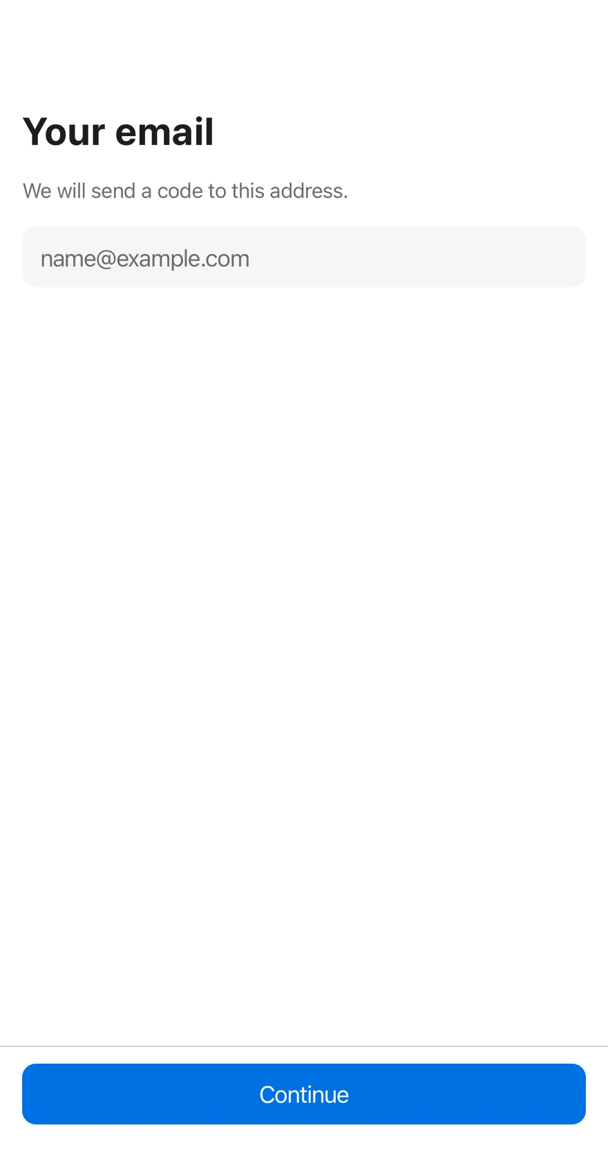
A scrollable form with a bottom bar holding the main action.
```tsx
import { BottomBar, BottomBarContent } from "@/components/ui/bottom-bar"
import { Button } from "@/components/ui/button"
import { Input } from "@/components/ui/input"
import { Screen, ScreenContent } from "@/components/ui/screen"
import { Text } from "@/components/ui/text"
export function ScreenWithBottomBarExample() {
return (
Your email
We will send a code to this address.
)
}
```
```swift
import EsuissUI
import SwiftUI
struct ScreenBottomBarDemo: View {
@State private var email = ""
var body: some View {
Screen {
ScreenContent {
Text("Your email").textVariant(.h2)
Text("We will send a code to this address.").textVariant(.muted)
TextField(String("name@example.com"), text: $email)
.textFieldStyle(.input)
.keyboardType(.emailAddress)
.textInputAutocapitalization(.never)
}
BottomBar(separator: true) {
BottomBarContent {
Button {} label: {
Text("Continue")
}
.buttonStyle(.variant(size: .lg, block: true))
}
}
}
}
}
```
```kotlin
import androidx.compose.foundation.layout.Column
import androidx.compose.foundation.layout.fillMaxSize
import androidx.compose.foundation.text.KeyboardOptions
import androidx.compose.runtime.Composable
import androidx.compose.runtime.getValue
import androidx.compose.runtime.mutableStateOf
import androidx.compose.runtime.saveable.rememberSaveable
import androidx.compose.runtime.setValue
import androidx.compose.ui.Modifier
import androidx.compose.ui.text.input.KeyboardType
import com.esuiss.ui.components.BottomBar
import com.esuiss.ui.components.BottomBarContent
import com.esuiss.ui.components.Button
import com.esuiss.ui.components.ButtonSize
import com.esuiss.ui.components.Input
import com.esuiss.ui.components.Screen
import com.esuiss.ui.components.ScreenContent
import com.esuiss.ui.components.Text
import com.esuiss.ui.components.TextVariant
@Composable
fun ScreenWithBottomBar() {
var email by rememberSaveable { mutableStateOf("") }
Screen {
Column(Modifier.fillMaxSize()) {
ScreenContent(Modifier.weight(1f), scrollable = true) {
Text("Your email", variant = TextVariant.H2)
Text("We will send a code to this address.", variant = TextVariant.Muted)
Input(
email,
{ email = it },
placeholder = "name@example.com",
keyboardOptions = KeyboardOptions(keyboardType = KeyboardType.Email),
)
}
BottomBar(separator = true) {
BottomBarContent {
Button("Continue", onClick = {}, size = ButtonSize.Lg, block = true)
}
}
}
}
}
```
## API Reference
### Screen
The root view that pads for safe area insets.
### ScreenContent
The padded body, optionally scrollable.
## Notes
- Uses the `bg-surface` and `bg-surface-secondary` tokens.
- The status bar uses `light-content` in dark mode and `dark-content` in light mode, following the system appearance.
- Requires `react-native-safe-area-context` and the Keyboard Scroll View component.