# Progress
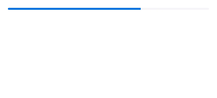
A horizontal bar that shows how far a task has progressed, with an optional label and value.
Progress is an open-source mobile component from suiss/uim for React Native and Expo, with SwiftUI and Jetpack Compose versions built from the same design tokens. The @esuiss/uim CLI copies its source into your project, so you own the code.
Source: https://uim.suiss.app/docs/components/progress
```tsx
import * as React from "react"
import { Progress } from "@/components/ui/progress"
function ProgressDemo() {
const [value, setValue] = React.useState(13)
React.useEffect(() => {
const timer = setTimeout(() => setValue(66), 500)
return () => clearTimeout(timer)
}, [])
return
}
export function ProgressExample() {
return (
)
}
```
```swift
import EsuissUI
import SwiftUI
struct ProgressDelayed: View {
@State private var value = 13.0
var body: some View {
ProgressView(value: value, total: 100)
.progressViewStyle(.bar)
.task {
try? await Task.sleep(for: .milliseconds(500))
value = 66
}
}
}
```
```kotlin
import androidx.compose.foundation.layout.fillMaxWidth
import androidx.compose.runtime.Composable
import androidx.compose.runtime.LaunchedEffect
import androidx.compose.runtime.getValue
import androidx.compose.runtime.mutableFloatStateOf
import androidx.compose.runtime.saveable.rememberSaveable
import androidx.compose.runtime.setValue
import androidx.compose.ui.Modifier
import com.esuiss.ui.components.Progress
import kotlinx.coroutines.delay
@Composable
fun ProgressDefault() {
var value by rememberSaveable { mutableFloatStateOf(13f) }
LaunchedEffect(Unit) {
delay(500)
value = 66f
}
Progress(value, Modifier.fillMaxWidth())
}
```
`Progress` renders a thin track with an indicator whose width follows `value`. The width animates with a Reanimated spring, clamped between 0 and 100 percent. Any children, such as `ProgressLabel` and `ProgressValue`, are placed in a row above the bar.
Use it for uploads, downloads and other tasks with a known amount of work.
## Installation
```bash title="Terminal"
npx @esuiss/uim@latest add progress
```
```bash title="Terminal"
npx @esuiss/uim@latest add progress --platform swift
```
```bash title="Terminal"
npx @esuiss/uim@latest add progress --platform kotlin
```
### Manual
**Uniwind**
1. Install the dependencies:
```bash title="Terminal"
npx expo install cn react-native-reanimated react-native-worklets
```
2. Add the pieces it builds on: the primitives `components/primitives/progress.tsx`, `components/primitives/use-render.tsx`.
3. Copy the source into `components/ui/progress.tsx`:
```tsx title="uniwind/components/ui/progress.tsx"
import { cn } from "cn"
import Animated, {
Extrapolation,
interpolate,
useAnimatedStyle,
useDerivedValue,
withSpring,
} from "react-native-reanimated"
import * as ProgressPrimitive from "@/components/primitives/progress"
import { resolveClassName } from "@/components/primitives/use-render"
function Progress({
className,
children,
trackClassName,
indicatorClassName,
...props
}: React.ComponentProps & {
trackClassName?: string
indicatorClassName?: string
}) {
return (
cn(
"w-full flex-row flex-wrap gap-3",
resolveClassName(className, state)
)
}
{...props}
>
{children}
)
}
function ProgressTrack({
className,
...props
}: React.ComponentProps) {
return (
cn(
"relative h-1 w-full flex-row items-center overflow-hidden rounded-full bg-surface-secondary",
resolveClassName(className, state)
)
}
{...props}
/>
)
}
function ProgressIndicator({
className,
...props
}: Omit, "render">) {
const { percentage } = ProgressPrimitive.useRootContext()
const progress = useDerivedValue(() => percentage ?? 0)
const indicator = useAnimatedStyle(() => {
return {
width: withSpring(
`${interpolate(progress.value, [0, 100], [0, 100], Extrapolation.CLAMP)}%`,
{ overshootClamping: true }
),
}
})
return (
cn("h-full bg-accent", resolveClassName(className, state))
}
render={}
{...props}
/>
)
}
function ProgressLabel({
className,
...props
}: React.ComponentProps) {
return (
cn("text-sm text-label", resolveClassName(className, state))
}
{...props}
/>
)
}
function ProgressValue({
className,
...props
}: React.ComponentProps) {
return (
cn(
"ms-auto text-sm text-label-secondary tabular-nums",
resolveClassName(className, state)
)
}
{...props}
/>
)
}
export {
Progress,
ProgressIndicator,
ProgressLabel,
ProgressTrack,
ProgressValue,
}
```
4. Update the import paths to match your project.
**NativeWind**
1. Install the dependencies:
```bash title="Terminal"
npx expo install cn react-native-reanimated react-native-worklets
```
2. Add the pieces it builds on: the primitives `components/primitives/progress.tsx`, `components/primitives/use-render.tsx`.
3. Copy the source into `components/ui/progress.tsx`:
```tsx title="nativewind/components/ui/progress.tsx"
import { cn } from "cn"
import Animated, {
Extrapolation,
interpolate,
useAnimatedStyle,
useDerivedValue,
withSpring,
} from "react-native-reanimated"
import * as ProgressPrimitive from "@/components/primitives/progress"
import { resolveClassName } from "@/components/primitives/use-render"
function Progress({
className,
children,
trackClassName,
indicatorClassName,
...props
}: React.ComponentProps & {
trackClassName?: string
indicatorClassName?: string
}) {
return (
cn(
"w-full flex-row flex-wrap gap-3",
resolveClassName(className, state)
)
}
{...props}
>
{children}
)
}
function ProgressTrack({
className,
...props
}: React.ComponentProps) {
return (
cn(
"relative h-1 w-full flex-row items-center overflow-hidden rounded-full bg-surface-secondary",
resolveClassName(className, state)
)
}
{...props}
/>
)
}
function ProgressIndicator({
className,
...props
}: Omit, "render">) {
const { percentage } = ProgressPrimitive.useRootContext()
const progress = useDerivedValue(() => percentage ?? 0)
const indicator = useAnimatedStyle(() => {
return {
width: withSpring(
`${interpolate(progress.value, [0, 100], [0, 100], Extrapolation.CLAMP)}%`,
{ overshootClamping: true }
),
}
})
return (
cn("h-full bg-accent", resolveClassName(className, state))
}
render={}
{...props}
/>
)
}
function ProgressLabel({
className,
...props
}: React.ComponentProps) {
return (
cn("text-sm text-label", resolveClassName(className, state))
}
{...props}
/>
)
}
function ProgressValue({
className,
...props
}: React.ComponentProps) {
return (
cn(
"ms-auto text-sm text-label-secondary tabular-nums",
resolveClassName(className, state)
)
}
{...props}
/>
)
}
export {
Progress,
ProgressIndicator,
ProgressLabel,
ProgressTrack,
ProgressValue,
}
```
4. Update the import paths to match your project.
**StyleSheet**
1. Install the dependencies:
```bash title="Terminal"
npx expo install react-native-reanimated react-native-worklets
```
2. Add the pieces it builds on: the primitives `components/primitives/progress.tsx`, `components/primitives/use-render.tsx`.
3. Copy the source into `components/ui/progress.tsx`:
```tsx title="stylesheet/components/ui/progress.tsx"
import { type StyleProp, StyleSheet, type ViewStyle } from "react-native"
import Animated, {
Extrapolation,
interpolate,
useAnimatedStyle,
useDerivedValue,
withSpring,
} from "react-native-reanimated"
import * as ProgressPrimitive from "@/components/primitives/progress"
import { fontSize, radius, useTheme } from "@/components/ui/theme"
const styles = StyleSheet.create({
root: {
width: "100%",
flexDirection: "row",
flexWrap: "wrap",
gap: 12,
},
track: {
position: "relative",
height: 4,
width: "100%",
flexDirection: "row",
alignItems: "center",
overflow: "hidden",
borderRadius: radius.full,
},
indicator: { height: "100%" },
label: { ...fontSize.sm },
value: {
...fontSize.sm,
marginStart: "auto",
fontVariant: ["tabular-nums"],
},
})
function Progress({
style,
children,
trackStyle,
indicatorStyle,
...props
}: React.ComponentProps & {
trackStyle?: StyleProp
indicatorStyle?: StyleProp
}) {
return (
[
styles.root,
typeof style === "function" ? style(state) : style,
]}
{...props}
>
{children}
)
}
function ProgressTrack({
style,
...props
}: React.ComponentProps) {
const { colors } = useTheme()
return (
[
styles.track,
{ backgroundColor: colors.surfaceSecondary },
typeof style === "function" ? style(state) : style,
]}
{...props}
/>
)
}
function ProgressIndicator({
style,
...props
}: Omit, "render">) {
const { colors } = useTheme()
const { percentage } = ProgressPrimitive.useRootContext()
const progress = useDerivedValue(() => percentage ?? 0)
const indicator = useAnimatedStyle(() => {
return {
width: withSpring(
`${interpolate(progress.value, [0, 100], [0, 100], Extrapolation.CLAMP)}%`,
{ overshootClamping: true }
),
}
})
return (
[
styles.indicator,
{ backgroundColor: colors.accent },
typeof style === "function" ? style(state) : style,
]}
render={}
{...props}
/>
)
}
function ProgressLabel({
style,
...props
}: React.ComponentProps) {
const { colors } = useTheme()
return (
[
styles.label,
{ color: colors.label },
typeof style === "function" ? style(state) : style,
]}
{...props}
/>
)
}
function ProgressValue({
style,
...props
}: React.ComponentProps) {
const { colors } = useTheme()
return (
[
styles.value,
{ color: colors.labelSecondary },
typeof style === "function" ? style(state) : style,
]}
{...props}
/>
)
}
export {
Progress,
ProgressIndicator,
ProgressLabel,
ProgressTrack,
ProgressValue,
}
```
4. Update the import paths to match your project.
**SwiftUI**
1. Target iOS 17 or later.
2. Copy the theme files every view uses:
```swift title="swift/Theme/Theme.swift"
import SwiftUI
import UIKit
struct RGBA: Sendable {
let red: CGFloat
let green: CGFloat
let blue: CGFloat
let alpha: CGFloat
init(_ hex: UInt32, _ alpha: CGFloat = 1) {
red = CGFloat((hex >> 16) & 0xFF) / 255
green = CGFloat((hex >> 8) & 0xFF) / 255
blue = CGFloat(hex & 0xFF) / 255
self.alpha = alpha
}
var uiColor: UIColor {
UIColor(red: red, green: green, blue: blue, alpha: alpha)
}
}
extension Color {
static func adaptive(light: RGBA, dark: RGBA) -> Color {
let lightColor = light.uiColor
let darkColor = dark.uiColor
return Color(uiColor: UIColor { traits in
traits.userInterfaceStyle == .dark ? darkColor : lightColor
})
}
}
public struct TextStyle: Sendable, Hashable {
public let size: CGFloat
public let lineHeight: CGFloat
public let letterSpacing: CGFloat
public init(size: CGFloat, lineHeight: CGFloat, letterSpacing: CGFloat) {
self.size = size
self.lineHeight = lineHeight
self.letterSpacing = letterSpacing
}
public func font(weight: Font.Weight = .regular) -> Font {
.system(size: size, weight: weight)
}
public var lineSpacing: CGFloat {
max(0, lineHeight - UIFont.systemFont(ofSize: size).lineHeight)
}
}
extension Hashable where Self == Font {
public static func textStyle(_ style: TextStyle, weight: Font.Weight = .regular) -> Font {
style.font(weight: weight)
}
}
private struct TextStyleModifier: ViewModifier {
let style: TextStyle
let weight: Font.Weight
func body(content: Content) -> some View {
content
.font(style.font(weight: weight))
.tracking(style.letterSpacing)
.lineSpacing(style.lineSpacing)
.padding(.vertical, style.lineSpacing / 2)
}
}
extension View {
public func textStyle(_ style: TextStyle, weight: Font.Weight = .regular) -> some View {
modifier(TextStyleModifier(style: style, weight: weight))
}
}
public struct Shadow: Sendable, Hashable {
public let color: Color
public let radius: CGFloat
public let x: CGFloat
public let y: CGFloat
public init(color: Color, radius: CGFloat, x: CGFloat = 0, y: CGFloat = 0) {
self.color = color
self.radius = radius
self.x = x
self.y = y
}
}
extension View {
public func shadow(_ shadow: Shadow) -> some View {
self.shadow(color: shadow.color, radius: shadow.radius, x: shadow.x, y: shadow.y)
}
}
```
```swift title="swift/Theme/Tokens.swift"
import SwiftUI
extension Color {
public static let surface = Color.adaptive(light: .init(0xFFFFFF), dark: .init(0x000000))
public static let surfaceSecondary = Color.adaptive(light: .init(0xF5F5F7), dark: .init(0x161617))
public static let surfaceTertiary = Color.adaptive(light: .init(0xE8E8ED), dark: .init(0x2C2C2E))
public static let surfaceRaised = Color.adaptive(light: .init(0xFFFFFF), dark: .init(0x1D1D1F))
public static let label = Color.adaptive(light: .init(0x1D1D1F), dark: .init(0xF5F5F7))
public static let labelSecondary = Color.adaptive(light: .init(0x6E6E73), dark: .init(0xA1A1A6))
public static let labelTertiary = Color.adaptive(light: .init(0x86868B), dark: .init(0x86868B))
public static let labelQuaternary = Color.adaptive(light: .init(0xD2D2D7), dark: .init(0x424245))
public static let control = Color.adaptive(light: .init(0x000000, 0.04), dark: .init(0xFFFFFF, 0.1))
public static let controlPressed = Color.adaptive(light: .init(0x000000, 0.12), dark: .init(0xFFFFFF, 0.22))
public static let controlSelected = Color.adaptive(light: .init(0x1D1D1F), dark: .init(0xF5F5F7))
public static let controlDisabled = Color.adaptive(light: .init(0x000000, 0.03), dark: .init(0xFFFFFF, 0.05))
public static let onControlSelected = Color.adaptive(light: .init(0xFFFFFF), dark: .init(0x000000))
public static let itemPressed = Color.adaptive(light: .init(0x000000, 0.08), dark: .init(0xFFFFFF, 0.12))
public static let itemSelected = Color.adaptive(light: .init(0x000000, 0.06), dark: .init(0xFFFFFF, 0.1))
public static let separator = Color.adaptive(light: .init(0xD2D2D7), dark: .init(0x424245))
public static let separatorStrong = Color.adaptive(light: .init(0x86868B), dark: .init(0x6E6E73))
public static let accent = Color.adaptive(light: .init(0x0071E3), dark: .init(0x0071E3))
public static let accentPressed = Color.adaptive(light: .init(0x005BB8), dark: .init(0x004D9E))
public static let accentSelected = Color.adaptive(light: .init(0x0071E3), dark: .init(0x0071E3))
public static let accentDisabled = Color.adaptive(light: .init(0x0071E3, 0.4), dark: .init(0x0071E3, 0.4))
public static let onAccent = Color.adaptive(light: .init(0xFFFFFF), dark: .init(0xFFFFFF))
public static let accentSurface = Color.adaptive(light: .init(0x0071E3, 0.09), dark: .init(0x0071E3, 0.18))
public static let accentSurfacePressed = Color.adaptive(light: .init(0x0071E3, 0.18), dark: .init(0x0071E3, 0.3))
public static let link = Color.adaptive(light: .init(0x0066CC), dark: .init(0x2997FF))
public static let focus = Color.adaptive(light: .init(0x0071E3), dark: .init(0x0071E3))
public static let scrim = Color.adaptive(light: .init(0x000000, 0.48), dark: .init(0x000000, 0.48))
public static let media = Color.adaptive(light: .init(0x000000), dark: .init(0x000000))
public static let onMedia = Color.adaptive(light: .init(0xFFFFFF), dark: .init(0xFFFFFF))
public static let danger = Color.adaptive(light: .init(0xD0000A), dark: .init(0xFF5447))
public static let dangerSurface = Color.adaptive(light: .init(0xD70015, 0.08), dark: .init(0xFF453A, 0.2))
public static let dangerSurfacePressed = Color.adaptive(light: .init(0xD70015, 0.16), dark: .init(0xFF453A, 0.36))
public static let success = Color.adaptive(light: .init(0x008009), dark: .init(0x30D158))
public static let successSurface = Color.adaptive(light: .init(0xEFFAF1), dark: .init(0x30D158, 0.16))
public static let warning = Color.adaptive(light: .init(0xB64400), dark: .init(0xFF9F0A))
public static let warningSurface = Color.adaptive(light: .init(0xFFF5EA), dark: .init(0xFF9F0A, 0.16))
}
public enum Radius {
public static let xs: CGFloat = 3
public static let sm: CGFloat = 5
public static let md: CGFloat = 8
public static let lg: CGFloat = 10
public static let xl: CGFloat = 12
public static let xl2: CGFloat = 18
public static let xl3: CGFloat = 28
public static let full: CGFloat = 9999
}
extension TextStyle {
public static let xs3 = TextStyle(size: 11, lineHeight: 13, letterSpacing: 0.066)
public static let xs2 = TextStyle(size: 12, lineHeight: 16, letterSpacing: 0)
public static let xs = TextStyle(size: 13, lineHeight: 18, letterSpacing: -0.078)
public static let sm = TextStyle(size: 15, lineHeight: 20, letterSpacing: -0.24)
public static let md = TextStyle(size: 16, lineHeight: 21, letterSpacing: -0.32)
public static let base = TextStyle(size: 17, lineHeight: 22, letterSpacing: -0.442)
public static let lg = TextStyle(size: 20, lineHeight: 25, letterSpacing: -0.46)
public static let xl = TextStyle(size: 22, lineHeight: 28, letterSpacing: -0.264)
public static let xl2 = TextStyle(size: 28, lineHeight: 34, letterSpacing: 0.392)
public static let xl3 = TextStyle(size: 34, lineHeight: 41, letterSpacing: 0.408)
public static let allCases: [TextStyle] = [.xs3, .xs2, .xs, .sm, .md, .base, .lg, .xl, .xl2, .xl3]
}
extension Shadow {
public static let md = Shadow(color: .black.opacity(0.08), radius: 6, x: 2, y: 4)
public static let lg = Shadow(color: .black.opacity(0.12), radius: 12, y: 4)
}
```
3. Copy the source and every file it uses:
```swift title="swift/Components/Progress.swift"
import SwiftUI
public struct BarProgressViewStyle: ProgressViewStyle {
public init() {}
public func makeBody(configuration: Configuration) -> some View {
BarProgress(configuration: configuration)
}
}
private struct BarProgress: View {
let configuration: ProgressViewStyleConfiguration
@Environment(\.accessibilityReduceMotion) private var reduceMotion
var body: some View {
let fraction = min(max(configuration.fractionCompleted ?? 0, 0), 1)
VStack(alignment: .leading, spacing: 12) {
HStack(alignment: .firstTextBaseline, spacing: 12) {
configuration.label
.foregroundStyle(Color.label)
Spacer(minLength: 0)
configuration.currentValueLabel
.monospacedDigit()
.foregroundStyle(Color.labelSecondary)
}
.scaledTextStyle(.sm)
Capsule()
.fill(Color.surfaceSecondary)
.frame(height: 4)
.overlay(alignment: .leading) {
GeometryReader { proxy in
Rectangle()
.fill(Color.accent)
.frame(width: proxy.size.width * fraction)
.animation(reduceMotion ? nil : .spring(response: 0.4, dampingFraction: 1), value: fraction)
}
}
.clipShape(Capsule())
}
.frame(maxWidth: .infinity, alignment: .leading)
}
}
extension ProgressViewStyle where Self == BarProgressViewStyle {
public static var bar: BarProgressViewStyle { BarProgressViewStyle() }
}
```
```swift title="swift/Components/TextVariant.swift"
import SwiftUI
public enum TextVariant: CaseIterable, Sendable {
case `default`, h1, h2, h3, h4, p, blockquote, code, lead, large, small, muted
var style: TextStyle {
switch self {
case .h1: .xl3
case .h2: .xl2
case .h3: .xl
case .h4, .lead, .large: .lg
case .code, .small, .muted: .sm
default: .base
}
}
var weight: Font.Weight {
switch self {
case .h1, .h2: .bold
case .h3, .h4, .large, .code: .semibold
case .small: .medium
default: .regular
}
}
var color: Color {
switch self {
case .lead, .muted: .labelSecondary
default: .label
}
}
var isHeading: Bool {
switch self {
case .h1, .h2, .h3, .h4: true
default: false
}
}
}
private struct TextVariantModifier: ViewModifier {
let variant: TextVariant
func body(content: Content) -> some View {
switch variant {
case .blockquote:
styled(content)
.italic()
.padding(.leading, 12)
.overlay(alignment: .leading) {
Rectangle().fill(Color.separator).frame(width: 2)
}
.padding(.top, 16)
case .code:
styled(content)
.monospaced()
.padding(.horizontal, 4)
.padding(.vertical, 2)
.background(Color.surfaceSecondary, in: RoundedRectangle(cornerRadius: Radius.sm, style: .continuous))
case .p:
styled(content).padding(.top, 12)
default:
styled(content)
}
}
private func styled(_ content: Content) -> some View {
content
.scaledTextStyle(variant.style, weight: variant.weight)
.foregroundStyle(variant.color)
.accessibilityAddTraits(variant.isHeading ? .isHeader : [])
}
}
extension View {
public func textVariant(_ variant: TextVariant) -> some View {
modifier(TextVariantModifier(variant: variant))
}
}
private struct ScaledTextStyleModifier: ViewModifier {
let style: TextStyle
let weight: Font.Weight
@ScaledMetric(relativeTo: .body) private var scale: CGFloat = 1
func body(content: Content) -> some View {
let size = style.size * scale
let lineSpacing = max(0, style.lineHeight * scale - UIFont.systemFont(ofSize: size).lineHeight)
content
.font(.system(size: size, weight: weight))
.tracking(style.letterSpacing)
.lineSpacing(lineSpacing)
.padding(.vertical, lineSpacing / 2)
}
}
extension View {
func scaledTextStyle(_ style: TextStyle, weight: Font.Weight = .regular) -> some View {
modifier(ScaledTextStyleModifier(style: style, weight: weight))
}
func scaledFont(_ style: TextStyle, weight: Font.Weight = .regular) -> some View {
modifier(ScaledFontModifier(style: style, weight: weight))
}
}
private struct ScaledFontModifier: ViewModifier {
let style: TextStyle
let weight: Font.Weight
@ScaledMetric(relativeTo: .body) private var scale: CGFloat = 1
func body(content: Content) -> some View {
content
.font(.system(size: style.size * scale, weight: weight))
.tracking(style.letterSpacing)
}
}
```
4. Add the files to your app target.
**Jetpack Compose**
1. Set `minSdk` to 24 or higher and add the dependencies:
```kotlin title="build.gradle.kts"
implementation(platform("androidx.compose:compose-bom:2026.09.00"))
implementation("androidx.compose.foundation:foundation")
implementation("androidx.compose.ui:ui")
```
2. Copy the theme files every view uses:
```kt title="kotlin/theme/Theme.kt"
package com.esuiss.ui.theme
import androidx.compose.foundation.isSystemInDarkTheme
import androidx.compose.runtime.Composable
import androidx.compose.runtime.CompositionLocalProvider
import androidx.compose.runtime.Immutable
import androidx.compose.runtime.staticCompositionLocalOf
import androidx.compose.ui.Modifier
import androidx.compose.ui.draw.dropShadow
import androidx.compose.ui.graphics.Color
import androidx.compose.ui.graphics.Shape
import androidx.compose.ui.graphics.shadow.Shadow as DropShadow
import androidx.compose.ui.text.TextStyle
import androidx.compose.ui.text.style.LineHeightStyle
import androidx.compose.ui.unit.Dp
import androidx.compose.ui.unit.DpOffset
import androidx.compose.ui.unit.em
import androidx.compose.ui.unit.sp
internal fun textStyle(size: Double, lineHeight: Double, letterSpacing: Double) = TextStyle(
fontSize = size.sp,
lineHeight = lineHeight.sp,
letterSpacing = letterSpacing.em,
lineHeightStyle = LineHeightStyle(
alignment = LineHeightStyle.Alignment.Center,
trim = LineHeightStyle.Trim.None,
),
)
@Immutable
data class Shadow(
val offsetX: Dp,
val offsetY: Dp,
val blur: Dp,
val color: Color,
)
fun Modifier.shadow(shadow: Shadow, shape: Shape): Modifier = dropShadow(
shape,
DropShadow(
radius = shadow.blur,
color = shadow.color,
offset = DpOffset(shadow.offsetX, shadow.offsetY),
),
)
val LocalColors = staticCompositionLocalOf { LightColors }
object EsuissTheme {
val colors: Colors
@Composable get() = LocalColors.current
val typography: Typography
get() = Typography
val radius: Radius
get() = Radius
val shadows: Shadows
get() = Shadows
}
@Composable
fun EsuissTheme(
darkTheme: Boolean = isSystemInDarkTheme(),
content: @Composable () -> Unit,
) {
CompositionLocalProvider(
LocalColors provides if (darkTheme) DarkColors else LightColors,
content = content,
)
}
```
```kt title="kotlin/theme/Tokens.kt"
package com.esuiss.ui.theme
import androidx.compose.runtime.Immutable
import androidx.compose.ui.graphics.Color
import androidx.compose.ui.unit.dp
@Immutable
data class Colors(
val surface: Color,
val surfaceSecondary: Color,
val surfaceTertiary: Color,
val surfaceRaised: Color,
val label: Color,
val labelSecondary: Color,
val labelTertiary: Color,
val labelQuaternary: Color,
val control: Color,
val controlPressed: Color,
val controlSelected: Color,
val controlDisabled: Color,
val onControlSelected: Color,
val itemPressed: Color,
val itemSelected: Color,
val separator: Color,
val separatorStrong: Color,
val accent: Color,
val accentPressed: Color,
val accentSelected: Color,
val accentDisabled: Color,
val onAccent: Color,
val accentSurface: Color,
val accentSurfacePressed: Color,
val link: Color,
val focus: Color,
val scrim: Color,
val media: Color,
val onMedia: Color,
val danger: Color,
val dangerSurface: Color,
val dangerSurfacePressed: Color,
val success: Color,
val successSurface: Color,
val warning: Color,
val warningSurface: Color,
val blue: Color,
val green: Color,
val orange: Color,
val red: Color,
val yellow: Color,
val purple: Color,
val pink: Color,
val indigo: Color,
val teal: Color,
val mint: Color,
val cyan: Color,
val brown: Color,
val gray: Color,
val isDark: Boolean,
)
val LightColors = Colors(
surface = Color(0xFFFFFFFF),
surfaceSecondary = Color(0xFFF5F5F7),
surfaceTertiary = Color(0xFFE8E8ED),
surfaceRaised = Color(0xFFFFFFFF),
label = Color(0xFF1D1D1F),
labelSecondary = Color(0xFF6E6E73),
labelTertiary = Color(0xFF86868B),
labelQuaternary = Color(0xFFD2D2D7),
control = Color(0xFF000000).copy(alpha = 0.04f),
controlPressed = Color(0xFF000000).copy(alpha = 0.12f),
controlSelected = Color(0xFF1D1D1F),
controlDisabled = Color(0xFF000000).copy(alpha = 0.03f),
onControlSelected = Color(0xFFFFFFFF),
itemPressed = Color(0xFF000000).copy(alpha = 0.08f),
itemSelected = Color(0xFF000000).copy(alpha = 0.06f),
separator = Color(0xFFD2D2D7),
separatorStrong = Color(0xFF86868B),
accent = Color(0xFF0071E3),
accentPressed = Color(0xFF005BB8),
accentSelected = Color(0xFF0071E3),
accentDisabled = Color(0xFF0071E3).copy(alpha = 0.4f),
onAccent = Color(0xFFFFFFFF),
accentSurface = Color(0xFF0071E3).copy(alpha = 0.09f),
accentSurfacePressed = Color(0xFF0071E3).copy(alpha = 0.18f),
link = Color(0xFF0066CC),
focus = Color(0xFF0071E3),
scrim = Color(0xFF000000).copy(alpha = 0.48f),
media = Color(0xFF000000),
onMedia = Color(0xFFFFFFFF),
danger = Color(0xFFD0000A),
dangerSurface = Color(0xFFD70015).copy(alpha = 0.08f),
dangerSurfacePressed = Color(0xFFD70015).copy(alpha = 0.16f),
success = Color(0xFF008009),
successSurface = Color(0xFFEFFAF1),
warning = Color(0xFFB64400),
warningSurface = Color(0xFFFFF5EA),
blue = Color(0xFF007AFF),
green = Color(0xFF34C759),
orange = Color(0xFFFF9500),
red = Color(0xFFFF3B30),
yellow = Color(0xFFFFCC00),
purple = Color(0xFFAF52DE),
pink = Color(0xFFFF2D55),
indigo = Color(0xFF5856D6),
teal = Color(0xFF30B0C7),
mint = Color(0xFF00C7BE),
cyan = Color(0xFF32ADE6),
brown = Color(0xFFA2845E),
gray = Color(0xFF8E8E93),
isDark = false,
)
val DarkColors = Colors(
surface = Color(0xFF000000),
surfaceSecondary = Color(0xFF161617),
surfaceTertiary = Color(0xFF2C2C2E),
surfaceRaised = Color(0xFF1D1D1F),
label = Color(0xFFF5F5F7),
labelSecondary = Color(0xFFA1A1A6),
labelTertiary = Color(0xFF86868B),
labelQuaternary = Color(0xFF424245),
control = Color(0xFFFFFFFF).copy(alpha = 0.1f),
controlPressed = Color(0xFFFFFFFF).copy(alpha = 0.22f),
controlSelected = Color(0xFFF5F5F7),
controlDisabled = Color(0xFFFFFFFF).copy(alpha = 0.05f),
onControlSelected = Color(0xFF000000),
itemPressed = Color(0xFFFFFFFF).copy(alpha = 0.12f),
itemSelected = Color(0xFFFFFFFF).copy(alpha = 0.1f),
separator = Color(0xFF424245),
separatorStrong = Color(0xFF6E6E73),
accent = Color(0xFF0071E3),
accentPressed = Color(0xFF004D9E),
accentSelected = Color(0xFF0071E3),
accentDisabled = Color(0xFF0071E3).copy(alpha = 0.4f),
onAccent = Color(0xFFFFFFFF),
accentSurface = Color(0xFF0071E3).copy(alpha = 0.18f),
accentSurfacePressed = Color(0xFF0071E3).copy(alpha = 0.3f),
link = Color(0xFF2997FF),
focus = Color(0xFF0071E3),
scrim = Color(0xFF000000).copy(alpha = 0.48f),
media = Color(0xFF000000),
onMedia = Color(0xFFFFFFFF),
danger = Color(0xFFFF5447),
dangerSurface = Color(0xFFFF453A).copy(alpha = 0.2f),
dangerSurfacePressed = Color(0xFFFF453A).copy(alpha = 0.36f),
success = Color(0xFF30D158),
successSurface = Color(0xFF30D158).copy(alpha = 0.16f),
warning = Color(0xFFFF9F0A),
warningSurface = Color(0xFFFF9F0A).copy(alpha = 0.16f),
blue = Color(0xFF0A84FF),
green = Color(0xFF30D158),
orange = Color(0xFFFF9F0A),
red = Color(0xFFFF453A),
yellow = Color(0xFFFFD60A),
purple = Color(0xFFBF5AF2),
pink = Color(0xFFFF375F),
indigo = Color(0xFF5E5CE6),
teal = Color(0xFF40C8E0),
mint = Color(0xFF66D4CF),
cyan = Color(0xFF64D2FF),
brown = Color(0xFFAC8E68),
gray = Color(0xFF8E8E93),
isDark = true,
)
object Radius {
val xs = 3.dp
val sm = 5.dp
val md = 8.dp
val lg = 10.dp
val xl = 12.dp
val xl2 = 18.dp
val xl3 = 28.dp
val full = 9999.dp
}
object Typography {
val xs3 = textStyle(11.0, 13.0, 0.006)
val xs2 = textStyle(12.0, 16.0, 0.0)
val xs = textStyle(13.0, 18.0, -0.006)
val sm = textStyle(15.0, 20.0, -0.016)
val md = textStyle(16.0, 21.0, -0.02)
val base = textStyle(17.0, 22.0, -0.026)
val lg = textStyle(20.0, 25.0, -0.023)
val xl = textStyle(22.0, 28.0, -0.012)
val xl2 = textStyle(28.0, 34.0, 0.014)
val xl3 = textStyle(34.0, 41.0, 0.012)
val all = listOf(xs3, xs2, xs, sm, md, base, lg, xl, xl2, xl3)
}
object Shadows {
val md = Shadow(2.dp, 4.dp, 12.dp, Color.Black.copy(alpha = 0.08f))
val lg = Shadow(0.dp, 4.dp, 24.dp, Color.Black.copy(alpha = 0.12f))
}
```
3. Copy the source:
```kt title="kotlin/components/Progress.kt"
package com.esuiss.ui.components
import androidx.compose.animation.core.Spring
import androidx.compose.animation.core.animateFloatAsState
import androidx.compose.animation.core.spring
import androidx.compose.foundation.background
import androidx.compose.foundation.layout.Arrangement
import androidx.compose.foundation.layout.Box
import androidx.compose.foundation.layout.Column
import androidx.compose.foundation.layout.Row
import androidx.compose.foundation.layout.Spacer
import androidx.compose.foundation.layout.fillMaxHeight
import androidx.compose.foundation.layout.fillMaxWidth
import androidx.compose.foundation.layout.height
import androidx.compose.foundation.shape.CircleShape
import androidx.compose.foundation.text.BasicText
import androidx.compose.runtime.Composable
import androidx.compose.runtime.getValue
import androidx.compose.ui.Alignment
import androidx.compose.ui.Modifier
import androidx.compose.ui.draw.clip
import androidx.compose.ui.semantics.ProgressBarRangeInfo
import androidx.compose.ui.semantics.progressBarRangeInfo
import androidx.compose.ui.semantics.semantics
import androidx.compose.ui.unit.dp
import com.esuiss.ui.theme.EsuissTheme
import com.esuiss.ui.theme.Typography
import kotlin.math.roundToInt
@Composable
fun Progress(
value: Float?,
modifier: Modifier = Modifier,
max: Float = 100f,
label: String? = null,
showValue: Boolean = false,
) {
val colors = EsuissTheme.colors
val fraction = if (value == null || max <= 0f) 0f else (value / max).coerceIn(0f, 1f)
val animated by animateFloatAsState(
targetValue = fraction,
animationSpec = spring(dampingRatio = Spring.DampingRatioNoBouncy, stiffness = 100f),
label = "progress",
)
Column(
modifier = modifier
.fillMaxWidth()
.semantics(mergeDescendants = true) {
progressBarRangeInfo = if (value == null) {
ProgressBarRangeInfo.Indeterminate
} else {
ProgressBarRangeInfo(value.coerceIn(0f, max), 0f..max)
}
},
verticalArrangement = Arrangement.spacedBy(12.dp),
) {
if (label != null || showValue) {
Row(verticalAlignment = Alignment.CenterVertically) {
if (label != null) {
BasicText(label, style = Typography.sm.copy(color = colors.label))
}
Spacer(Modifier.weight(1f))
if (showValue && value != null) {
BasicText(
"${(fraction * 100).roundToInt()}%",
style = Typography.sm.copy(color = colors.labelSecondary, fontFeatureSettings = "tnum"),
)
}
}
}
Box(
Modifier
.fillMaxWidth()
.height(4.dp)
.clip(CircleShape)
.background(colors.surfaceSecondary),
) {
Box(
Modifier
.fillMaxHeight()
.fillMaxWidth(animated)
.background(colors.accent),
)
}
}
}
```
4. Update the `com.esuiss.ui` package names to match your project.
## Usage
```tsx
import { Progress, ProgressTrack, ProgressIndicator, ProgressLabel, ProgressValue } from "@/components/ui/progress"
```
```tsx
```
Set `value` between `min` and `max` (0 and 100 by default). Pass `null` when the progress is unknown.
Add a `ProgressLabel` and a `ProgressValue` as children to show a caption and the formatted value; the value is pushed to the end of the row. Format the value with `format` and `locale`.
Style the bar with `trackClassName` and `indicatorClassName`. `ProgressTrack` and `ProgressIndicator` are also exported for custom layouts.
## Examples
### With label
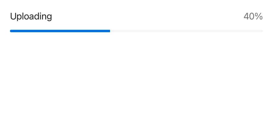
A bar with a label and a live percentage value.
```tsx
import * as React from "react"
import { Progress, ProgressLabel, ProgressValue } from "@/components/ui/progress"
function WithLabelDemo() {
const [value, setValue] = React.useState(0)
React.useEffect(() => {
const timer = setInterval(() => {
setValue((current) => (current >= 100 ? 0 : current + 10))
}, 600)
return () => clearInterval(timer)
}, [])
return (
)
}
export function ProgressWithLabelExample() {
return (
)
}
```
```swift
import EsuissUI
import SwiftUI
struct ProgressWithLabel: View {
@State private var value = 0
var body: some View {
ProgressView(value: Double(value), total: 100) {
Text("Uploading")
} currentValueLabel: {
Text(verbatim: "\(value)%")
}
.progressViewStyle(.bar)
.task {
while !Task.isCancelled {
try? await Task.sleep(for: .milliseconds(600))
value = value >= 100 ? 0 : value + 10
}
}
}
}
```
```kotlin
import androidx.compose.foundation.layout.fillMaxWidth
import androidx.compose.runtime.Composable
import androidx.compose.runtime.LaunchedEffect
import androidx.compose.runtime.getValue
import androidx.compose.runtime.mutableFloatStateOf
import androidx.compose.runtime.saveable.rememberSaveable
import androidx.compose.runtime.setValue
import androidx.compose.ui.Modifier
import com.esuiss.ui.components.Progress
import kotlinx.coroutines.delay
@Composable
fun ProgressWithLabel() {
var value by rememberSaveable { mutableFloatStateOf(0f) }
LaunchedEffect(Unit) {
while (true) {
delay(600)
value = if (value >= 100f) 0f else value + 10f
}
}
Progress(value, Modifier.fillMaxWidth(), label = "Uploading", showValue = true)
}
```
### Complete
A bar at 100 percent.

```tsx
import { Progress } from "@/components/ui/progress"
export function ProgressCompleteExample() {
return (
)
}
```
```swift
import EsuissUI
import SwiftUI
struct ProgressCompleteExample: View {
var body: some View {
ProgressView(value: 100, total: 100)
.progressViewStyle(.bar)
}
}
```
```kotlin
import androidx.compose.foundation.layout.fillMaxWidth
import androidx.compose.runtime.Composable
import androidx.compose.ui.Modifier
import com.esuiss.ui.components.Progress
@Composable
fun ProgressCompleteExample() {
Progress(100f, Modifier.fillMaxWidth())
}
```
### Values
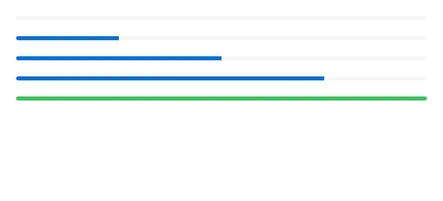
Bars at 0, 25, 50, 75 and 100 percent, the last with a custom indicator color.
```tsx
import { View } from "react-native"
import { Progress } from "@/components/ui/progress"
export function ProgressValuesExample() {
return (
)
}
```
```swift
import EsuissUI
import SwiftUI
struct ProgressValuesExample: View {
var body: some View {
VStack(spacing: 16) {
ForEach([0.0, 25, 50, 75, 100], id: \.self) { value in
ProgressView(value: value, total: 100)
.progressViewStyle(.bar)
}
}
.frame(maxWidth: .infinity)
}
}
```
```kotlin
import androidx.compose.foundation.layout.Arrangement
import androidx.compose.foundation.layout.Column
import androidx.compose.foundation.layout.fillMaxWidth
import androidx.compose.runtime.Composable
import androidx.compose.ui.Modifier
import androidx.compose.ui.unit.dp
import com.esuiss.ui.components.Progress
@Composable
fun ProgressValues() {
Column(Modifier.fillMaxWidth(), verticalArrangement = Arrangement.spacedBy(16.dp)) {
listOf(0f, 25f, 50f, 75f, 100f).forEach { Progress(it, Modifier.fillMaxWidth()) }
}
}
```
## API Reference
### Progress
Root that holds the value and renders the track and indicator.
### ProgressTrack
Background bar.
### ProgressIndicator
Animated fill that shows the current value.
### ProgressLabel
Caption text above the bar.
### ProgressValue
Formatted value text, aligned to the end.
## Accessibility
- The root has the `progressbar` role and reports `min`, `max`, the current value and a value text, so VoiceOver and TalkBack announce the progress.
- Use `getAccessibilityValueText` to customize the announced text.
## Notes
- The track uses `bg-surface-secondary` and the indicator `bg-accent`.
- Label and value text use `text-label` and `text-label-secondary`, with tabular numbers for the value.
- Light and dark colors follow the system appearance.