# Input Otp
A row of single-character boxes for entering one-time codes, with autofill support.
Input Otp is an open-source mobile component from suiss/uim for React Native and Expo, with SwiftUI and Jetpack Compose versions built from the same design tokens. The @esuiss/uim CLI copies its source into your project, so you own the code.
Source: https://uim.suiss.app/docs/components/input-otp
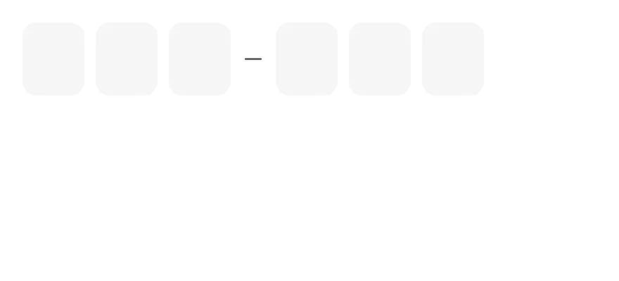
```tsx
import { InputOTP, InputOTPGroup, InputOTPSeparator, InputOTPSlot } from "@/components/ui/input-otp"
export function InputOtpExample() {
return (
)
}
```
```swift
import EsuissUI
import SwiftUI
struct InputOTPDefaultDemo: View {
@State private var text = ""
var body: some View {
InputOTP(text: $text, length: 6) {
InputOTPGroup {
InputOTPSlot(index: 0)
InputOTPSlot(index: 1)
InputOTPSlot(index: 2)
}
InputOTPSeparator()
InputOTPGroup {
InputOTPSlot(index: 3)
InputOTPSlot(index: 4)
InputOTPSlot(index: 5)
}
}
}
}
```
```kotlin
import androidx.compose.foundation.layout.Column
import androidx.compose.runtime.Composable
import androidx.compose.runtime.getValue
import androidx.compose.runtime.mutableStateOf
import androidx.compose.runtime.saveable.rememberSaveable
import androidx.compose.runtime.setValue
import com.esuiss.ui.components.InputOTP
import com.esuiss.ui.components.InputOTPGroup
import com.esuiss.ui.components.InputOTPSeparator
import com.esuiss.ui.components.InputOTPSlot
@Composable
fun InputOTPDefault() {
var value by rememberSaveable { mutableStateOf("") }
Column {
InputOTP(value, { value = it }, maxLength = 6) {
InputOTPGroup {
InputOTPSlot(0)
InputOTPSlot(1)
InputOTPSlot(2)
}
InputOTPSeparator()
InputOTPGroup {
InputOTPSlot(3)
InputOTPSlot(4)
InputOTPSlot(5)
}
}
}
}
```
`InputOTP` is backed by one hidden `TextInput` and shows each character in an `InputOTPSlot`. The active slot gets an accent border and a blinking caret. The hidden input uses the one-time-code autofill hints, so codes from messages can be filled in automatically, and pasting fills every slot.
Group slots with `InputOTPGroup` and place an `InputOTPSeparator` between groups for codes such as `123-456`.
## Installation
```bash title="Terminal"
npx @esuiss/uim@latest add input-otp
```
```bash title="Terminal"
npx @esuiss/uim@latest add input-otp --platform swift
```
```bash title="Terminal"
npx @esuiss/uim@latest add input-otp --platform kotlin
```
The CLI also adds what it builds on: [Icon](/docs/components/icon), [Text](/docs/components/text).
### Manual
**Uniwind**
1. Install the dependencies:
```bash title="Terminal"
npx expo install cn phosphor-react-native react-native-reanimated react-native-svg react-native-worklets
```
2. Add the pieces it builds on: [Icon](/docs/components/icon), [Text](/docs/components/text), and the primitives `components/primitives/otp-field.tsx`, `components/primitives/use-render.tsx`.
3. Copy the source into `components/ui/input-otp.tsx`:
```tsx title="uniwind/components/ui/input-otp.tsx"
import { cn } from "cn"
import { MinusIcon } from "phosphor-react-native"
import * as React from "react"
import { View } from "react-native"
import Animated, {
cancelAnimation,
ReduceMotion,
useAnimatedStyle,
useSharedValue,
withDelay,
withRepeat,
withSequence,
withTiming,
} from "react-native-reanimated"
import * as OTPFieldPrimitive from "@/components/primitives/otp-field"
import { resolveClassName } from "@/components/primitives/use-render"
import { Icon } from "@/components/ui/icon"
import { Text } from "@/components/ui/text"
type InputOTPSlotClassNames = {
className?: string
textClassName?: string
}
const InputOTPSlotClassContext = React.createContext<
InputOTPSlotClassNames | undefined
>(undefined)
function InputOTP({
className,
...props
}: React.ComponentProps) {
return (
cn("flex-row items-center gap-2", resolveClassName(className, state))
}
{...props}
/>
)
}
function InputOTPGroup({
className,
...props
}: React.ComponentProps) {
return (
)
}
function InputOTPCaret() {
const opacity = useSharedValue(1)
React.useEffect(() => {
opacity.value = withRepeat(
withSequence(
withTiming(0, { duration: 200 }),
withDelay(300, withTiming(1, { duration: 200 })),
withDelay(300, withTiming(1, { duration: 0 }))
),
-1,
false,
undefined,
ReduceMotion.System
)
return () => cancelAnimation(opacity)
}, [opacity])
const caretStyle = useAnimatedStyle(() => ({ opacity: opacity.value }))
return (
)
}
function InputOTPSlot({
index,
className,
...props
}: Omit, "children">) {
const { disabled } = OTPFieldPrimitive.useRootContext().state
const slotClassNames = React.useContext(InputOTPSlotClassContext)
return (
cn(
"relative h-13 w-11 items-center justify-center rounded-lg border-[1.5px] border-transparent bg-control",
state.disabled && "bg-control-disabled",
state.active && "z-10 border-accent",
slotClassNames?.className,
resolveClassName(className, state)
)
}
{...props}
>
{(slot) => (
<>
{slot.char}
{slot.hasFakeCaret ? : null}
)}
)
}
function InputOTPSeparator({
className,
...props
}: React.ComponentProps) {
return (
cn("items-center", resolveClassName(className, state))
}
{...props}
>
)
}
function OTPSeparatorIcon() {
const { disabled } = OTPFieldPrimitive.useRootContext().state
return (
)
}
export type { InputOTPSlotClassNames }
export {
InputOTP,
InputOTPGroup,
InputOTPSeparator,
InputOTPSlot,
InputOTPSlotClassContext,
}
```
4. Update the import paths to match your project.
**NativeWind**
1. Install the dependencies:
```bash title="Terminal"
npx expo install cn phosphor-react-native react-native-reanimated react-native-svg react-native-worklets
```
2. Add the pieces it builds on: [Icon](/docs/components/icon), [Text](/docs/components/text), and the primitives `components/primitives/otp-field.tsx`, `components/primitives/use-render.tsx`.
3. Copy the source into `components/ui/input-otp.tsx`:
```tsx title="nativewind/components/ui/input-otp.tsx"
import { cn } from "cn"
import { MinusIcon } from "phosphor-react-native"
import * as React from "react"
import { View } from "react-native"
import Animated, {
cancelAnimation,
ReduceMotion,
useAnimatedStyle,
useSharedValue,
withDelay,
withRepeat,
withSequence,
withTiming,
} from "react-native-reanimated"
import * as OTPFieldPrimitive from "@/components/primitives/otp-field"
import { resolveClassName } from "@/components/primitives/use-render"
import { Icon } from "@/components/ui/icon"
import { Text } from "@/components/ui/text"
type InputOTPSlotClassNames = {
className?: string
textClassName?: string
}
const InputOTPSlotClassContext = React.createContext<
InputOTPSlotClassNames | undefined
>(undefined)
function InputOTP({
className,
...props
}: React.ComponentProps) {
return (
cn("flex-row items-center gap-2", resolveClassName(className, state))
}
{...props}
/>
)
}
function InputOTPGroup({
className,
...props
}: React.ComponentProps) {
return (
)
}
function InputOTPCaret() {
const opacity = useSharedValue(1)
React.useEffect(() => {
opacity.value = withRepeat(
withSequence(
withTiming(0, { duration: 200 }),
withDelay(300, withTiming(1, { duration: 200 })),
withDelay(300, withTiming(1, { duration: 0 }))
),
-1,
false,
undefined,
ReduceMotion.System
)
return () => cancelAnimation(opacity)
}, [opacity])
const caretStyle = useAnimatedStyle(() => ({ opacity: opacity.value }))
return (
)
}
function InputOTPSlot({
index,
className,
...props
}: Omit, "children">) {
const { disabled } = OTPFieldPrimitive.useRootContext().state
const slotClassNames = React.useContext(InputOTPSlotClassContext)
return (
cn(
"relative h-[3.25rem] w-11 items-center justify-center rounded-lg border-[1.5px] border-transparent bg-control",
state.disabled && "bg-control-disabled",
state.active && "z-10 border-accent",
slotClassNames?.className,
resolveClassName(className, state)
)
}
{...props}
>
{(slot) => (
<>
{slot.char}
{slot.hasFakeCaret ? : null}
)}
)
}
function InputOTPSeparator({
className,
...props
}: React.ComponentProps) {
return (
cn("items-center", resolveClassName(className, state))
}
{...props}
>
)
}
function OTPSeparatorIcon() {
const { disabled } = OTPFieldPrimitive.useRootContext().state
return (
)
}
export type { InputOTPSlotClassNames }
export {
InputOTP,
InputOTPGroup,
InputOTPSeparator,
InputOTPSlot,
InputOTPSlotClassContext,
}
```
4. Update the import paths to match your project.
**StyleSheet**
1. Install the dependencies:
```bash title="Terminal"
npx expo install phosphor-react-native react-native-reanimated react-native-svg react-native-worklets
```
2. Add the pieces it builds on: [Icon](/docs/components/icon), [Text](/docs/components/text), and the primitives `components/primitives/otp-field.tsx`, `components/primitives/use-render.tsx`.
3. Copy the source into `components/ui/input-otp.tsx`:
```tsx title="stylesheet/components/ui/input-otp.tsx"
import { MinusIcon } from "phosphor-react-native"
import * as React from "react"
import { StyleSheet, type TextStyle, View, type ViewStyle } from "react-native"
import Animated, {
cancelAnimation,
ReduceMotion,
useAnimatedStyle,
useSharedValue,
withDelay,
withRepeat,
withSequence,
withTiming,
} from "react-native-reanimated"
import * as OTPFieldPrimitive from "@/components/primitives/otp-field"
import { Icon } from "@/components/ui/icon"
import { Text } from "@/components/ui/text"
import { fontSize, radius, useTheme } from "@/components/ui/theme"
type InputOTPSlotStyles = {
style?: ViewStyle
textStyle?: TextStyle
}
const InputOTPSlotStyleContext = React.createContext<
InputOTPSlotStyles | undefined
>(undefined)
const styles = StyleSheet.create({
root: { flexDirection: "row", alignItems: "center", gap: 8 },
group: { flexDirection: "row", alignItems: "center", gap: 8 },
slot: {
position: "relative",
height: 52,
width: 44,
alignItems: "center",
justifyContent: "center",
borderRadius: radius.lg,
borderWidth: 1.5,
borderColor: "transparent",
},
slotActive: { zIndex: 10 },
char: { ...fontSize.xl, fontWeight: "600", fontVariant: ["tabular-nums"] },
caretContainer: {
position: "absolute",
top: 0,
left: 0,
right: 0,
bottom: 0,
alignItems: "center",
justifyContent: "center",
},
caret: { height: 24, width: 2, borderRadius: 9999 },
separator: { alignItems: "center" },
})
function InputOTP({
style,
...props
}: React.ComponentProps) {
return (
[
styles.root,
typeof style === "function" ? style(state) : style,
]}
{...props}
/>
)
}
function InputOTPGroup({ style, ...props }: React.ComponentProps) {
return
}
function InputOTPCaret() {
const { colors } = useTheme()
const opacity = useSharedValue(1)
React.useEffect(() => {
opacity.value = withRepeat(
withSequence(
withTiming(0, { duration: 200 }),
withDelay(300, withTiming(1, { duration: 200 })),
withDelay(300, withTiming(1, { duration: 0 }))
),
-1,
false,
undefined,
ReduceMotion.System
)
return () => cancelAnimation(opacity)
}, [opacity])
const caretStyle = useAnimatedStyle(() => ({ opacity: opacity.value }))
return (
)
}
function InputOTPSlot({
index,
style,
...props
}: Omit, "children">) {
const { colors } = useTheme()
const { disabled } = OTPFieldPrimitive.useRootContext().state
const slotStyles = React.useContext(InputOTPSlotStyleContext)
return (
[
styles.slot,
{
backgroundColor: state.disabled
? colors.controlDisabled
: colors.control,
},
state.active && [styles.slotActive, { borderColor: colors.accent }],
slotStyles?.style,
typeof style === "function" ? style(state) : style,
]}
{...props}
>
{(slot) => (
<>
{slot.char}
{slot.hasFakeCaret ? : null}
)}
)
}
function InputOTPSeparator({
style,
...props
}: React.ComponentProps) {
return (
[
styles.separator,
typeof style === "function" ? style(state) : style,
]}
{...props}
>
)
}
function OTPSeparatorIcon() {
const { colors } = useTheme()
const { disabled } = OTPFieldPrimitive.useRootContext().state
return (
)
}
export type { InputOTPSlotStyles }
export {
InputOTP,
InputOTPGroup,
InputOTPSeparator,
InputOTPSlot,
InputOTPSlotStyleContext,
}
```
4. Update the import paths to match your project.
**SwiftUI**
1. Target iOS 17 or later.
2. Add the Swift package to your app:
```swift title="Package.swift"
.package(url: "https://github.com/phosphor-icons/swift", from: "2.1.0")
```
3. Copy the theme files every view uses:
```swift title="swift/Theme/Theme.swift"
import SwiftUI
import UIKit
struct RGBA: Sendable {
let red: CGFloat
let green: CGFloat
let blue: CGFloat
let alpha: CGFloat
init(_ hex: UInt32, _ alpha: CGFloat = 1) {
red = CGFloat((hex >> 16) & 0xFF) / 255
green = CGFloat((hex >> 8) & 0xFF) / 255
blue = CGFloat(hex & 0xFF) / 255
self.alpha = alpha
}
var uiColor: UIColor {
UIColor(red: red, green: green, blue: blue, alpha: alpha)
}
}
extension Color {
static func adaptive(light: RGBA, dark: RGBA) -> Color {
let lightColor = light.uiColor
let darkColor = dark.uiColor
return Color(uiColor: UIColor { traits in
traits.userInterfaceStyle == .dark ? darkColor : lightColor
})
}
}
public struct TextStyle: Sendable, Hashable {
public let size: CGFloat
public let lineHeight: CGFloat
public let letterSpacing: CGFloat
public init(size: CGFloat, lineHeight: CGFloat, letterSpacing: CGFloat) {
self.size = size
self.lineHeight = lineHeight
self.letterSpacing = letterSpacing
}
public func font(weight: Font.Weight = .regular) -> Font {
.system(size: size, weight: weight)
}
public var lineSpacing: CGFloat {
max(0, lineHeight - UIFont.systemFont(ofSize: size).lineHeight)
}
}
extension Hashable where Self == Font {
public static func textStyle(_ style: TextStyle, weight: Font.Weight = .regular) -> Font {
style.font(weight: weight)
}
}
private struct TextStyleModifier: ViewModifier {
let style: TextStyle
let weight: Font.Weight
func body(content: Content) -> some View {
content
.font(style.font(weight: weight))
.tracking(style.letterSpacing)
.lineSpacing(style.lineSpacing)
.padding(.vertical, style.lineSpacing / 2)
}
}
extension View {
public func textStyle(_ style: TextStyle, weight: Font.Weight = .regular) -> some View {
modifier(TextStyleModifier(style: style, weight: weight))
}
}
public struct Shadow: Sendable, Hashable {
public let color: Color
public let radius: CGFloat
public let x: CGFloat
public let y: CGFloat
public init(color: Color, radius: CGFloat, x: CGFloat = 0, y: CGFloat = 0) {
self.color = color
self.radius = radius
self.x = x
self.y = y
}
}
extension View {
public func shadow(_ shadow: Shadow) -> some View {
self.shadow(color: shadow.color, radius: shadow.radius, x: shadow.x, y: shadow.y)
}
}
```
```swift title="swift/Theme/Tokens.swift"
import SwiftUI
extension Color {
public static let surface = Color.adaptive(light: .init(0xFFFFFF), dark: .init(0x000000))
public static let surfaceSecondary = Color.adaptive(light: .init(0xF5F5F7), dark: .init(0x161617))
public static let surfaceTertiary = Color.adaptive(light: .init(0xE8E8ED), dark: .init(0x2C2C2E))
public static let surfaceRaised = Color.adaptive(light: .init(0xFFFFFF), dark: .init(0x1D1D1F))
public static let label = Color.adaptive(light: .init(0x1D1D1F), dark: .init(0xF5F5F7))
public static let labelSecondary = Color.adaptive(light: .init(0x6E6E73), dark: .init(0xA1A1A6))
public static let labelTertiary = Color.adaptive(light: .init(0x86868B), dark: .init(0x86868B))
public static let labelQuaternary = Color.adaptive(light: .init(0xD2D2D7), dark: .init(0x424245))
public static let control = Color.adaptive(light: .init(0x000000, 0.04), dark: .init(0xFFFFFF, 0.1))
public static let controlPressed = Color.adaptive(light: .init(0x000000, 0.12), dark: .init(0xFFFFFF, 0.22))
public static let controlSelected = Color.adaptive(light: .init(0x1D1D1F), dark: .init(0xF5F5F7))
public static let controlDisabled = Color.adaptive(light: .init(0x000000, 0.03), dark: .init(0xFFFFFF, 0.05))
public static let onControlSelected = Color.adaptive(light: .init(0xFFFFFF), dark: .init(0x000000))
public static let itemPressed = Color.adaptive(light: .init(0x000000, 0.08), dark: .init(0xFFFFFF, 0.12))
public static let itemSelected = Color.adaptive(light: .init(0x000000, 0.06), dark: .init(0xFFFFFF, 0.1))
public static let separator = Color.adaptive(light: .init(0xD2D2D7), dark: .init(0x424245))
public static let separatorStrong = Color.adaptive(light: .init(0x86868B), dark: .init(0x6E6E73))
public static let accent = Color.adaptive(light: .init(0x0071E3), dark: .init(0x0071E3))
public static let accentPressed = Color.adaptive(light: .init(0x005BB8), dark: .init(0x004D9E))
public static let accentSelected = Color.adaptive(light: .init(0x0071E3), dark: .init(0x0071E3))
public static let accentDisabled = Color.adaptive(light: .init(0x0071E3, 0.4), dark: .init(0x0071E3, 0.4))
public static let onAccent = Color.adaptive(light: .init(0xFFFFFF), dark: .init(0xFFFFFF))
public static let accentSurface = Color.adaptive(light: .init(0x0071E3, 0.09), dark: .init(0x0071E3, 0.18))
public static let accentSurfacePressed = Color.adaptive(light: .init(0x0071E3, 0.18), dark: .init(0x0071E3, 0.3))
public static let link = Color.adaptive(light: .init(0x0066CC), dark: .init(0x2997FF))
public static let focus = Color.adaptive(light: .init(0x0071E3), dark: .init(0x0071E3))
public static let scrim = Color.adaptive(light: .init(0x000000, 0.48), dark: .init(0x000000, 0.48))
public static let media = Color.adaptive(light: .init(0x000000), dark: .init(0x000000))
public static let onMedia = Color.adaptive(light: .init(0xFFFFFF), dark: .init(0xFFFFFF))
public static let danger = Color.adaptive(light: .init(0xD0000A), dark: .init(0xFF5447))
public static let dangerSurface = Color.adaptive(light: .init(0xD70015, 0.08), dark: .init(0xFF453A, 0.2))
public static let dangerSurfacePressed = Color.adaptive(light: .init(0xD70015, 0.16), dark: .init(0xFF453A, 0.36))
public static let success = Color.adaptive(light: .init(0x008009), dark: .init(0x30D158))
public static let successSurface = Color.adaptive(light: .init(0xEFFAF1), dark: .init(0x30D158, 0.16))
public static let warning = Color.adaptive(light: .init(0xB64400), dark: .init(0xFF9F0A))
public static let warningSurface = Color.adaptive(light: .init(0xFFF5EA), dark: .init(0xFF9F0A, 0.16))
}
public enum Radius {
public static let xs: CGFloat = 3
public static let sm: CGFloat = 5
public static let md: CGFloat = 8
public static let lg: CGFloat = 10
public static let xl: CGFloat = 12
public static let xl2: CGFloat = 18
public static let xl3: CGFloat = 28
public static let full: CGFloat = 9999
}
extension TextStyle {
public static let xs3 = TextStyle(size: 11, lineHeight: 13, letterSpacing: 0.066)
public static let xs2 = TextStyle(size: 12, lineHeight: 16, letterSpacing: 0)
public static let xs = TextStyle(size: 13, lineHeight: 18, letterSpacing: -0.078)
public static let sm = TextStyle(size: 15, lineHeight: 20, letterSpacing: -0.24)
public static let md = TextStyle(size: 16, lineHeight: 21, letterSpacing: -0.32)
public static let base = TextStyle(size: 17, lineHeight: 22, letterSpacing: -0.442)
public static let lg = TextStyle(size: 20, lineHeight: 25, letterSpacing: -0.46)
public static let xl = TextStyle(size: 22, lineHeight: 28, letterSpacing: -0.264)
public static let xl2 = TextStyle(size: 28, lineHeight: 34, letterSpacing: 0.392)
public static let xl3 = TextStyle(size: 34, lineHeight: 41, letterSpacing: 0.408)
public static let allCases: [TextStyle] = [.xs3, .xs2, .xs, .sm, .md, .base, .lg, .xl, .xl2, .xl3]
}
extension Shadow {
public static let md = Shadow(color: .black.opacity(0.08), radius: 6, x: 2, y: 4)
public static let lg = Shadow(color: .black.opacity(0.12), radius: 12, y: 4)
}
```
4. Copy the source and every file it uses:
```swift title="swift/Components/InputOTP.swift"
import PhosphorSwift
import SwiftUI
struct InputOTPContext {
var characters: [Character]
var length: Int
var focused: Bool
}
struct InputOTPTone: Equatable {
var danger = false
var verified = false
var dimmed = false
var pops: [Int] = []
}
extension EnvironmentValues {
@Entry var inputOTP = InputOTPContext(characters: [], length: 0, focused: false)
@Entry var inputOTPTone = InputOTPTone()
@Entry var inputOTPFocus: Binding?
}
public struct InputOTP: View {
@Binding var text: String
let length: Int
let allowed: CharacterSet
let content: Content
@FocusState private var focused: Bool
@Environment(\.inputOTPFocus) private var externalFocus
public init(
text: Binding,
length: Int,
allowed: CharacterSet = .decimalDigits,
@ViewBuilder content: () -> Content
) {
_text = text
self.length = length
self.allowed = allowed
self.content = content()
}
public var body: some View {
HStack(spacing: 8) {
content
}
.accessibilityHidden(true)
.environment(\.inputOTP, InputOTPContext(characters: Array(text), length: length, focused: focused))
.background {
TextField("", text: filtered)
.textContentType(.oneTimeCode)
.keyboardType(allowed == .decimalDigits ? .numberPad : .asciiCapable)
.textInputAutocapitalization(.never)
.autocorrectionDisabled()
.focused($focused)
.foregroundStyle(.clear)
.tint(.clear)
.accessibilityLabel(Text("One-time code"))
.accessibilityValue(Text(verbatim: text))
}
.contentShape(Rectangle())
.onTapGesture { focused = true }
.onAppear {
if externalFocus?.wrappedValue == true { focused = true }
}
.onChange(of: focused) { _, new in
if let externalFocus, externalFocus.wrappedValue != new { externalFocus.wrappedValue = new }
}
.onChange(of: externalFocus?.wrappedValue) { _, new in
if let new, new != focused { focused = new }
}
}
private var filtered: Binding {
Binding(
get: { text },
set: { newValue in
let scalars = newValue.unicodeScalars.filter { allowed.contains($0) }
text = String(String.UnicodeScalarView(scalars).prefix(length))
}
)
}
}
extension InputOTP where Content == InputOTPGroup, Int, InputOTPSlot>> {
public init(text: Binding, length: Int, allowed: CharacterSet = .decimalDigits) {
self.init(text: text, length: length, allowed: allowed) {
InputOTPGroup {
ForEach(0..: View {
let content: Content
public init(@ViewBuilder content: () -> Content) {
self.content = content()
}
public var body: some View {
HStack(spacing: 8) {
content
}
}
}
public struct InputOTPSlot: View {
let index: Int
@Environment(\.inputOTP) private var context
@Environment(\.inputOTPTone) private var tone
@Environment(\.isEnabled) private var isEnabled
@Environment(\.isInvalid) private var invalid
@Environment(\.colorScheme) private var colorScheme
@Environment(\.accessibilityReduceMotion) private var reduceMotion
@ScaledMetric(relativeTo: .title2) private var scale: CGFloat = 1
public init(index: Int) {
self.index = index
}
public var body: some View {
let shape = RoundedRectangle(cornerRadius: Radius.lg, style: .continuous)
let character = index < context.characters.count ? context.characters[index] : nil
let active = isEnabled && context.focused
&& index == min(context.characters.count, context.length - 1)
let pop = index < tone.pops.count ? tone.pops[index] : 0
let still = reduceMotion
ZStack {
if let character {
Text(String(character))
.font(.system(size: TextStyle.xl.size * scale, weight: .semibold))
.monospacedDigit()
.foregroundStyle(foreground)
} else if active {
InputOTPCaret()
}
}
.frame(width: 44 * scale, height: 52 * scale)
.background(background, in: shape)
.overlay {
shape.strokeBorder(border(active: active), lineWidth: 1.5)
}
.opacity(tone.dimmed ? 0.6 : 1)
.animation(.easeInOut(duration: 0.3), value: tone)
.animation(.easeInOut(duration: 0.3), value: invalid)
.keyframeAnimator(initialValue: CGFloat(1), trigger: pop) { view, value in
view.scaleEffect(still ? 1 : value)
} keyframes: { _ in
KeyframeTrack {
LinearKeyframe(0.8, duration: 0.001)
CubicKeyframe(1.08, duration: 0.144)
CubicKeyframe(1, duration: 0.096)
}
}
.zIndex(active ? 1 : 0)
}
private var foreground: Color {
if !isEnabled { return .labelQuaternary }
if tone.verified { return .success }
if tone.danger { return .danger }
return .label
}
private var background: Color {
if !isEnabled { return .controlDisabled }
if tone.verified { return .successSurface }
if invalid { return .danger.opacity(colorScheme == .dark ? 0.1 : 0.05) }
return .control
}
private func border(active: Bool) -> Color {
if !isEnabled { return .clear }
if tone.verified { return .success }
if invalid { return .danger }
return active ? .accent : .clear
}
}
private struct InputOTPCaret: View {
@Environment(\.accessibilityReduceMotion) private var reduceMotion
var body: some View {
TimelineView(.periodic(from: .now, by: 0.5)) { timeline in
let phase = Int(timeline.date.timeIntervalSinceReferenceDate * 2) % 2
Capsule()
.fill(Color.accent)
.frame(width: 2, height: 24)
.opacity(reduceMotion || phase == 0 ? 1 : 0)
.animation(reduceMotion ? nil : .easeInOut(duration: 0.2), value: phase)
}
}
}
public struct InputOTPSeparator: View {
@Environment(\.isEnabled) private var isEnabled
public init() {}
public var body: some View {
Ph.minus.regular
.frame(width: 16, height: 16)
.foregroundStyle(isEnabled ? Color.label : .labelQuaternary)
}
}
```
```swift title="swift/Components/Checkbox.swift"
import PhosphorSwift
import SwiftUI
extension Shadow {
static let control = Shadow(color: .black.opacity(0.08), radius: 0.5, y: 0.5)
static let thumb = Shadow(color: .black.opacity(0.12), radius: 1.5, y: 1)
}
struct SelectionIndicator: View {
let checked: Bool
let pressed: Bool
let cornerRadius: CGFloat
let mark: Mark
@Environment(\.isEnabled) private var isEnabled
@Environment(\.isInvalid) private var invalid
@Environment(\.colorScheme) private var colorScheme
init(checked: Bool, pressed: Bool, cornerRadius: CGFloat, @ViewBuilder mark: () -> Mark) {
self.checked = checked
self.pressed = pressed
self.cornerRadius = cornerRadius
self.mark = mark()
}
var body: some View {
let shape = RoundedRectangle(cornerRadius: cornerRadius, style: .continuous)
ZStack {
shape.fill(fill)
shape.strokeBorder(border, lineWidth: 1)
if checked {
mark
}
}
.frame(width: 16, height: 16)
.shadow(raised ? .control : Shadow(color: .clear, radius: 0))
}
private var isDark: Bool { colorScheme == .dark }
private var raised: Bool { !checked && isEnabled && !isDark }
private var fill: Color {
if checked {
return !isEnabled ? .accentDisabled : pressed ? .accentPressed : .accent
}
if !isEnabled { return .controlDisabled }
if isDark { return pressed ? .labelTertiary.opacity(0.6) : .labelQuaternary }
return pressed ? .control : .surface
}
private var border: Color {
if checked {
return !isEnabled ? .clear : pressed ? .accentPressed : .accent
}
if !isEnabled { return isDark ? .clear : .label.opacity(0.1) }
if invalid { return .danger }
return isDark ? .clear : .label.opacity(0.25)
}
}
struct PressReader: ButtonStyle {
let content: (Bool) -> Content
init(@ViewBuilder content: @escaping (Bool) -> Content) {
self.content = content
}
func makeBody(configuration: Configuration) -> some View {
content(configuration.isPressed)
}
}
public struct CheckboxStyle: ToggleStyle {
public init() {}
public func makeBody(configuration: Configuration) -> some View {
HapticButton(style: PressReader { pressed in
HStack(spacing: 12) {
SelectionIndicator(
checked: configuration.isOn || configuration.isMixed,
pressed: pressed,
cornerRadius: 4
) {
(configuration.isMixed ? Ph.minus.regular : Ph.check.regular)
.frame(width: 14, height: 14)
.foregroundStyle(Color.onAccent)
}
configuration.label
}
.contentShape(Rectangle().inset(by: -8))
}) {
configuration.isOn.toggle()
return true
}
.accessibilityElement(children: .combine)
.accessibilityRemoveTraits(.isButton)
.accessibilityAddTraits(.isToggle)
.accessibilityValue(
configuration.isMixed
? Text("Mixed")
: configuration.isOn ? Text("Checked") : Text("Unchecked")
)
}
}
extension ToggleStyle where Self == CheckboxStyle {
public static var checkbox: CheckboxStyle { CheckboxStyle() }
}
```
```swift title="swift/Components/Field.swift"
import SwiftUI
extension EnvironmentValues {
@Entry public var isInvalid = false
@Entry var fieldInset = false
@Entry var fieldGroupInset = false
@Entry var fieldSetInset = false
}
extension View {
public func invalid(_ isInvalid: Bool = true) -> some View {
environment(\.isInvalid, isInvalid)
}
}
public enum FieldOrientation: CaseIterable, Sendable {
case vertical, horizontal
}
public struct Field: View {
let orientation: FieldOrientation
let invalid: Bool?
let content: Content
@Environment(\.fieldGroupInset) private var inset
@Environment(\.isInvalid) private var inheritedInvalid
public init(
orientation: FieldOrientation = .vertical,
invalid: Bool? = nil,
@ViewBuilder content: () -> Content
) {
self.orientation = orientation
self.invalid = invalid
self.content = content()
}
public var body: some View {
Group {
switch orientation {
case .vertical:
VStack(alignment: .leading, spacing: 12) { content }
case .horizontal:
HStack(alignment: .center, spacing: 12) { content }
}
}
.frame(maxWidth: .infinity, alignment: .leading)
.padding(.horizontal, inset ? 16 : 0)
.padding(.vertical, inset ? 6 : 0)
.frame(minHeight: inset ? 44 : nil)
.overlay(alignment: .top) {
if inset {
Color.separator
.frame(height: 1)
.padding(.leading, 16)
.offset(y: -1)
}
}
.environment(\.fieldInset, inset)
.environment(\.fieldGroupInset, false)
.environment(\.isInvalid, invalid ?? inheritedInvalid)
}
}
public struct FieldContent: View {
let content: Content
public init(@ViewBuilder content: () -> Content) {
self.content = content()
}
public var body: some View {
VStack(alignment: .leading, spacing: 4) {
content
}
.frame(maxWidth: .infinity, alignment: .leading)
}
}
public struct FieldTitle: View {
let text: Text
@Environment(\.isEnabled) private var isEnabled
public init(_ title: LocalizedStringKey) {
text = Text(title)
}
public init(_ title: S) {
text = Text(title)
}
public var body: some View {
text
.scaledTextStyle(.base, weight: .semibold)
.foregroundStyle(isEnabled ? Color.label : .labelQuaternary)
}
}
public struct FieldDescription: View {
let text: Text
@Environment(\.fieldSetInset) private var inset
public init(_ description: LocalizedStringKey) {
text = Text(description)
}
public init(_ description: S) {
text = Text(description)
}
public var body: some View {
text
.scaledTextStyle(inset ? .xs : .sm)
.foregroundStyle(Color.labelSecondary)
.multilineTextAlignment(.leading)
.fixedSize(horizontal: false, vertical: true)
.padding(.leading, inset ? 16 : 0)
}
}
public struct FieldError: View {
let messages: [String]
let text: Text?
public init(_ message: LocalizedStringKey) {
messages = []
text = Text(message)
}
public init(errors: [String?]) {
var seen = Set()
messages = errors.compactMap { $0 }.filter { !$0.isEmpty && seen.insert($0).inserted }
text = nil
}
public var body: some View {
if let content {
content
.scaledTextStyle(.sm)
.foregroundStyle(Color.danger)
.multilineTextAlignment(.leading)
.fixedSize(horizontal: false, vertical: true)
}
}
private var content: Text? {
if let text { return text }
switch messages.count {
case 0: return nil
case 1: return Text(verbatim: messages[0])
default: return Text(verbatim: messages.map { "\u{2022} \($0)" }.joined(separator: "\n"))
}
}
}
public enum FieldGroupVariant: CaseIterable, Sendable {
case `default`, inset
}
public struct FieldGroup: View {
let variant: FieldGroupVariant
let content: Content
public init(_ variant: FieldGroupVariant = .default, @ViewBuilder content: () -> Content) {
self.variant = variant
self.content = content()
}
public var body: some View {
styled
.environment(\.fieldGroupInset, variant == .inset)
.environment(\.fieldSetInset, false)
.transformPreference(FieldSetInsetKey.self) { $0 = variant == .inset }
}
@ViewBuilder private var styled: some View {
let stack = VStack(alignment: .leading, spacing: variant == .inset ? 0 : 28) {
content
}
.frame(maxWidth: .infinity, alignment: .leading)
if variant == .inset {
let shape = RoundedRectangle(cornerRadius: Radius.xl2, style: .continuous)
stack
.background(Color.surfaceSecondary, in: shape)
.clipShape(shape)
} else {
stack
}
}
}
struct FieldSetInsetKey: PreferenceKey {
static let defaultValue = false
static func reduce(value: inout Bool, nextValue: () -> Bool) {
value = value || nextValue()
}
}
public struct FieldSet: View {
let content: Content
@State private var inset = false
public init(@ViewBuilder content: () -> Content) {
self.content = content()
}
public var body: some View {
VStack(alignment: .leading, spacing: inset ? 8 : 24) {
content
}
.frame(maxWidth: .infinity, alignment: .leading)
.environment(\.fieldSetInset, inset)
.onPreferenceChange(FieldSetInsetKey.self) { inset = $0 }
.transformPreference(FieldSetInsetKey.self) { $0 = false }
.accessibilityElement(children: .contain)
}
}
public struct FieldLegend: View {
public enum Variant: CaseIterable, Sendable {
case legend, label
}
let text: Text
let variant: Variant
@Environment(\.fieldSetInset) private var inset
@Environment(\.isEnabled) private var isEnabled
public init(_ title: LocalizedStringKey, variant: Variant = .legend) {
text = Text(title)
self.variant = variant
}
public init(_ title: S, variant: Variant = .legend) {
text = Text(title)
self.variant = variant
}
public var body: some View {
Group {
if inset {
text
.textCase(.uppercase)
.scaledTextStyle(.xs)
.foregroundStyle(isEnabled ? Color.labelSecondary : .labelQuaternary)
.padding(.leading, 16)
} else {
text
.scaledTextStyle(.base, weight: .semibold)
.foregroundStyle(isEnabled ? Color.label : .labelQuaternary)
.padding(.bottom, 12)
}
}
.accessibilityAddTraits(variant == .legend ? .isHeader : [])
}
}
public struct FieldSeparator: View {
let content: Content
public init(@ViewBuilder content: () -> Content) {
self.content = content()
}
public var body: some View {
ZStack {
Separator()
content
.scaledTextStyle(.sm)
.foregroundStyle(Color.labelSecondary)
.padding(.horizontal, 8)
.background(Color.surface)
}
.frame(minHeight: 20)
.padding(.vertical, -8)
}
}
extension FieldSeparator where Content == EmptyView {
public init() {
self.init { EmptyView() }
}
}
extension FieldSeparator where Content == Text {
public init(_ title: LocalizedStringKey) {
self.init { Text(title) }
}
}
```
```swift title="swift/Components/Haptics.swift"
import SwiftUI
extension EnvironmentValues {
@Entry public var hapticsEnabled = true
}
extension View {
public func haptics(_ enabled: Bool) -> some View {
environment(\.hapticsEnabled, enabled)
}
func hapticFeedback(_ feedback: SensoryFeedback, trigger: Trigger) -> some View {
modifier(HapticFeedbackModifier(feedback: feedback, trigger: trigger) { _, _ in true })
}
func hapticFeedback(
_ feedback: SensoryFeedback,
trigger: Trigger,
condition: @escaping (Trigger, Trigger) -> Bool
) -> some View {
modifier(HapticFeedbackModifier(feedback: feedback, trigger: trigger, condition: condition))
}
}
private struct HapticFeedbackModifier: ViewModifier {
let feedback: SensoryFeedback
let trigger: Trigger
let condition: (Trigger, Trigger) -> Bool
@Environment(\.hapticsEnabled) private var enabled
func body(content: Content) -> some View {
let enabled = enabled
let condition = condition
content.sensoryFeedback(feedback, trigger: trigger) { old, new in
enabled && condition(old, new)
}
}
}
enum HapticMoments {
static func step(_ value: Double, bounds: ClosedRange, step: Double?) -> Int? {
guard let step, step > 0 else { return nil }
return Int(((value - bounds.lowerBound) / step).rounded())
}
static func lifted(_ old: Value?, _ new: Value?) -> Bool {
new != nil && old != new
}
static func crossed(_ old: Value?, _ new: Value?) -> Bool {
old == nil && new != nil
}
static func moved(_ old: Int?, _ new: Int?) -> Bool {
guard let old, let new else { return false }
return old != new
}
}
struct HapticButton: View {
let feedback: SensoryFeedback
let action: () -> Bool
let style: Style
@State private var count = 0
init(_ feedback: SensoryFeedback = .selection, style: Style, action: @escaping () -> Bool) {
self.feedback = feedback
self.style = style
self.action = action
}
var body: some View {
Button {
if action() { count += 1 }
} label: {
EmptyView()
}
.buttonStyle(style)
.hapticFeedback(feedback, trigger: count)
}
}
```
```swift title="swift/Components/Separator.swift"
import SwiftUI
public struct Separator: View {
let orientation: Axis
public init(_ orientation: Axis = .horizontal) {
self.orientation = orientation
}
public var body: some View {
Rectangle()
.fill(Color.separator)
.frame(width: orientation == .vertical ? 1 : nil, height: orientation == .horizontal ? 1 : nil)
.frame(maxWidth: orientation == .horizontal ? .infinity : nil, maxHeight: orientation == .vertical ? .infinity : nil)
.accessibilityHidden(true)
}
}
```
```swift title="swift/Components/TextVariant.swift"
import SwiftUI
public enum TextVariant: CaseIterable, Sendable {
case `default`, h1, h2, h3, h4, p, blockquote, code, lead, large, small, muted
var style: TextStyle {
switch self {
case .h1: .xl3
case .h2: .xl2
case .h3: .xl
case .h4, .lead, .large: .lg
case .code, .small, .muted: .sm
default: .base
}
}
var weight: Font.Weight {
switch self {
case .h1, .h2: .bold
case .h3, .h4, .large, .code: .semibold
case .small: .medium
default: .regular
}
}
var color: Color {
switch self {
case .lead, .muted: .labelSecondary
default: .label
}
}
var isHeading: Bool {
switch self {
case .h1, .h2, .h3, .h4: true
default: false
}
}
}
private struct TextVariantModifier: ViewModifier {
let variant: TextVariant
func body(content: Content) -> some View {
switch variant {
case .blockquote:
styled(content)
.italic()
.padding(.leading, 12)
.overlay(alignment: .leading) {
Rectangle().fill(Color.separator).frame(width: 2)
}
.padding(.top, 16)
case .code:
styled(content)
.monospaced()
.padding(.horizontal, 4)
.padding(.vertical, 2)
.background(Color.surfaceSecondary, in: RoundedRectangle(cornerRadius: Radius.sm, style: .continuous))
case .p:
styled(content).padding(.top, 12)
default:
styled(content)
}
}
private func styled(_ content: Content) -> some View {
content
.scaledTextStyle(variant.style, weight: variant.weight)
.foregroundStyle(variant.color)
.accessibilityAddTraits(variant.isHeading ? .isHeader : [])
}
}
extension View {
public func textVariant(_ variant: TextVariant) -> some View {
modifier(TextVariantModifier(variant: variant))
}
}
private struct ScaledTextStyleModifier: ViewModifier {
let style: TextStyle
let weight: Font.Weight
@ScaledMetric(relativeTo: .body) private var scale: CGFloat = 1
func body(content: Content) -> some View {
let size = style.size * scale
let lineSpacing = max(0, style.lineHeight * scale - UIFont.systemFont(ofSize: size).lineHeight)
content
.font(.system(size: size, weight: weight))
.tracking(style.letterSpacing)
.lineSpacing(lineSpacing)
.padding(.vertical, lineSpacing / 2)
}
}
extension View {
func scaledTextStyle(_ style: TextStyle, weight: Font.Weight = .regular) -> some View {
modifier(ScaledTextStyleModifier(style: style, weight: weight))
}
func scaledFont(_ style: TextStyle, weight: Font.Weight = .regular) -> some View {
modifier(ScaledFontModifier(style: style, weight: weight))
}
}
private struct ScaledFontModifier: ViewModifier {
let style: TextStyle
let weight: Font.Weight
@ScaledMetric(relativeTo: .body) private var scale: CGFloat = 1
func body(content: Content) -> some View {
content
.font(.system(size: style.size * scale, weight: weight))
.tracking(style.letterSpacing)
}
}
```
5. Add the files to your app target.
**Jetpack Compose**
1. Set `minSdk` to 24 or higher and add the dependencies:
```kotlin title="build.gradle.kts"
implementation(platform("androidx.compose:compose-bom:2026.09.00"))
implementation("androidx.compose.foundation:foundation")
implementation("androidx.compose.ui:ui")
implementation("com.adamglin:phosphor-icon-android:1.0.0")
```
2. Copy the theme files every view uses:
```kt title="kotlin/theme/Theme.kt"
package com.esuiss.ui.theme
import androidx.compose.foundation.isSystemInDarkTheme
import androidx.compose.runtime.Composable
import androidx.compose.runtime.CompositionLocalProvider
import androidx.compose.runtime.Immutable
import androidx.compose.runtime.staticCompositionLocalOf
import androidx.compose.ui.Modifier
import androidx.compose.ui.draw.dropShadow
import androidx.compose.ui.graphics.Color
import androidx.compose.ui.graphics.Shape
import androidx.compose.ui.graphics.shadow.Shadow as DropShadow
import androidx.compose.ui.text.TextStyle
import androidx.compose.ui.text.style.LineHeightStyle
import androidx.compose.ui.unit.Dp
import androidx.compose.ui.unit.DpOffset
import androidx.compose.ui.unit.em
import androidx.compose.ui.unit.sp
internal fun textStyle(size: Double, lineHeight: Double, letterSpacing: Double) = TextStyle(
fontSize = size.sp,
lineHeight = lineHeight.sp,
letterSpacing = letterSpacing.em,
lineHeightStyle = LineHeightStyle(
alignment = LineHeightStyle.Alignment.Center,
trim = LineHeightStyle.Trim.None,
),
)
@Immutable
data class Shadow(
val offsetX: Dp,
val offsetY: Dp,
val blur: Dp,
val color: Color,
)
fun Modifier.shadow(shadow: Shadow, shape: Shape): Modifier = dropShadow(
shape,
DropShadow(
radius = shadow.blur,
color = shadow.color,
offset = DpOffset(shadow.offsetX, shadow.offsetY),
),
)
val LocalColors = staticCompositionLocalOf { LightColors }
object EsuissTheme {
val colors: Colors
@Composable get() = LocalColors.current
val typography: Typography
get() = Typography
val radius: Radius
get() = Radius
val shadows: Shadows
get() = Shadows
}
@Composable
fun EsuissTheme(
darkTheme: Boolean = isSystemInDarkTheme(),
content: @Composable () -> Unit,
) {
CompositionLocalProvider(
LocalColors provides if (darkTheme) DarkColors else LightColors,
content = content,
)
}
```
```kt title="kotlin/theme/Tokens.kt"
package com.esuiss.ui.theme
import androidx.compose.runtime.Immutable
import androidx.compose.ui.graphics.Color
import androidx.compose.ui.unit.dp
@Immutable
data class Colors(
val surface: Color,
val surfaceSecondary: Color,
val surfaceTertiary: Color,
val surfaceRaised: Color,
val label: Color,
val labelSecondary: Color,
val labelTertiary: Color,
val labelQuaternary: Color,
val control: Color,
val controlPressed: Color,
val controlSelected: Color,
val controlDisabled: Color,
val onControlSelected: Color,
val itemPressed: Color,
val itemSelected: Color,
val separator: Color,
val separatorStrong: Color,
val accent: Color,
val accentPressed: Color,
val accentSelected: Color,
val accentDisabled: Color,
val onAccent: Color,
val accentSurface: Color,
val accentSurfacePressed: Color,
val link: Color,
val focus: Color,
val scrim: Color,
val media: Color,
val onMedia: Color,
val danger: Color,
val dangerSurface: Color,
val dangerSurfacePressed: Color,
val success: Color,
val successSurface: Color,
val warning: Color,
val warningSurface: Color,
val blue: Color,
val green: Color,
val orange: Color,
val red: Color,
val yellow: Color,
val purple: Color,
val pink: Color,
val indigo: Color,
val teal: Color,
val mint: Color,
val cyan: Color,
val brown: Color,
val gray: Color,
val isDark: Boolean,
)
val LightColors = Colors(
surface = Color(0xFFFFFFFF),
surfaceSecondary = Color(0xFFF5F5F7),
surfaceTertiary = Color(0xFFE8E8ED),
surfaceRaised = Color(0xFFFFFFFF),
label = Color(0xFF1D1D1F),
labelSecondary = Color(0xFF6E6E73),
labelTertiary = Color(0xFF86868B),
labelQuaternary = Color(0xFFD2D2D7),
control = Color(0xFF000000).copy(alpha = 0.04f),
controlPressed = Color(0xFF000000).copy(alpha = 0.12f),
controlSelected = Color(0xFF1D1D1F),
controlDisabled = Color(0xFF000000).copy(alpha = 0.03f),
onControlSelected = Color(0xFFFFFFFF),
itemPressed = Color(0xFF000000).copy(alpha = 0.08f),
itemSelected = Color(0xFF000000).copy(alpha = 0.06f),
separator = Color(0xFFD2D2D7),
separatorStrong = Color(0xFF86868B),
accent = Color(0xFF0071E3),
accentPressed = Color(0xFF005BB8),
accentSelected = Color(0xFF0071E3),
accentDisabled = Color(0xFF0071E3).copy(alpha = 0.4f),
onAccent = Color(0xFFFFFFFF),
accentSurface = Color(0xFF0071E3).copy(alpha = 0.09f),
accentSurfacePressed = Color(0xFF0071E3).copy(alpha = 0.18f),
link = Color(0xFF0066CC),
focus = Color(0xFF0071E3),
scrim = Color(0xFF000000).copy(alpha = 0.48f),
media = Color(0xFF000000),
onMedia = Color(0xFFFFFFFF),
danger = Color(0xFFD0000A),
dangerSurface = Color(0xFFD70015).copy(alpha = 0.08f),
dangerSurfacePressed = Color(0xFFD70015).copy(alpha = 0.16f),
success = Color(0xFF008009),
successSurface = Color(0xFFEFFAF1),
warning = Color(0xFFB64400),
warningSurface = Color(0xFFFFF5EA),
blue = Color(0xFF007AFF),
green = Color(0xFF34C759),
orange = Color(0xFFFF9500),
red = Color(0xFFFF3B30),
yellow = Color(0xFFFFCC00),
purple = Color(0xFFAF52DE),
pink = Color(0xFFFF2D55),
indigo = Color(0xFF5856D6),
teal = Color(0xFF30B0C7),
mint = Color(0xFF00C7BE),
cyan = Color(0xFF32ADE6),
brown = Color(0xFFA2845E),
gray = Color(0xFF8E8E93),
isDark = false,
)
val DarkColors = Colors(
surface = Color(0xFF000000),
surfaceSecondary = Color(0xFF161617),
surfaceTertiary = Color(0xFF2C2C2E),
surfaceRaised = Color(0xFF1D1D1F),
label = Color(0xFFF5F5F7),
labelSecondary = Color(0xFFA1A1A6),
labelTertiary = Color(0xFF86868B),
labelQuaternary = Color(0xFF424245),
control = Color(0xFFFFFFFF).copy(alpha = 0.1f),
controlPressed = Color(0xFFFFFFFF).copy(alpha = 0.22f),
controlSelected = Color(0xFFF5F5F7),
controlDisabled = Color(0xFFFFFFFF).copy(alpha = 0.05f),
onControlSelected = Color(0xFF000000),
itemPressed = Color(0xFFFFFFFF).copy(alpha = 0.12f),
itemSelected = Color(0xFFFFFFFF).copy(alpha = 0.1f),
separator = Color(0xFF424245),
separatorStrong = Color(0xFF6E6E73),
accent = Color(0xFF0071E3),
accentPressed = Color(0xFF004D9E),
accentSelected = Color(0xFF0071E3),
accentDisabled = Color(0xFF0071E3).copy(alpha = 0.4f),
onAccent = Color(0xFFFFFFFF),
accentSurface = Color(0xFF0071E3).copy(alpha = 0.18f),
accentSurfacePressed = Color(0xFF0071E3).copy(alpha = 0.3f),
link = Color(0xFF2997FF),
focus = Color(0xFF0071E3),
scrim = Color(0xFF000000).copy(alpha = 0.48f),
media = Color(0xFF000000),
onMedia = Color(0xFFFFFFFF),
danger = Color(0xFFFF5447),
dangerSurface = Color(0xFFFF453A).copy(alpha = 0.2f),
dangerSurfacePressed = Color(0xFFFF453A).copy(alpha = 0.36f),
success = Color(0xFF30D158),
successSurface = Color(0xFF30D158).copy(alpha = 0.16f),
warning = Color(0xFFFF9F0A),
warningSurface = Color(0xFFFF9F0A).copy(alpha = 0.16f),
blue = Color(0xFF0A84FF),
green = Color(0xFF30D158),
orange = Color(0xFFFF9F0A),
red = Color(0xFFFF453A),
yellow = Color(0xFFFFD60A),
purple = Color(0xFFBF5AF2),
pink = Color(0xFFFF375F),
indigo = Color(0xFF5E5CE6),
teal = Color(0xFF40C8E0),
mint = Color(0xFF66D4CF),
cyan = Color(0xFF64D2FF),
brown = Color(0xFFAC8E68),
gray = Color(0xFF8E8E93),
isDark = true,
)
object Radius {
val xs = 3.dp
val sm = 5.dp
val md = 8.dp
val lg = 10.dp
val xl = 12.dp
val xl2 = 18.dp
val xl3 = 28.dp
val full = 9999.dp
}
object Typography {
val xs3 = textStyle(11.0, 13.0, 0.006)
val xs2 = textStyle(12.0, 16.0, 0.0)
val xs = textStyle(13.0, 18.0, -0.006)
val sm = textStyle(15.0, 20.0, -0.016)
val md = textStyle(16.0, 21.0, -0.02)
val base = textStyle(17.0, 22.0, -0.026)
val lg = textStyle(20.0, 25.0, -0.023)
val xl = textStyle(22.0, 28.0, -0.012)
val xl2 = textStyle(28.0, 34.0, 0.014)
val xl3 = textStyle(34.0, 41.0, 0.012)
val all = listOf(xs3, xs2, xs, sm, md, base, lg, xl, xl2, xl3)
}
object Shadows {
val md = Shadow(2.dp, 4.dp, 12.dp, Color.Black.copy(alpha = 0.08f))
val lg = Shadow(0.dp, 4.dp, 24.dp, Color.Black.copy(alpha = 0.12f))
}
```
3. Copy the source and every file it uses:
```kt title="kotlin/components/InputOTP.kt"
package com.esuiss.ui.components
import androidx.compose.animation.animateColorAsState
import androidx.compose.animation.core.Animatable
import androidx.compose.animation.core.animateFloat
import androidx.compose.animation.core.animateFloatAsState
import androidx.compose.animation.core.infiniteRepeatable
import androidx.compose.animation.core.keyframes
import androidx.compose.animation.core.rememberInfiniteTransition
import androidx.compose.animation.core.tween
import androidx.compose.foundation.background
import androidx.compose.foundation.border
import androidx.compose.foundation.interaction.MutableInteractionSource
import androidx.compose.foundation.interaction.collectIsFocusedAsState
import androidx.compose.foundation.layout.Arrangement
import androidx.compose.foundation.layout.Box
import androidx.compose.foundation.layout.Row
import androidx.compose.foundation.layout.RowScope
import androidx.compose.foundation.layout.size
import androidx.compose.foundation.shape.CircleShape
import androidx.compose.foundation.shape.RoundedCornerShape
import androidx.compose.foundation.text.BasicText
import androidx.compose.foundation.text.BasicTextField
import androidx.compose.foundation.text.KeyboardActions
import androidx.compose.foundation.text.KeyboardOptions
import androidx.compose.runtime.Composable
import androidx.compose.runtime.CompositionLocalProvider
import androidx.compose.runtime.Immutable
import androidx.compose.runtime.LaunchedEffect
import androidx.compose.runtime.getValue
import androidx.compose.runtime.remember
import androidx.compose.runtime.rememberUpdatedState
import androidx.compose.runtime.staticCompositionLocalOf
import androidx.compose.ui.Alignment
import androidx.compose.ui.Modifier
import androidx.compose.ui.autofill.ContentType
import androidx.compose.ui.graphics.Color
import androidx.compose.ui.graphics.SolidColor
import androidx.compose.ui.graphics.graphicsLayer
import androidx.compose.ui.semantics.clearAndSetSemantics
import androidx.compose.ui.semantics.contentType
import androidx.compose.ui.semantics.semantics
import androidx.compose.ui.text.TextRange
import androidx.compose.ui.text.TextStyle
import androidx.compose.ui.text.font.FontWeight
import androidx.compose.ui.text.input.ImeAction
import androidx.compose.ui.text.input.KeyboardType
import androidx.compose.ui.text.input.TextFieldValue
import androidx.compose.ui.unit.dp
import androidx.compose.ui.zIndex
import com.adamglin.PhosphorIcons
import com.adamglin.phosphoricons.Regular
import com.adamglin.phosphoricons.regular.Minus
import com.esuiss.ui.theme.EsuissTheme
import com.esuiss.ui.theme.Radius
import com.esuiss.ui.theme.Typography
internal enum class OtpTone { Default, Verifying, Verified, Invalid }
@Immutable
internal class OtpAppearance(val tone: OtpTone, val pop: Boolean)
internal val LocalOtpAppearance = staticCompositionLocalOf { OtpAppearance(OtpTone.Default, pop = false) }
@Immutable
private class OtpState(
val value: String,
val maxLength: Int,
val focused: Boolean,
val enabled: Boolean,
val invalid: Boolean,
val appearance: OtpAppearance,
)
private val LocalOtpState = staticCompositionLocalOf {
OtpState("", 0, focused = false, enabled = true, invalid = false, appearance = OtpAppearance(OtpTone.Default, pop = false))
}
@Composable
fun InputOTP(
value: String,
onValueChange: (String) -> Unit,
maxLength: Int,
modifier: Modifier = Modifier,
enabled: Boolean = LocalFieldState.current.enabled,
invalid: Boolean = LocalFieldState.current.invalid,
readOnly: Boolean = false,
keyboardType: KeyboardType = KeyboardType.NumberPassword,
onComplete: ((String) -> Unit)? = null,
keyboardActions: KeyboardActions = KeyboardActions.Default,
interactionSource: MutableInteractionSource? = null,
content: @Composable RowScope.() -> Unit = {
InputOTPGroup {
repeat(maxLength) { InputOTPSlot(it) }
}
},
) {
val source = interactionSource ?: remember { MutableInteractionSource() }
val focused by source.collectIsFocusedAsState()
val currentValue by rememberUpdatedState(value)
val appearance = LocalOtpAppearance.current
val numeric = keyboardType == KeyboardType.NumberPassword || keyboardType == KeyboardType.Number
BasicTextField(
value = TextFieldValue(value, TextRange(value.length)),
onValueChange = { next ->
val filtered = next.text
.filter { if (numeric) it.isDigit() else it.isLetterOrDigit() }
.take(maxLength)
if (filtered != currentValue) {
onValueChange(filtered)
if (filtered.length == maxLength) onComplete?.invoke(filtered)
}
},
modifier = modifier.semantics { contentType = ContentType.SmsOtpCode },
enabled = enabled,
readOnly = readOnly,
textStyle = TextStyle(color = Color.Transparent),
keyboardOptions = KeyboardOptions(keyboardType = keyboardType, imeAction = ImeAction.Done),
keyboardActions = keyboardActions,
singleLine = true,
interactionSource = source,
cursorBrush = SolidColor(Color.Transparent),
decorationBox = {
CompositionLocalProvider(LocalOtpState provides OtpState(value, maxLength, focused, enabled, invalid, appearance)) {
Row(
modifier = Modifier.clearAndSetSemantics {},
horizontalArrangement = Arrangement.spacedBy(8.dp),
verticalAlignment = Alignment.CenterVertically,
content = content,
)
}
},
)
}
@Composable
fun InputOTPGroup(
modifier: Modifier = Modifier,
content: @Composable RowScope.() -> Unit,
) {
Row(
modifier = modifier,
horizontalArrangement = Arrangement.spacedBy(8.dp),
verticalAlignment = Alignment.CenterVertically,
content = content,
)
}
@Composable
fun InputOTPSlot(index: Int, modifier: Modifier = Modifier) {
val colors = EsuissTheme.colors
val state = LocalOtpState.current
val tone = state.appearance.tone
val char = state.value.getOrNull(index)
val active = state.focused && state.maxLength > 0 &&
index == state.value.length.coerceAtMost(state.maxLength - 1)
val shape = RoundedCornerShape(Radius.lg)
val dangerFill = colors.danger.copy(alpha = if (colors.isDark) 0.1f else 0.05f)
val background = when {
!state.enabled -> colors.controlDisabled
tone == OtpTone.Verified -> colors.successSurface
tone == OtpTone.Invalid || state.invalid -> dangerFill
else -> colors.control
}
val border = when {
!state.enabled -> Color.Transparent
tone == OtpTone.Verified -> colors.success
tone == OtpTone.Invalid -> colors.danger
active -> colors.accent
state.invalid -> colors.danger
else -> Color.Transparent
}
val foreground = when {
!state.enabled -> colors.labelQuaternary
tone == OtpTone.Verified -> colors.success
tone == OtpTone.Invalid -> colors.danger
else -> colors.label
}
val spec = tween(if (tone == OtpTone.Default) 150 else 300, easing = FormEasing)
val animatedBackground by animateColorAsState(background, spec, label = "background")
val animatedBorder by animateColorAsState(border, spec, label = "border")
val animatedForeground by animateColorAsState(foreground, spec, label = "foreground")
val alpha by animateFloatAsState(if (tone == OtpTone.Verifying) 0.6f else 1f, tween(300, easing = FormEasing), label = "alpha")
val reduced = formReducedMotion()
val scale = remember { Animatable(1f) }
val pop = state.appearance.pop
LaunchedEffect(char) {
if (char != null && pop && !reduced) {
scale.snapTo(0.8f)
scale.animateTo(
1f,
keyframes {
durationMillis = 240
0.8f at 0 using FormEasing
1.08f at 144 using FormEasing
1f at 240
},
)
}
}
Box(
modifier = modifier
.zIndex(if (active) 1f else 0f)
.graphicsLayer {
this.alpha = alpha
scaleX = scale.value
scaleY = scale.value
}
.size(width = 44.dp, height = 52.dp)
.background(animatedBackground, shape)
.border(1.5.dp, animatedBorder, shape),
contentAlignment = Alignment.Center,
) {
if (char != null) {
BasicText(
char.toString(),
style = Typography.xl.copy(
color = animatedForeground,
fontWeight = FontWeight.SemiBold,
fontFeatureSettings = "tnum",
),
)
} else if (active && tone == OtpTone.Default) {
OtpCaret()
}
}
}
@Composable
fun InputOTPSeparator(modifier: Modifier = Modifier) {
val colors = EsuissTheme.colors
val enabled = LocalOtpState.current.enabled
Icon(
PhosphorIcons.Regular.Minus,
contentDescription = null,
modifier = modifier,
size = 16.dp,
tint = if (enabled) colors.label else colors.labelQuaternary,
)
}
@Composable
private fun OtpCaret() {
val reduced = formReducedMotion()
val transition = rememberInfiniteTransition(label = "caret")
val blink by transition.animateFloat(
initialValue = 1f,
targetValue = 1f,
animationSpec = infiniteRepeatable(
keyframes {
durationMillis = 1000
1f at 0
0f at 200
0f at 500
1f at 700
1f at 1000
},
),
label = "caret",
)
Box(
Modifier
.graphicsLayer { alpha = if (reduced) 1f else blink }
.size(width = 2.dp, height = 24.dp)
.background(EsuissTheme.colors.accent, CircleShape),
)
}
```
```kt title="kotlin/components/Content.kt"
package com.esuiss.ui.components
import androidx.compose.runtime.compositionLocalOf
import androidx.compose.ui.graphics.Color
import androidx.compose.ui.text.TextStyle
import androidx.compose.ui.unit.Dp
import androidx.compose.ui.unit.dp
val LocalContentStyle = compositionLocalOf { TextStyle.Default }
val LocalContentColor = compositionLocalOf { Color.Unspecified }
val LocalIconSize = compositionLocalOf { 20.dp }
```
```kt title="kotlin/components/Field.kt"
package com.esuiss.ui.components
import androidx.compose.foundation.background
import androidx.compose.foundation.gestures.Orientation
import androidx.compose.foundation.layout.Arrangement
import androidx.compose.foundation.layout.Box
import androidx.compose.foundation.layout.Column
import androidx.compose.foundation.layout.ColumnScope
import androidx.compose.foundation.layout.LayoutScopeMarker
import androidx.compose.foundation.layout.Row
import androidx.compose.foundation.layout.RowScope
import androidx.compose.foundation.layout.fillMaxWidth
import androidx.compose.foundation.layout.heightIn
import androidx.compose.foundation.layout.padding
import androidx.compose.foundation.shape.RoundedCornerShape
import androidx.compose.foundation.text.BasicText
import androidx.compose.runtime.Composable
import androidx.compose.runtime.CompositionLocalProvider
import androidx.compose.runtime.Immutable
import androidx.compose.runtime.remember
import androidx.compose.runtime.staticCompositionLocalOf
import androidx.compose.ui.Alignment
import androidx.compose.ui.Modifier
import androidx.compose.ui.draw.clip
import androidx.compose.ui.layout.layout
import androidx.compose.ui.platform.LocalConfiguration
import androidx.compose.ui.semantics.LiveRegionMode
import androidx.compose.ui.semantics.heading
import androidx.compose.ui.semantics.liveRegion
import androidx.compose.ui.semantics.semantics
import androidx.compose.ui.text.font.FontWeight
import androidx.compose.ui.unit.dp
import com.esuiss.ui.theme.EsuissTheme
import com.esuiss.ui.theme.Radius
import com.esuiss.ui.theme.Typography
enum class FieldOrientation { Vertical, Horizontal, Responsive }
enum class FieldGroupVariant { Default, Inset }
enum class FieldLegendVariant { Legend, Label }
@Immutable
internal class FieldState(val enabled: Boolean, val invalid: Boolean)
internal val LocalFieldState = staticCompositionLocalOf { FieldState(enabled = true, invalid = false) }
private val LocalFieldSetInset = staticCompositionLocalOf { false }
private val LocalFieldGroupVariant = staticCompositionLocalOf { null }
private val LocalFieldInset = staticCompositionLocalOf { false }
@LayoutScopeMarker
@Immutable
interface FieldScope {
fun Modifier.weight(weight: Float): Modifier
}
private class RowFieldScope(private val scope: RowScope) : FieldScope {
override fun Modifier.weight(weight: Float): Modifier = with(scope) { this@weight.weight(weight, true) }
}
private object ColumnFieldScope : FieldScope {
override fun Modifier.weight(weight: Float): Modifier = this
}
@Composable
fun FieldSet(
modifier: Modifier = Modifier,
variant: FieldGroupVariant = FieldGroupVariant.Default,
enabled: Boolean = true,
content: @Composable ColumnScope.() -> Unit,
) {
val inset = variant == FieldGroupVariant.Inset
CompositionLocalProvider(
LocalFieldSetInset provides inset,
LocalFieldState provides FieldState(enabled, LocalFieldState.current.invalid),
) {
Column(
modifier = modifier.fillMaxWidth(),
verticalArrangement = Arrangement.spacedBy(if (inset) 8.dp else 24.dp),
content = content,
)
}
}
@Composable
fun FieldLegend(
text: String,
modifier: Modifier = Modifier,
variant: FieldLegendVariant = FieldLegendVariant.Legend,
) {
val colors = EsuissTheme.colors
val inset = LocalFieldSetInset.current
val enabled = LocalFieldState.current.enabled
val style = if (inset) {
Typography.xs.copy(color = if (enabled) colors.labelSecondary else colors.labelQuaternary)
} else {
Typography.base.copy(color = if (enabled) colors.label else colors.labelQuaternary, fontWeight = FontWeight.SemiBold)
}
BasicText(
text = if (inset) text.uppercase() else text,
modifier = modifier
.then(if (variant == FieldLegendVariant.Legend) Modifier.semantics { heading() } else Modifier)
.padding(start = if (inset) 16.dp else 0.dp, bottom = if (inset) 0.dp else 12.dp),
style = style,
)
}
@Composable
fun FieldGroup(
modifier: Modifier = Modifier,
variant: FieldGroupVariant = FieldGroupVariant.Default,
content: @Composable () -> Unit,
) {
val colors = EsuissTheme.colors
CompositionLocalProvider(
LocalFieldSetInset provides false,
LocalFieldGroupVariant provides variant,
) {
if (variant == FieldGroupVariant.Inset) {
FormDividedStack(
orientation = Orientation.Vertical,
dividerColor = colors.separator,
modifier = modifier
.fillMaxWidth()
.clip(RoundedCornerShape(Radius.xl2))
.background(colors.surfaceSecondary),
dividerInsetStart = 16.dp,
content = content,
)
} else {
Column(
modifier = modifier.fillMaxWidth(),
verticalArrangement = Arrangement.spacedBy(28.dp),
) {
content()
}
}
}
}
@Composable
fun Field(
modifier: Modifier = Modifier,
orientation: FieldOrientation = FieldOrientation.Vertical,
enabled: Boolean = LocalFieldState.current.enabled,
invalid: Boolean = false,
content: @Composable FieldScope.() -> Unit,
) {
val inset = LocalFieldGroupVariant.current == FieldGroupVariant.Inset
val horizontal = when (orientation) {
FieldOrientation.Vertical -> false
FieldOrientation.Horizontal -> true
FieldOrientation.Responsive -> LocalConfiguration.current.screenWidthDp >= 768
}
val sizing = modifier
.fillMaxWidth()
.then(if (inset) Modifier.heightIn(min = 44.dp).padding(horizontal = 16.dp, vertical = 6.dp) else Modifier)
CompositionLocalProvider(
LocalFieldGroupVariant provides null,
LocalFieldInset provides inset,
LocalFieldState provides FieldState(enabled, invalid),
) {
if (horizontal) {
Row(
modifier = sizing,
horizontalArrangement = Arrangement.spacedBy(12.dp),
verticalAlignment = Alignment.CenterVertically,
) {
val scope = remember(this) { RowFieldScope(this) }
scope.content()
}
} else {
Column(
modifier = sizing,
verticalArrangement = Arrangement.spacedBy(12.dp, Alignment.CenterVertically),
) {
ColumnFieldScope.content()
}
}
}
}
@Composable
fun FieldScope.FieldContent(
modifier: Modifier = Modifier,
content: @Composable ColumnScope.() -> Unit,
) {
Column(
modifier = modifier.weight(1f),
verticalArrangement = Arrangement.spacedBy(4.dp),
content = content,
)
}
@Composable
fun FieldLabel(text: String, modifier: Modifier = Modifier) {
val colors = EsuissTheme.colors
val enabled = LocalFieldState.current.enabled
BasicText(
text = text,
modifier = modifier,
style = Typography.base.copy(
color = if (enabled) colors.label else colors.labelQuaternary,
fontWeight = if (LocalFieldInset.current) FontWeight.Normal else FontWeight.SemiBold,
),
)
}
@Composable
fun FieldTitle(text: String, modifier: Modifier = Modifier) {
val colors = EsuissTheme.colors
val enabled = LocalFieldState.current.enabled
BasicText(
text = text,
modifier = modifier,
style = Typography.base.copy(
color = if (enabled) colors.label else colors.labelQuaternary,
fontWeight = FontWeight.SemiBold,
),
)
}
@Composable
fun FieldDescription(text: String, modifier: Modifier = Modifier) {
val colors = EsuissTheme.colors
val inset = LocalFieldSetInset.current
BasicText(
text = text,
modifier = modifier.padding(start = if (inset) 16.dp else 0.dp),
style = (if (inset) Typography.xs else Typography.sm).copy(color = colors.labelSecondary),
)
}
@Composable
fun FieldSeparator(
modifier: Modifier = Modifier,
text: String? = null,
) {
val colors = EsuissTheme.colors
Box(
modifier = modifier
.fillMaxWidth()
.layout { measurable, constraints ->
val placeable = measurable.measure(constraints)
val overlap = 8.dp.roundToPx()
val height = (placeable.height - overlap * 2).coerceAtLeast(0)
layout(placeable.width, height) { placeable.place(0, -overlap) }
}
.heightIn(min = 20.dp),
contentAlignment = Alignment.Center,
) {
Separator()
if (text != null) {
BasicText(
text = text,
modifier = Modifier.background(colors.surface).padding(horizontal = 8.dp),
style = Typography.sm.copy(color = colors.labelSecondary),
)
}
}
}
@Composable
fun FieldError(text: String?, modifier: Modifier = Modifier) {
if (text.isNullOrEmpty()) return
BasicText(
text = text,
modifier = modifier.semantics { liveRegion = LiveRegionMode.Polite },
style = Typography.sm.copy(color = EsuissTheme.colors.danger),
)
}
@Composable
fun FieldError(errors: List, modifier: Modifier = Modifier) {
val messages = errors.filterNotNull().filter { it.isNotEmpty() }.distinct()
val text = when (messages.size) {
0 -> null
1 -> messages[0]
else -> messages.joinToString("\n") { "• $it" }
}
FieldError(text, modifier)
}
```
```kt title="kotlin/components/FormSupport.kt"
package com.esuiss.ui.components
import android.provider.Settings
import androidx.compose.animation.core.CubicBezierEasing
import androidx.compose.foundation.background
import androidx.compose.foundation.border
import androidx.compose.foundation.gestures.Orientation
import androidx.compose.foundation.text.selection.TextSelectionColors
import androidx.compose.runtime.Composable
import androidx.compose.runtime.mutableStateOf
import androidx.compose.runtime.remember
import androidx.compose.ui.Modifier
import androidx.compose.ui.draw.clip
import androidx.compose.ui.draw.drawWithContent
import androidx.compose.ui.geometry.Offset
import androidx.compose.ui.geometry.Size
import androidx.compose.ui.graphics.Color
import androidx.compose.ui.graphics.Shape
import androidx.compose.ui.layout.Layout
import androidx.compose.ui.layout.layout
import androidx.compose.ui.platform.LocalContext
import androidx.compose.ui.unit.Constraints
import androidx.compose.ui.unit.Dp
import androidx.compose.ui.unit.LayoutDirection
import androidx.compose.ui.unit.constrainHeight
import androidx.compose.ui.unit.constrainWidth
import androidx.compose.ui.unit.dp
import com.esuiss.ui.theme.Colors
import com.esuiss.ui.theme.Shadow
internal val FormShadowXs = Shadow(0.dp, 1.dp, 2.dp, Color.Black.copy(alpha = 0.05f))
internal val FormShadowSm = Shadow(0.dp, 1.dp, 3.dp, Color.Black.copy(alpha = 0.1f))
internal val FormEasing = CubicBezierEasing(0.32f, 0.72f, 0f, 1f)
internal fun Modifier.formTouchTarget(): Modifier = layout { measurable, constraints ->
val minimum = 48.dp.roundToPx()
val placeable = measurable.measure(constraints)
val width = constraints.constrainWidth(maxOf(placeable.width, minimum))
val height = constraints.constrainHeight(maxOf(placeable.height, minimum))
layout(width, height) {
placeable.place((width - placeable.width) / 2, (height - placeable.height) / 2)
}
}
@Composable
internal fun formReducedMotion(): Boolean {
val context = LocalContext.current
return remember(context) {
Settings.Global.getFloat(context.contentResolver, Settings.Global.ANIMATOR_DURATION_SCALE, 1f) == 0f
}
}
internal fun formSelectionColors(colors: Colors) = TextSelectionColors(
handleColor = colors.accent,
backgroundColor = colors.accent.copy(alpha = 0.3f),
)
internal fun Modifier.formInputSurface(
colors: Colors,
shape: Shape,
focused: Boolean,
invalid: Boolean,
enabled: Boolean,
): Modifier {
val background = when {
!enabled -> colors.controlDisabled
invalid -> colors.danger.copy(alpha = if (colors.isDark) 0.1f else 0.05f)
else -> colors.control
}
val border = when {
invalid -> colors.danger
focused -> colors.focus
else -> Color.Transparent
}
return clip(shape).background(background, shape).border(1.dp, border, shape)
}
@Composable
internal fun FormDividedStack(
orientation: Orientation,
dividerColor: Color,
modifier: Modifier = Modifier,
dividerInsetStart: Dp = 0.dp,
content: @Composable () -> Unit,
) {
val boundaries = remember { mutableStateOf(IntArray(0)) }
val vertical = orientation == Orientation.Vertical
Layout(
content = content,
modifier = modifier.drawWithContent {
drawContent()
val stroke = 1.dp.toPx()
val inset = dividerInsetStart.toPx()
boundaries.value.forEach { position ->
if (vertical) {
val start = if (layoutDirection == LayoutDirection.Rtl) 0f else inset
drawRect(dividerColor, Offset(start, position.toFloat()), Size(size.width - inset, stroke))
} else {
val x = if (layoutDirection == LayoutDirection.Rtl) size.width - position - stroke else position.toFloat()
drawRect(dividerColor, Offset(x, 0f), Size(stroke, size.height))
}
}
},
) { measurables, constraints ->
if (vertical) {
val width = if (constraints.hasFixedWidth) {
constraints.maxWidth
} else {
constraints.constrainWidth(measurables.maxOfOrNull { it.maxIntrinsicWidth(Constraints.Infinity) } ?: 0)
}
val placeables = measurables.map {
it.measure(Constraints(minWidth = width, maxWidth = width))
}
val offsets = IntArray(placeables.size)
var y = 0
placeables.forEachIndexed { index, placeable ->
offsets[index] = y
y += placeable.height
}
val next = offsets.drop(1).toIntArray()
if (!next.contentEquals(boundaries.value)) boundaries.value = next
layout(width, constraints.constrainHeight(y)) {
placeables.forEachIndexed { index, placeable -> placeable.placeRelative(0, offsets[index]) }
}
} else {
val height = if (constraints.hasFixedHeight) {
constraints.maxHeight
} else {
constraints.constrainHeight(measurables.maxOfOrNull { it.maxIntrinsicHeight(Constraints.Infinity) } ?: 0)
}
val placeables = measurables.map {
it.measure(Constraints(minHeight = height, maxHeight = height))
}
val offsets = IntArray(placeables.size)
var x = 0
placeables.forEachIndexed { index, placeable ->
offsets[index] = x
x += placeable.width
}
val next = offsets.drop(1).toIntArray()
if (!next.contentEquals(boundaries.value)) boundaries.value = next
layout(constraints.constrainWidth(x), height) {
placeables.forEachIndexed { index, placeable -> placeable.placeRelative(offsets[index], 0) }
}
}
}
}
```
```kt title="kotlin/components/Icon.kt"
package com.esuiss.ui.components
import androidx.compose.foundation.Image
import androidx.compose.foundation.layout.size
import androidx.compose.runtime.Composable
import androidx.compose.ui.Modifier
import androidx.compose.ui.graphics.Color
import androidx.compose.ui.graphics.ColorFilter
import androidx.compose.ui.graphics.takeOrElse
import androidx.compose.ui.graphics.vector.ImageVector
import androidx.compose.ui.unit.Dp
import com.esuiss.ui.theme.EsuissTheme
@Composable
fun Icon(
imageVector: ImageVector,
contentDescription: String?,
modifier: Modifier = Modifier,
size: Dp = LocalIconSize.current,
tint: Color = LocalContentColor.current.takeOrElse { EsuissTheme.colors.label },
) {
Image(
imageVector = imageVector,
contentDescription = contentDescription,
modifier = modifier.size(size),
colorFilter = ColorFilter.tint(tint),
)
}
```
```kt title="kotlin/components/Label.kt"
package com.esuiss.ui.components
import androidx.compose.foundation.layout.Arrangement
import androidx.compose.foundation.layout.Row
import androidx.compose.foundation.layout.RowScope
import androidx.compose.foundation.text.BasicText
import androidx.compose.runtime.Composable
import androidx.compose.runtime.CompositionLocalProvider
import androidx.compose.ui.Alignment
import androidx.compose.ui.Modifier
import androidx.compose.ui.text.font.FontWeight
import androidx.compose.ui.unit.dp
import com.esuiss.ui.theme.EsuissTheme
import com.esuiss.ui.theme.Typography
@Composable
fun Label(
modifier: Modifier = Modifier,
enabled: Boolean = true,
content: @Composable RowScope.() -> Unit,
) {
val colors = EsuissTheme.colors
val color = if (enabled) colors.label else colors.labelQuaternary
Row(
modifier = modifier,
horizontalArrangement = Arrangement.spacedBy(8.dp),
verticalAlignment = Alignment.CenterVertically,
) {
CompositionLocalProvider(
LocalContentStyle provides Typography.base.copy(color = color, fontWeight = FontWeight.SemiBold),
LocalContentColor provides color,
) {
content()
}
}
}
@Composable
fun Label(
text: String,
modifier: Modifier = Modifier,
enabled: Boolean = true,
) {
Label(modifier, enabled) {
BasicText(text, style = LocalContentStyle.current)
}
}
```
```kt title="kotlin/components/Separator.kt"
package com.esuiss.ui.components
import androidx.compose.foundation.background
import androidx.compose.foundation.gestures.Orientation
import androidx.compose.foundation.layout.Box
import androidx.compose.foundation.layout.fillMaxHeight
import androidx.compose.foundation.layout.fillMaxWidth
import androidx.compose.foundation.layout.height
import androidx.compose.foundation.layout.width
import androidx.compose.runtime.Composable
import androidx.compose.ui.Modifier
import androidx.compose.ui.unit.dp
import com.esuiss.ui.theme.EsuissTheme
@Composable
fun Separator(
modifier: Modifier = Modifier,
orientation: Orientation = Orientation.Horizontal,
) {
val sizing = if (orientation == Orientation.Horizontal) {
Modifier.fillMaxWidth().height(1.dp)
} else {
Modifier.fillMaxHeight().width(1.dp)
}
Box(modifier.then(sizing).background(EsuissTheme.colors.separator))
}
```
4. Update the `com.esuiss.ui` package names to match your project.
## Usage
```tsx
import { InputOTP, InputOTPGroup, InputOTPSlot, InputOTPSeparator } from "@/components/ui/input-otp"
```
```tsx
```
Set `length` and render one `InputOTPSlot` per `index`. Use `value` with `onValueChange` for controlled state, or `defaultValue`. `onValueComplete` fires when every slot is filled.
`validationType` limits input to `numeric` (the default number pad), `alpha`, `alphanumeric` or `none`, and `onValueInvalid` reports rejected characters. Set `mask` to hide the characters.
Use `InputOTPSlotClassContext` to style every slot at once, or `className` on a single slot.
## Examples
### Controlled
Controlled with `value` and `onValueChange`.
```tsx
import * as React from "react"
import { View } from "react-native"
import { InputOTP, InputOTPGroup, InputOTPSlot } from "@/components/ui/input-otp"
import { Text } from "@/components/ui/text"
function slotIndexes(length: number) {
return Array.from({ length }, (_, index) => index)
}
function ControlledDemo() {
const [value, setValue] = React.useState("")
const [completed, setCompleted] = React.useState(null)
return (
{slotIndexes(4).map((index) => (
))}
{completed ? `Submitted ${completed}` : "Enter the 4 digit code"}
)
}
export function InputOtpControlledExample() {
return (
)
}
```
```swift
import EsuissUI
import SwiftUI
struct InputOTPControlledDemo: View {
@State private var value = ""
@State private var completed: String?
var body: some View {
VStack(alignment: .leading, spacing: 12) {
InputOTP(text: $value, length: 4)
Text(completed.map { "Submitted \($0)" } ?? "Enter the 4 digit code")
.textVariant(.muted)
}
.onChange(of: value) { _, next in
if next.count == 4 { completed = next }
}
}
}
```
```kotlin
import androidx.compose.foundation.layout.Arrangement
import androidx.compose.foundation.layout.Column
import androidx.compose.runtime.Composable
import androidx.compose.runtime.getValue
import androidx.compose.runtime.mutableStateOf
import androidx.compose.runtime.saveable.rememberSaveable
import androidx.compose.runtime.setValue
import androidx.compose.ui.unit.dp
import com.esuiss.ui.components.InputOTP
import com.esuiss.ui.components.Text
import com.esuiss.ui.components.TextVariant
@Composable
fun InputOTPControlled() {
var value by rememberSaveable { mutableStateOf("") }
var completed by rememberSaveable { mutableStateOf(null) }
Column(verticalArrangement = Arrangement.spacedBy(12.dp)) {
InputOTP(value, { value = it }, maxLength = 4, onComplete = { completed = it })
Text(completed?.let { "Submitted $it" } ?: "Enter the 4 digit code", variant = TextVariant.Muted)
}
}
```
### Alphanumeric
Letters and numbers with `validationType="alphanumeric"`.
```tsx
import { InputOTP, InputOTPGroup, InputOTPSlot } from "@/components/ui/input-otp"
function slotIndexes(length: number) {
return Array.from({ length }, (_, index) => index)
}
export function InputOtpAlphanumericExample() {
return (
value.toUpperCase()}
>
{slotIndexes(6).map((index) => (
))}
)
}
```
```swift
import EsuissUI
import SwiftUI
struct InputOTPAlphanumericDemo: View {
@State private var value = ""
var body: some View {
InputOTP(
text: Binding(get: { value }, set: { value = $0.uppercased() }),
length: 6,
allowed: .alphanumerics
)
}
}
```
```kotlin
import androidx.compose.foundation.layout.Column
import androidx.compose.runtime.Composable
import androidx.compose.runtime.getValue
import androidx.compose.runtime.mutableStateOf
import androidx.compose.runtime.saveable.rememberSaveable
import androidx.compose.runtime.setValue
import androidx.compose.ui.text.input.KeyboardType
import com.esuiss.ui.components.InputOTP
@Composable
fun InputOTPAlphanumeric() {
var value by rememberSaveable { mutableStateOf("") }
Column {
InputOTP(value, { value = it.uppercase() }, maxLength = 6, keyboardType = KeyboardType.Ascii)
}
}
```
### Masked
A four-digit code with hidden characters.
```tsx
import { InputOTP, InputOTPGroup, InputOTPSlot } from "@/components/ui/input-otp"
function slotIndexes(length: number) {
return Array.from({ length }, (_, index) => index)
}
export function InputOtpMaskedExample() {
return (
{slotIndexes(4).map((index) => (
))}
)
}
```
### Disabled
A disabled field with a partial value.
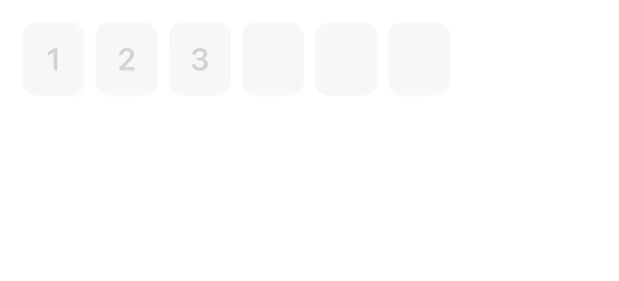
```tsx
import { InputOTP, InputOTPGroup, InputOTPSlot } from "@/components/ui/input-otp"
function slotIndexes(length: number) {
return Array.from({ length }, (_, index) => index)
}
export function InputOtpDisabledExample() {
return (
{slotIndexes(6).map((index) => (
))}
)
}
```
```swift
import EsuissUI
import SwiftUI
struct InputOTPDisabledExample: View {
var body: some View {
InputOTPDemo(length: 6, initial: "123")
.disabled(true)
}
}
struct InputOTPDemo: View {
let length: Int
@State private var text: String
init(length: Int, initial: String = "") {
self.length = length
_text = State(initialValue: initial)
}
var body: some View {
InputOTP(text: $text, length: length)
}
}
```
```kotlin
import androidx.compose.foundation.layout.Column
import androidx.compose.runtime.Composable
import androidx.compose.runtime.getValue
import androidx.compose.runtime.mutableStateOf
import androidx.compose.runtime.saveable.rememberSaveable
import androidx.compose.runtime.setValue
import com.esuiss.ui.components.InputOTP
@Composable
fun InputOTPDisabled() {
var value by rememberSaveable { mutableStateOf("123") }
Column {
InputOTP(value, { value = it }, maxLength = 6, enabled = false)
}
}
```
## API Reference
### InputOTP
Root that owns the hidden input and the value.
### InputOTPGroup
Row of adjacent slots.
### InputOTPSlot
Box that shows one character.
### InputOTPSeparator
Dash between groups.
## Accessibility
- Screen readers interact with the hidden input, labelled "N character code" by default; pass `inputProps` with an `accessibilityLabel` to localize it.
- The visual slots are hidden from VoiceOver and TalkBack.
- `disabled` is exposed on the input.
## Notes
- The hidden input sets `textContentType="oneTimeCode"` for iOS and `autoComplete="one-time-code"` for Android autofill.
- The caret blink respects the system Reduce Motion setting.
- Uses `bg-control`, `border-accent` and `bg-accent` tokens; light and dark follow the system appearance.